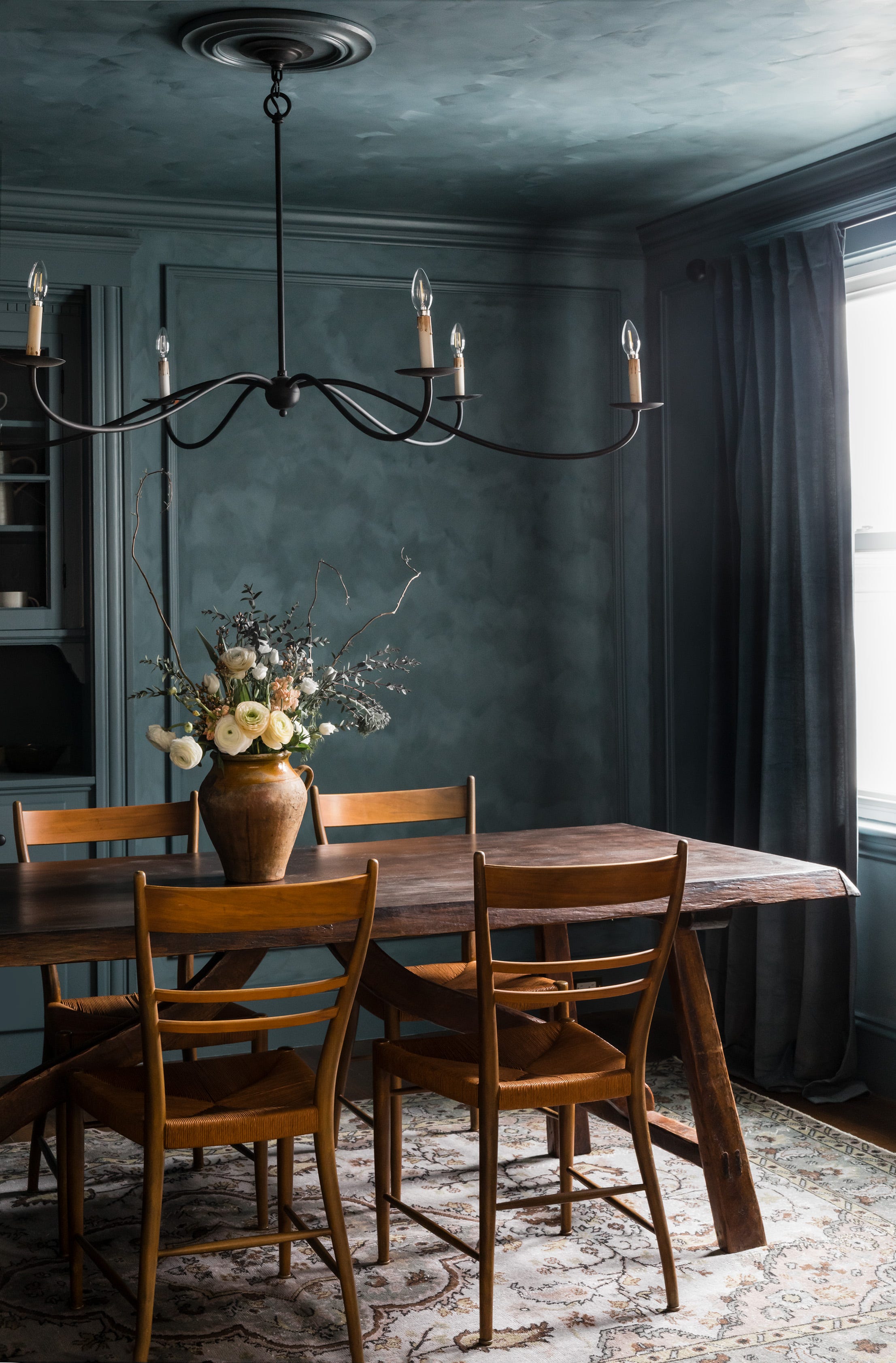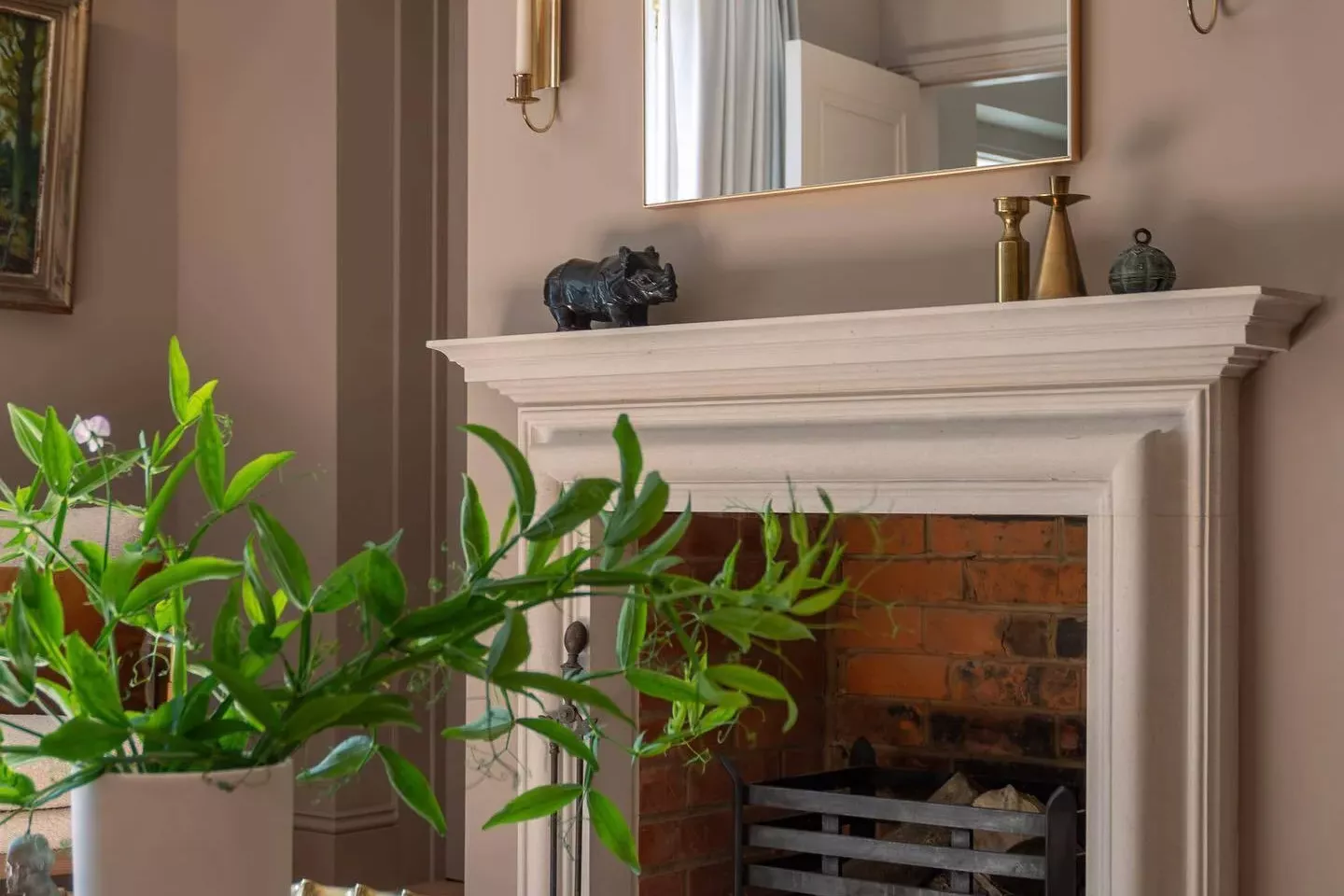
33 Absolutely Perfect Paint Colors Designers Love
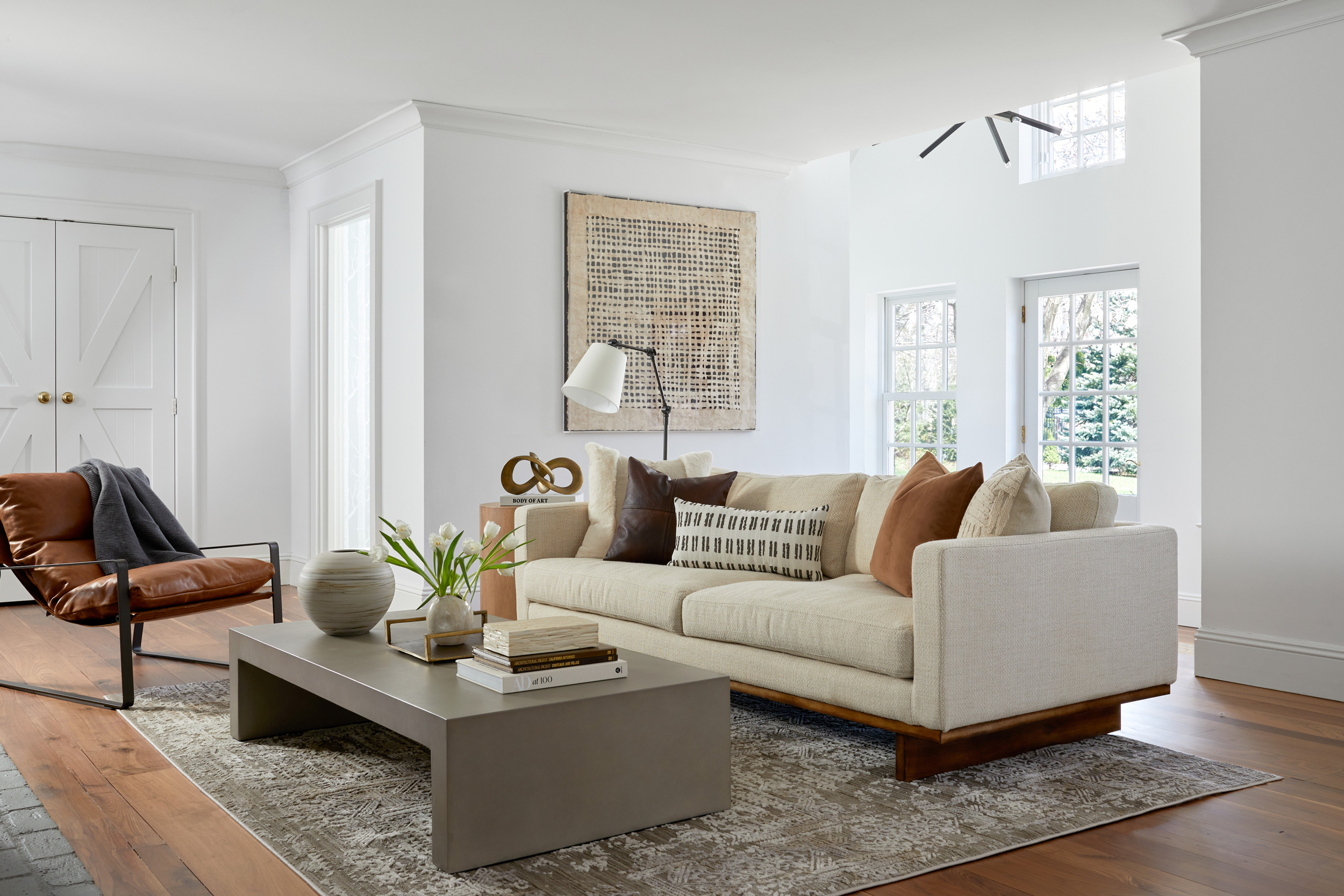
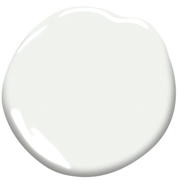
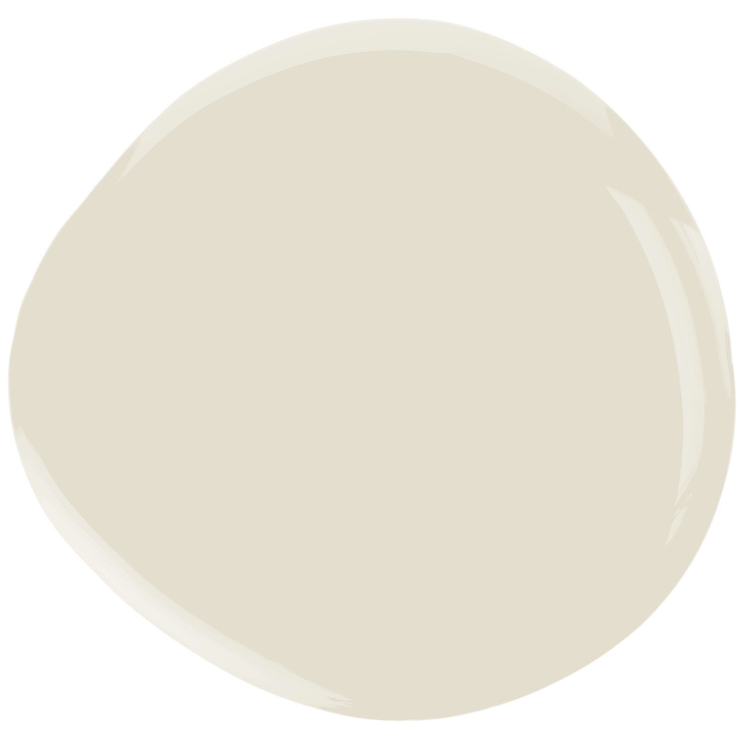
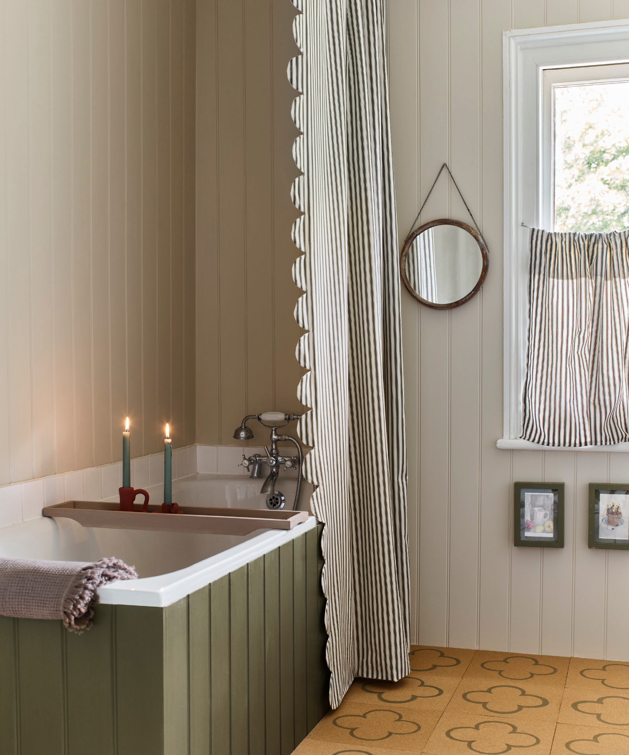
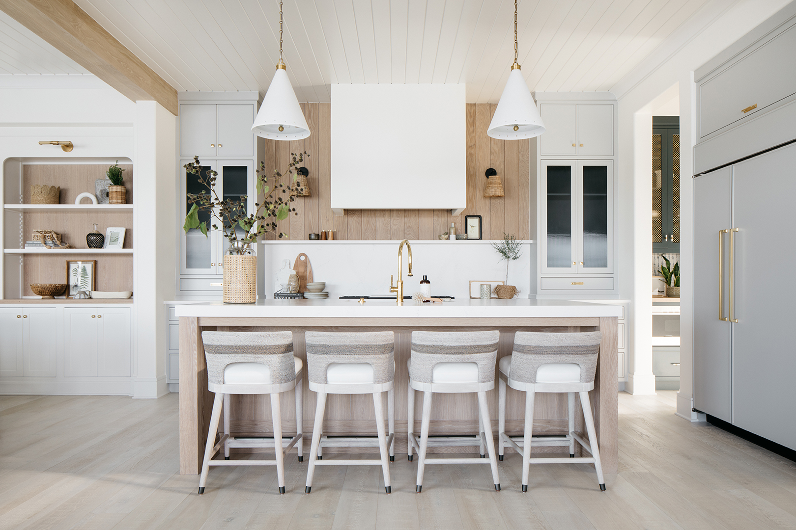
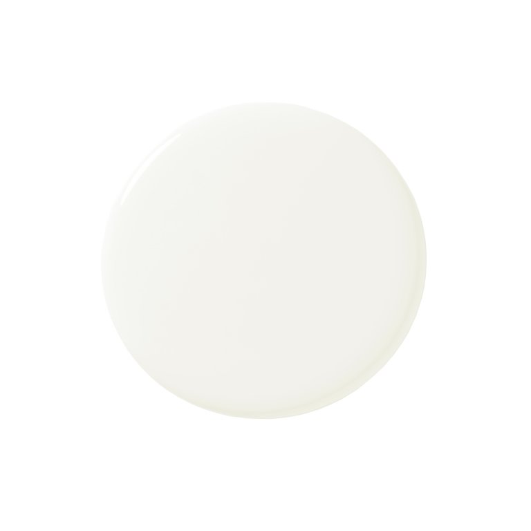
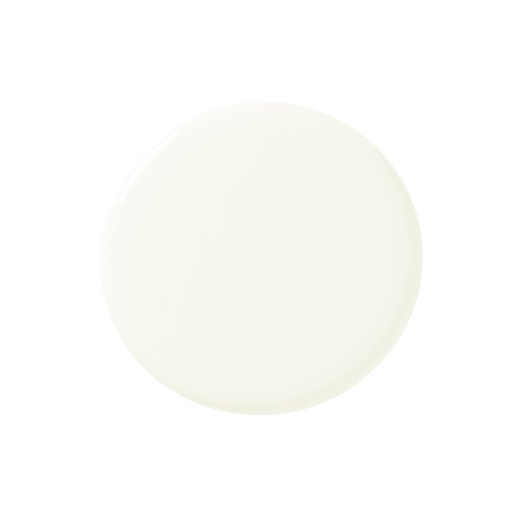
Choosing the right paint color can significantly influence the ambiance of a home. Interior designers frequently recommend a select group of paint colors that reliably enhance various spaces. Among white and off-white shades, Benjamin Moore's Paper White is favored for its warm, slightly gray undertone, making it versatile for kitchens, stairwells, and moldings. White Dove, also by Benjamin Moore, is another classic, offering a subtle warmth without appearing yellow, suitable for entire homes. Benjamin Moore's Linen White provides a perfect ivory with depth, adapting from a pure ivory in bright light to a soft pink as the sun sets. Decorator's White, a Benjamin Moore color with a slight blue tone, brightens rooms and is ideal for walls, trim, millwork, and built-ins. Simply White by Benjamin Moore is a go-to warm white for all-white schemes, and its effect can be enhanced by varying sheen finishes on walls, doors, and baseboards.
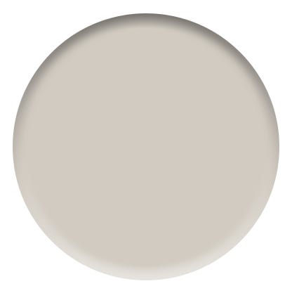
For neutral grays, Benjamin Moore's Light Pewter is a timeless option that serves as an excellent backdrop for various interior styles. Shoreline, another Benjamin Moore hue, is a pale gray praised for its neutrality, avoiding blue, green, or lavender undertones, making it suitable for family rooms, hallways, and kitchens. Sherwin-Williams' Passive is a reliable neutral gray without strong undertones, adaptable to almost any room. Revere Pewter by Benjamin Moore is a warm taupe-gray known for its chameleon-like quality, subtly changing with light conditions.
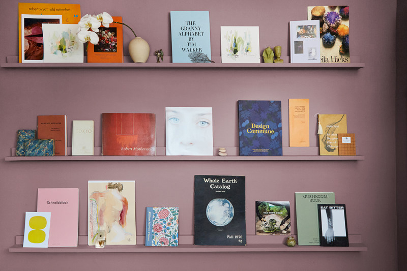
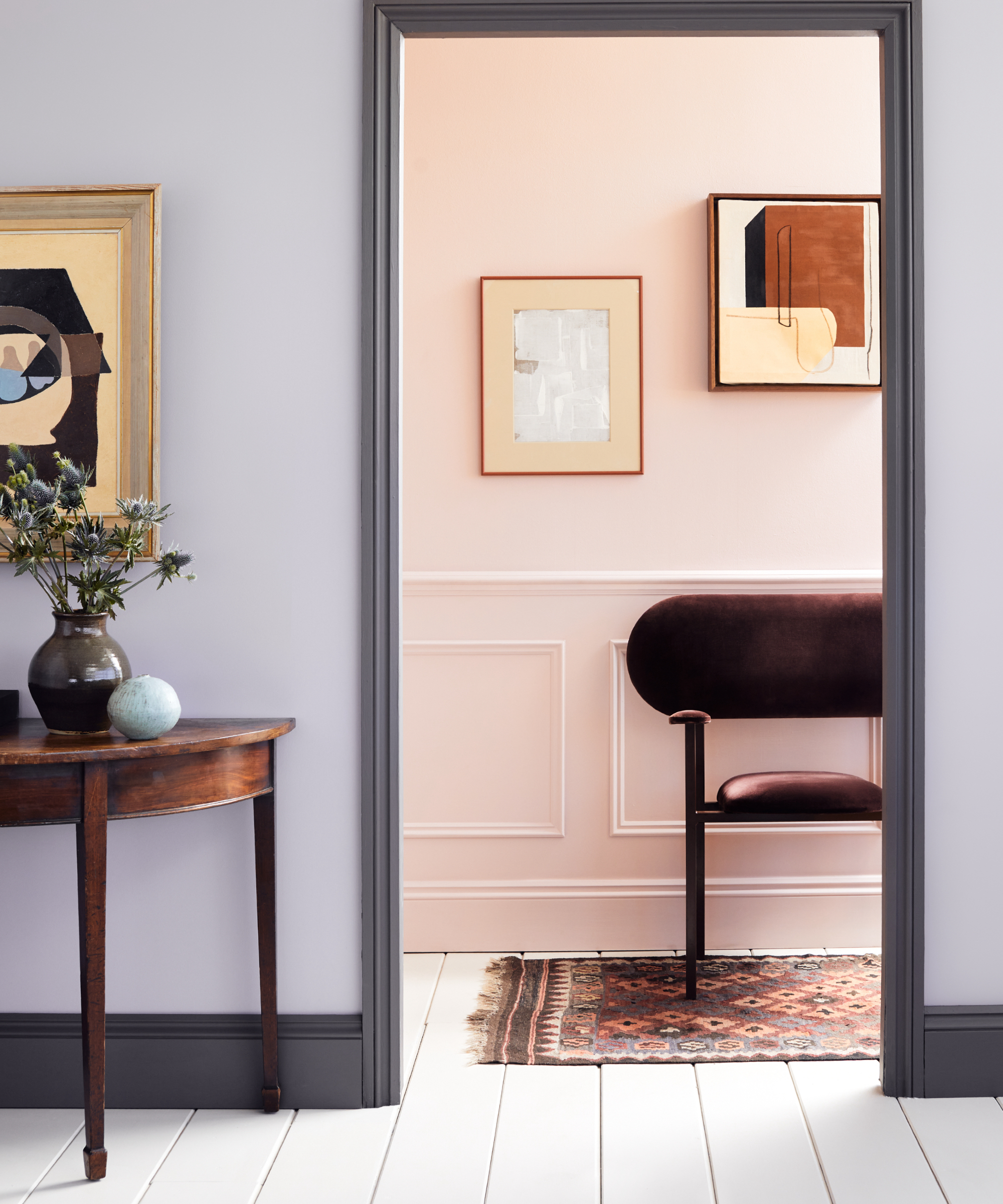
Designers also embrace bold and vibrant colors. Farrow & Ball's Parma Gray, a blue with a purple undertone, can appear gray-blue and is used in high gloss for dramatic foyers or in matte for cozy family rooms. Brassica, by Farrow & Ball, is described as a quiet, masculine purple that complements various antique and modern furnishings. Benjamin Moore's Alligator Alley is a rich green with gray undertones, making it easy to integrate into a design scheme, whether as a base for wallpaper or an accent on ceilings. Heritage Red, a Benjamin Moore color, is recommended in high gloss for dining rooms or libraries, particularly for spaces used at night, creating a luxurious and cozy atmosphere. Benjamin Moore's Autumn Purple, a sophisticated berry hue, adds warmth and is suitable for dining rooms, powder rooms, or high-gloss built-ins in home offices.
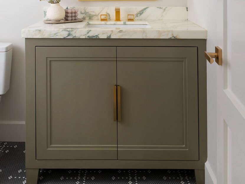
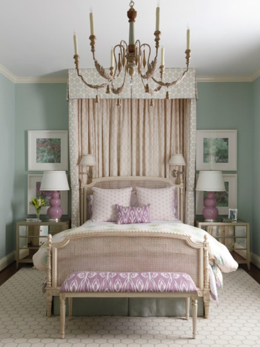
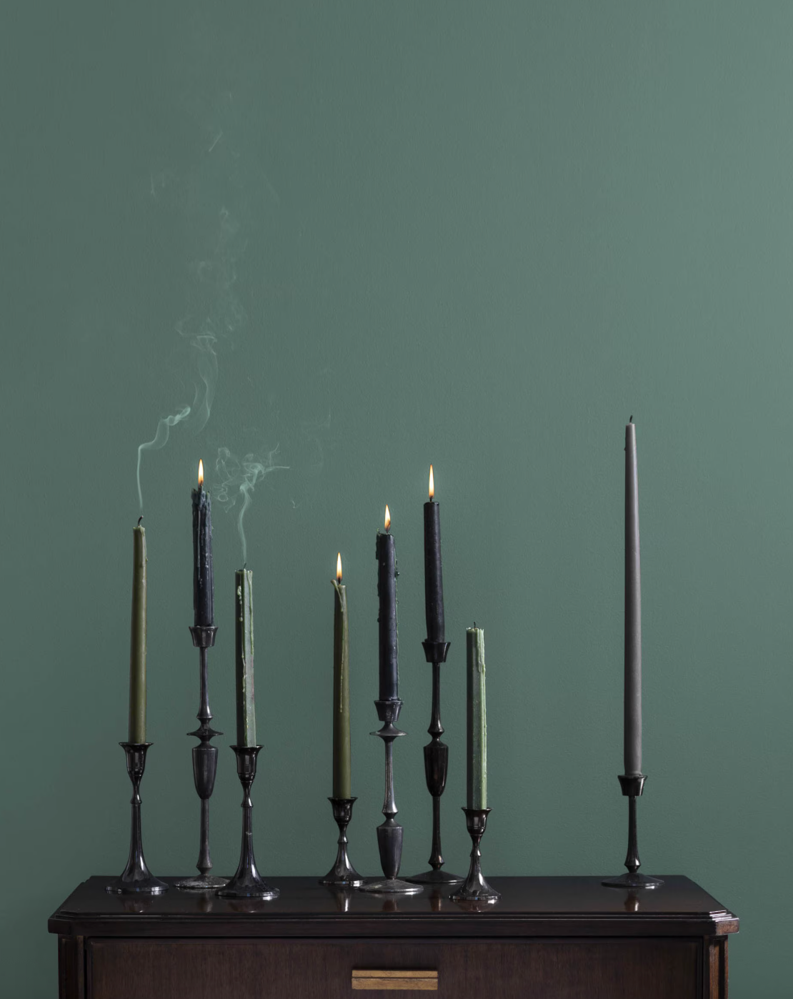
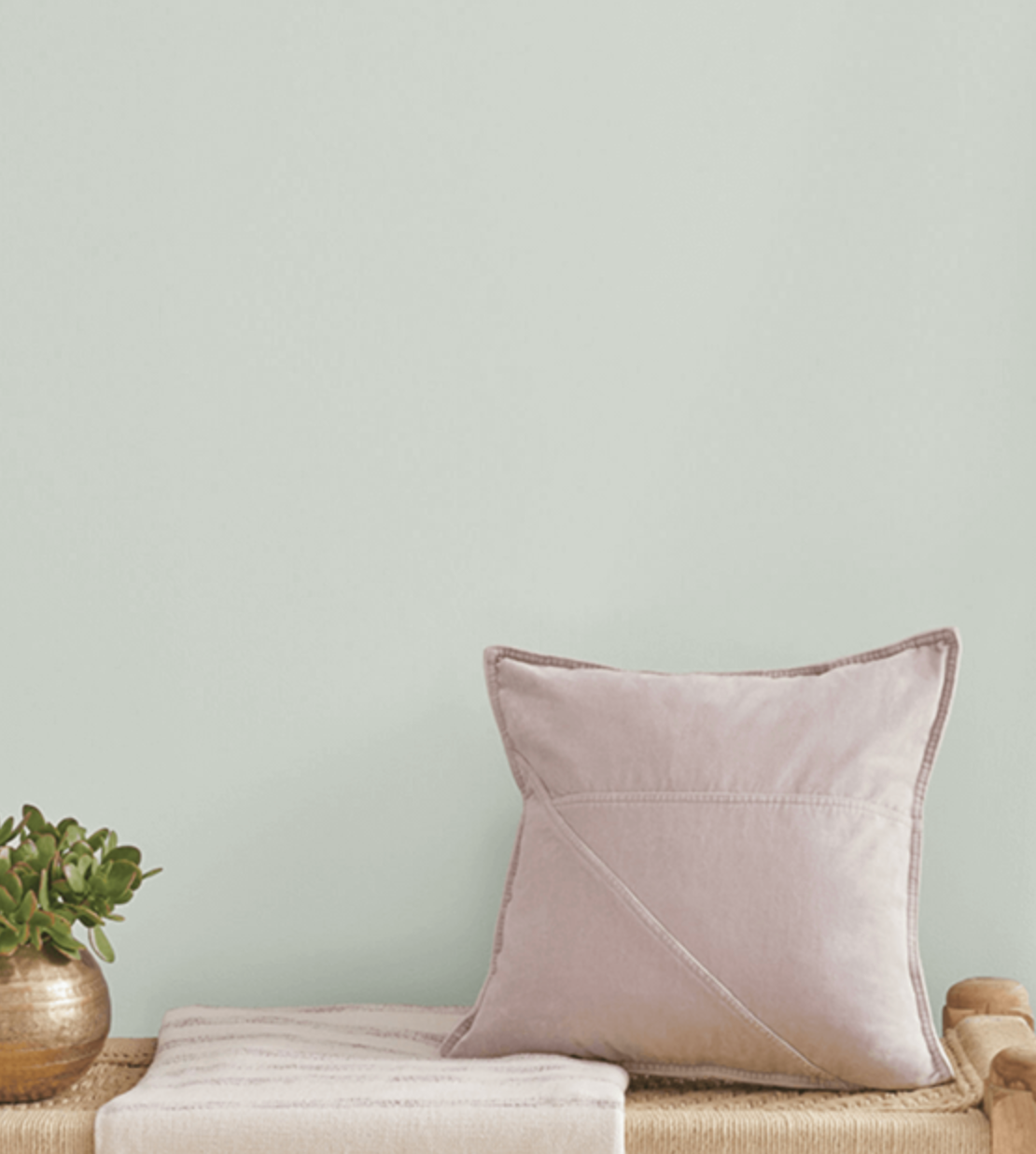
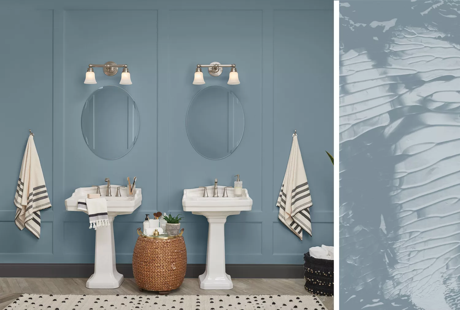
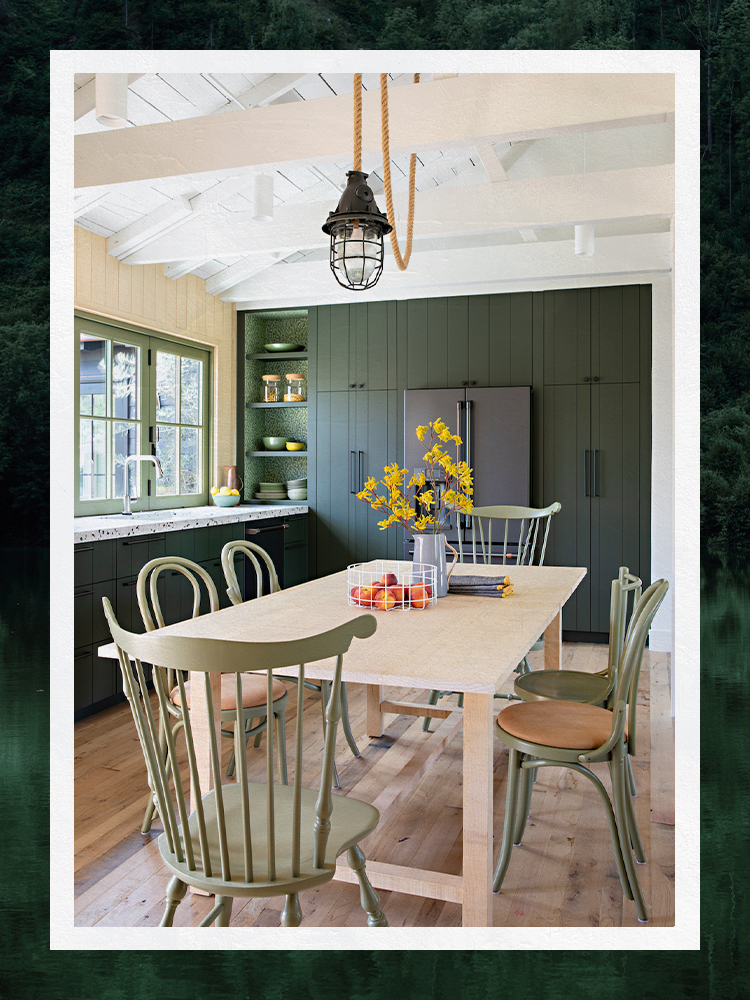
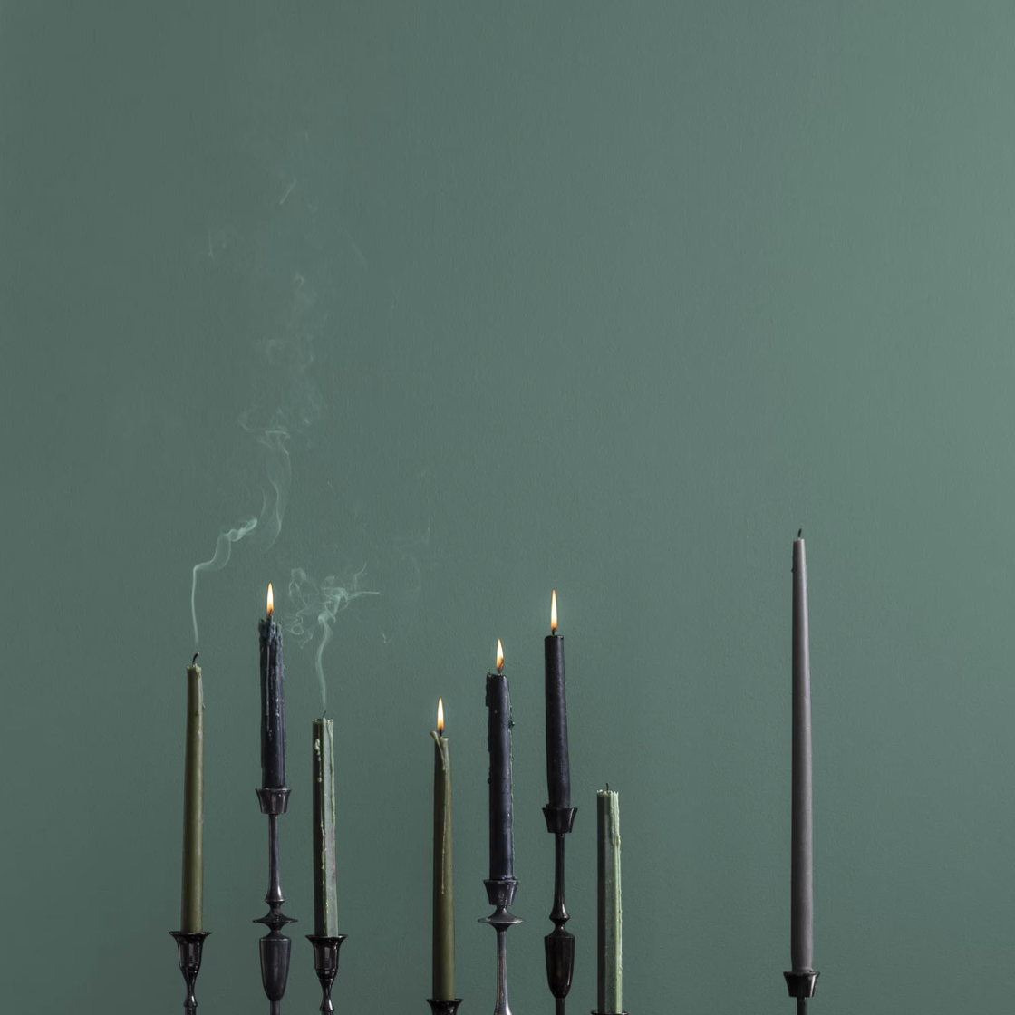
Specific blues and greens are also highlighted. Benjamin Moore's Bermuda Turquoise is a rich, saturated jewel tone perfect for small, transitional spaces like foyers and powder rooms, especially in a high-gloss finish. Blue Haze, another Benjamin Moore color, is an ethereal blue that is both calming and stimulating, often recommended for bedrooms. Brewster Gray by Benjamin Moore, a dusty blue, pairs well with brass or wallpaper and is used on walls, trim, and cabinetry. Sherwin-Williams' Evergreen Fog is a saturated, dusty green that acts as a neutral, providing a calming effect, particularly when paired with warm wood tones. Topsail by Sherwin-Williams is a subtle mint color, offering a refreshing hint of pale blue and green that can uplift or relax a room.
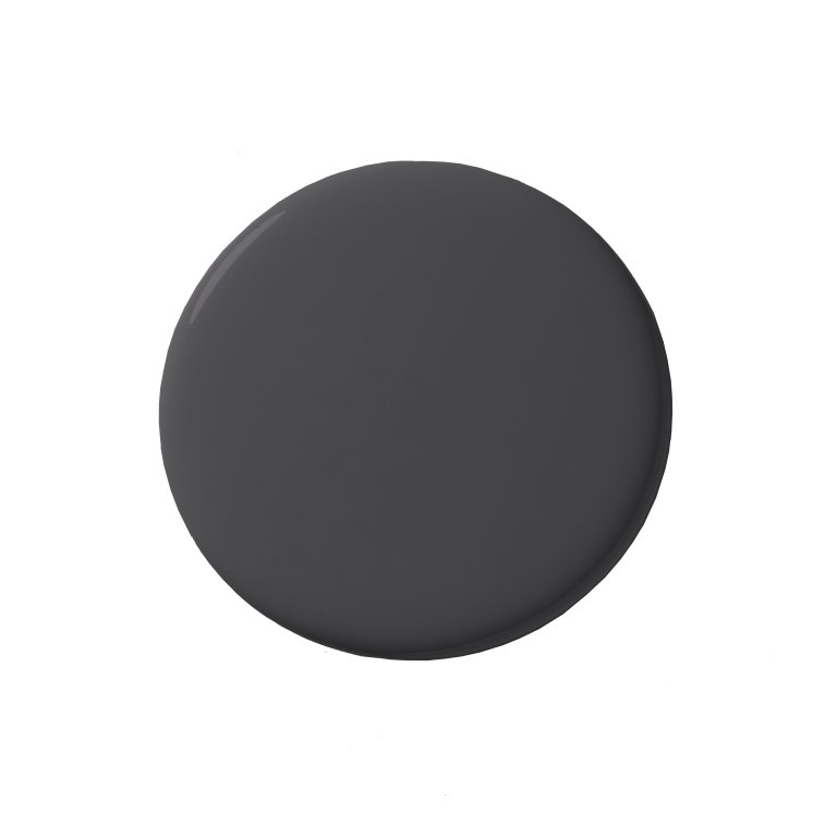
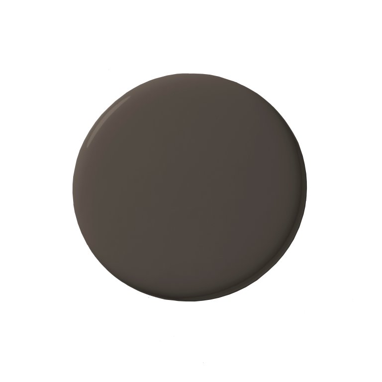
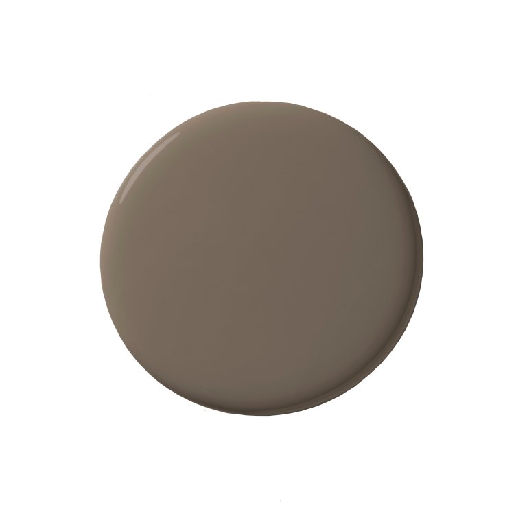
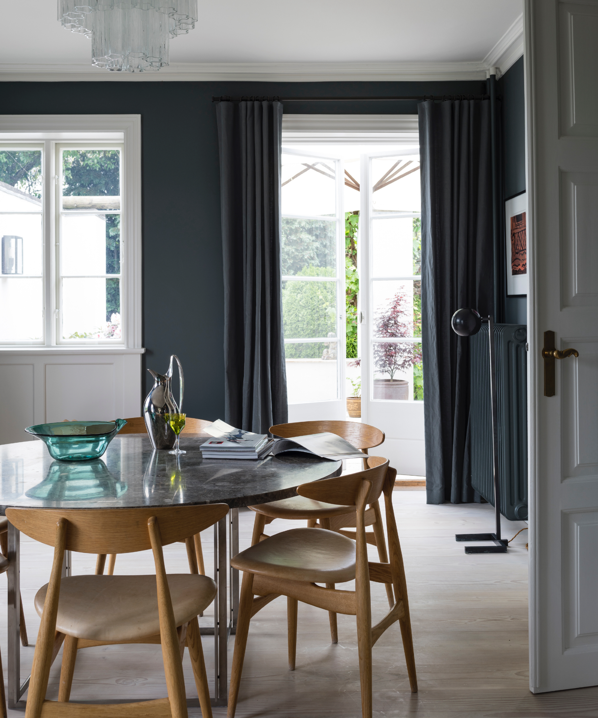
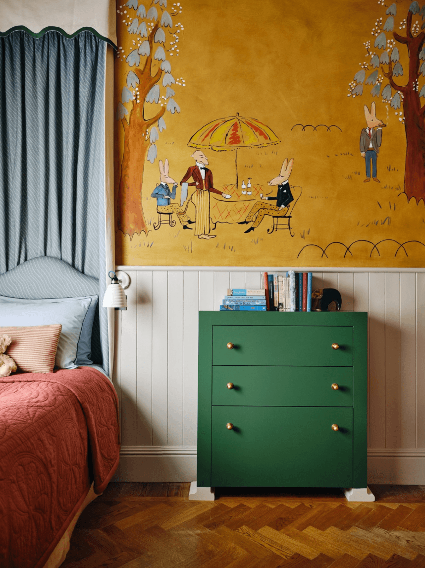
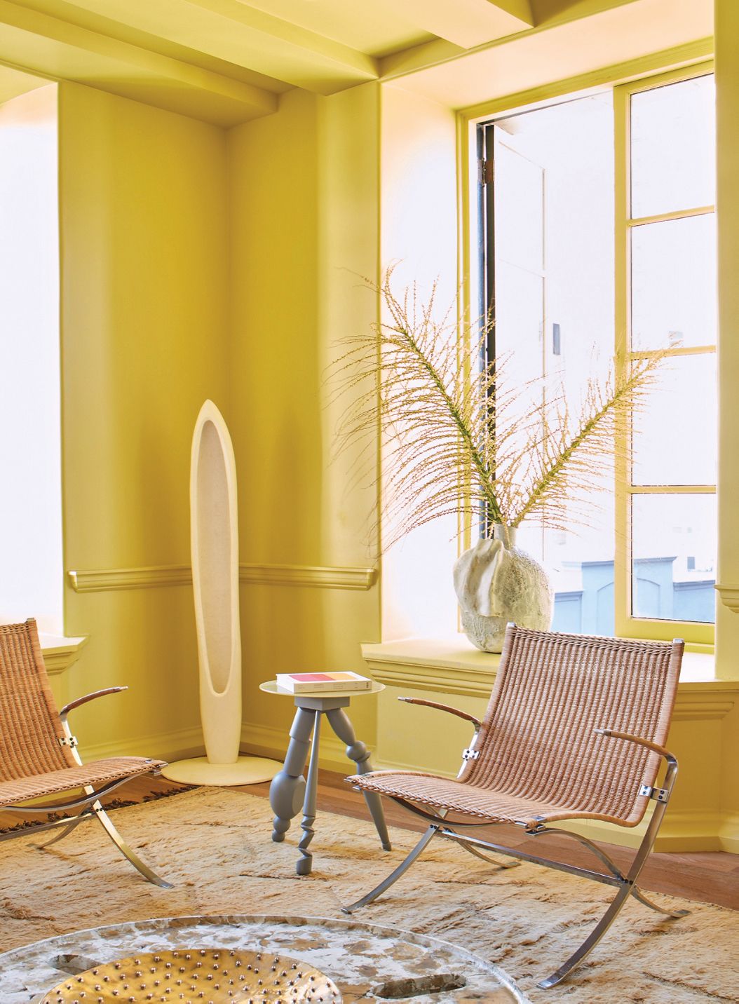
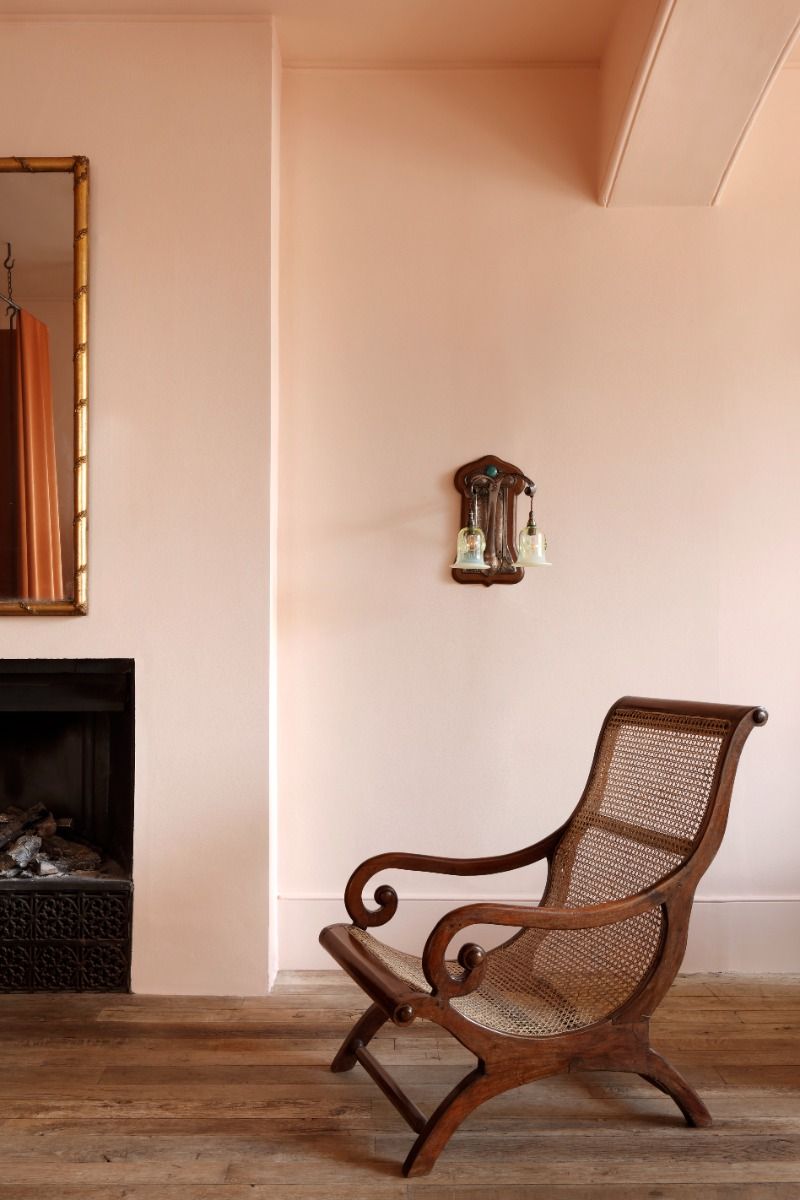
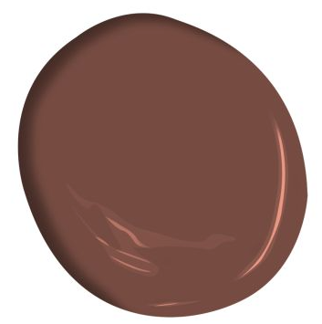
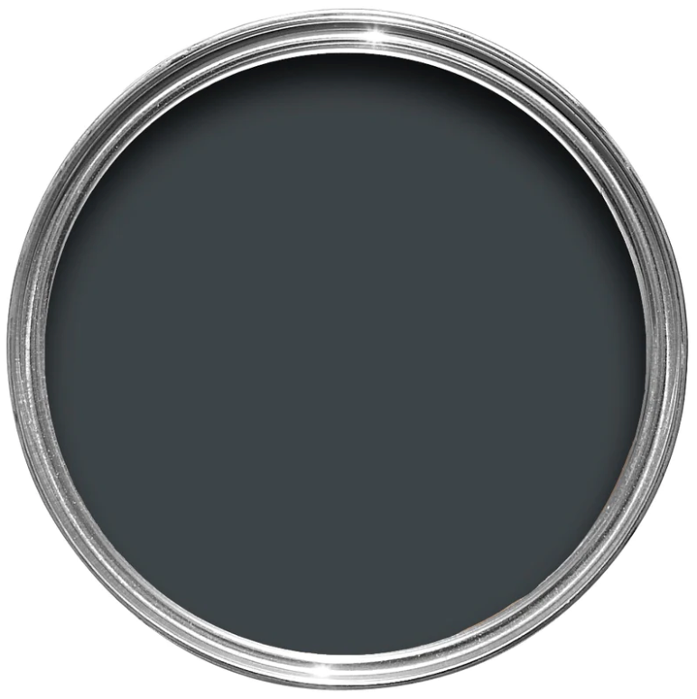
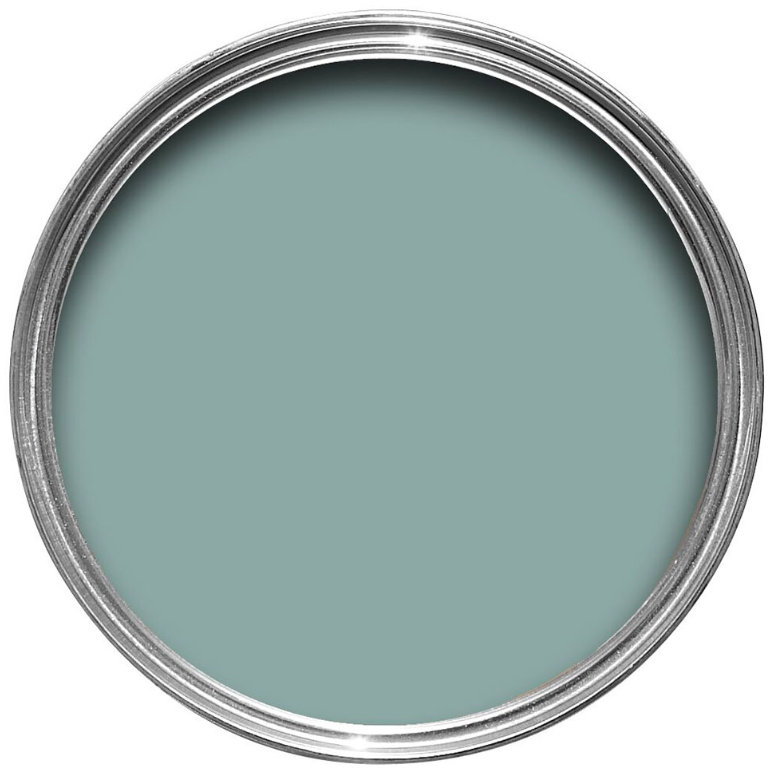
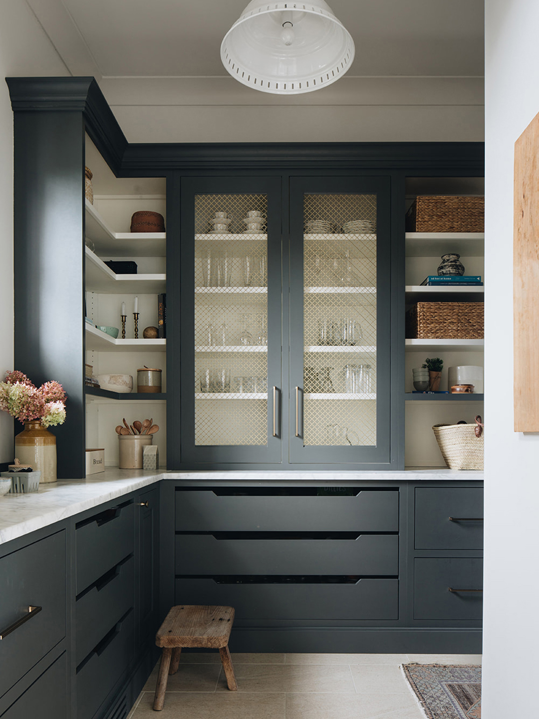
Unique and earthy tones include Farrow & Ball's Hardwick White, which reads as a taupe despite its name, offering warmth and neutrality. Wevet, also by Farrow & Ball, is a delicate white with a barely-there, translucent feel and a slight gray undertone. Skimming Stone by Farrow & Ball is a light mushroom color, perfect for neutral rooms and effective on kitchen cabinets or interior walls. Jitney, another Farrow & Ball favorite, is a light and creamy brown with pink or peach undertones, offering earthy moodiness. Benjamin Moore's Palest Pistachio appears white with hints of blue or green, creating a happy and clean feeling. Palladian Blue by Benjamin Moore, which often presents more green than blue, is deep, elegant, and timeless. Sherwin-Williams' Accessible Beige is a warm beige that avoids yellow undertones and works well for kitchen cabinets. Cavern Clay by Sherwin-Williams, a terracotta-inspired hue, adds richness and is ideal for pairing with warm woods and neutral colors, even on ceilings for a rosy glow. Outerspace by Sherwin-Williams is a deep blue with heavy gray undertones, perfect for high-impact areas like built-ins. Lawn Party by Backdrop is a vibrant medium green with warm yellow and tan undertones, suitable for walls, ceilings, and cabinetry. Inchyra Blue by Farrow & Ball is a versatile blend of blue and gray, shifting with light, and ideal for islands or millwork. Finally, Red Earth by Farrow & Ball, a blend of red and yellow pigments, provides warmth and is excellent for accent cupboards or front doors.
#PaintColors #InteriorDesign #HomeDecor #ColorSelection #DesignTips #NeutralColors #BoldColors #FarrowAndBall #BenjaminMoore #PaintColors #InteriorDesign #HomeDecor #ColorSelection #DesignTips #NeutralColors #BoldColors #FarrowAndBall #BenjaminMoore
0 comment in total
 No comments yet
You may also like

An A-List Designer’s Secrets To Picking Perfect Paint Colors


11 Paint Colors That INSTANTLY Make Your Home Look "Expensive," According to Designers

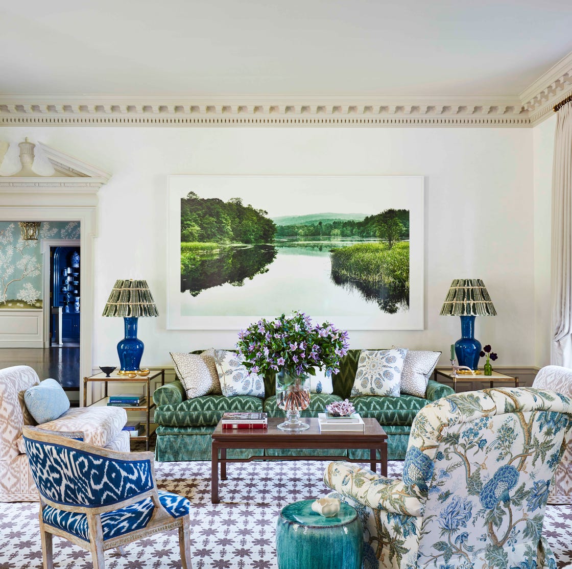
35 Neutral Paint Colors Interior Designers Can't Get Enough Of

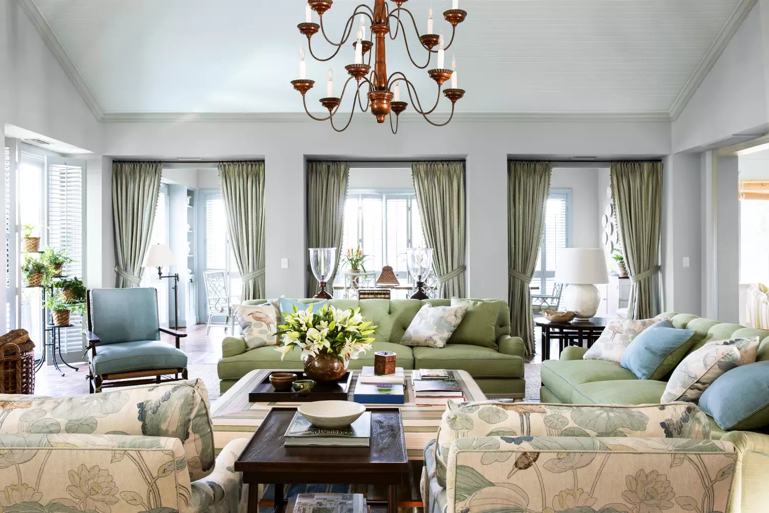
15 Timeless Paint Colors You’ll Never Tire Of, According To Designers
Britain's best interior designers on the paint colours you just can't go wrong with
19 go-to paint colors that Dallas designers love
12 Paint Colors That Interior Designers Are Buzzing About—See the Gorgeous Hues Here
All the interior designers with paint collaborations (and our favourite shades)
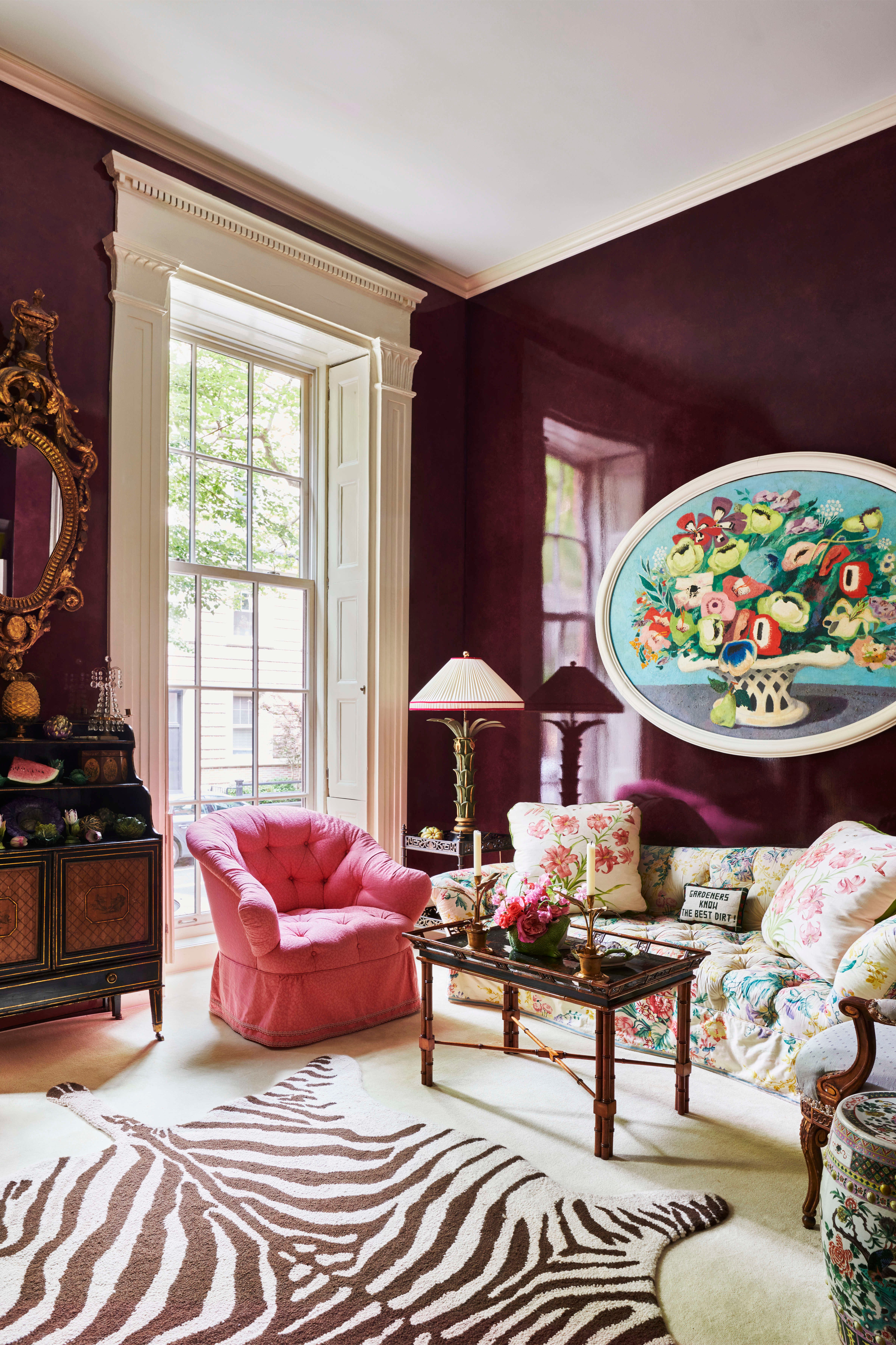
Top Designers Reveal the 16 Best Purple Paint Colors They Absolutely Swear By
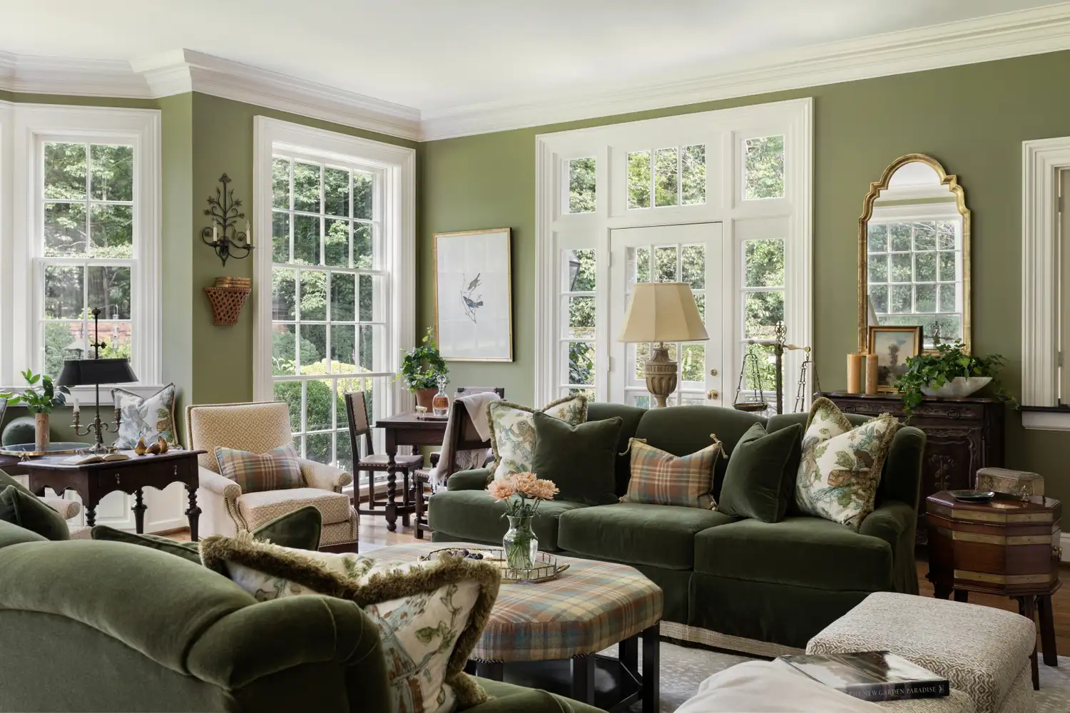
5 Secrets To Picking Paint Colors Like A Designer
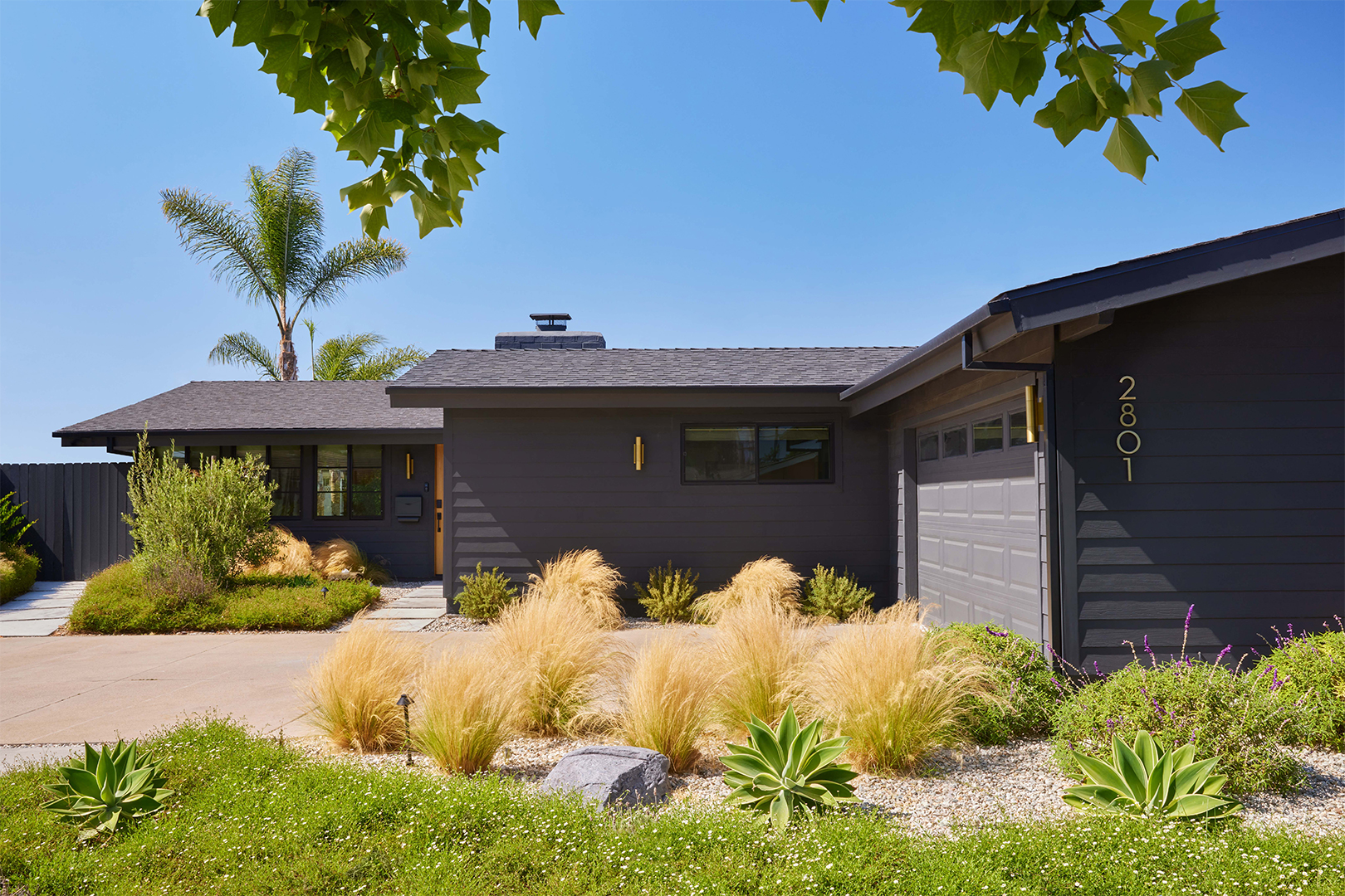
The Best Exterior Paint Colors Designers Have Ever Used

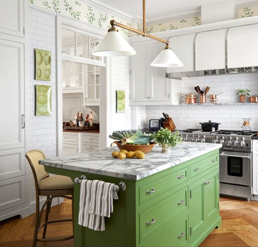
It’s Official: These are the Best Kitchen Paint Colors, According to Designers
20 Interior Paint Colors Decorating Experts Love

Designers Share Their Tried-and-True Shades From the Best Interior Paint Brands

7 of the most versatile and easy to use paint colors according to designers

The 10 Best Blue-Green Paint Colors Designers Can't Stop Using

The most timeless paint colors according to designers

8 Favorite Paint Colors of Local Interior Designers

The Paint Color That All This Designer's Followers Ask About | domino

5 Underrated Paint Colors Designers Always Use in Their Projects (and You Should Too)