5 Underrated Paint Colors Designers Always Use in Their Projects (and You Should Too)
The article explores five underrated paint colors that interior designers frequently utilize in their projects, offering alternatives to popular trends and encouraging homeowners to consider less common hues. It emphasizes moving beyond social media trends to create unique and personalized home interiors.
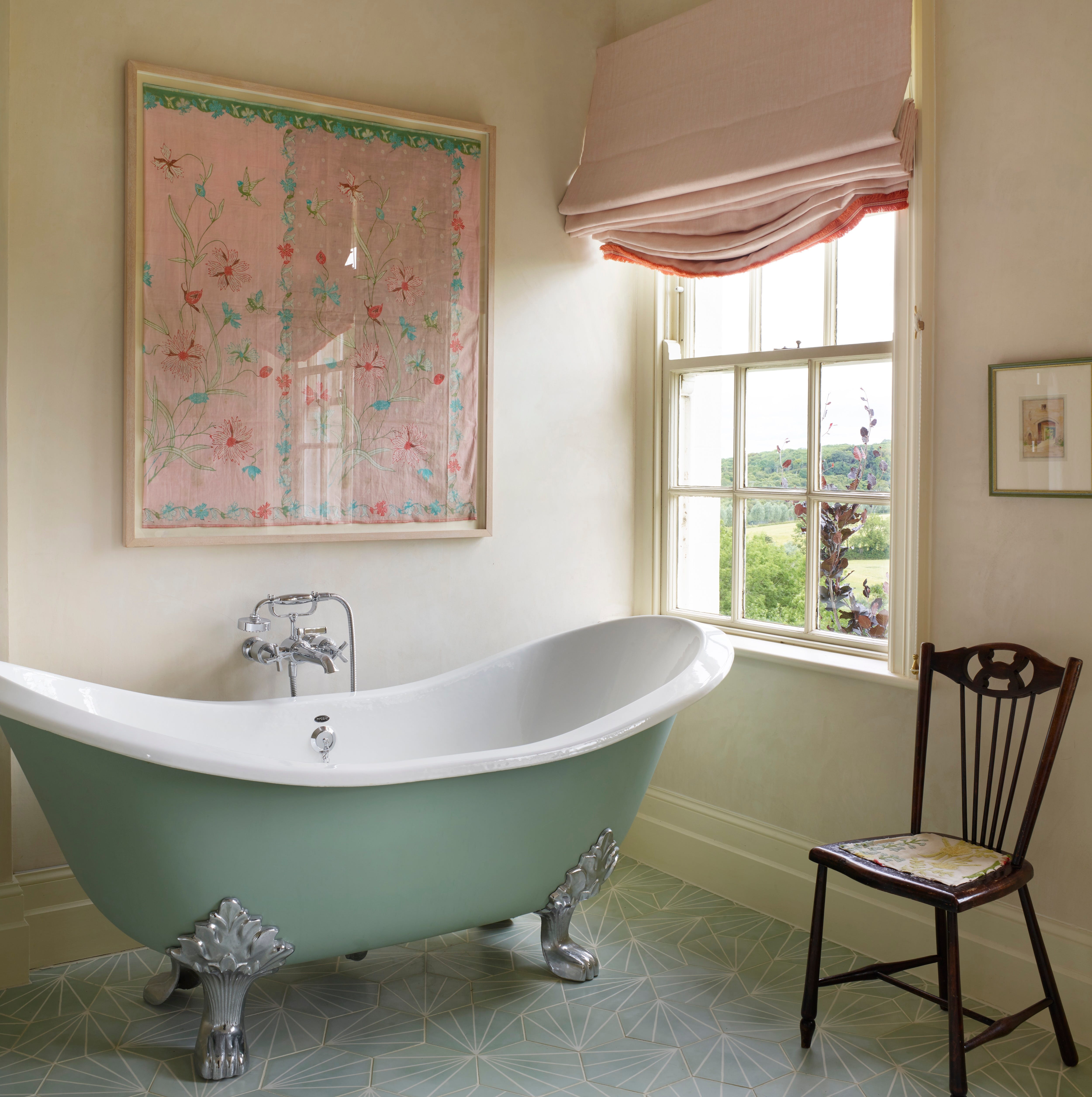
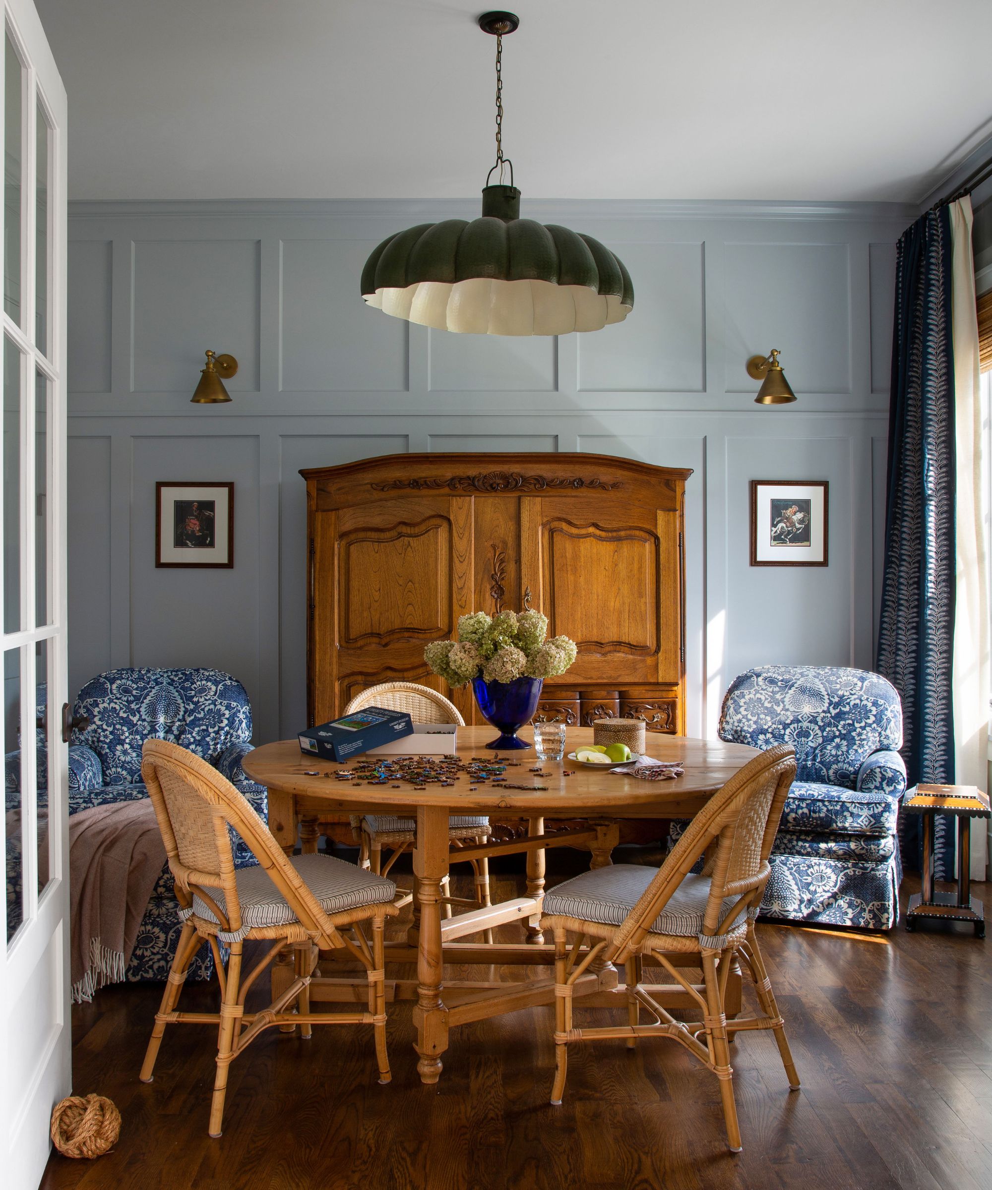
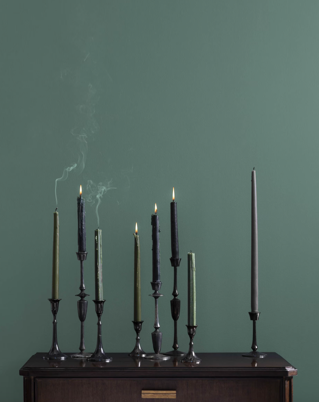
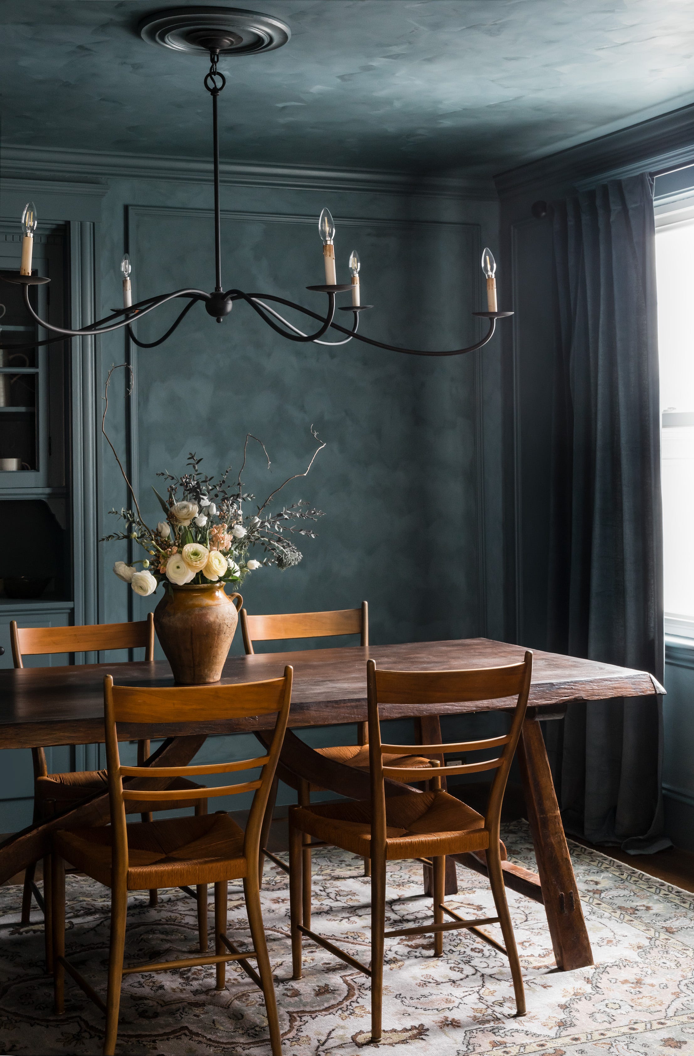
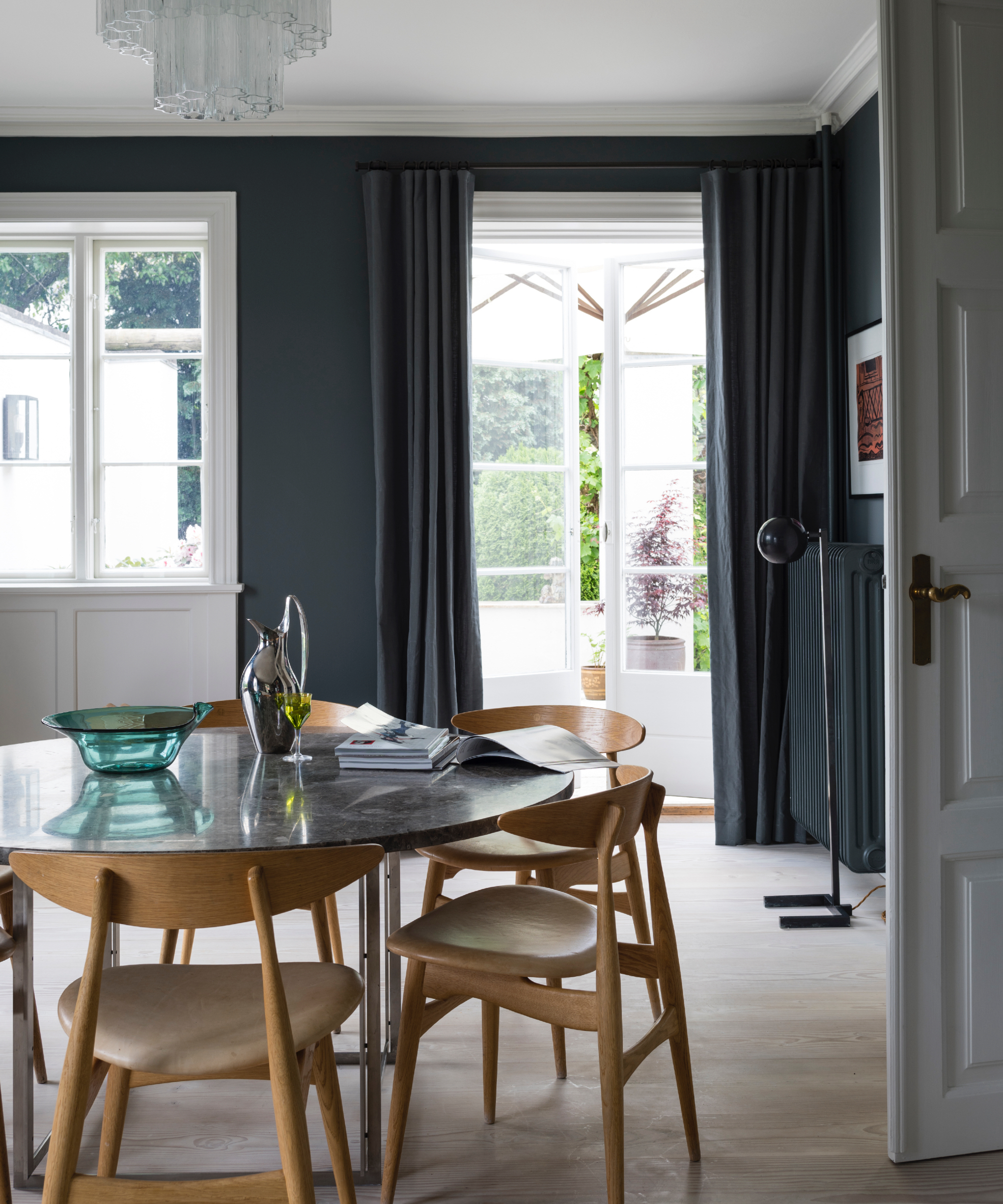
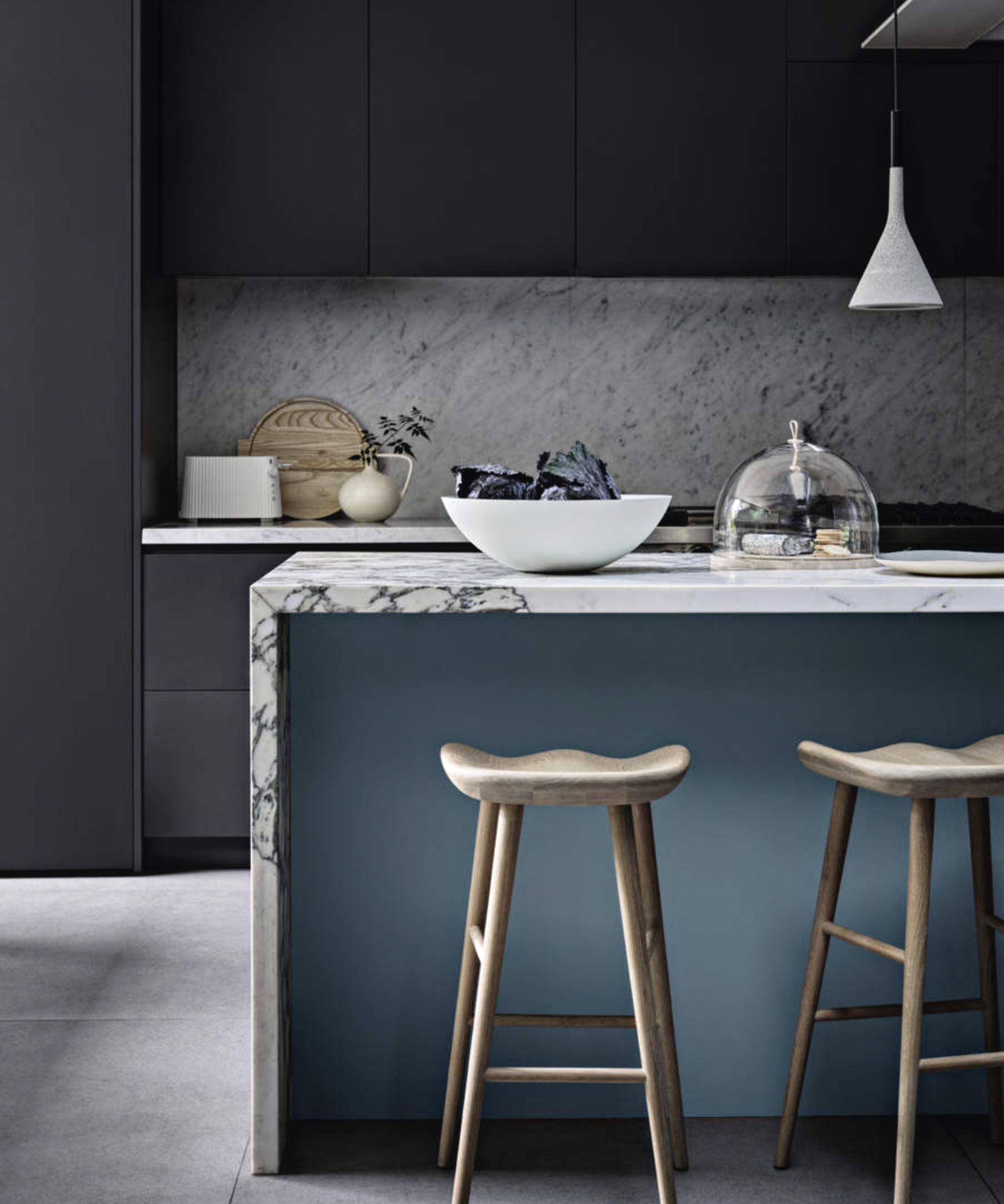
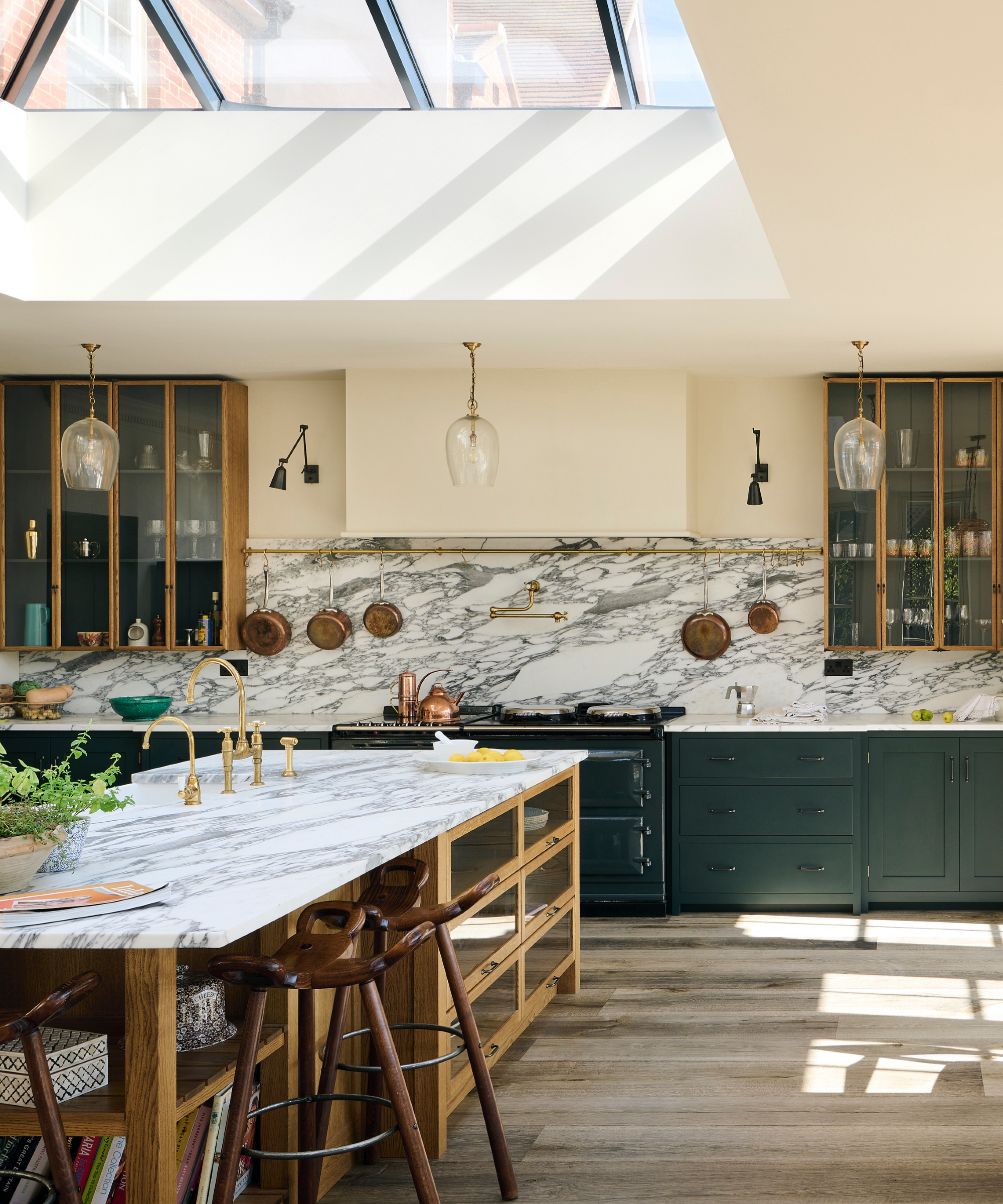
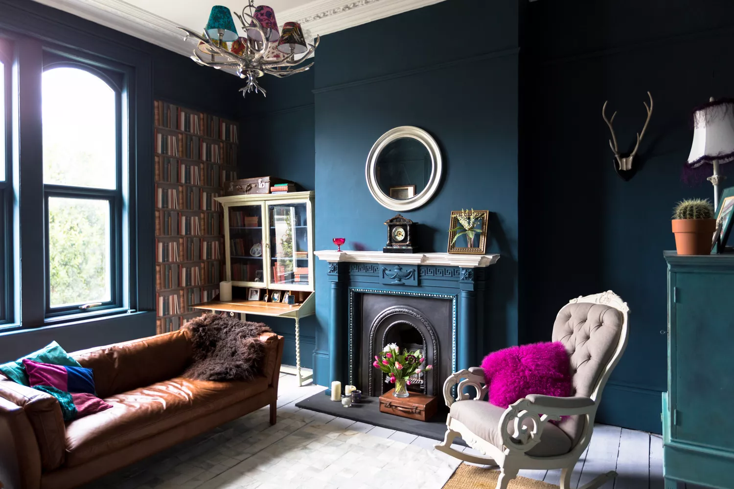
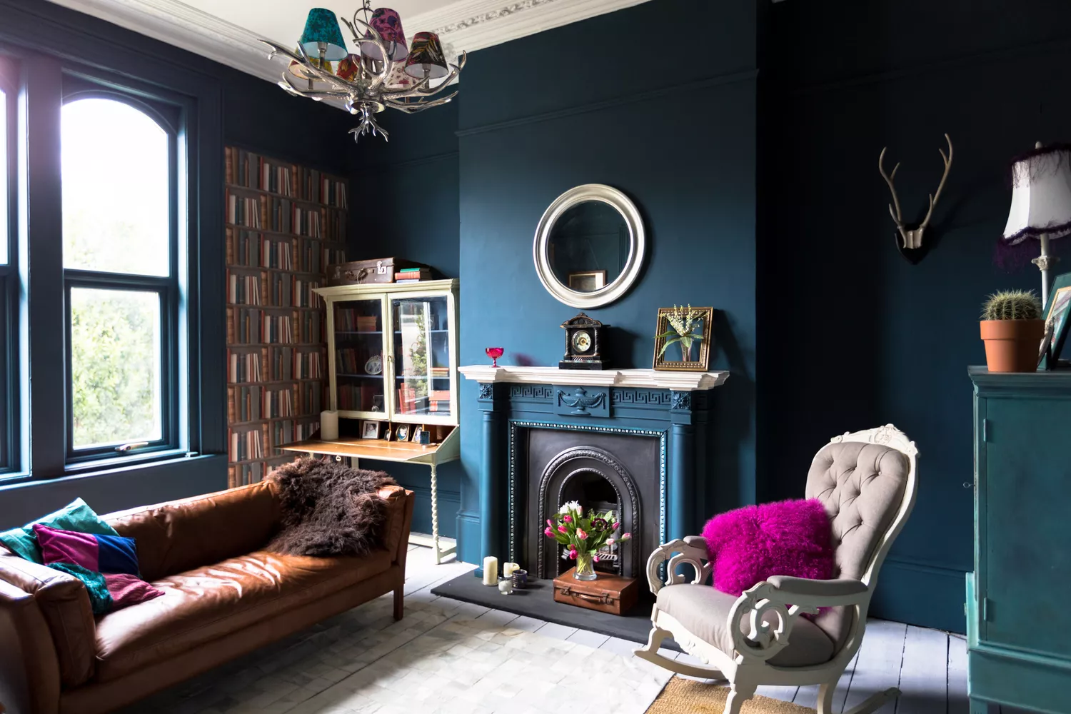
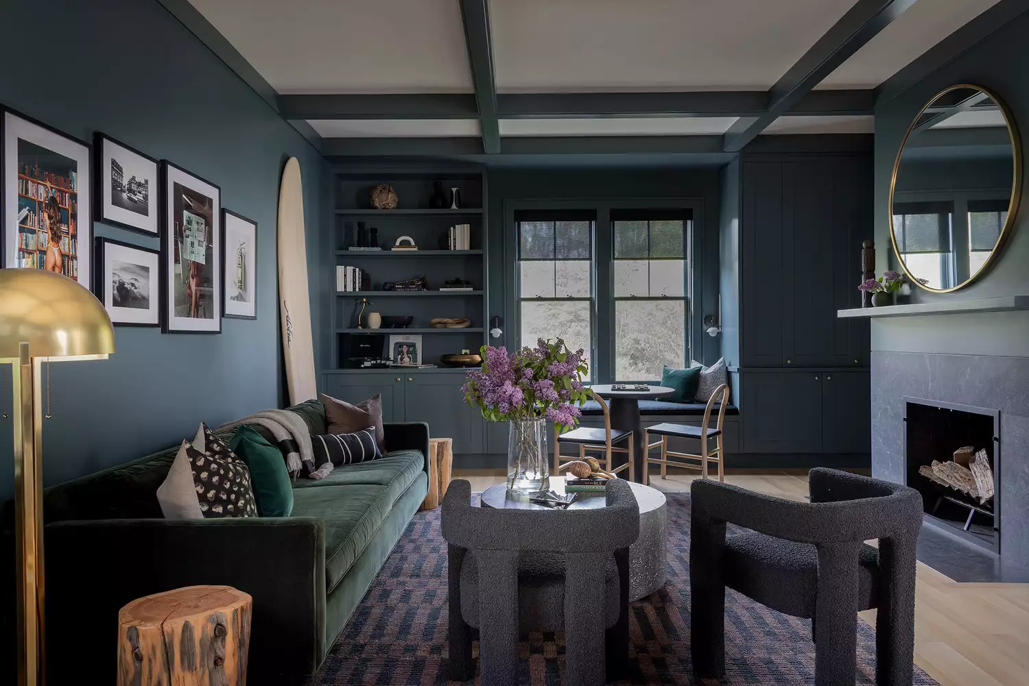
The first color highlighted is Deep Teal. While it had a moment in the 2010s, designers suggest its resurgence for spaces like dining rooms and powder rooms. Jodi Peterman of Elizabeth Erin Designs notes its beautiful pairing with warm wood tones and other blue hues, creating a monochromatic look with depth. Janelle Patton recommends using it on trim and cabinetry, suggesting combinations with yellow, green, blue, or pink.
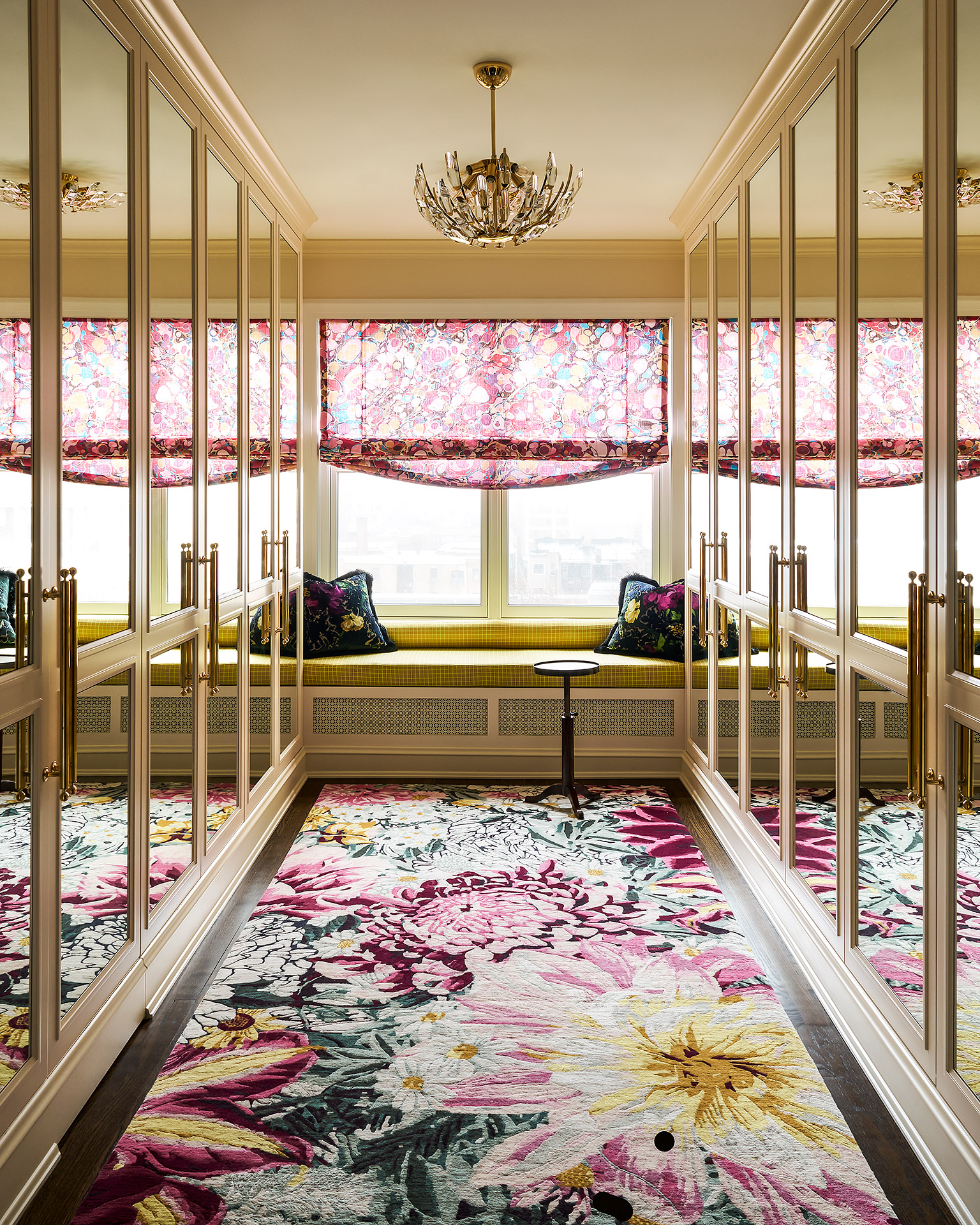
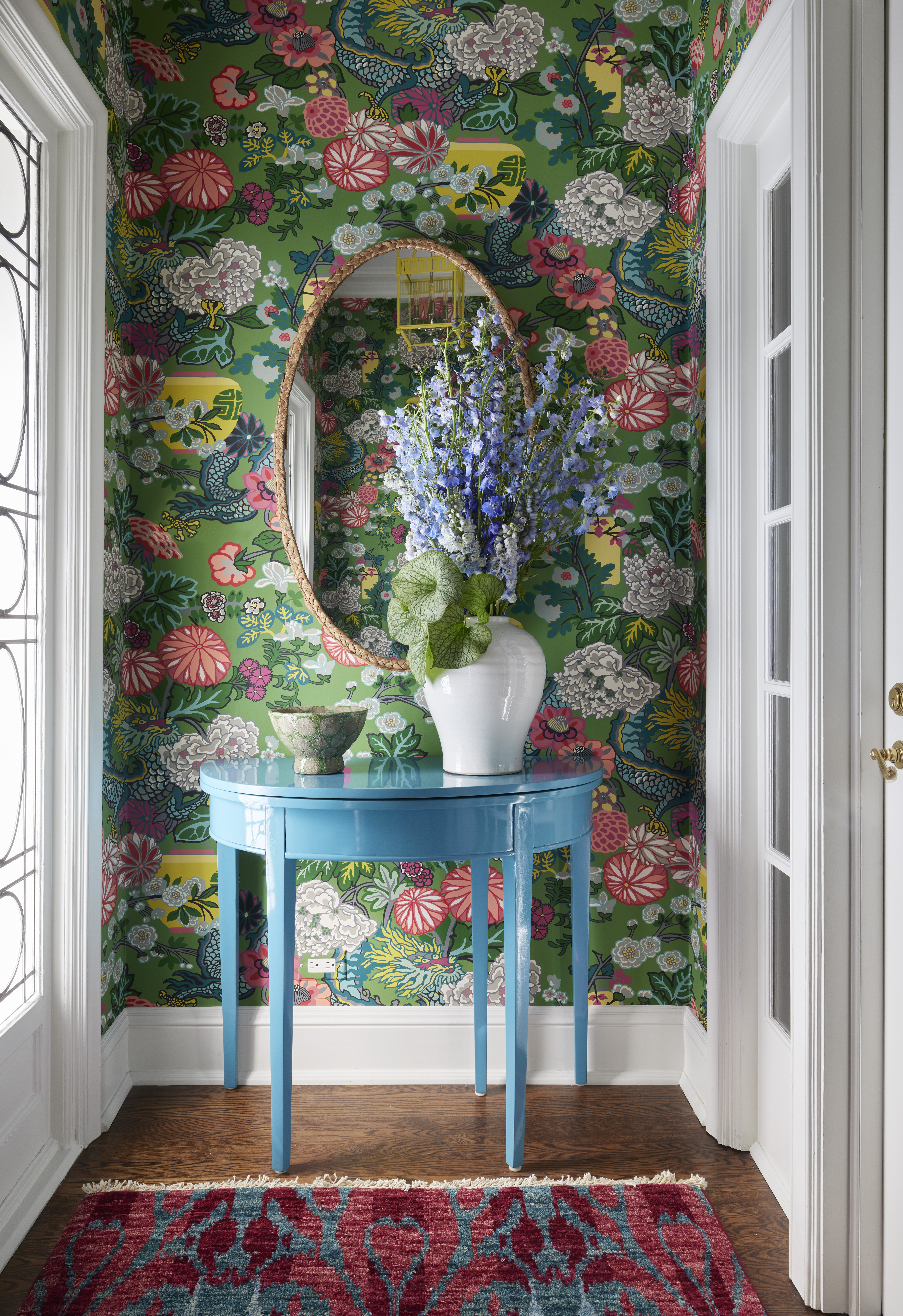
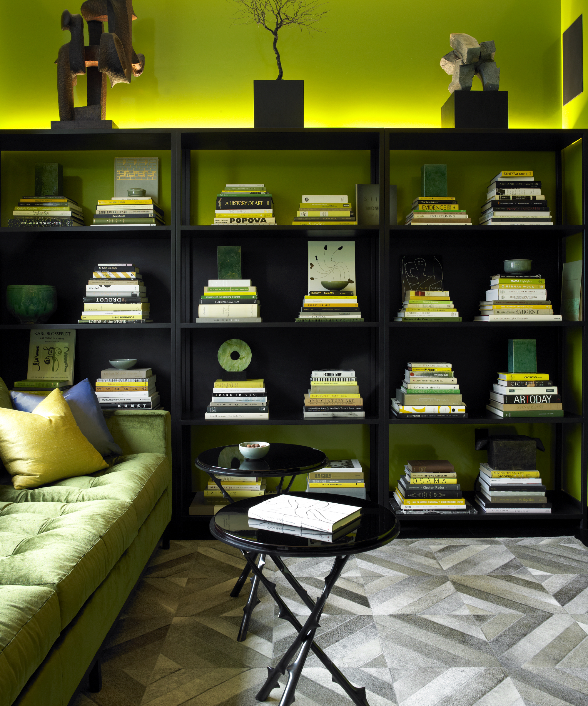
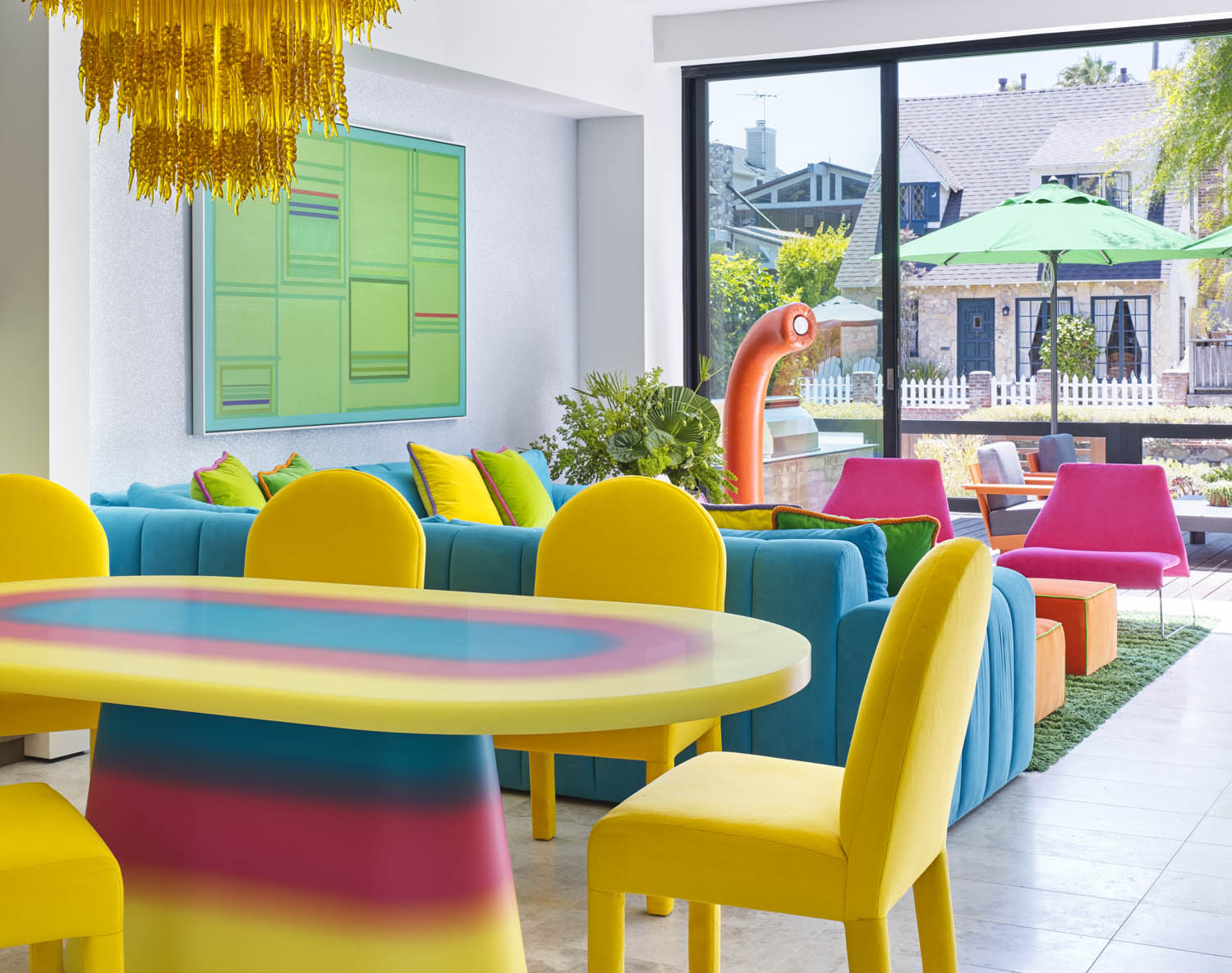
Next, Chartreuse, a blend of yellow and green, is presented as a surprising yet effective choice. Alexandra Peck advocates for this vivid color, particularly for wet bars, to introduce an unexpected pop of fun. This demonstrates how a bold, less conventional color can energize specific areas within a home.
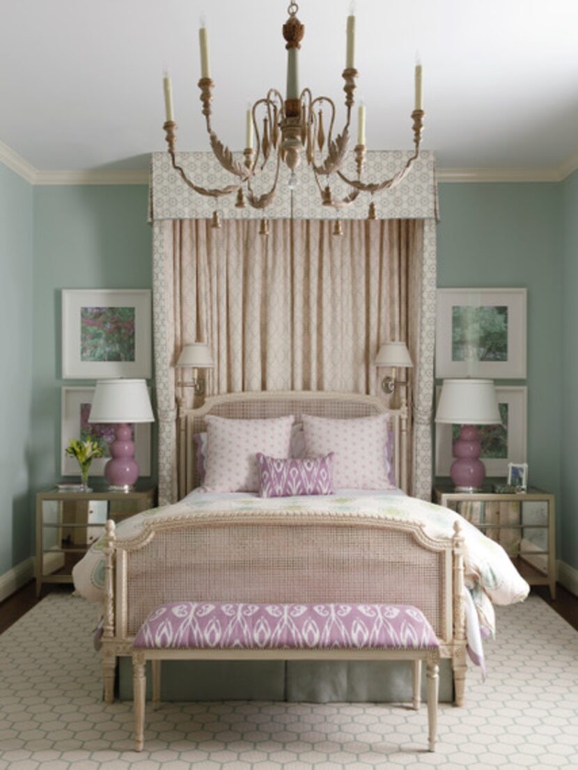
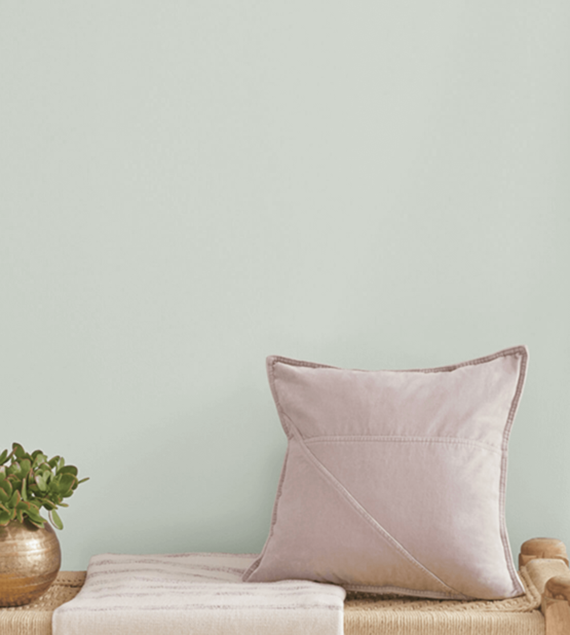
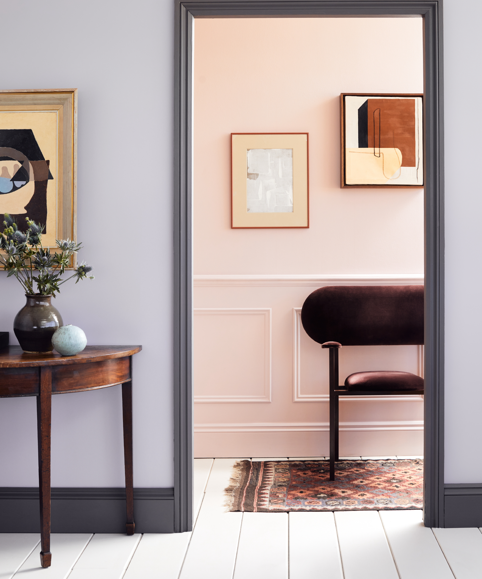
Lavender is introduced as an alternative to the currently popular pale, dusty blue. Patton suggests lavender for its relaxing quality and added warmth, recommending its use on bathroom vanities or even kitchen cabinets for those seeking a bolder statement. This highlights purple as an underutilized color in interior design, offering a fresh pastel option.
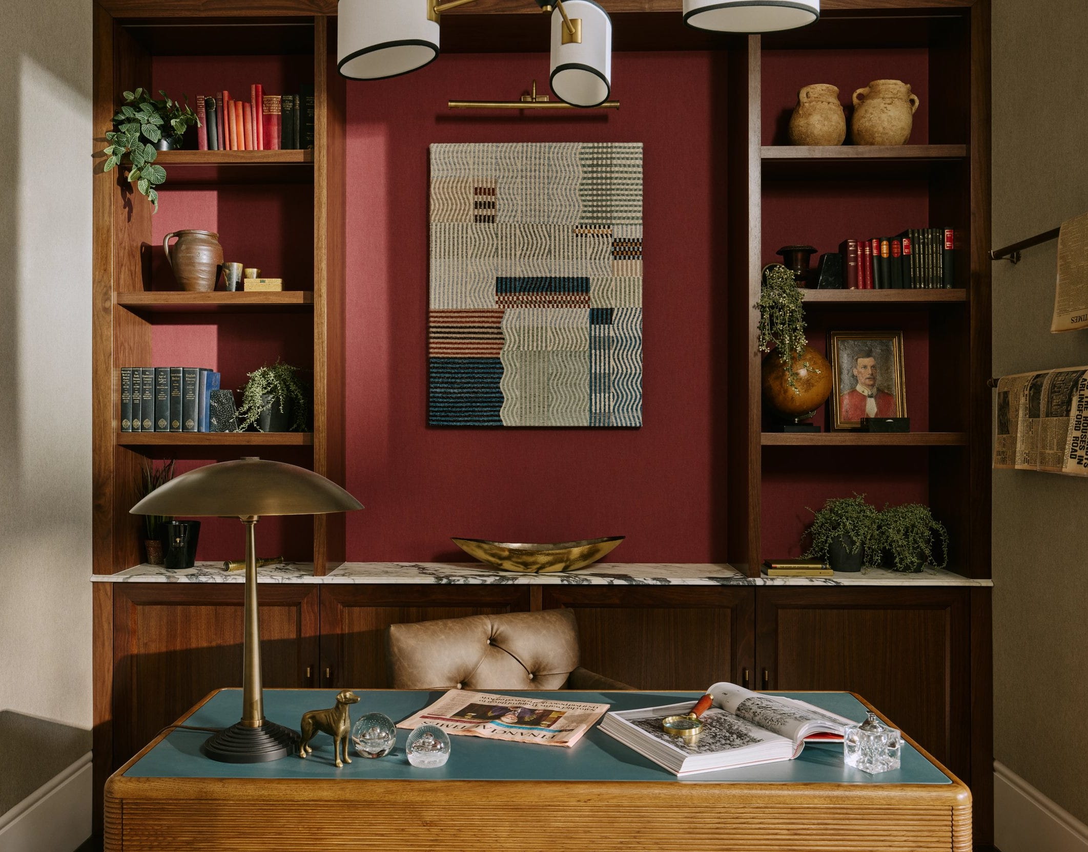
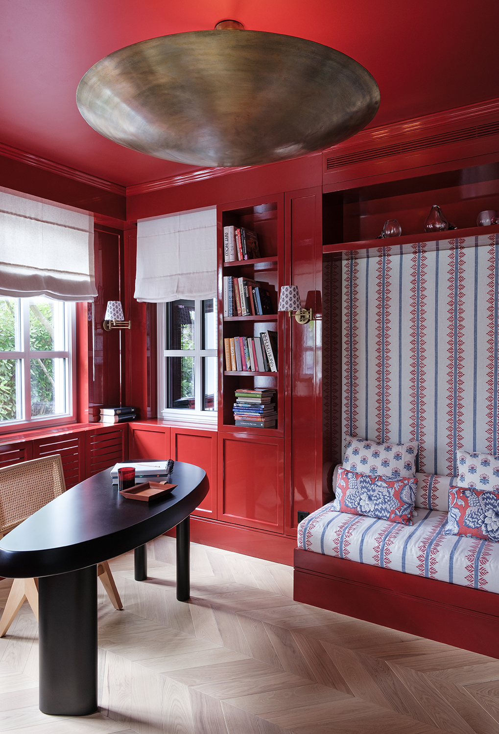
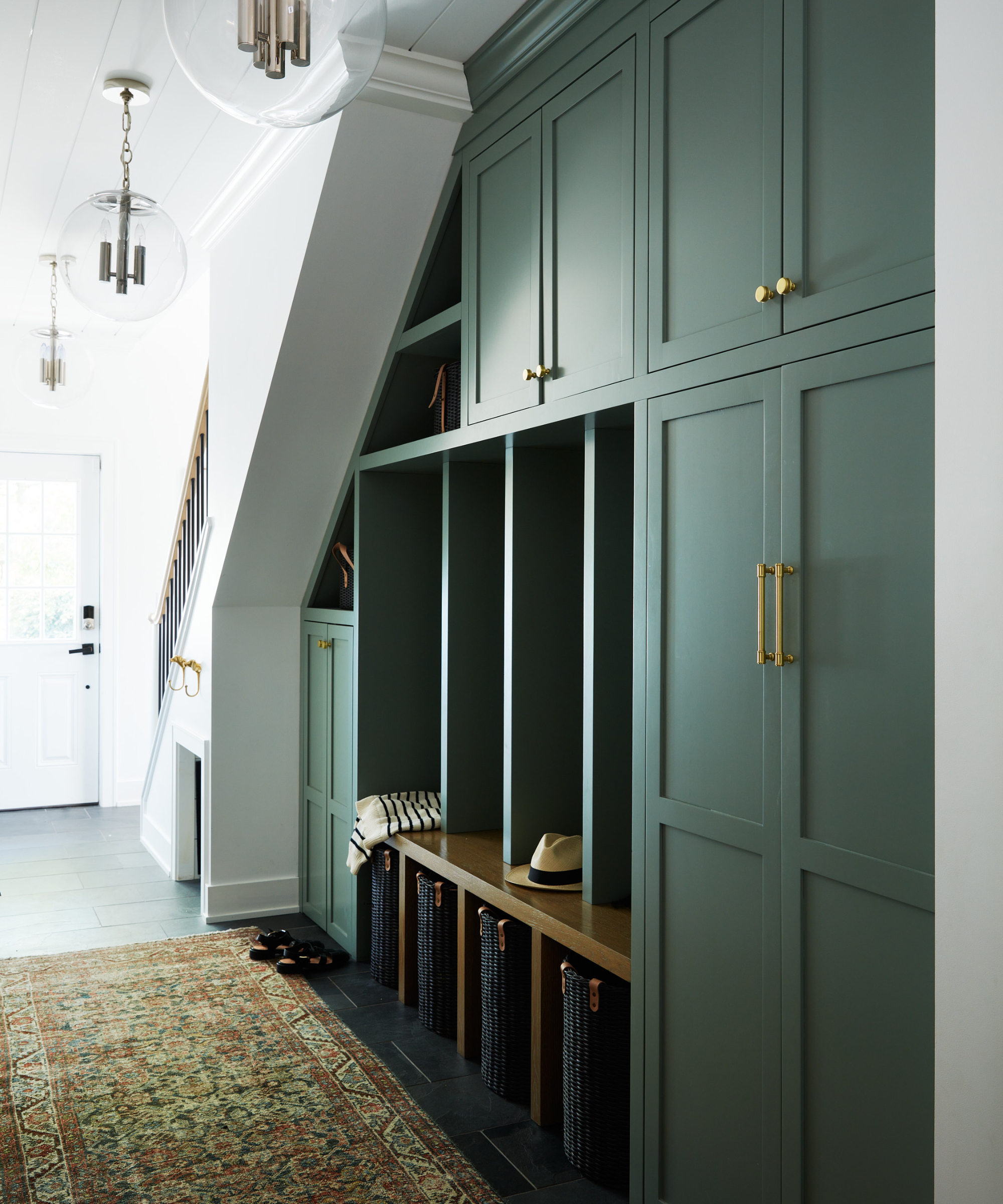
Plum, another jewel tone, is championed by Alexandra Peck for its rich and deep qualities. She believes this color should be seen more frequently and notes its effectiveness on mudroom cabinetry, especially when contrasted with brass accents. This encourages the incorporation of dramatic, saturated colors to add sophistication and allure.
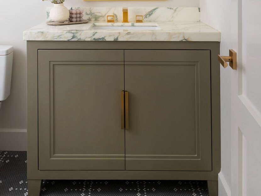
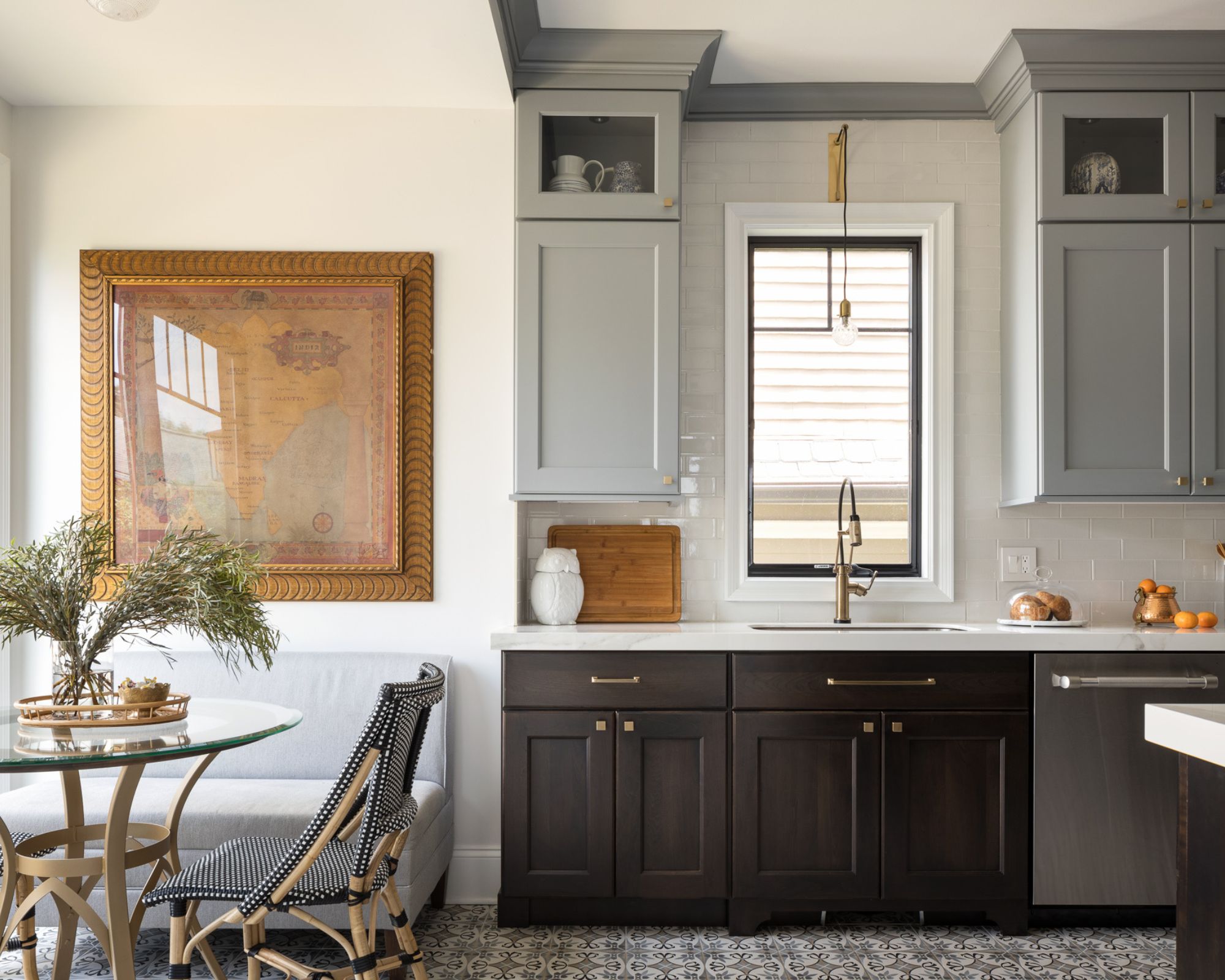
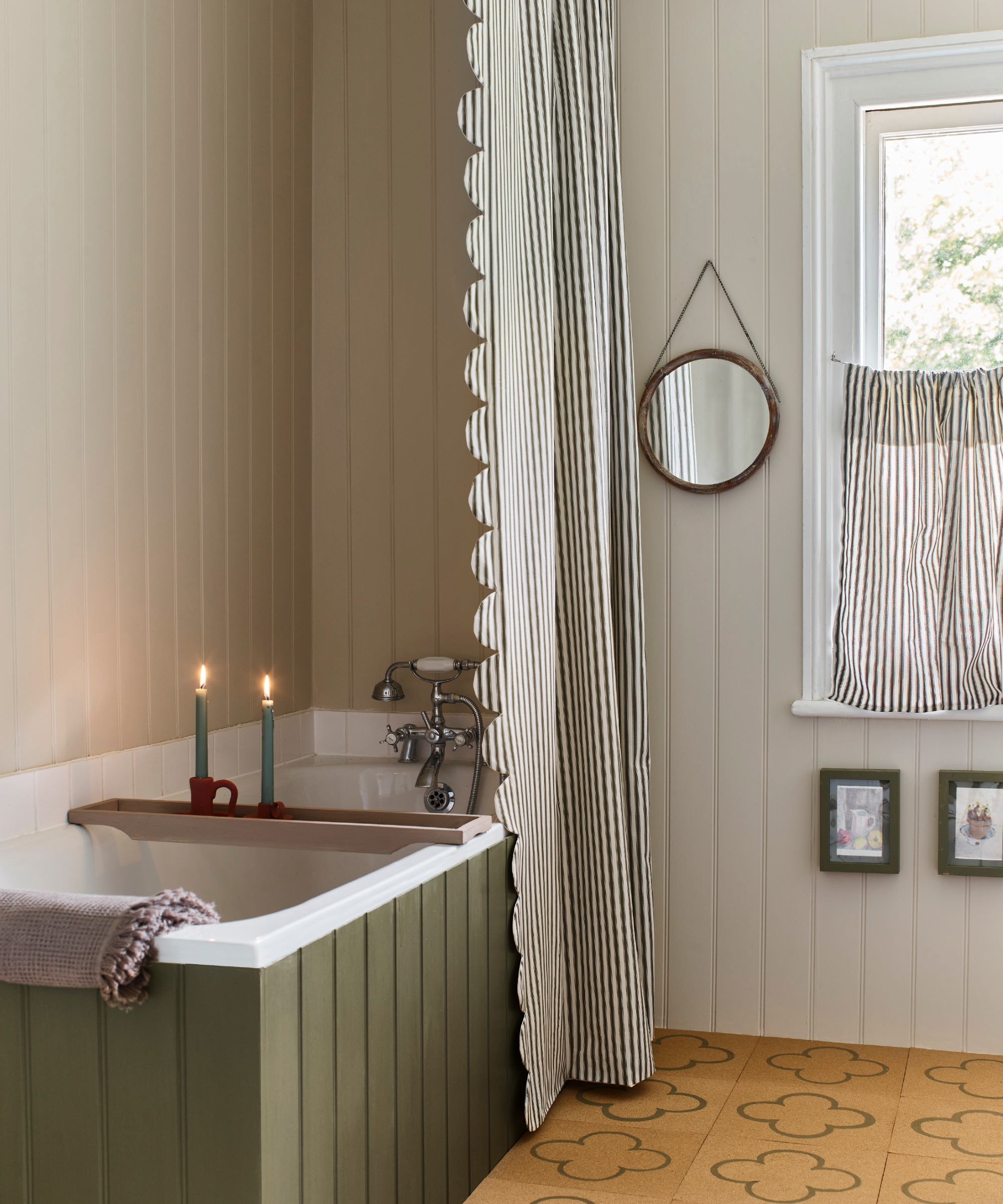
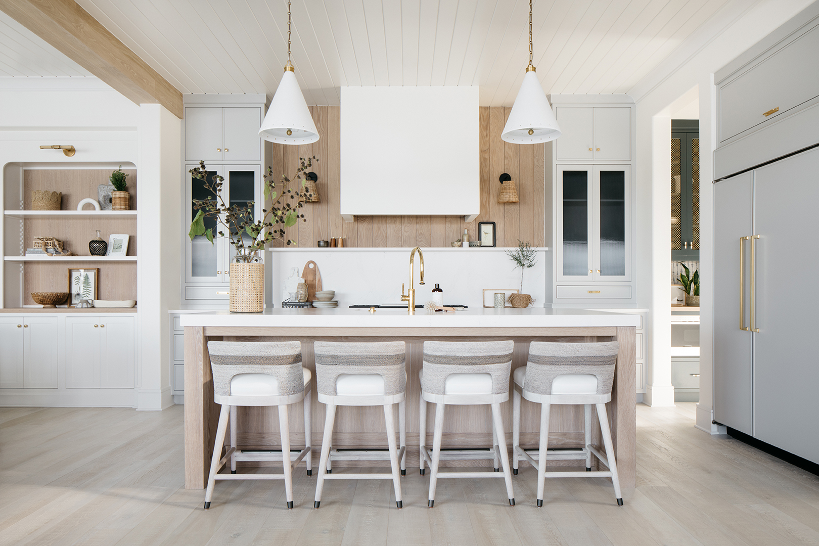
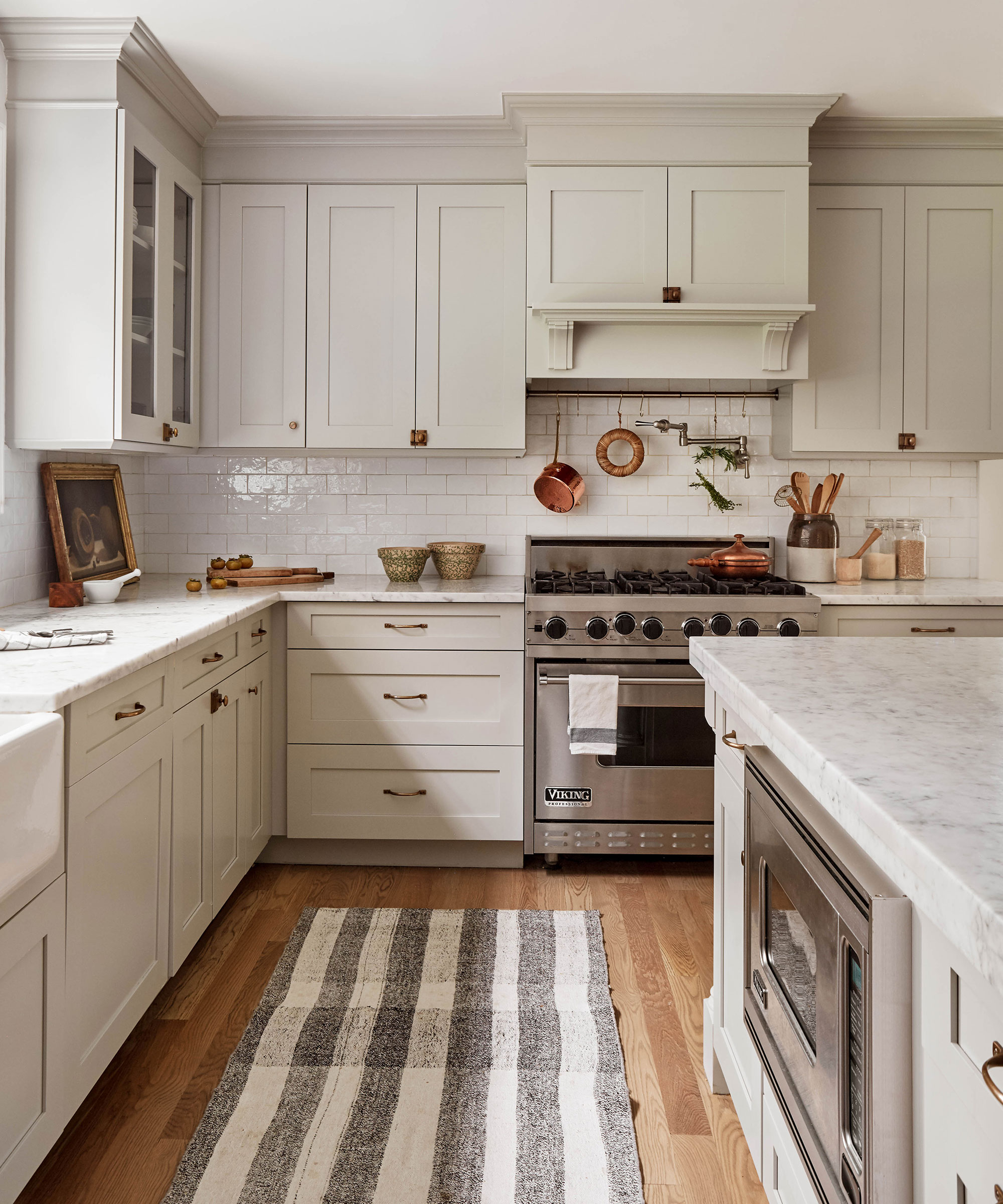
Finally, the article discusses the brown color family, specifically “mushroom colors,” which encompass a warm range of creams and browns. Jodi Peterman observes a comeback for brown tones, suggesting them for kitchen and laundry room cabinets as a refreshing alternative to classic white. She notes their ability to create a warm and welcoming atmosphere, particularly when combined with neutral mosaic floor tile.
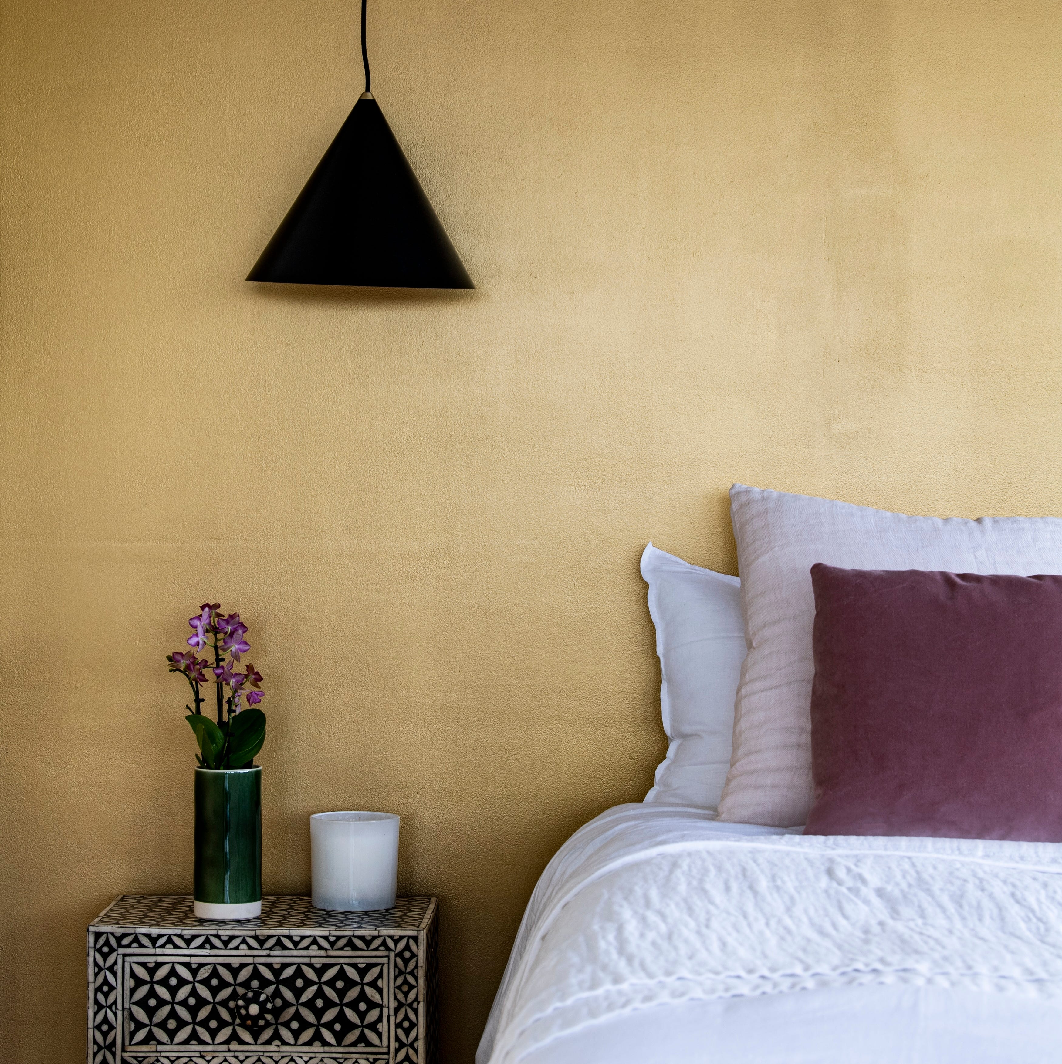
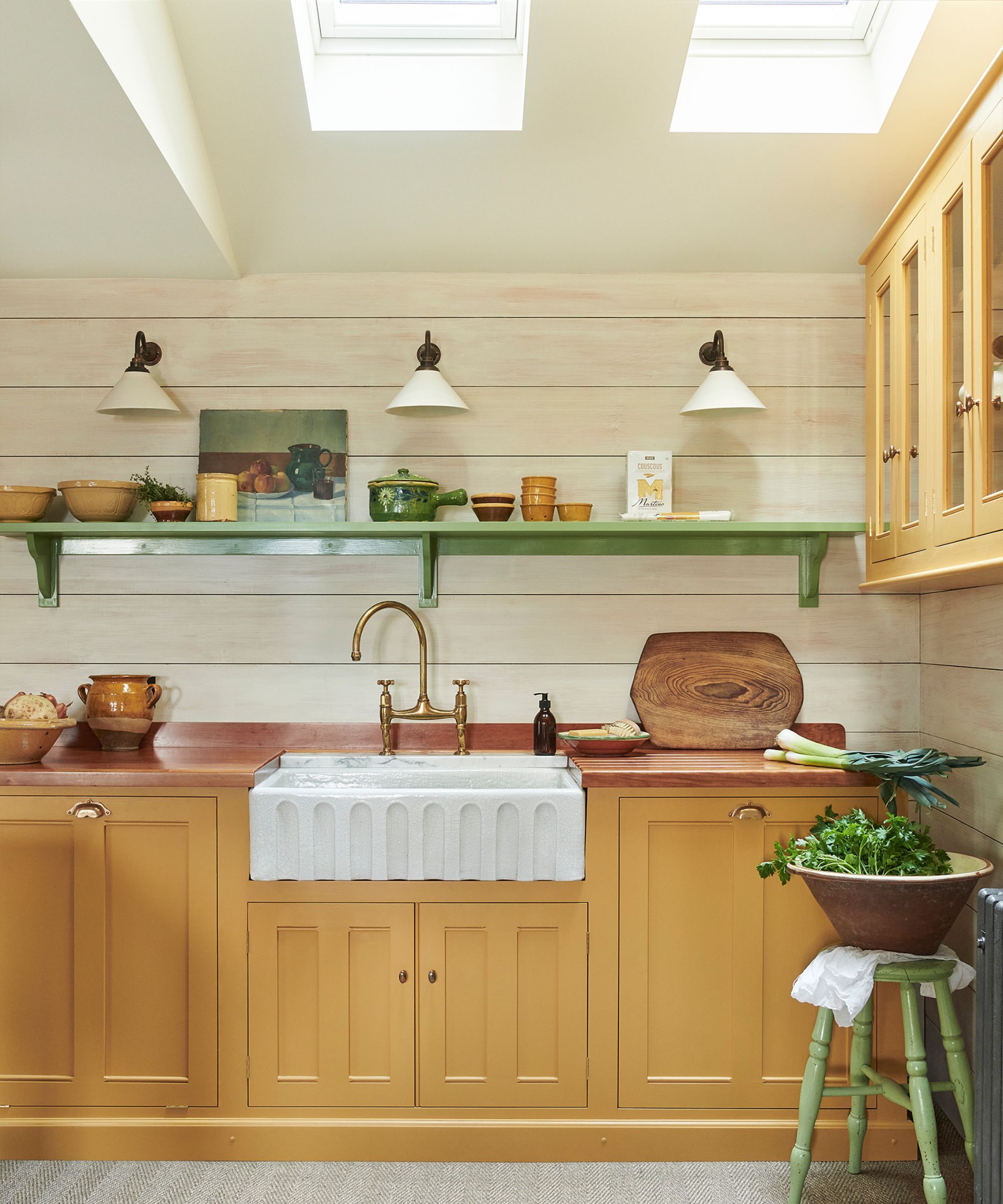
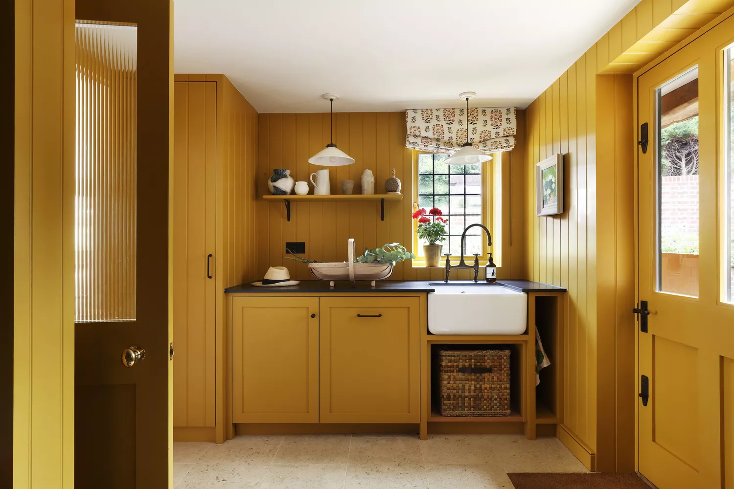
The article also mentions Ochre as a bold choice for those unafraid of color. Peck describes it as an earth-tone color derived from natural clay earth pigment, distinct from typical mustard yellow due to its orange undertones. She suggests pairing it with blue and green and using it monochromatically on walls, ceilings, woodwork, or for upholstery in materials like velvet or mohair. This illustrates the versatility of natural pigments in creating impactful and sophisticated design statements.
Overall, the article provides practical advice from design experts, guiding readers toward less common but impactful paint choices to personalize their living spaces. It aims to broaden perspectives on color use in home interiors, moving beyond fleeting trends to timeless and character-rich selections.
#UnderratedPaintColors #InteriorDesign #HomeDecor #ColorTrends #DesignersChoice #PaintSelection #HomeImprovement #PersonalizedHome #ColorPsychology #UnderratedPaintColors #InteriorDesign #HomeDecor #ColorTrends #DesignersChoice #PaintSelection #HomeImprovement #PersonalizedHome #ColorPsychology
0 comment in total
 No comments yet
You may also like

5 Timeless Paint Colors That Will NEVER Go Out of Style, According to Designers


The most timeless paint colors according to designers

5 Vibrant Color Palettes Designers Are Using to Add Energy and Excitement to Decor

7 Paint Colors Designers Totally Regret Using (and What They Wish They’d Used Instead)

7 Most Underrated Paint Colours, According To Colour Experts

I asked interior designers what color they include in every project – these 5 enduring shades were the favorites
7 Paint Colors Designers Wish They Never Used (and What You Should Use Instead)

Kitchen Color Selection Tips from 5 Designers

An A-List Designer’s Secrets To Picking Perfect Paint Colors
5 Secrets To Picking Paint Colors Like A Designer

7 of the most versatile and easy to use paint colors according to designers
5 best green paints that will always be classics, according to interior designers
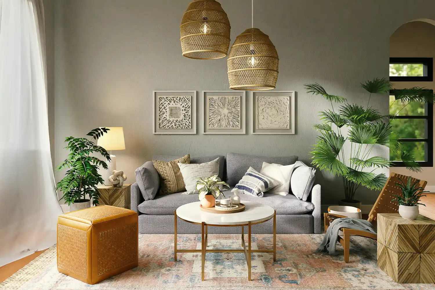
The 5 Most Overused Paint Colors and What to Try Instead, According to Designers
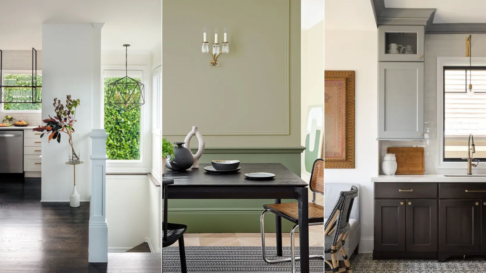
5 enduring colors designers always return to when they have trend fatigue
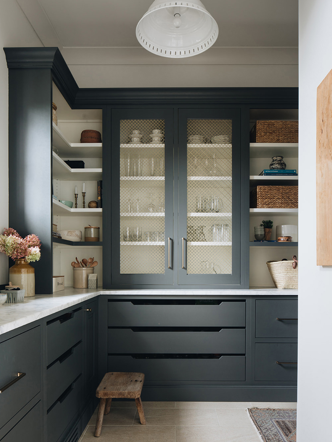
The Paint Color That All This Designer's Followers Ask About | domino


8 Favorite Paint Colors of Local Interior Designers

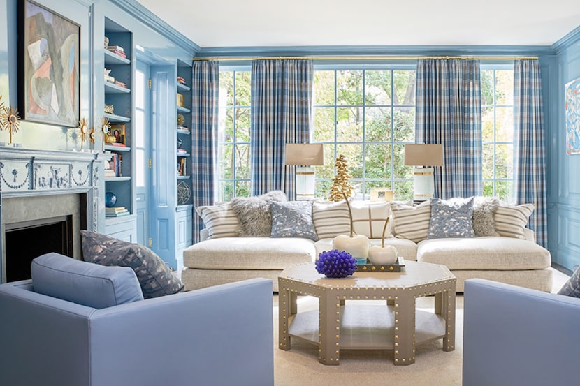
19 go-to paint colors that Dallas designers love
The 10 Best Blue-Green Paint Colors Designers Can't Stop Using
Outdated color trends – 5 overdone colors that designers no longer love, and what to use instead
These 5 Simple Questions Help Designers Pick the Perfect Paint Color Every Time