



1/6
I asked interior designers what color they include in every project – these 5 enduring shades were the favorites
The article explores the preferred color palettes of interior designers, offering insights into hues that are consistently incorporated into various decorating projects. It highlights five prominent colors: yellow, warm neutrals, blue, white, and green, detailing why each is a favored choice among professionals.
Yellow is presented as a versatile and inviting color, with Charlotte-based interior designer Alexis Warren noting its ability to layer effectively with other shades and add brightness. Despite perceptions of it being a bold choice, yellow is experiencing a resurgence in modern homes, with examples such as sandy yellow kitchen cabinets demonstrating its charming and warming effects.
Warm neutrals, including soft taupes, greiges, and off-whites with warm undertones, are emphasized for their timeless appeal and versatility. Melissa Read, creative director at Studio Burntwood, explains that these shades provide a calm and inviting backdrop, making them suitable for various interior design styles and allowing for easy updates to furniture and accessories without needing to repaint. An illustration features Farrow & Ball's Scallop in a light dining room, showcasing its undisturbed yet inviting quality.
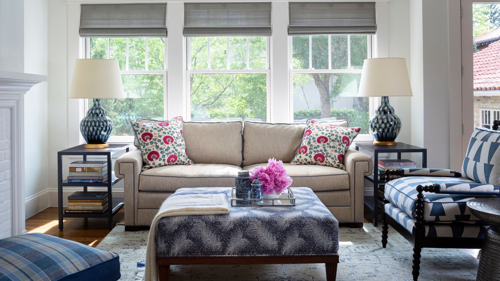
Blue is celebrated for its calming and peaceful qualities, often associated with natural serene environments like lakes or beaches. Denver-based designer Nadia Watts frequently pairs blue with green to evoke a sense of growth and renewal, aiming for peaceful, nature-connected, and cozy spaces. Ashley Macuga of Collected Interiors also favors soft blue hues for their ability to enhance natural light and bring happiness.
White remains a classic choice, lauded for its freshness, timelessness, and calming effect. Sarah Latham of Latham Interiors and Meg Lonergan frequently use white or ivory, especially Benjamin Moore’s Soft Chamois, for its warm undertones that create an inviting atmosphere. Amy Peltier also recommends Benjamin Moore's Chantilly Lace for a crisp, clean, and modern feel, suitable for creating a timeless backdrop.
Green is consistently integrated into projects by designers like Alexandra Kaehler and Allison Garrison. Kaehler appreciates its ability to bring the outdoors in, noting its warmth and versatility, whether used as a soft sage or a bold emerald. Garrison highlights green's soothing and grounding effects, often incorporating it through custom cabinetry, rugs, or simply through the addition of plants to achieve a natural and calming ambiance. The article concludes by reinforcing that while neutrals are timeless, the thoughtful integration of vibrant colors like yellow and green can also achieve enduring style.
#InteriorDesign #ColorPalettes #HomeDecor #DesignTrends #YellowInteriors #NeutralColors #BlueSpaces #WhiteDesign #GreenDecor #InteriorDesign #ColorPalettes #HomeDecor #DesignTrends #YellowInteriors #NeutralColors #BlueSpaces #WhiteDesign #GreenDecor
 No comments yet