5 Secrets To Picking Paint Colors Like A Designer
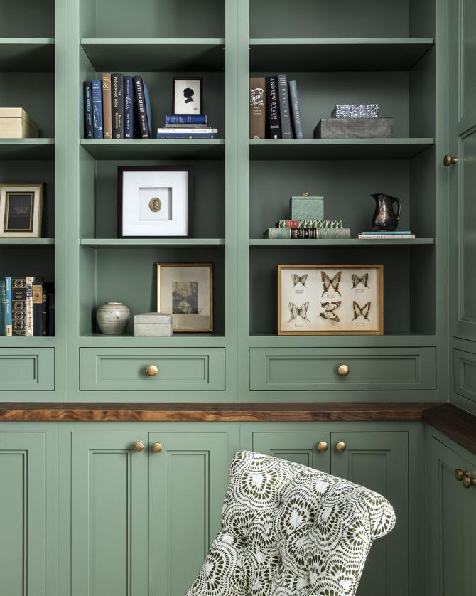
The selection of paint color serves as a foundational element in interior design, influencing the overall aesthetic and harmony of a room. A successful paint choice can complement existing furnishings and decor, while an ill-suited one can lead to extensive redecoration or repainting. To assist in making informed decisions, three design experts—Debbie Mathews LeRoy, Liz Williams, and Michelle Murphy—offer their professional insights and strategies for confidently choosing paint colors.
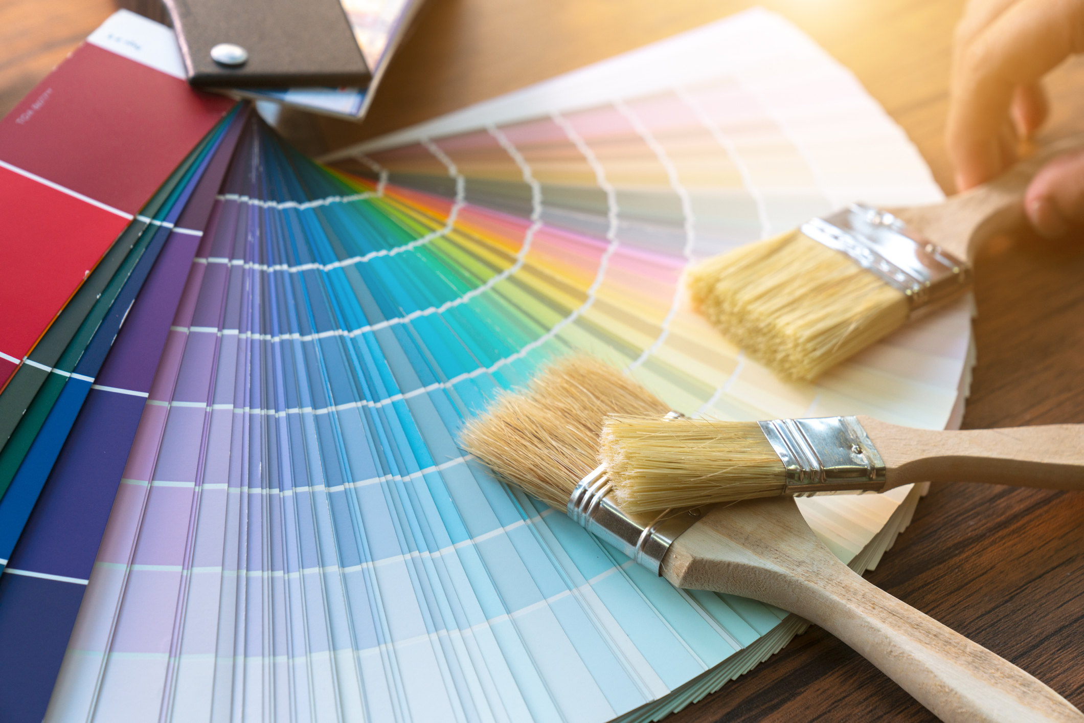
A critical initial step involves creating substantial paint swatches. Michelle Murphy recommends painting swatches at least 2 by 2 feet wide in multiple locations within the room. Debbie Mathews LeRoy further advises applying a minimum of two coats to each swatch, as sample formulations are often thin and may allow the underlying color to show through. Once applied, these swatches should be observed at various times throughout the day, including early morning, midday, sunset, and at night under artificial lighting, to understand how the color shifts under different light conditions.
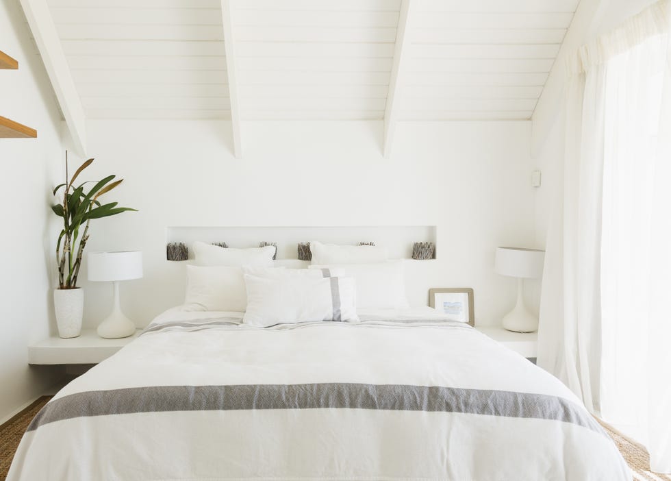
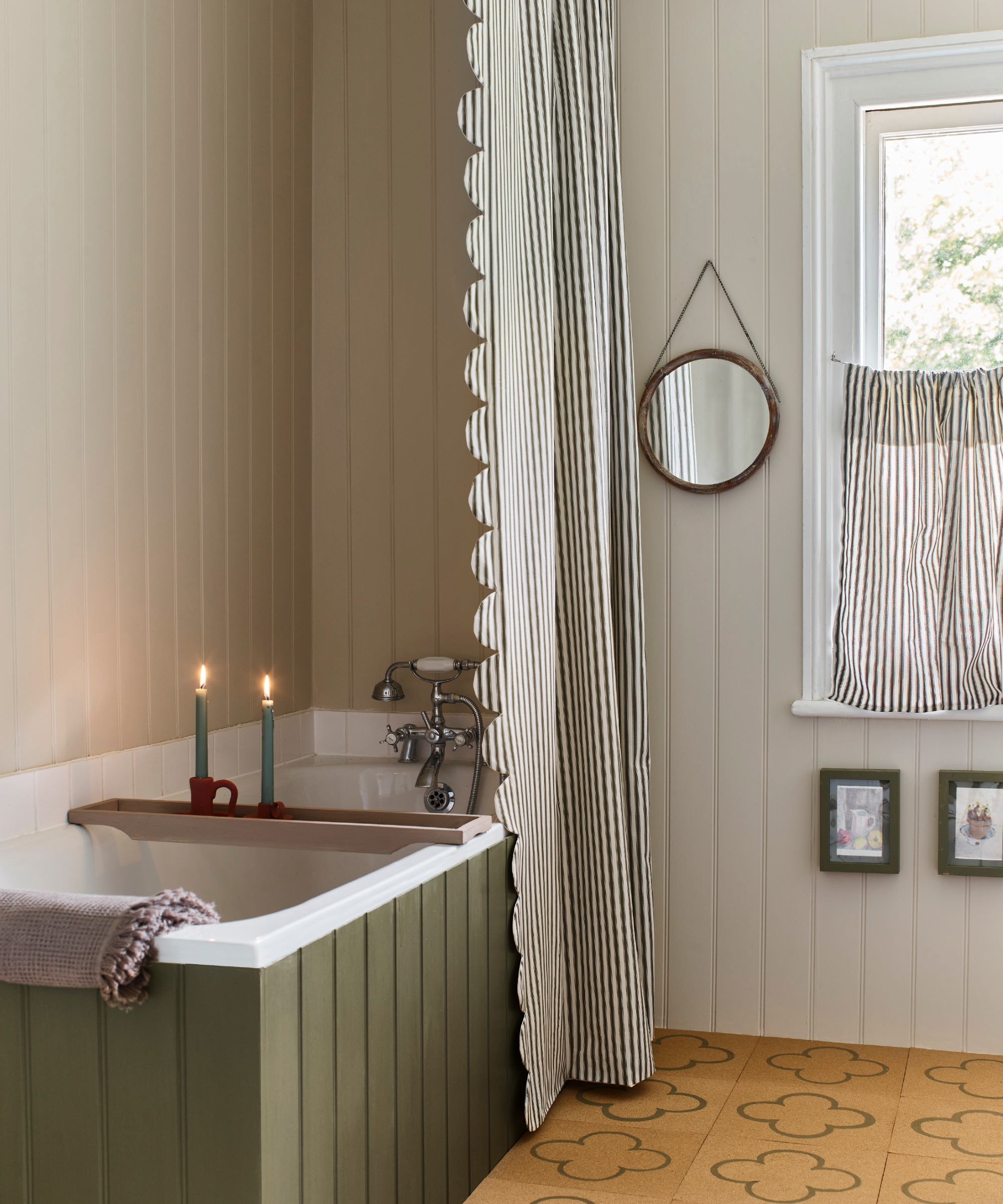
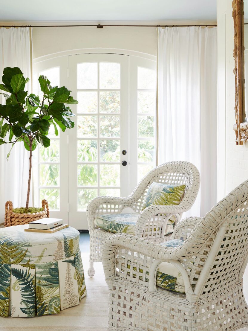
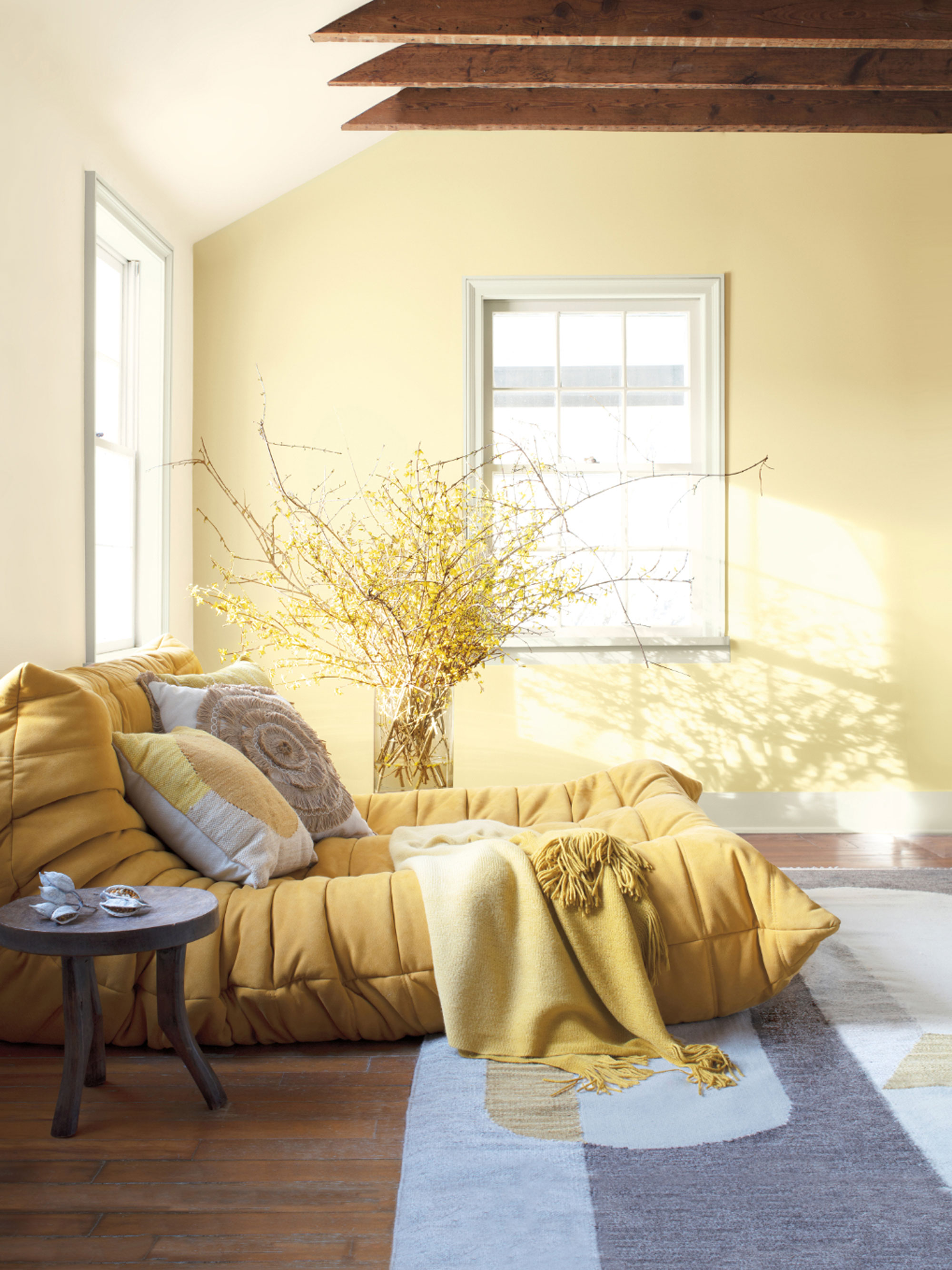
Natural light plays a significant role in how paint colors are perceived. Liz Williams emphasizes that the direction a room faces directly impacts color appearance. Northern light, being cooler, can make colors appear more muted. Southern light, consistent and warm, enhances the richness of a color. East-facing rooms experience warm and soft light in the morning, which diminishes in the afternoon, causing colors to appear brighter early on and more subdued later. Conversely, western light intensifies in the late afternoon and early evening, making colors appear more vibrant as the day progresses. Understanding these dynamics is crucial before committing to a color.
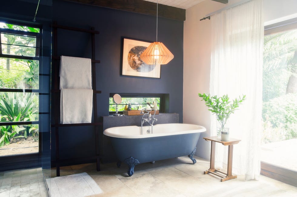
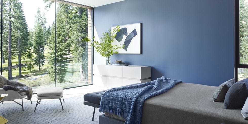
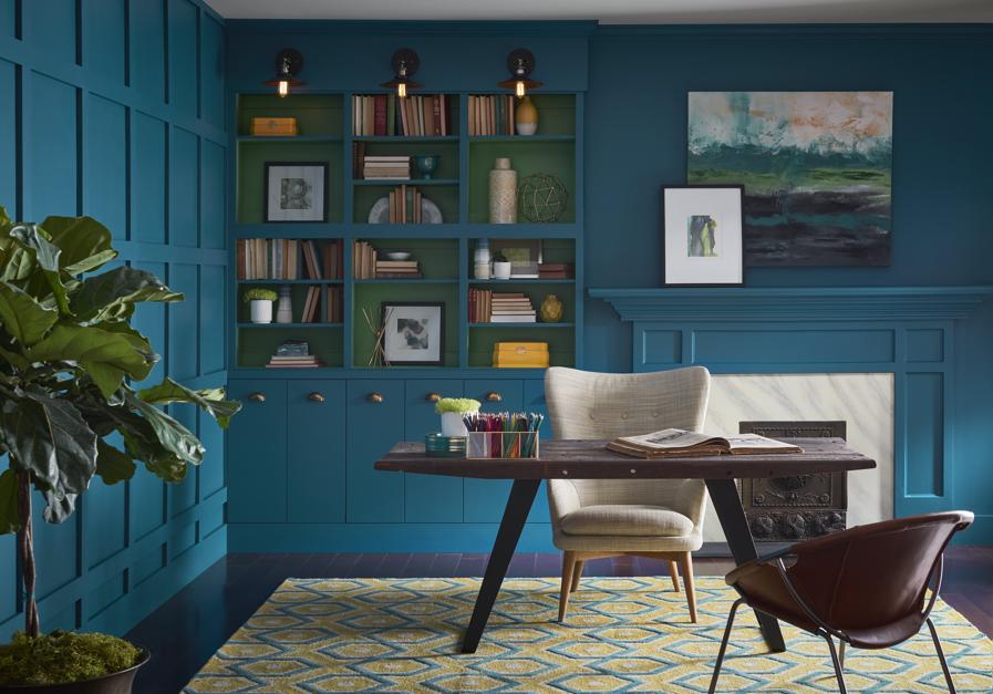

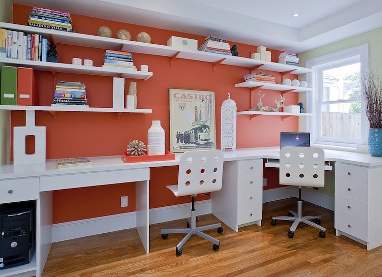
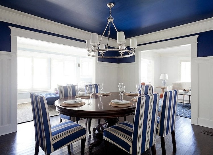
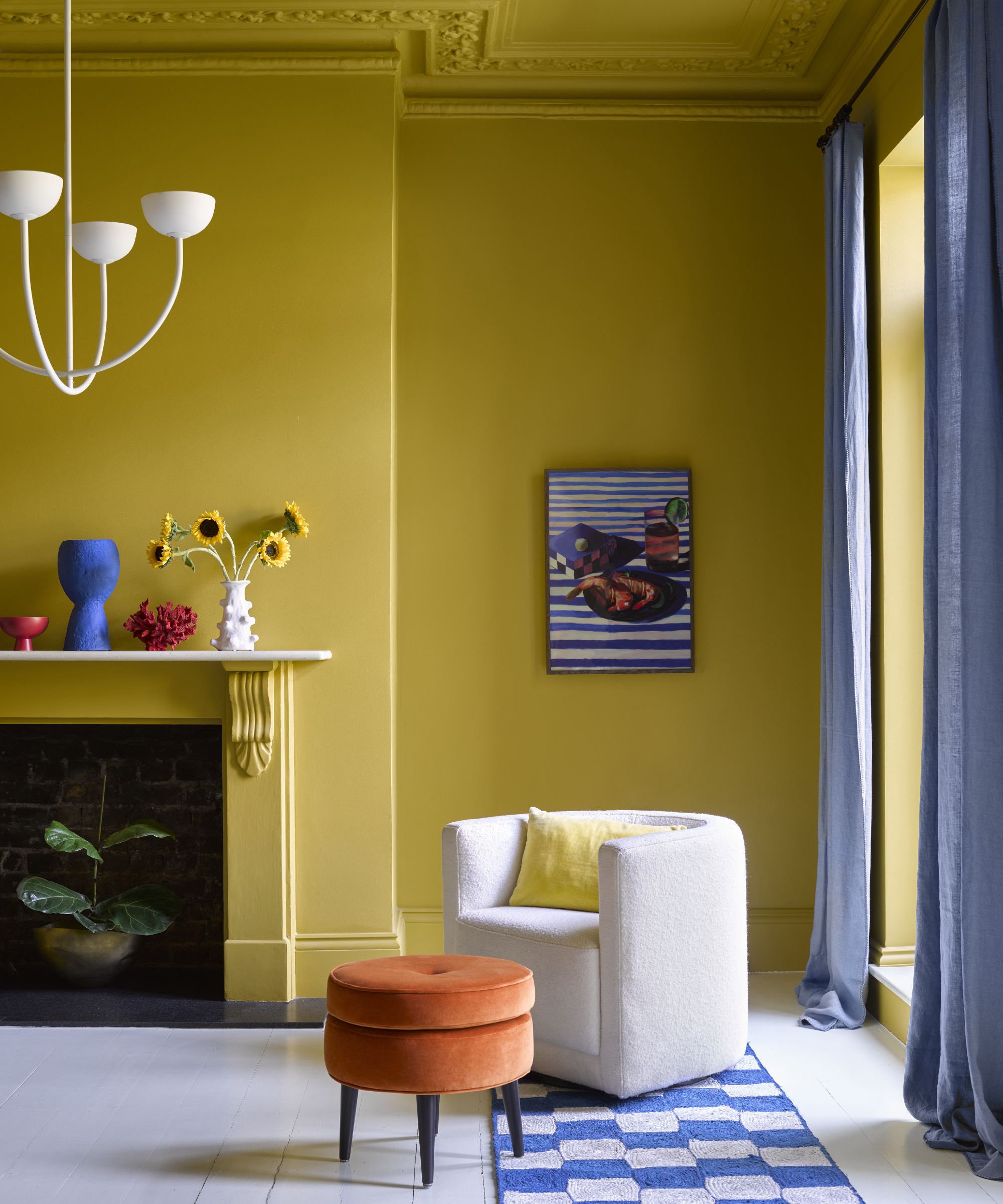
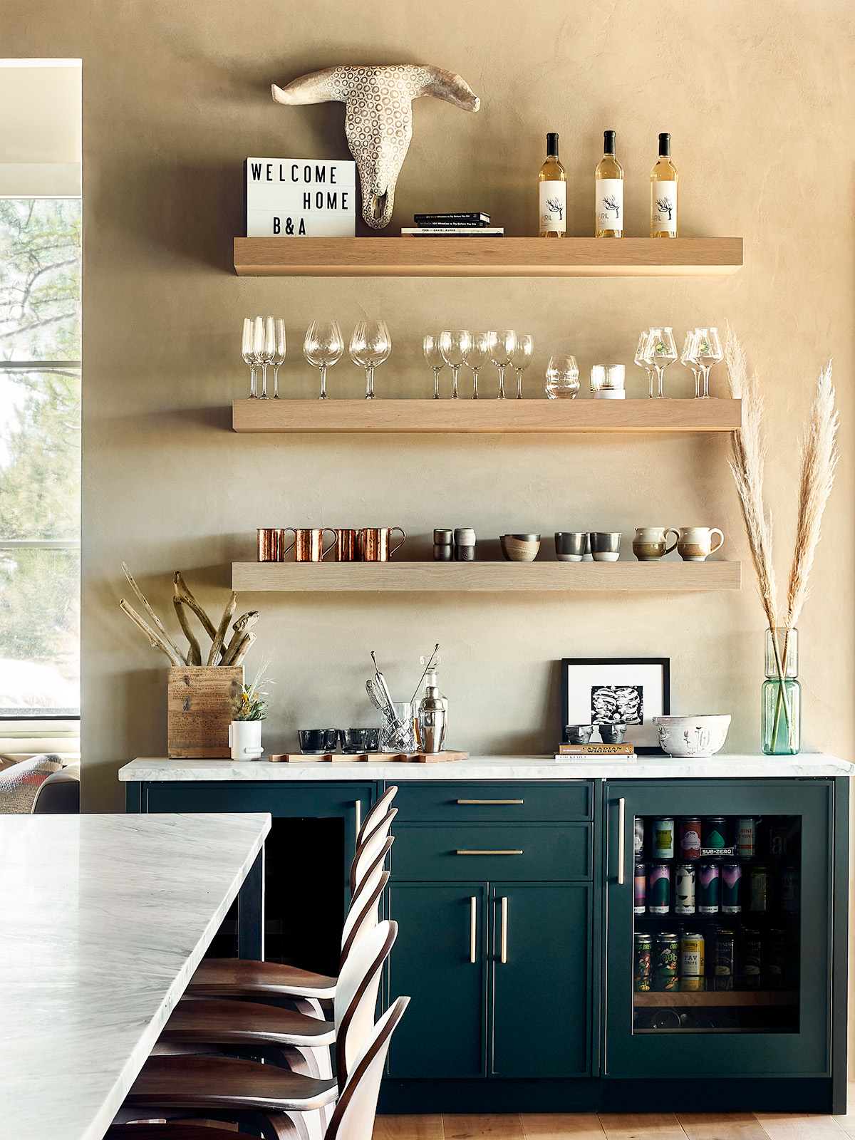
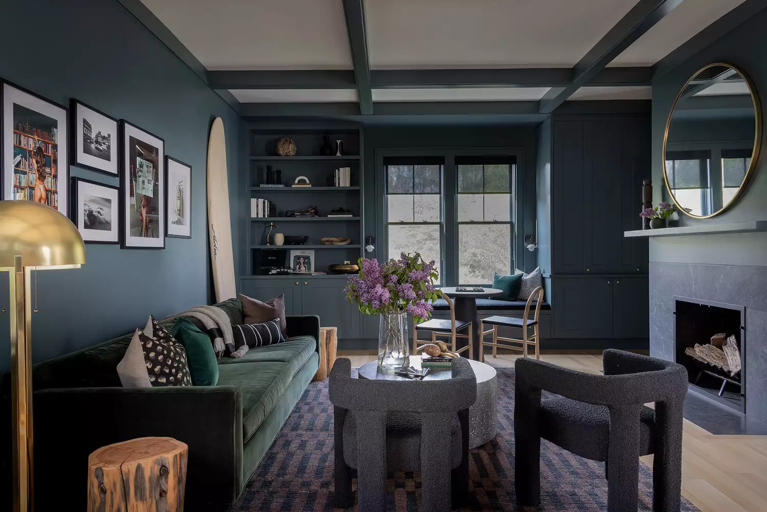
When aiming for a bolder look, a common designer trick is to select a color that is one or two shades lighter than the initially desired bold hue. This approach, as suggested by Williams, allows for a noticeable impact without overwhelming the space, resulting in a more livable and less intense outcome. For instance, opting for a medium yellowish-green instead of a vibrant lime green can introduce personality in a more harmonious manner.
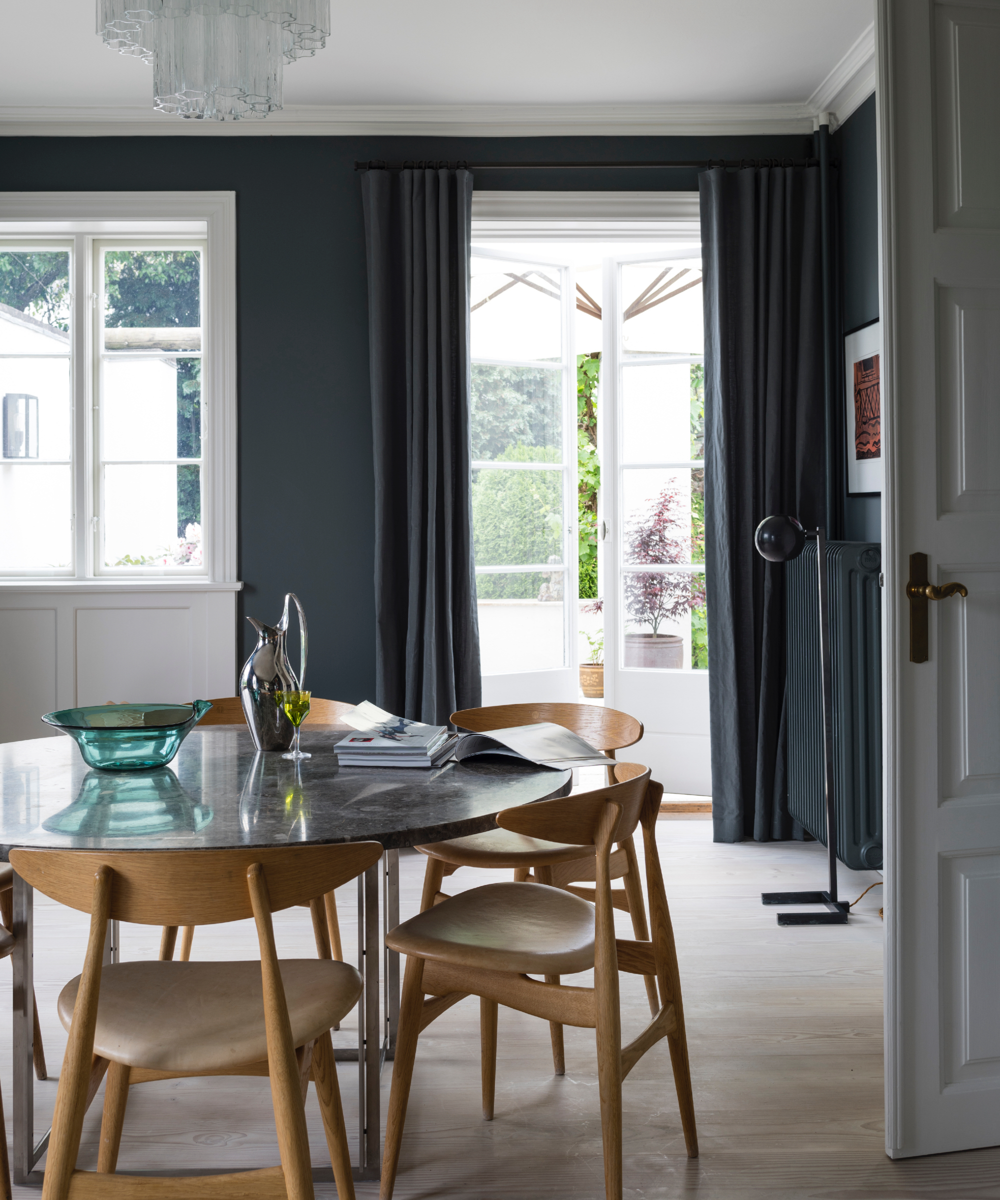
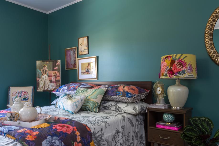
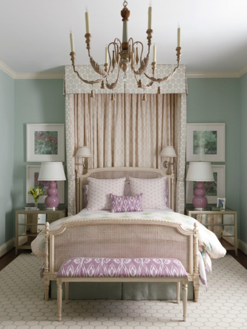
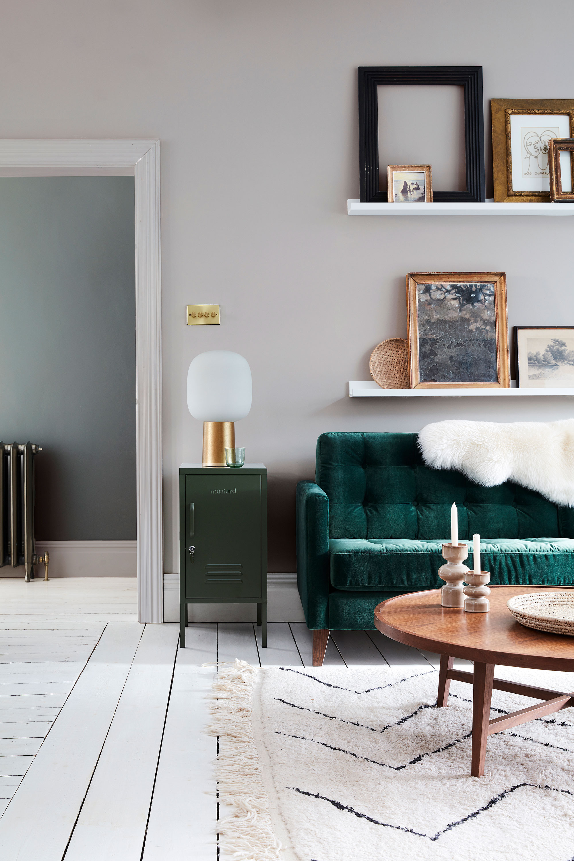
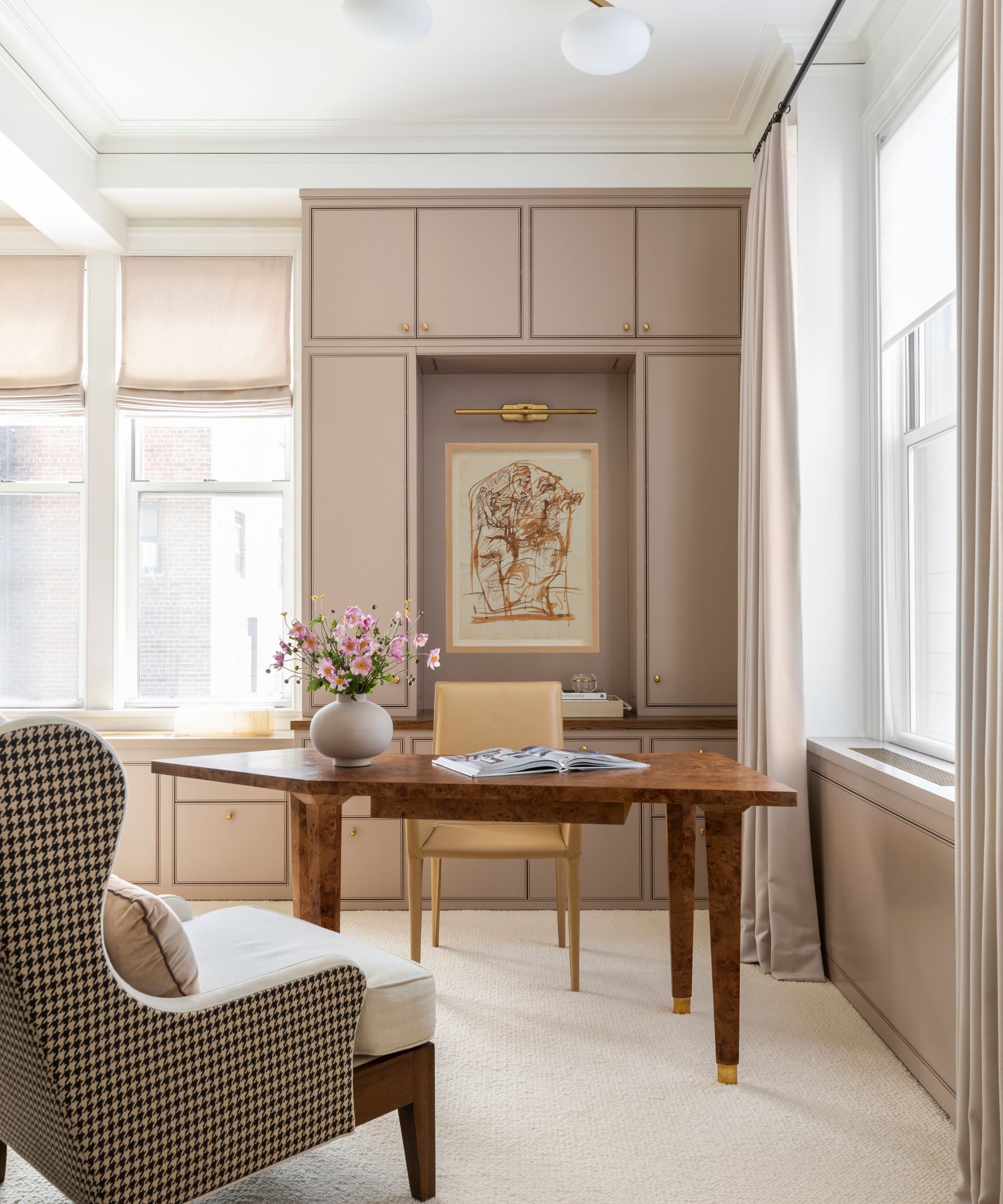
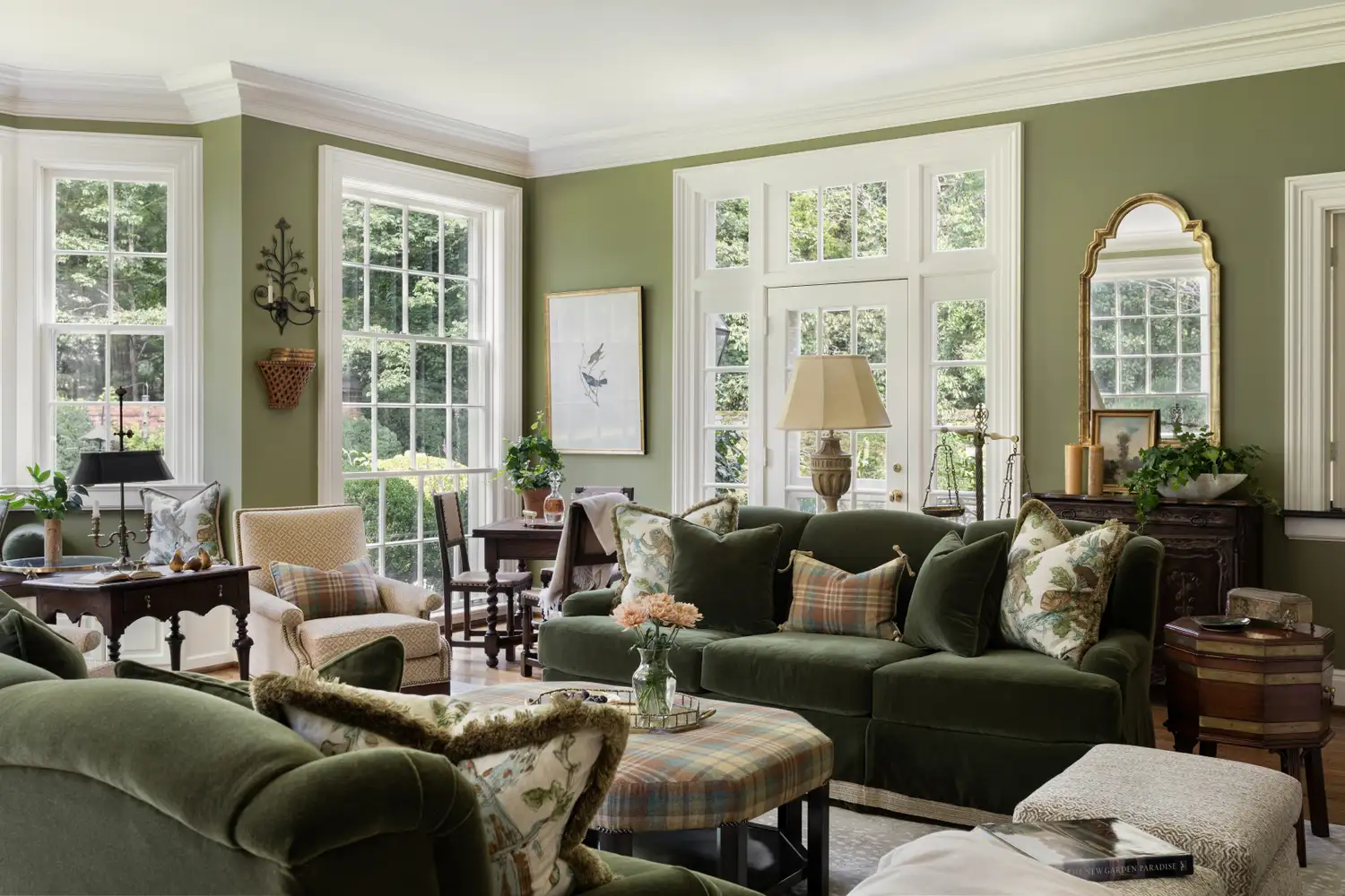
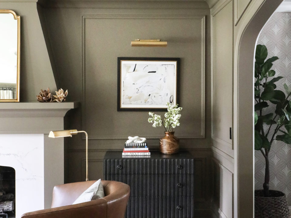
Considering existing room elements is also vital. Debbie Mathews LeRoy often consults paint decks to find colors that harmonize with upholstered furniture, area rugs, or wallpaper. She advises against exact matches, instead suggesting shades that are several tones lighter or darker, depending on the room's natural light and the desired color saturation. This method helps integrate the new paint color seamlessly with existing decor.
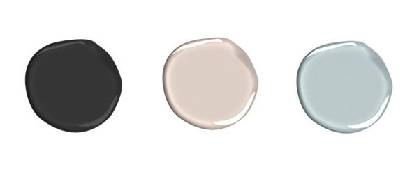
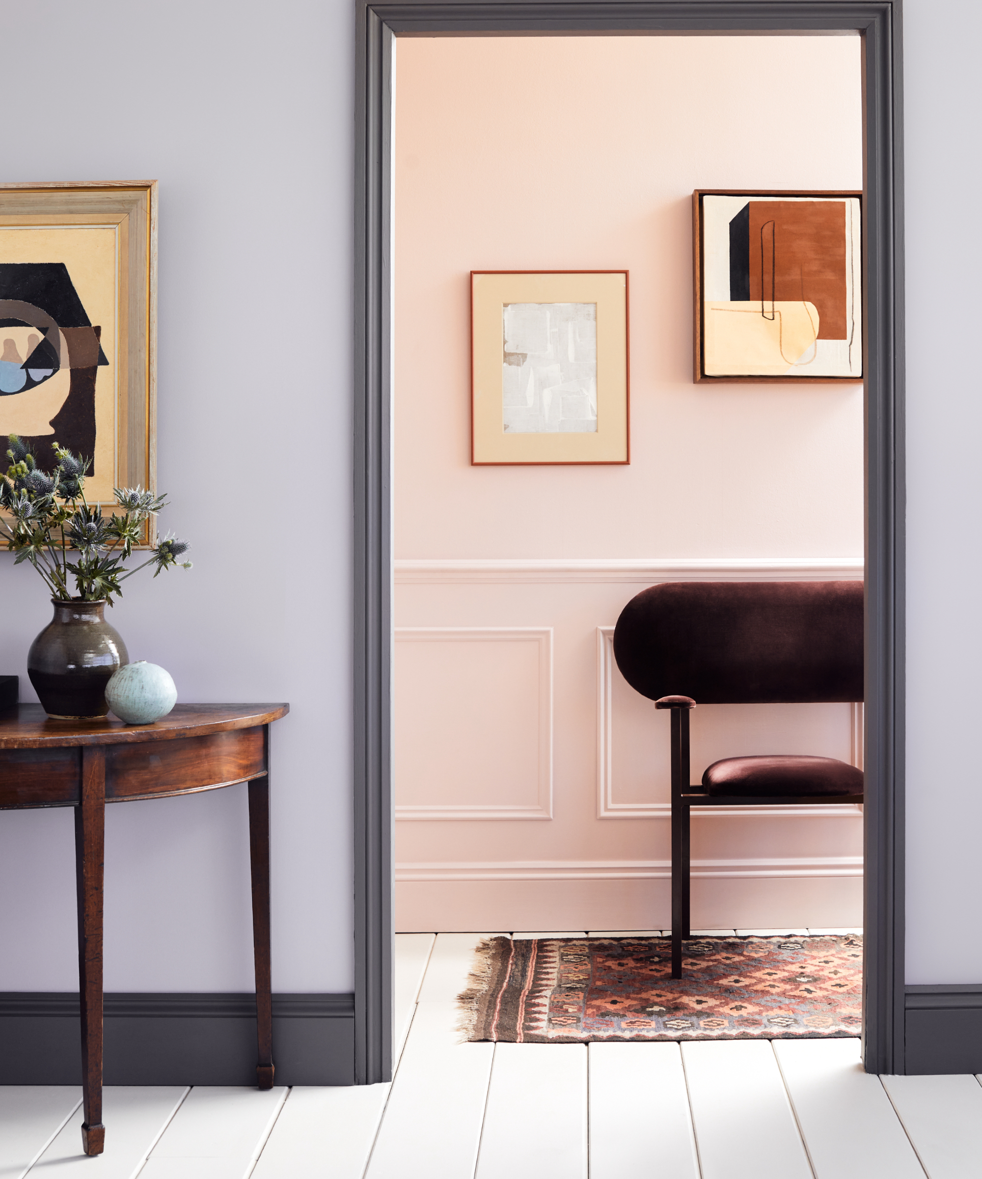
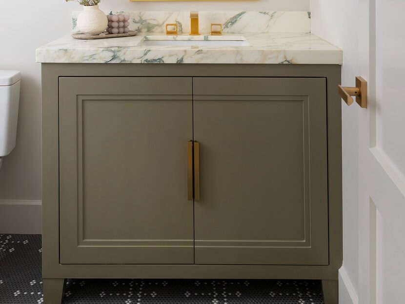
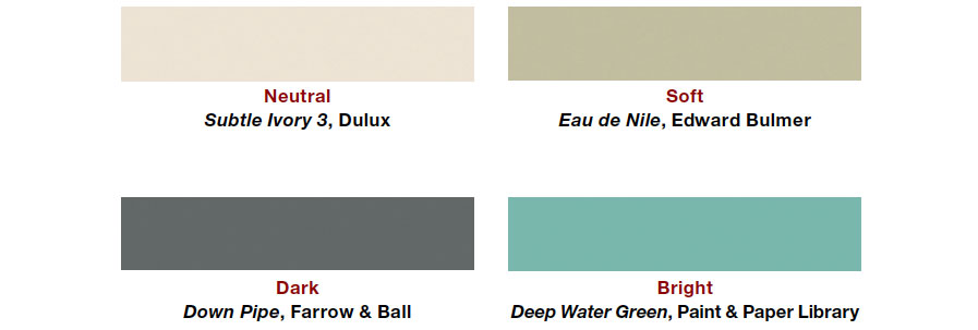
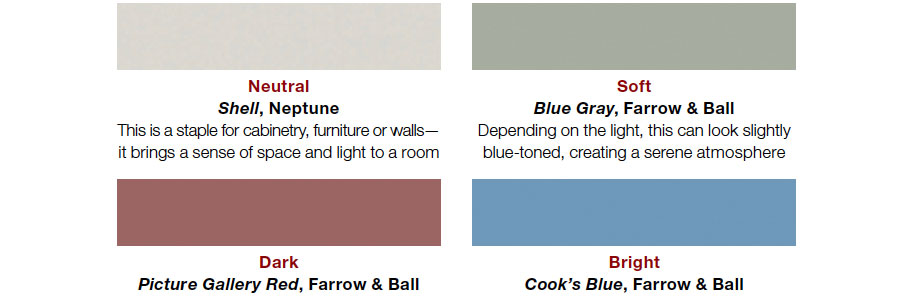
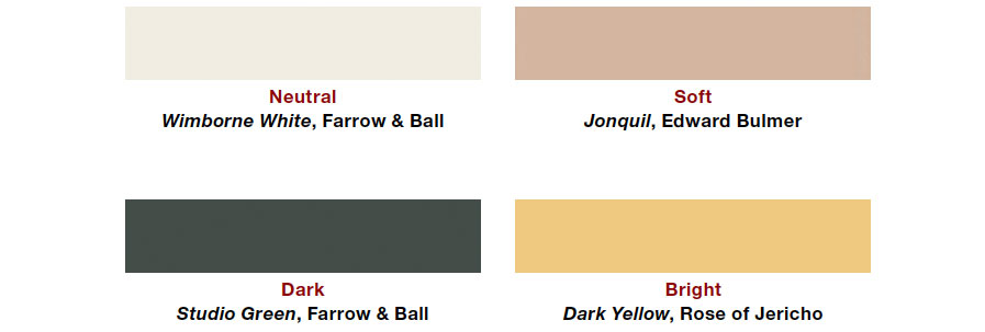
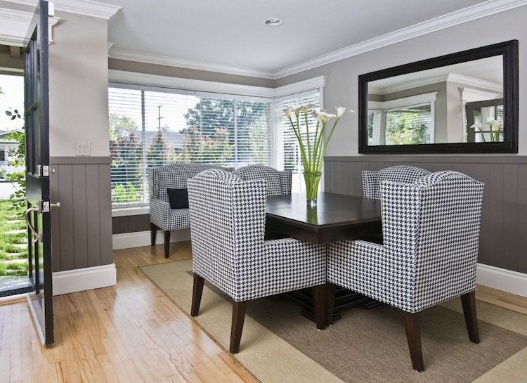
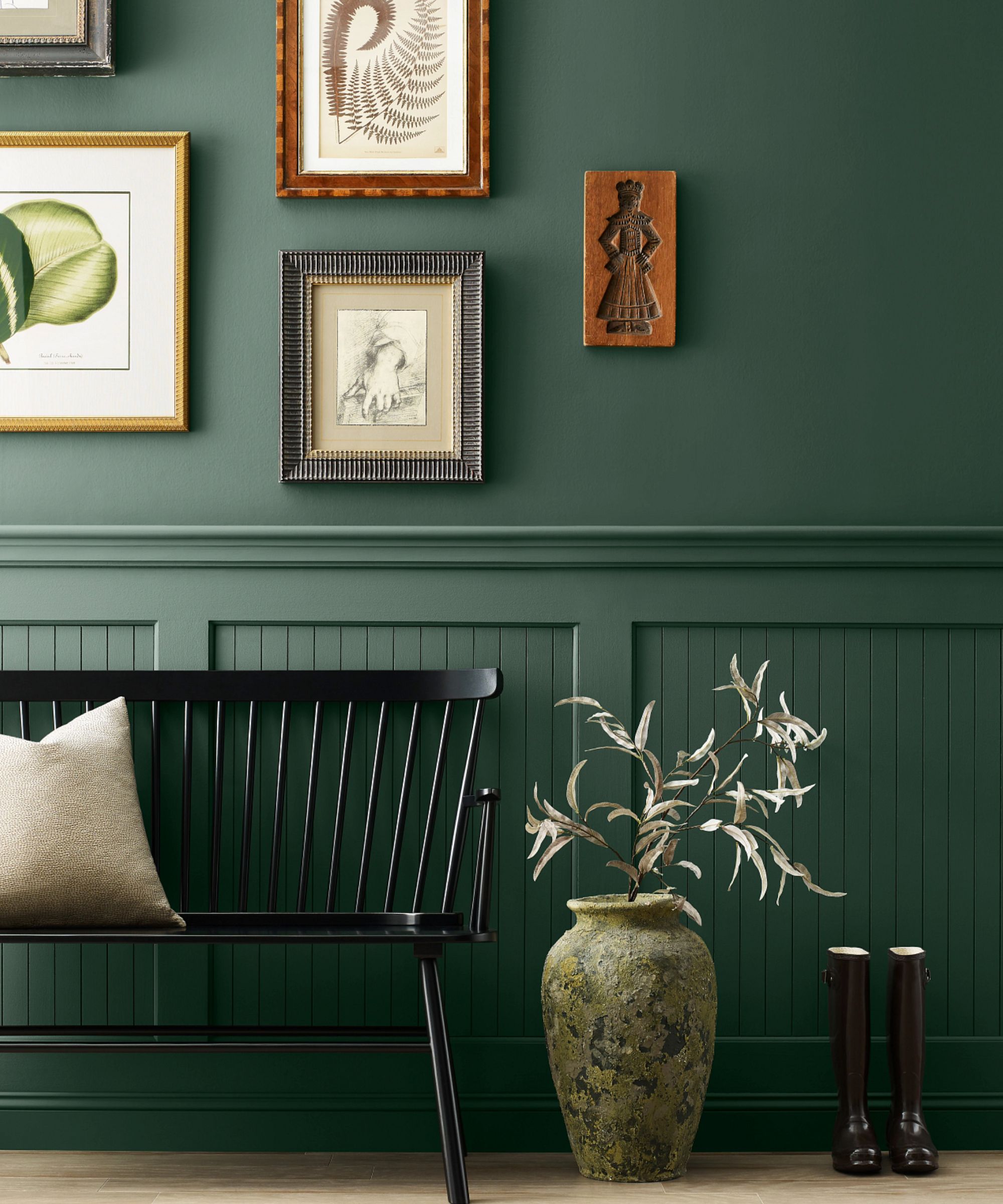
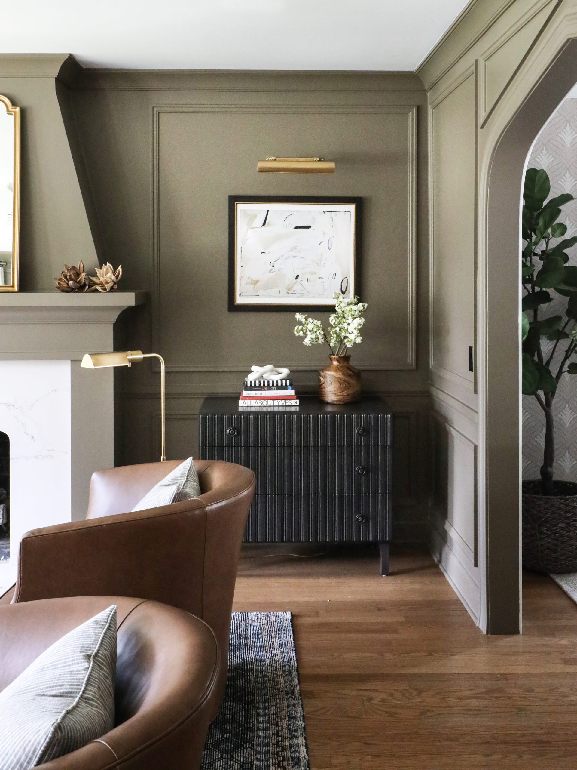
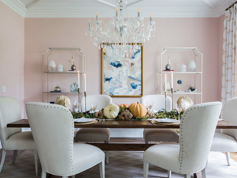
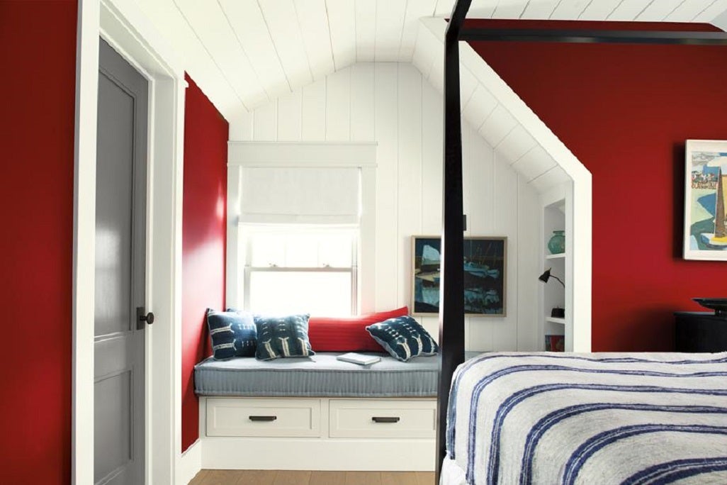
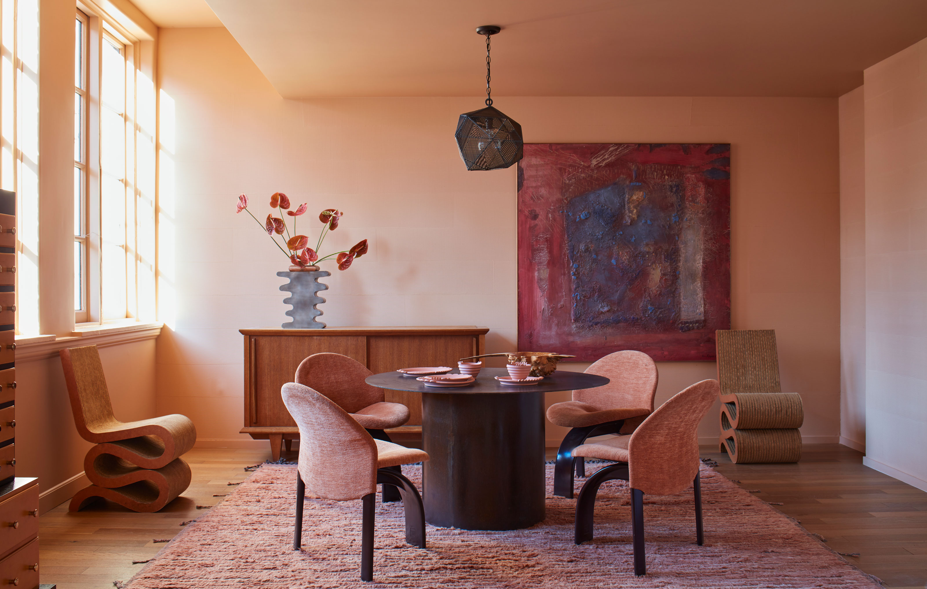
Finally, attention to undertones is paramount. Pure white, black, or primary colors are rarely suitable for walls, and most paint colors contain subtle undertones that influence their character. Liz Williams highlights the importance of recognizing these underlying hues, noting that red or pink undertones can impart warmth or, if not carefully chosen, a muddy appearance. Gray and green undertones can make a space feel drab. To accurately assess undertones, Michelle Murphy recommends comparing a paint swatch against the major fixed elements in the room, ensuring the chosen color complements rather than competes with the existing color scheme.
#PaintColors #InteriorDesign #HomeDecor #DesignerTips #ColorSelection #LightingInfluence #Undertones #SwatchTesting #Decorating #PaintColors #InteriorDesign #HomeDecor #DesignerTips #ColorSelection #LightingInfluence #Undertones #SwatchTesting #Decorating
0 comment in total
 No comments yet
You may also like

An A-List Designer’s Secrets To Picking Perfect Paint Colors

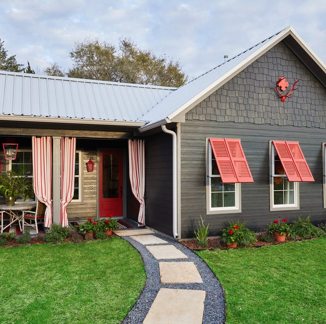
Here's What Colorists Want You to Know About Picking House Paint

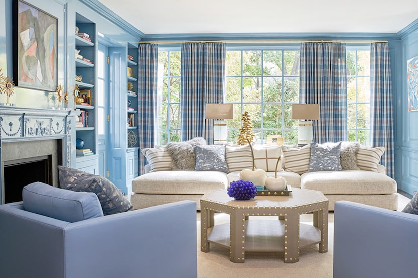
19 go-to paint colors that Dallas designers love
to choose paint colors.
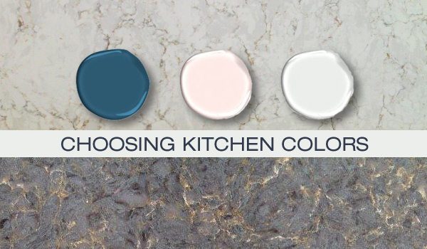
Kitchen Color Selection Tips from 5 Designers

11 Paint Colors That INSTANTLY Make Your Home Look "Expensive," According to Designers

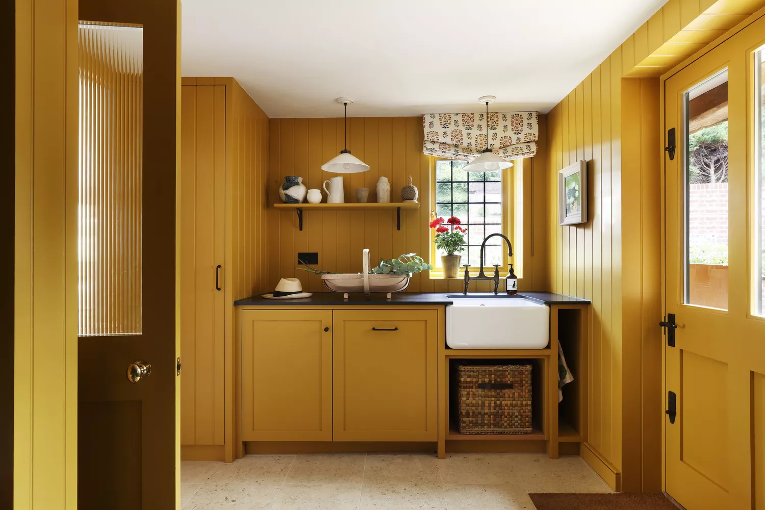
5 Underrated Paint Colors Designers Always Use in Their Projects (and You Should Too)

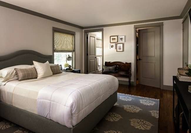
If This, Then That: Your Guide to Pairing Paint Colors

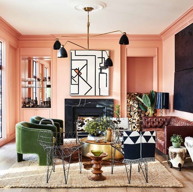
These Master Tips Will Help You Avoid Choosing The Wrong Type Of Paint

Can't Choose a Paint Color? Here Are 7 Hacks Interior Designers Swear By


5 Timeless Paint Colors That Will NEVER Go Out of Style, According to Designers
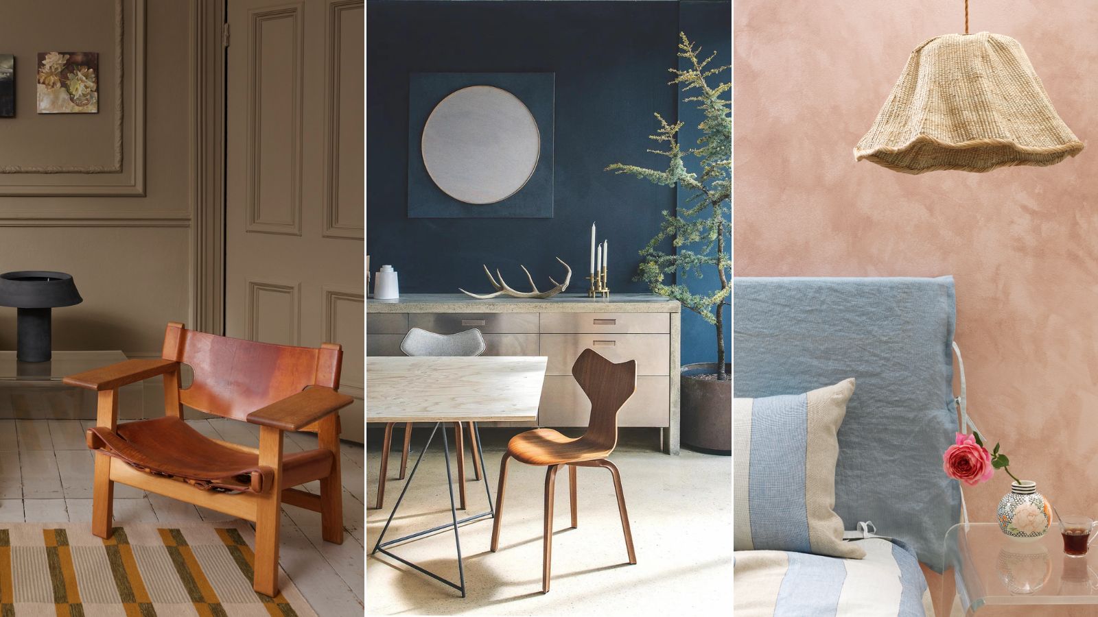
Professional painters reveal the secret to color matching a paint shade from an image alone

These 5 Simple Questions Help Designers Pick the Perfect Paint Color Every Time
The Paint Color That All This Designer's Followers Ask About | domino

Britain's best interior designers on the paint colours you just can't go wrong with
How to Pick the Best Paint Colors for Every Space in Your Home


7 of the most versatile and easy to use paint colors according to designers
Tips for adding the hottest paint colors to your decor

Paint color ideas for every room – experts explain the best choices for different spaces

23 Expert Tips for Choosing the Right Paint Colors for Your Home