1/7
Here's What Colorists Want You to Know About Picking House Paint
The article delves into the intricacies of selecting exterior paint colors for a home, emphasizing the importance of coordinating the body, trim, and roof colors. It features insights from professional colorists Debra Kling and Amy Krane, who offer practical advice beyond simple virtual try-ons or paint samples. A primary consideration highlighted is the roof's color, which is often more permanent than the house paint and significantly influences the overall exterior scheme. Kling suggests keeping the roof in the same color family as the siding, advocating for cool-colored roofing with cool body colors and vice versa for warm tones. Curb appeal is also a factor, particularly how visible the roof is from the street.
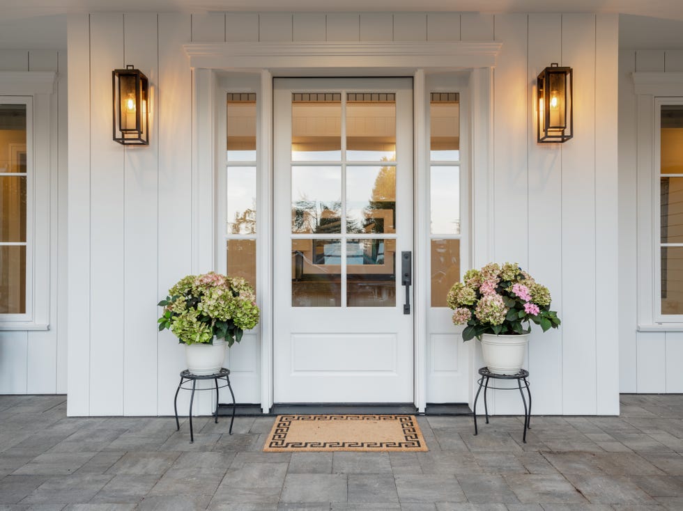
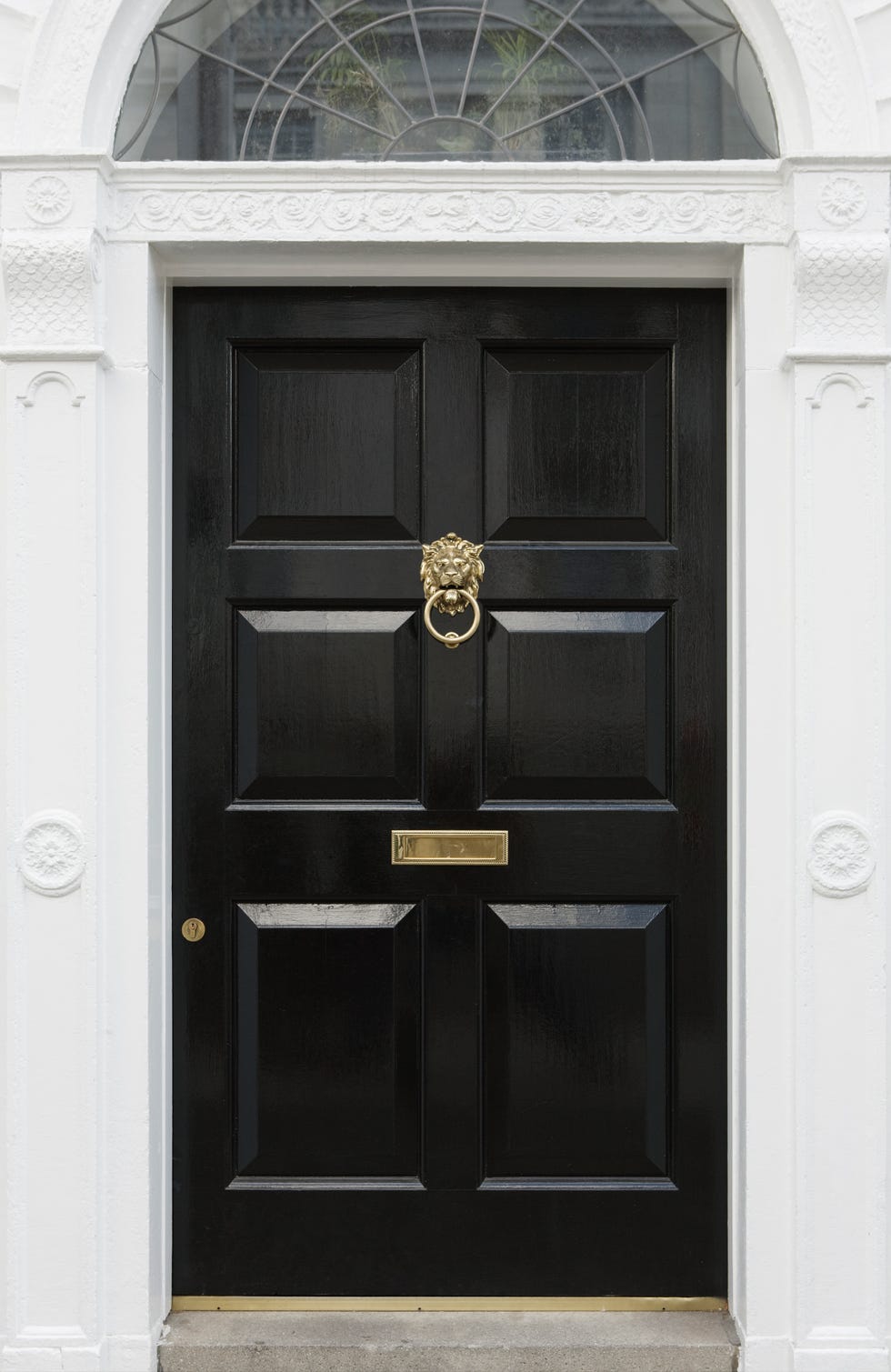
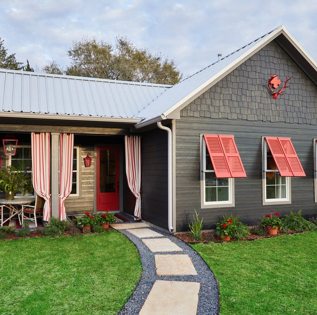
Front doors, according to Kling, present an opportunity for a unique color that doesn't necessarily need to match other elements of the house. However, for additional architectural features like shutters, a paler or neutral color is recommended to complement a bold front door. The article notes that larger homes can accommodate more colors, but advises against overdoing it, instead suggesting a balanced composition of color placement. Breaking traditional rules, such as pairing a dark roof with a light house, can create a striking effect.
The article provides several examples of successful exterior paint schemes. For painted brick, options range from a stately, consistent color to a casual, whitewashed look. A Maryland home by Jess Weeth is cited for its distressed brick, natural slate roof, and classic black and white trim, which together create a welcoming feel. Recommended trim combinations for whitewashed brick include black, white, and dark green, or more modern choices like navy blue and mossy green.
For homes with shakes or shingles, especially near the coast, durability and versatility are key. The Grey Gardens estate in East Hampton is showcased, where the gray roof harmonizes with the natural graying cedar, forming a neutral backdrop for turquoise shutters. Bright white window trim and diamond panes add contrast and visual interest. For classic colonial houses, white clapboards and black shutters are a timeless choice, particularly in New England. Krane advises against dark siding with a light asphalt roof to avoid stark contrast, suggesting that a simpler palette allows the architecture to shine. A Maine home by Nina Campbell exemplifies this, with dark shutters uniting the house with its silvery roof.
Monochromatic schemes are also discussed, with a Nantucket cottage by Veronica Beard serving as an example where the roof's silver slate influences the overall palette. This approach creates a serene, natural look that blends with the landscape. Krane observes that subtle variations in lightness and darkness between the house body and roof shingles contribute to a tranquil aesthetic, especially when the roof is highly visible. Finally, the article highlights the use of cheery pops of color for smaller homes, as seen in Alessandra Branca's Round Top bungalow. Despite minimal color contrast between the house and roof, rose-colored shutters and a modern steel rooftop add character. Kling suggests that for asymmetrical entrances on smaller homes, the front door color should match the shutters for unity. Ultimately, the article stresses the importance of considering a home's architecture and landscape, and swatching paint colors to observe how light affects them throughout the day to achieve optimal curb appeal.
#HousePaintColors #ExteriorDesign #ColorConsulting #CurbAppeal #HomeRenovation #ArchitecturalStyle #PaintSelection #DesignTips #HousePaintColors #ExteriorDesign #ColorConsulting #CurbAppeal #HomeRenovation #ArchitecturalStyle #PaintSelection #DesignTips
0 comment in total
 No comments yet
You may also like
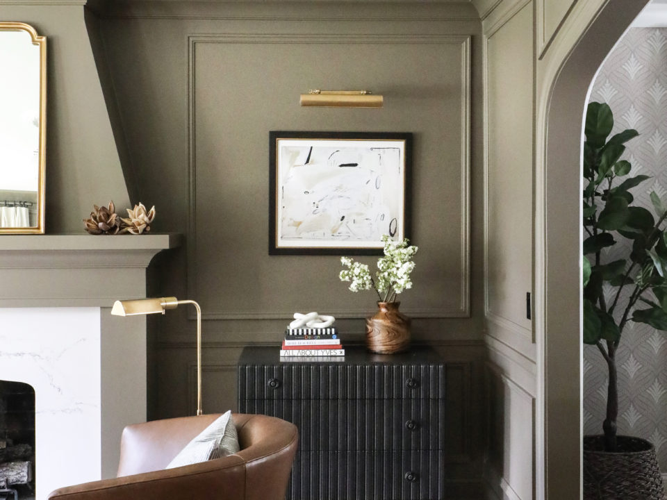
How to Pick the Best Paint Colors for Every Space in Your Home

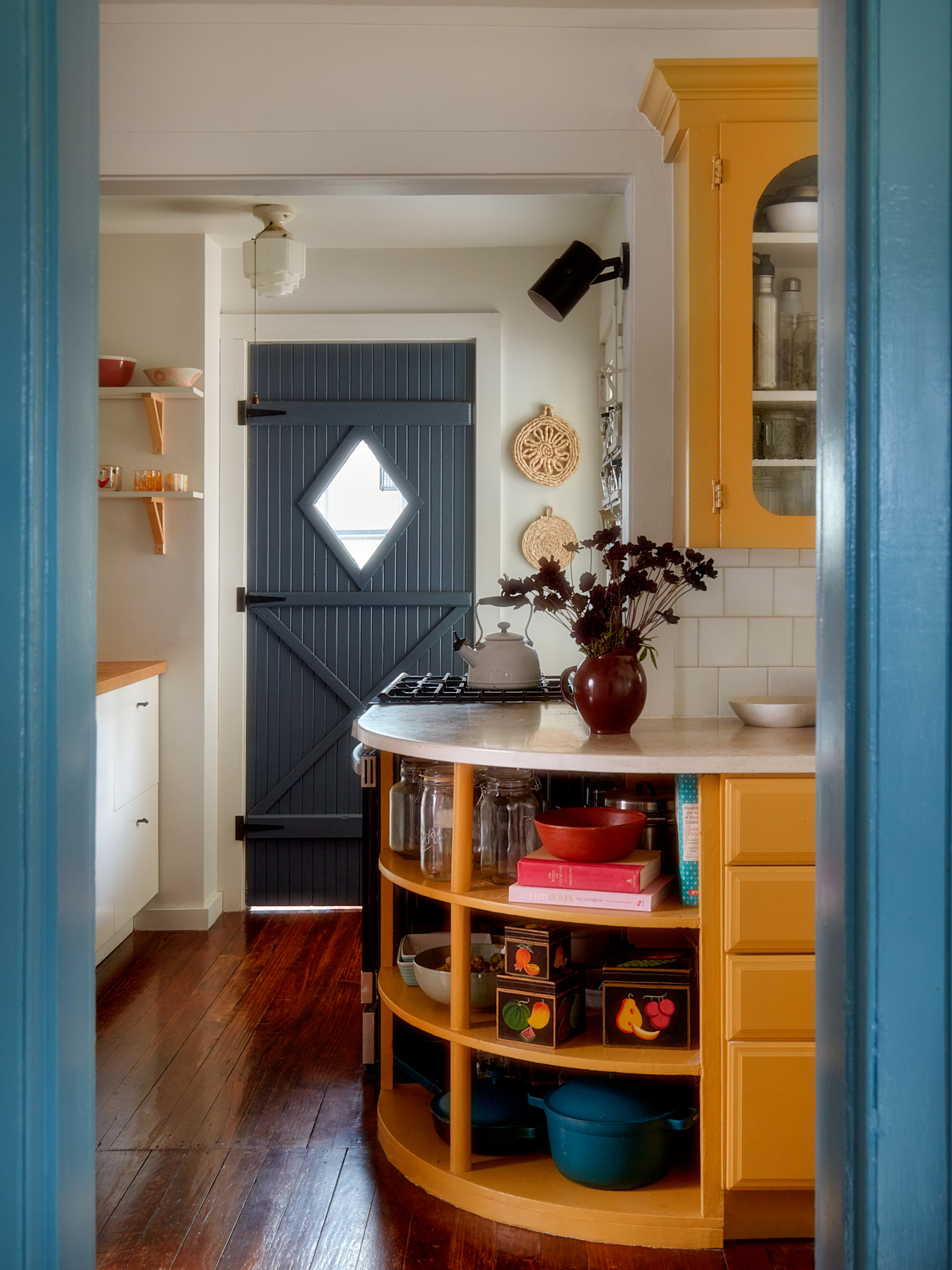
This Cheery Kitchen Color Could Hurt Your Home Value

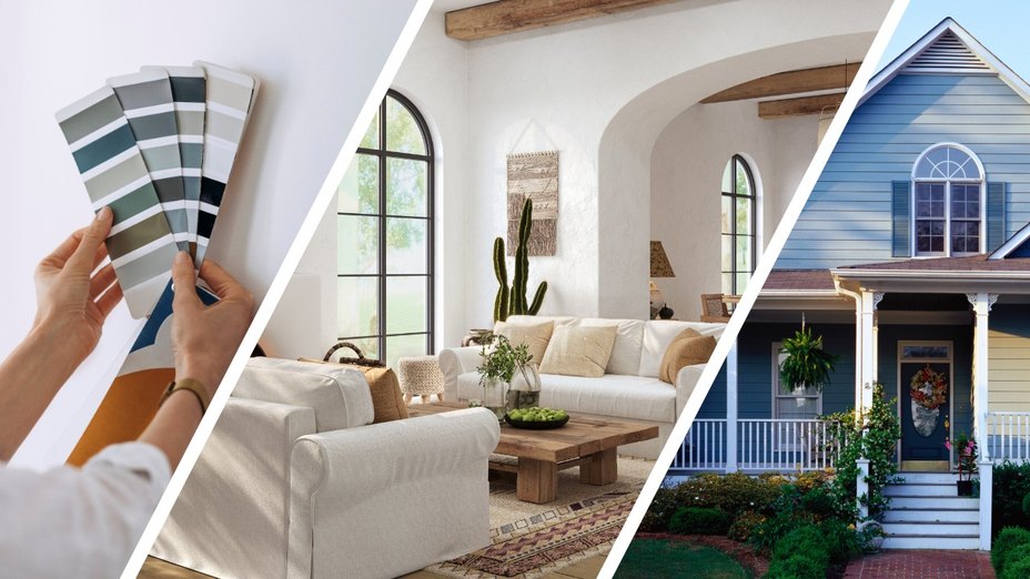
Real Estate Experts Reveal the Paint Colors That Decrease Your Home Value—and Tricks for Finding the Perfect Hue
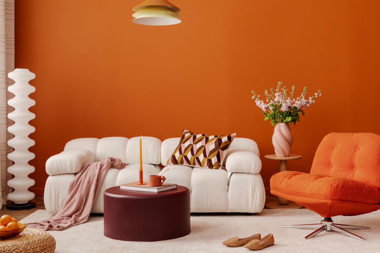
Never Regret a Paint Color Again—Avoid These 6 Common Mistakes

How to choose the best paint color for any room in your house
Millennial Gray Is So Over—Here Are 5 Paint Colors to Try Right Now

The man they call 'the paint detective' shares his 10 tips for choosing the right colours for your house
Four Gorgeous Front Range Rooms That Embrace Color
8 Surprising Colors That Will Decrease Your Home's Value, According to Experts


How To Choose The Right Paint Color For Your Home, According To An Interior Design Expert

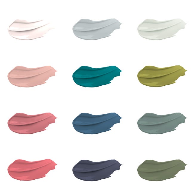
30 on-trend paint colours for every room in your home

6 Paint Colors That Will Make Your House Sell for More Money

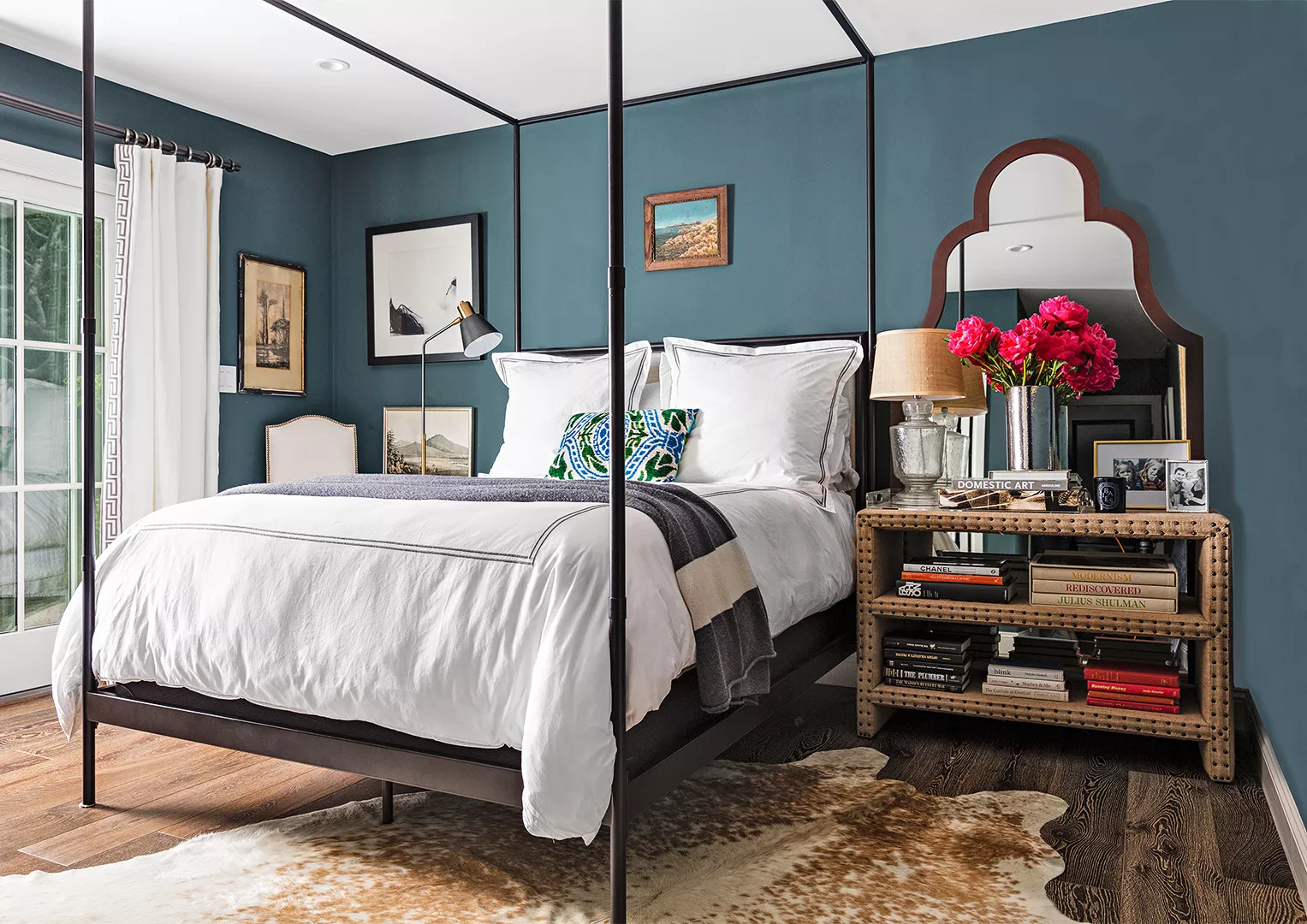
23 Expert Tips for Choosing the Right Paint Colors for Your Home


These Dark Interior Colors Can Sell Your House for More Money, According to Zillow

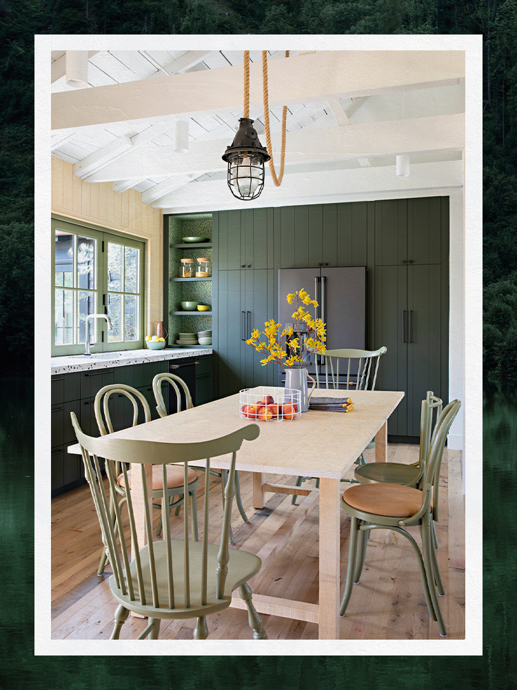
Designers Share Their Tried-and-True Shades From the Best Interior Paint Brands
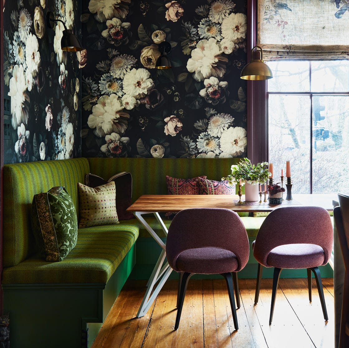
12 Color Schemes That Are Popping Off Right Now, According to Designers
Interior Paint: A Guide to Buying the Best Paints for Your Home

Paint color ideas for every room – experts explain the best choices for different spaces

14 Paint Colors That Can Make a Room Feel Instantly Cozy
7 Paint Colors That Make a House Sell for More Money