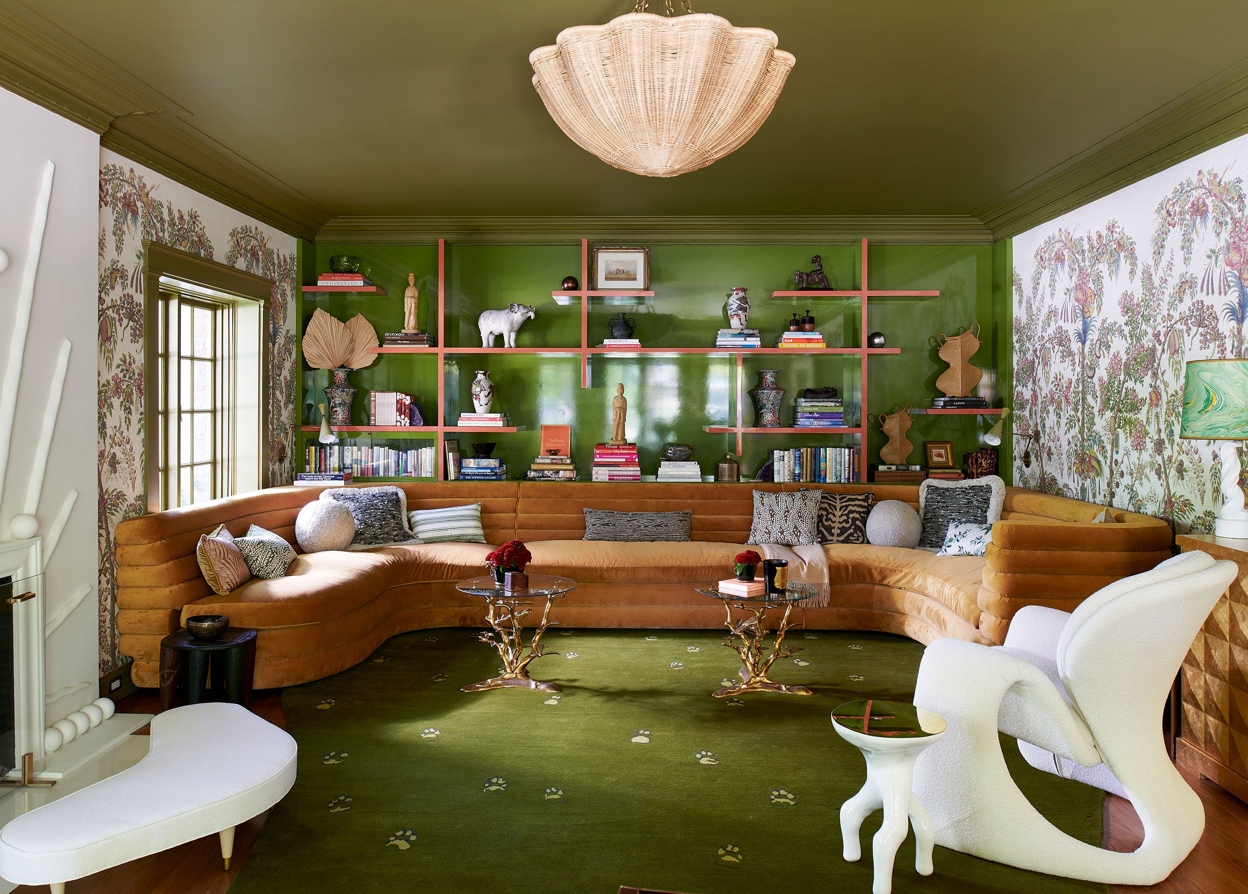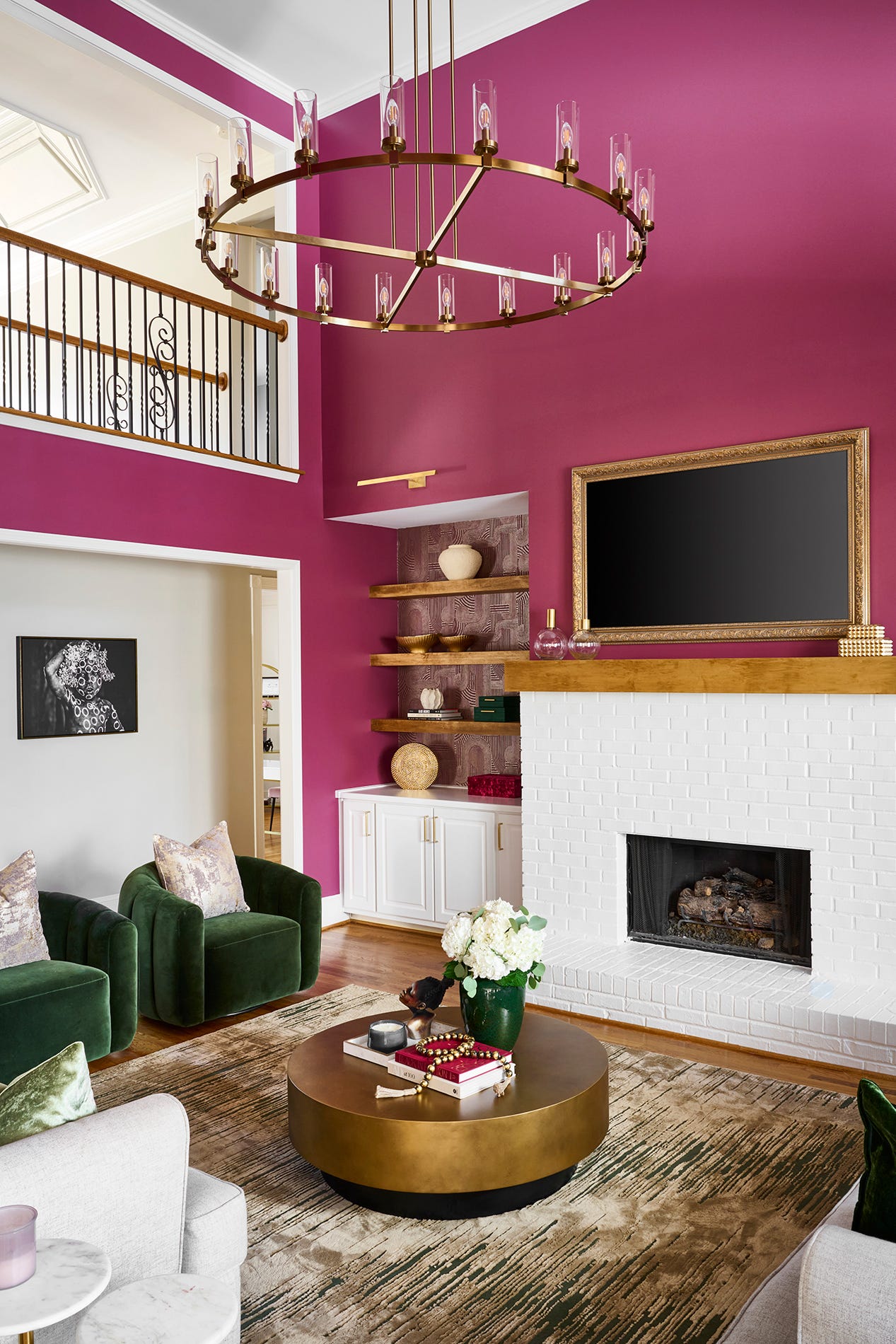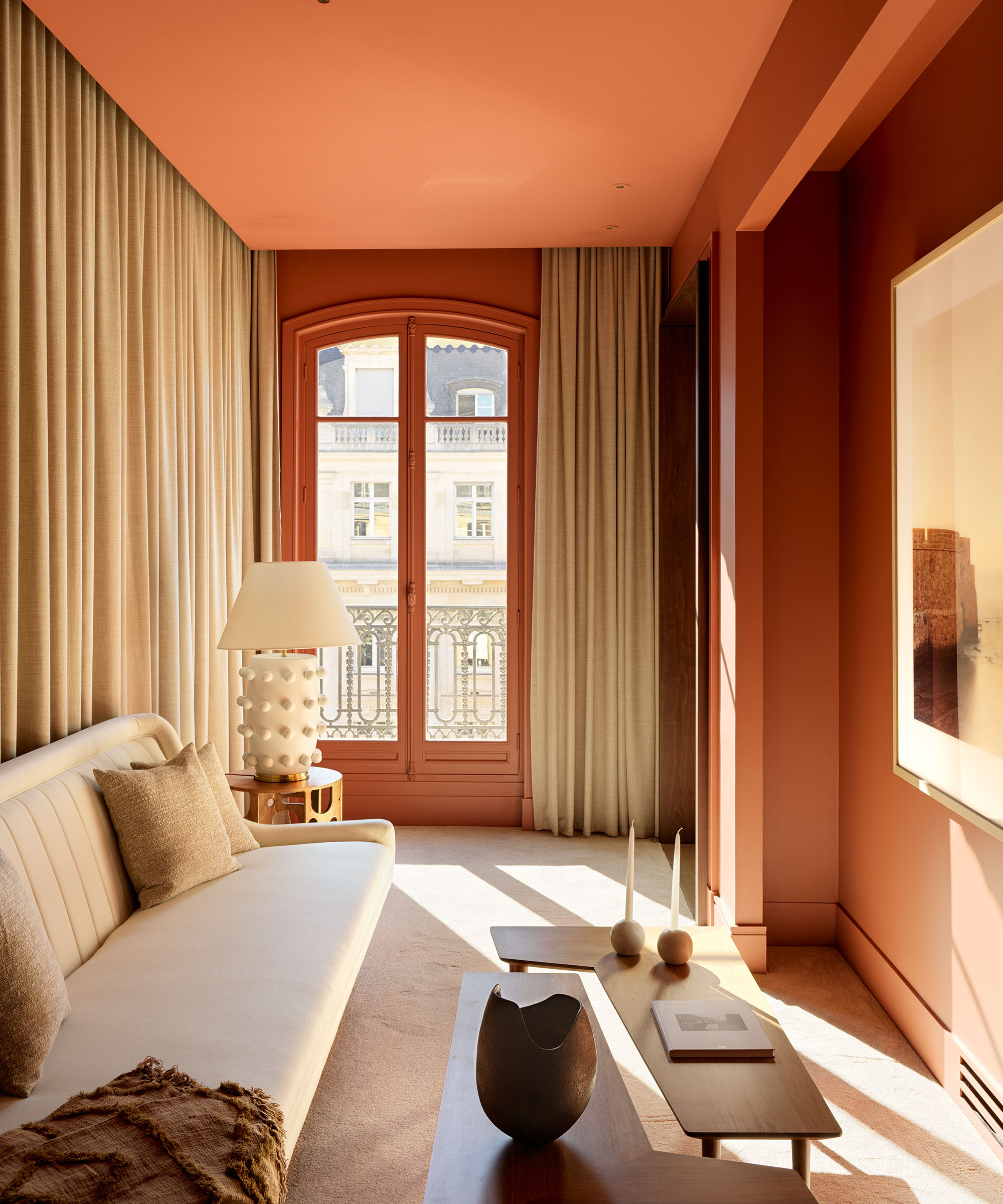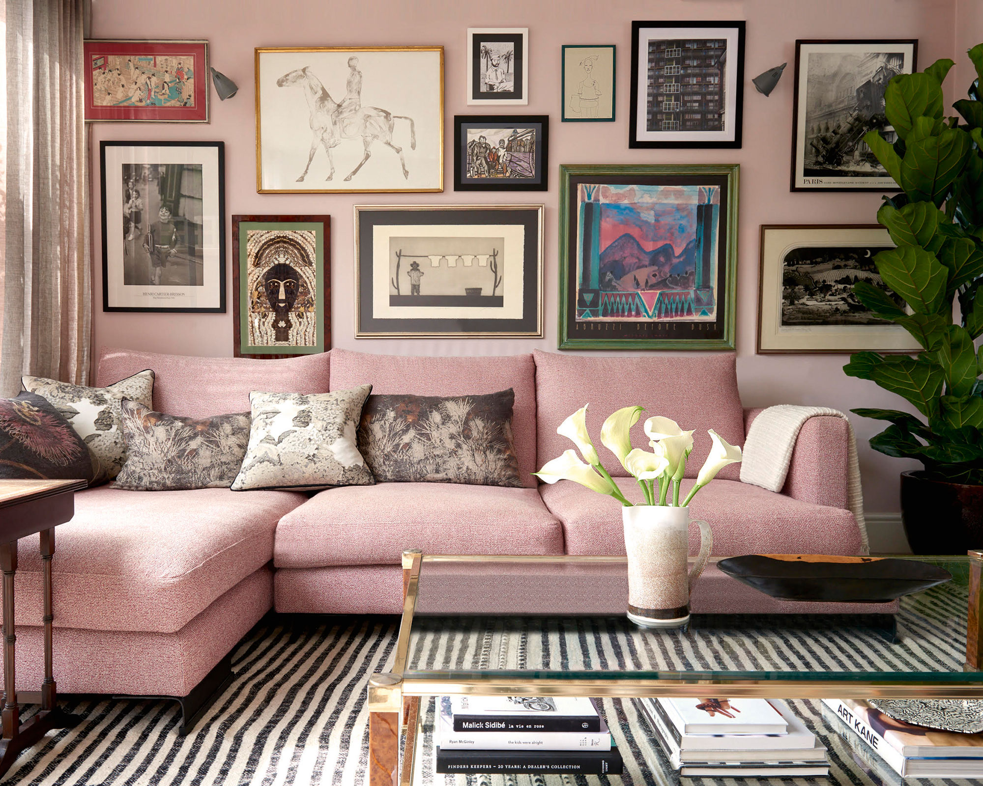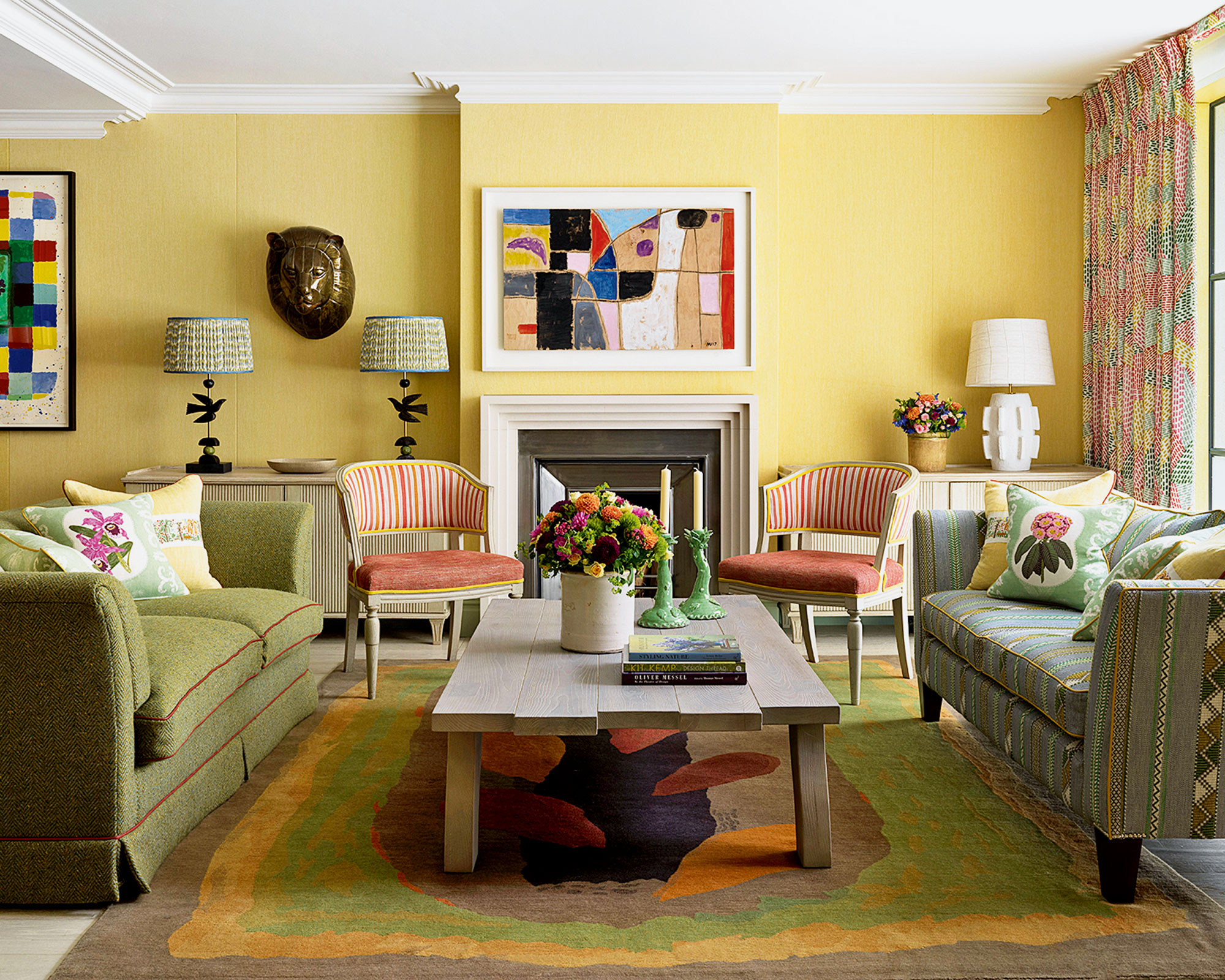
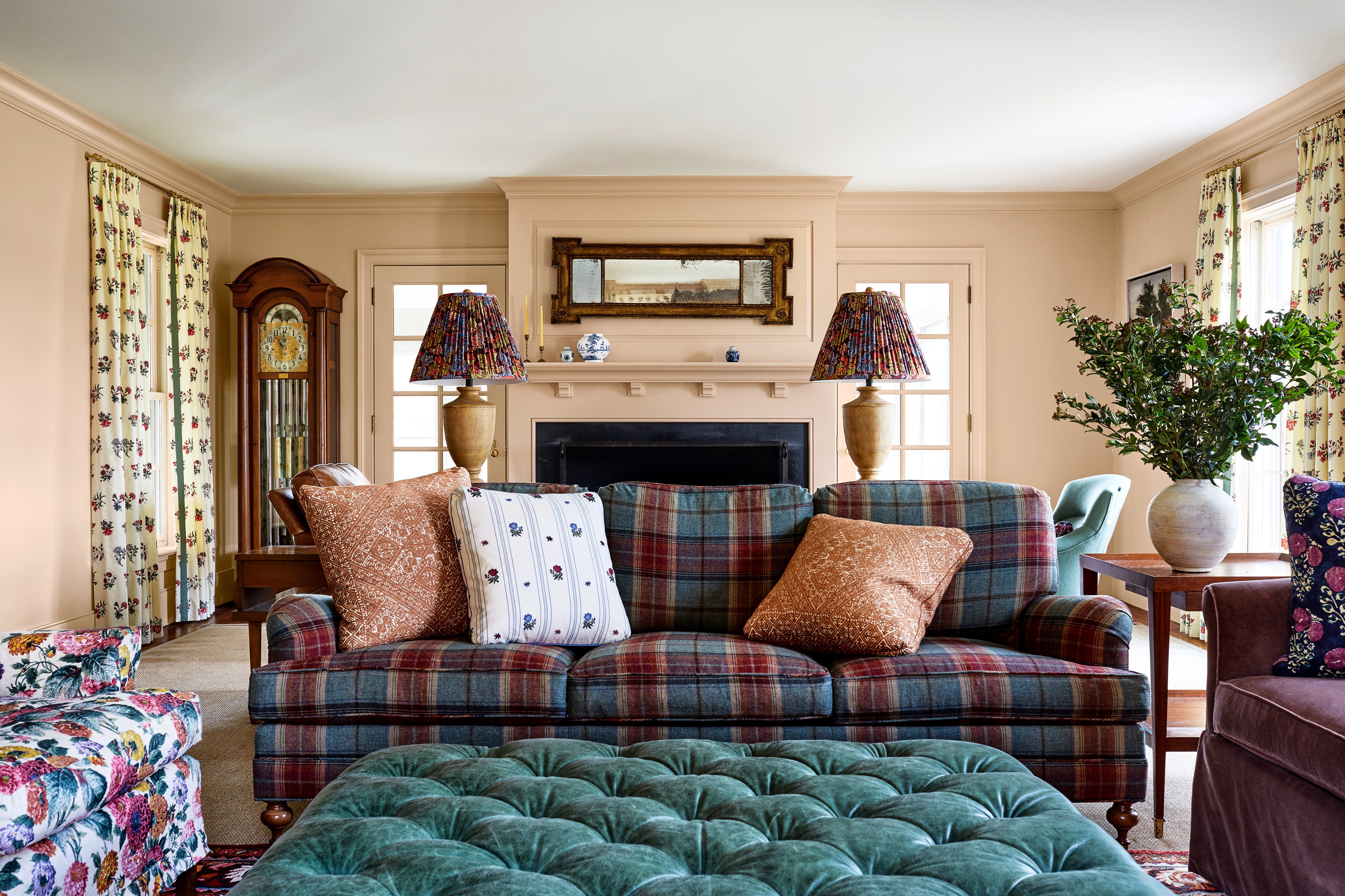
The Best Living Room Paint Colors, According To Designers
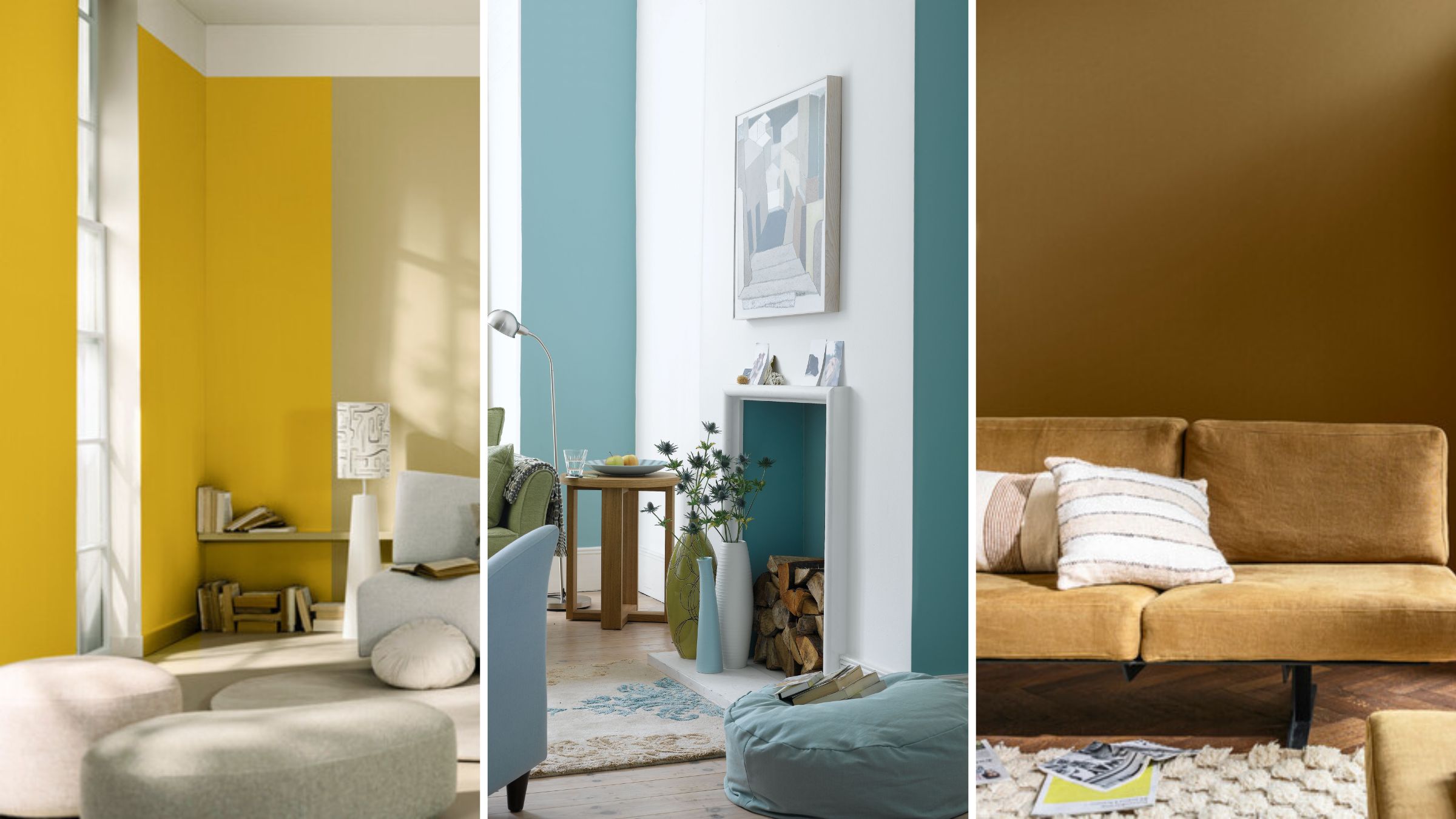
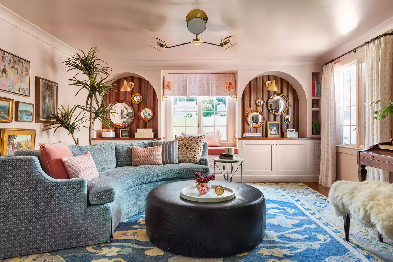
Selecting the ideal living room paint color can significantly impact the ambiance of a home. Expert designers offer a range of suggestions, from subtly colored hues to classic neutrals, to help homeowners make informed choices. These recommendations consider factors like light interaction, complementary furnishings, and desired aesthetic.
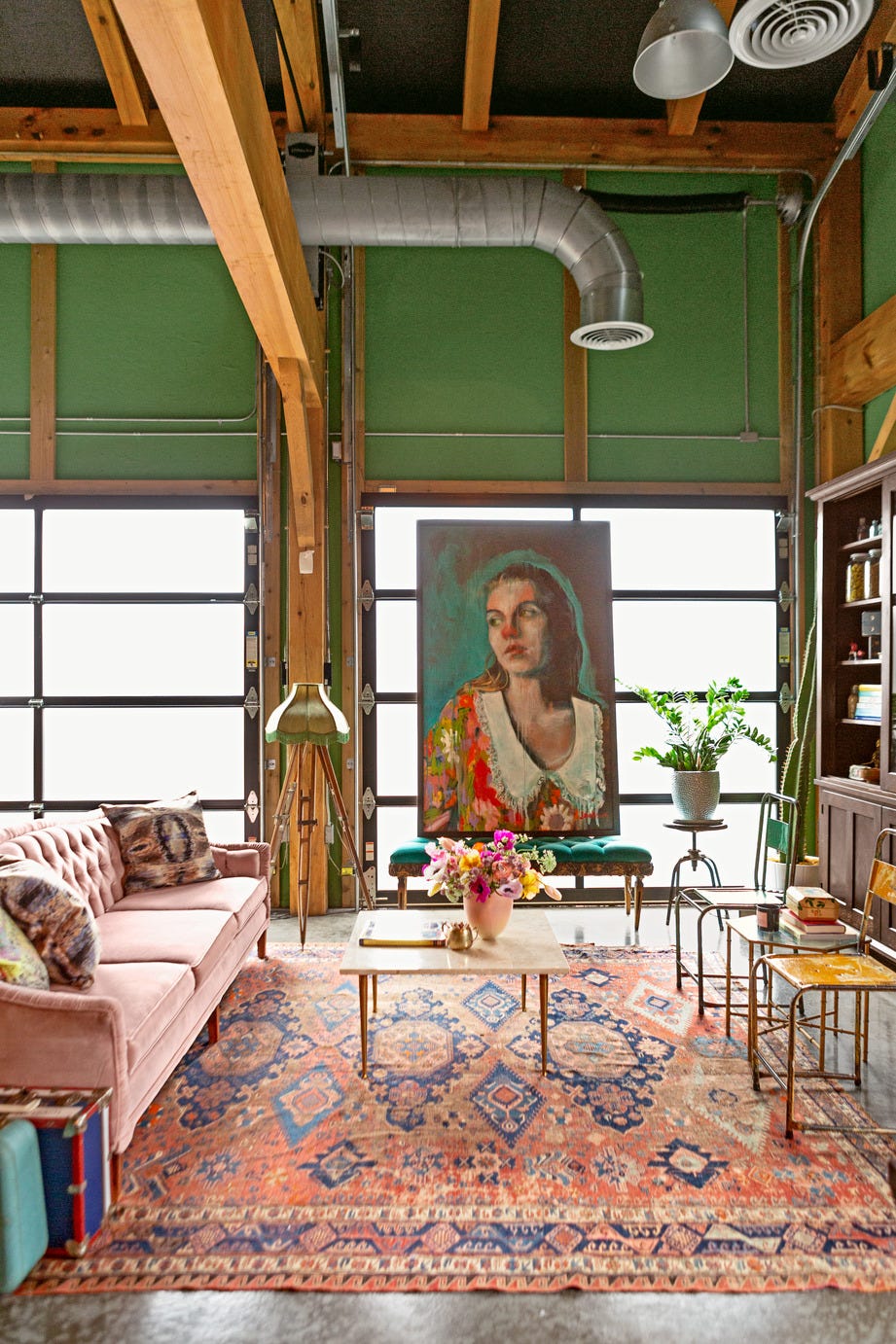
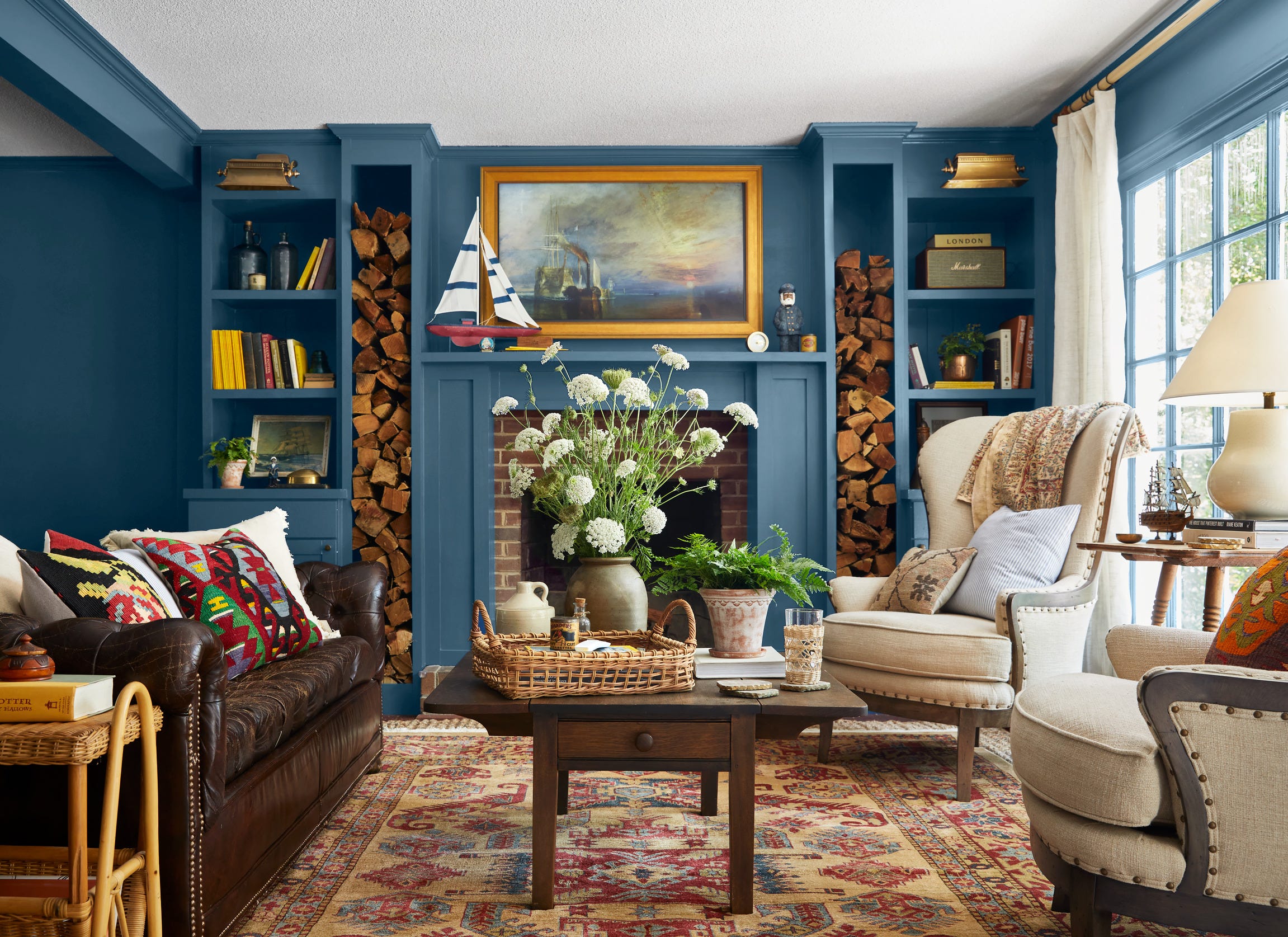
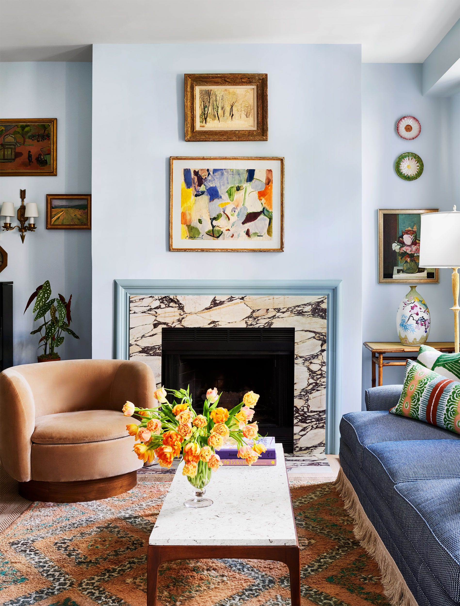
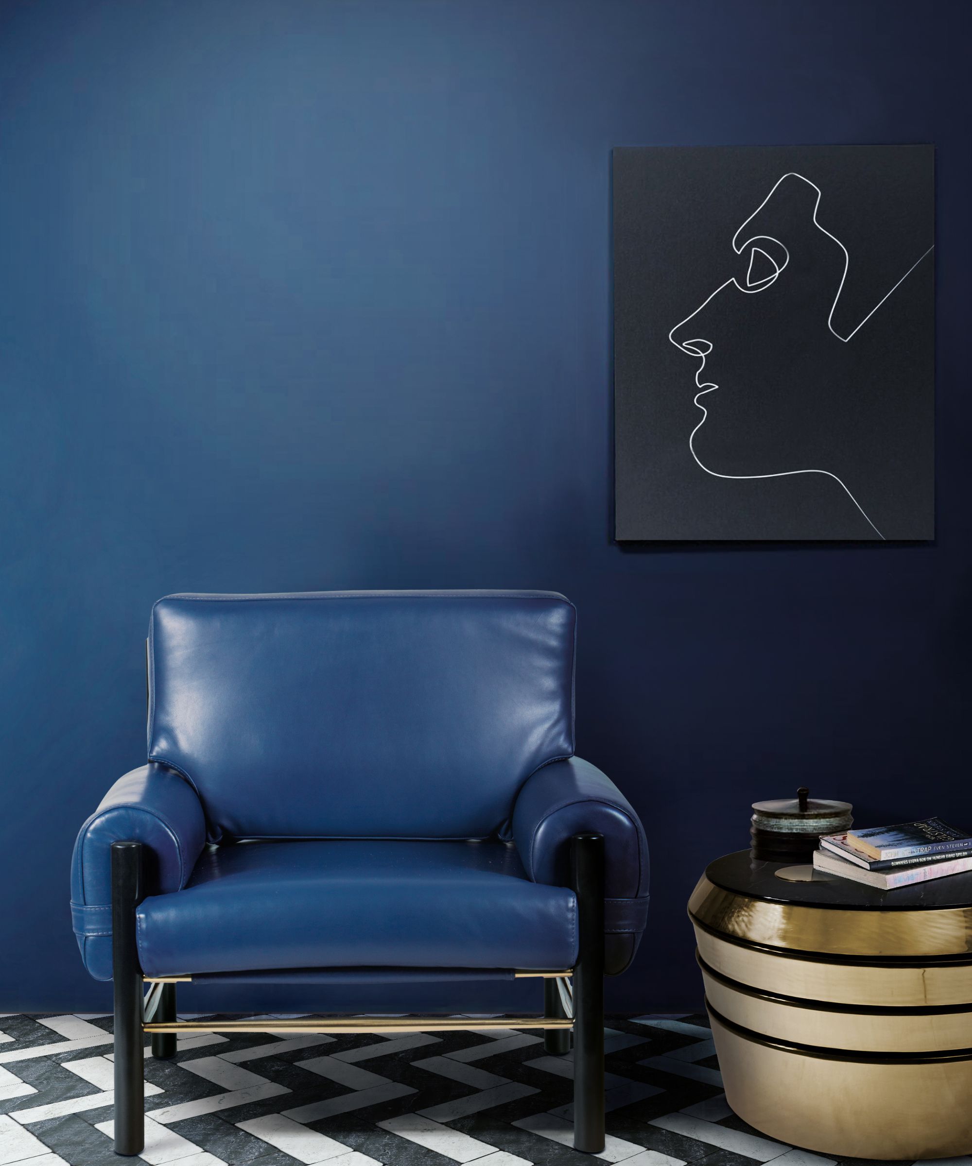
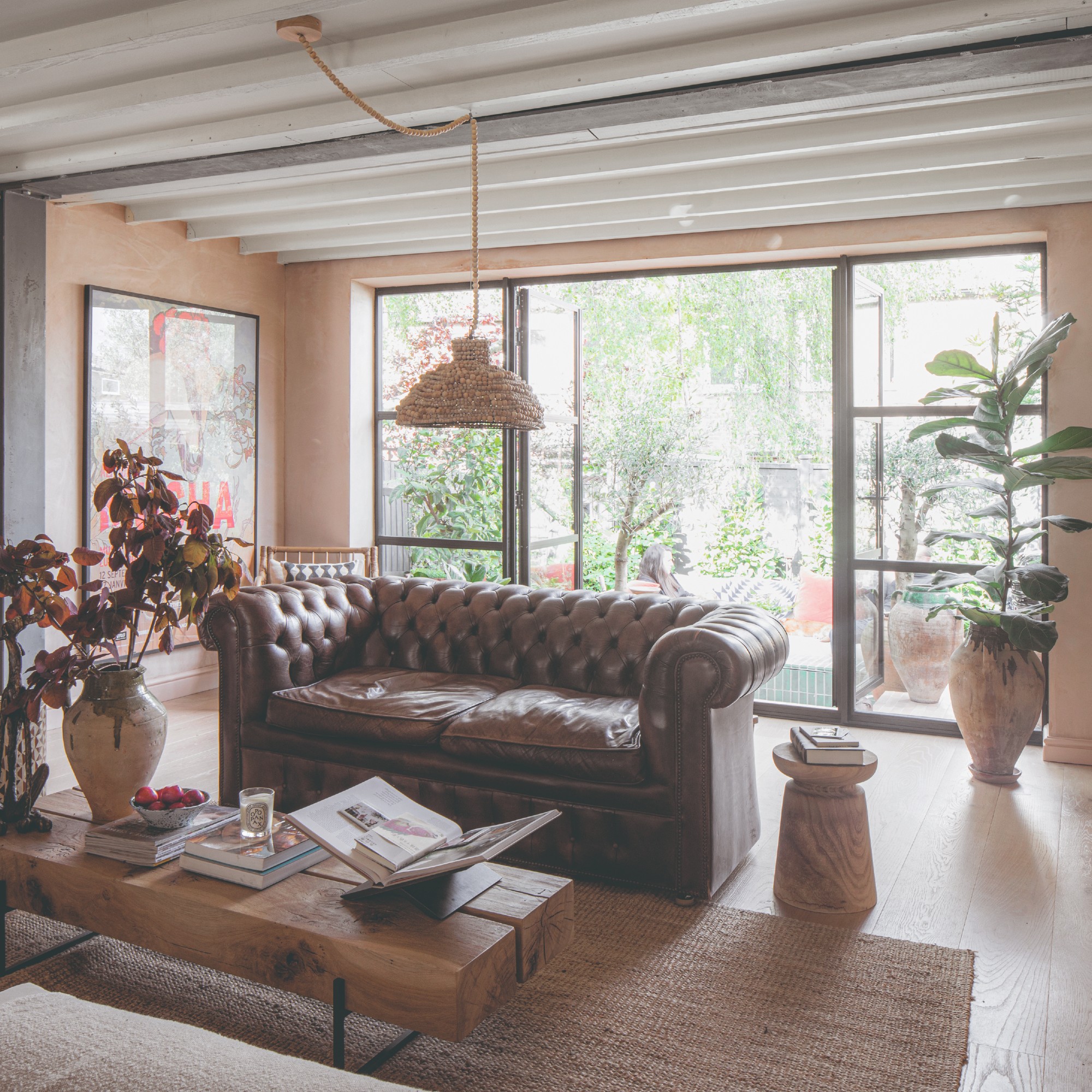
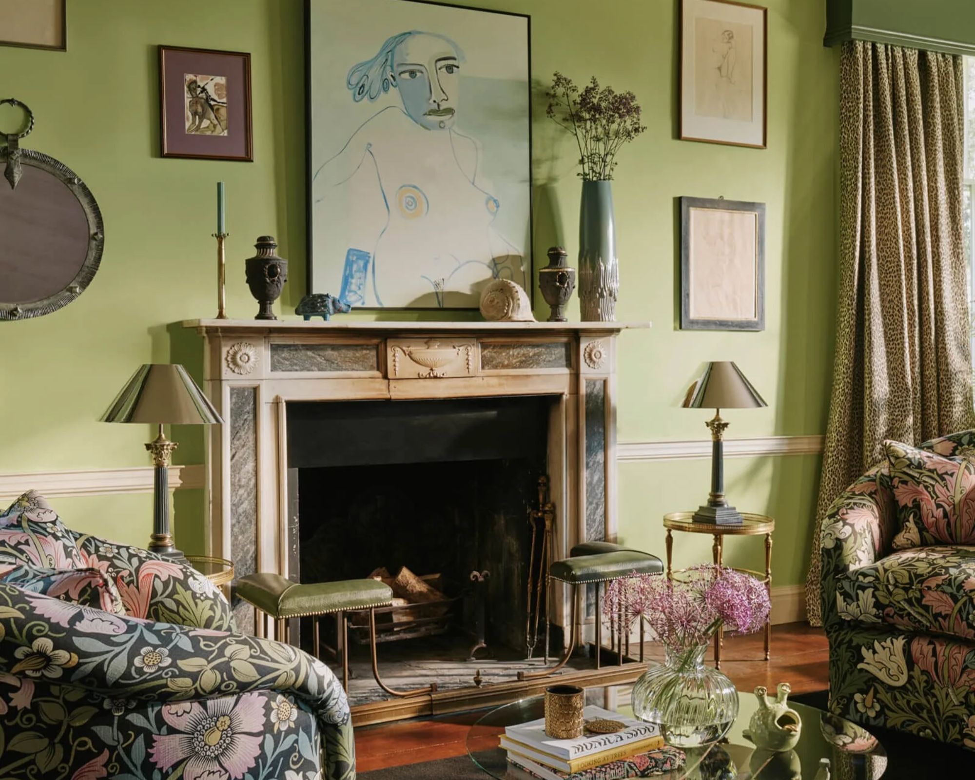
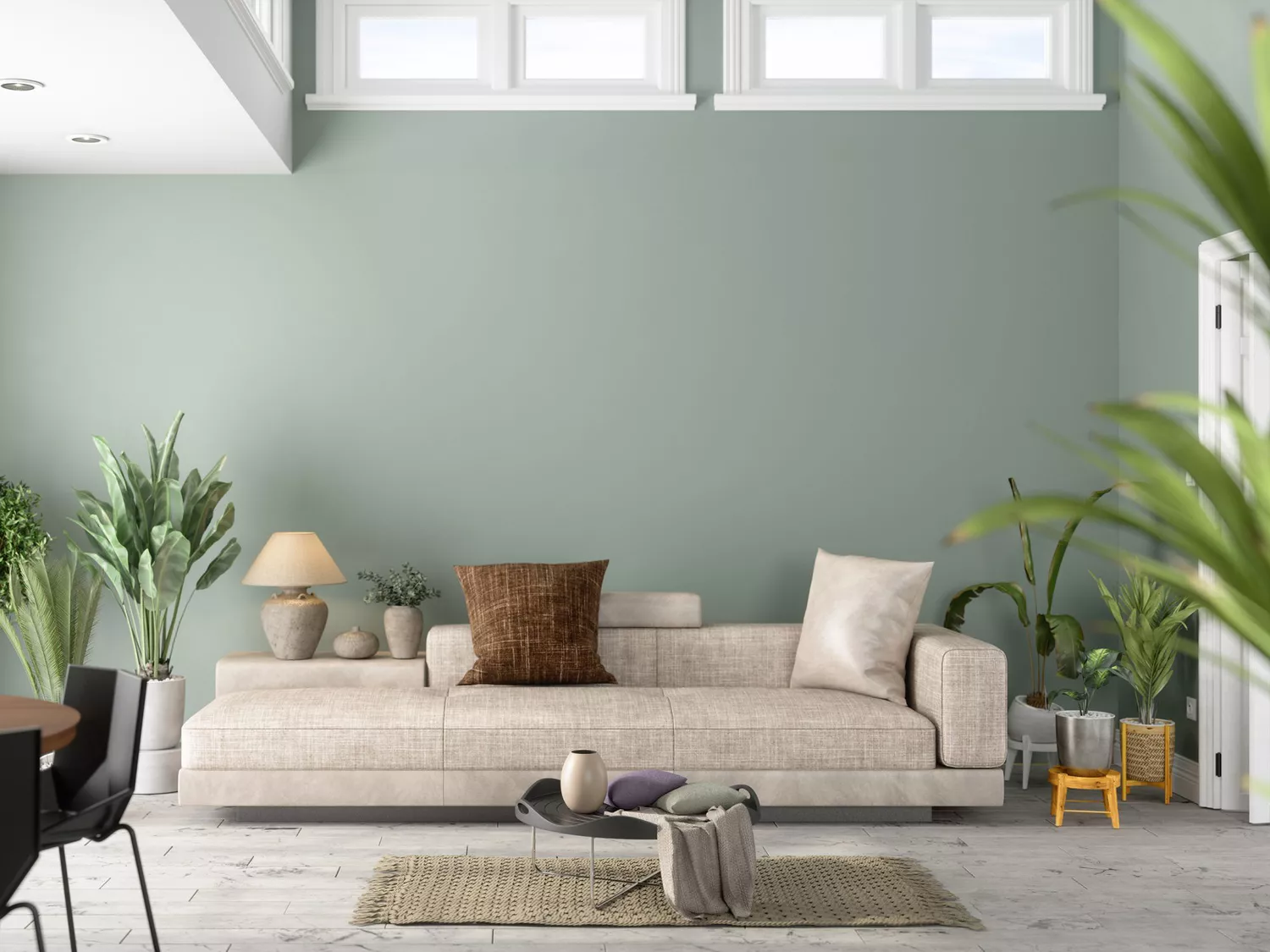
Farrow & Ball Light Blue (No. 22) is highlighted for its dynamic quality. According to Anna-Wooten Loggins of A.Wooten Interiors, this shade can appear blue, light green, or even gray depending on the lighting throughout the day. Its versatility makes it suitable for pairing with warm brown case goods, such as antiques, creating a harmonious and evolving visual experience within the living space.
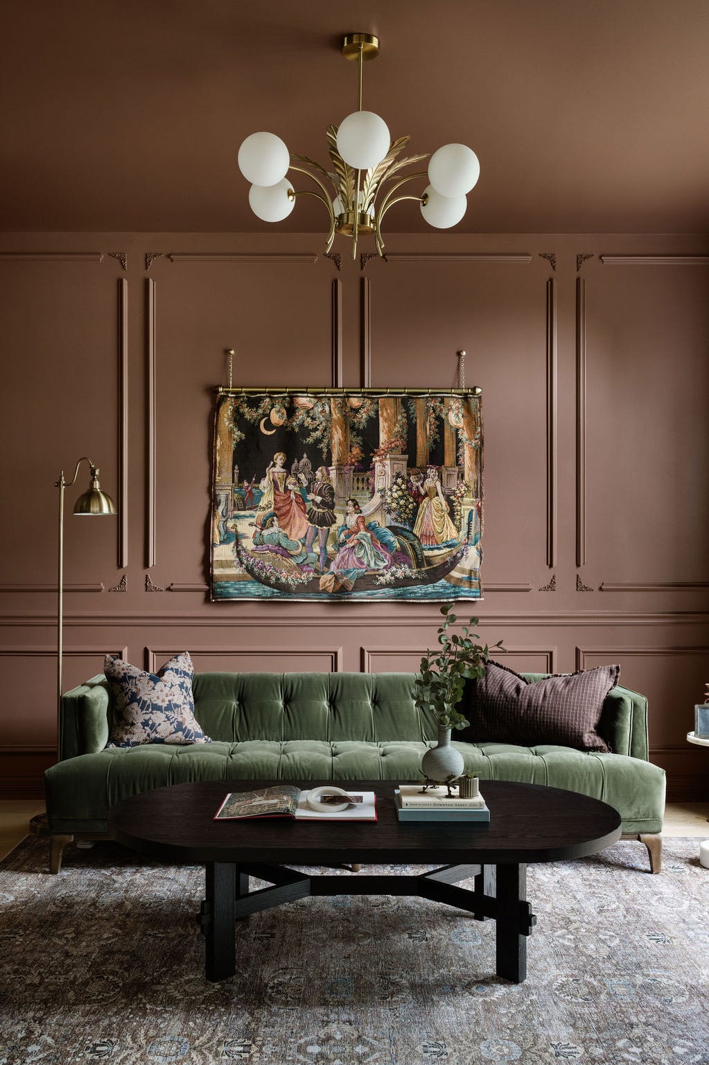
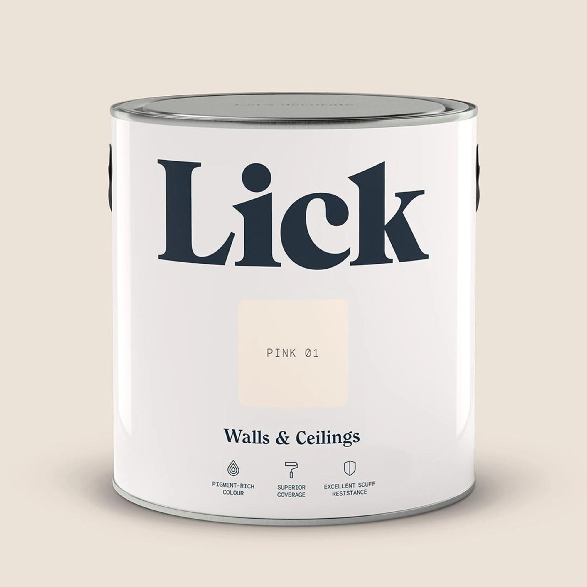
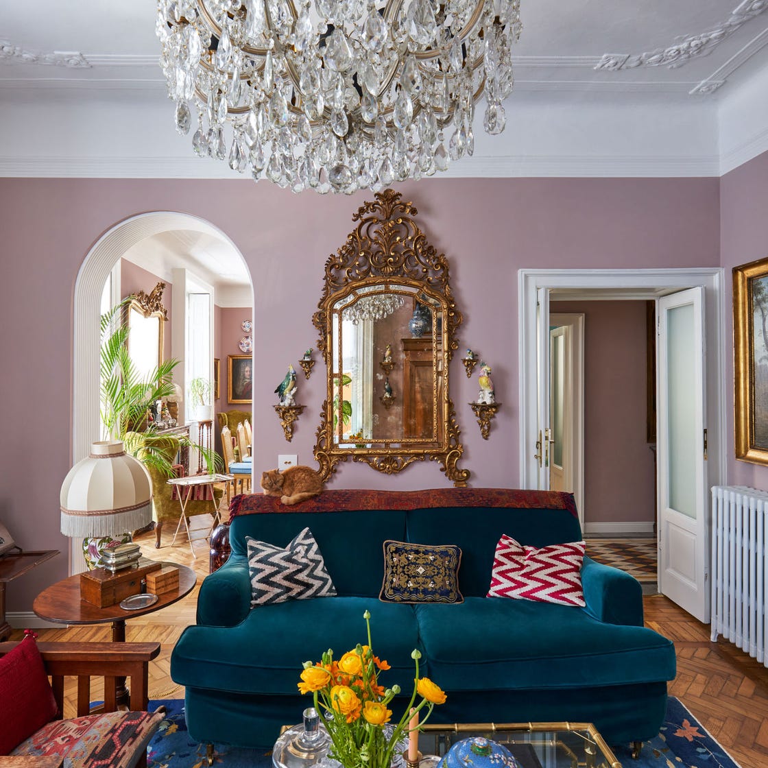
Another option from Farrow & Ball, Dimity (No. 2008), is described as a 'barely-there pinky taupe.' Callie Windle of Callie Windle Interiors recommends this color for clients seeking a warm, neutral foundation in their living rooms. This gentle hue allows other elements, like art and furniture, to stand out and become focal points without being overwhelmed by the wall color.
For those preferring classic white, Benjamin Moore Glacier White OC-37 is a top choice for Anna Still, co-founder of Still Johnson Interiors. She appreciates its balanced tone, which is neither too stark nor overly warm or cool. This neutrality prevents the color from restricting future design choices and ensures that bare walls do not appear unfinished. Glacier White also demonstrates adaptability, fitting well into both modern and vintage-inspired interior designs.
Sherwin-Williams Shoji White SW 7042 is another favored white, praised by Andrea Seymour of Springdale Custom Builders for its depth, saturation, and calming effect. Seymour notes its suitability for neutral color palettes where a harsh white might be too intense. It pairs particularly well with white oak, suggesting a natural and serene aesthetic for the living room.
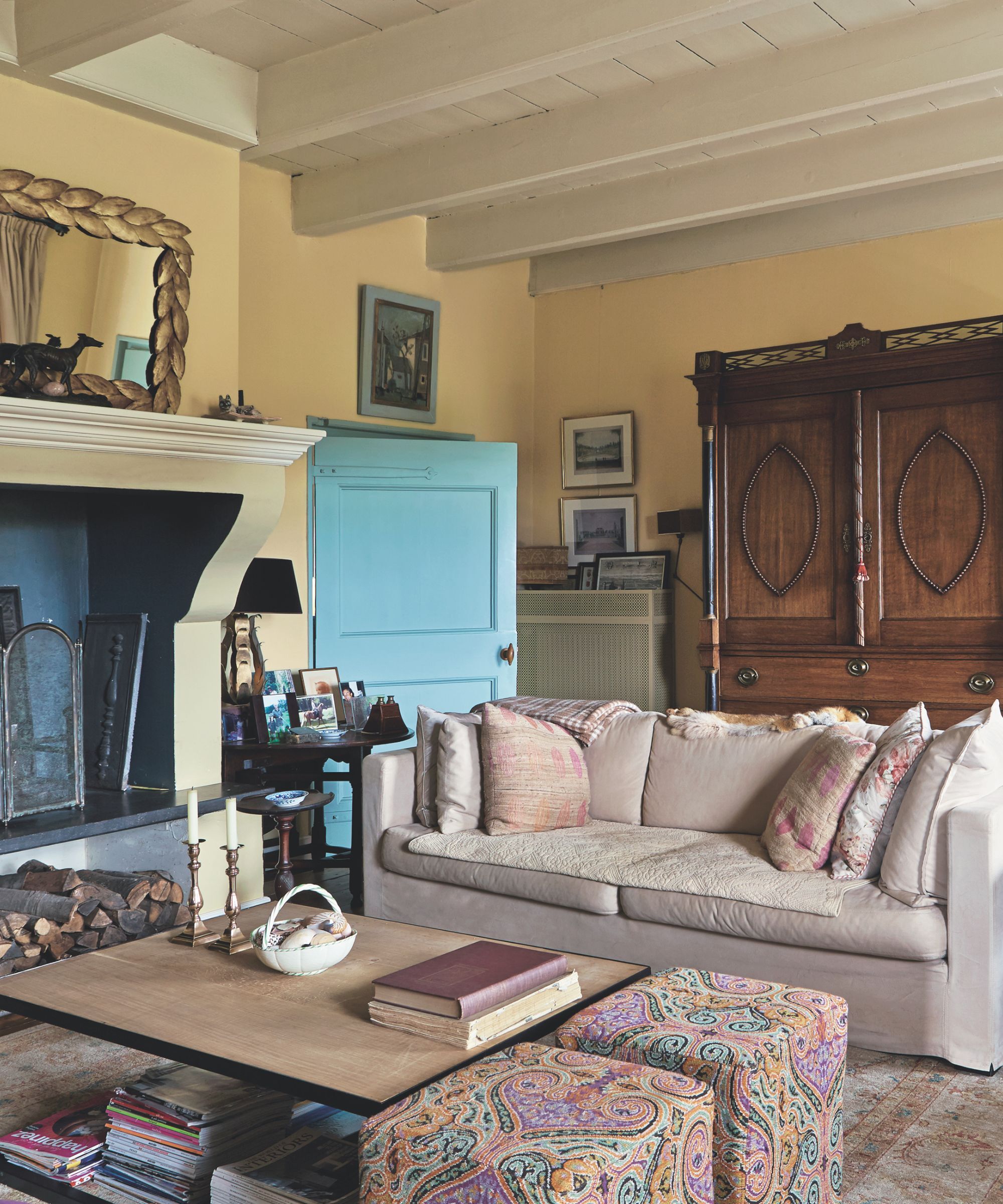
Benjamin Moore Swiss Coffee OC-45 caters to those who prefer a warm white, moving away from crisp, bright tones. Rachel Houser, co-founder of Intuitive Design, suggests this creamy shade for traditional interiors, noting its beautiful appearance when used with wainscoting, which adds architectural detail and enhances the room's character.
Also from Benjamin Moore, Chantilly Lace OC-65 is another warm white recommended by Houser. This color is noted for its ability to reflect natural light effectively without introducing undesirable yellow undertones, contributing to a bright and inviting atmosphere.
Finally, for a more gray-leaning neutral, Suzanne Manlove of Manlove and Company Interiors recommends Benjamin Moore Balboa Mist 1549. This choice emphasizes the importance of selecting a color with gray undertones that can adapt to natural light changes throughout the day. Manlove also highlights that the wall color should complement, rather than compete with, the art and decor within the space, allowing each element to contribute to the overall aesthetic without clashing.
#LivingRoomPaint #InteriorDesign #DesignerApproved #PaintColors #HomeDecor #NeutralHues #ColorPalettes #FarrowAndBall #BenjaminMoore #SherwinWilliams #LivingRoomPaint #InteriorDesign #DesignerApproved #PaintColors #HomeDecor #NeutralHues #ColorPalettes #FarrowAndBall #BenjaminMoore #SherwinWilliams
0 comment in total
You may also like
Experts reveal the best living room paint colours to transform every space

10 Timeless Living Room Paint Colors Designers Swear By
55 Living Room Color Ideas That Will Take Your Space from Drab to Fab

The 3 All-Time Worst Living-Room Paint Colors, According to Designers

Listen Up: These Are the Best Paint Colors for Your Living Room

Jewel Tones Are Trending for Living Room Paint Colors, According to Designers

The 8 Best Living Room Paint Colors, According to Design Experts

5 colors that will make your living room feel happier, according to interior designers
These are interior designers' favorite color combinations for living rooms – from neutral and calming to bold and playful
The 15 Best Paint Colors for Your Living Room, According to Interior Designers
The best paint colors for small living rooms, according to design experts

‘When your sofa and wall colours are in sync, the space feels intentional’ – experts reveal the 4 best paint and sofa colour combinations
The Best Living Room Paint Colors, According To Designers

7 Popular Paint Colors for the Living Room
Designers Swear By These 65 Living Room Paint Colors

5 living room paint colors going out of style in 2025
Designer-Approved Living Room Colors That'll Make You Feel Happier
These Living Room Paint Colors Are a Total Mindset Shift

The 60 Most Popular Living Room Paint Colors Right Now
4 Living Room Paint Colors That Are So Outdated, According to Designers