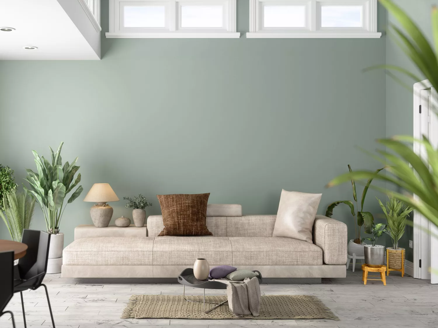
The 8 Best Living Room Paint Colors, According to Design Experts
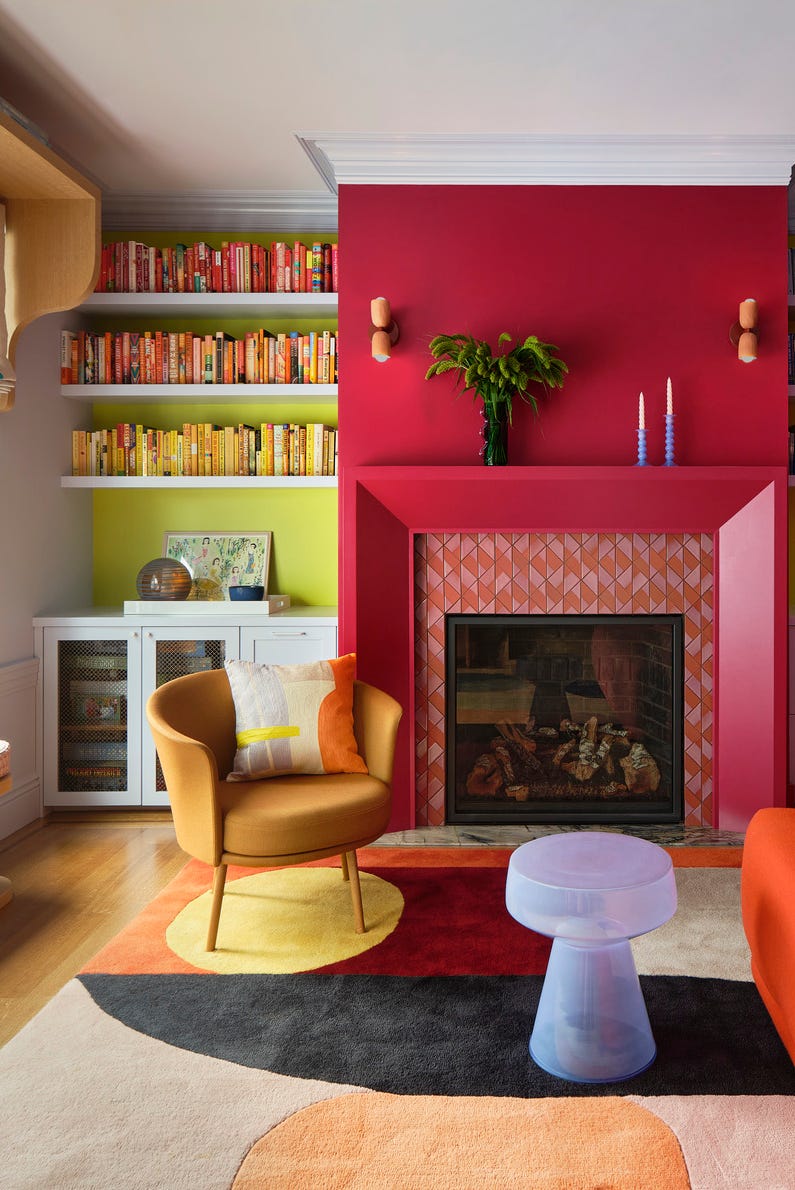
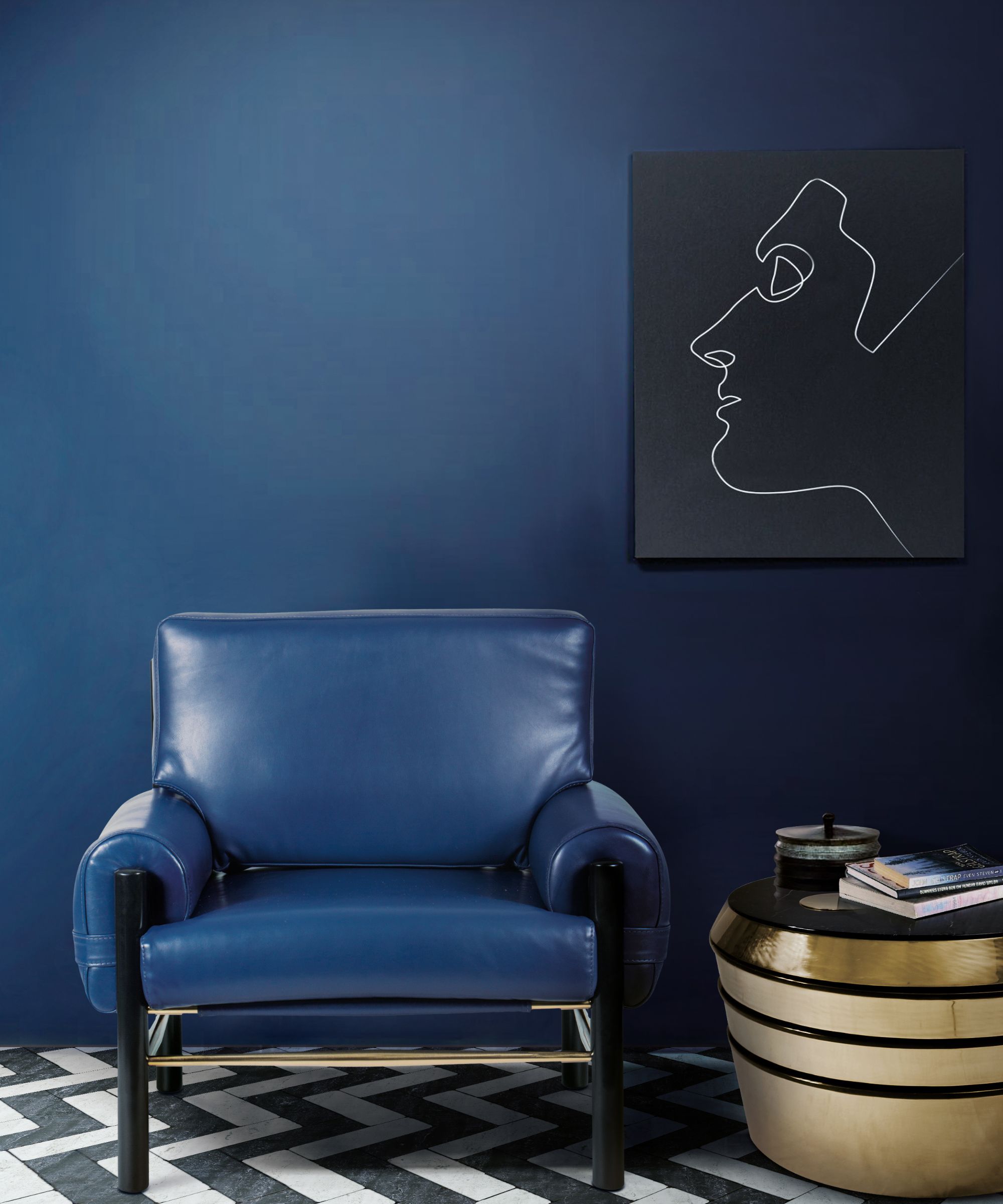
This article explores the transformative power of paint in a living room, highlighting eight expert-recommended colors that can revamp a space. The challenge of selecting the right living room paint color is addressed, emphasizing the desire for a fresh and noticeable change without being overpowering or clashing with existing decor. To mitigate 'painter's regret,' the piece consults home and paint color experts for their top choices, ranging from sophisticated neutrals to contemporary earthy greens.
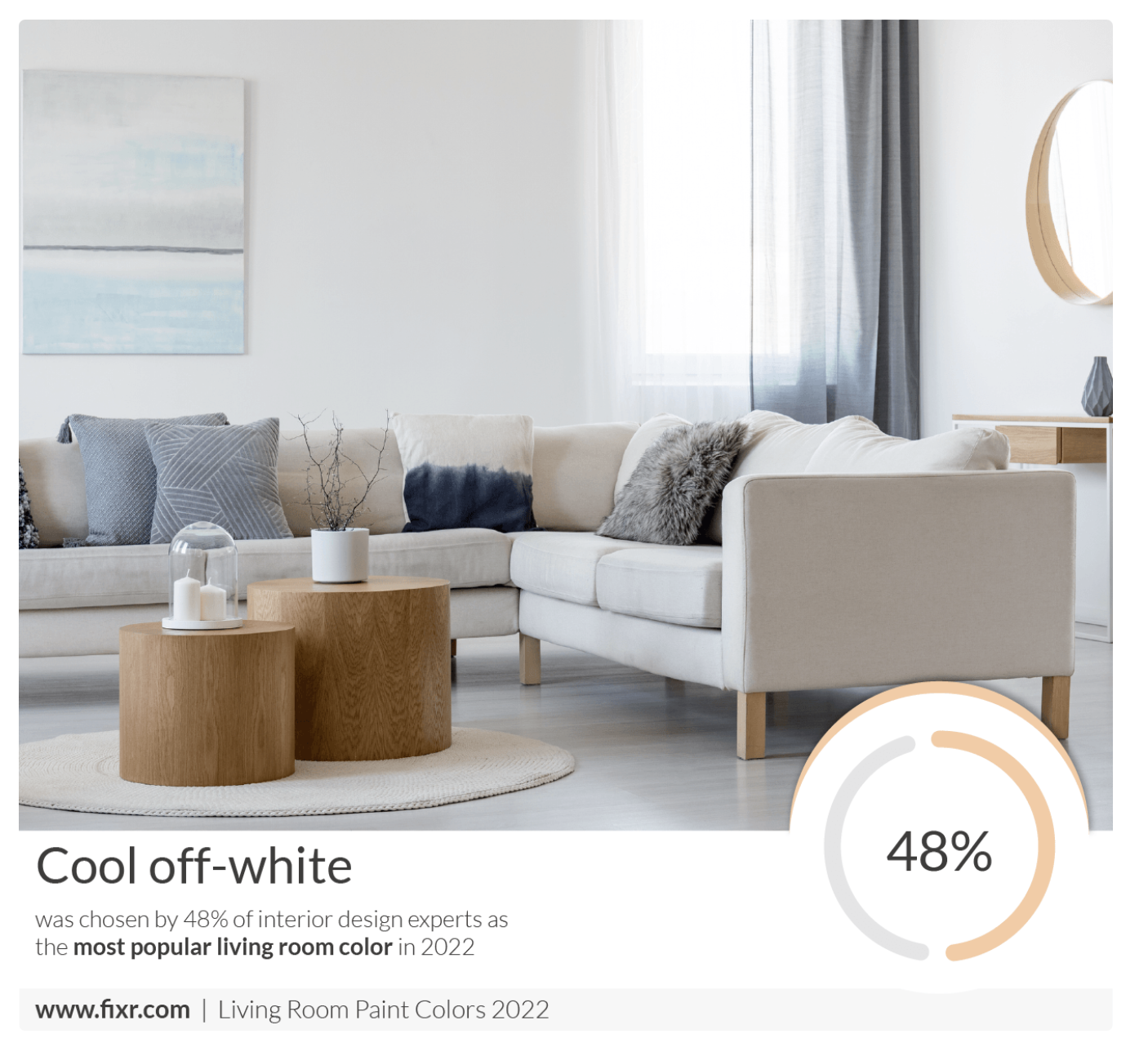
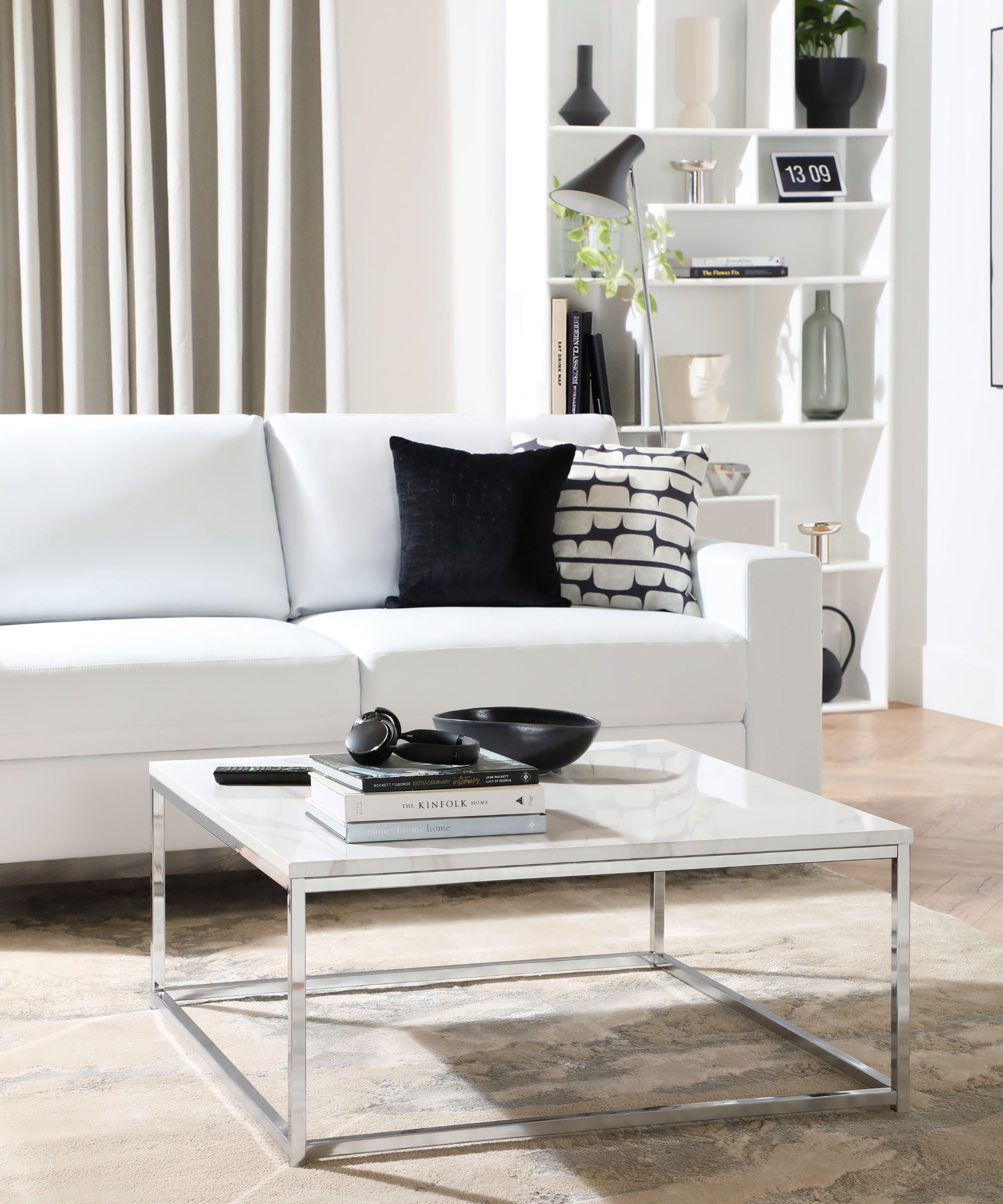
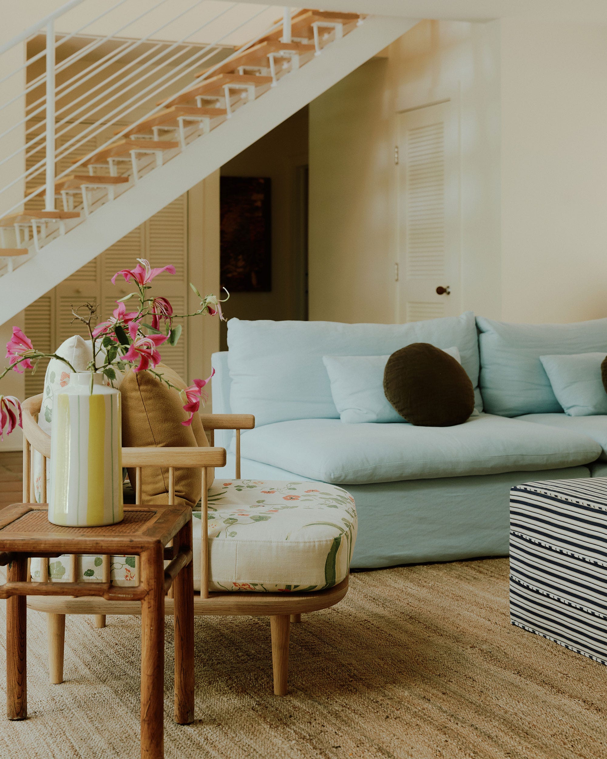
Several specific paint colors are recommended by design professionals. Anna Franklin, an interior designer and founder of Stone House Collective, suggests 'Crushed Ice' by Sherwin-Williams as a favored cool white. She describes it as clean, bright, and space-opening, particularly suitable for modern, coastal, Scandinavian, and contemporary design aesthetics.
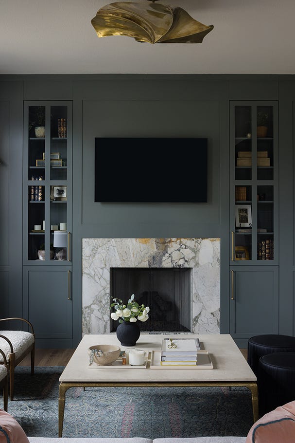
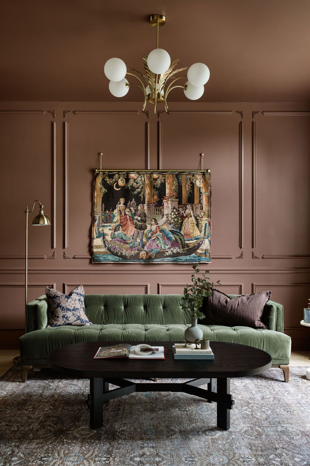
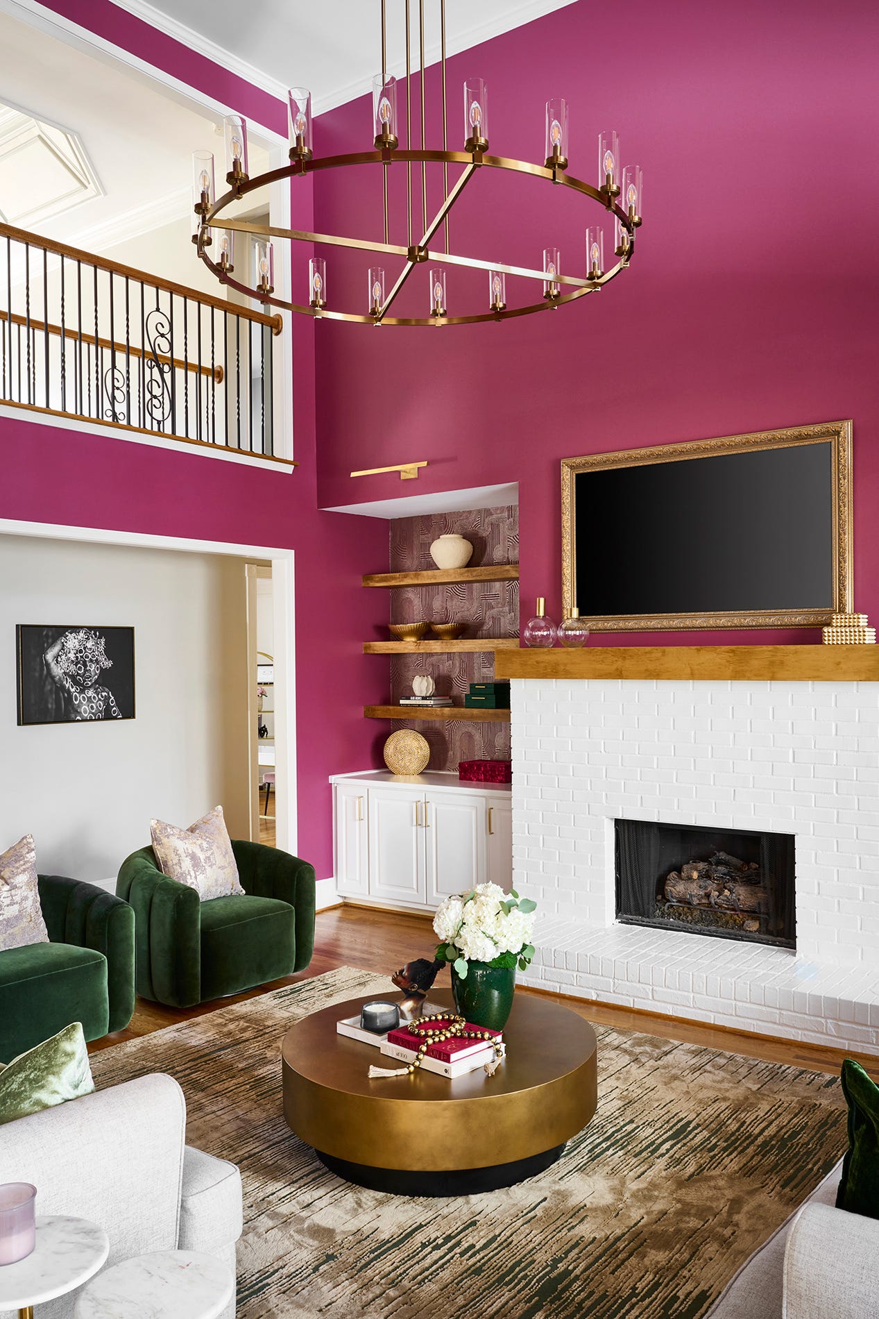
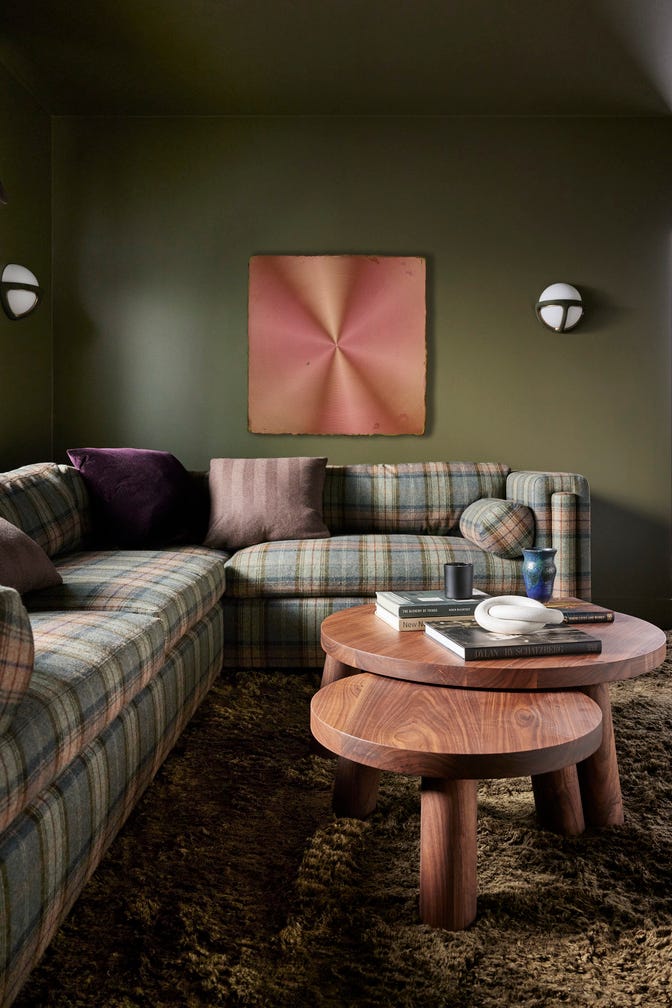
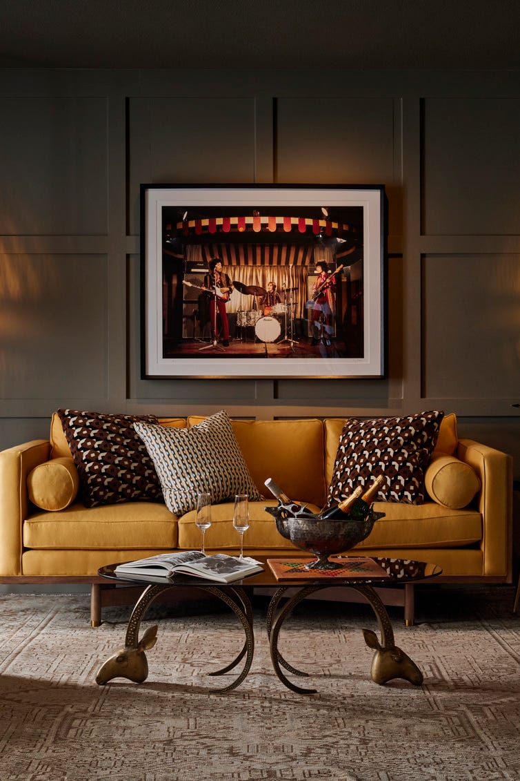
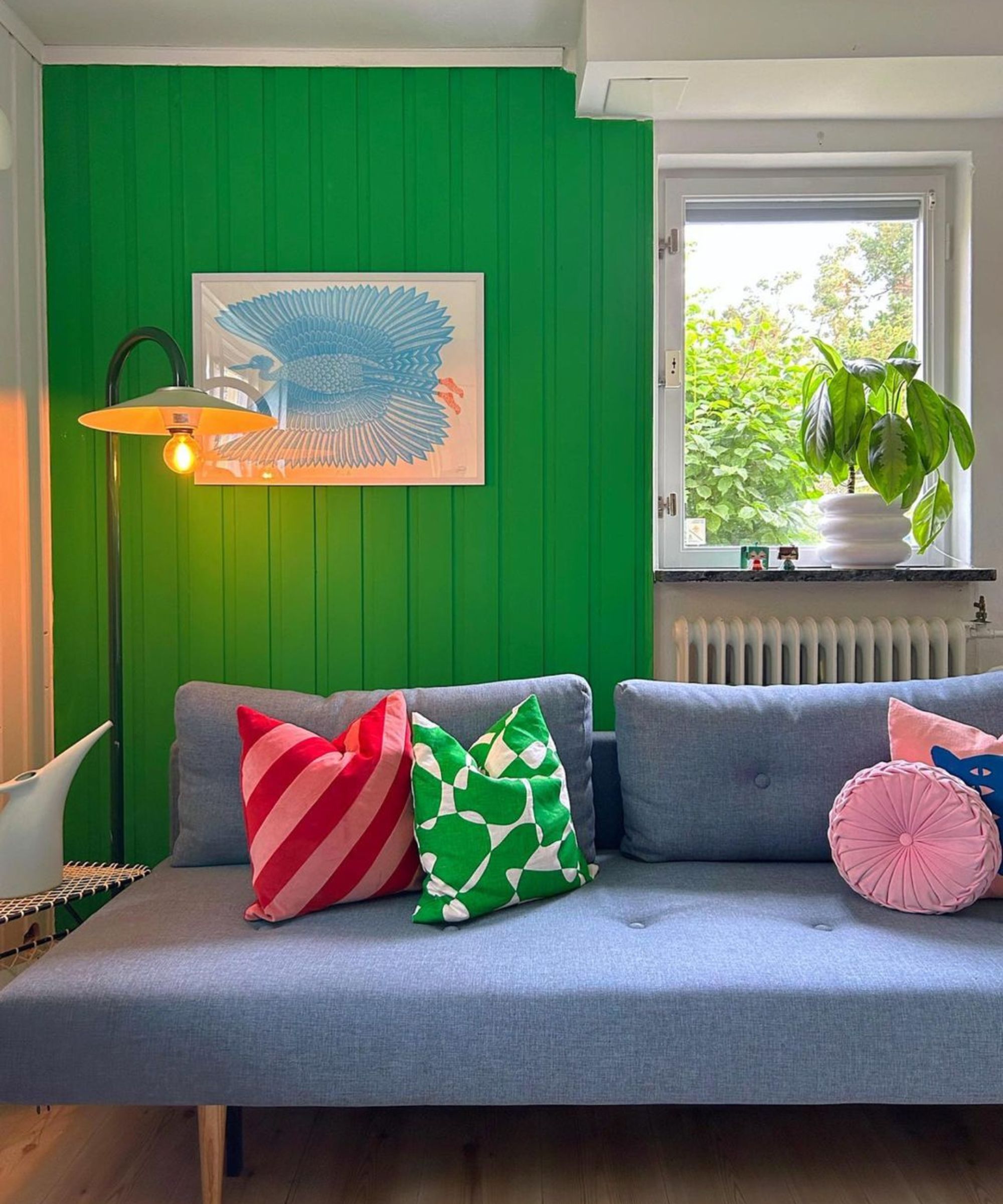
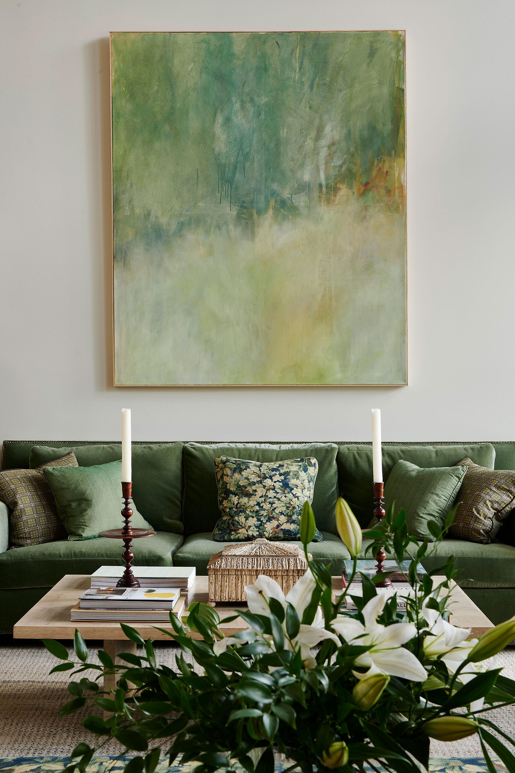
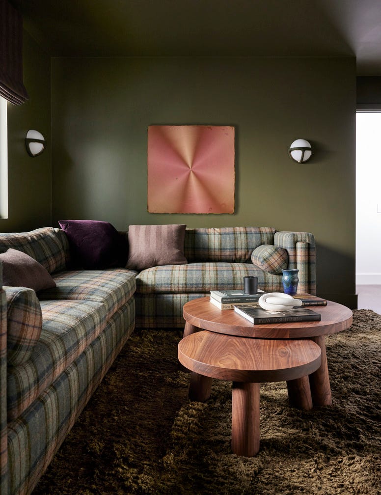
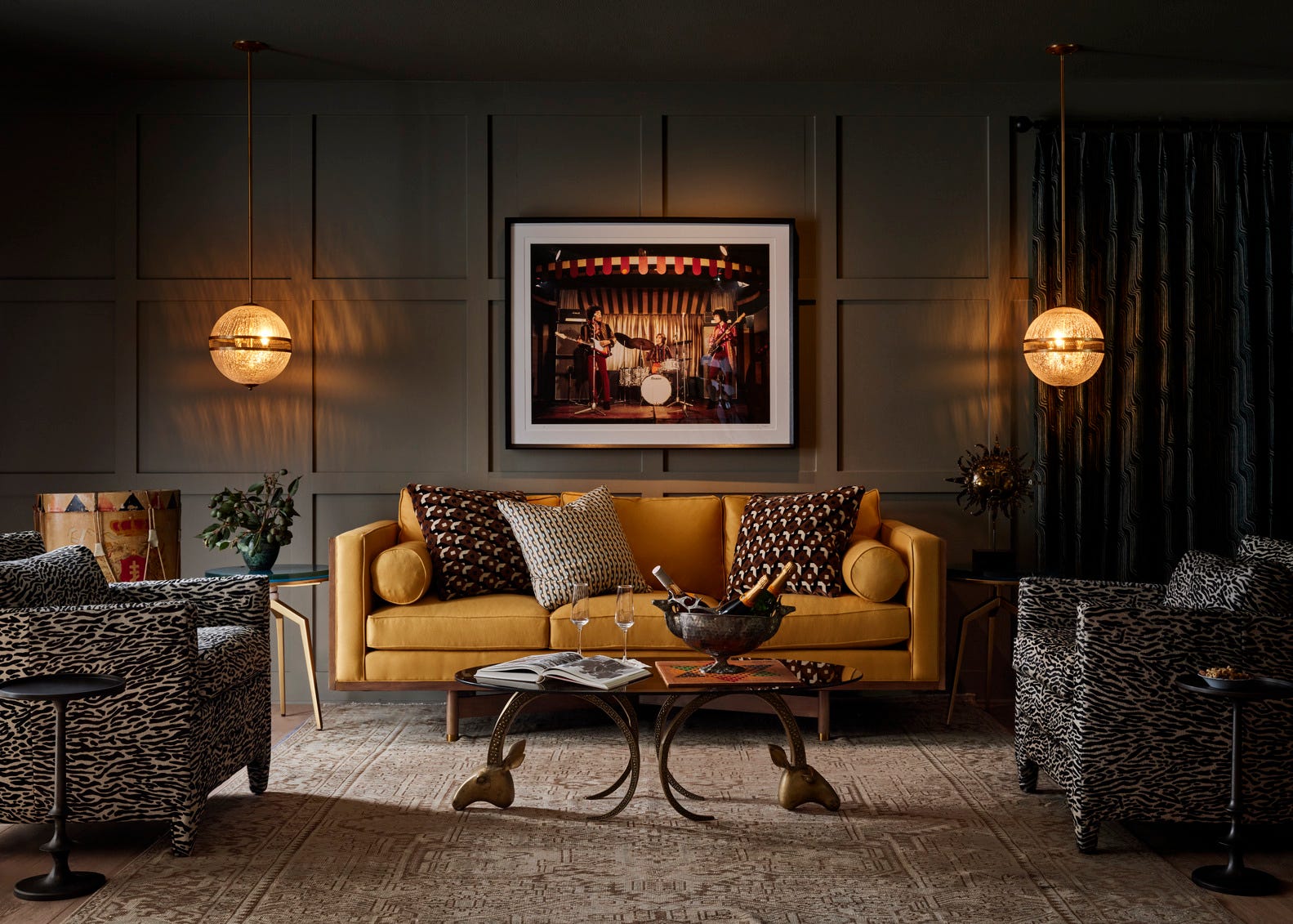
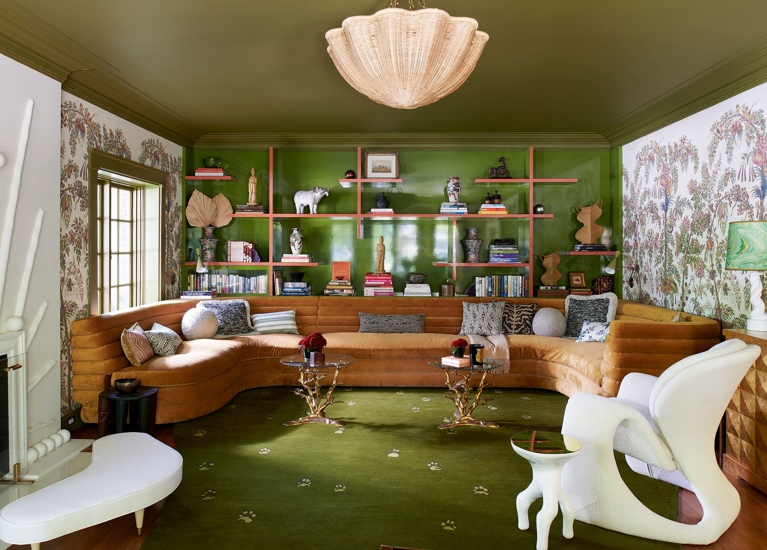

Diana Weinstein, an interior designer and founder of DW Designs, notes a growing client preference for more color. She expresses enthusiasm for 'Rainy Afternoon' by Benjamin Moore, characterizing it as a sage-inspired pine hue with an earthy, dusty, and smoky quality that pairs well with lavenders. Weinstein also recommends 'Studio Green' by Farrow & Ball for an English-inspired feel, noting its application on moldings and coffers can create a traditional look with a modern twist when combined with colors like ivory, blush, and lavender. Furthermore, she highlights 'Salamander' by Benjamin Moore, a dark green, for its ability to make a space feel cozy, luxurious, and moody. Despite common reservations about dark colors making rooms feel smaller, Weinstein argues this hue adds presence and inviting warmth, especially when contrasted with ivory, chunky textured curtain panels.
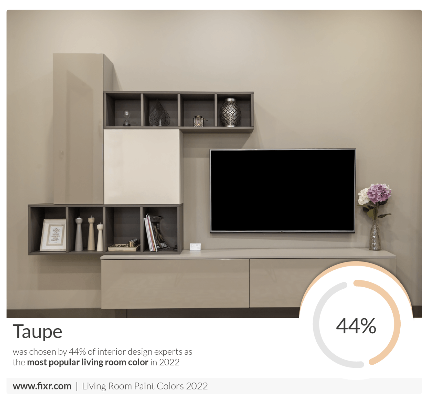
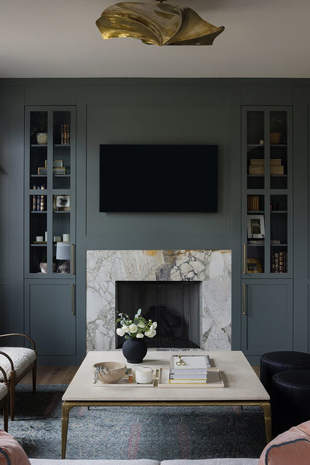
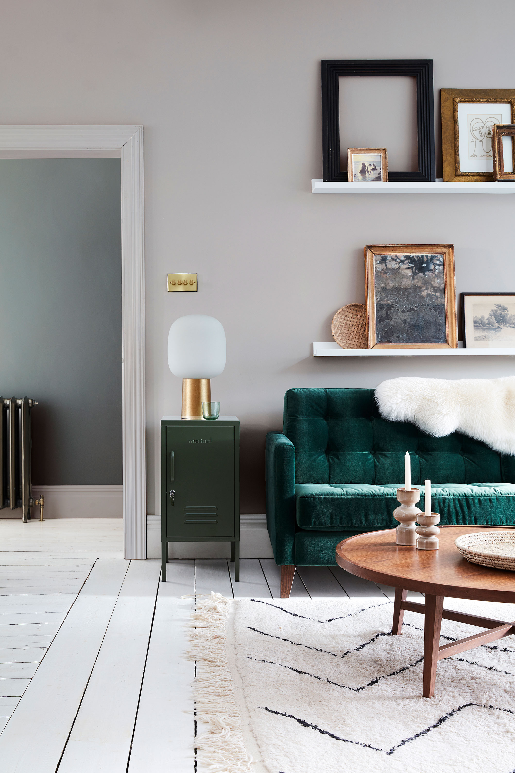
Alessandra Wood, a design expert and VP of Style at Modsy, points to 'Revere Pewter' by Benjamin Moore as a timeless neutral. She describes this classic greige as ideal for a neutral palette that can accommodate both warm and cool tones, making it perfect for those who prefer not to have white walls but are also averse to bold colors. Wood also praises 'Evergreen Fog' by Sherwin-Williams, noting its soft and serene qualities provide a rich, earthy backdrop without being overwhelming. She states that this cool-toned hue fosters a sense of calm in the living room.
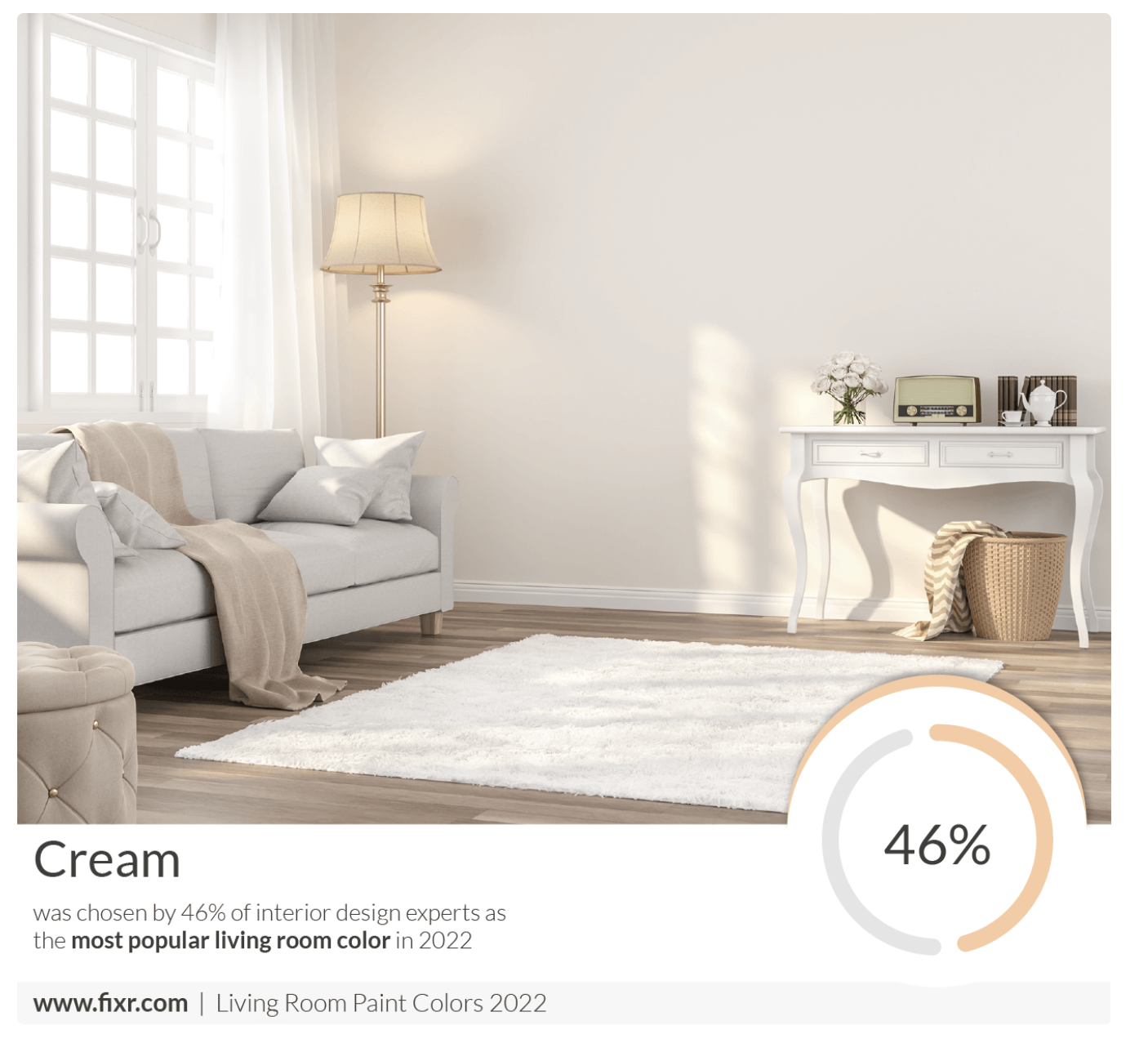
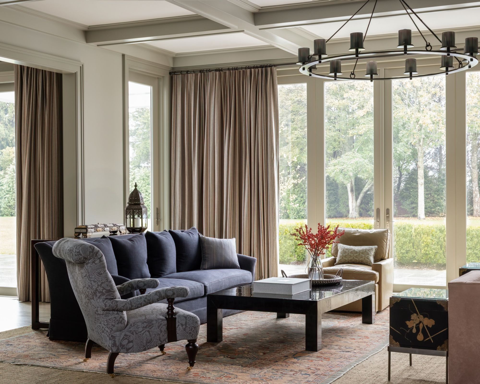
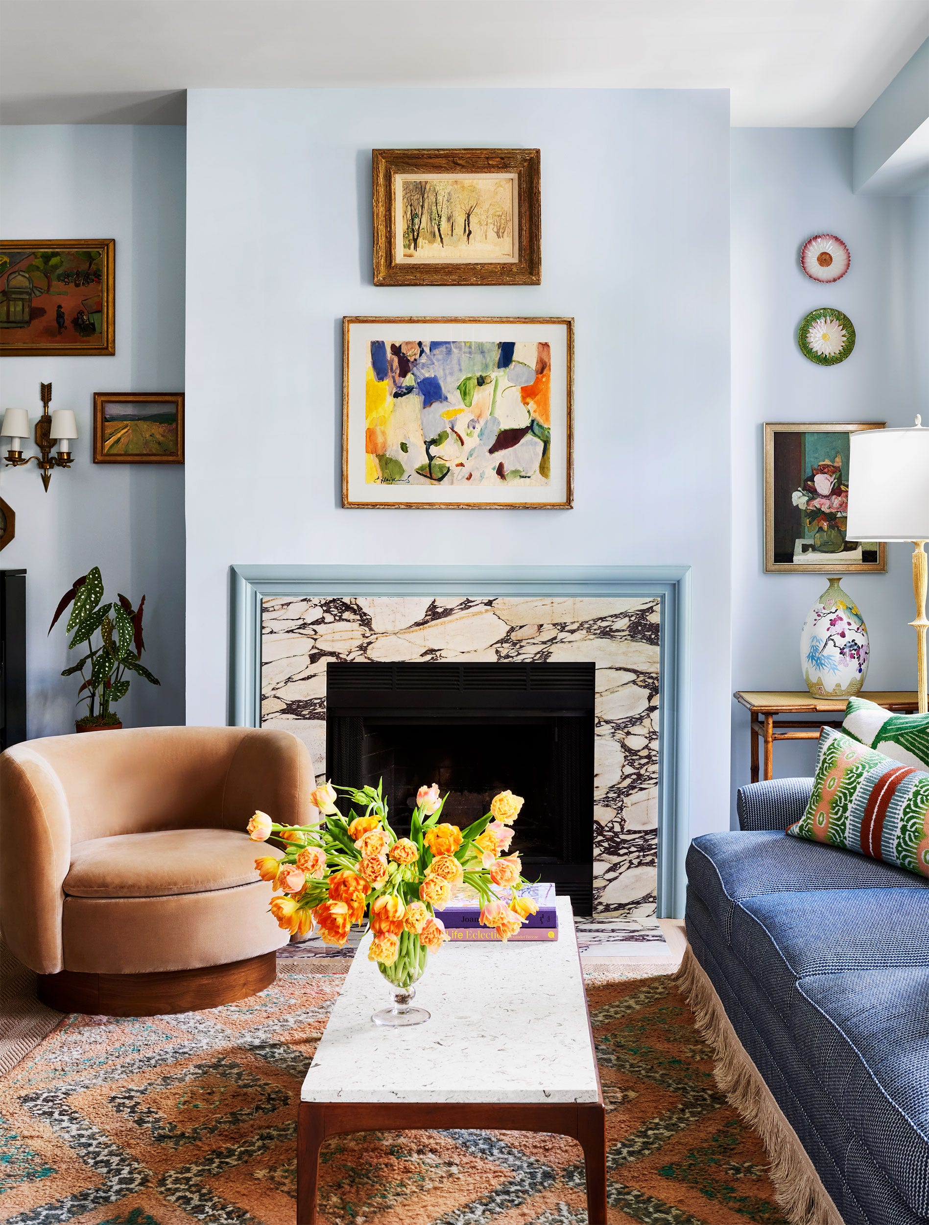
Andrea Magno, Director of Color Marketing and Development at Benjamin Moore, suggests 'Collector's Item' by Benjamin Moore. This creamy white is lauded for its welcoming softness and extreme versatility, allowing it to complement a wide array of decor styles. Magno also recommends 'Edgecomb Gray' by Benjamin Moore, describing it as an ideal neutral that perfectly balances warm and cool tones. Its flexibility makes it suitable for styles ranging from modern to traditional, and its neutral base allows for the introduction of other colors, making it a great option for open-concept floor plans.
#LivingRoomDesign #PaintColors #InteriorDesign #HomeImprovement #DecoratingTips #NeutralColors #GreenPaint #DesignExpertAdvice #LivingRoomDesign #PaintColors #InteriorDesign #HomeImprovement #DecoratingTips #NeutralColors #GreenPaint #DesignExpertAdvice
0 comment in total
 No comments yet
You may also like
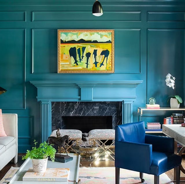
Listen Up: These Are the Best Paint Colors for Your Living Room

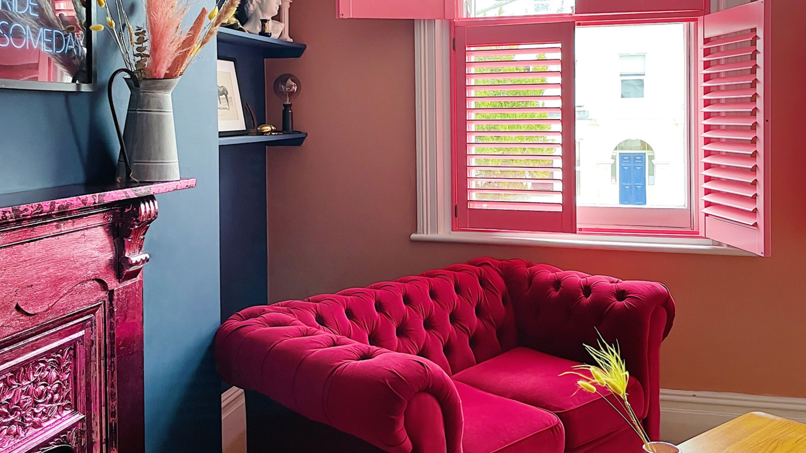
The best paint colors for small living rooms, according to design experts

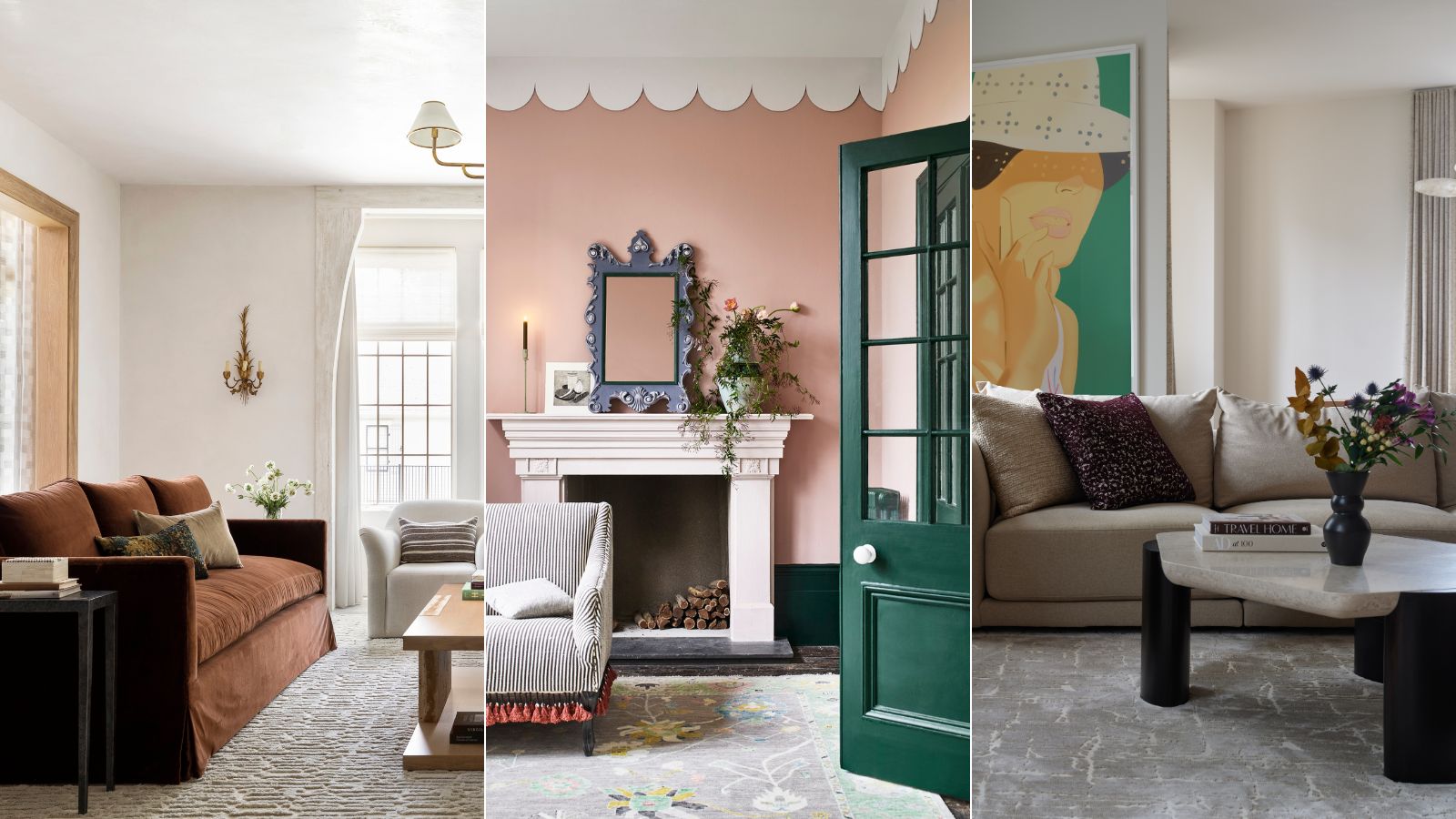
These are interior designers' favorite color combinations for living rooms – from neutral and calming to bold and playful
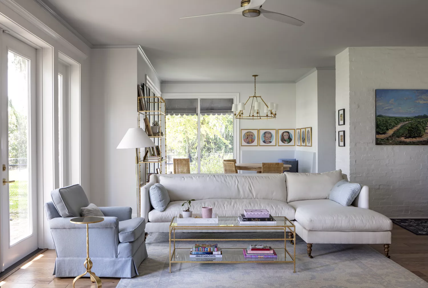
8 Calming Paint Colors Designers Use to Create a Warm, Welcoming Living Room

Experts reveal the best living room paint colours to transform every space

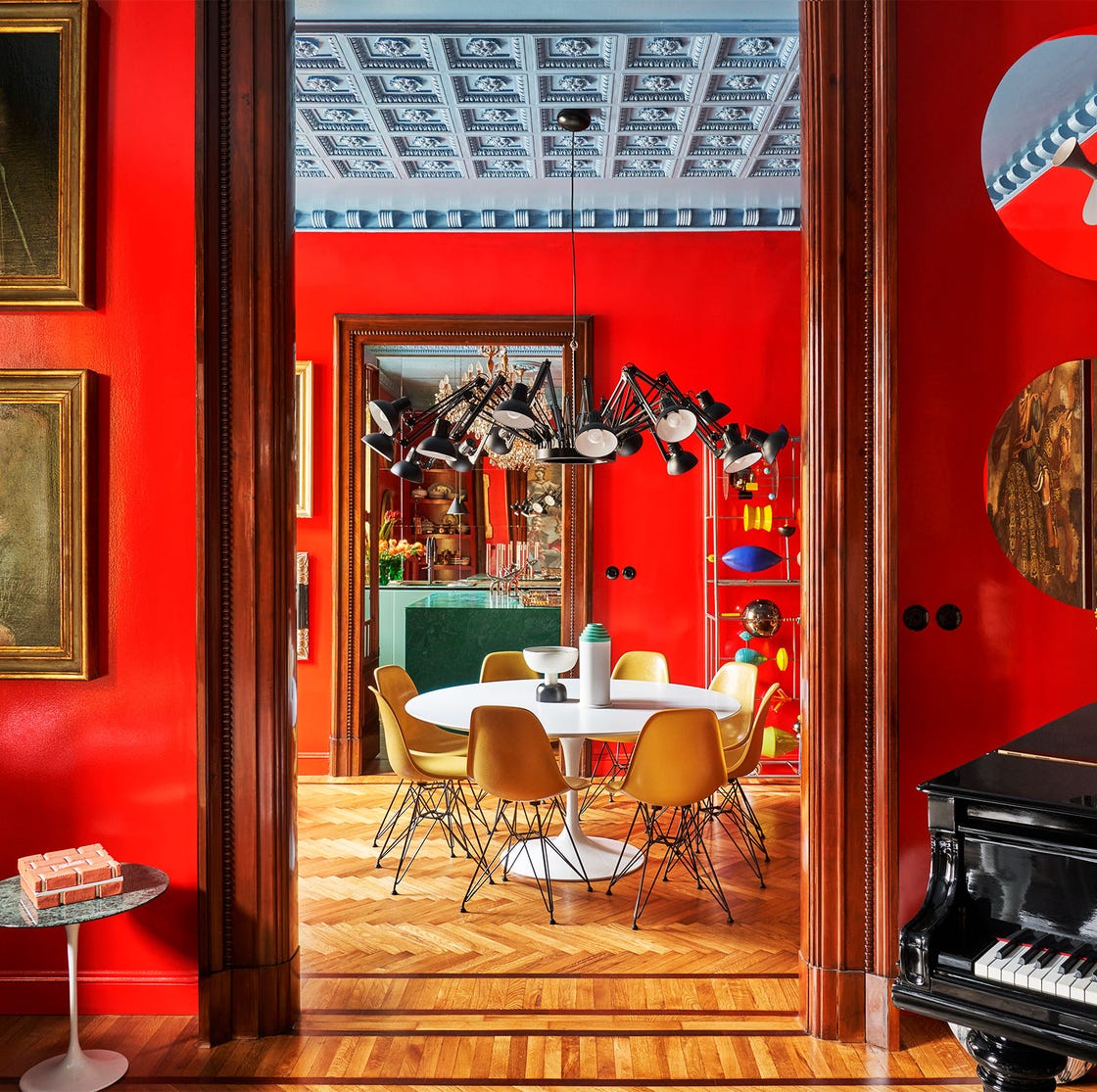
55 Living Room Color Ideas That Will Take Your Space from Drab to Fab

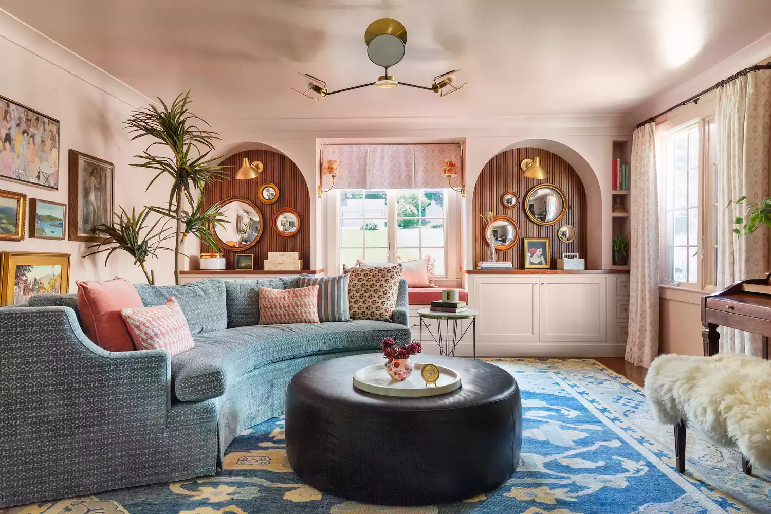
The 15 Best Paint Colors for Your Living Room, According to Interior Designers
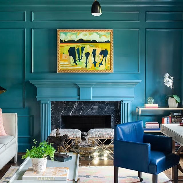
The 60 Most Popular Living Room Paint Colors Right Now
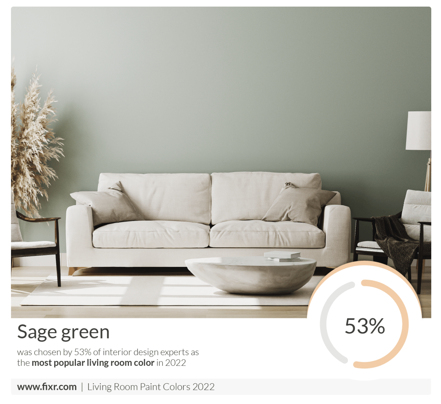
7 Popular Paint Colors for the Living Room
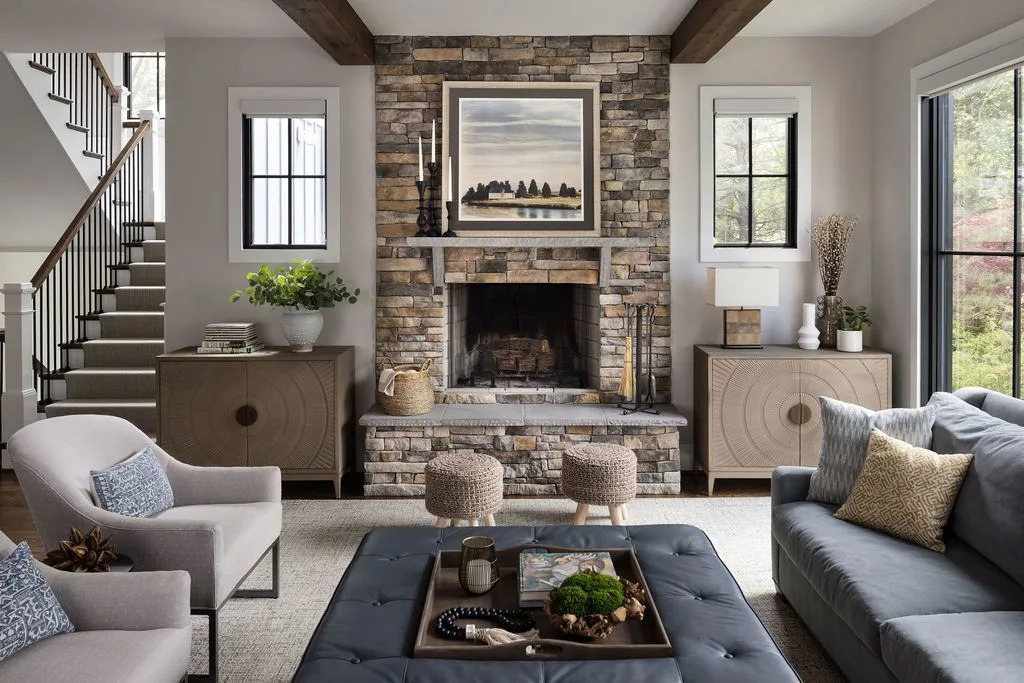
The Best Living Room Paint Colors, According To Designers

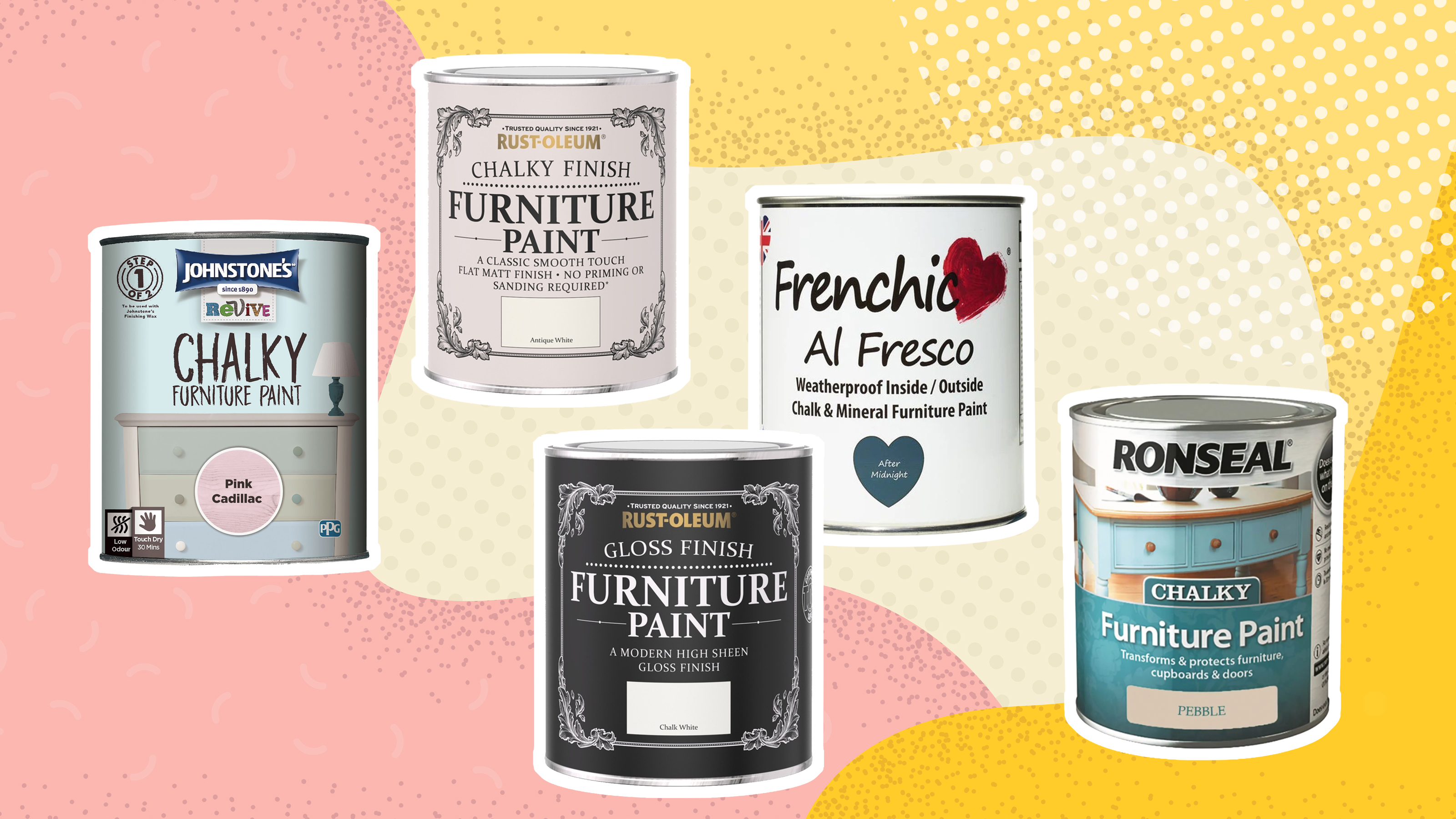
Best paint for furniture: 8 best furniture paints
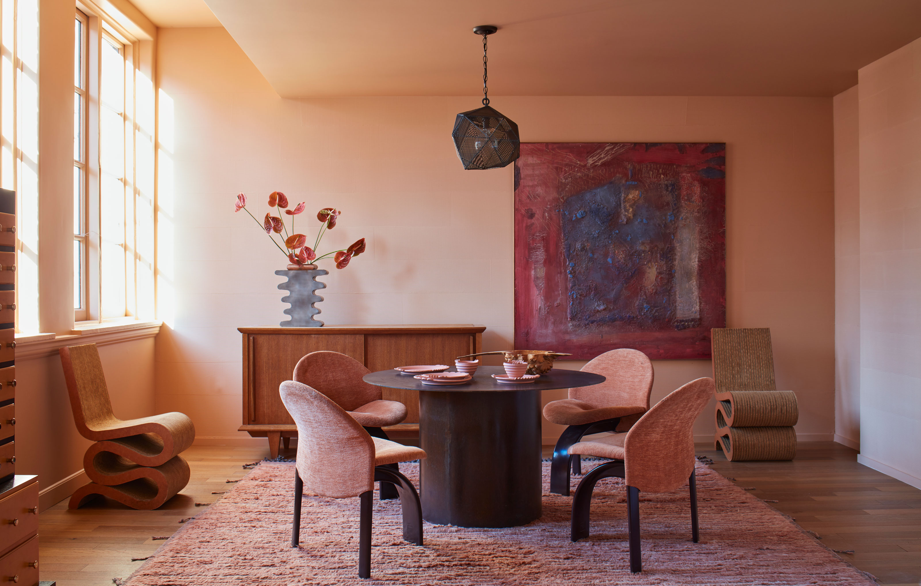
Paint color ideas for every room – experts explain the best choices for different spaces

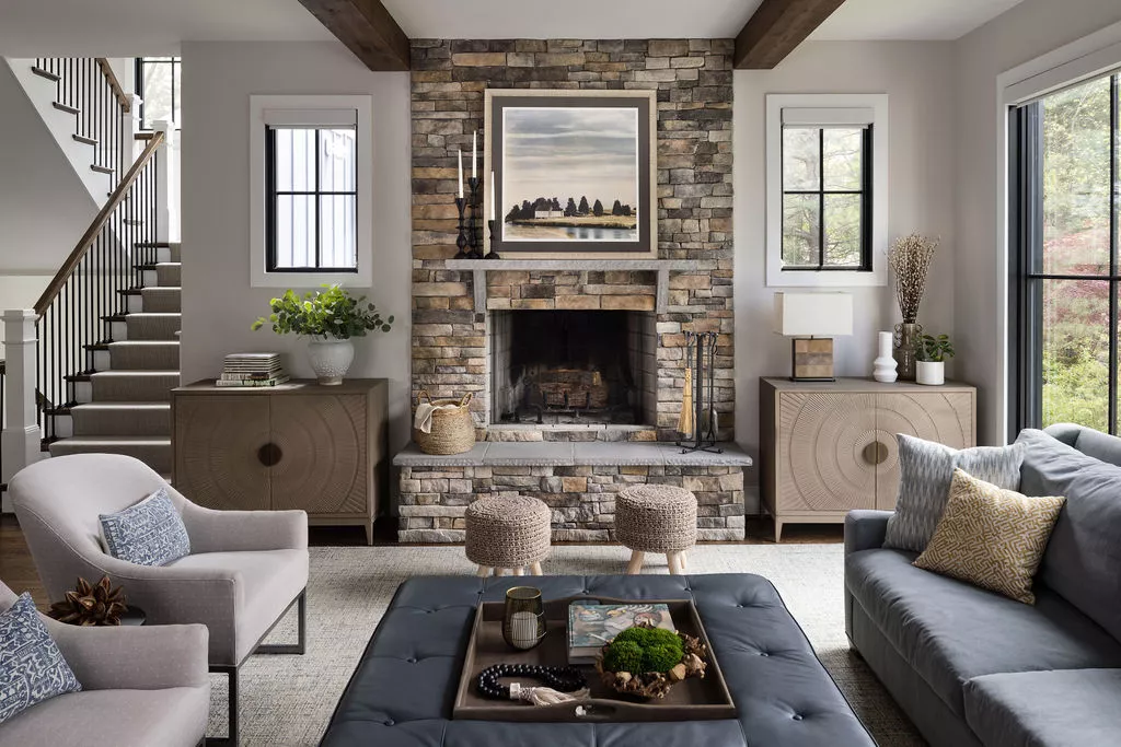
The Best Living Room Paint Colors, According To Designers

10 Timeless Living Room Paint Colors Designers Swear By

8 Favorite Paint Colors of Local Interior Designers

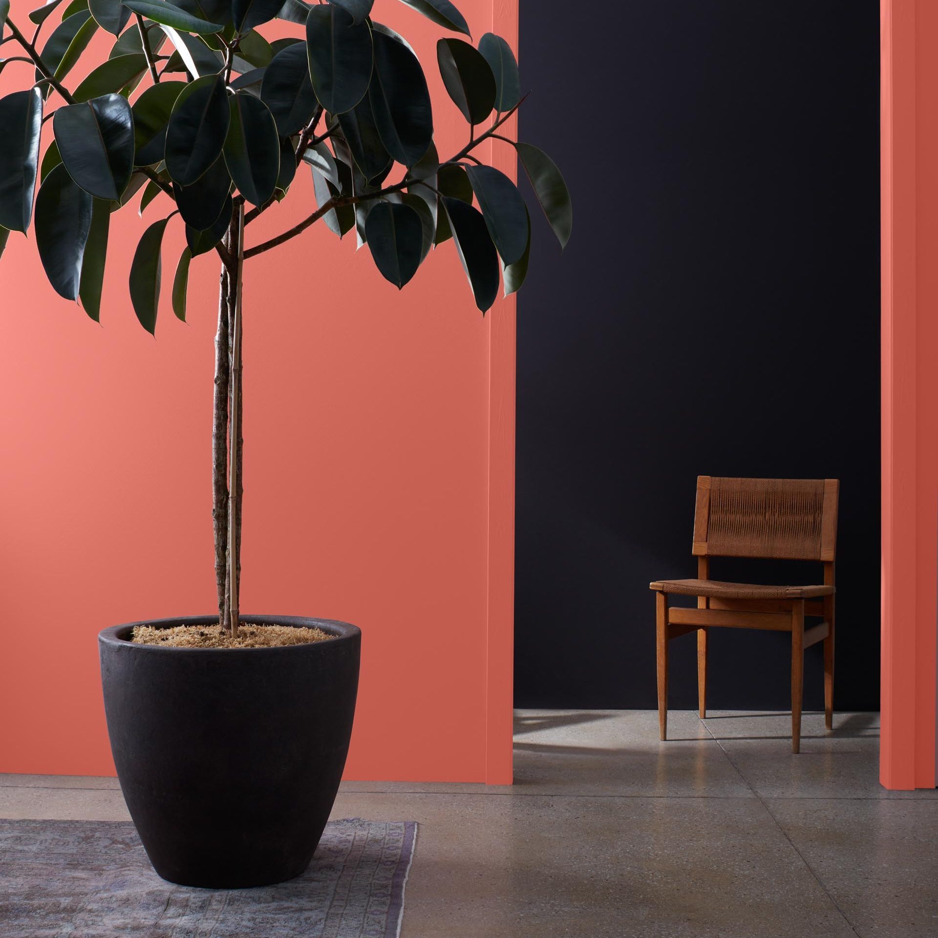
9 Best Interior Paint Colors

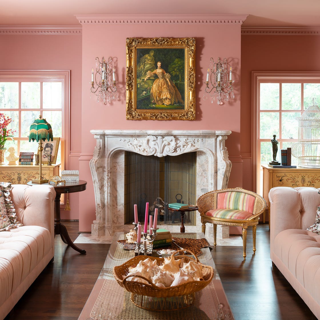
Designer-Approved Living Room Colors That'll Make You Feel Happier

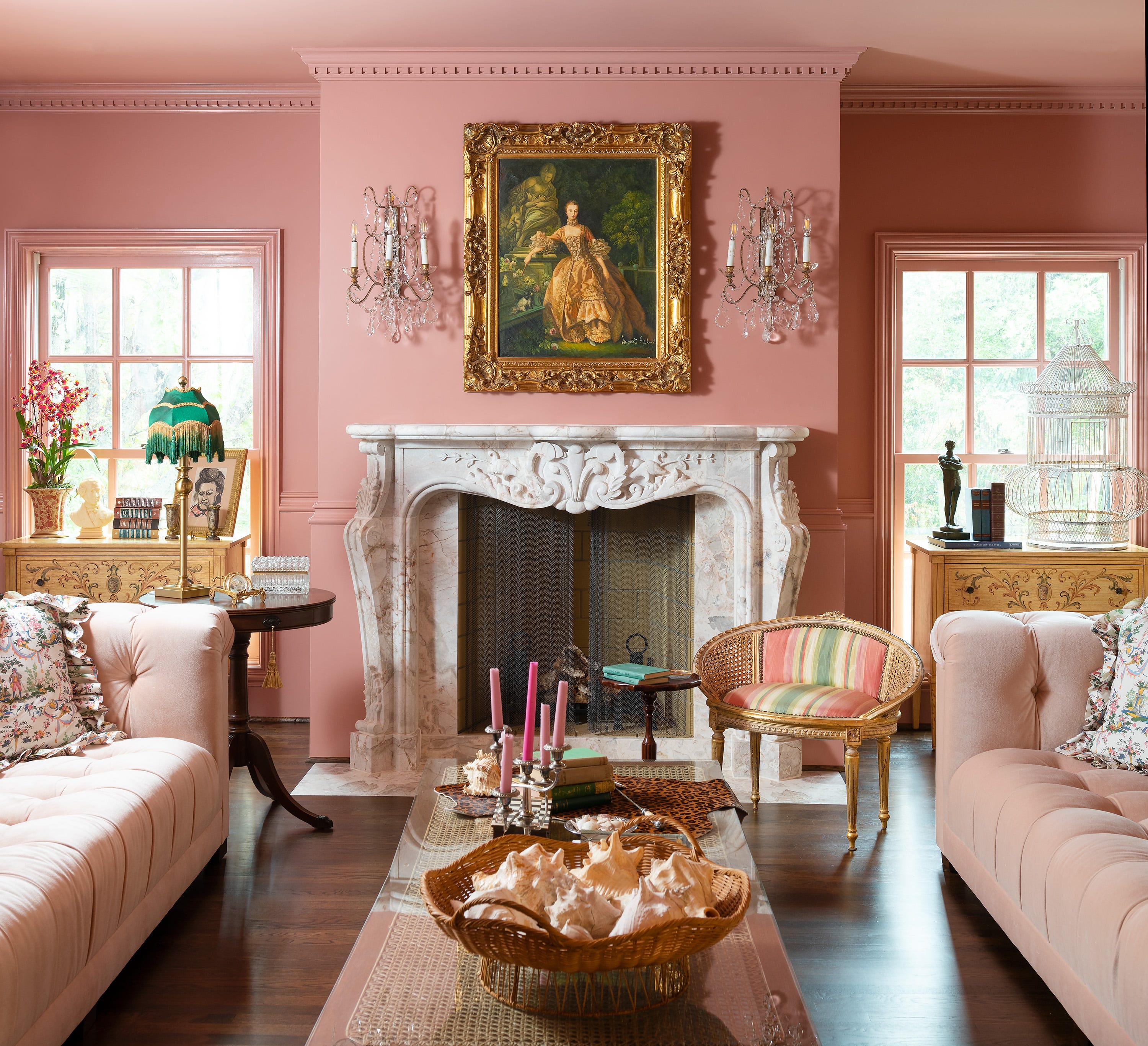
Jewel Tones Are Trending for Living Room Paint Colors, According to Designers
These Living Room Paint Colors Are a Total Mindset Shift
The 3 All-Time Worst Living-Room Paint Colors, According to Designers