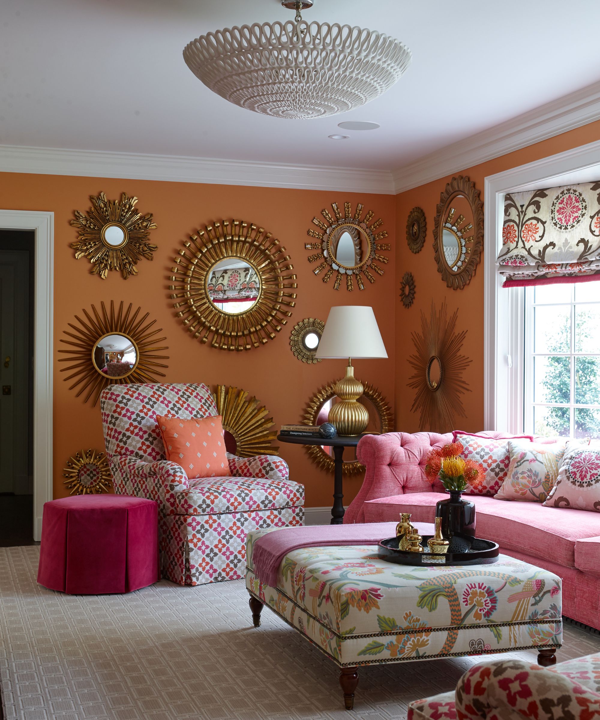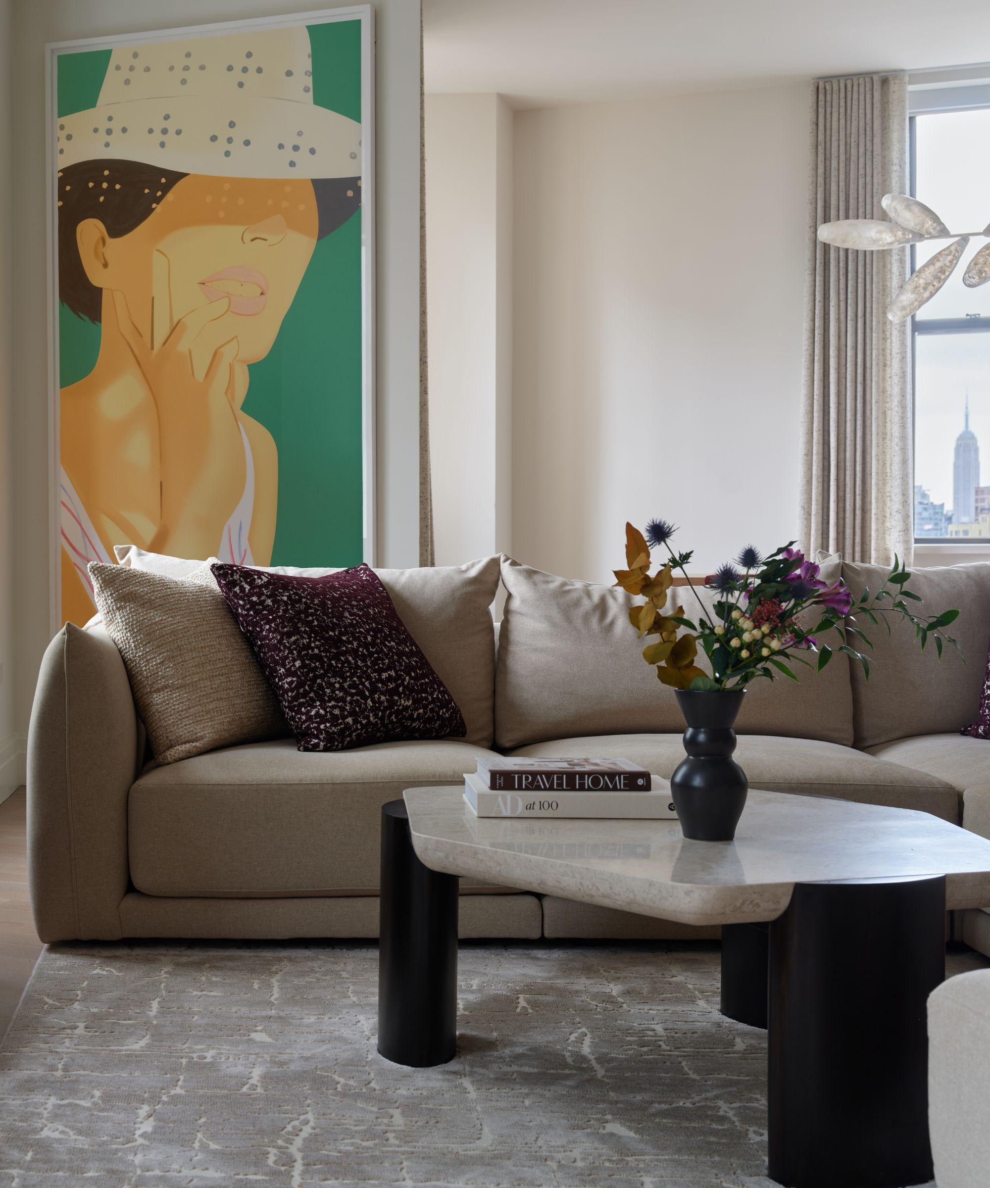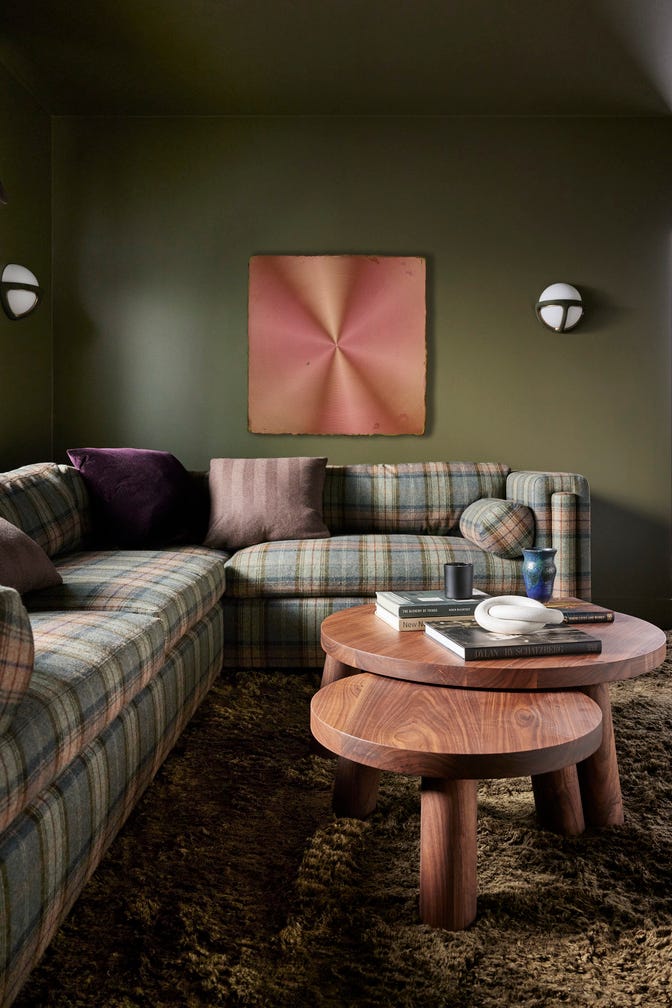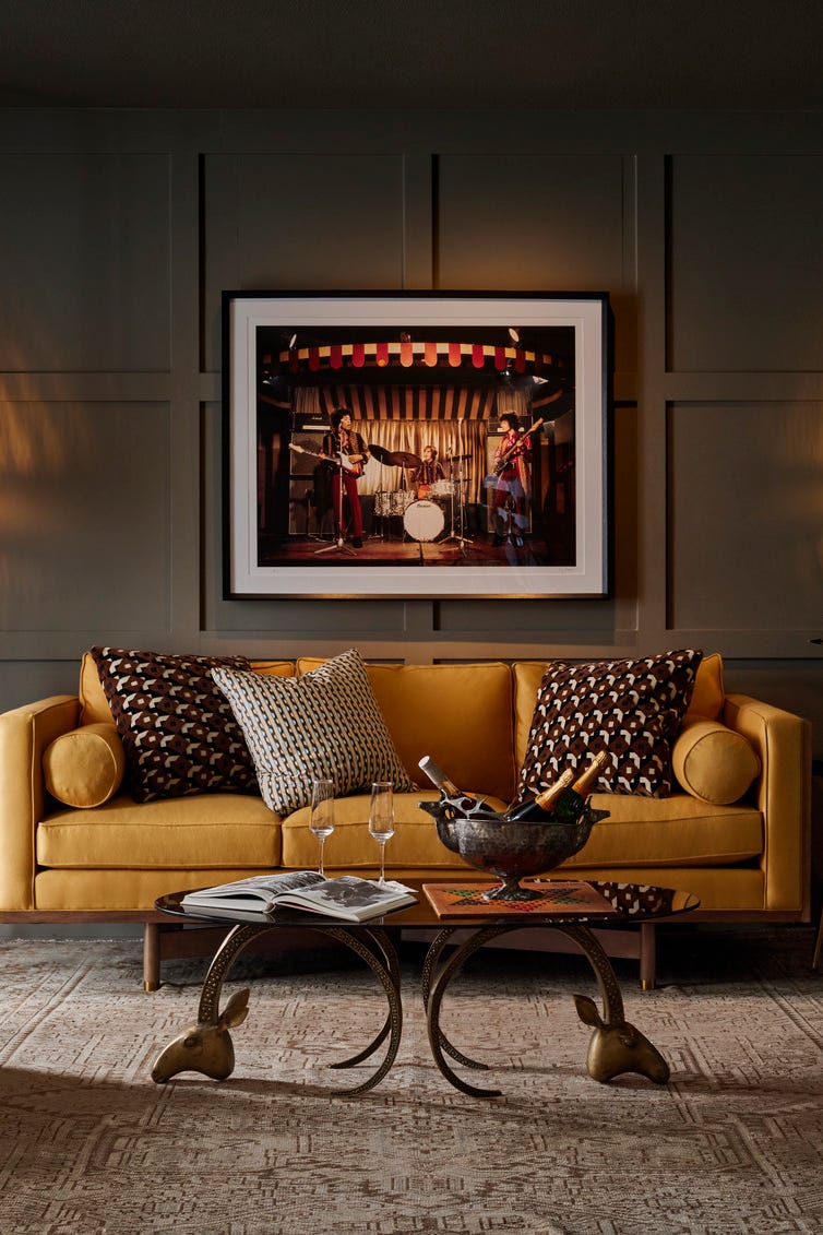
The Best Living Room Paint Colors, According To Designers
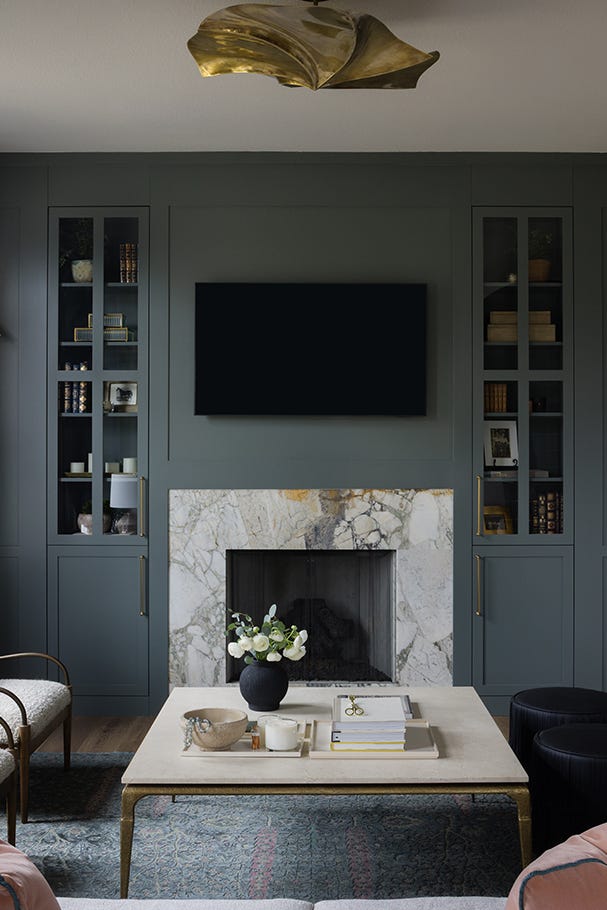
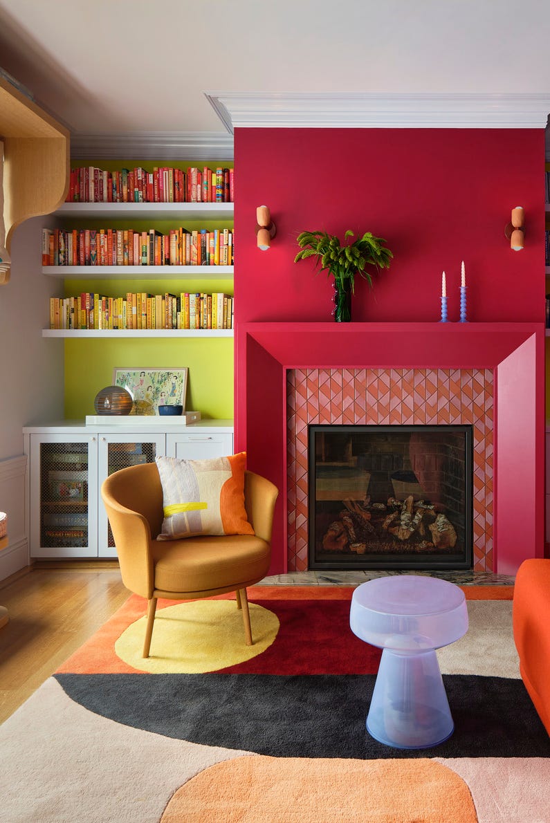
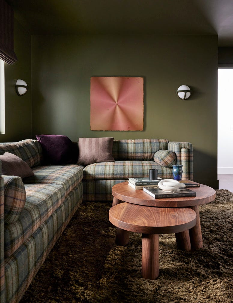
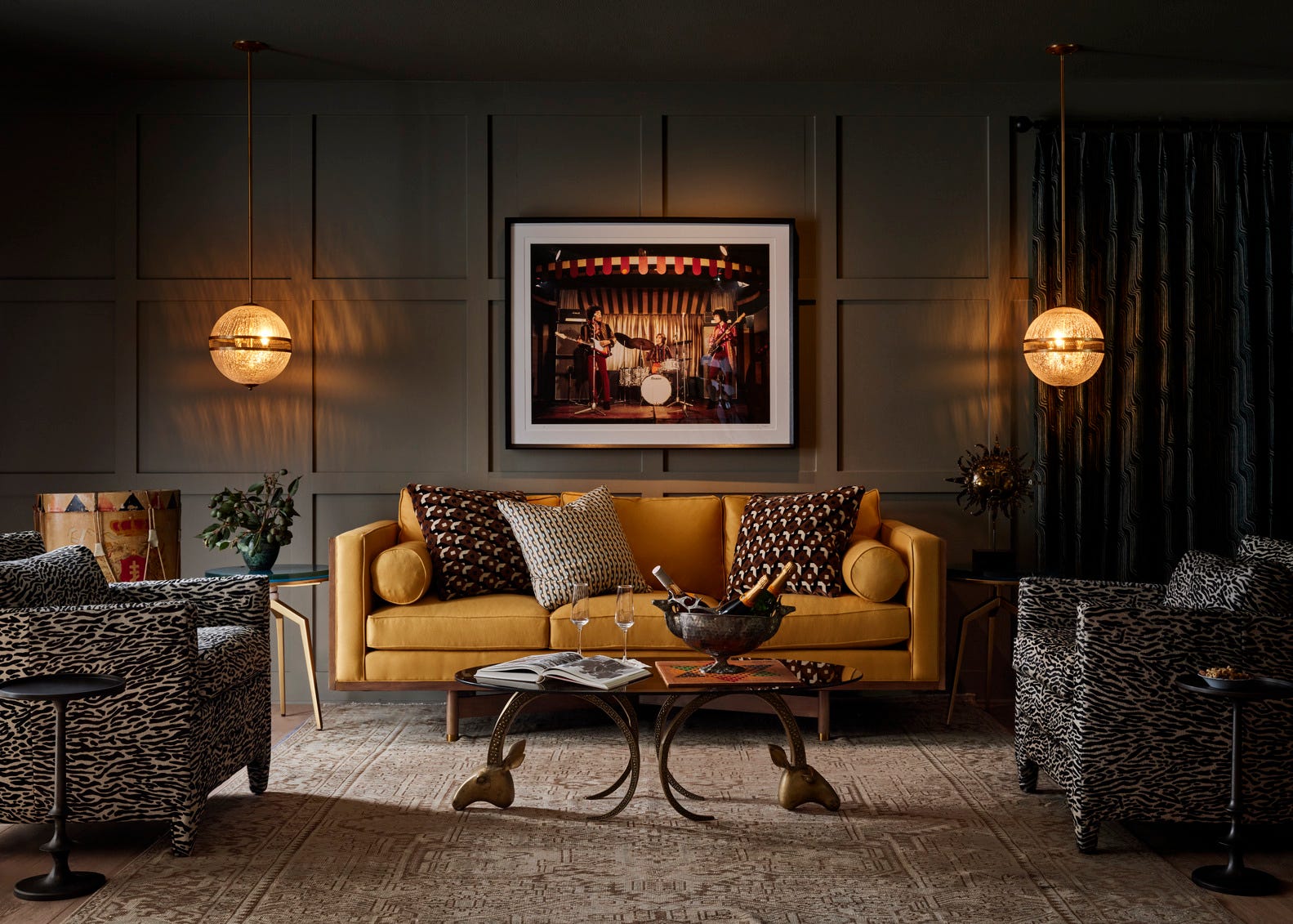
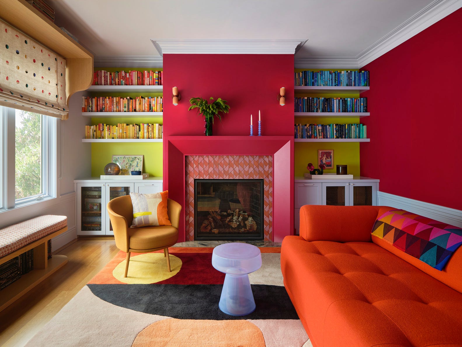
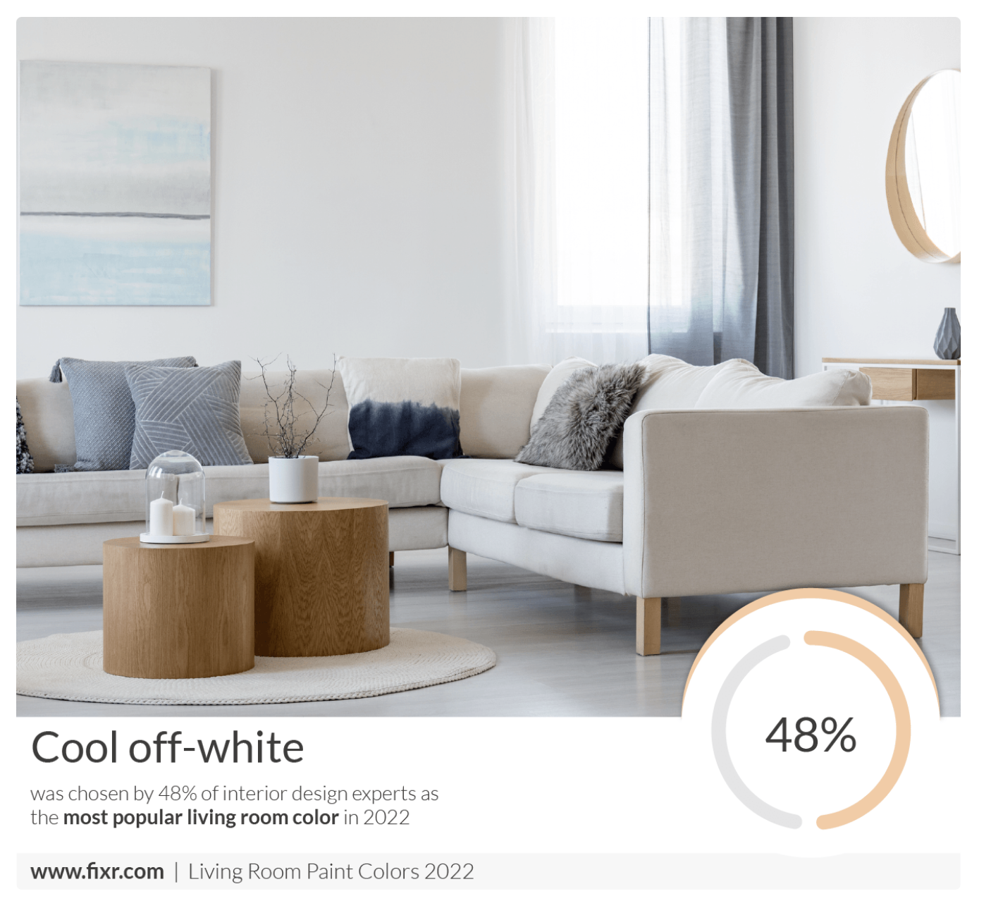
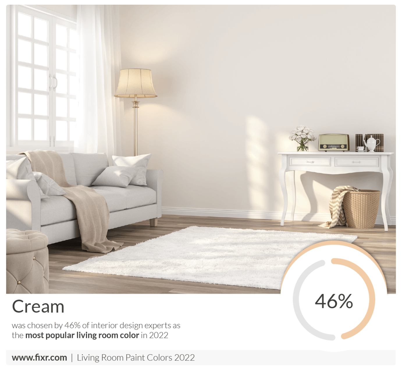
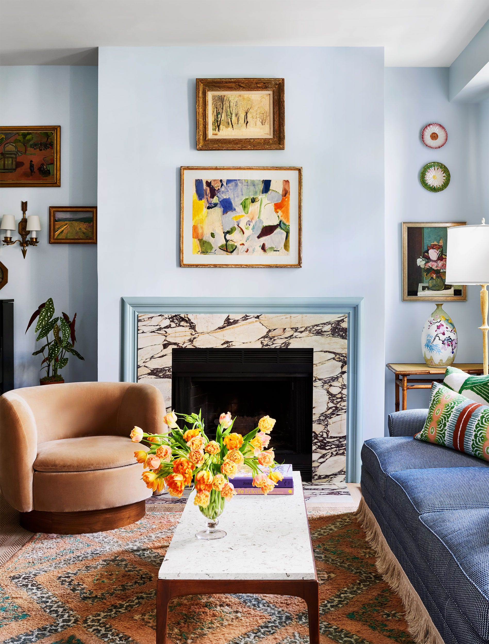
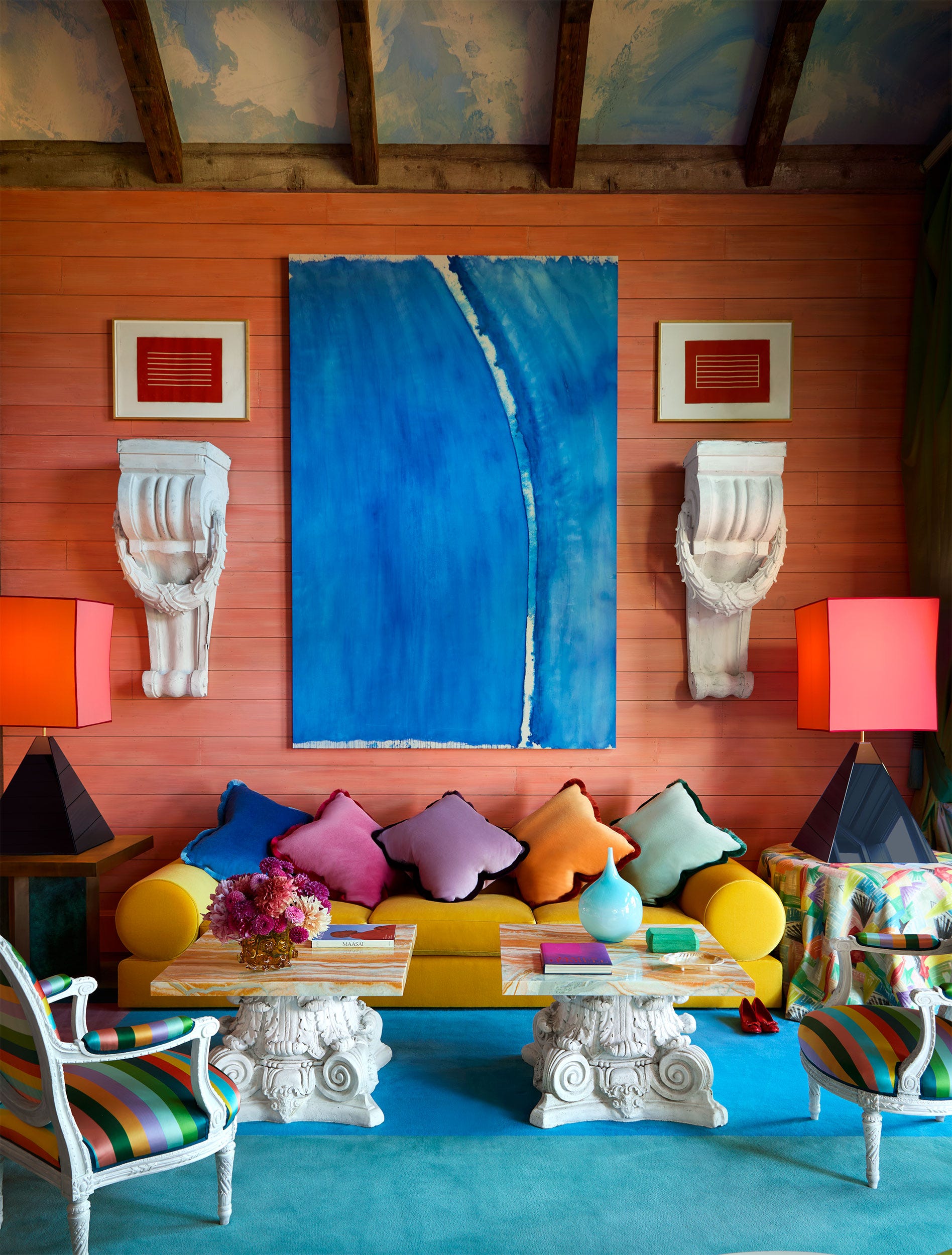
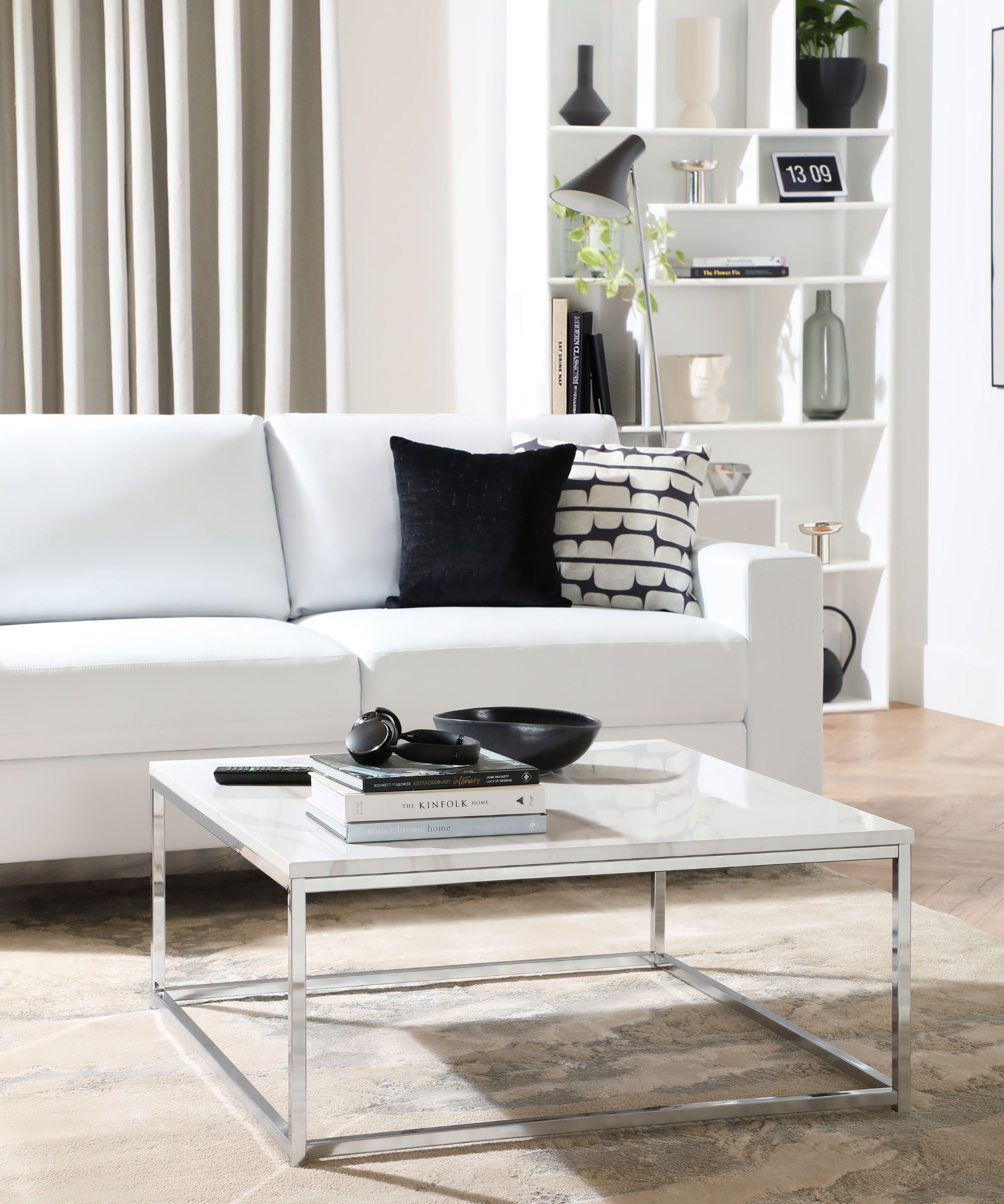
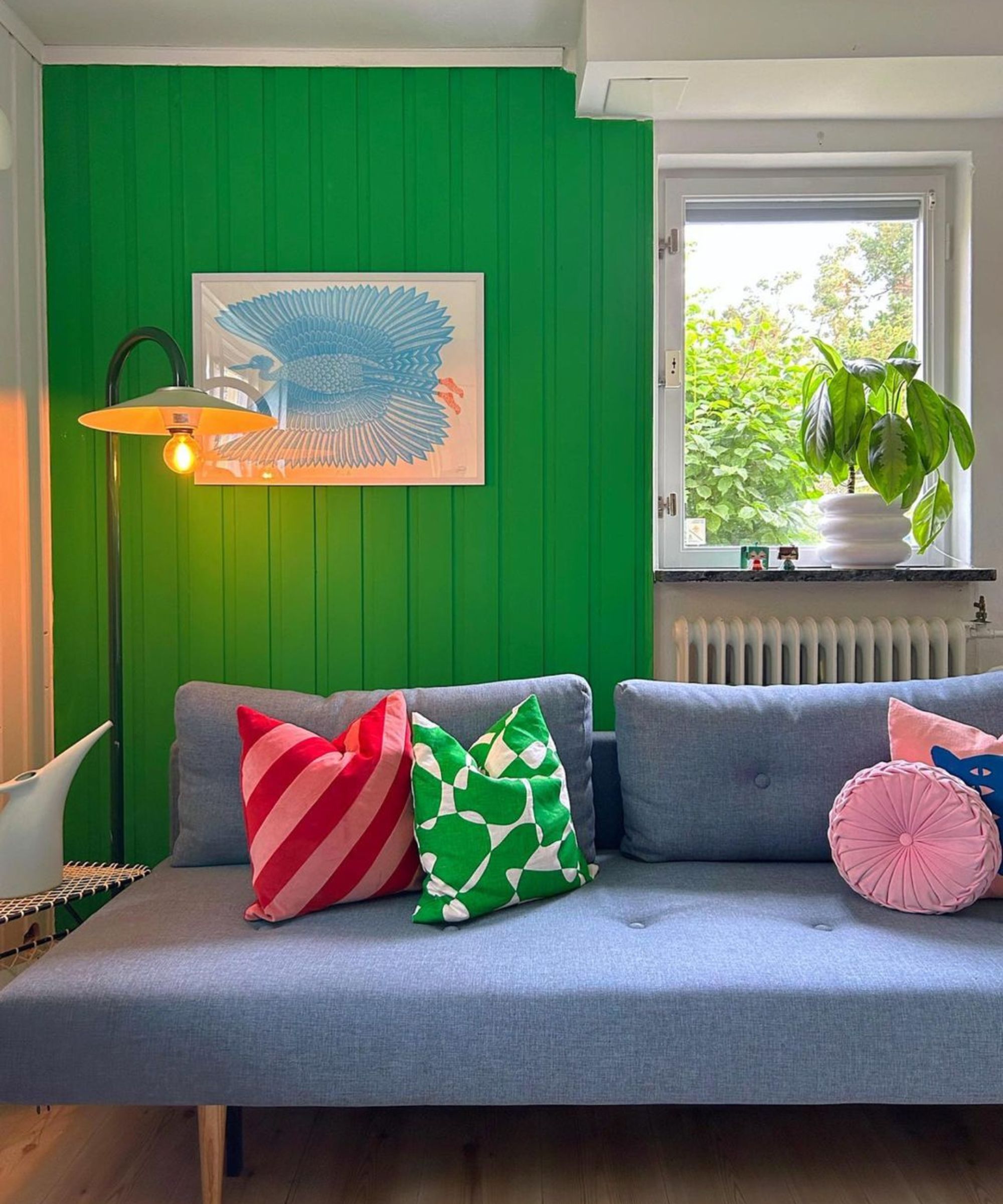
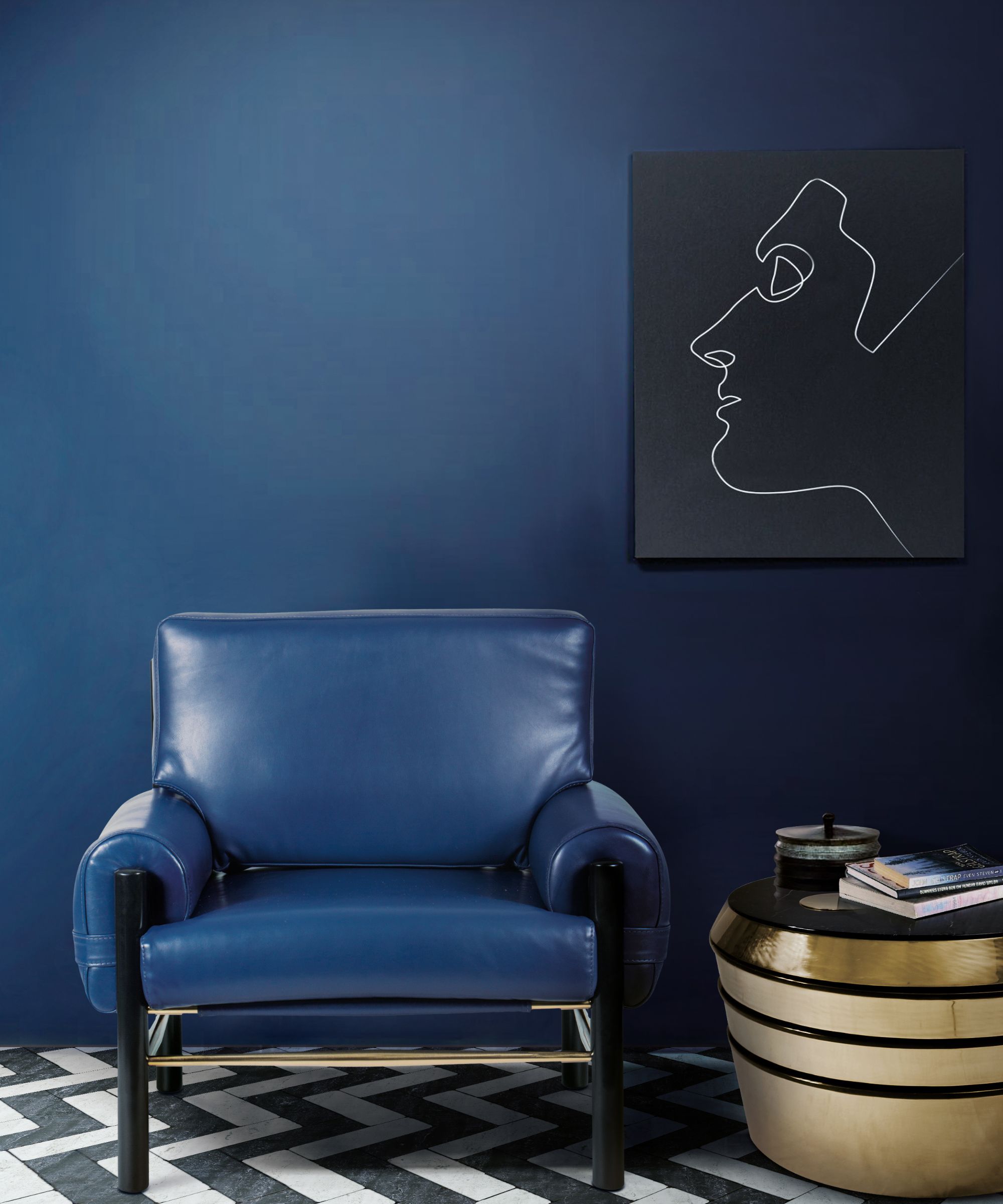
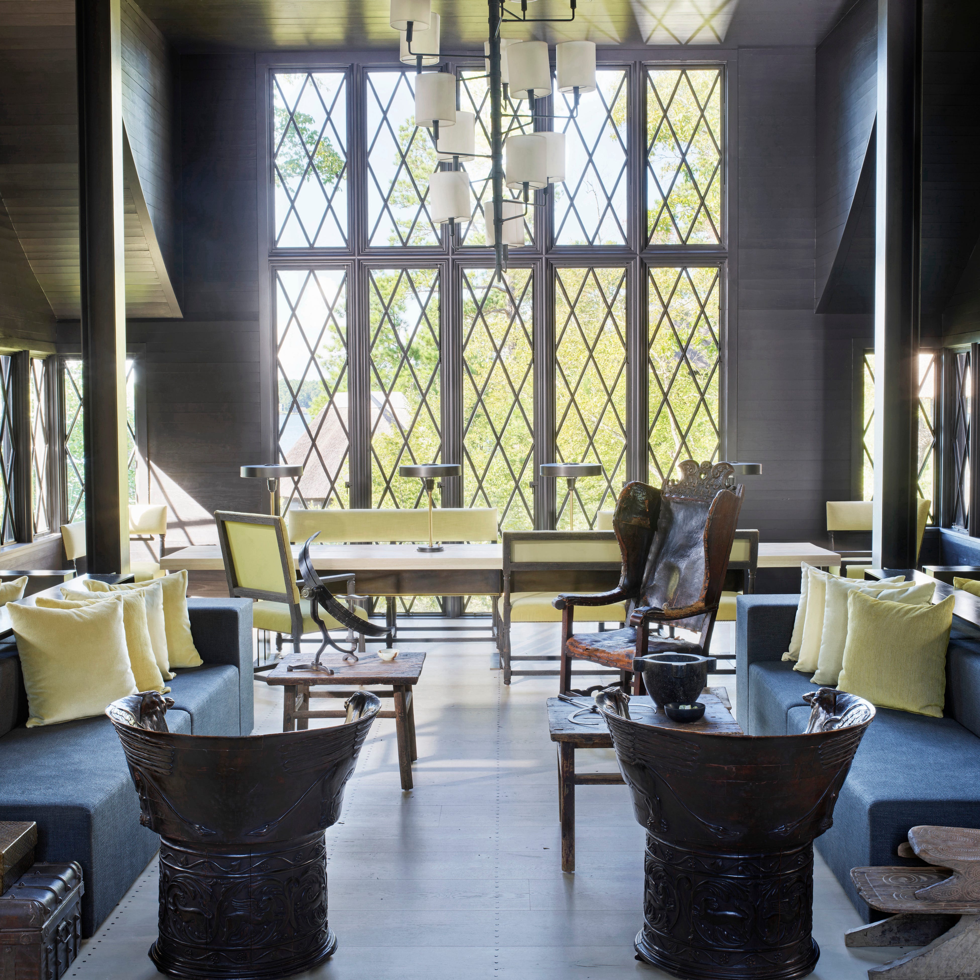
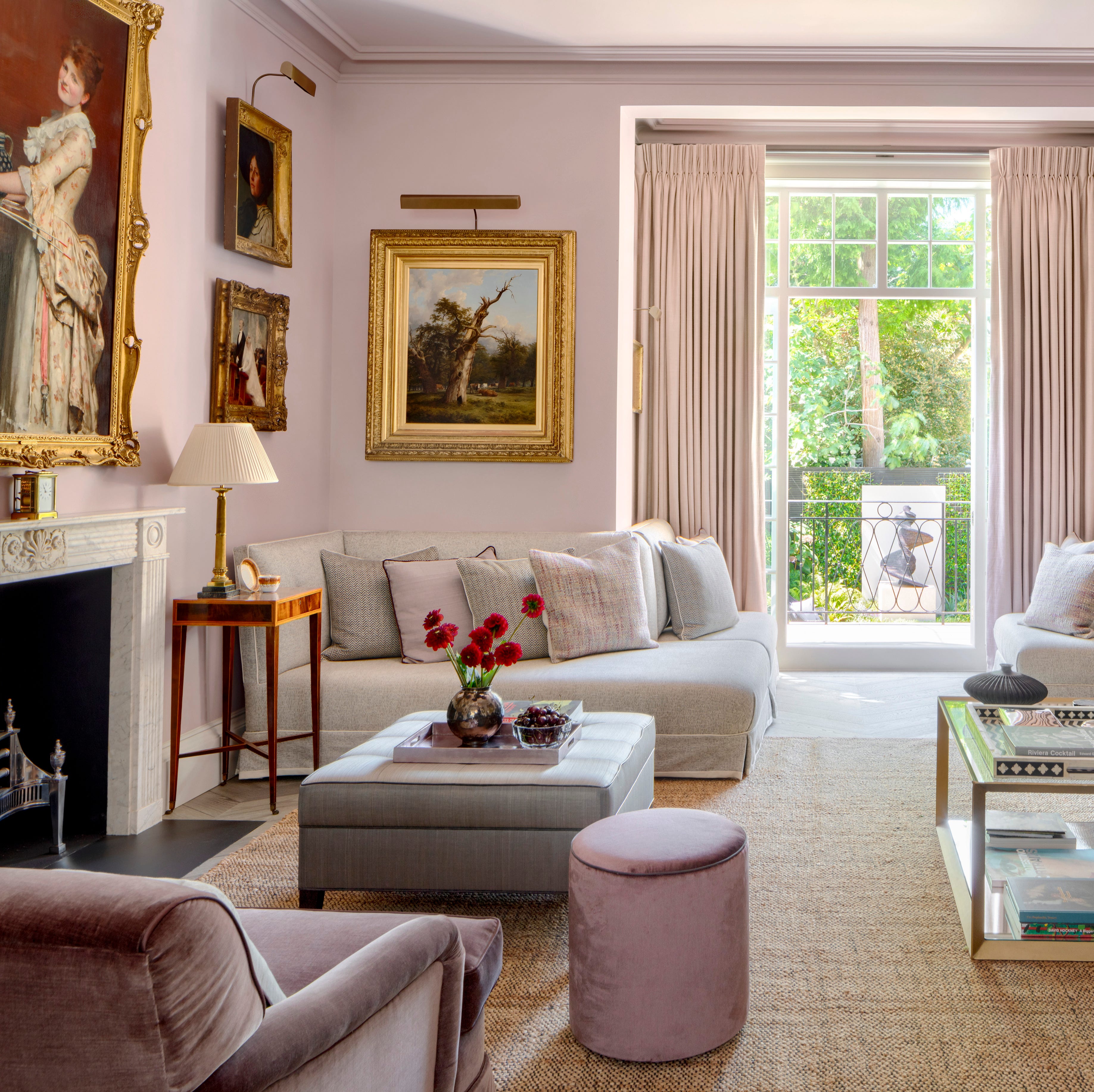
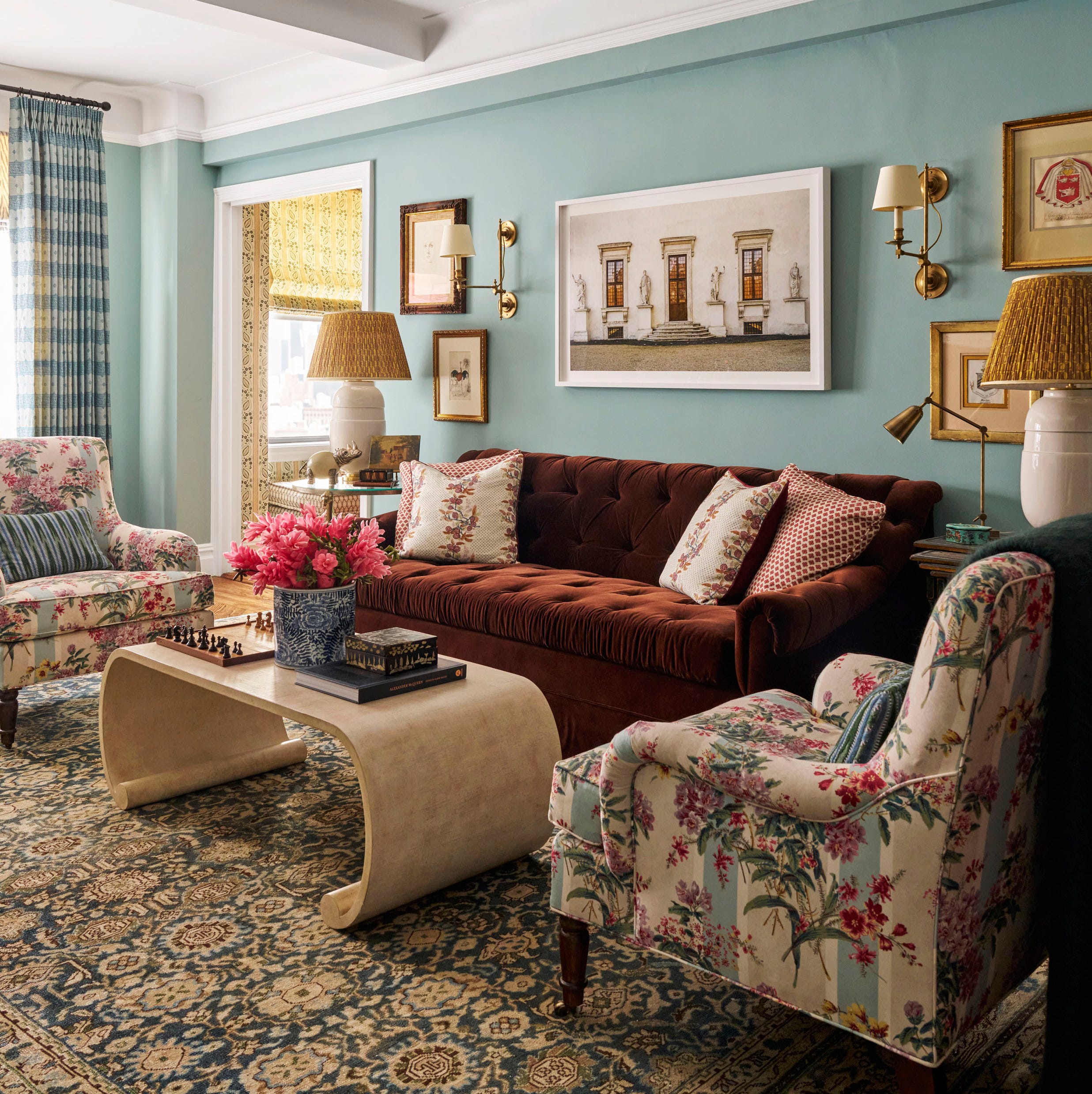
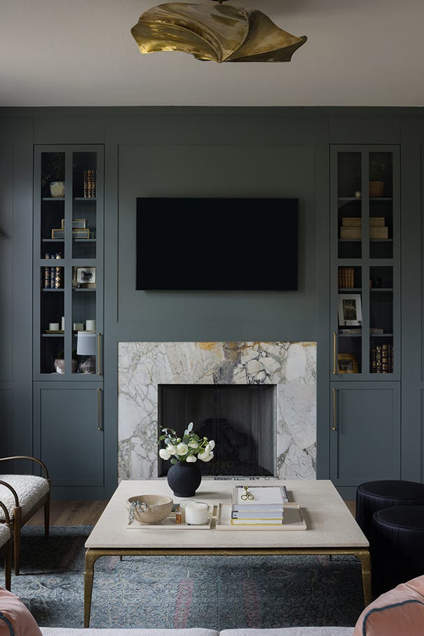
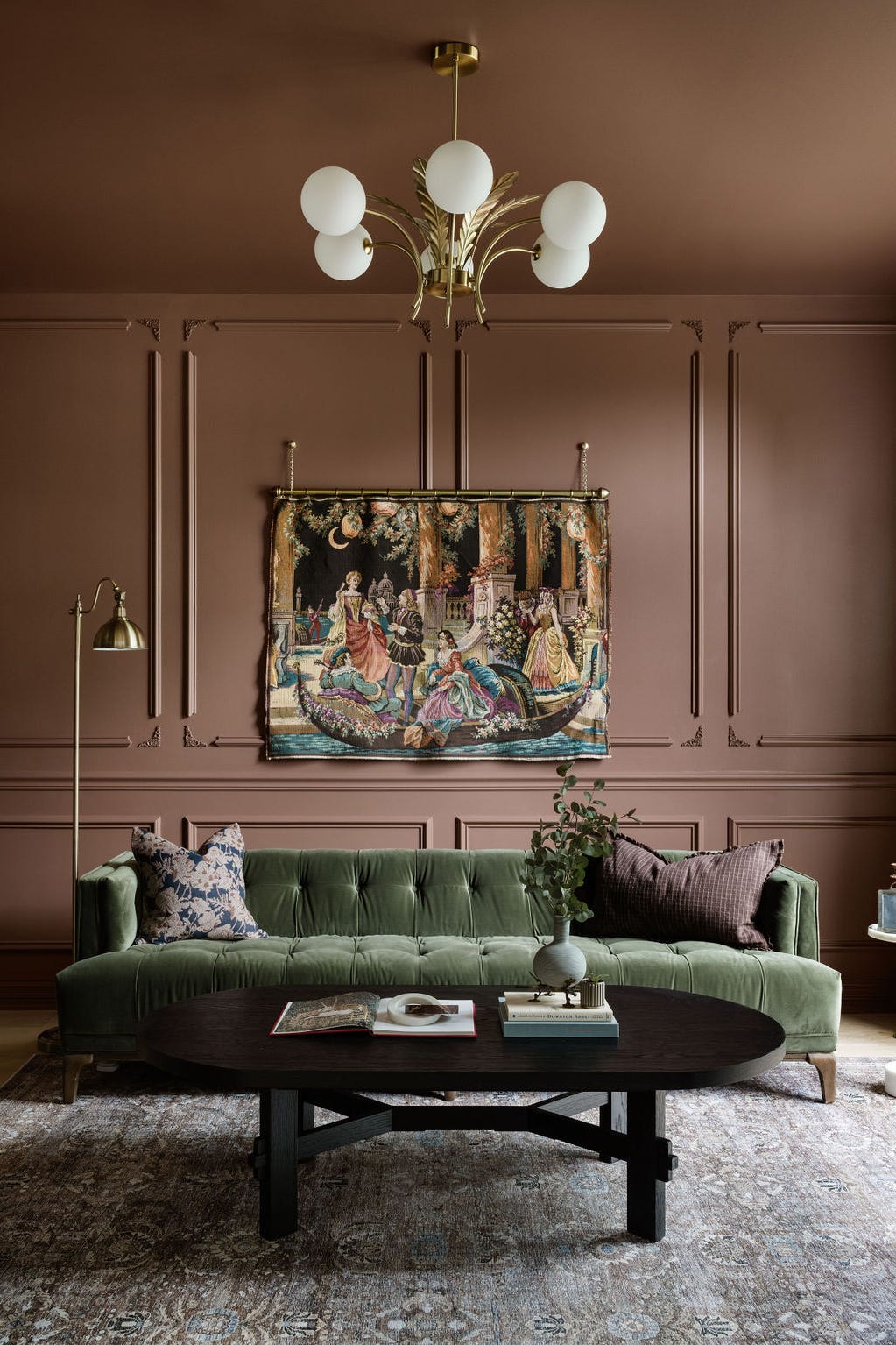
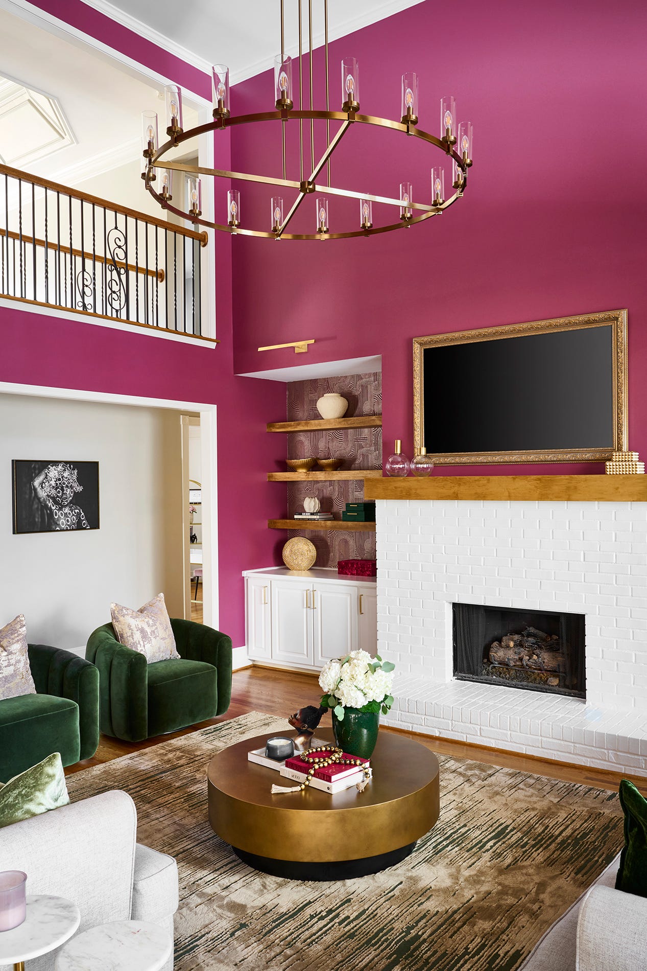
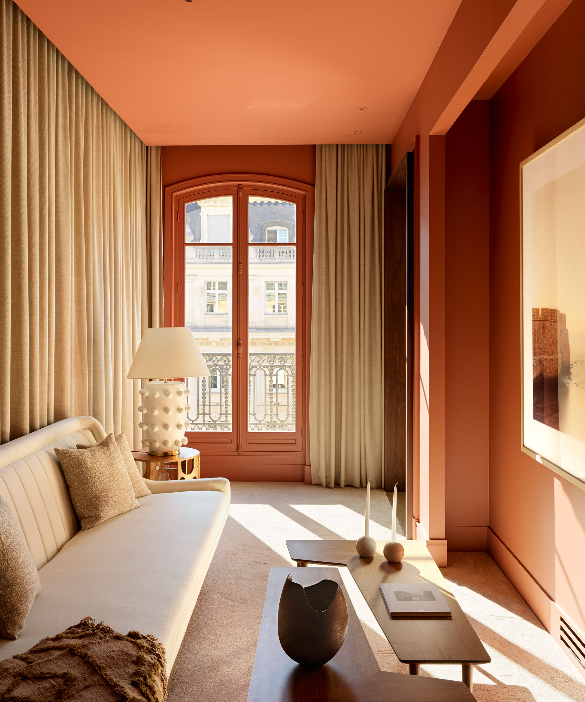
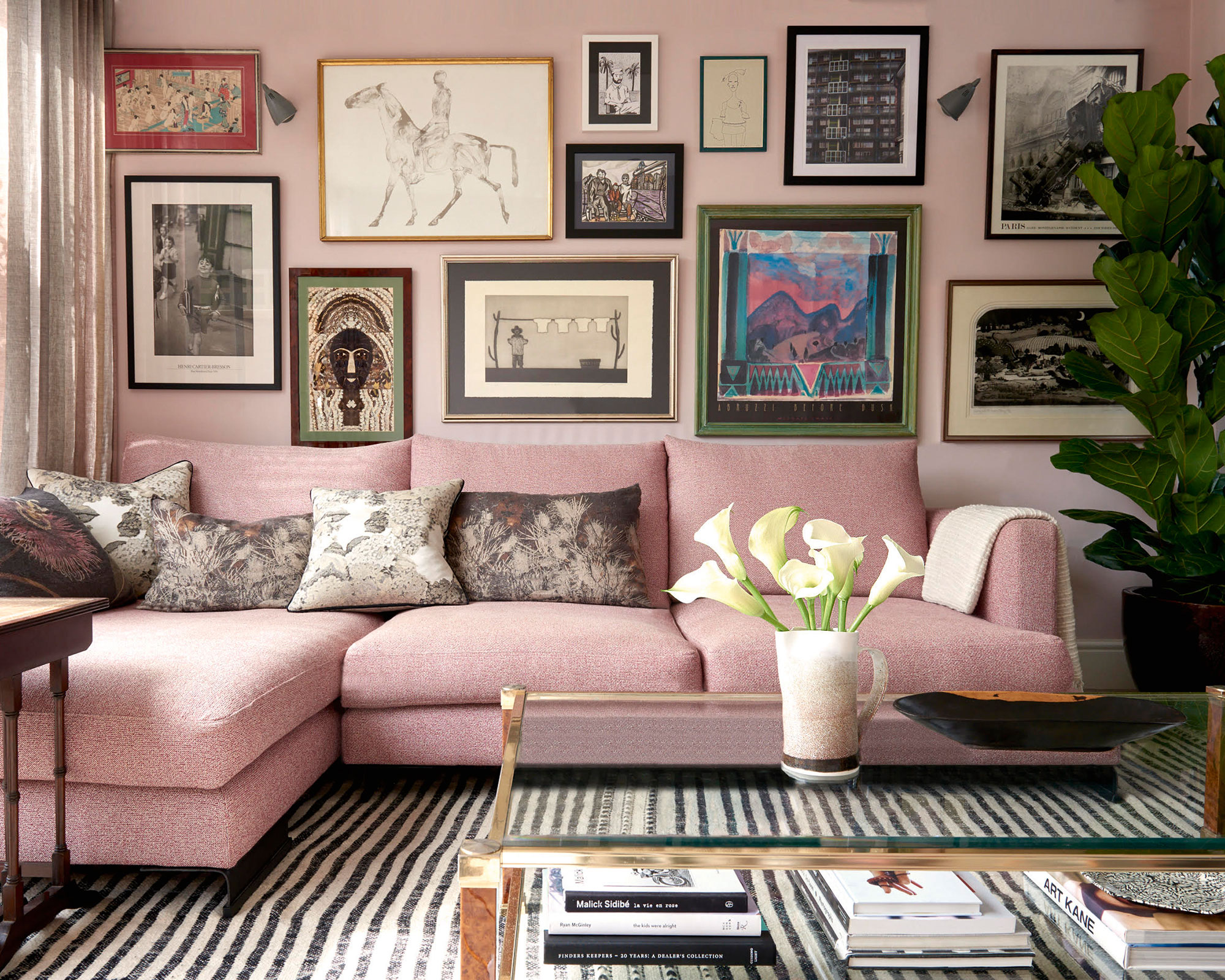
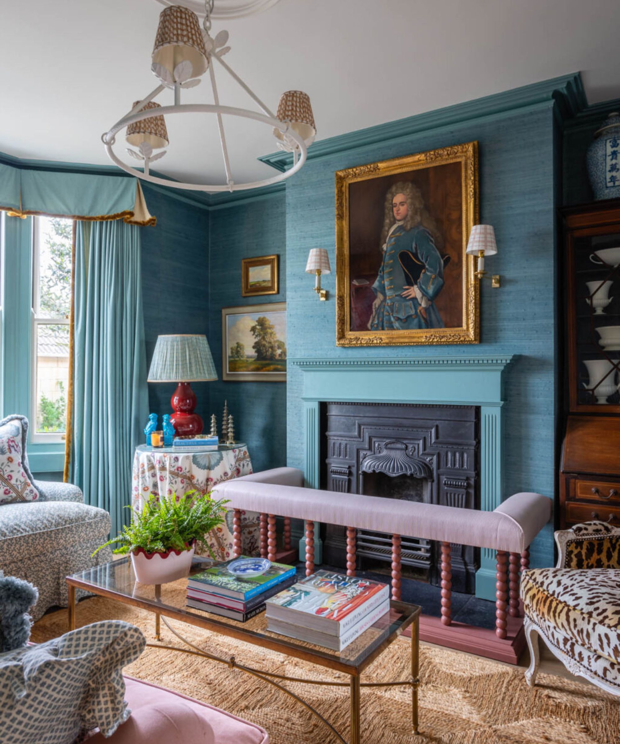
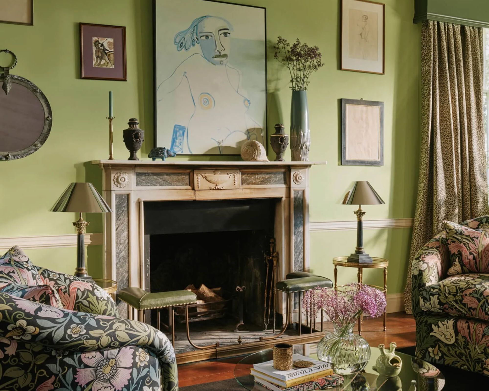
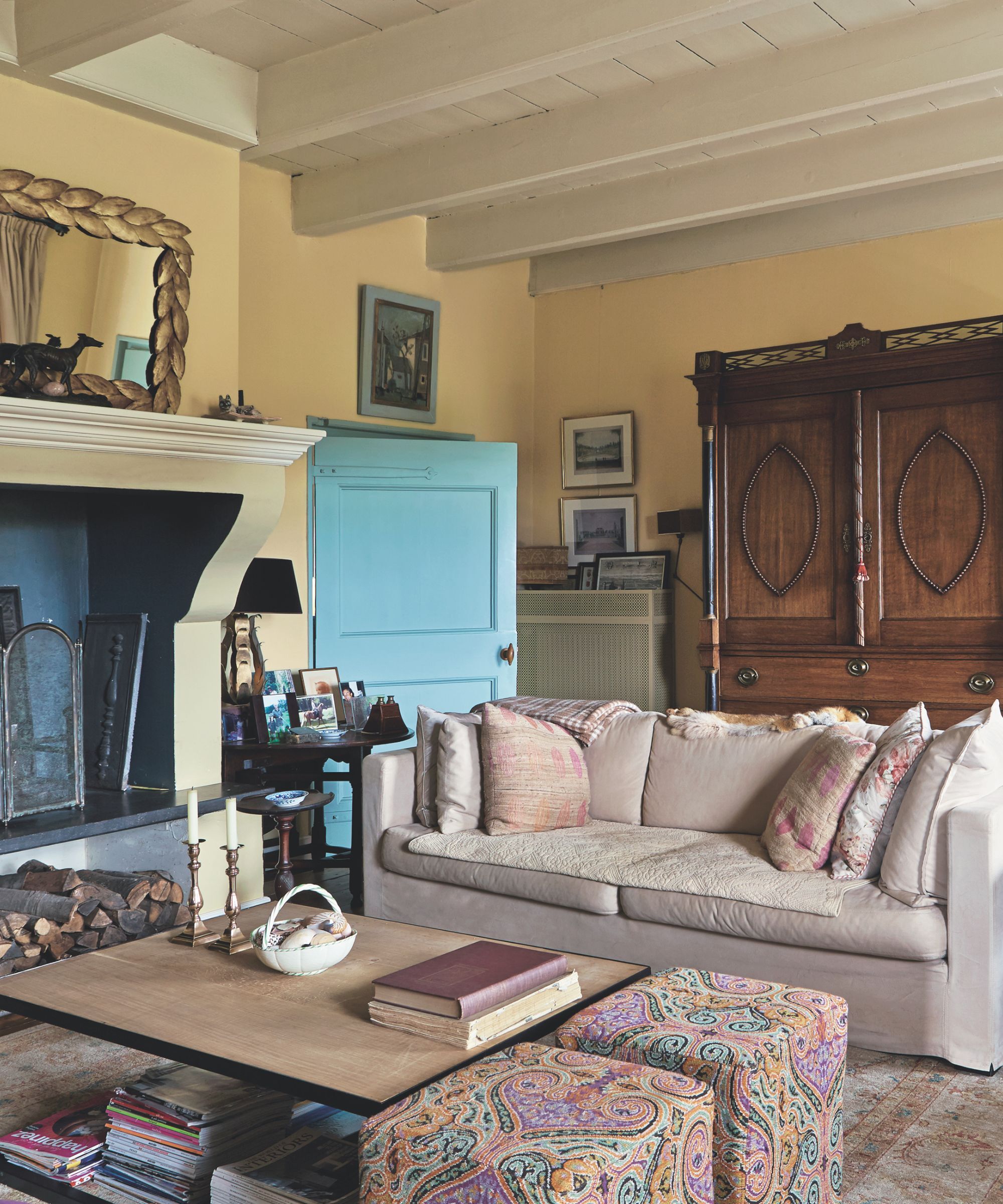
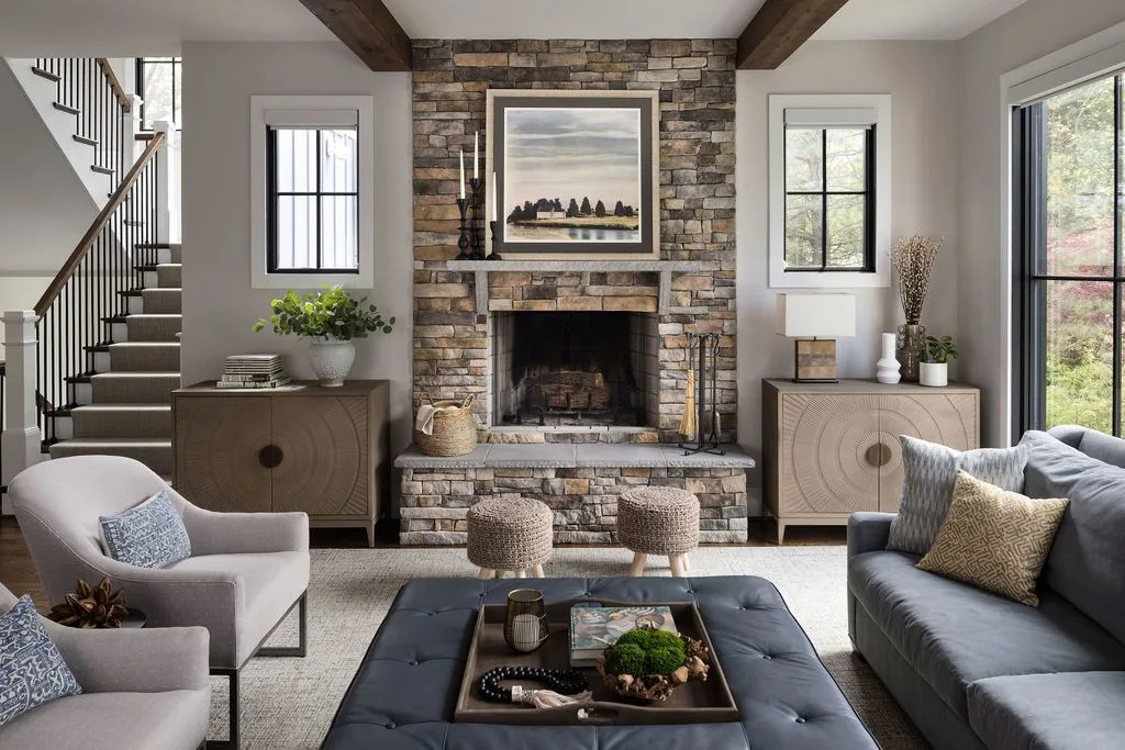
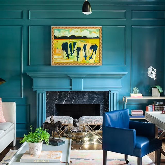
The article delves into the expertise of top interior designers to unveil a curated selection of the best paint colors for living rooms. Designers emphasize the importance of creating a space that feels inviting and reflects personal style. Anna-Wooten Loggins suggests Benjamin Moore Balboa Mist, a soft off-white, for its ability to brighten rooms and serve as a versatile backdrop for various decor styles. She highlights its particular suitability for rooms with limited natural light, as it avoids feeling stark or cold. Callie Windle recommends Farrow & Ball's Pigeon, a muted green-blue, noting its adaptability to different lighting conditions throughout the day. This shade offers a sophisticated and calming atmosphere, providing a subtle pop of color without overwhelming the space. Windle also points out its ability to complement both traditional and modern aesthetics.
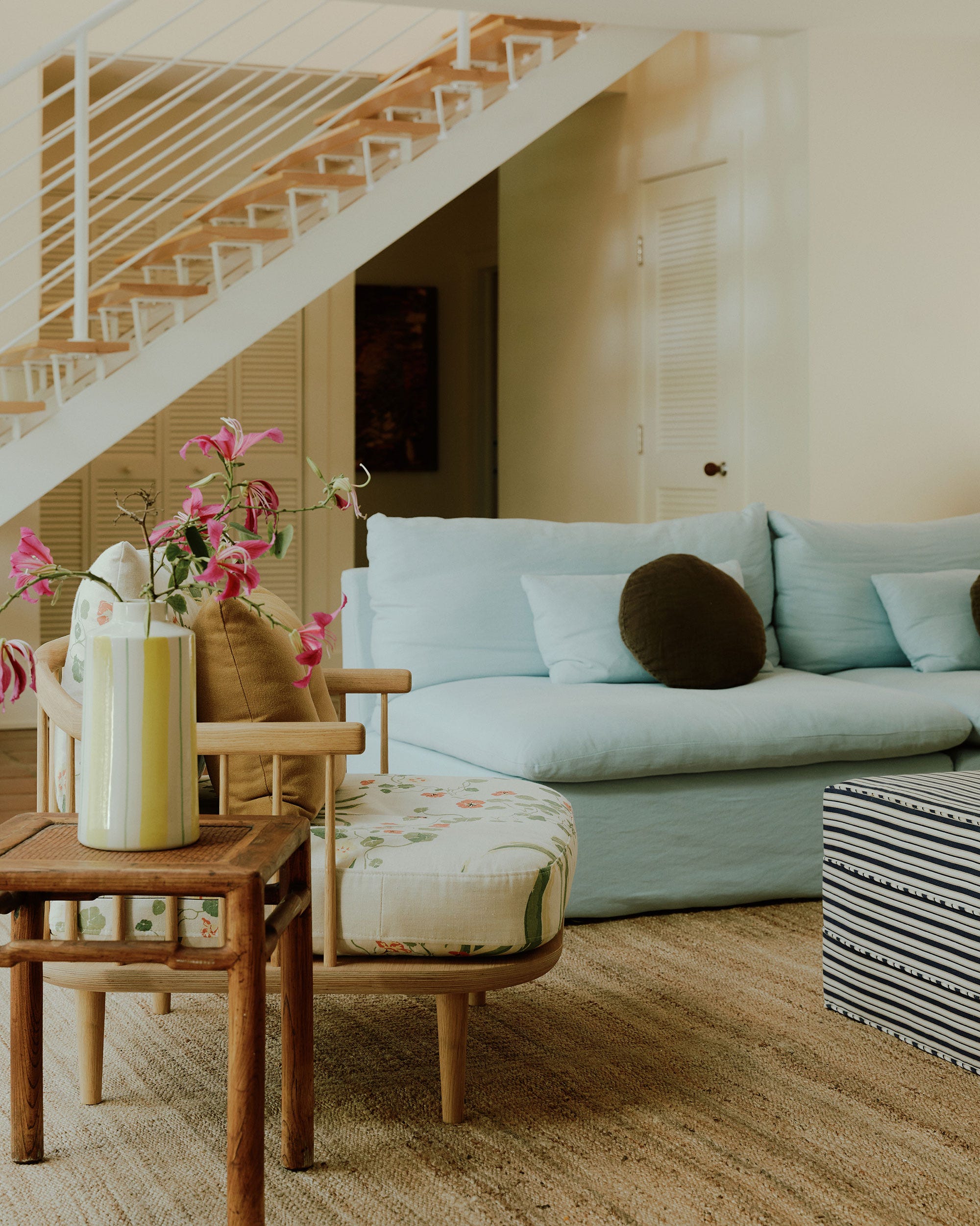
Marguerite Johnson advocates for Benjamin Moore's Glacier, a light and airy blue. She explains that this color evokes a sense of tranquility and spaciousness, making it ideal for smaller living areas or those seeking a serene ambiance. Johnson advises pairing Glacier with natural wood tones and crisp white accents to enhance its refreshing quality. The article further explores how these designer-approved colors can influence the mood and perception of a living room. For instance, warmer neutrals like Balboa Mist can create a cozy and intimate setting, while cooler tones like Glacier can make a room feel larger and more open. The designers collectively underscore the significance of considering a room's natural light, existing furnishings, and desired mood when selecting a paint color.
The featured designers agree that paint is a powerful and relatively inexpensive tool for transforming a living room's aesthetic. They advise testing paint samples on different walls and observing them throughout the day to see how the color interacts with varying light sources. This practical tip ensures that the chosen shade performs as expected in the actual living environment. The article also touches upon the psychological impact of color, with soft neutrals promoting relaxation and subtle blues fostering a sense of calm. The consensus is that while trends come and go, timeless and versatile shades remain a smart investment for creating an enduringly beautiful living space.
Ultimately, the article serves as a guide for homeowners looking to refresh their living rooms, offering expert insights and specific color recommendations from experienced interior designers. It encourages readers to think beyond mere aesthetics and consider the overall atmosphere they wish to cultivate. By focusing on quality paint and thoughtful color selection, individuals can achieve a designer-approved living room that is both stylish and comfortable. The article concludes by reinforcing the idea that the right paint color can significantly enhance the perceived value and enjoyment of a home's central gathering space.
#BenjaminMooreBalboaMist #NeutralColorPalette #AnnaWootenLoggins #CallieWindleInteriors #MargueriteJohnson #ColorPalette #BenjaminMooreGlacier #LivingRoomDesign #InteriorDesign #BenjaminMooreBalboaMist #NeutralColorPalette #AnnaWootenLoggins #CallieWindleInteriors #MargueriteJohnson #ColorPalette #BenjaminMooreGlacier #LivingRoomDesign #InteriorDesign
0 comment in total
 No comments yet
You may also like

Experts reveal the best living room paint colours to transform every space


10 Timeless Living Room Paint Colors Designers Swear By
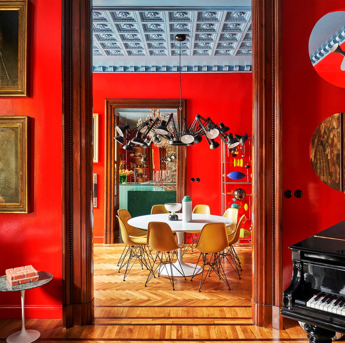
55 Living Room Color Ideas That Will Take Your Space from Drab to Fab

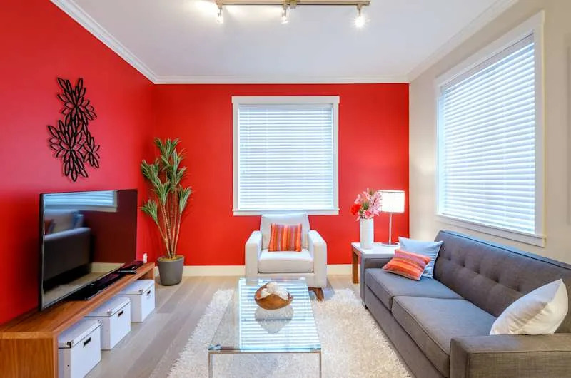
The 3 All-Time Worst Living-Room Paint Colors, According to Designers

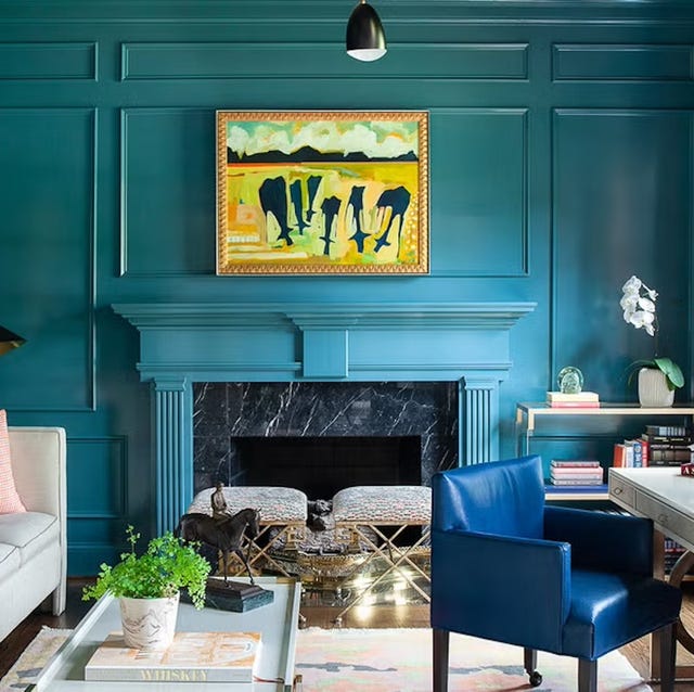
Listen Up: These Are the Best Paint Colors for Your Living Room

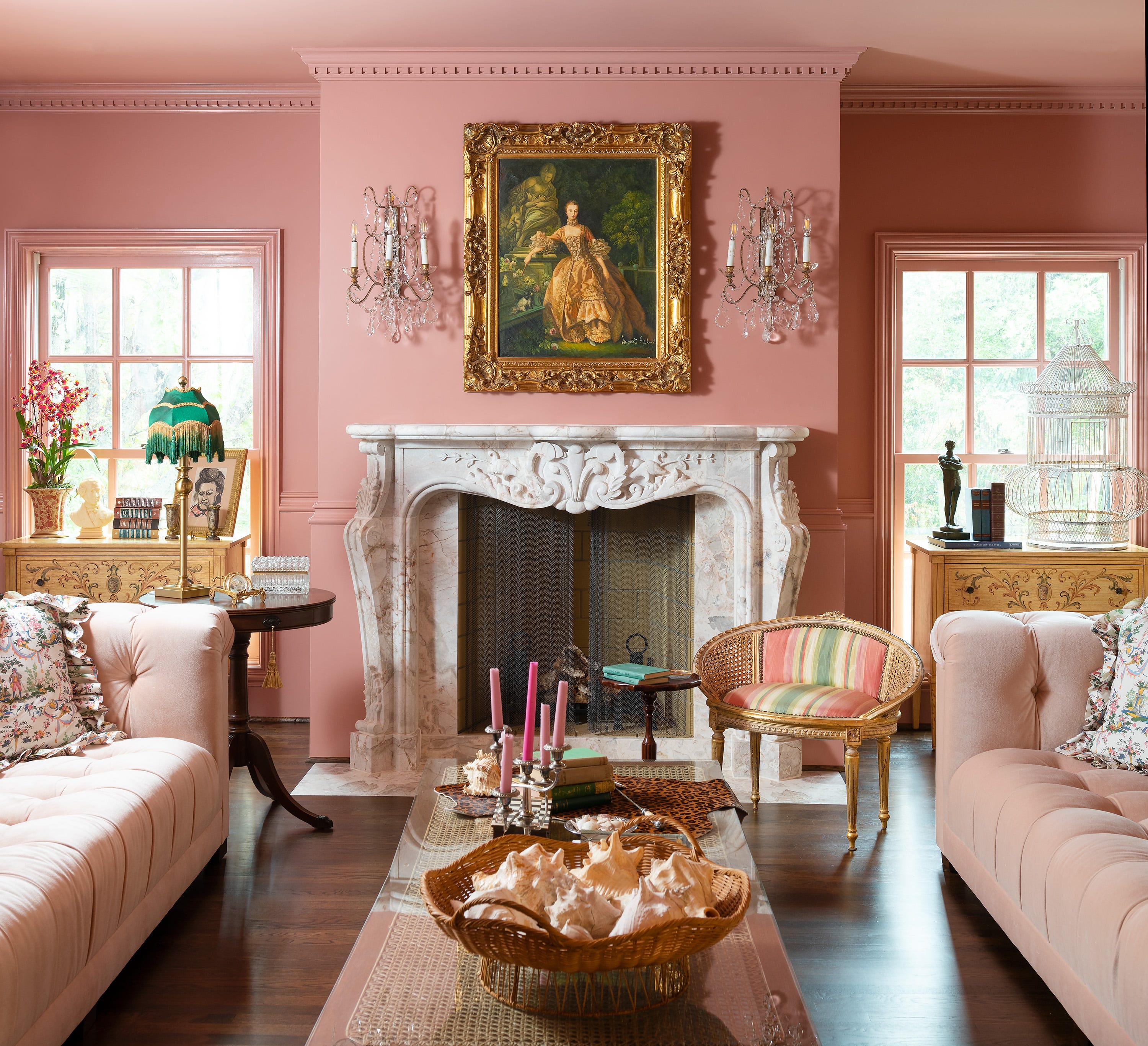
Jewel Tones Are Trending for Living Room Paint Colors, According to Designers

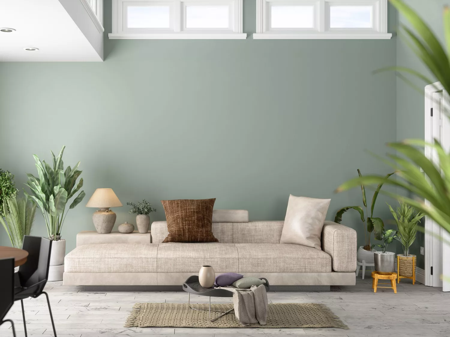
The 8 Best Living Room Paint Colors, According to Design Experts

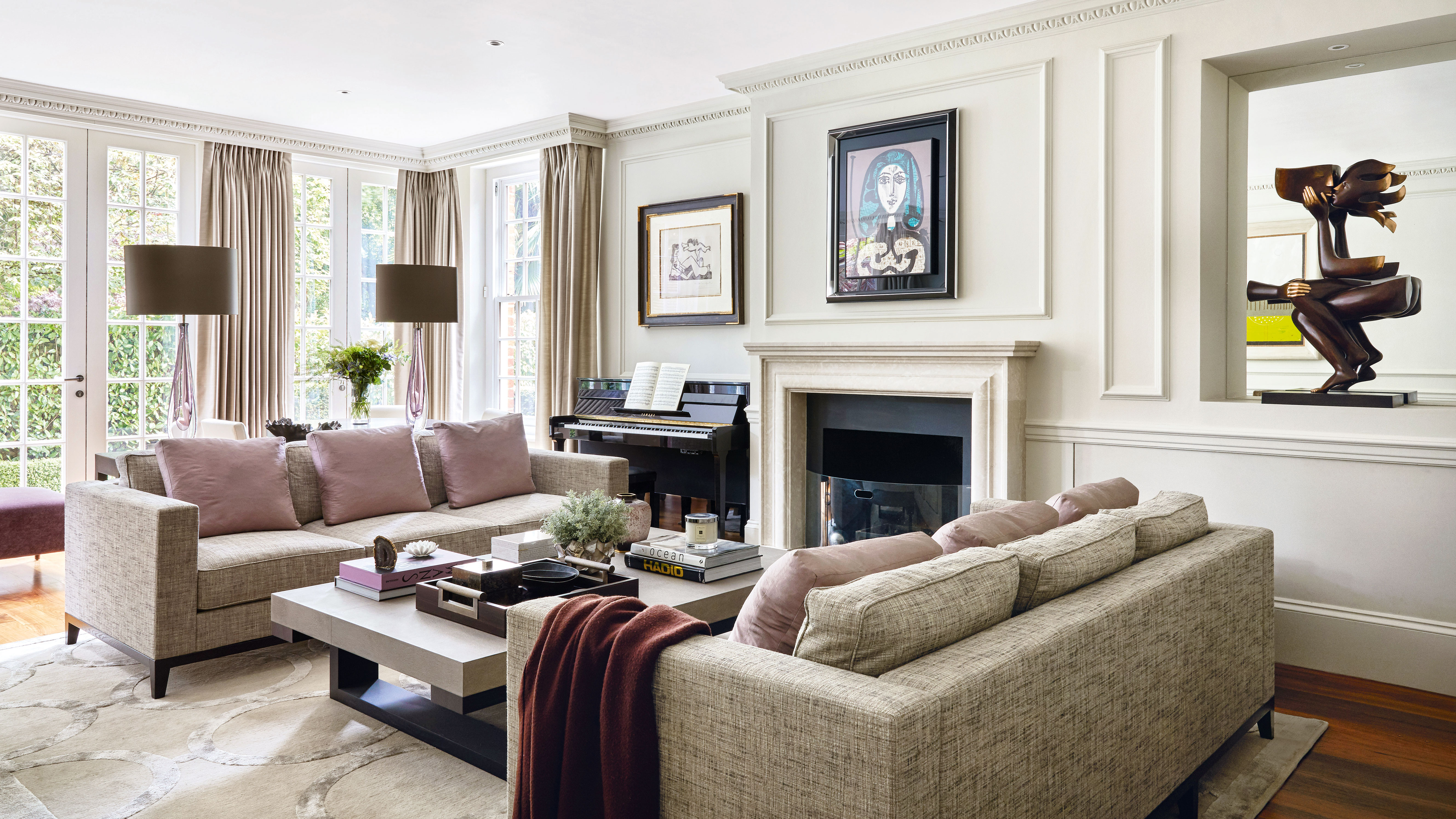
5 colors that will make your living room feel happier, according to interior designers
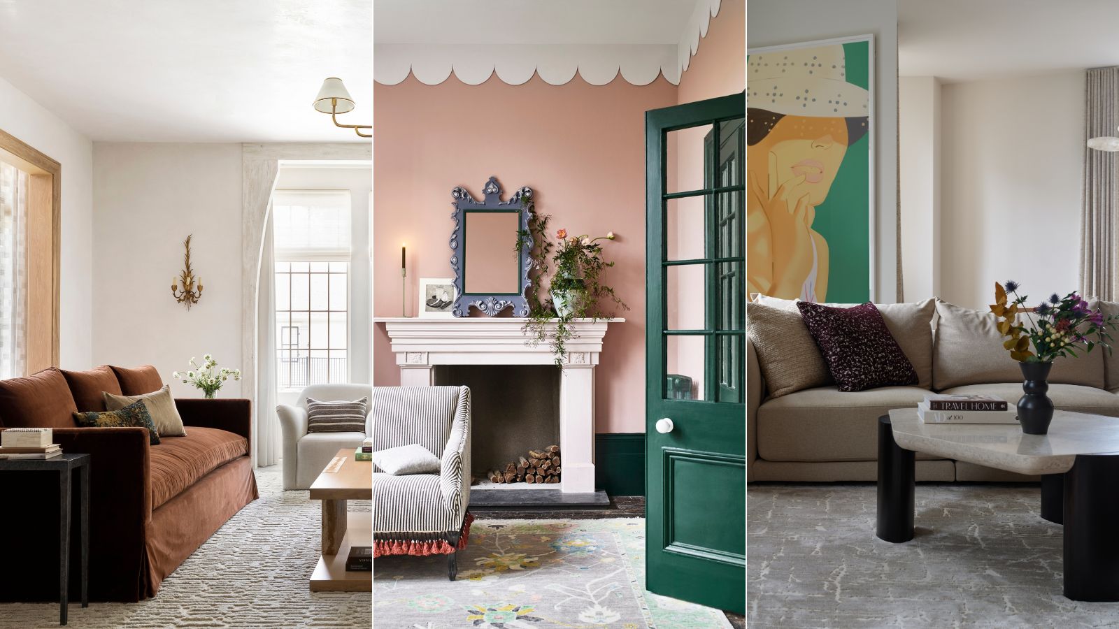
These are interior designers' favorite color combinations for living rooms – from neutral and calming to bold and playful
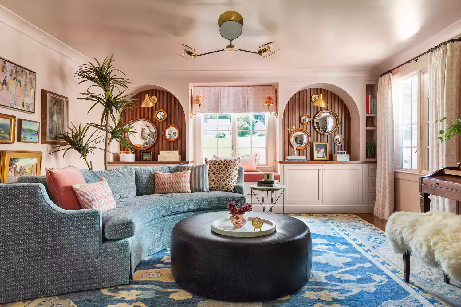
The 15 Best Paint Colors for Your Living Room, According to Interior Designers
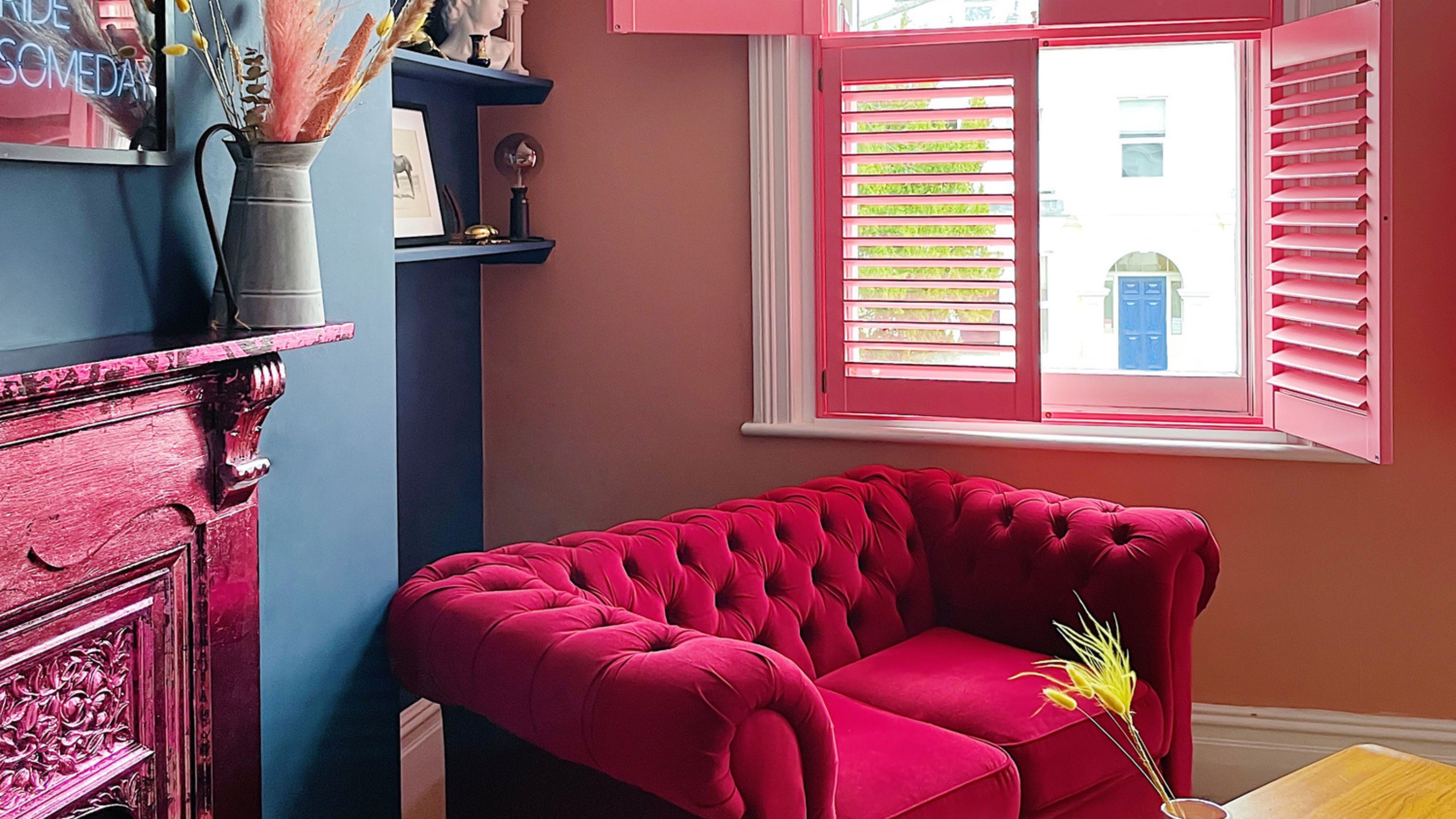
The best paint colors for small living rooms, according to design experts

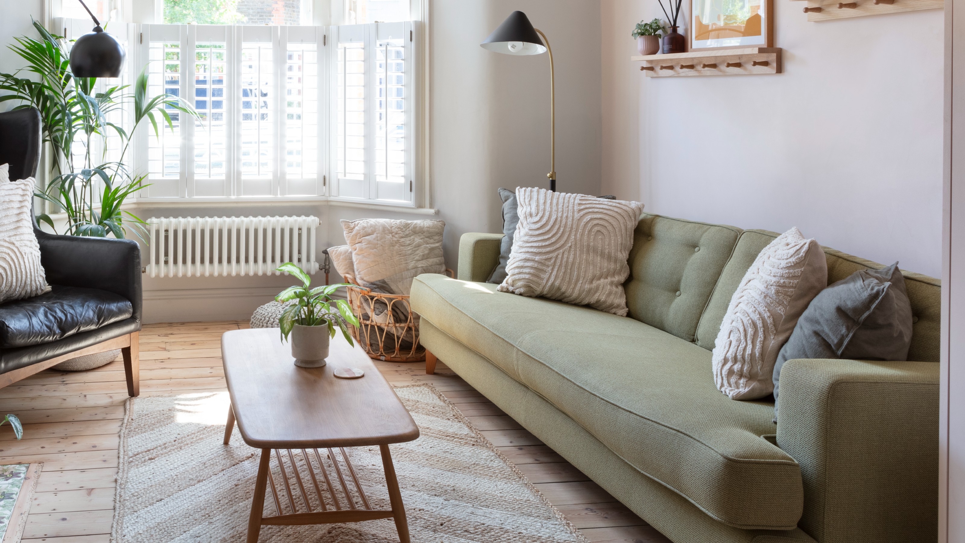
‘When your sofa and wall colours are in sync, the space feels intentional’ – experts reveal the 4 best paint and sofa colour combinations
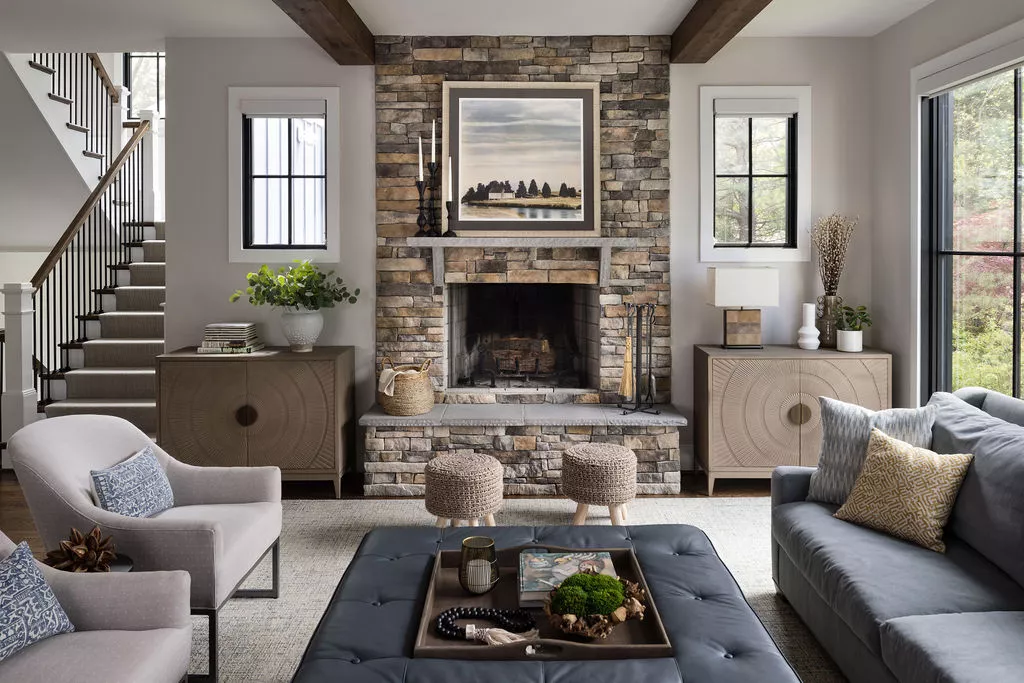
The Best Living Room Paint Colors, According To Designers
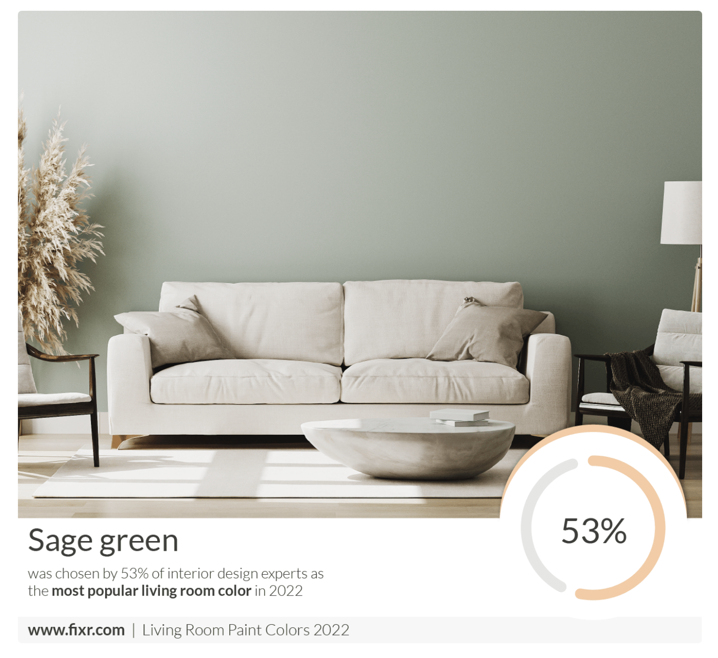
7 Popular Paint Colors for the Living Room
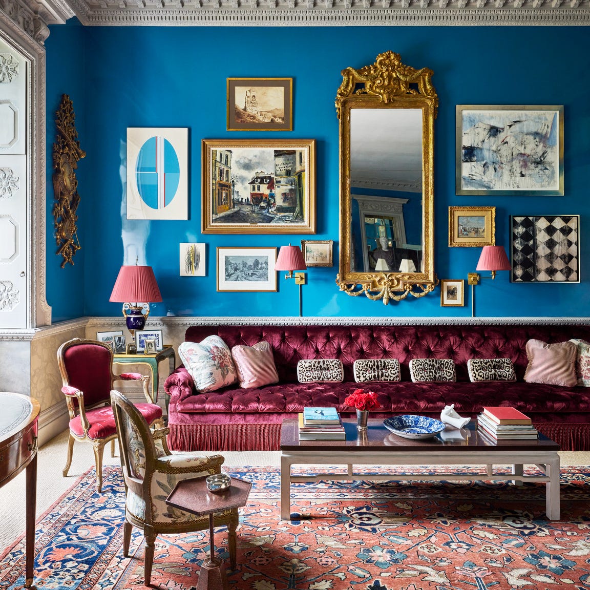
Designers Swear By These 65 Living Room Paint Colors

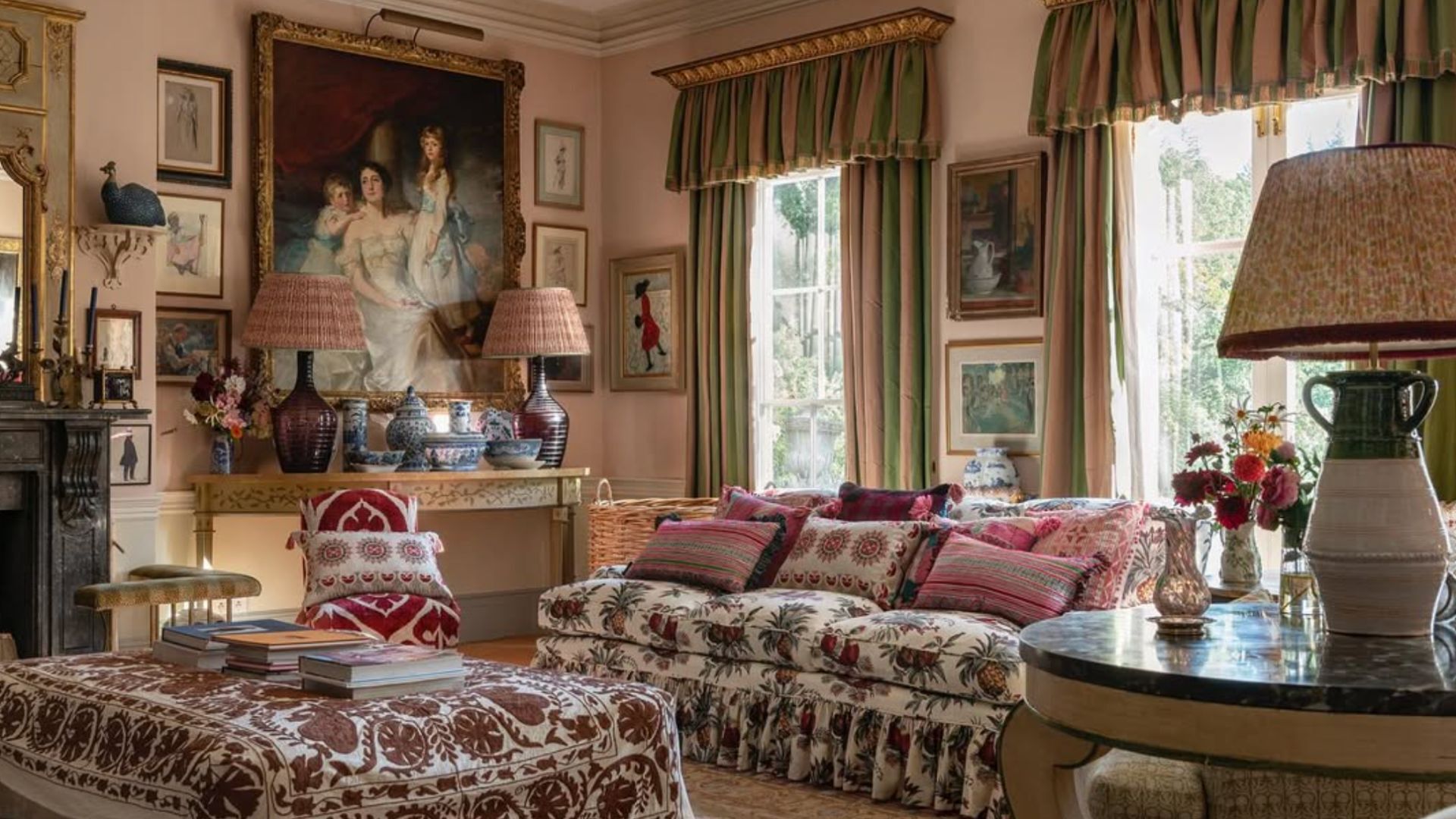
5 living room paint colors going out of style in 2025
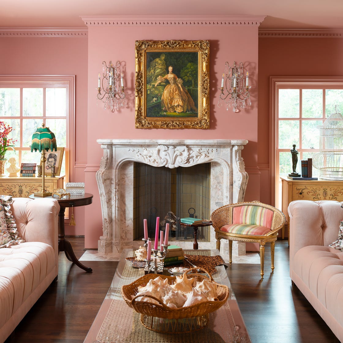
Designer-Approved Living Room Colors That'll Make You Feel Happier
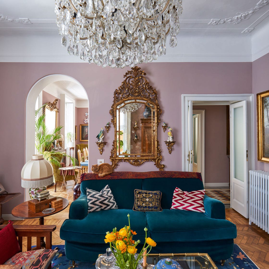
These Living Room Paint Colors Are a Total Mindset Shift
The 60 Most Popular Living Room Paint Colors Right Now
4 Living Room Paint Colors That Are So Outdated, According to Designers