1/21
Designers Swear By These 65 Living Room Paint Colors
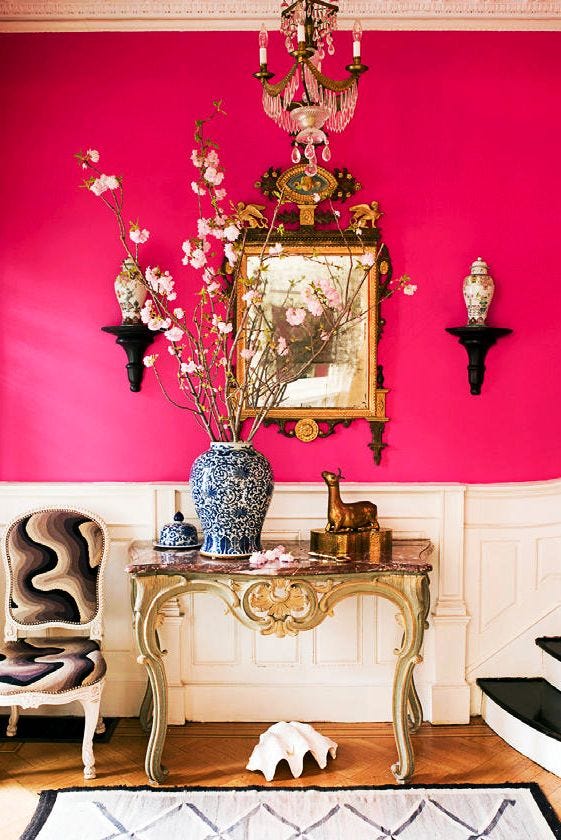
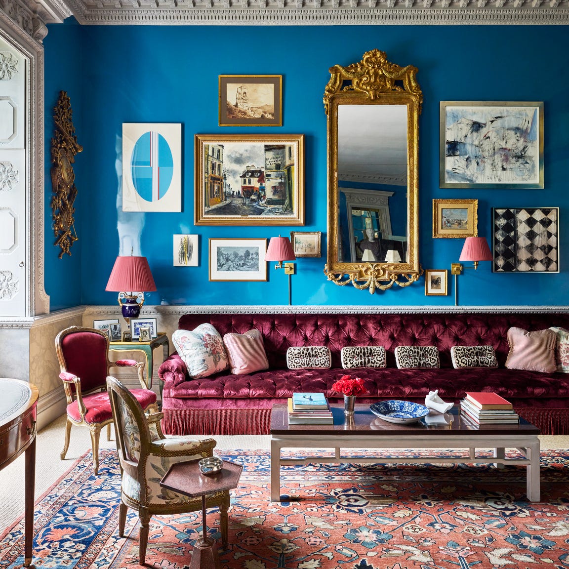
Selecting the perfect paint color for a living room is a critical aspect of home design, as it significantly influences the room's overall aesthetic and mood. This curated list presents 65 designer-approved living room paint colors for 2025, offering a comprehensive guide to help homeowners and designers choose the ideal hue for their spaces. The article emphasizes that paint color is one of the most dominant design elements, particularly in the living room, often considered the heart of the home.
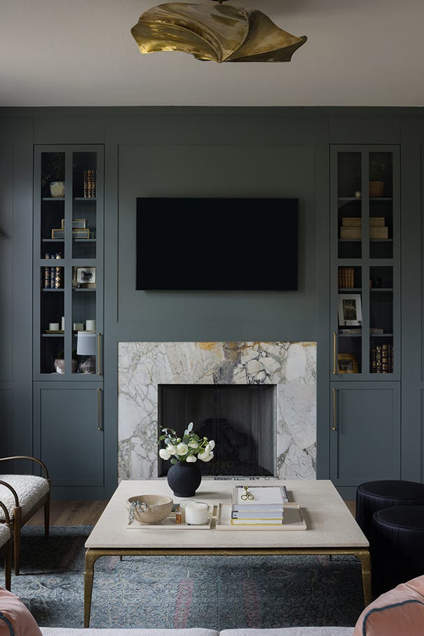
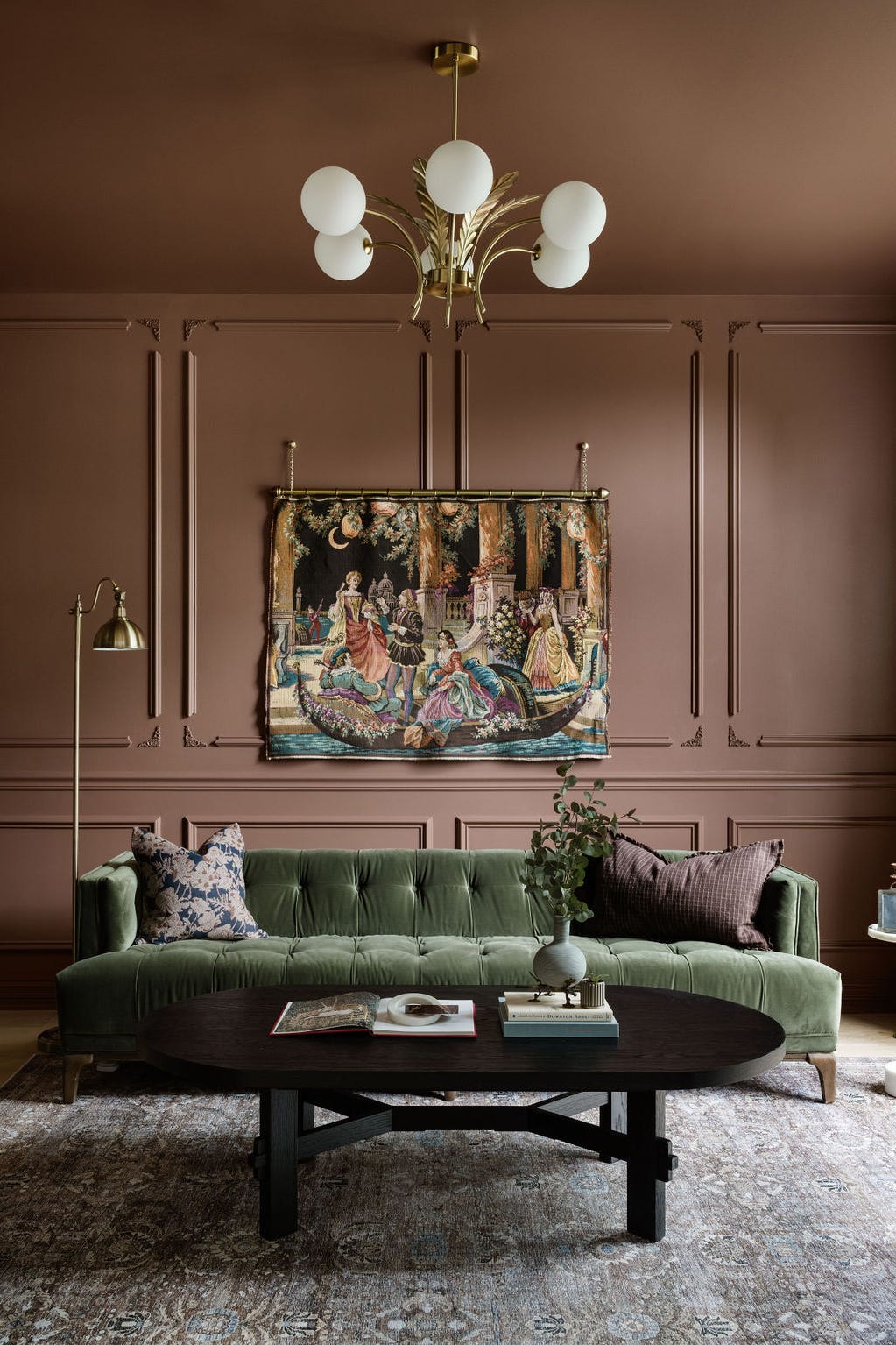
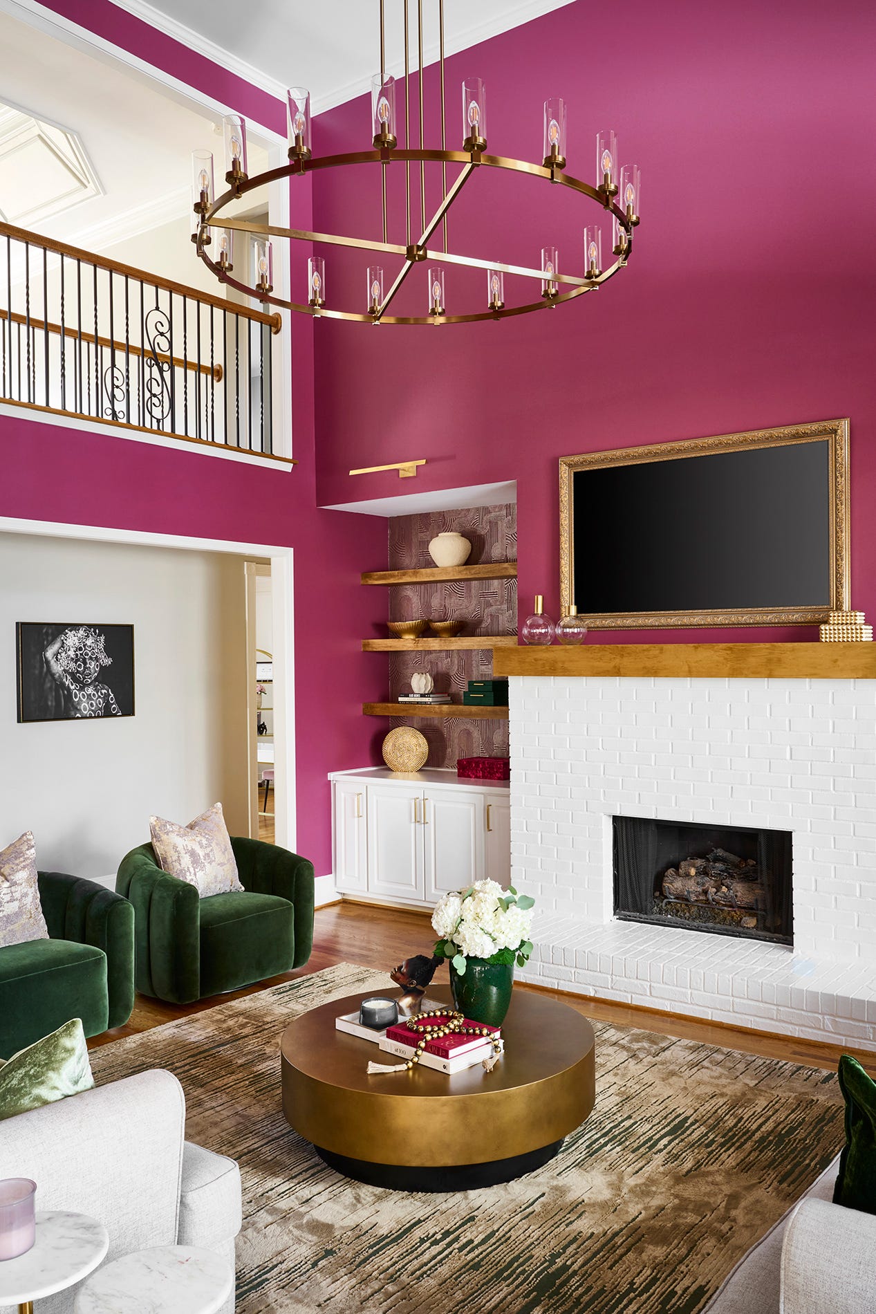
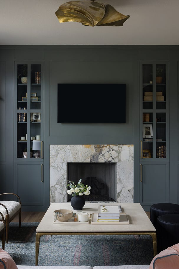
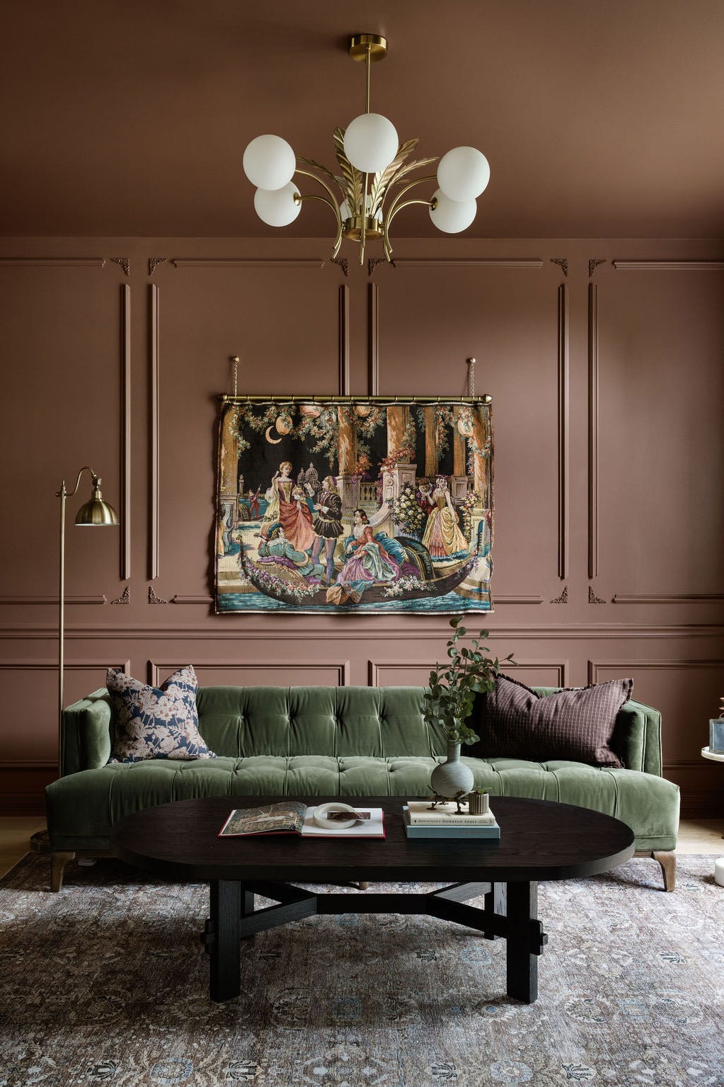
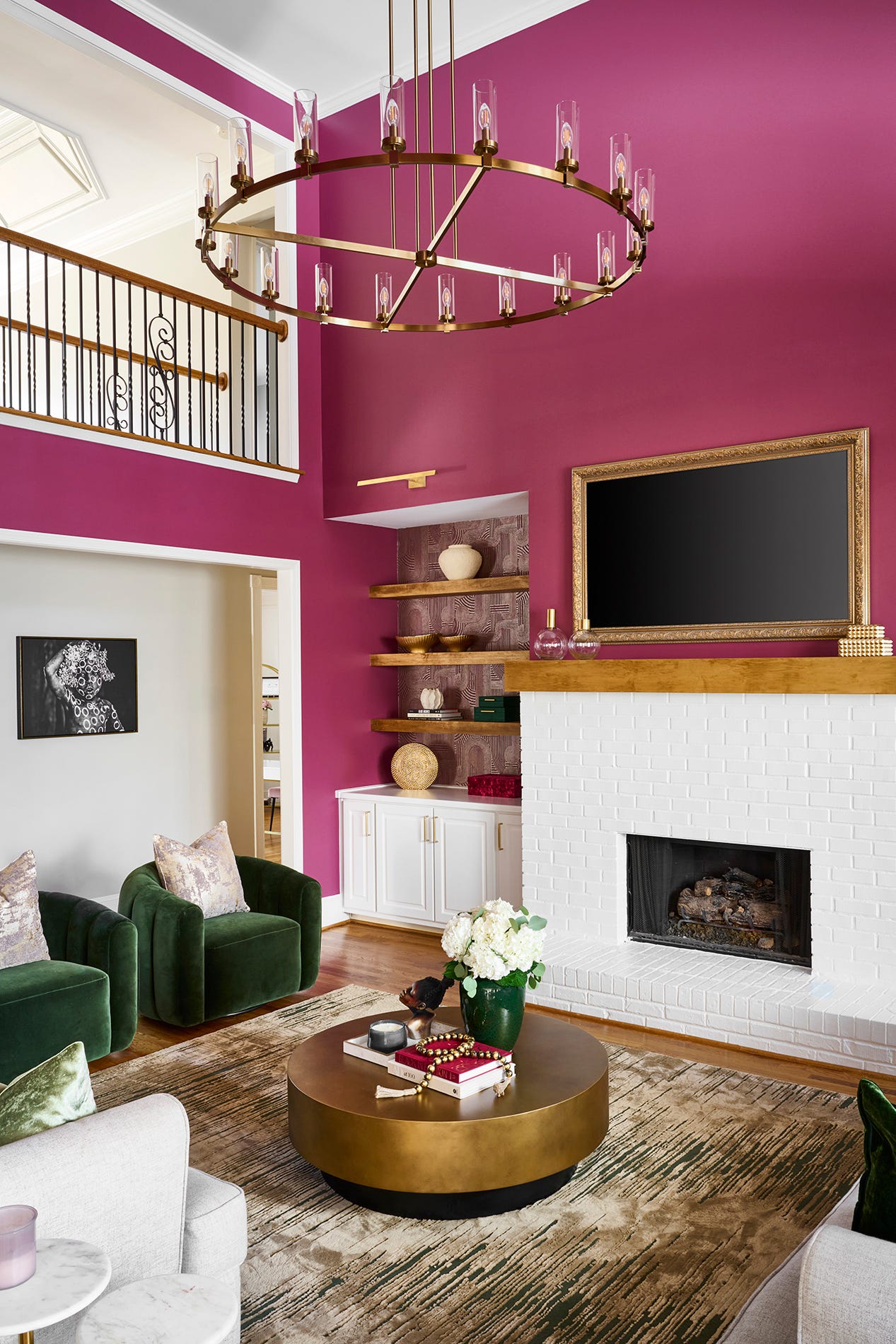
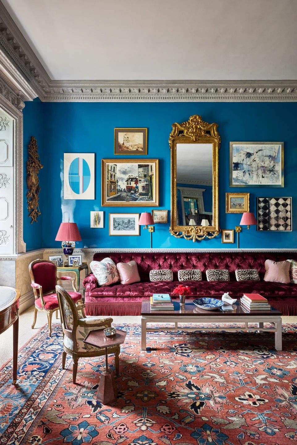
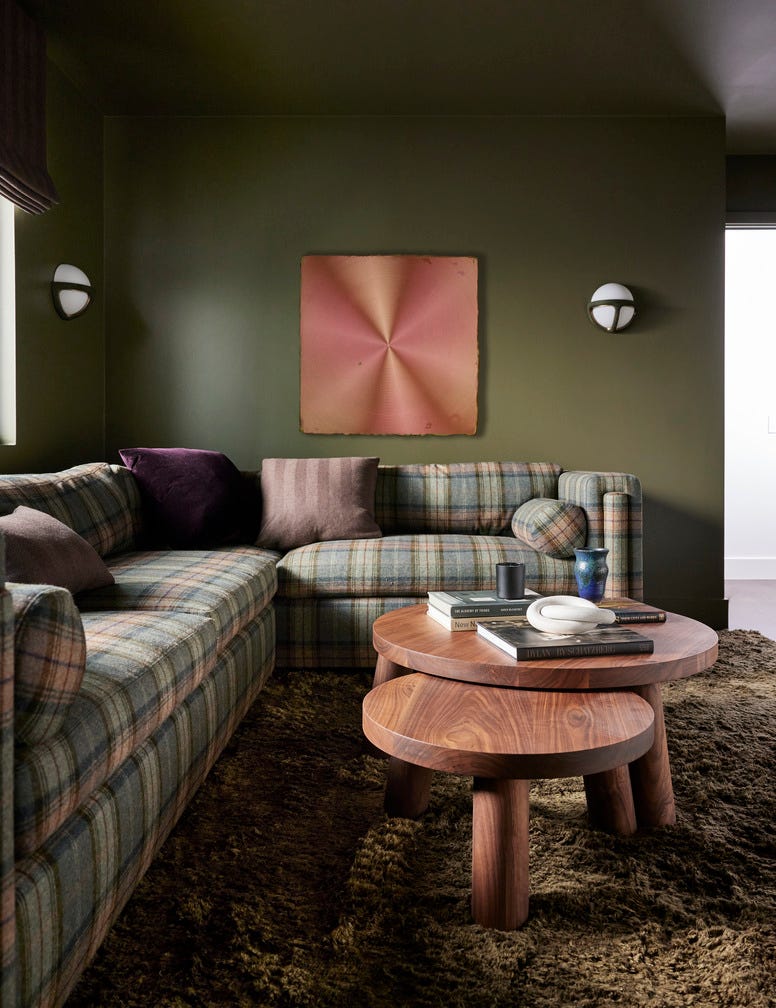
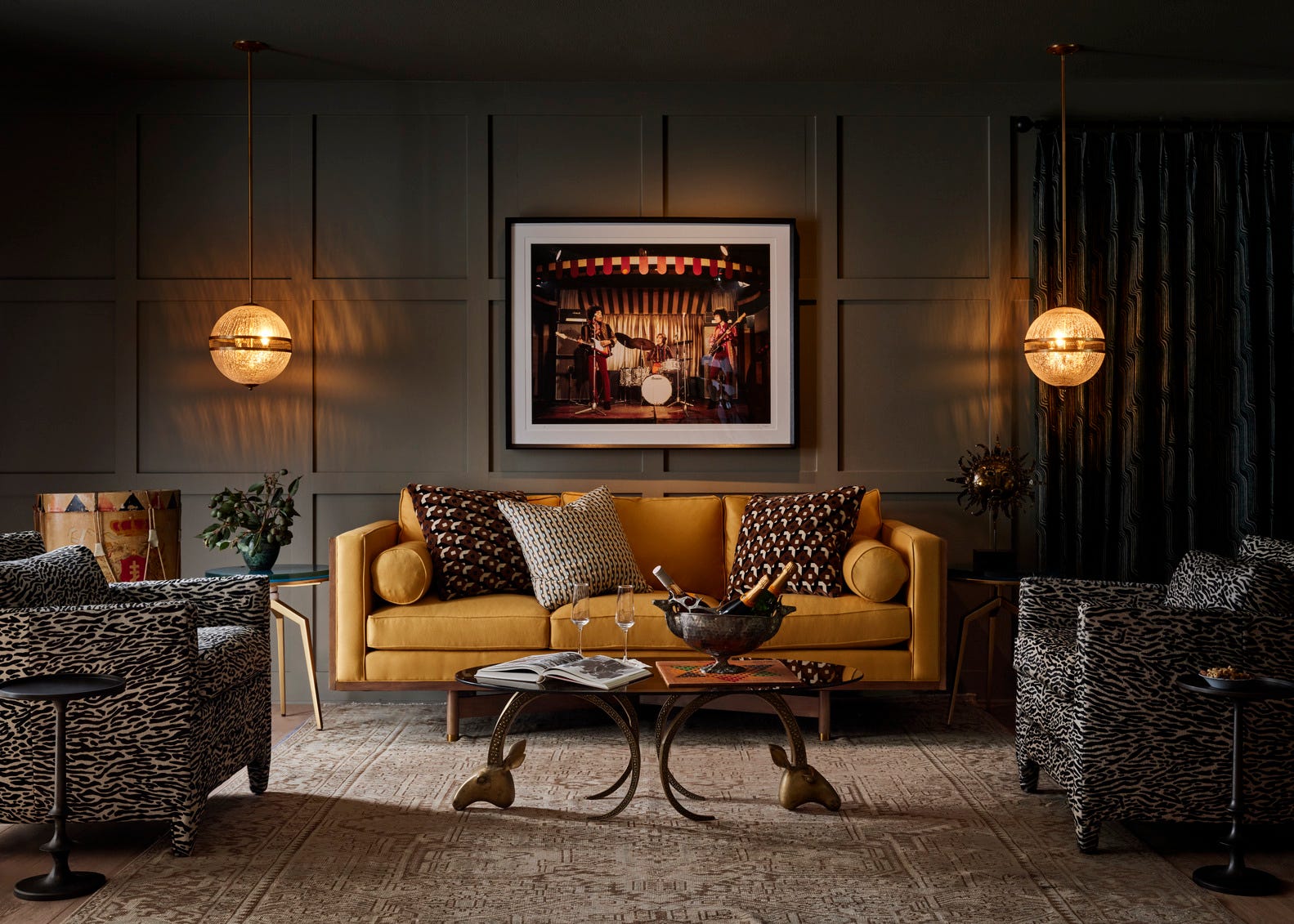
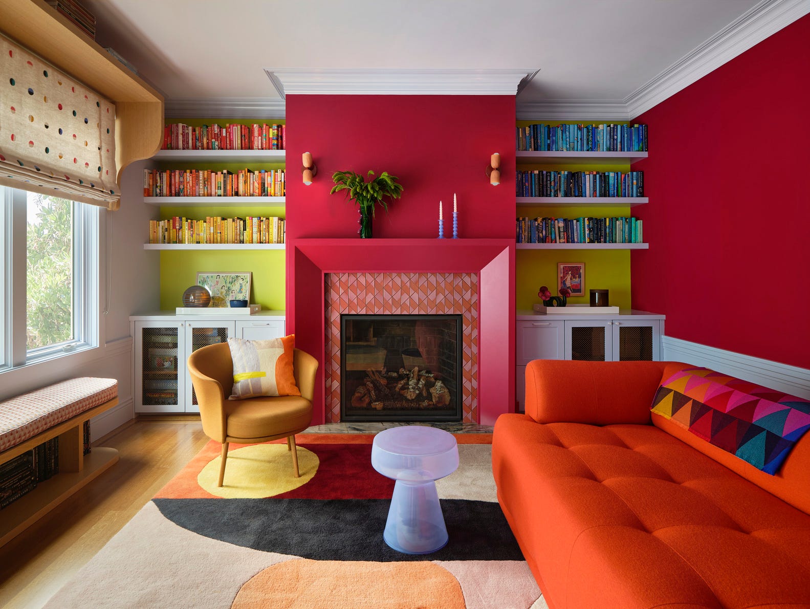
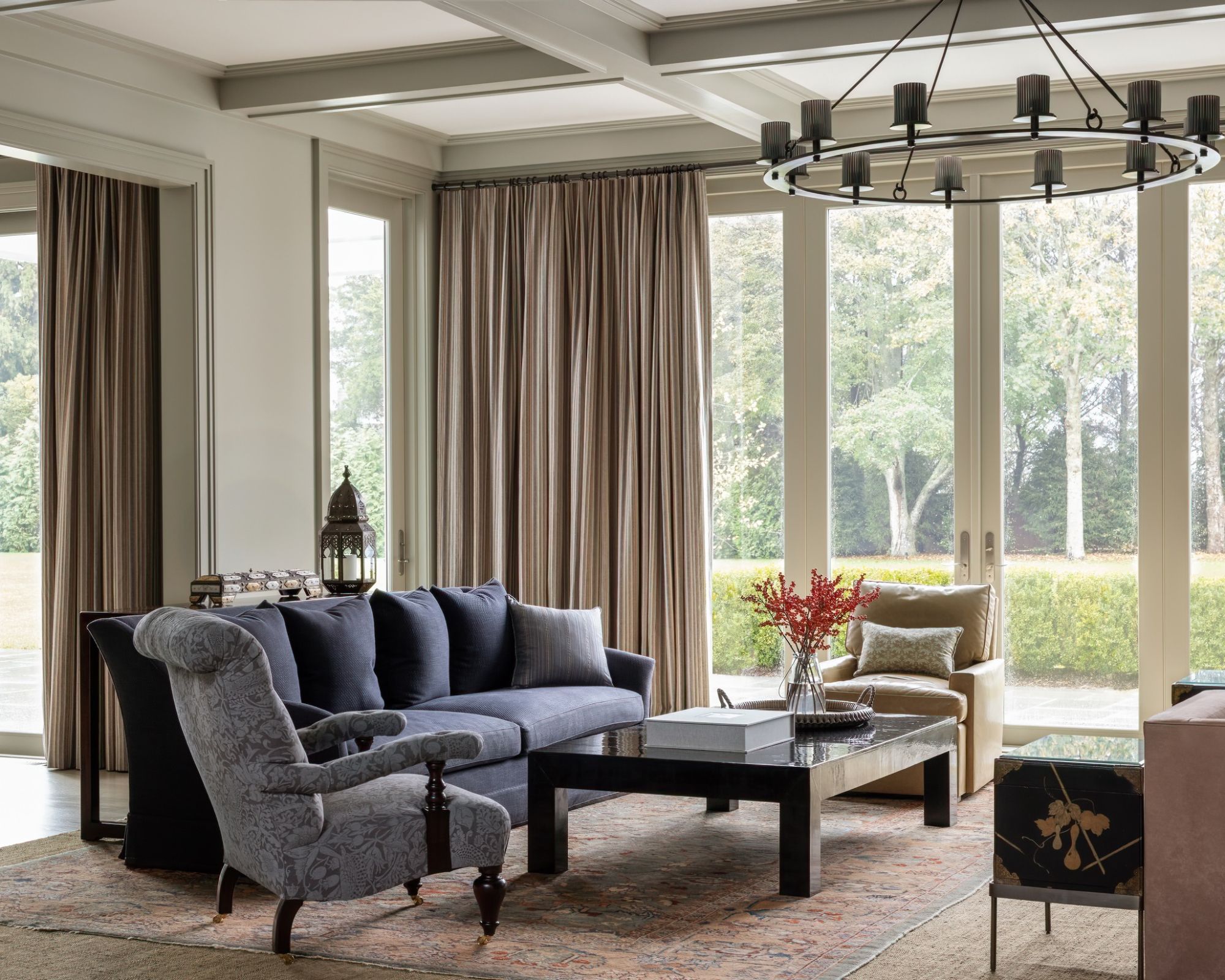
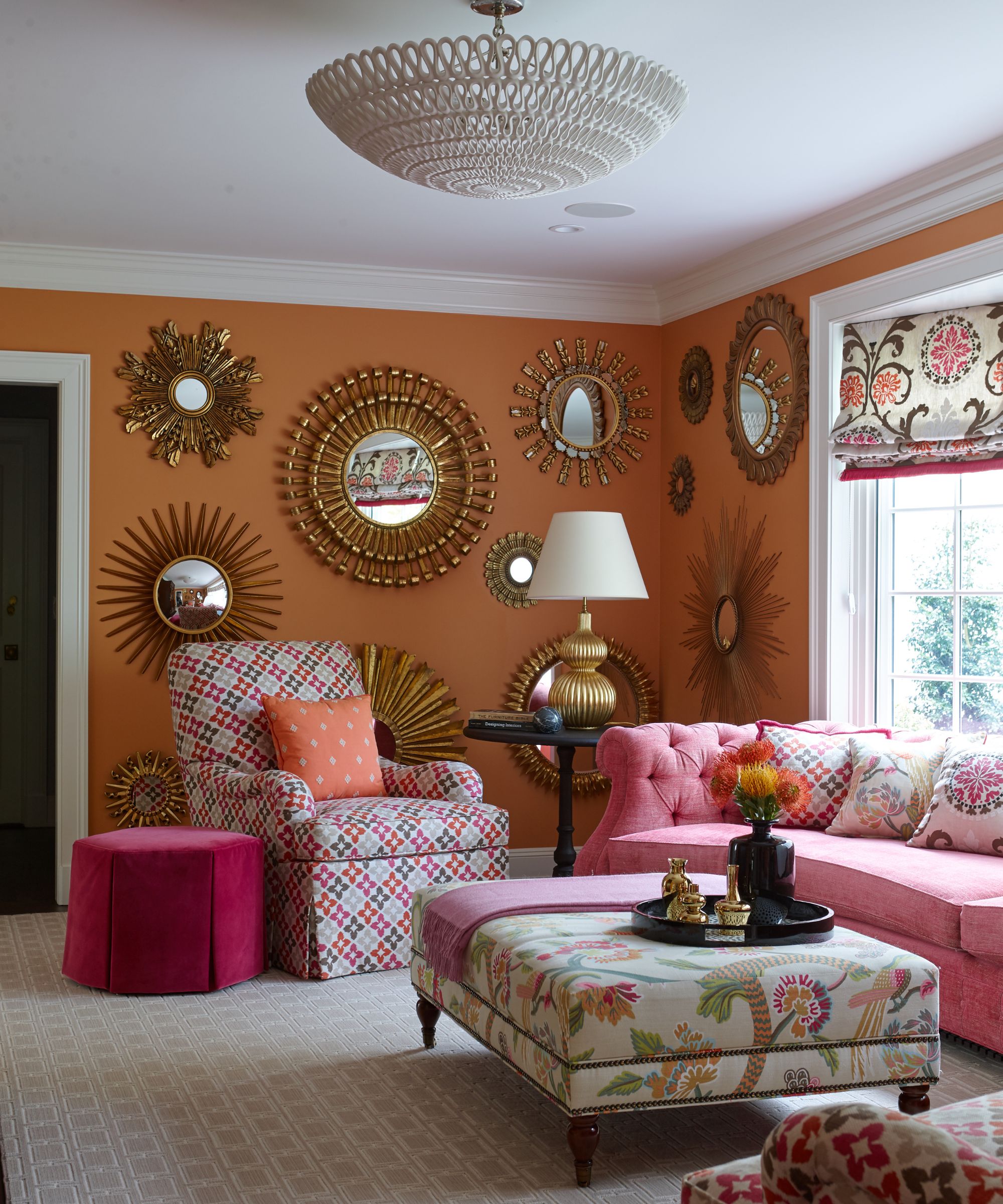
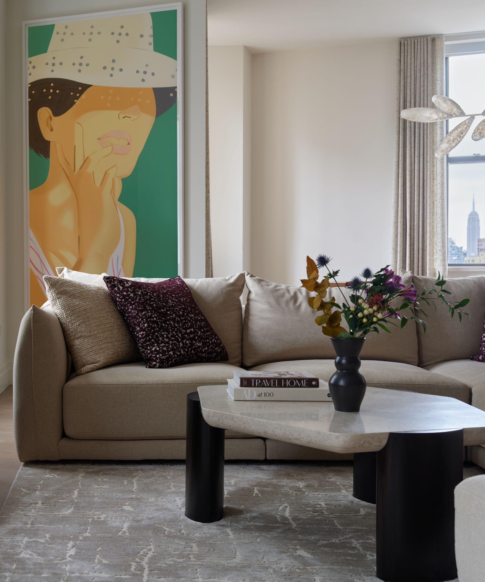
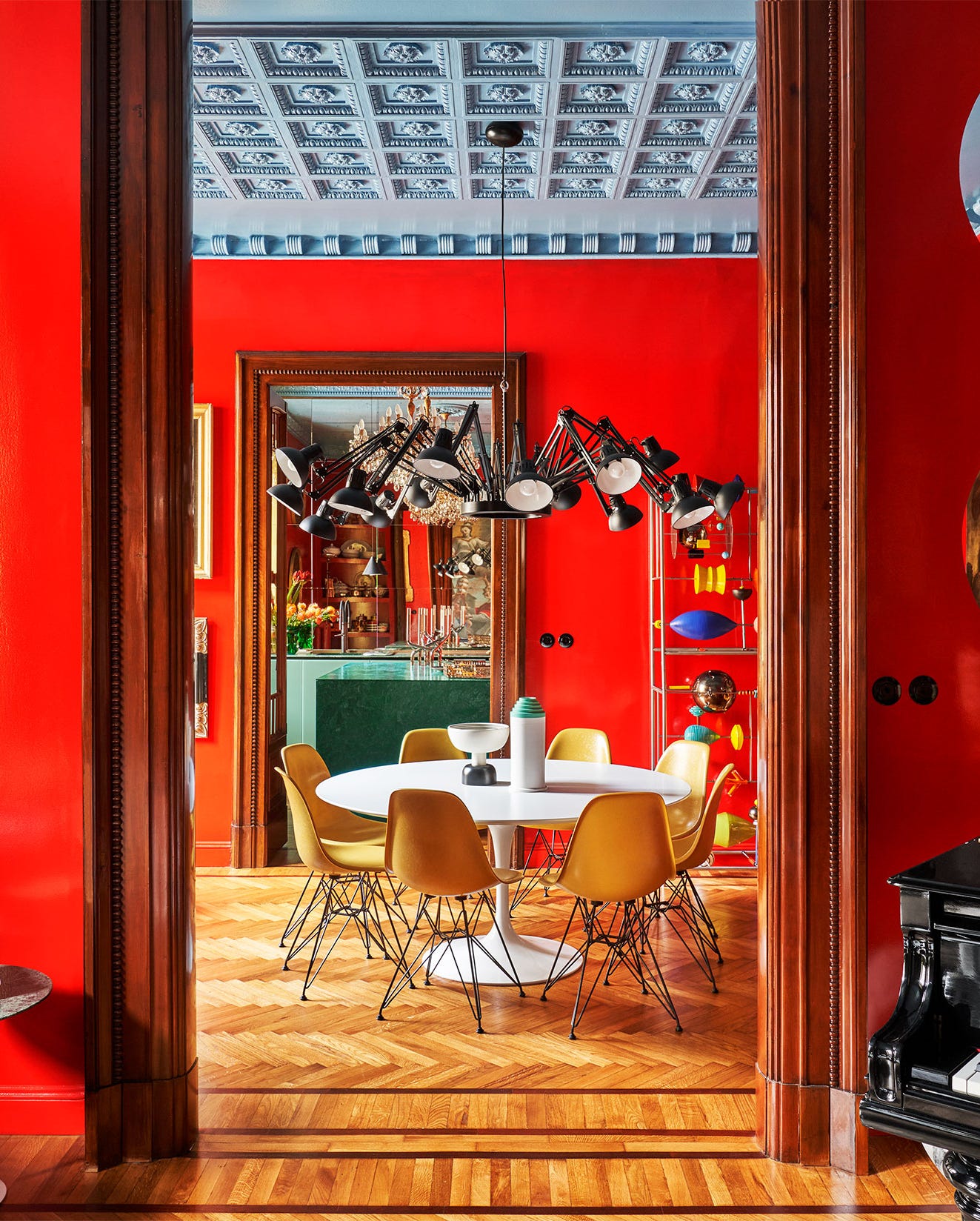
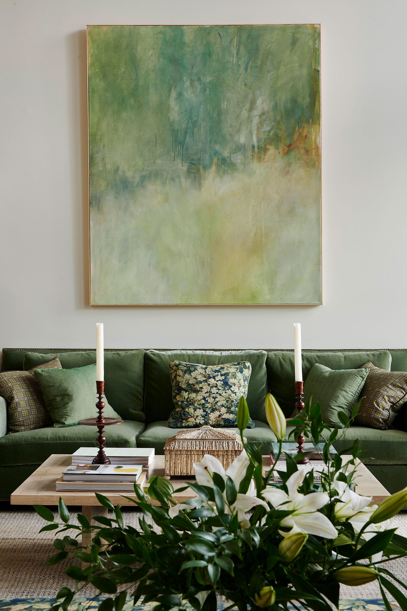
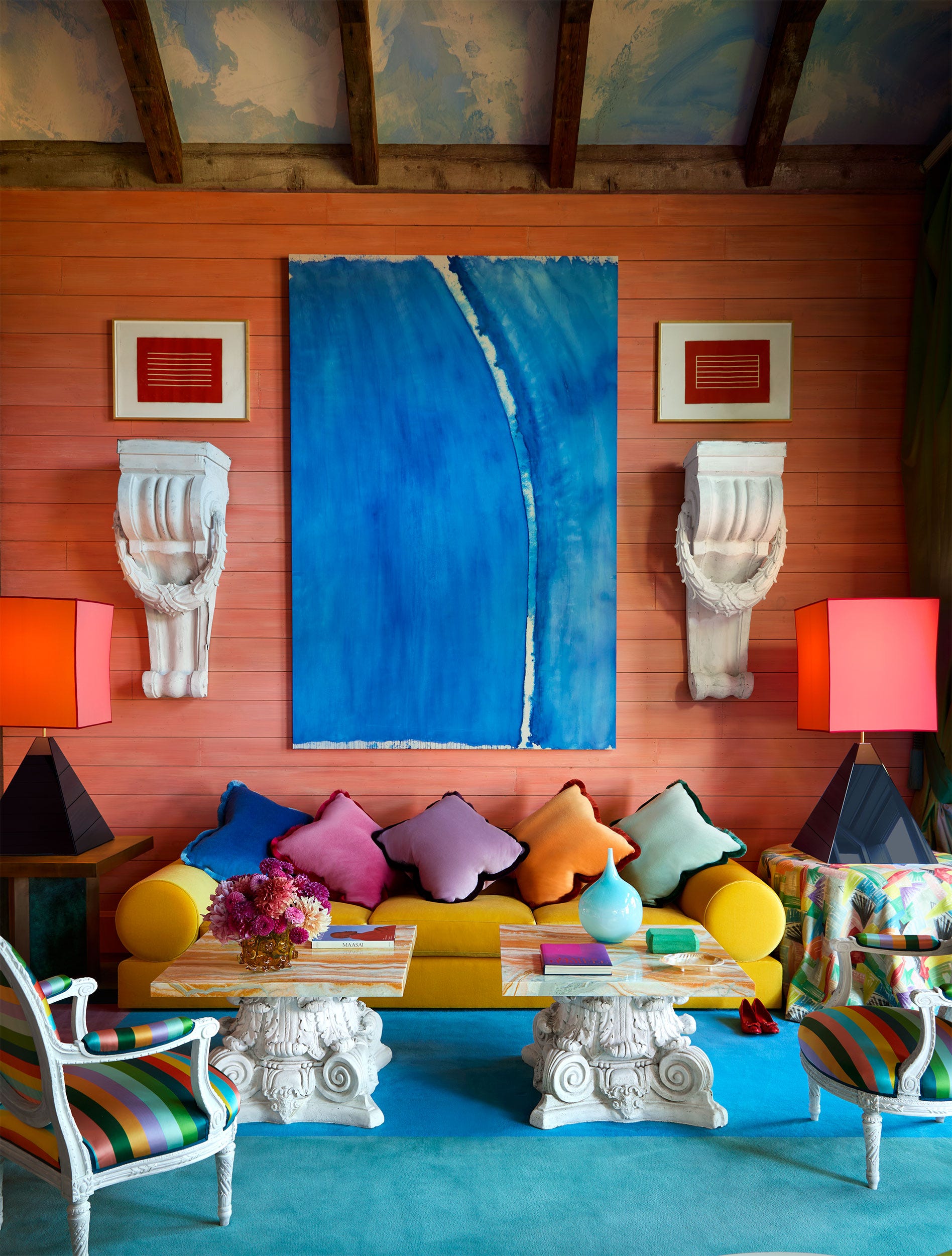
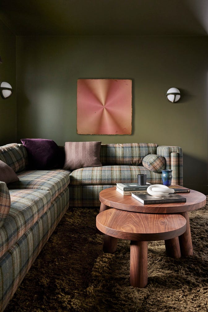
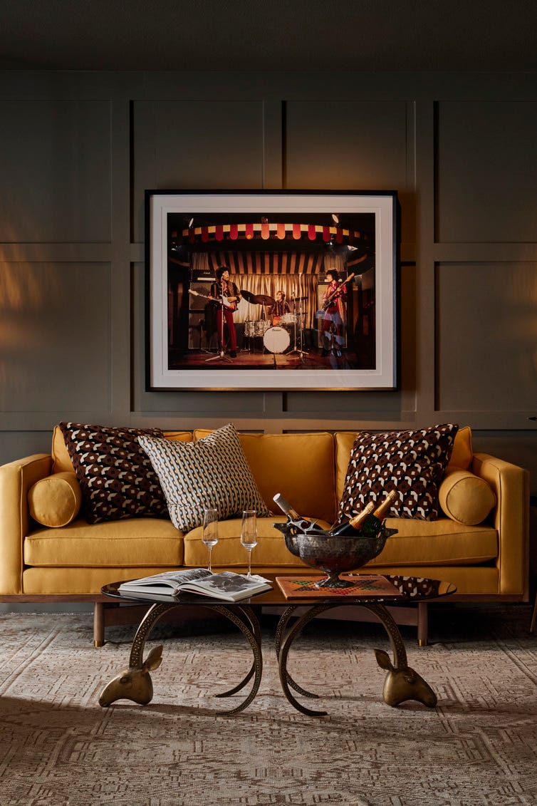
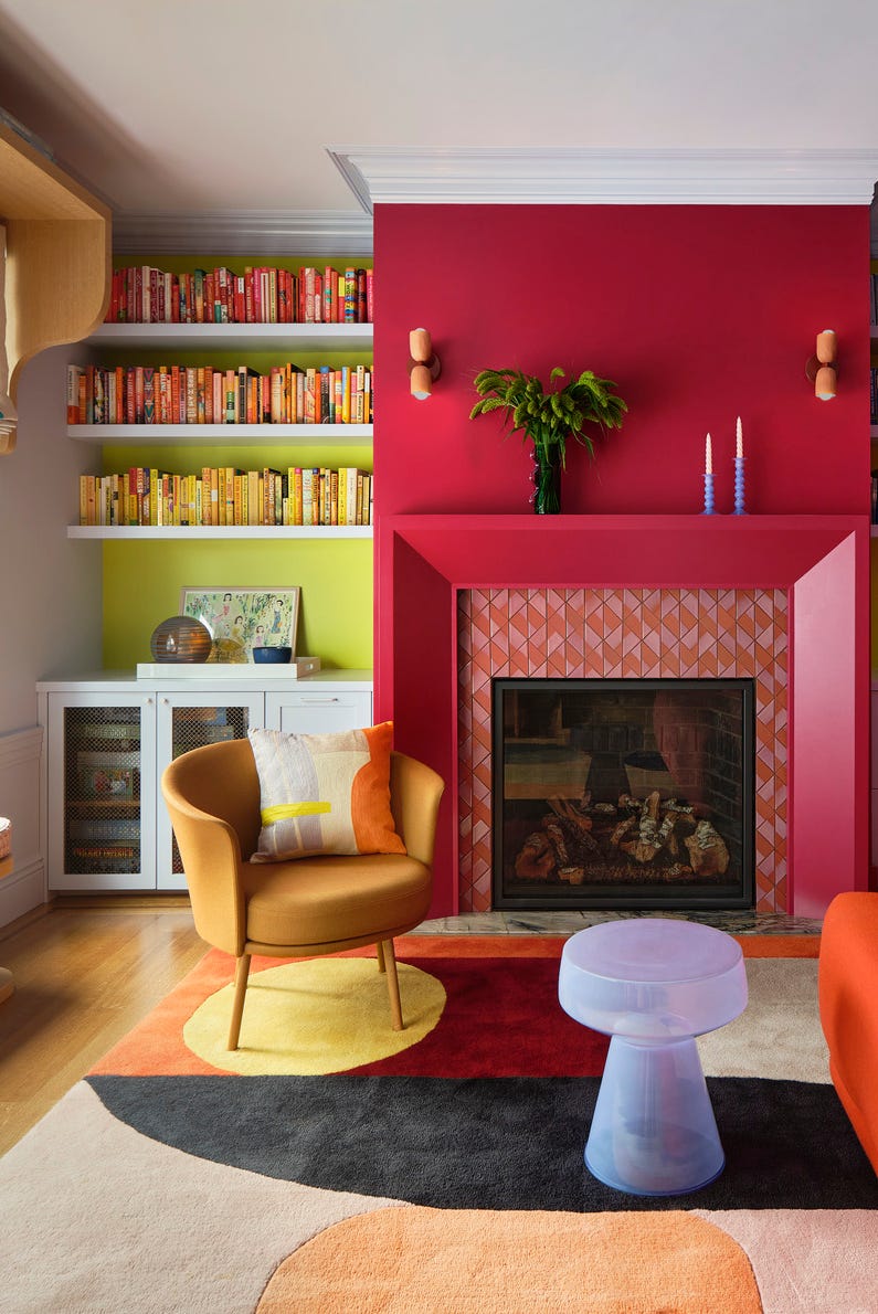
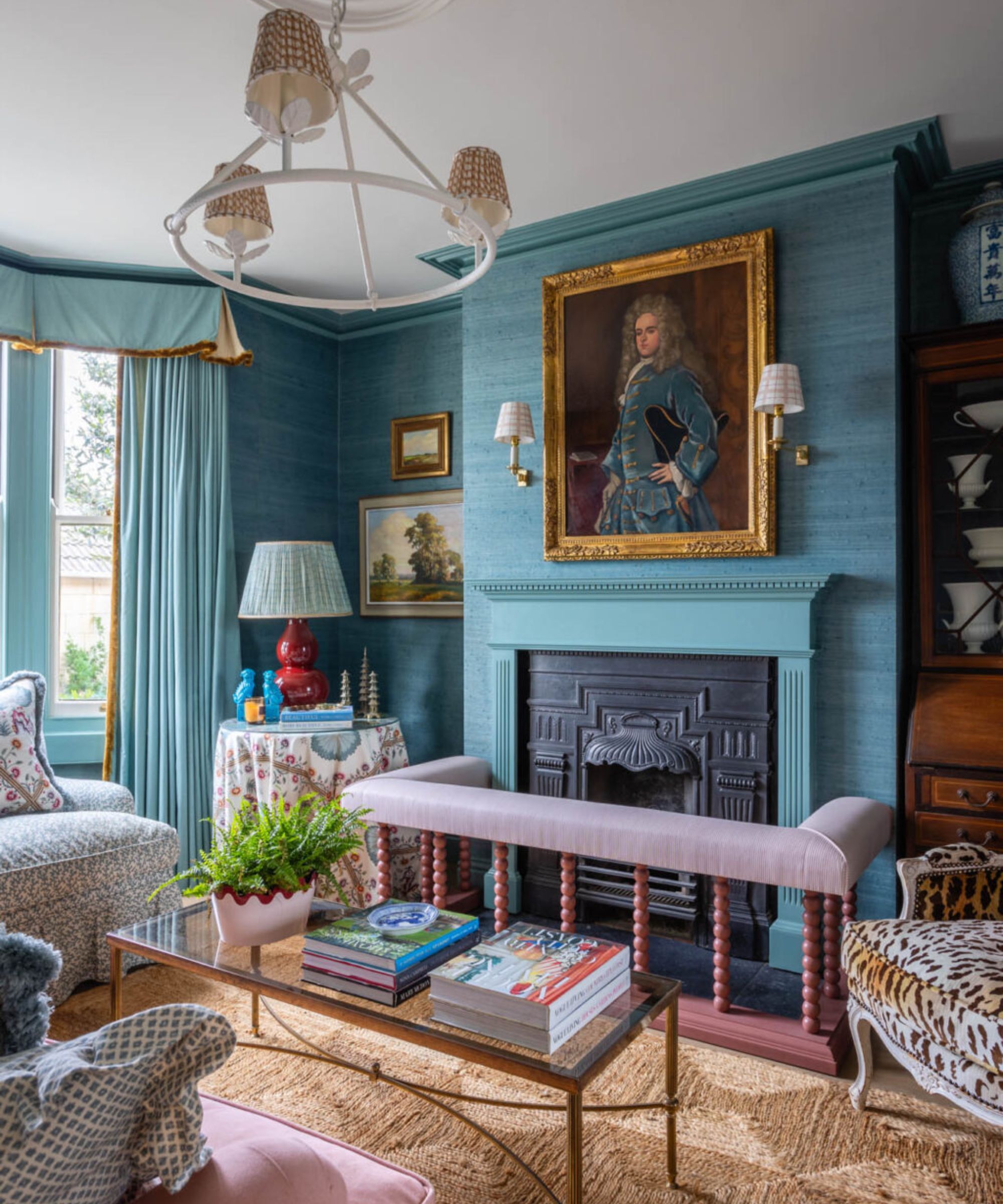
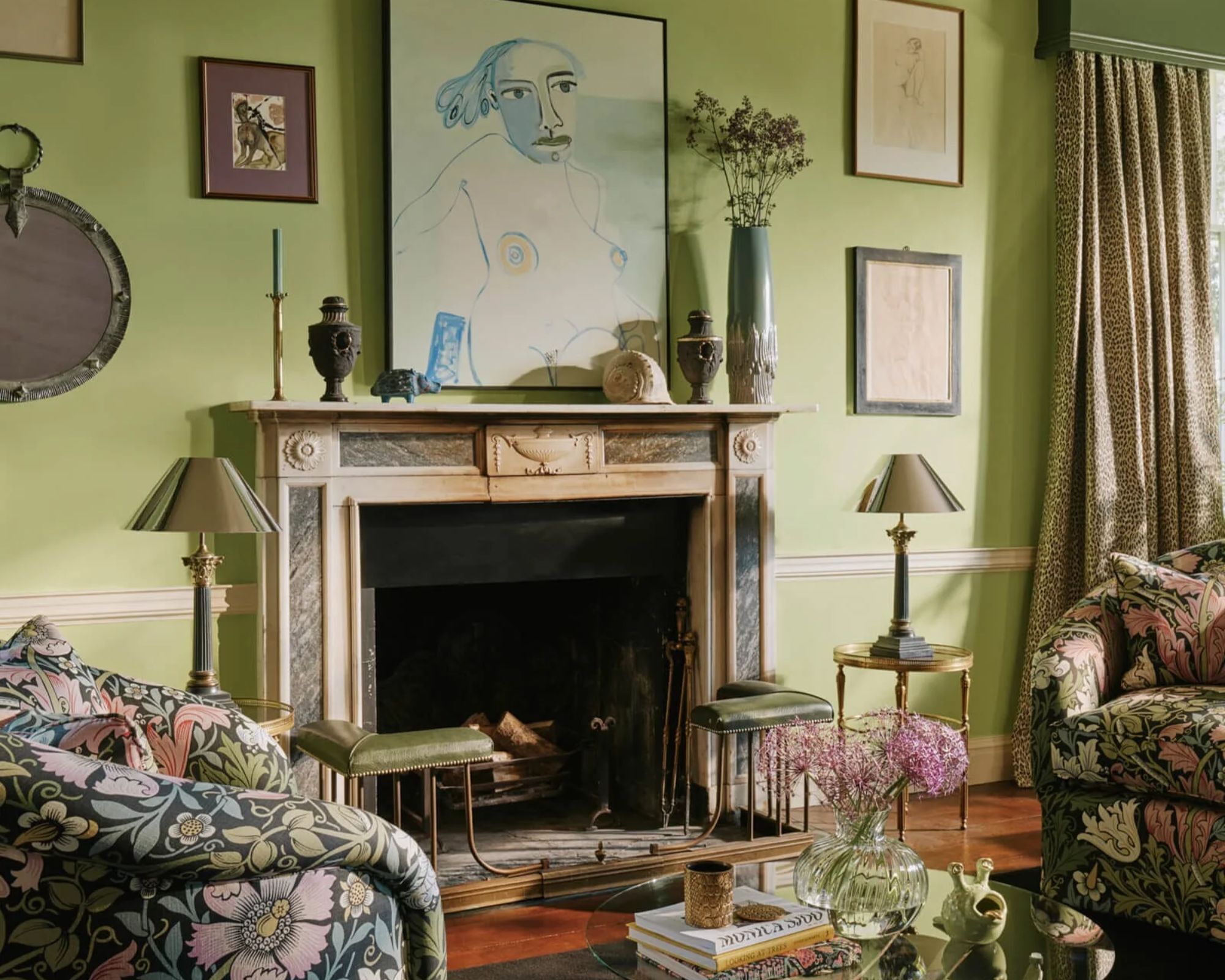
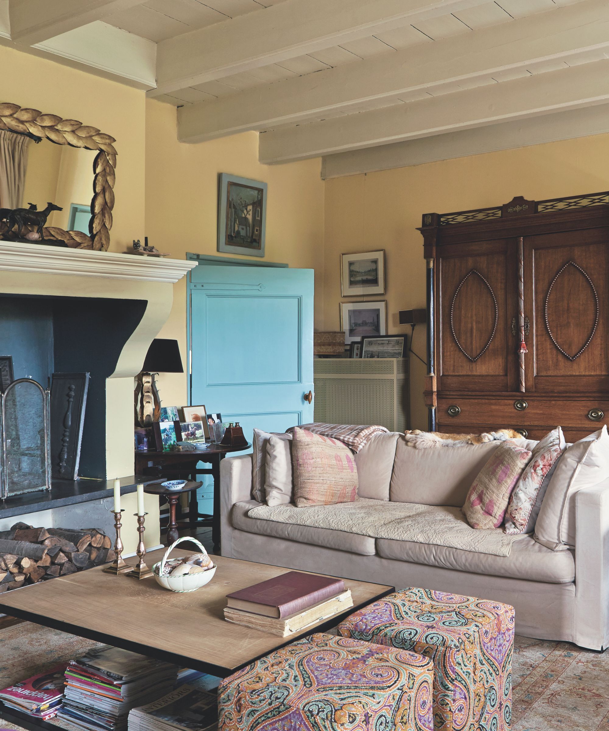
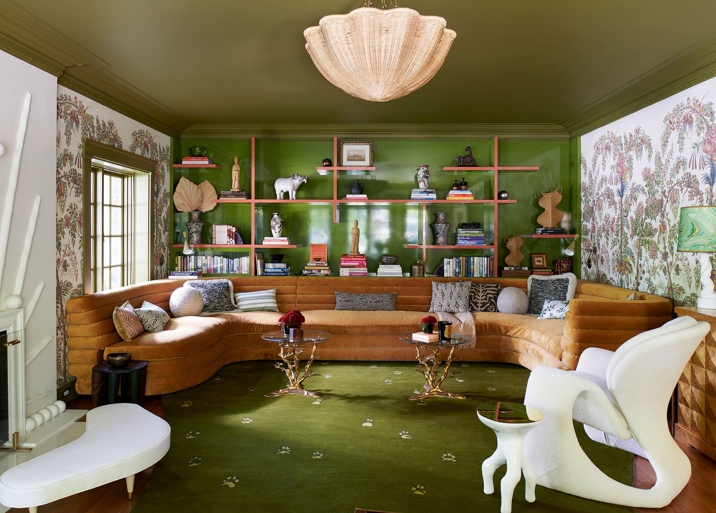
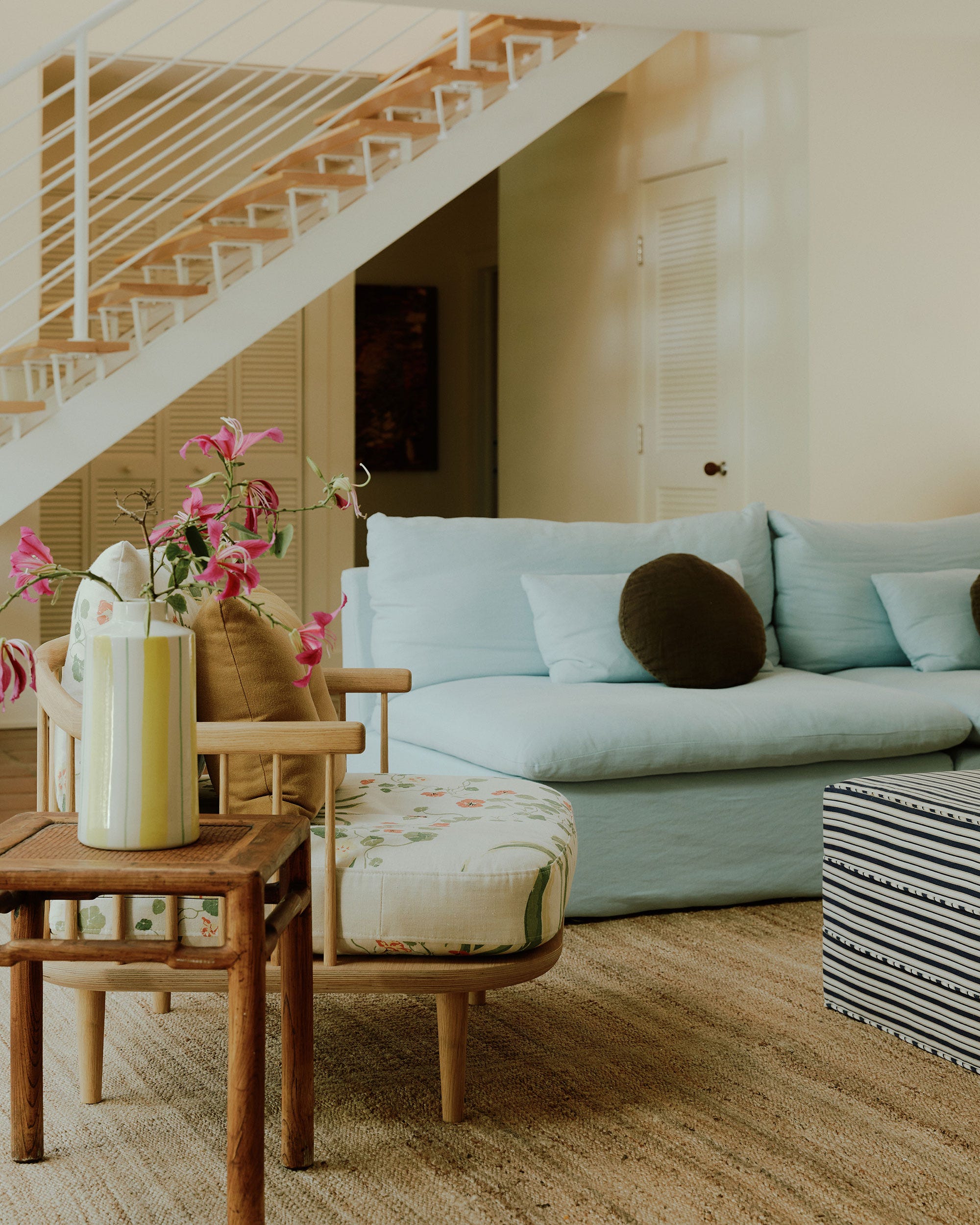
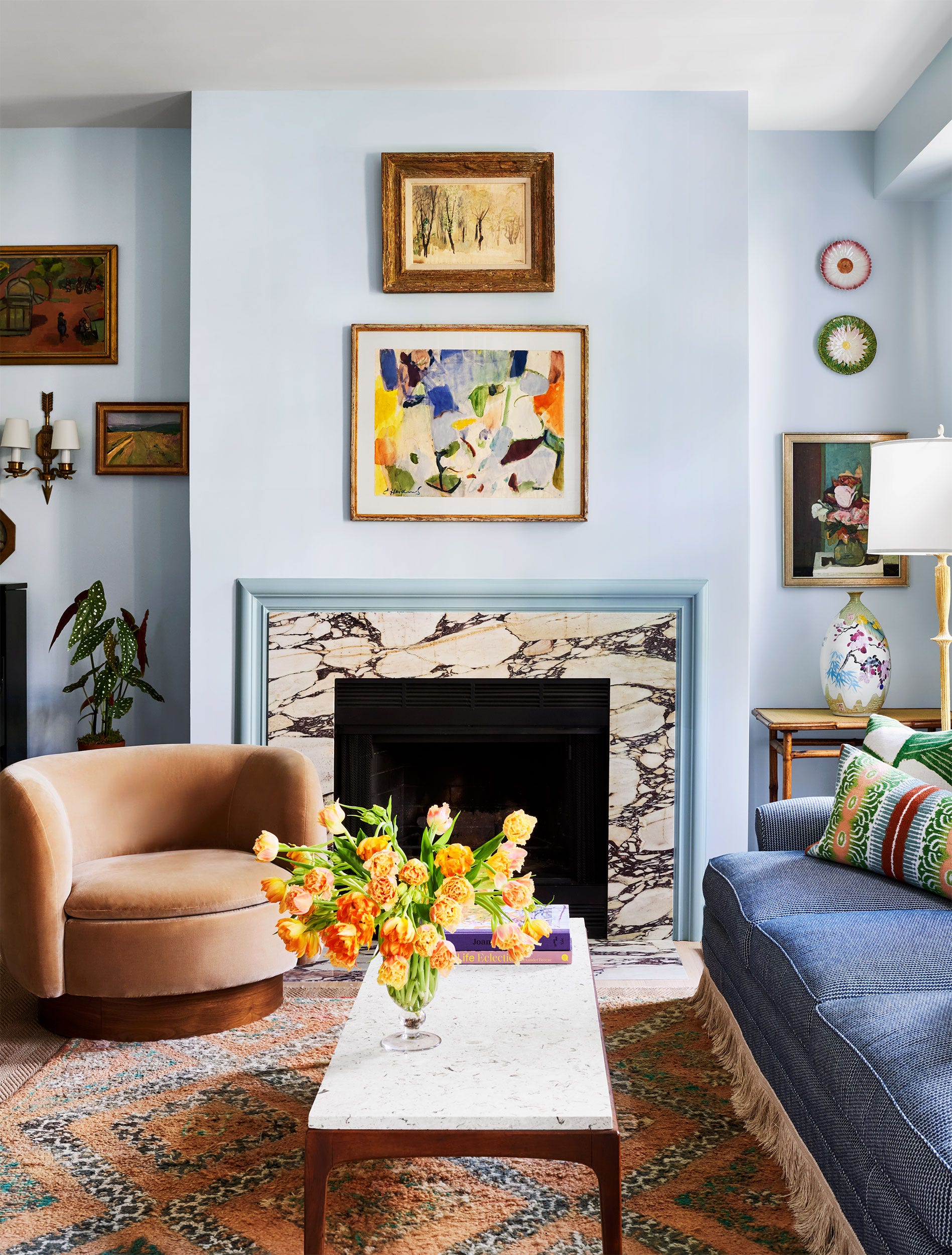
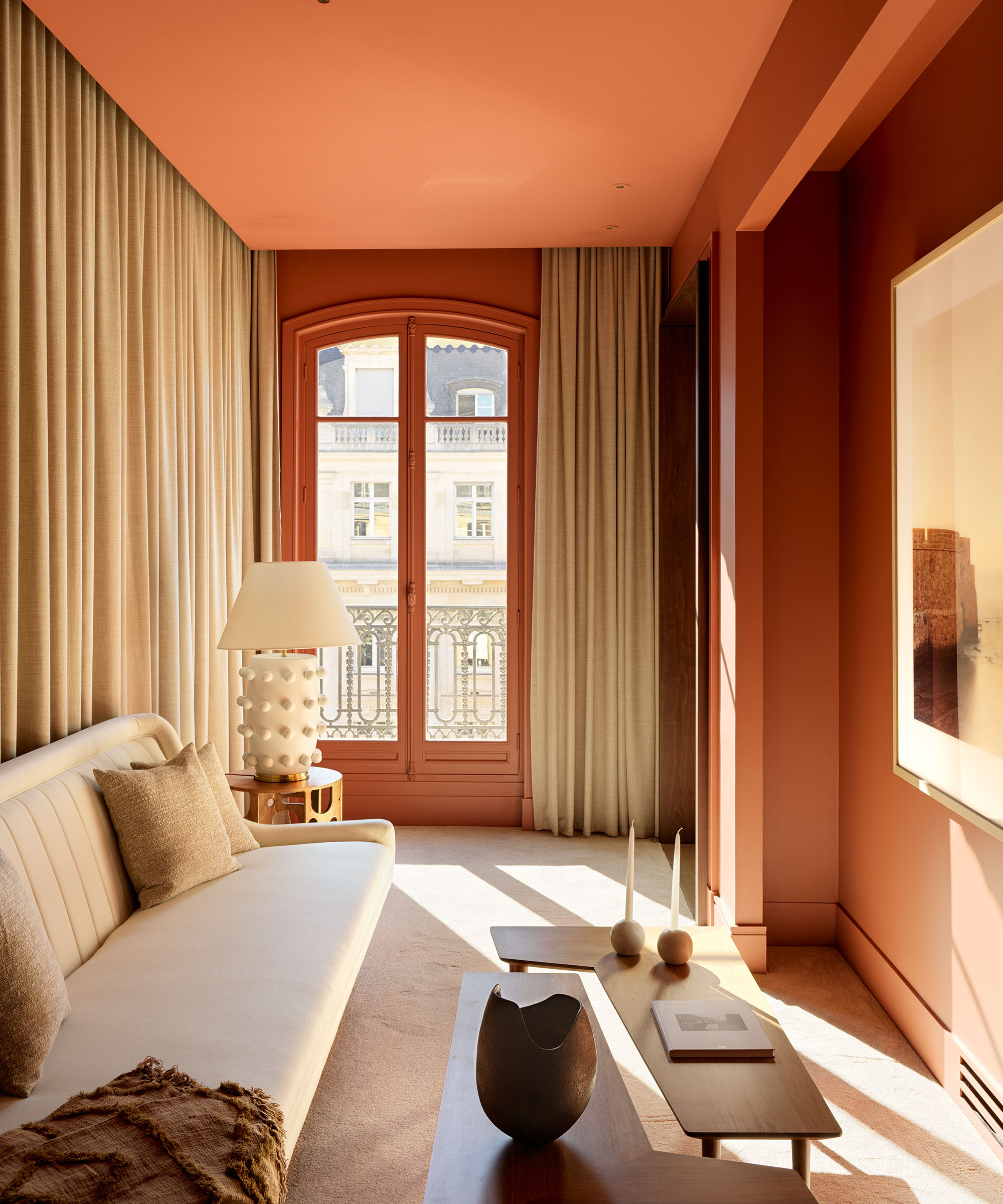
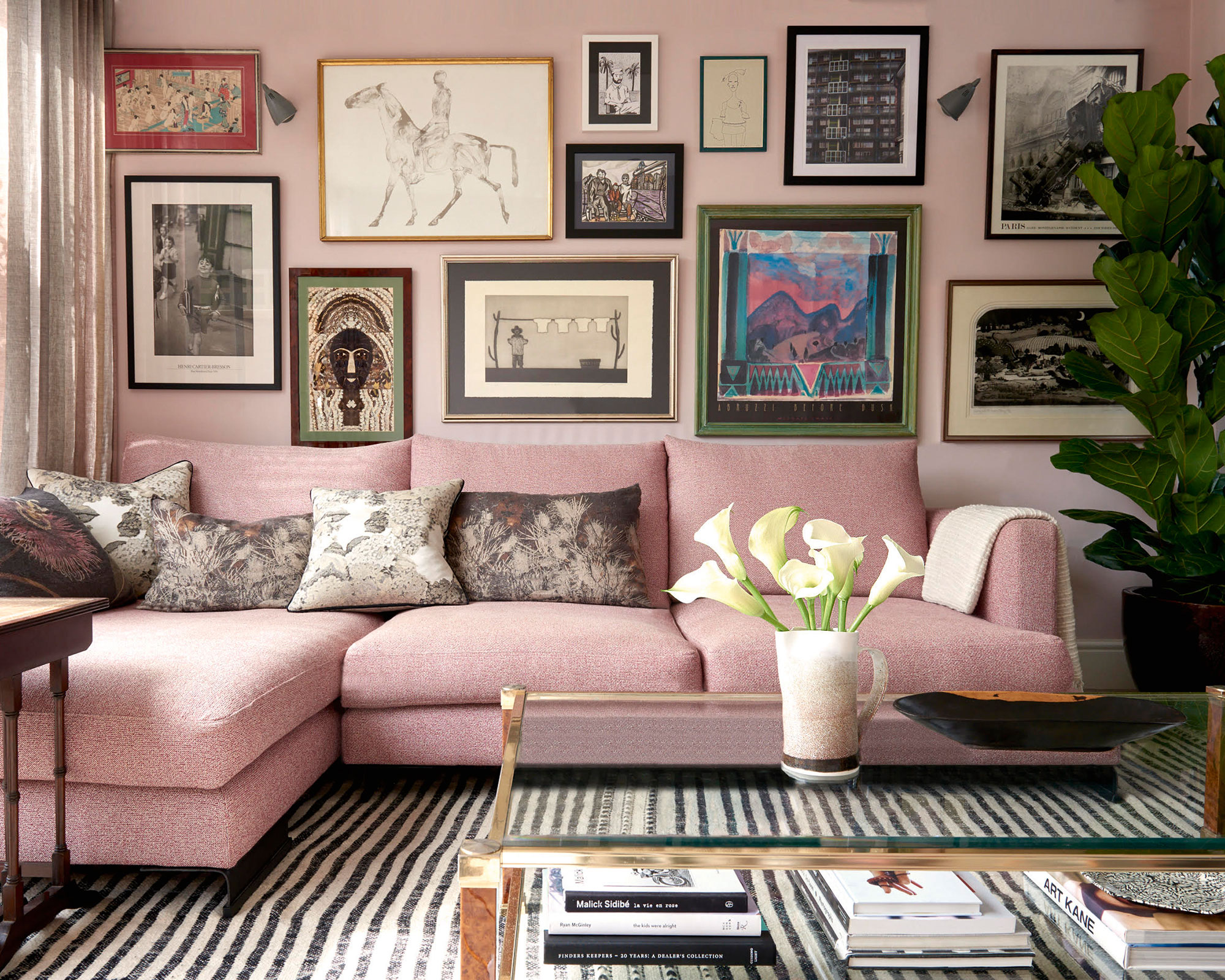
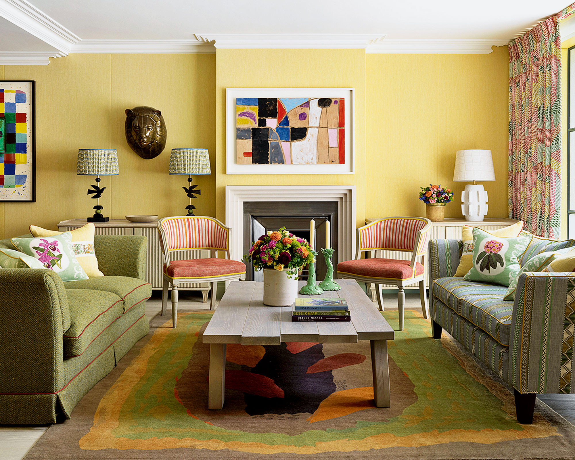
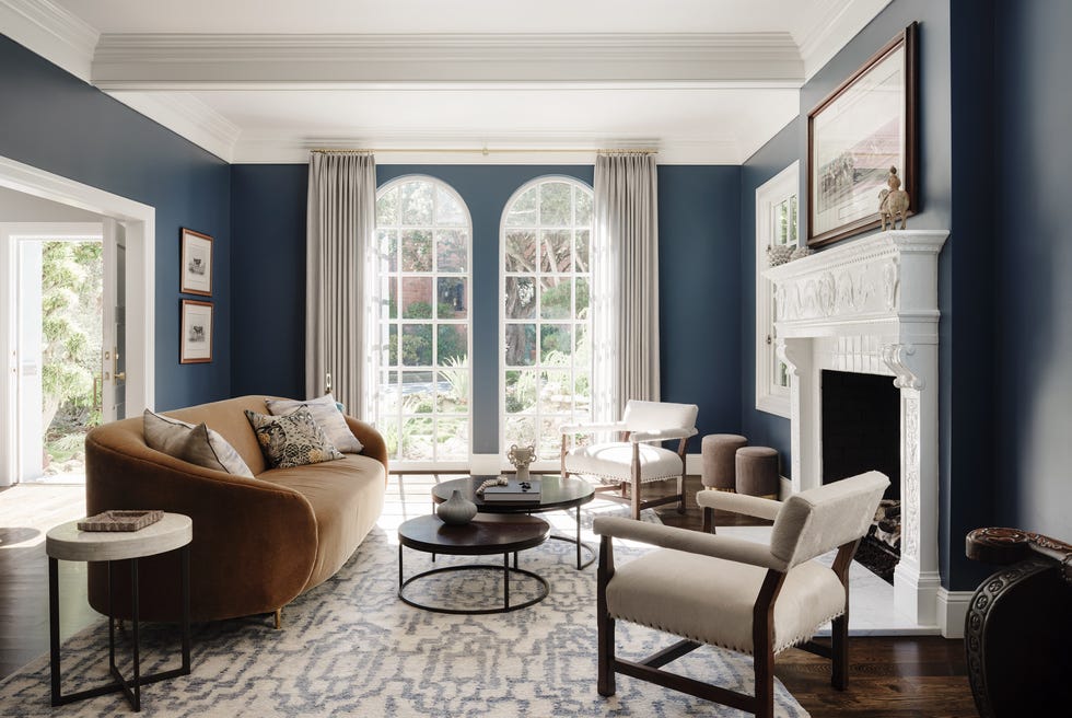
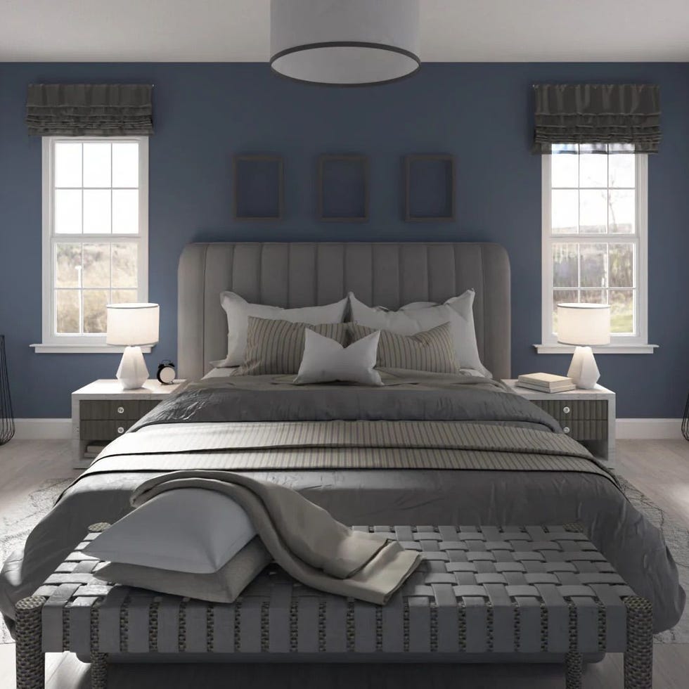
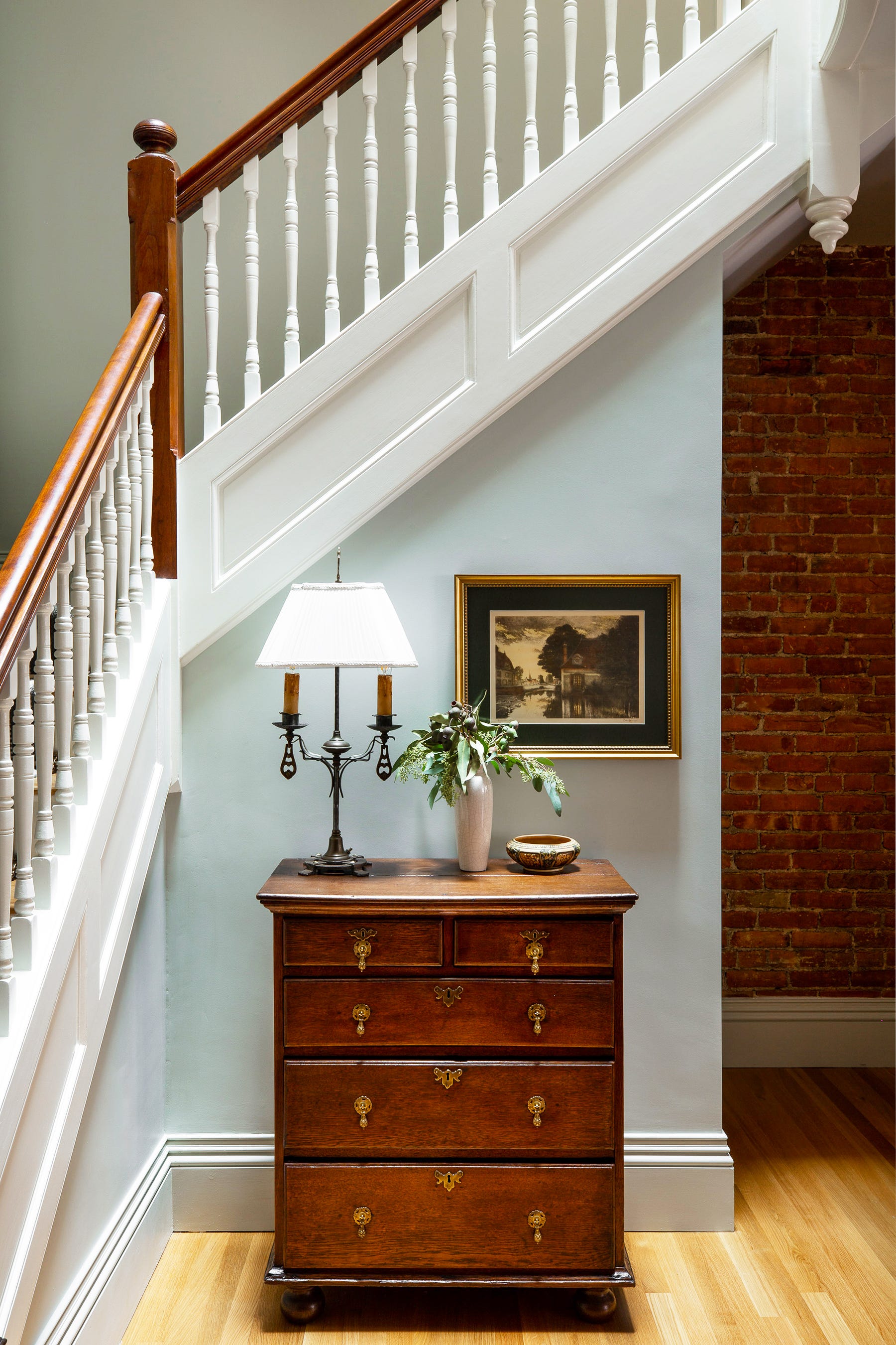
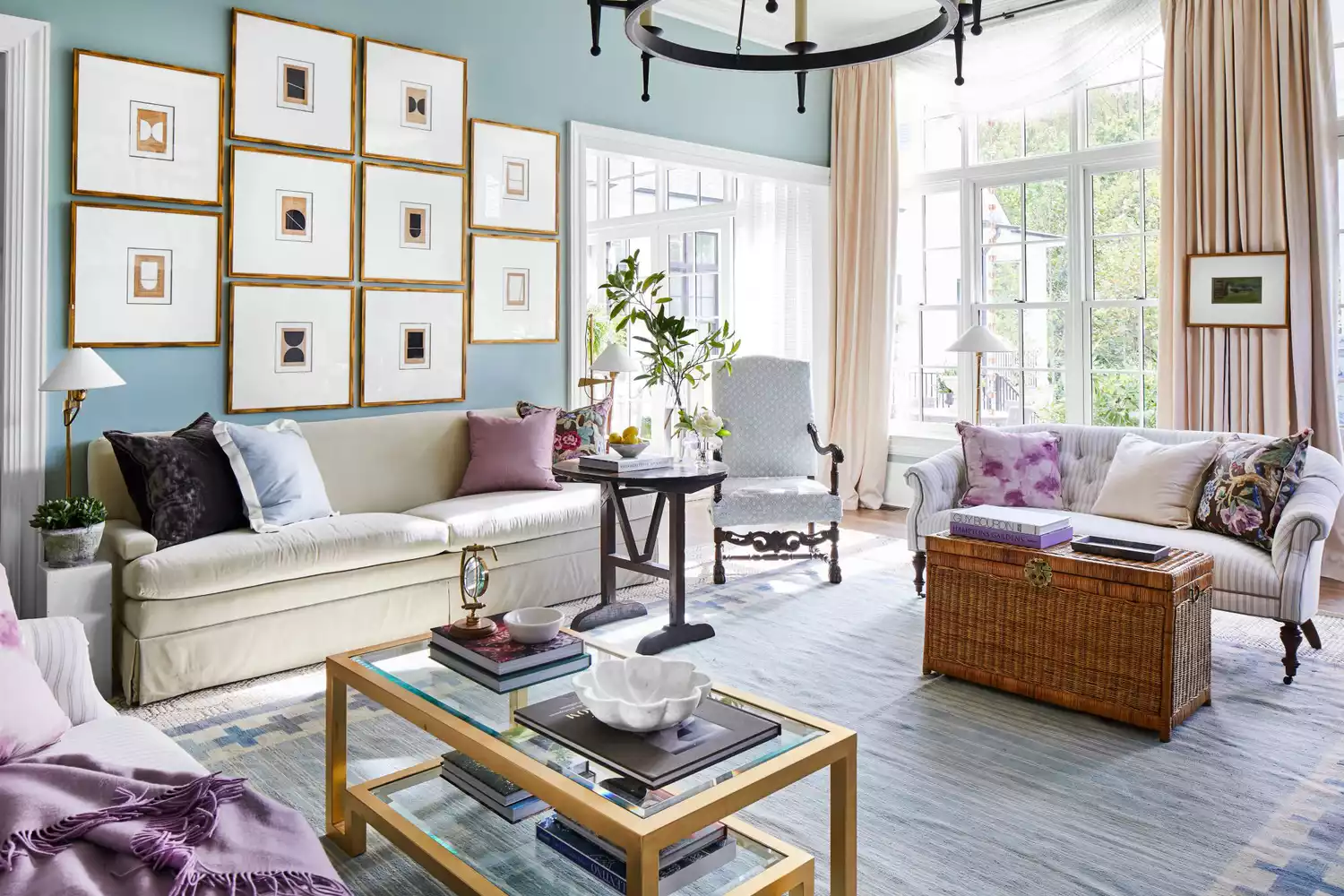
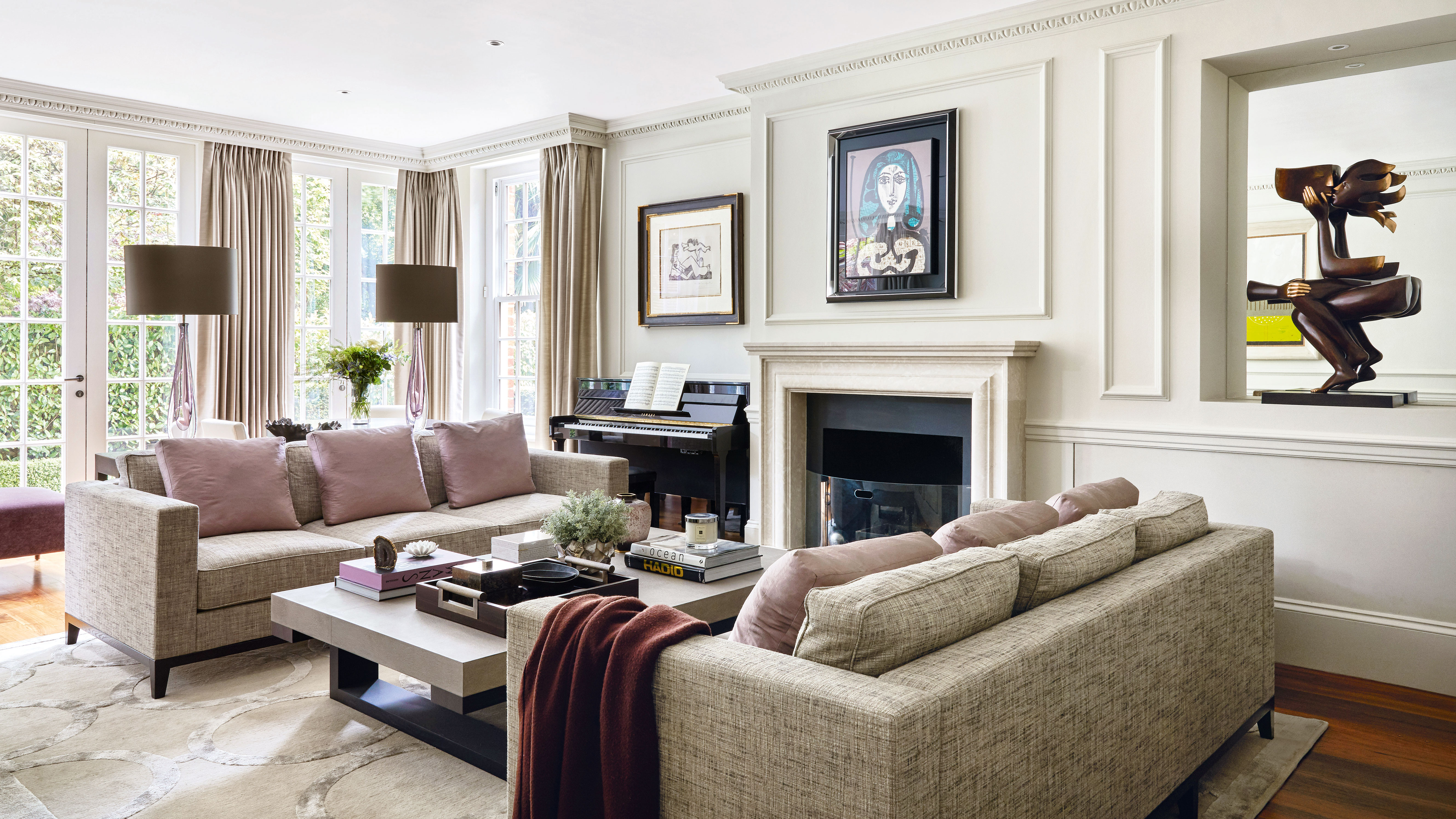
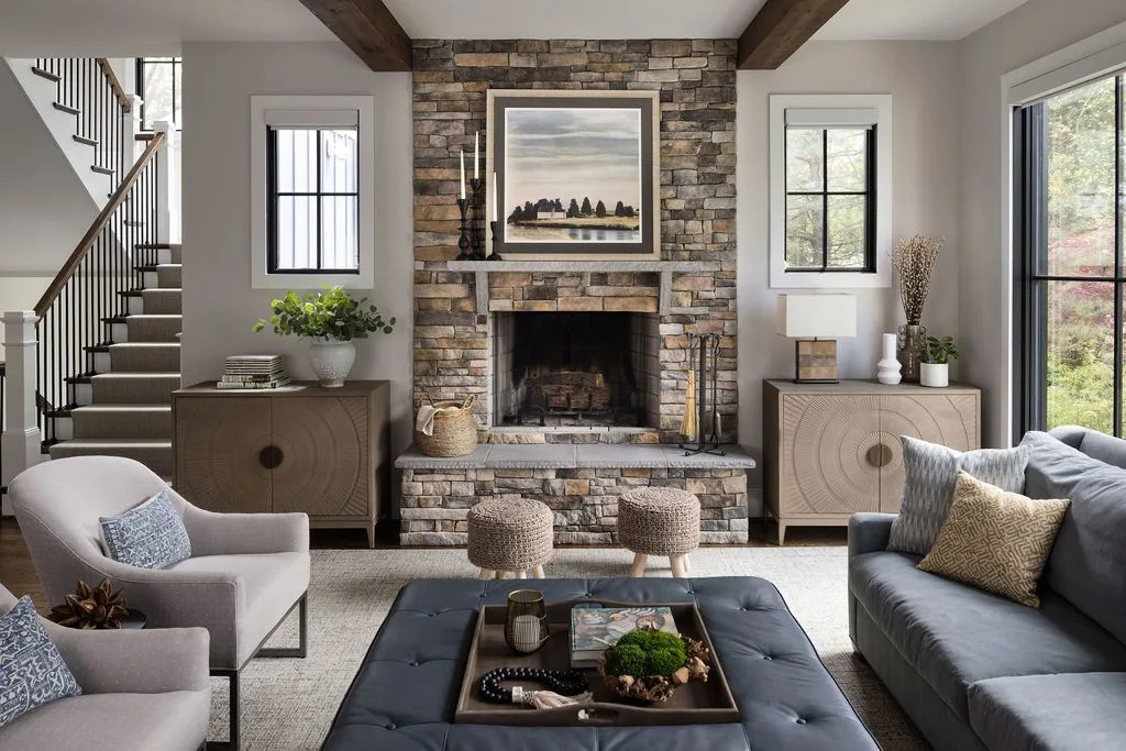
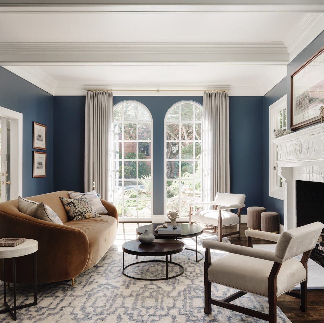
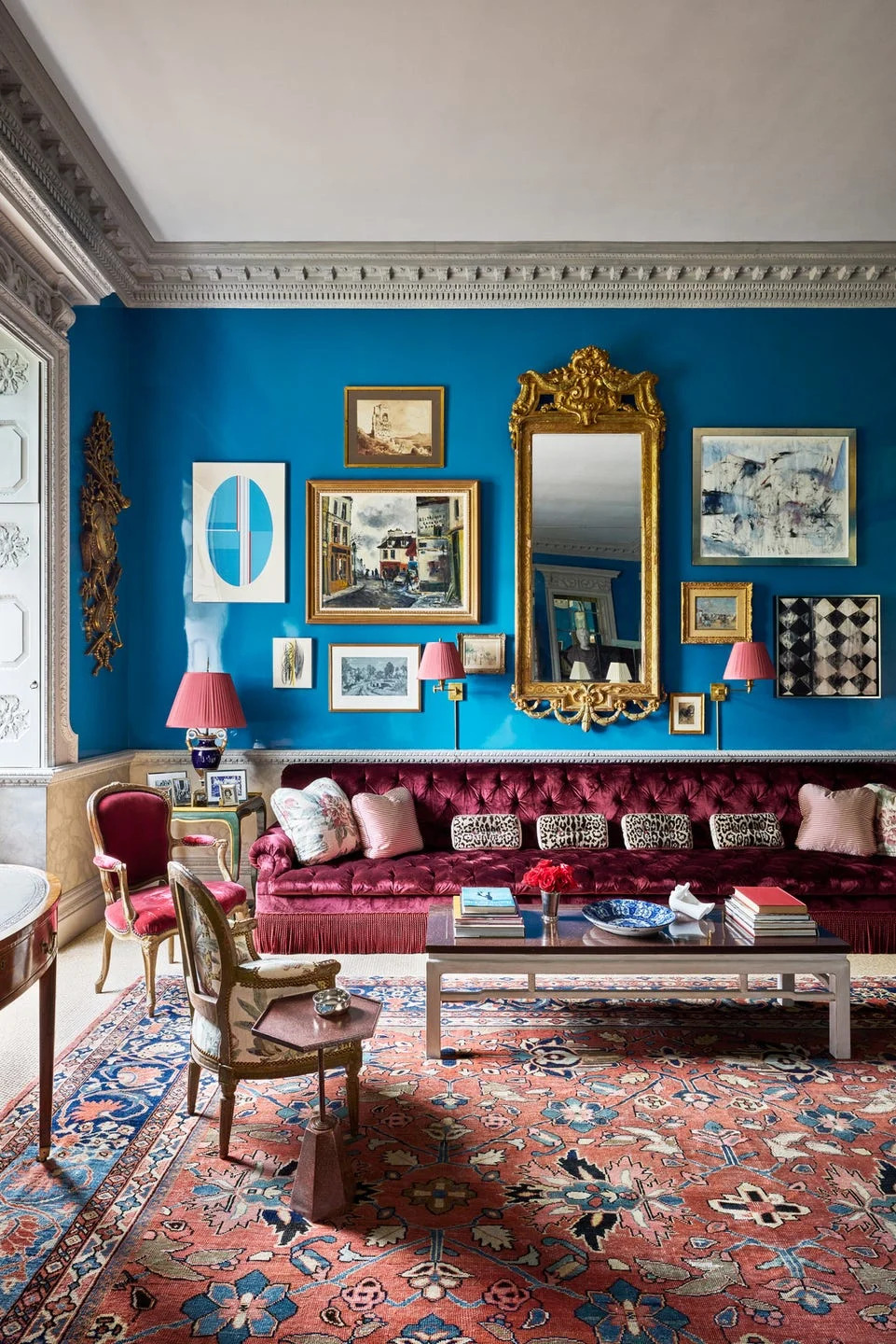
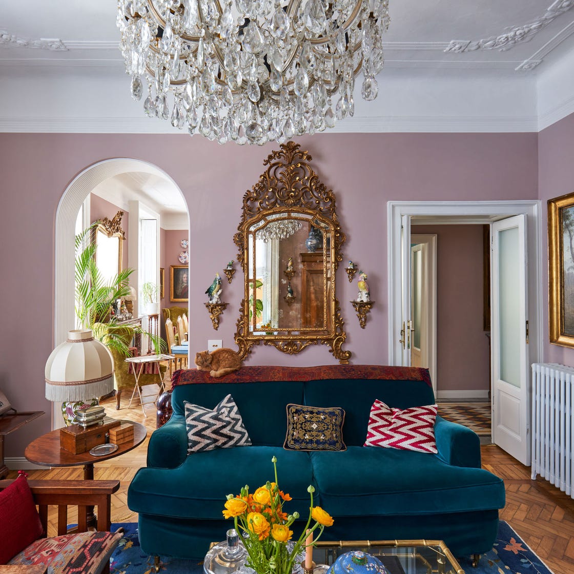
The selection of colors presented caters to a wide range of preferences and room types, from large, expansive living rooms to more intimate, smaller spaces, and from modern minimalist designs to traditional, ornate interiors. Each color suggestion is accompanied by photographic examples, illustrating how these hues integrate within a room's broader design scheme. This visual aid is crucial for understanding the practical application and impact of each paint color.
The article encourages readers to consider various factors when choosing a paint color. These include whether they prefer light and airy shades that promote a sense of calm or more lively and vivid hues that inject energy into a space. It also suggests aligning paint choices with personal style, personality types, and even astrological signs, adding a personalized dimension to the decision-making process. Furthermore, the importance of coordinating the chosen paint color with existing or planned elements such as artwork, antique furnishings, and other decorative collections is highlighted. The goal is to ensure that the paint color harmonizes with all elements to create a cohesive and aesthetically pleasing environment.
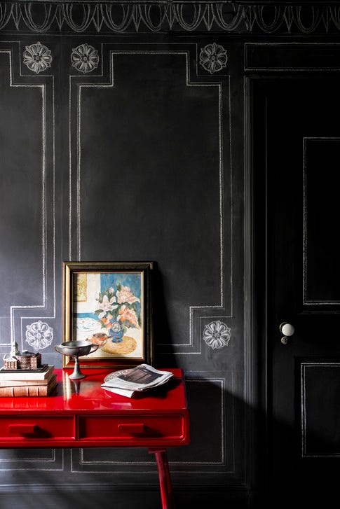
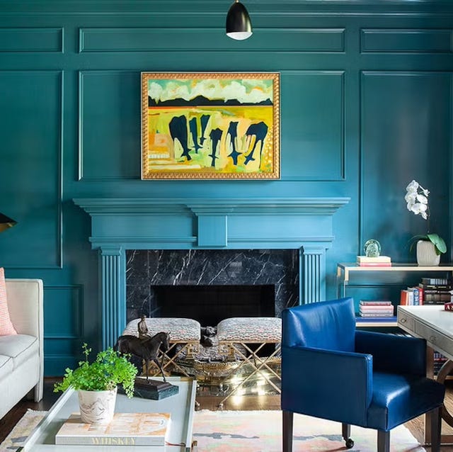
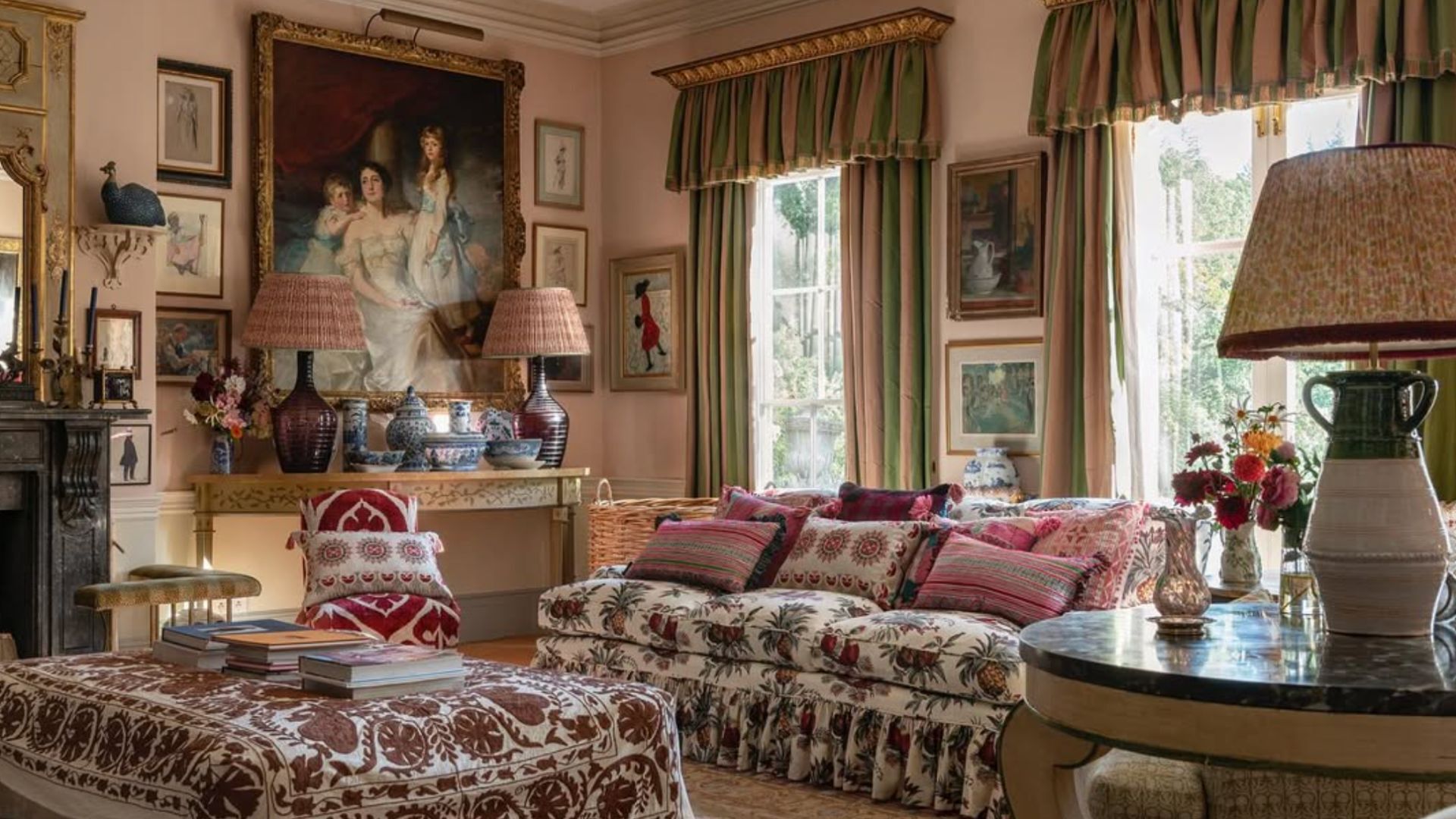
The featured colors showcase a diverse palette, including rich and moody options like Sherwin-Williams' Black Magic, which architects Bobby McAlpine and Blake Weeks used to draw focus to a lakeside view, and Farrow & Ball's Tanner Brown, employed by Suzanne Kasler to create a playful contrast with floral patterns. Lighter options include Edward Bulmer Paint's Jonquil, a neutral pink chosen by Mary Graham to tie together diverse colors in an English family room, and Benjamin Moore’s Wisteria, a dusty violet that textile designer Sandra Jordan uses to create varying moods throughout the day. Vibrant selections such as Meredith Ellis's use of Farrow & Ball's Dix Blue and Redd Kaihoi's dazzling peacock blue demonstrate how bold colors can be integrated effectively.
Other notable examples include Guy Oliver's use of a quiet lavender shade to complement Pre-Raphaelite art, and Fine Paints of Europe's NCS 1020-G807 (light chartreuse) chosen by Anna Brockway to reflect outdoor hues. The article also addresses practical considerations, such as Laura Lee Clark's technique of painting ceilings with high-gloss warm neutrals like Benjamin Moore's Sea Froth to enhance spaciousness in rooms with lower ceilings. Cathy Kincaid's approach of using slightly different neutral shades (Farrow & Ball's Pointing for walls and Borrowed Light for ceilings) is suggested to prevent a room from feeling monotonous. The guide also covers glossy whites, such as Benjamin Moore's Swiss Coffee, used by Lucy Doswell to bounce garden light indoors, and aqua blues like Benjamin Moore’s Antiqued Aqua, which highlights sea treasures in Thomas Boog's French country home. The article provides inspiration and practical advice for transforming living rooms into visually striking and harmonious spaces, offering a range of colors from dramatic to subtle, ensuring that every homeowner can find a suitable option to elevate their interior design.
#LivingRoomDesign #PaintColors2025 #InteriorDesignTrends #HomeDecor #ColorPalette #DesignerTips #DecoratingIdeas #AccentWalls #HomeImprovement #LivingRoomDesign #PaintColors2025 #InteriorDesignTrends #HomeDecor #ColorPalette #DesignerTips #DecoratingIdeas #AccentWalls #HomeImprovement
0 comment in total
 No comments yet
You may also like

10 Timeless Living Room Paint Colors Designers Swear By
Jewel Tones Are Trending for Living Room Paint Colors, According to Designers

Designer-Approved Living Room Colors That'll Make You Feel Happier
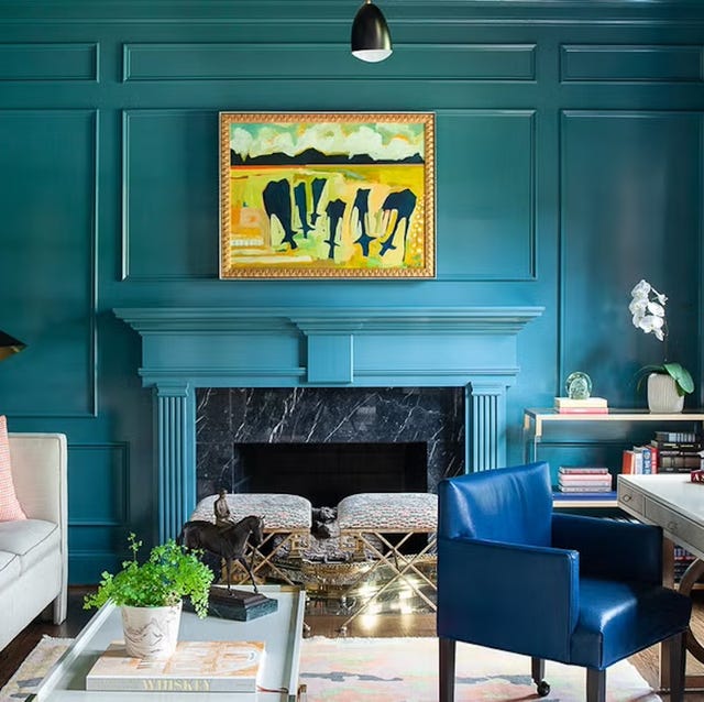
6 Calming Paint Colors Designers Swear By For A Relaxing Living Room
The 60 Most Popular Living Room Paint Colors Right Now

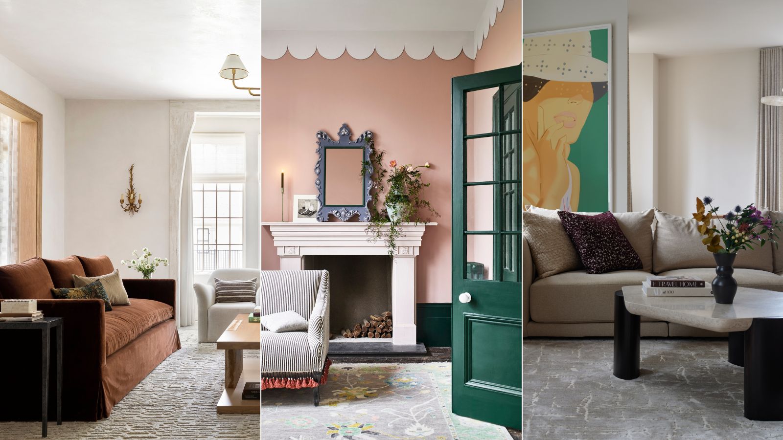
These are interior designers' favorite color combinations for living rooms – from neutral and calming to bold and playful
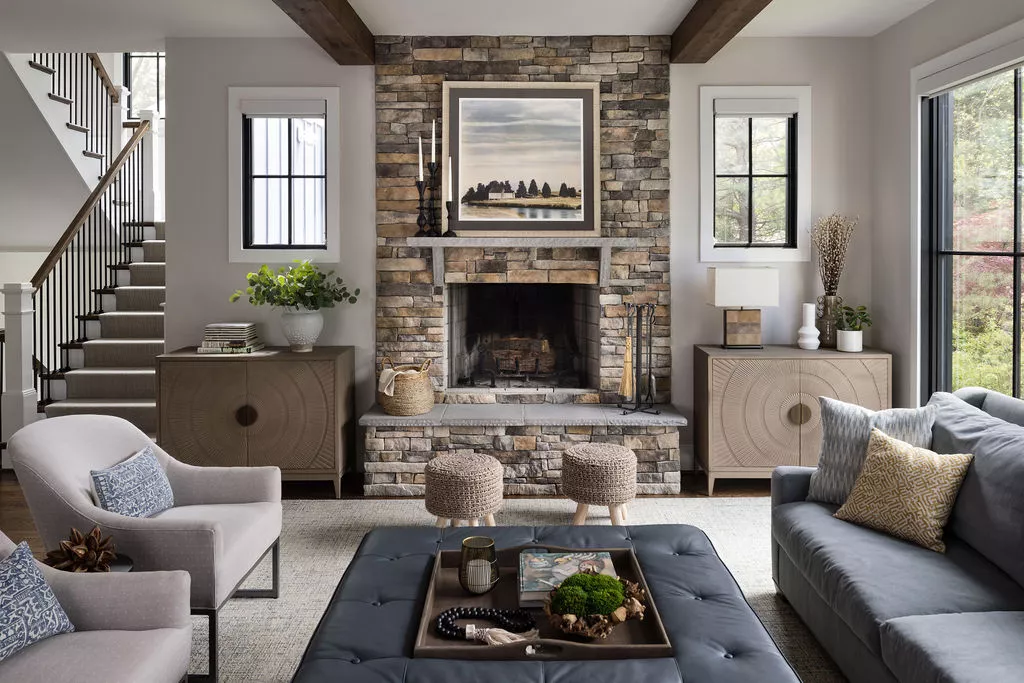
The Best Living Room Paint Colors, According To Designers
5 colors that will make your living room feel happier, according to interior designers
Listen Up: These Are the Best Paint Colors for Your Living Room
The Best Living Room Paint Colors, According To Designers

5 living room paint colors going out of style in 2025
Lick Paint Will Transform the Mood in Your Home Through Color Psychology
Designers Swear By These 55 Living Room Paint Colors

7 Popular Paint Colors for the Living Room
These Living Room Paint Colors Are a Total Mindset Shift
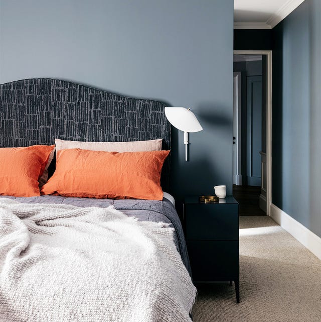
35 Paint Colors to Consider for Every Room in Your House

Experts reveal the best living room paint colours to transform every space

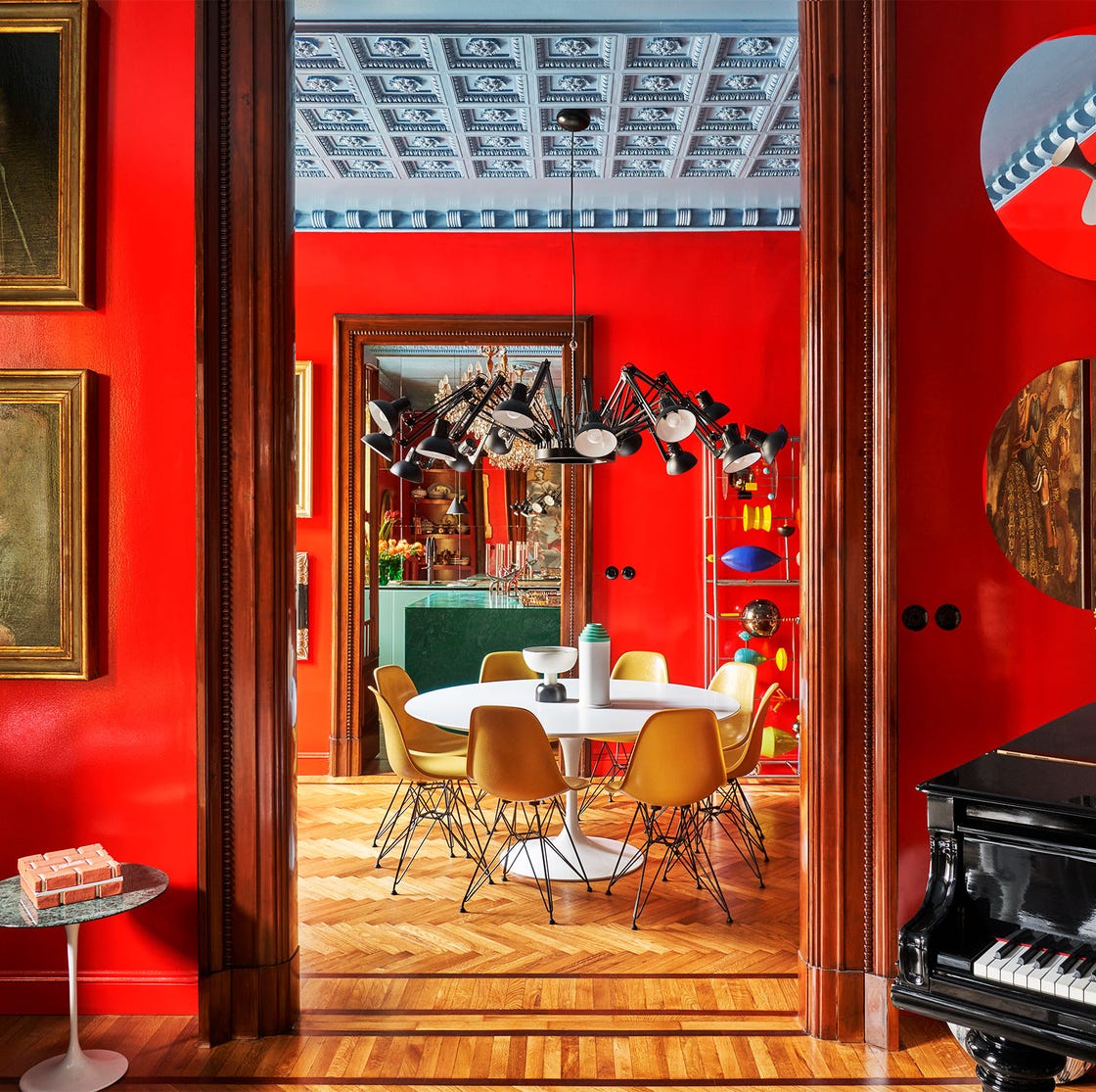
55 Living Room Color Ideas That Will Take Your Space from Drab to Fab


11 Paint Colors That INSTANTLY Make Your Home Look "Expensive," According to Designers
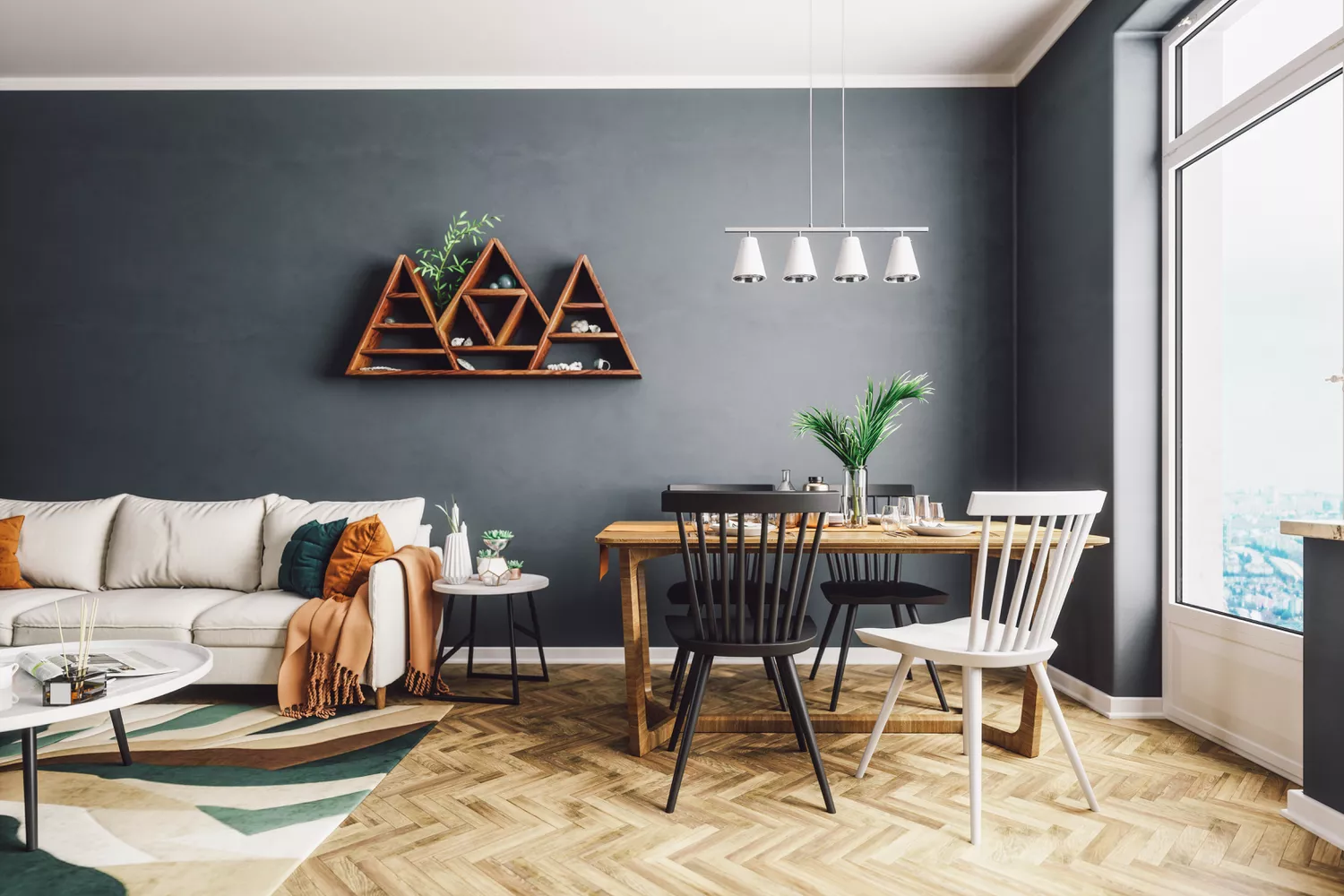
4 Living Room Paint Colors That Are So Outdated, According to Designers