1/13
12 Color Schemes That Are Popping Off Right Now, According to Designers
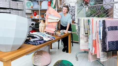
The article explores a variety of interior design color schemes, as recommended by professional designers, emphasizing the importance of thoughtful color selection to create timeless spaces rather than falling prey to fleeting trends. It addresses the challenge of distinguishing between enduring palettes and passing fads, particularly given the influence of social media. To simplify the process for readers, the article compiles twelve expert-approved color combinations, offering visual inspiration for each.
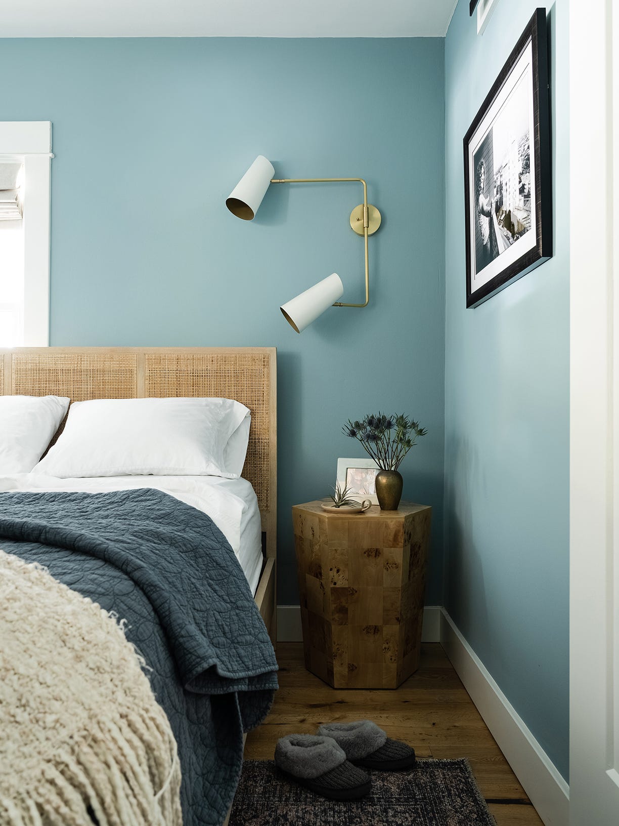
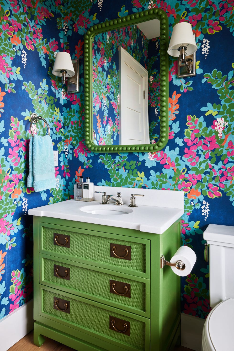
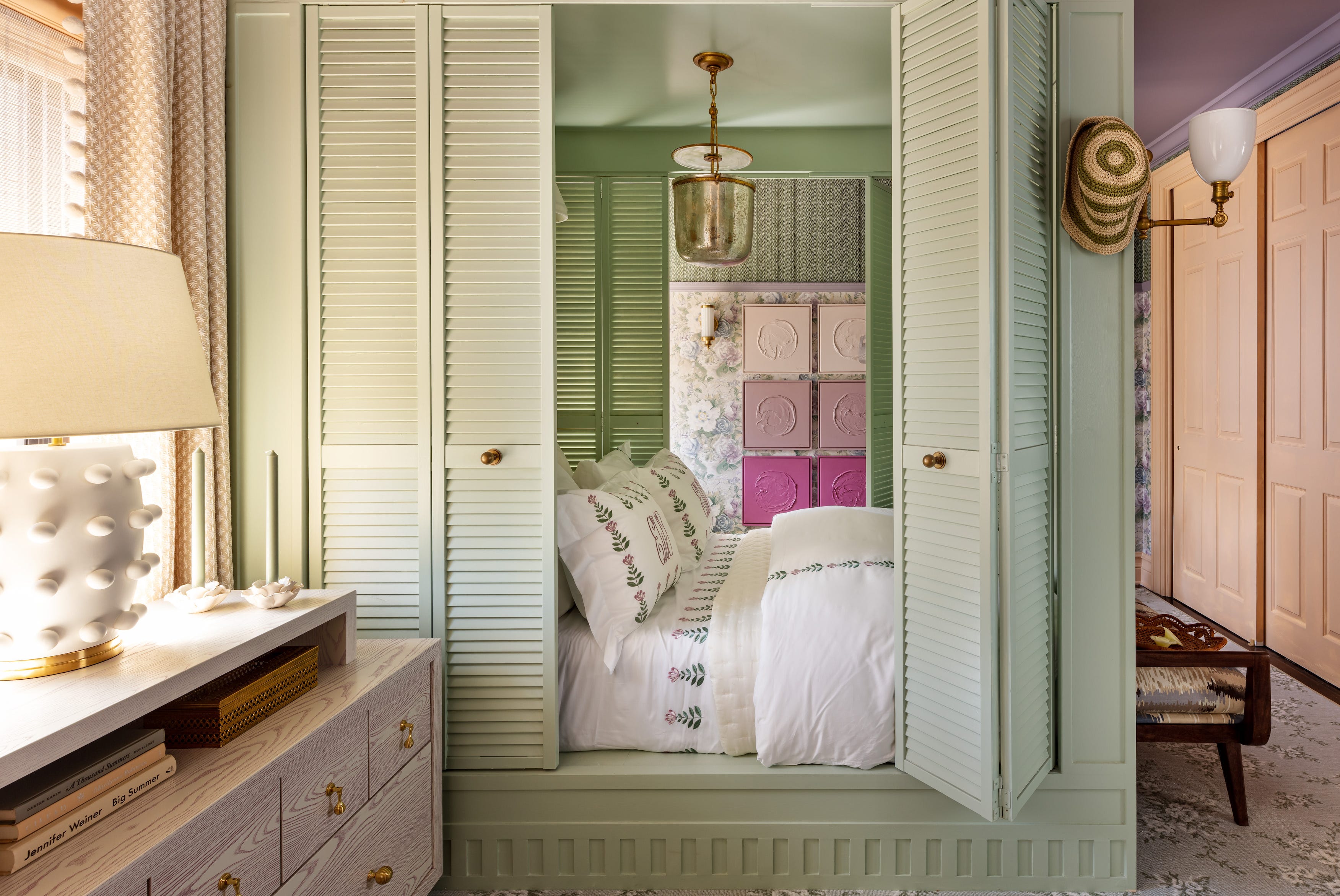
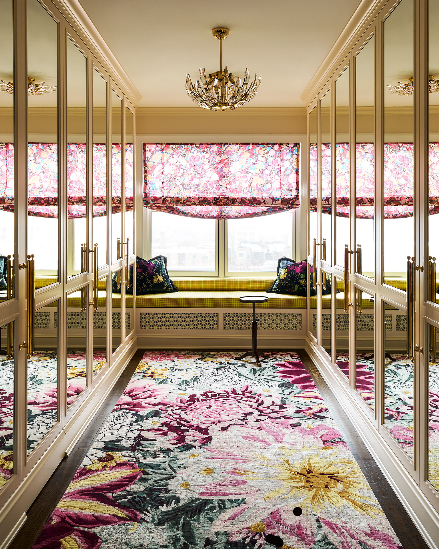
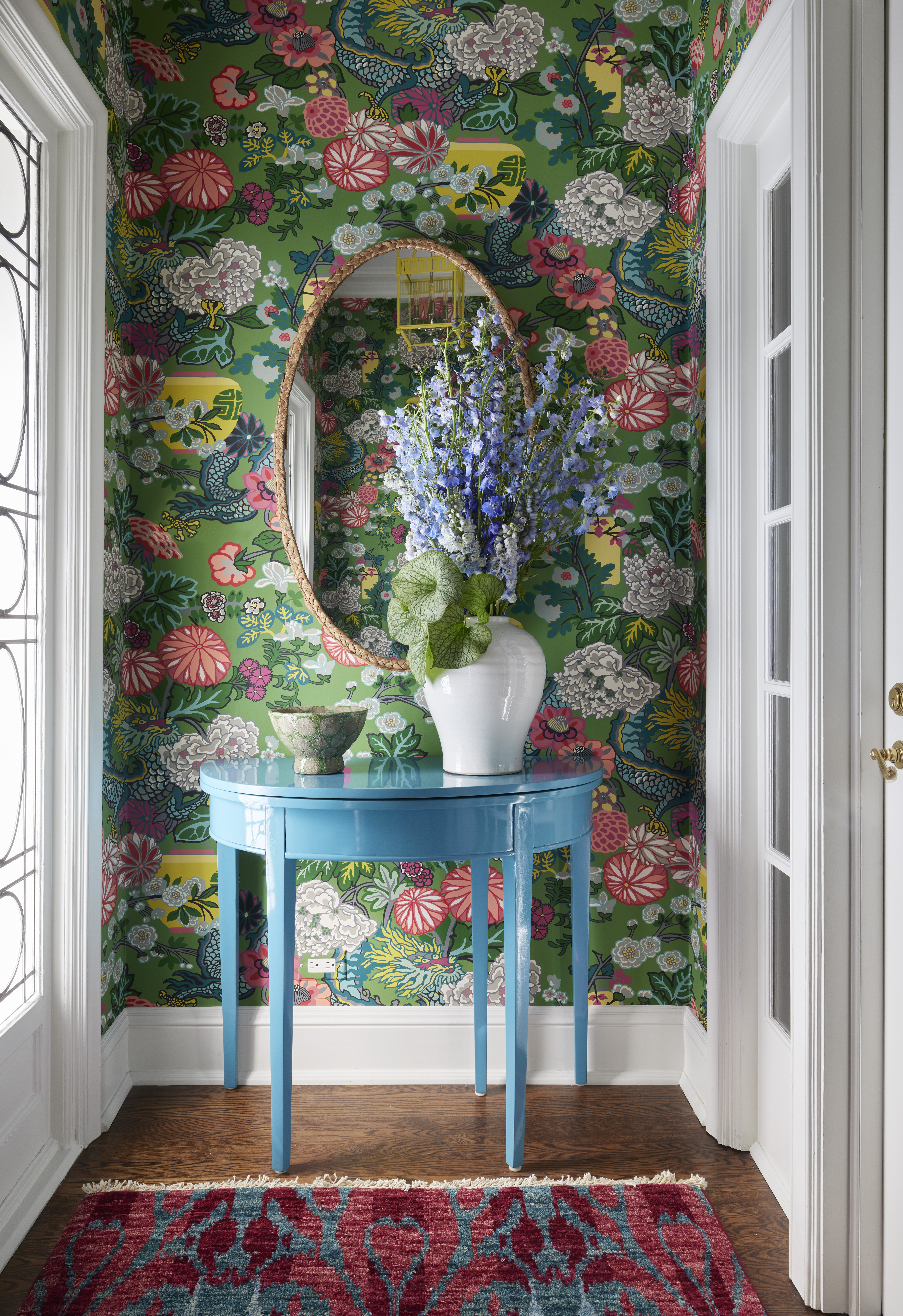
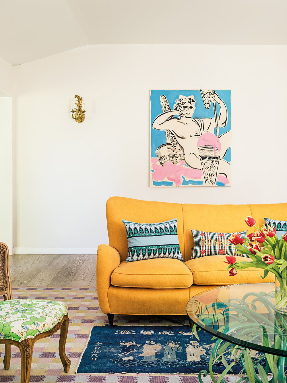
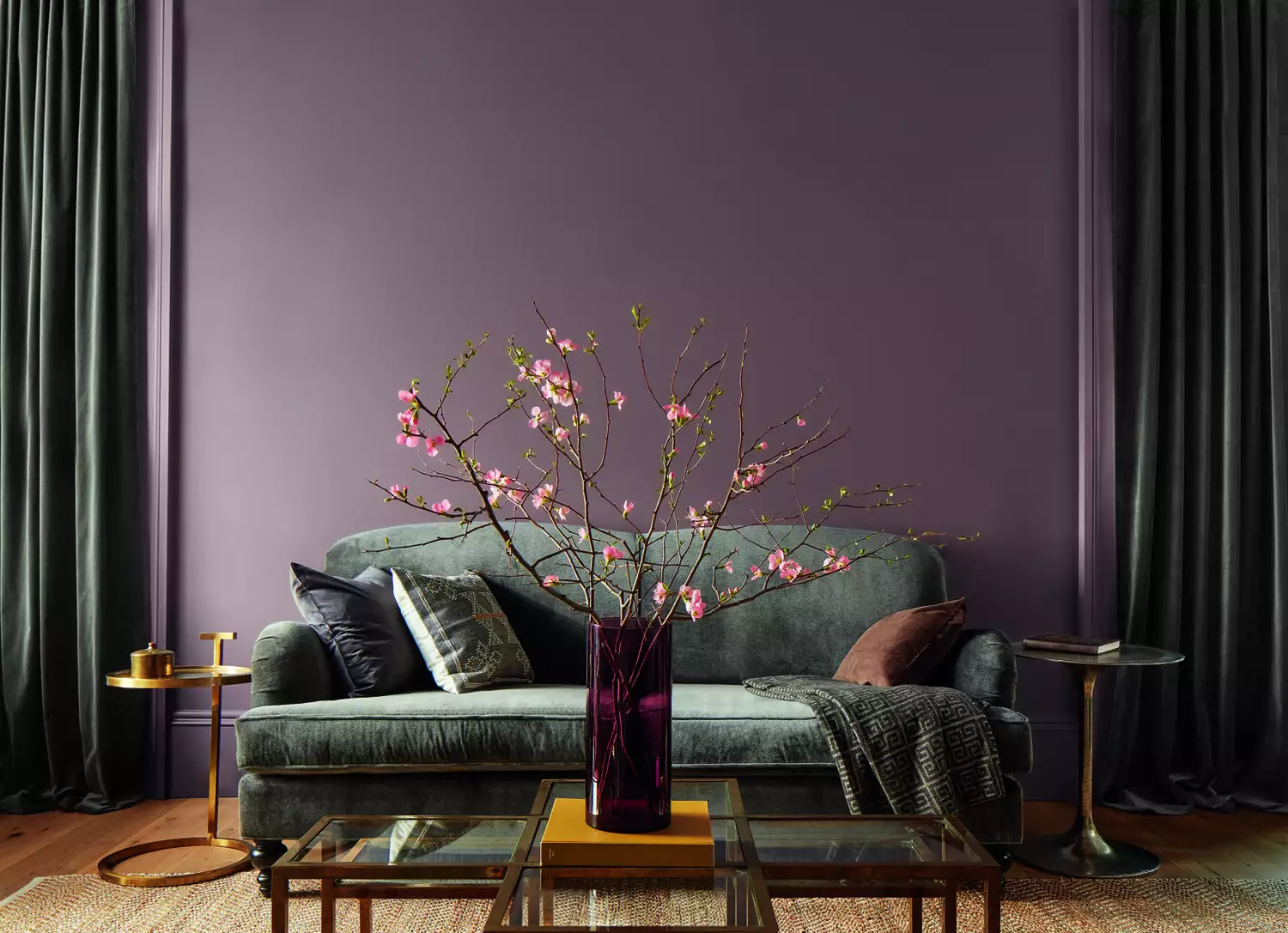
One featured combination is 'Aqua and Pink,' which designer Shauna Glenn describes as evoking happy summers and beach cabanas, with endless possibilities across various shades from deep raspberry to pale aqua. Another scheme, 'Green, Blue, and Pink,' is favored by Christina Salway for historical houses, where soft neutral white walls are complemented by historically appropriate colors on trim and millwork, such as Farrow & Ball’s Inchyra Blue, Vert De Terre, and Setting Plaster, to add contrast and interest. 'Purple and Green' is highlighted by Amber Guyton, noting its majestic and inviting quality and natural blend, reminiscent of wisteria and vineyards. This combination pairs well with various metals and design aesthetics, creating an effortless, collected look with layers of solids and patterns.
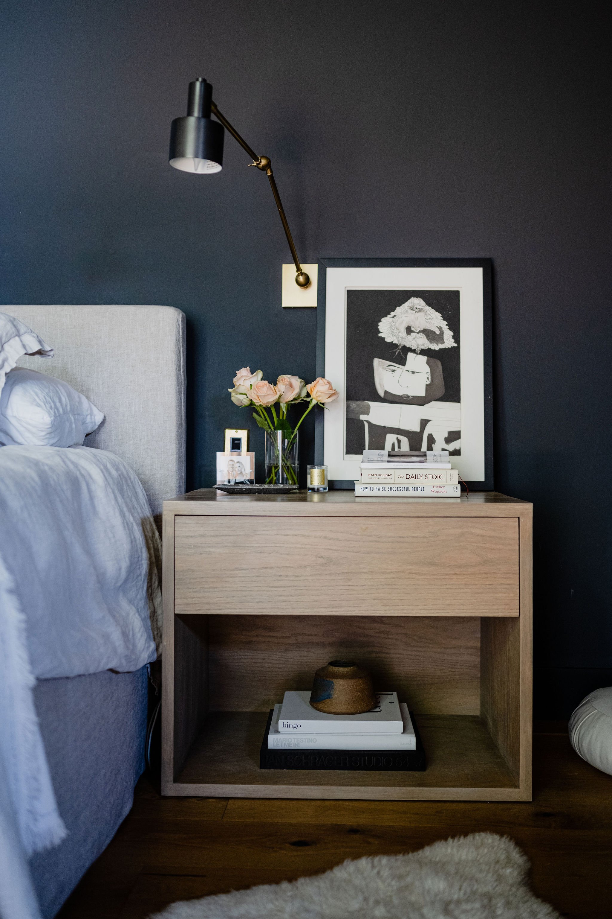
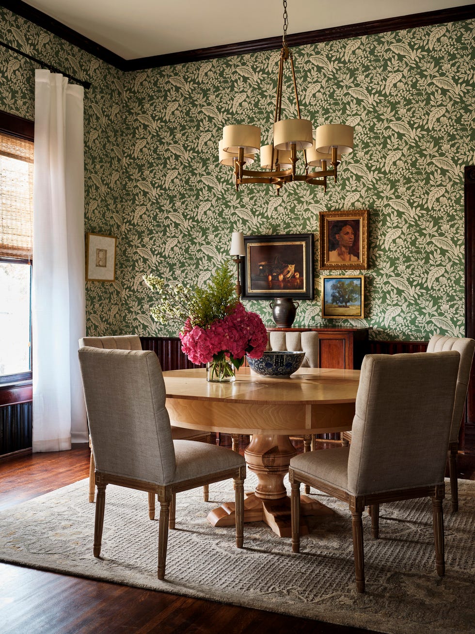
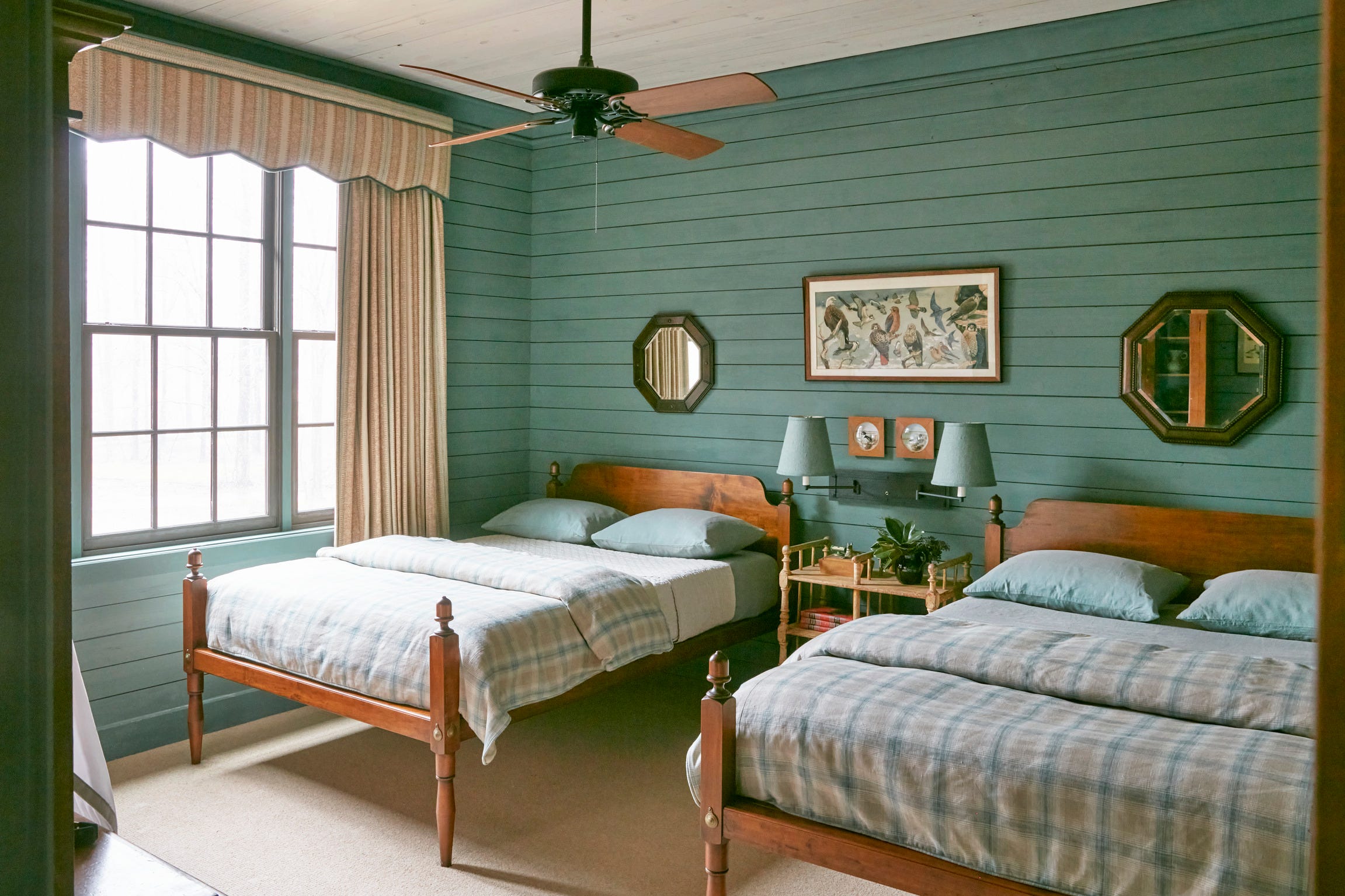
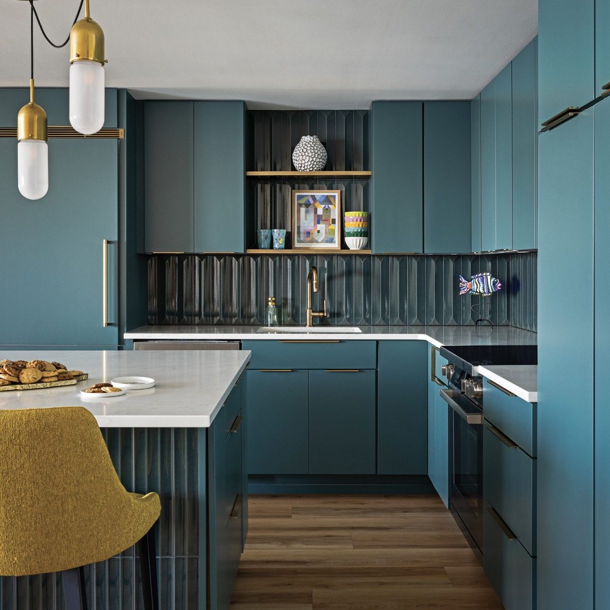
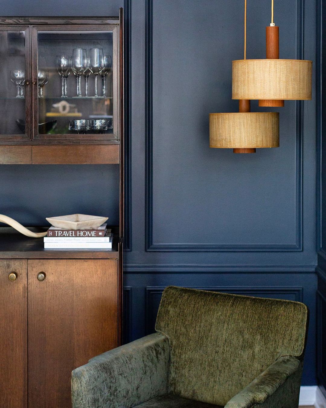
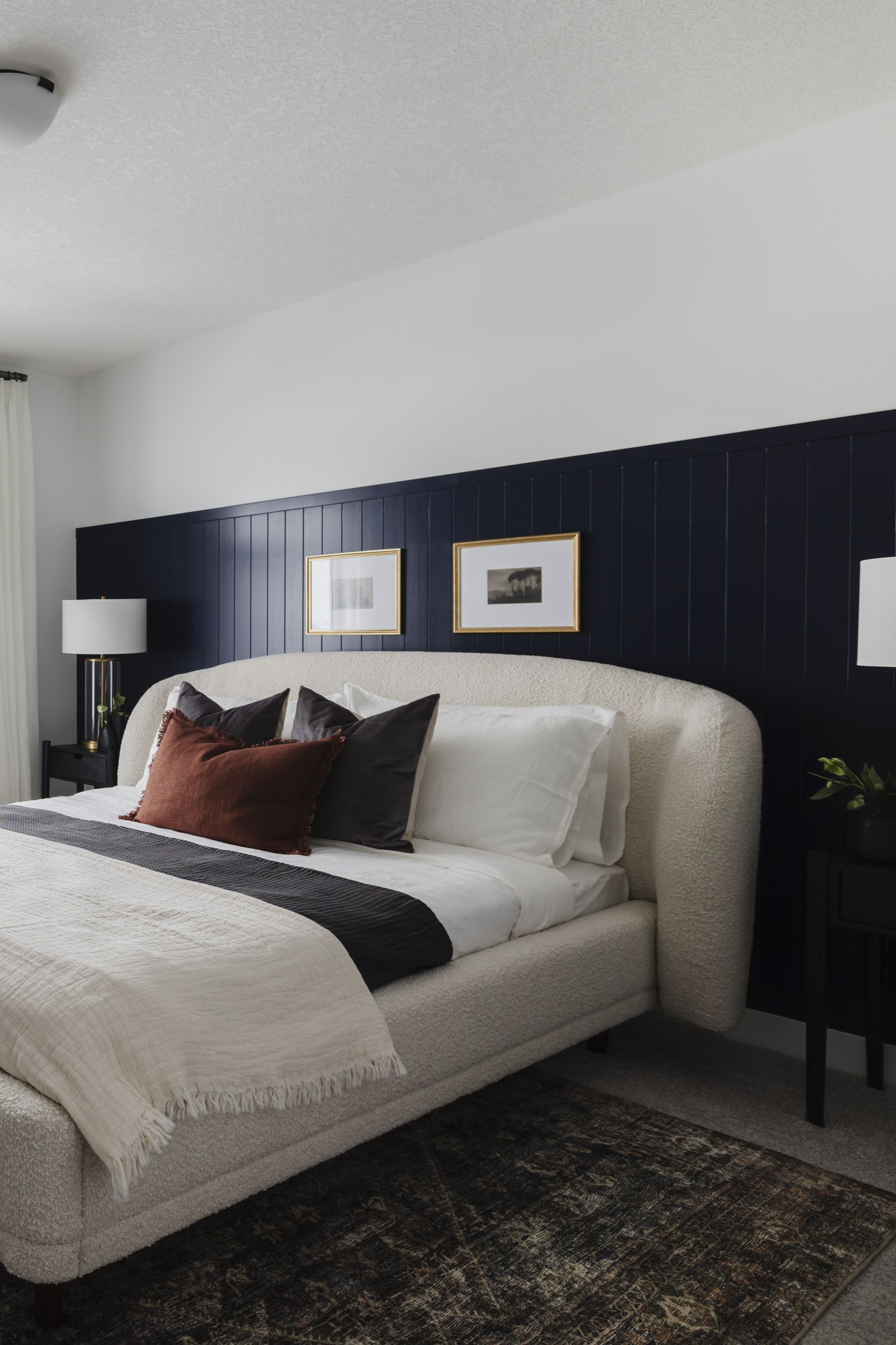
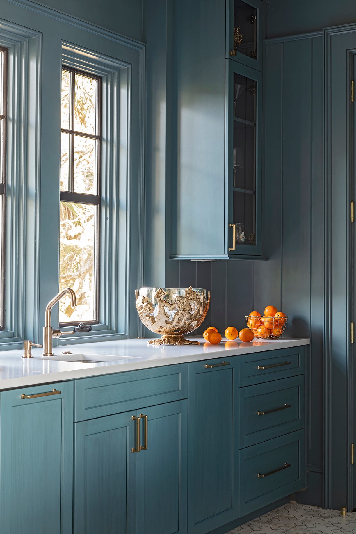
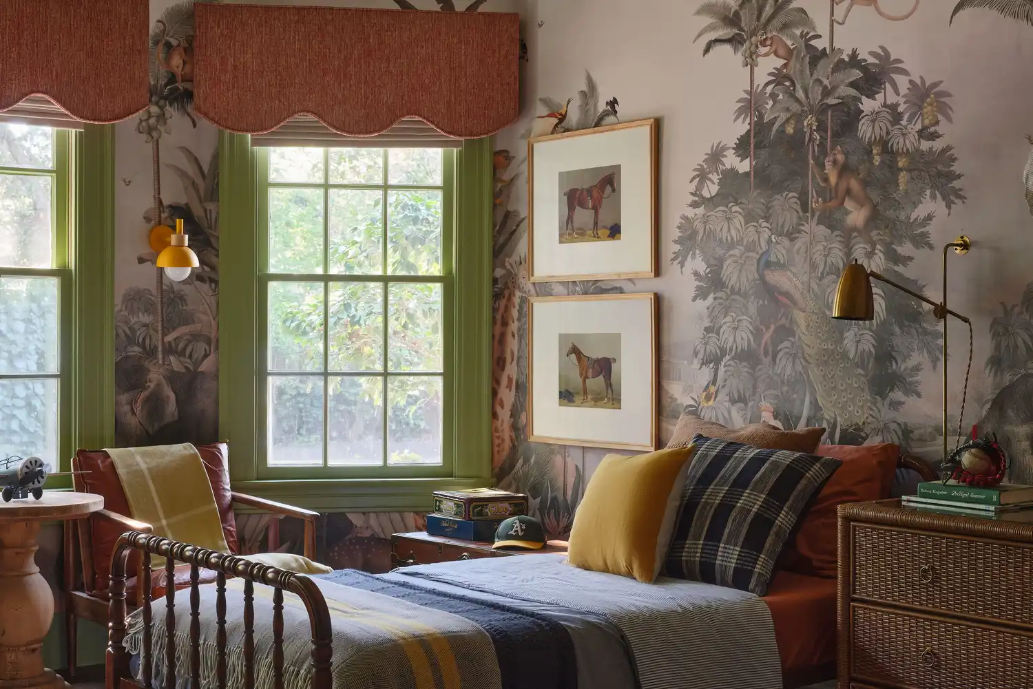
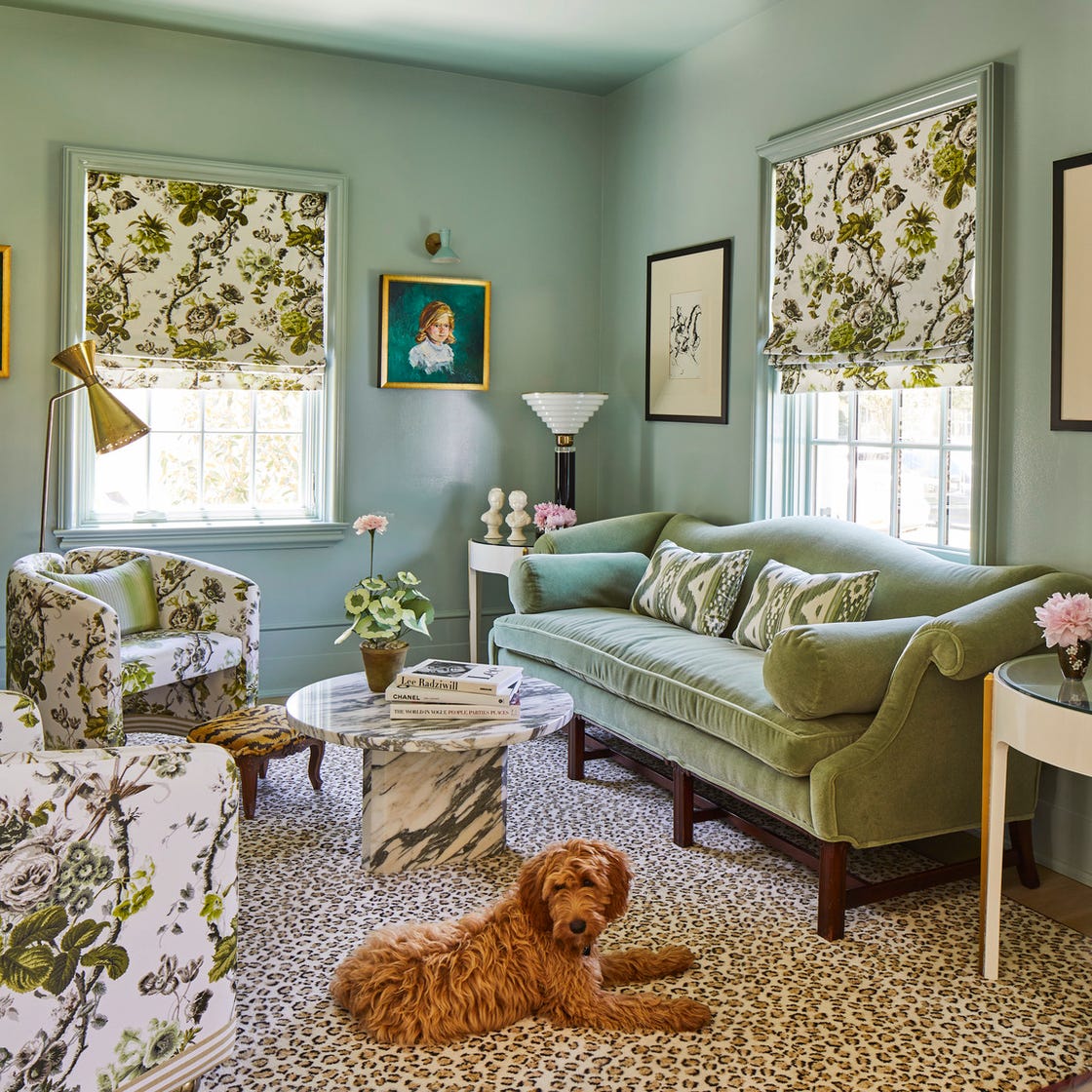
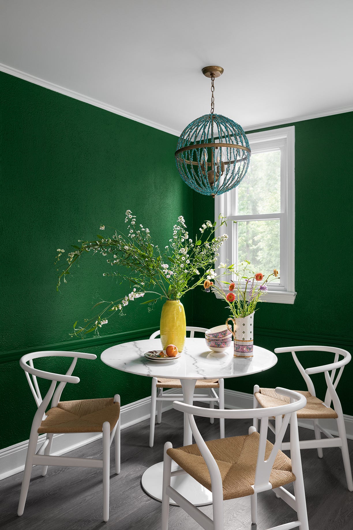
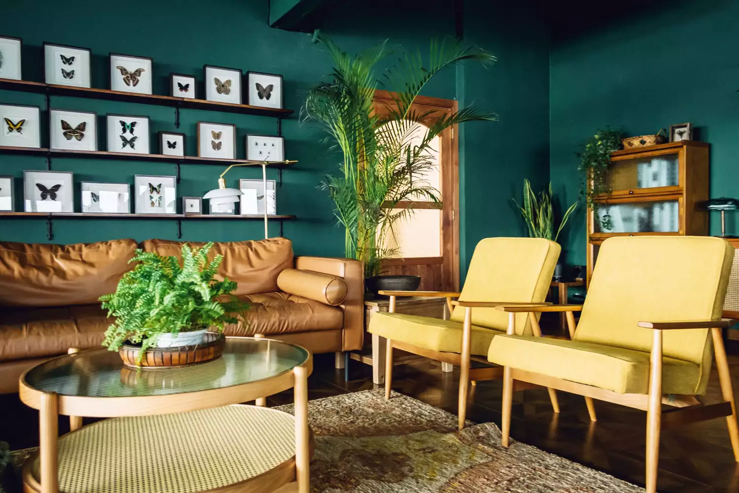
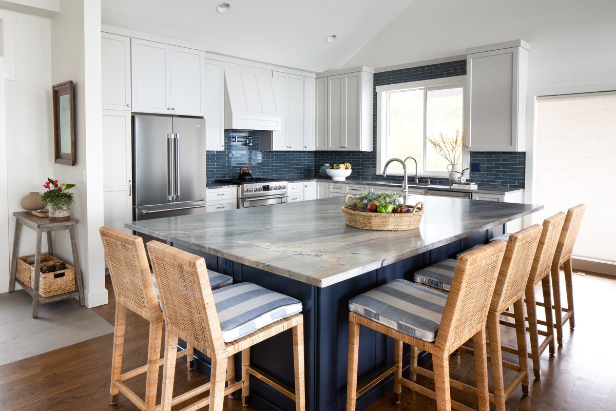
'Blues and Greens' are recommended by Elle Cantrell for bold color applications, especially saturated cool tones that pair beautifully with stained woods, adding depth without overwhelming the space. Connie Vernich champions 'Shades of Green,' calling it an outgoing and likable hue that harmonizes with almost any color on the color wheel. For neutral and calming environments, Jennifer Sissom suggests 'Mid Brown and Stony Gray,' advocating for layering patterns in neutral tones and corresponding colors. She also advises sampling paint colors at different saturations and combining brands, citing Benjamin Moore's Stone Hearth and Farrow & Ball’s London Stone as an inviting example for a powder room.
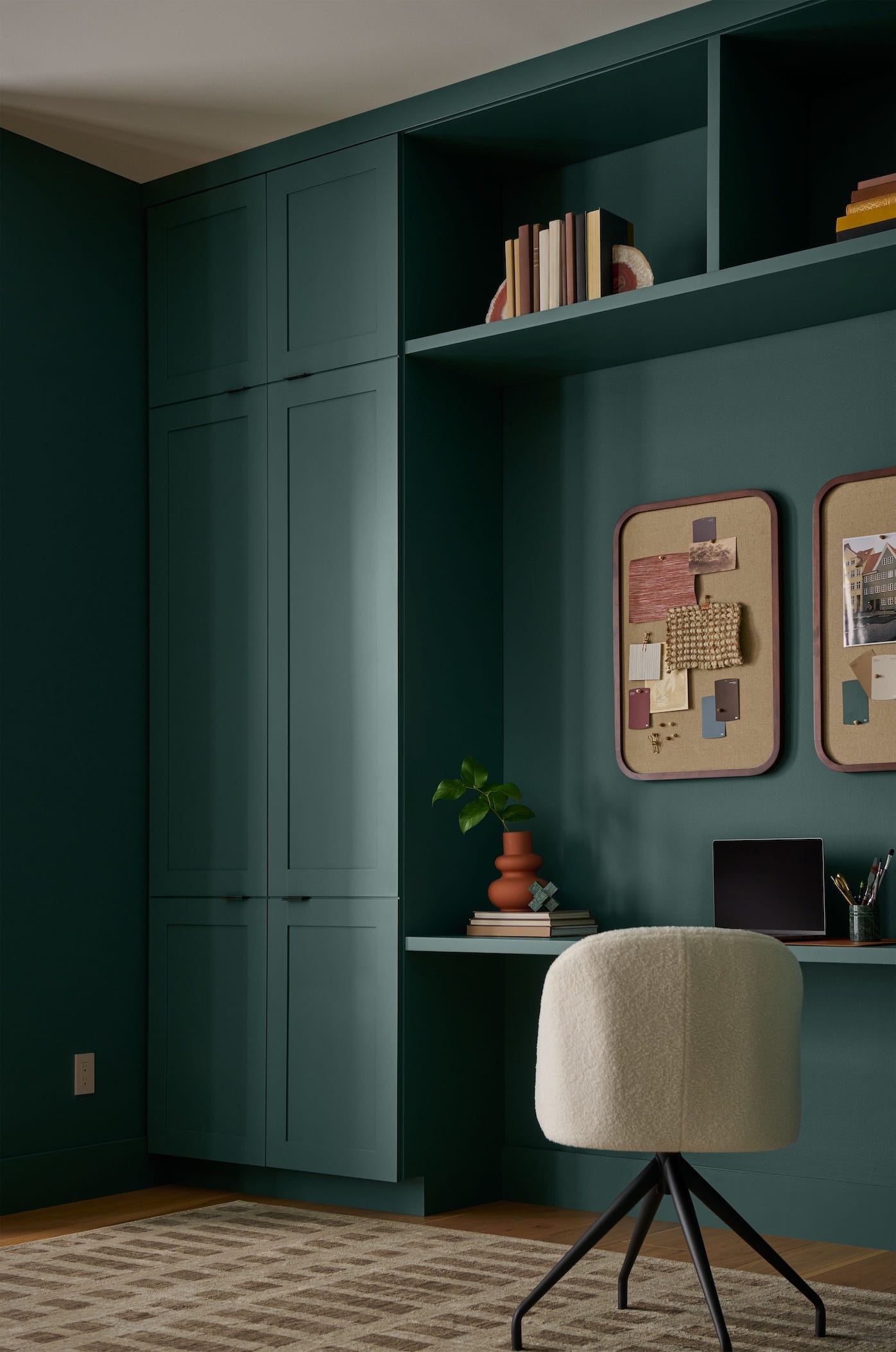
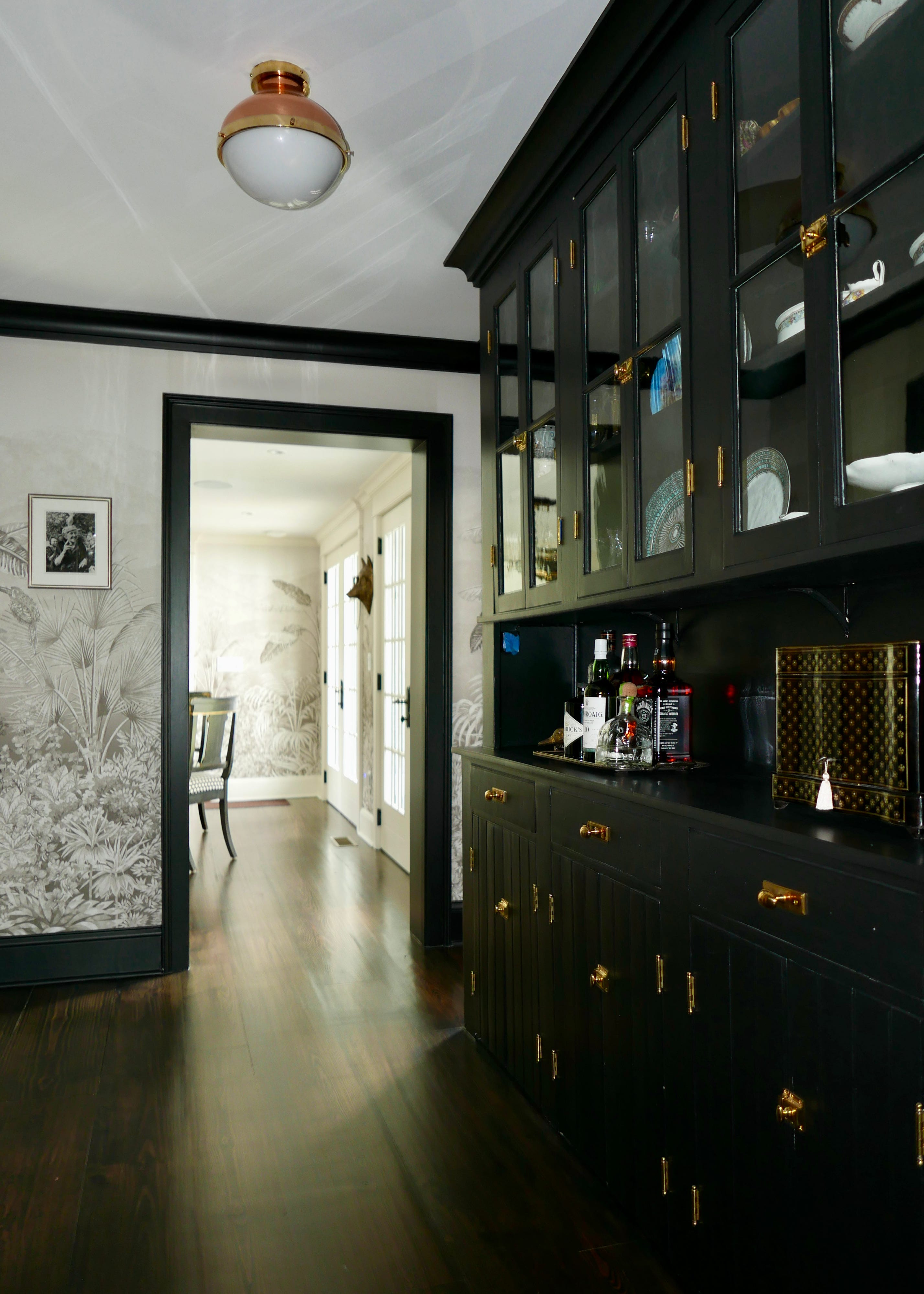
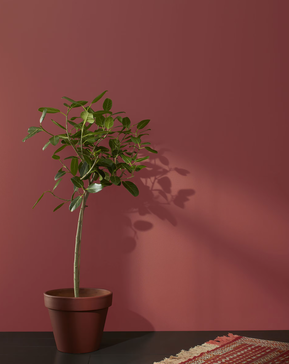
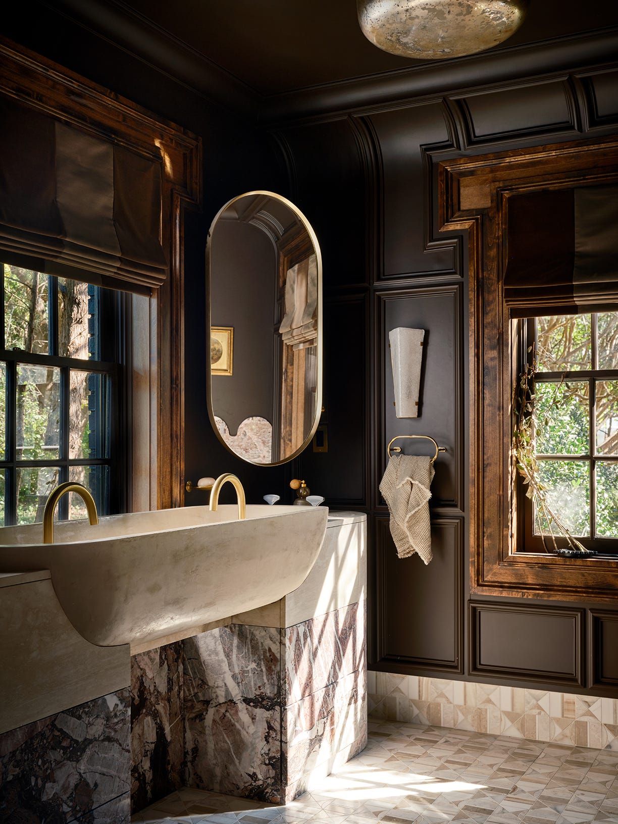
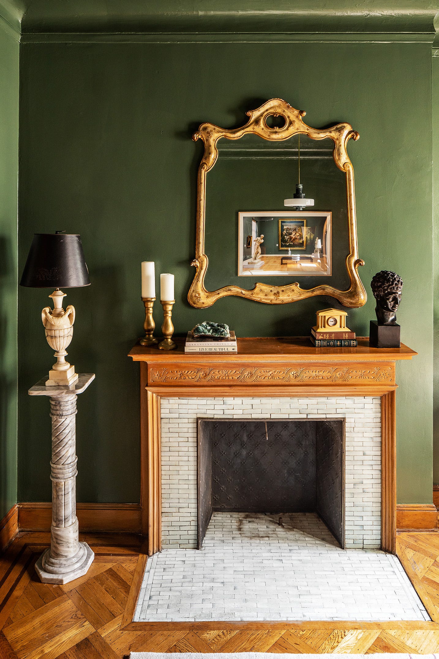
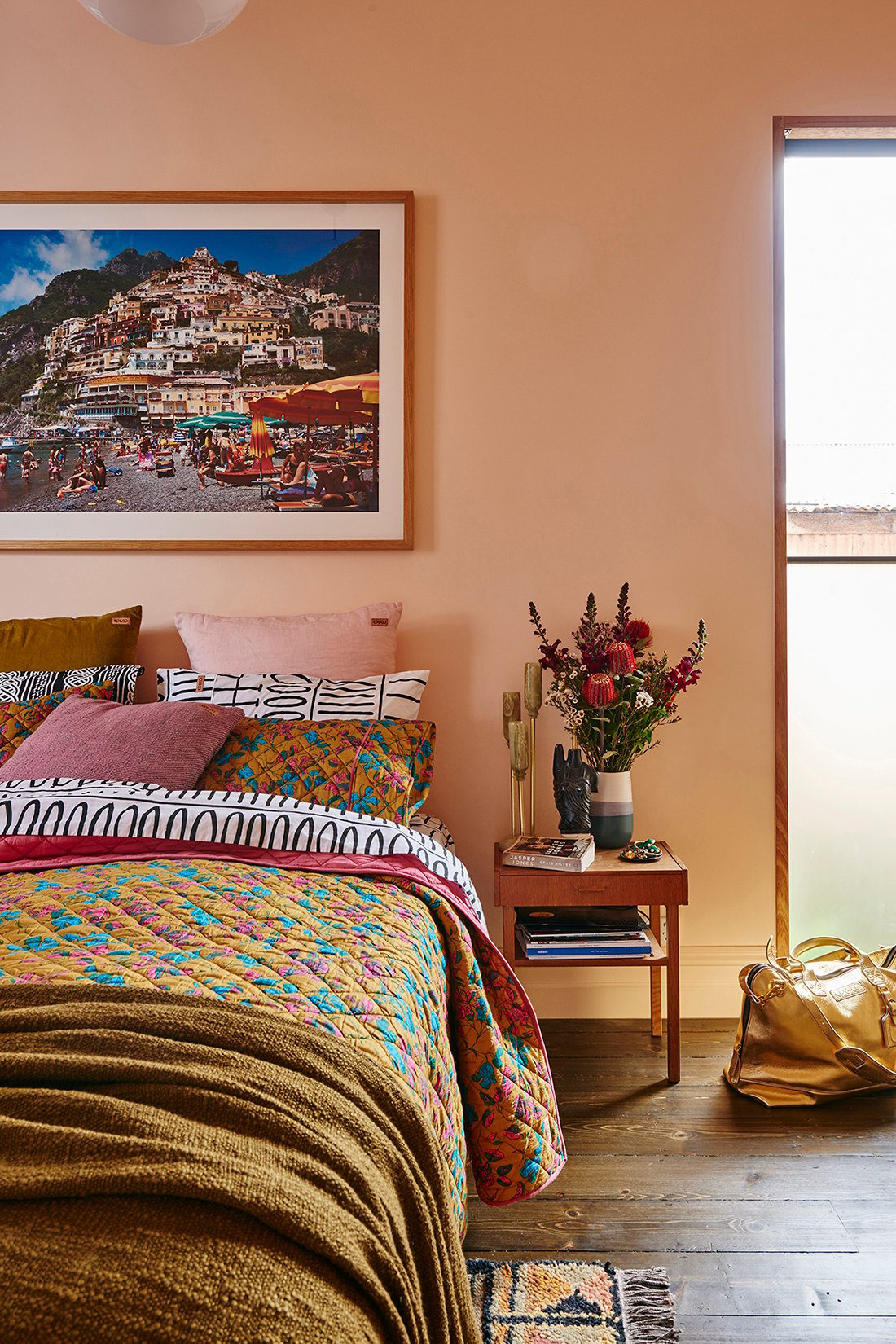
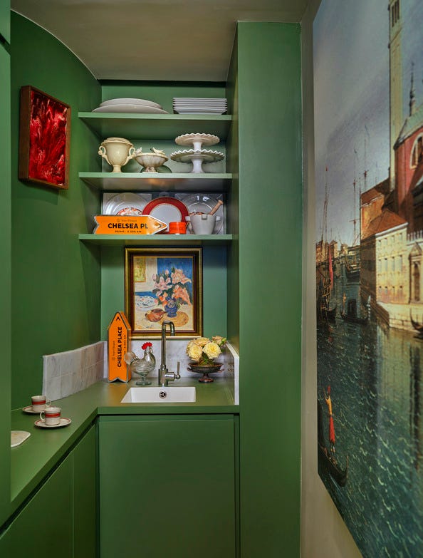
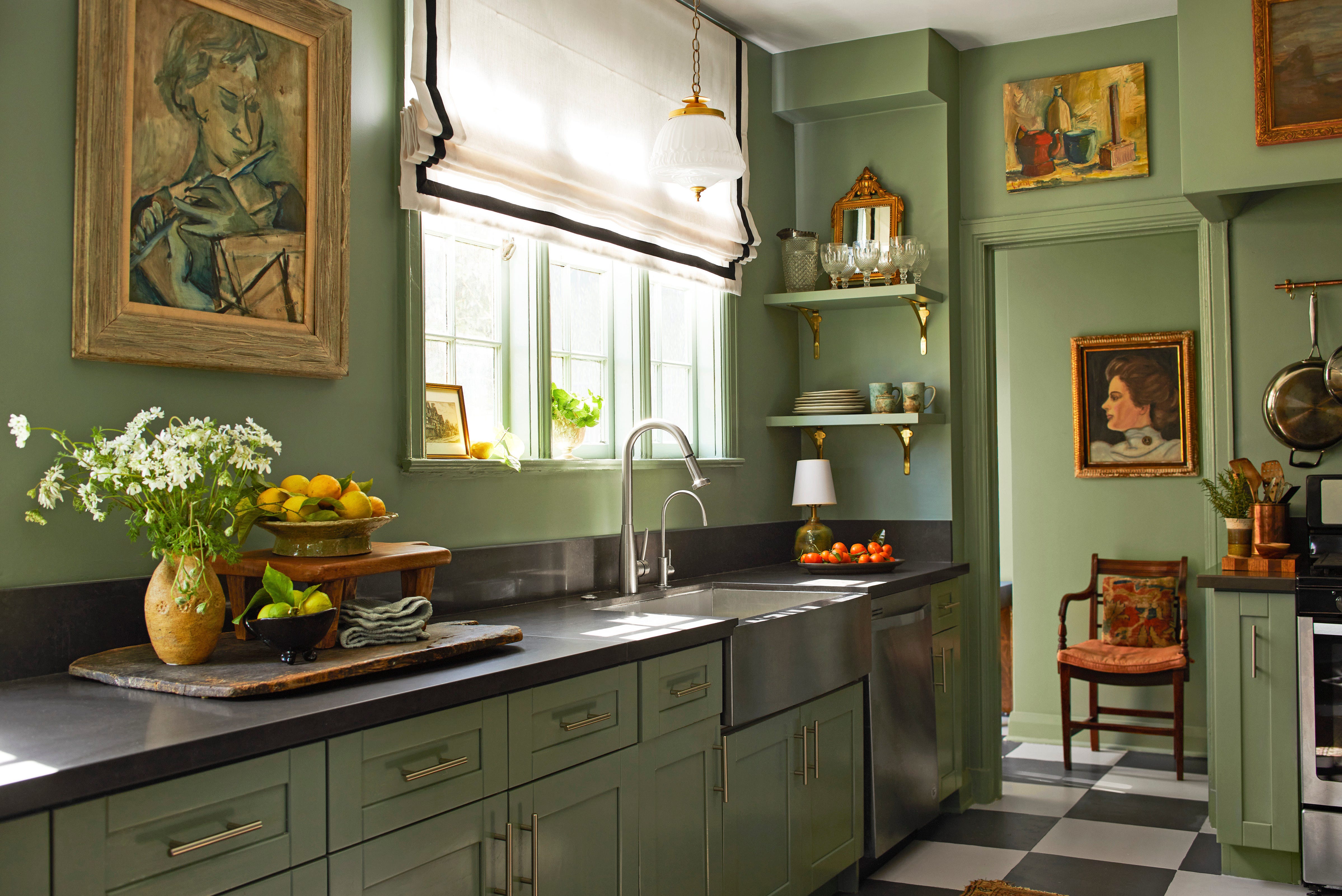
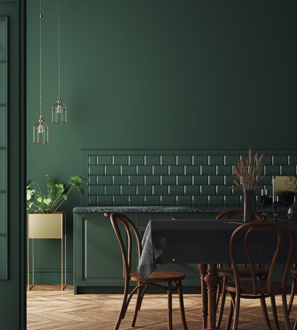
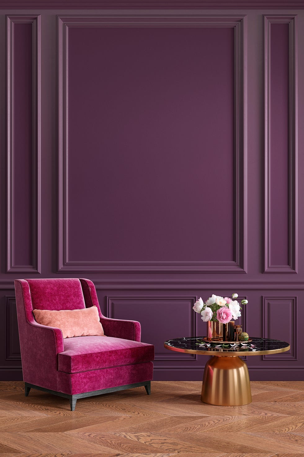
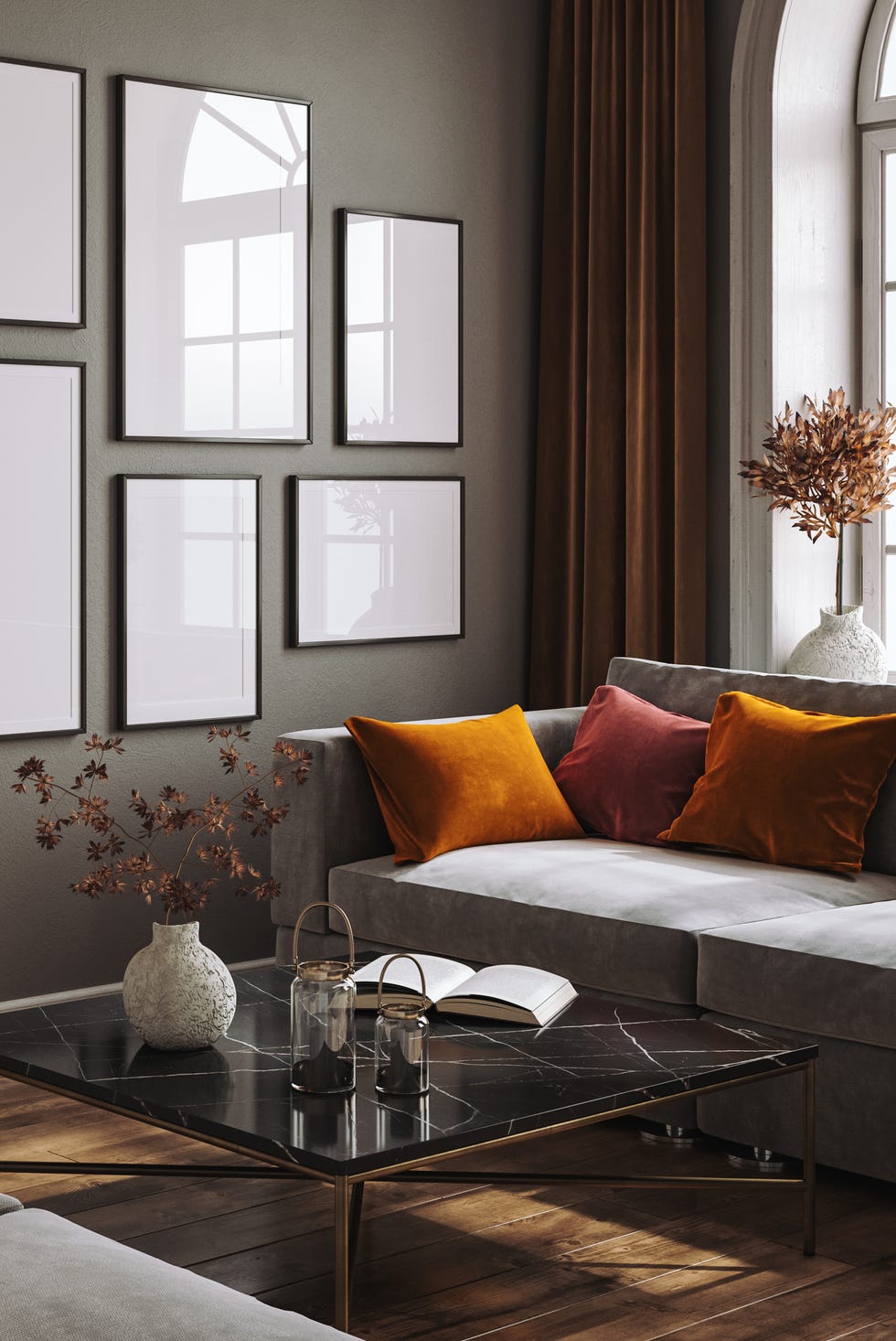
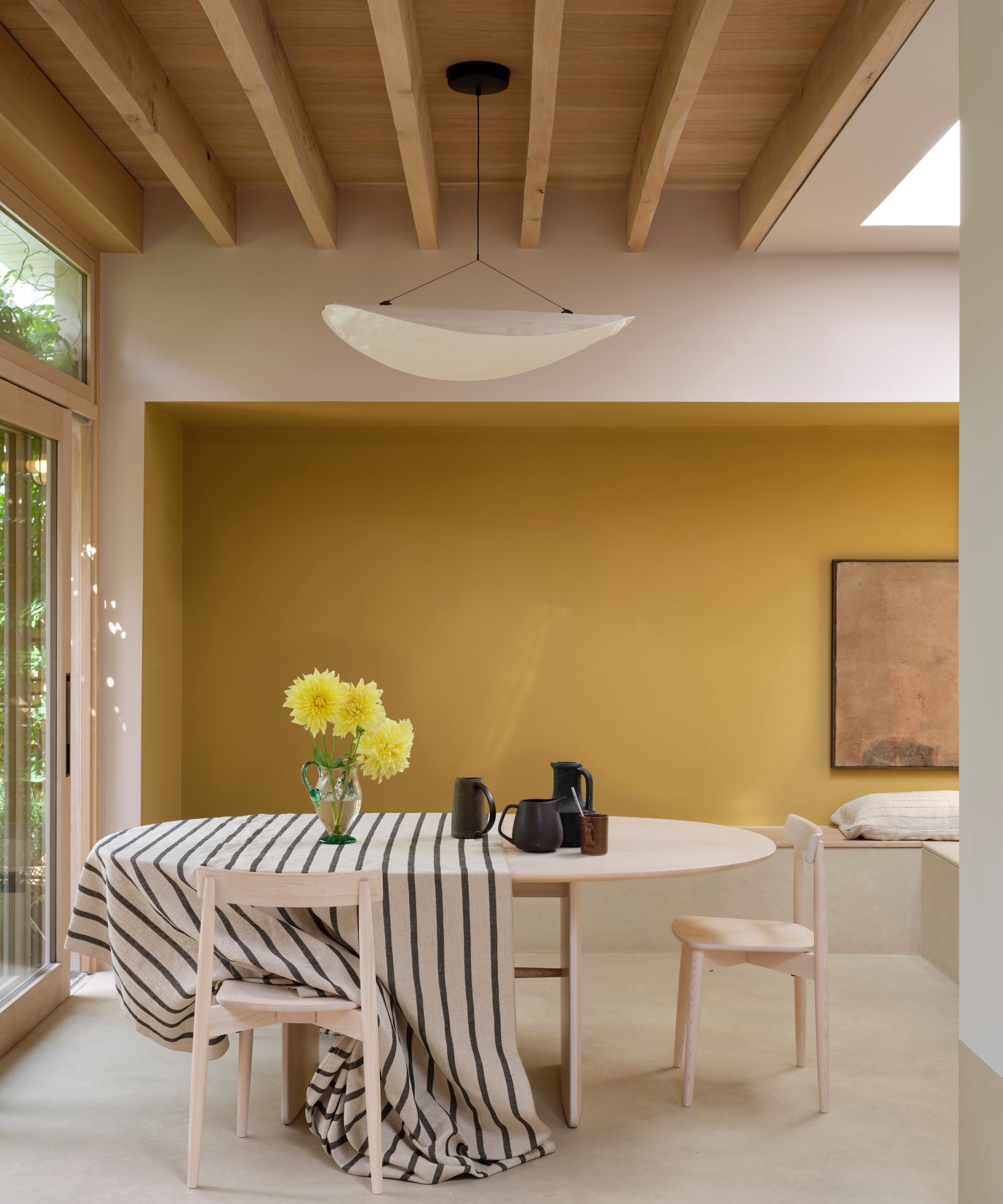
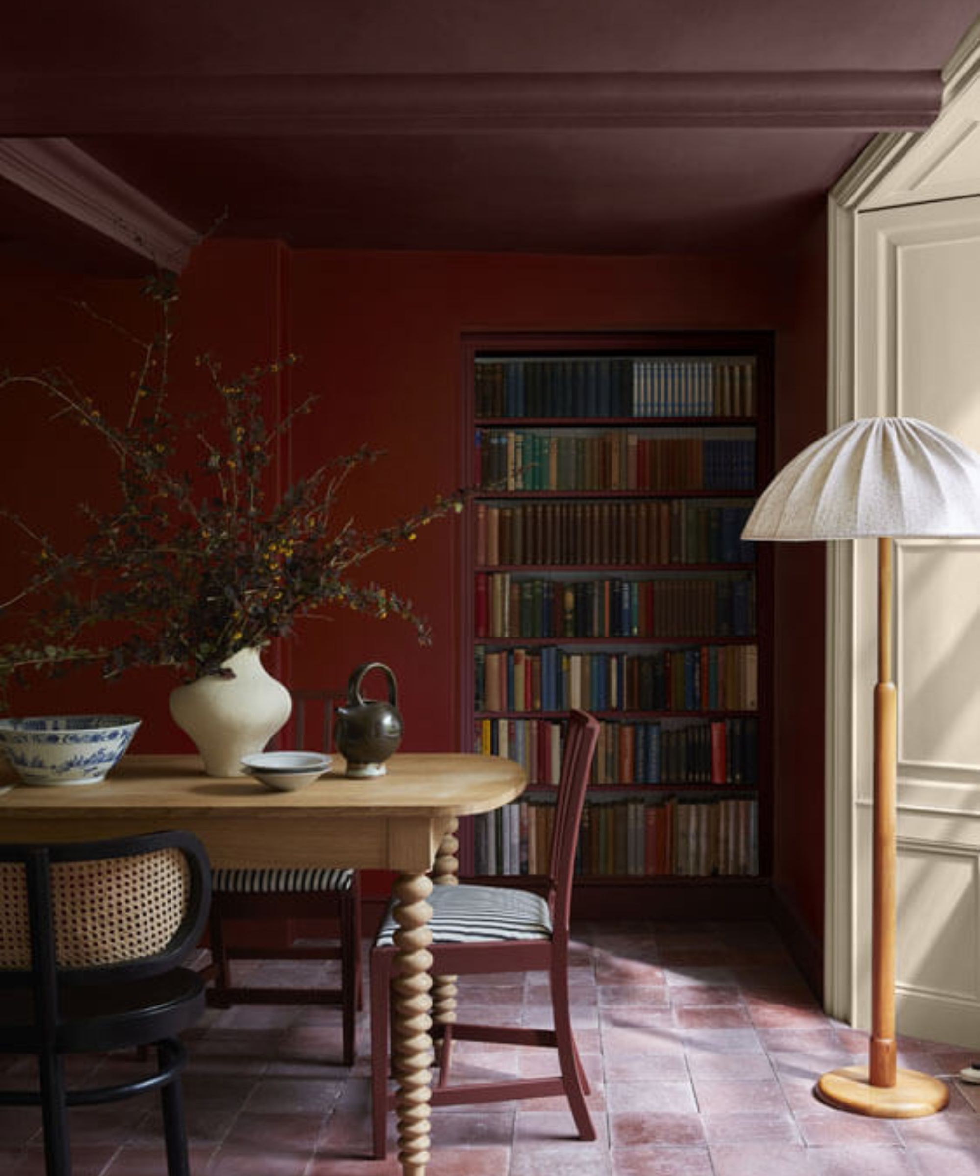
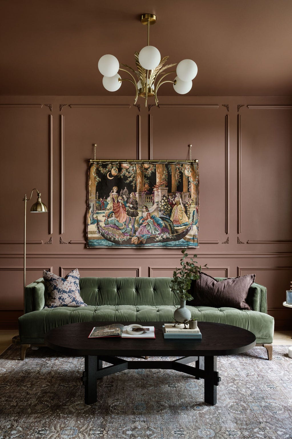
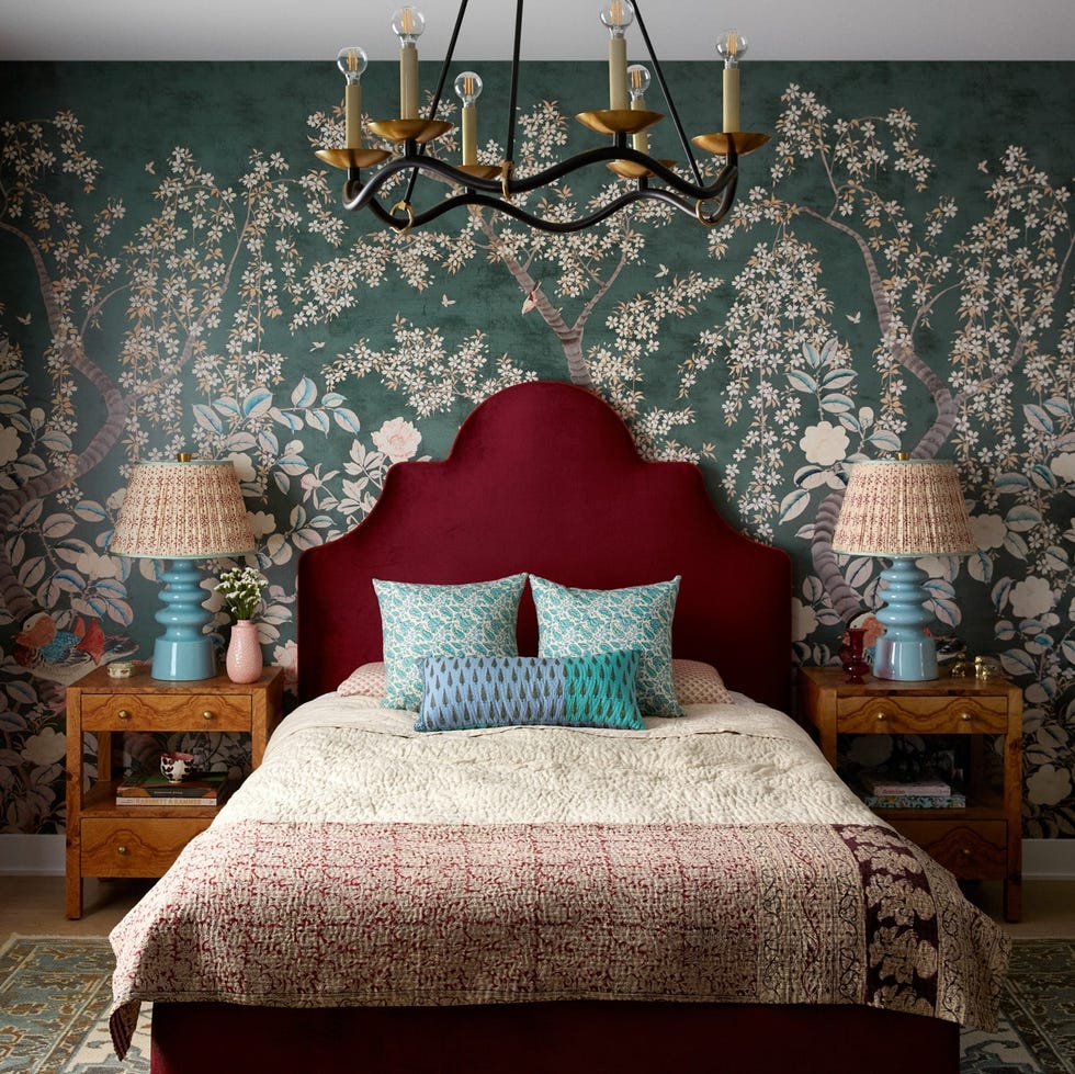
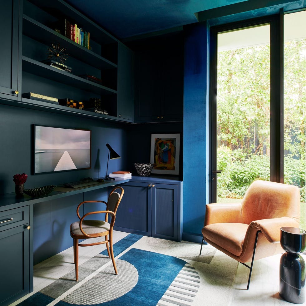
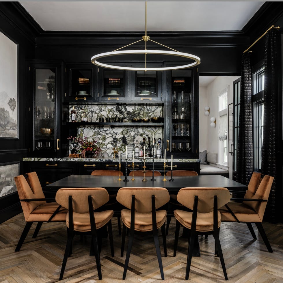
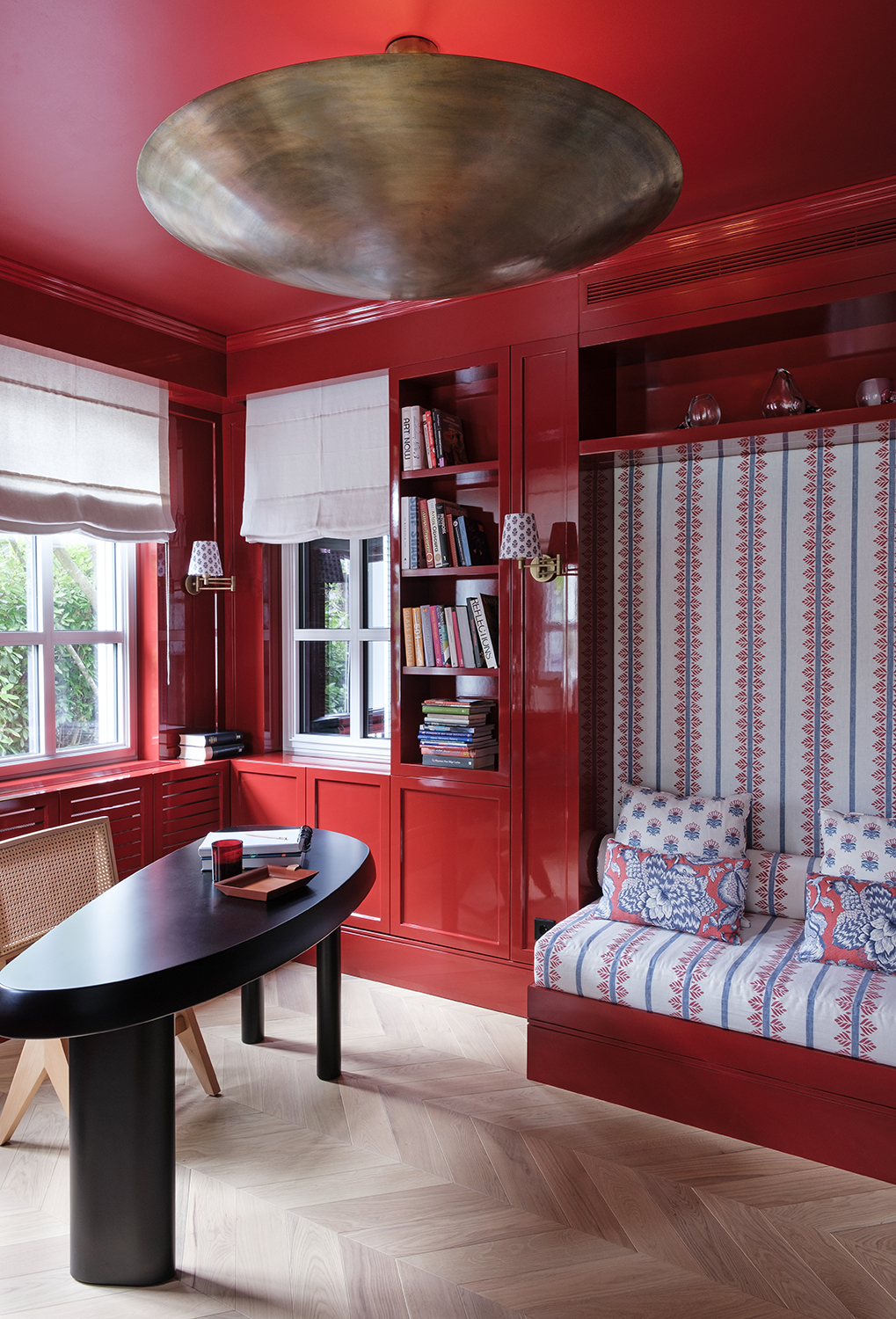
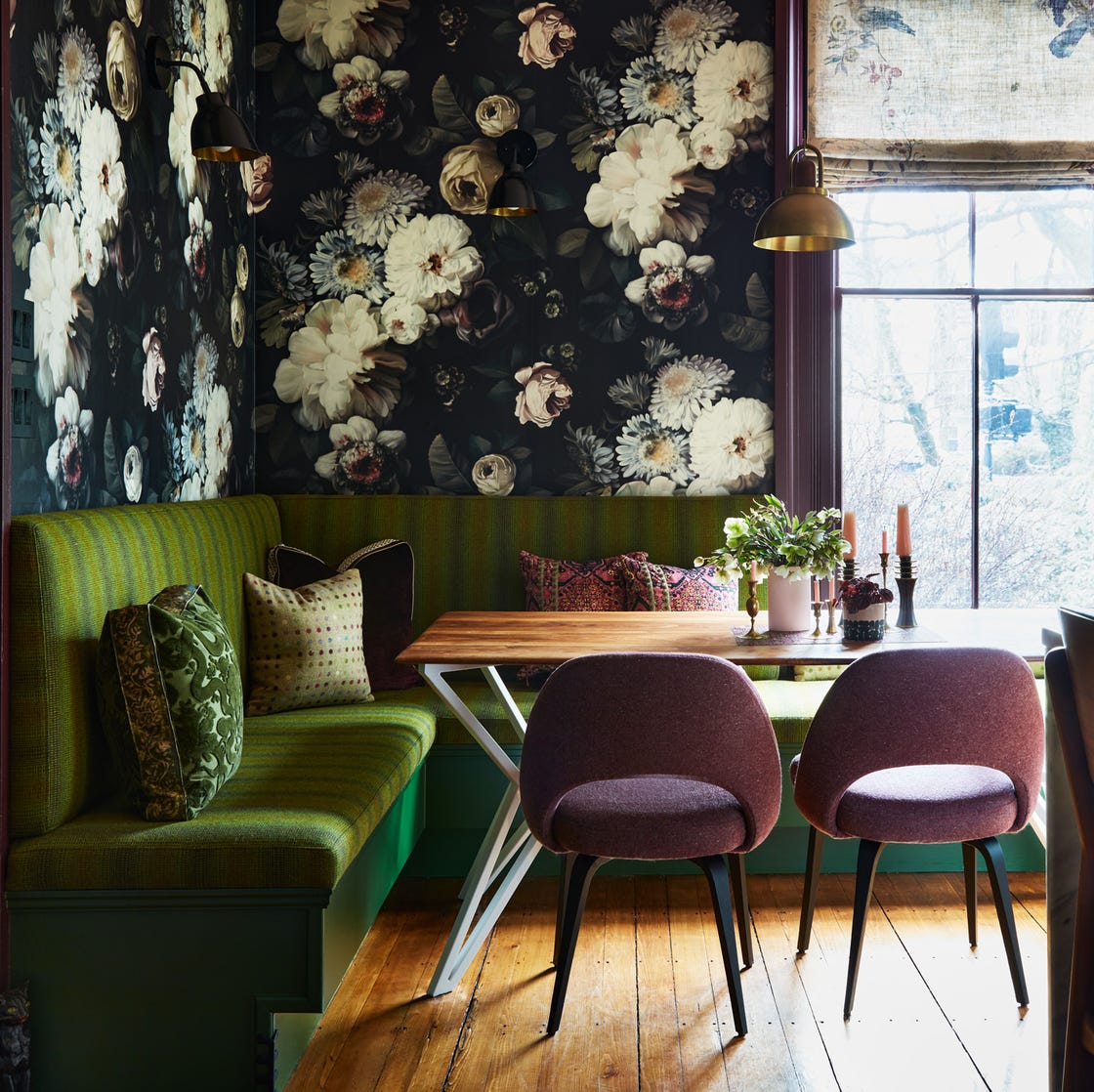
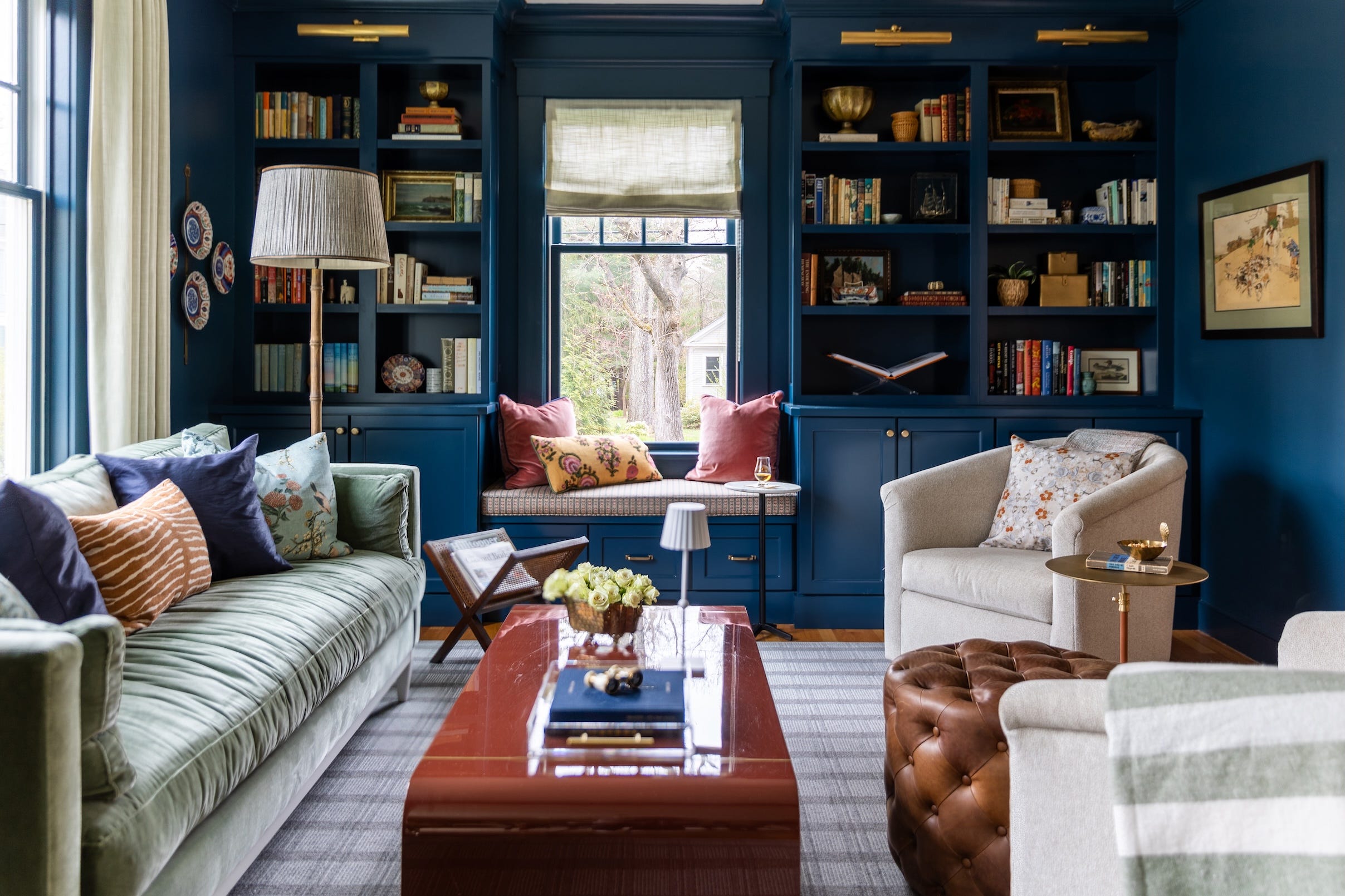
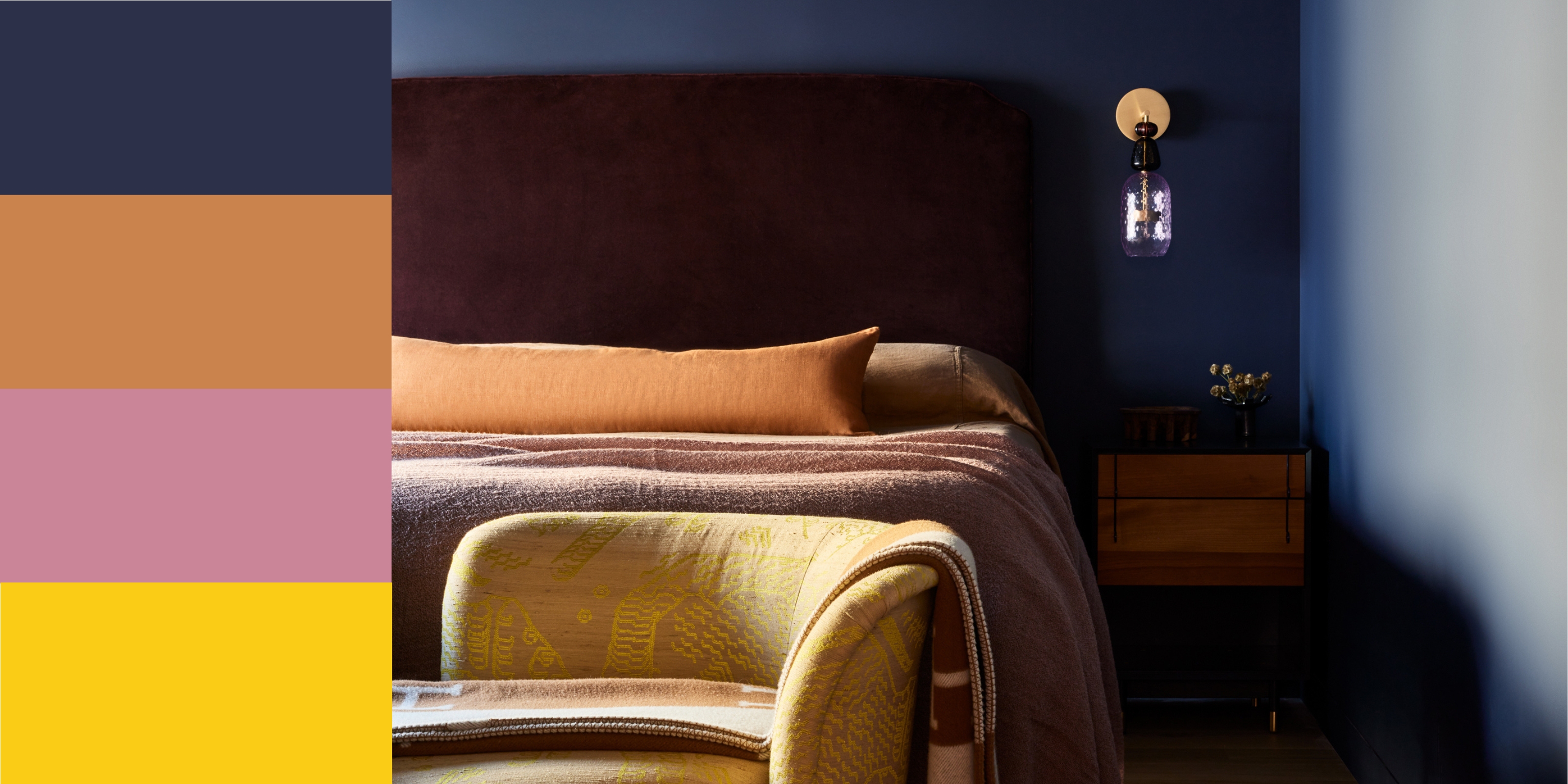
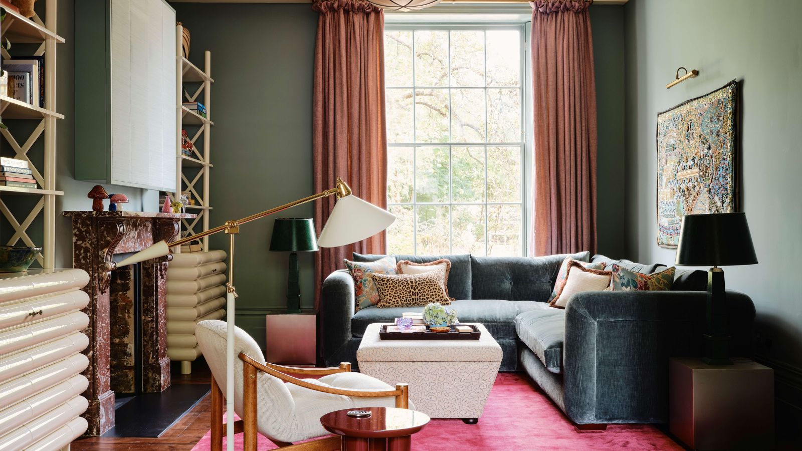
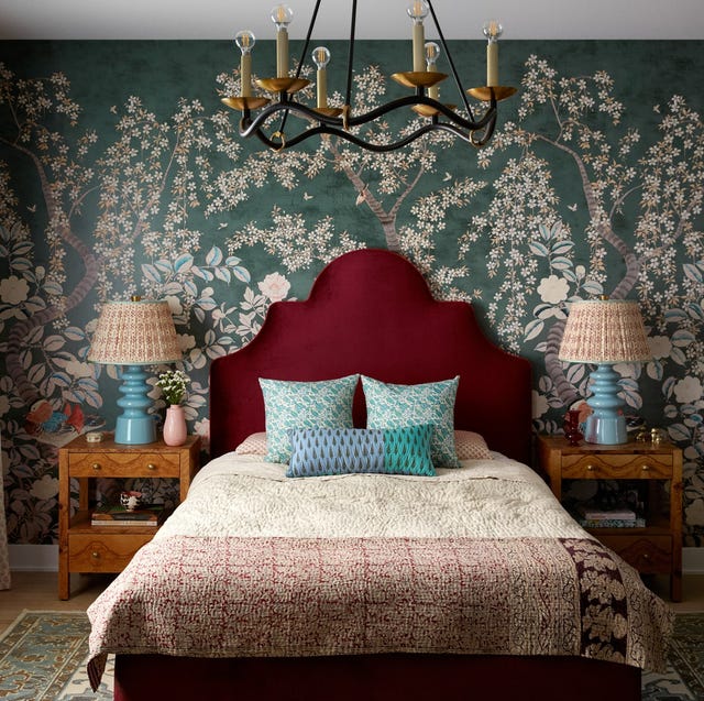
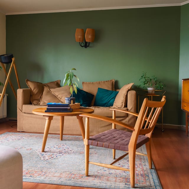
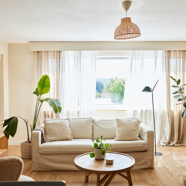
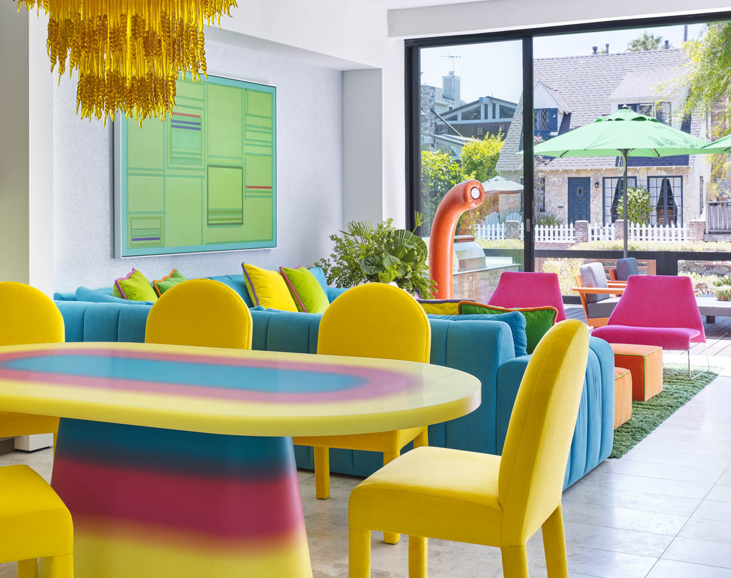
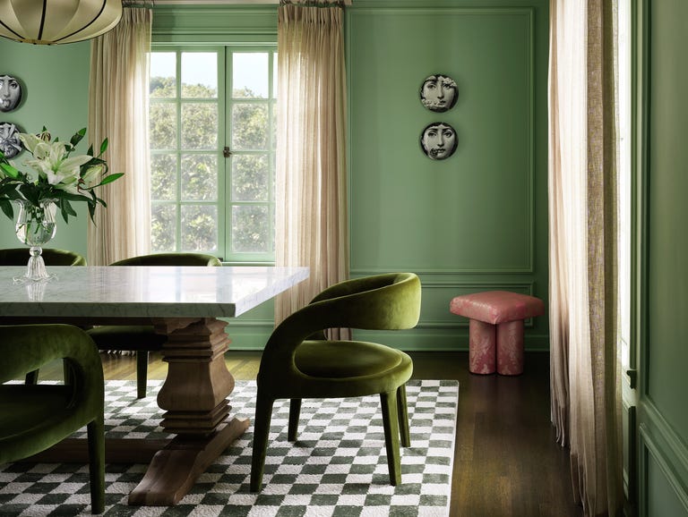
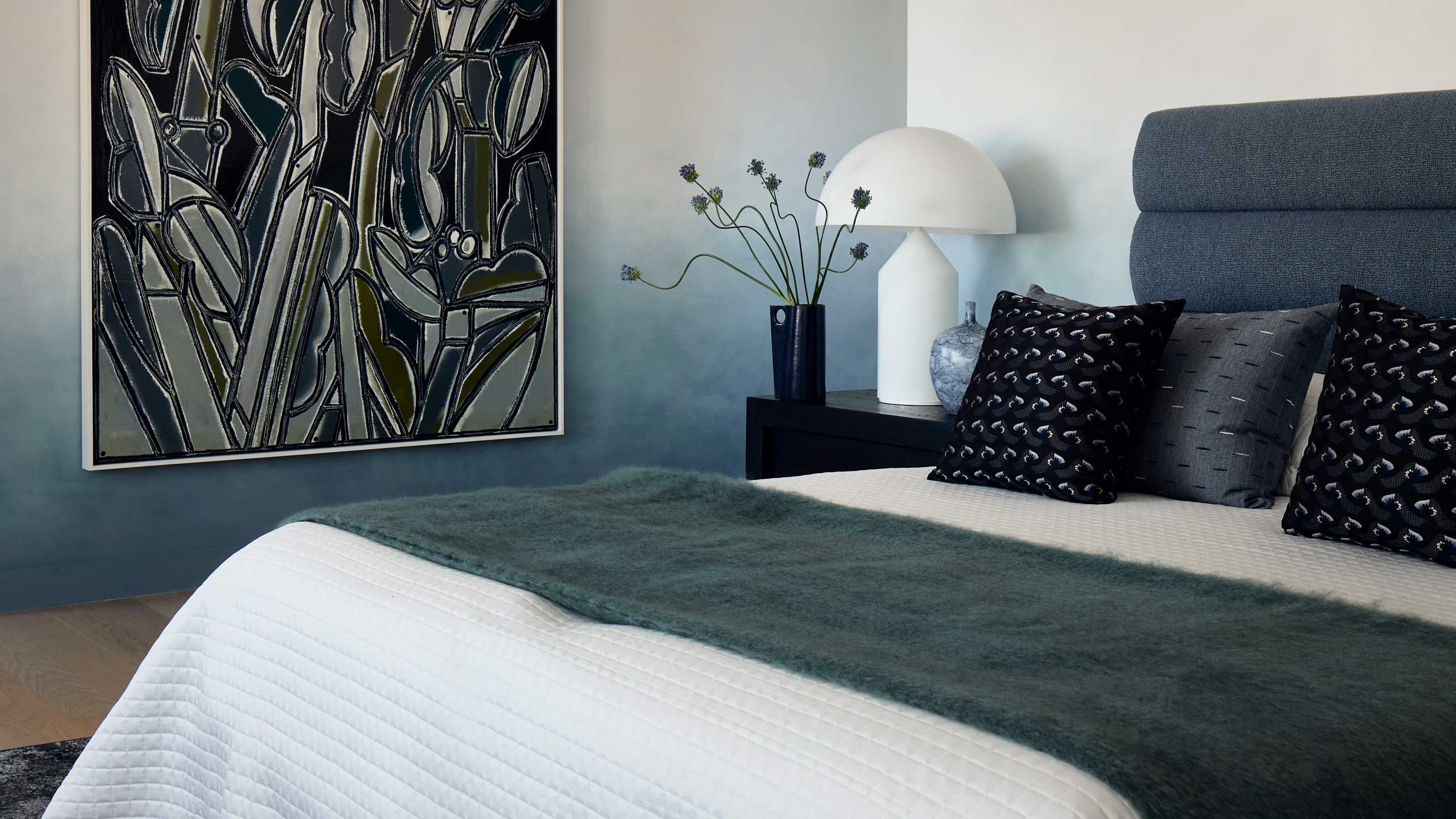
Laetitia Laurent prefers 'Gray, Beige, Off-White, and Pale Pink,' a natural color scheme with soft, muted tones contrasted by bolder elements like walnut wood or black details. This versatile palette can be easily updated, enhances natural light, and adapts to different styles. Marc Ange is drawn to 'Terra-cotta, Ochre, Sienna, Browns, and Gold,' a warm, earthy scheme that evolves with his personal journey and the cultural landscape, often accented with contrasting greens or blues. Jaqui Seerman advocates for 'Color-Drenched' schemes, finding them powerful in creating luxurious, enveloping environments. Lindye Galloway incorporates 'Earth Tones' for their versatility and ability to add warmth, ensuring a cozy and timeless feel. Finally, Cecilia Casagrande favors 'Burgundy, Smoky Green, and Pink,' especially with brass and walnut wood tones, praising its richness in unexpected areas like kitchens and baths, and she also loves 'Jewel Tones' like sapphire, ruby, and emerald for living rooms, for their grand, luxurious, yet warm and inviting appeal.
#InteriorDesign #ColorSchemes #HomeDecor #DesignTrends #PaintColors #HomeStyling #DesignerTips #RoomDecor #ColorPsychology #InteriorDesign #ColorSchemes #HomeDecor #DesignTrends #PaintColors #HomeStyling #DesignerTips #RoomDecor #ColorPsychology
0 comment in total
You may also like
Designers Say These 12 Paint Colors Will Be Everywhere in 2026

Designers Swear By These 11 Sage Green Paint Colors

Colors That Go With Navy Blue — 12 Combinations Designers Are Choosing in 2025

21 Designers Share Their Color-Trend Predictions for Spring

12 Trending Paint Colors for 2024, According to Design Experts
What you didn’t know about colour

12 Vintage Paint Colors That Are Trending Again, According to Color Experts


6 Paint Color Duos Designers Can't Get Enough of This Fall
4 Interior Designers Share the Biggest Paint Color Trends Right Now (and What’s Out!)

12 Paint Colors That Interior Designers Are Buzzing About—See the Gorgeous Hues Here
According to Designers, These Are The Outdated Color Trends for 2026

Designers Predict These Color Combinations Will Be EVERYWHERE This Summer

12 Jewel-Tone Paint Colors Designers Say Are Always On-Trend
Designers Say These Vintage Paint Colors Are Back
The #1 Paint Color Trend of 2025, According to Designers
5 Vibrant Color Palettes Designers Are Using to Add Energy and Excitement to Decor
This SURPRISING Color Is About to Be Everywhere, According to Designers
Color Explosion: 2025 Color Trends

This surprising color trend is having a comeback
Every Designer I Talked to Said This Popular Paint Color Is on Its Way Out