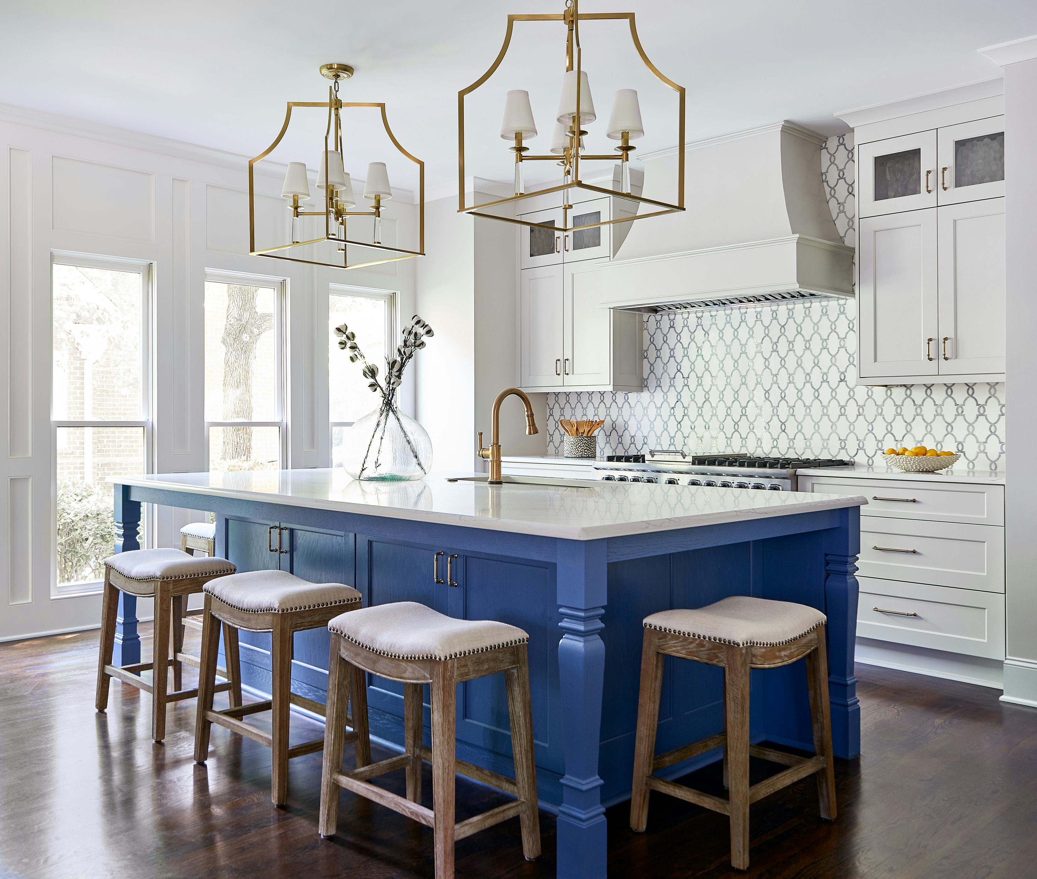
1/7
6 Paint Color Duos Designers Can't Get Enough of This Fall
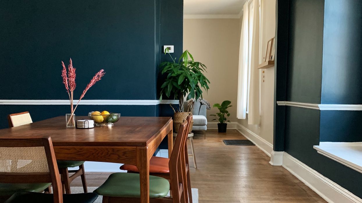
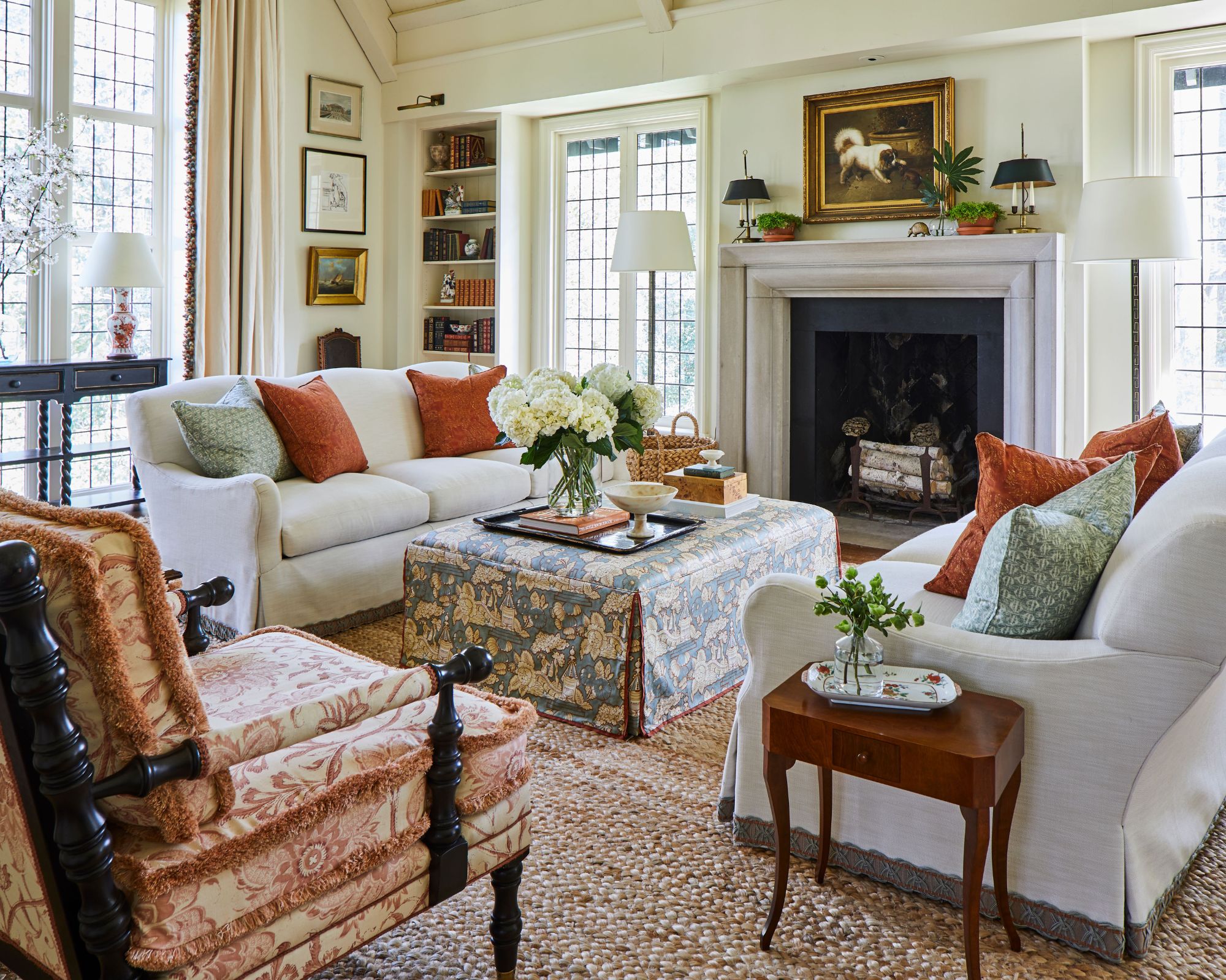
The article explores how to use paint to infuse personality and depth into a home by showcasing six expert-approved color combinations. Paint is presented as an accessible and affordable method for transforming living spaces, moving beyond the traditional single-color-per-room approach to create layered, curated, and chic interiors. The focus is on how specific color pairings can establish unique moods and energies, striking a balance between sophistication and surprise.
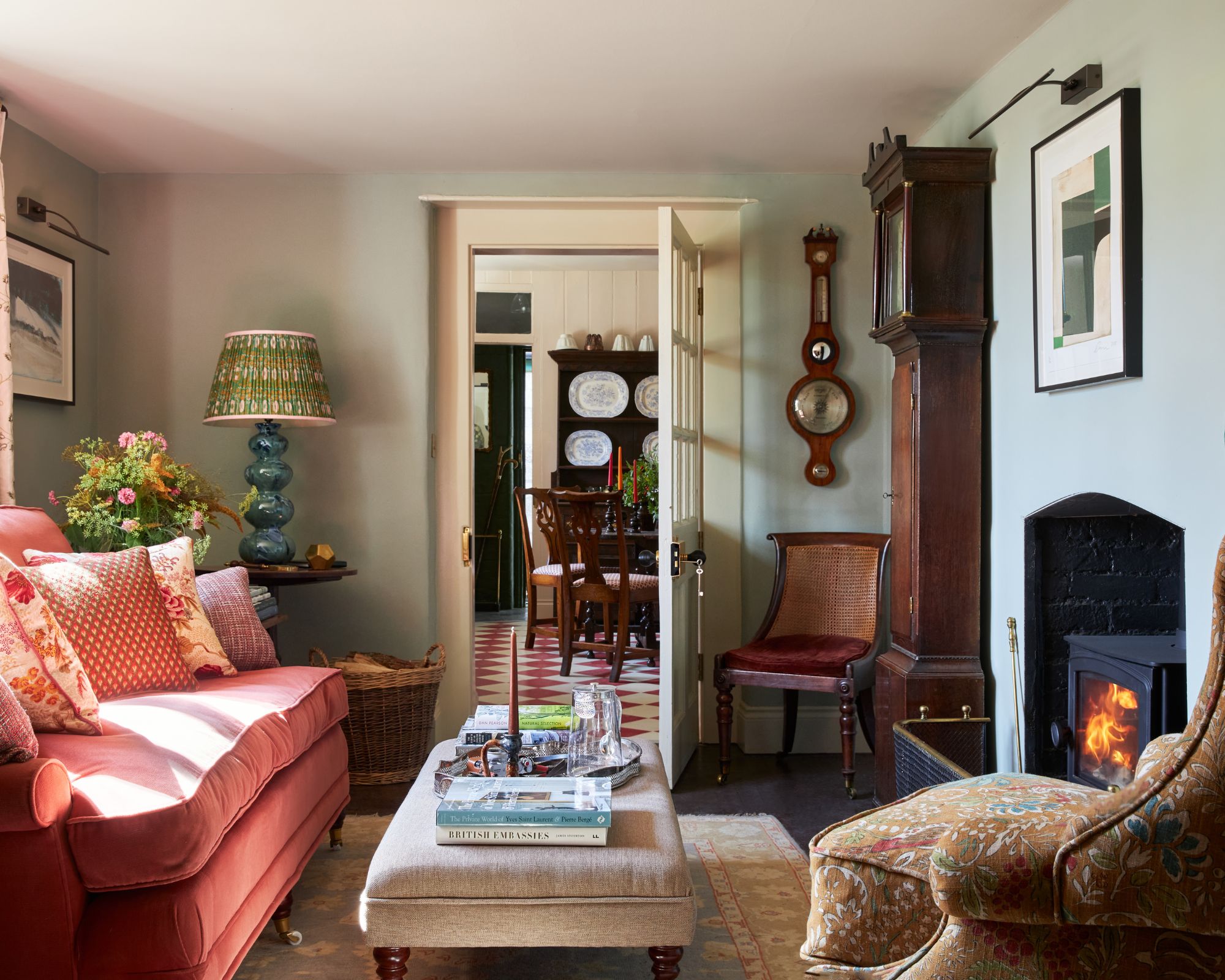
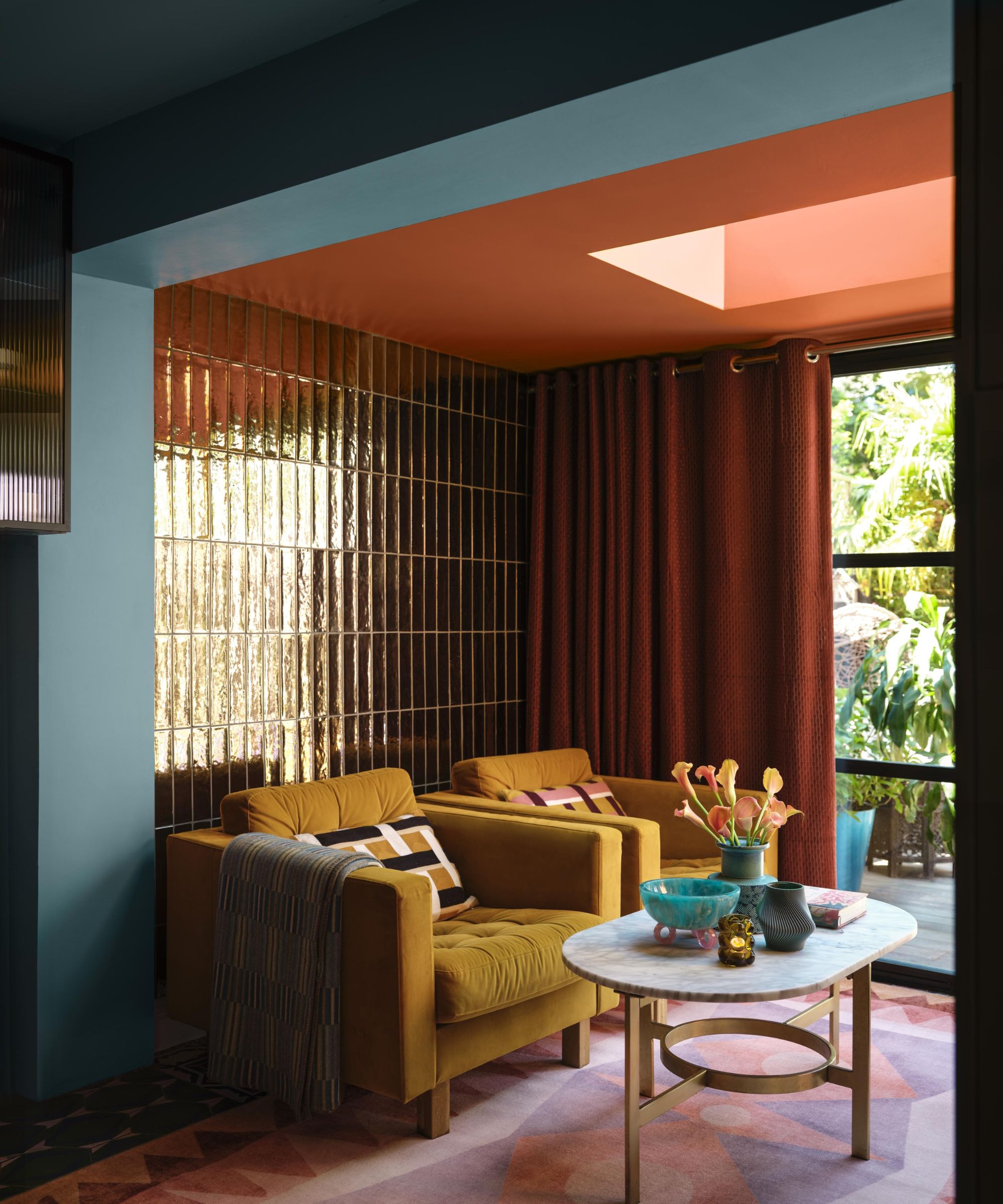
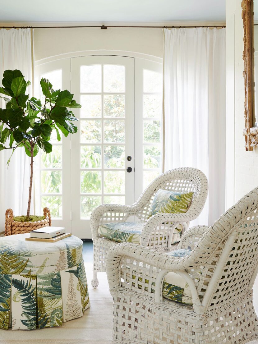
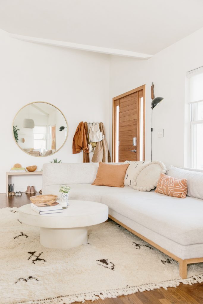
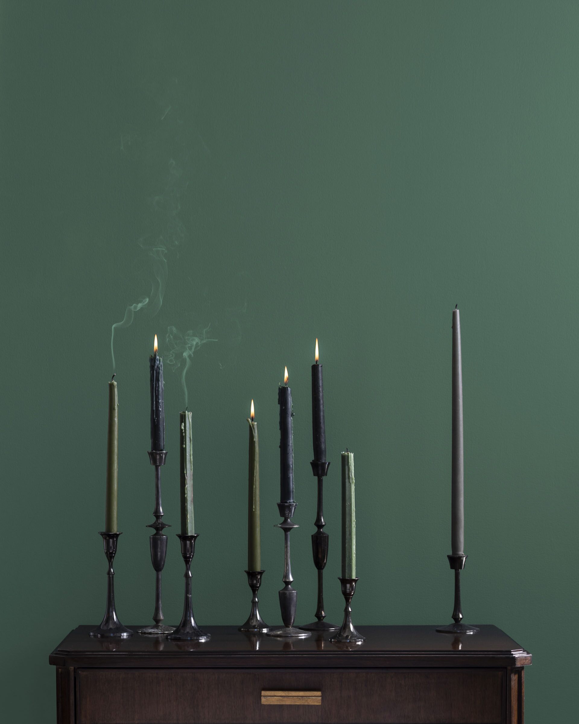
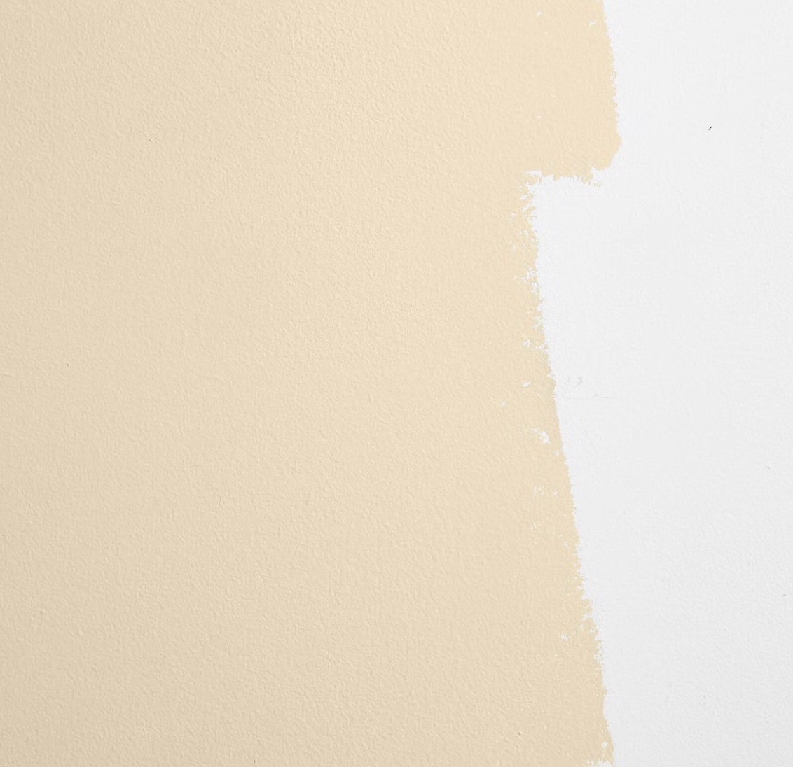
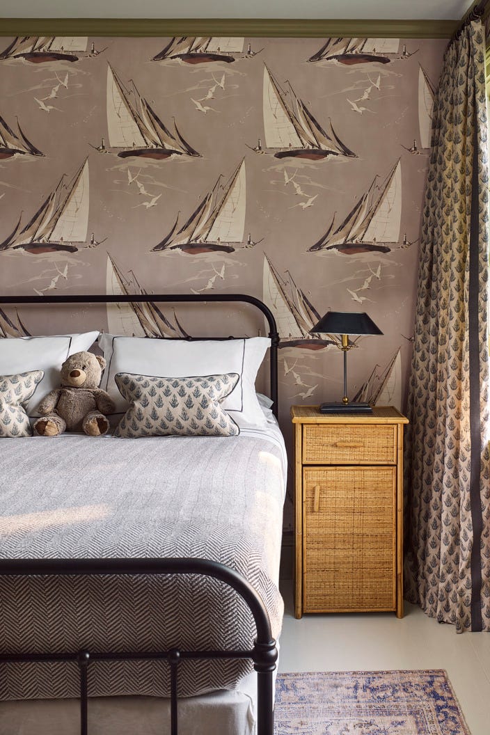
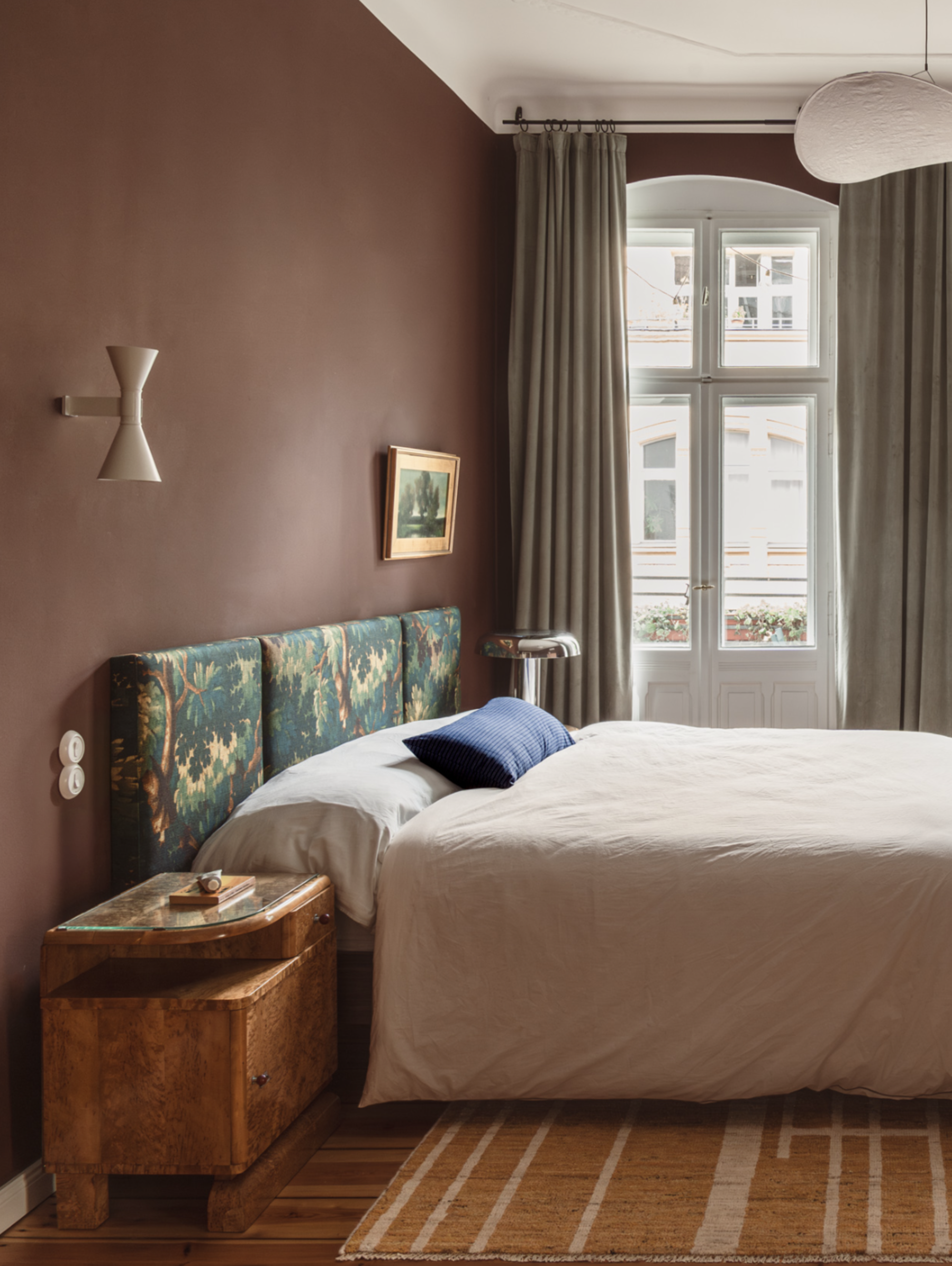
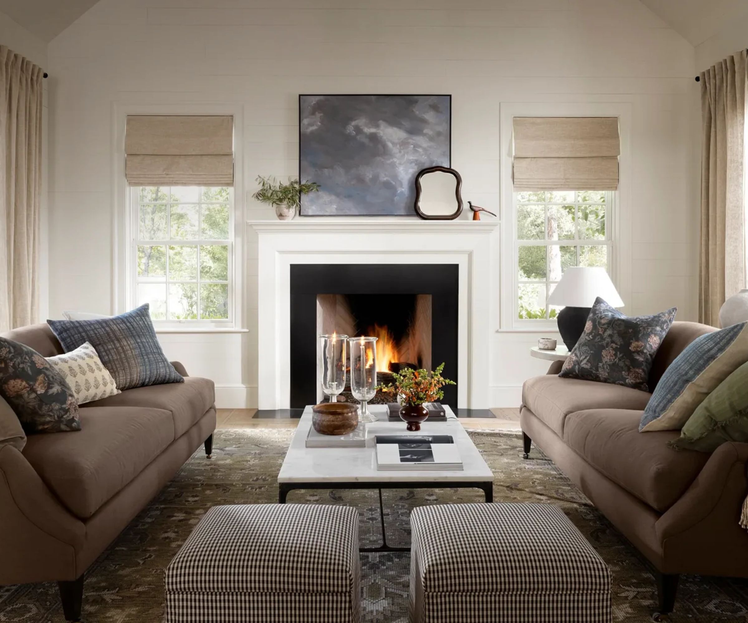
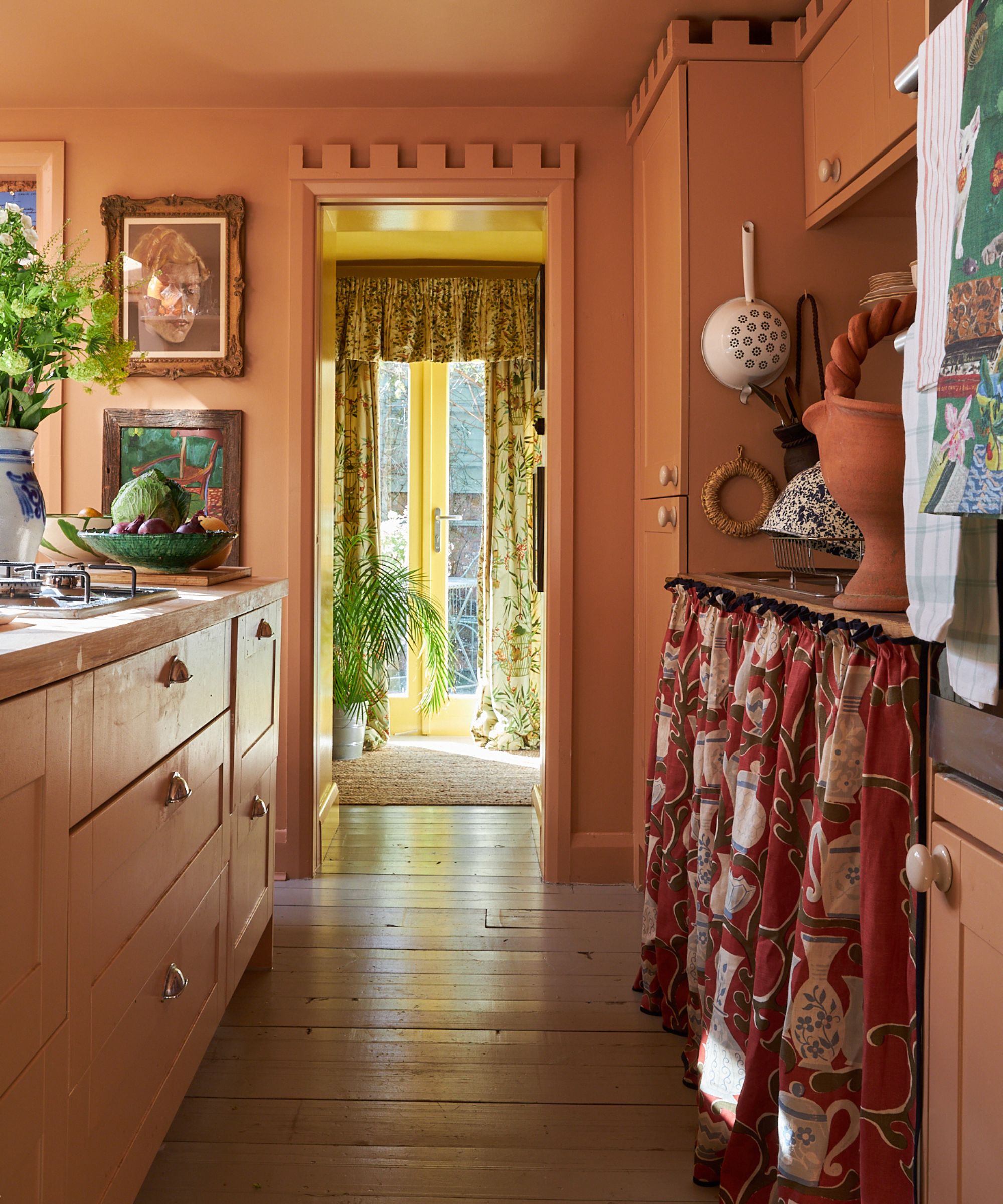
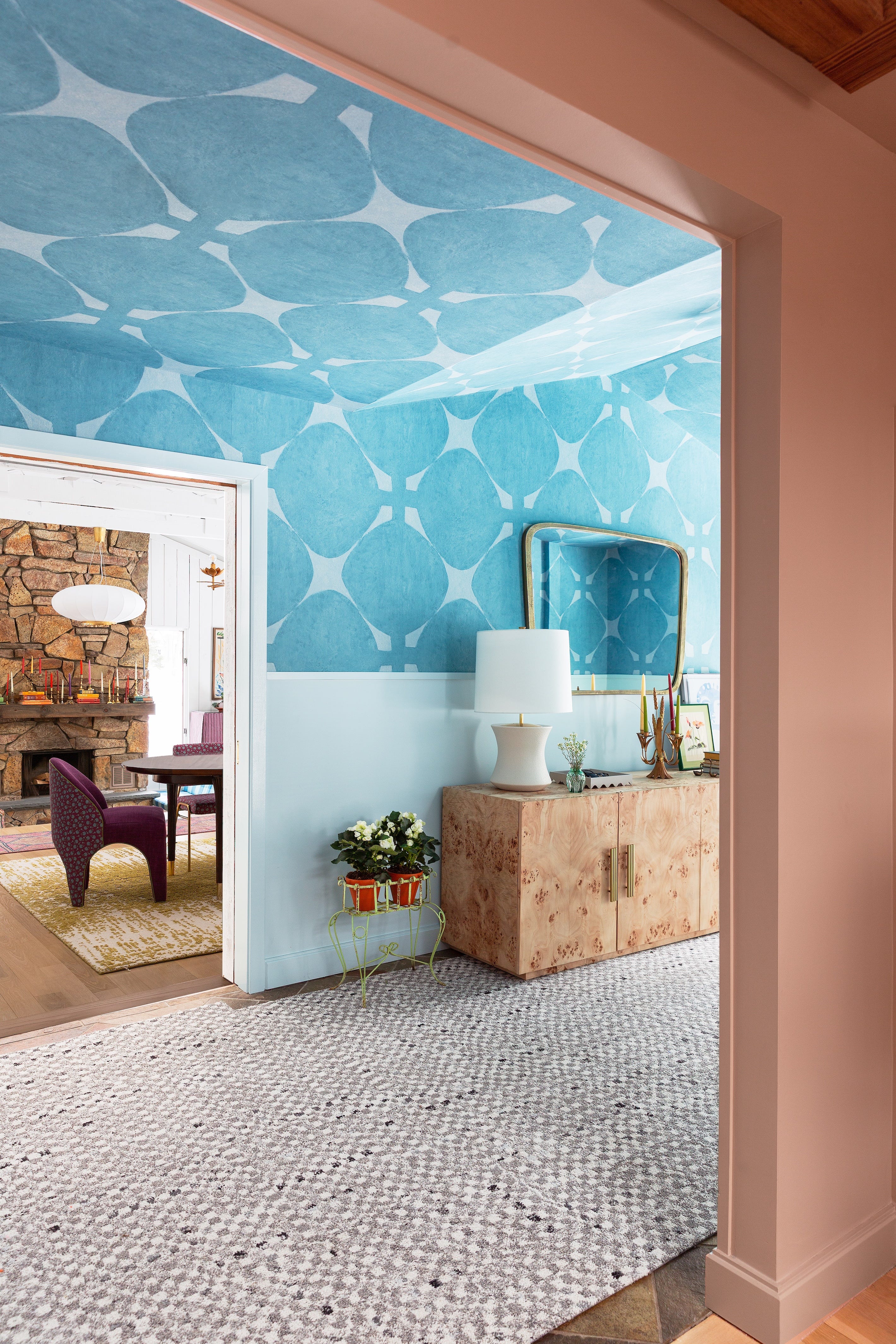

Six interior designers share their preferred paint duos and explain the intentionality behind their choices. Beth Diana Smith highlights the pairing of olive green and classic tan, using Benjamin Moore’s Rosepine and Seasalt to bring richness, depth, warmth, and natural grounding, creating a sophisticated yet homey atmosphere. Justina Blakeney, known for her vibrant use of color, advocates for shades in the red-orange-coral spectrum. She recommends Benjamin Moore’s Golden Gate and Fiery Opal, which together radiate warmth, joy, and the impression of perpetual golden hour, blending seamlessly due to their similar hues.
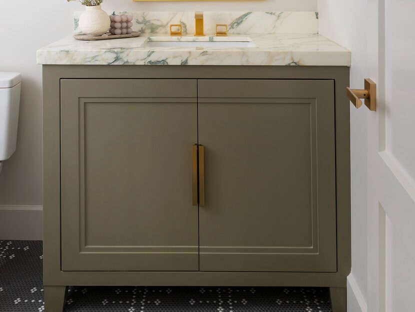
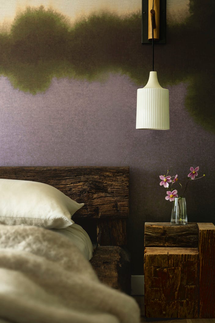
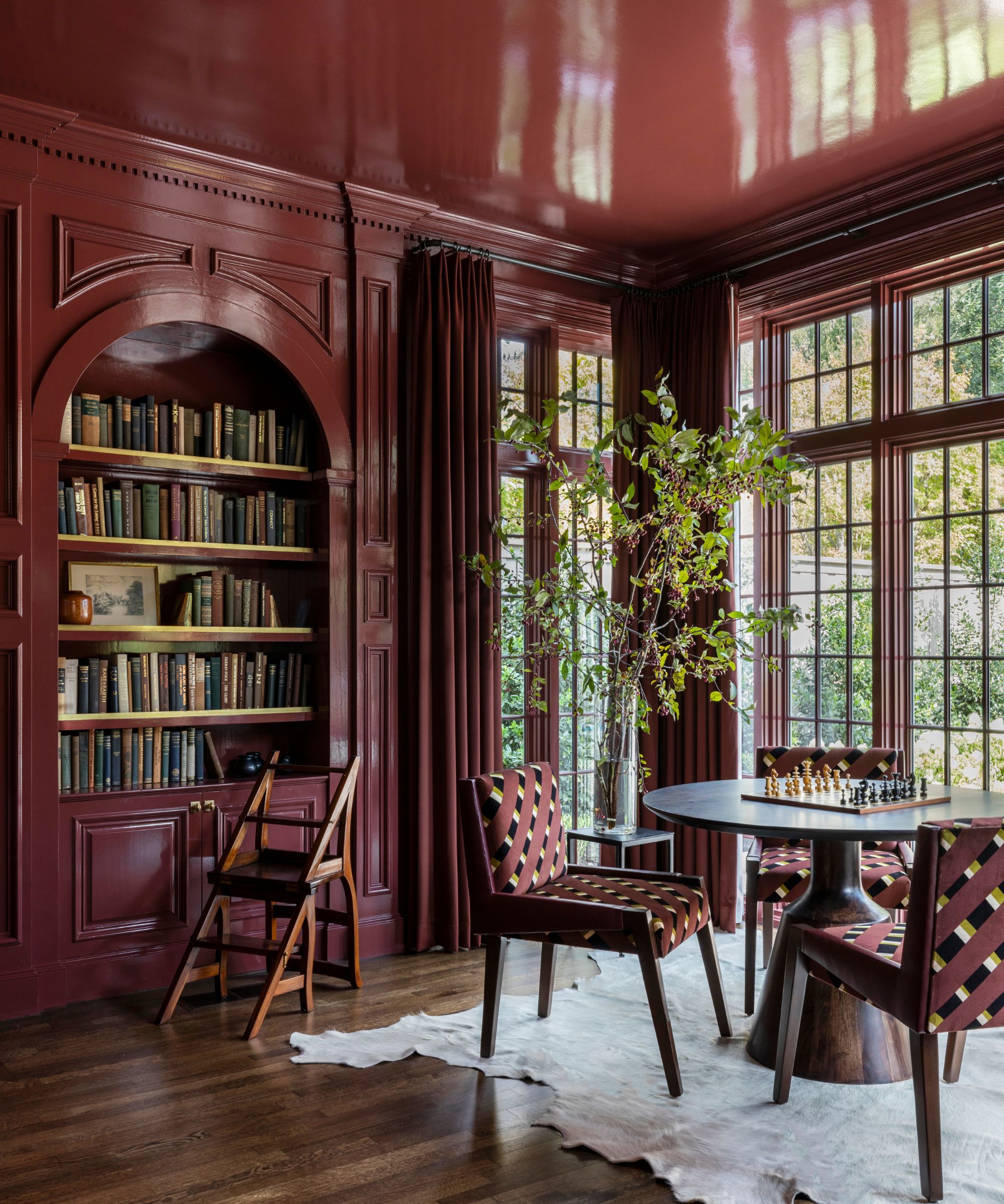
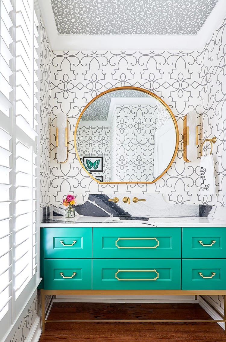
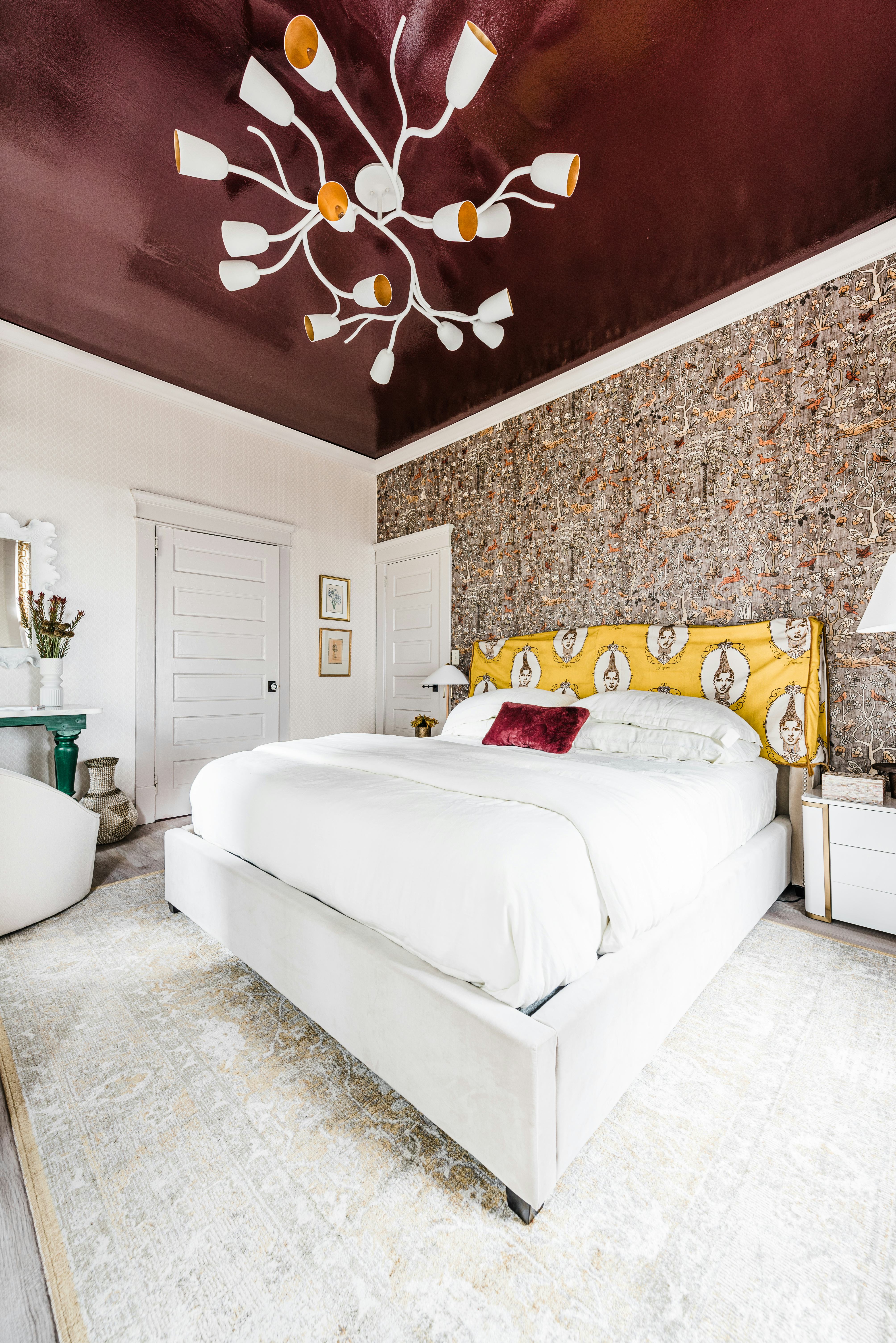
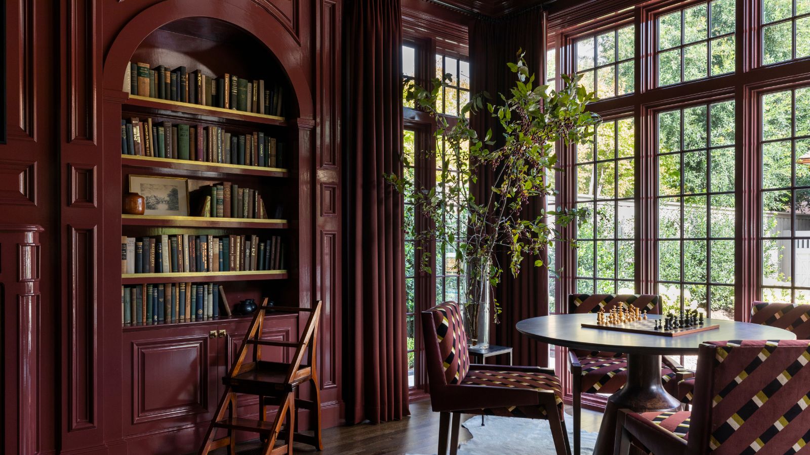
Kathryn Murphy suggests looking to complementary colors on the color wheel for effective pairings. She particularly favors deep burgundy tones accented with gold. An example provided is a living room with a rich burgundy ceiling paired with gold wallpaper, achieving a warm, luxurious, and inviting ambiance suitable for cooler seasons. Kelsey Grose expresses her current obsession with steely blues and warm, umber-toned reds. She illustrates this with a half-bath featuring an umber-painted window and door frame alongside muted blue/green wallpaper, recommending Benjamin Moore’s Dark Nut Brown for its depth, neutrality, and evocative color.
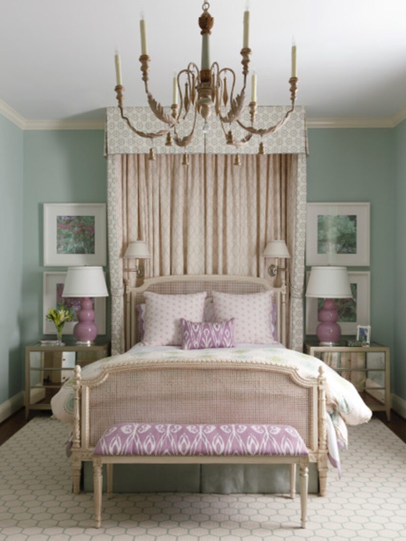
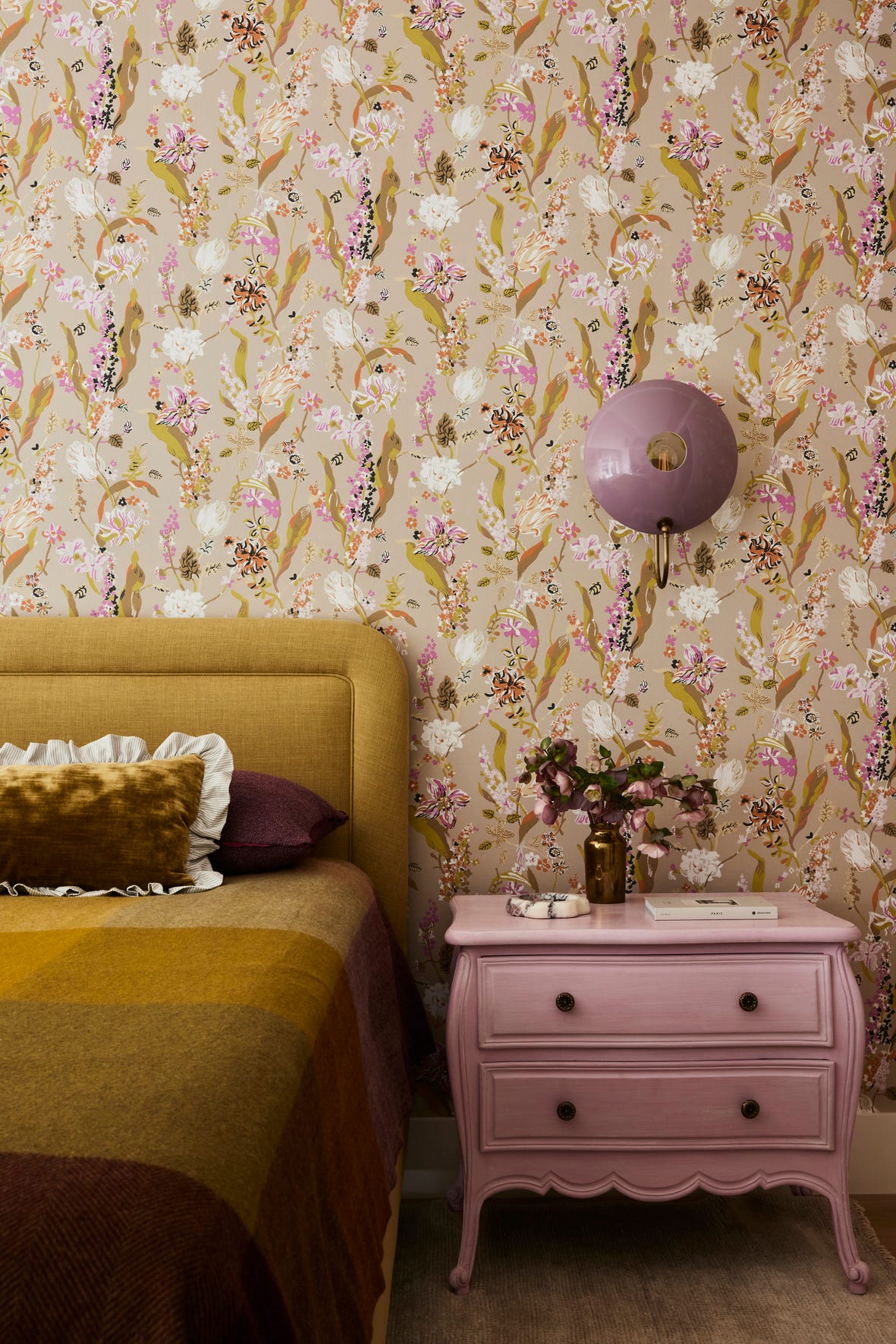
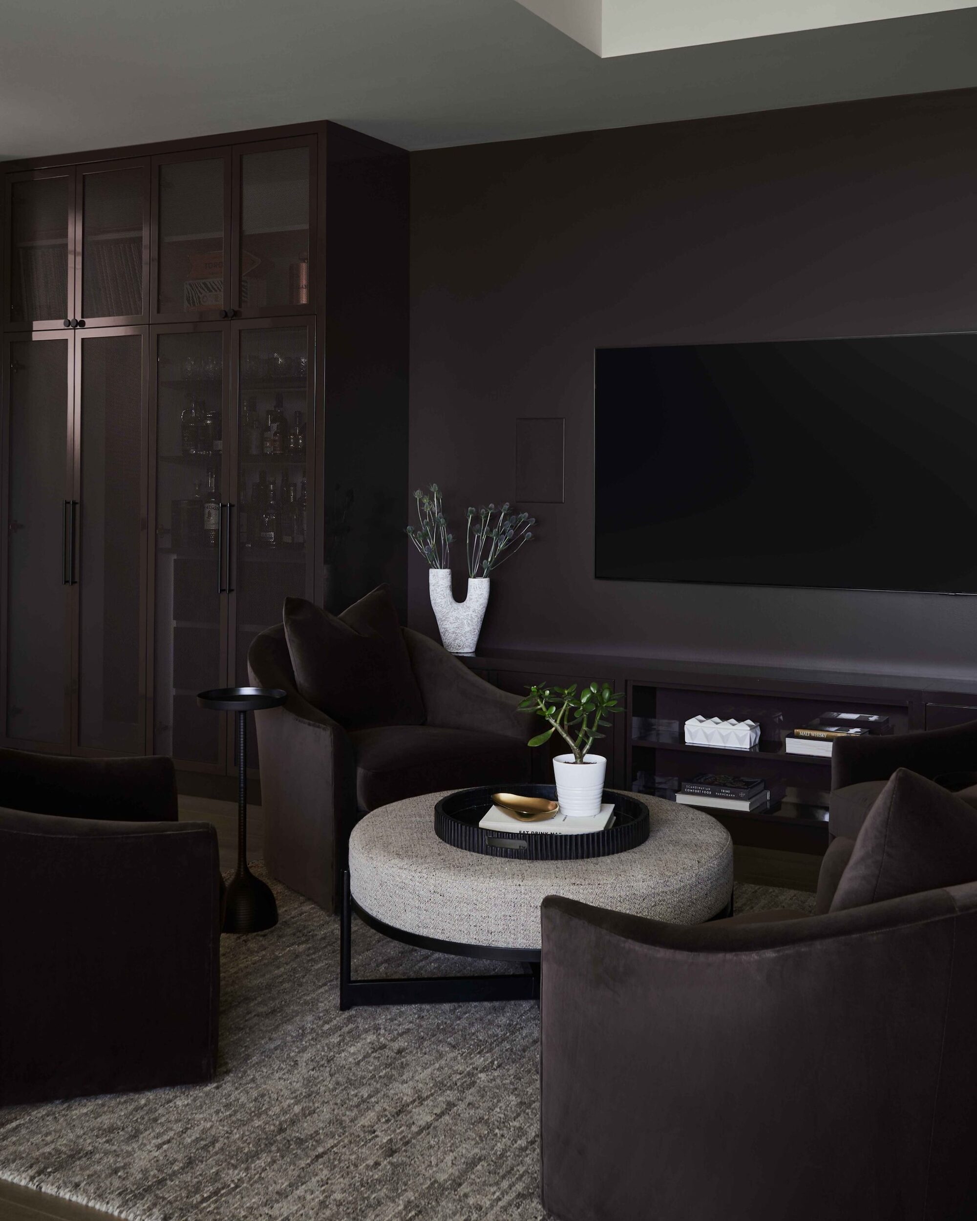
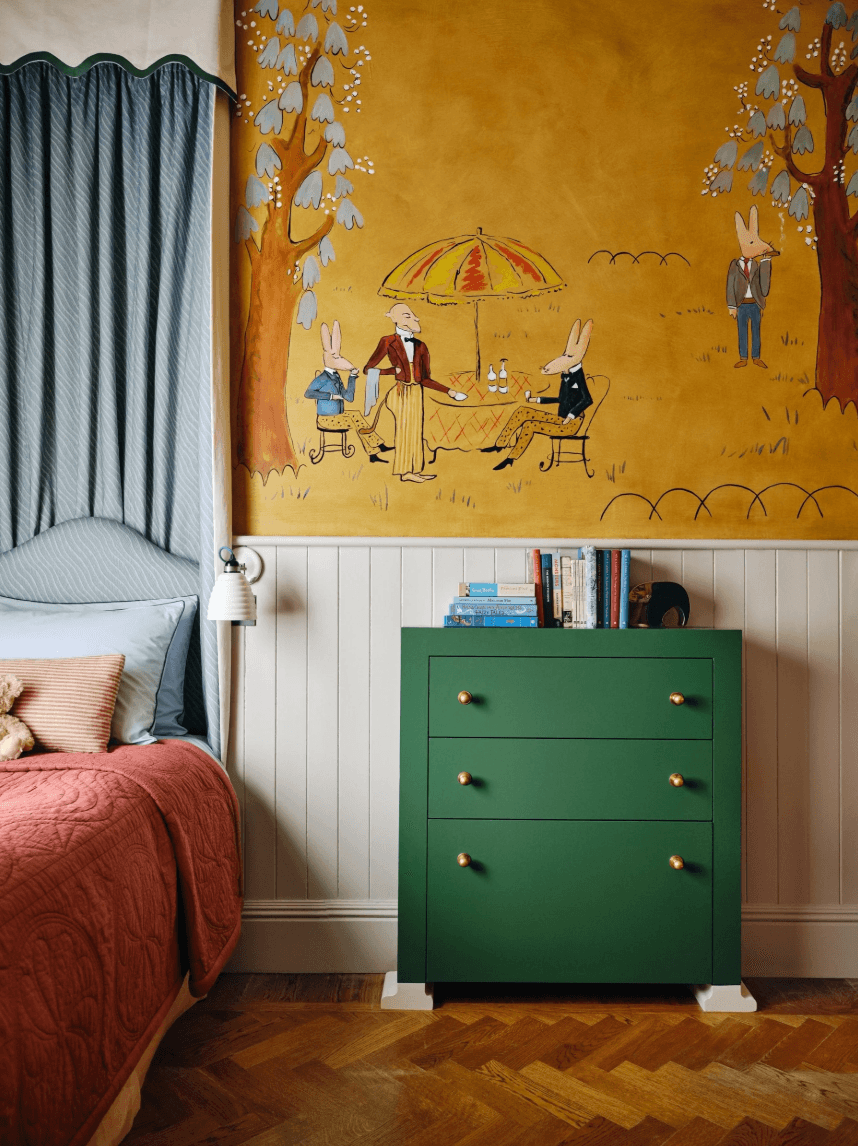
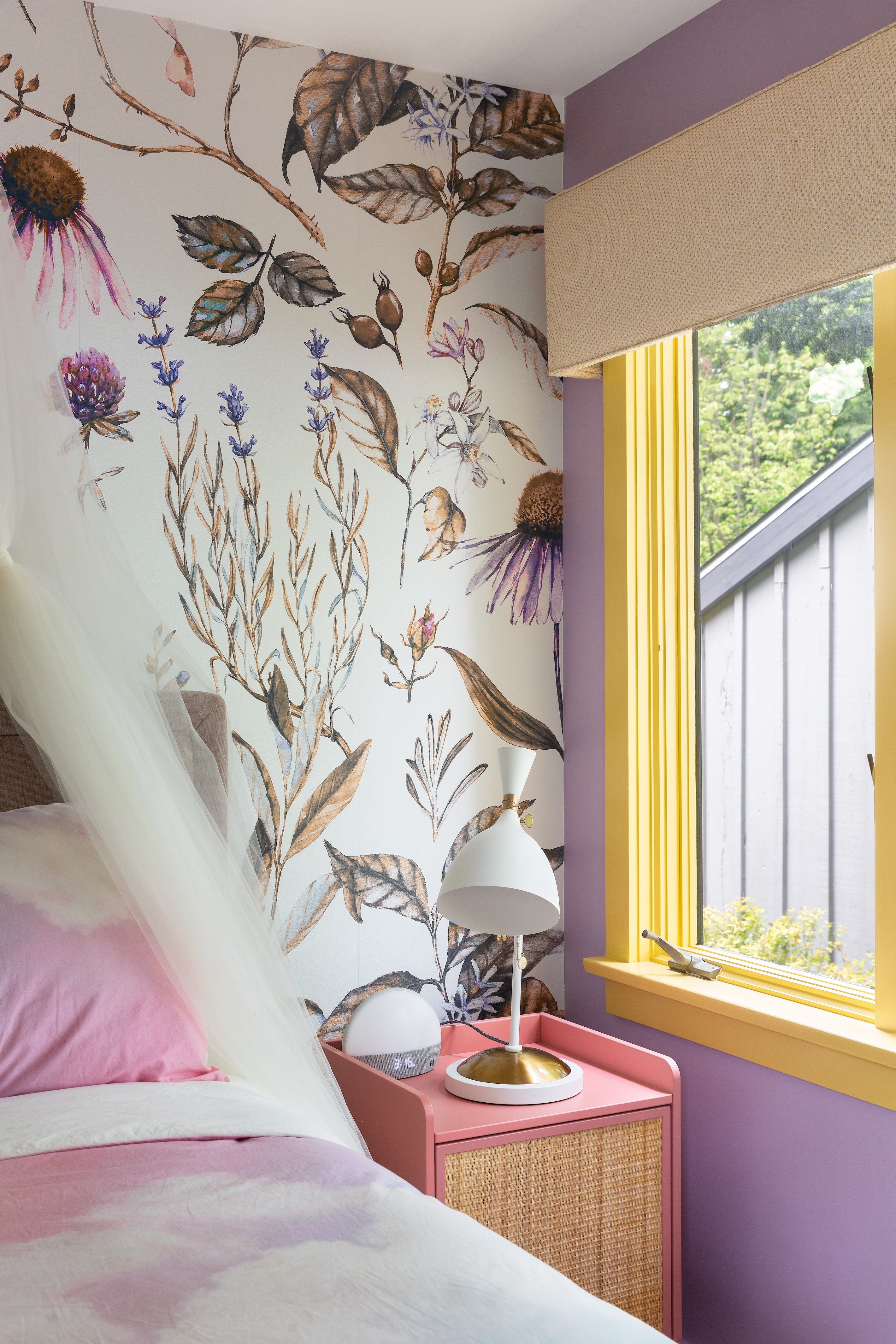
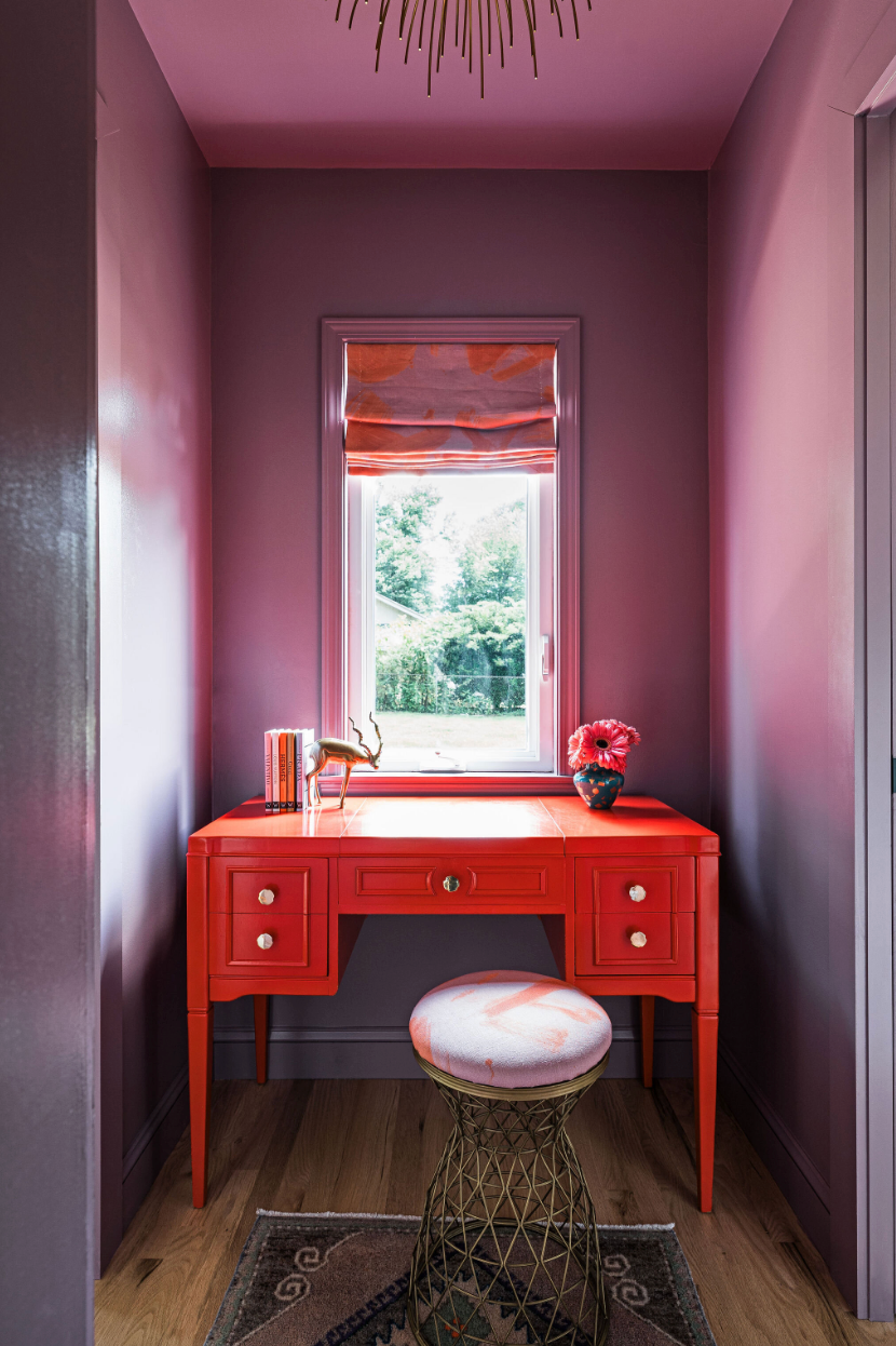
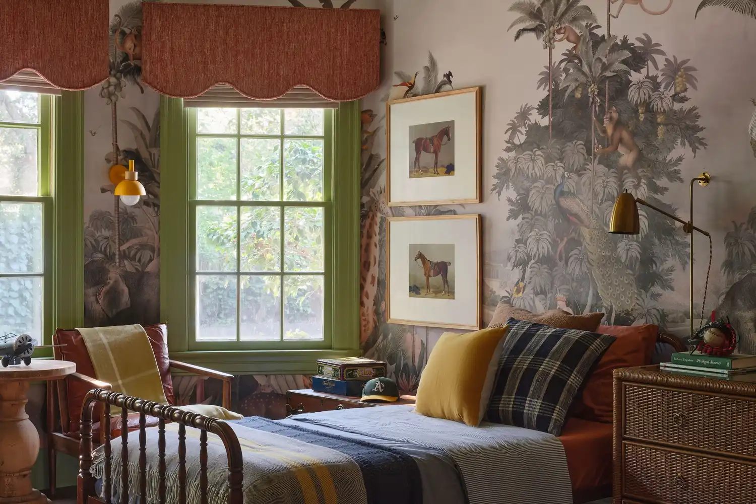
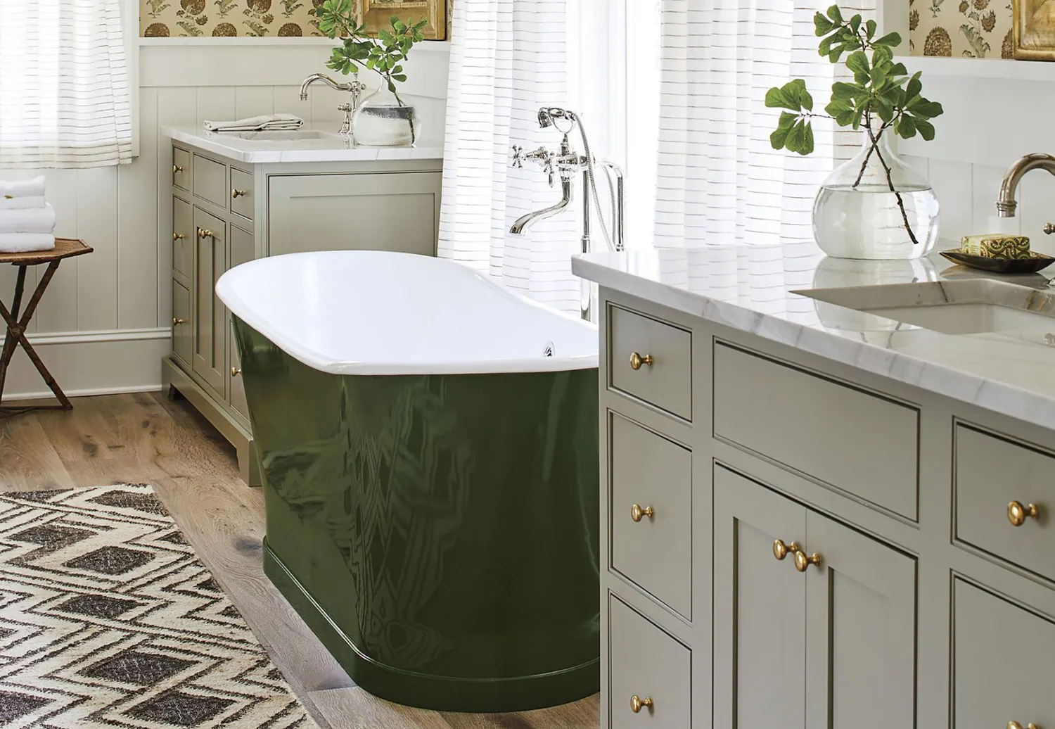
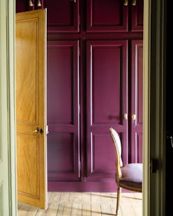
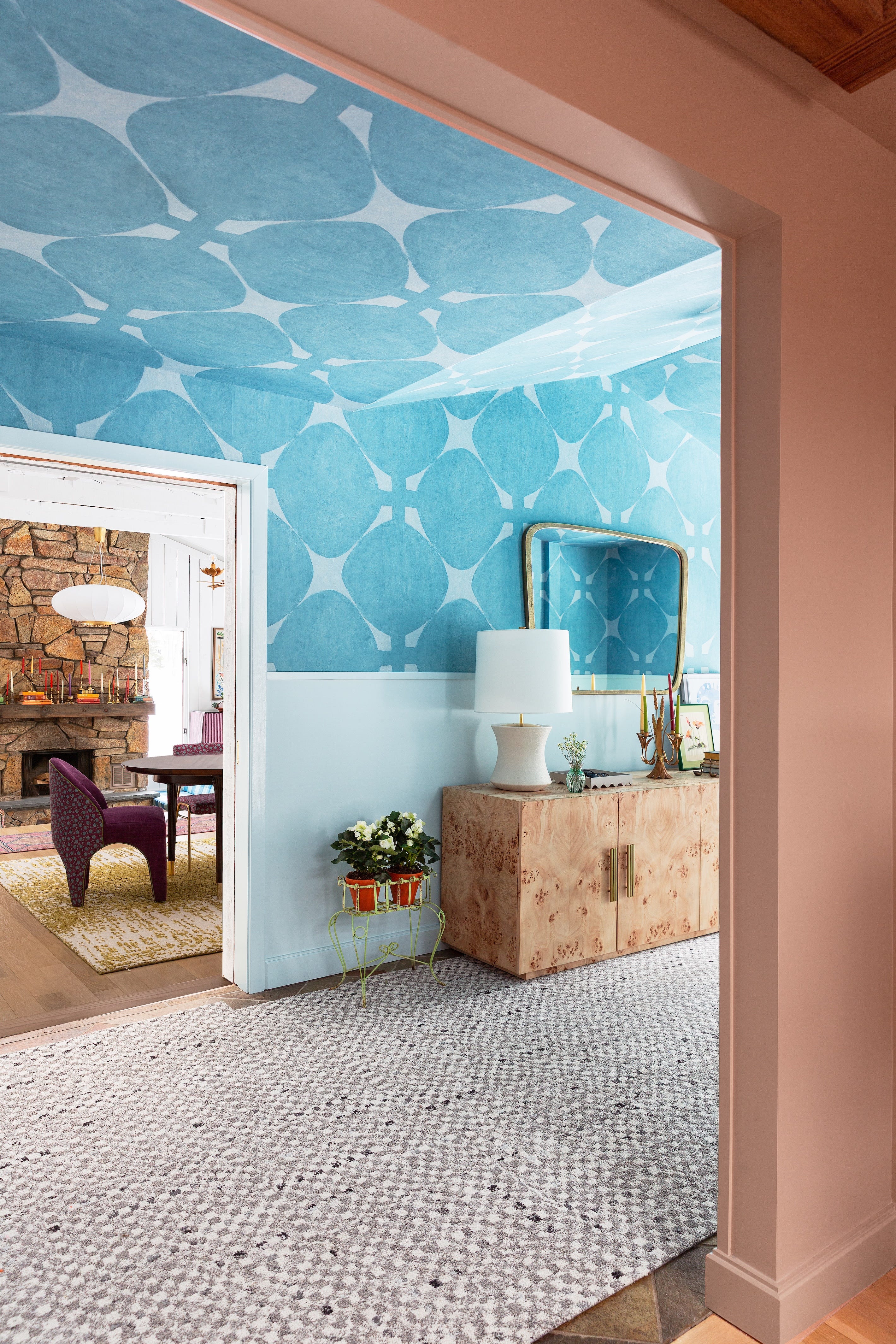
Amanda Jacobs gravitates towards bold plum set against soft, light green. In one project, she used a deep plum in a hallway to create a striking contrast with a sage kitchen, resulting in a vibrant yet grounded, warm, and natural feel reminiscent of autumn leaves. Lastly, Alexandra Azat discusses monochromatic color-blocking by combining colors that share a similar base hue but differ in tone, depth, and temperature. For a vintage-inspired children's room, she paired Farrow and Ball’s Churlish Green and Yeabridge Green, creating a harmonious yet contrasting effect that is both playful and elegant.
These designer insights underscore the transformative power of color combinations in interior design, providing practical guidance for homeowners seeking to personalize their spaces with thoughtful and impactful paint choices.
#InteriorDesign #PaintColors #HomeDecor #ColorCombinations #FallTrends #DesignerTips #DecoratingIdeas #HomeImprovement #InteriorDesign #PaintColors #HomeDecor #ColorCombinations #FallTrends #DesignerTips #DecoratingIdeas #HomeImprovement
0 comment in total
 No comments yet
You may also like
Fall’s Most Stylish Paint Color Trends Have Us Swooning
Designers Weigh In on the 7 Biggest Paint Color Trends of Fall 2022

The most timeless paint colors according to designers

12 Paint Colors That Interior Designers Are Buzzing About—See the Gorgeous Hues Here
What are the best color combinations for fall? 7 cozy-season-ready suggestions from designers
Designers LOVE Pairing These Unexpected Colors With This Sophisticated Hue

7 Color Combos That ALWAYS Look Good Together, According to Designers


An A-List Designer’s Secrets To Picking Perfect Paint Colors

Designers LOVE Pairing These Unexpected Colors With This One Timeless Hue
10 Greige Paint Colors Designers Recommend Again And Again
It's time to look beyond pumpkin spice – 10 fall colors designers swear by for a cozy, seasonal, and timeless look
These Unusual Paint Colors May Not Be An Obvious Choice, But Designers Can’t Get Enough
7 Fall Paint Color Trends Designers Want You to Use This Year

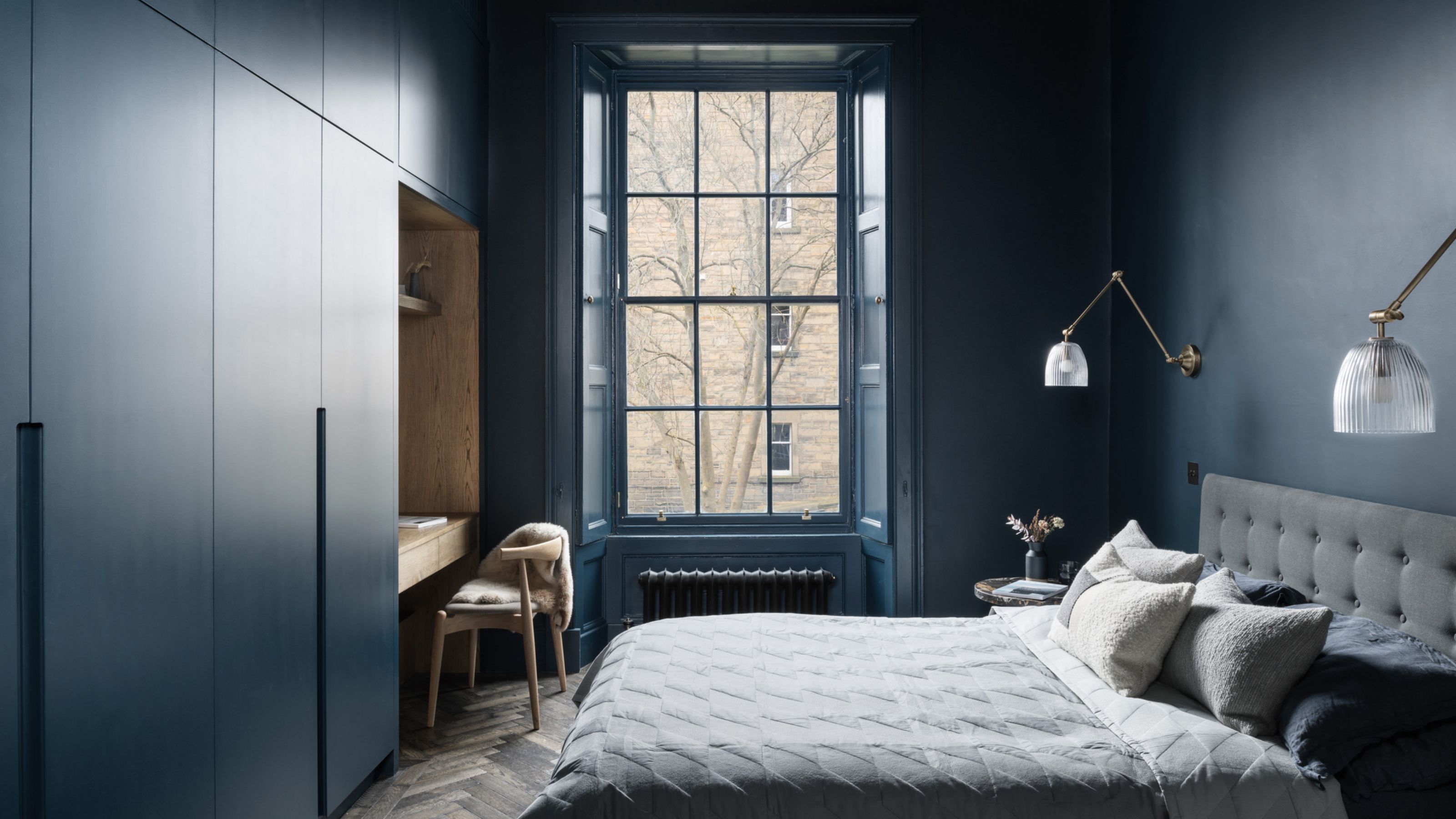
6 Dark Paint Colors That Designers Use to Bring Glamour


4 Interior Designers Share the Biggest Paint Color Trends Right Now (and What’s Out!)

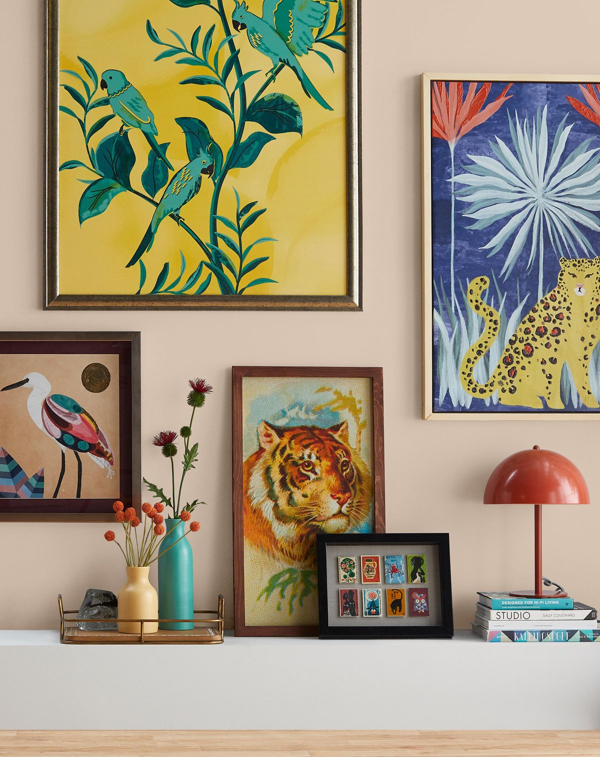
12 Home Paint Colors We're Loving for Fall

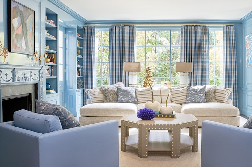
19 go-to paint colors that Dallas designers love
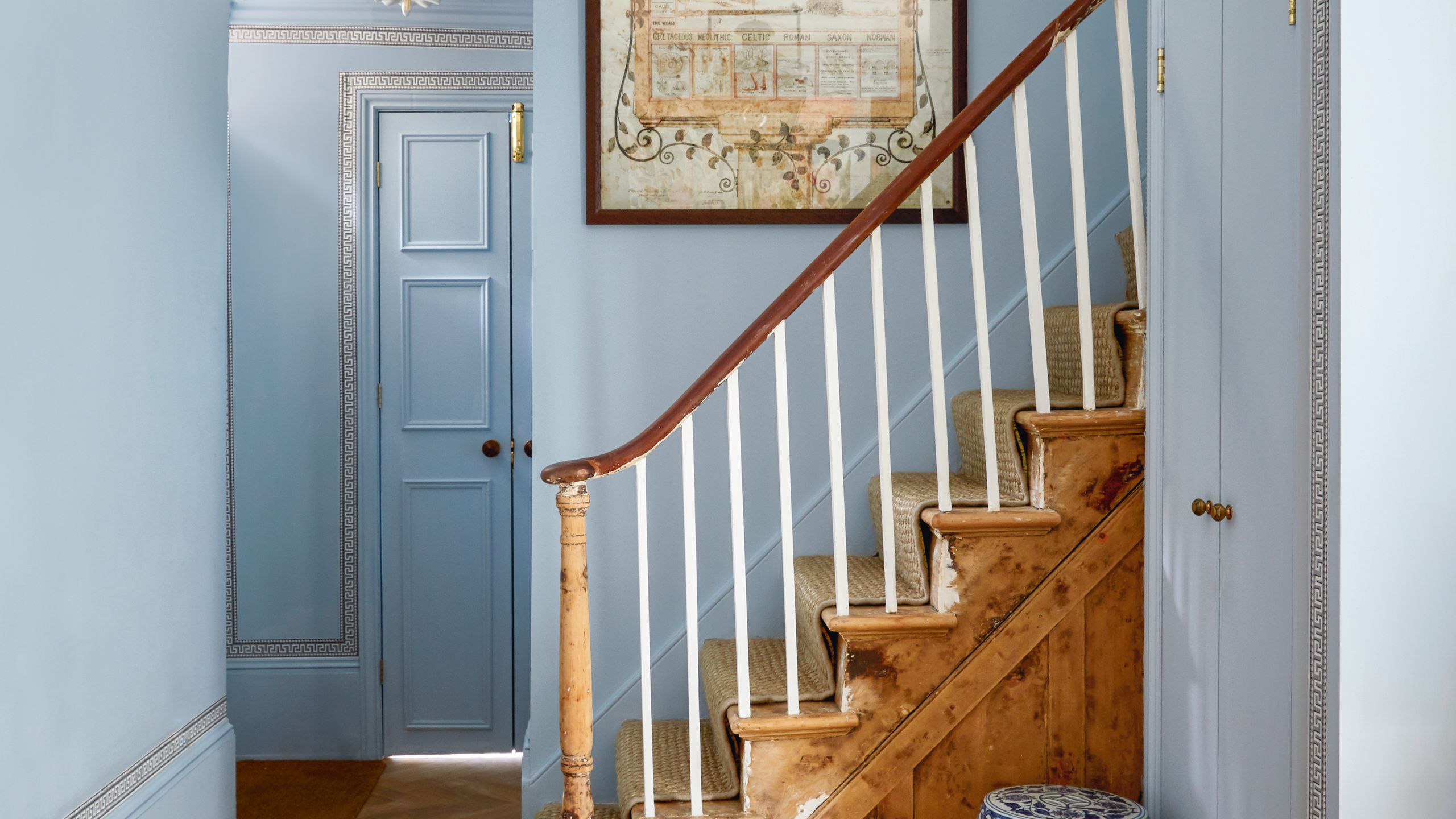
All the interior designers with paint collaborations (and our favourite shades)
Designers Say These Unusual Paint Color Combos Will Transform Your Home

33 Absolutely Perfect Paint Colors Designers Love