1/5
Fall’s Most Stylish Paint Color Trends Have Us Swooning
The transition from summer to fall often brings a desire for change, extending beyond wardrobes to living spaces. Reinvigorating one's home can be achieved through various methods, with painting being a particularly impactful yet accessible option. For Fall 2020, interior design experts and paint brands have identified key color trends that reflect current moods and aesthetic preferences.
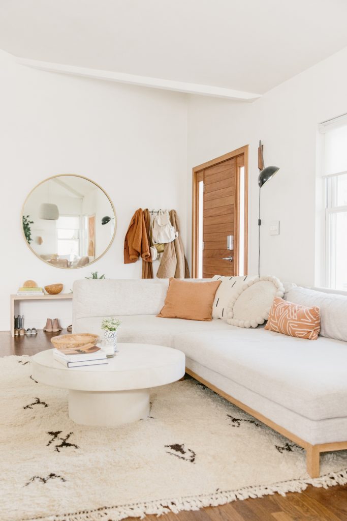
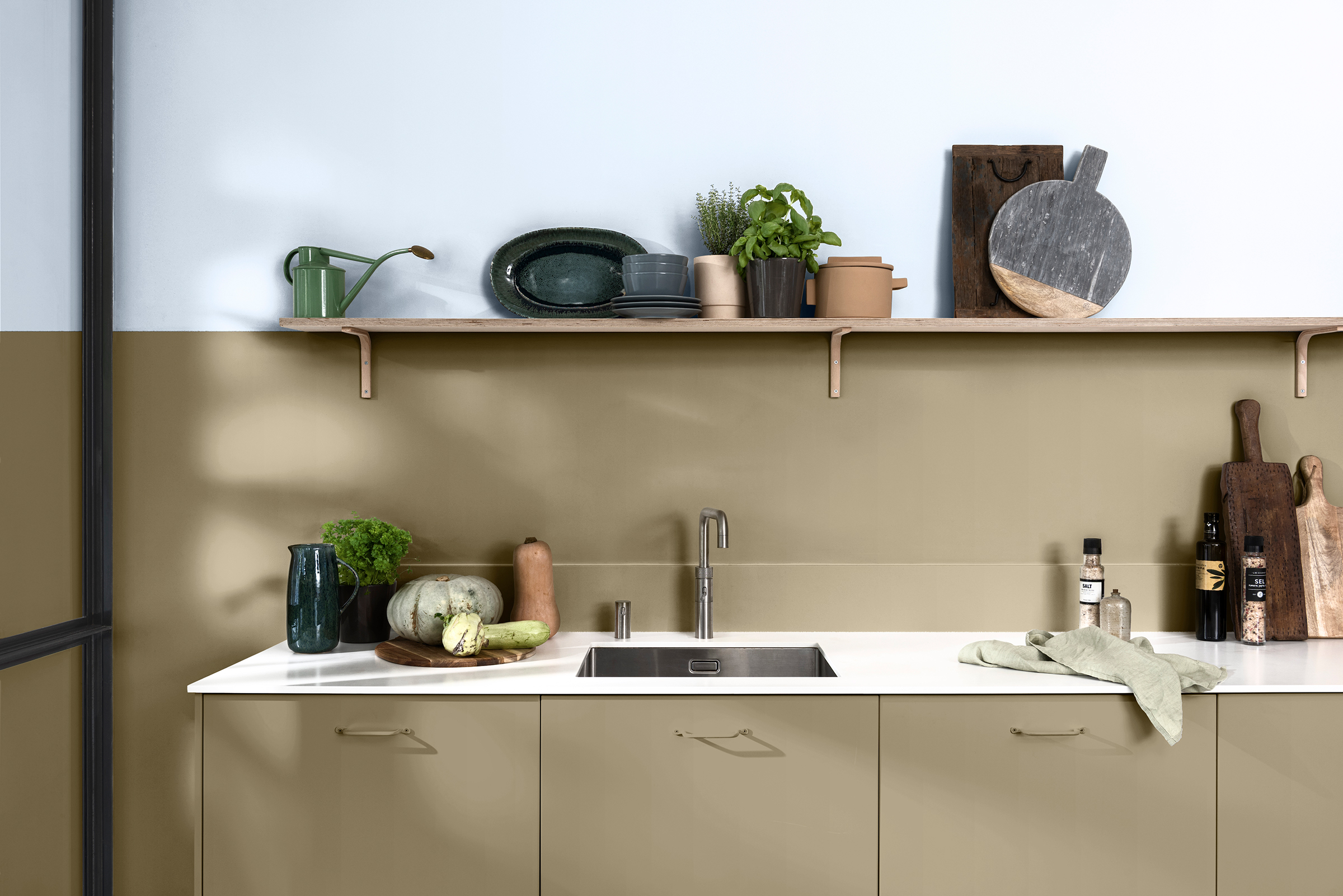
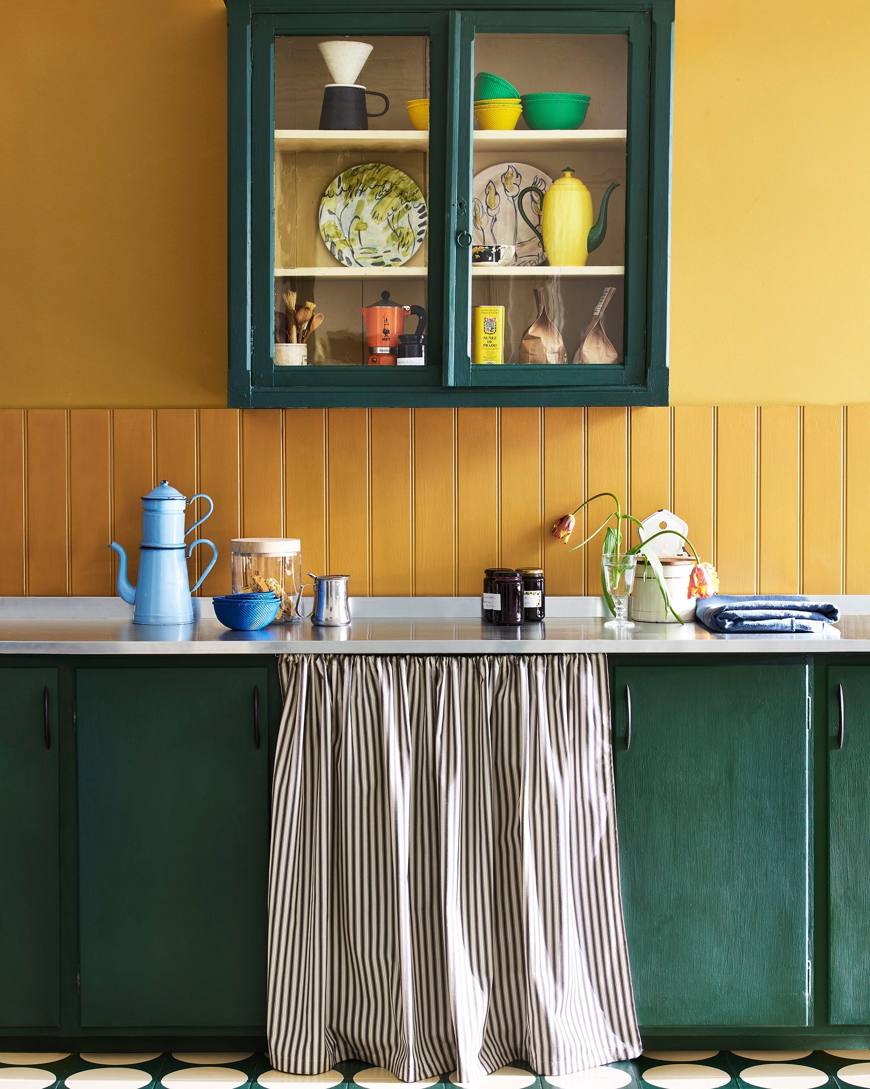
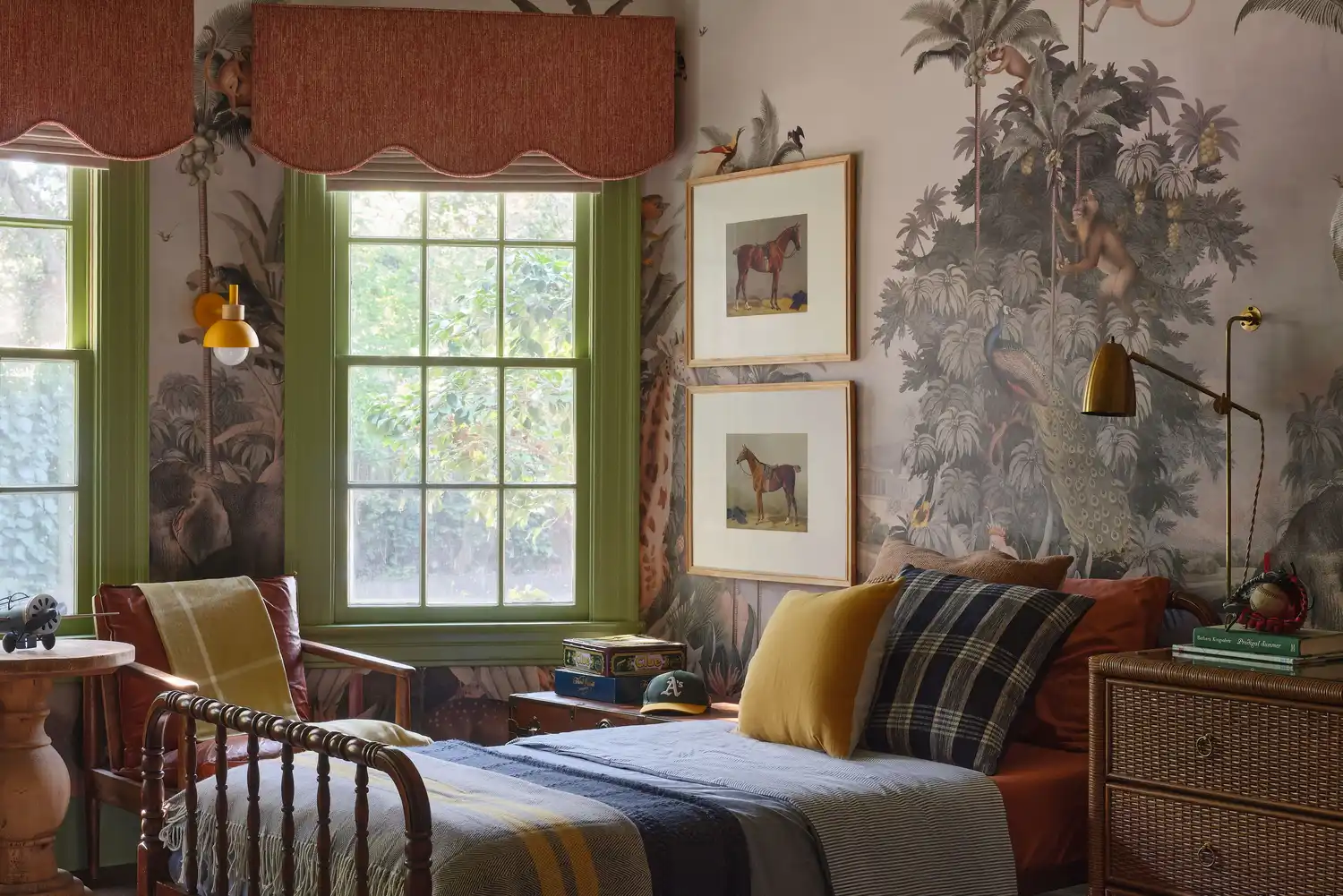
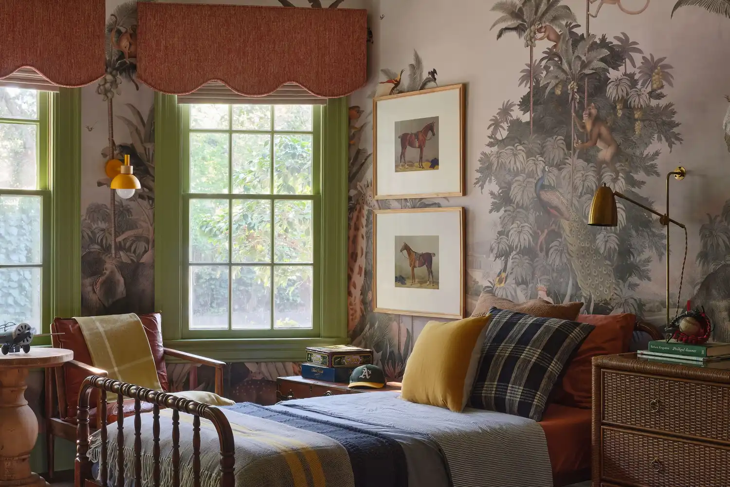
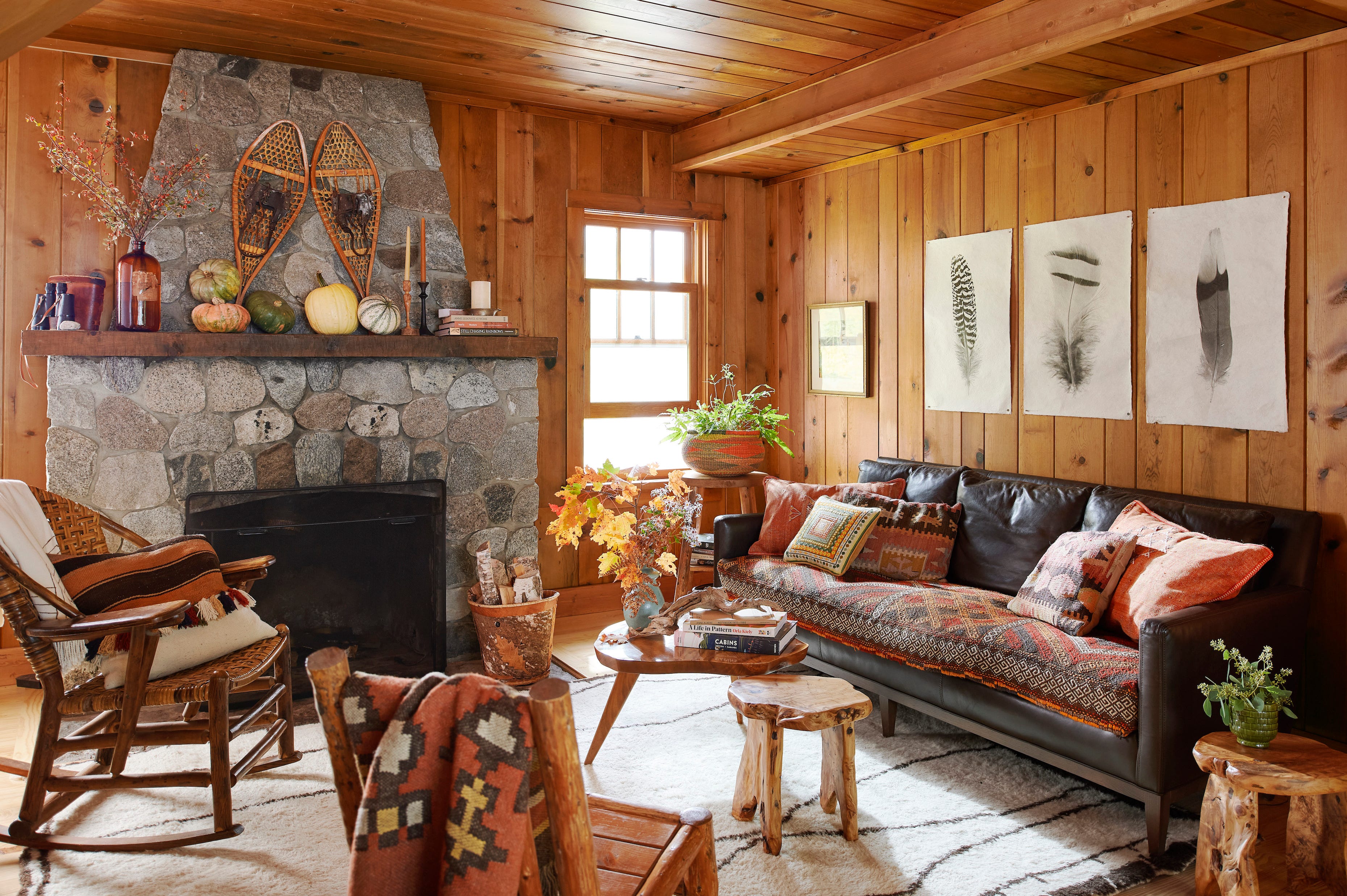
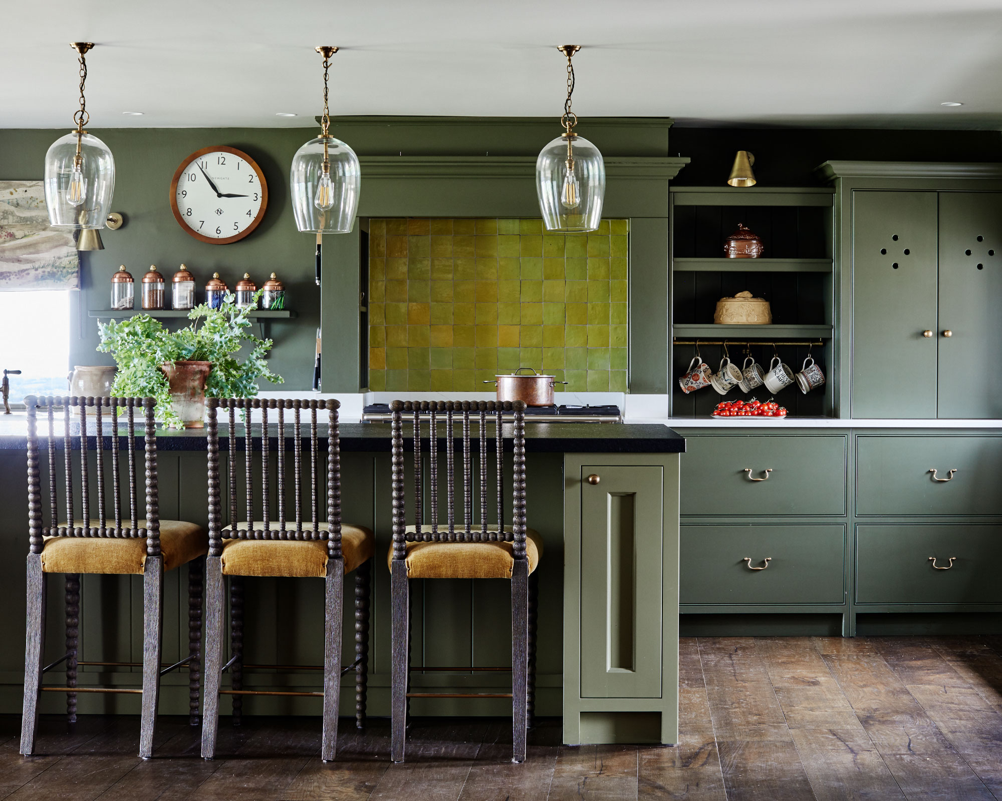
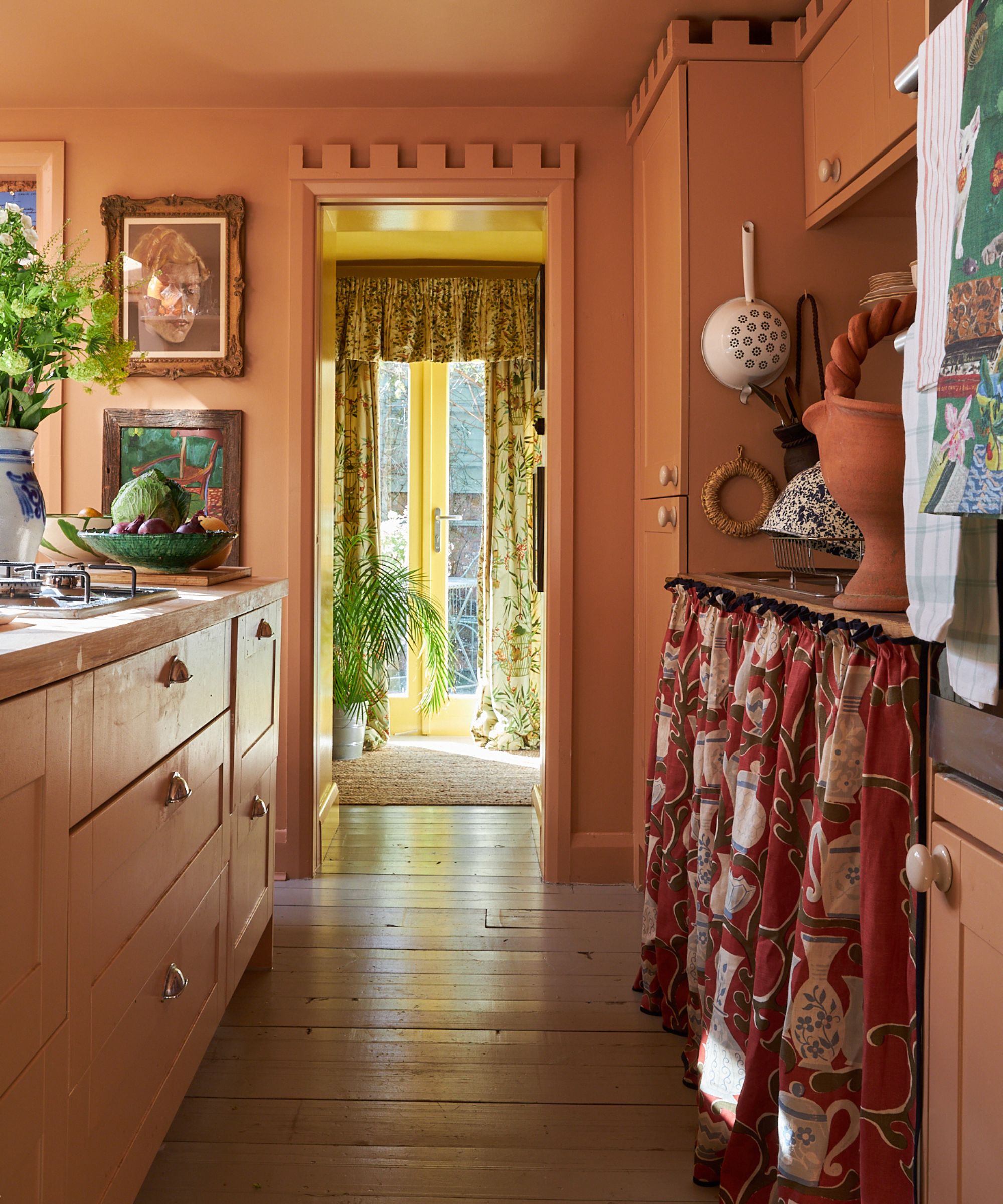
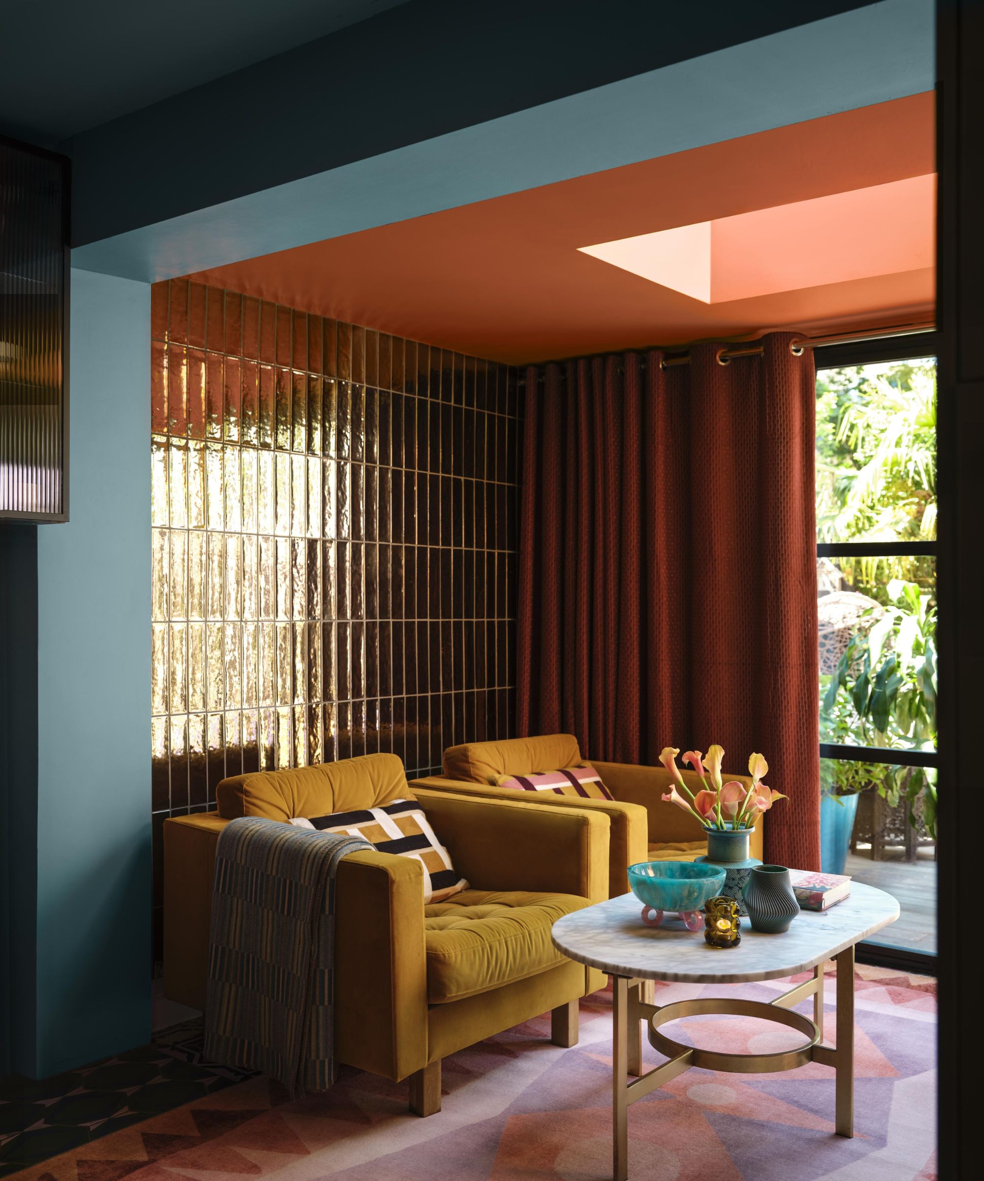
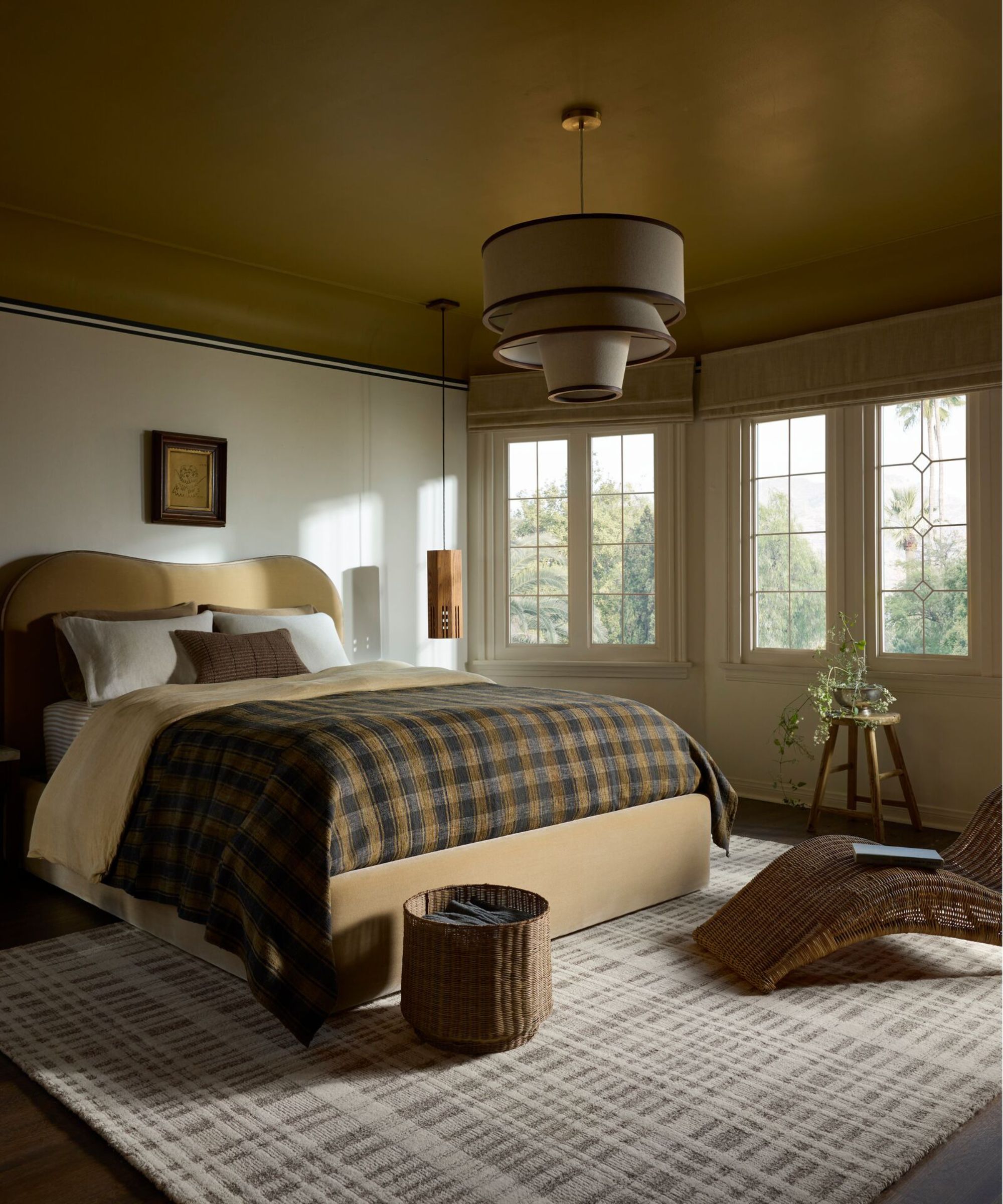
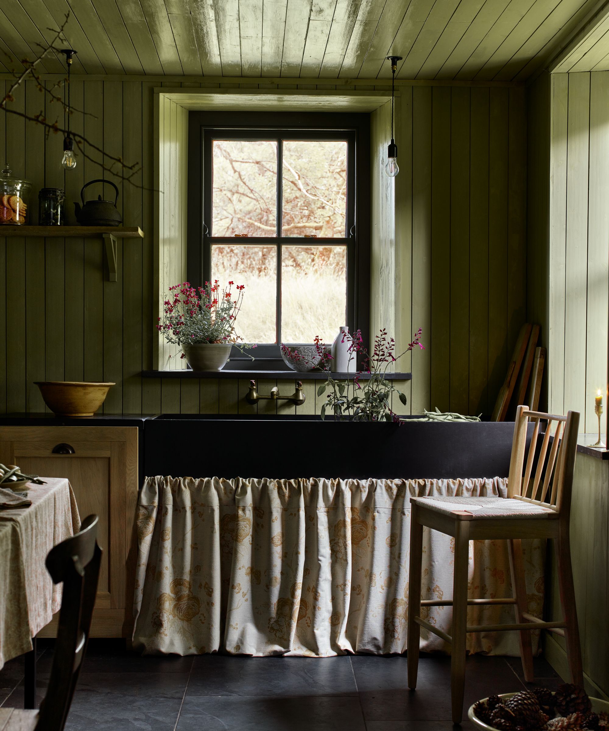
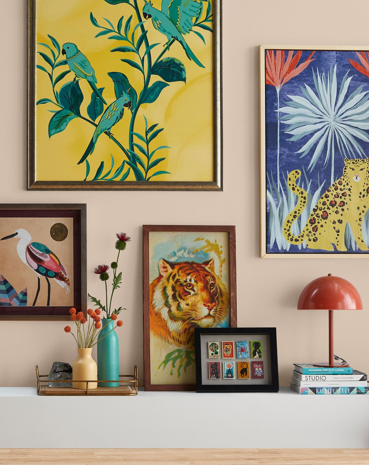
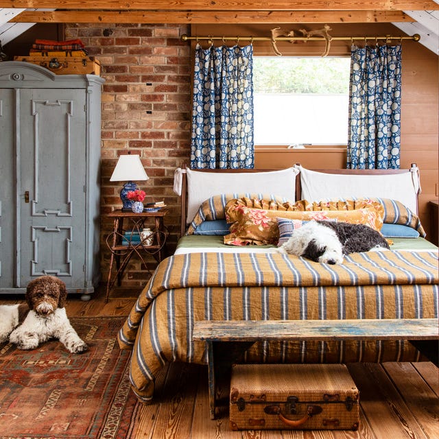
Leading the palette for this season is a strong emphasis on earthy tones. These colors provide a sense of comfort and stability, aligning with a renewed focus on creating cozy and inviting indoor environments. Shades of deep terracotta, warm olive green, and rich ochre are prominent, offering a natural and grounded feel. These hues are versatile, capable of bringing warmth to a minimalist space or complementing a more bohemian decor. They also pair well with natural materials like wood, rattan, and linen, enhancing the organic aesthetic.
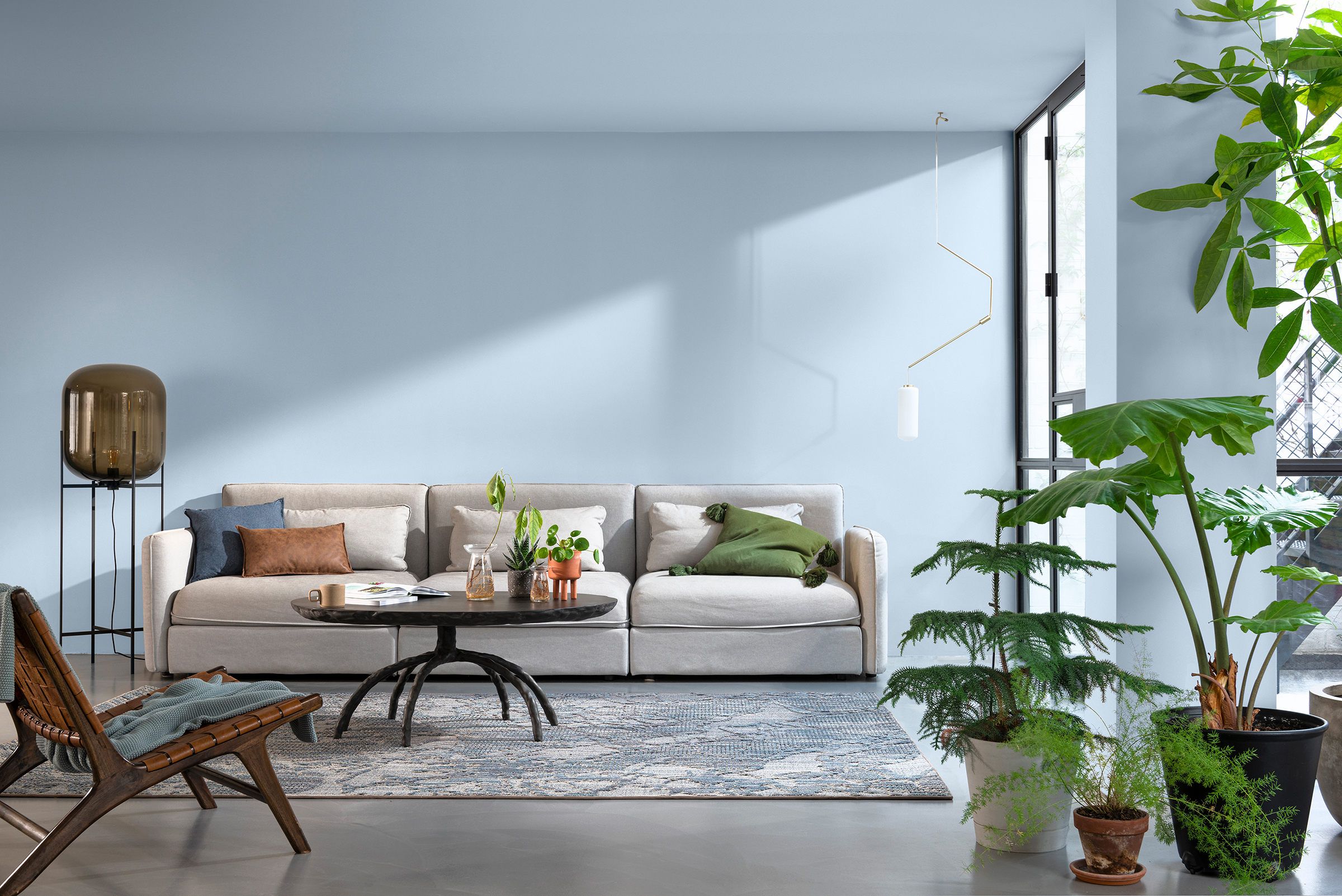
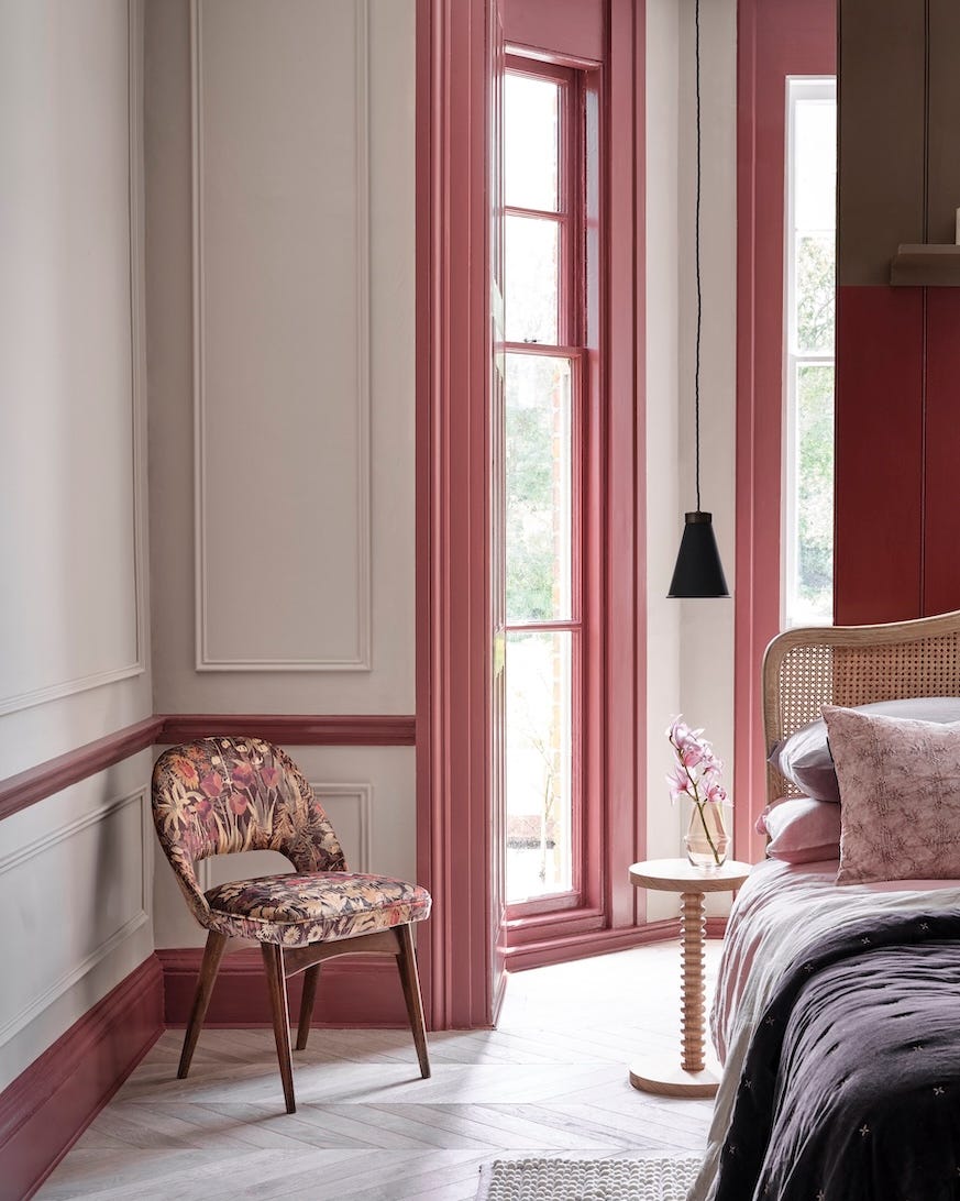
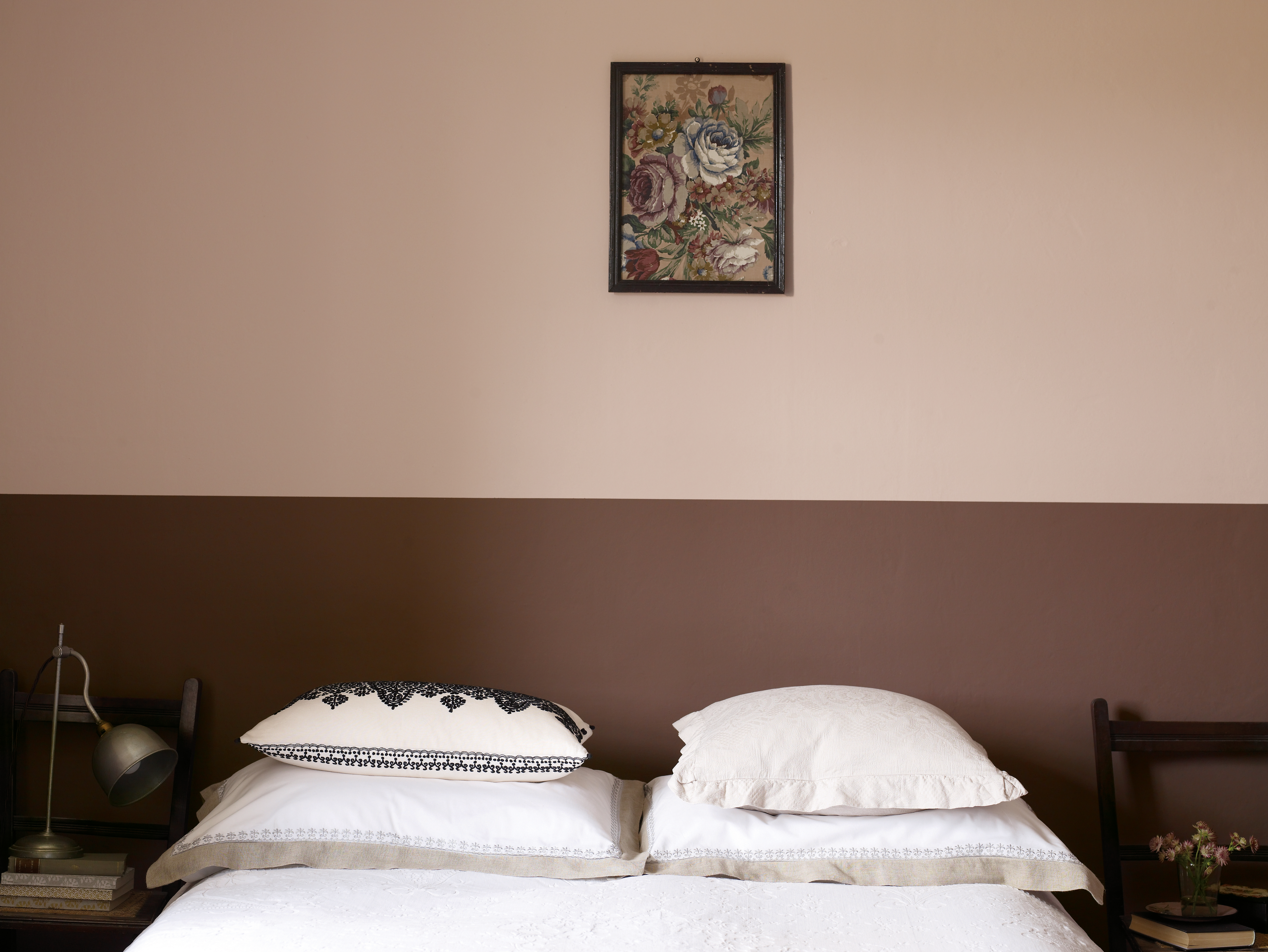
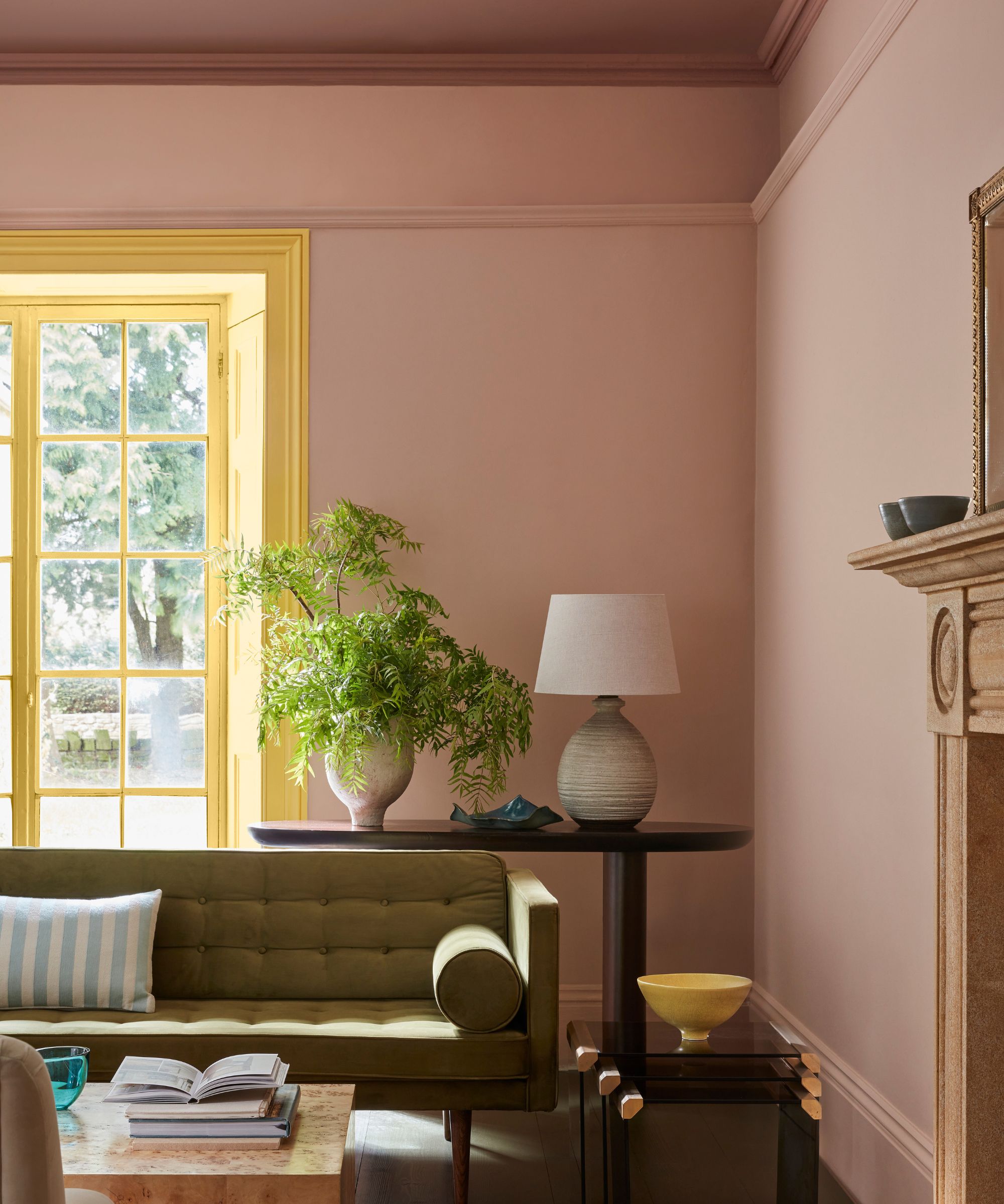
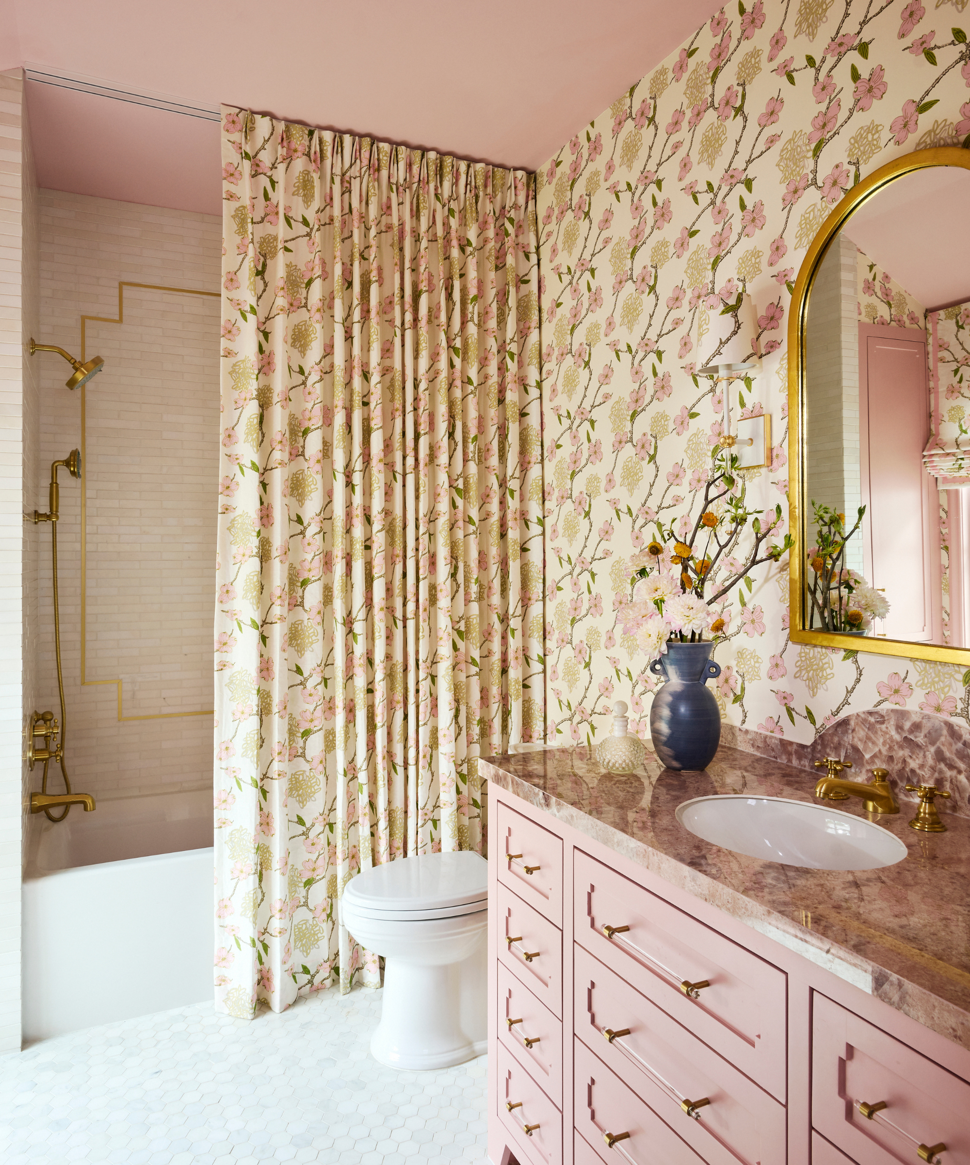
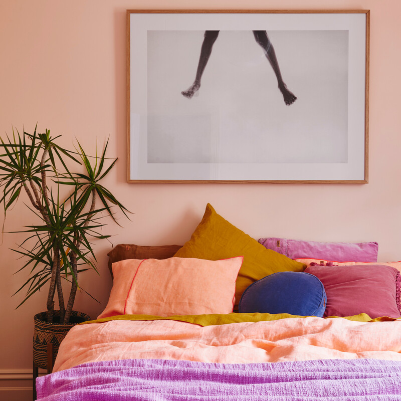
Alongside the earthy tones, muted pastels are emerging as a sophisticated choice. Unlike the vibrant pastels of previous seasons, these are softer, almost desaturated versions that exude tranquility and elegance. Think dusty rose, gentle sage, and subtle sky blue. These colors are ideal for creating serene bedrooms or calming living areas, promoting relaxation and well-being. Their understated quality allows for easy integration with existing furniture and artwork, providing a fresh update without overwhelming the space.
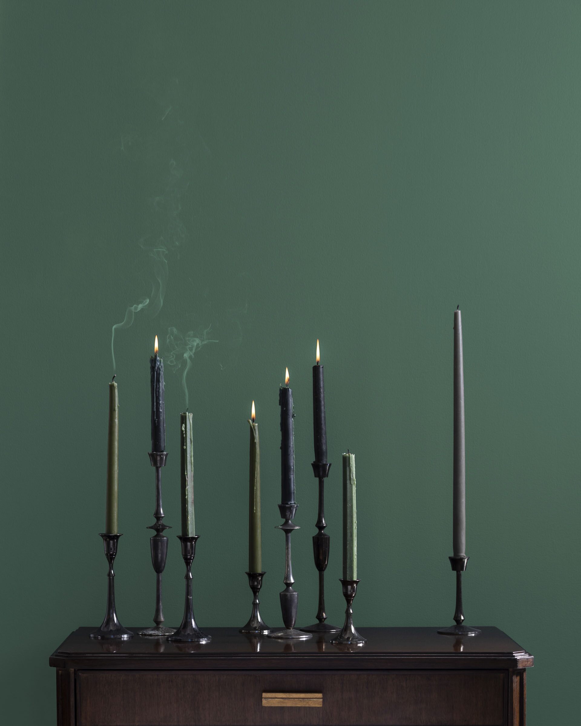
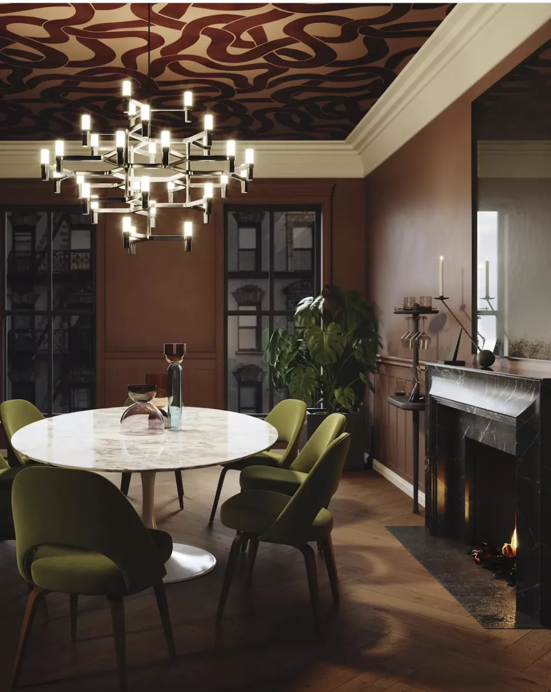
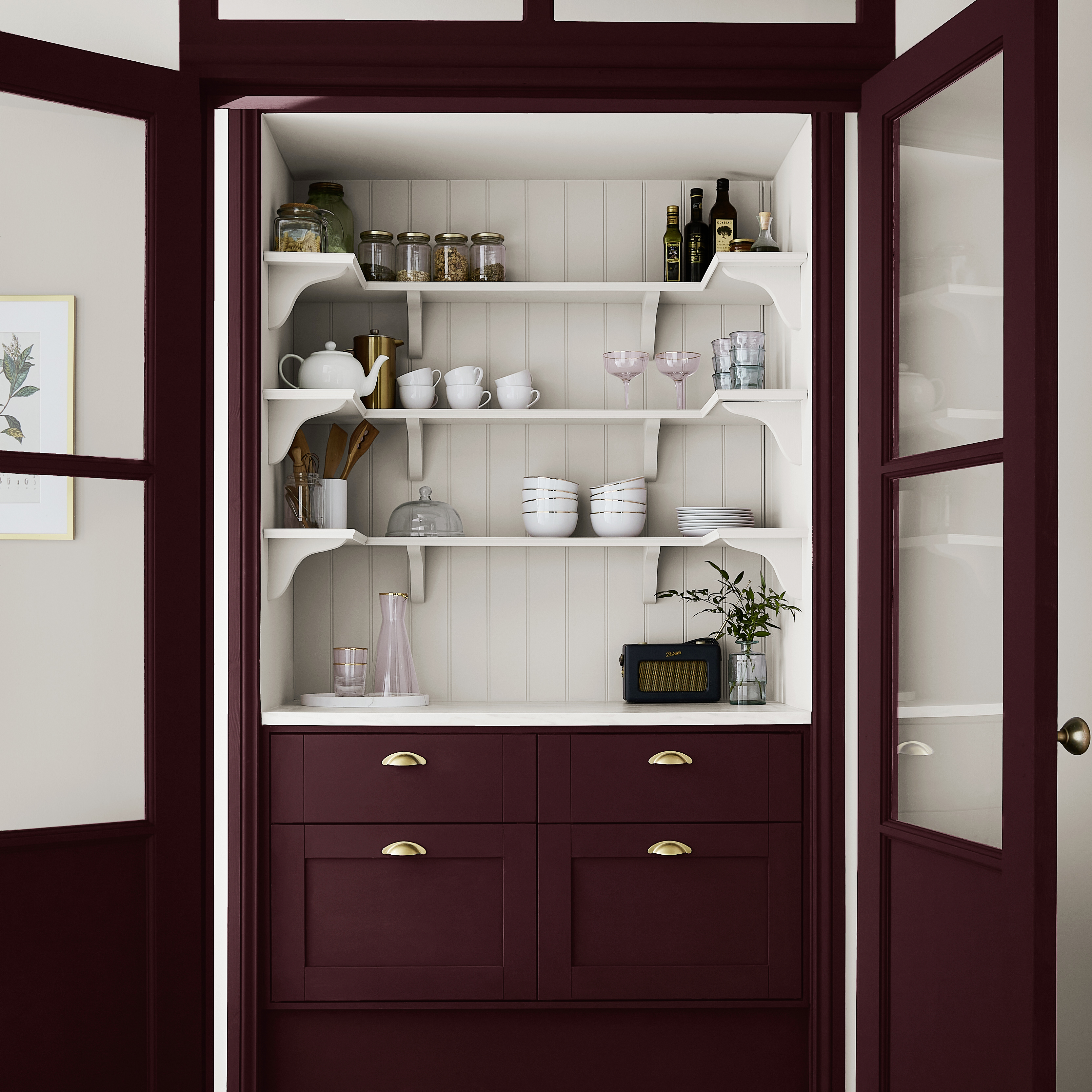
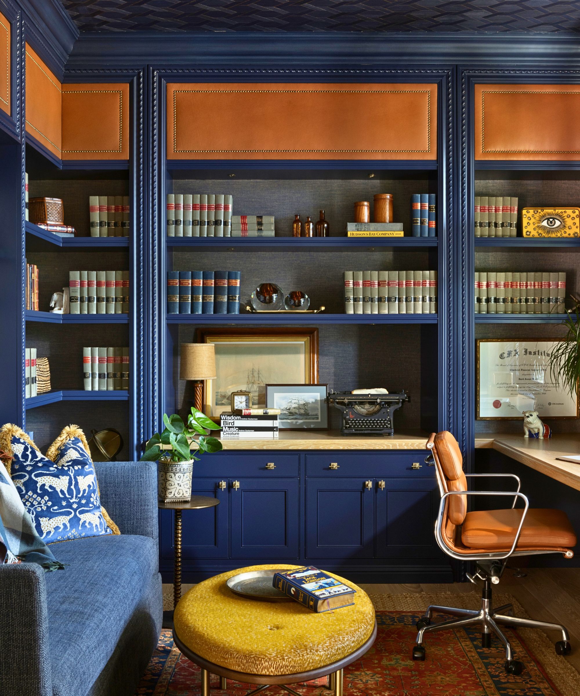
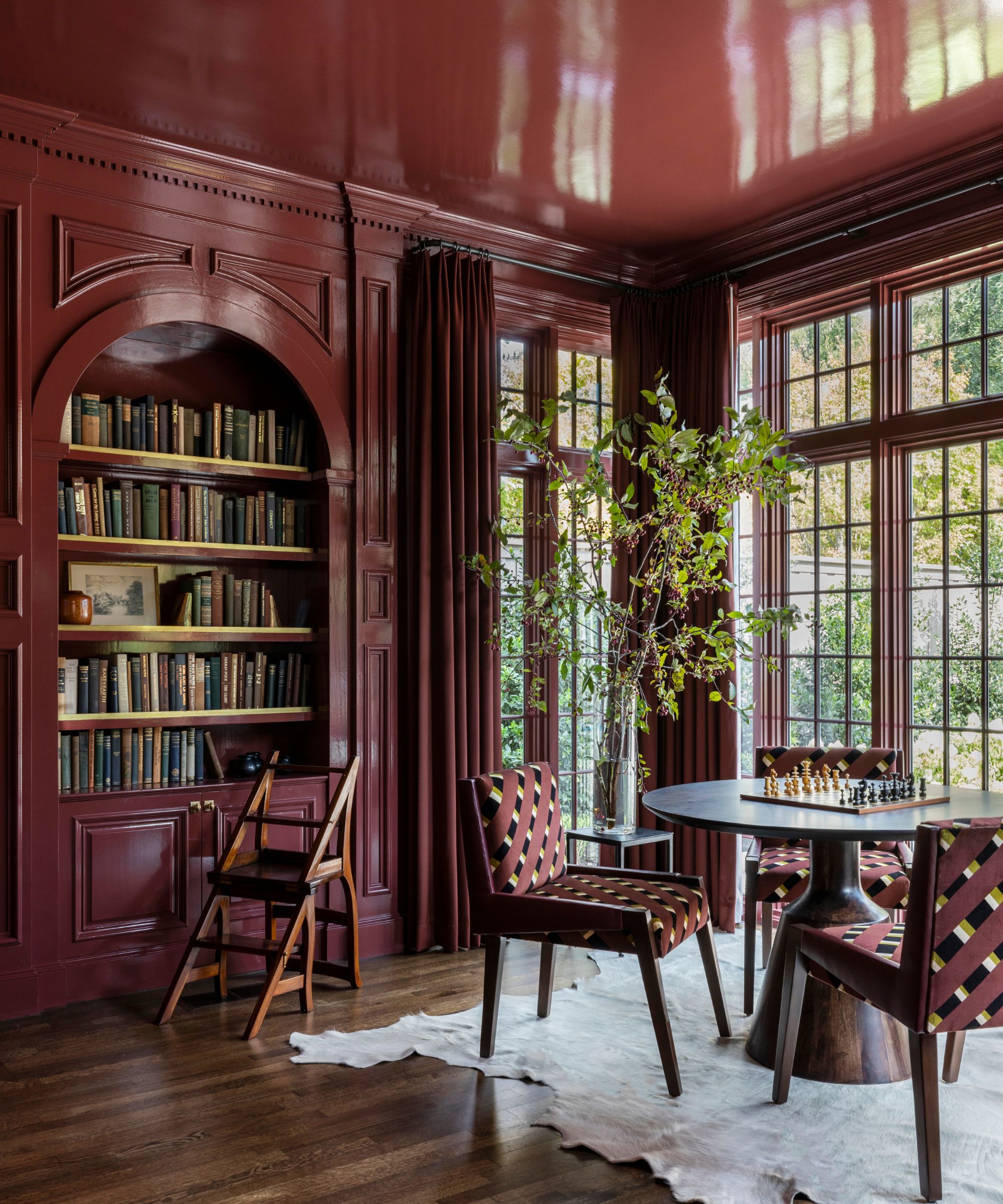
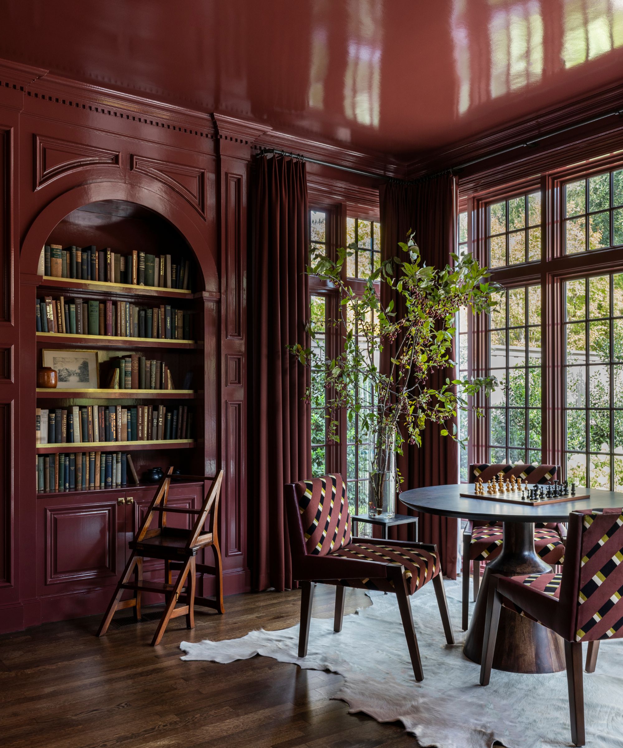
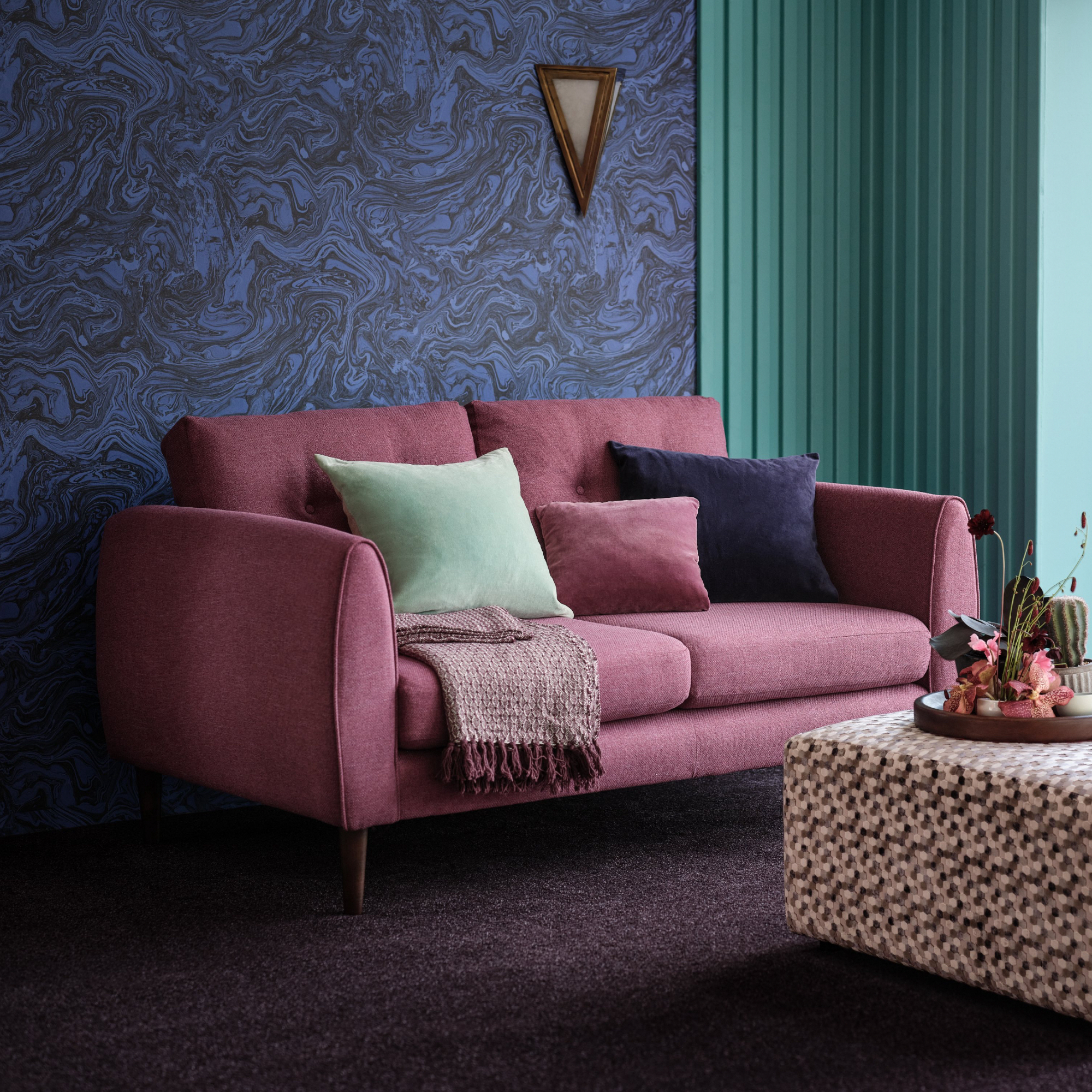
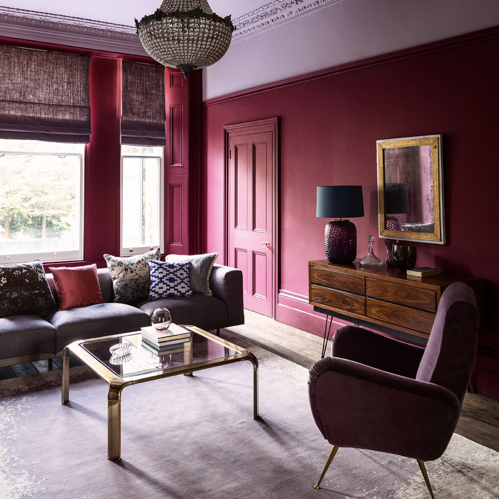
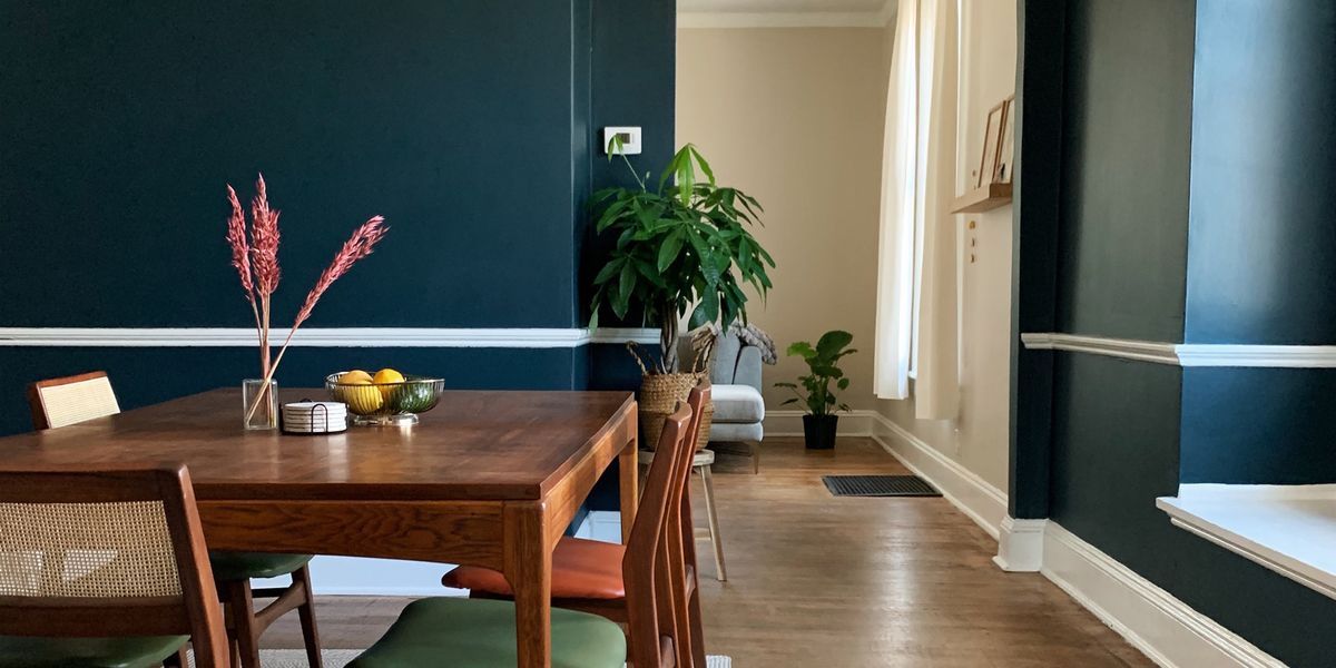
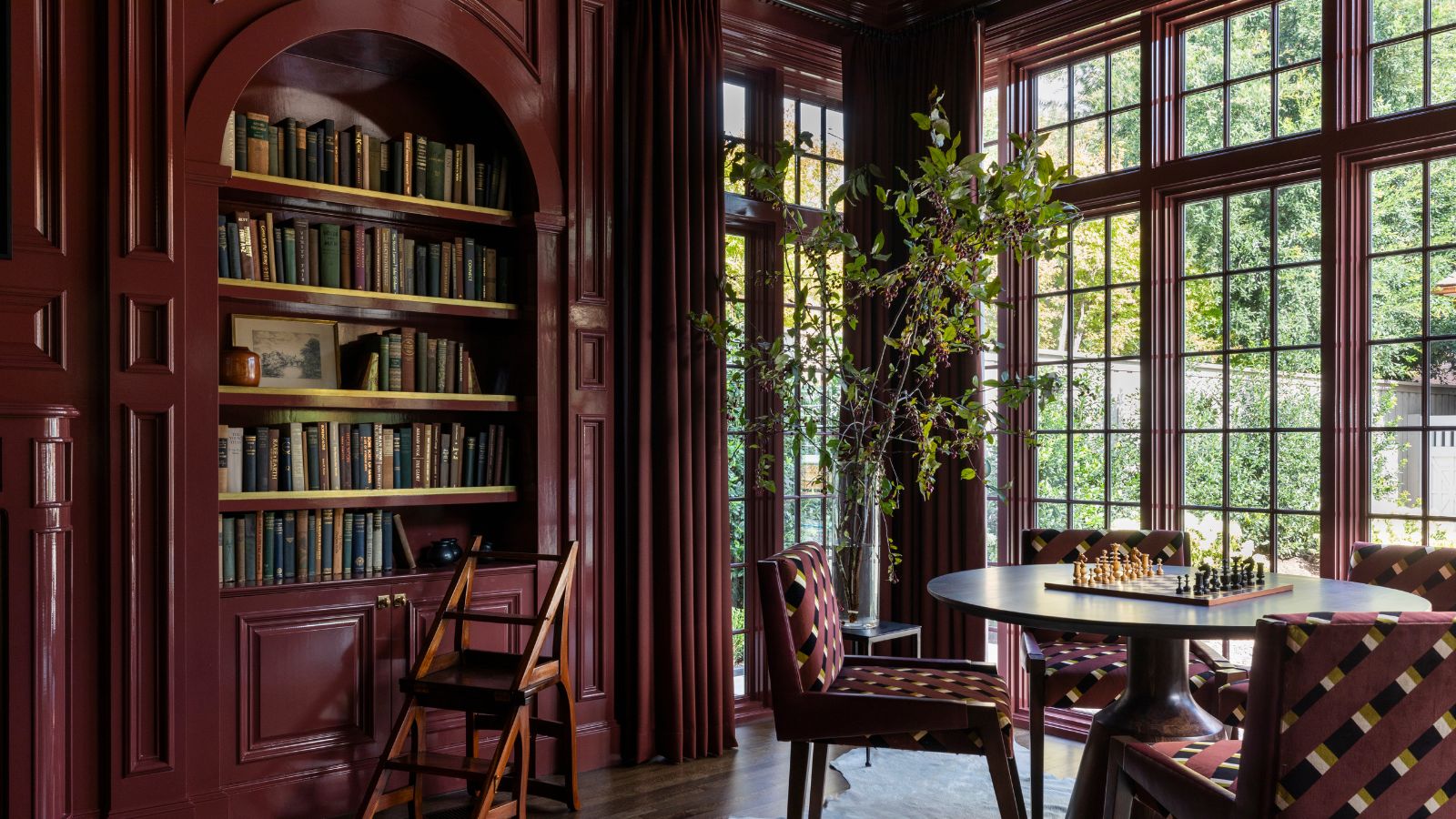
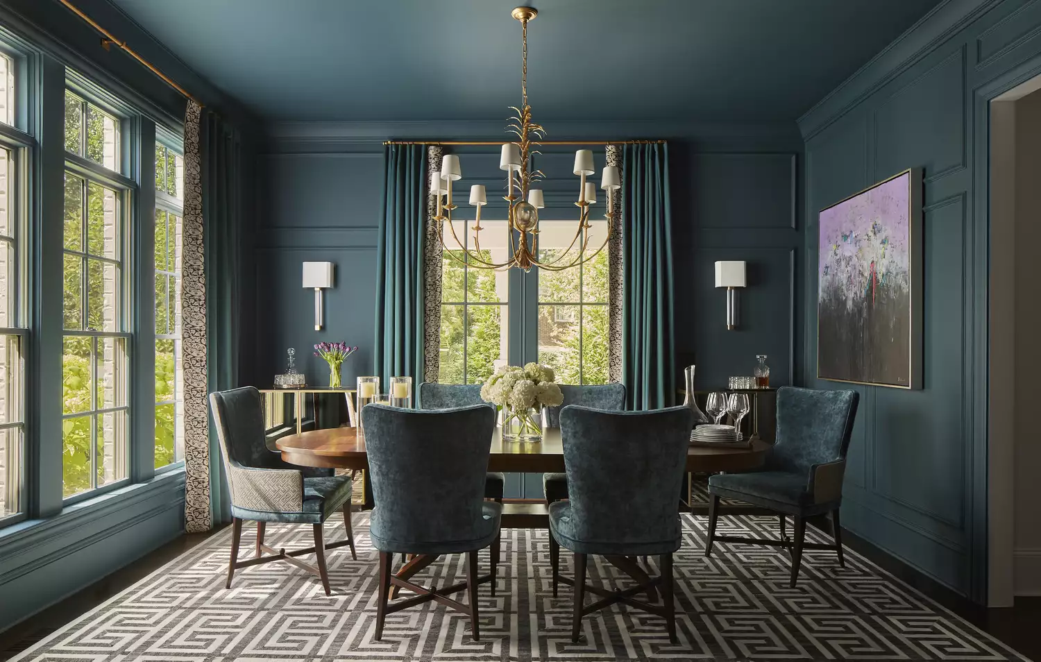

Another notable trend is the embrace of deep, saturated jewel tones, albeit with a refined twist. Instead of bright and flashy, these colors are more subdued and luxurious. Emerald green, sapphire blue, and amethyst purple are being reinterpreted in darker, more sophisticated shades. These colors can be used to create accent walls, add a touch of drama to a dining room, or bring depth to a study. They evoke a sense of opulence and can be particularly effective in spaces that benefit from a touch of formality or a bold statement.
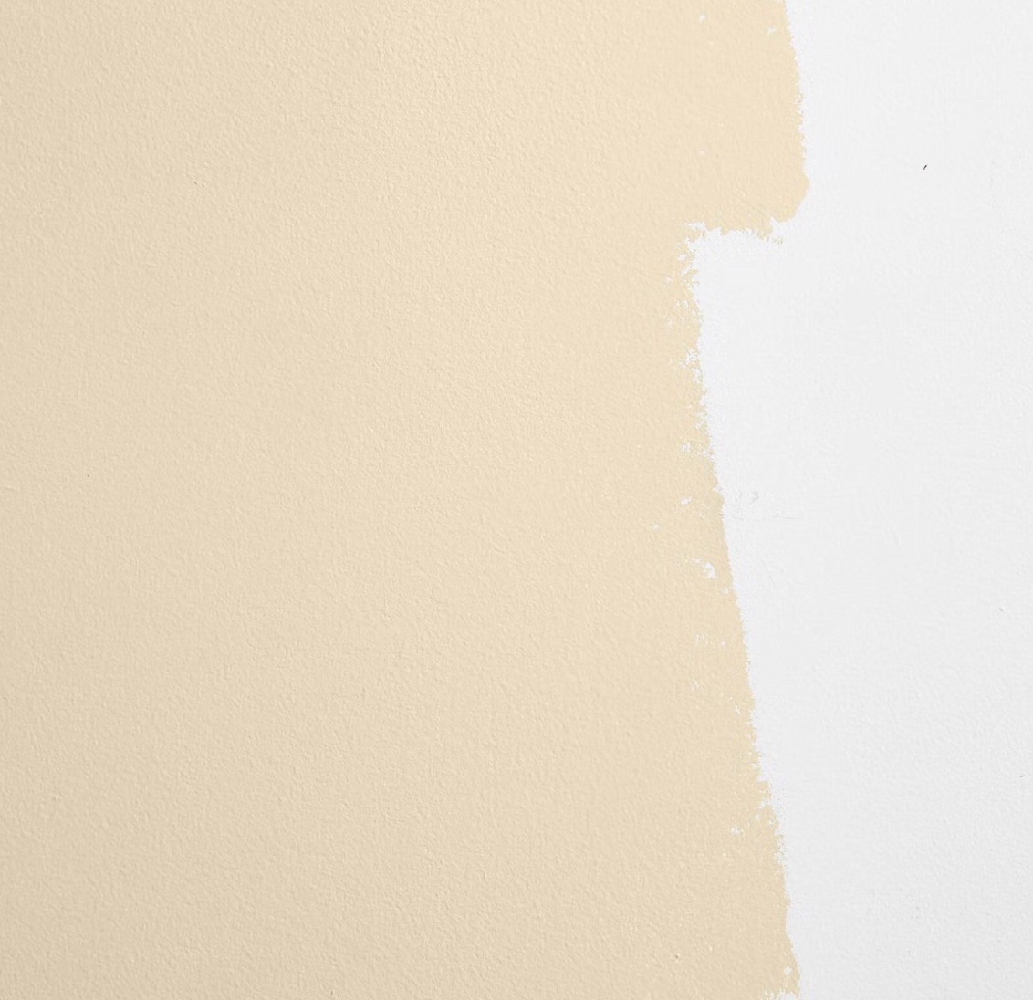
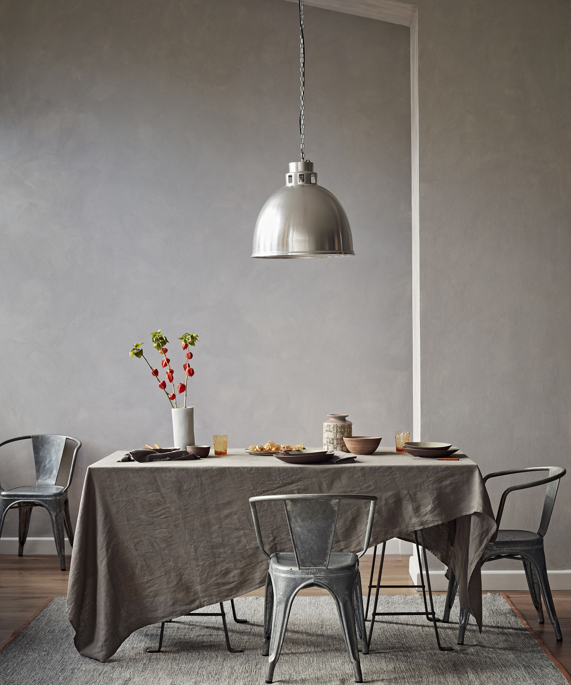
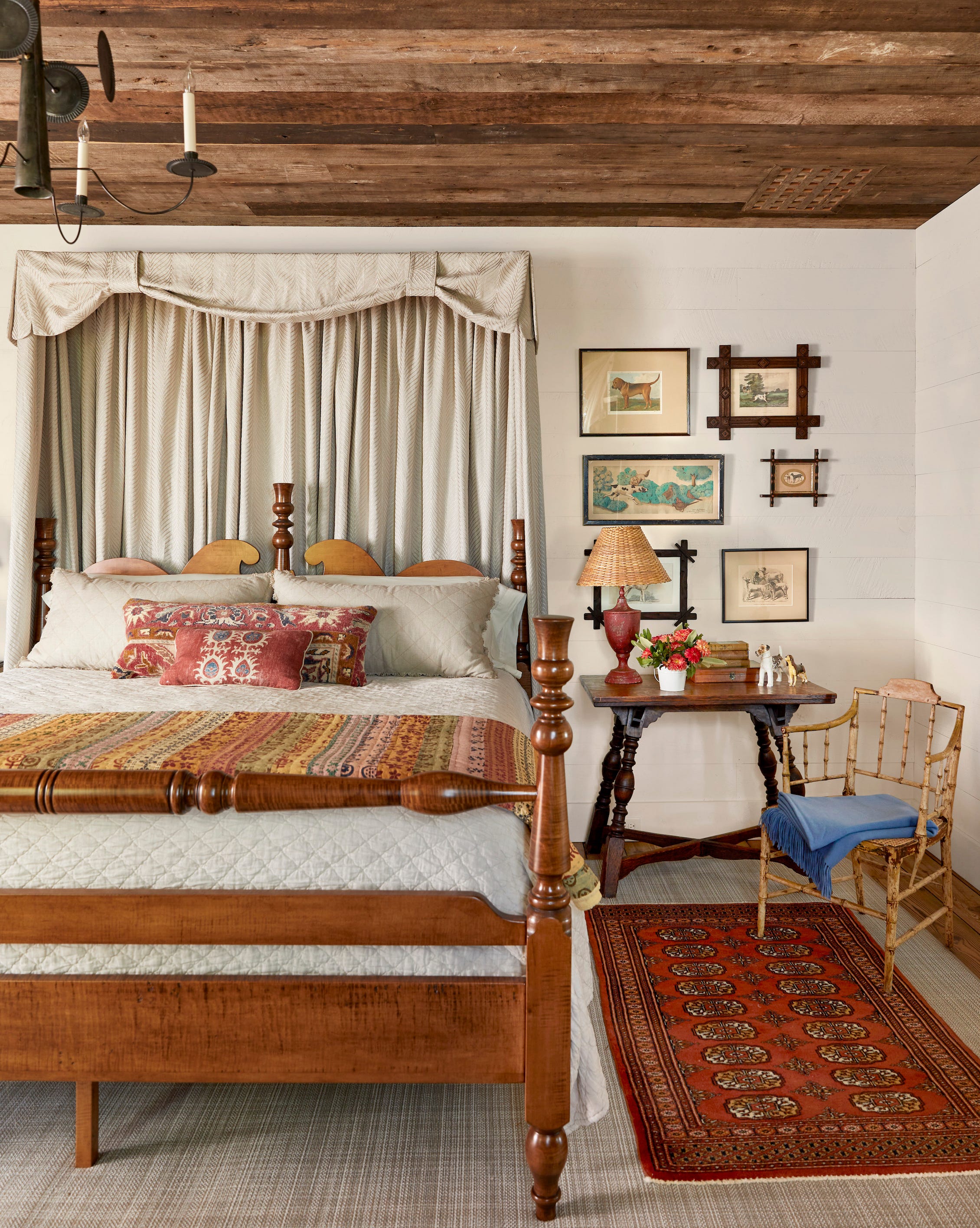
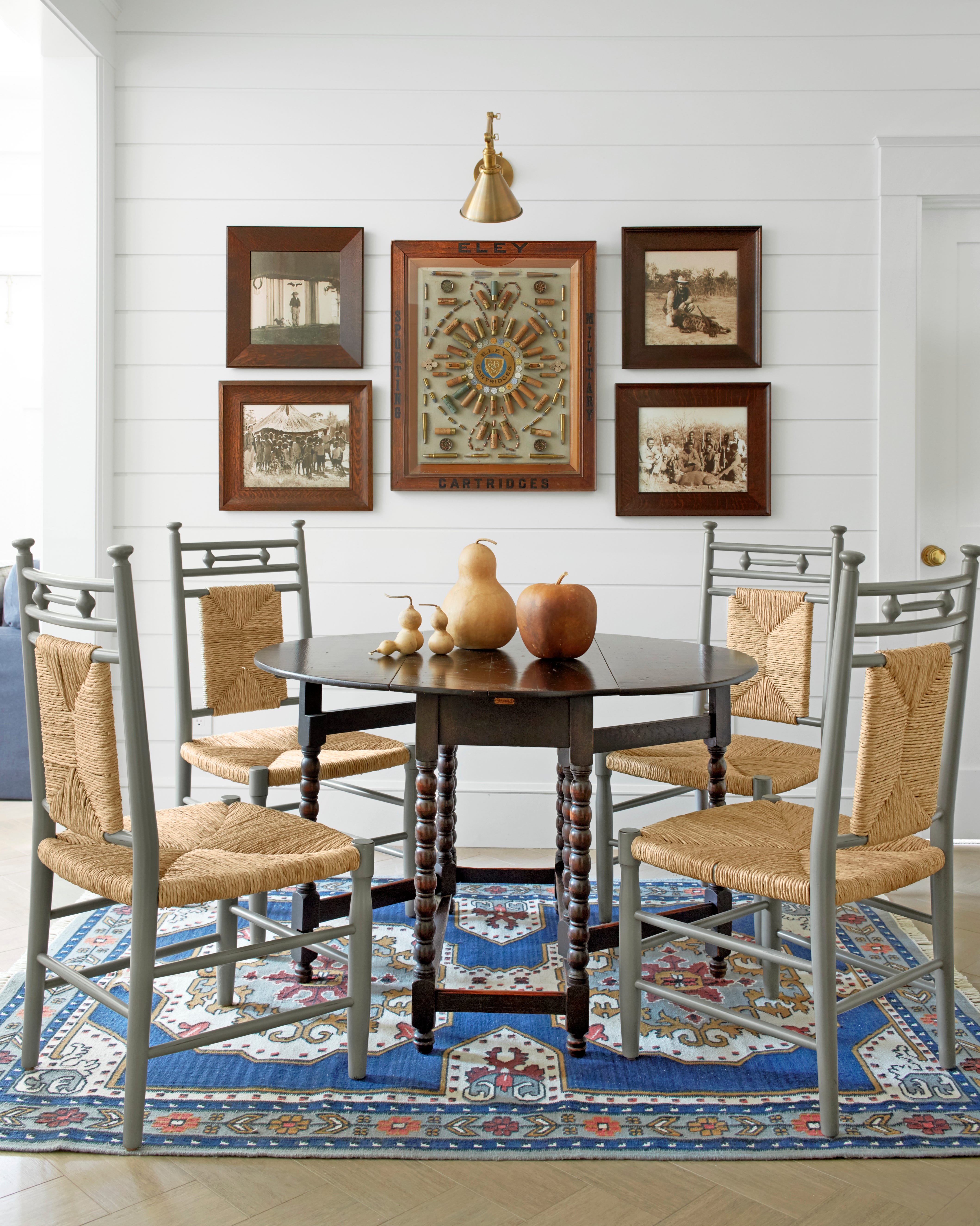

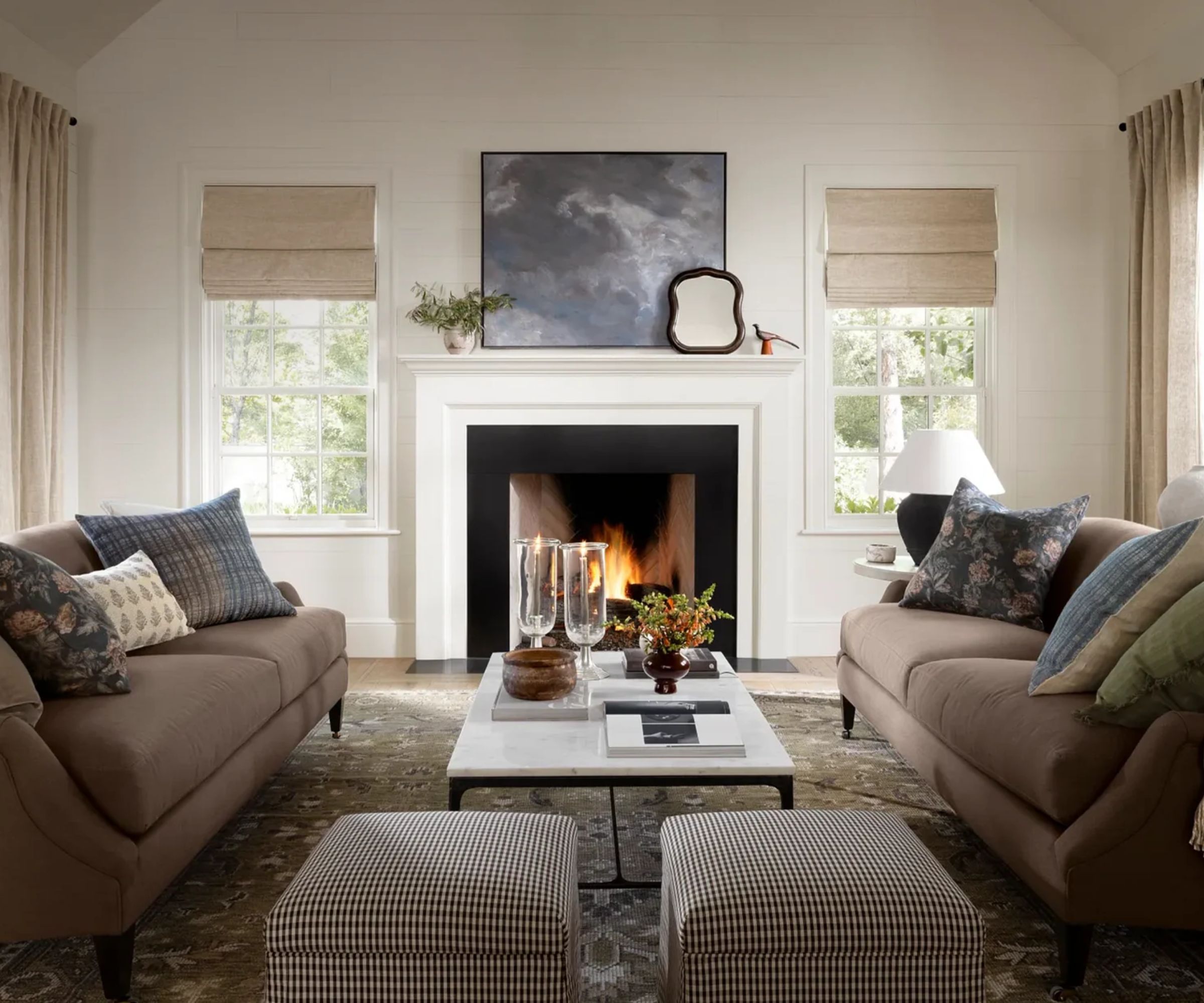
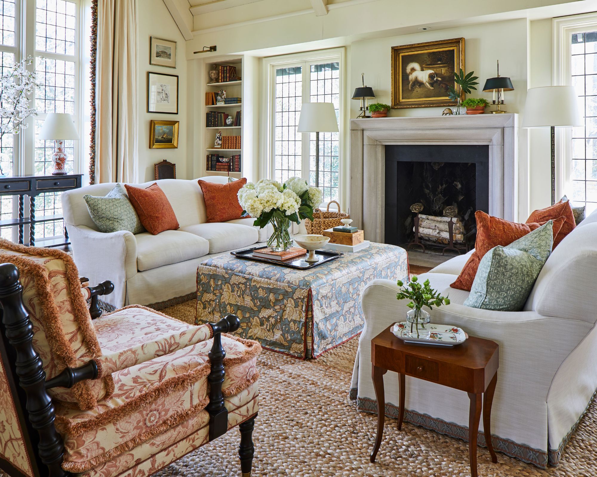
Warm neutrals continue to be a foundational element in fall decor, but with a shift towards more complex undertones. Beyond simple beige or off-white, colors like creamy ivory with a hint of peach, or soft grey with a touch of warmth, are gaining popularity. These sophisticated neutrals serve as an excellent backdrop for bolder furniture or artwork, allowing other design elements to shine. They also contribute to a cohesive and inviting atmosphere, providing a sense of spaciousness and light.
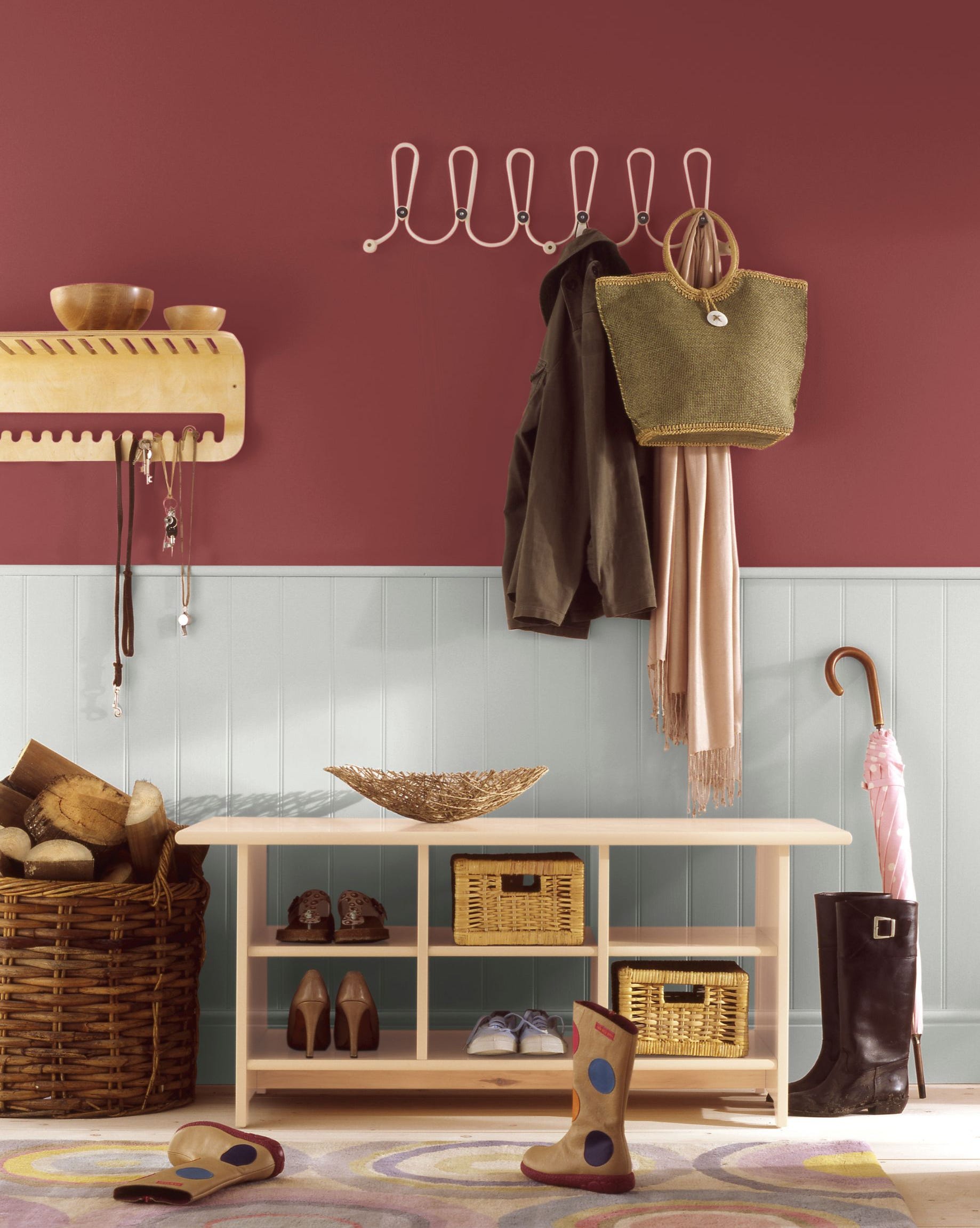
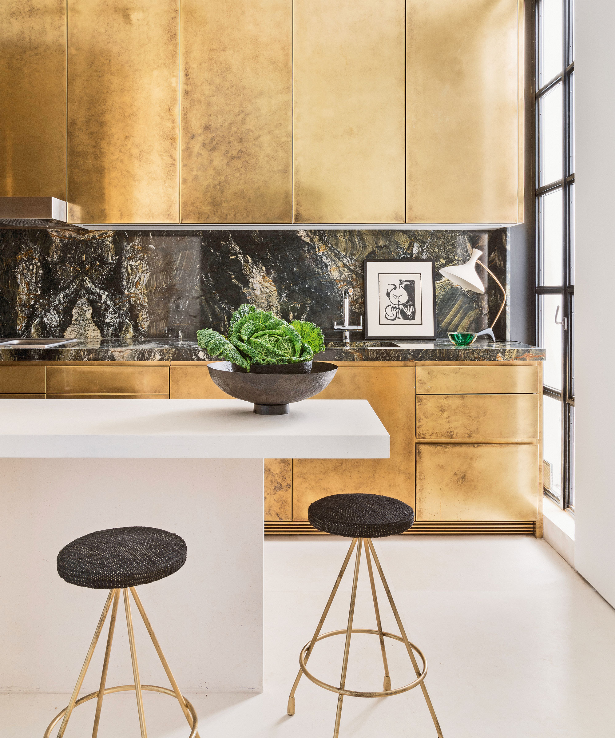
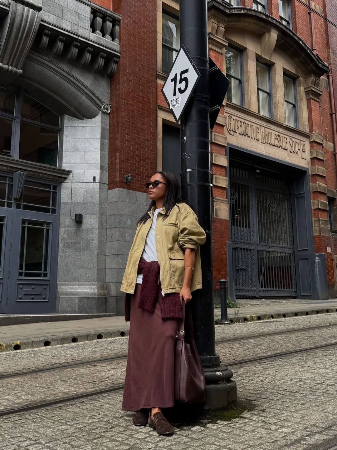
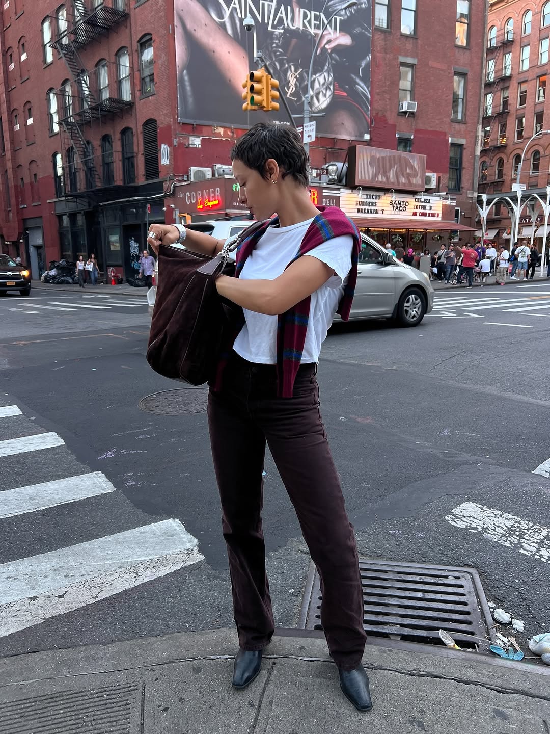
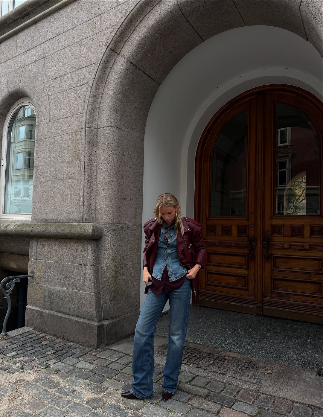
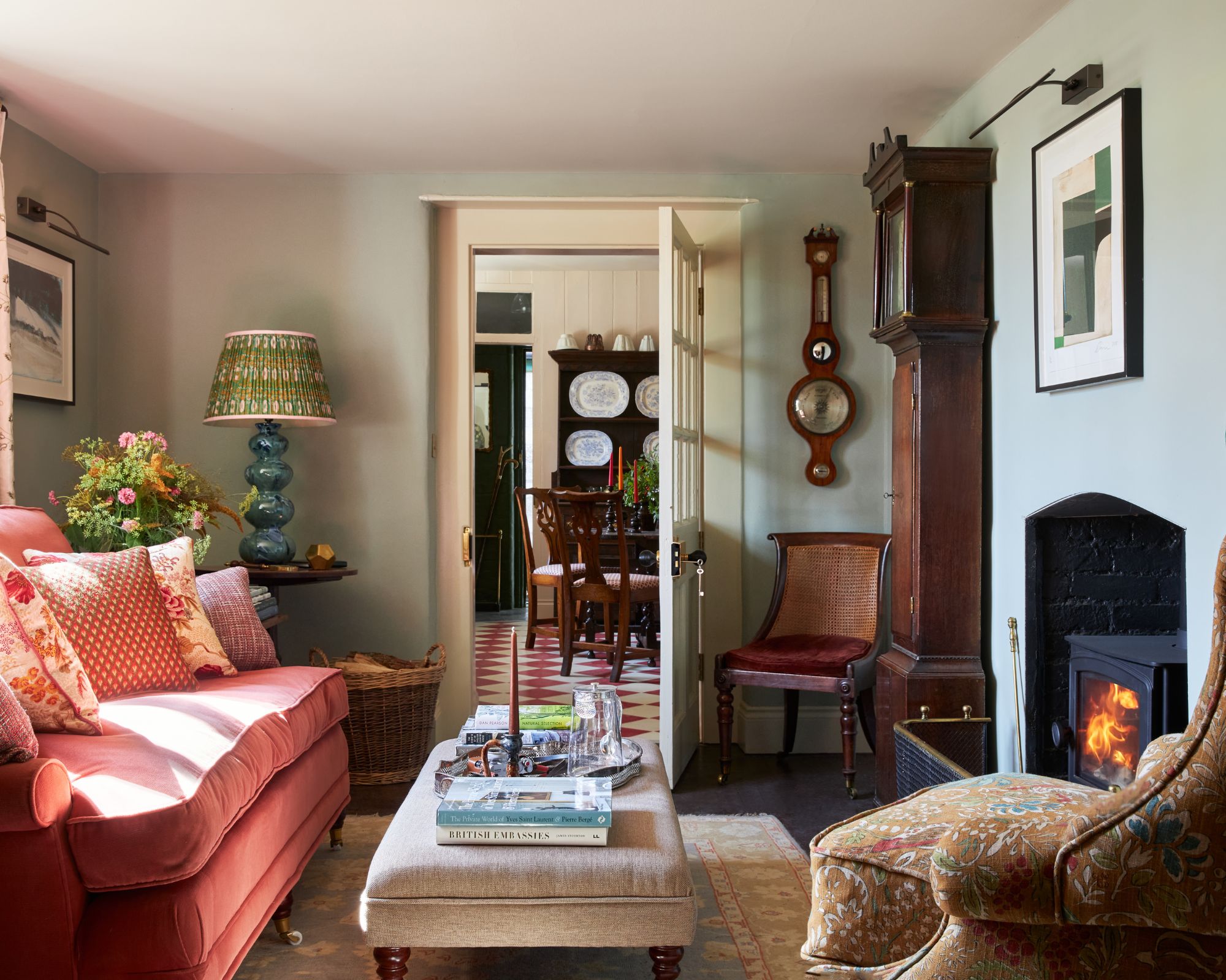
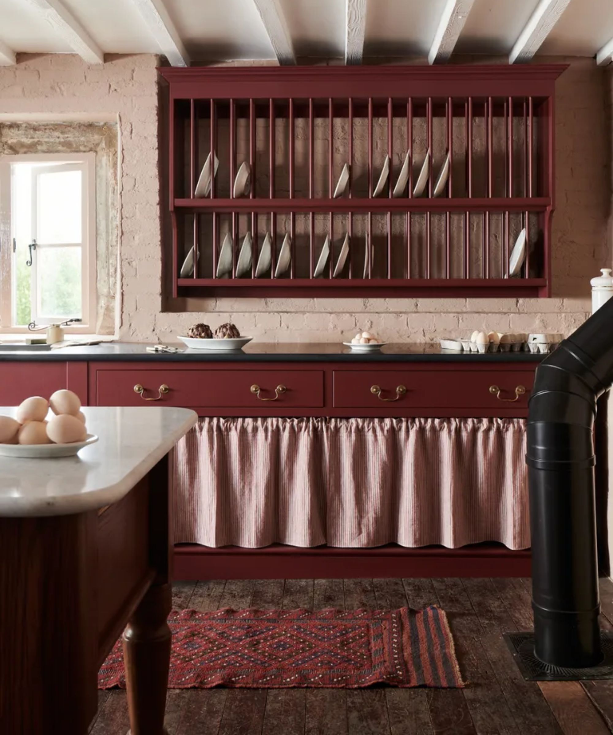
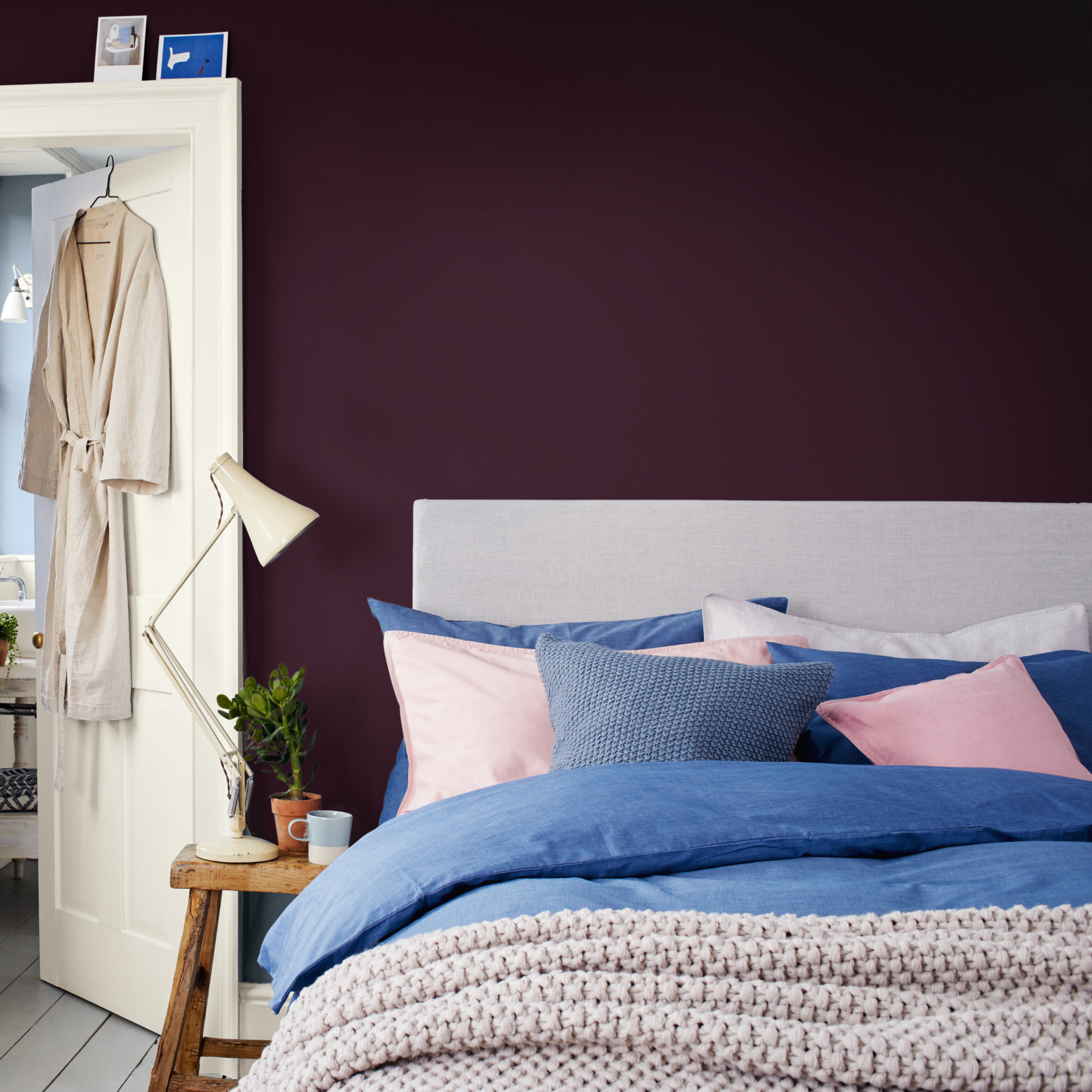
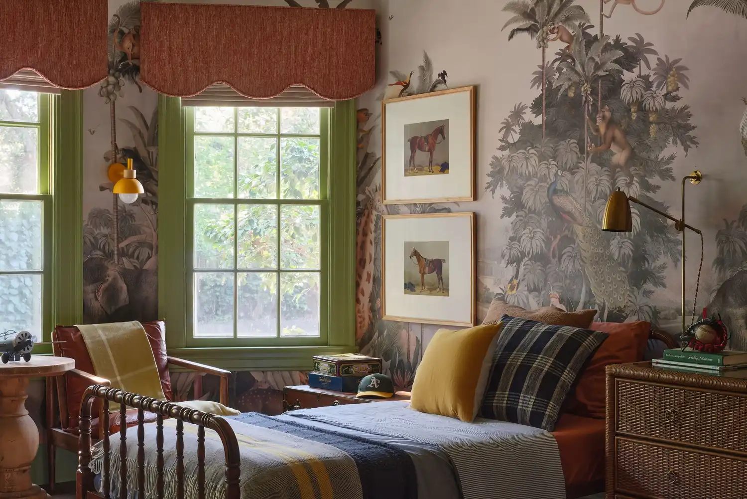
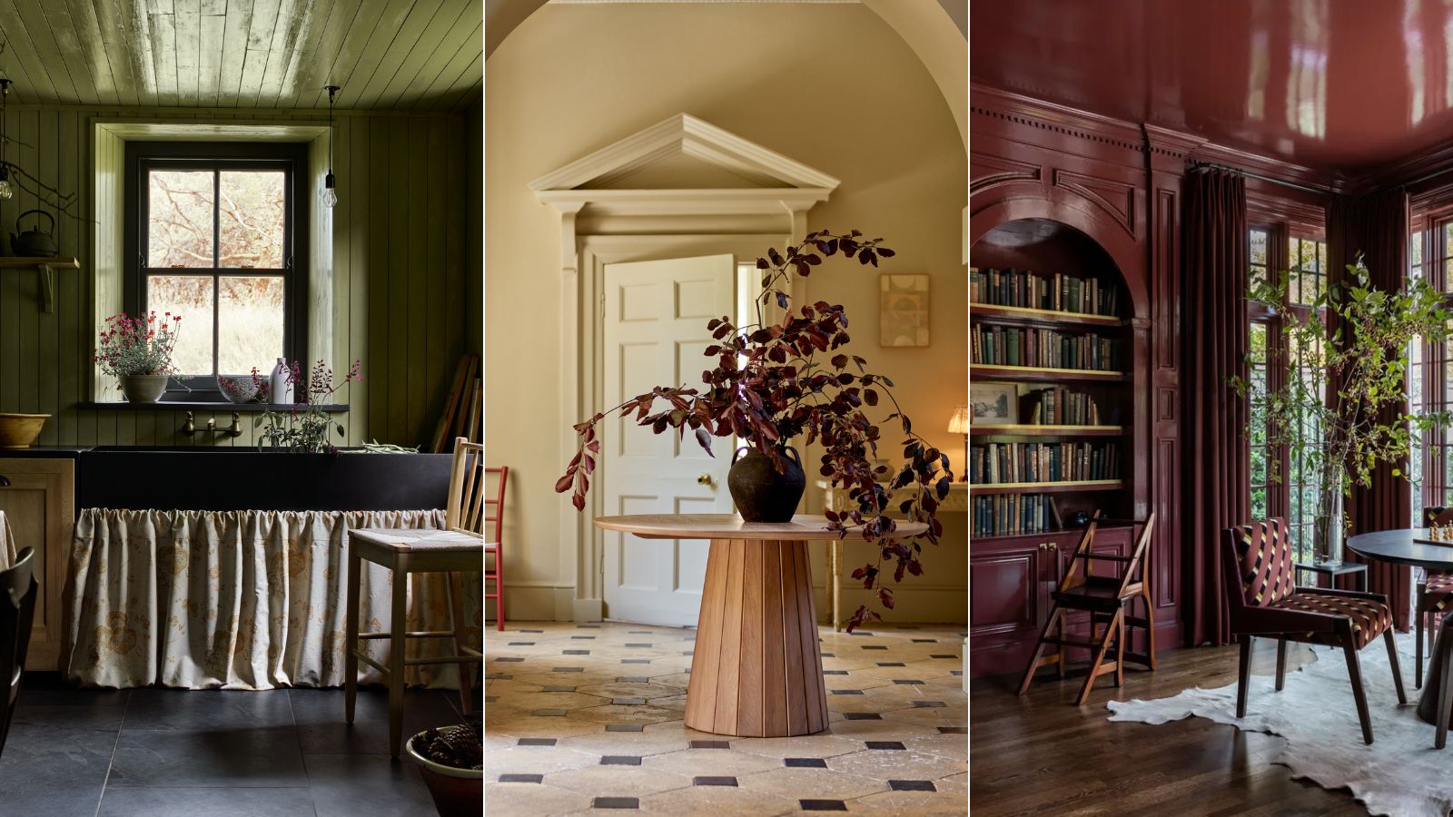
Furthermore, there's a growing appreciation for colors that evoke a sense of heritage and history. These include deep mustards, burnt oranges, and rich plums, reminiscent of vintage textiles and classic interiors. These colors bring character and a timeless appeal to a home, perfect for those looking to create a space with a story. They can be particularly effective in older homes or in rooms where a sense of tradition is desired.
Finally, the integration of black as an accent color is gaining traction. Not just for furniture or fixtures, black paint is being used sparingly but effectively to create striking contrasts and define architectural features. A black accent wall, a painted door, or even window frames can add a contemporary edge and a sense of sophistication to an otherwise light-colored room. This trend highlights the power of contrast and the impact of deliberate color choices in modern interior design.
#FallDecor #PaintColorTrends #InteriorDesign #HomeRenovation #EarthyTones #MutedPastels #JewelTones #WarmNeutrals #AccentColors #FallDecor #PaintColorTrends #InteriorDesign #HomeRenovation #EarthyTones #MutedPastels #JewelTones #WarmNeutrals #AccentColors
0 comment in total
 No comments yet
You may also like
Designers Weigh In on the 7 Biggest Paint Color Trends of Fall 2022
6 Paint Color Duos Designers Can't Get Enough of This Fall

It's time to look beyond pumpkin spice – 10 fall colors designers swear by for a cozy, seasonal, and timeless look

10 Color Drenching Ideas That Highlight the Beauty of This Paint Trend
12 Home Paint Colors We're Loving for Fall

22 Beautiful Fall Color Schemes for Your Home
7 Fall Paint Color Trends Designers Want You to Use This Year

11 fall interior design trends that will help you to create elegant, warm looks for your home this autumn
10 fall color schemes that aren't all about orange

16 Fall Paint Colors That Capture the Beauty of Autumn
This Chic Color Pairing Is Cooler Than Beige and Black and Set to Dominate Fall Outfits

This cosy and warm colour is on track to become autumn's stand out shade
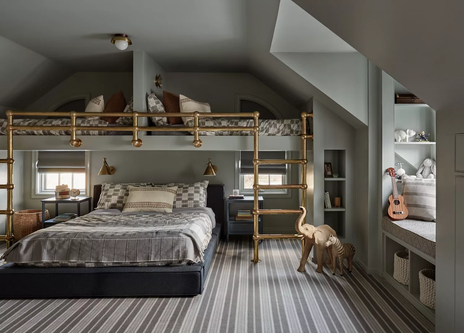
24 Fall Paint Colors to Make Your Space Cozy Just in Time for Autumn

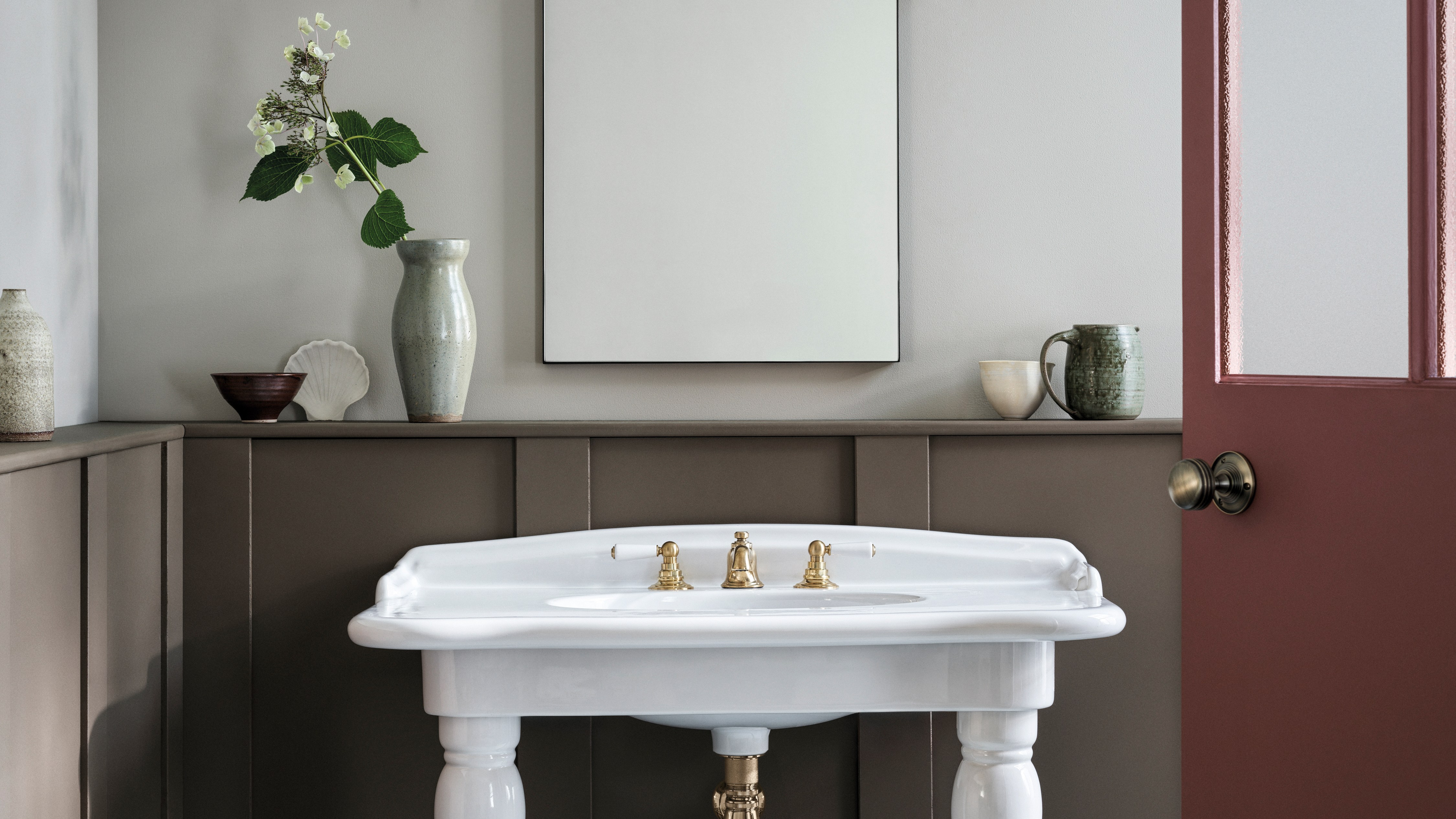
The best paint colours for autumn — and how to style them at home
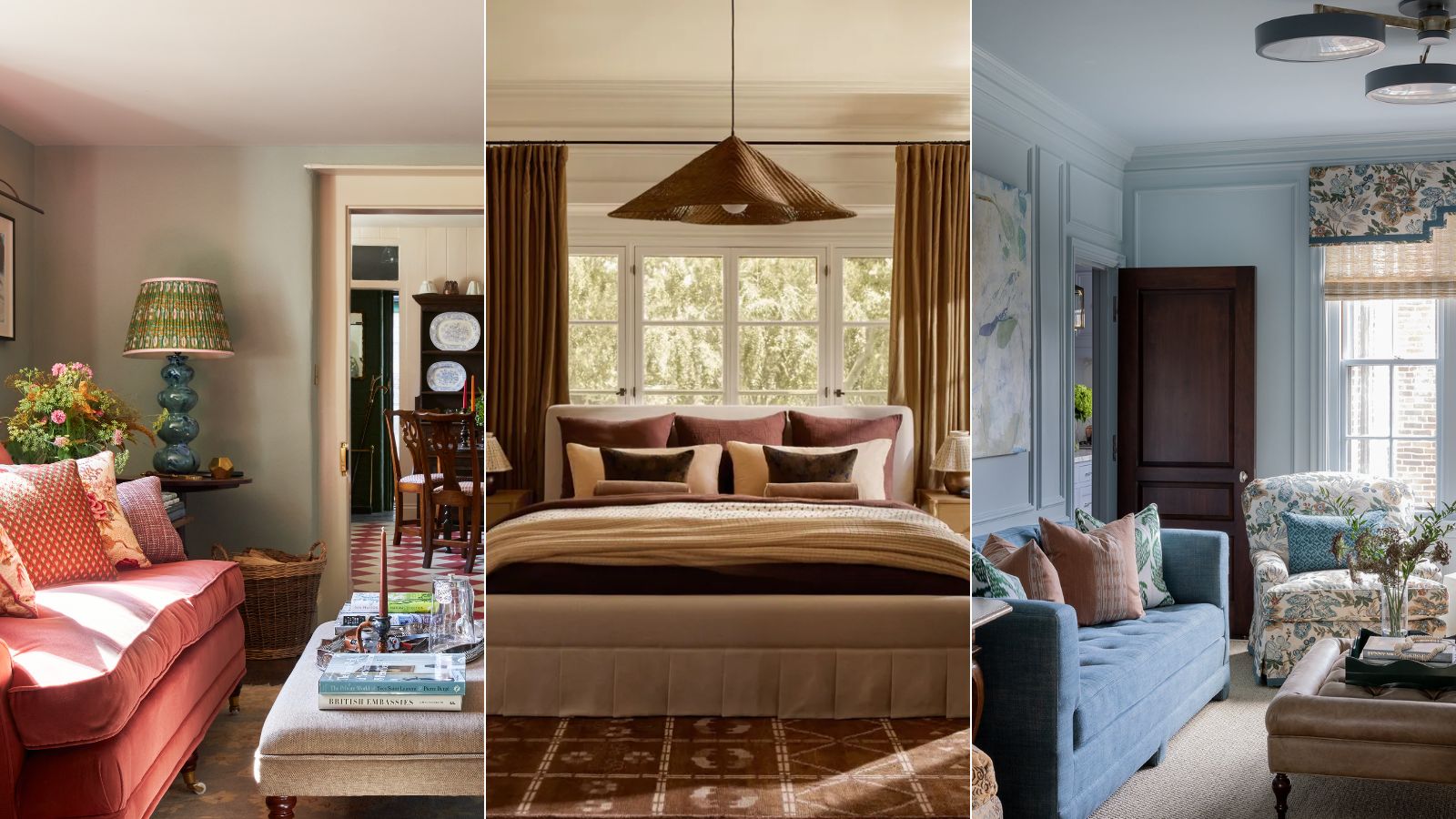
What are the best color combinations for fall? 7 cozy-season-ready suggestions from designers
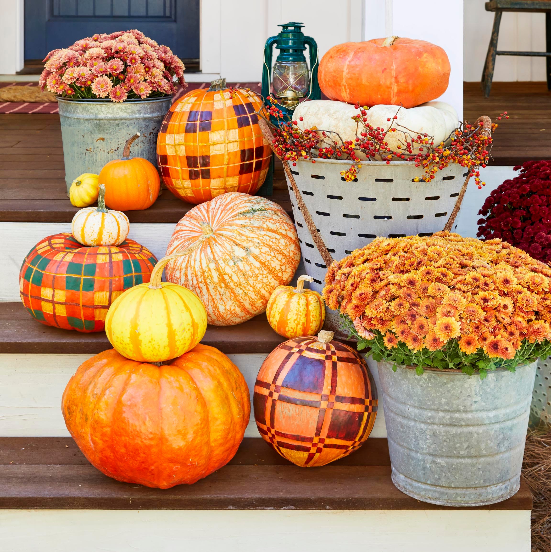
This Year’s Cutest Fall Trend? Painted Pumpkins You Can DIY in Minutes
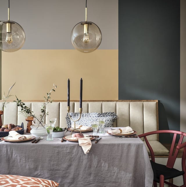
5 Autumn Paint Colours Designers Say Will Make Your Home Feel Instantly Cosier

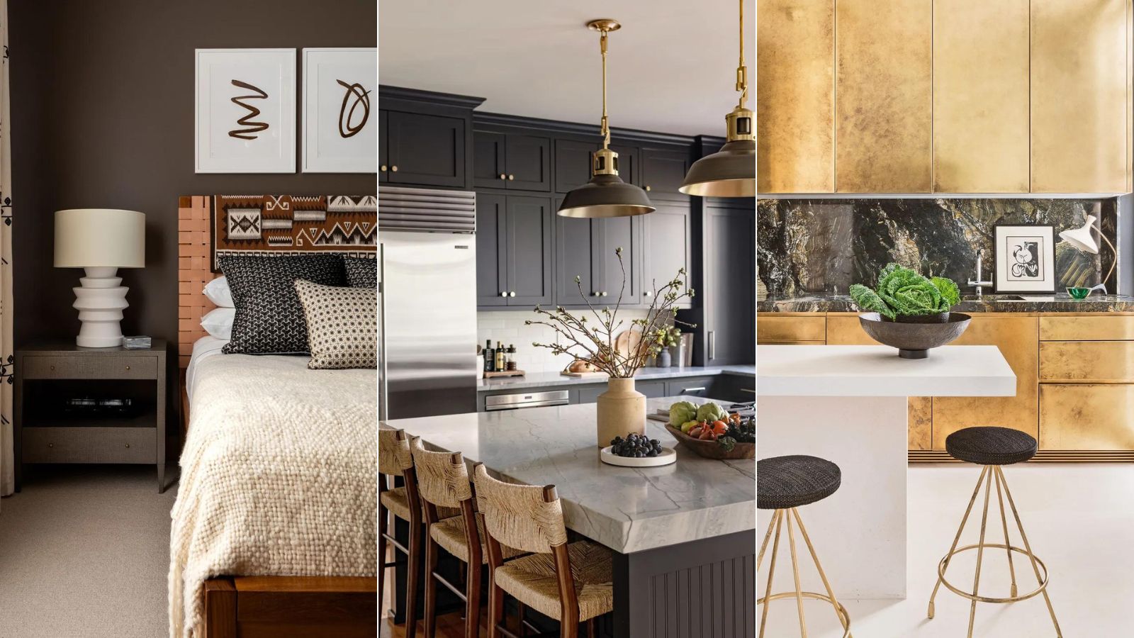
7 colors to decorate with in September 2024
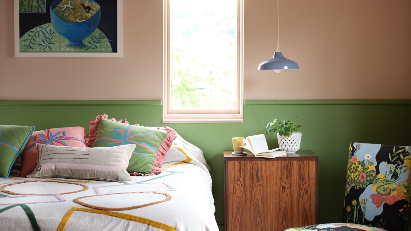
Move over color drenching, ‘color capping’ is the chic new tonal technique you’ll be seeing everywhere this fall
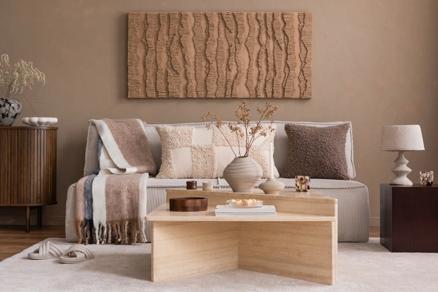
Designers Say These 5 Trends Will Be Everywhere This Fall—But This One Is Officially Out