1/4
'Colour capping' is the new paint trick design experts are using to make a room feel bigger – how to make it work in your home
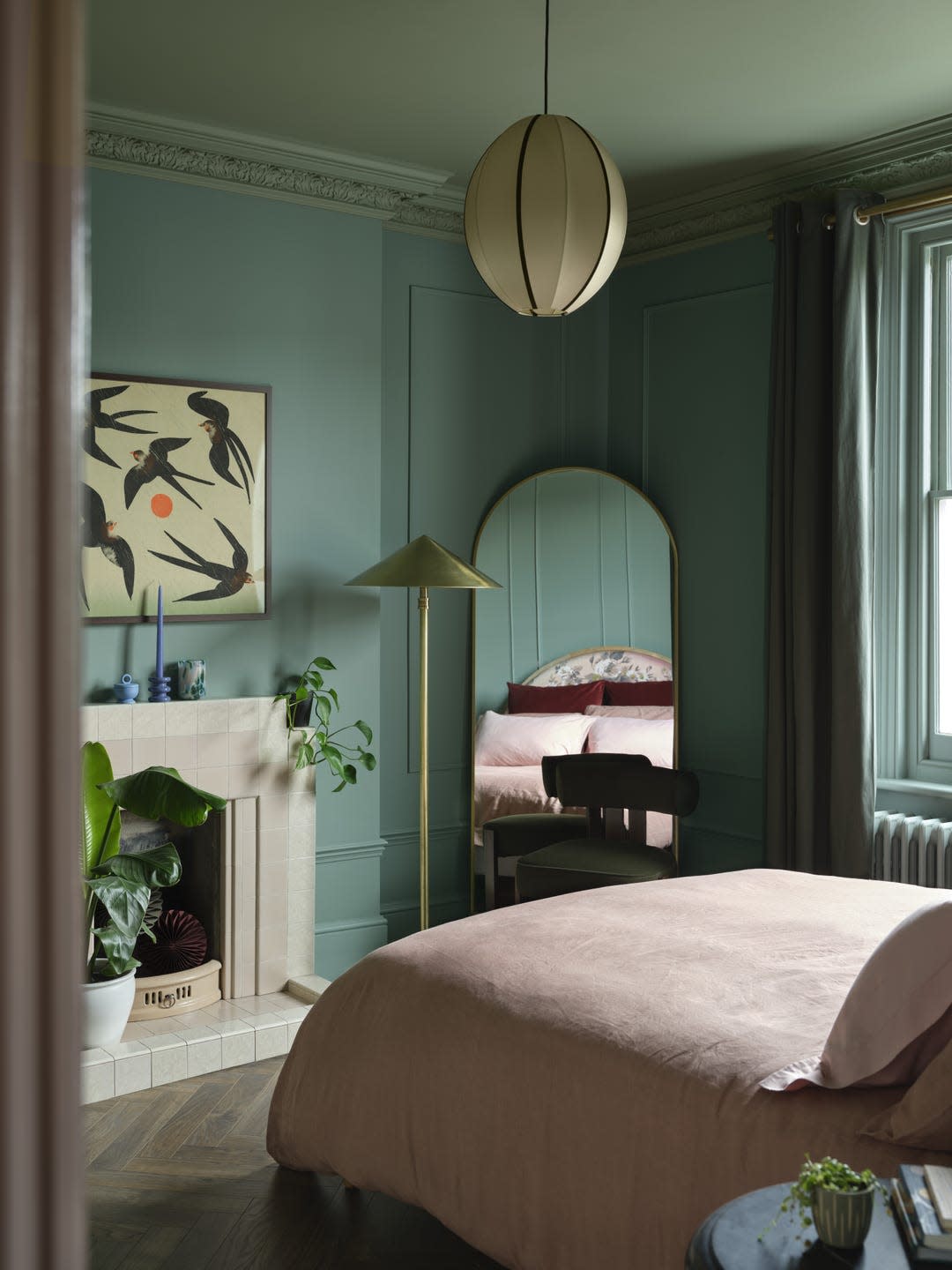
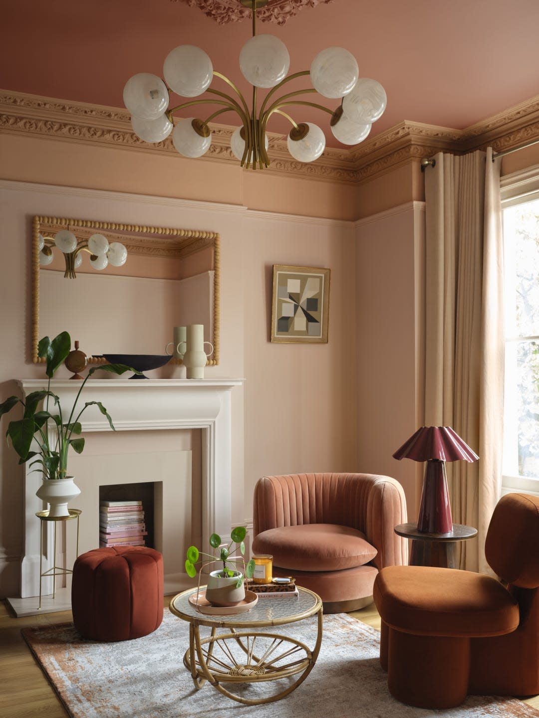
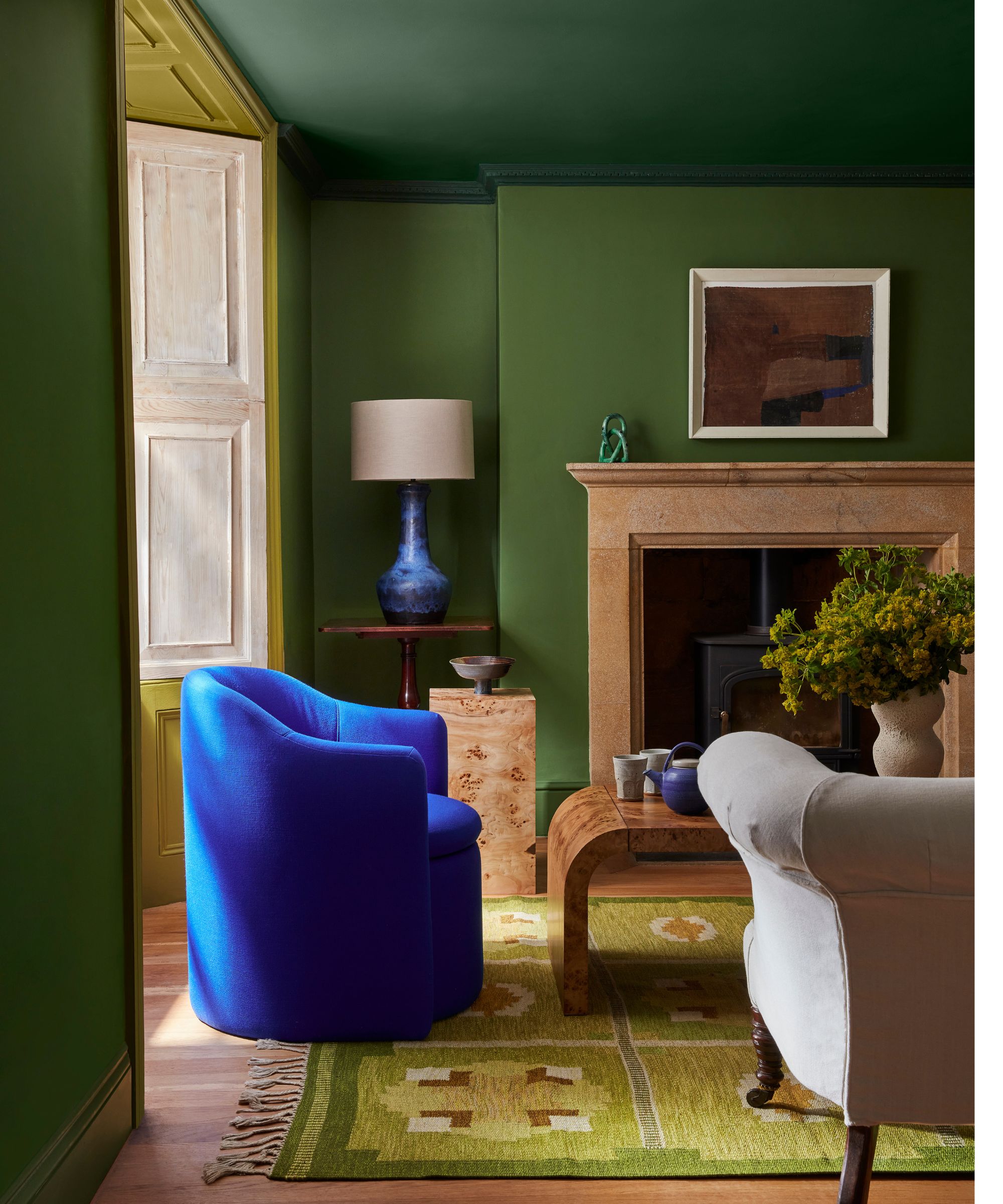
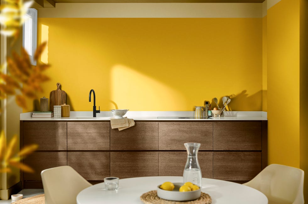
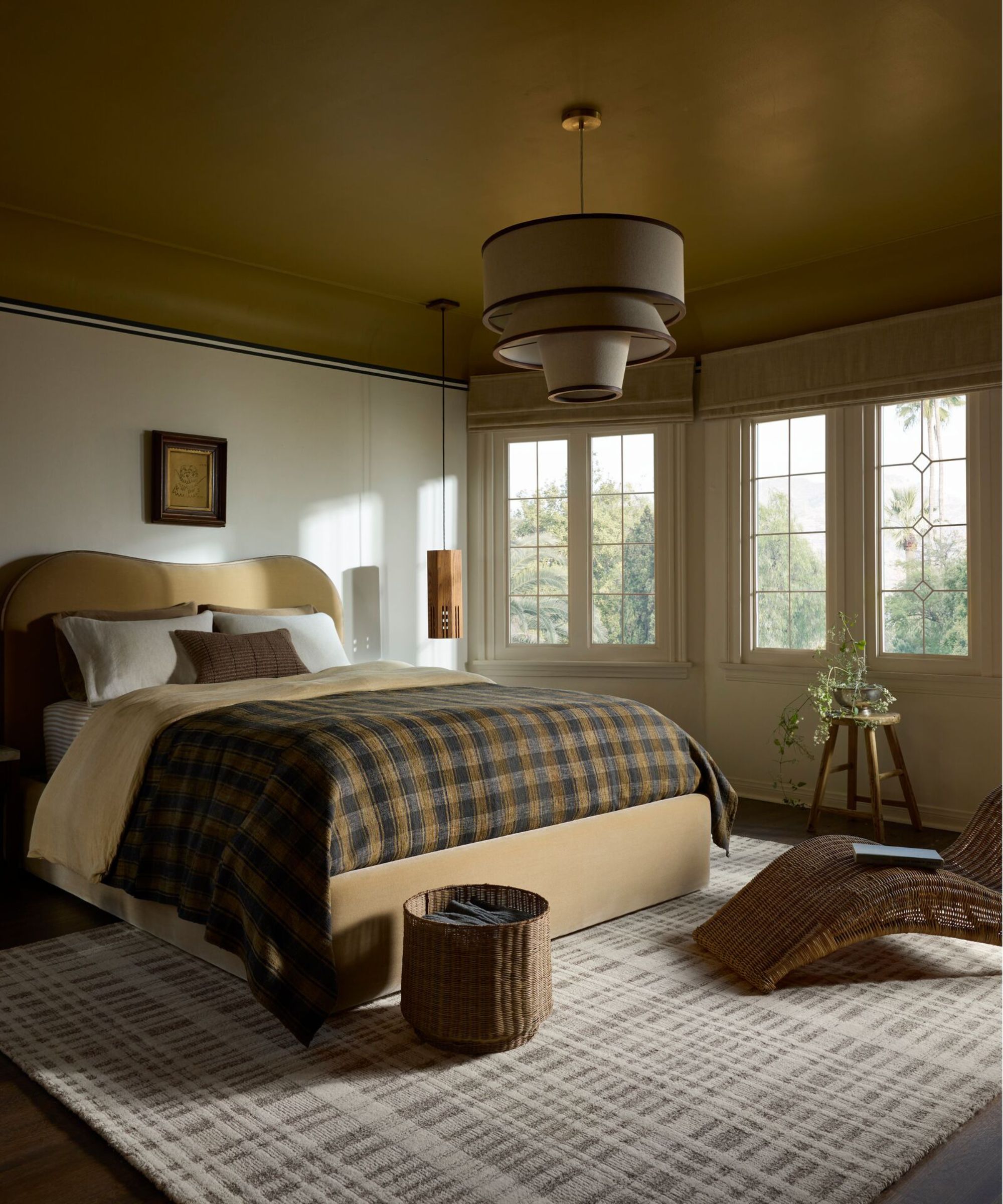
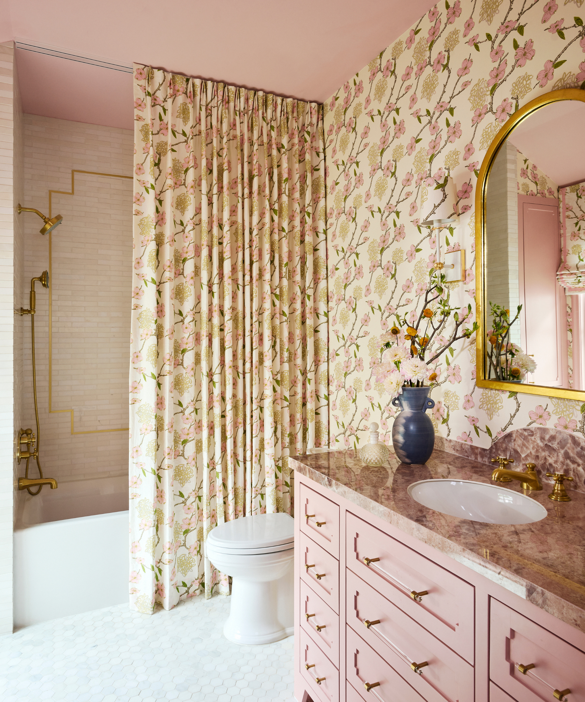
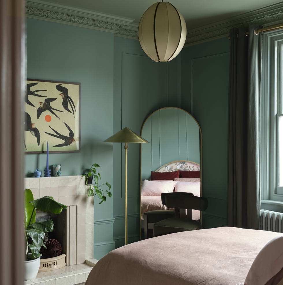
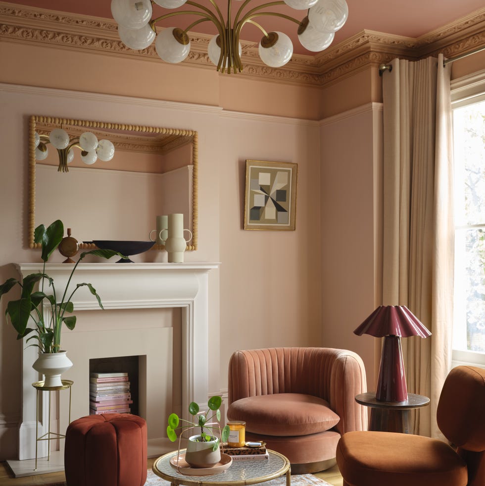
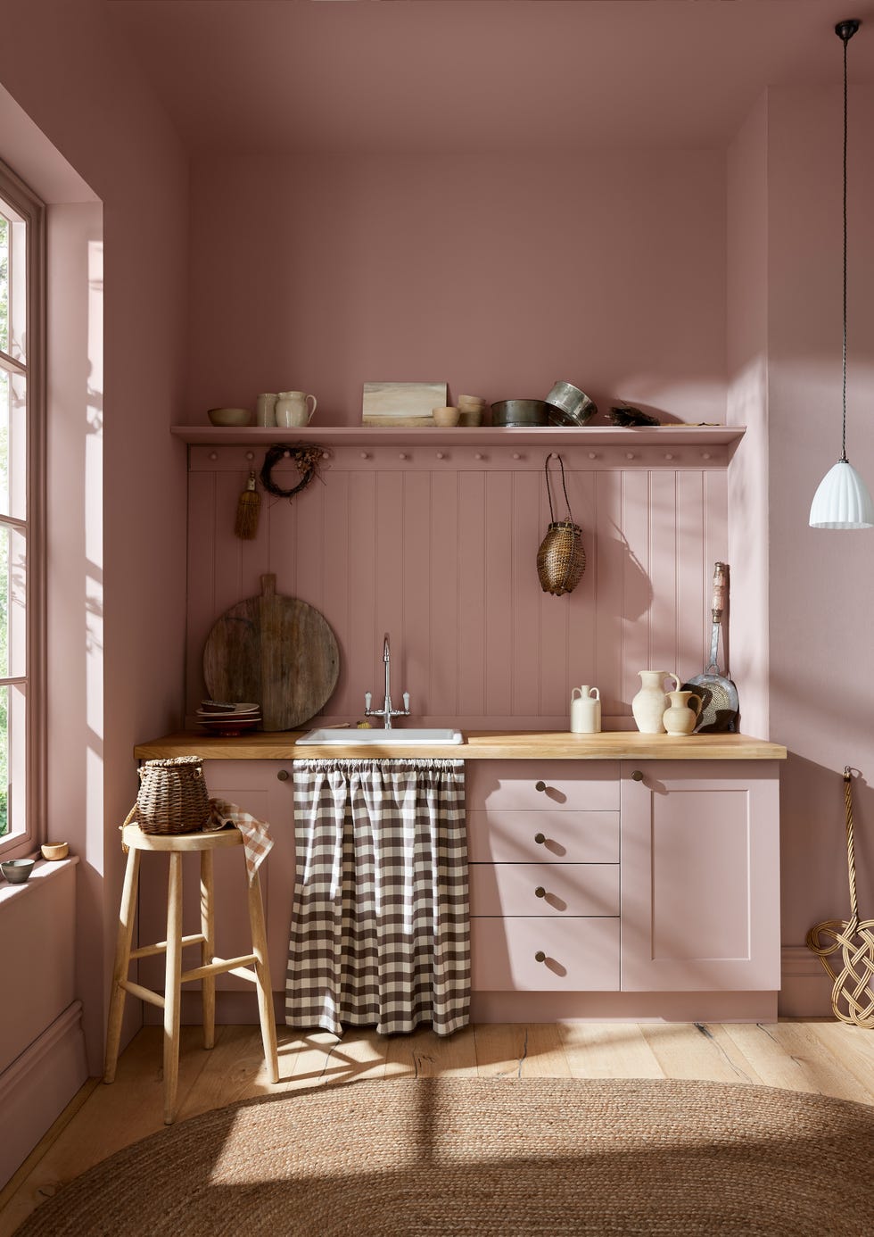
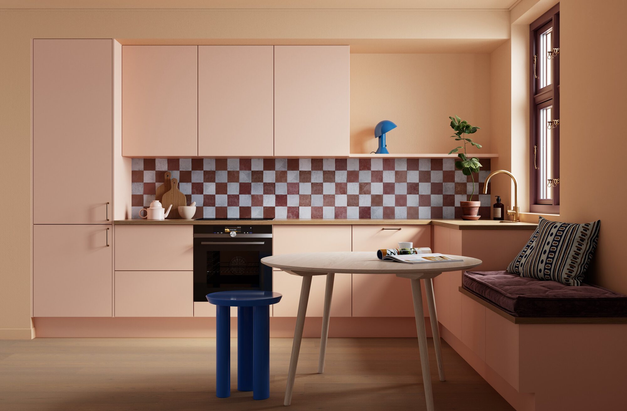
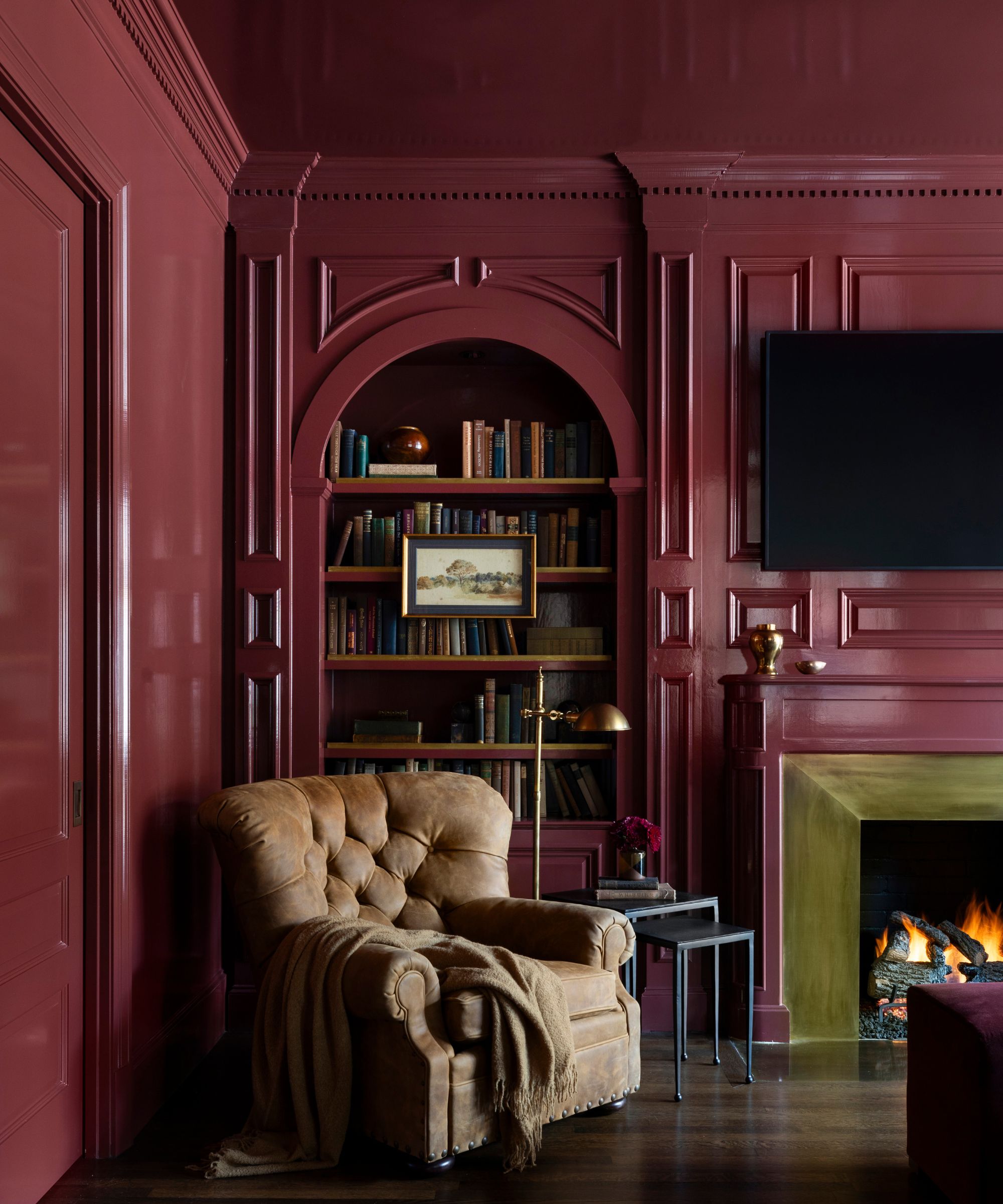
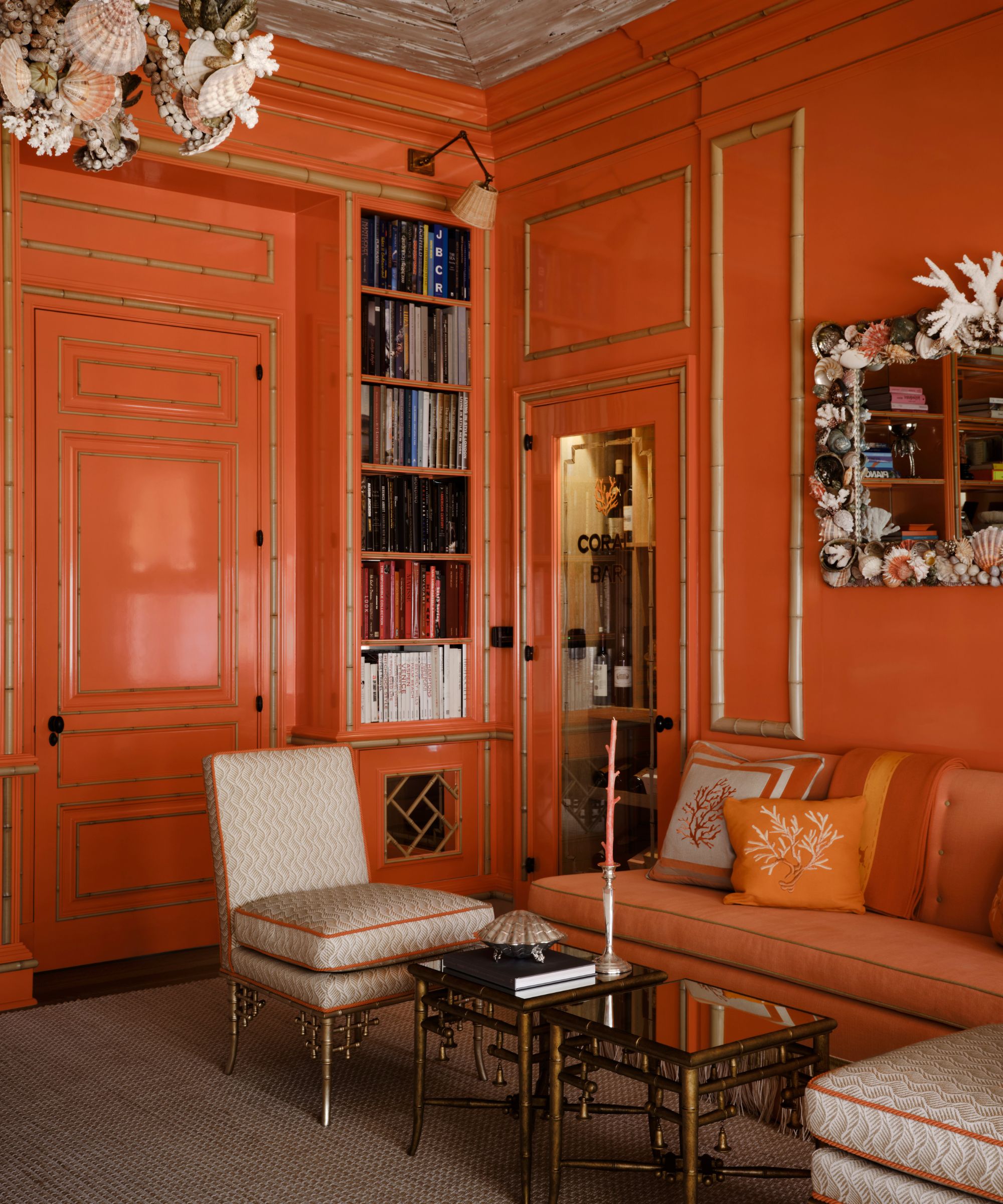
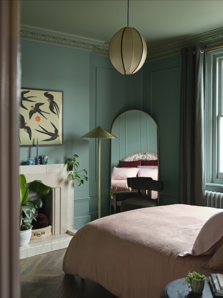
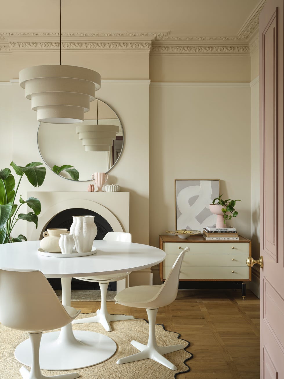
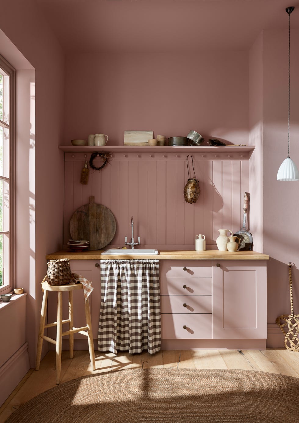
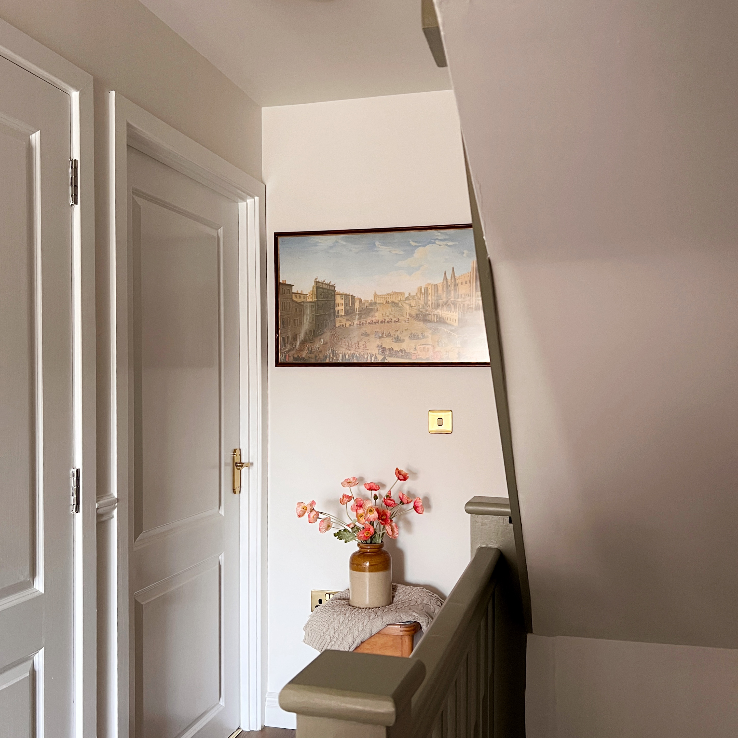
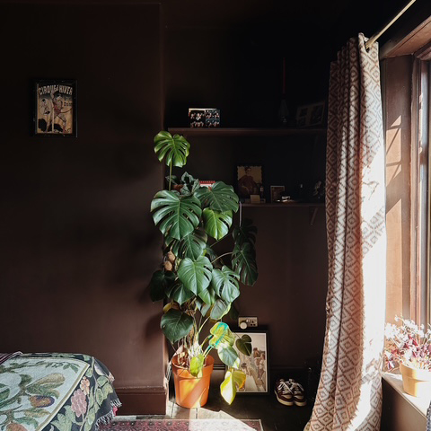
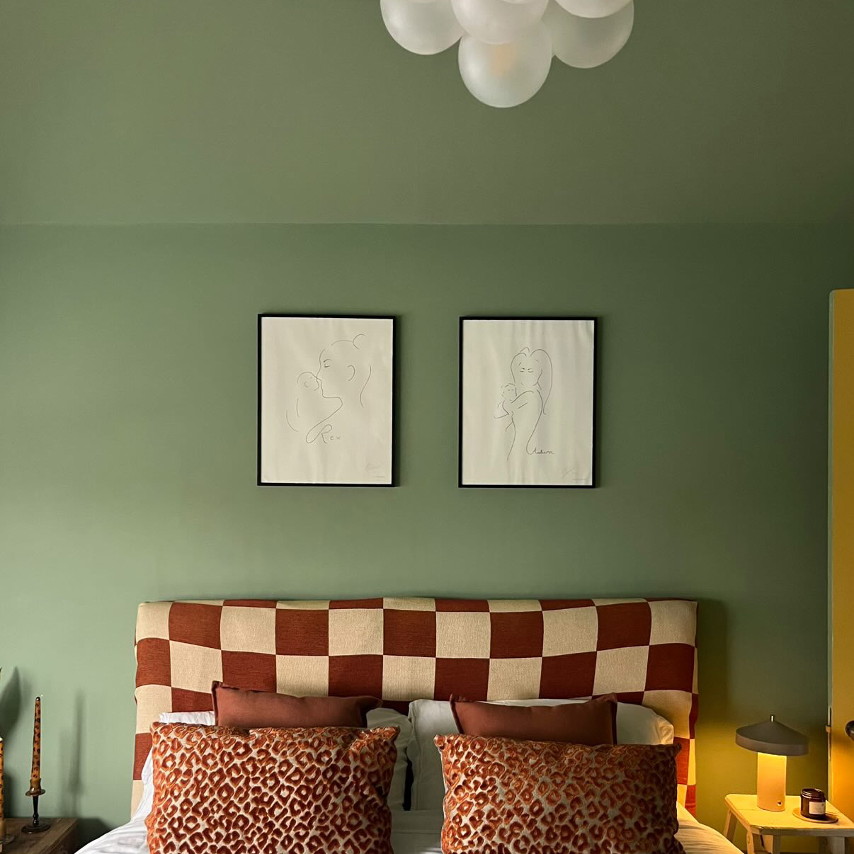
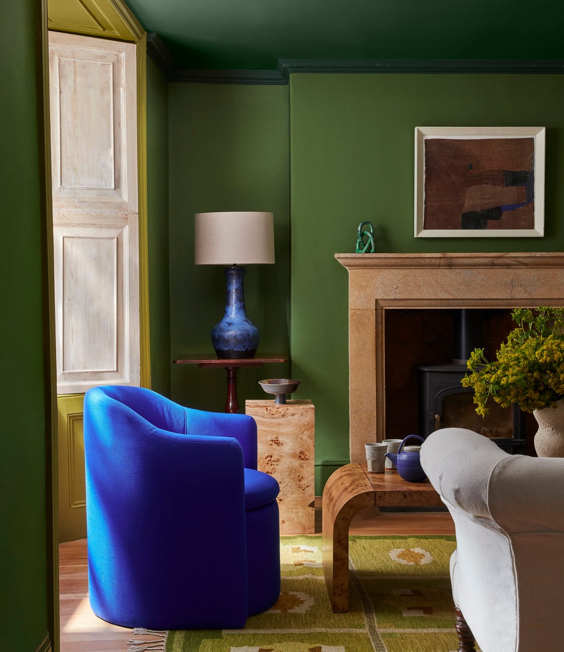
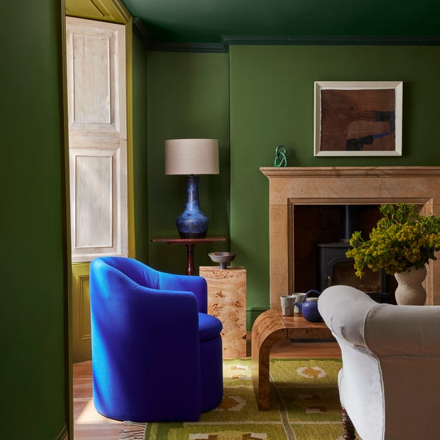
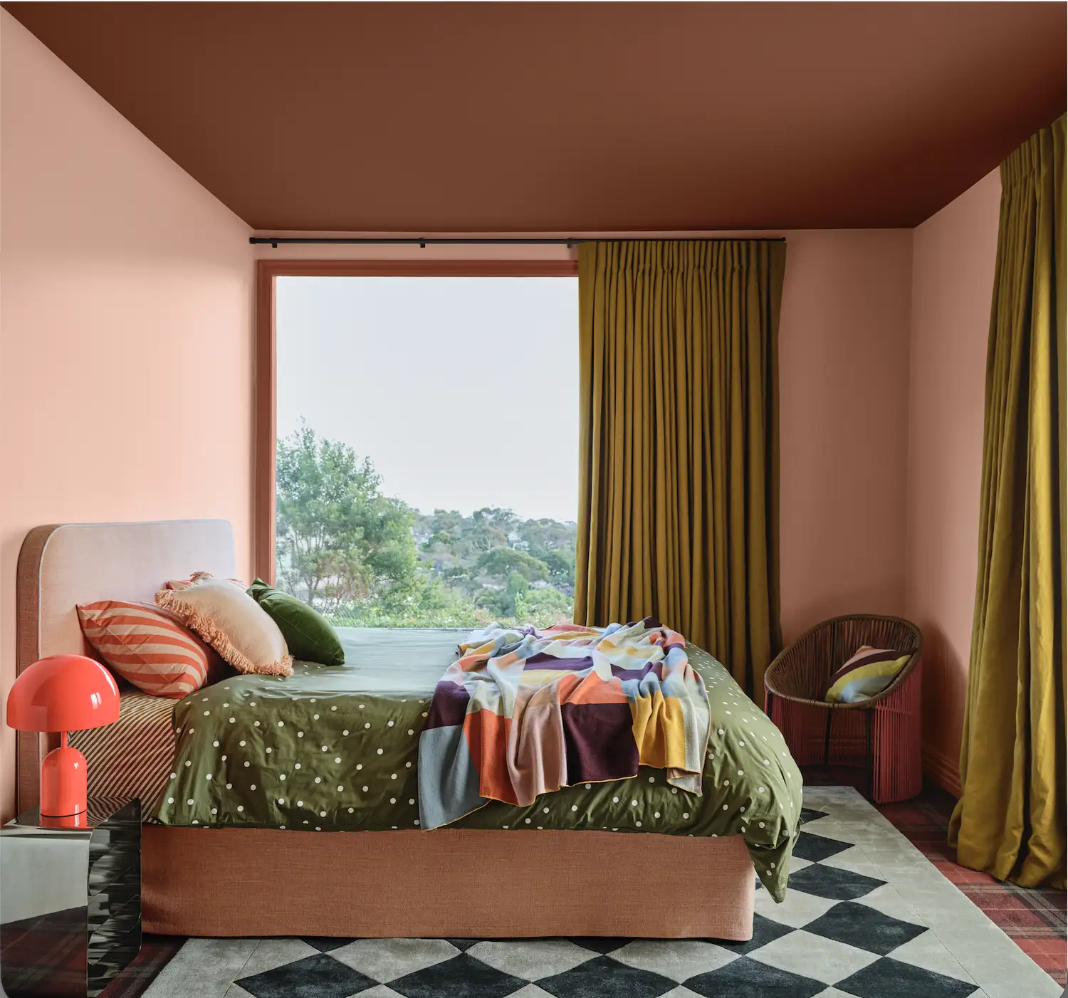
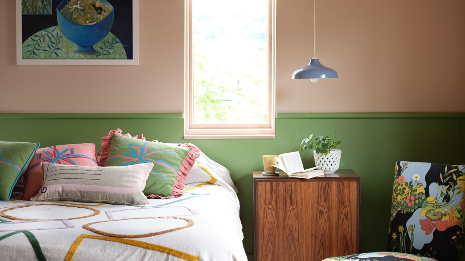
Colour capping is an emerging paint trend that builds upon the concept of colour drenching, offering a new technique to enhance the perception of space and add visual interest to a room. Unlike traditional colour drenching, which involves using a single hue across all surfaces, colour capping utilizes multiple tonal shades from the same colour family, creating a graduated effect that extends to the ceiling. This method aims to transform the ceiling into a focal point, contributing to a layered and polished aesthetic.
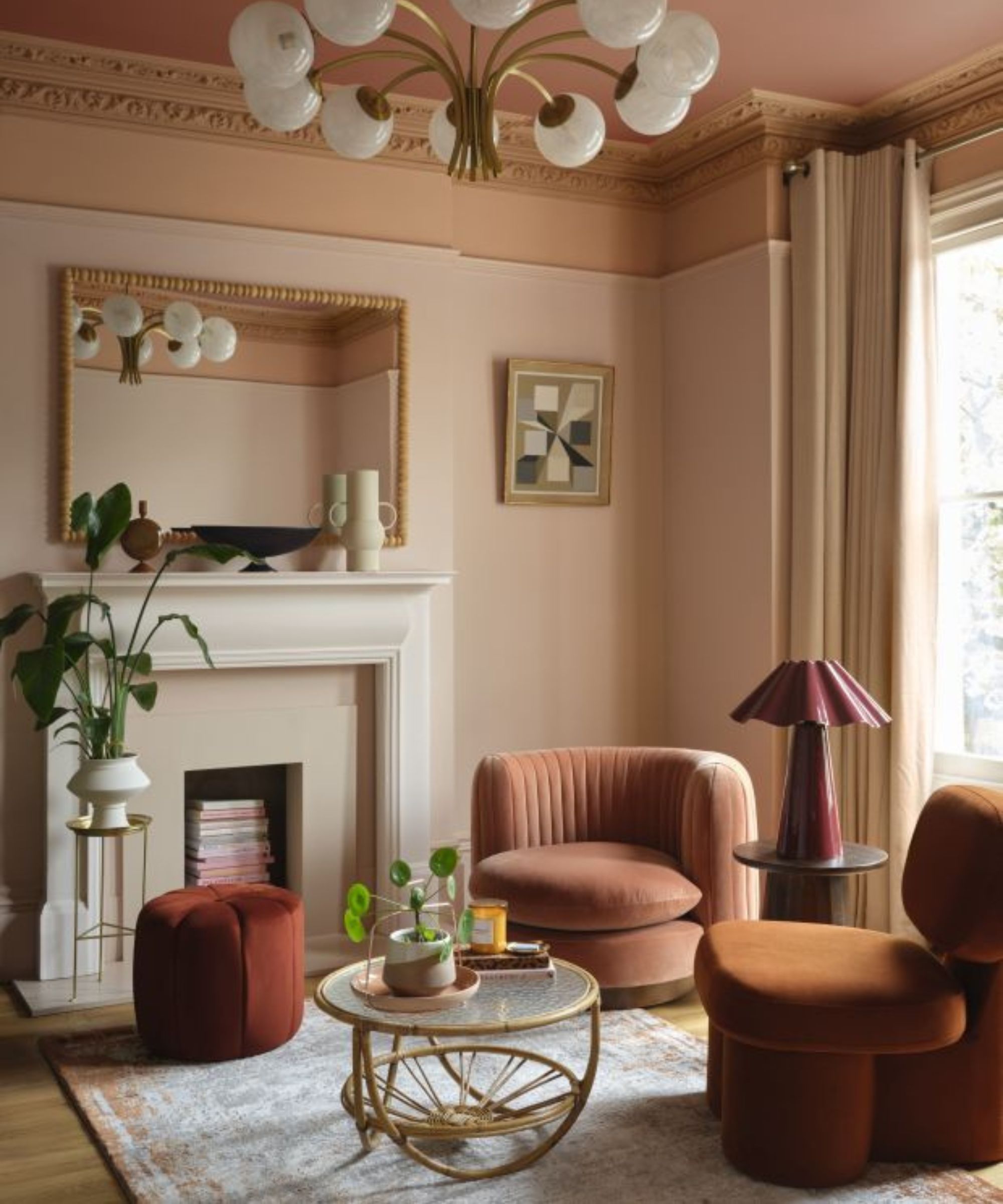
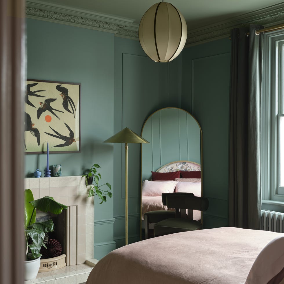
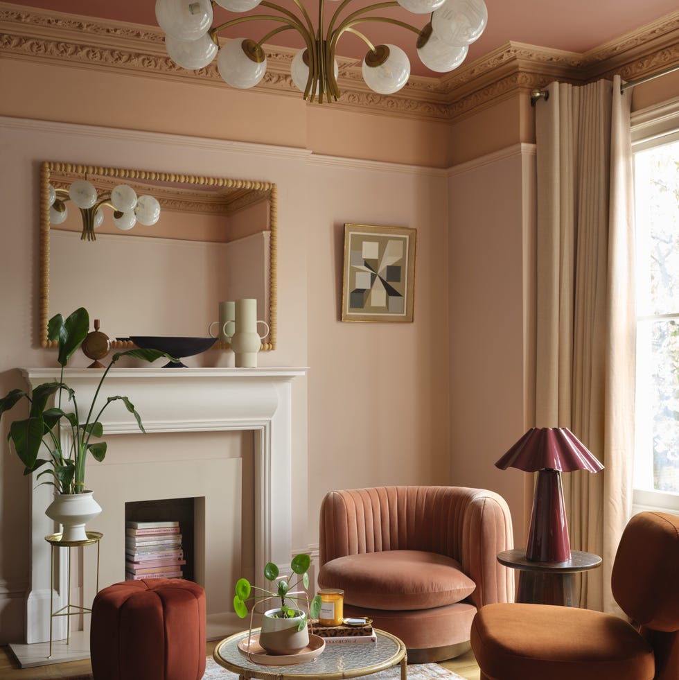
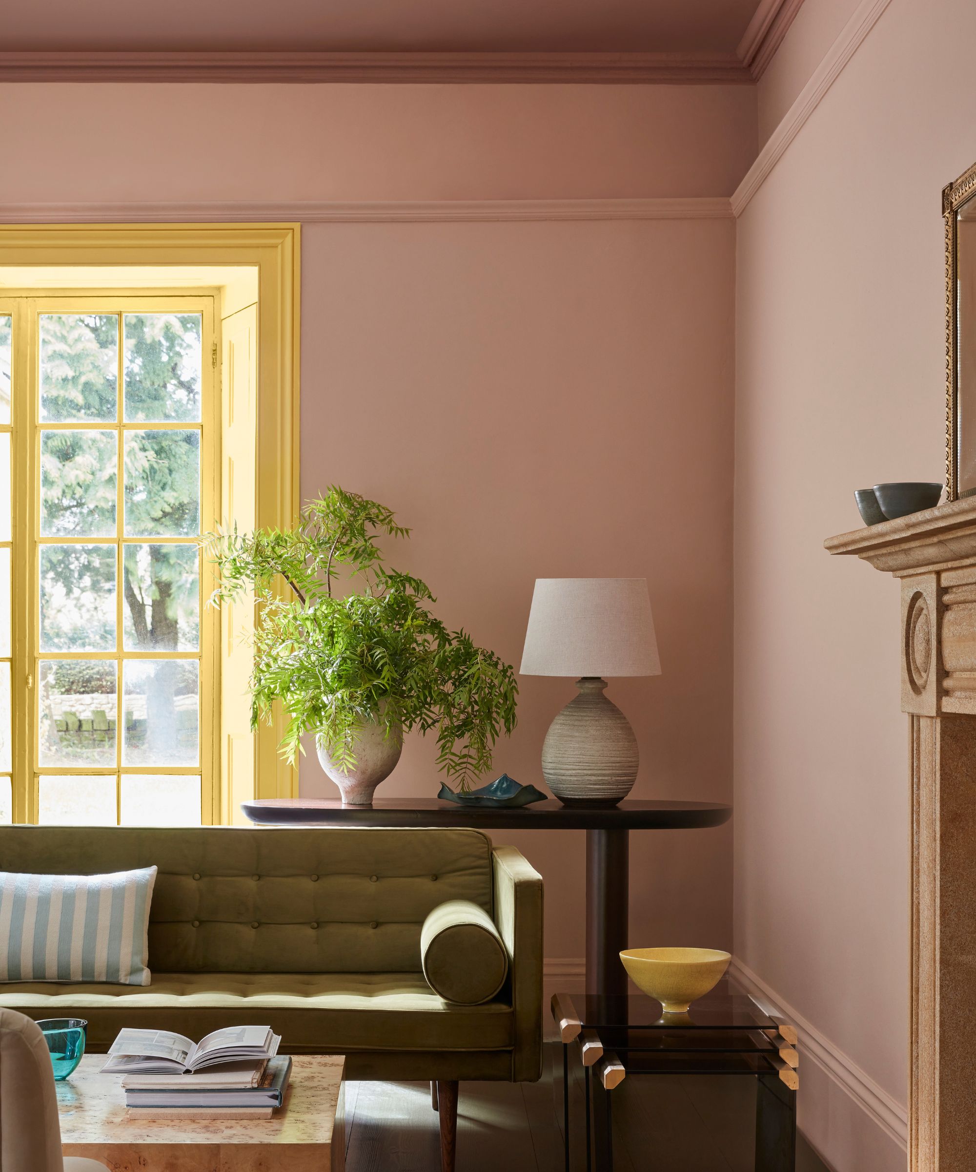
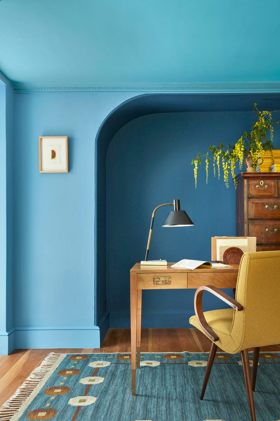
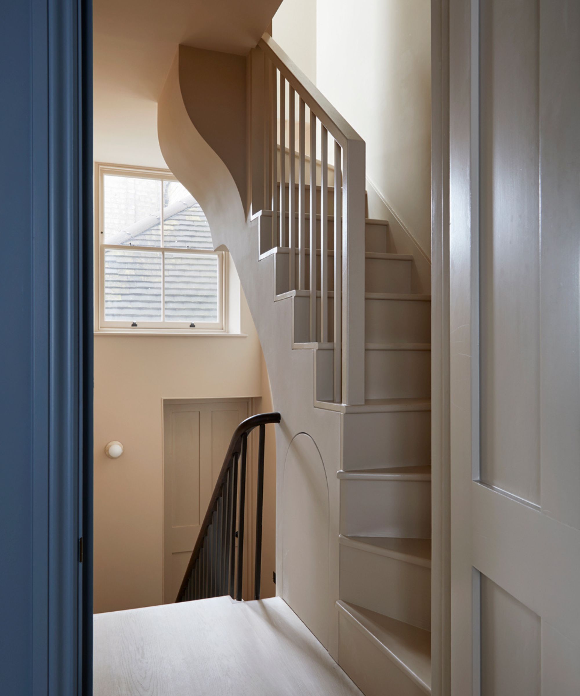
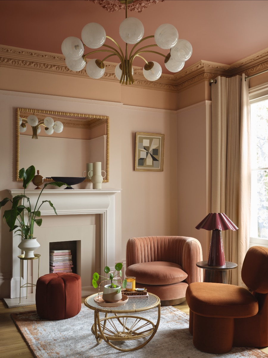
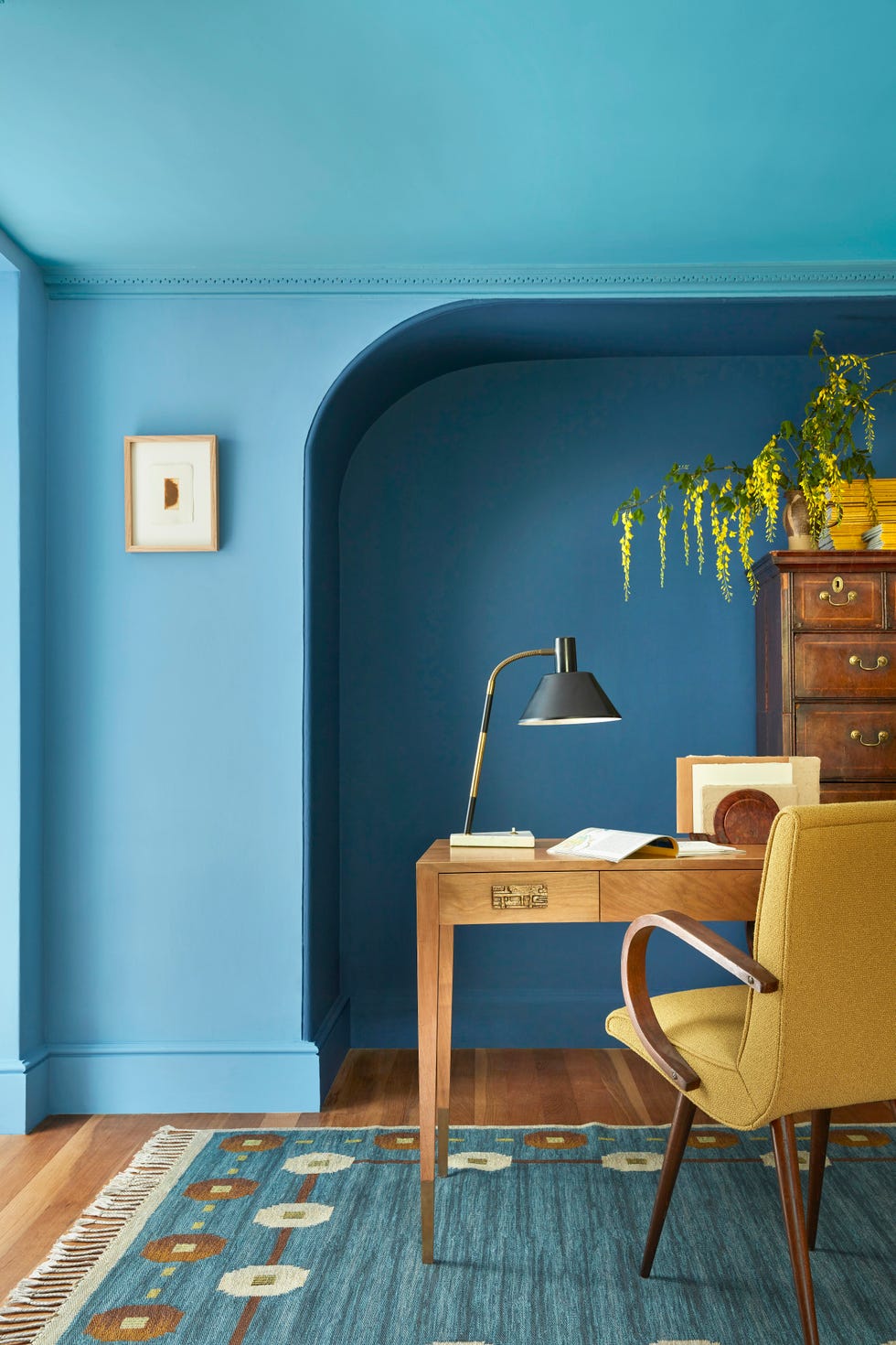
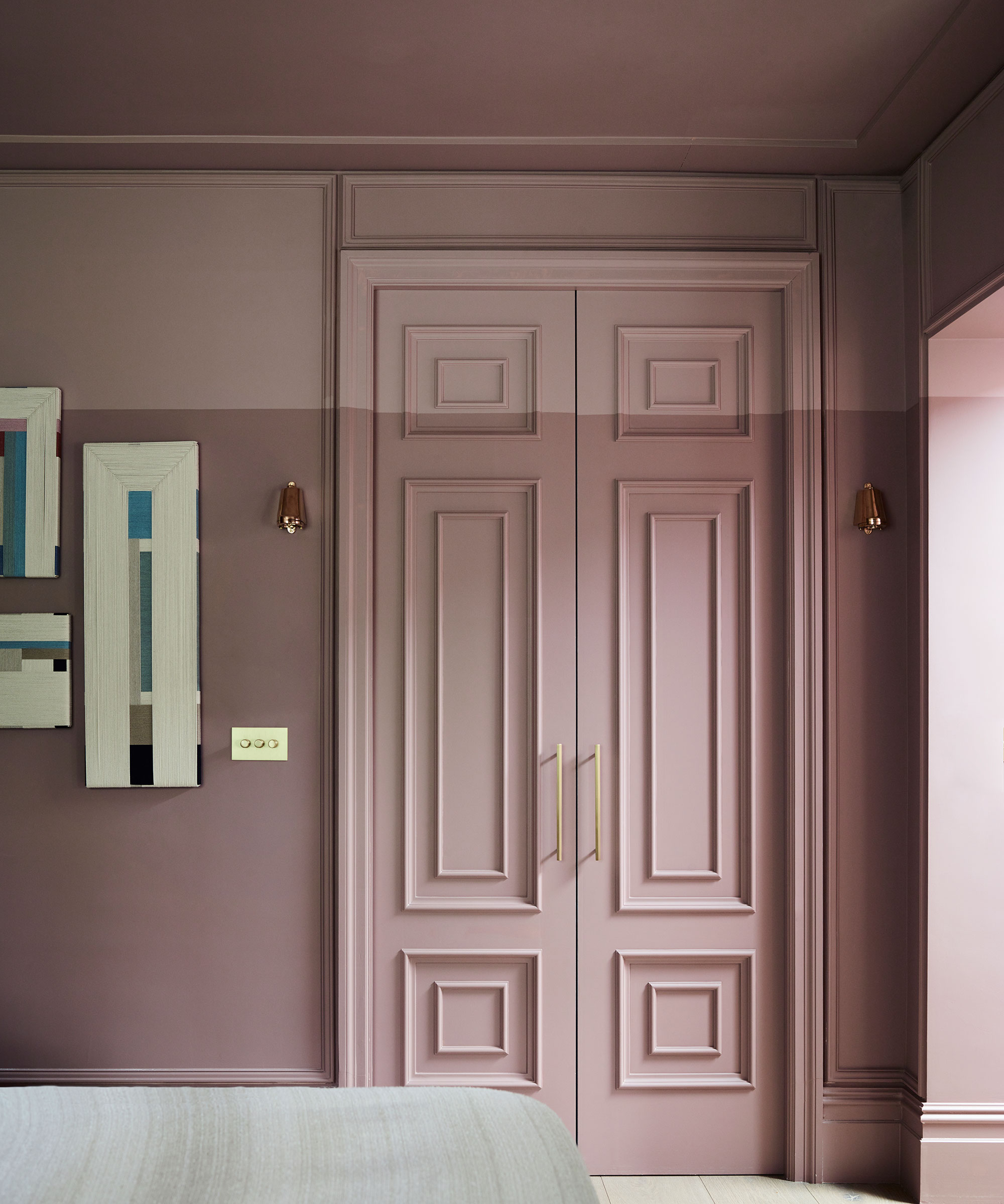
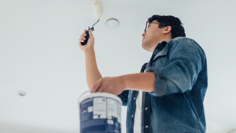
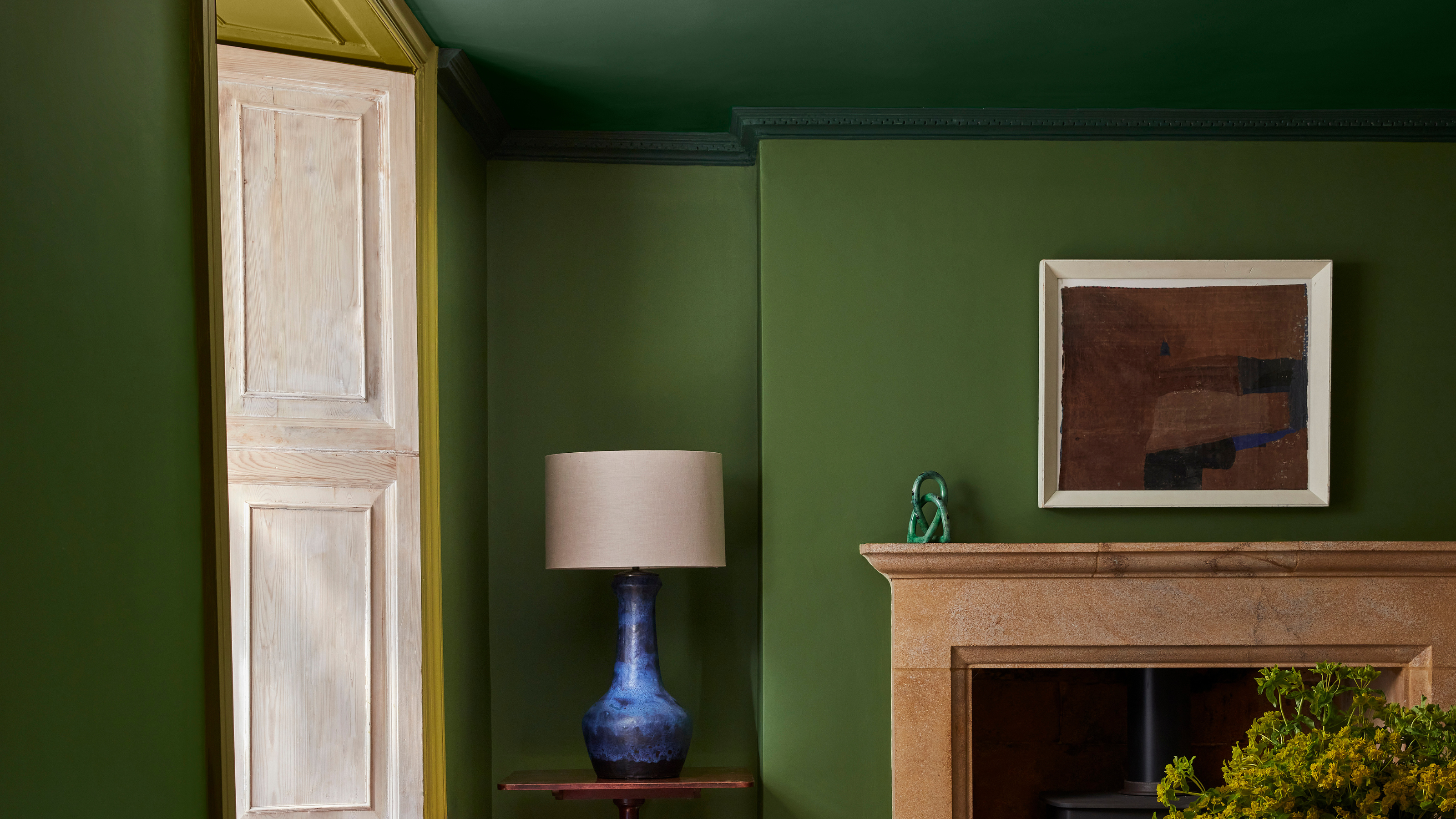
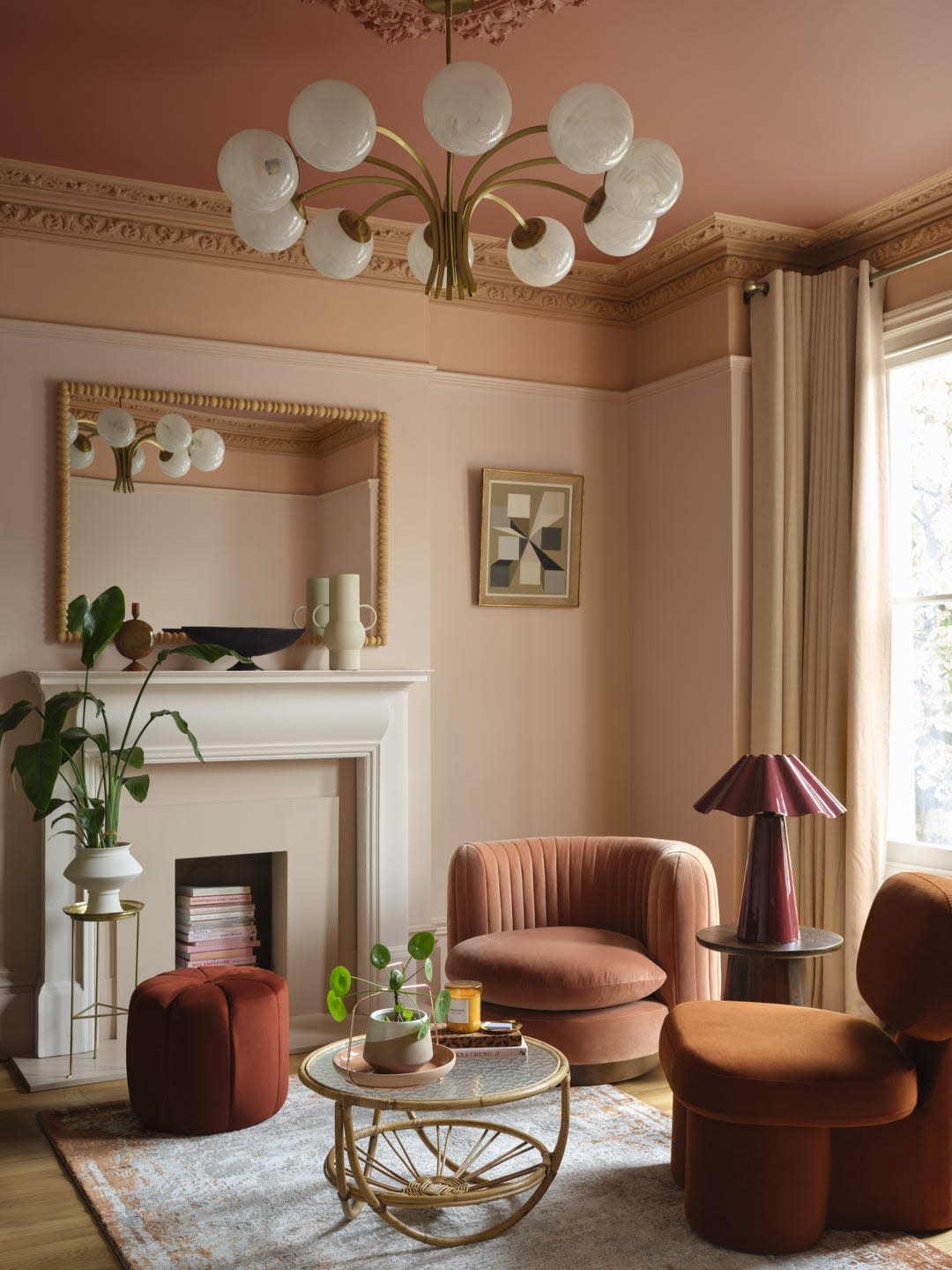
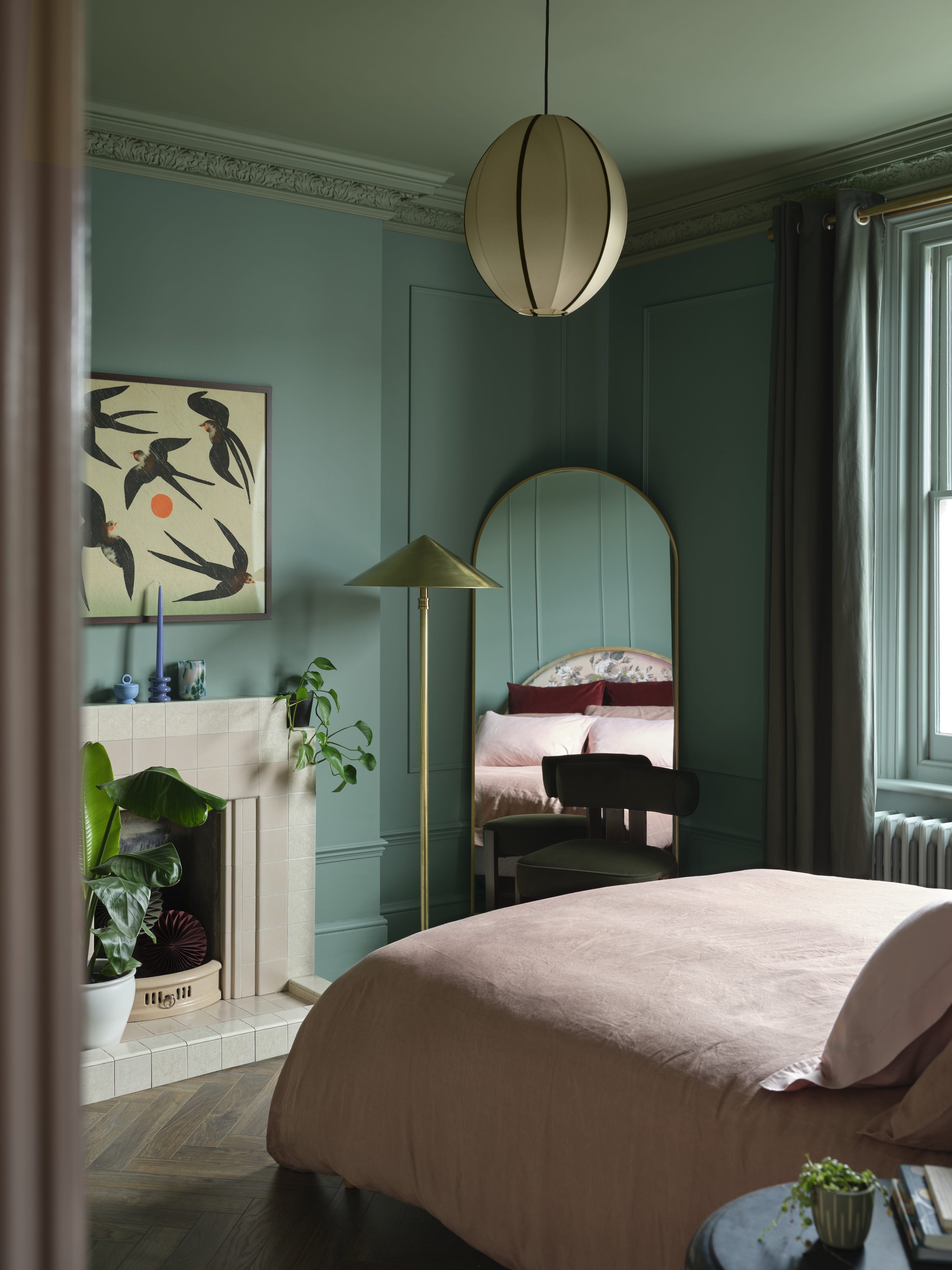
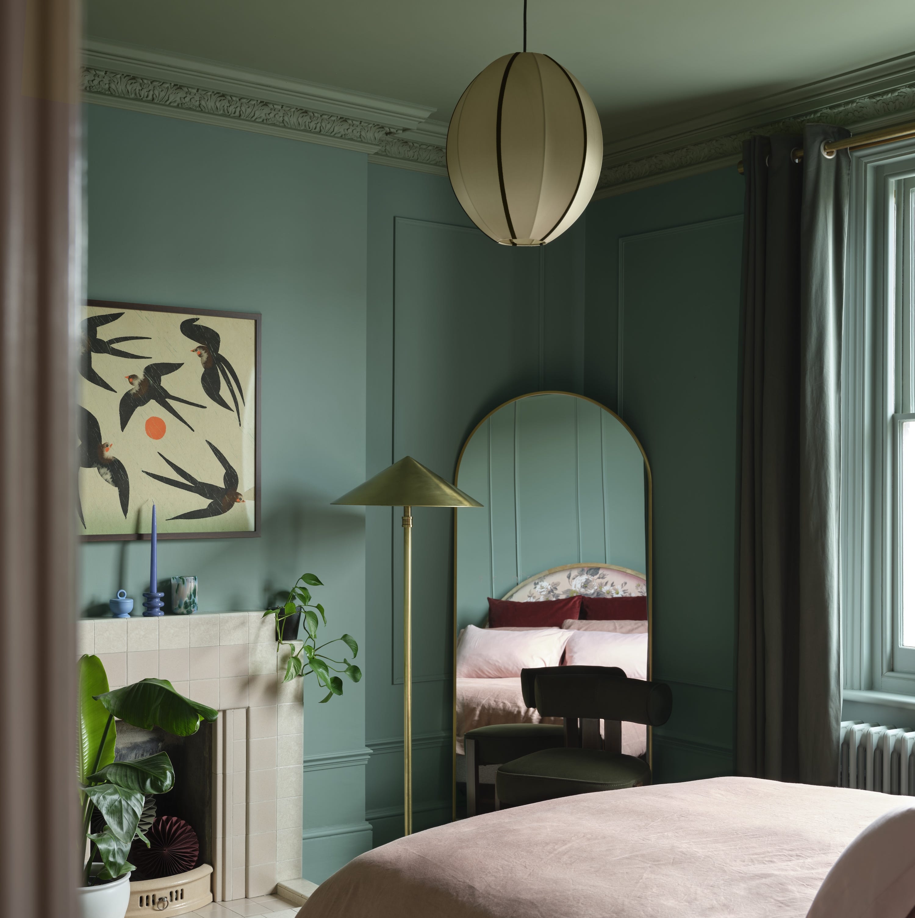
The technique typically involves painting the ceiling in the deepest shade, the cornicing in a mid-tone, and the walls in a lighter tone. This gradual transition fosters a subtle sense of cohesion and elegance within the space. Design experts, such as Helen Shaw from Benjamin Moore, emphasize that this method creates greater visual interest and can make a room feel larger. By extending the wall colour onto the ceiling with a slightly darker shade, a seamless, enveloping effect is achieved. This optical illusion makes flat surfaces appear more dimensional and causes the ceiling to seem further away, effectively expanding the perceived size of the room.
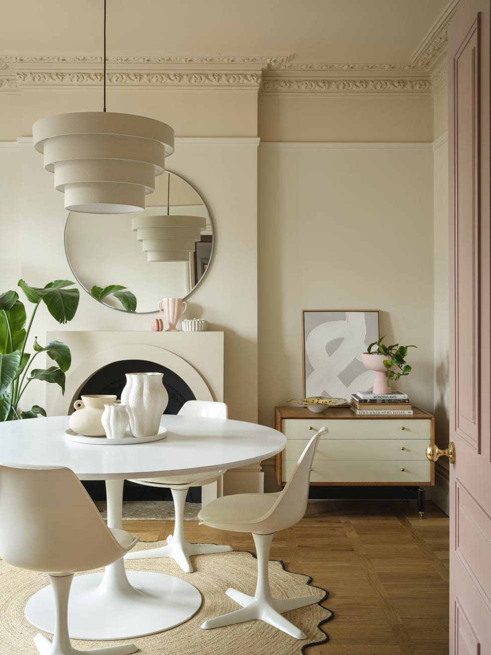
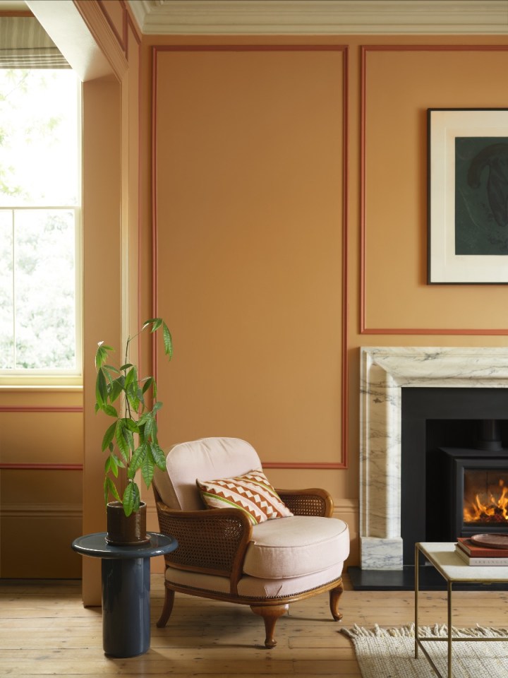
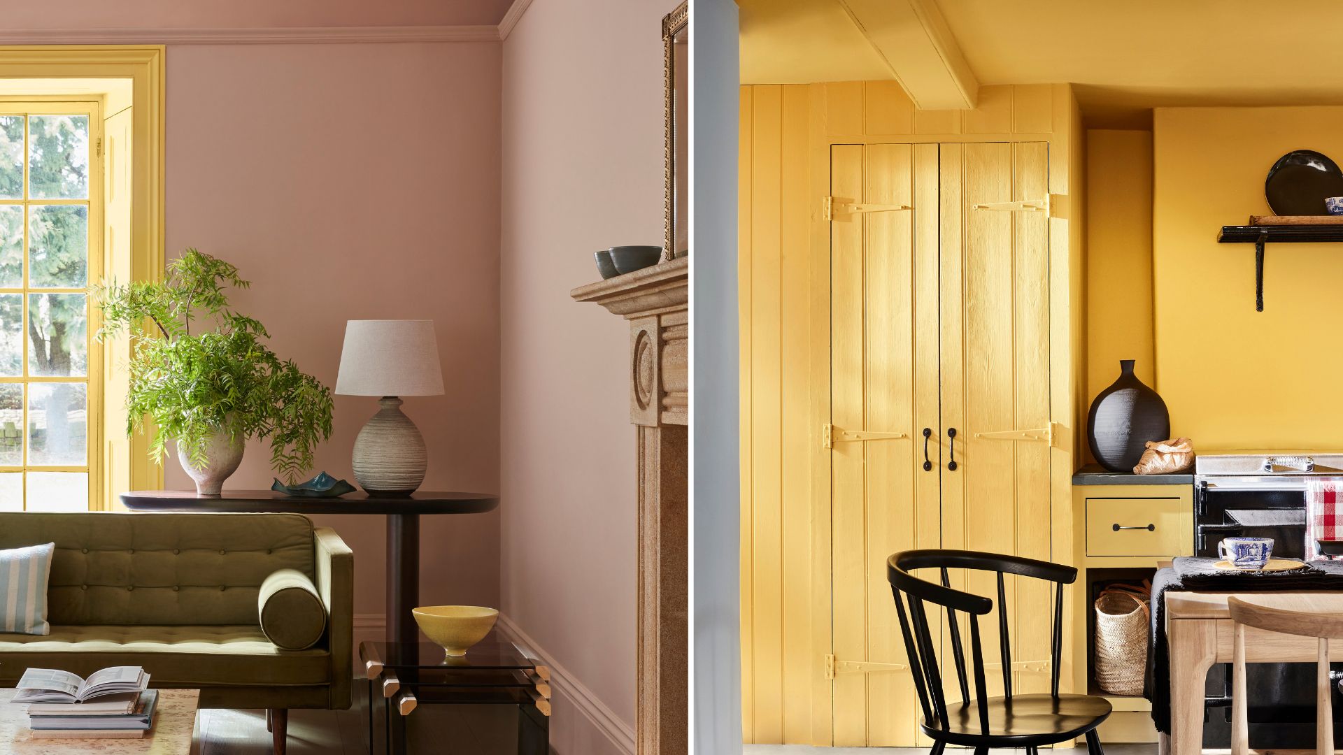
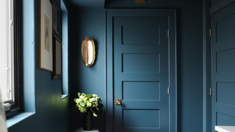
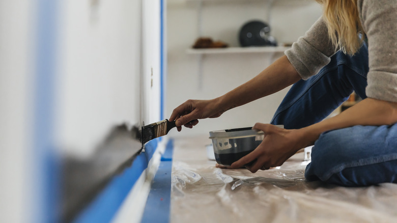
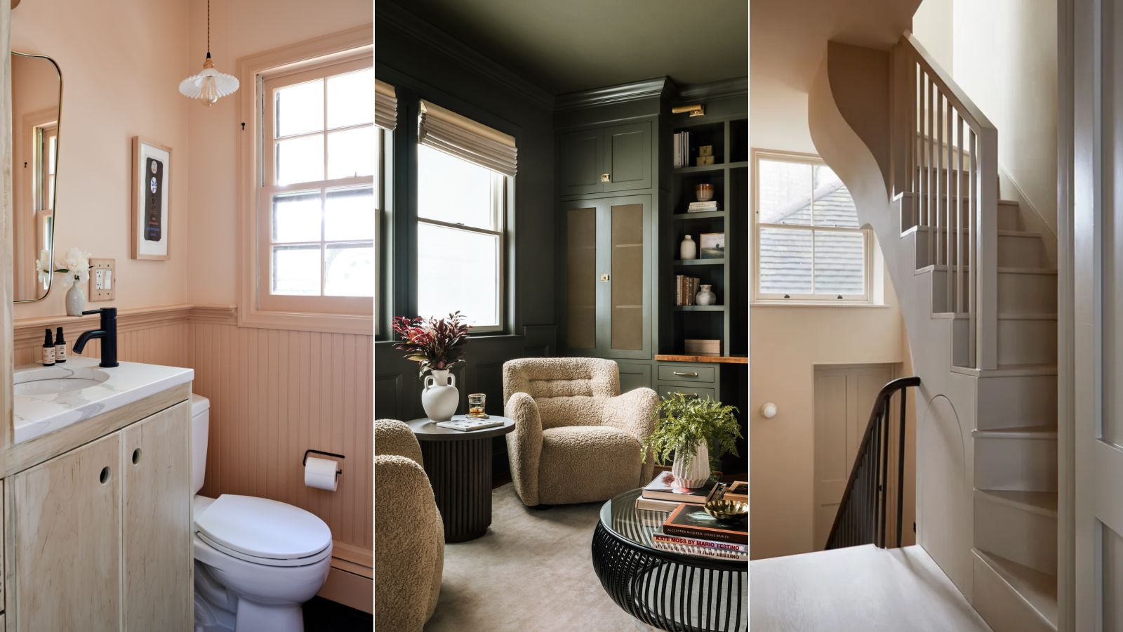
For a truly cohesive and contemporary finish, it is recommended to include skirting boards in the tonal wash, avoiding stark white contrasts. This integration helps connect all elements of the room, contributing to a unified design. Creative Director Ruth Mottershead of Little Greene advocates for this approach, suggesting that banishing habitual white skirting and doors in favor of coordinated colours enhances the overall impact.
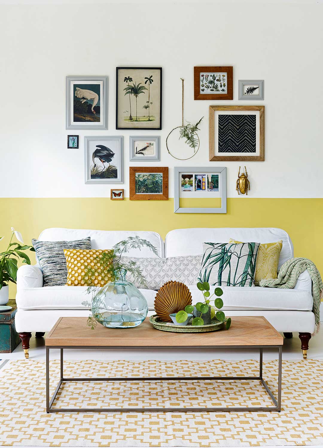
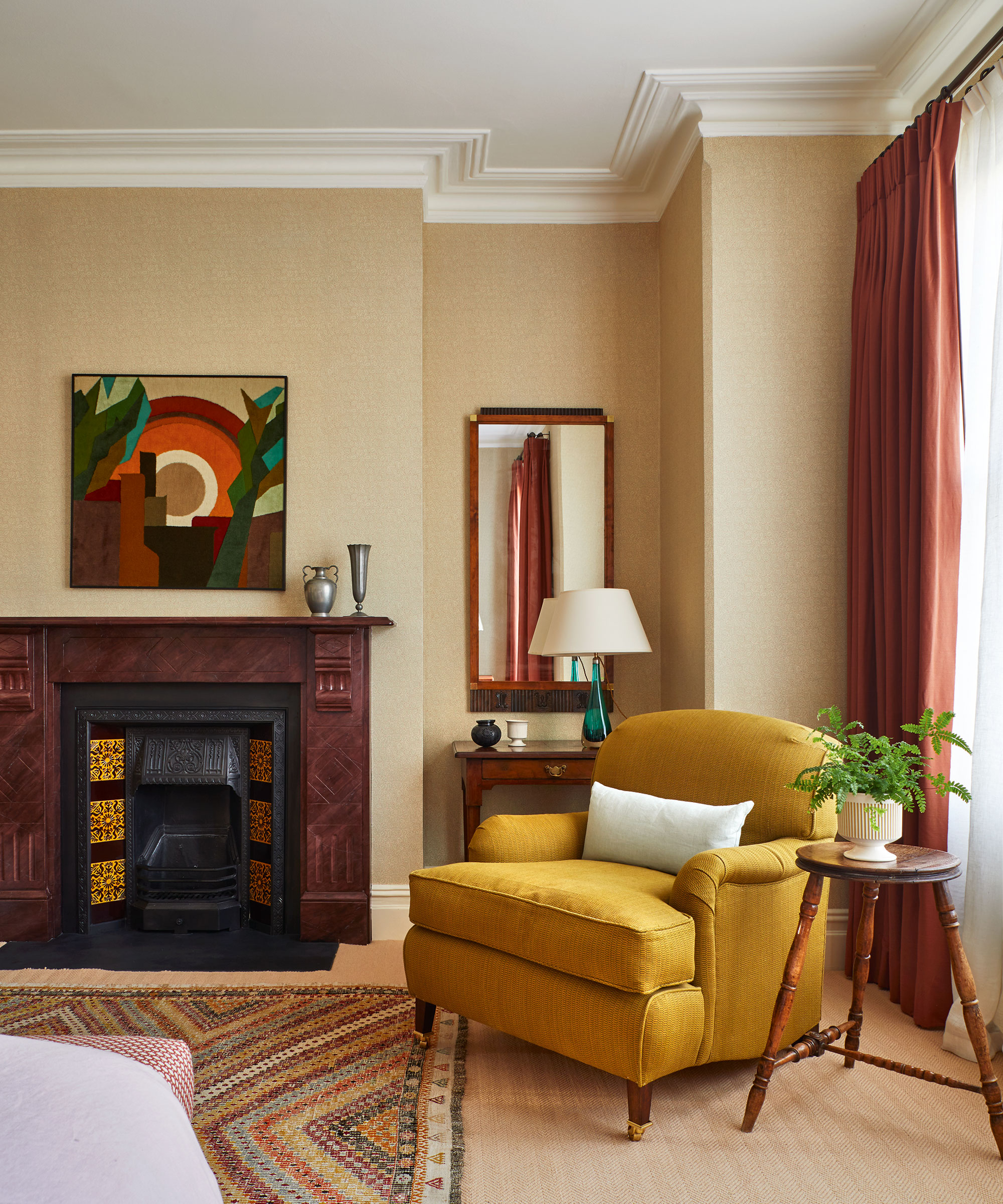
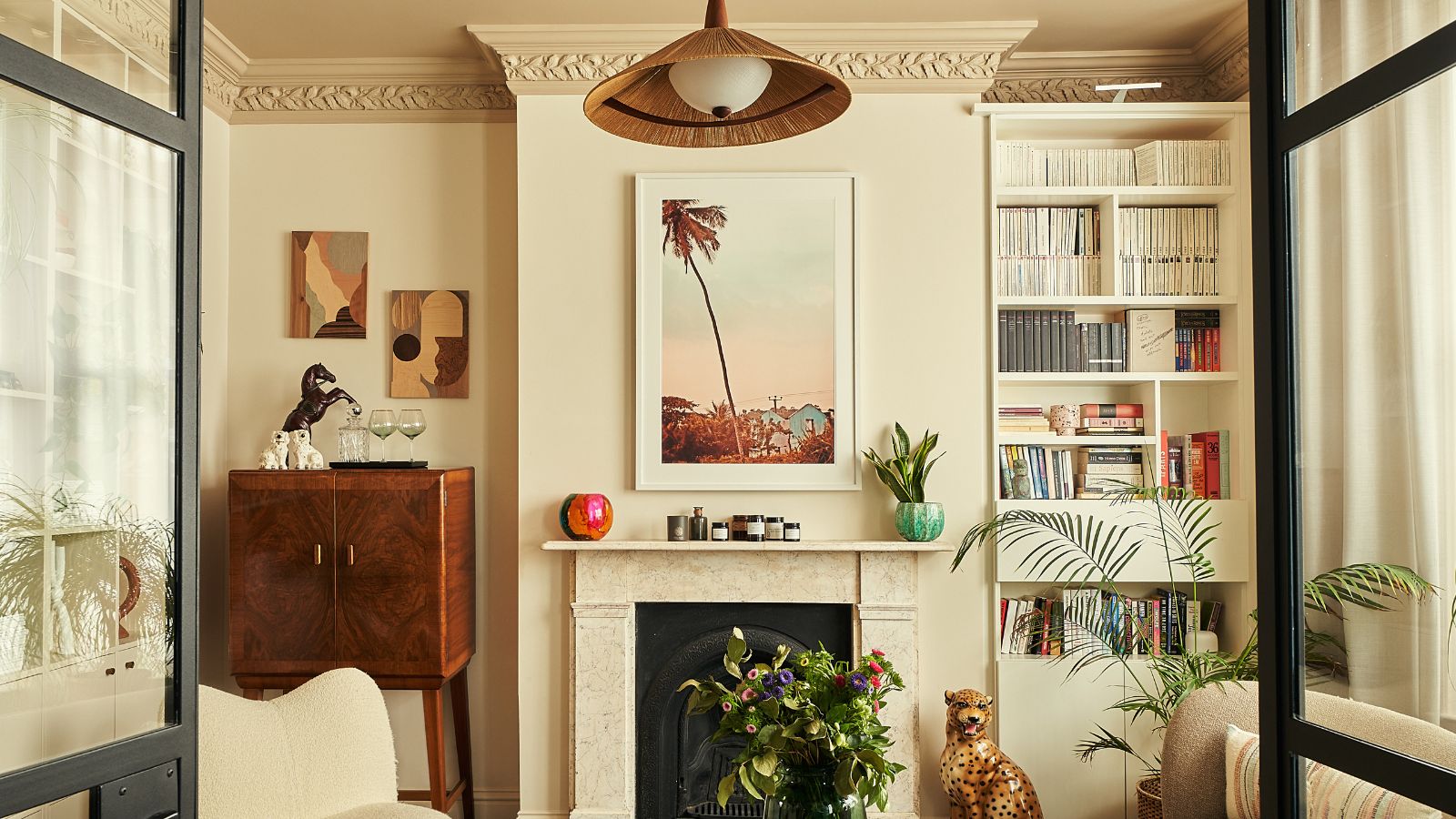
Colour capping is versatile and suitable for various home styles. In period properties, it can highlight existing architectural features like decorative ceilings and fireplaces, with richer greens or blues complementing the home's character. For modern homes, where ornate details might be absent, this technique can introduce character and define areas or zone spaces, adding design detail through colour variations, even in rooms with low ceilings. The beauty of these creative schemes lies in their adaptability to both period and contemporary interiors.
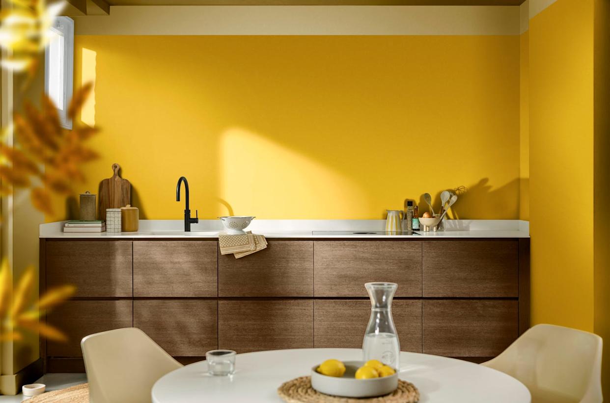
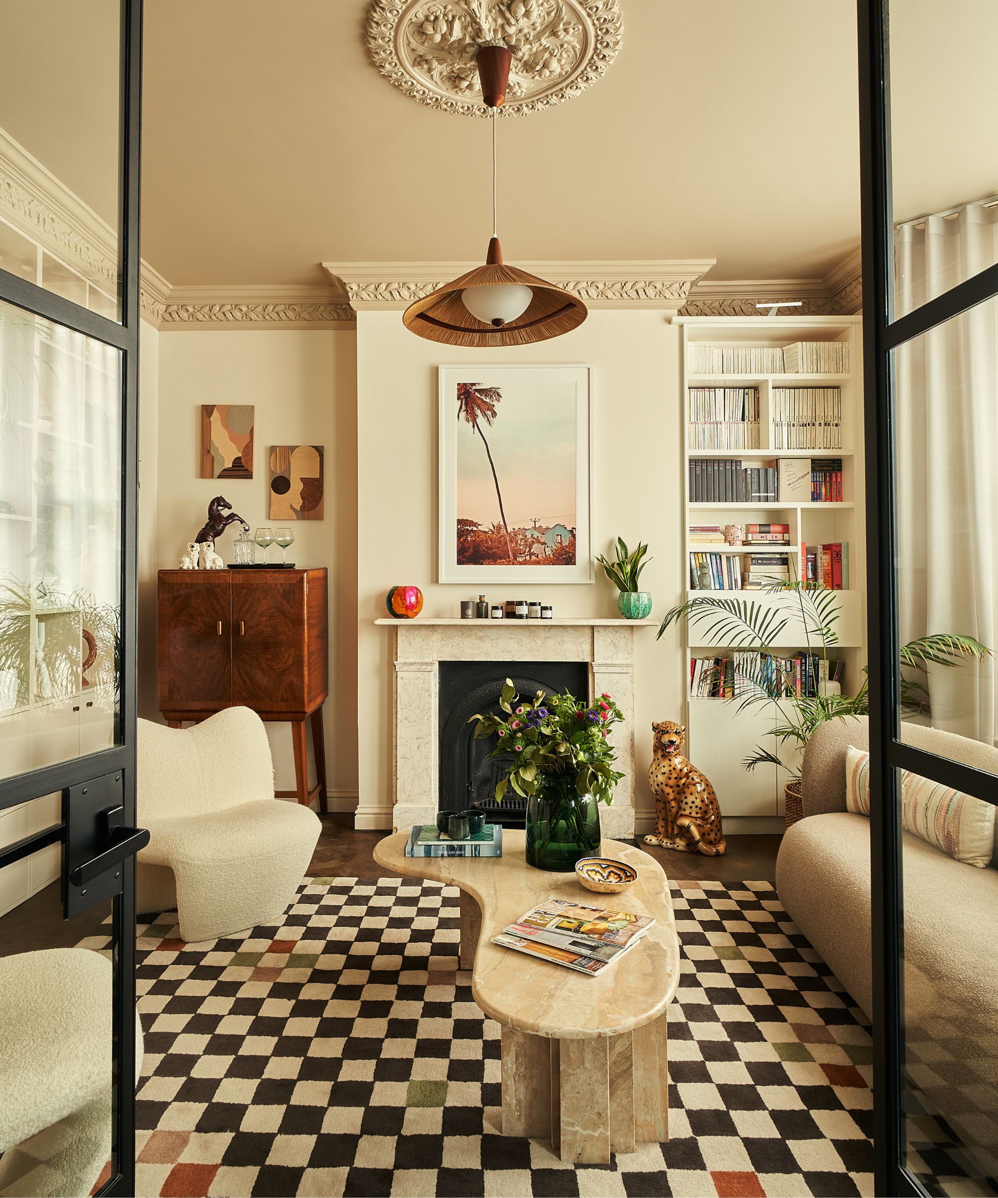
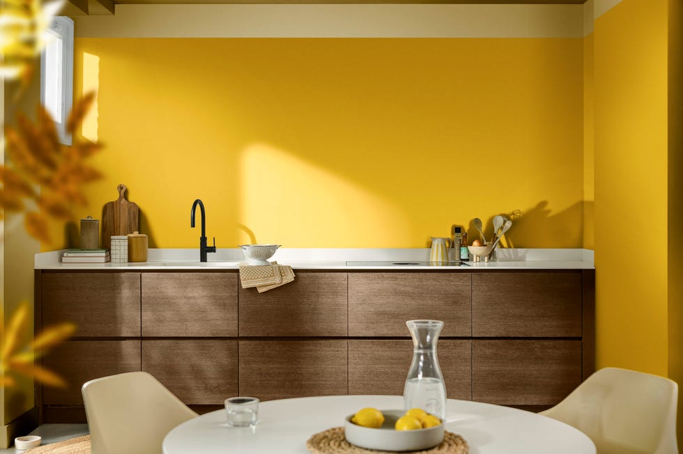
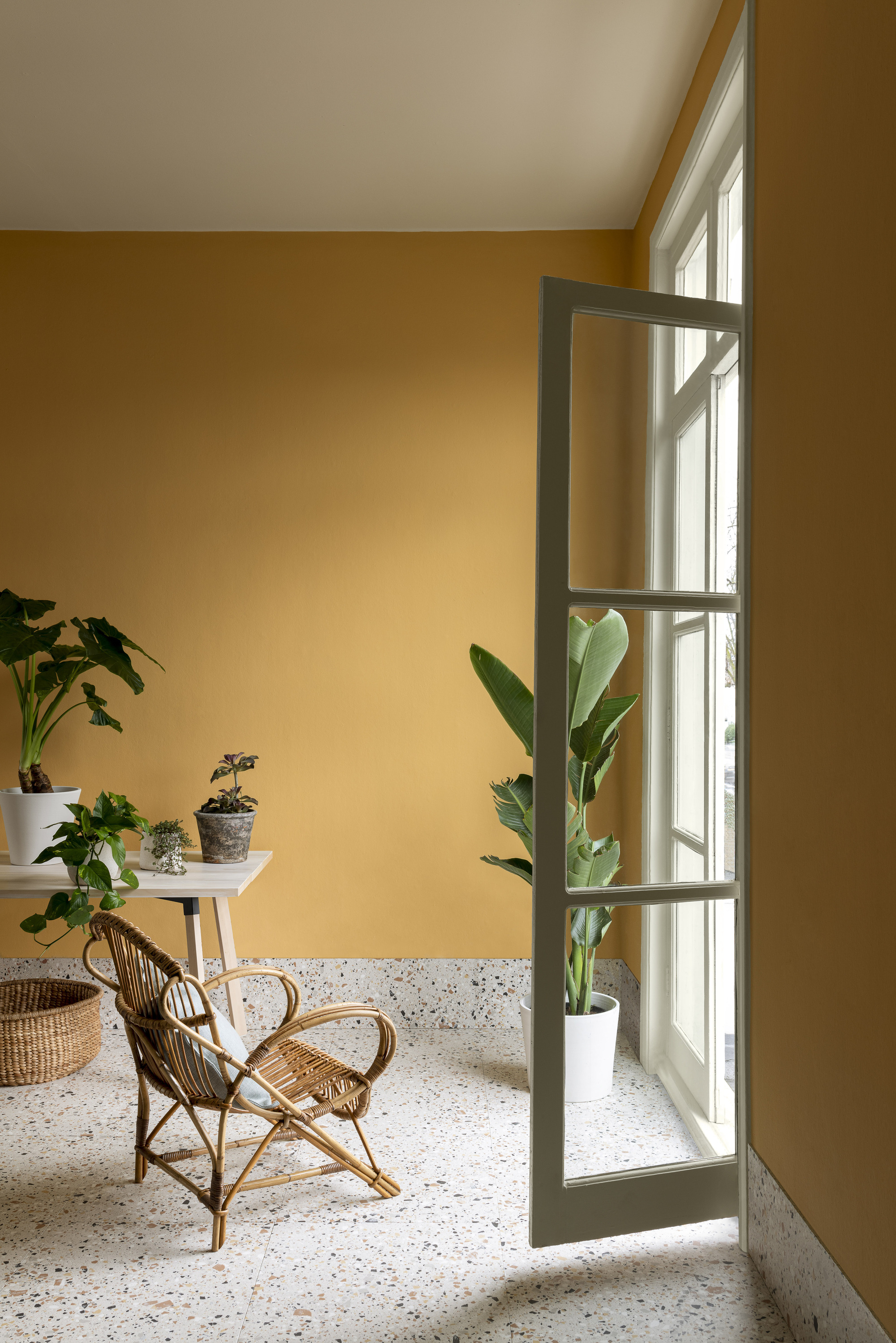
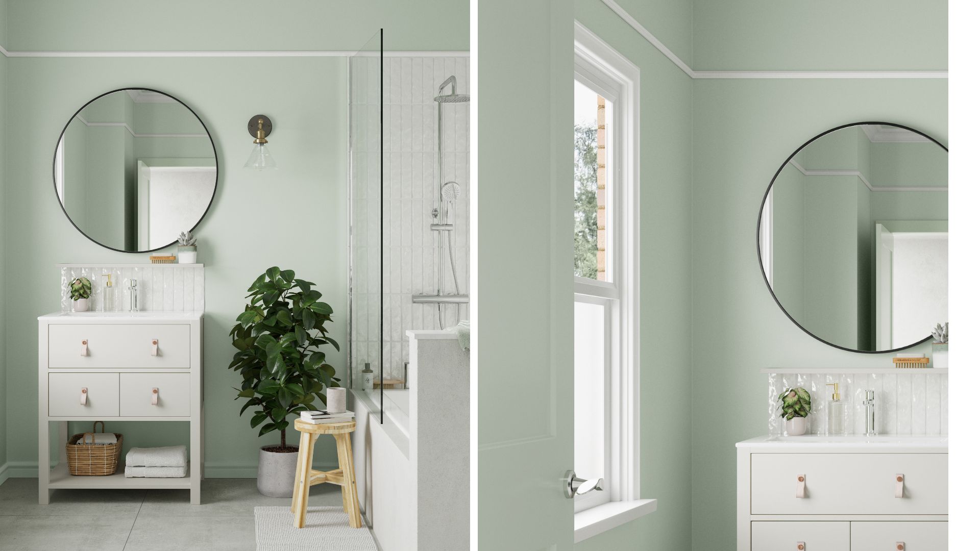
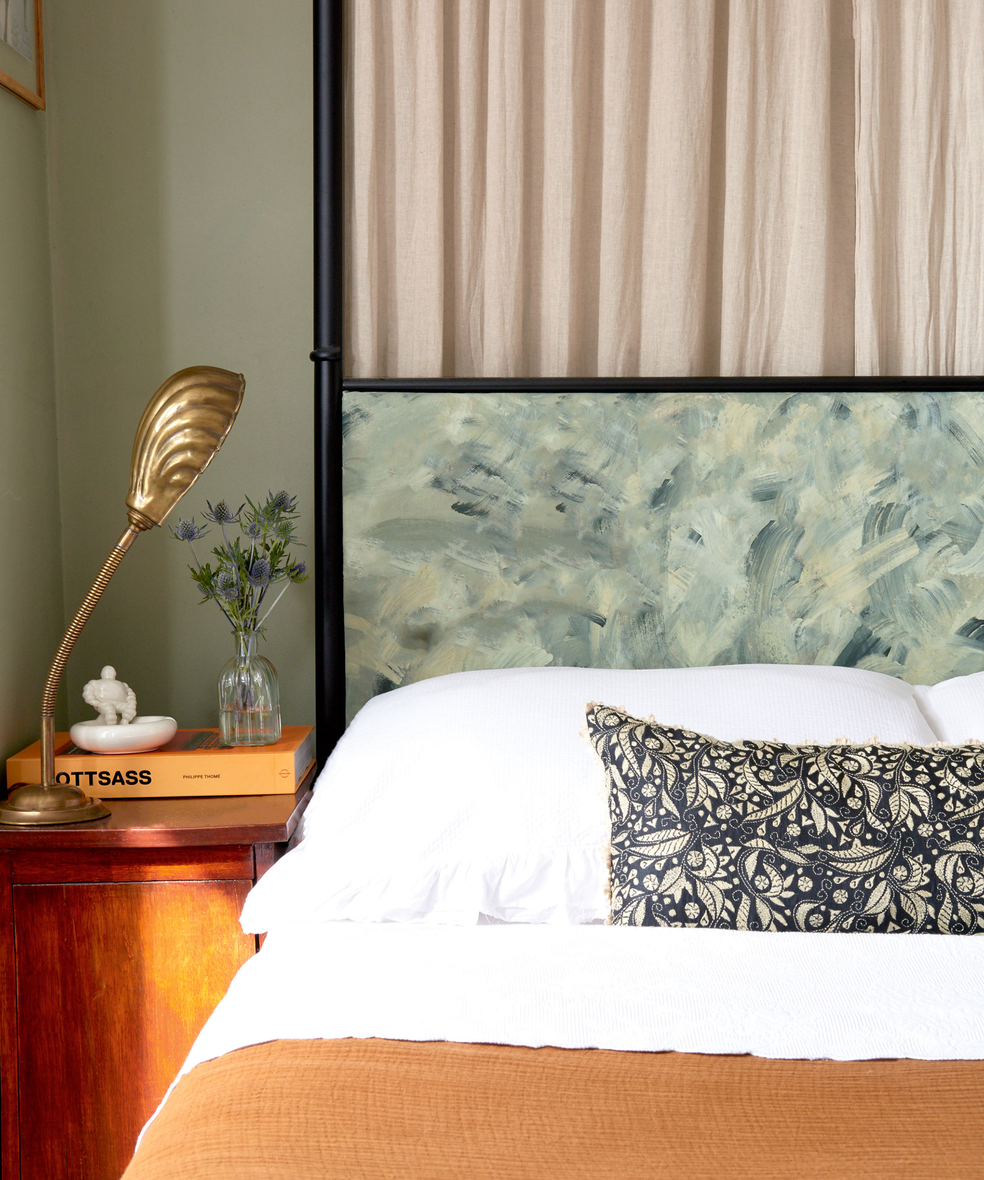
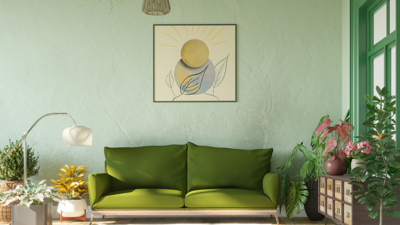
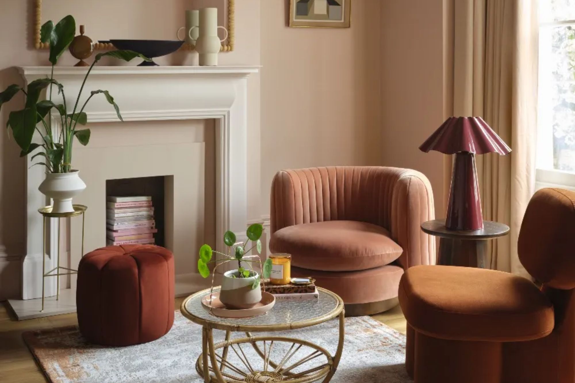
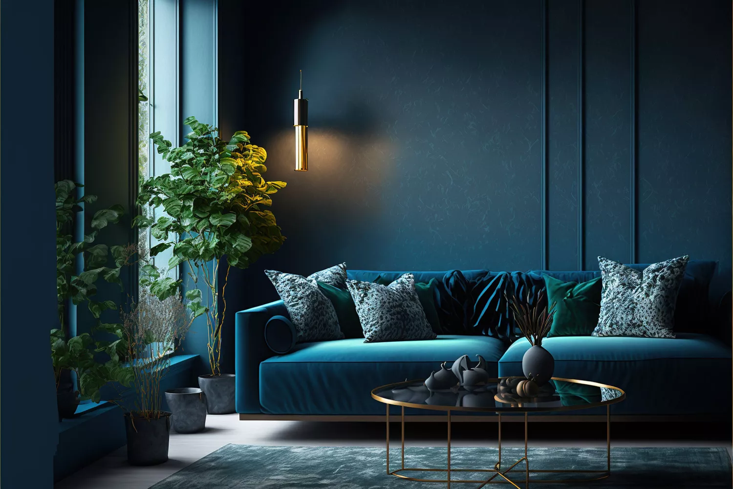
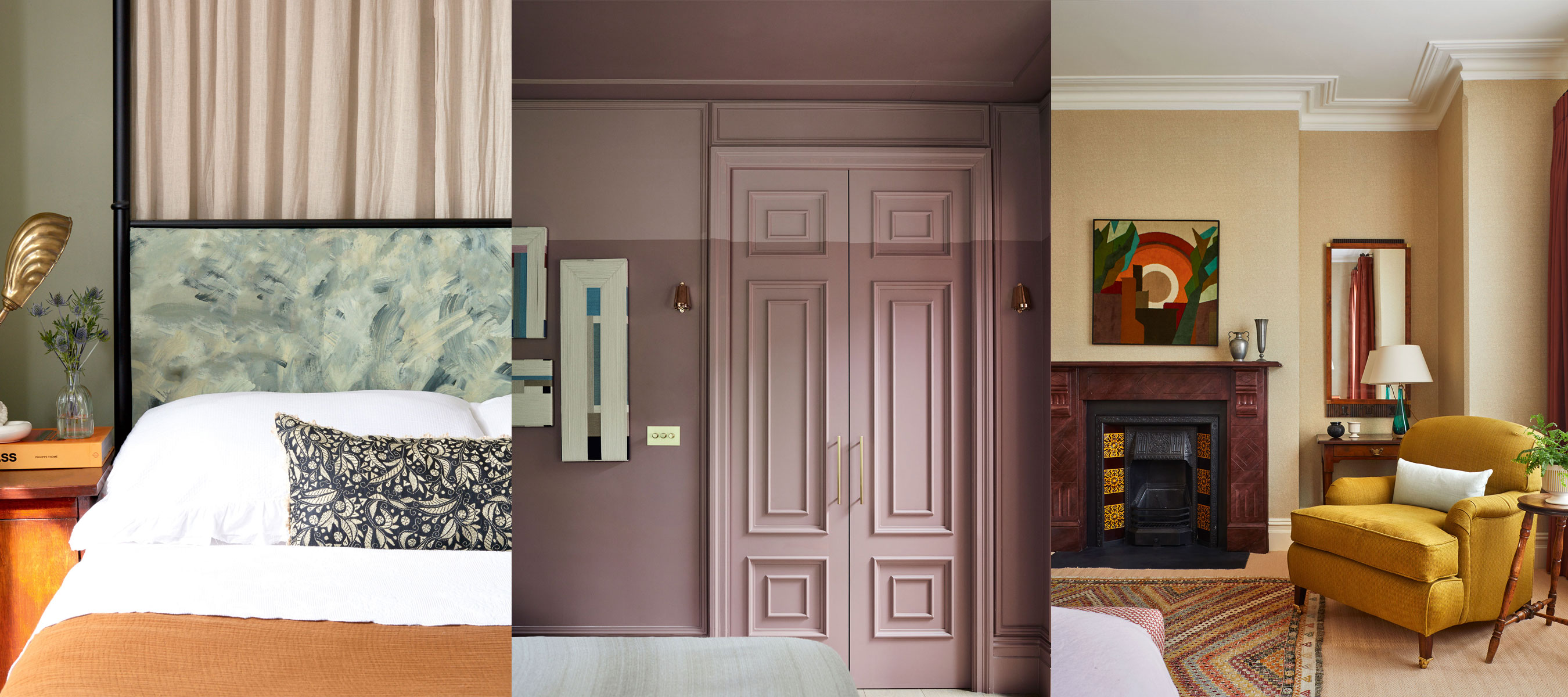
When selecting colours for colour capping, versatility is crucial, as at least three shades from the same family are required. To enlarge a space, light, muted shades such as blues or greens are effective, as they make walls appear taller and reflect natural light, creating the illusion of a larger area. These lighter tones can be paired with deeper shades from the same family to achieve the desired capping effect. Even for those who prefer neutral palettes, colour capping can be implemented effectively. An off-white wall colour capped with a slightly more saturated neutral hue can create a subtly impactful finish, drawing attention to the ceiling as an integral part of the décor.
However, it is important to avoid clashing or discordant colours, as the transition between shades should be intentional and harmonious. Colour capping might not be ideal for spaces with overly complex ceiling structures or areas already rich in visual elements like intricate architectural features, patterns, or textures, as this could result in a cluttered appearance. Similarly, using a deep ceiling colour in very small, dark rooms could make the space feel overly enclosed, unless a moody, intimate atmosphere is specifically desired. Popular paint brands like Little Greene and Crown offer suitable shades for implementing this trend, with navy hues being suggested for a calming effect.
#ColourCapping #PaintTrends #InteriorDesign #HomeDecor #SpacePerception #PaintTechniques #TonalPalettes #RoomEnlargement #ColourCapping #PaintTrends #InteriorDesign #HomeDecor #SpacePerception #PaintTechniques #TonalPalettes #RoomEnlargement
0 comment in total
 No comments yet
You may also like
This British Paint Trend Is Set to Take Over 2026

This British Paint Trend Is Set to Take Over 2026
Interior designers reveal the home decor trend that will take over 2026 & why it's time to bin off accent walls
This Color Trend Is Taking Over Homes—And It Makes Any Space Look Bigger
Goodbye plain white ceilings – designers say color capping is the clever paint hack that makes a small living room feel taller

Interiors experts predict this will be the biggest paint trend of 2026

The Latest Color Trend You'll Be Seeing Everywhere In Fall 2025
12 Tips For Making Small Rooms Appear Larger Using Paint

Meet 'colour capping', the paint trend set to take over 2026
Move Over, Color Drenching— Color Capping Will Dominate 2026 Interiors

Designers Predict This Will Be The Biggest Paint Trend Of 2026

Is colour drenching really a radical new way to decorate, or is it just lazy decorating?
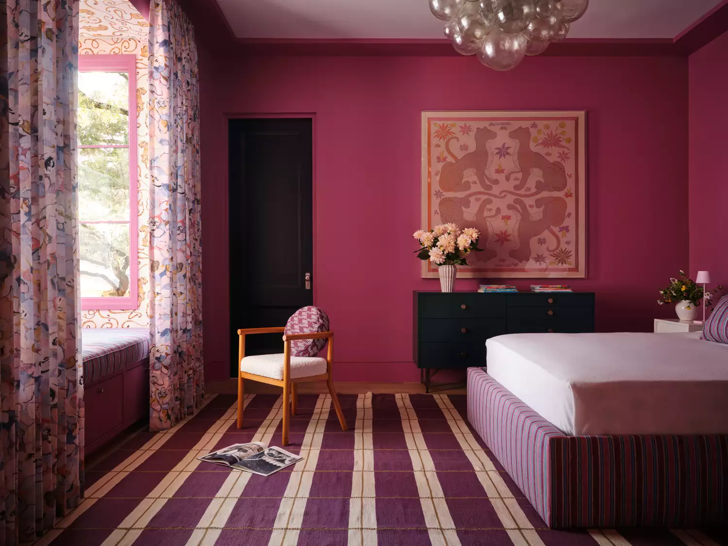
Color Capping Is the Surprising Interior Design Trend Everyone Will Be Trying in 2026
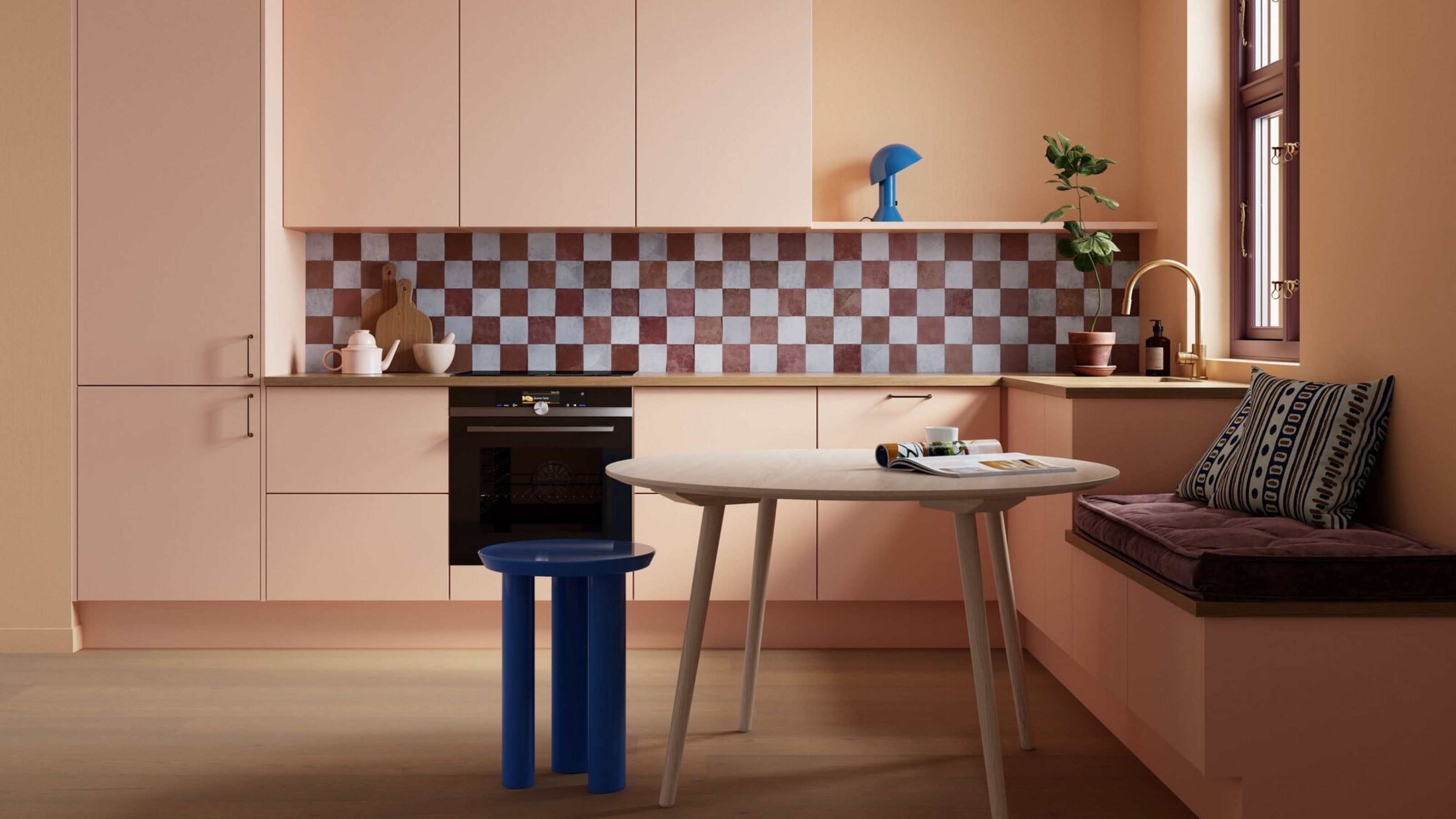
What Colors Make a Room Look Bigger? 5 That Designers Reach for to Make Walls 'Visually Expand'

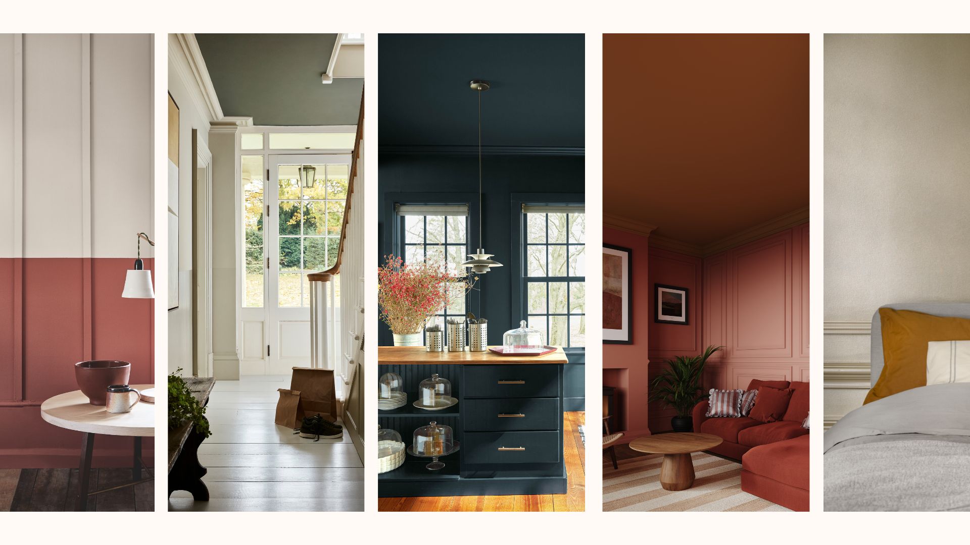
How to make a room look bigger with paint: 10 expert tips

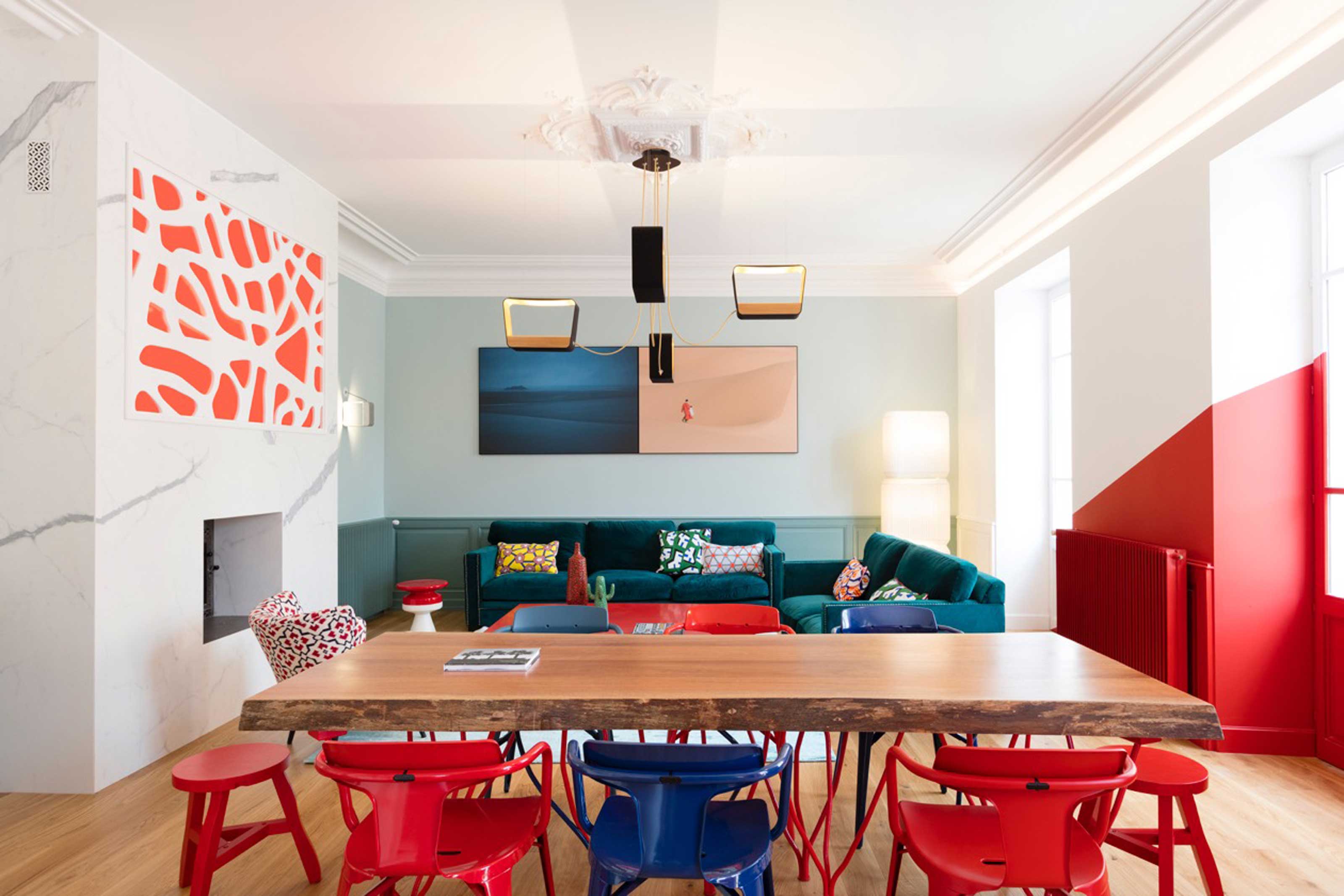
How to use paint to change the size and shape of your room
Move over color drenching, ‘color capping’ is the chic new tonal technique you’ll be seeing everywhere this fall
9 rooms that prove color drenching makes small spaces look bigger
Paint tricks – 10 painting tips and techniques loved by the experts
14 Genius Painting Tricks to Make a Room Look Bigger