1/4
How paint colour in your home can affect your mood
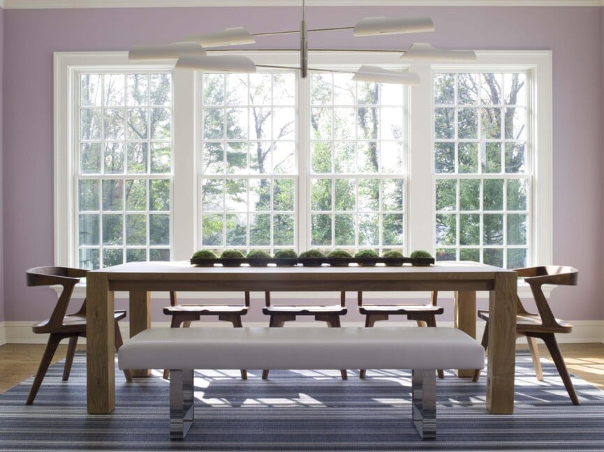
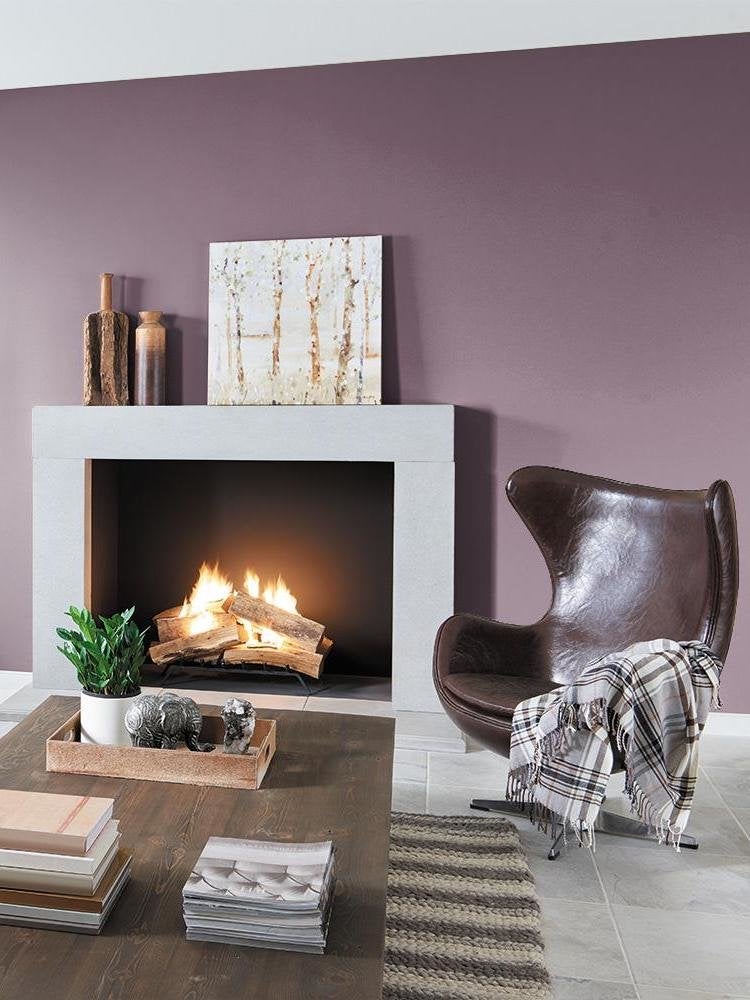
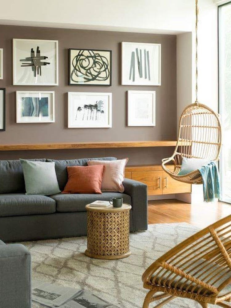
The colours used in a home significantly influence mood and feelings, a concept explored by Marianne Shillingford, Creative Director at Dulux. She suggests that just as people choose clothing colours to express or achieve a certain mood for social events, home paint colours can similarly be utilized to cultivate desired emotional states within living spaces. Shillingford notes that prolonged periods spent at home, such as during recent years, can lead to a desire for change and rejuvenation of familiar environments. Rather than undertaking extensive redecoration, she proposes that integrating small bursts of colour is an accessible and manageable way to refresh a space.
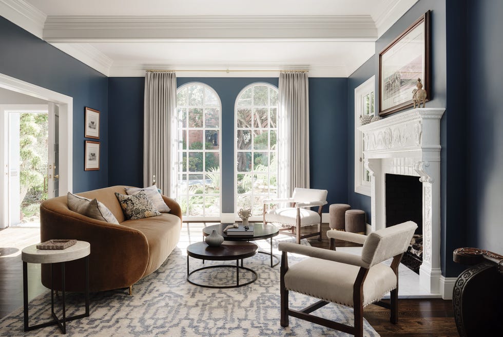
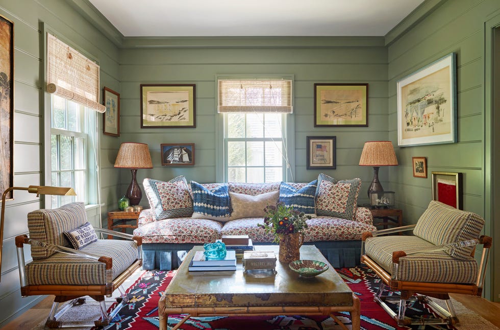
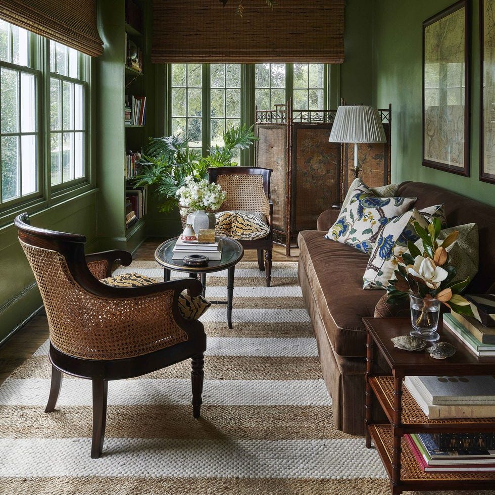
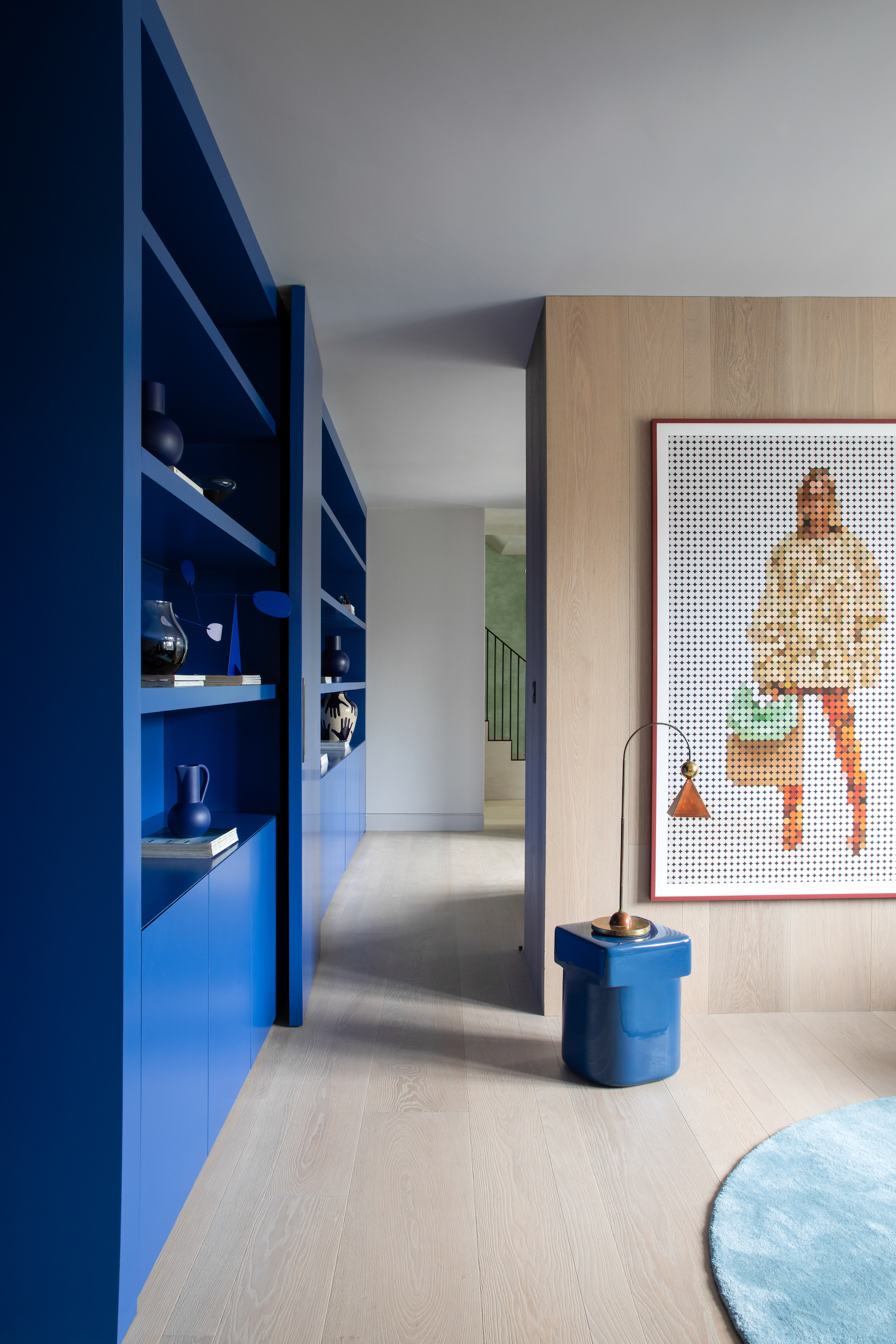
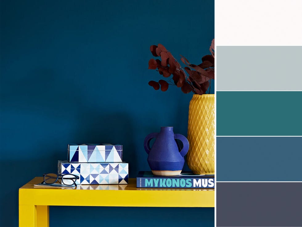
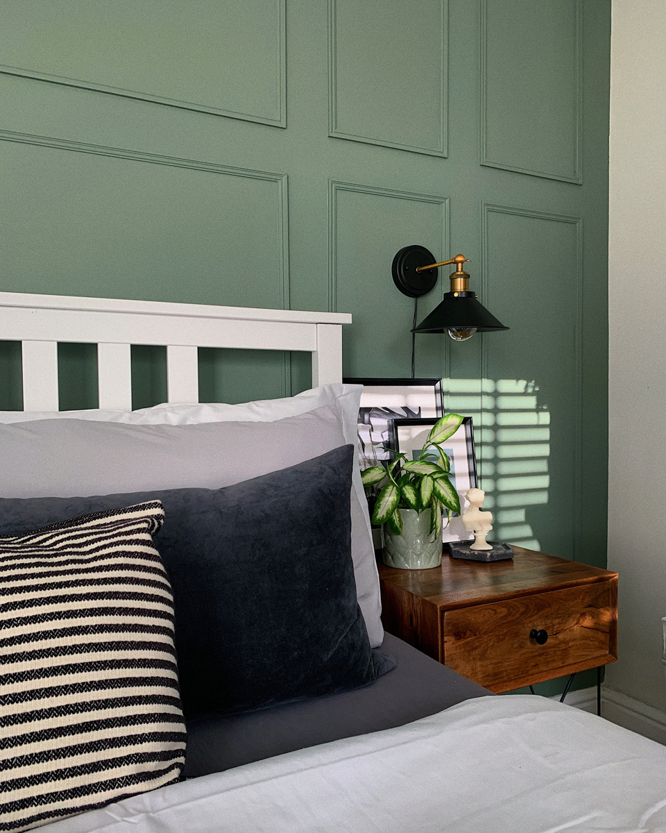
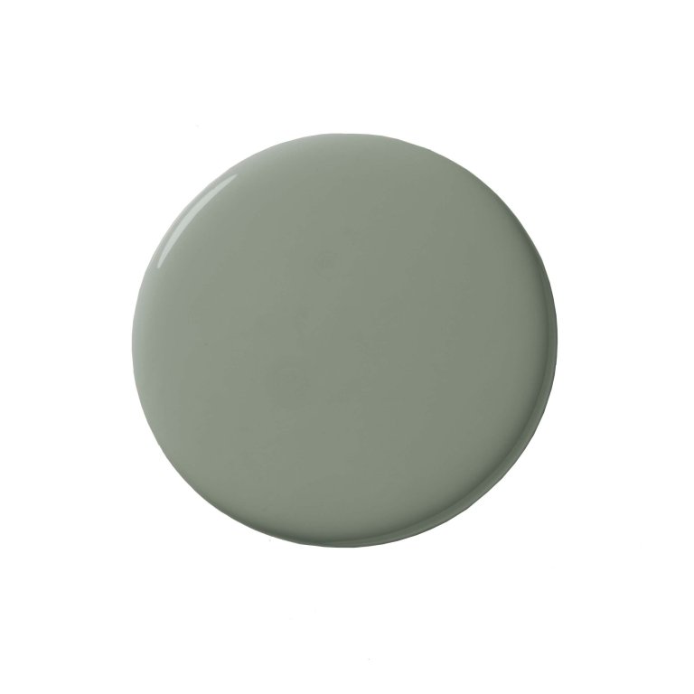
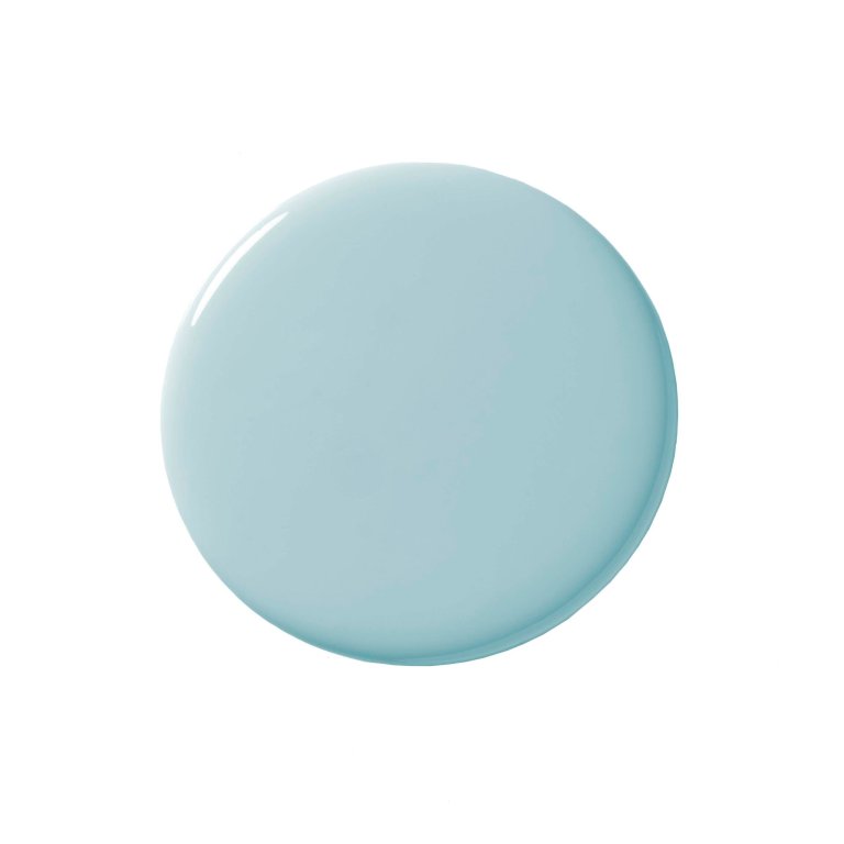
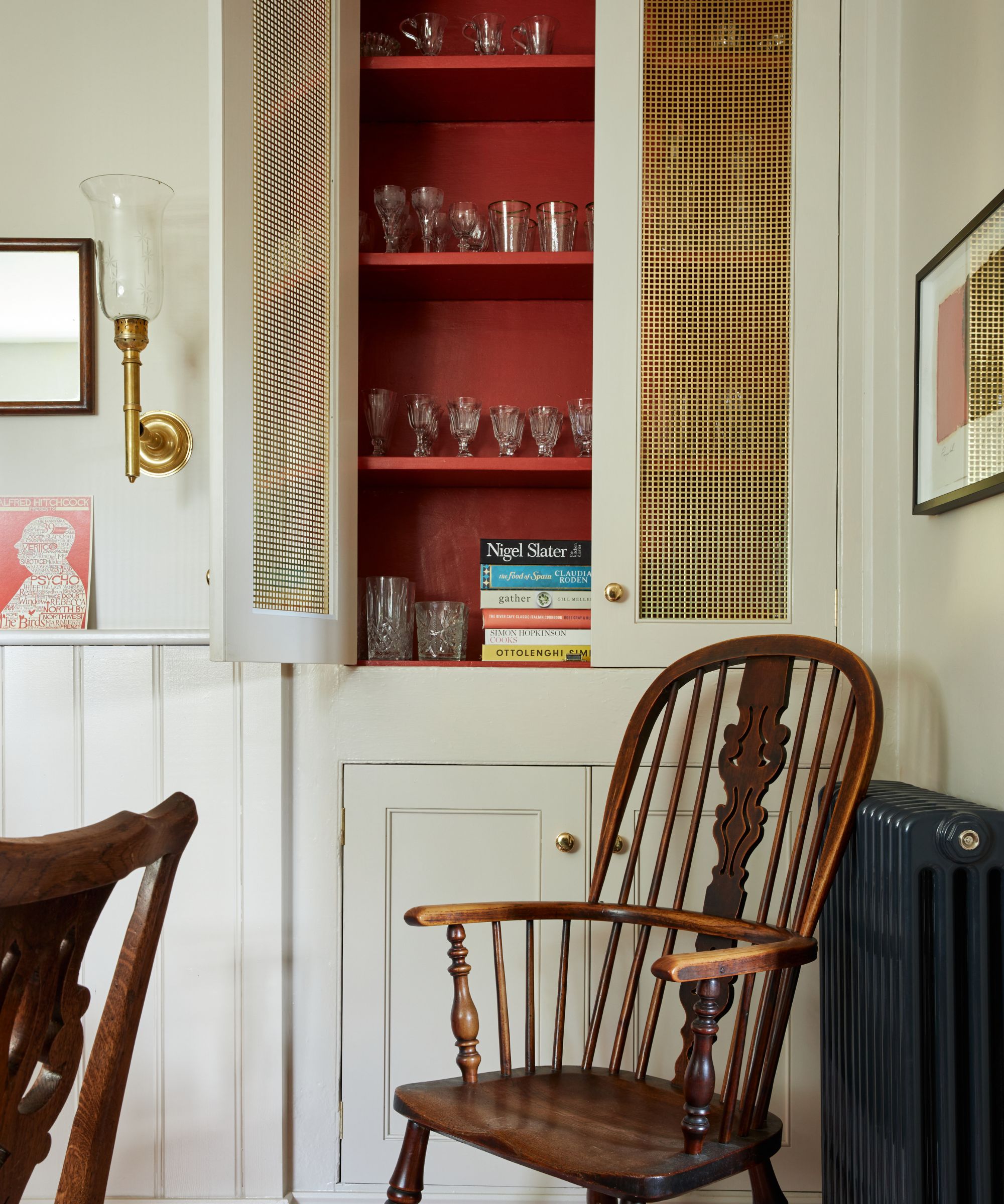
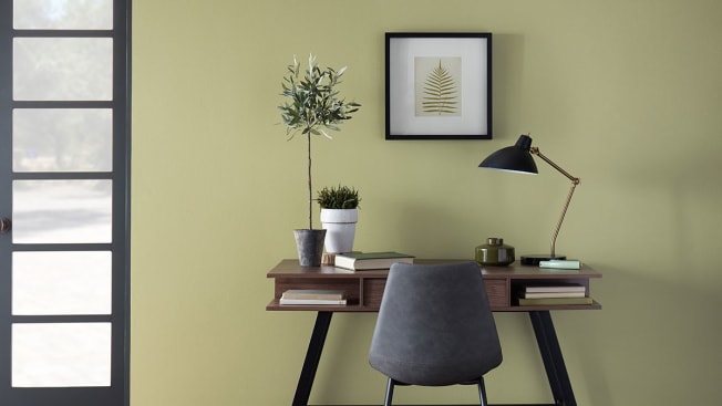
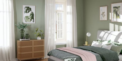
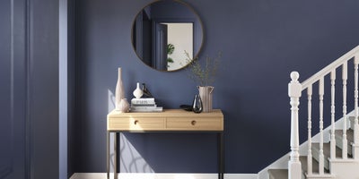
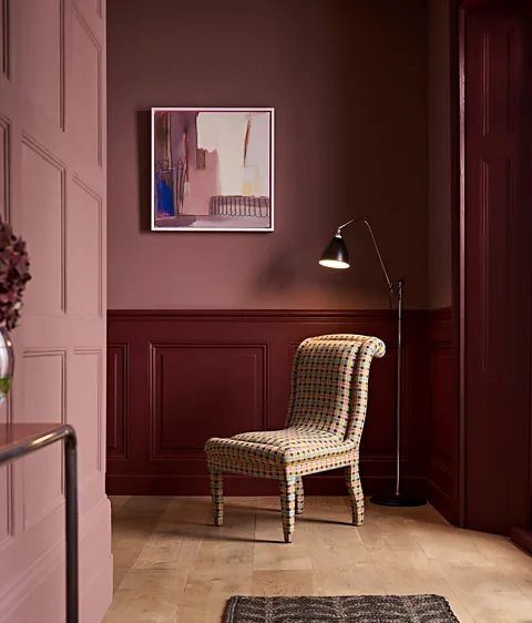
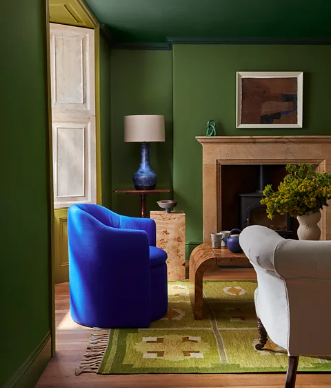
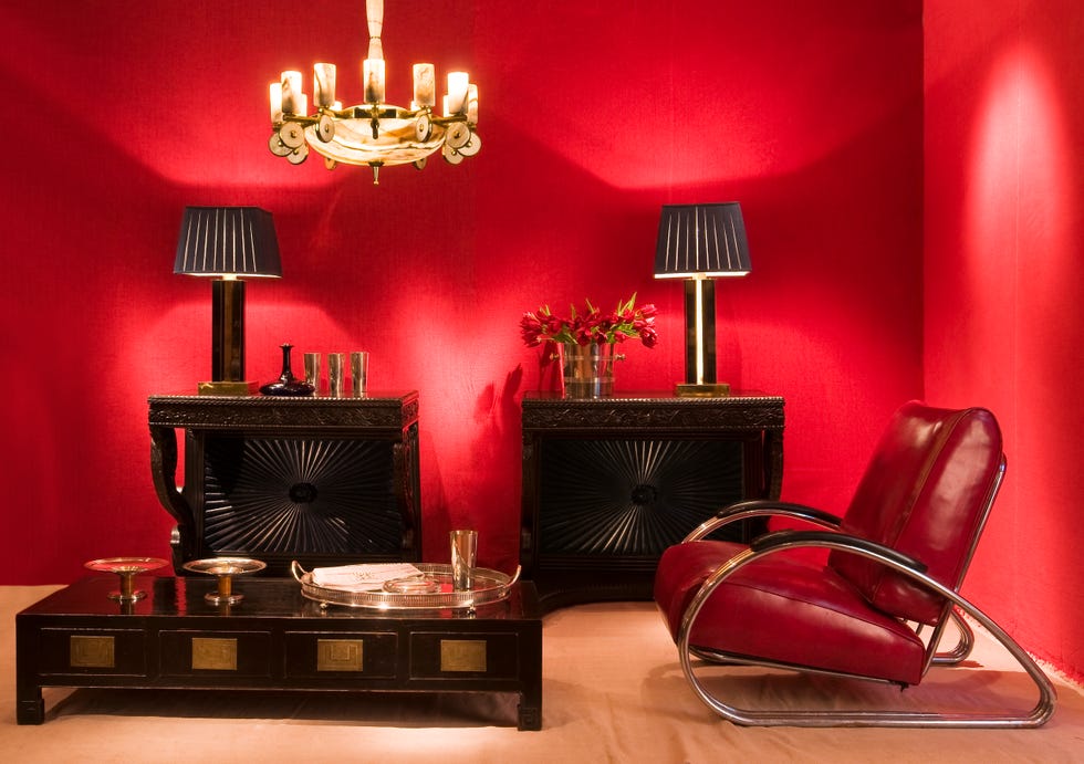
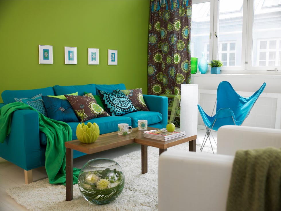
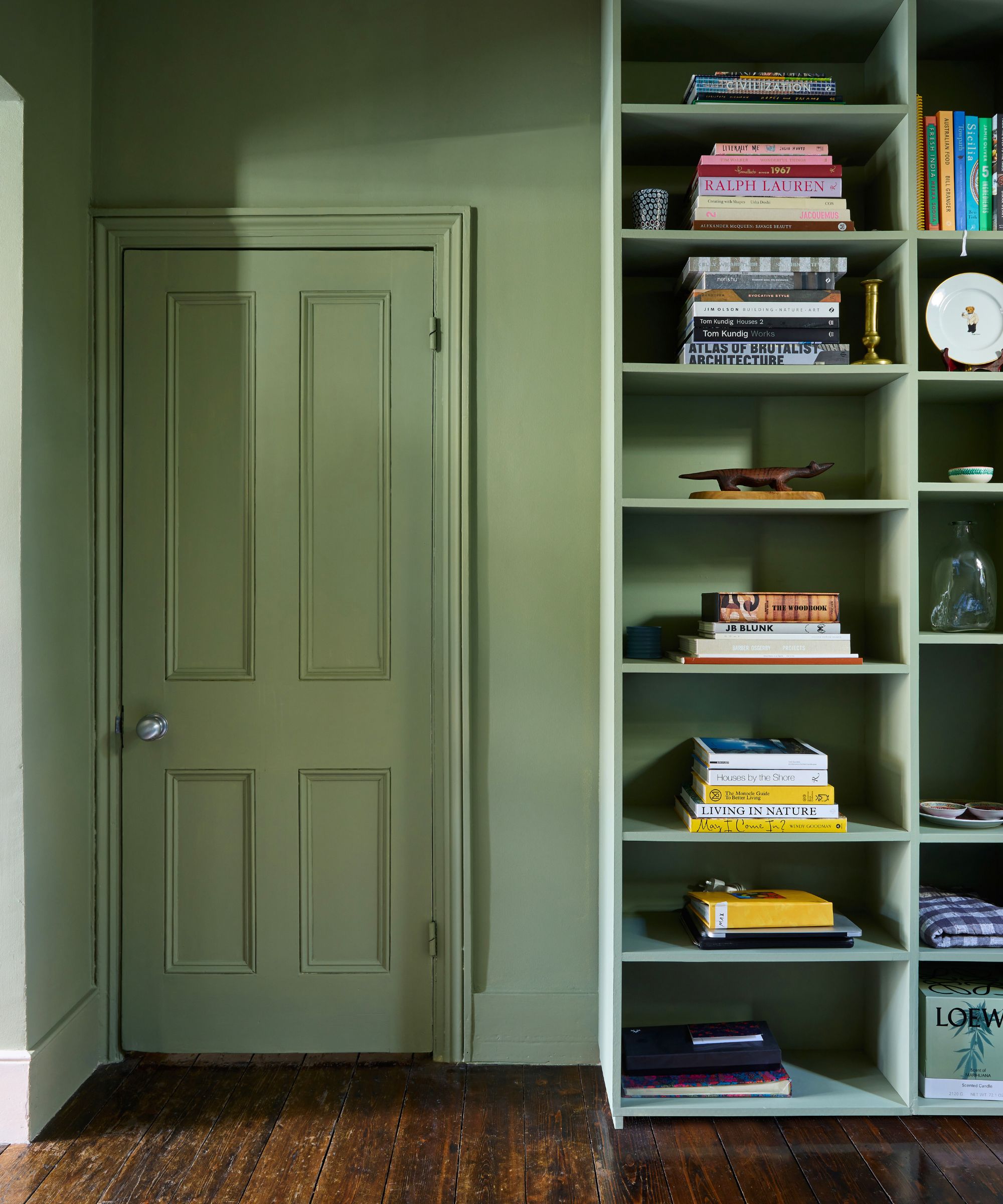
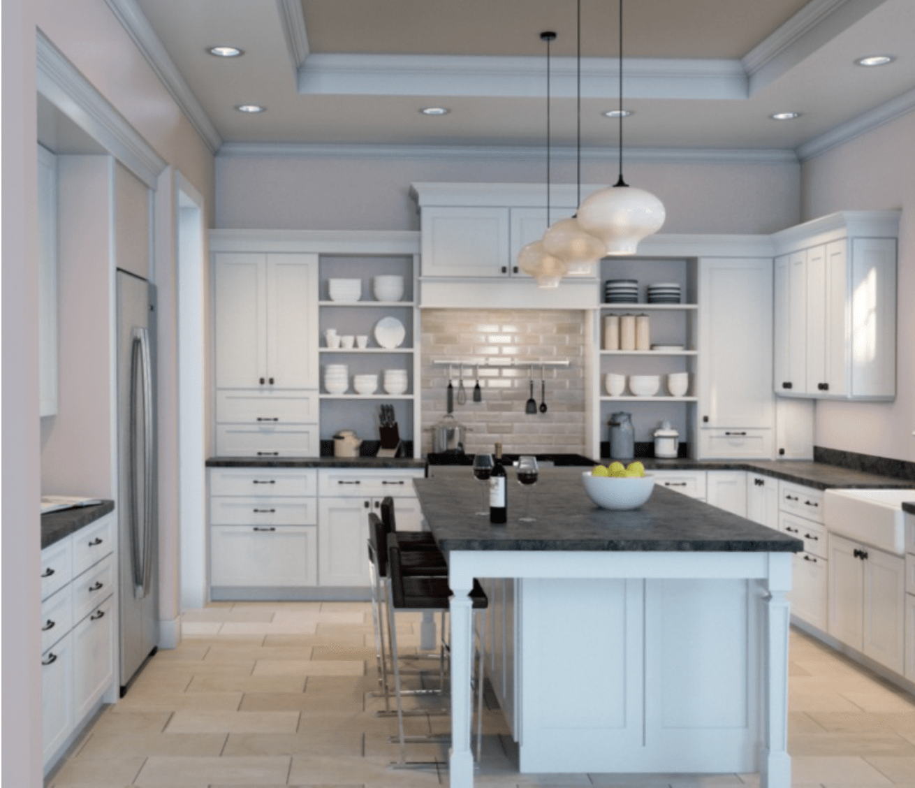
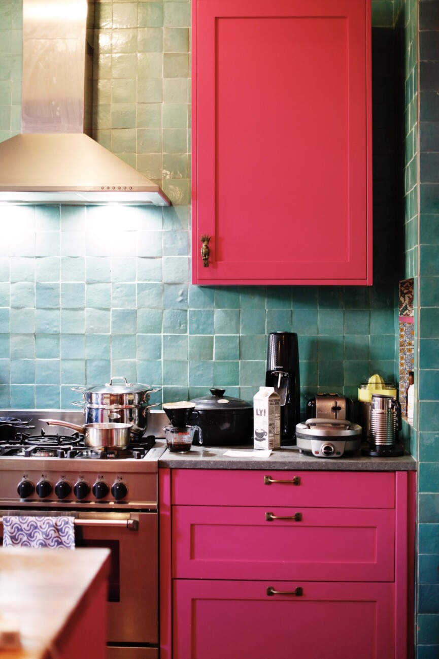
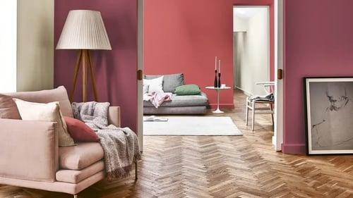
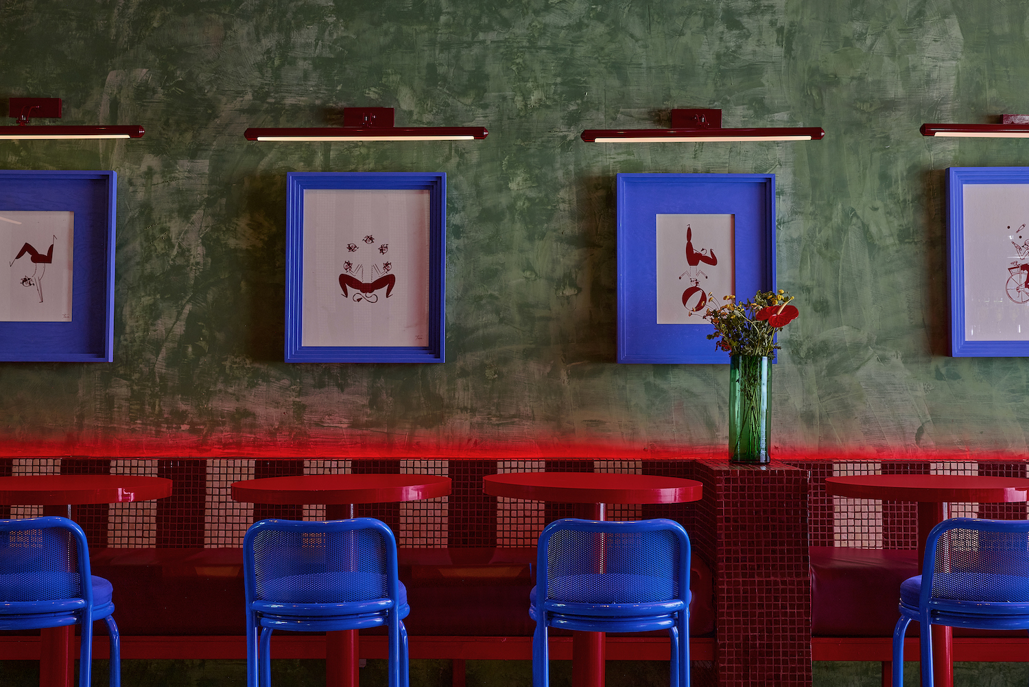
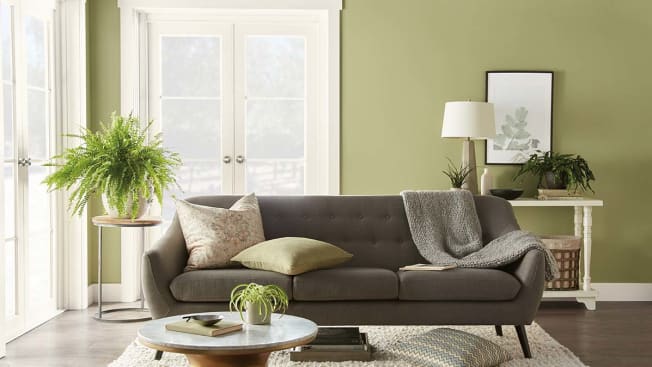
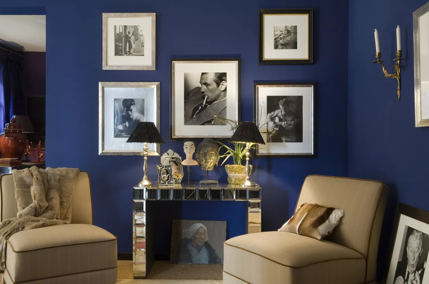
Specific colours are associated with different emotional responses. Red, for instance, with its long visual wavelength, is stimulating and draws attention. It is historically linked to dining areas and restaurants because it is believed to enhance conversation and appetite, making food taste better and sweeter. While red is powerful and can create pockets of energy, moderation is key to avoid overstimulation. Conversely, for a sense of calmness, shorter wavelength colours like blues and greens are recommended. These colours reconnect individuals with nature, appearing to recede and thus making spaces feel less enclosed and more connected to the outdoors. Drawing on the soothing effects of nature, soft organic blues, grass greens, and raw organic material colours are suggested for environments where tranquility is desired, particularly beneficial for those managing work and family life.
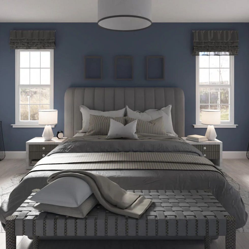
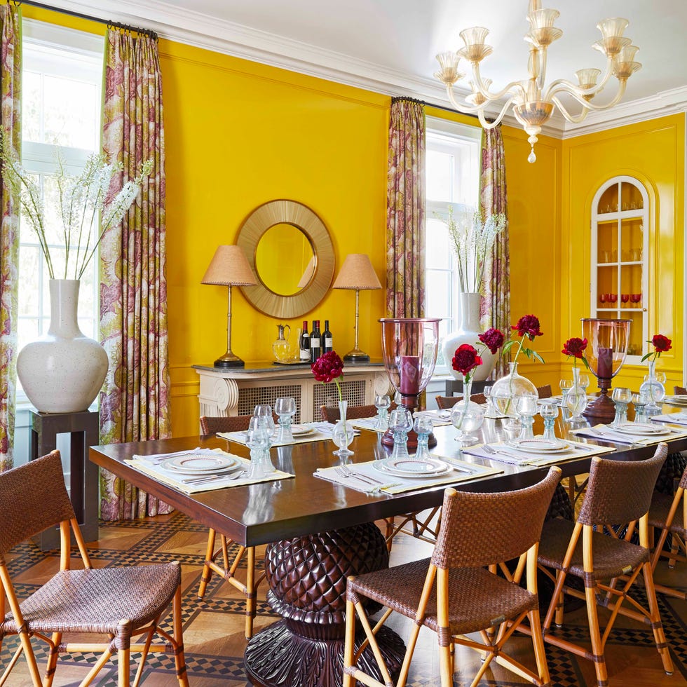
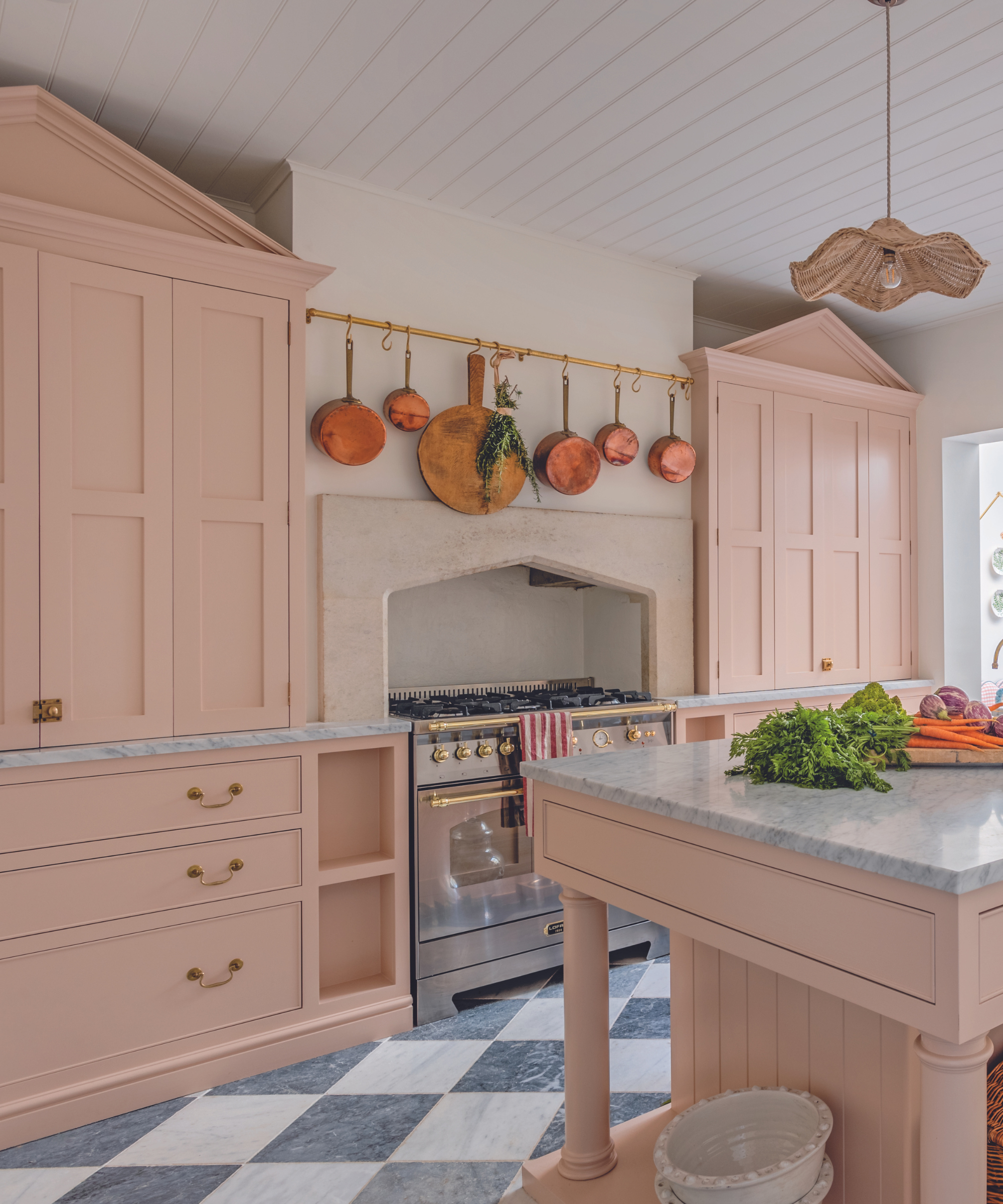
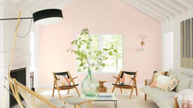
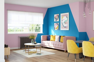
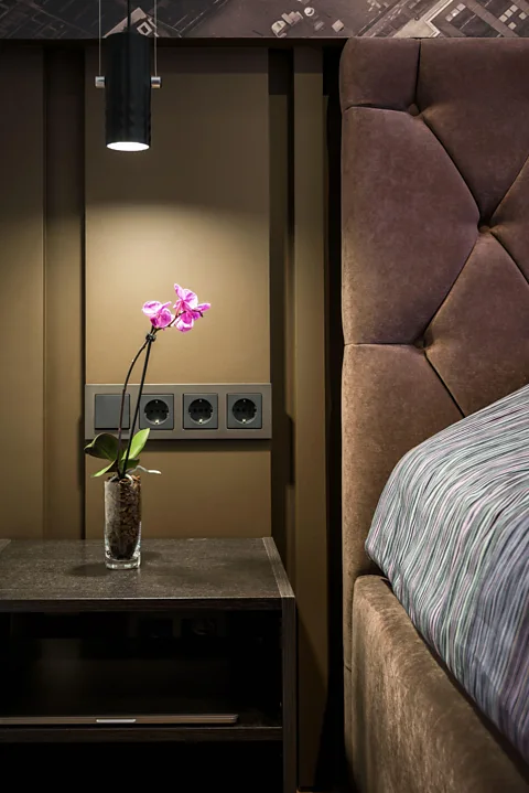
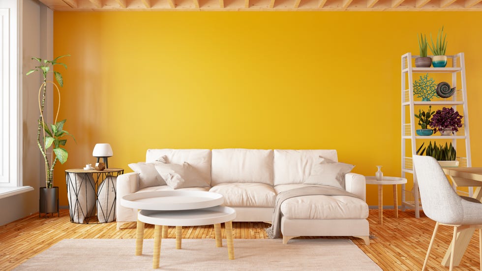
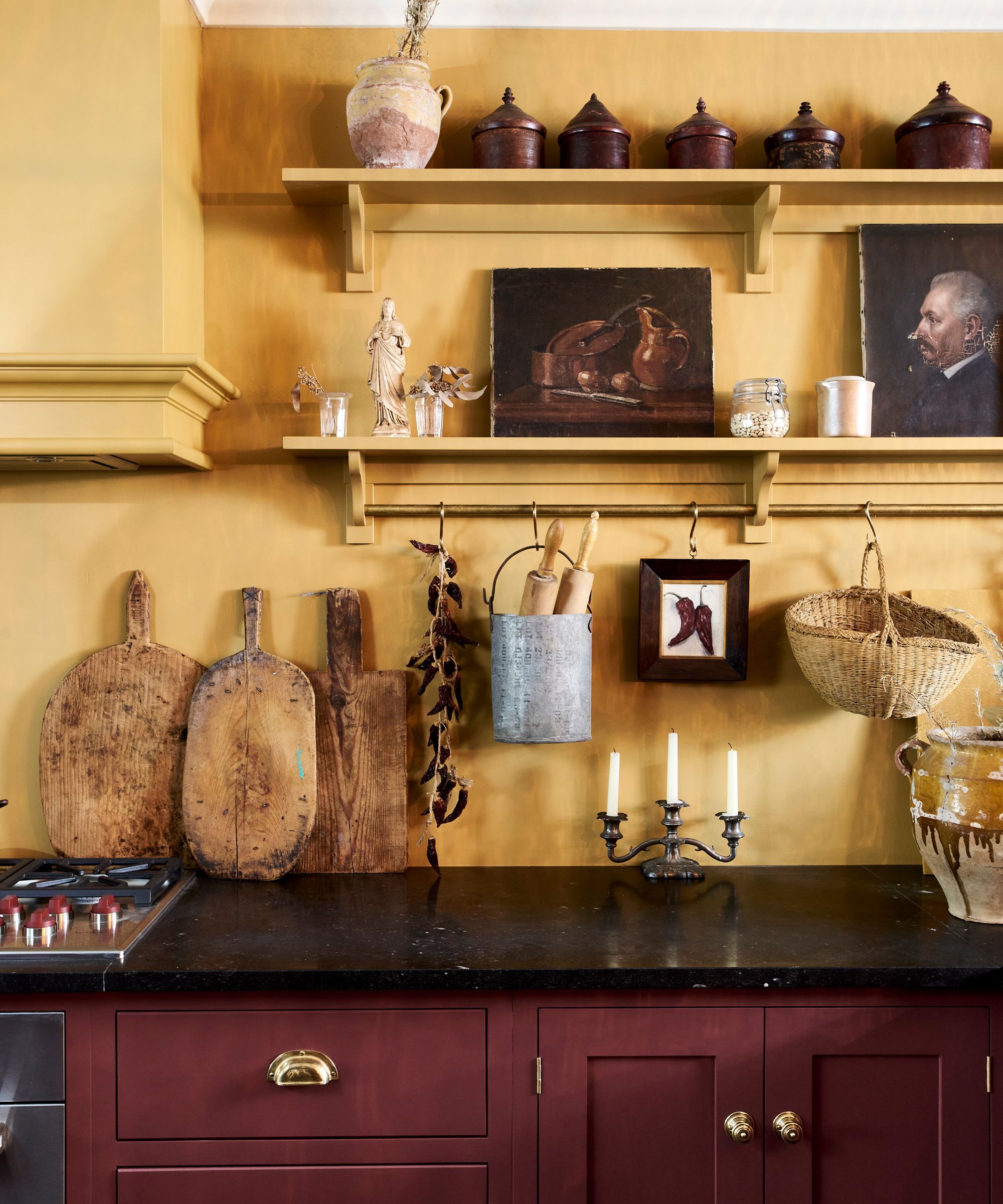
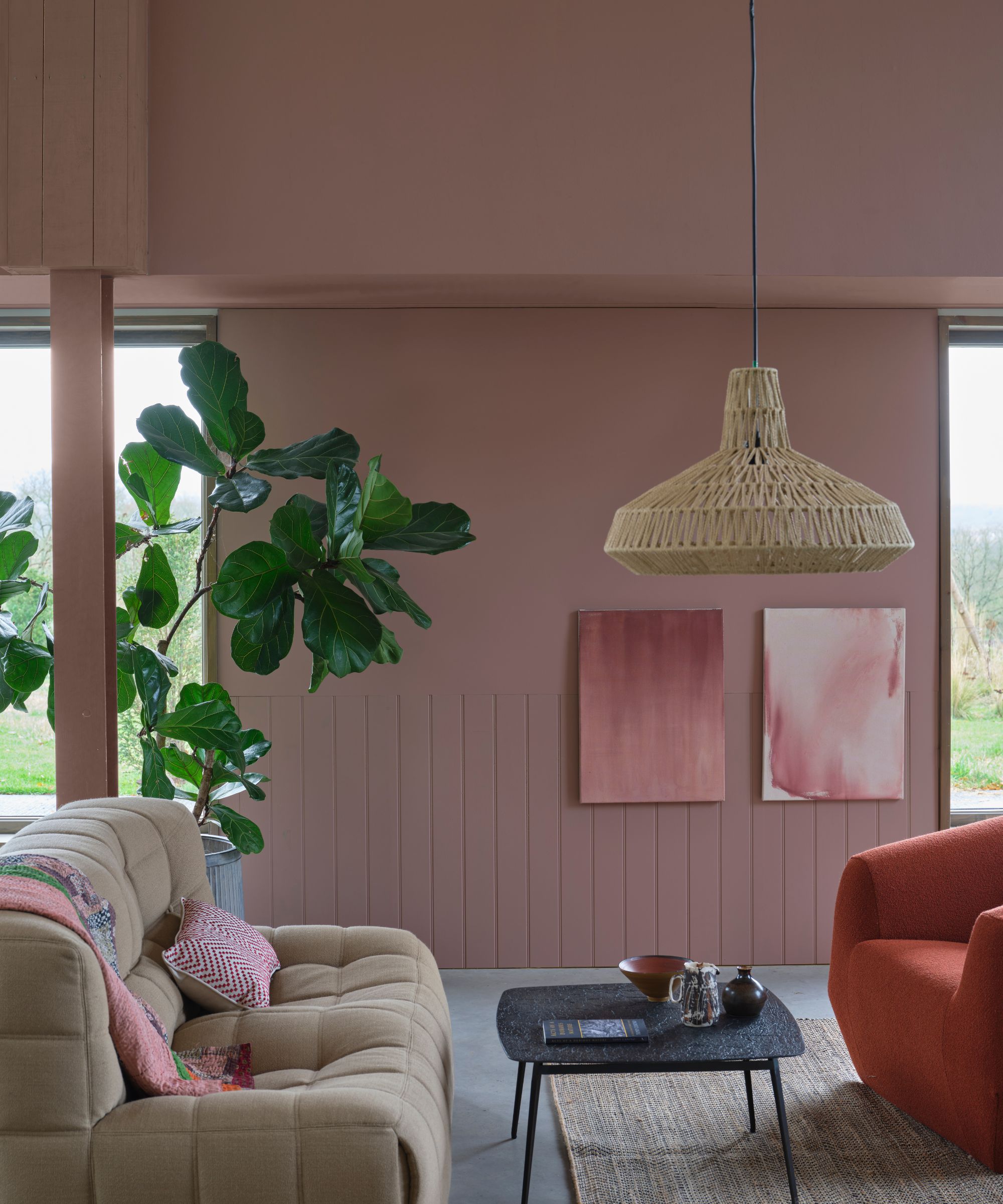
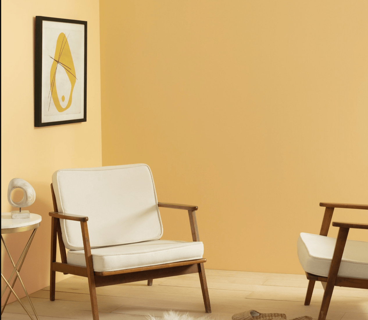
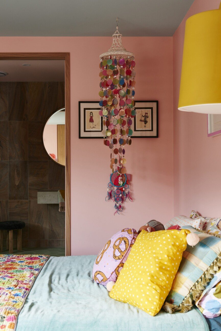
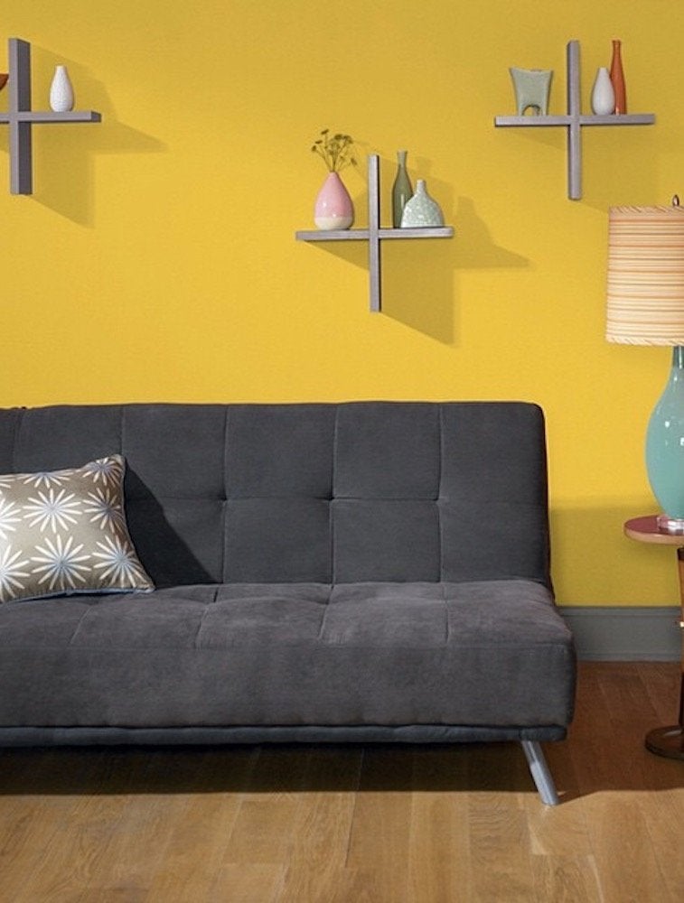
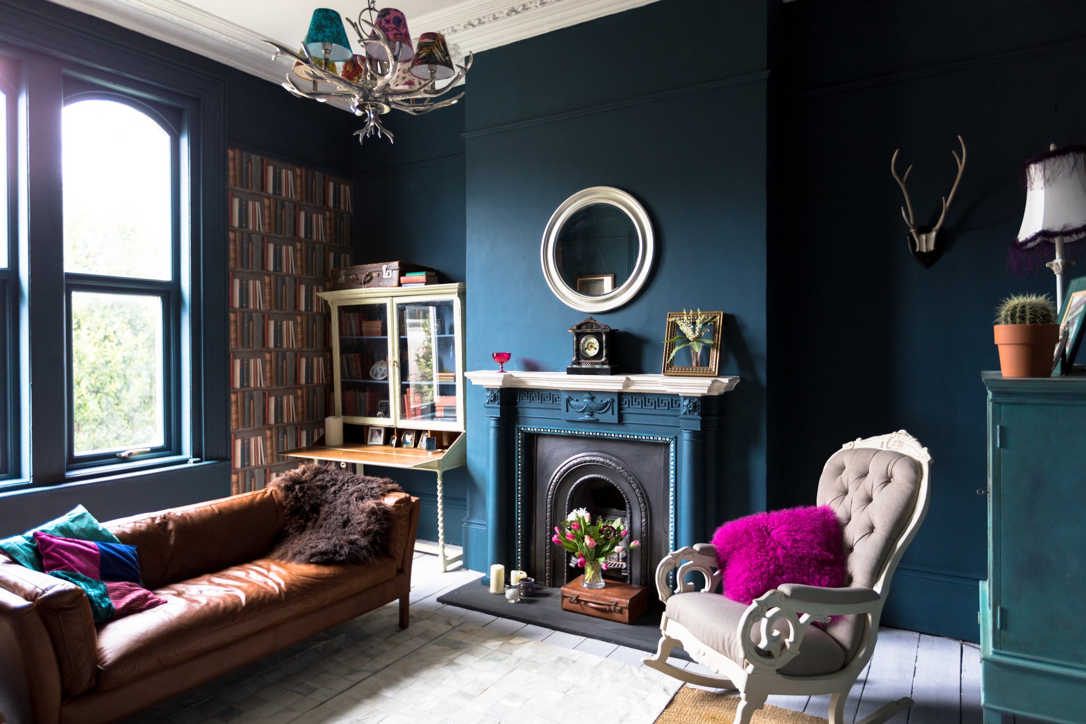
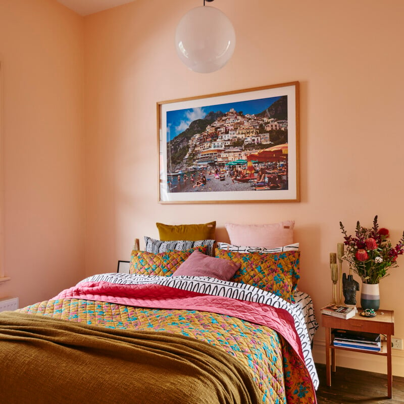
To foster happiness, colours with more intensity and pigment are often chosen, acting as 'flashes of joy.' Yellow is frequently cited as a happy colour due to its association with sunshine, spring flowers, and hopeful seasonal events. Pink, once predominantly associated with young girls, has been re-evaluated and is now enjoyed more broadly as a gentle source of joy. For promoting sleep, dark blues and deep greens are effective. Shillingford suggests that painting sections of a room, such as extending colour from a wall onto the ceiling to form a canopy around a bed, can help create a relaxing sleep zone while allowing for more energizing colours elsewhere in the room for morning wakefulness.
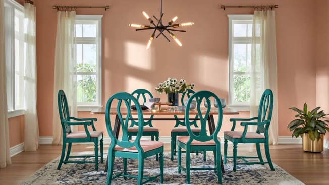
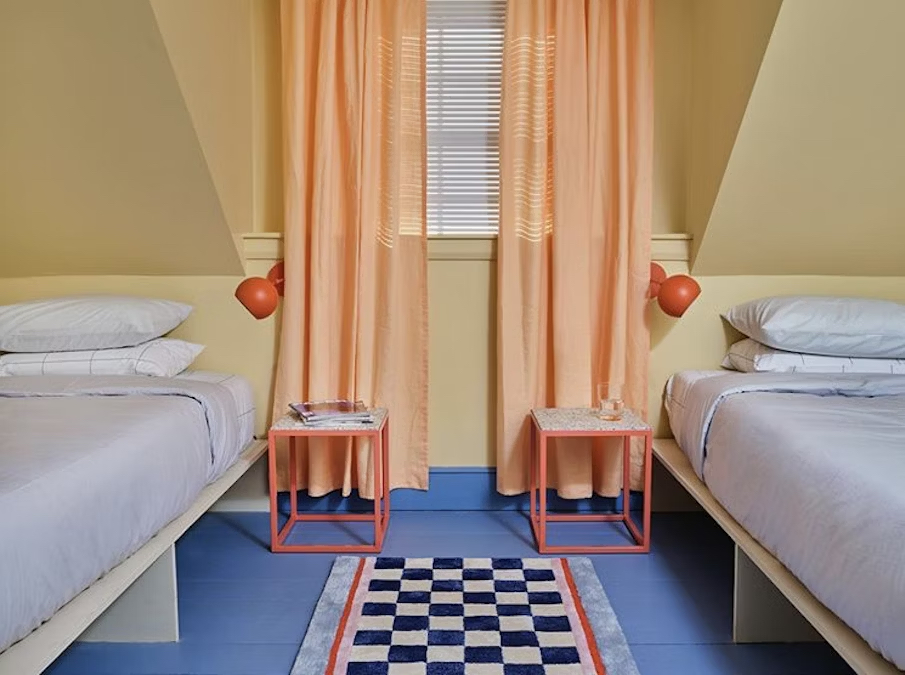
Regarding motivation and creativity, strong colours are advised, but again, in moderation to prevent agitation. Colour blocking—applying strong colours in specific areas around furniture or artwork—can elevate energy levels without overwhelming the space. Orange is highlighted as a highly creative colour, combining the vibrancy of red without its intensity, making it suitable for stimulating creative thought. People with a more creative disposition are often more comfortable incorporating intense colours like oranges and yellows into their environments. Dulux Heritage offers a collection of 112 colours, blending classic and contemporary shades to achieve these varied atmospheric effects.
#InteriorDesign #ColorPsychology #HomeDecor #MoodEnhancement #PaintColors #LivingSpaces #DuluxHeritage #EmotionalWellbeing #InteriorDesign #ColorPsychology #HomeDecor #MoodEnhancement #PaintColors #LivingSpaces #DuluxHeritage #EmotionalWellbeing
0 comment in total
 No comments yet
You may also like
Lick Paint Will Transform the Mood in Your Home Through Color Psychology

A Color Psychologist Says This Is the Most Relaxing Paint Color

'Mocha mousse' to plum: The nine paint colours that can transform your home
Never Regret a Paint Color Again—Avoid These 6 Common Mistakes

How Your Home's Paint Colors Can Make You Happier, According to Experts

A color psychologist says these color schemes are the most likely to boost your mood

We Asked Designers Which Paint Colors Homeowners Always Regret—These 5 Came Up the Most

The 13 Best Paint Colors for Low-Light Rooms

7 'Unhappy' Colors That Color Psychology Experts Would Never Paint Their Walls

The colours you paint your walls can impact your mood, and here’s the science to prove it


What are the worst colors to paint a room? The shades experts say you should never use
The Brighter, the Better—These Vibrant Paints Will Infuse Your Home With Positivity

8 Paint Colors That Promote Wellness at Home

Hottest Interior Paint Colors of 2020
These Paint Colors Bring Hostility to Your Home, According to Experts

14 Paint Colors That Can Make a Room Feel Instantly Cozy

30 on-trend paint colours for every room in your home
Decorating with paint

My rented apartment follows the key rules of color psychology – here's why I'd never go back to an all-white home
6 Paint Colors That Make Your Living Room Look Smaller, According to Interior Designers