6 Paint Colors That Make Your Living Room Look Smaller, According to Interior Designers
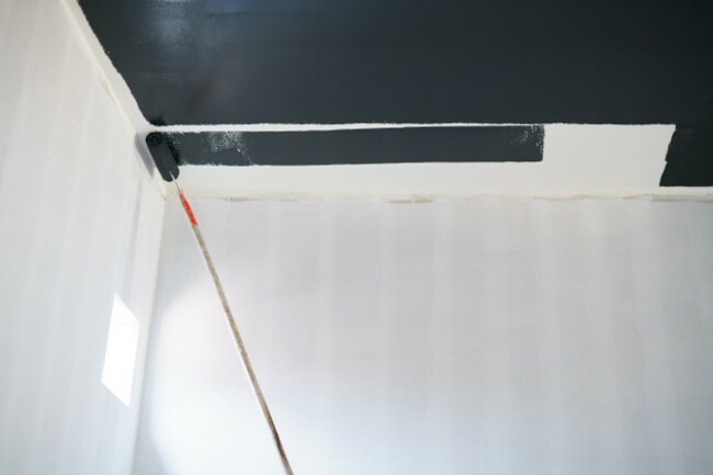
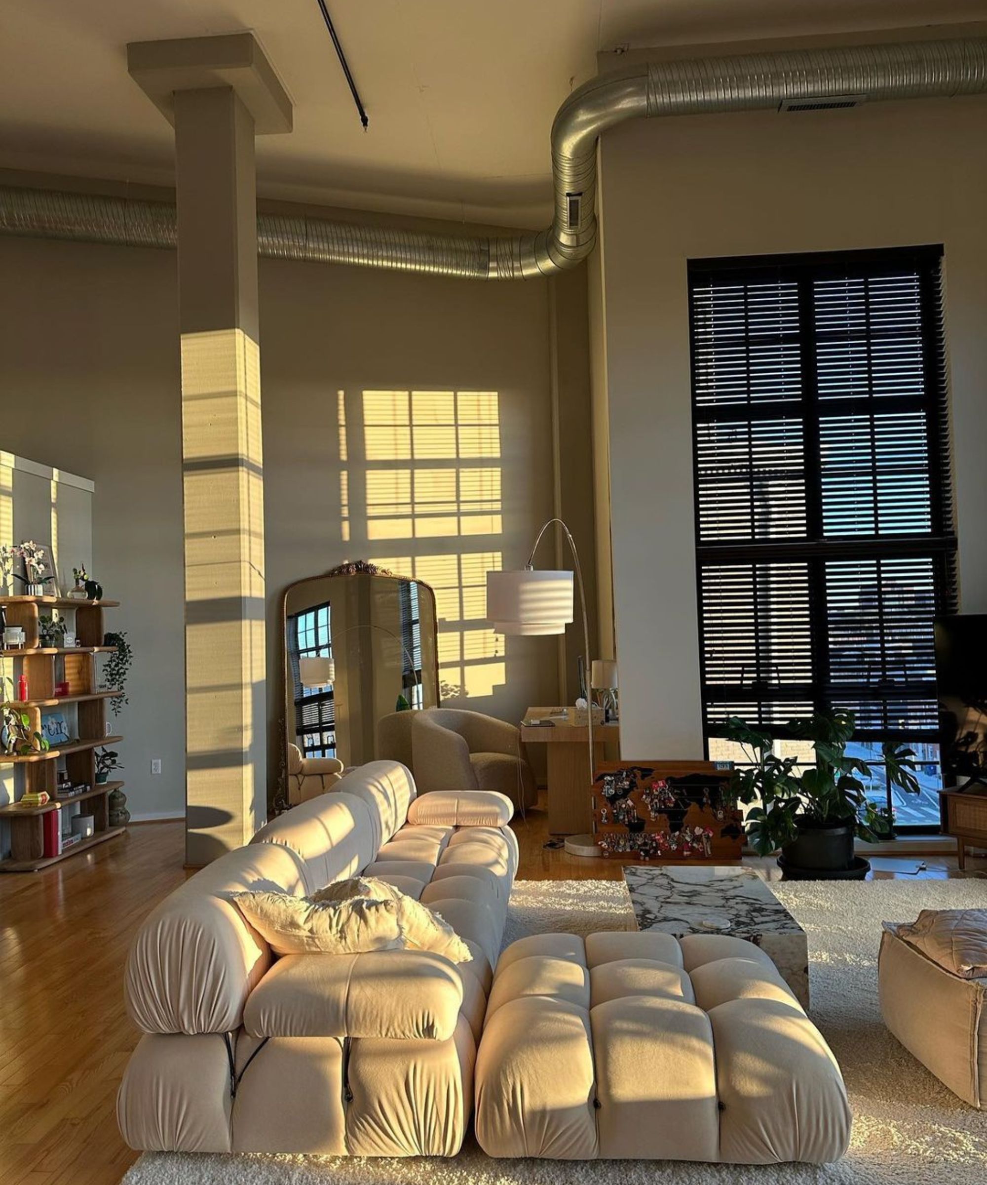
While white and pastel shades are often favored for creating spacious and airy interiors, darker, more dramatic hues can lead to a feeling of reduced space within a room. This effect, though sometimes desired for a grounded or defined atmosphere, can also make a living room feel cramped or moody, particularly when the goal is to create an open and welcoming environment. This article, drawing on the expertise of interior designers Daniel Joseph Chenin, Kellie Richardson, and Kristin Kurko, identifies six specific paint colors that tend to make a living room appear smaller and offers advice on how to use them effectively or mitigate their constricting effects.
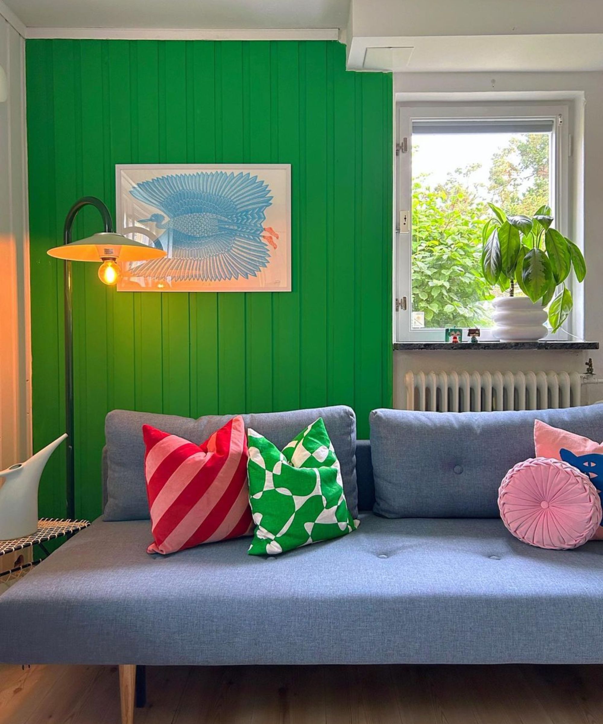
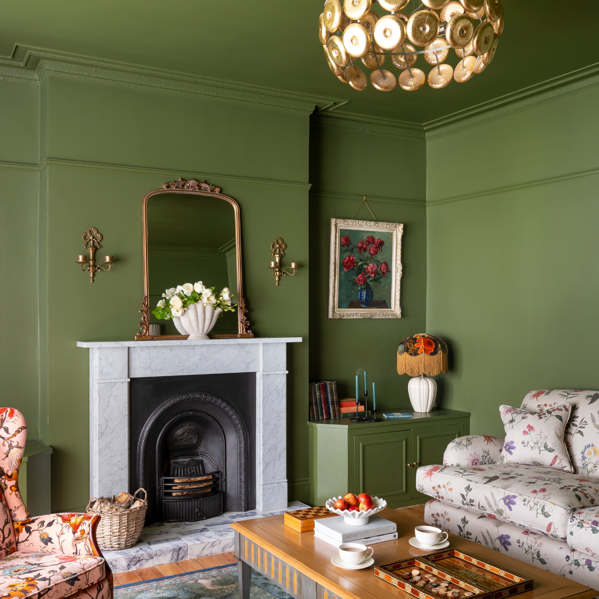
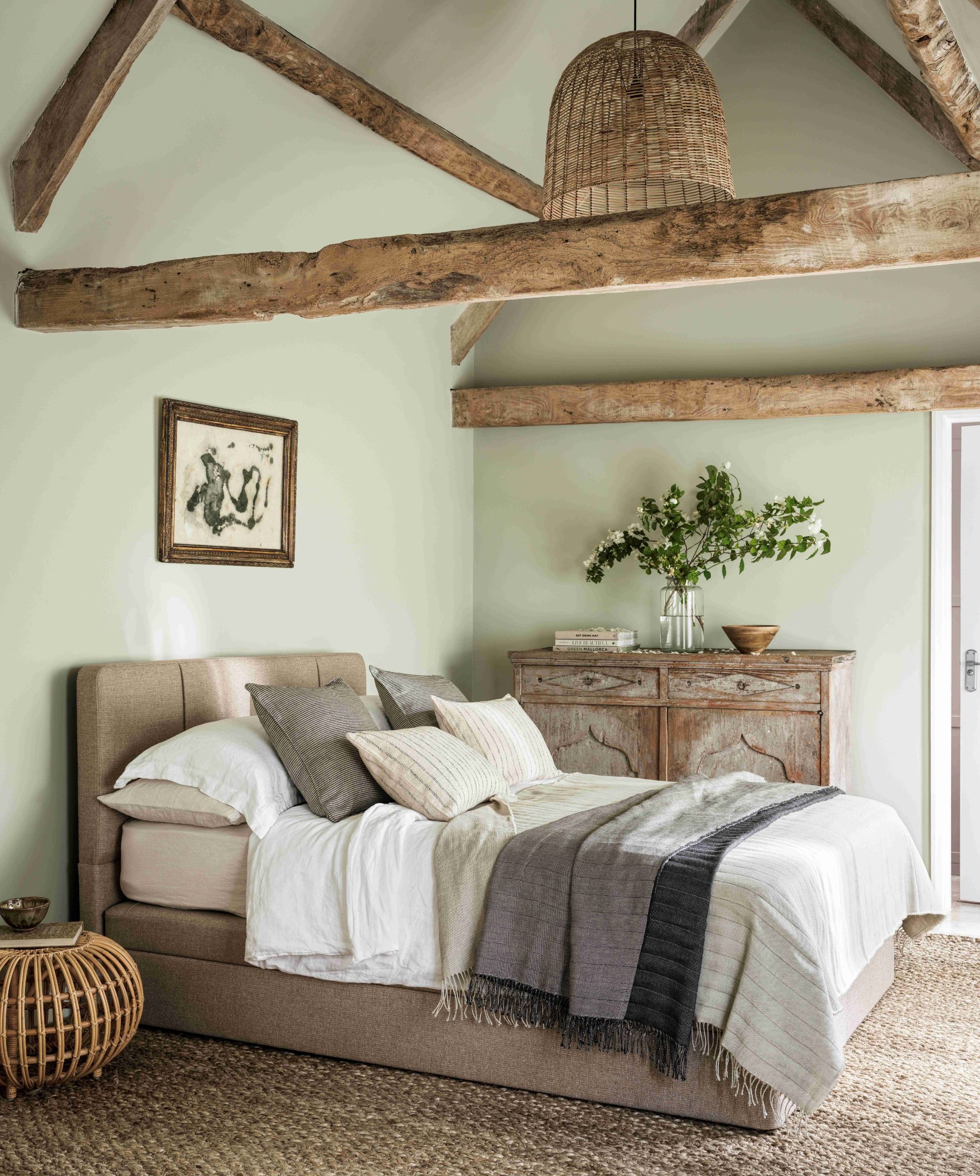
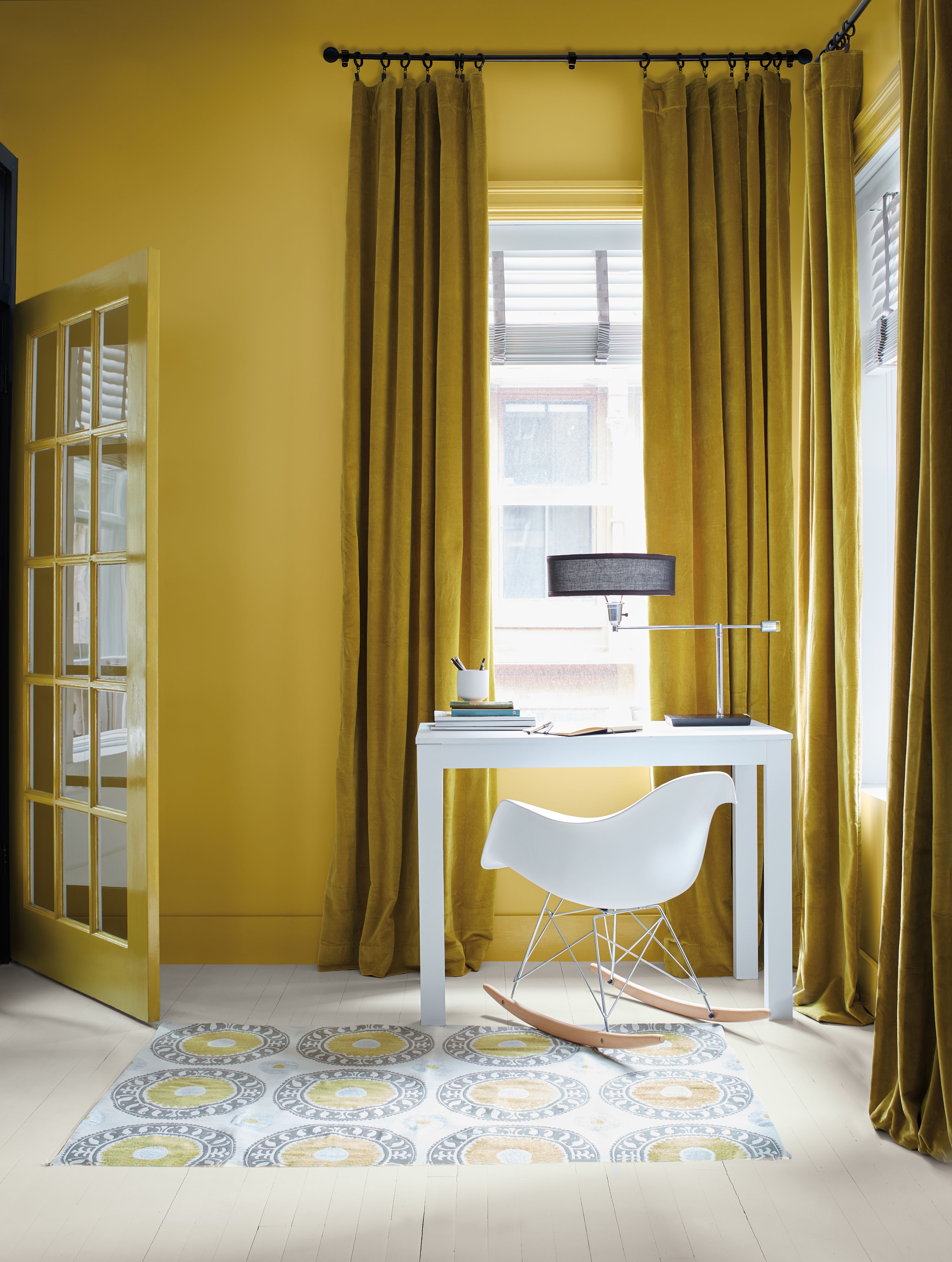
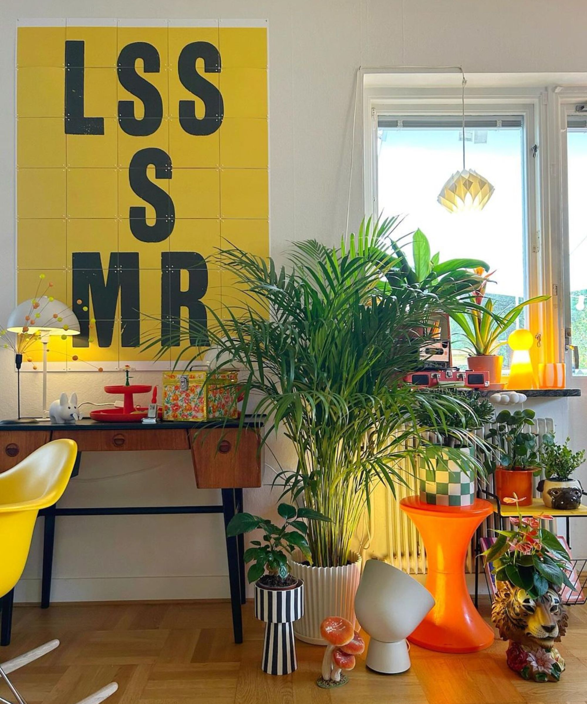
Olive green, described by Kristin Kurko as the 'new gray,' offers an organic and tranquil connection to nature. While it can create a beautiful sense of enclosure, an excessive application can quickly lead to a claustrophobic feel. Kurko suggests utilizing soft, muted shades like sage or olive for a calming effect, or a richer emerald for added drama, ensuring balance to avoid overwhelming the space.
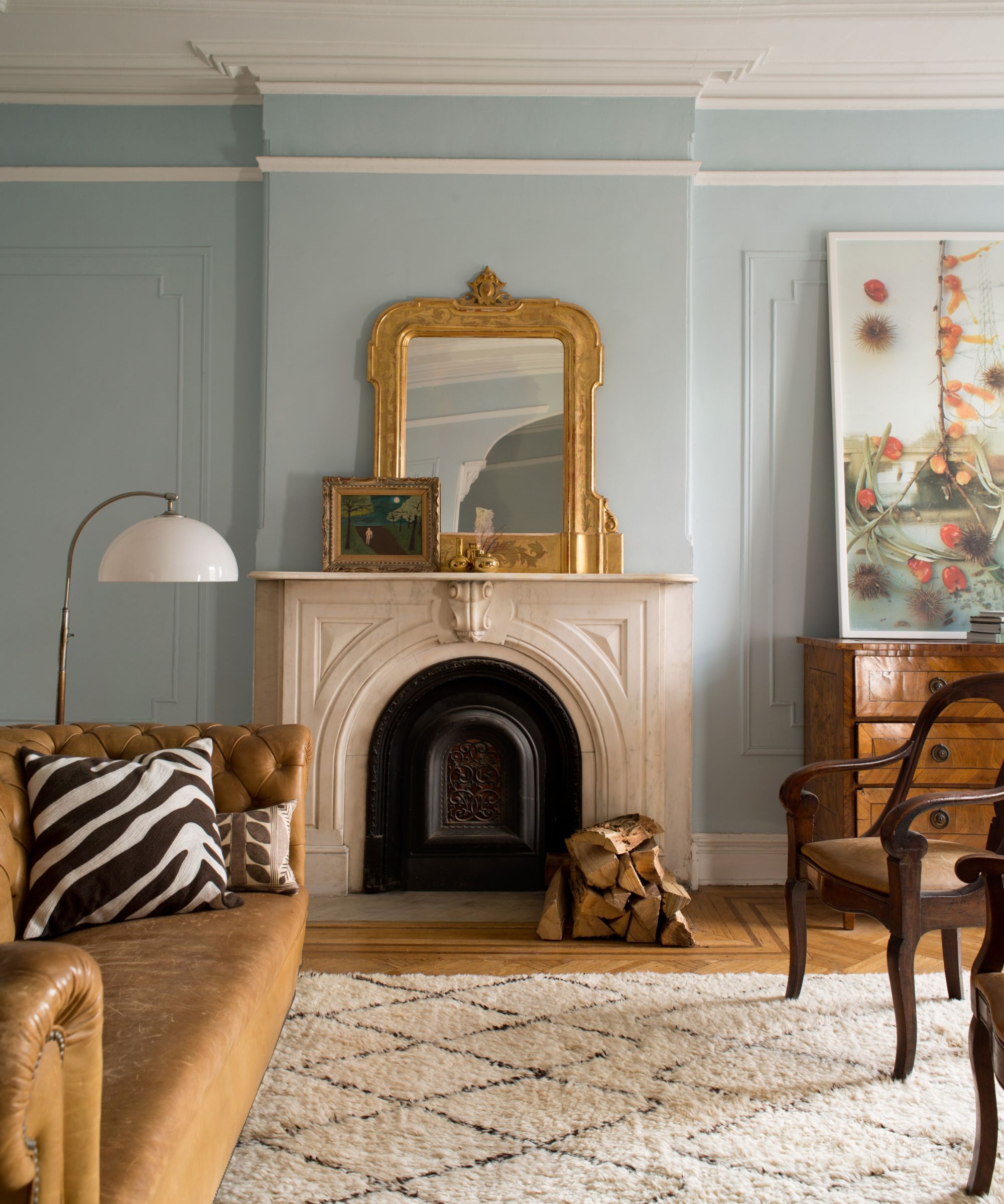
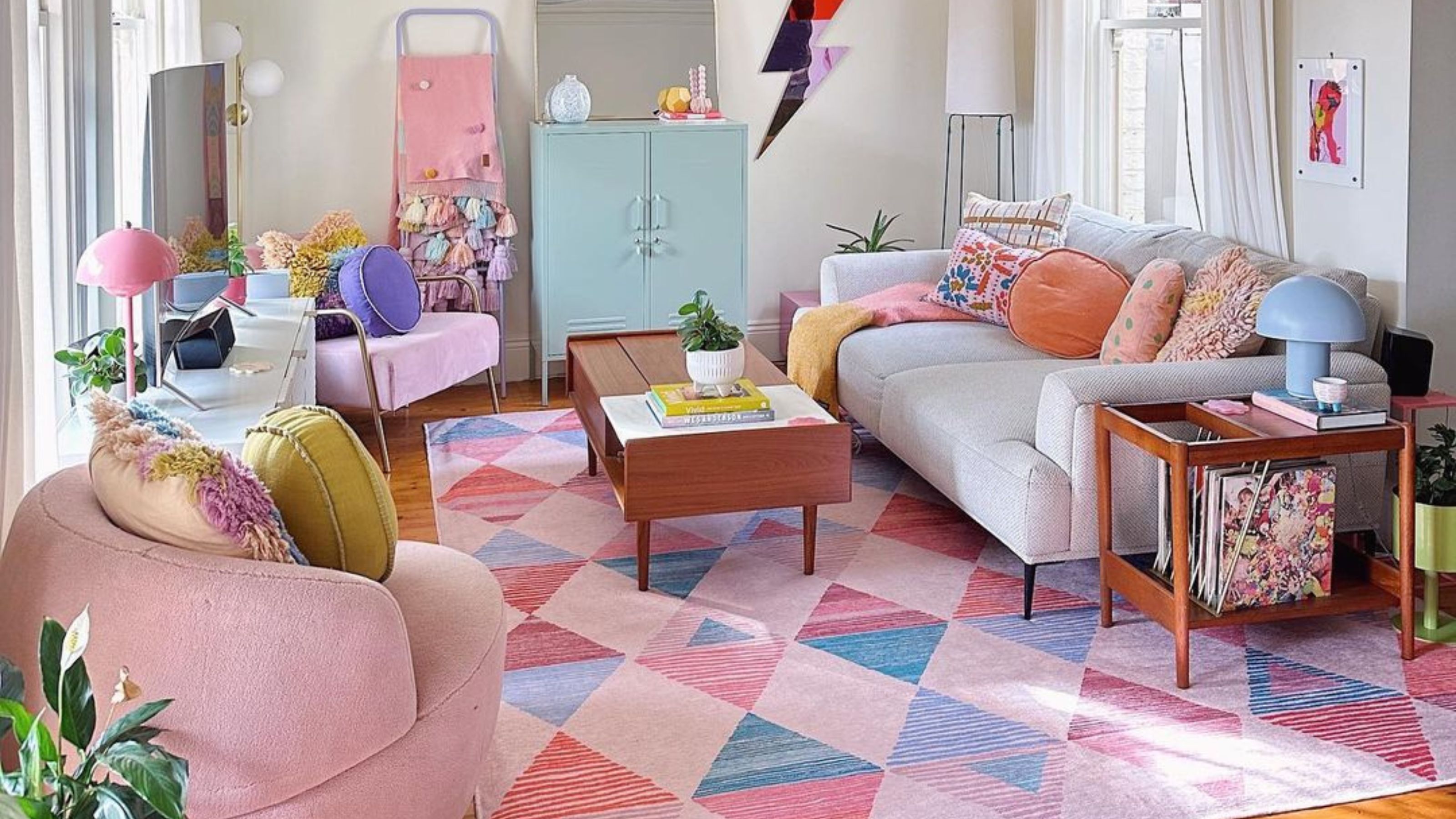
Lavender possesses a dual nature, capable of evoking both calm and drama. Although it contributes to a cozy ambiance, it can also make a room feel smaller. Kurko emphasizes that the perceived coziness depends heavily on the accompanying styling. Pairing lavender with soft textures and wool rugs can enhance a snug, intimate atmosphere, whereas modern elements can introduce a fresh and sophisticated contrast.
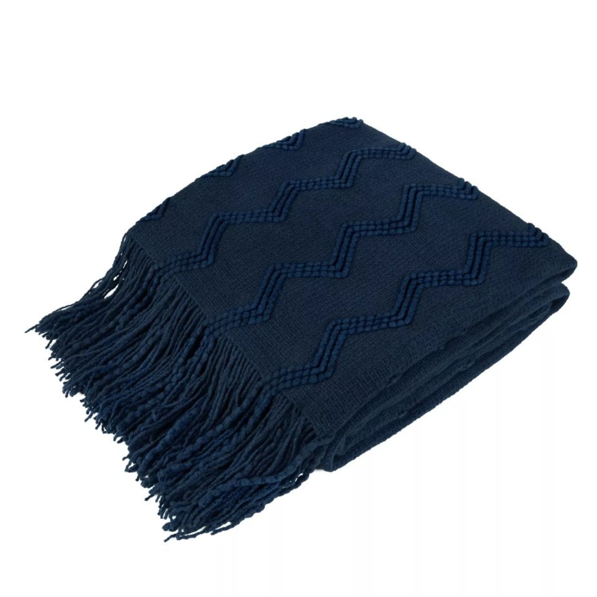
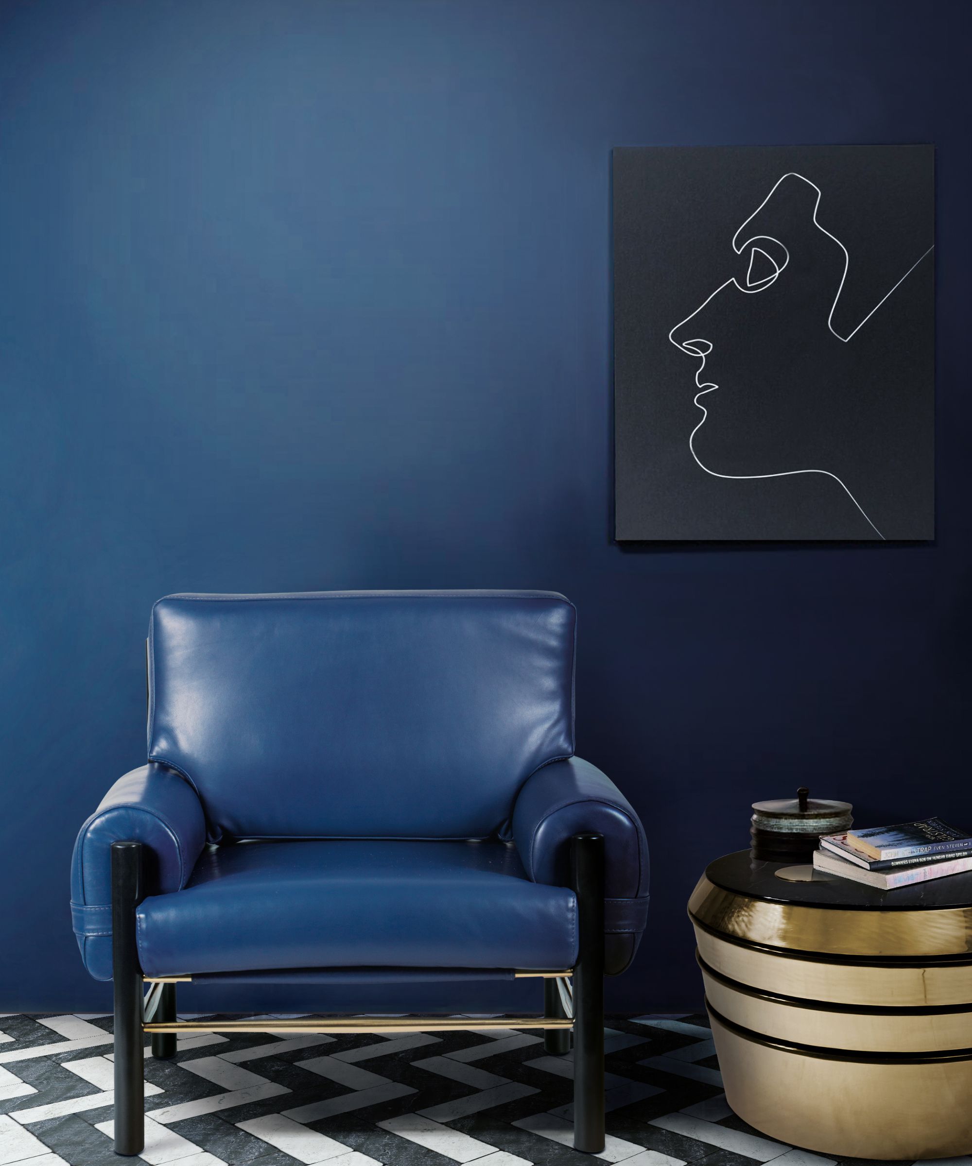
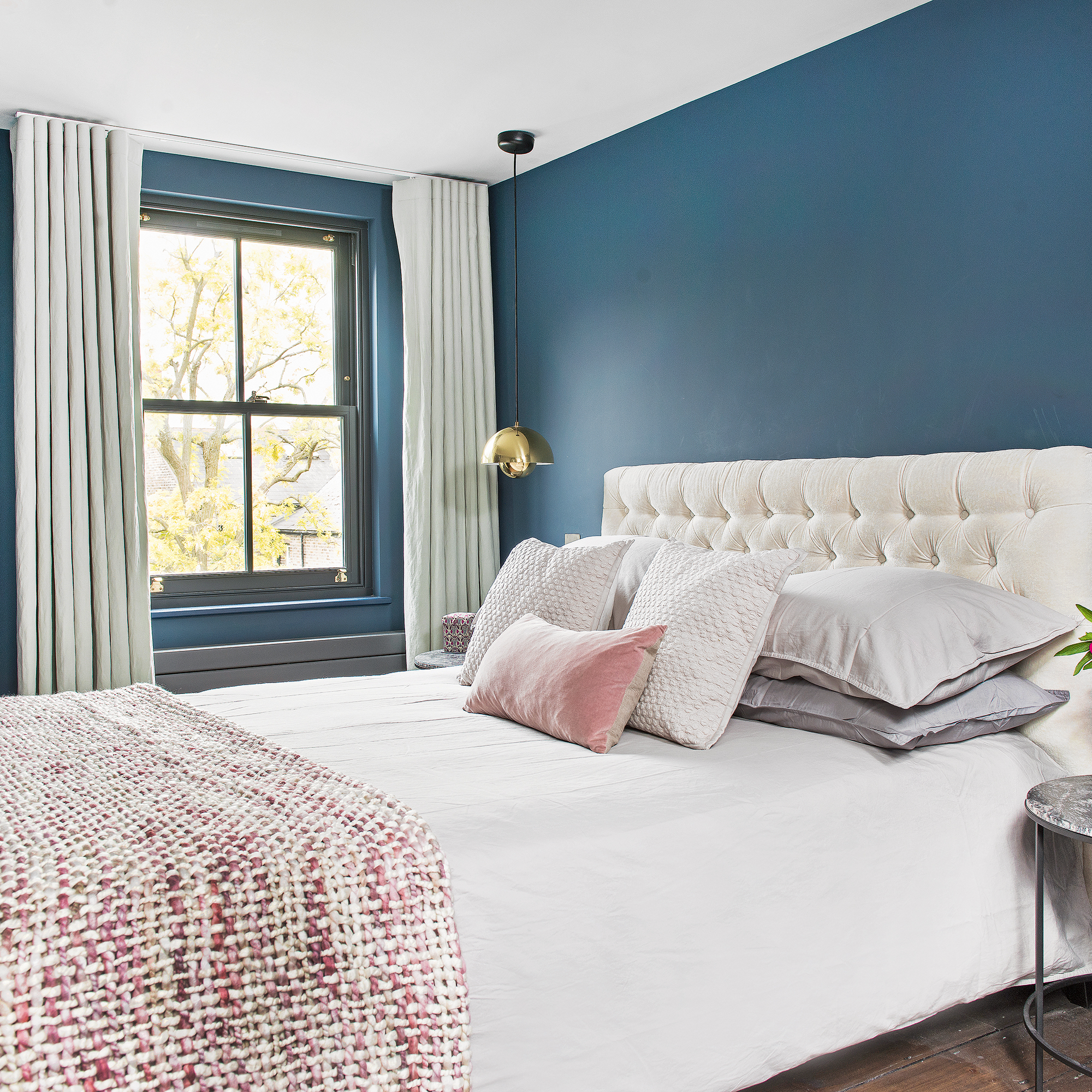
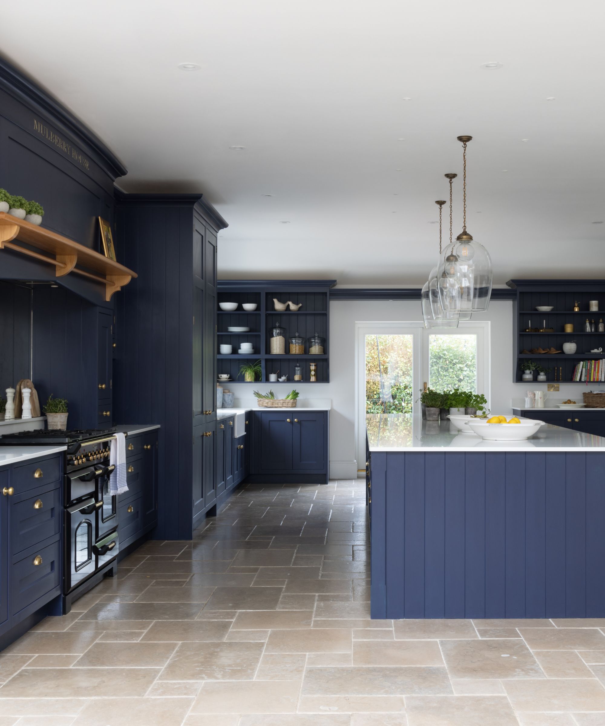
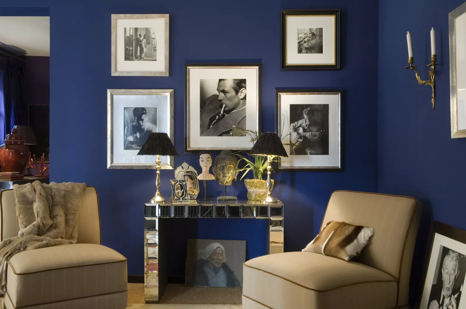
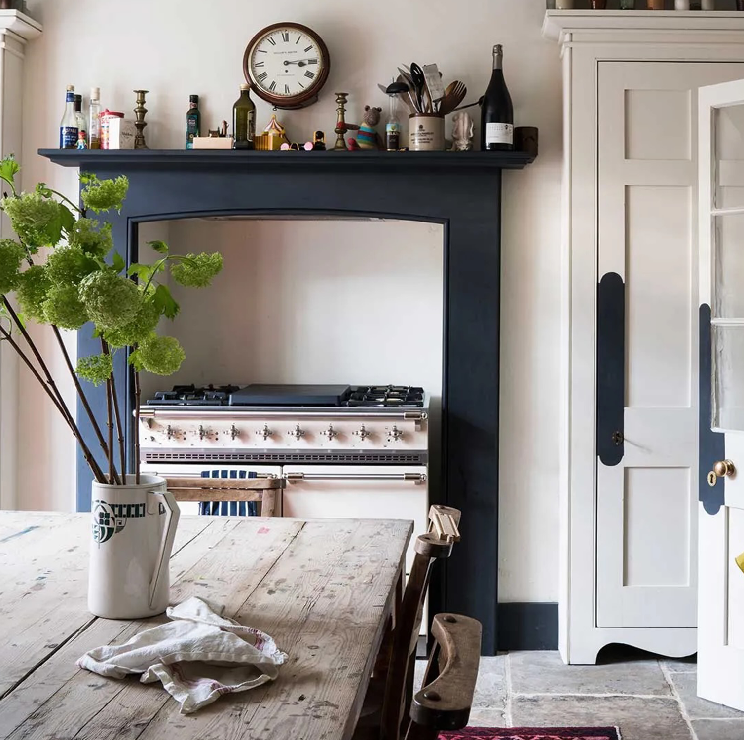
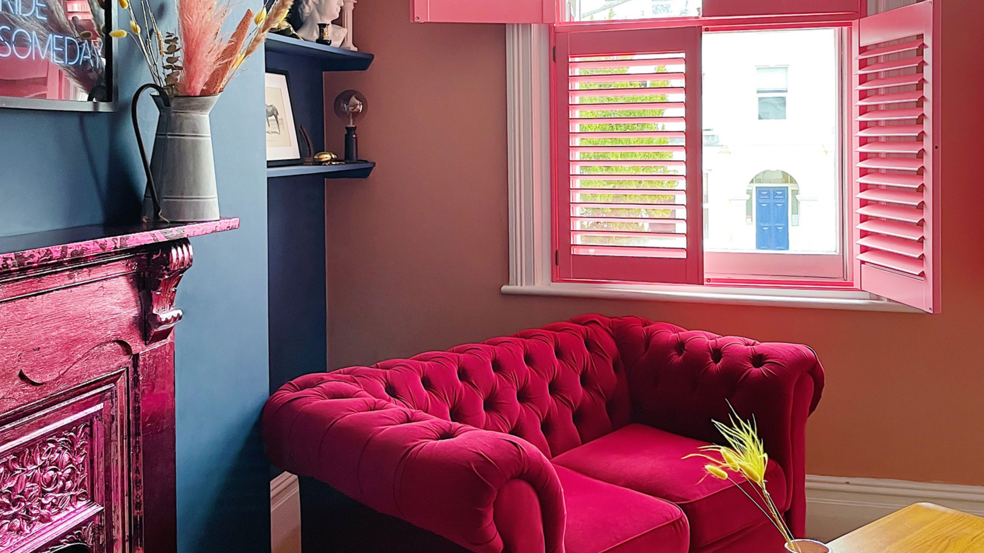
Navy blue is highlighted by Daniel Joseph Chenin as a color that adds structure and focus, adept at transforming large, impersonal areas into polished and cohesive spaces. However, if not carefully accessorized, navy can appear oppressive and overbearing, leading to a cramped sensation. To counteract this, Chenin advises incorporating warmer, cozier elements such as jewel-toned velvet upholstery and natural wood details like oak shelving to introduce warmth and balance the cool undertones of the color. Layering accessories like woven throw blankets, patterned rugs, or subtly textured cushions can further enhance the room's comfort and visual appeal.
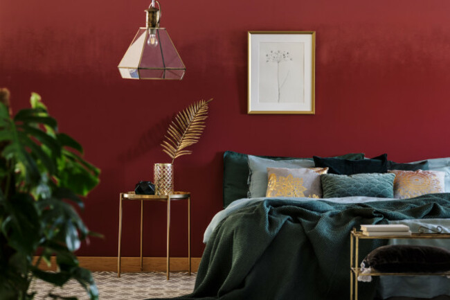
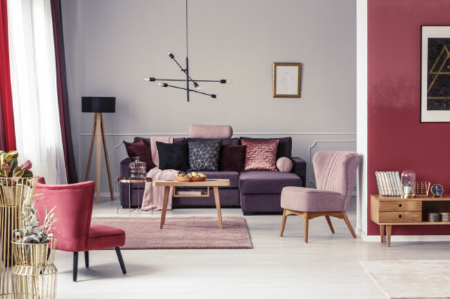
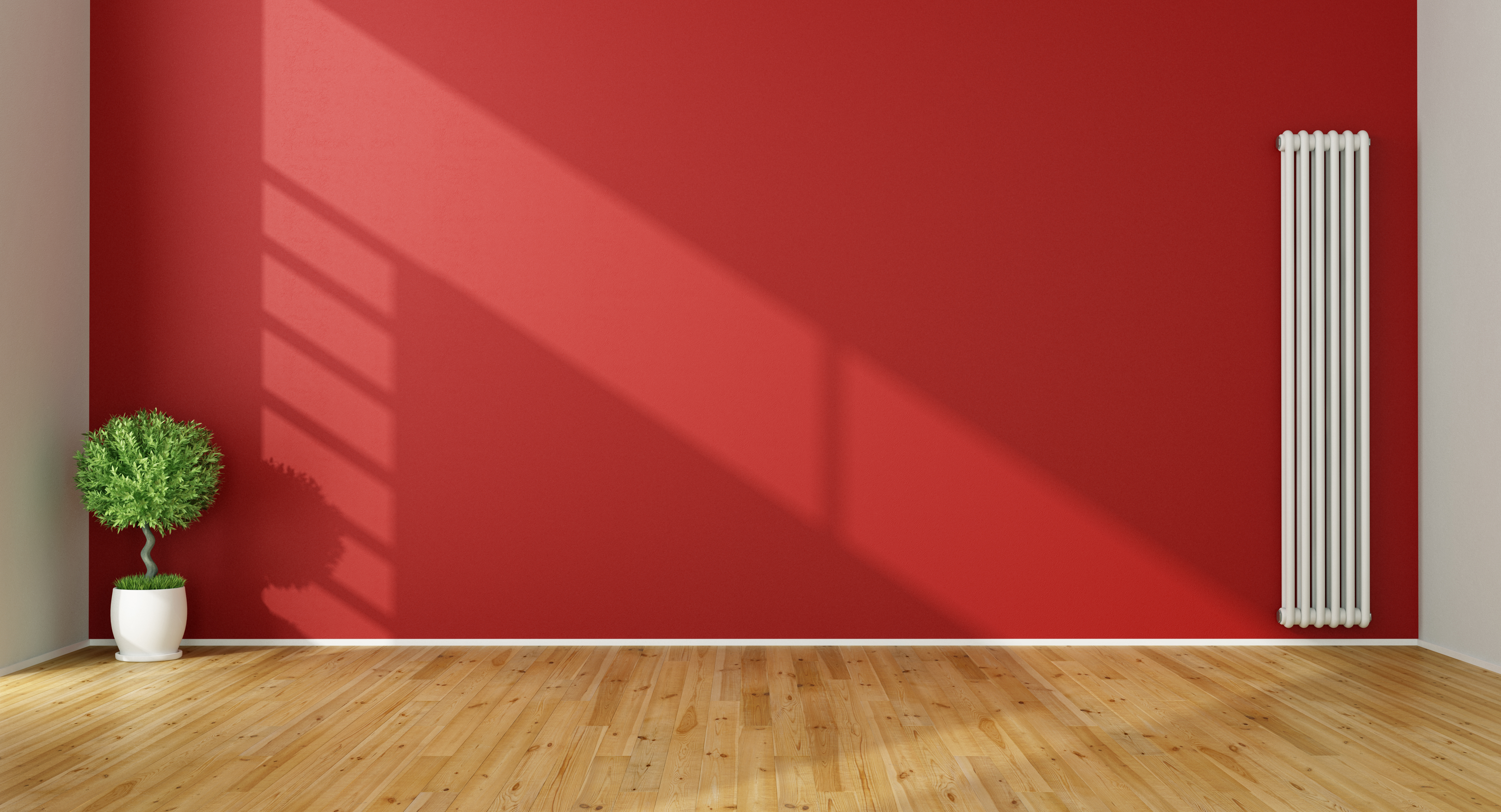
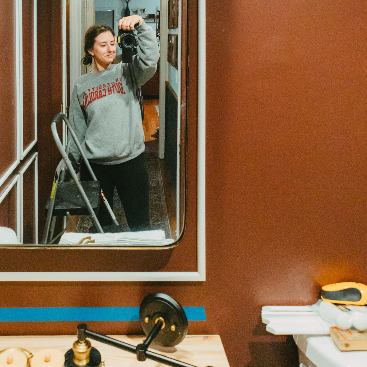
Burgundy is presented as a bold choice that brings immediate drama and warmth but requires careful application to avoid dominating the room. Kellie Richardson suggests balancing this deep, rich shade with ample natural light and lighter accents. Light-colored furniture, bright textiles, or sheer curtains can soften the intensity of burgundy and prevent the room from feeling too enclosed.
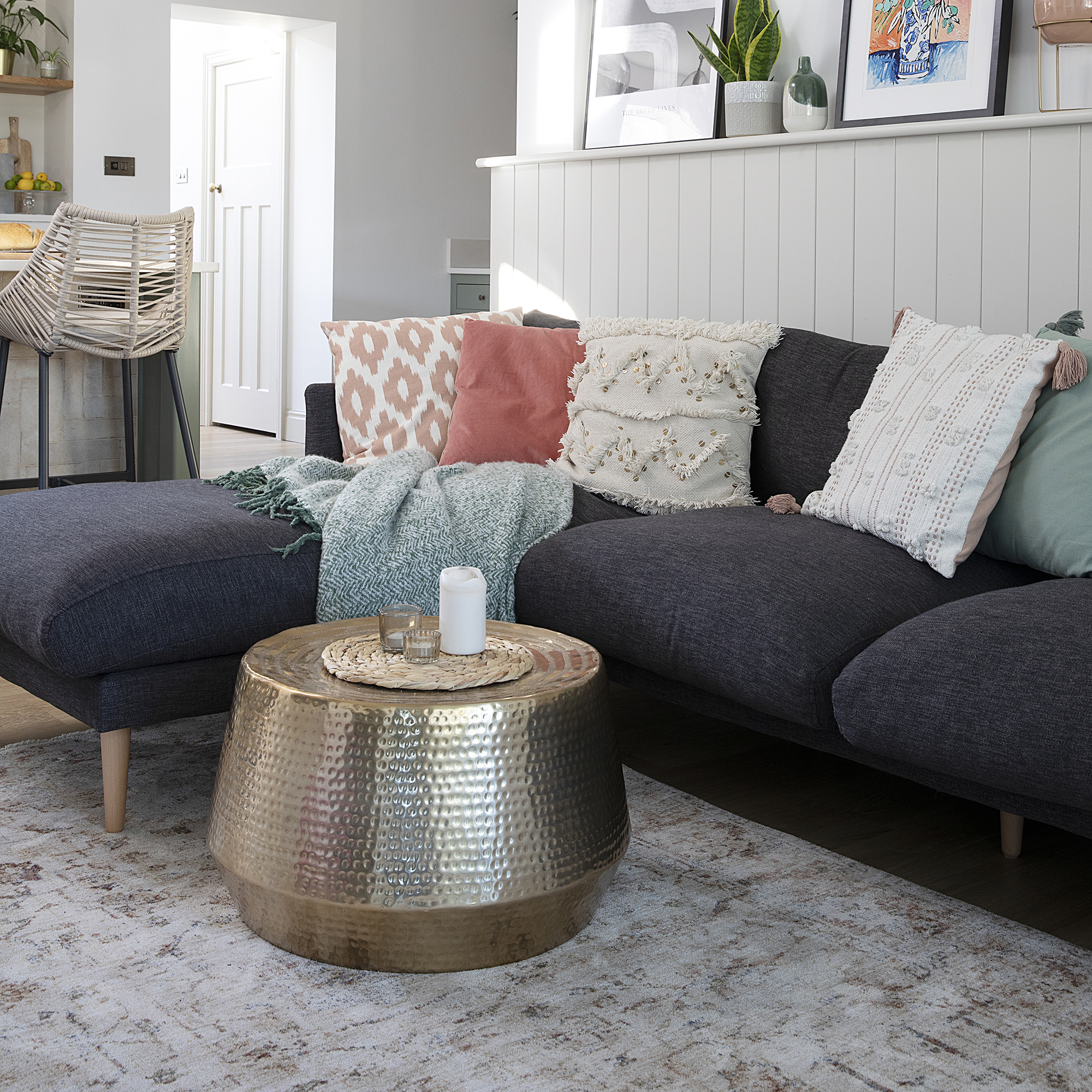
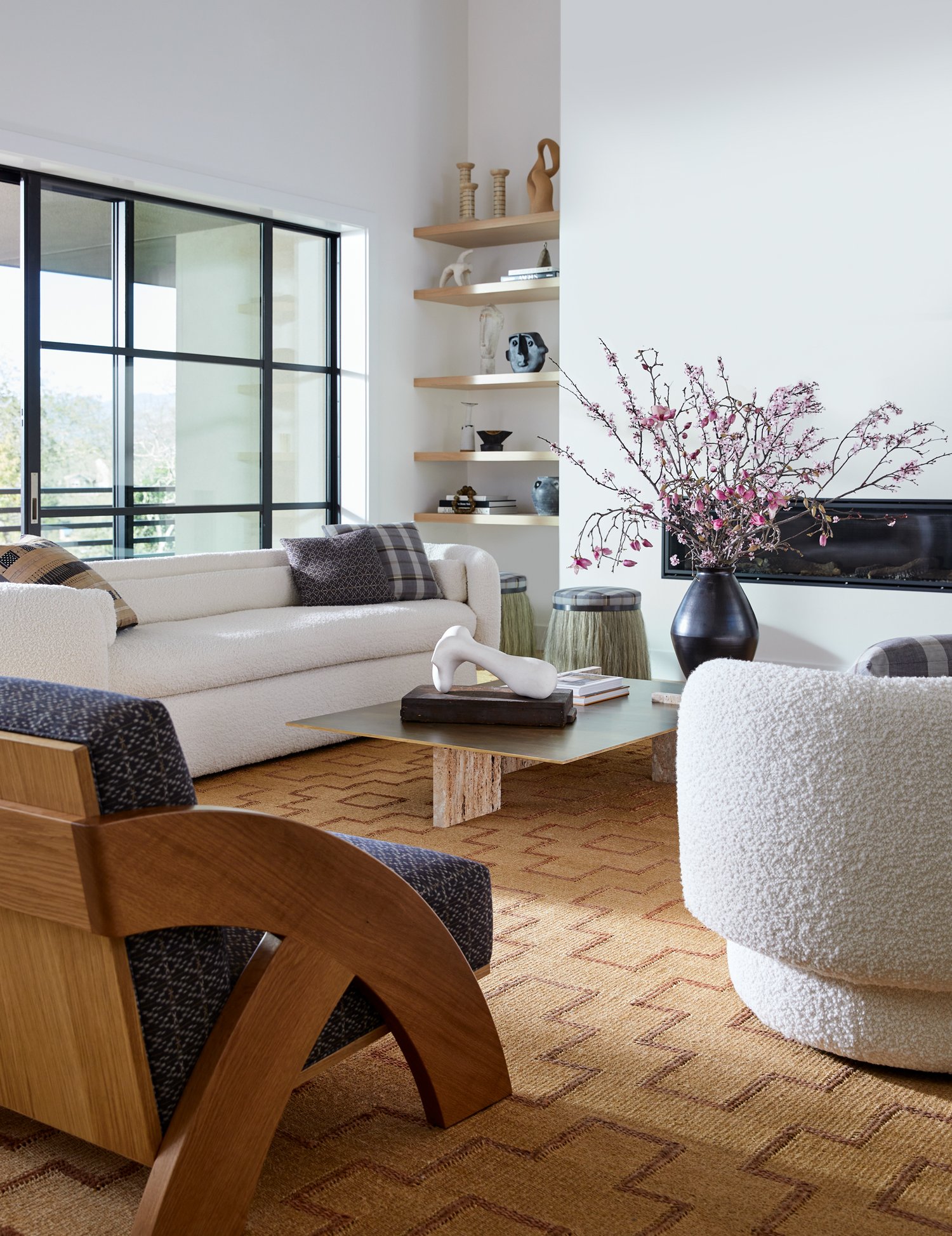
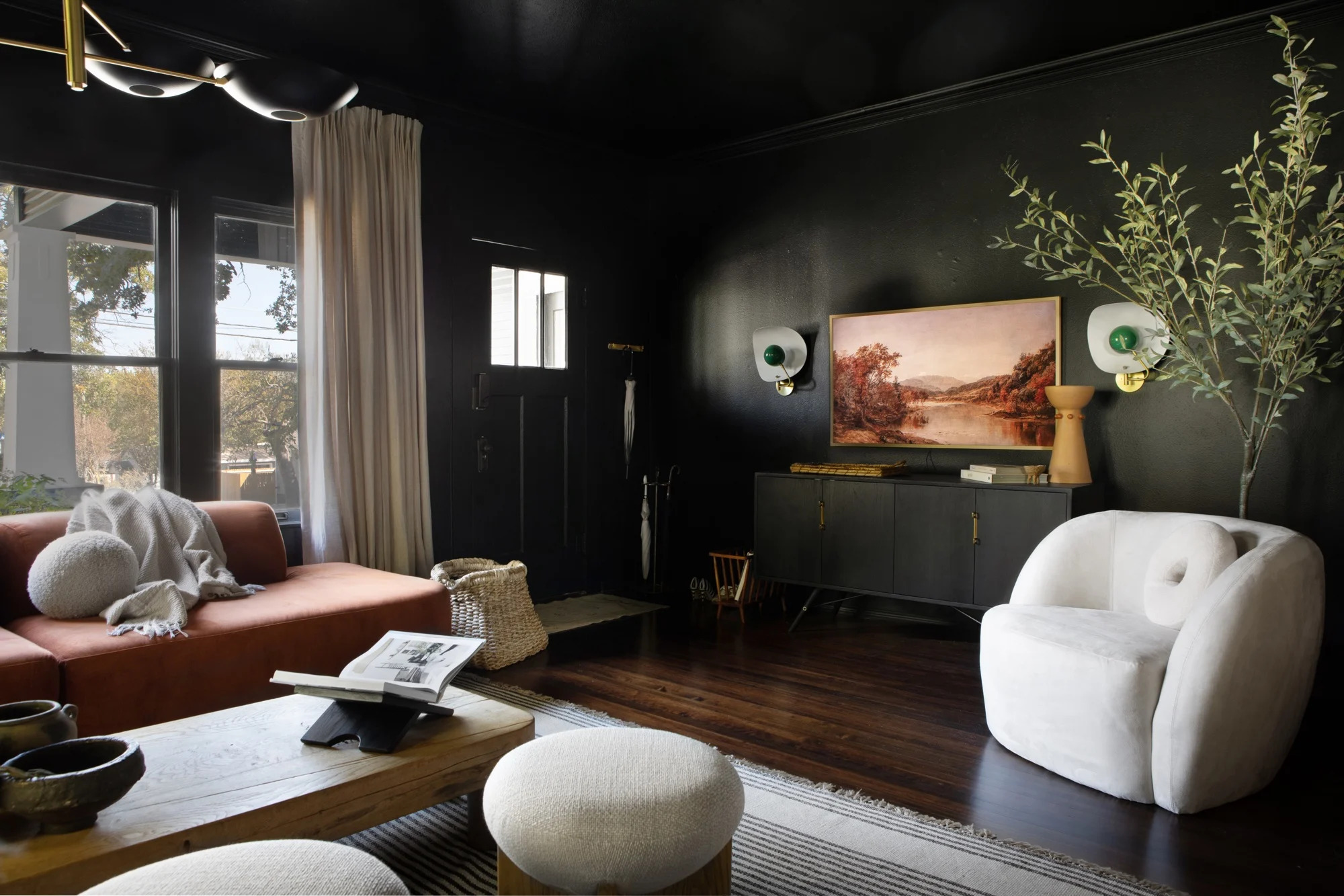
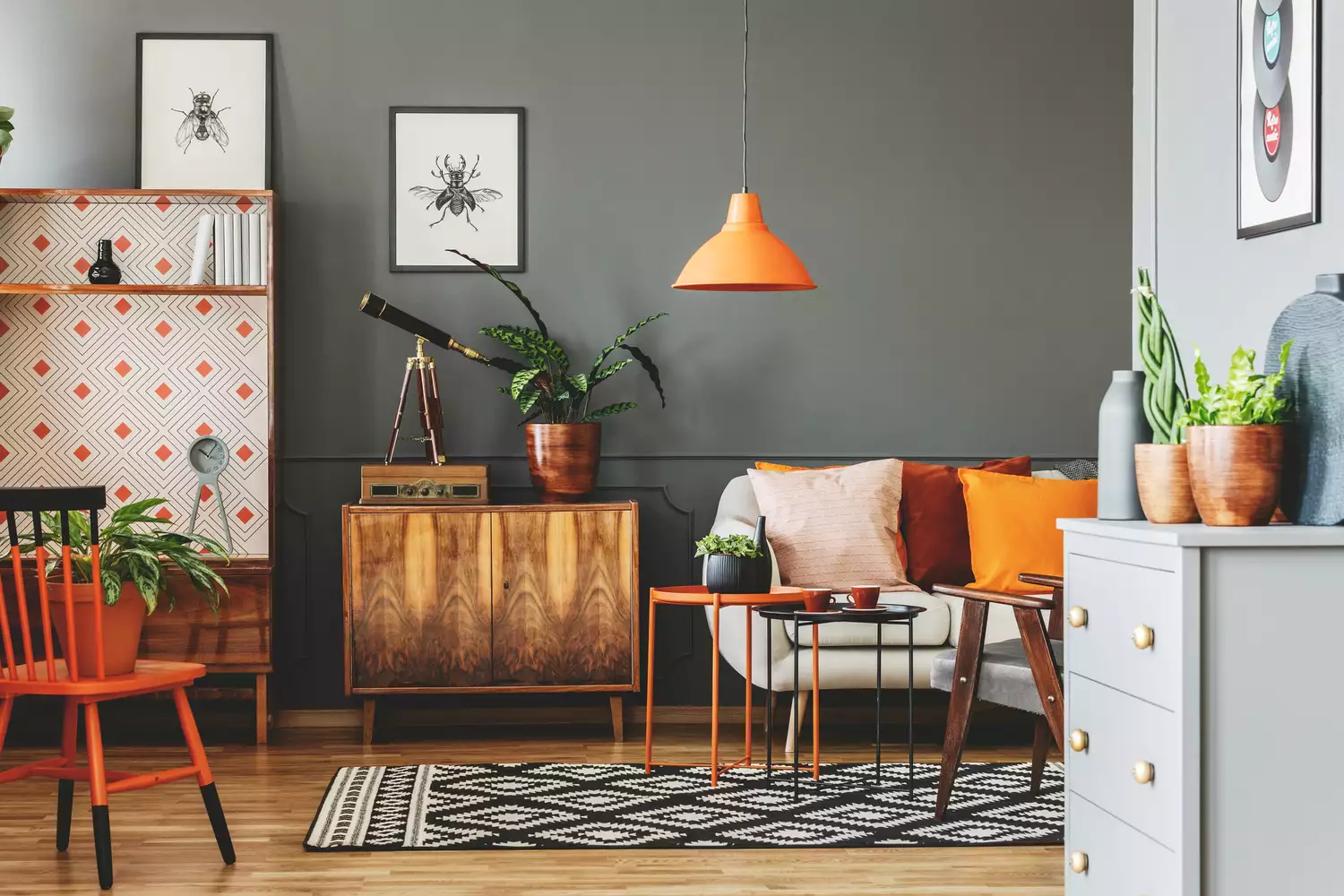
Dark gray, while versatile, also absorbs light, contributing to a more enclosed and less open feel. To prevent a cold or claustrophobic environment, Richardson recommends ensuring plenty of natural light and incorporating warm-toned accents such as wood furniture or gold decor. Despite its tendency to reduce perceived space, gray's neutrality makes it adaptable to various design styles and color palettes.
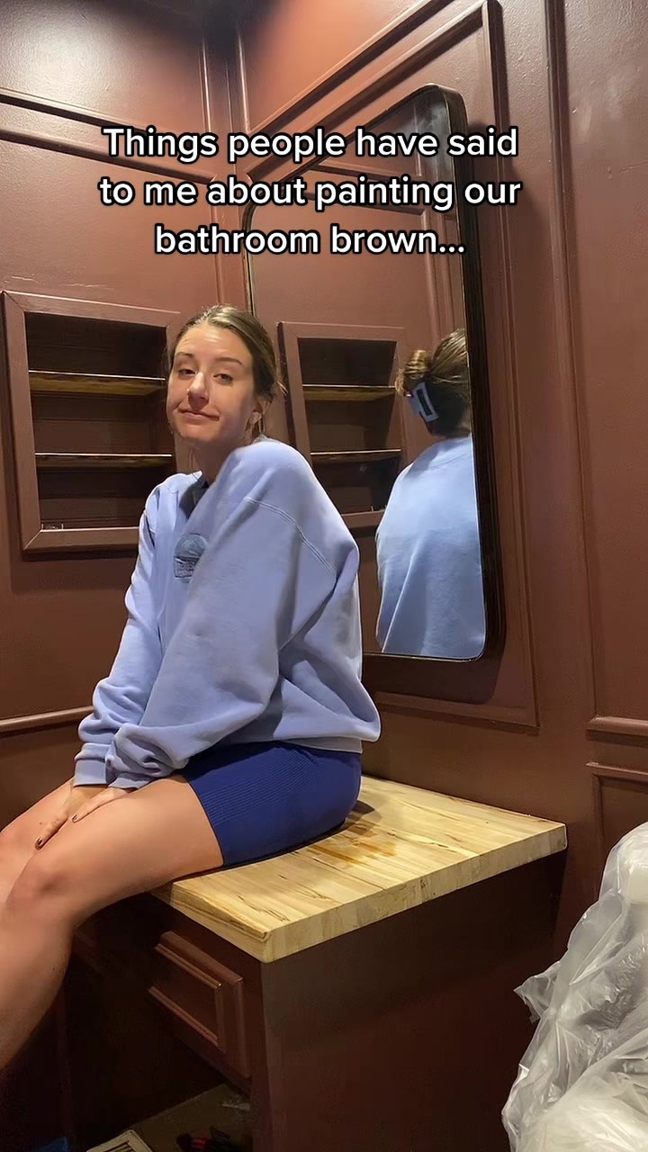
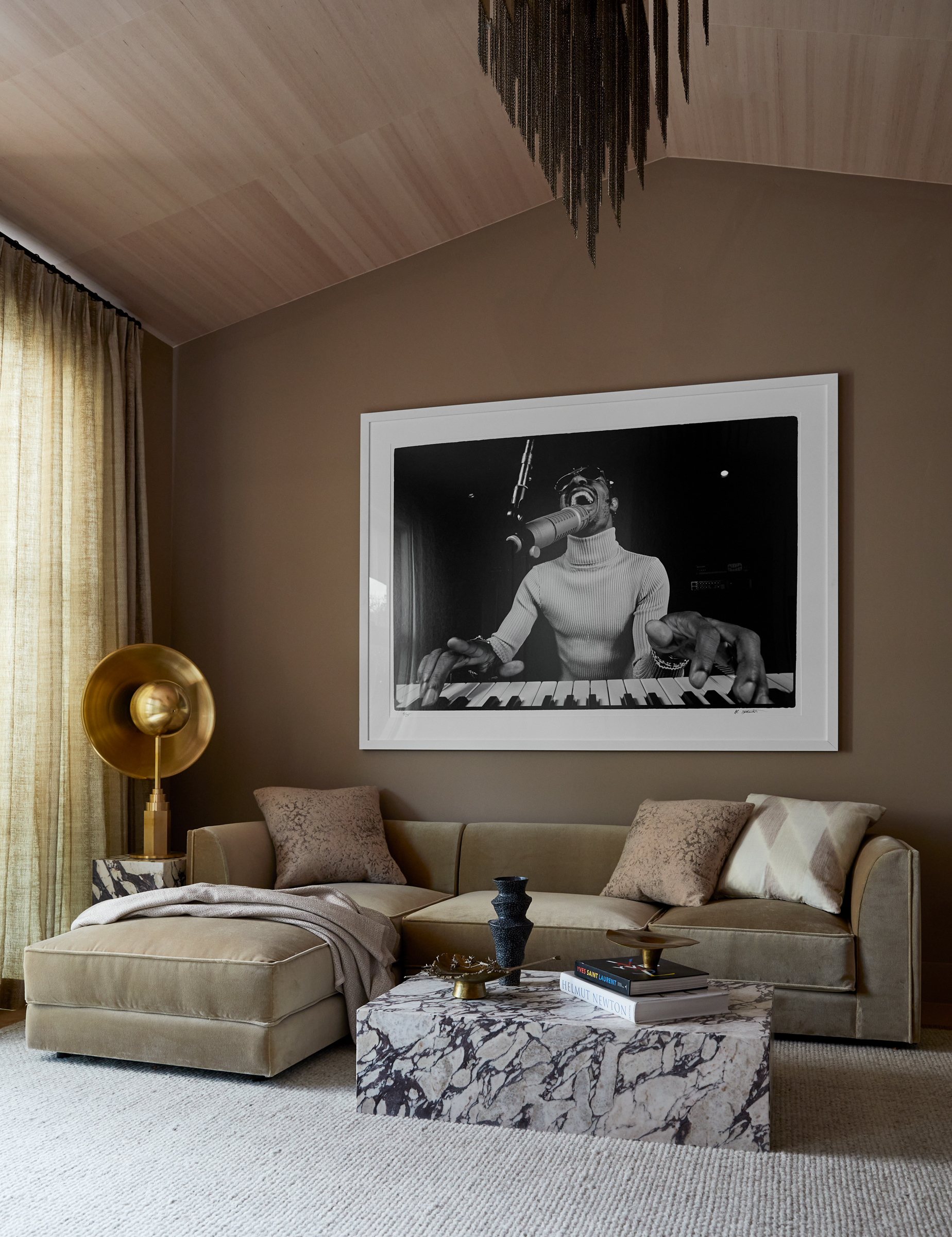
Finally, chocolate brown, especially in rich shades, can impart a dense, earthy feel to a room but also has the effect of making the ceiling appear lower. Richardson advises integrating abundant lighting, both natural and artificial, to maintain a sense of openness while still enjoying the comforting appeal of the dark brown hue. These insights provide homeowners with practical guidance for selecting paint colors that align with their desired living room aesthetic without inadvertently making the space feel smaller than it is.
#InteriorDesign #PaintColors #LivingRoomDecor #HomeDecor #SpacePerception #DesignTips #ColorPsychology #InteriorDesign #PaintColors #LivingRoomDecor #HomeDecor #SpacePerception #DesignTips #ColorPsychology
0 comment in total
 No comments yet
You may also like
The paint colors to avoid in small living rooms — and what to use instead

The 3 worst colours for a small living room – the shades that will make a tiny lounge look smaller and less inviting
Is it better to paint small rooms light or dark? Here's what the top colour experts have to say
The Best Paint Colors to Make Small Rooms Feel Bigger (Some May Surprise You!)
These 6 paint colours instantly make small rooms feel bigger

'Dark ceilings make the room look smaller': 6 classic paint colour myths it's time to give up on

5 of best dark colors to paint small rooms, as chosen by designers – 'they'll make them feel bigger, and ceilings higher'

How To Successfully Paint Small Spaces Dark Colors & Actually Make Your Room Look BIGGER

The best paint colors for small living rooms, according to design experts
7 Paint Colors That Instantly Make Small Living Rooms Feel Bigger, Designers Say

8 of the best paint colors to enhance small spaces, according to experts
6 furniture items that will make a living room look bigger, according to design experts
7 Paint Colors That Make Your Kitchen Look Smaller, According to Interior Designers
I’m an interior designer - the worst paint colours for small rooms, and why bright white walls is not a good idea

This Is the Best Paint for Dark Rooms — 6 Shades Interior Designers Swear By for Light-Limited Spaces

What color couch makes a room look bigger? Designers reveal their favorite space-stretching sofa shades

5 colors you should never paint a small room – designers warn us to steer clear of these hues, and what to pick instead

The 10 Best Colors for Small Bedrooms, According to Color Experts and Interior Designers
What kitchen floor colors make a small space look bigger? Interior pros spill their secrets

12 Paint Colors That Will Make Small Rooms Feel Bigger