The Best Paint Colors to Make Small Rooms Feel Bigger (Some May Surprise You!)
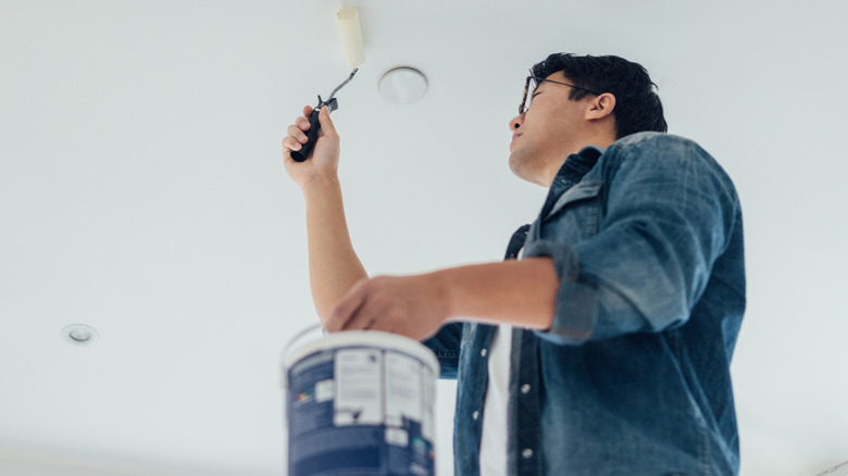
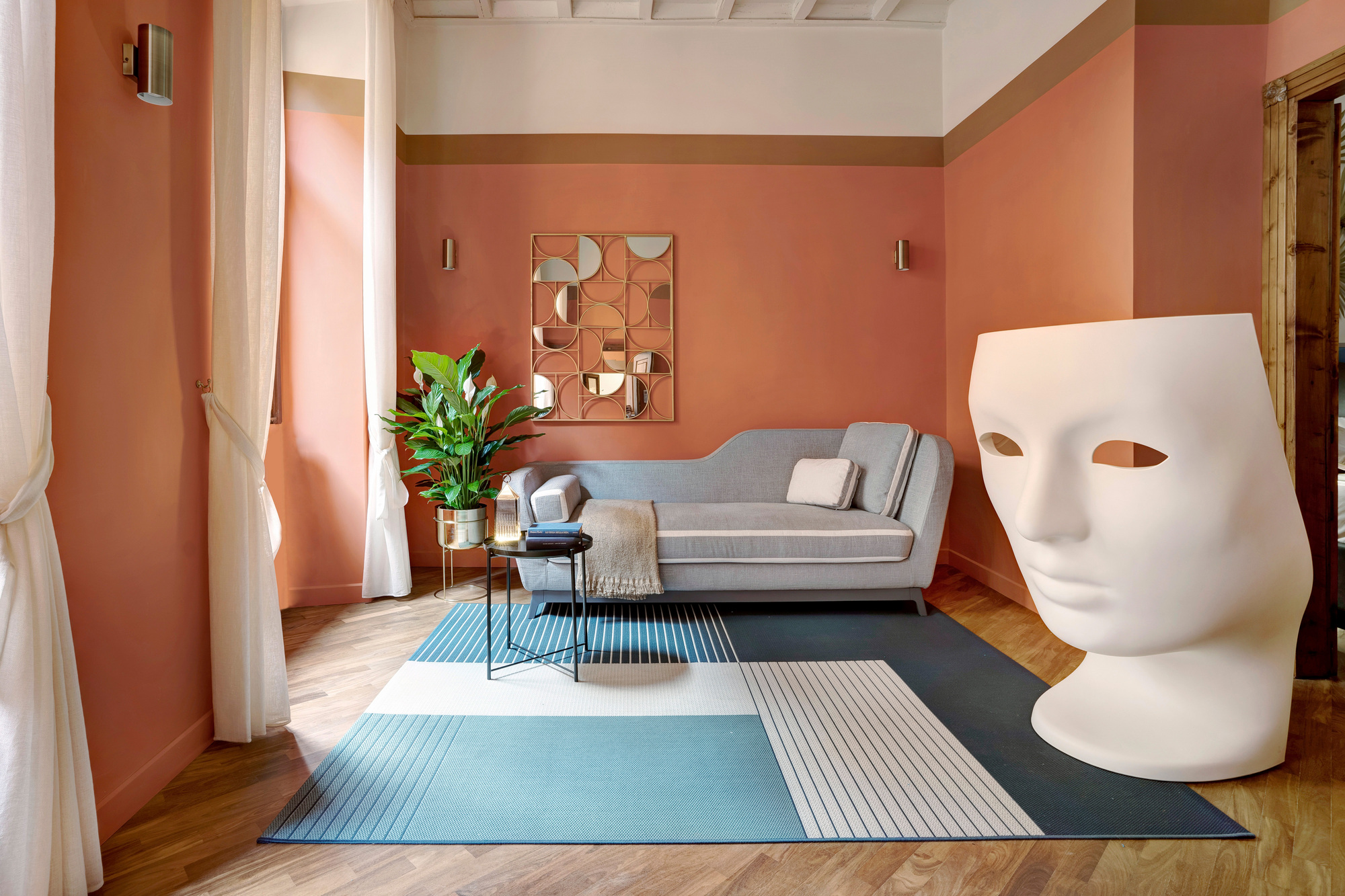
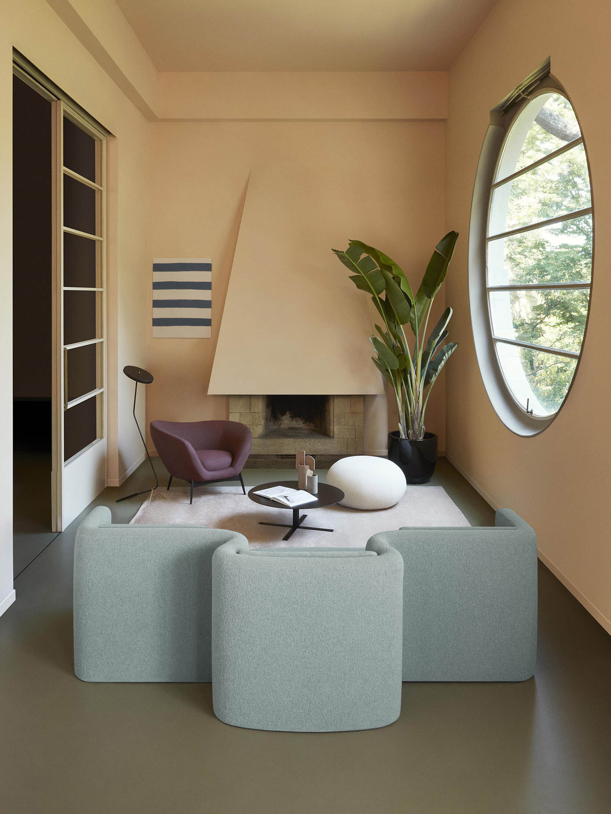
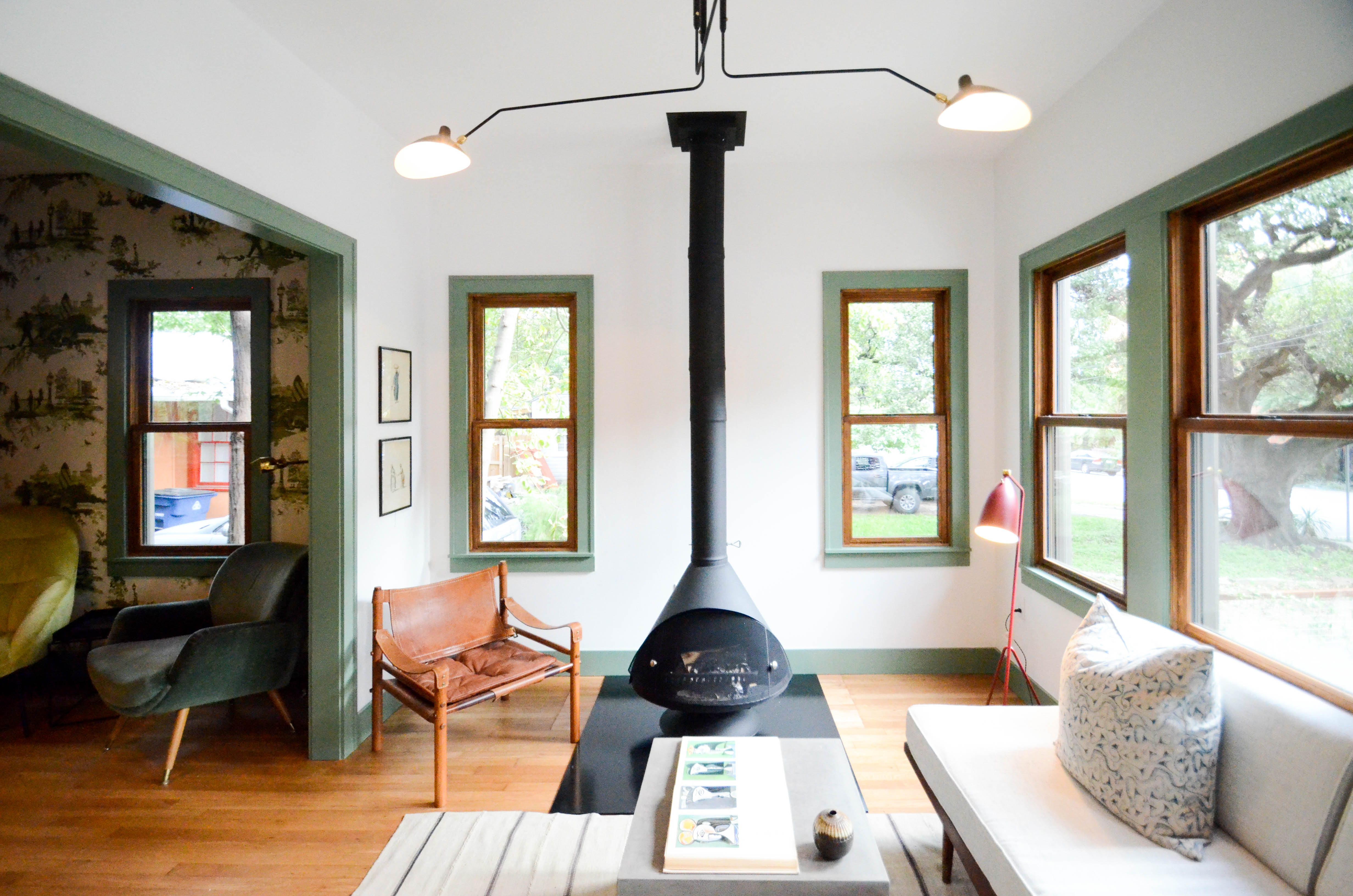
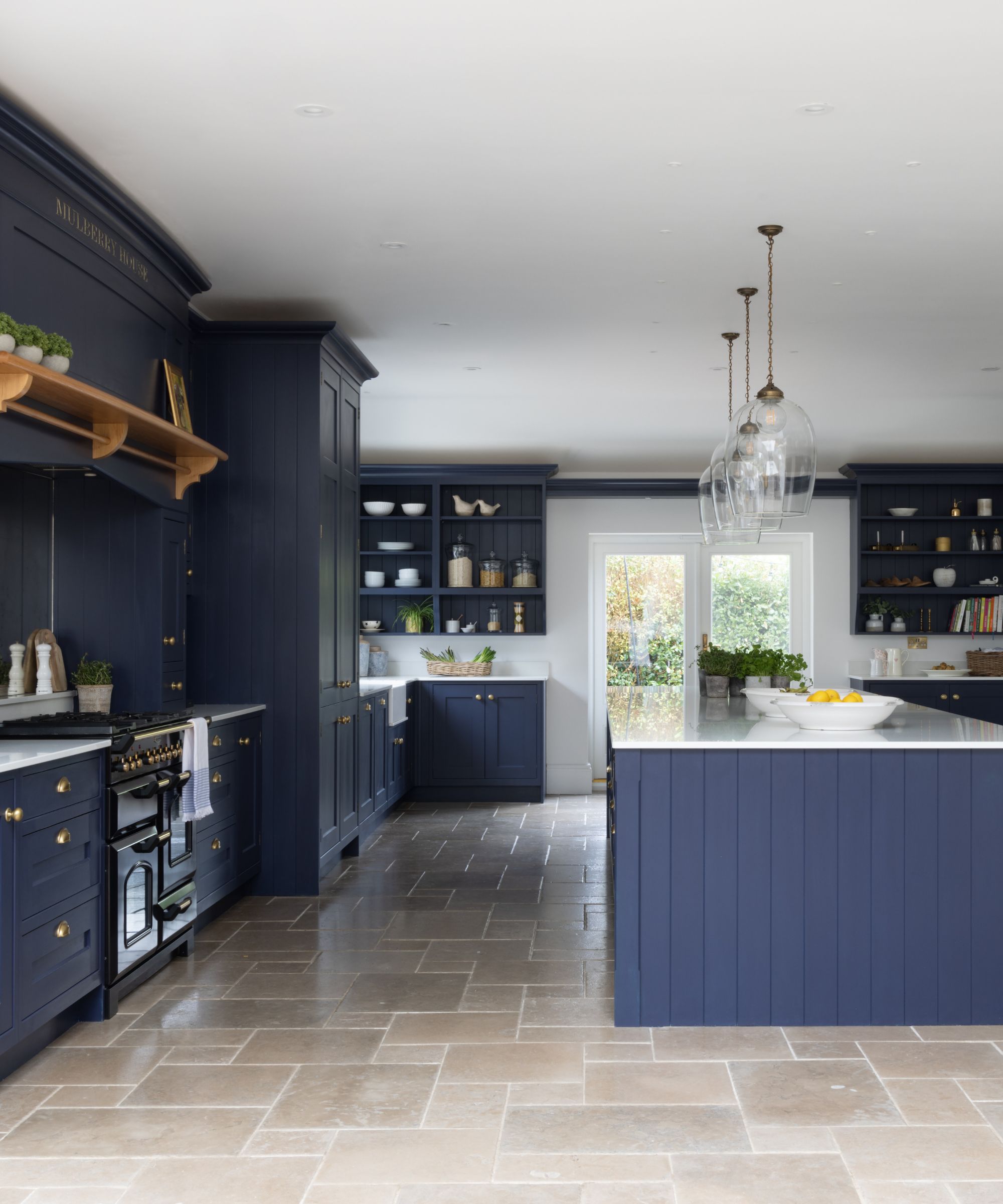
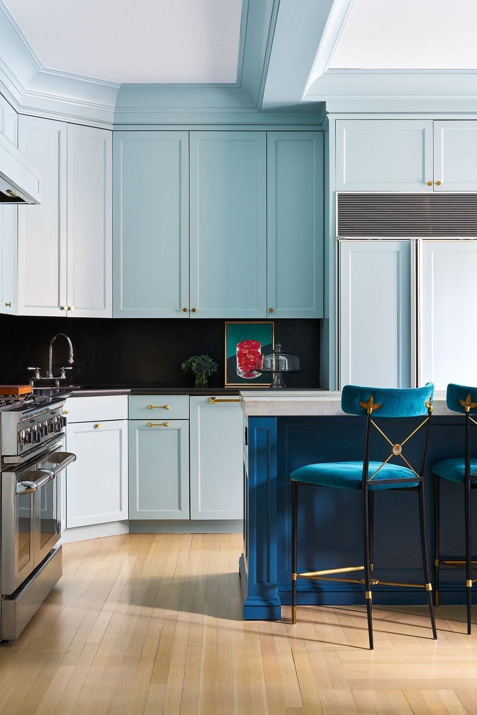
The article explores how specific paint colors can create an illusion of greater space in small rooms, drawing on insights from interior designers. It highlights that beyond multipurpose furniture and minimalist aesthetics, the strategic use of paint is a highly effective method for maximizing square footage. Seven distinct paint colors are recommended, each with specific characteristics that contribute to an airy and expansive feel.
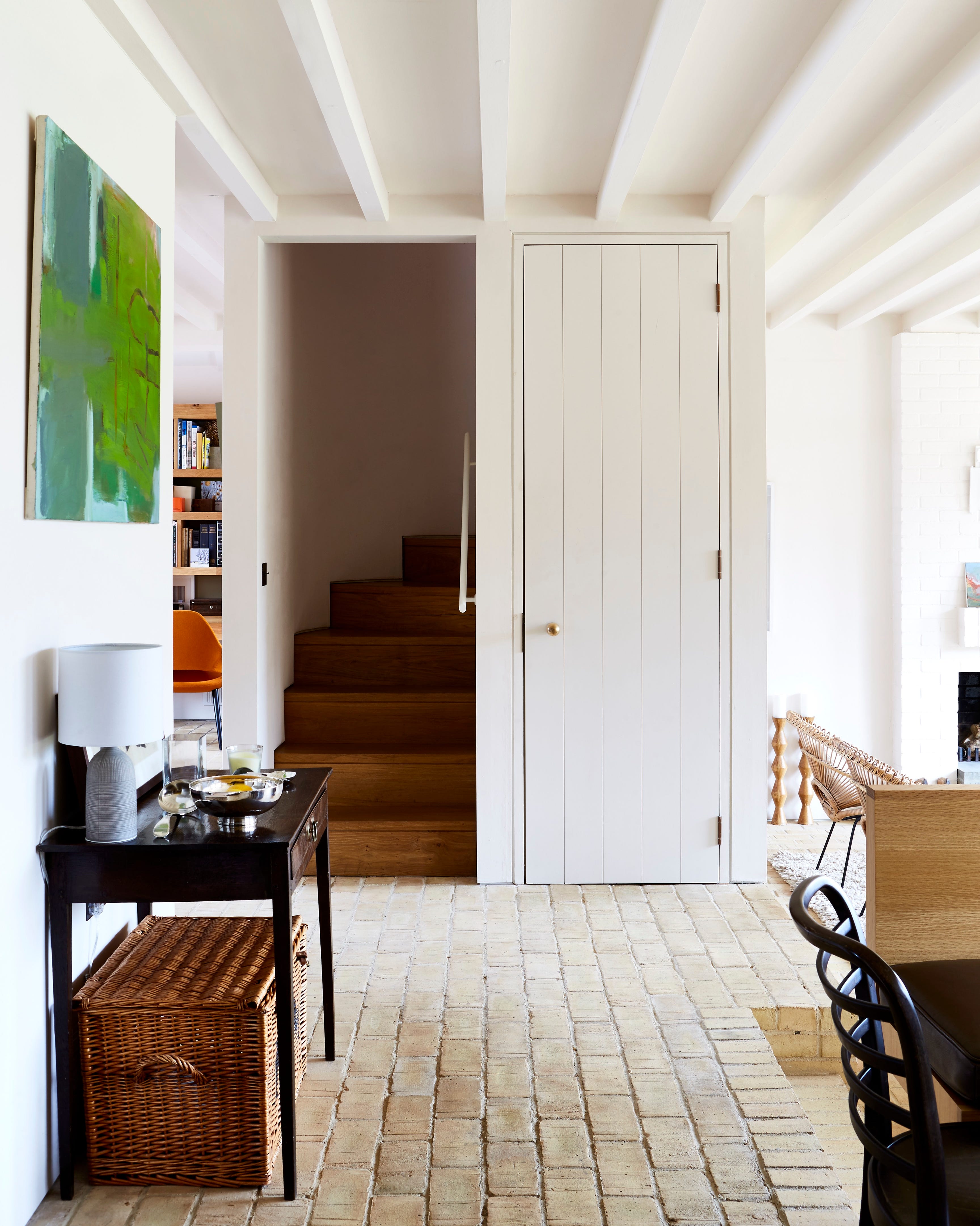
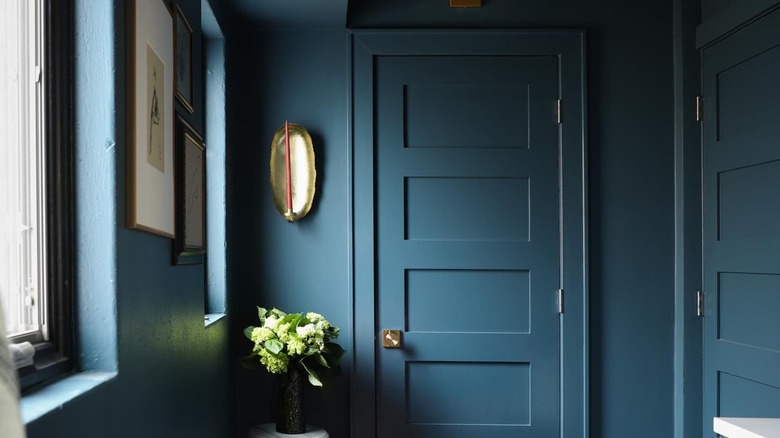
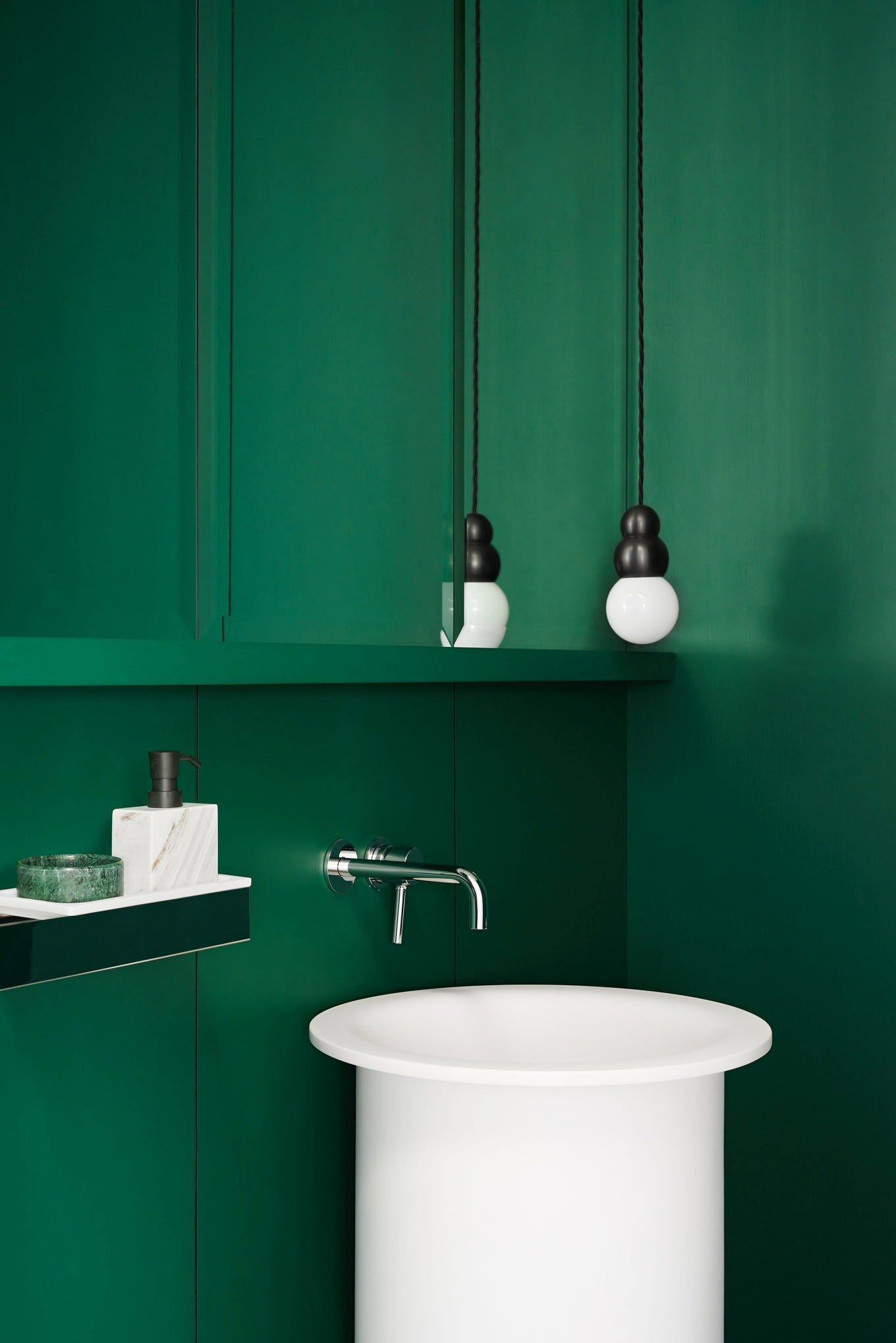
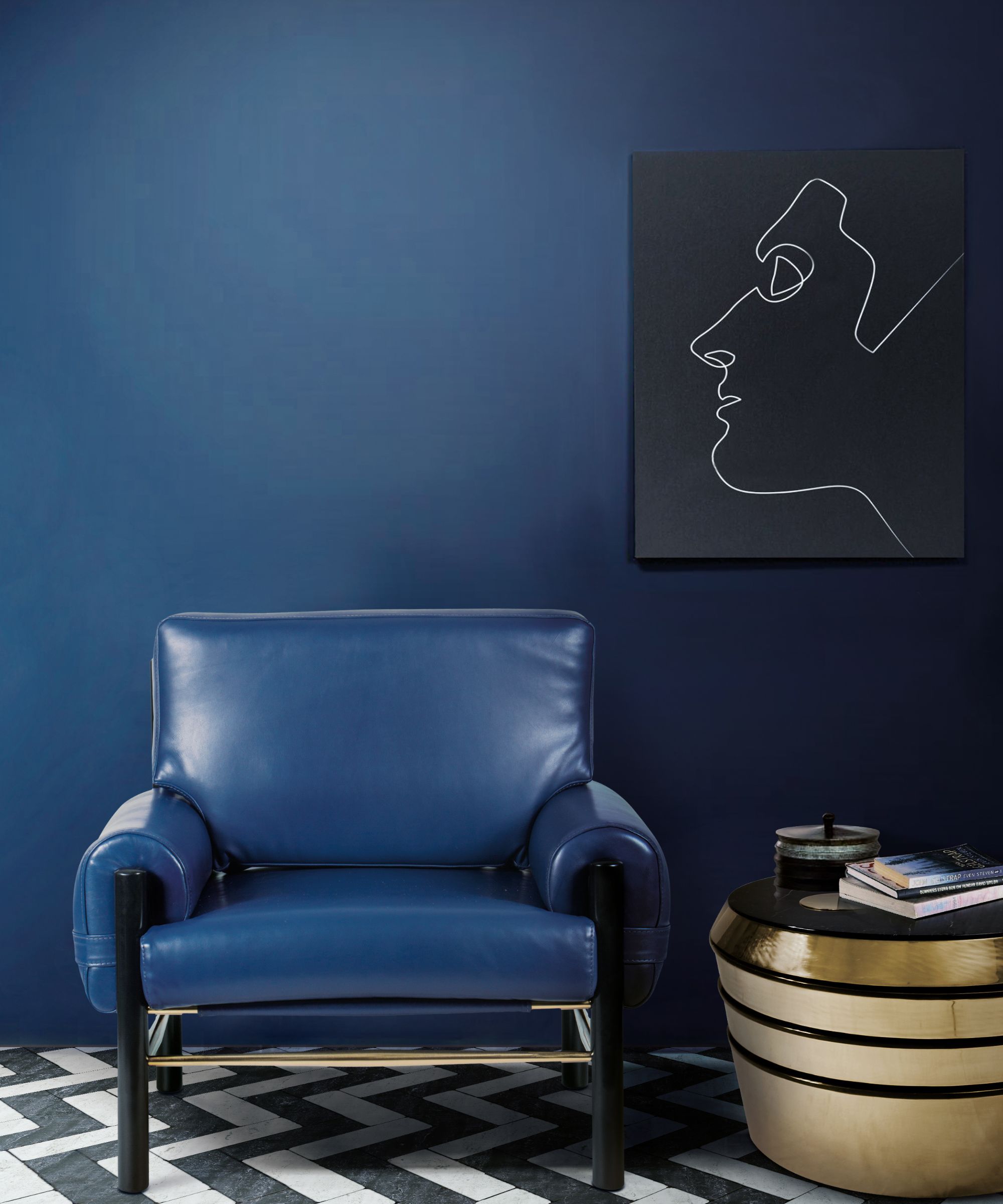
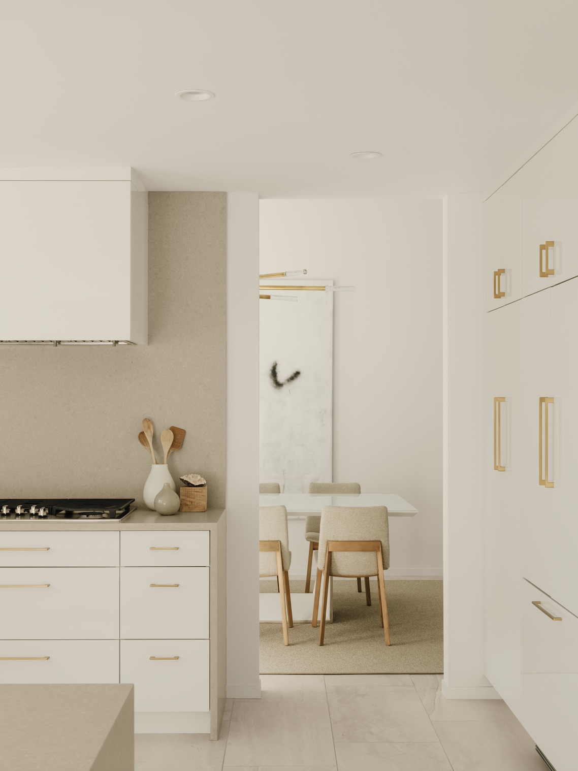
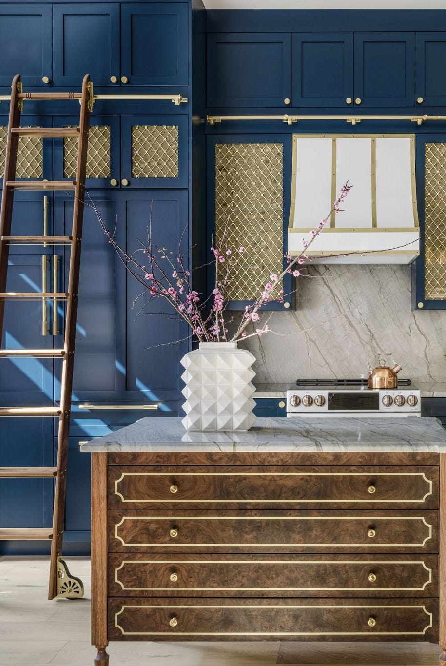
The first recommendation is "Calm" by Benjamin Moore, a soft, neutral white with warm undertones. Elana Tenenbaum Cline of Carta Creatives suggests painting both walls and ceilings with this color to eliminate visual breaks and create a seamless, elevated look, thereby making the room feel larger. Surprisingly, darker hues are also presented as effective in expanding a room. "Gentleman's Gray" by Benjamin Moore is one such color. Yena Jung of By Yena Designs describes it as creating the sensation of "looking out into a vast, never-ending ocean at night," which contributes to a more spacious and open atmosphere within a room.
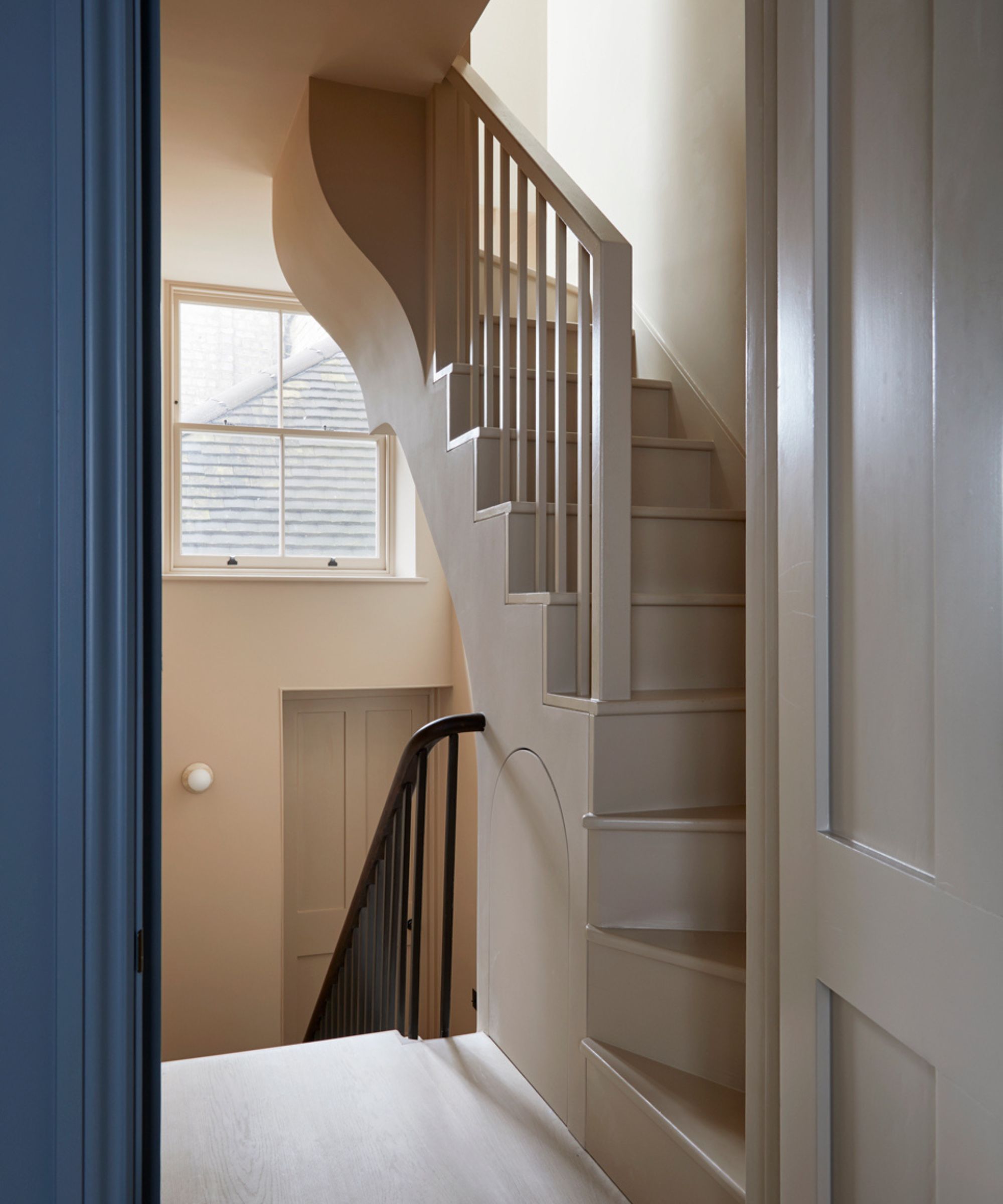
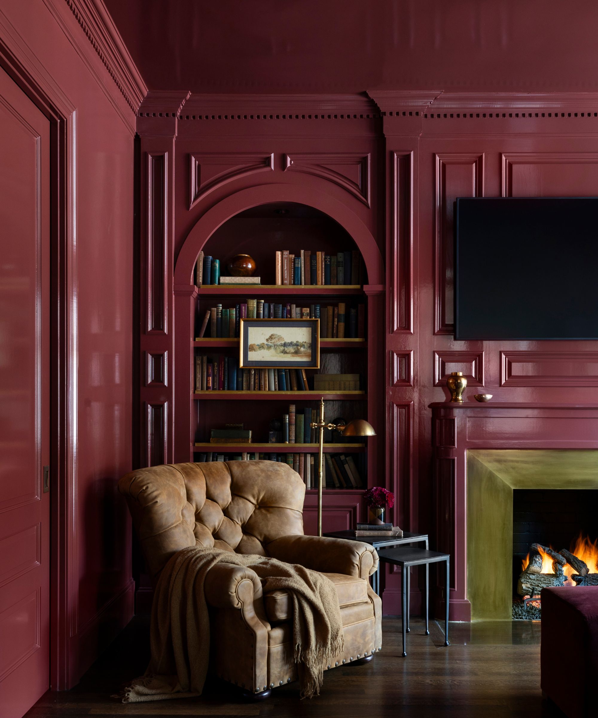
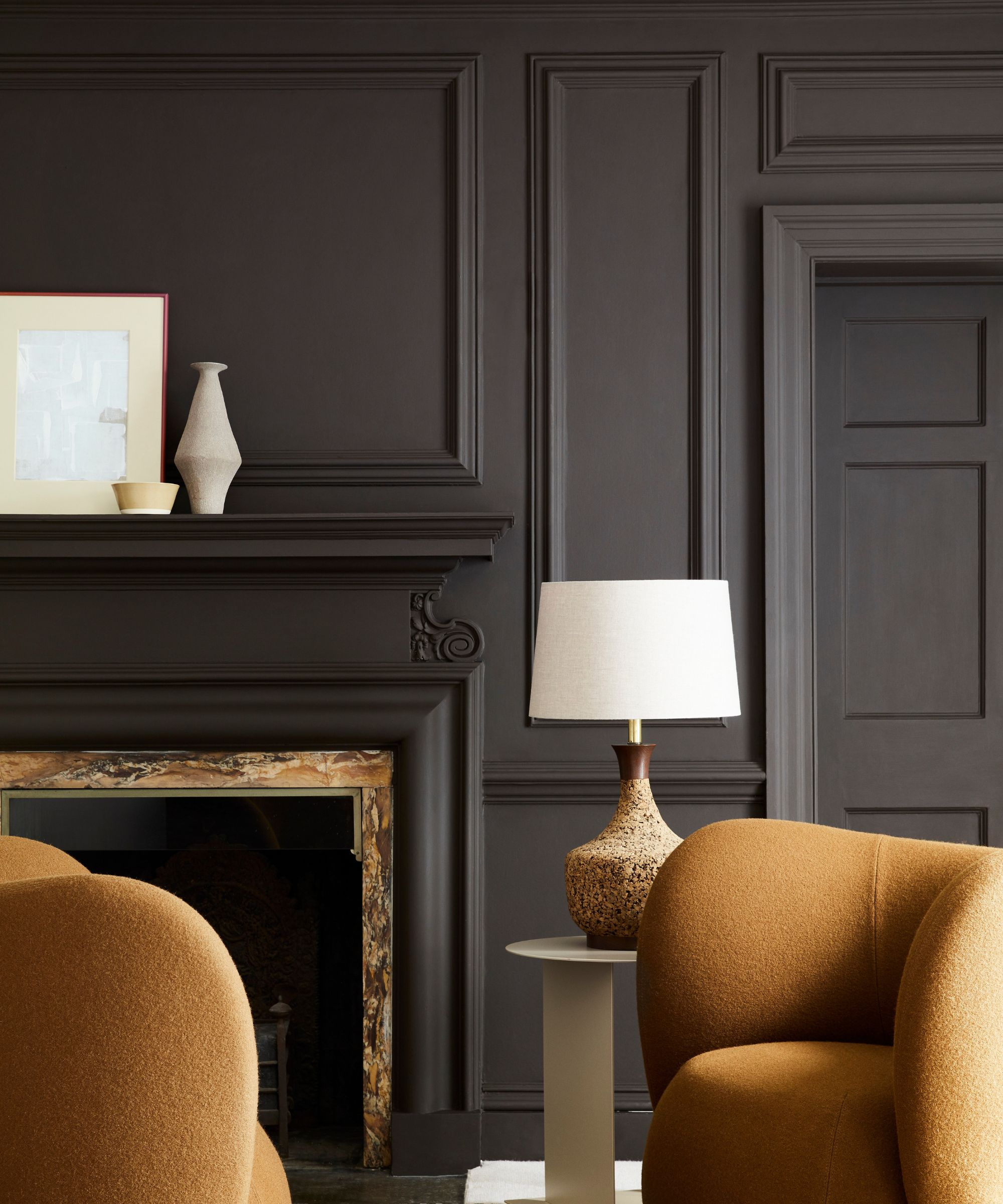
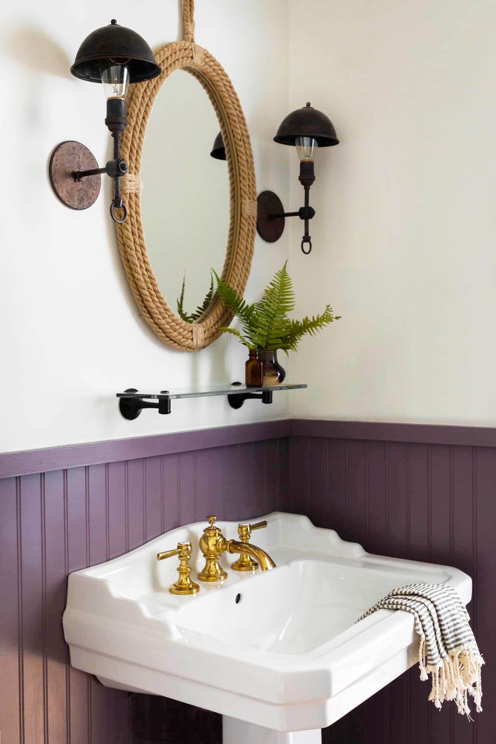
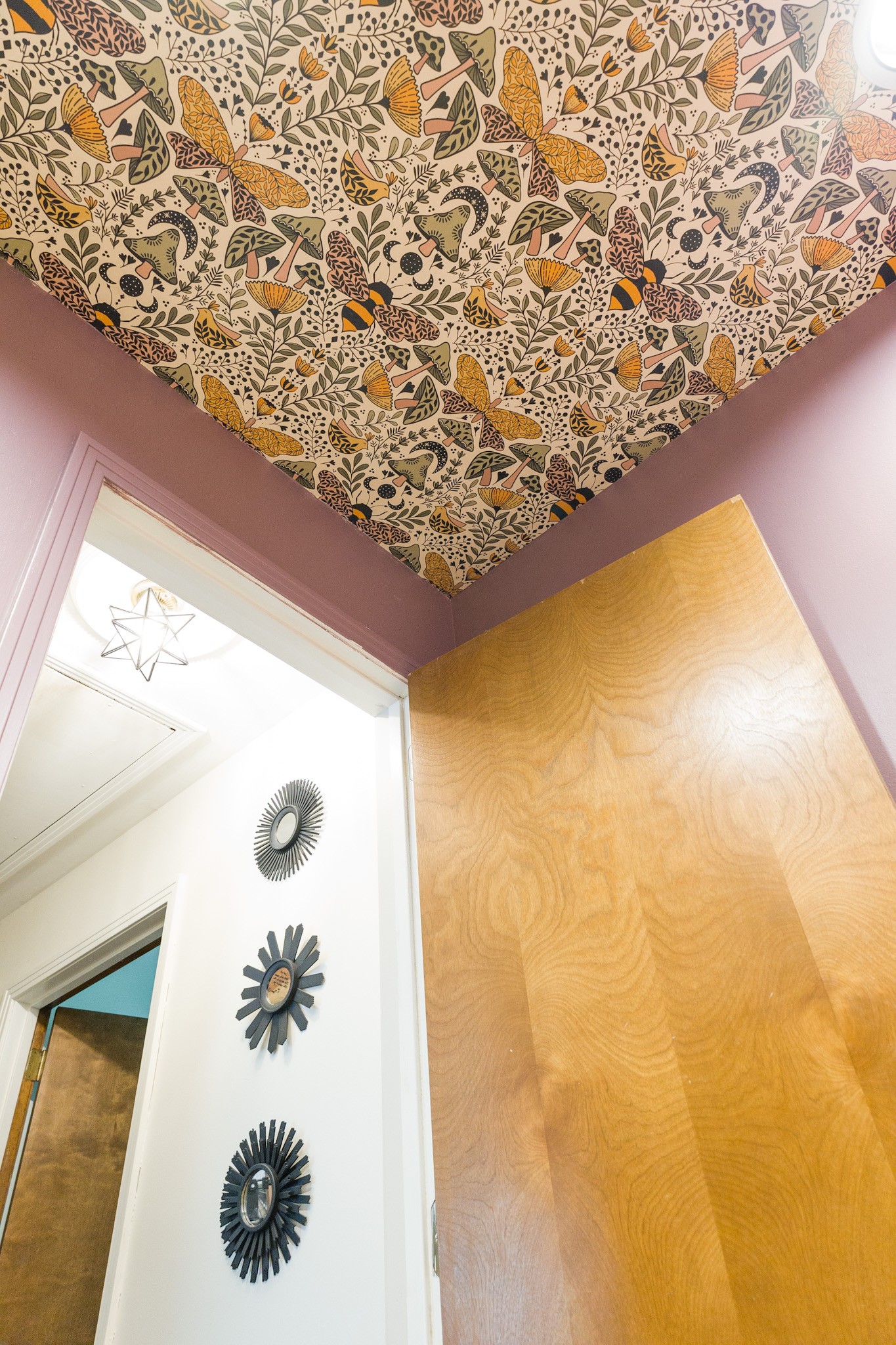
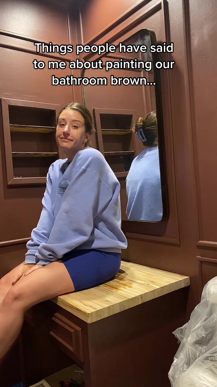
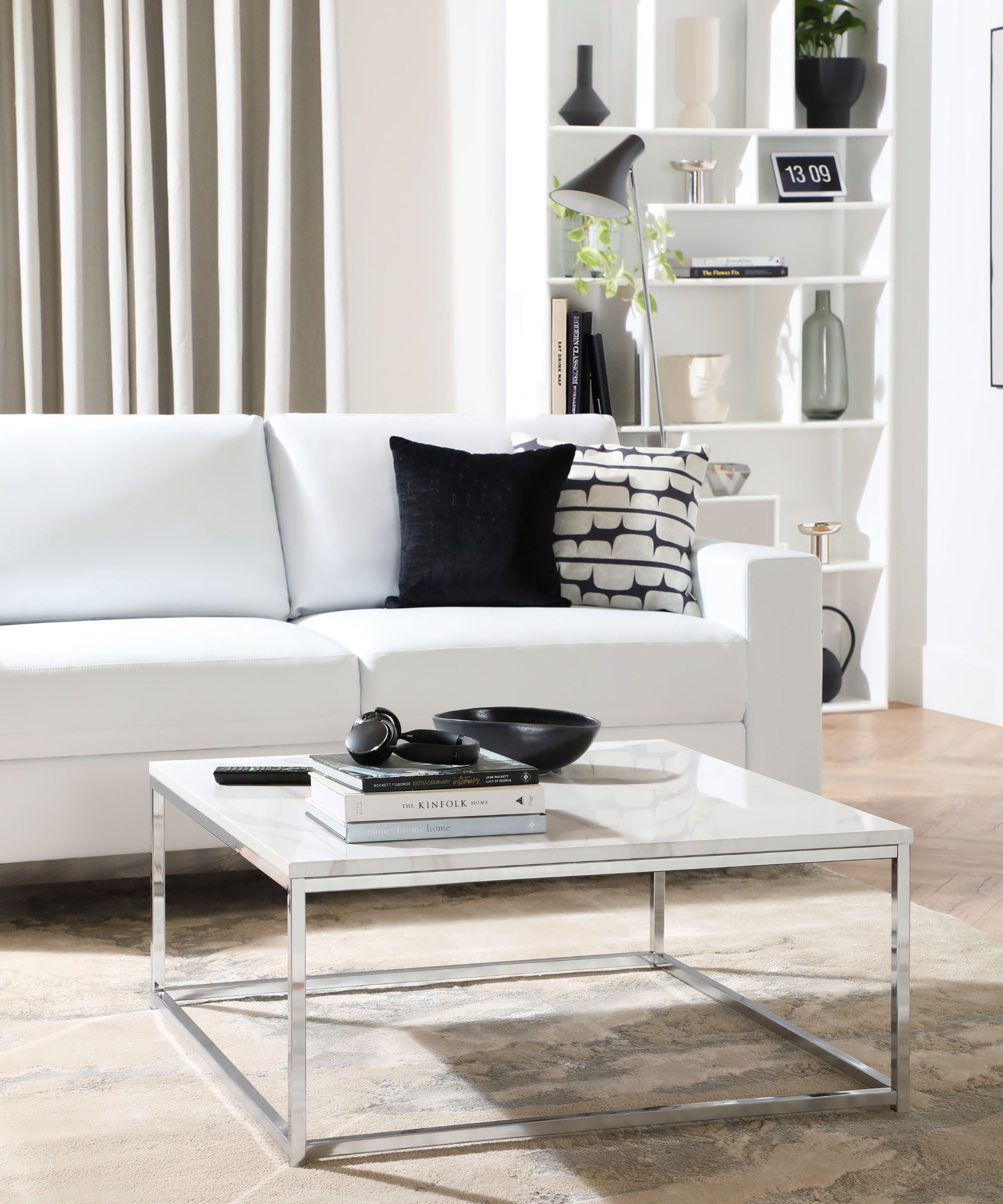
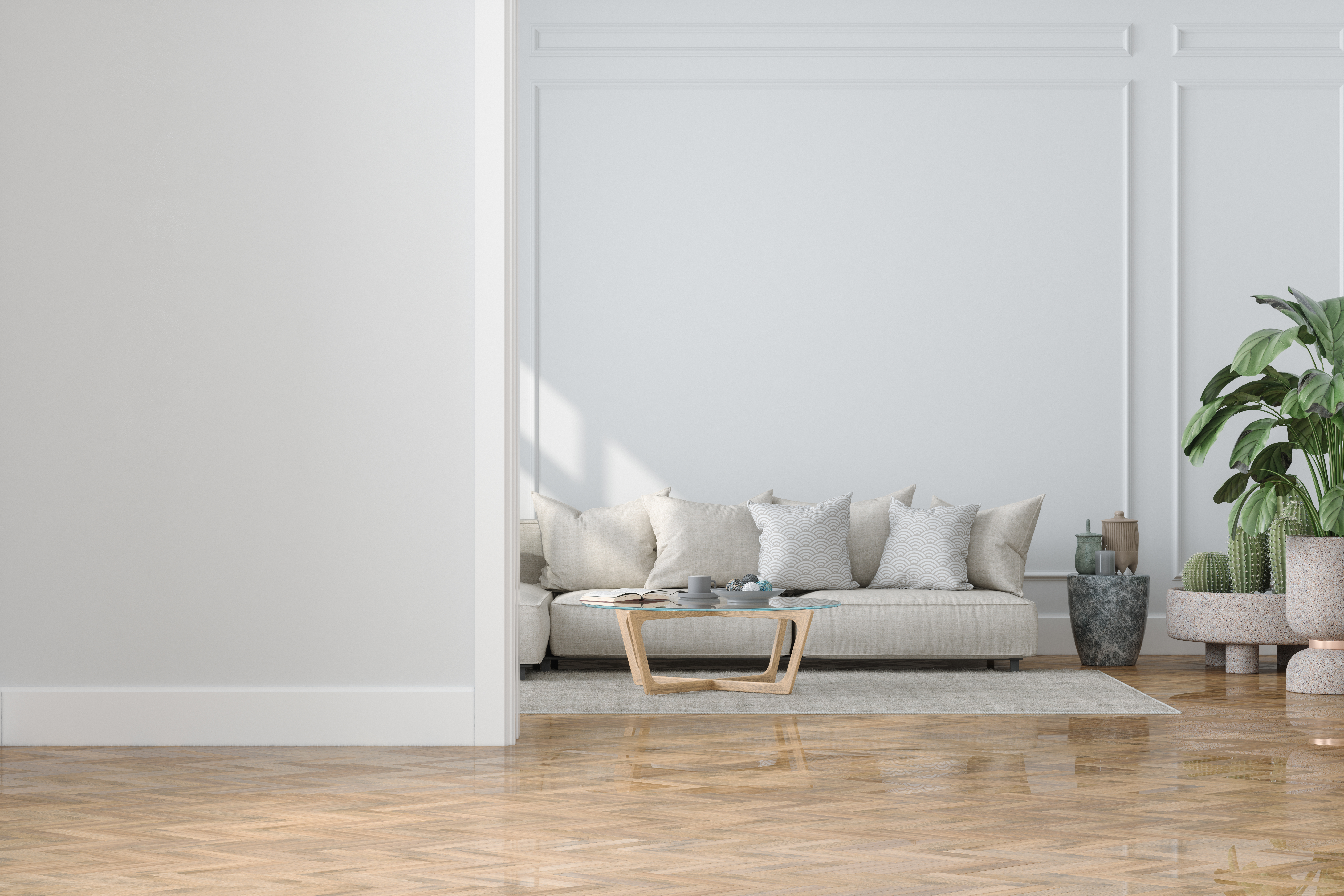
Another dark color discussed is "Black Berry" by Benjamin Moore. This shade of black is noted for its warm and inviting quality due to subtle purple and blue tints, making it suitable even for small spaces like mudrooms, where it can add a touch of luxury. Proper application is crucial for dark colors to prevent a streaky finish. "Alabaster" by Sherwin-Williams is highly praised by designers Shaolin Low of Studio Shaolin and Leah Bailey of Leah Bailey Interiors. It is a soft white that brightens spaces without feeling stark or cold, with subtle greige undertones that diffuse light and create an effortlessly larger feel.
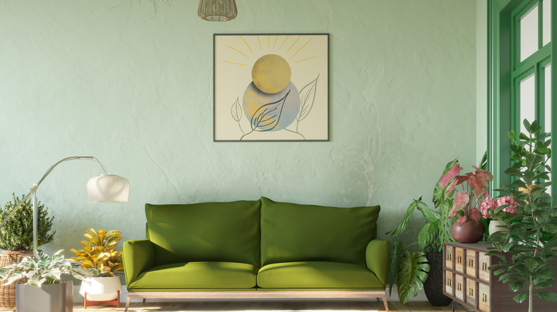
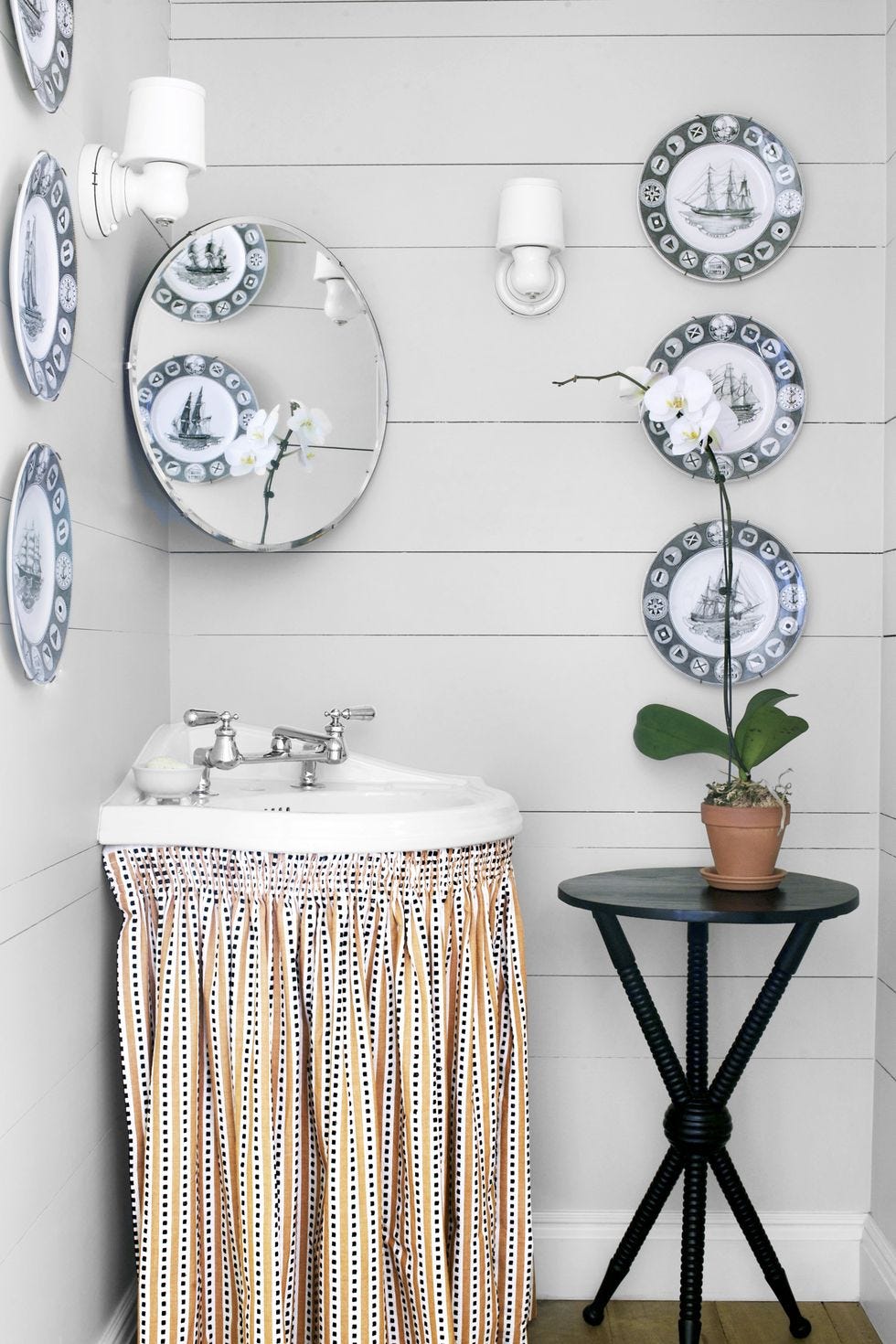
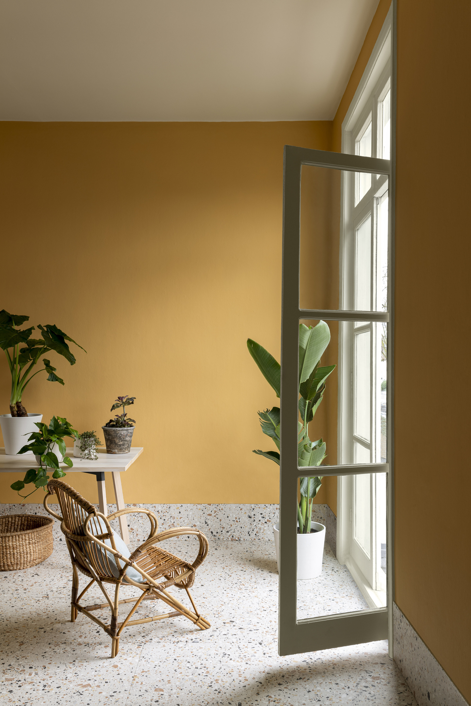
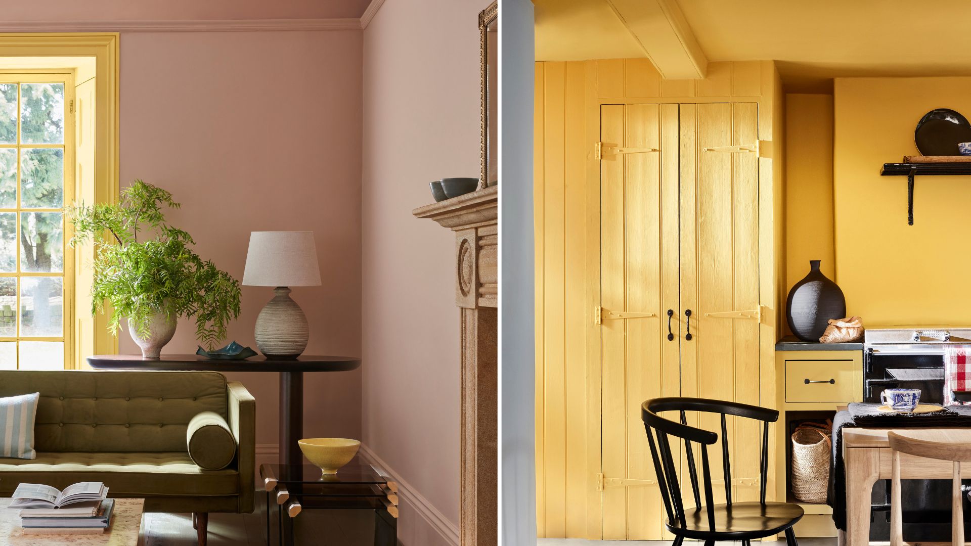
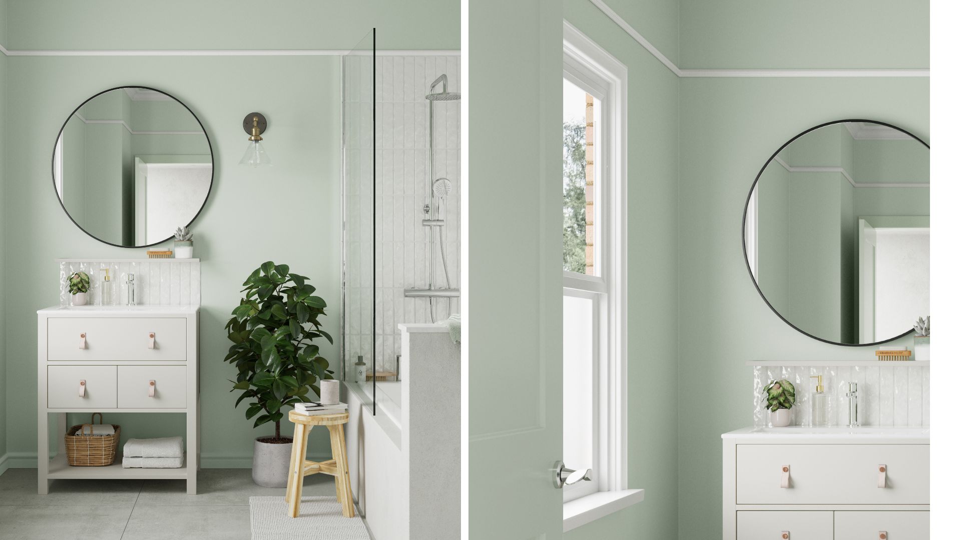
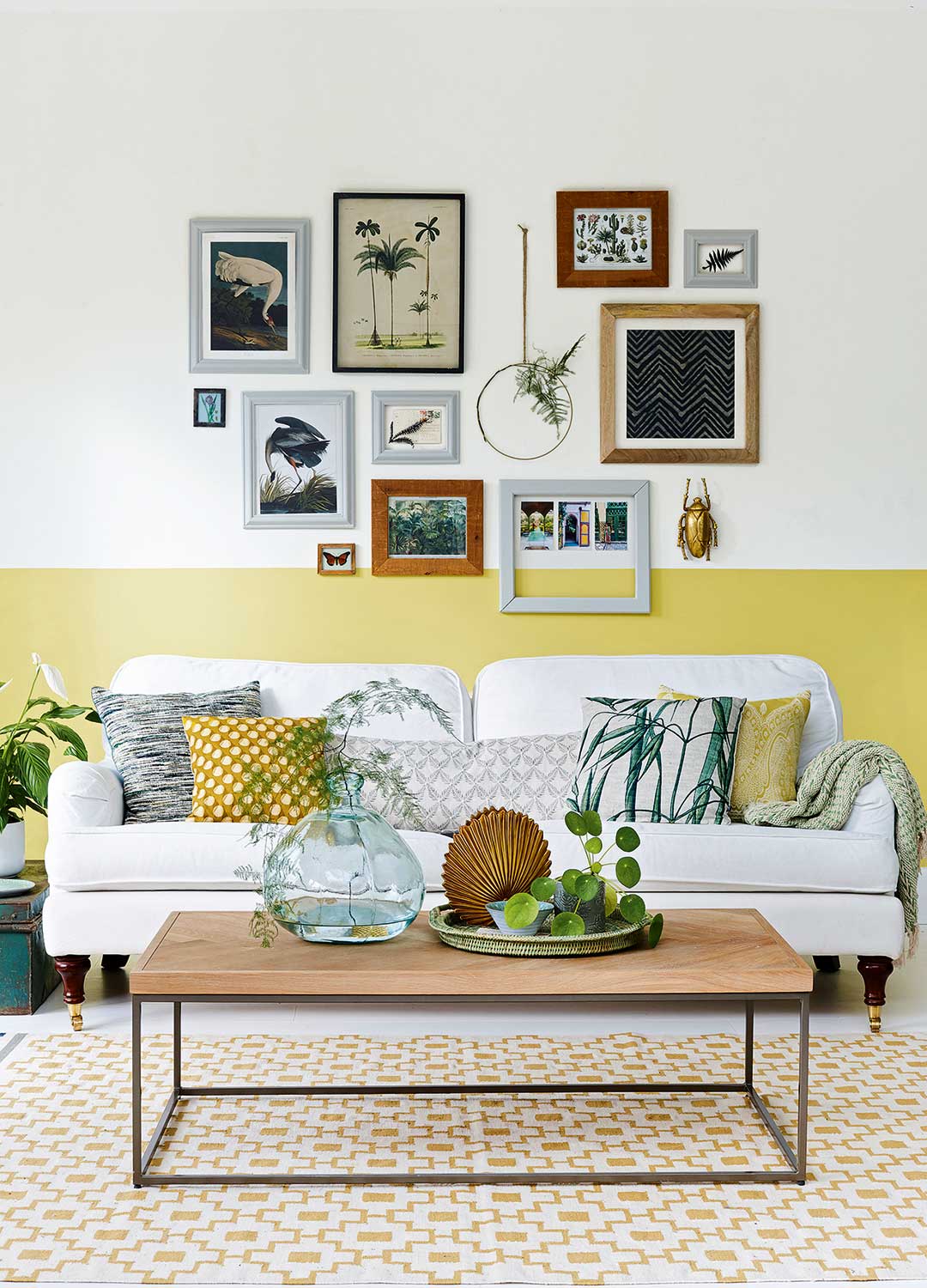
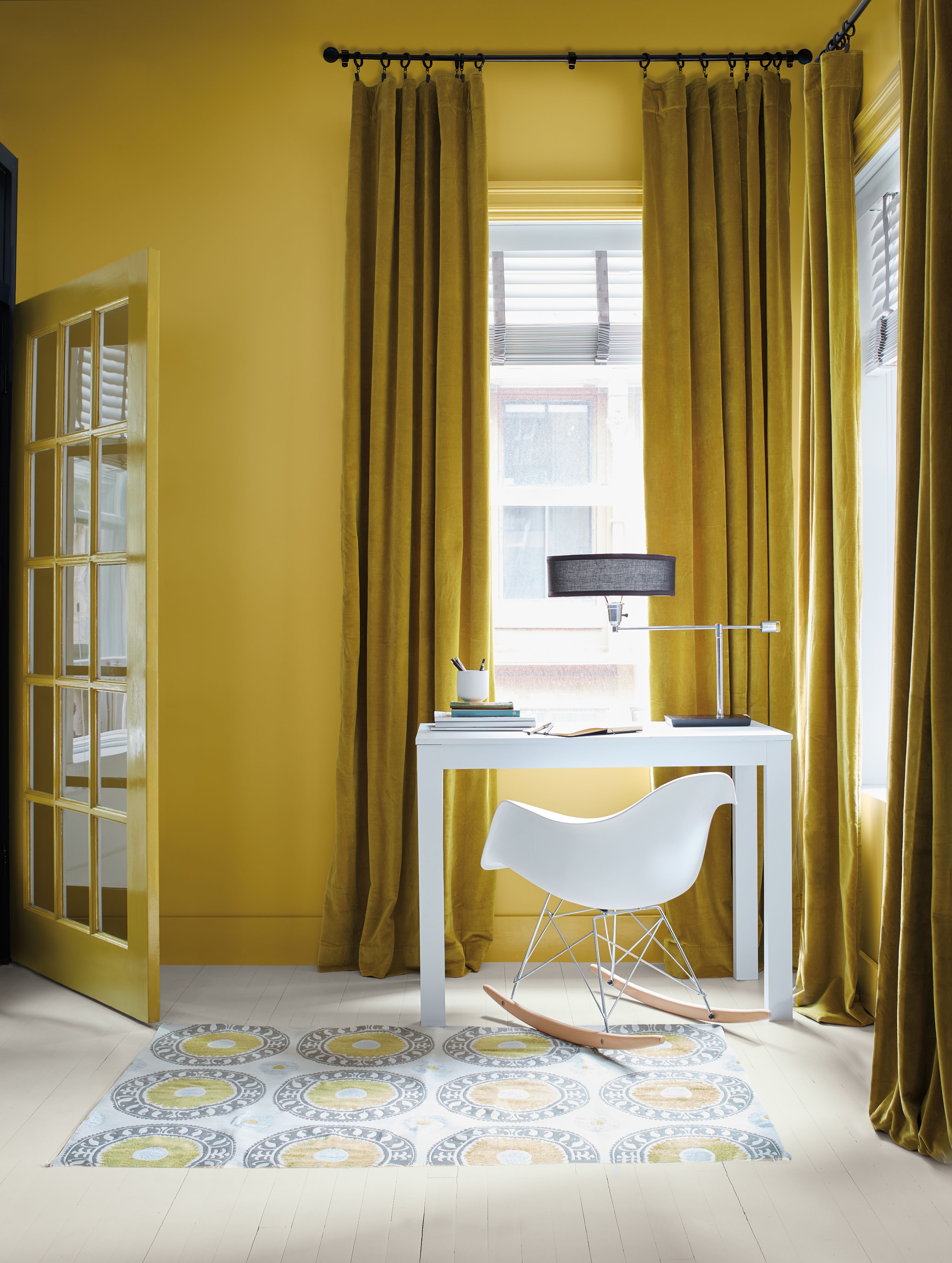
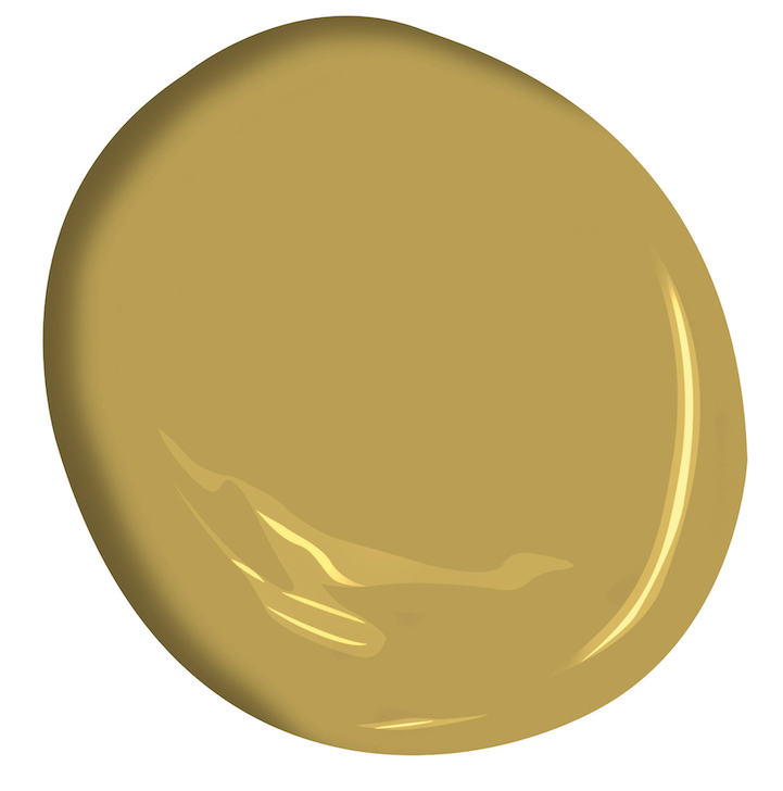
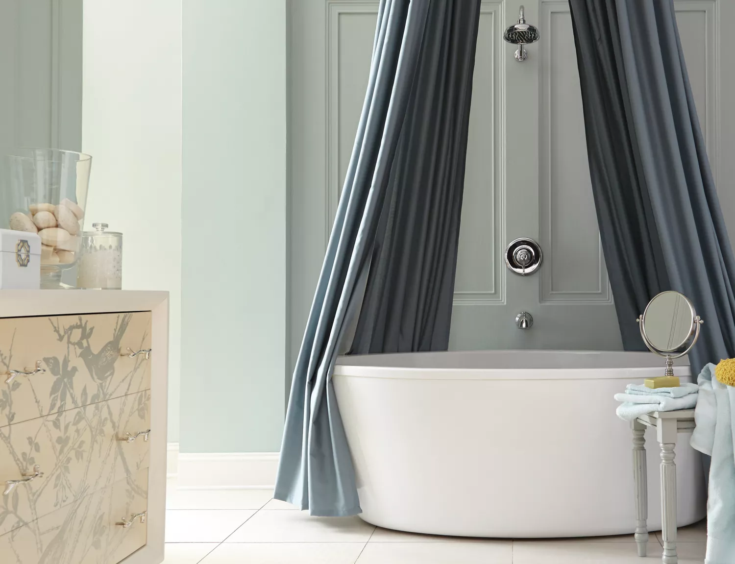
"Tallow" by Farrow & Ball is recommended by Heather Kate of MDI Luxury Design. This creamy yellow, with its warmer undertones, makes rooms feel more inviting and contributes to a sense of airiness and connection when used seamlessly throughout a space. For a serene, coastal ambiance, "Sea Salt" by Sherwin-Williams is suggested. Ania Agárdy, an interior designer, explains that lighter, cooler tones visually recede, making walls appear further apart and the room more spacious. While white is a common choice, this cool gray offers a similar effect.
Finally, "Chantilly Lace" by Benjamin Moore is presented as a timeless and elegant soft white. Agárdy emphasizes its ability to reflect light and create a sense of openness, making it a reliable choice for enhancing the perception of space in any room. The article concludes by reinforcing the idea that thoughtful paint selection can significantly alter the perceived size and mood of an interior, providing practical advice for homeowners and designers alike.
#PaintColors #InteriorDesign #SmallSpaces #HomeDecor #DesignTips #RoomExpansion #ColorPsychology #SherwinWilliams #BenjaminMoore #PaintColors #InteriorDesign #SmallSpaces #HomeDecor #DesignTips #RoomExpansion #ColorPsychology #SherwinWilliams #BenjaminMoore
0 comment in total
 No comments yet
You may also like
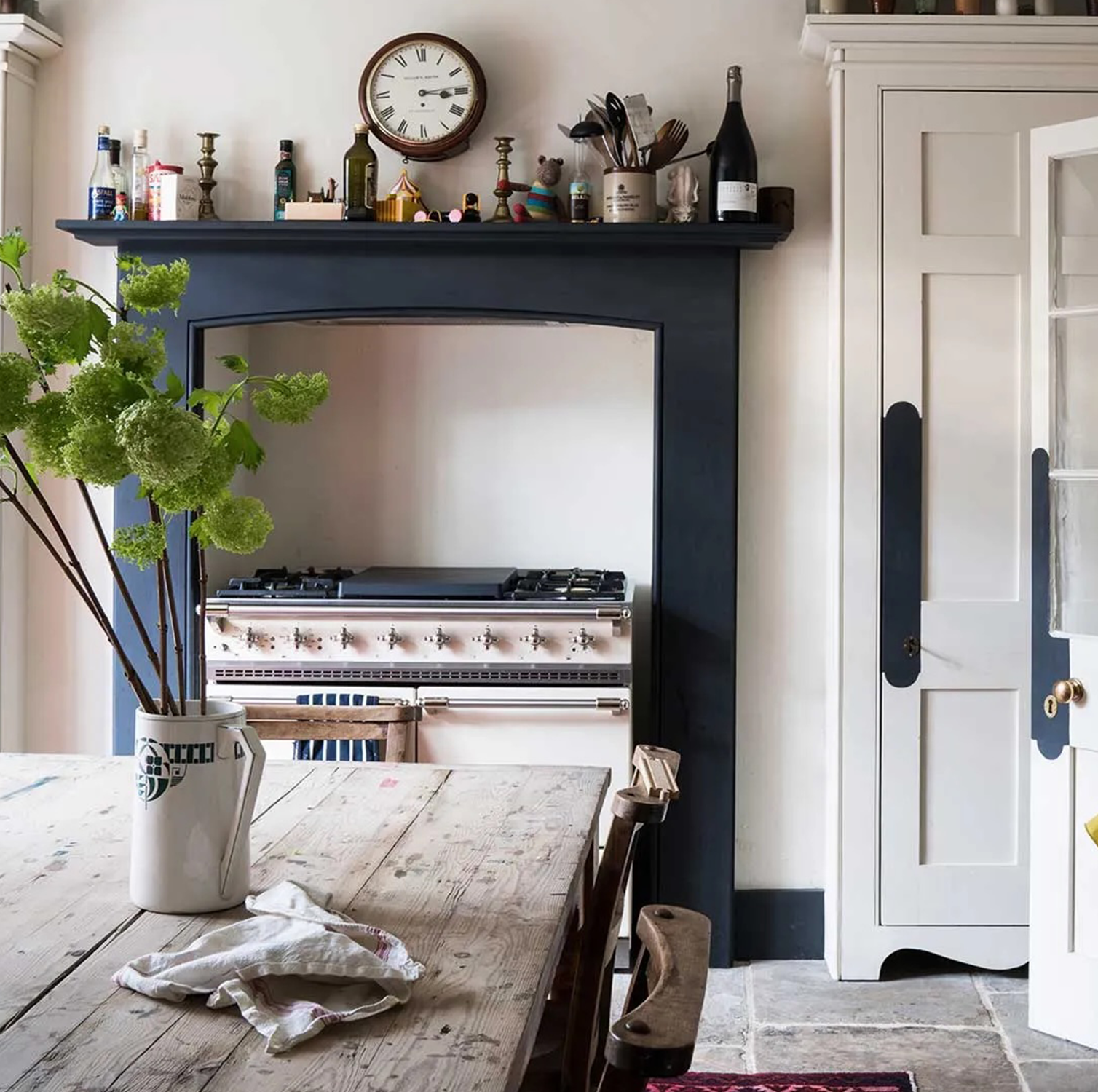
These 6 paint colours instantly make small rooms feel bigger
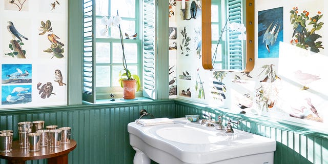
18 Best Paint Colors to Make Small Bathrooms Feel Bigger

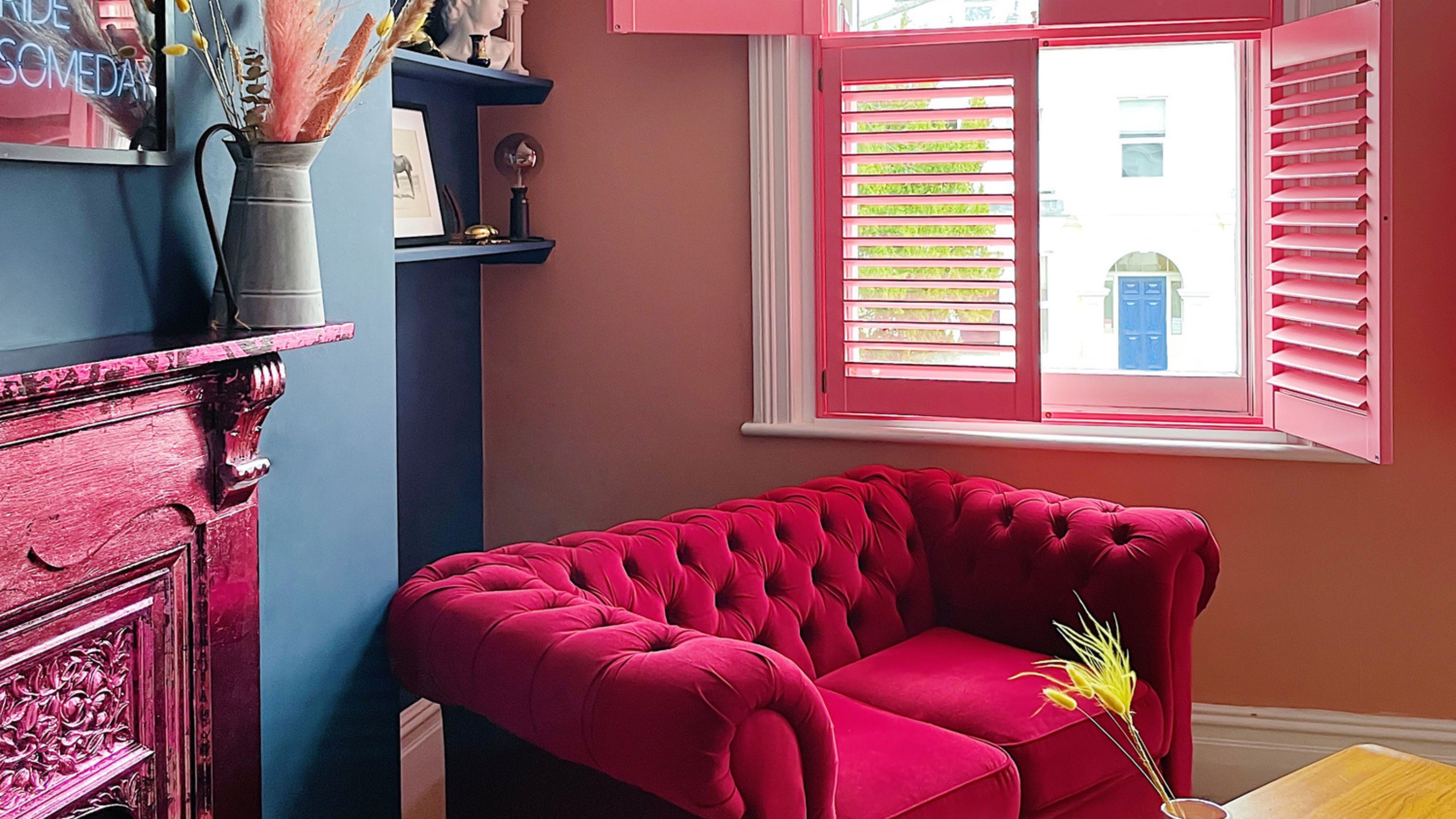
The best paint colors for small living rooms, according to design experts

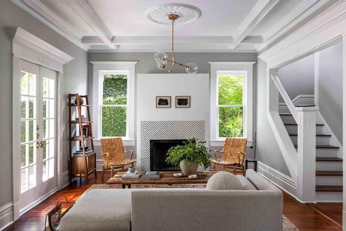
14 Genius Painting Tricks to Make a Room Look Bigger
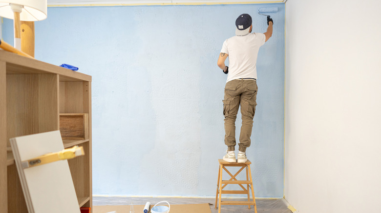
12 Tips For Making Small Rooms Appear Larger Using Paint

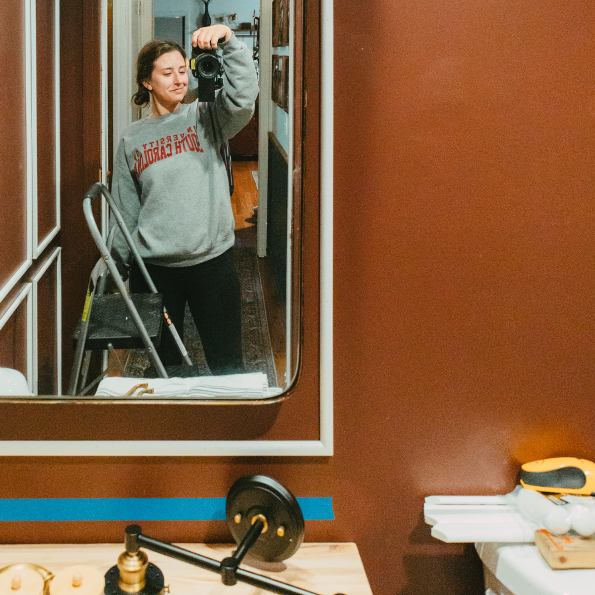
How To Successfully Paint Small Spaces Dark Colors & Actually Make Your Room Look BIGGER

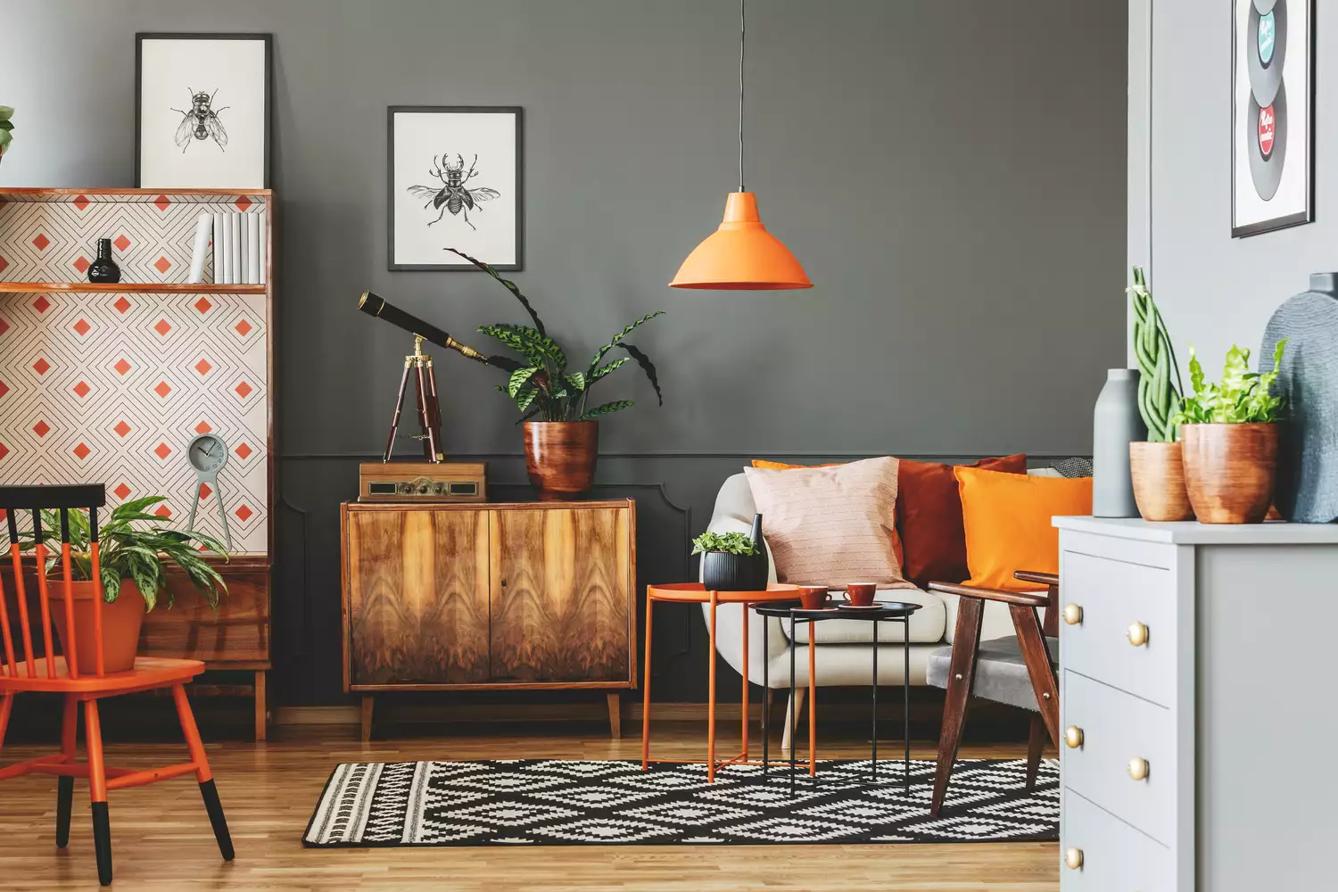
7 Paint Colors That Instantly Make Small Living Rooms Feel Bigger, Designers Say

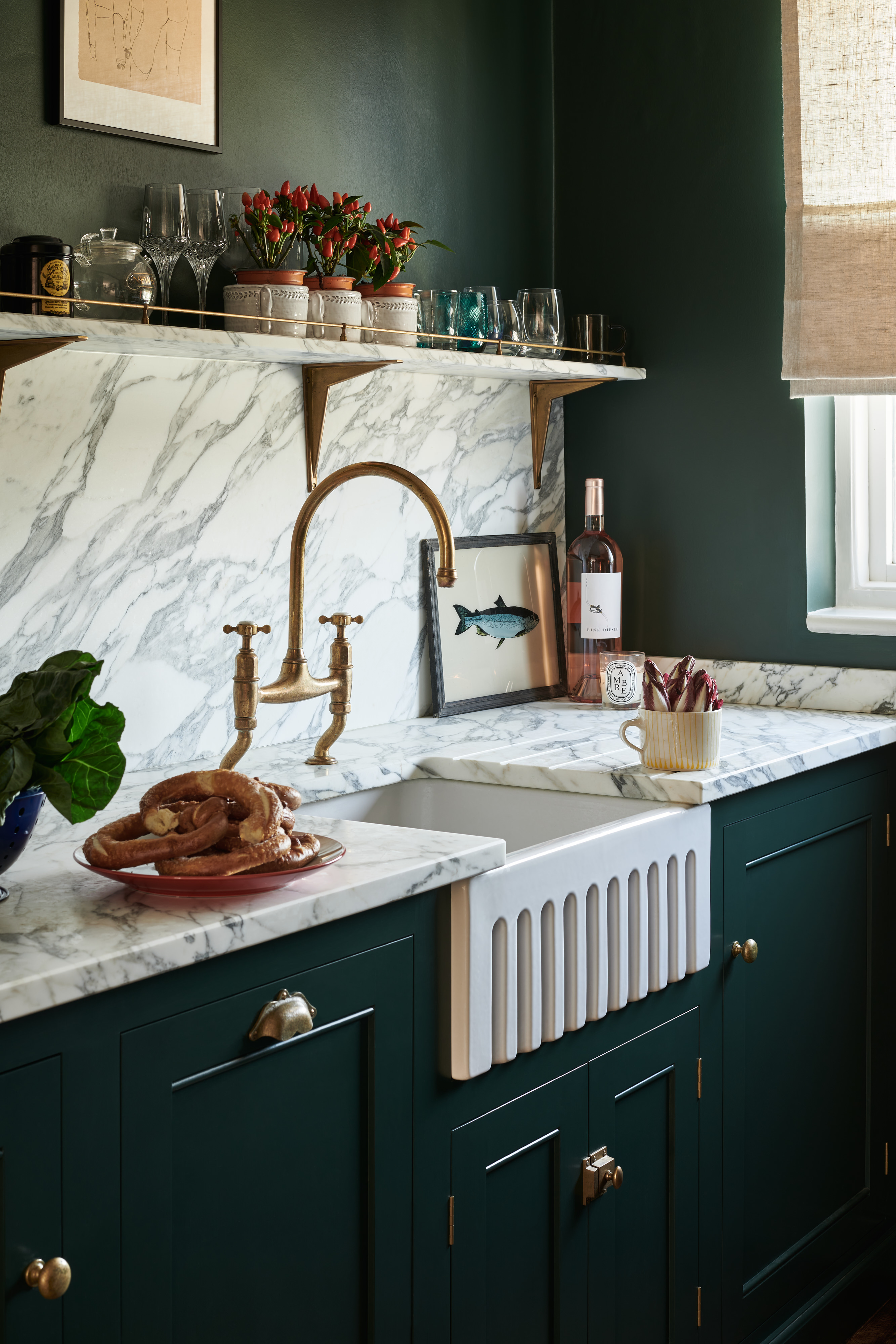
10 kitchen cabinet colors to make a small space look bigger
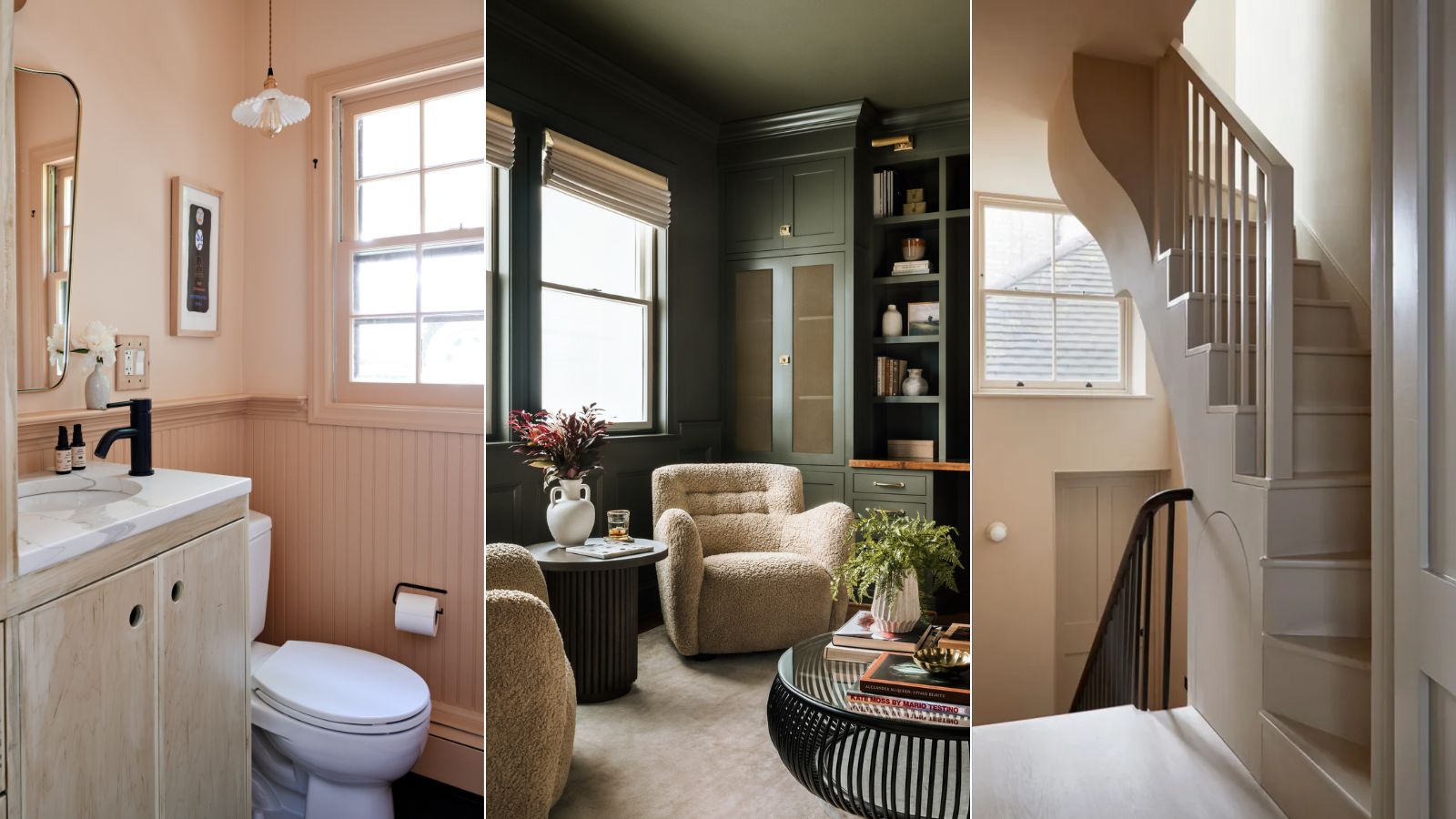
9 rooms that prove color drenching makes small spaces look bigger

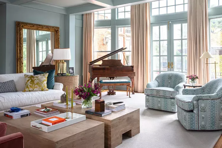
12 Paint Colors That Will Make Any Room Look Bigger
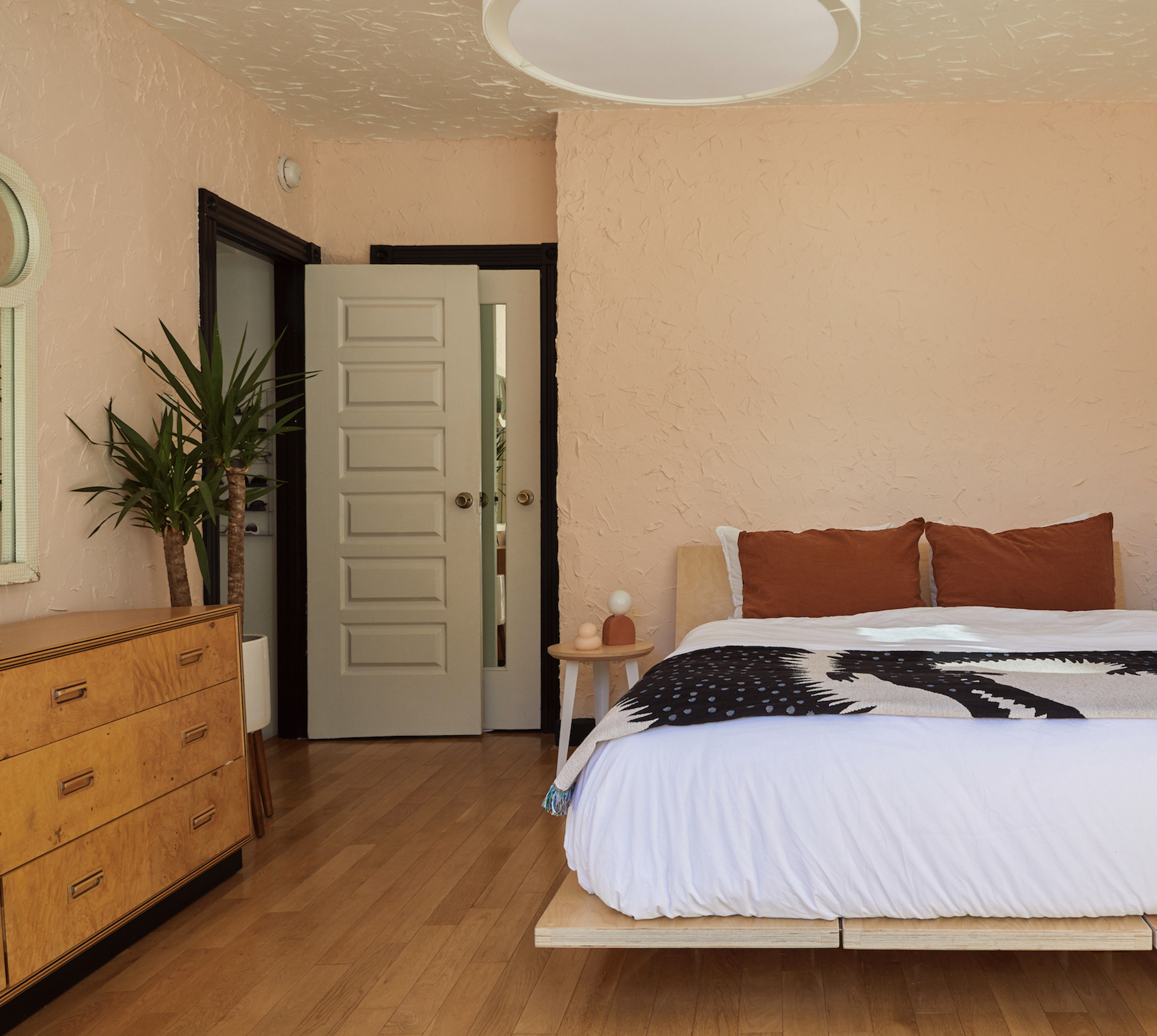
8 of the best paint colors to enhance small spaces, according to experts
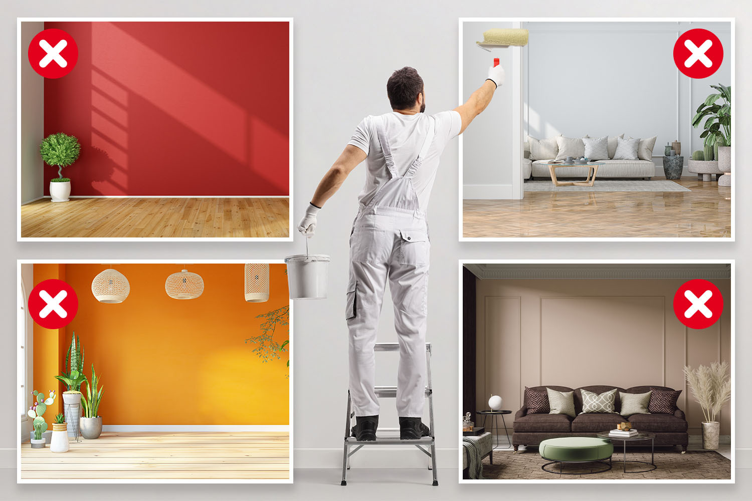
I’m an interior designer - the worst paint colours for small rooms, and why bright white walls is not a good idea

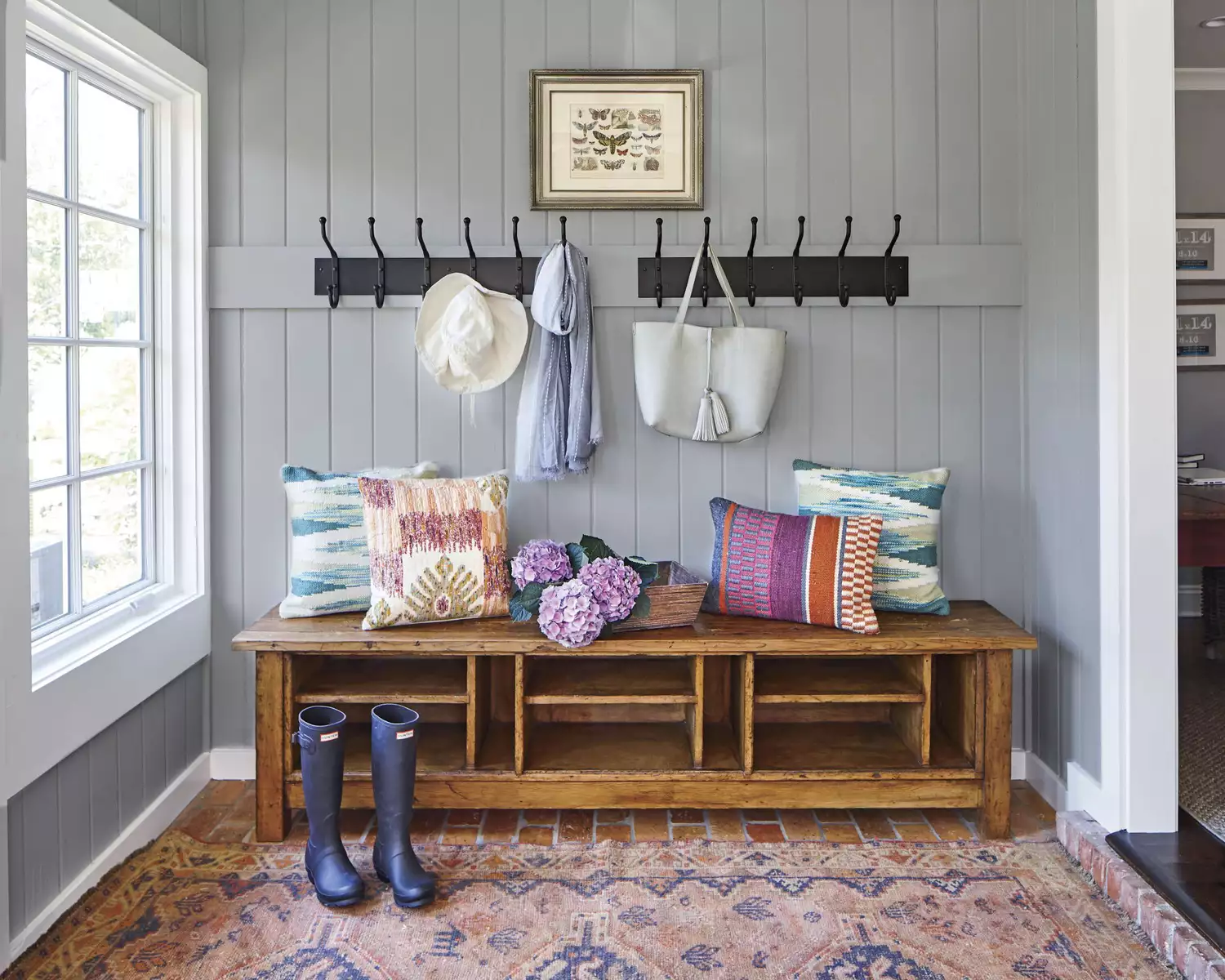
12 Paint Colors That Will Make Small Rooms Feel Bigger
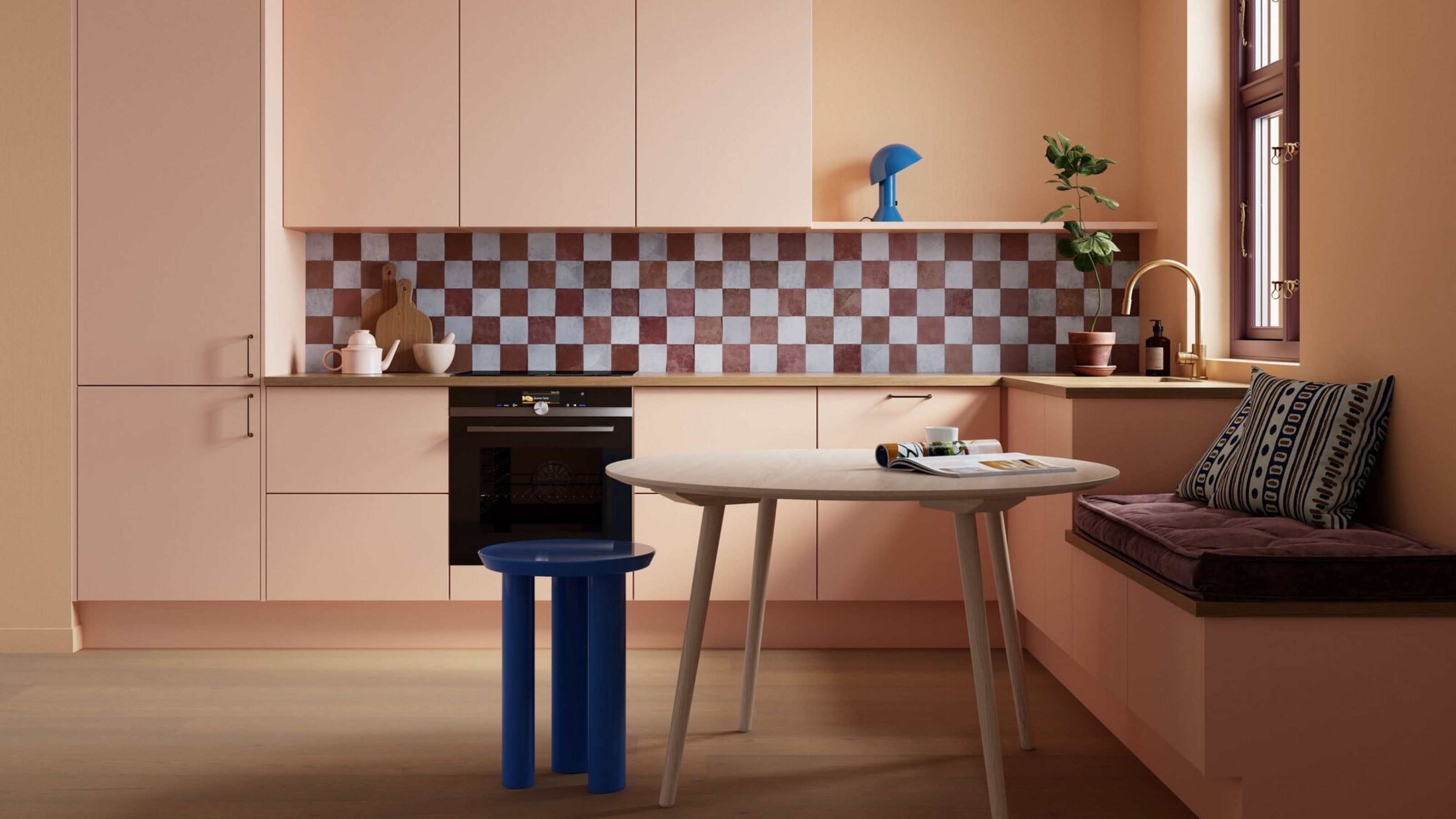
What Colors Make a Room Look Bigger? 5 That Designers Reach for to Make Walls 'Visually Expand'

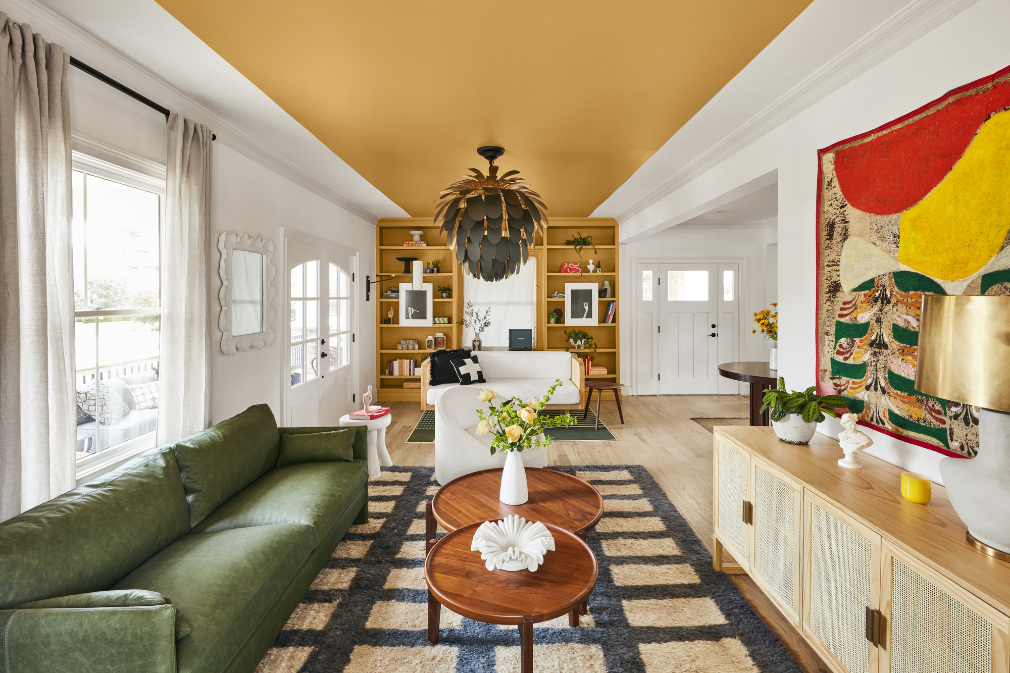
How to make a narrow room look wider with paint - expert tricks to make small spaces seem bigger
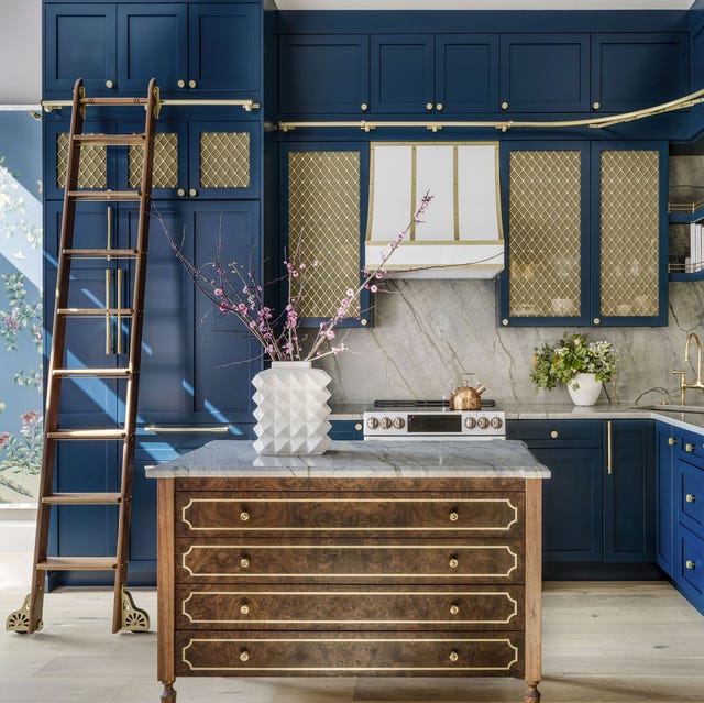
These Colors Will Make Your Kitchen Look Bigger, According to Designers

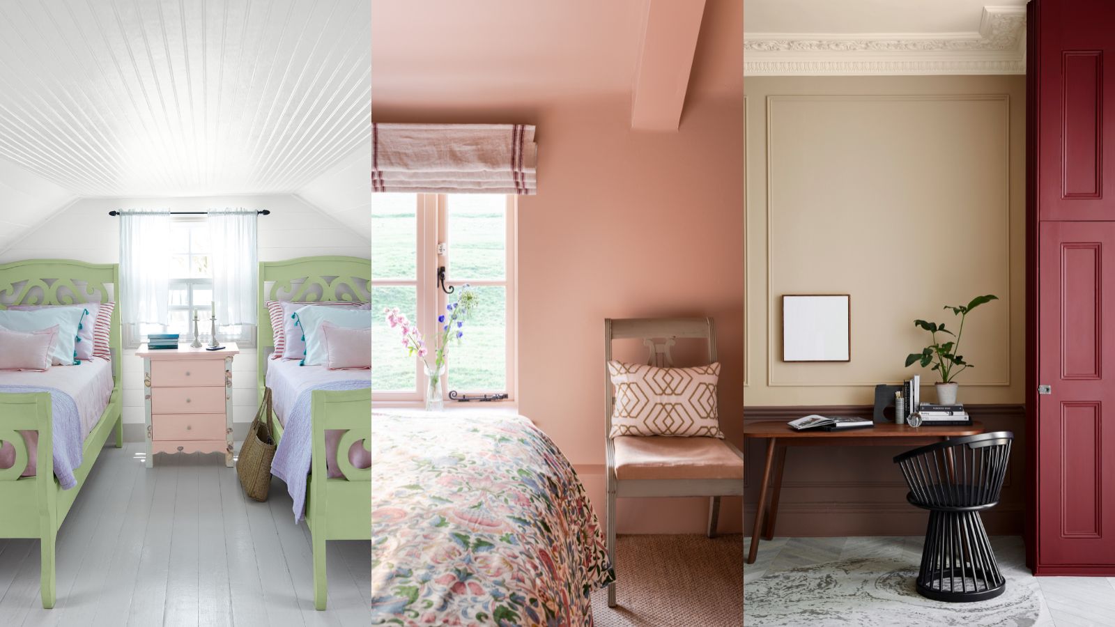
What colors make a small room look bigger? These space-stretching shades are what design experts use
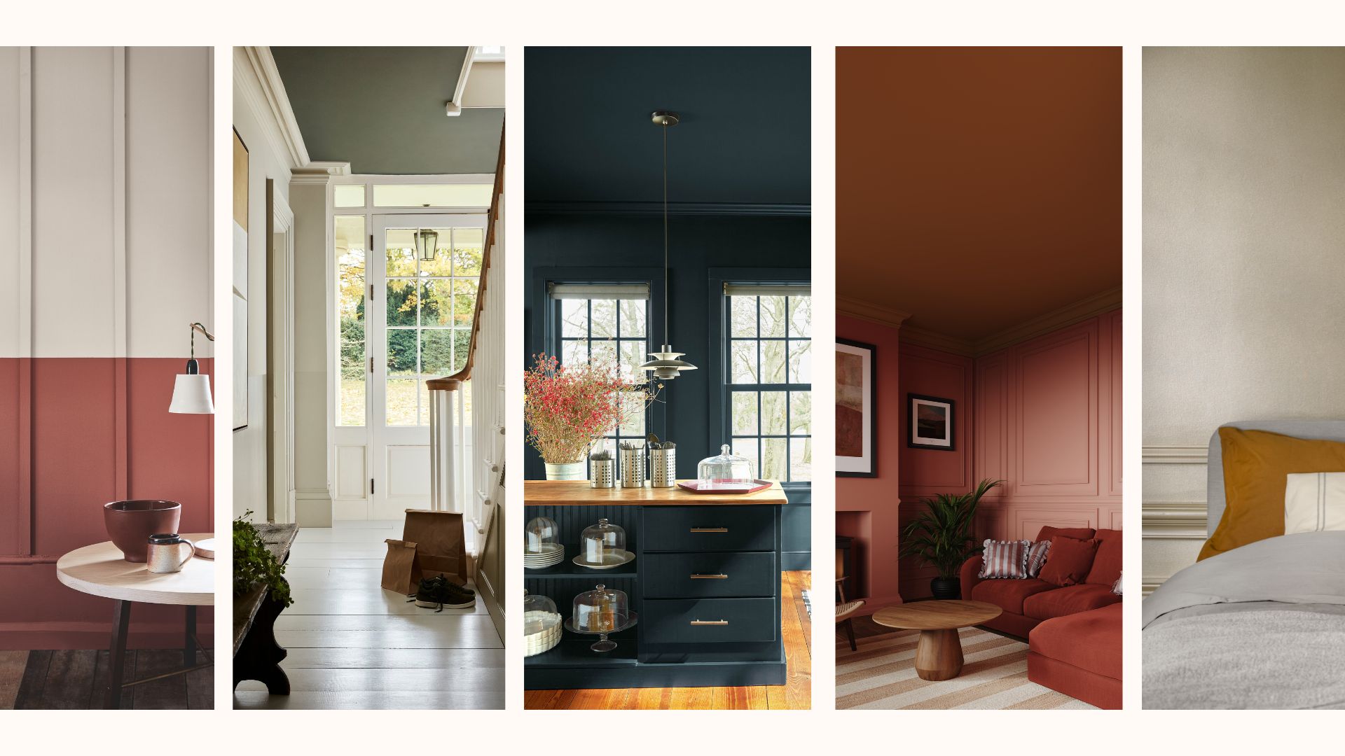
How to make a room look bigger with paint: 10 expert tips

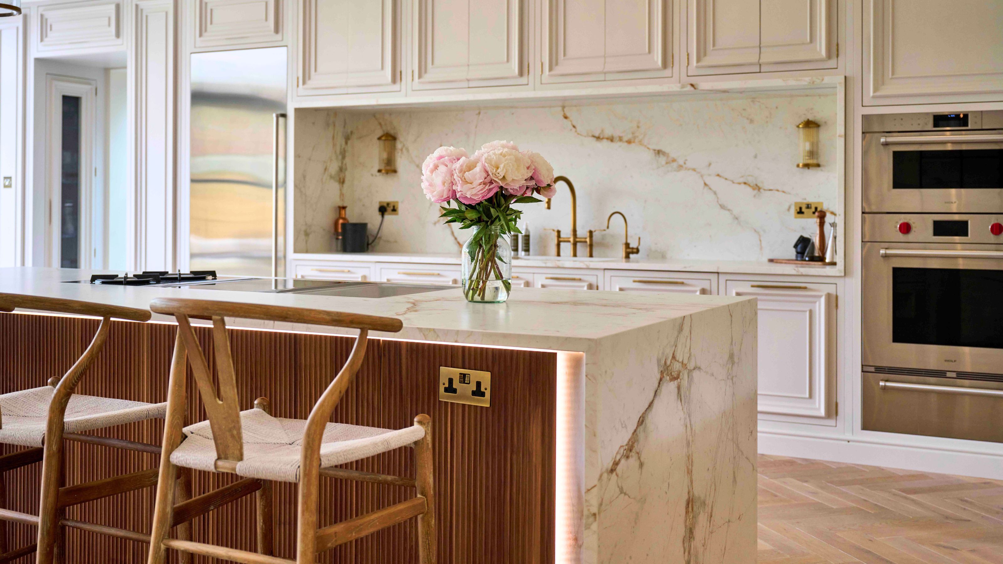
What kitchen floor colors make a small space look bigger? Interior pros spill their secrets

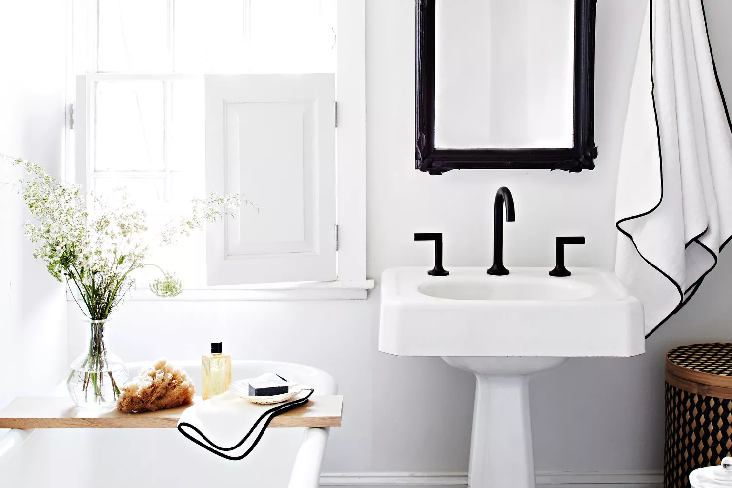
13 Paint Colors That Make Small Bathrooms Feel Bigger