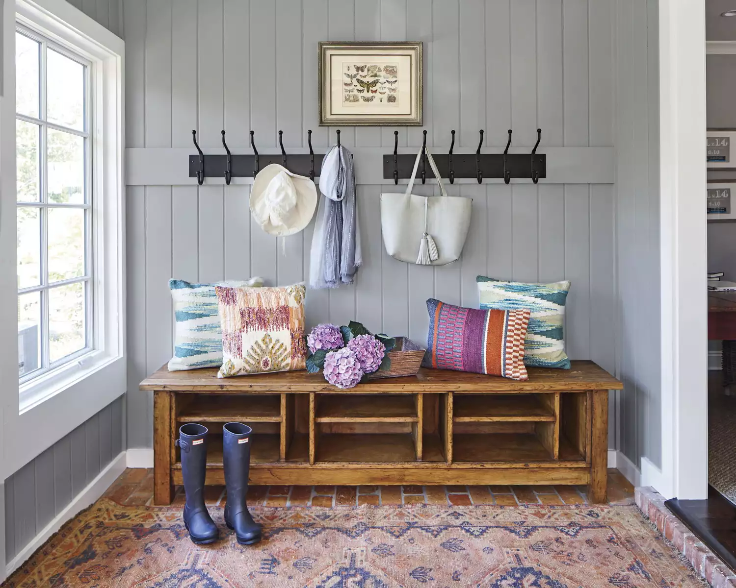
12 Paint Colors That Will Make Small Rooms Feel Bigger
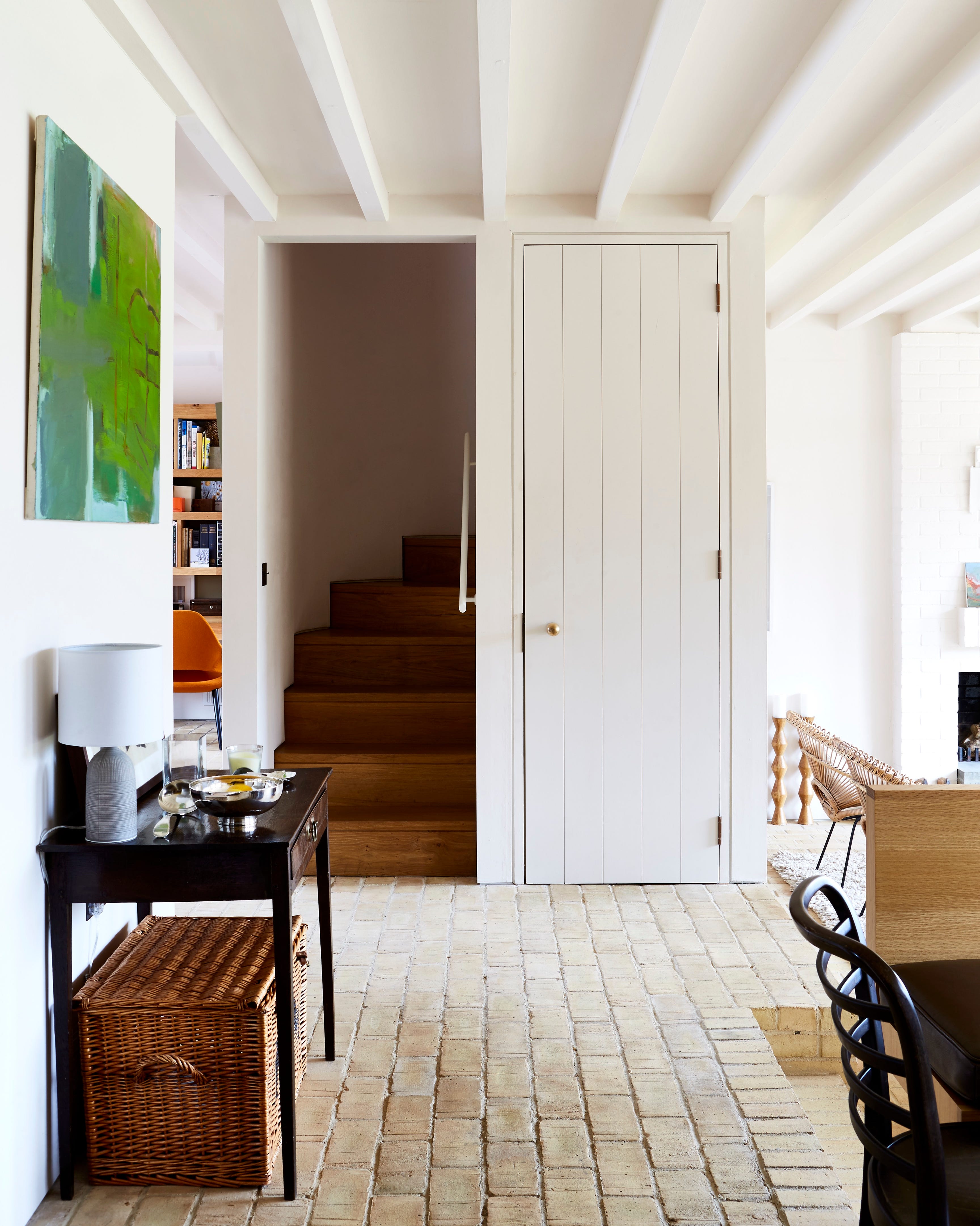
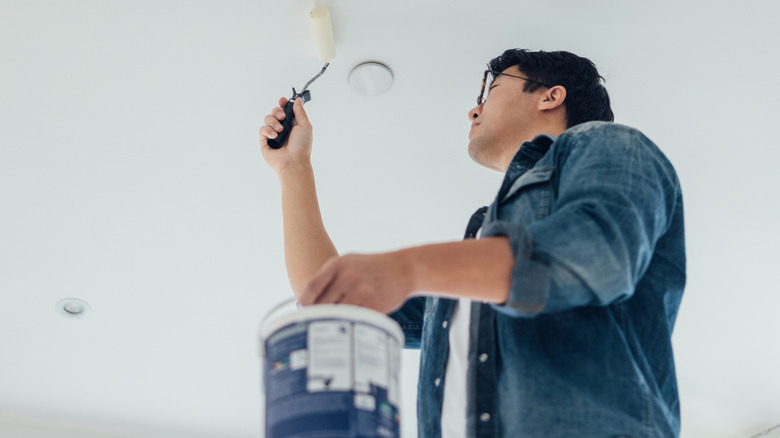
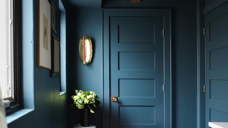
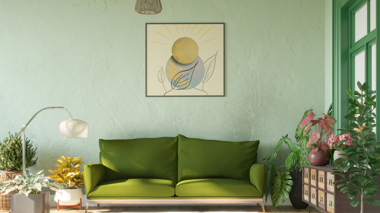
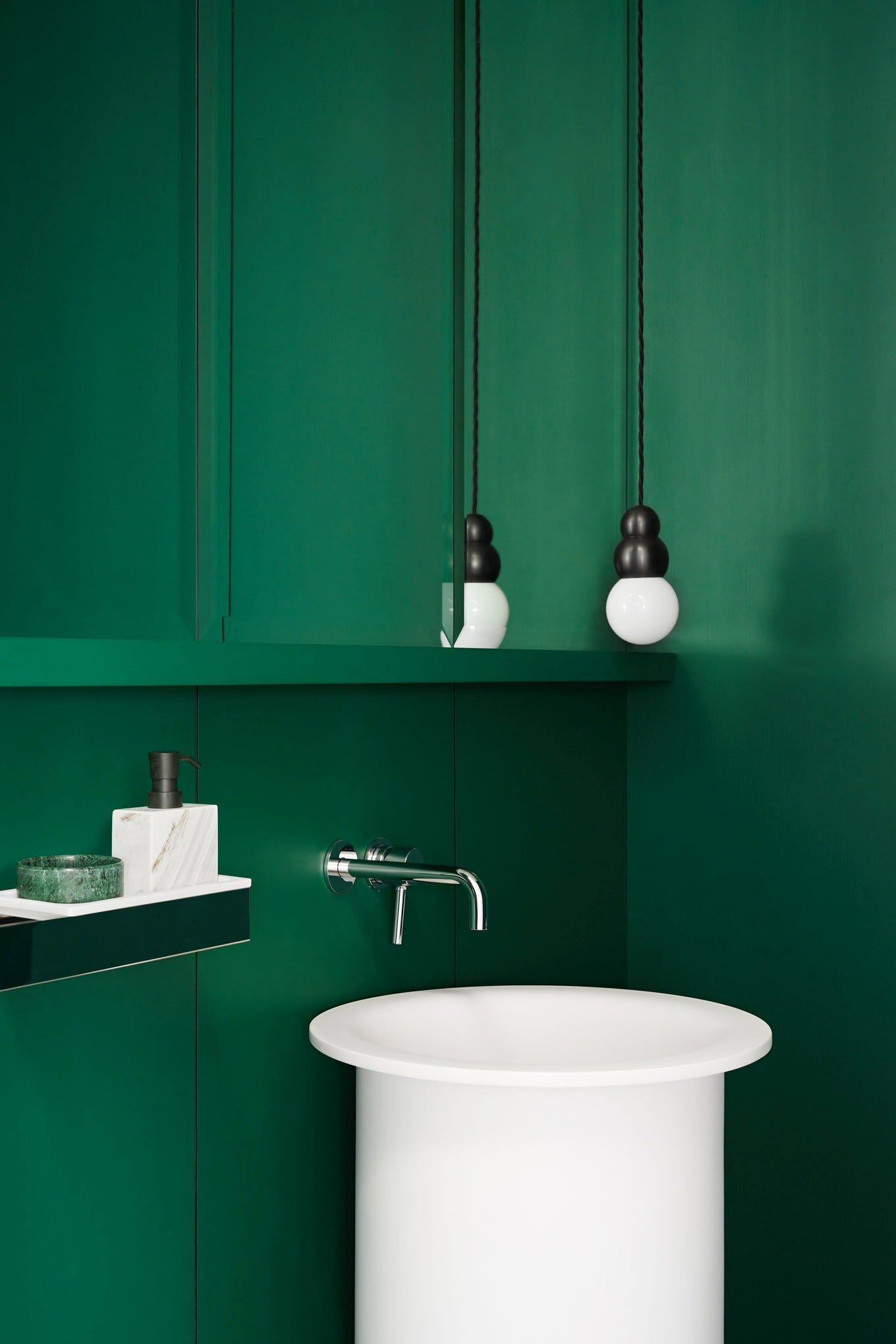
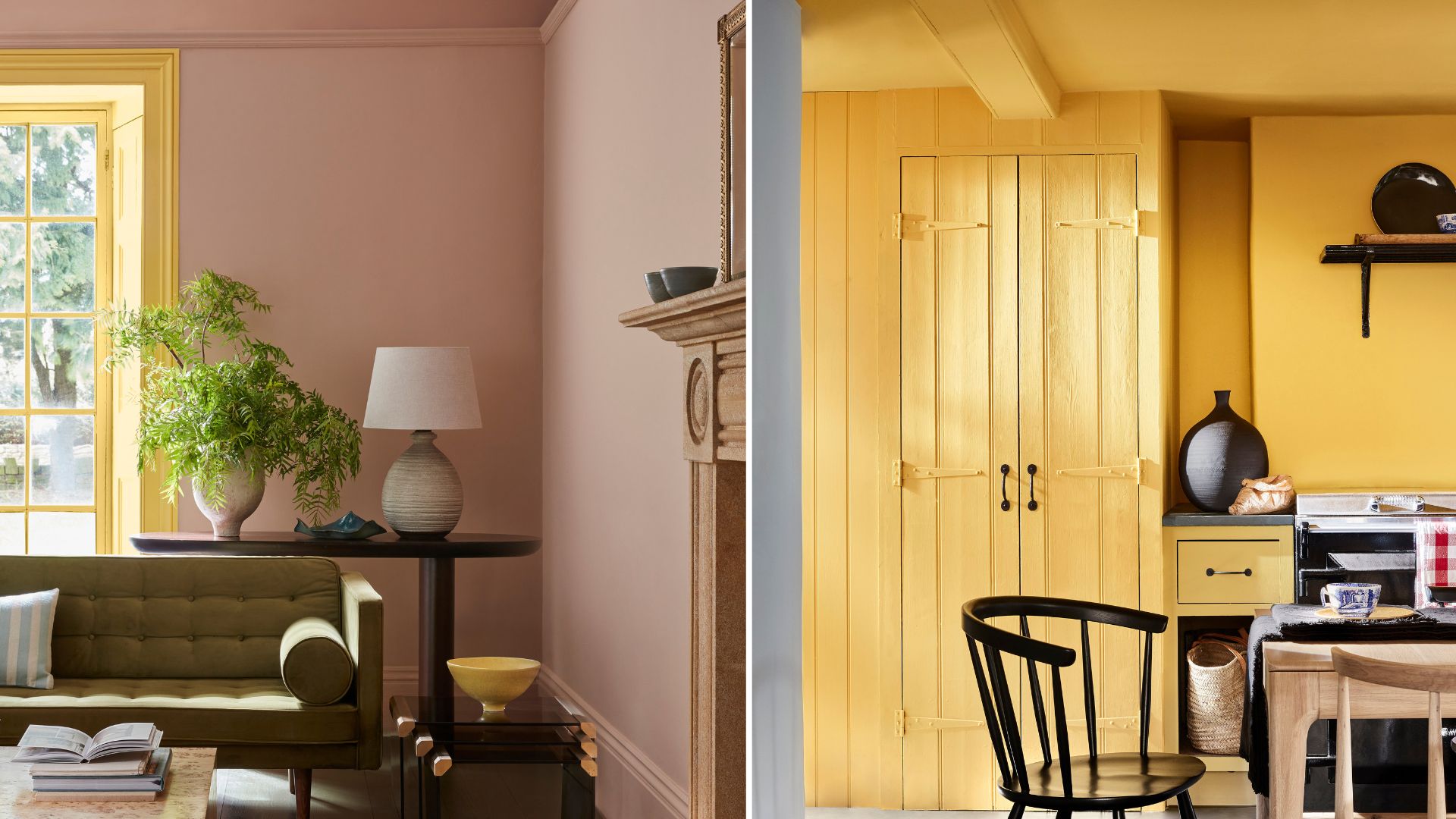
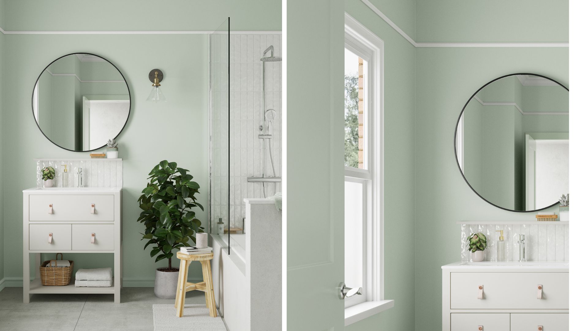
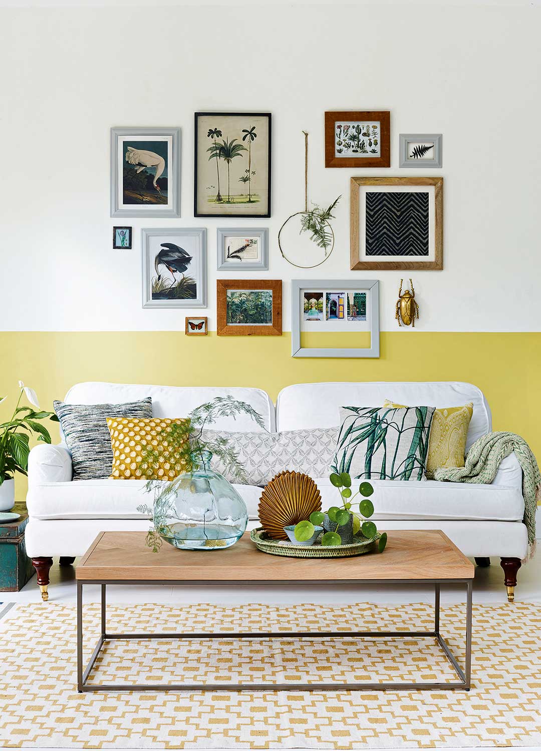
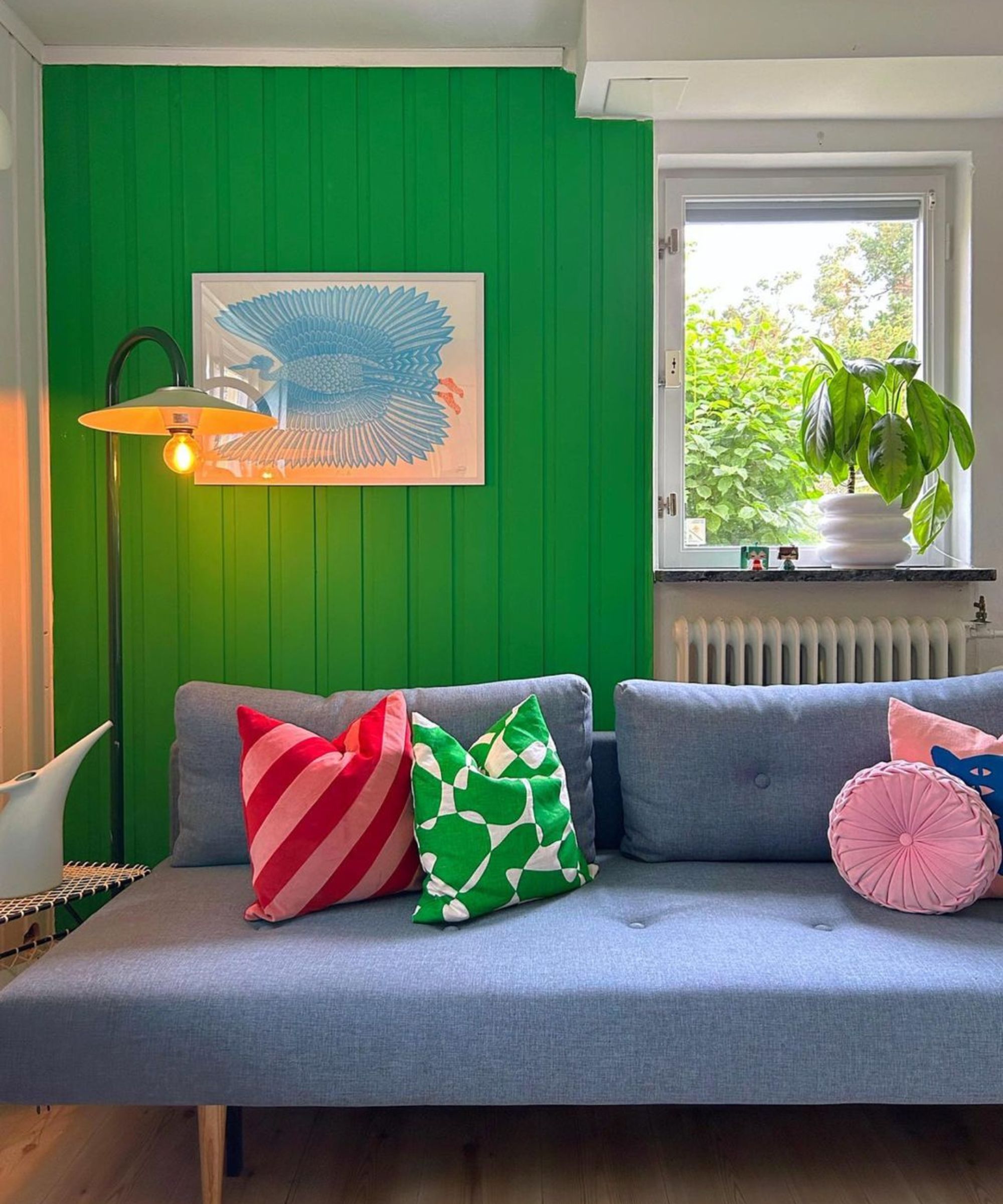
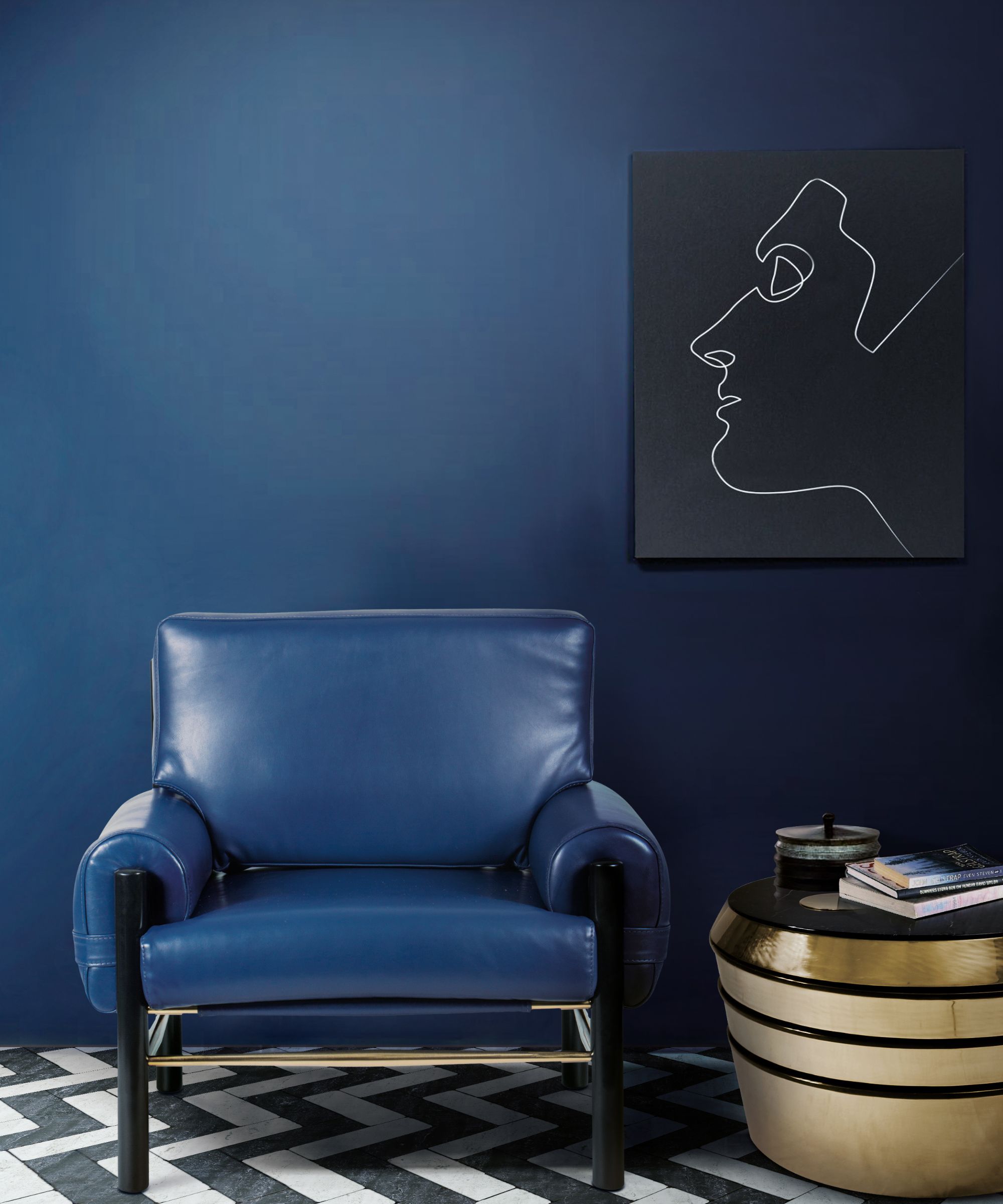
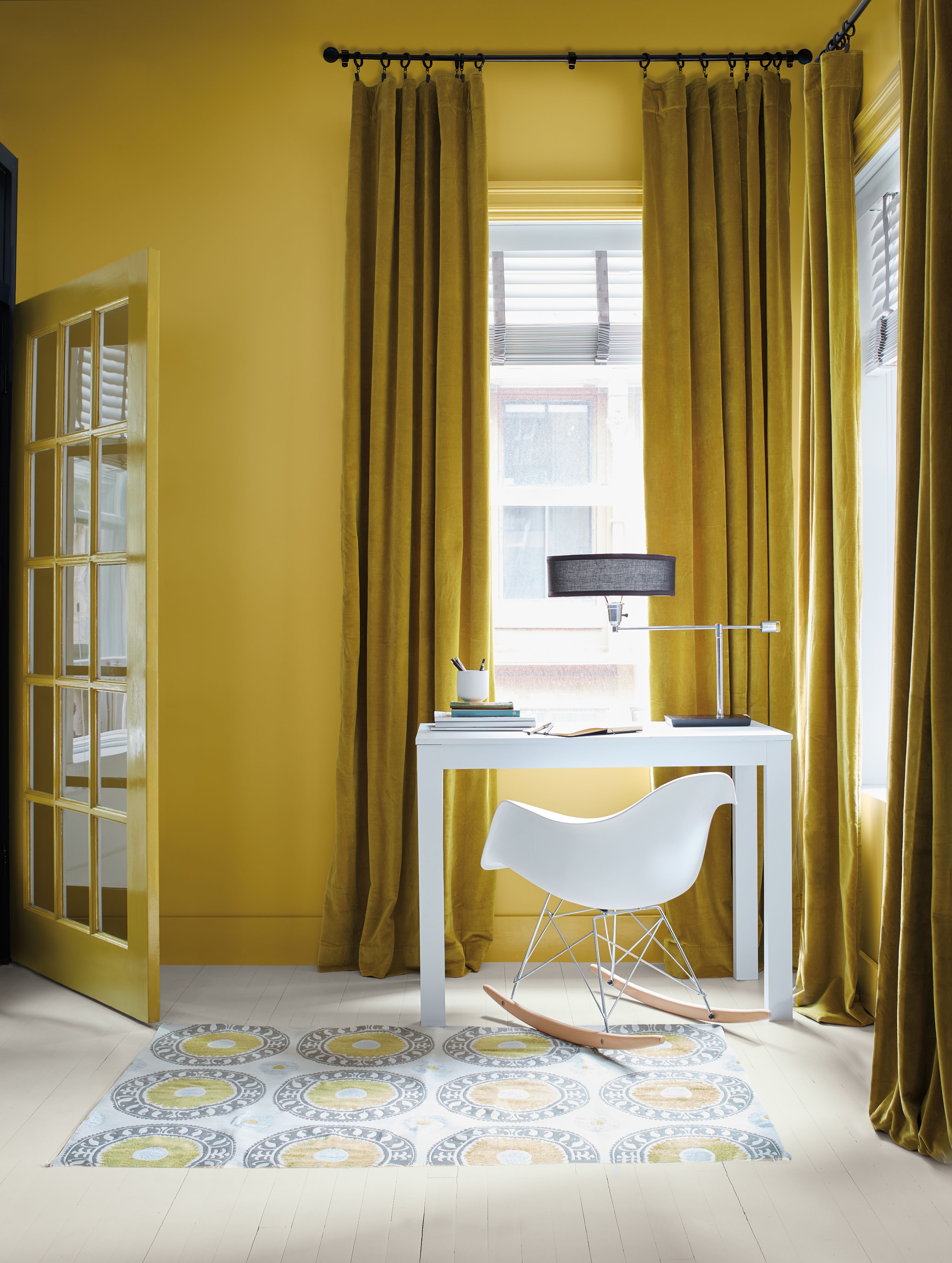
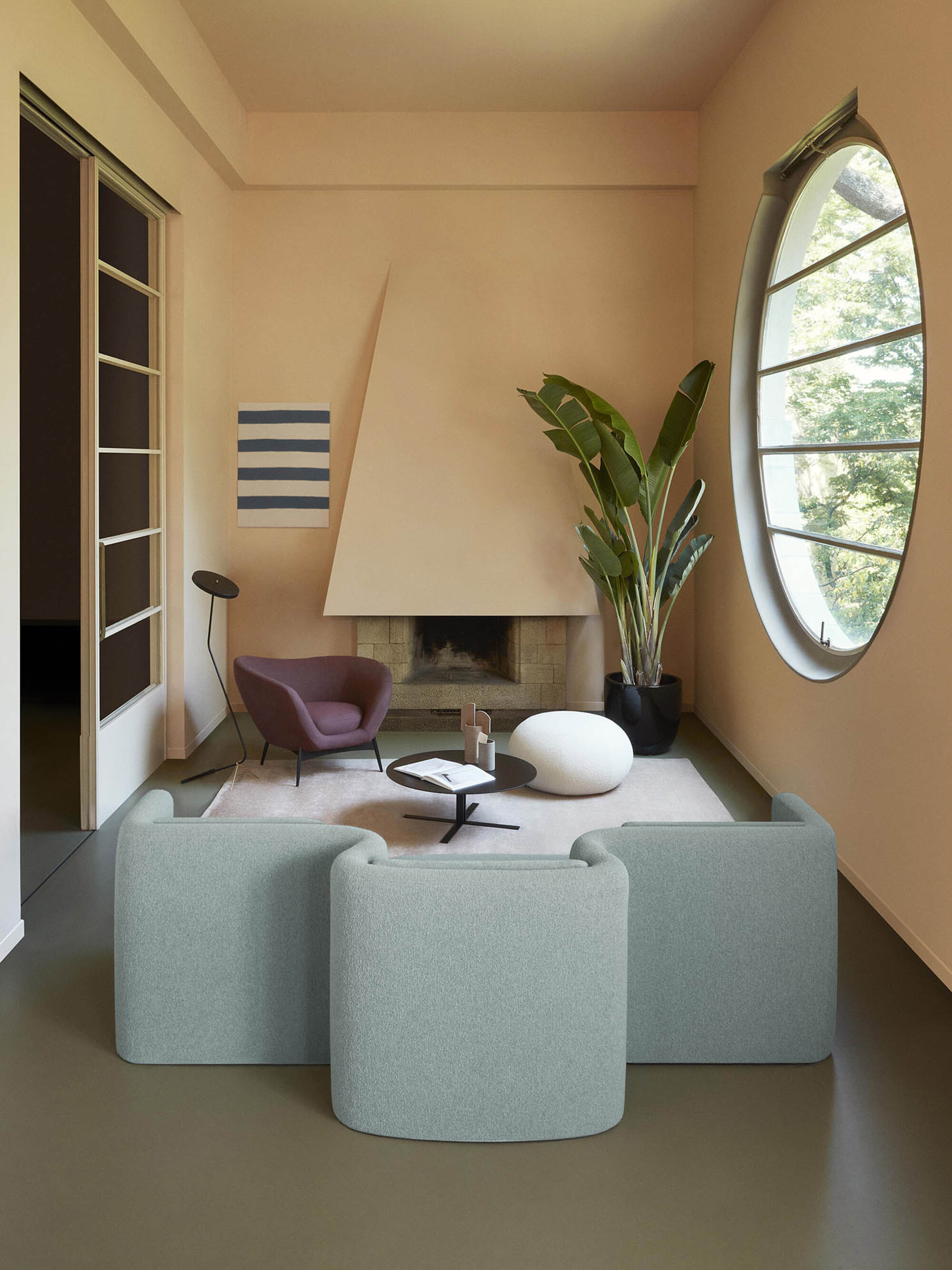
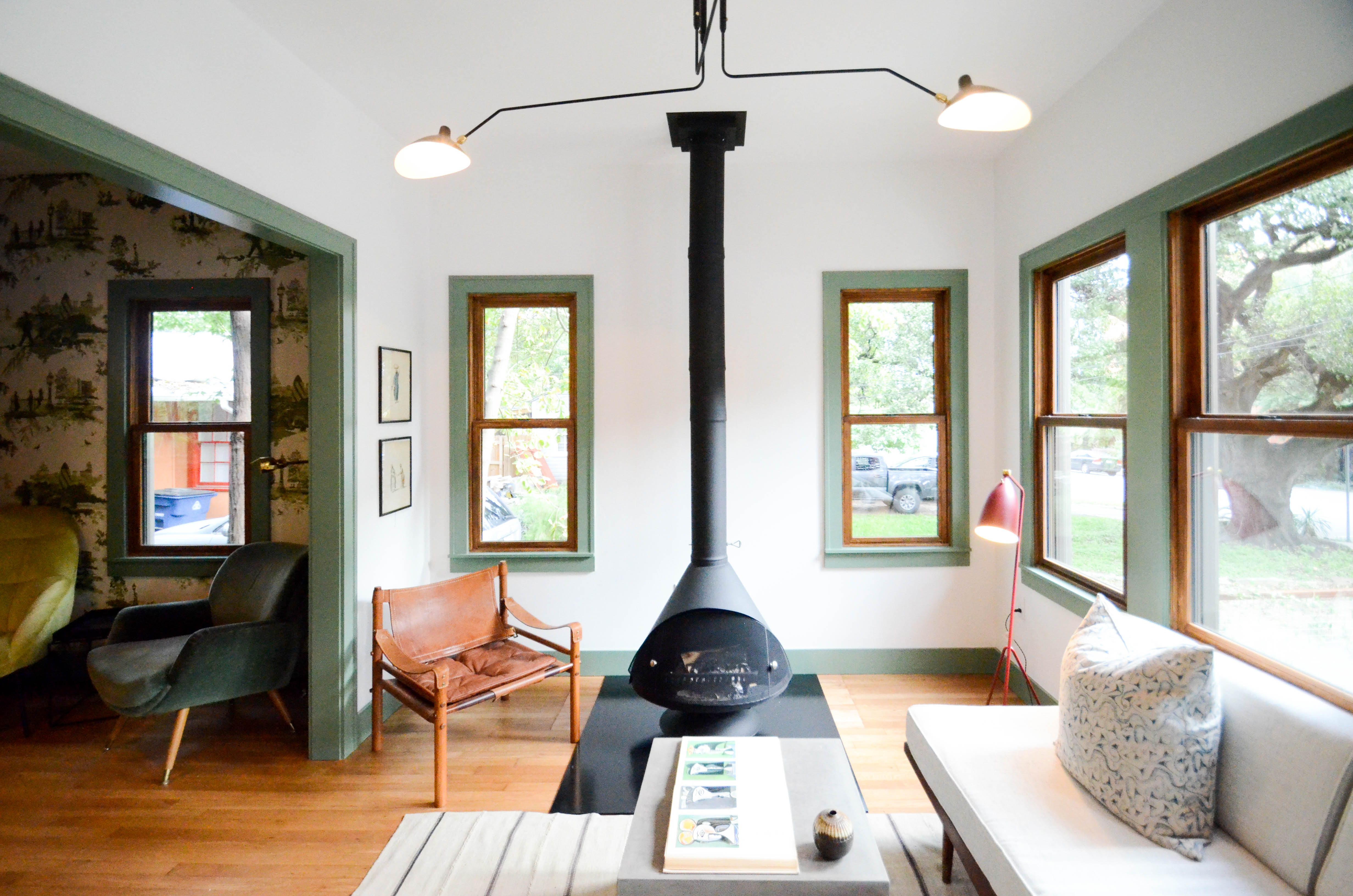
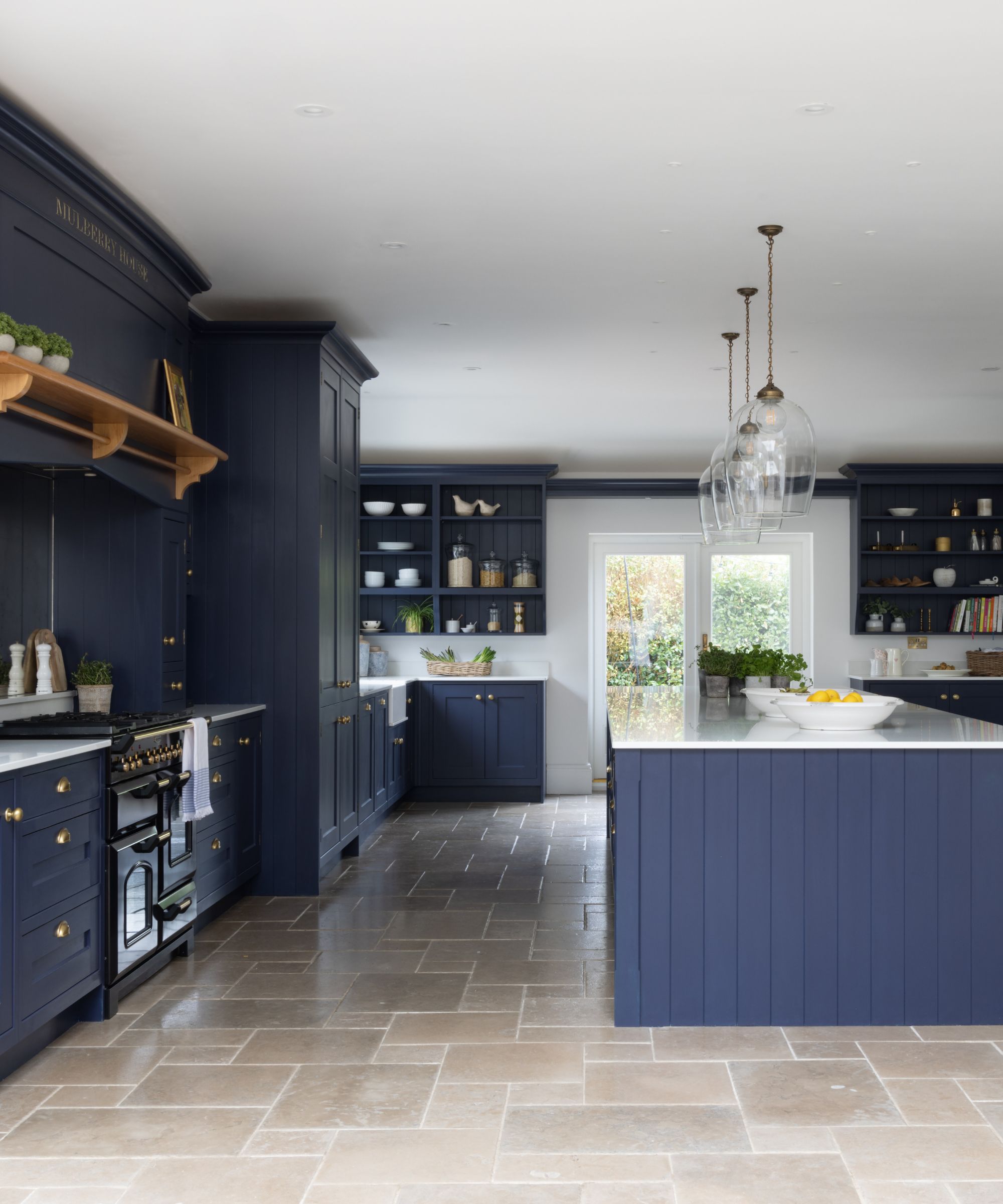
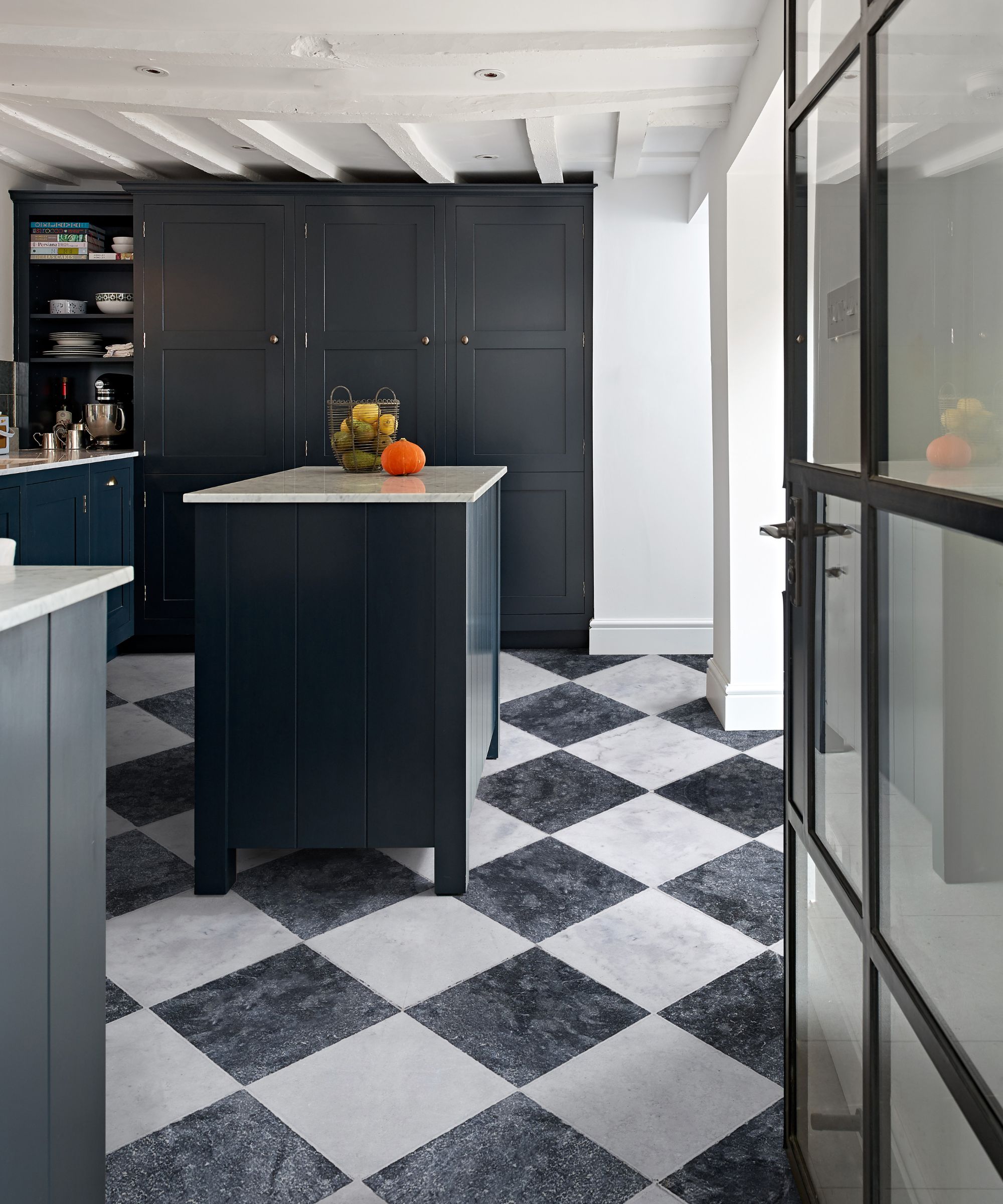
The article explores how paint color can significantly impact the perceived size of small rooms, offering expert advice and specific recommendations from top Southern designers. Nicole Gibbons, Founder and CEO of Clare Paint, suggests that light, bright colors contribute to an illusion of spaciousness by being less conspicuous and seemingly expanding the area. Conversely, she notes that darker, more saturated hues can also create depth, making walls appear to recede and thereby enlarging the room's visual footprint. Atlanta-based interior designer Alice Cramer emphasizes the importance of natural light, stating that dark paint colors can be particularly effective in well-lit spaces.
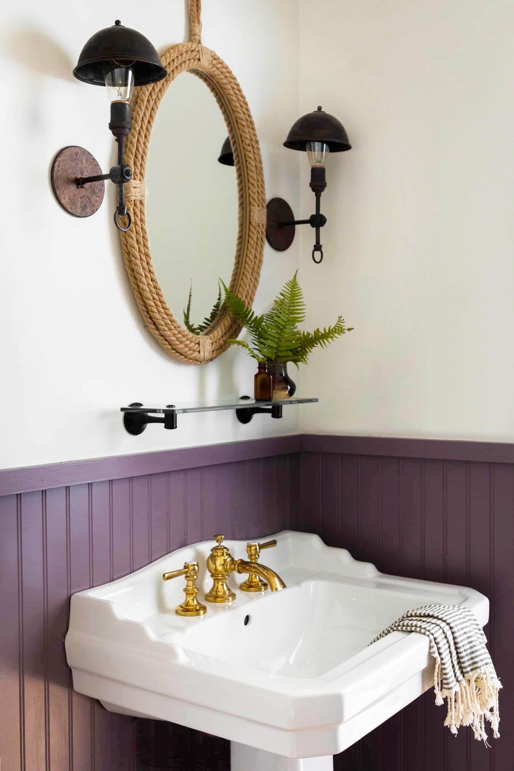
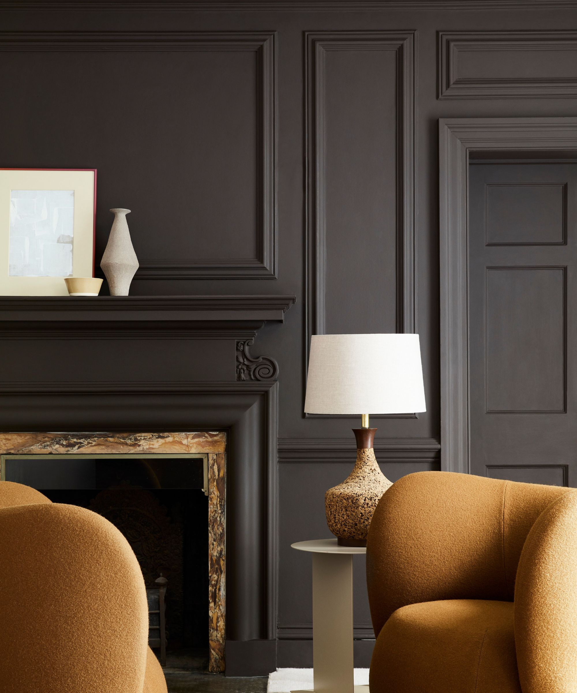
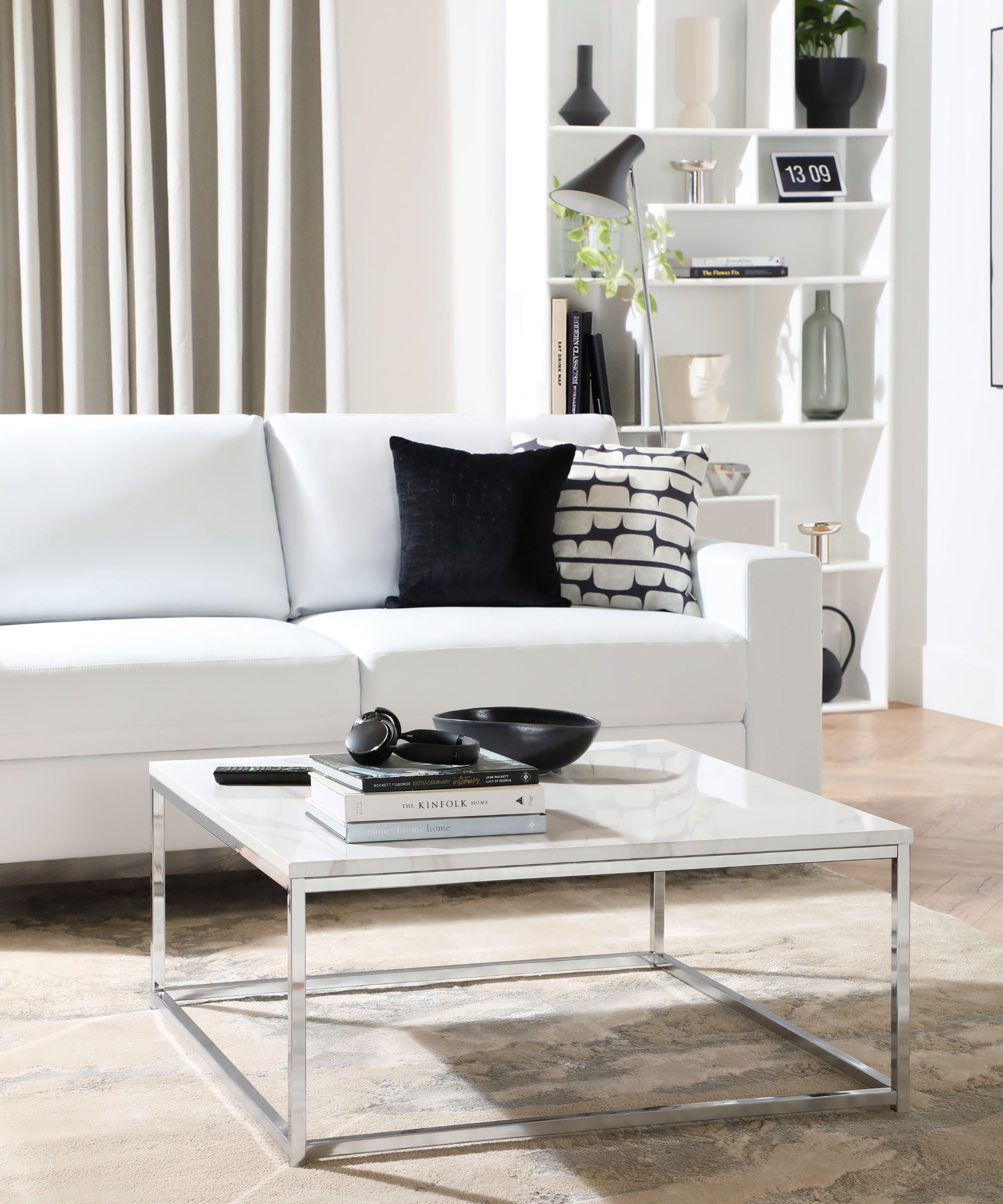
The article provides a curated list of 12 paint colors, detailing how each can be used to enhance small spaces. For instance, Katie Davis of Katie Davis Design utilized Benjamin Moore's Lead Gray in a powder bath to add depth, especially effective with architectural features like paneling. Jennifer Barron of Jennifer Barron Interiors recommends Farrow & Ball's Down Pipe, a warm, dark gray, to make small spaces feel cozier yet larger due to its depth. Hattie Sparks, a New Orleans-based designer, favors Benjamin Moore's White Dove for its pure, fresh, and bright quality that makes rooms feel clean and airy without appearing sterile.
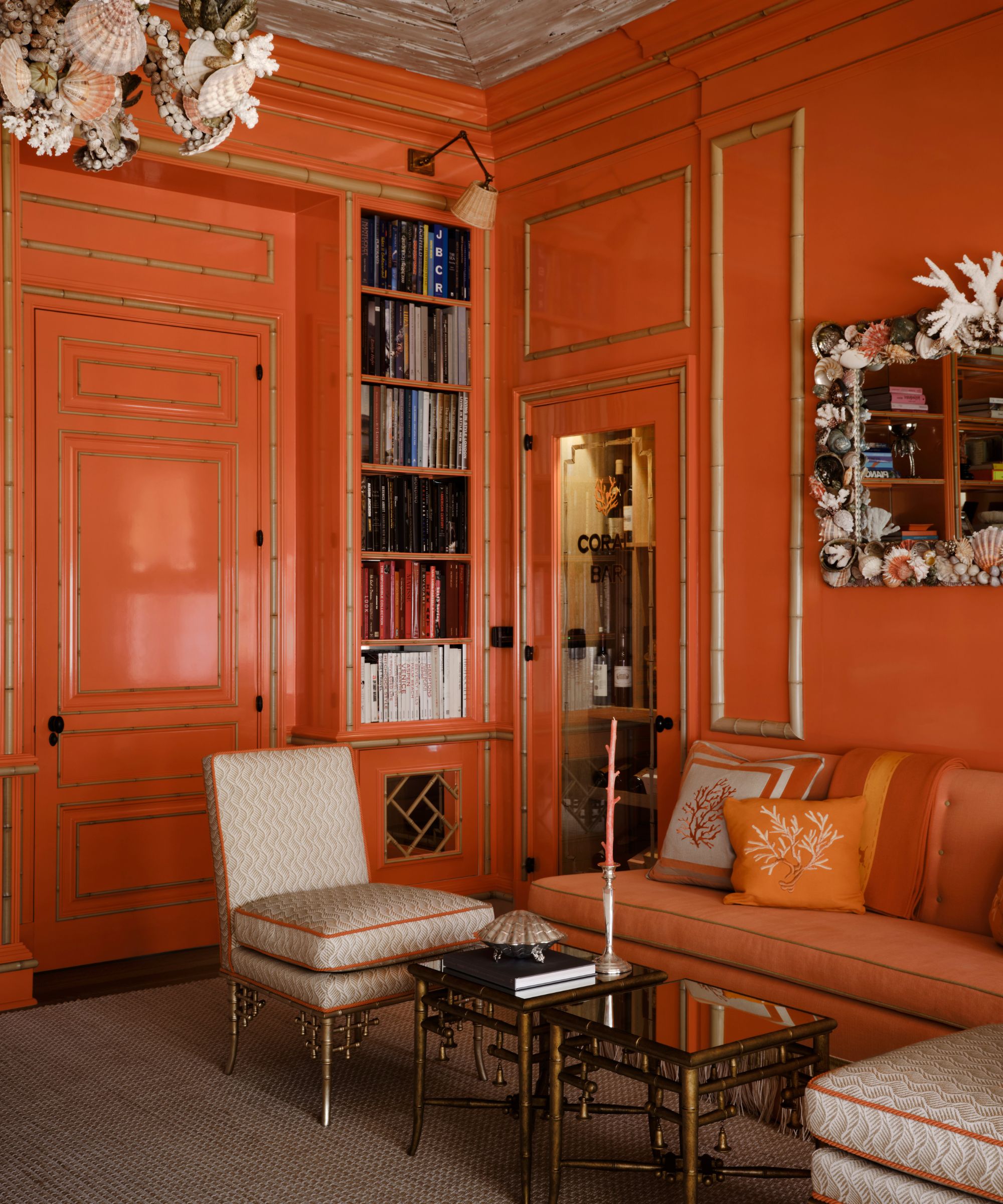
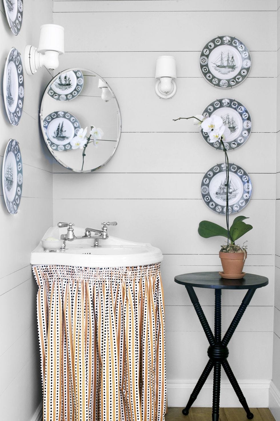
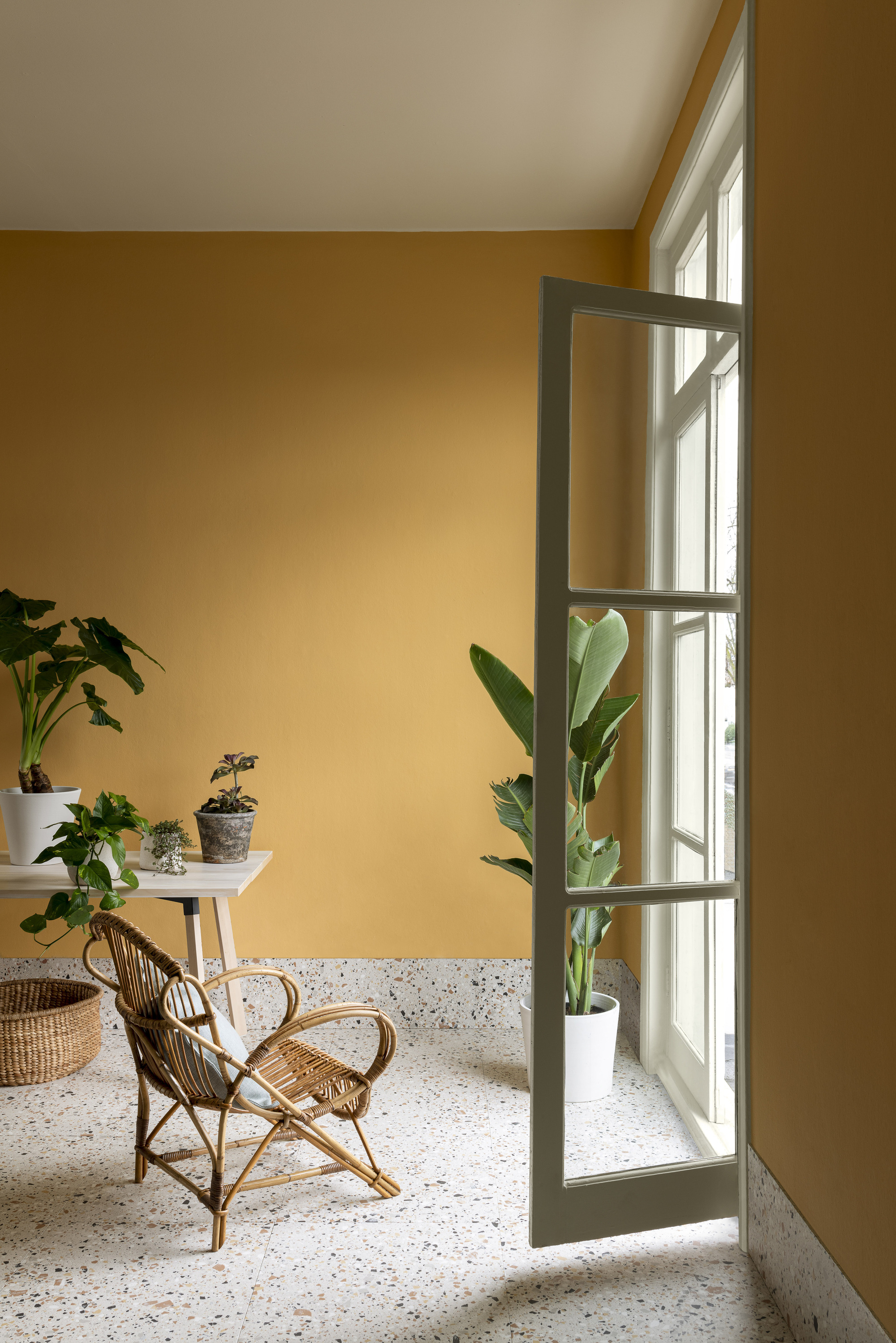
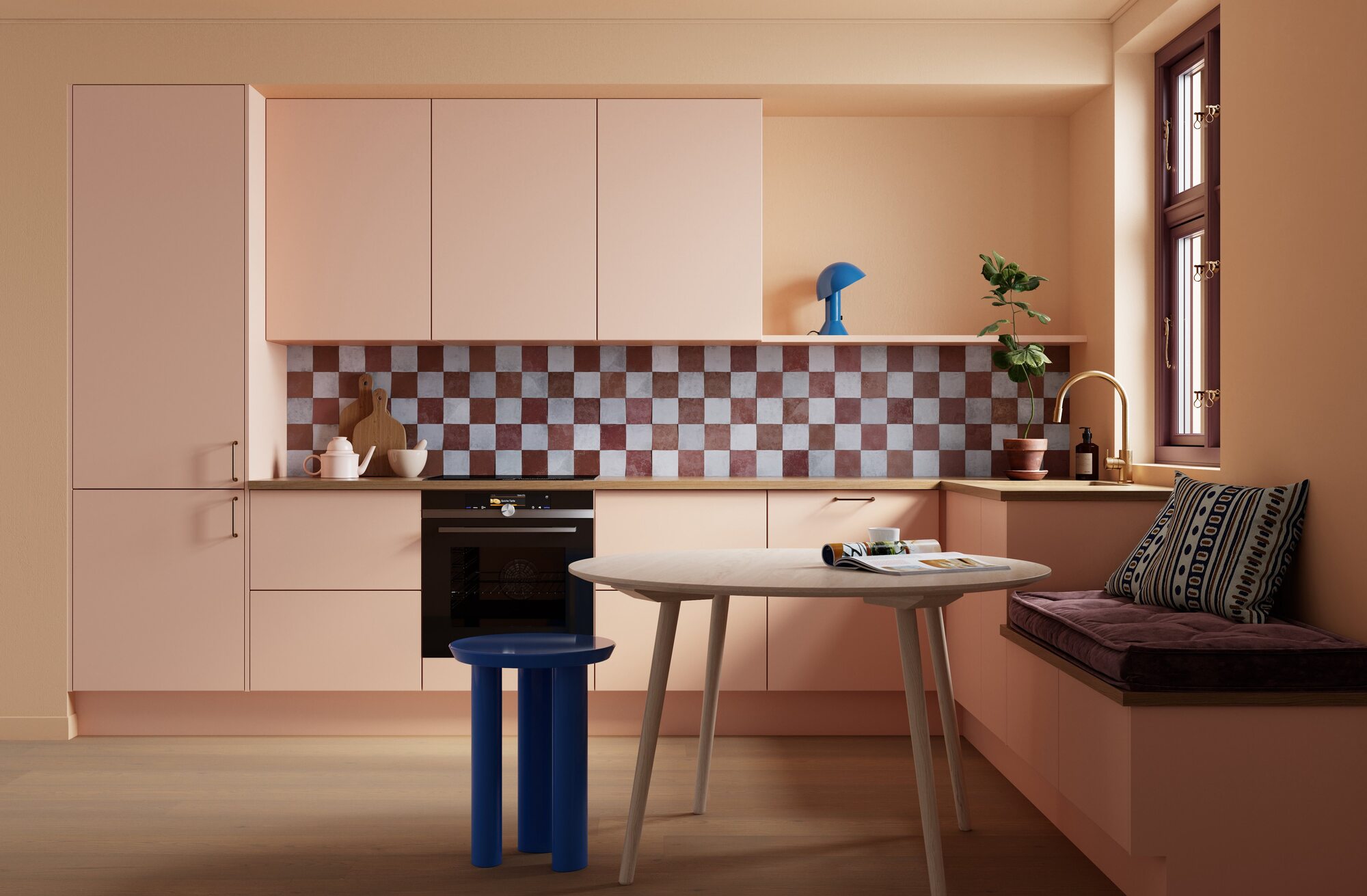
Philip Thomas Vanderford of Studio Thomas James suggests Benjamin Moore's Onyx for a modern office, painting both walls and ceiling in matte black to create an immersive, focused environment. He also champions Benjamin Moore's Coral Dust for small, cheerful workspaces, encouraging bold color choices in tight quarters. Megan Molten, a Charleston interior designer, frequently uses Benjamin Moore's Chantilly Lace, a bright white, to achieve a clean, coastal, and airy feel.
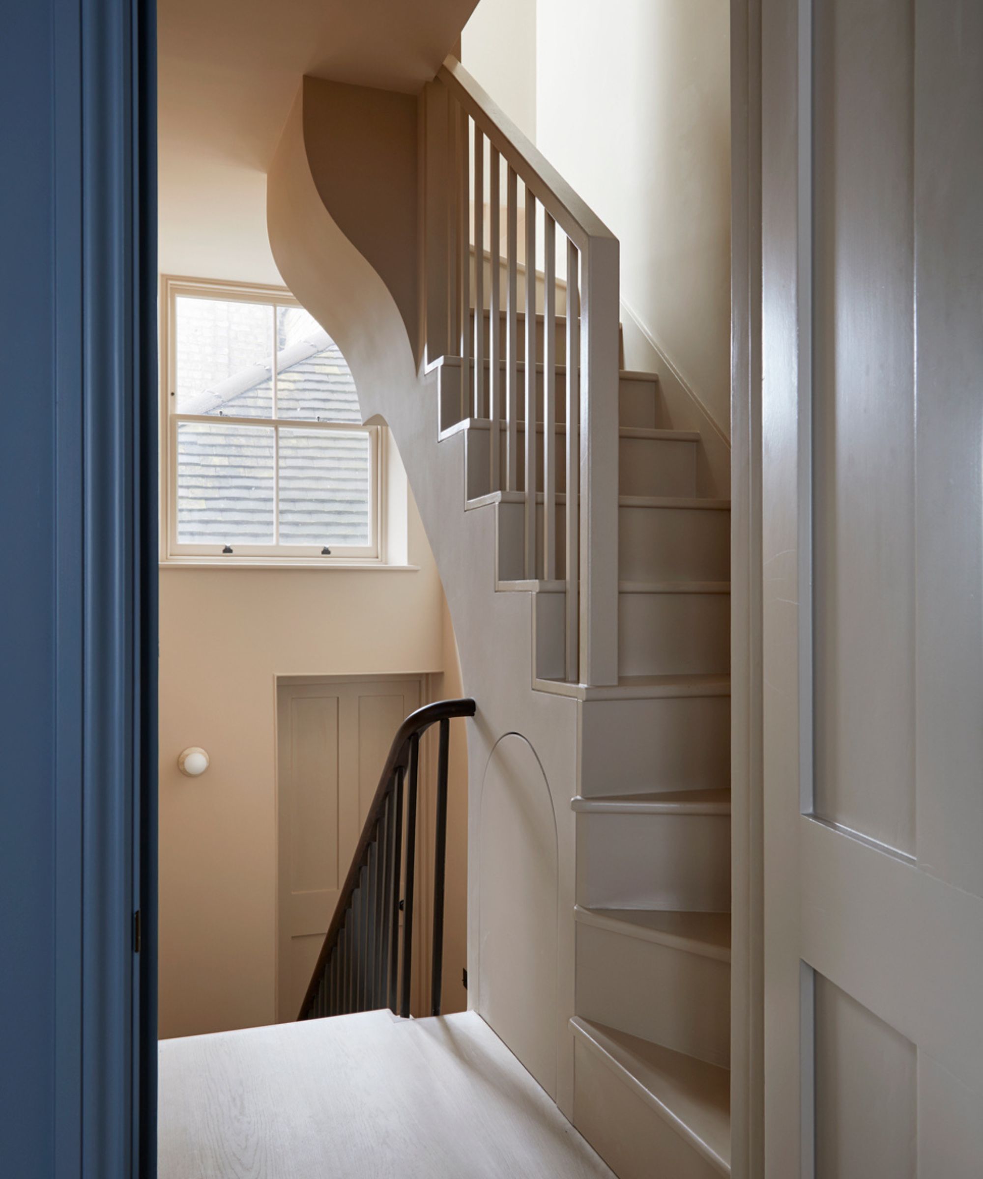
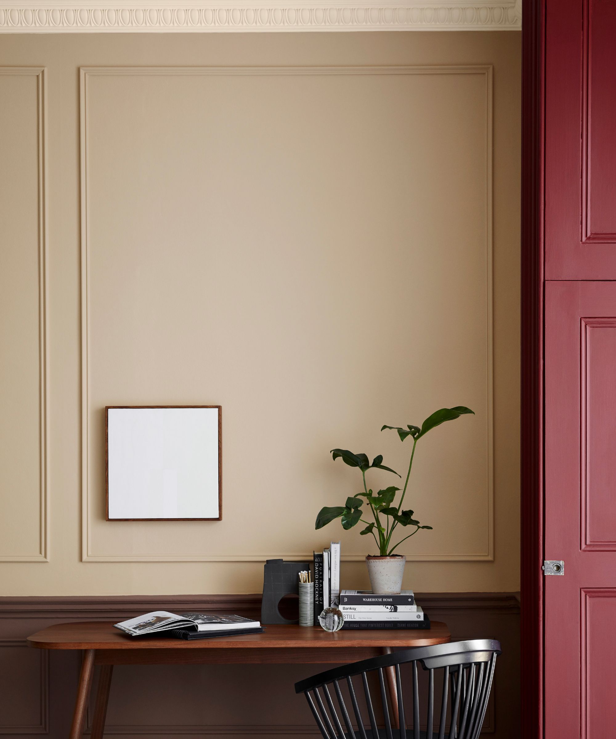
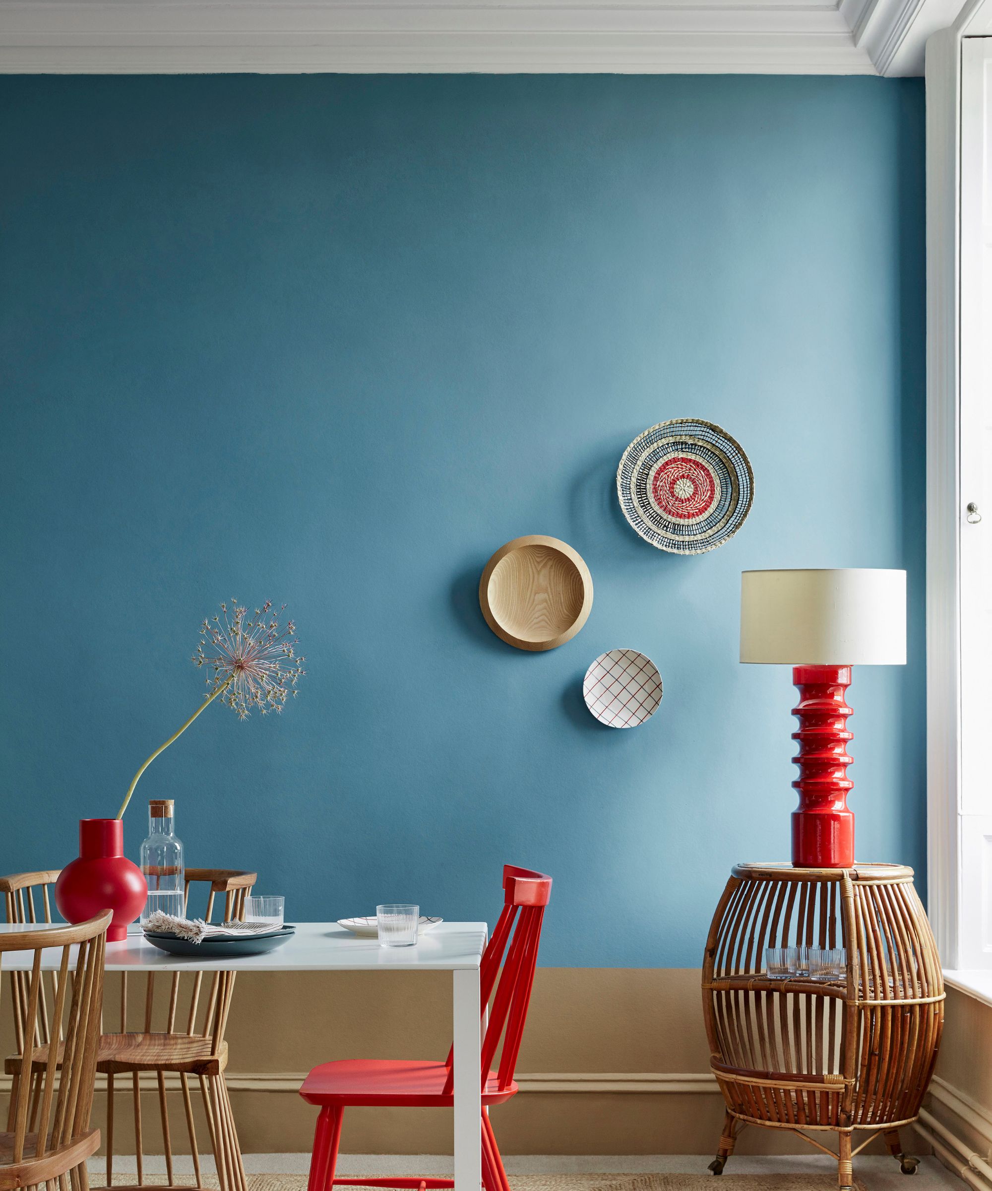
Morgan Farrow of Morgan Farrow Interiors highlights Sherwin-Williams' Meander Blue for children's rooms, noting its ability to transform small bedrooms into joyful and seemingly larger spaces. Anne Scott Gates and Allison Smith of Maison Studios recommend Sherwin-Williams' Spare White, valued for its subtle blue-gray tones that allow millwork to stand out. Julie Dodson of Dodson Interiors advises painting trim, walls, and baseboards the same color, exemplified by Benjamin Moore's Pashmina at 50% intensity, to instantly expand a room.
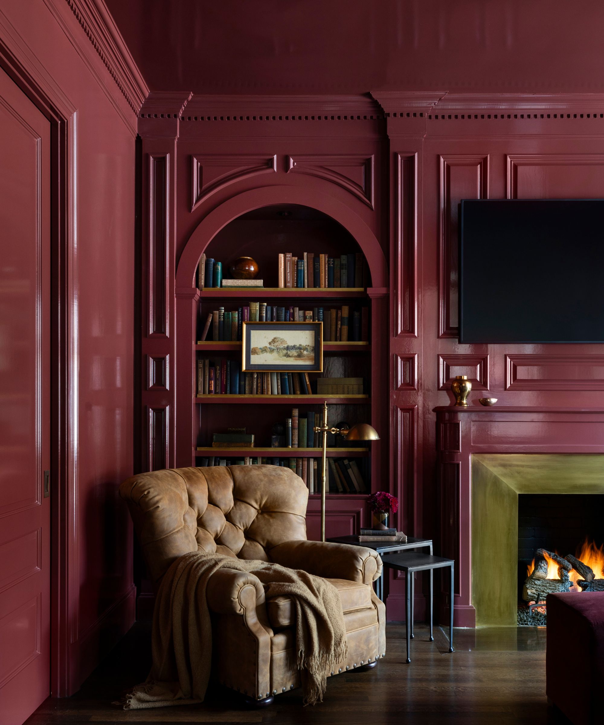
Interior designer Jean Liu proposes using a high-gloss dark paint like Sherwin-Williams' Tricorn Black, arguing that minimizing delineation between surfaces makes a room appear larger and taller. Katie Davis also endorses Sherwin-Williams' Magnetic Gray for its versatility and ability to add a cheerful touch to spaces. Finally, Megan Molten used Benjamin Moore's Normandy Blue for shelves and walls in a small room, demonstrating how a darker color can create depth and make a statement while making the room feel larger. The article concludes by addressing practical questions regarding paint coverage and can sizes.
#PaintColors #SmallRooms #InteriorDesign #HomeDecor #SpaceSavingTips #ColorPalettes #DesignTips #BenjaminMoore #SherwinWilliams #PaintColors #SmallRooms #InteriorDesign #HomeDecor #SpaceSavingTips #ColorPalettes #DesignTips #BenjaminMoore #SherwinWilliams
0 comment in total
 No comments yet
You may also like
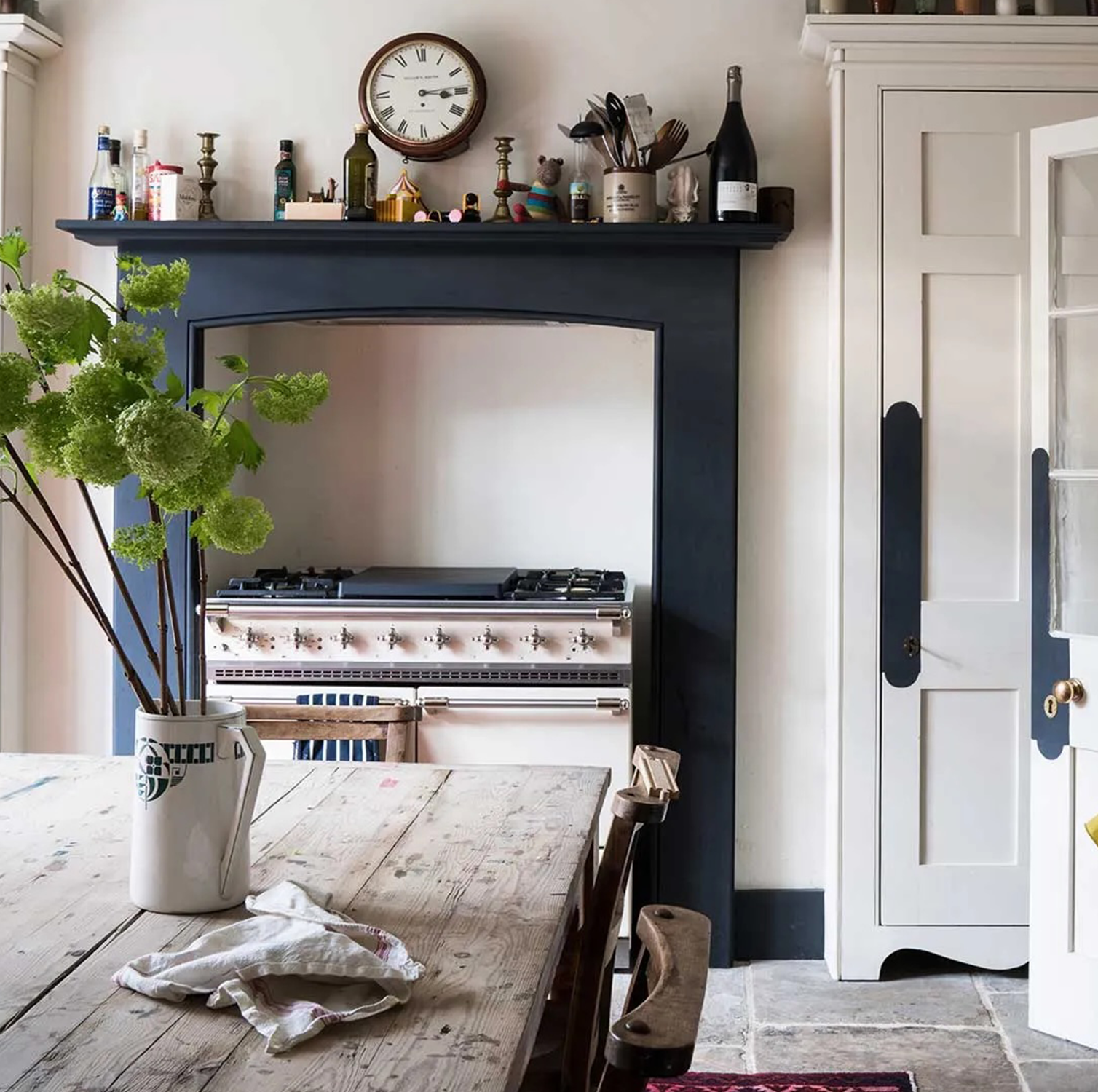
These 6 paint colours instantly make small rooms feel bigger
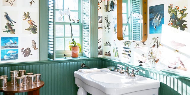
18 Best Paint Colors to Make Small Bathrooms Feel Bigger

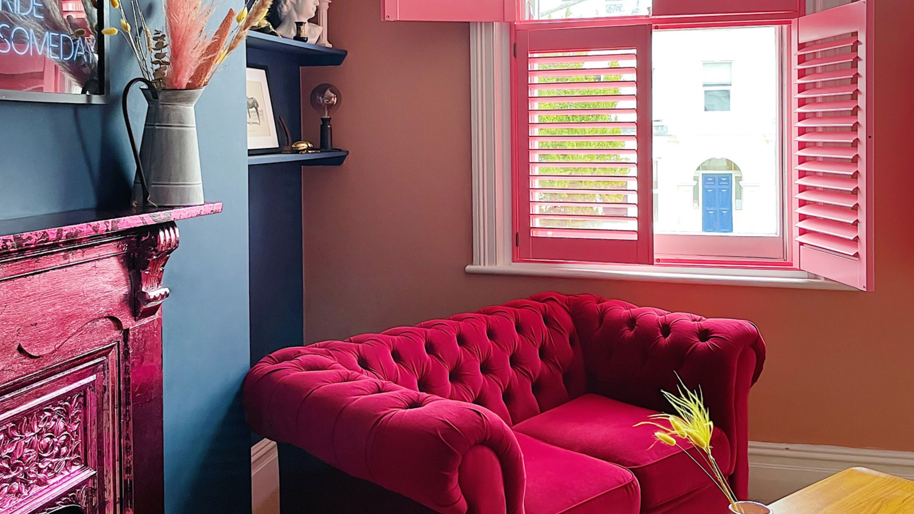
The best paint colors for small living rooms, according to design experts

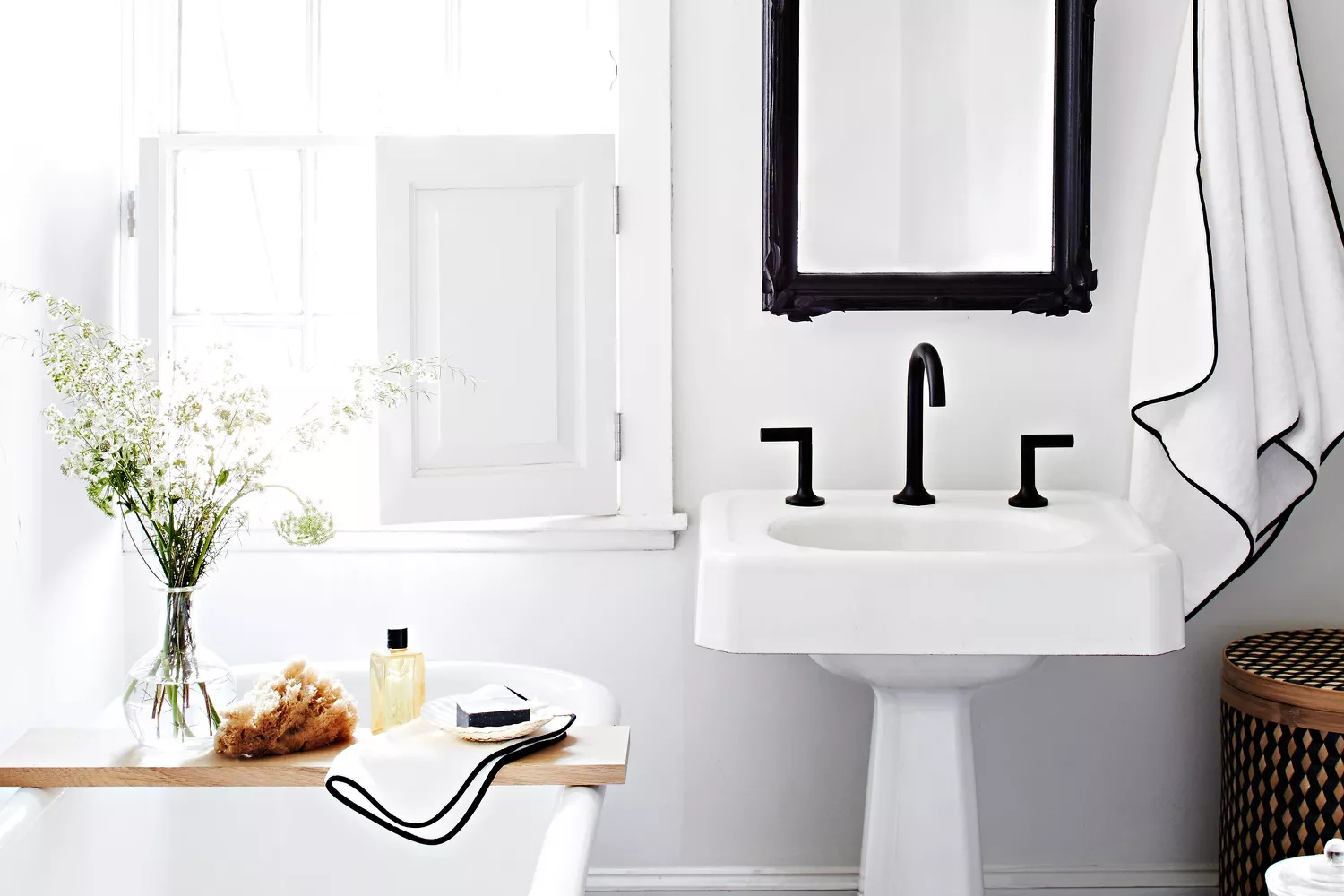
13 Paint Colors That Make Small Bathrooms Feel Bigger
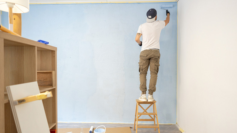
12 Tips For Making Small Rooms Appear Larger Using Paint

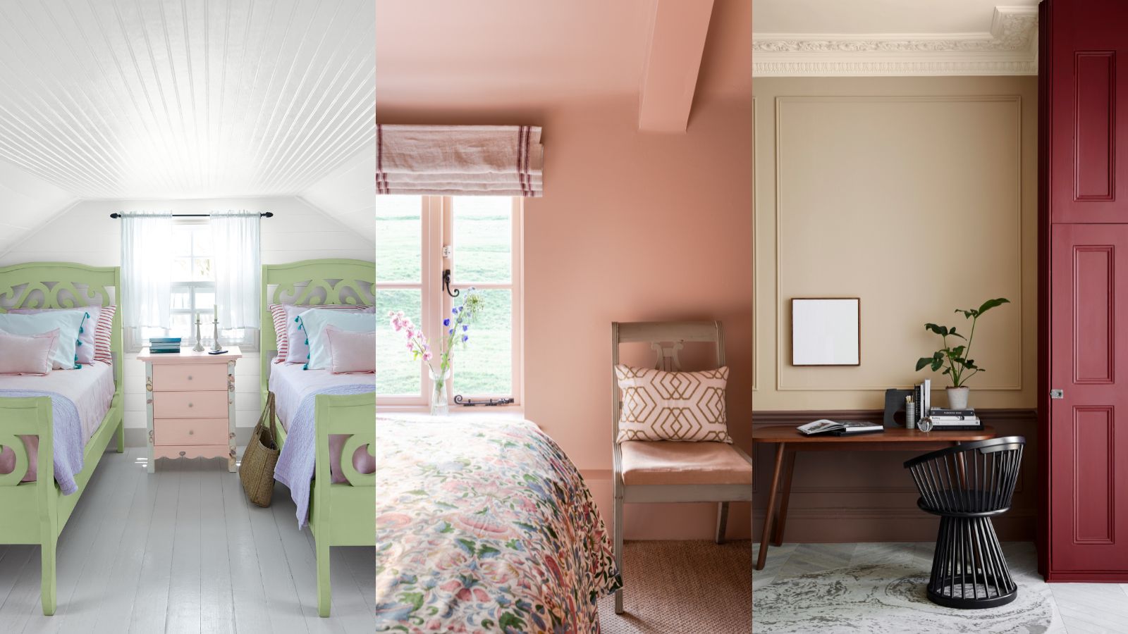
What colors make a small room look bigger? These space-stretching shades are what design experts use

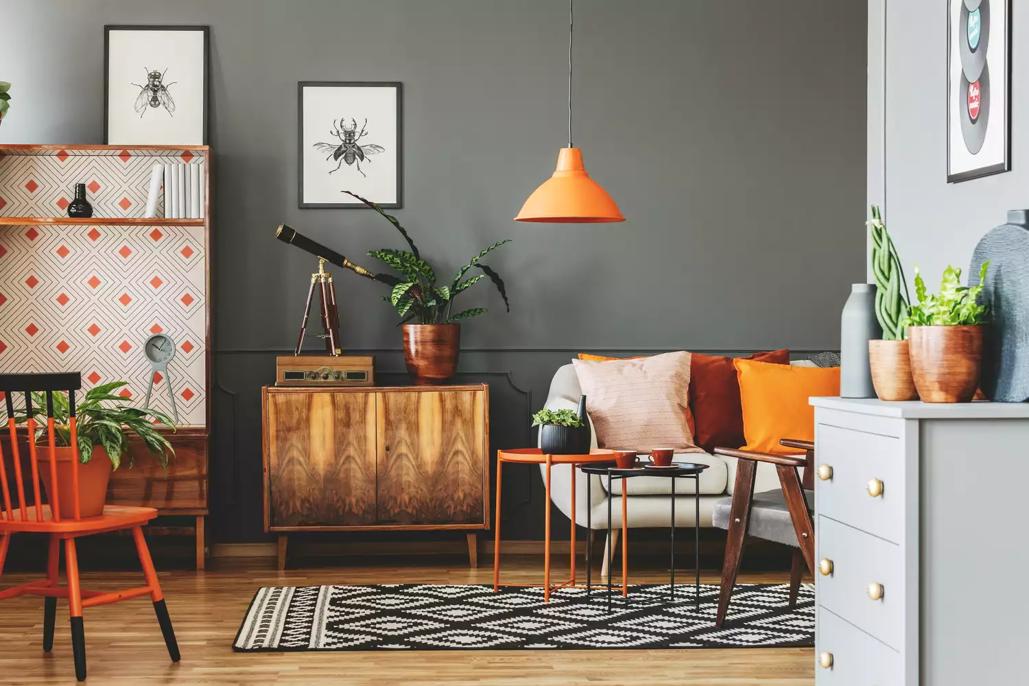
7 Paint Colors That Instantly Make Small Living Rooms Feel Bigger, Designers Say

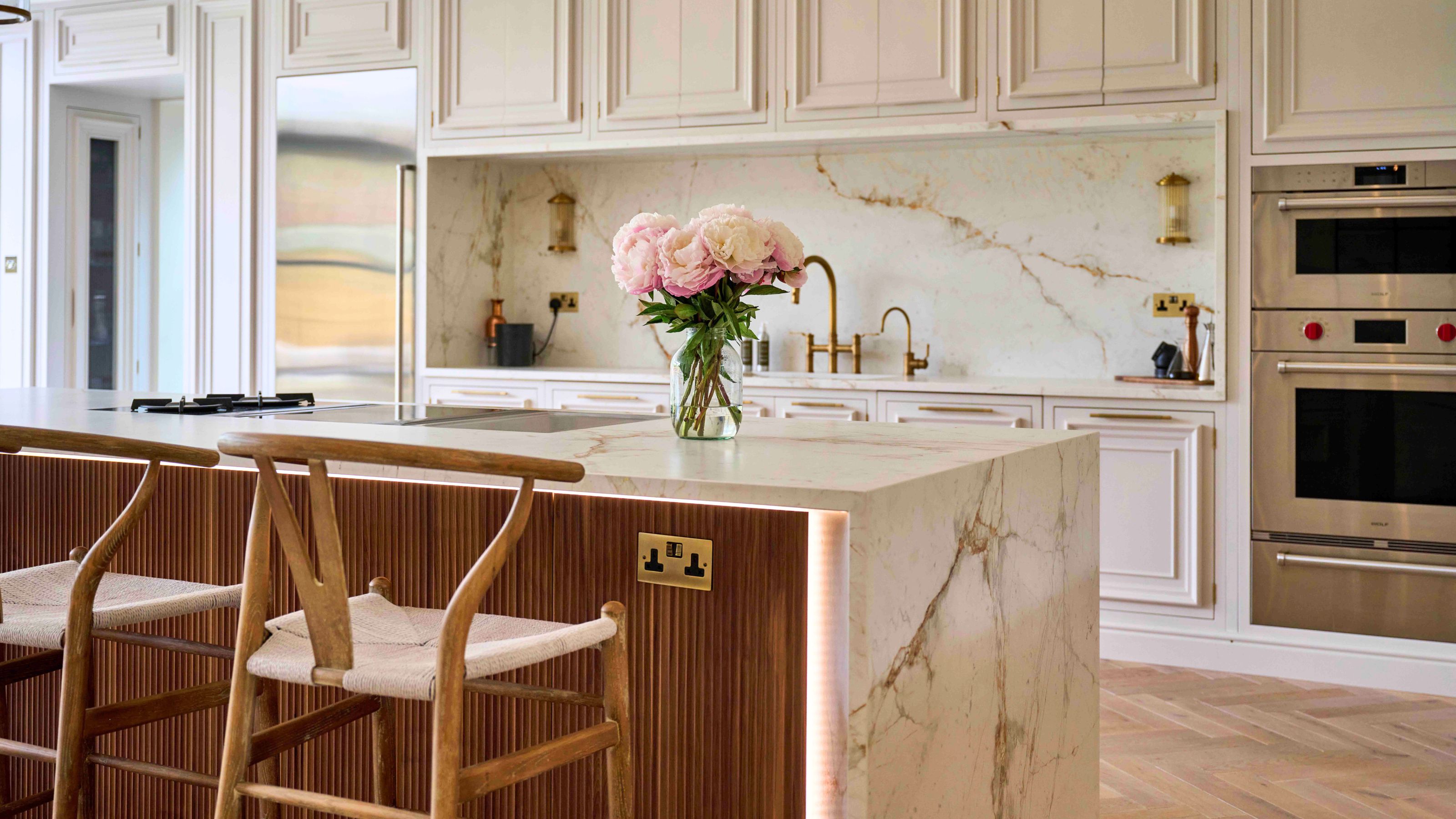
What kitchen floor colors make a small space look bigger? Interior pros spill their secrets

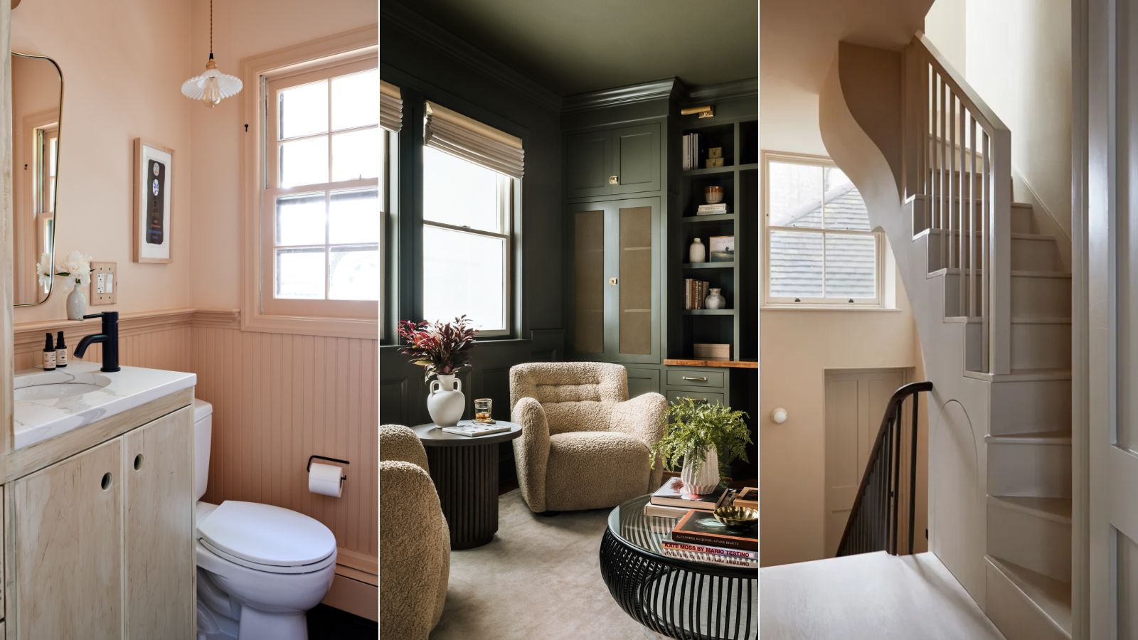
9 rooms that prove color drenching makes small spaces look bigger
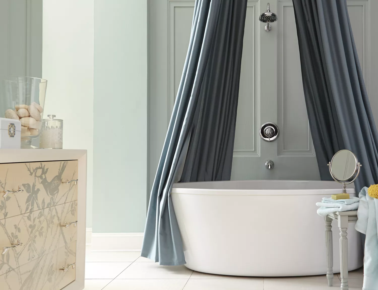
The Best Paint Colors to Make Small Rooms Feel Bigger (Some May Surprise You!)
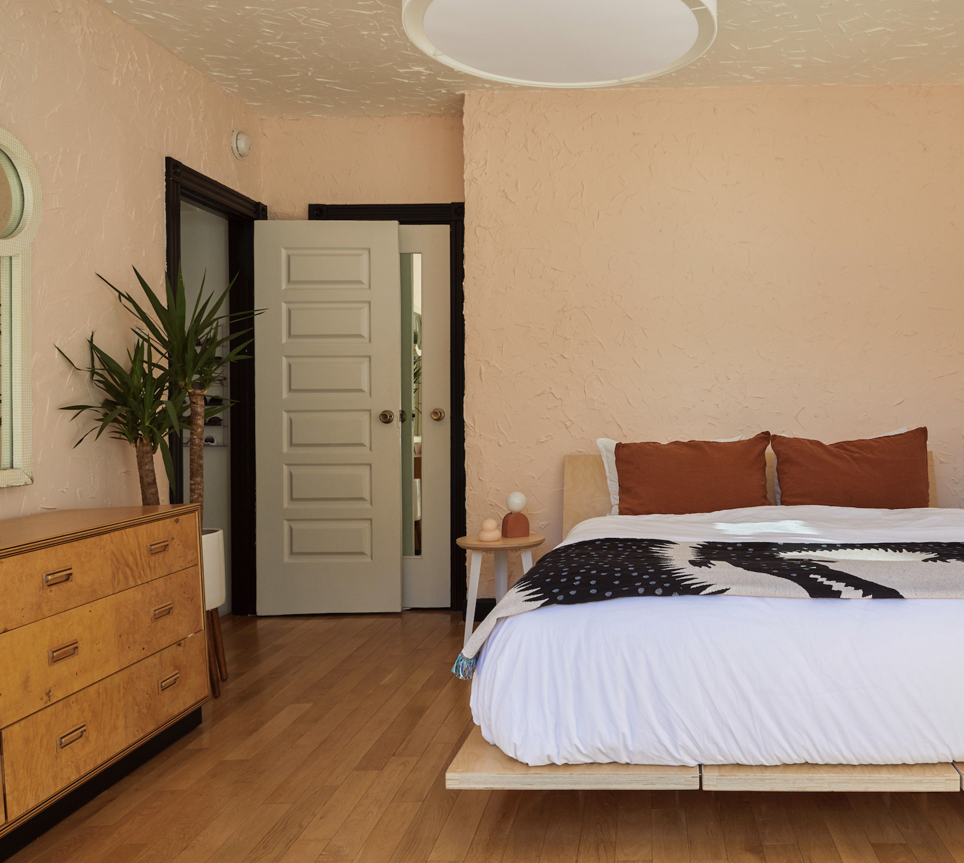
8 of the best paint colors to enhance small spaces, according to experts
14 clever ways to make small rooms look bigger

12 Paint Colors That Will Make Any Room Look Bigger
What Colors Make a Room Look Bigger? 5 That Designers Reach for to Make Walls 'Visually Expand'

10 kitchen cabinet colors to make a small space look bigger
I’m an interior designer - the worst paint colours for small rooms, and why bright white walls is not a good idea

How To Successfully Paint Small Spaces Dark Colors & Actually Make Your Room Look BIGGER

How to make a room look bigger with paint: 10 expert tips

How to make a narrow room look wider with paint - expert tricks to make small spaces seem bigger
11 Paint Colors That Instantly Make a Small Bathroom Look Bigger