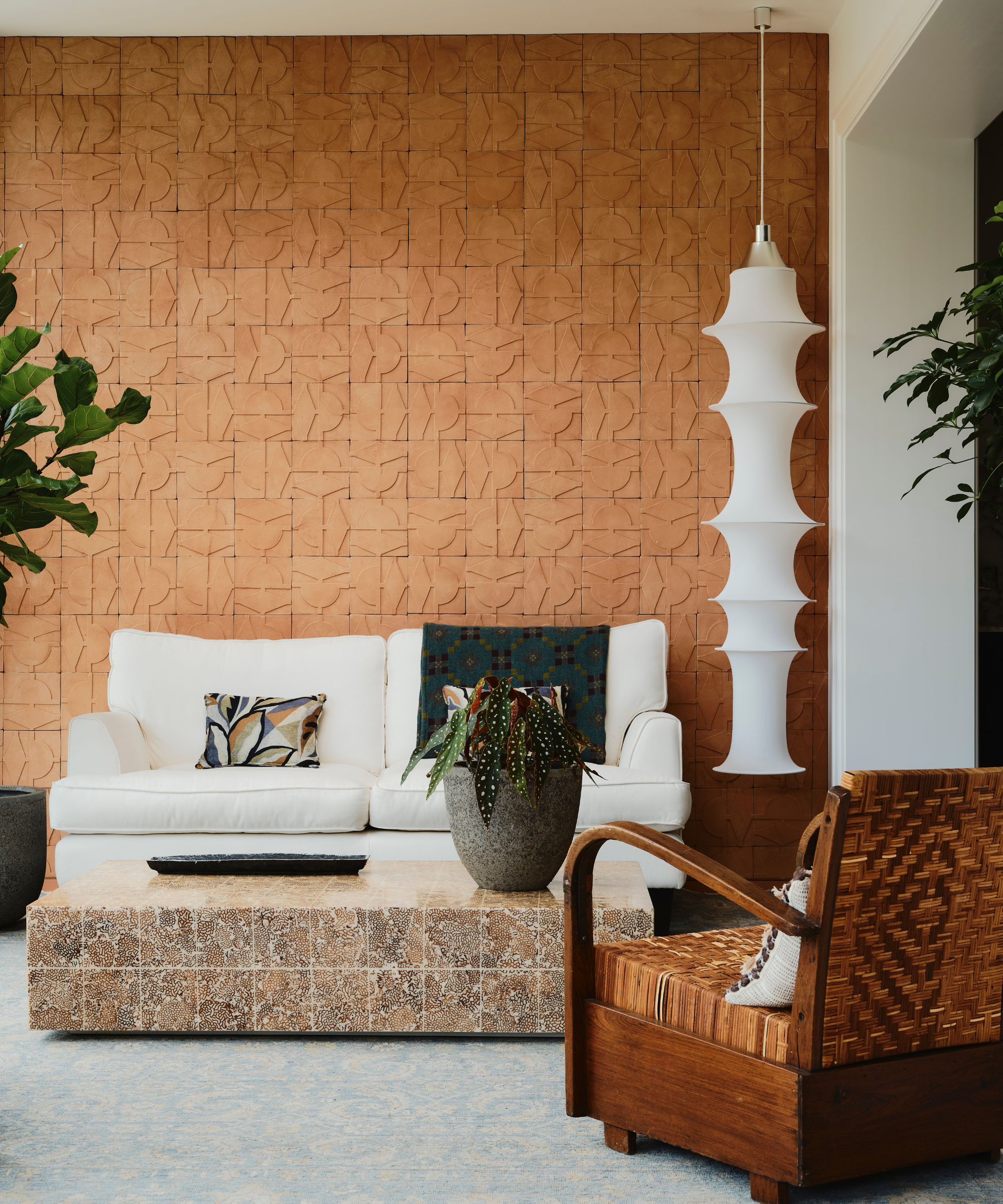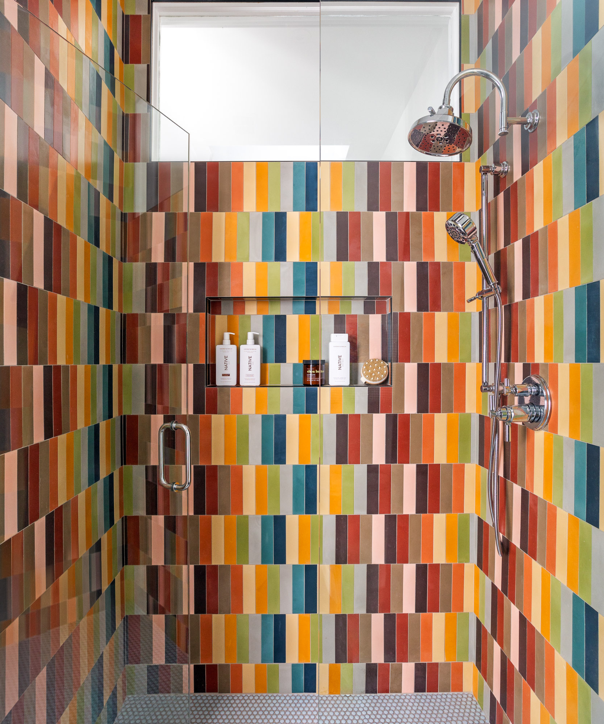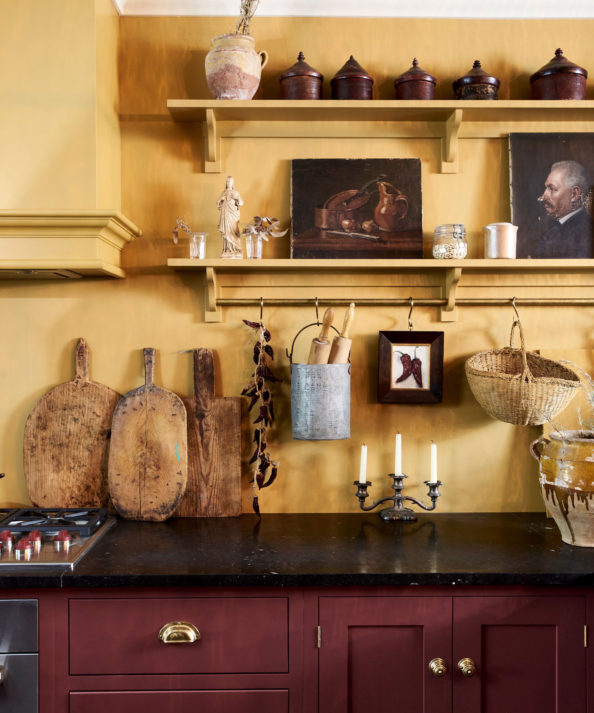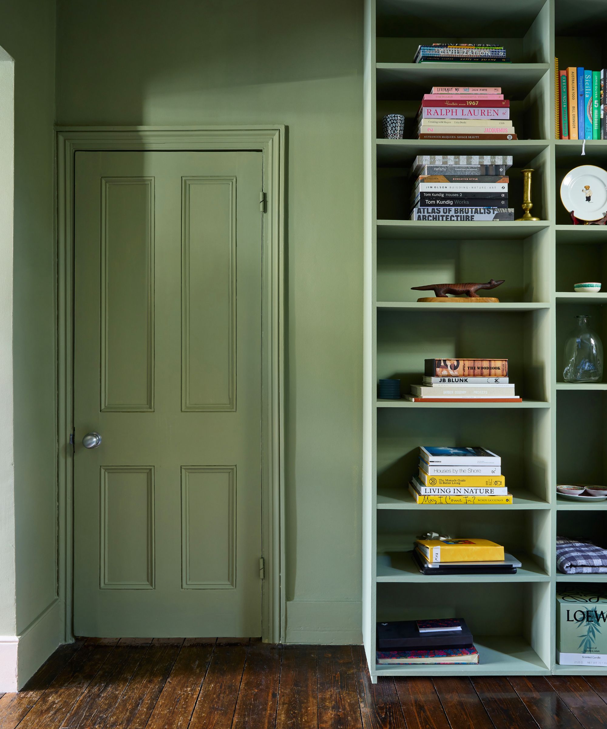
The colours you paint your walls can impact your mood, and here’s the science to prove it
The colours chosen for interior walls can significantly influence human mood and emotional states, a phenomenon explored in a collaborative study by Australian paint company Taubmans, virtual reality firm Liminal VR, and neuroscientists from the Florey Institute of Neuroscience and Mental Health in Melbourne. This research aimed to scientifically validate anecdotal beliefs about colour psychology in home environments.
Traditional assumptions about how colours affect emotions have long existed, but this study provided empirical evidence. The research involved 745 participants who used Google Daydream virtual reality headsets. They were presented with five different colours from Taubmans’ paint range, displayed within three distinct virtual room settings. Following each colour exposure, participants were asked to choose from eight emotional responses, such as “excited,” “cheerful,” or “tense,” to describe their feelings. Additionally, they rated their preference for each colour on a five-point scale.
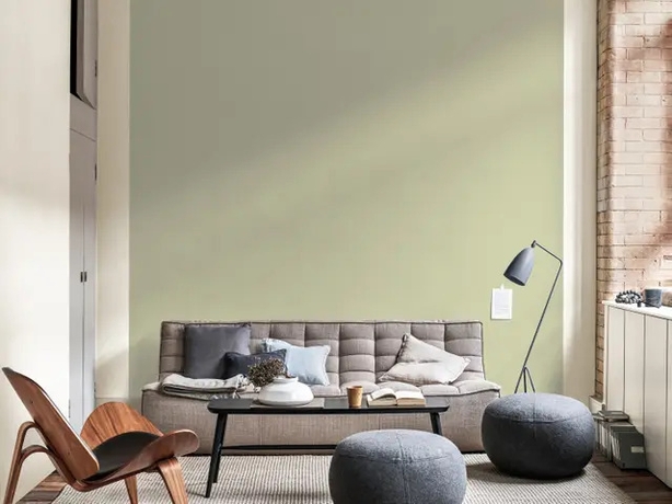
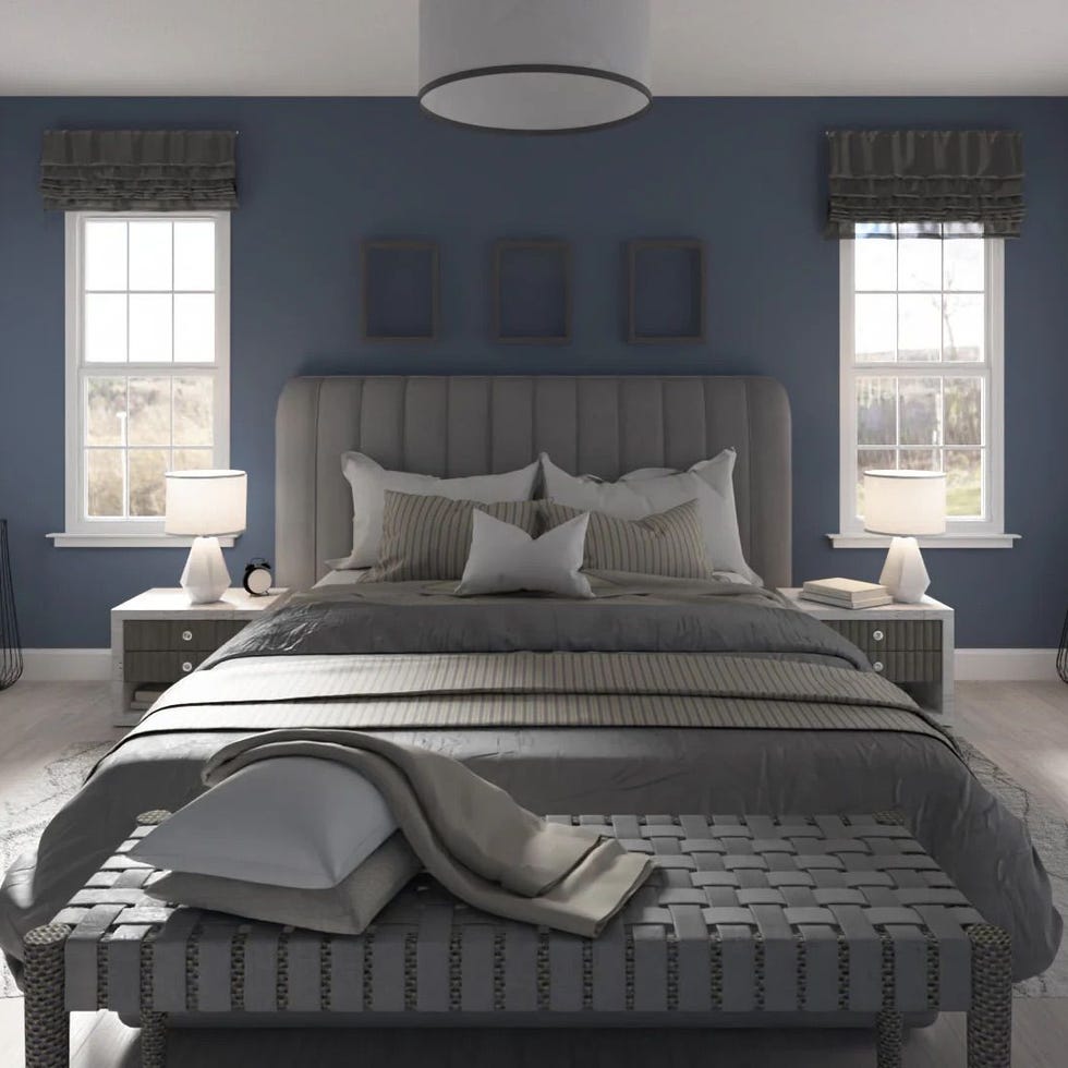
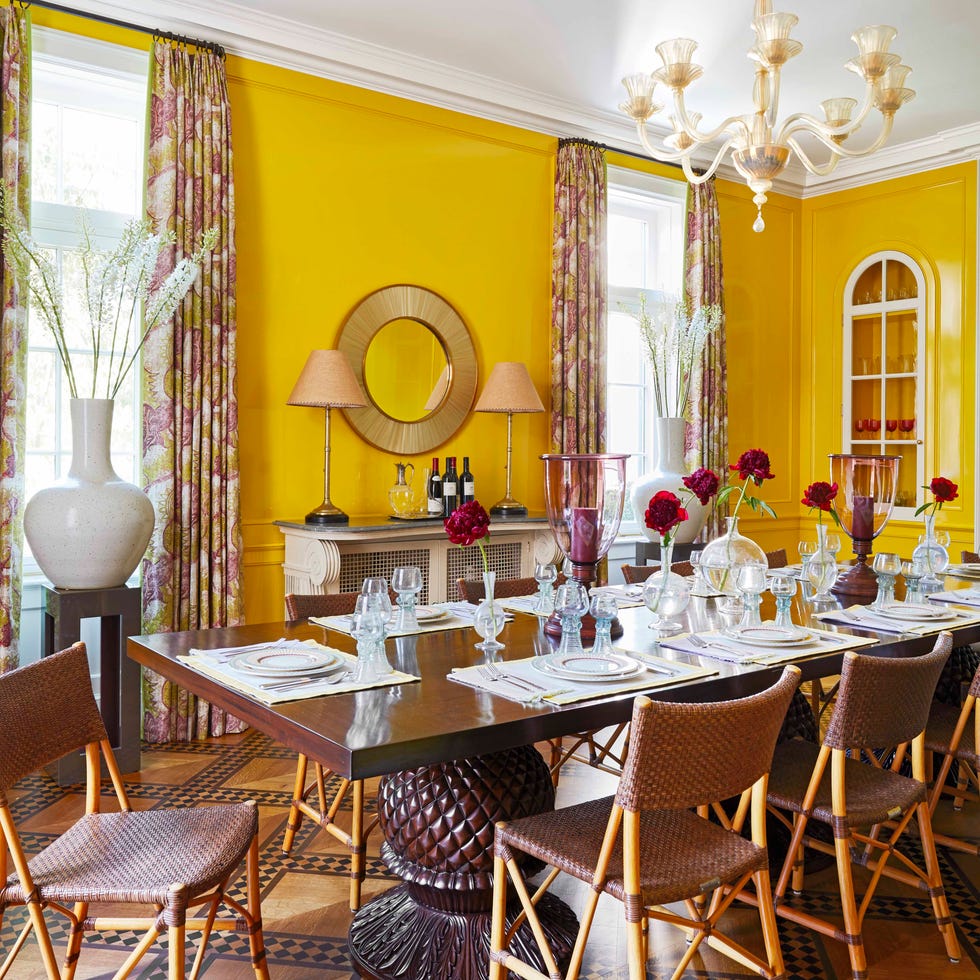
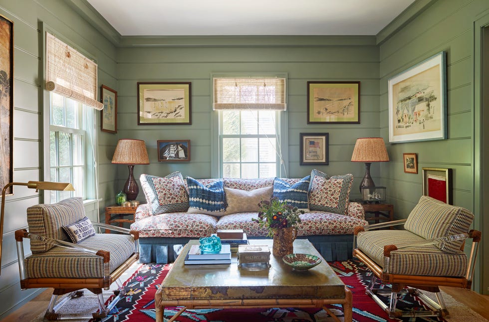
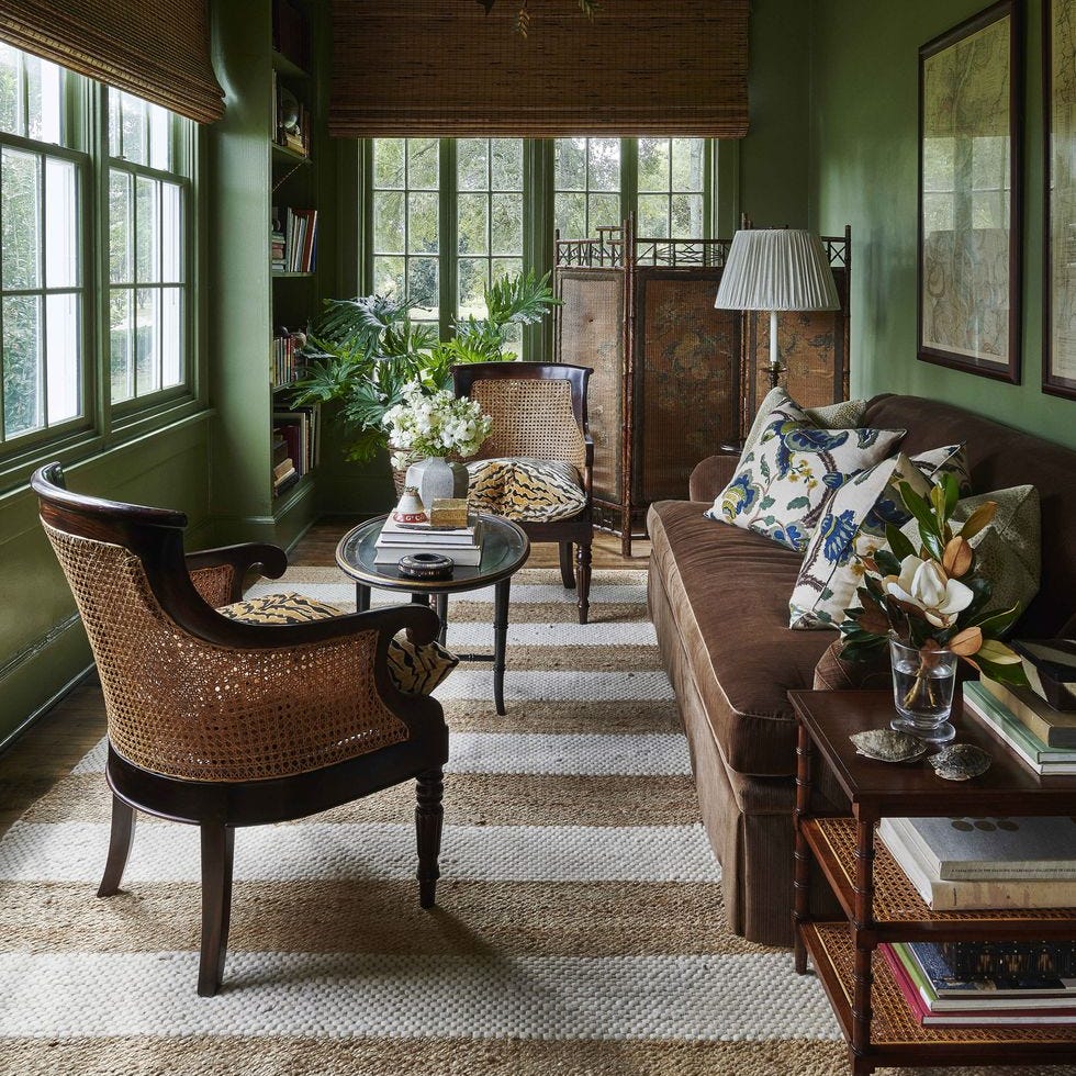
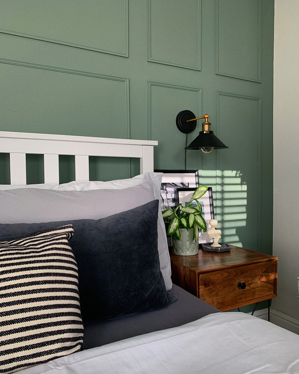
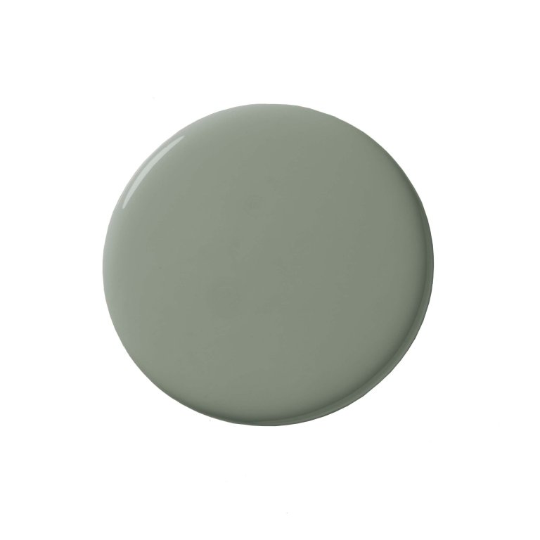
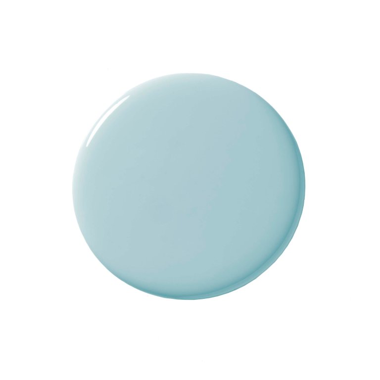
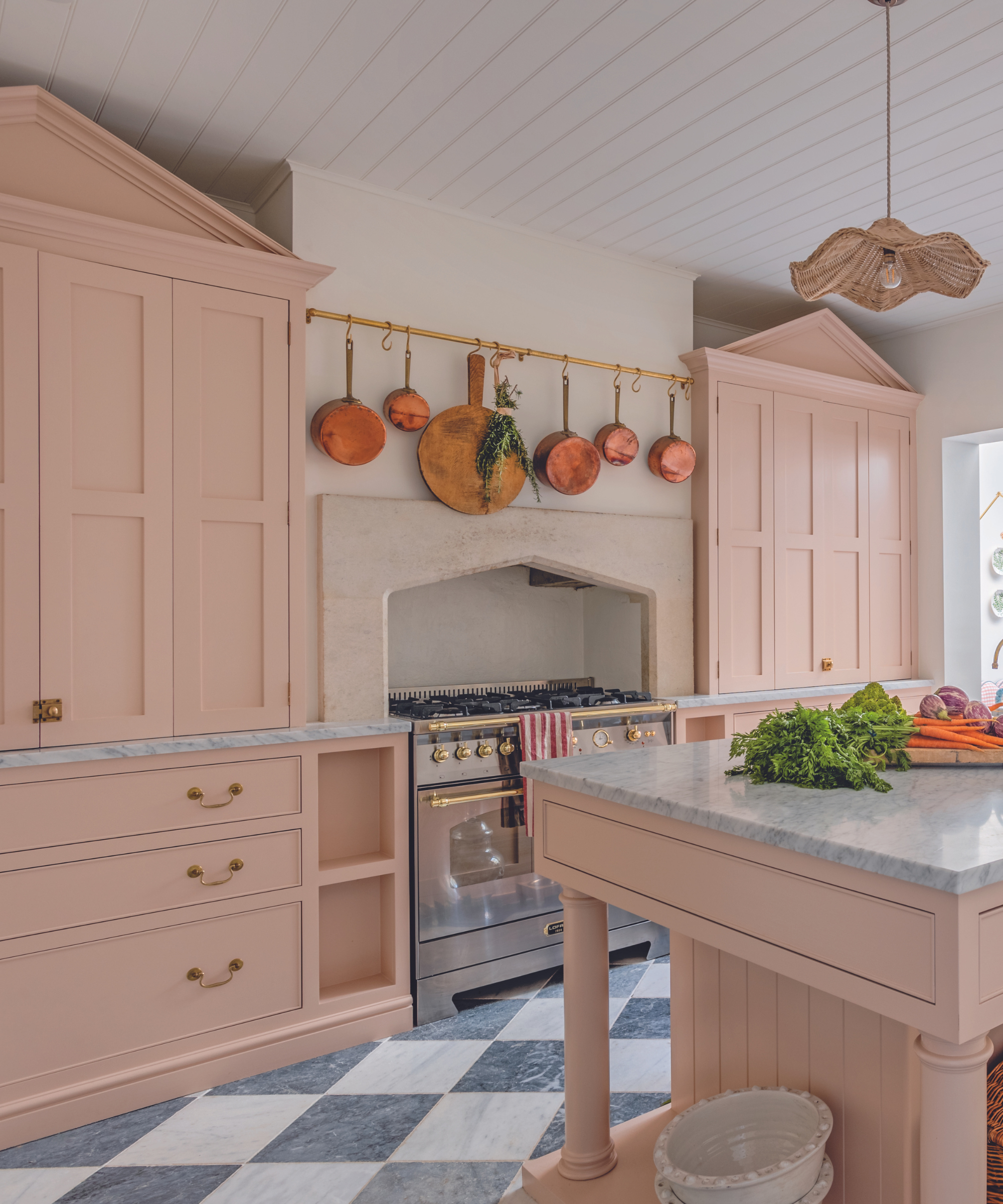
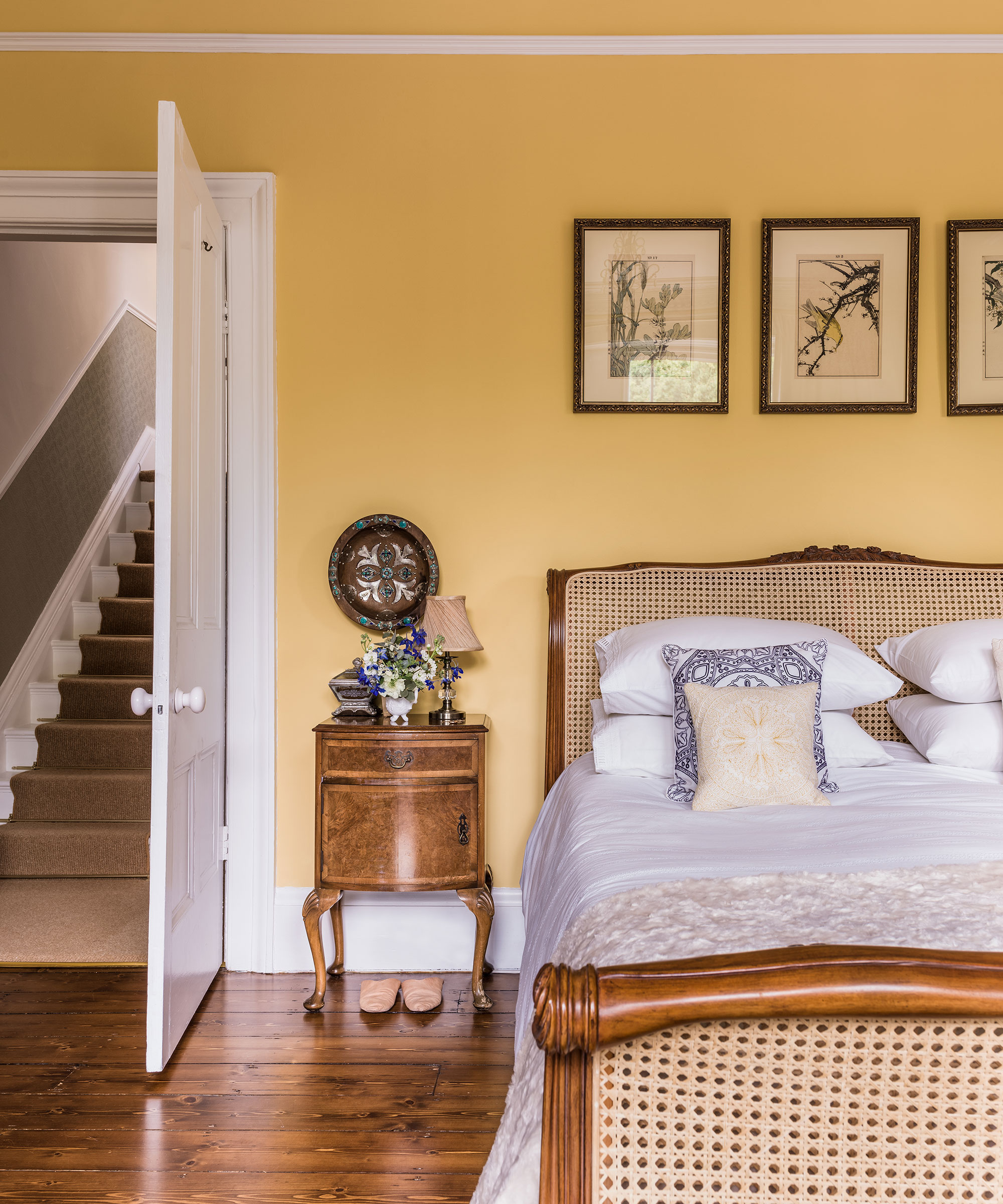
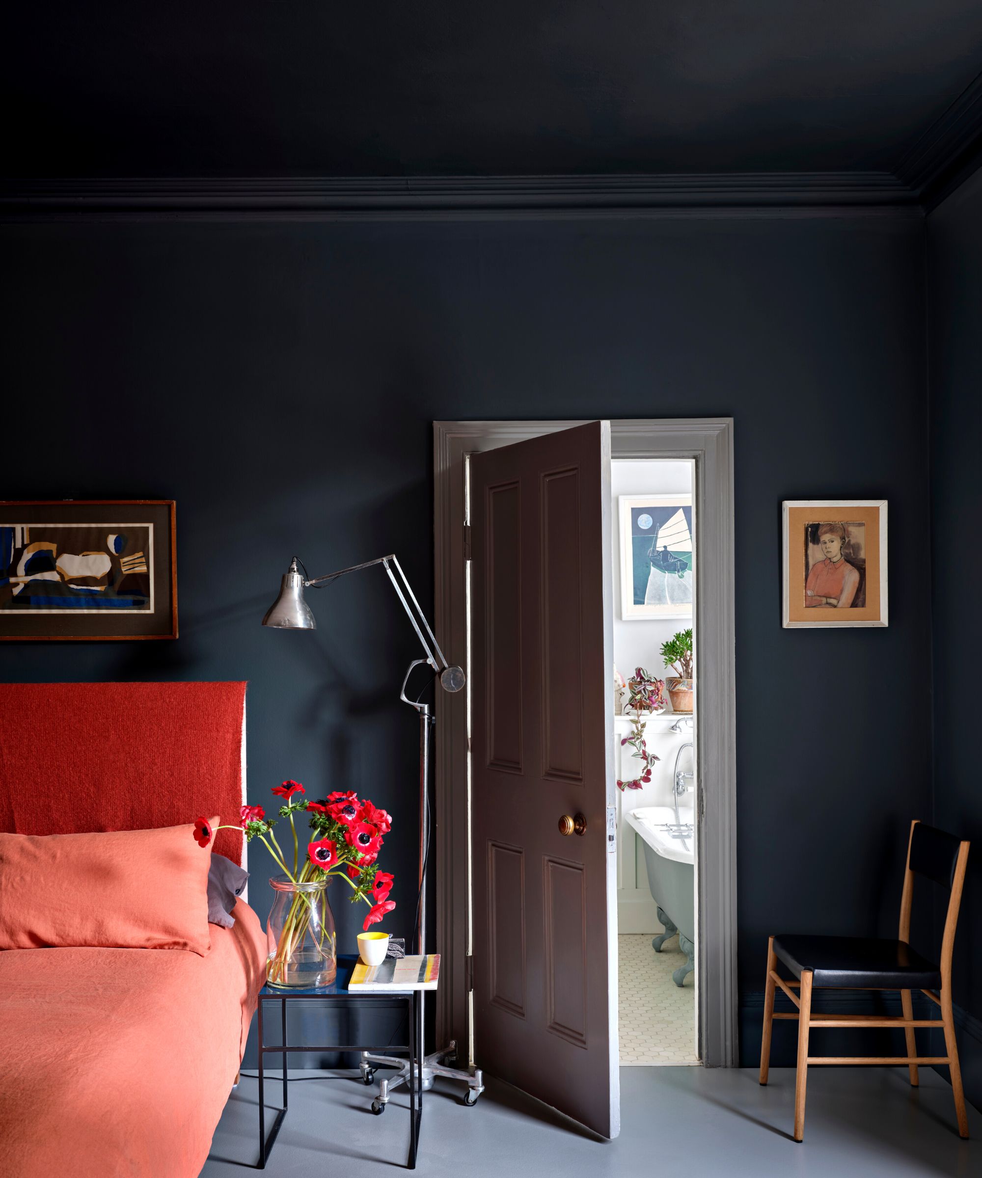
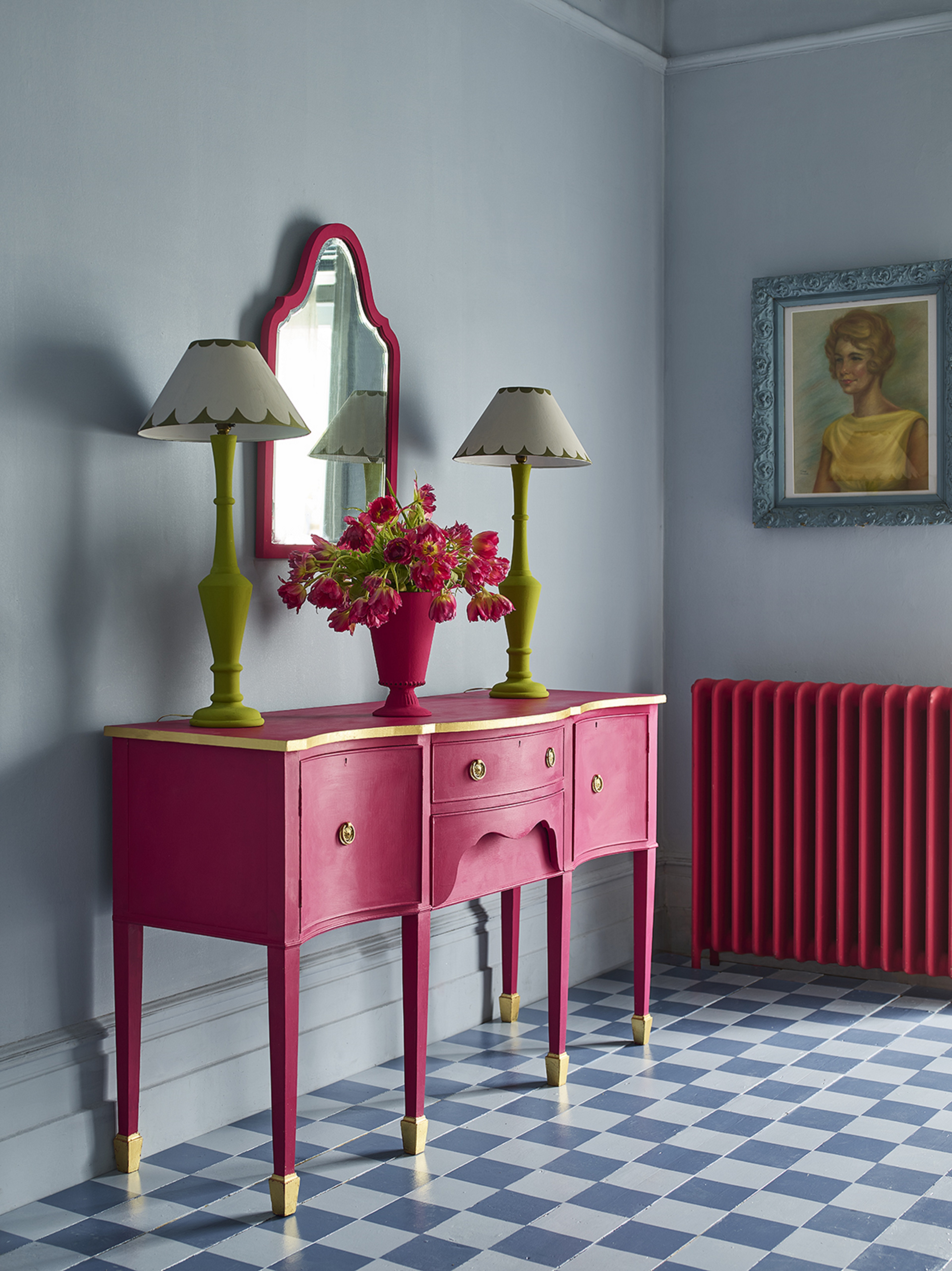
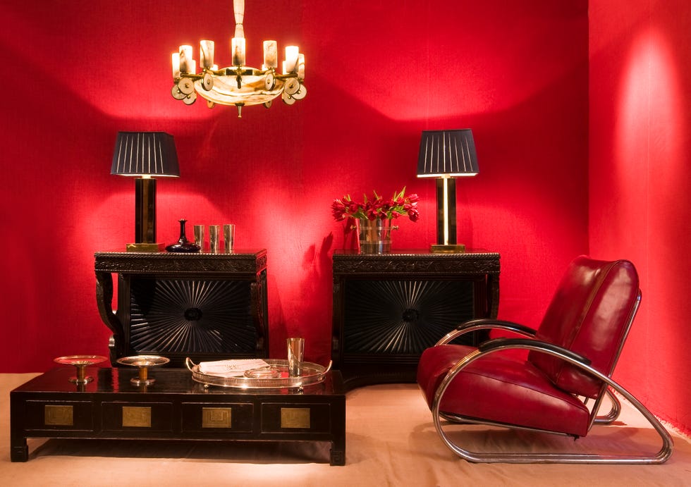
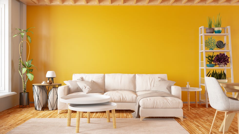
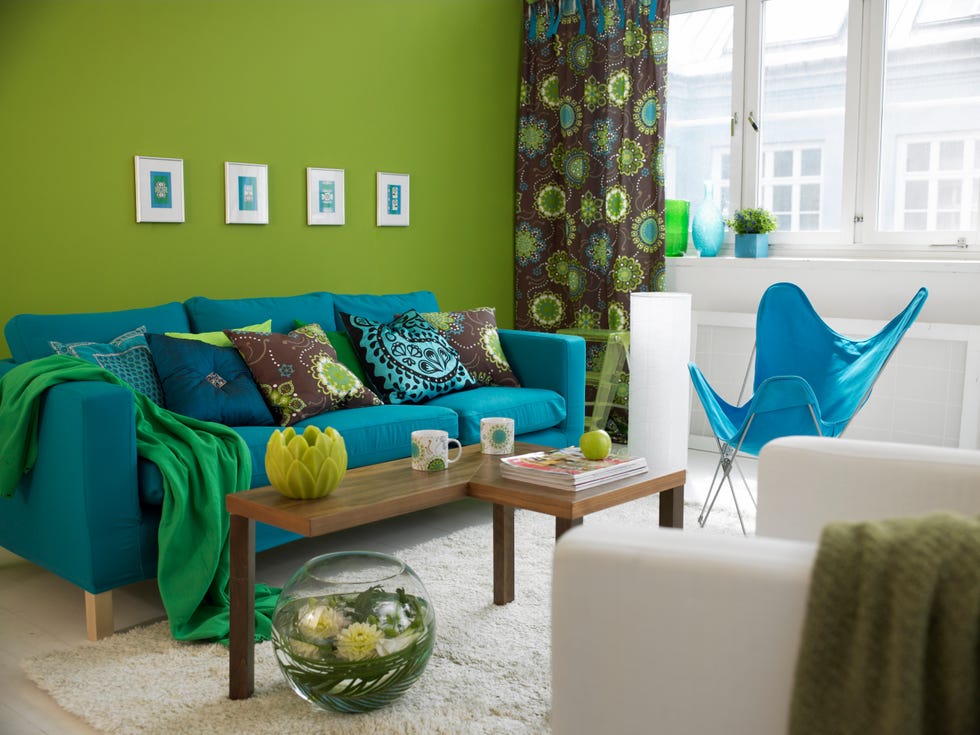
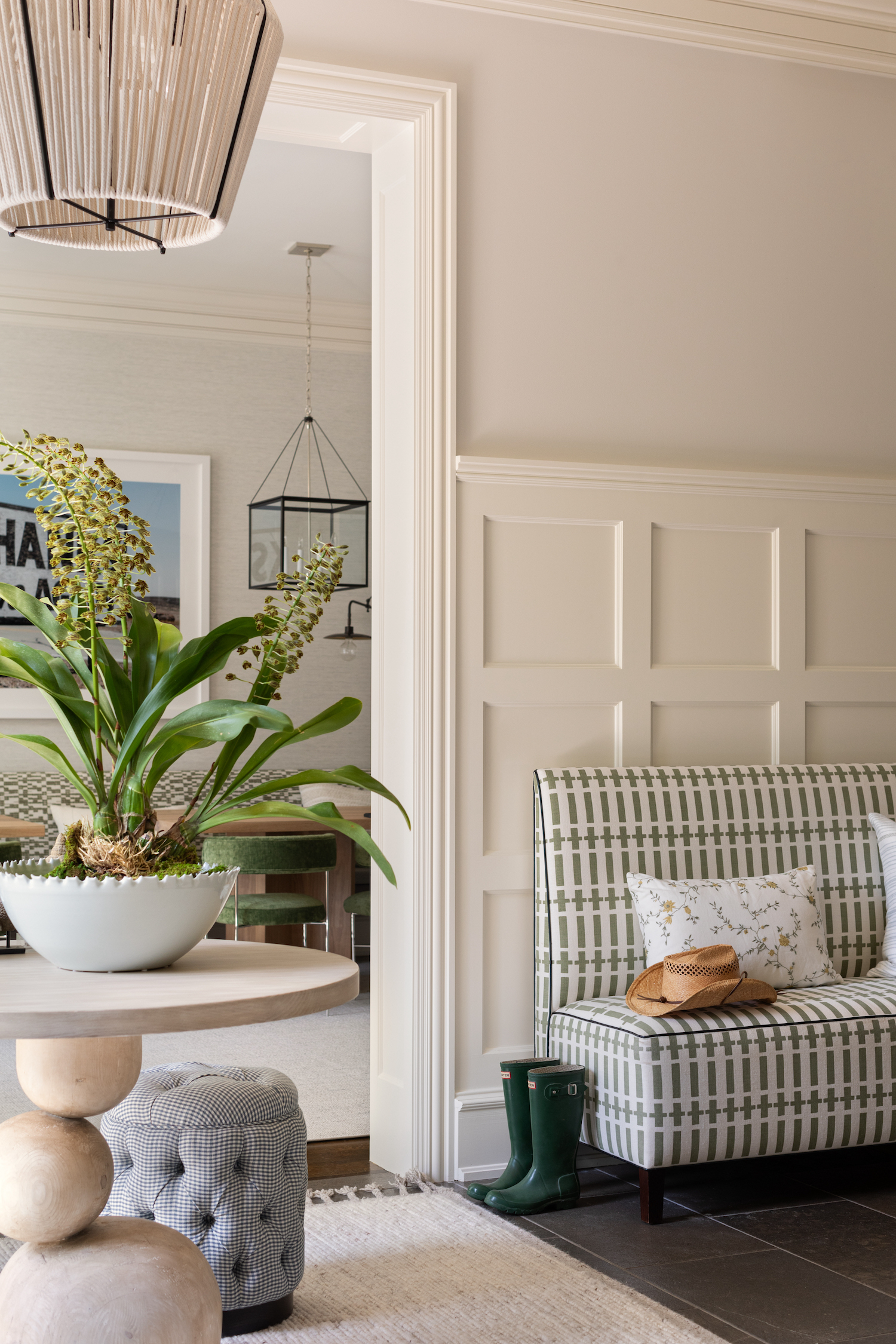
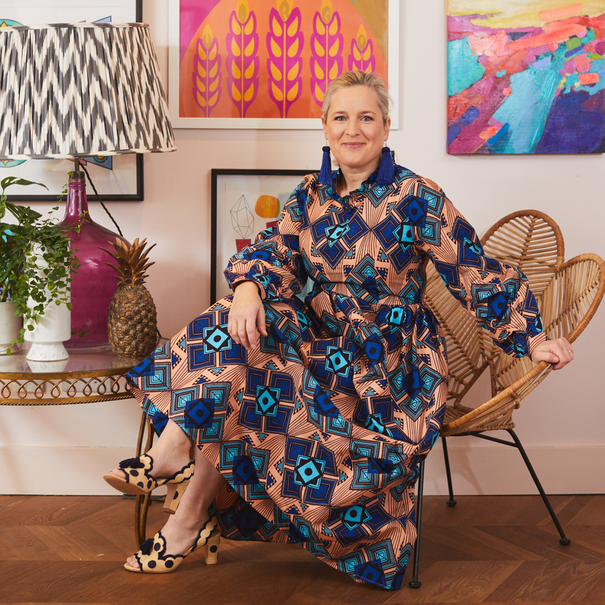
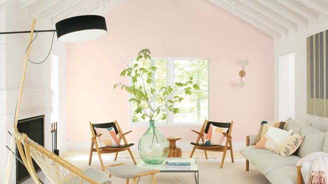
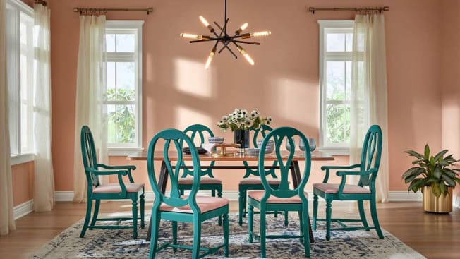
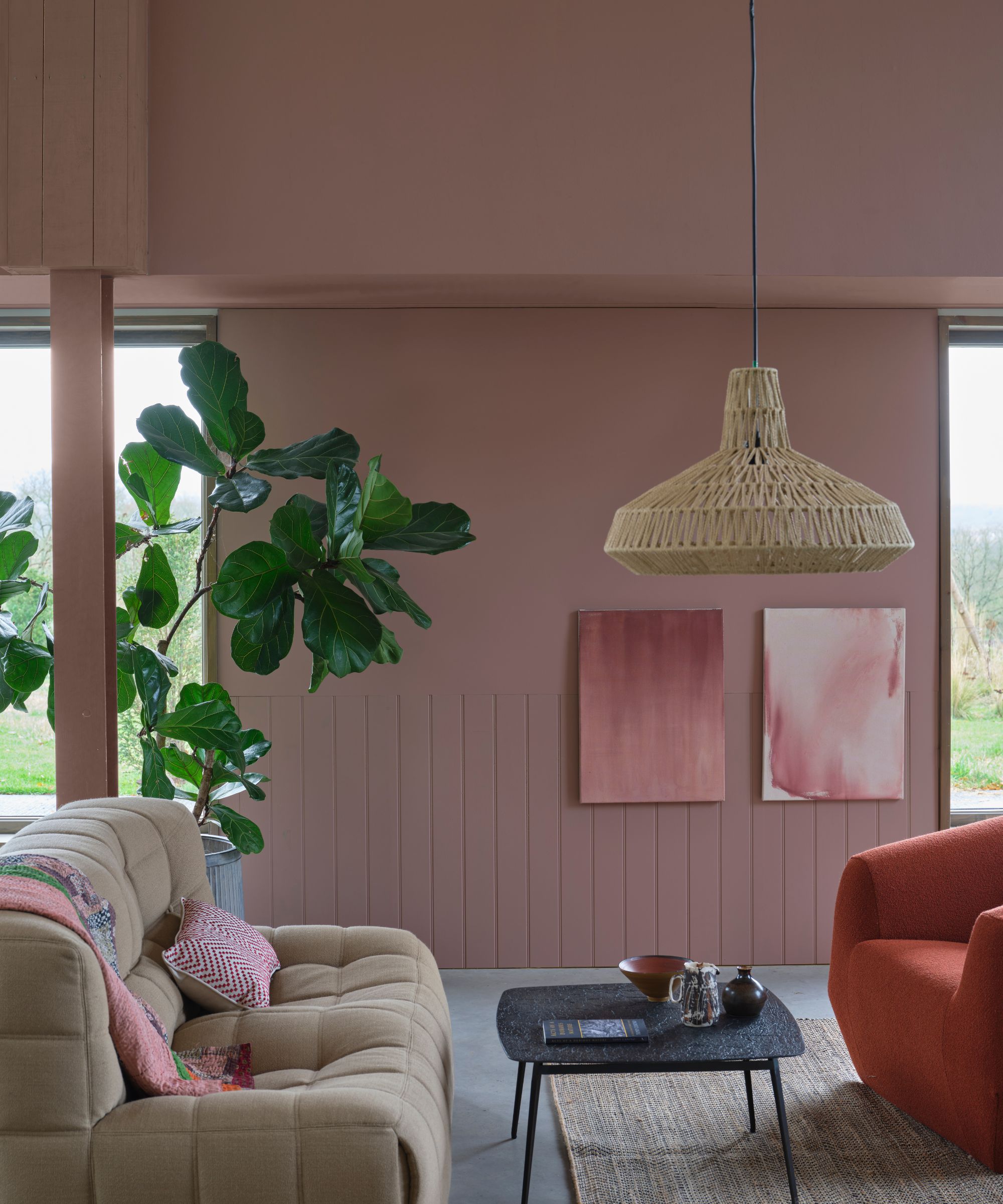
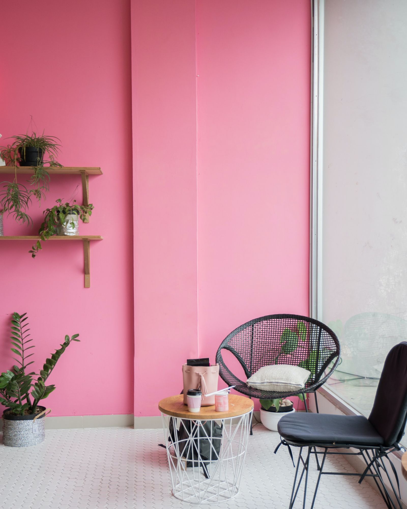
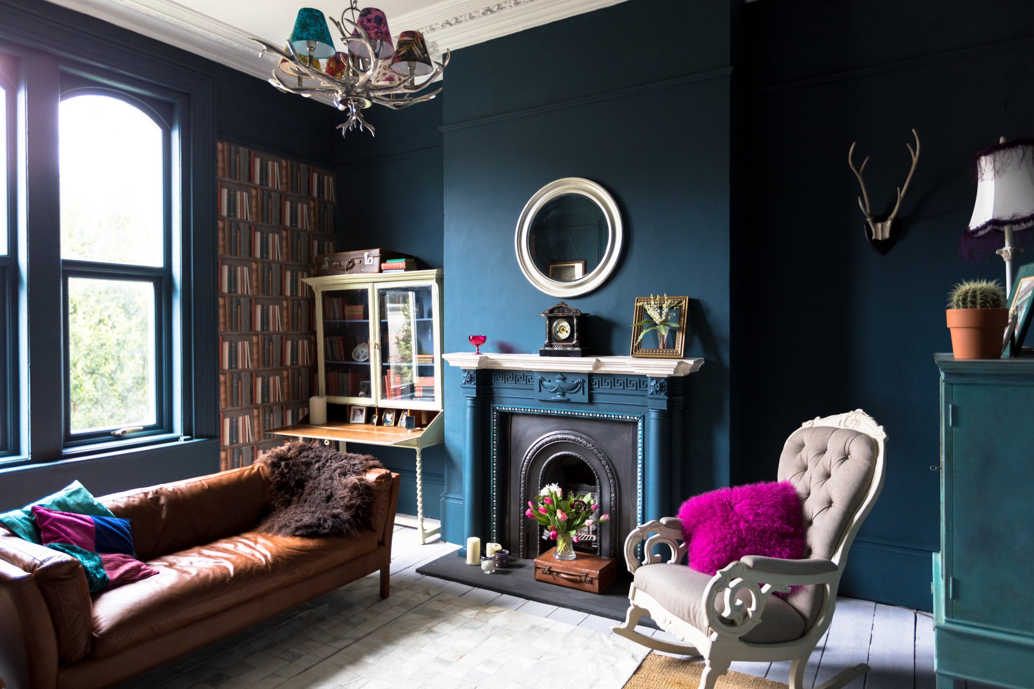
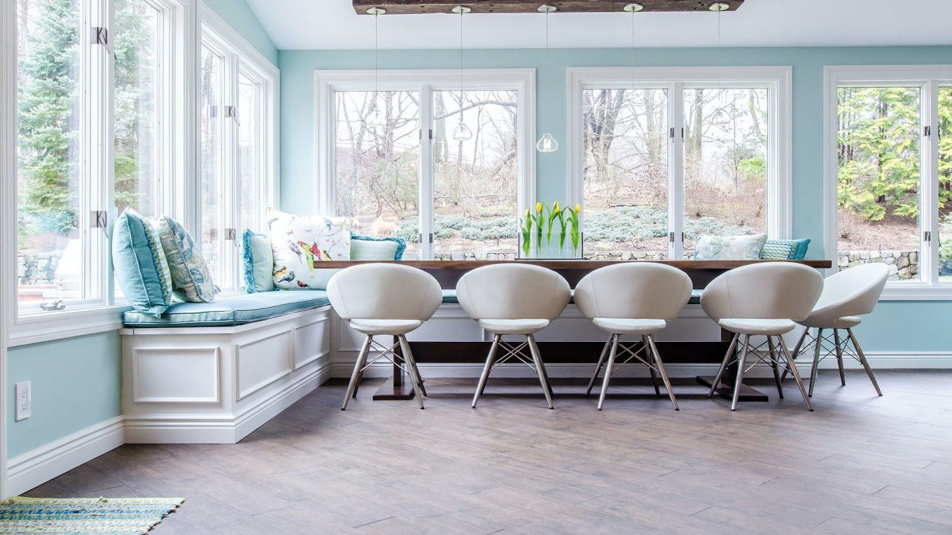
The findings indicated a clear correlation between specific colour palettes and emotional reactions. Pastel shades, including light green, lilac, and blue, were consistently associated with feelings of calmness and serenity. In contrast, brighter and more vibrant colours like yellow, orange, and pink tended to evoke more upbeat and excitable emotions among participants. The study also addressed the common trend of using darker colours in home interiors, suggesting that while fashionable, these hues might contribute to feelings of sadness.
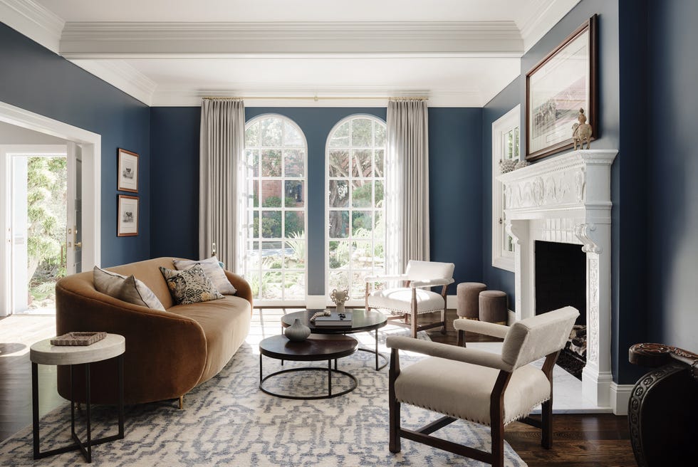
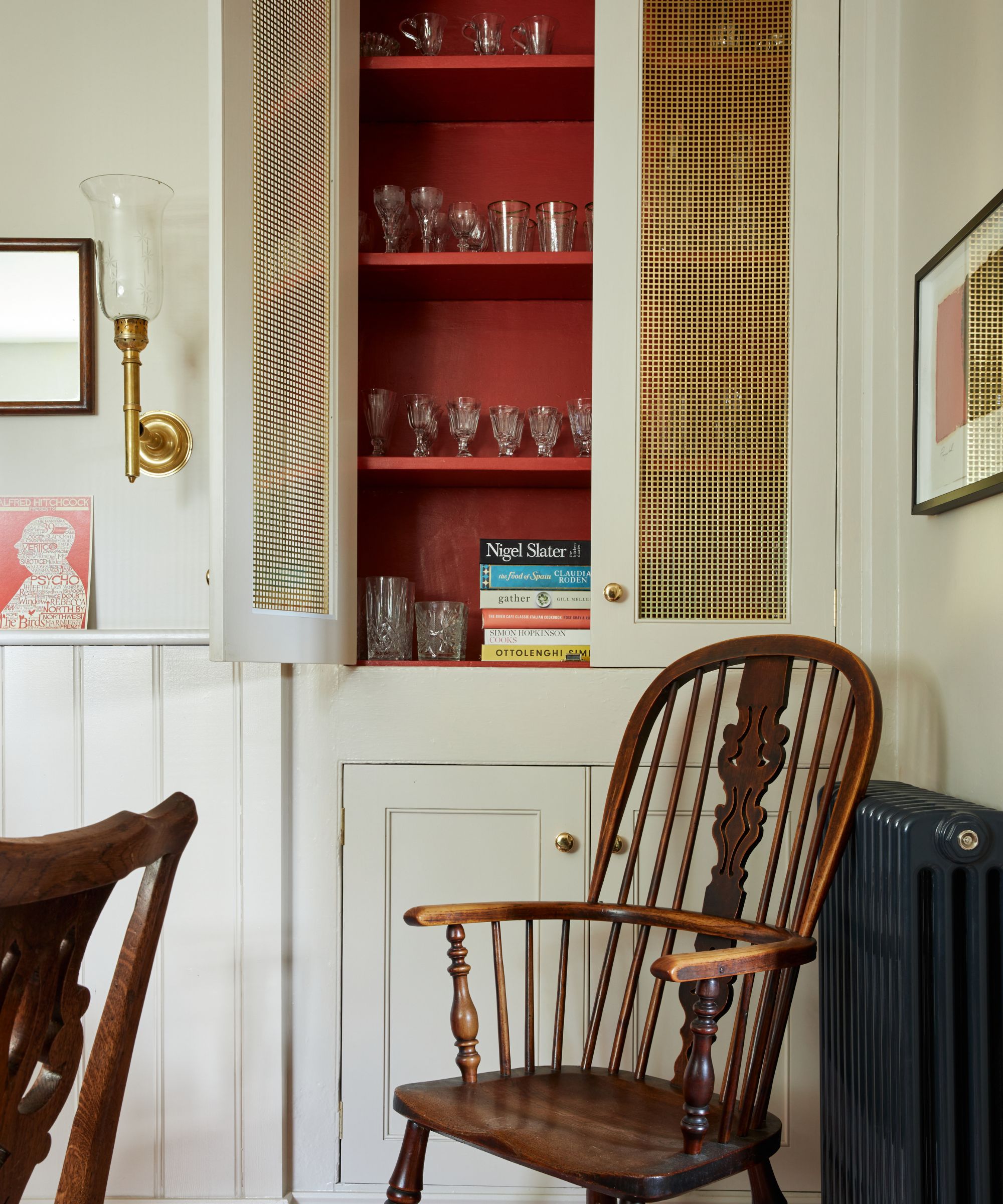
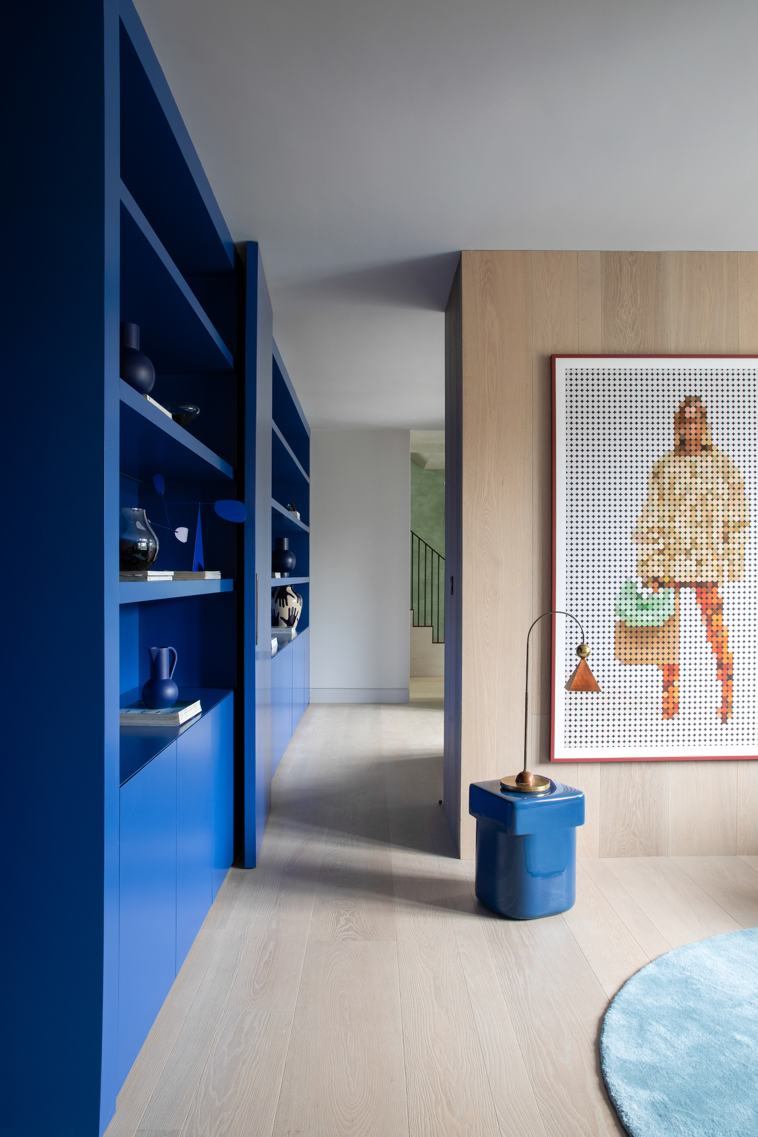
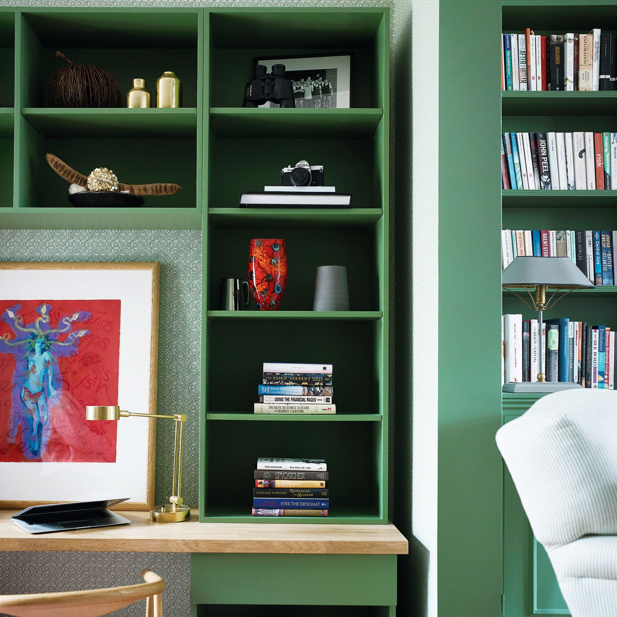
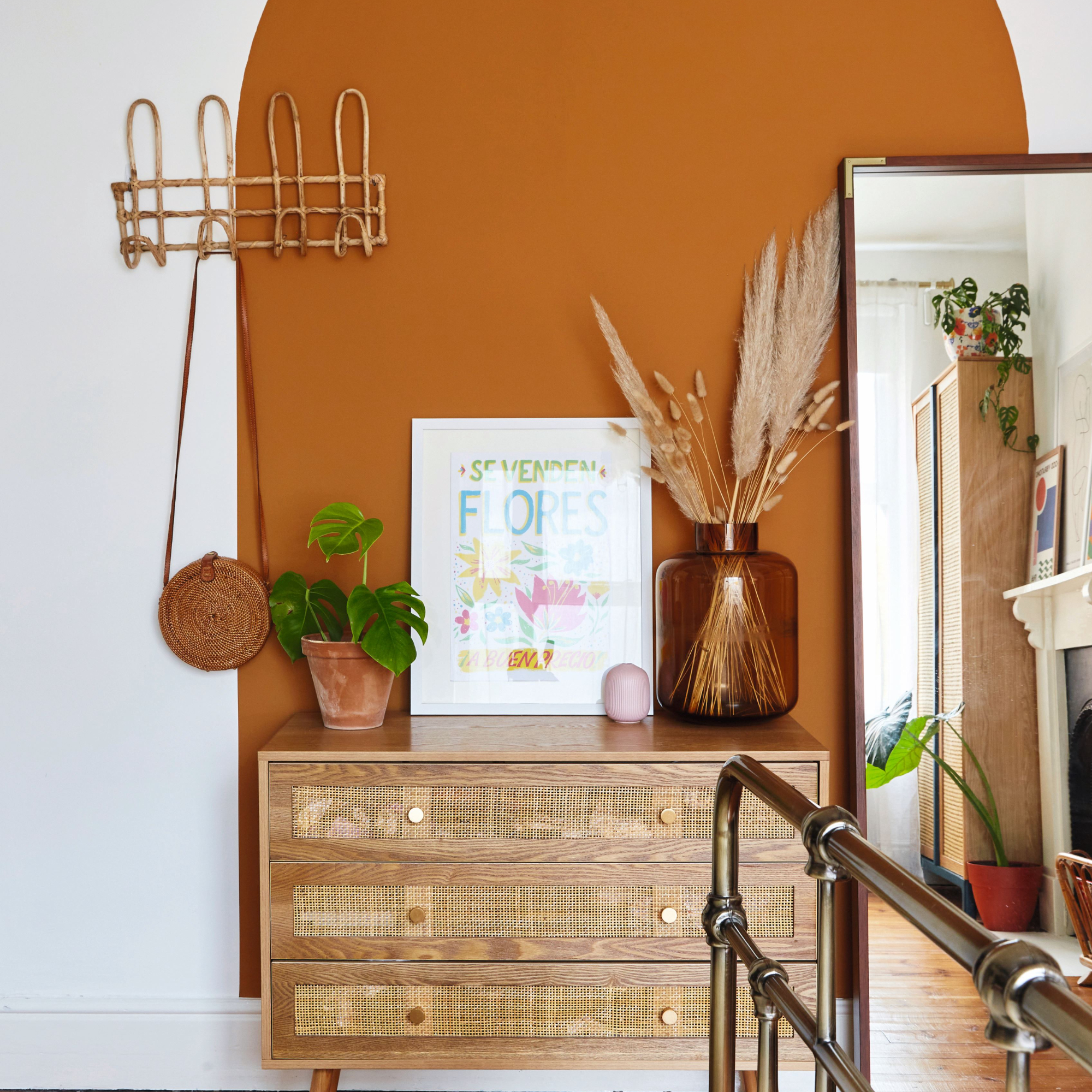
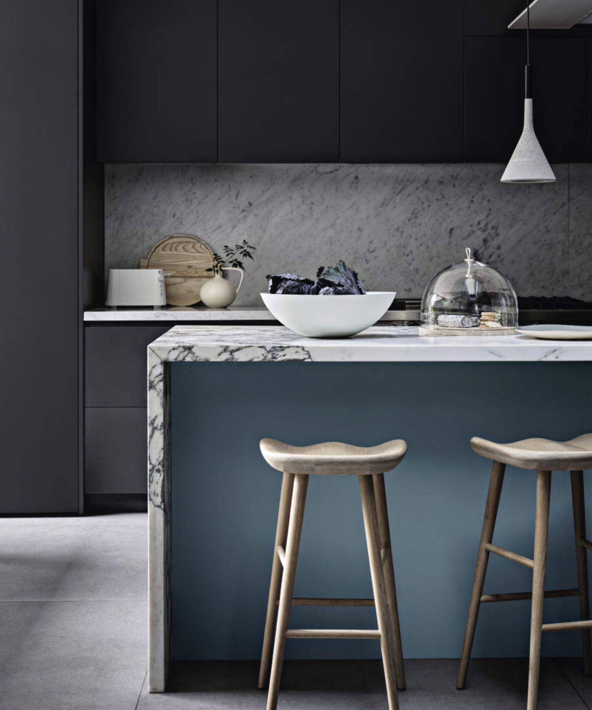
However, the research and expert opinions also highlighted that the strategic application of darker colours could yield positive outcomes. Grace Garrett, a colour consultant, advised that dark colours, when used thoughtfully, can create a striking impact without overwhelming the occupant. She suggested that spaces where less time is spent, such as entrances, powder rooms, or bathrooms, are ideal for incorporating dark feature colours, allowing for a bold aesthetic without prolonged exposure that might negatively affect mood. This nuanced approach suggests that context and duration of exposure are crucial factors in how dark colours influence emotional well-being.
Damian Moratti, CEO of Liminal VR, emphasized the novelty and effectiveness of using virtual reality for this study. He noted that the VR technology enabled accurate assessment of emotional responses within immersive, realistic environments, a capability that static images could not provide. Professor Julie Bernhardt of the Florey Institute further explained that VR created environments that the human brain perceived as real, making the study’s findings more convincing and robust. This technological approach allowed researchers to study colour within contextual environments, which is critical for understanding its impact on human psychology.
The collaboration underscored the potential for interdisciplinary partnerships between science and industry to generate actionable knowledge. The results of the Taubmans Colour Emotion Study offer valuable insights for homeowners, interior designers, and architects, enabling them to make evidence-informed decisions about colour choices to enhance well-being and desired atmospheric qualities in various settings. This study marks a significant step in understanding the scientific basis behind how different colours in our surroundings shape our emotional landscape.
#ColourPsychology #InteriorDesign #MoodImpact #VirtualRealityStudy #NeuroscienceResearch #HomeDecor #EmotionalResponses #PaintChoices #ScientificStudy #ColourPsychology #InteriorDesign #MoodImpact #VirtualRealityStudy #NeuroscienceResearch #HomeDecor #EmotionalResponses #PaintChoices #ScientificStudy
0 comment in total
 No comments yet
You may also like
How paint colour in your home can affect your mood
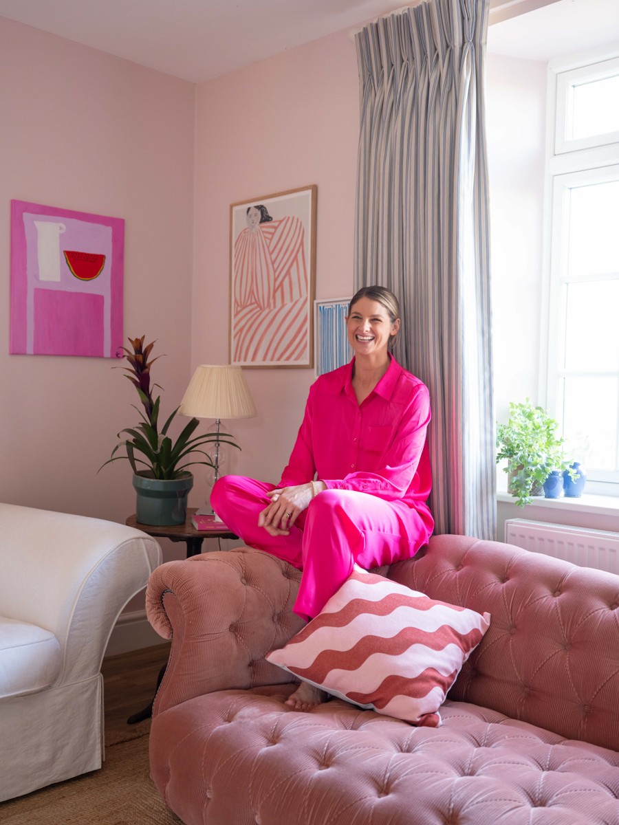
A Color Psychologist Says This Is the Most Relaxing Paint Color

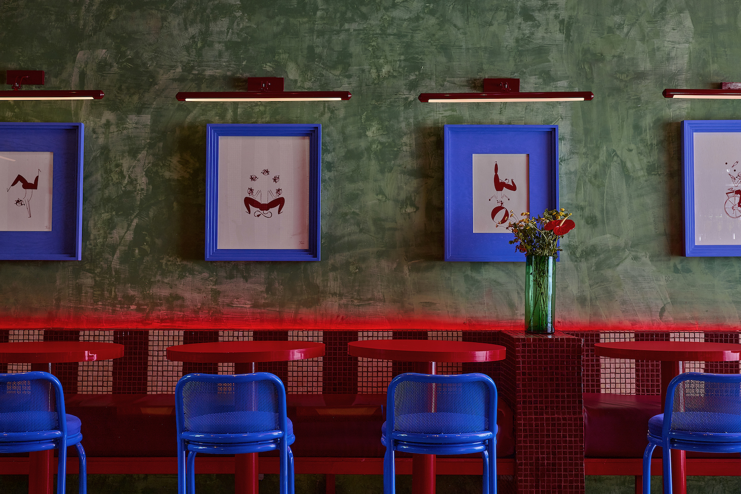
7 'Unhappy' Colors That Color Psychology Experts Would Never Paint Their Walls

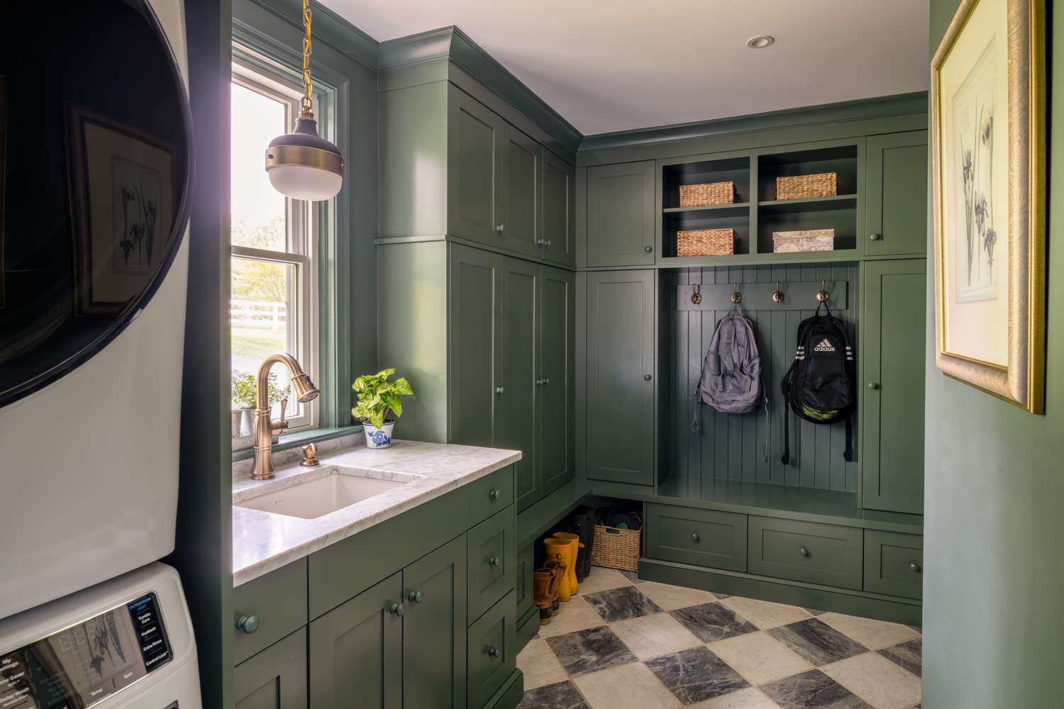
Tired of Touch-Ups? These 9 Paint Colors Are Forgiving and Designer-Approved

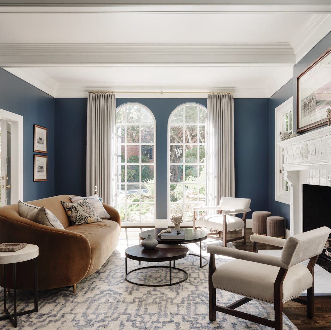
Lick Paint Will Transform the Mood in Your Home Through Color Psychology

A color psychologist says these color schemes are the most likely to boost your mood

37 Best Accent Wall Colors for an Instant Room Makeover

What are the worst colors to paint a room? The shades experts say you should never use
How Your Home's Paint Colors Can Make You Happier, According to Experts

10 Accent Wall Paint Colors That Will Freshen Up Any Space, According to Designers

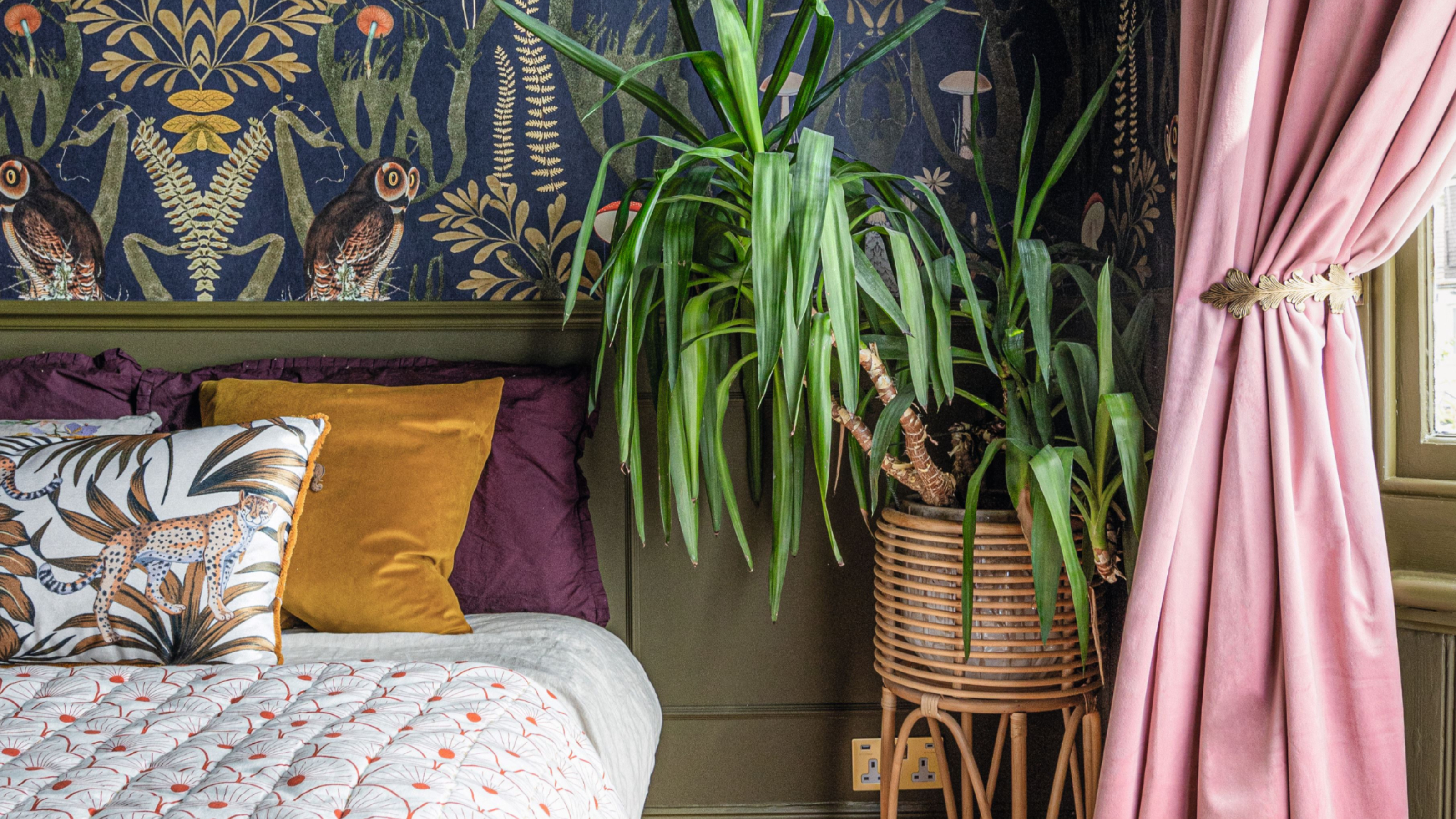
'It's so effective at making your home work harder' – the latest paint trend endorsed by colour gurus
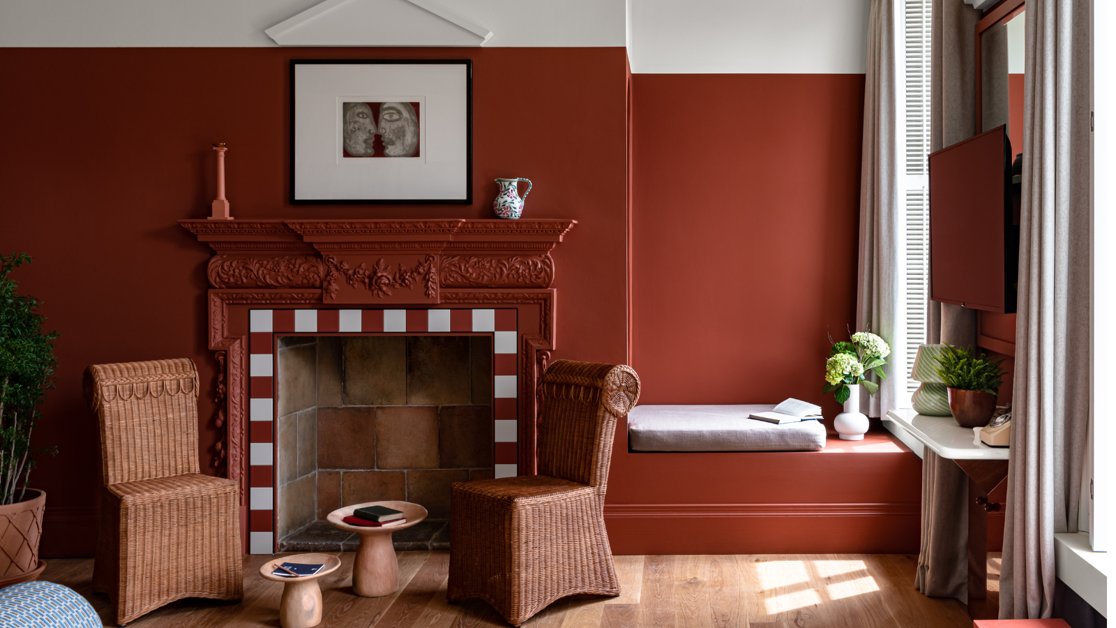
6 'Energetic Colors' for Vitality and "Sophisticated Interiors", According To Psychologists And Design Experts
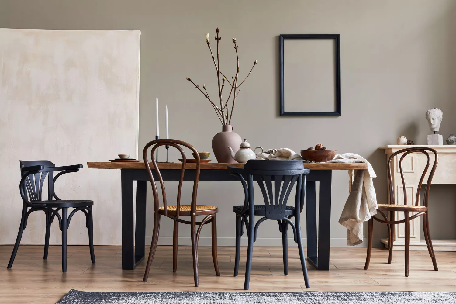
8 Paint Colors That Promote Wellness at Home

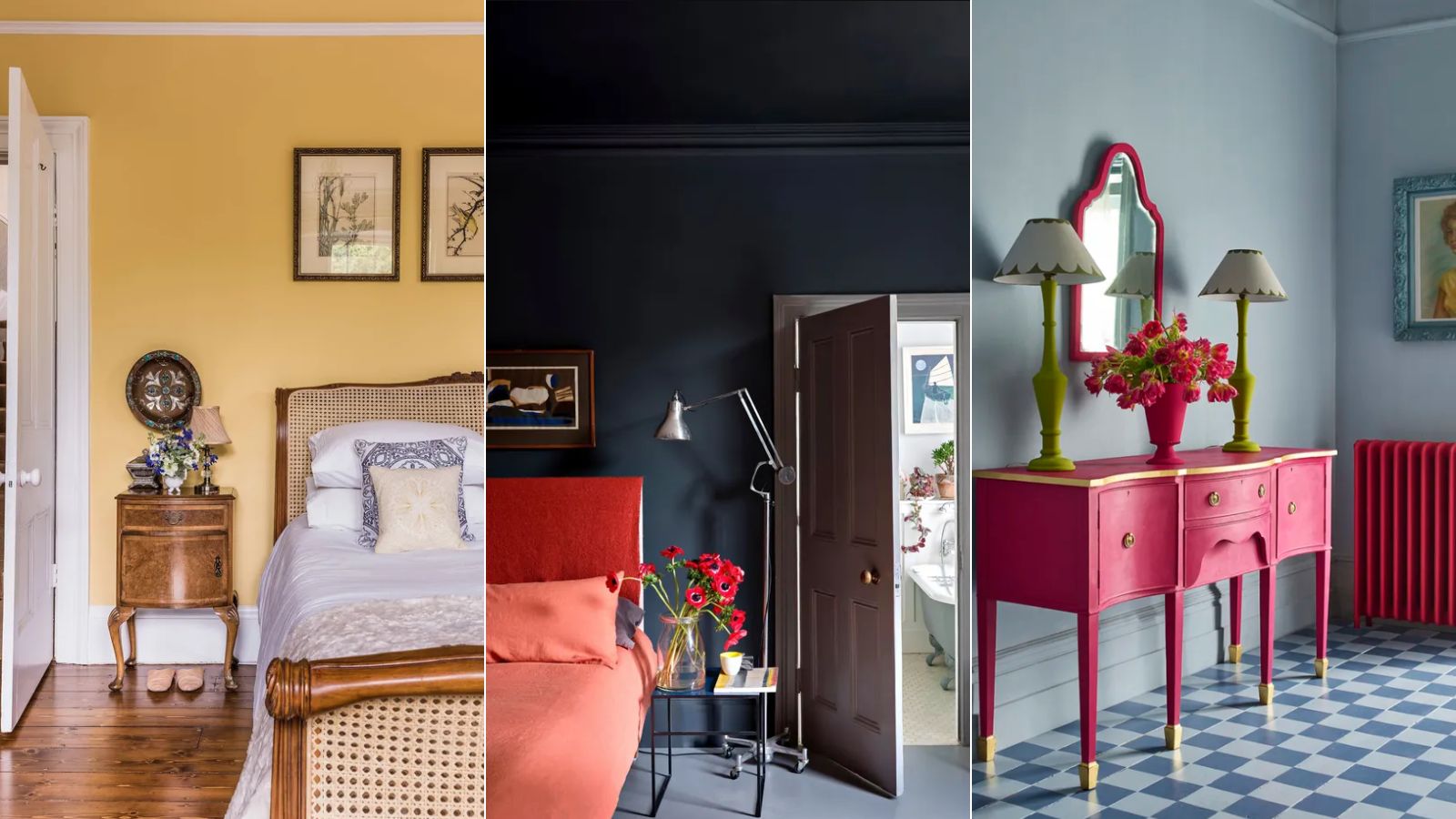
3 'small but impactful' paint updates to try in 2024, according to a color expert
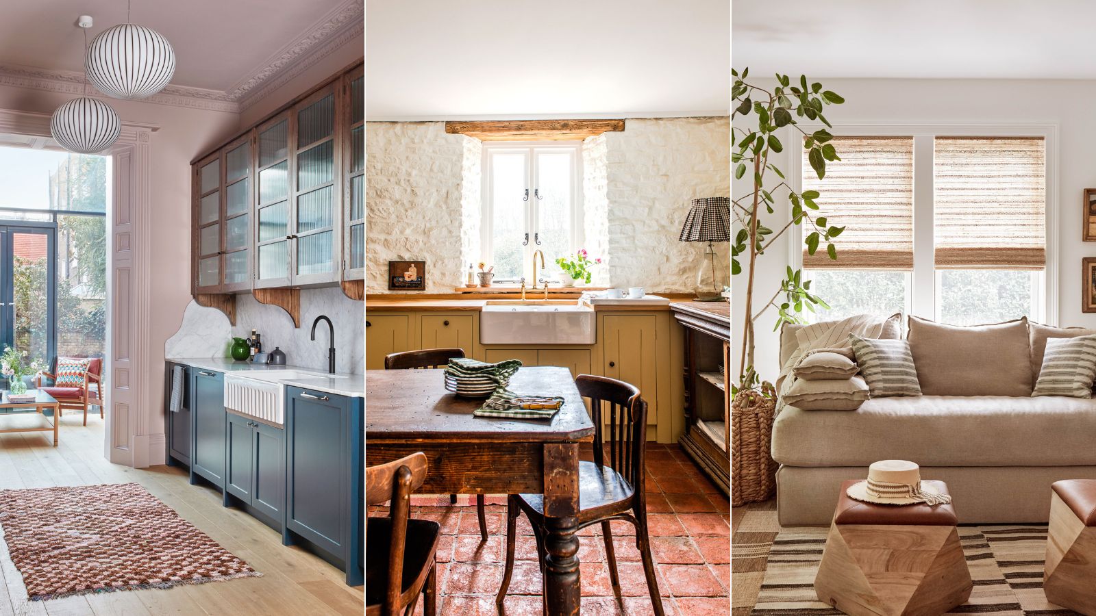
Outdated color trends – 5 overdone colors that designers no longer love, and what to use instead
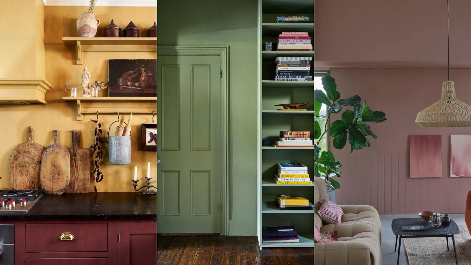
My rented apartment follows the key rules of color psychology – here's why I'd never go back to an all-white home

Let the walls talk — colours that shape your space

These Paint Colors Bring Hostility to Your Home, According to Experts

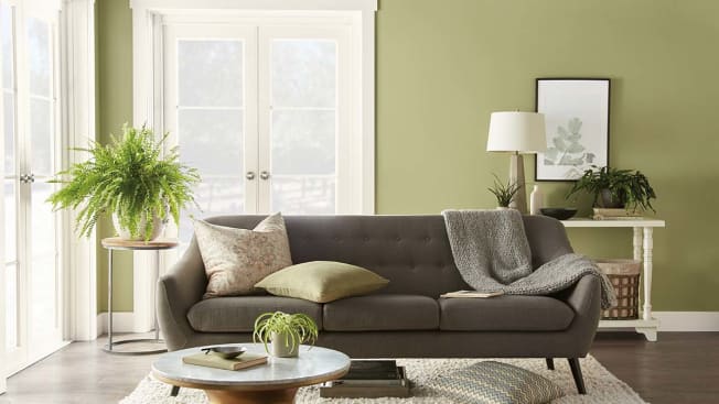
Hottest Interior Paint Colors of 2020
Expert Speak: What are the most soothing colours for the home?