
1/4
Let the walls talk — colours that shape your space
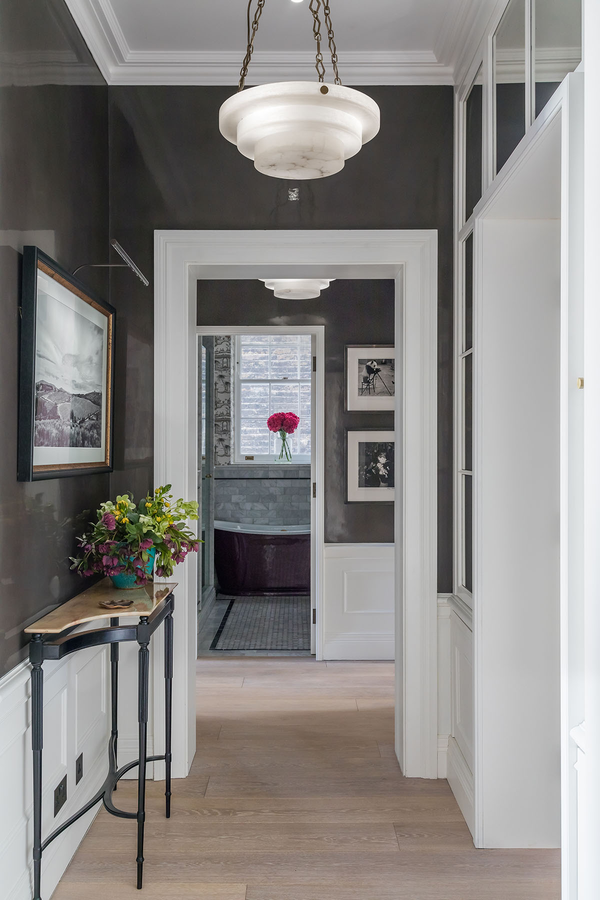
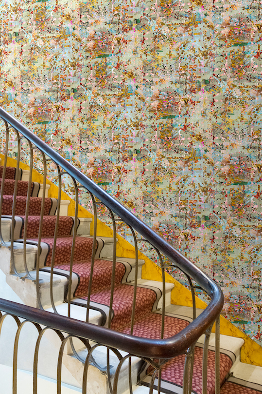
The article explores how colour can significantly impact home spaces, drawing inspiration from the vibrant seasonal colours of the Indian subcontinent. It features insights from leading architects and designers who share their projects and strategies for incorporating colour effectively throughout the year. The piece highlights four distinct projects, each demonstrating a unique approach to colour application in residential design.
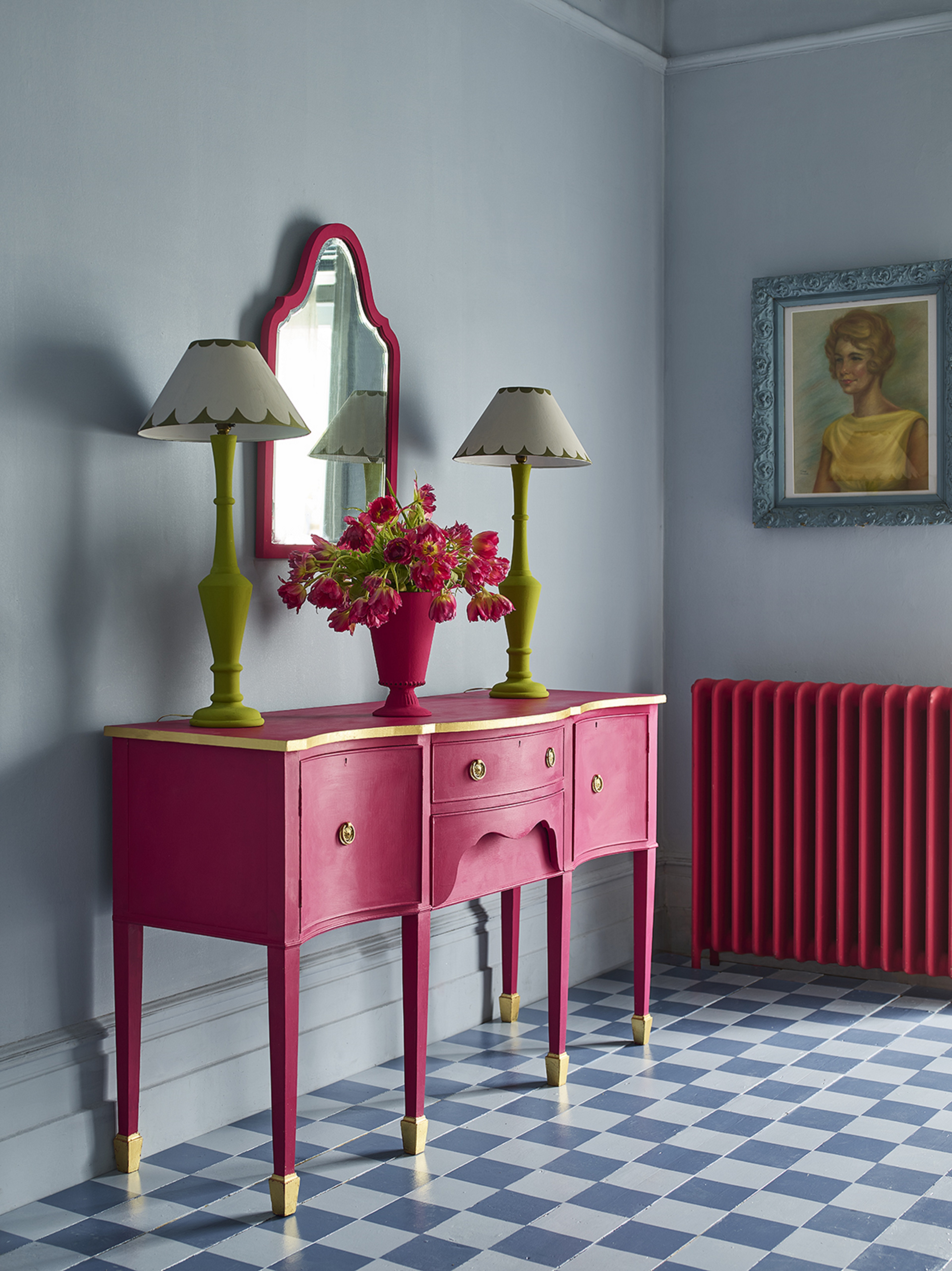
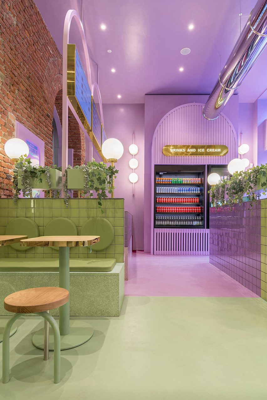
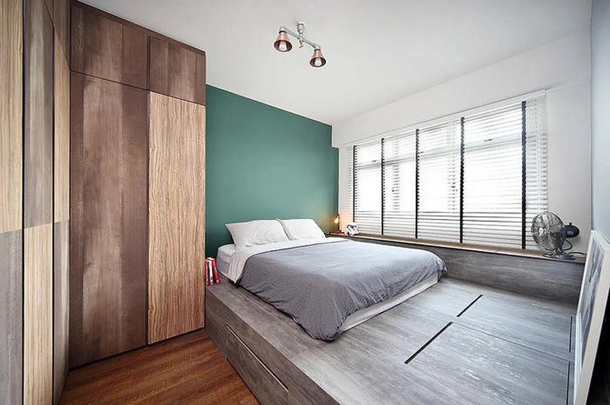
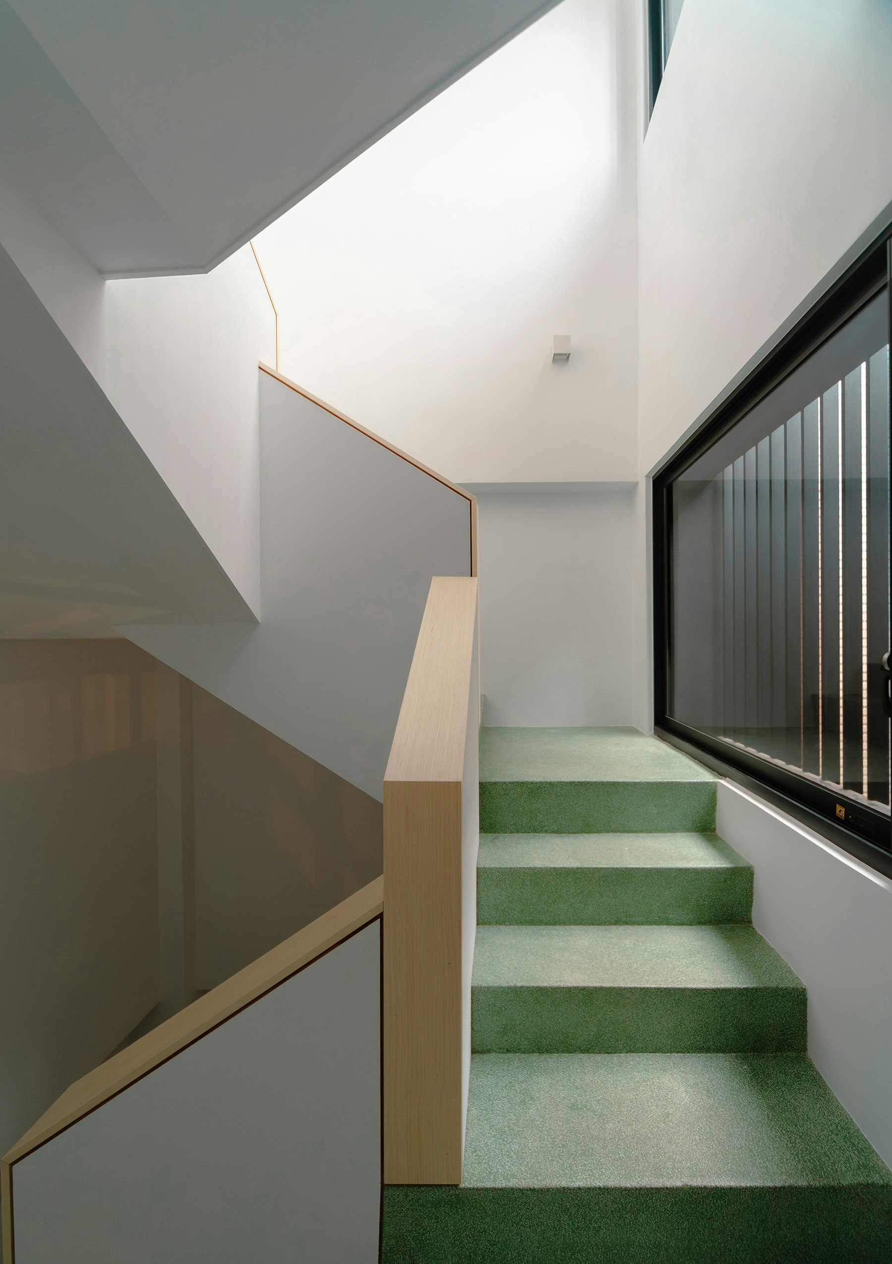
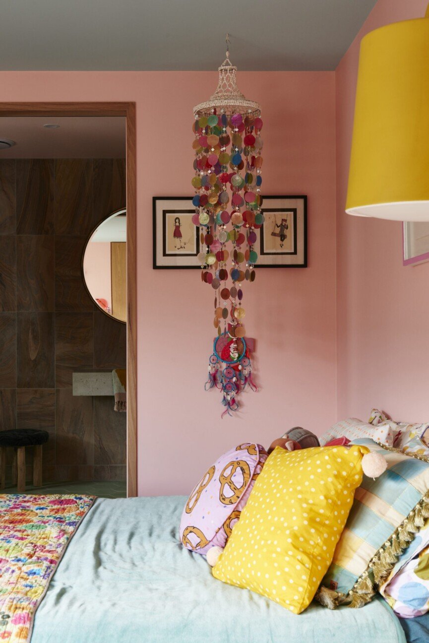
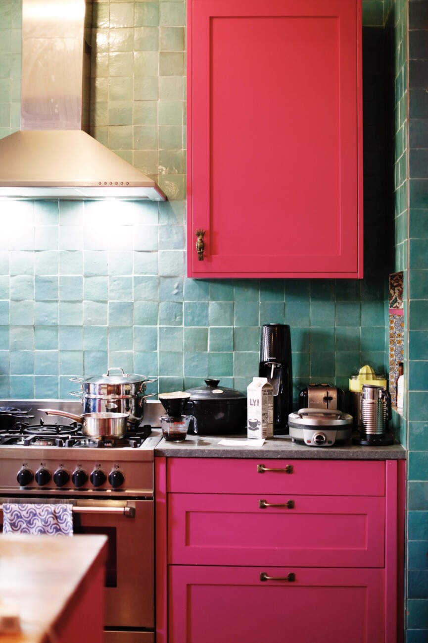
The first project, 'Rose Milk House' by 85:15 in Chennai, designed by Vaishali Srinivasan for her parents, emphasizes contextually-rooted spaces with a lived-in appeal. The design is inspired by 1990s government quarters and incorporates personal details like French red wardrobes, laminated finishes, and traditional textiles. A prominent feature is a bold band of green lime plaster that interacts with daylight to reveal varied textures. Srinivasan advises using personal keepsakes, art, and textiles to discover a colour palette that resonates with individual tastes, ensuring spaces feel uniquely personal.
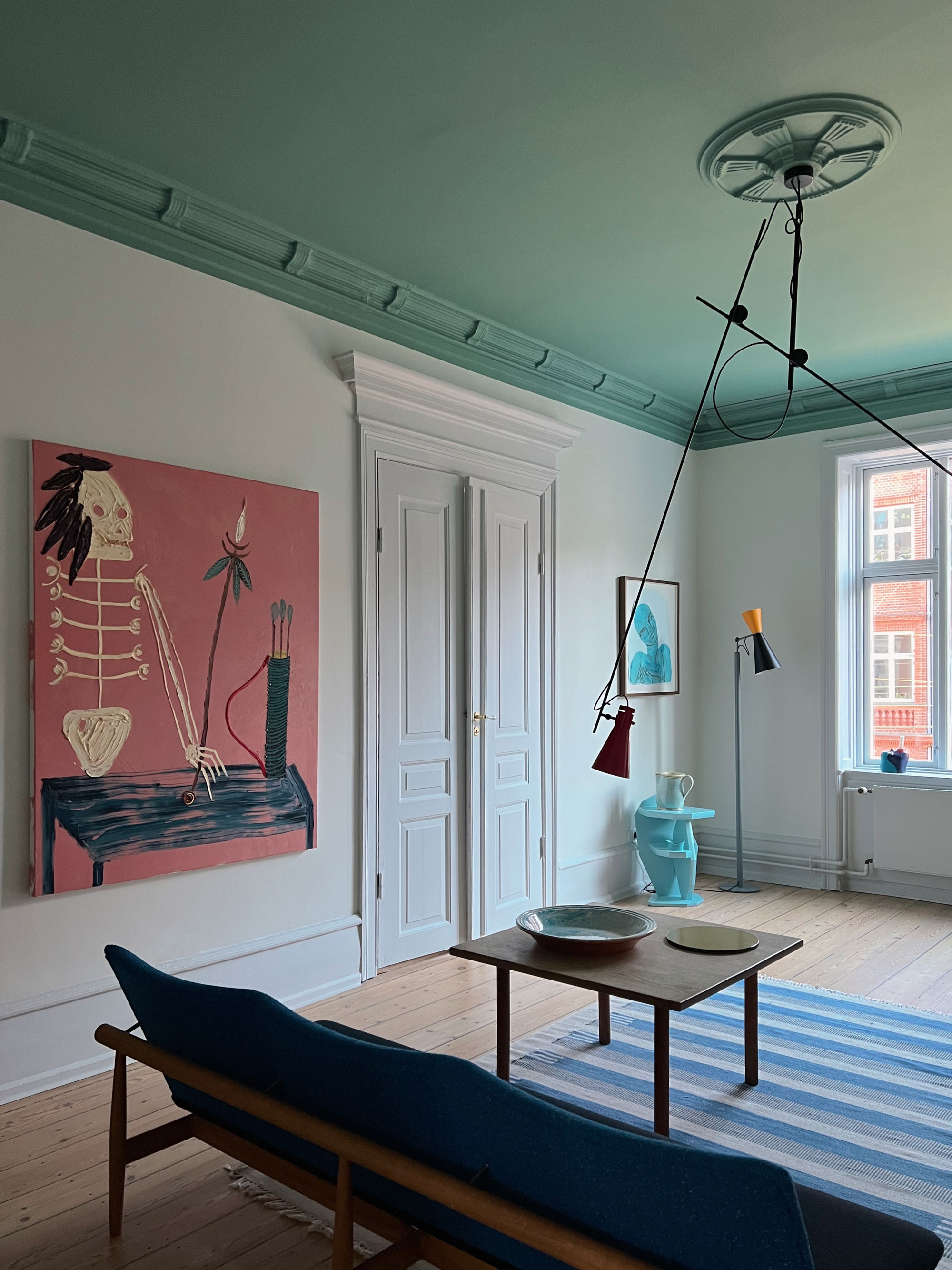
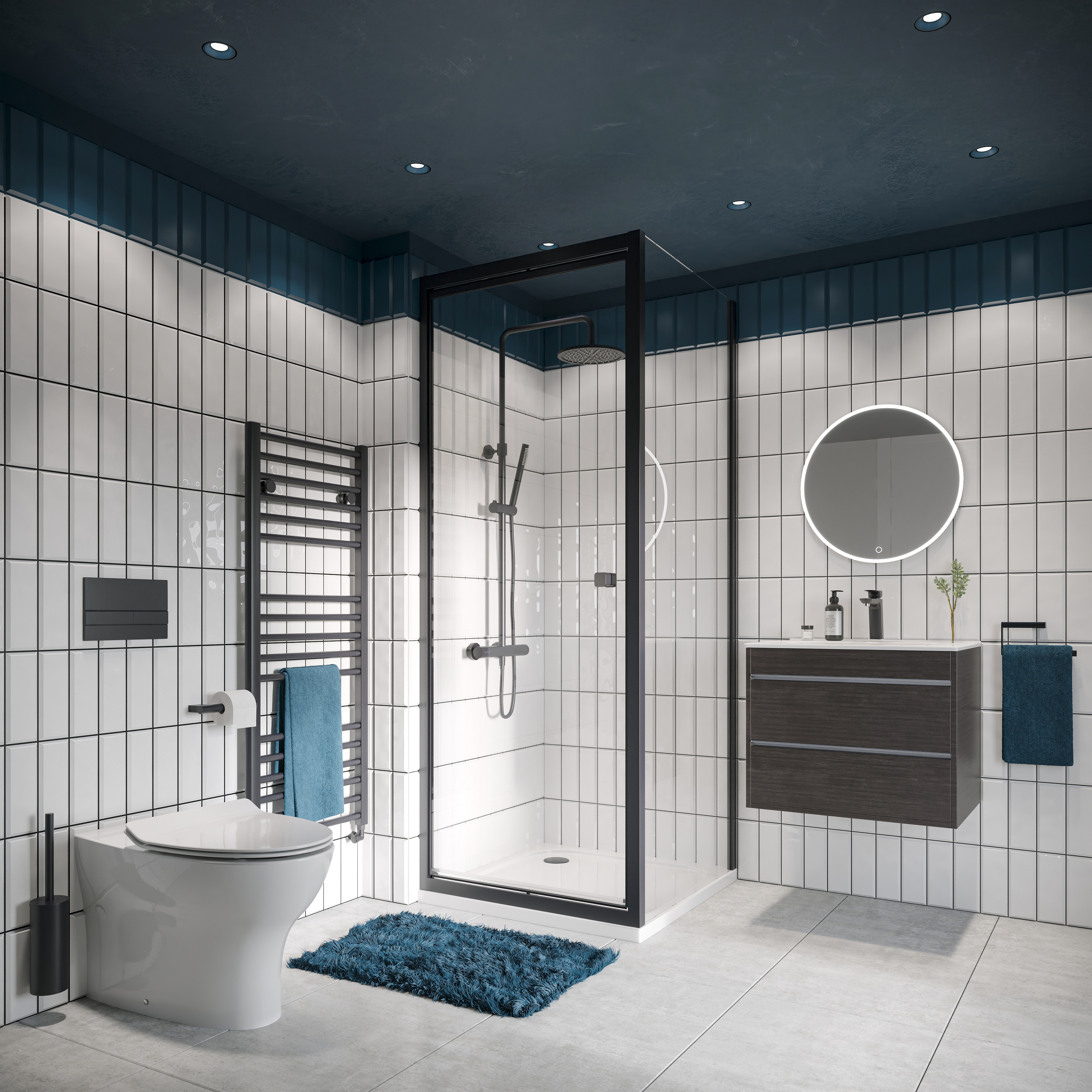
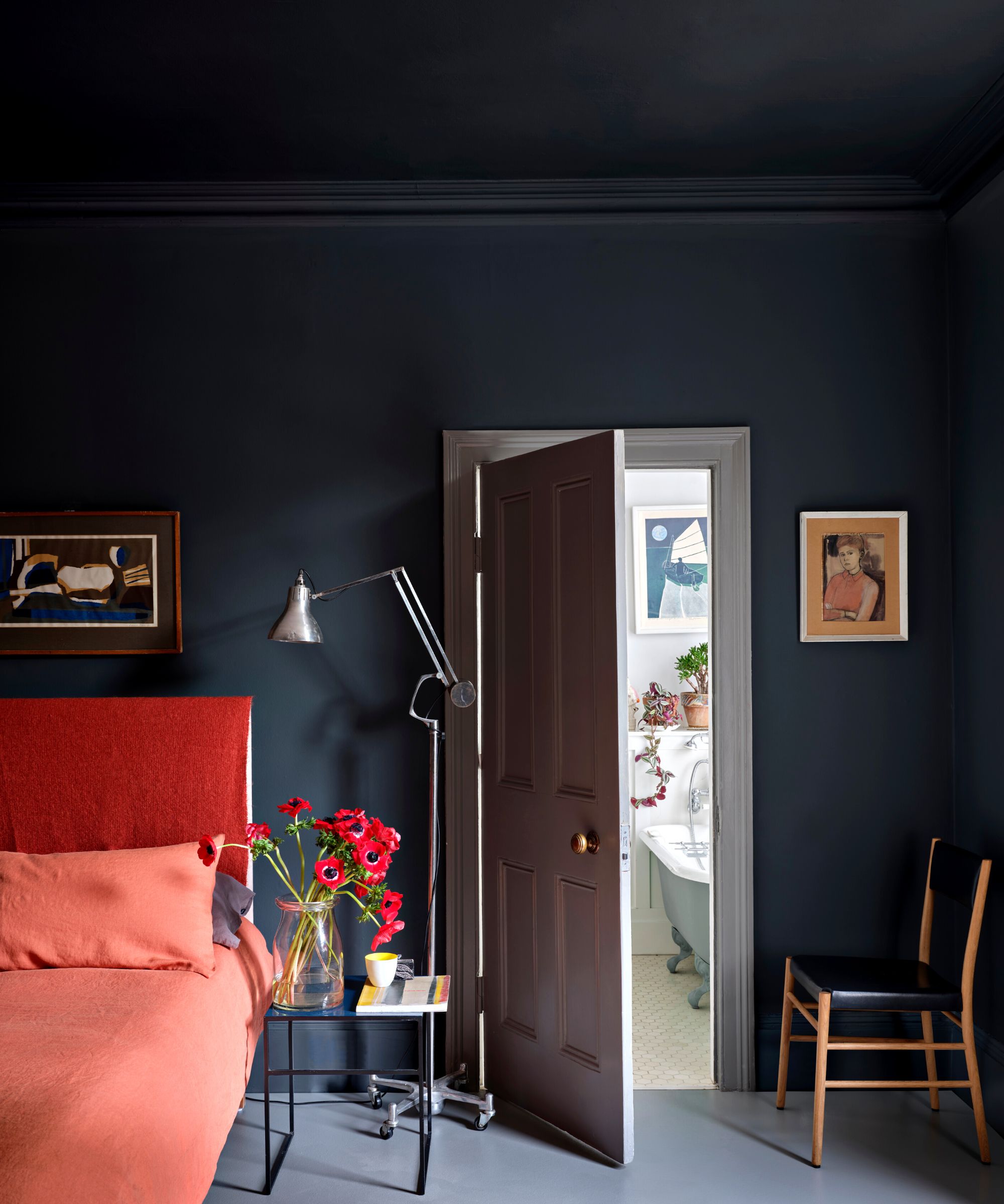
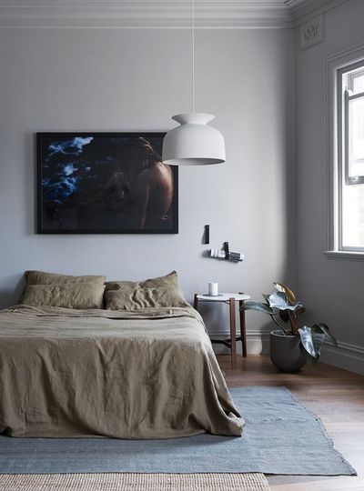
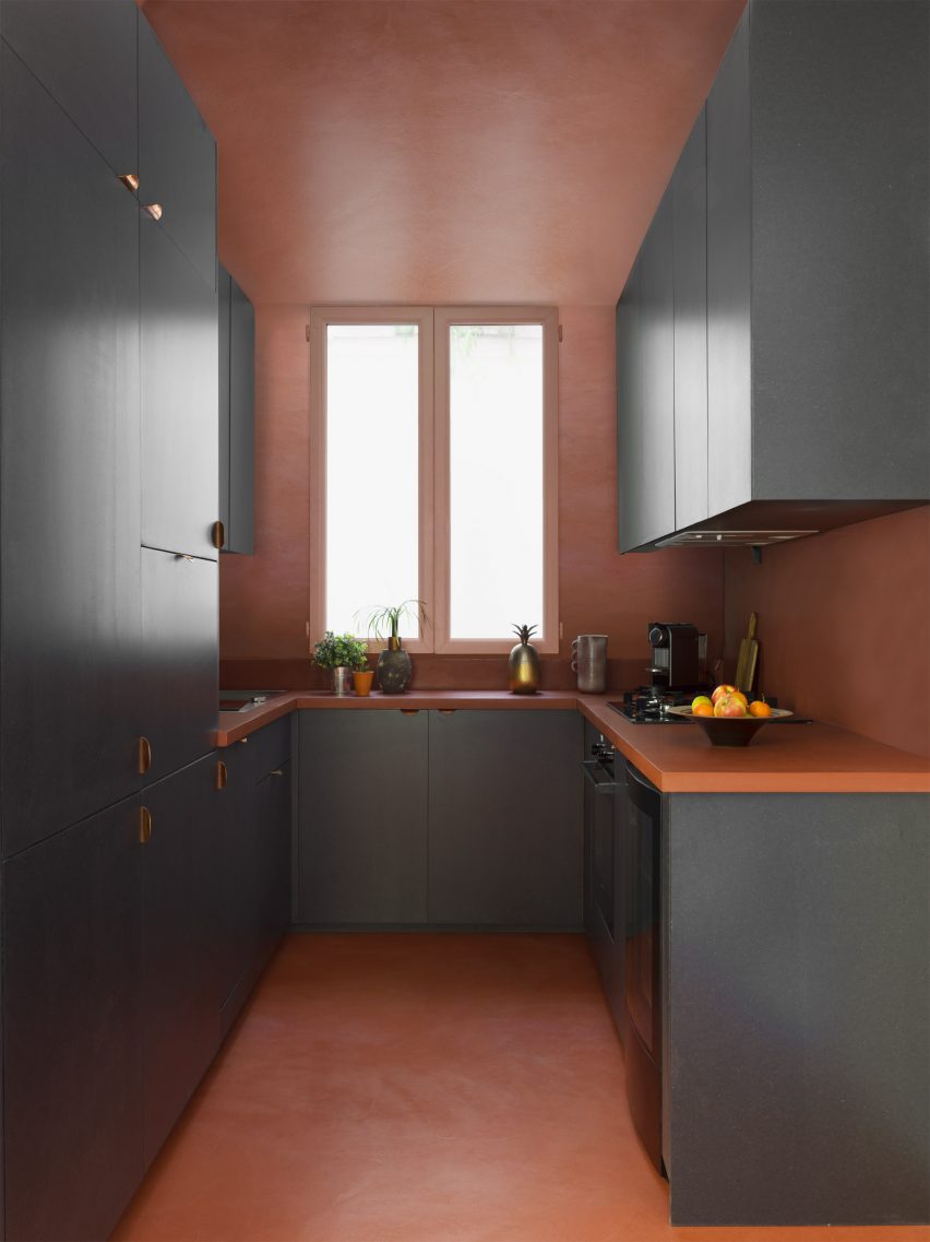
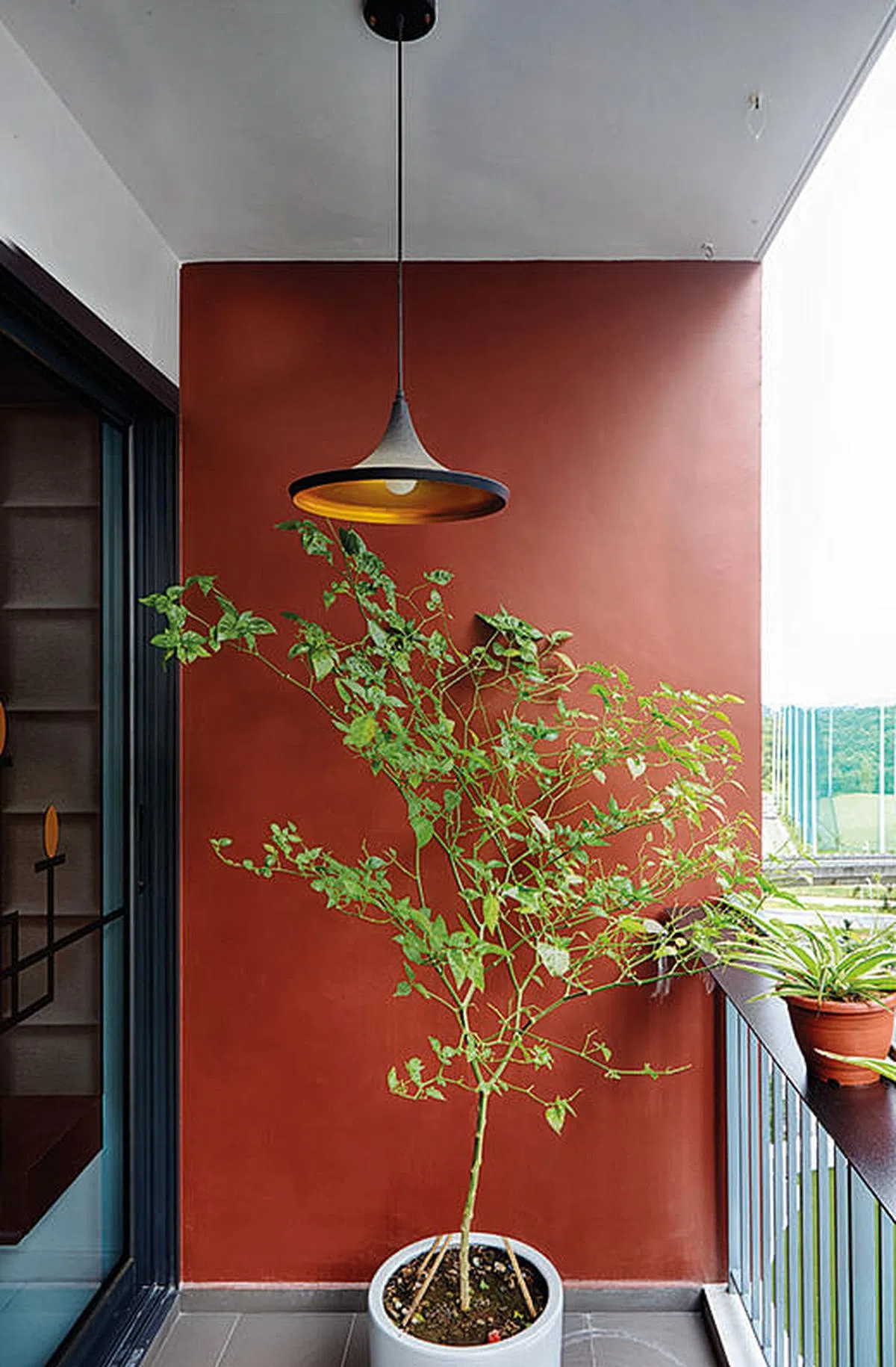
The second project, 'The Leftovers' by MuseLAB in Mumbai, is a 2,200 sq.ft. apartment redesigned for art and design enthusiasts. Principal architects Huzefa Rangwala and Jasem Pirani utilized colour-blocking to create a neo-vintage gallery-like atmosphere. A terracotta ceiling warms communal areas, while bedrooms feature signature hues, such as a dramatic indigo cascading from ceiling to wall to highlight artwork. Rangwala emphasizes that colours are integrated with the family's cherished possessions, making colour a language for expressing their story. MuseLAB suggests starting with subtle elements like furnishings and textiles, and experimenting with tonal variations. The studio currently favors dusky pinks, powder blues, and olive greens for their sophisticated and adaptable qualities.
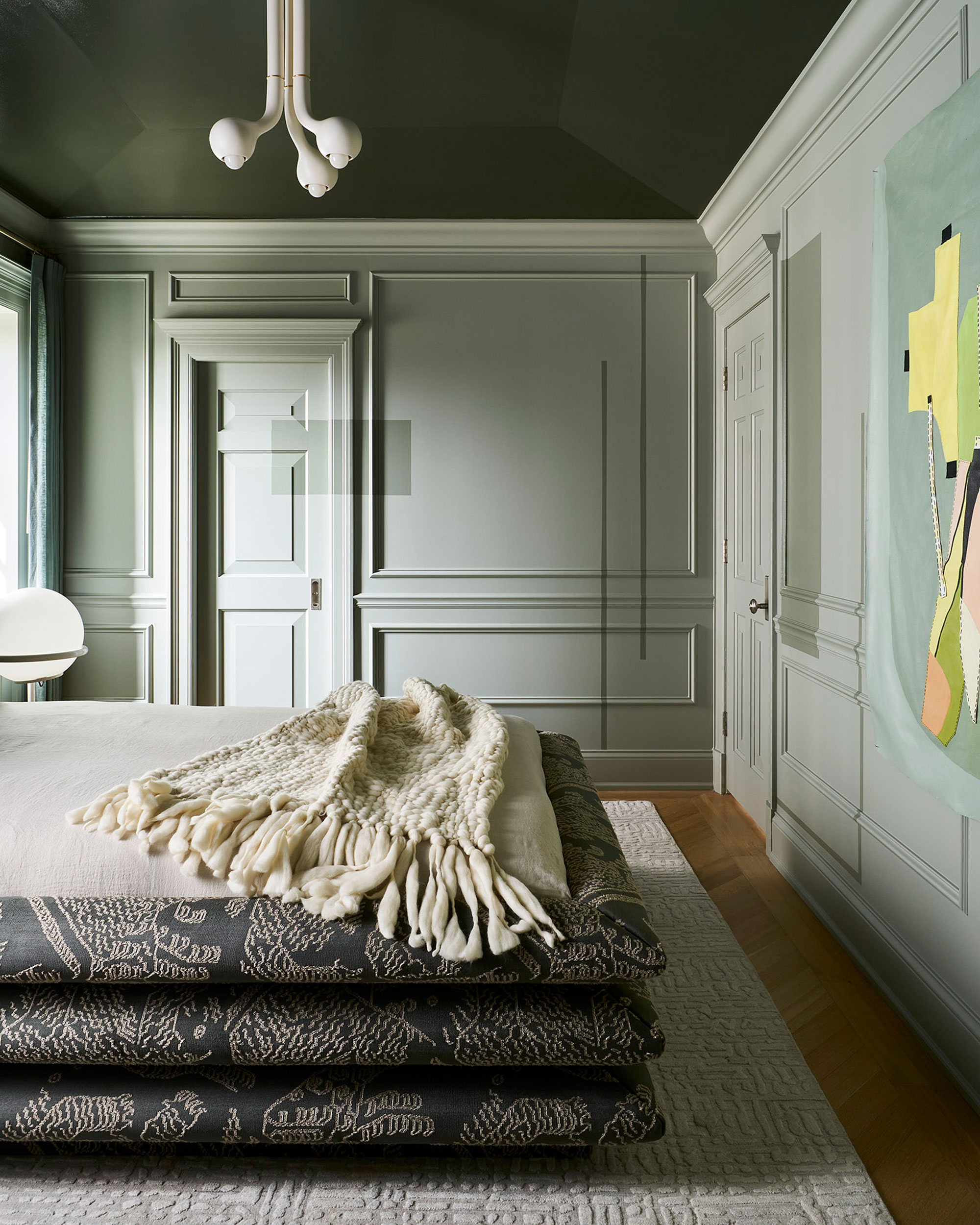
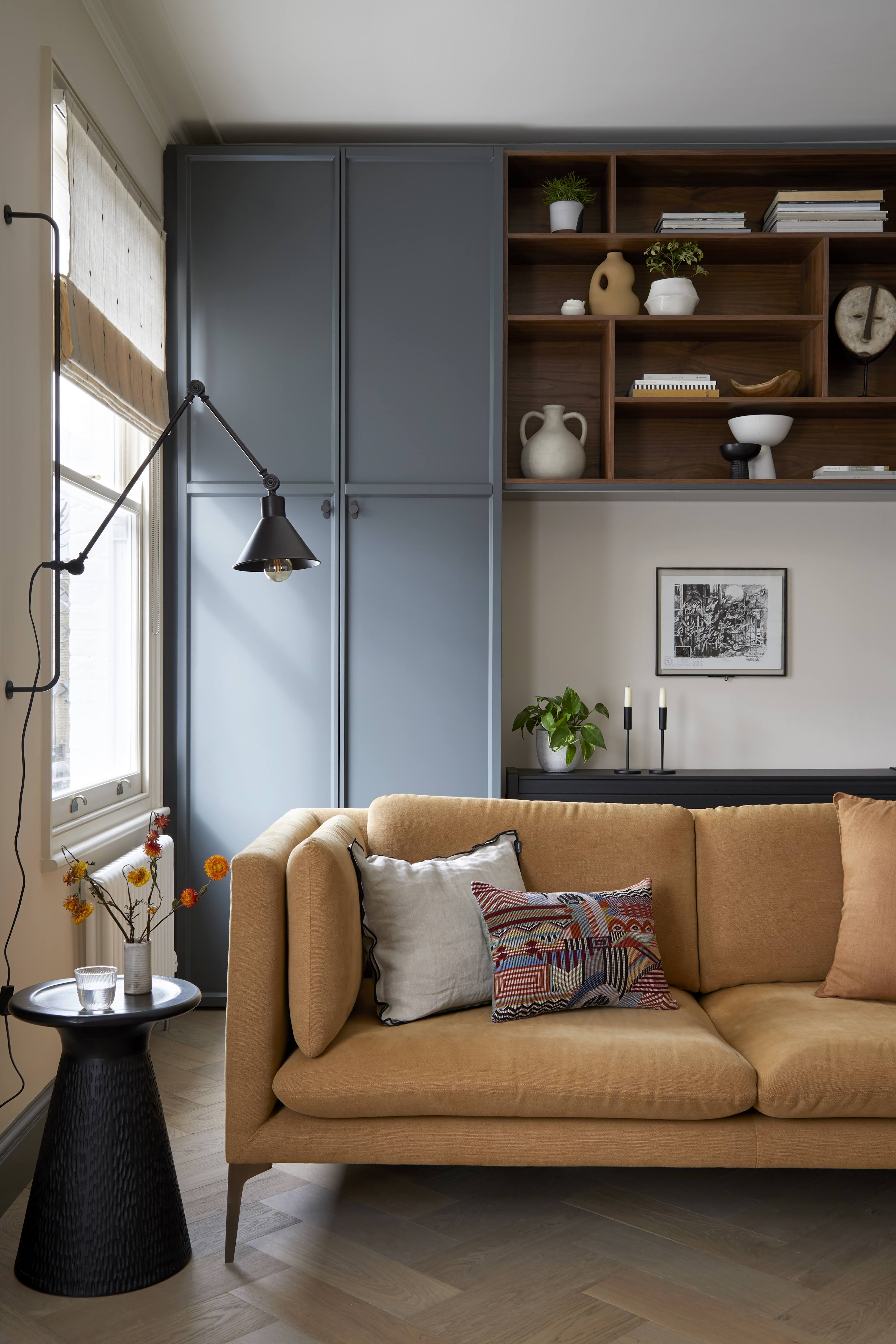
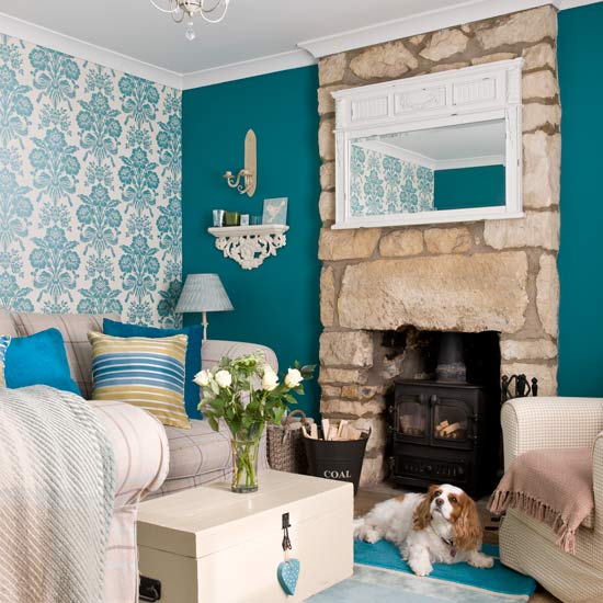
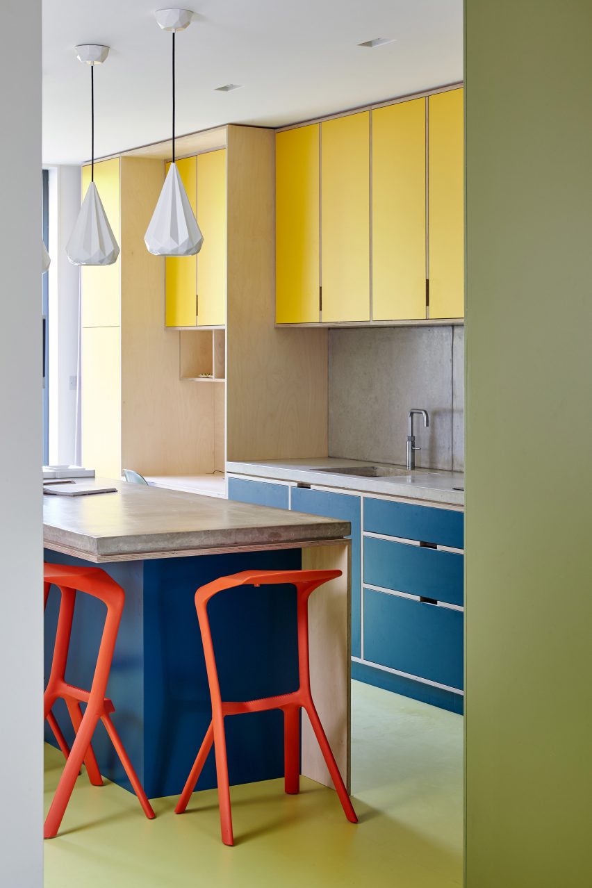
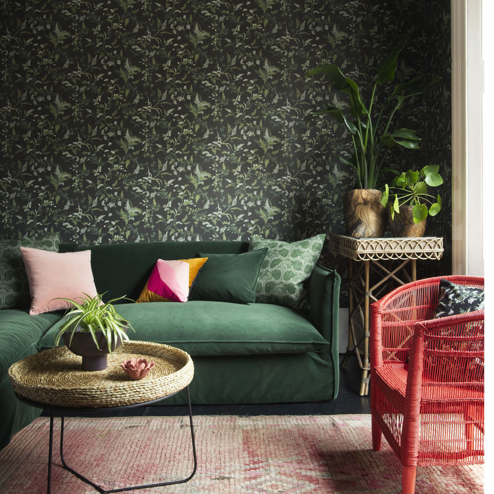
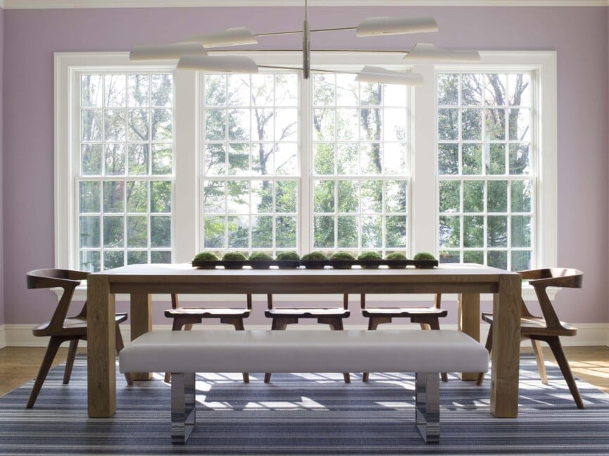
The third project, 'The Deco Haus' by Chestnut Storeys in Chennai, is a 7,000 sq.ft. private residence where principal designer Farah Agarwal blends contemporary design with the home's historic integrity. The design strategy involves balancing statement accents against subdued neutrals. A neutral base for the walls allows bold pops of colour to be introduced through furniture, sculptural inserts, or accent walls in deep greens. Agarwal notes that this approach creates a visual rhythm and incorporates personal elements like art and photographs. She recommends embracing jewel tones, blending muted pastels with bolder shades, and incorporating earthy hues such as ochre, moss, and terracotta. Additionally, Agarwal highlights the importance of texture, suggesting woven fabrics, metallic accents, and natural materials to add dimension.
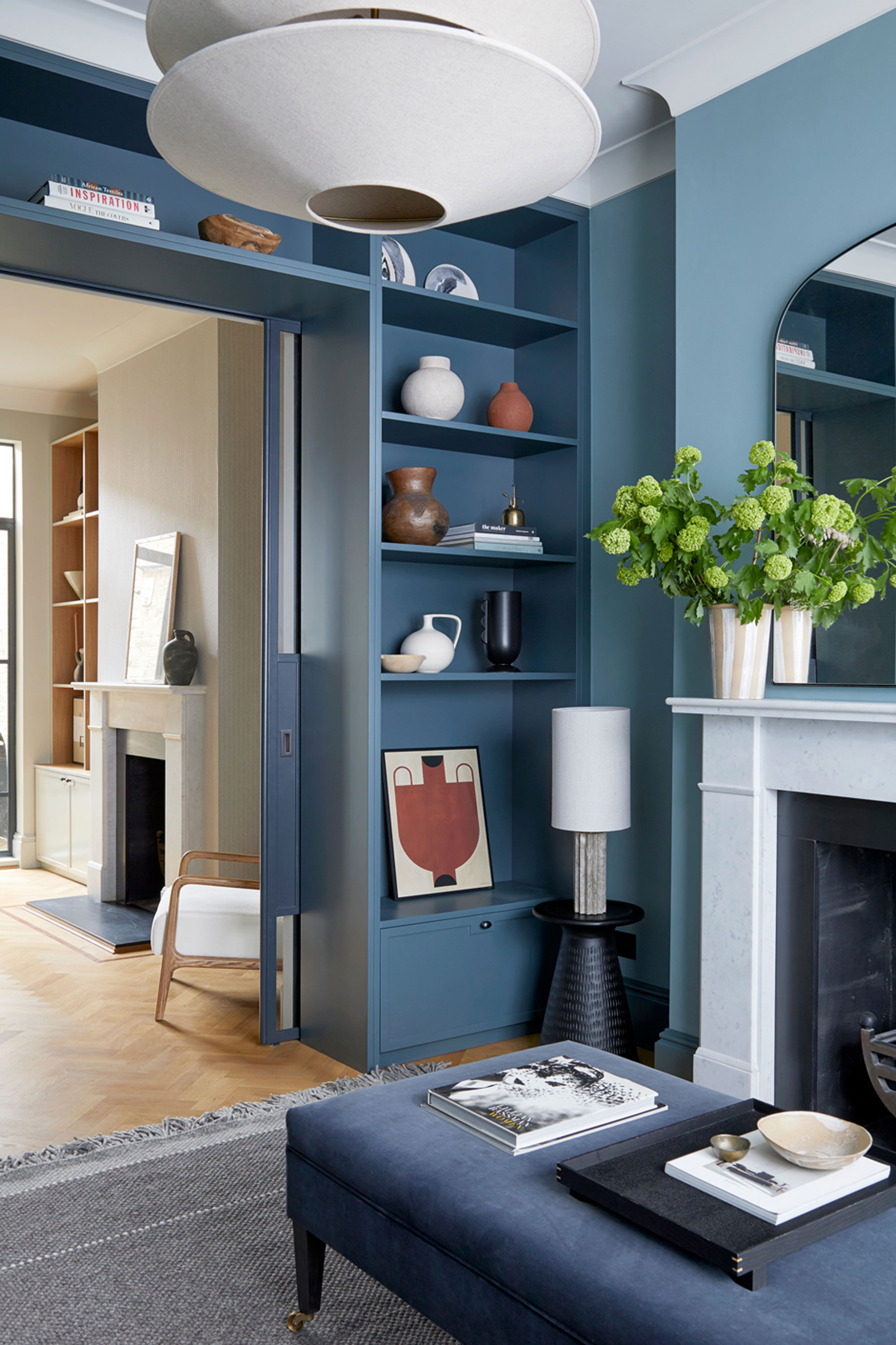
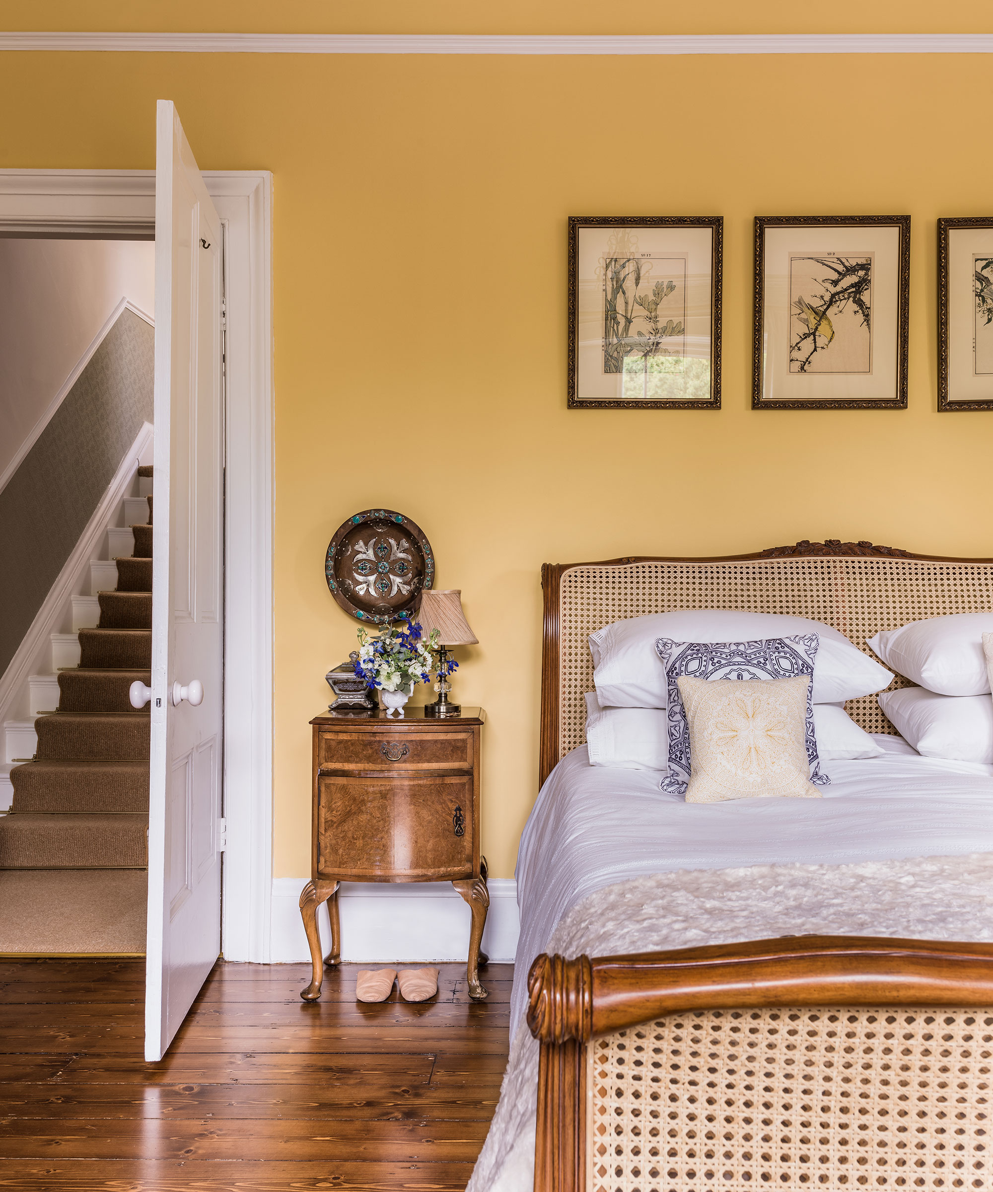
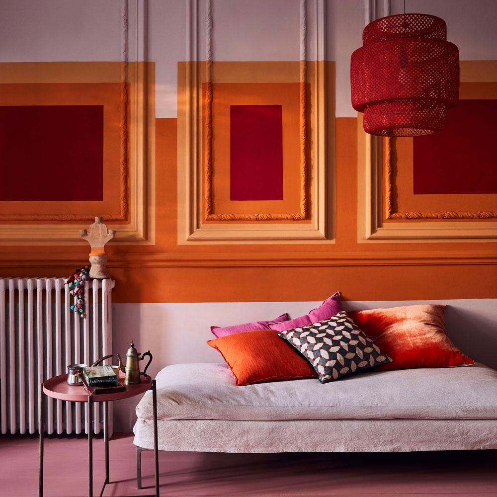
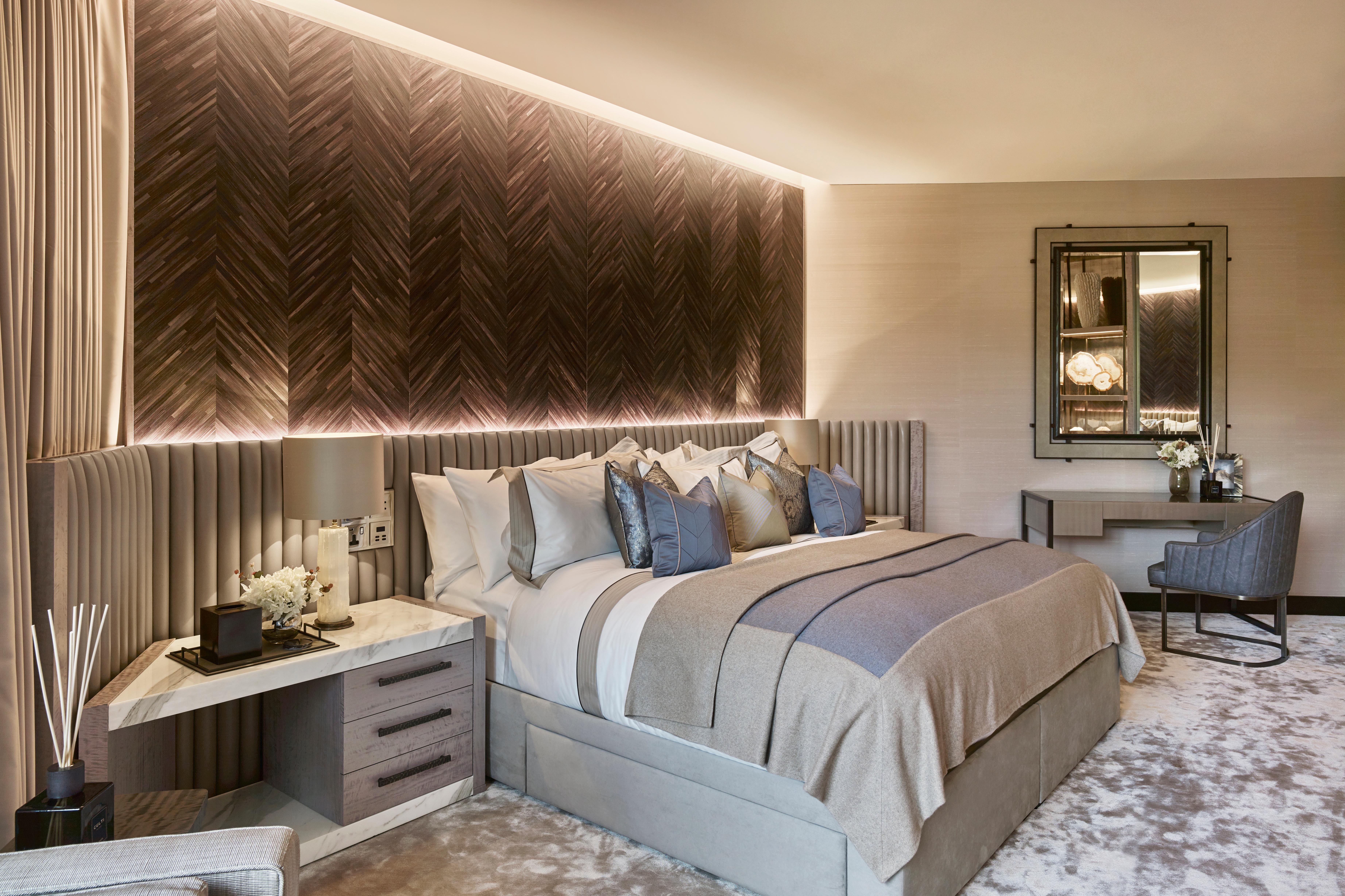
The final project, 'Jade' by The Arch Studio in Pune, is a 1,750 sq.ft. apartment designed by Siddhina Sakla. Her work is characterized by warmth, cultural resonance, and functionality, using vibrant, soothing tones like soft yellows and deep greens through paint, fabrics, and finishes to create emotionally rich spaces. In 'Jade,' colour serves as a visual bookmark, providing an individualistic persona that is further enhanced by textiles, bespoke drapery, traditional Lakkadhaara furniture, and gold-accented ceilings. Sakla's approach aims to move away from sterile whites, creating colourful, personalized homes that reflect comfort, utility, and nostalgia. She advises choosing a champion hue and building a palette from there, blending subtle patterns and coloured accents through upholstery, vintage finds, or wall mouldings, and using curtains or lighting to add colour year-round.
#InteriorDesign #HomeDecor #ColourPalette #ArchitecturalDesign #ResidentialDesign #IndianDesign #MuseLAB #ChestnutStoreys #TheArchStudio #InteriorDesign #HomeDecor #ColourPalette #ArchitecturalDesign #ResidentialDesign #IndianDesign #MuseLAB #ChestnutStoreys #TheArchStudio
0 comment in total
 No comments yet
You may also like
colorful living rooms (no beige allowed)!
7 amazing colours for a statement wall with wow
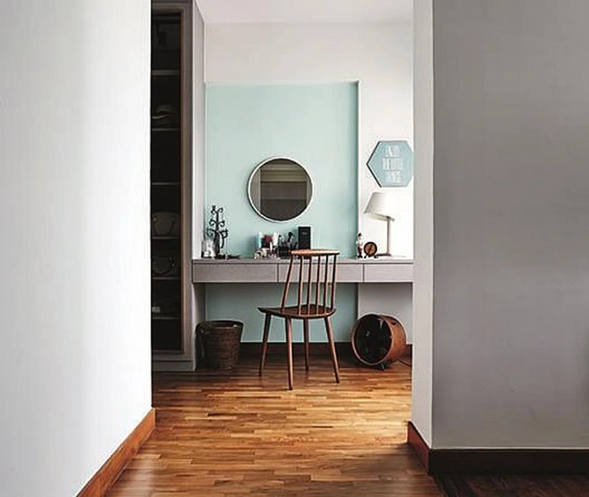
Design idea: Use paint for simple but great looking feature walls
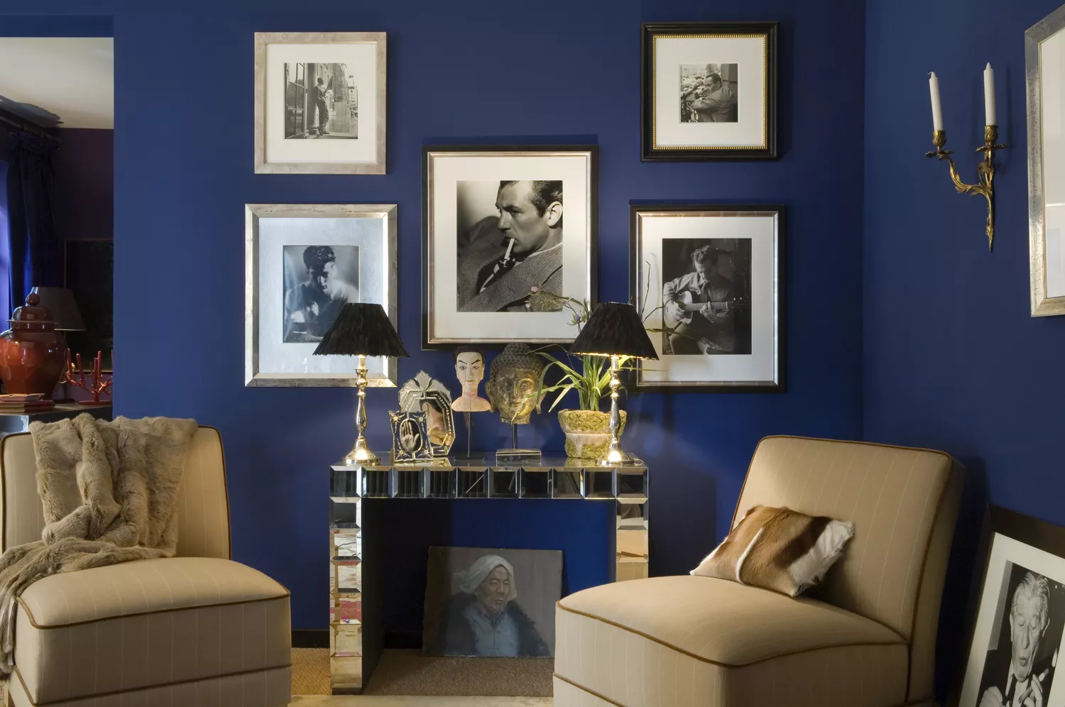
6 Paint Colors That Make Your Living Room Look Smaller, According to Interior Designers
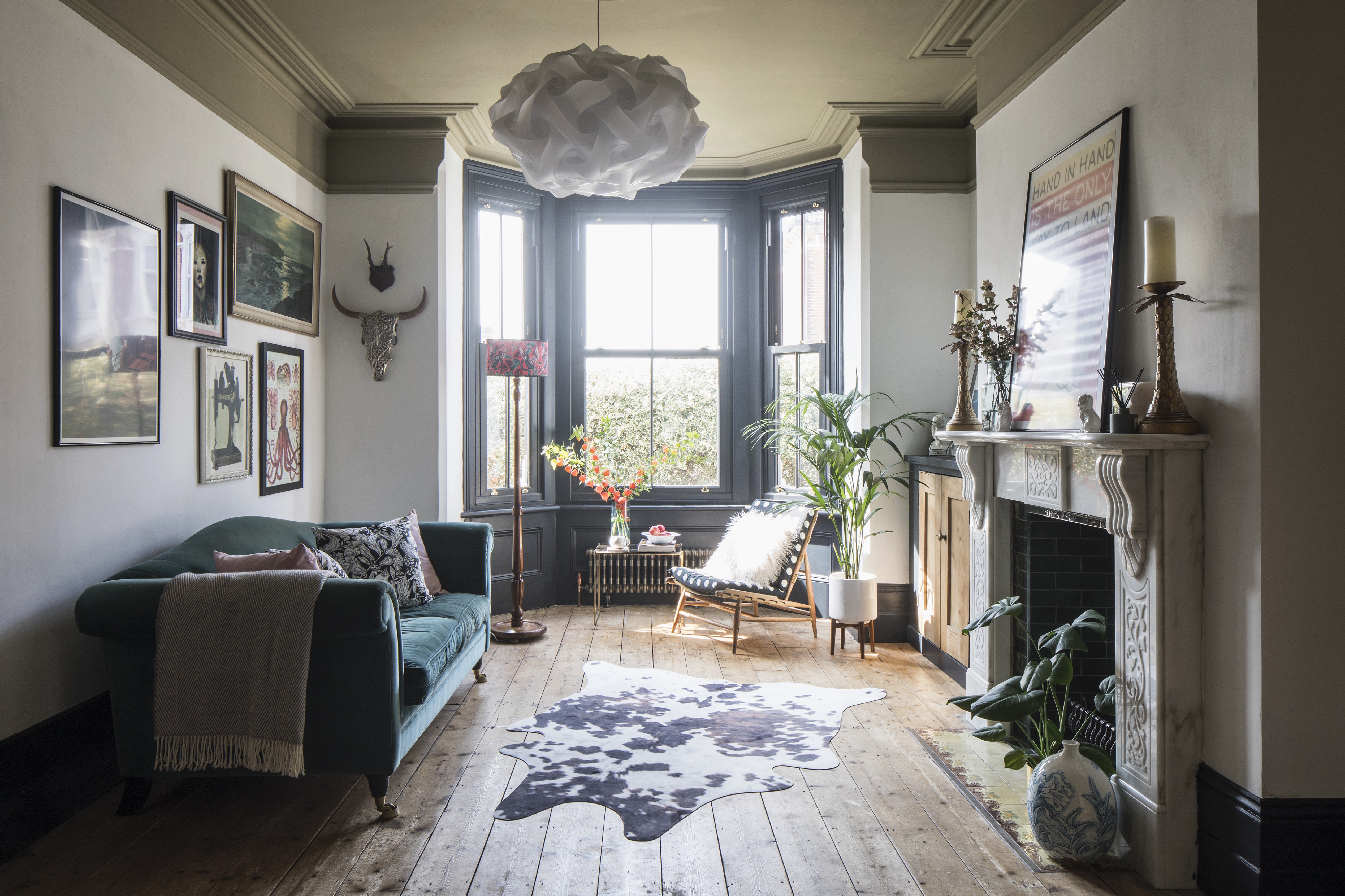
Should you paint dark ceilings with light walls? Experts weigh in on the pros and cons

How to make dark, moody walls work at home

How to Make Your Accent Wall Look Intentional, Not Like an Accident

Accent wall ideas – 20 of the latest ways to create a statement feature

Living room accent wall ideas – 10 new ways designers recommend to style your blank spaces
37 Best Accent Wall Colors for an Instant Room Makeover

Living room wall decor ideas – 27 easy ways to add style
The Brighter, the Better—These Vibrant Paints Will Infuse Your Home With Positivity

10 Accent Wall Paint Colors That Will Freshen Up Any Space, According to Designers

Ten bright and bold interiors that make use of colour theory
"Help, My White Walls Look Blue" — Here's Why It's Happening, and How to Fix This Common Problem
Forget painting your walls grey, it’s time to sparkle
3 'small but impactful' paint updates to try in 2024, according to a color expert
Should living room flooring be lighter or darker than the walls? Experts weigh in
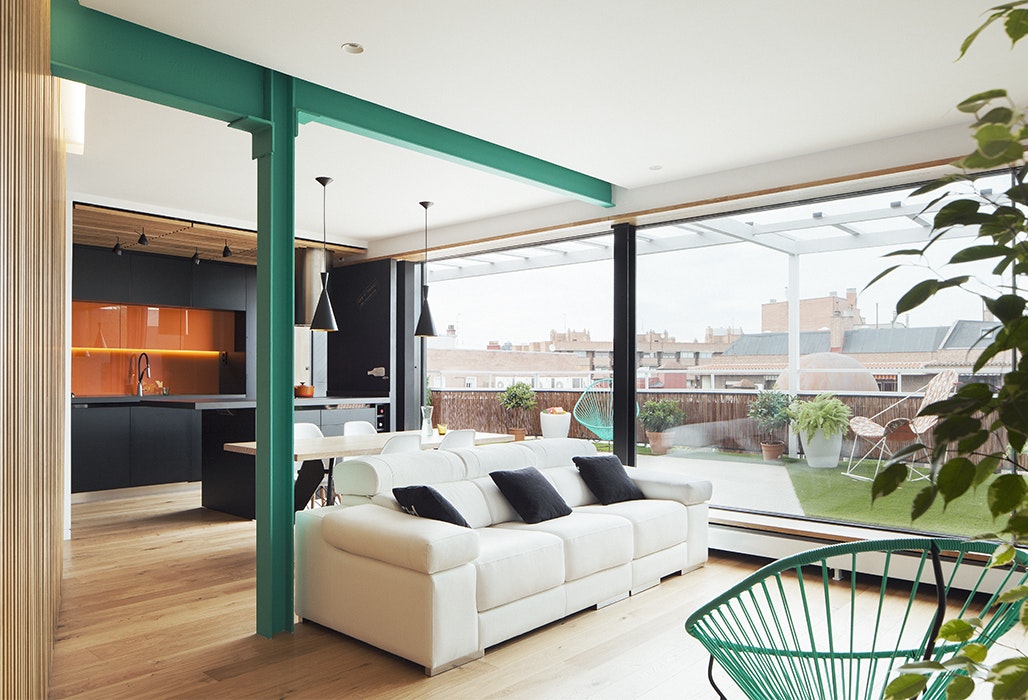
Dress Up Your Space With Contrasting Colors

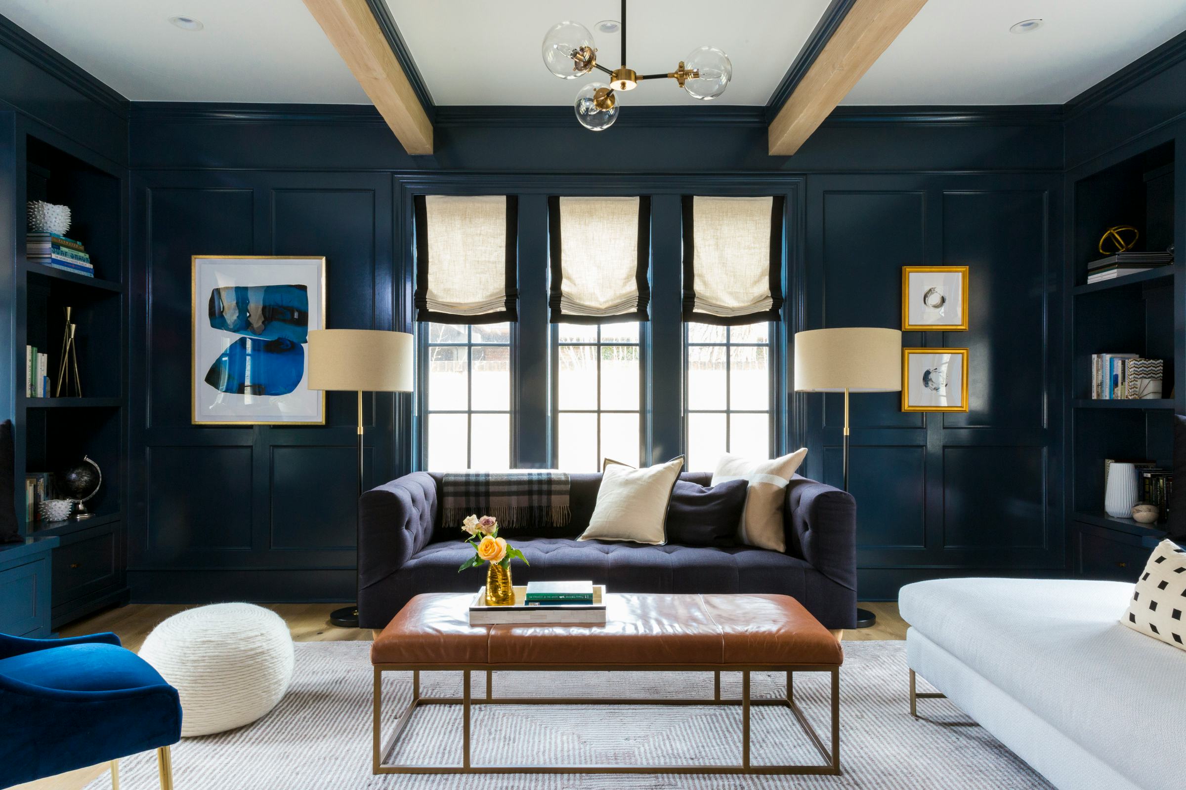
This Color Will Transform Your Living Room Instantly