1/11
Ten bright and bold interiors that make use of colour theory
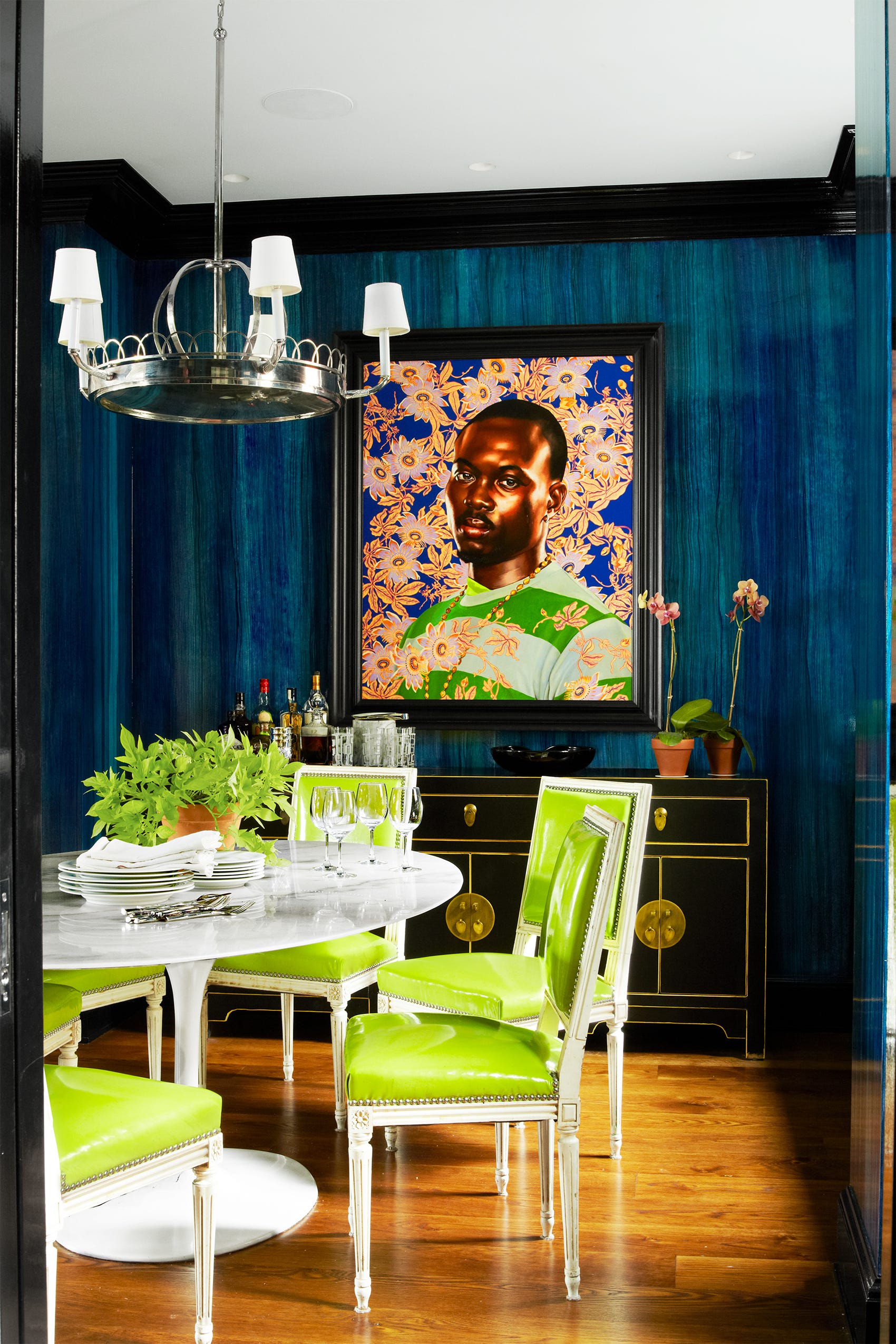
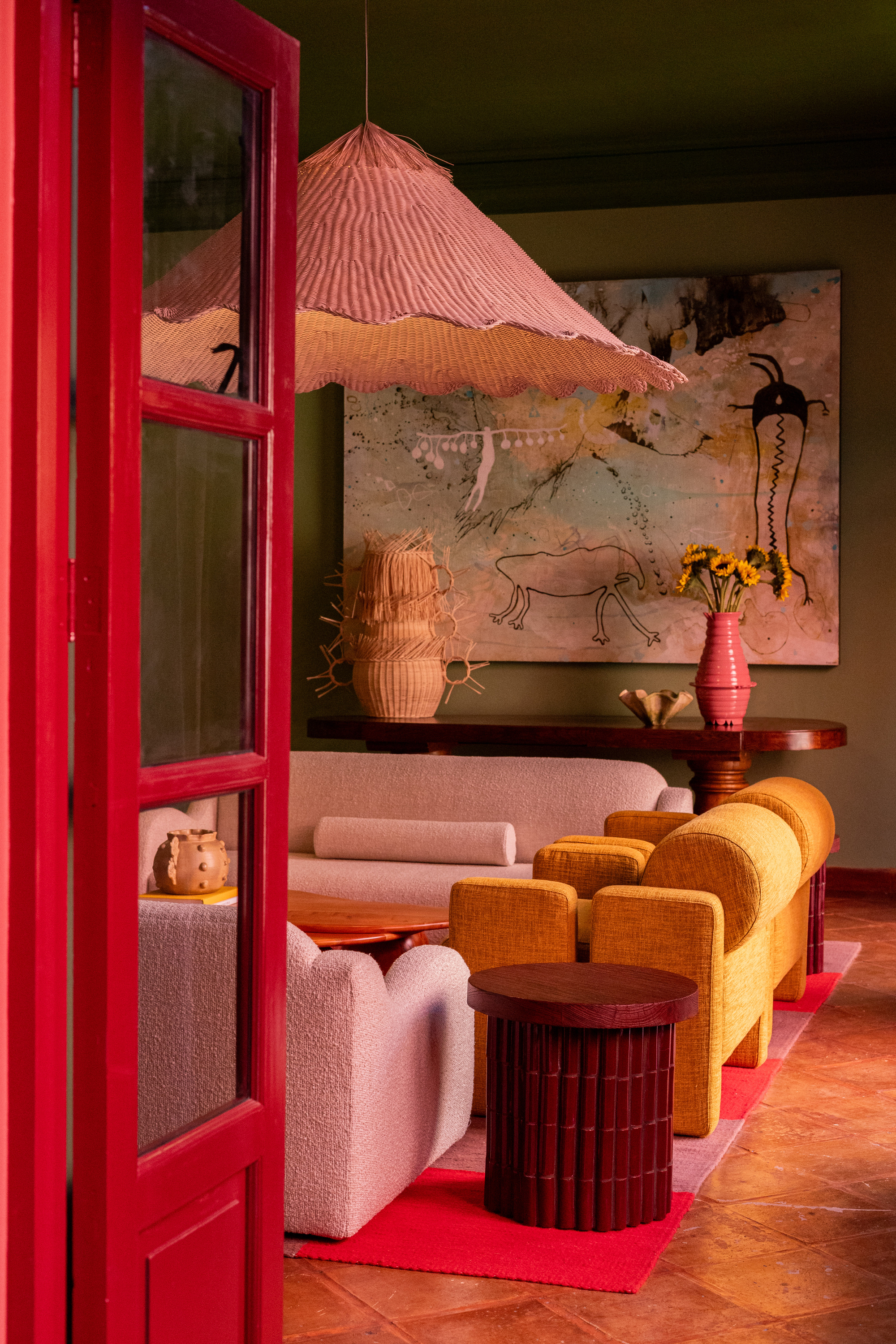
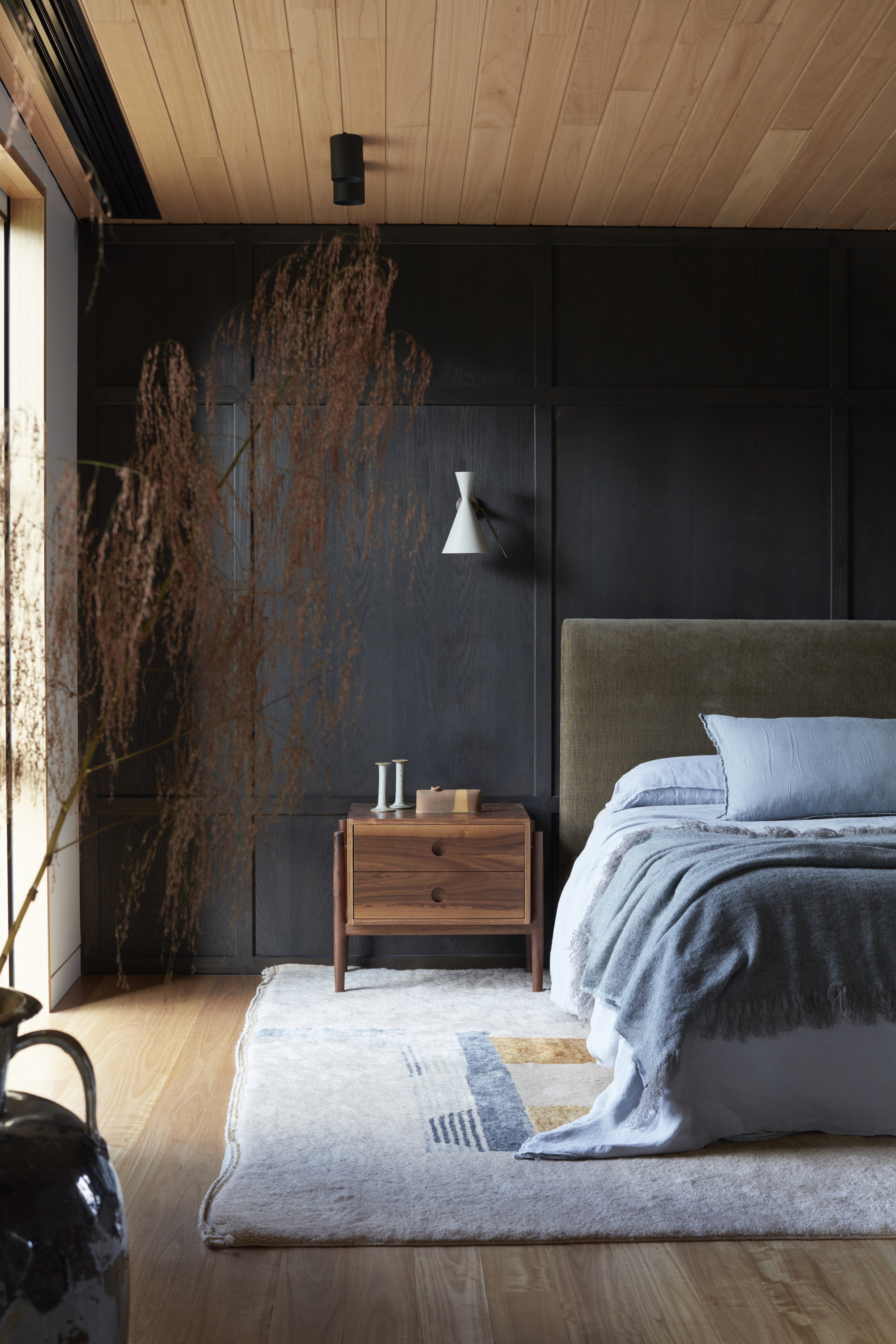
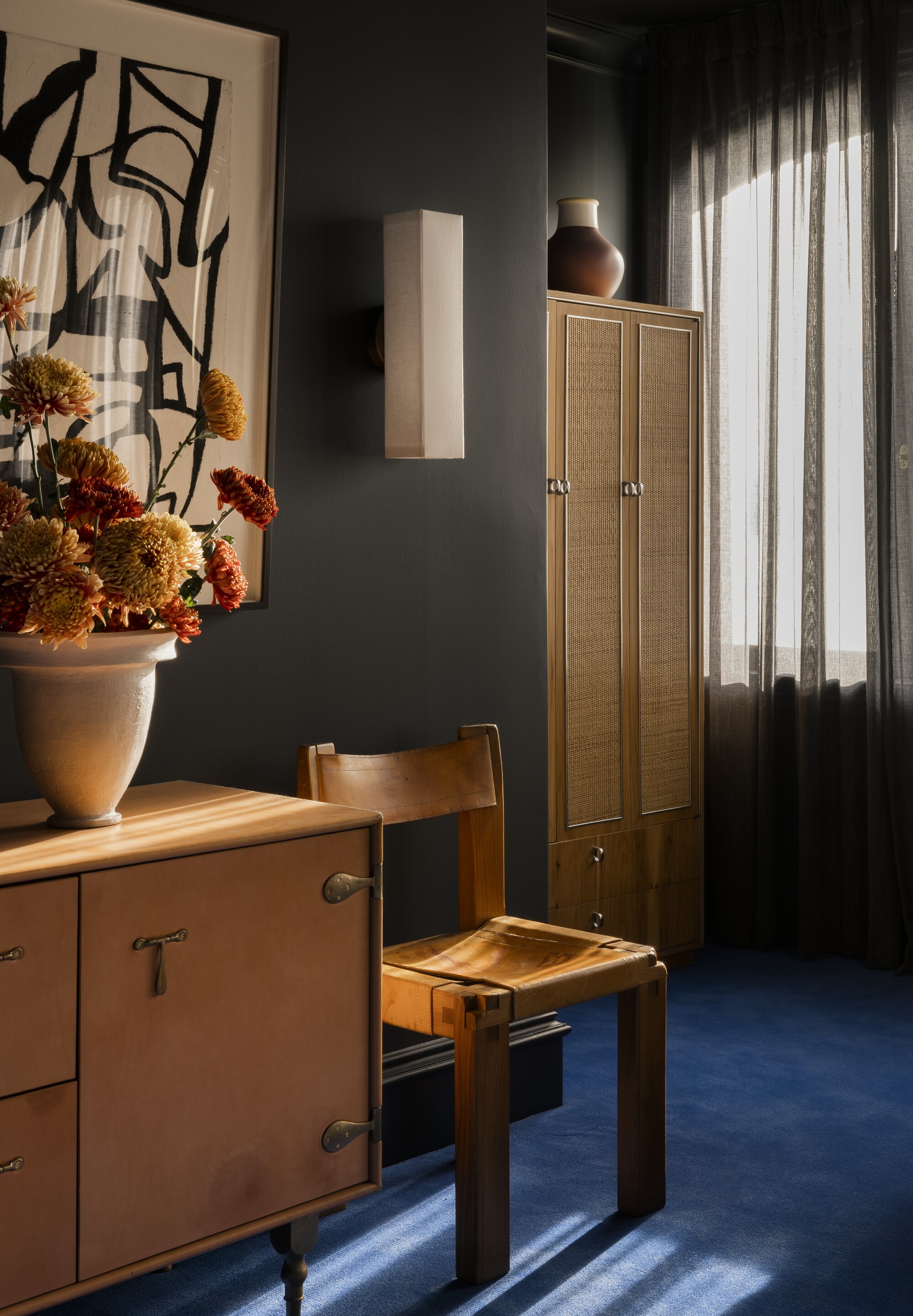
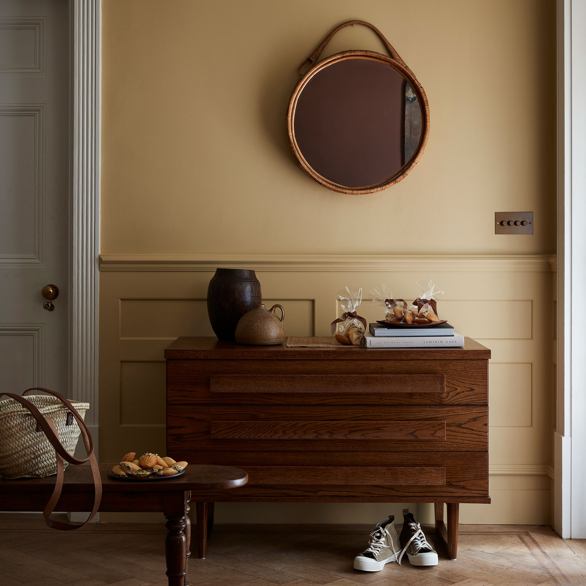
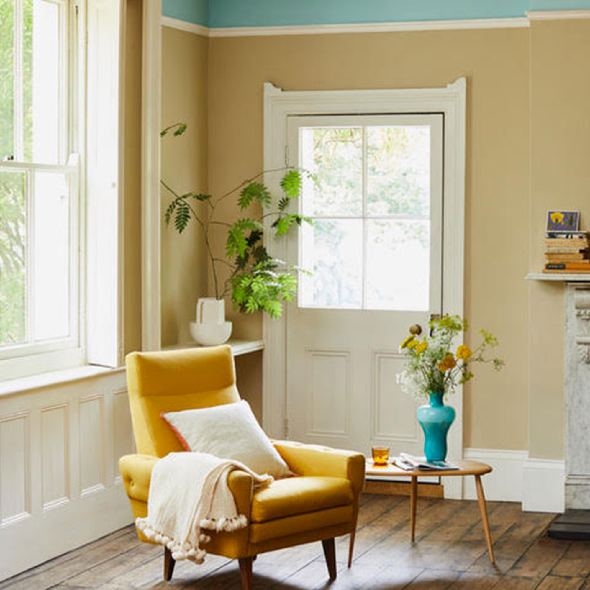
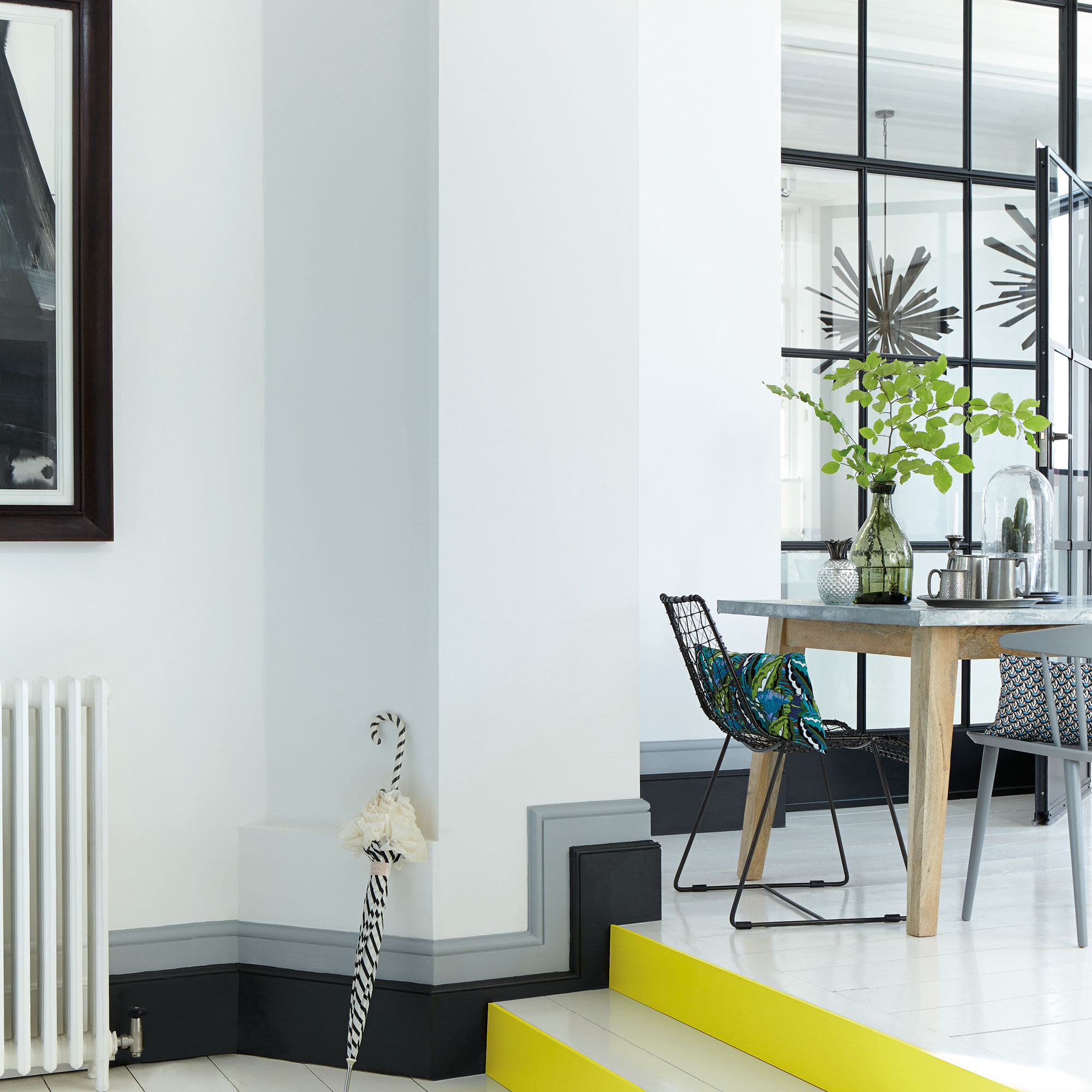
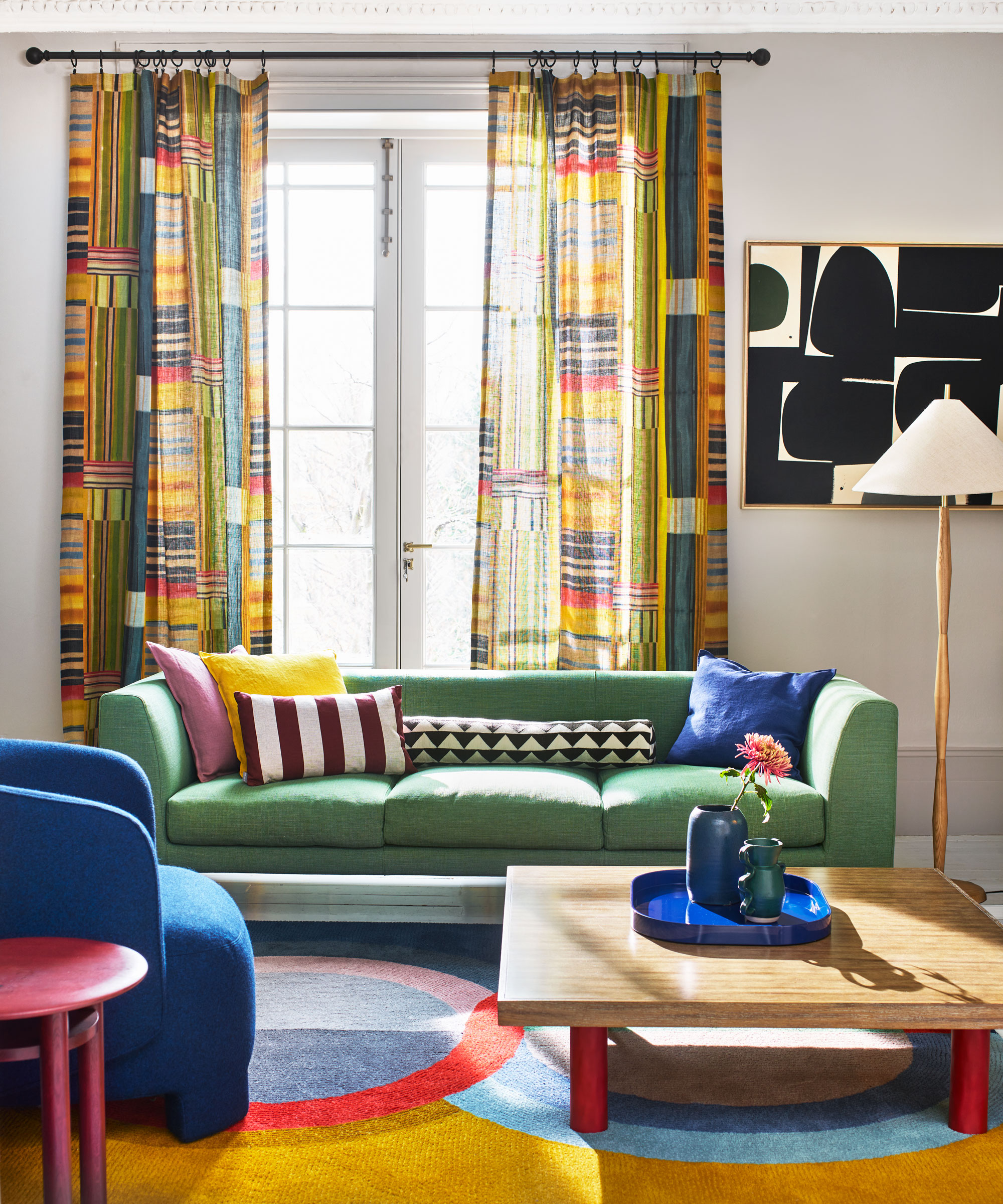
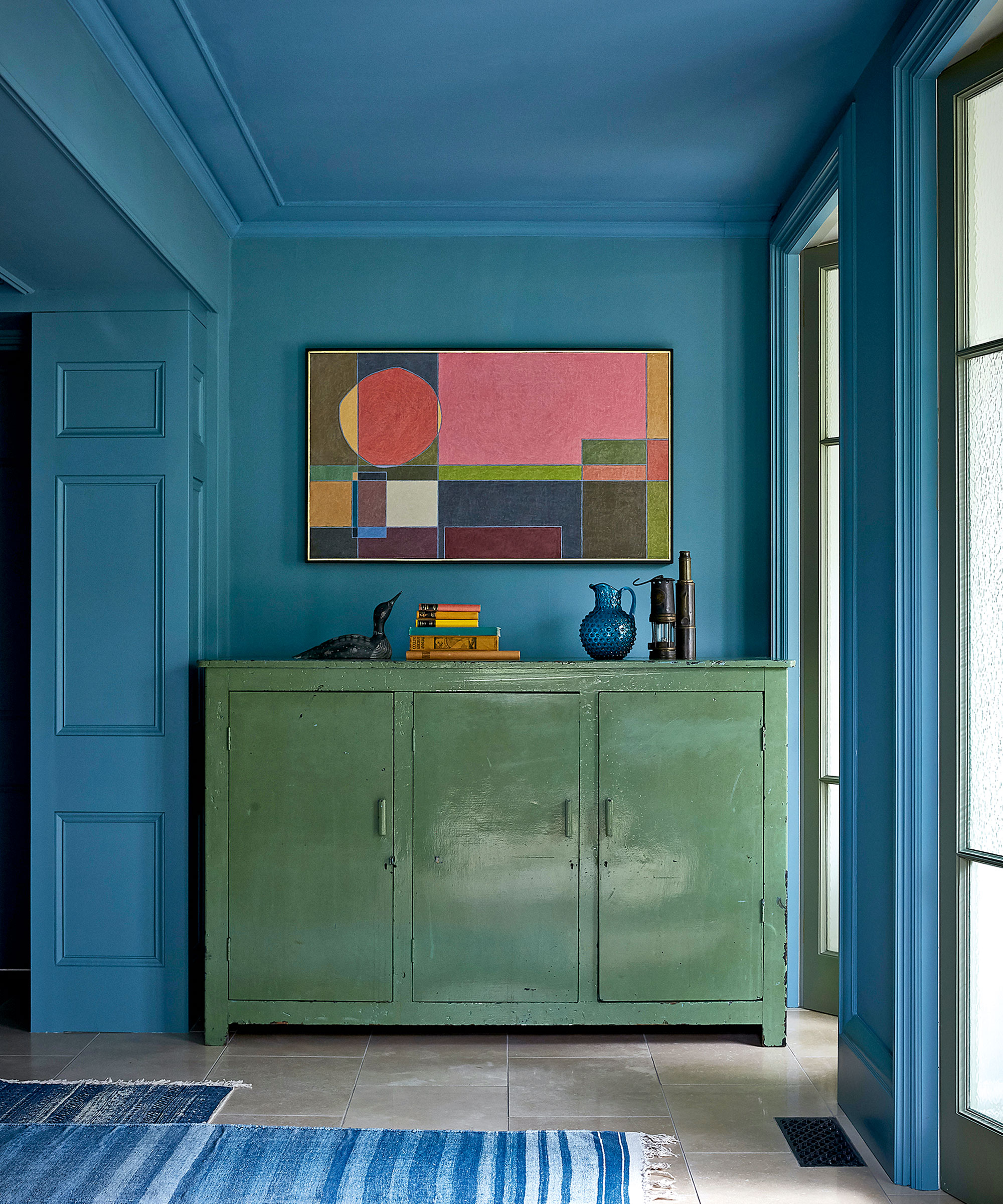
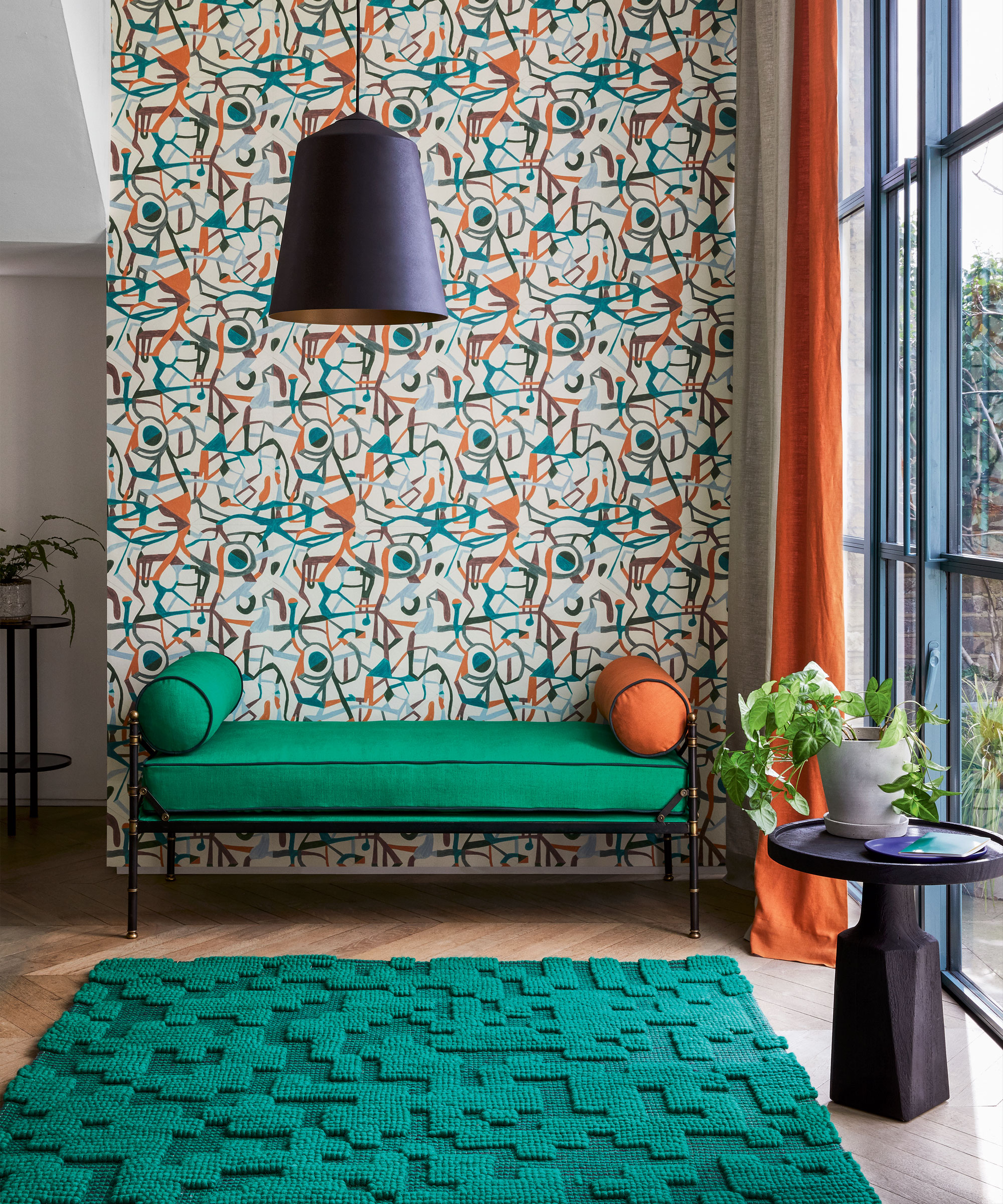
This lookbook presents ten interior design projects that demonstrate the effective use of colour theory to create vibrant and dynamic spaces. The article highlights two primary approaches: using analogous colours, which are adjacent on the colour wheel, and complementary colours, which are opposite each other, a technique often referred to as colour-blocking. This latter method, popularized by Dutch artist Piet Mondrian, has transcended art to influence fashion and interior design. Each featured project showcases how designers apply these principles to transform various spaces, from residential apartments to commercial establishments and university facilities.
The examples begin with Bun, a Milanese burger restaurant designed by Masquespacio, which employs lilac and avocado green to delineate different functional areas, creating a youthful ambiance. Another Masquespacio project, the Resa San Mamés student accommodation in Bilbao, challenges conventional colour pairings by using baby pink seating with dark red walls, demonstrating how analogous colours can create warmth and an inviting community feel. This project specifically showcases pink and red together, illustrating that colors not traditionally paired can work cohesively to create a welcoming environment.
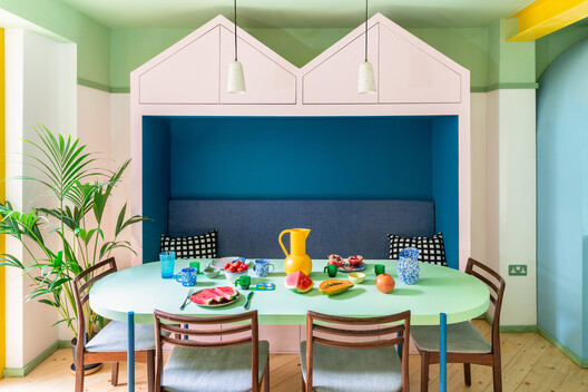
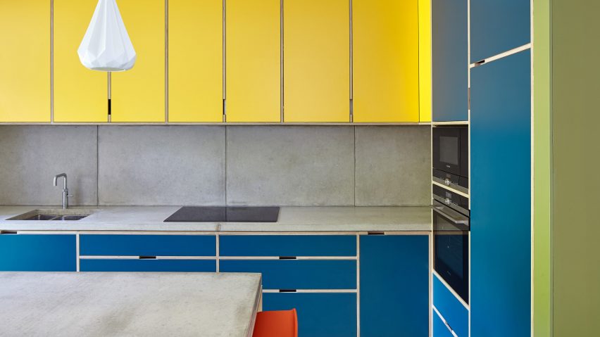
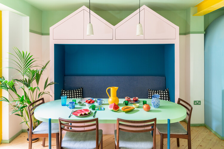
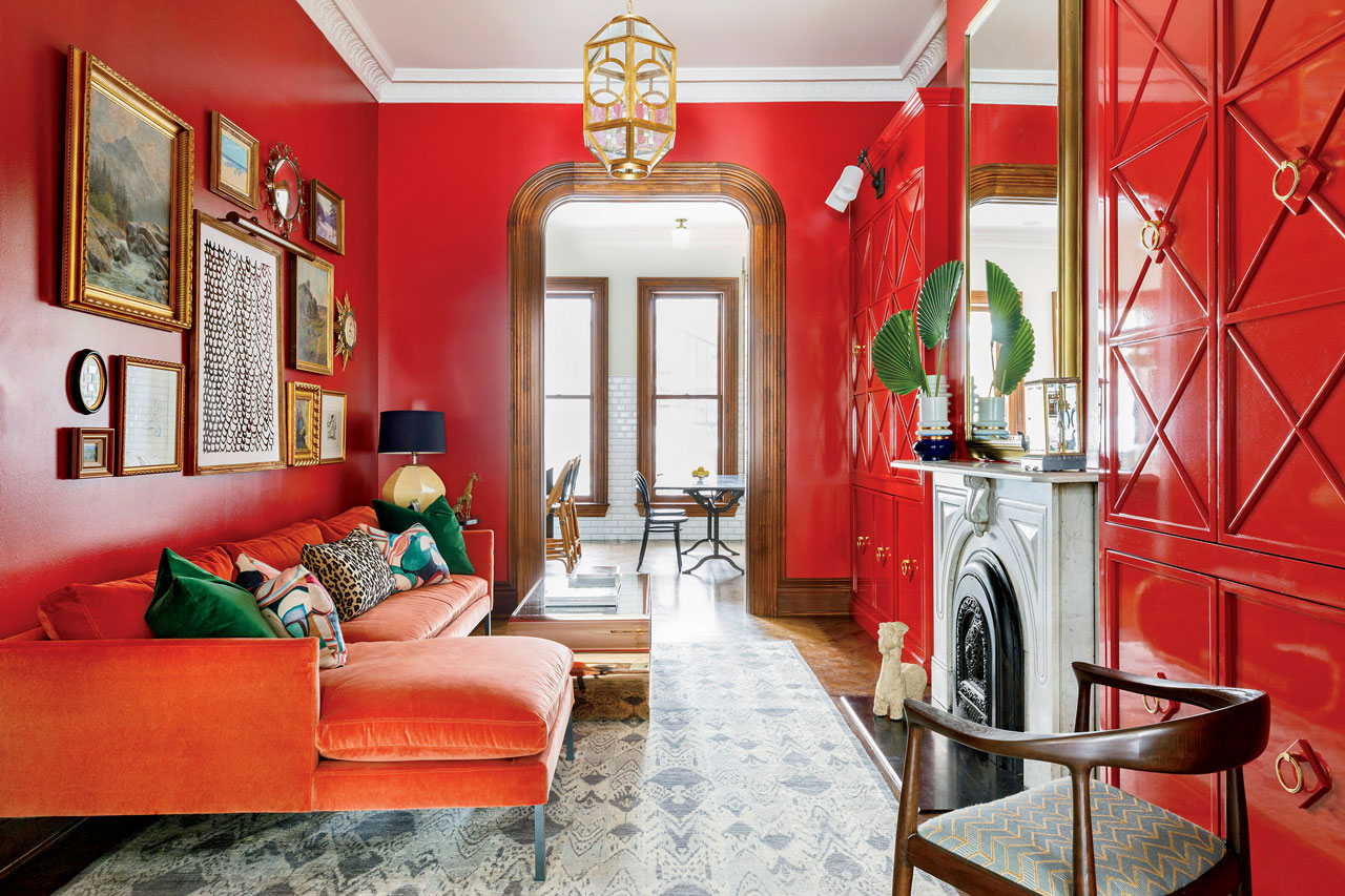
Sophie Dries's design for a Haussmann-era apartment in Paris features strong colours as a backdrop for a client's street art collection, combining grey cabinets with orangey-red floors, ceilings, and walls. Dries innovatively substitutes the traditional blue complement of orange with dark grey to achieve a unique colour-blocking effect. Similarly, R2 Studio's renovation of a London townhouse uses splashes of blue, orange, yellow, and green, with a kitchen that boldly pairs bright yellow and blue cabinets, alongside orange bar stools and green floors and walls, exemplifying how opposing colors can integrate effectively.
Forma's work for Yale University's student radio station employs grey and vibrant orange blocks in recording studios and performance spaces, accented by bright orange chairs, to create visually stimulating environments. Office S&M;’s Mo-tel House in London features a multicoloured staircase with a yellow banister complementing dark blue, invigorated by pink accents, showcasing a bold and vibrant colour palette in a previously dark space. Adi Goodrich's design for Wine and Eggs, a grocery store in Los Angeles, utilizes a checkerboard green and blue floor, green walls, and a blue roof, drawing inspiration from eclectic European grocery stores and integrating plants to enhance the analogous colour scheme.
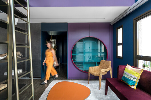
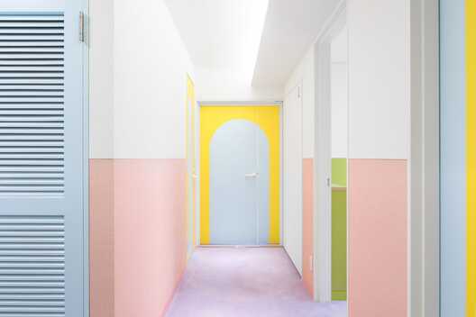
Studio11's workspace in Minsk demonstrates a more subtle application of colour-blocking, with strips of muted plum and teal blue lining the office, complemented by a pale pink kitchen island and delicate grey concrete floors. Wutopia Lab's His House and Her House in Shenzhen, China, explores gender constructs through pink and blue buildings, with interiors reflecting this theme; the blue building, for instance, features green walls and blue ceilings inspired by Henri Matisse. Finally, Adam Nathaniel Furman's Nagatachō Apartment in Tokyo transforms a previously claustrophobic space into a bright, pastel-hued environment with a lilac carpet and complementary colour-blocking seen in bright yellow doors with pale pink borders, likening the aesthetic to icing on a cake. These examples collectively illustrate the versatility and impact of colour theory in interior design, showcasing diverse applications of analogous and complementary colour schemes to create varied moods and functional distinctions within spaces.
#InteriorDesign #ColourTheory #ColourBlocking #HomeDecor #ApartmentDesign #CommercialInteriors #VibrantSpaces #Masquespacio #ResidentialDesign #InteriorDesign #ColourTheory #ColourBlocking #HomeDecor #ApartmentDesign #CommercialInteriors #VibrantSpaces #Masquespacio #ResidentialDesign
0 comment in total
 No comments yet
You may also like
Ten maximalist interiors that are saturated with colours and patterns
Designers Say These Unusual Paint Color Combos Will Transform Your Home

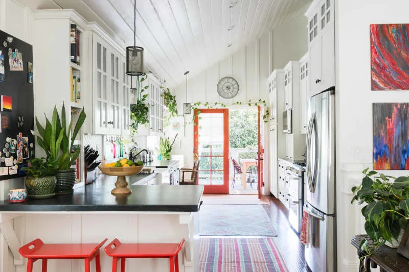
'The World of Color is Rife With Danger' — 5 Color Combinations That Don't Go Together and What to Use Instead

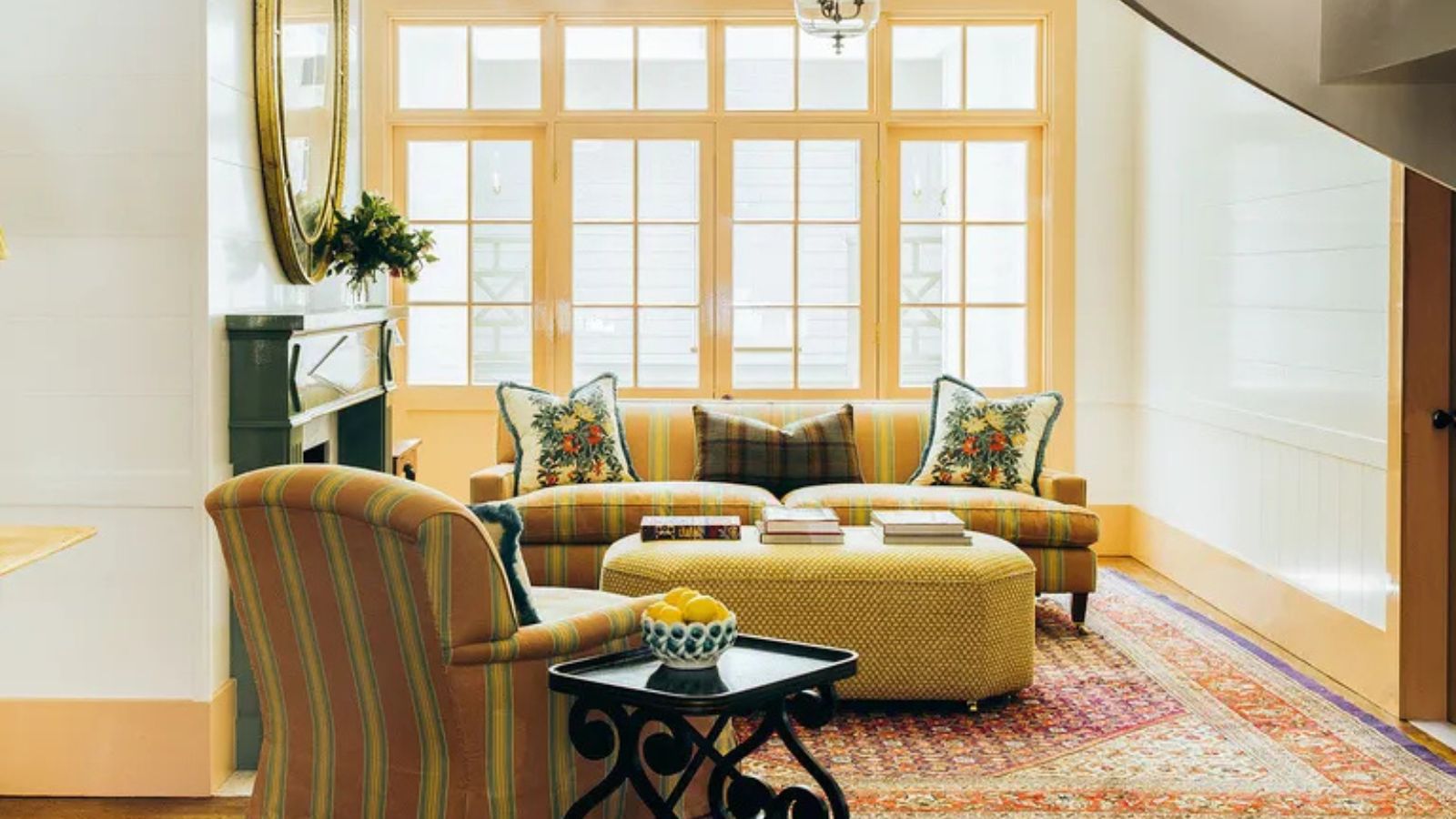
I Tried This Controversial Color Rule in My Living Room, and I Wish I’d Done it Sooner
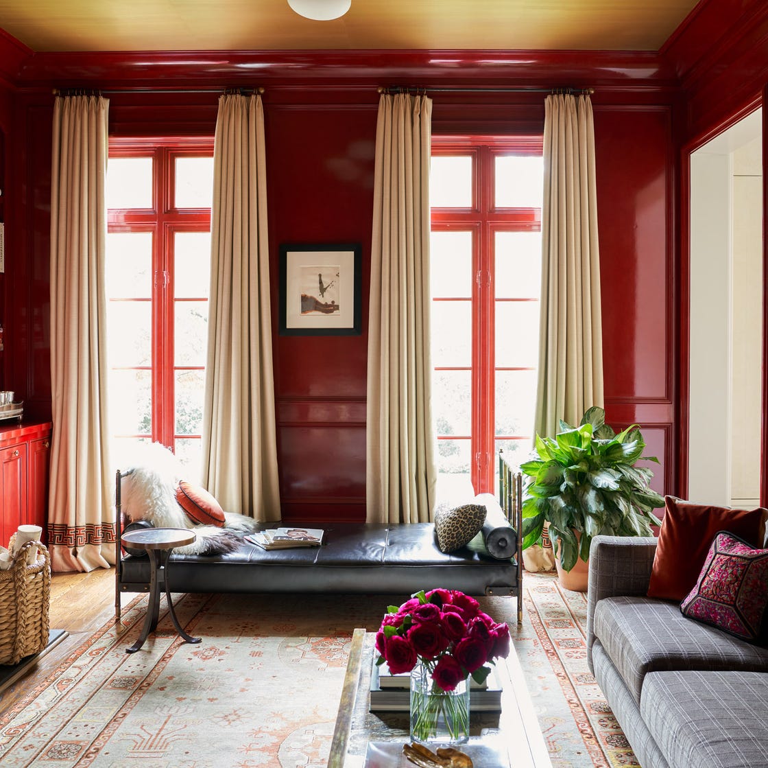
What the unexpected fashion trick, the 'Sandwich Method', taught me about decorating with color in my home

Why This Hue Is Suddenly Dominating Every Designer's Wishlist—Plus, How to Style It

I Tried This Controversial Color Rule in My Living Room, and I Wish I’d Done it Sooner

Colorful room ideas – 15 vibrant spaces with daring decor
10 opulent interiors that spurn minimalism for rich colours and textures
We Asked Designers Which Paint Colors Make a Room Feel Stuffy—And We're Repainting ASAP

35 Unexpected Color Combos We Can't Get Enough Of

Making it Pop: 24 Residential Interiors that Embrace Color Blocking

Home Design: How to Go All In on a Bold Hue
5 Vibrant Color Palettes Designers Are Using to Add Energy and Excitement to Decor
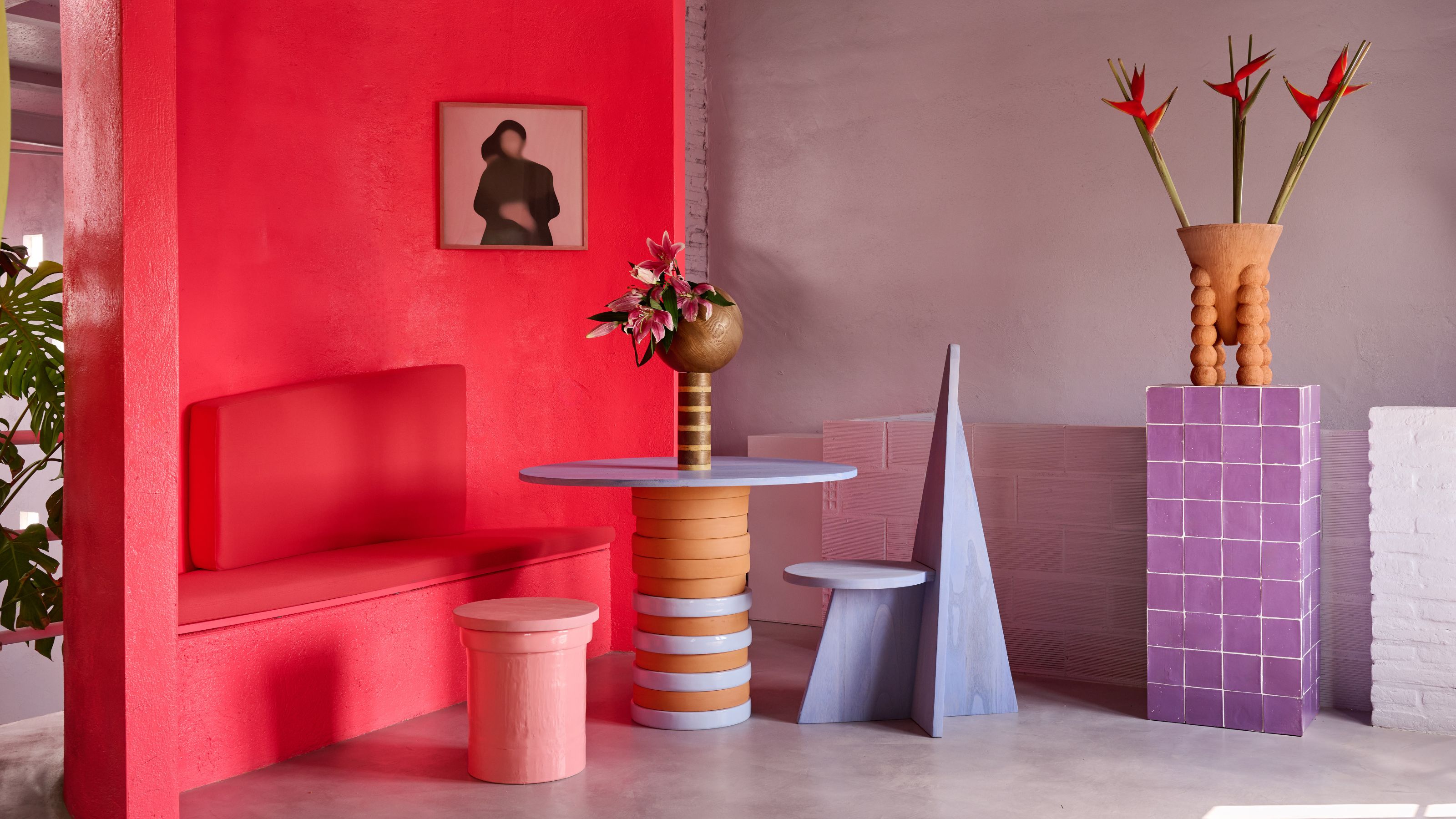
What Are Advancing and Receding Colors in Interior Design?

What are the worst colors to paint a room? The shades experts say you should never use

Interior design experts reveal the colour rules you should be breaking

These Colors Will Be Everywhere in Interiors in 2025
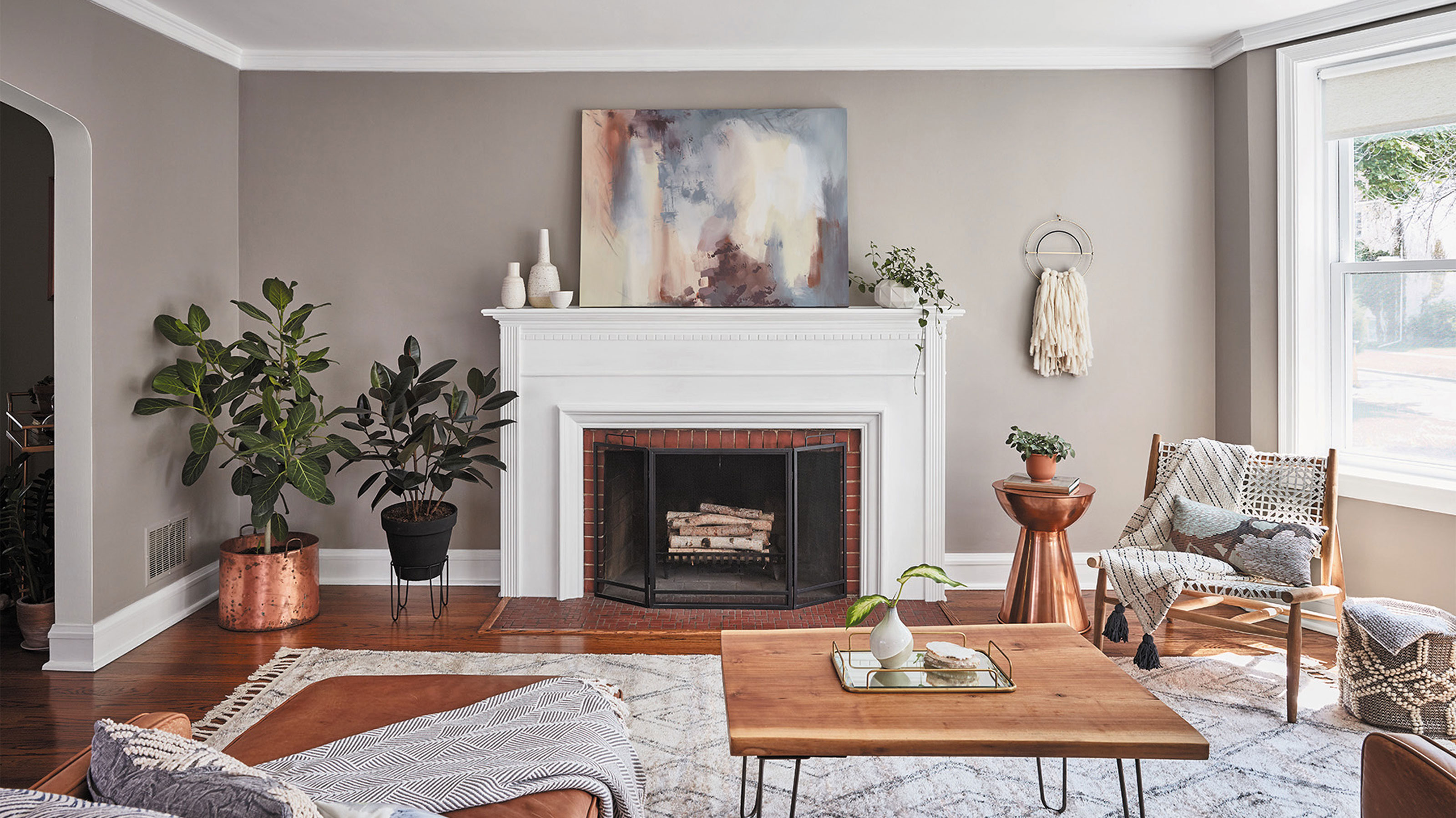
Should woodwork be lighter or darker than walls? The rules colour experts use to choose the perfect colour
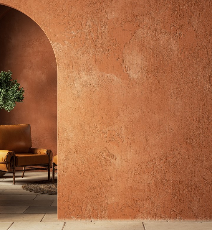
Color Drenching Might Be Everywhere, But My Mom’s Been Doing It Since the ’90s