1/5
What Are Advancing and Receding Colors in Interior Design?
The article delves into the fundamental principles of 'advancing' and 'receding' colors in interior design, a crucial concept for effectively decorating a home. It highlights that color is a powerful tool for adding character to interiors, capable of transforming a space from simple to sophisticated. The author explains that while some colors can expand a room, others can make it feel smaller, making an understanding of advancing and receding colors essential for achieving a balanced and desired aesthetic.
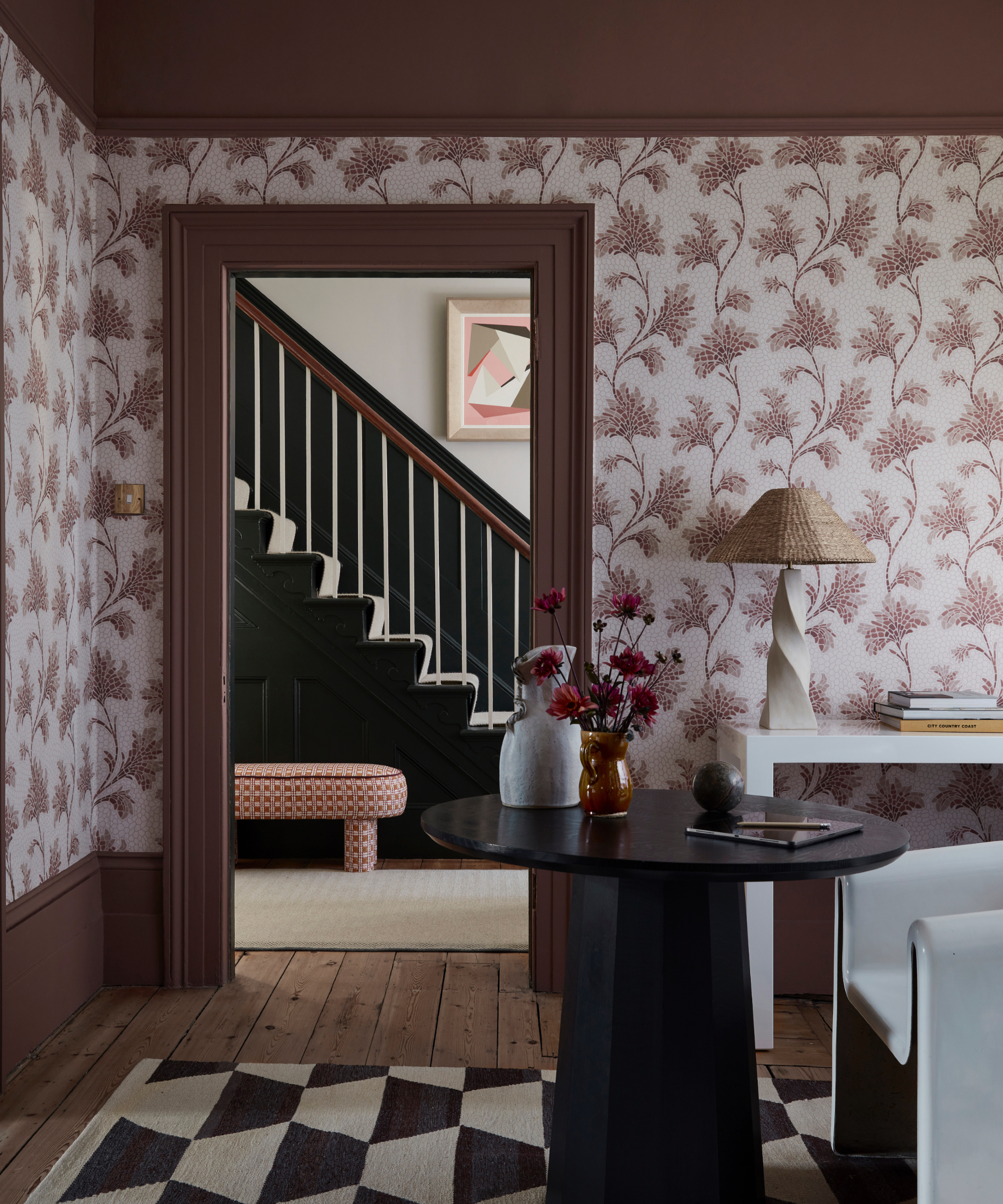
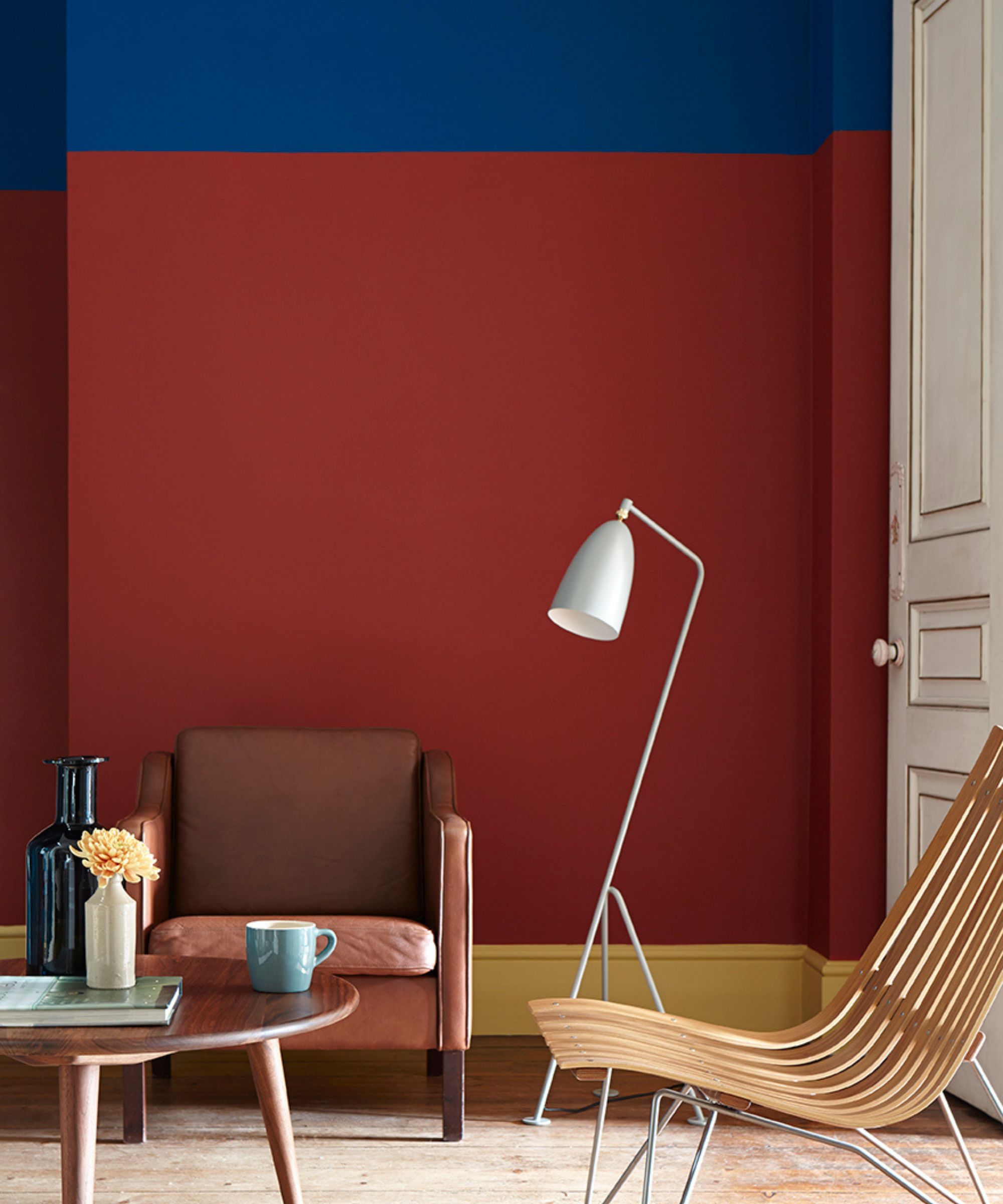
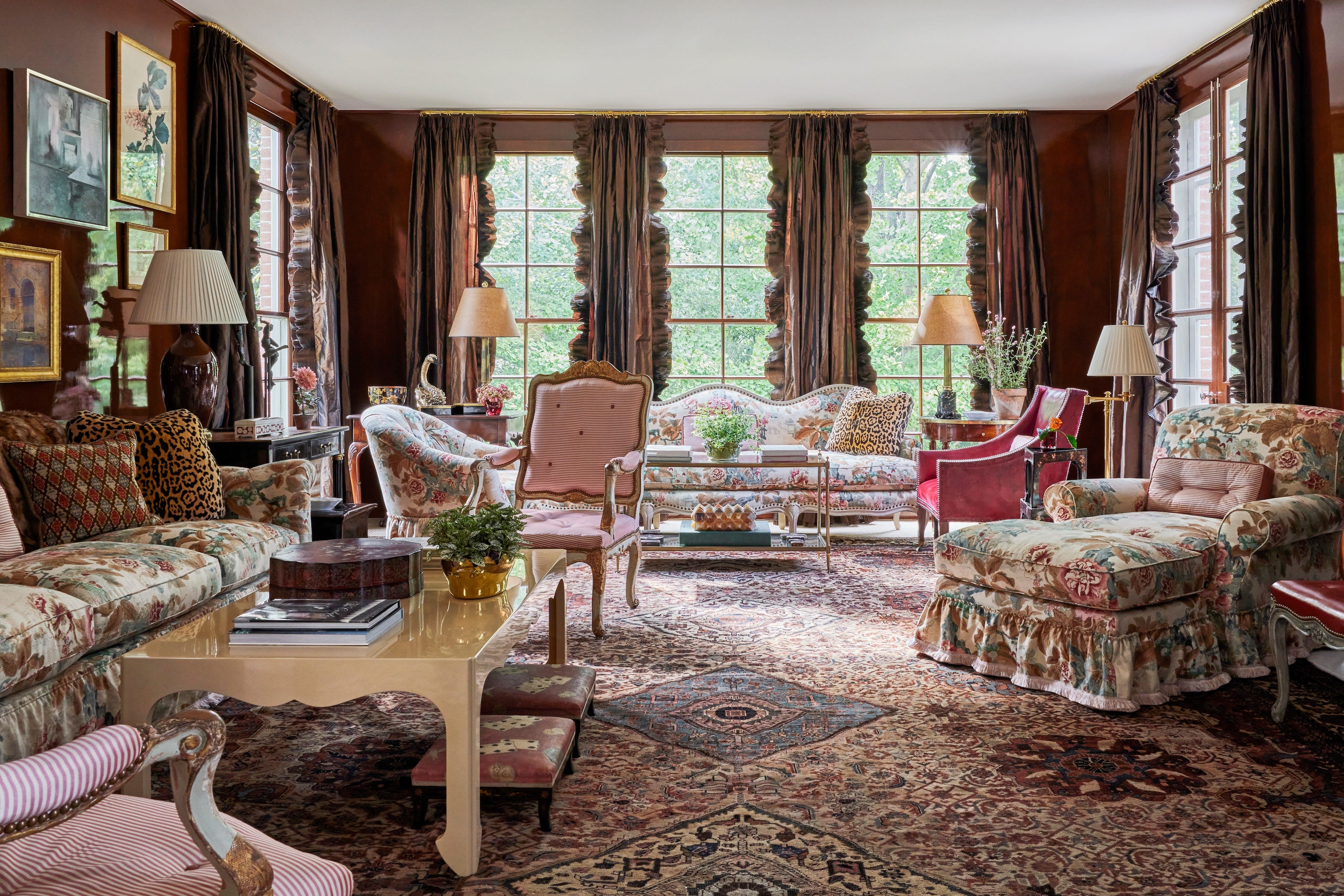
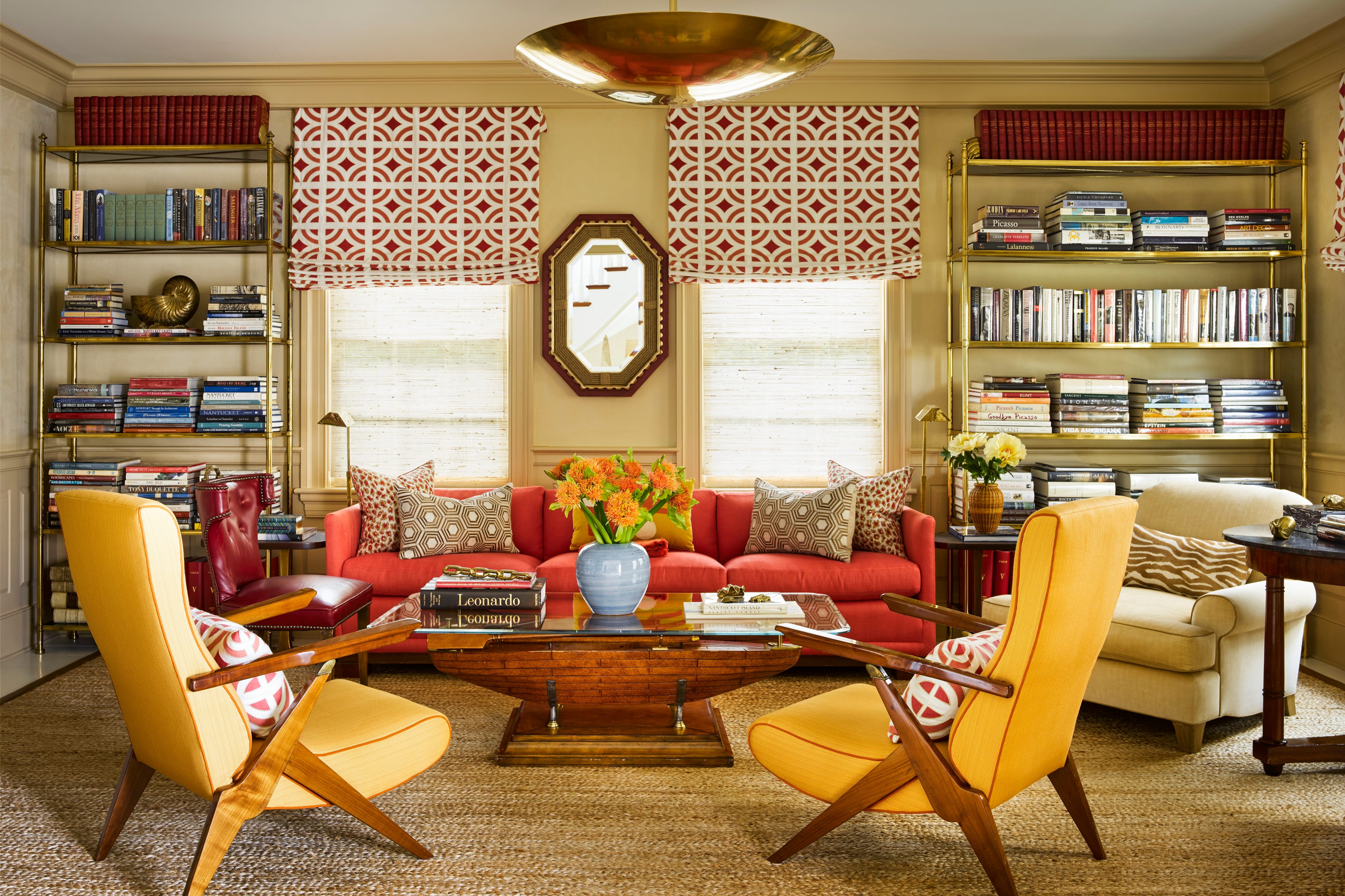
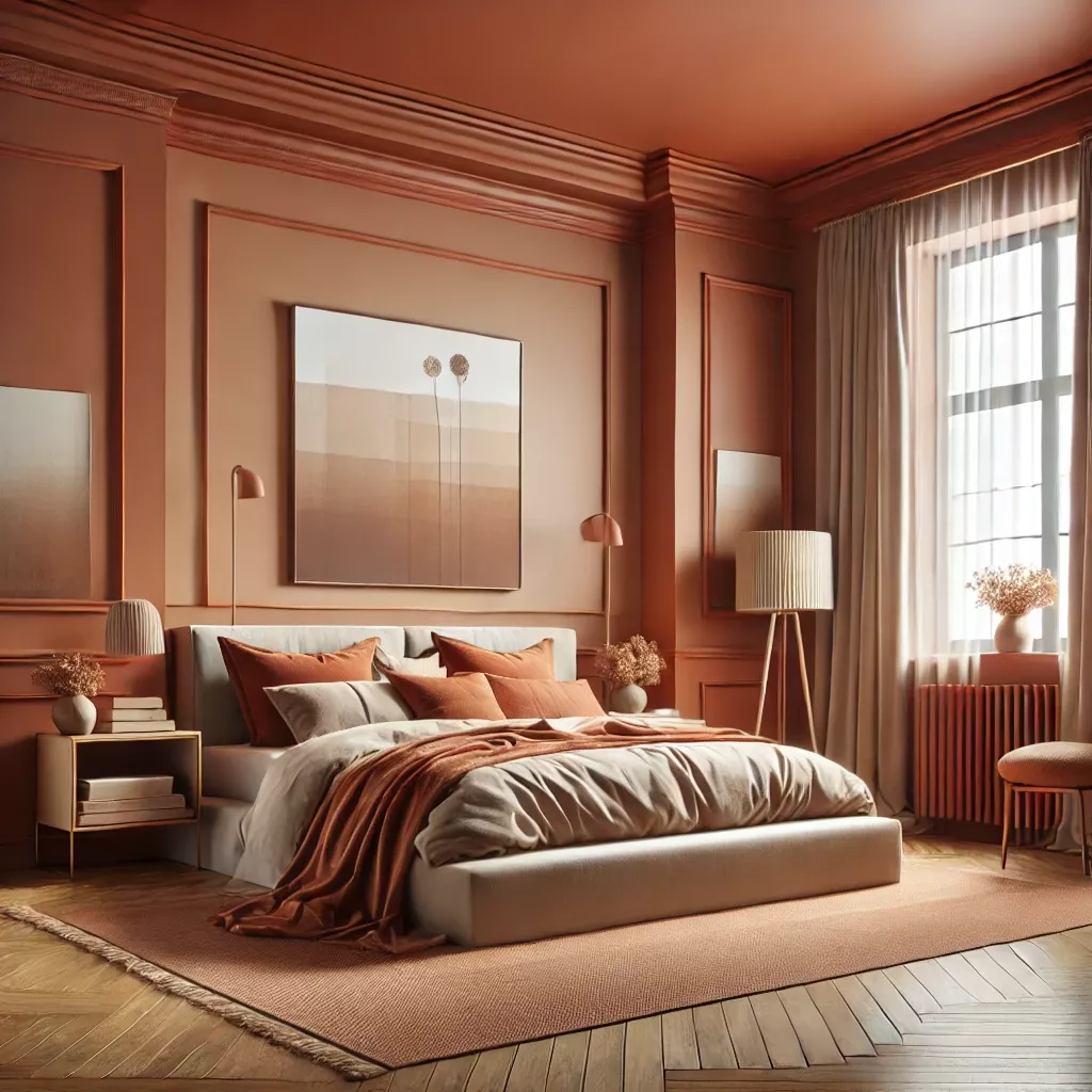
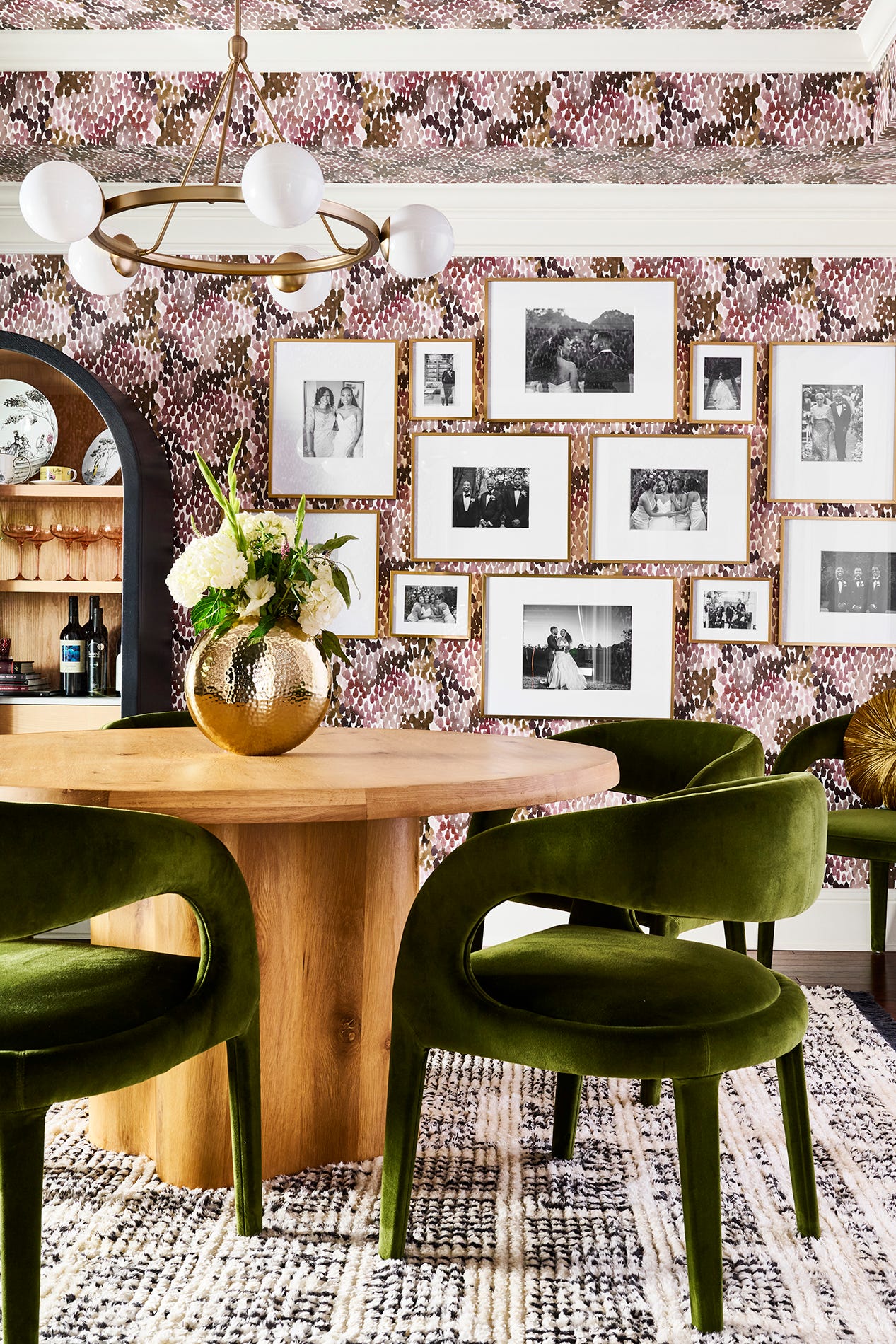
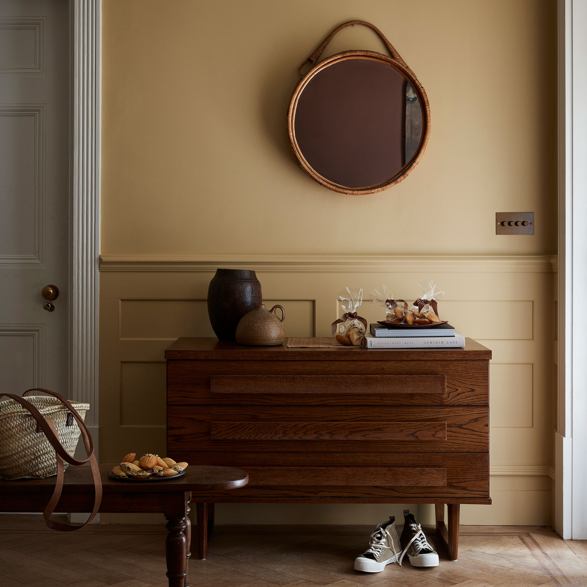
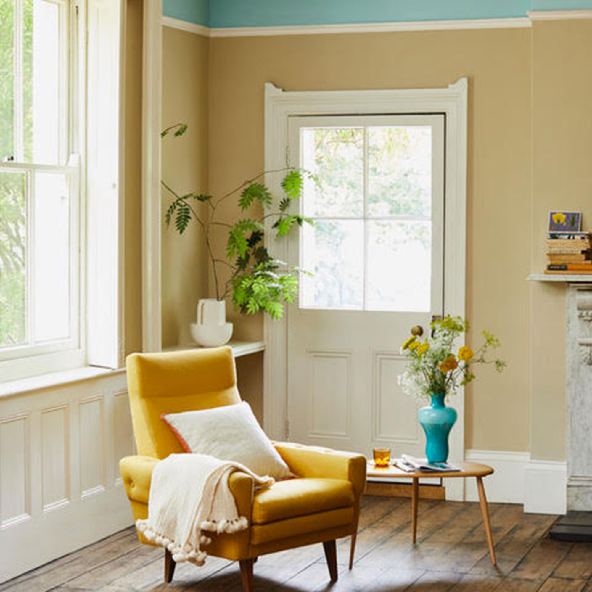
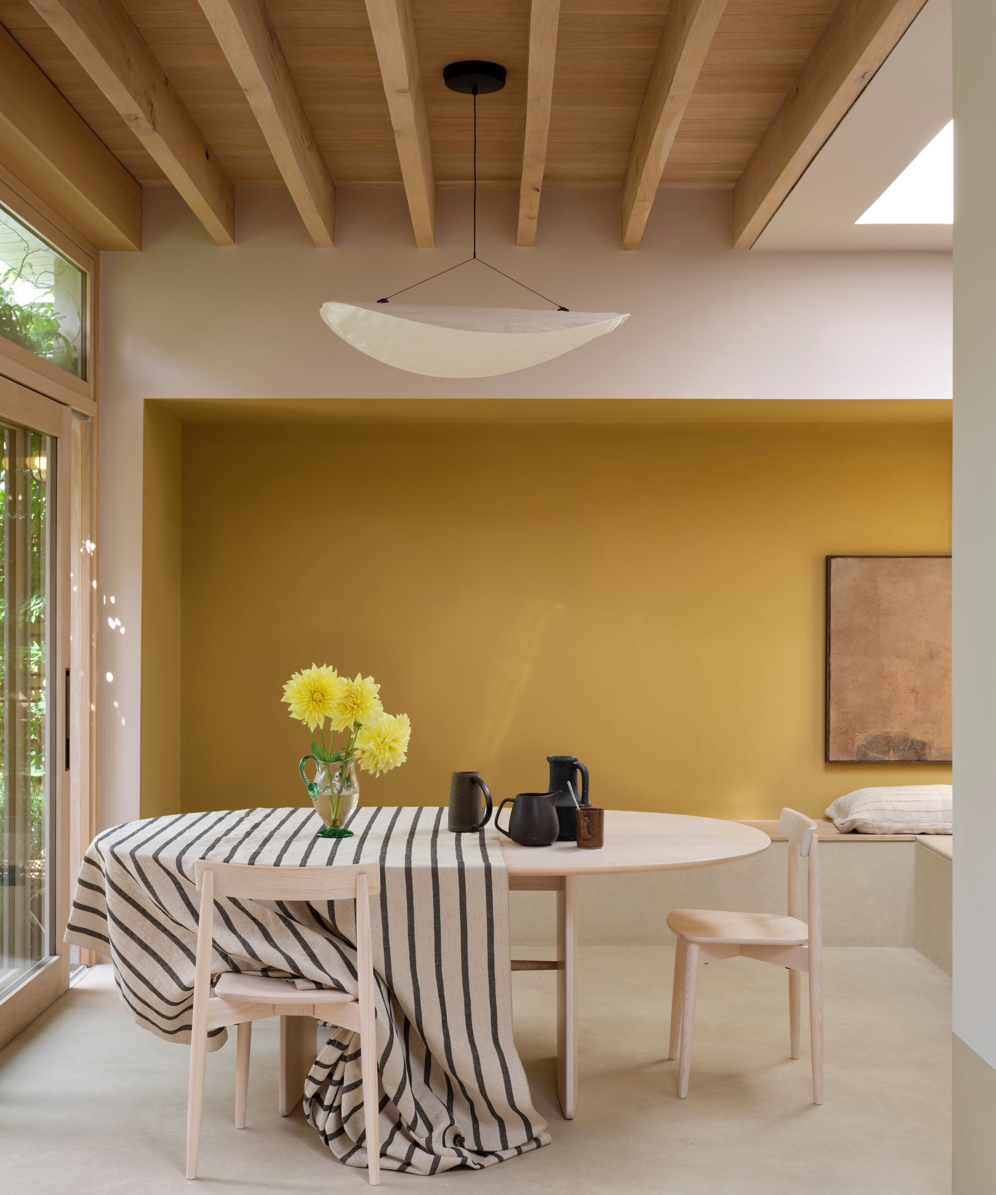
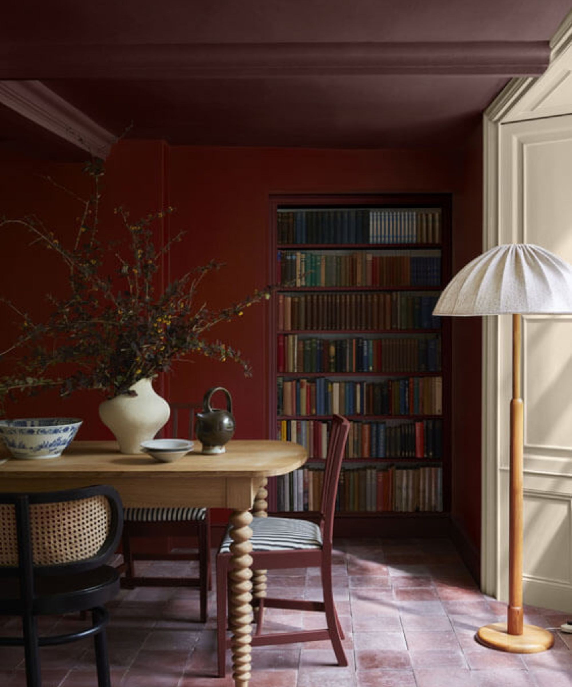
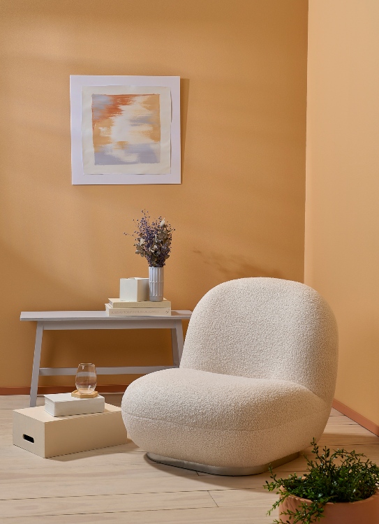
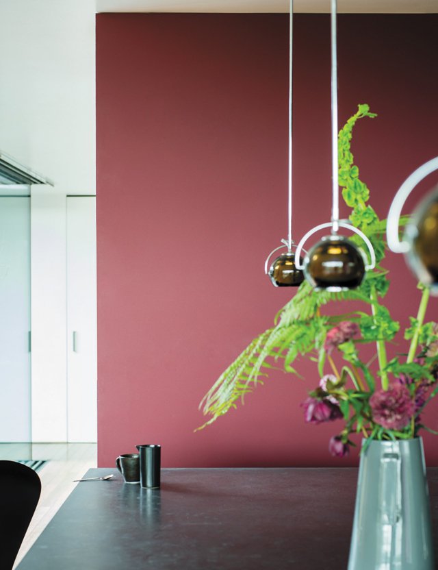
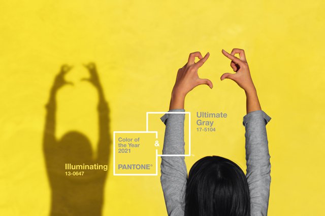
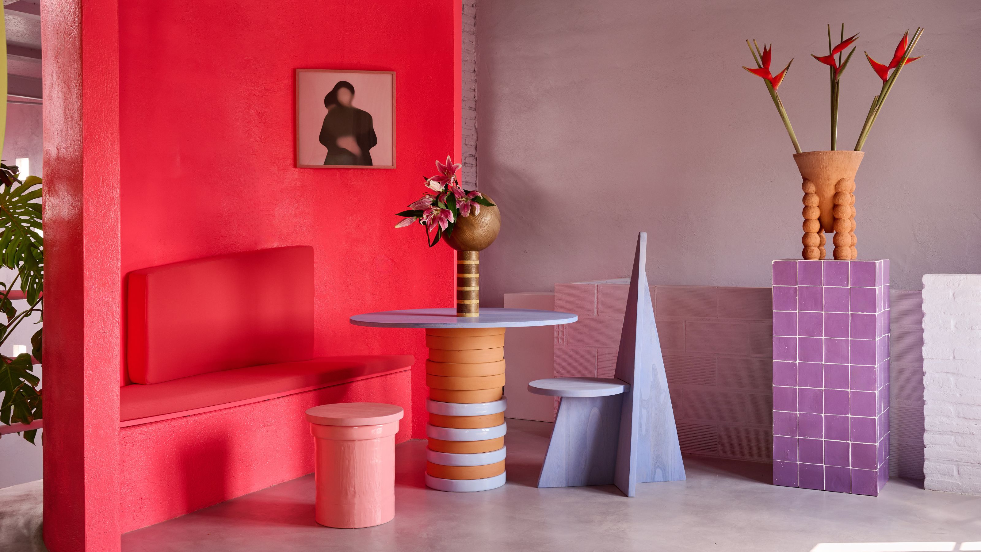
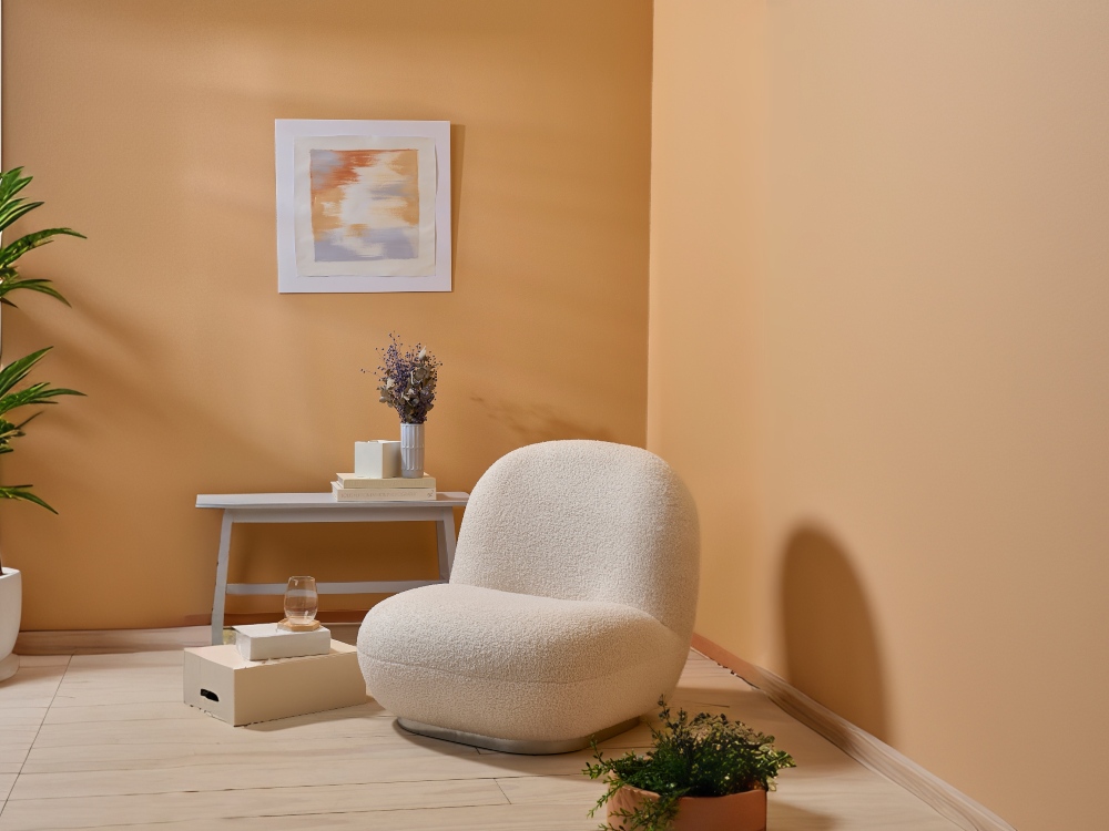
Advancing colors are identified as warm tones such as reds, oranges, and yellows. These colors possess longer wavelengths, causing them to appear to move forward and command attention within a room. They are described as vibrant, energetic, and capable of making objects or areas stand out. While they can make a space feel cozier, a warm-dominant palette can also make an already small room feel more restricted. Consequently, advancing colors are ideal for introducing warmth and a cocooning effect, especially in larger, open-plan areas or bedrooms where a sense of intimacy is desired.
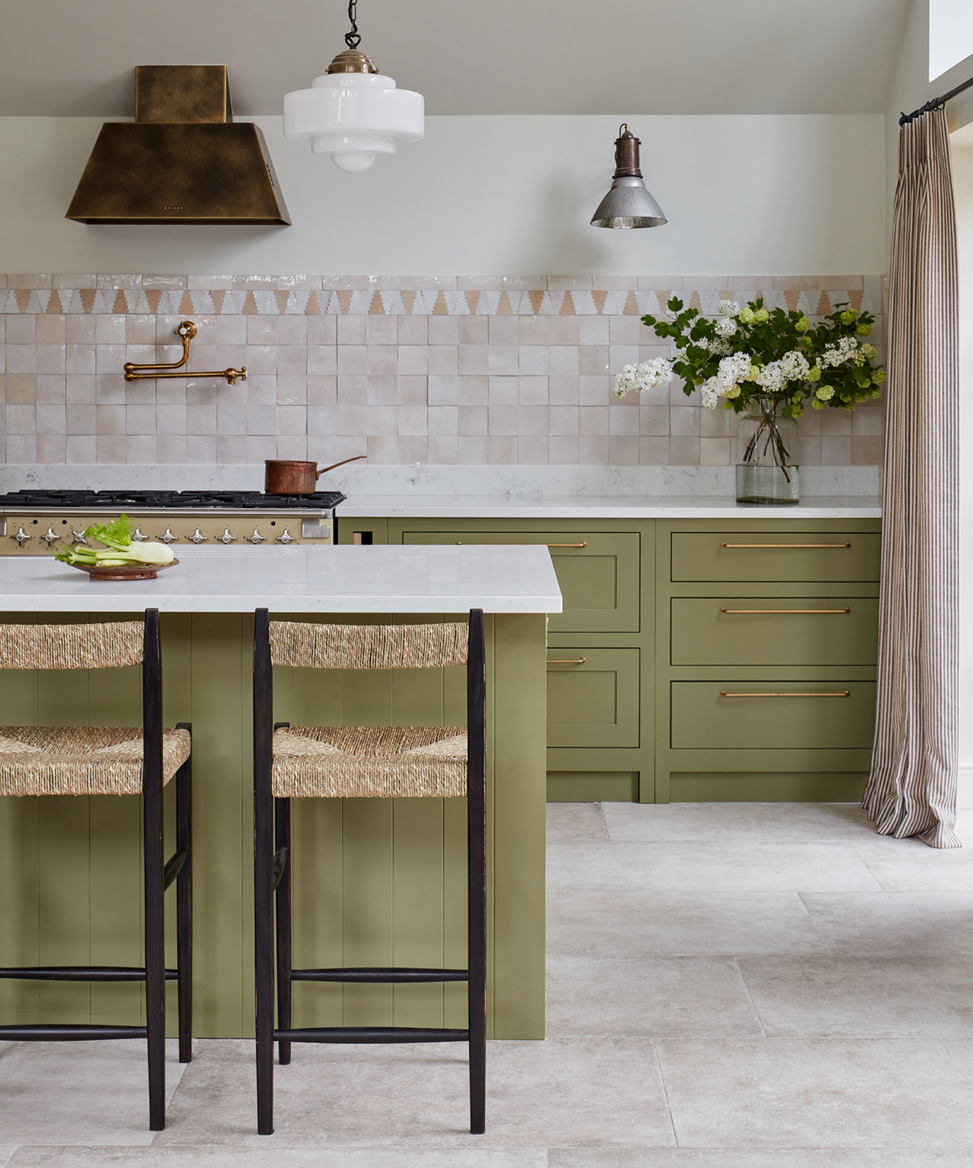
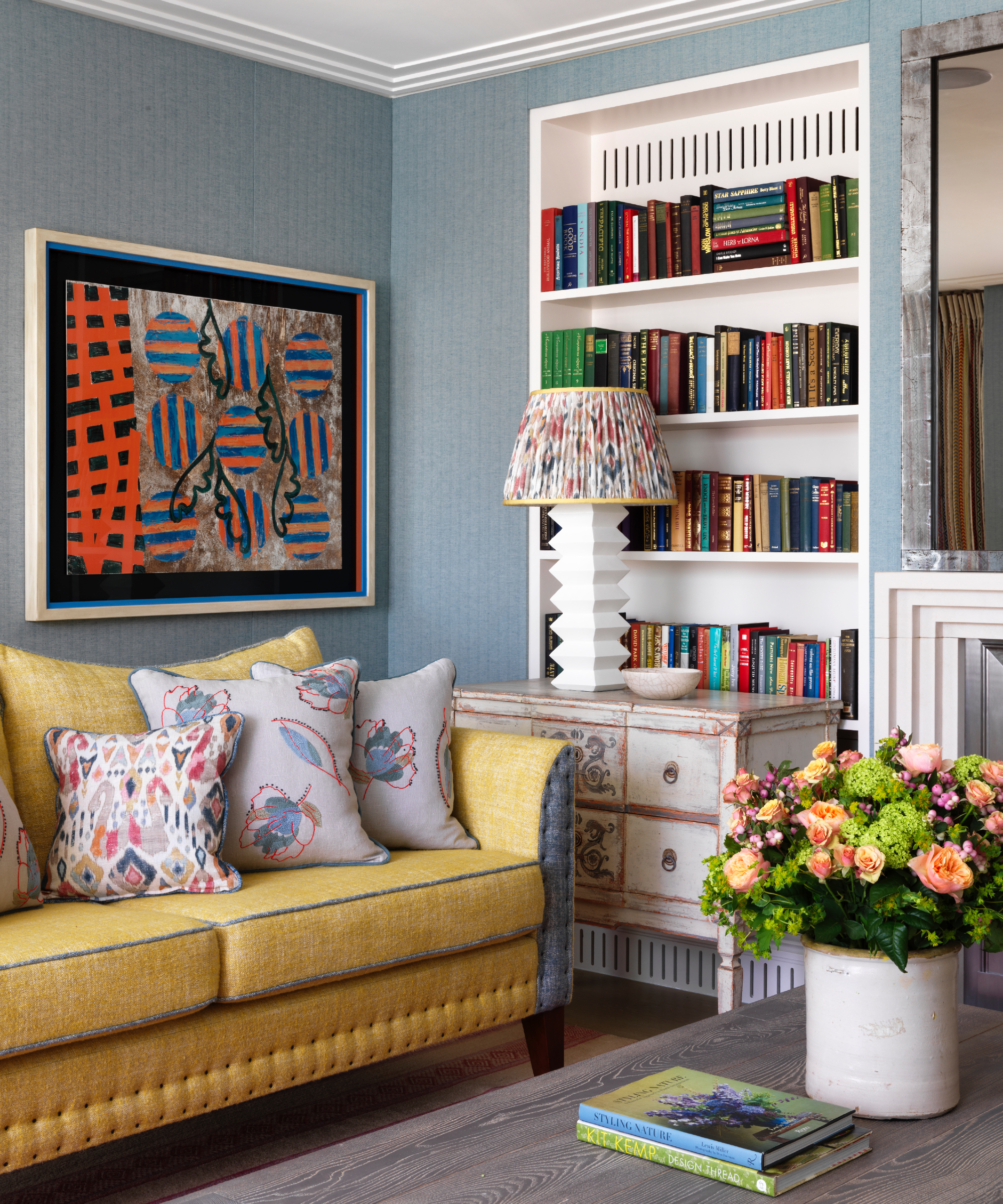
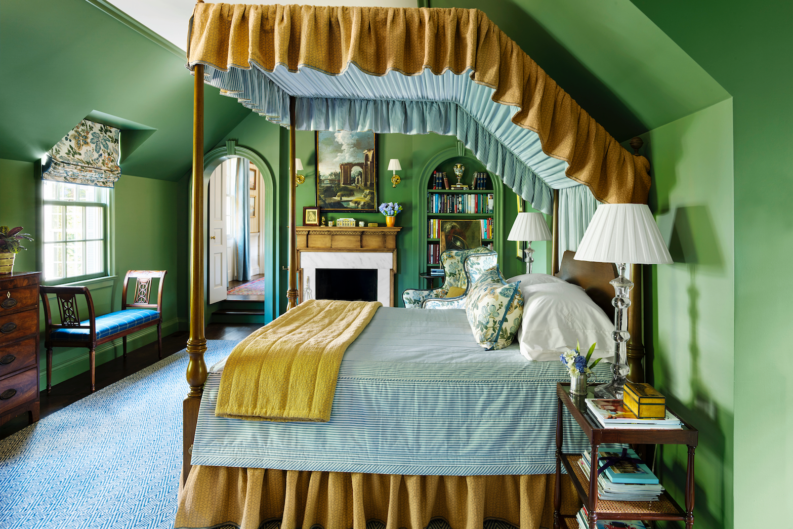
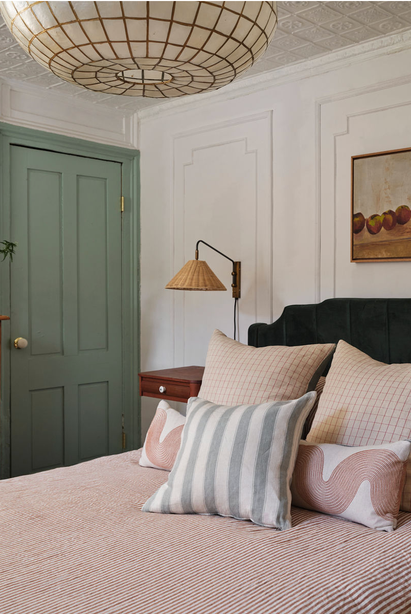
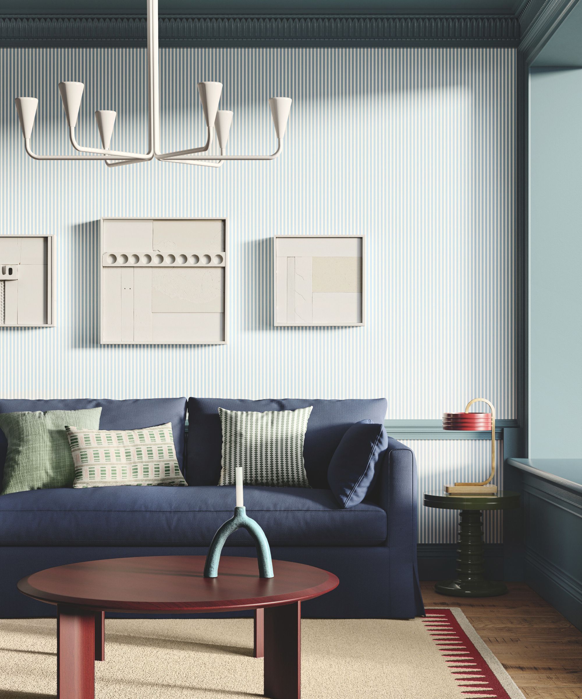
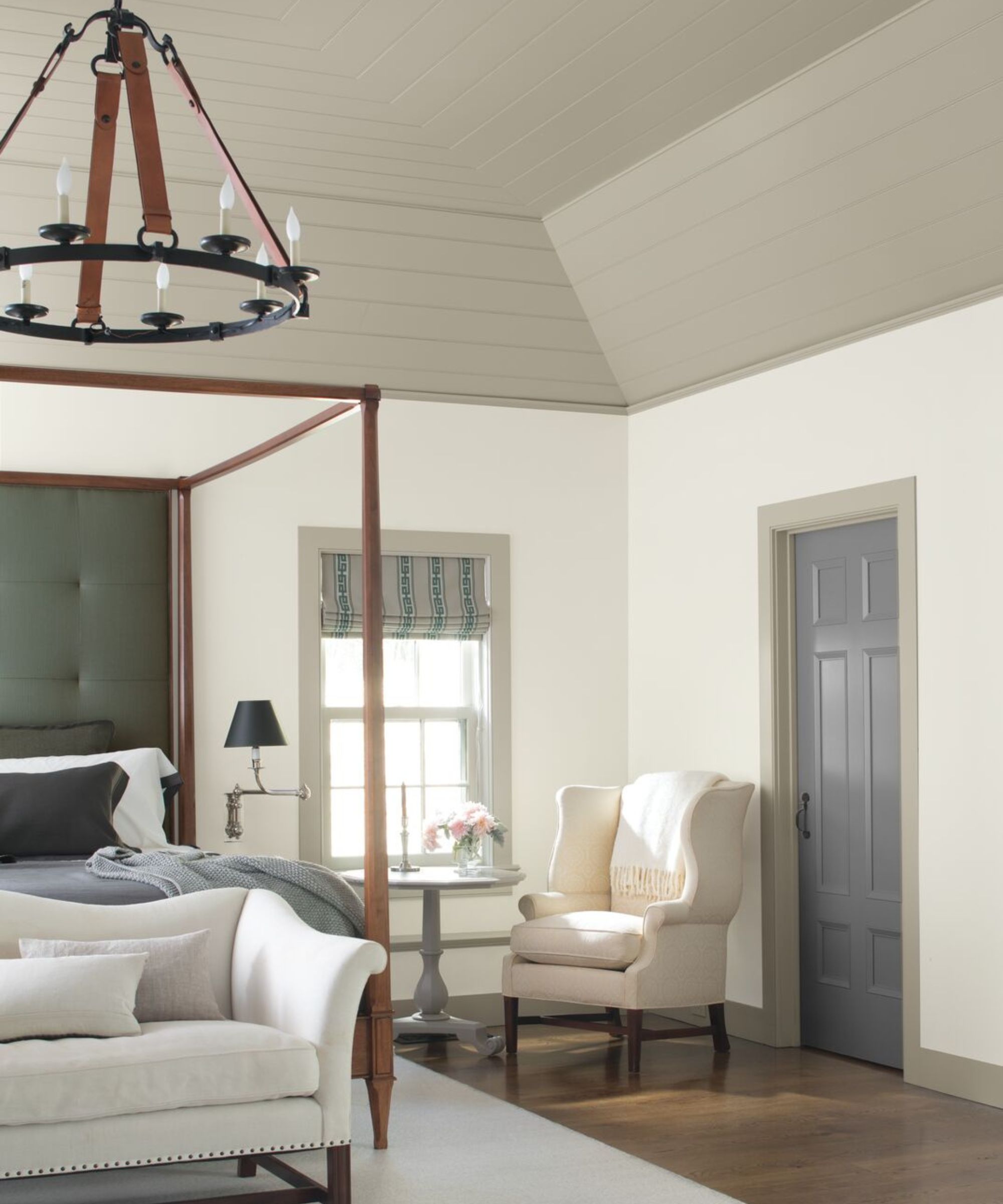
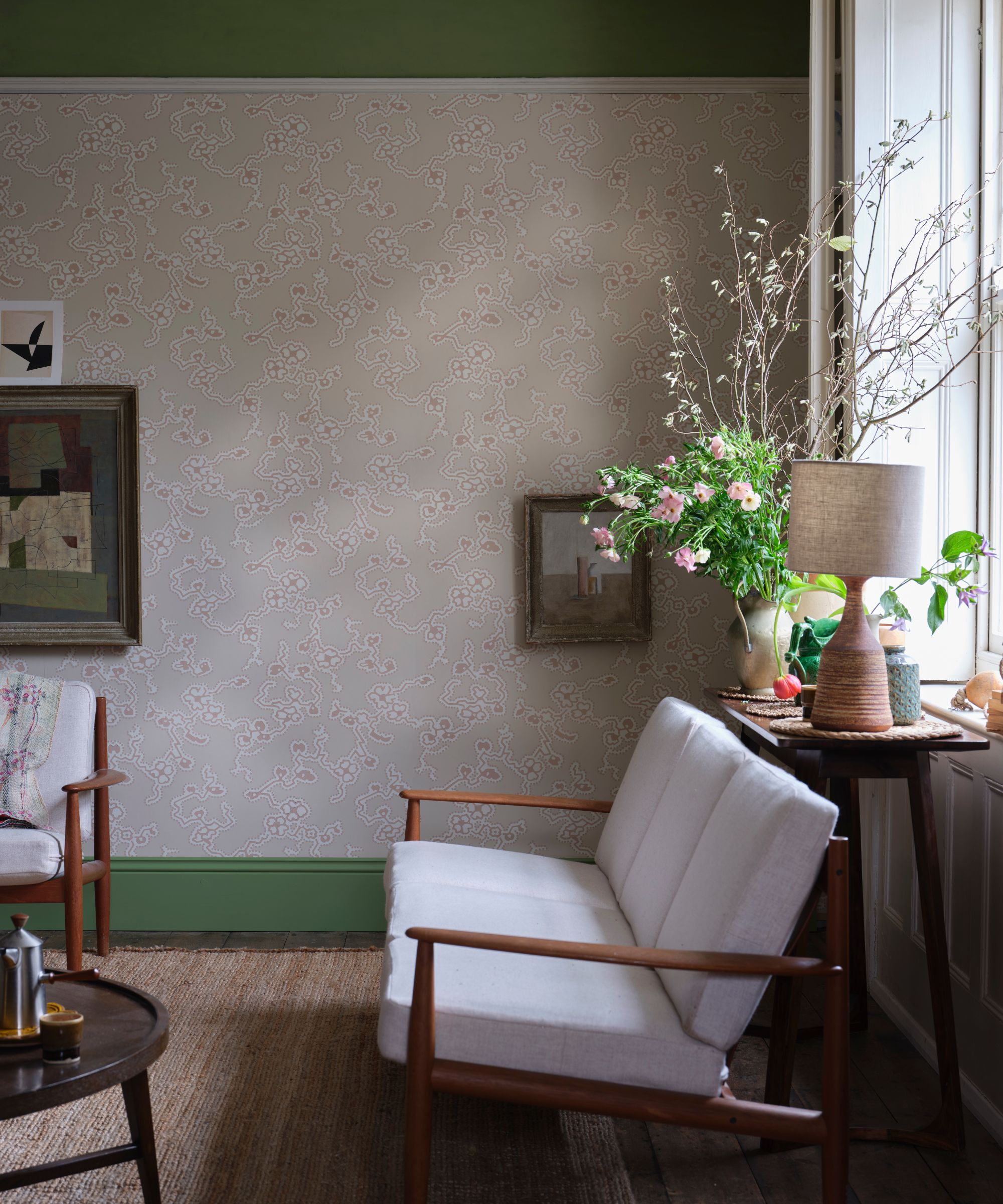
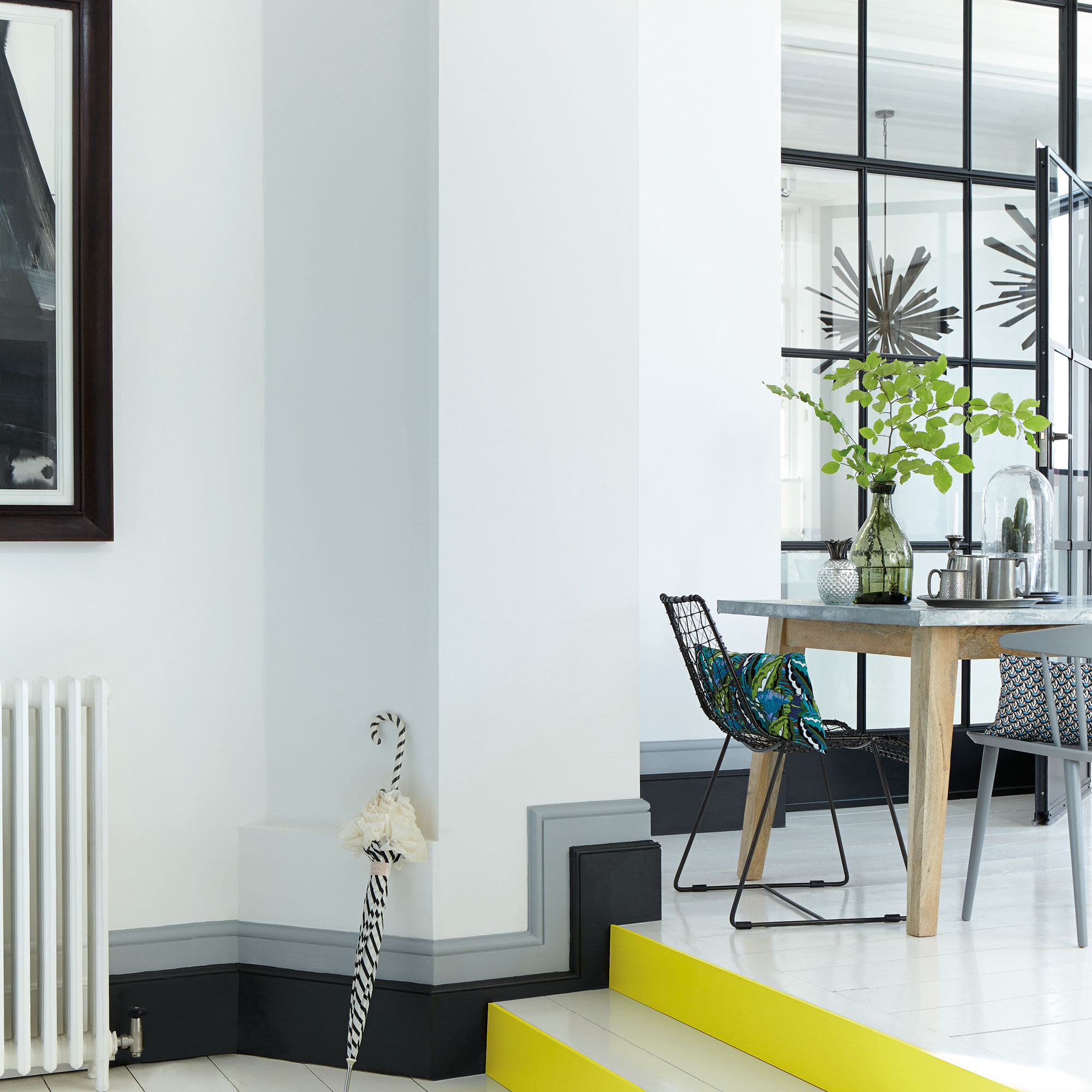
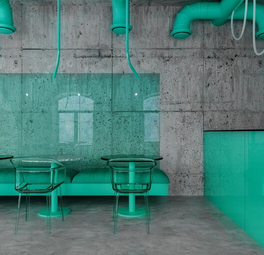
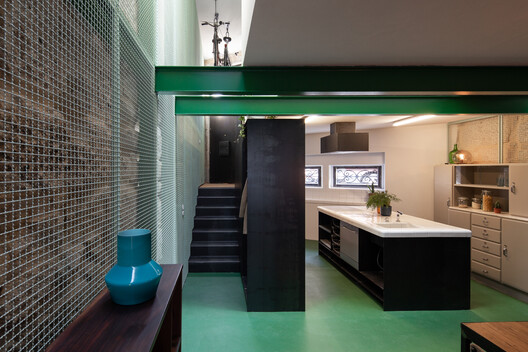
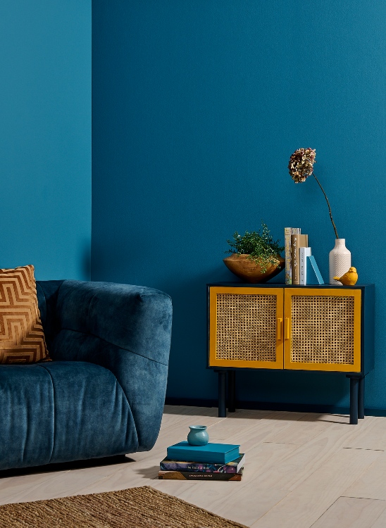
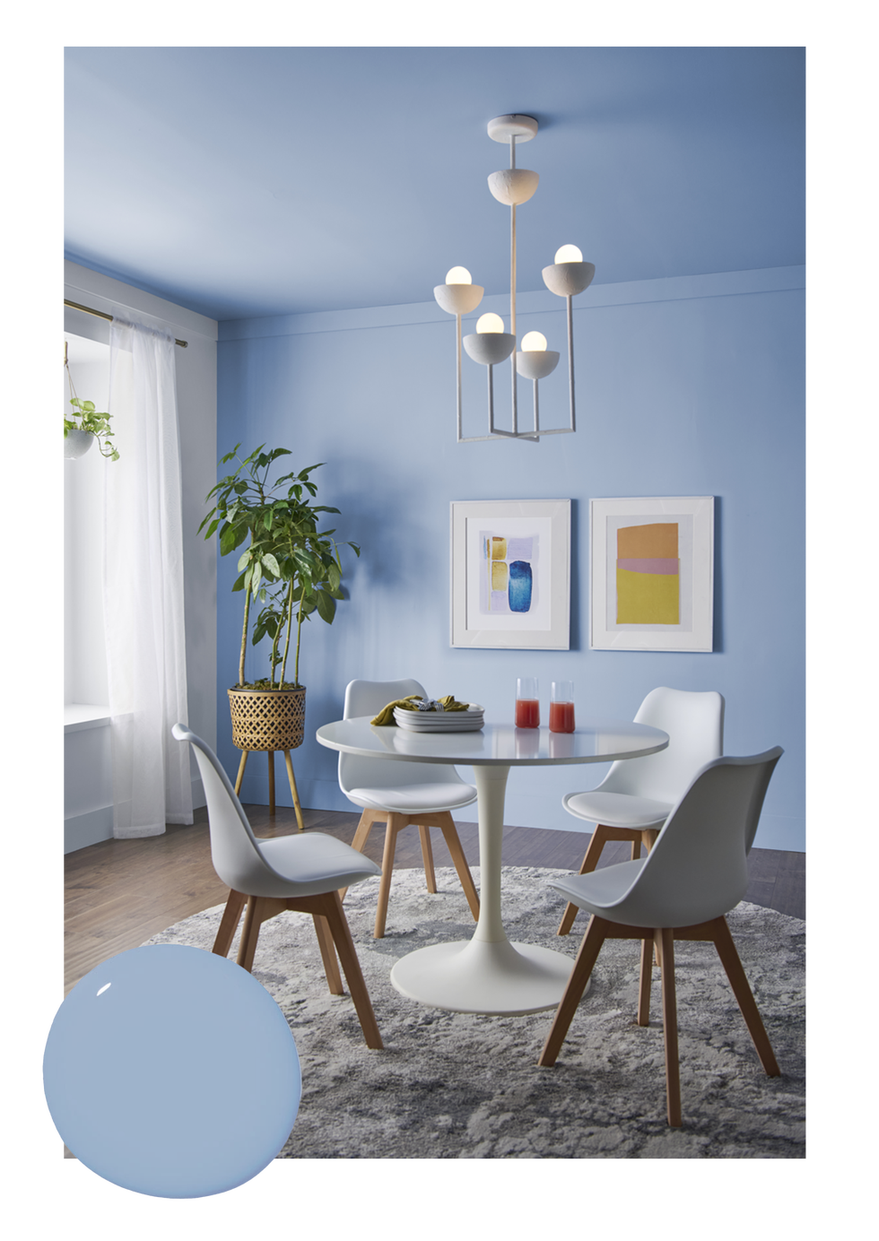
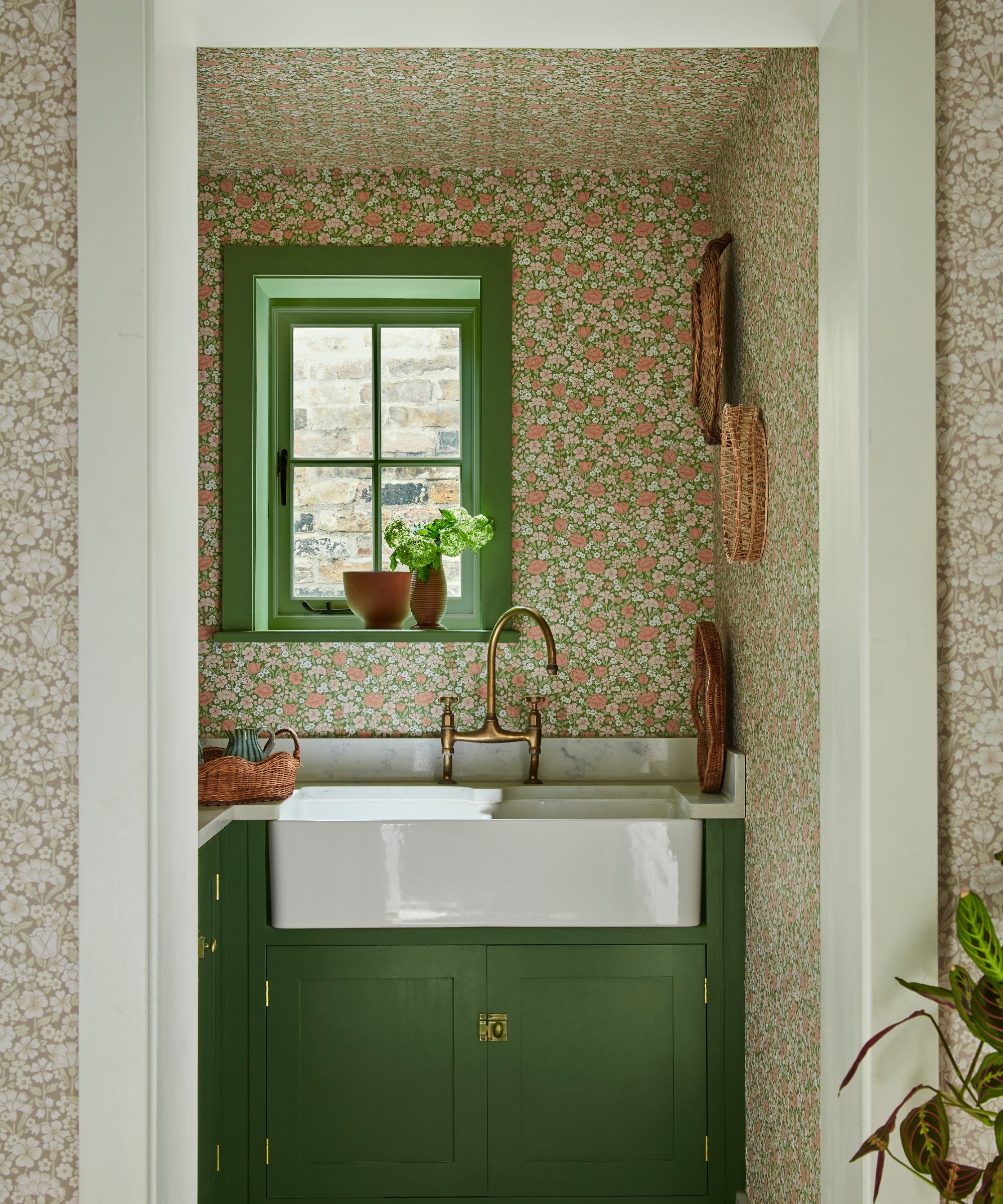
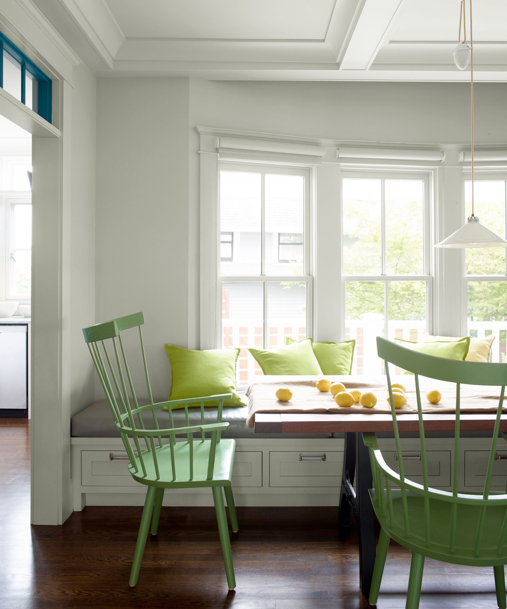
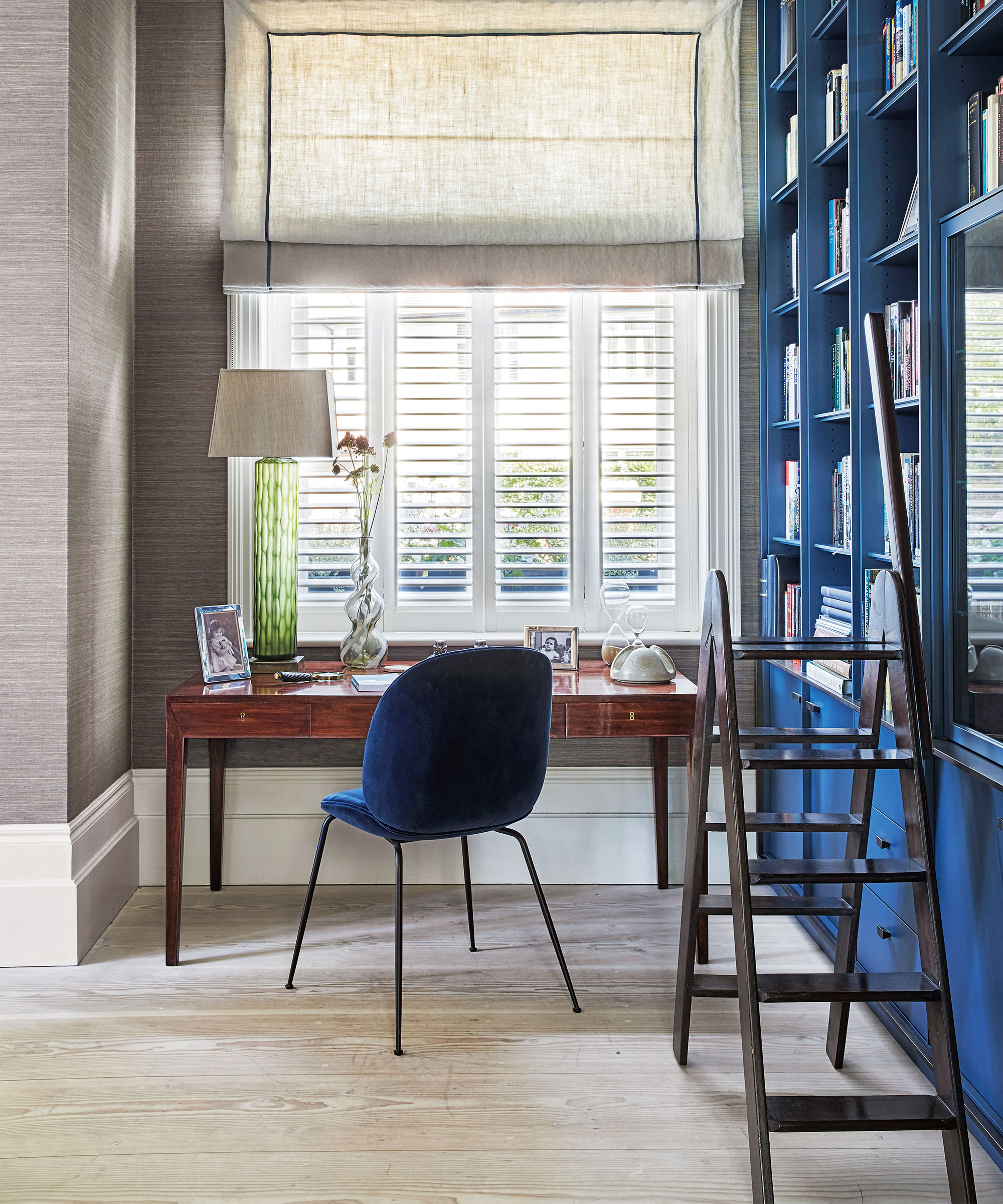
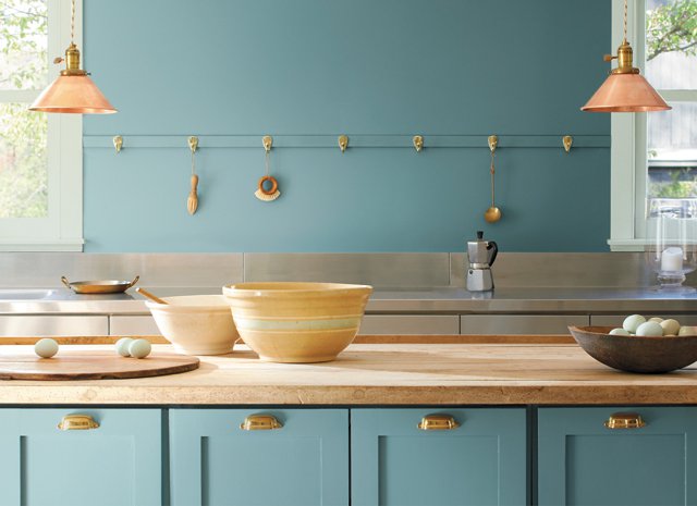
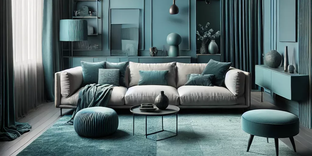
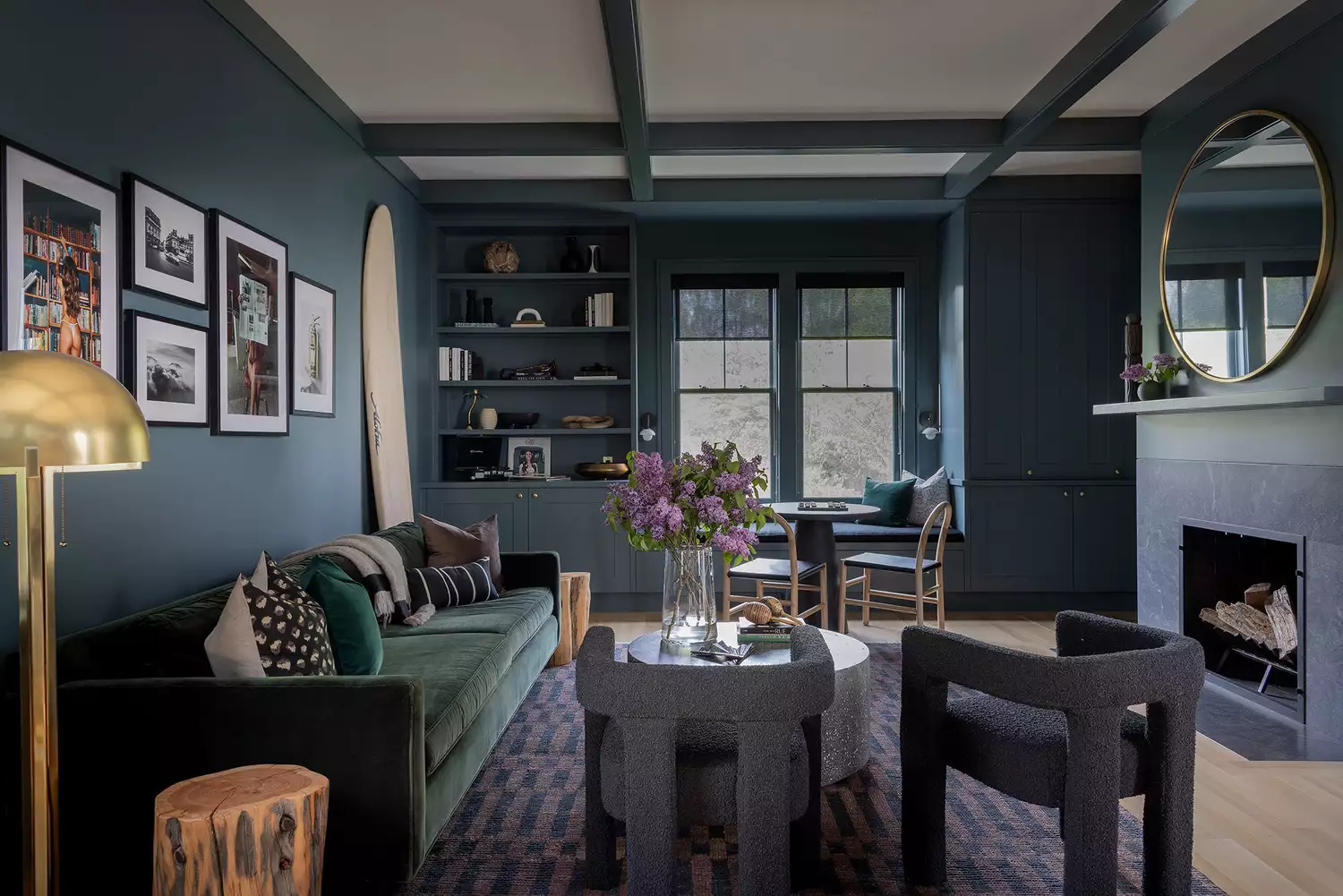
Conversely, receding colors are typically cooler hues like blues, greens, and violets. These colors have shorter wavelengths, making them appear to recede into the background. They are characterized as calm, unobtrusive, and allow other elements to take center stage. Receding colors create an illusion of depth, making spaces appear more expansive and fostering a sense of spaciousness. They are particularly effective for making small layouts feel larger or for use on low ceilings. A palette dominated by receding colors can contribute to a peaceful and serene environment, serving as a good base for a broader color scheme.
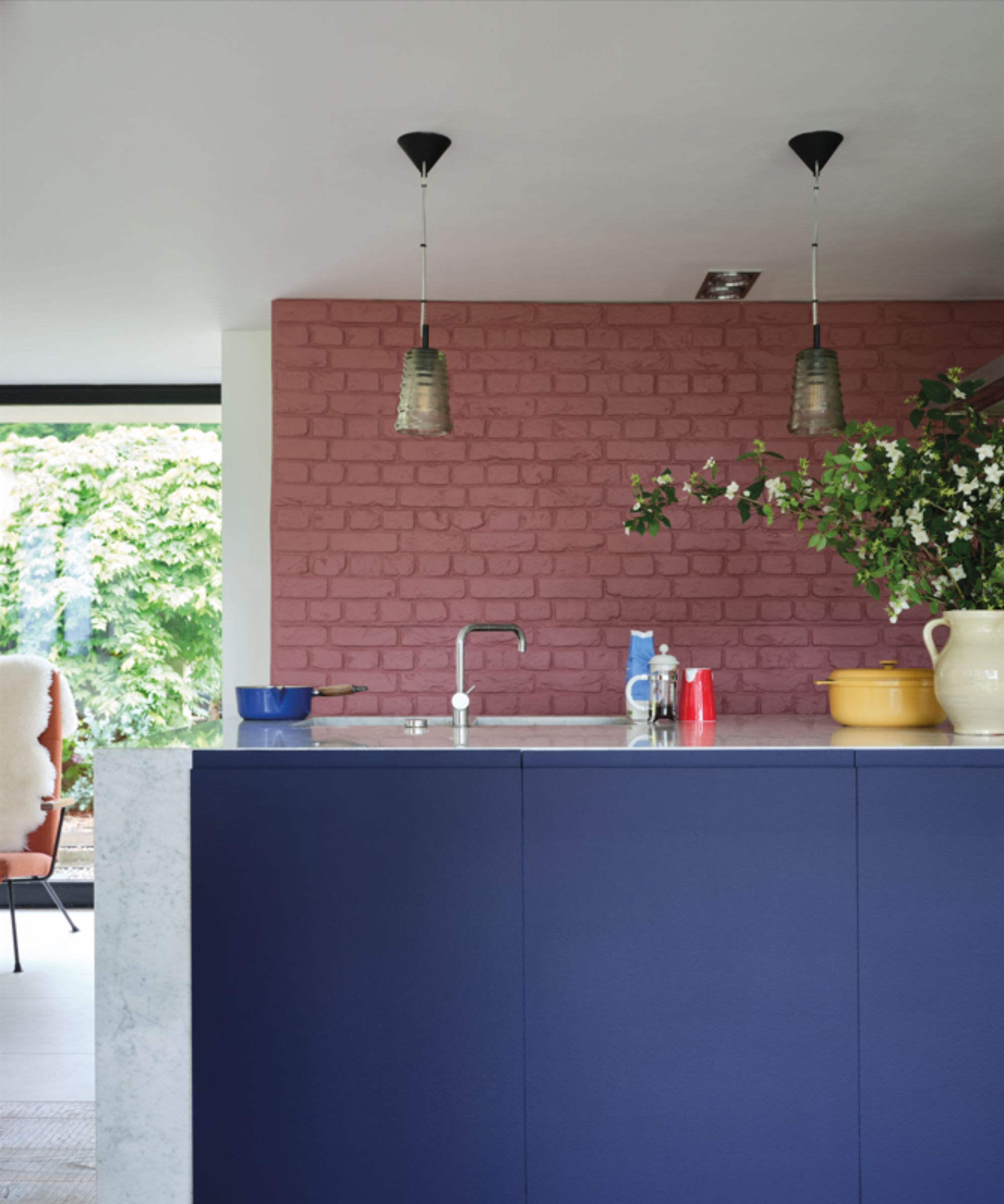
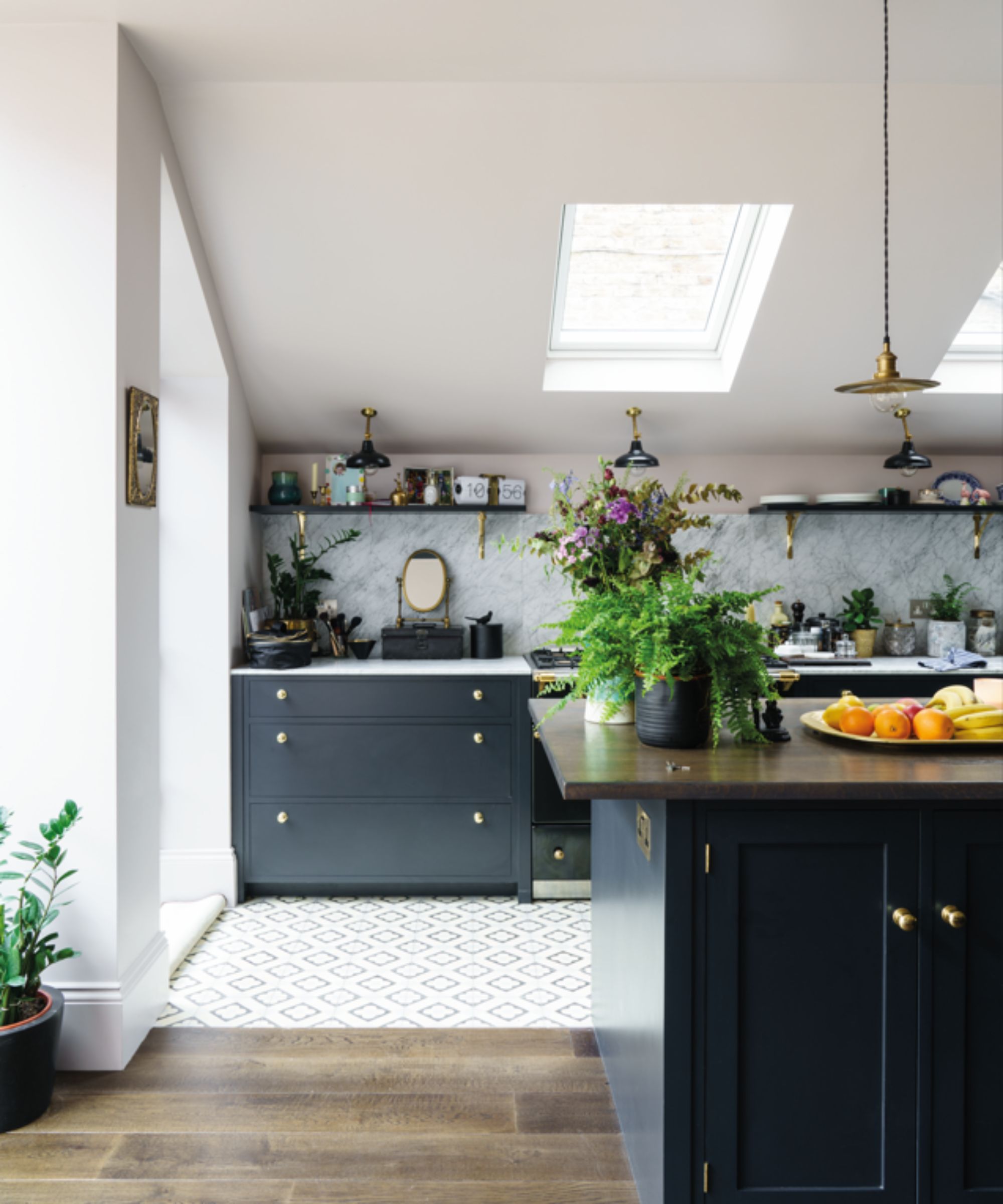
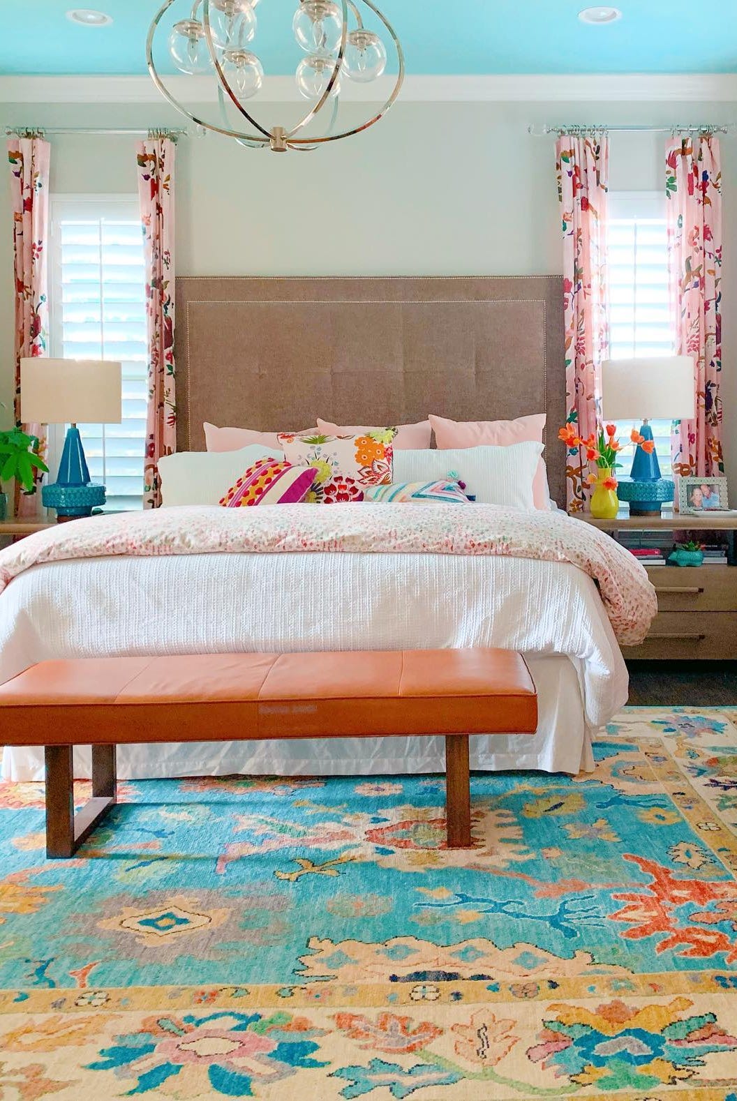
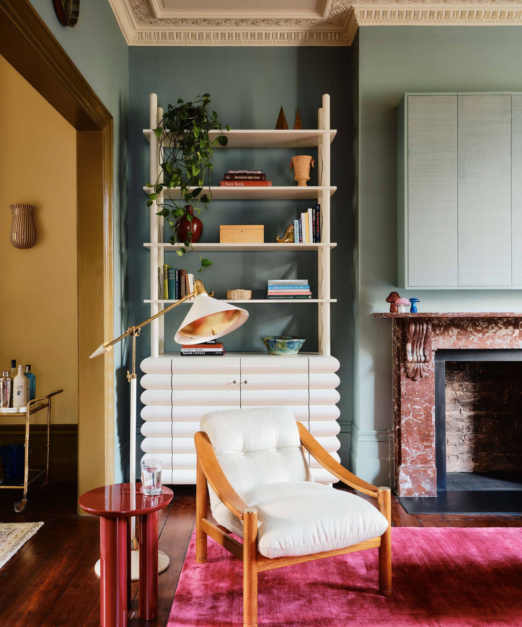
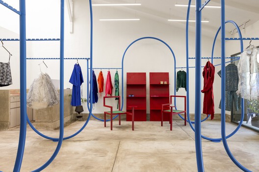
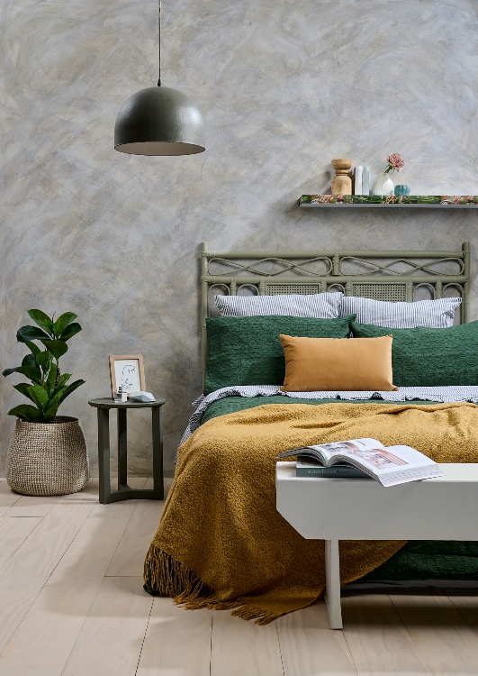
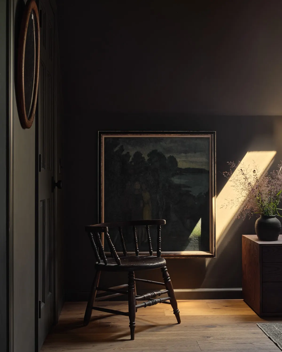
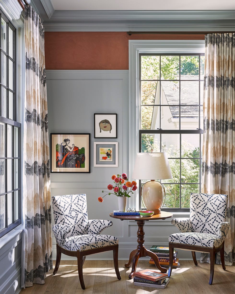
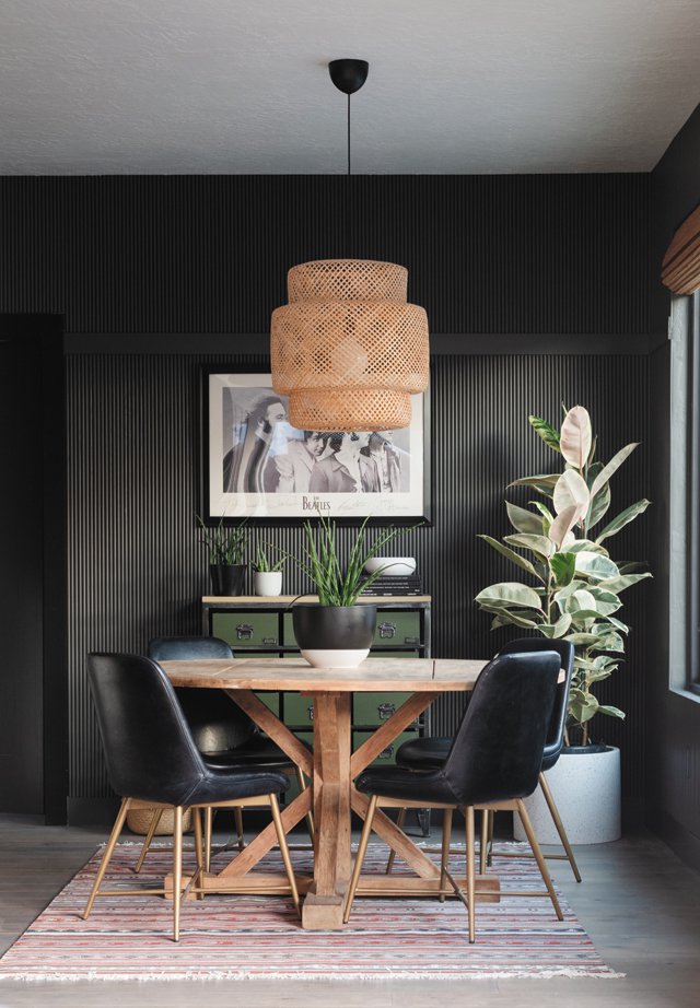
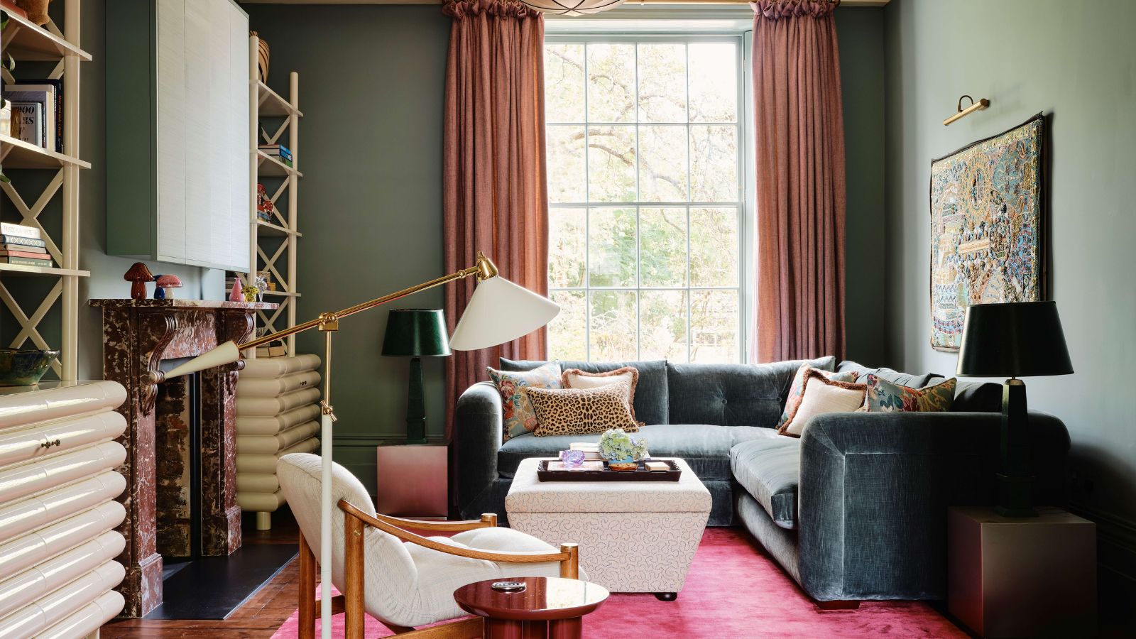
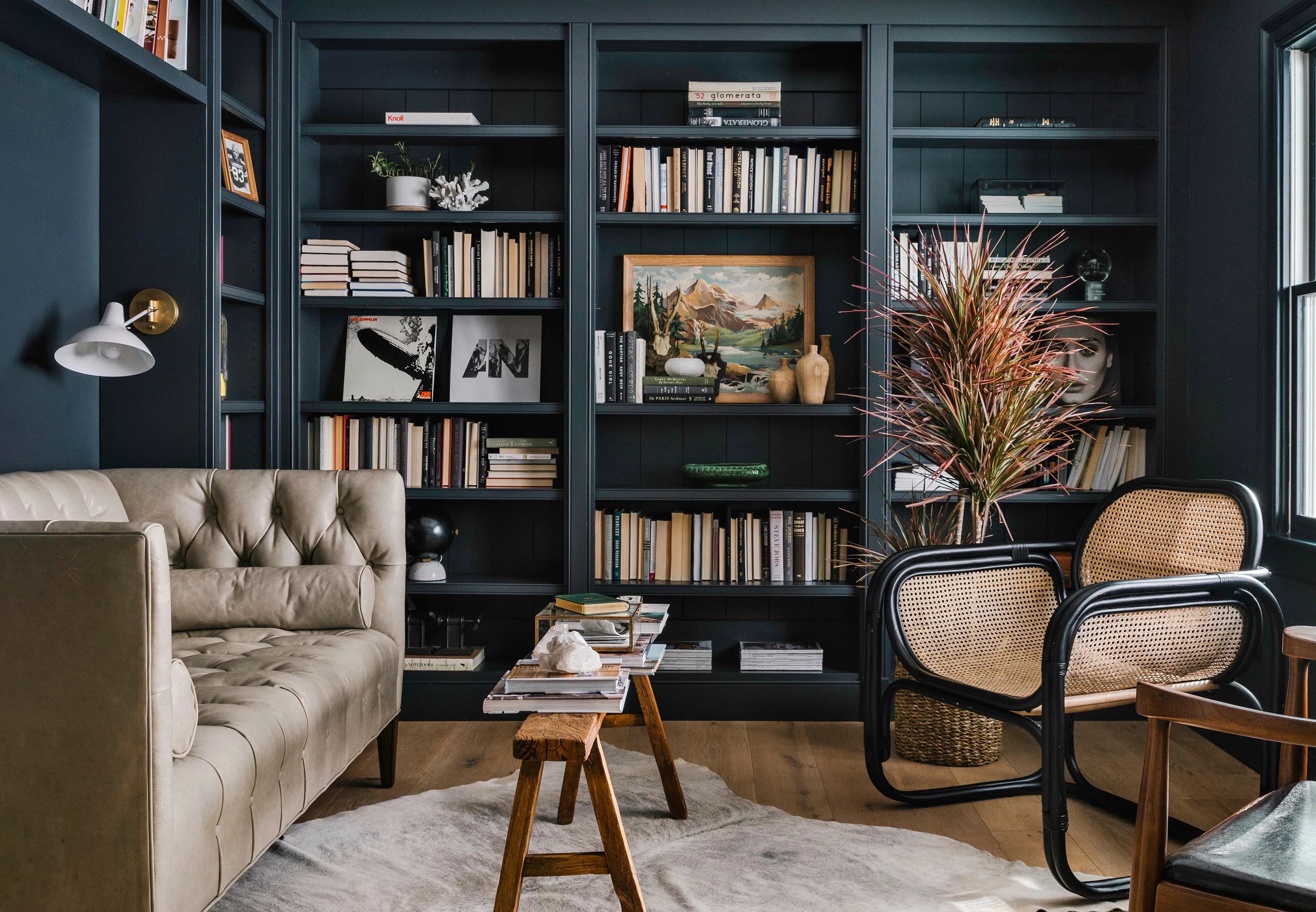
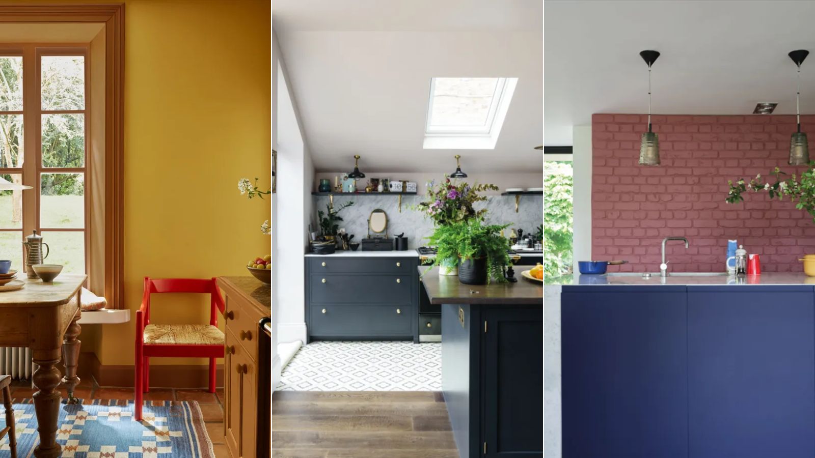
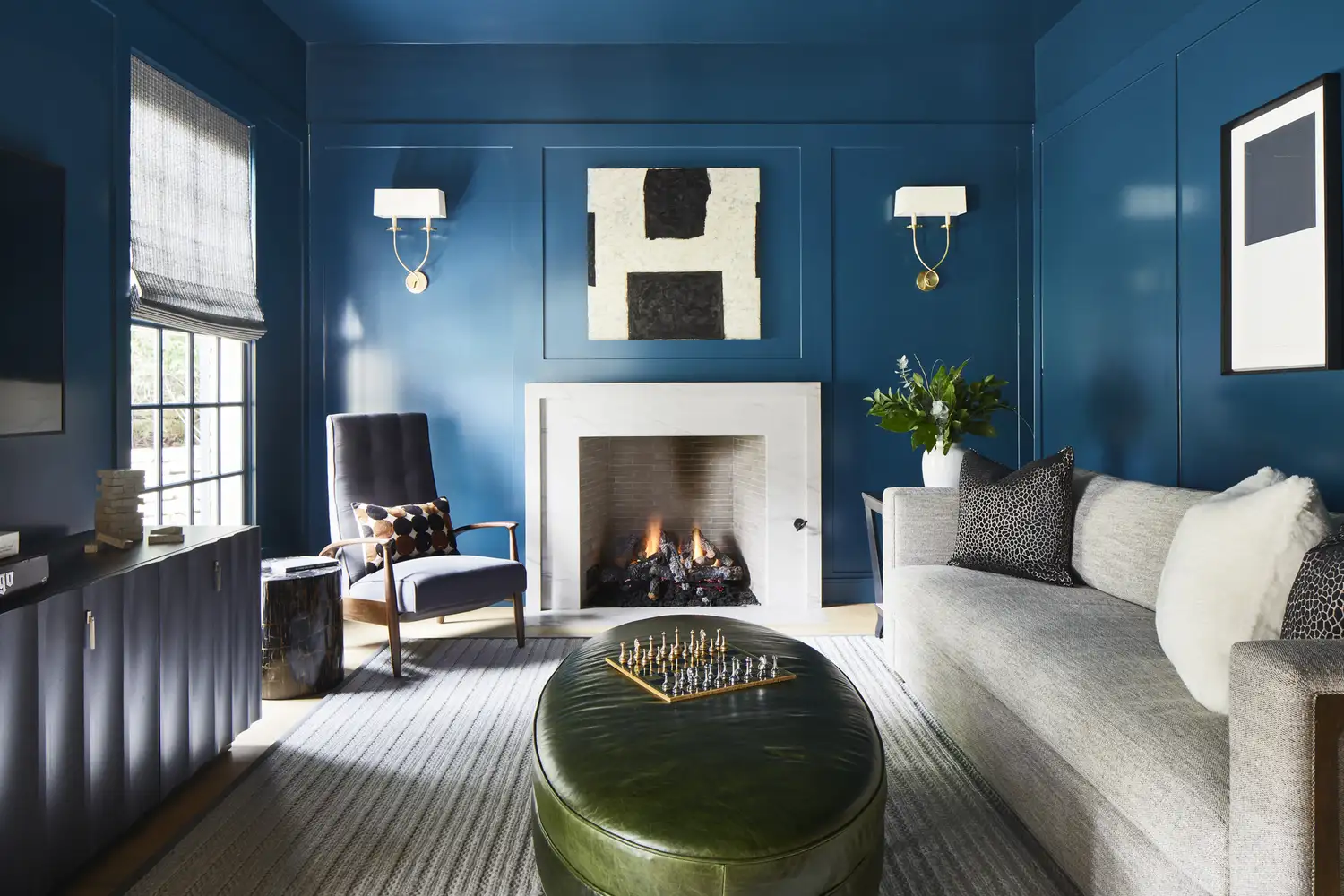
The article emphasizes the importance of understanding how to combine these two types of colors to create visual balance and dynamism. When placed together, advancing and receding colors create an illusion where the warmer tones project forward while the cooler tones withdraw. This interplay can temper the effects of the leading tone, leading to harmonious yet dynamic interiors. For instance, color-drenching a room in a cool, receding color like deep olive green or navy blue can make the space feel expansive, which can then be accentuated with contrasting advancing accents in orange or terracotta. Conversely, a warm color scheme, such as brick red, can be balanced with large pieces of receding deep greens and blues to add depth, contrast, and richness.
Ultimately, the effective use of advancing and receding colors depends on context, placement, and contrast. Their impact is more noticeable when directly juxtaposed, while layering them with neutrals can soften their effects. The article encourages readers to experiment and observe how different colors interact to create a personal and effective color palette that aligns with their design style.
#InteriorDesign #ColorTheory #DecoratingScheme #AdvancingColors #RecedingColors #WarmTones #CoolHues #HomeDecor #ColorPalette #InteriorDesign #ColorTheory #DecoratingScheme #AdvancingColors #RecedingColors #WarmTones #CoolHues #HomeDecor #ColorPalette
0 comment in total
 No comments yet
You may also like
10 beautiful transitional color schemes for every room in the house

What the unexpected fashion trick, the 'Sandwich Method', taught me about decorating with color in my home
According to Designers, These Are The Outdated Color Trends for 2026
We Asked 5 Designers If Moody Paint Colors Are Still Trendy, and They All Said the Same Thing

Designers are swapping tonal color schemes for high-contrast hues – here's how to do this daring color trend stylishly

These Colors Will Be Everywhere in Interiors in 2025
Say Goodbye to Neutrals: Color-Drenching Will Define 2026 Interiors

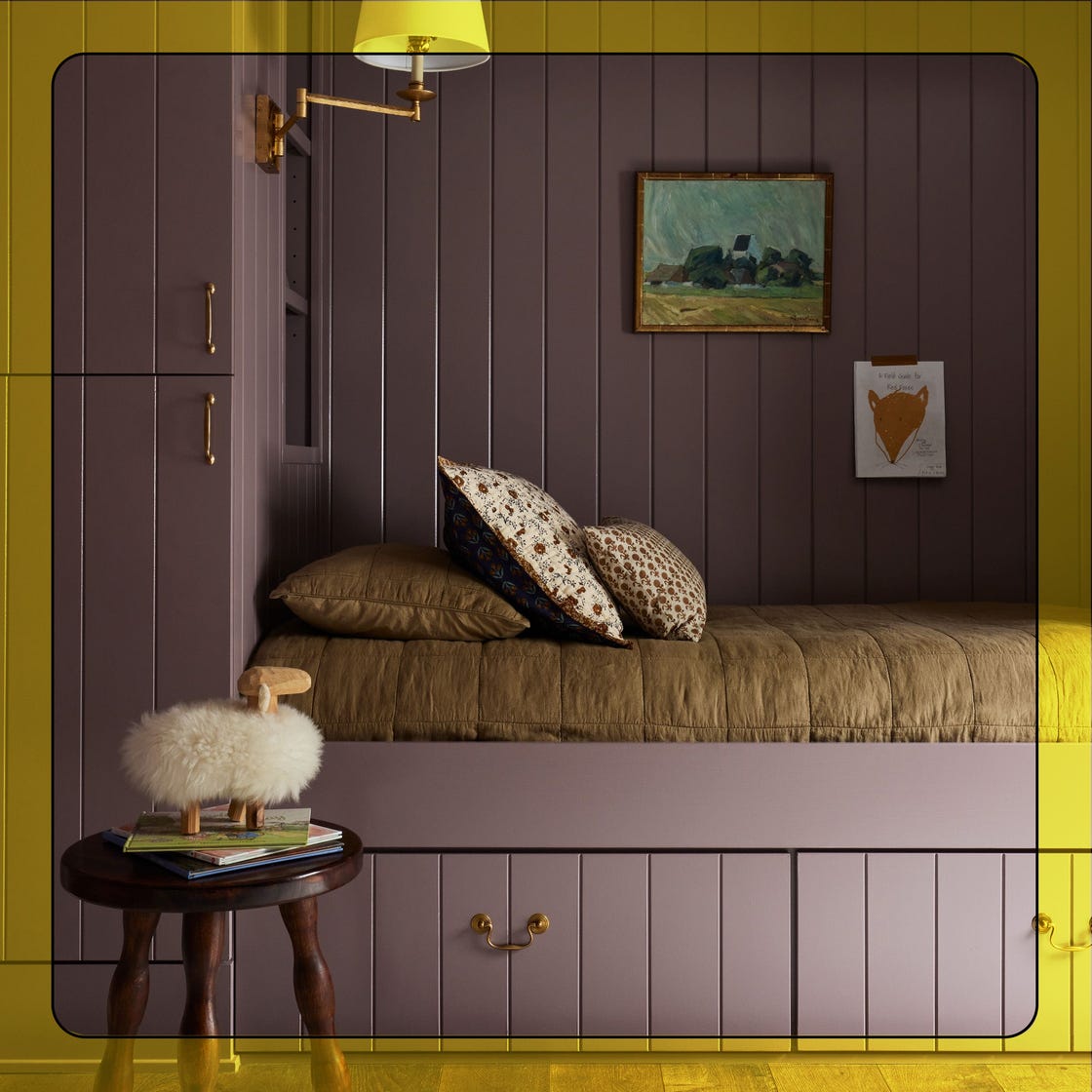
What Paint Colors Will Rule 2026? Designers Make Their Predictions

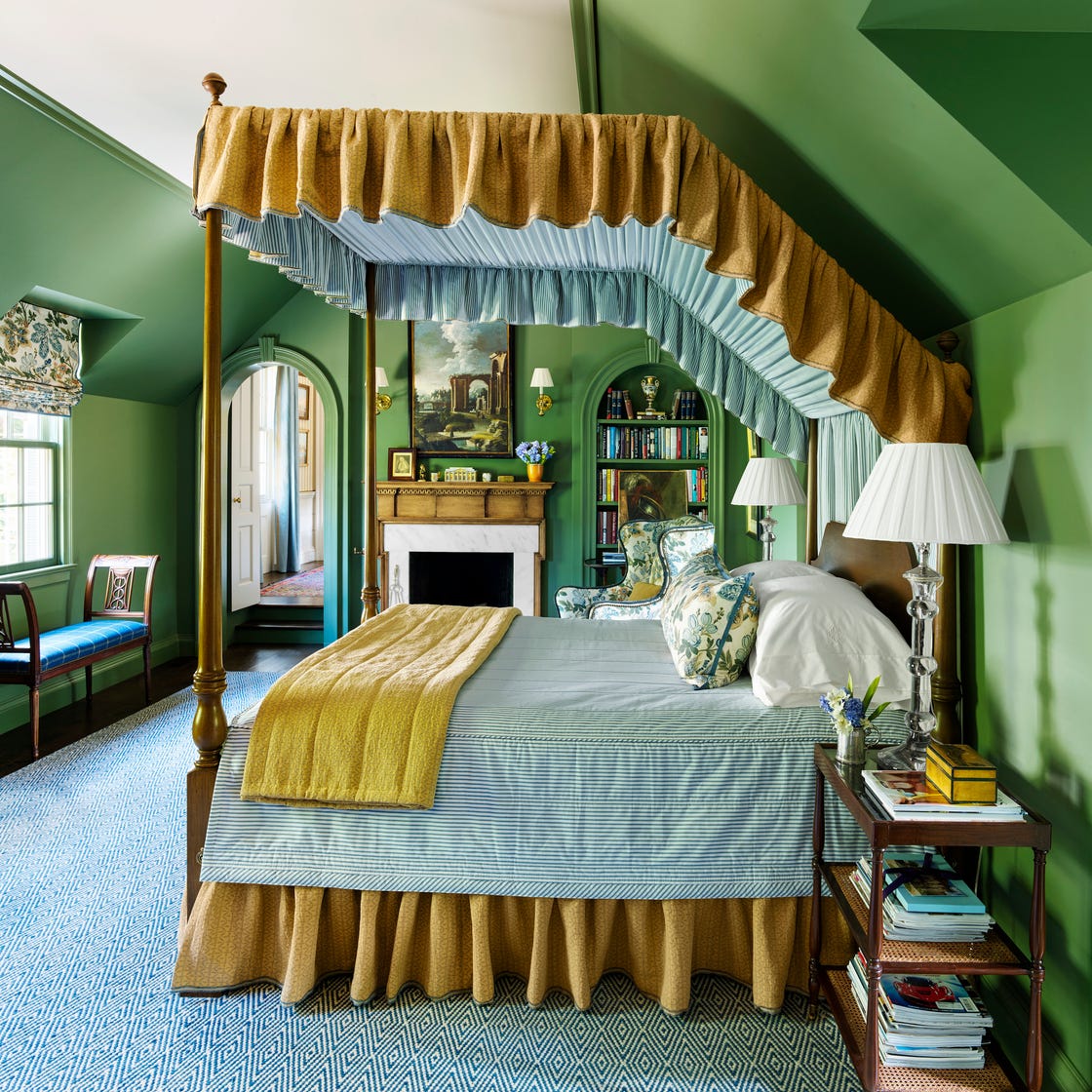
These 7 Colors Will Rule Interiors in 2026, According to Experts

Choose contrasting color schemes for a more powerful effect
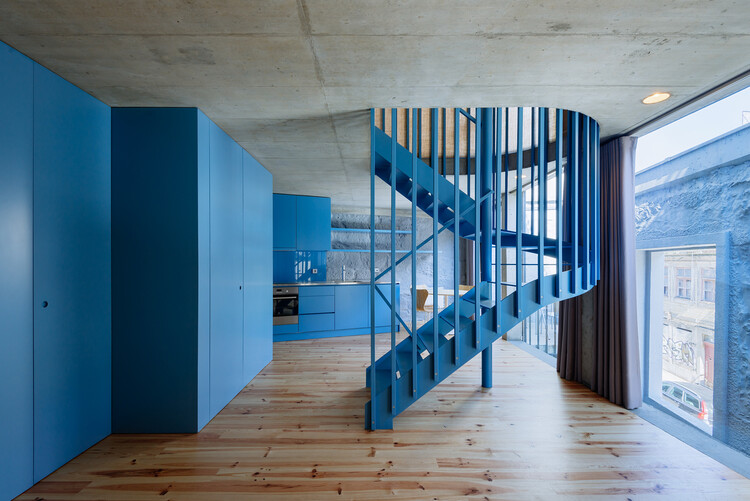
How to Combine Colors and Textures in Interior Decor

2021’s Palette of Possibilities
Colour drenching: the interior design trend everyone’s talking about

6 key colors to decorate with in May 2025, according to interior design and color experts in the know

These 6 Colors Will Rule Interiors in 2026, According to Experts

What color is replacing red? Discover the new trending accent colors designers are favoring for 2024 and beyond
12 Color Schemes That Are Popping Off Right Now, According to Designers
Should woodwork be lighter or darker than walls? The rules colour experts use to choose the perfect colour
Interior Design Trendwatch: Colour is coming home
These 5 Simple Questions Help Designers Pick the Perfect Paint Color Every Time