1/6
7 colour tricks to transform your mood and living room design
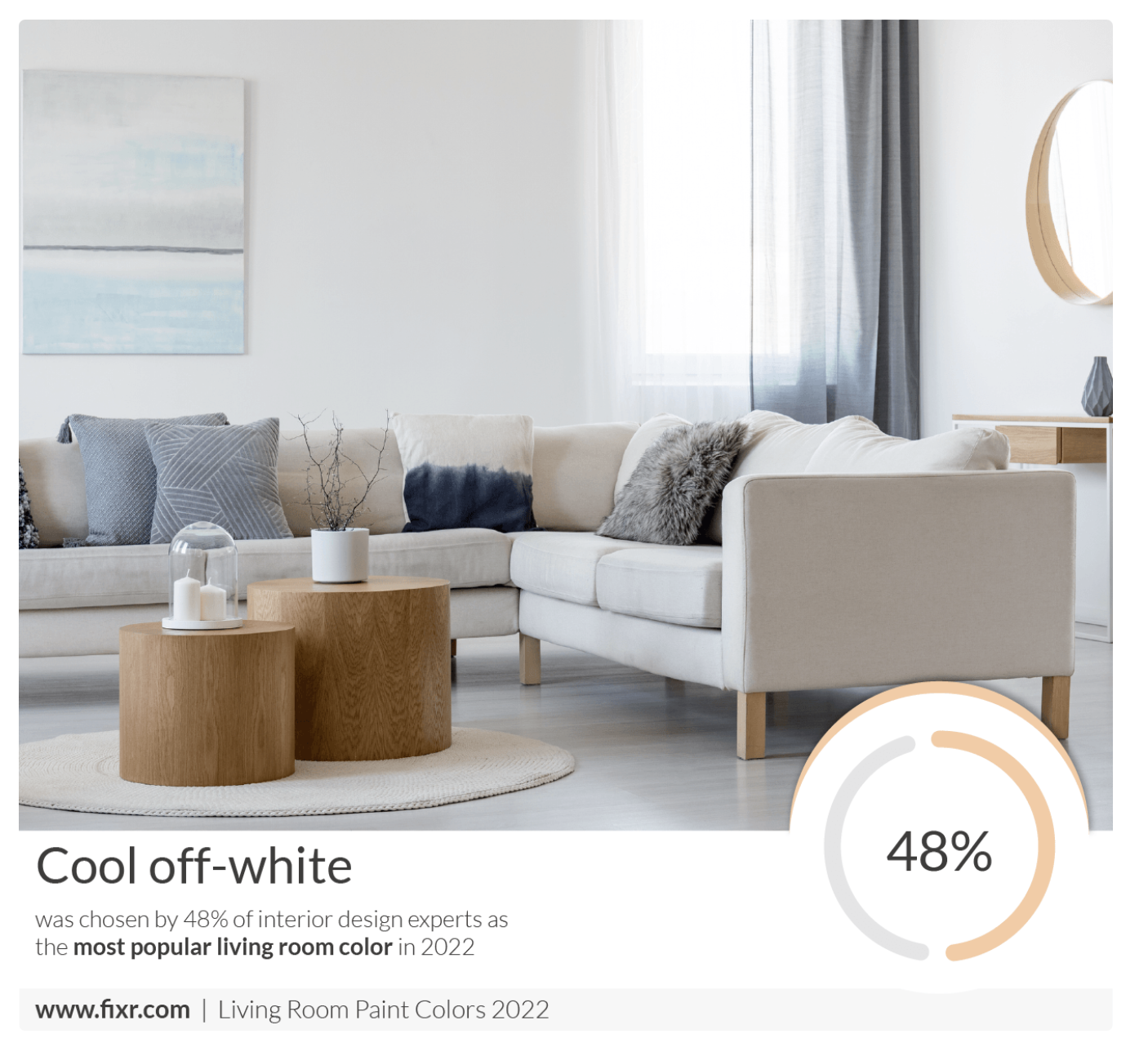
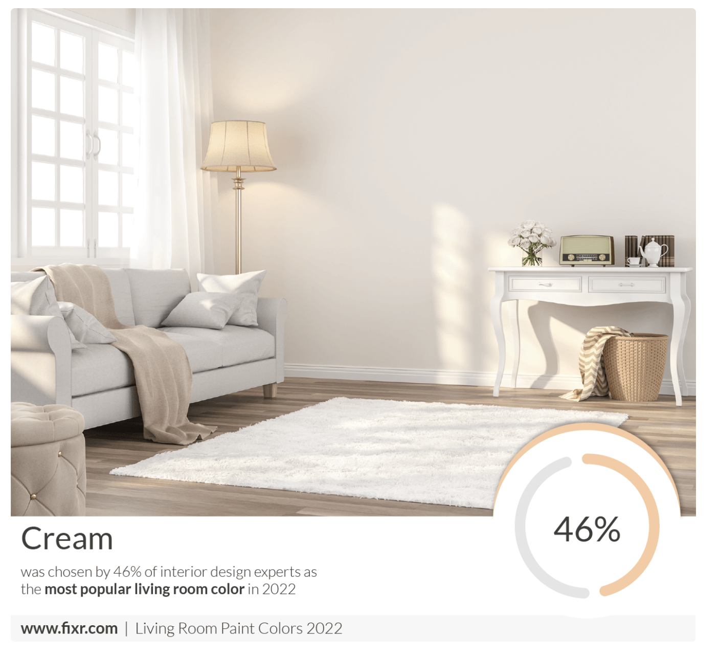
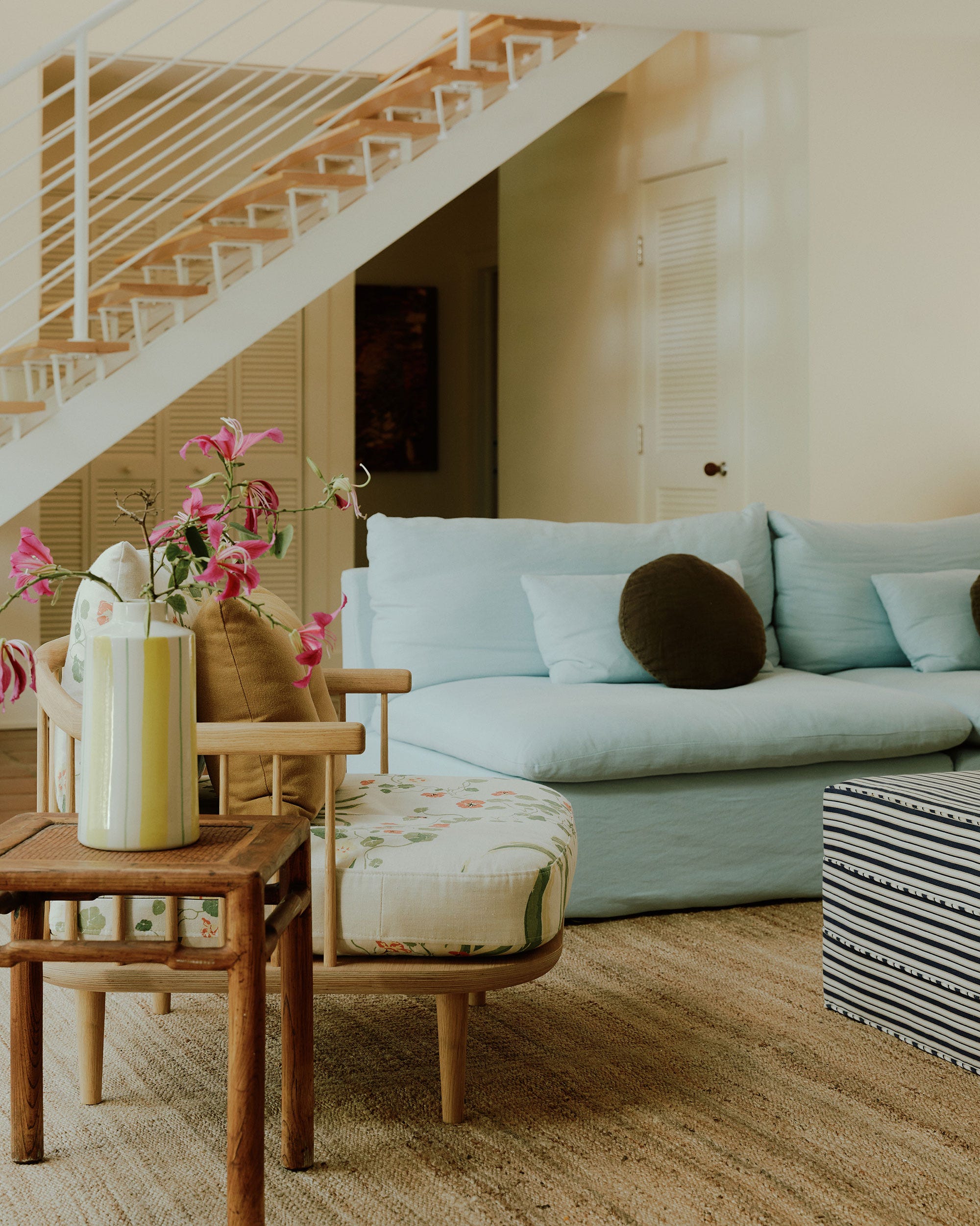
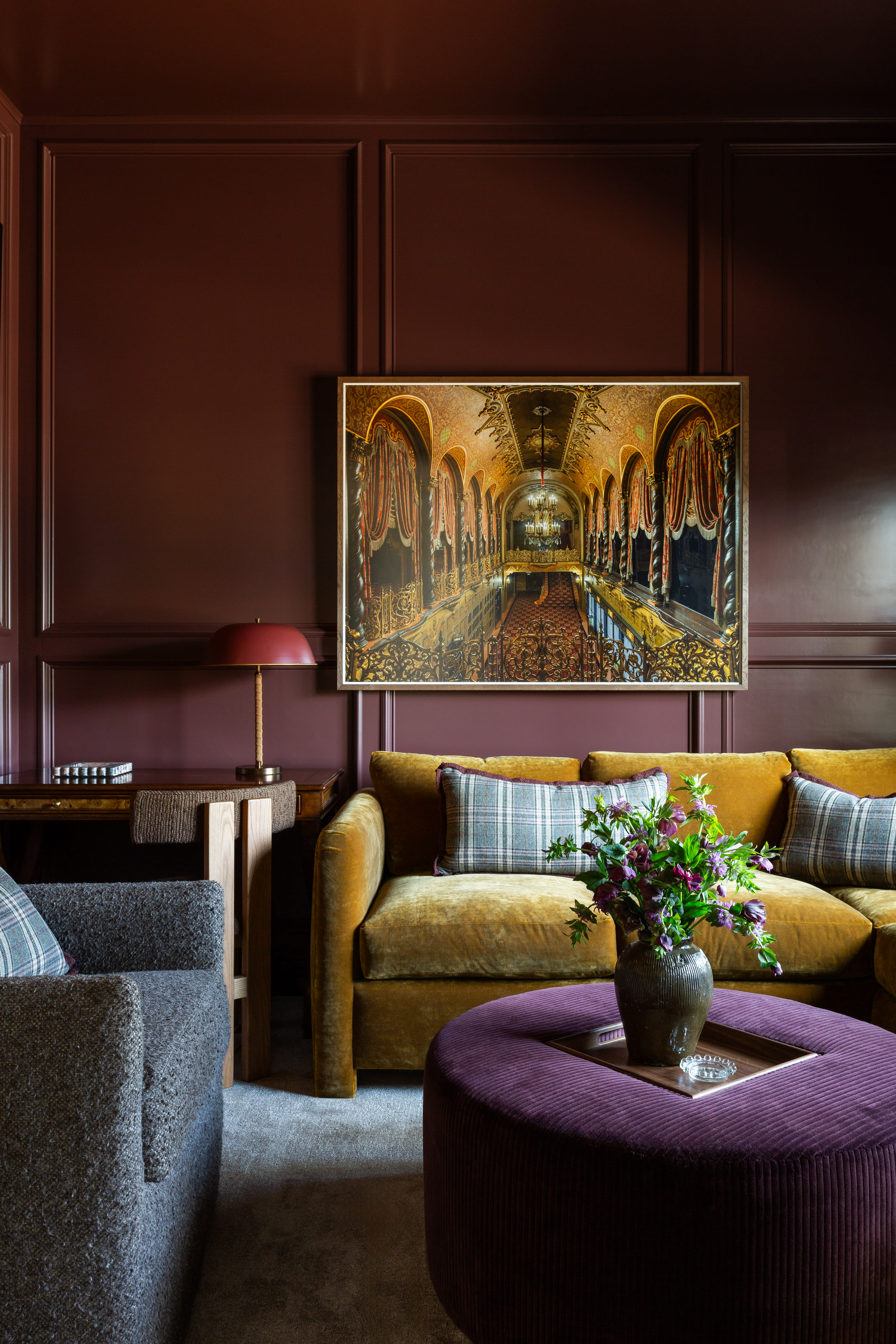
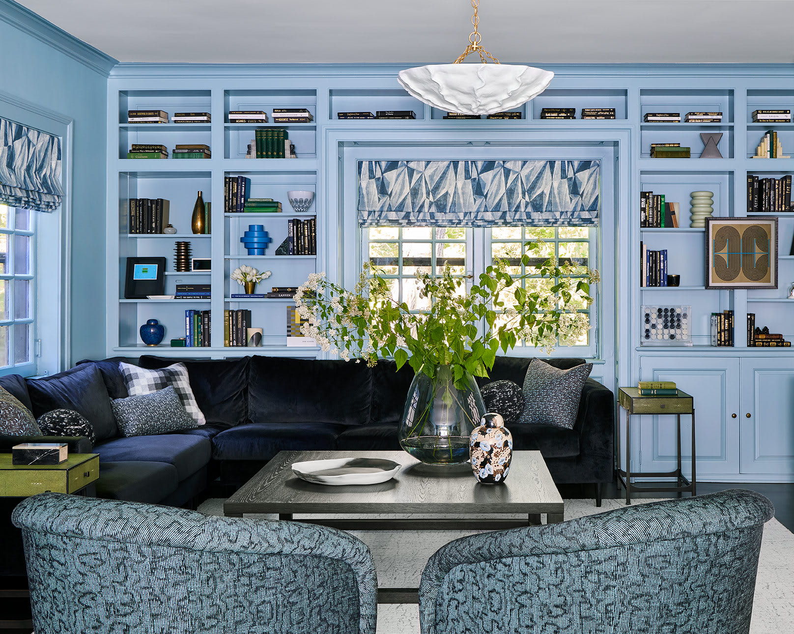
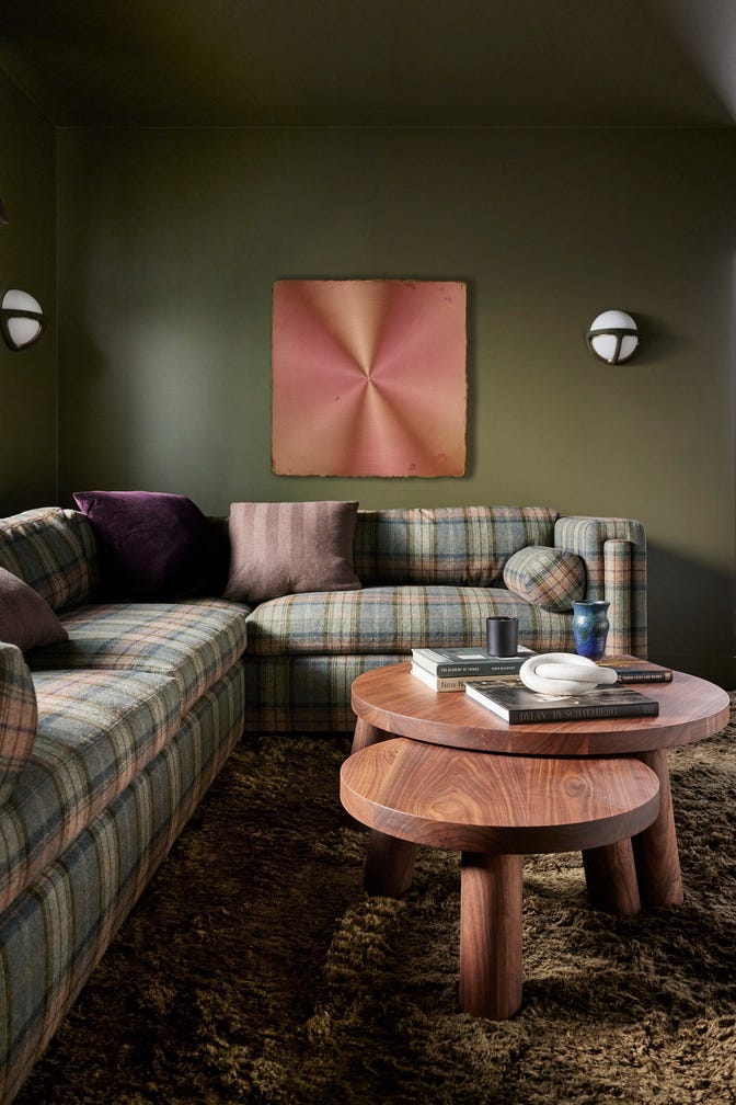
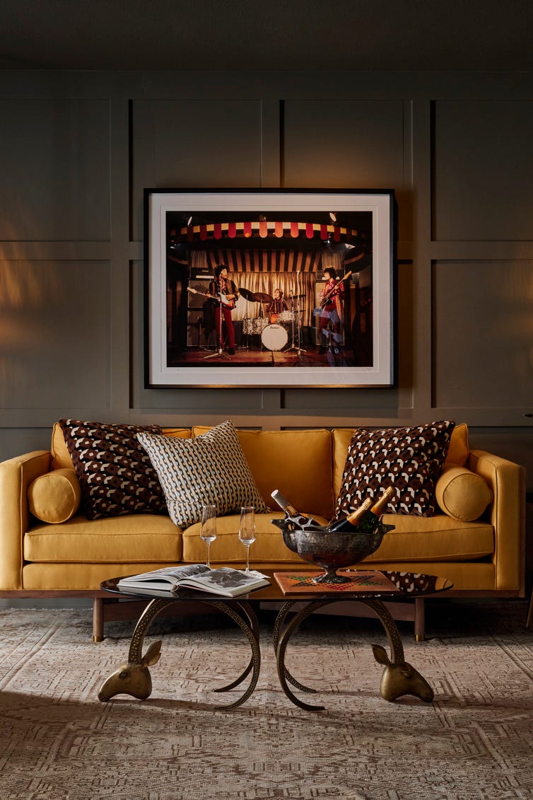
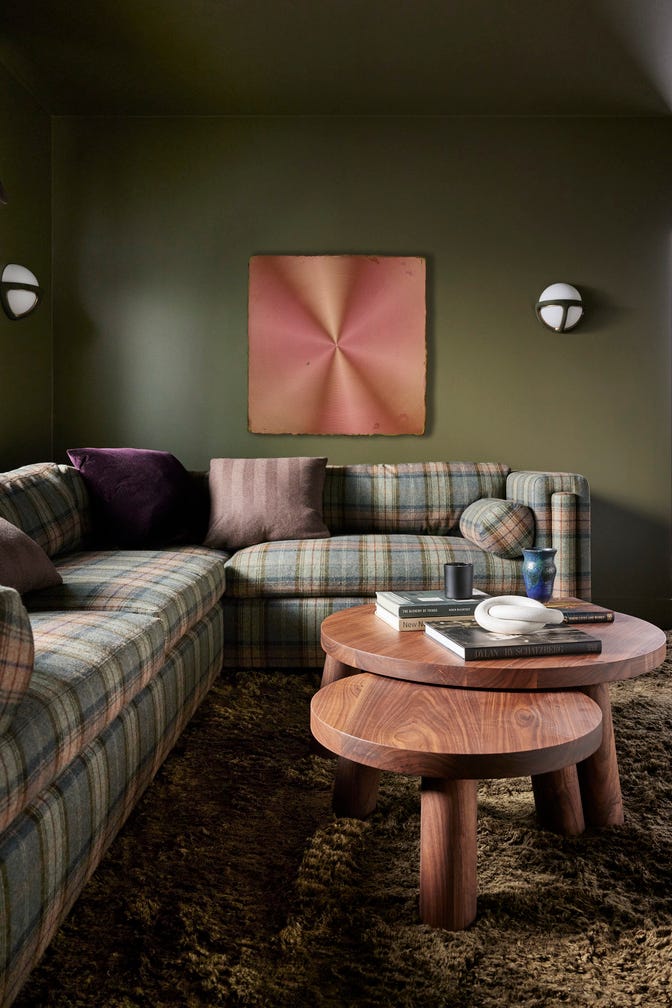
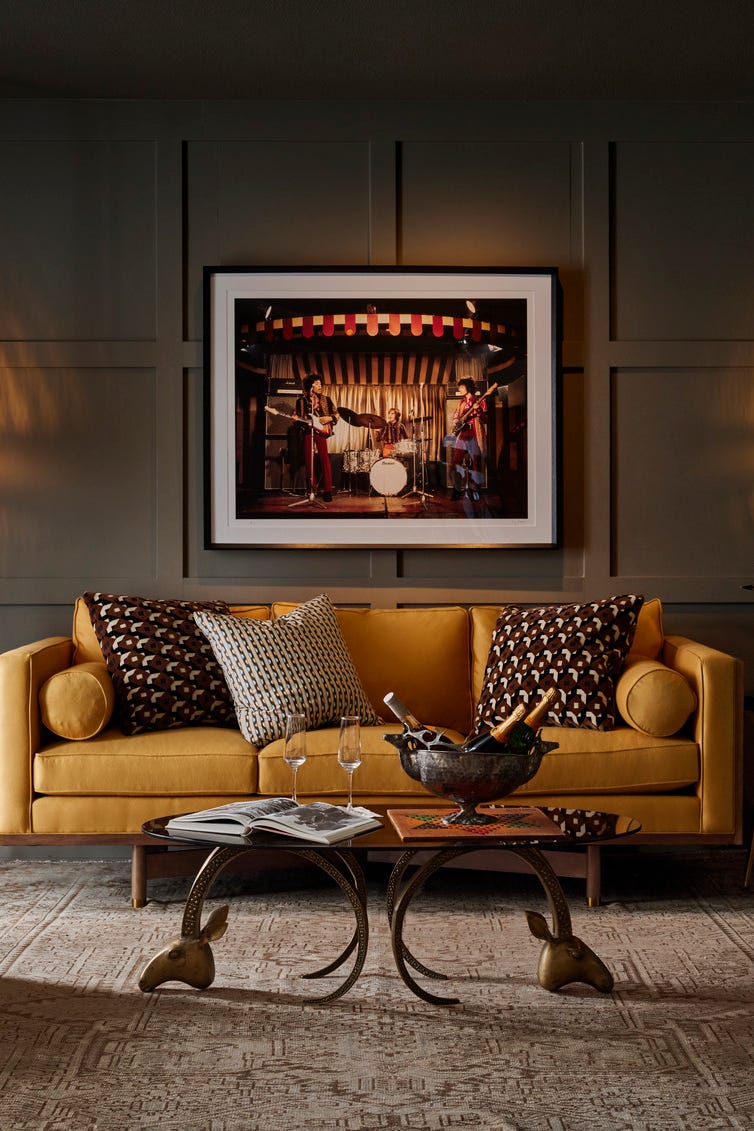
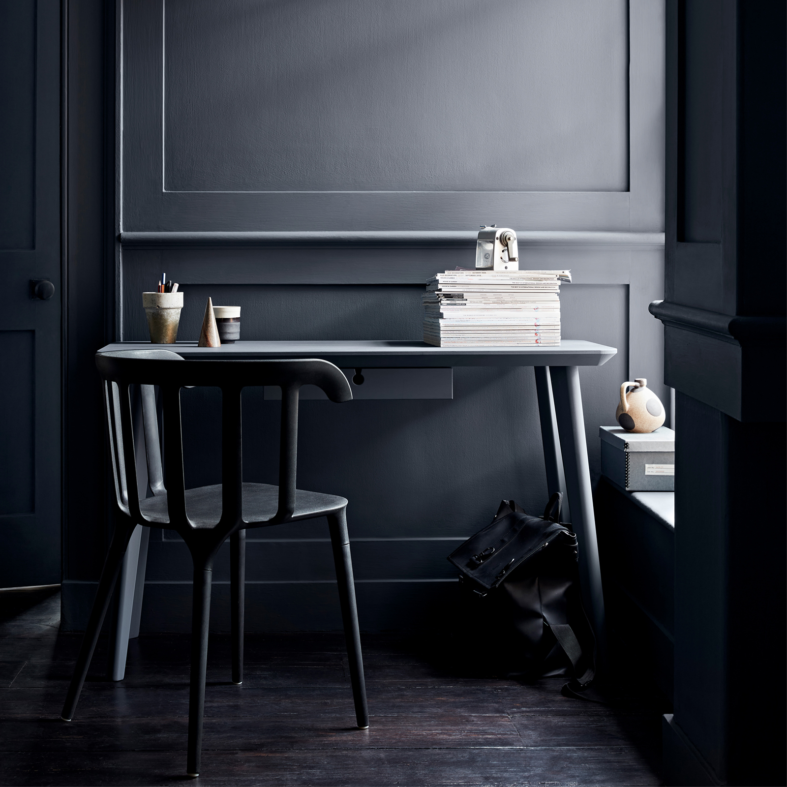
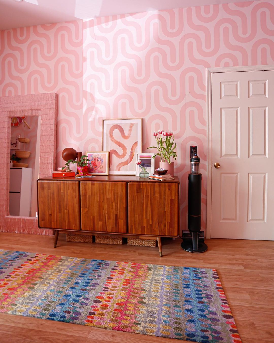
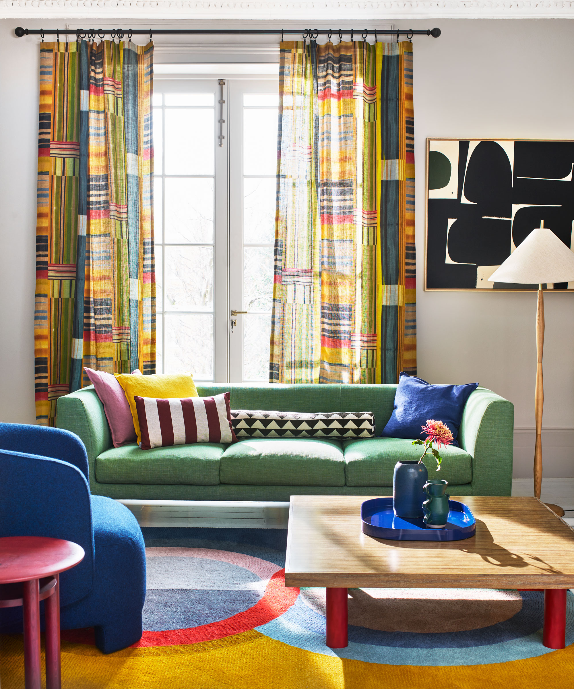
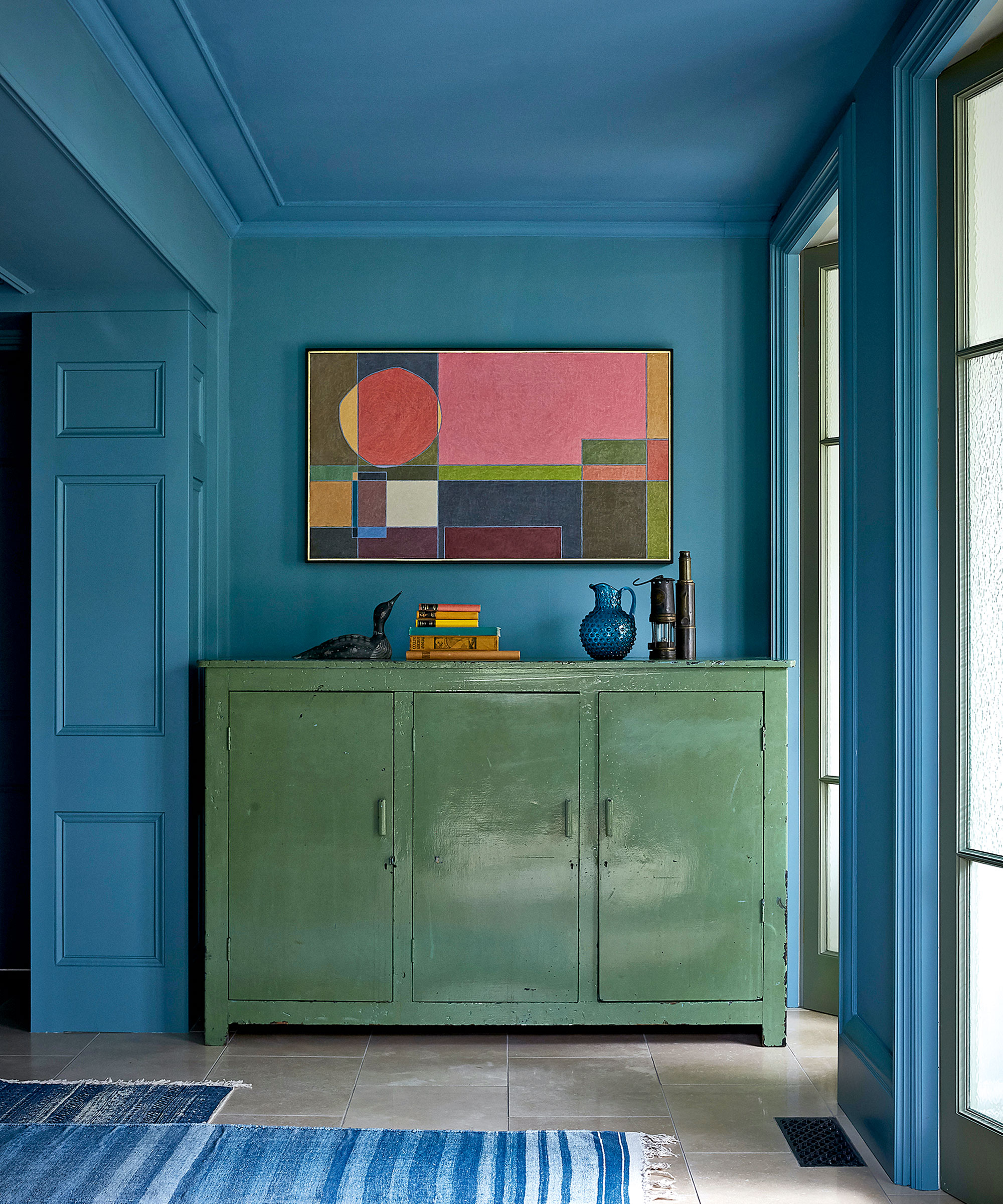
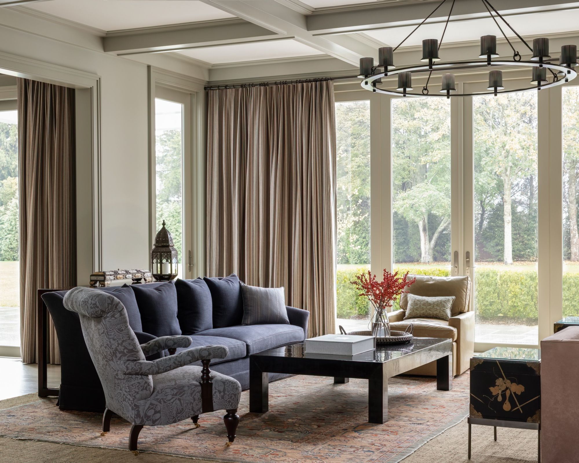
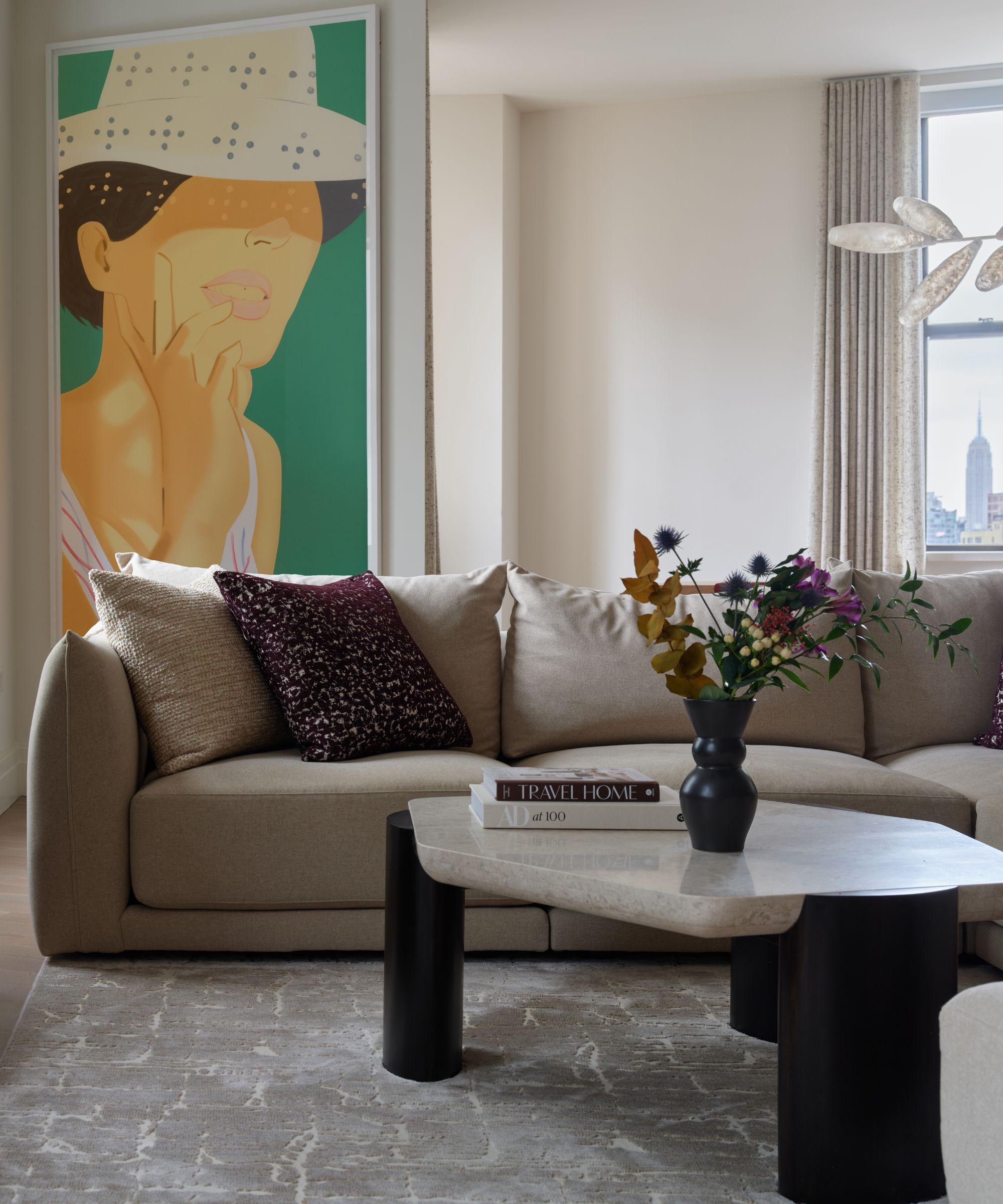
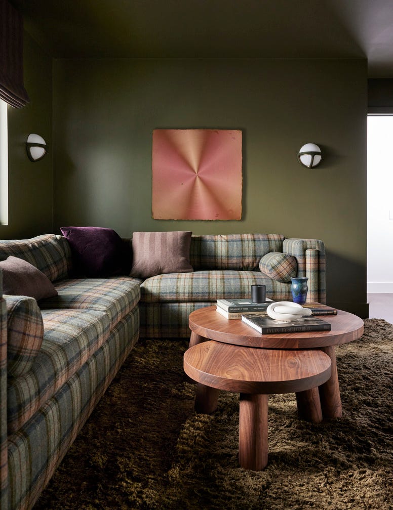
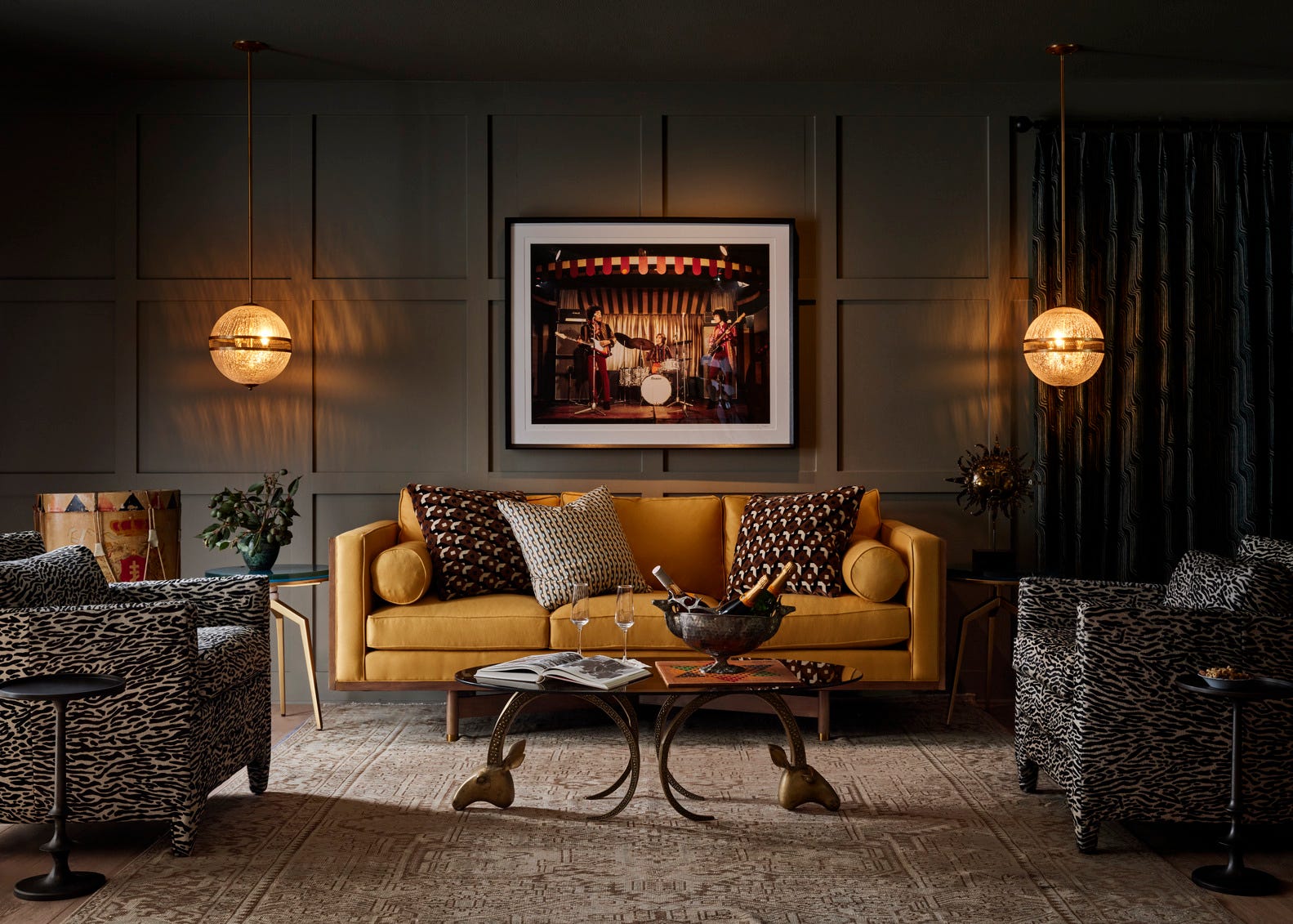
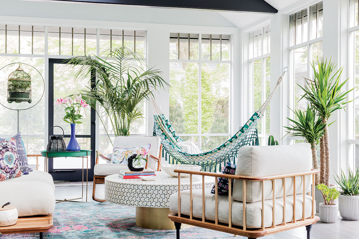
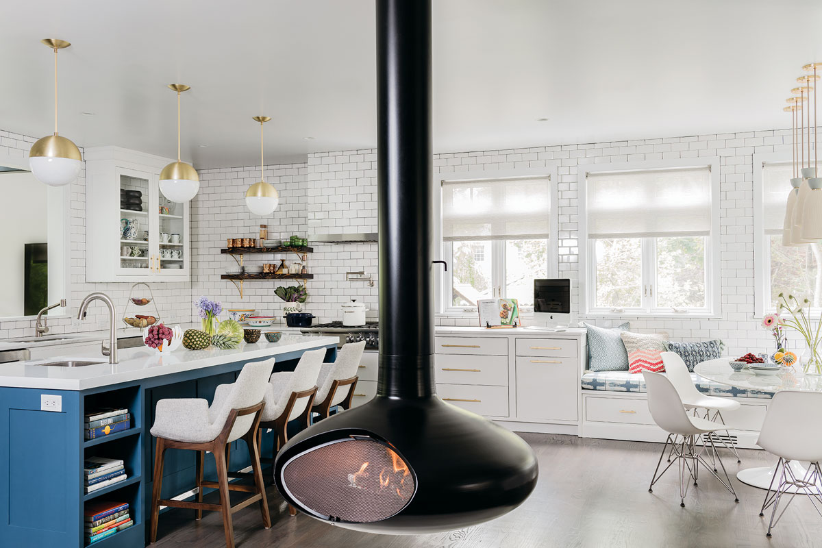
This article explores the profound impact of color on both human mood and perception of space, offering seven practical ways to leverage color for interior design. Color is presented not merely as an aesthetic choice but as a powerful tool to reshape the living environment. The discussion begins with how color influences size perception, noting that lighter colors, such as whites and pastels, effectively create an illusion of spaciousness and airiness, making them ideal for smaller rooms. Conversely, darker hues, like deep blues or blacks, can make a large room feel more intimate and enclosed.
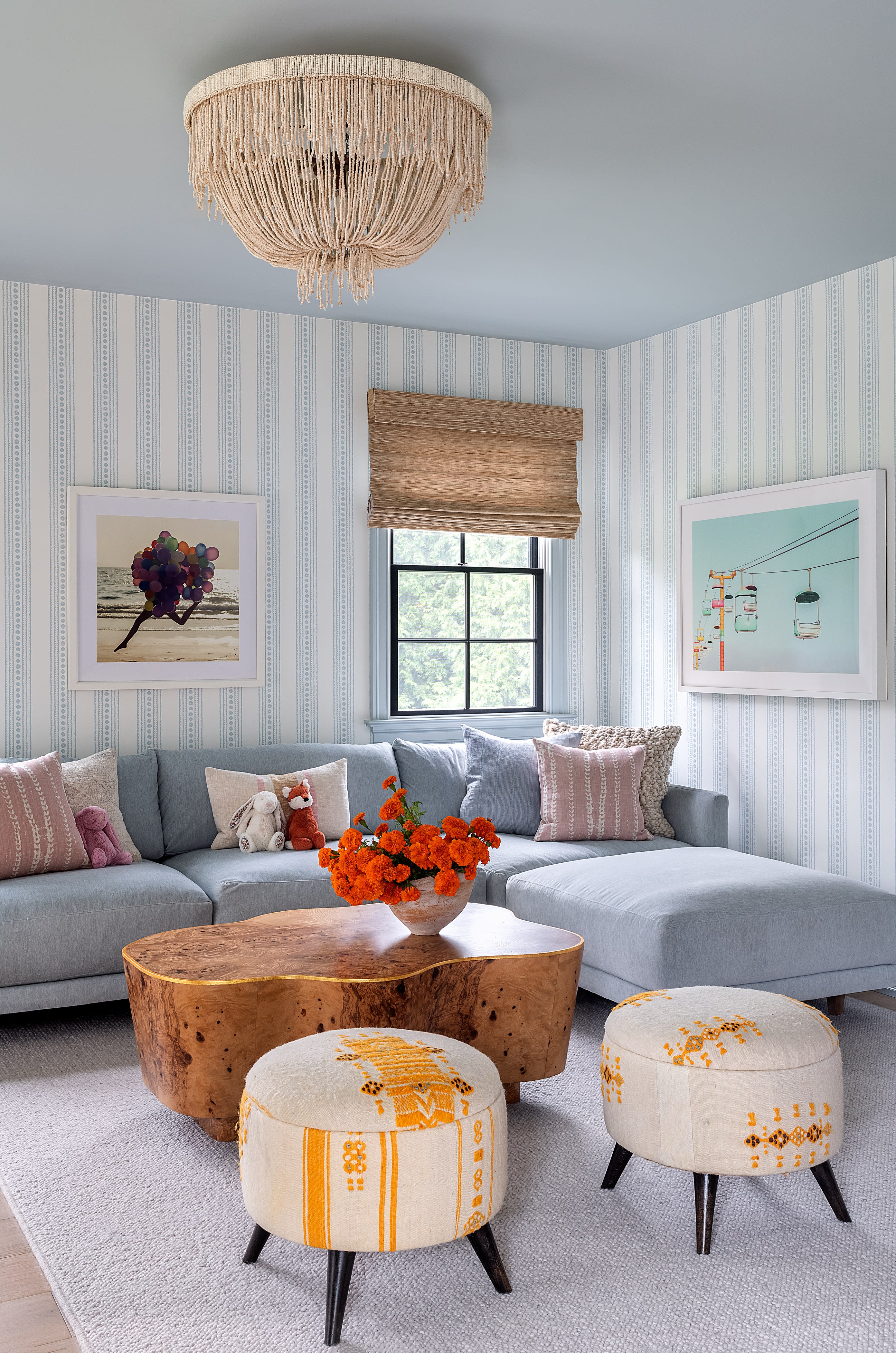
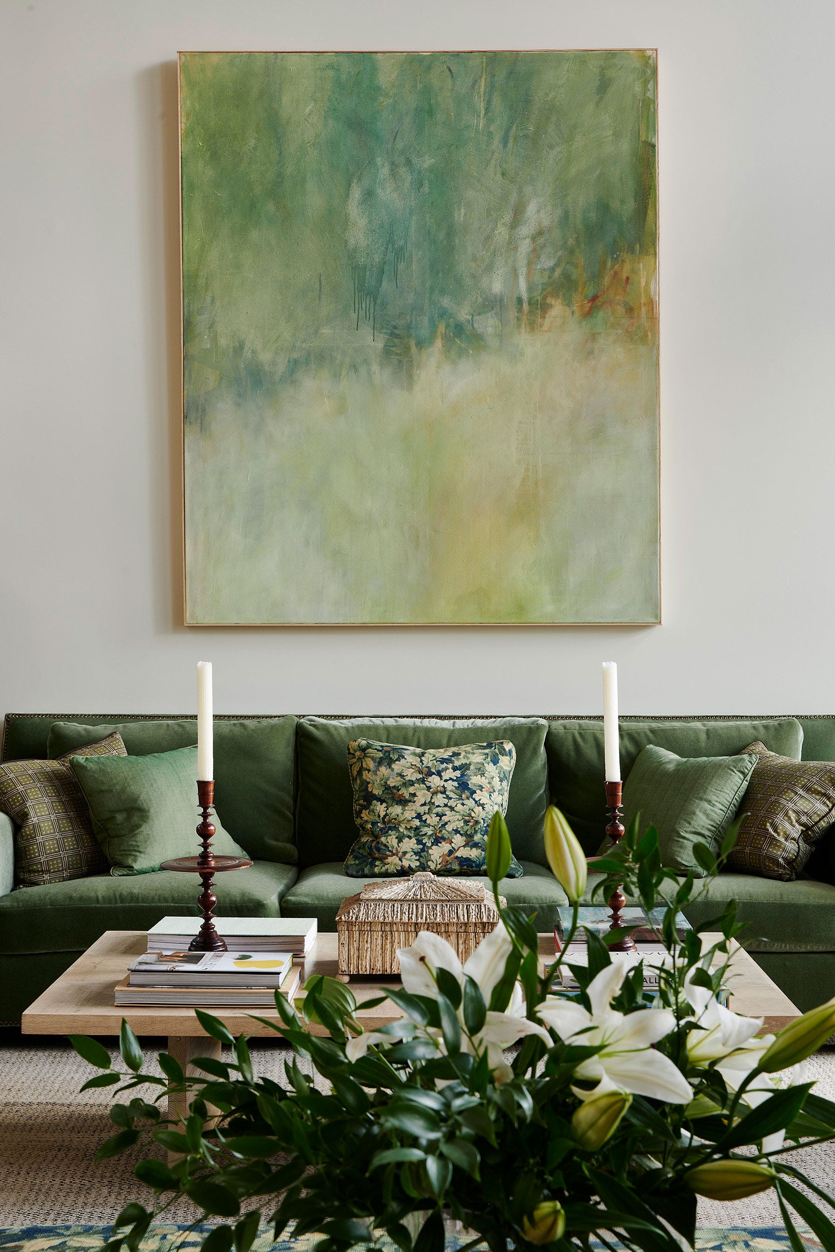
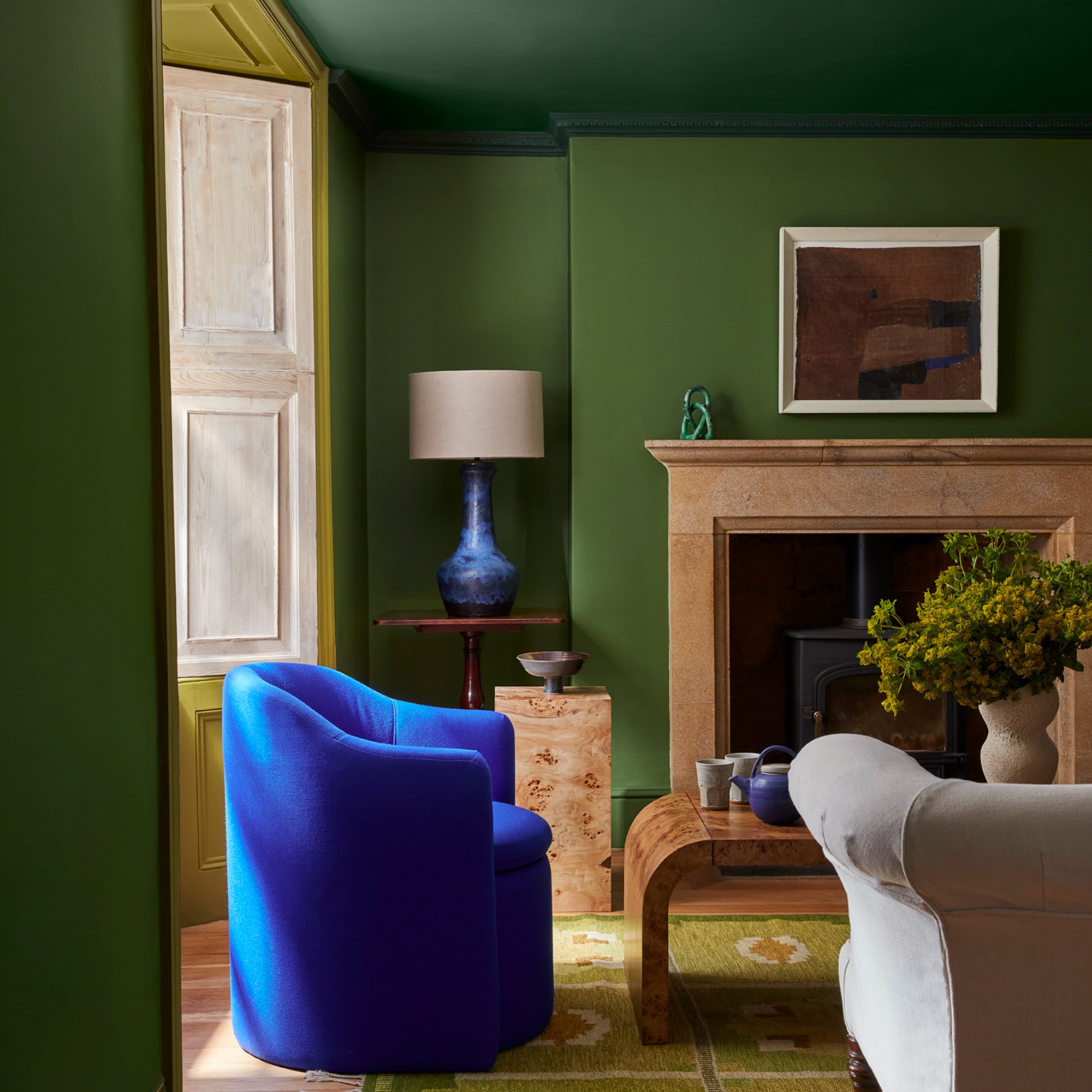
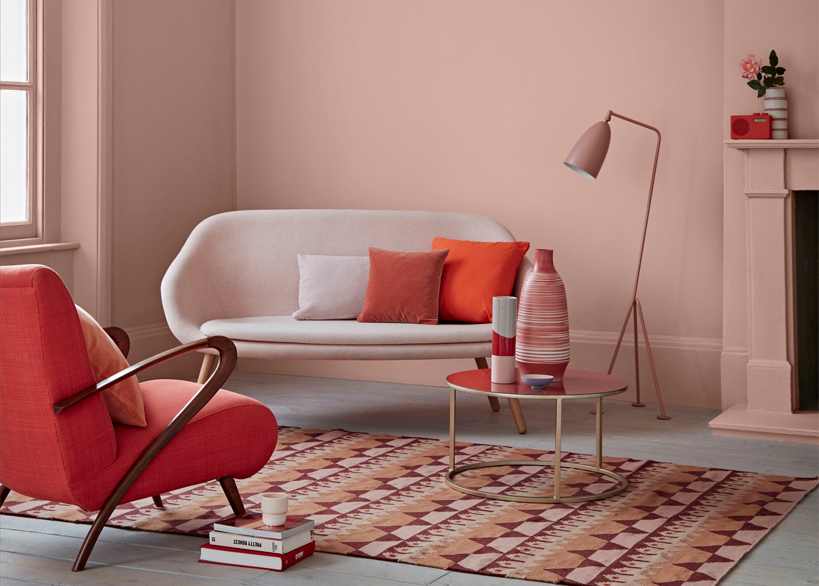
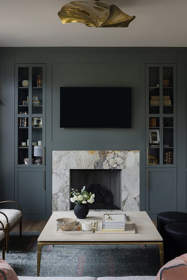
The article then delves into temperature perception, explaining that warm colors evoke a sense of warmth, while cool colors generate a feeling of coolness. This principle can be strategically applied to balance the actual temperature of a space; for instance, a sun-drenched, south-facing room might benefit from cool hues to achieve a balanced feel. Following this, the concept of weight perception is introduced, illustrating that lighter colors tend to recede, making objects appear less substantial, whereas darker colors visually advance, lending objects a heavier appearance.
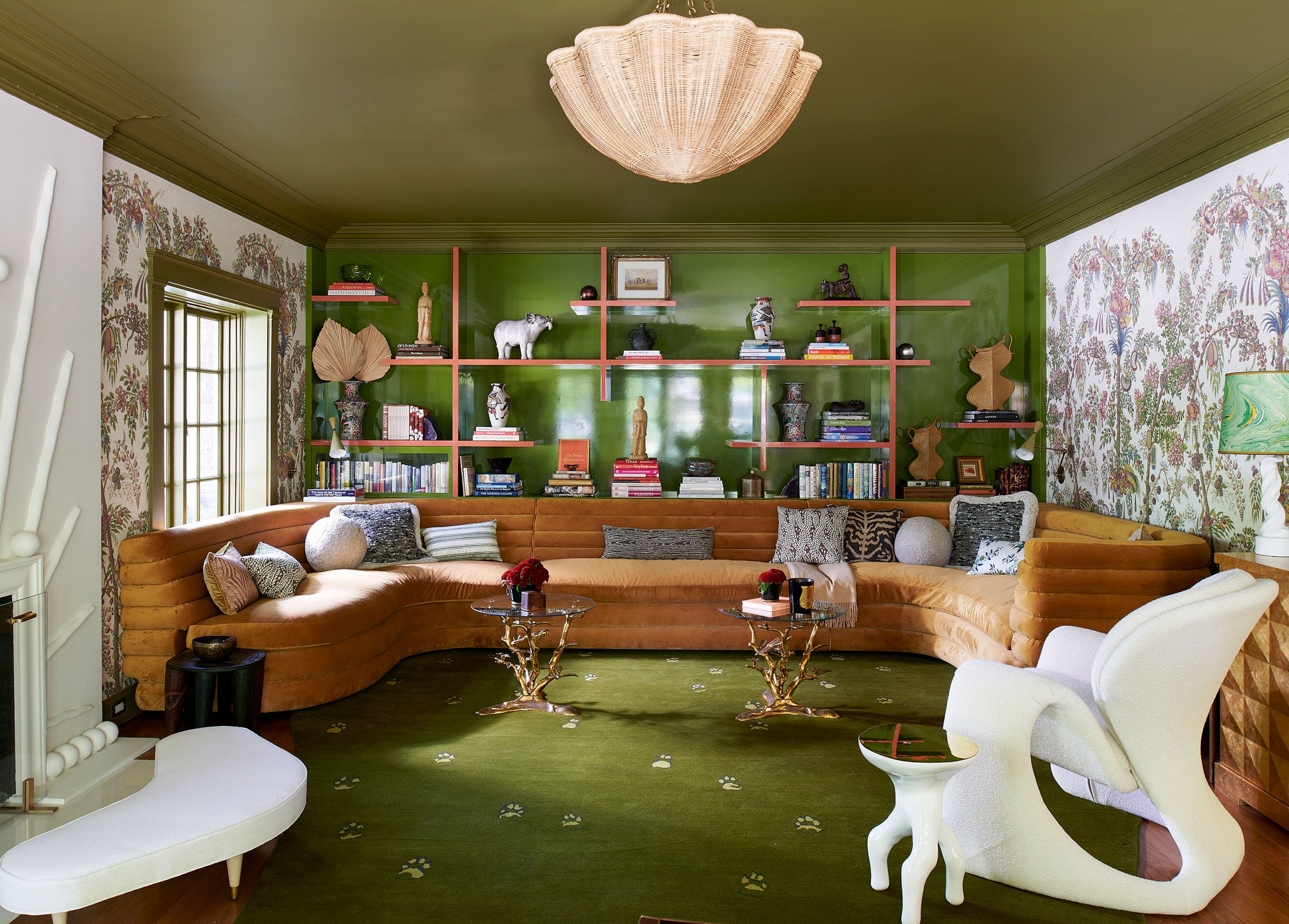
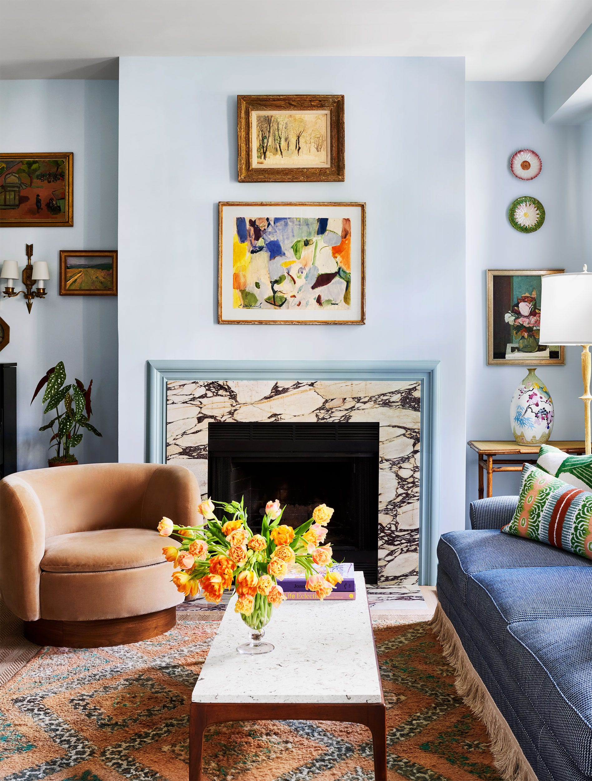
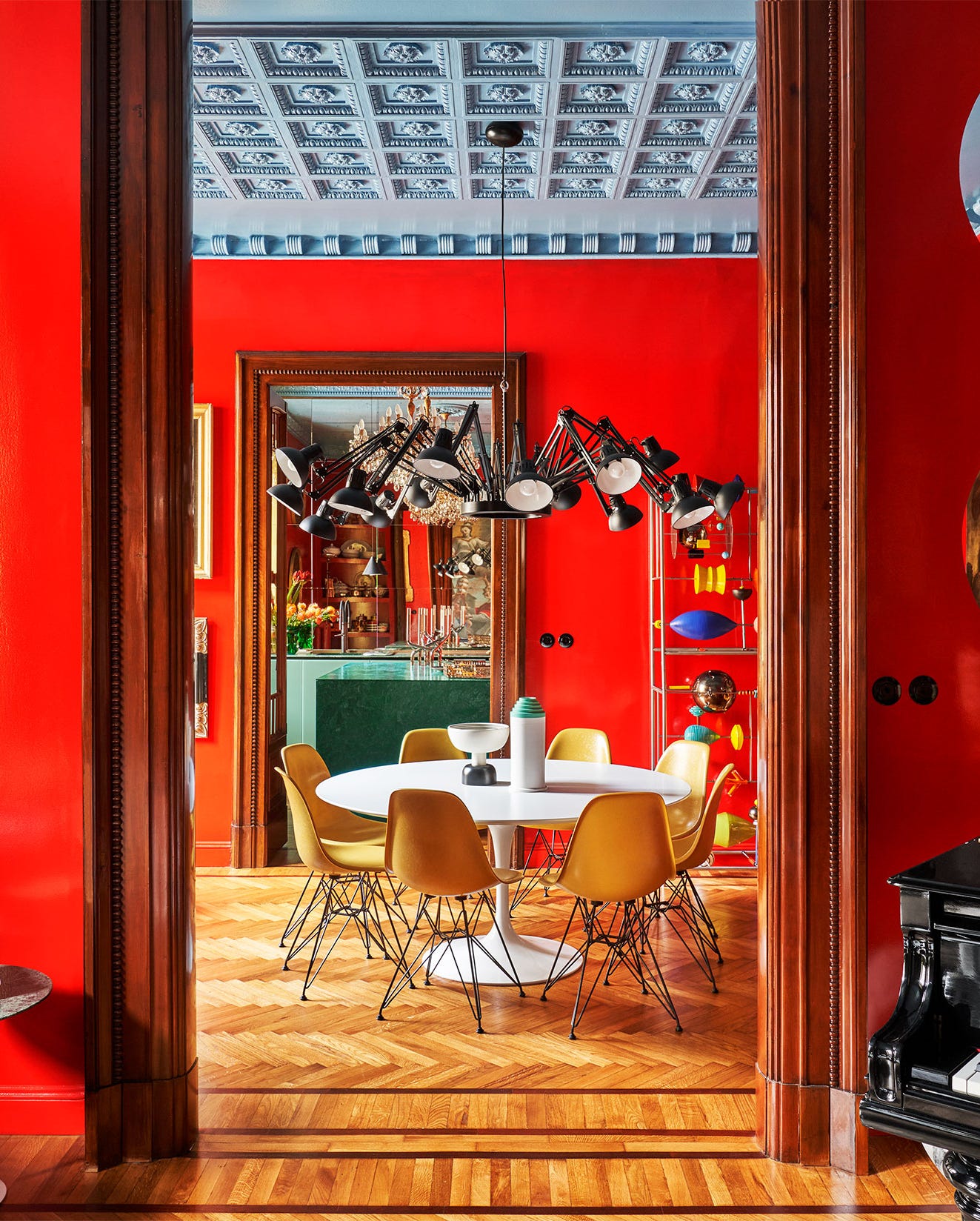
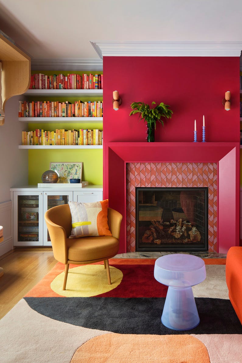
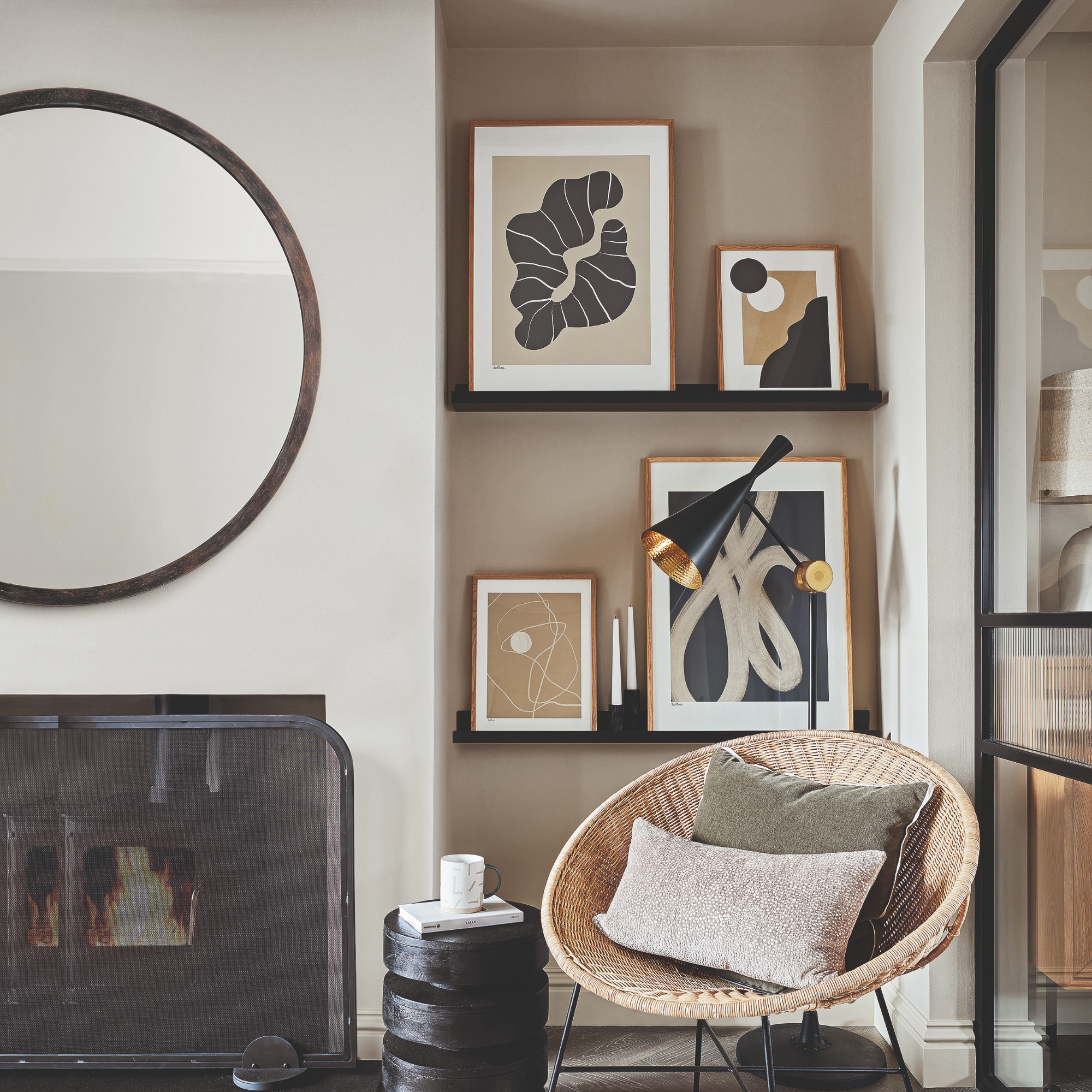
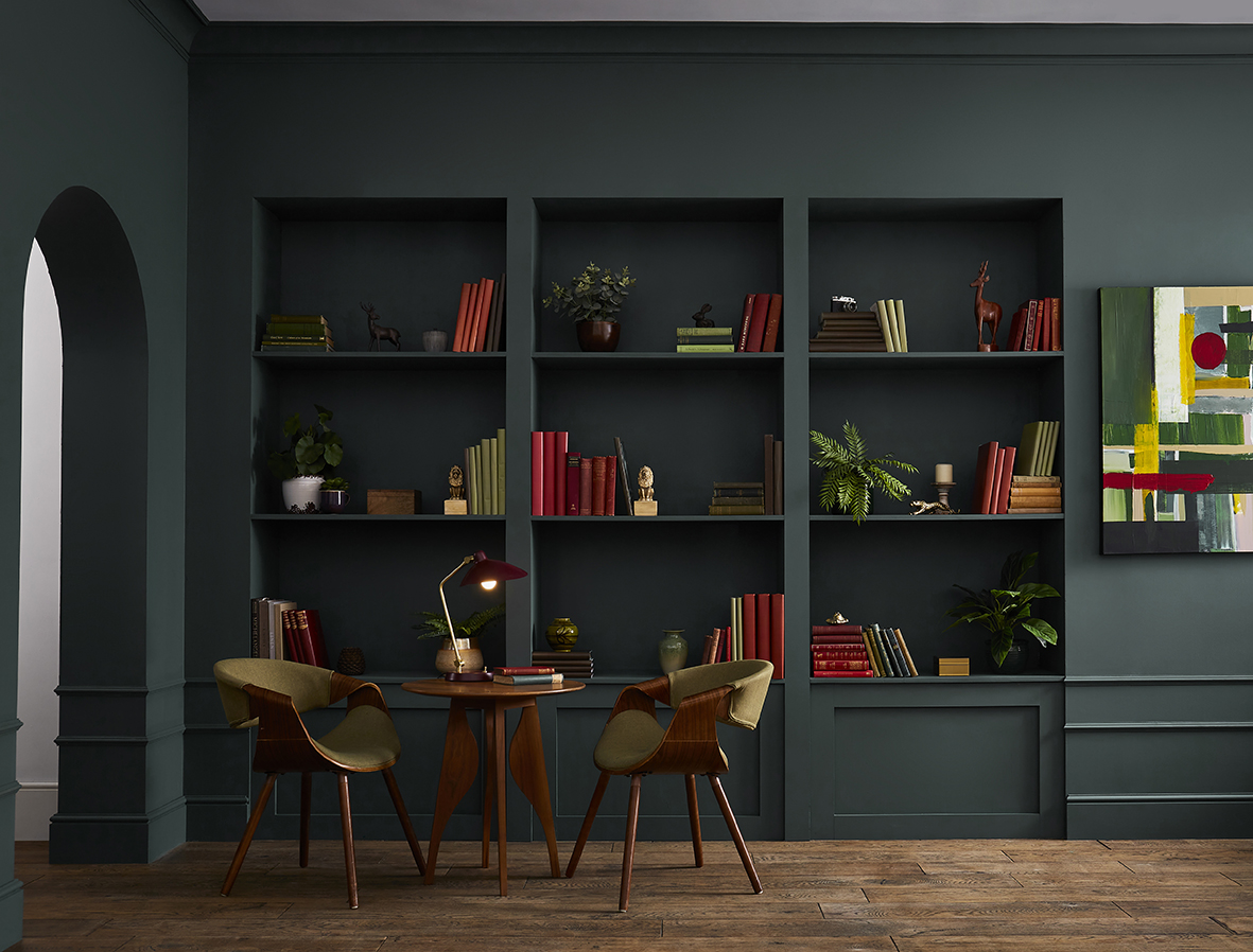
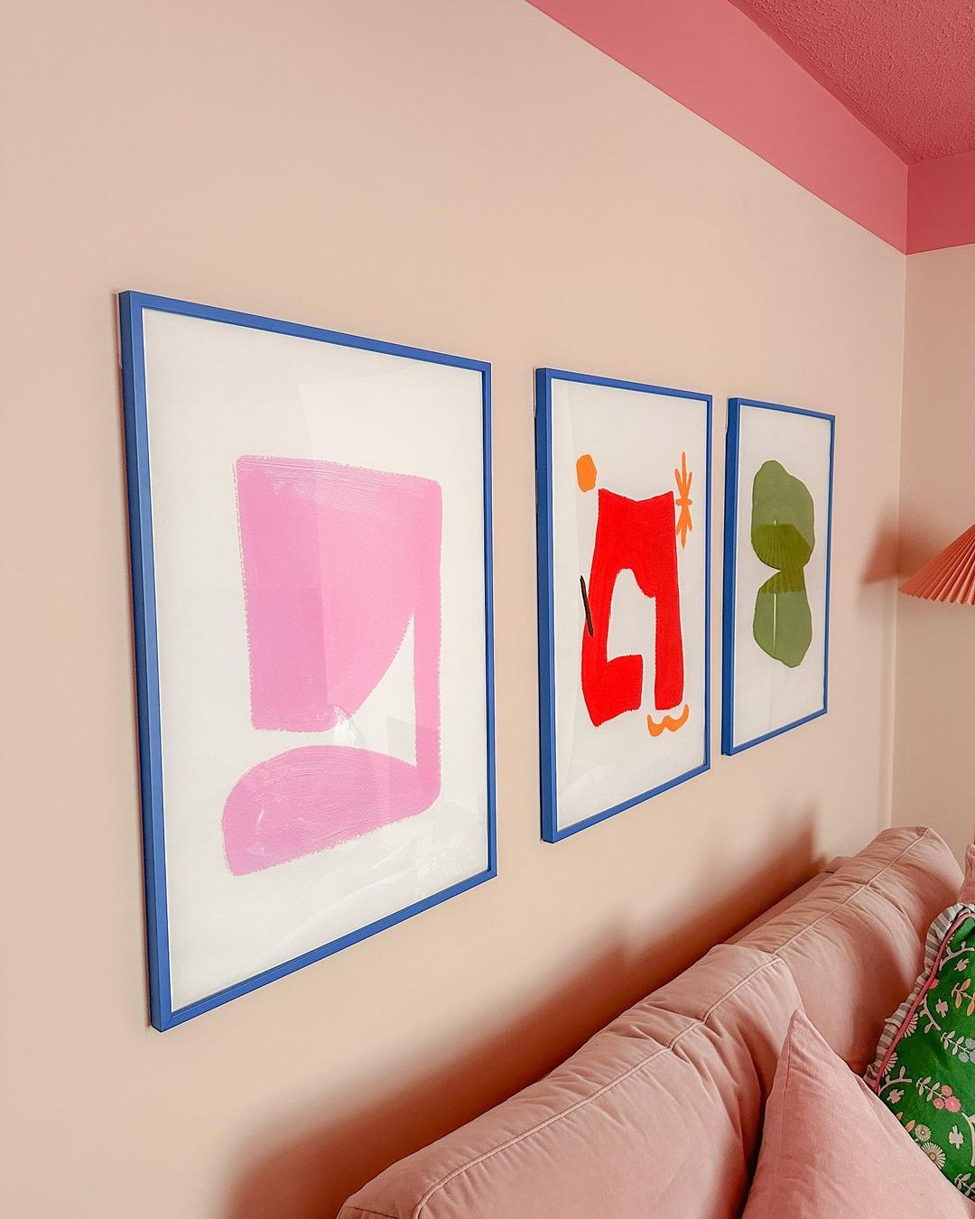
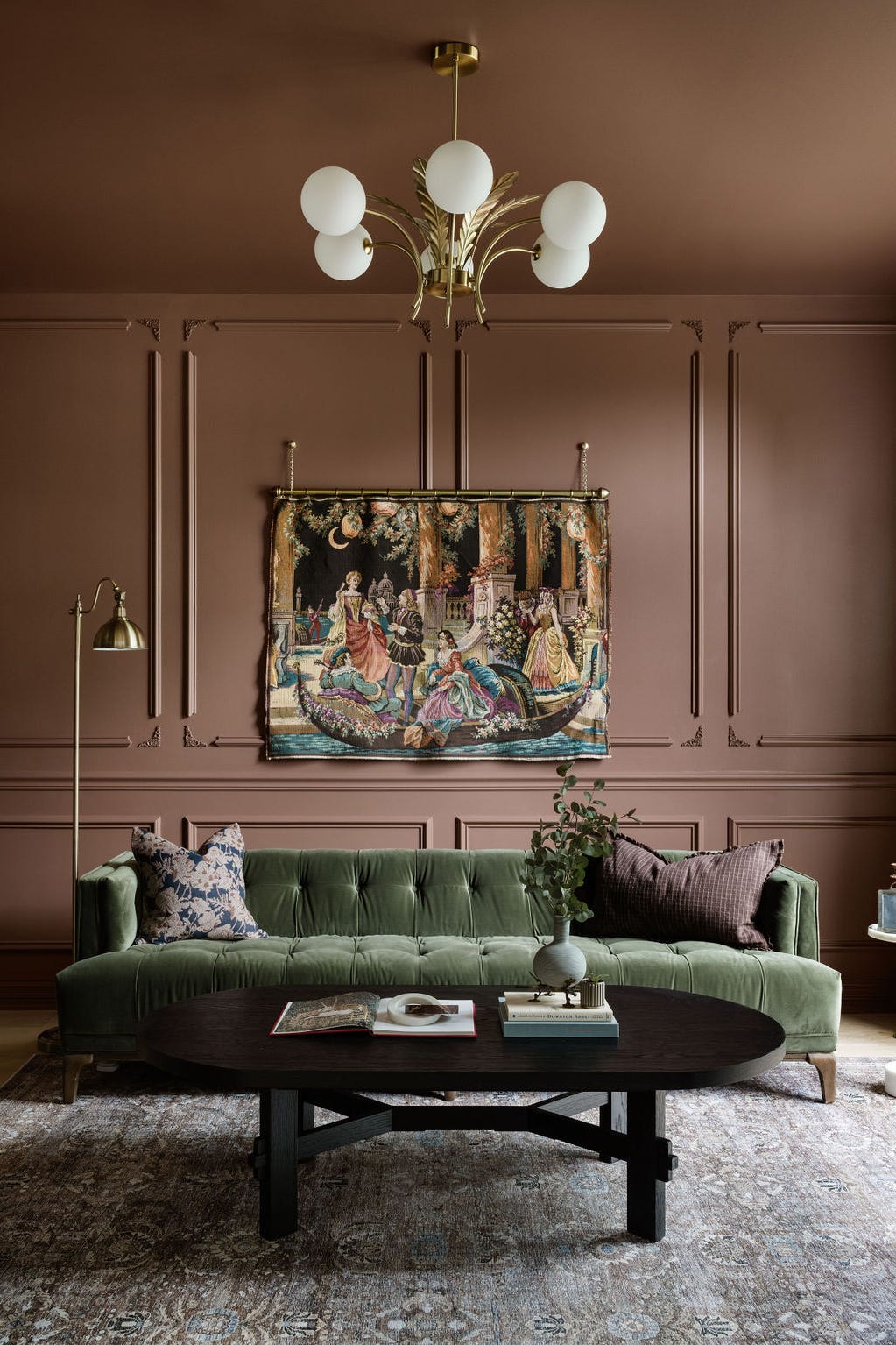
Another key aspect is the influence of color on ceiling height perception. Darker colors applied to ceilings can visually lower them, fostering a cozier and more intimate atmosphere. In contrast, lighter colors on ceilings can make a room feel taller and more expansive. The article also highlights the utility of color in accentuating architectural features. By painting a recessed alcove or a similar element in a contrasting color, designers can effectively draw attention to it, making it stand out as a focal point.
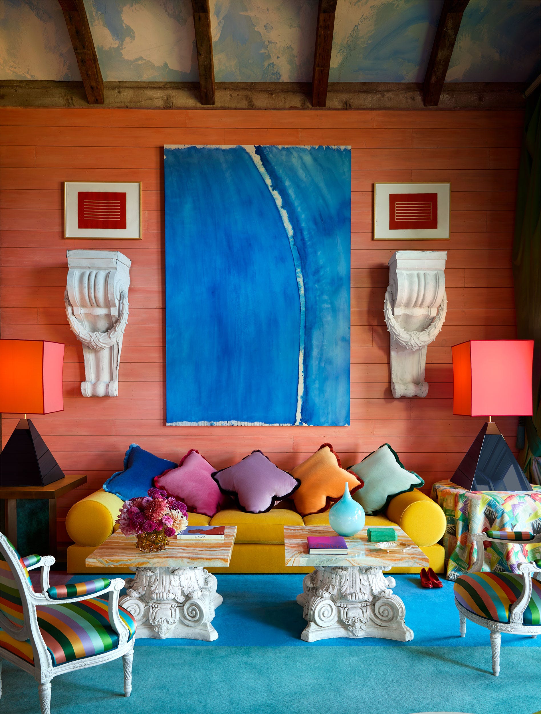
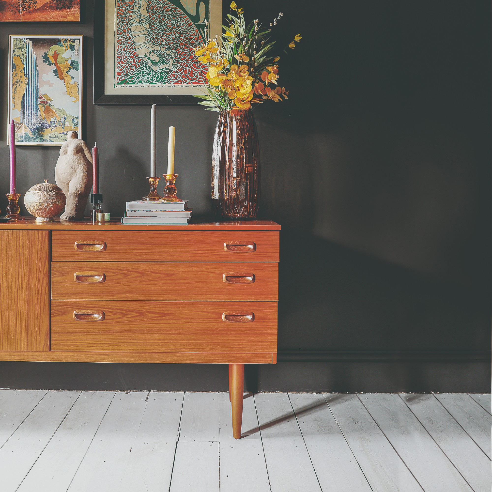
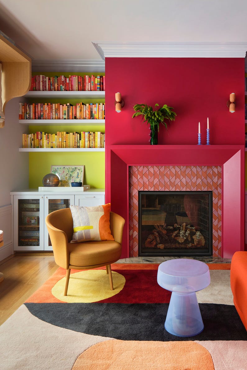
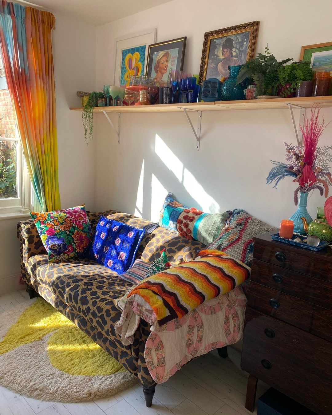
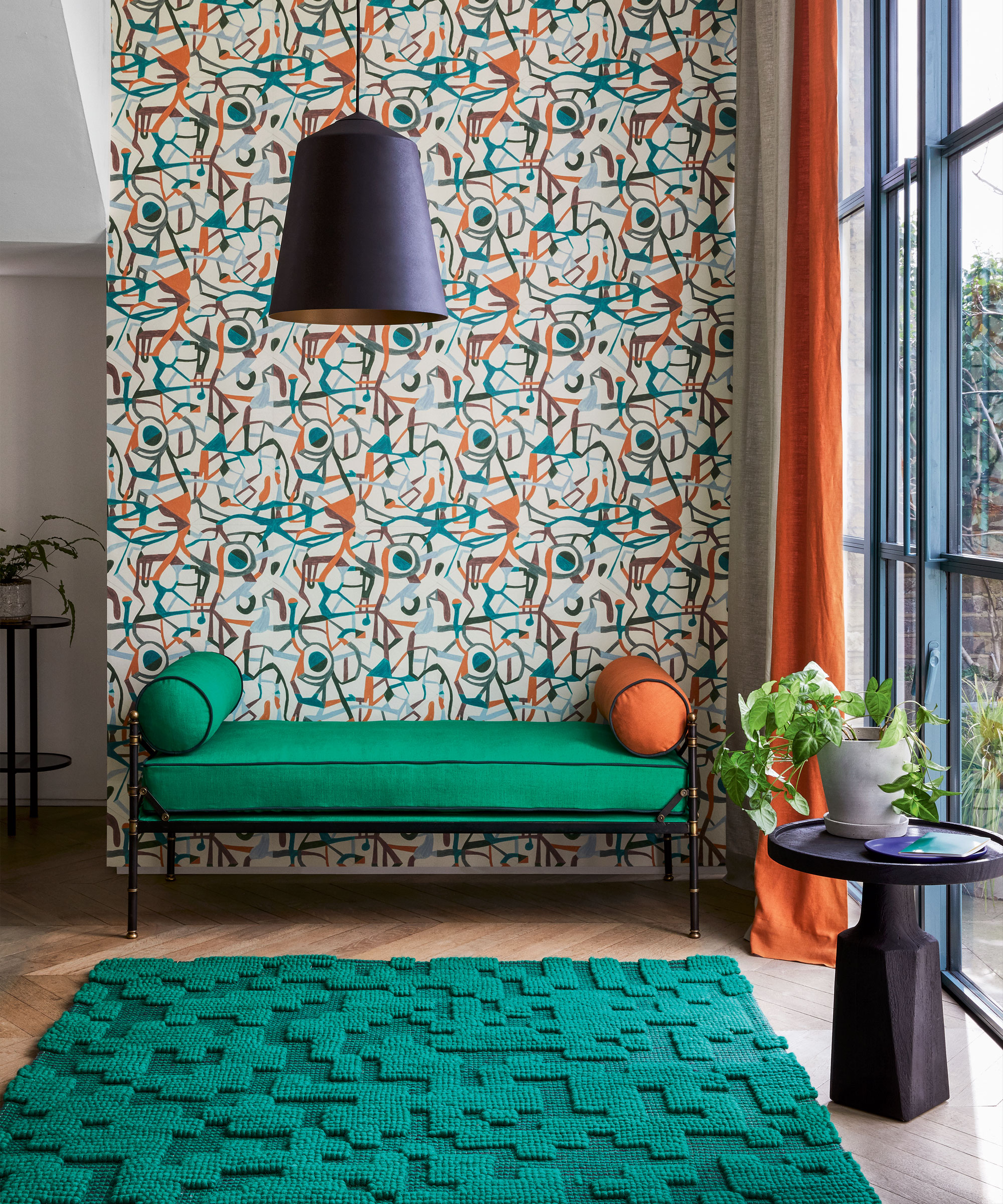
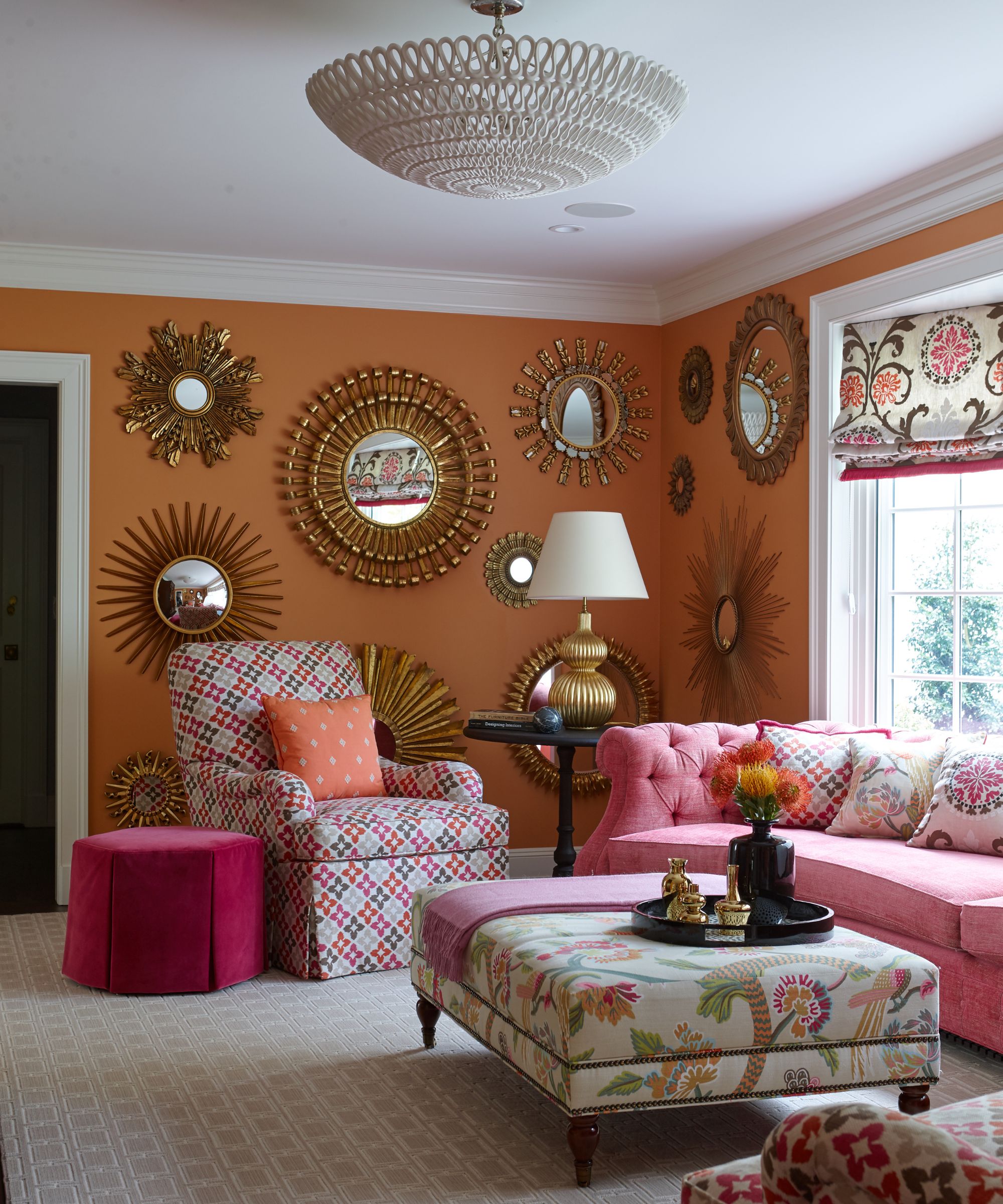
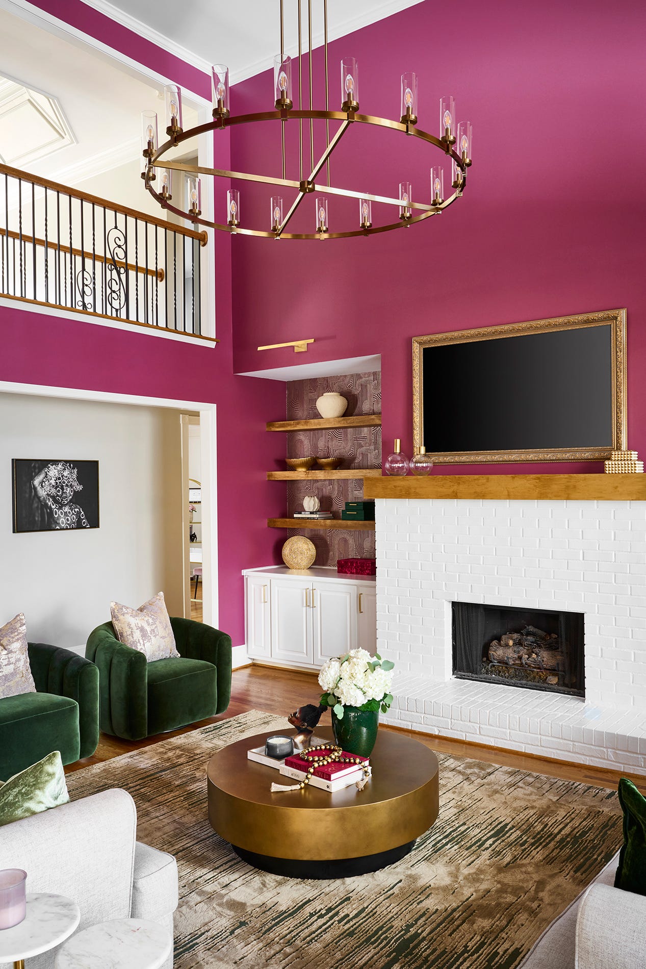
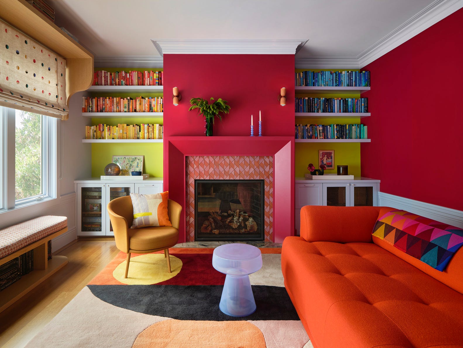
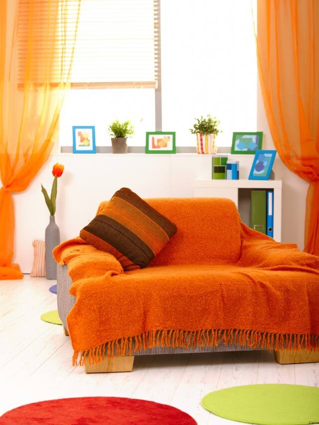
Furthermore, the article touches upon the psychological link between color and appetite. It notes that colors such as red and orange are known to stimulate appetite, explaining their frequent use in restaurant branding and decor. Conversely, cool colors are indicated to have an appetite-suppressing effect. Finally, the piece emphasizes the significant role of personal preference and cultural background in shaping individual color perceptions within an interior space. It suggests that personal experiences, such as growing up near a blue ocean, might lead to a preference for cool blue tones in a home, while a vibrant urban upbringing could incline an individual towards stimulating reds and oranges. These insights collectively underscore the multifaceted influence of color in home design.
#ColorPsychology #LivingRoomDesign #HomeDecoration #InteriorDesign #SpacePerception #MoodEnhancement #ArchitecturalFeatures #ColorPsychology #LivingRoomDesign #HomeDecoration #InteriorDesign #SpacePerception #MoodEnhancement #ArchitecturalFeatures
0 comment in total
 No comments yet
You may also like

Experts reveal the best living room paint colours to transform every space

55 Living Room Color Ideas That Will Take Your Space from Drab to Fab

How to transform your rooms with colour drenching
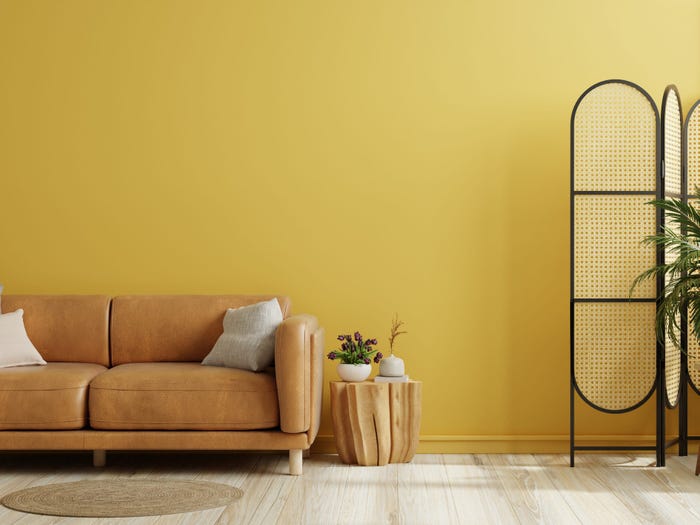
An expert in color psychology shares the 5 shades you should have in your living room
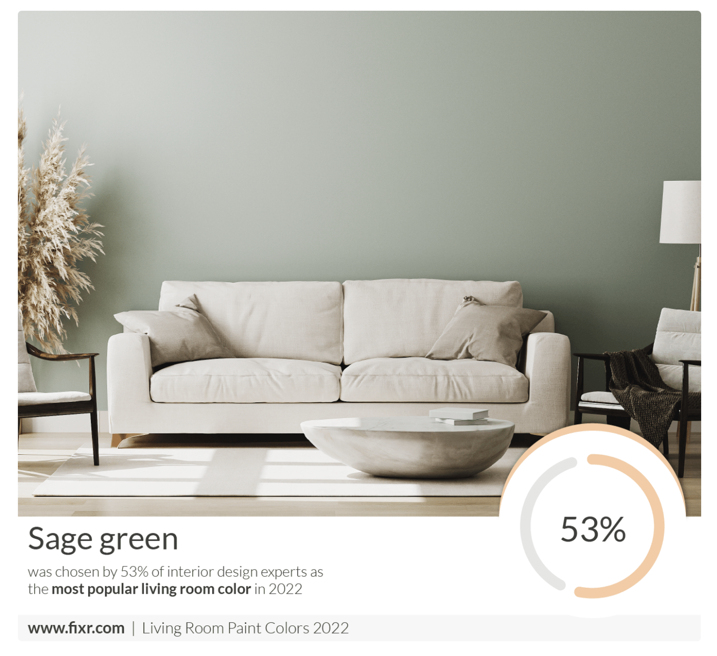
7 Popular Paint Colors for the Living Room
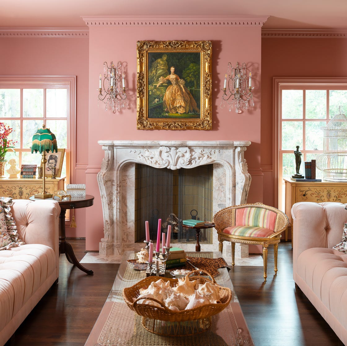
The Year's Best Living Rooms

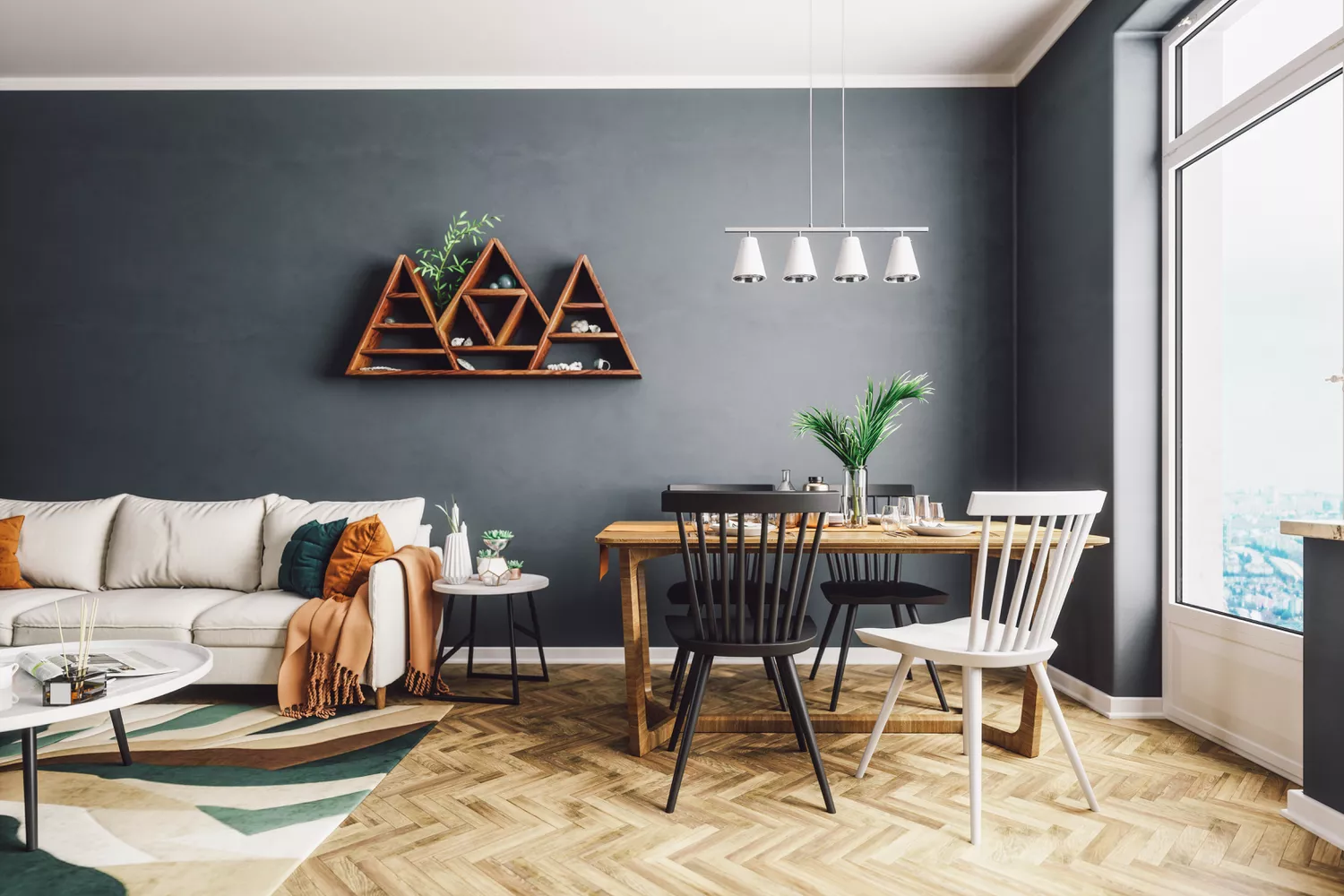
4 Living Room Paint Colors That Are So Outdated, According to Designers

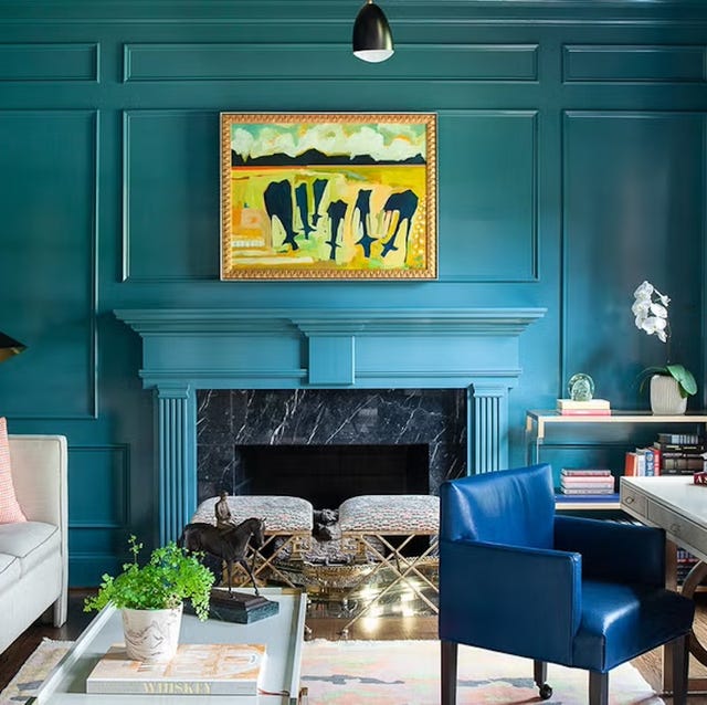
The 60 Most Popular Living Room Paint Colors Right Now

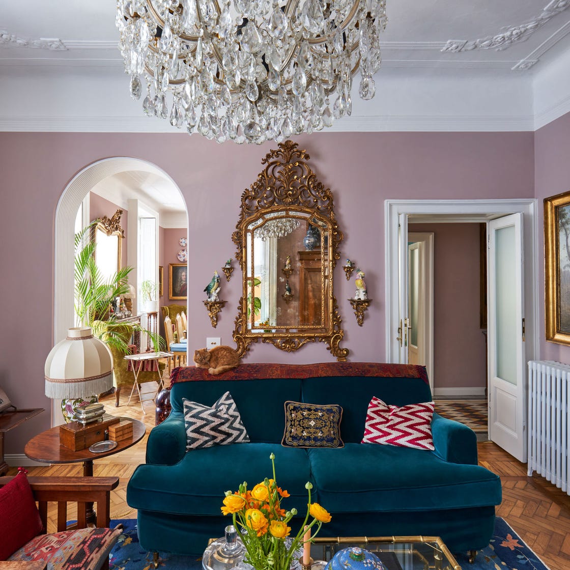
These Living Room Paint Colors Are a Total Mindset Shift
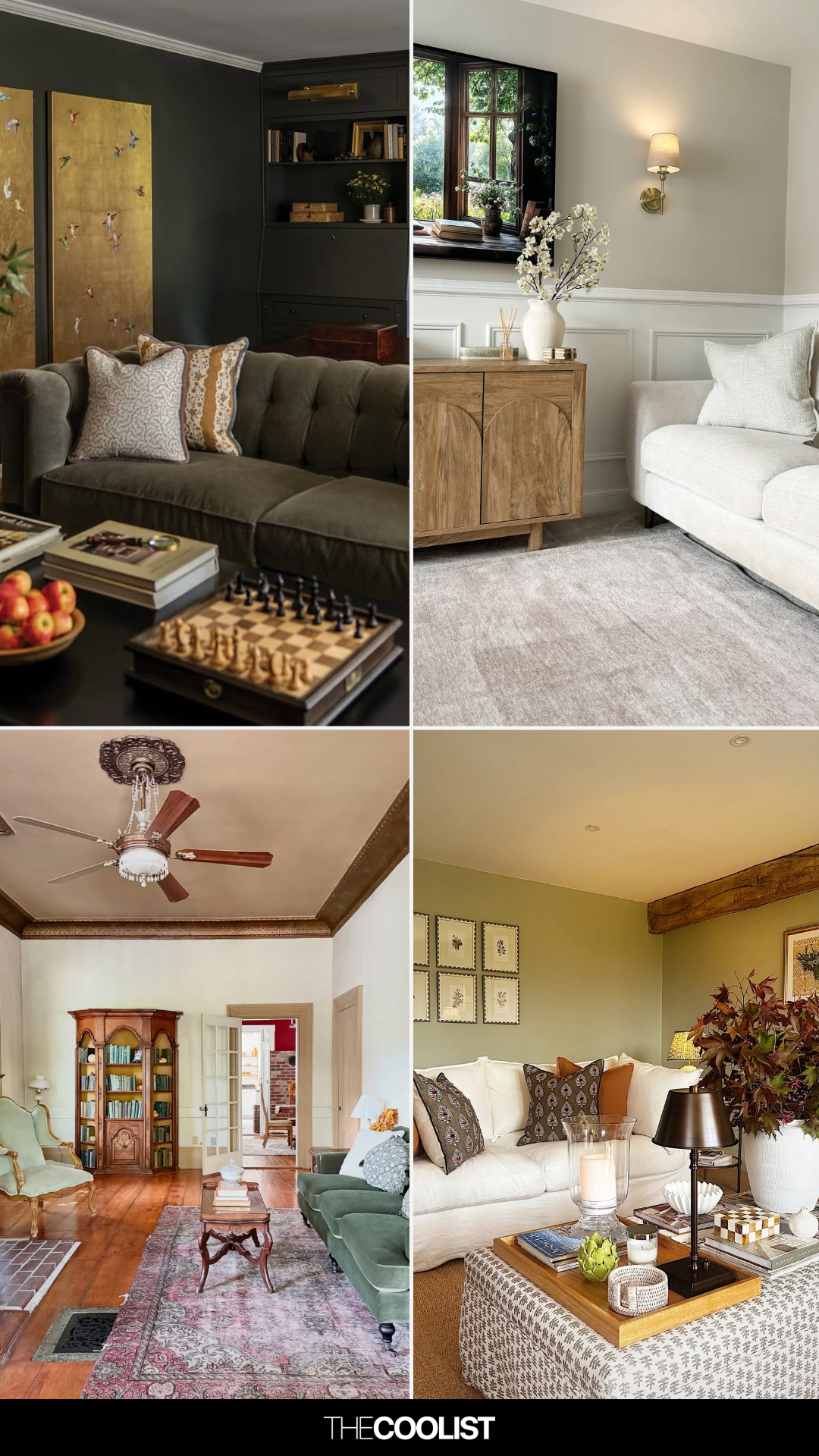
28 Living Room Paint Color Ideas That Make Beige Feel Basic (In the Best Way)

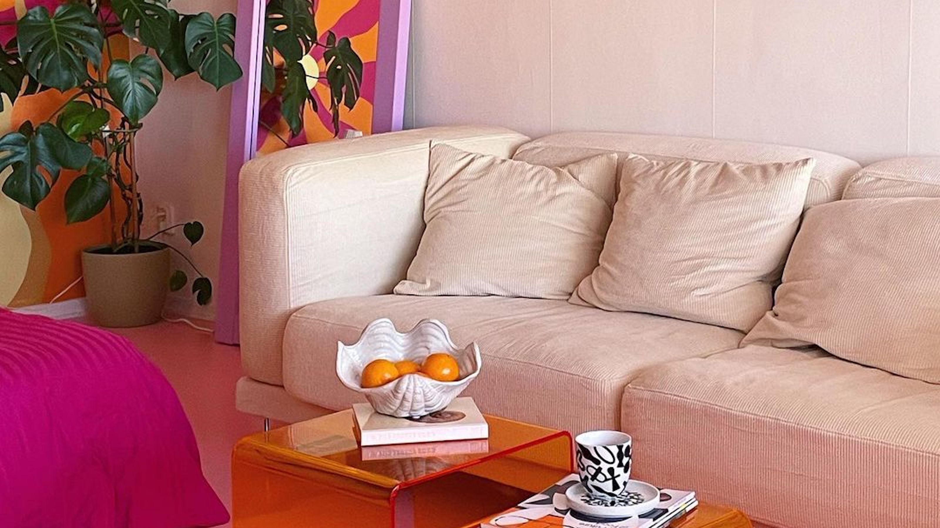
Interior influencers show us how it’s done with these colorful living room ideas

Jewel Tones Are Trending for Living Room Paint Colors, According to Designers
Why This Hue Is Suddenly Dominating Every Designer's Wishlist—Plus, How to Style It

Living room paint ideas – 27 easy ways to bring your lounge to life with stylish and creative colours and techniques
Colorful room ideas – 15 vibrant spaces with daring decor

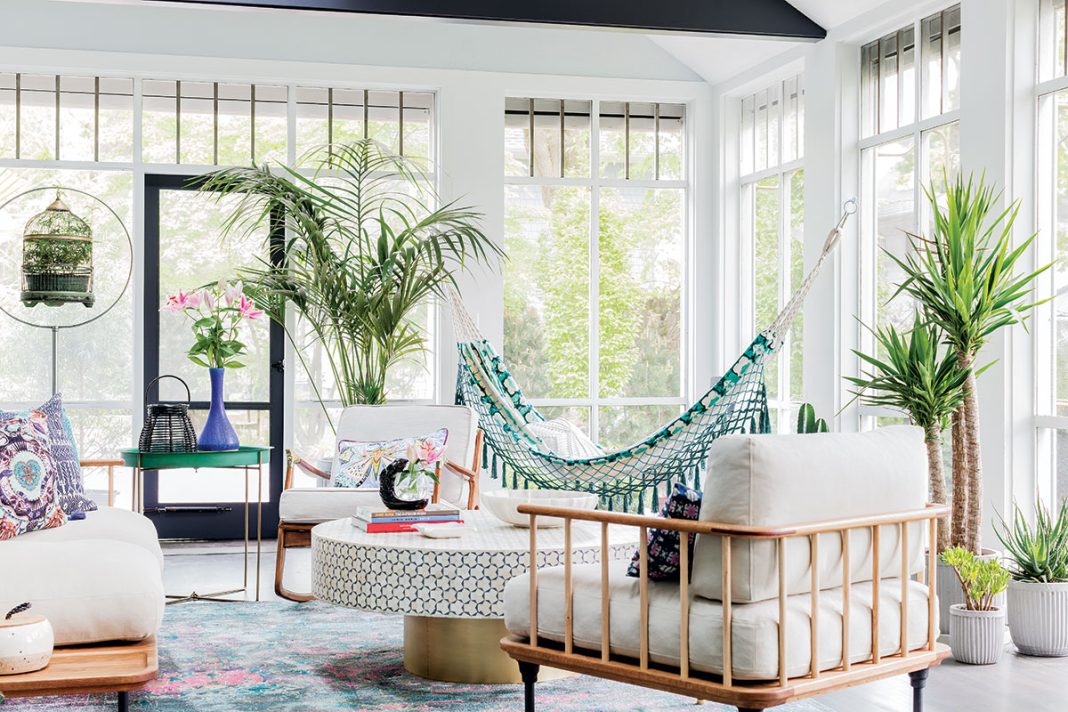
Creative, Captivating Use of Color Helps This Home Redesign Shine

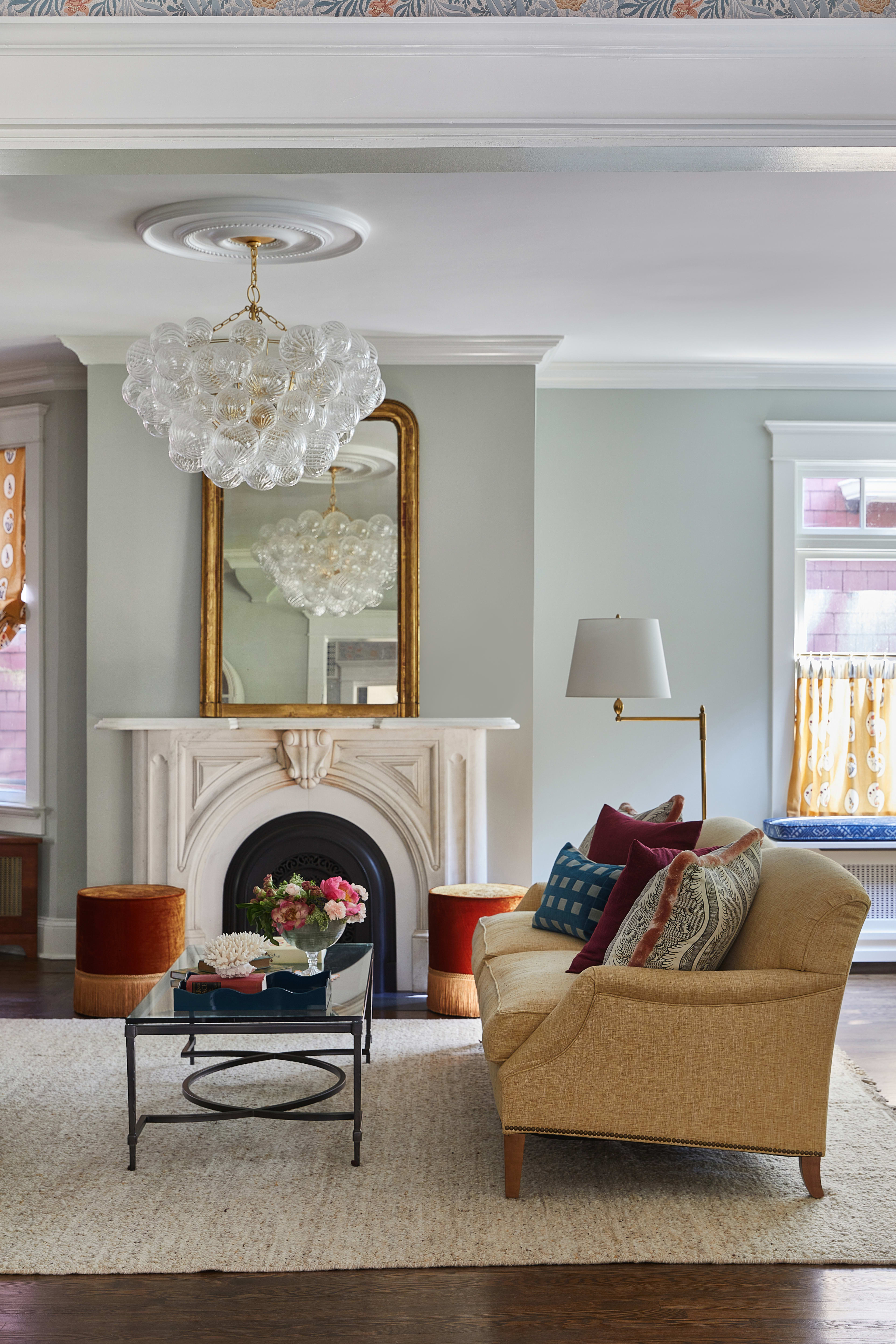
18 Living Room Color Ideas That are Oh-So Inviting
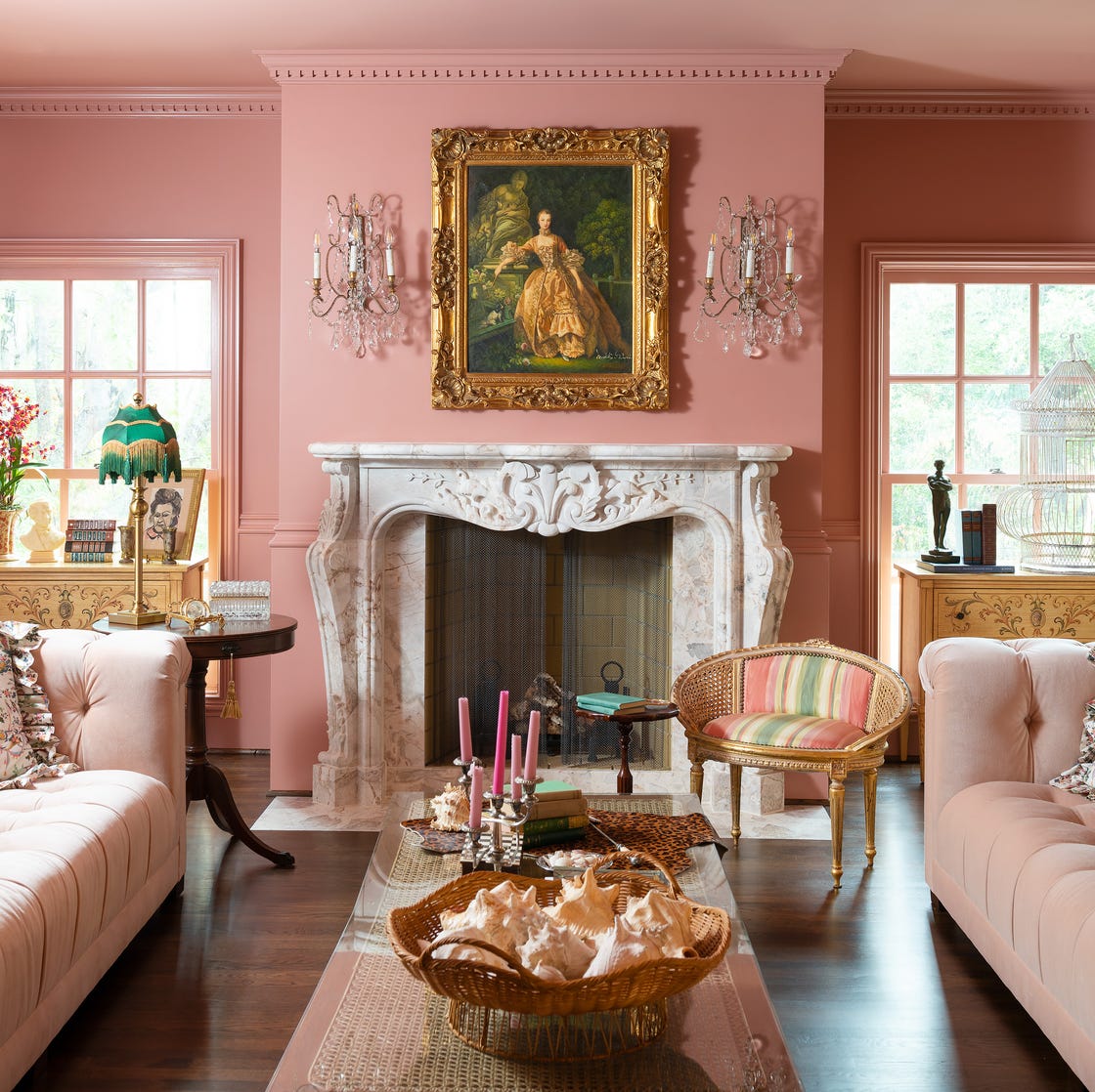
Designer-Approved Living Room Colors That'll Make You Feel Happier
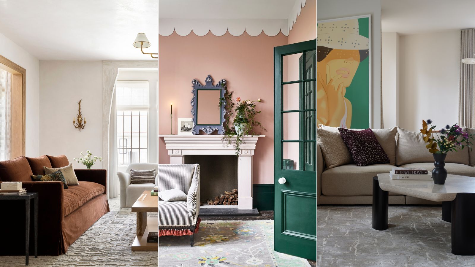
These are interior designers' favorite color combinations for living rooms – from neutral and calming to bold and playful
7 Paint Colors That Instantly Make Small Living Rooms Feel Bigger, Designers Say