1/21
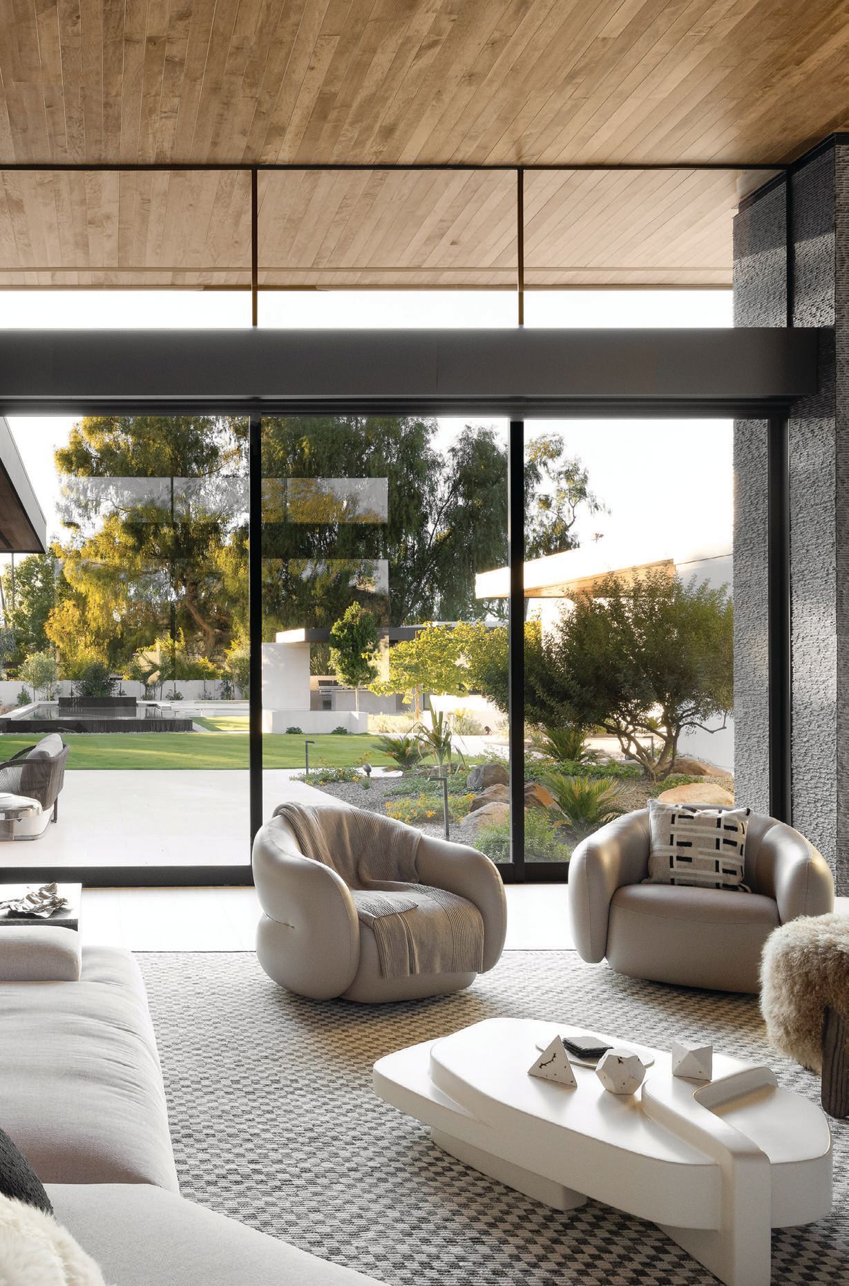
The Year's Best Living Rooms
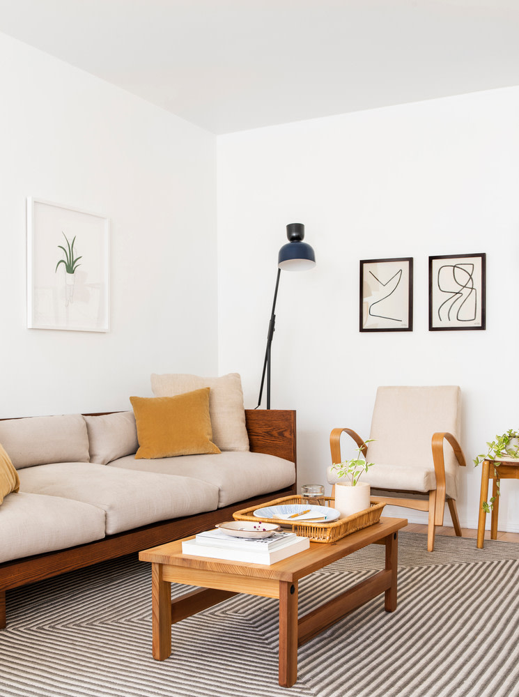
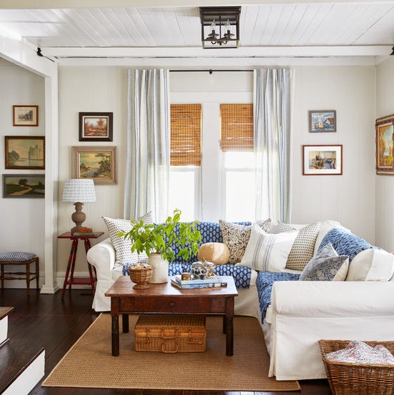
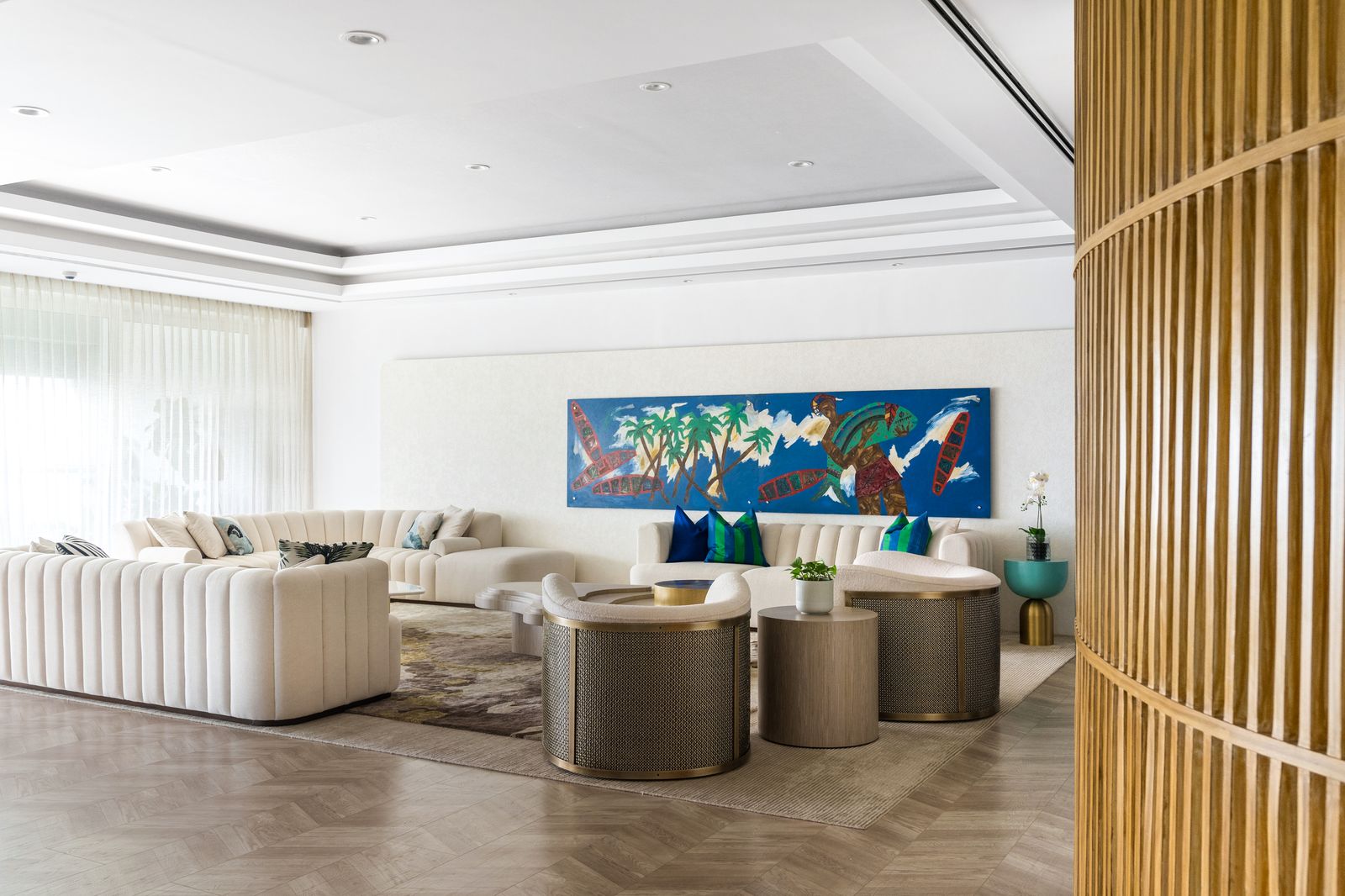
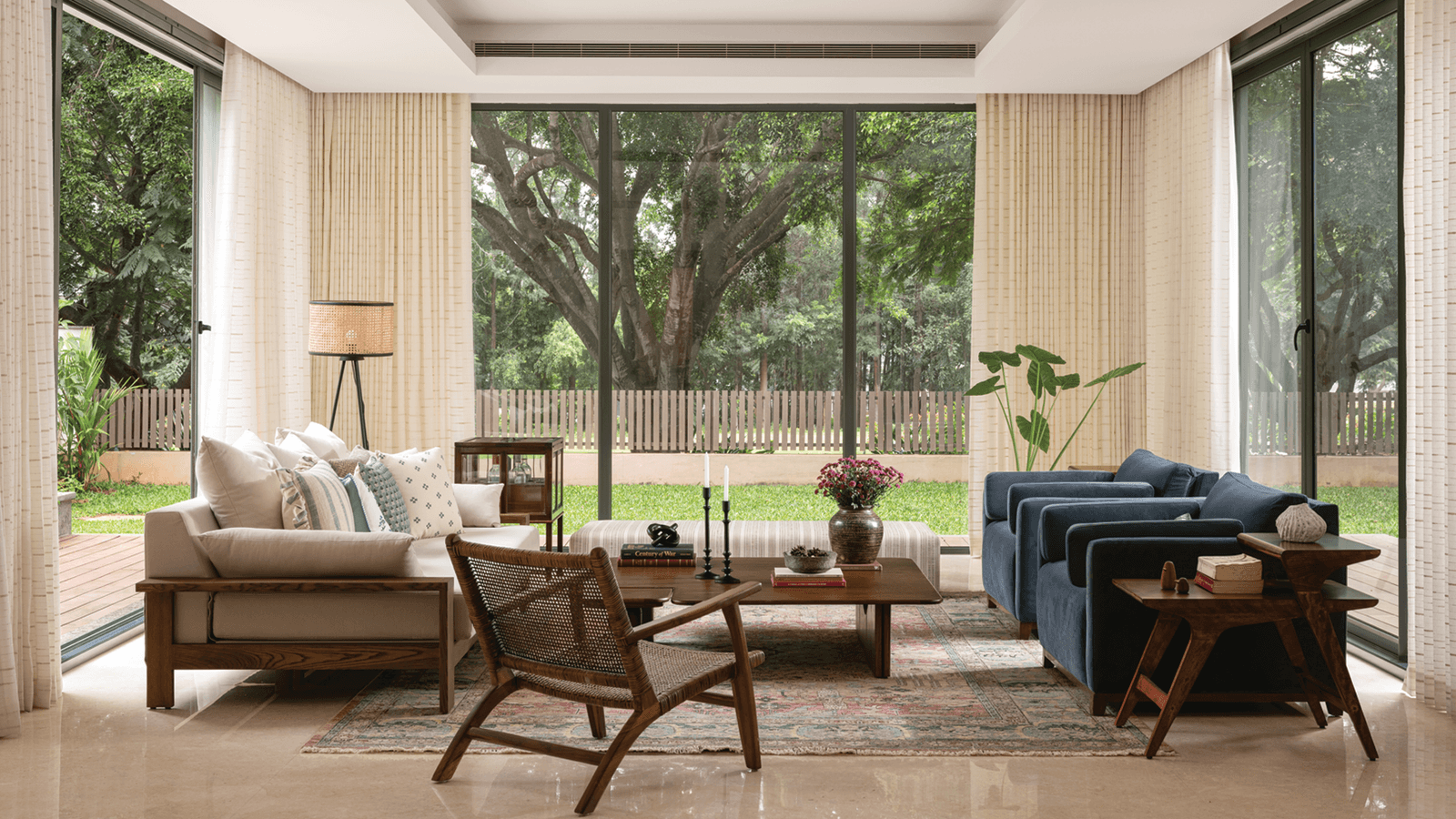
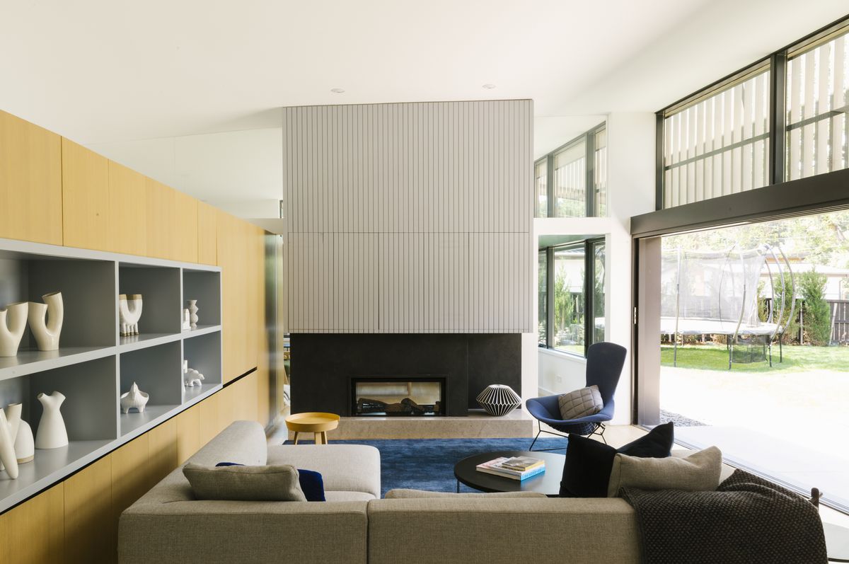
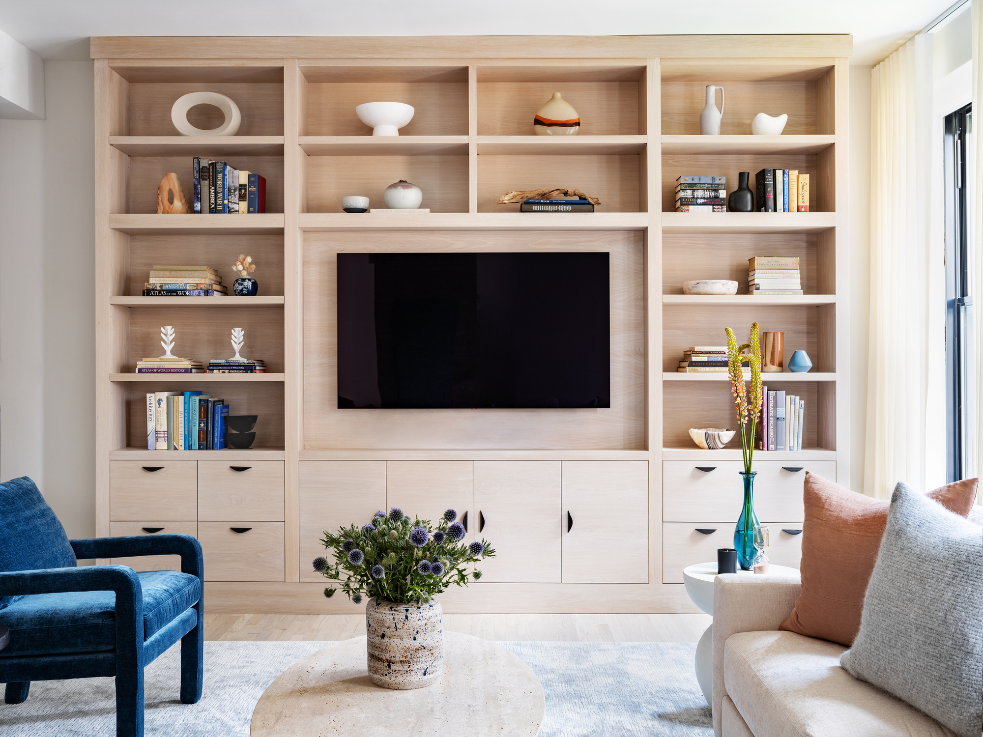
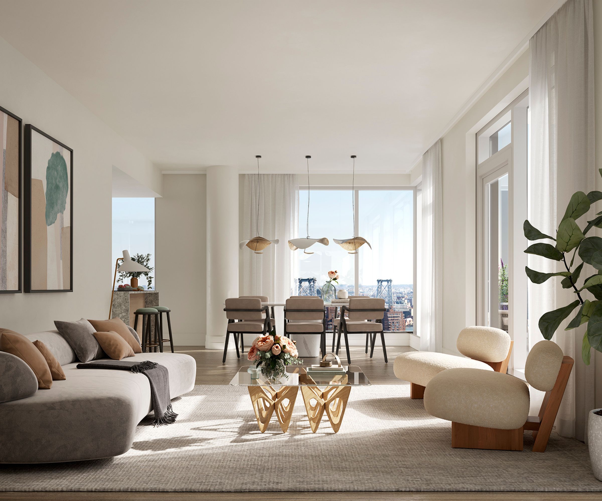
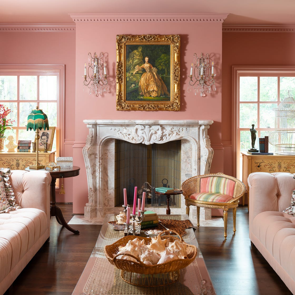
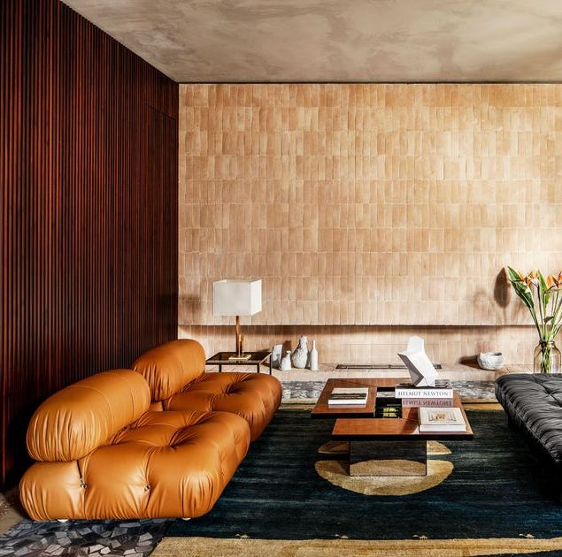
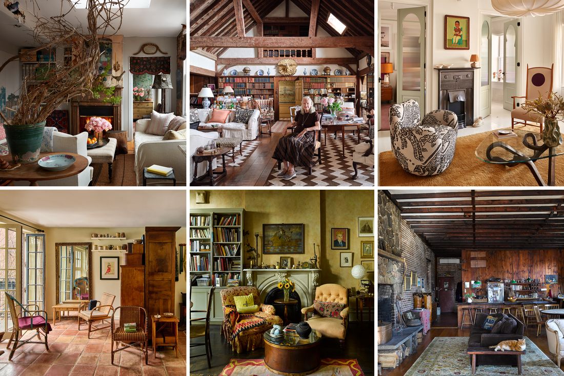
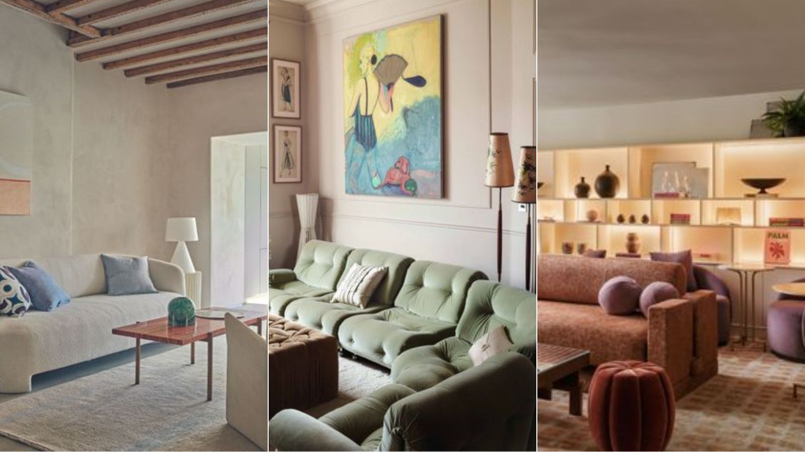
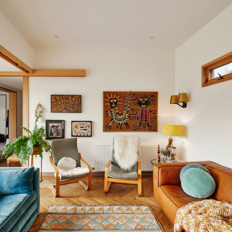
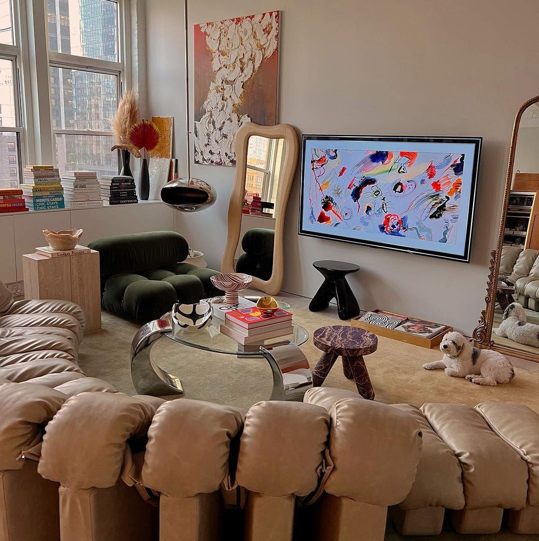
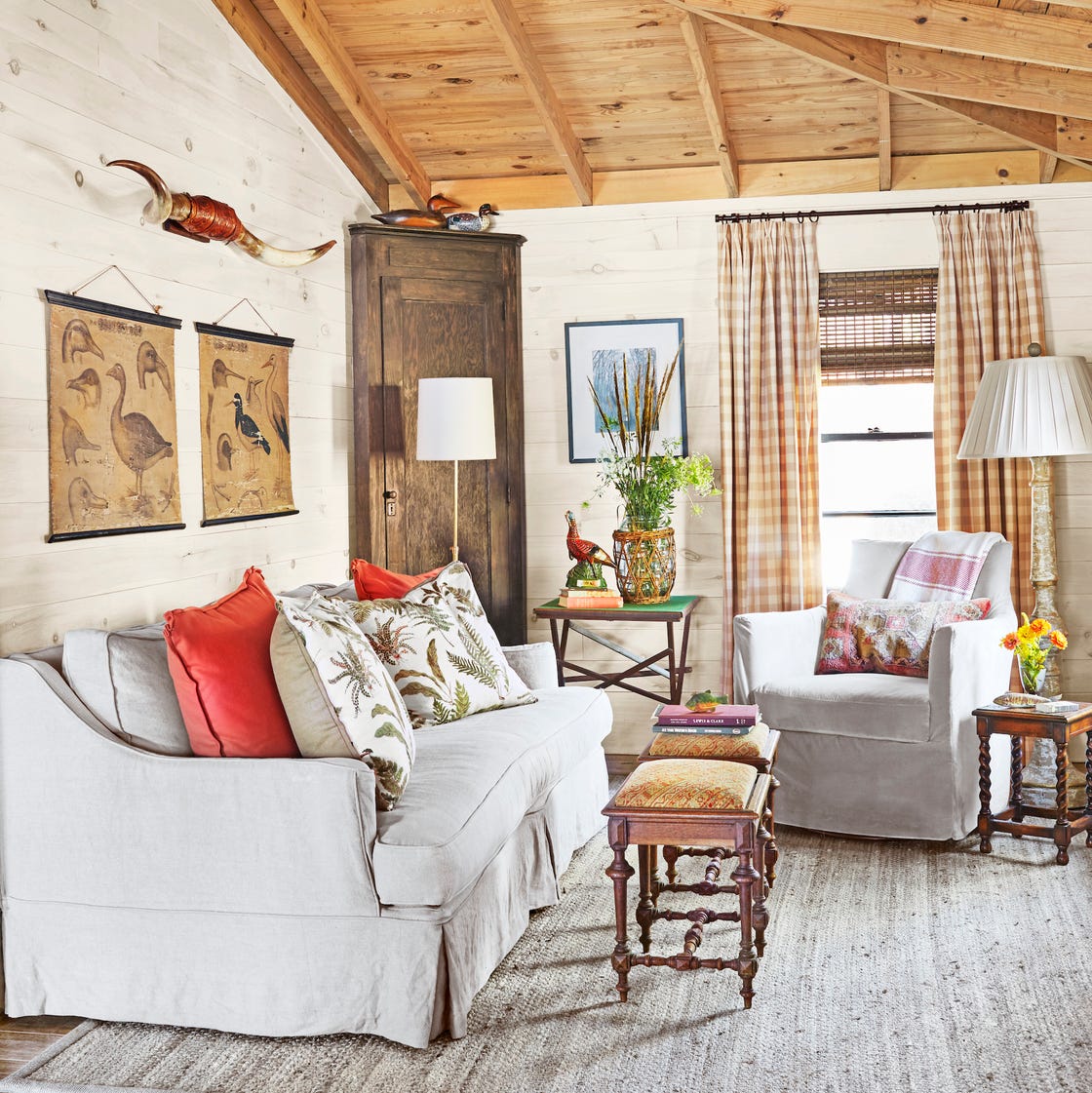
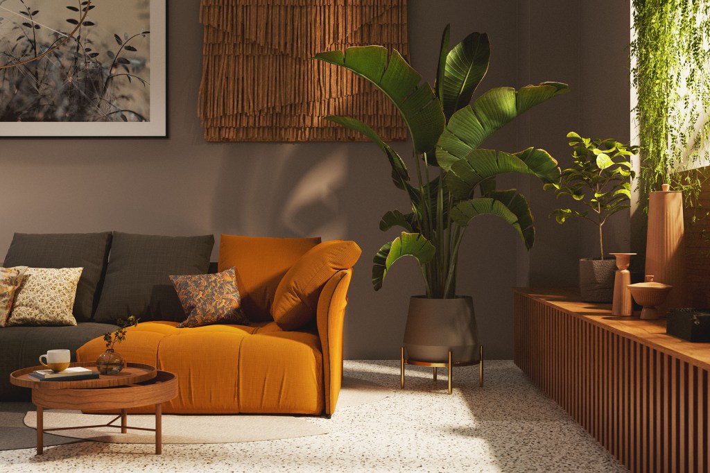
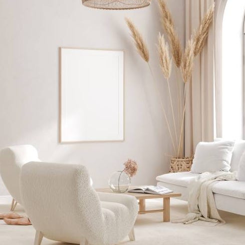
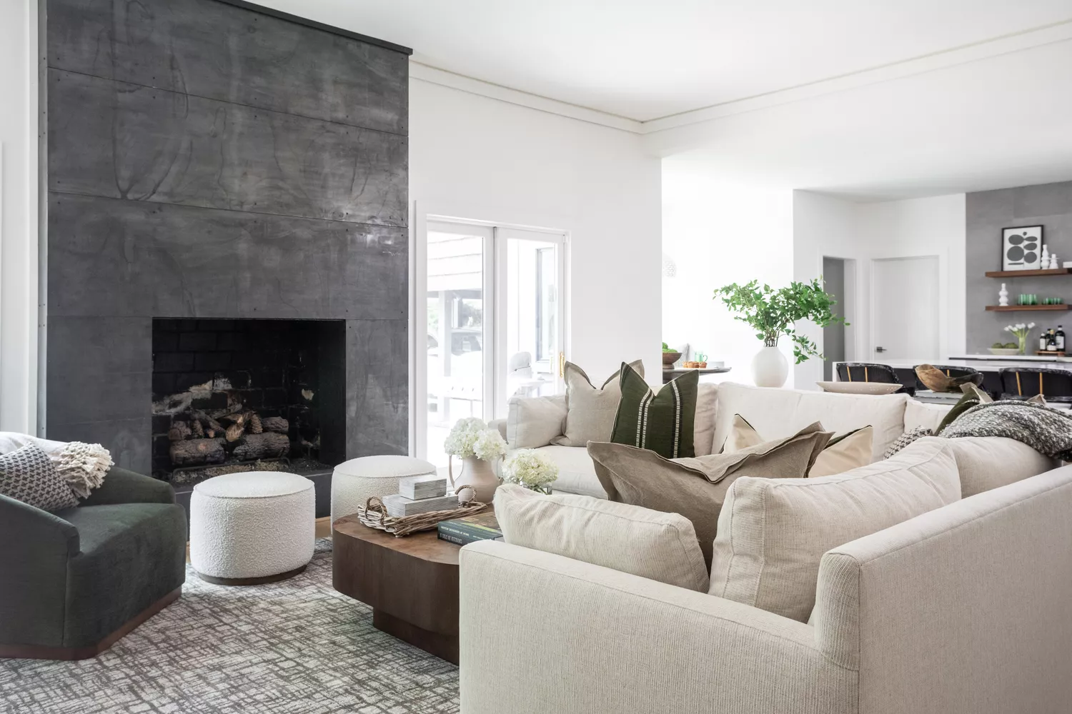
This comprehensive article explores 78 living room paint color ideas curated from top designers, offering inspiration for transforming any living space. The piece emphasizes the significant impact a fresh coat of paint can have on a room's ambiance, even without changing furniture. It addresses the common challenge of selecting the ideal color, balancing trendy choices with timeless appeal, and aligning with a home's existing architecture and personal style. While traditional neutrals like white, off-white, and greige maintain their popularity, the article highlights a growing trend among designers towards richer tones such as brown and burgundy.
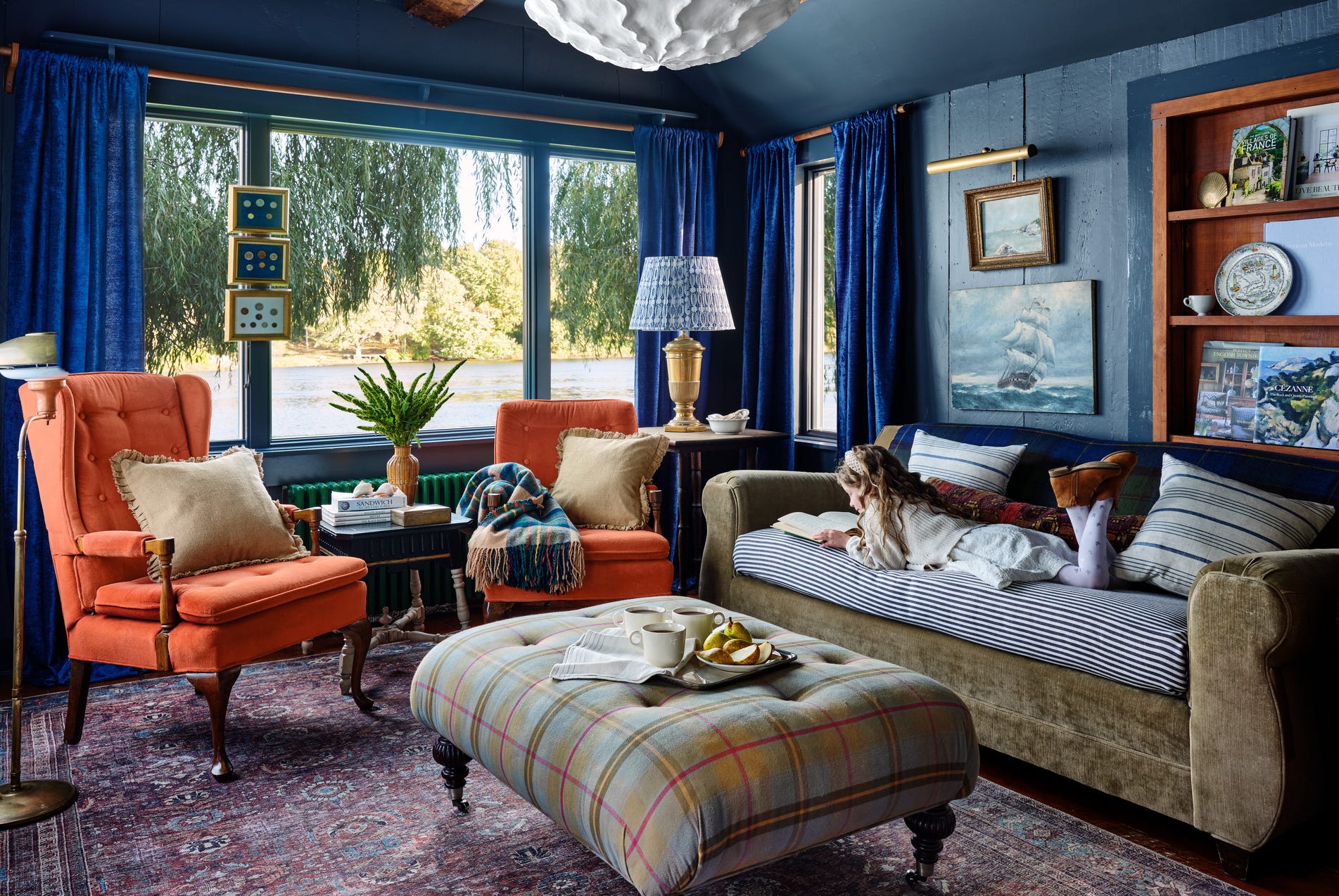
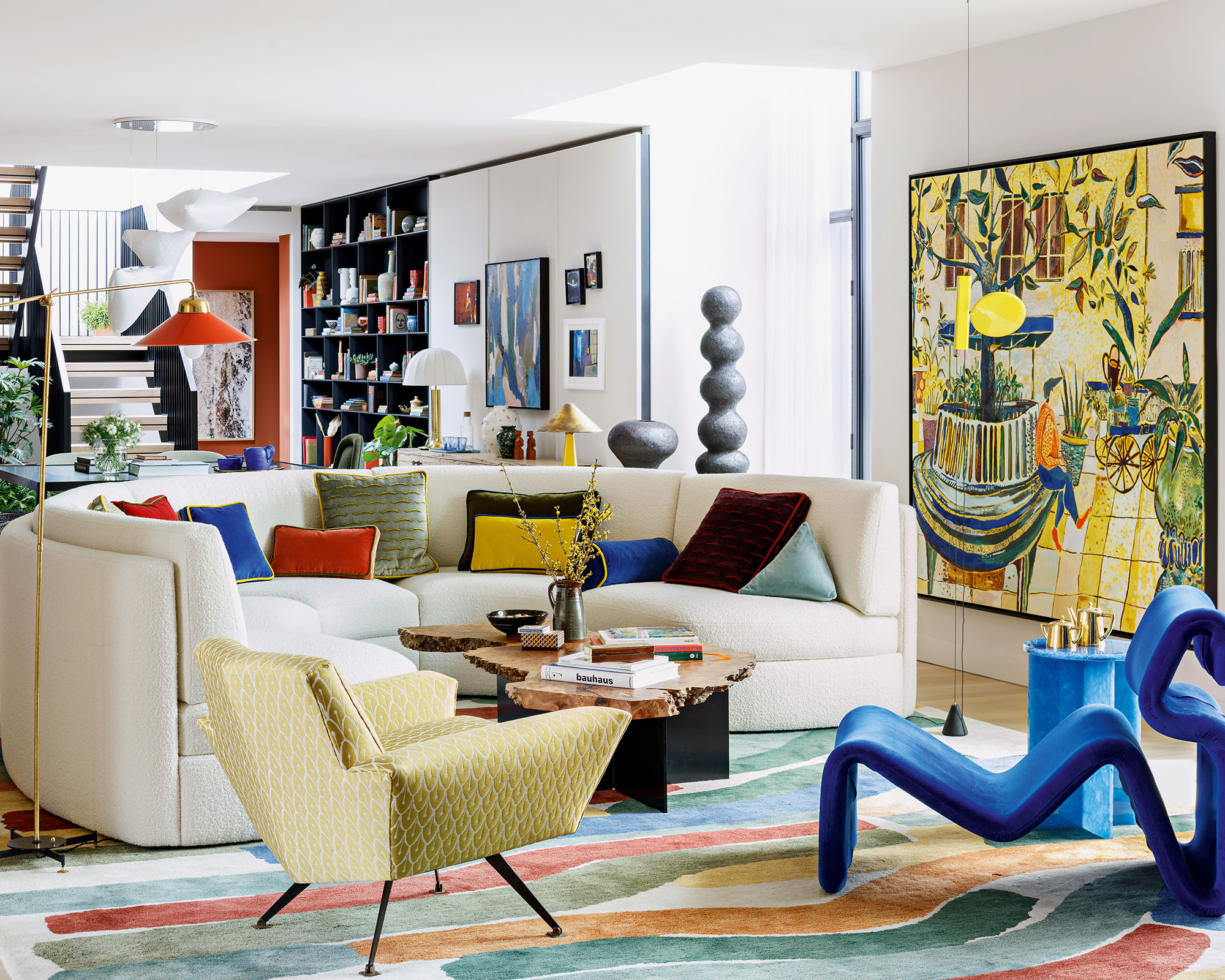
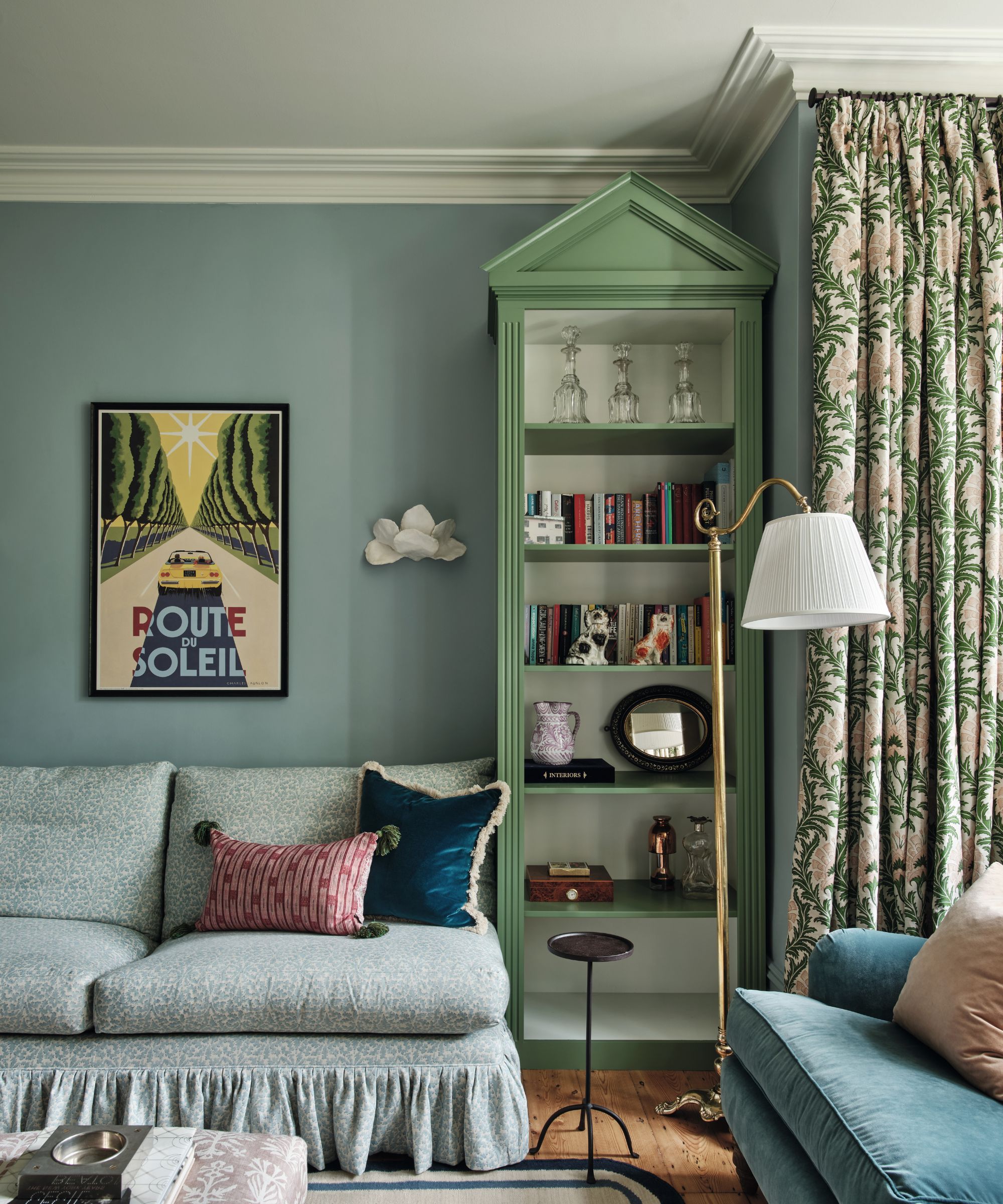
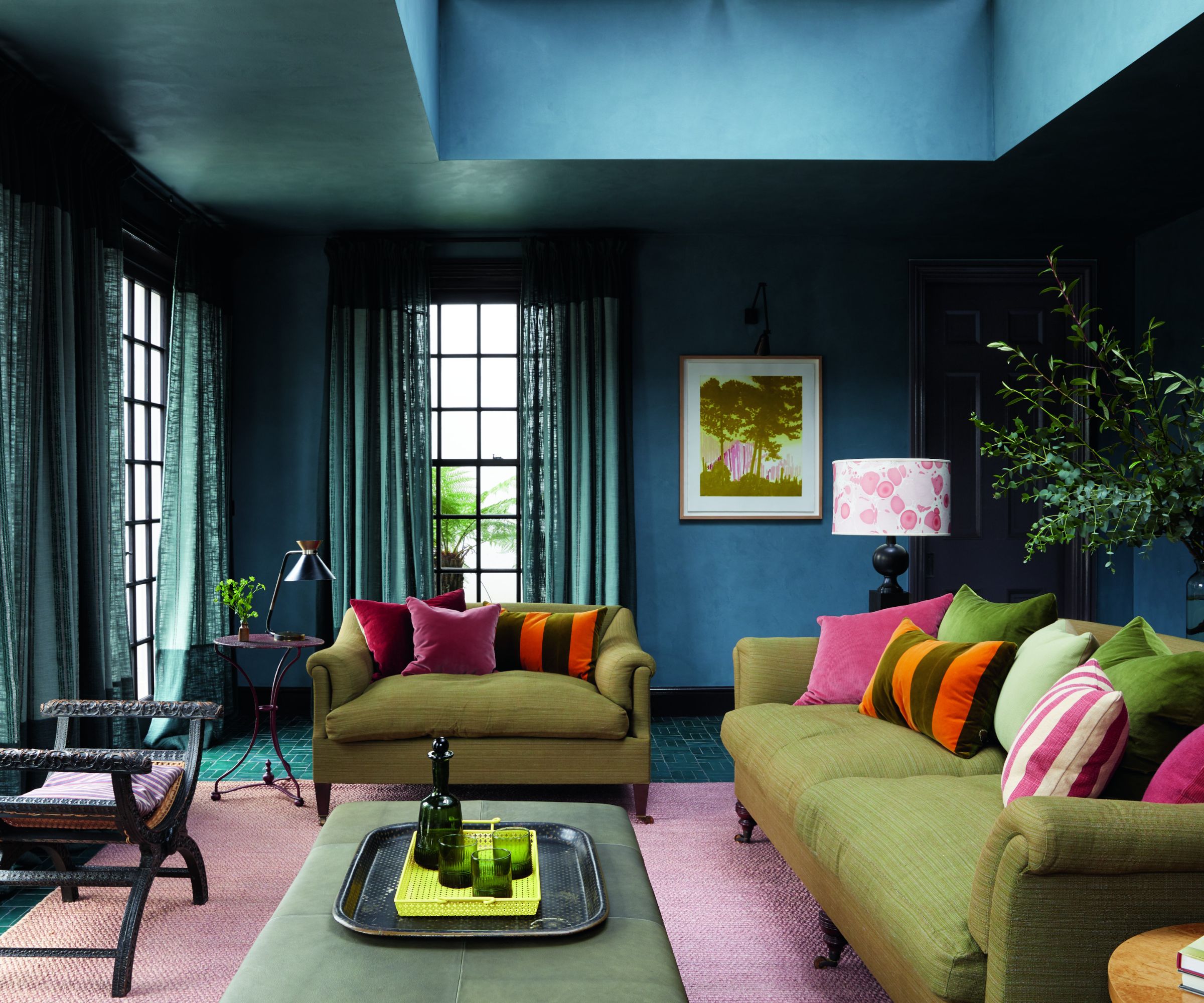
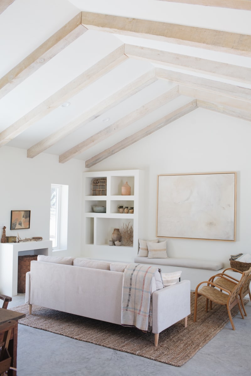
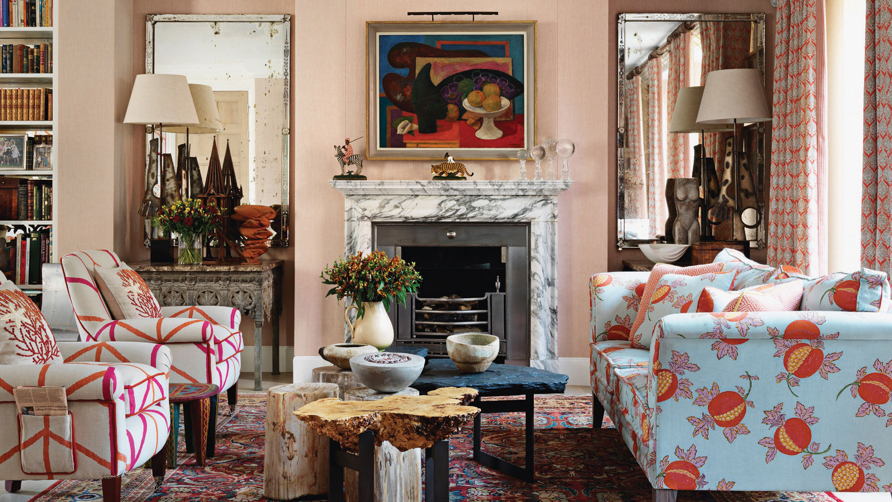
The discussion delves into how different color palettes can evoke specific moods and aesthetics. Jewel tones are presented as a means to achieve a dramatic and intimate atmosphere, while pastels and soft shades are suggested for their ability to reflect natural light and create a more open feel in smaller rooms. Conversely, moody colors like navy or forest green are noted for establishing a cozy and intimate environment. The article offers a diverse range of 78 paint colors, ensuring inspiration for various styles and spaces.
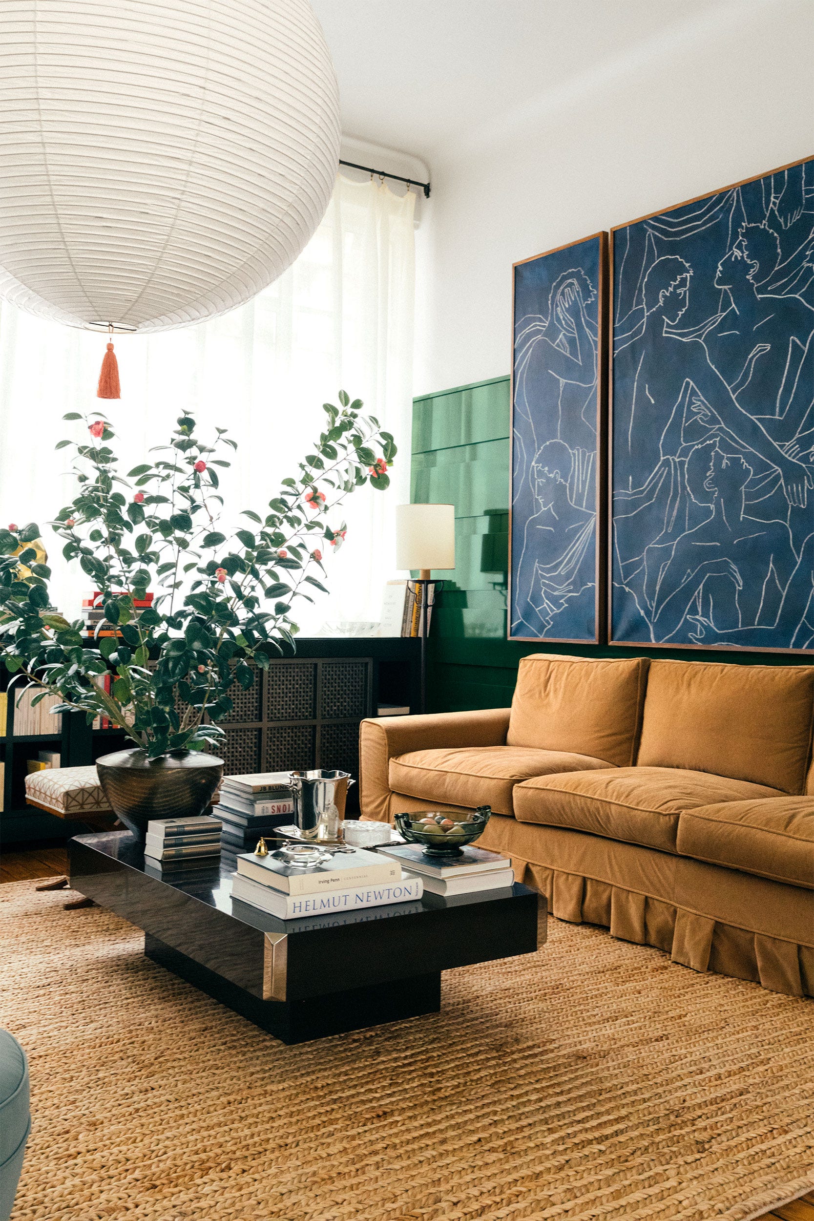
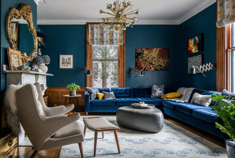
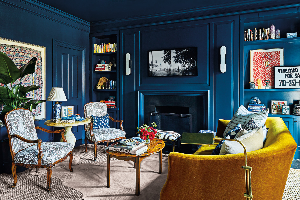
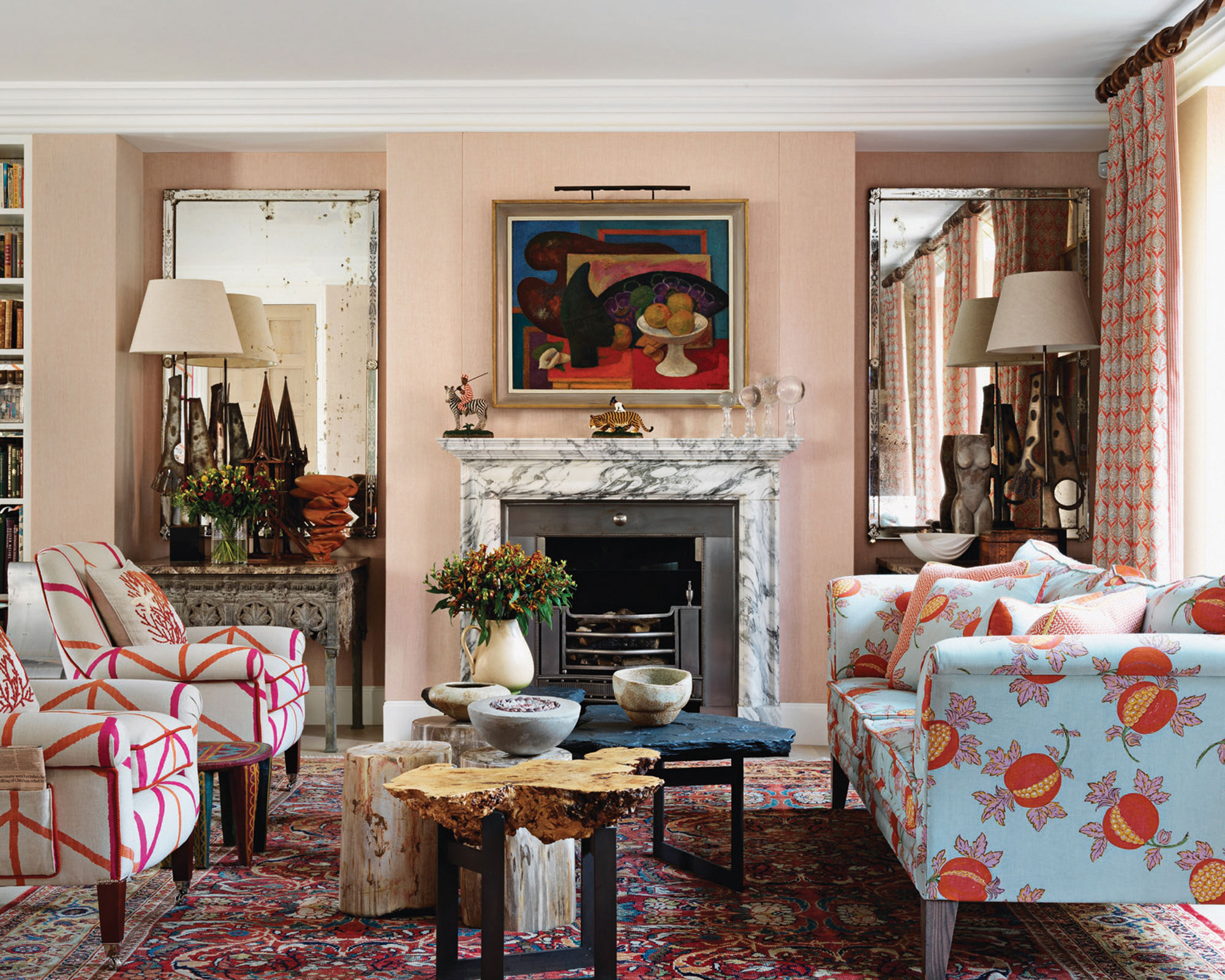
Several specific examples of designer-chosen paint colors and their effects are provided. Kristen Peña utilized Benjamin Moore's 'Trailing Vines' for a moody, dark olive living room with a charcoal gray undertone. Sarah Stacey selected a rich gray-brown for a speakeasy-inspired space, aiming for intimacy. Sawyers Design incorporated vibrant lime green and magenta walls for a powerful and polished aesthetic. Ali Budd chose Sherwin-Williams' 'Patchwork Plum' to create intimacy and tie into a kitchen's color scheme, while Heather French used Benjamin Moore's 'Admiral Blue' to anchor a heavily patterned space. Hannah Ozburn's deep Kelly green walls served as a neutral backdrop for a colorful room, and Suzanne Kasler opted for a glossy Benjamin Moore 'Providence Blue' ceiling to differentiate a wood-paneled room.
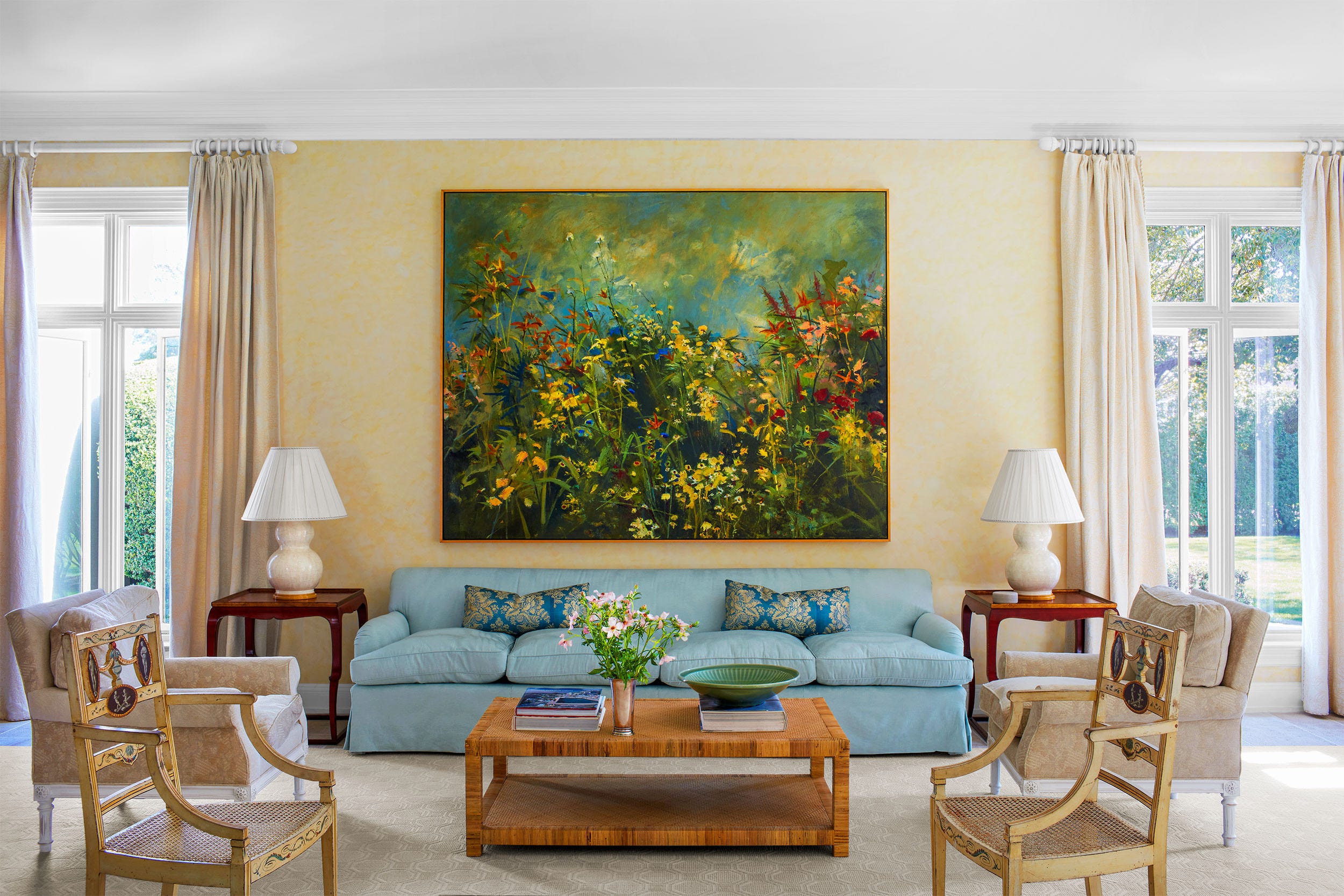
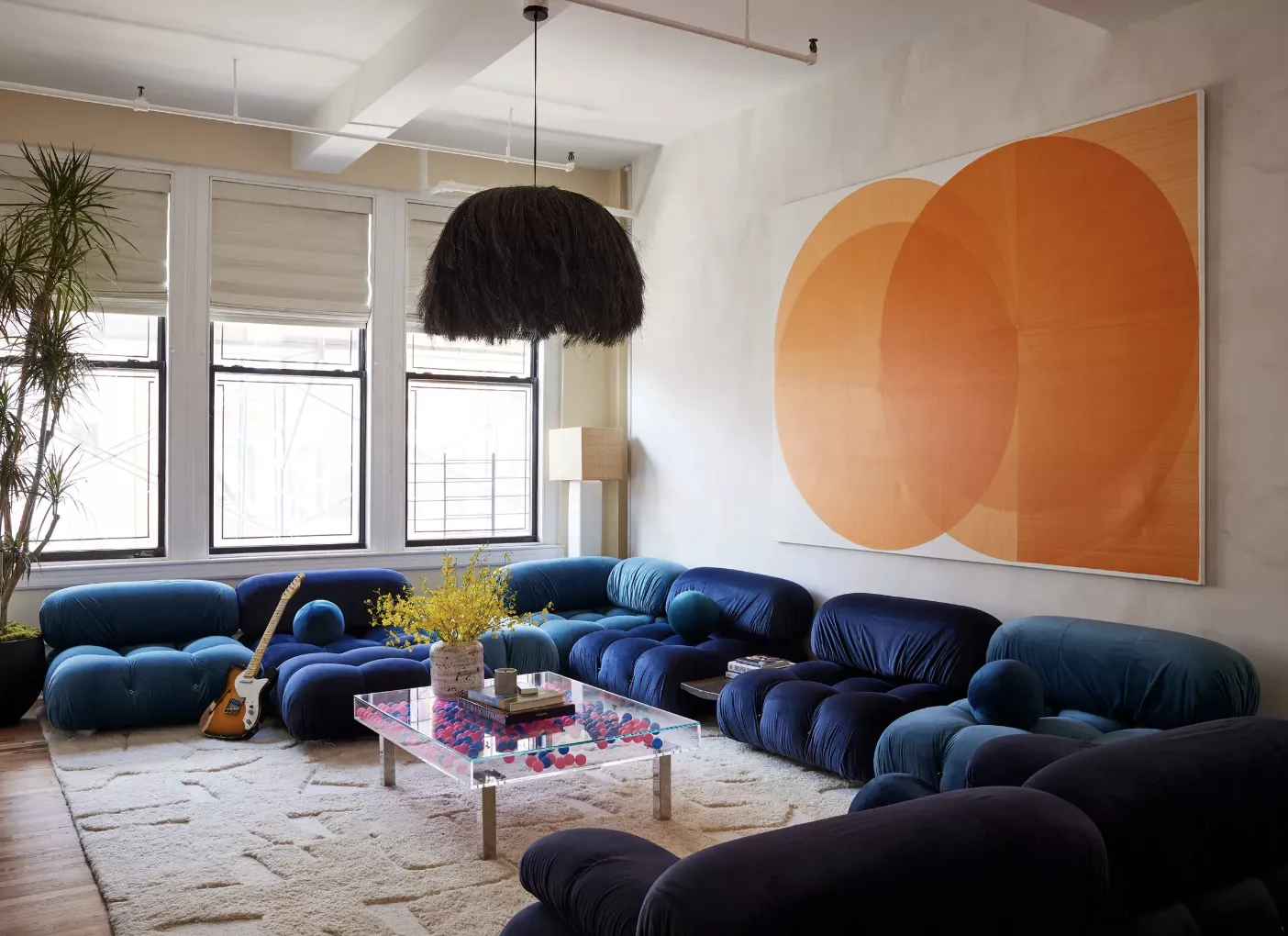
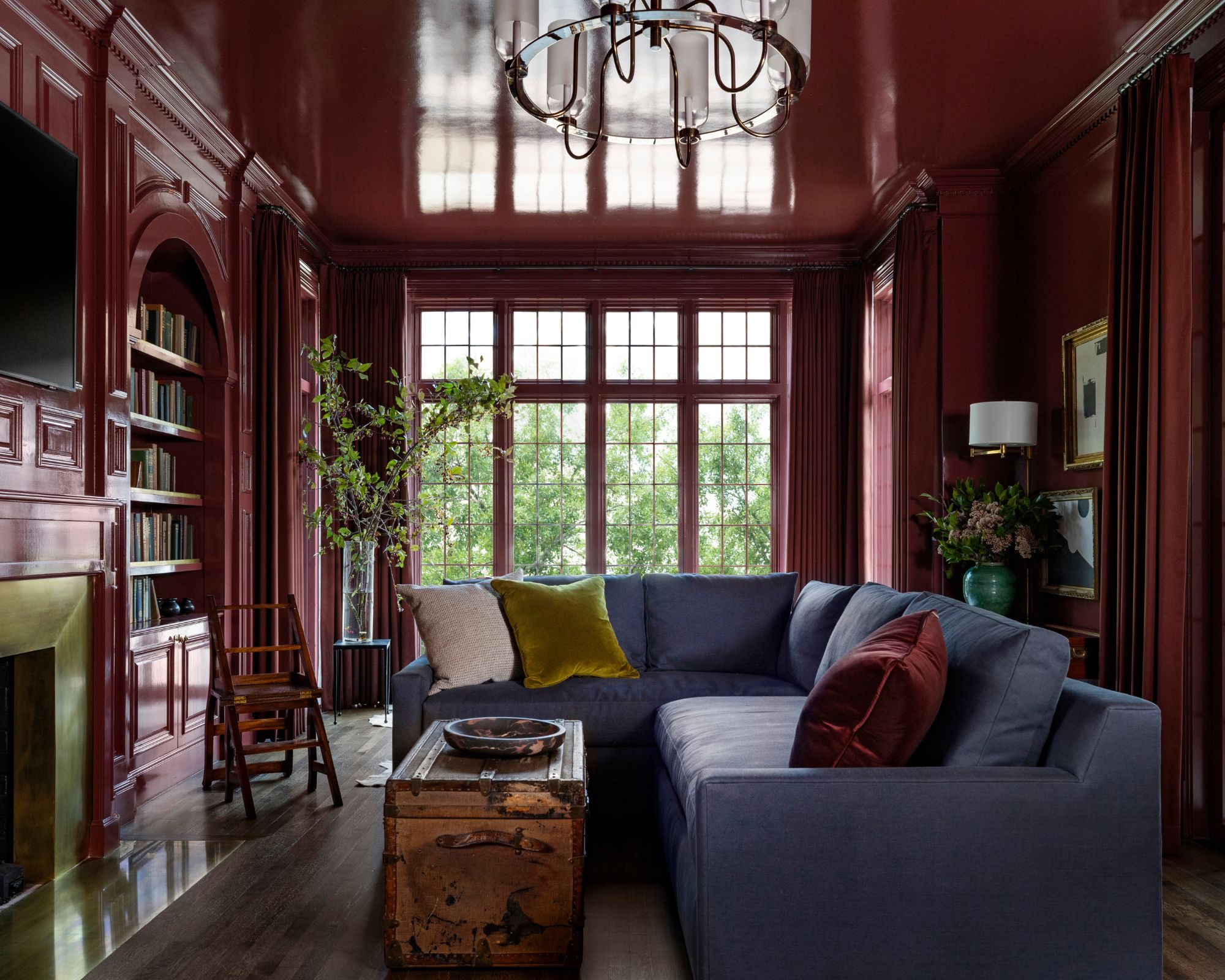
Serena Dugan chose Benjamin Moore's 'Raindance,' a versatile gray-green that adapts to surrounding decor. Amber Lewis highlighted the transformative power of a mossy green, such as Dunn-Edwards' 'Elemental Green,' encouraging readers to take risks with color choices. Minnette Jackson created a cozy and calming atmosphere in a narrow living room with a custom cloudy blue paint. Samantha Stathis Lynch used Farrow & Ball's 'Tailor Tack,' a delicate pink, inspired by spring cherry blossoms. The article also mentions ochre for its inviting warmth, Marie Flanigan’s burgundy for a dynamic and cozy lounge, and Sarah Vaile’s warm orange, noting its inviting quality when paired with complementary blues. Sage green is presented as a soothing choice, while Erin Shakoor's lilac purple adds playful sophistication. Ben Pentreath’s vibrant egg-yolk yellow is highlighted for its sunny ambiance, and Fort Design Studio's bubblegum pink is showcased for its ability to honor original architecture. Cecilia Casagrande’s deep teal, Farrow & Ball’s 'Hague Blue,' is described as lush and livable, creating an illusion of higher ceilings. Lastly, Kemble Interiors chose a soft turquoise, Benjamin Moore's 'Del Mar Blue,' to elevate a coastal design. #LivingRoomDesign #PaintColorIdeas #InteriorDesign #HomeDecor #ColorSchemes #DesignerTips #RoomTransformation #NeutralColors #BoldColors
0 comment in total
You may also like
The Very Best Living Rooms of 2021

Living room design ideas to try this year, according to AD List architects and designers

21 living room ideas to inspire you now
Wendy Goodman’s Most-Read Stories of 2025
Our Favorite Living Rooms in 2018, Period
9 of the best living rooms in the world – as chosen by the interior design experts

Living Room Decor Ideas and Inspiration

Dream living room upgrades homeowners always come to regret – according to the experts
8 Beautiful Living Room Ideas
77 Living Room Ideas to Design Your Dream Space

40 living room ideas for 2025 – stylish yet practical tips to help you design a space you’ll love to lounge in year-round
And Now, the Best Living Room Decor Ideas for 2025

13 Living Room Layout Ideas to Make Any Space Feel Its Best

Best Living Room Design 2025: A Serene, Soulful Space
3 Dated Living Room Layouts That Have No Place in 2025 (and How to Fix It If You've Ended Up With One)

Ahem: You're Gonna See These 6 Living Room Trends All! Year! Long!
The Coziest Living Rooms Ever
2024 home design: 9 gorgeous living room decor ideas the experts swear by
37 living room ideas that will instantly switch-up your style
20 Cozy Living Room Ideas That Will Make It Your Favorite Place to Lounge