1/21
Design Pros Have Spoken: Here Are the Only Paint Color Trends That Matter in 2022
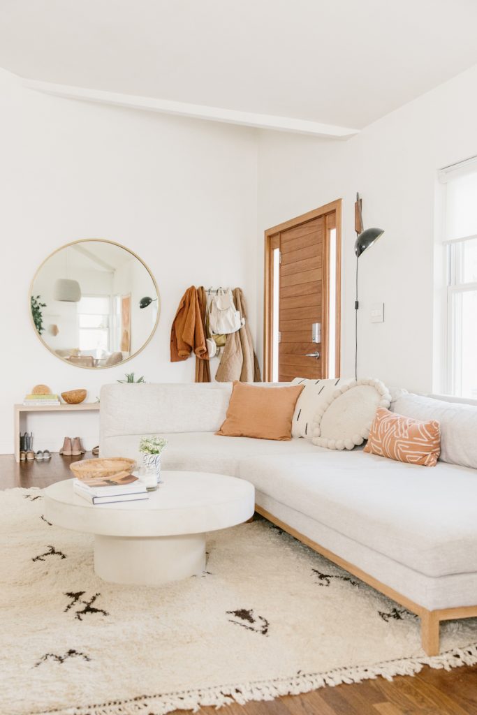
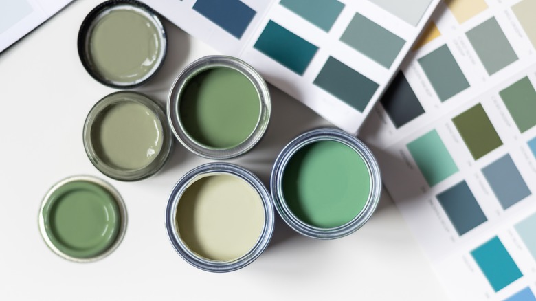
Selecting the appropriate living room paint color presents a significant challenge due to the vast number of options and the necessity to consider undertones and varying lighting conditions. A single shade can appear dramatically different from morning to night, highlighting the importance of careful selection. The chosen wall color profoundly influences the overall atmosphere of the living space, particularly in the living room, where the right hue can enhance mood and promote relaxation. To assist in this decision-making process, interior designers were consulted to identify popular and aesthetically pleasing paint colors, suitable for both timeless preferences and current trends.
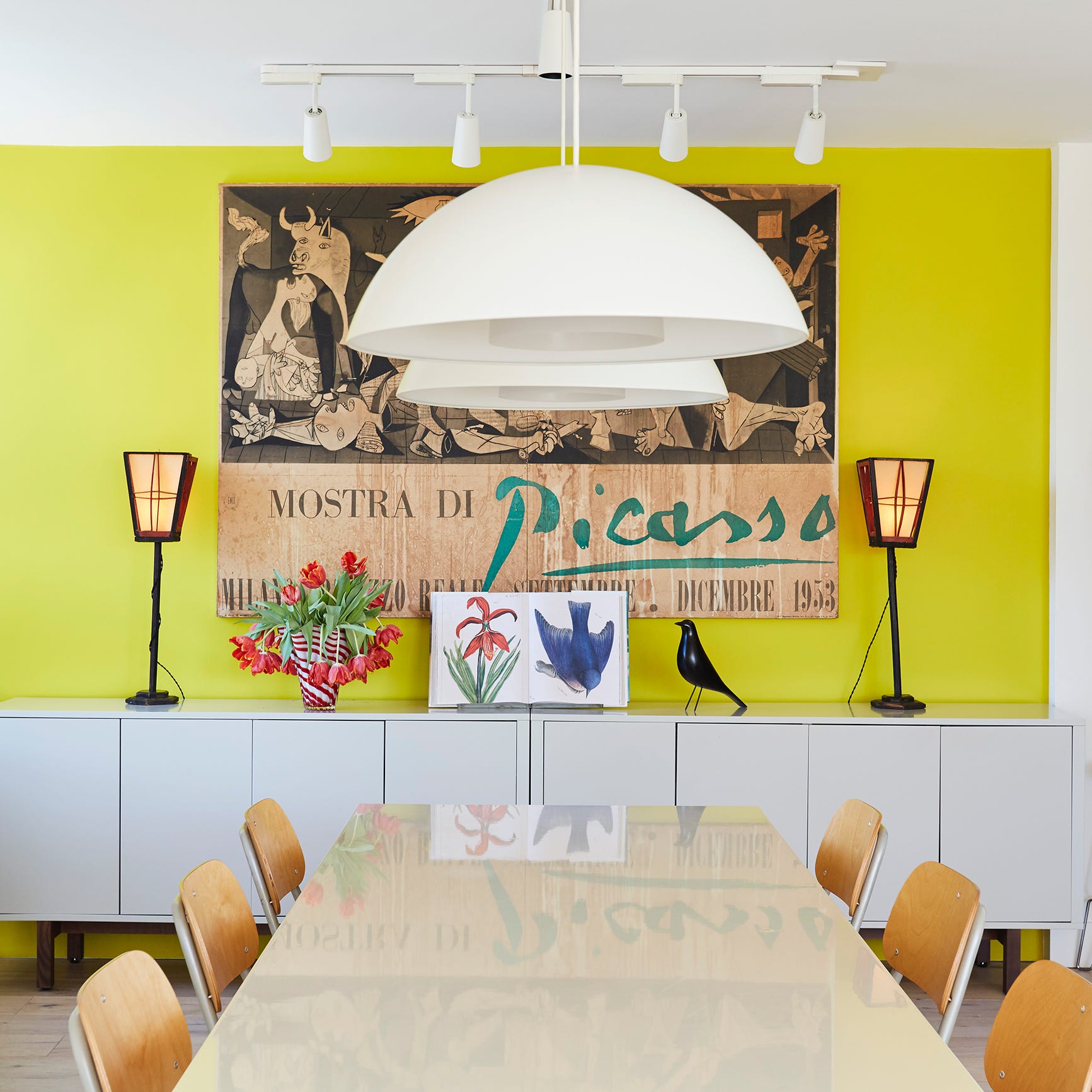
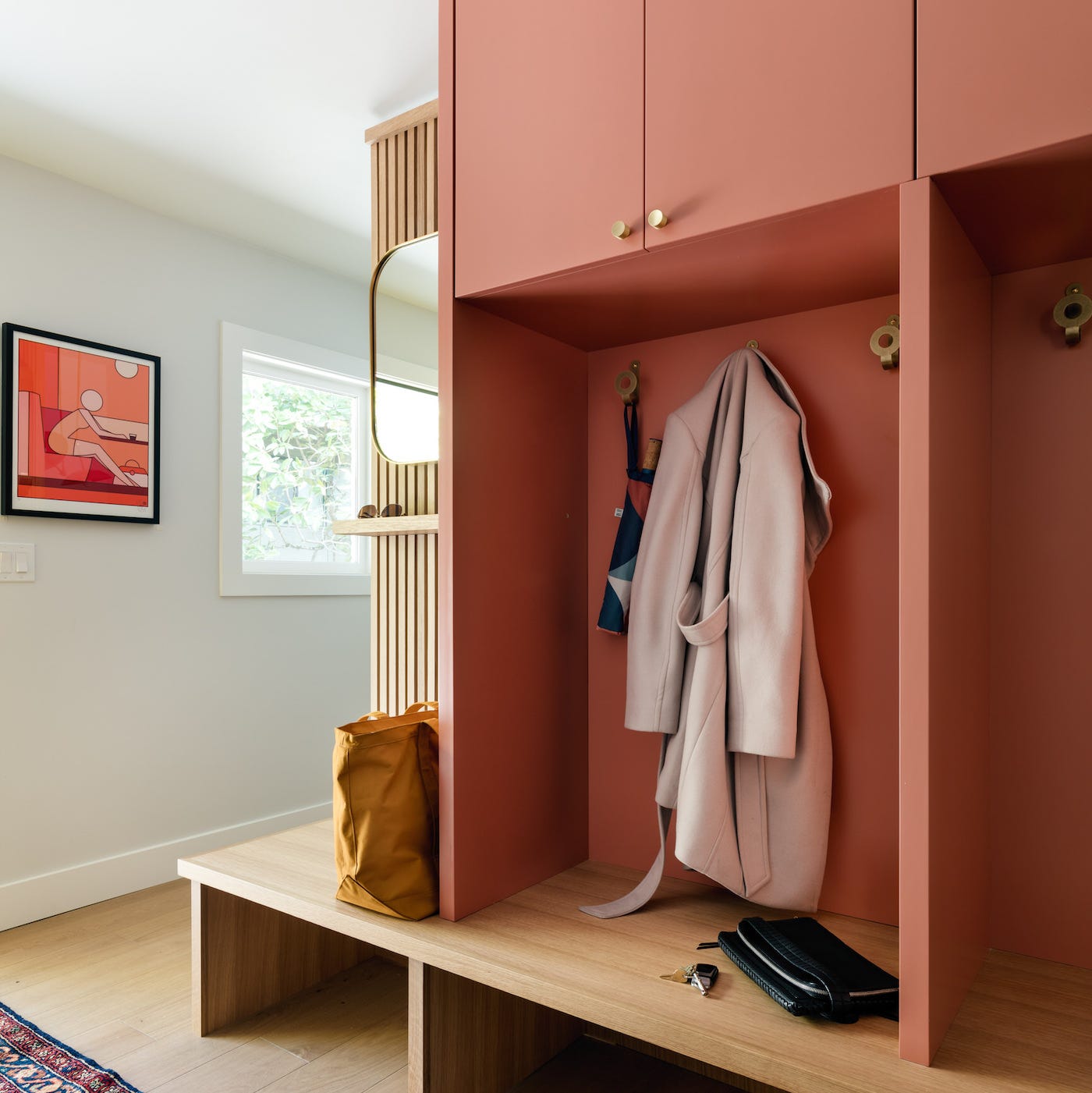
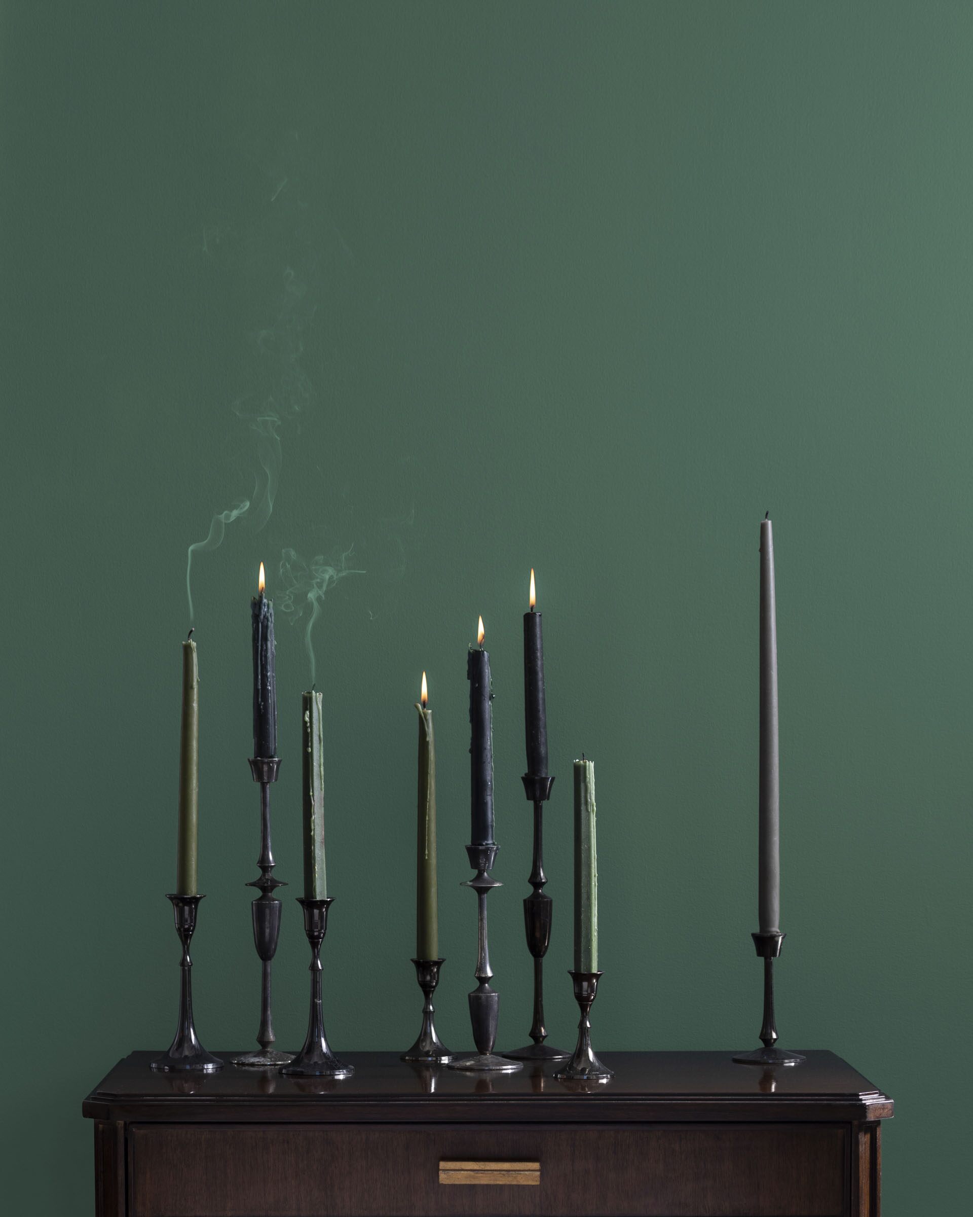
The article showcases a diverse range of colors, from vibrant and dramatic tones to more subdued and calming options. For those seeking bold statements, cheerful greens, fresh blues, and moody purples are highlighted, with designers suggesting their applicability even in smaller rooms. Conversely, for a safer and more tranquil ambiance, muted tones such as light blue, blush pink, and soft sage are recommended. Classic warm hues like sandy beige, creamy white, and rich brown, as well as cool tones like bright white and classic gray, are also presented as dependable choices.
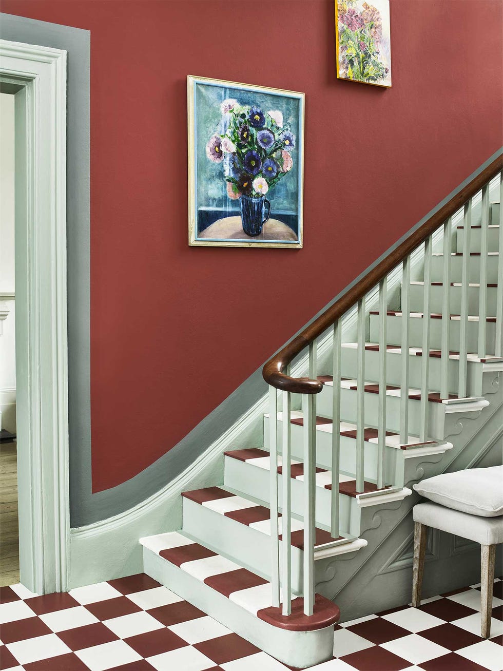
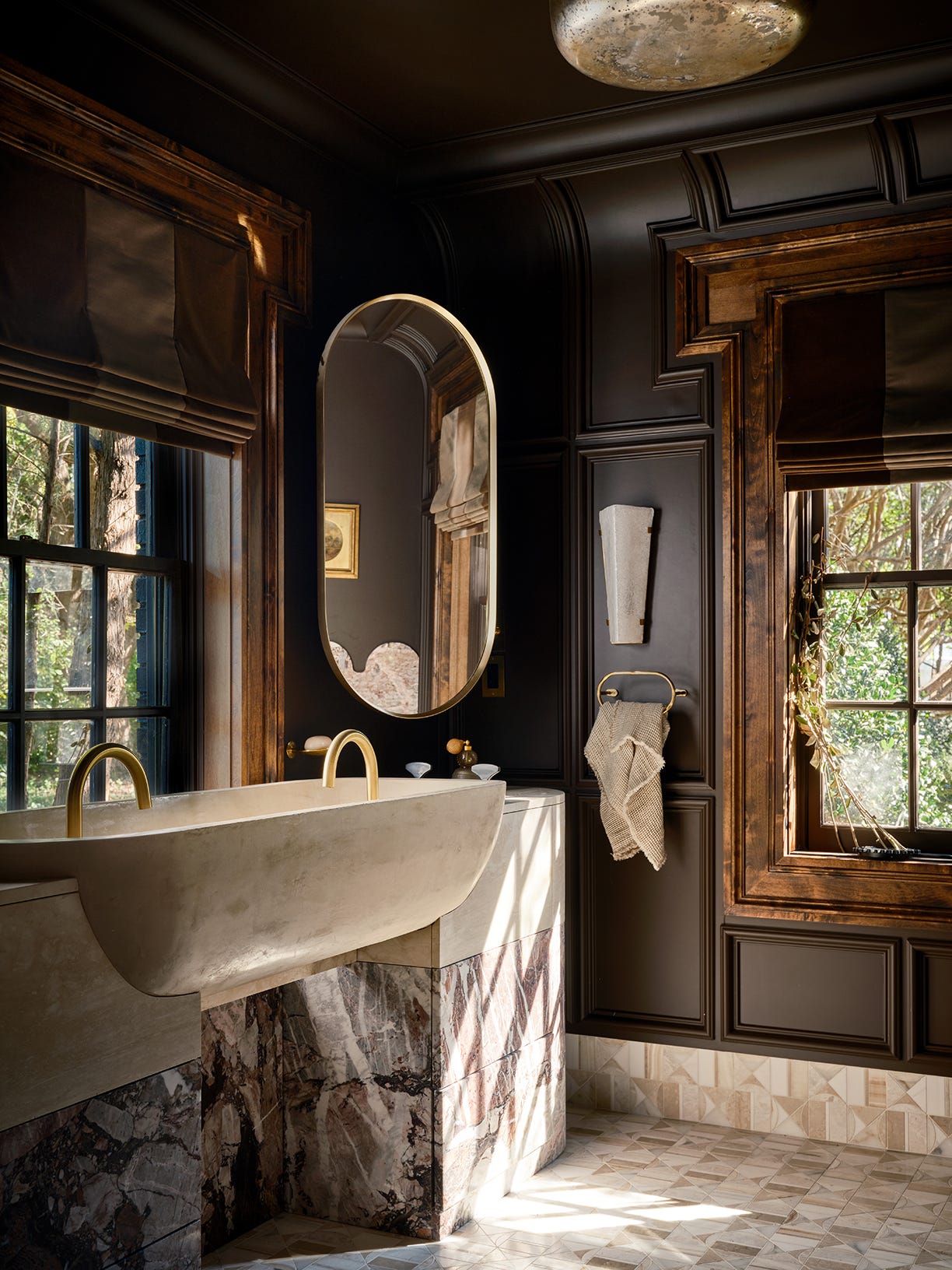
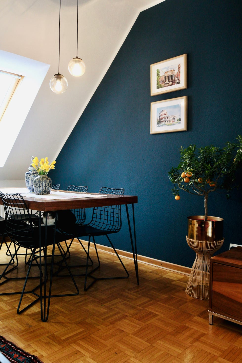
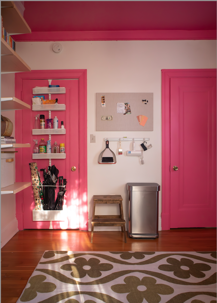
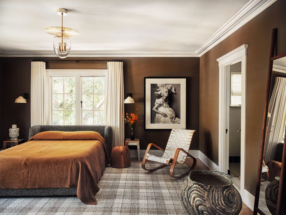
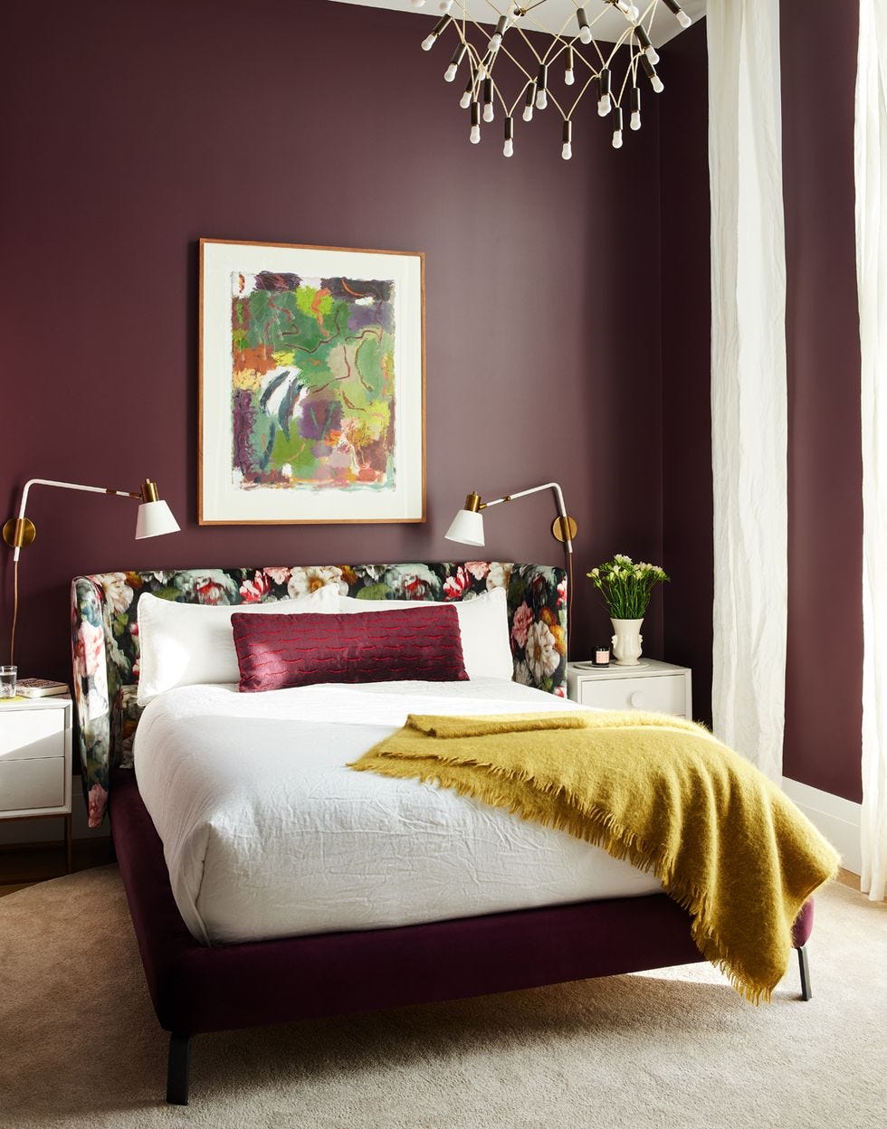
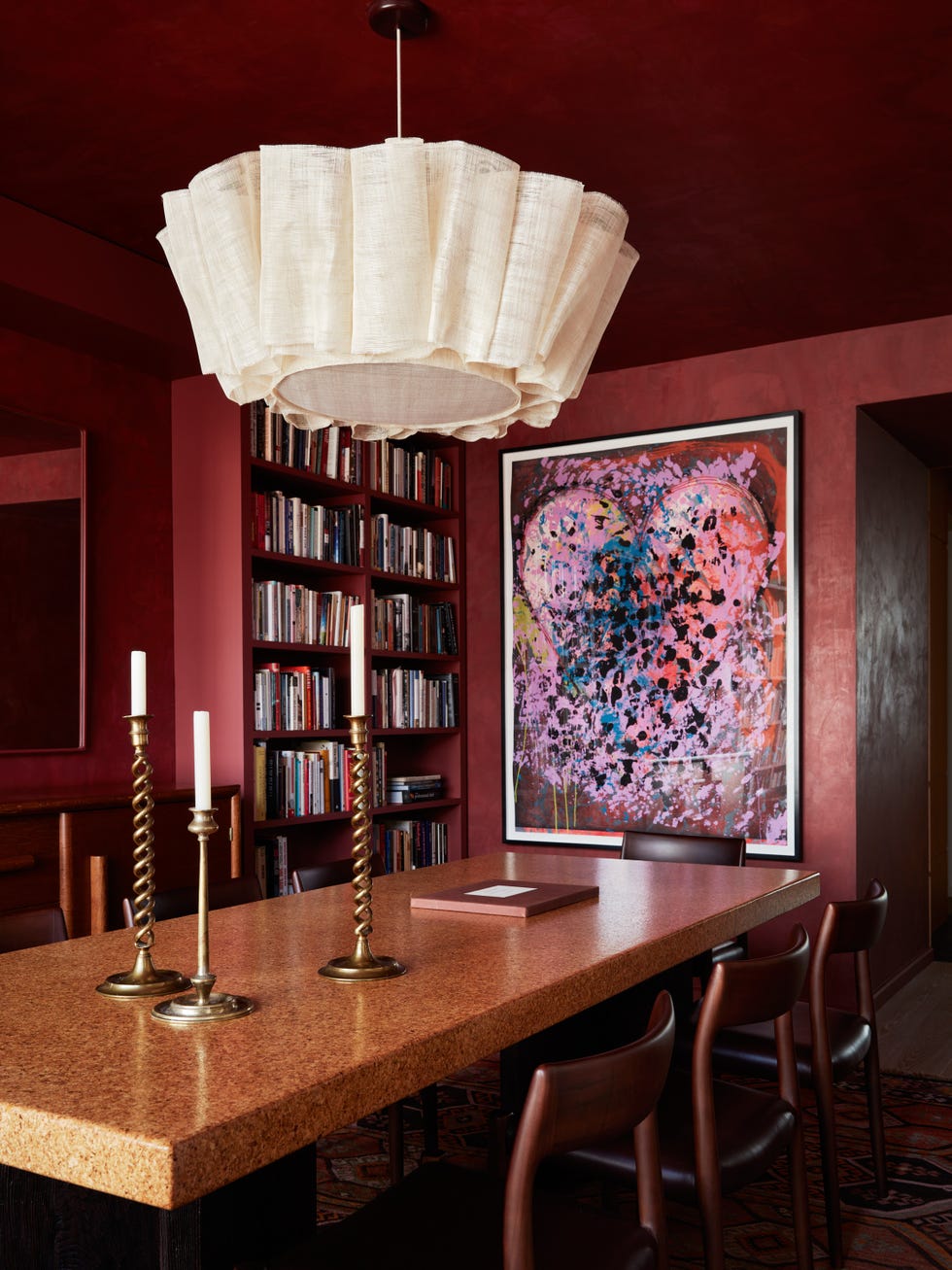
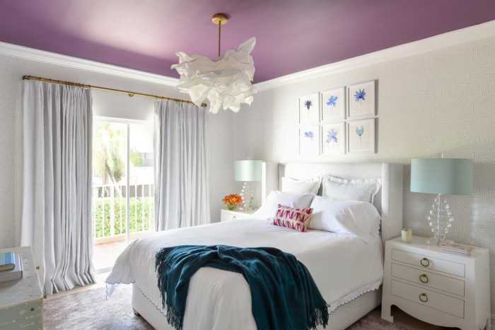
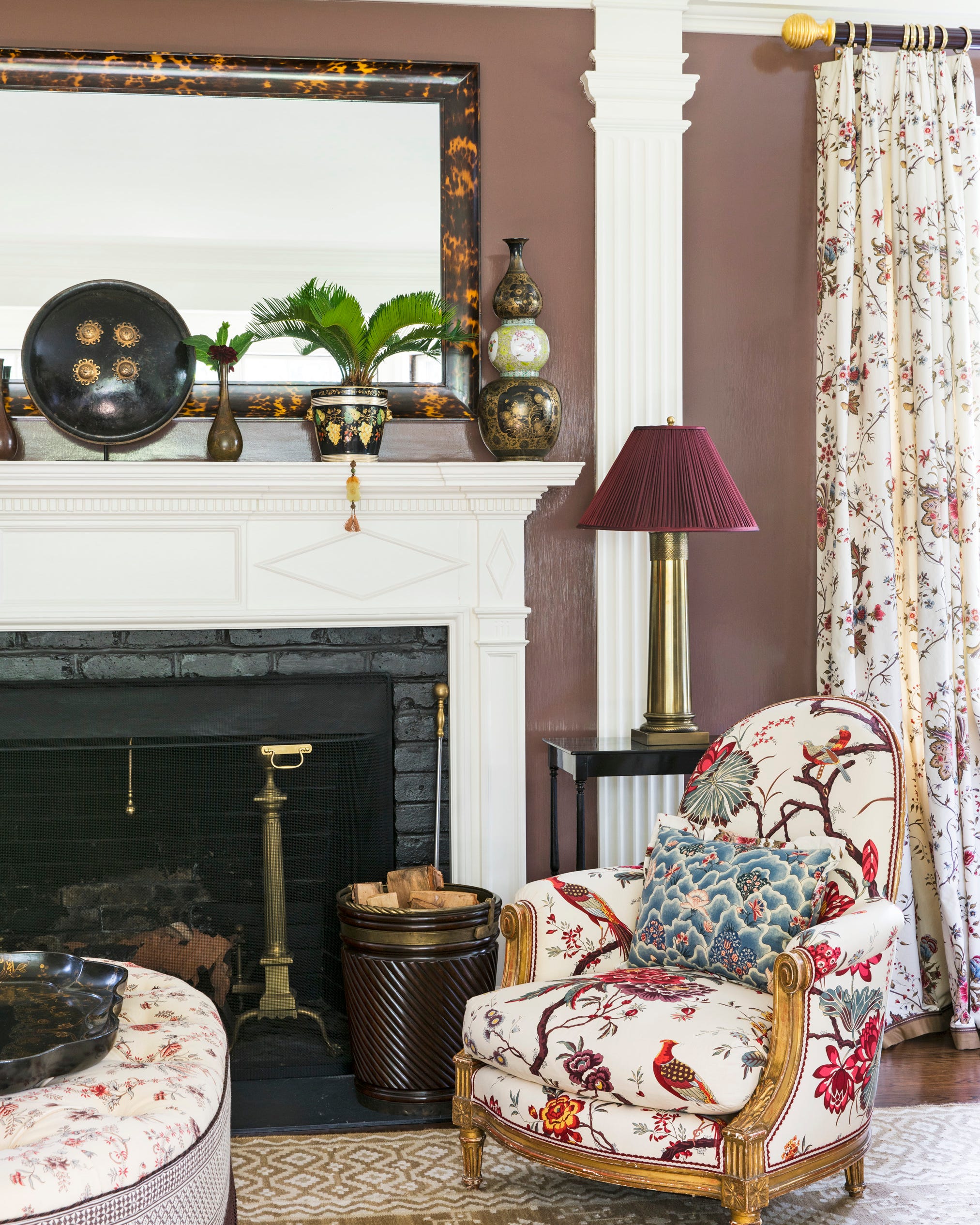
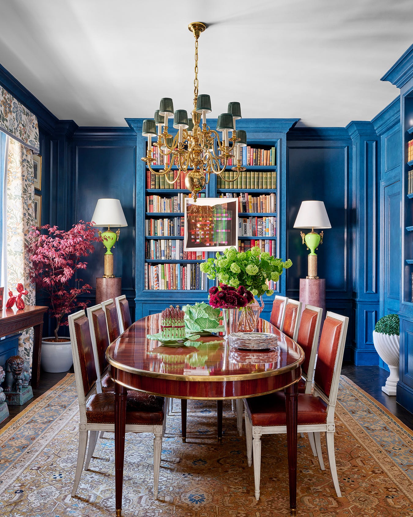
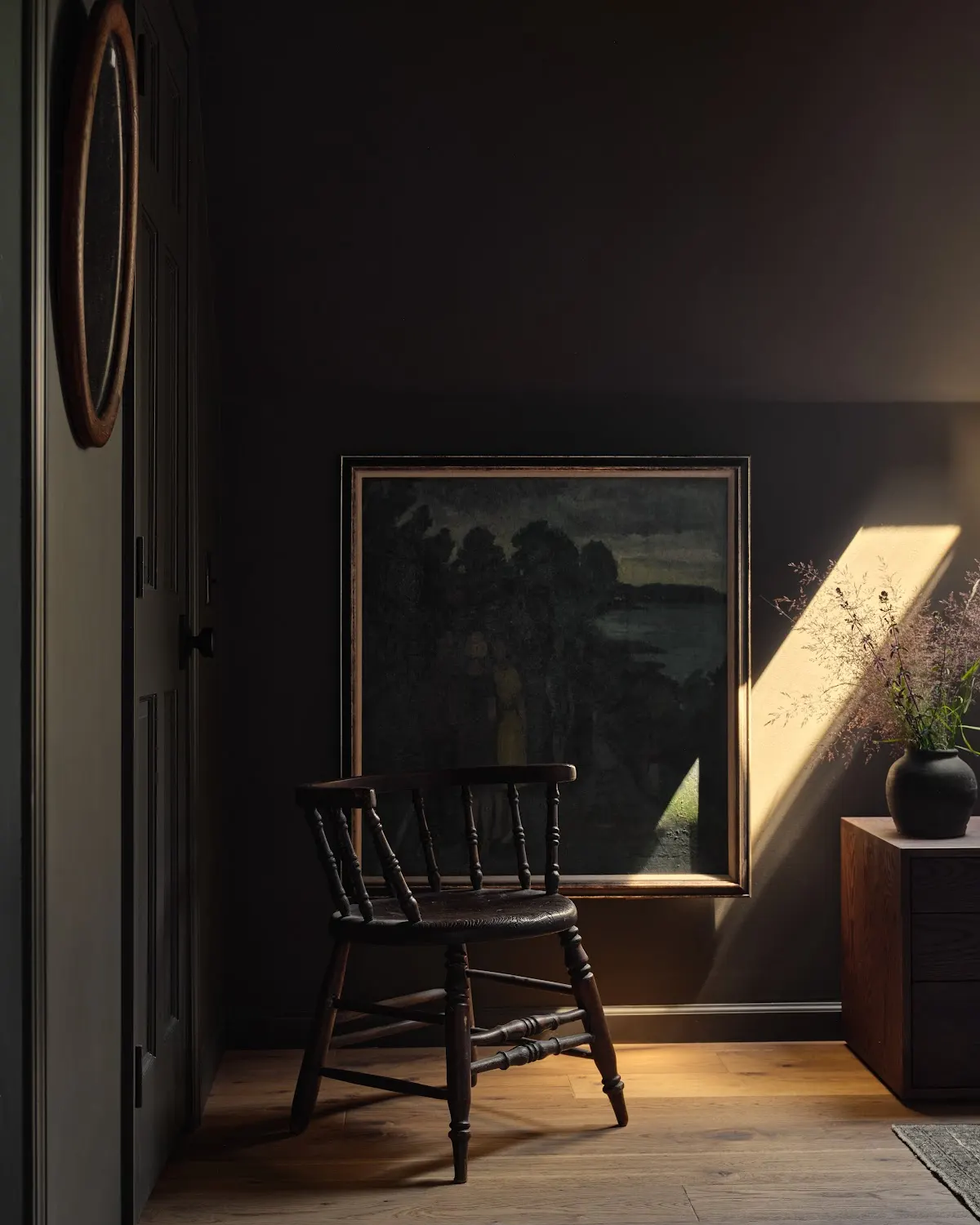
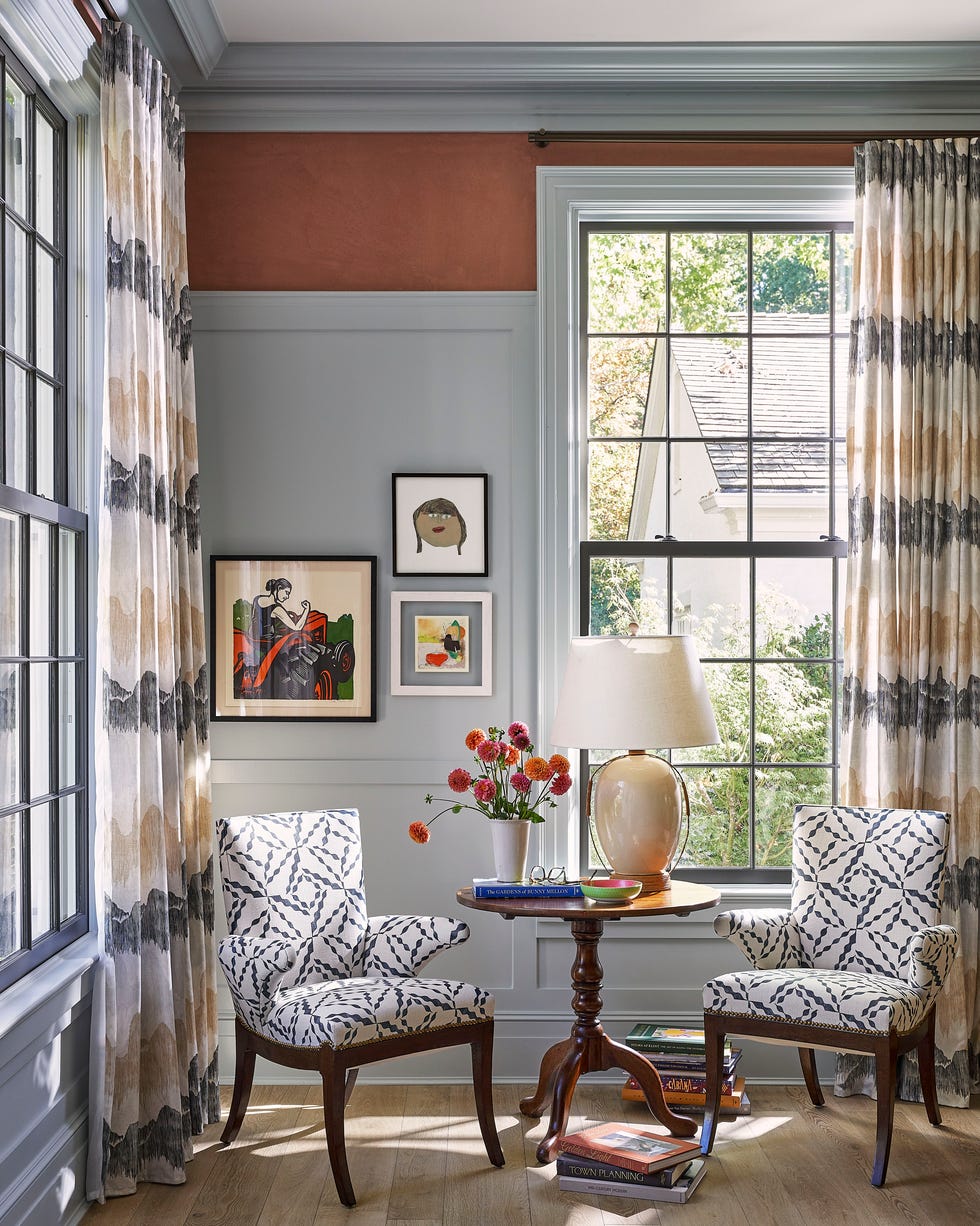
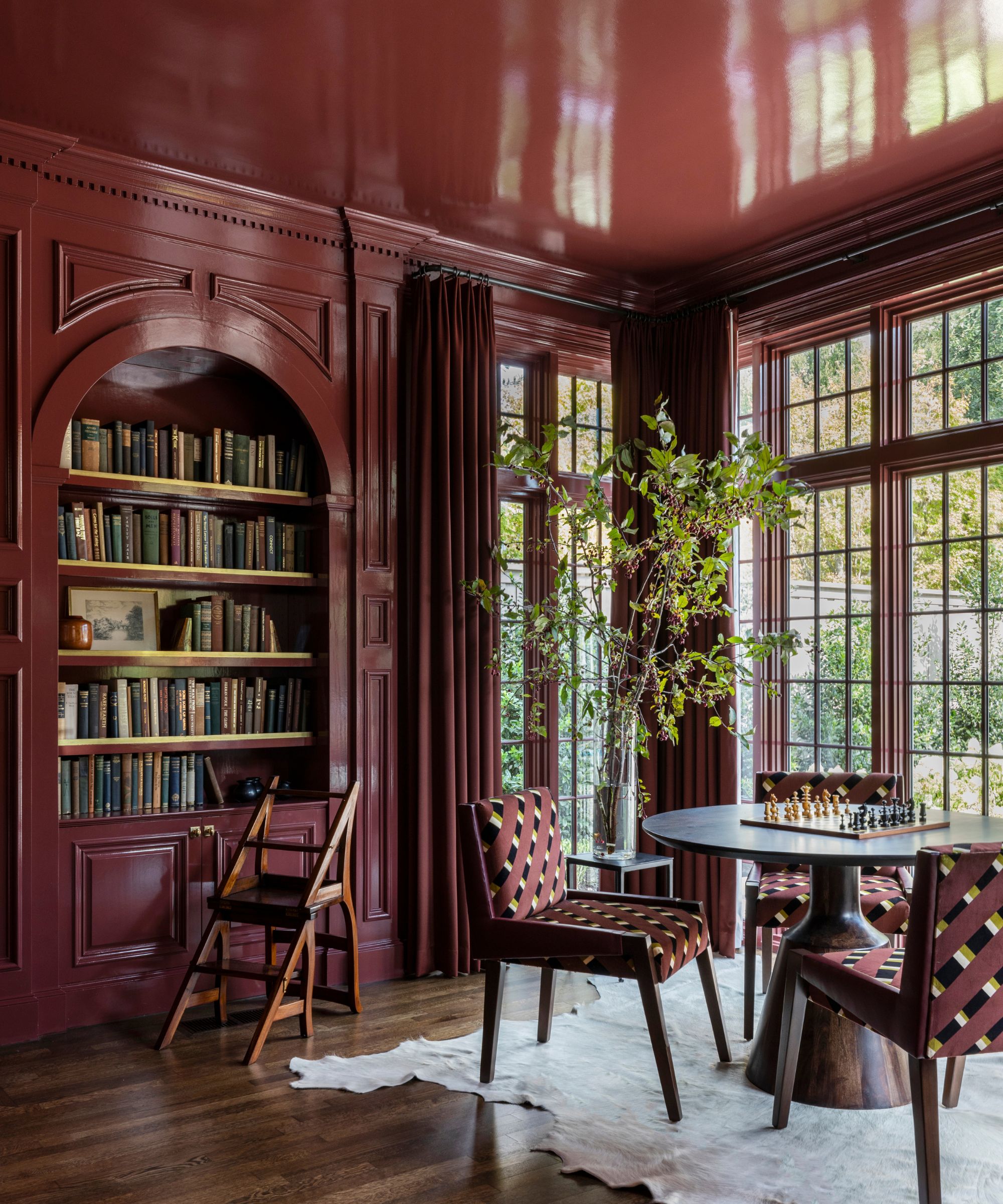
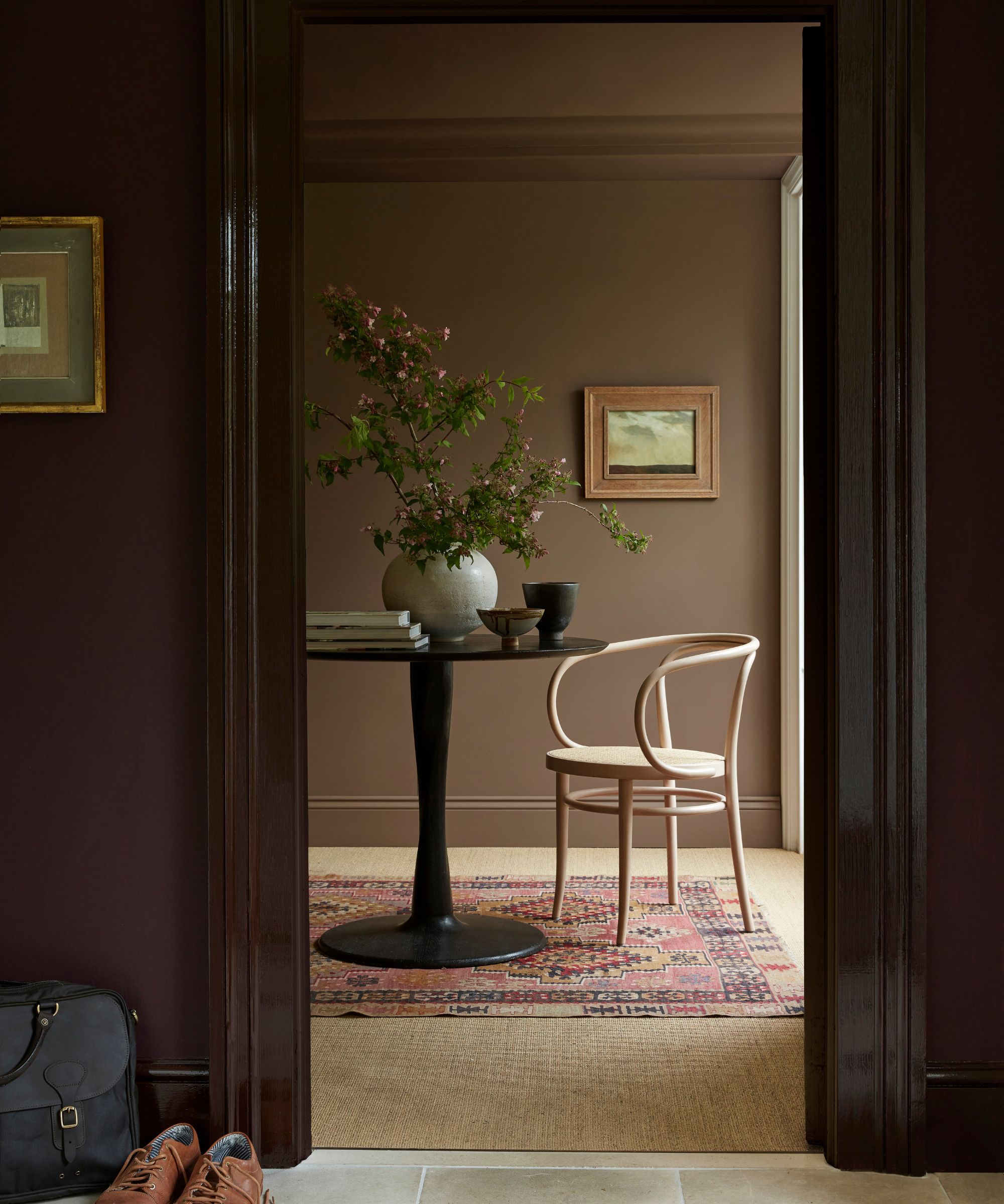
The selection includes specific color recommendations and examples of their application in real living room settings. For instance, a deep blue-gray is depicted as moody yet neutral, complementing a marble fireplace. A rich brown, specifically a red-toned variant, is shown to create a warm and cozy atmosphere, extending to both walls and ceiling. Magenta pink offers a striking option for a two-story living room, effectively contrasted with white accents. Peacock blue is presented as a choice for a monochrome scheme, pairing well with a green velvet couch. Charcoal black is suggested for a bold, functional aesthetic, especially beneficial for media rooms, and is often combined with wallpapered ceilings.
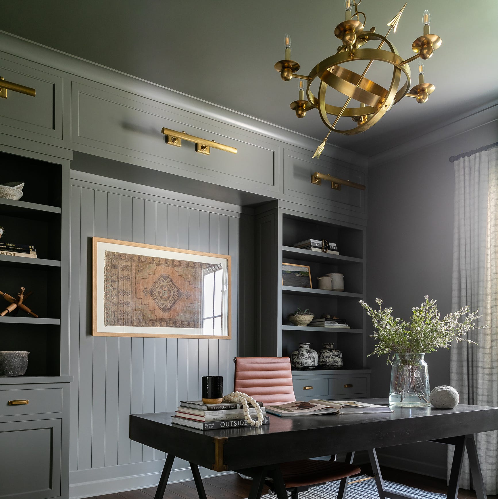
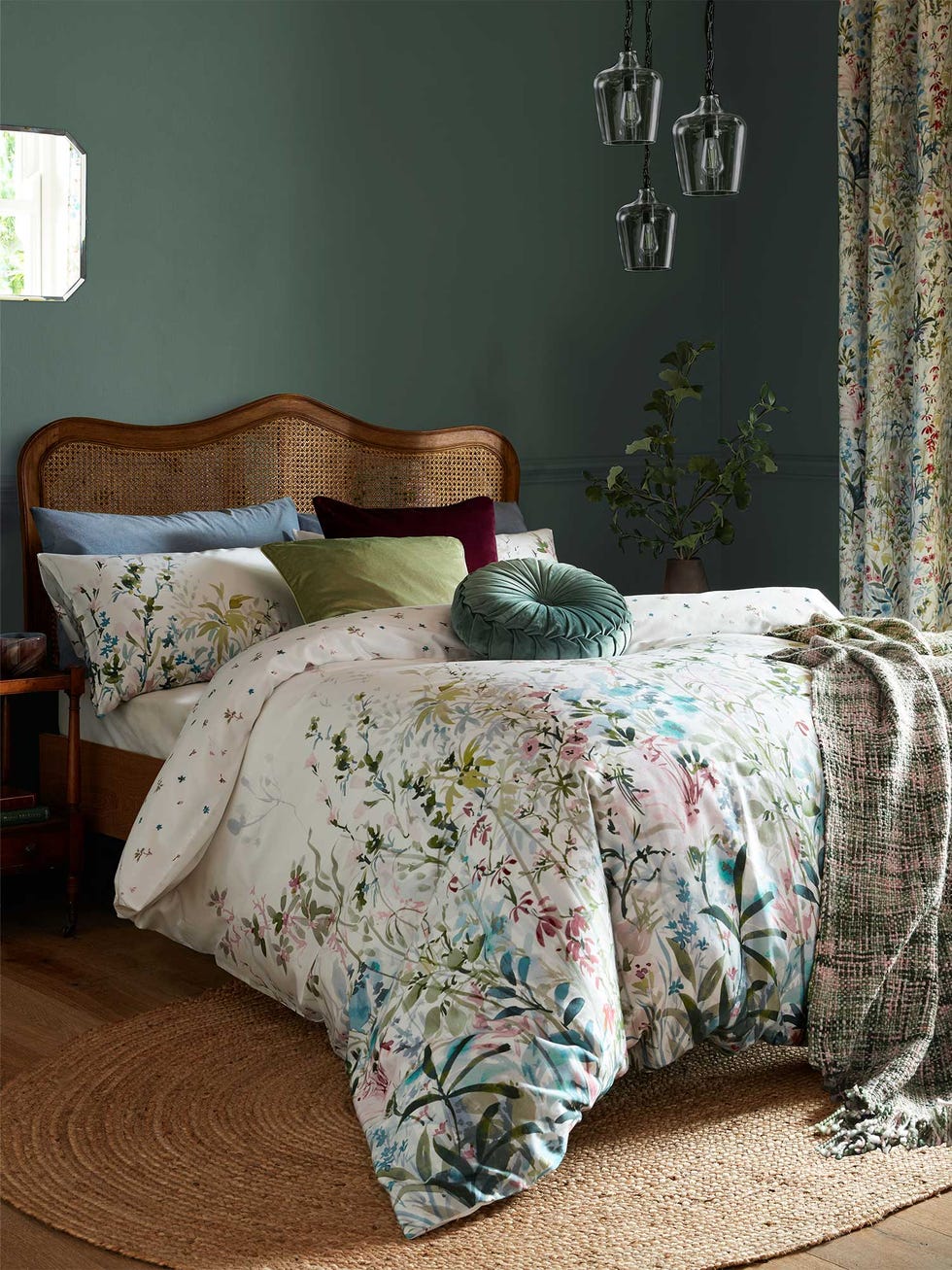
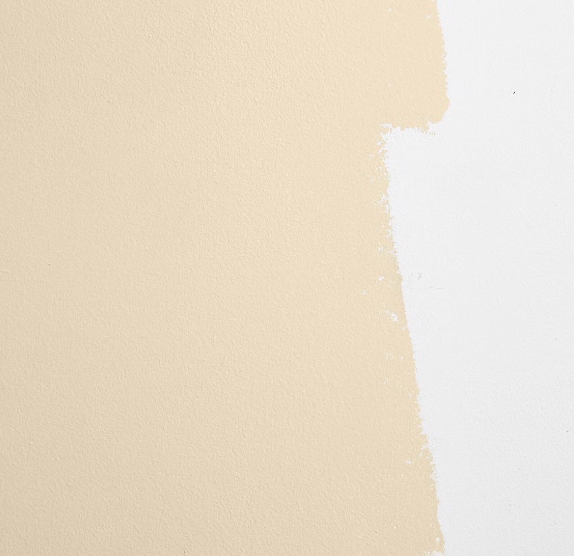
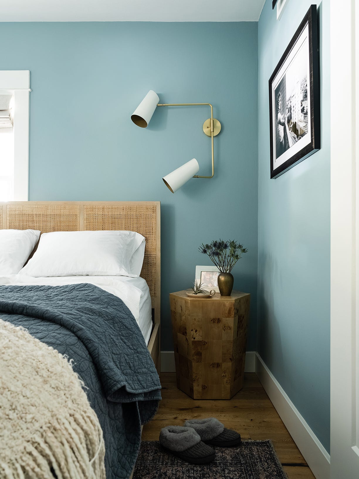
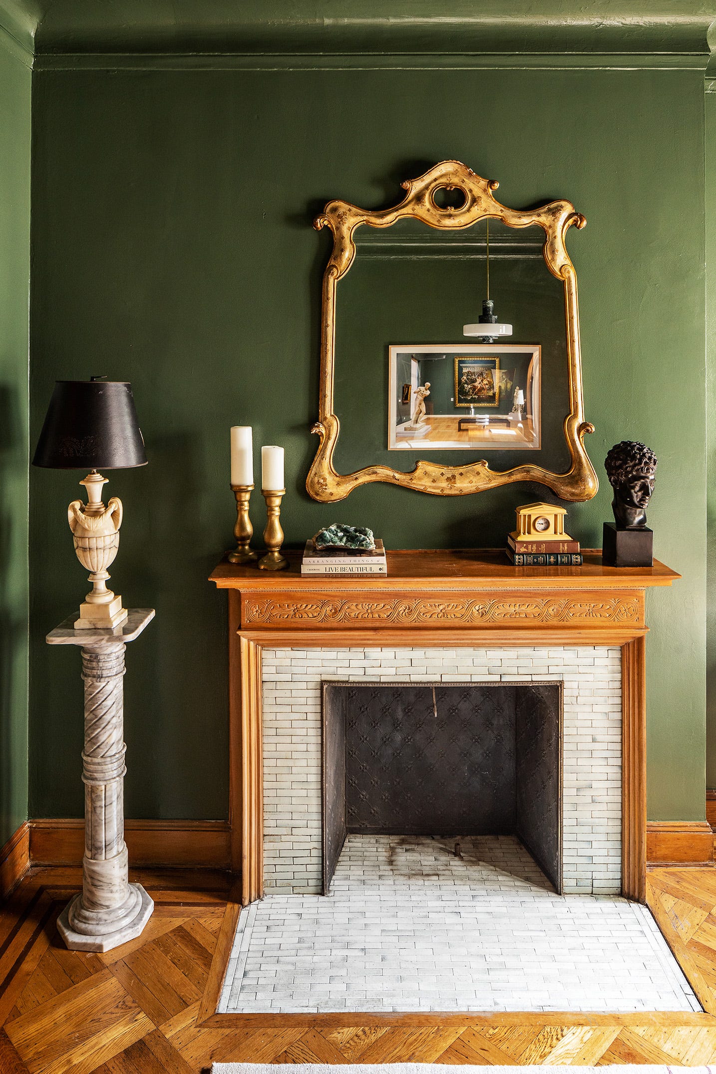
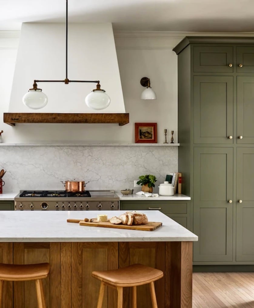
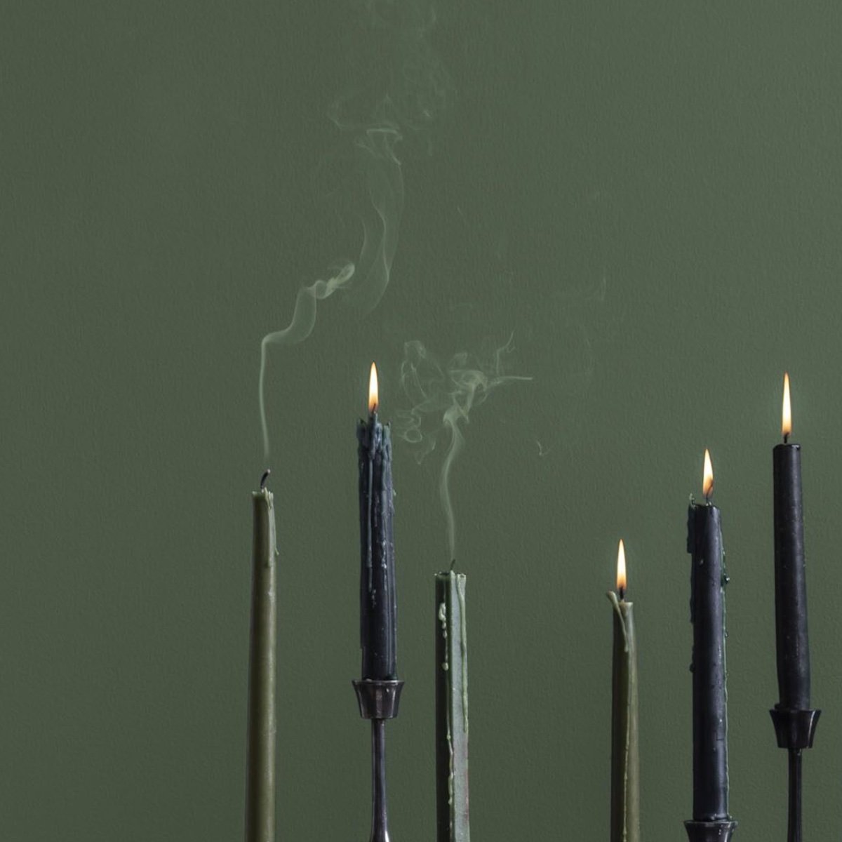
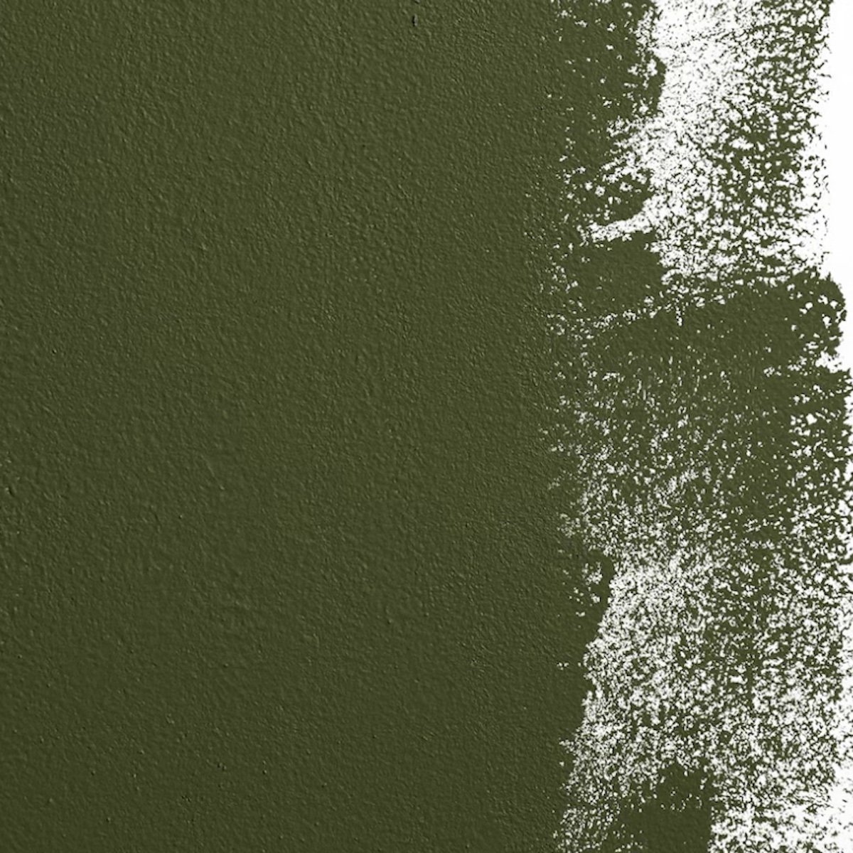
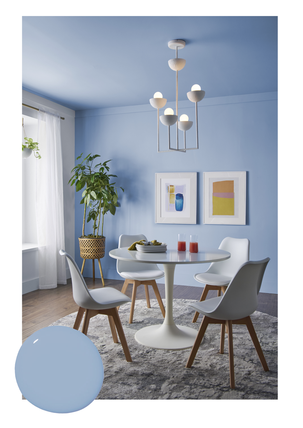
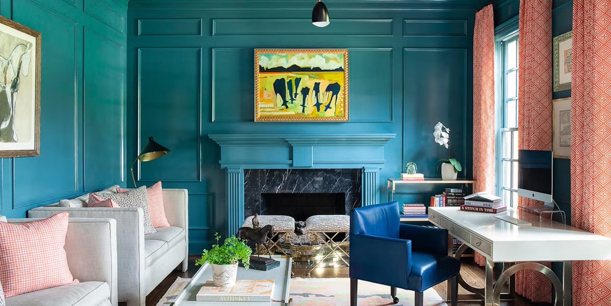
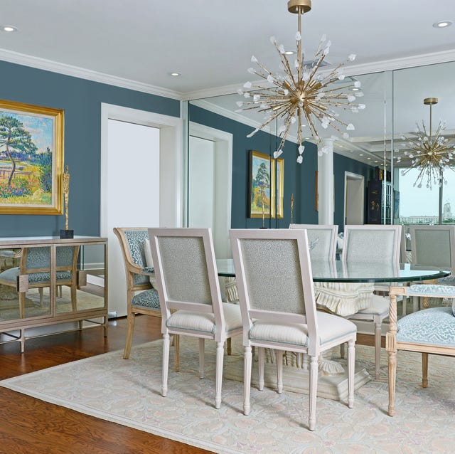
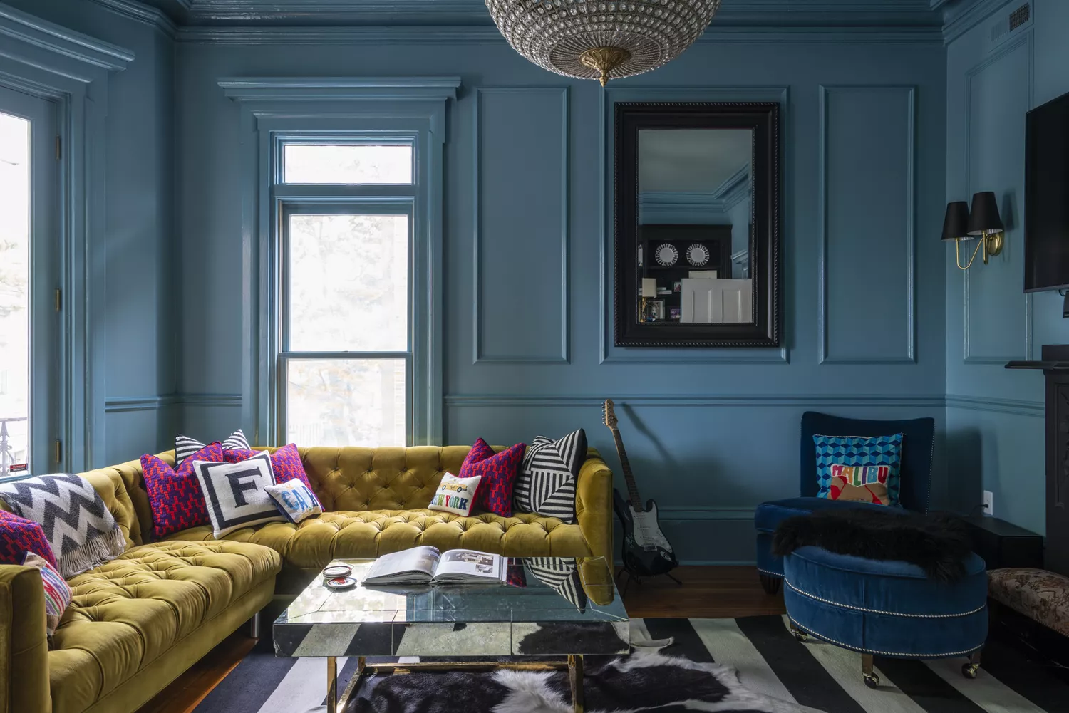
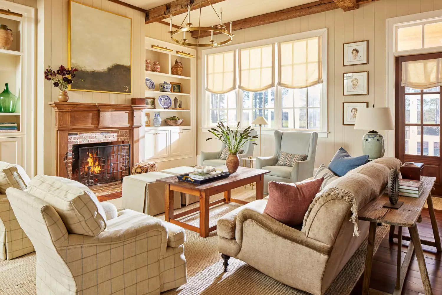
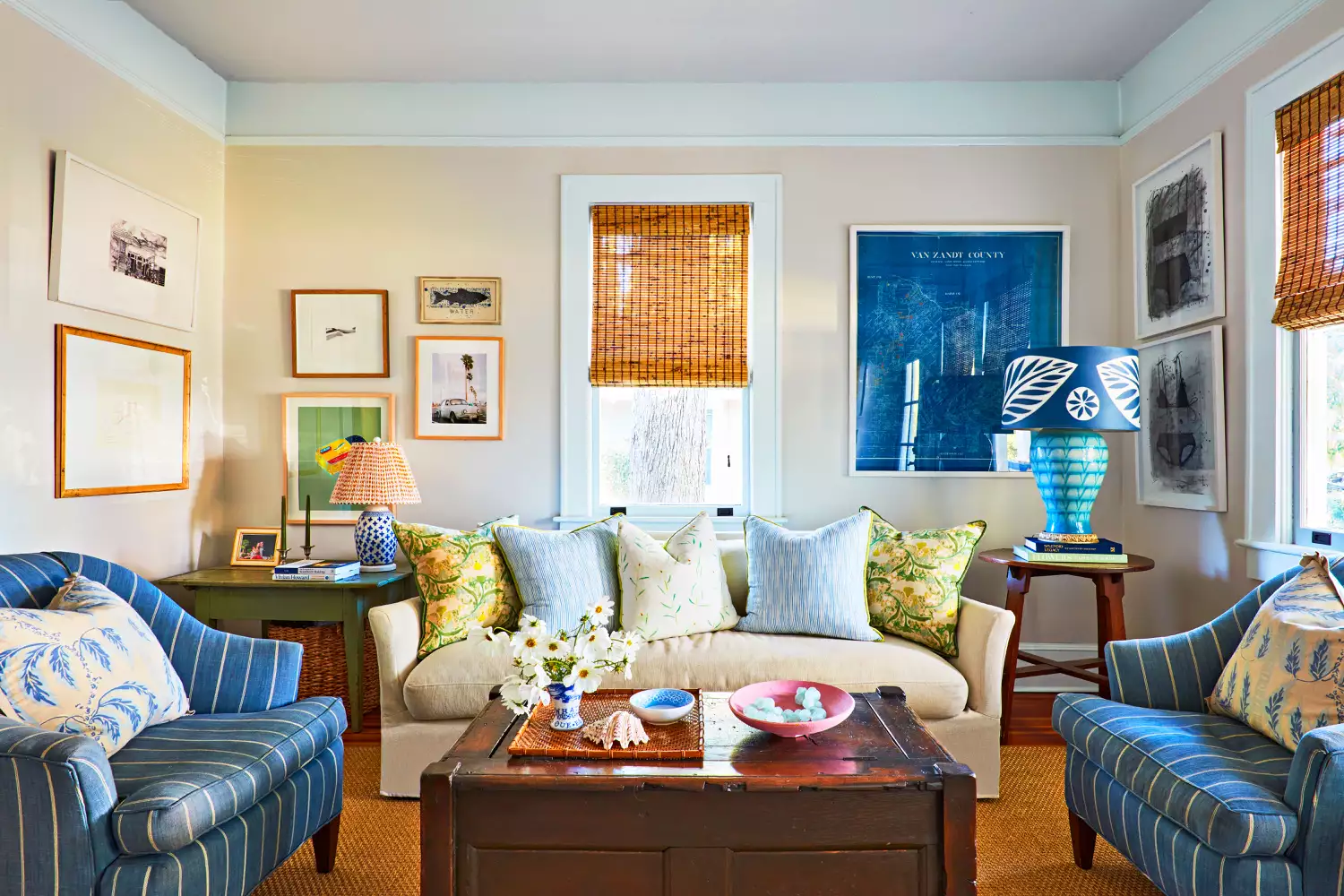
Further examples include olive green, used on built-in shelving against crisp white walls for a subtle, natural feel. Golden beige is shown to exude warmth, with the recommendation to extend it onto the ceiling. Mist green, a gray-tinged green, is ideal for light-filled rooms, accentuated by patterns and green shades. A soft blue-gray provides a fresh, clean, and bright coastal feel, with blue accents helping to emphasize the color. Teal blue, a vibrant blue-green, is demonstrated with patterned wallpaper on the ceiling for added drama. Honey yellow is described as a warm, lively color that changes appearance throughout the day. Mid gray offers a calm and cozy timeless appeal, often contrasted with glossy black elements like fireplaces. Deep turquoise is shown on shiplap walls and built-ins, balanced by warm woods.
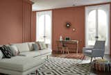
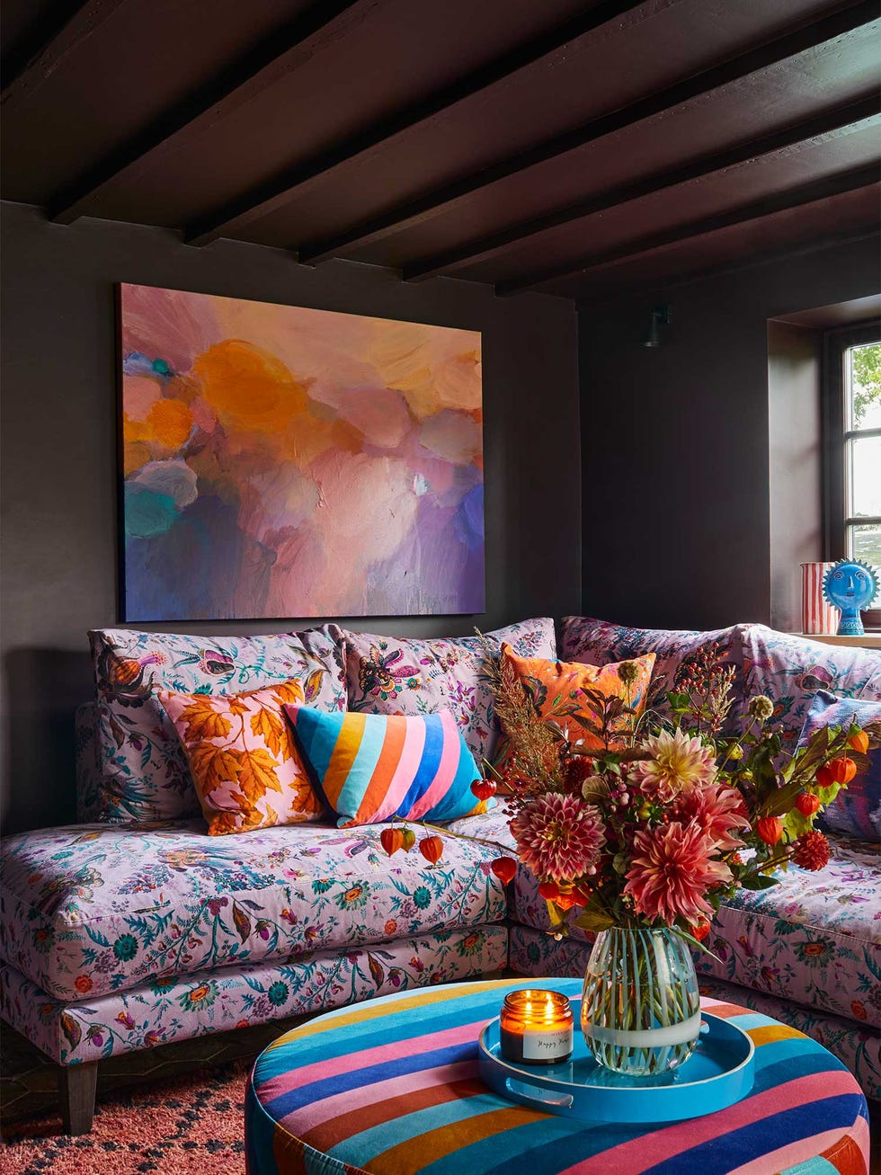
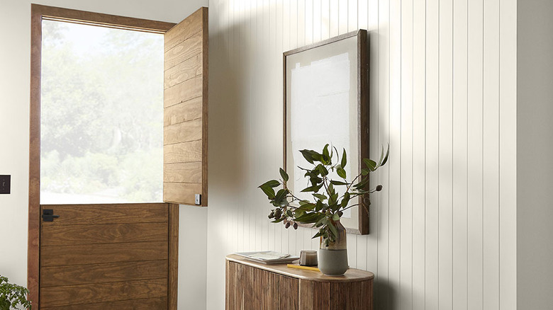
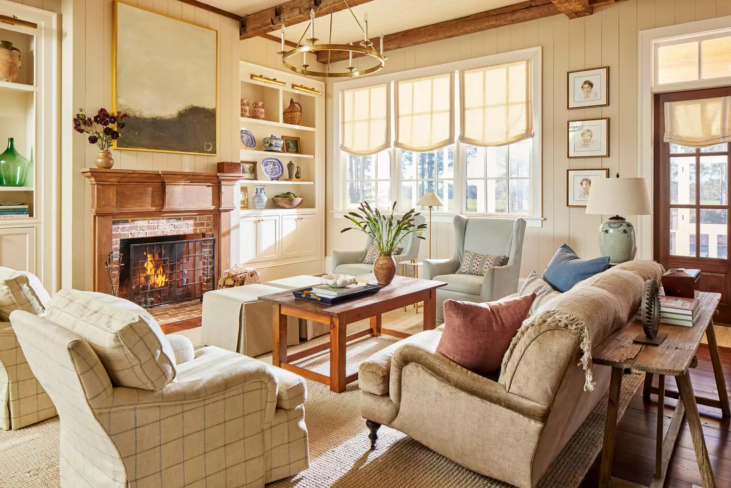
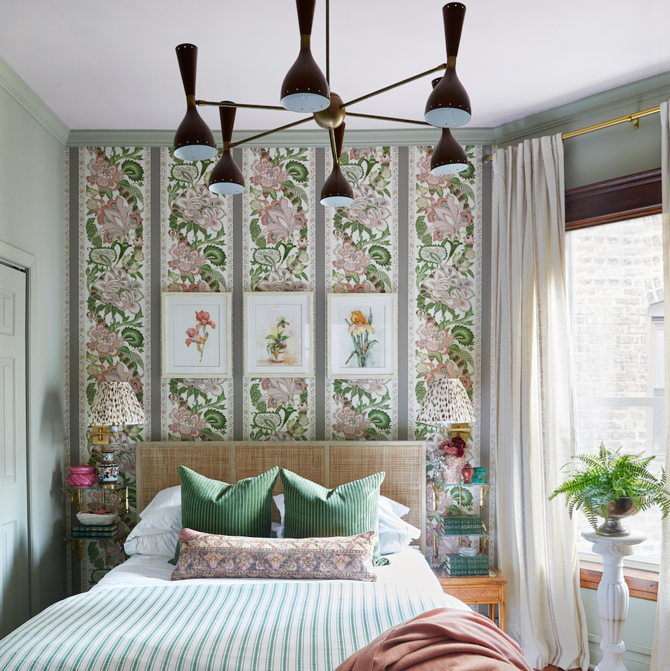
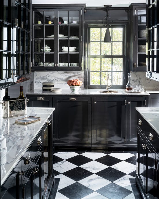
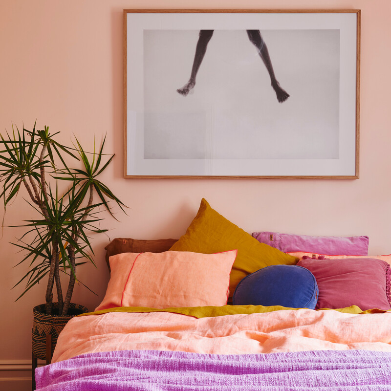
The article also covers bright white for making spaces feel larger and brighter, dark teal for dramatic effects in media rooms, and dusty pink for a soft, neutral-but-not-neutral feel. Pretty peach is suggested for a daring yet balanced look, incorporating warm-toned sofas and complementary textures. Sage green is noted for its calm, natural versatility. Classic beige provides a bright and timeless appeal, adaptable to various design styles. Lastly, deep black creates a bold, cozy, and dramatic yet neutral backdrop, often paired with modern elements like marble fireplaces and gold fixtures.
#LivingRoomDesign #PaintColors #InteriorDesign #HomeDecor #ColorTrends #NeutralColors #BoldColors #HomeImprovement #LivingRoomDesign #PaintColors #InteriorDesign #HomeDecor #ColorTrends #NeutralColors #BoldColors #HomeImprovement
0 comment in total
 No comments yet
You may also like
Design Pros Have Spoken: Here Are the Only Paint Color Trends That Matter in 2023
Designers Weigh In on the 7 Biggest Paint Color Trends of Fall 2022

8 Paint Color Trends You'll ACTUALLY Want to Live With in 2026, According to Designers

9 Trending Paint Colors You'll See Everywhere in 2025, According to Designers
These Paint Colors Will Dominate Our Homes in 2022

12 Trending Paint Colors for 2024, According to Design Experts
4 Paint Color Trends Designers Are Ready To Ditch In 2025
These 8 Color Trends Will Rule in 2025, According to Color Pros


The #1 Paint Color Trend of 2025, According to Designers
This Serene Paint Trend Is Set To Take Over In 2022
These 5 Paint Color Trends Will Be Everywhere in 2024, According to Interior Designers
What Paint Colors Will Rule 2026? Designers Make Their Predictions

5 Paint Color Trends Designers Are Begging You to Leave in 2025

The Paint Color Trends of 2023 Are in—And They’re Gorgeous
We’re Calling It: These Are the Official Color Trends of 2025
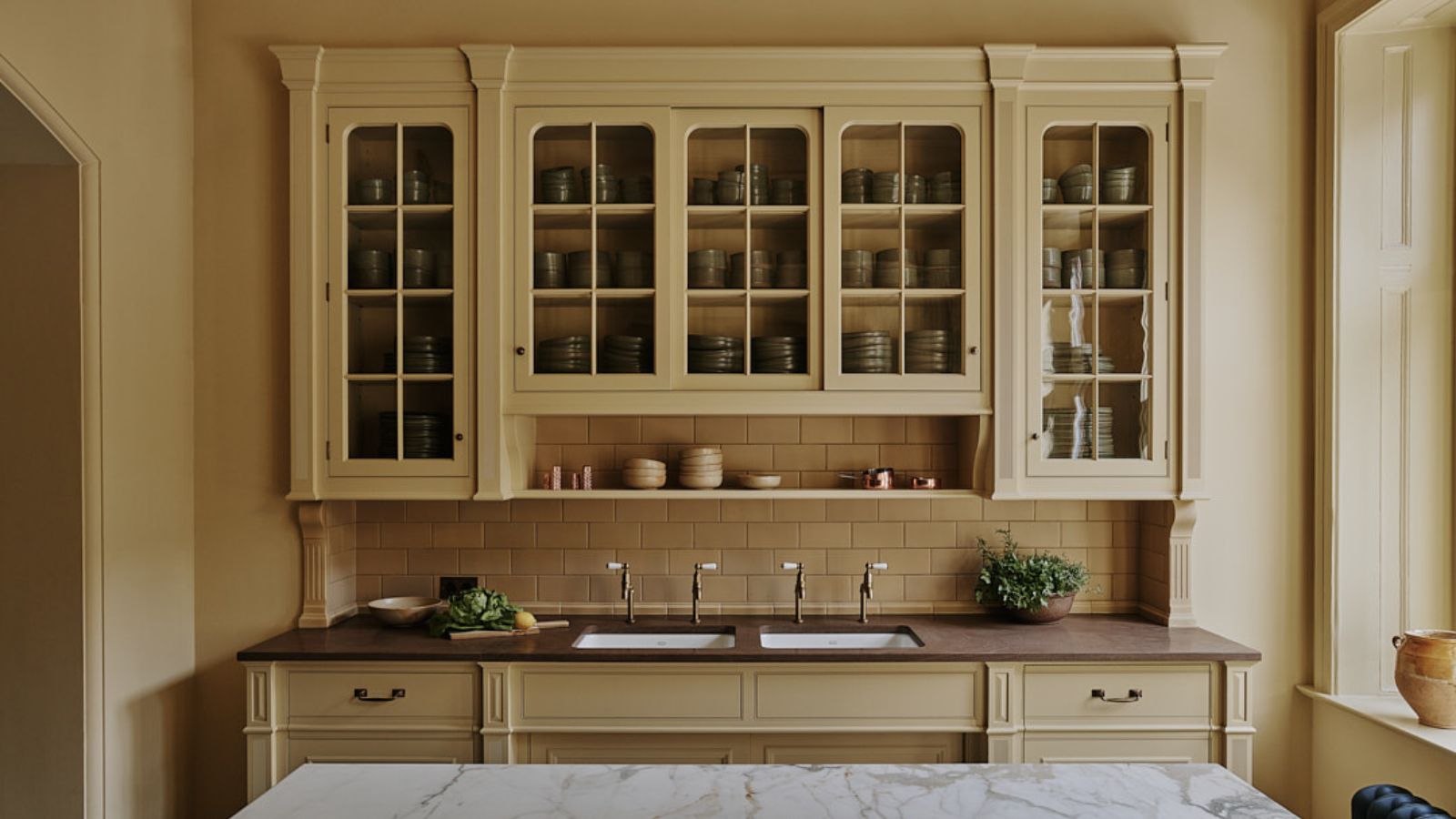
The biggest color trends of 2025 – 10 colors designers say will lead the way next year

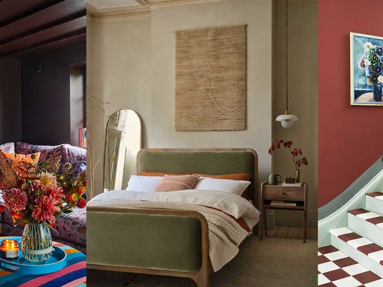
Colour experts share their top paint trends for 2024

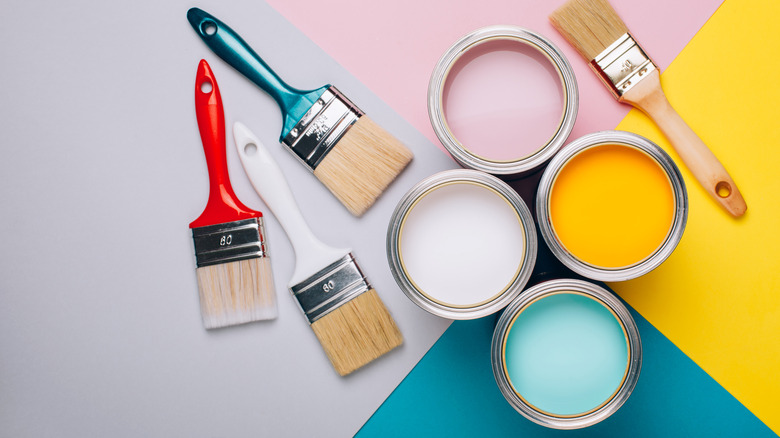
What To Expect For 2023 Paint Color Trends

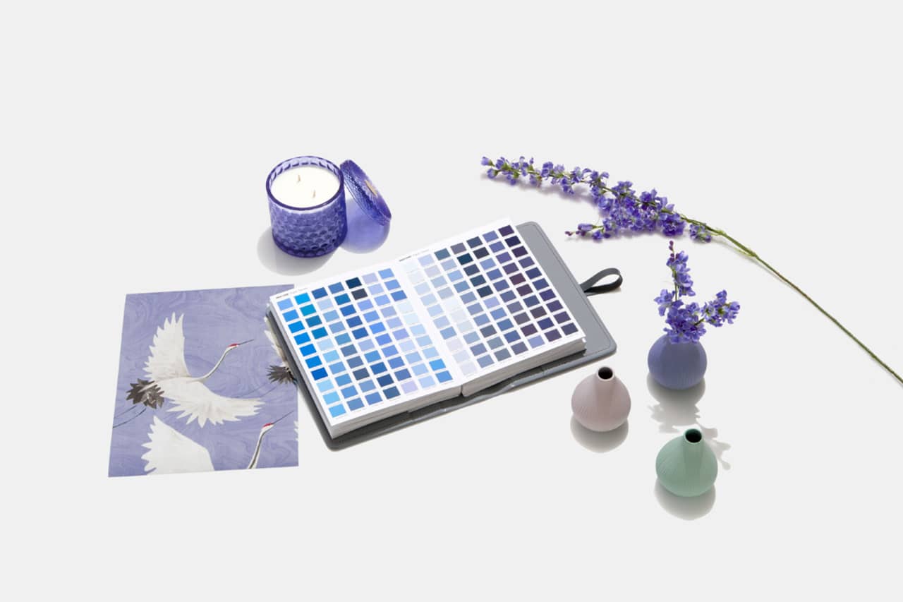
Designers Weigh in on 'Very Peri'—Pantone’s Color of the Year 2022
5 Paint Color Trends We Hope Don't Come Back This Year