1/9
These 8 Color Trends Will Rule in 2025, According to Color Pros
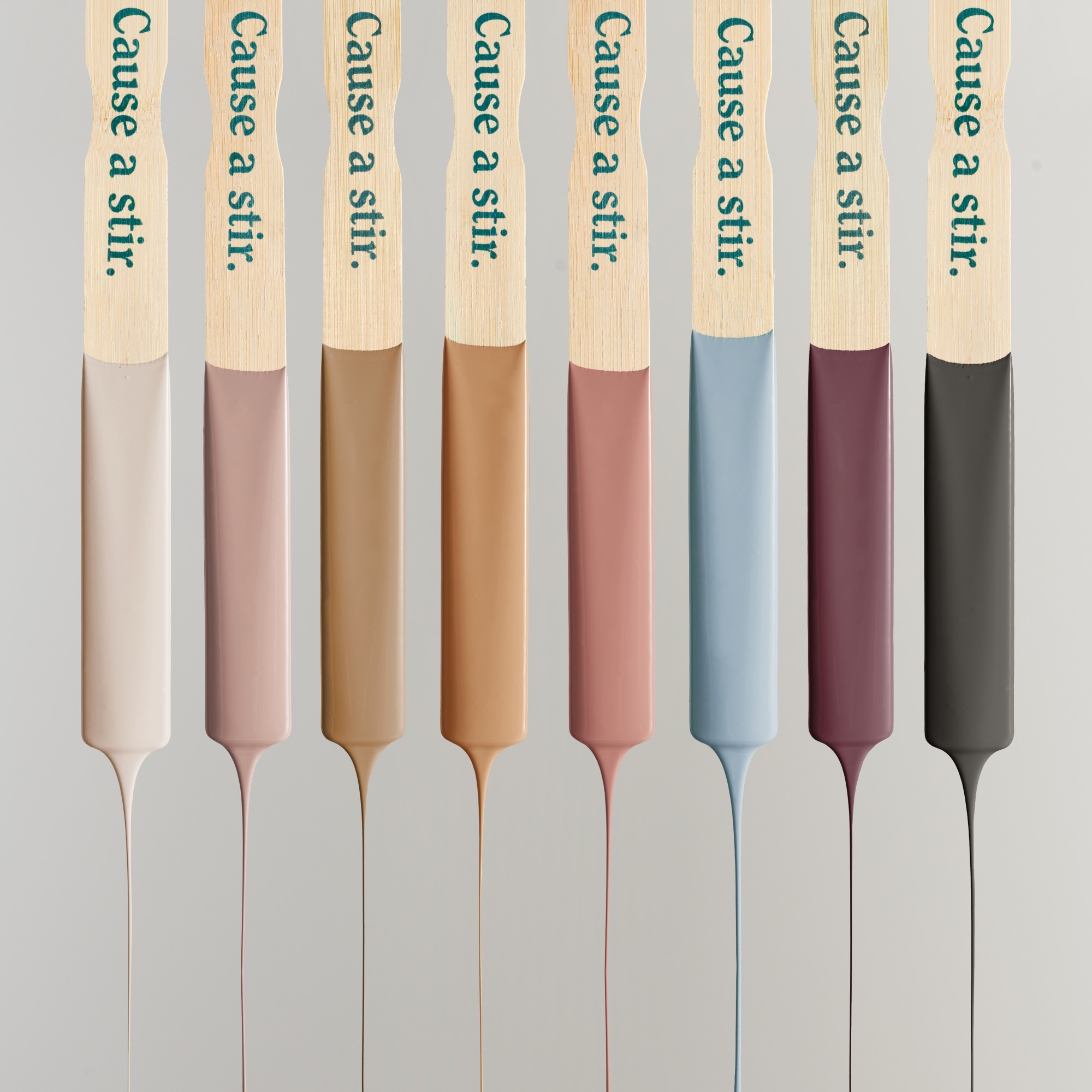
In 2025, color trends in interior design are shifting significantly, moving away from stark whites, cool neutrals, and dated grays towards more personalized, layered, and comforting palettes. This evolution emphasizes creating spaces that reflect individual stories and well-being. Experts from leading paint companies and color institutions, such as Sherwin-Williams, Little Greene, Pantone, C2 Paint, Graham & Brown, Valspar, HGTV Home by Sherwin-Williams, Dutch Boy, Krylon, Behr, Benjamin Moore, Glidden, Minwax, Dunn-Edwards, Coloro x WGSN, all highlight this transition.
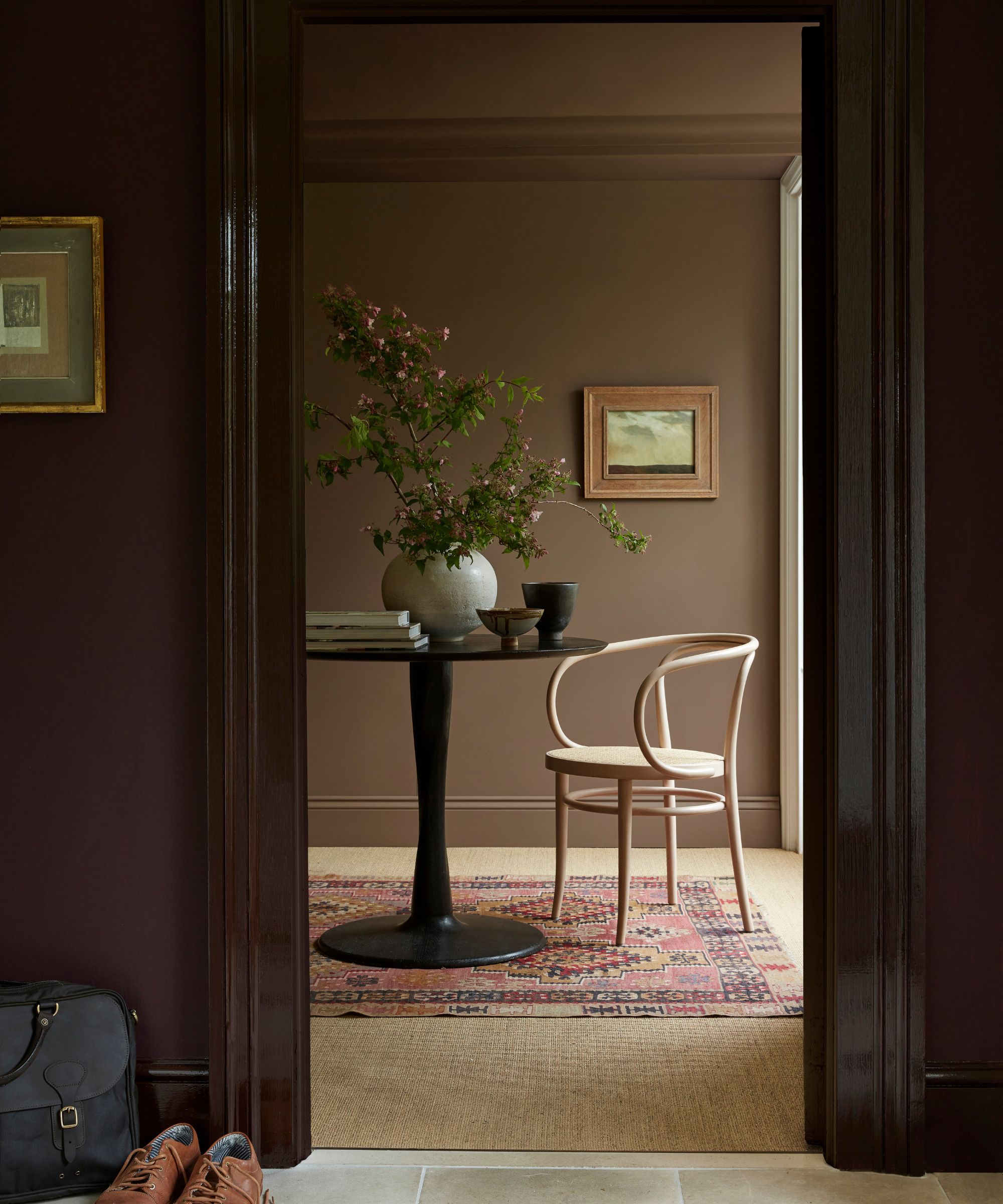
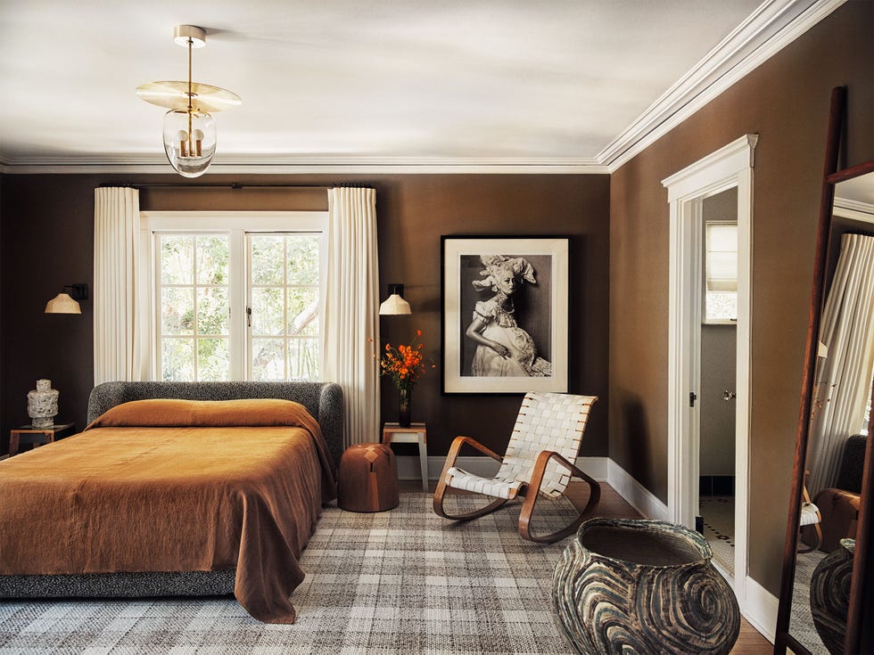
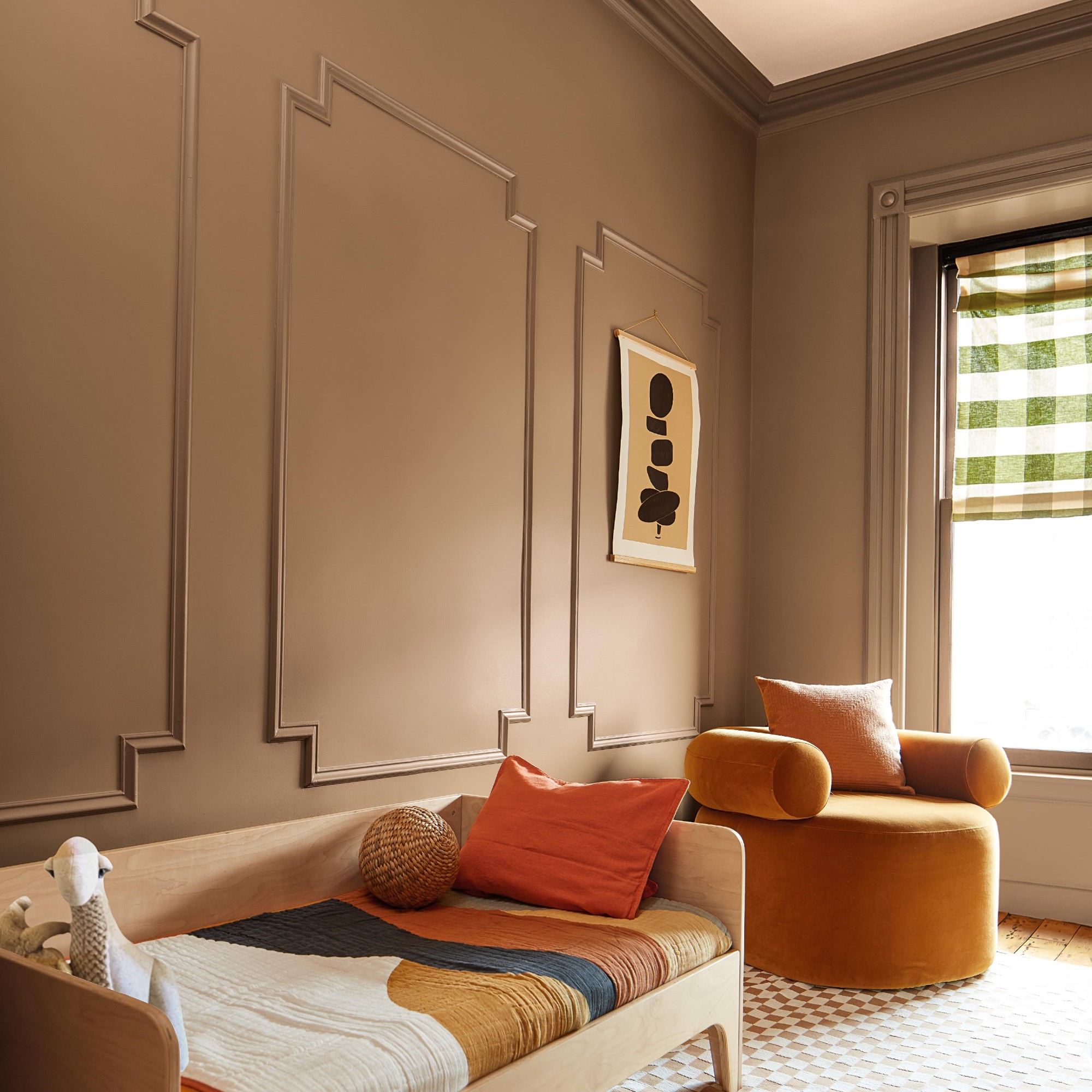
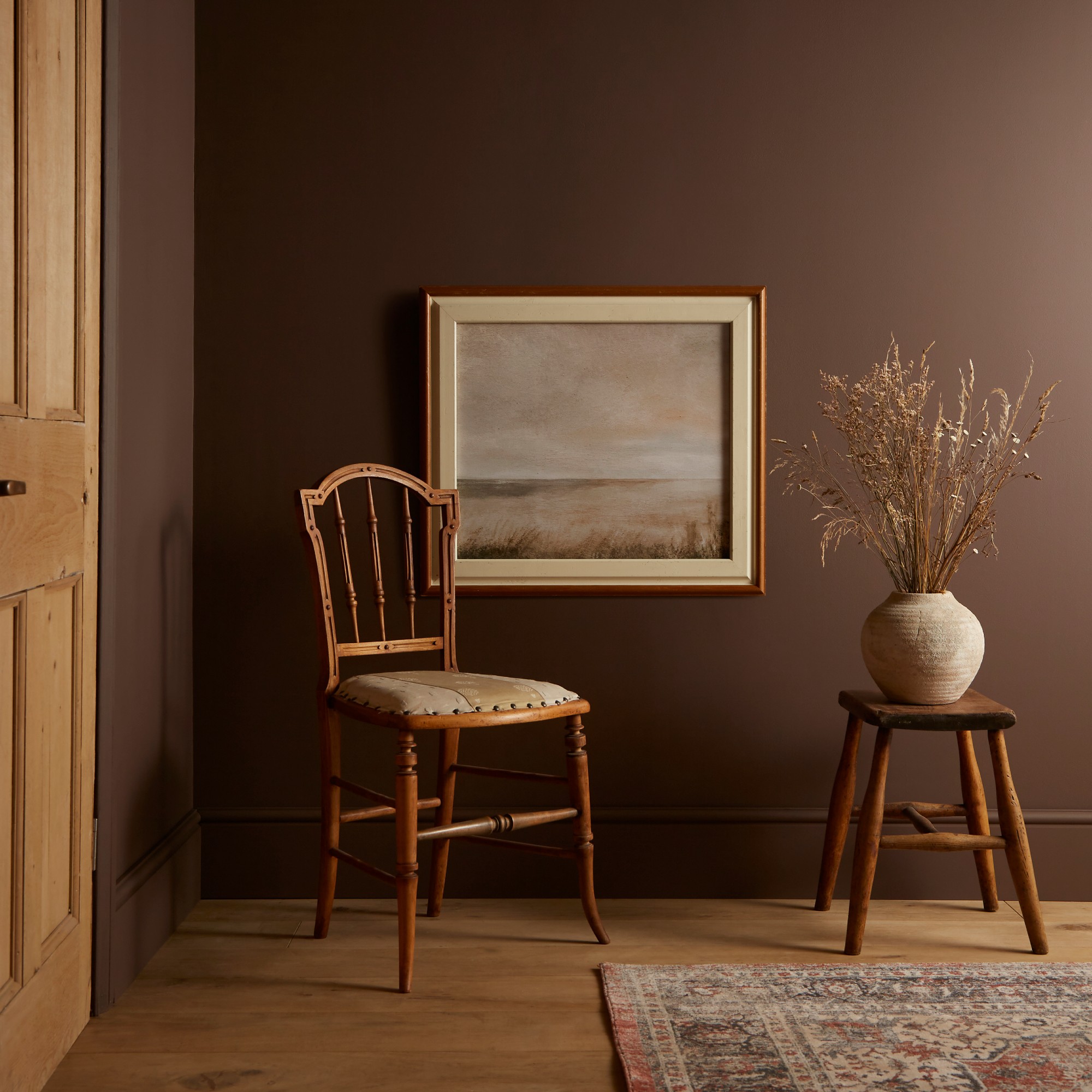
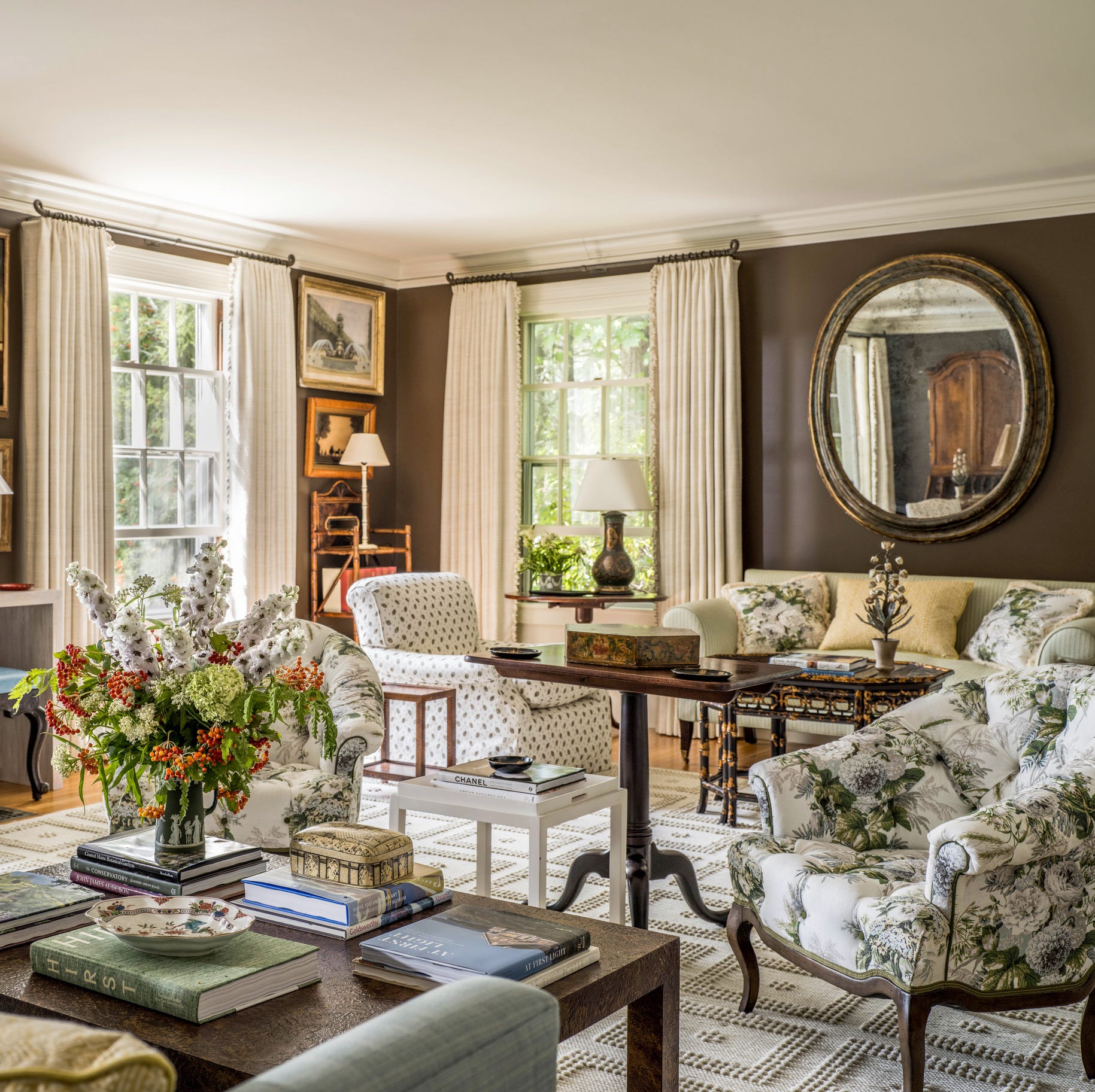
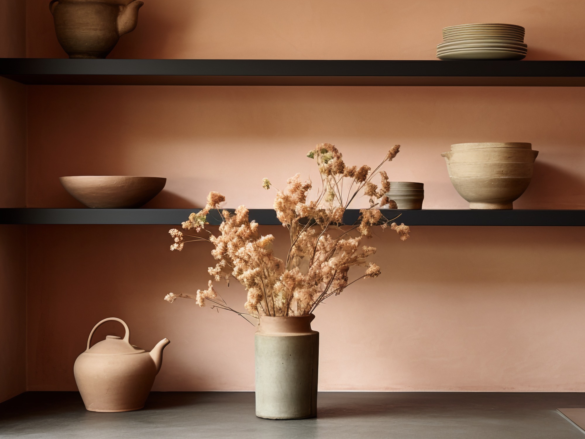
One prominent trend is "Dessert Browns," where brown hues take on a sweeter, more refined character. Shades like chocolate, coffee, caramel, and toffee are expected to dominate, replacing cooler palettes with warmth and comfort. Little Greene's Mochi and Pantone's Mocha Mousse, both warm brown shades, exemplify this, offering versatility for both traditional and contemporary settings. C2 Paint's Raku, a rich mahogany inspired by Japanese tea ceremonies, and Graham & Brown's Elderton, a neutral brown reminiscent of elder tree leaves, further cement the importance of earthy, grounding browns. Sherwin-Williams also features "Grounded," a rich brown that brings a calming nature to interiors within their 2025 Color Capsule.
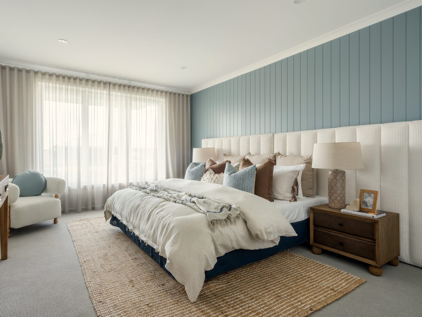
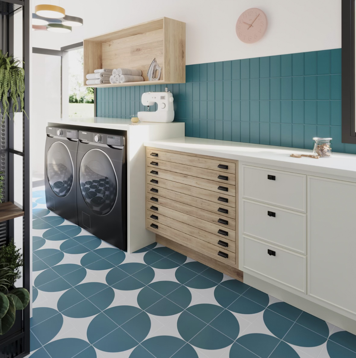
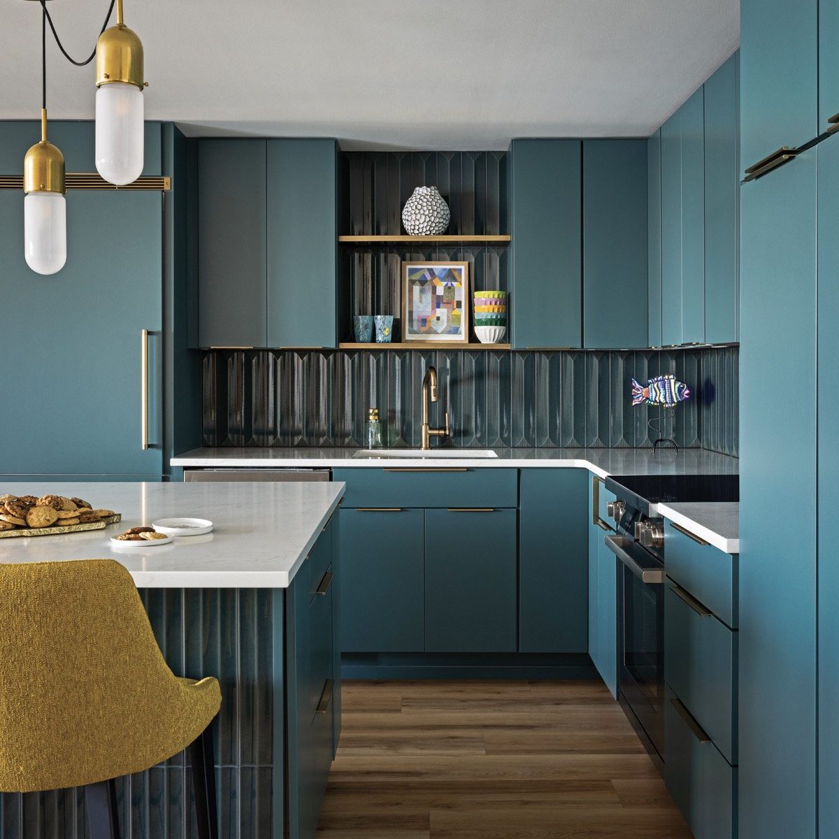
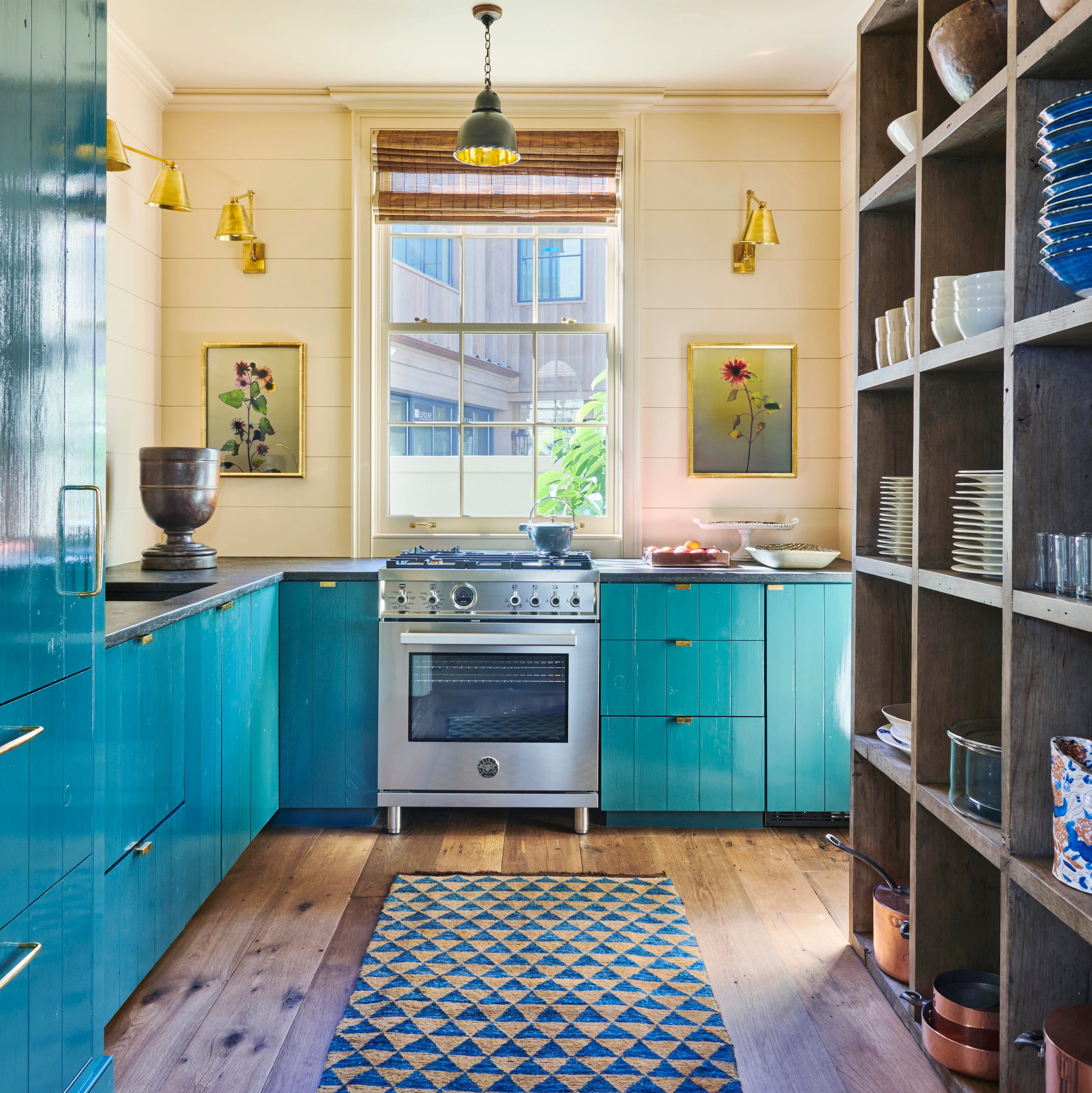
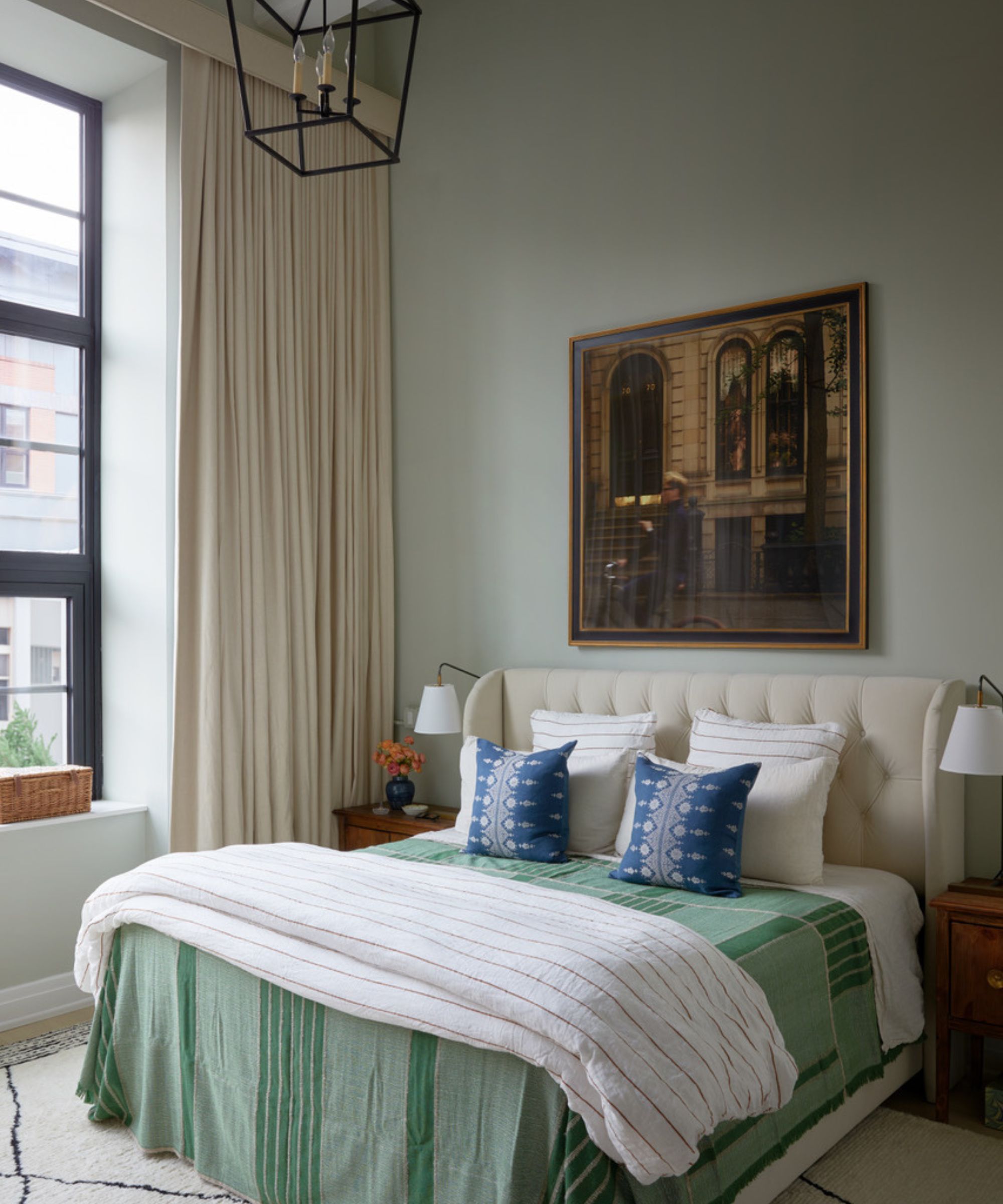
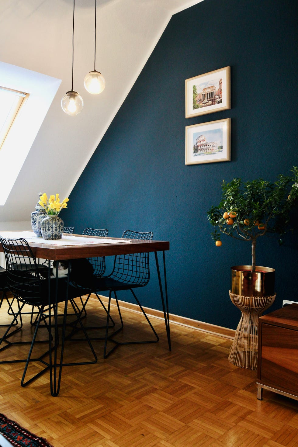
The article also identifies "Otherworldly Blues" as a key trend, with a move towards deeper, enchanting shades of blue. VERANDA's choice of Cosmic Cobalt, a brilliant ultramarine, signifies a desire for captivating yet calming colors inspired by the night sky and deep sea. Valspar's Encore, a rich sapphire, and HGTV Home by Sherwin-Williams's Quietude, a blue-sage hue, reflect this, emphasizing serenity and a timeless quality. Dutch Boy's Mapped Blue, a classic medium blue with yellow undertones, also caters to the demand for vibrant yet familiar colors.
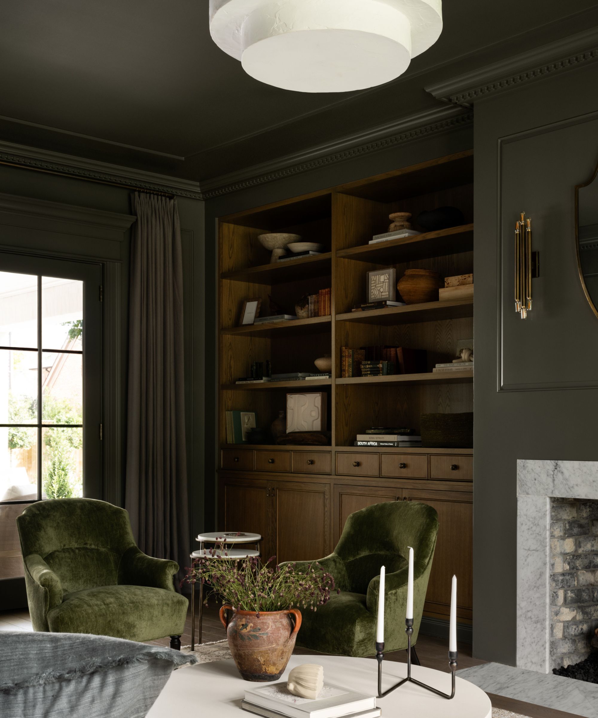
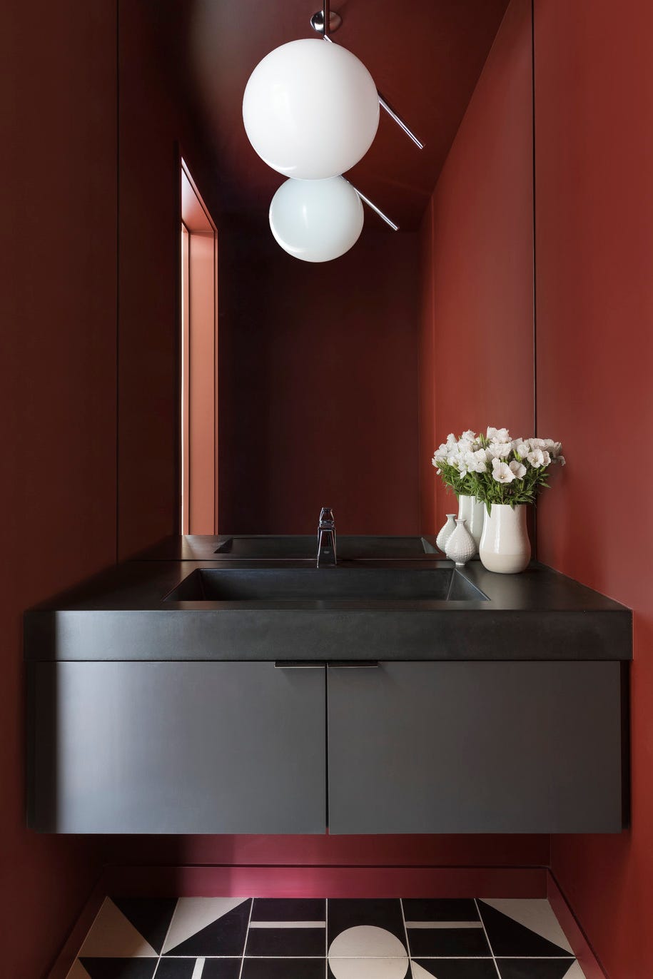
"Bold Ebony" emerges as a trend for making a statement, utilizing deep ebony and black olive tones as accents to ground brighter palettes, adding depth, elegance, and polish. Krylon's Hammered Black, inspired by gothic and brutalist design, and Sherwin-Williams's Clove, a deep brown that borders on black, underscore this shift towards rich, impactful hues.
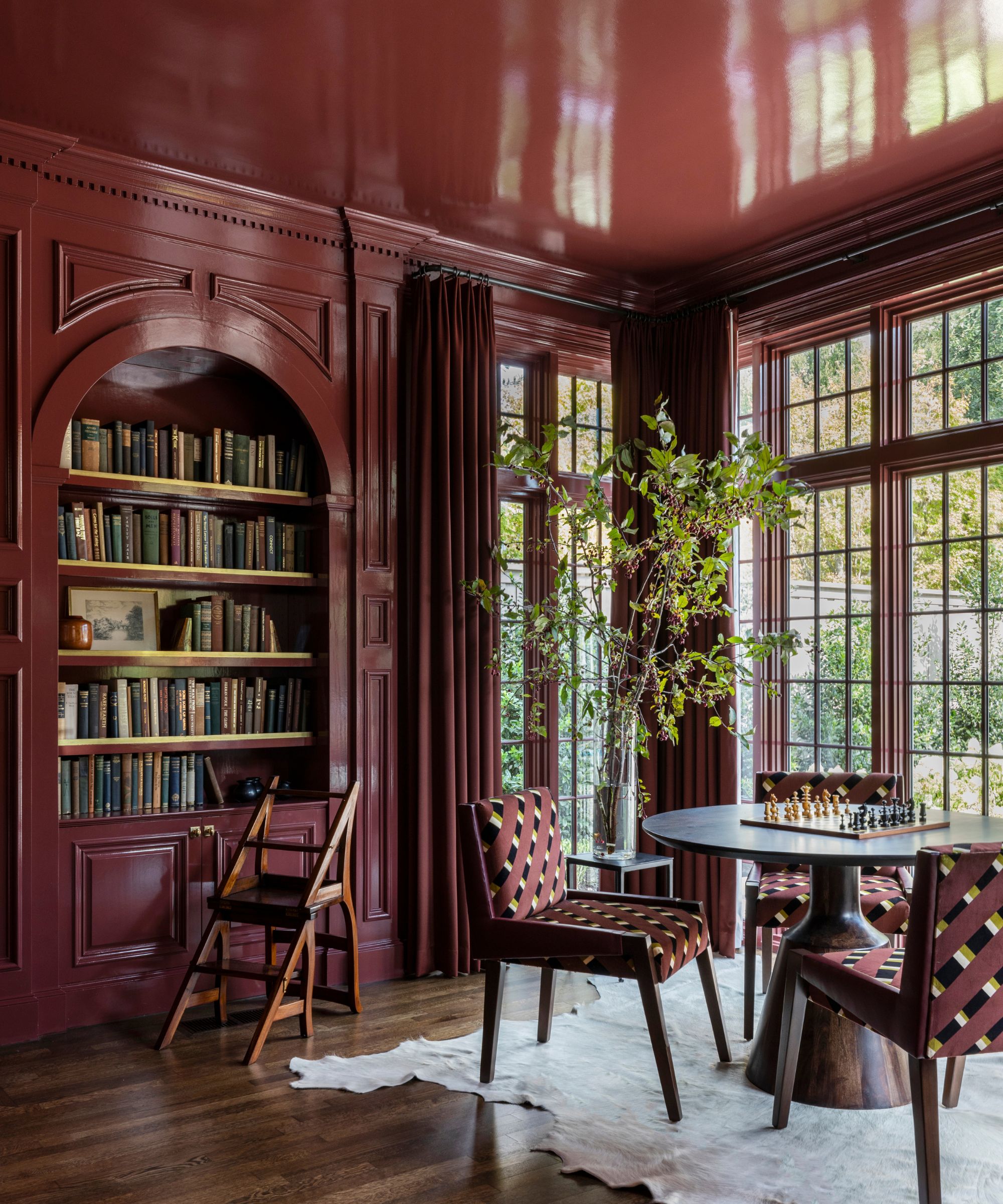
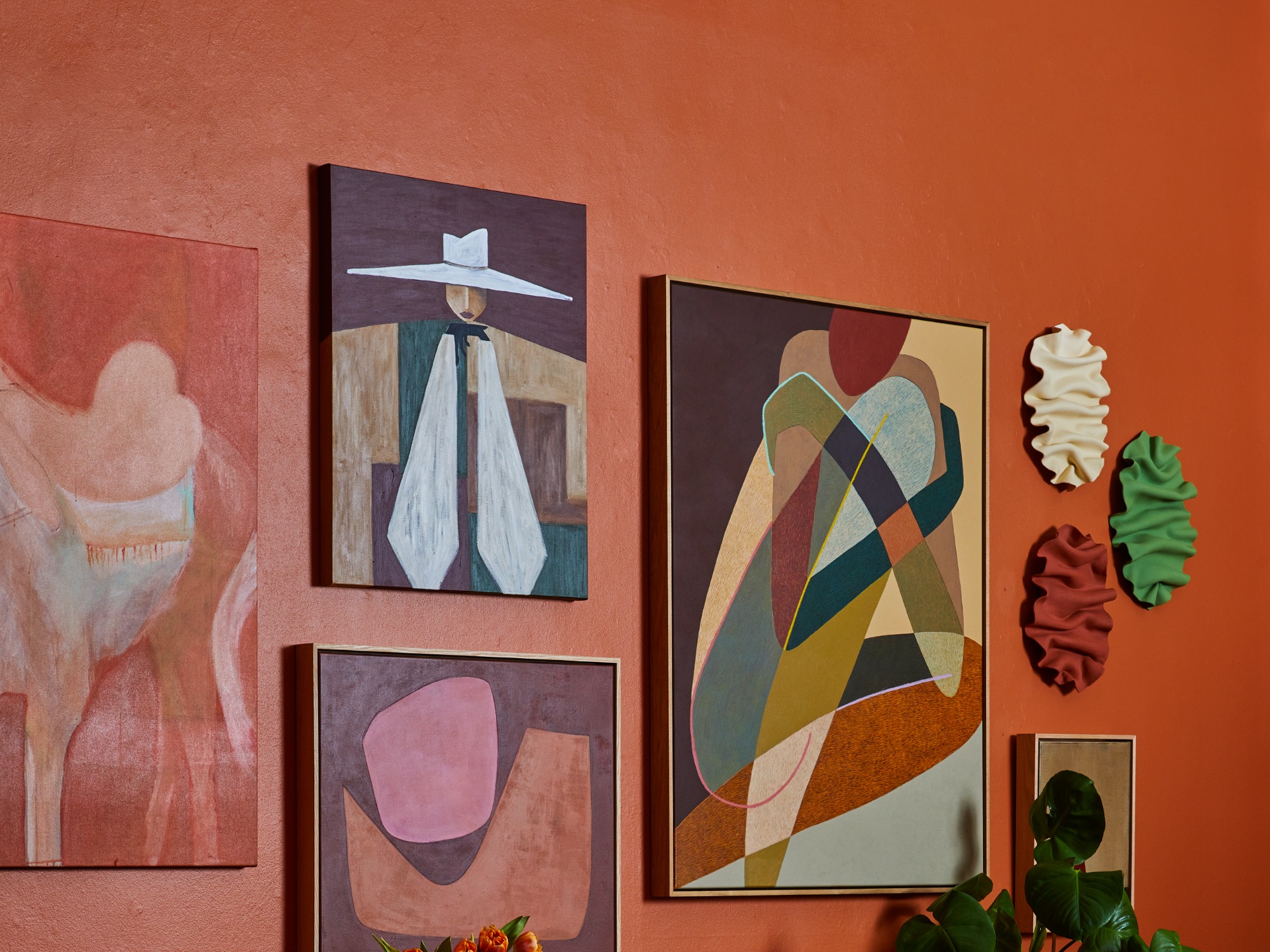
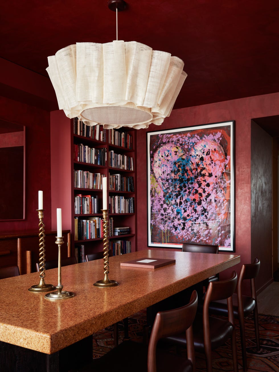
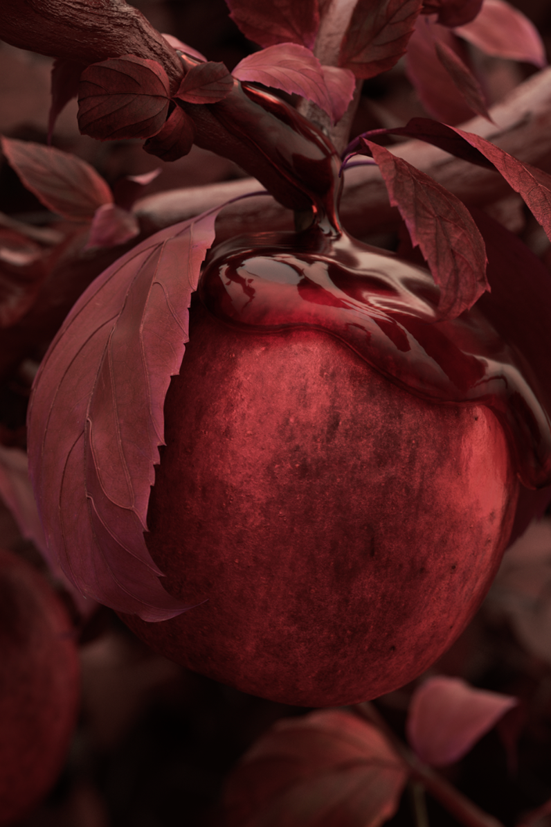
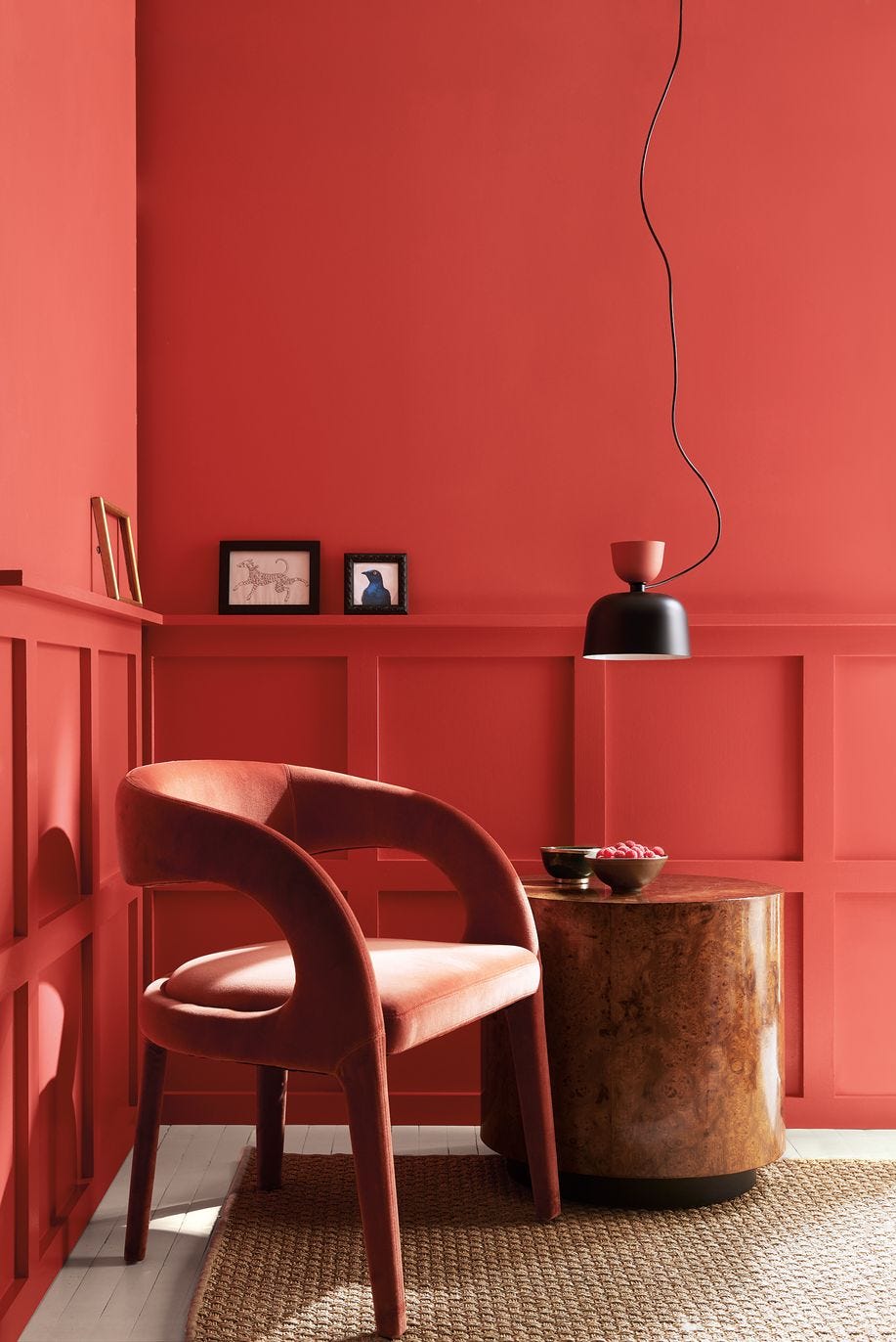
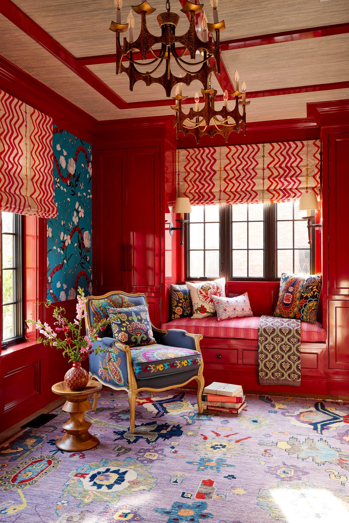
"Ruby" colors, encompassing stunning rubies and nostalgic reds, are also gaining traction, tying into the red thread theory and a desire for historical, familiar tones. Behr's Rumors, a sultry ruby reminiscent of 90s hues, and Sherwin-Williams's Borscht and Red Tomato, vibrant raspberry and red shades, indicate a departure from previously dominant soft greens and blues, yet still exuding warmth.
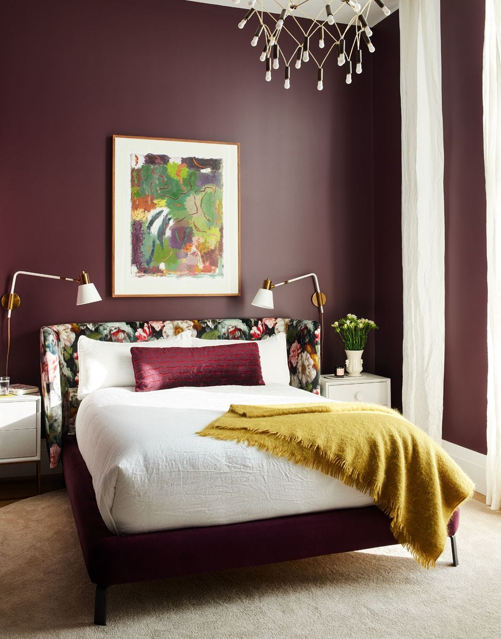
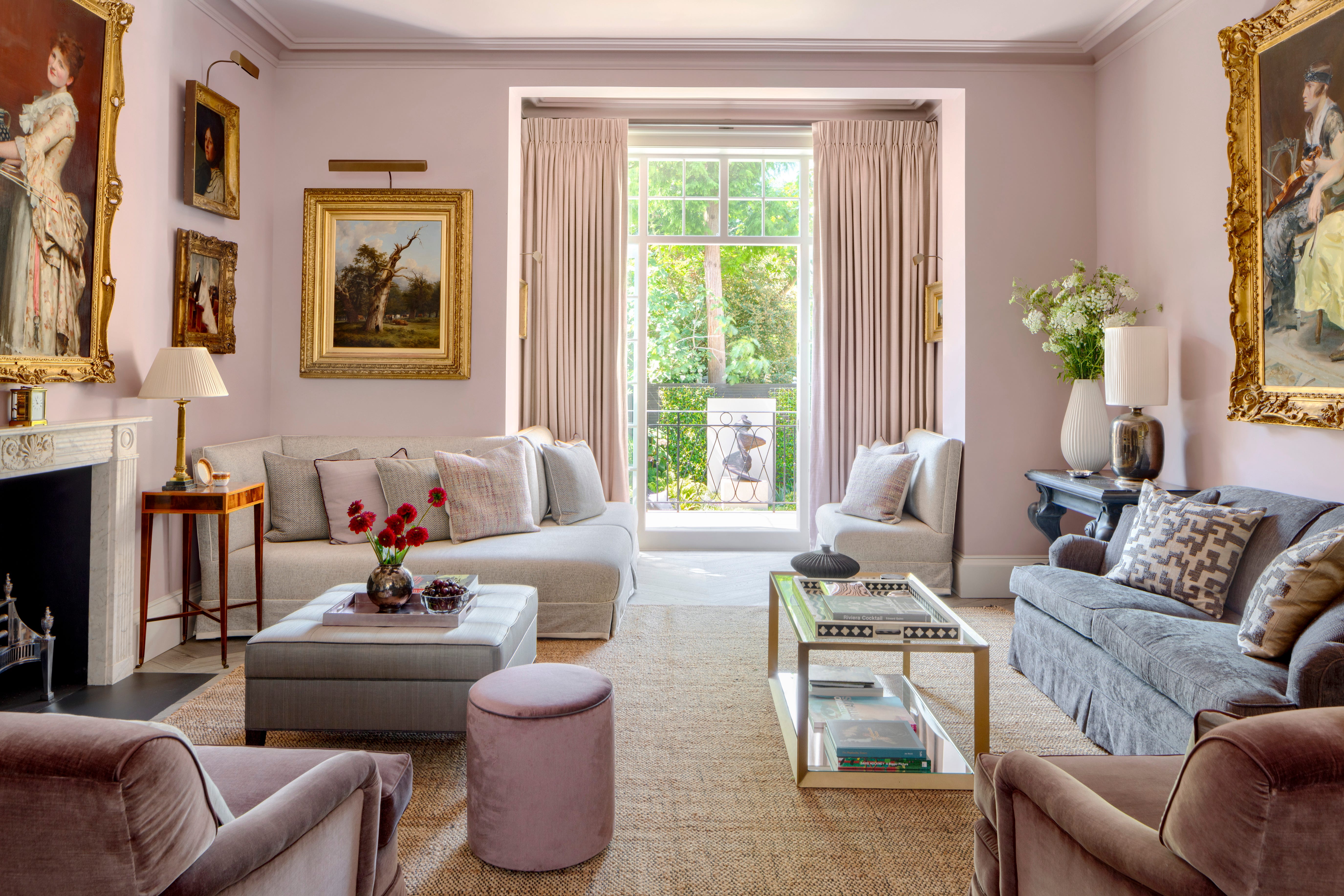
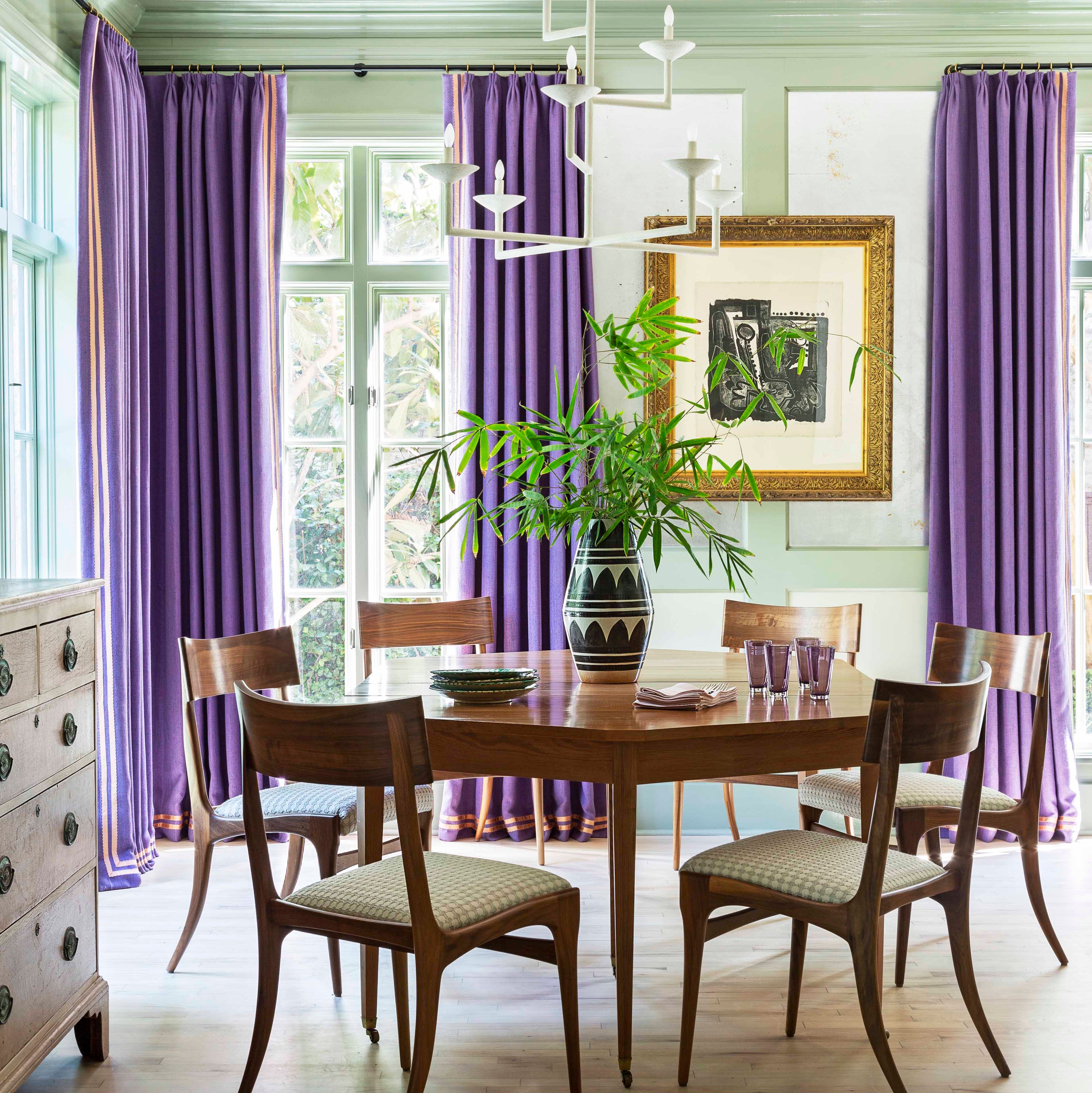
"Striking Plum" introduces earthy purples such as aubergine, plum, and jam. Benjamin Moore's Cinnamon Slate, a mix of heathered plum and velvet brown, is highlighted as their 2025 color of the year. Glidden's Purple Basil encourages bold color choices for self-expression, and Minwax's Violet leans into jewel tones, all suggesting a push towards vibrant yet natural-world connected purples.
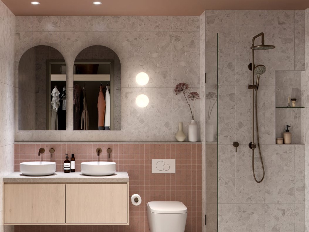
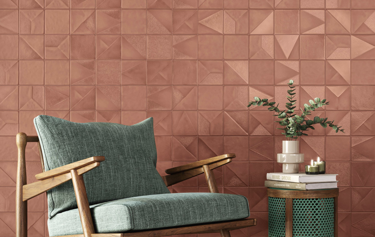
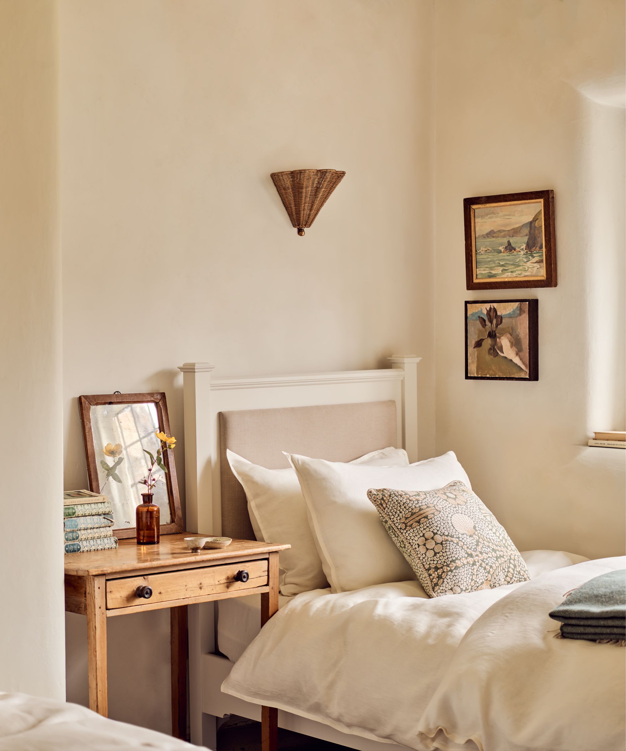
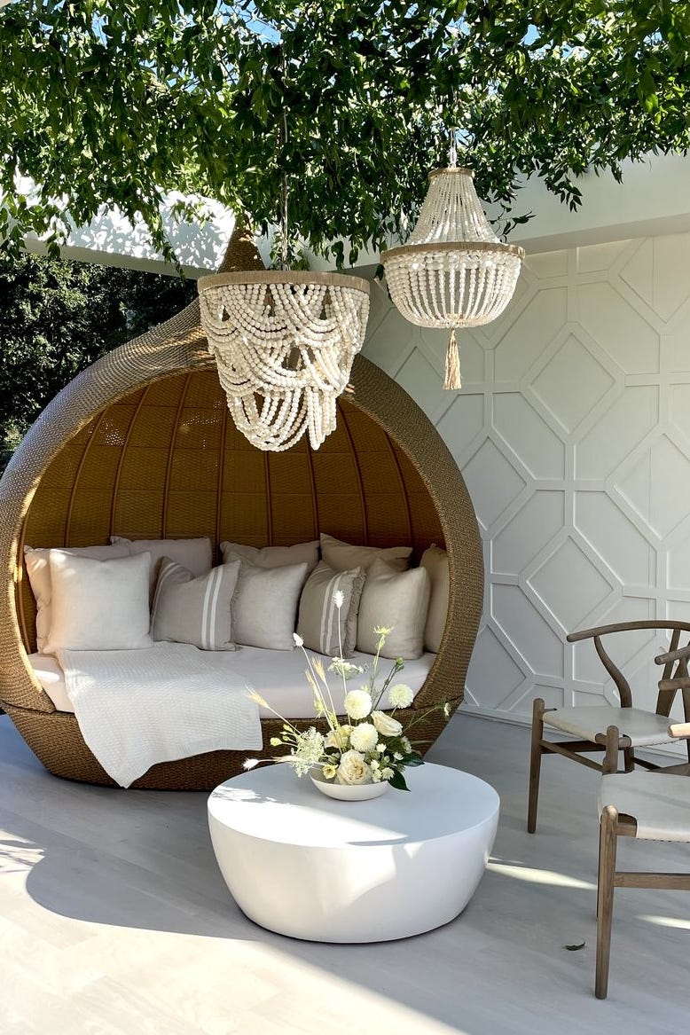
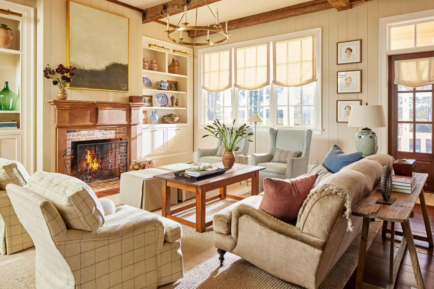
"Honeyed Neutrals" signify a continued shift away from cool tones towards toasty, warm neutrals. These elemental and raw tones are seen as essential for balancing bold accents and adding warmth. Dunn-Edwards' Caramelized, a soft terracotta brown, highlights the rise of sunbaked, earthy tones, reinforcing the move towards comforting and serene palettes. Sherwin-Williams's Chrysalis palette also aligns with these grounding qualities.
Finally, "Artist's Ochre" emphasizes the popularity of illustrious ambers and a growing interest in mustard and earthy-rich yellows. These hues provide comfort, relief, and a touch of luxury, suitable for studies or wellness rooms. Coloro x WGSN's Amber Haze, a green-toned yellow, is noted for its energizing and rejuvenating properties.
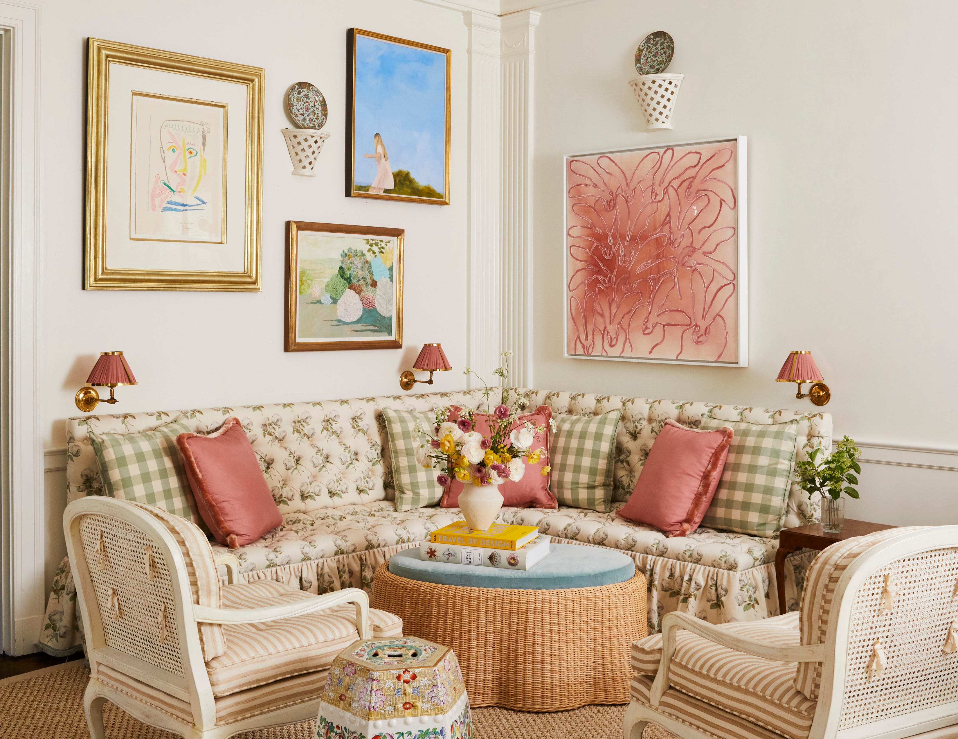
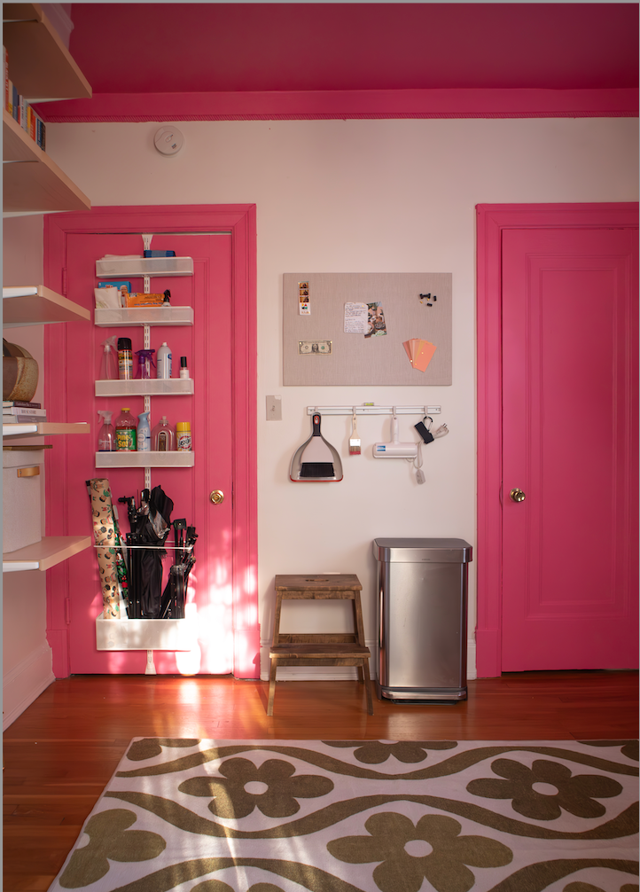
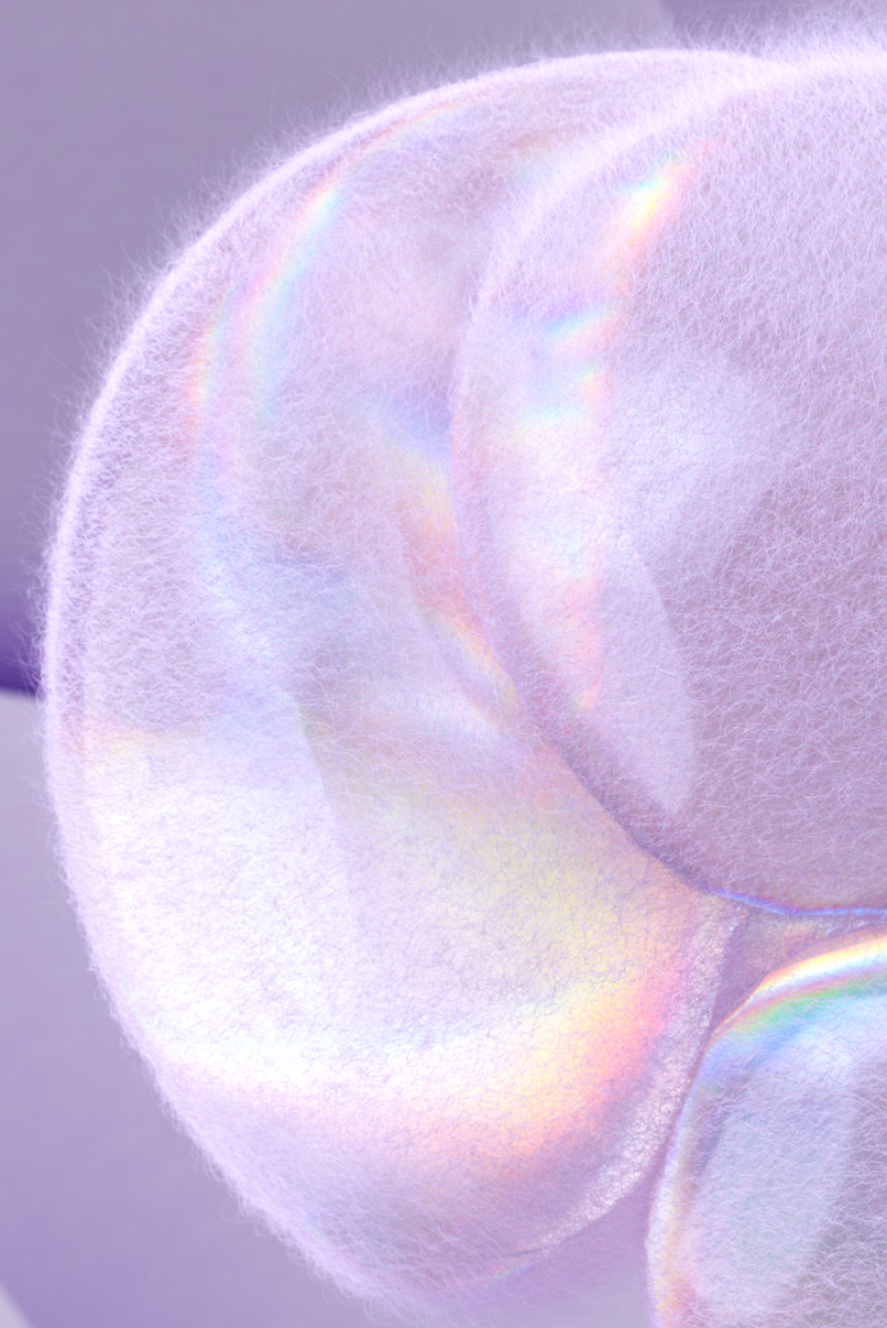
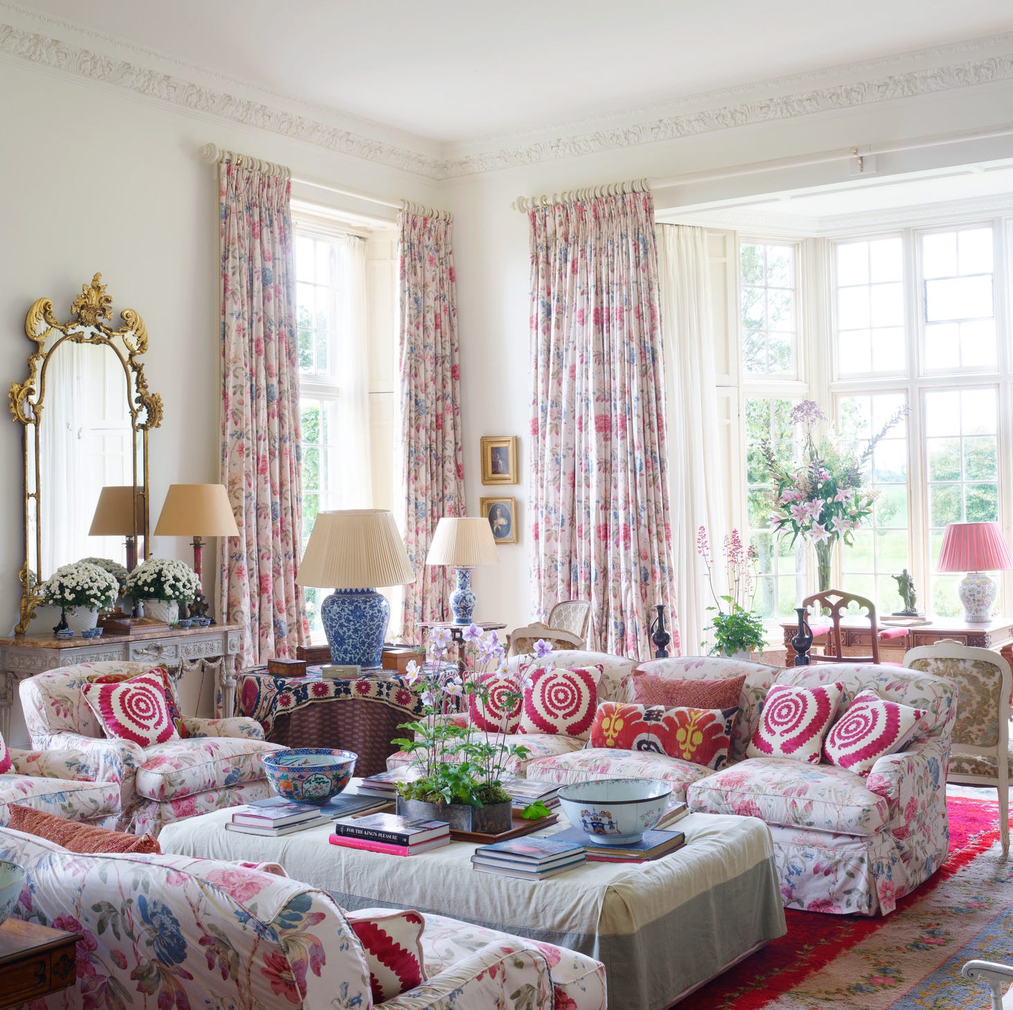
"Candied Tones" represent a whimsical departure from past trends, focusing on bright, electric, candy-colored accents. This playfulness encourages risk-taking with color, as seen in Sherwin-Williams's Paradox palette, featuring juicy pinks like Dragon Fruit and mesmerizing purples like Euphoric Lilac. This trend highlights a broader acceptance of vibrant and unexpected colors in interiors, encouraging a more expressive approach to design.
#ColorTrends2025 #InteriorDesign #HomeDecorating #PaintColors #WarmNeutrals #EarthyTones #BoldColors #DesignForecast #ColorPsychology #ColorTrends2025 #InteriorDesign #HomeDecorating #PaintColors #WarmNeutrals #EarthyTones #BoldColors #DesignForecast #ColorPsychology
0 comment in total
 No comments yet
You may also like
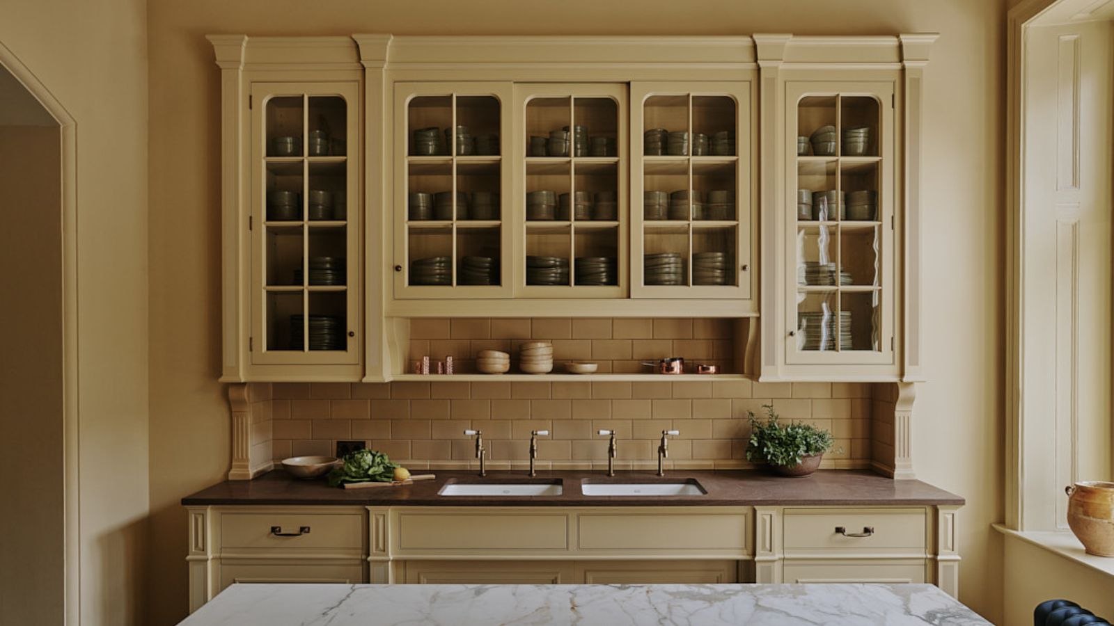
The biggest color trends of 2025 – 10 colors designers say will lead the way next year

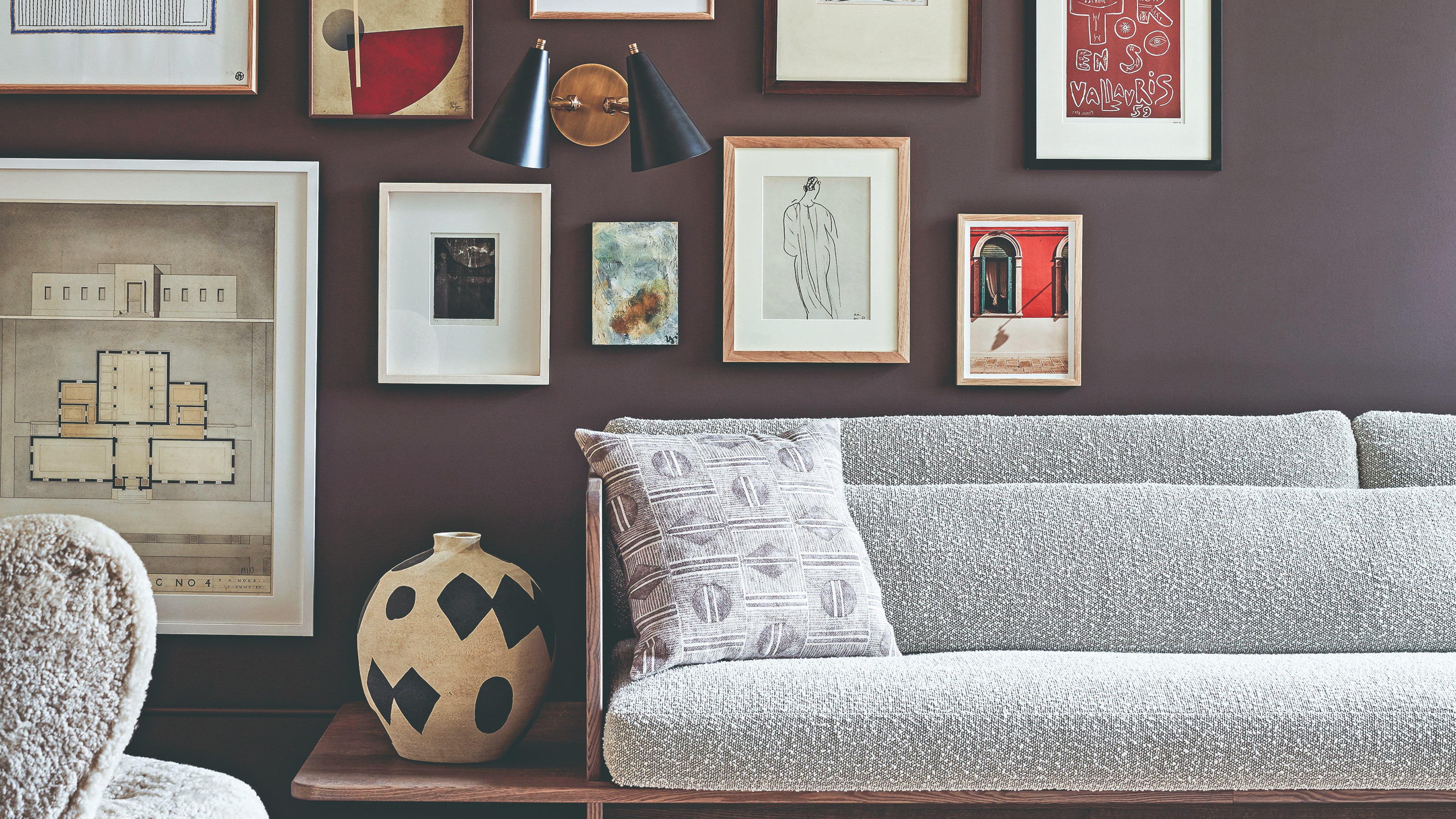
The colour palette for 2025 – these are the shades paint experts say we’ll see everywhere next year
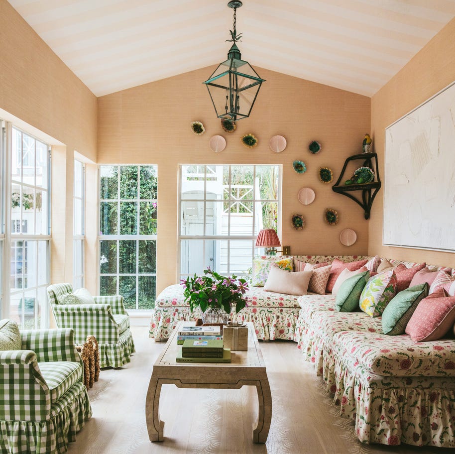
7 Color Trends That Will Be Huge in 2024, According to Color Experts
The Latest Color Trend You'll Be Seeing Everywhere In Fall 2025
The Biggest Colour Trends Taking Off in 2025

The #1 Paint Color Trend of 2025, According to Designers

5 Paint Colors That Will Take Over in 2025, According to Interior Designers

What Colors Will Rule 2027 (and Beyond)? Experts Make Their Predictions

We’re Calling It: These Are the Official Color Trends of 2025
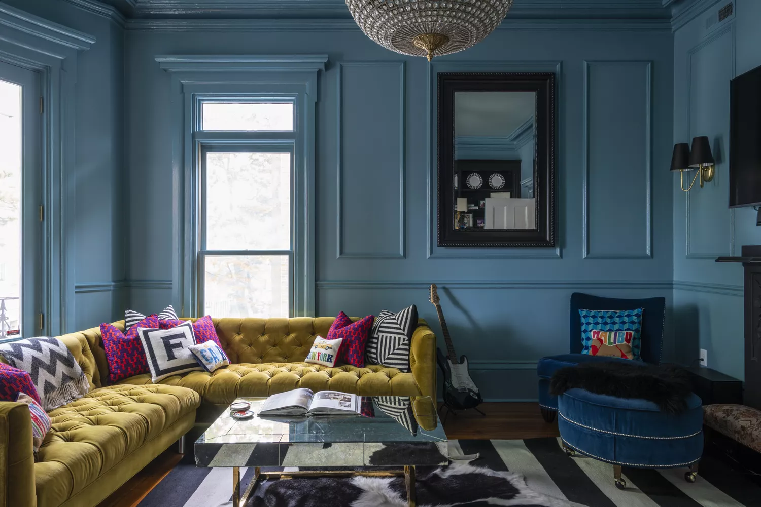
9 Trending Paint Colors You'll See Everywhere in 2025, According to Designers
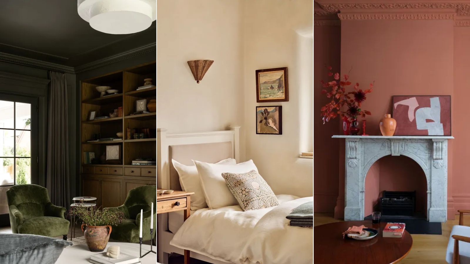
As a color editor, I've seen hundreds of color trends come and go this year – these are the ones I think will stick for 2025

These Colors Will Be Everywhere in Interiors in 2025
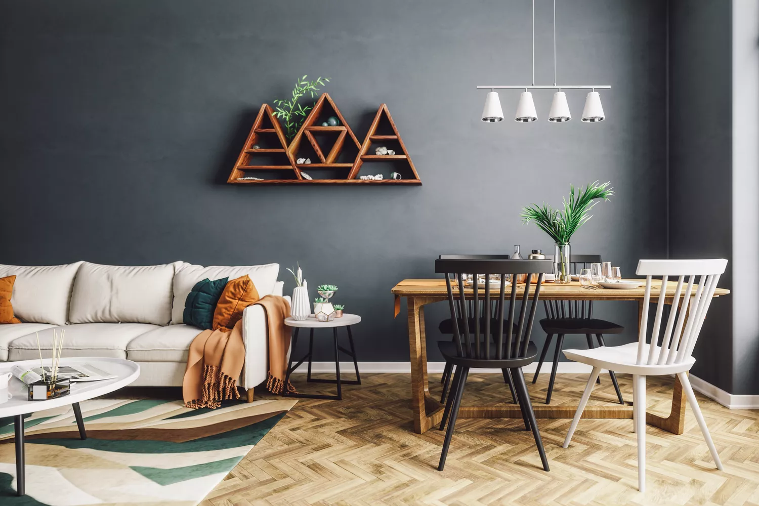
8 Paint Colors Going Out of Style In 2025, According to Designers
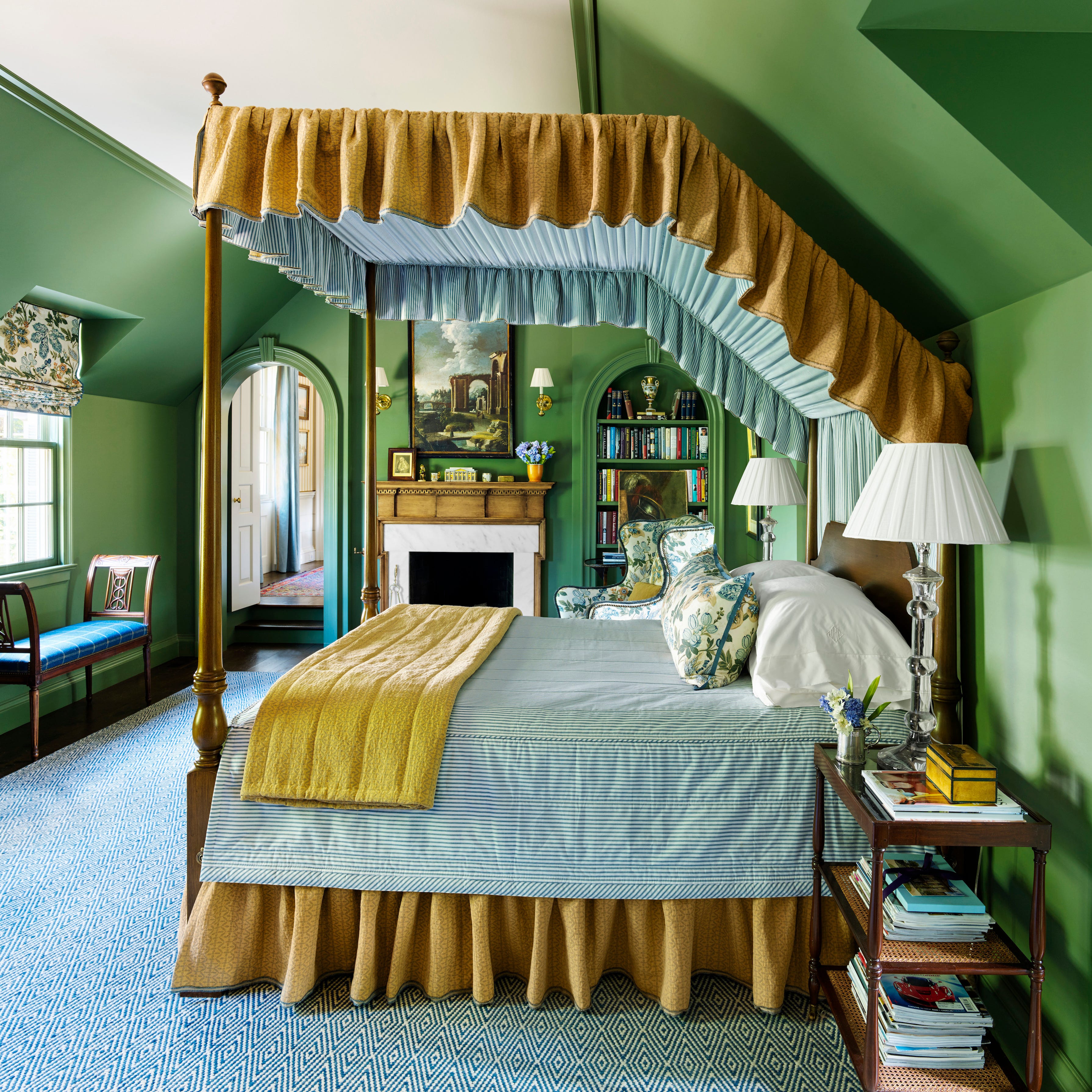
These 8 Colors Will Rule Interiors in 2026, According to Experts


Experts Say These 5 Paint Colours Will Be Everywhere In 2026
9 Color Trends That Will Take Over in 2023
Color Explosion: 2025 Color Trends


8 Paint Color Trends You'll ACTUALLY Want to Live With in 2026, According to Designers
These 5 Paint Color Trends Will Be Everywhere in 2024, According to Interior Designers
4 Paint Color Trends Designers Are Ready To Ditch In 2025