1/5
Tips on Calming Colors Schemes From a Workout Guru
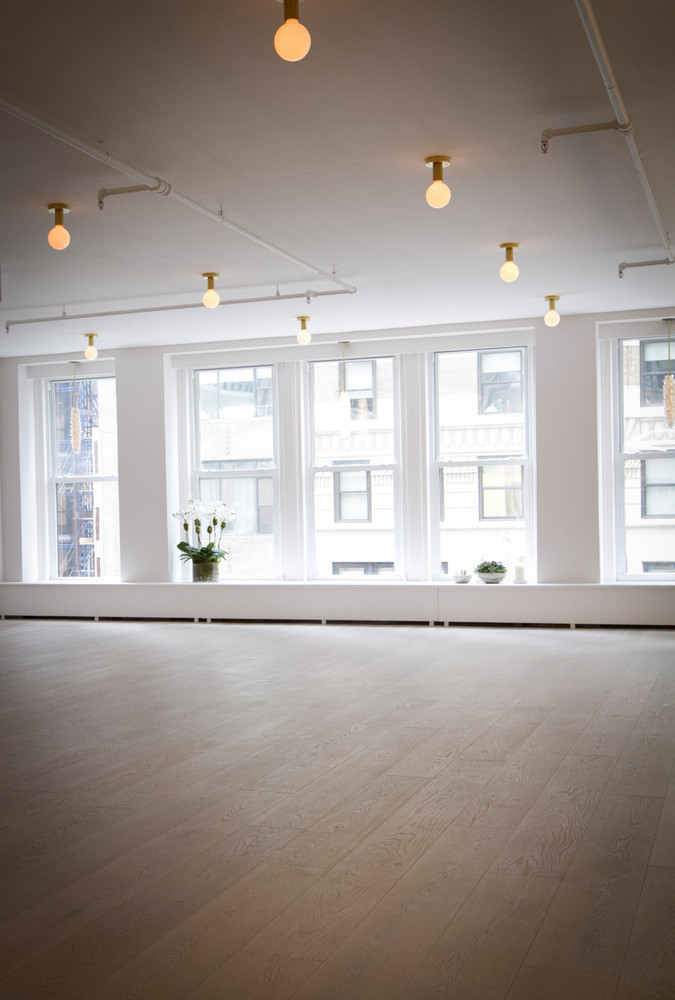
Taryn Toomey, the creator of 'The Class,' has successfully built an empire in just four years, expanding her fitness method from a grassroots movement to studios in major cities like New York, Los Angeles, and Vancouver, along with summer pop-ups. Beyond her thriving fitness studios, Toomey has strategically collaborated with notable brands, including a three-color nail polish collection with tenoverten and an 11-piece special-edition apparel collection with Lululemon. A hallmark of these ventures is Toomey's ability to infuse her signature style and calming color palette into every aspect, making each product distinctively 'Toomey.'
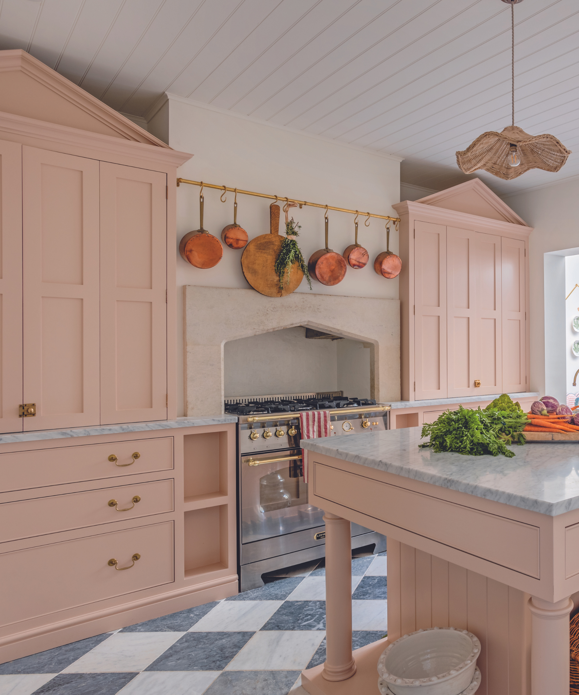
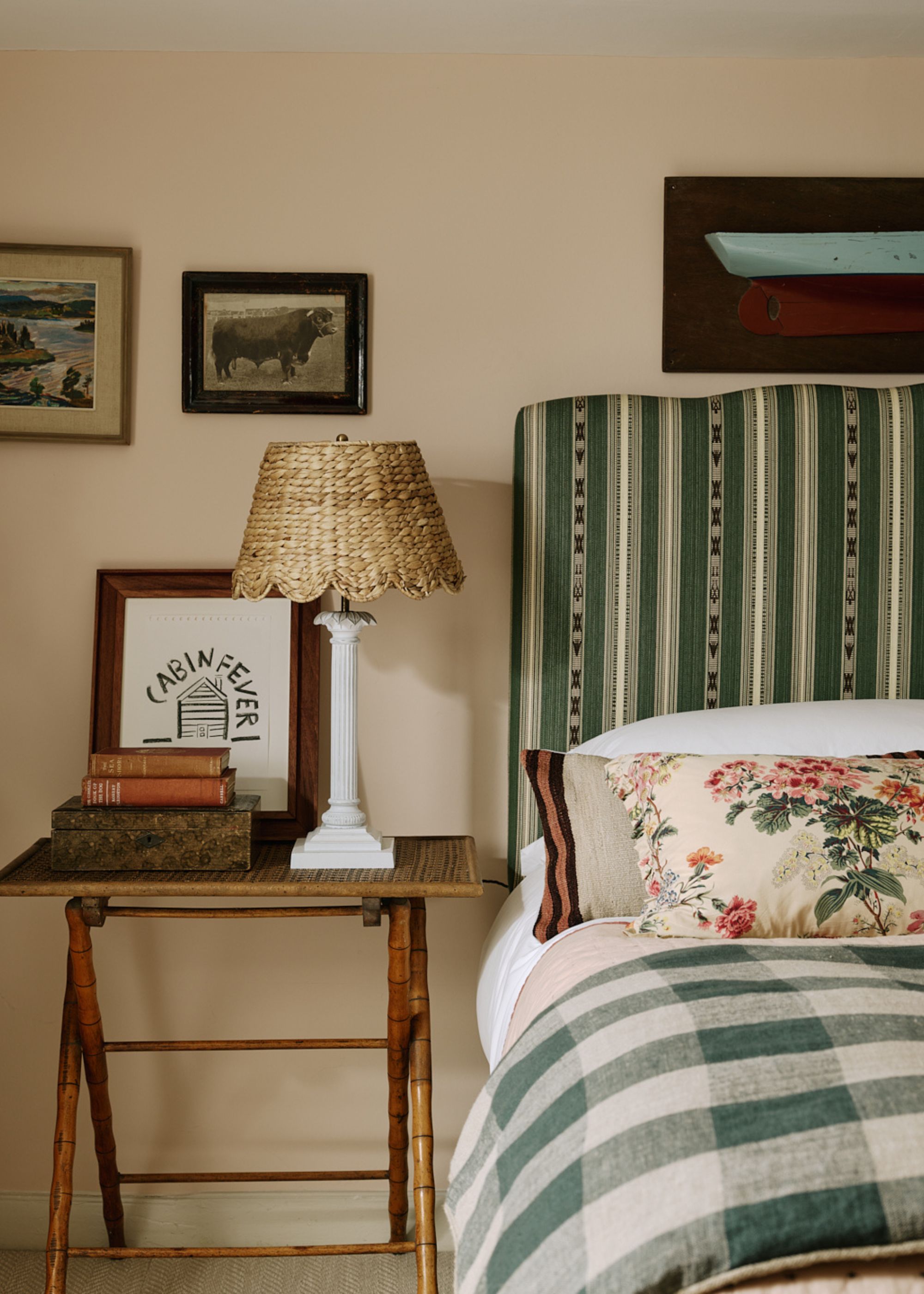
Toomey's approach to color is deeply rooted in her philosophy of creating spaces and products that evoke a sense of calm, peace, and serenity. Her studios, for instance, are designed to be visually stunning yet untraditional, incorporating elements like marble slabs, crystals, burning candles, and a specific pink-gray finish. This aesthetic is intended to promote energy balancing and resonate with the Hindu philosophy of 'prana,' or cosmic energy. Toomey emphasizes that the visual serenity provided by these colors complements the intense spiritual and meditative aspects of her classes, offering an energetic exhale upon entry.
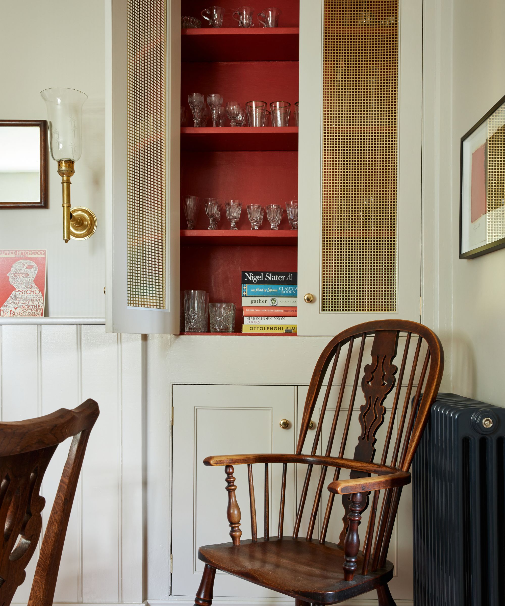
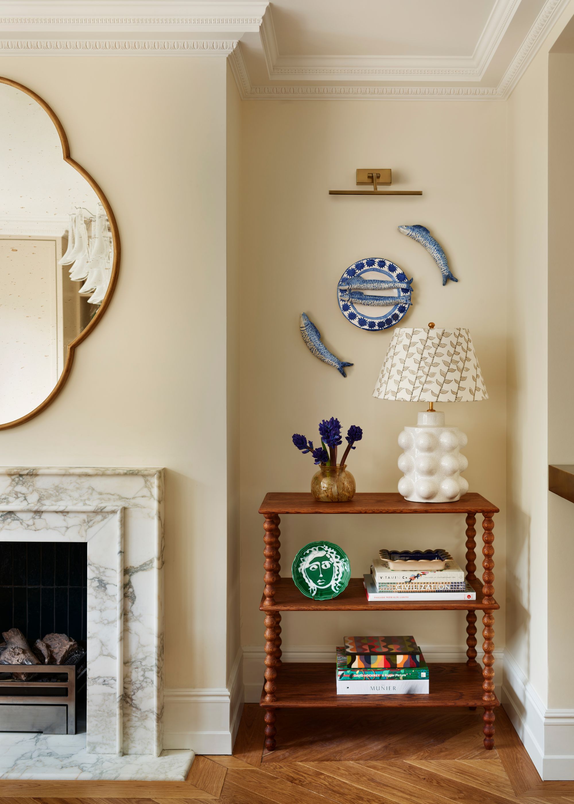
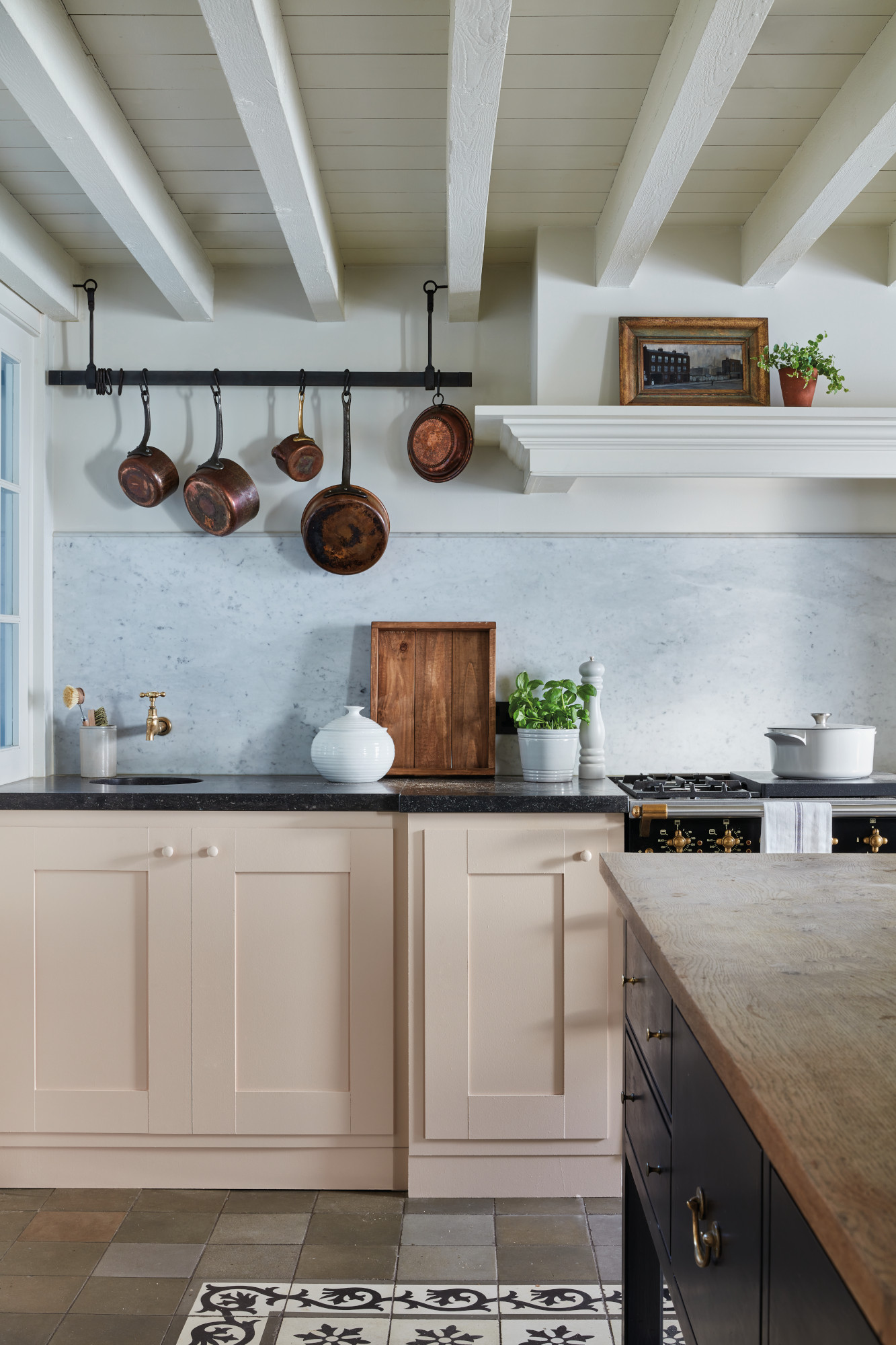
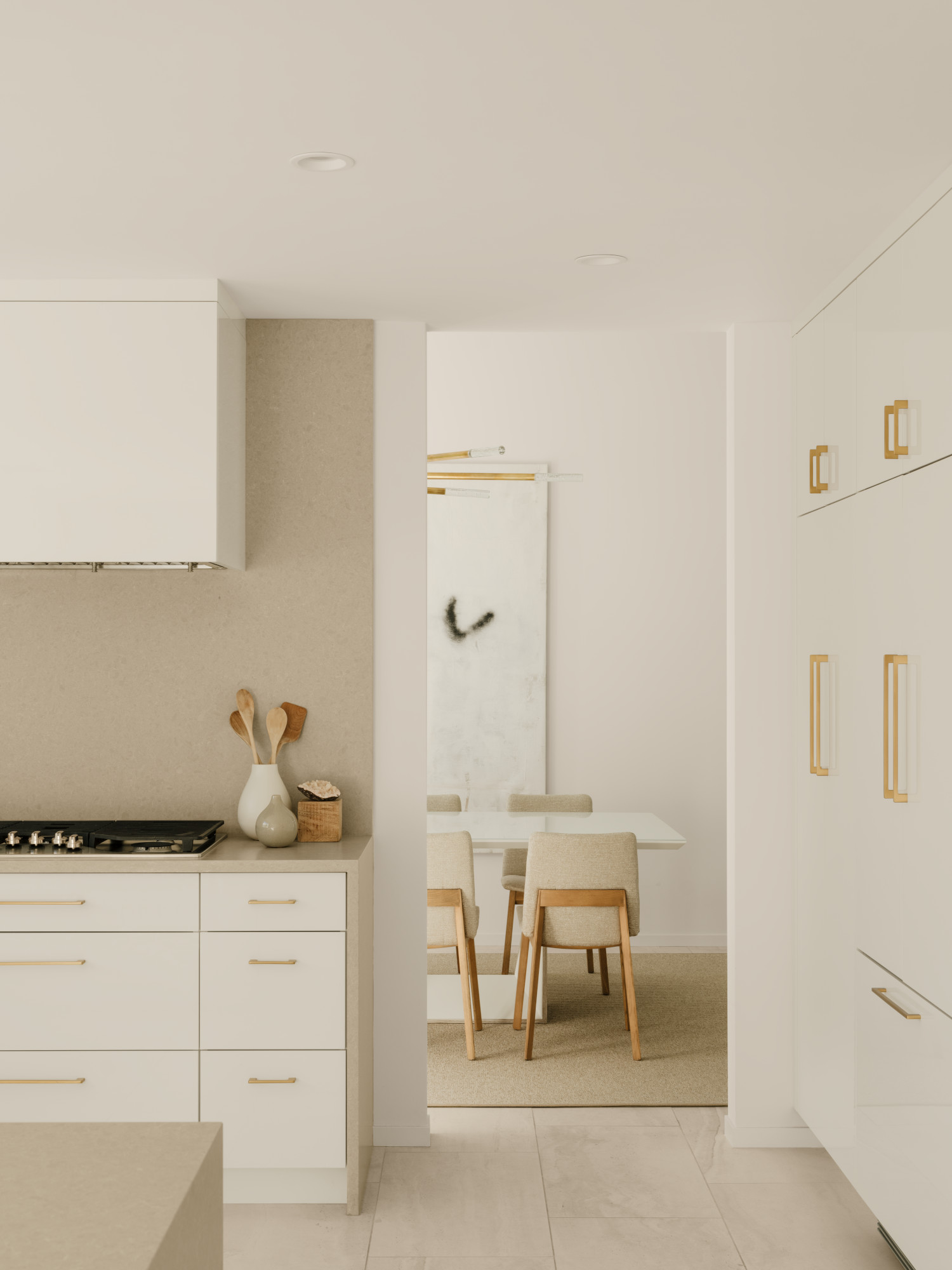
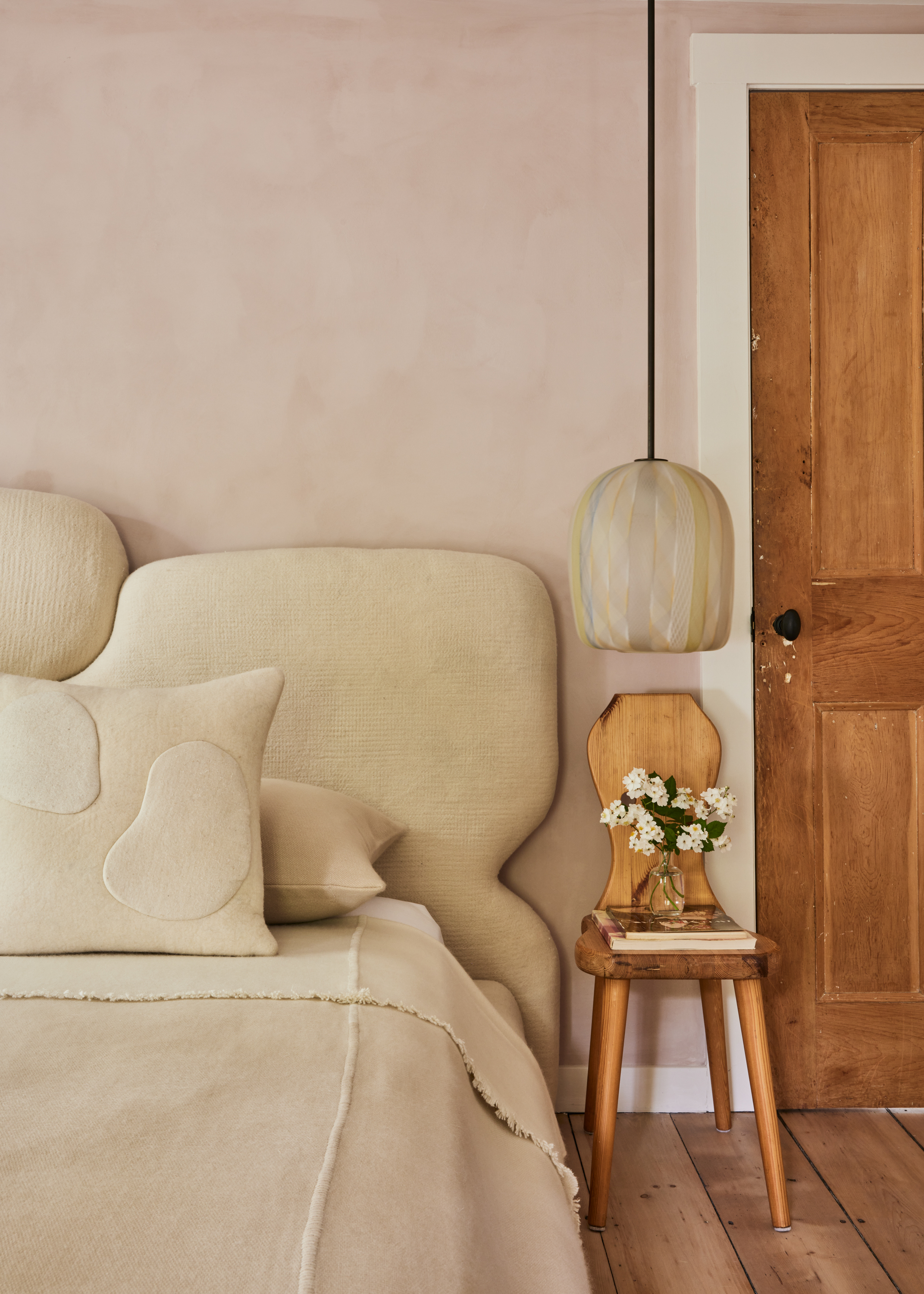
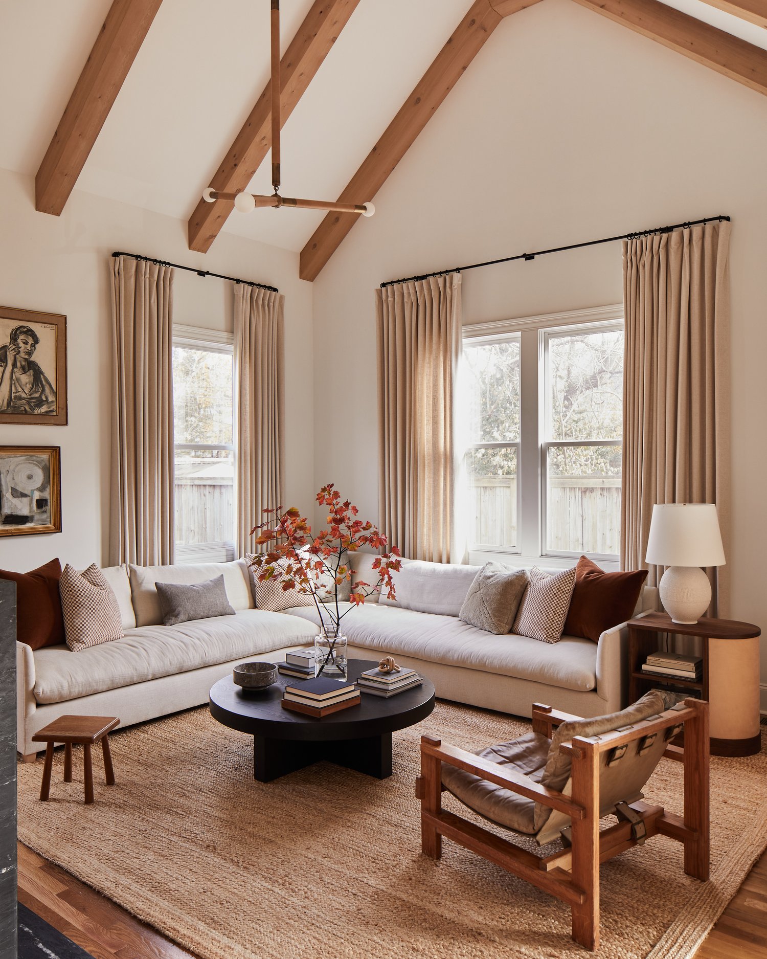
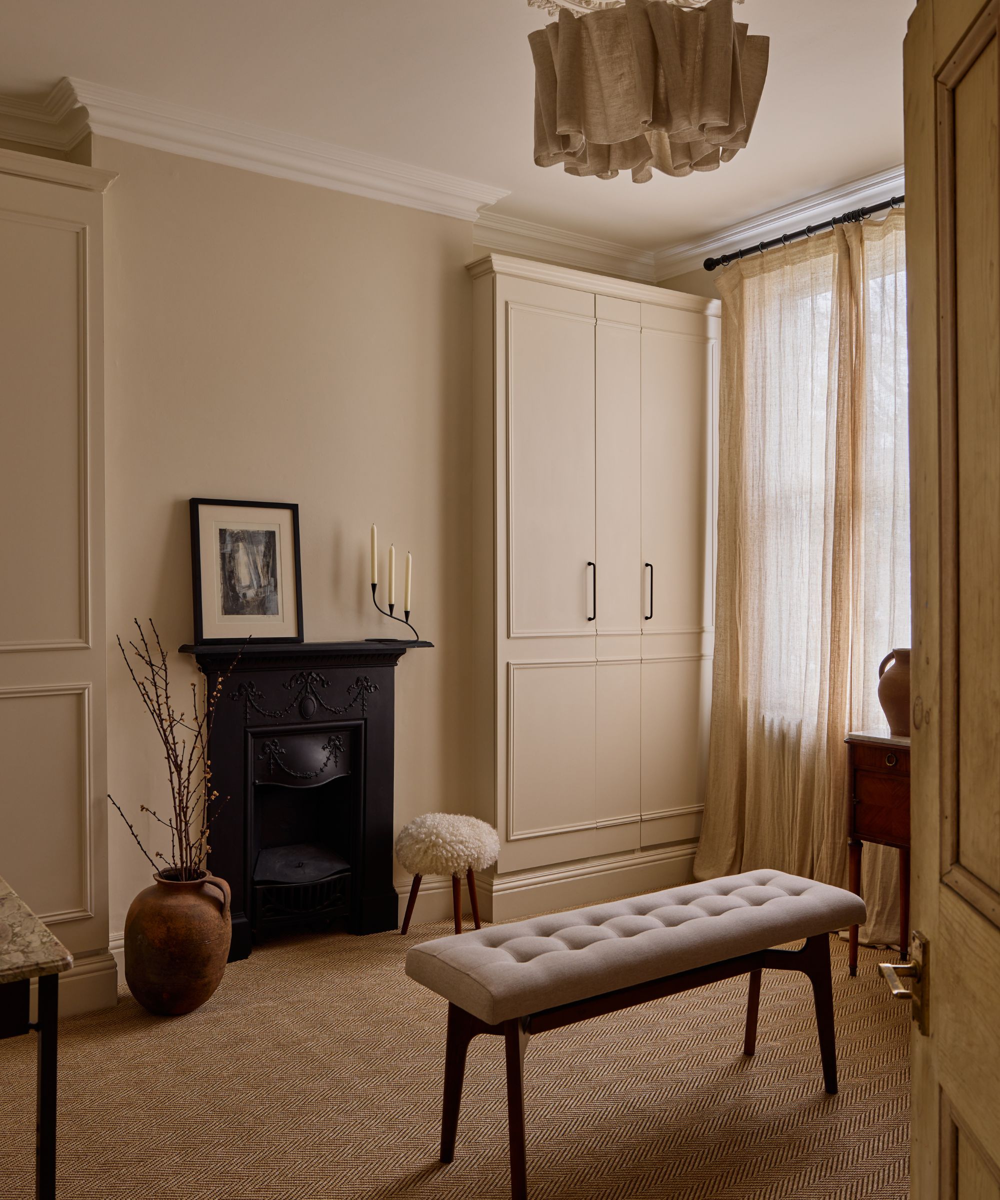
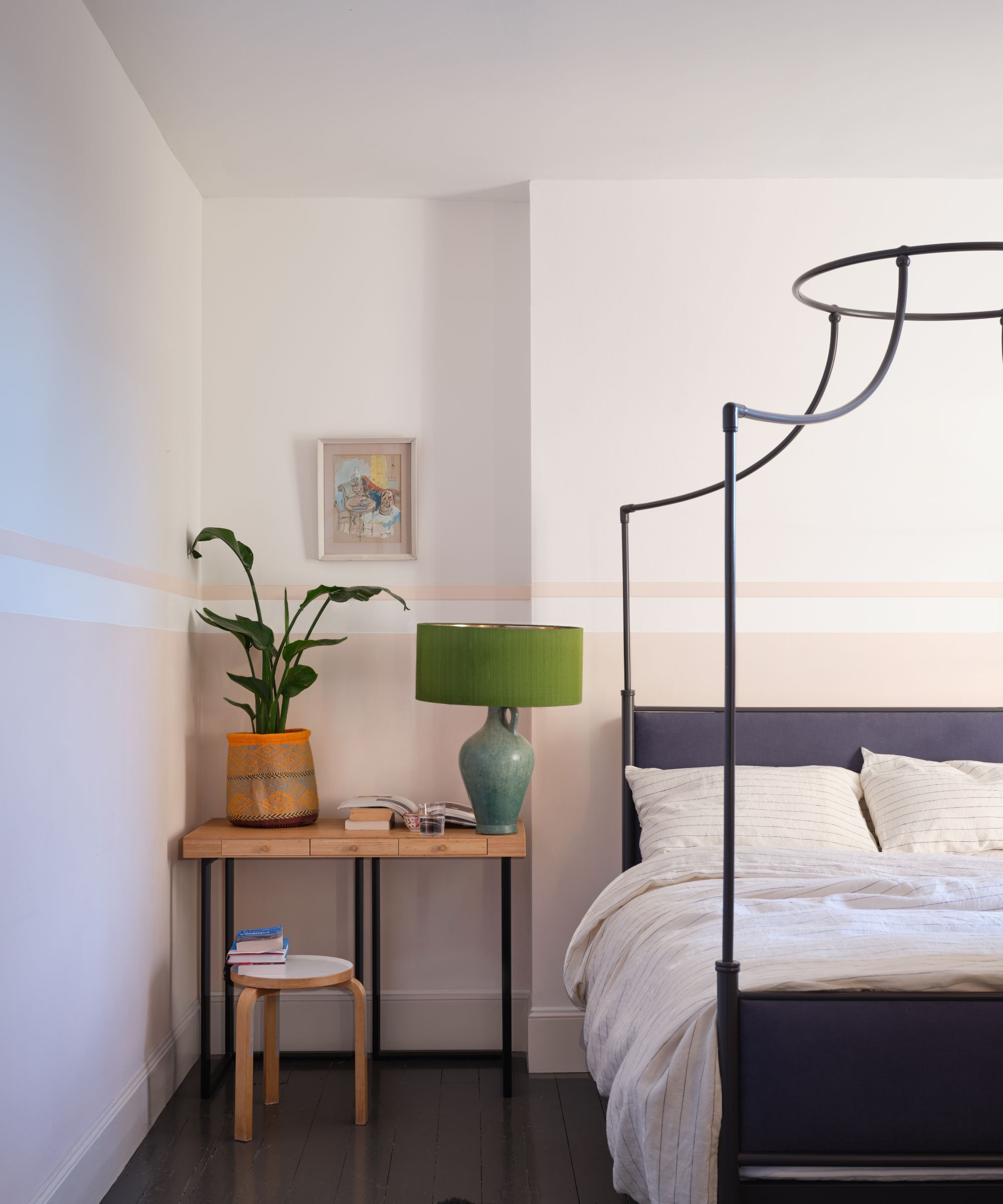
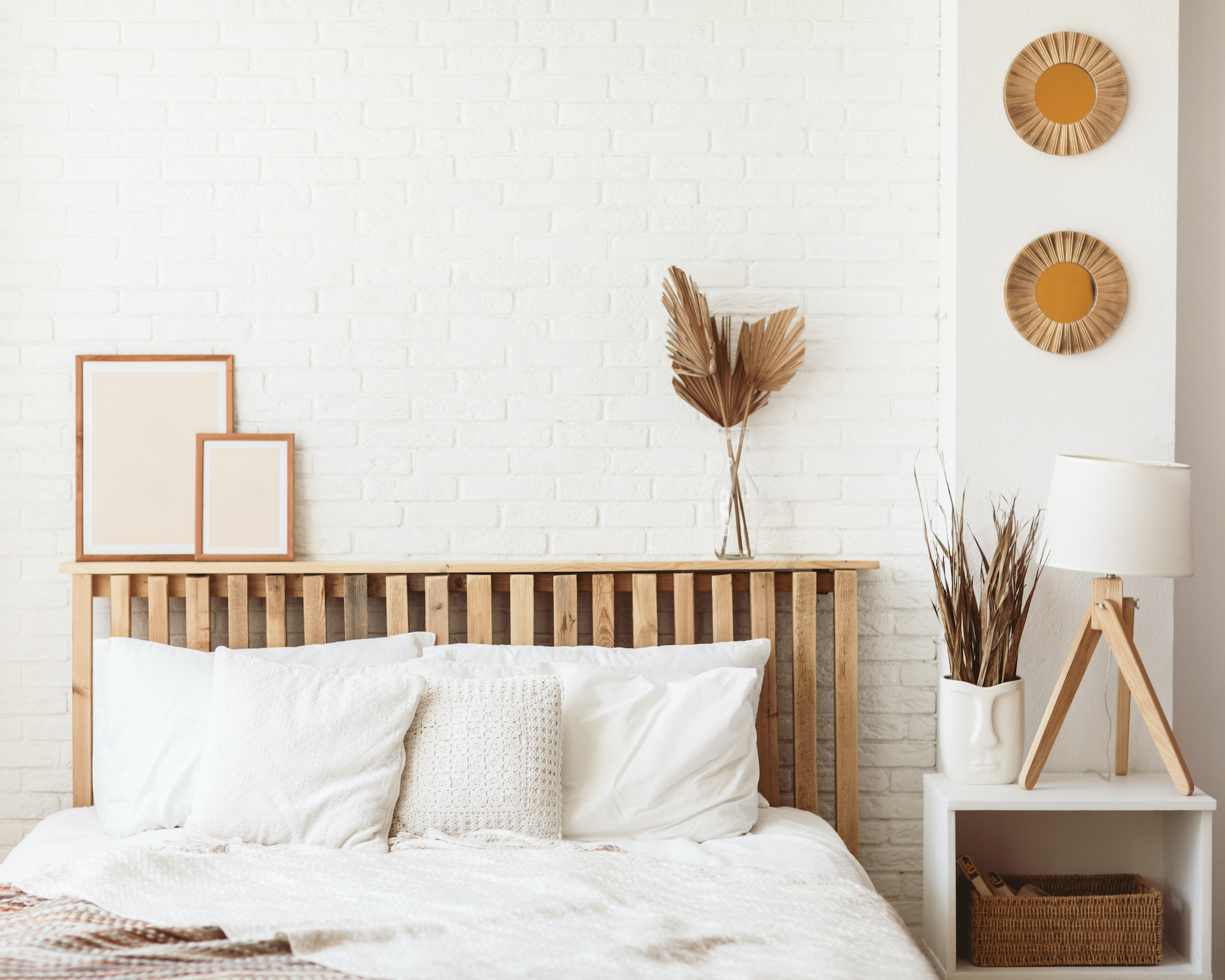
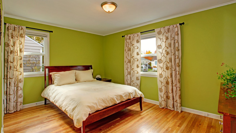
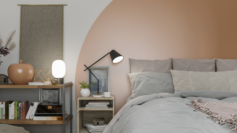
The calming color scheme extends to all her studio locations, where muted, earthy tones are consistently applied to walls, light fixtures, and even her personal attire. Toomey is meticulously involved in the selection of every color swatch, favoring shades such as light gray, sand, cream, mauve, and moss. She prefers these colors to have a 'caulky' quality, ensuring they are not overtly feminine and instead resemble sun-dried earth tones or beach-inspired hues. This deliberate choice ensures that the colors directly contribute to a feeling of deep energetic release for those who experience them.
Beyond color, the studios are adorned with objects chosen for their deeper meaning and purpose. This includes healing clear quartz light fixtures by Kelly Wearstler and organic geometry lighting by Christopher Boots. The flooring itself is designed to cleanse and ground, incorporating tourmaline and hematite. Each design element, color, and image is selected not only for its visual appeal but also for its spiritual significance, aligning with Toomey's preference for collaborators who imbue their work with intention and a sense of mysticism.
Her collaborations also reflect this dedication to a specific color palette. The Lululemon collection, which took years to develop, features seamless crops, bras, knit wraps, and ribbed leotards in neutral colors like cement, cream, dusty mauve, and mossy fern. These pieces are designed for unrestricted movement, with descriptions emphasizing their light and airy feel. This collection rapidly sold out, indicating a strong demand for her preferred aesthetic in athletic wear. Similarly, her tenoverten nail polish collection offers three shades—milky white, dusty rose, and cocoa beige—that align with her calming, natural aesthetic. This collaboration also incorporates her holistic wellness philosophy, offering polishes that are eight-toxin free and featuring a poem by Toomey that emphasizes self-reflection and inner peace. Across all her endeavors, Toomey consistently brings her holistic vision of wellness, color, and intention to the forefront, creating a cohesive and impactful brand experience.
#TarynToomey #CalmingColors #WellnessDesign #StudioAesthetics #HomeDecor #ColorPsychology #MindfulLiving #DesignCollaboration #InteriorColors #TarynToomey #CalmingColors #WellnessDesign #StudioAesthetics #HomeDecor #ColorPsychology #MindfulLiving #DesignCollaboration #InteriorColors
0 comment in total
 No comments yet
You may also like
Best Home Gym Paint Colors for 2025

13 Calming Paint Colors Designers Use to Make Rooms Feel Soothing — And No, They're Not All Neutrals

6 calming and cozy paint colors from Farrow & Ball

8 Paint Colors That Promote Wellness at Home

A Color Psychologist Says This Is the Most Relaxing Paint Color


33 Fabulous Home Gym Ideas That Make Working Out a Joy

Designers Agree: These Are the Most Relaxing Paint Colors for Any Room

16 Calming Paint Colors That Will Make Your Home a More Restful Place

20 Calming Paint Colors That Will Change the Way You Live

6 Calming Paint Colors Designers Swear By For A Relaxing Living Room
What is the most calming color for a small bedroom? Experts weigh in on what works and what to avoid

3 color coordination tips any beginner can master
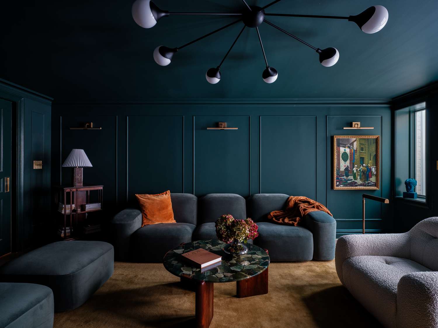
8 Calming Colors to Paint Your Living Room—and Make the Space More Relaxing

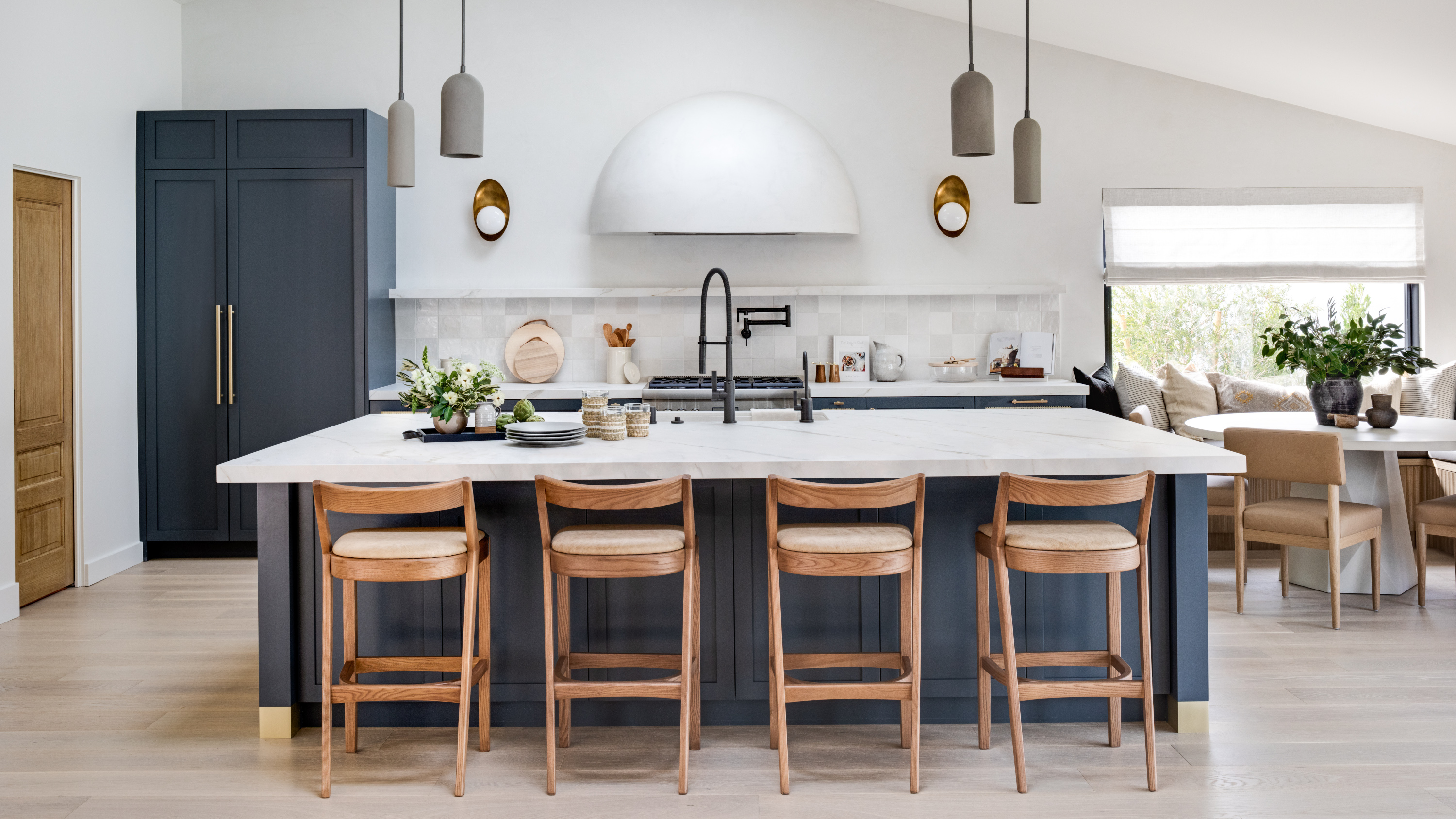
The 6 relaxing kitchen colors you should be using for calming schemes, according to designers
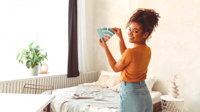
Paint Colors Our Design Expert Says To Avoid Using In The Bedroom
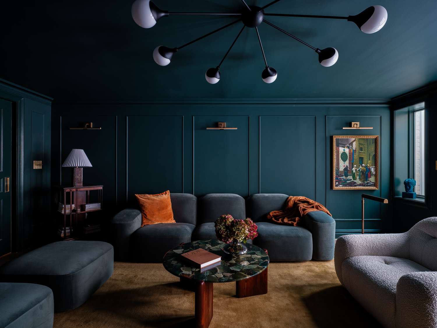
12 Calming Colors to Paint Your Walls, According to Interior Designers
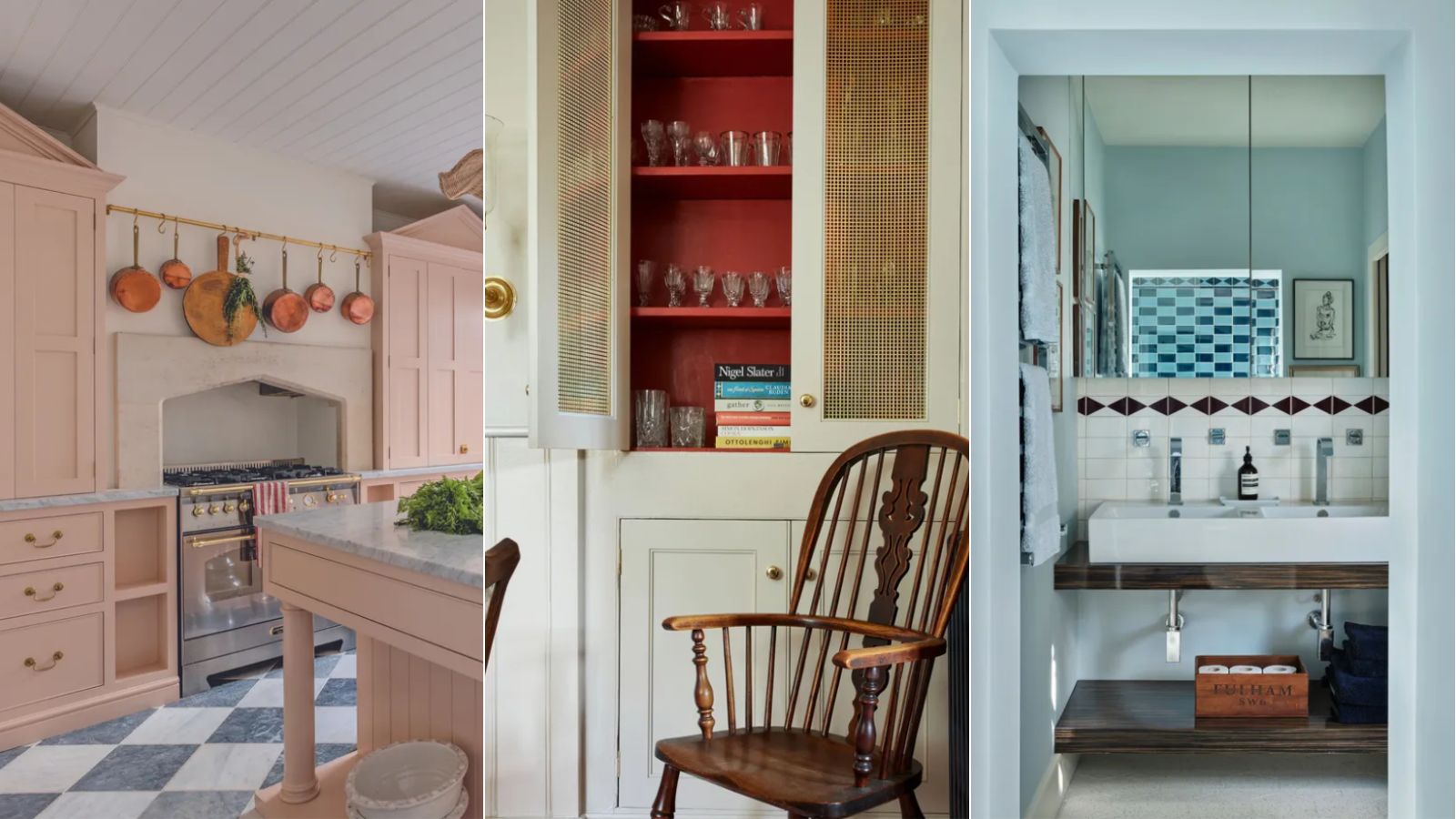
A color psychologist says these color schemes are the most likely to boost your mood
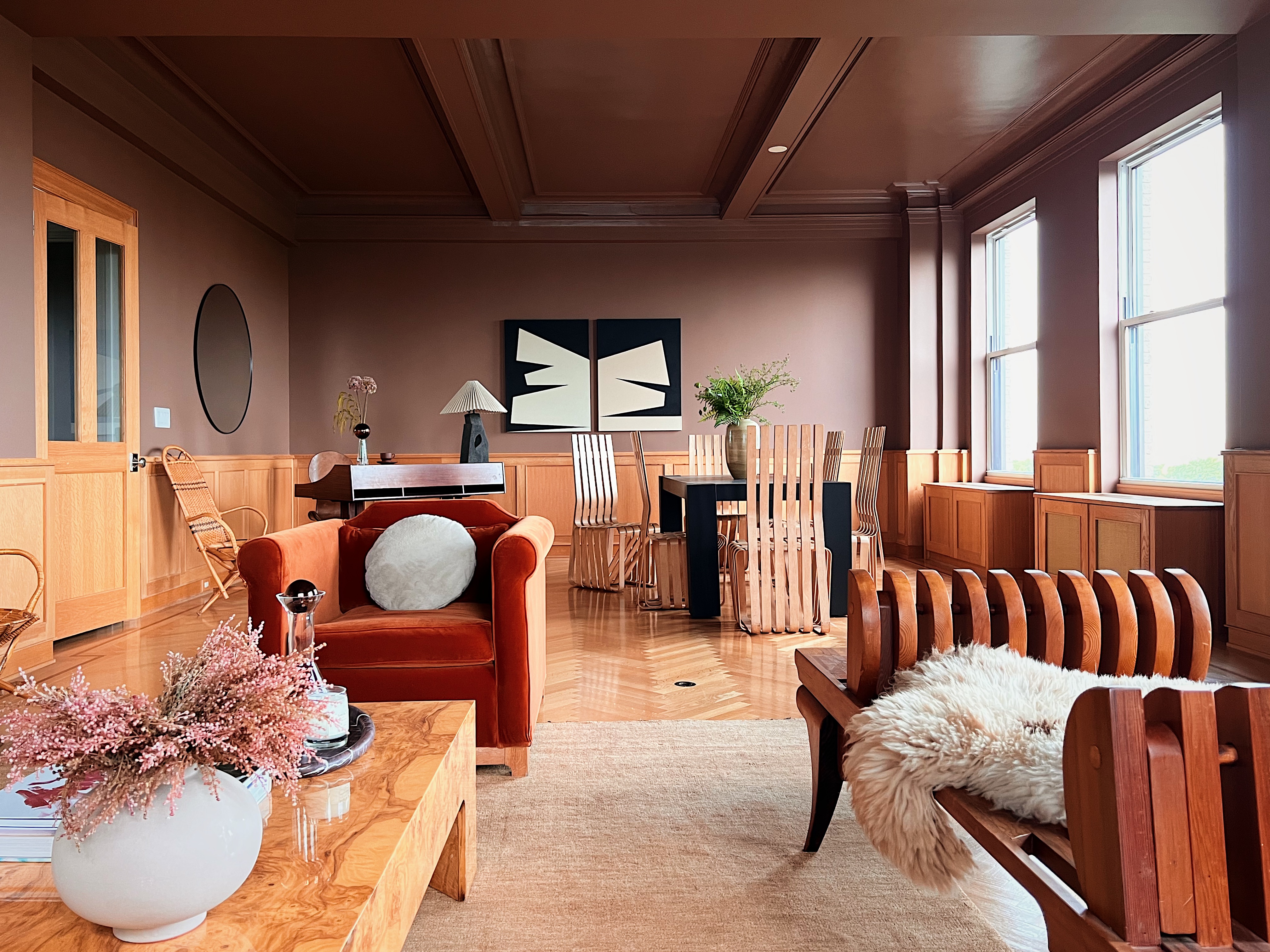
How to Create a Calm Color Palette Without Skimping on Character — 8 Interior Designers Share Their Tips
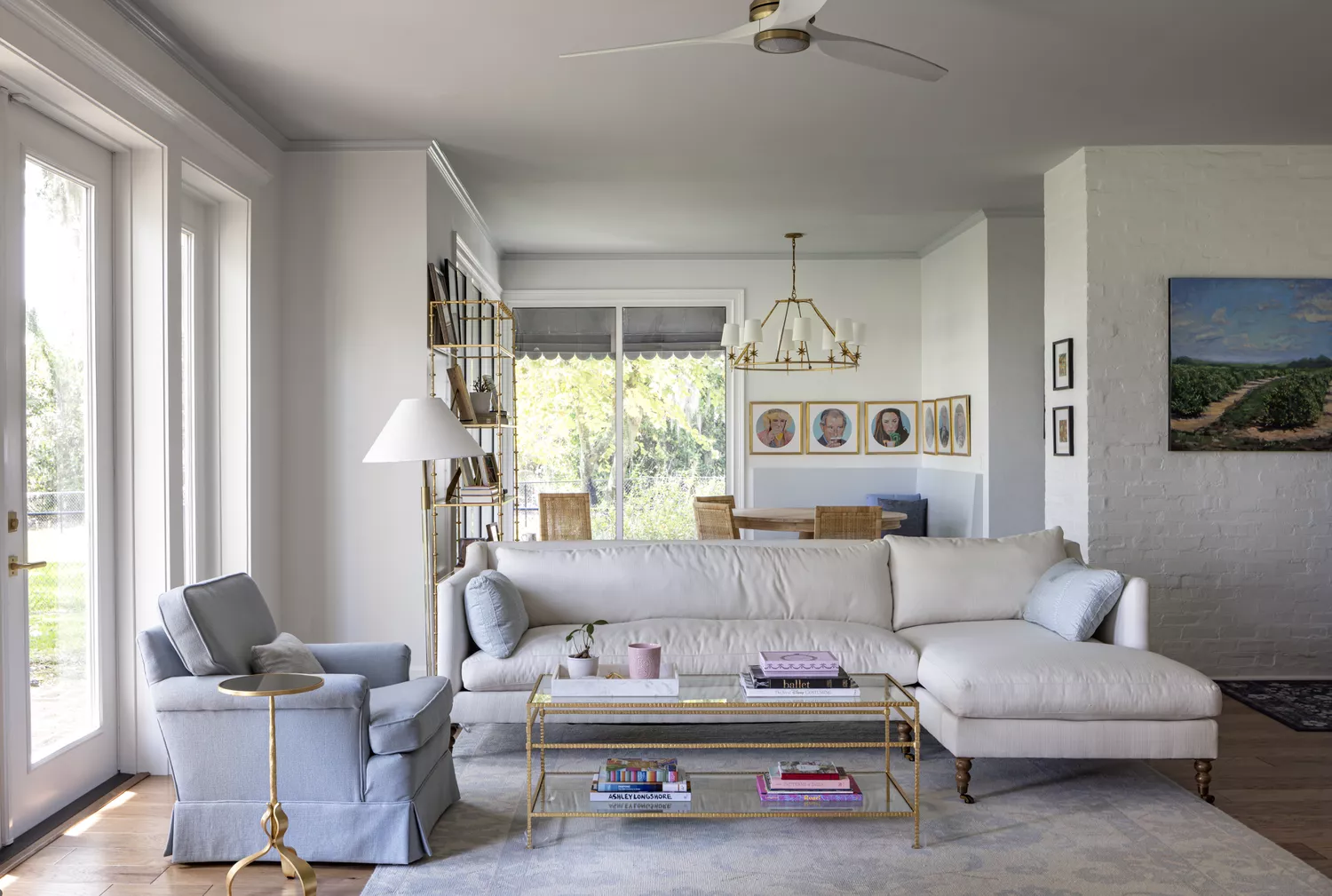
8 Calming Paint Colors Designers Use to Create a Warm, Welcoming Living Room
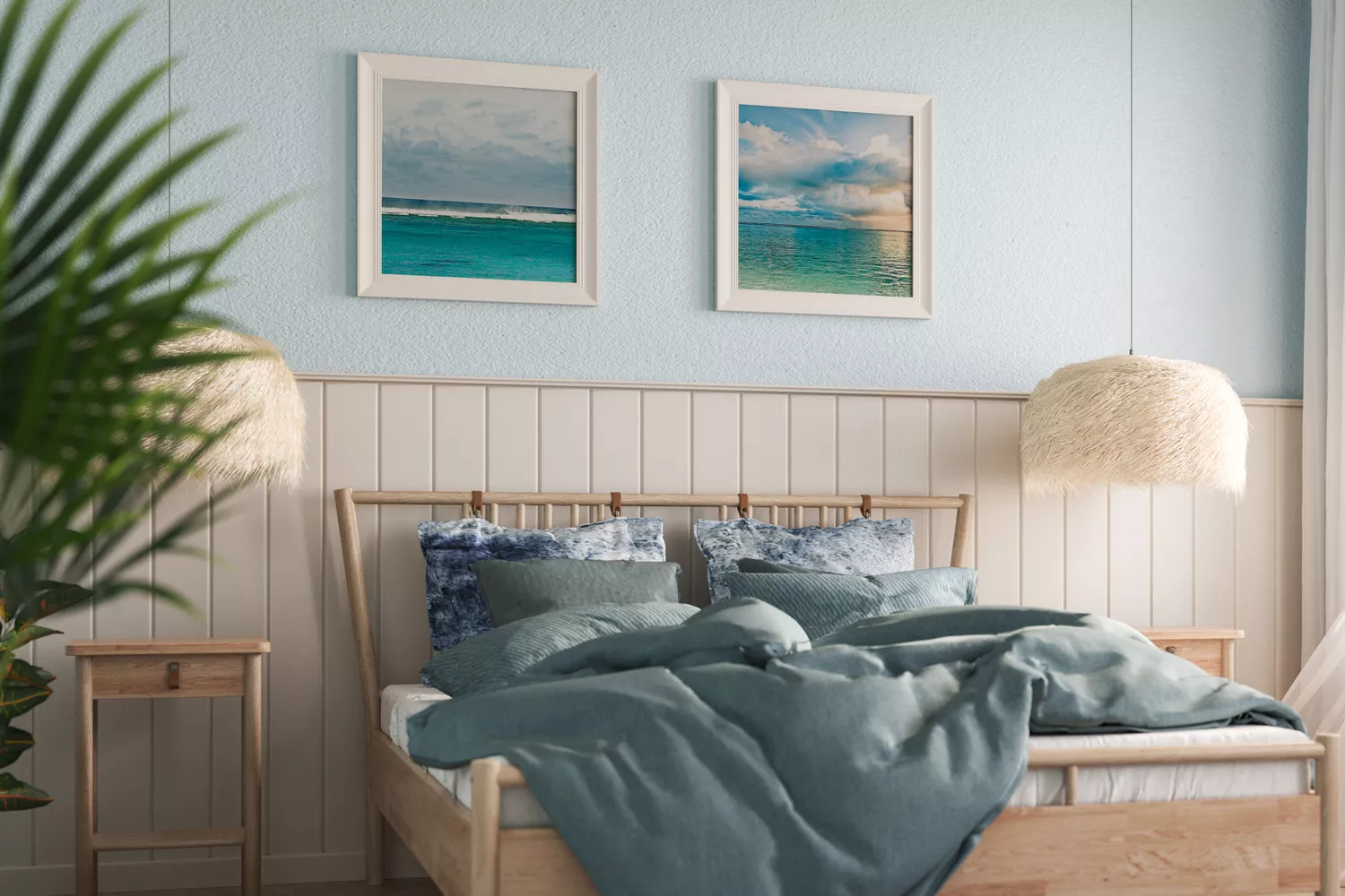
11 Calming Bedroom Paint Colors to Help You Relax and Wind Down at the End of the Day