5 Living Room Paint Color Trends for When You're Craving a New Look
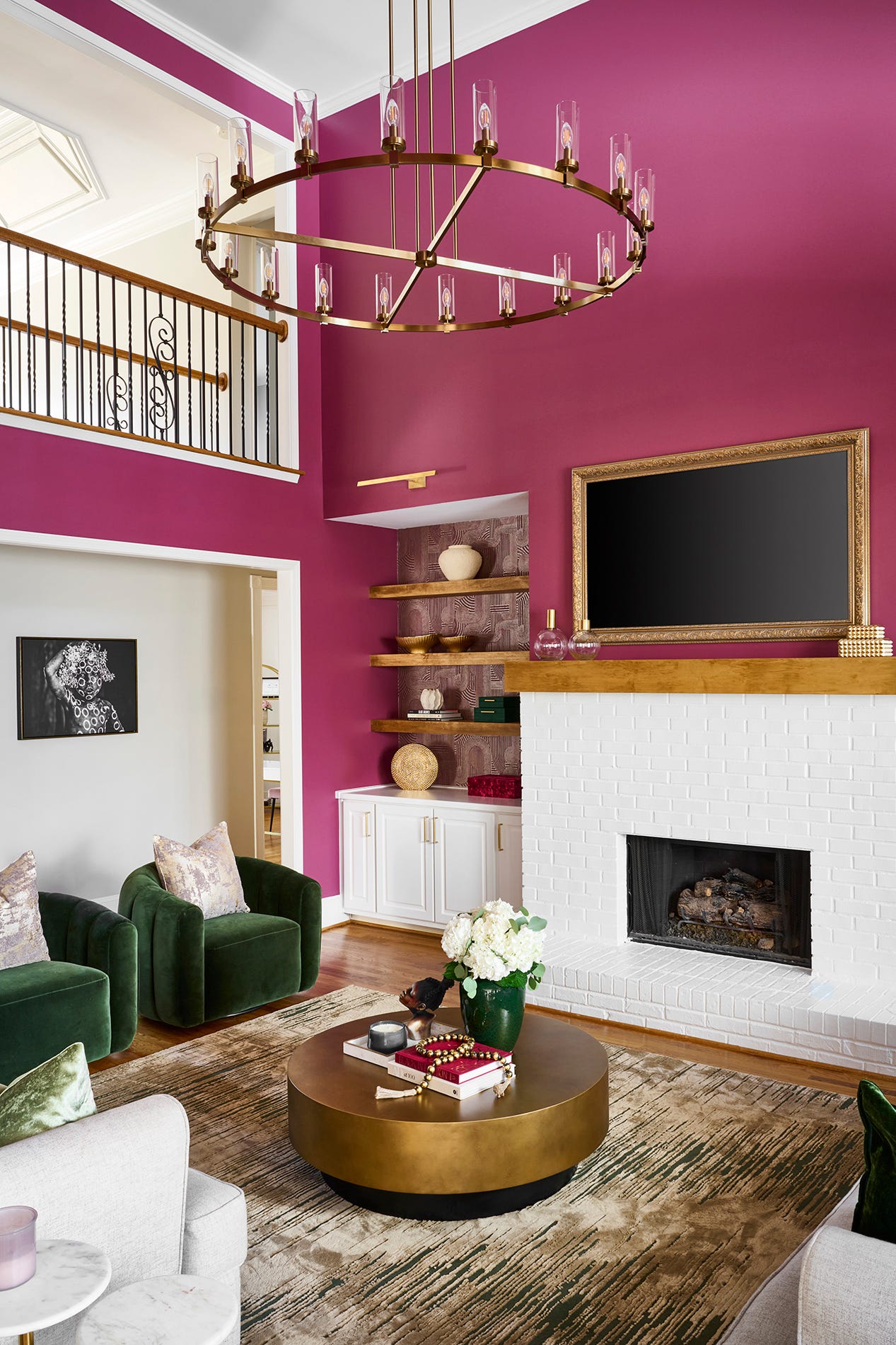
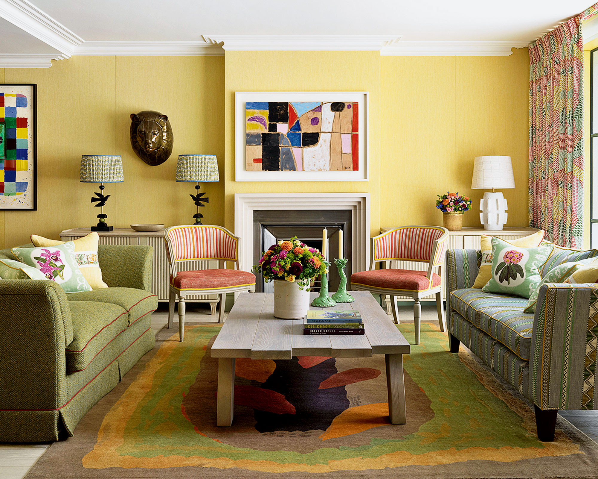
The living room, a central and versatile space in any home, requires a design aesthetic that can adapt to various activities, from social gatherings to quiet relaxation. In 2024, the prevailing color trends for living rooms feature a blend of calming neutrals and deep, dramatic hues, all aimed at fostering a sense of personality and warmth. Erika Woelfel, vice president of color and creative services at Behr, notes that after a period of global uncertainty, consumers are seeking calm, which translates into their living spaces. This desire for tranquility manifests differently for individuals, with some preferring warm neutrals or rich browns, while others gravitate towards vibrant accents or nature-inspired greens. Ultimately, the goal is for occupants to feel calm and centered upon entering their living space.
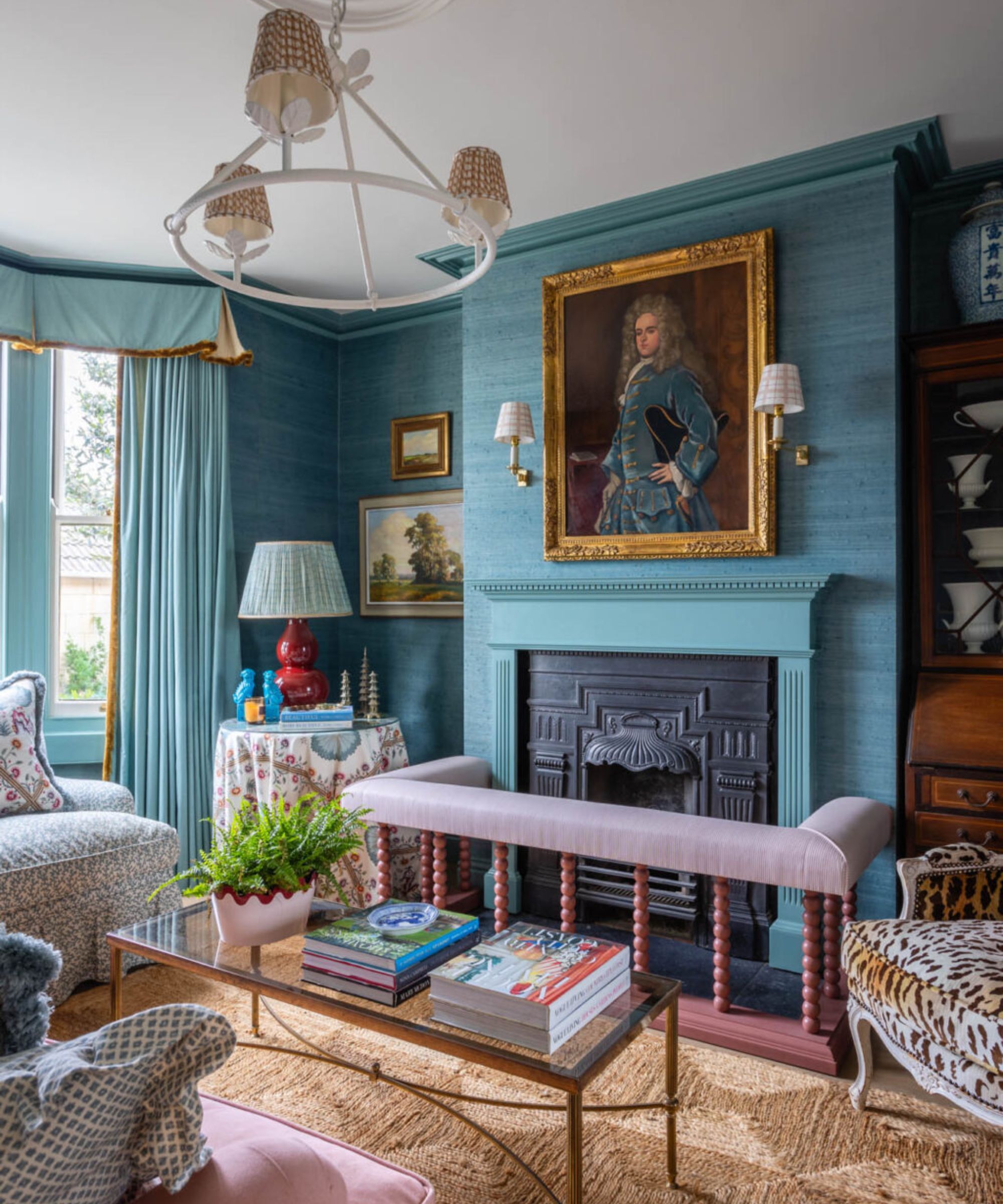
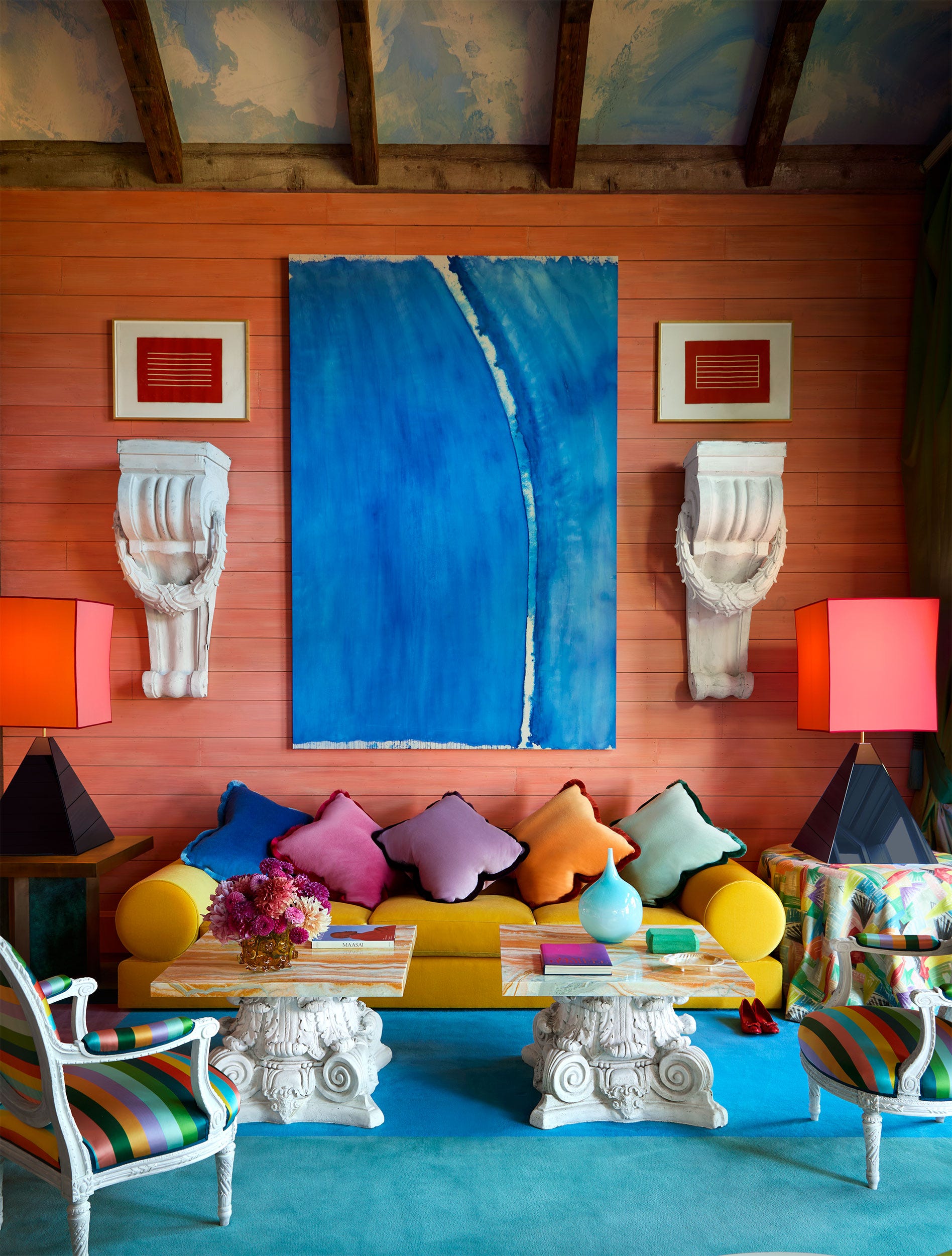
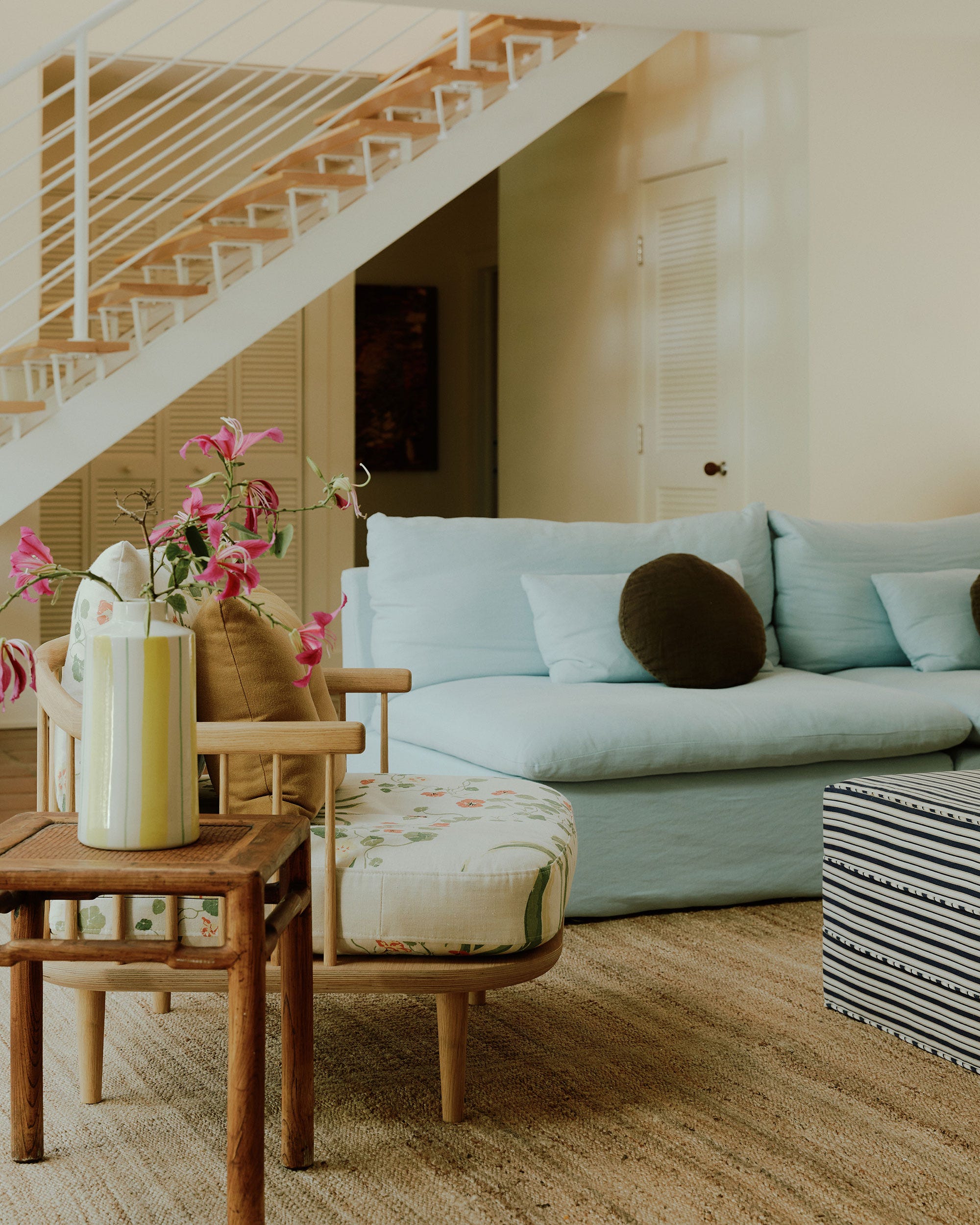
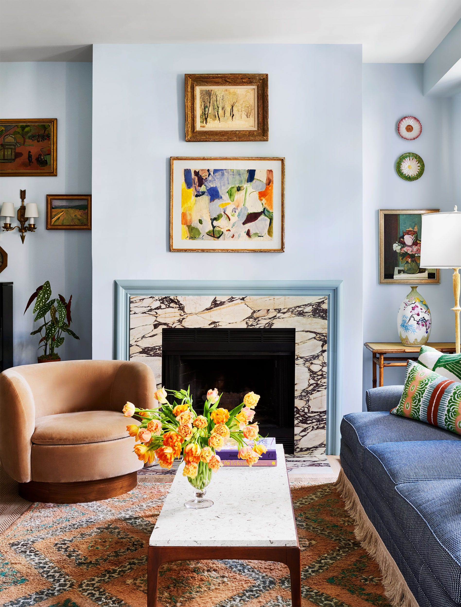
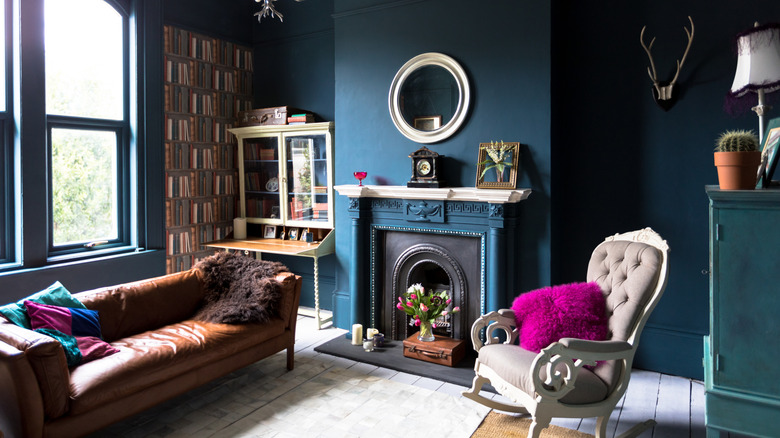
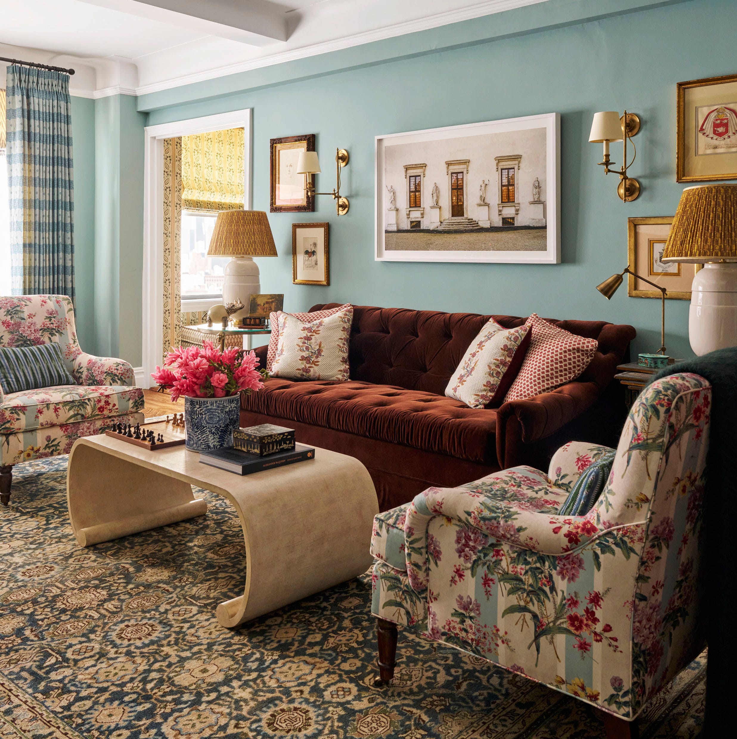
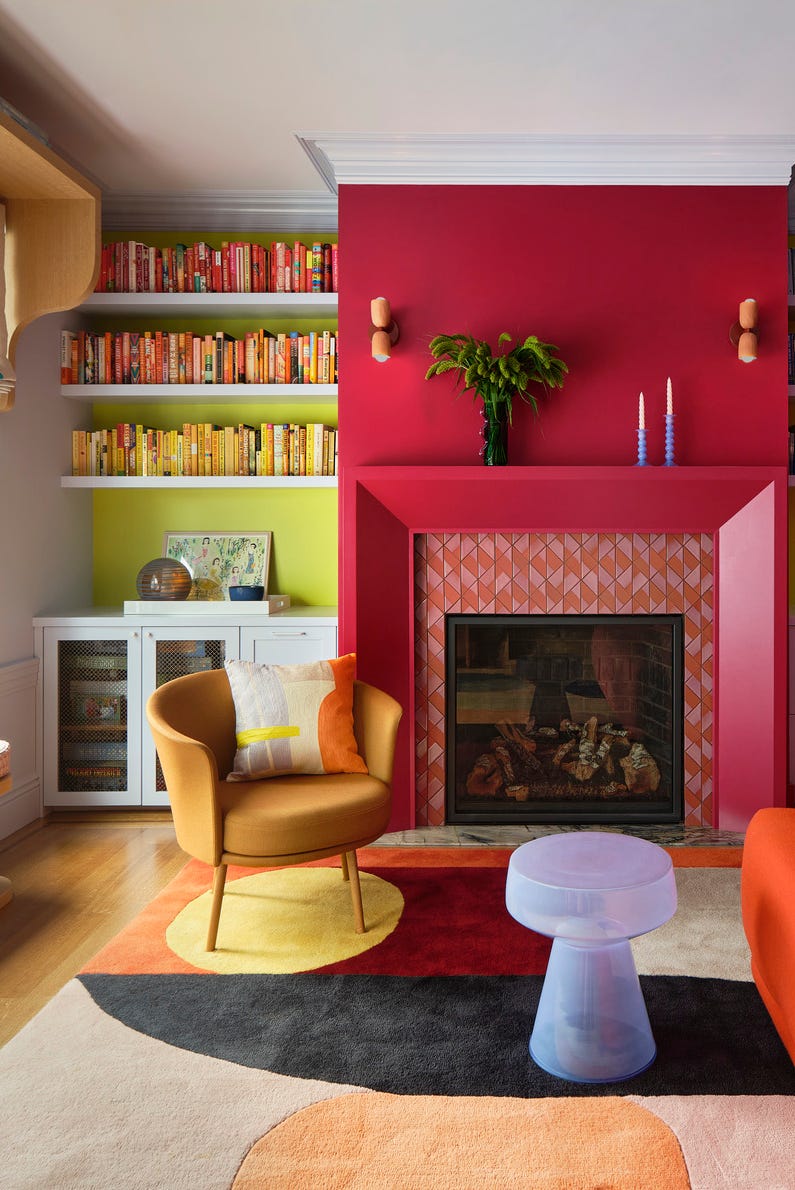
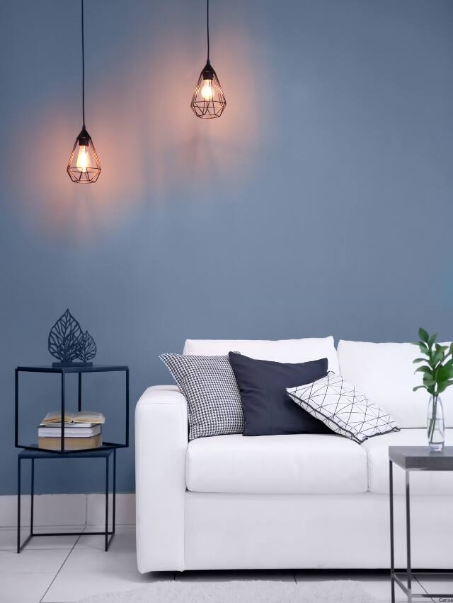
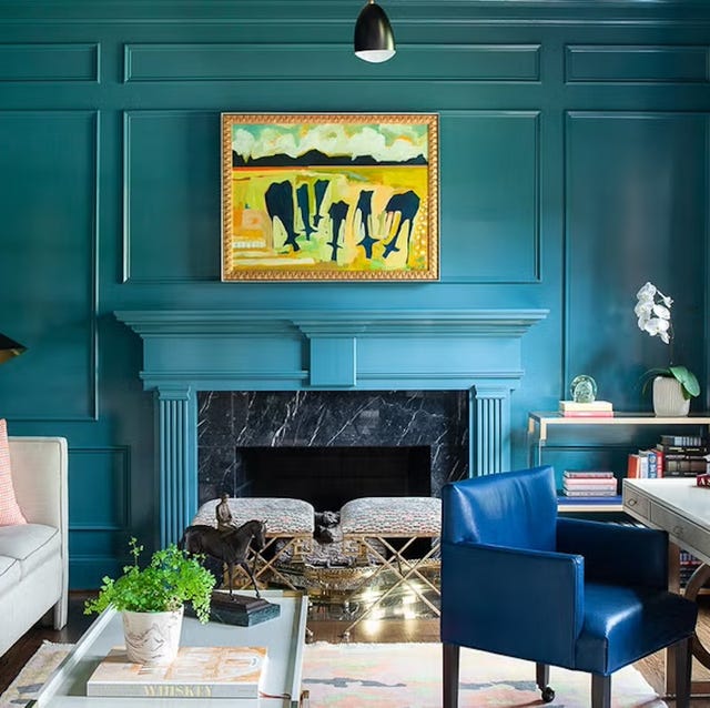
One prominent trend for 2024 is the use of calming blues. Several paint companies, including Sherwin-Williams (Upward), Valspar (Renew Blue), Minwax (Bay Blue), Dunn-Edwards (Skipping Stones), and Benjamin Moore (Blue Nova), have selected shades of blue as their color of the year. Blue tones in a living room are believed to evoke serenity and tranquility, appearing in various applications from fully color-drenched rooms to subtle accents on built-in bookshelves and ceilings.
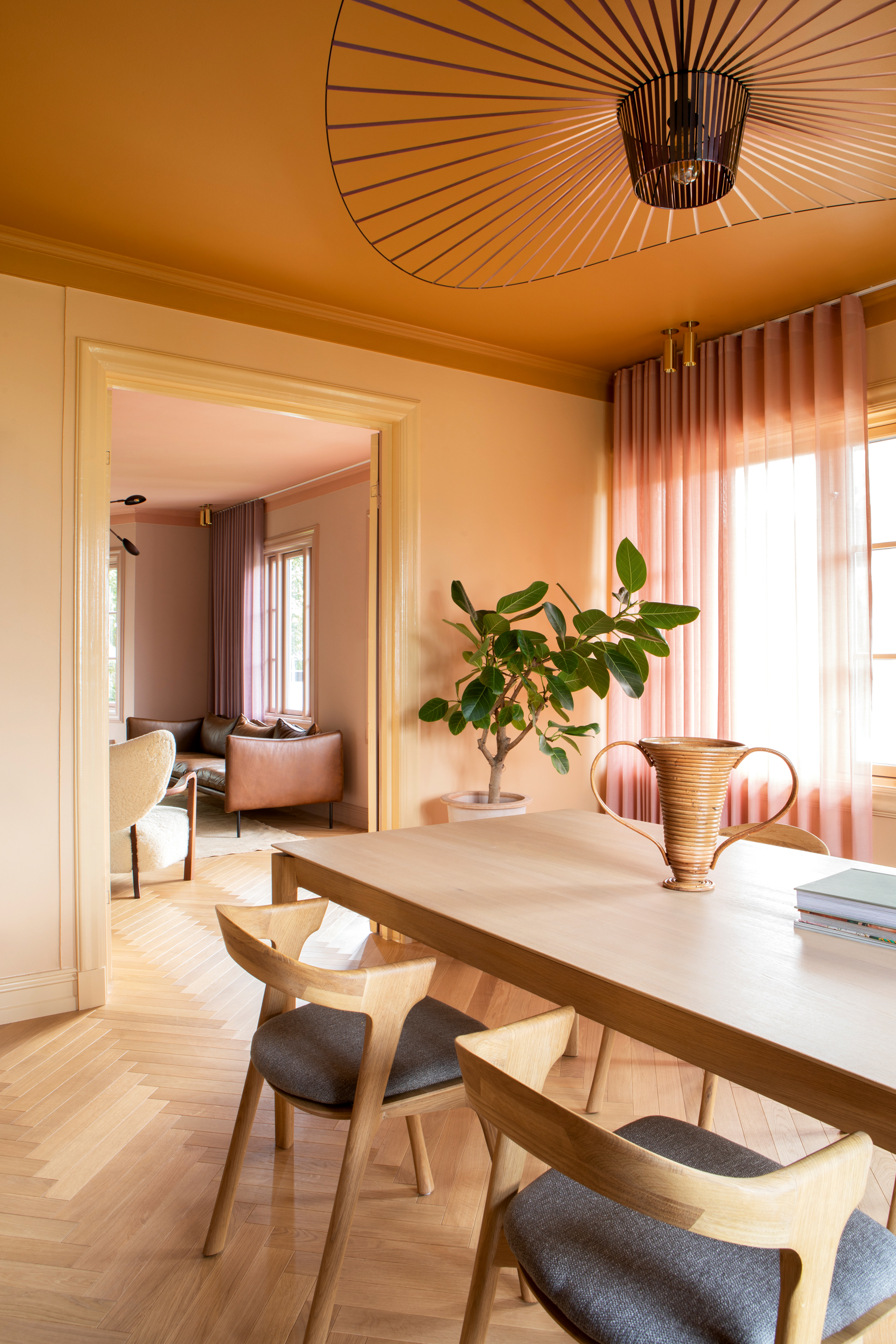
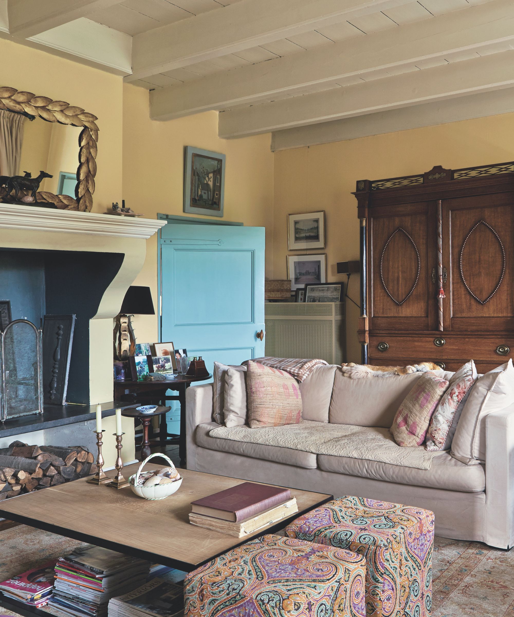
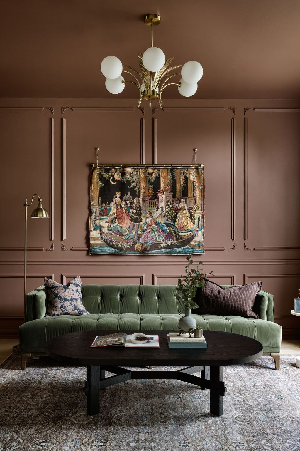
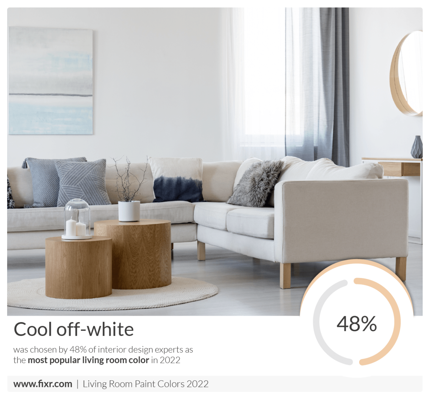
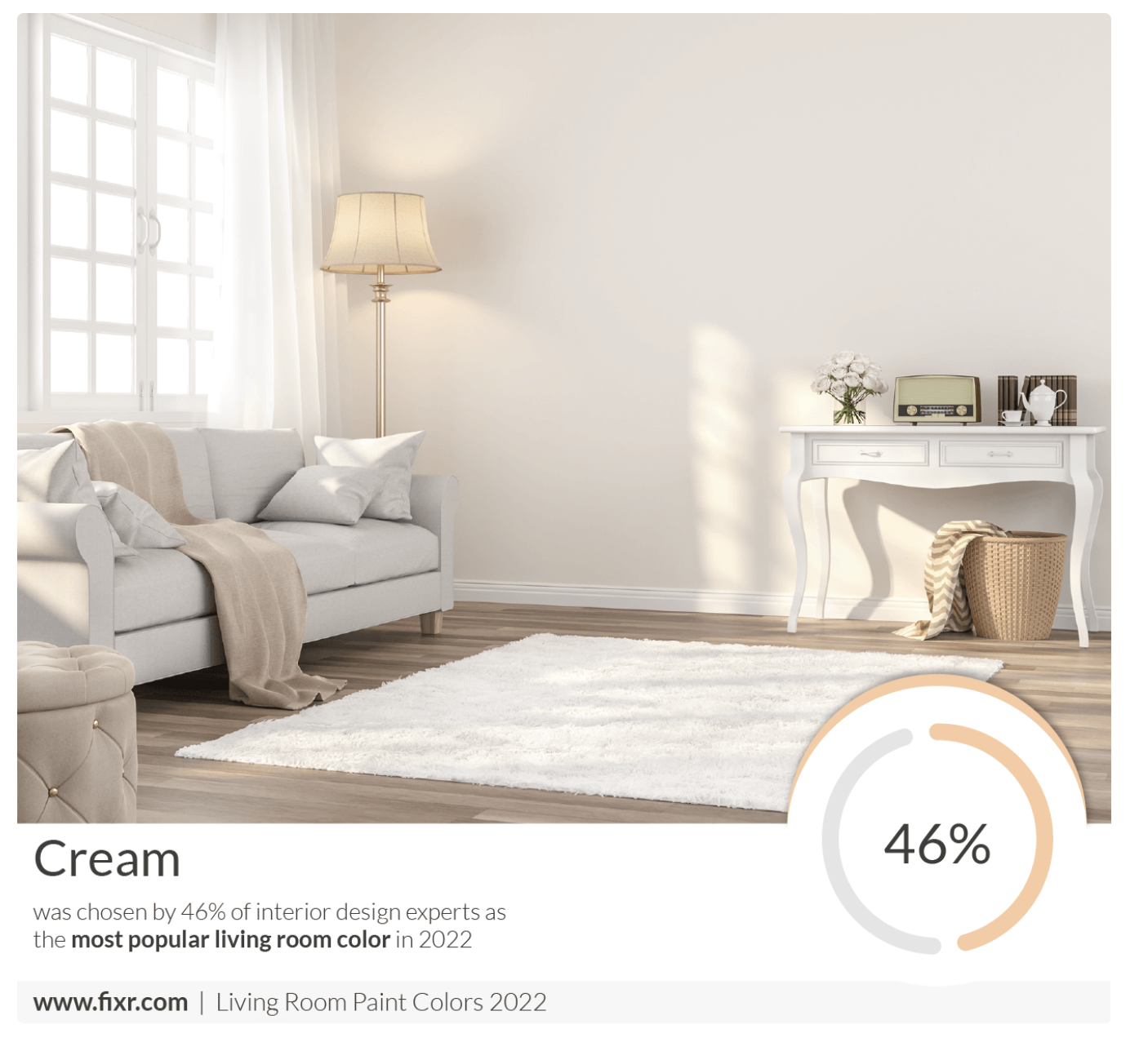
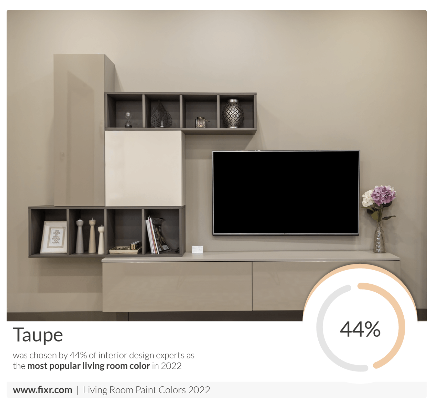
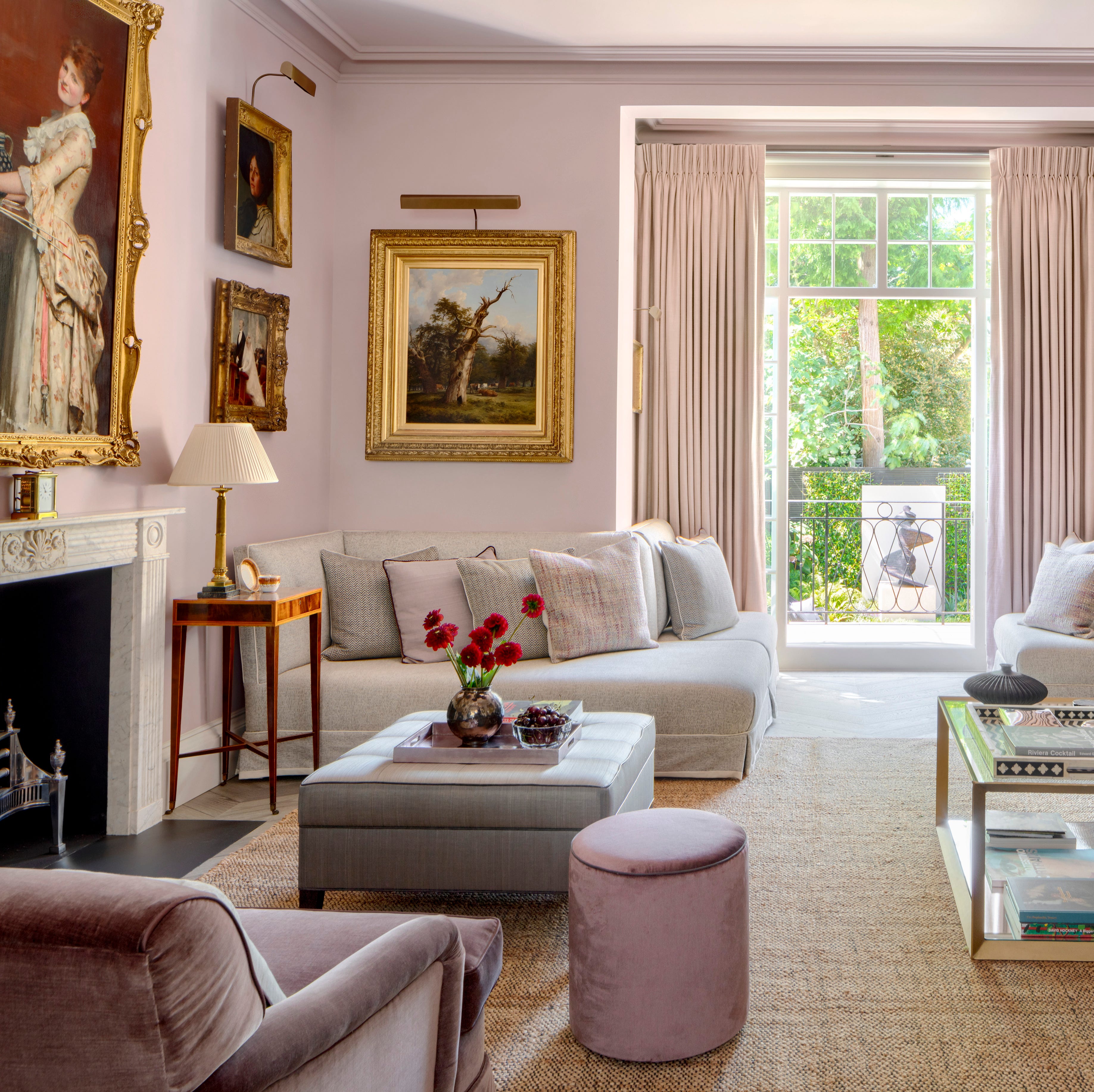
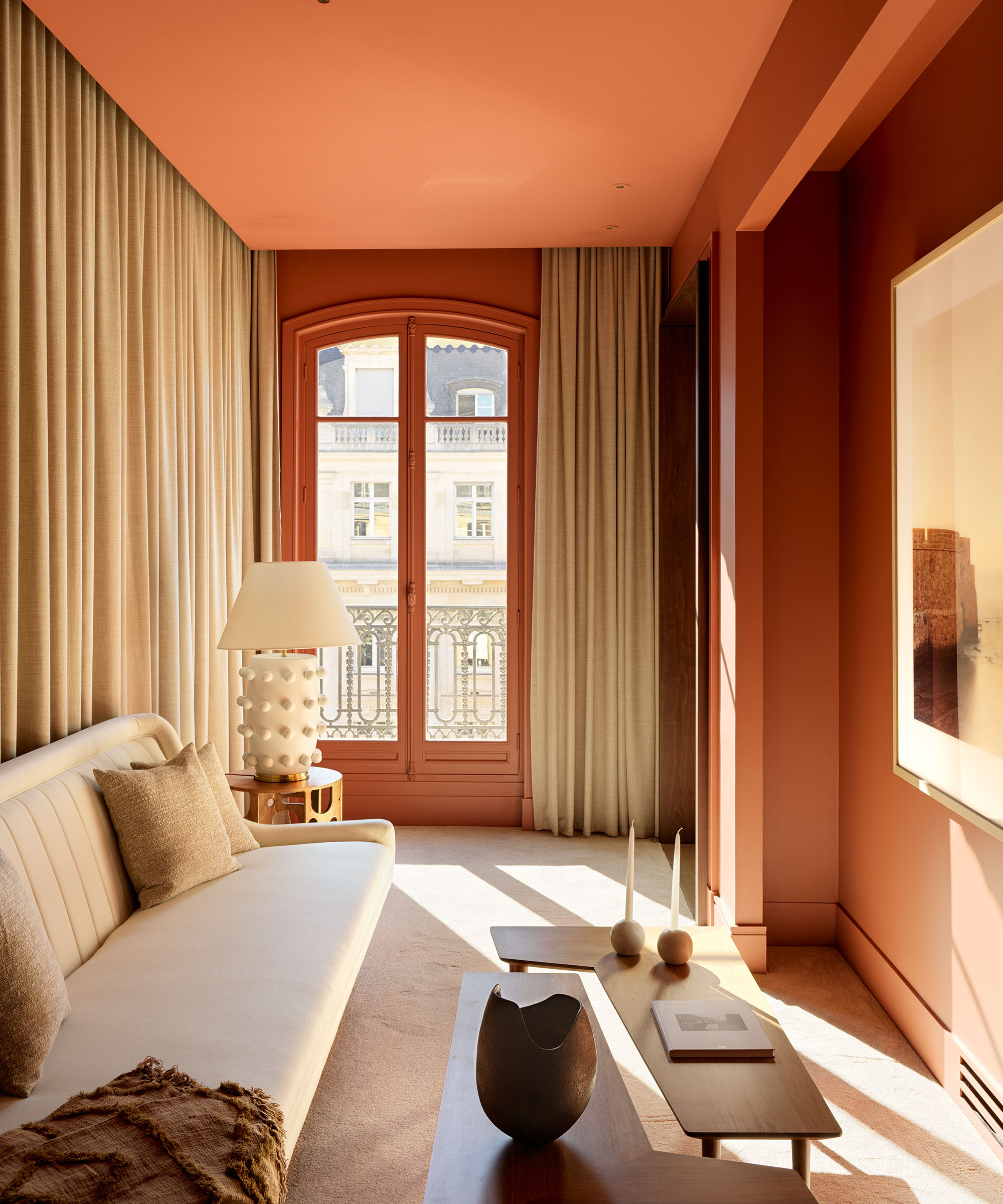
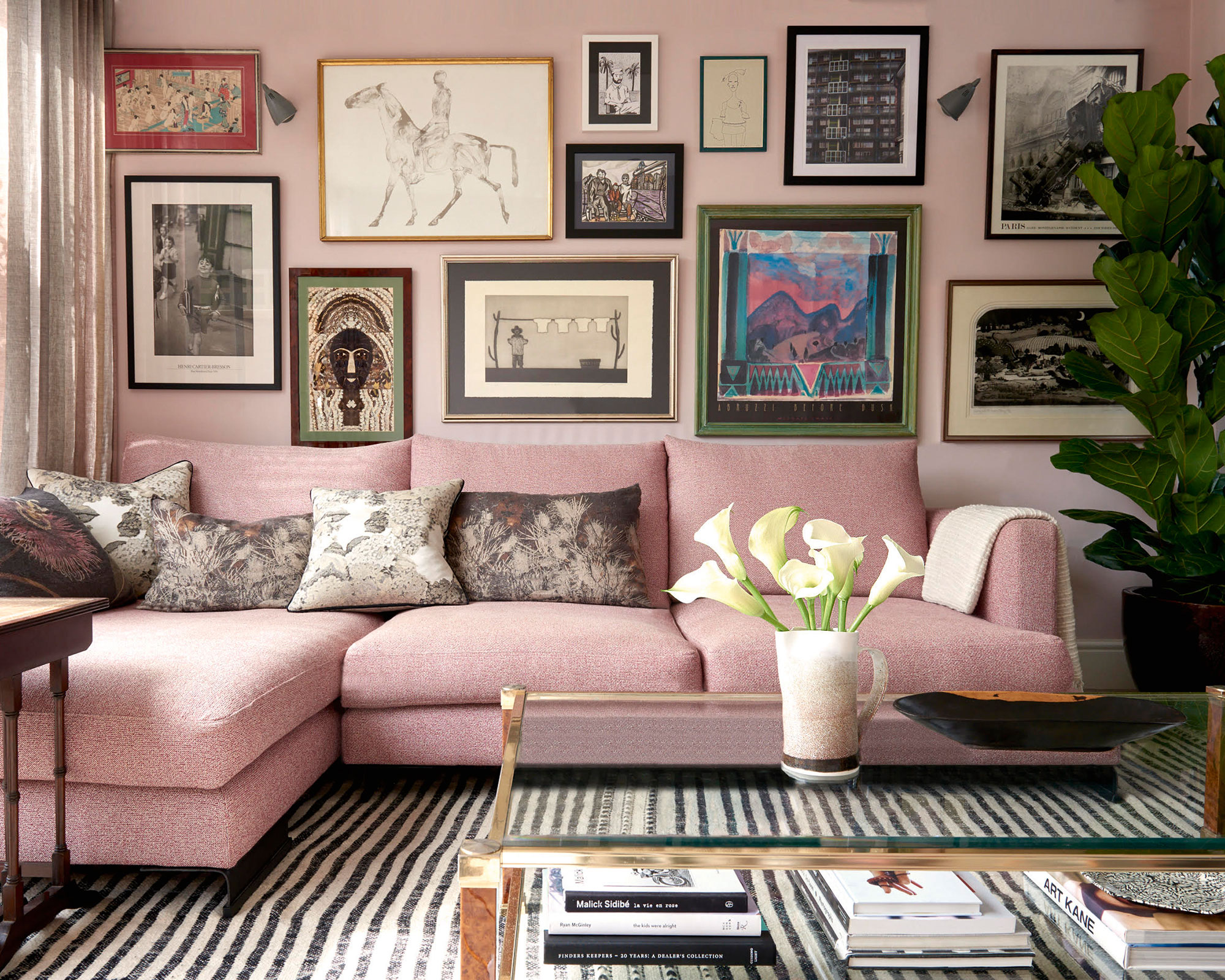
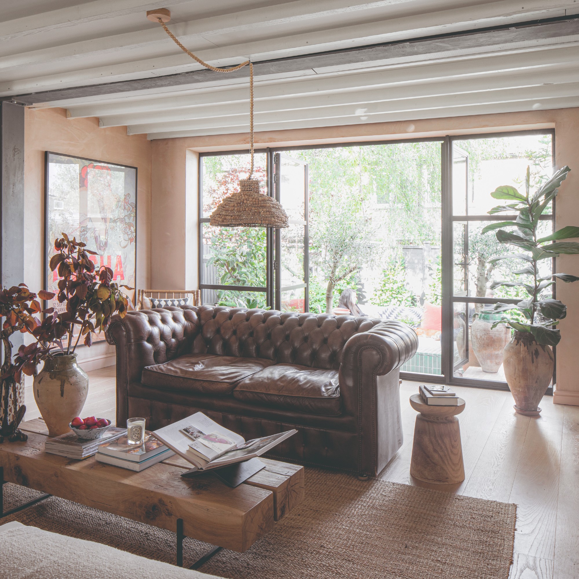
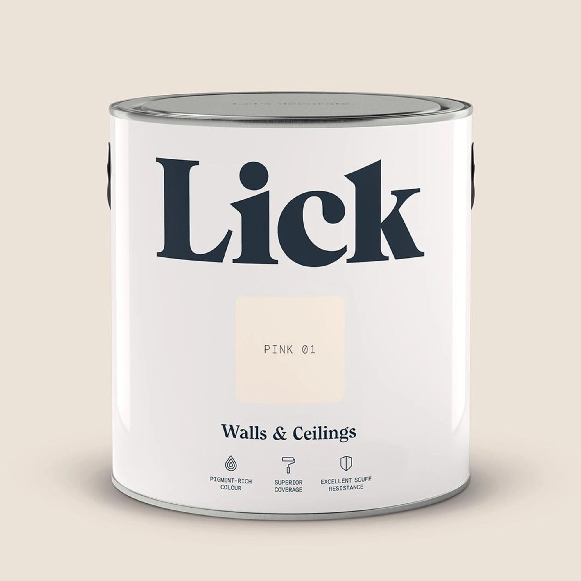
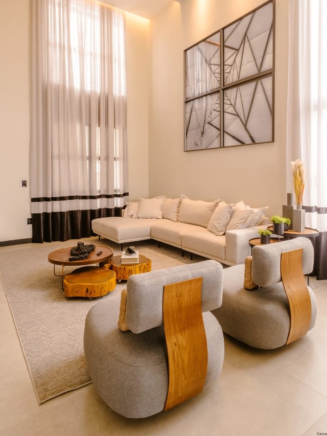
Neutral paint colors, such as tan and khaki, remain a timeless choice for living rooms, providing a versatile backdrop for diverse design and decor elements. Woelfel highlights neutrals as a natural trend because they offer a clean slate for design possibilities. She points to sand, beige, tan, khaki, and various shades of brown, from cinnamon to chocolate, as key colors to watch for creating comforting and cozy environments. Nicole Gibbons, founder of Clare, observes that her customers are increasingly drawn to these warm-toned neutrals like Clare's Neutral Territory or Like Buttah, appreciating the cozy, comforting, and inviting atmosphere they create.
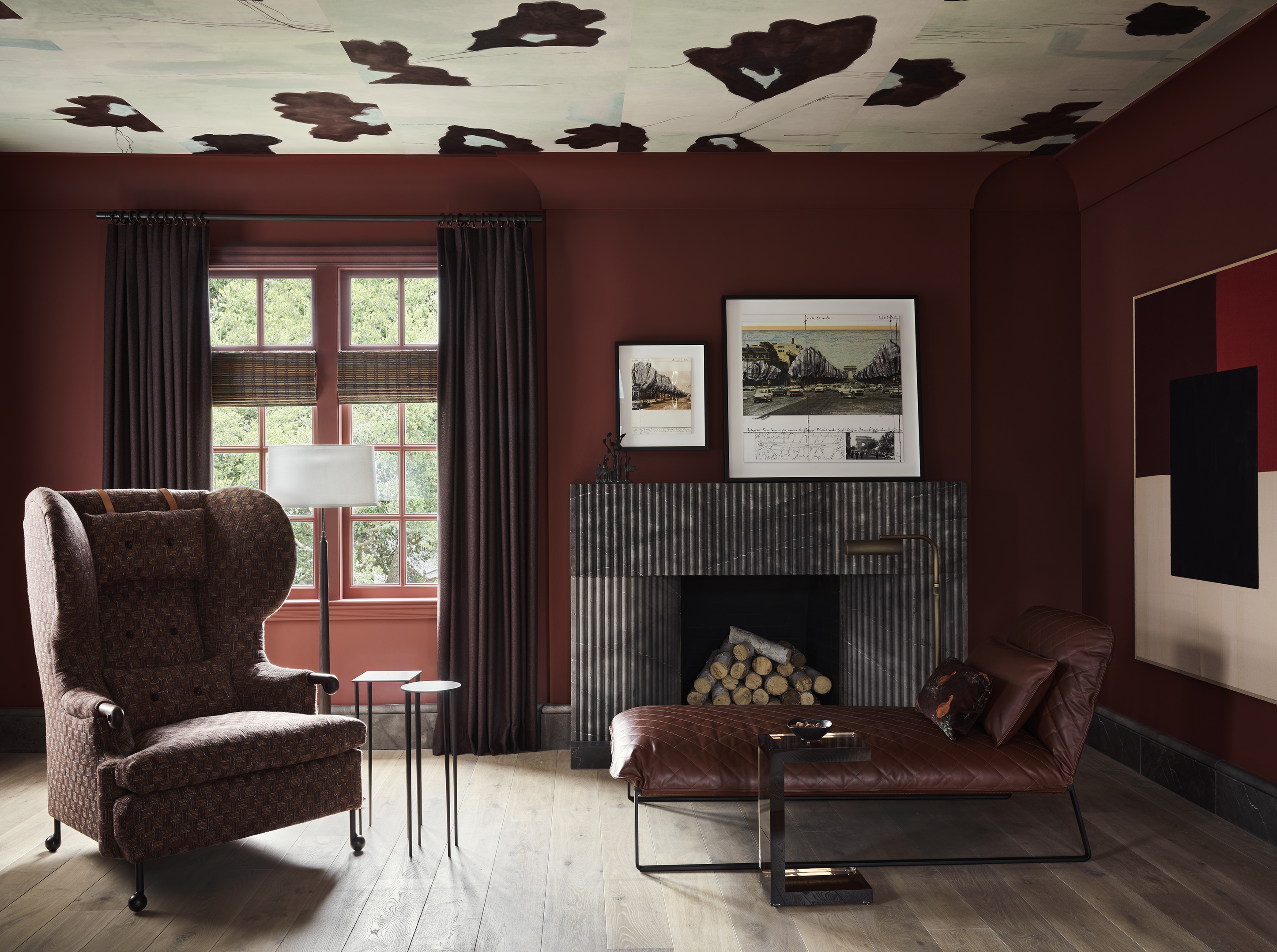
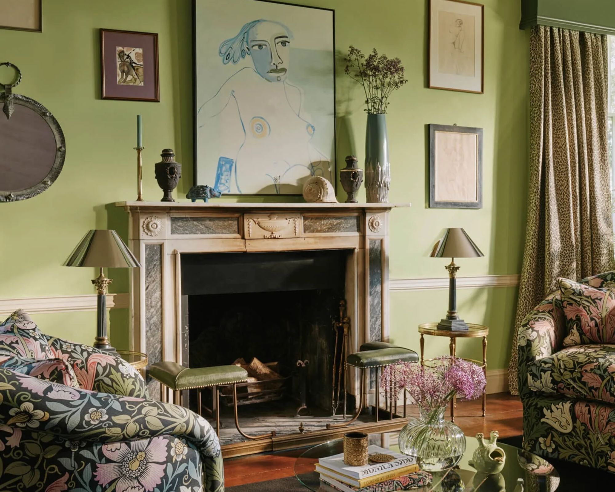
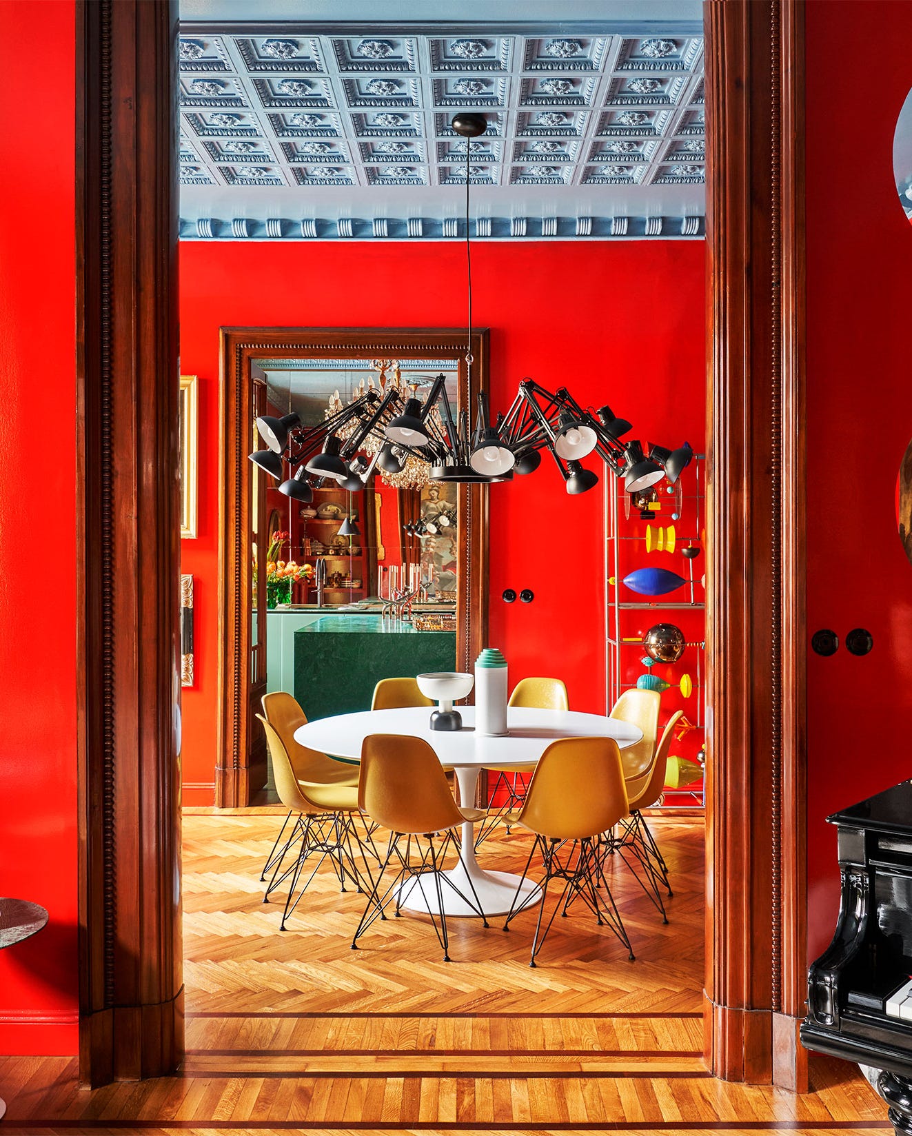
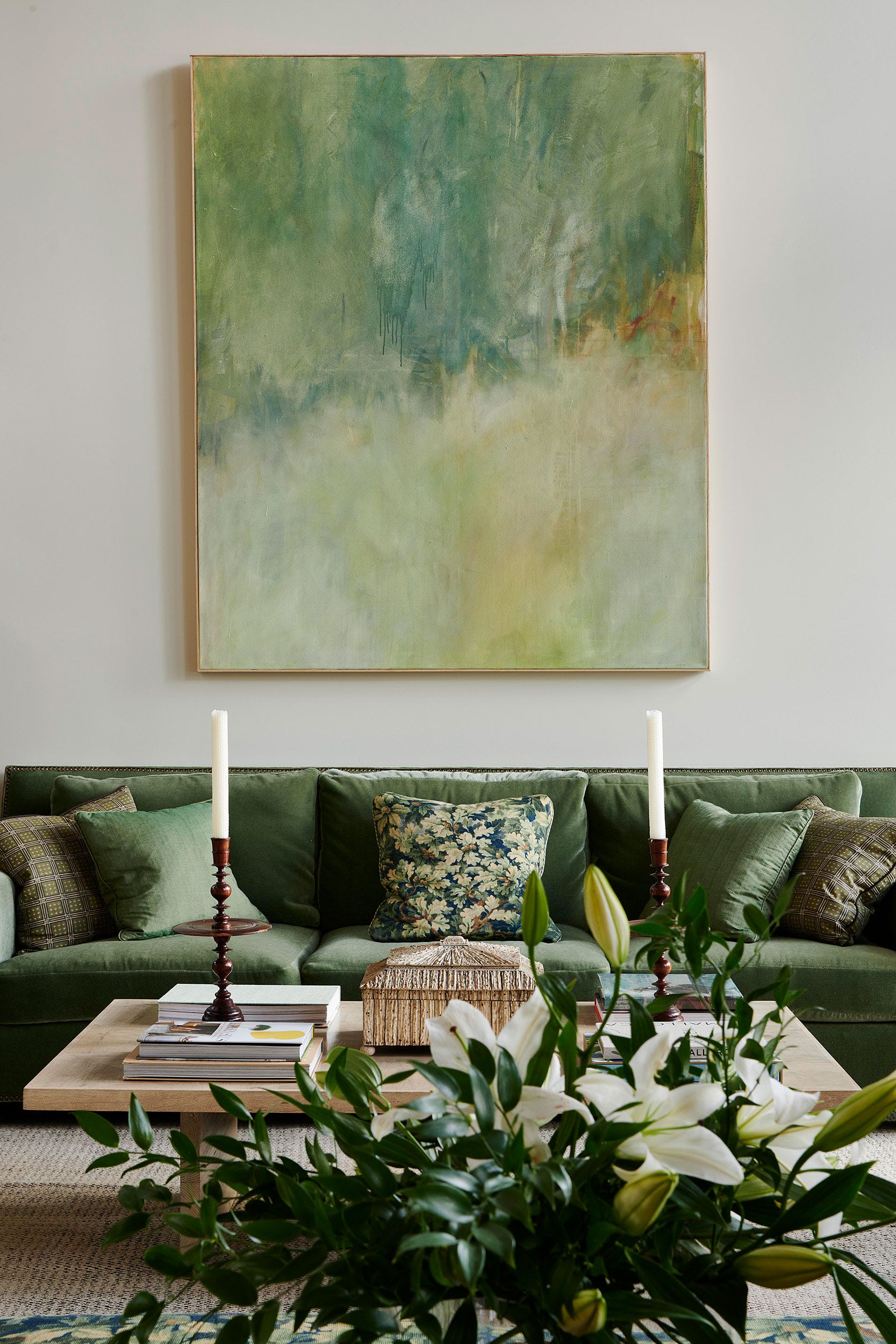
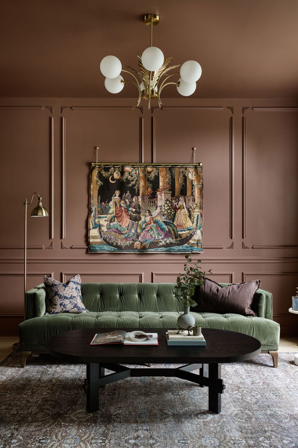
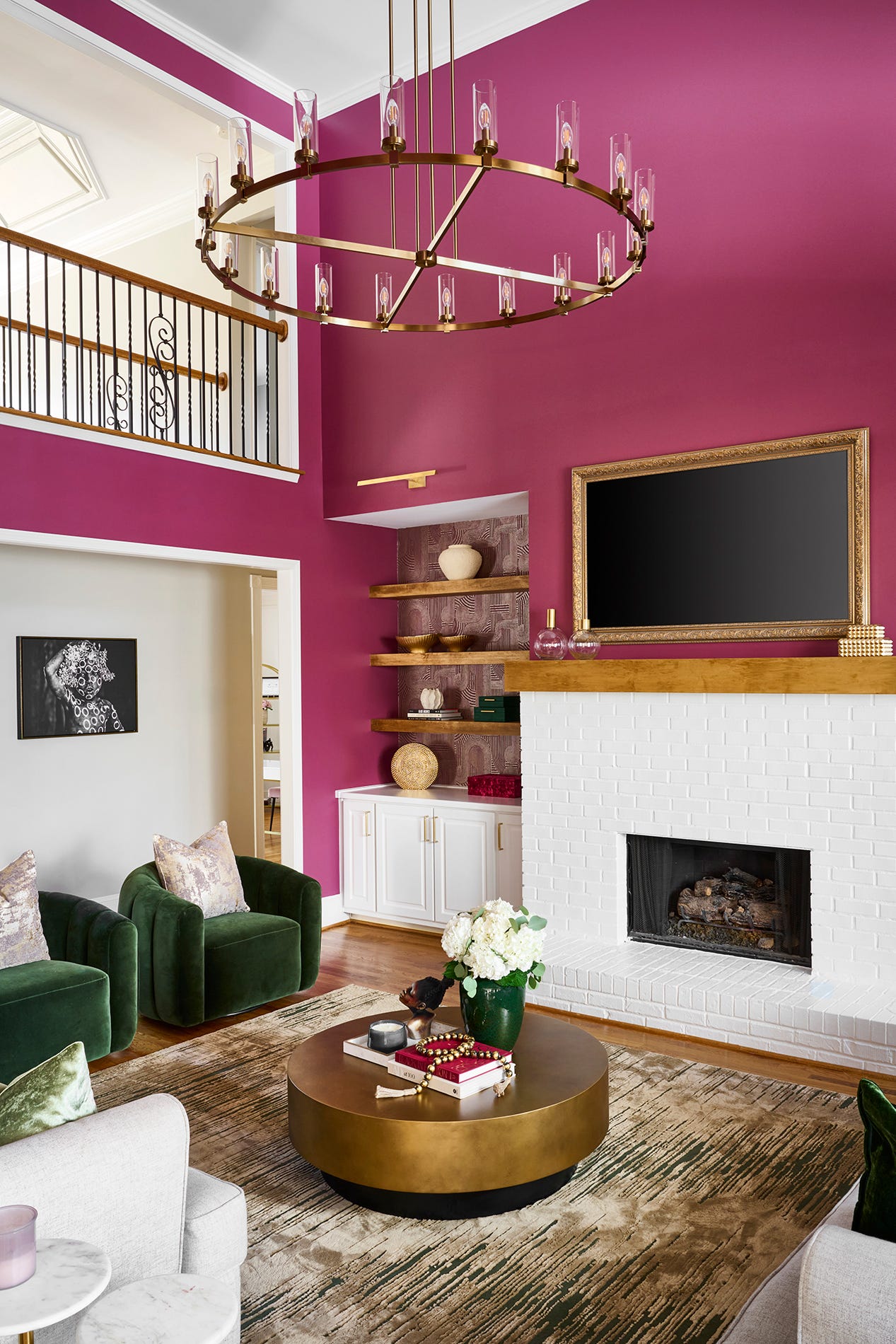
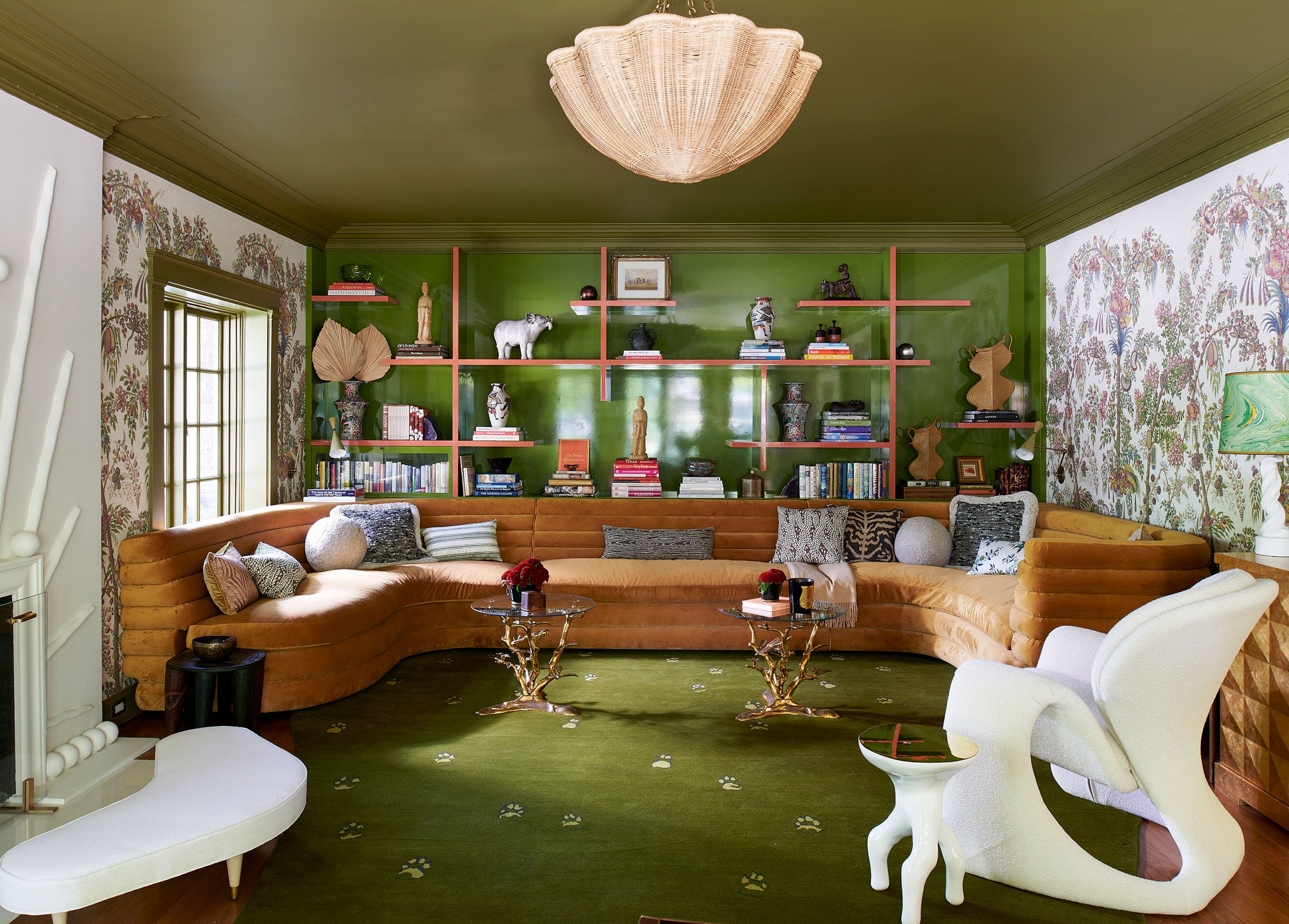
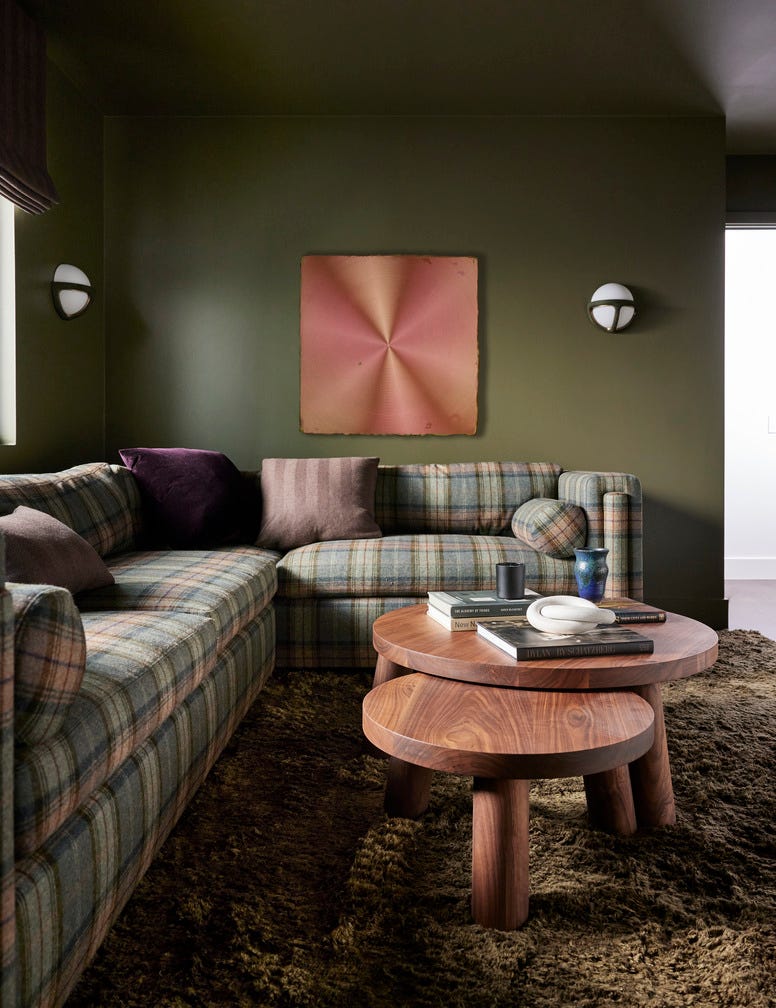
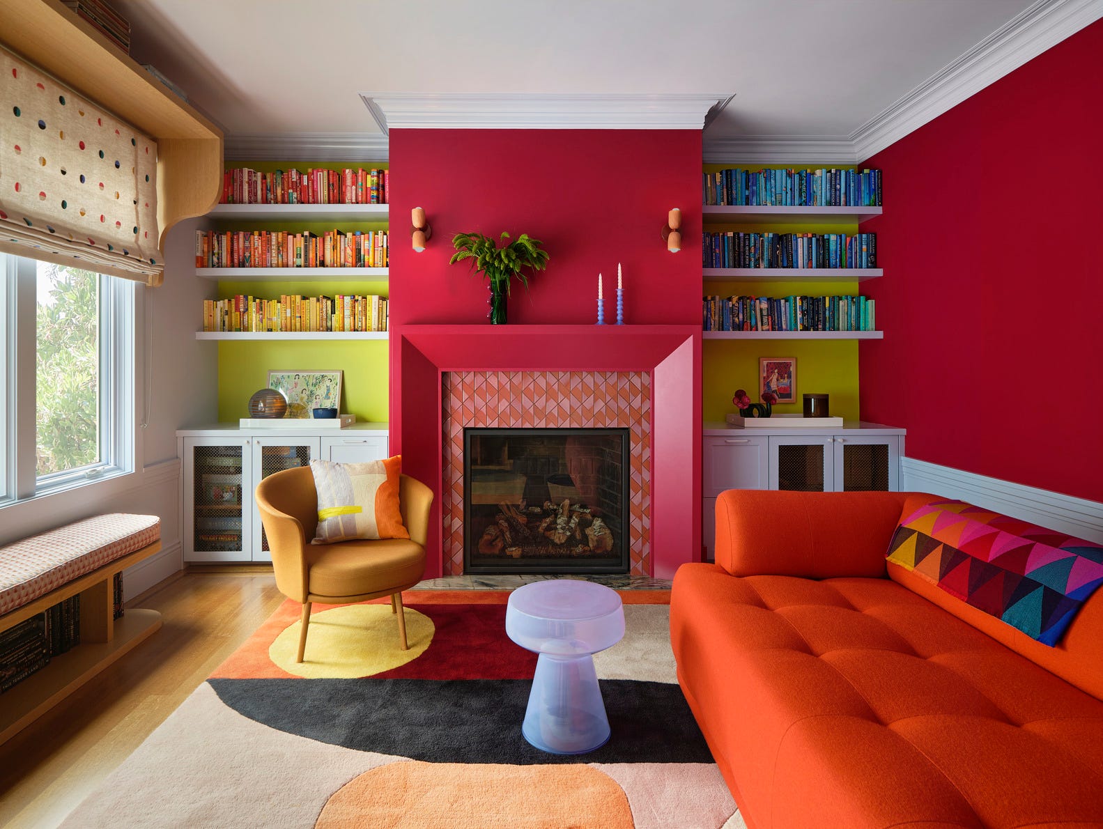
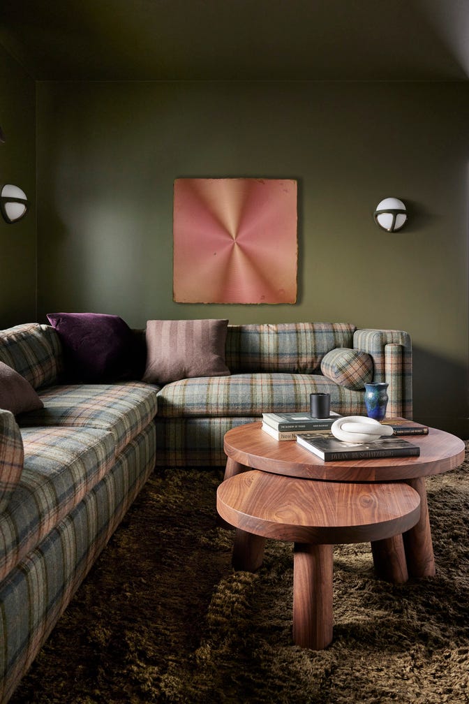
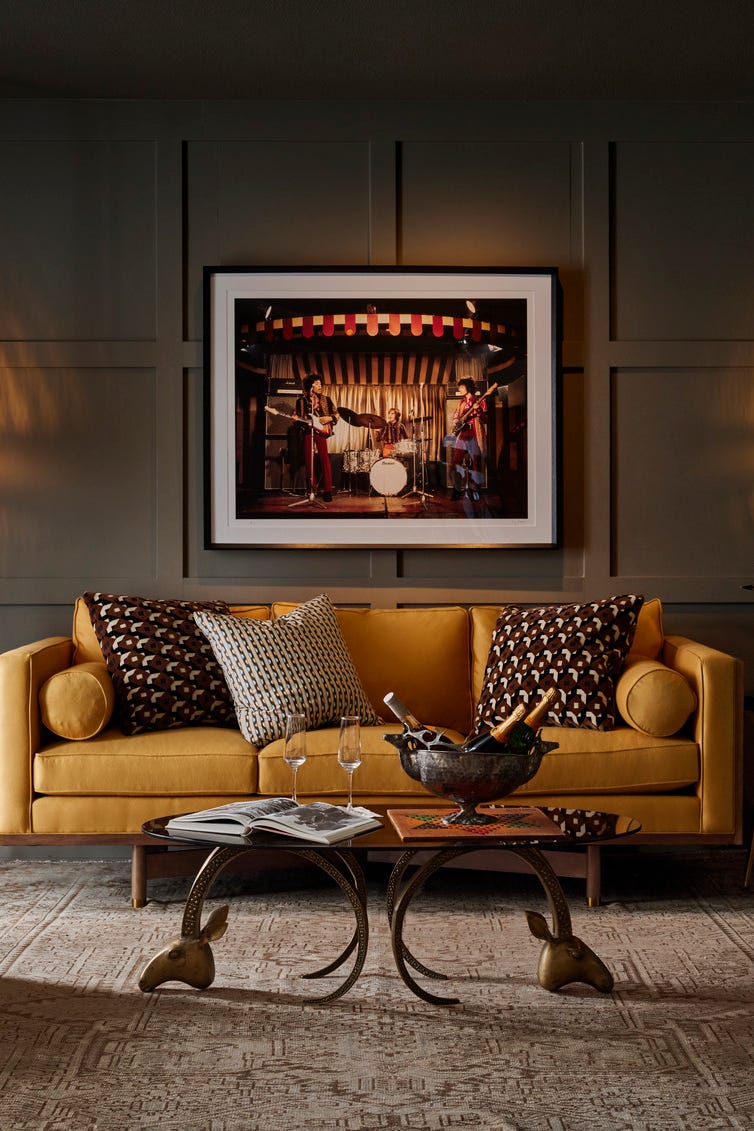
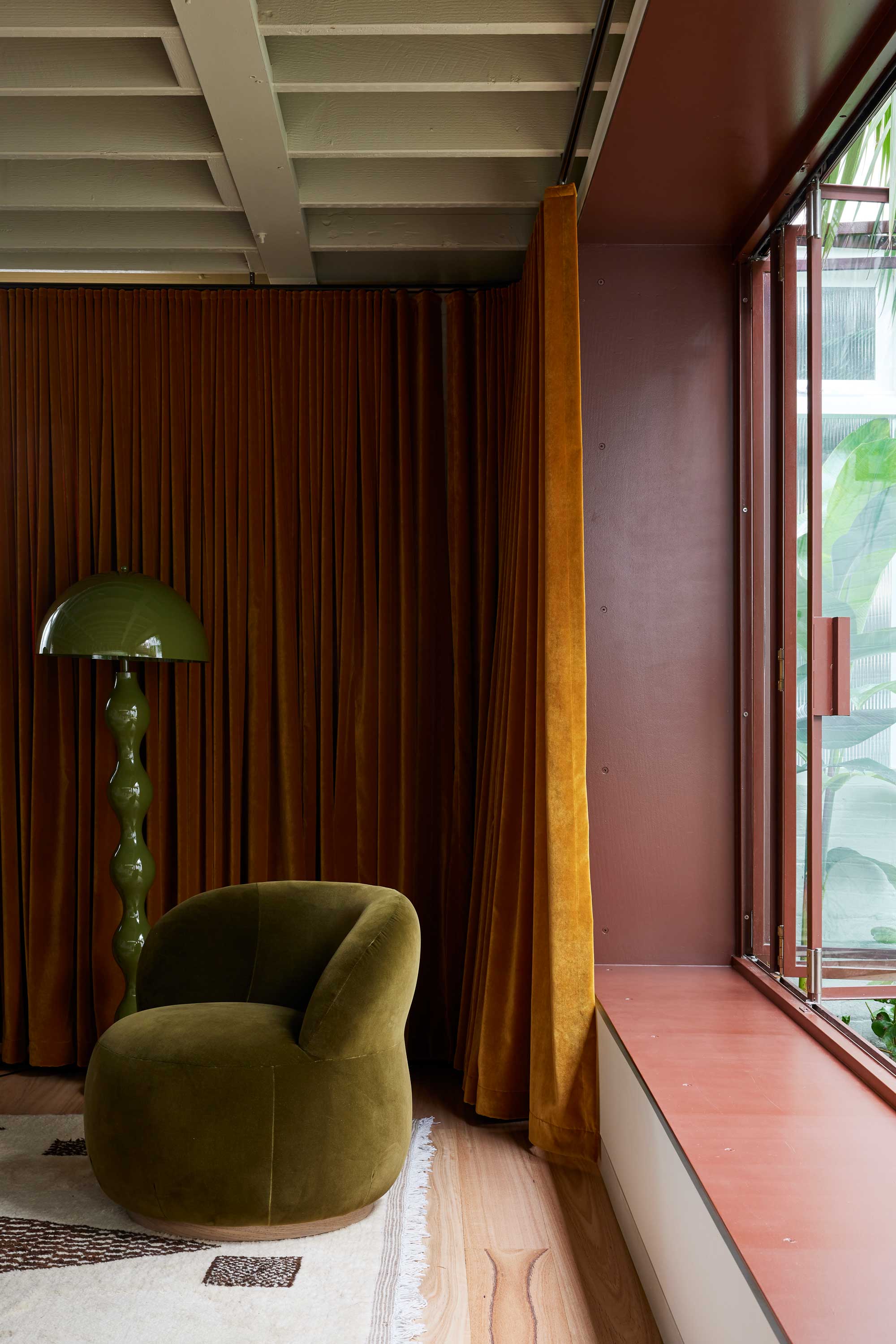
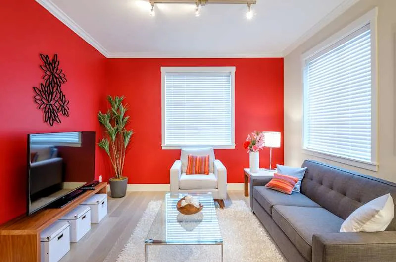
Warm browns and reds are also significant trends. Sue Wadden, director of color marketing at Sherwin-Williams, recommends Urbane Bronze for living rooms, suggesting it creates a sanctuary-like feel while adding energy. For a more blended option, Redend Point, a blush-beige, is noted for its versatility in coordinating with furniture and decor. Outdoor-inspired greens continue to be popular, embodying hues from spring grass to emerald ocean tones. Gibbons notes the increasing popularity of green shades, emphasizing their natural origin and versatility in any room. Light and misty greens like Breezeway offer an uplifting feel, while herbal greens such as Back to Nature provide a rejuvenating quality. For those seeking a bolder statement, deep greens like Vine Leaf are timeless choices for walls and cabinetry.
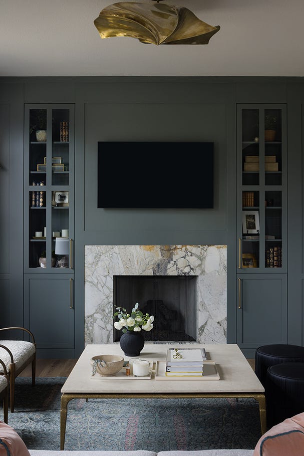
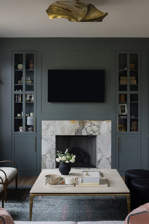
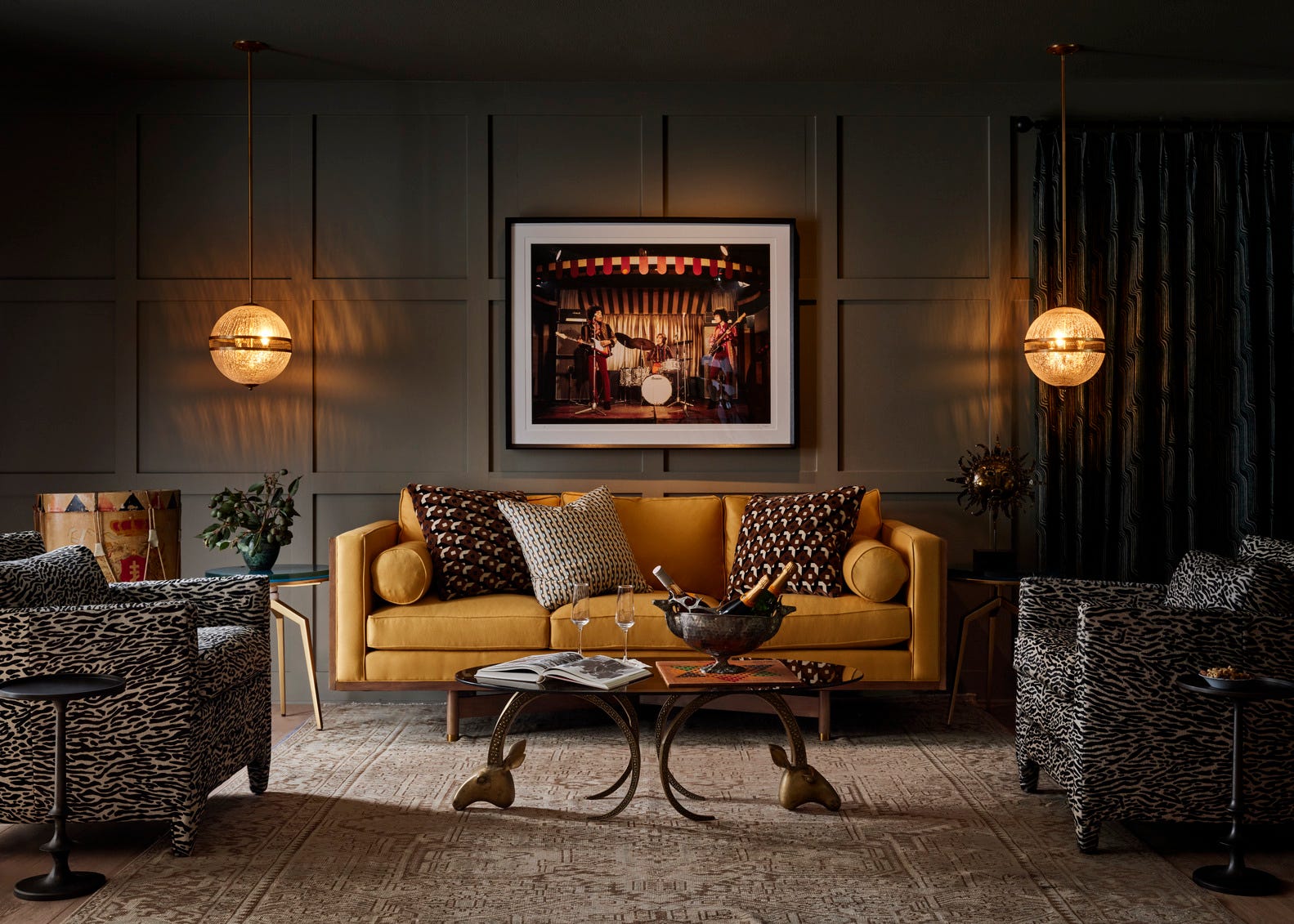
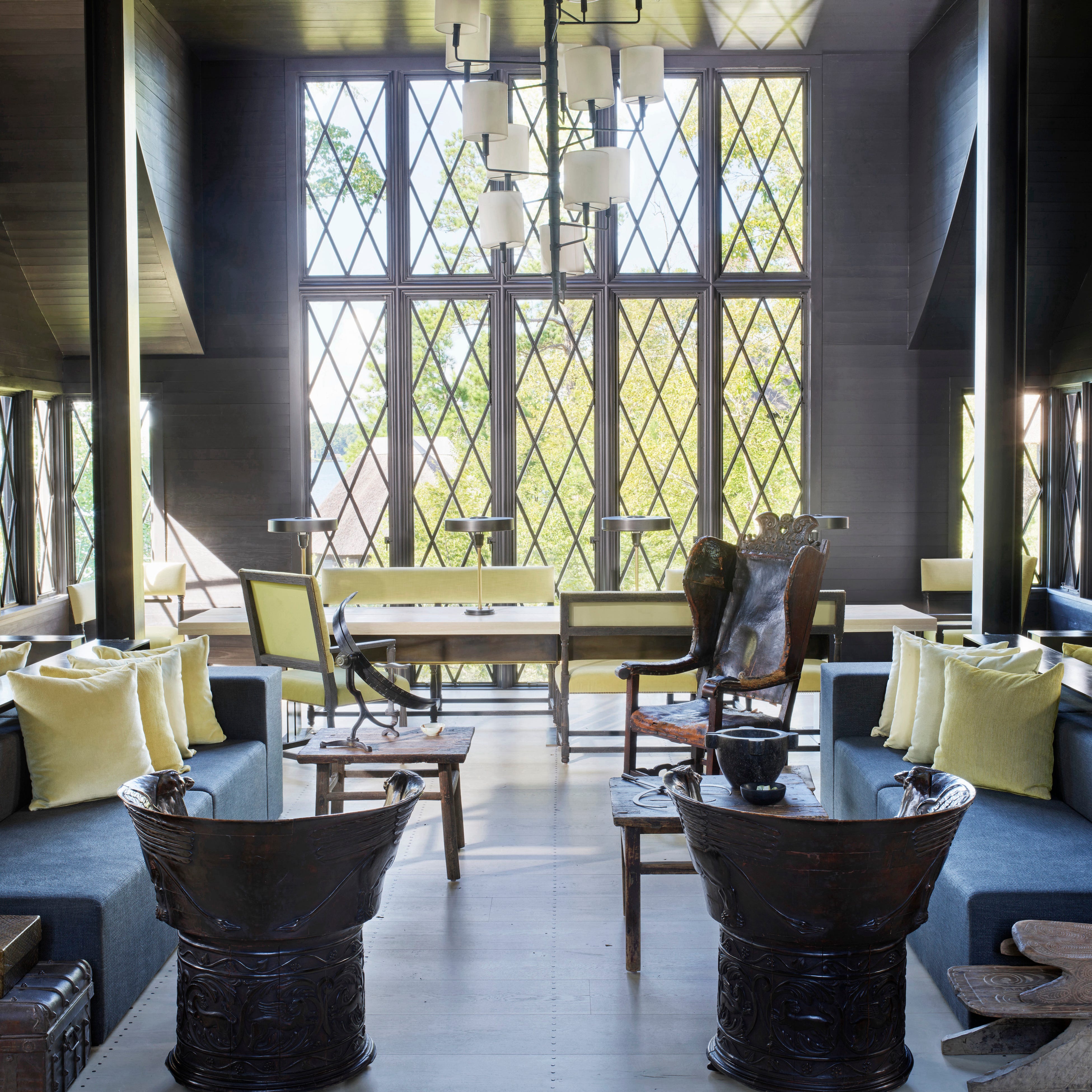
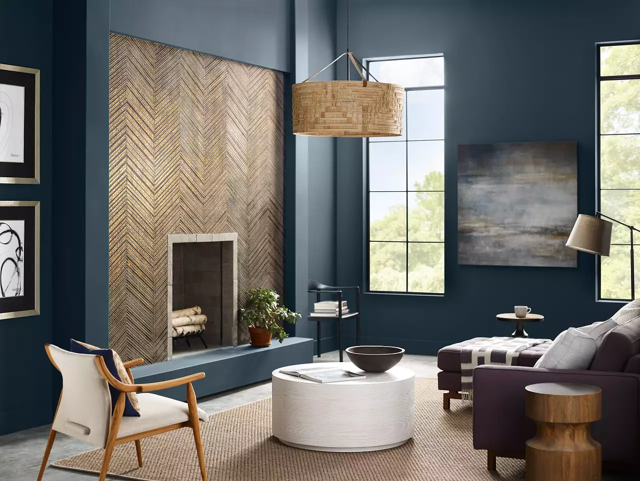
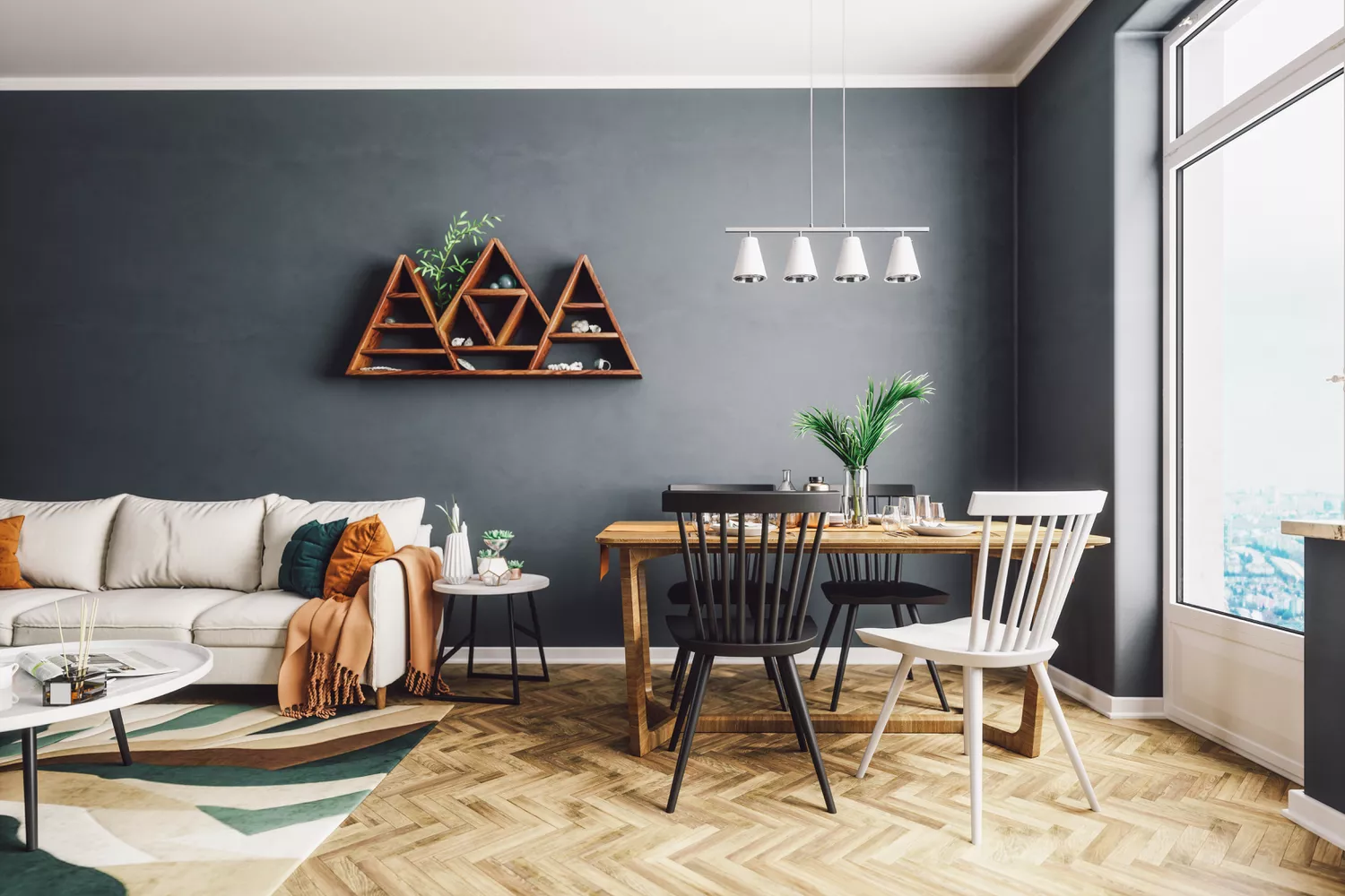
Finally, darker tones are gaining traction for their bold and dramatic effect. While potentially intimidating, a dark color such as Behr’s 2024 color of the year, Cracked Pepper, can ground a space and allow lighter accents to stand out, creating a striking and sophisticated living environment.
#LivingRoomDesign #PaintColorTrends #HomeDecor #InteriorDesign #ColorPsychology #CalmingColors #NeutralPalette #WarmTones #NatureInspired #LivingRoomDesign #PaintColorTrends #HomeDecor #InteriorDesign #ColorPsychology #CalmingColors #NeutralPalette #WarmTones #NatureInspired
0 comment in total
 No comments yet
You may also like
5 Living Room Color Trends for 2025 — New and Exciting Shades Designers Are Choosing for Walls

Listen Up: These Are the Best Paint Colors for Your Living Room

7 Popular Paint Colors for the Living Room
The 3 All-Time Worst Living-Room Paint Colors, According to Designers

5 living room paint colors going out of style in 2025
The 60 Most Popular Living Room Paint Colors Right Now

The Best Colors To Incorporate Into Your Living Room In 2025

‘When your sofa and wall colours are in sync, the space feels intentional’ – experts reveal the 4 best paint and sofa colour combinations
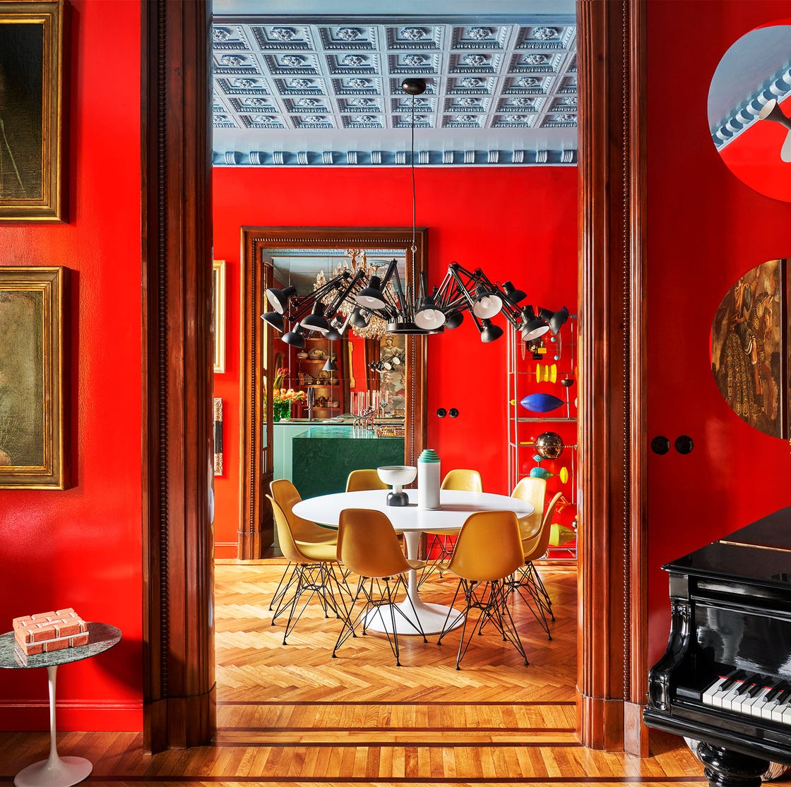
55 Living Room Color Ideas That Will Take Your Space from Drab to Fab

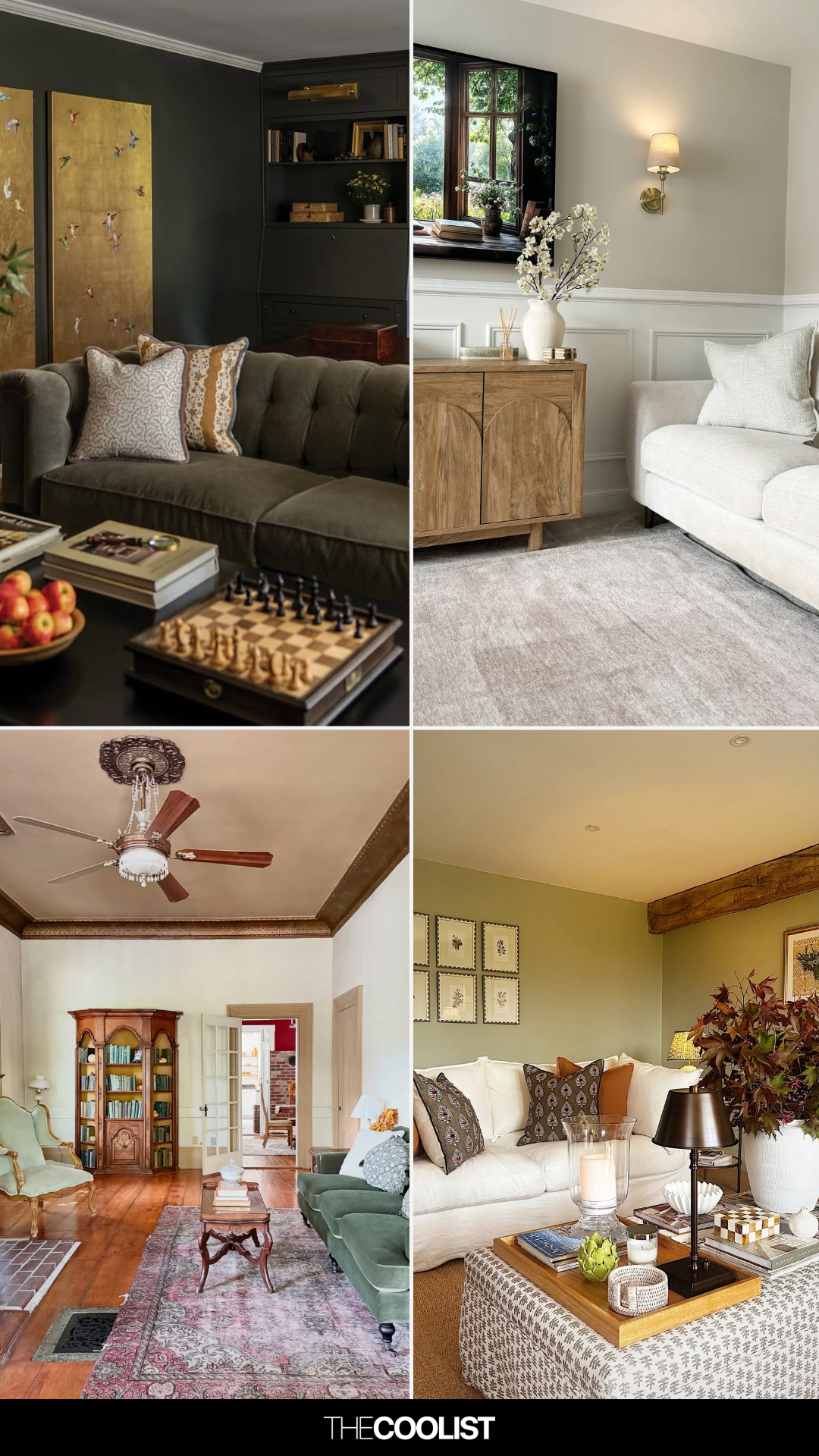
28 Living Room Paint Color Ideas That Make Beige Feel Basic (In the Best Way)

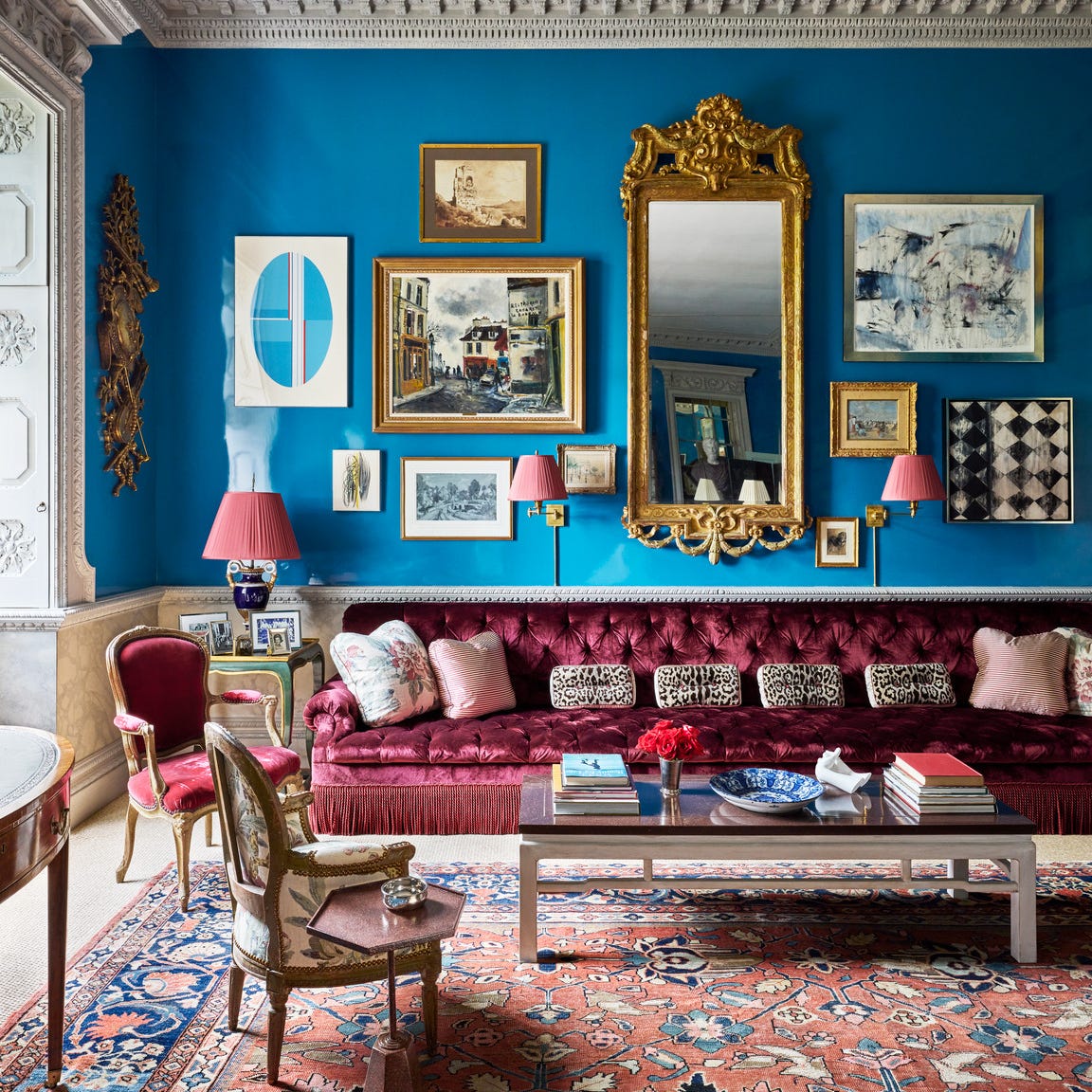
Designers Swear By These 65 Living Room Paint Colors

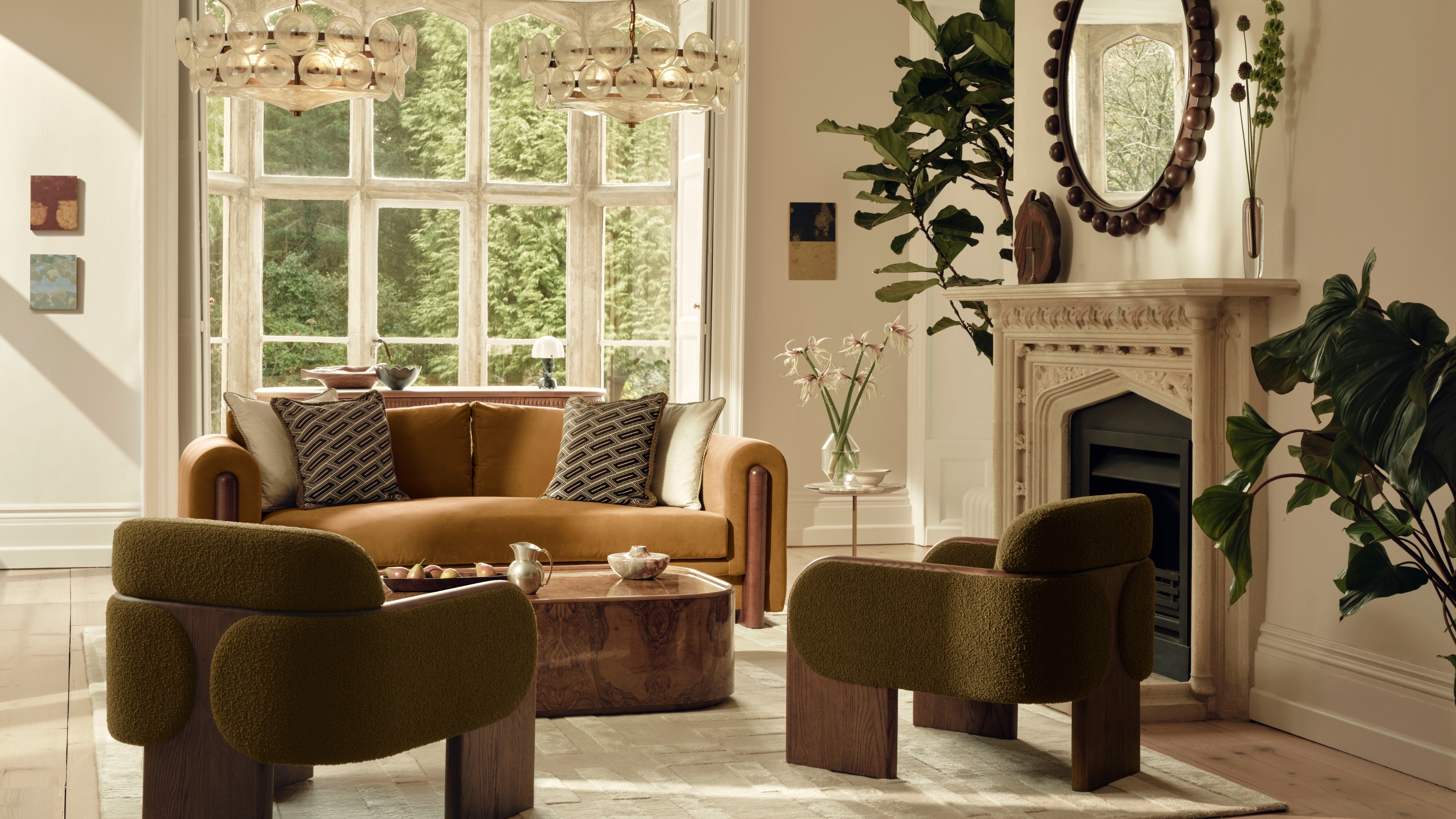
These Are the 3 Living Room Colors That Are Out of Style in 2025 — And the Shades to Use Instead
4 Living Room Paint Colors That Are So Outdated, According to Designers

These Living Room Paint Colors Are a Total Mindset Shift
Designer-Approved Living Room Colors That'll Make You Feel Happier

7 colour tricks to transform your mood and living room design


Experts reveal the best living room paint colours to transform every space

Jewel Tones Are Trending for Living Room Paint Colors, According to Designers
5 colors that will make your living room feel happier, according to interior designers
6 Living Room Paint Color Trends That Are Going to Take Over Walls in 2026