1/26
Living room colour schemes – 26 ways to bring your lounge to life with on-trend shades and timeless colour combos
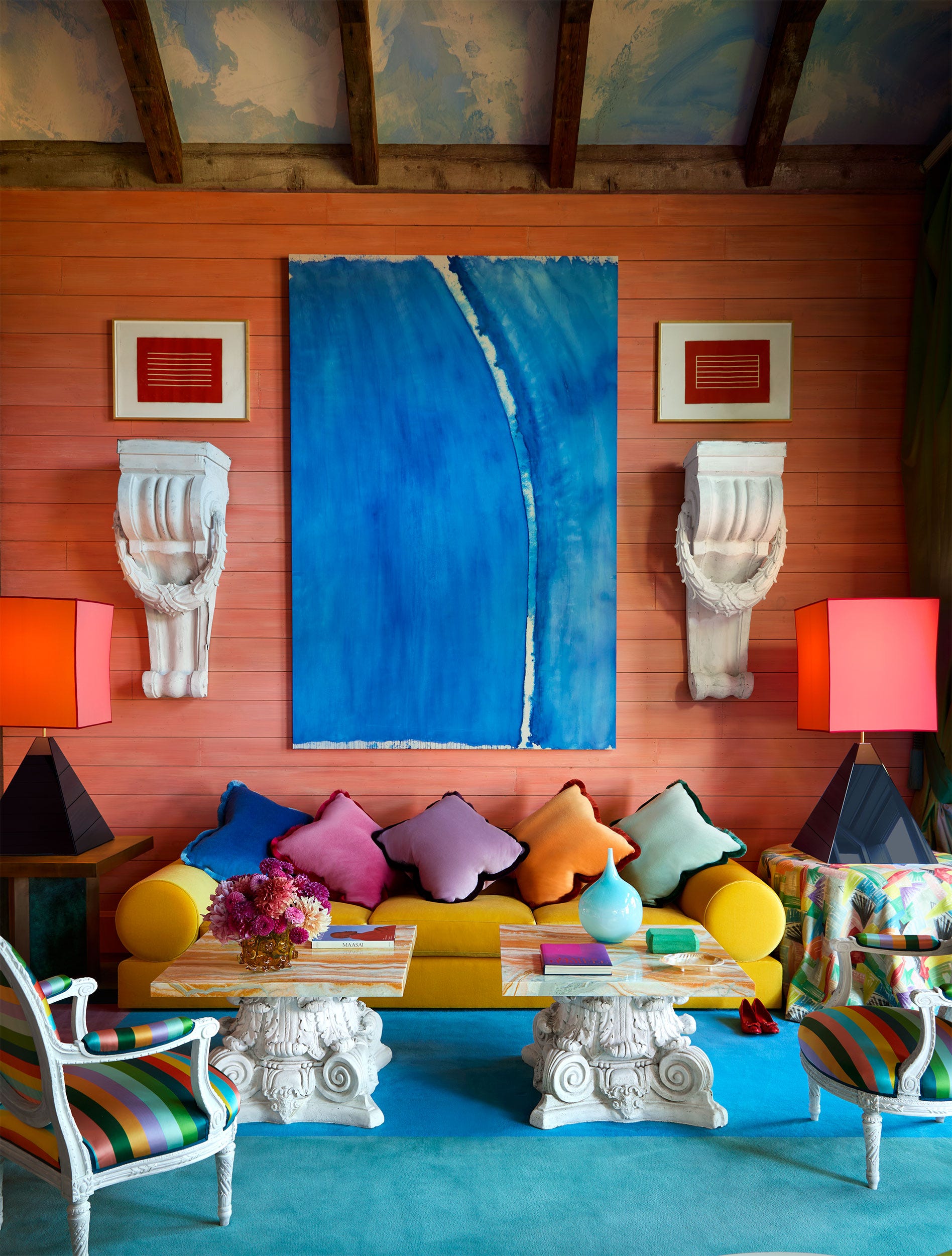
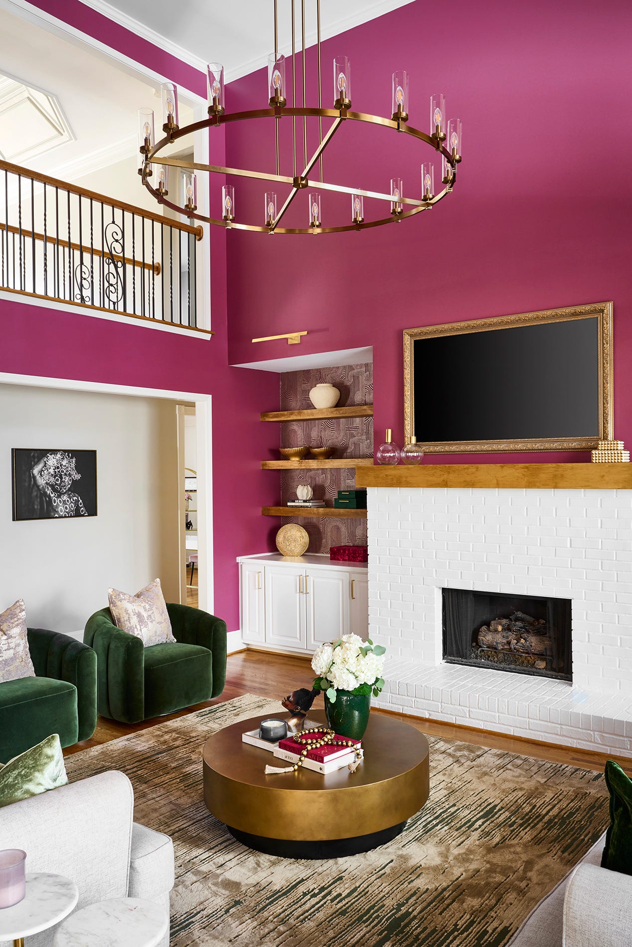
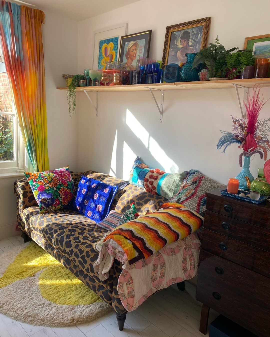
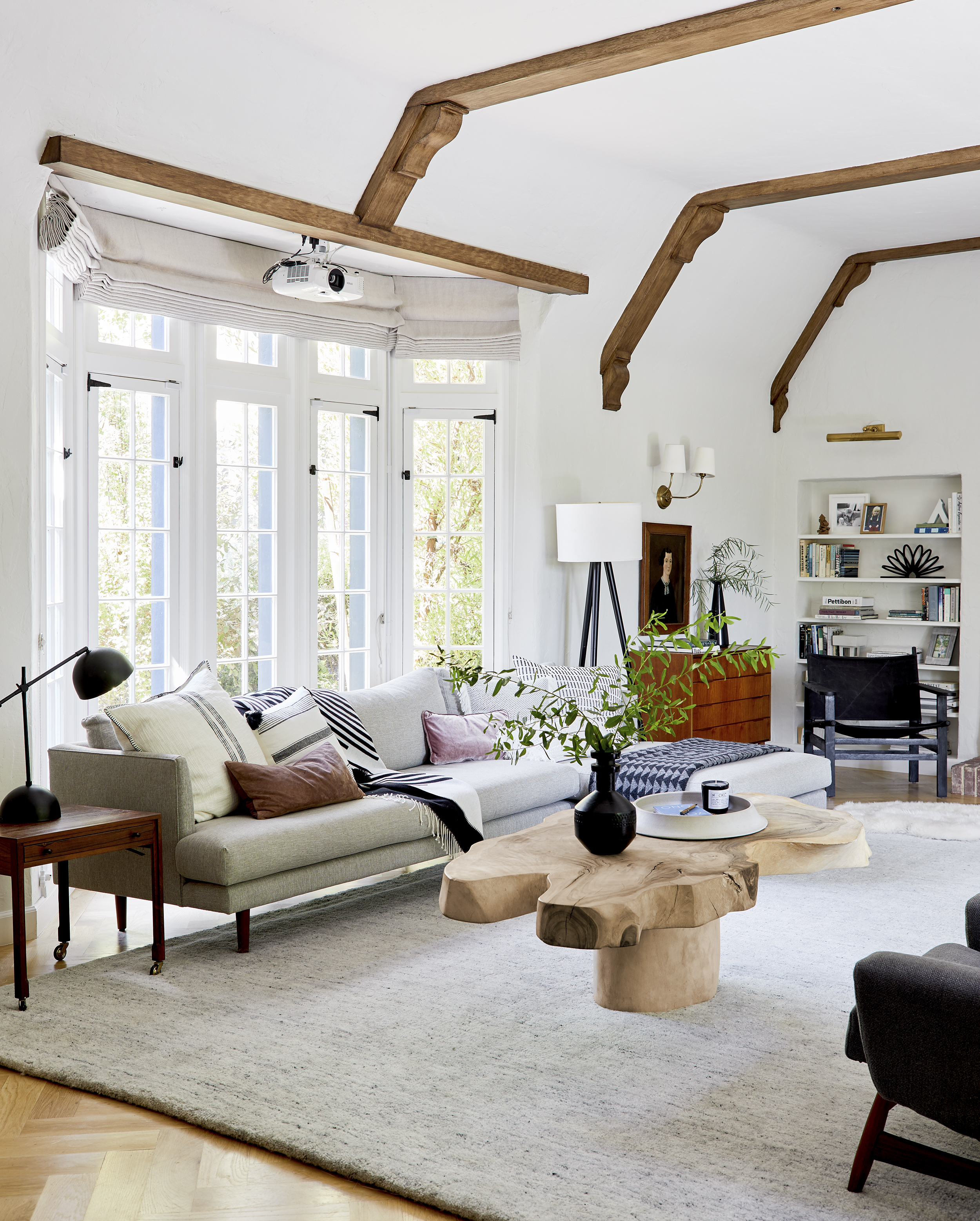
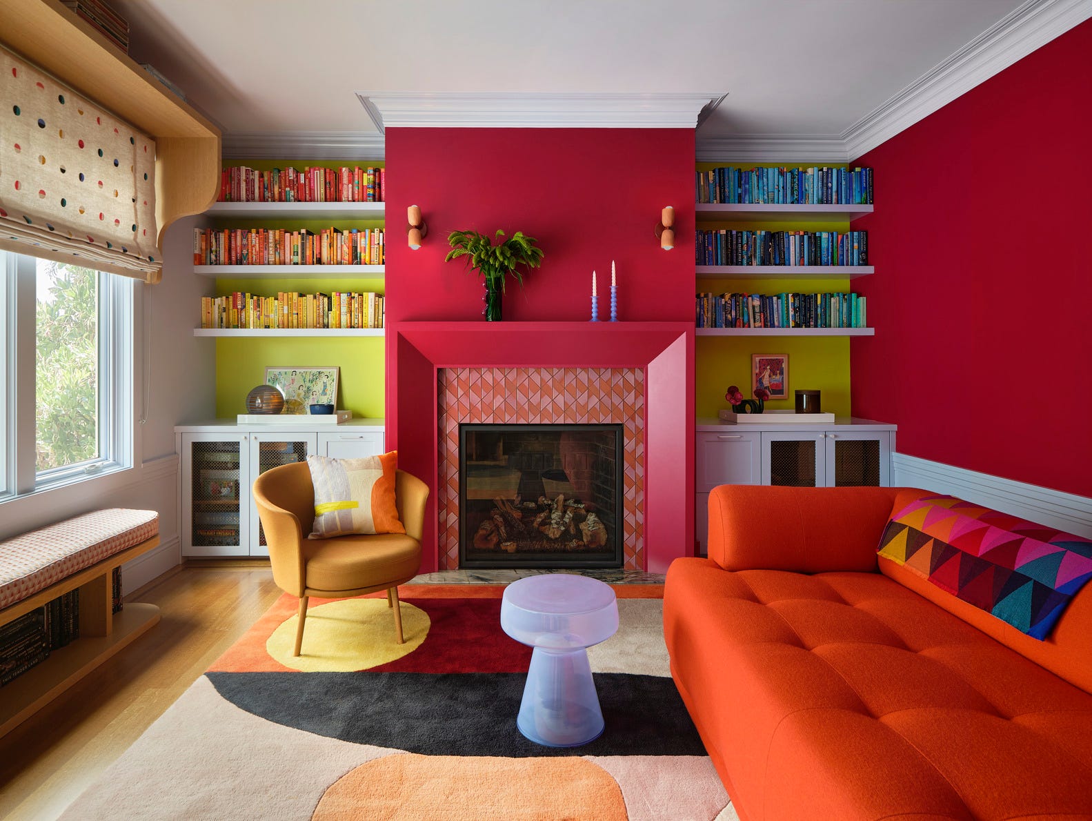
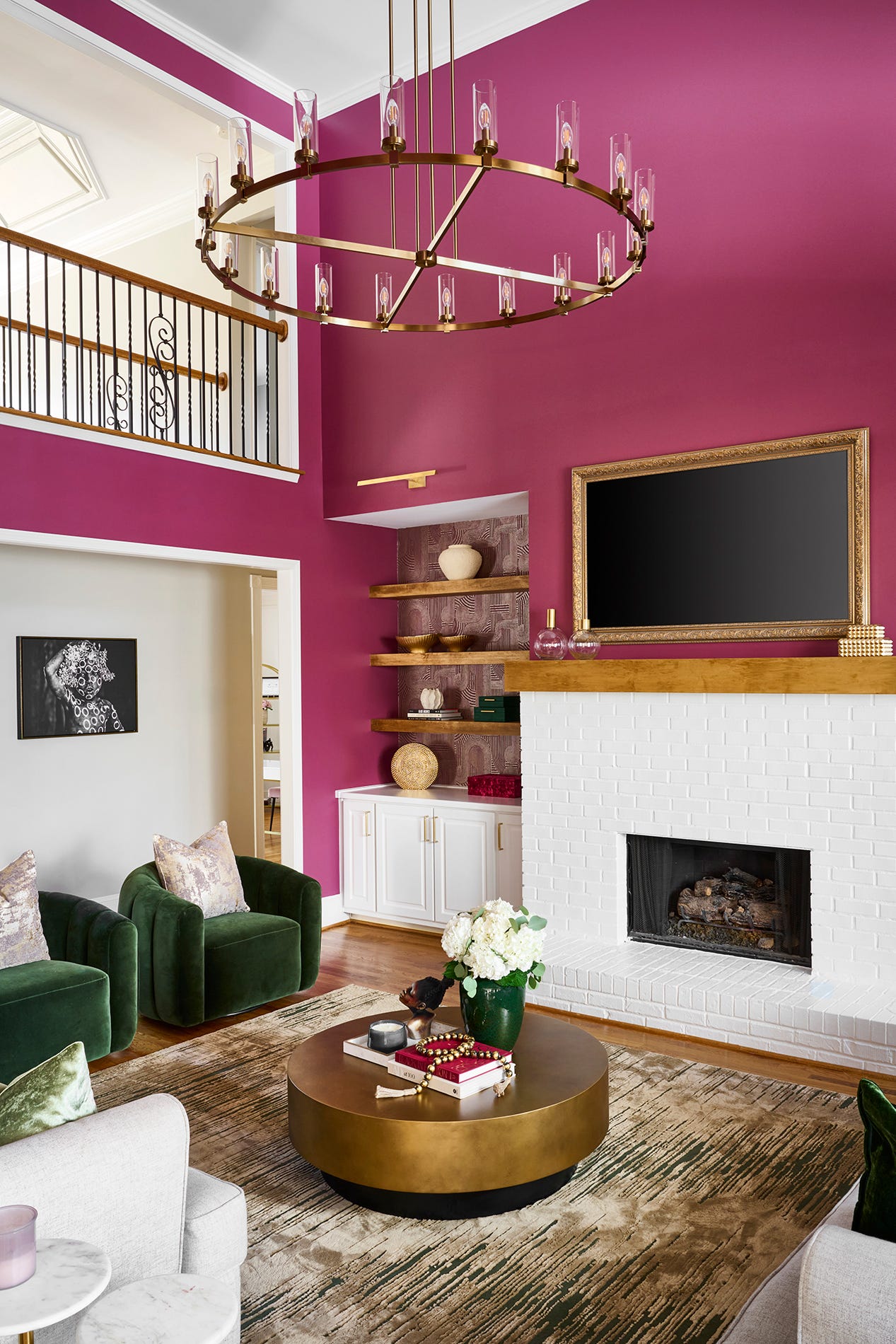
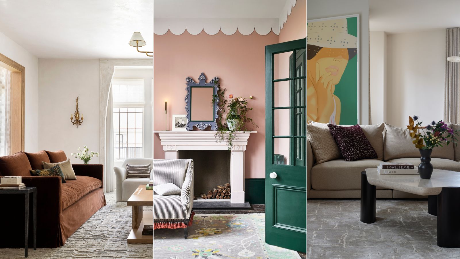
Living rooms are increasingly becoming multi-functional spaces used for entertaining, relaxing, and reflecting personal style. This shift is evident in the growing confidence homeowners and renters show in using bold colors rather than traditional neutrals. Tash Bradley, Director of Interior Design and Color Psychologist at Lick, notes that living rooms are no longer just neutral backdrops but are being embraced with vibrant hues and creative styling. Michael Rolland, Managing Director at The Paint Shed, emphasizes that the best living room colors are those that create an inviting and comfortable atmosphere while aligning with personal preferences. He also advises maintaining consistency with the home's overall color palette to ensure a cohesive flow. The 'dopamine decor' trend further encourages playful designs and individualistic styles in home decoration.
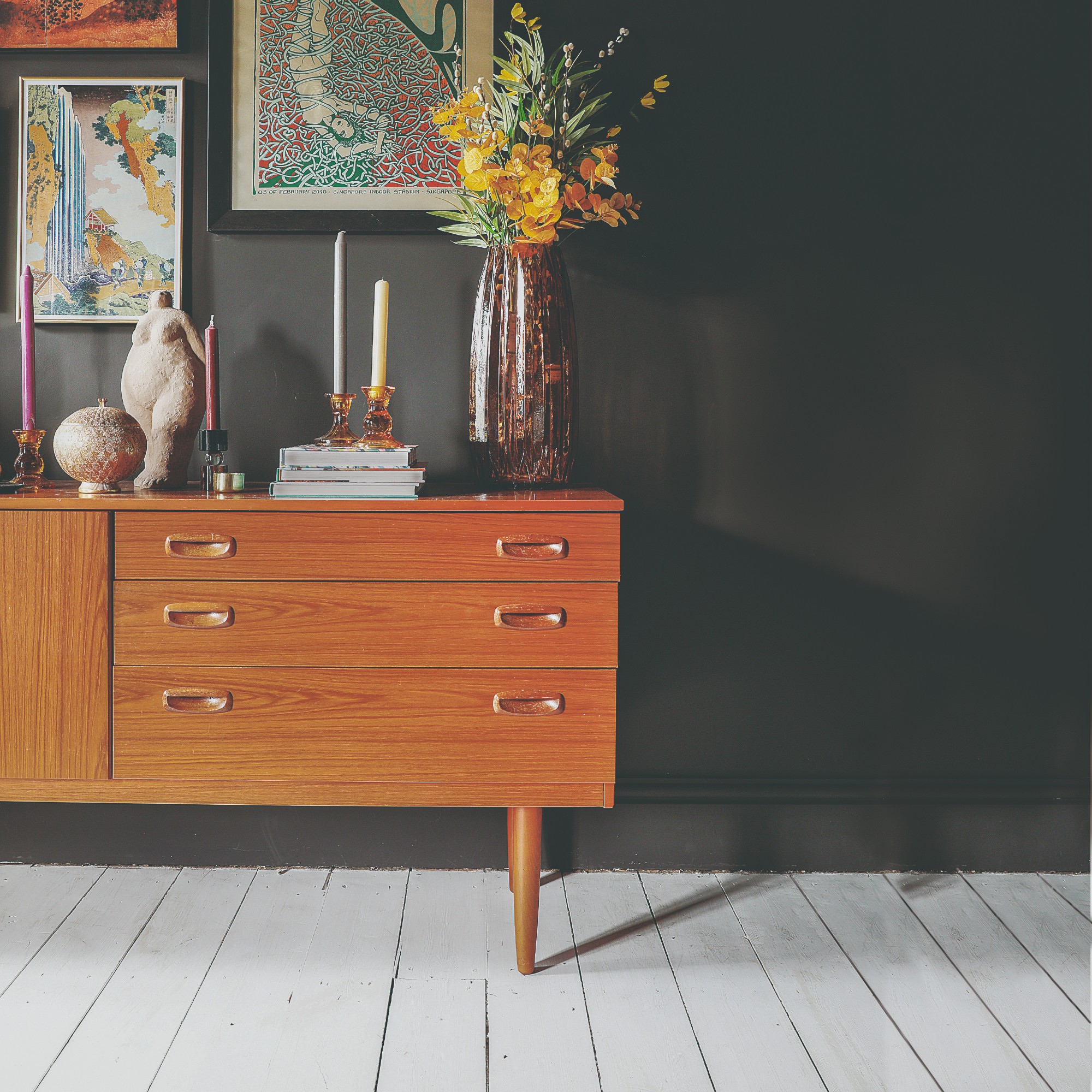
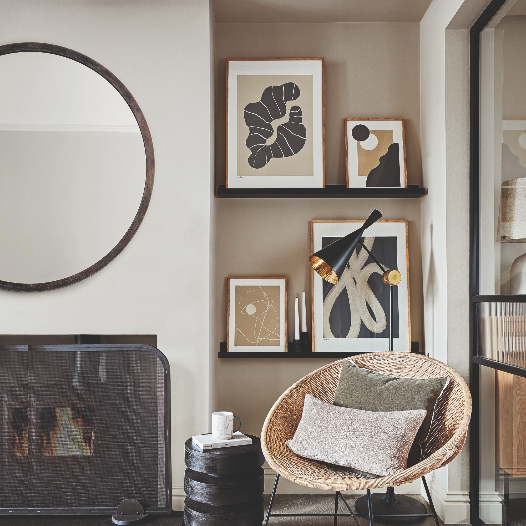
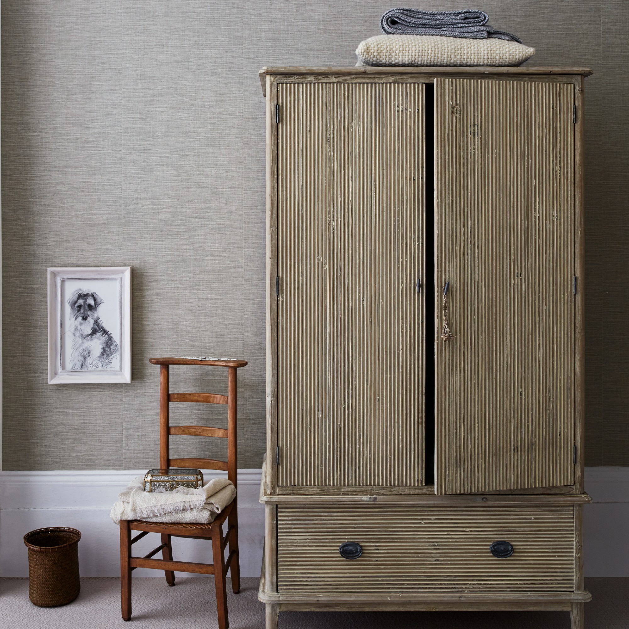
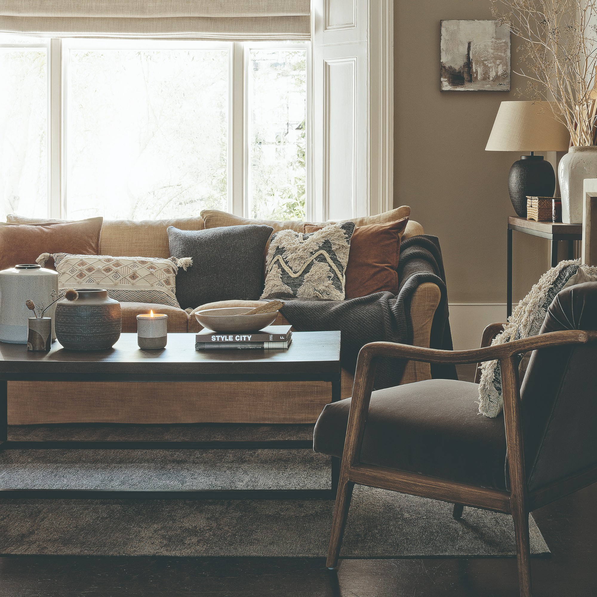
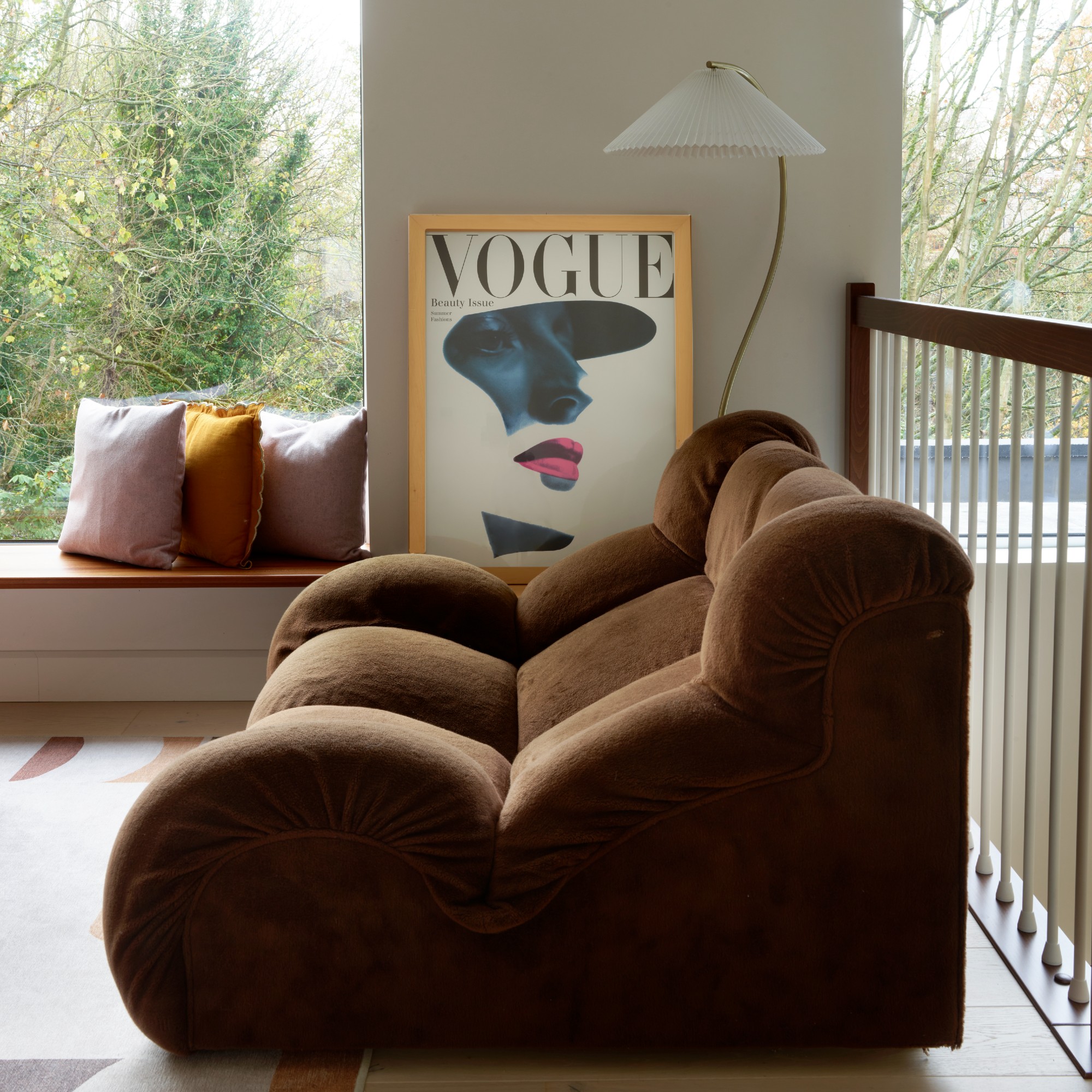
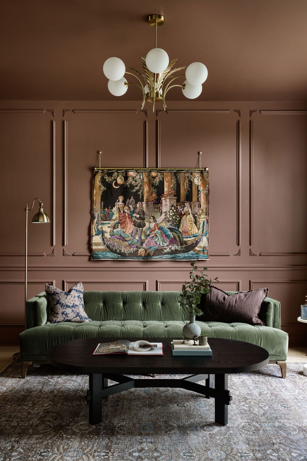
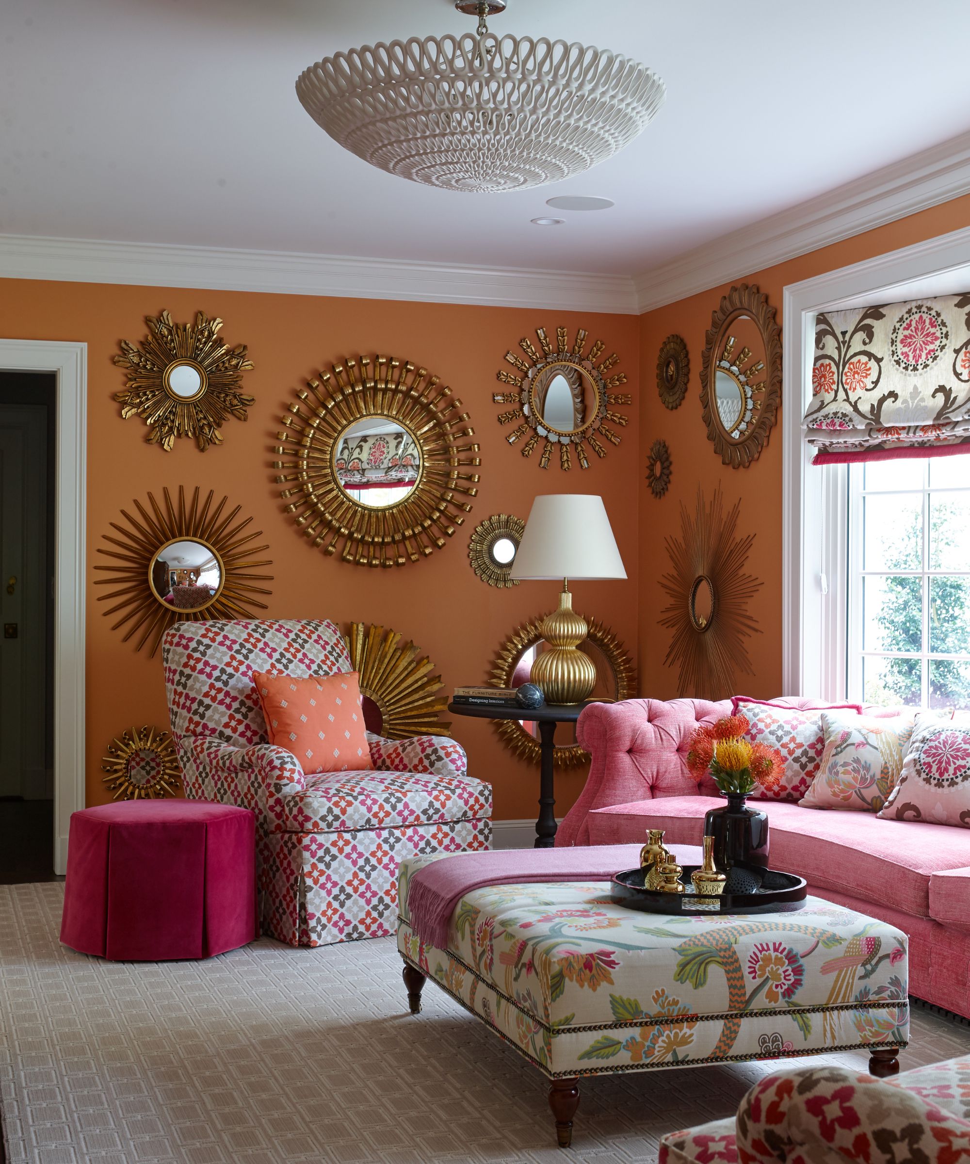
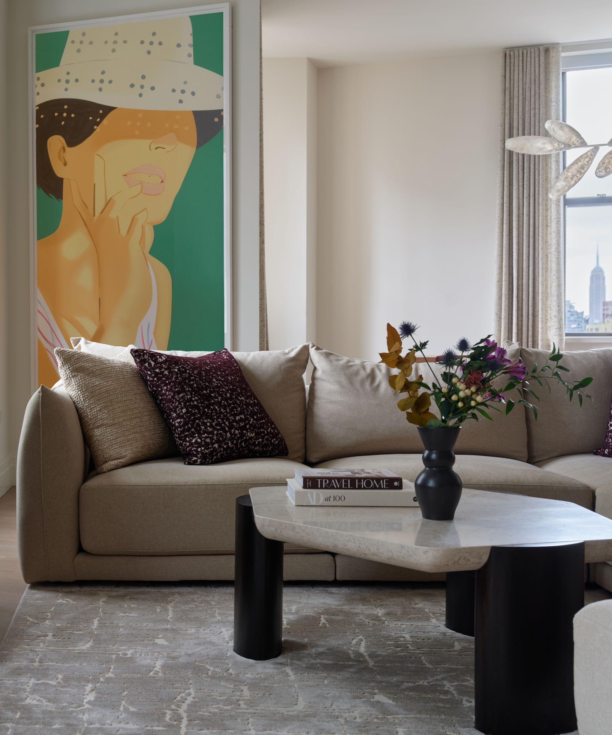
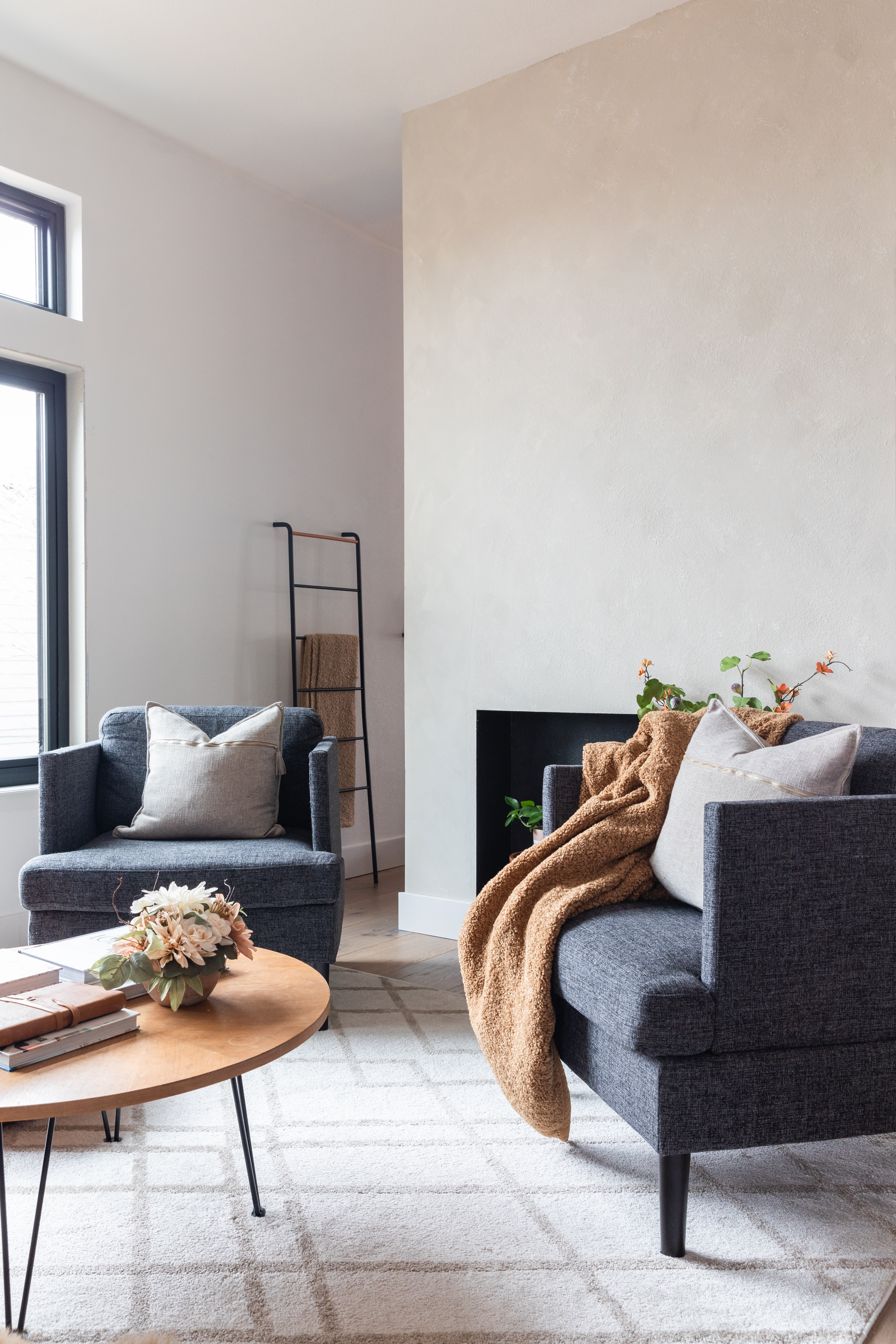
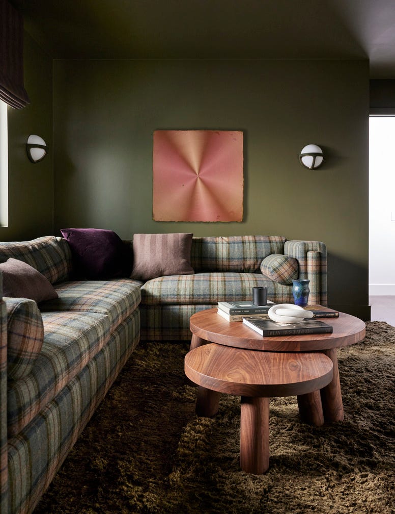
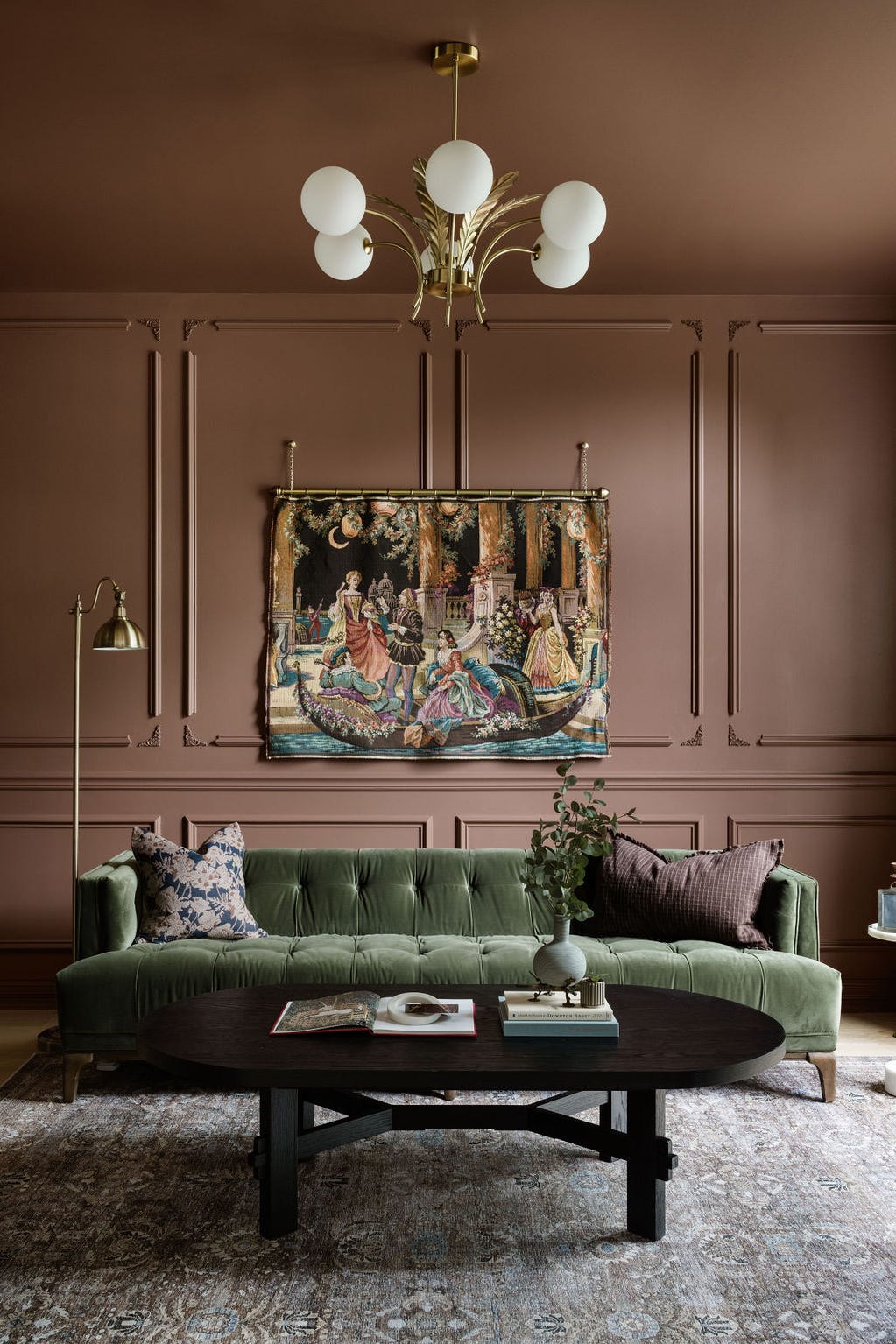
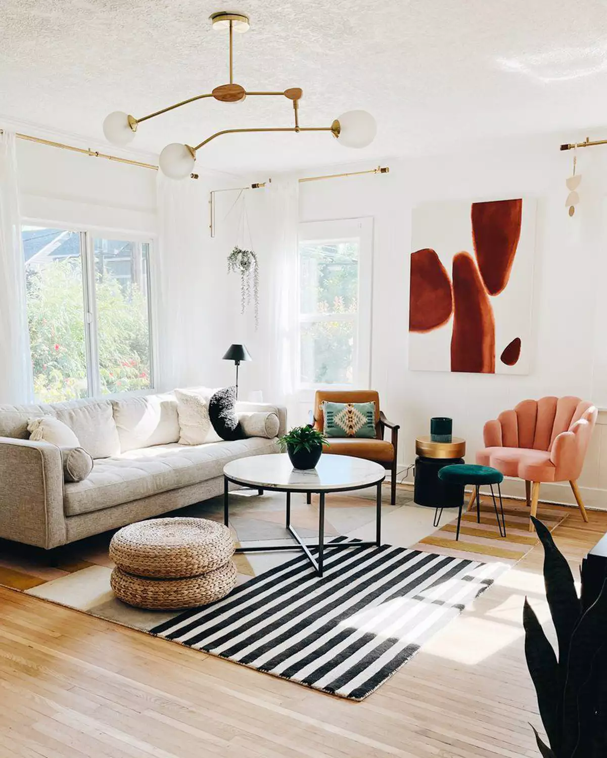
Earthy and brown tones, including Pantone's 2025 'Mocha Mousse,' are gaining significant popularity for living room color schemes. Lucy Steele, paint and interiors expert at Valspar Paint, describes Mocha Mousse as a rich and comforting shade that brings depth and calm, offering a softer approach to minimalism compared to bright whites and greys. Other grounding earthy shades like terracotta and olive green can also create a cozy vibe when paired with neutral furniture and wooden accents. Accent colors can be introduced through smaller decorative items like vases, lampshades, or even books. Alternatively, a statement piece like a bold armchair or rug can tie the room together, especially when walls are kept in neutral tones.
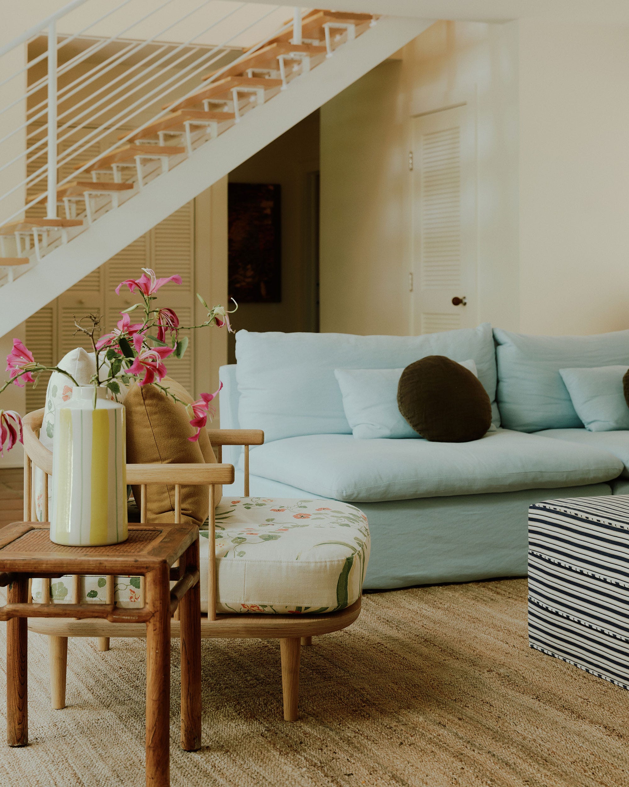
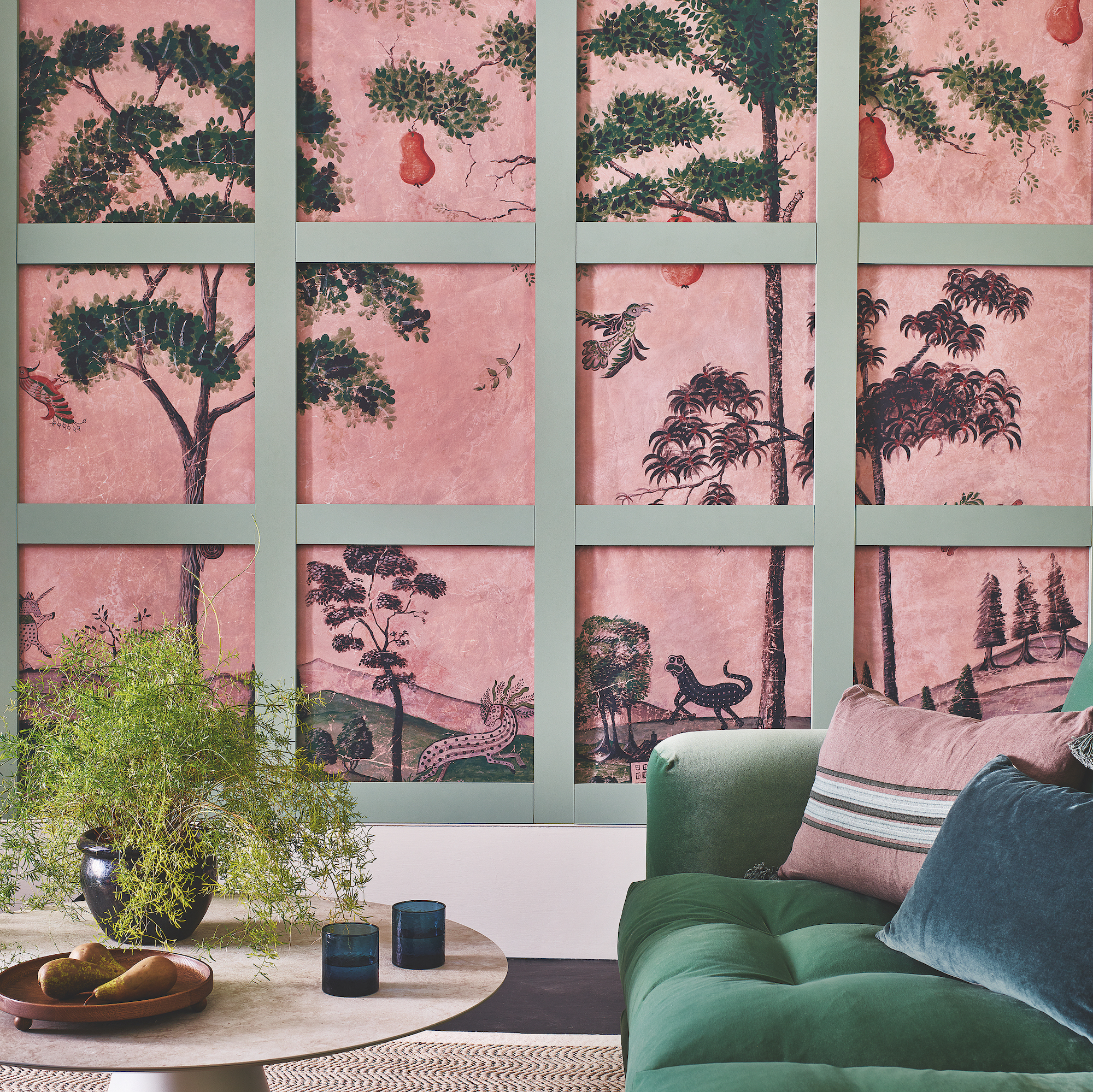
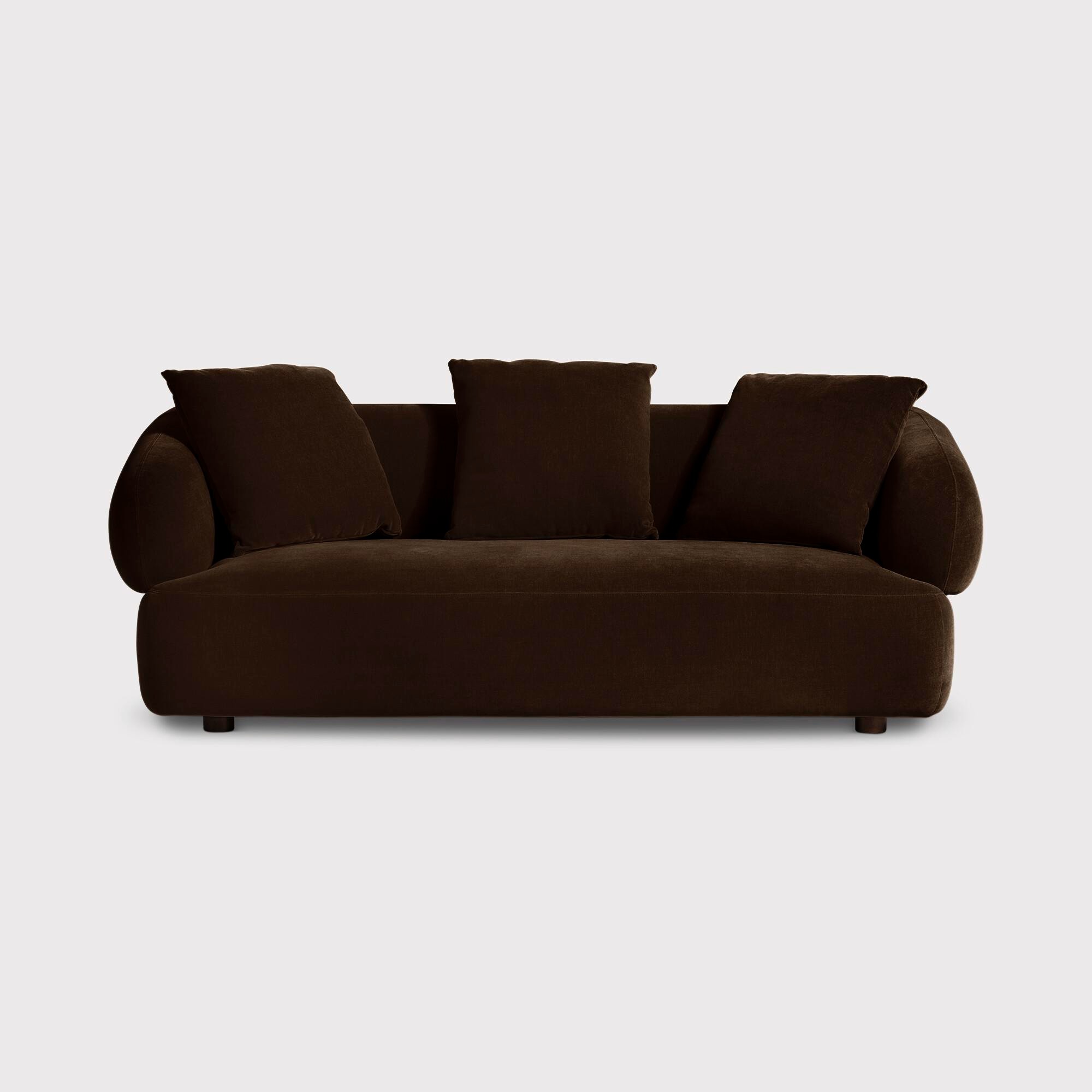
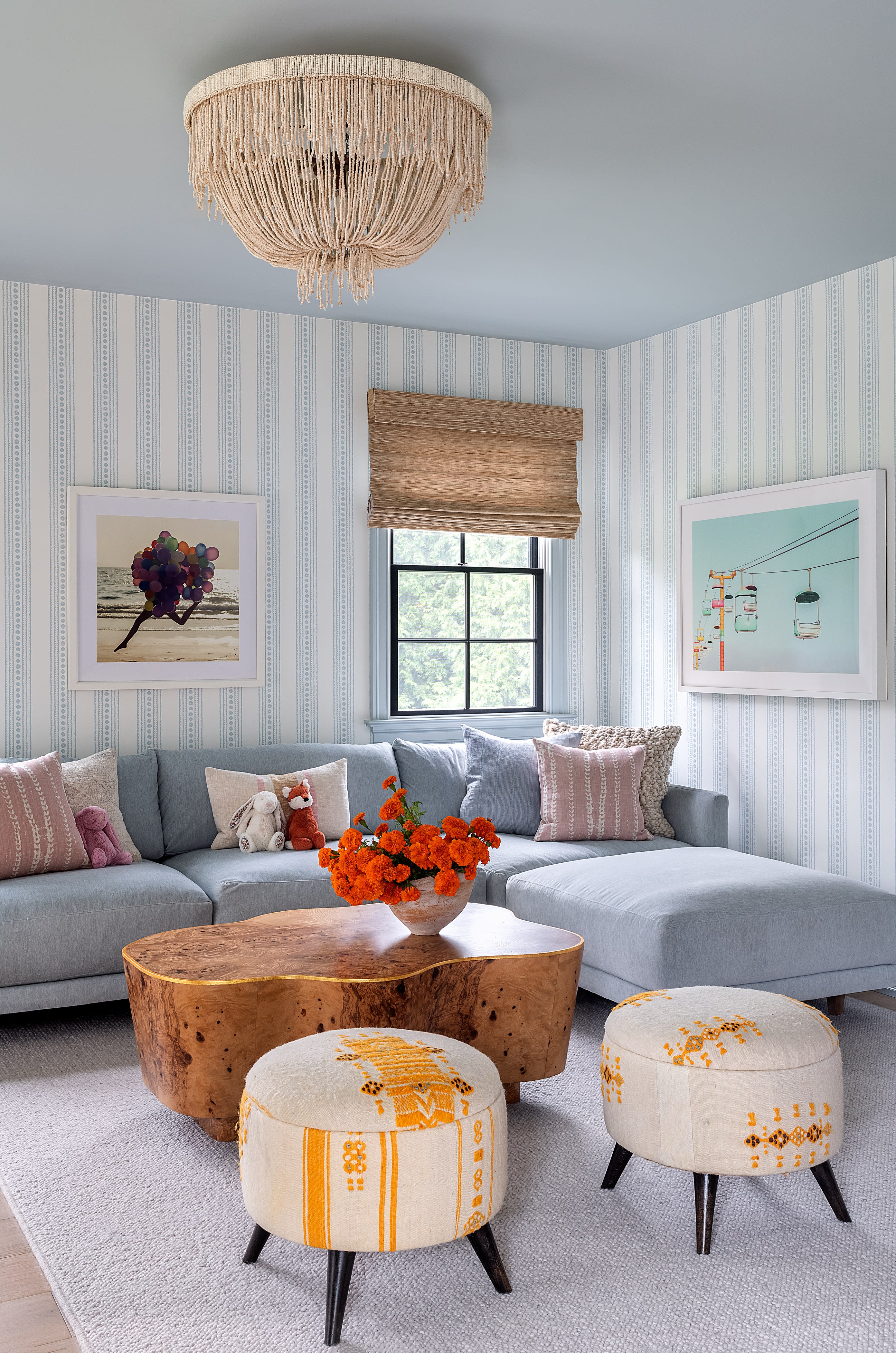
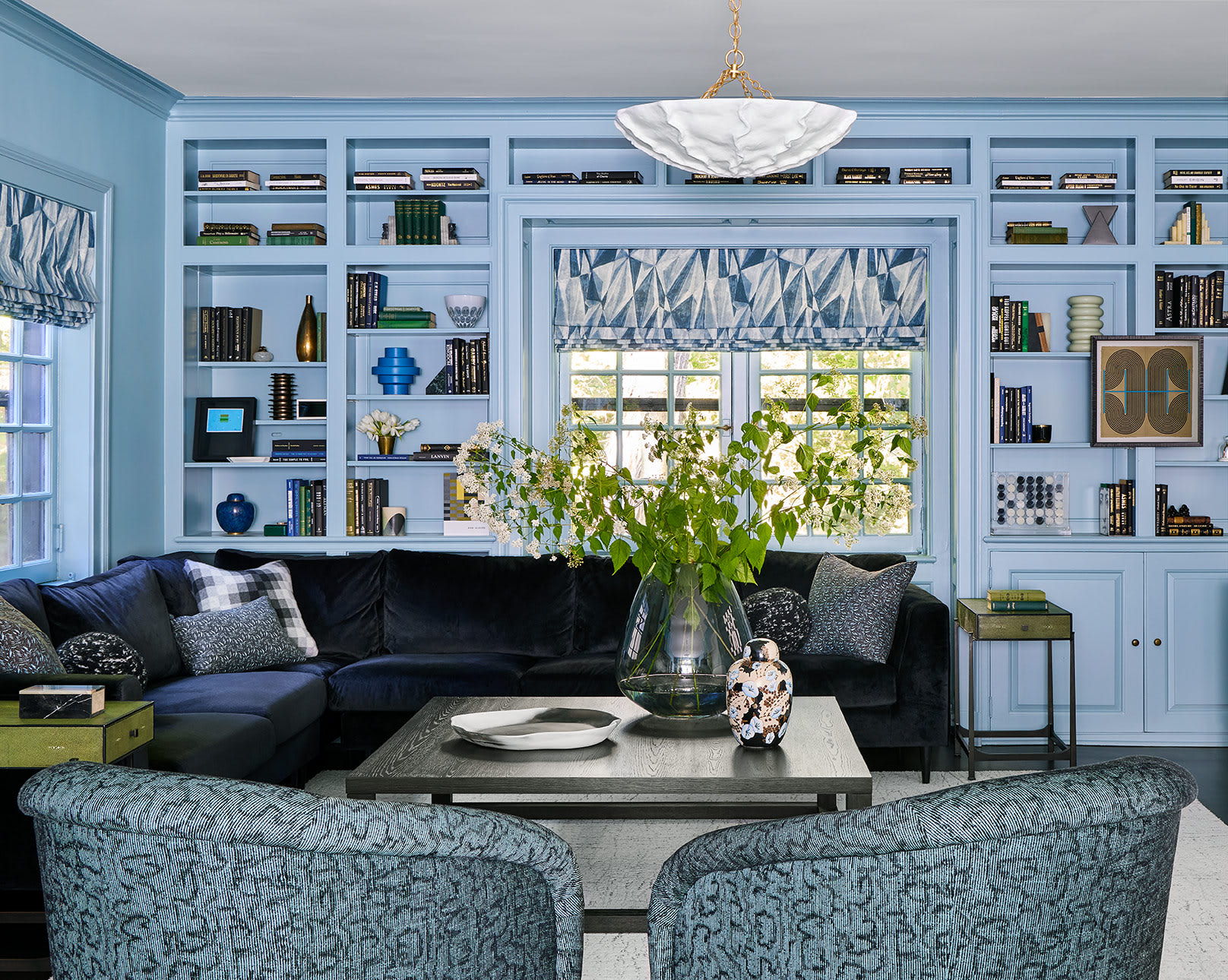
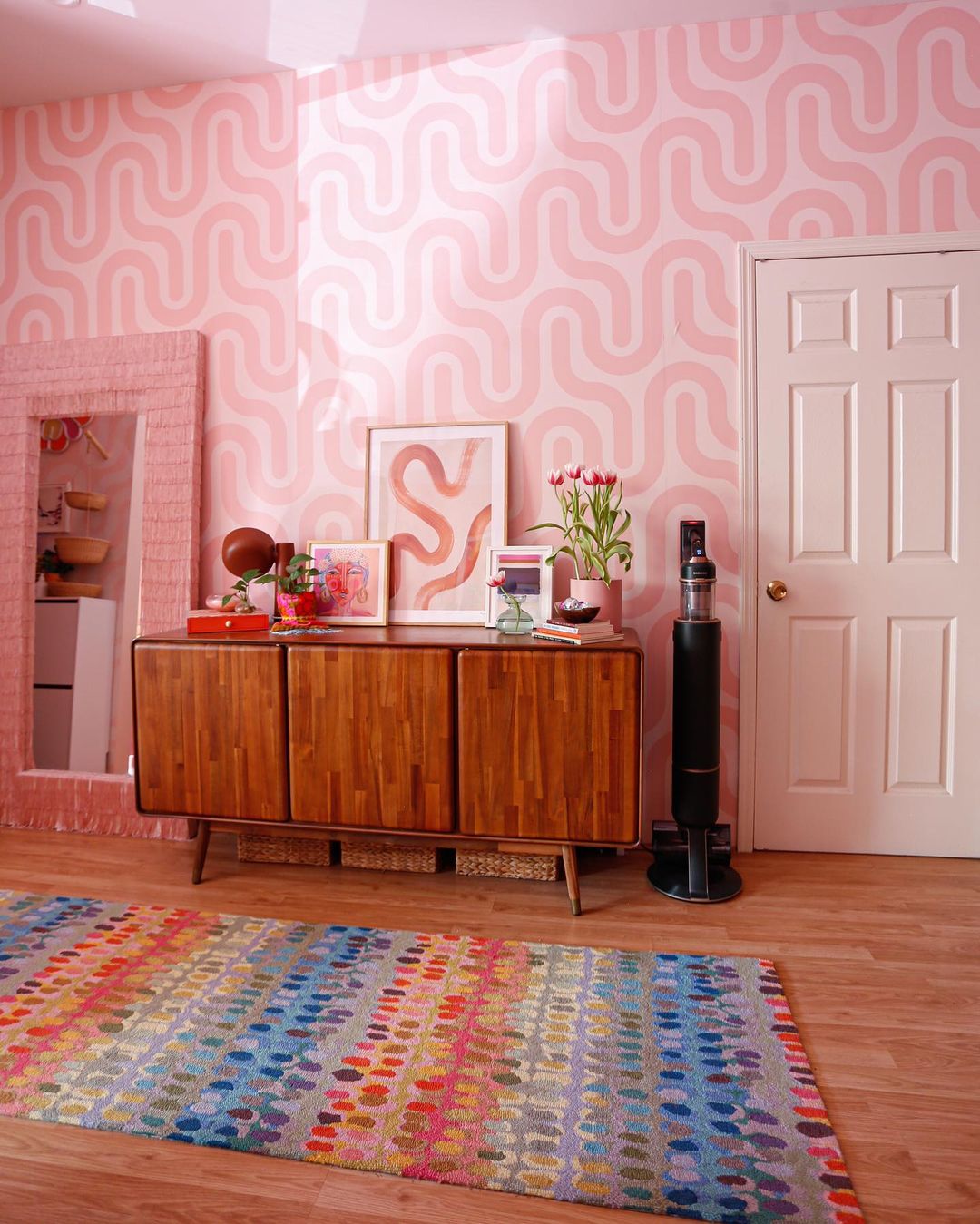
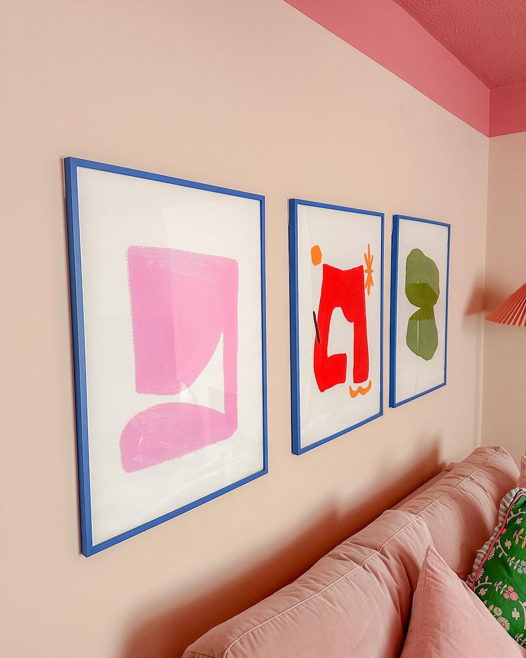
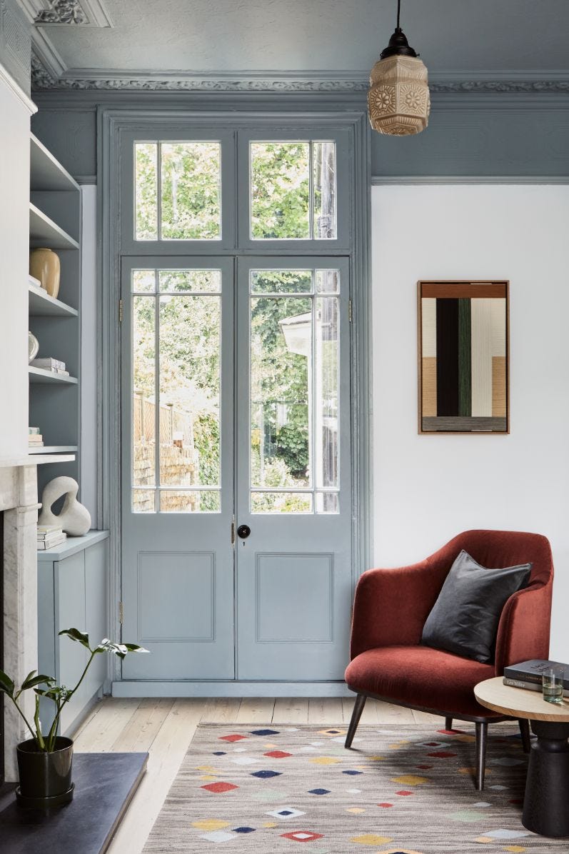
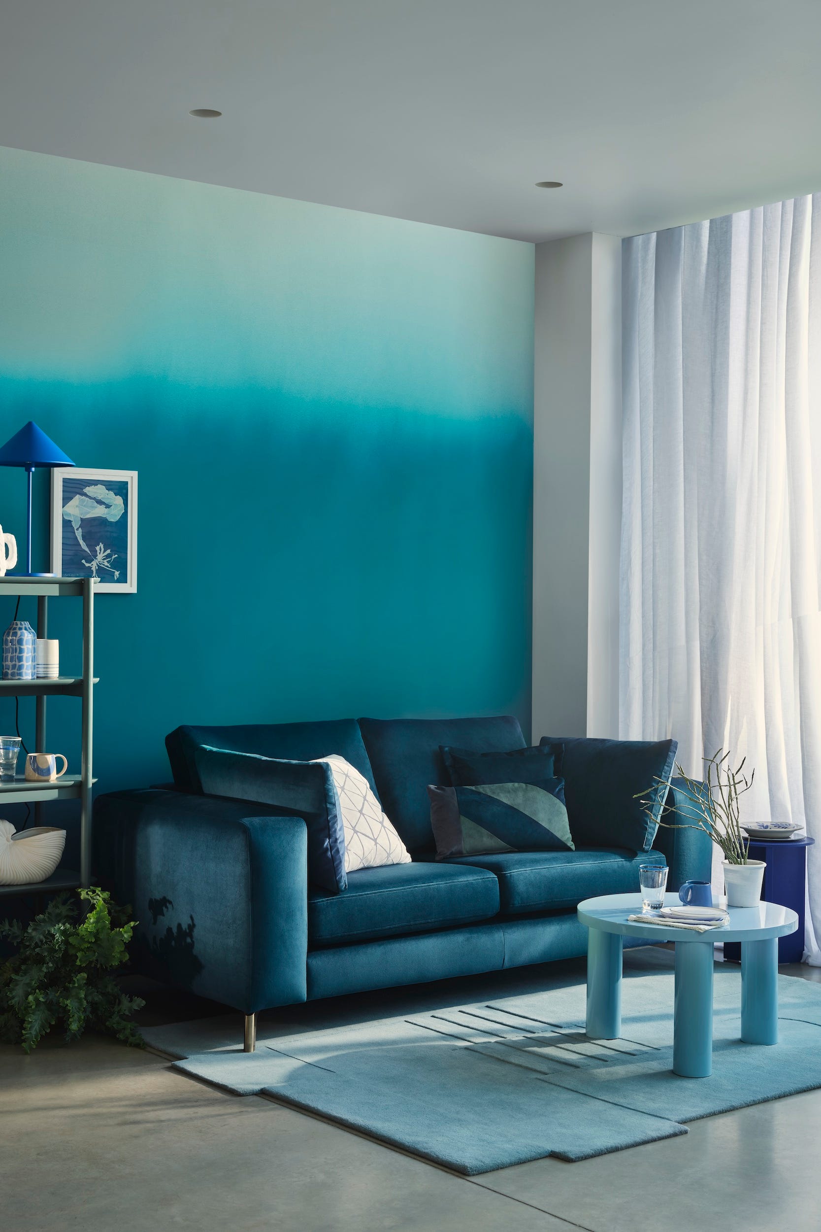
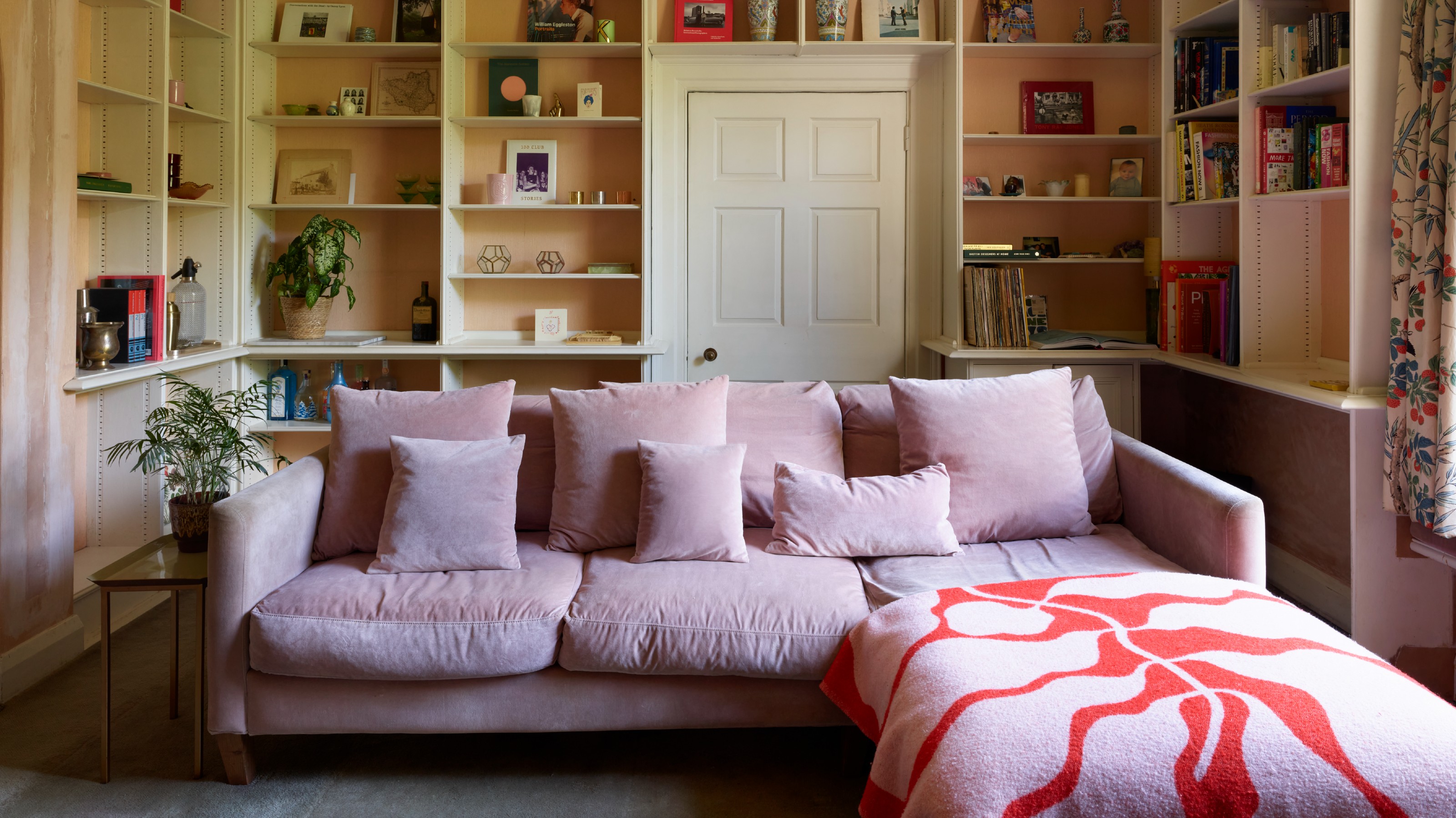
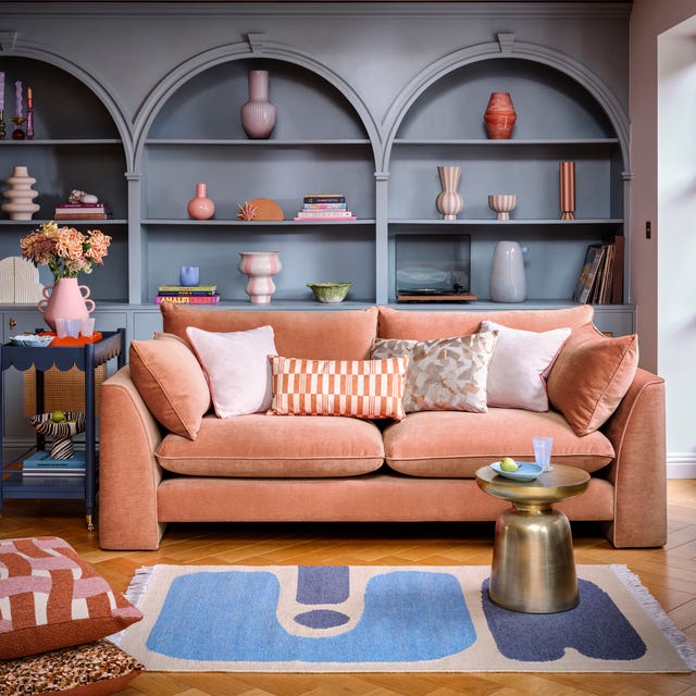
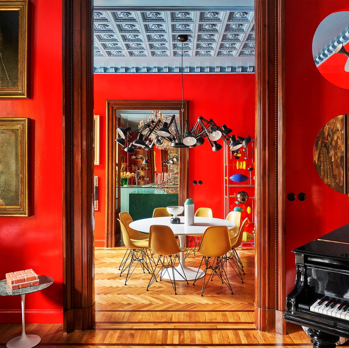
Pale blue and brown create a calming combination, as highlighted by Michael Rolland, who suggests soft blues for their serene qualities that reduce stress. Tash Bradley plans to paint her living room in a warm pale blue and pair it with a rich chocolate brown velvet sofa, noting that blue and brown are complementary colors often found in nature. To balance the warmth of these tones, she recommends adding cool accents like chrome fixtures. For those preferring pink and red, an earthy approach using terracotta shades can provide a soothing, warm hug-like feel, according to Bradley, who advises choosing mid-tone to earthy shades over highly saturated ones.
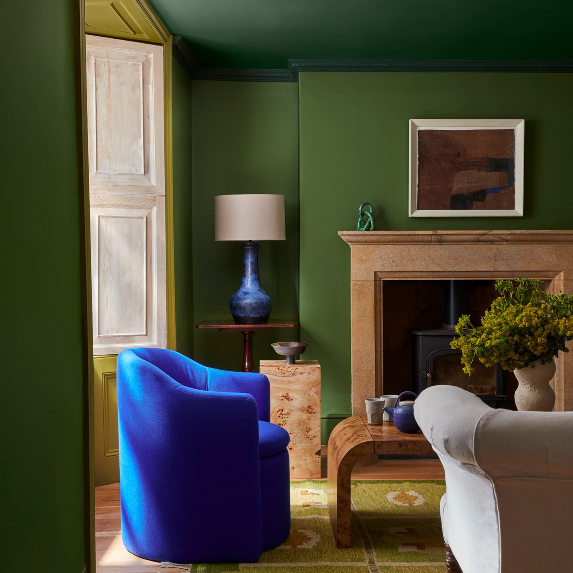
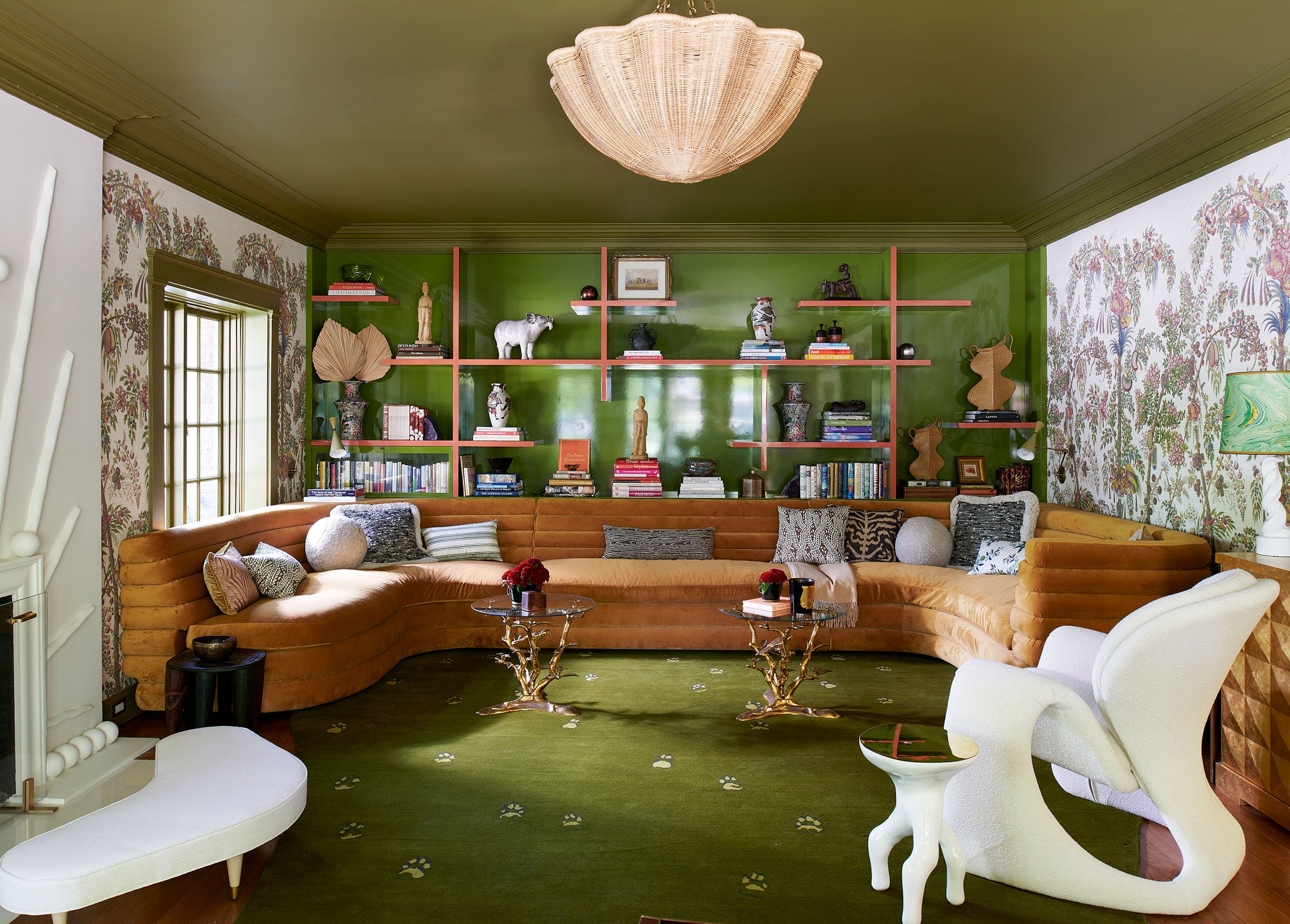
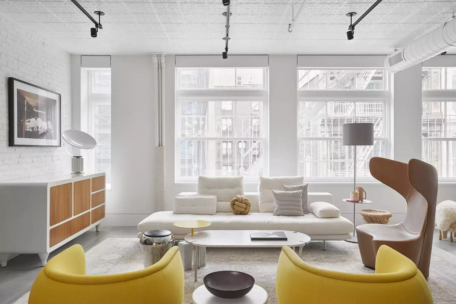
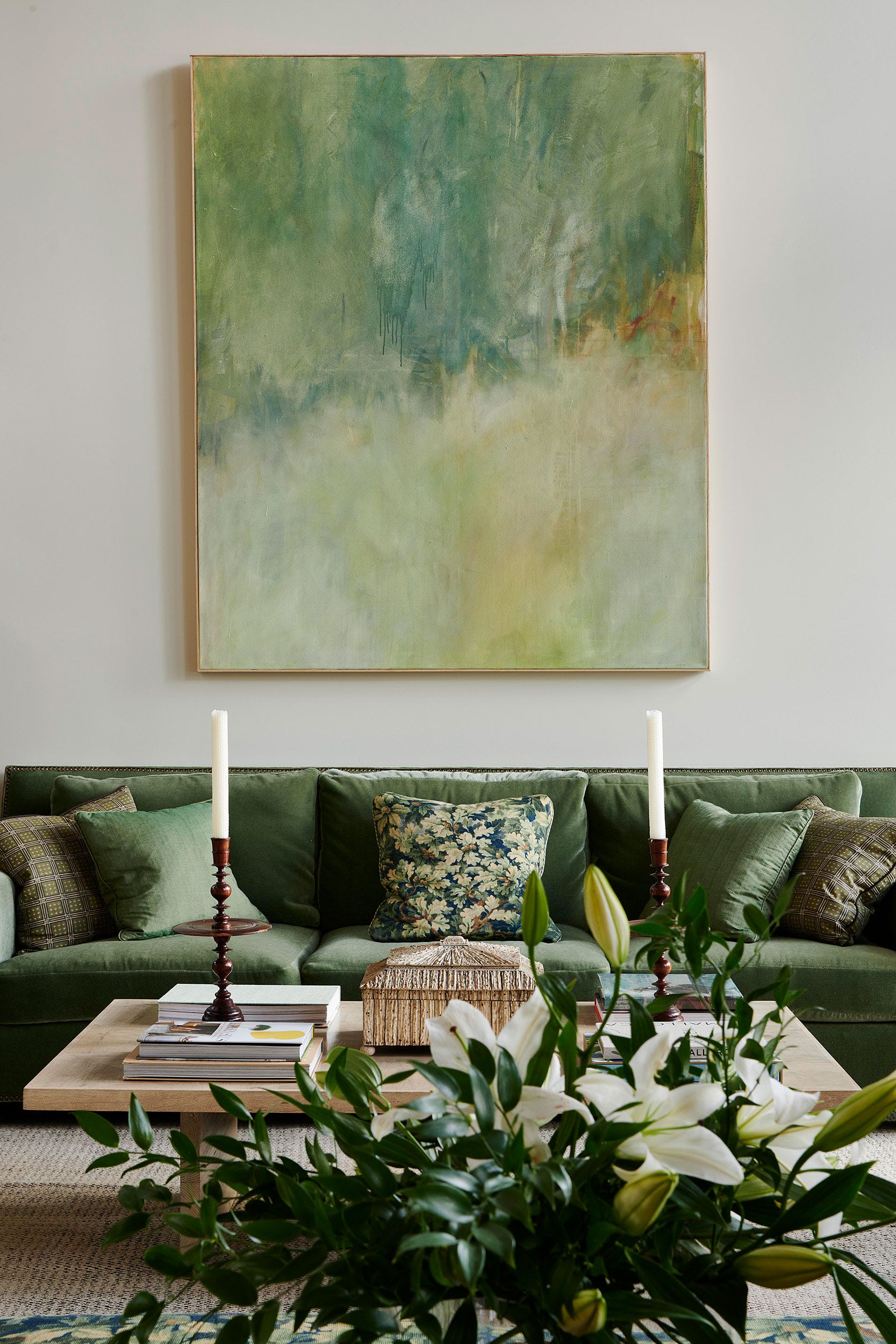
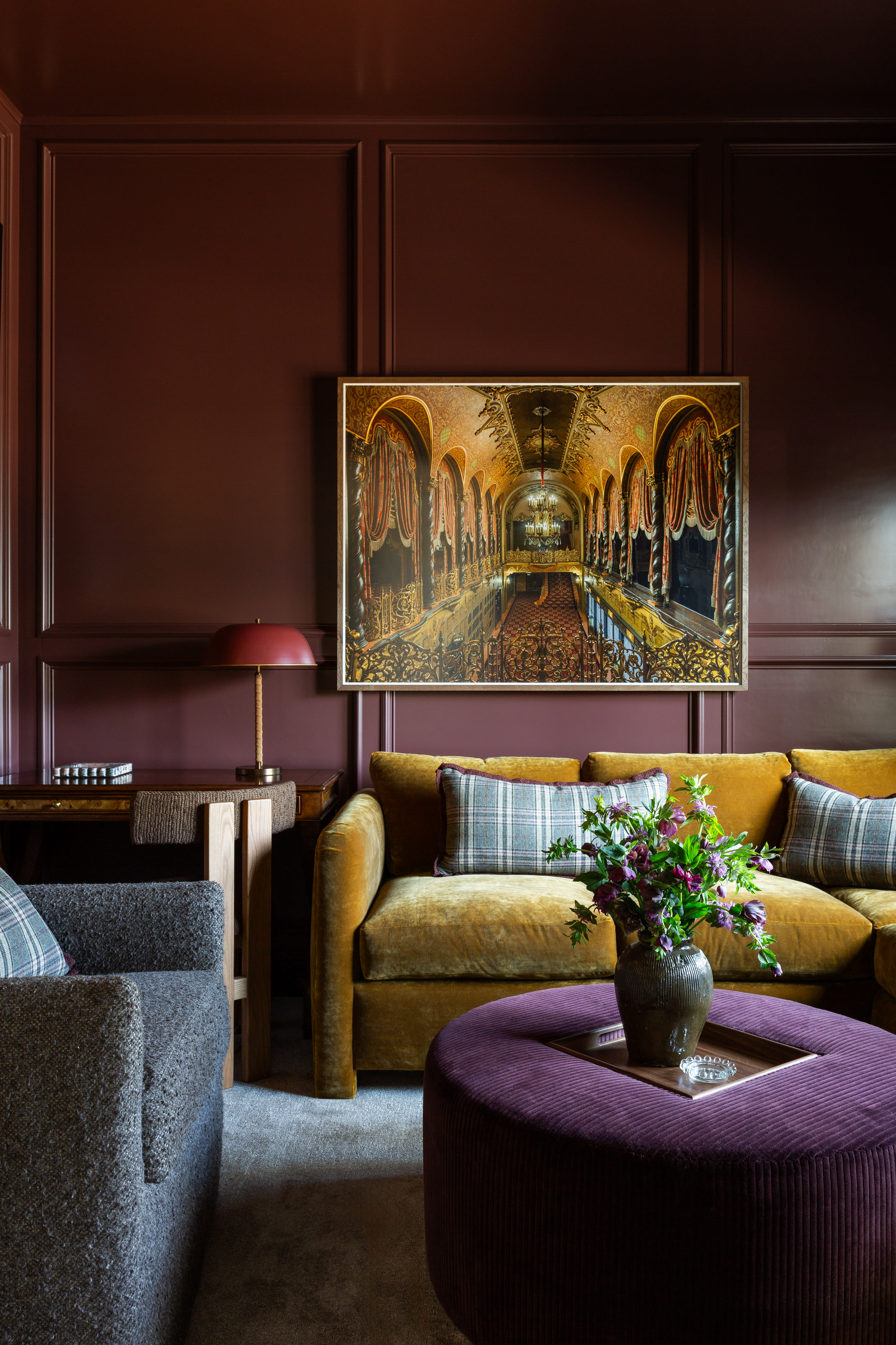
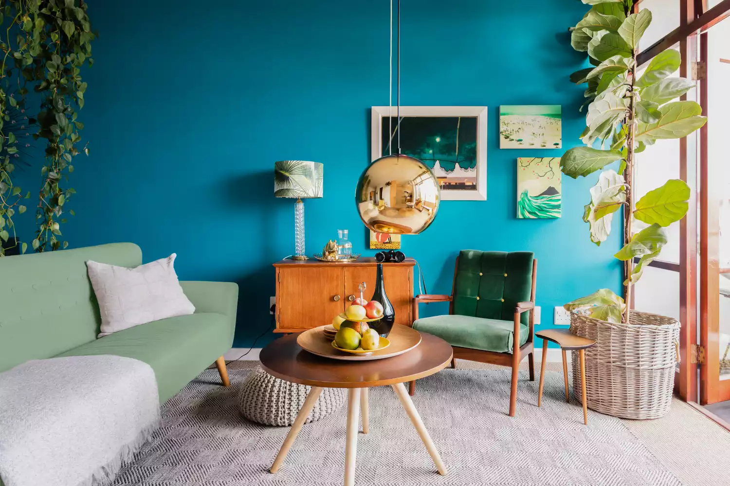
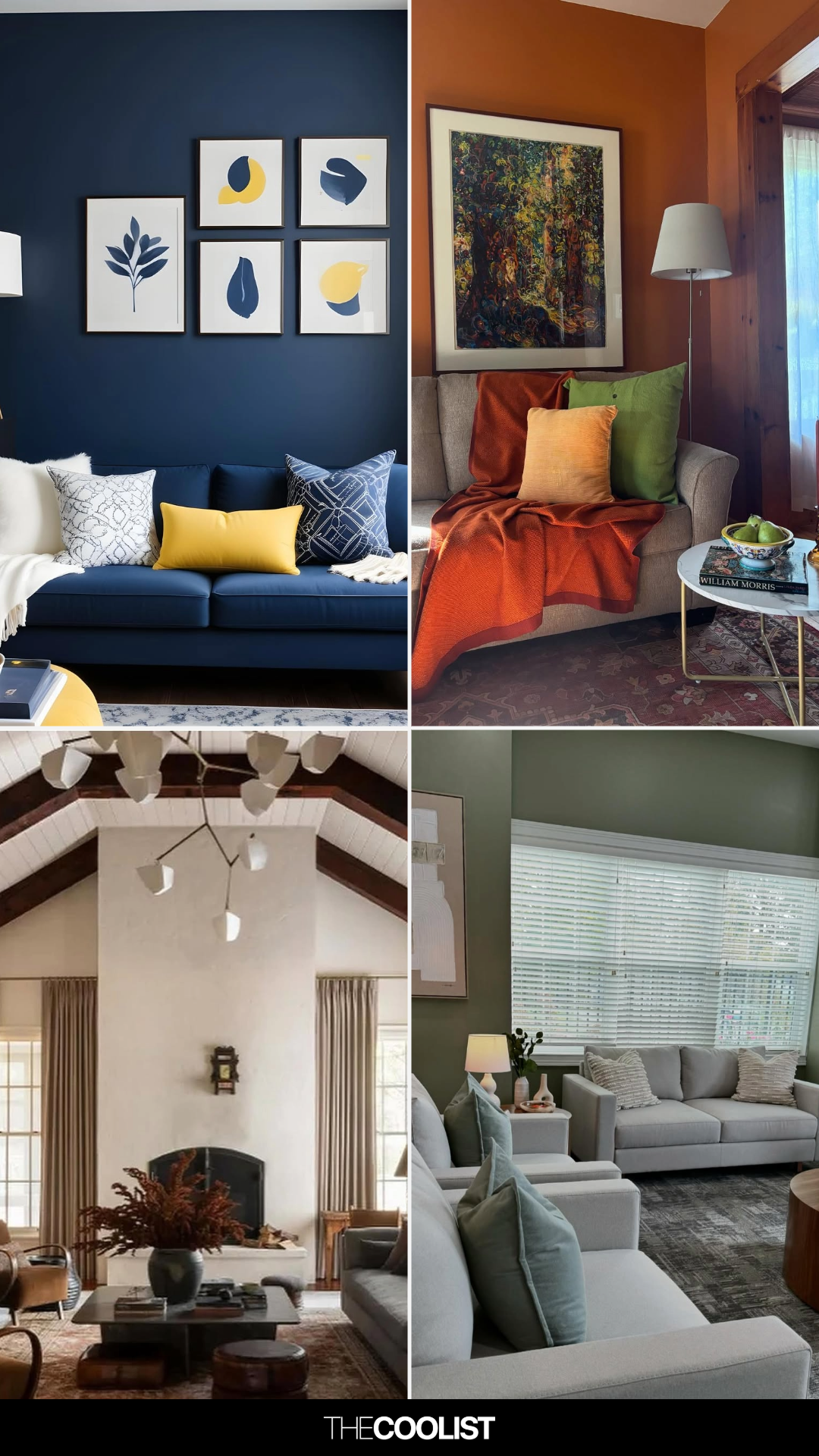
Buttery yellow is emerging as a vibrant alternative to beige in neutral living room ideas. Bradley suggests pairing it with earthy pinks for a striking look, emphasizing that buttery yellow and brown can create a more impactful and welcoming ambiance than traditional beige. For a bold and balanced scheme, sage green and royal blue are recommended. Jo Plant, Head of Design at Pooky, explains that this classic combination works well throughout the day, with natural light bringing out energizing qualities, while ambient lighting at night enhances tranquility. For neutral schemes, pops of forest green can add life and texture, especially when combined with retro furniture and wooden elements.
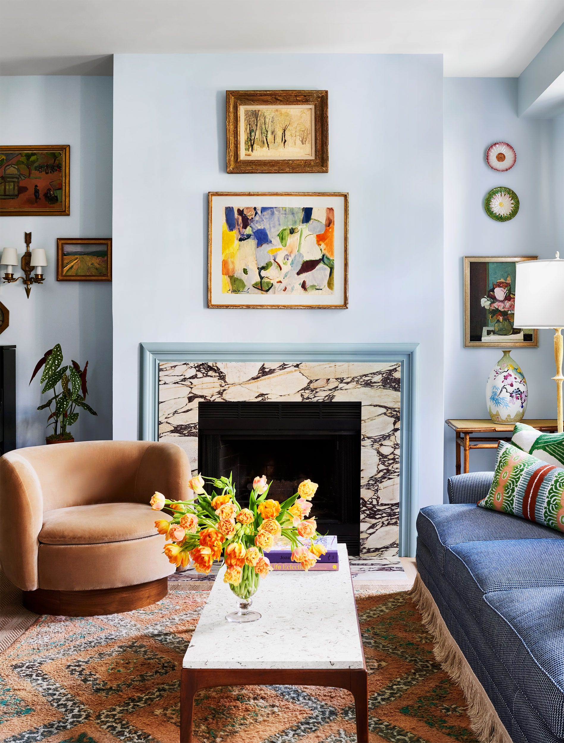
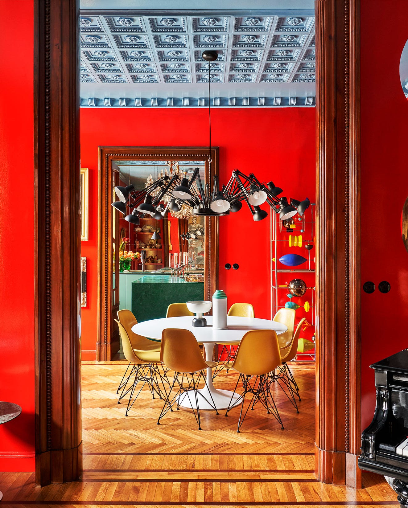
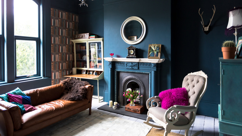
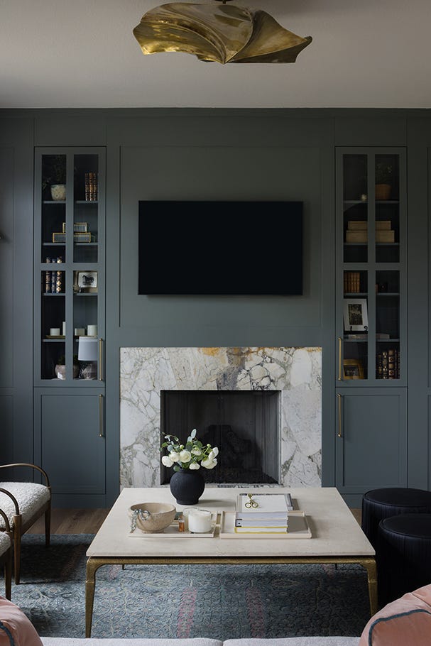
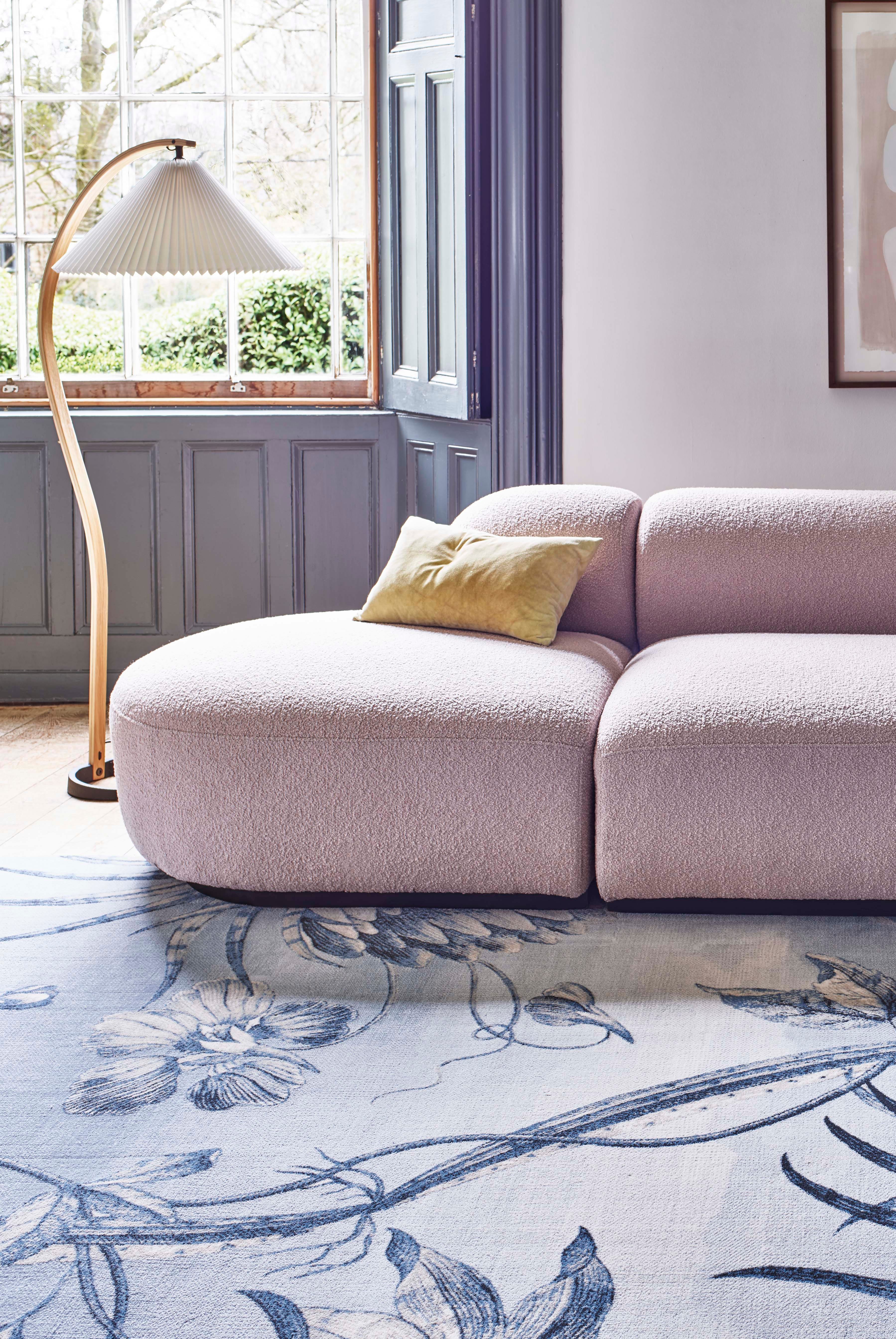
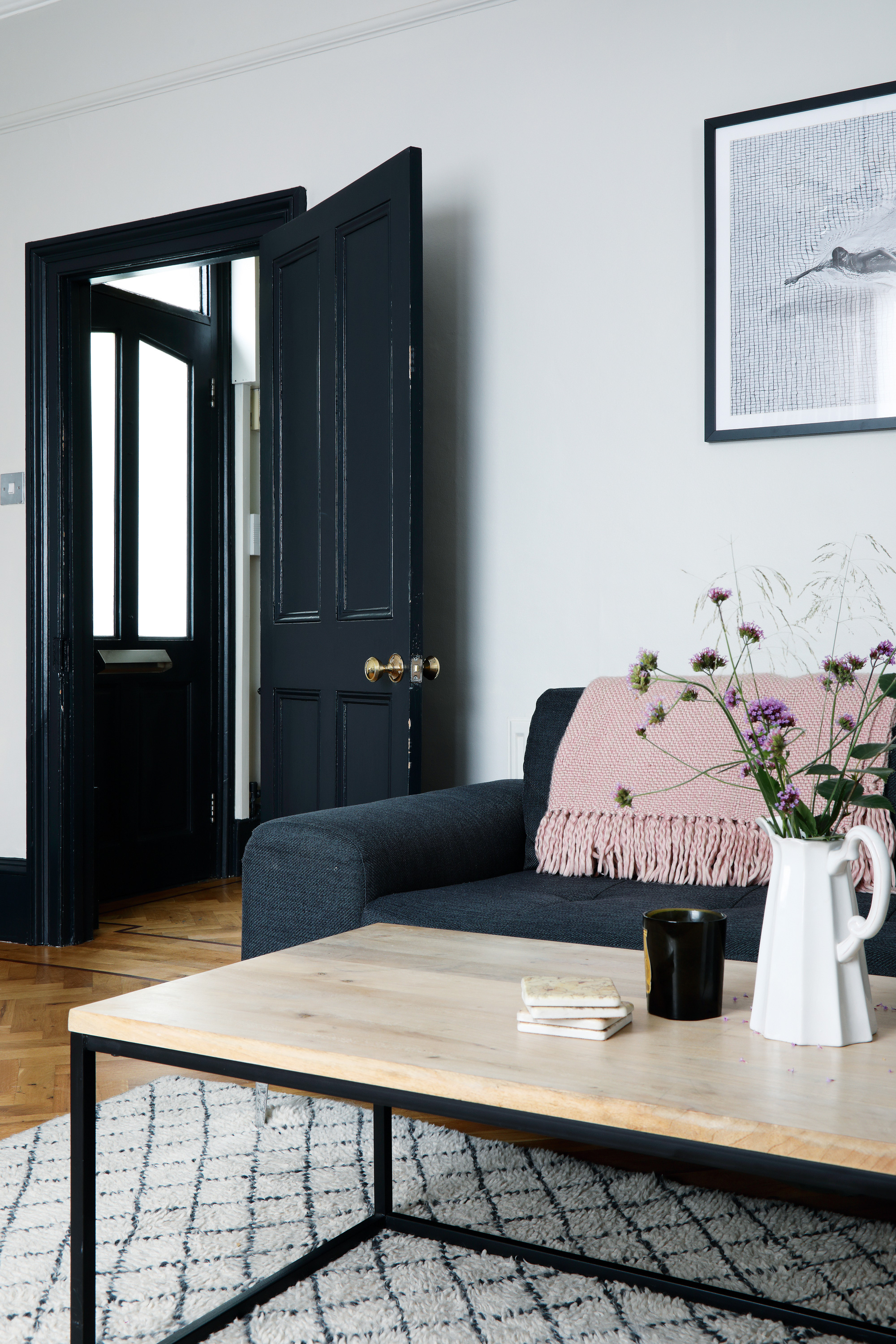
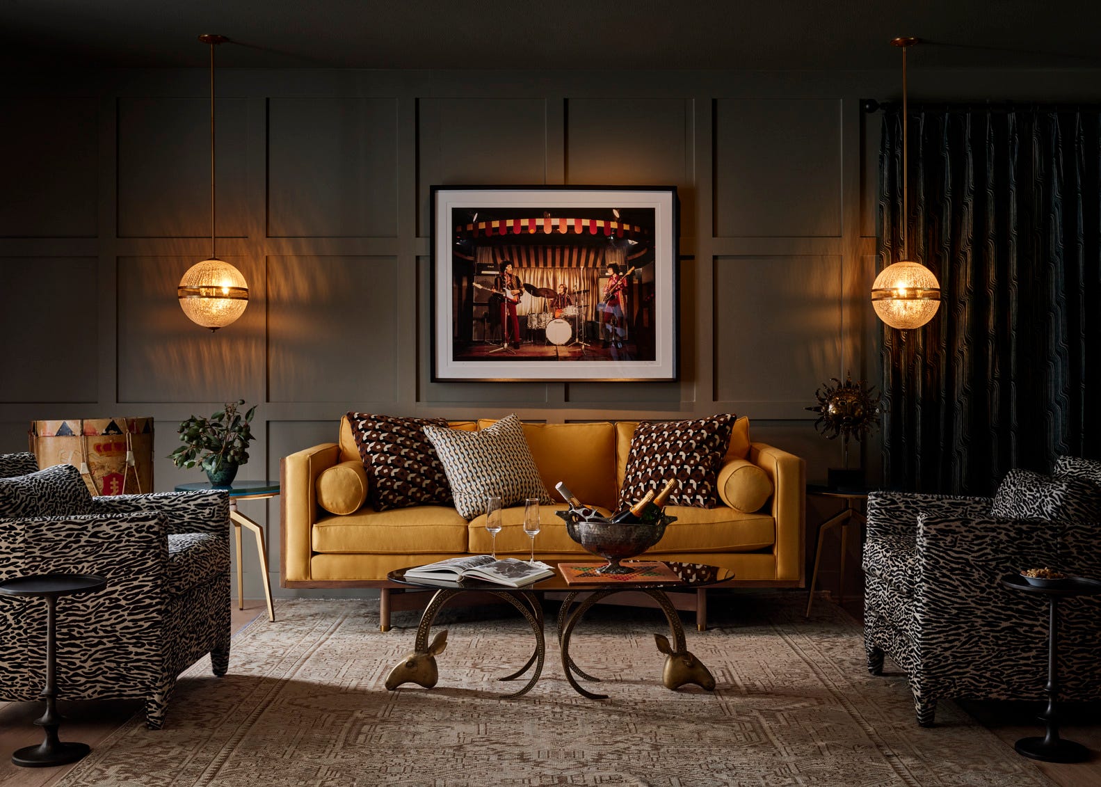
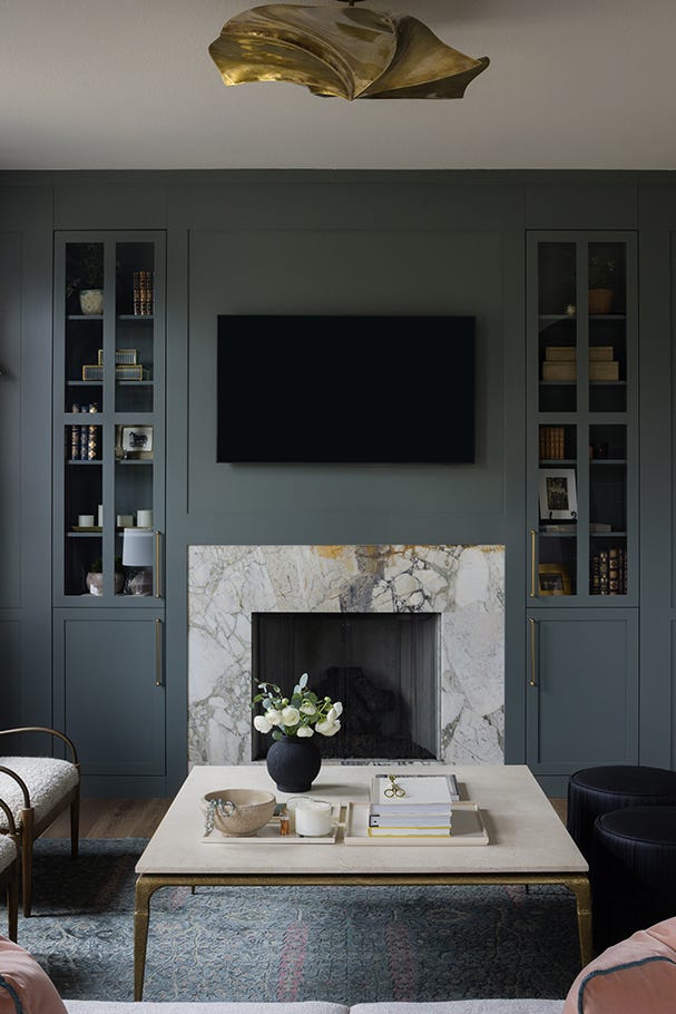
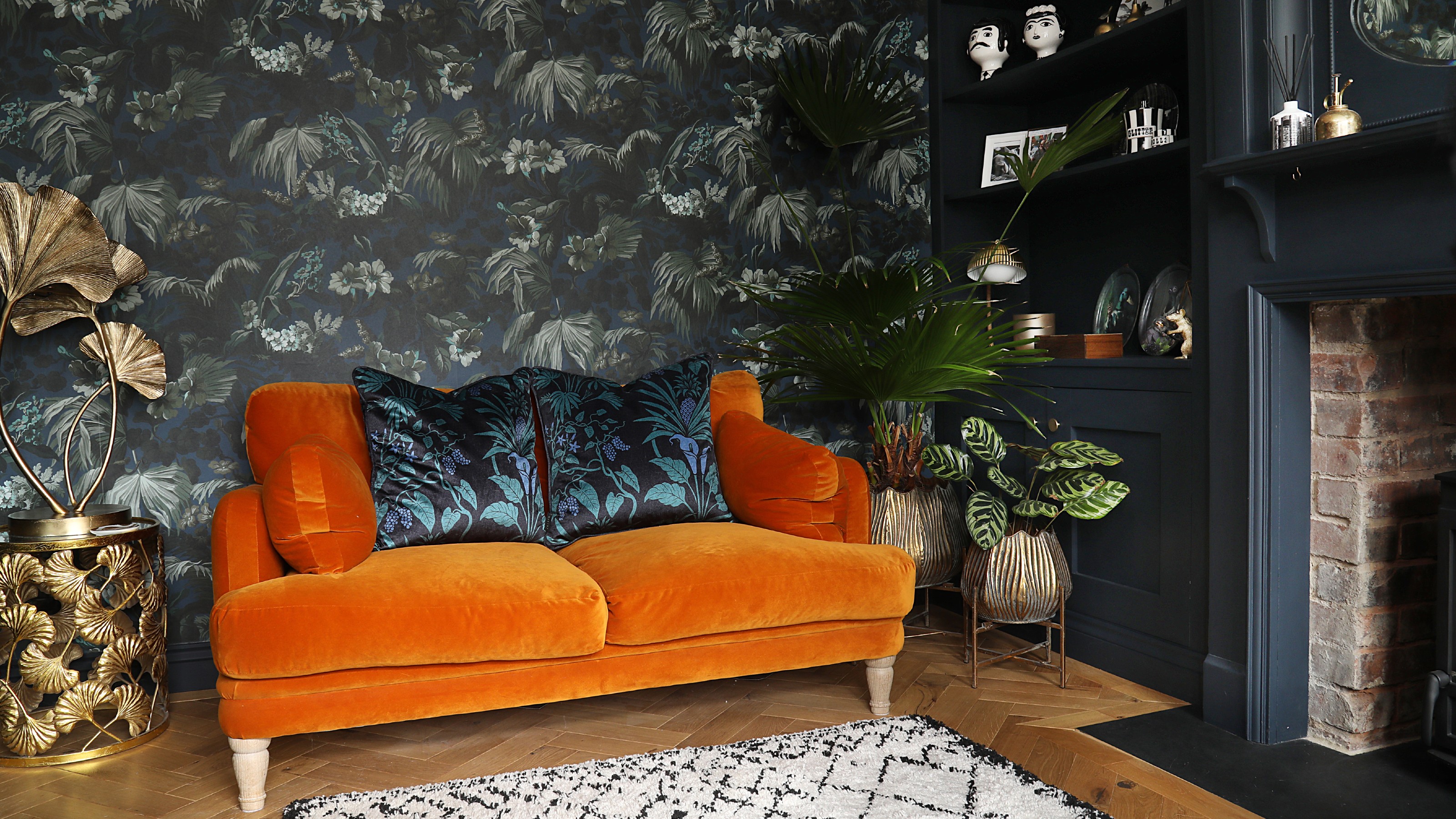
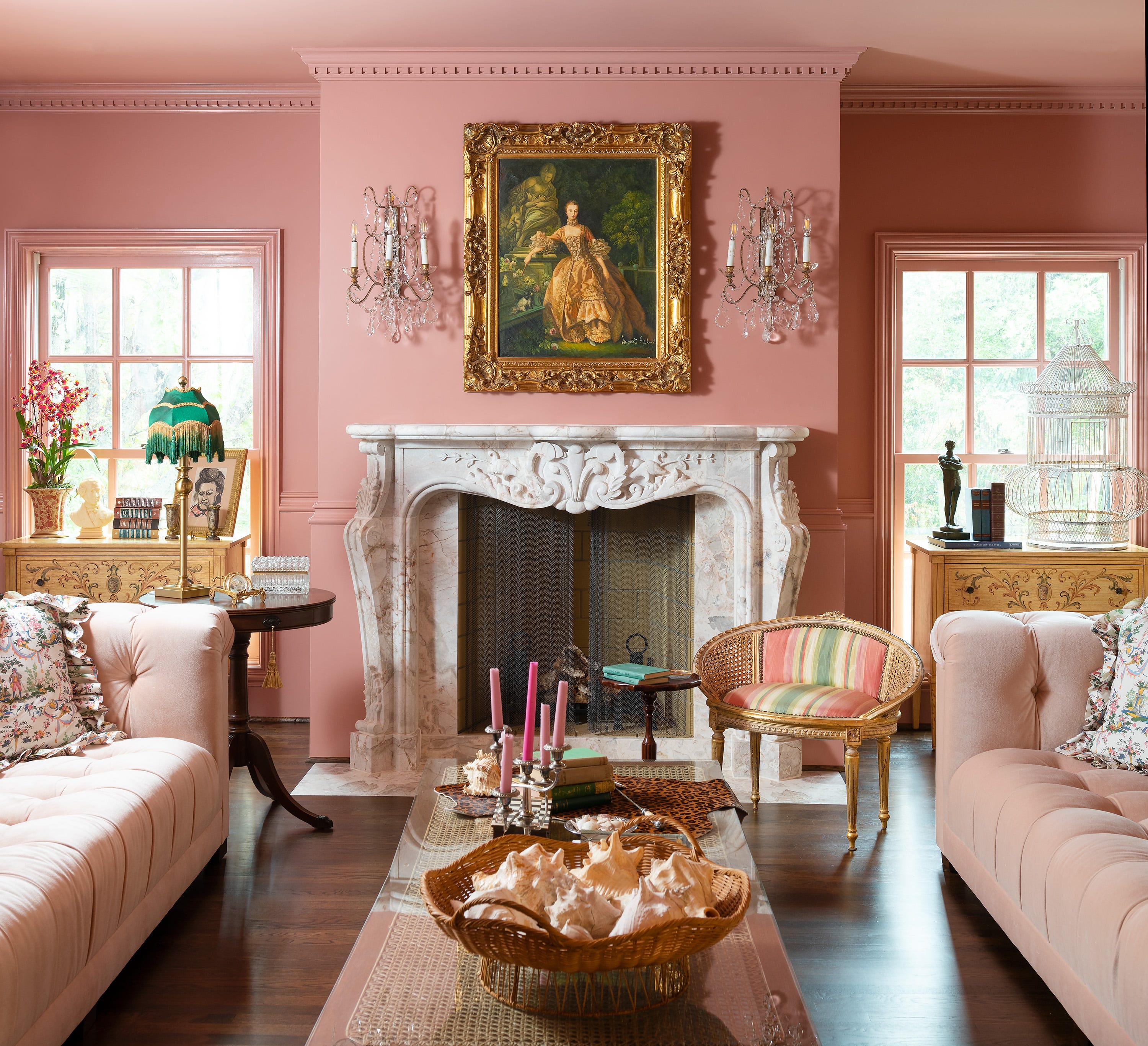
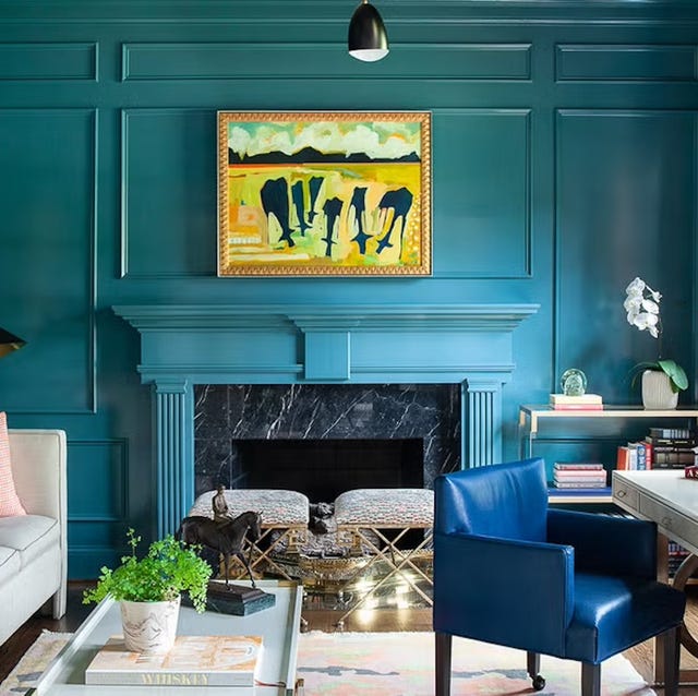
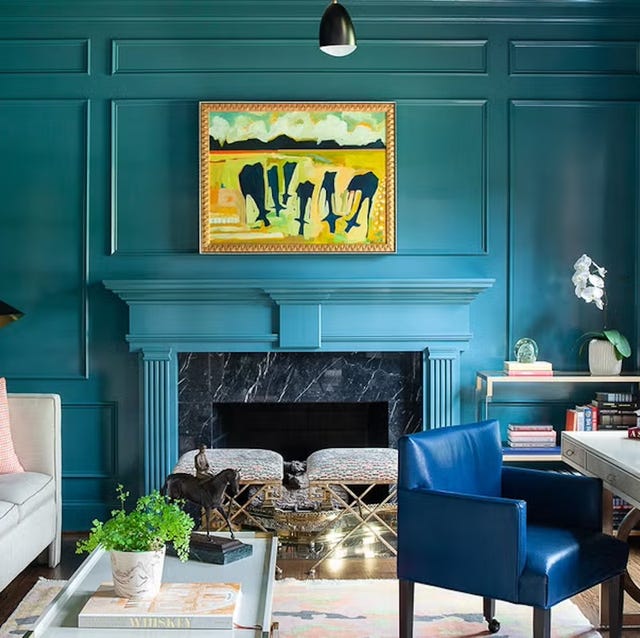
Unusual yet effective combinations include burnt orange and sky blue, which create a striking contrast. Emma Deterding of Kelling Designs suggests using orange in brighter accents and teal in shadows, with monochrome and metallic details to unify the look. Saffron and blush pink offer a stylish option for color enthusiasts, creating a dramatic yet luxurious feel when jewel tones are paired with softer shades. Scandi grey with a coral pop offers a cool, subtle scheme, while coral and red provide warmth for north-facing rooms. Other popular choices include pale blue with yellow accents for a retro feel, rust and forest green for an autumnal ambiance, and jade with ecru for a modern, fresh aesthetic. Deep, dark greys and blacks create moody and sophisticated spaces, treating them as versatile neutrals. Finally, jewel tones like emerald green, deep turquoise, and amethyst are trending for their luxurious and individualistic appeal, often balanced with black, grey, and white elements.
#LivingRoomDesign #ColorSchemes #InteriorDesignTrends #HomeDecor #PaintColors #EarthyTones #DopamineDecor #MuiContainer #ColorPsychology #LivingRoomDesign #ColorSchemes #InteriorDesignTrends #HomeDecor #PaintColors #EarthyTones #DopamineDecor #MuiContainer #ColorPsychology
0 comment in total
 No comments yet
You may also like
Living room paint ideas – 27 easy ways to bring your lounge to life with stylish and creative colours and techniques
Sofa colour trends 2025 – the 6 hottest shades to inject into your living room
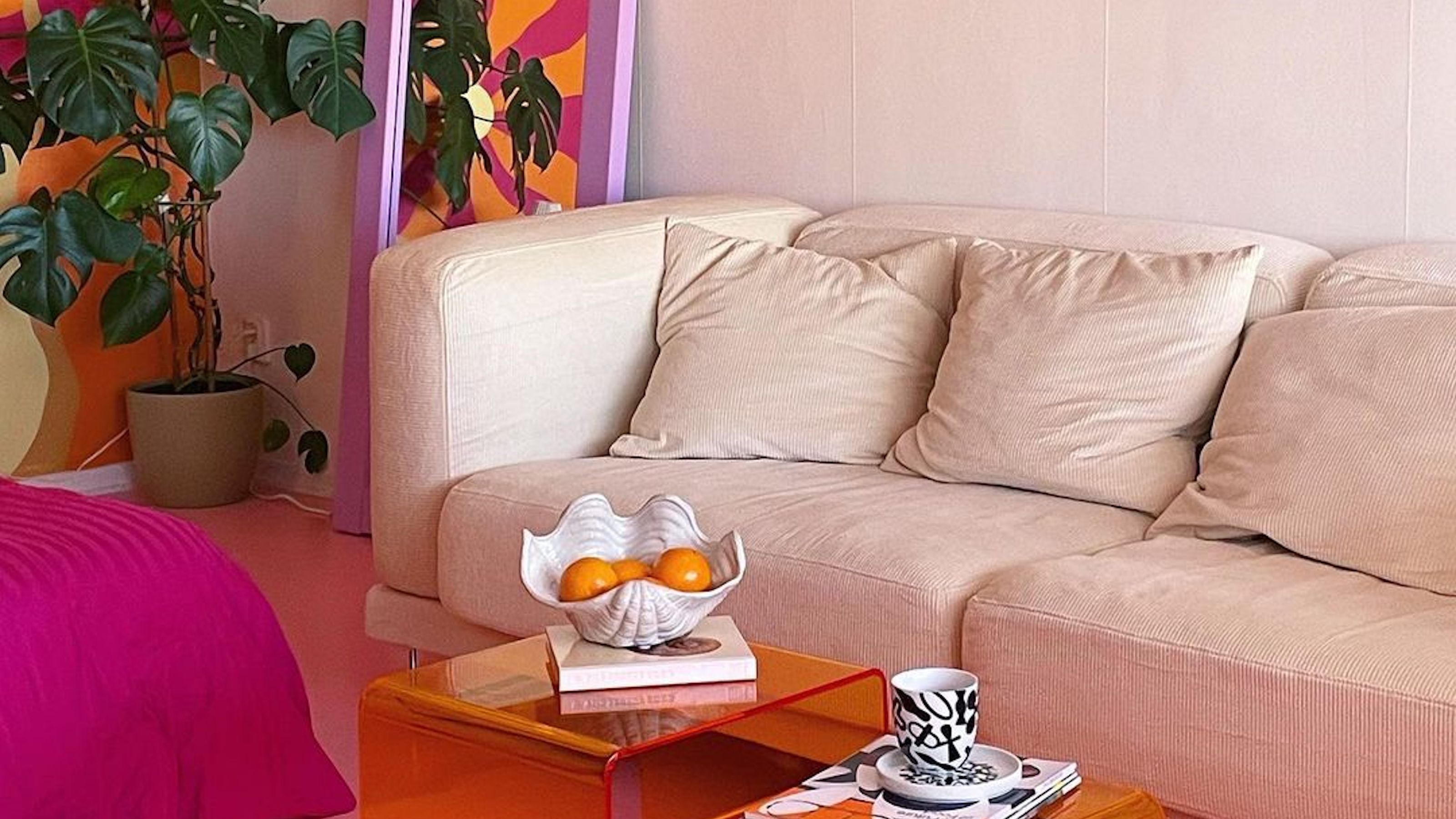
Interior influencers show us how it’s done with these colorful living room ideas

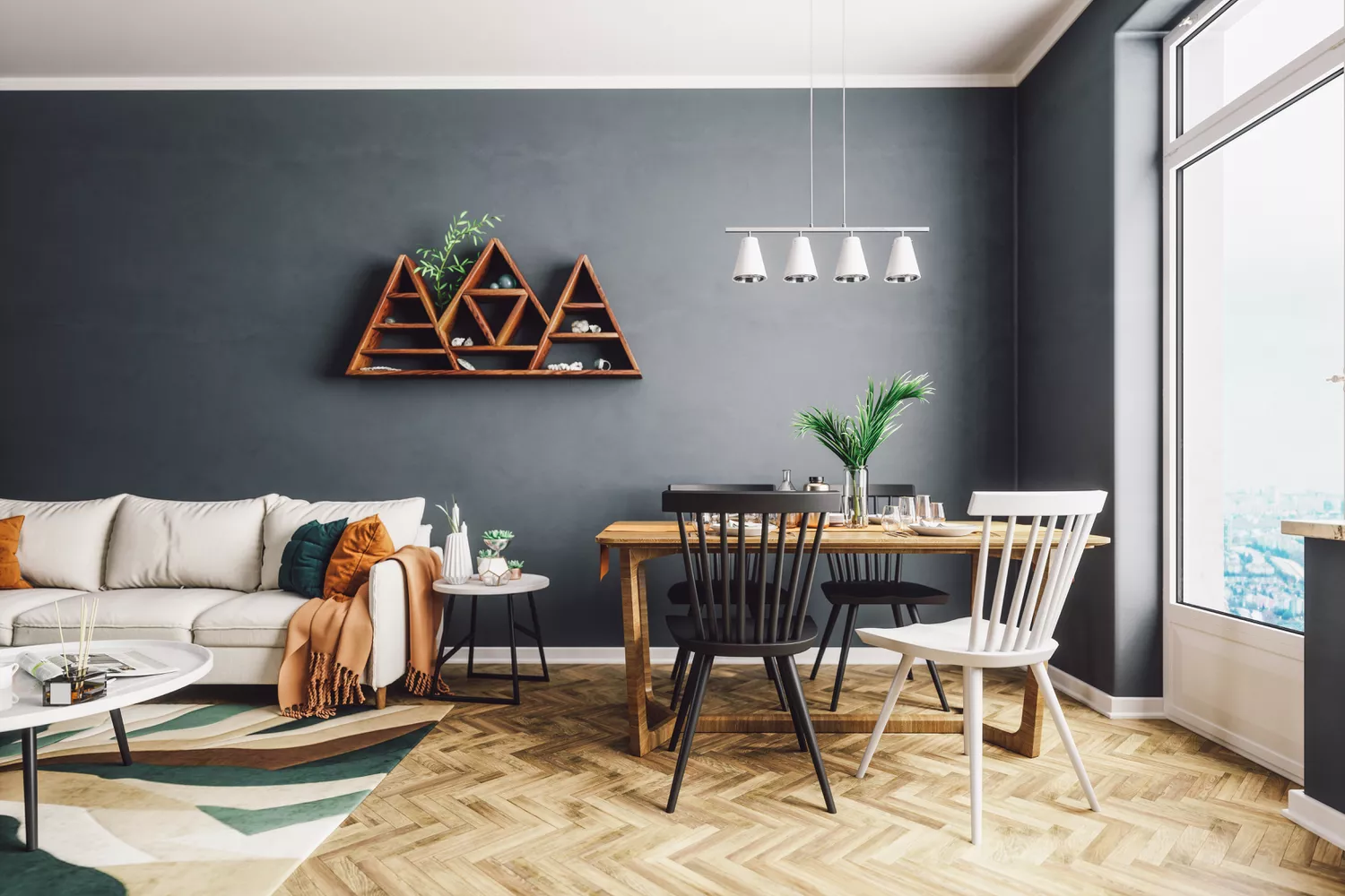
4 Living Room Paint Colors That Are So Outdated, According to Designers

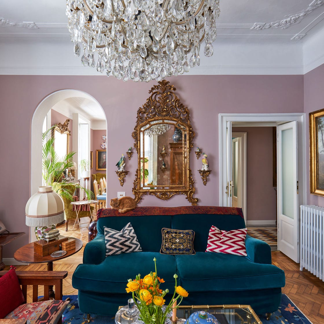
These Living Room Paint Colors Are a Total Mindset Shift
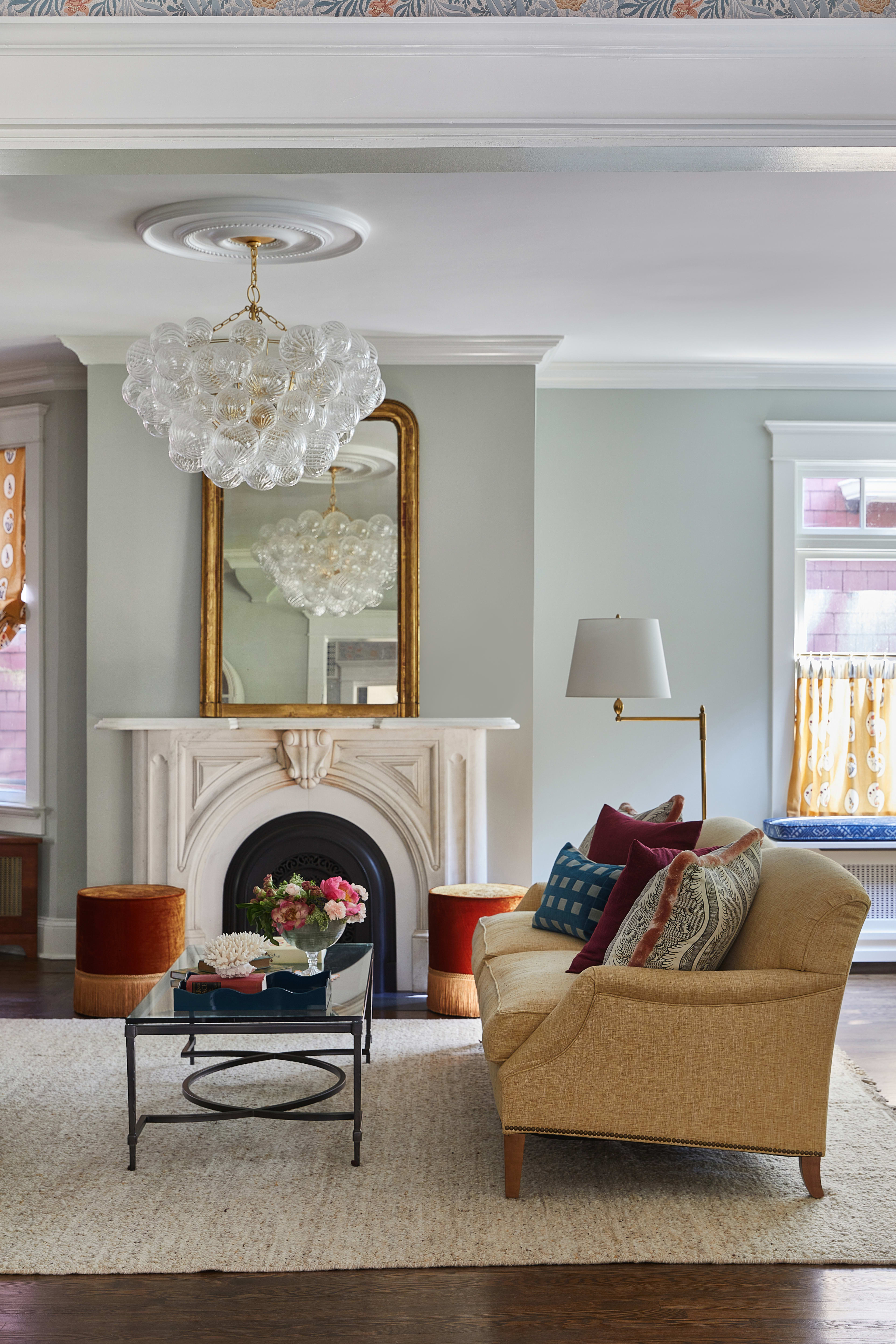
18 Living Room Color Ideas That are Oh-So Inviting
16 Living Rooms Perfect for Those Who Only Want a "Pop" of Color

These Colors Will Be Everywhere in Interiors in 2025
27 living room wallpaper ideas to liven up your lounge with the help of pattern and colour

The Best Colors To Incorporate Into Your Living Room In 2025

Blue living rooms: 26 fabulous ideas to inspire a makeover

Jewel Tones Are Trending for Living Room Paint Colors, According to Designers
51 Living Room Color Schemes That Will Bring Your Space to Life
Listen Up: These Are the Best Paint Colors for Your Living Room


Experts reveal the best living room paint colours to transform every space

The 60 Most Popular Living Room Paint Colors Right Now
55 Living Room Color Ideas That Will Take Your Space from Drab to Fab

These are interior designers' favorite color combinations for living rooms – from neutral and calming to bold and playful
26 white living room ideas to suit all styles
24 Obsessive Living Room Color Scheme Ideas You’ll Regret Not Seeing First