Mixing, Matching and Getting It Right
Kit Kemp, the design director behind several sophisticated and eclectic boutique hotels, offers insights into balancing color and pattern, drawing from her experience with the Haymarket Hotel in London. She emphasizes the importance of planning and experimentation in decorating, advising a gradual approach for those hesitant about bold colors. Starting with a vibrant pillow and slowly integrating the shade into other elements, such as painting a single wall, allows for comfort and adaptation. Kemp believes that a room's design should evolve organically, embracing unexpected tweaks that enhance creativity and keep the space interesting.
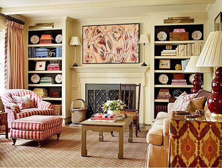
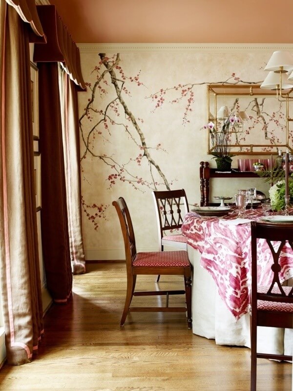
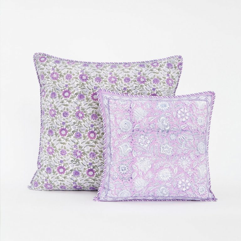
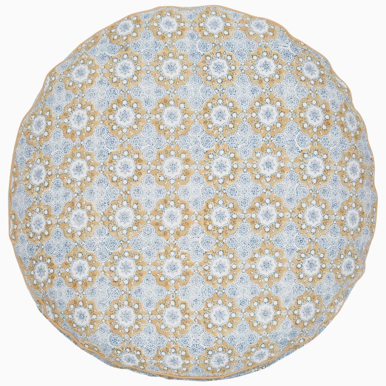
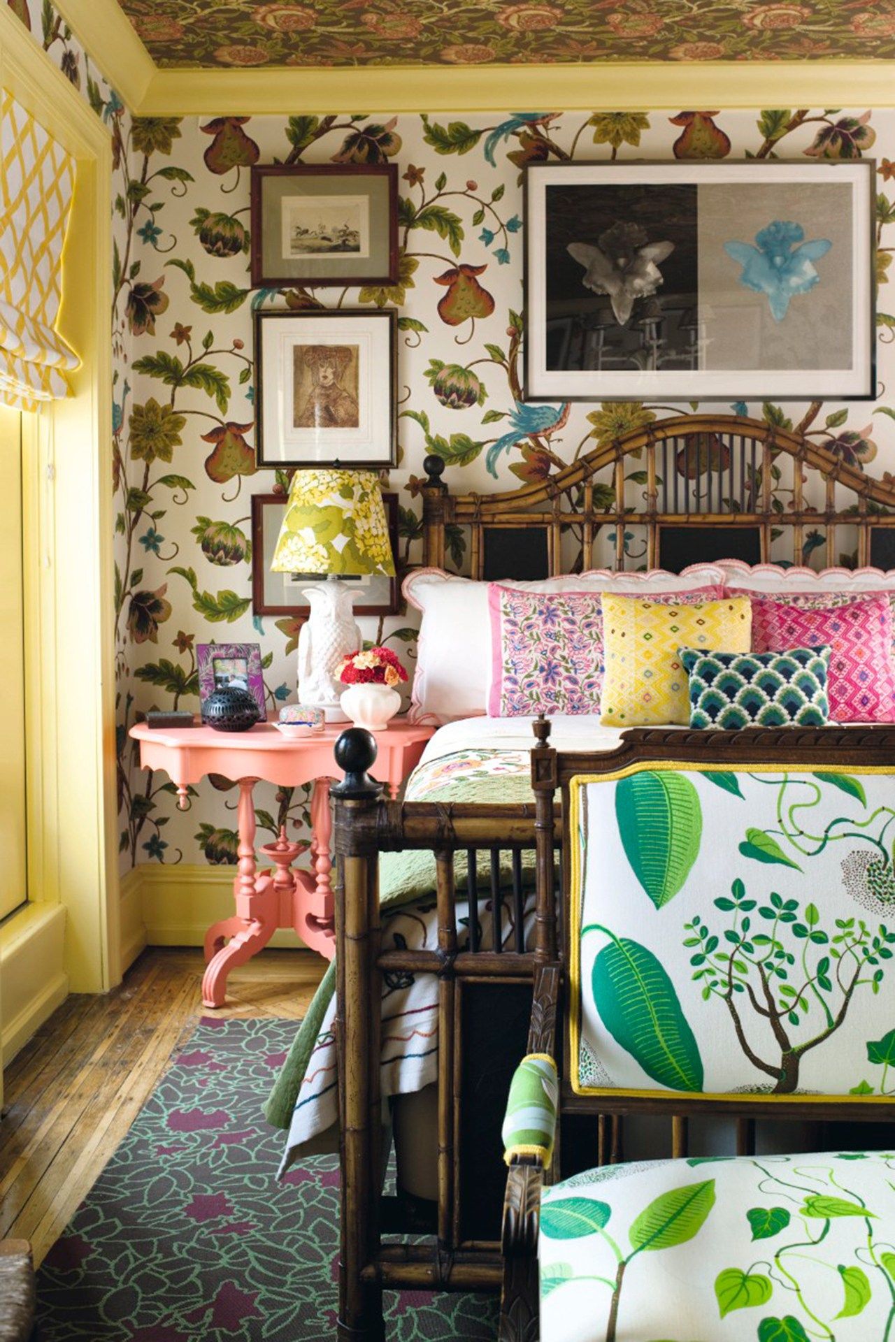
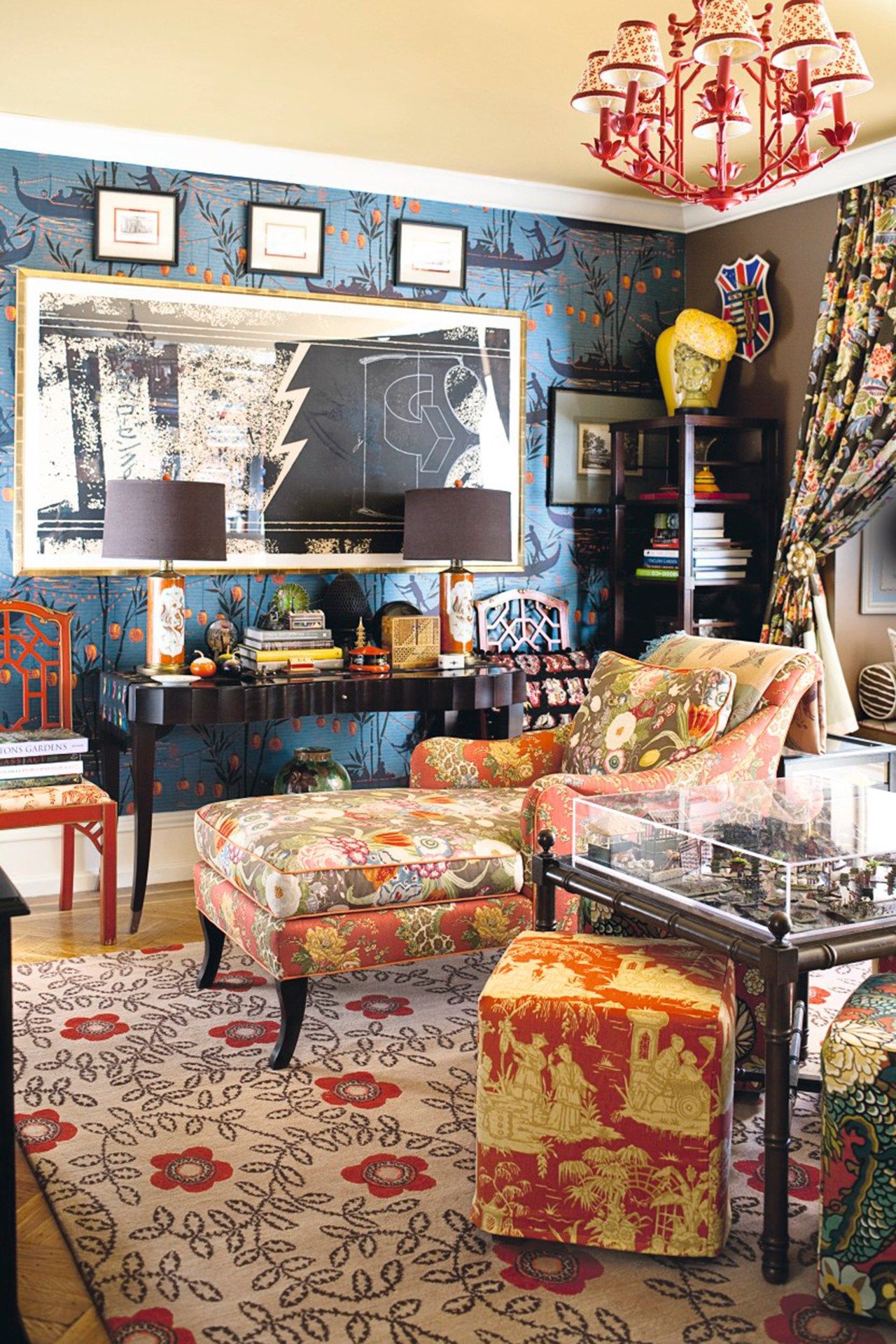
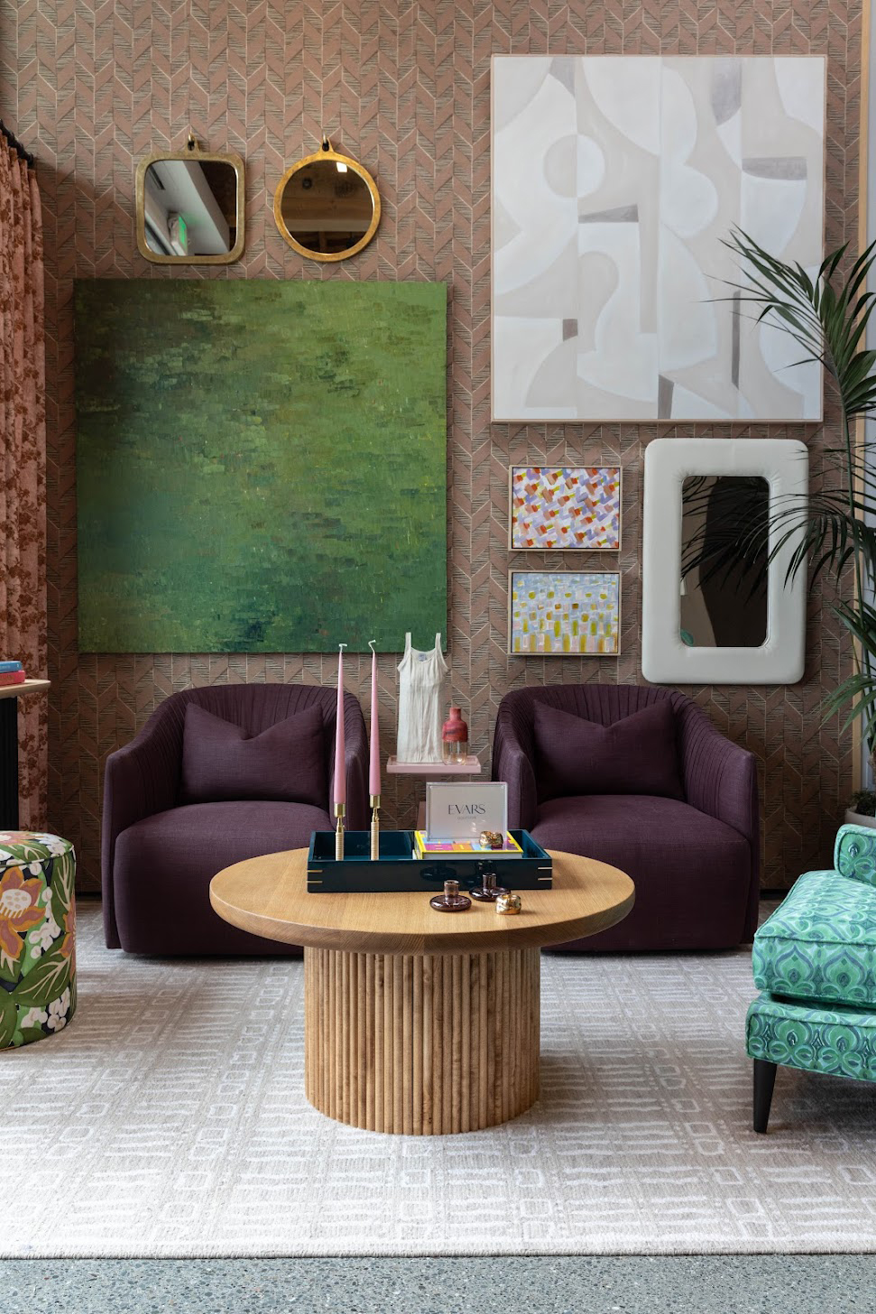
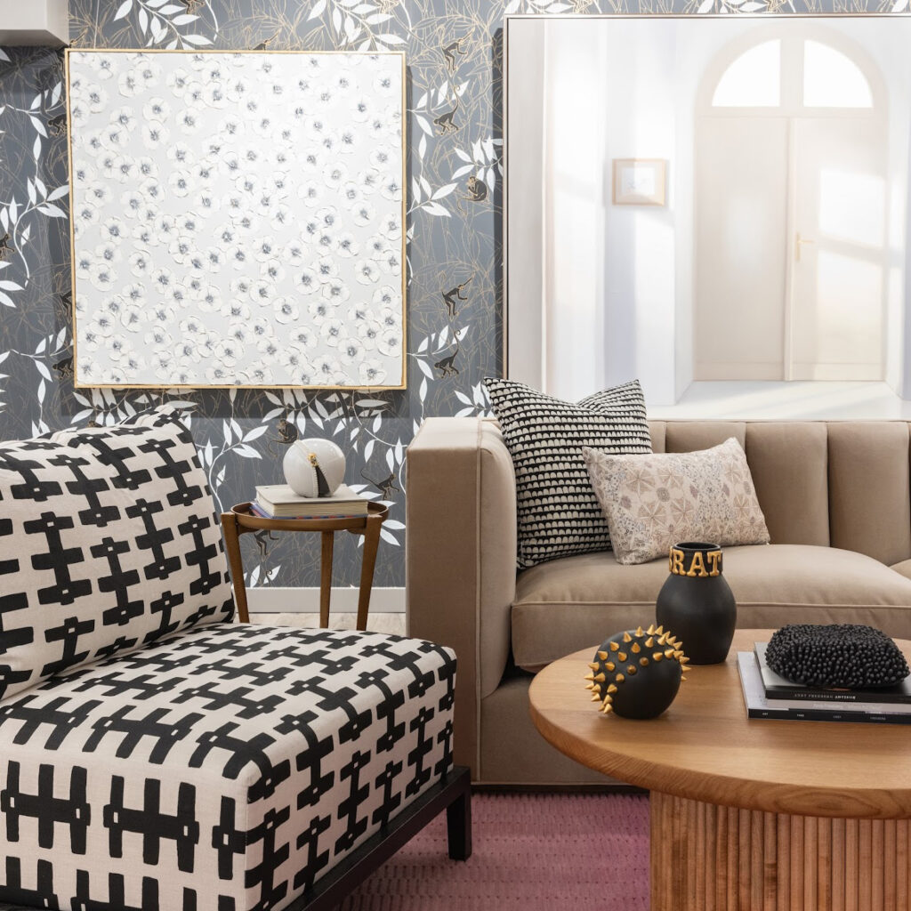
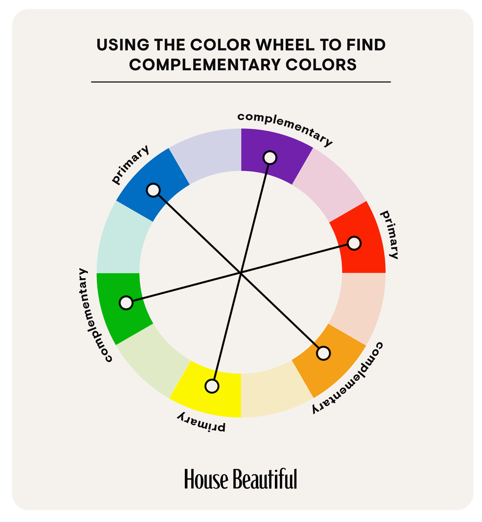
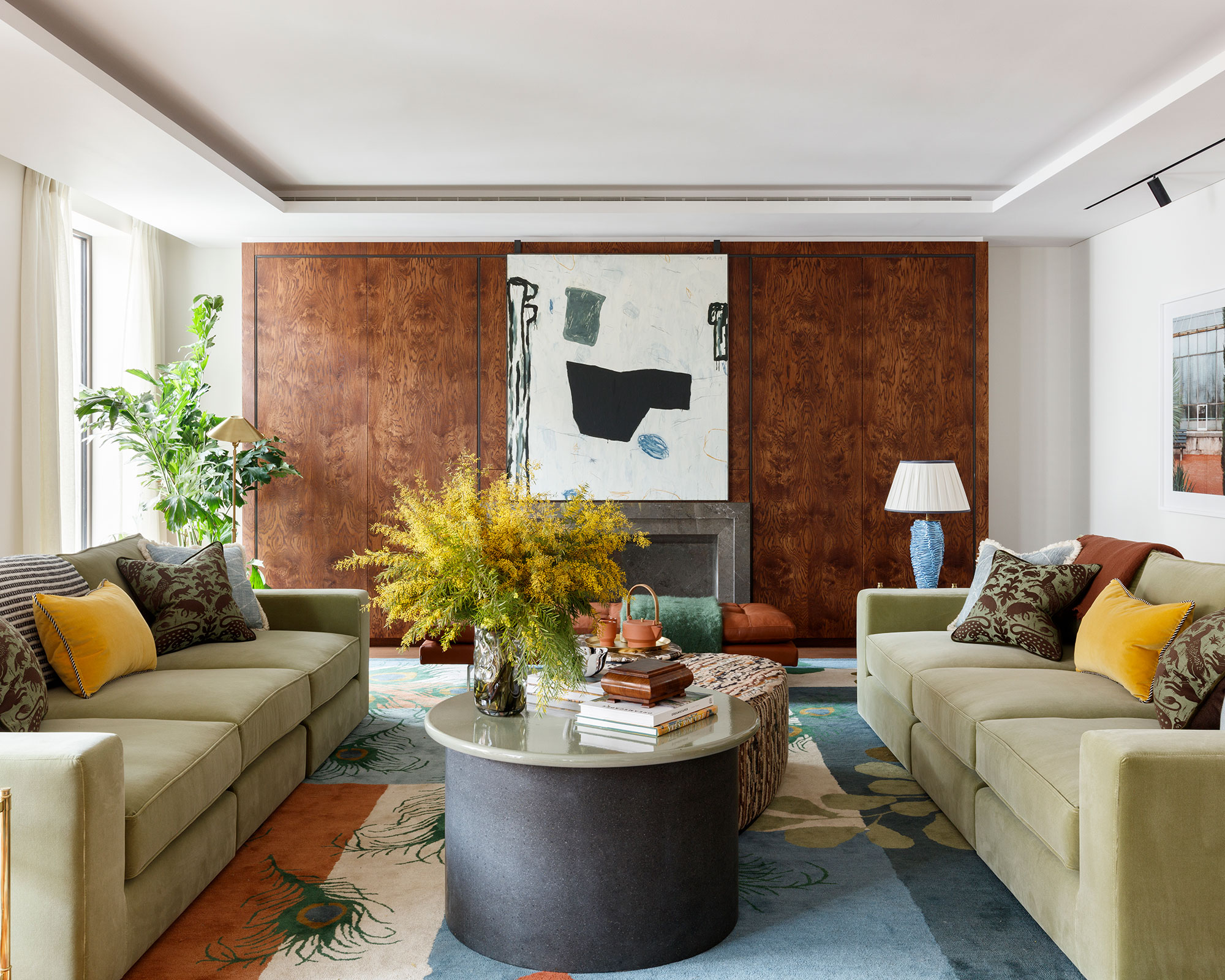
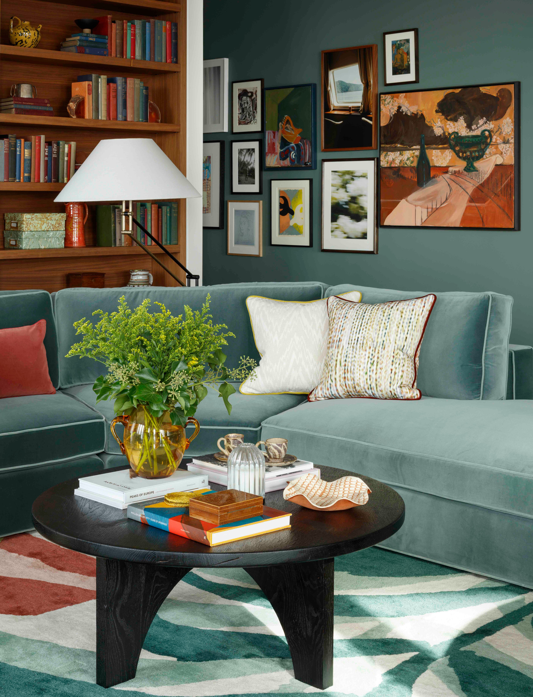
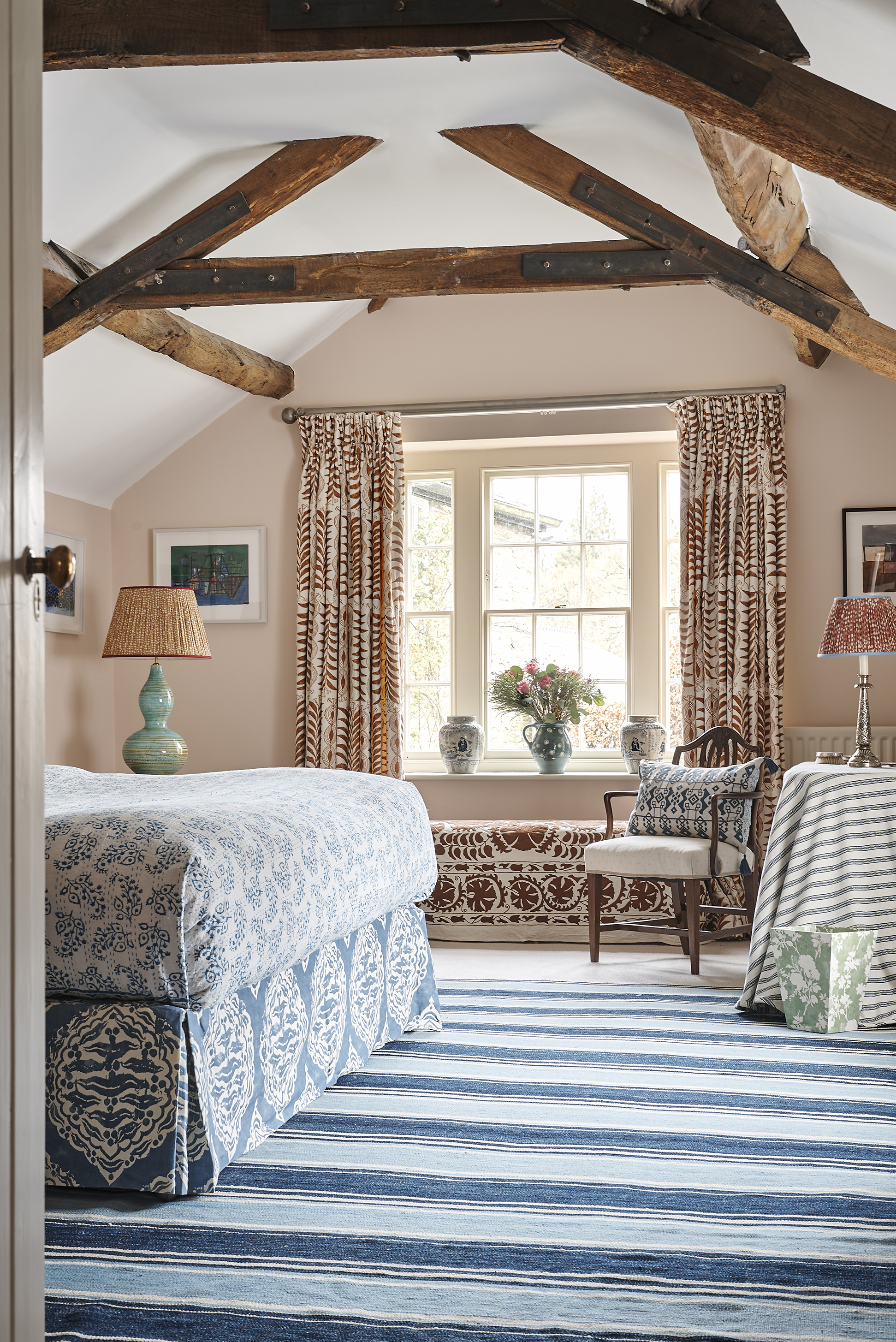
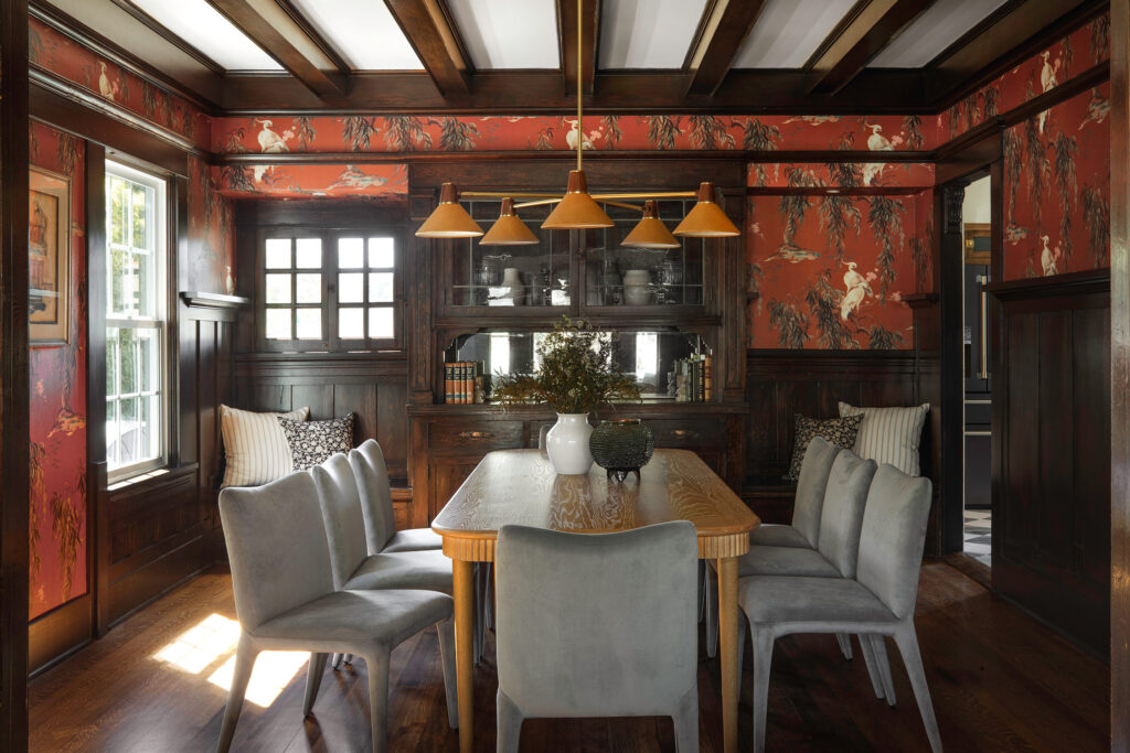
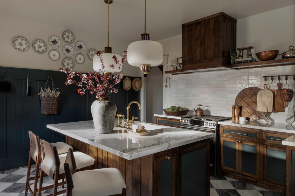
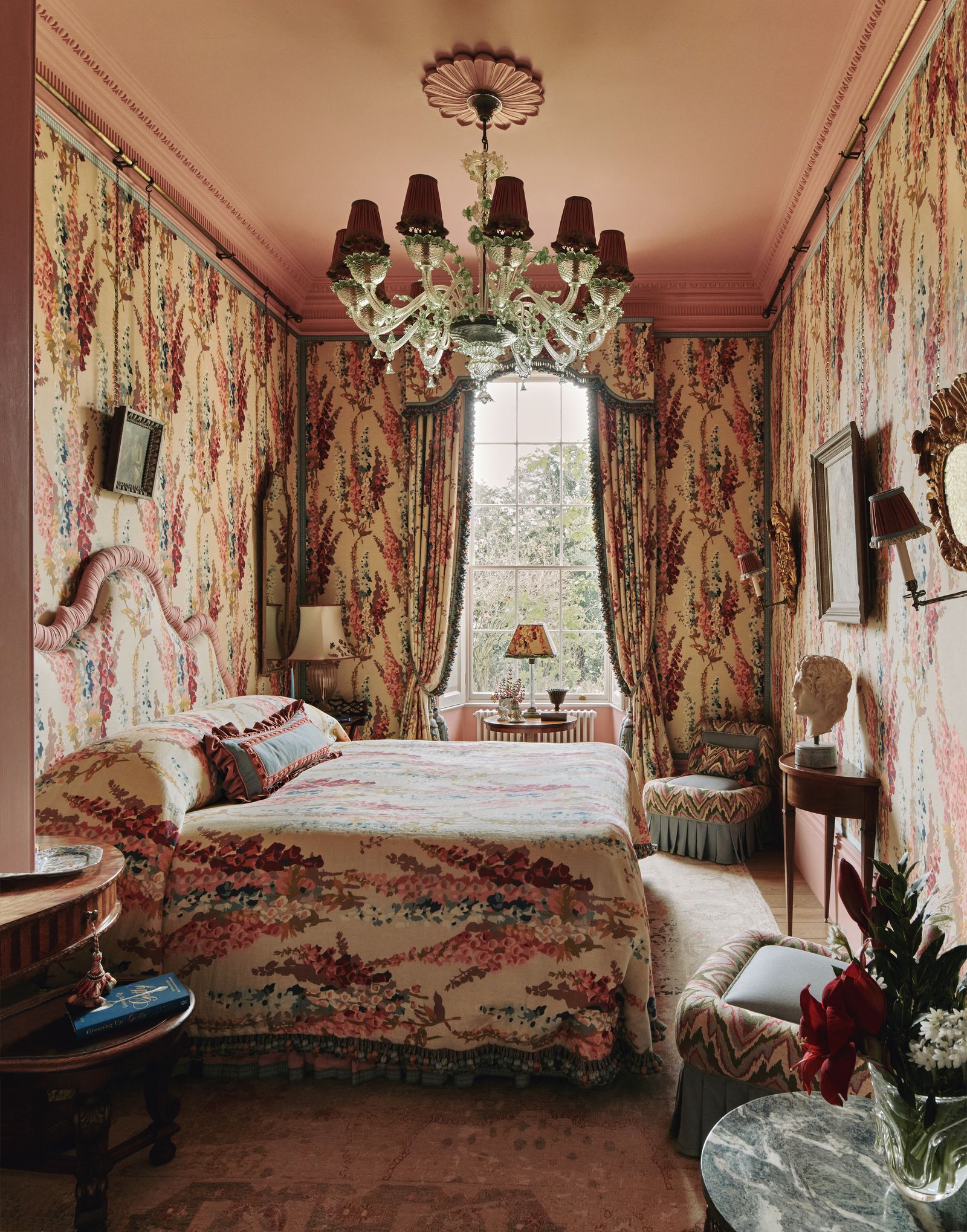
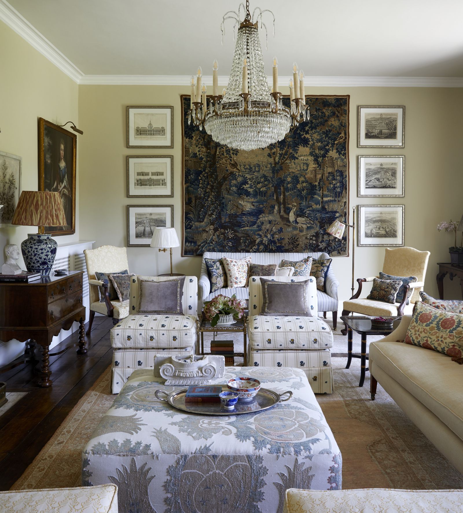
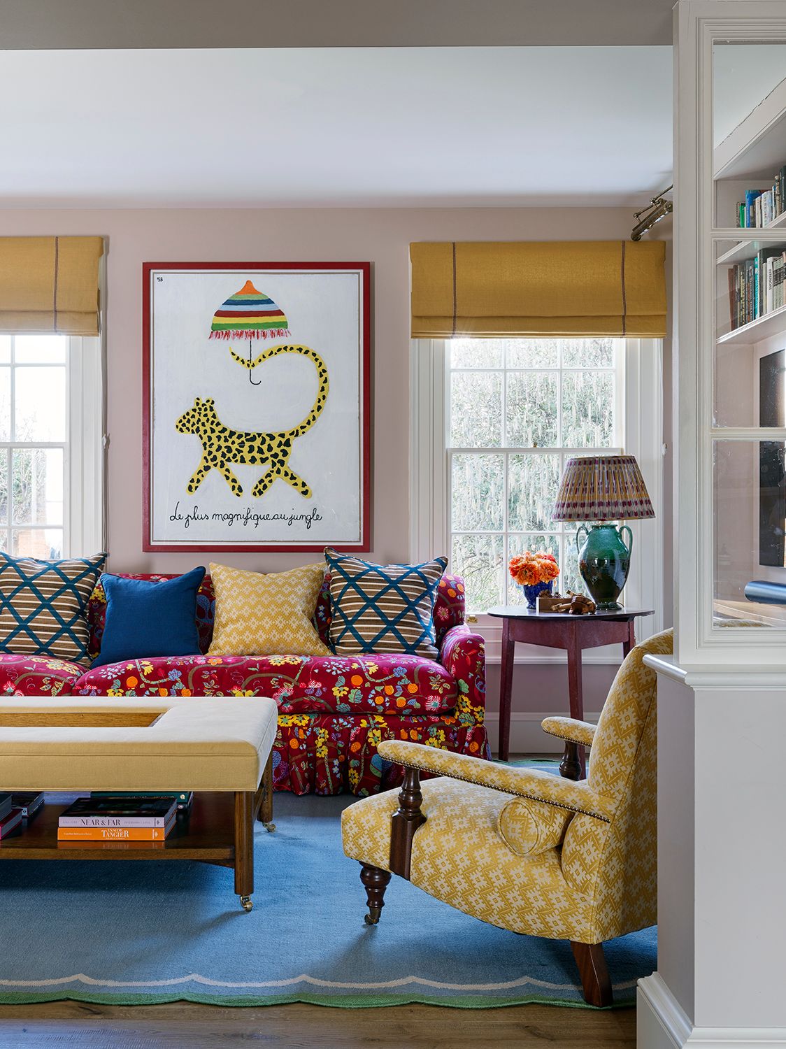
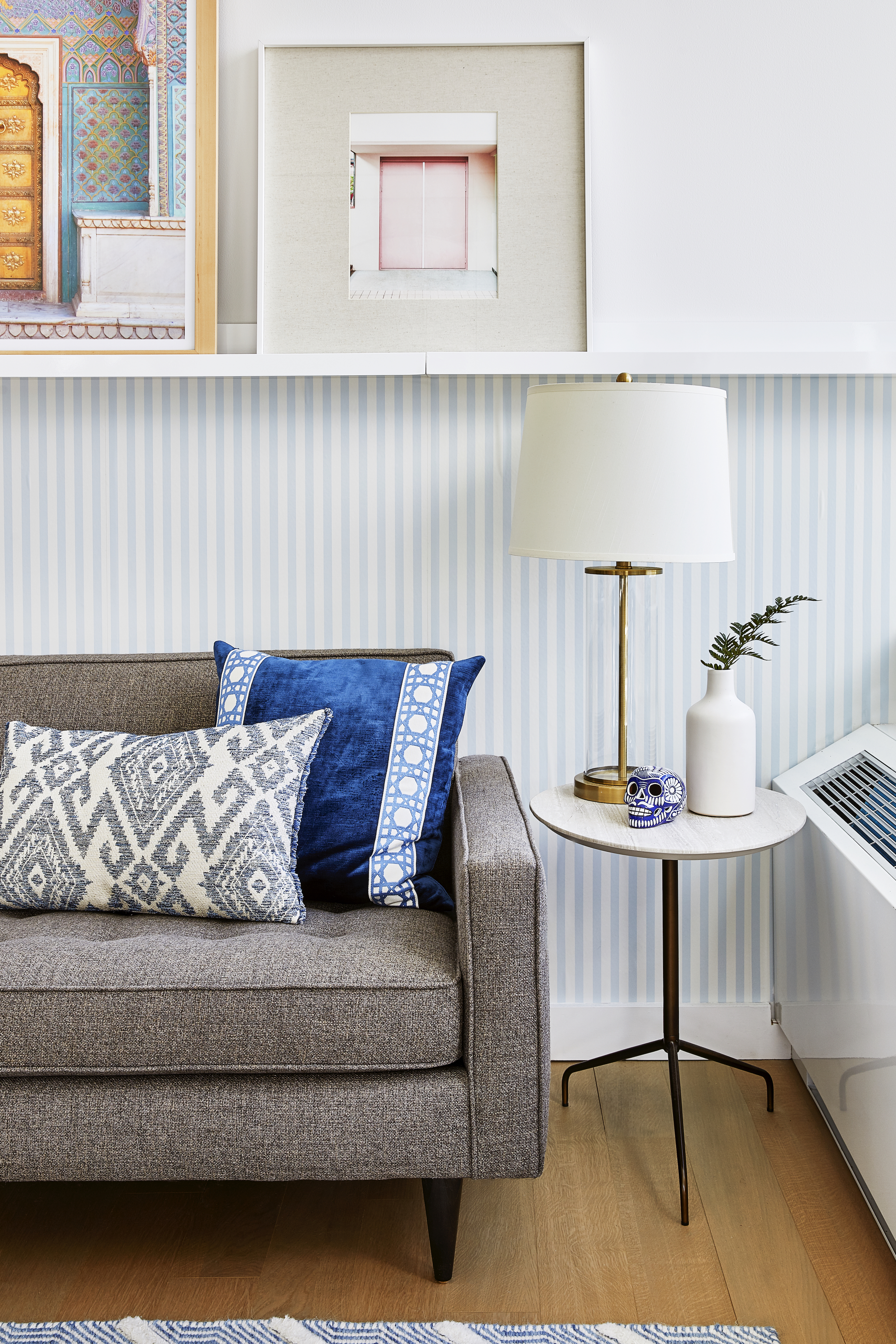
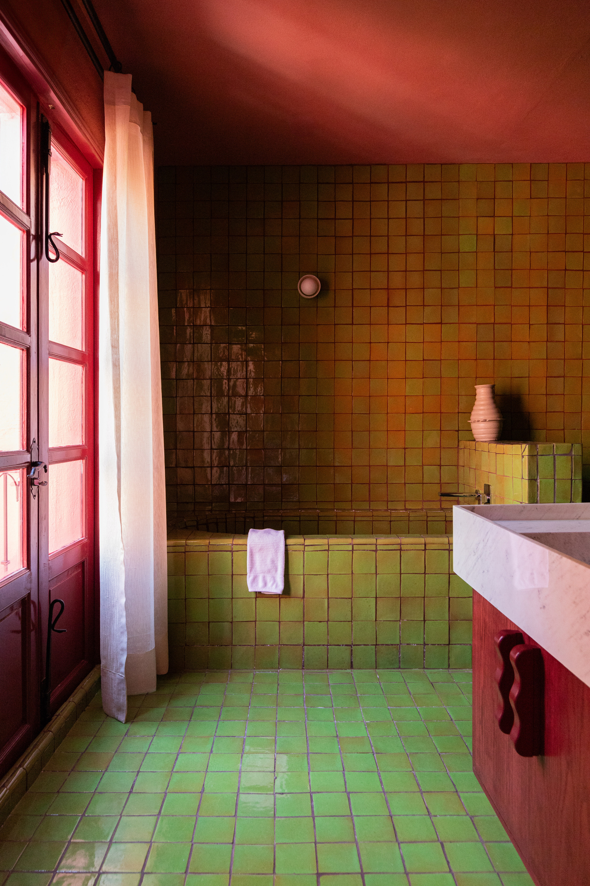
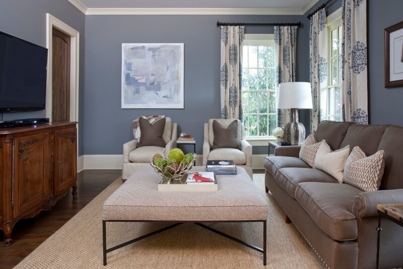
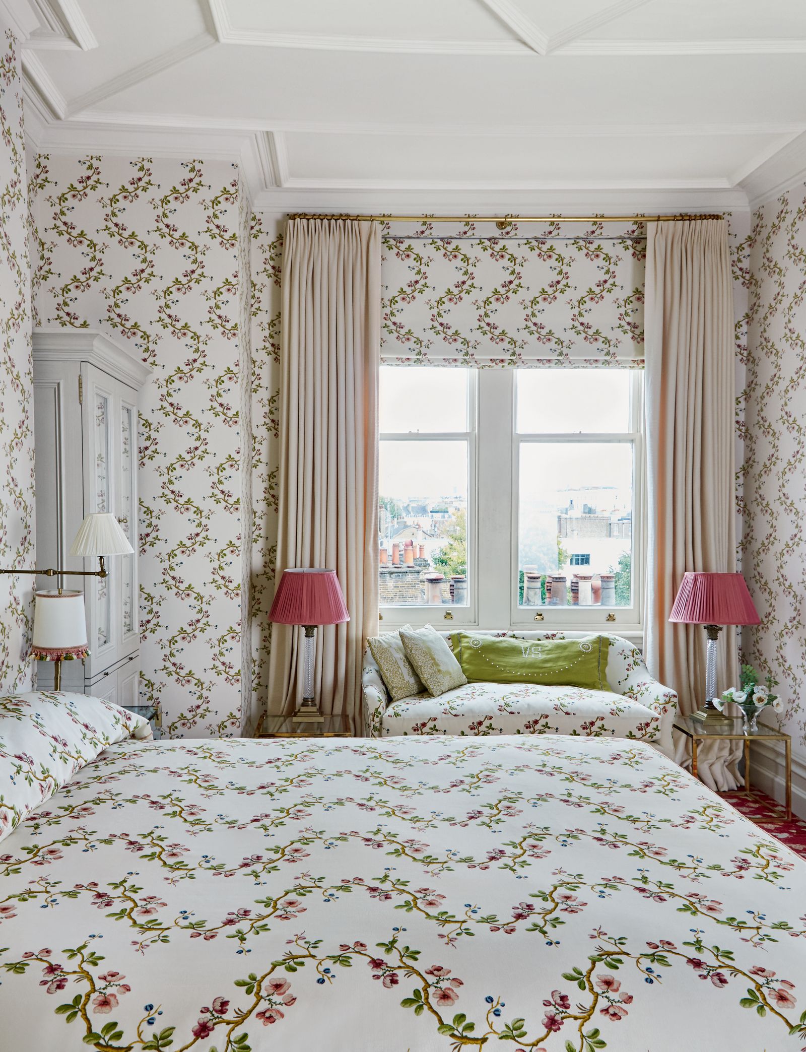
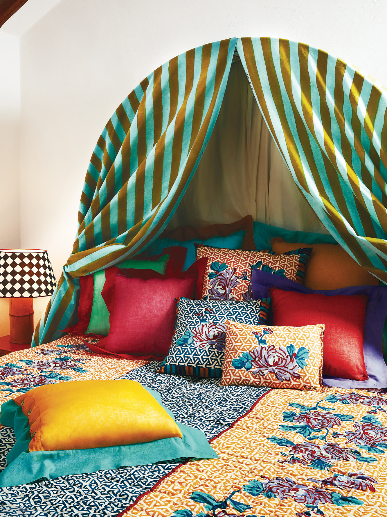
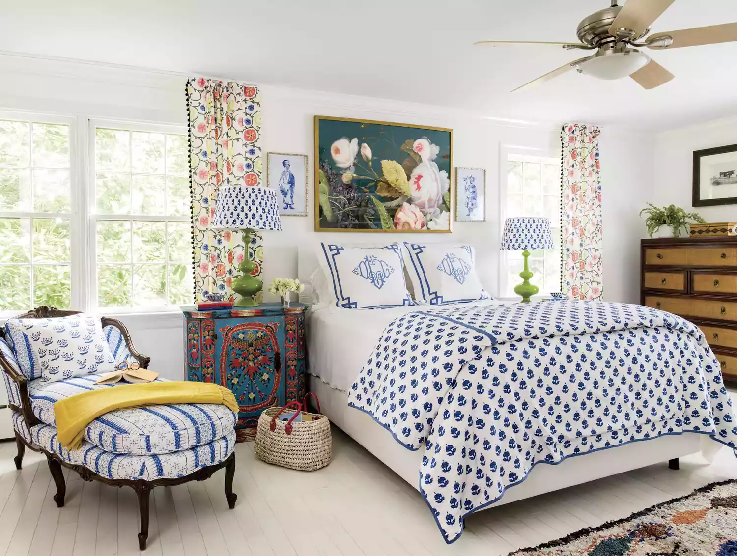
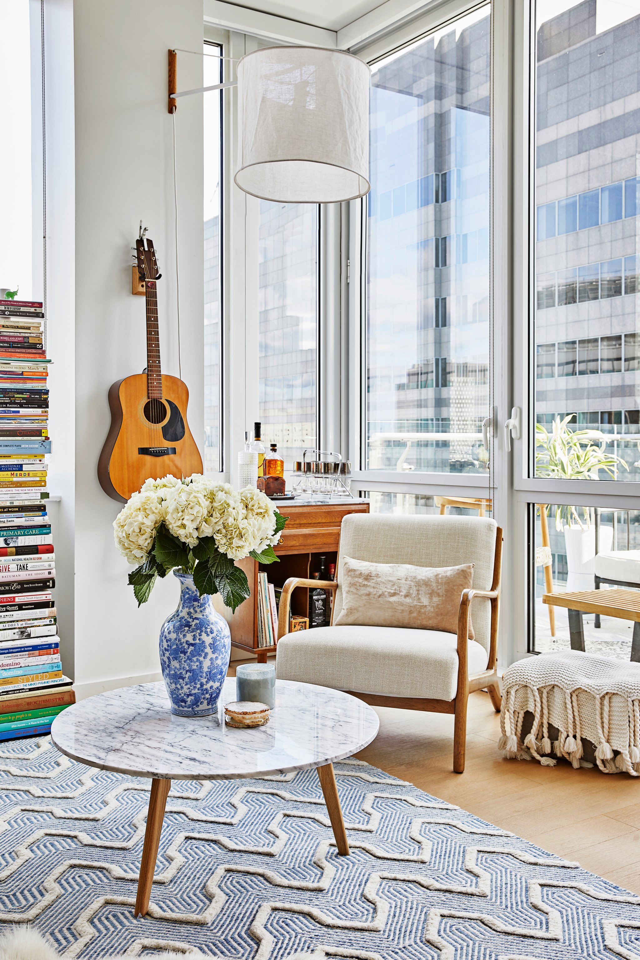
When selecting patterns, Kemp suggests beginning with a beloved large-scale print that features multiple colors. Subsequent patterns should be progressively smaller, ensuring they are distinct yet complementary, without overwhelming the main design. She advises against using large-scale patterns on walls to prevent a busy look, instead recommending their use on furniture to elaborate on curtain patterns. The color scheme for fabrics should build upon the dominant colors in the initial large-scale print. In rooms with numerous patterns, a narrower color palette is generally preferred, though tailored patterns can accommodate more daring color combinations.
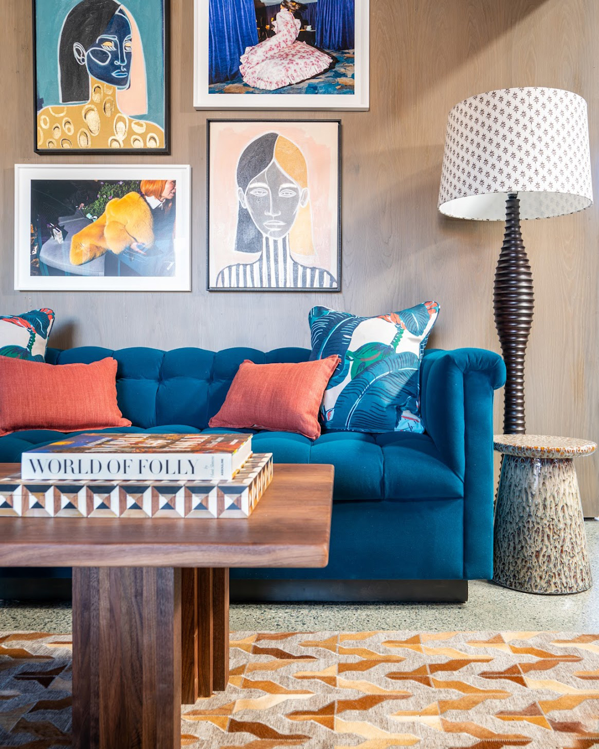
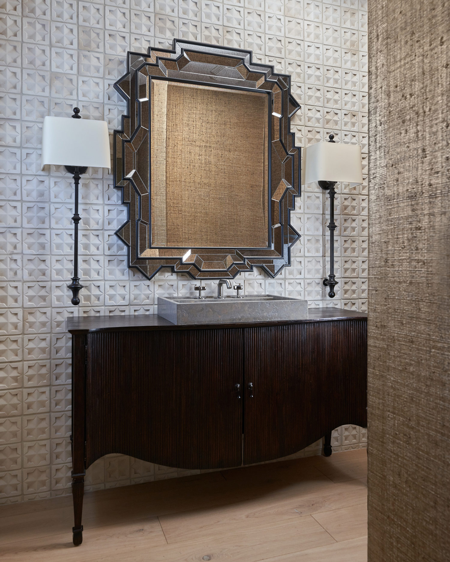
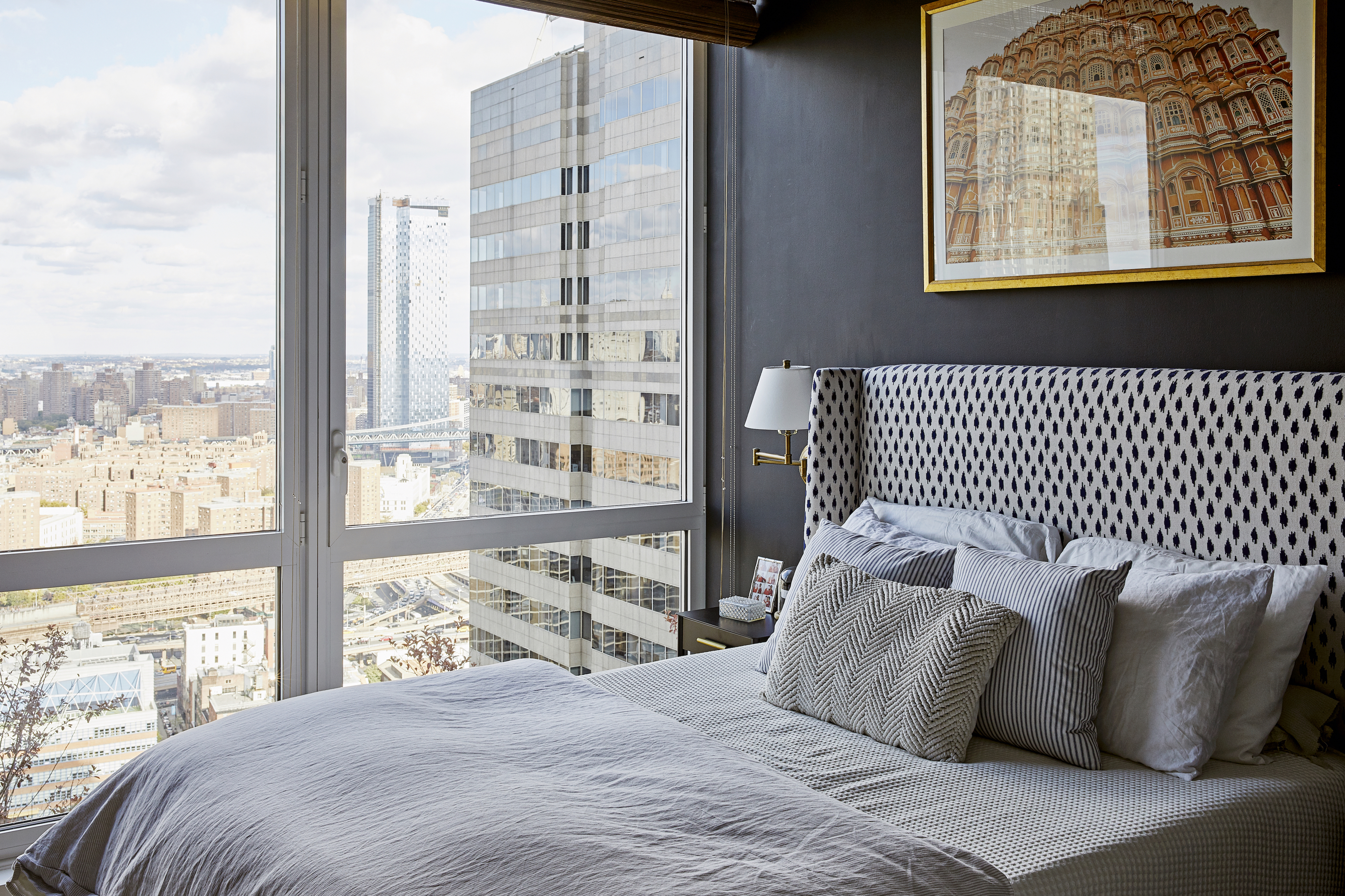
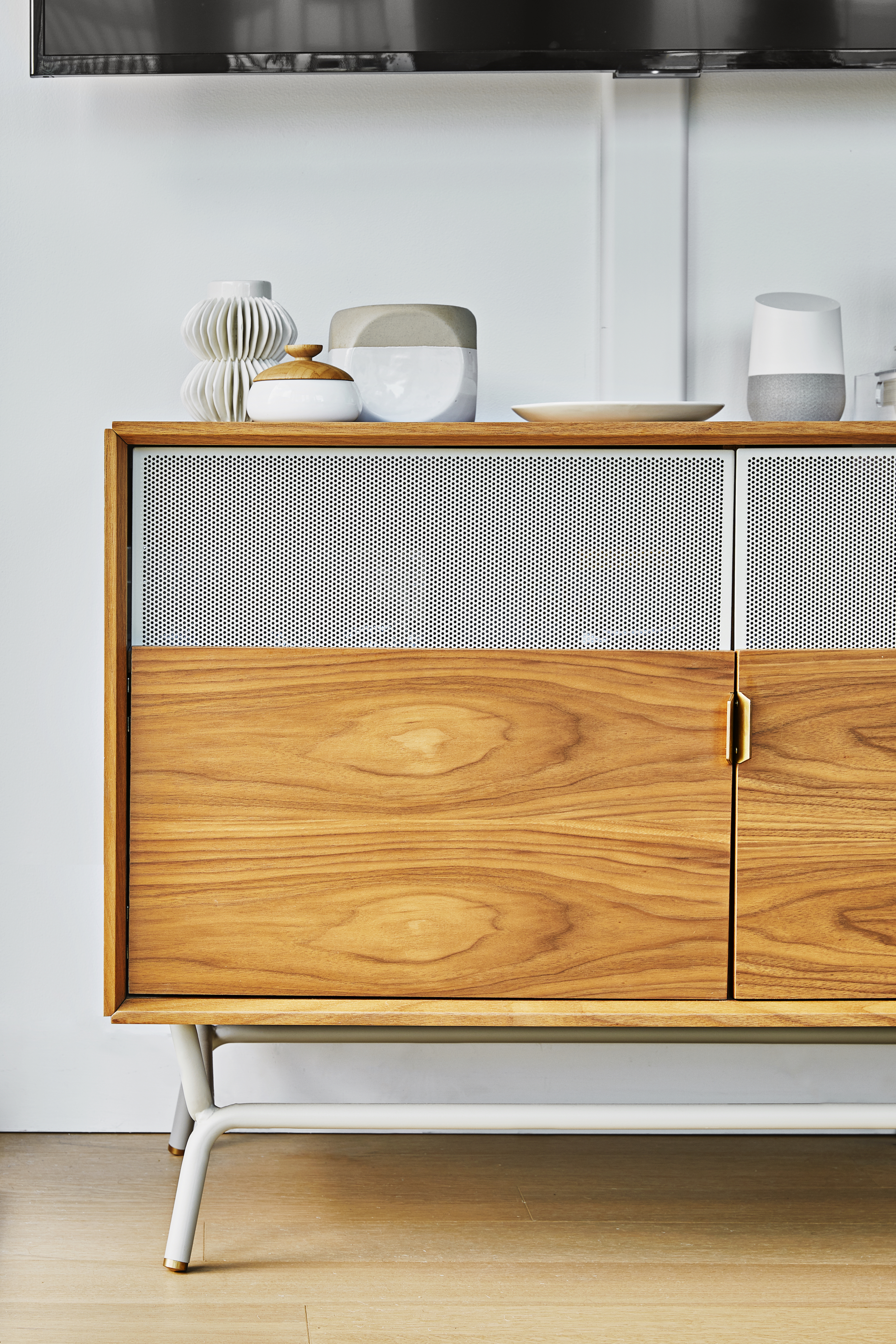
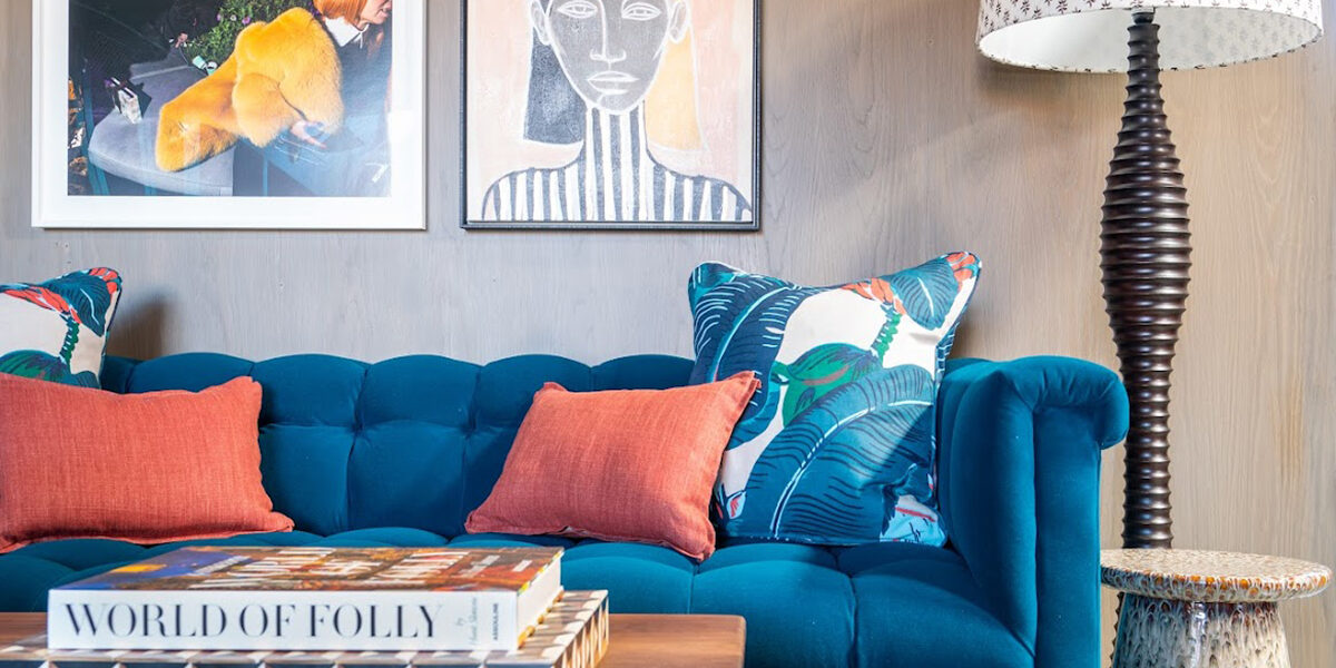
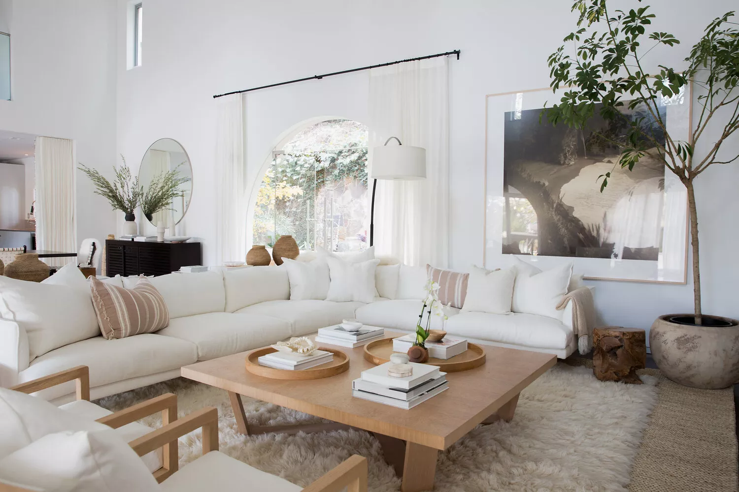
Texture is highlighted as a crucial element, equally important as pattern mixing. Varied textures contribute to visual depth and encourage tactile interaction, making a space more engaging. Kemp finds personal triumph when her furniture designs evoke a physical response, such as a child or a formal individual touching them. Texture can be incorporated through exposed stitching, fabric thickness, or creative techniques like exposing upholstery seams. This approach adds a unique, handcrafted feel to the decor.
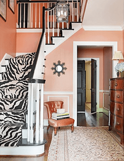
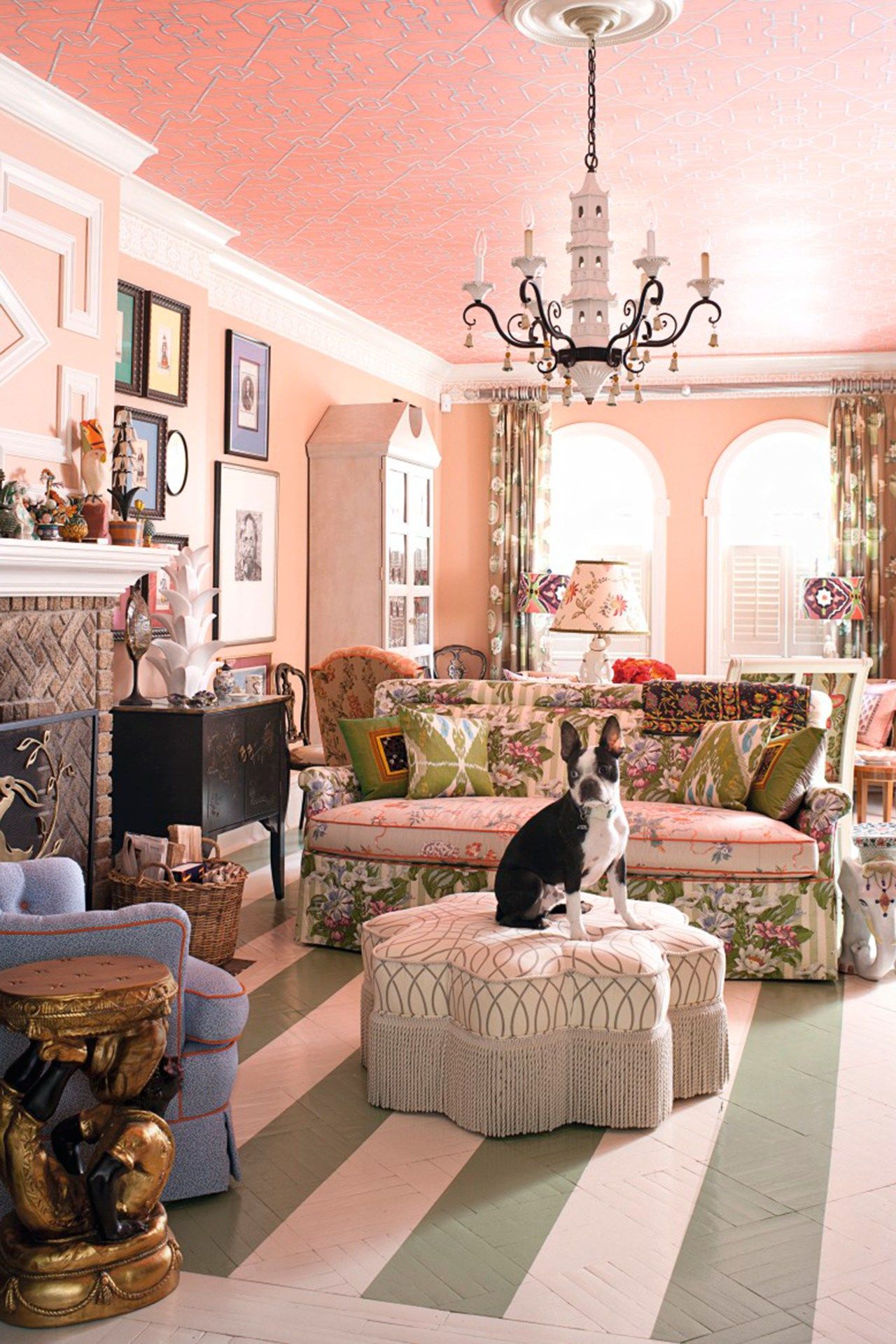
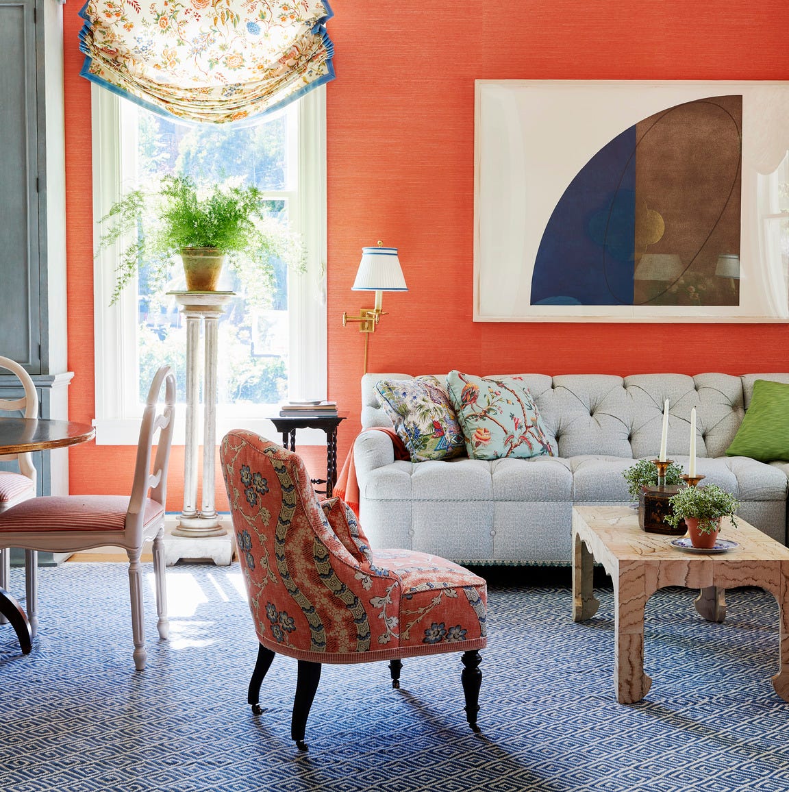
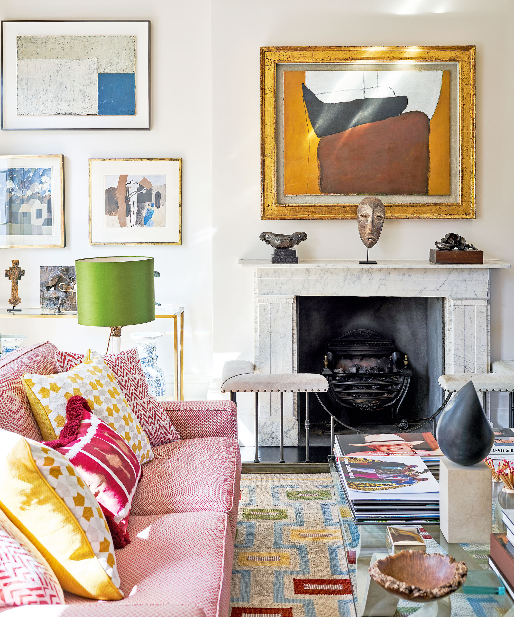
To achieve balance in a room, Kemp advocates for contrasting bold patterns with areas of solid color or neutrals. This layering of visual relief allows the eye to rest and appreciate the prints without feeling overwhelmed. Solid colors are employed to maintain harmony and emphasize the chosen patterns. Regarding furnishings, she encourages a reinterpretation of tradition. Classic antique furniture can be modernized by re-upholstering it with contemporary fabrics, such as combining African mud cloth with vibrant felt on an 18th-century bergère chair. Alternatively, placing antique pieces alongside modern items, like pairing a modern rug with an 18th-century sofa, can give the entire arrangement a contemporary feel. Kemp concludes that breaking traditional rules and embracing a playful approach to design can lead to truly unique and enjoyable interiors, transforming conventional spaces into something fresh and exciting.
#InteriorDesign #ColorPalette #PatternMixing #Texture #HomeDecor #DesignTips #BoutiqueHotelDesign #KitKemp #HaymarketHotel #InteriorDesign #ColorPalette #PatternMixing #Texture #HomeDecor #DesignTips #BoutiqueHotelDesign #KitKemp #HaymarketHotel
0 comment in total
You may also like
The ONLY Advice You Need to Mix Patterns Like a Pro!

The 8 Dos and Don’ts of Mixing Patterns in Your Home
The return of the matchy matchy pattern look, and how to do it right
Can You Mix and Match Wood Furniture? What Designers Actually Think of the Trend

Our Current Pattern Crush Is Made for Mixing and Matching
How to Choose Colors That Work Together Every Time

How To Mix Metal Finishes

Symmetry Meets Style

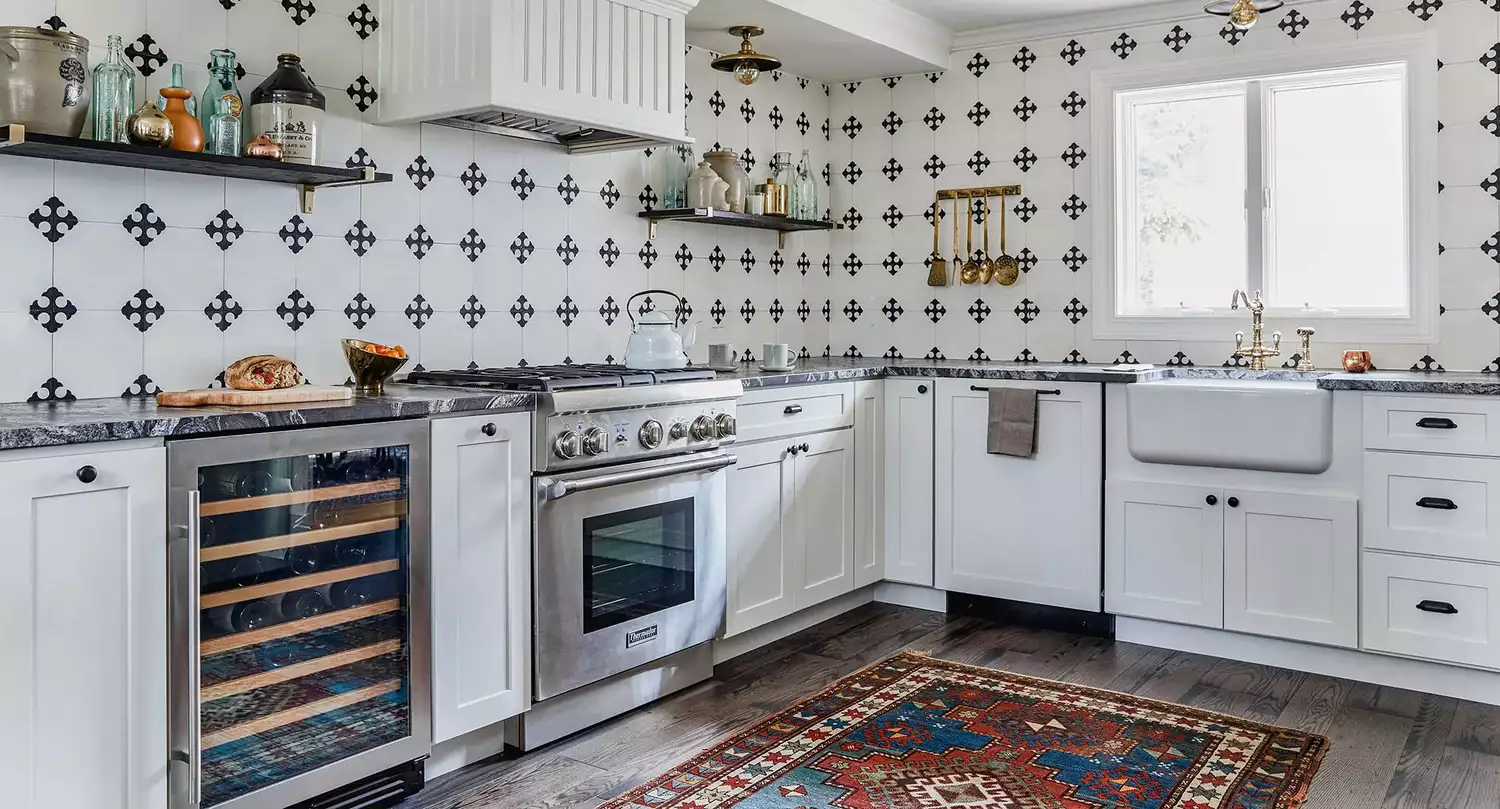
A masterclass in mixing pattern
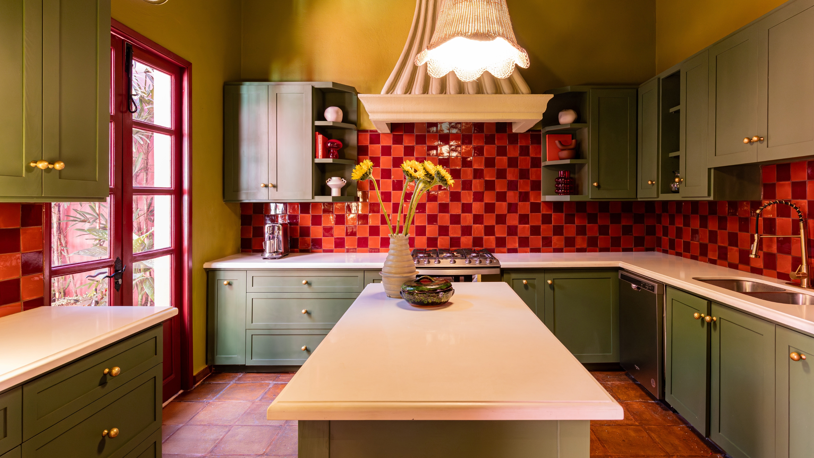
This Richmond Makeover Proves Mixing Is Better Than Matching With Color And Pattern
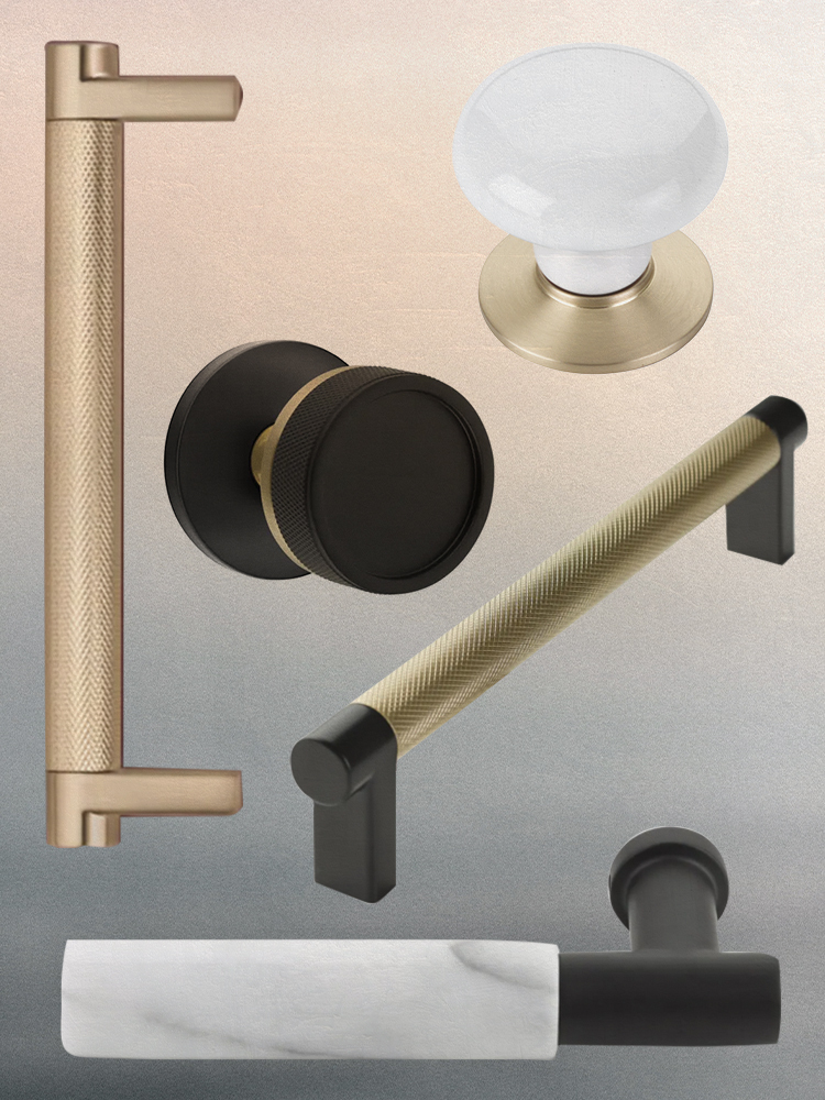
We Cracked the Code on Mixing and Matching Hardware
Ever Heard of a Split Complementary Color Palette? It's the Secret to Perfecting More Unexpected Pairings

7 Golden Rules for Mixing and Matching Patterns That Designers Swear By

Mixing patterns and prints in interior design – a 12-step masterclass

How to Blend Your Style With Your S.O.’s—And Actually Make It Work

Experts say to follow these 7 rules when mixing metals in your home

If This, Then That: Your Guide to Pairing Paint Colors

This Is the Correct Way to Mix Design Eras and Styles
Symmetry Meets Style

Matching the right paint with the right surface