1/8
How to Choose Colors That Work Together Every Time
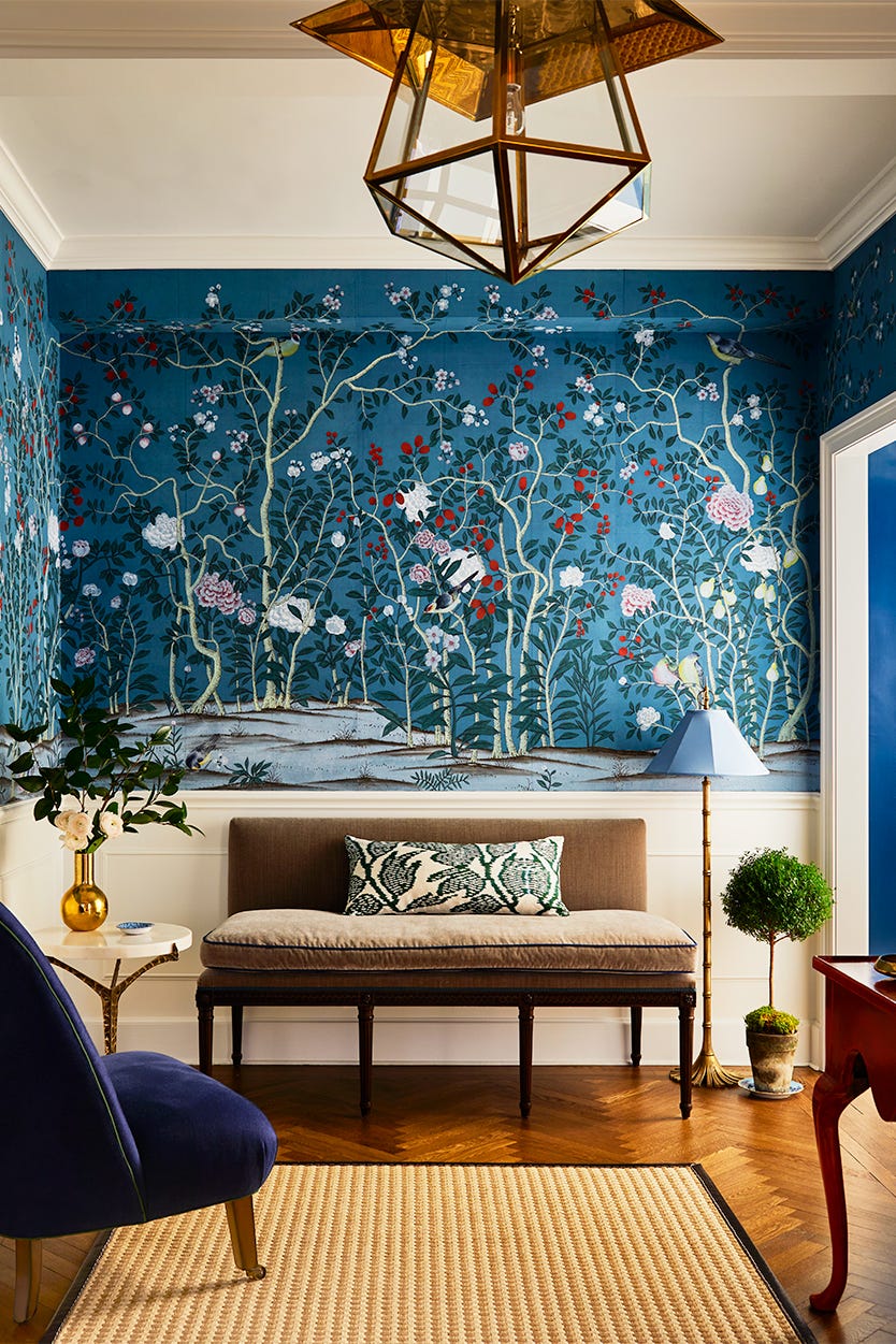

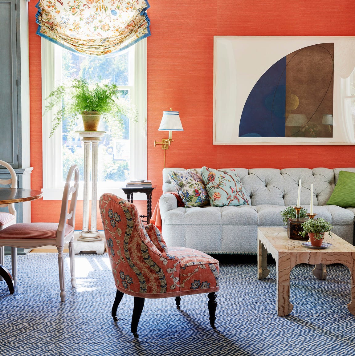
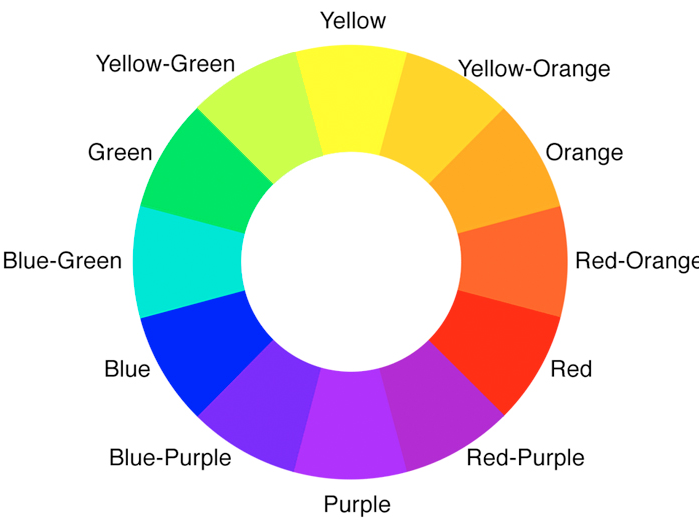
The article delves into the concept of complementary colors within interior design, explaining how these color pairings can transform a room's aesthetic. Complementary colors are defined as those positioned directly opposite each other on the color wheel, comprising one primary and one secondary hue. When combined, these colors enhance each other's vibrancy, creating a striking and visually stimulating contrast. The three primary complementary pairings are yellow and purple, red and green, and blue and orange.
The mechanism behind complementary colors' effectiveness is rooted in human vision. Each color activates distinct receptors in the eyes, and complementary pairings stimulate multiple receptors simultaneously, leading to increased brightness and boldness for both colors. While some might associate certain complementary pairs, like red and green, with specific themes (e.g., Christmas), the article emphasizes that with careful selection of shades and tones, these combinations can be elevated and sophisticated.
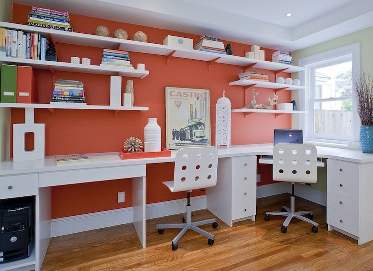
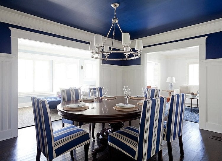
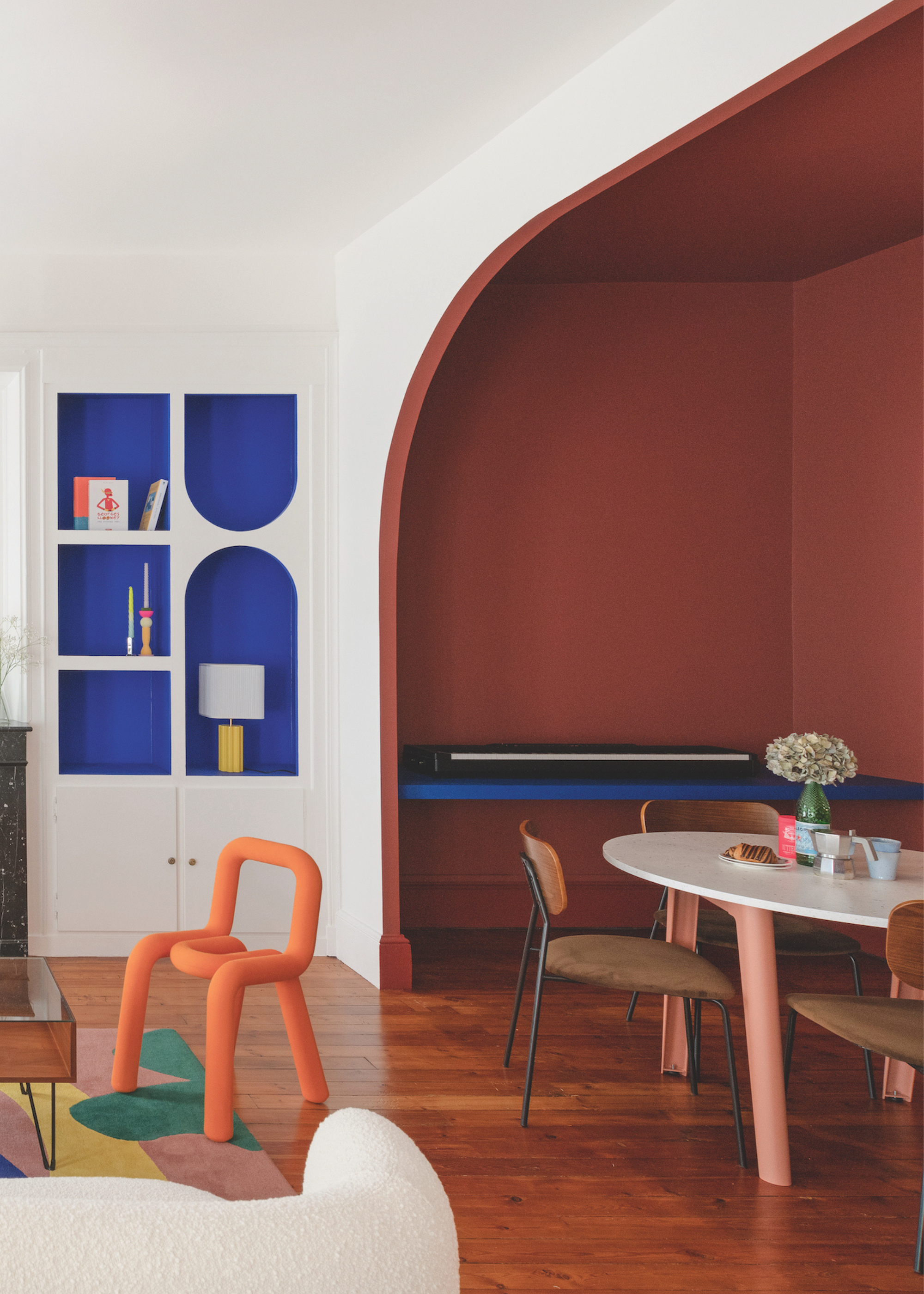
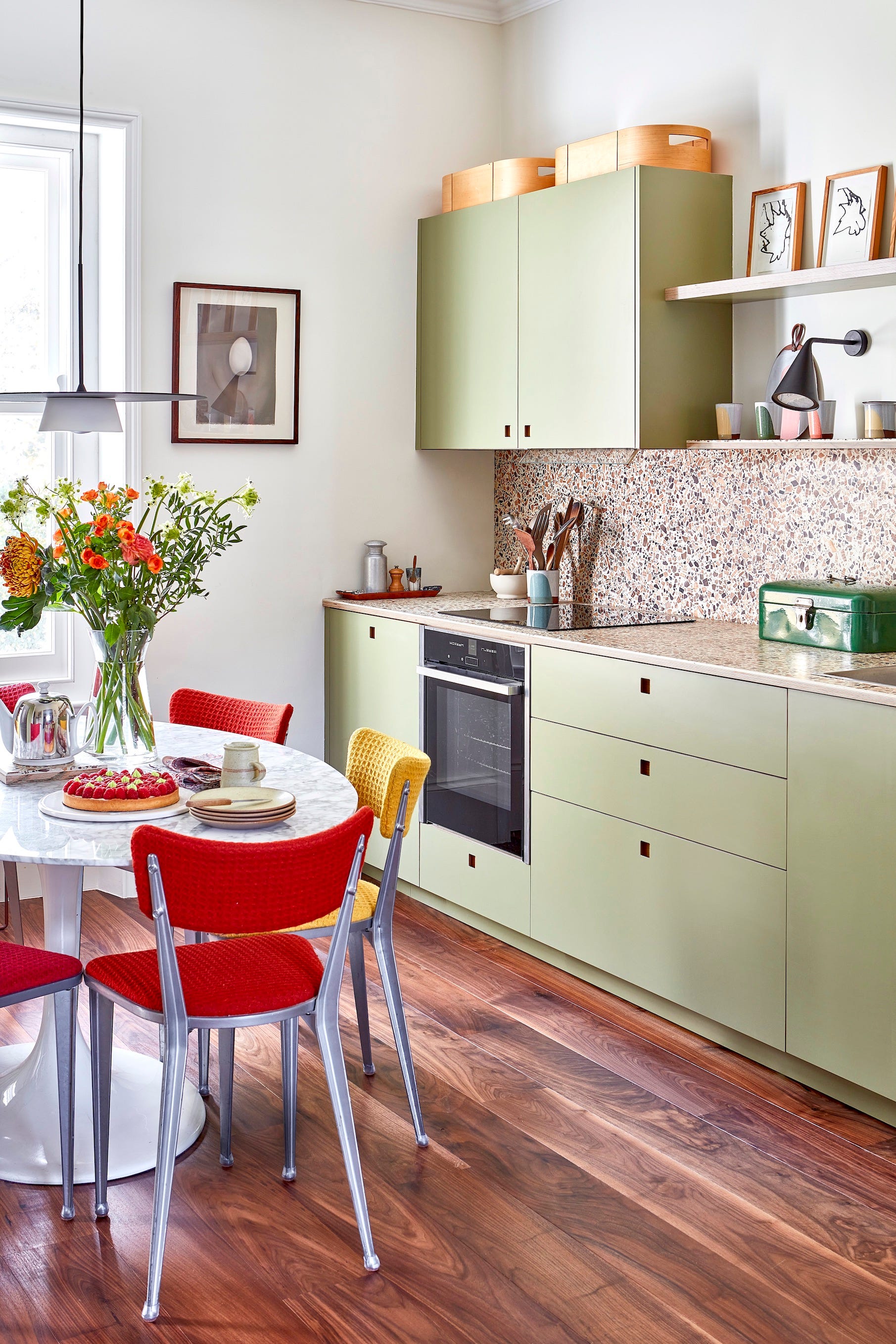
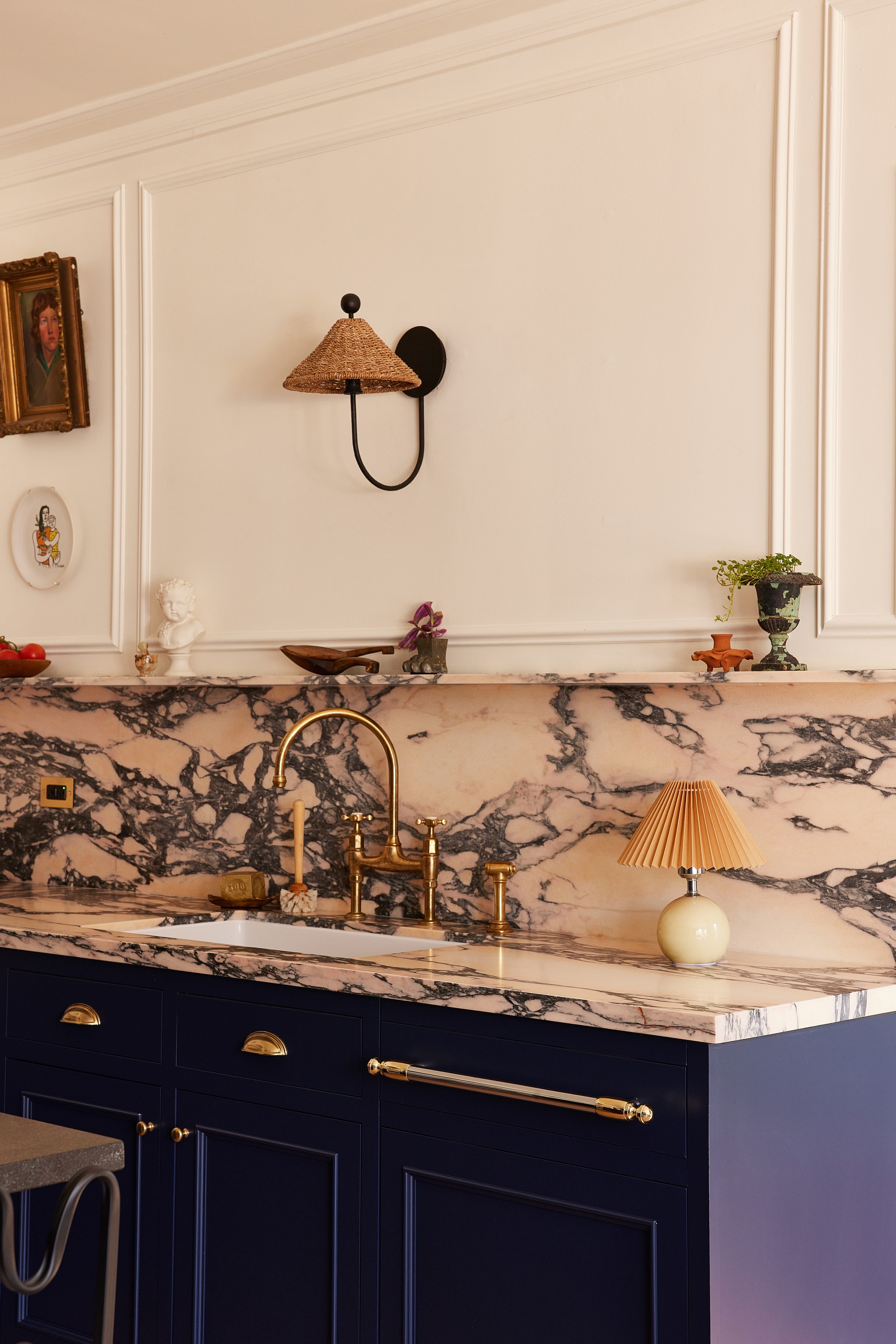
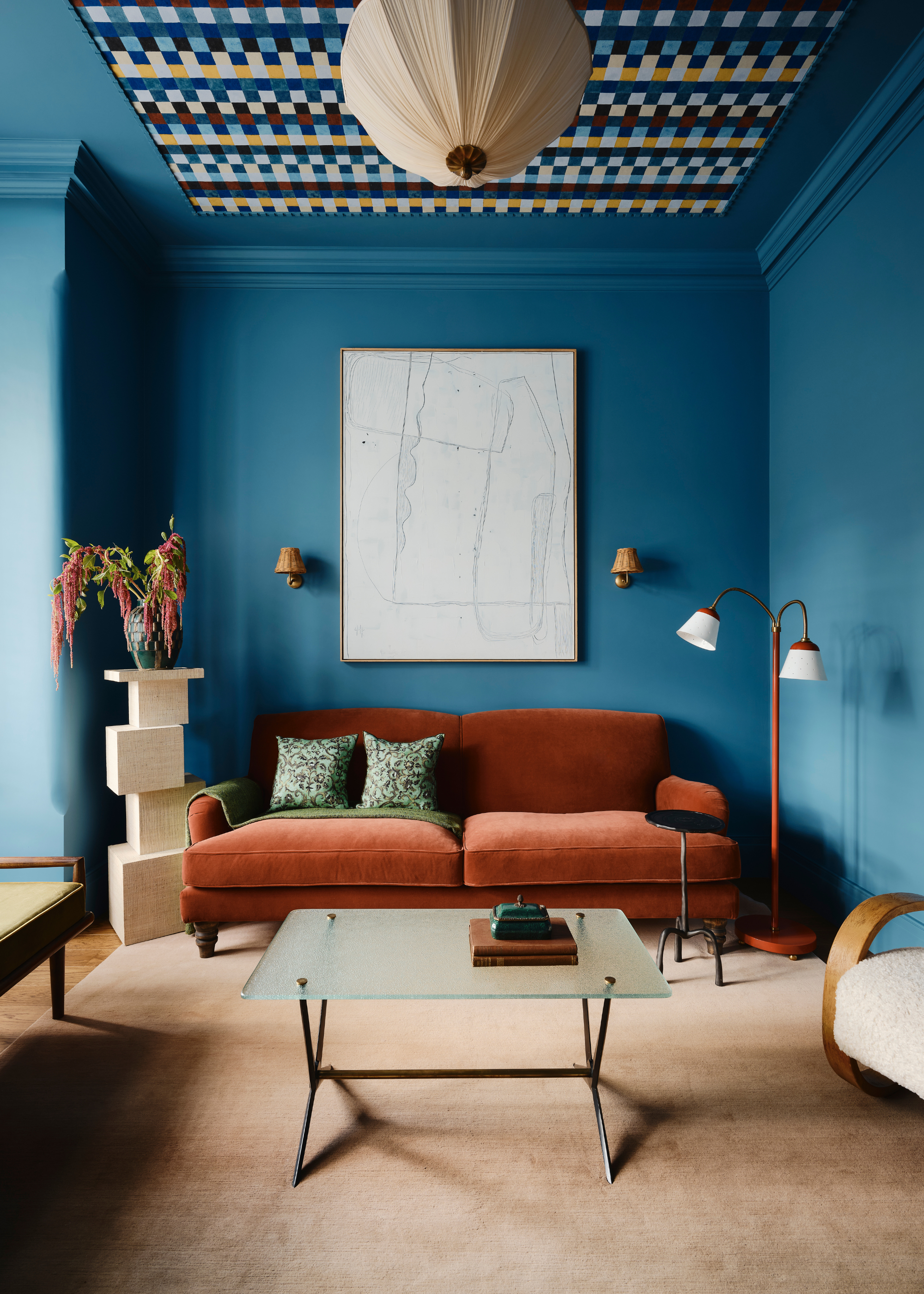
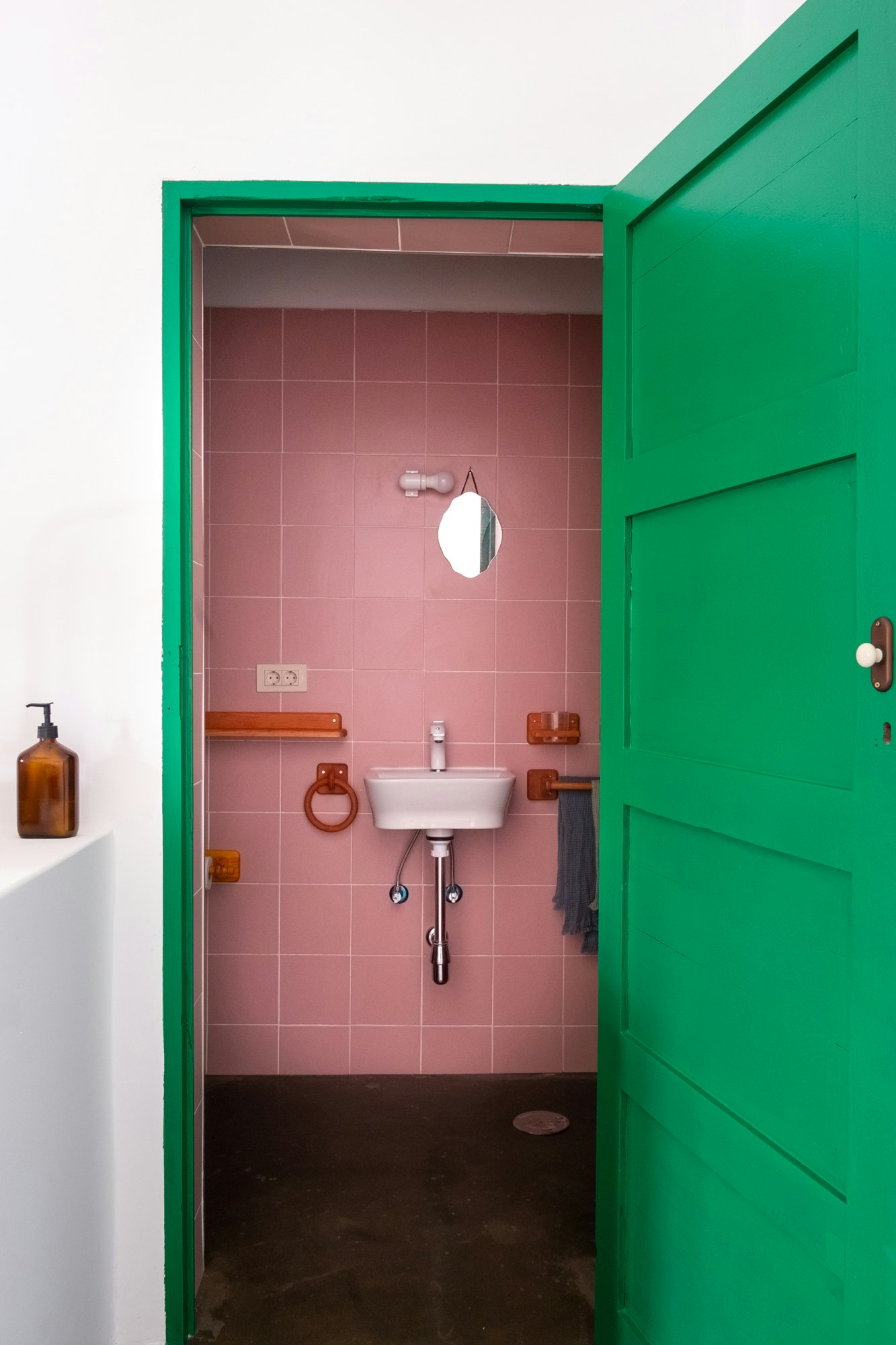
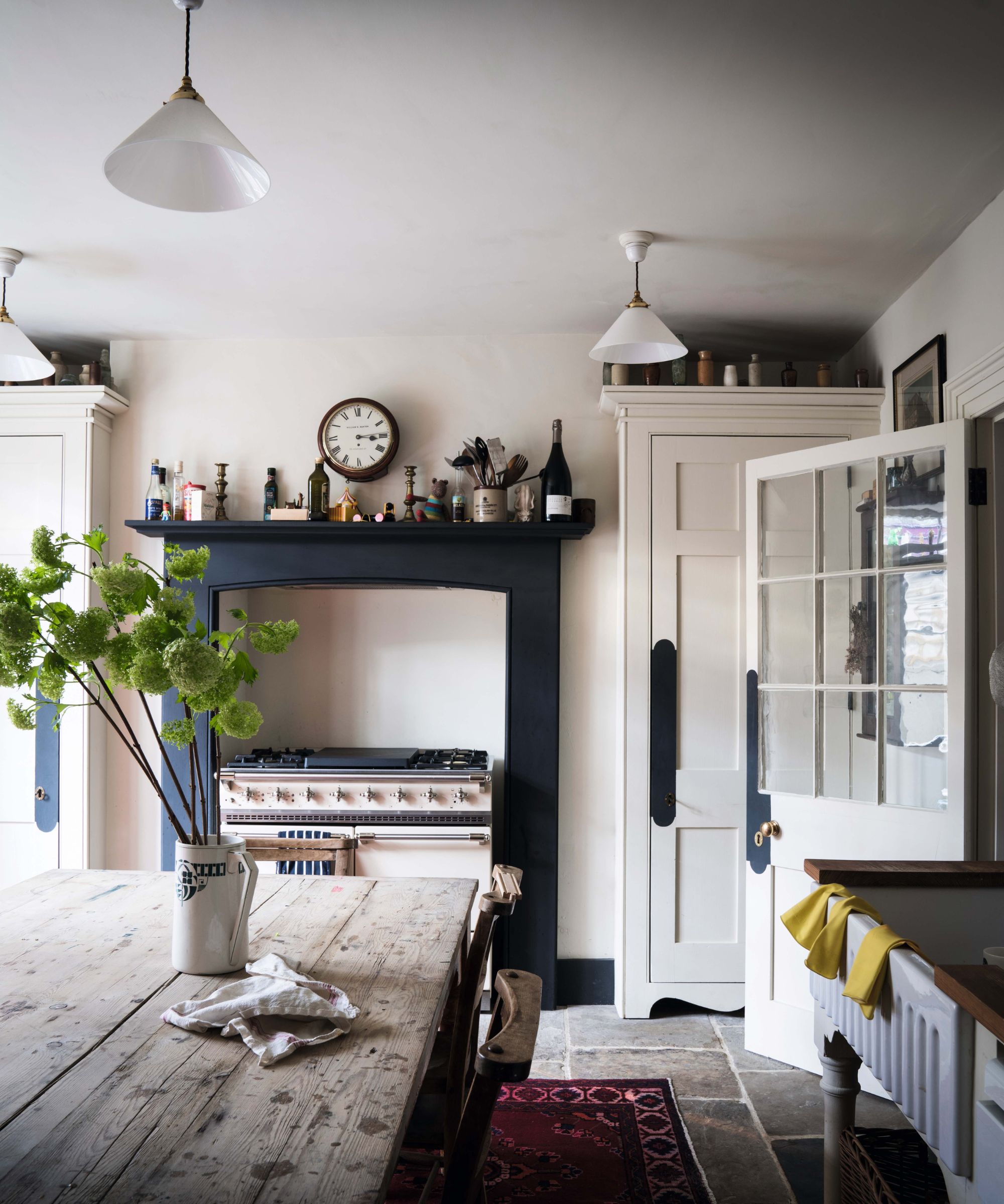
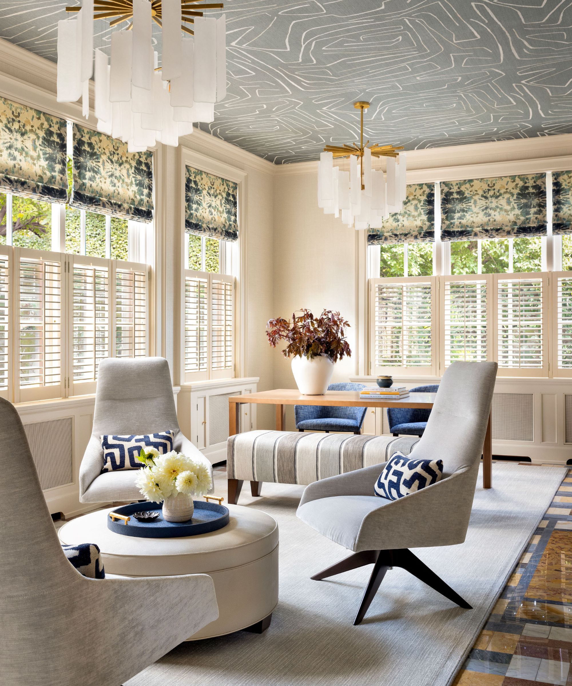
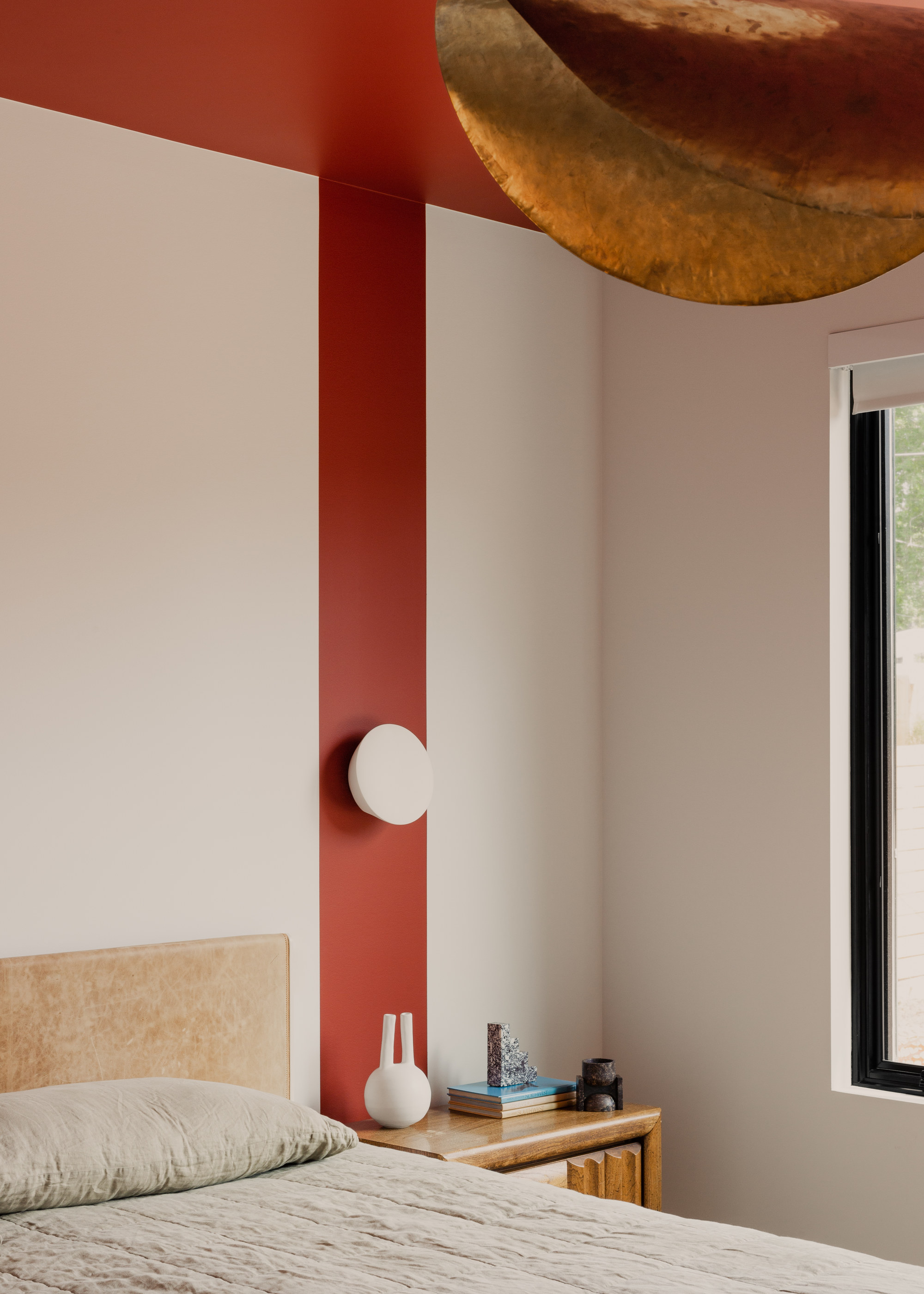
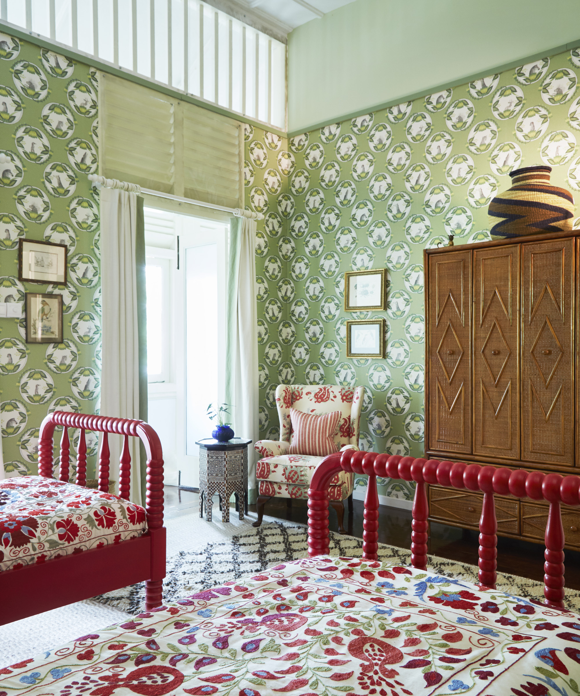
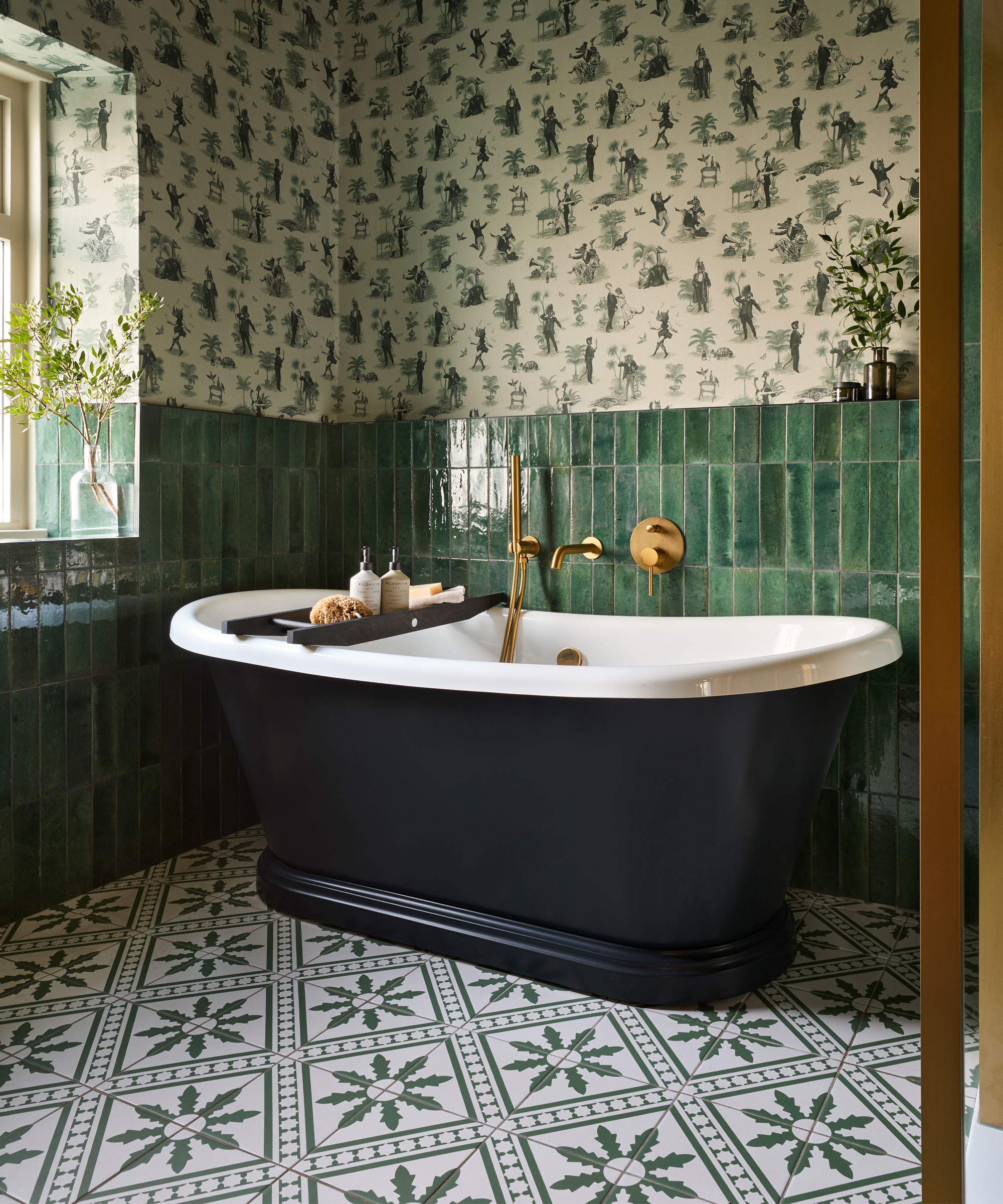
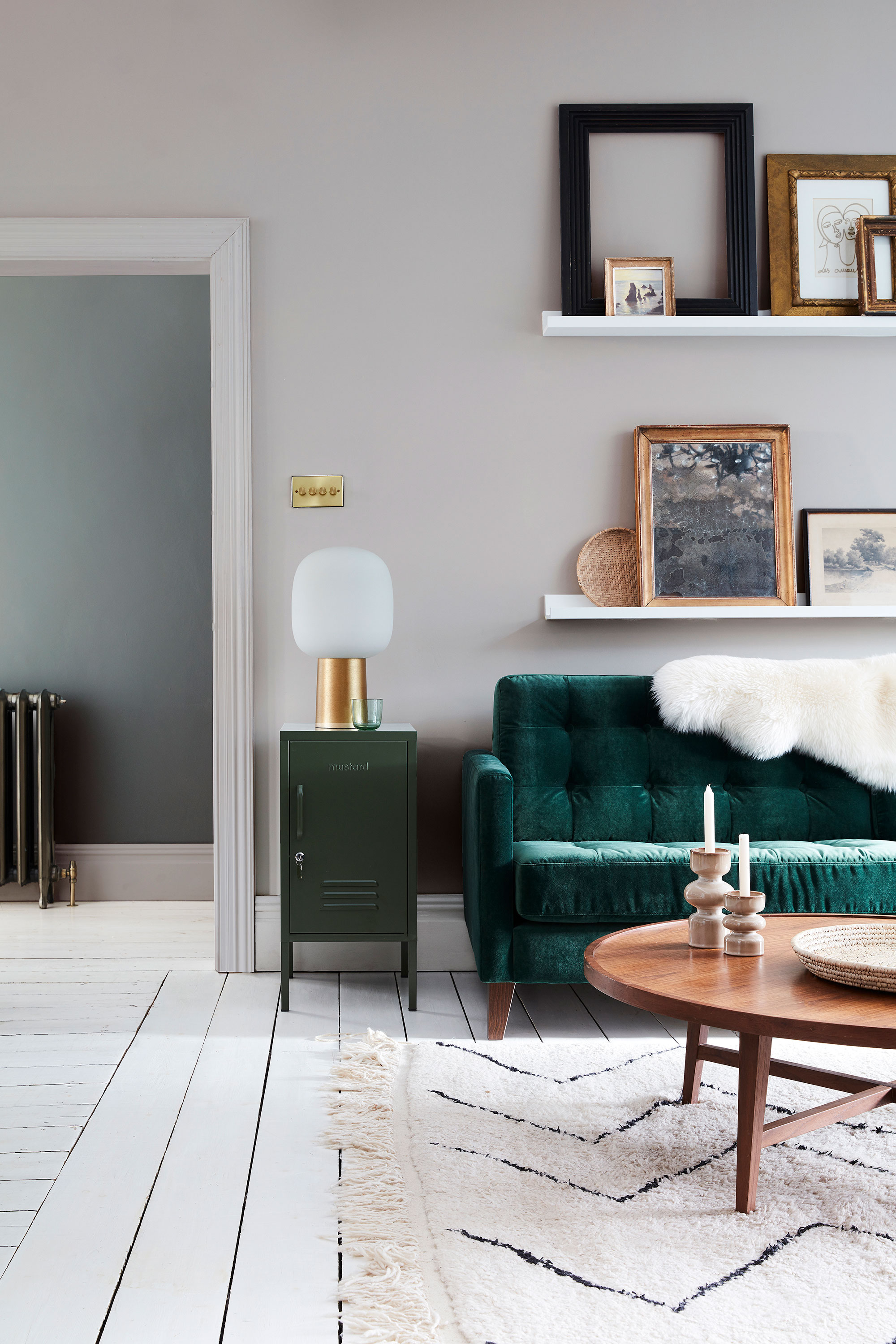
The article provides a detailed breakdown of each primary complementary pair. For blue, its complementary color is orange. To avoid a sports-logo aesthetic, the recommendation is to start with navy as the blue base and pair it with a coral orange for a nuanced combination. For red, its complement is green. Despite the seasonal association, red and green can coexist harmoniously year-round, with the natural tones of green softening red's intensity.
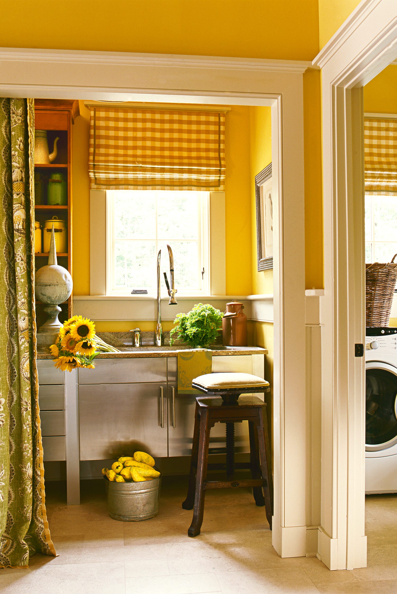
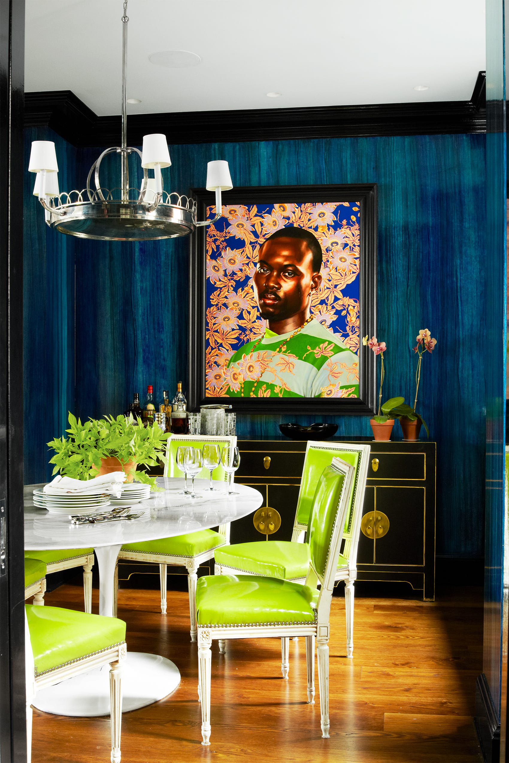
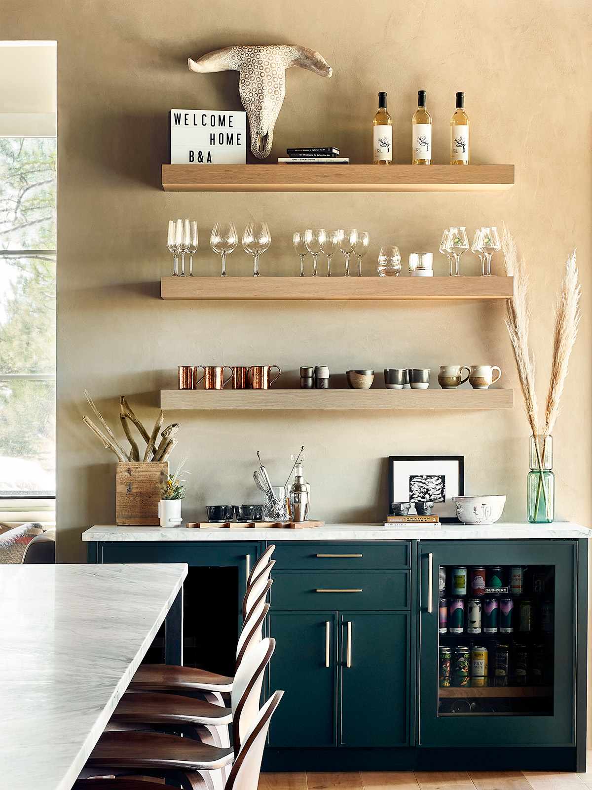
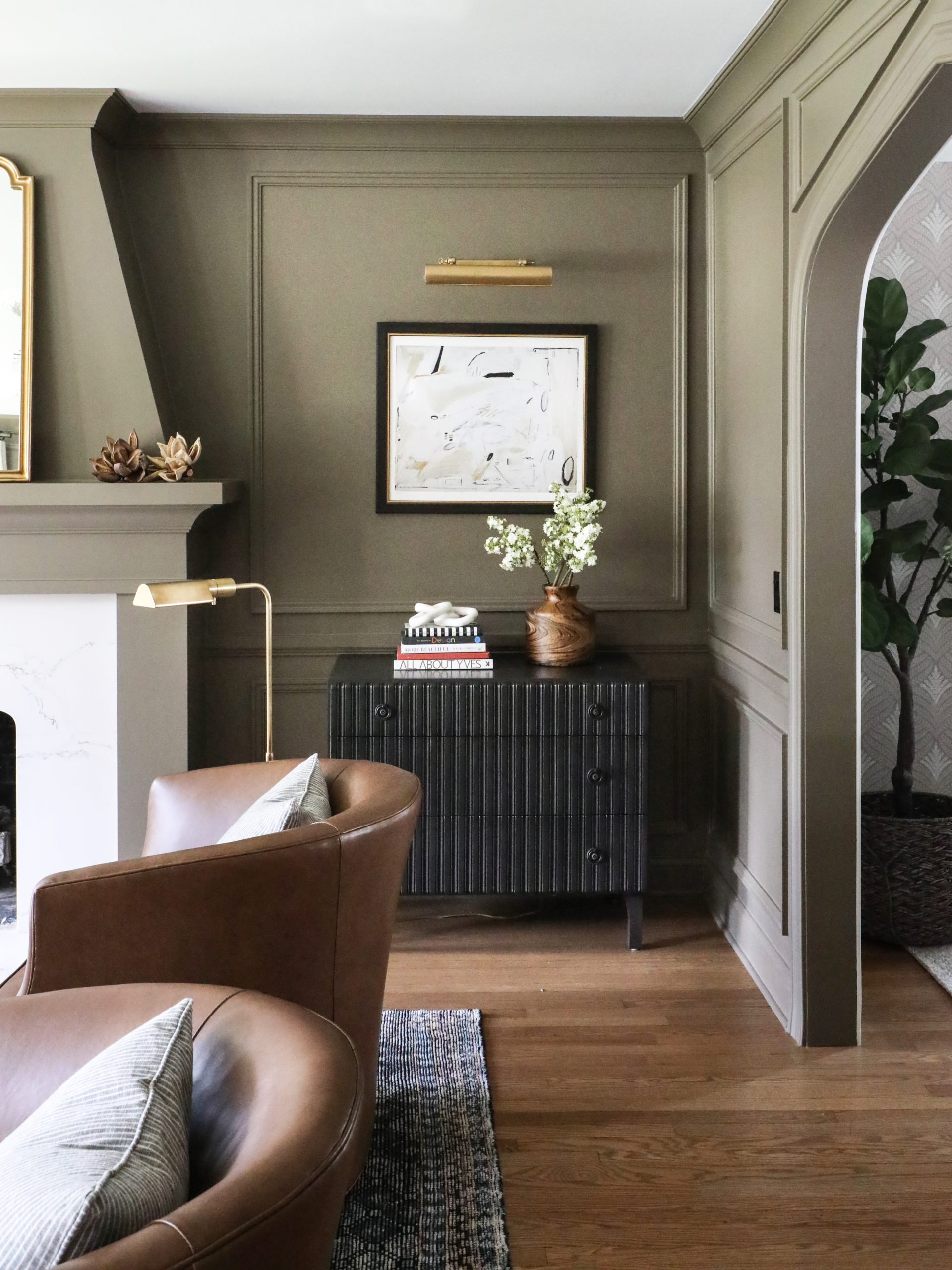
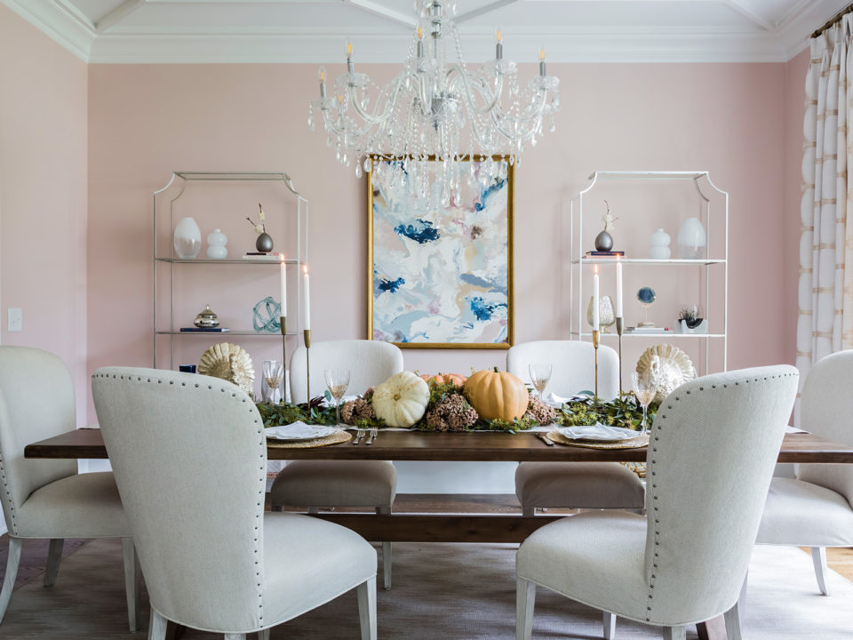
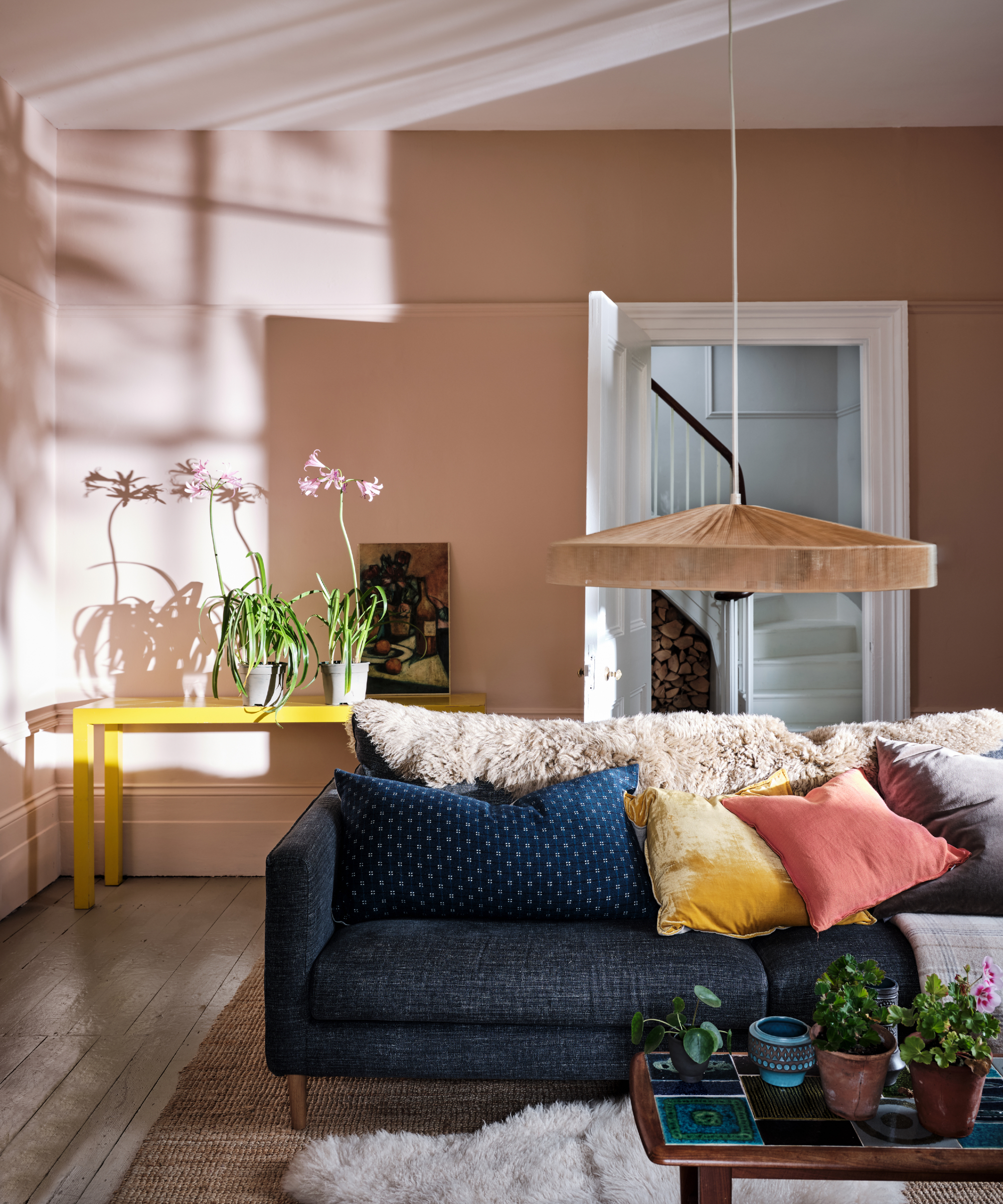
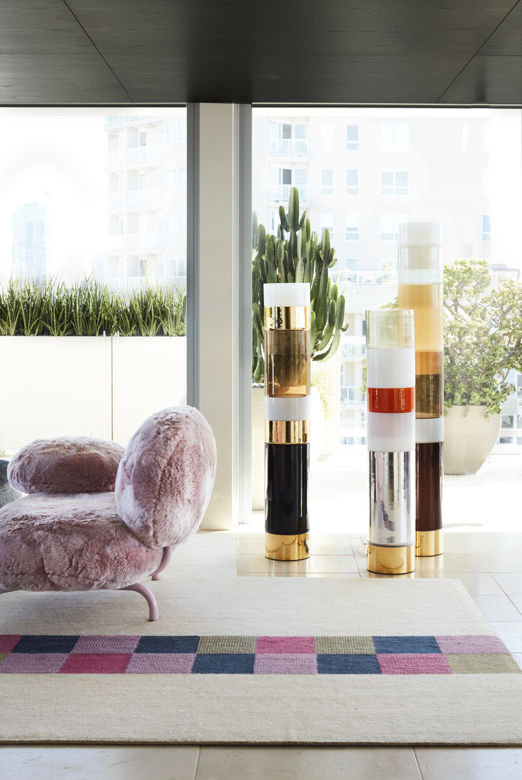
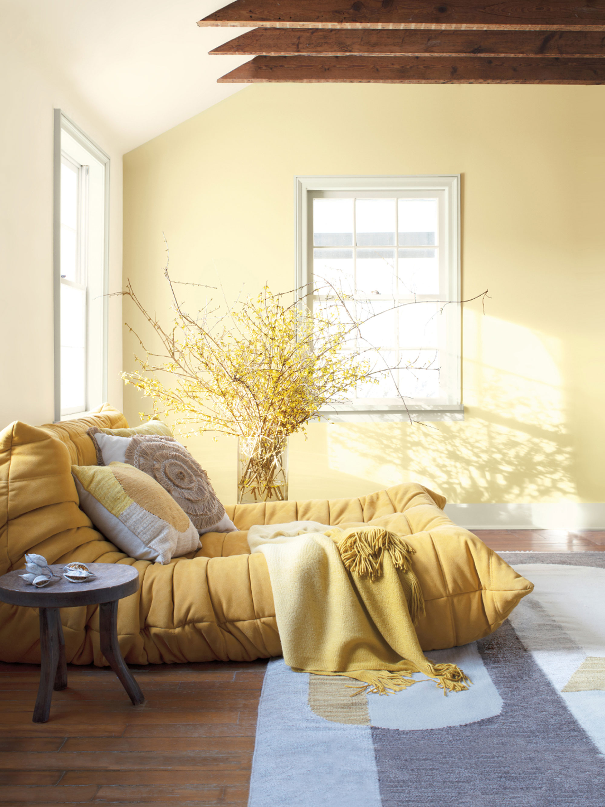
Yellow's complementary color is purple. The article suggests observing nature, like pansies in a garden, to appreciate the beauty of this combination. For home decor, using pastel tones of yellow and purple is advised to create an elegant look, preventing the space from appearing overly bright or themed. The article also provides practical examples of how to incorporate these complementary color schemes into home interiors. For blue and orange, an illustration shows a dining room with high-gloss orange walls and pastel blue velvet chairs, demonstrating how cooler blue tones can balance the warmth of orange.
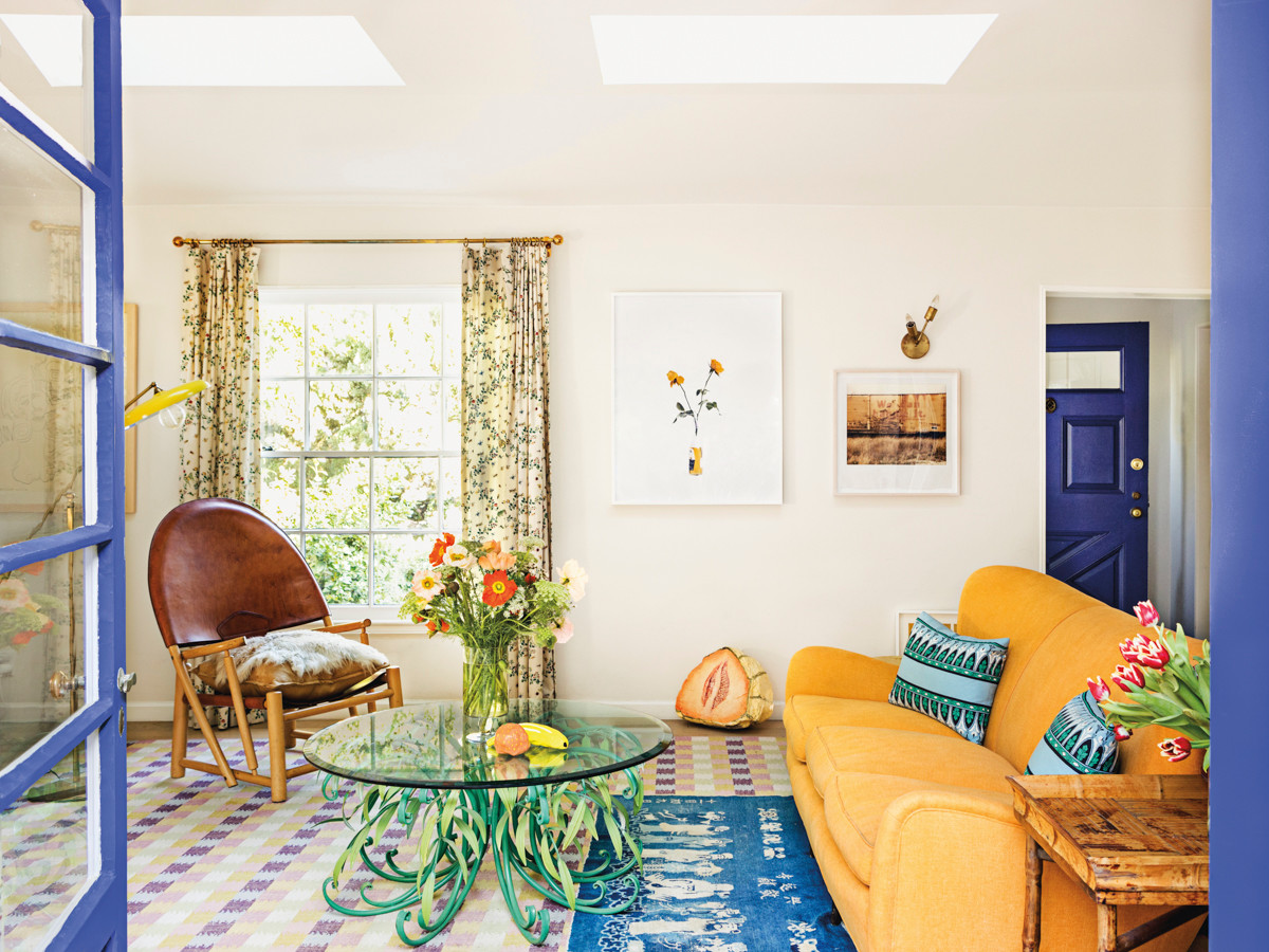
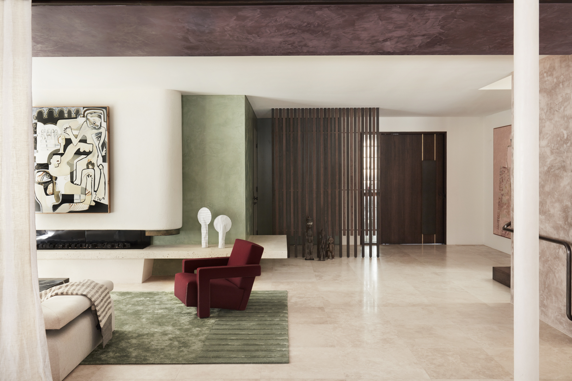
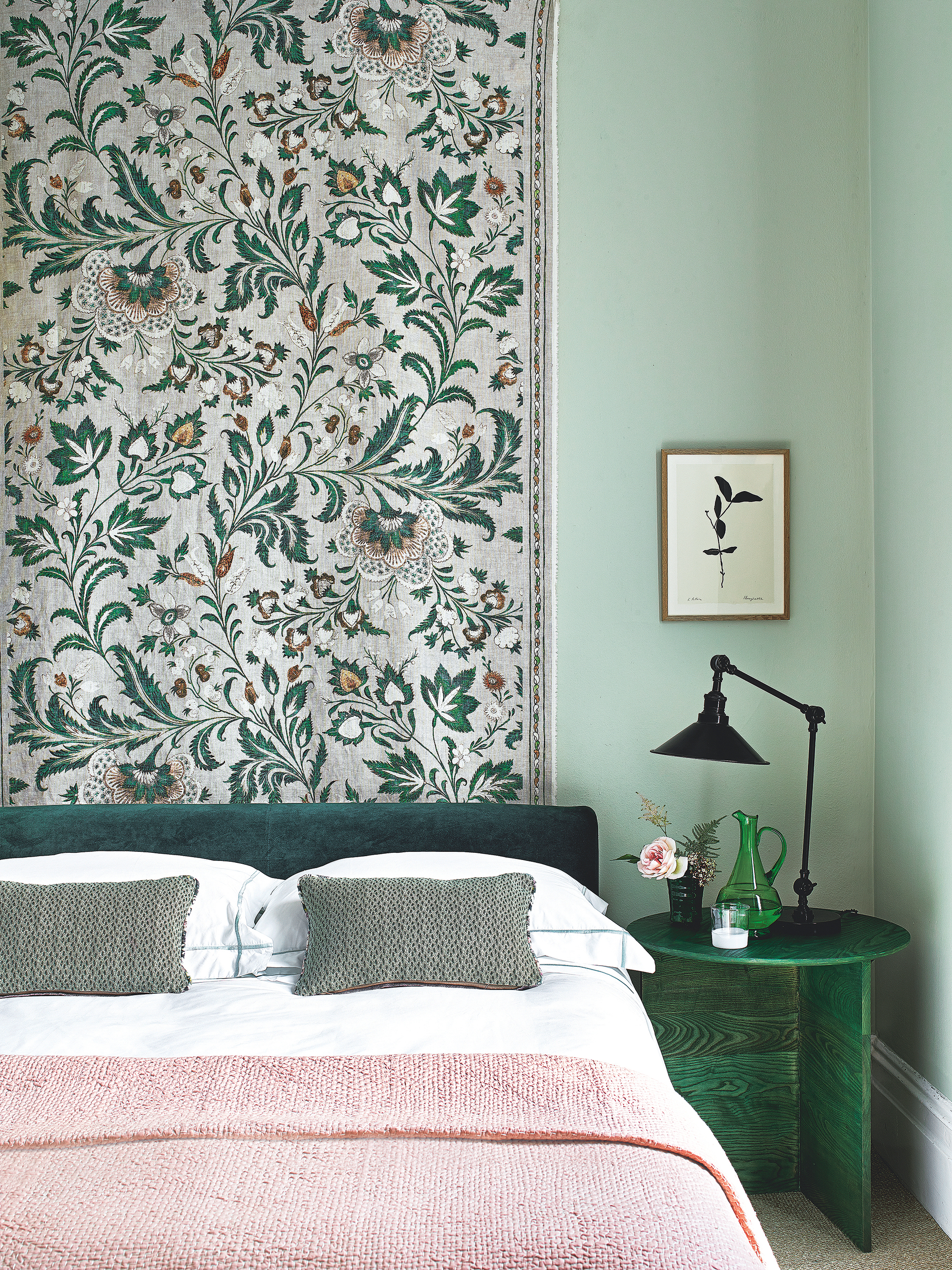
For red and green, the article highlights a kitchen where these colors are used as accent hues within a predominantly neutral space, with houseplants adding natural green elements. In the case of yellow and purple, a living room design is presented, utilizing lavender on the walls to enhance natural light and mustard-toned soft furnishings and decor to provide yellow accents. The overarching advice from interior designer Amanda Wyatt is that while the concept might seem elementary, careful consideration of shades and tones allows for an elevated and non-chaotic application of complementary colors in home design.
#ComplementaryColors #InteriorDesign #ColorTheory #HomeDecor #DesignSchemes #ColorWheel #RoomDecorating #DesignerTips #ComplementaryColors #InteriorDesign #ColorTheory #HomeDecor #DesignSchemes #ColorWheel #RoomDecorating #DesignerTips
0 comment in total
 No comments yet
You may also like
6 Failsafe Color Combinations That Designers Always Fall Back on – 'They're so Reliable!'

35 Unexpected Color Combos We Can't Get Enough Of

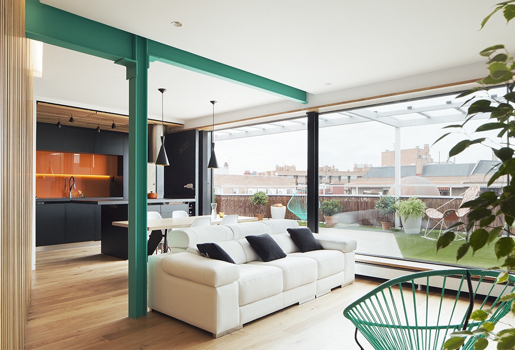
Dress Up Your Space With Contrasting Colors

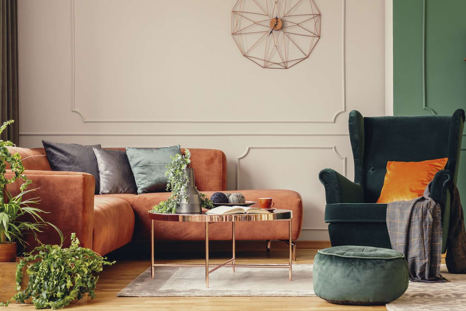
5 Timeless Paint Colors That Go With Absolutely Everything, According to Color Experts

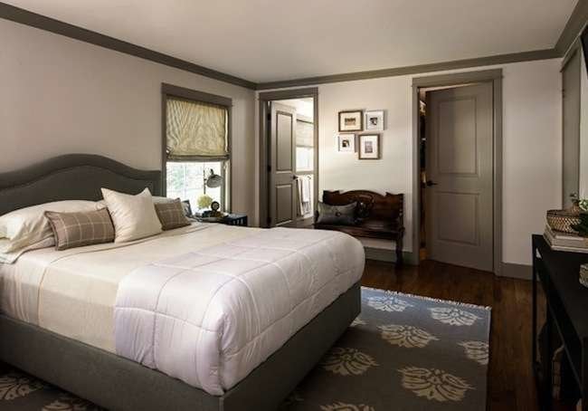
If This, Then That: Your Guide to Pairing Paint Colors

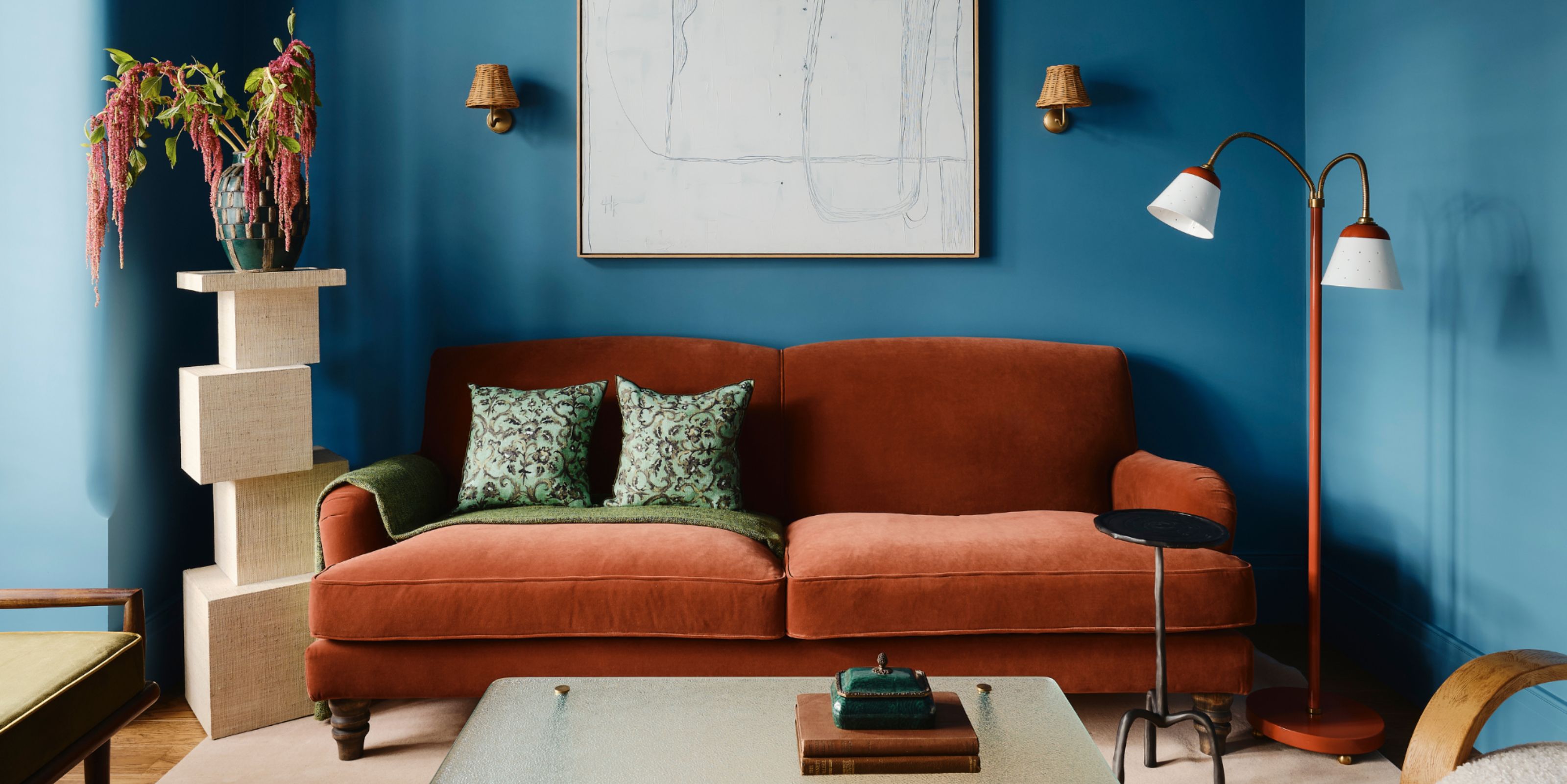
Colors That Go With Blue — 16 Pairings Designers Depend on for Bold, Breezy, and Perfectly Balanced Palettes
3 color coordination tips any beginner can master
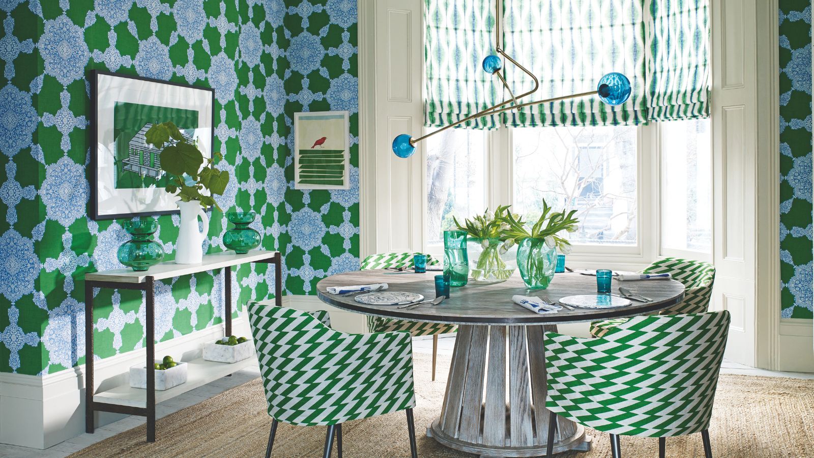
What colors go with green? Professionals propose these harmonious pairings for successful schemes

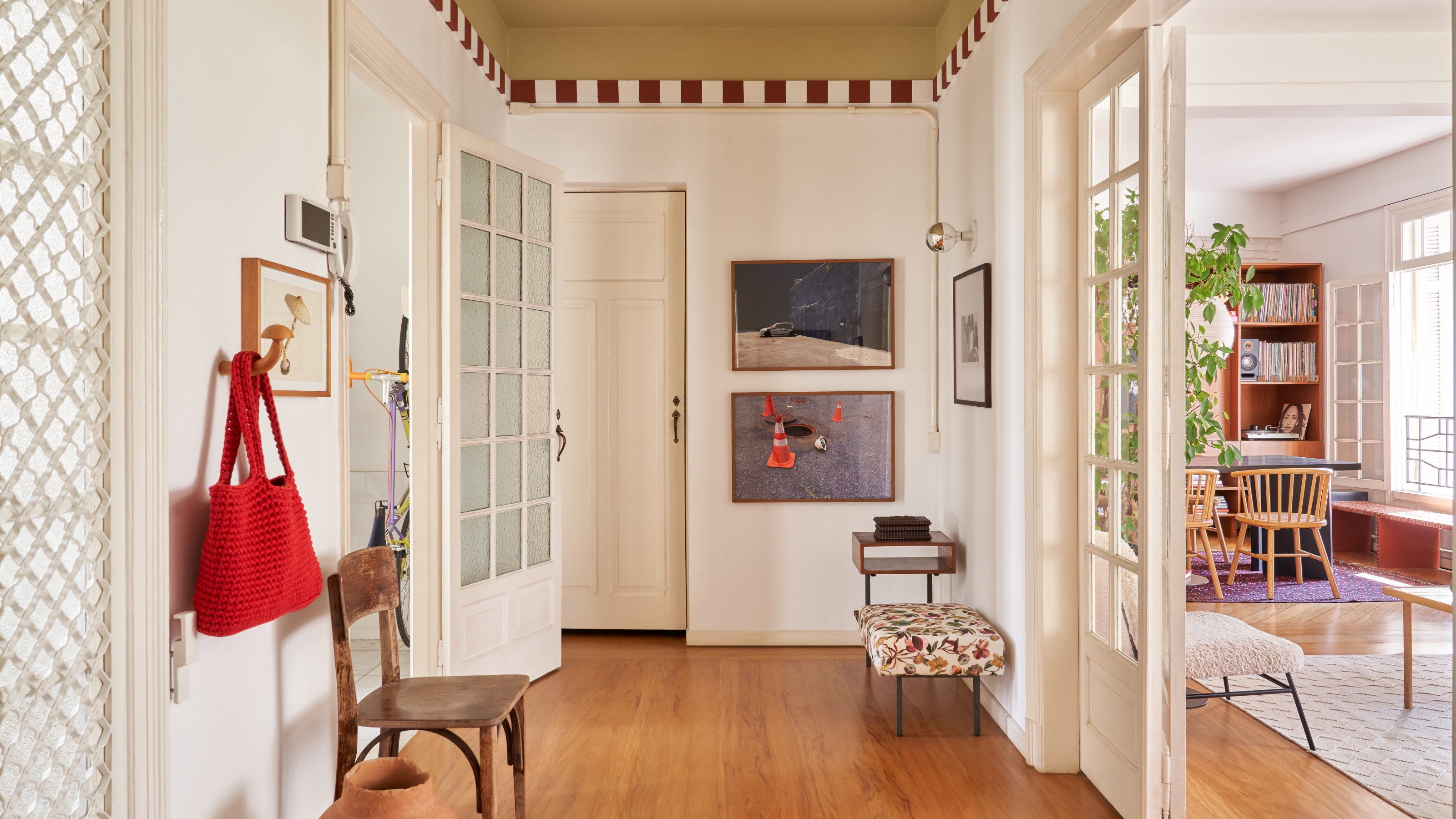
Here's How to Coordinate Paint Colors Throughout Your Home, so That It Looks Cohesive, Curated, but Still Creative
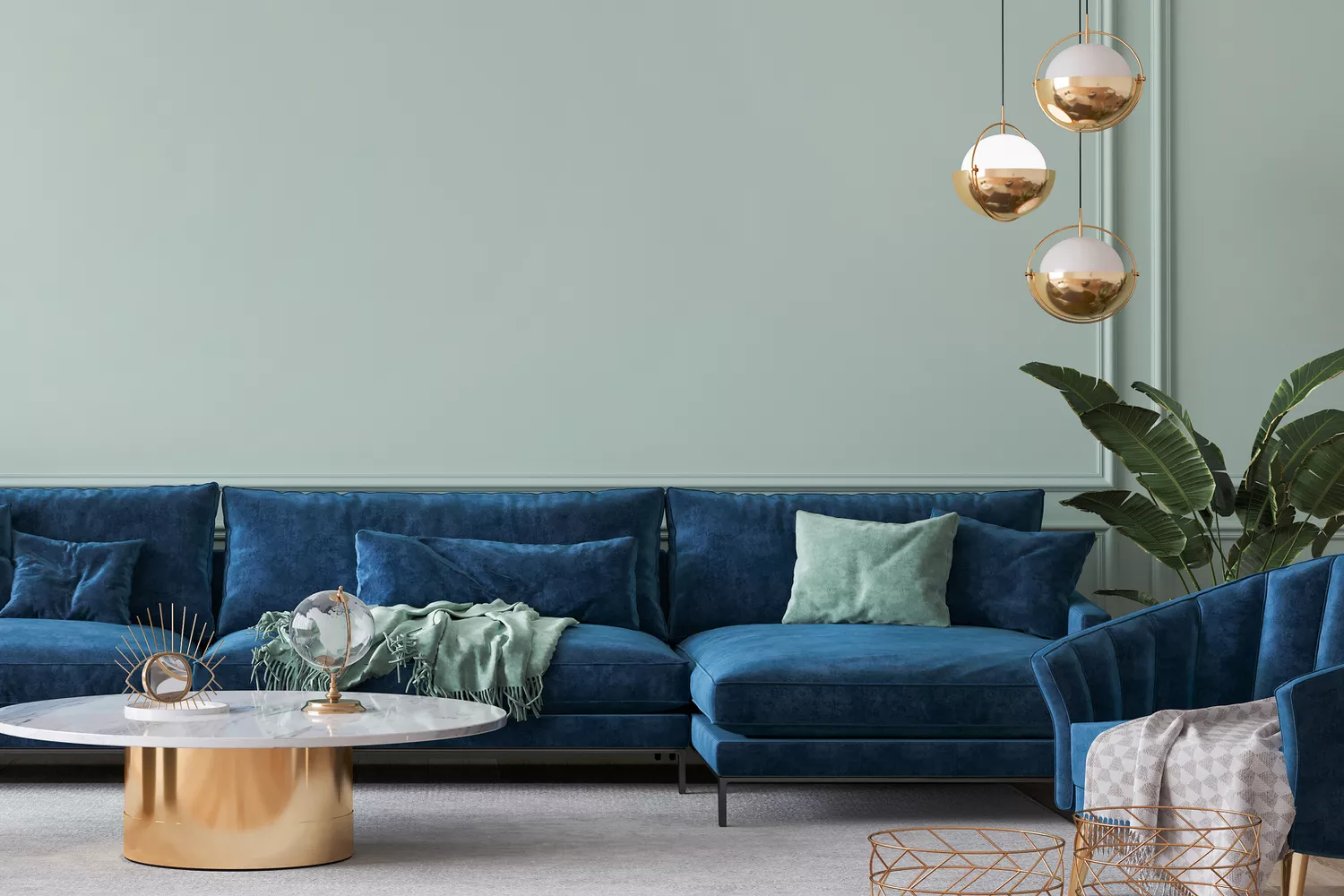
7 Color Combos That ALWAYS Look Good Together, According to Designers

What makes a paint color flattering? Experts share their go-to shades for a universally complementary scheme

An A-List Designer’s Secrets To Picking Perfect Paint Colors
The Trick to Finding a Paint Color That Works With Everything You Already Have
How to Pick the Best Paint Colors for Every Space in Your Home

'The World of Color is Rife With Danger' — 5 Color Combinations That Don't Go Together and What to Use Instead
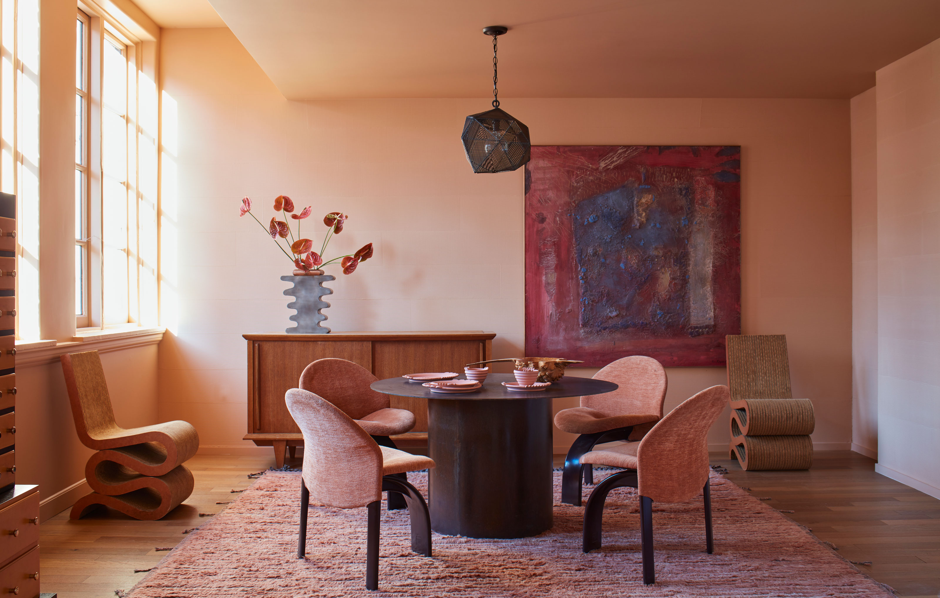
Paint color ideas for every room – experts explain the best choices for different spaces
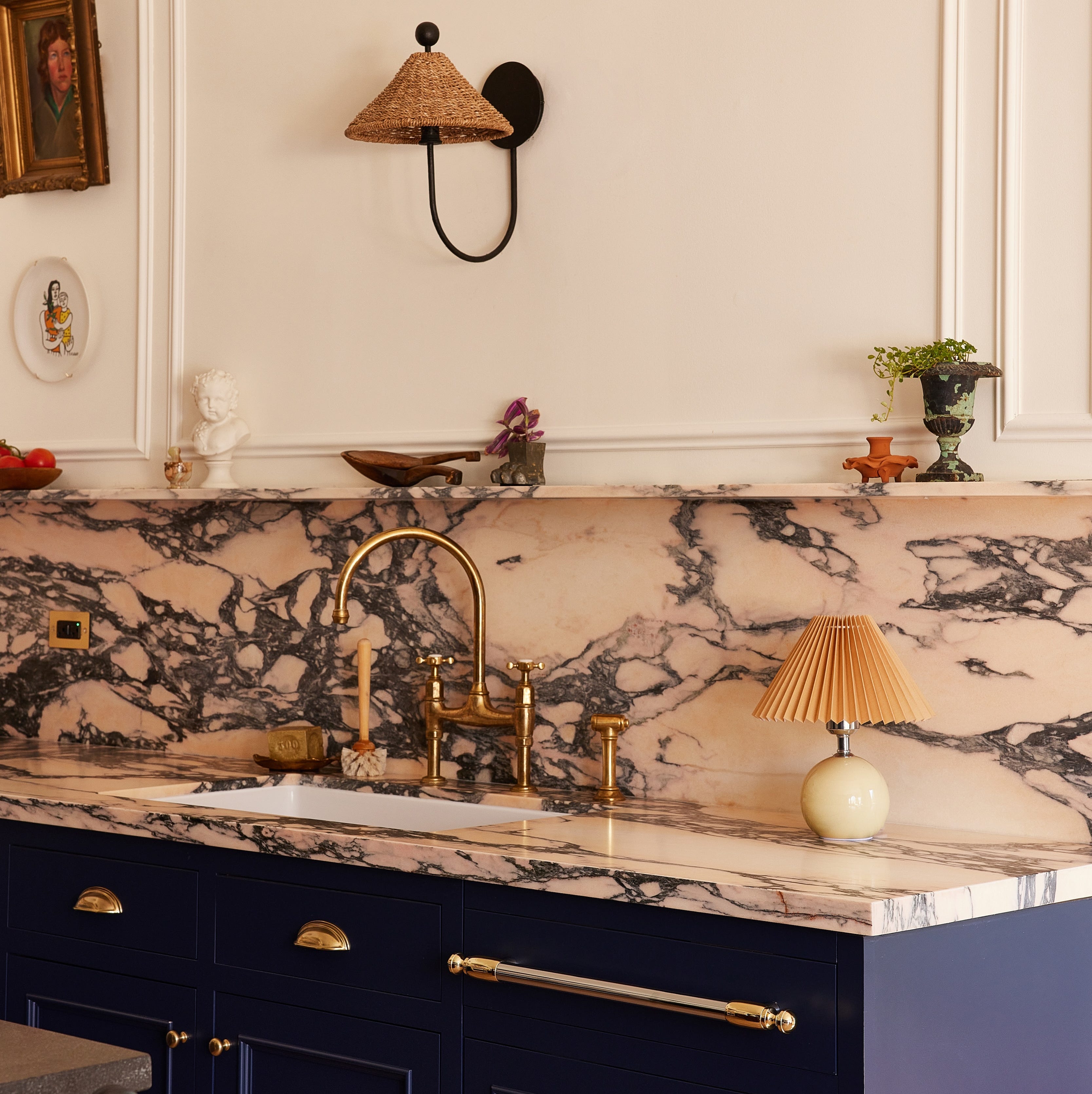
No-fail kitchen colour ideas: 20 pairings that just work
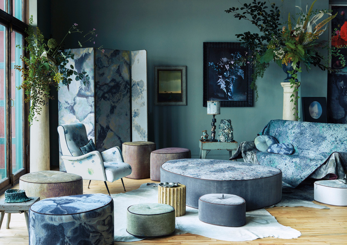
The Color Combo You’re About to See Everywhere

Designers LOVE Pairing These Unexpected Colors With This One Timeless Hue
to choose paint colors.