1/5
Ever Heard of a Split Complementary Color Palette? It's the Secret to Perfecting More Unexpected Pairings
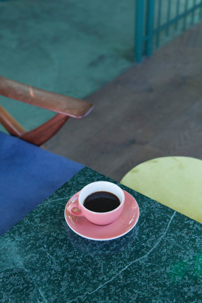
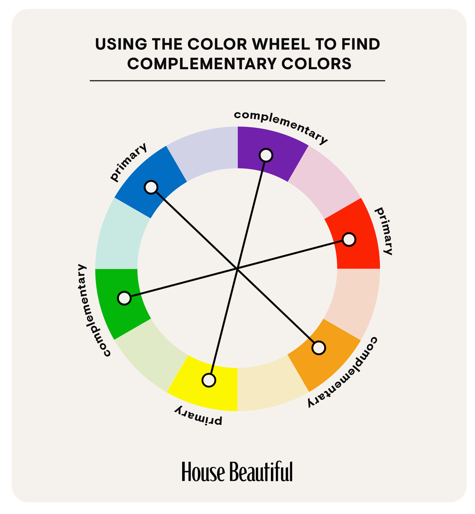
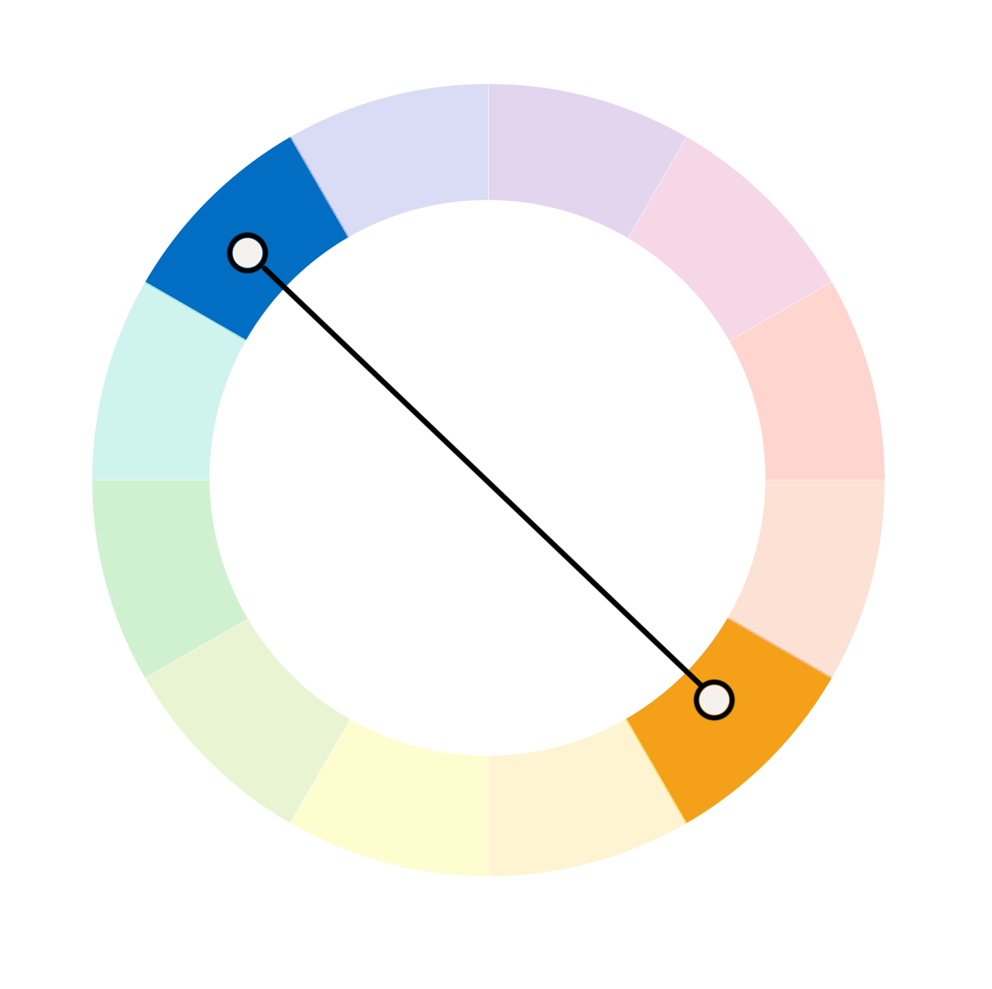
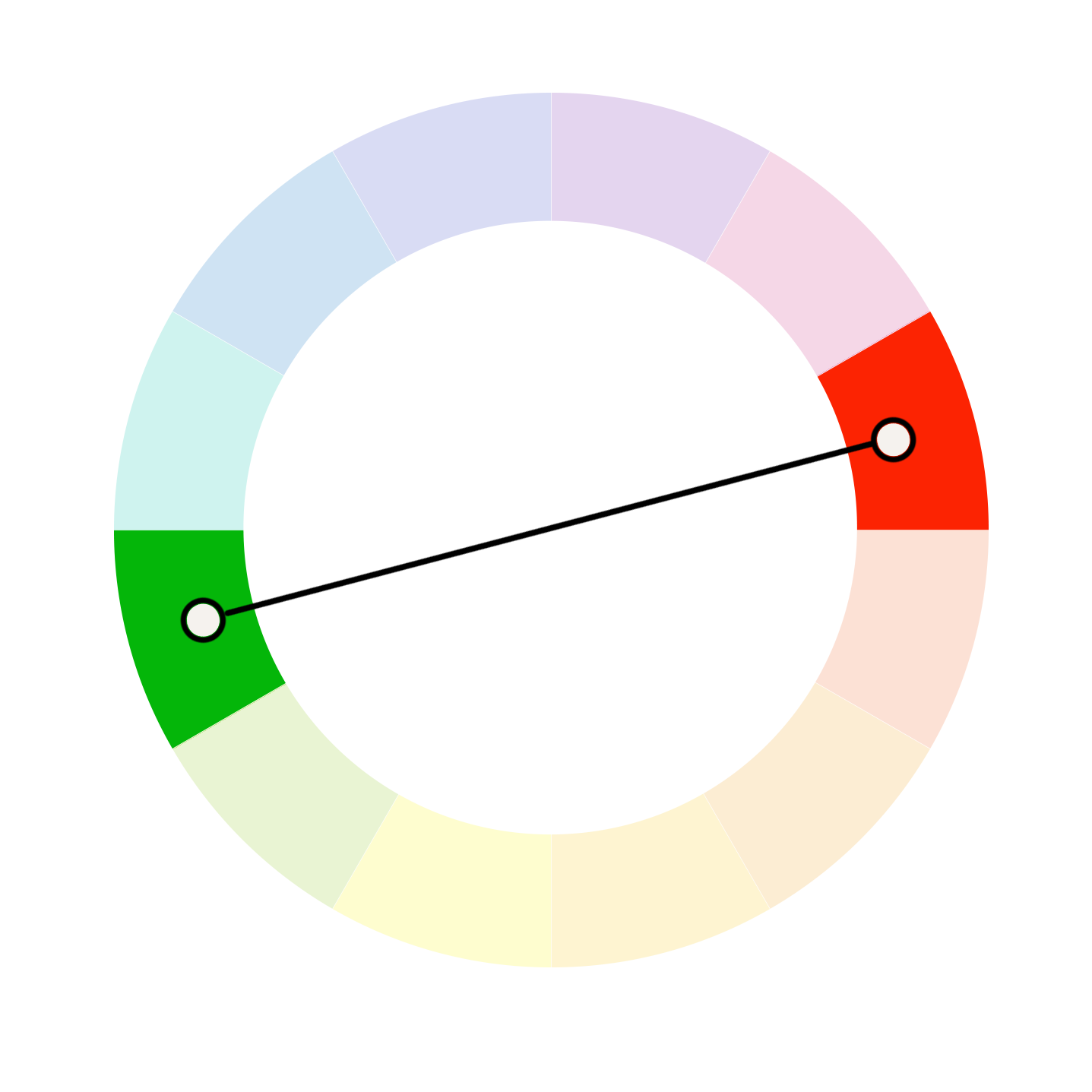
The article explores the concept of a split complementary color palette as an advanced technique for interior design, building upon the understanding of basic complementary colors. While a traditional complementary scheme pairs two colors directly opposite each other on the color wheel, a split complementary approach involves selecting a base color, then identifying its direct complement, and finally using the two colors adjacent to that direct complement. This method creates a trio of colors that offers visual contrast and energy, yet with a softer and more harmonious outcome compared to a direct complementary pairing.
Interior designers, such as Jen Baxter of Baxter Hill Interiors, advocate for split complementary palettes to achieve contrast without chaos and vibrancy without jarring intensity. Tash Bradley, a color expert and director of interior design at Lick, further explains that this scheme is a clever twist on classic complementary pairings, creating a softer, more livable effect. Both complementary and split complementary palettes rely on contrast for visual impact, but the latter is considered gentler and easier to integrate into daily living, making it suitable for those who desire contrast but prefer a more balanced and nuanced aesthetic.
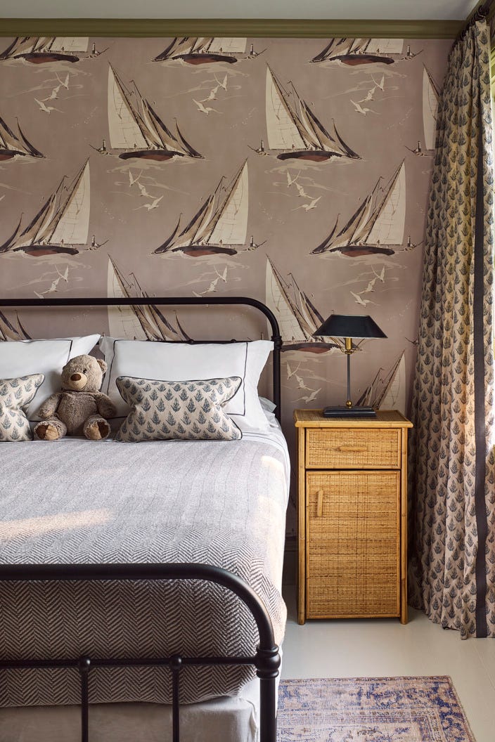
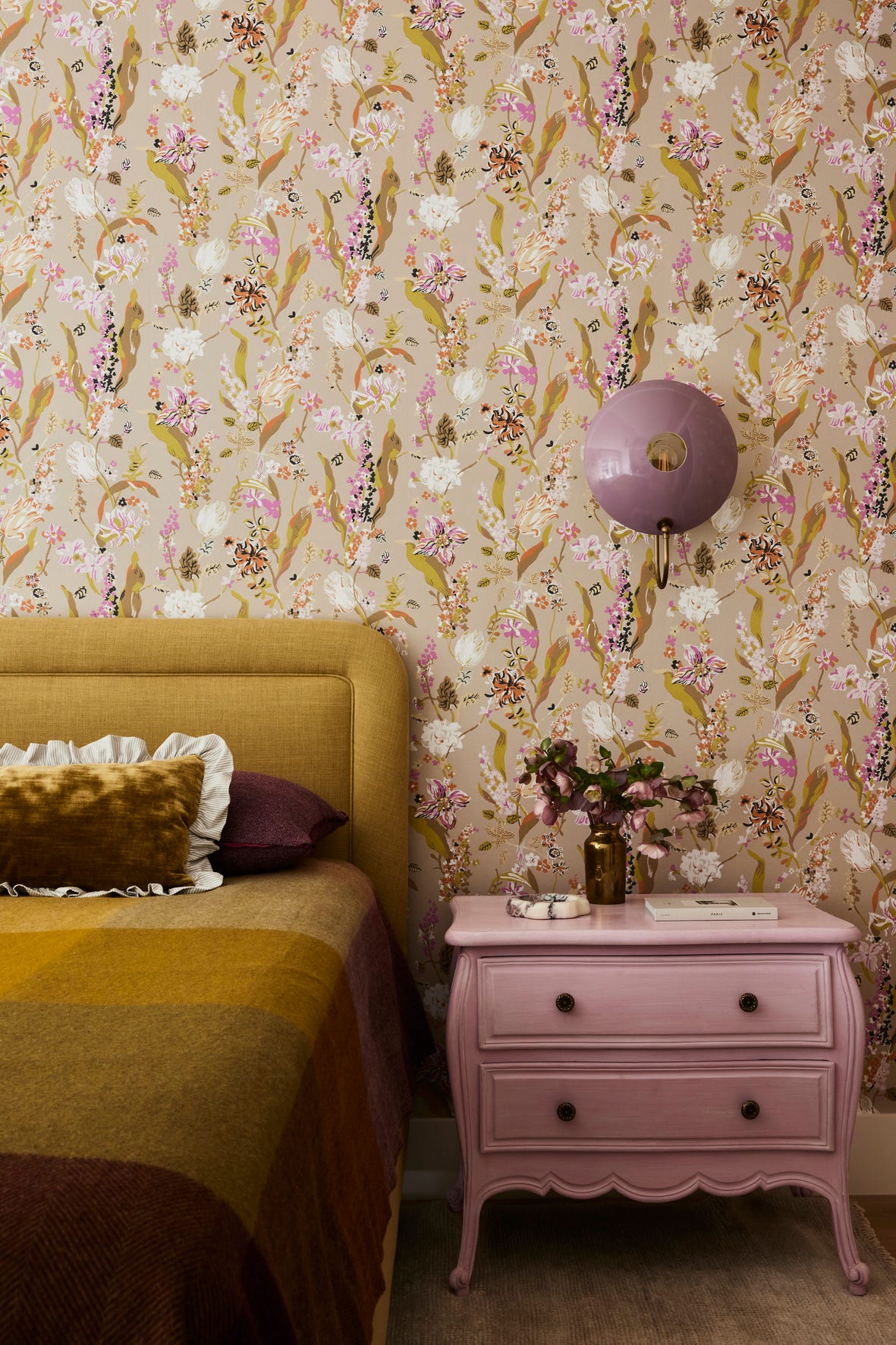
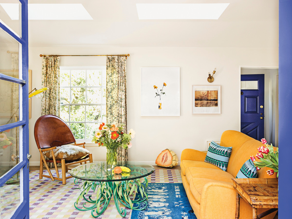
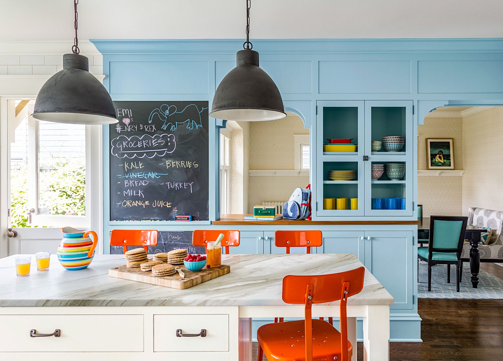
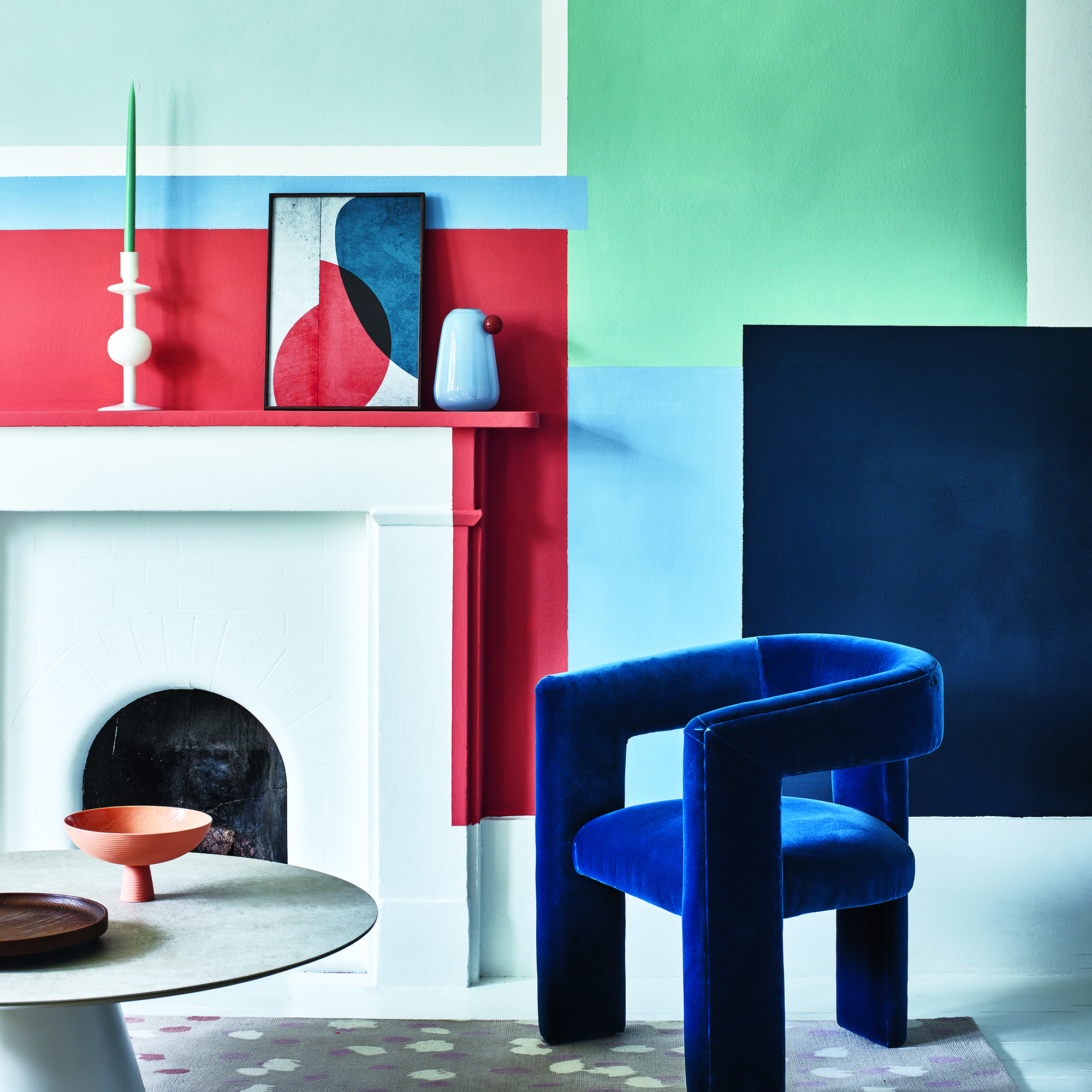
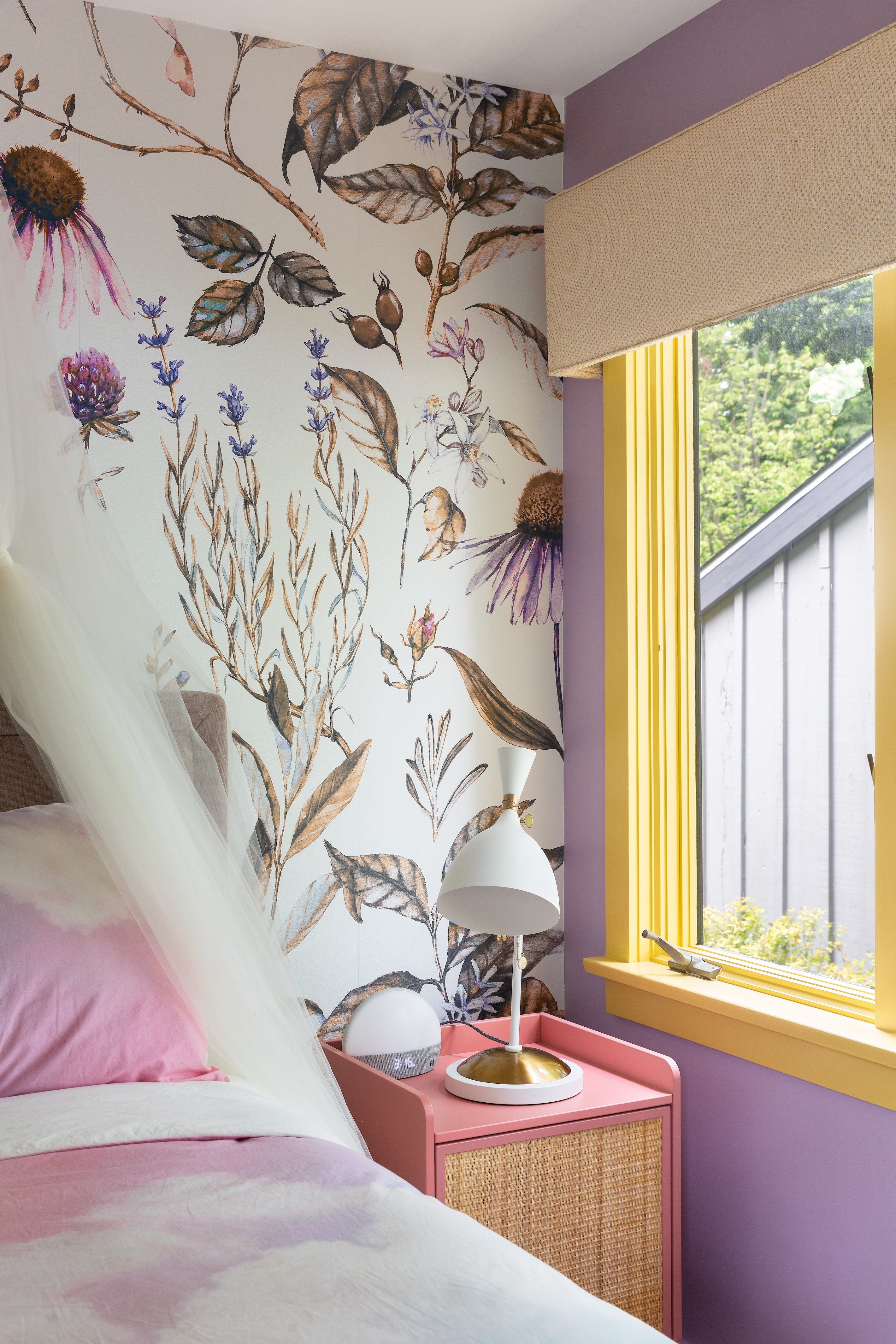
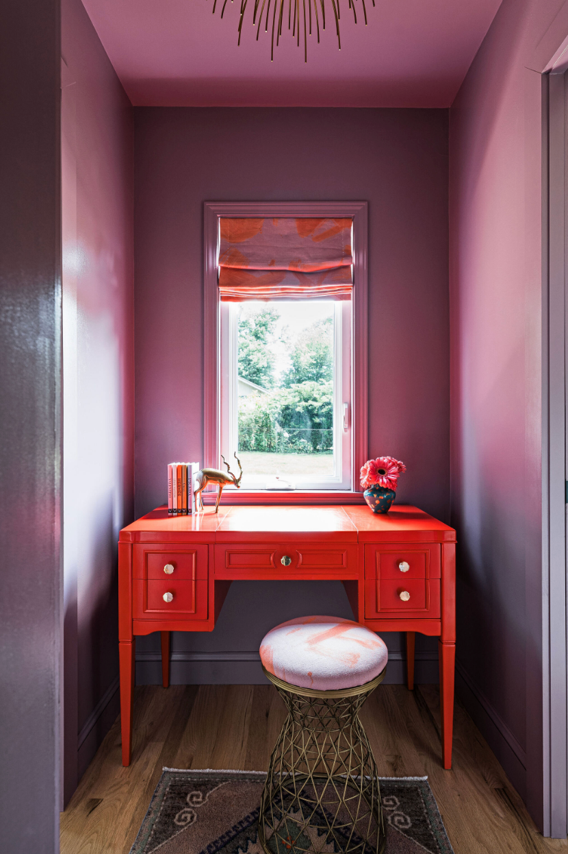
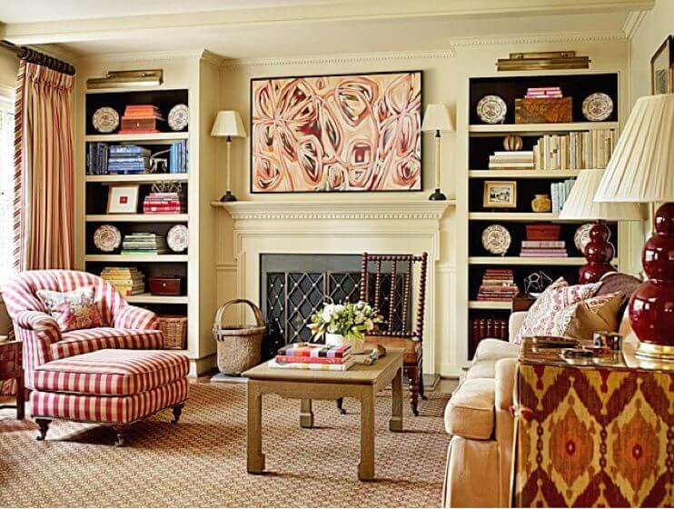
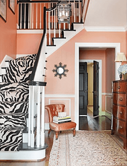
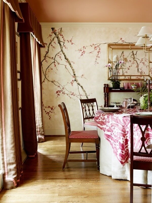

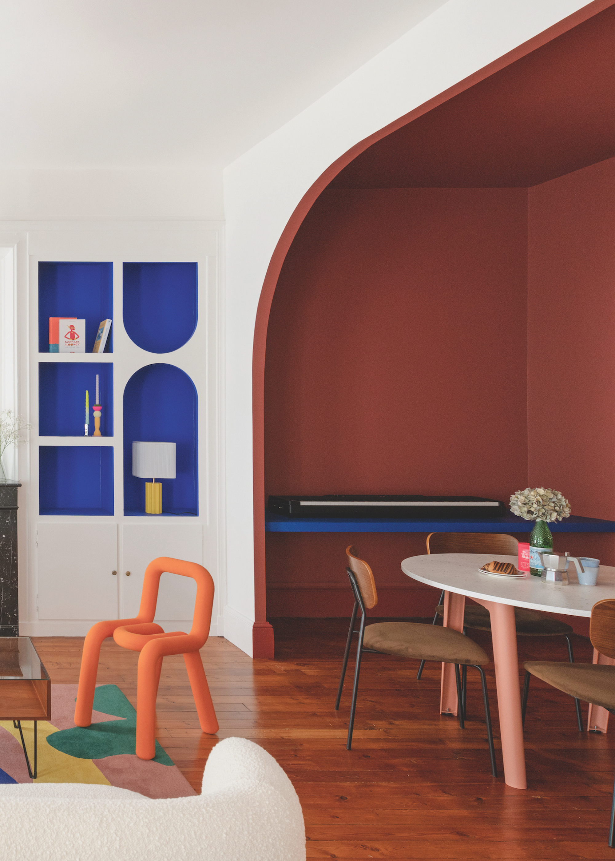
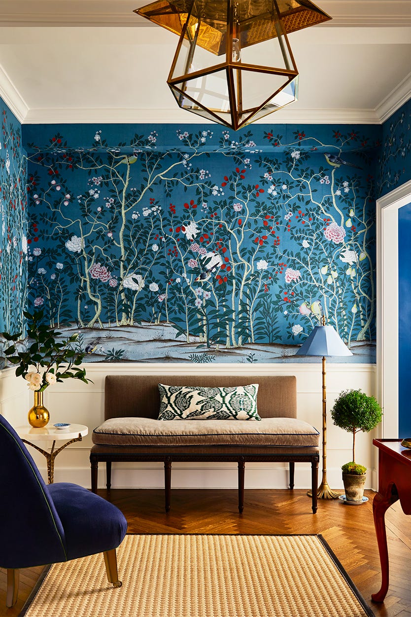
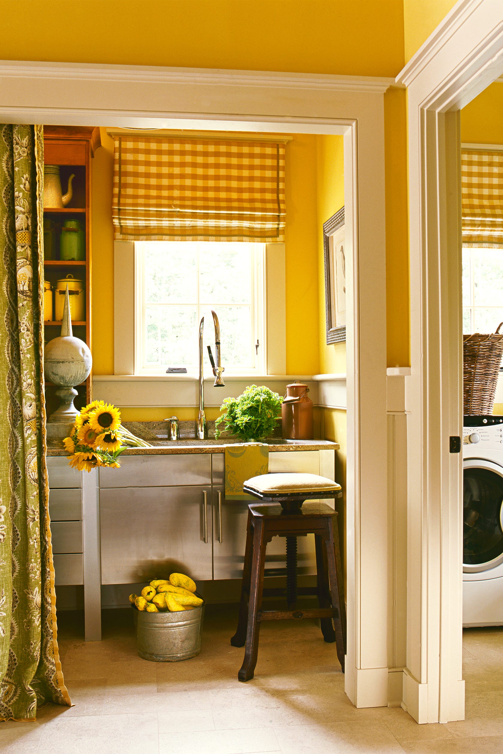
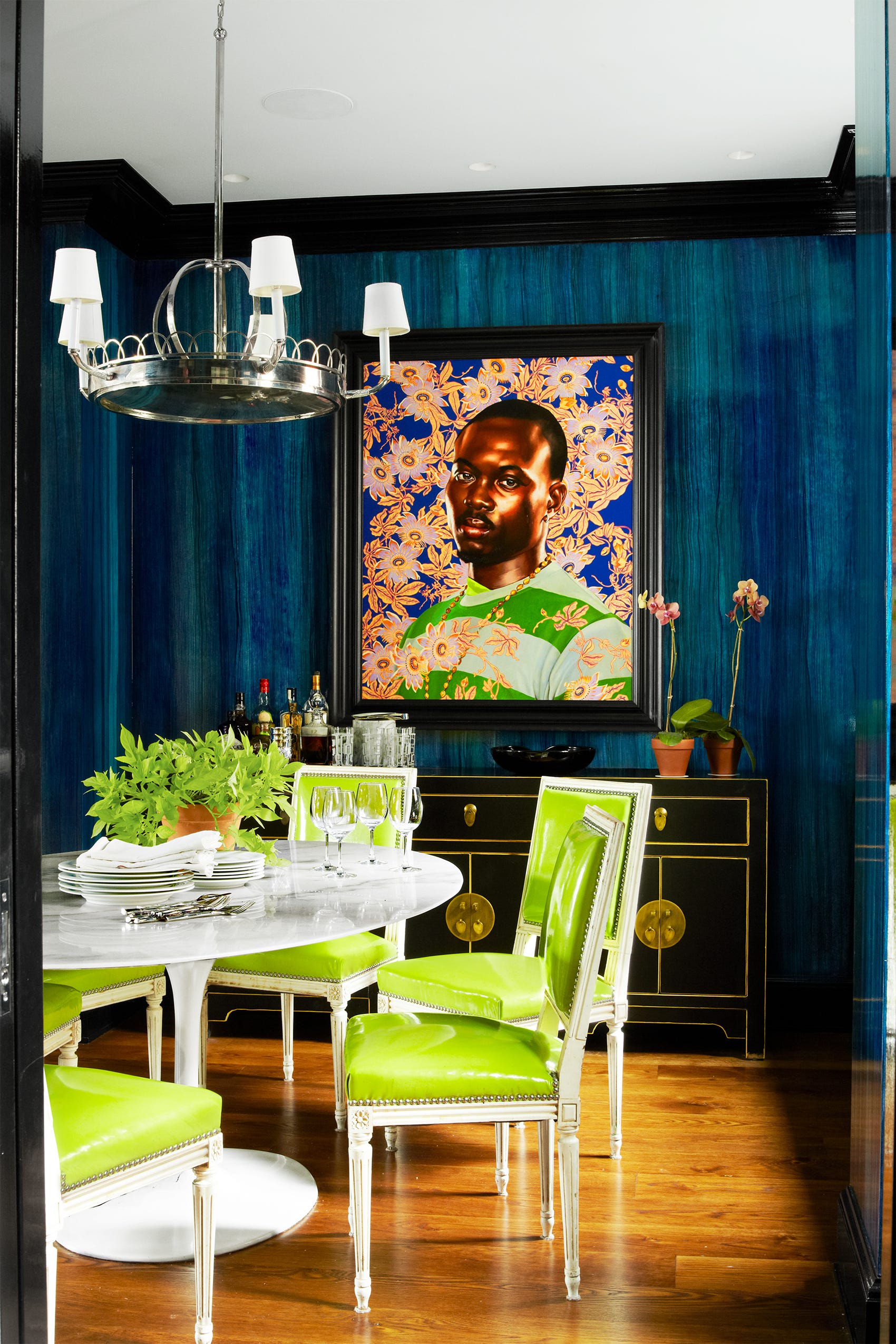
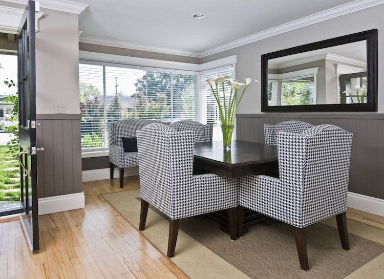
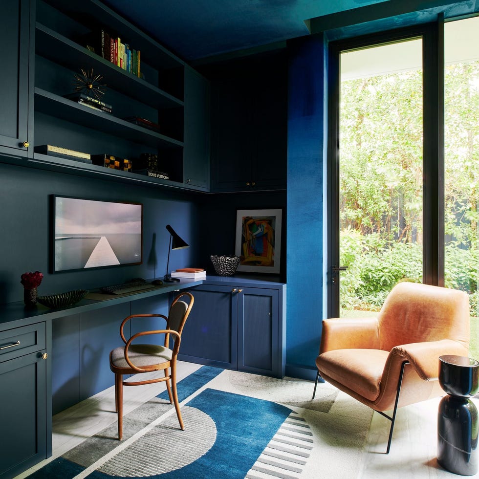
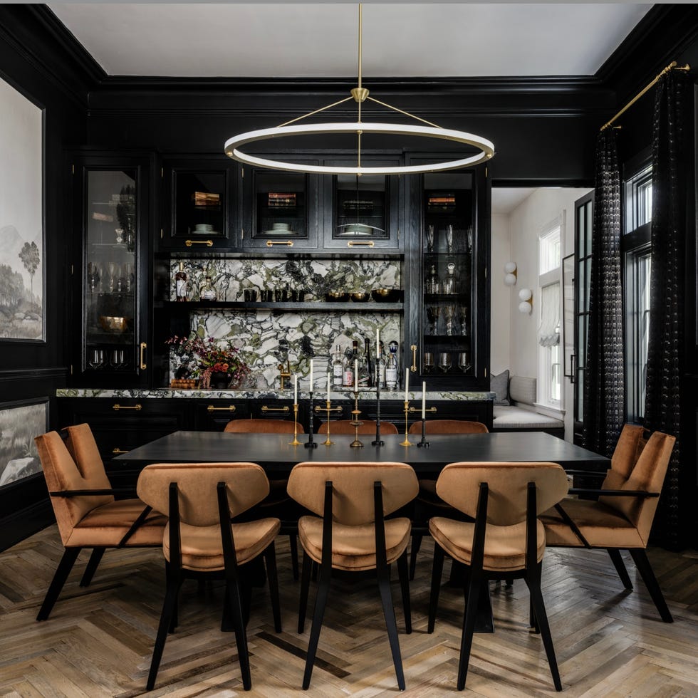
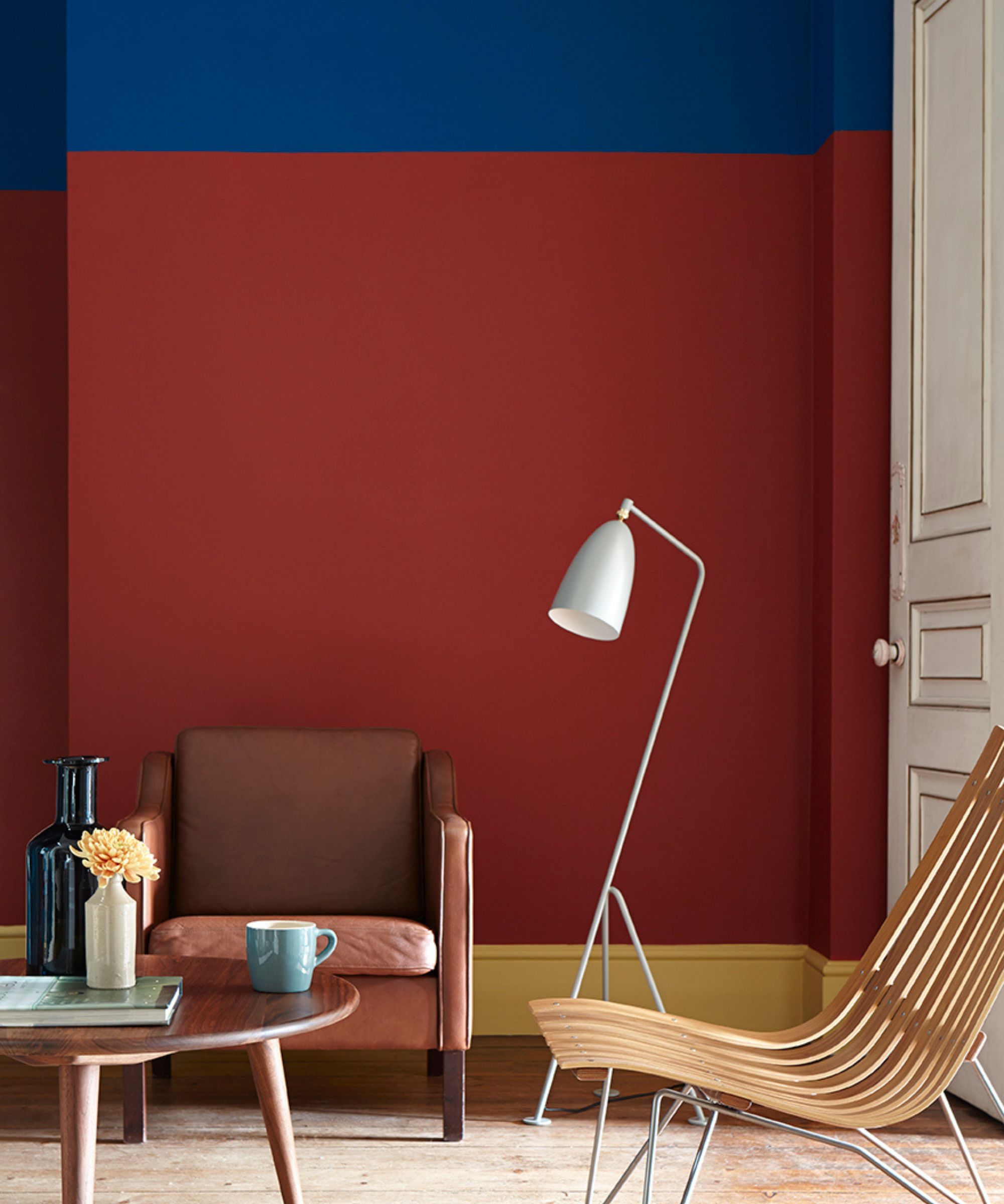
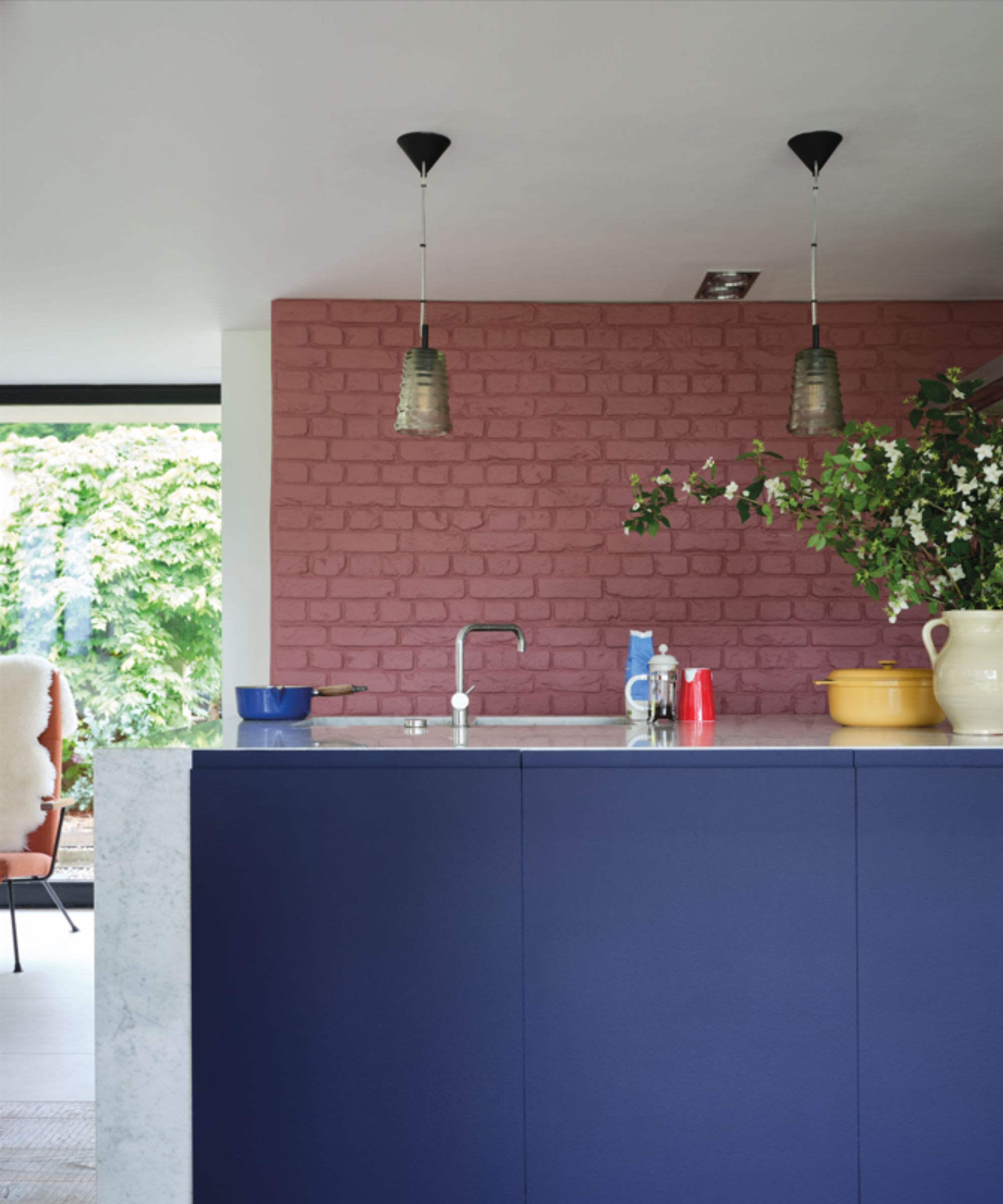
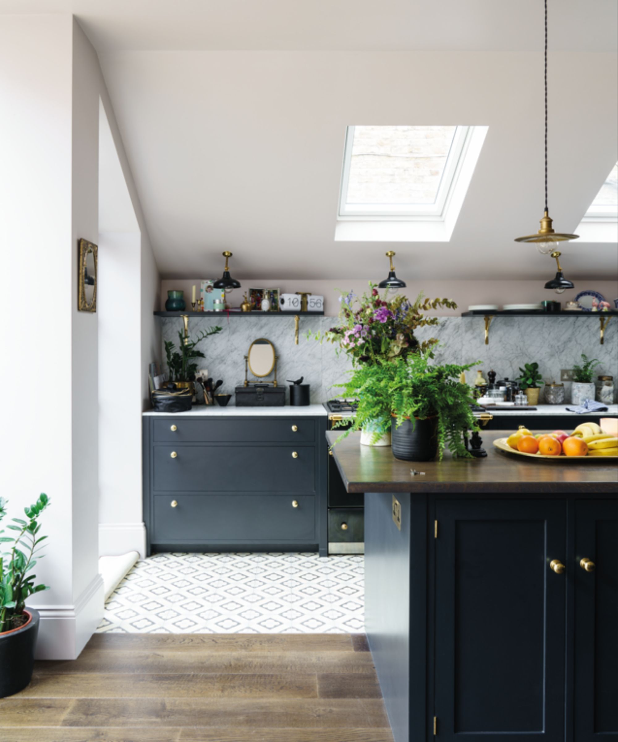
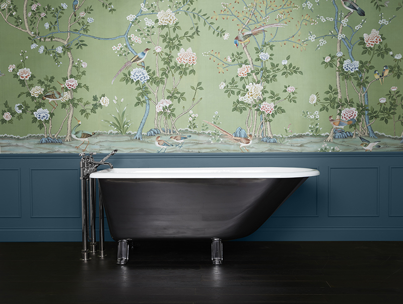
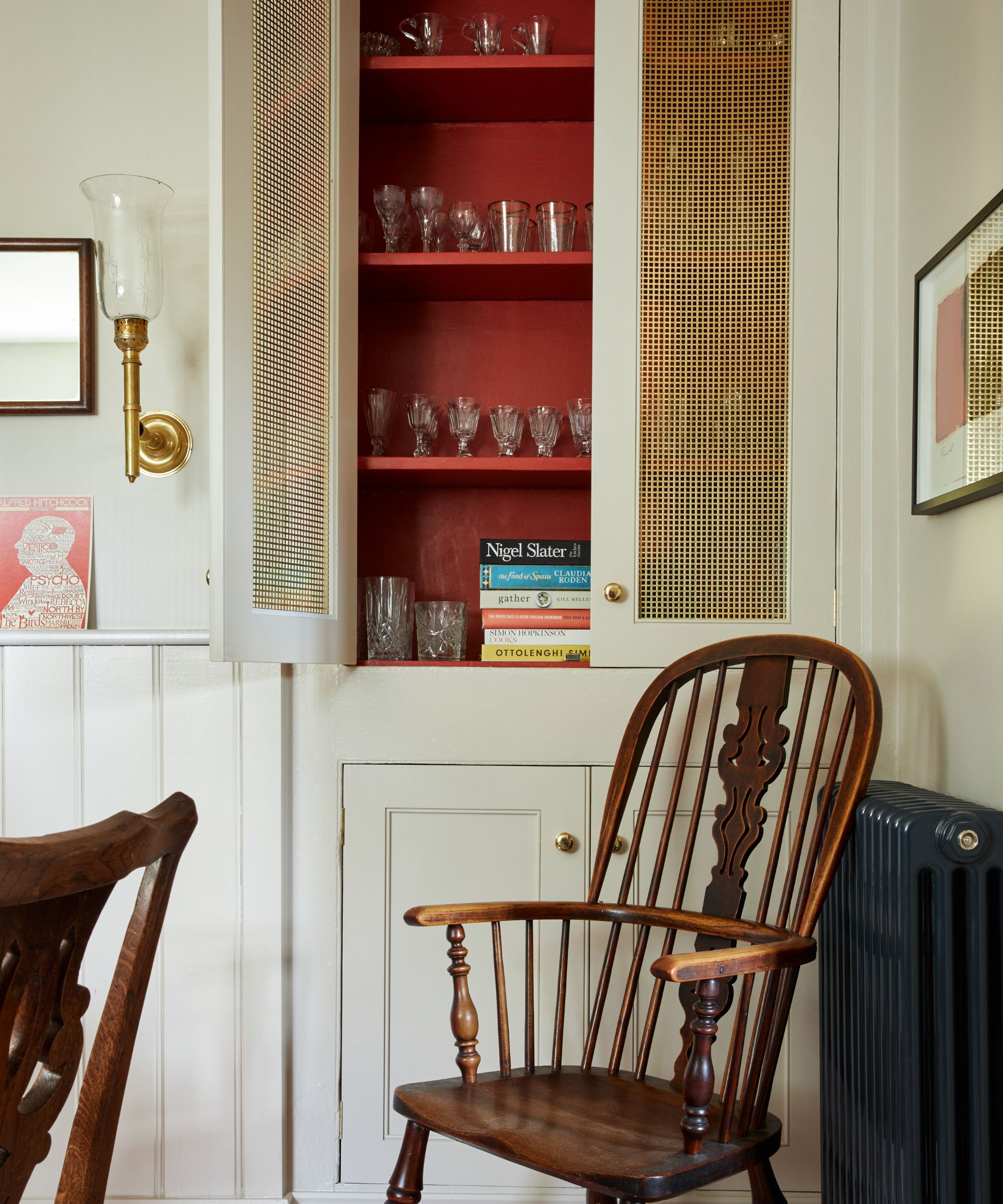
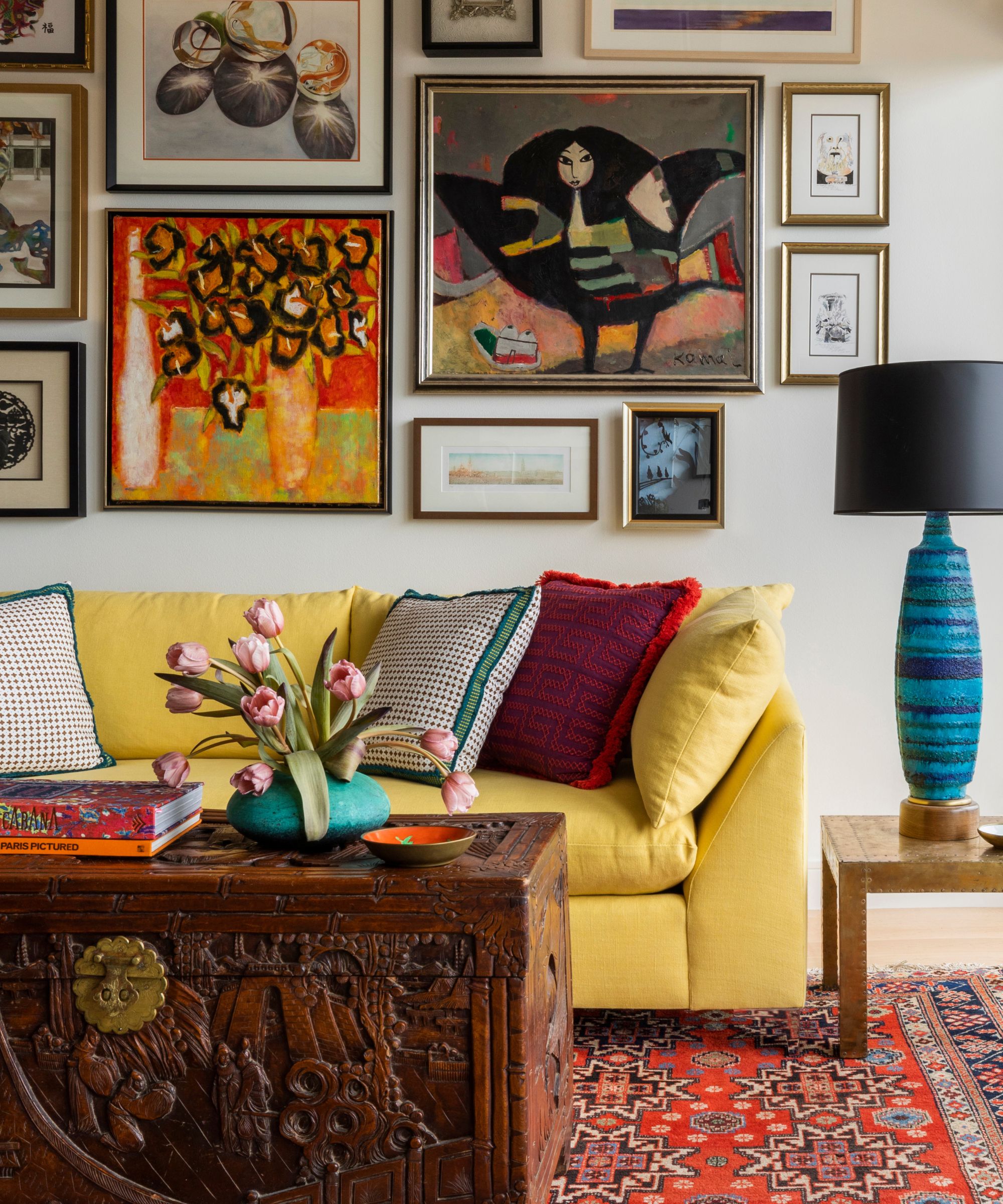
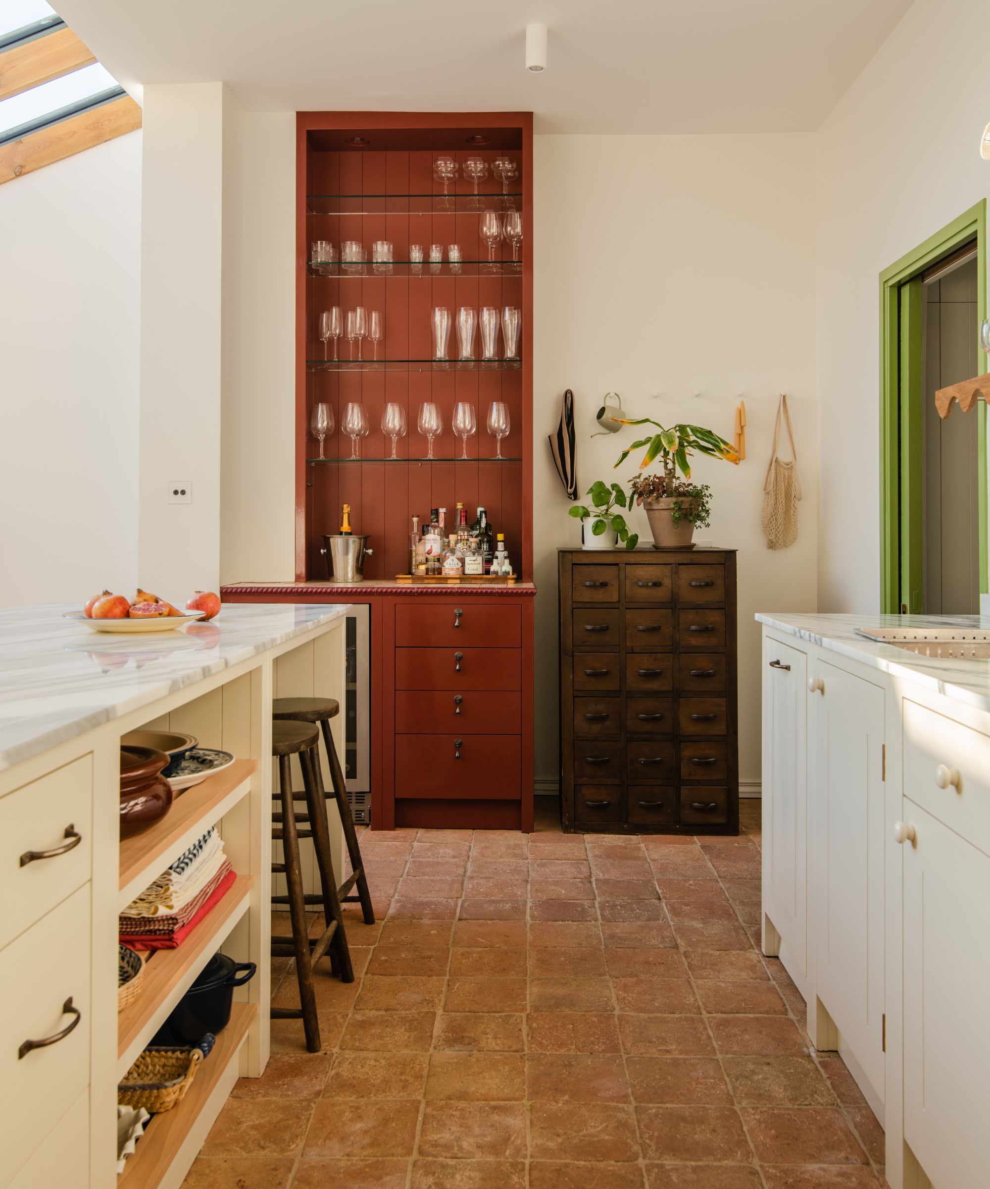
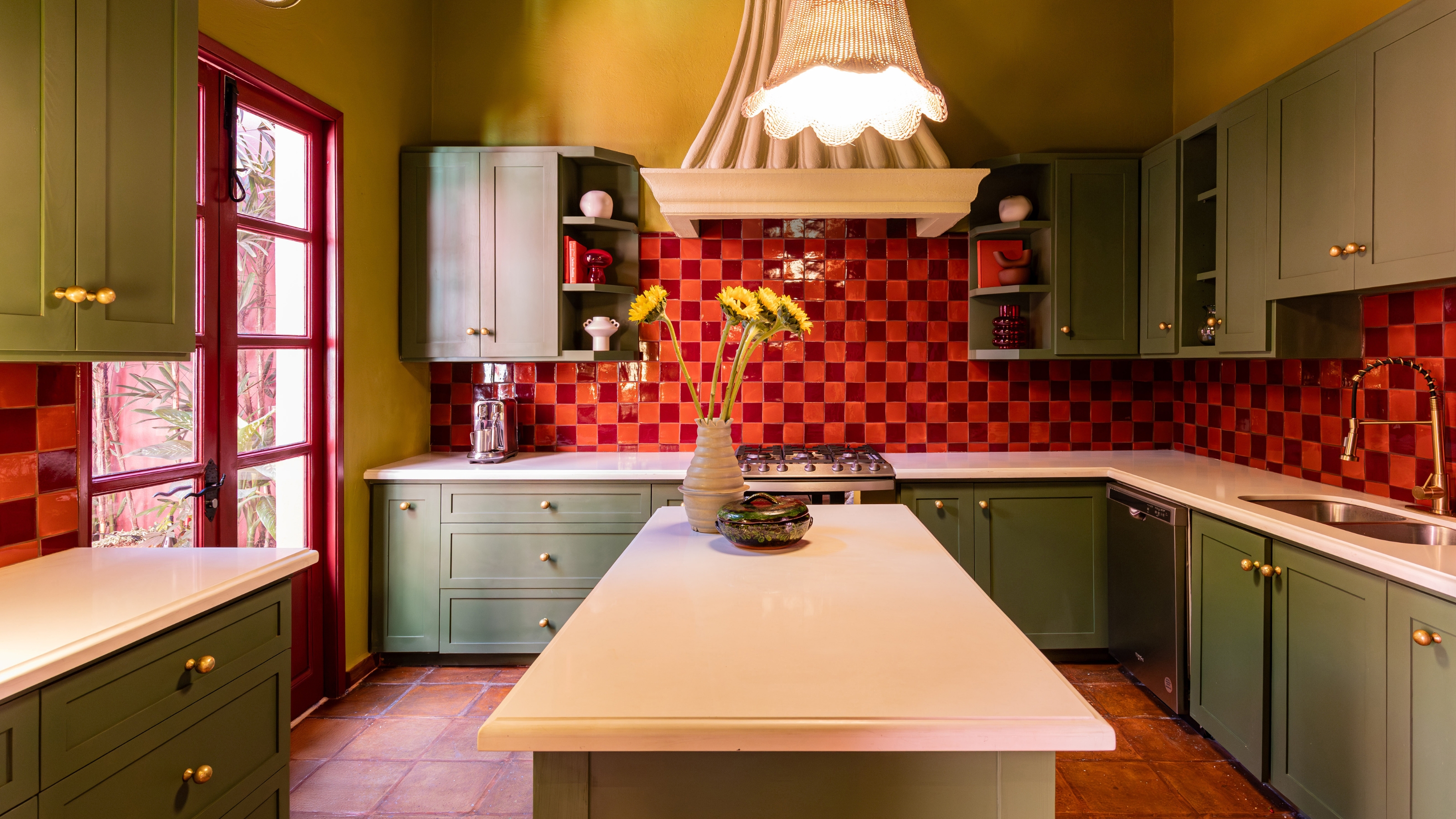
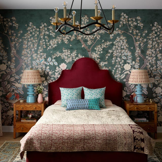
To effectively use split complementary colors in interiors, the article suggests starting by choosing one color as the dominant hue for larger areas like walls, upholstery, or rugs. The other two colors in the palette can then be introduced as accent colors through artwork, soft furnishings, or decorative items. This approach ensures a clear base and prevents the palette from becoming overwhelming. A recommended strategy involves using deeper or cooler tones for larger surfaces and warmer tones for accents.
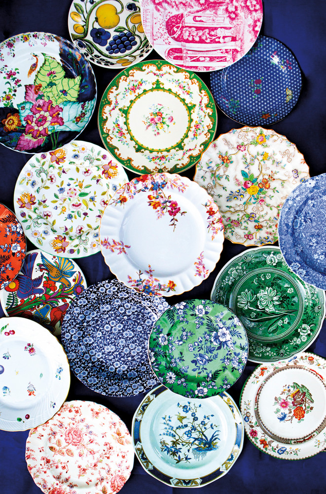
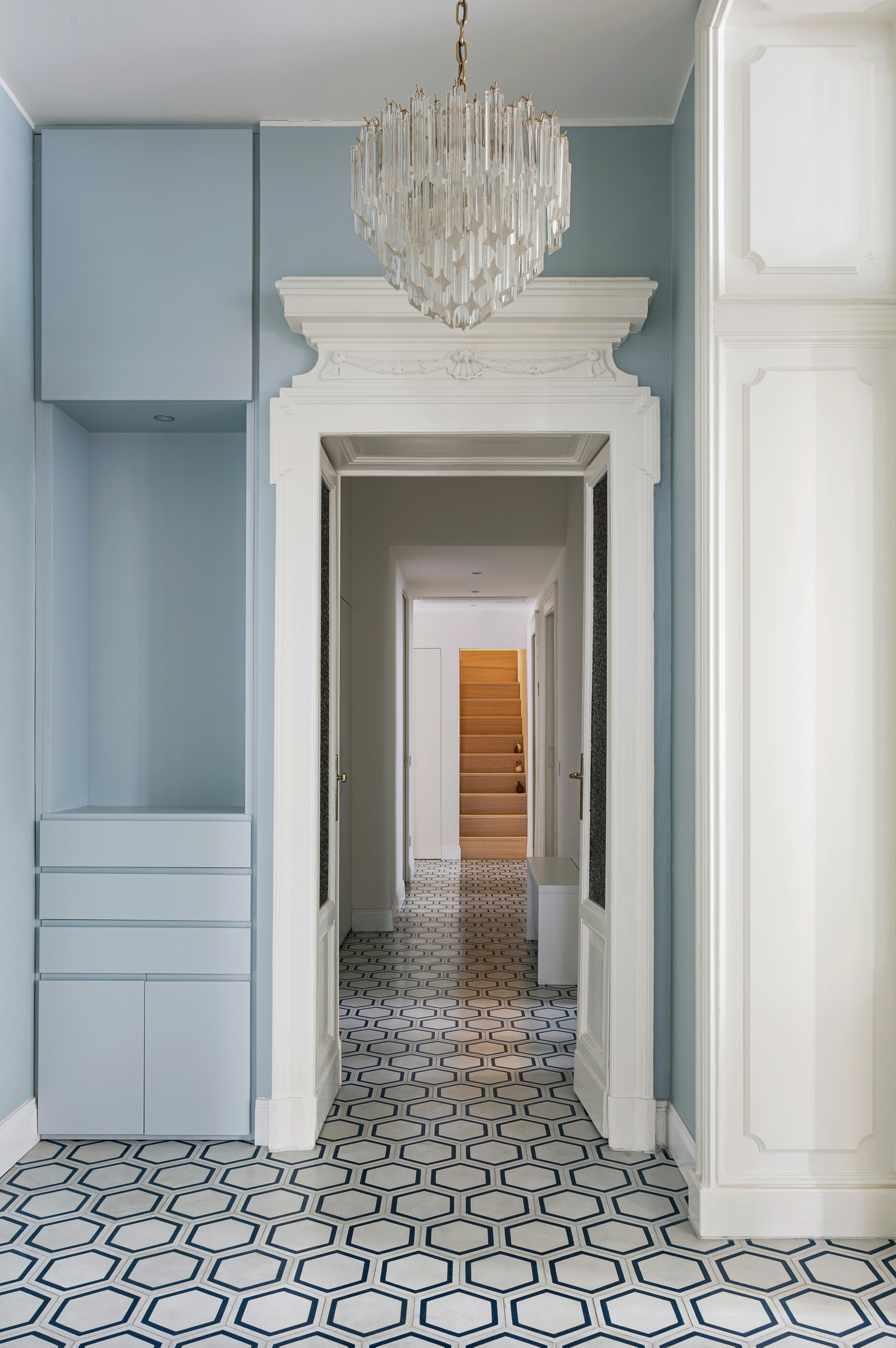
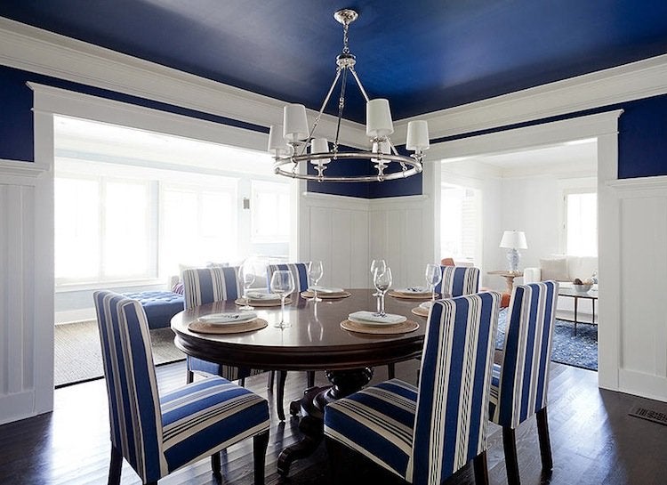
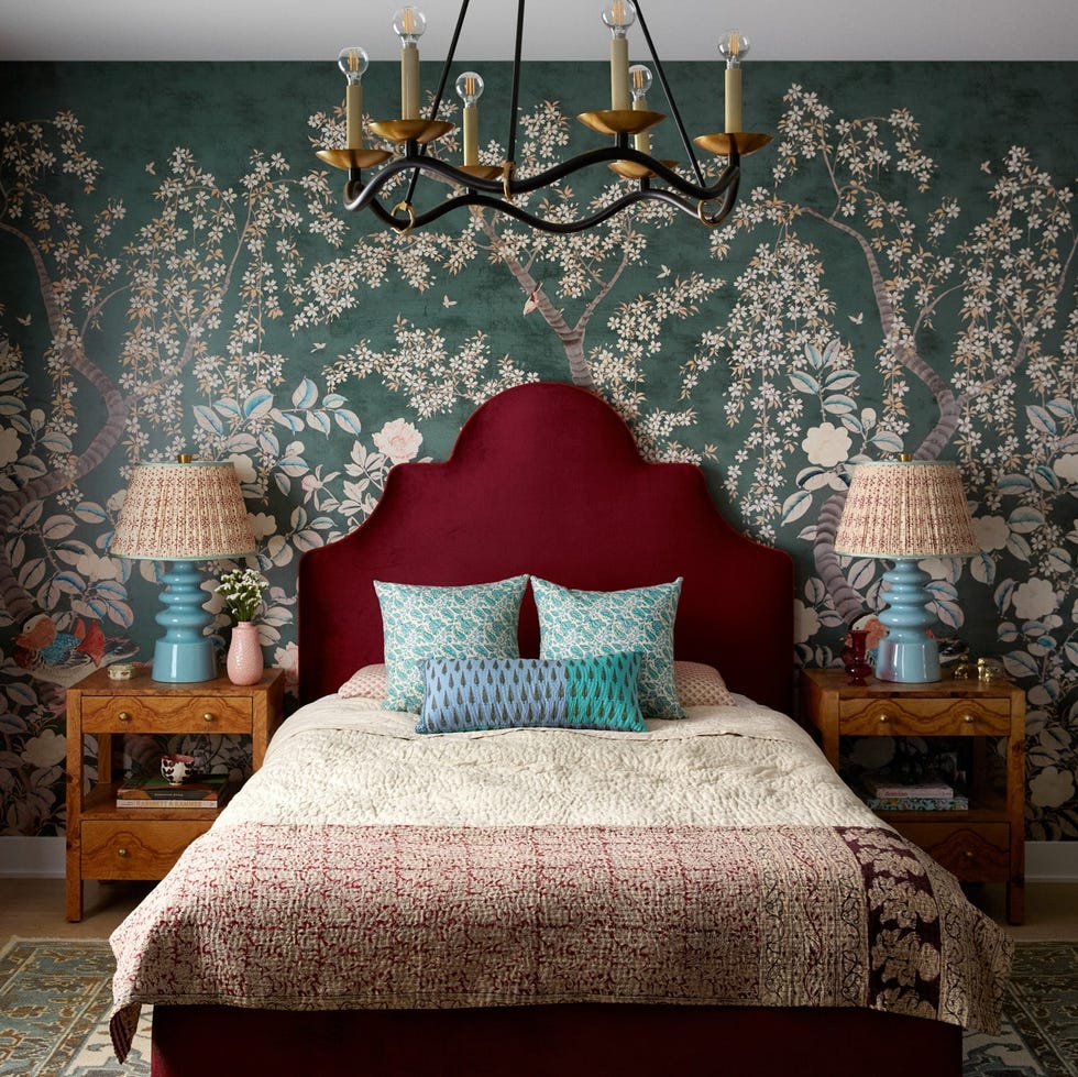
The 60-30-10 rule is presented as a guideline for proportioning the colors: 60% for the dominant color, 30% for the second color, and 10% for the punchiest accent. Incorporating neutrals is also advised to provide balance and allow the room to breathe. The article also suggests weaving in patterns that include multiple colors from the palette to create a cohesive look and avoid a color-block effect. Muted or dusky tones within a split complementary scheme can result in a sophisticated and soft ambiance.
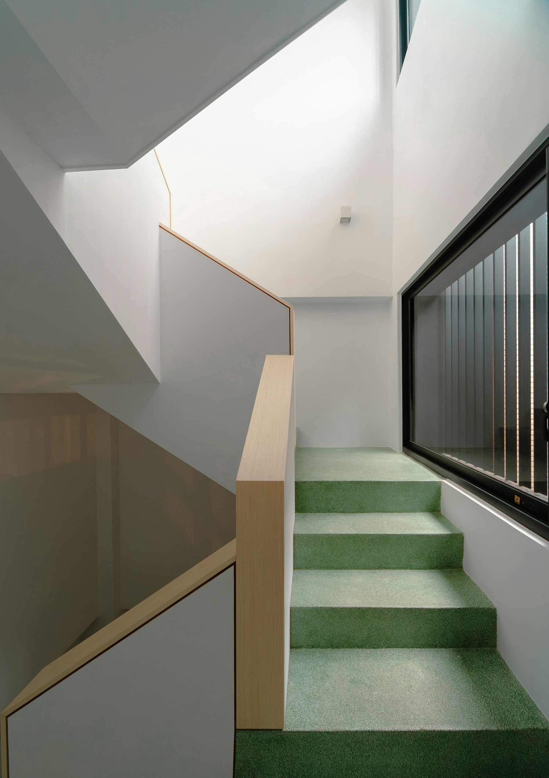
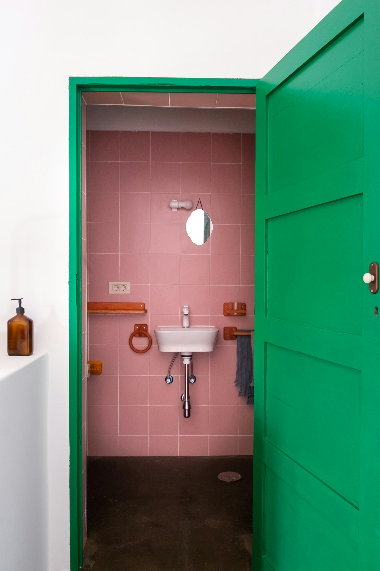
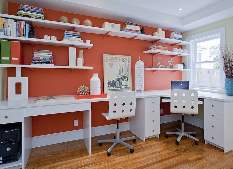
Practical examples of split complementary palettes are provided for various base colors, including red, blue, yellow, orange, green, and purple, detailing the accent colors that would create these schemes. For instance, a red base would pair with yellow-green and blue-tinted green, while a blue base would complement ochre yellow and burnt orange. A yellow base would work with magenta-leaning purple and indigo blue, and an orange base would suit deep teals and mid-tone blues with a slight purple tint. Green as a base would pair with red-oranges and magentas, and a purple base would combine with warm oranges and light olive greens. The article concludes by highlighting that a split complementary palette offers a refined, curated, and nuanced approach to home color schemes, enabling sophisticated painting techniques like double drenching.
#SplitComplementaryColors #ColorTheory #InteriorDesign #HomeDecor #ColorPalette #AccentColors #DesignTechniques #ColorPsychology #SplitComplementaryColors #ColorTheory #InteriorDesign #HomeDecor #ColorPalette #AccentColors #DesignTechniques #ColorPsychology
0 comment in total
 No comments yet
You may also like
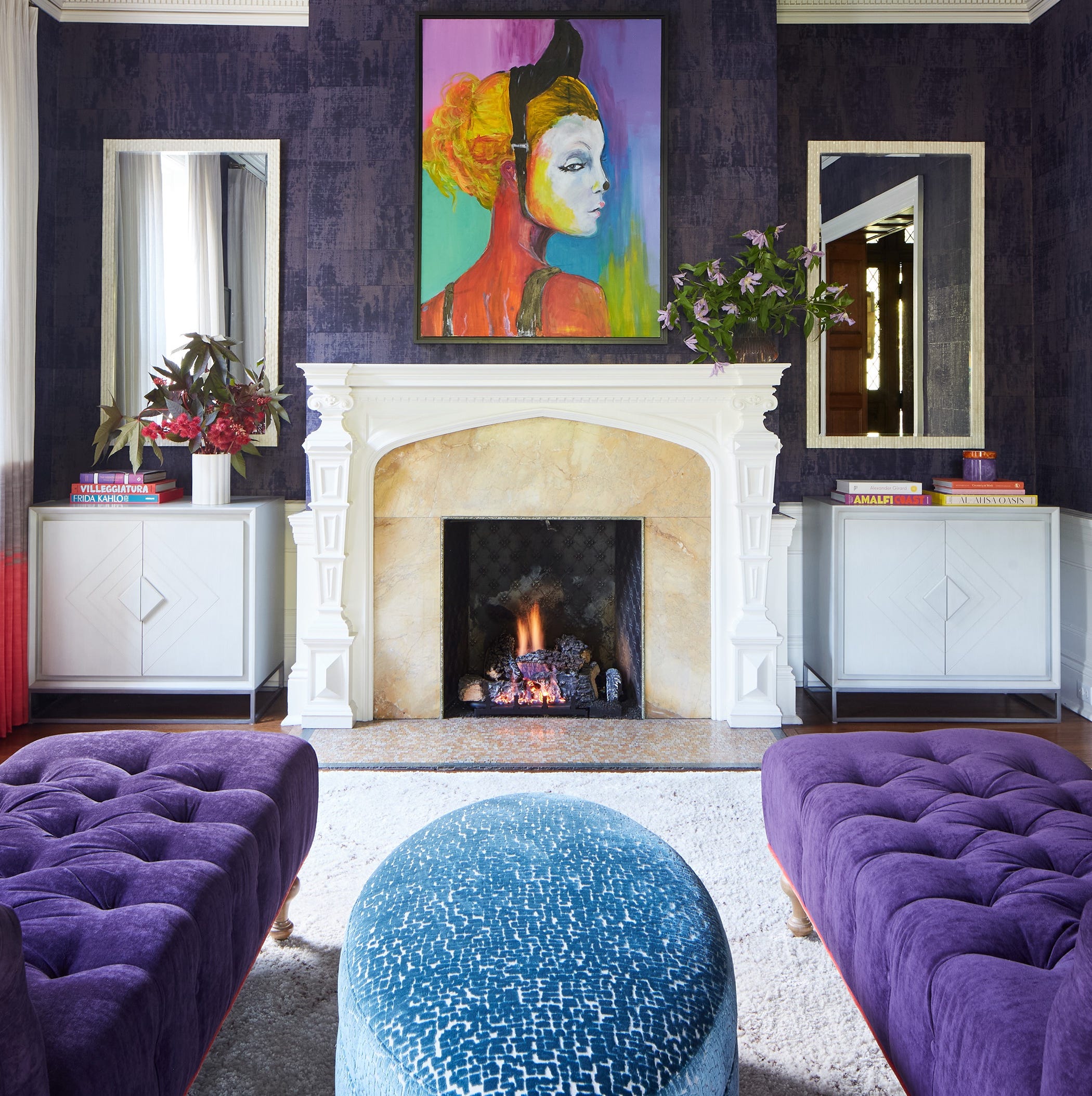
Designers LOVE Pairing These Unexpected Colors With This Sophisticated Hue

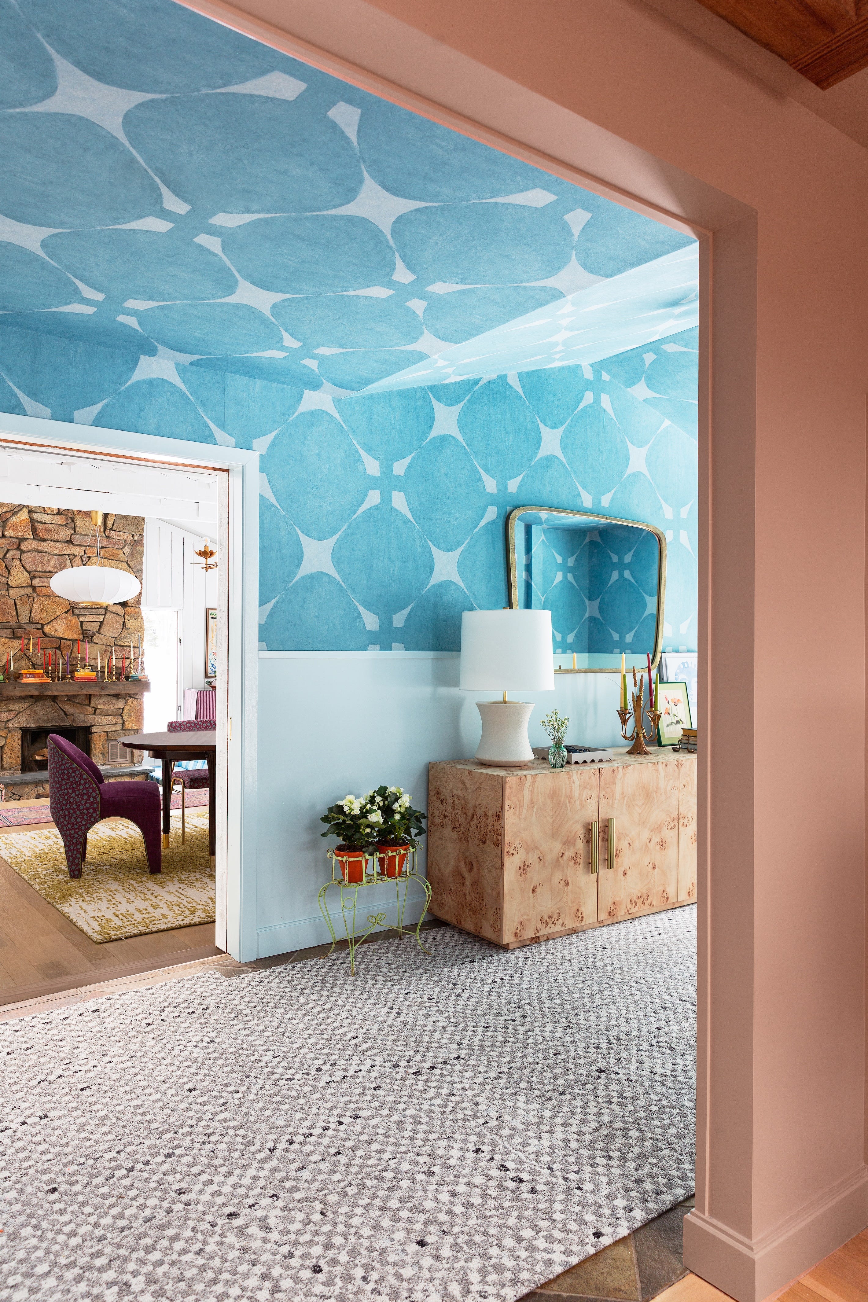
Designers Say These Unusual Paint Color Combos Will Transform Your Home

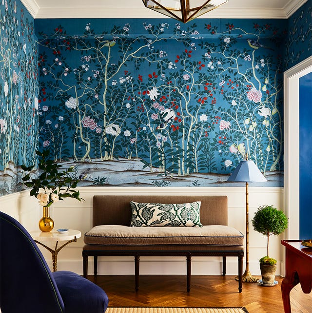
35 Unexpected Color Combos We Can't Get Enough Of

Choose contrasting color schemes for a more powerful effect

Designers LOVE Pairing These Unexpected Colors With This One Timeless Hue
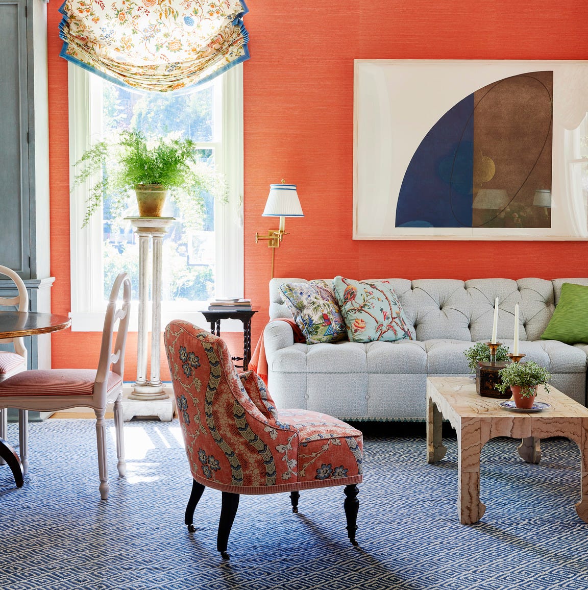
How to Choose Colors That Work Together Every Time
If You Think Teal And Turquoise Are The Same Color, You Might Not Do Well On This Color Trivia

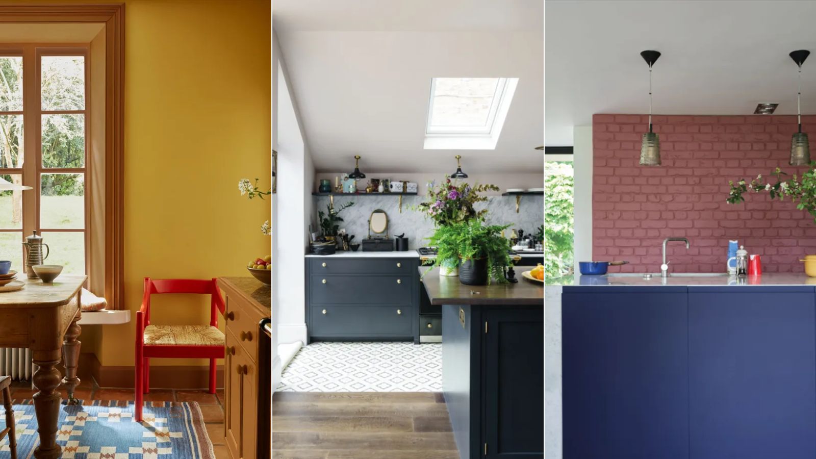
Designers are swapping tonal color schemes for high-contrast hues – here's how to do this daring color trend stylishly

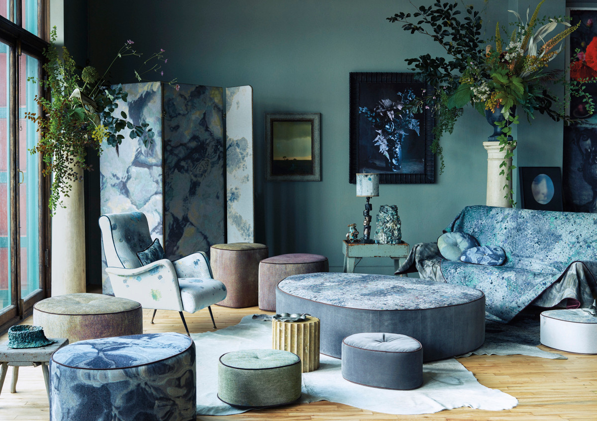
The Color Combo You’re About to See Everywhere
The Trick to Finding a Paint Color That Works With Everything You Already Have

Dress Up Your Space With Contrasting Colors

How to combine colour, pattern and texture without making a complete mess of things
24 Complementary Color Schemes That Will Make Any Room Pop

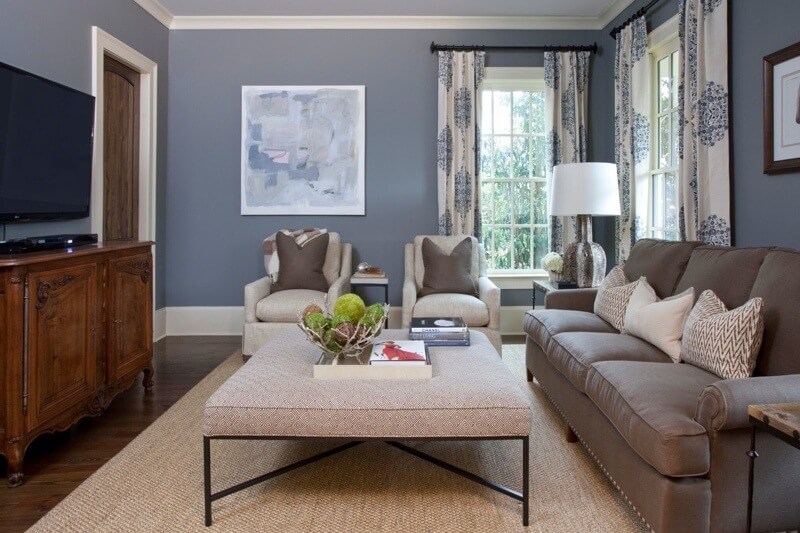
The ONLY Advice You Need to Mix Patterns Like a Pro!

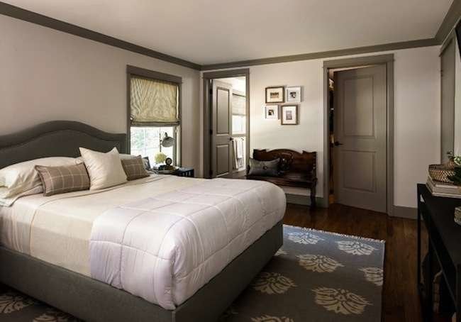
If This, Then That: Your Guide to Pairing Paint Colors

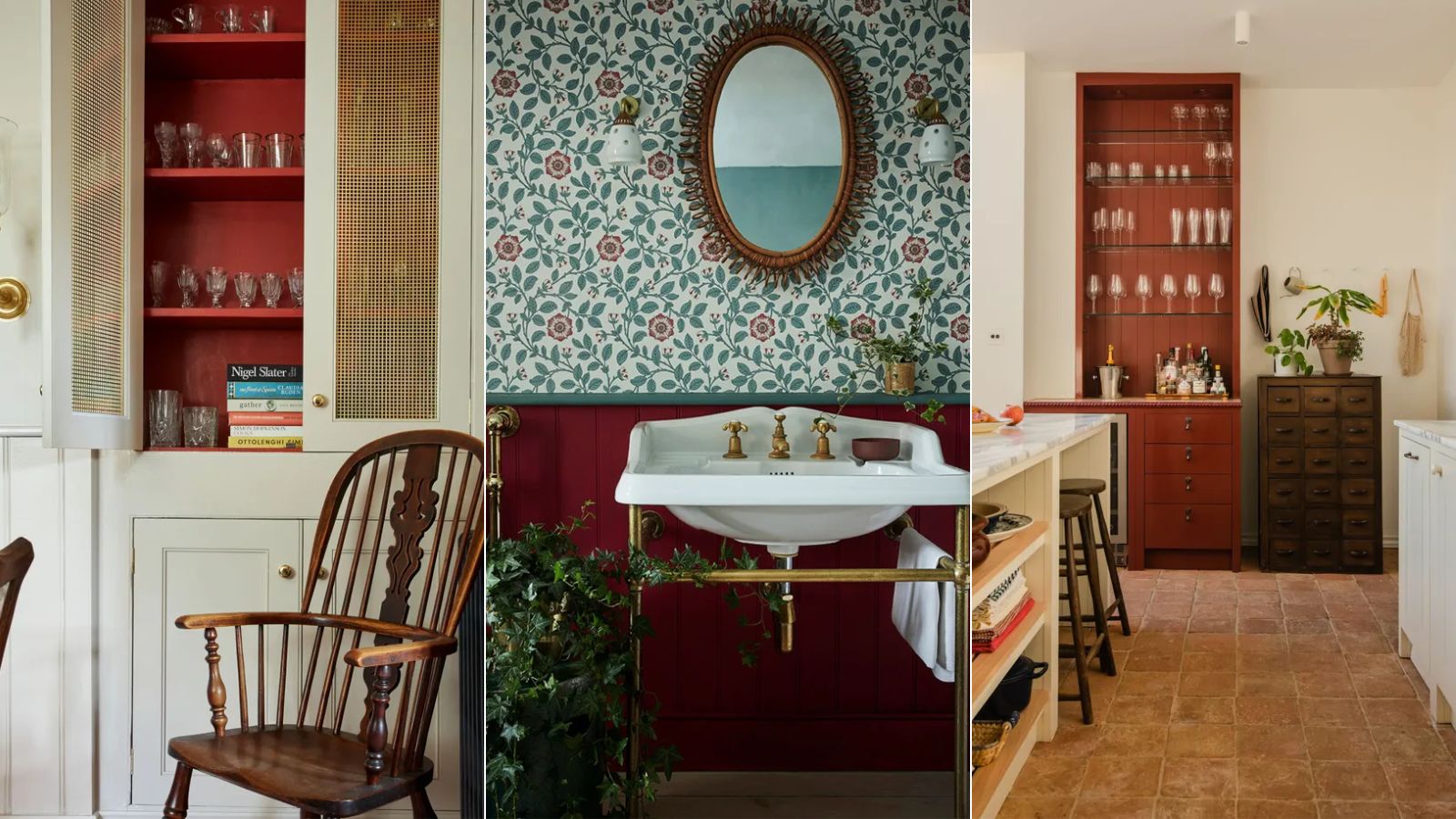
Here's what color experts actually think about the unexpected red theory – is it really as simple as it sounds?
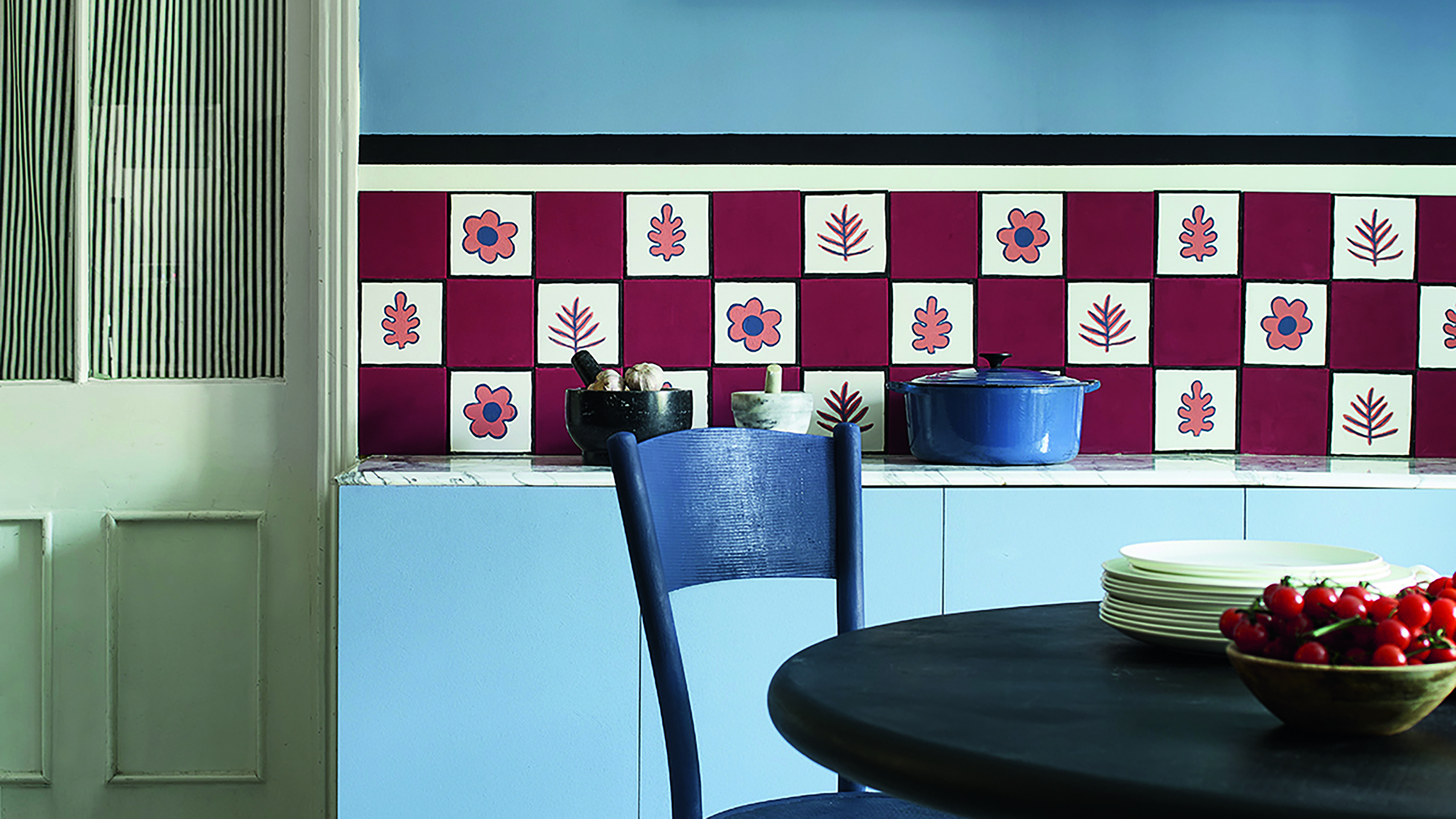
Primary colours are having a moment - but the secret to styling them is through 'unexpected' touches
Here's How to Coordinate Paint Colors Throughout Your Home, so That It Looks Cohesive, Curated, but Still Creative
Designers Predict These Color Combinations Will Be EVERYWHERE This Summer
These color sensors take the pain out of paint matching