1/4
The 8 Dos and Don’ts of Mixing Patterns in Your Home
This article, drawing on the expertise of interior designer Nancy Evars of Evars Collective, provides comprehensive guidance on effectively mixing patterns in home decor. It emphasizes a 'layering' approach rather than simple 'mixing' to achieve a sophisticated and cohesive look.
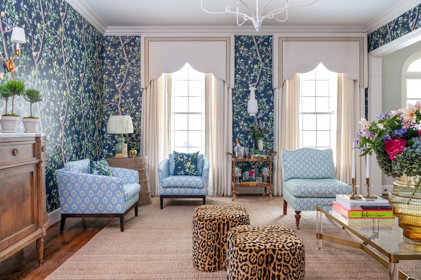
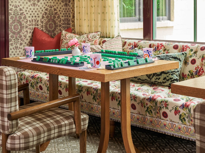
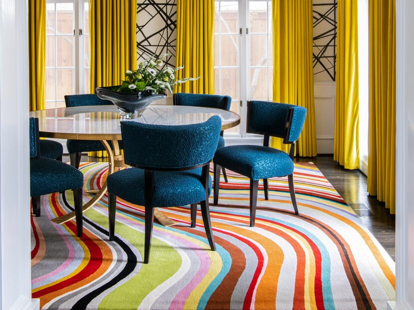
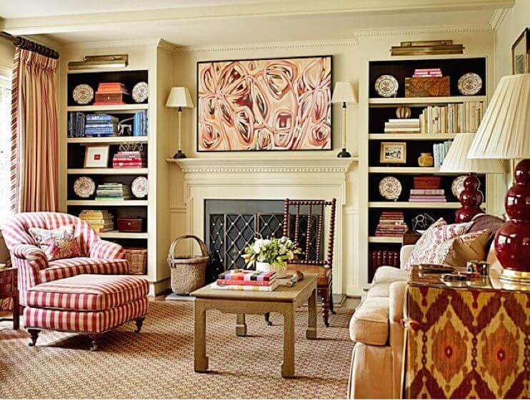
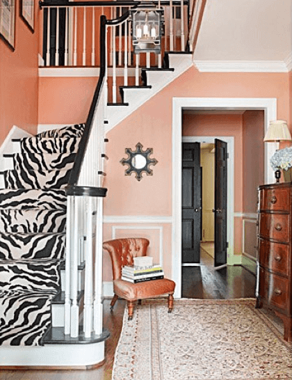
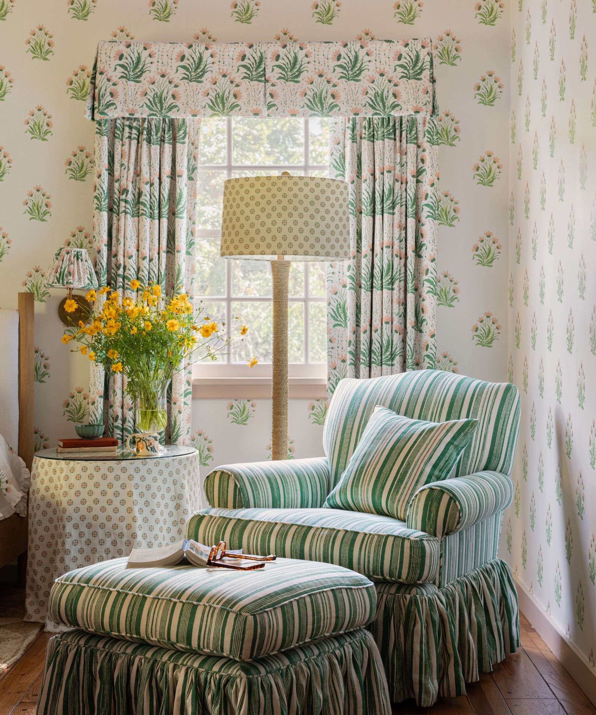
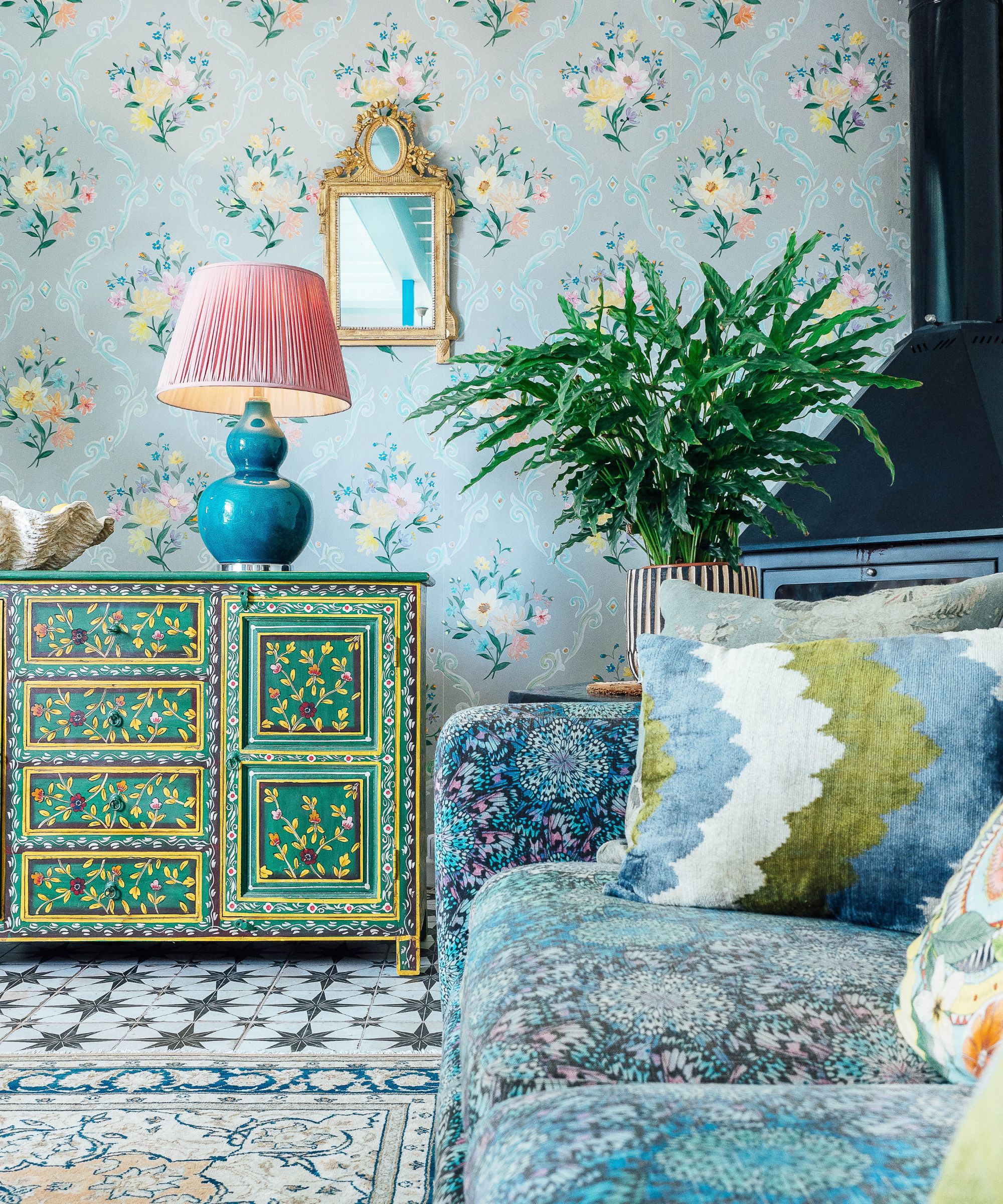
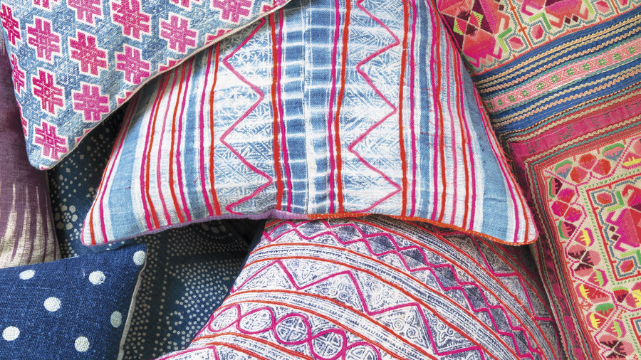
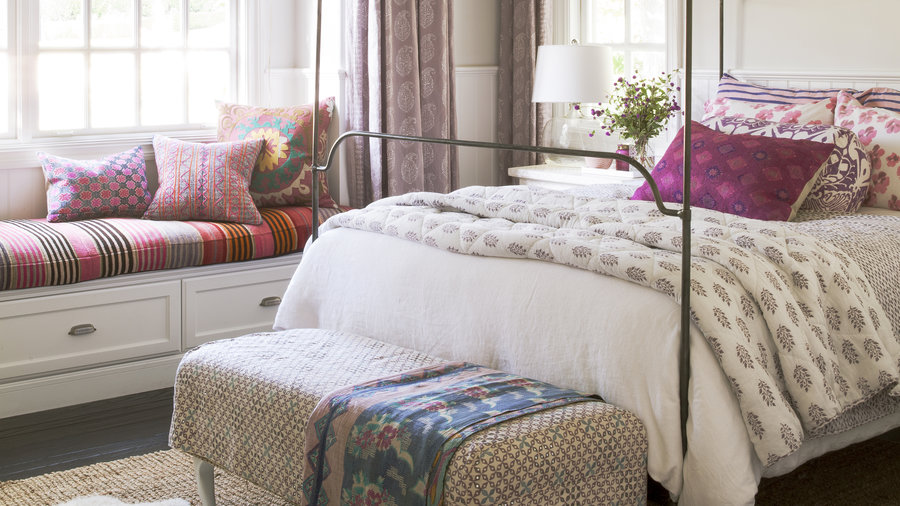
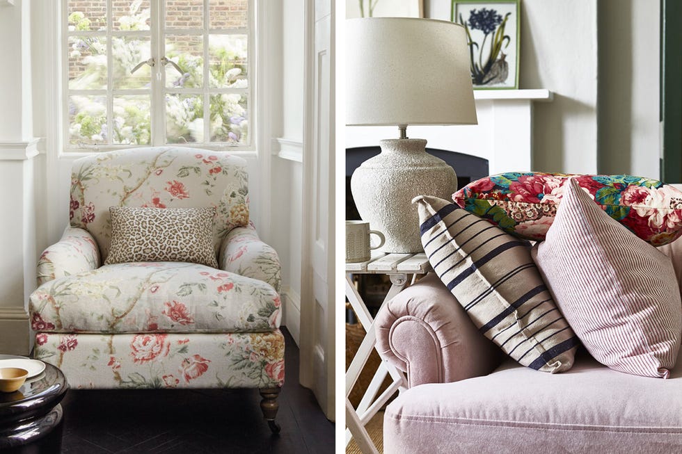
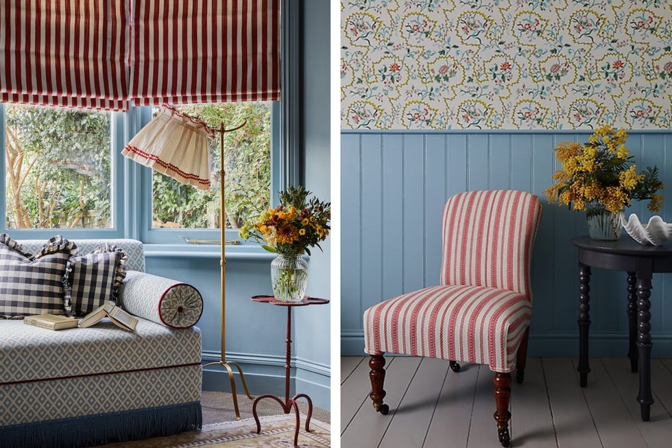
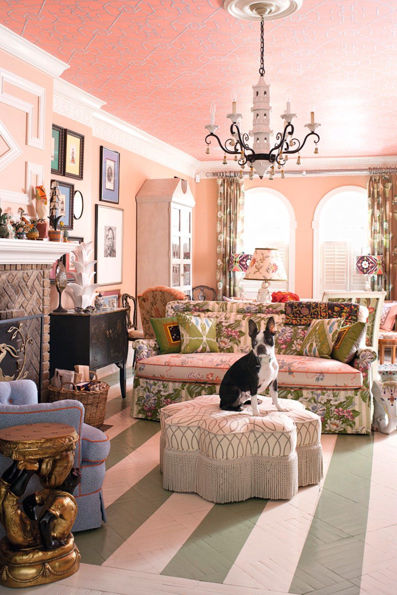
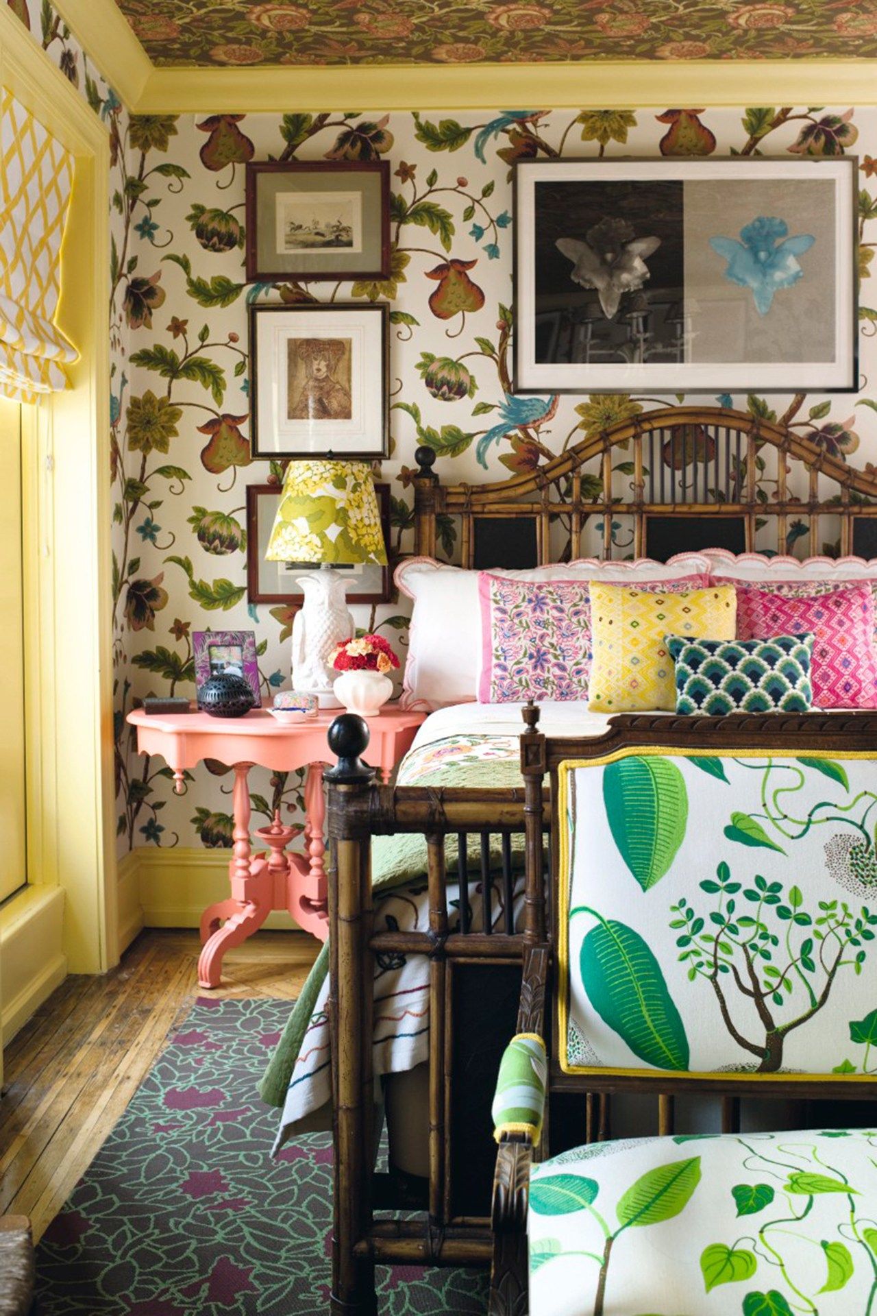
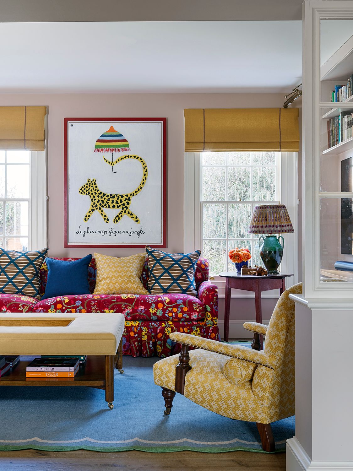
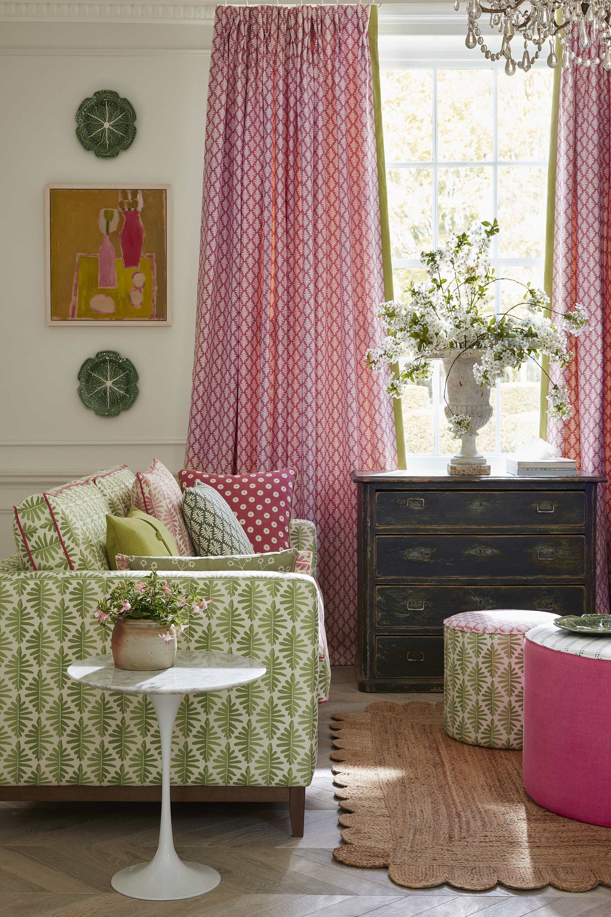
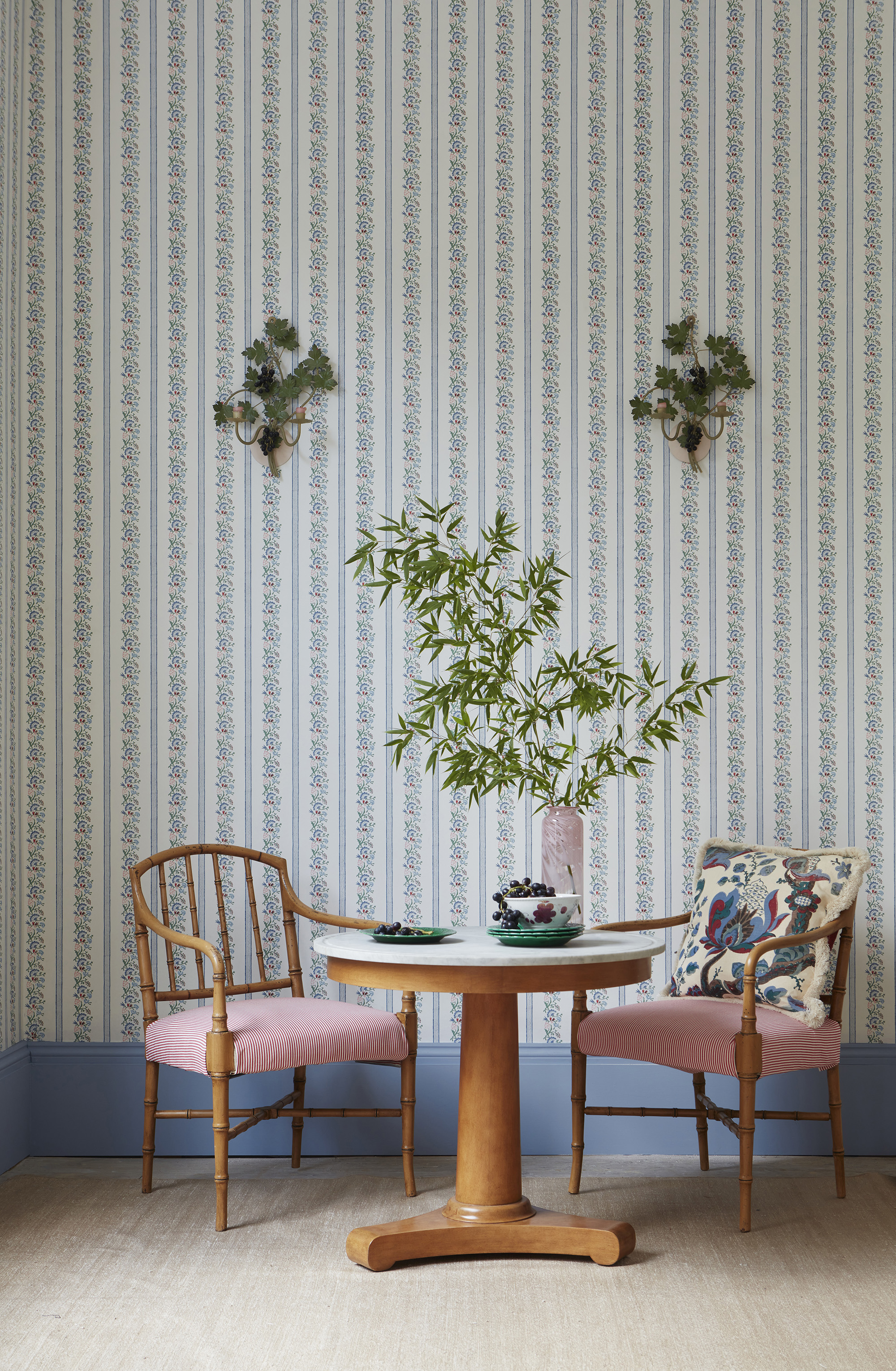
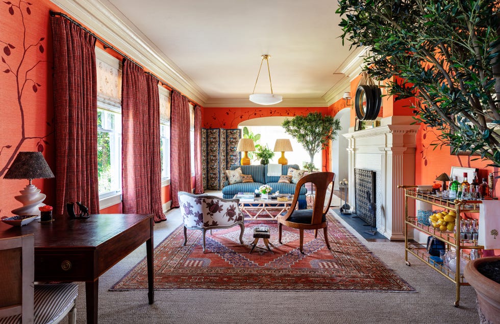
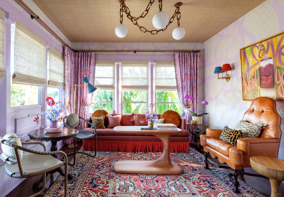
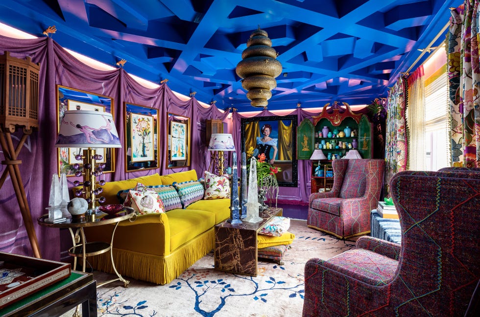
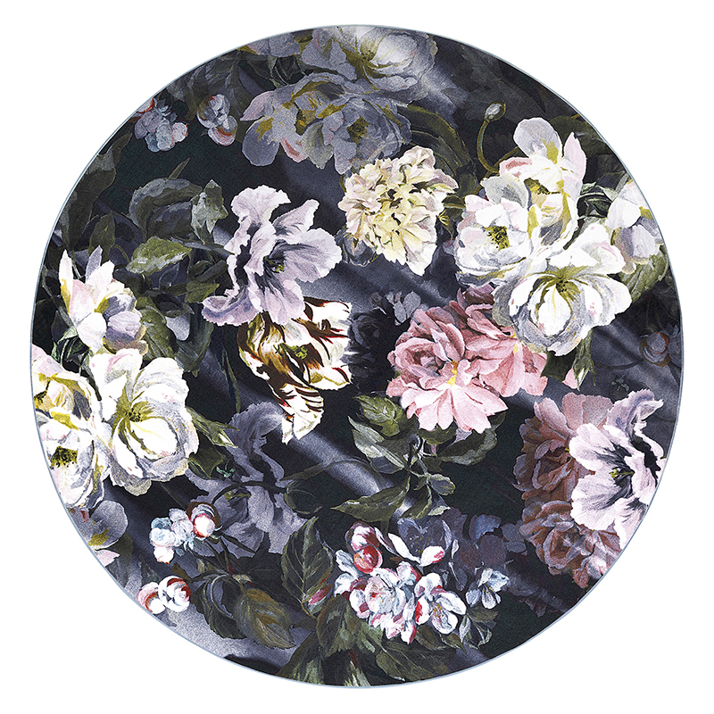
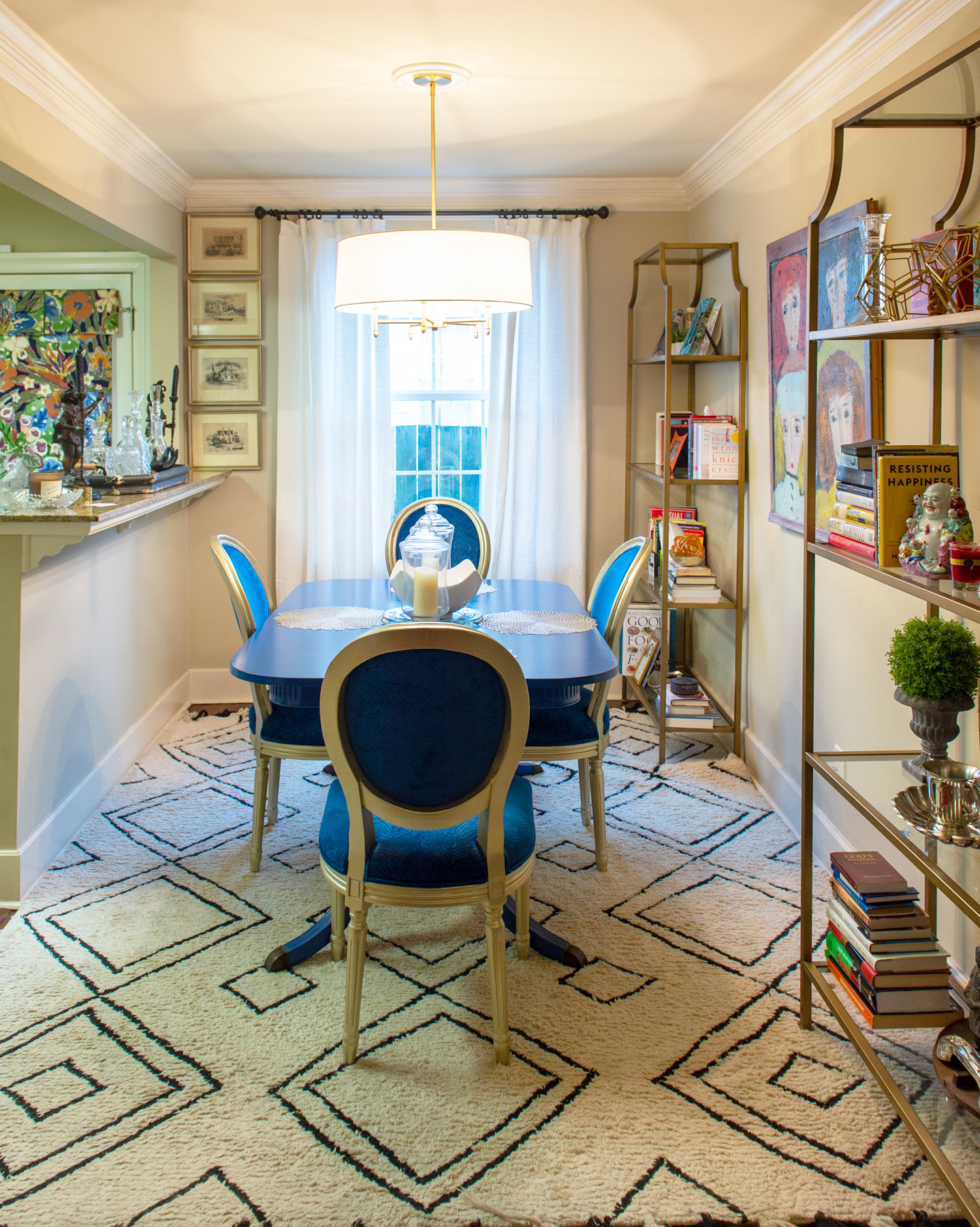
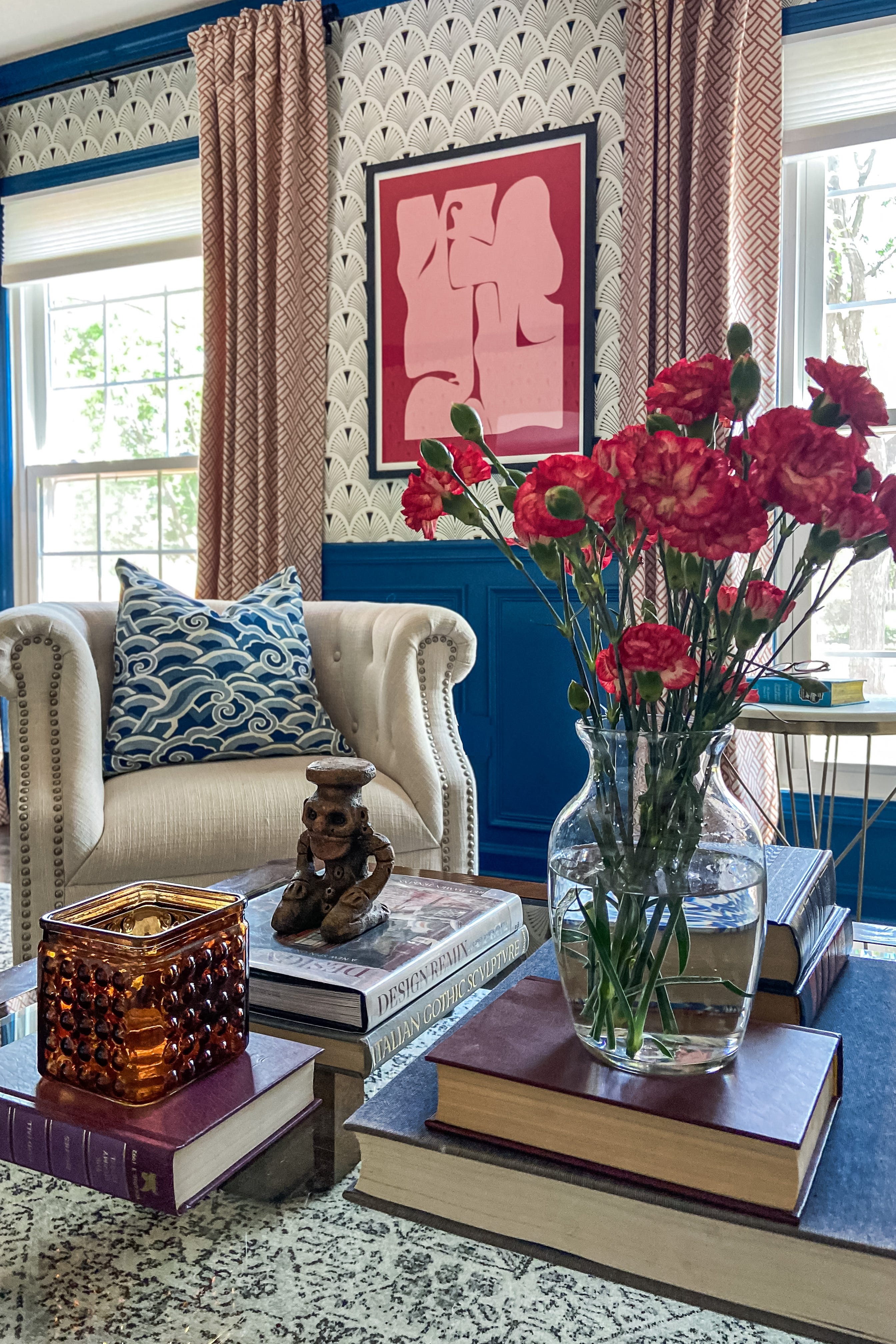
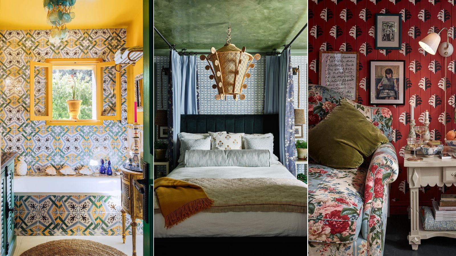
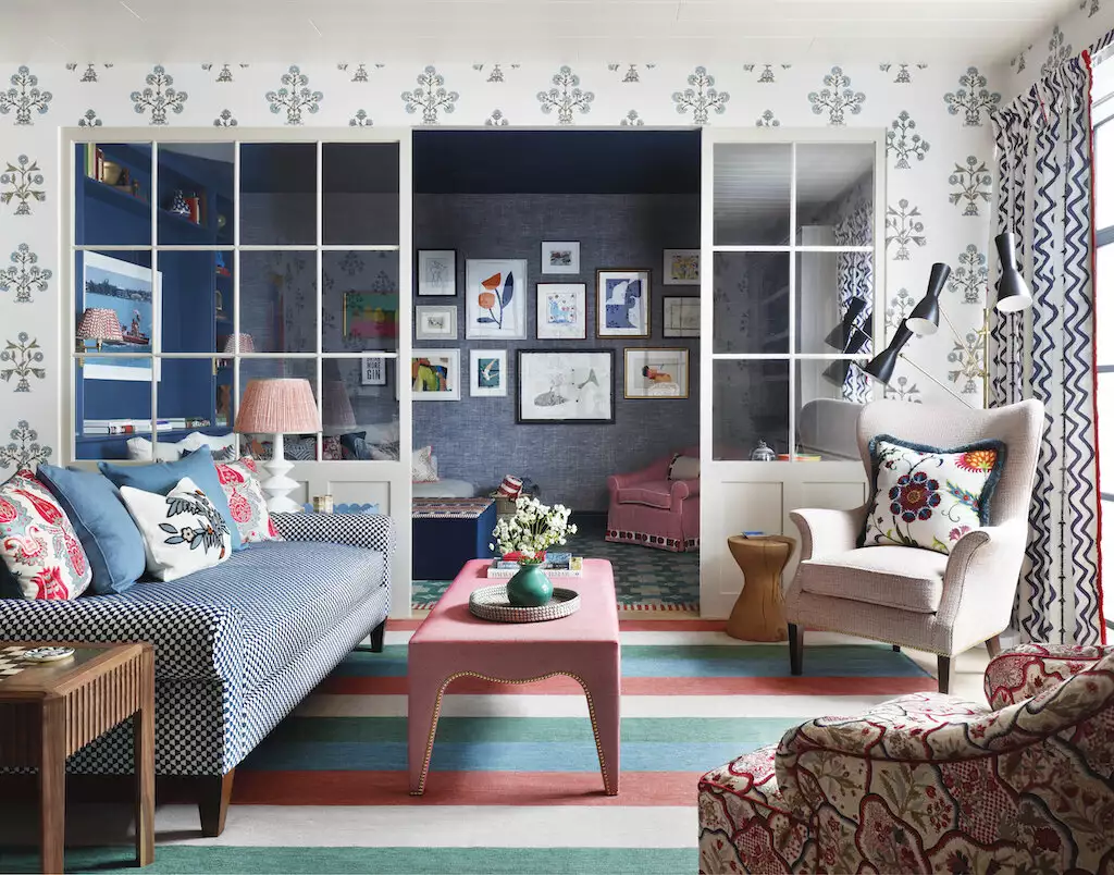
A foundational 'Do' is to utilize patterns with varying scales. Evars suggests starting with small elements like throw pillows to experiment. A common recommendation is to combine a large-scale pattern, such as a bold stripe, with a smaller-scale pattern, like a delicate floral print. The article highlights that contemporary floral patterns offer a fresh perspective, even for those who prefer traditional styles like grandmillennial aesthetics, proving that florals can be both a throwback and current. The key is to ensure the patterns differ in size to create visual interest and avoid a cluttered appearance.
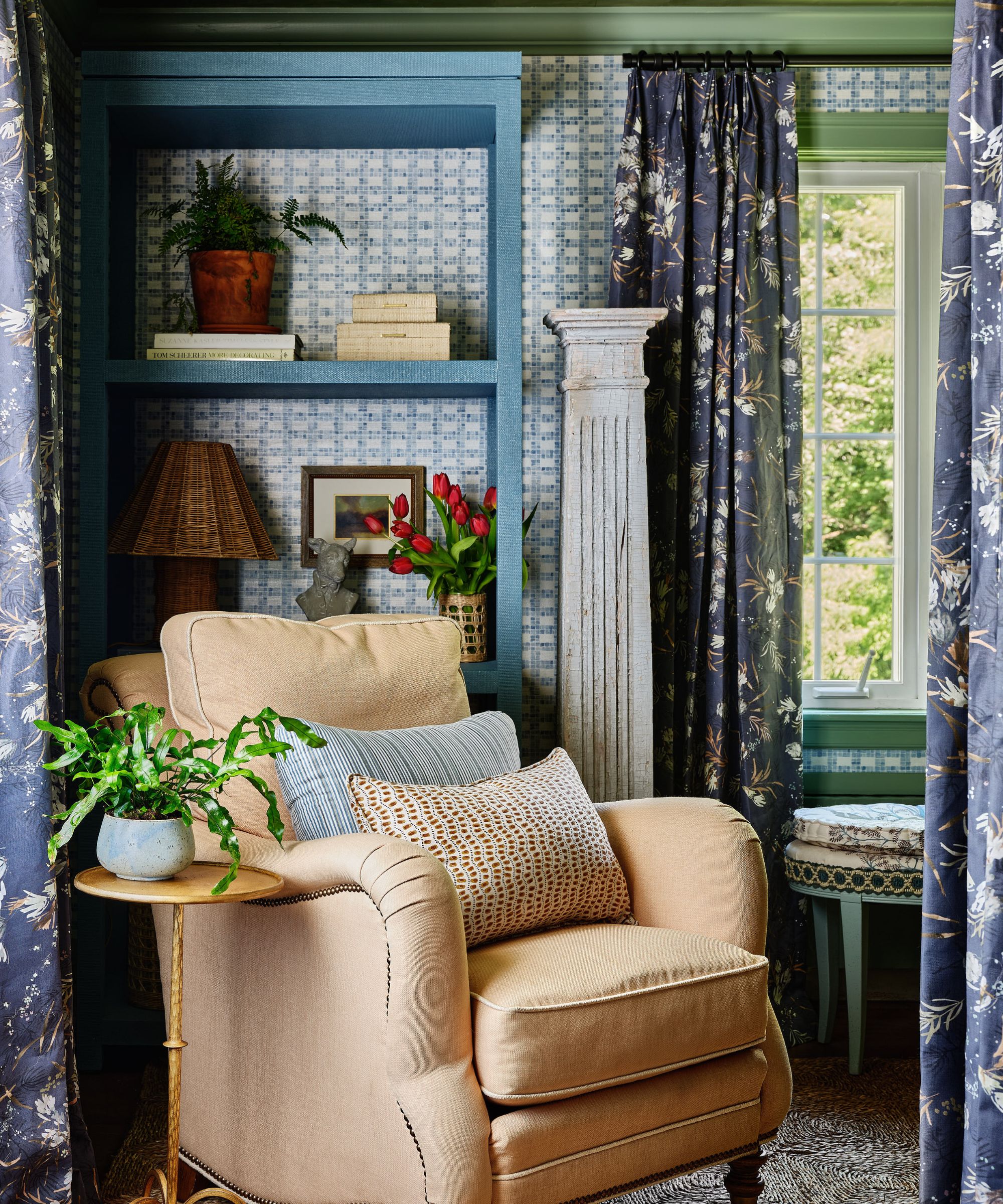
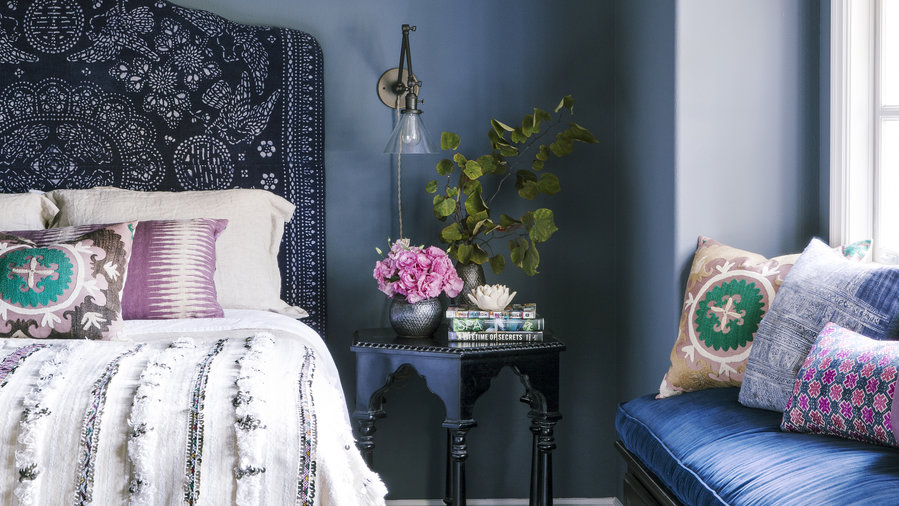
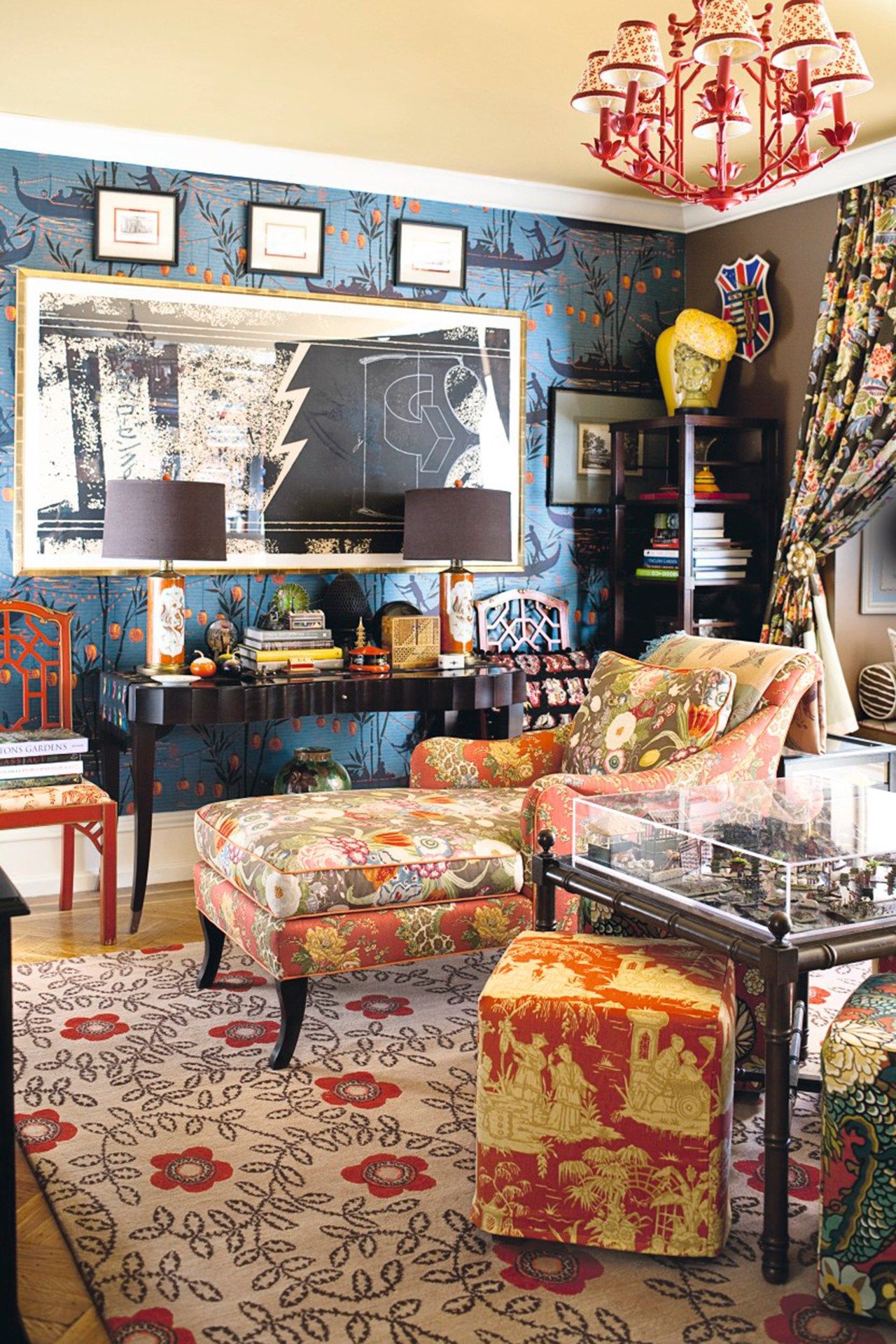
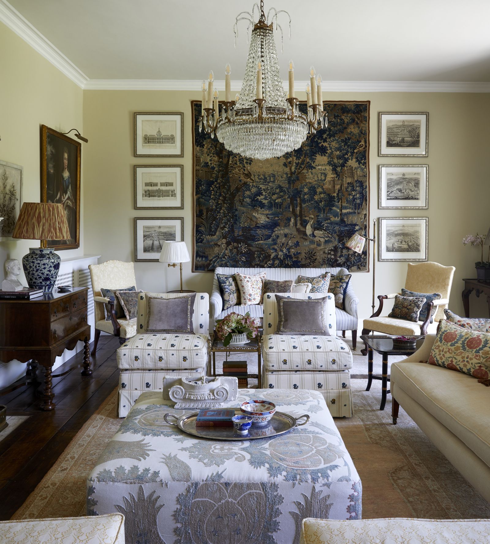
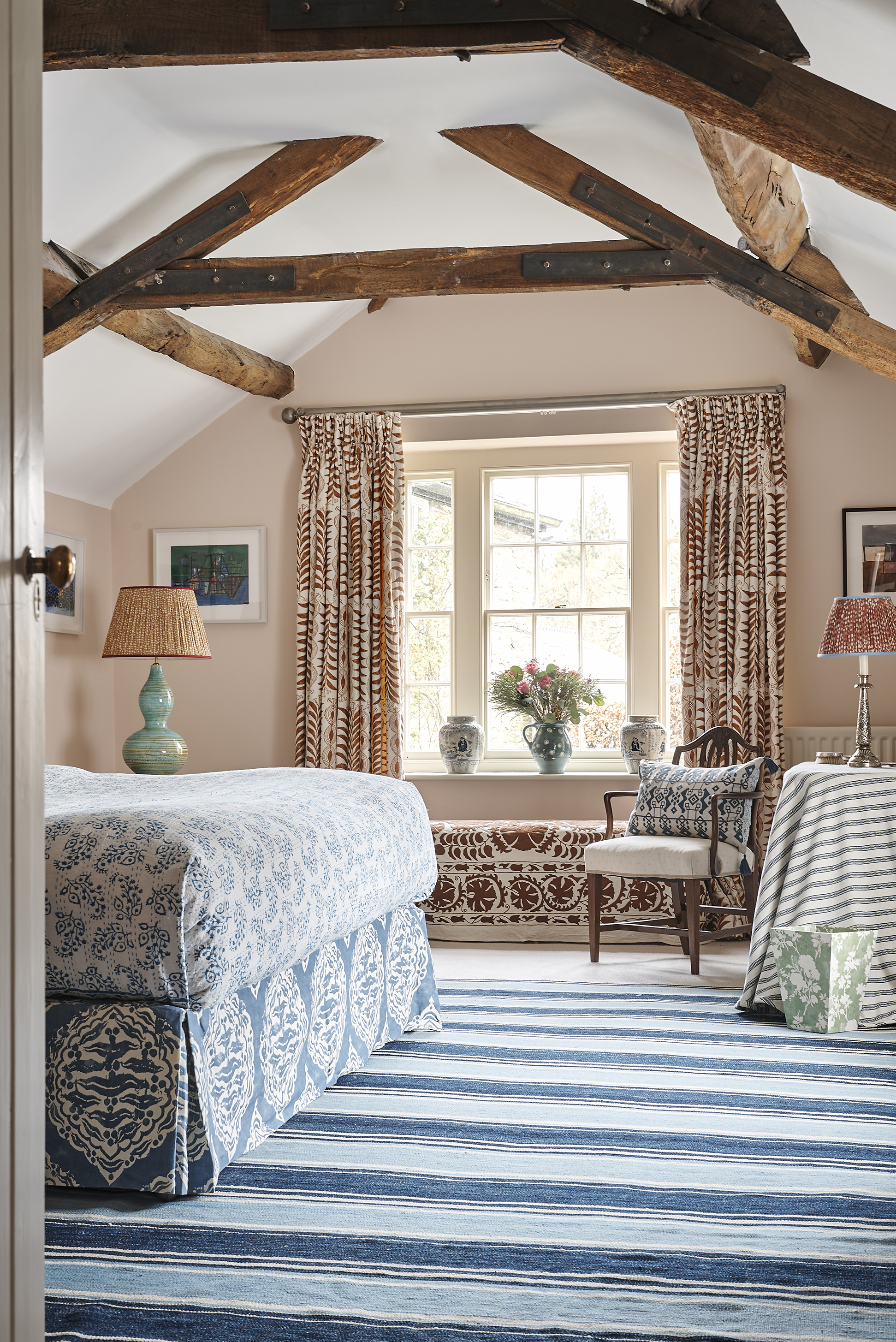
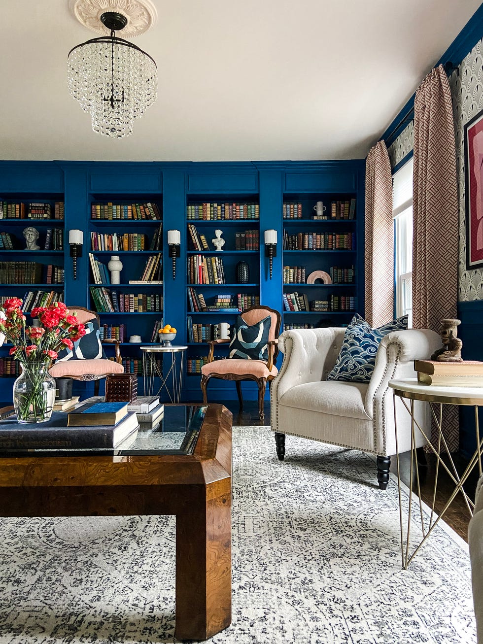
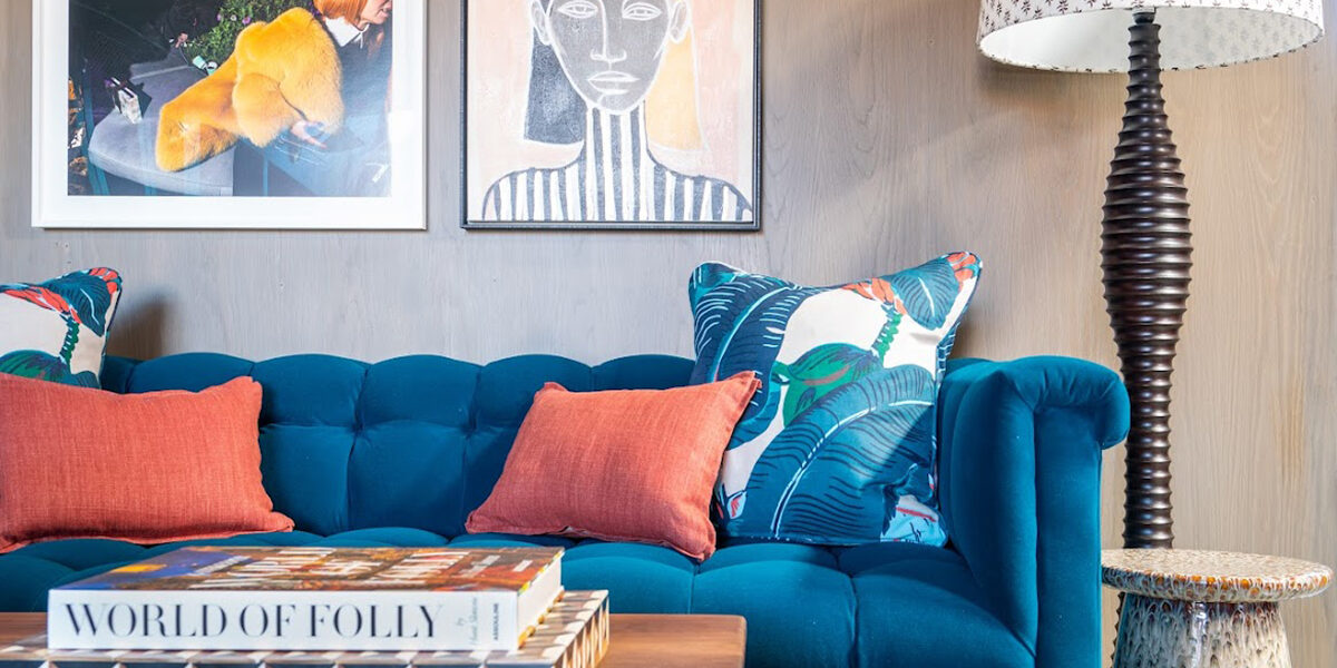
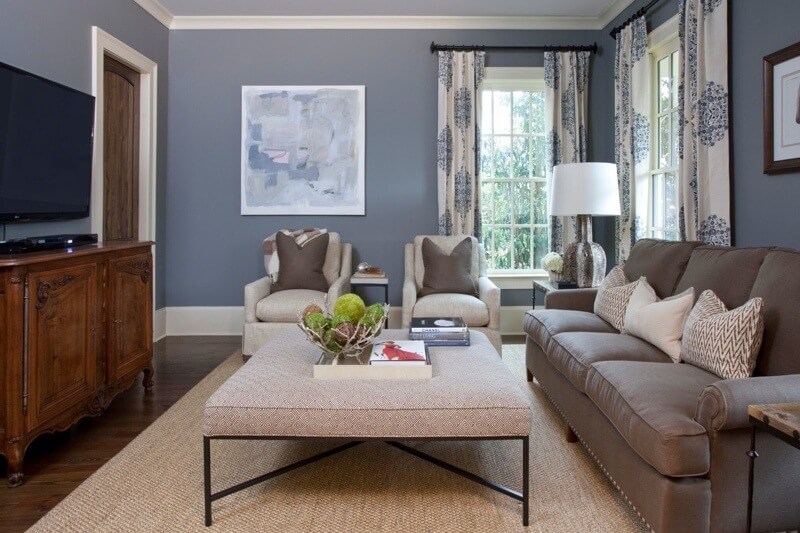
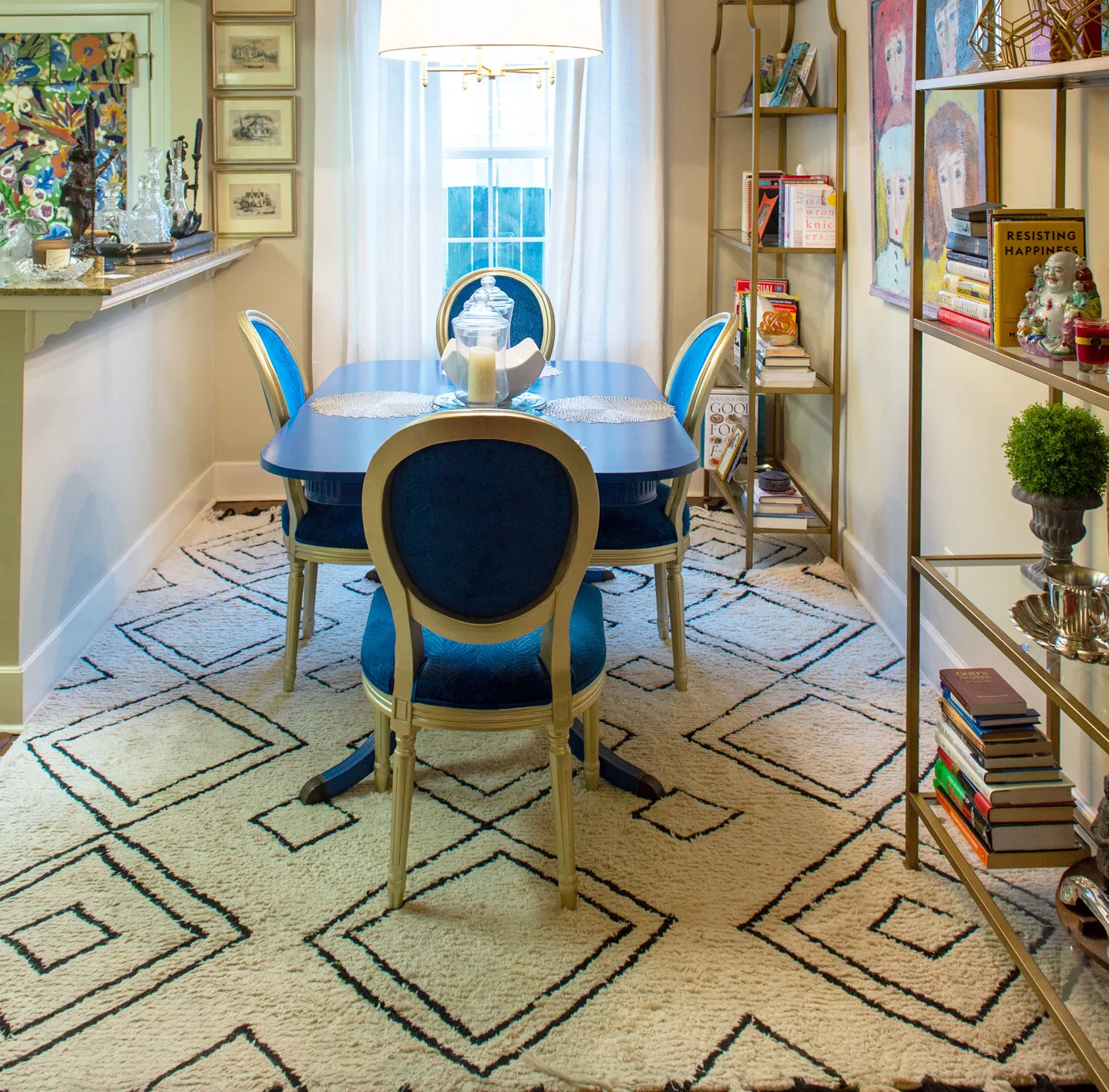
Another crucial 'Do' involves finding cohesion through colorways. The article explains that color acts as a unifying element for design decisions, allowing various patterns to complement each other. By extracting and using different colors and shades present in a primary pattern, individuals can select accents like throw pillows and lampshades that tie the space together. Evars's own family room, for instance, achieves harmony by combining blues and various shades of brown, demonstrating how a consistent color palette can bridge diverse patterns and textures.
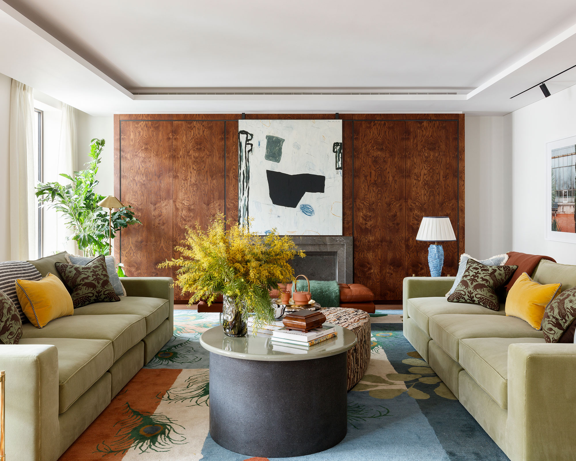
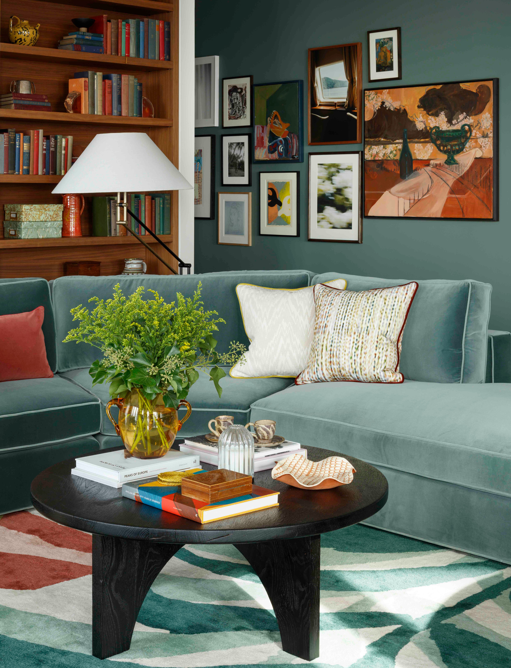
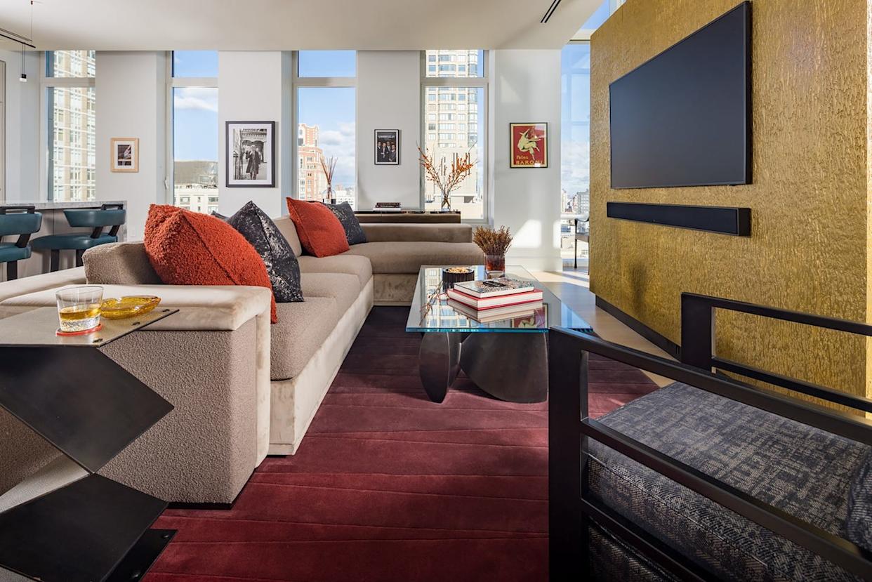
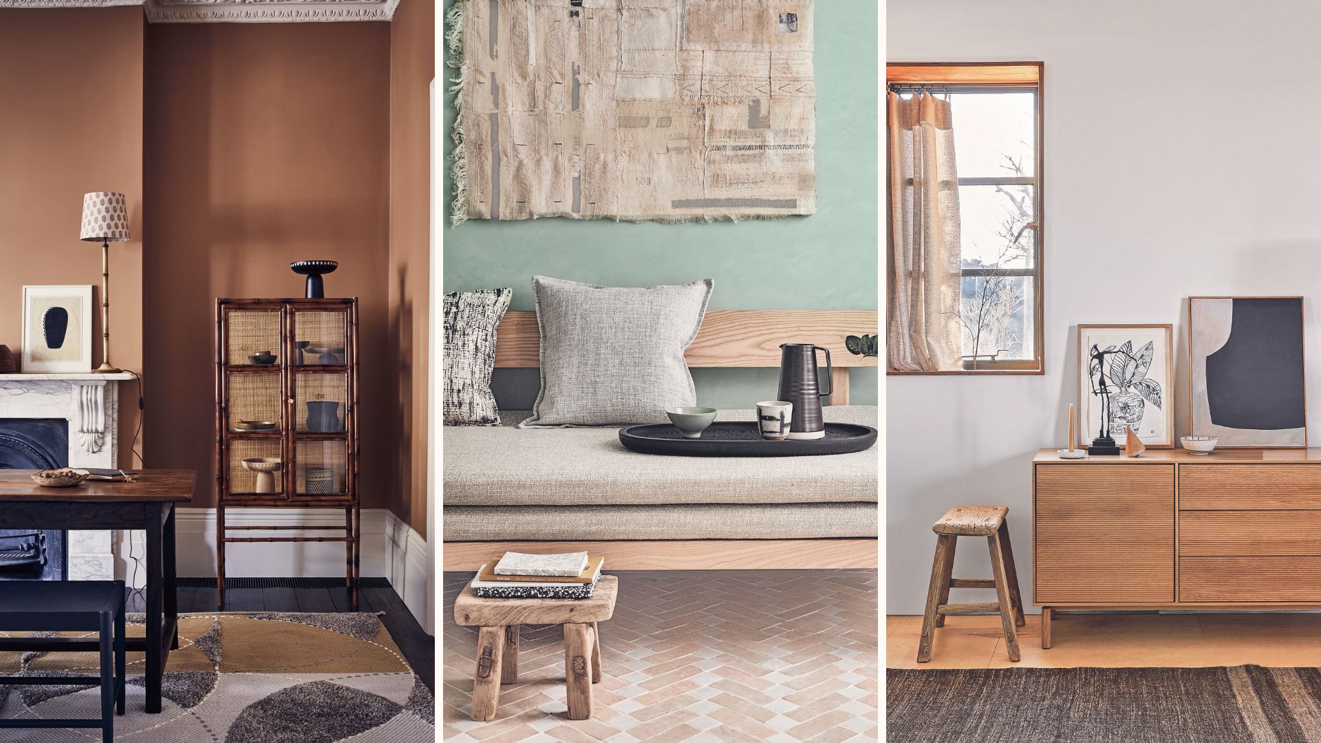
Conversely, a significant 'Don't' is to layer similar fabrics. The article cautions that using fabrics with too many commonalities, such as velvet and mohair, can result in a one-dimensional aesthetic lacking contrast. Distinct textures are essential for adding depth and richness to a space, making it visually more engaging.
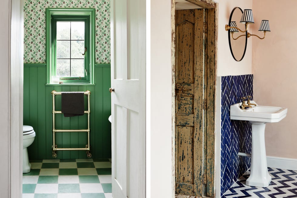
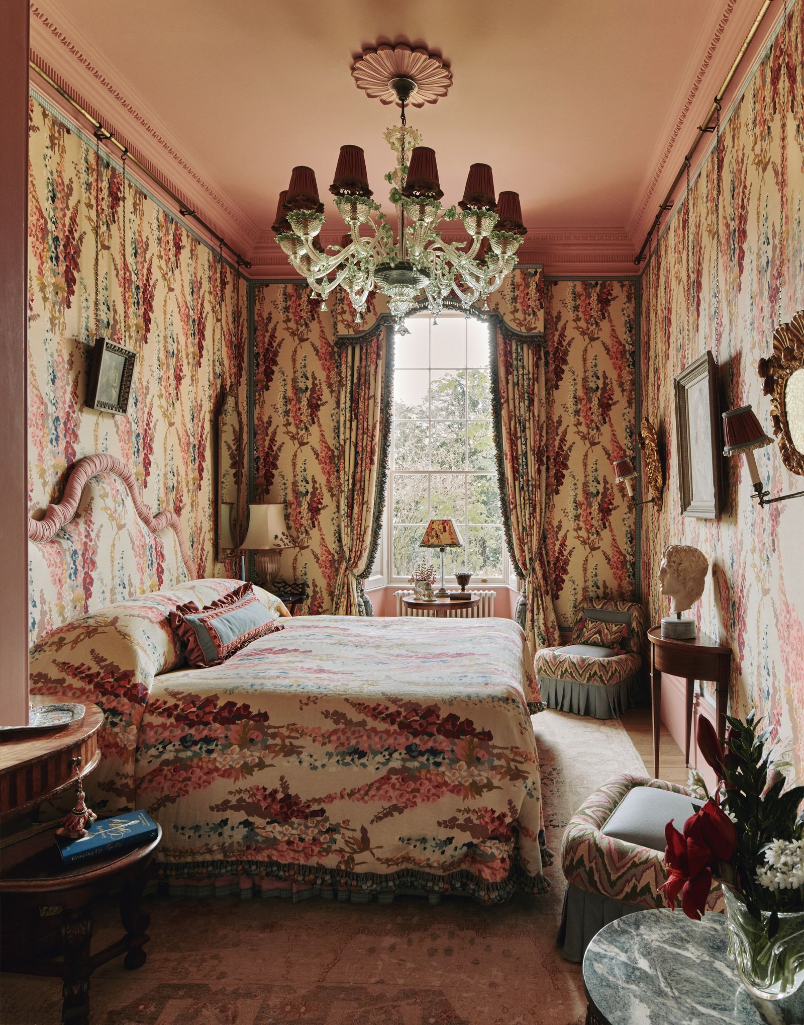
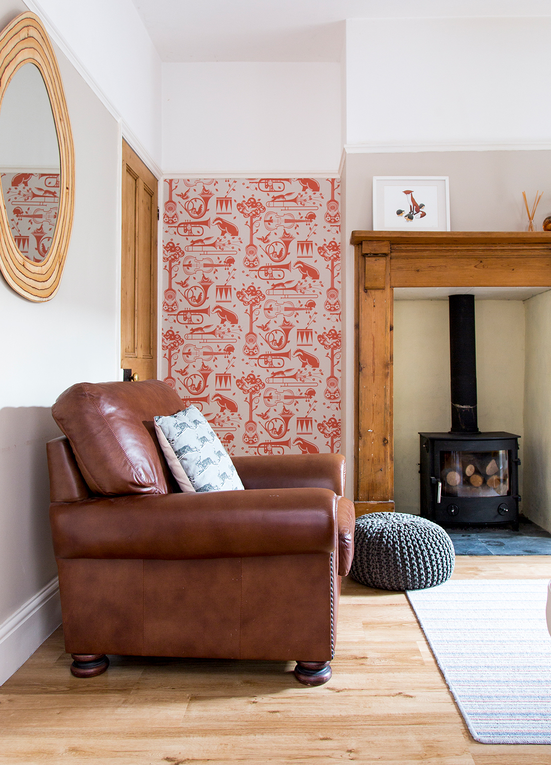
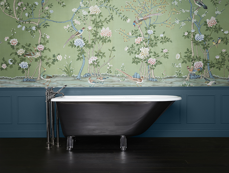
Thinking of wallpaper and other decor as layers is another 'Do' presented in the article. Wallpaper, whether patterned or textured, is highlighted as a popular and impactful element. Evars notes a trend in using eye-catching wallpaper in smaller rooms and mentions the appeal of textured options like grasscloth. Beyond wallpaper, she recommends incorporating unique lampshades, customizing furniture with contrast welts, and using rugs with high-low pile patterns to introduce varied textures and patterns throughout a room.
However, a related 'Don't' is to match textures in adjacent rooms. While varied textures are encouraged within a single space, the article advises against using overly similar wallpapers or textures in connecting rooms. This distinction ensures that each room retains its unique character and prevents a monotonous feel throughout the home. Evars illustrates this by describing her use of distinct grasscloth wallpapers in her bedroom and office.
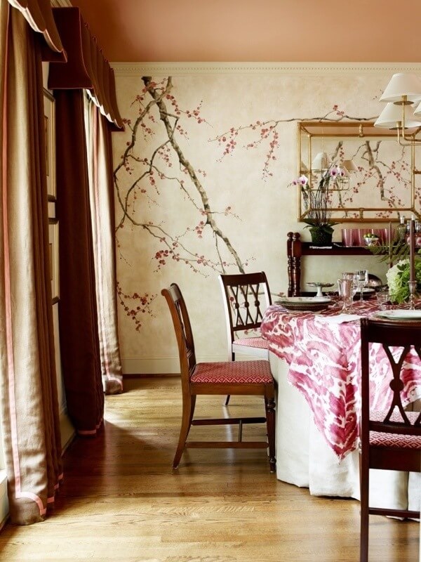
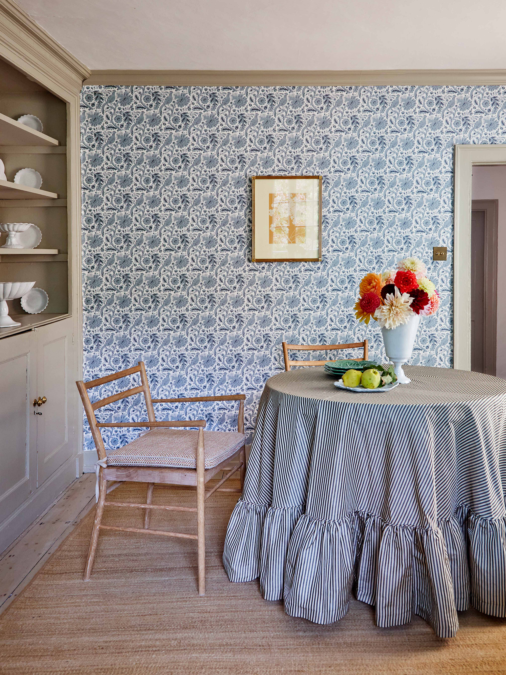
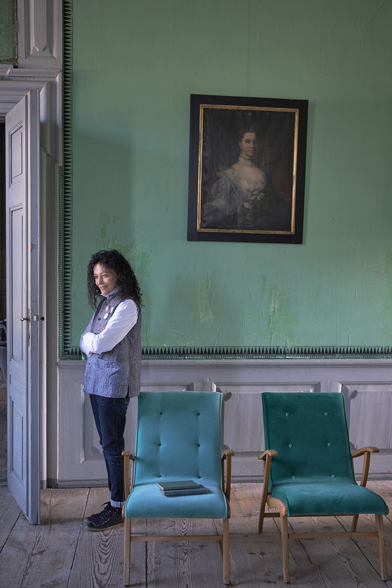
Mixing wallpaper with artwork is another 'Do' for enhancing a room's aesthetic. Evars asserts that artwork appears more elevated and complete when placed over wallpaper, dismissing the misconception that one must choose between the two. She notes that art can either complement or contrast with the wallpaper, adding layers of visual complexity. The article further clarifies that coordinating art styles is not always necessary; a traditional room can benefit from a modern art piece, creating a captivating juxtaposition and tension that enriches the overall design. The final 'Do' is to constantly edit and refine your decor. Evars encourages both professionals and novices to view their spaces as fluid, allowing for seasonal adjustments or relocation of items to refresh the look. This iterative process prevents a room from feeling overly busy and ensures that the decor remains dynamic and personally resonant. #InteriorDesign #PatternMixing #HomeDecor #DesignerTips #ColorCohesion #WallpaperTrends #TextileLayering #ArtPlacement
0 comment in total
 No comments yet
You may also like
Pattern play: These 15 rooms by Dallas designers will inspire mixing and matching
How to use clashing patterns in your home, according to design experts
Decorating with pattern – 11 ways to embrace print at home

If You Subscribe To Maximalist Style, You'll Love This Wallpaper Trend
The ONLY Advice You Need to Mix Patterns Like a Pro!


A masterclass in mixing pattern
Interior Design Tips: The Dos and Don’ts of Layering
Go-to tips for finding harmony in eclectic home design
Pattern clashing is the tricky trend we are loving – 10 rules designers always follow to ensure it works
Designers Say You Might Be Mixing Textures in Your Home All Wrong

5 rules of thumb for mixing wood tones around your home, shared by interior designers

Dress Up Your Space With Contrasting Colors

7 Golden Rules for Mixing and Matching Patterns That Designers Swear By

The return of the matchy matchy pattern look, and how to do it right
How to Successfully Mix Bold Colors in Your Home Like an Interior Designer
Inside a Home Library That Features More Than 300 Patterns

9 Ways to Decorate with Patterns
Mixing patterns and prints in interior design – a 12-step masterclass
How to combine colour, pattern and texture without making a complete mess of things
Floral Patterns Are Trending This Summer—How to Mix and Match Them Like a Designer