1/6
How to use clashing patterns in your home, according to design experts
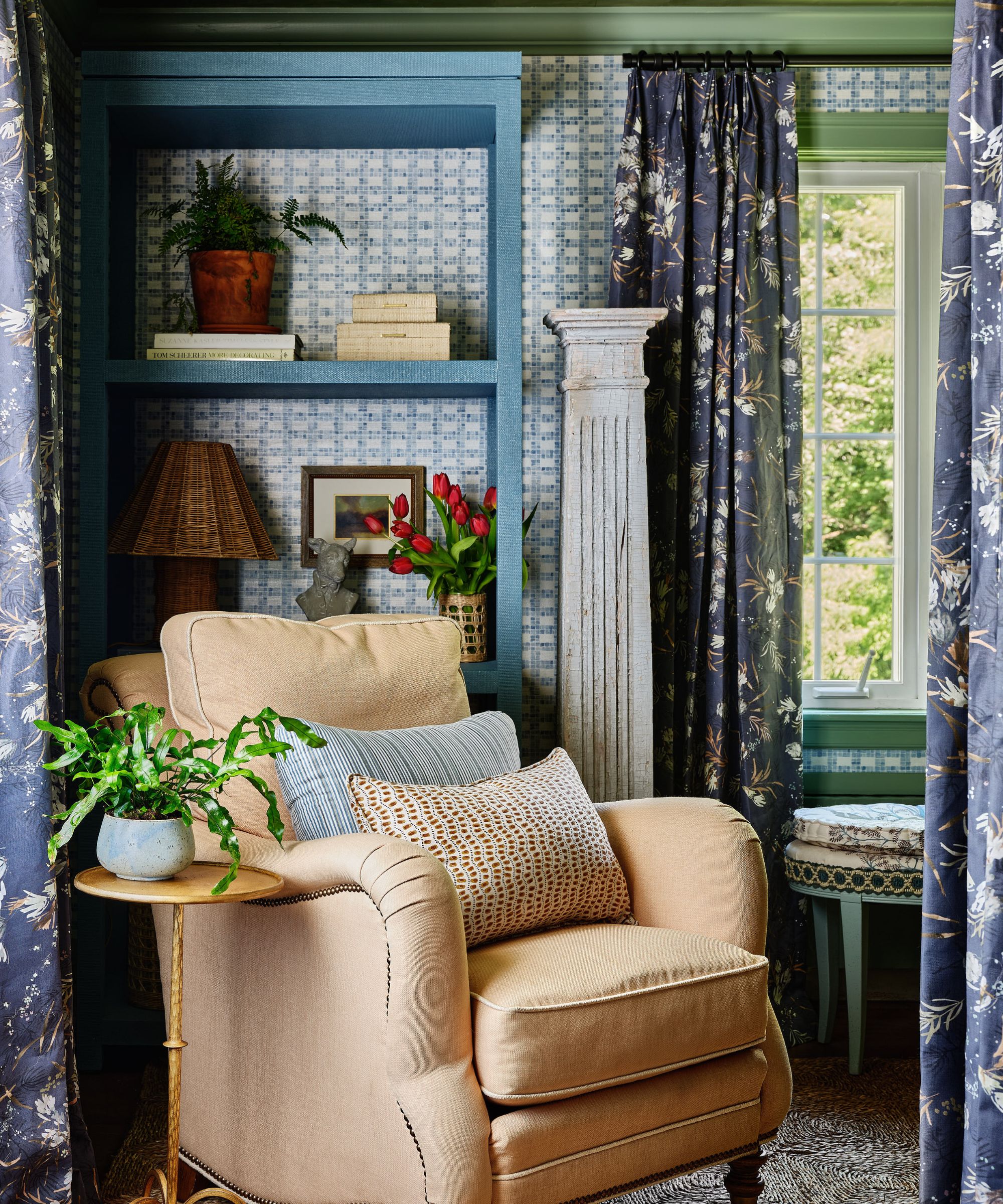
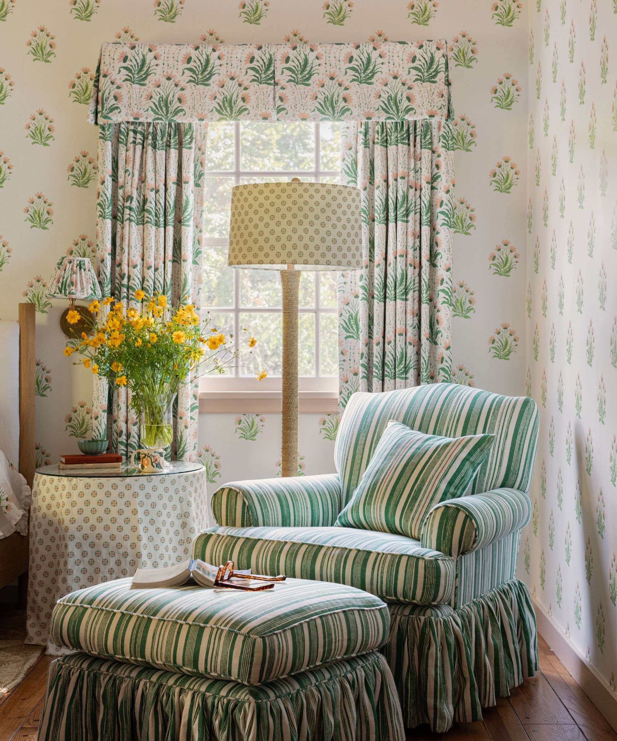
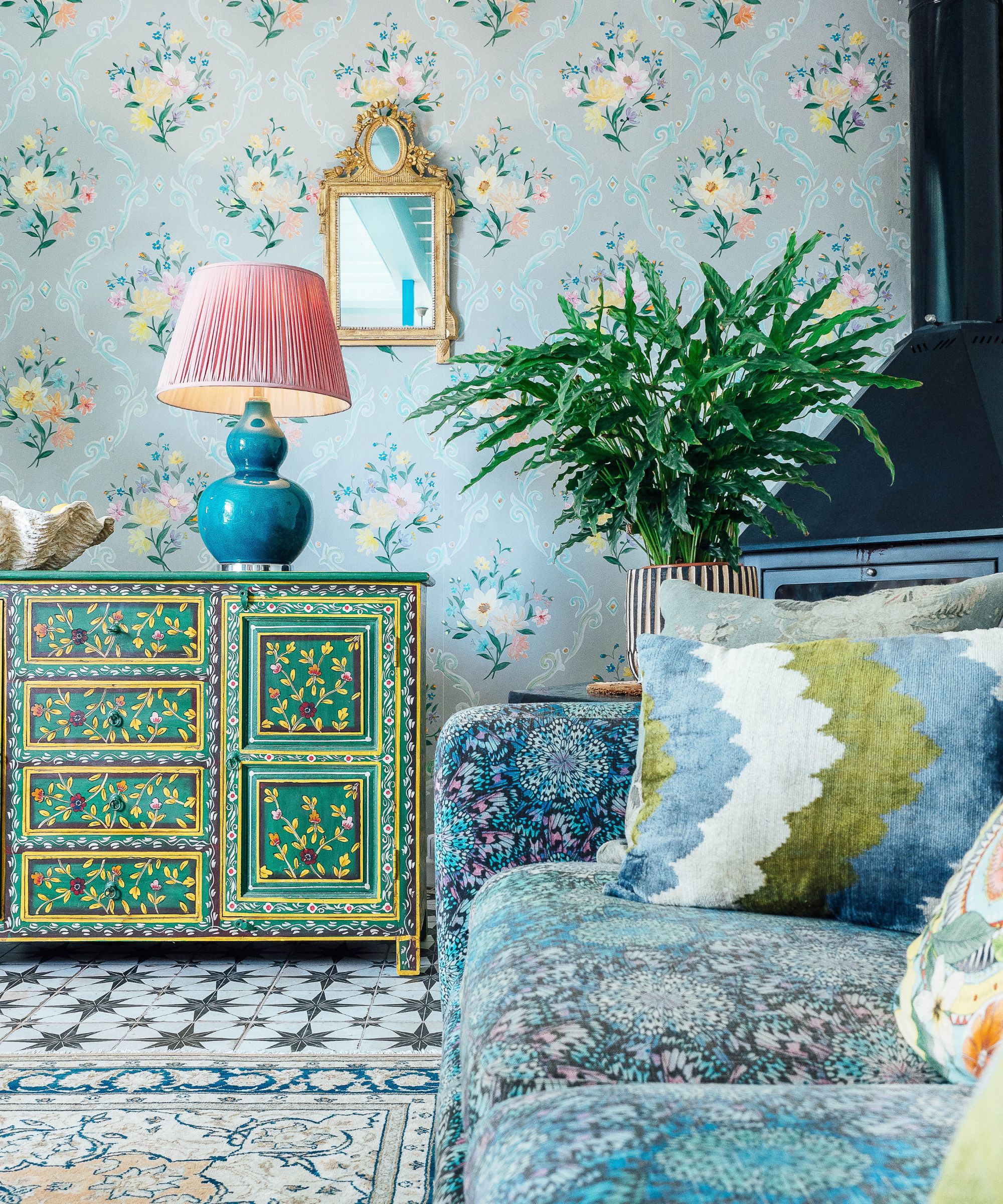
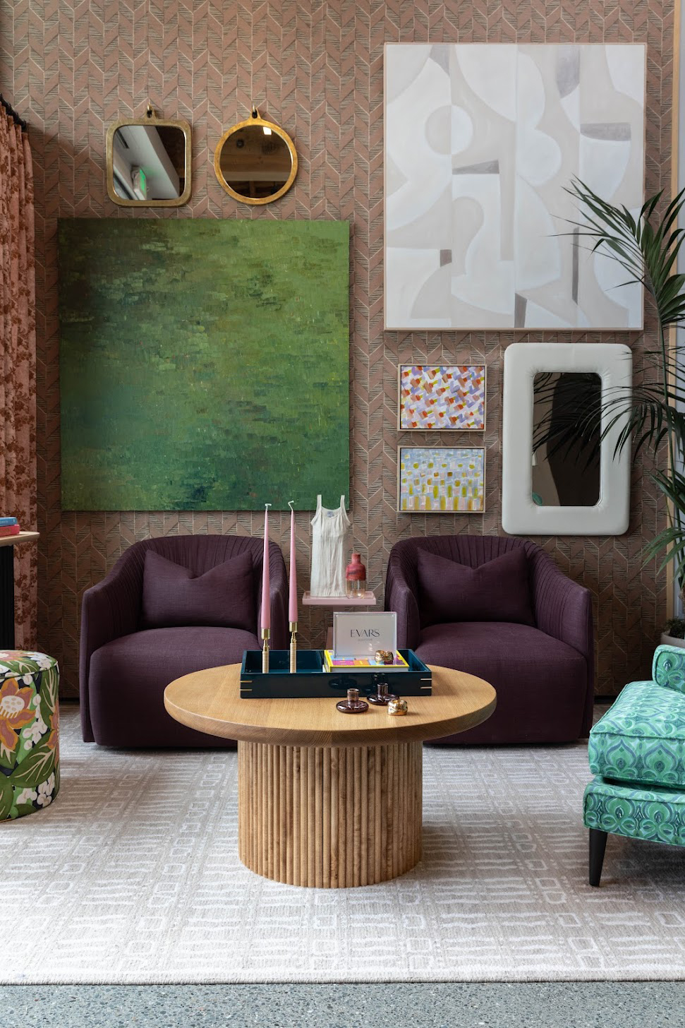
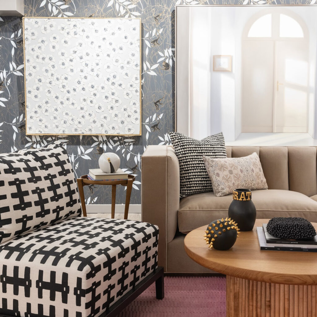
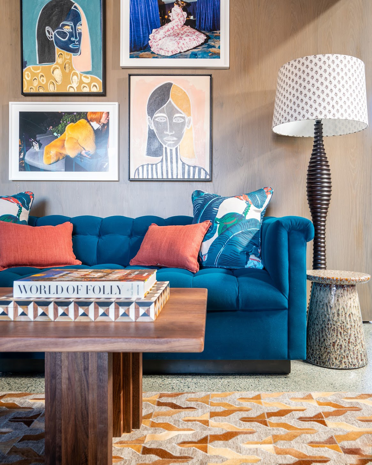
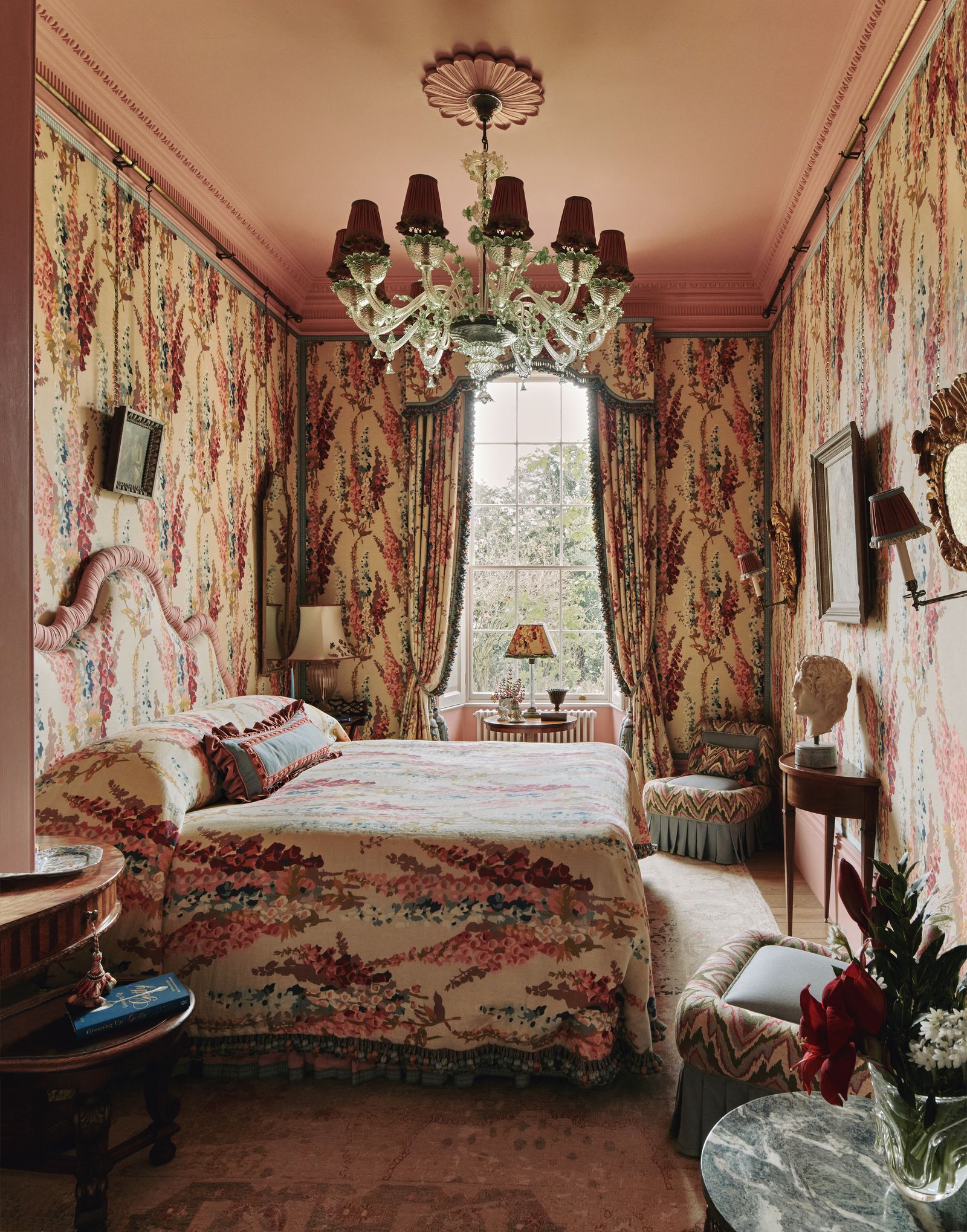
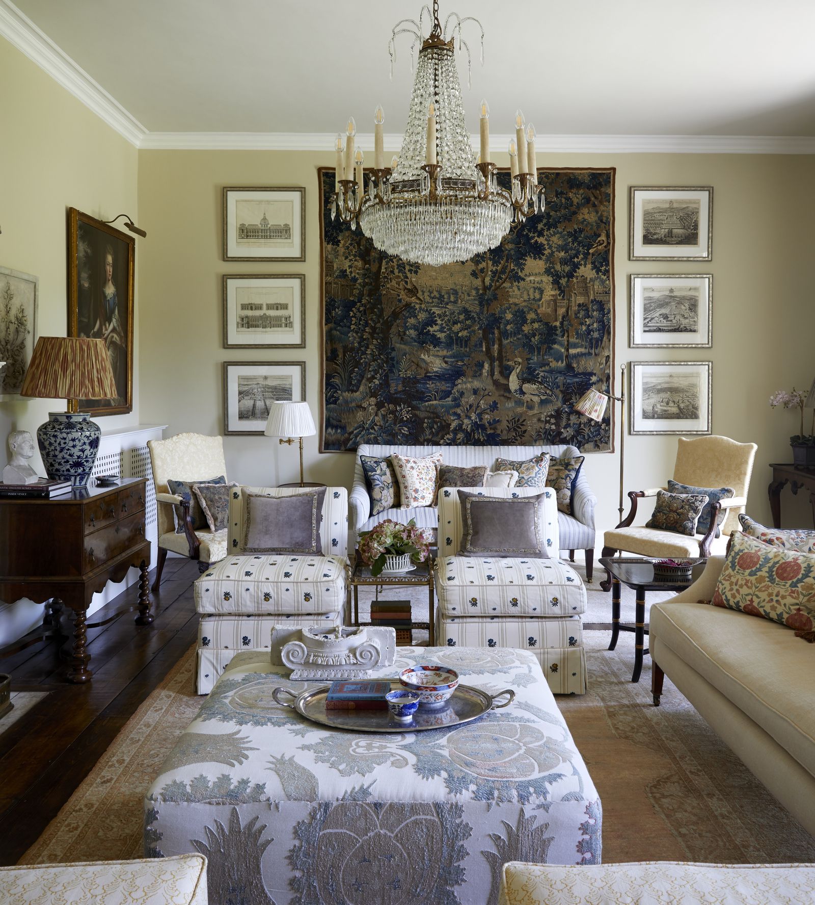
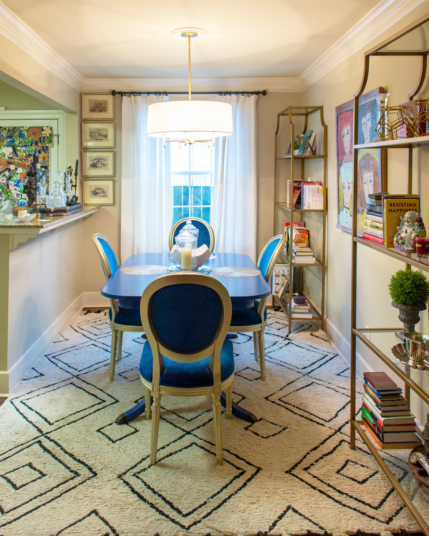
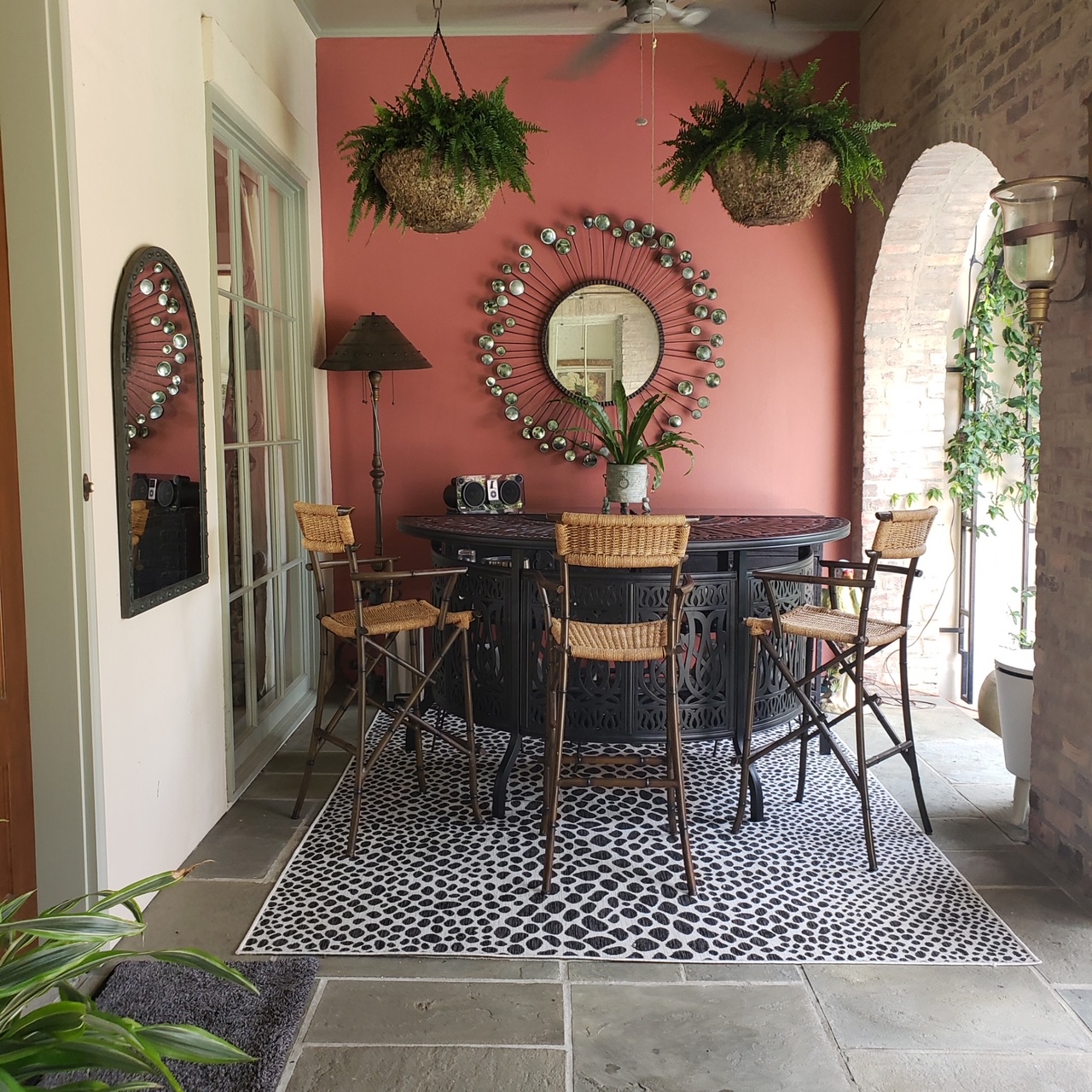
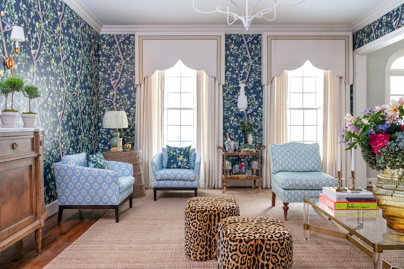
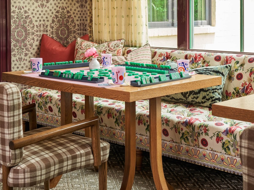
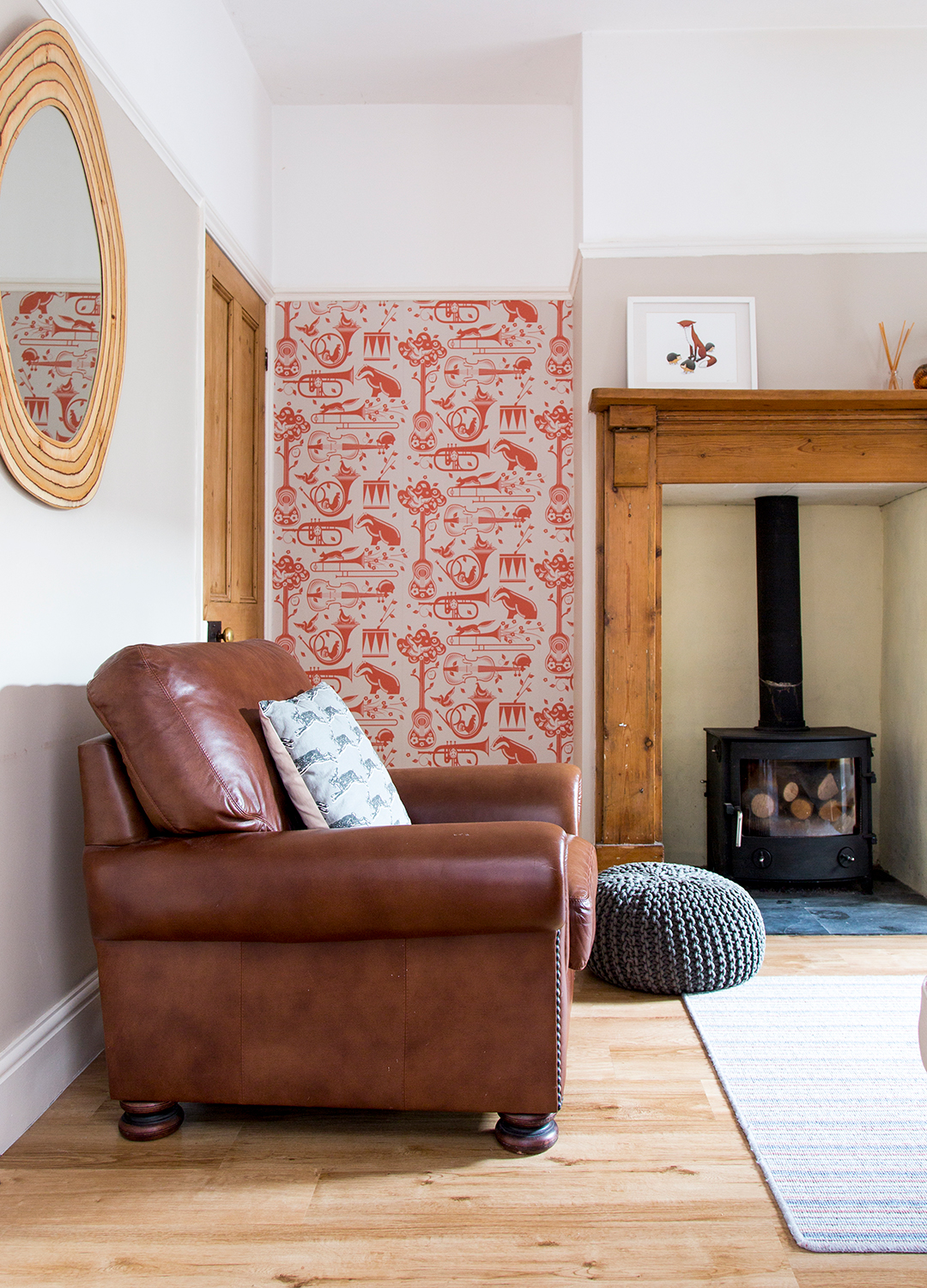
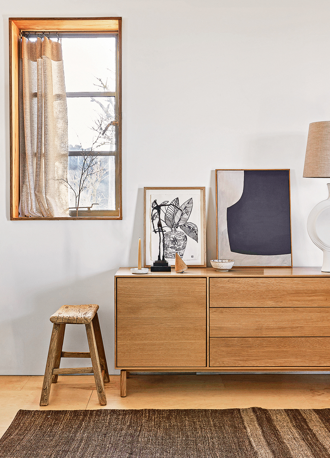
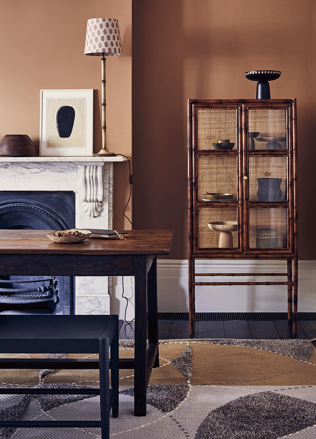
The article explores the effective use of clashing patterns in British interior design, highlighting how a mix-and-match approach, combining old and new elements with both light and playful touches and traditional weight, has become a hallmark of stylish British homes. It details several strategies and insights from design experts for intentionally integrating diverse patterns to achieve an eclectic yet cohesive aesthetic.
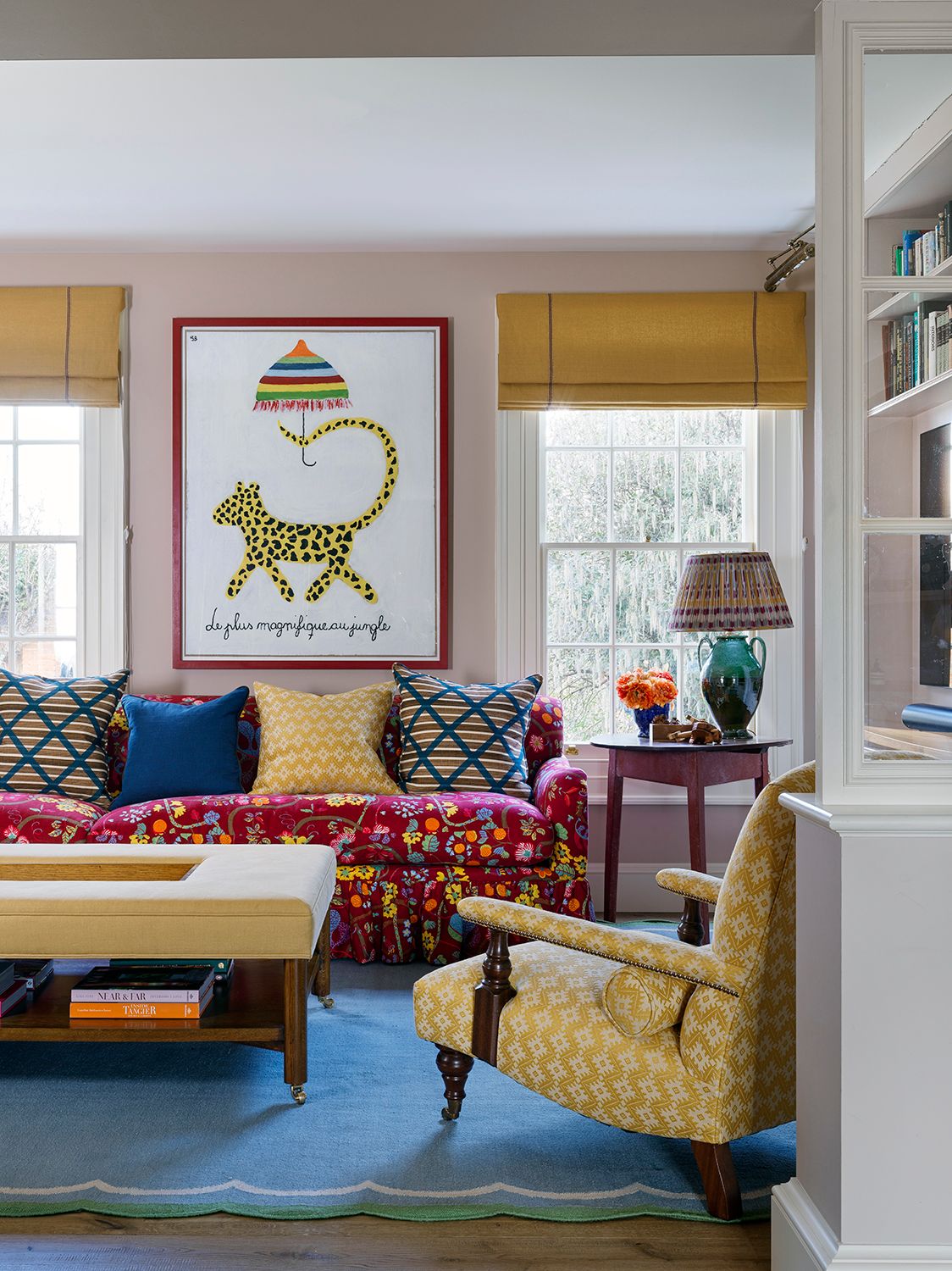
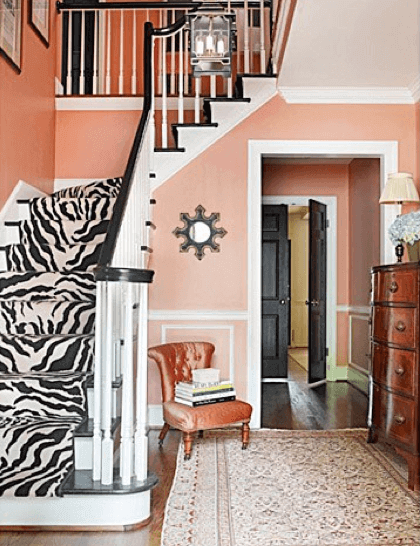
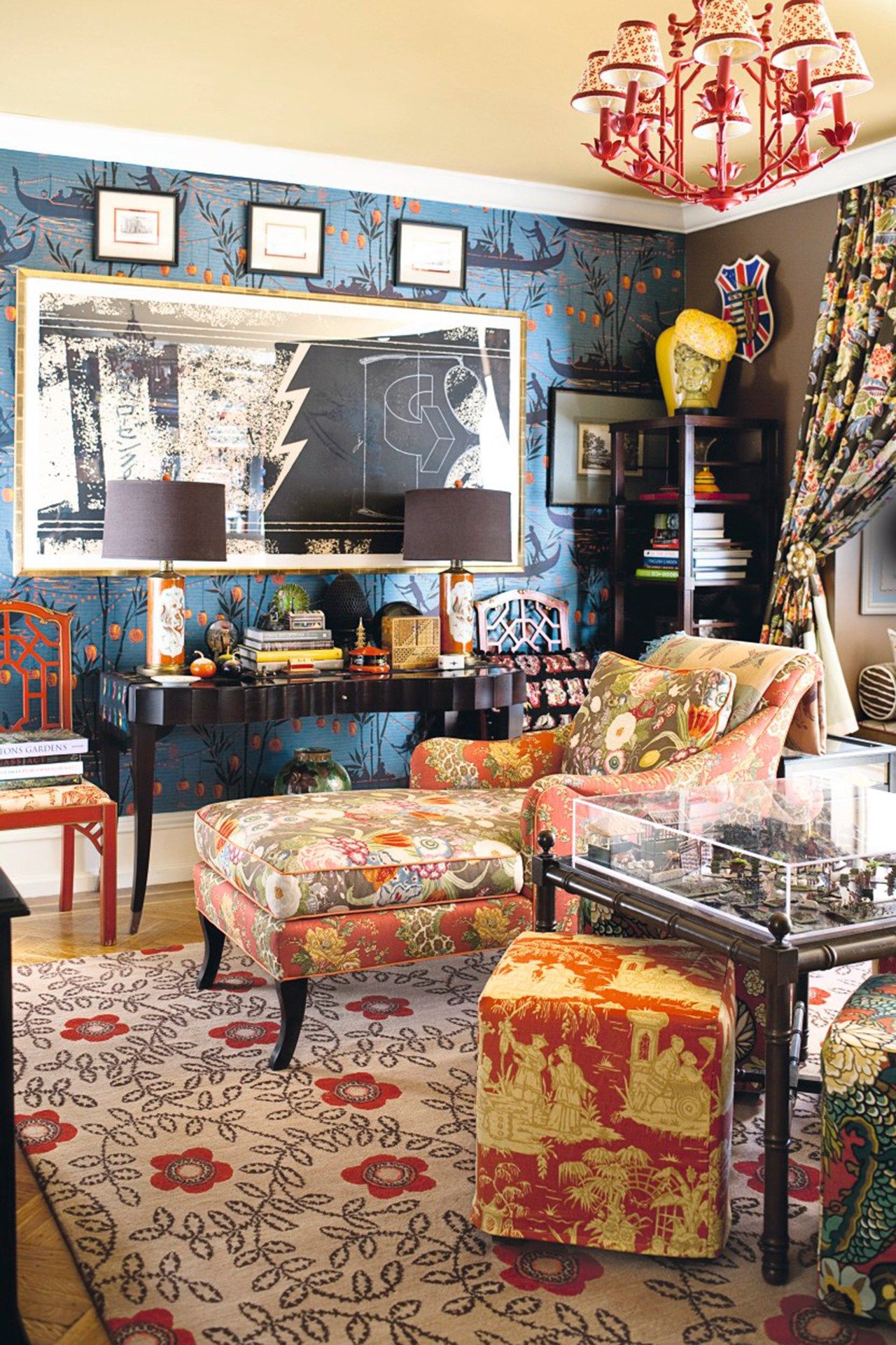
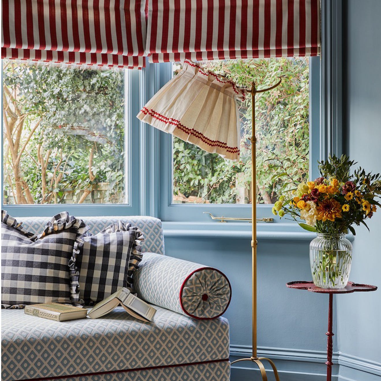
One approach involves starting small by incorporating patterned accessories and soft furnishings. Lucy Ackroyd, Head of Design at Christy, suggests using patterned items like romantic floral bedding or deep blue and lime green striped towels to introduce character and unexpected color pairings. Feature patterns such as leopard print, gingham, or bold stripes are considered safe choices for accents, similar to a colorful feature chair in a living room, adding visual interest without overpowering the space.
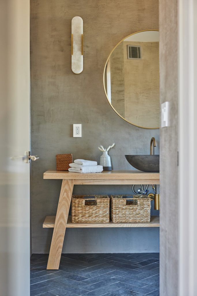
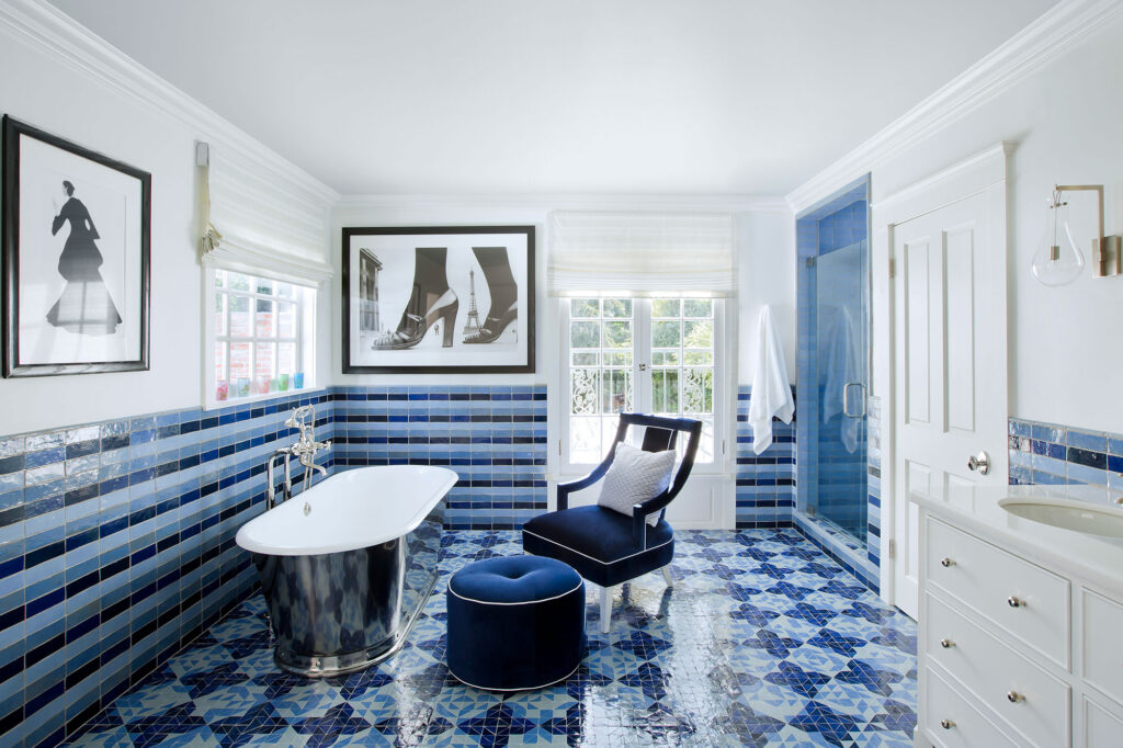
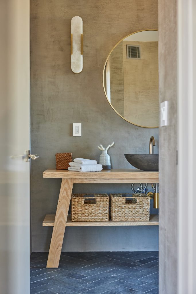
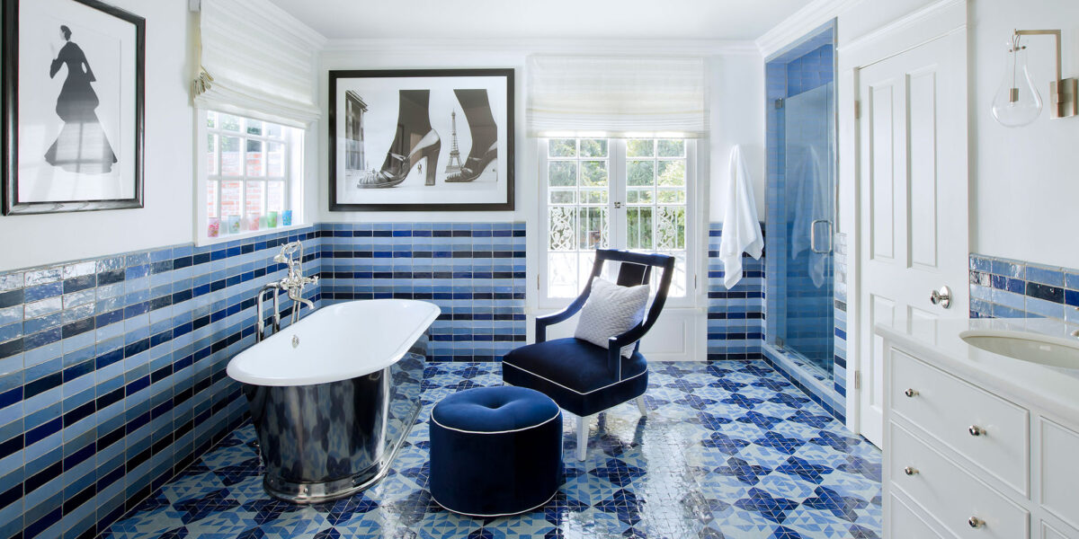
Another strategy focuses on utilizing compact spaces, such as bathrooms or downstairs loos, for design experimentation. These smaller areas provide an ideal canvas for clashing patterns, with options ranging from zig-zag, herringbone, or checkered floor tiles to playful wallpapers. The article showcases a Bert & May bathroom example that successfully combines stringent lines with organic floral shapes, adhering to a limited two-color palette for coherence.
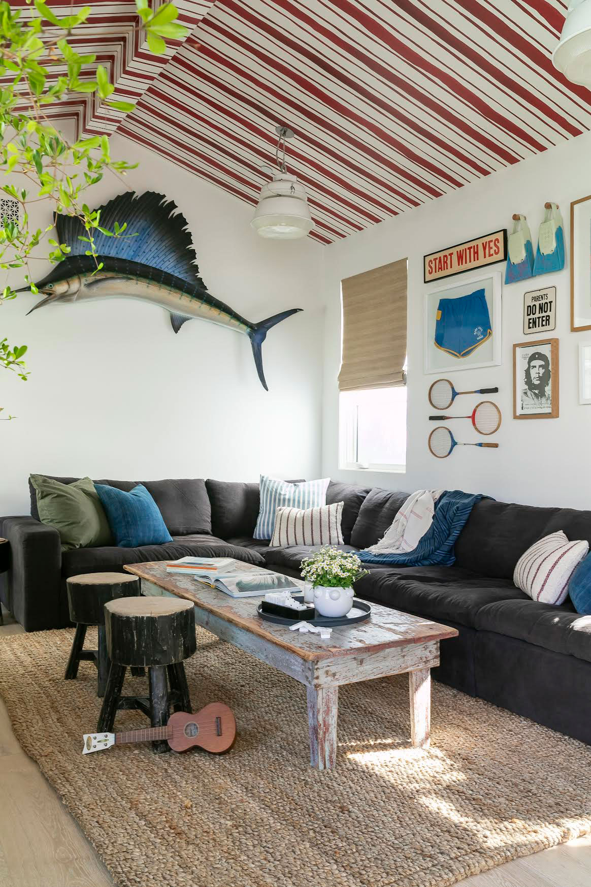
Interior designer Laura Stephens shares her expertise, emphasizing the use of prints that don't appear overly coordinated but complement each other effectively. She recommends pairing stripes with bold floral prints, as demonstrated in a bathroom setting where a coral color from wallpaper is echoed in a striped fabric on an occasional chair. In a playroom, she combines a subtle jacquard fabric on a sofa with a bold stripe and gingham, creating a playful and quirky scheme. Stephens advises against being afraid to mix prints of various scales, suggesting the combination of graphic stripes or checks with florals to achieve a layered and personalized feel.
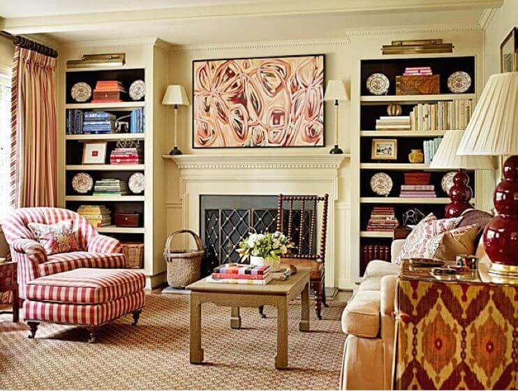
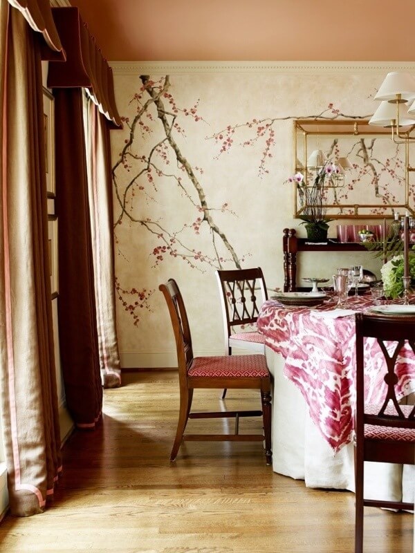
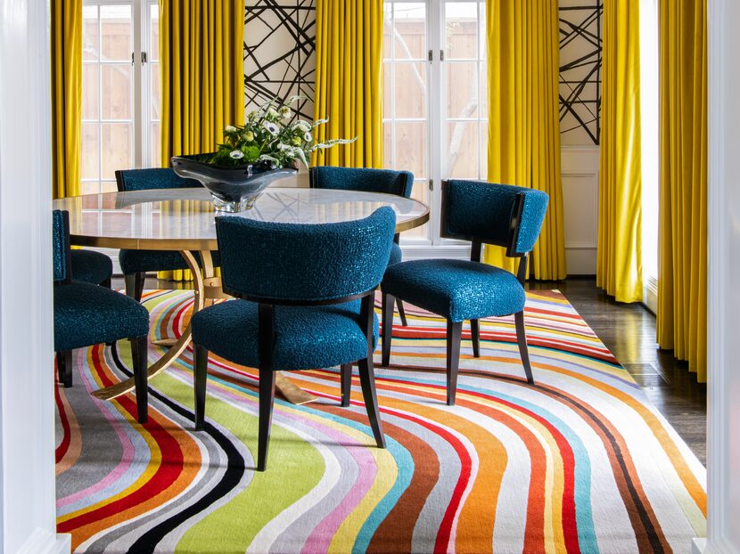
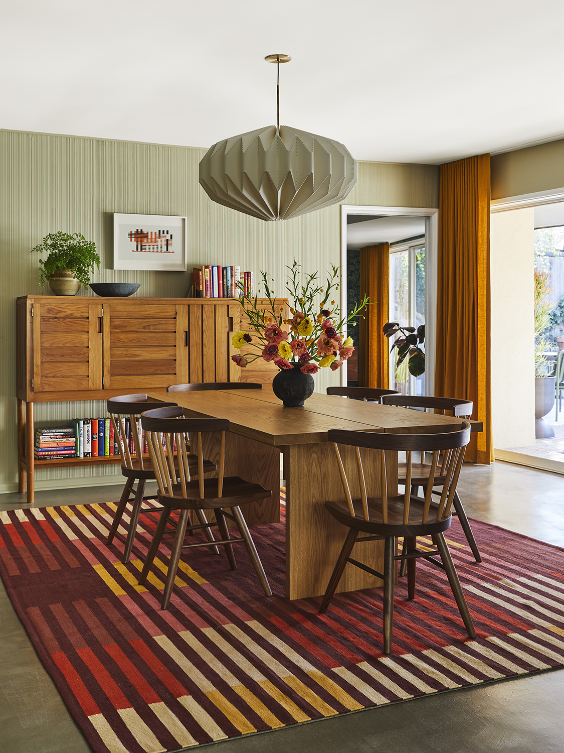
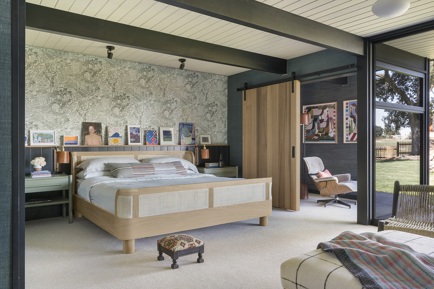
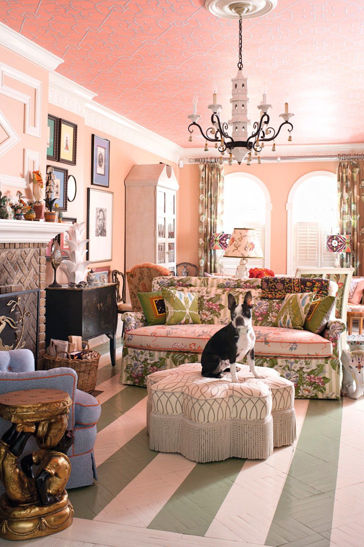
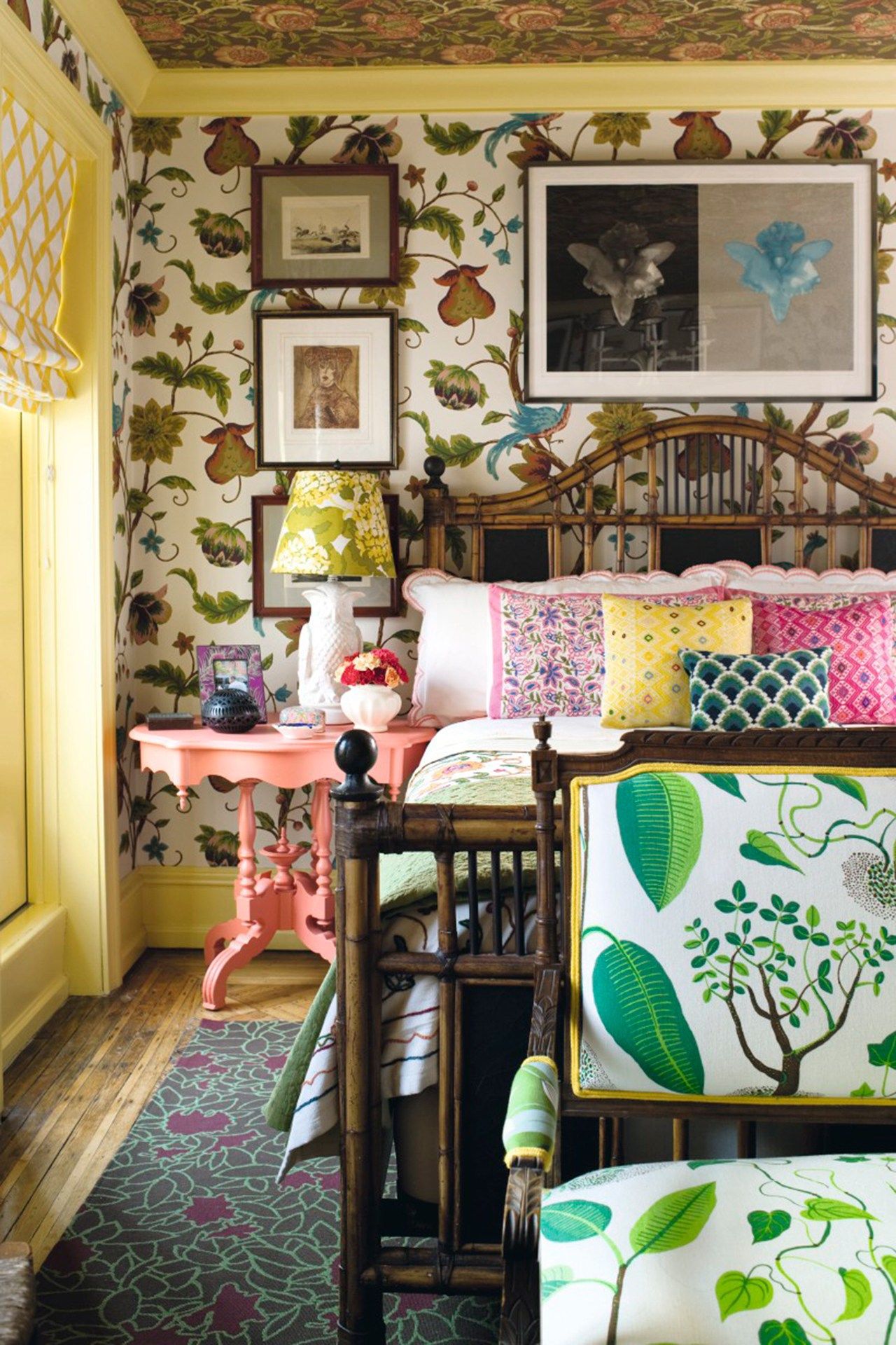
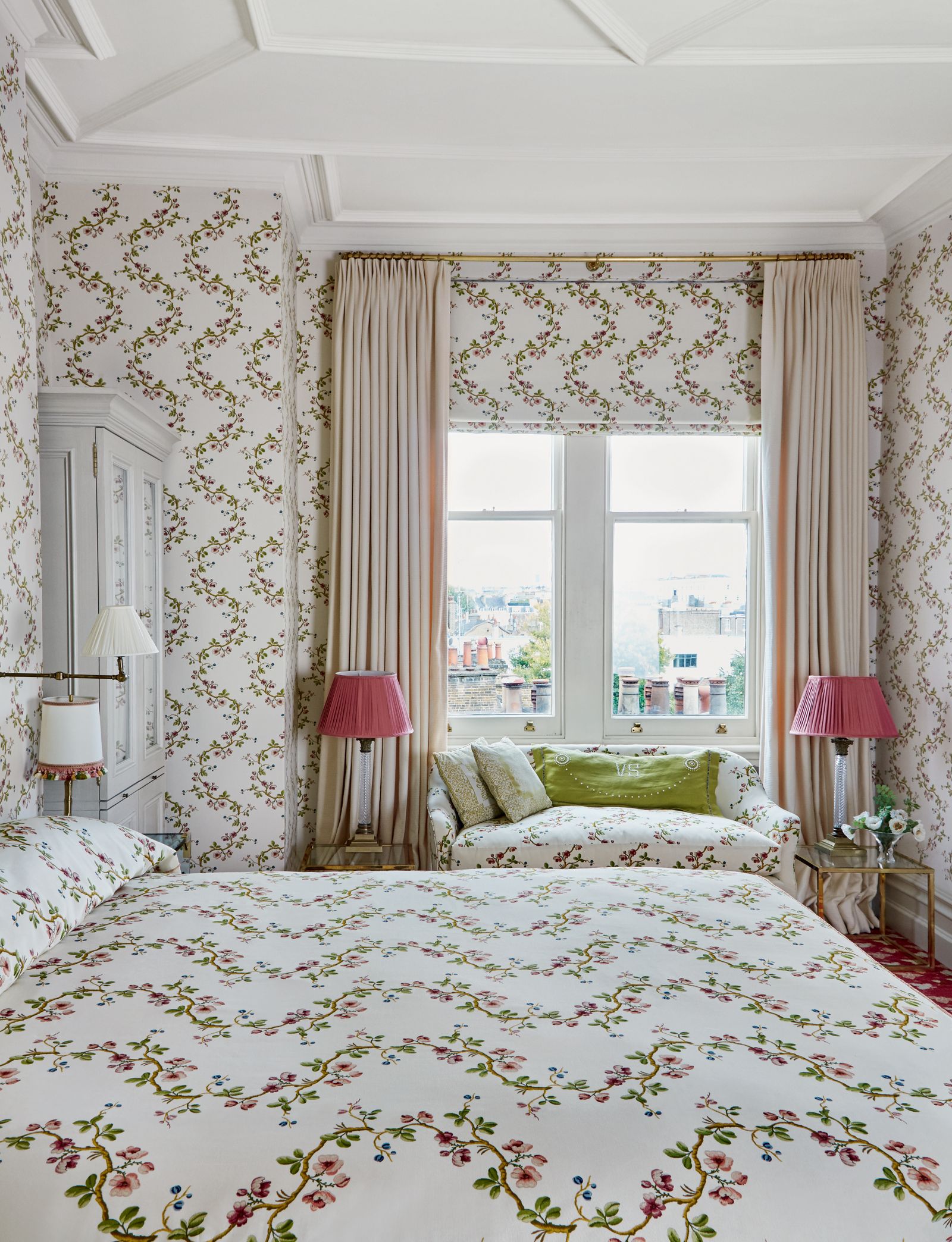
Furthermore, the article suggests matching colors while mixing patterns to create a cohesive yet dynamic look. This safe approach involves selecting a small color palette, ideally fewer than three colors, and applying them across different clashing prints. Examples include a Cath Kidston x DFS chaise where a scalloped motif picks up red roses, and a Colefax and Fowler bedroom featuring three distinct prints in the same color scheme. Amy Wilson, an interior designer for 247 Curtains, highlights the potential of window dressings for pattern clashing, recommending floral curtains against striped wallpaper or bold paint for a maximalist effect.
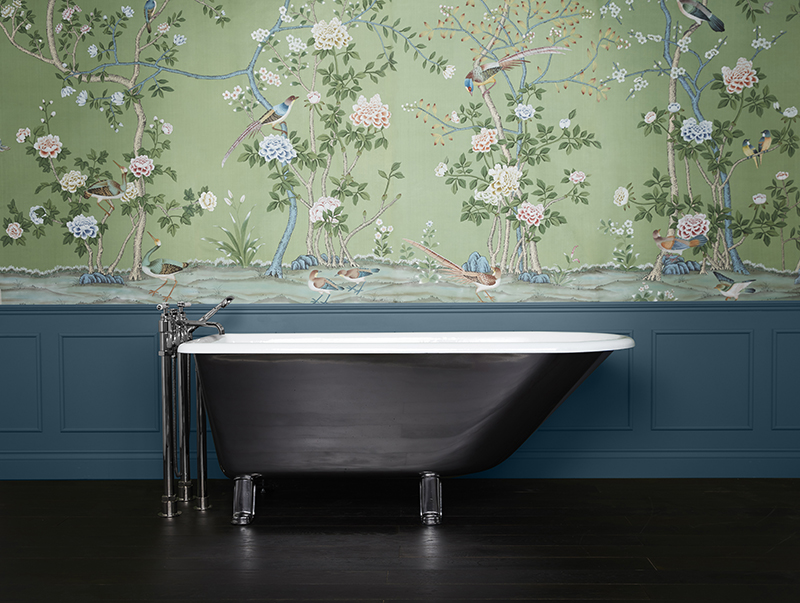
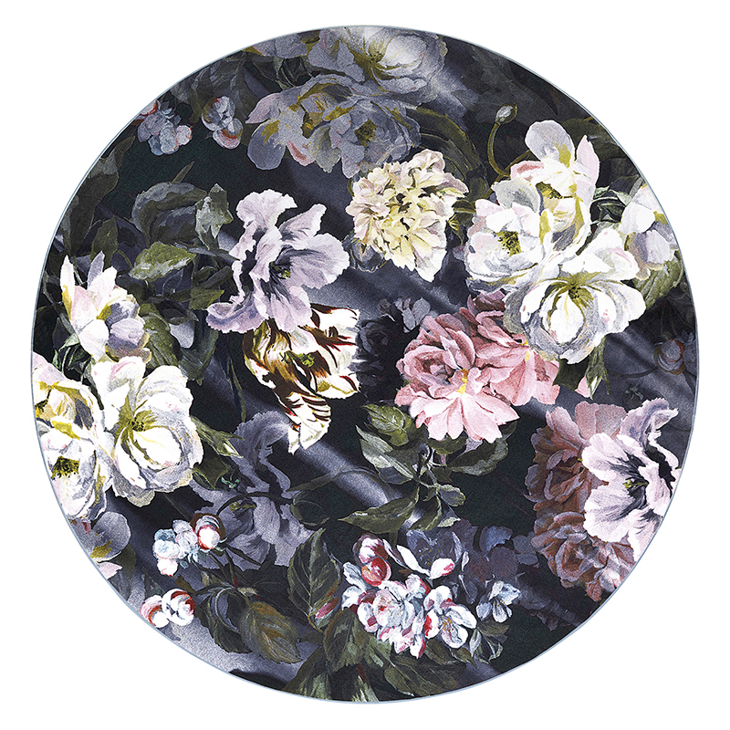
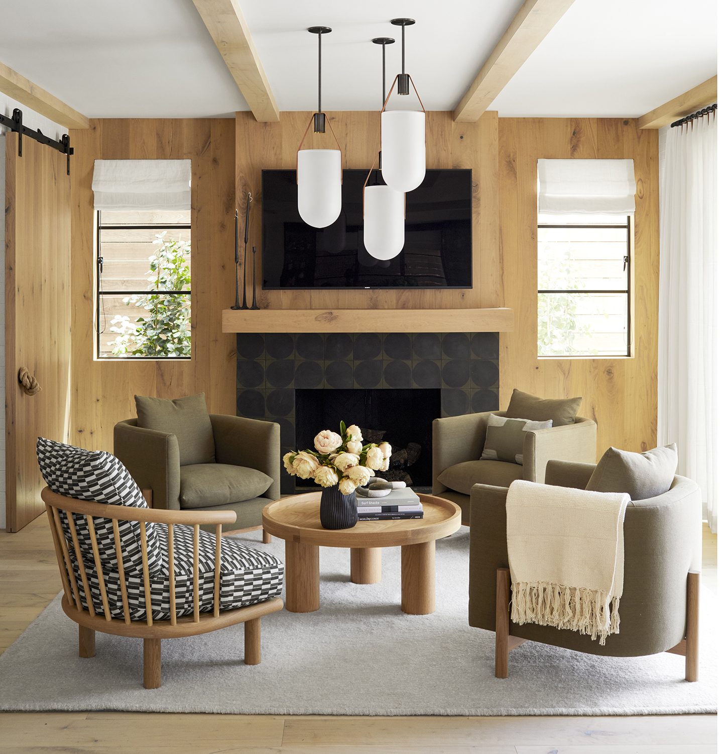
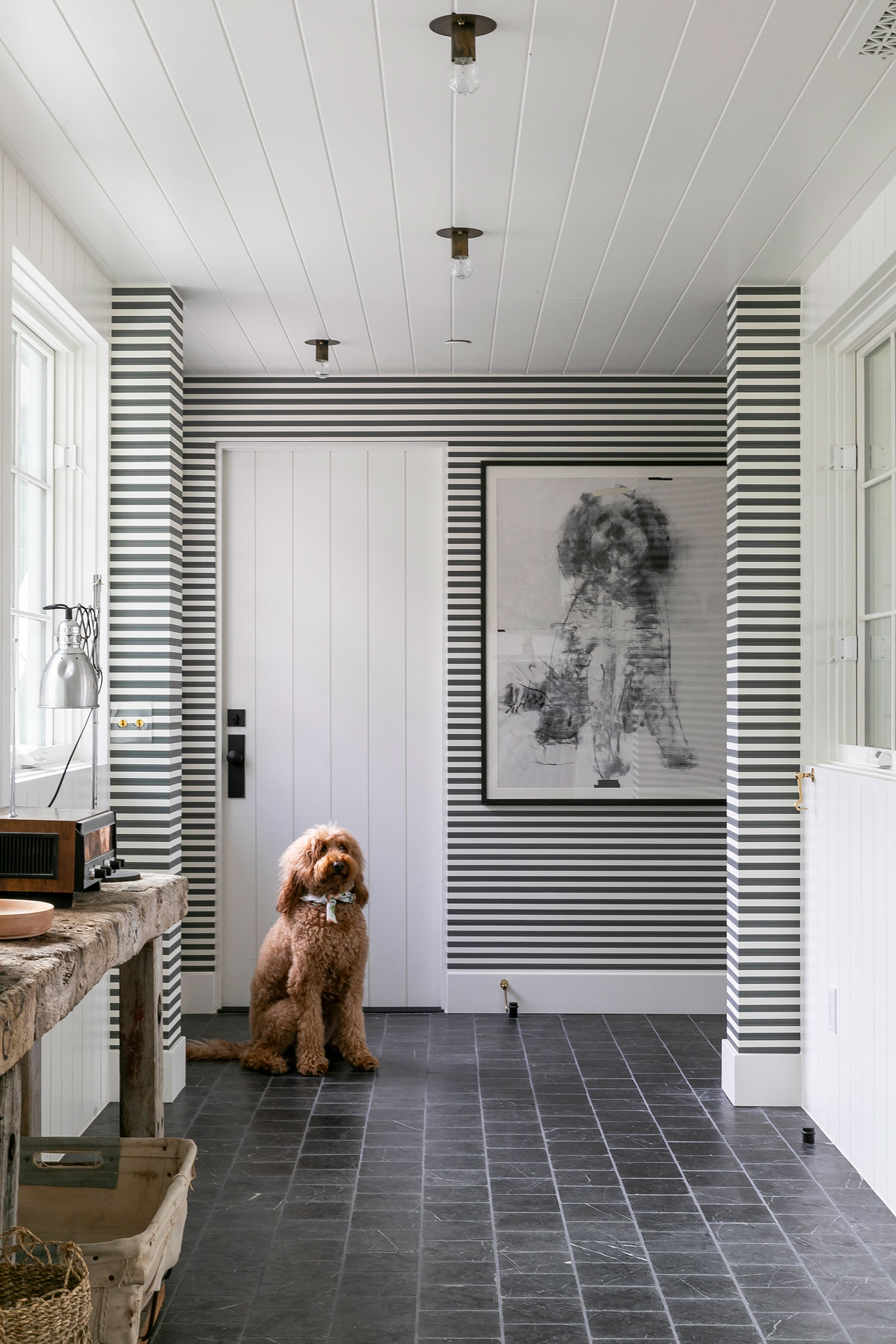
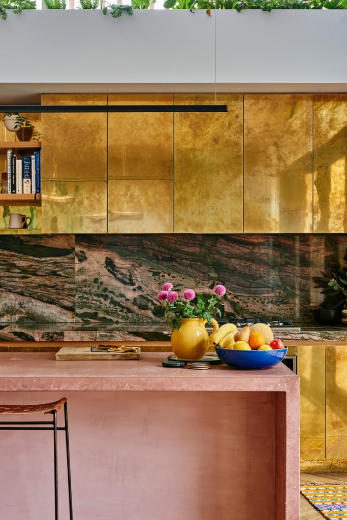
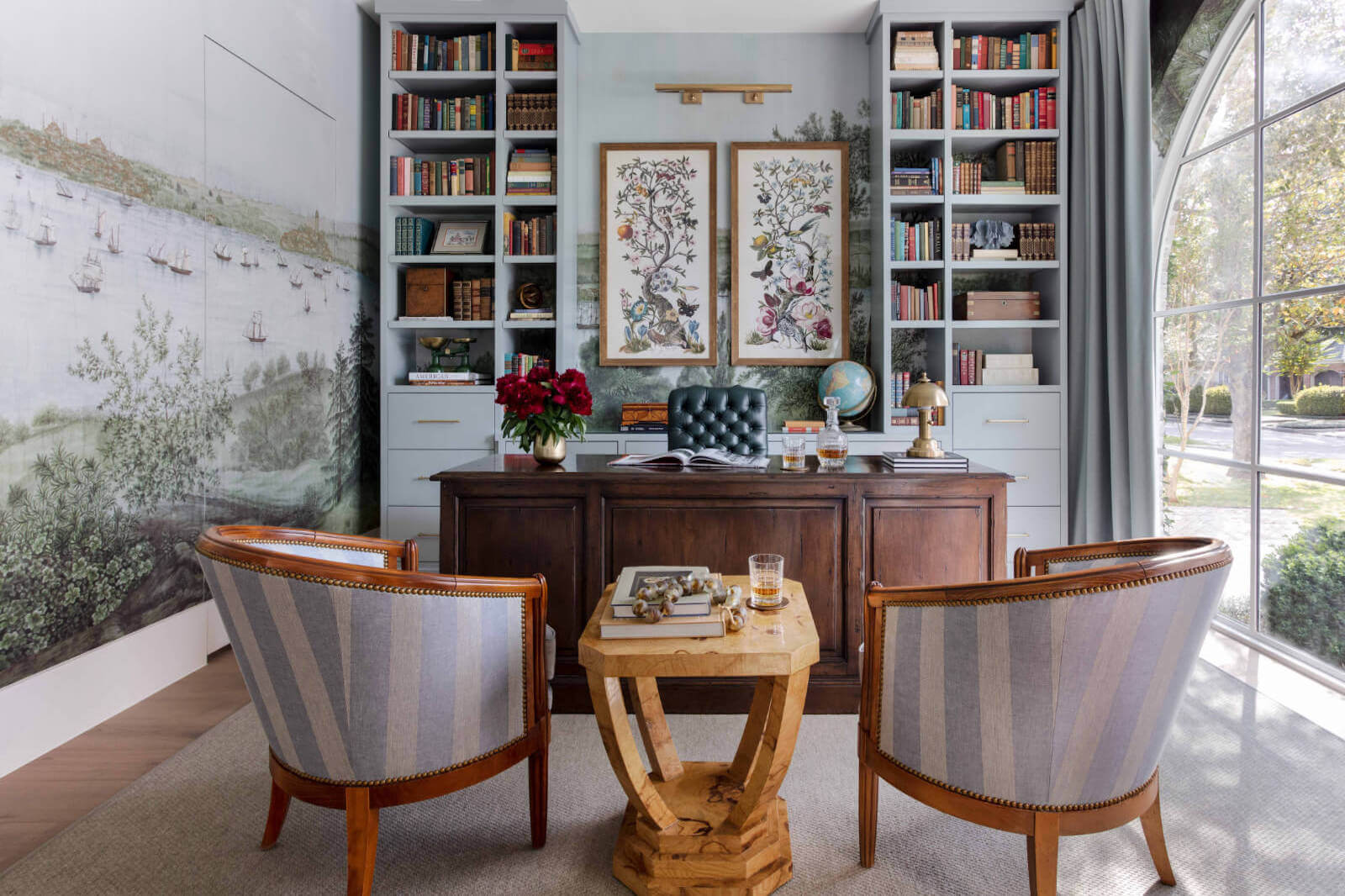
Finally, the article discusses clashing textures, treating strict lines like herringbone floors, metro tiles, or subtle wall paneling as base patterns. These can then be juxtaposed with dramatic elements such as large floral or tropical wallpapers, as seen with the Crane Fonda wallpaper from Divine Savages. A crucial caveat is to consider texture and pattern as interconnected design elements, for instance, using warmer colors in patterns to complement a mahogany floor's rich tones. This integrated approach ensures that the overall design remains harmonious despite the deliberate clash of patterns and textures.
#ClashingPatterns #InteriorDesign #HomeDecor #PatternMixing #DesignTips #SoftFurnishings #CompactSpaces #ColorPalette #TextureClash #ClashingPatterns #InteriorDesign #HomeDecor #PatternMixing #DesignTips #SoftFurnishings #CompactSpaces #ColorPalette #TextureClash
0 comment in total
 No comments yet
You may also like
Pattern clashing is the tricky trend we are loving – 10 rules designers always follow to ensure it works

Go-to tips for finding harmony in eclectic home design
How to combine colour, pattern and texture without making a complete mess of things
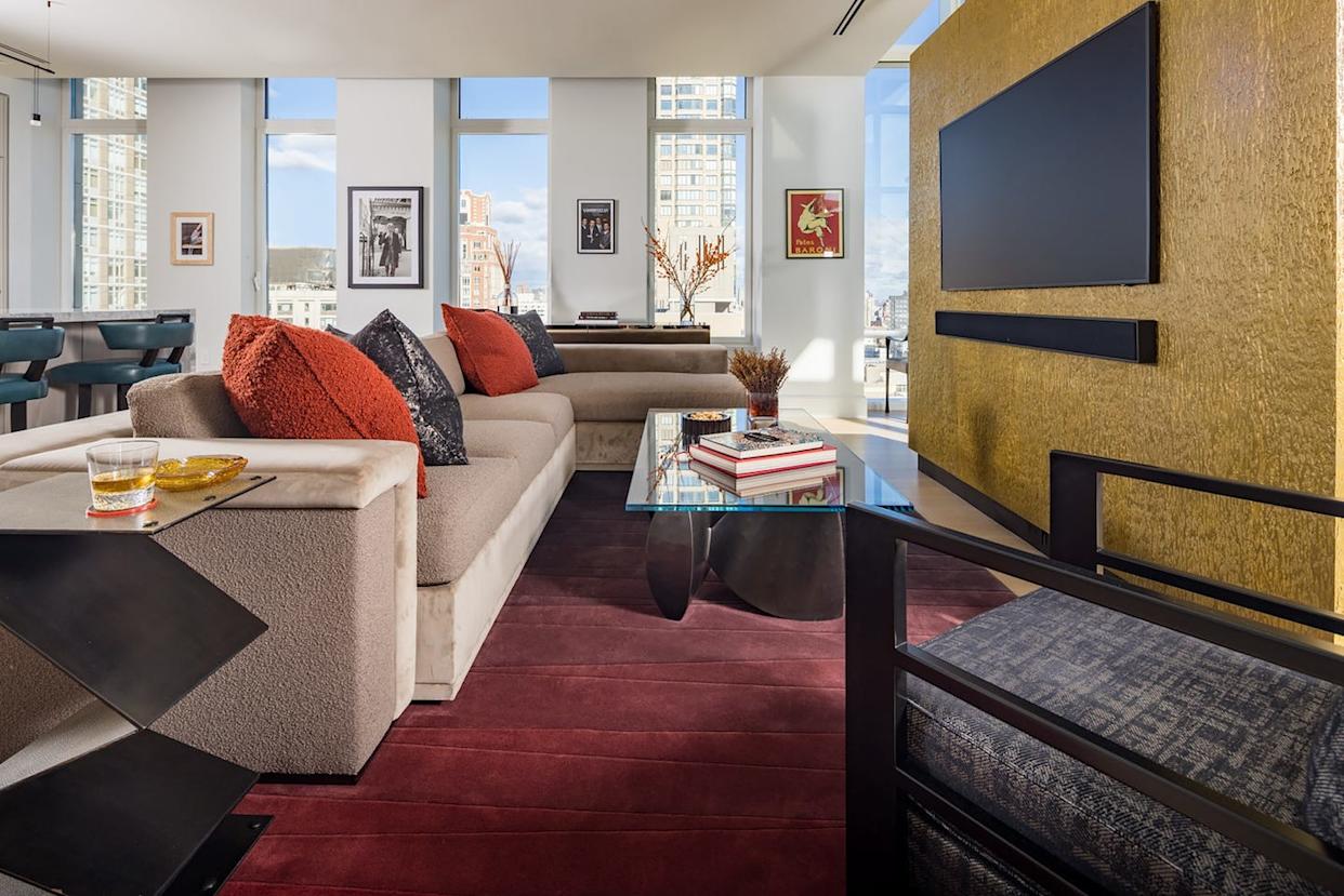
Designers Say You Might Be Mixing Textures in Your Home All Wrong

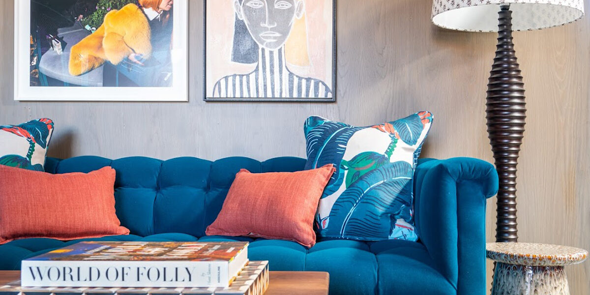
The 8 Dos and Don’ts of Mixing Patterns in Your Home
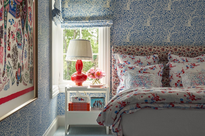
Pattern play: These 15 rooms by Dallas designers will inspire mixing and matching
Choose contrasting color schemes for a more powerful effect
Stripes Will Never Go out of Style—Here’s the Correct Way to Decorate with Them
The return of the matchy matchy pattern look, and how to do it right
Interior Design Tips: The Dos and Don’ts of Layering

The 10 Biggest Interior Design No Nos According to Decorators


A masterclass in mixing pattern
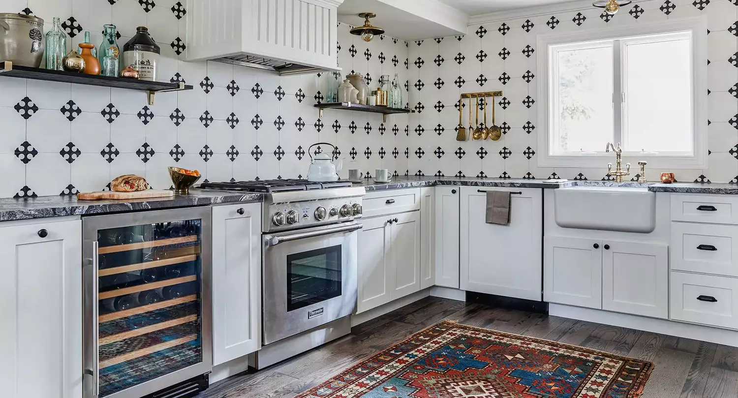
7 Golden Rules for Mixing and Matching Patterns That Designers Swear By

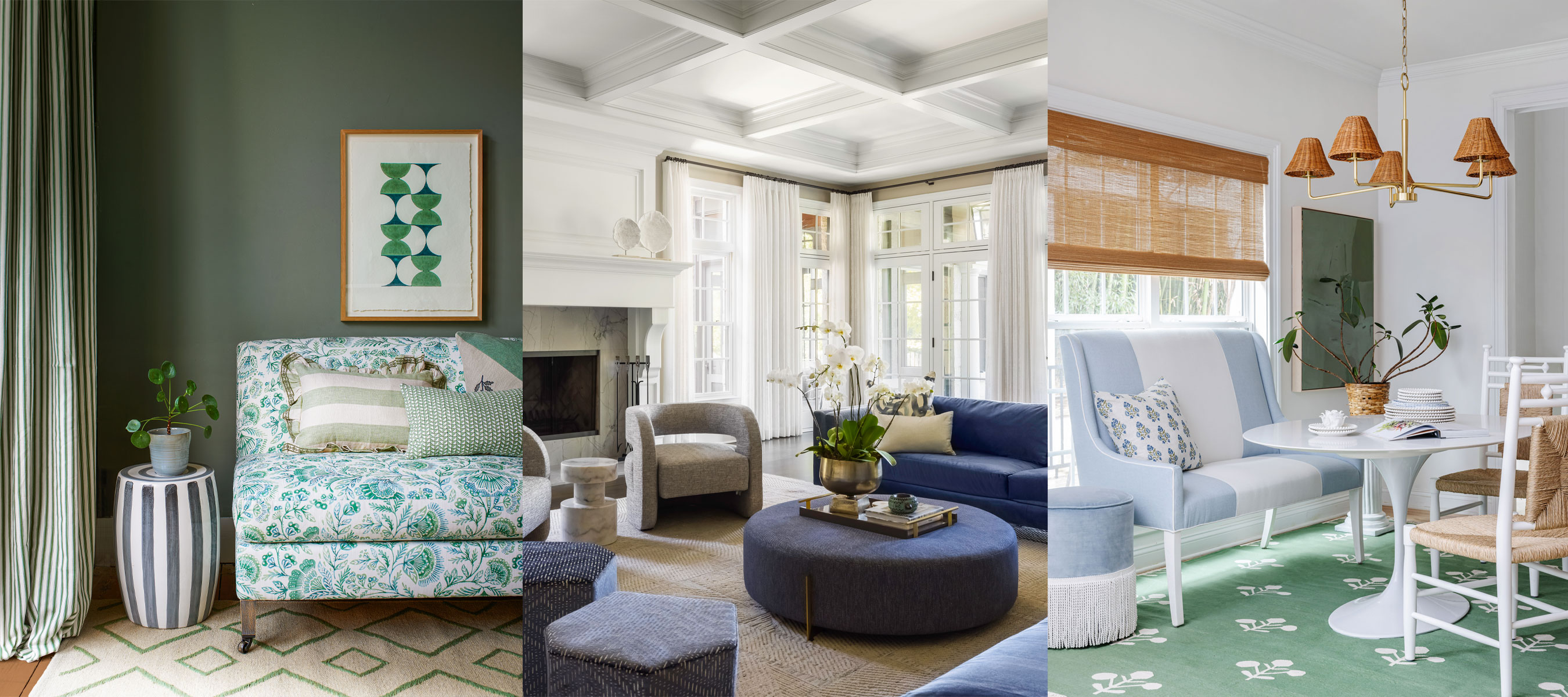
How to create repetition in interior design – 7 ideas for decorating success
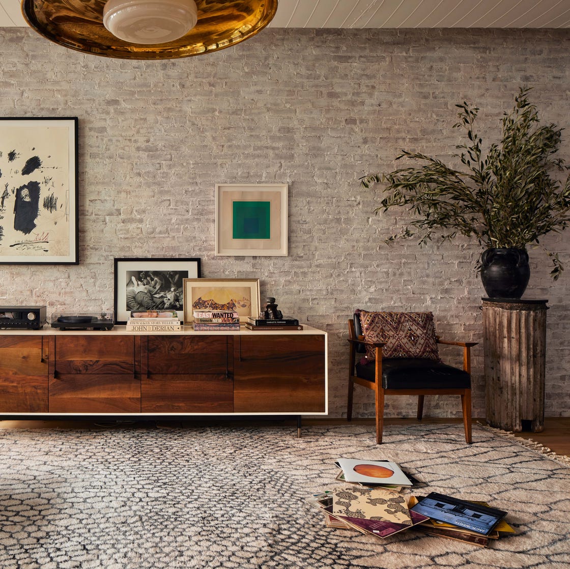
Designers Explain Why Asymmetry Is the Secret to a Well-Composed Space

From the Wrong Rug Size to Too-Short Curtains, Interior Designers Share Their Biggest Pet Peeves
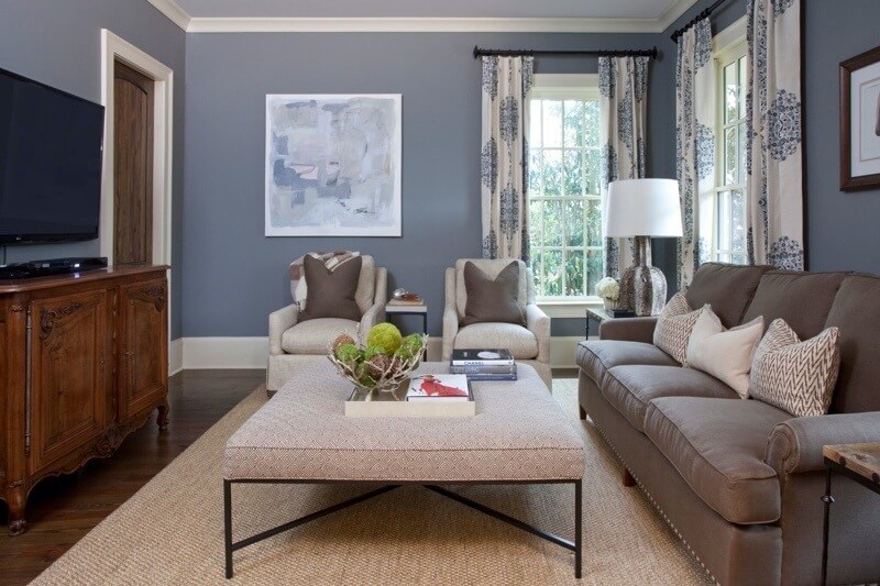
The ONLY Advice You Need to Mix Patterns Like a Pro!
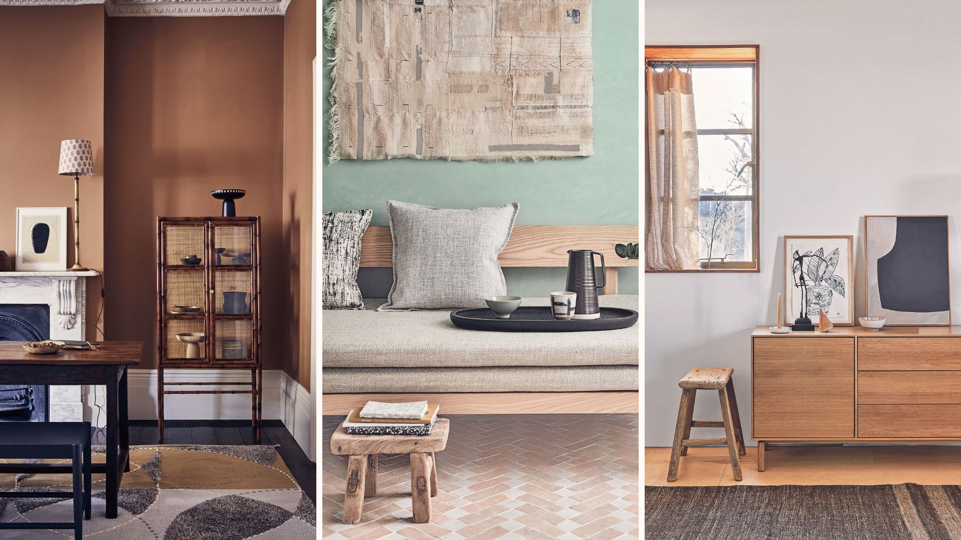
5 rules of thumb for mixing wood tones around your home, shared by interior designers

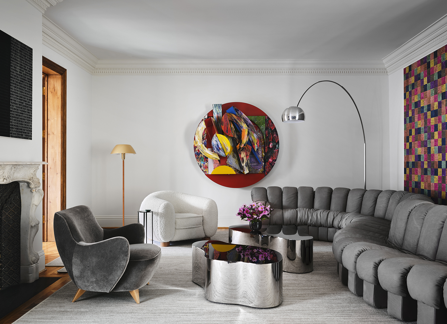
Rhythm in interior design - 11 ways to use this clever technique for rooms that look professionally done

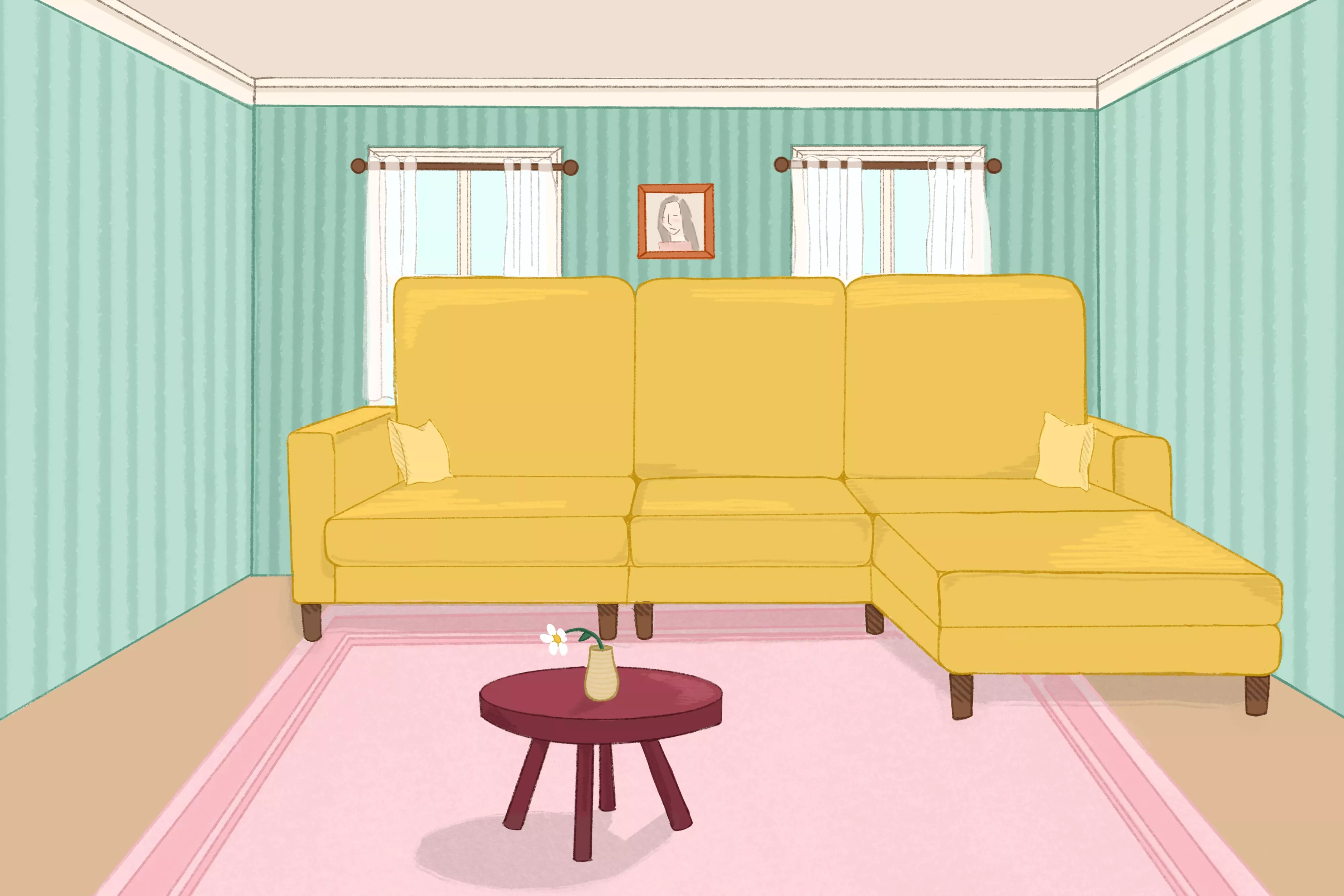
Why Your Room Feels 'Off'—6 Designer Rules for Perfecting Furniture Scale and Proportion