1/13
What you didn’t know about colour
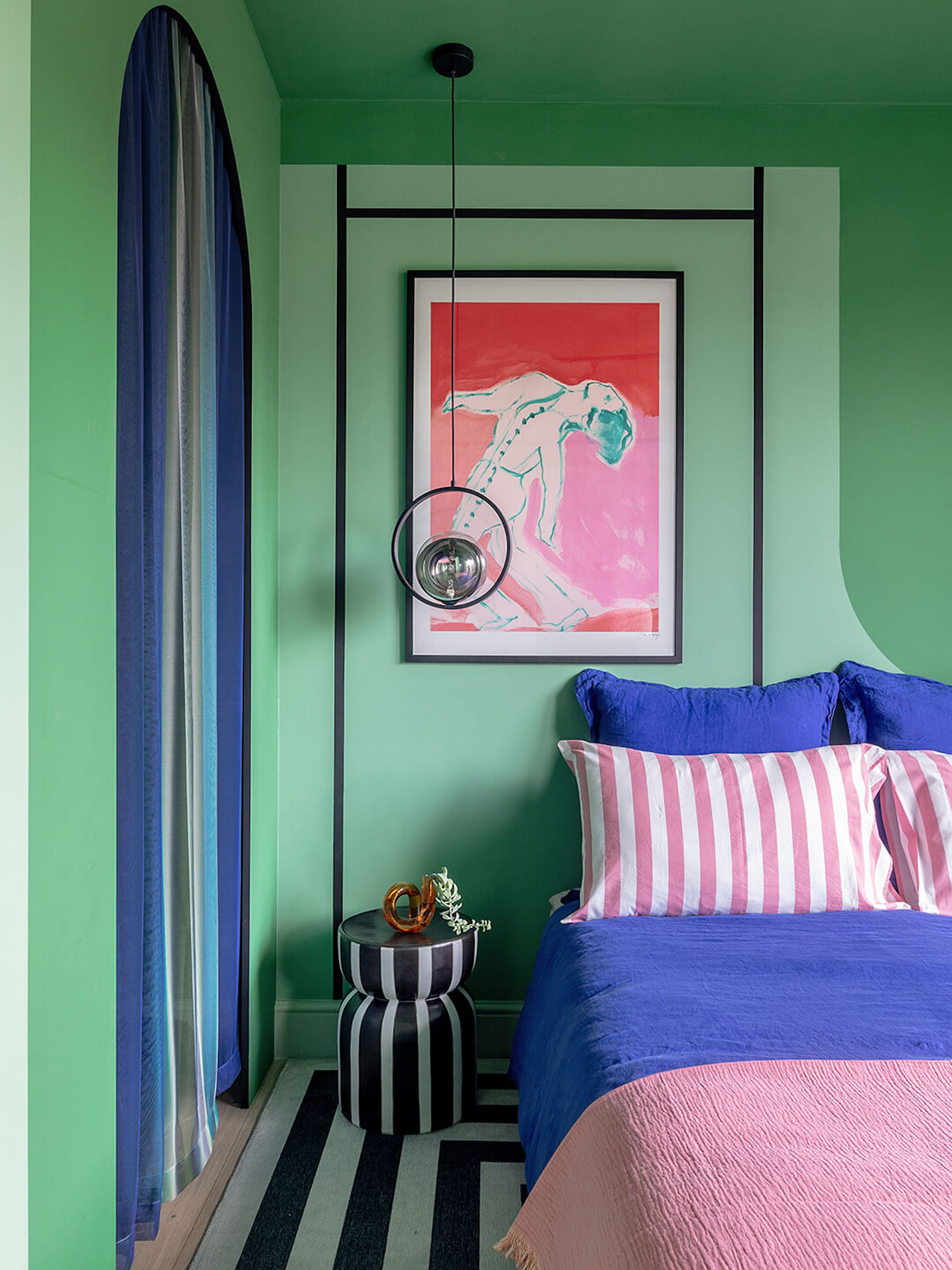
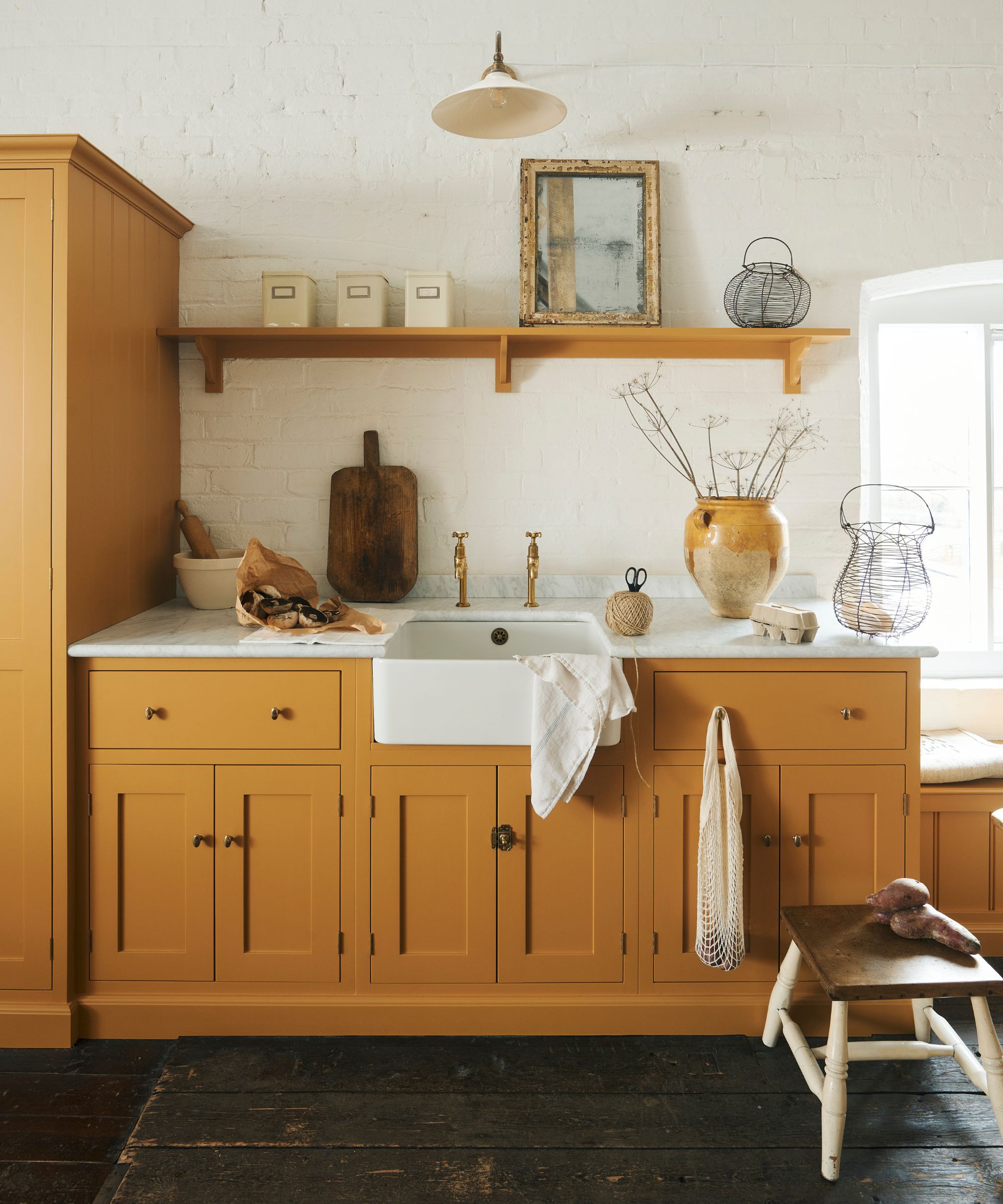
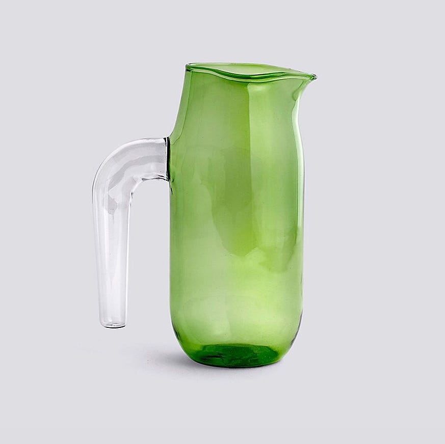
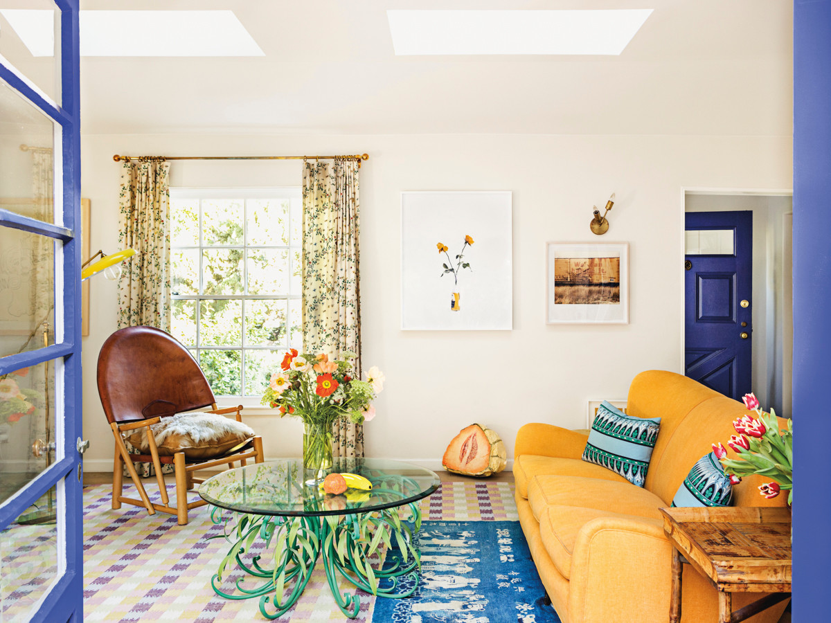
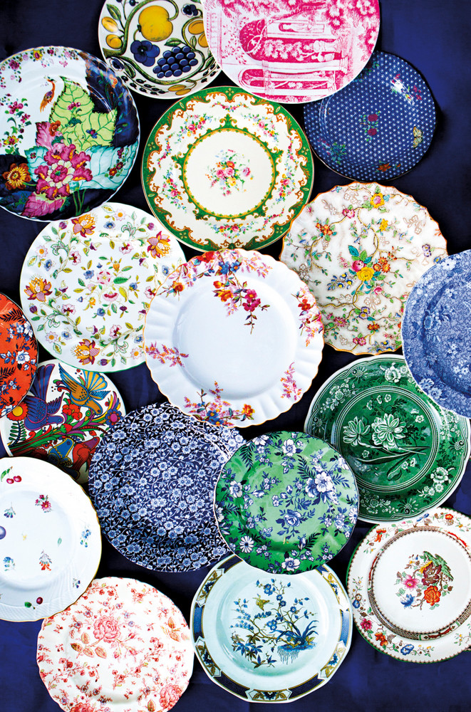
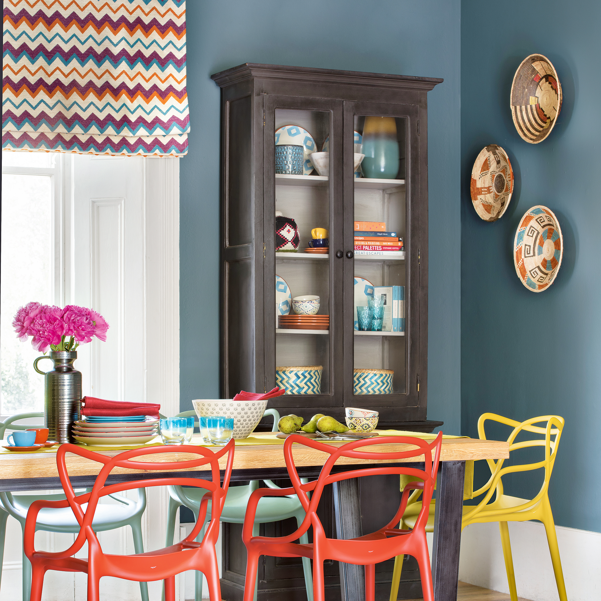
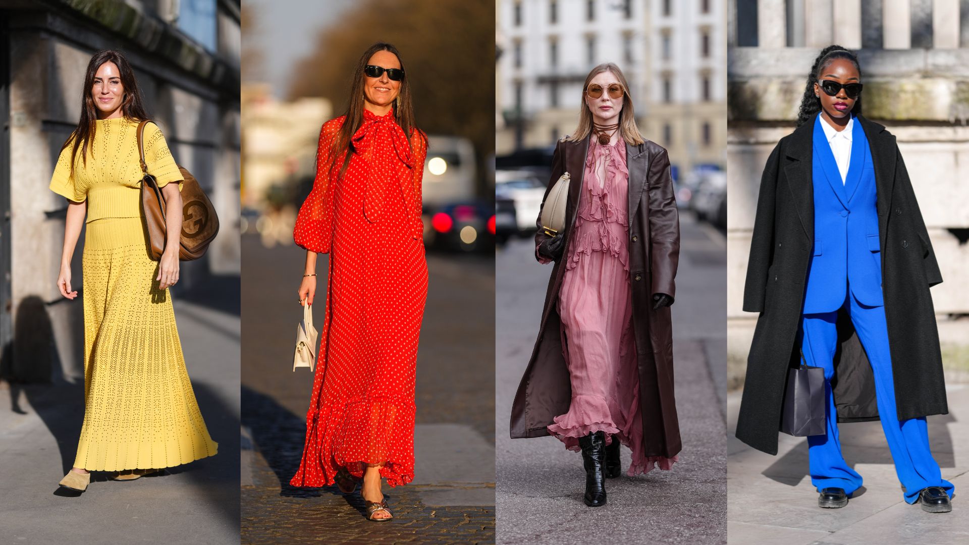
The article explores the multifaceted world of color, highlighting its subjective and collective impact on individuals and trends in fashion and home design. Color choices are influenced by personal emotional reactions and memories, while broader trends can be generational or inspired by specific artistic movements. The article notes the cyclical nature of color trends, from the minimalist 1990s to the resurgence of vibrant hues, with natural colors like green gaining popularity due to sustainability concerns. The influence of pop culture, such as movies like "The Grand Budapest Hotel," and the red-carpet fashion of A-listers, is suggested as a factor in the renewed appreciation for flamboyant colors.
Traditional color systems, such as Pantone's "Colour of the Year," Sweden's NCS, and Germany's RAL, are discussed as standardized methods for color reproduction and forecasting. Pantone's annual selection, like "Classic Blue" for 2020, is presented as a result of trend-forecasting research, aiming to capture the zeitgeist. However, many contemporary designers are moving away from these rigid systems, advocating for a more personal and experimental approach to color. Dutch designer Hella Jongerius is highlighted for her efforts to create a "new vocabulary" of color, challenging the standardization that she believes impoverishes the everyday color palette. Her work for Vitra and exhibitions like "Breathing Colour" showcase mutable colors and innovative formulations, such as 16 shades of black created without carbon.
The article delves into the origins and commercial aspects of color forecasting, noting that firms like Carlin began creating forecasts after World War Two to serve retailers. While these systems offer practical value in ensuring color consistency across global manufacturing, they are also viewed as marketing tools. Justine Fox and Carolina Calzada Oliveira of Calzada Fox emphasize that their color development extends beyond aesthetics to functionality, encompassing brand awareness and sustainability. They observe a shift towards longer-term color forecasting in fashion and product design, similar to the automotive industry, in response to growing consumer demand for sustainability.
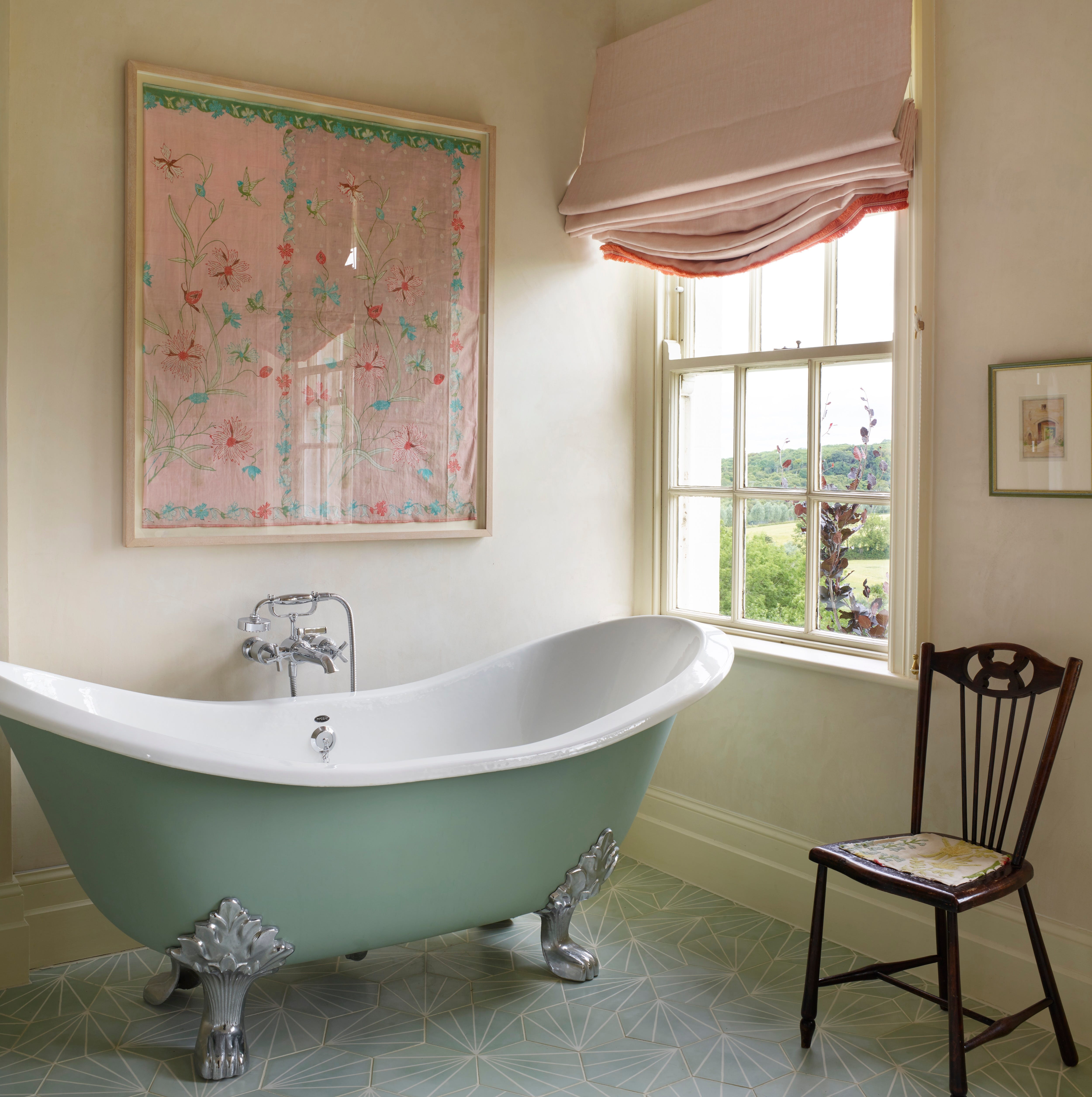
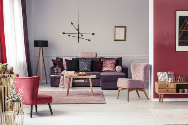
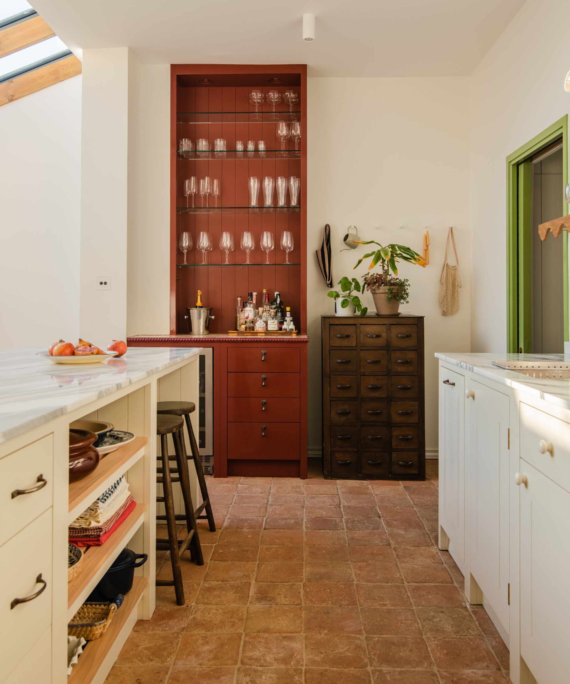
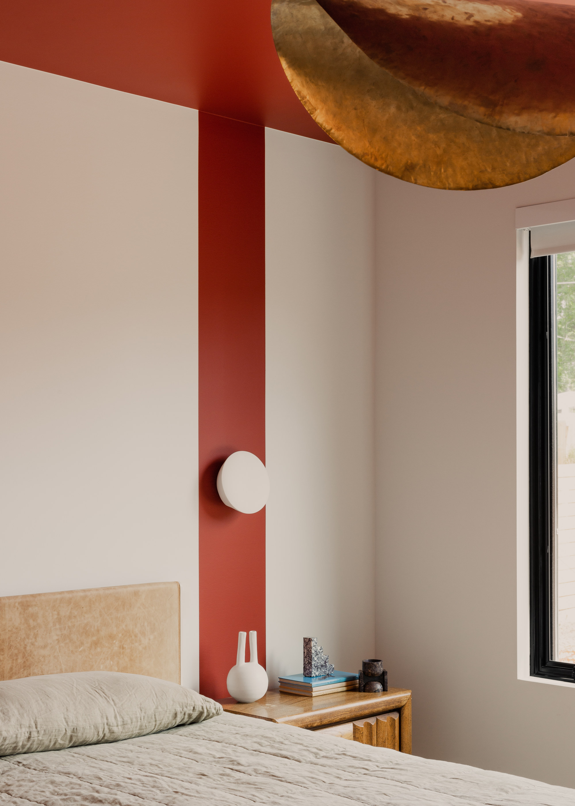
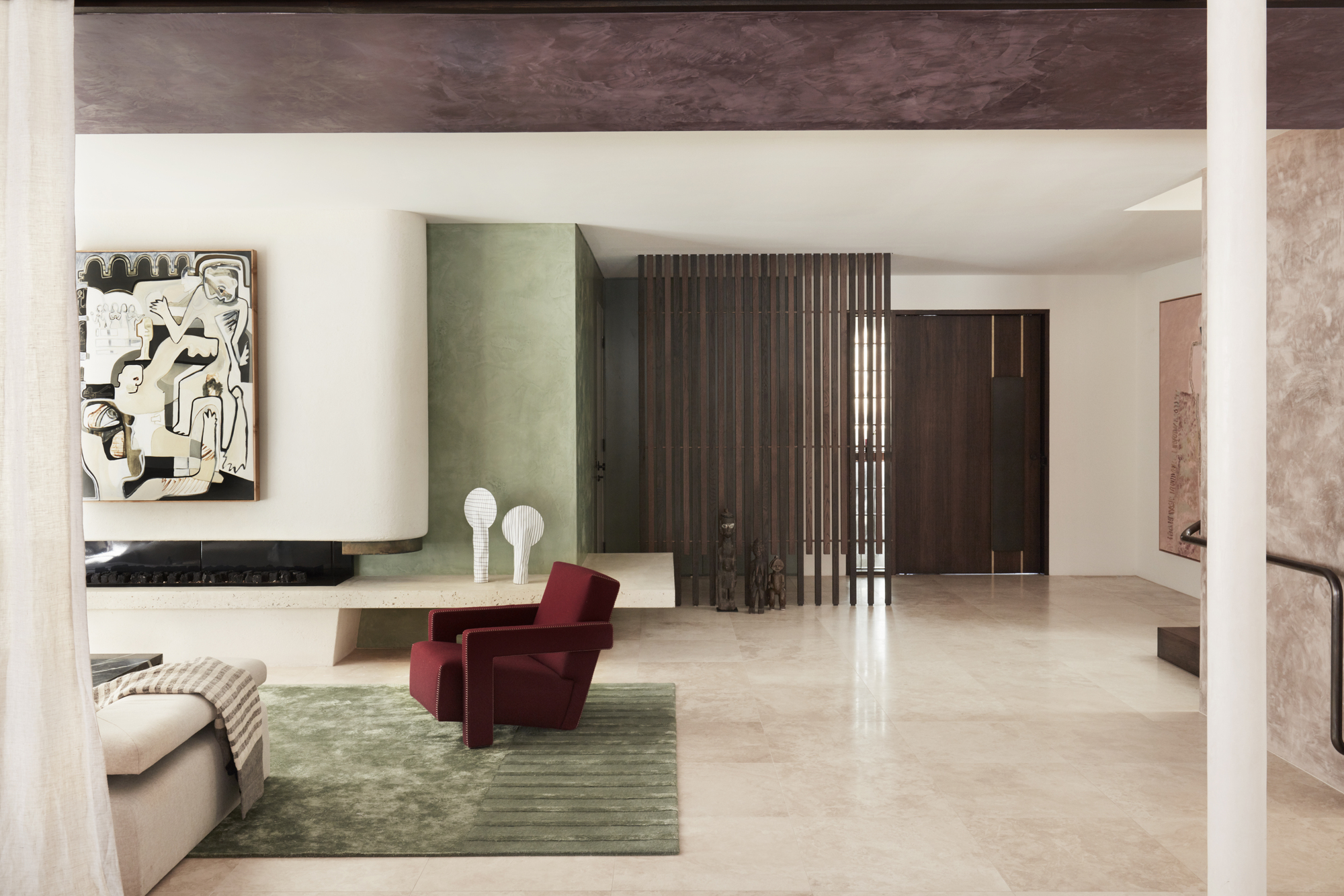
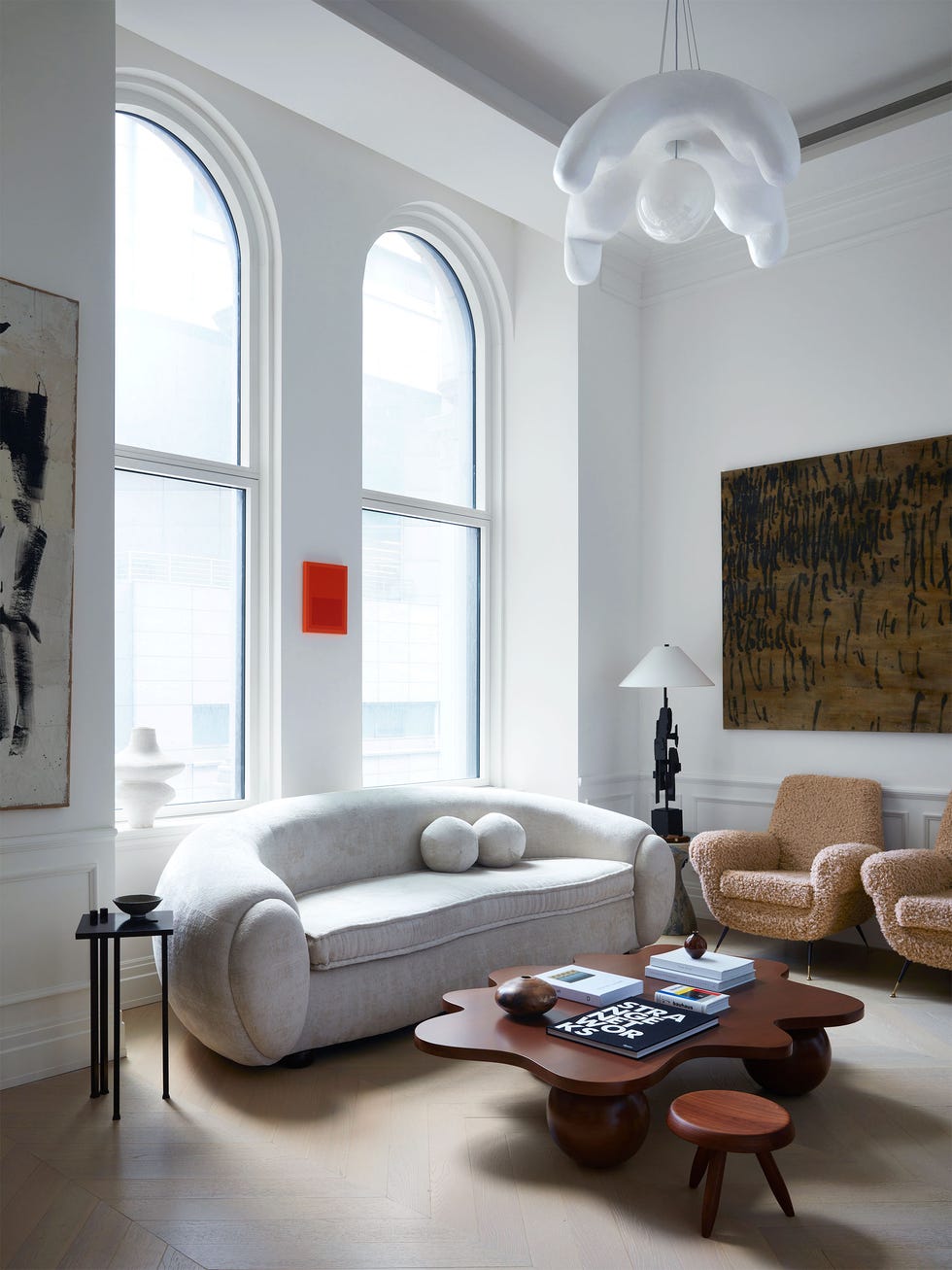
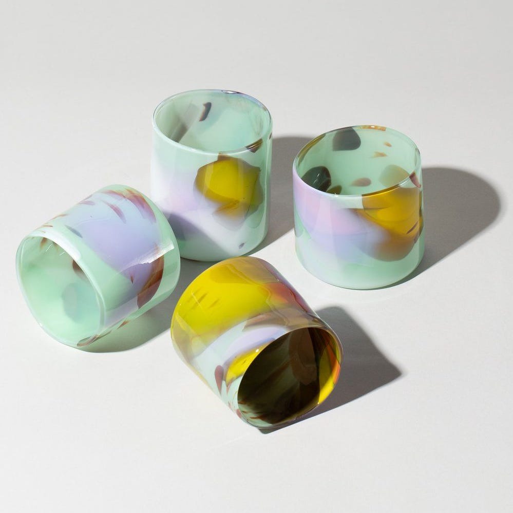
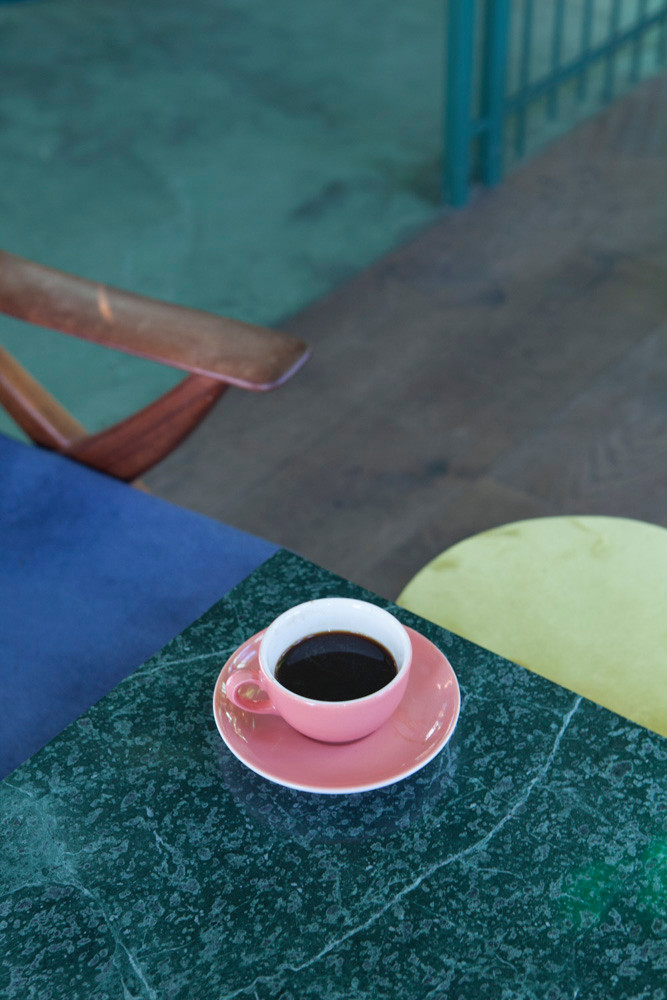
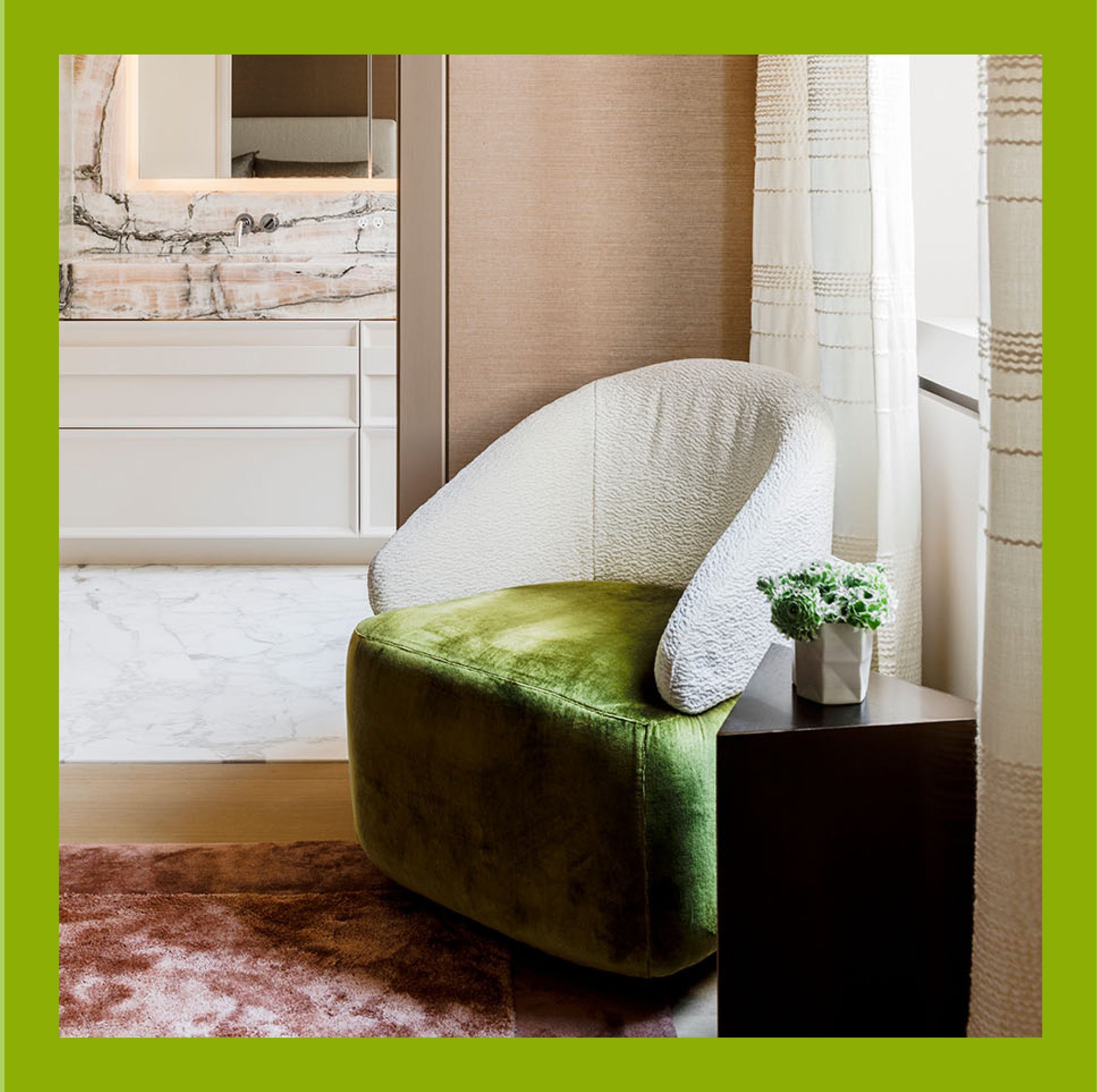
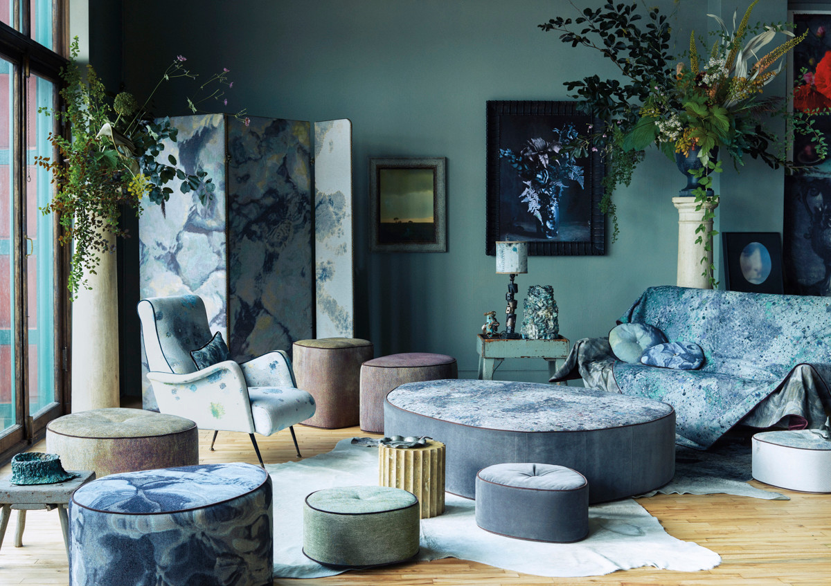
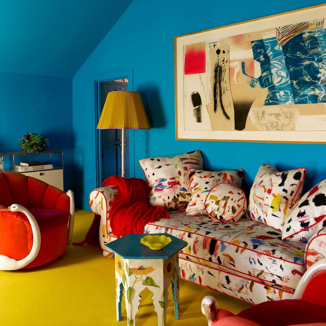
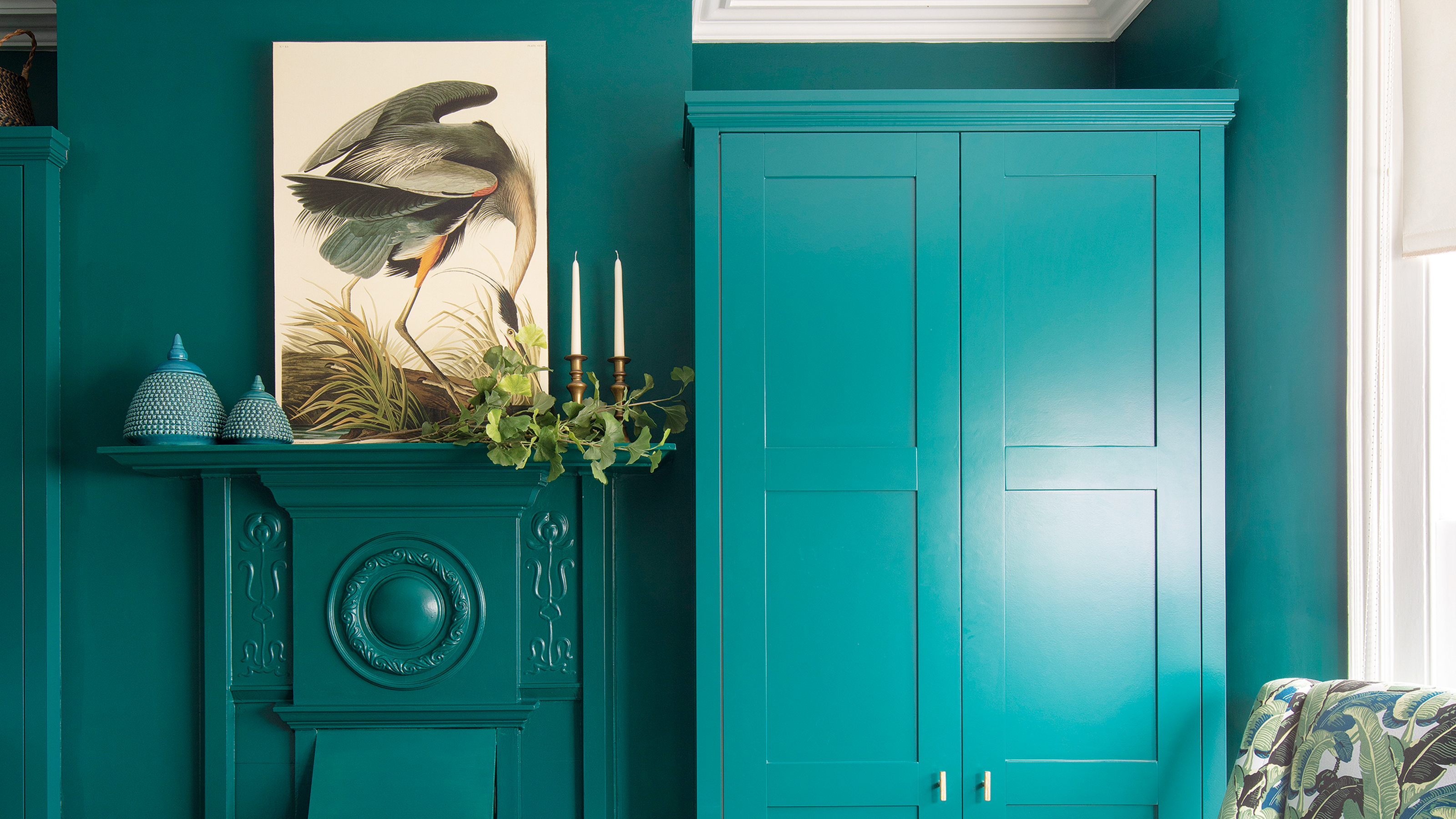
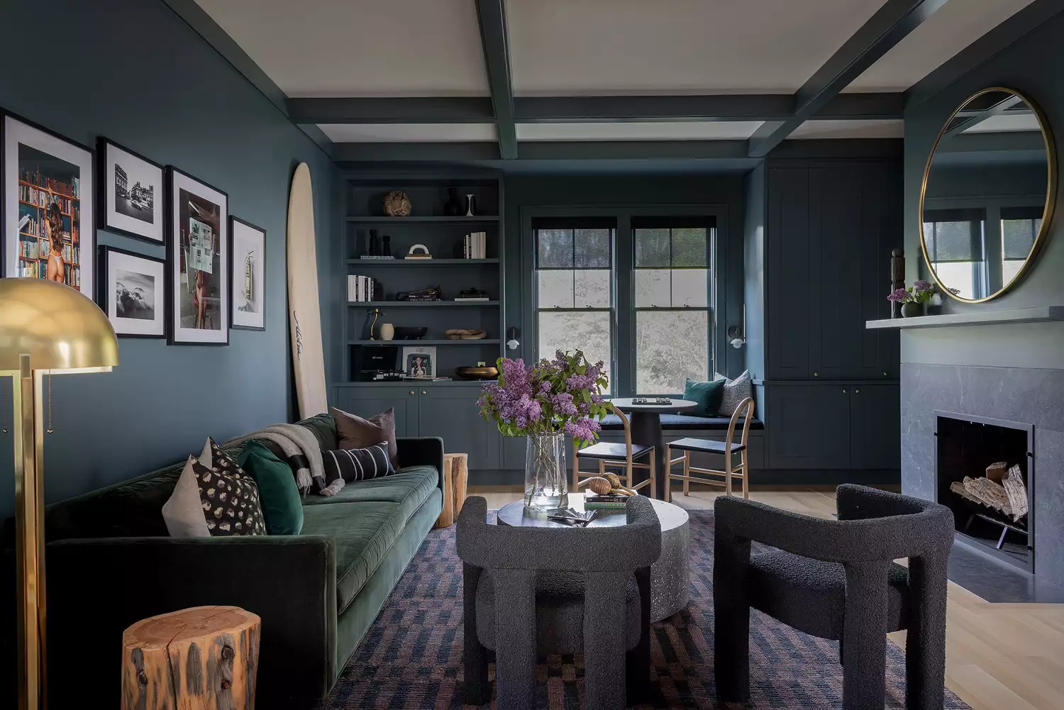
However, challenges exist in implementing sustainable color practices on a mass scale, as textile designer Lindsay Hanson explains regarding bacterial dyes. While environmentally friendly, these dyes face limitations in color range, affordability, and durability compared to synthetic alternatives. The article emphasizes that colors are often best appreciated in combination, challenging the isolated focus of "Colour of the Year" concepts. Examples include Calzada Fox's paint range for Craig & Rose, which explored color interaction through immersive installations.
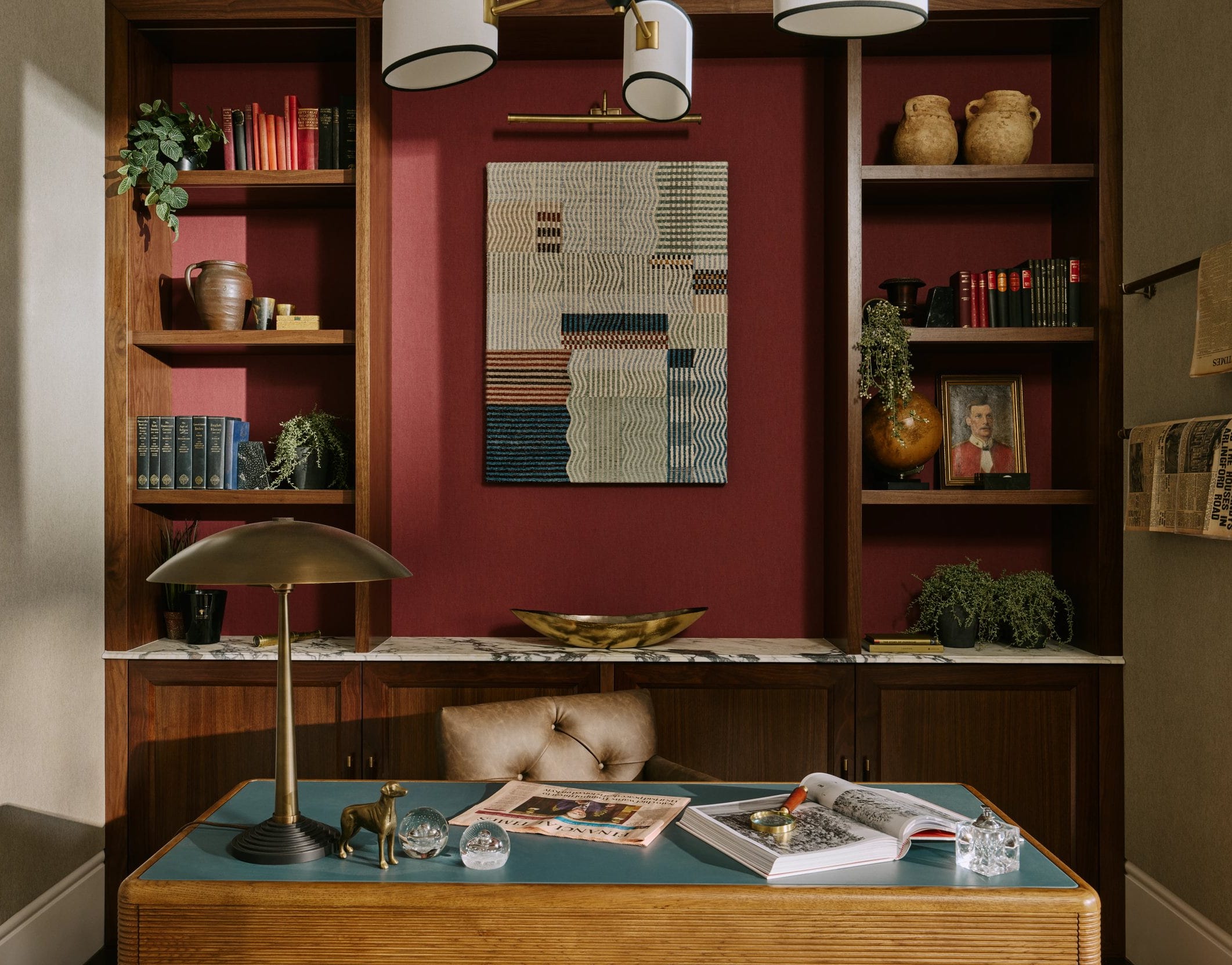
Italian colorist Giulio Ridolfo's work for Kvadrat, Vitra, and Moroso exemplifies this layering approach, drawing inspiration from natural landscapes, art, and cinema. His designs for woven textiles like Remix, which feature multiple yarn colors, create rich, subtly changing hues that appear monochrome from a distance but reveal intricate contrasts up close. The book "Materialising Colour: Journeys with Giulio Ridolfo" by Jane Withers further explores his process, connecting it to historical color theory and emphasizing the "in-between" colors created by material interaction.
UK-based textile design duo Wallace Sewell also embraces the unpredictable color combinations inherent in weaving, influenced by Bauhaus artist Johannes Itten. Their work for London Transport trains, featuring complex moquette designs, showcases how multiple colors can interact to create unique visual effects. They express skepticism about rigid color forecasting, advocating for designers' creative autonomy. The article concludes by looking to future innovations, such as Lindsay Hanson's Digitised Material project, which uses digital technology and structural color to allow wearers to change garment colors via a smartphone app. This approach offers a potentially sustainable model for reducing new garment production. Woven textile artist Ptolemy Mann shares a similar sentiment, embracing sophisticated secondary colors and asserting that "there is no such thing as a bad color combination," highlighting the importance of context in color perception.
#ColorTrends #DesignInnovation #TextileDesign #ColorForecasting #SustainableDesign #HomeDecor #FashionTrends #MaterialScience #ArtisticExpression #ColorTrends #DesignInnovation #TextileDesign #ColorForecasting #SustainableDesign #HomeDecor #FashionTrends #MaterialScience #ArtisticExpression
0 comment in total
You may also like
7 Most Underrated Paint Colours, According To Colour Experts

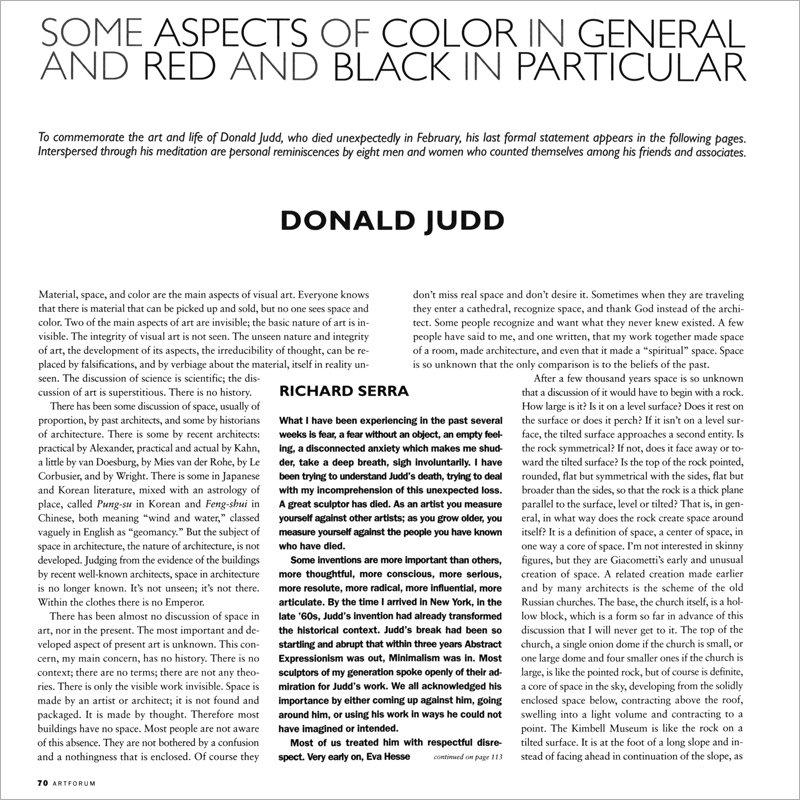
SOME ASPECTS OF COLOR IN GENERAL AND RED AND BLACK IN PARTICULAR

Never Guess a Paint Color Again, Thanks to This Hue-Matching Colorimeter

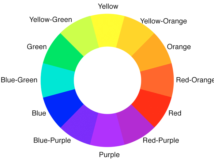
Color Wheel Theory: How to Talk About Color

What Season Are You? Everything You Need to Know About Color Analysis


Mother Nature Knows Best
3 color coordination tips any beginner can master
Acid Green - The Color of the Year That No One Is Talking About

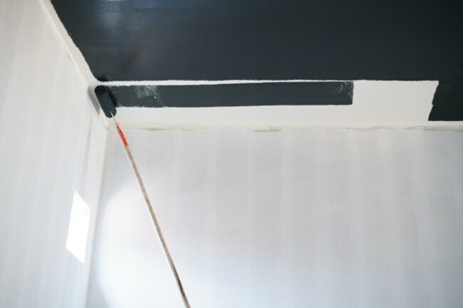
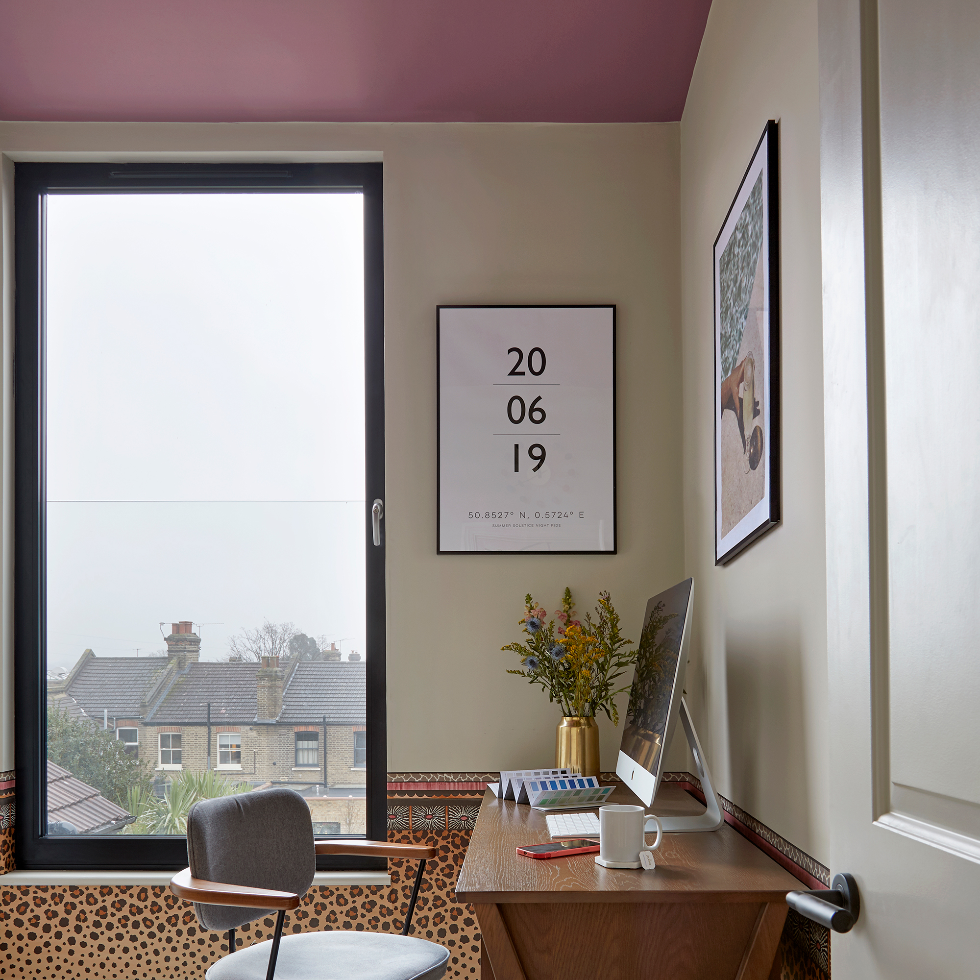
'Dark ceilings make the room look smaller': 6 classic paint colour myths it's time to give up on


Colour instinct: the art of personal colour analysis

3 overlooked colors you never thought could work in your kitchen – but interior designers swear by them

The Color Combo You’re About to See Everywhere

If You Think Teal And Turquoise Are The Same Color, You Might Not Do Well On This Color Trivia

Here's what color experts actually think about the unexpected red theory – is it really as simple as it sounds?
The Viral ‘Unexpected Red’ Theory in Interior Design Actually Isn’t That Simple
Interior design experts reveal the colour rules you should be breaking
Using the New Olo Color Scientists Discovered in Your Home

'The World of Color is Rife With Danger' — 5 Color Combinations That Don't Go Together and What to Use Instead
Wondering what colour suits me? Our experts reveal the most flattering shades to suit you all year round

These 5 Simple Questions Help Designers Pick the Perfect Paint Color Every Time