1/5
3 overlooked colors you never thought could work in your kitchen – but interior designers swear by them
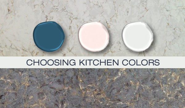
Choosing the right color scheme for a kitchen is a significant decision, as this space often functions as the heart of the home, balancing utility with social interaction. While soft neutrals offer a timeless appeal, exploring more adventurous hues can infuse a kitchen with personality and unique design interest. Interior designers are increasingly advocating for unexpected color choices to elevate this essential room.
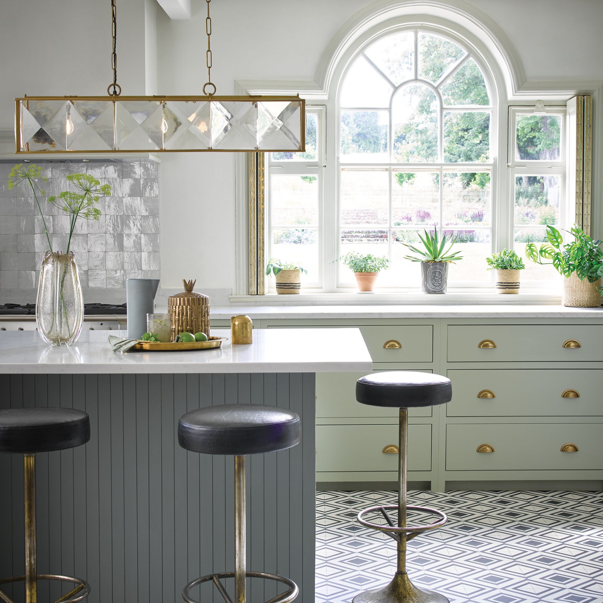
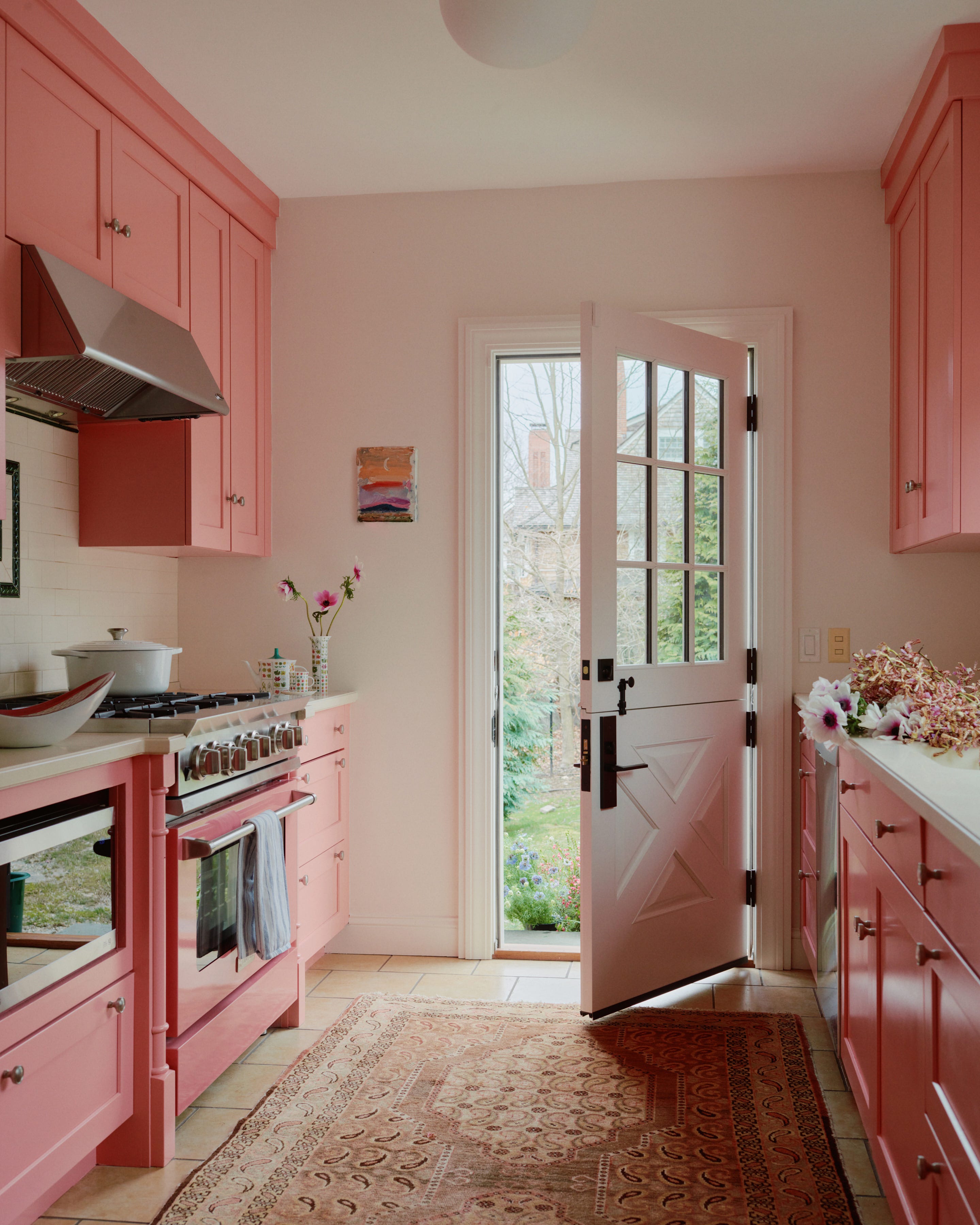
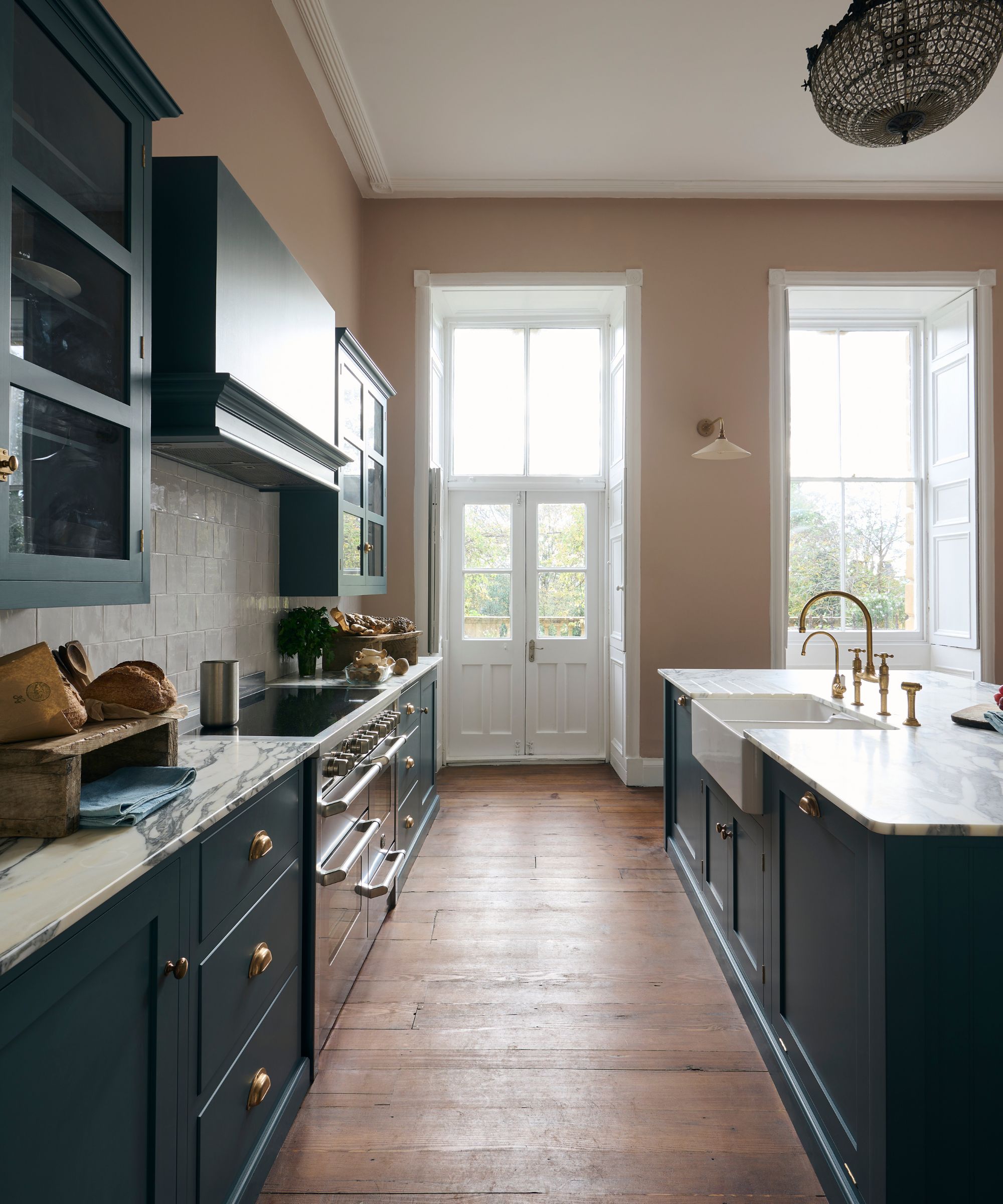
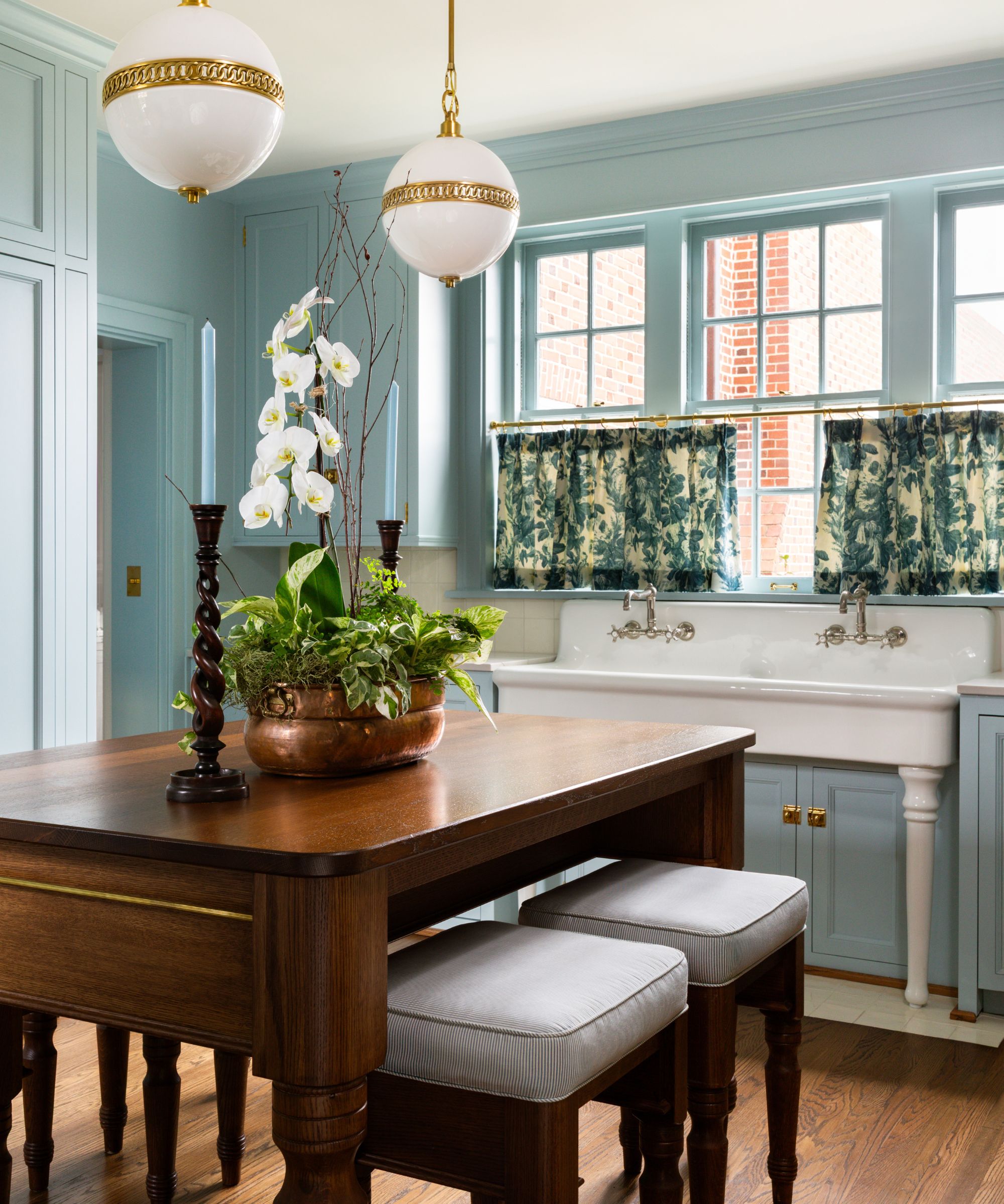
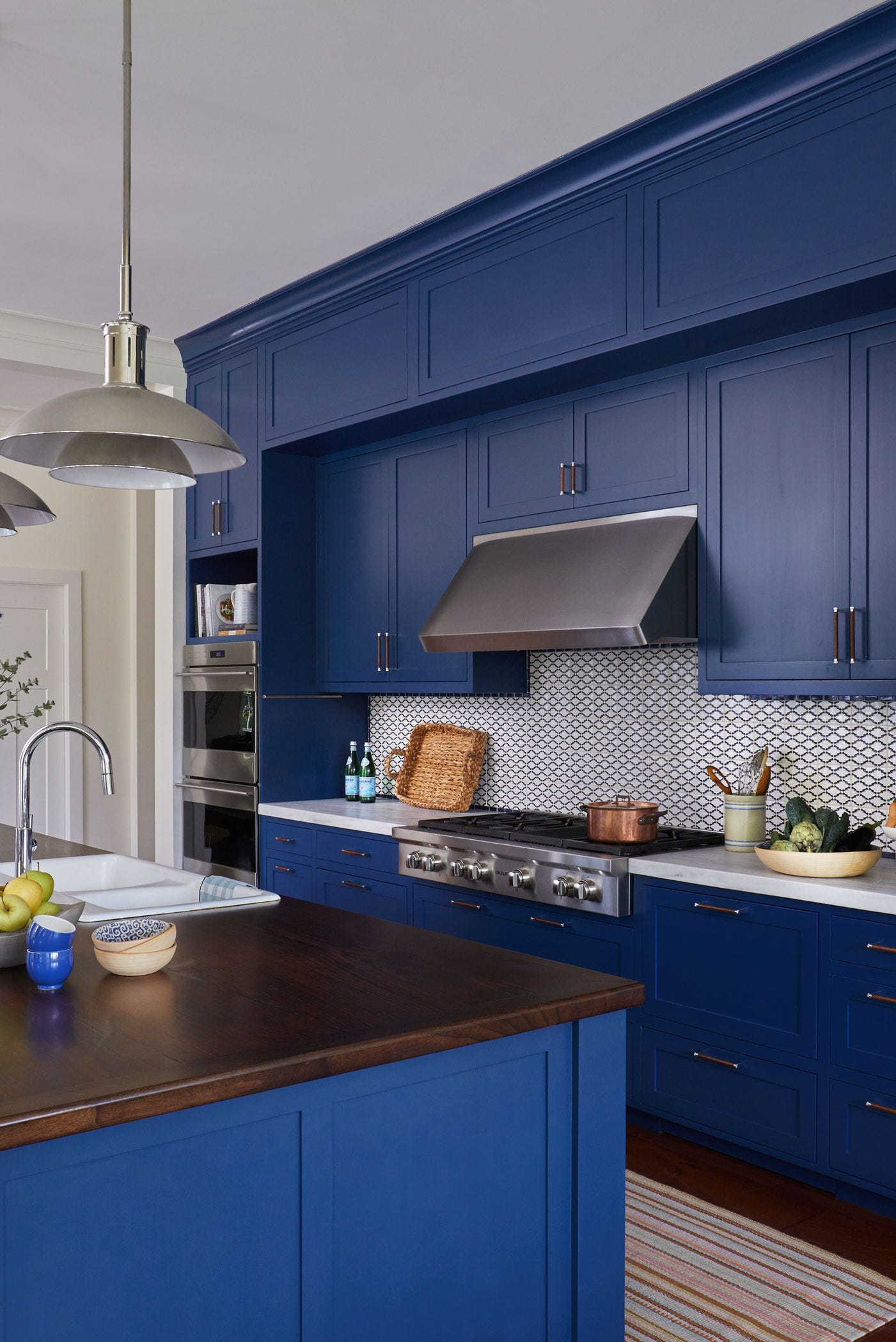
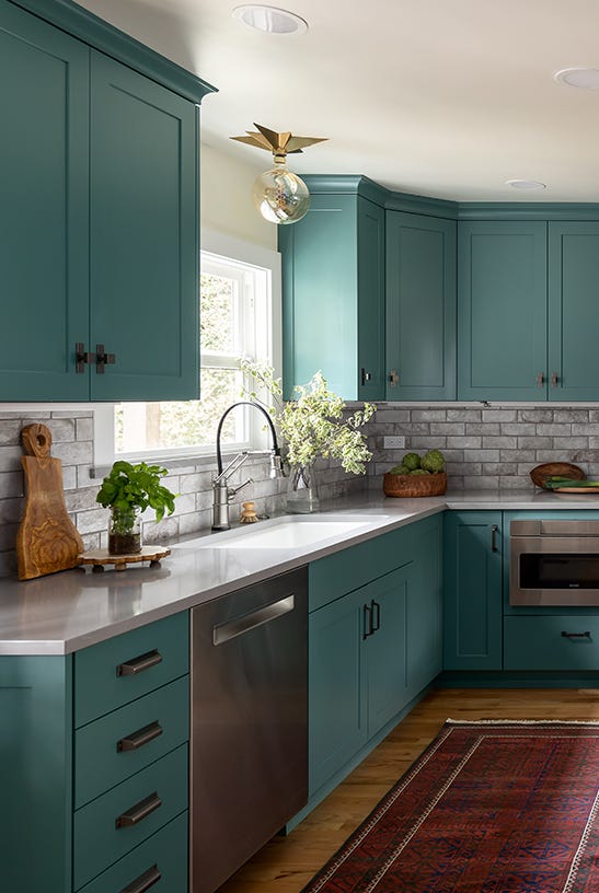
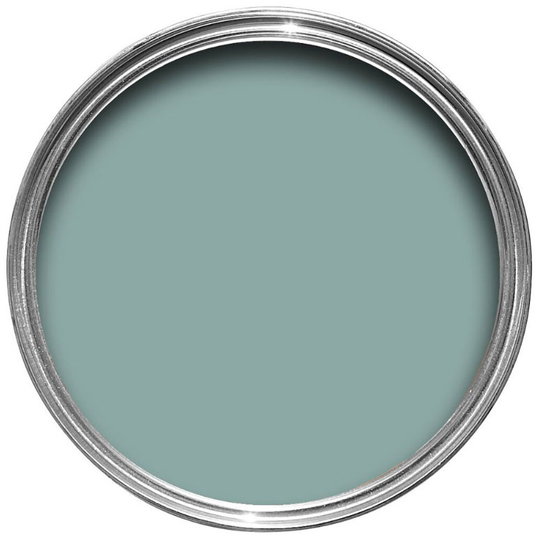
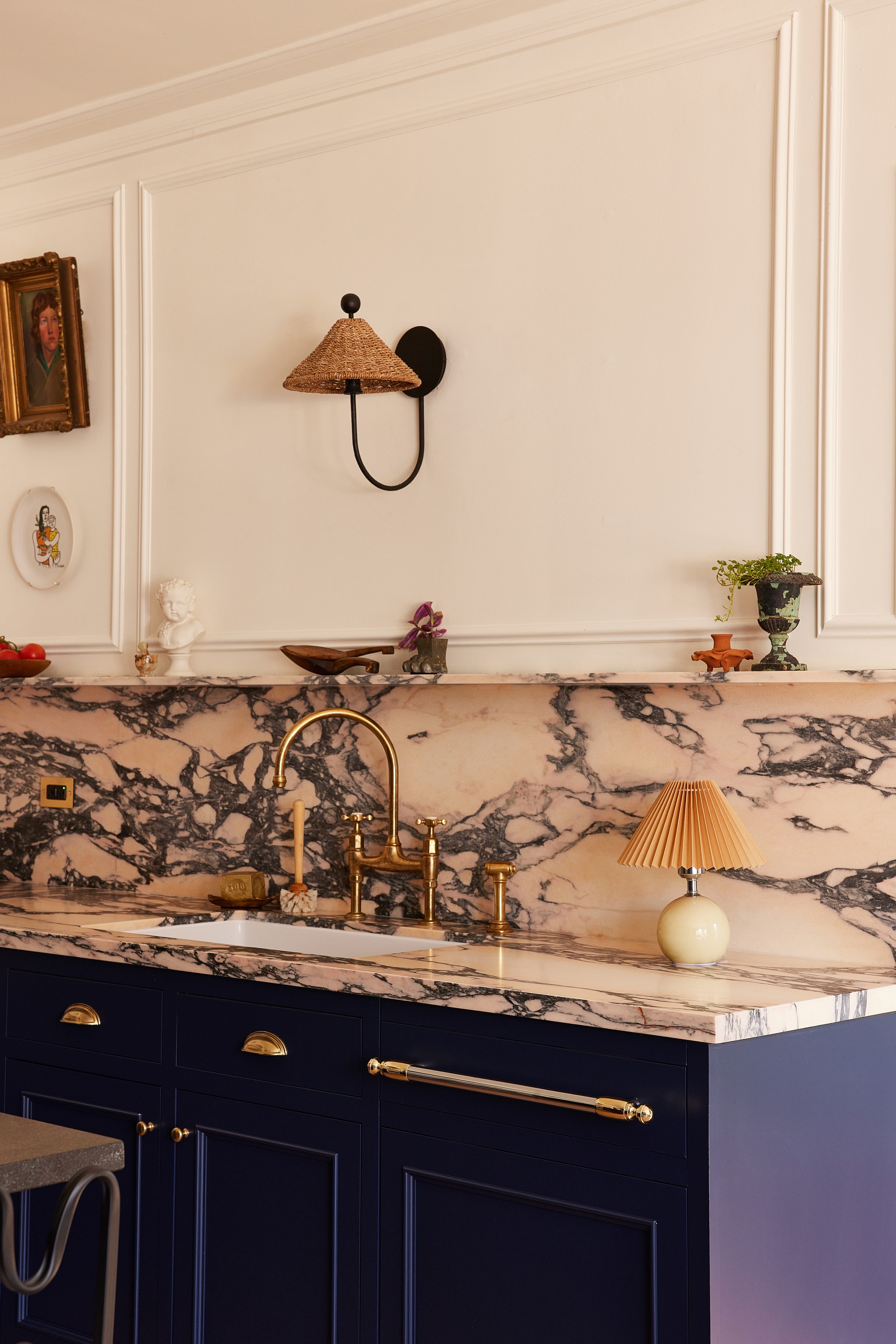
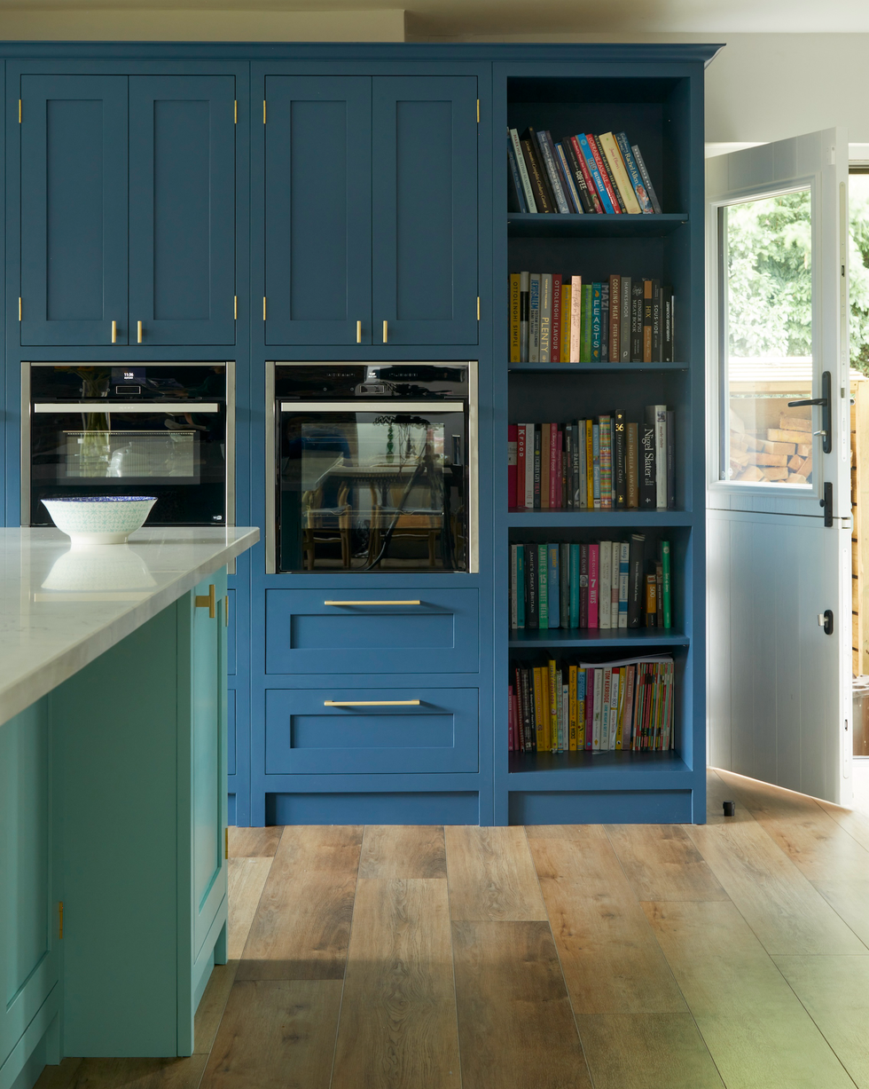
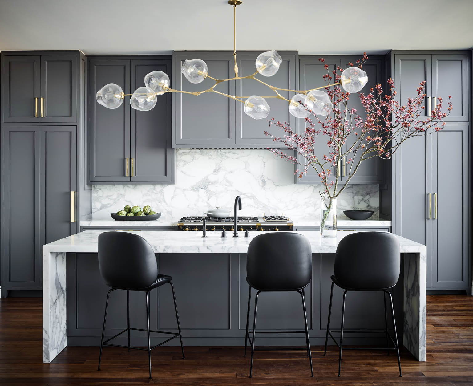
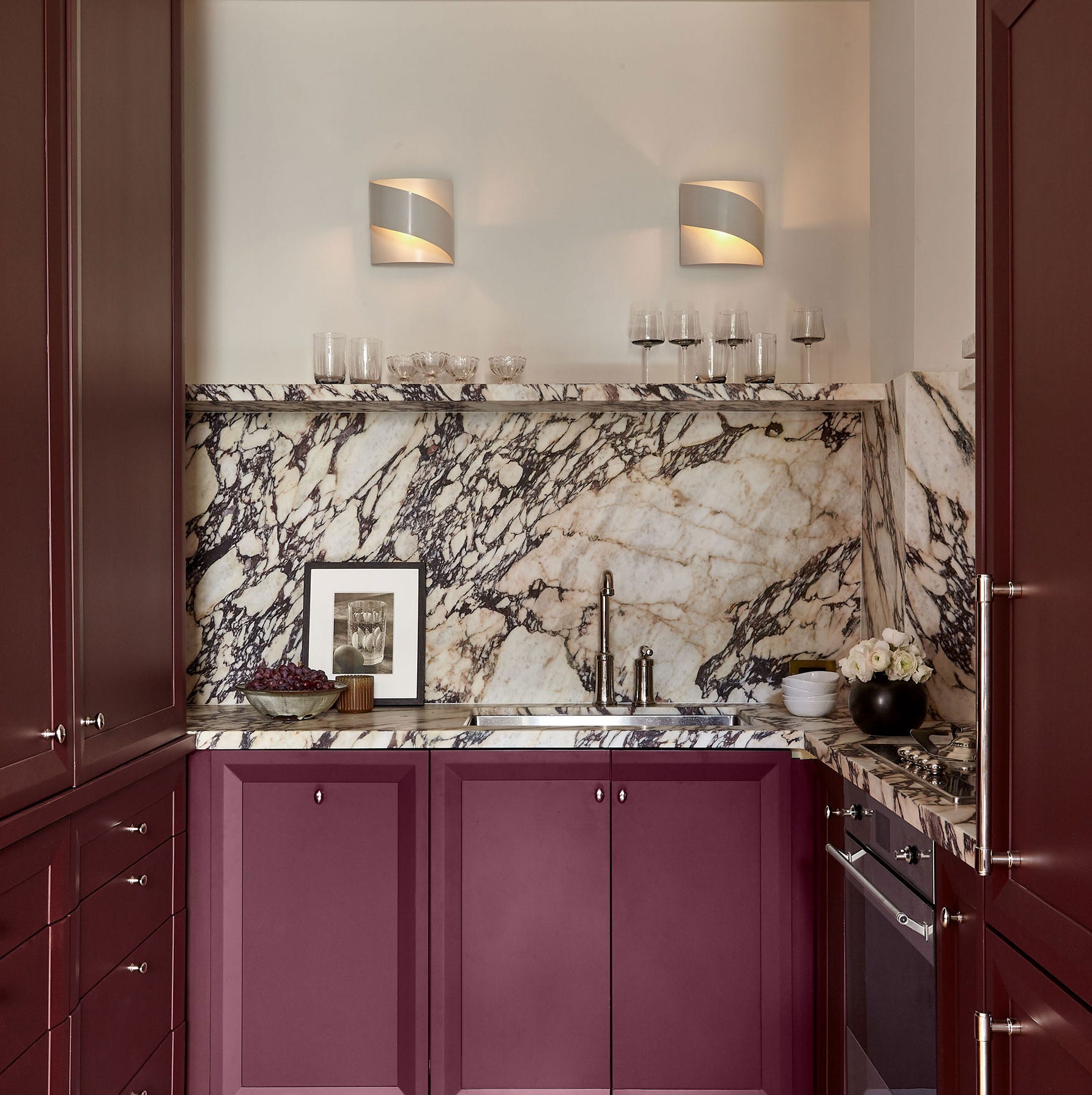
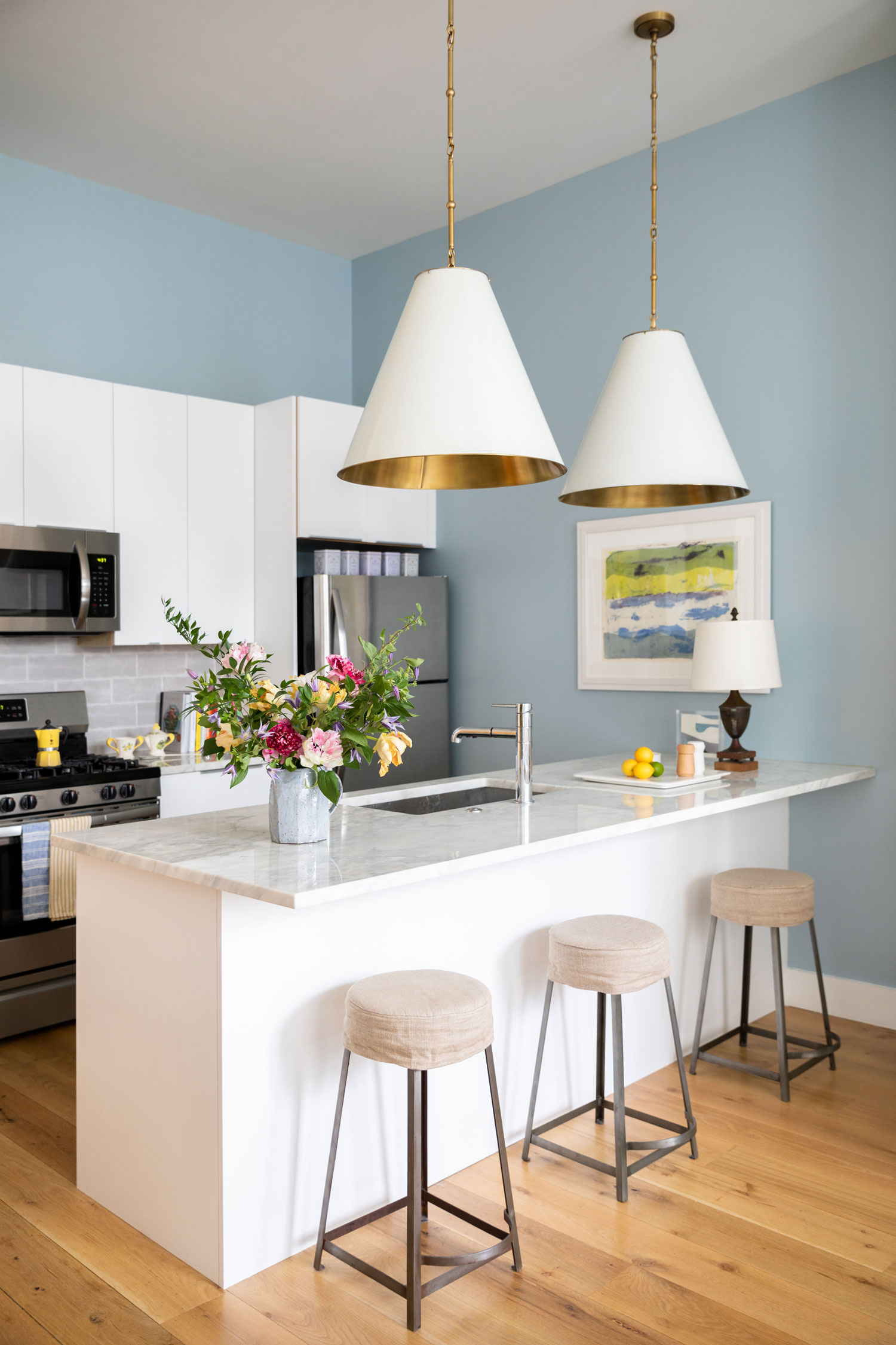
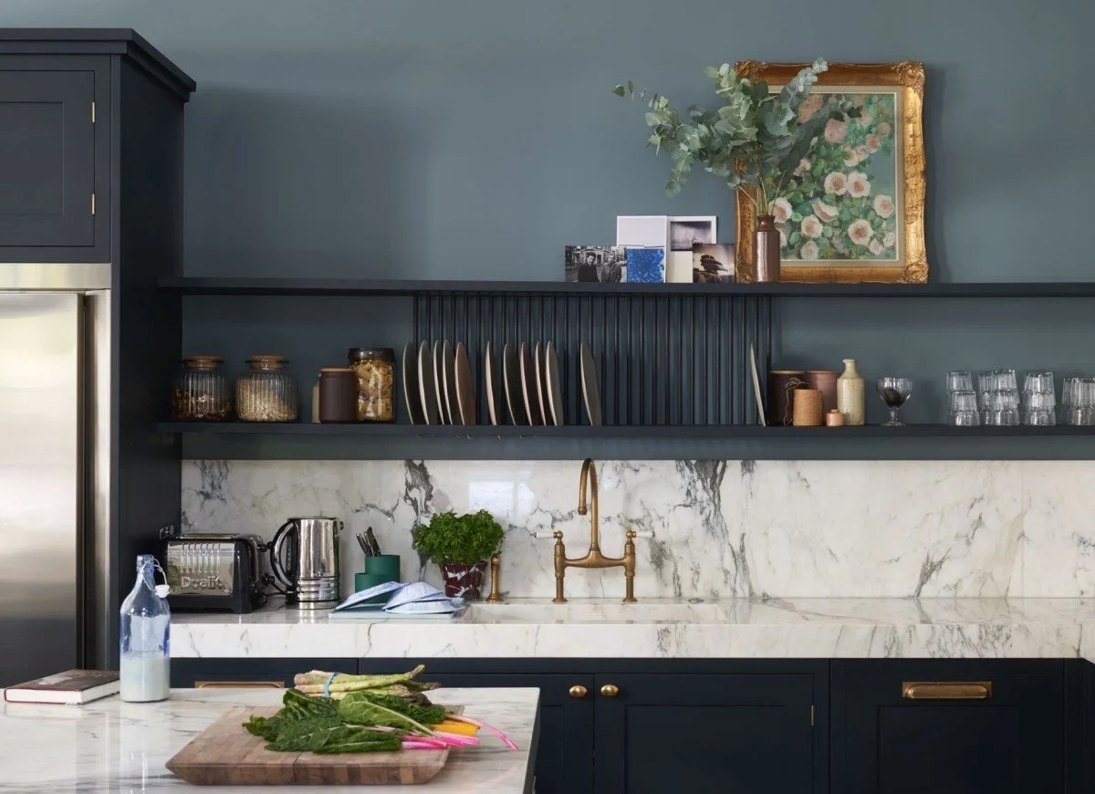
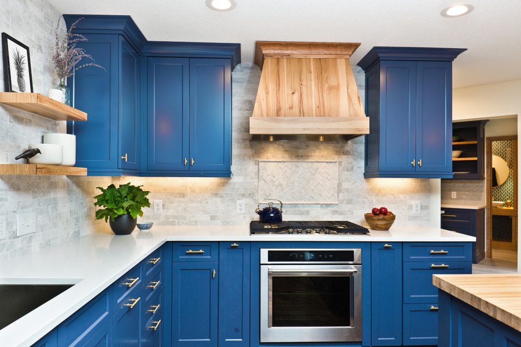
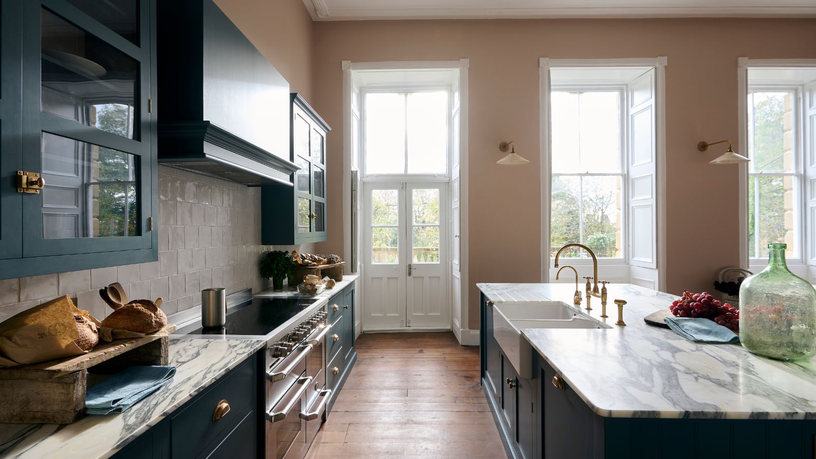
Teal, an 'in-between color' with blue and green undertones, is projected to be a prominent trend in 2025. This versatile shade can range from playful mid-tones to opulent darker variations. Designers are incorporating teal in various ways, such as wall colors or kitchen cabinets, to add character and visual depth. This marks a shift away from traditional lighter neutrals, as designers like Natalia Miyar note that color can significantly enhance the mood and inviting feel of a kitchen, especially when it also serves as a dining area. Tineke Triggs further suggests that less saturated teal tones can offer a historical yet fresh aesthetic, providing depth without overwhelming the space, particularly when paired with honed limestone or soapstone countertops.
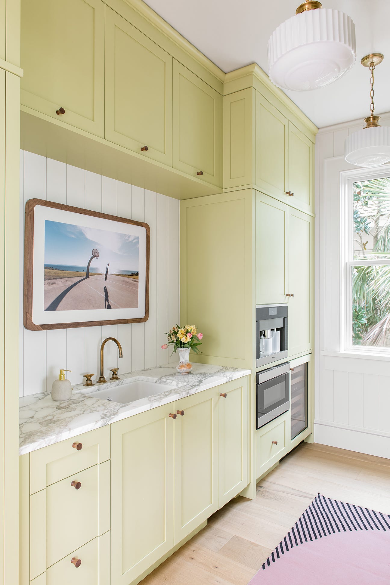
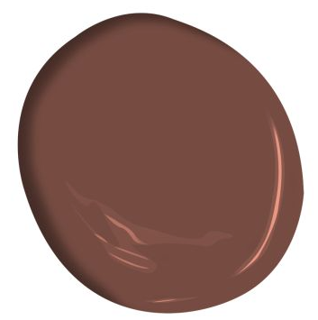
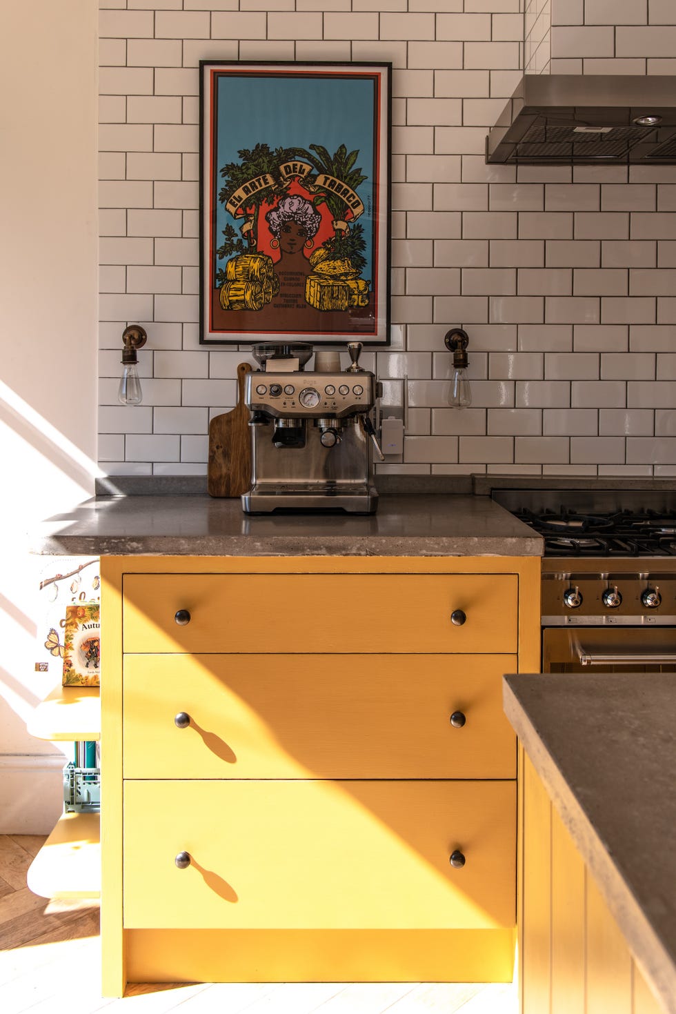
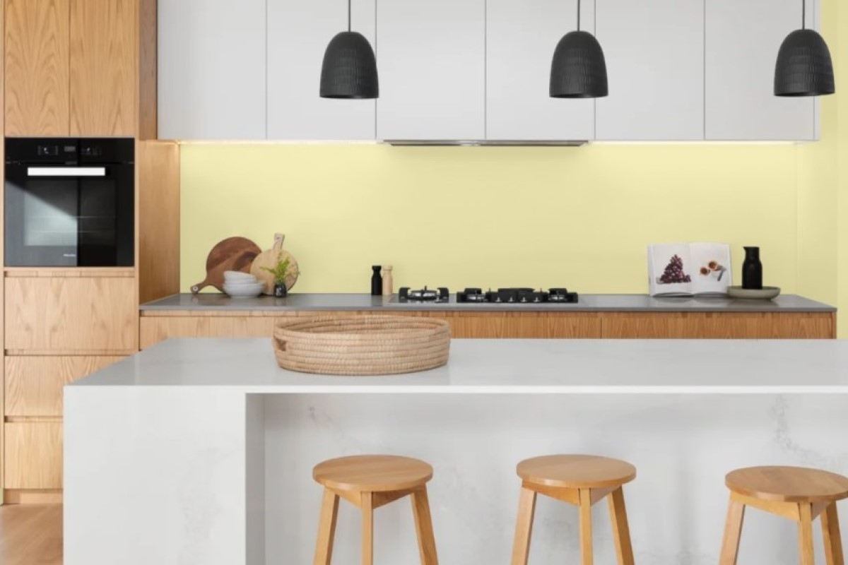
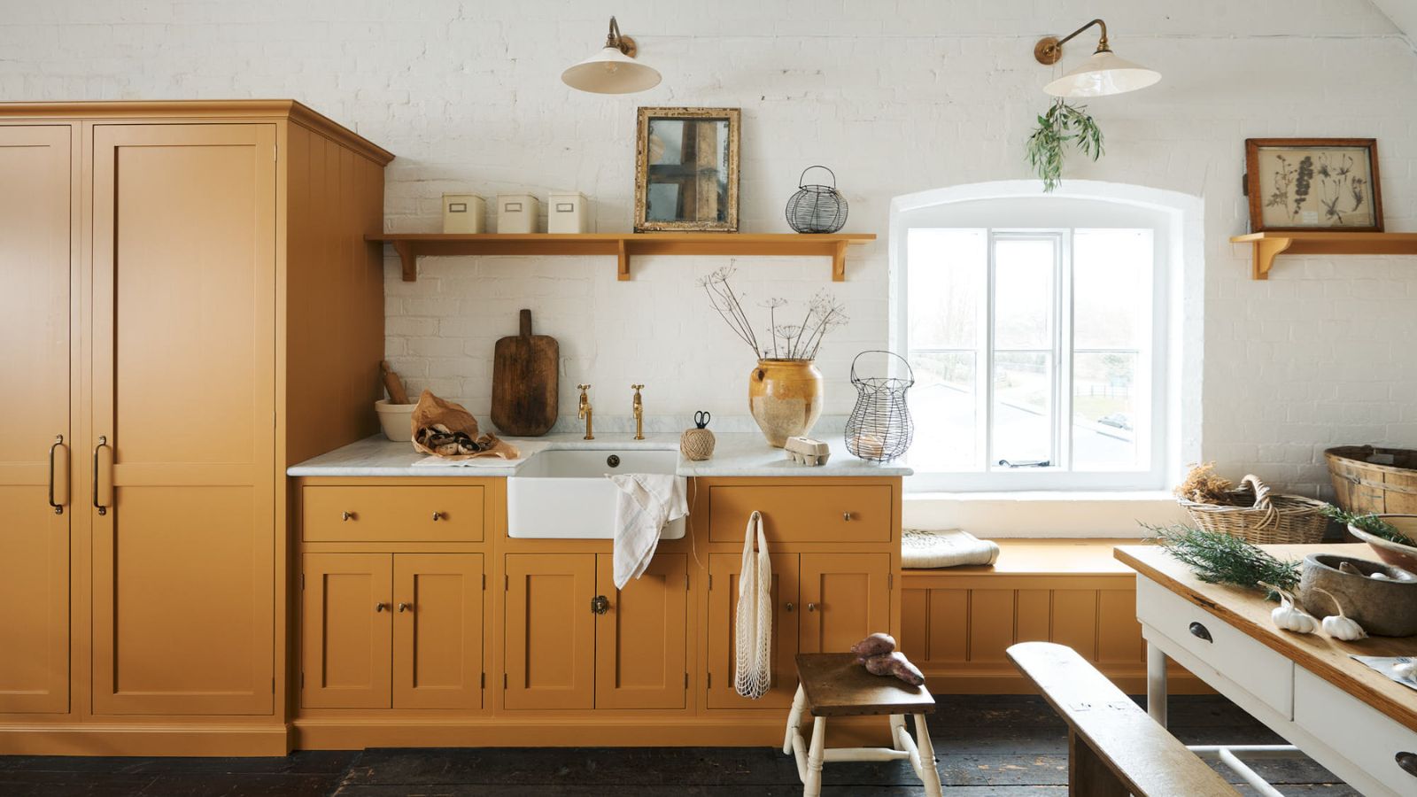
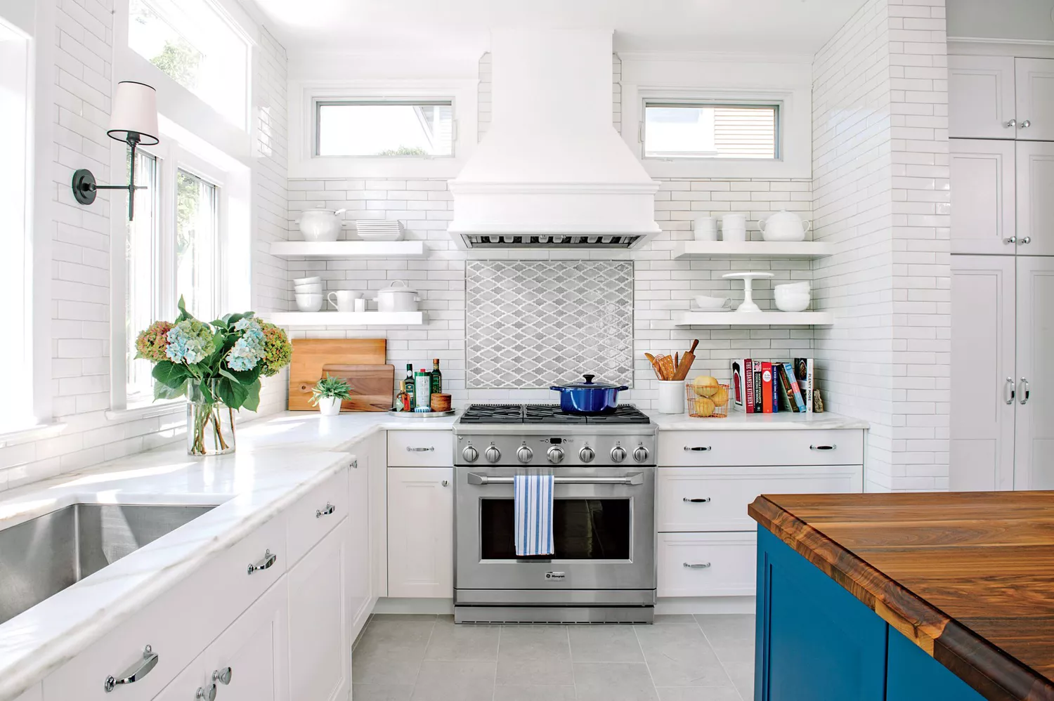
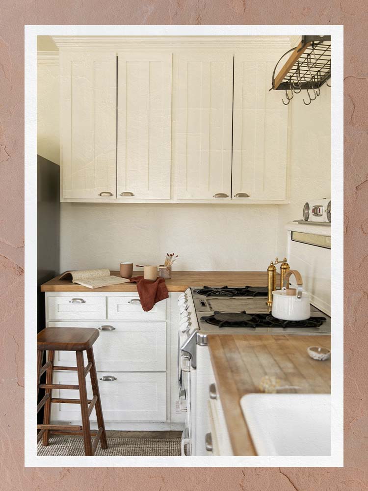
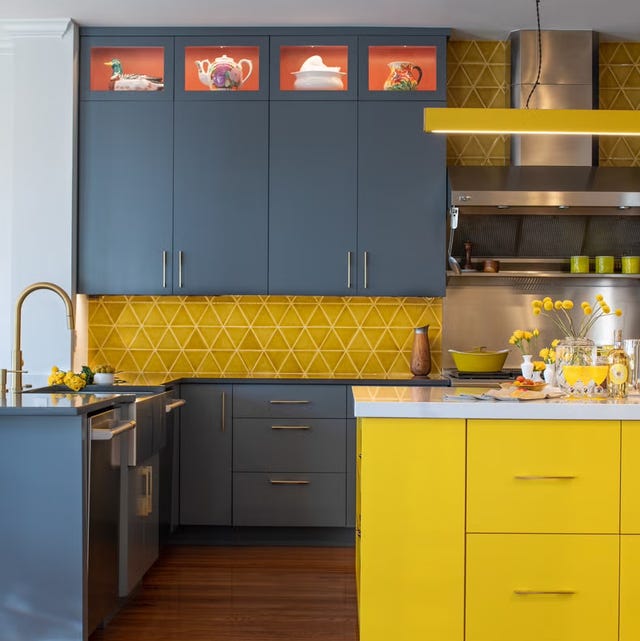
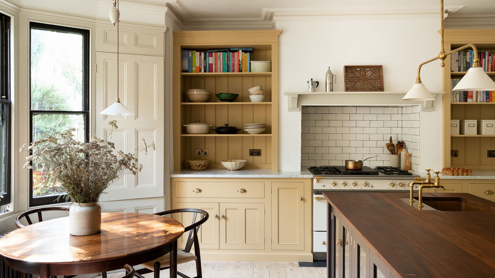
Yellow, often associated with outdated interior design trends, is being re-evaluated by designers for its cheerful and inviting qualities. The shade comes in various forms, from subtle butter yellows that lean towards neutrality to vibrant orange yellows. Sarah Latham of Latham Interiors highlights yellow ochre as a beautiful and often overlooked color for country kitchens, capable of creating a warm and inviting atmosphere when applied correctly. Ann Wolf of Wolf Holden Design shares an experience of using a butter-yellow color for kitchen cabinets, specifically Benjamin Moore's Golden Tan, noting its fresh and happy appeal reminiscent of the 1950s without being dated.
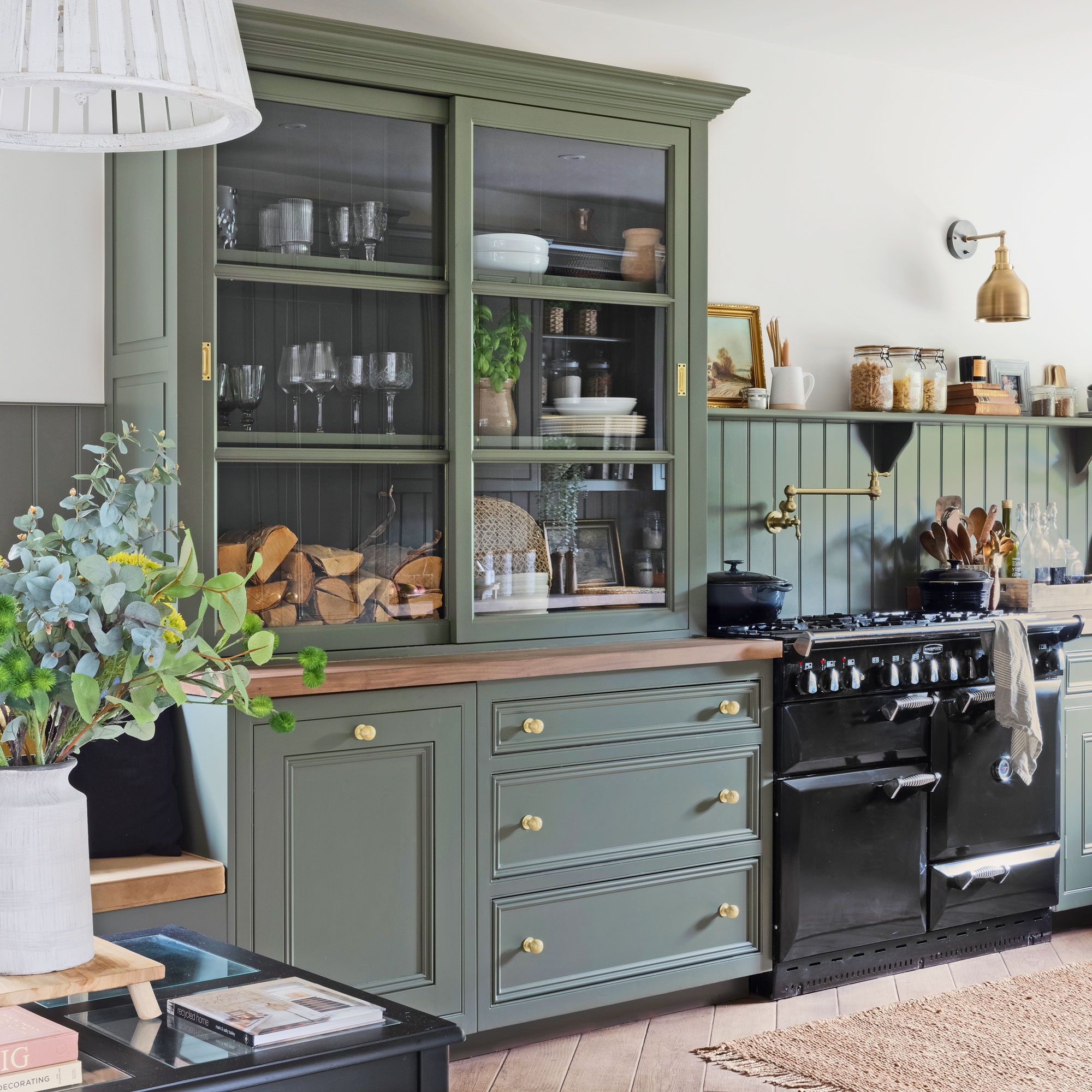
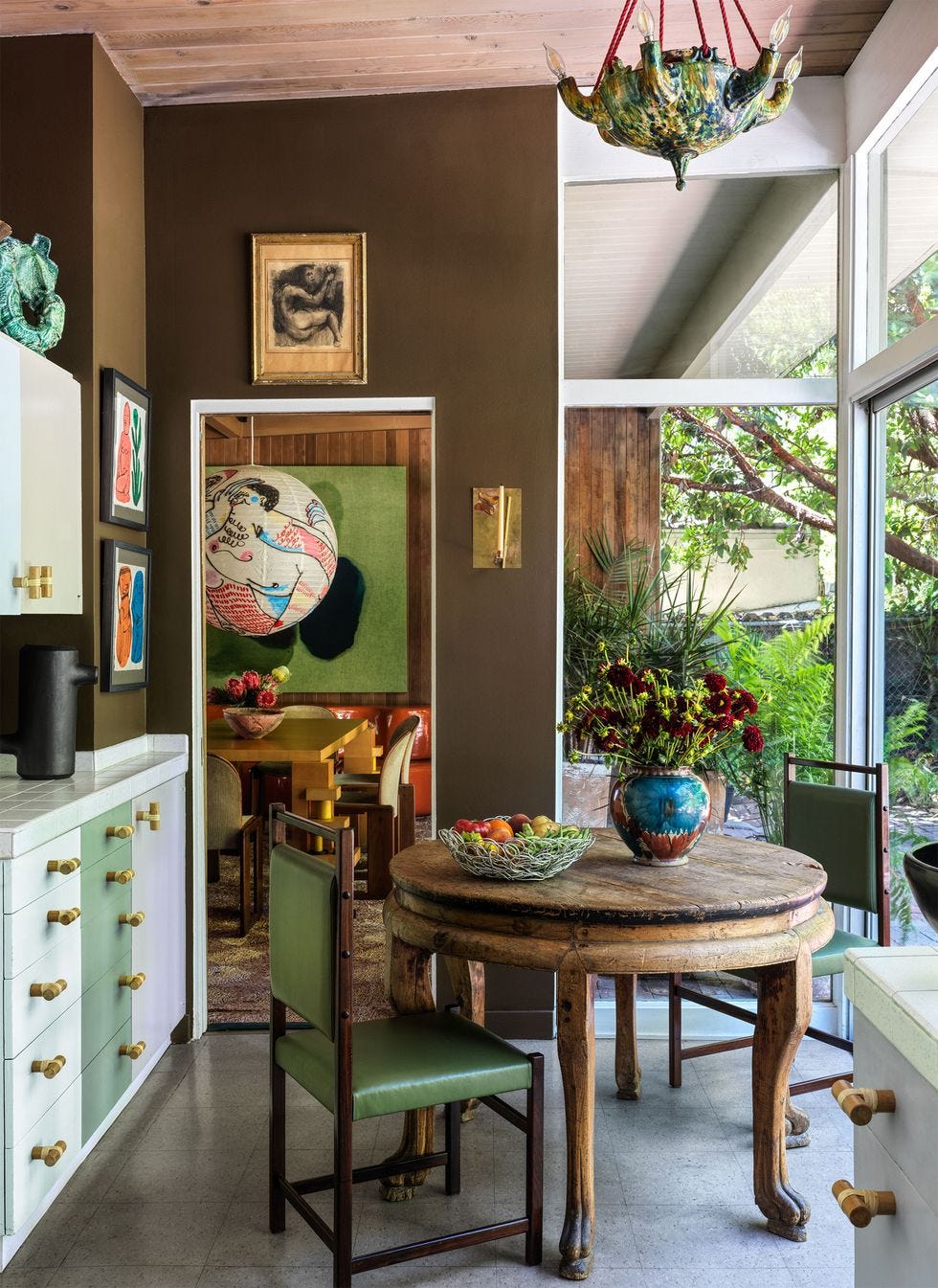
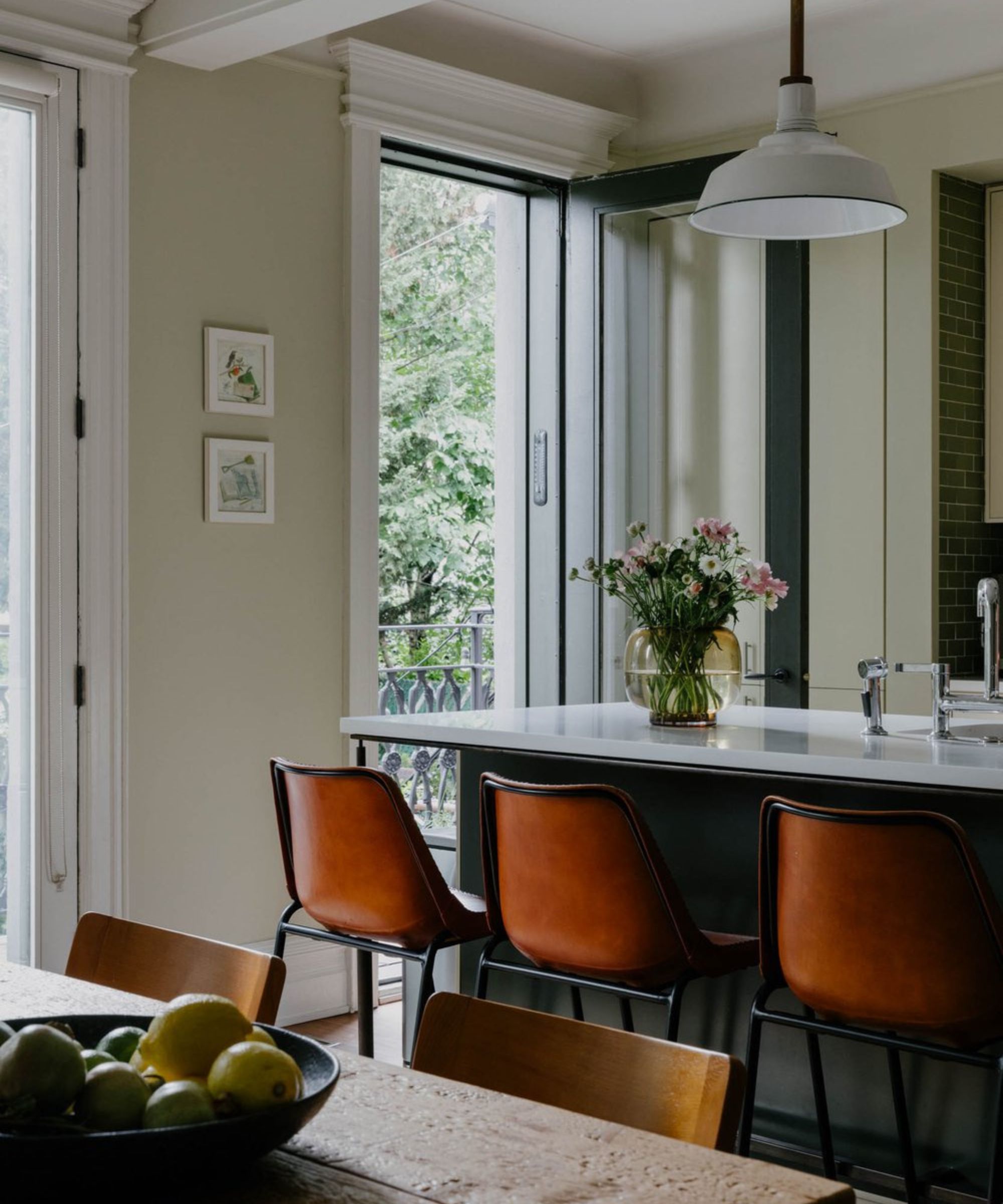
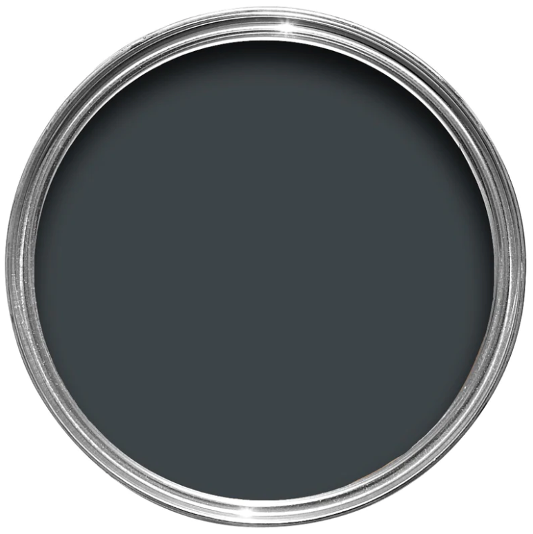
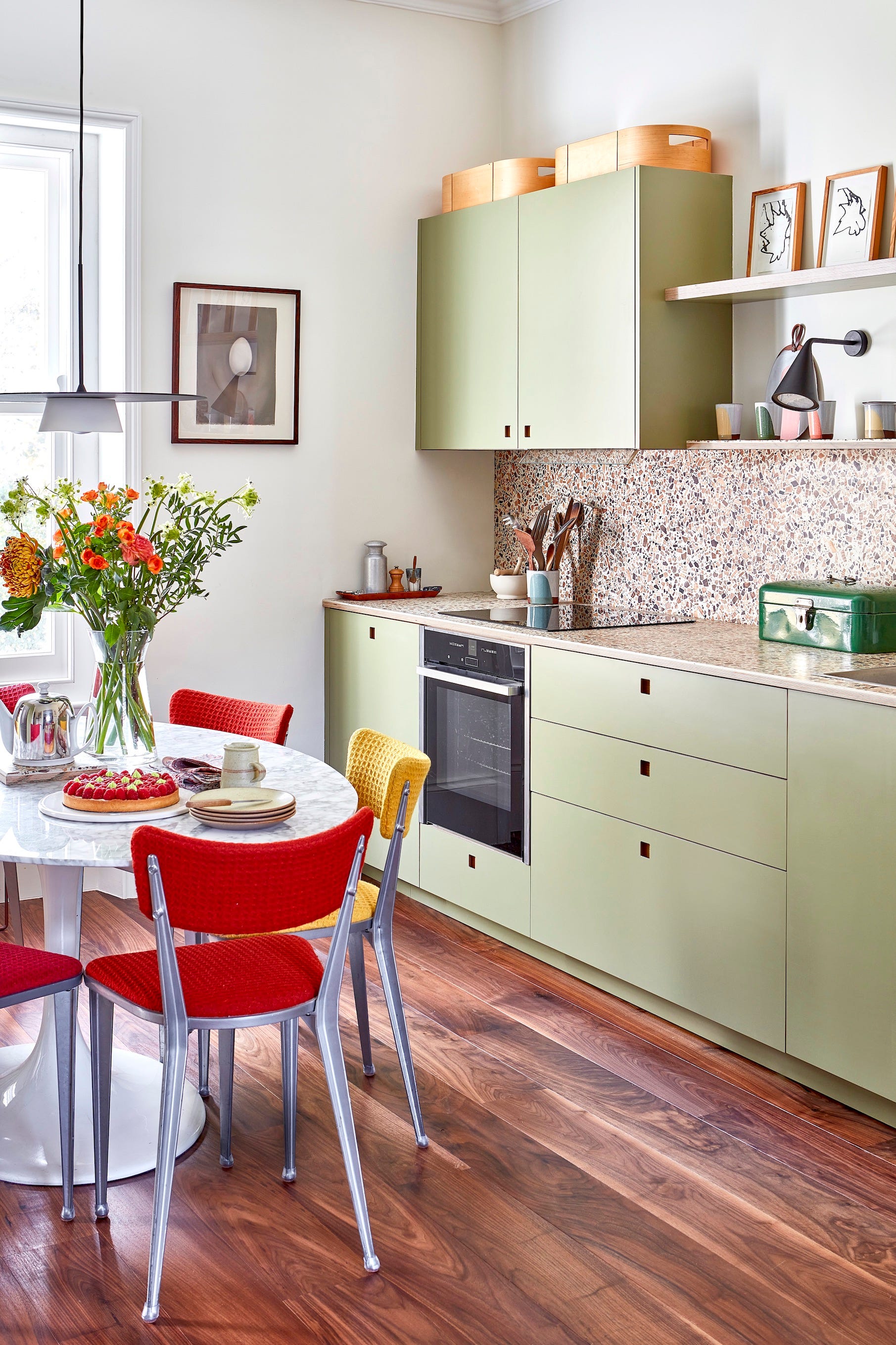
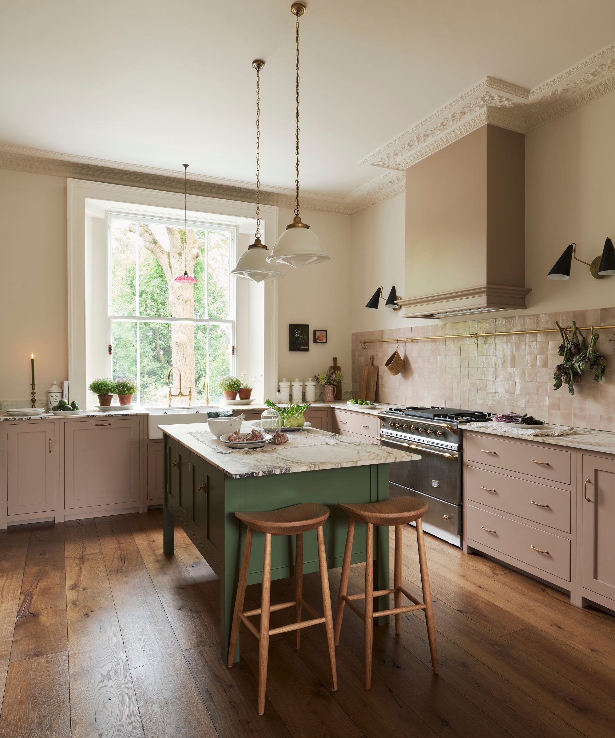
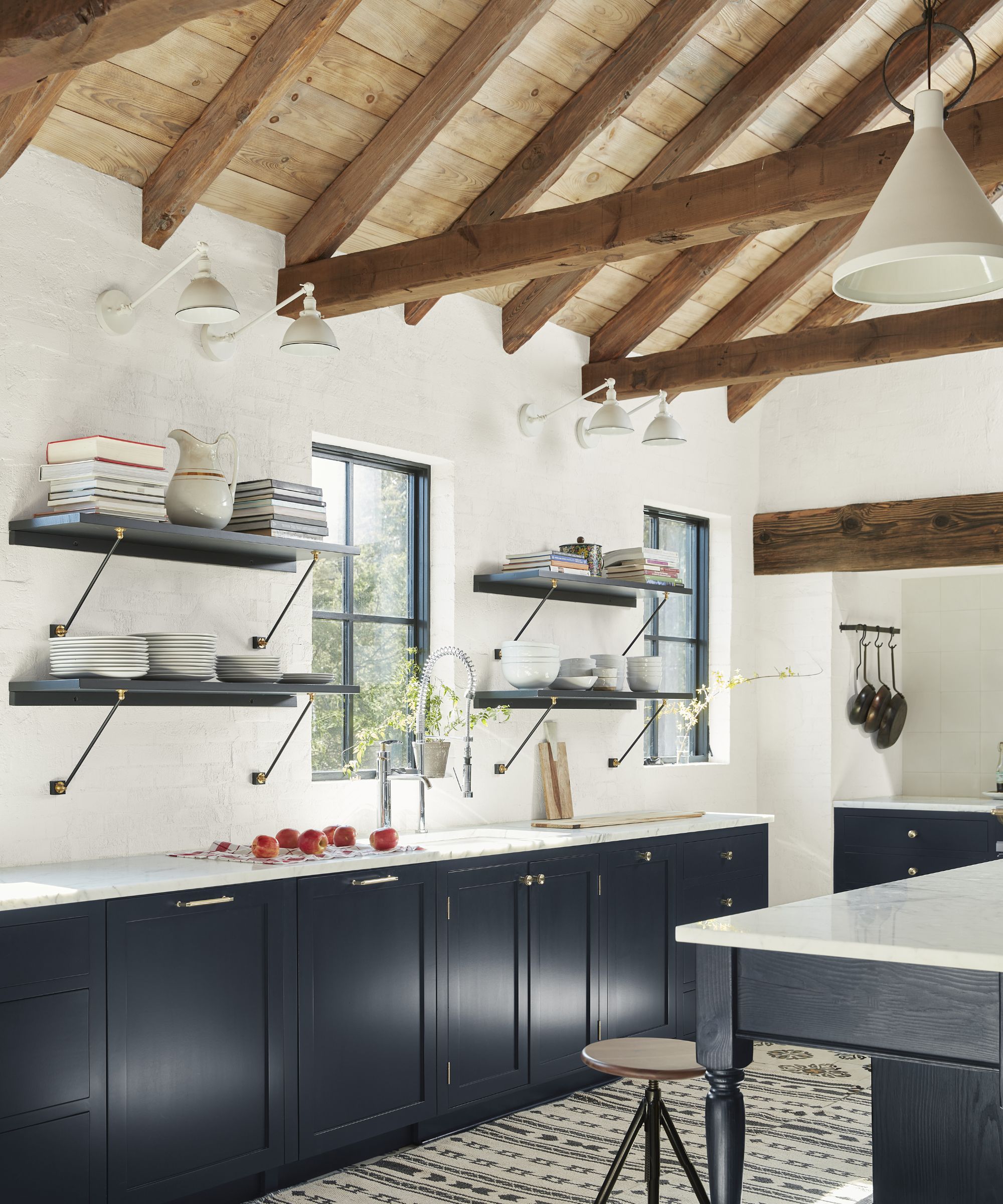
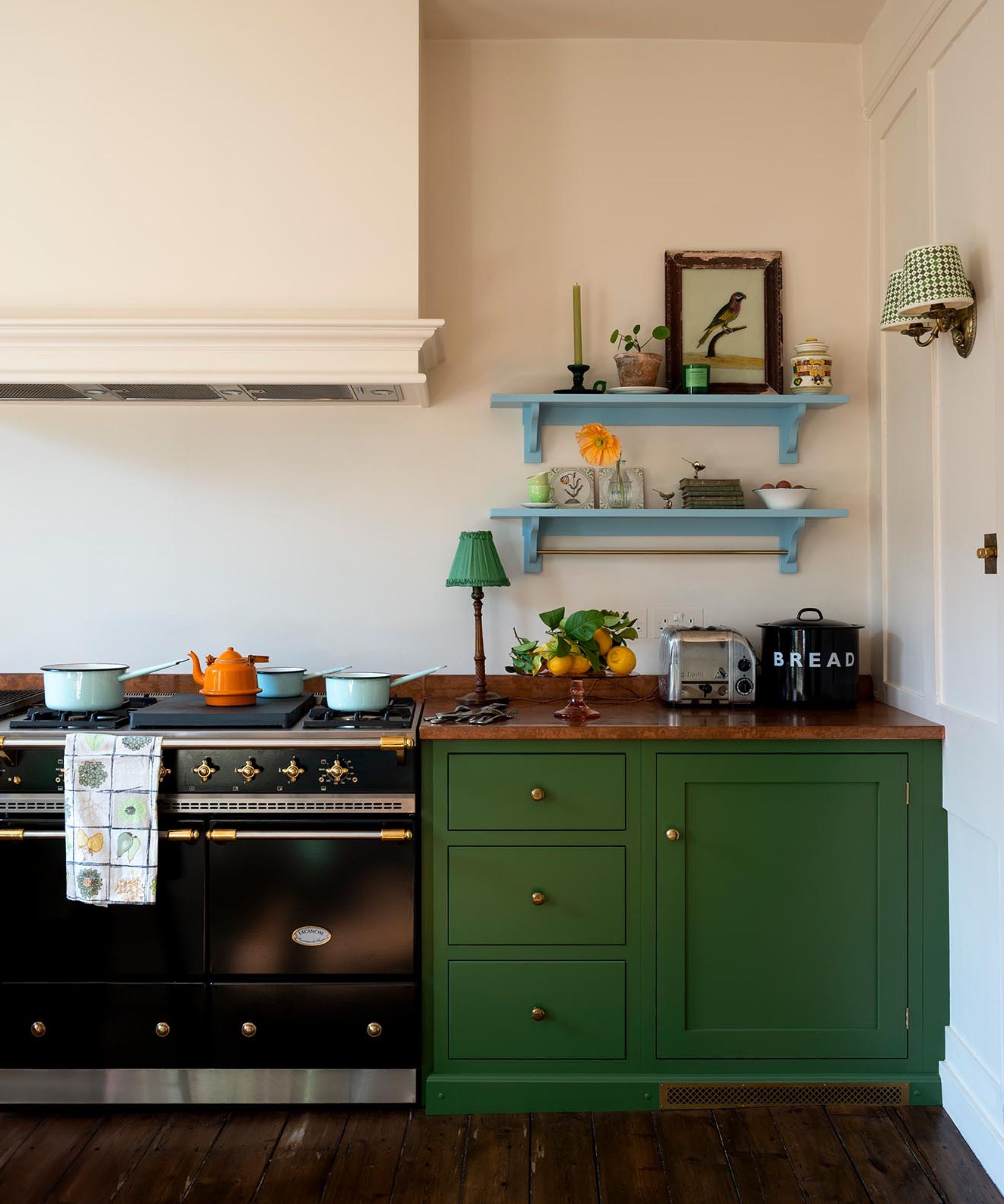
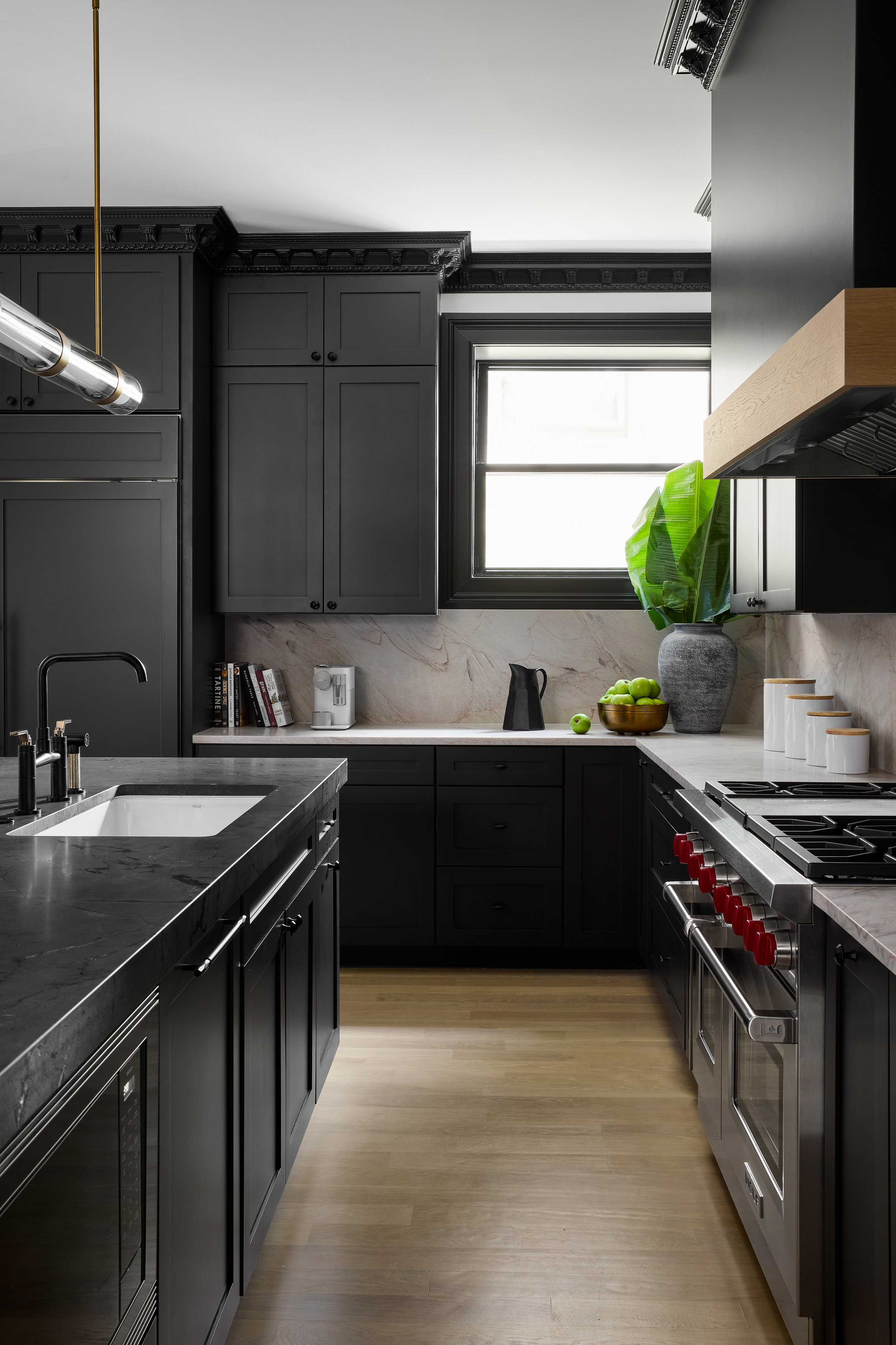
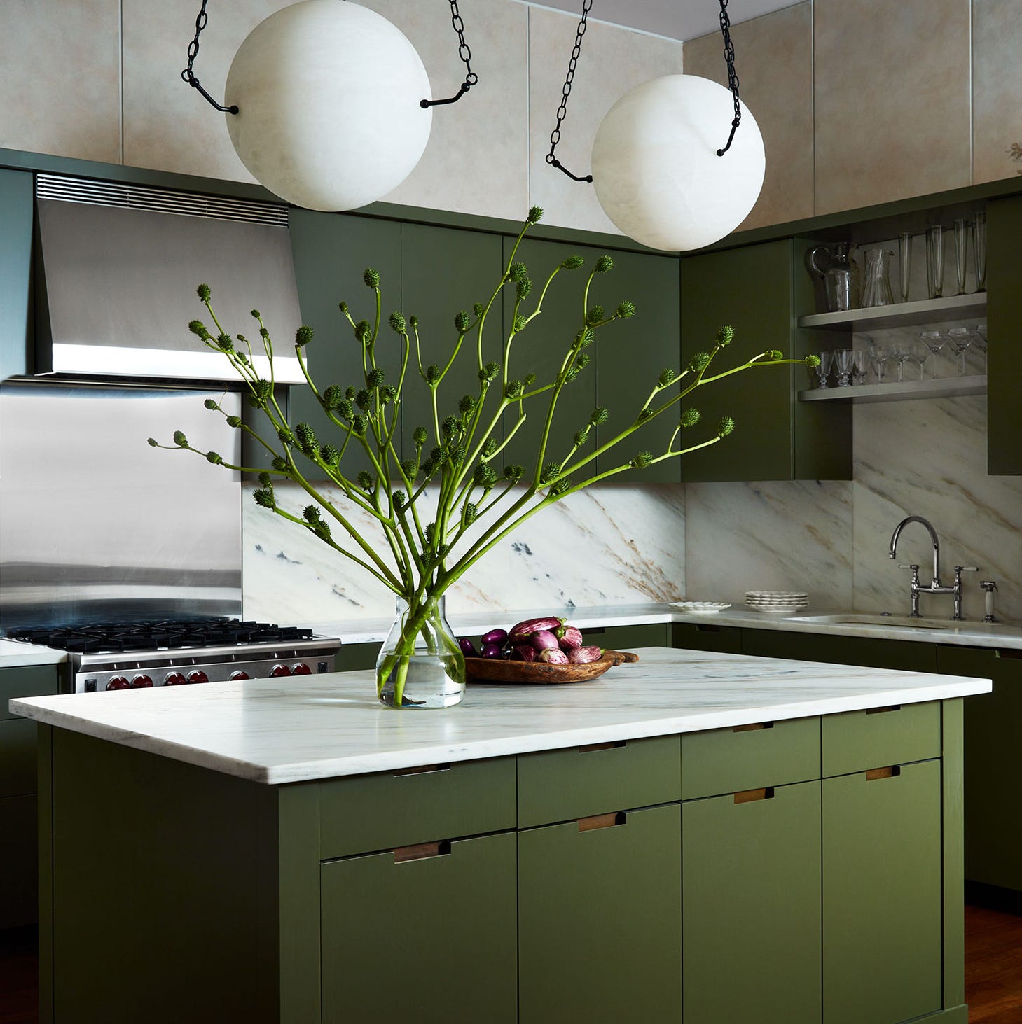
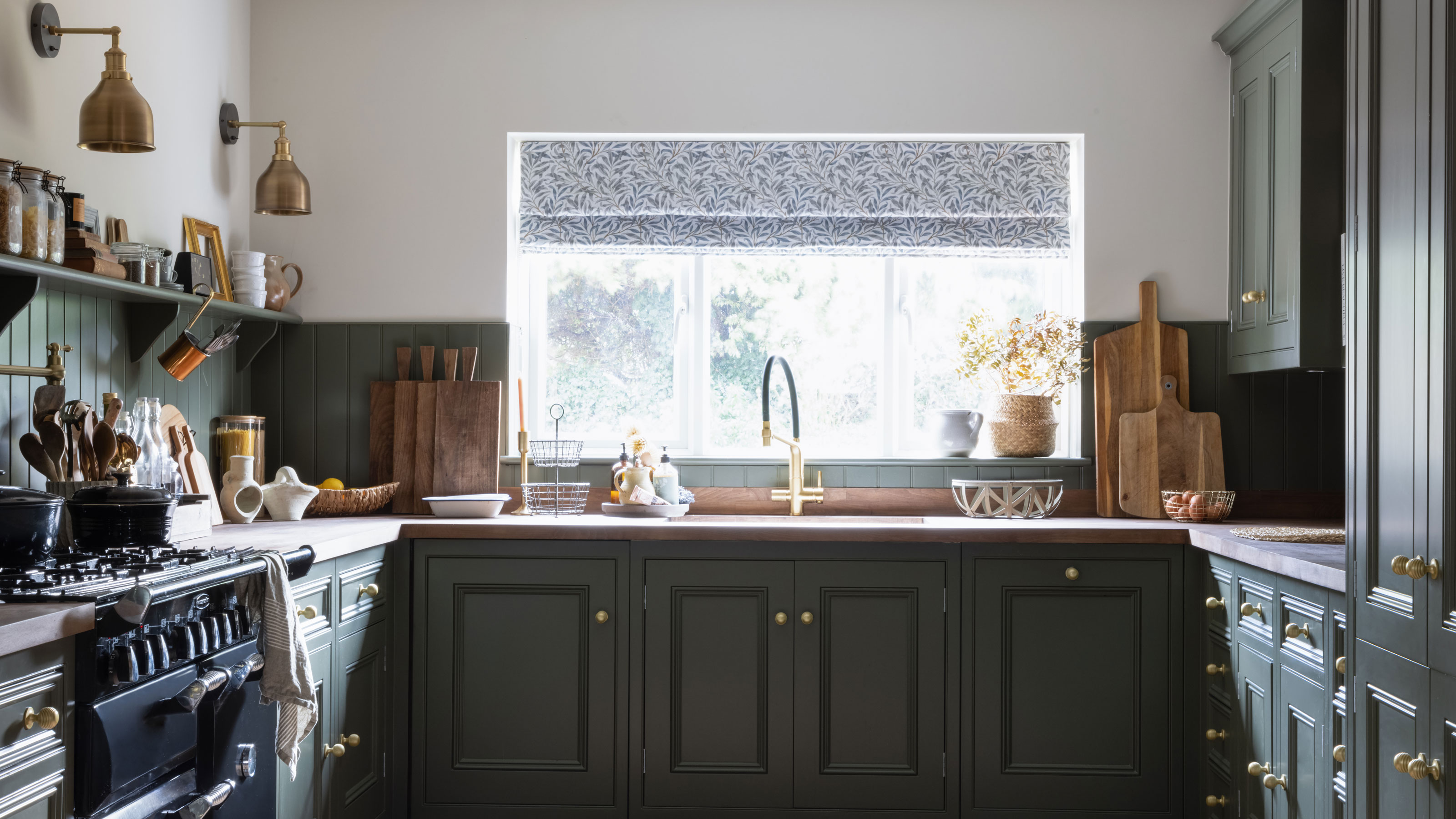
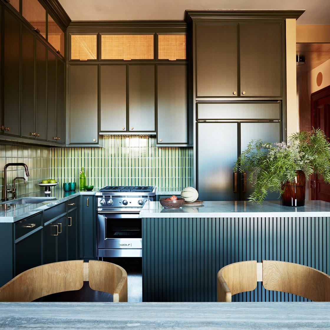
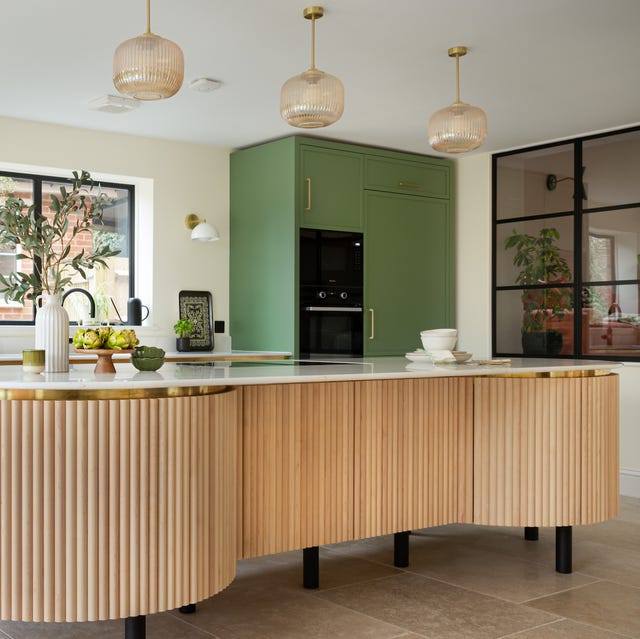
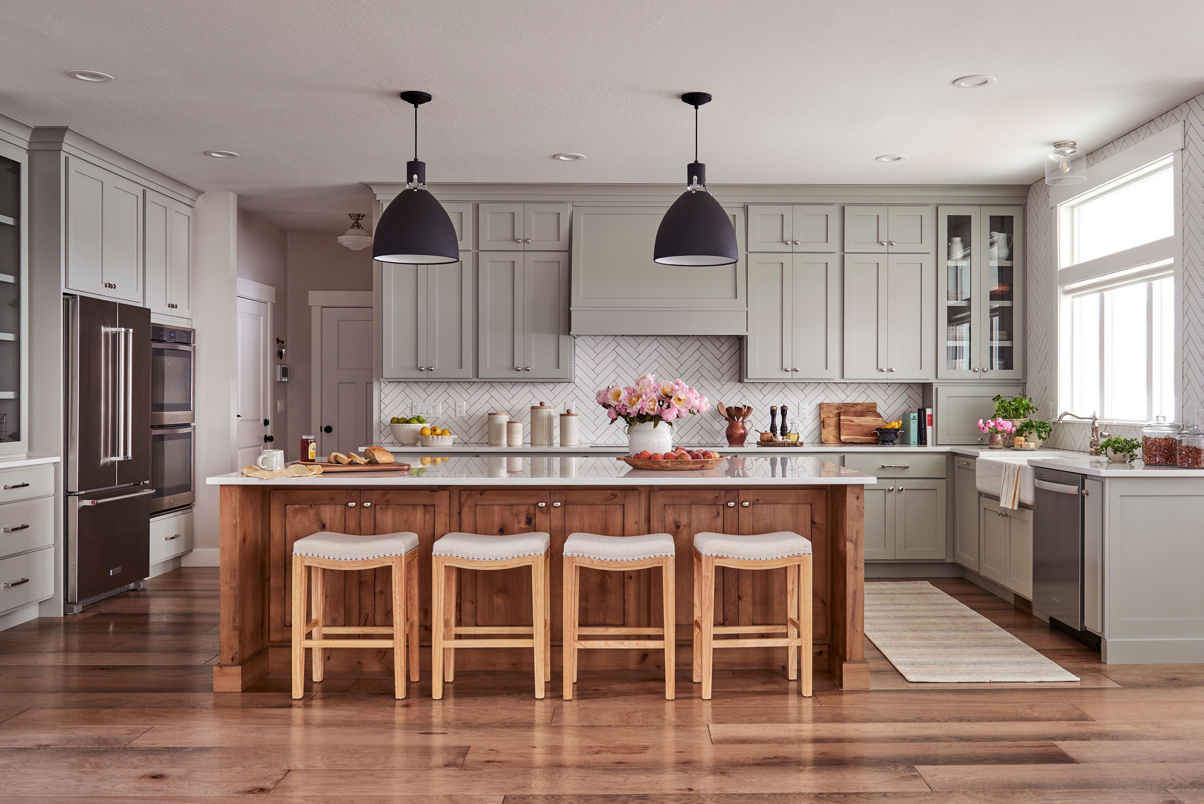
Olive green, while related to current dark green paint trends, is frequently overlooked in kitchen color schemes. Jessika Gatewood of Gatewood Designs advocates for deep olive green, describing it as a grounding, nature-inspired, rich, and sophisticated hue. Unlike more common sage greens, deep olive possesses a warm undertone that complements natural woods, brass hardware, and creamy countertops beautifully. When implementing this bold shade for kitchen cabinets, it is recommended to balance it with light neutral paint colors on the walls, such as Benjamin Moore's Swiss Coffee, to maintain a fresh and airy feel. Additionally, incorporating natural textures like wood beams, woven light fixtures, or handmade tiles can add further depth and warmth to the overall design.
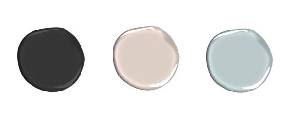
For those looking to refresh their kitchen's aesthetic, these three overlooked colors — teal, yellow, and olive green — offer compelling options beyond conventional neutrals. Whether aiming for a cheerful ambiance with yellow, a serene yet vibrant space with teal, or a moody and sophisticated feel with dark green, these shades are endorsed by interior designers for their ability to bring excitement and personality to the kitchen.
#KitchenDesign #ColorTrends2025 #InteriorDesign #TealKitchens #YellowKitchens #OliveGreenKitchens #KitchenCabinets #HomeDecor #DesignerRecommendations #KitchenDesign #ColorTrends2025 #InteriorDesign #TealKitchens #YellowKitchens #OliveGreenKitchens #KitchenCabinets #HomeDecor #DesignerRecommendations
0 comment in total
You may also like
These are the 3 wall colours to avoid if you have a green kitchen - and the expert-approved shades to try instead
It’s Official: These are the Best Kitchen Paint Colors, According to Designers
13 Unique Kitchen Color Combinations To Try Out In 2025
Designers say the key to kitchen paint colors in 2024 is to go bold

16 Designer-Approved Kitchen Color Schemes You’ll Want to Steal
Kitchen Color Selection Tips from 5 Designers
7 Paint Colors To Never Use In Your Kitchen, According To Designers
These 2025 Kitchen Color Trends Are Unexpectedly Chic

Designers are ditching gray walls in kitchens for these 3 on-trend alternatives – here's why you should too

The One Paint Color Designers Always Avoid in Kitchens—and What They Use Instead

These kitchen paint colours will be everywhere in 2025 – and there's even one for neutral lovers

The Best Kitchen Paint Colors All Have This One Thing In Common
3 Kitchen Paint Colors Experts Promise Will Never Go Out of Style

No-fail kitchen colour ideas: 20 pairings that just work
What Kitchen Color Should I Choose? 12 Ideas That Feel Right for Schemes in 2025

29 Best Paint Colors for a Kitchen You’ll Never Want to Leave

Ditch the White! Try One of These Designer-Approved Kitchen Colors

5 ways to nail the tri-color kitchen method, say designers
The best colors for kitchen appliances, according to interiors experts
9 Paint Colors You’ll Never Find in an Interior Designer’s Home