1/20
No-fail kitchen colour ideas: 20 pairings that just work
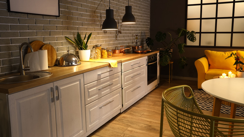
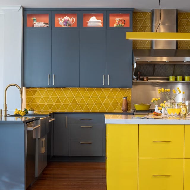
This article explores various kitchen color schemes and design tips, aiming to help readers create a well-balanced kitchen aesthetic. It addresses common design dilemmas, such as the impact of artificial light on color perception, the effect of semi-gloss finishes on subtle shades, and the challenge of coordinating practical elements like ovens and sinks with the overall color palette. The article provides a comprehensive guide to successful color pairings, offering suggestions for both minimalist and traditional styles, including farmhouse kitchens.
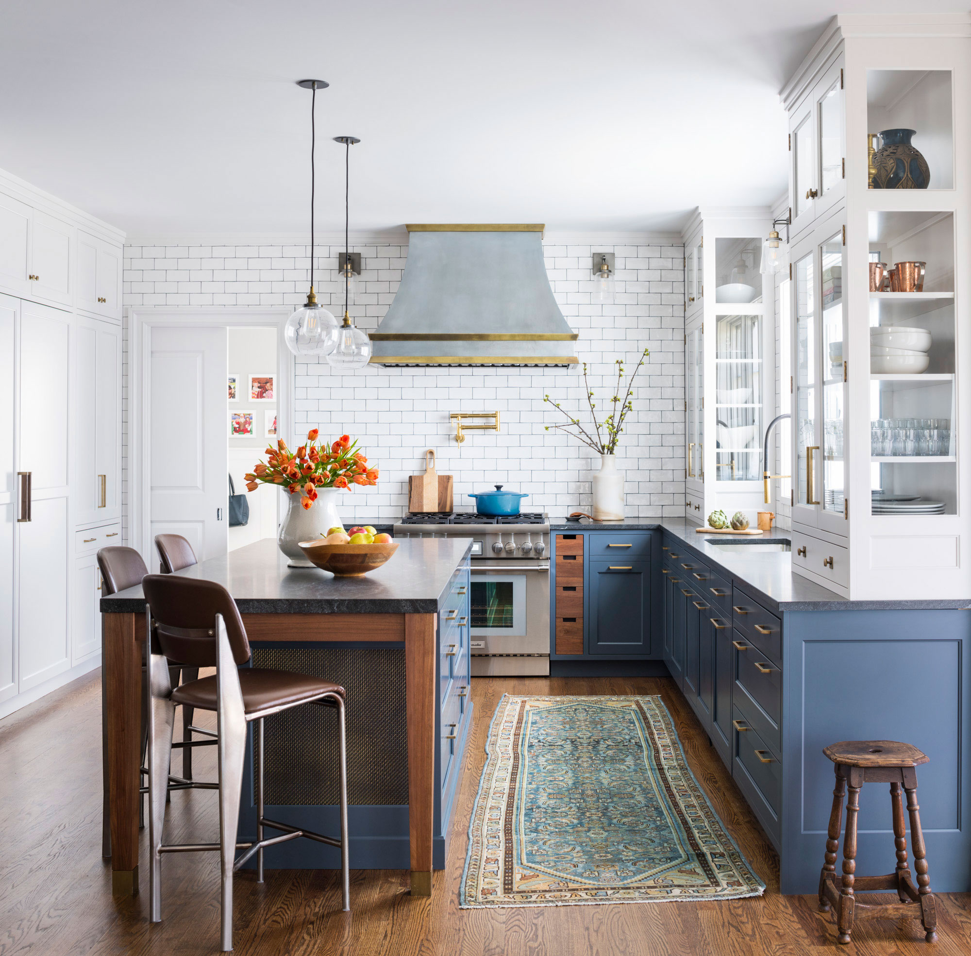
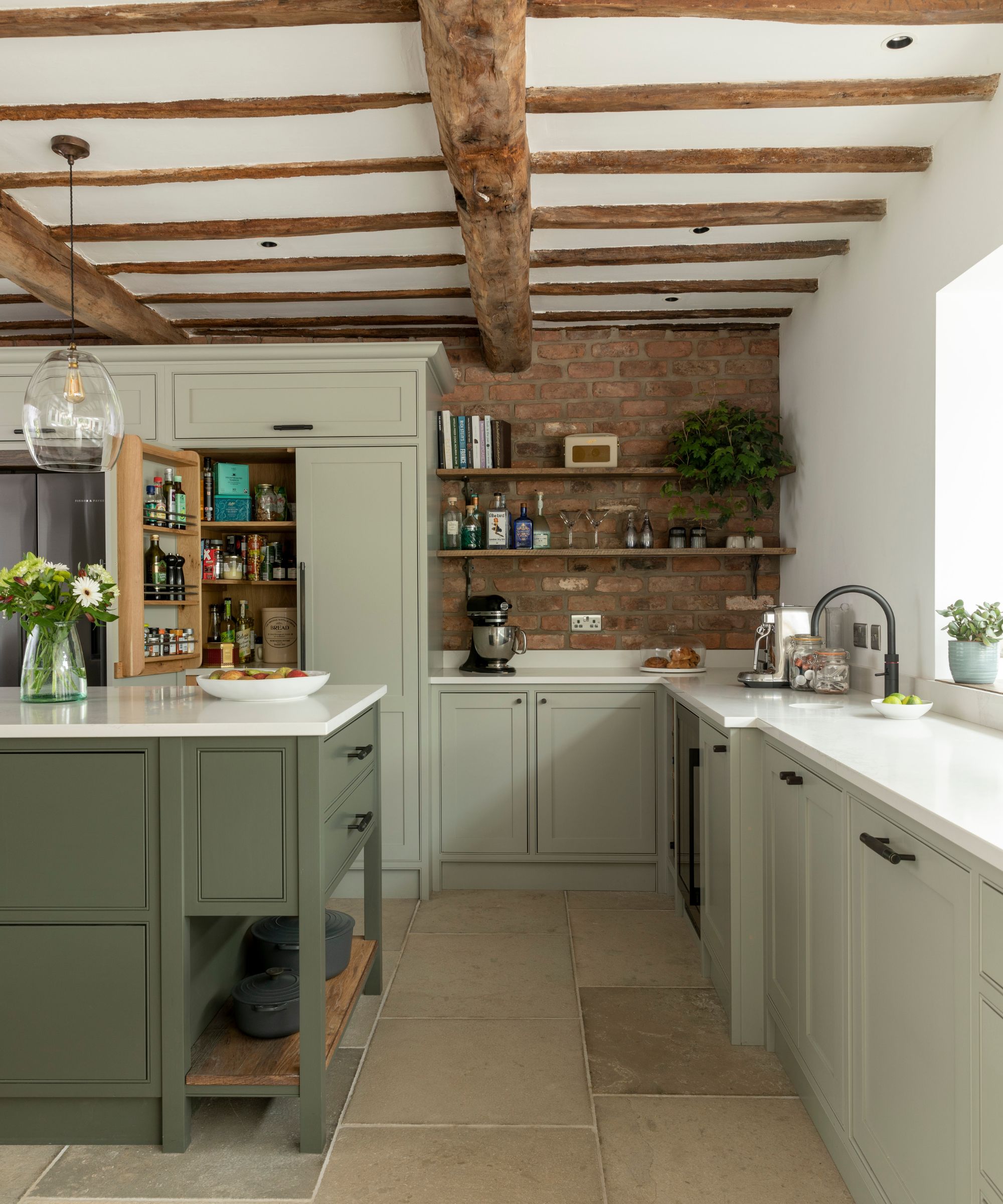
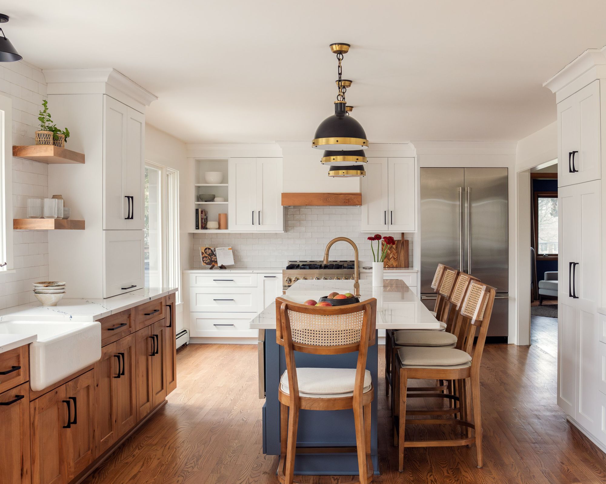
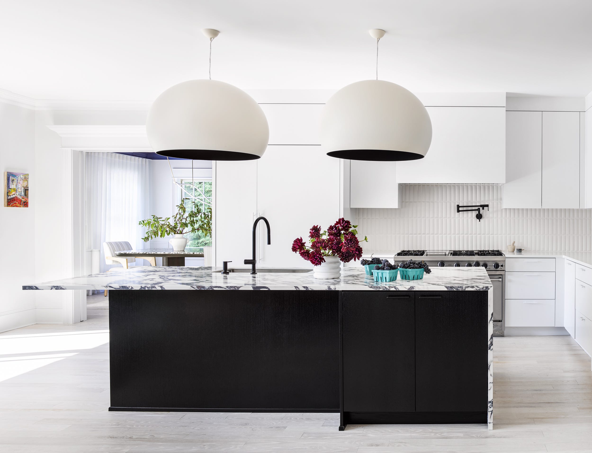
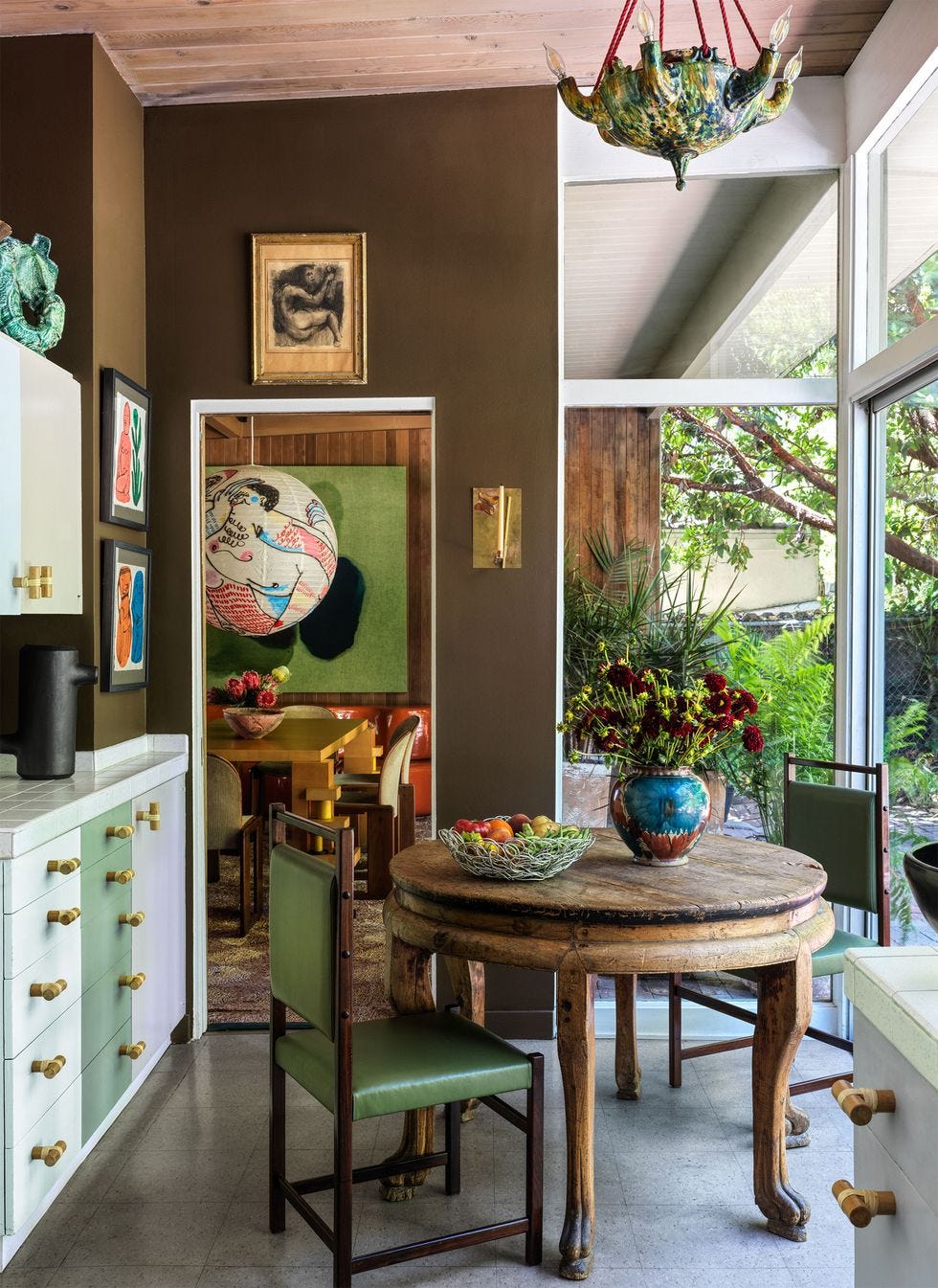
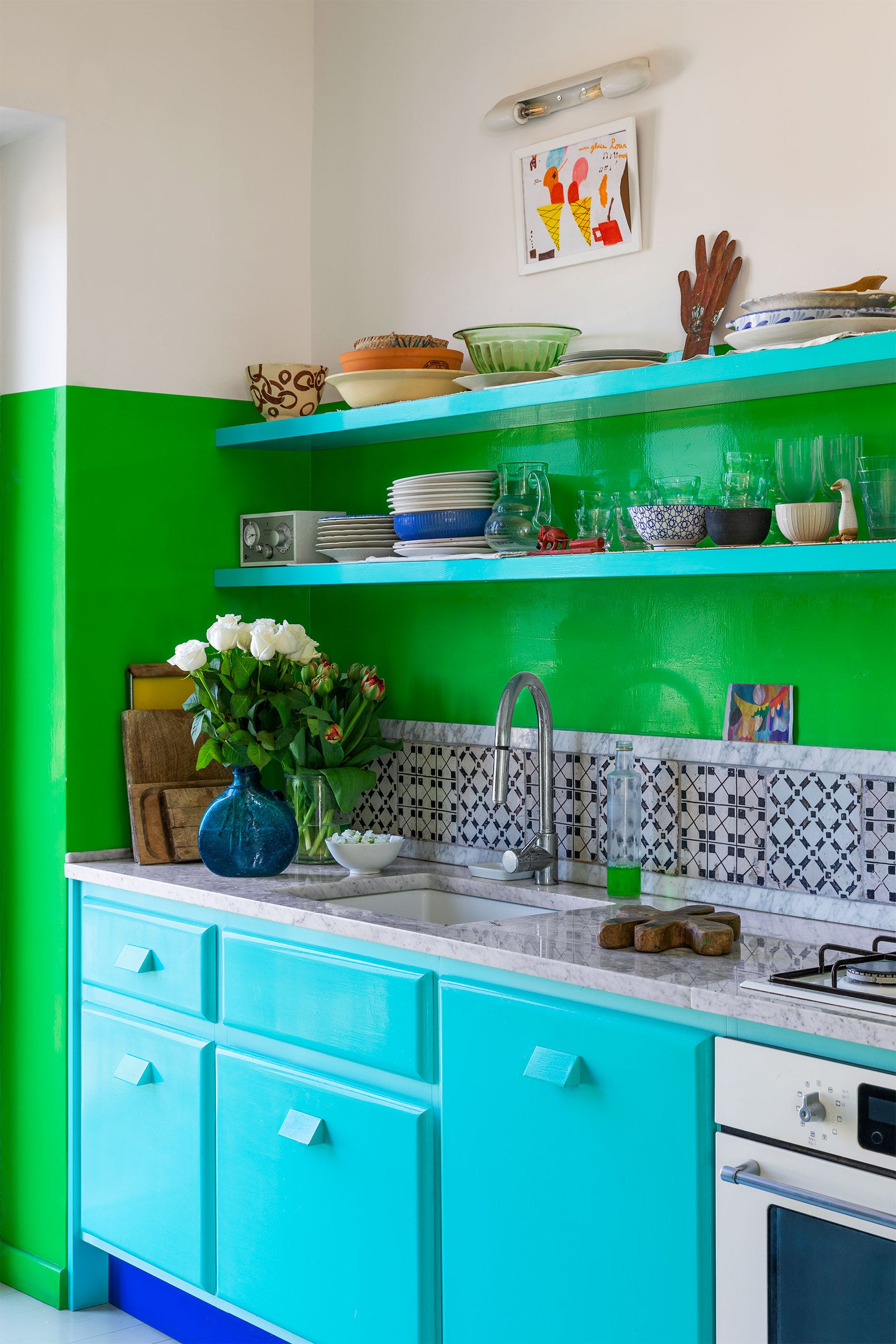
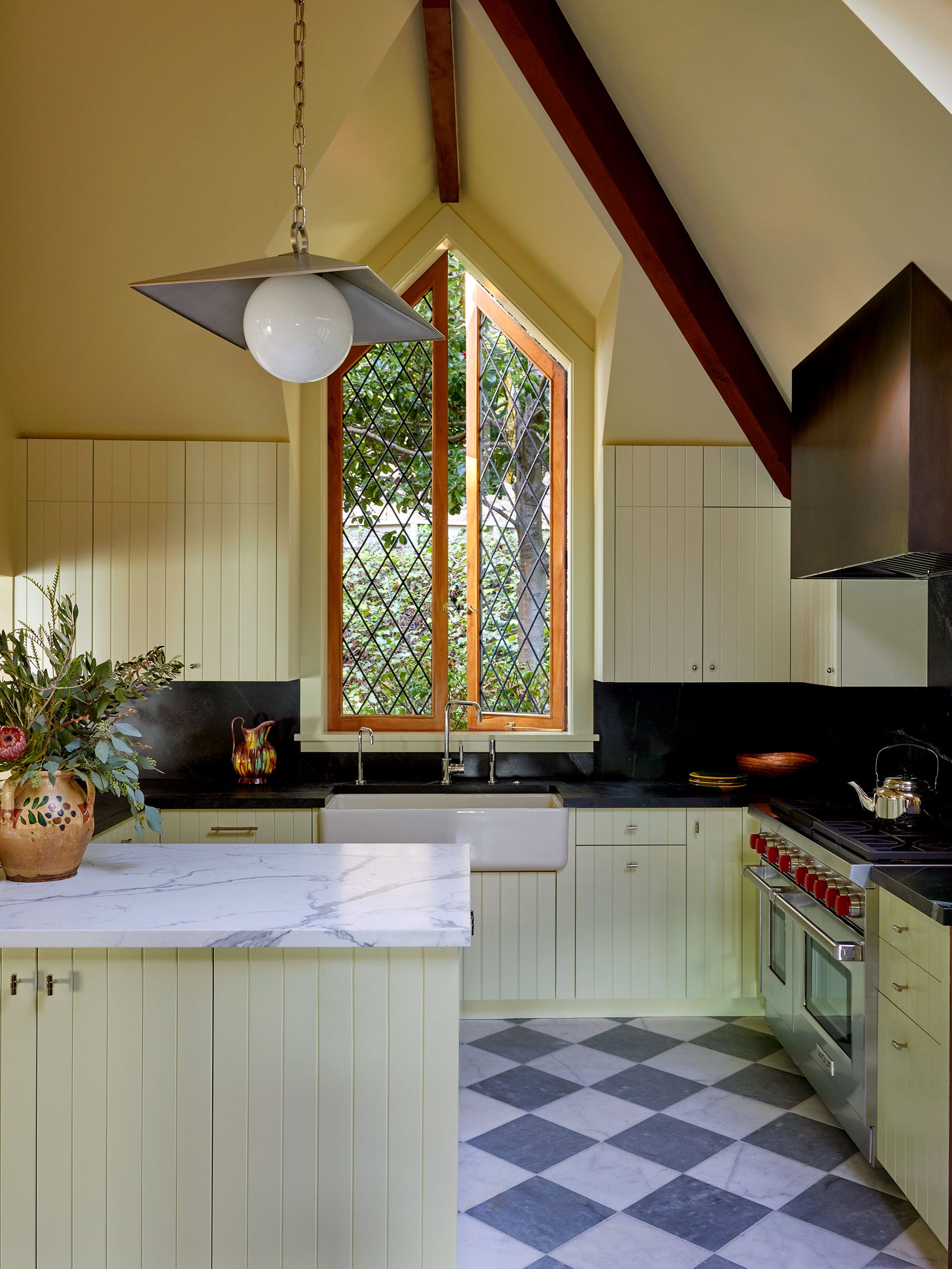
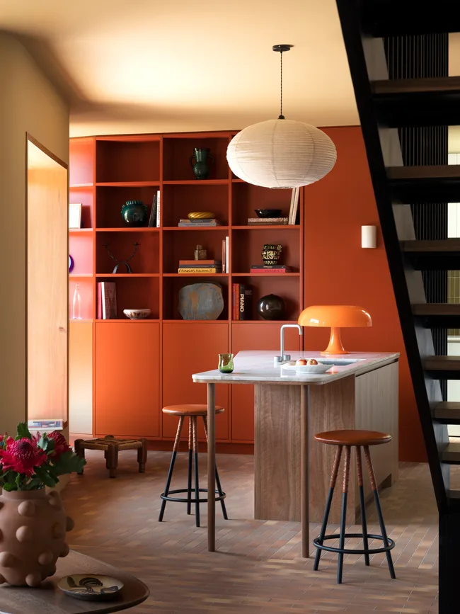
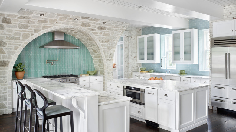
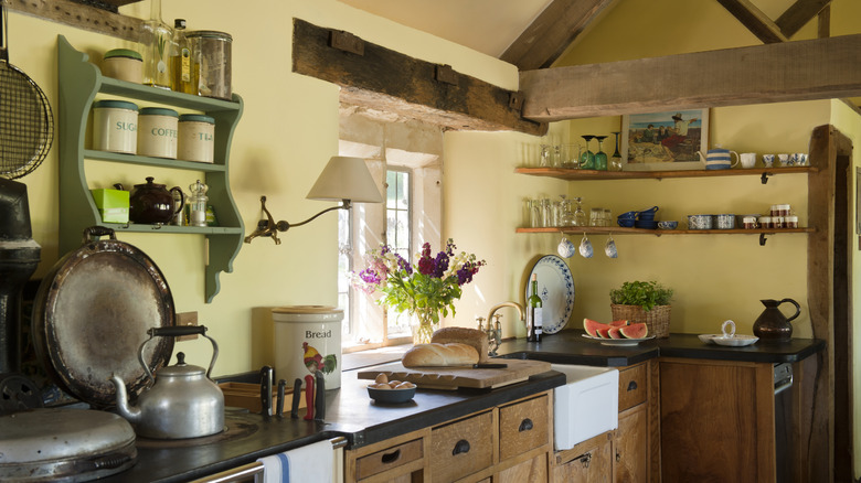
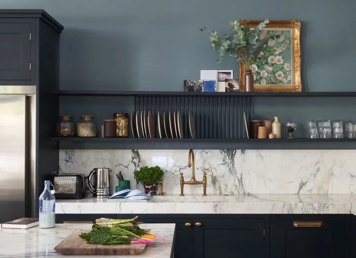
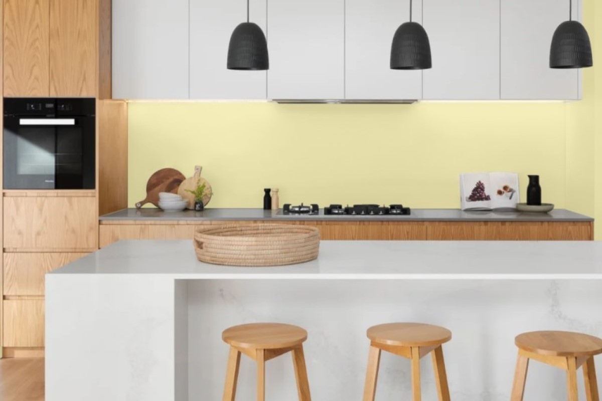
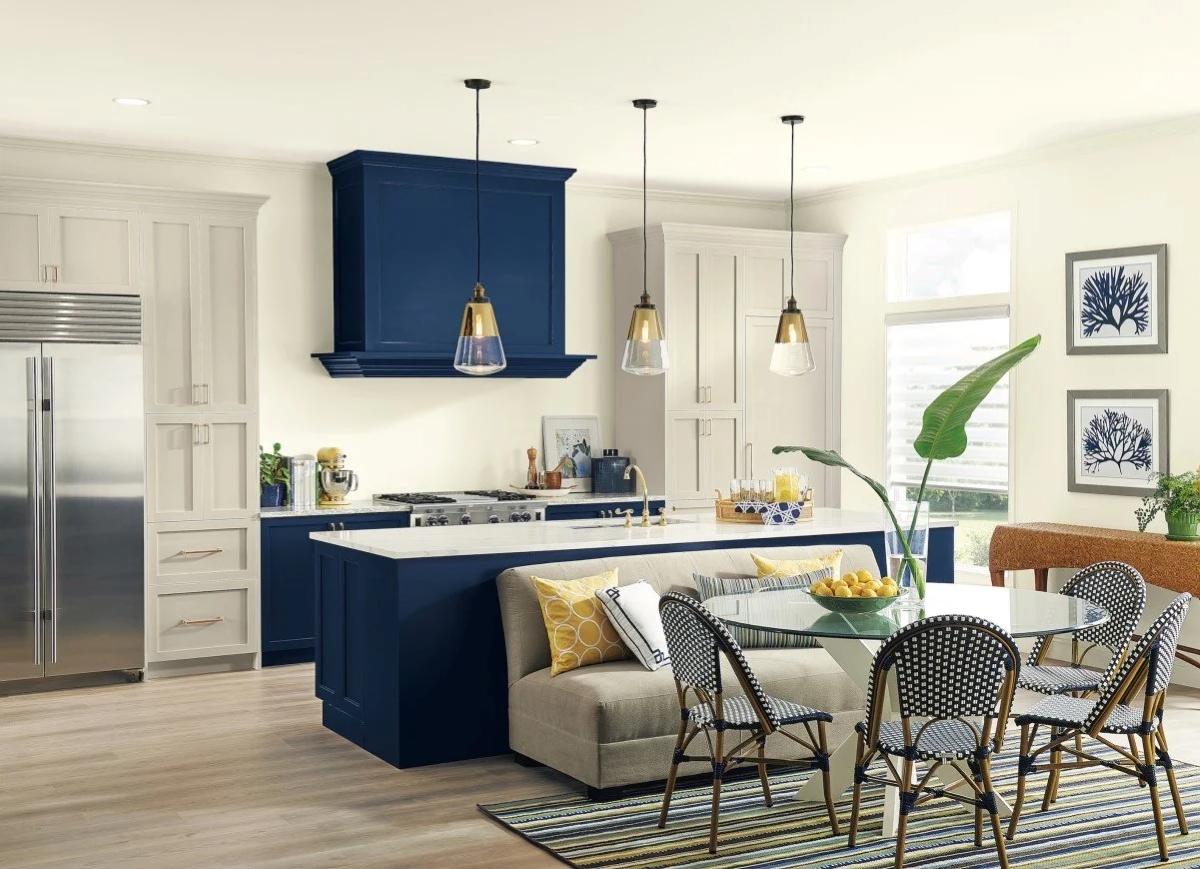
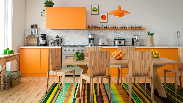
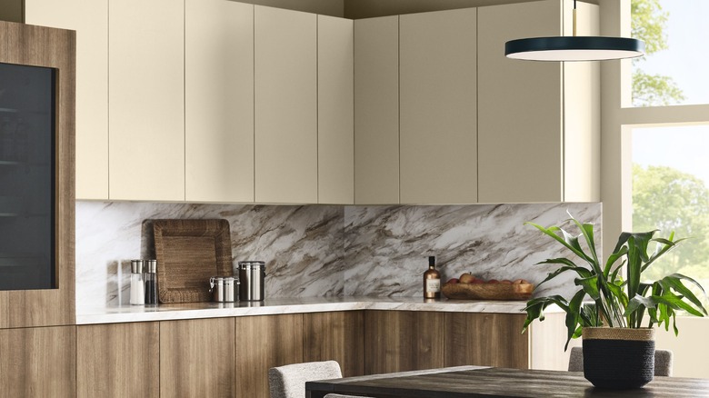
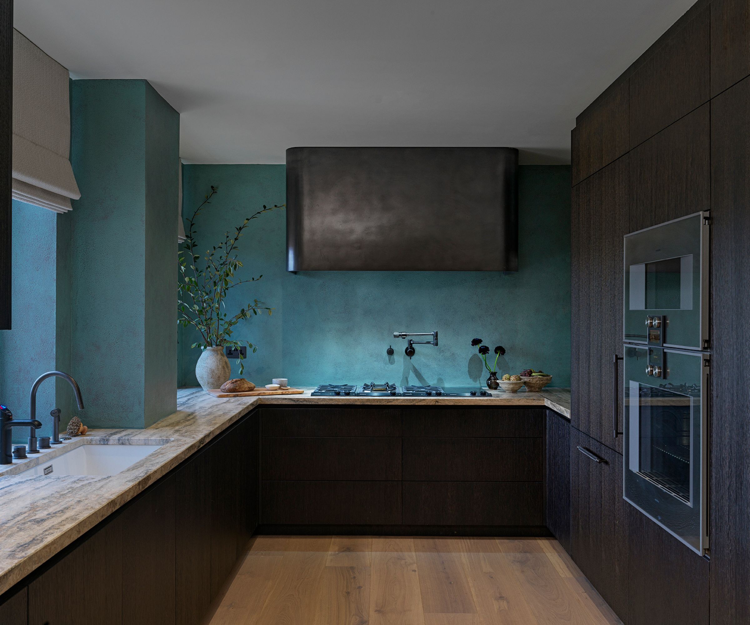
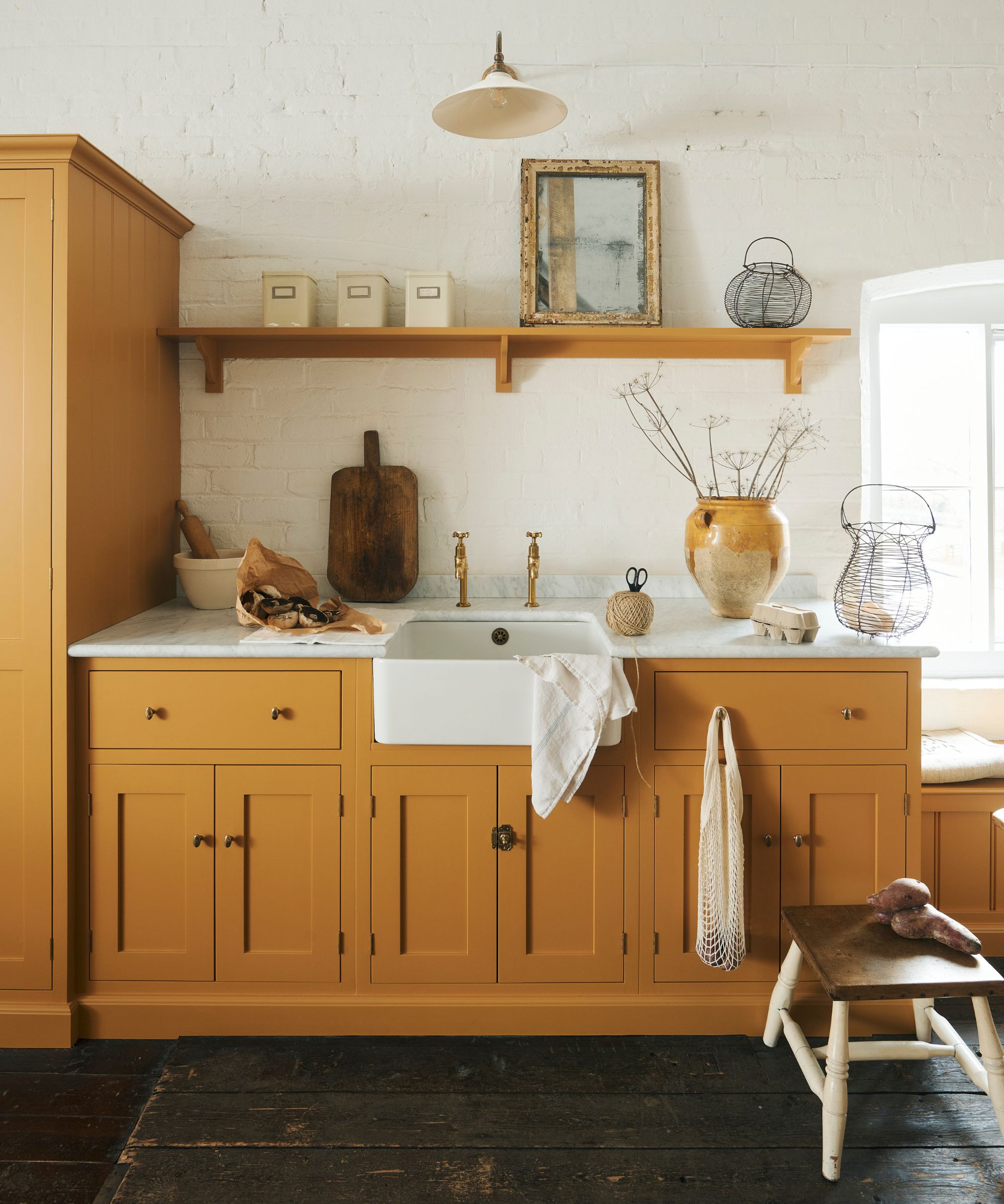

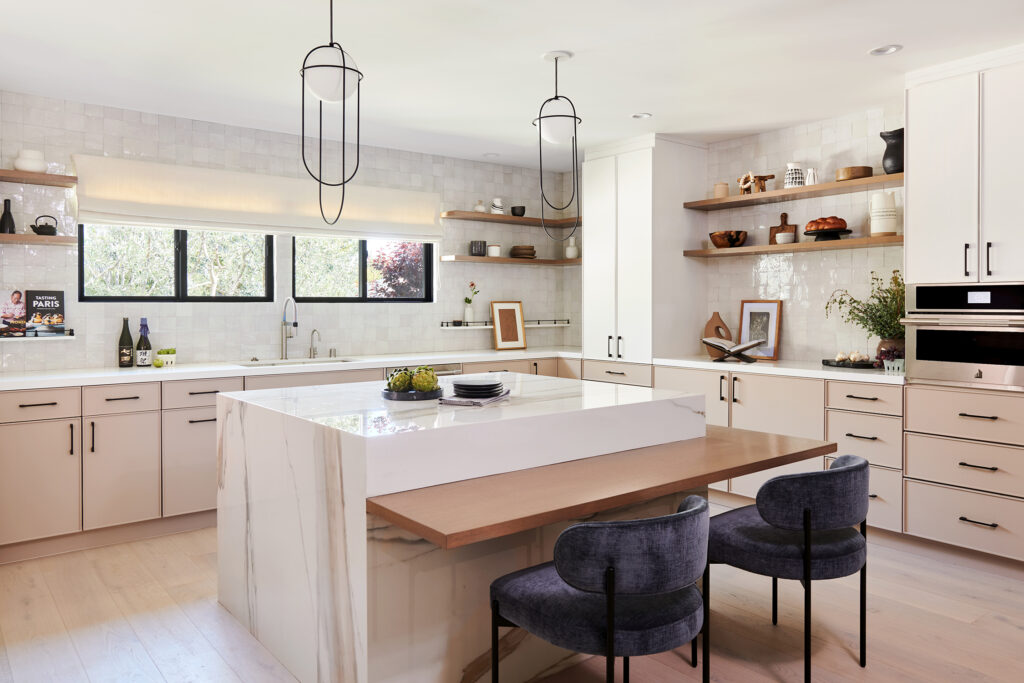
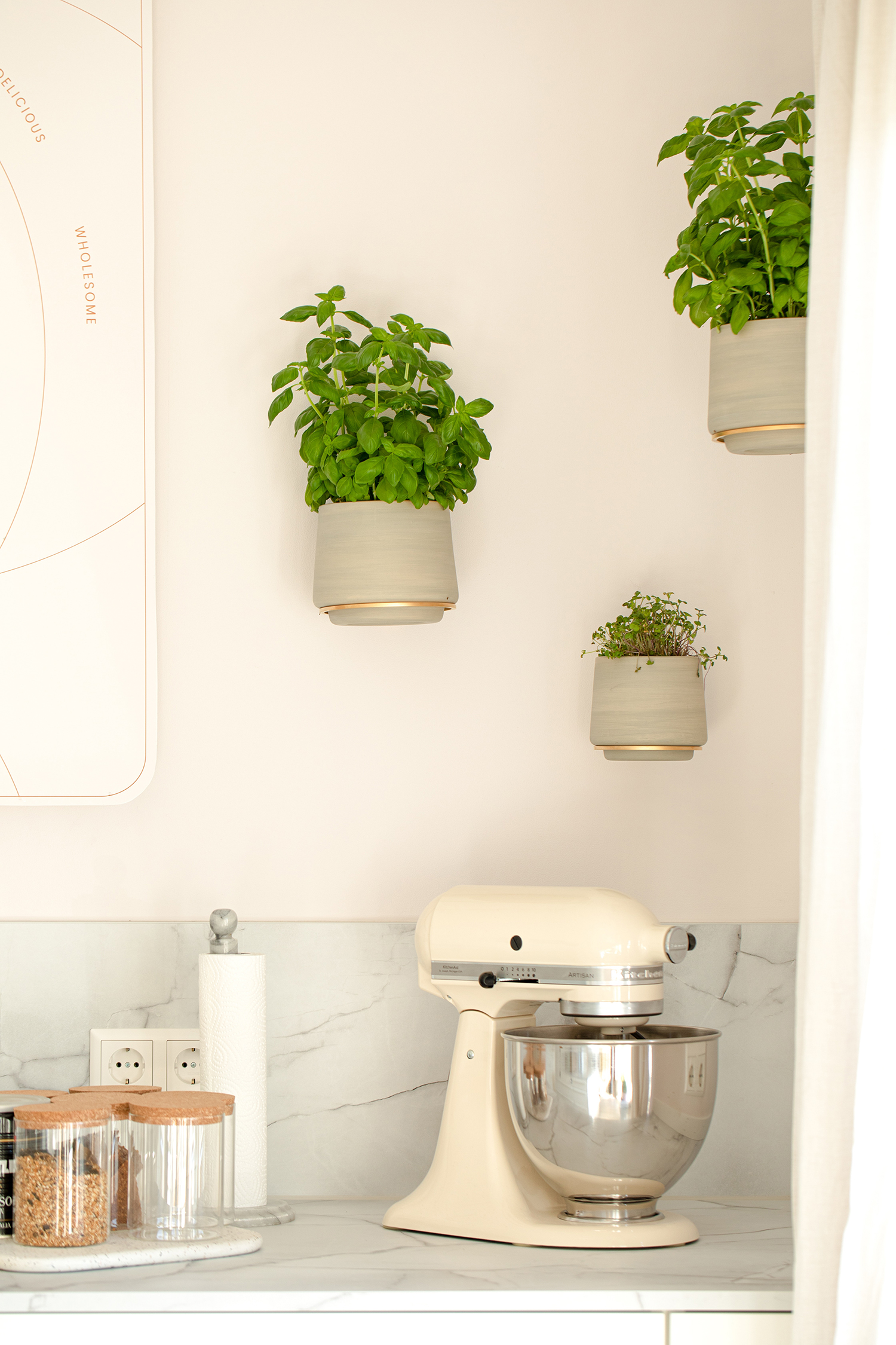
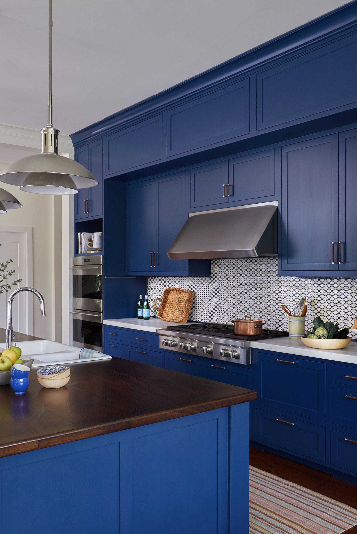
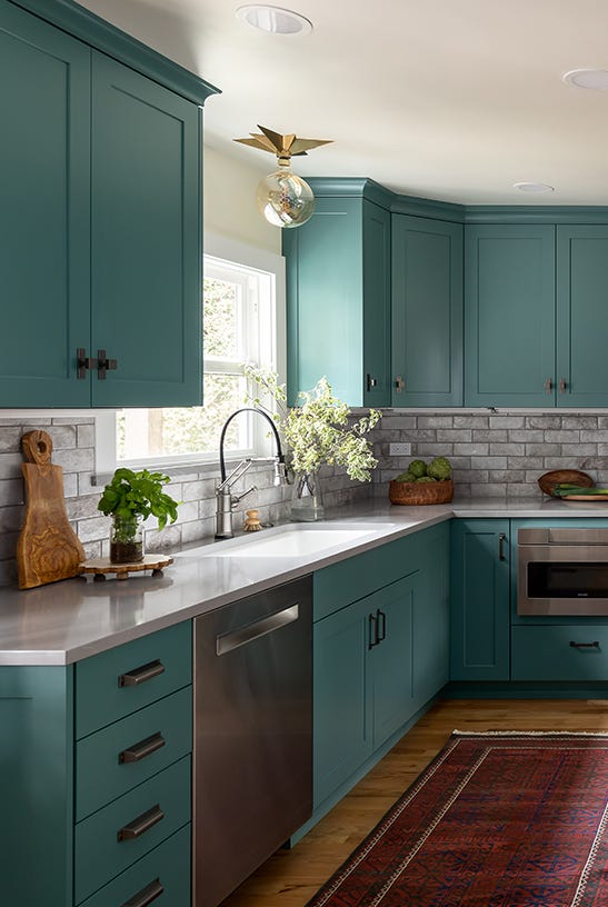
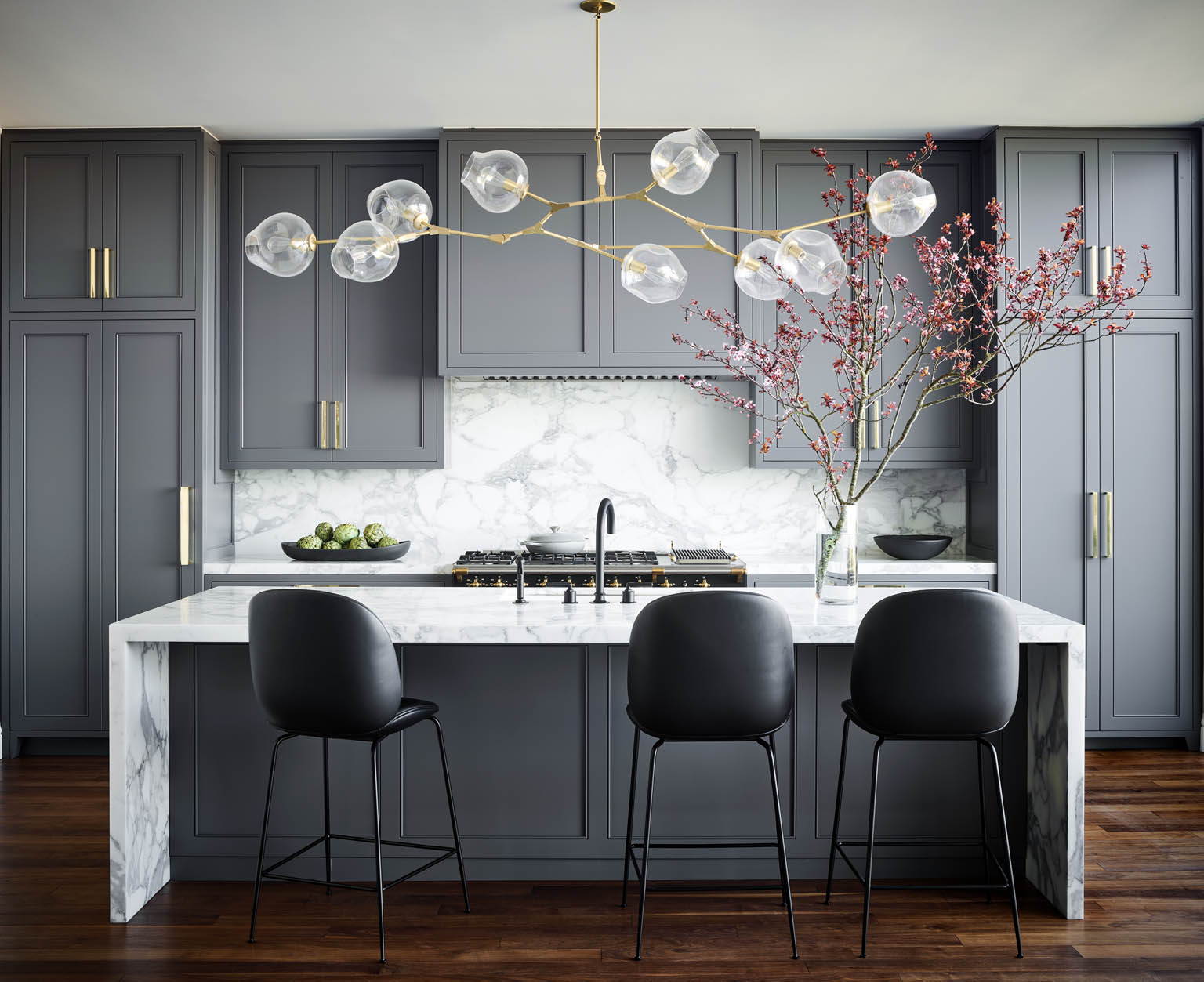
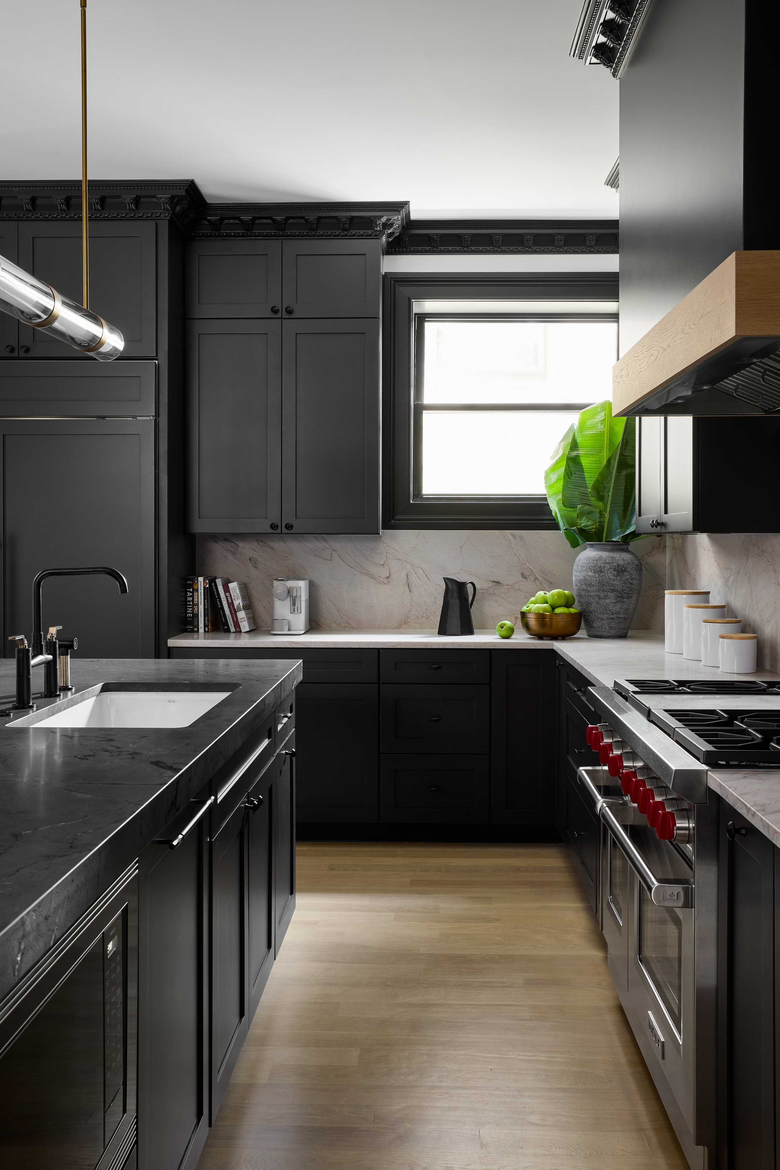
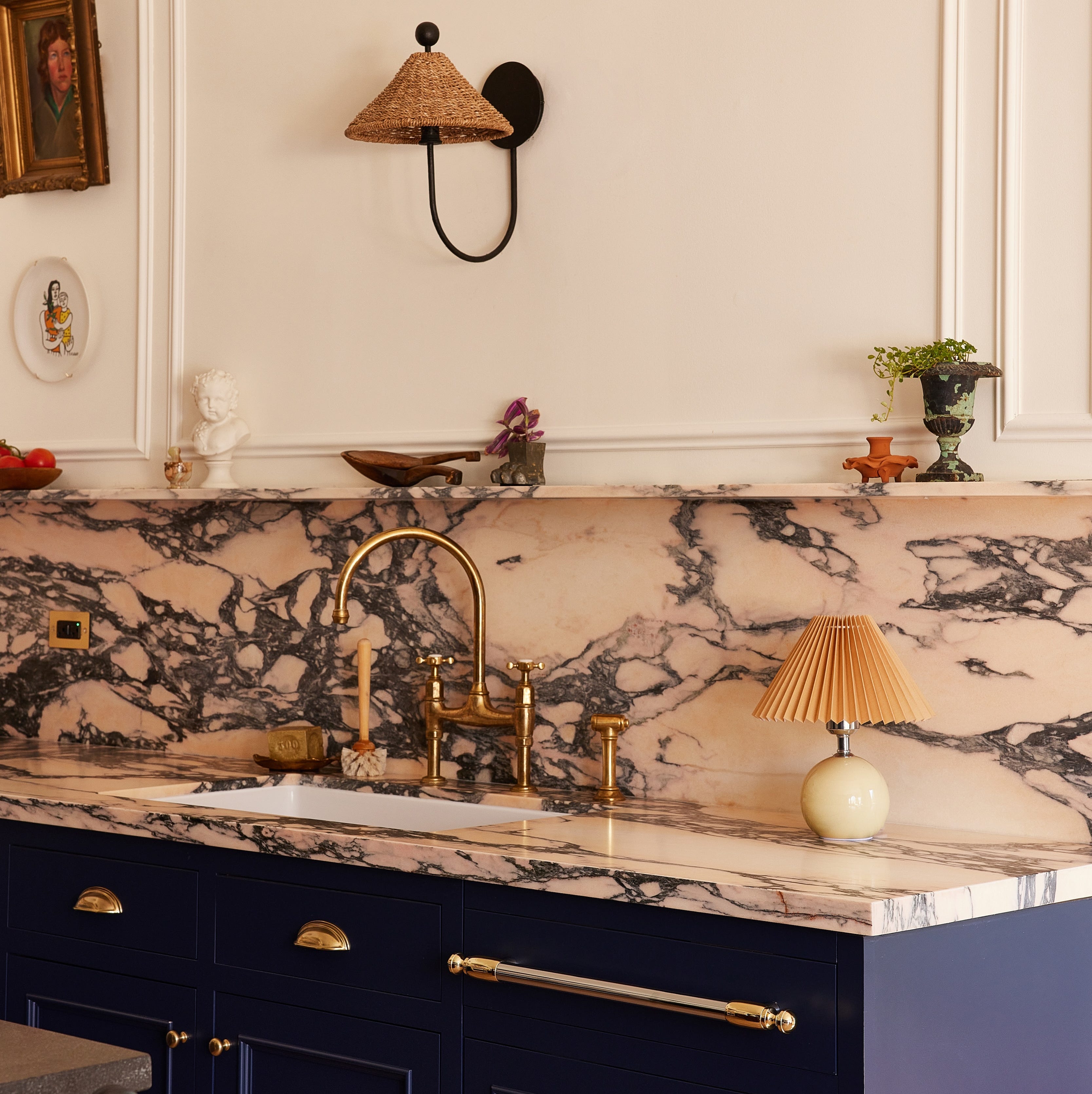
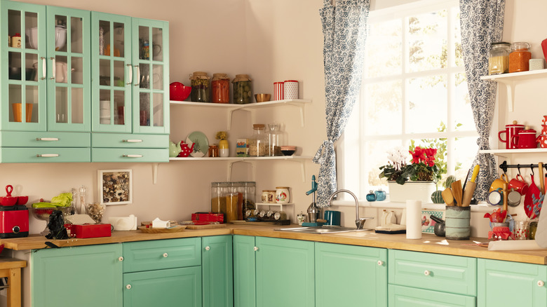
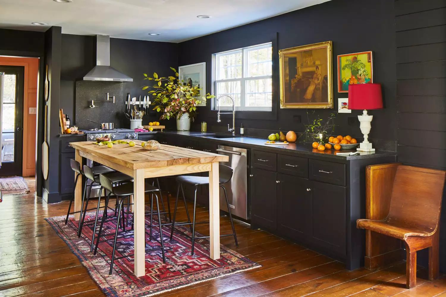
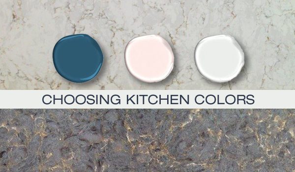
The featured color combinations begin with a vibrant contrast of green cabinets and red accents, demonstrating how opposing colors on the color wheel can create a high-impact look. It also showcases the warmth and anchoring effect of dark wood cabinetry against bright walls and floors. A navy and pink scheme is presented, inspired by a pinky Paonazzo Rose marble, highlighting the importance of natural stone in dictating a room's palette. Neutral cream tones paired with wood are suggested for a calming ambiance, illustrating how wood elements can enhance softness. The article also delves into effective use of black, such as a liquorice-colored kitchen with clay-pink walls and a gloss finish to reflect light. A classic white and navy combination is highlighted for balancing traditional and modern elements, featuring Shaker cabinetry and clean lines.
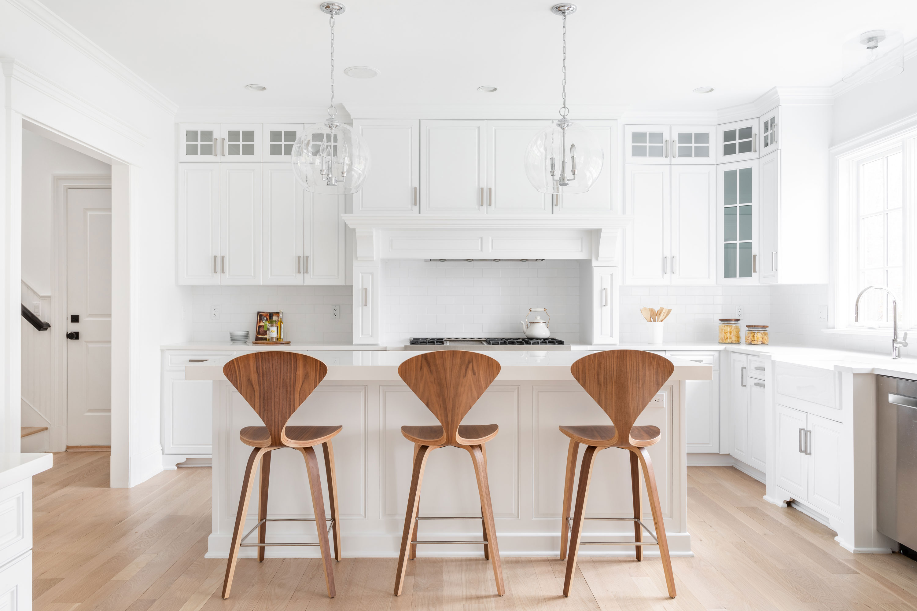
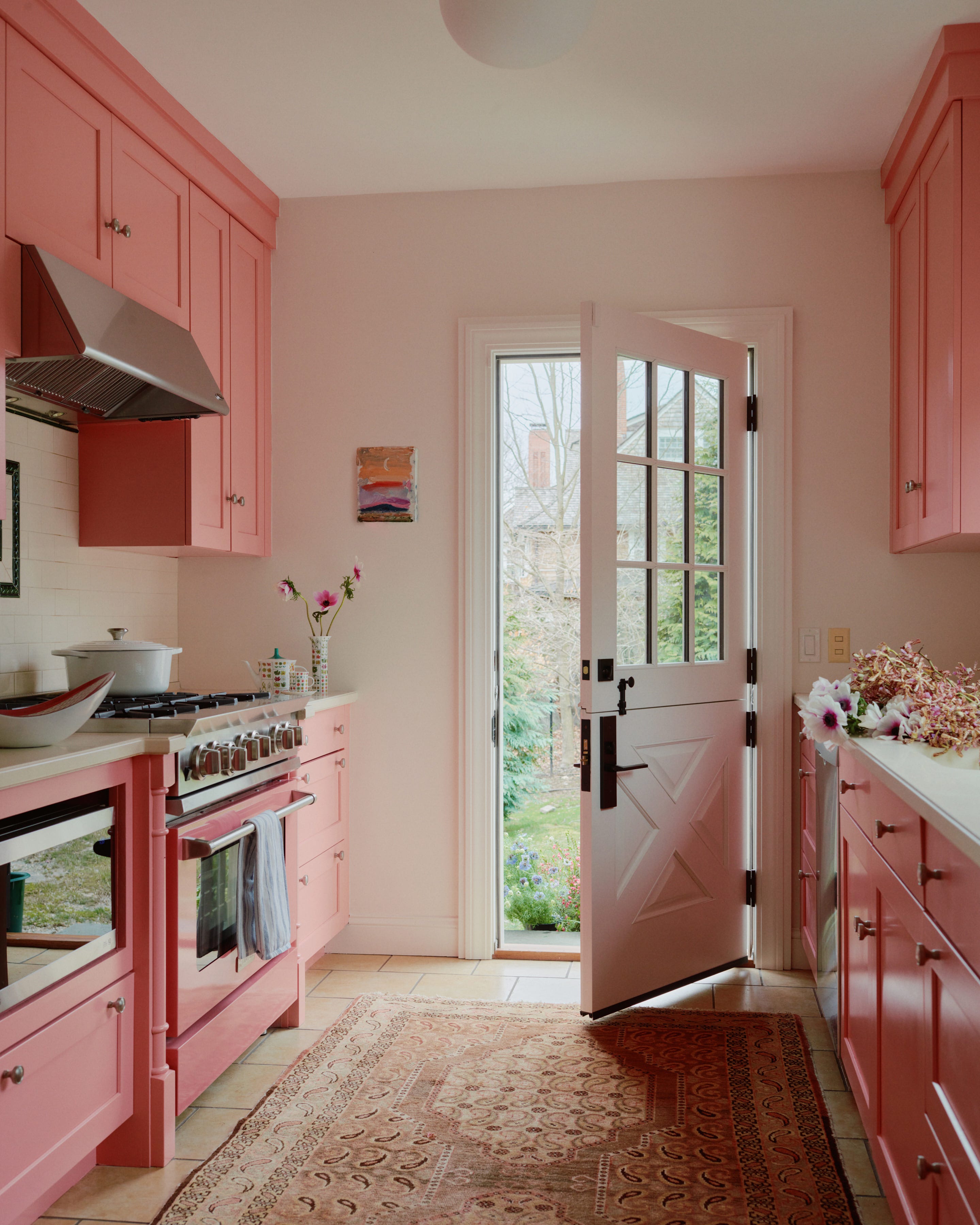
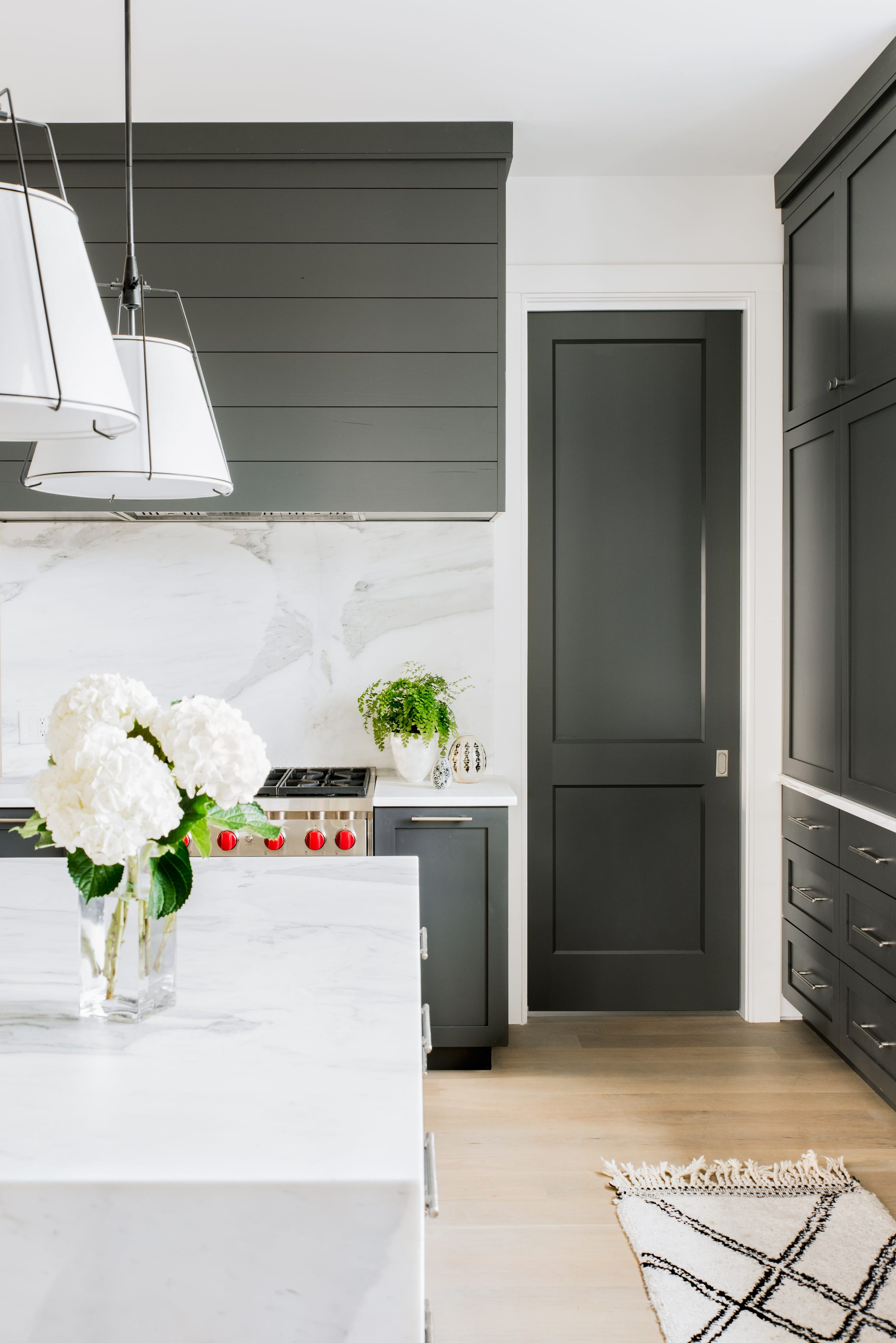
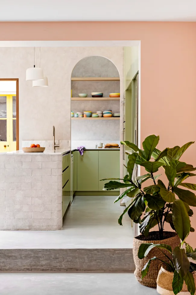
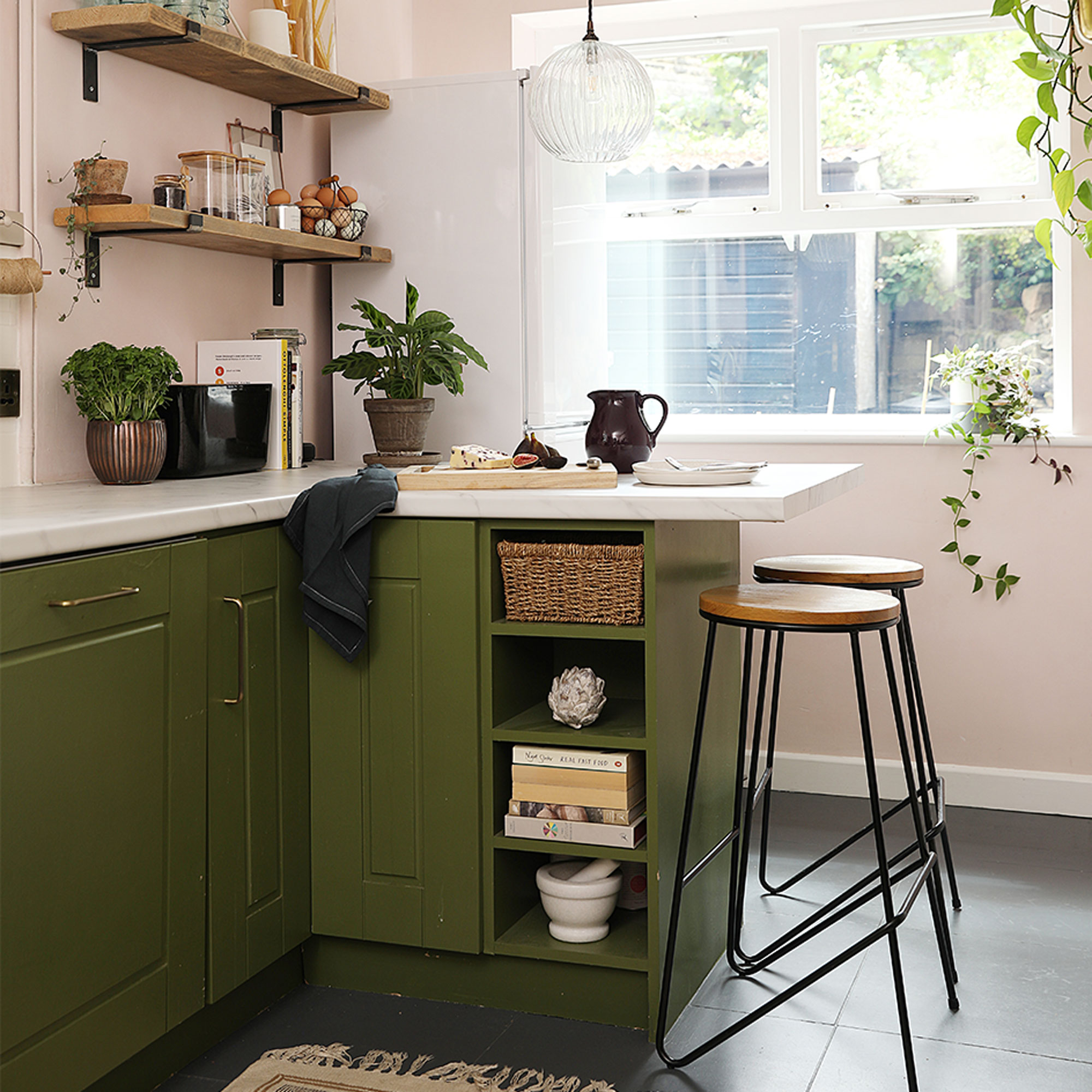
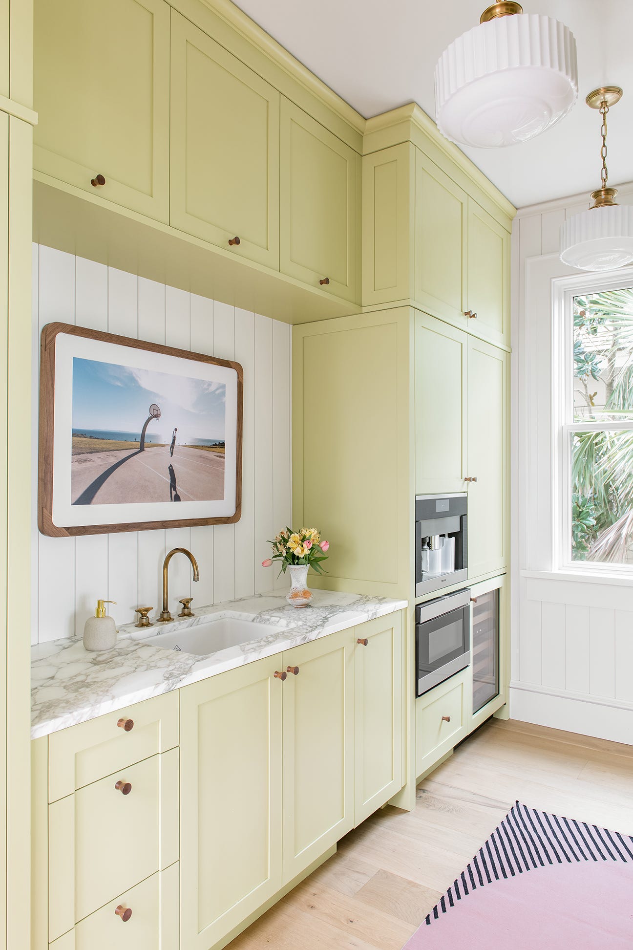
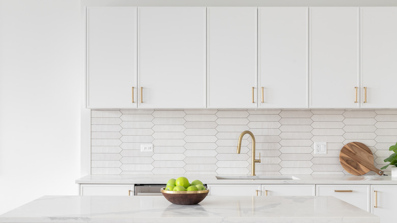
Further suggestions include an all-white palette, emphasizing the distinction between cool grey-toned whites for modern schemes and warm off-whites for country or vintage styles. A playful apple green with limewash pink is shown to create a cheerful atmosphere, with a reddish countertop intelligently chosen to avoid harsh lines. The article then illustrates how to incorporate shiny black and white, advising to keep black cabinets below eye level to prevent a room from feeling weighed down. A pink and green combination is presented, utilizing a blush paint and terrazzo-style green countertop, with an emphasis on letting feature materials guide the color scheme. Turquoise and terrazzo are suggested for a contemporary feel, employing a modernized terrazzo pattern and sleek handleless cabinets.
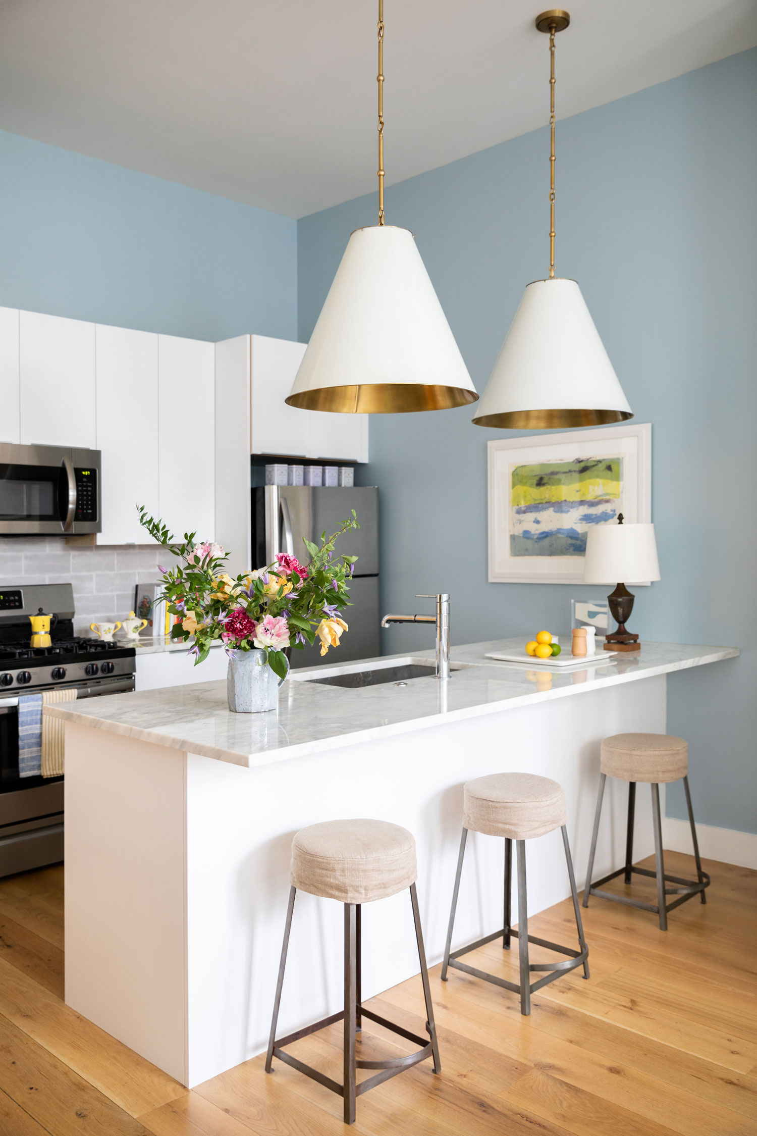
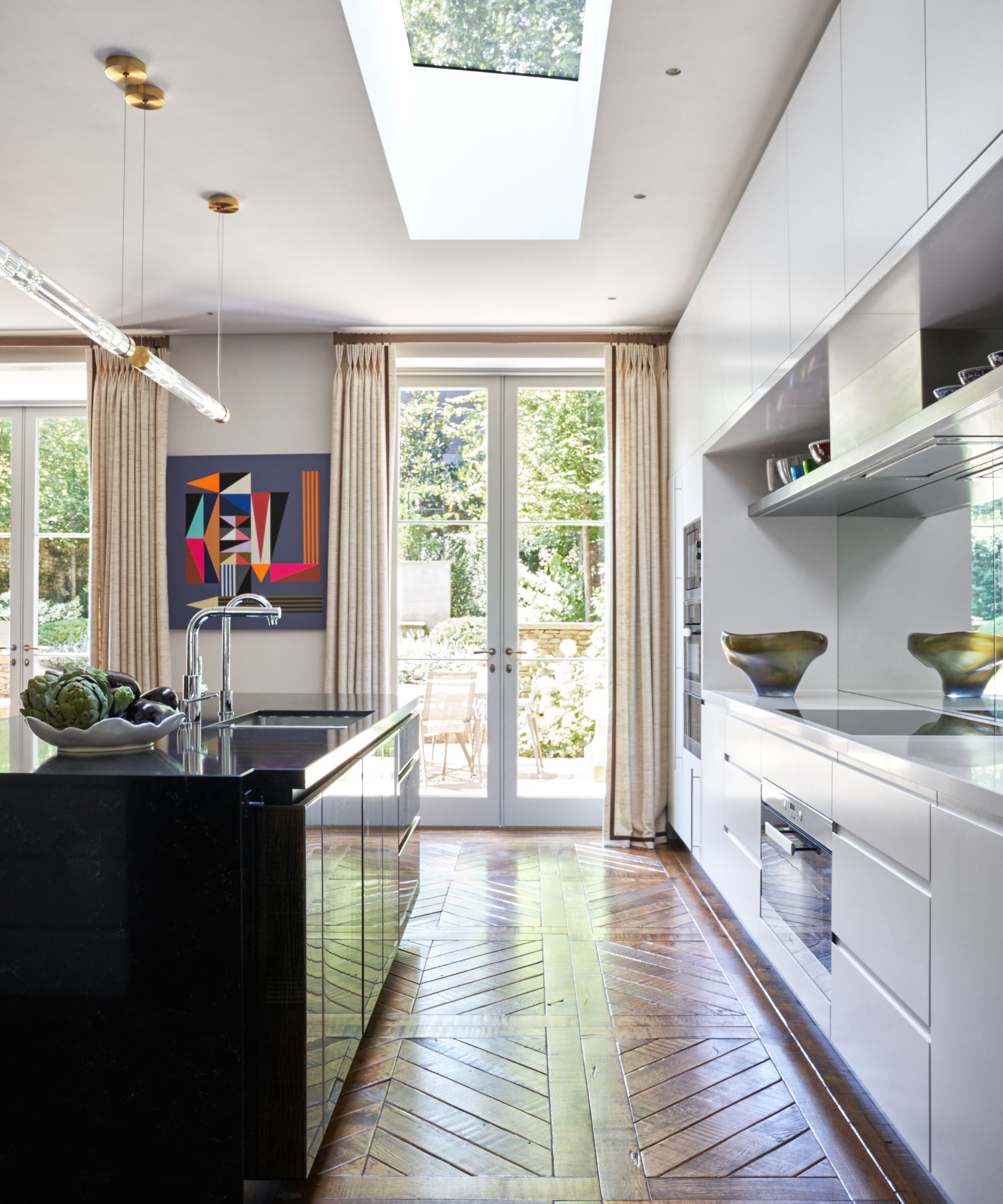
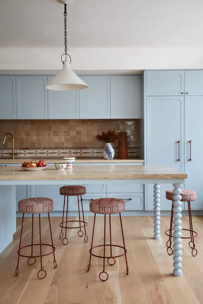
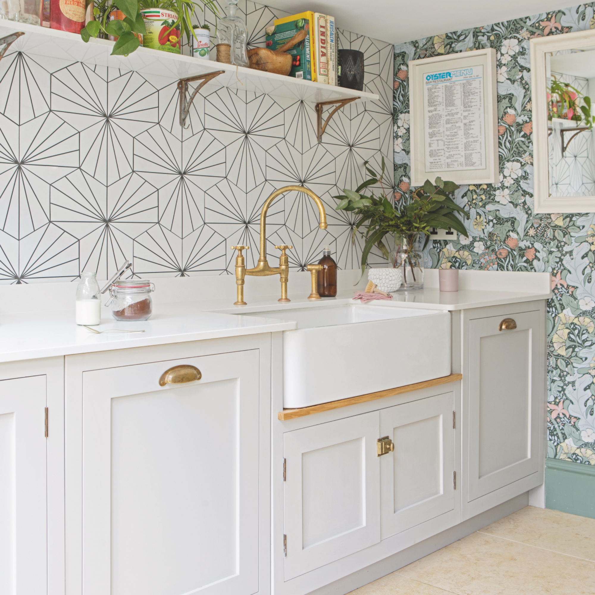
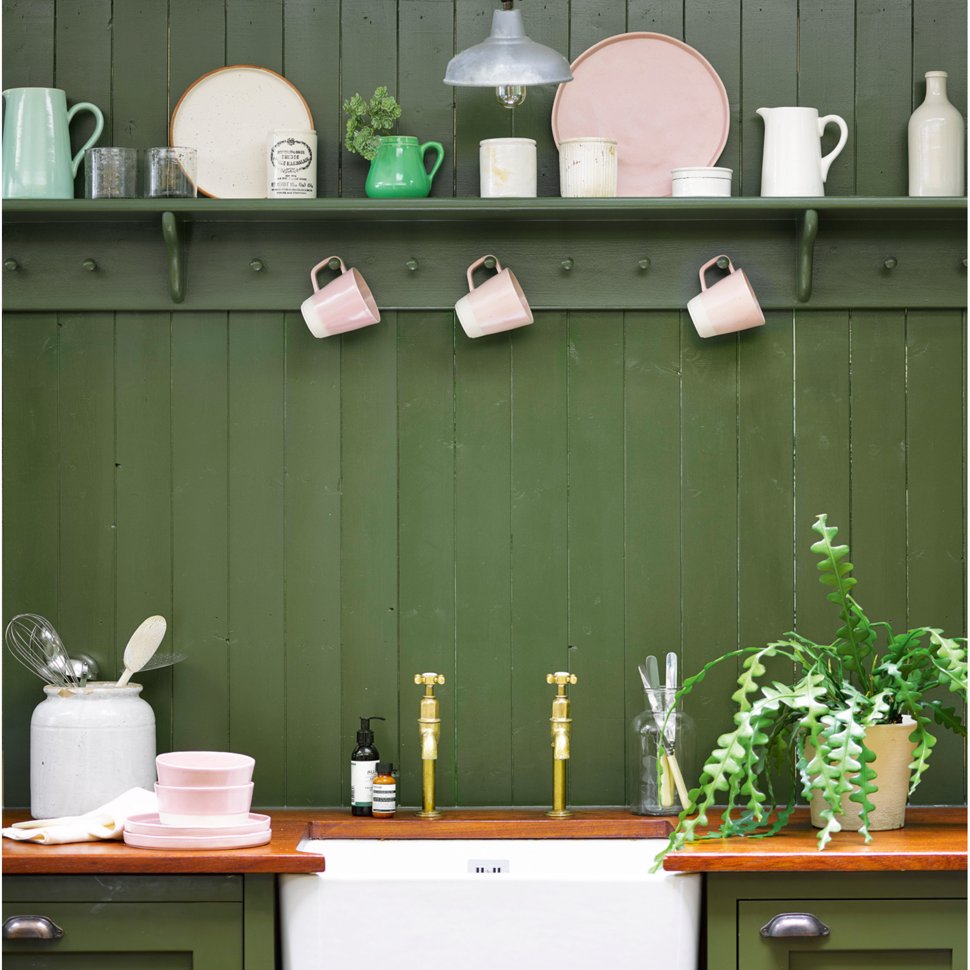
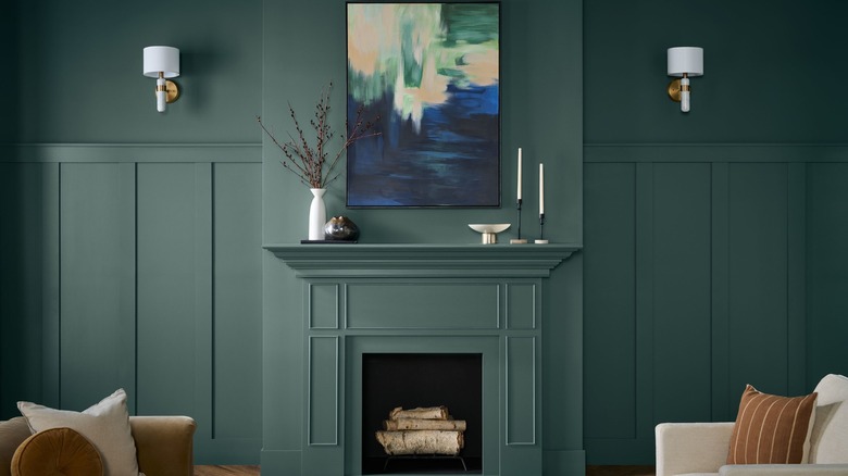
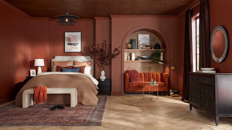
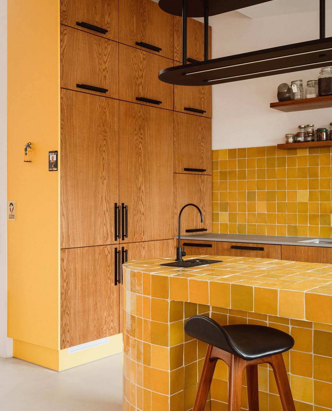
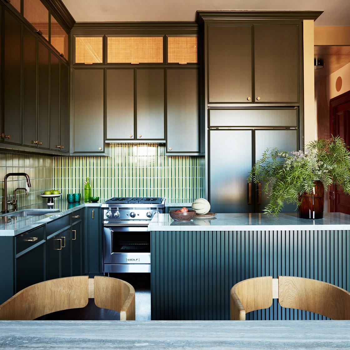
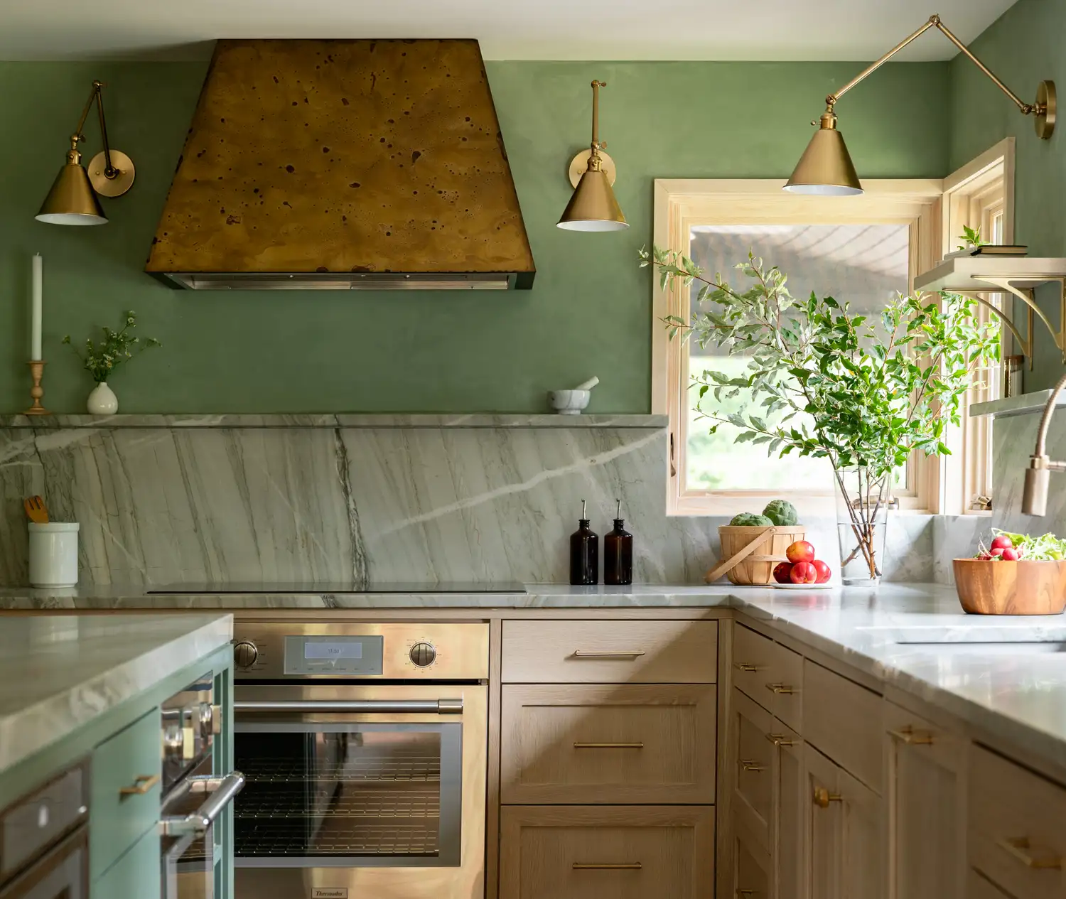
The article also covers a forest green scheme enhanced by white marble countertops extending up the wall to mitigate the richness of the green. A warm all-over kitchen design is showcased, demonstrating harmonious mixing of materials like heavily veined marble, mid-toned wood, and reflective stainless steel, noting how stainless steel adapts to the warmth of its surroundings. Deep reds are featured for pantries, creating a rich backdrop contrasted with black and white patterns. Pink and florals are explored, highlighting how botanical wallpaper provides contrast for pale pink cabinets. Cool tones are recommended for clean and simple kitchens, pairing high-gloss white with deep blue or forest green and natural woods. A light sage kitchen with retro touches is presented, suggesting yellow or sky blue as complementary accents. Finally, a salmon pink is used to brighten a neutral kitchen, opting for antiqued brass hardware over garish brass. Variations on purple showcase delicate pastel shades with natural wood and ceramics, incorporating thoughtful details like graduated pink shelves. The article concludes with a pink and black combination, emphasizing contrast and incorporating rich jewel tones like emerald green for a dramatic effect.
#KitchenDesign #ColorSchemes #InteriorDesign #HomeDecor #KitchenRenovation #DesignTips #ColorPairings #KitchenDesign #ColorSchemes #InteriorDesign #HomeDecor #KitchenRenovation #DesignTips #ColorPairings
0 comment in total
 No comments yet
You may also like
The Best Kitchen Paint Colors All Have This One Thing In Common
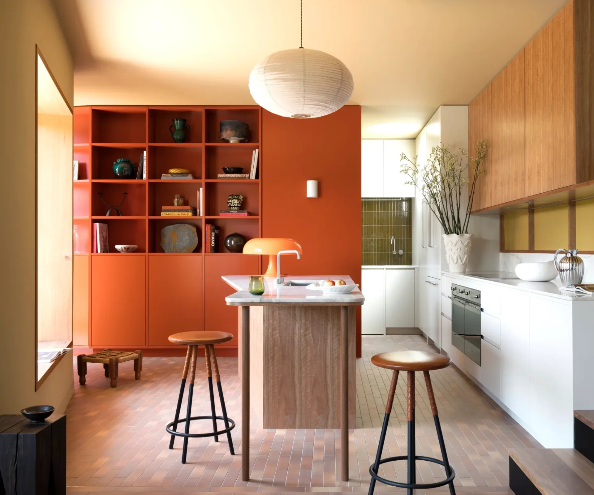
21 Colourful Kitchens That'll Have You Reaching For A Paint Brush

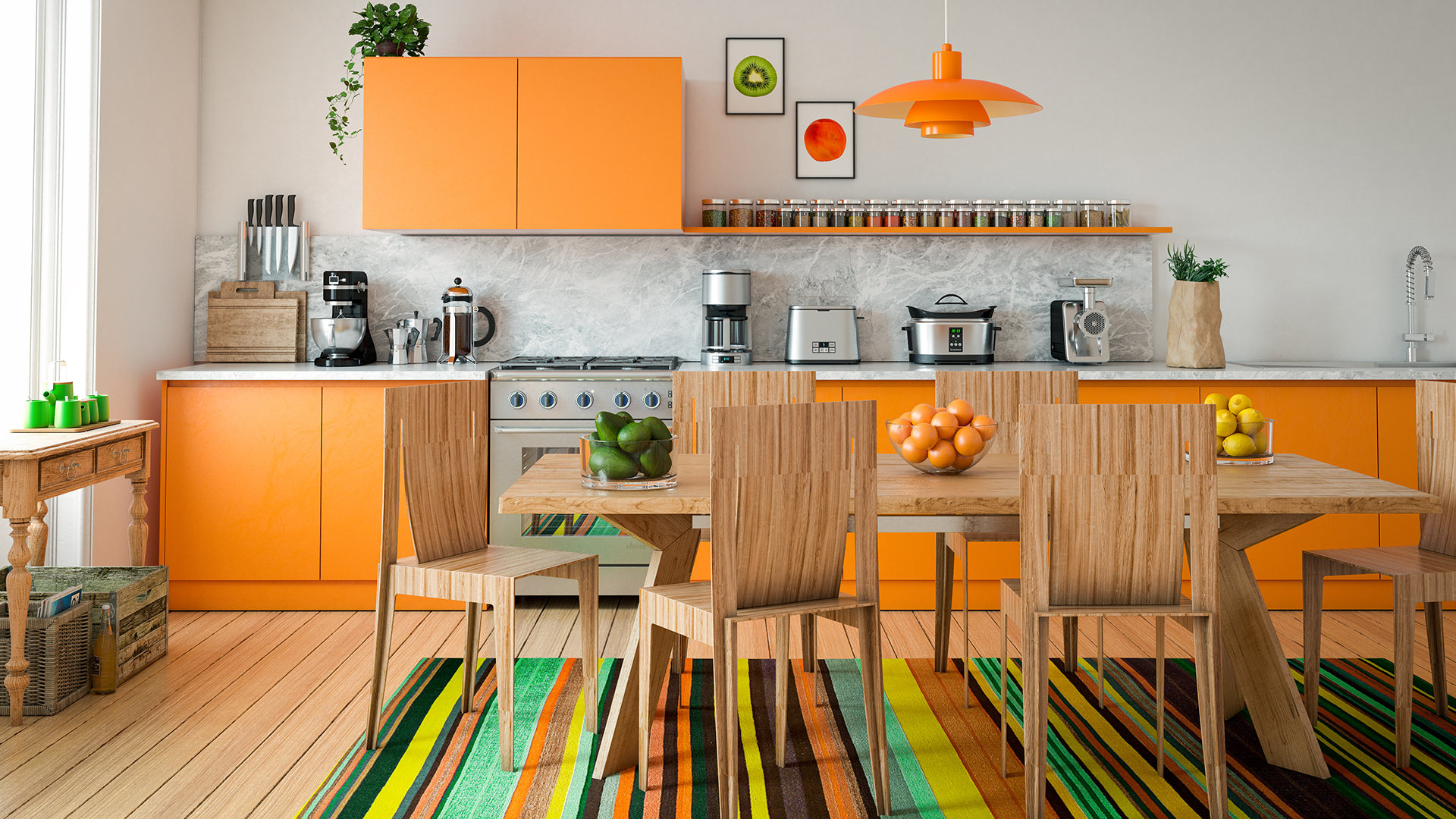
10 Colorful Kitchens That Buck The All-White Trend

These Will Be the Most Popular Kitchen Paint Colors In 2025, According to Interior Designers

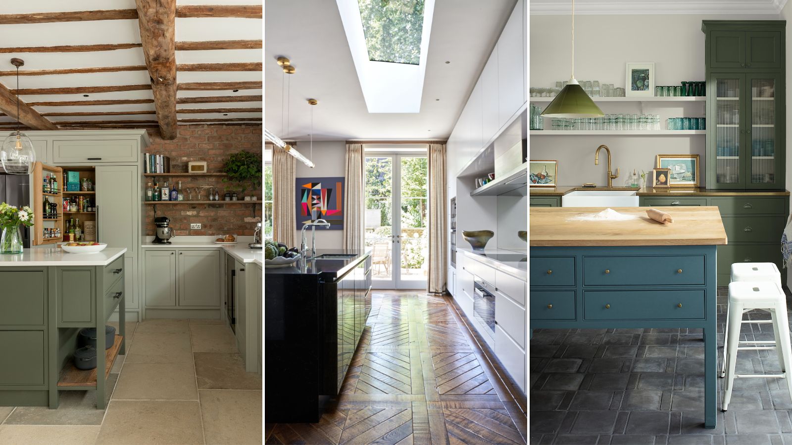
5 fail-safe kitchen cabinet color combinations that always work

13 Unique Kitchen Color Combinations To Try Out In 2025
4 Colors You Should Never Paint Cabinets, According To Designers
Ditch the White! Try One of These Designer-Approved Kitchen Colors

16 Designer-Approved Kitchen Color Schemes You’ll Want to Steal

Top 10 Trendy Kitchen Colour Combinations in 2025

11 Trendy Kitchen Paint Colors To Try In 2026

Kitchen Color Selection Tips from 5 Designers
Top 20 Kitchen Paint Colors for Every Style—From Timeless Neutrals to Rich Earth Tones
29 Best Paint Colors for a Kitchen You’ll Never Want to Leave

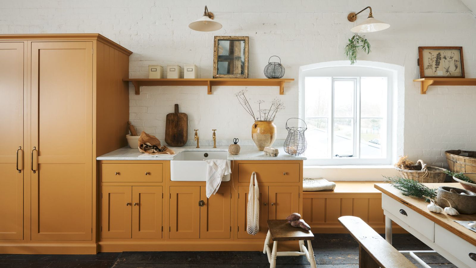
3 overlooked colors you never thought could work in your kitchen – but interior designers swear by them
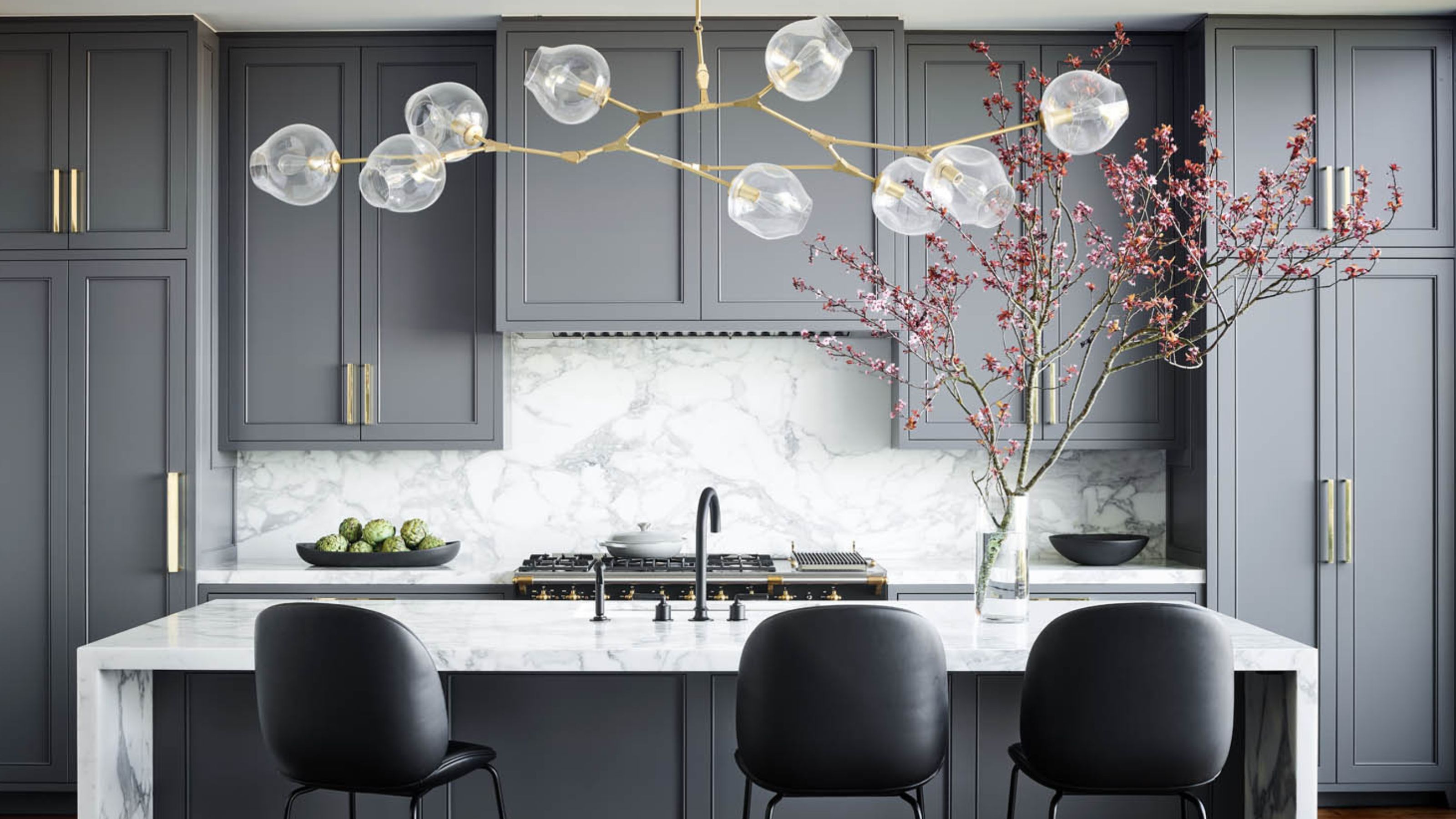
What Kitchen Color Should I Choose? 12 Ideas That Feel Right for Schemes in 2025

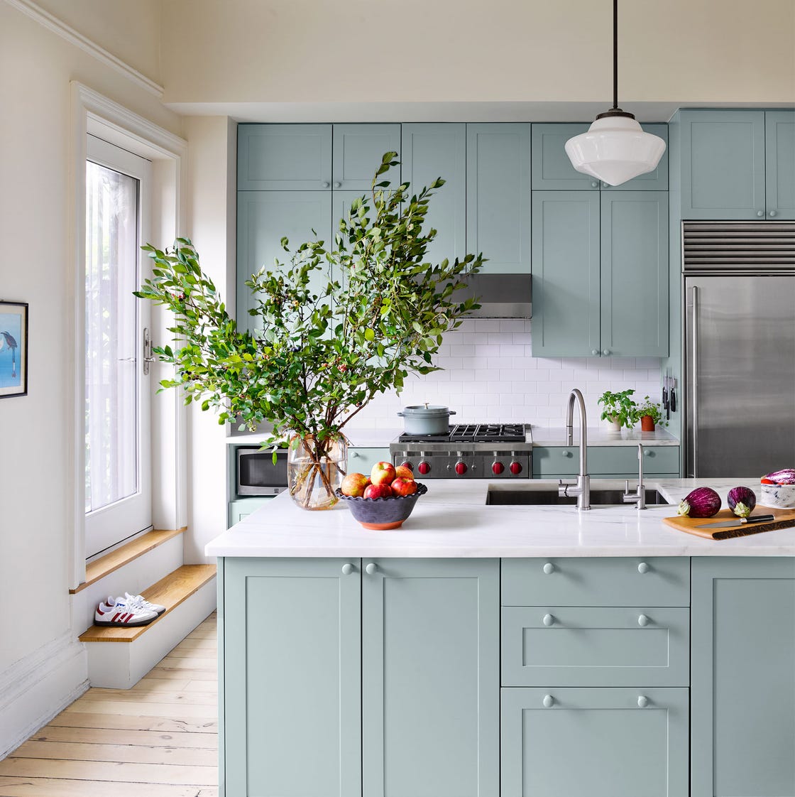
20 Kitchen Paint Colors to Try in 2024

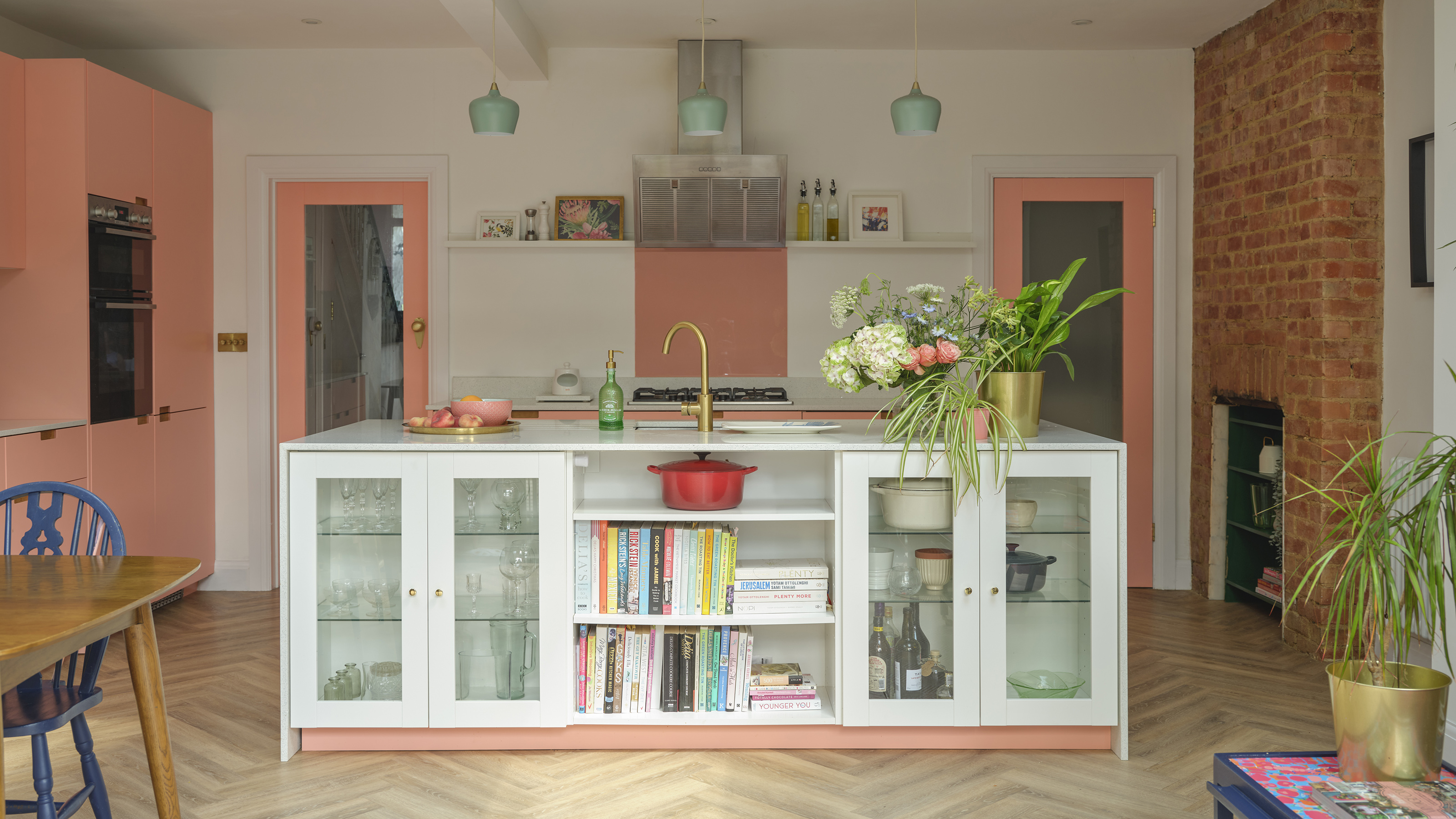
The best colours to paint a kitchen according to paint pros - pick the perfect shade for large, small, dark and light spaces
The 6 Paint Colors for Your Kitchen That Will Never Go out of Style
7 Outdated Cabinet Colors Designers Are Leaving Behind In 2026