1/14
13 Unique Kitchen Color Combinations To Try Out In 2025
Kitchens serve as the heart of many homes, being central to food preparation, meals, entertaining, and daily routines. While 2024 saw a prevalence of muted, timeless kitchen designs, 2025 is expected to usher in a resurgence of vibrant color. This shift away from the long-standing popularity of white kitchens and brushed metal appliances allows for exciting and unexpected color combinations to bring visual interest and energy to the space.
Transforming a kitchen's color palette can range from extensive renovations to simple decor changes. Repainting is an effective way to alter the room's entire feel, but one can start smaller by painting trim, shelves, or a wooden table. For those hesitant about committing to a costly design, beginning with new color ideas for decor items, such as contrasting or complementary dishes, is a practical approach. Existing floors, cabinets, and adjacent rooms can also provide a foundation for color experimentation.
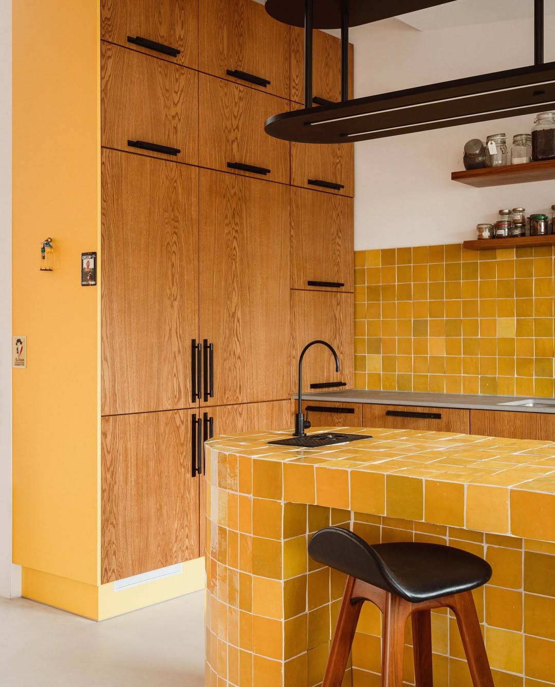
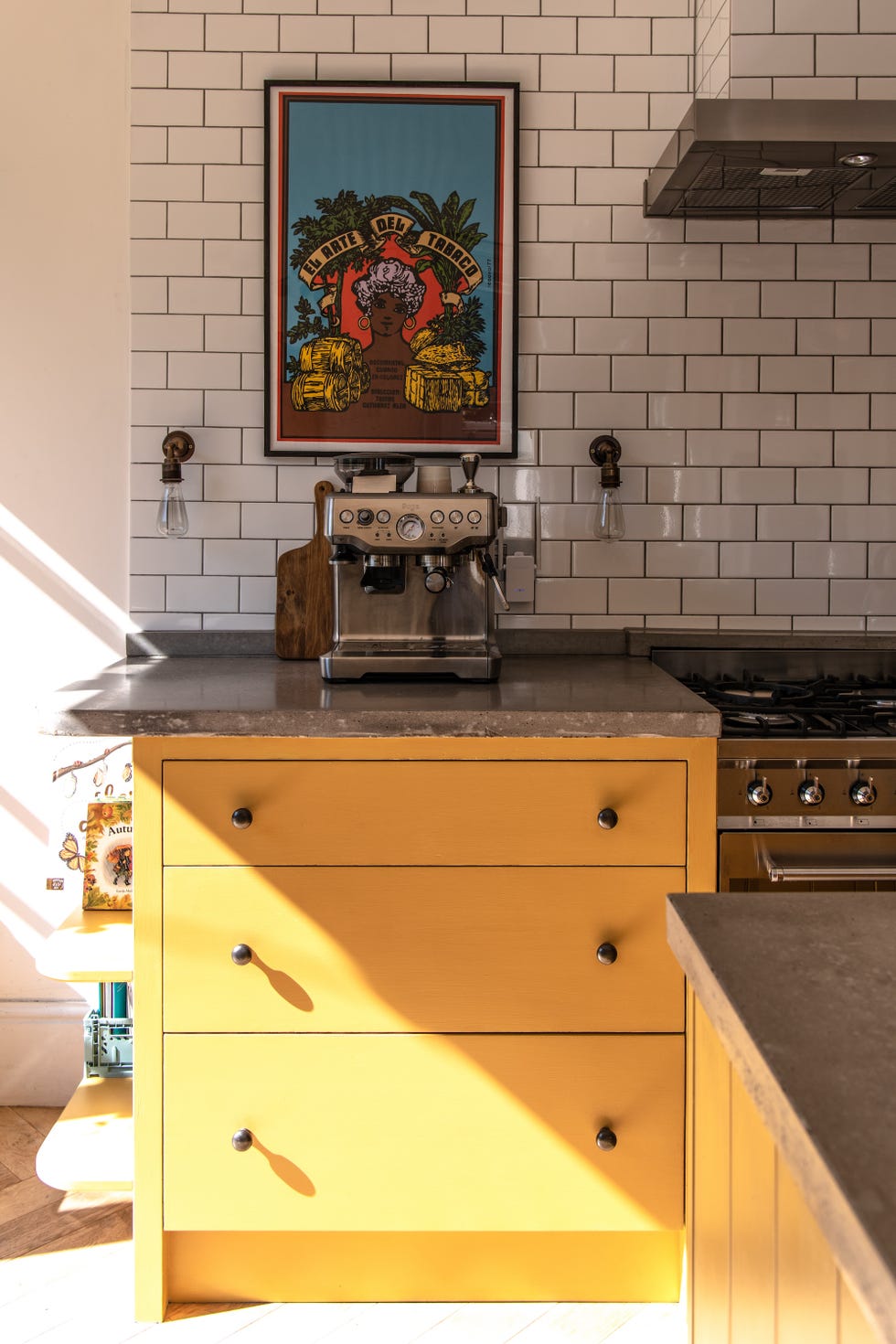
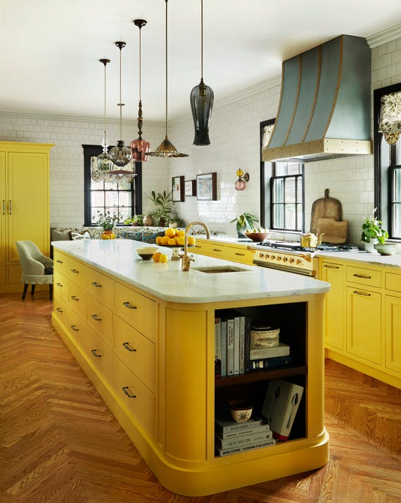
Several distinct color combinations are highlighted for 2025. Mustard and black offer a warm, rich palette, with mustard yellow complementing earth tones, black, natural greens, and cool metallics like silver. Recommended mustard paints include "Goldfinch" (Sherwin Williams), "Spicy Mustard" (Benjamin Moore), and "Sudbury Yellow" (Farrow & Ball).
Pale aqua and white create a breezy, open feel, ideal for spaces with limited natural light. This cool hue contrasts effectively with warm accents like orange or gold, and deeper jewel tones. Suggested aqua paints are Farrow & Ball's "Blue Ground" and Benjamin Moore's "Jamaican Aqua."
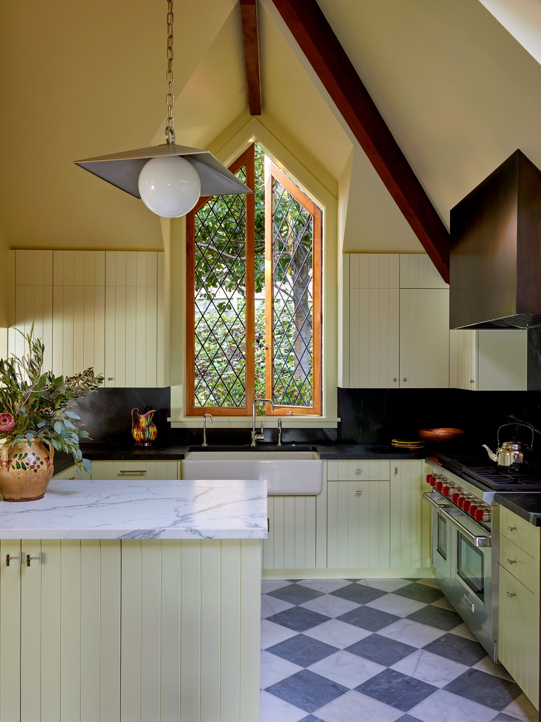
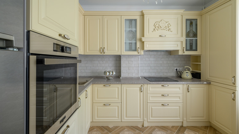
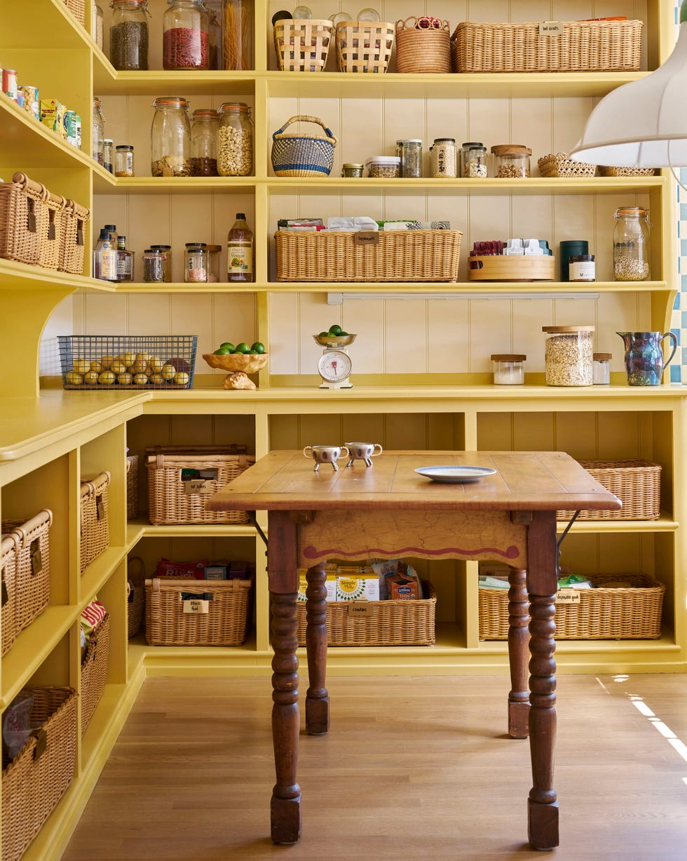
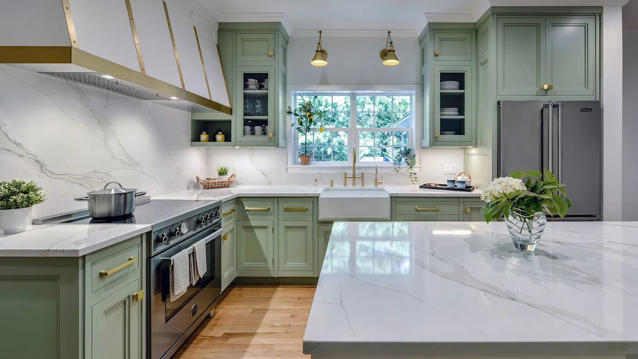
For homes with natural wood, butter yellow, muted green, and natural wood form a rustic and charming country aesthetic. Butter yellow makes rooms appear larger and is more versatile than brighter yellows. Benjamin Moore offers "Sunshine on the Bay," "Golden Honey," and "Butter" yellows, while muted greens like Farrow & Ball's "Pond Green" or Benjamin Moore's "Everglades" are suggested.
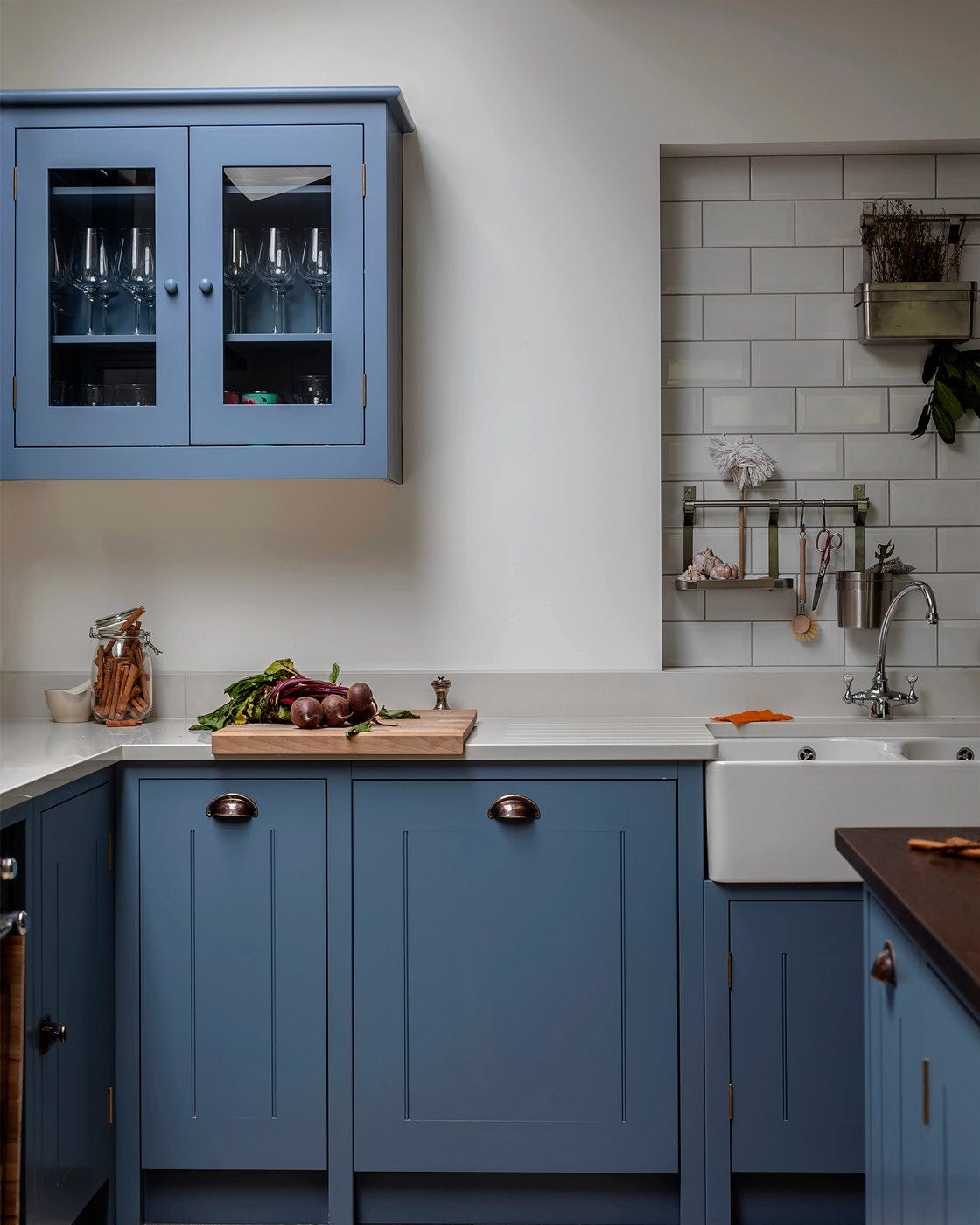
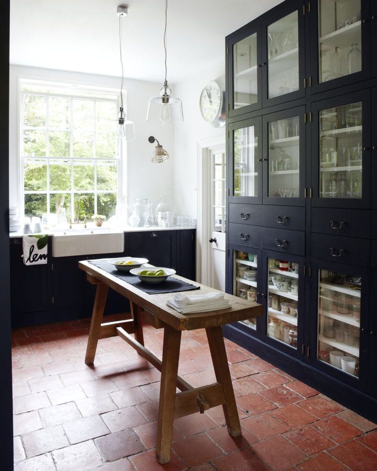
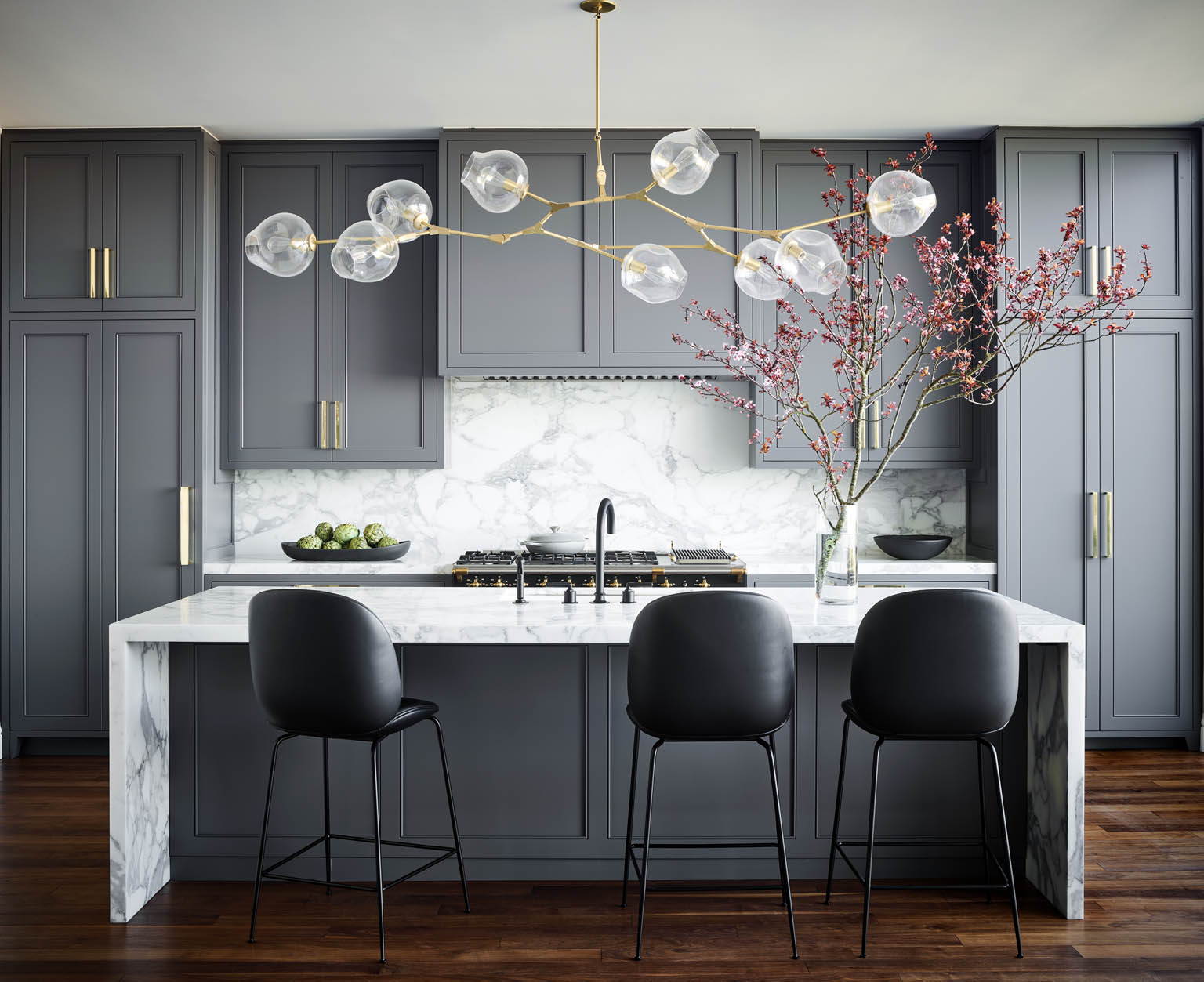
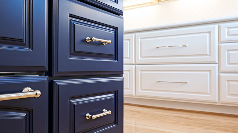
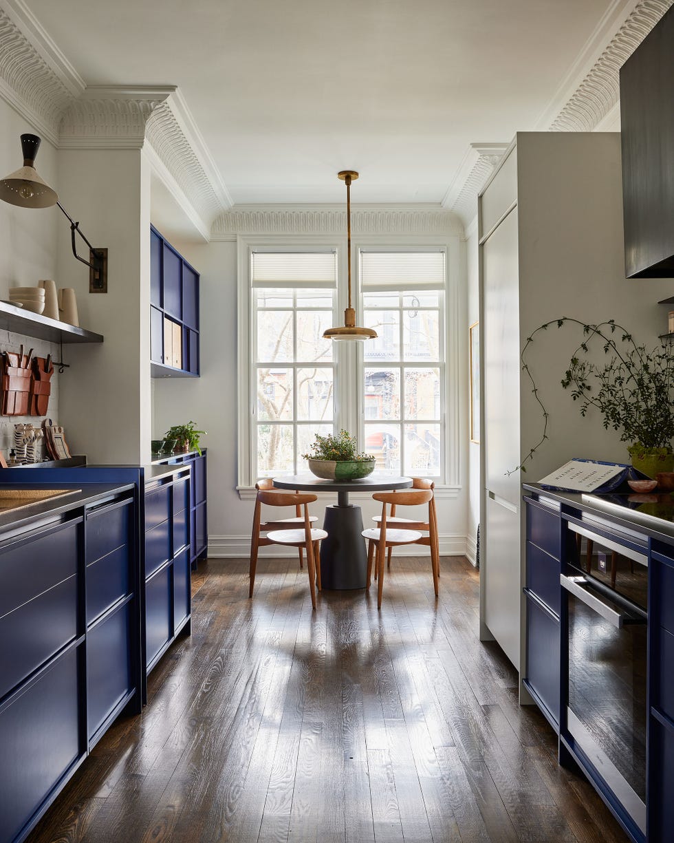
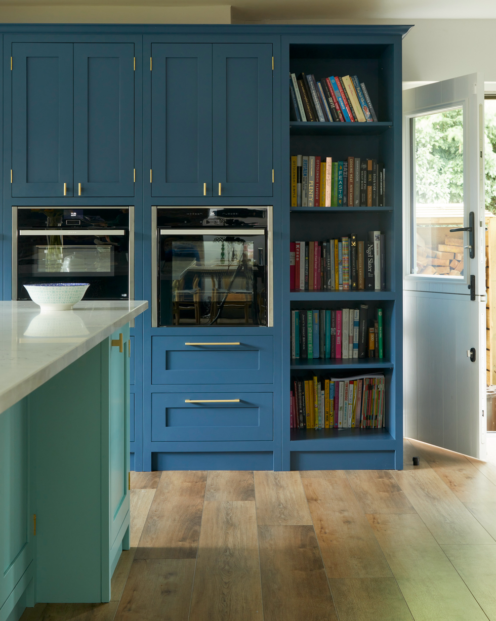
Dark blue, grey, and white provide a dramatic and calming backdrop. Marine or navy blue paired with white and pale grey can be warmed with natural wood or bright linens. Benjamin Moore's "Van Deusen Blue," "Mistral," and "Starry Night Blue" are recommended dark blues.
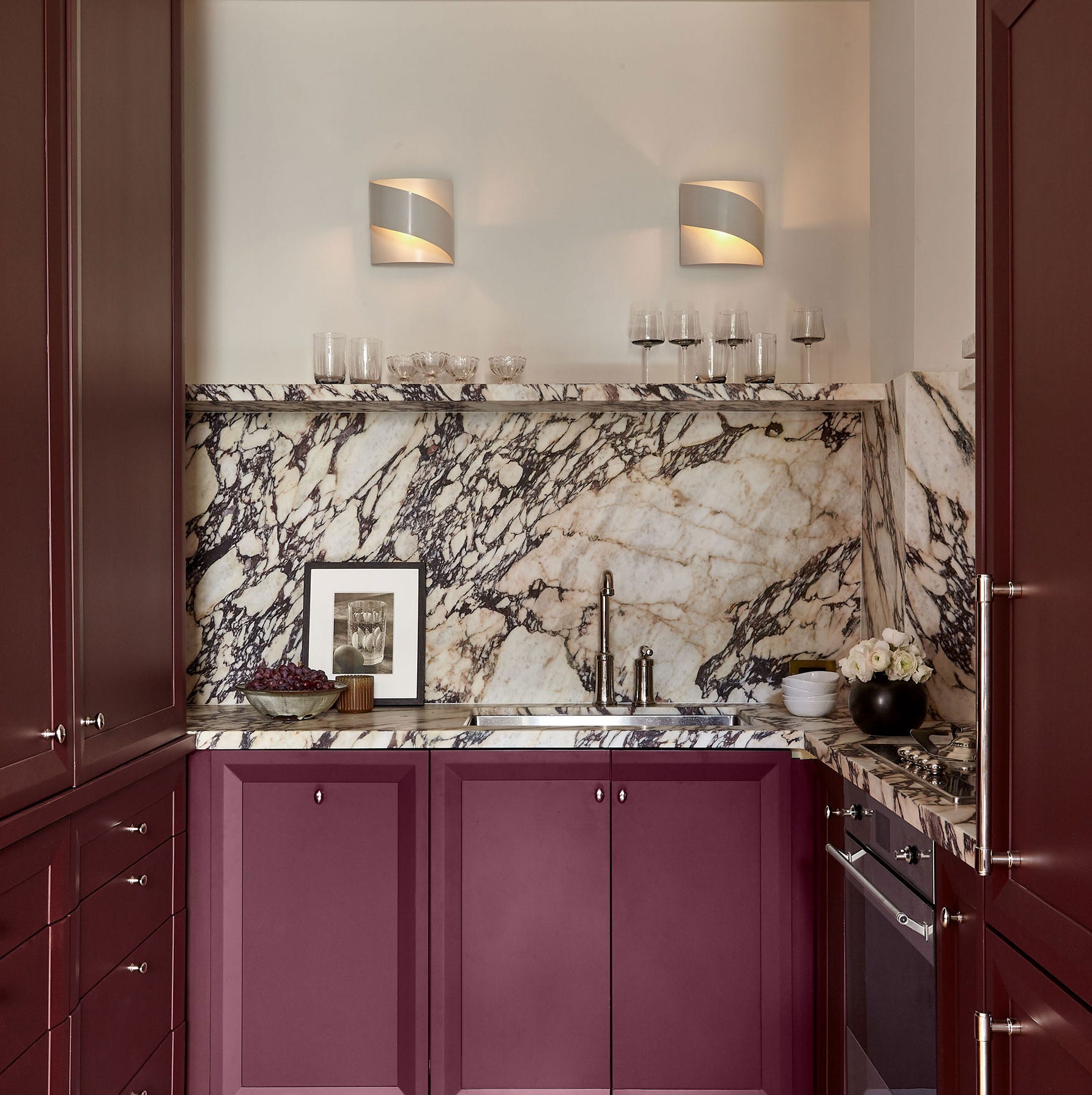
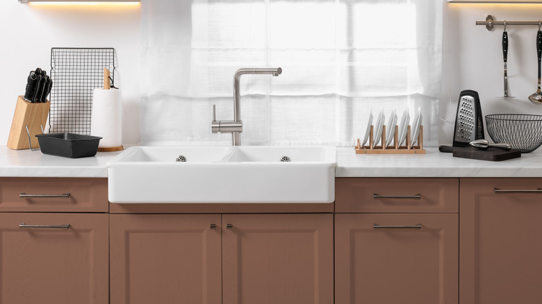
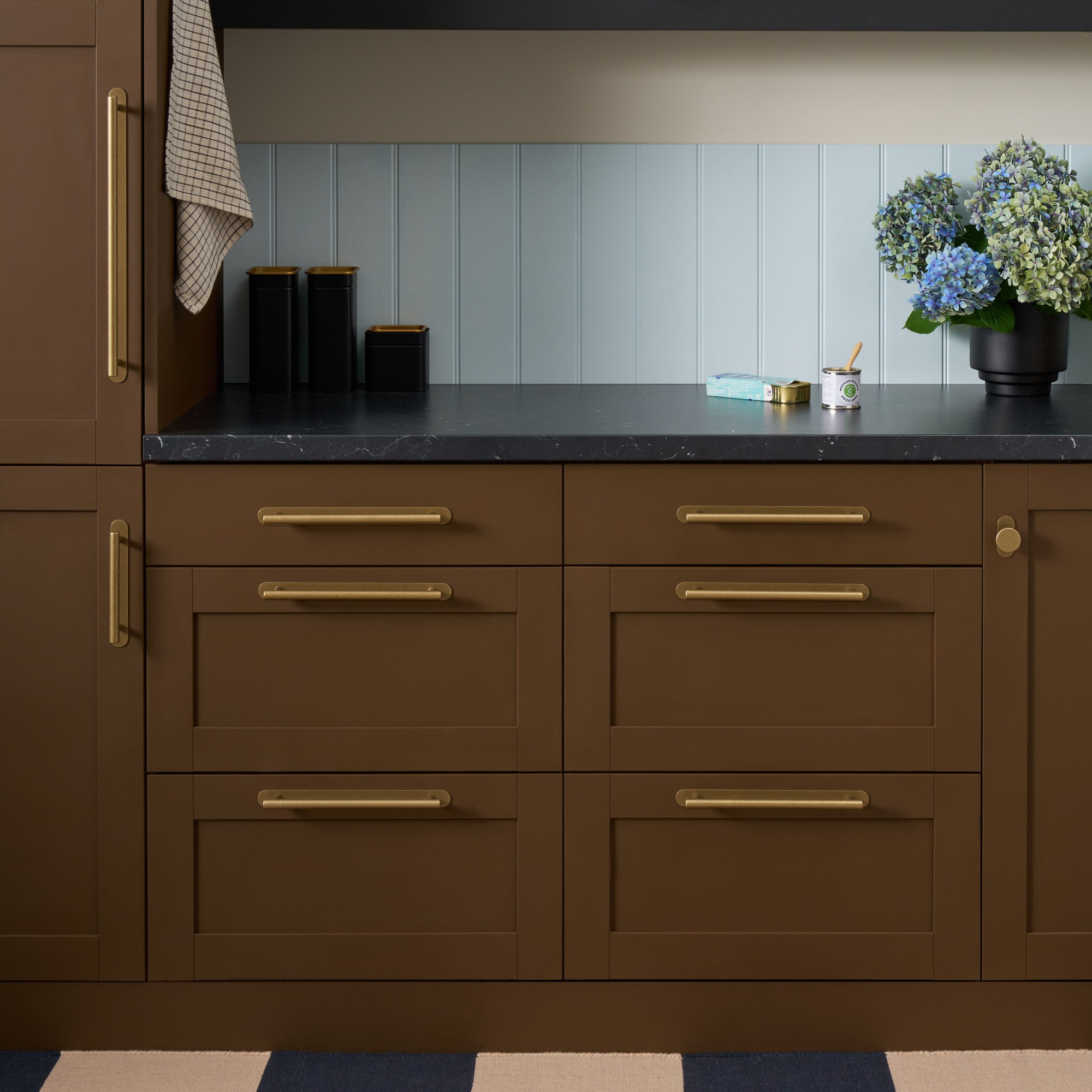
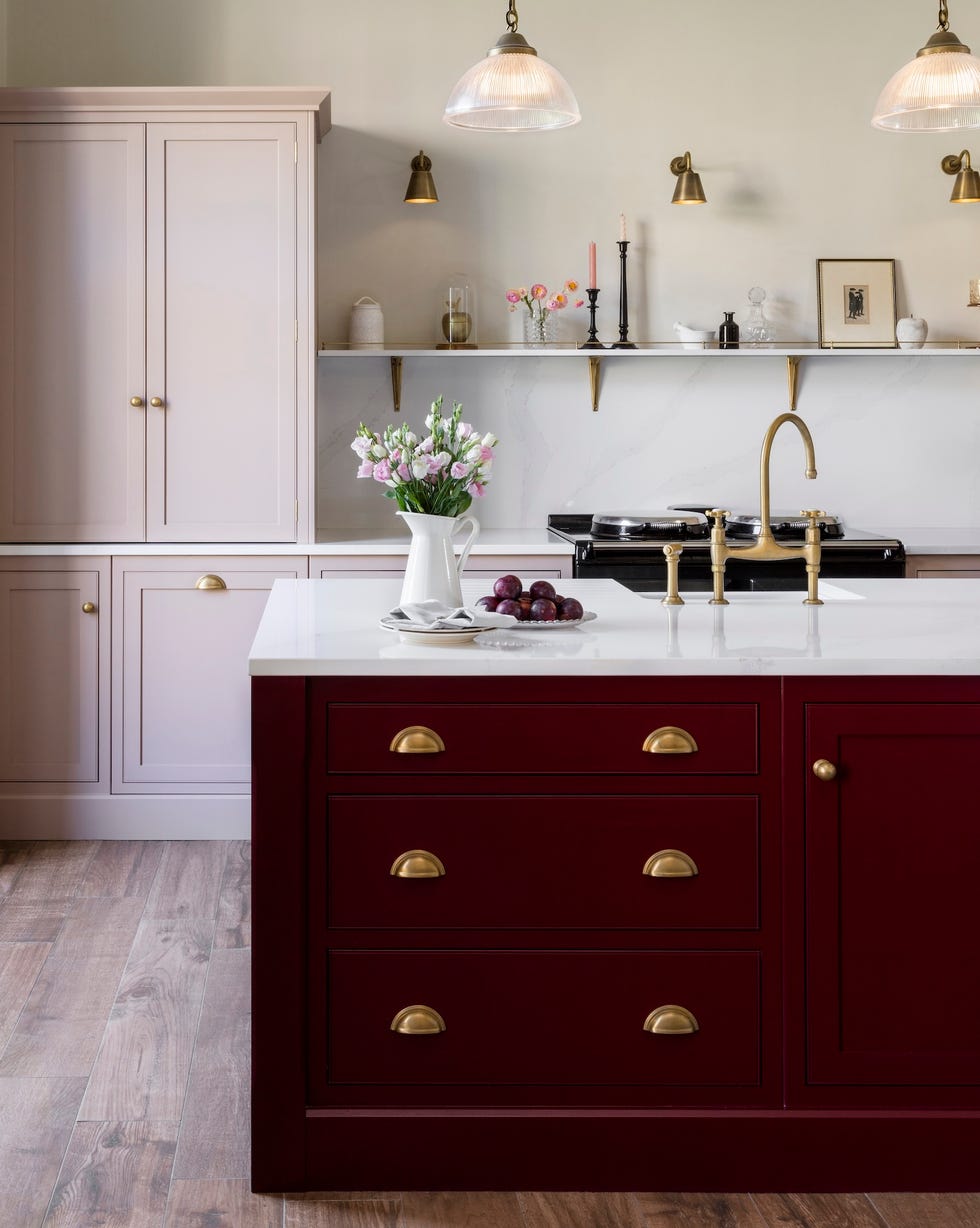
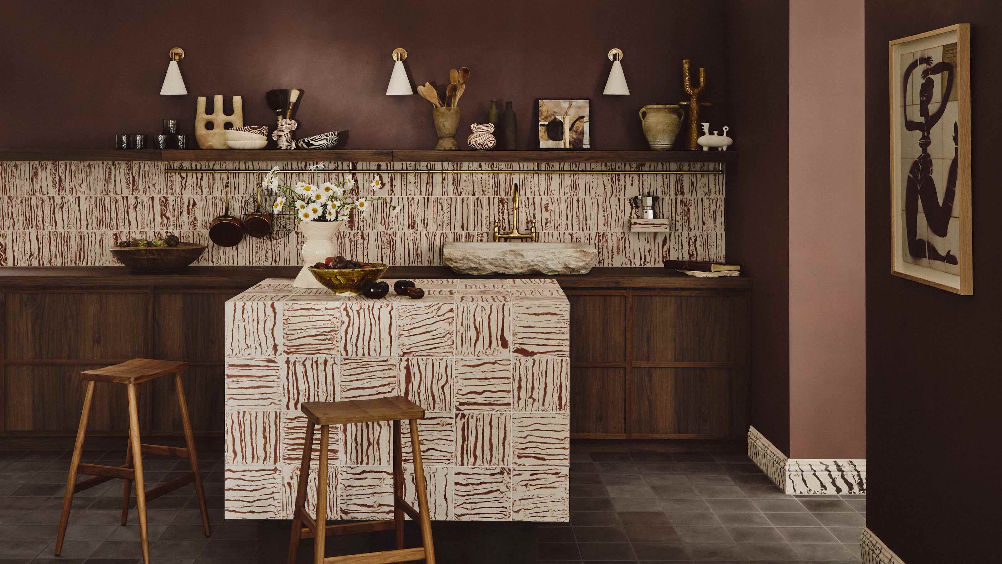
Mocha and mauve combine to create a subtle and sophisticated look, with Mocha Mousse being Pantone's 2025 Color of the Year. Mid-range browns offer an inviting base for interiors. Behr's "Modern Mocha" and Benjamin Moore's "Cafe Mocha" are suitable mocha paints, while Benjamin Moore's "Deep Mauve" or "Mauve Mist" complement them.
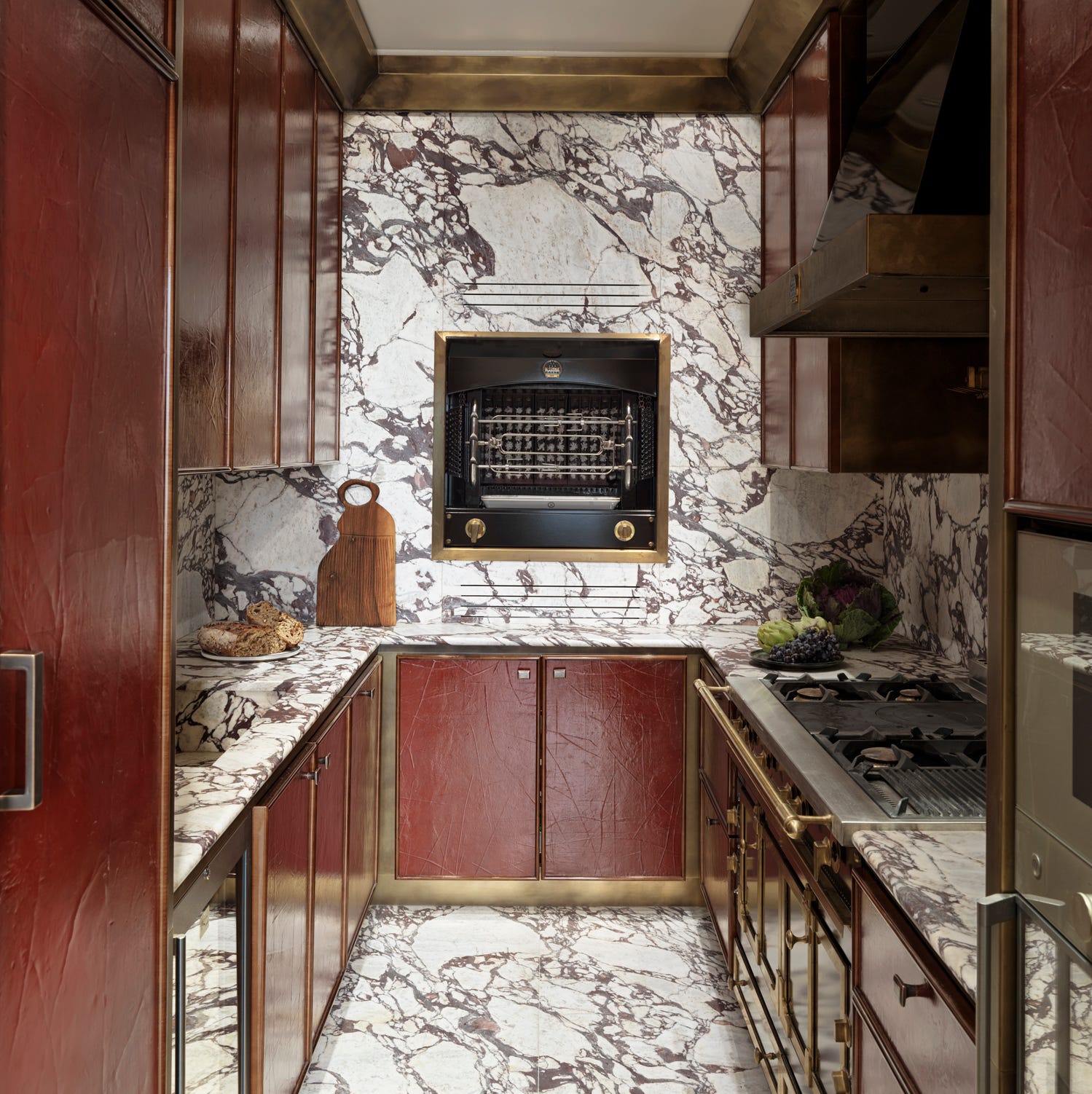
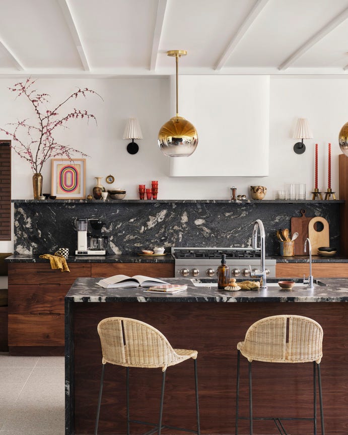
For a bold statement, black, white, and red offer a contemporary and stylish palette. Bright red, whether warm shades like tomato or cooler tones like cherry, adds stimulation. Benjamin Moore's "Raspberry Pudding" and "Umbria Red," along with Farrow & Ball's "Incarnadine," are highlighted.
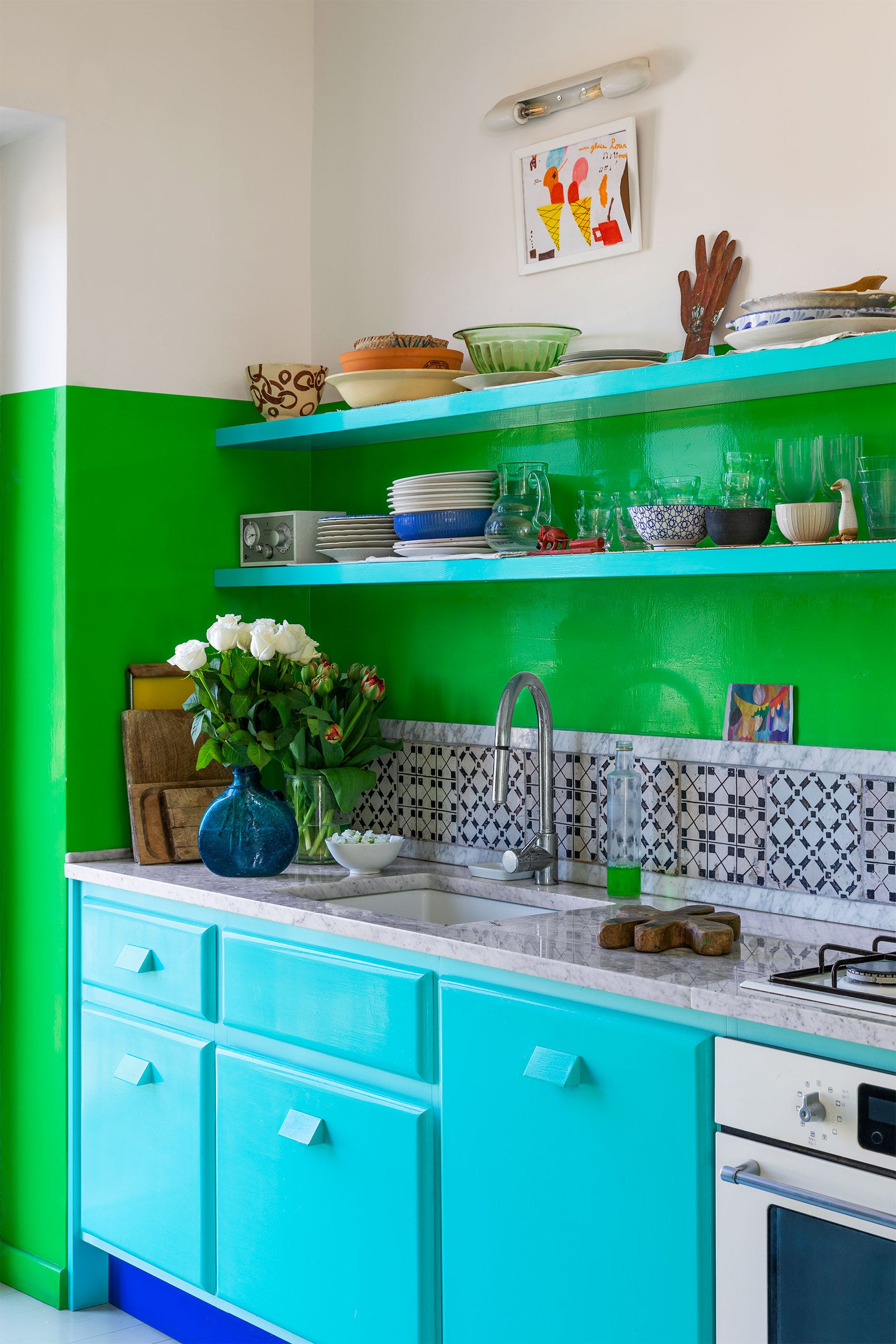
A vibrant yet cozy feel can be achieved with turquoise, cherry red, and gold, offering a muted primary color palette. Benjamin Moore's "Mexicali Turquoise" or "Clearlake," Farrow & Ball's "Romesco" or Glidden's "Calypso Berry" for reds, and Benjamin Moore's "Glen Ridge Gold" or "Golden Groves" for gold are suggested.
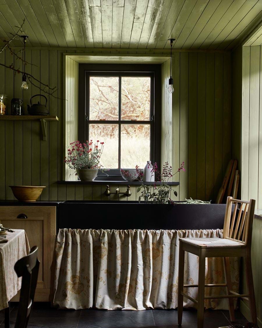
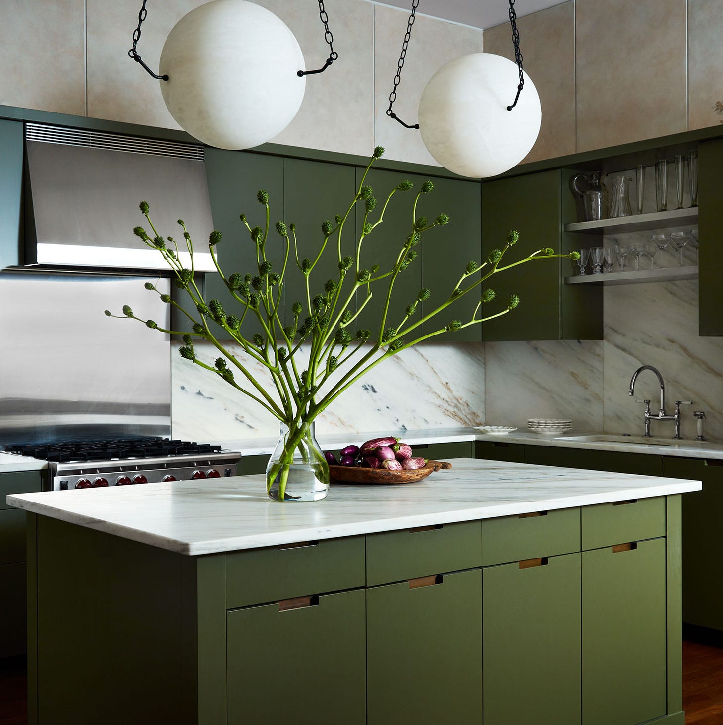
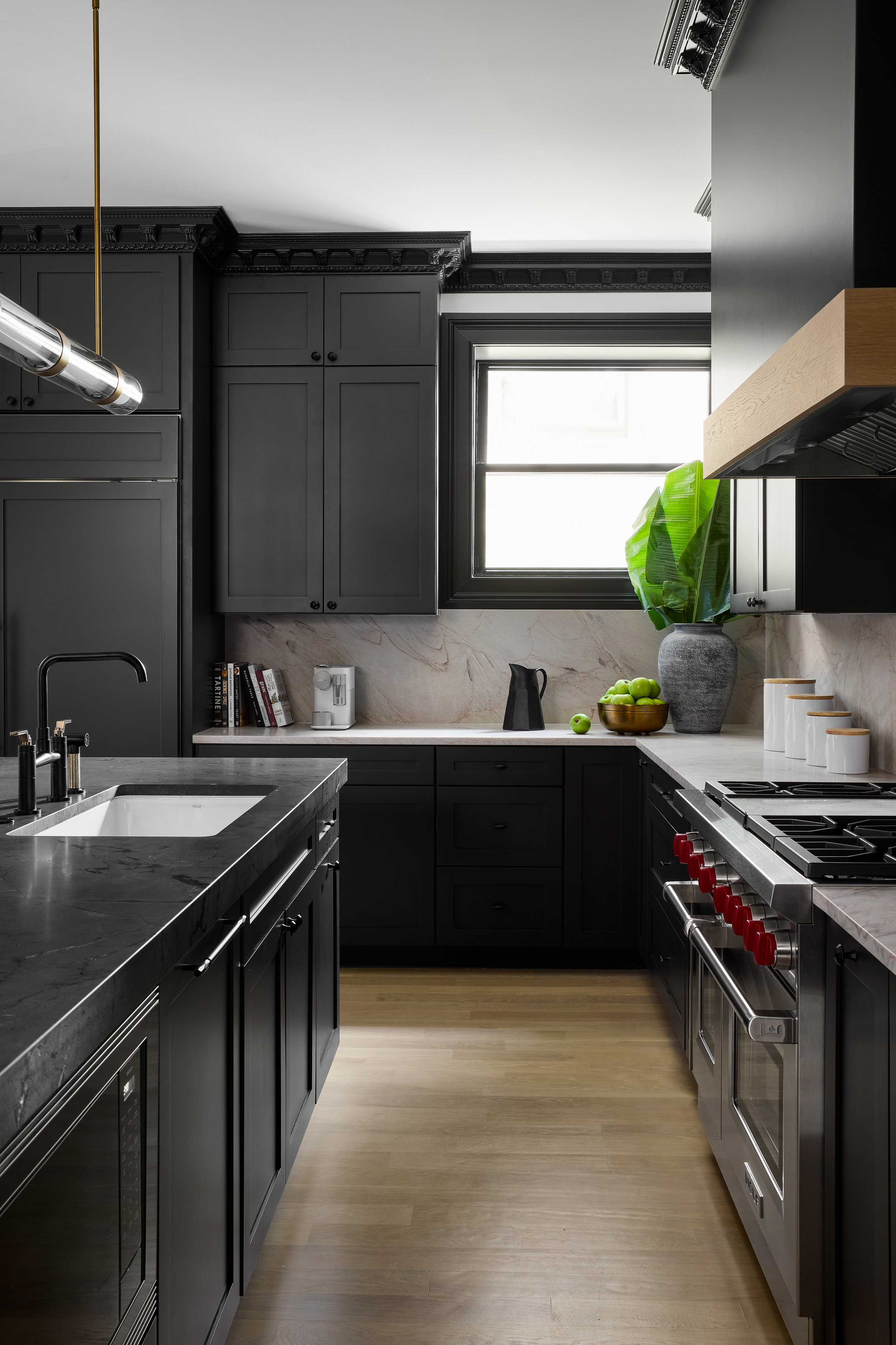
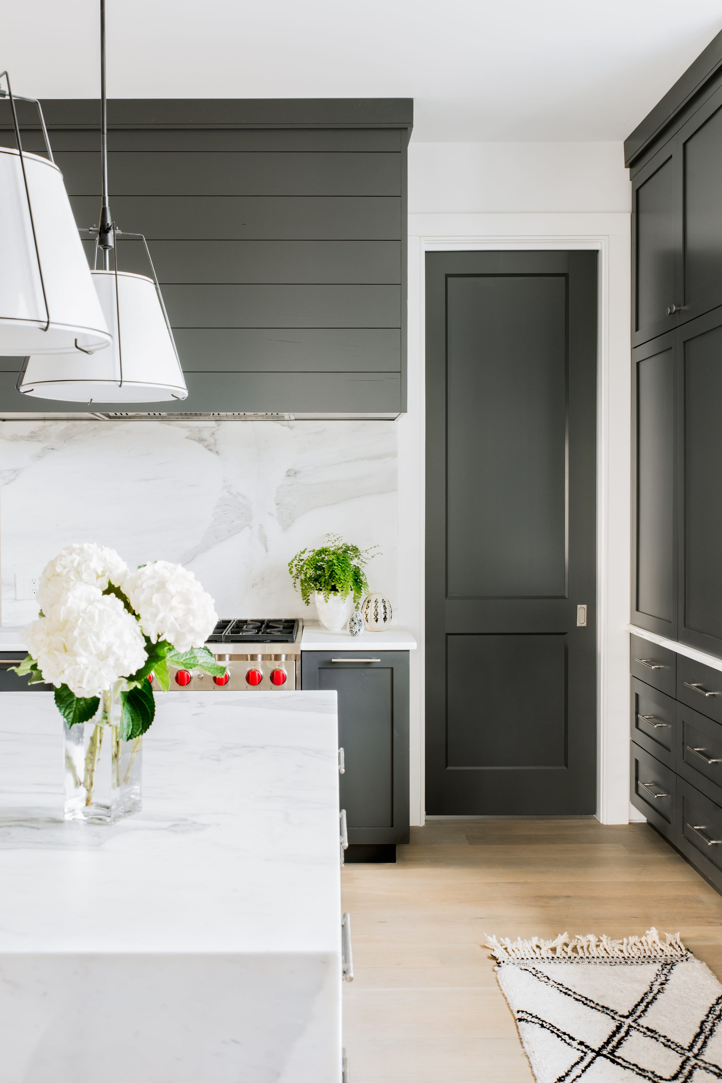
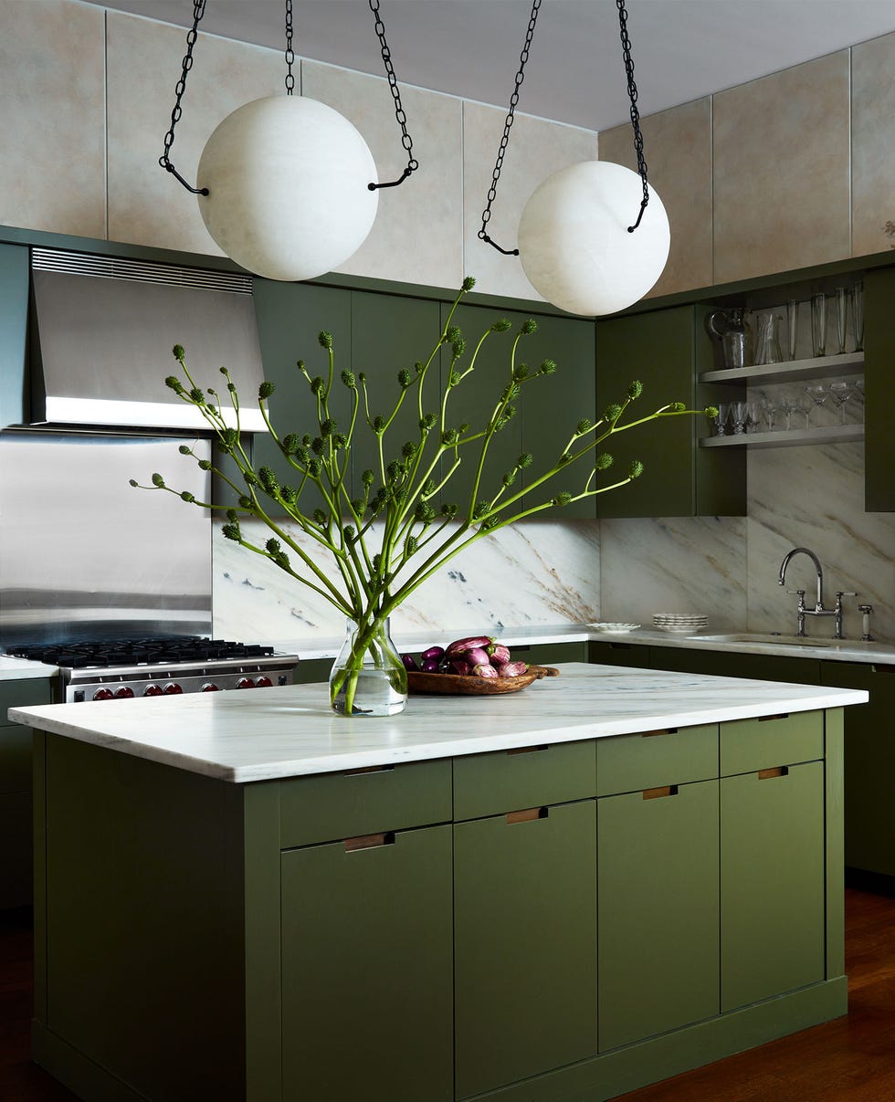
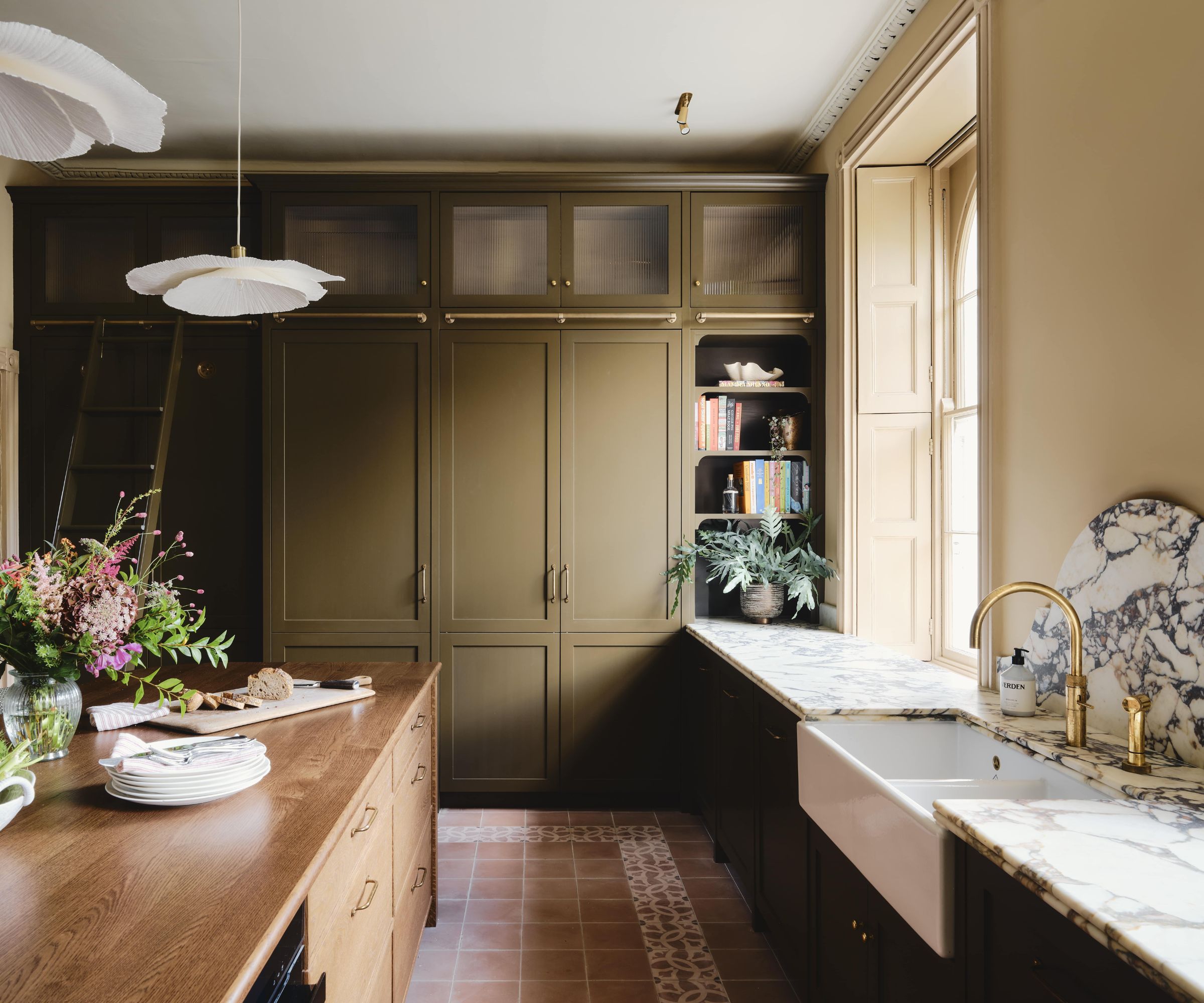
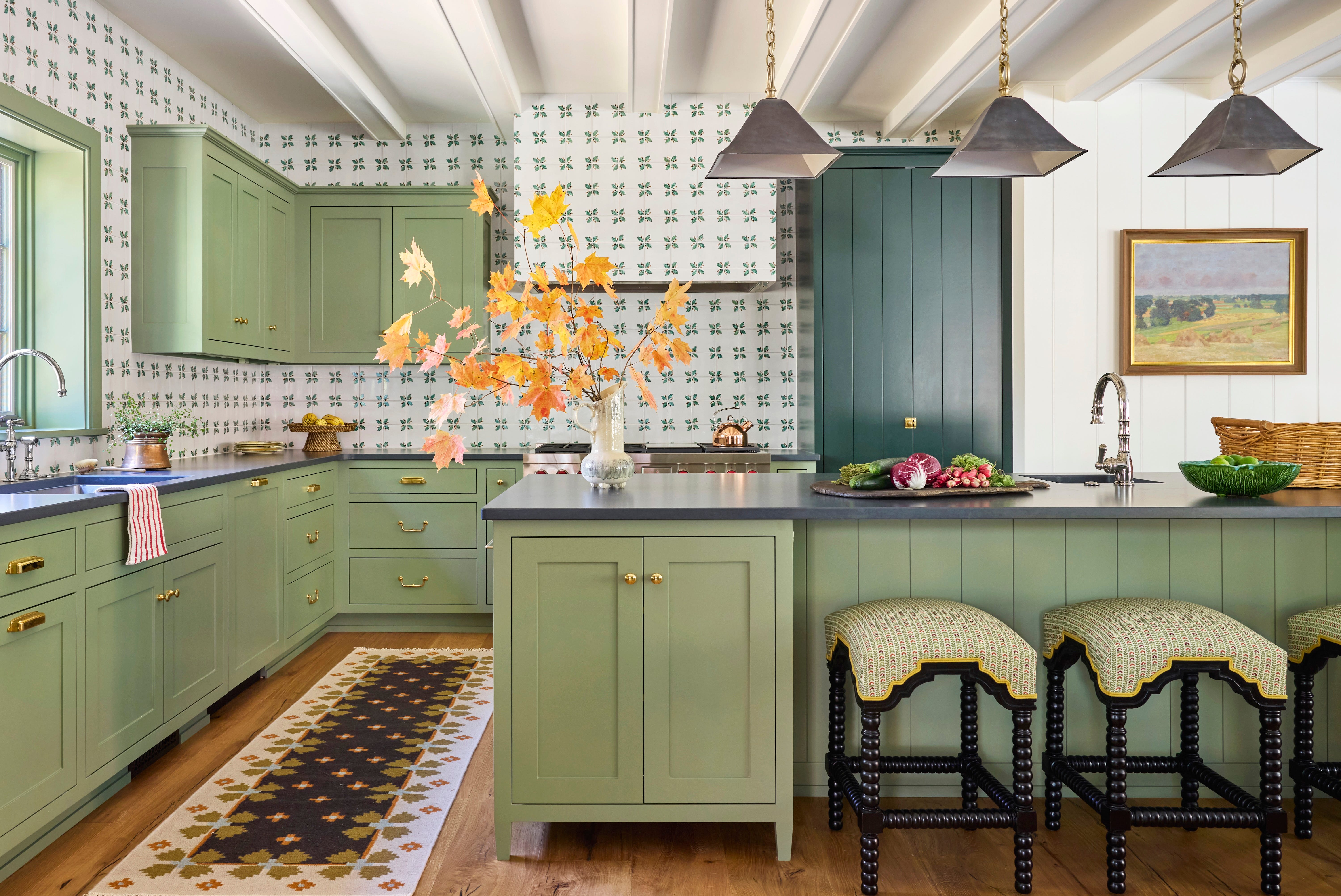
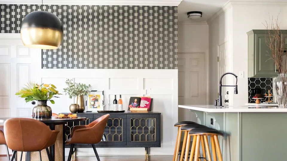
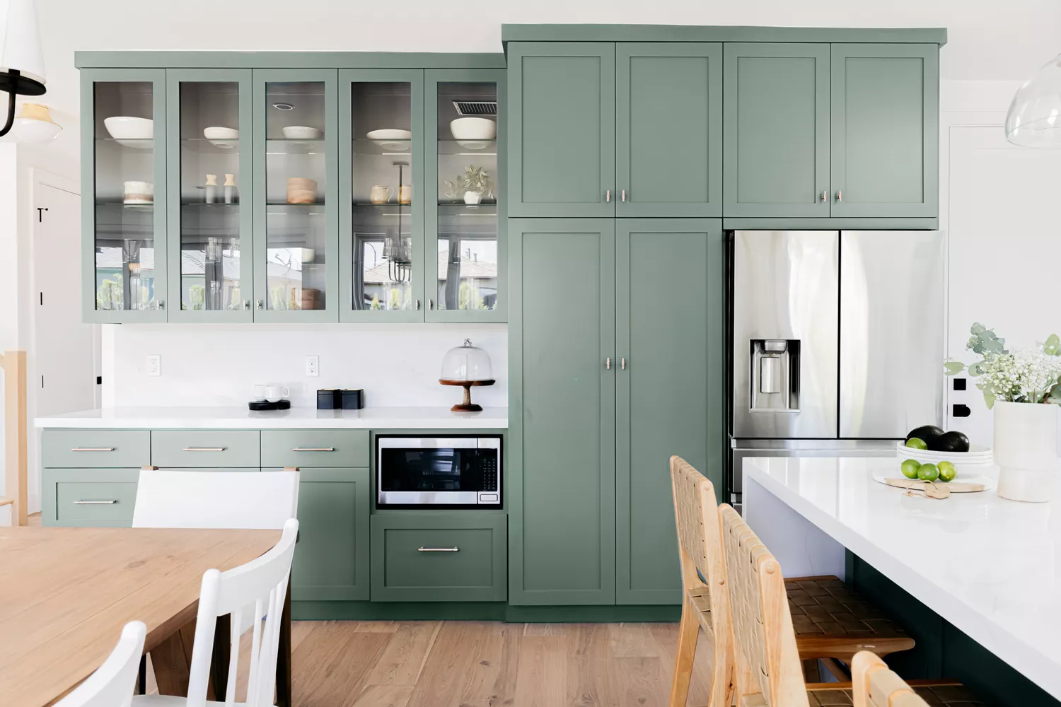
Olive green, charcoal, and dark wood enhance the warm tones of dark wood cabinets and countertops, creating a cozy and earthy atmosphere, especially with good natural light. Farrow & Ball's "Bancha" or "Sap Green" for olive, and Benjamin Moore's "Witching Hour" or "Flint" for charcoal, are recommended.
Periwinkle and white introduce a unique, calming, yet striking atmosphere. This color, a blend of lavender and mauve, can be contrasted with warm wood or metal, or paired with pale neutrals like dove grey. Glidden's "Roslyn's Periwinkle Blue," "Fresh Hyacinth," or "Pearl Violet" are good periwinkle options.
Peach and mint offer a delicate and subtle pastel alternative to all-white kitchens. This eye-catching combination is versatile. Benjamin Moore's "Juno Peach" and "Peach Cloud" are suitable peach shades, while "Soft Green" or "Reflection" are recommended for mint green.
Dark blue and copper create a stunning display by pairing the warm tones of copper with a deep cool blue. Sherwin Williams' "Loyal Blue" or "Endless Sea," and Farrow & Ball's "Serge," are suggested for deep blues.
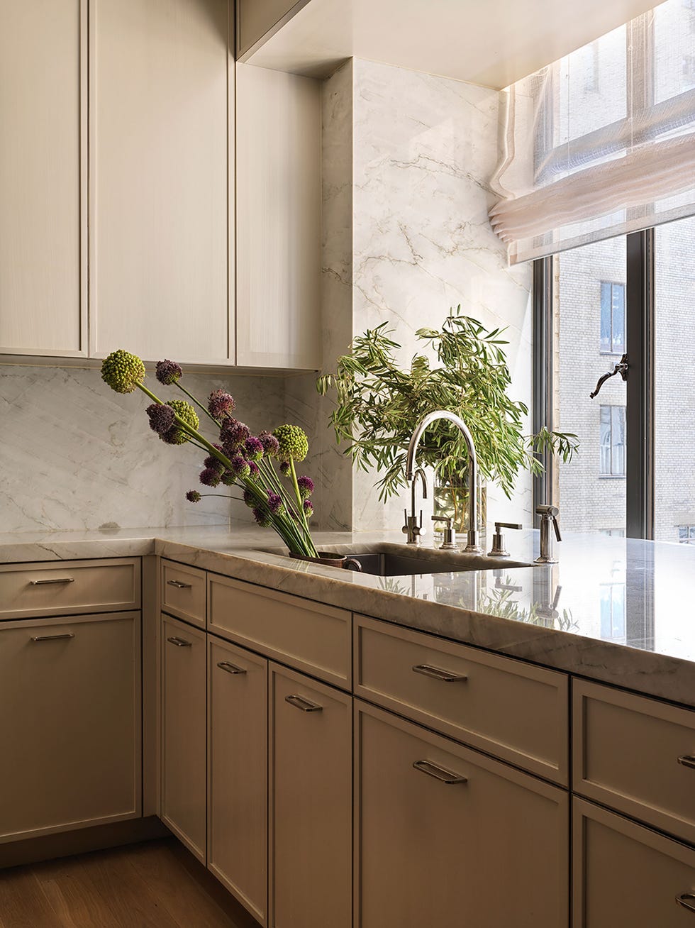
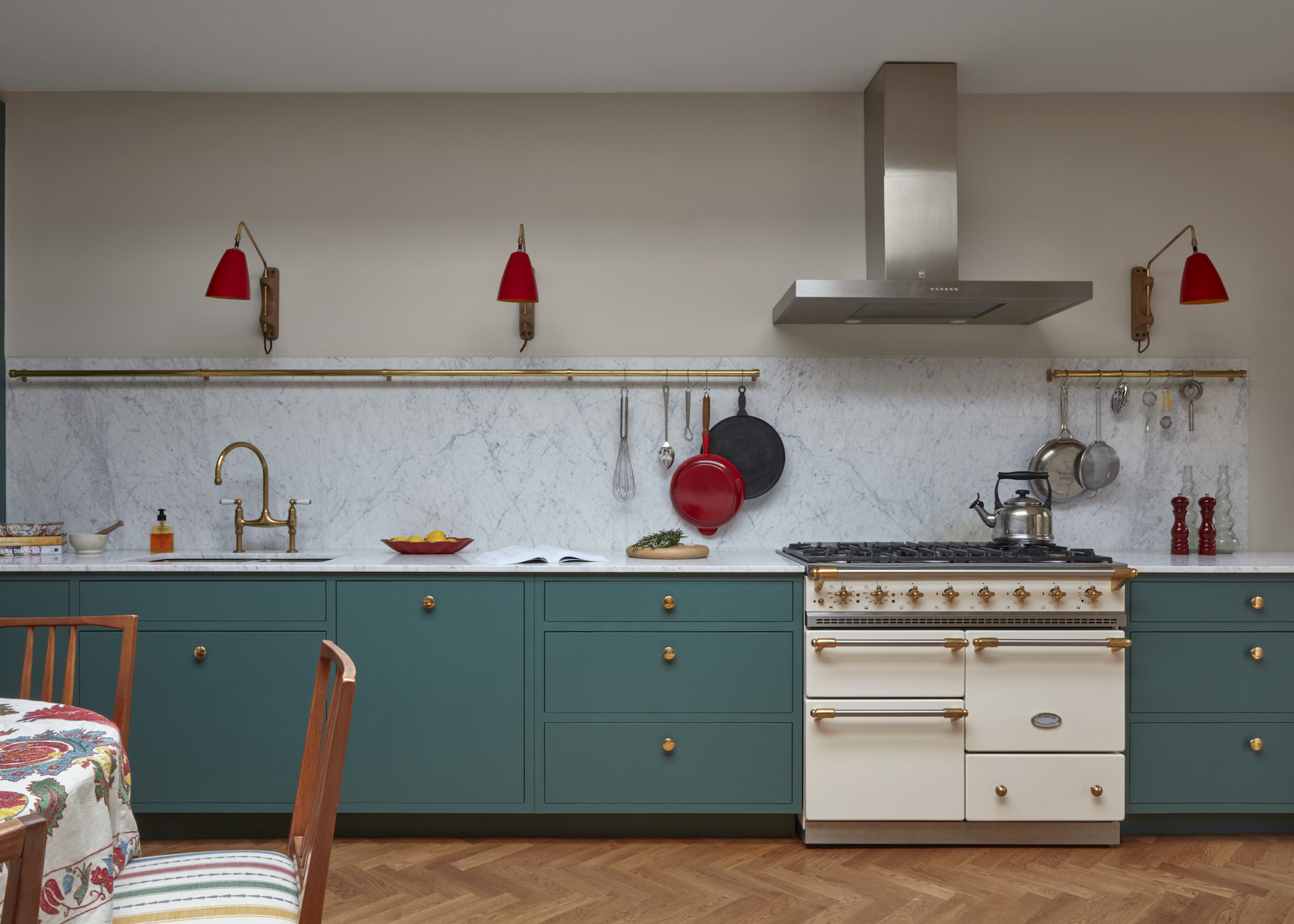
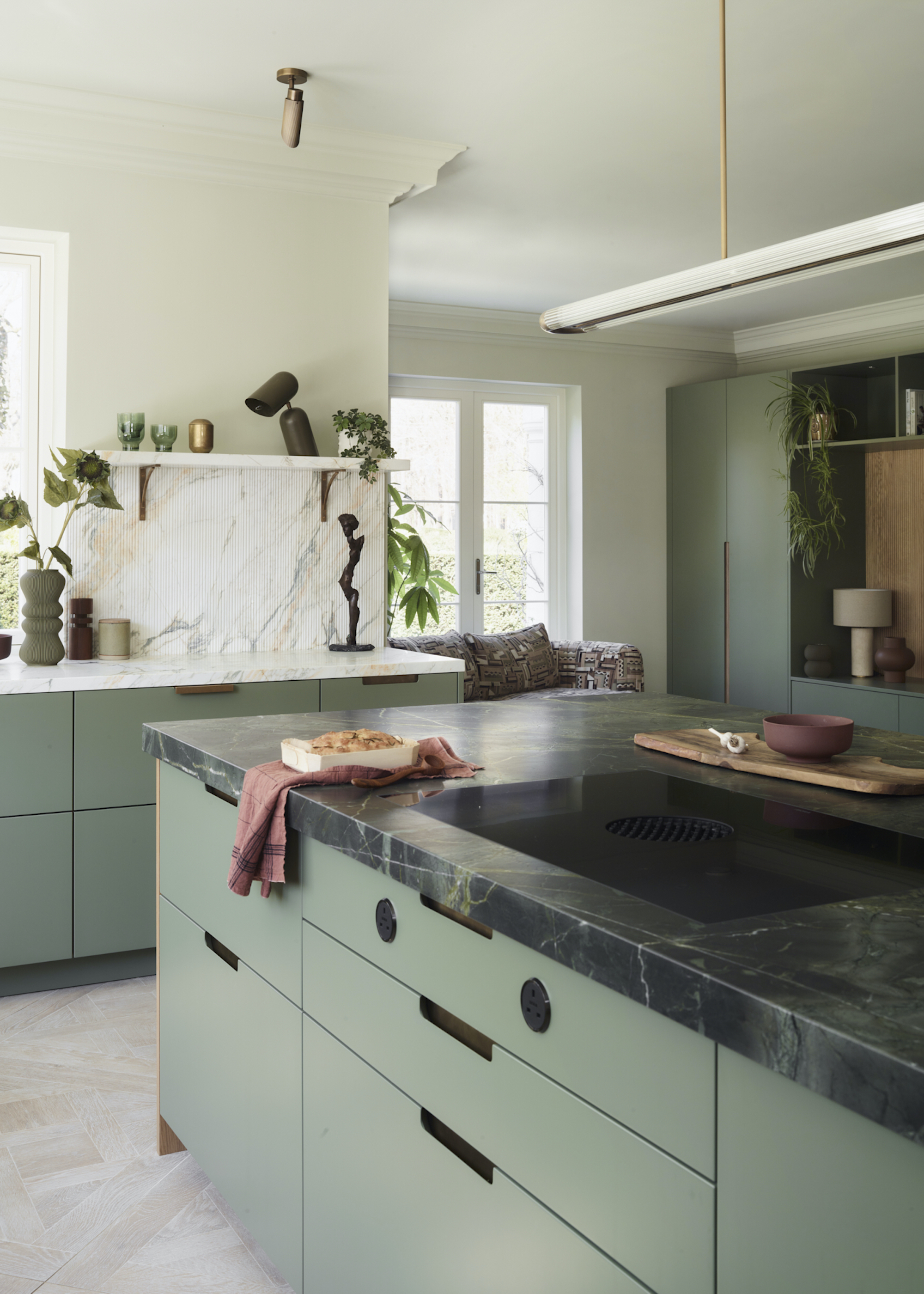
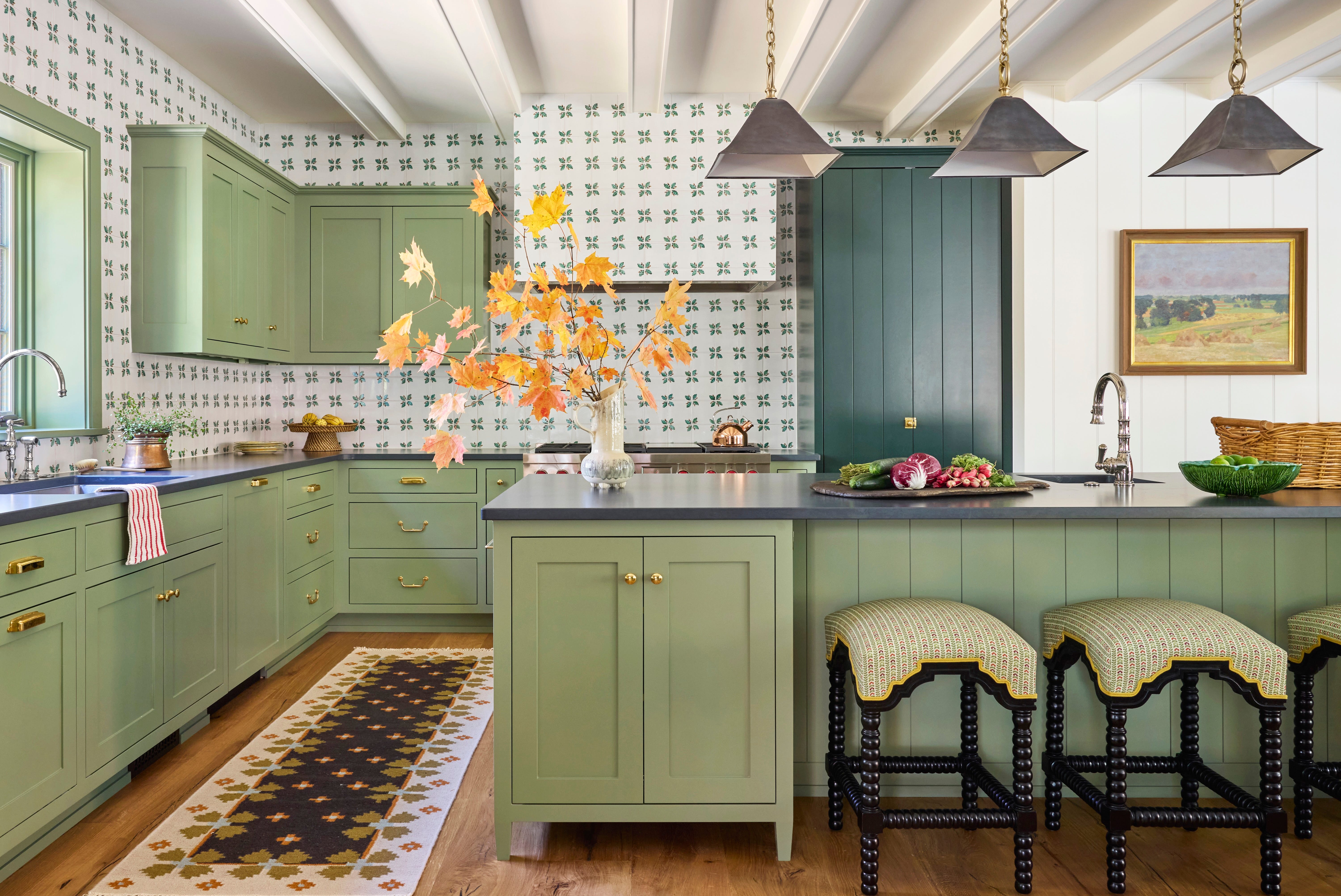
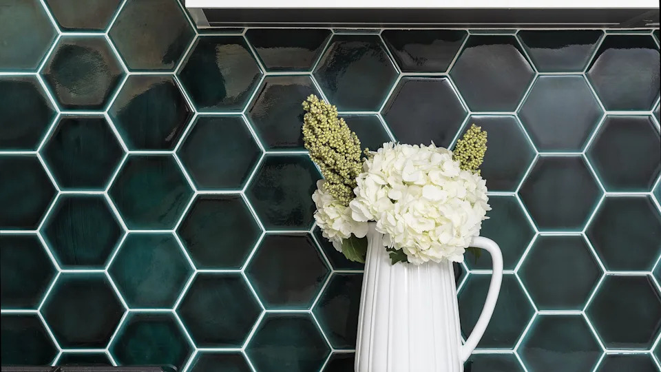
Finally, emerald green and taupe combine a versatile jewel tone with warm neutrals. Emerald green adds depth and subtle energy to colors like beige or taupe. Benjamin Moore's "Rainforest Foliage" or "Absolute Green," and "Green Bay," are recommended emerald greens.
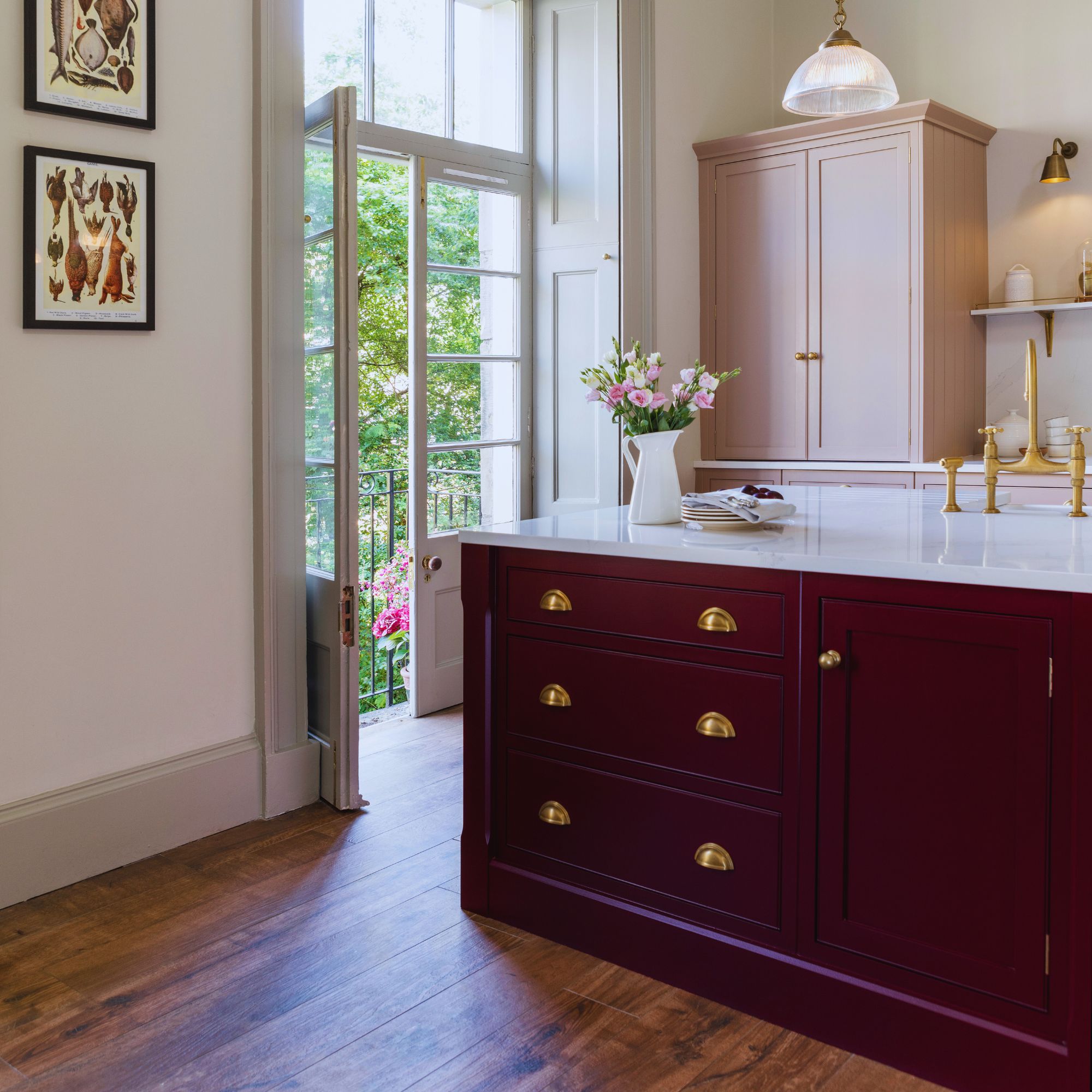
Rose pink and gray offer an inviting, charming, and modern feel. Rose pink avoids the 'princess' vibe while providing comfortable warmth, balancing its blue undertones with warmer accents. Benjamin Moore's "Genuine Pink," "Paradise Pink," and "Deep Carnation" are highlighted rose pink shades.
#KitchenDesign #ColorCombinations #HomeDecorTrends #InteriorDesign #PaintColors #KitchenRenovation #DesignInspiration #DecoratingIdeas #HomeImprovement #KitchenDesign #ColorCombinations #HomeDecorTrends #InteriorDesign #PaintColors #KitchenRenovation #DesignInspiration #DecoratingIdeas #HomeImprovement
0 comment in total
 No comments yet
You may also like
Top 13 kitchen colours for 2025
20 Kitchen Paint Colors to Try in 2024

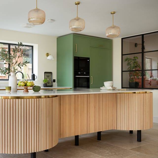
These kitchen paint colours will be everywhere in 2025 – and there's even one for neutral lovers

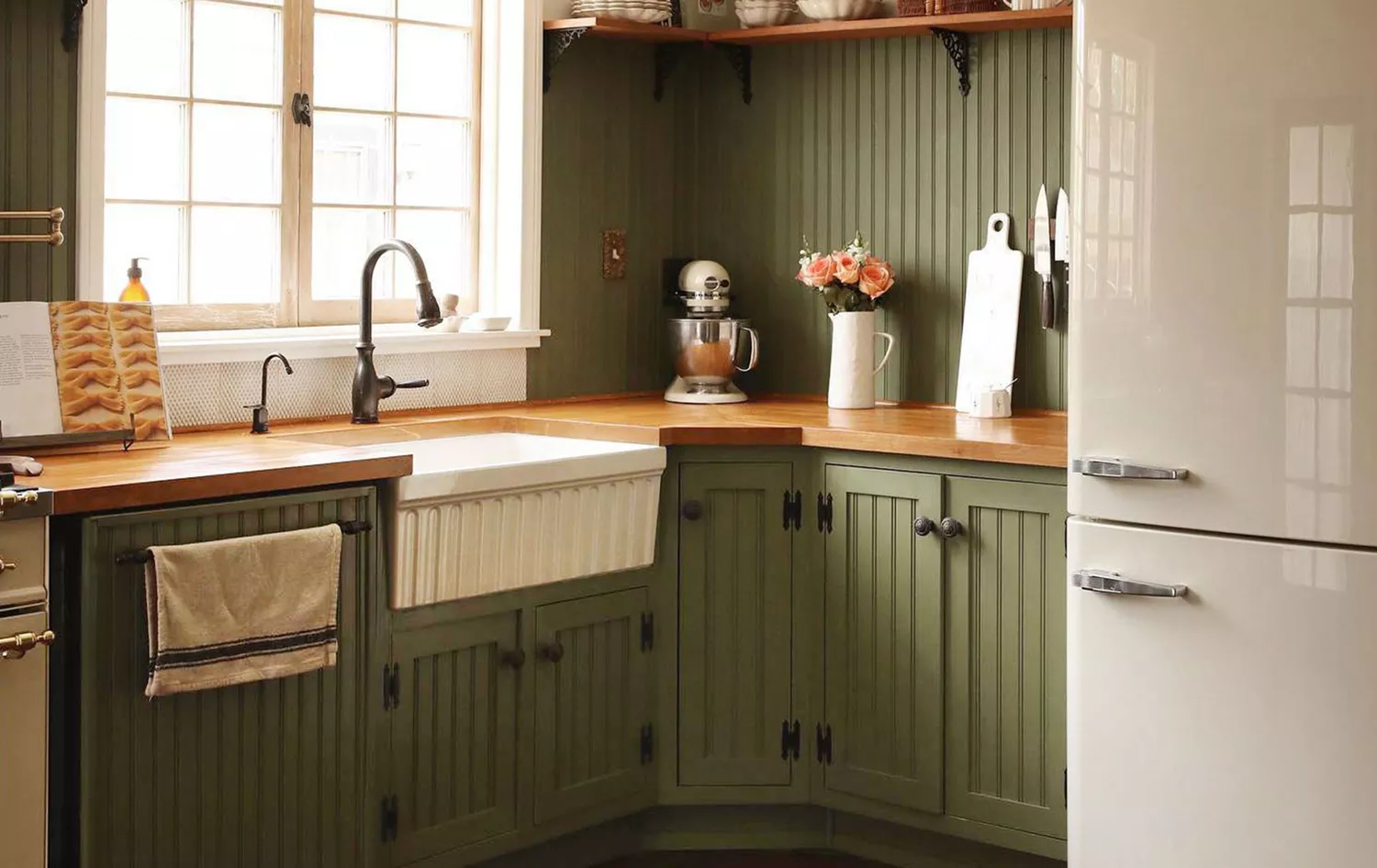
5 Kitchen Paint Color Trends for 2025 That Will Transform the Heart of Your Home
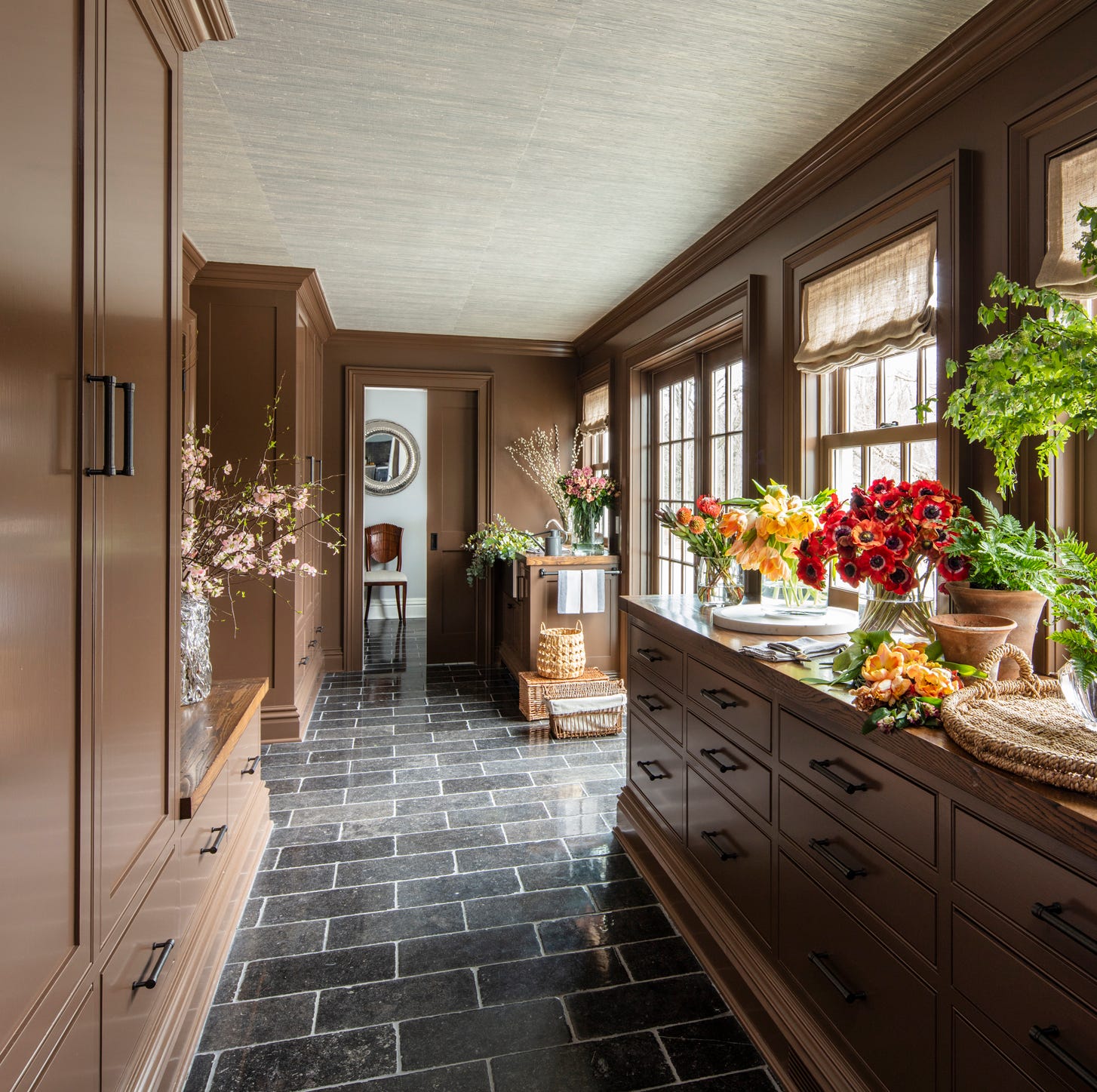
These 2025 Kitchen Color Trends Are Unexpectedly Chic
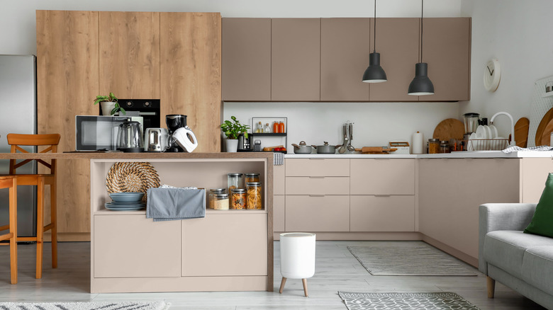
10 Trendy Kitchen Cabinet Colors You Should Try In 2025
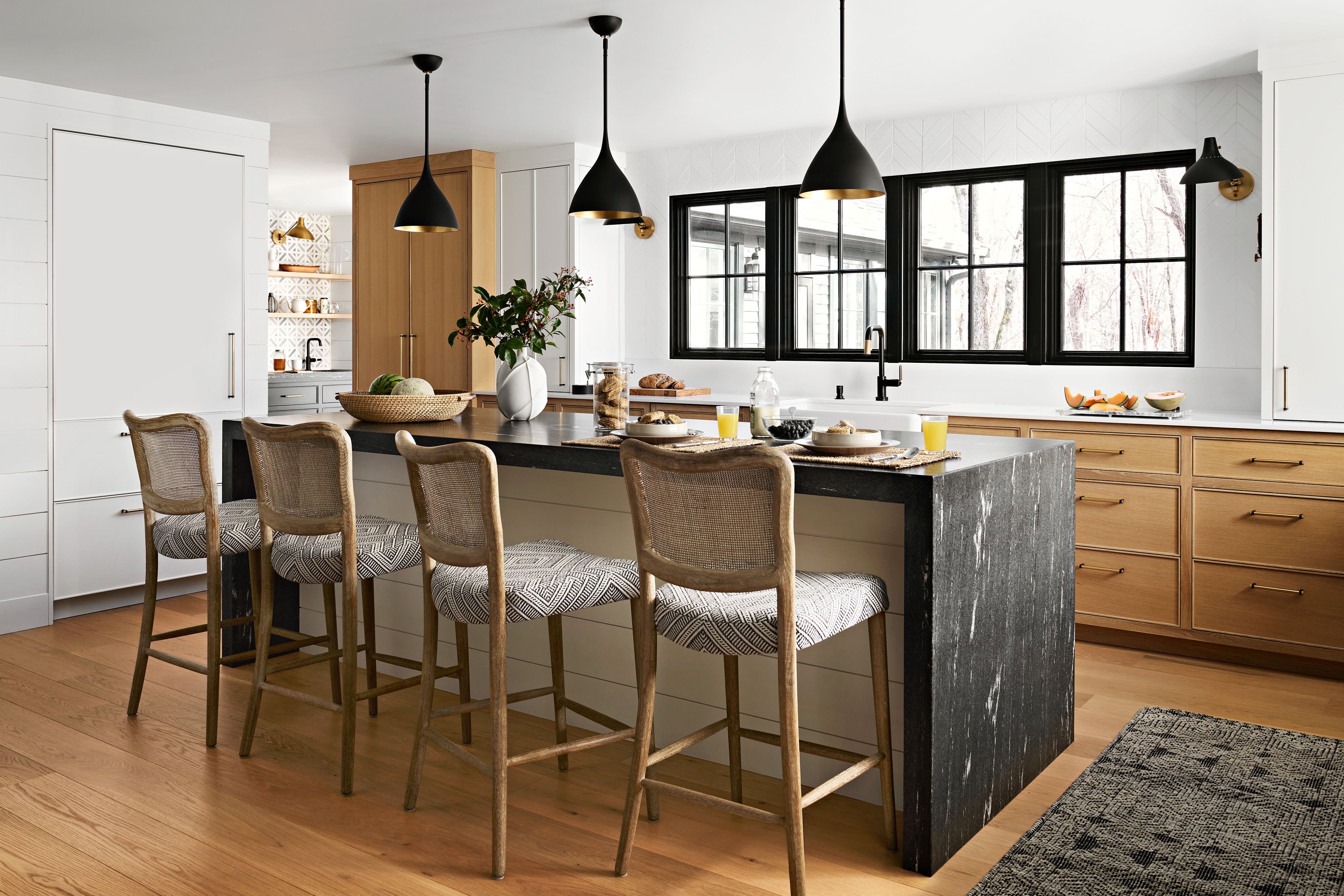
9 Top Kitchen Color Trends Experts Predict for 2025

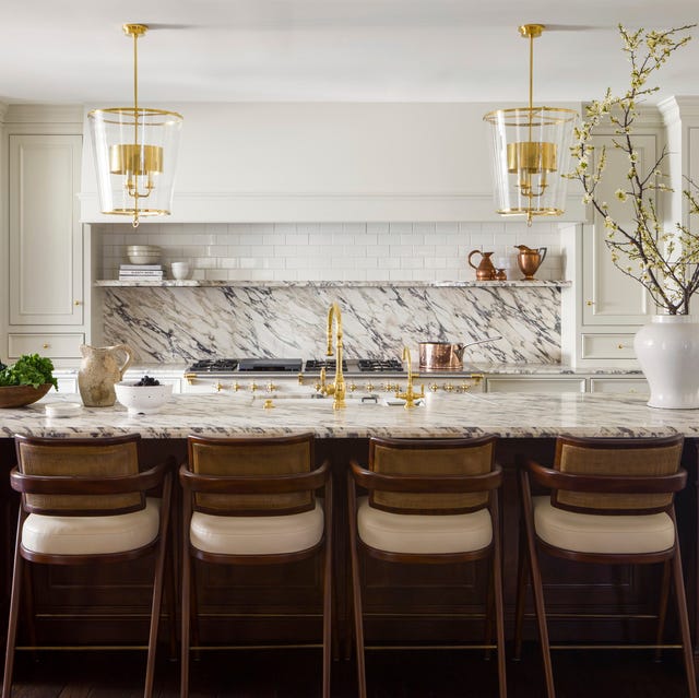
These Kitchen Paint Colors Will Be Everywhere in 2025
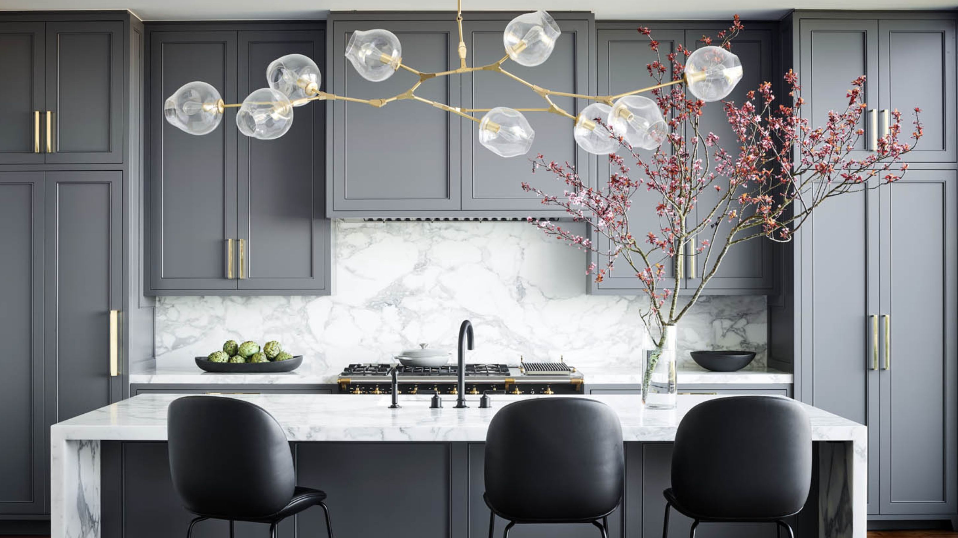
What Kitchen Color Should I Choose? 12 Ideas That Feel Right for Schemes in 2025

The Bold And Unexpected Color Combo You'll Be Seeing In Kitchens Everywhere In 2026
7 Kitchen Color Trends That Are Set to Take Over 2026

The Kitchen of Your Dreams Is Just a Paintbrush Away

Top 10 Trendy Kitchen Colour Combinations in 2025

Kitchen colour trends – interior designers reveal the 7 inviting new shades to embrace in 2025
Just In: These 11 Kitchen Color Trends Are Going to be Everywhere in 2026

The Kitchen Color You're Going to Be Seeing Everywhere in 2024
11 Trendy Kitchen Paint Colors To Try In 2026

5 Kitchen Paint Color Trends to Watch in 2024
The Best Kitchen Cabinet Colors to Try in 2025, According to Designers
8 Kitchen Color Trends You'll See in Every Home in 2025, According to Designers