1/8
Kitchen colour trends – interior designers reveal the 7 inviting new shades to embrace in 2025
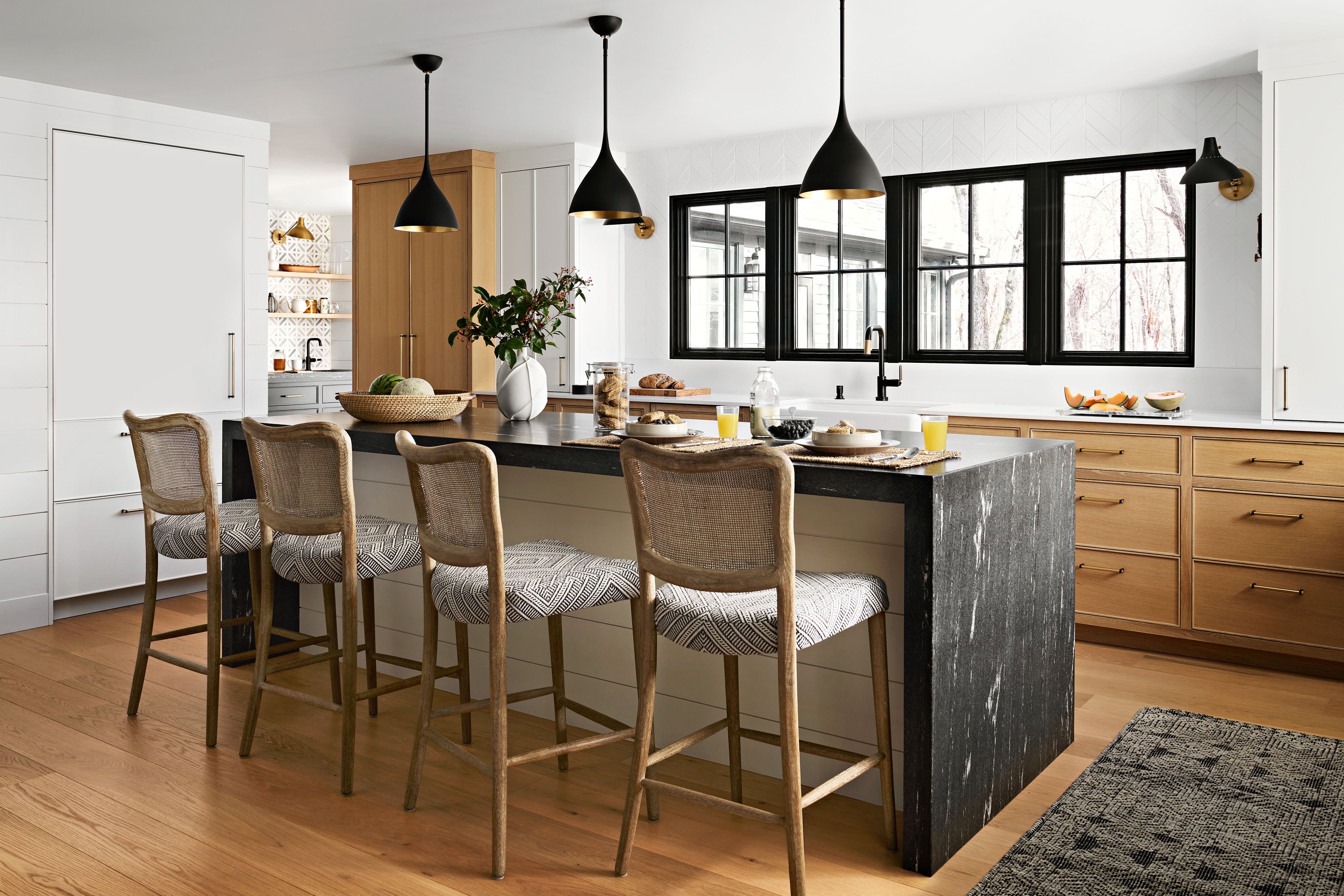
The article explores the latest kitchen colour trends predicted for 2025, emphasizing a shift towards warm, cosy, and comforting colours that encourage a desire to stay home and cook. It highlights that while colour trends for kitchens tend to be more timeless than fashion trends, there are always exciting new options and a general direction influencing design. Industry insiders, colour forecasters, and paint brands annually release predictions, and for 2025, the overarching theme is inviting colours.
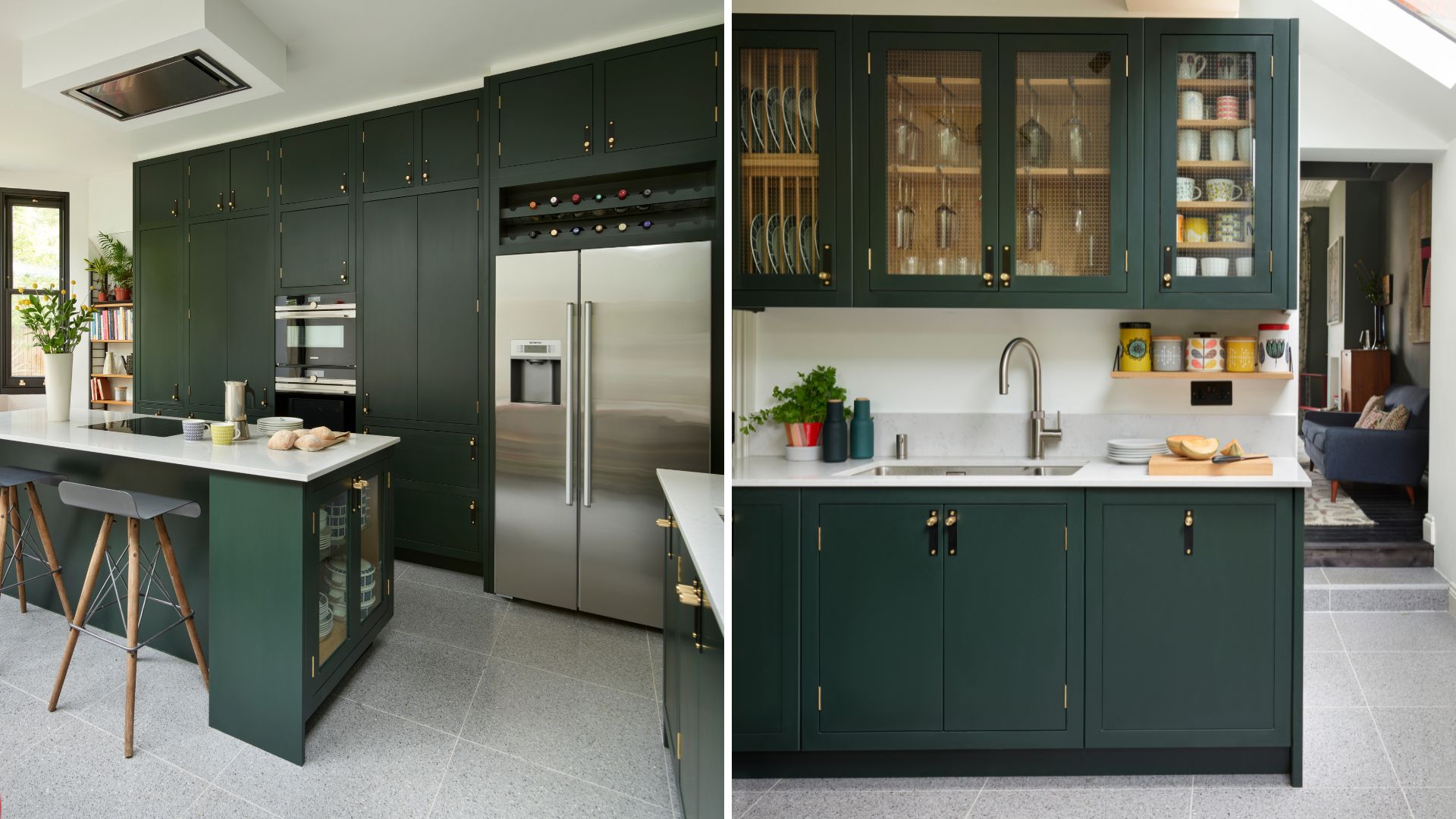
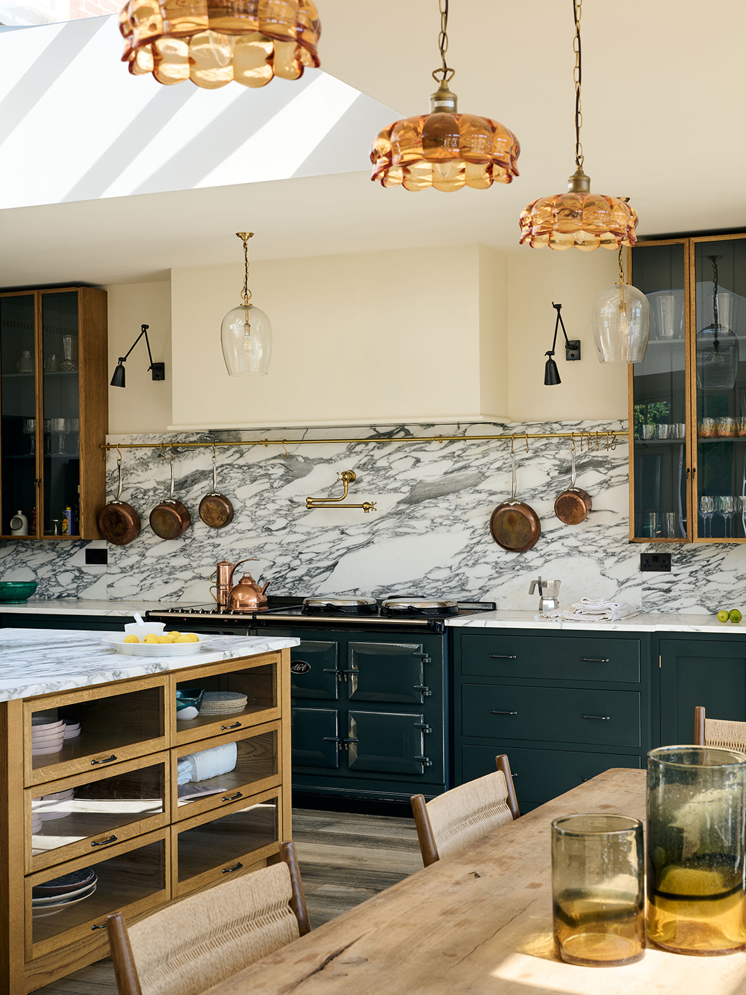
Michael Rolland, managing director at The Paint Shed, notes that 2025 will see homeowners moving away from 'safe' neutrals and embracing individuality and boldness, experimenting with rich tones, statement colours, and techniques like colour drenching. He anticipates growth in bolder colour schemes, including plums, wine reds, and emeralds, signifying a departure from white, beige, or pale greys as default choices.
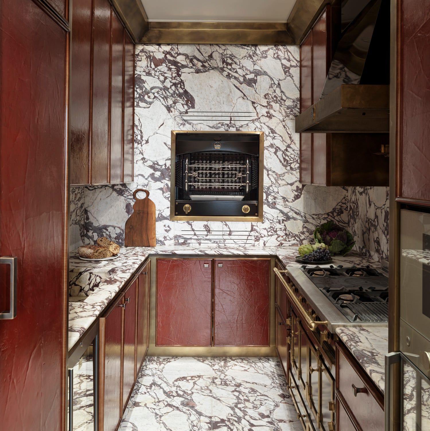
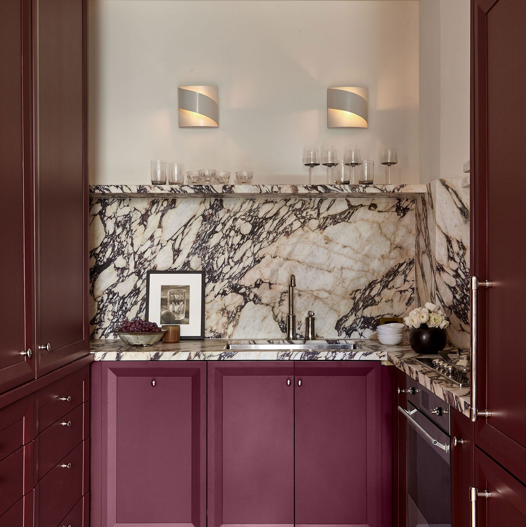
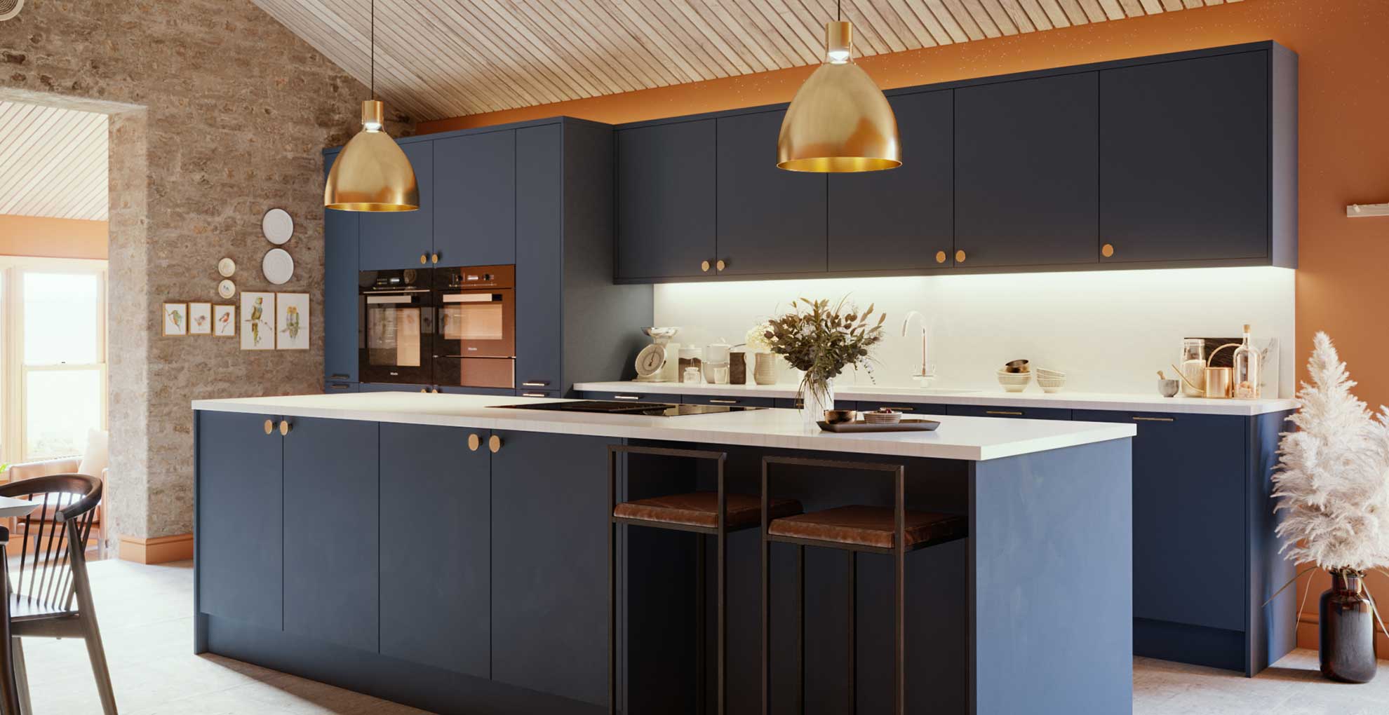
Seven specific trending shades are identified for 2025. First, burgundy is highlighted as a rich and luxurious choice that pairs well with other trending shades like pale pink and sky blue. Tash Bradley, head of interior design at Lick, predicts burgundy kitchens will be huge, offering more warmth and depth than dark blue. She specifically mentions Lick's 'Purple 03' as a deep velvet purple with blue, red, and yellow undertones, creating a cosy, sophisticated, and inspiring environment that pairs well with neutrals, burnt oranges, buttery yellows, fresh blues, and pinks.
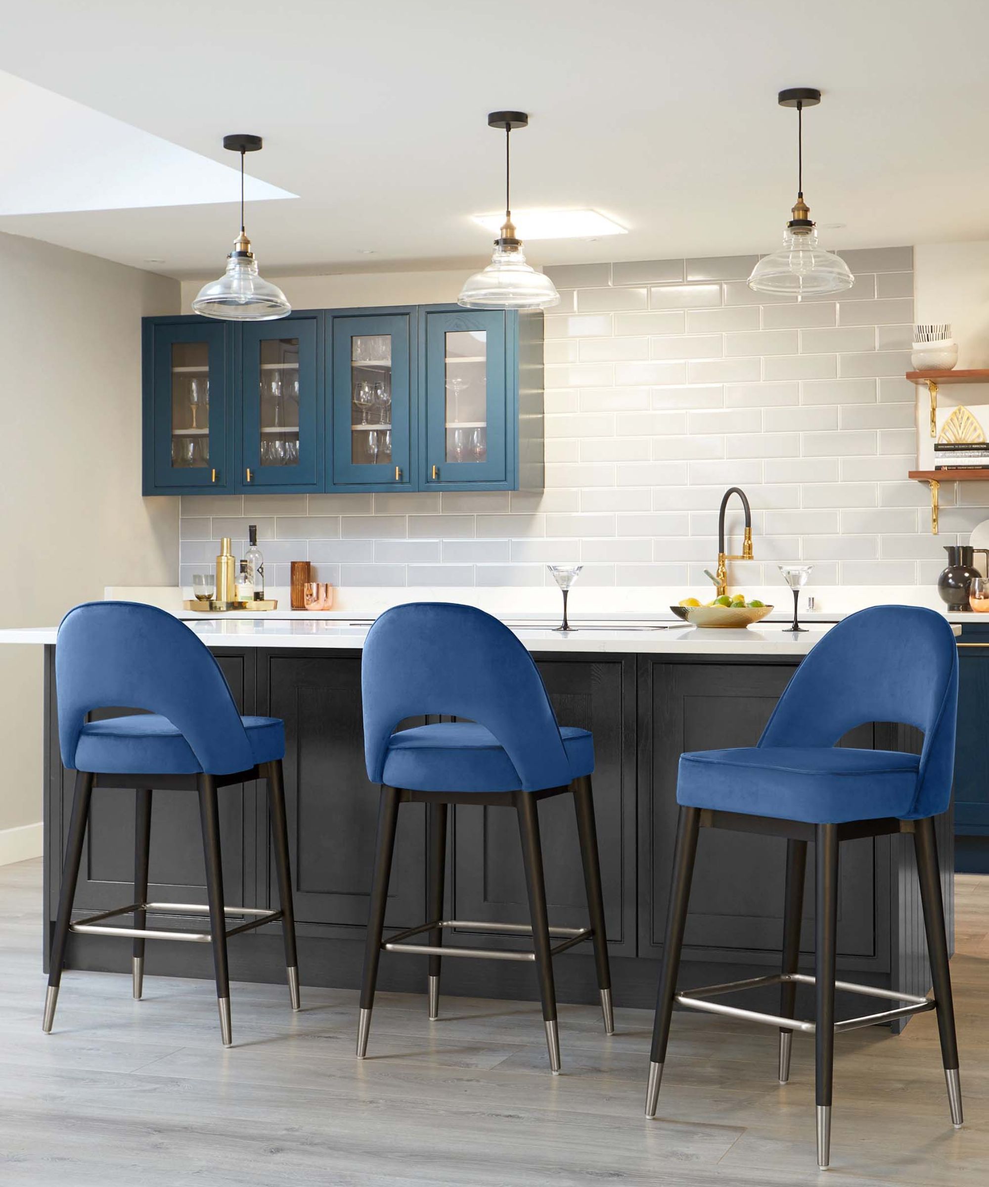
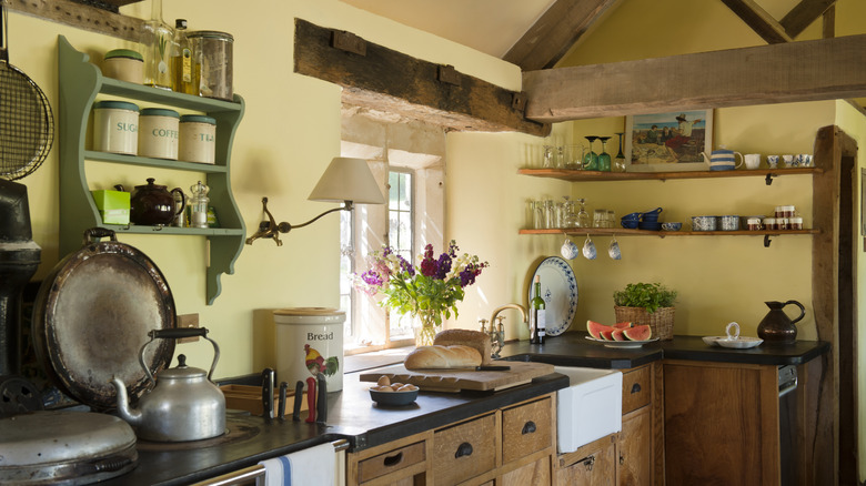
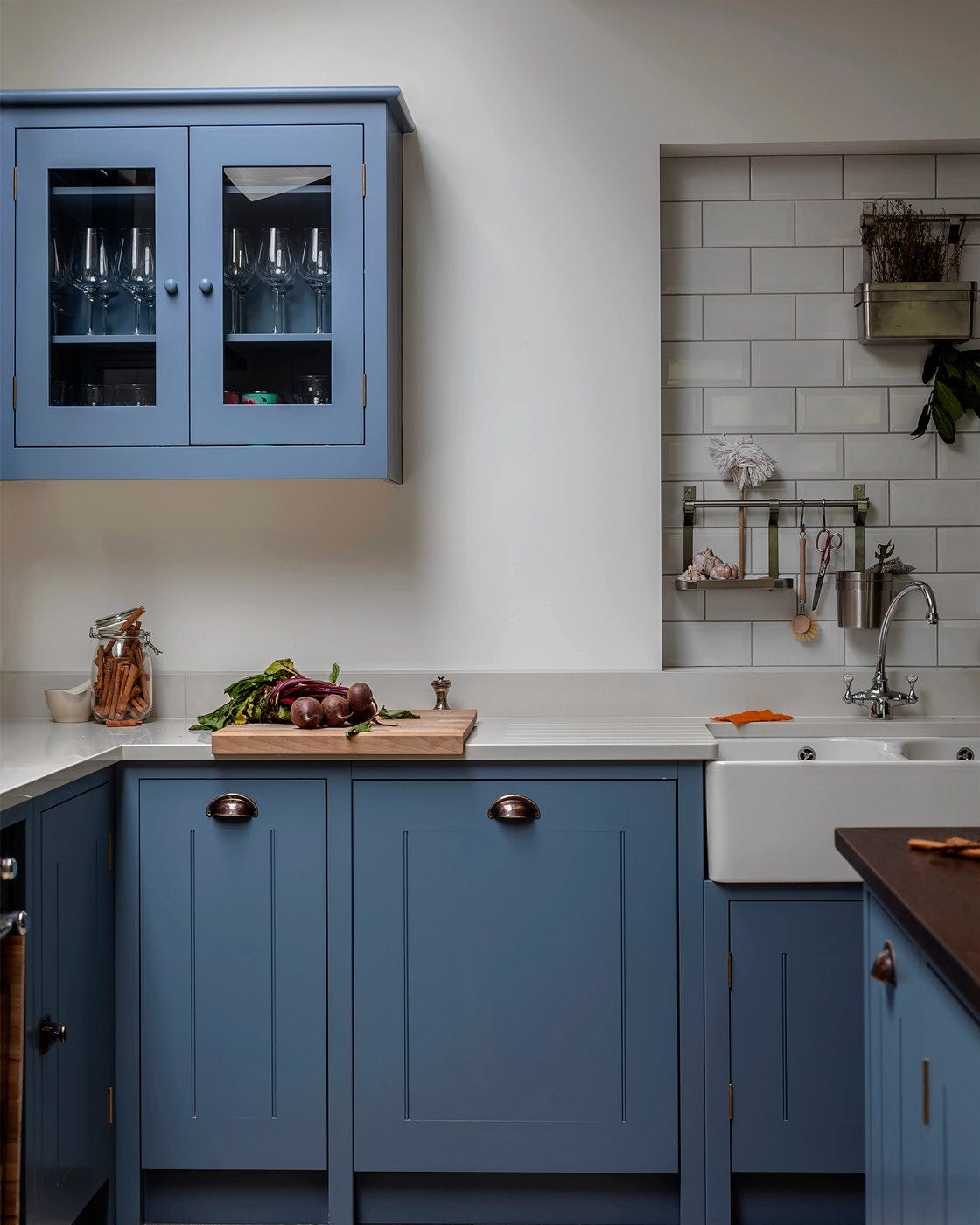
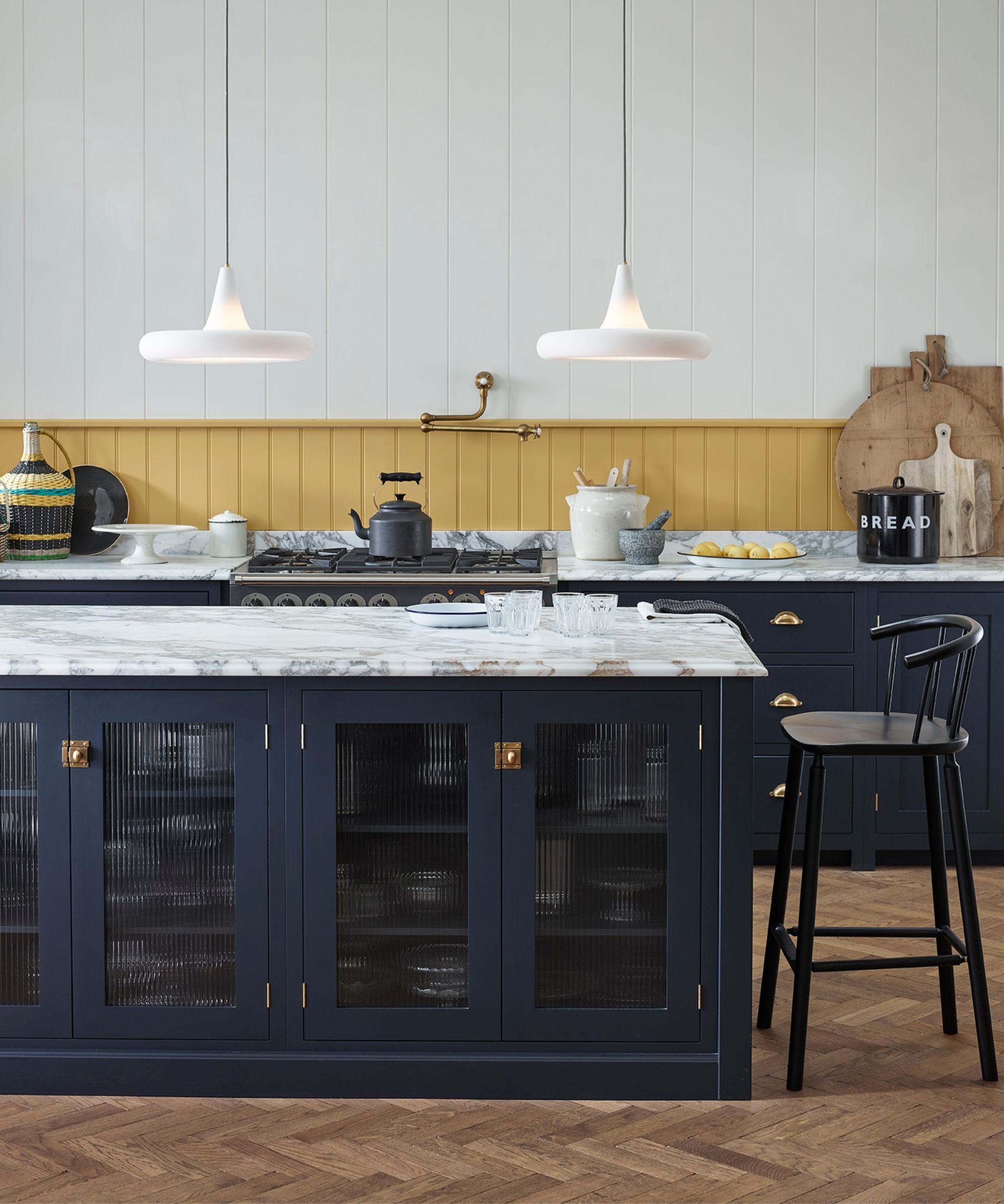
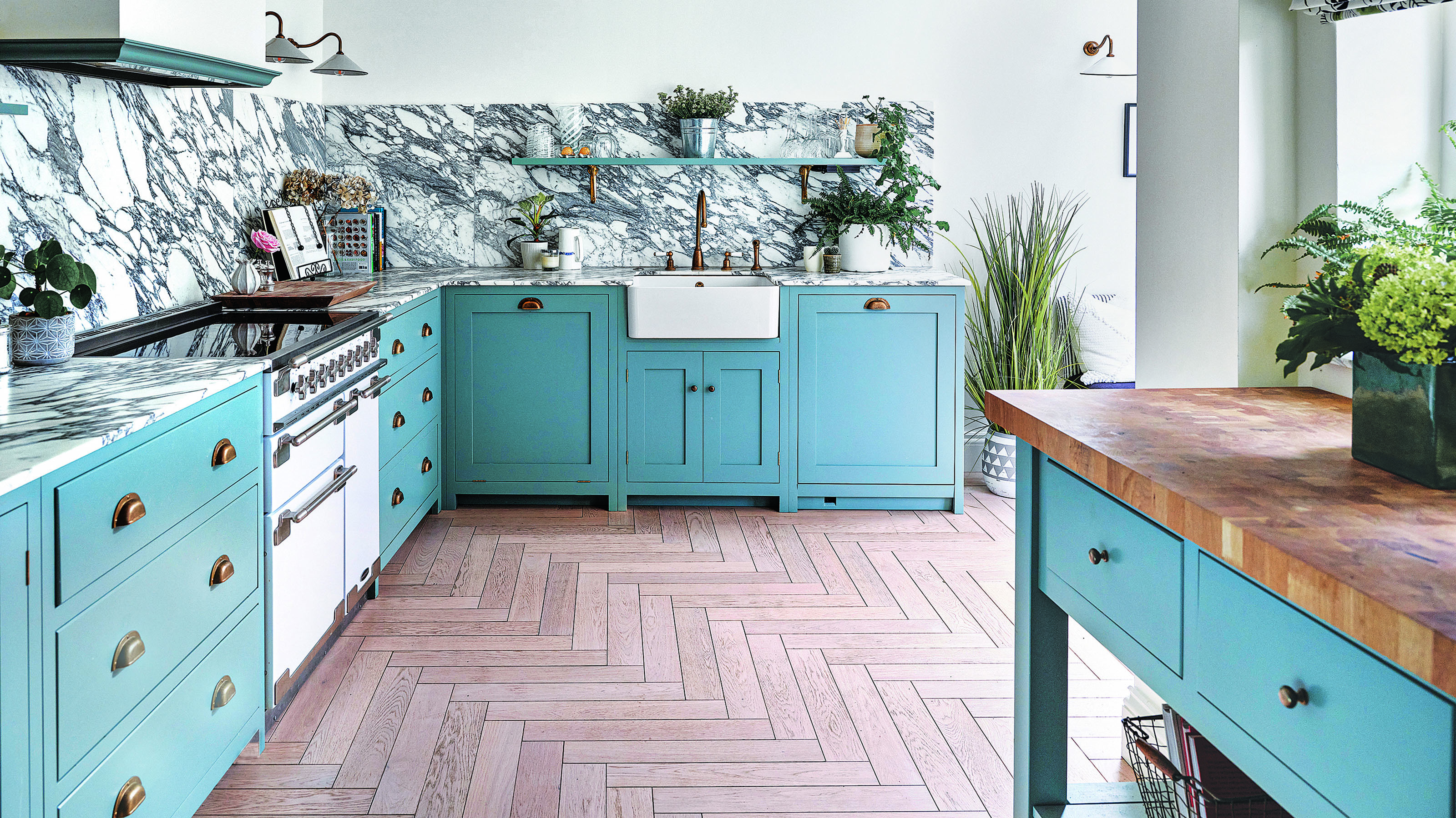
Second, pale blue is presented as a fresh take on traditional country kitchen tones, updated with brass cup handles, marble worktops, and open shelving. It is seen as a sunnier alternative to navy blue, brightening spaces and easily integrating with existing interiors.
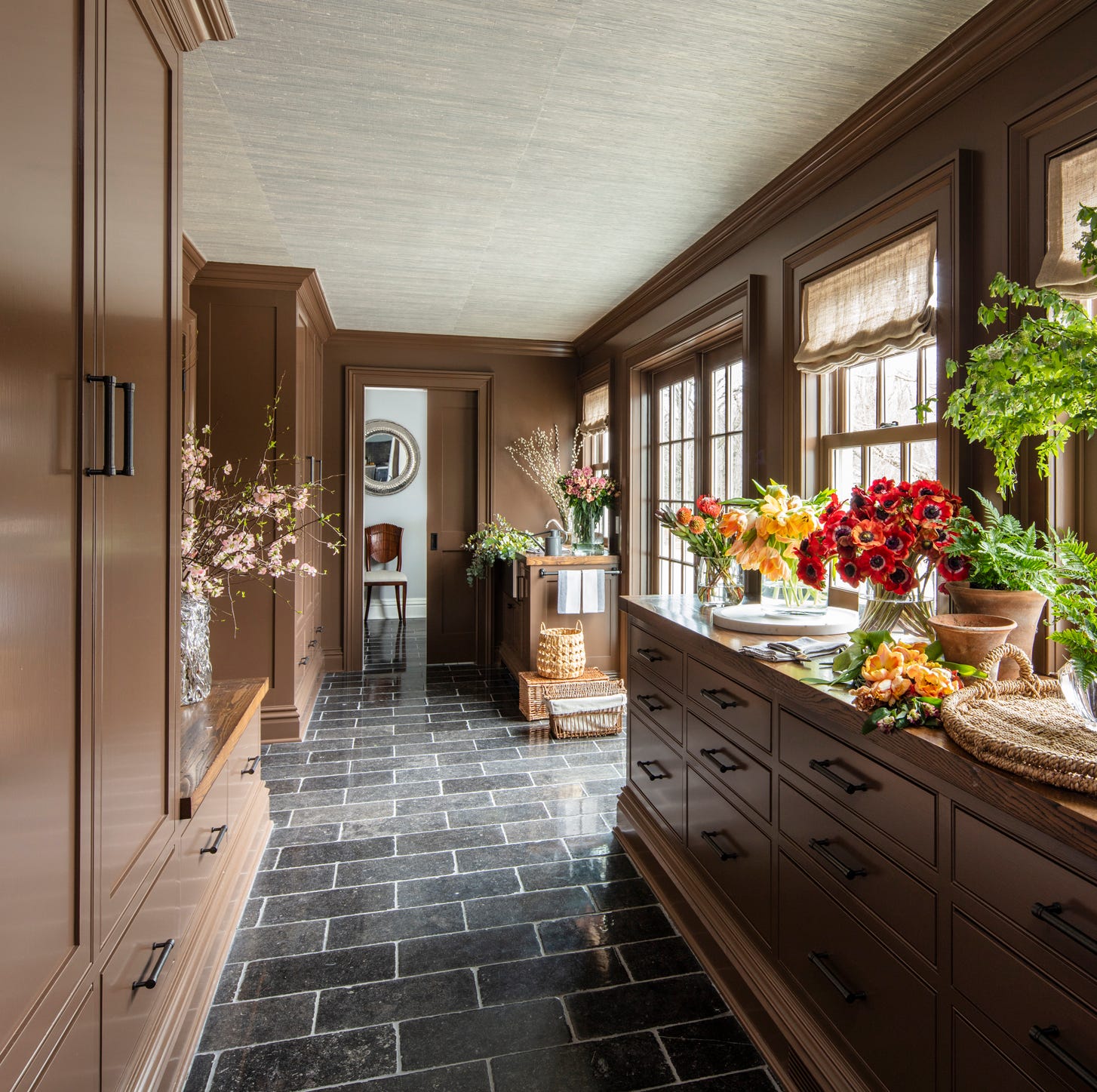
Third, 'Mocha Mousse' is introduced as a new neutral, moving away from light grey and beige. Darren Watts, showroom design director at Wren Kitchens, explains that this earthy tone, Pantone's colour of the year for 2025, will take centre stage in cabinetry, backsplashes, and seating. Isabel Fernandez from Quorn Stone adds that it offers a soft brown with pinkish tones and aligns with interior schemes, complementing warm wood effect tiles and neutral pale limestone flooring.
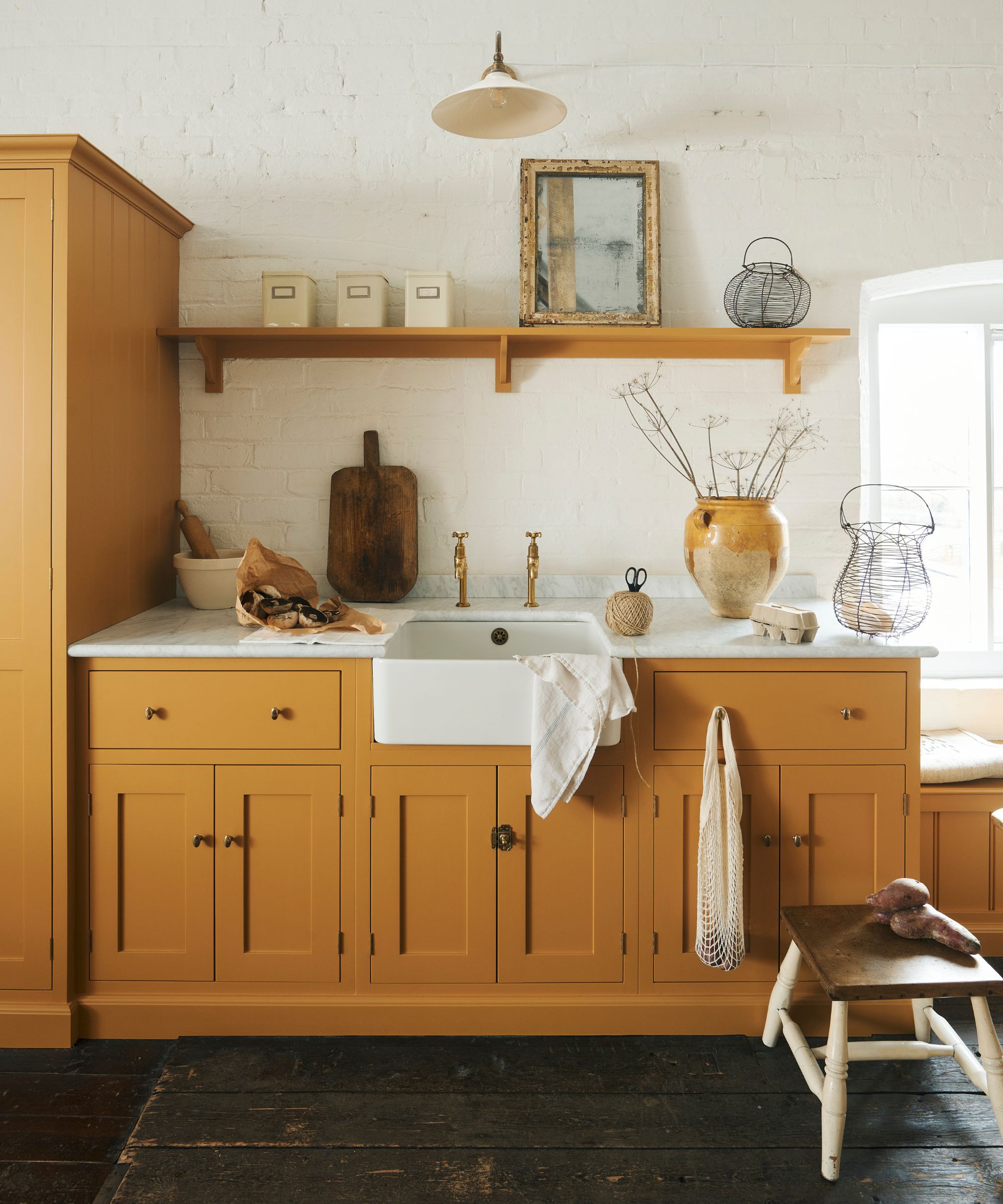
Fourth, primary shades are noted for making a big impact, following the success of the unexpected red theory in 2024. Red will remain significant, alongside bright yellow and bottle green. Dulux's 2025 colour of the year, 'True Joy' (a yellow), exemplifies this uplifting palette, bringing creative energy and optimism. Watts emphasizes yellow's visibility and light-reflecting properties, making it ideal for small or dimly lit kitchens due to its appetite-stimulating qualities.
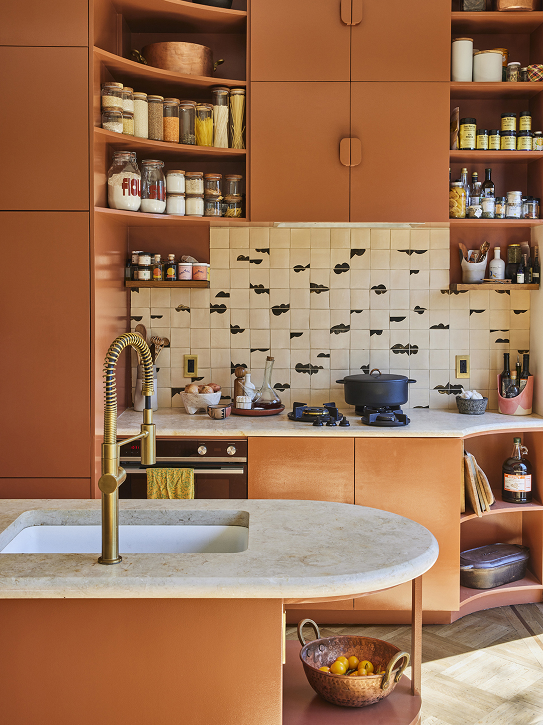
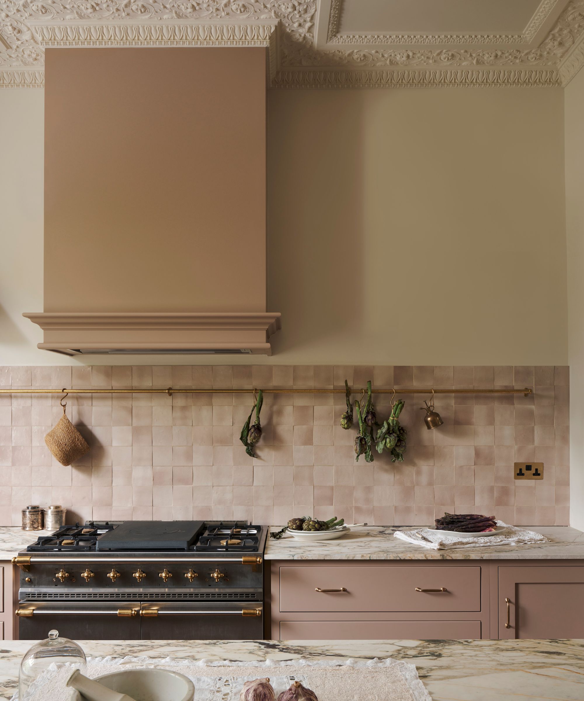
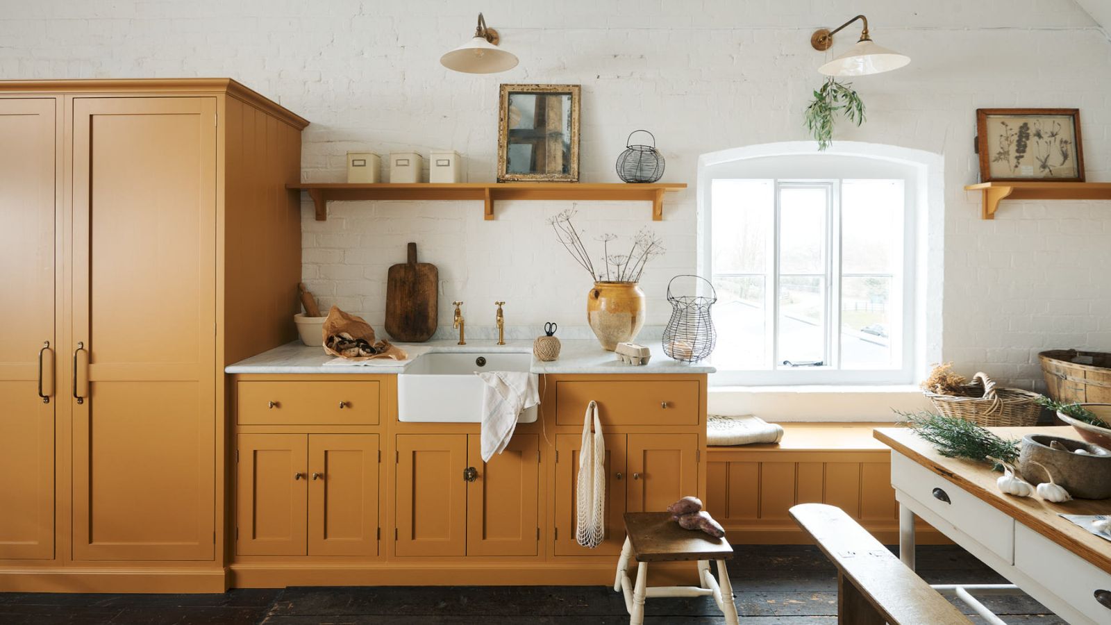
Fifth, warm terracotta is identified as a defining aesthetic, reflecting a yearning for warmer, Mediterranean-inspired themes. Jen Nash, Magnet’s head of design, foresees a shift towards terracotta-based tones, noting their ability to create a cosy, inviting atmosphere. Emma Bestley, creative director at YesColours, agrees, describing terracotta's burnt, bronzy richness as comforting and grounding, suitable for colour drenching in high-traffic rooms like kitchens and dining areas. The article suggests a softer approach with terracotta paired with soothing limestone neutrals.
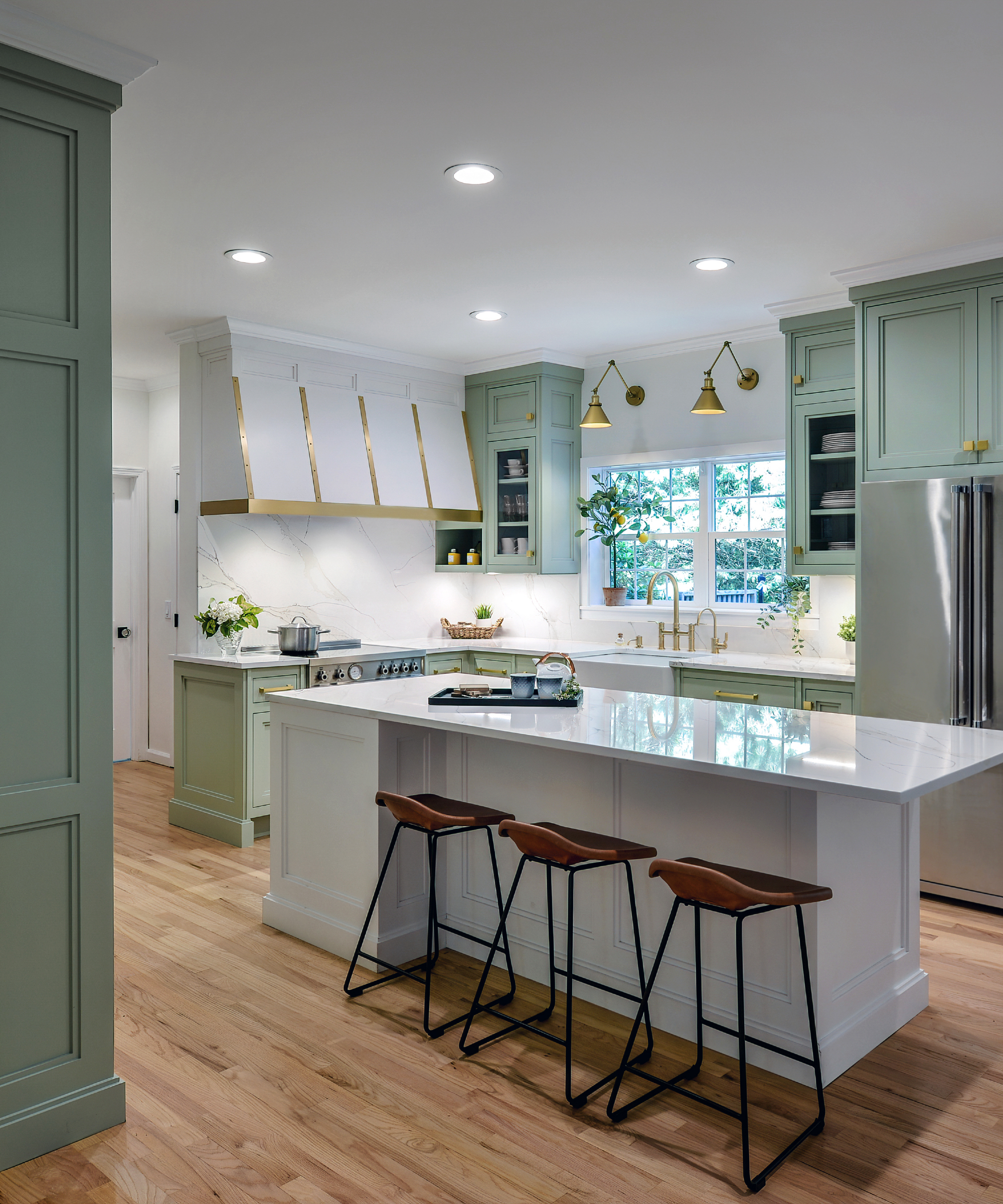
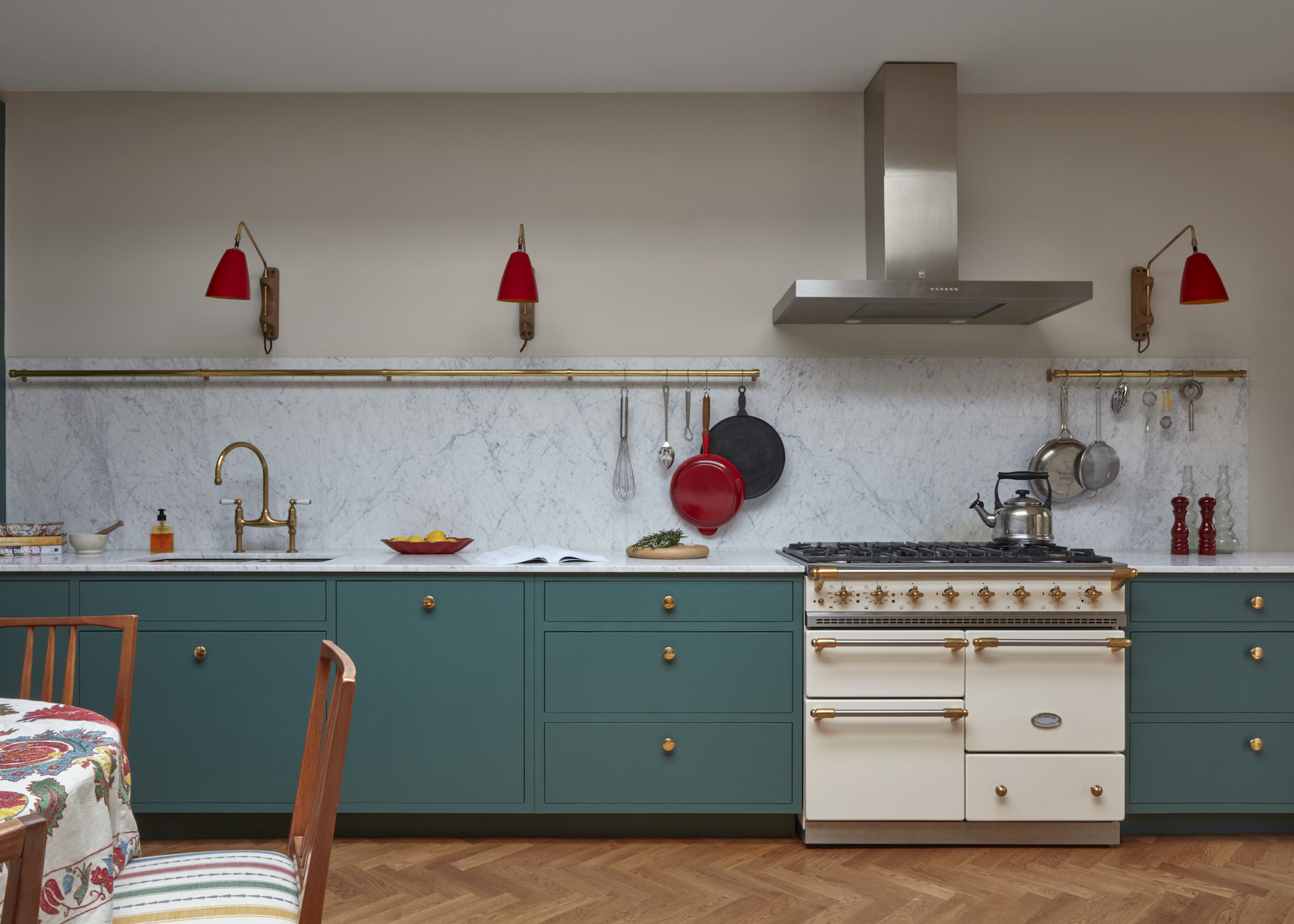
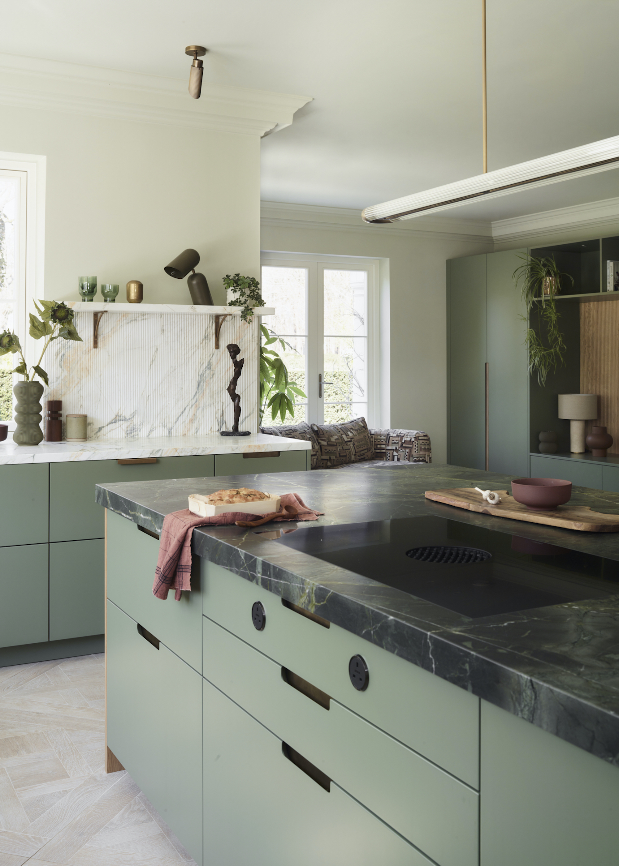
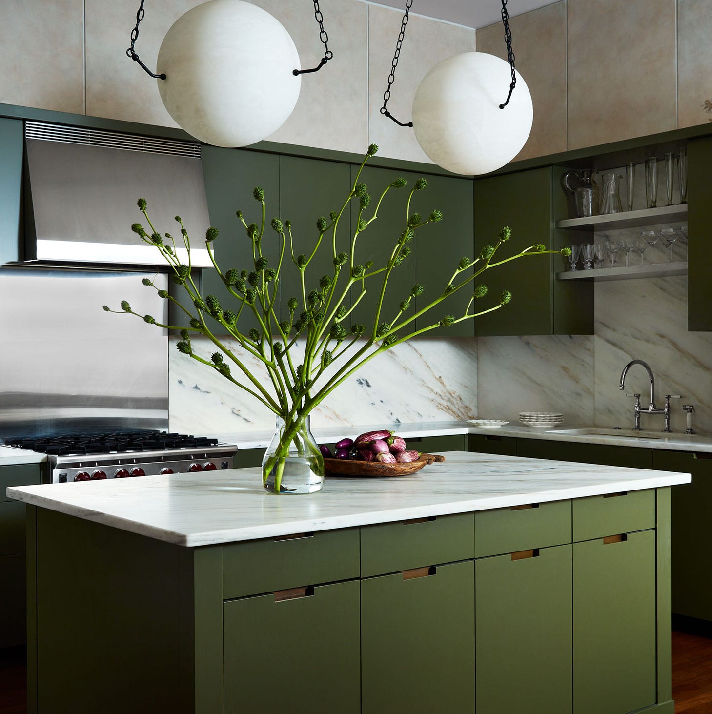
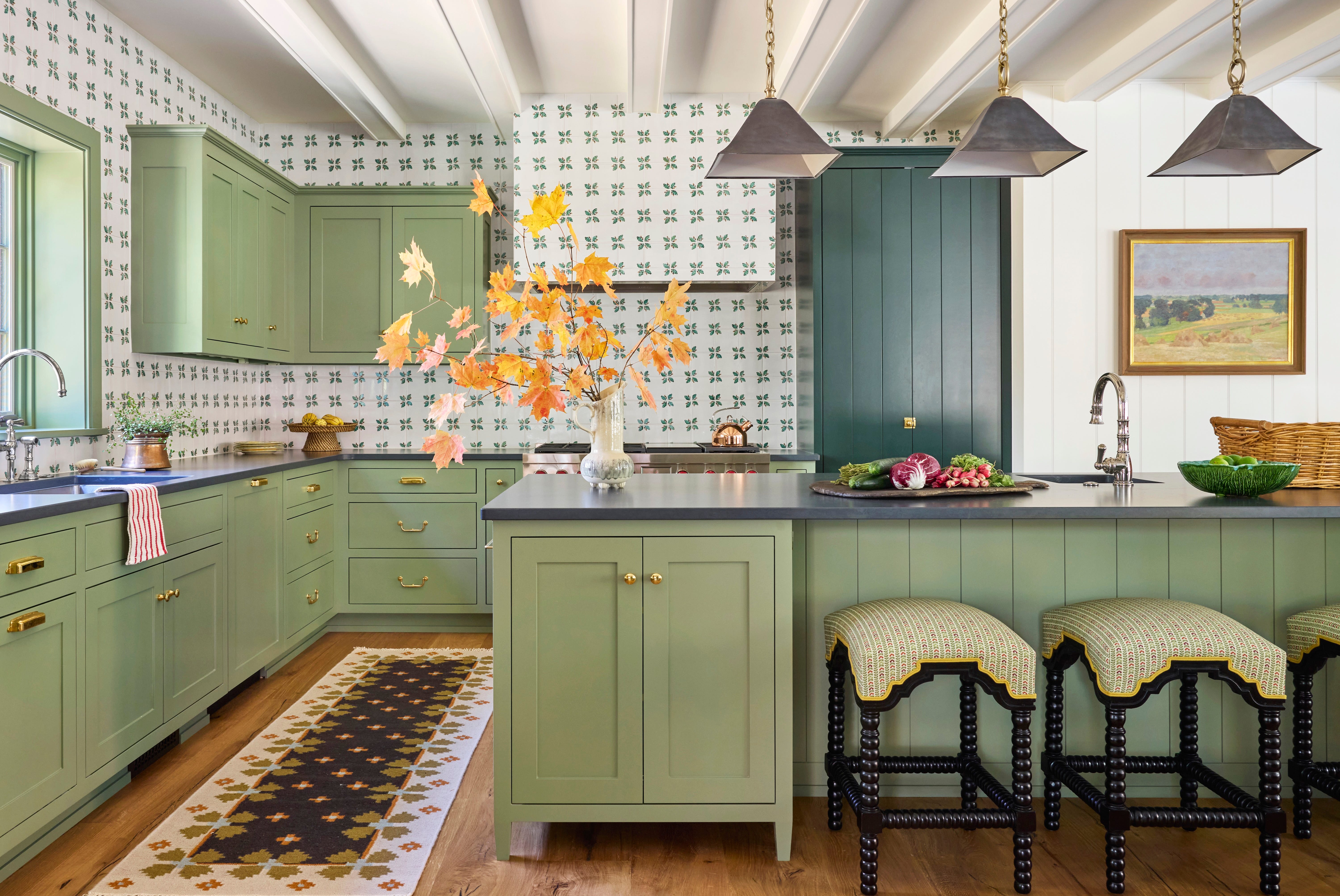
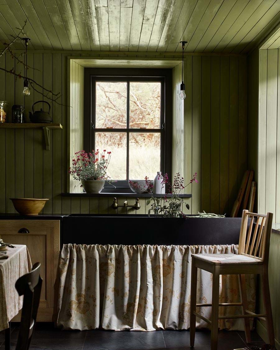
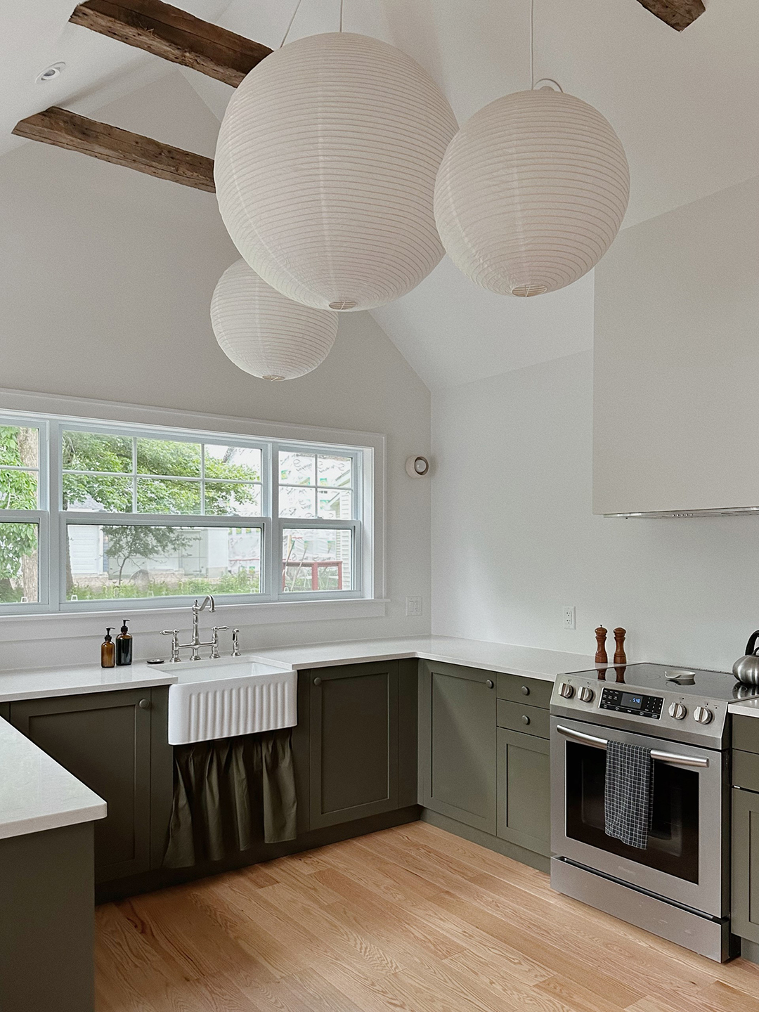
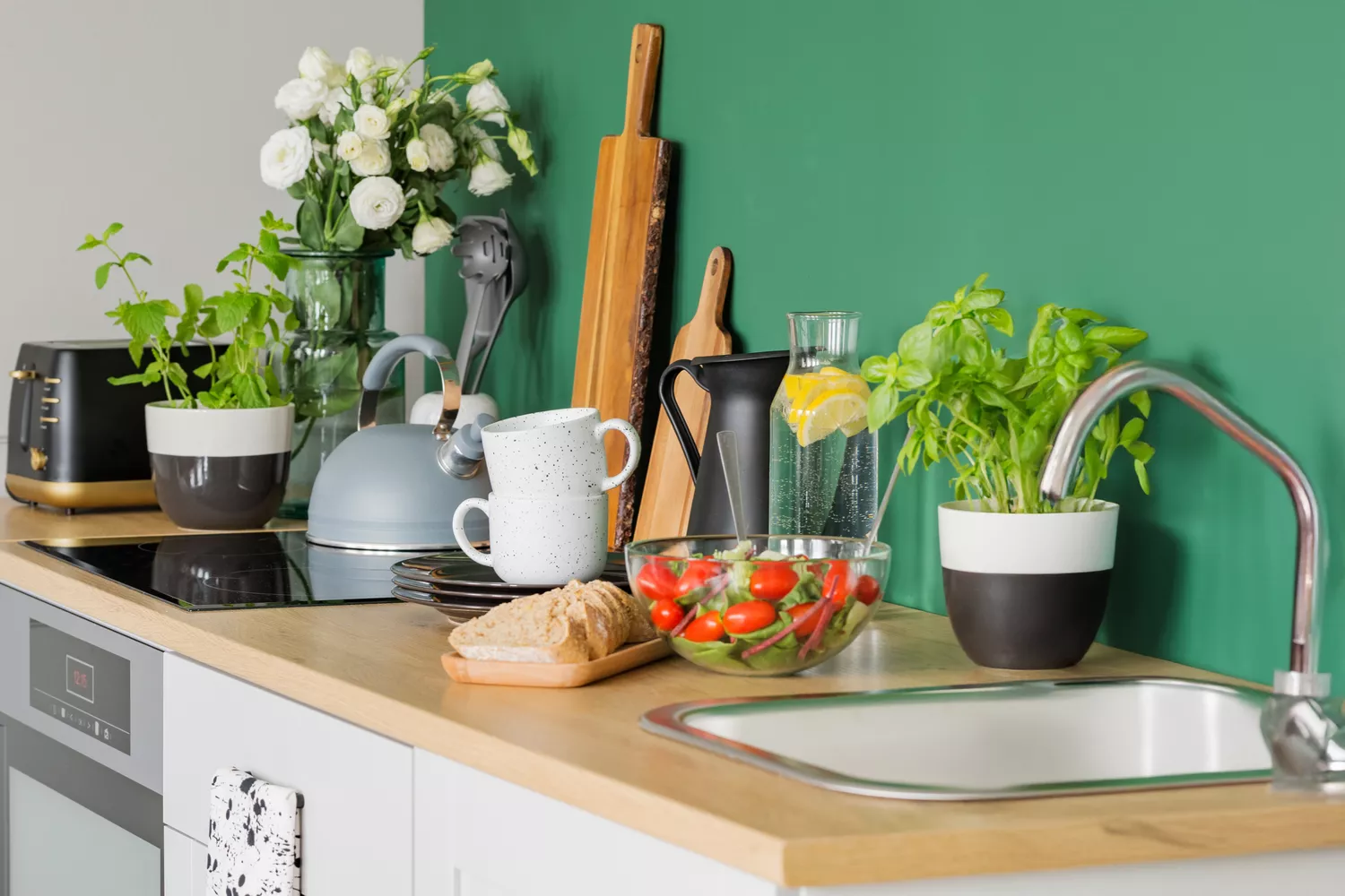
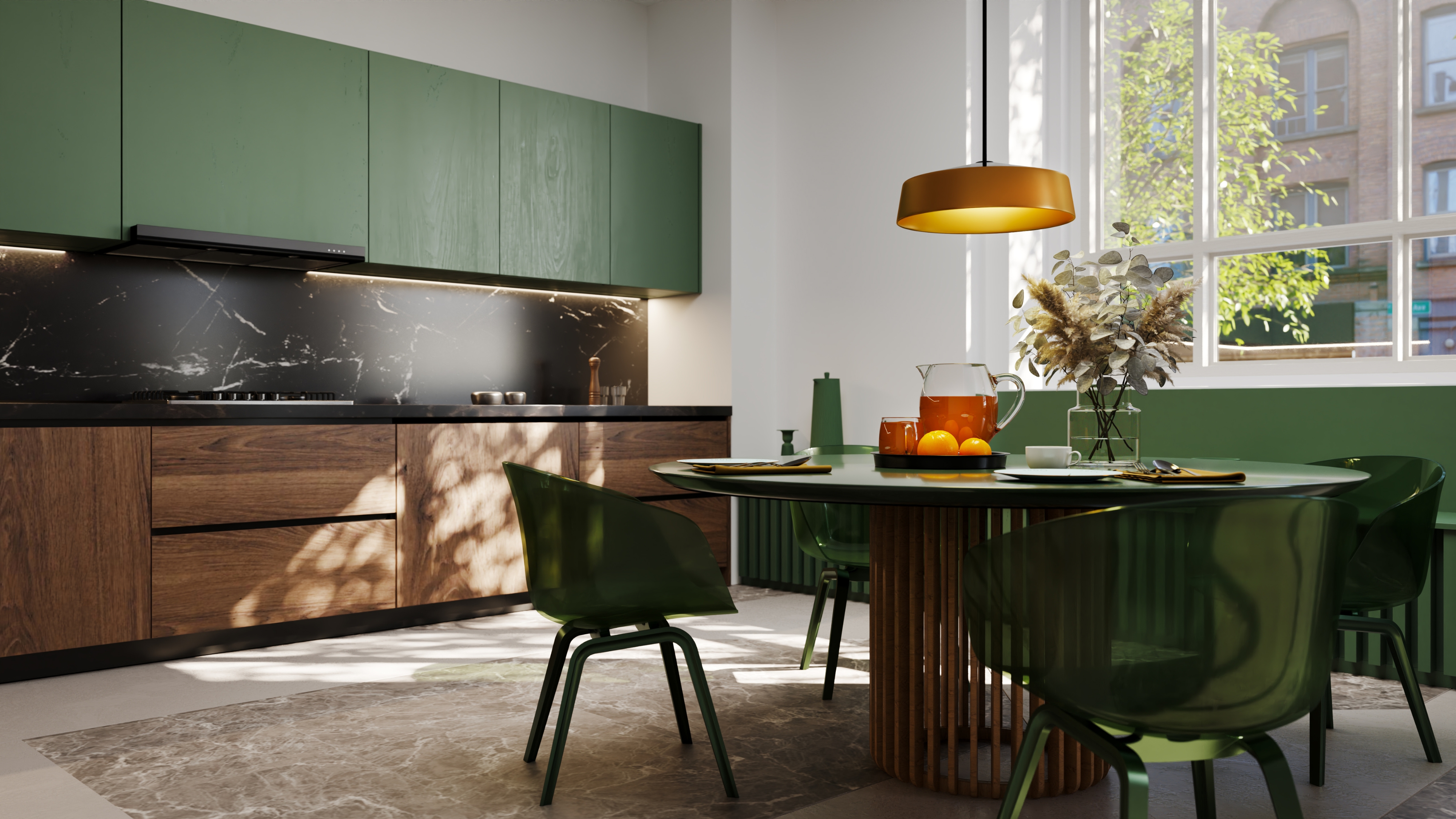
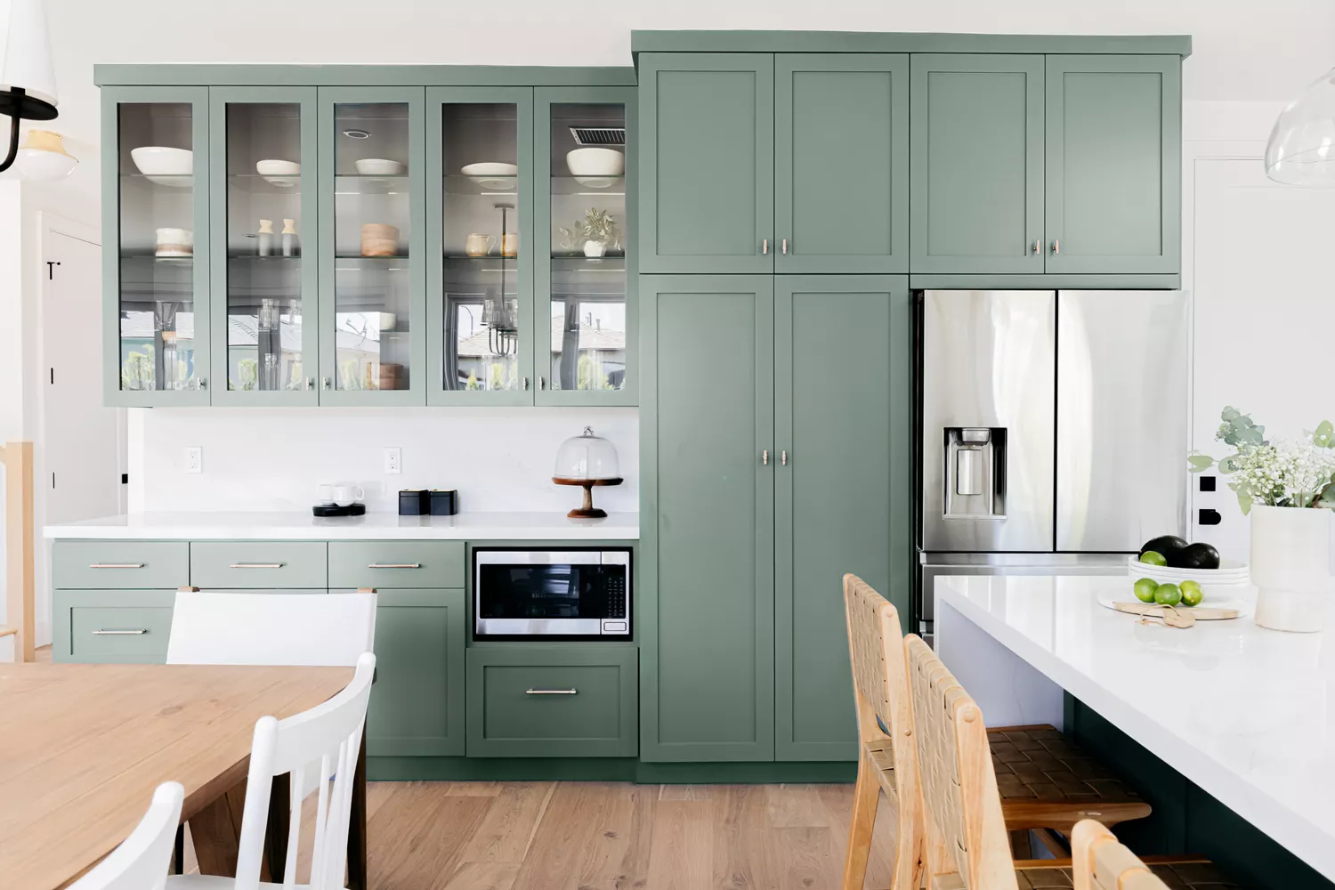
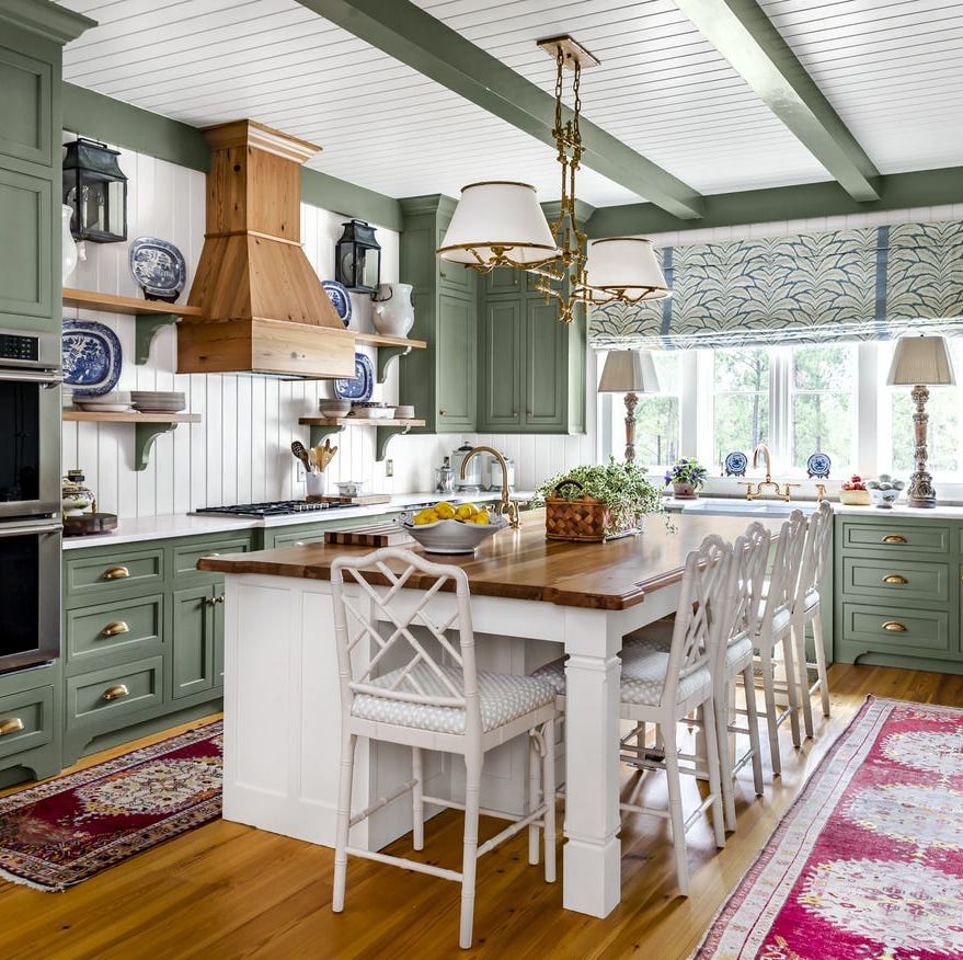
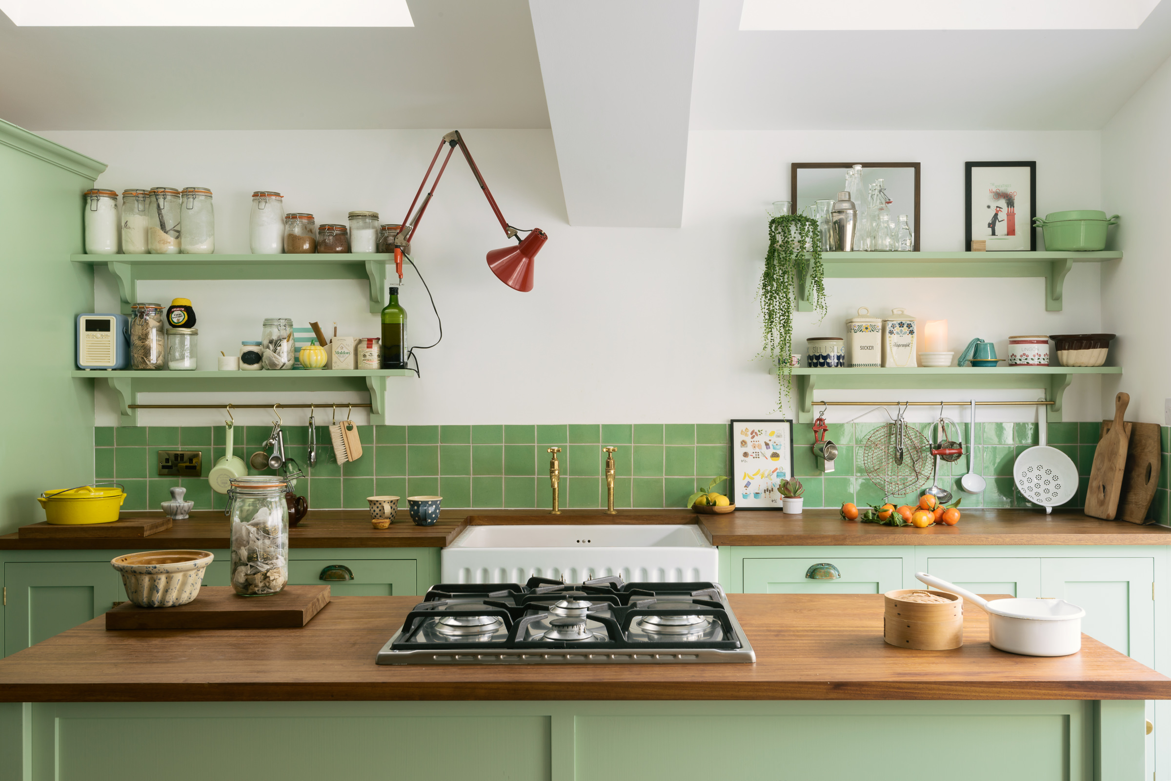
Sixth, moss green is highlighted as the trending shade of green for 2025, moving away from deep emeralds towards lighter, more natural tones. Tash Bradley recommends Lick's 'Green 19,' a warm dark moss green with brown and yellow undertones, for its restorative and stimulating qualities, creating a balanced and rejuvenated space. It pairs beautifully with burgundy, light blue, red, and warm yellow-based neutrals.
Finally, dusky pink is included, influenced by the 'Barbie fever' but leaning towards a more moody and sophisticated tone, like Farrow & Ball's 'Setting Plaster' or Zoffany’s 'Old Rose.' Simon Temprell, Interior Design Lead at Neptune, explains that pale pink is no longer gender-specific and works well with pale grey, warm neutrals, dark brown, and black. He also suggests brass or rose gold hardware for a vintage feel.
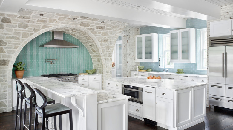
The article concludes by addressing frequently asked questions, confirming green as the most popular kitchen colour due to its natural associations, versatility, and wide variety of shades. White kitchens remain timeless and in style, offering a fresh, clean backdrop with excellent resale appeal. The importance of considering undertones in white paint and testing colours in situ is also emphasized.
#KitchenColourTrends #InteriorDesign #HomeDecor #ColourPalette2025 #BurgundyKitchens #PaleBlueKitchens #MochaMousse #PrimaryShades #TerracottaTones #MossGreen #DuskyPink #PaintTrends #KitchenColourTrends #InteriorDesign #HomeDecor #ColourPalette2025 #BurgundyKitchens #PaleBlueKitchens #MochaMousse #PrimaryShades #TerracottaTones #MossGreen #DuskyPink #PaintTrends
0 comment in total
You may also like
The top kitchen color trends of 2024 that interior designers are seeing everywhere — 7 lush hues to try

Kitchen Trends 2025: standout designs and colours inspiring home improvement projects

Top 13 kitchen colours for 2025
These Will Be the Most Popular Kitchen Paint Colors In 2025, According to Interior Designers

Kitchen cabinet color trends for 2025 – 7 looks for you to consider

13 Unique Kitchen Color Combinations To Try Out In 2025
8 Kitchen Color Trends You'll See in Every Home in 2025, According to Designers

3 overlooked colors you never thought could work in your kitchen – but interior designers swear by them

7 Kitchen Color Trends That Are Set to Take Over 2026


Top 10 Trendy Kitchen Colour Combinations in 2025

10 Trendy Kitchen Cabinet Colors You Should Try In 2025
Kitchen paint colors going out of style – 3 shades designers are ditching in 2025
9 Top Kitchen Color Trends Experts Predict for 2025

The Best Kitchen Cabinet Colors to Try in 2025, According to Designers
5 kitchen colors going out of style for 2024 – plus the 5 shades designers are replacing them with

These 7 Colors Will Rule Interiors in 2026, According to Experts

These 2025 Kitchen Color Trends Are Unexpectedly Chic

5 Kitchen Paint Color Trends to Watch in 2024
We Asked Designers: What’s the Next Big Kitchen Cabinet Color?
7 Interior Paint Color Trends You'll See Everywhere In 2025