1/12
SOME ASPECTS OF COLOR IN GENERAL AND RED AND BLACK IN PARTICULAR
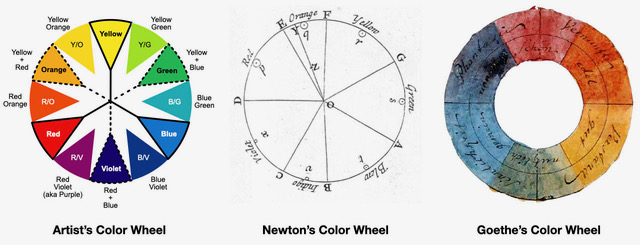
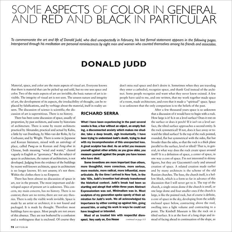
This essay delves into the fundamental, yet often overlooked, aspects of visual art: material, space, and color. It begins by highlighting the paradox that while material is tangible and readily commercialized, space and color, two of the most crucial elements, are frequently invisible or misunderstood. The author argues that the integrity of visual art, much like the unseen nature of space and color, is often obscured or replaced by superficial discussions focusing solely on material aspects. The discussion criticizes the lack of developed discourse on space in both art and architecture. Despite some historical and contemporary architects addressing proportion, a comprehensive understanding of architectural space remains elusive, often leading to buildings that lack genuine spatial quality. The author postulates that most people remain unaware of this absence, failing to recognize and desire true spatial experiences unless encountered in exceptional instances like cathedrals, where the appreciation is misattributed to religious belief rather than architectural design. To illustrate the fundamental nature of space, the author proposes a hypothetical primitive discussion starting with a simple rock, examining how its form and placement create space around it. This line of inquiry is then extended to the interaction of two rocks, emphasizing how their relationship defines the intervening space, potentially making the space more definite than the objects themselves. The essay points out that the development of space as a primary aspect of art is a relatively recent phenomenon, emerging only in the last thirty years, contrasting with the much longer history of color's dominance, particularly in painting. It highlights specific artists like Giacometti, Brancusi, Arp, Oldenburg, Larry Bell, Dan Flavin, Bob Irwin, and Richard Serra as key figures in developing spatial concepts in their work. The essay further explores the history and impact of color in art. It notes that the necessities of representation in traditional European art often inhibited the full expressive potential of color, contrasting this with Japanese prints and certain non-representational art forms where color maintains its vibrancy. The author references historical views on color, from Aristotle's classification to Josef Albers's "The Interaction of Color," emphasizing the subjective yet objectively verifiable nature of color experience. A significant portion of the essay is dedicated to the author's own pioneering work, particularly the invention of placing three-dimensional art directly on the floor and against the wall, thereby integrating the artwork with the room's architecture. This was a radical departure from traditional sculpture, which relied on pedestals or relief forms. The author details the evolution of his "whole room" works, starting from early wall-mounted pieces to large-scale installations that articulate and define the entire space, noting the pervasive misunderstanding and misapplication of these innovations. The article concludes by discussing the application of color in architecture, critiquing the current trends of misuse and commercialism. It argues for a more thoughtful integration of color into architectural design, drawing examples from historical and traditional architecture in different cultures. The author emphasizes that both space and color are fundamental components of art and architecture, urging for a renewed appreciation and intellectual engagement with these essential elements, which have been historically and continue to be undervalued or misrepresented. The author also reflects on the difficulty of fostering new ideas and the challenges artists face in a system that often debases innovation and lacks proper historical and critical discourse.
#VisualArt #SpaceInArt #ColorTheory #ArchitecturalDesign #ContemporaryArt #DonaldJudd #Minimalism #ArtHistory #ArtEducation #VisualArt #SpaceInArt #ColorTheory #ArchitecturalDesign #ContemporaryArt #DonaldJudd #Minimalism #ArtHistory #ArtEducation
0 comment in total
 No comments yet
You may also like
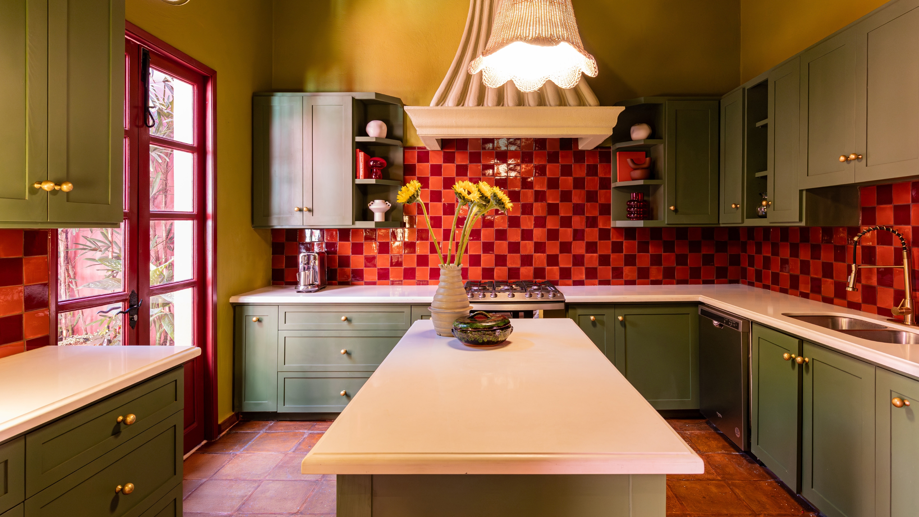
Ever Heard of a Split Complementary Color Palette? It's the Secret to Perfecting More Unexpected Pairings

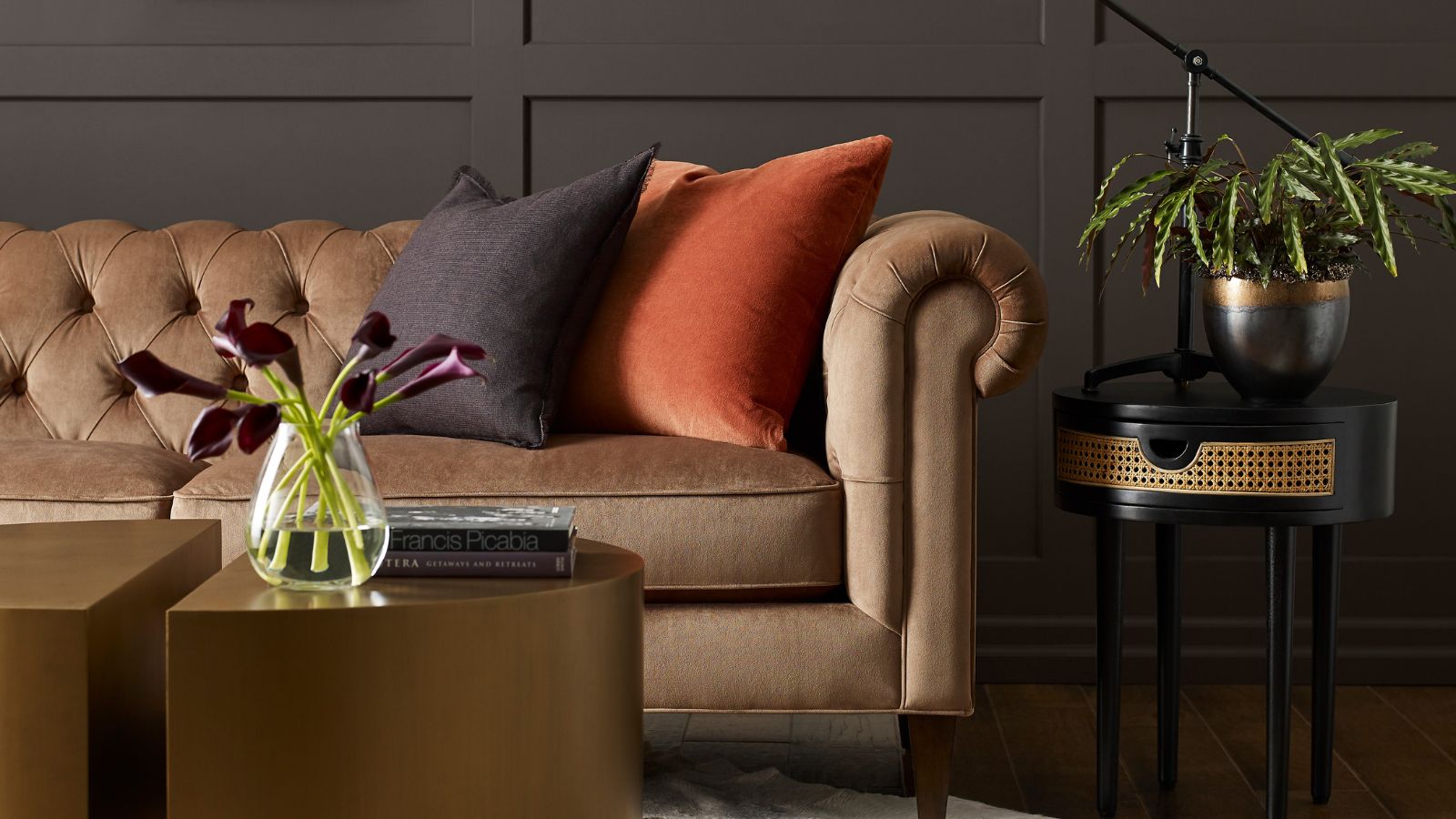
How to decorate with black and brown – experts weigh in on this moody and sophisticated color combination

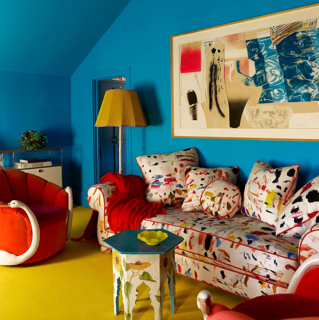
The Viral ‘Unexpected Red’ Theory in Interior Design Actually Isn’t That Simple
What Colors Go with Black? 15 Sophisticated Combinations to Try

9 colors that go with red – the best pairings for this bold shade
What Colors Go With Red? 10 Colors That Hold Their Own Alongside This Fiery Hue
What Colors Go with Red? 21 Knockout Combinations to Consider
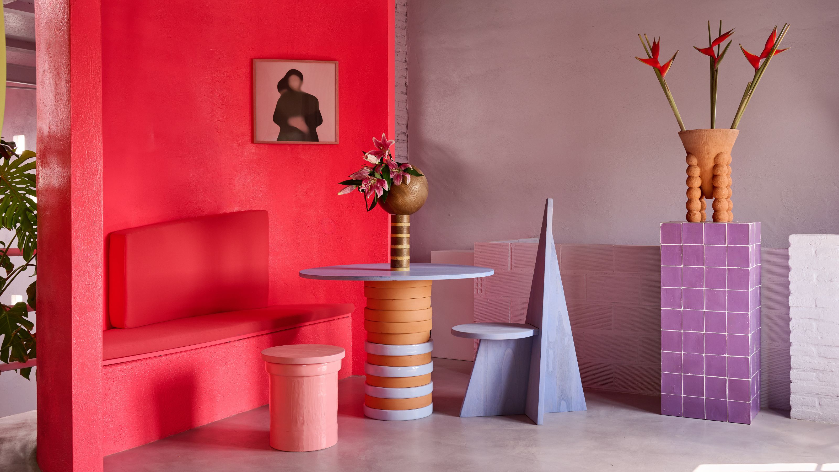
What Are Advancing and Receding Colors in Interior Design?
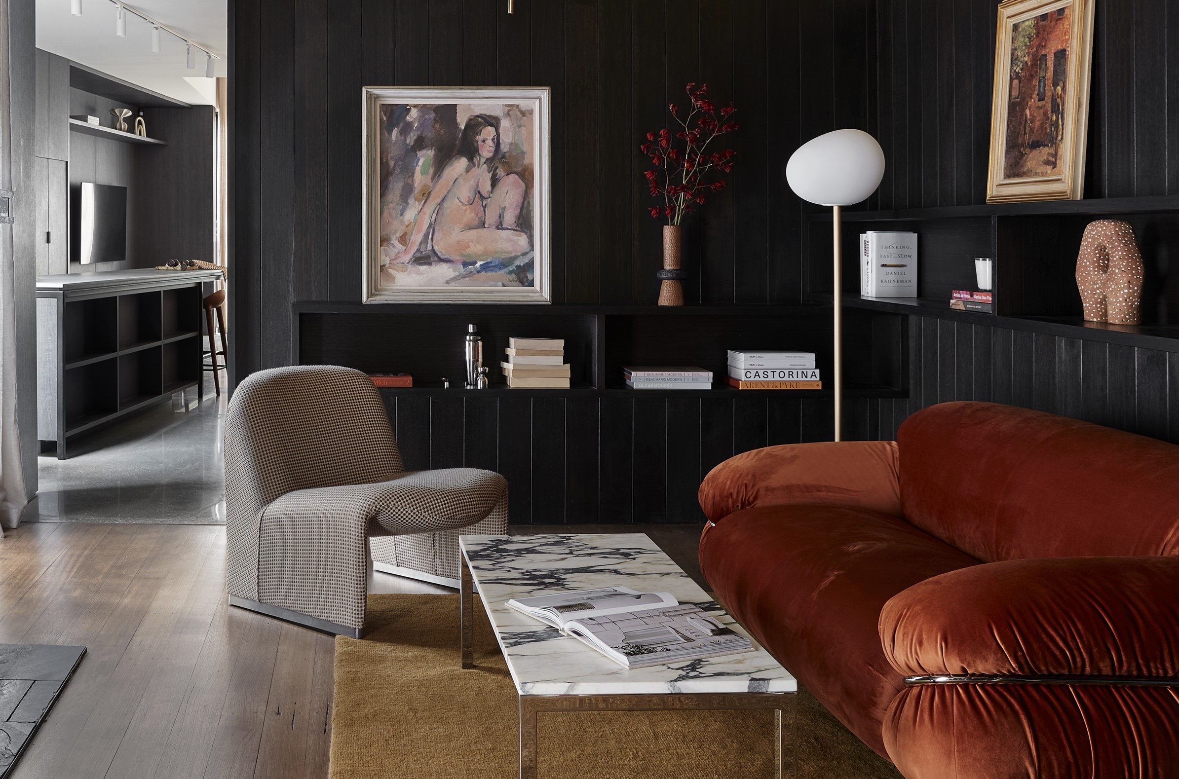
What Color Goes With Black? 10 Combinations That Help Soften This Dramatic Shade
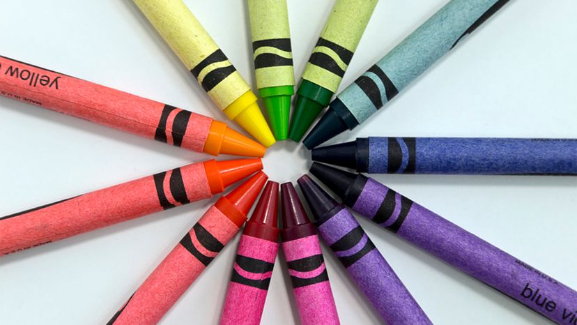
Color Wheel Theory: How to Talk About Color


6 Failsafe Color Combinations That Designers Always Fall Back on – 'They're so Reliable!'
"Seeing Red" Doesn't Have to Be a Bad Thing — Here's How Designers Are Decorating With Red in a Way That Still Feels Timeless

If You Think Teal And Turquoise Are The Same Color, You Might Not Do Well On This Color Trivia

'The World of Color is Rife With Danger' — 5 Color Combinations That Don't Go Together and What to Use Instead
Could this be the most daunting colour to decorate with?


What Season Are You? Everything You Need to Know About Color Analysis

Here's what color experts actually think about the unexpected red theory – is it really as simple as it sounds?

What are the worst colors to paint a room? The shades experts say you should never use

Mother Nature Knows Best
3 color coordination tips any beginner can master