1/13
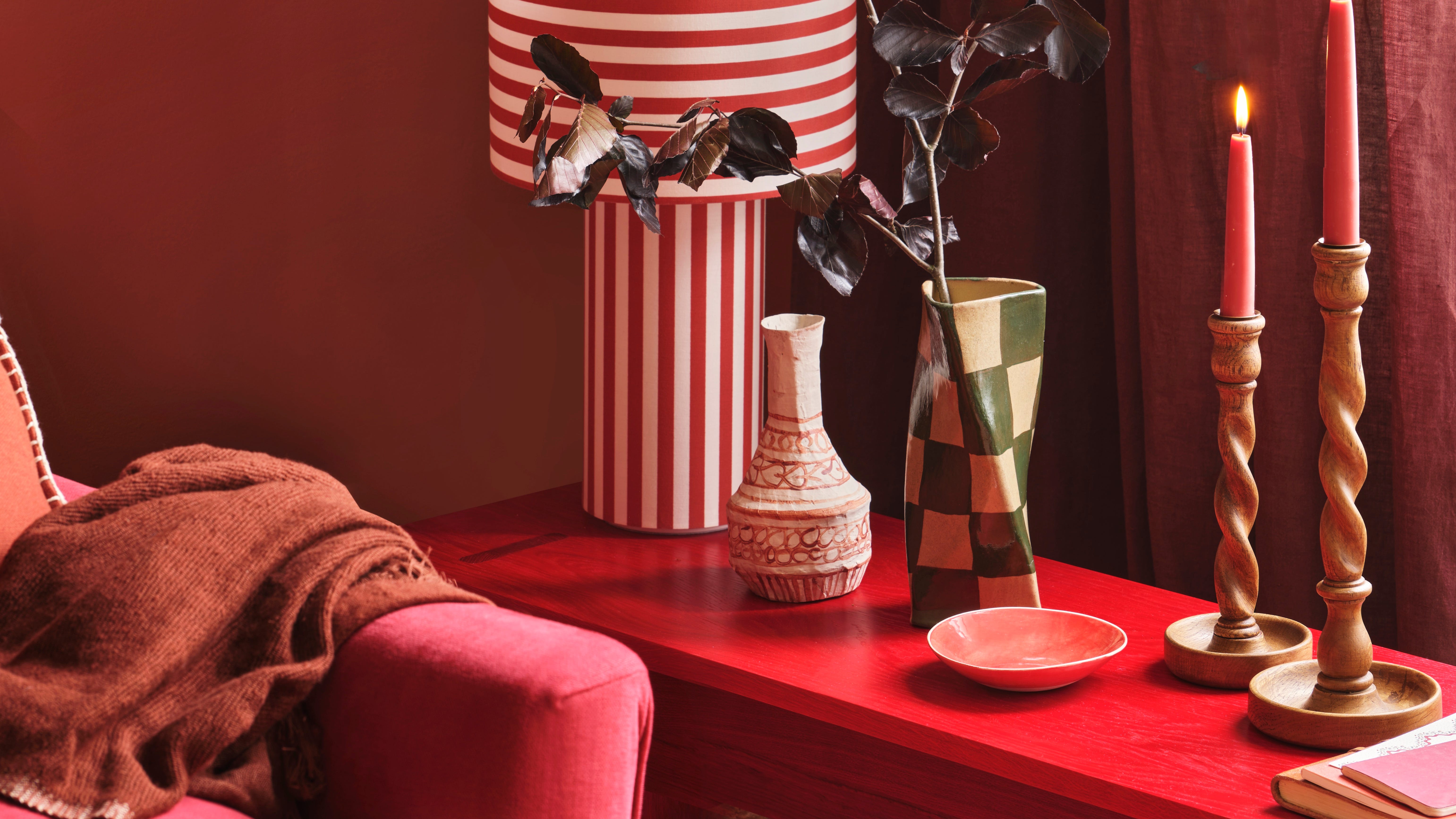
Could this be the most daunting colour to decorate with?
Red paint offers a spectrum of possibilities for interior design, ranging from soft, earthy tones to vibrant primary hues and deep, rich shades. Choosing the right red depends on the desired mood and aesthetic for a given space. Paint experts provide insights into three distinct categories of red to guide homeowners in their selection.
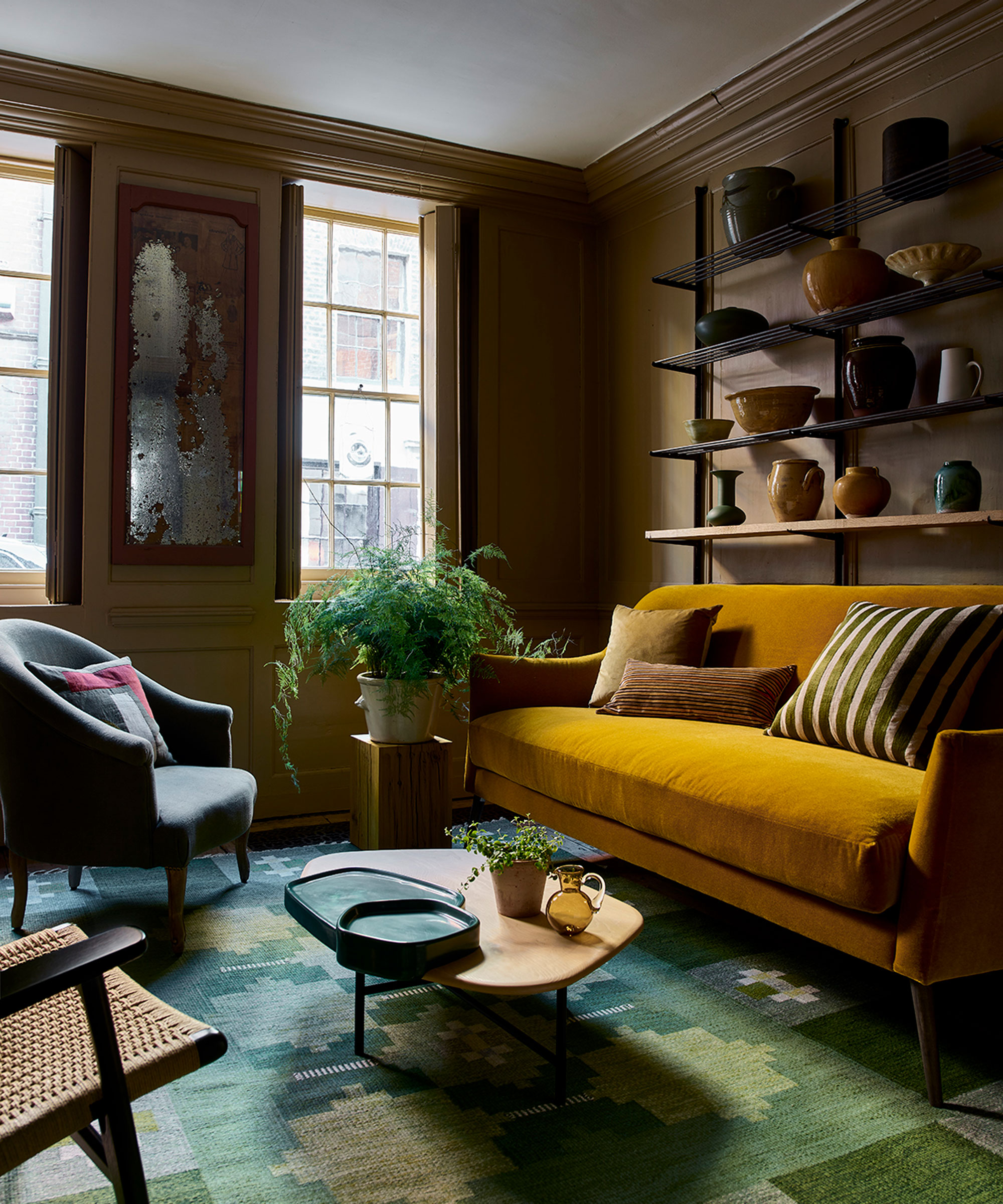
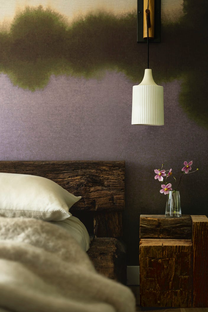
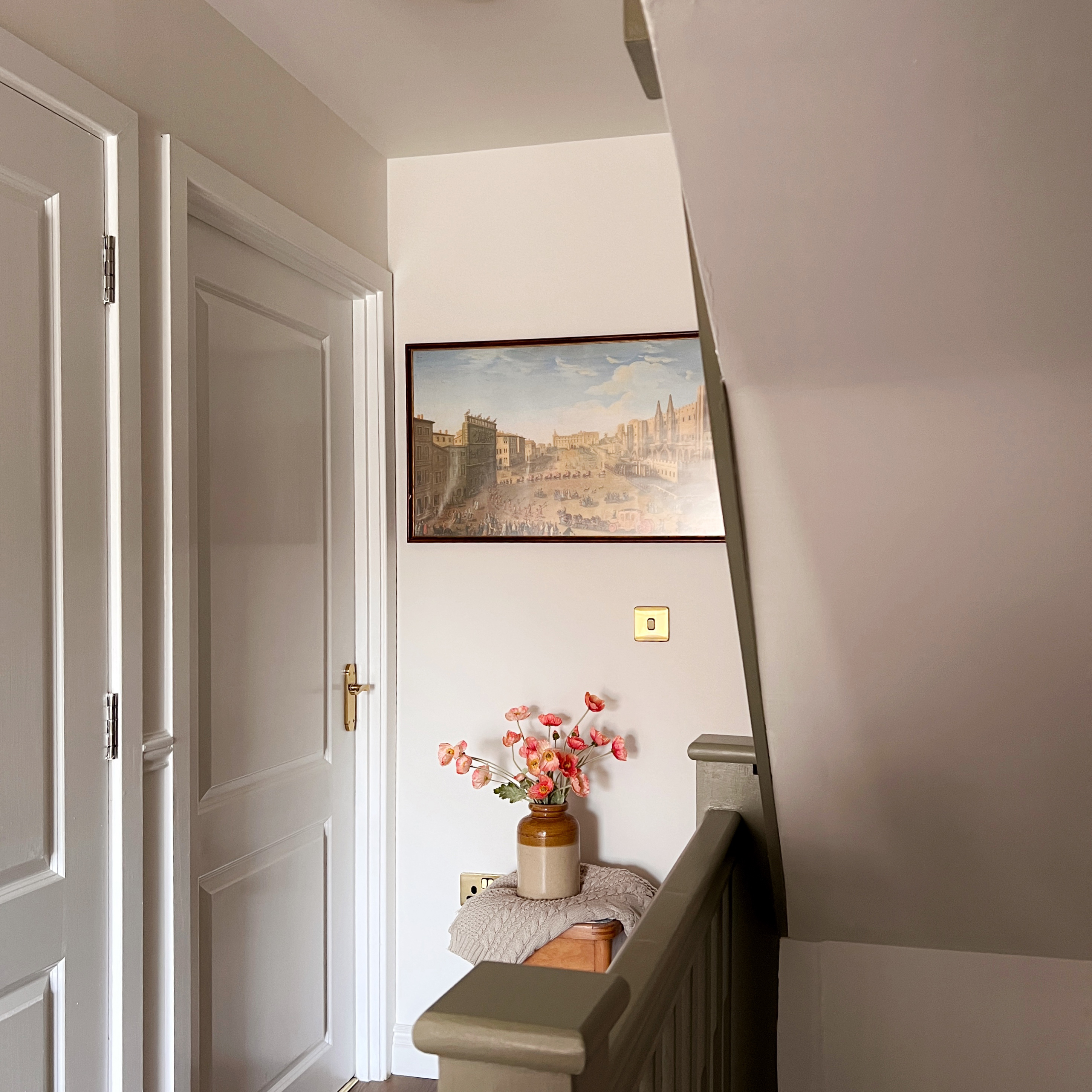
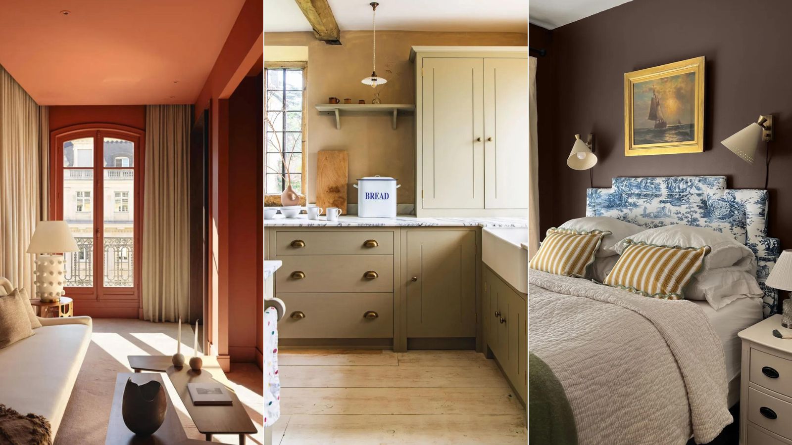
Earthy neutrals are recommended for those who seek to incorporate red without overwhelming a room. These muted shades, such as Little Greene's Nether Red, Arras, or Tuscan Red, feature earthy undertones, making them easier to integrate and allowing them to function almost as neutrals. Ruth Mottershead, Creative Director at Little Greene, emphasizes that these warm shades create a comforting and soothing environment, ideal for relaxation. They can be applied to all four walls, paired with warm whites and soft pinks, or used in a color-drenching approach to achieve a rich yet gentle interior.
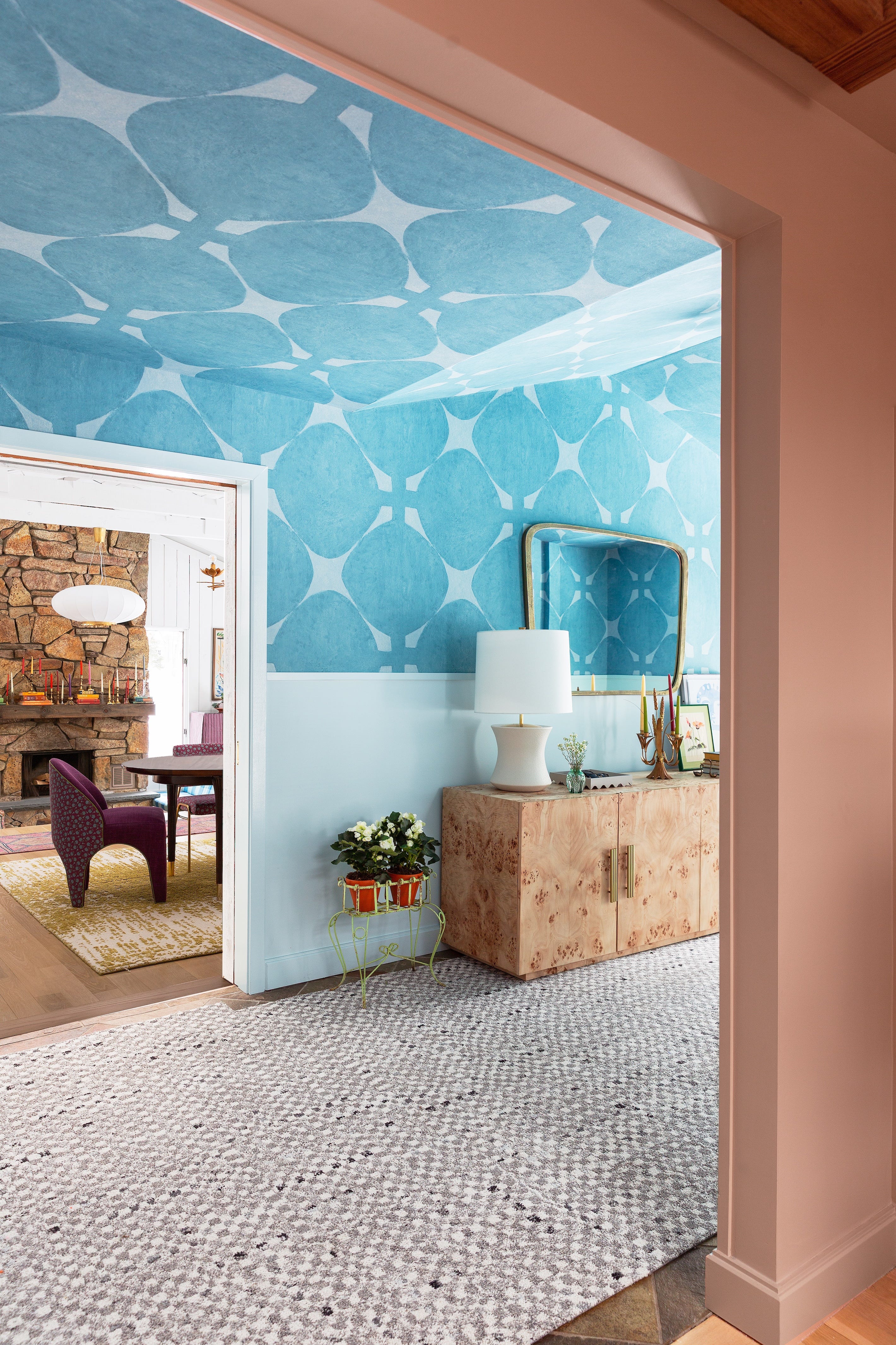
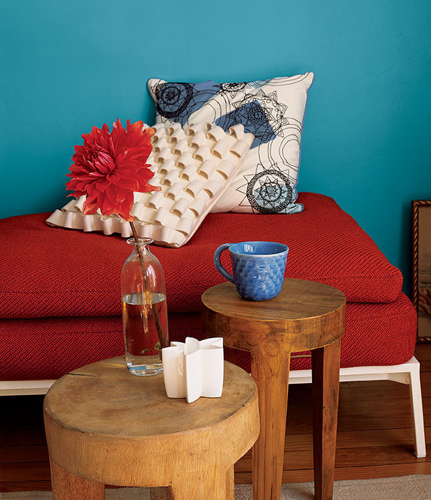
For decorators who are more adventurous, primary bright reds offer a powerful and energizing option. These vibrant shades align with the current trend of joyful interiors and can be embraced through maximalist design choices. Anna Hill, Brand Director and Colour Consultant at Fenwick & Tilbrook, suggests going "all in" and drenching a space in a softened bright red like Can-Can to add warmth and richness without excessive intensity. For a more controlled introduction, bright red can be used in smaller doses, such as on door frames, mirror edges, or furniture pieces. Hill also advises pairing red with complementary shades like blue or green to balance its intensity, or with warm, stony neutrals for a sophisticated look that avoids being overwhelming.
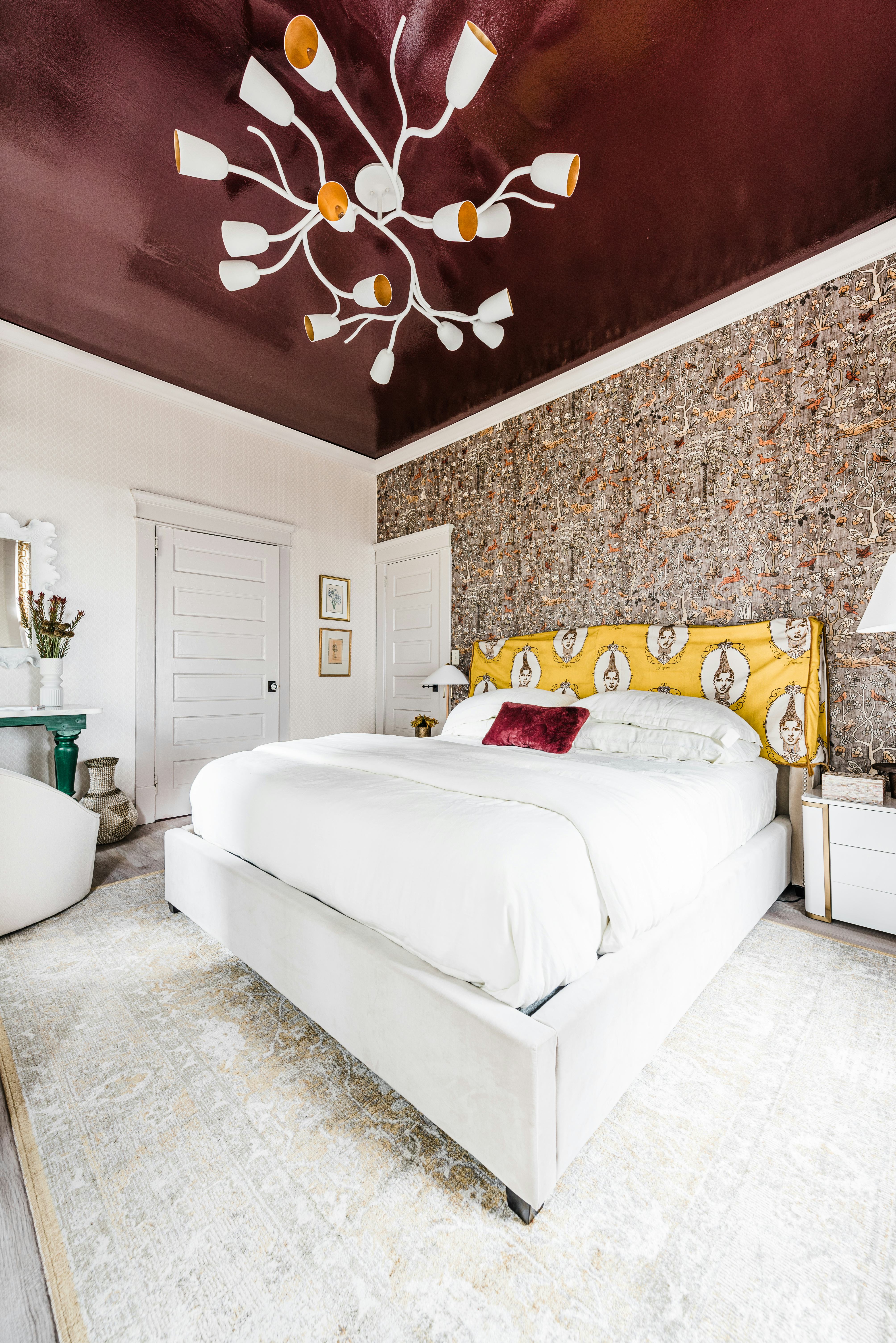
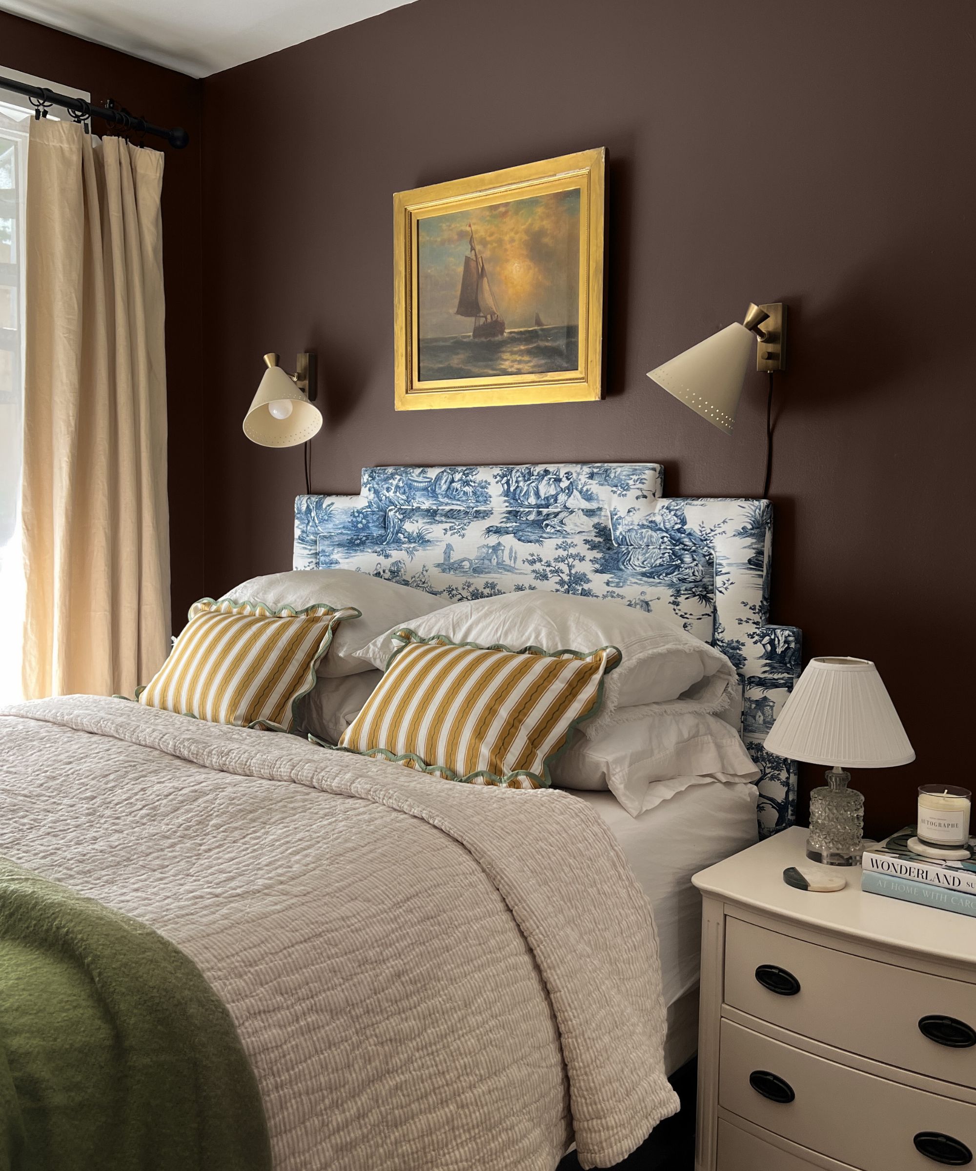
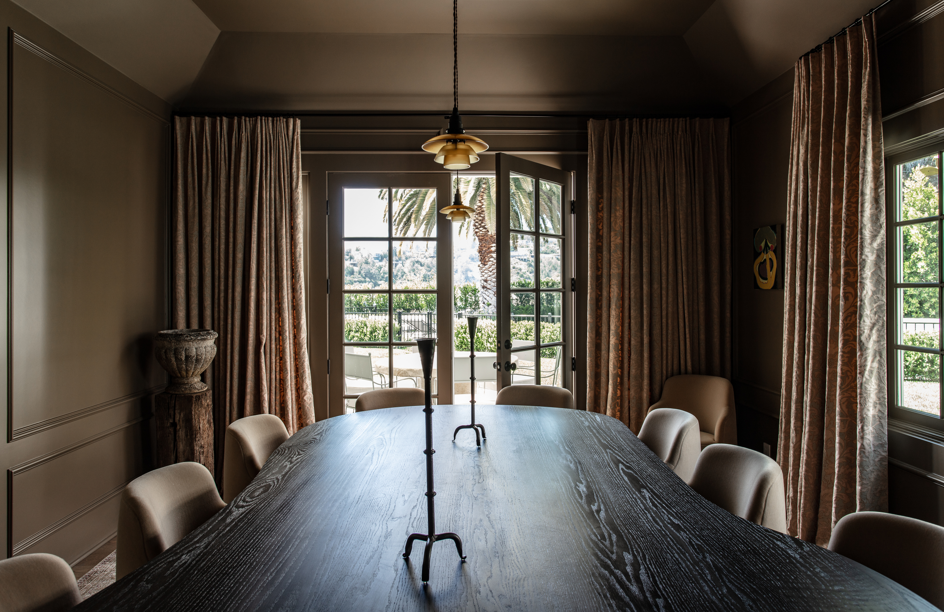
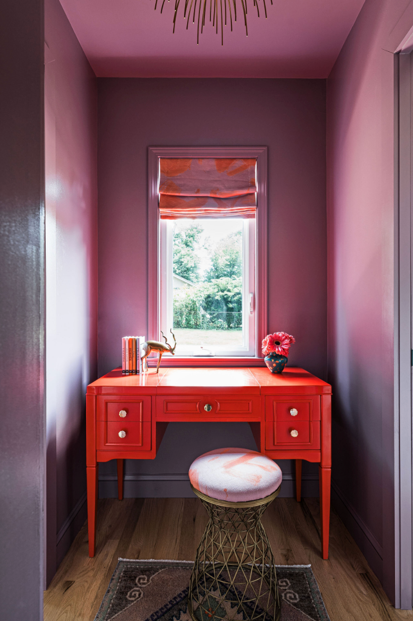
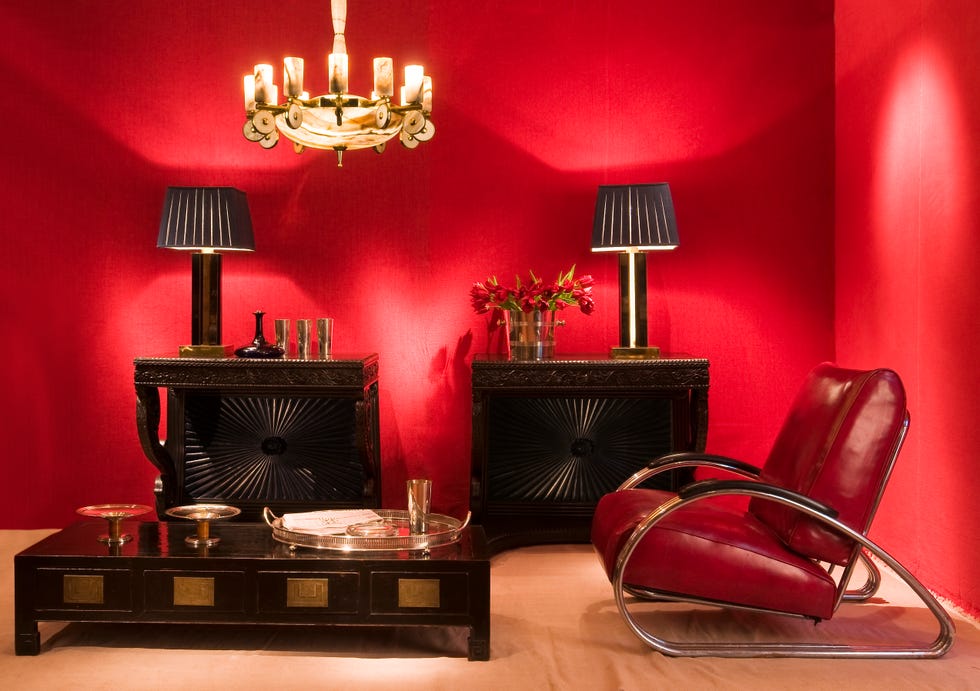
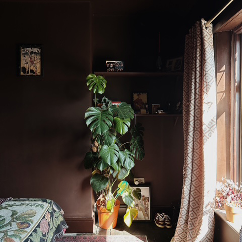
Dark, deep shades of red, such as burgundy, offer a luxurious and impactful alternative to brighter reds, and are identified as a significant color trend. Marianne Shillingford, Creative Director at Dulux, notes that these rich, deep reds are particularly effective in spaces intended for impressing guests, entertaining, or creating a cozy atmosphere. She explains that adding a touch of grey to a deep red can make it more versatile and less daunting to work with. Shades like Dulux's Redcurrant Glory, which contain a perfect amount of soothing grey, are recommended for their adaptability. When combined with calming neutrals like Knotted Twine or Goose Down, these deep reds become even more accessible for various decorating projects.
#RedPaint #InteriorDesign #HomeDecor #PaintShades #EarthyNeutrals #PrimaryBrights #DarkRed #ColorTrends #DecoratingTips #RedPaint #InteriorDesign #HomeDecor #PaintShades #EarthyNeutrals #PrimaryBrights #DarkRed #ColorTrends #DecoratingTips
0 comment in total
 No comments yet
You may also like
These Unusual Paint Colors May Not Be An Obvious Choice, But Designers Can’t Get Enough
'It's so effective at making your home work harder' – the latest paint trend endorsed by colour gurus
10 Ways To Decorate With The World’s Favorite Color
This Controversial Interior Paint Color Is My All-Time Favorite

How to Use One of the Trickiest Paint Colors in Your Home

Designers LOVE Pairing These Unexpected Colors With This Sophisticated Hue

The 10 Worst Paint Colors for Your Home, Experts Say

Is This the Most Expensive-Looking Color? Meet 'Phthalo Green', the New It Hue for Decorating Luxuriously

5 'ugly colors' that I'll be decorating with in 2024 – these undesirable colors will trend this year

How to Decorate With One of 2018’s Most Popular Colors | domino
Is colour drenching really a radical new way to decorate, or is it just lazy decorating?
We Can’t Get Enough of These 13 Paint Color Trends for 2021
Take a Leap into Bold Color with These Decorating Ideas

Designers Say These Unusual Paint Color Combos Will Transform Your Home

'It's the best way to make a home joyful' - this paint trend is the perfect idea to introduce color thoughtfully

Designers LOVE Pairing These Unexpected Colors With This One Timeless Hue
This Farrow & Ball paint color is trending, but it's tricky to decorate with – here's how the experts make it work
These Paint Colors Bring Hostility to Your Home, According to Experts
9 'good weird' paint colours approved by designers

The Most-Googled Bedroom Paint Color Isn’t the Soothing Hue You’d Expect