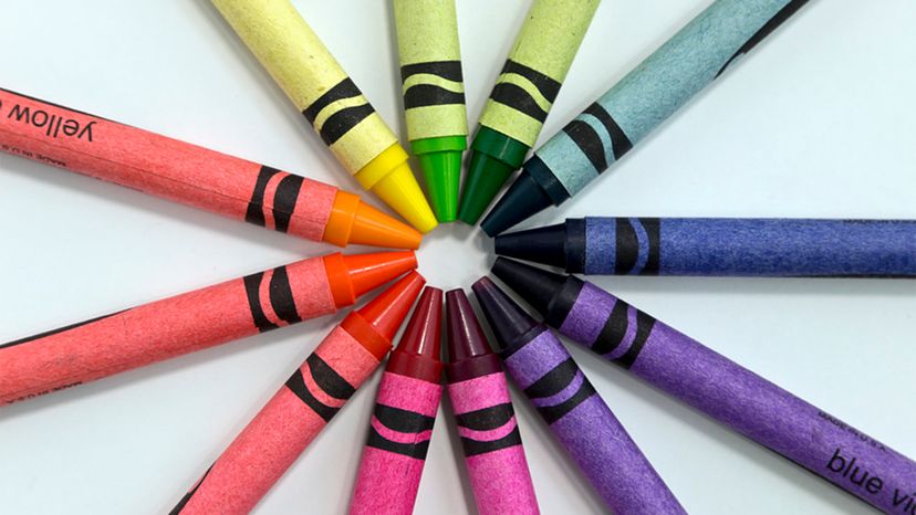
Color Wheel Theory: How to Talk About Color
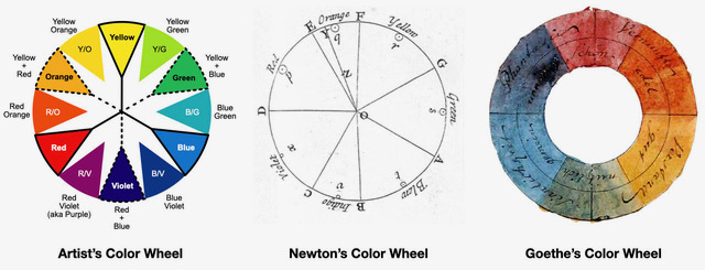
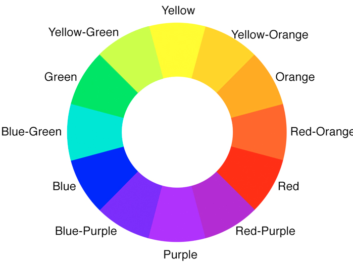
The color wheel is a fundamental tool in color theory, essential for understanding how colors relate to each other and for making informed design choices. This concept, initially developed by Sir Isaac Newton in 1666, provides a structured way to analyze and utilize color relationships in various applications, from graphic design to interior decoration. The ability to effectively articulate color choices relies on a shared vocabulary, which includes terms like hue, color value, and intensity.
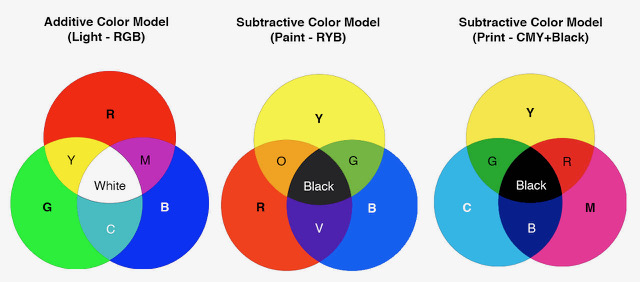
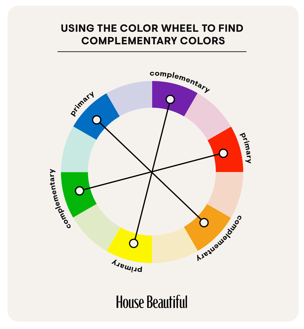
Isaac Newton's groundbreaking work laid the foundation for modern color theory. His experiments with prisms revealed that white sunlight is composed of all the colors of the rainbow. By arranging these colors in a circular form, Newton observed mathematical relationships between them, creating the first color wheel. This initial model, which demonstrated the continuous spectrum of colors, has been refined over centuries, leading to the 12-color wheel commonly used today. This wheel comprises primary colors (red, yellow, blue), secondary colors (green, orange, purple, formed by mixing two primaries), and tertiary colors (combinations of primary and secondary colors, such as red-orange or blue-green).
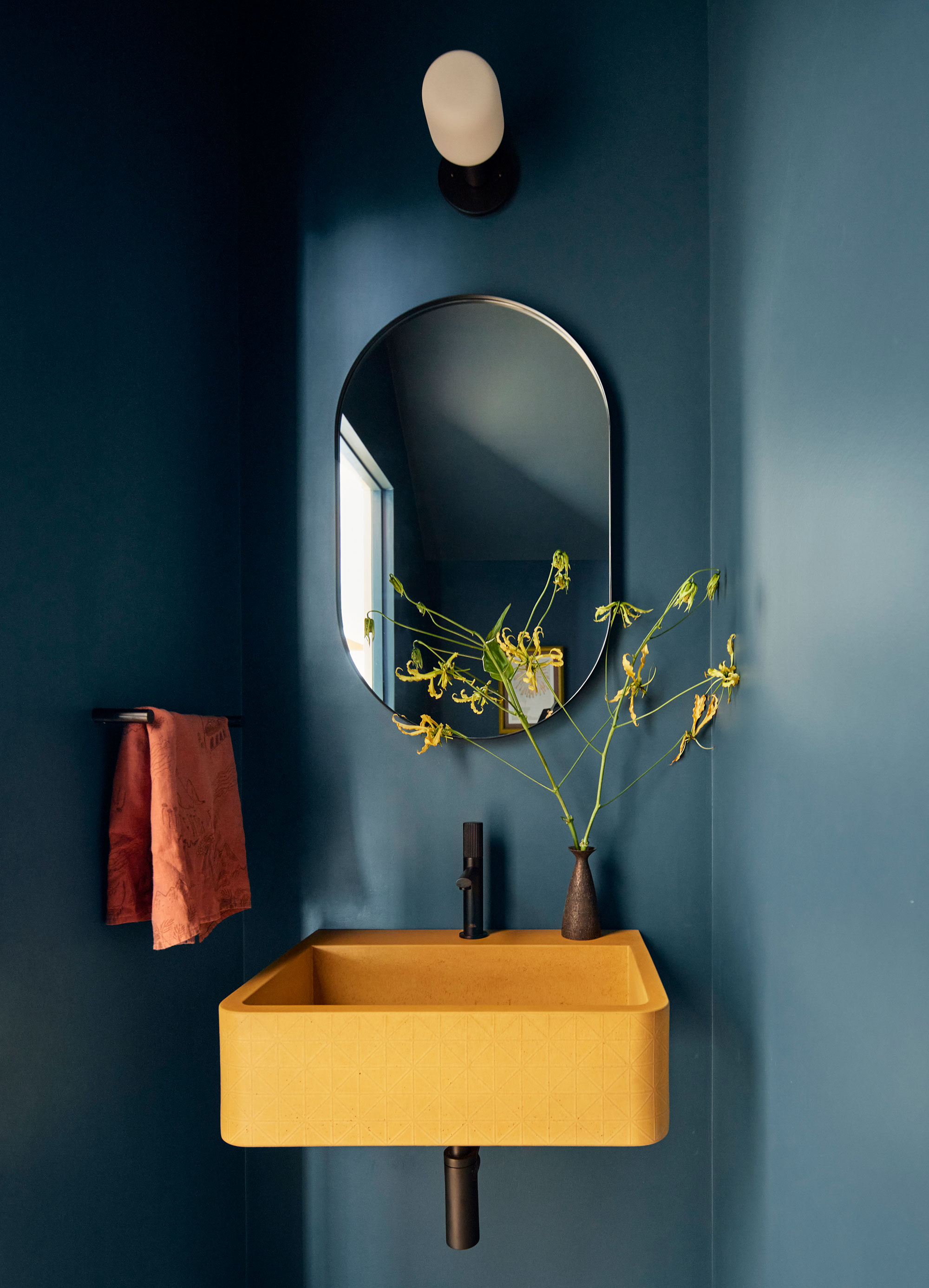
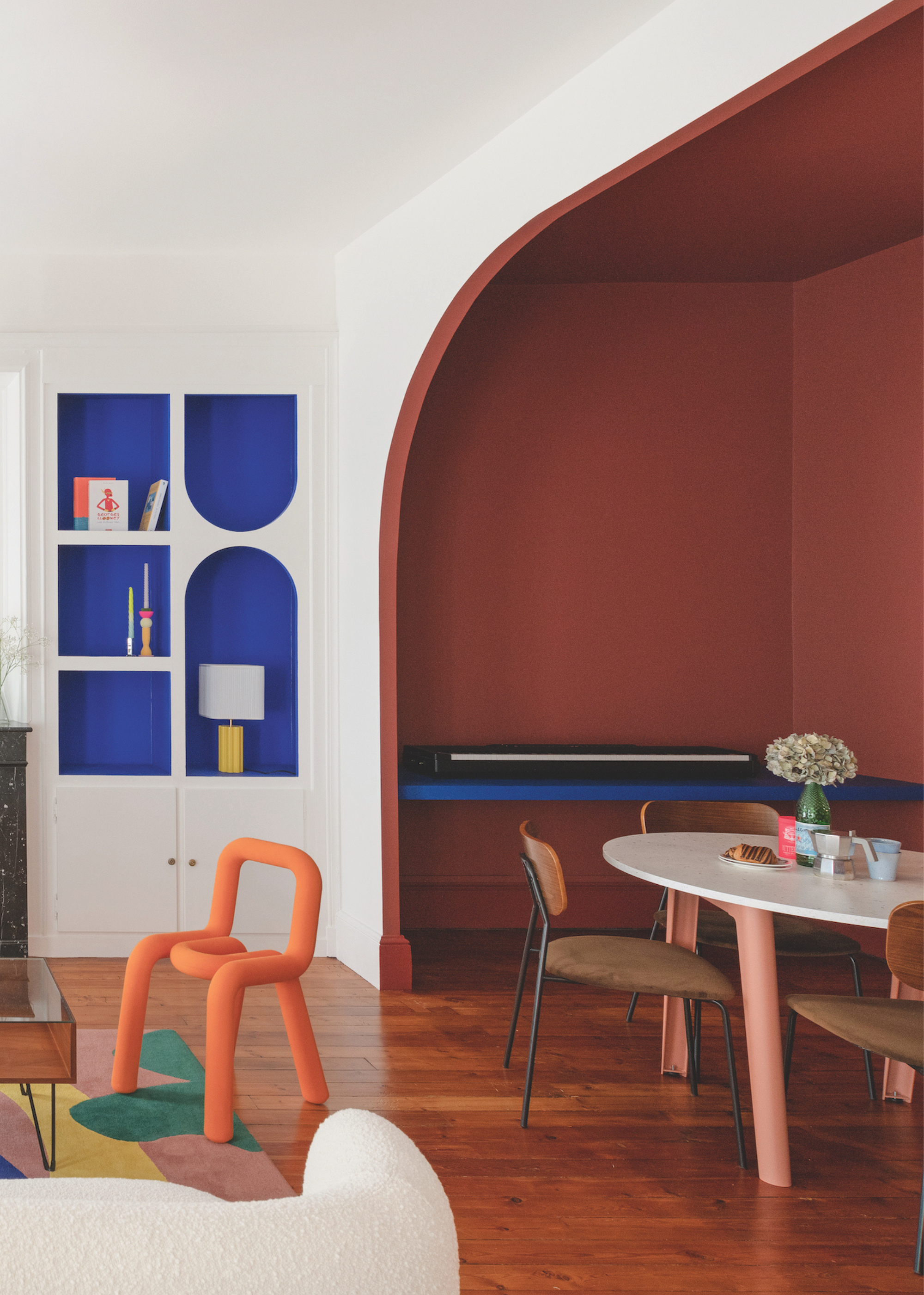
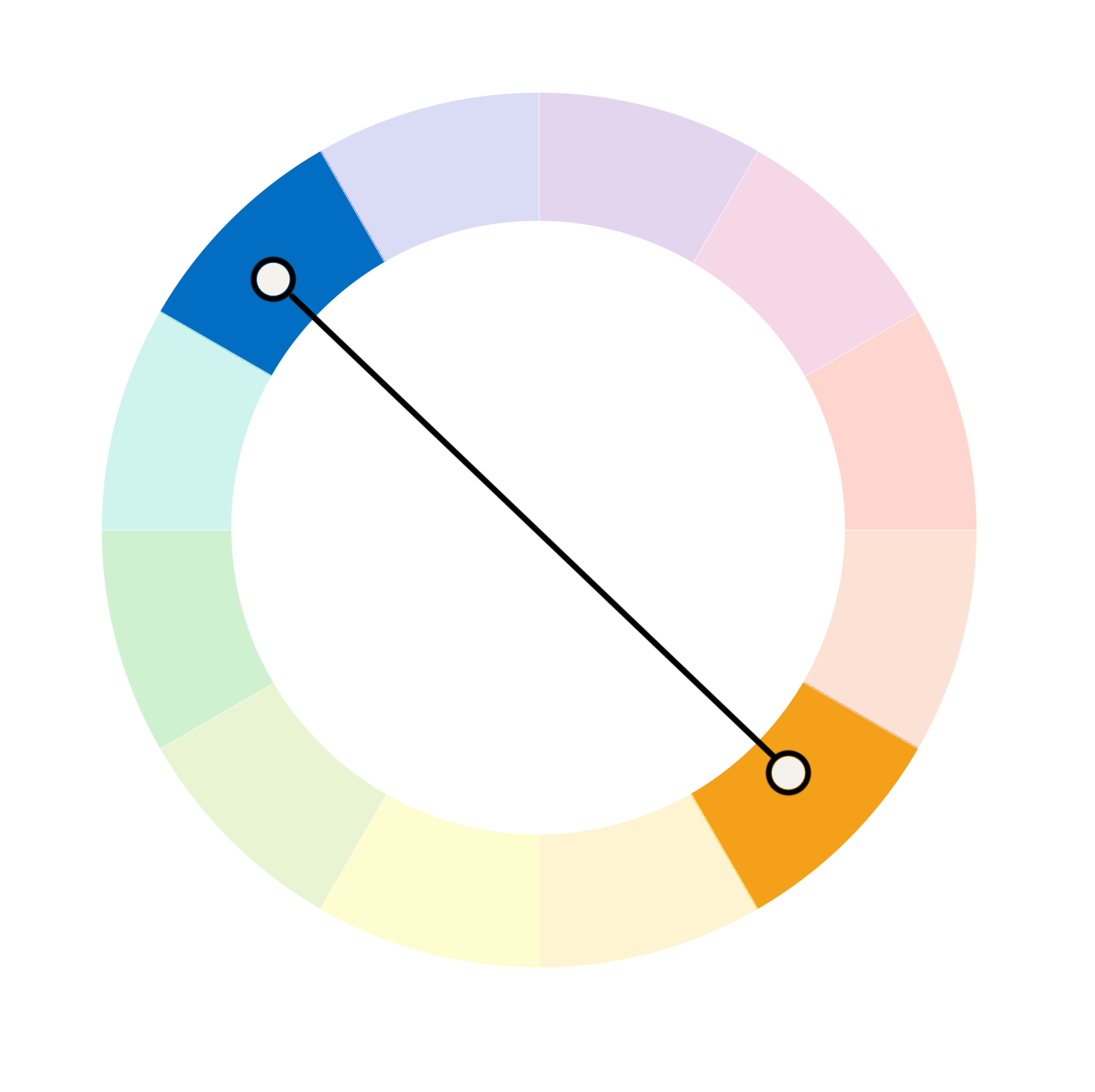
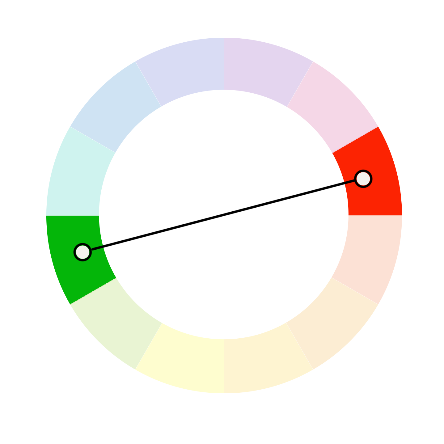
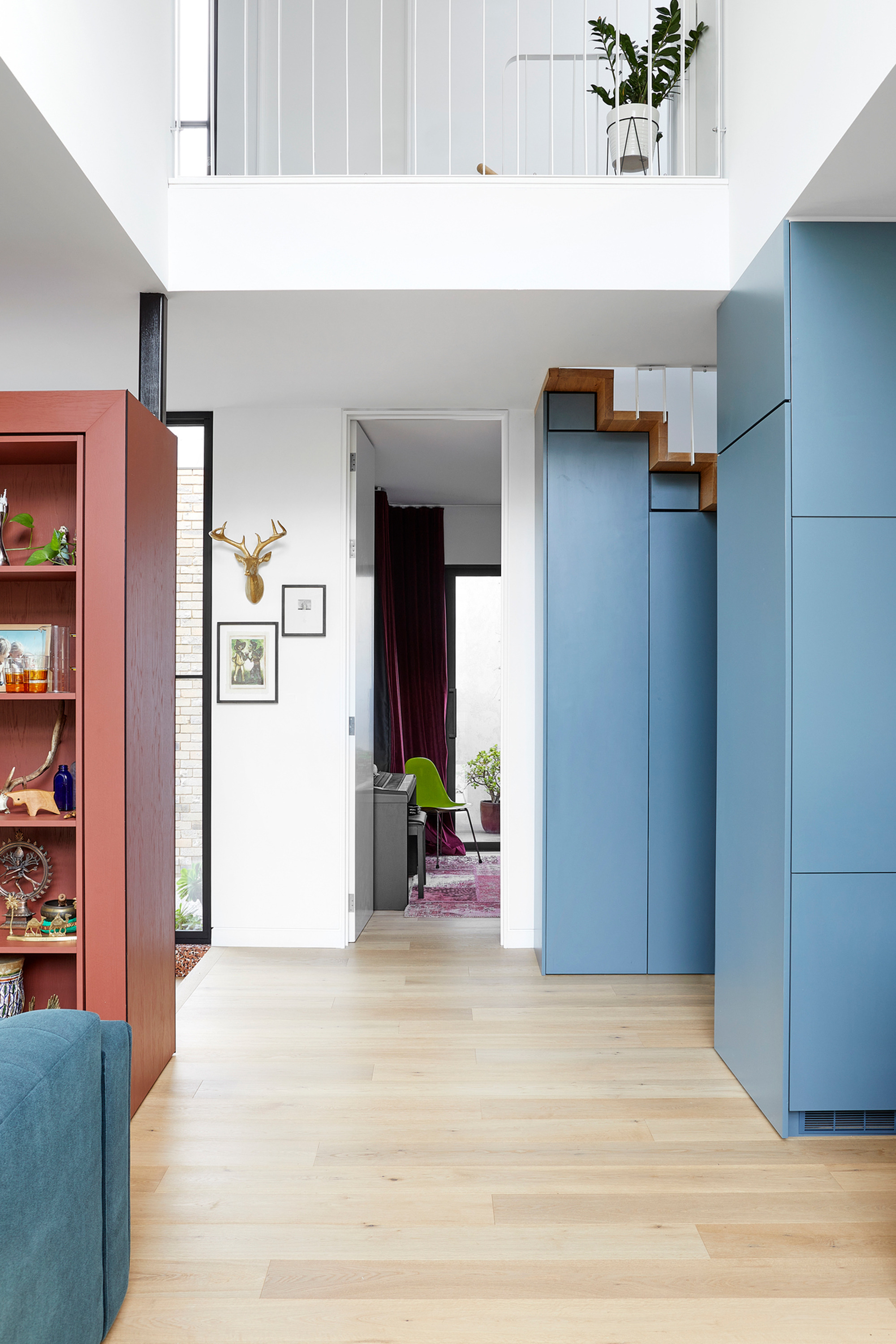
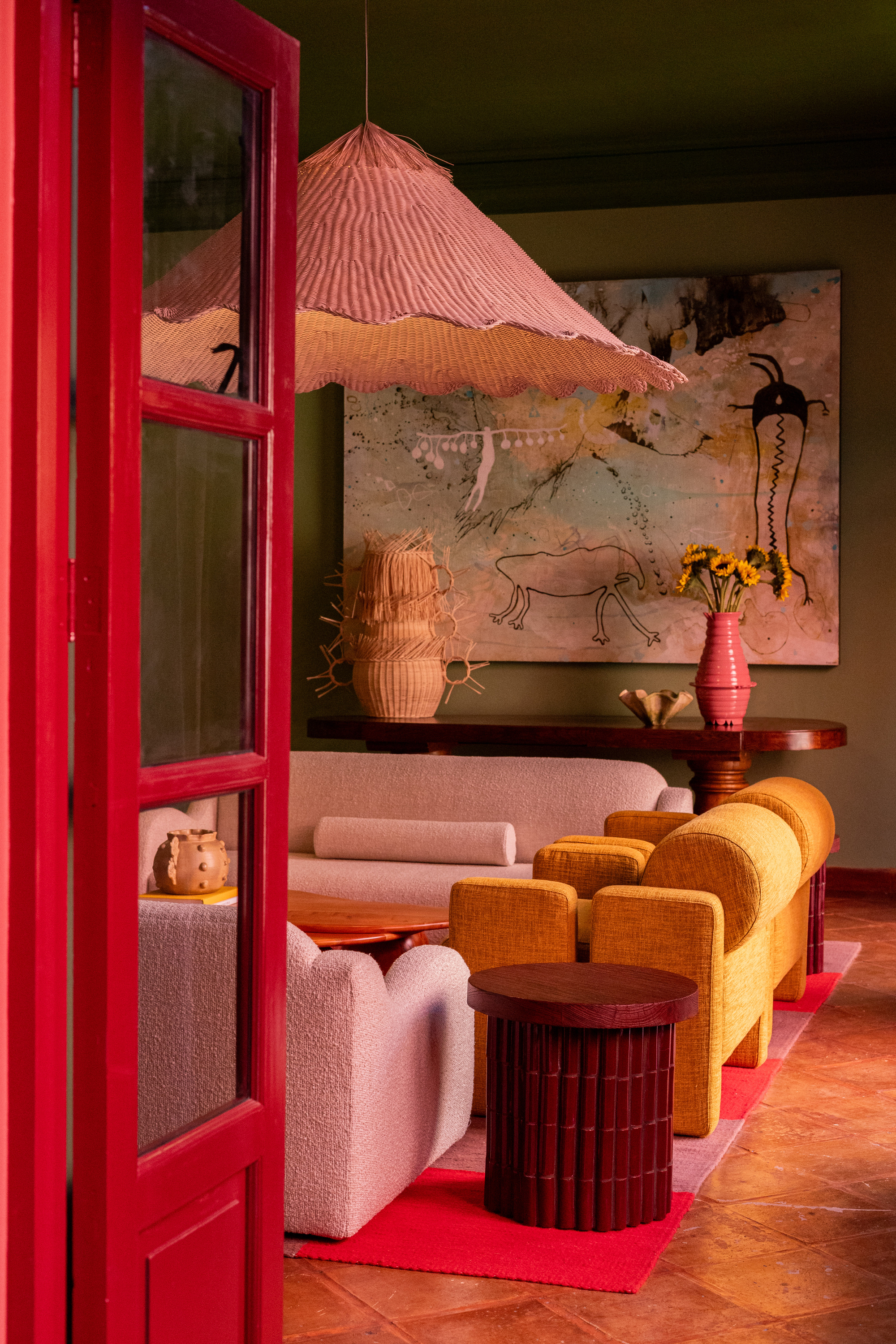
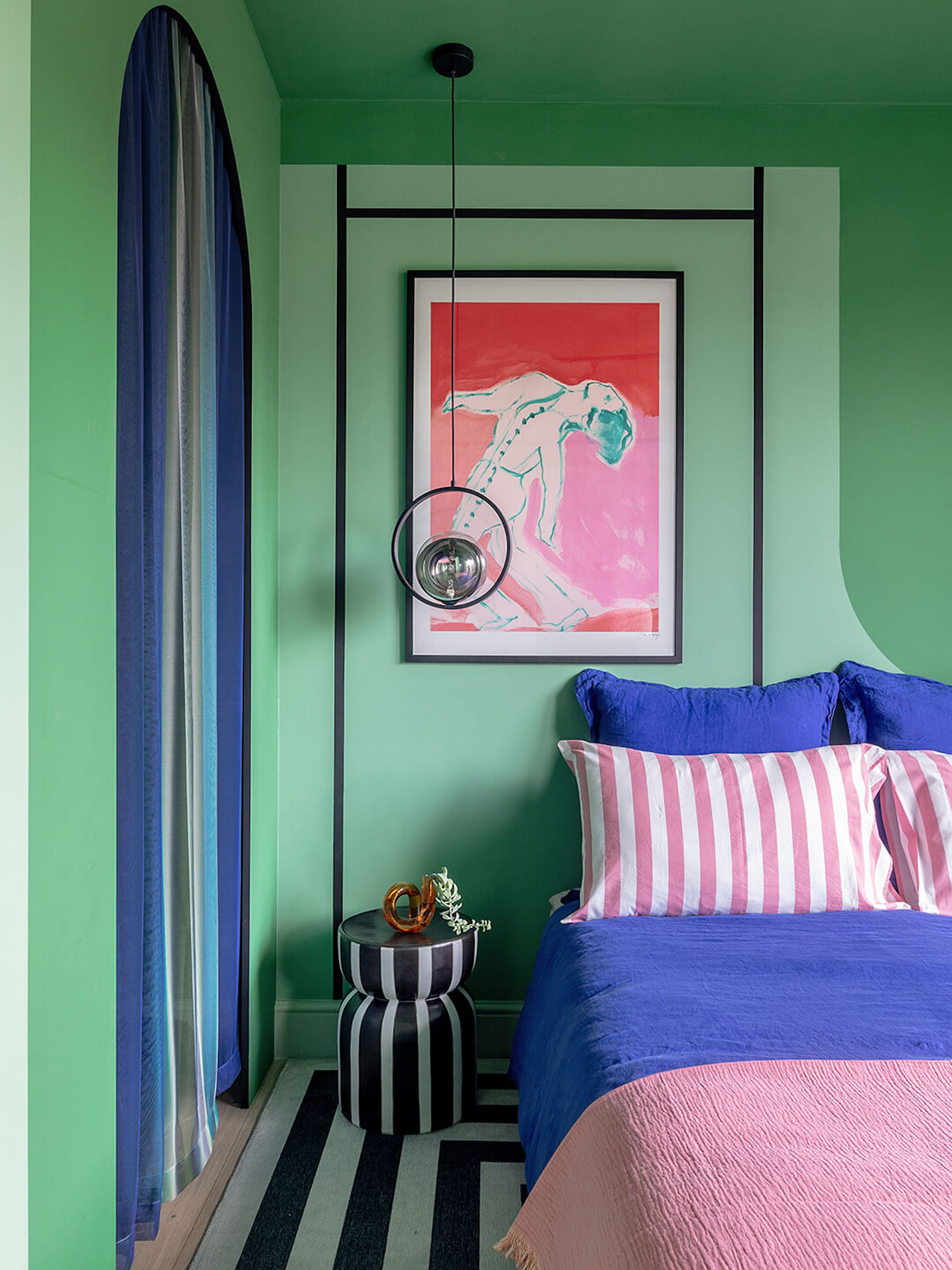
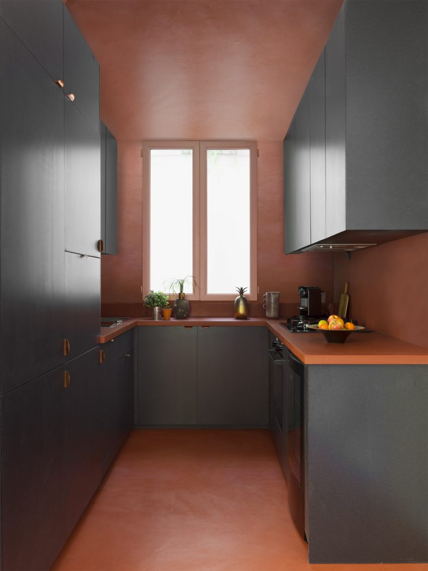
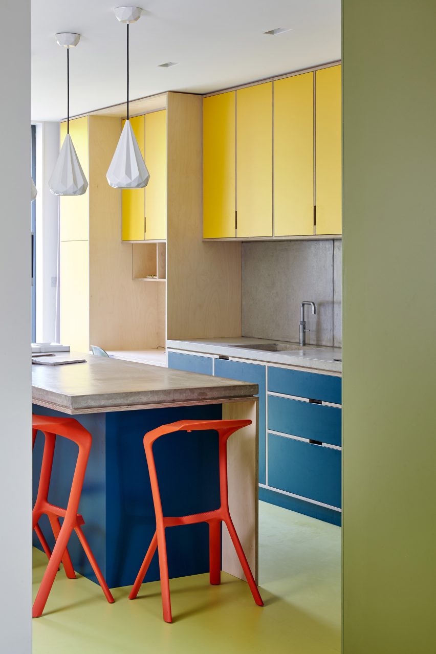
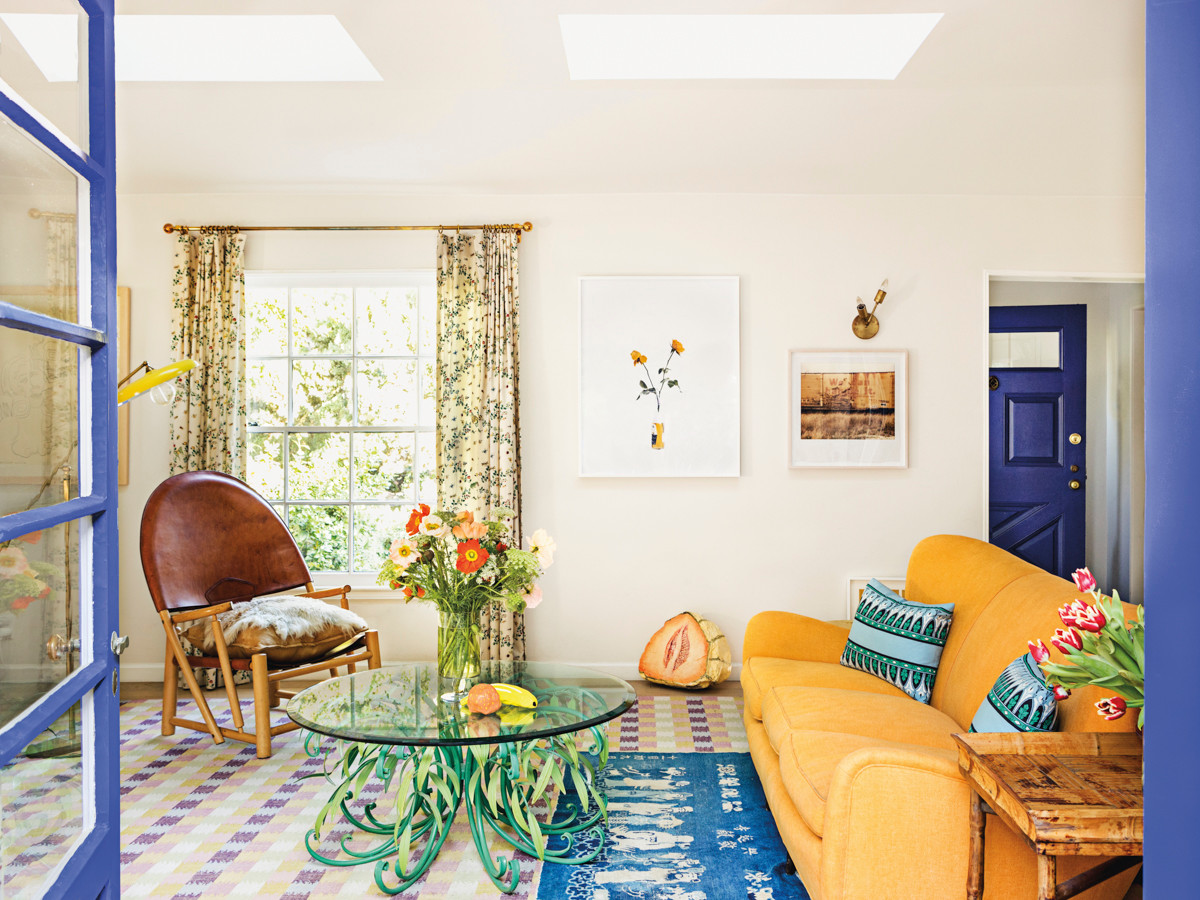
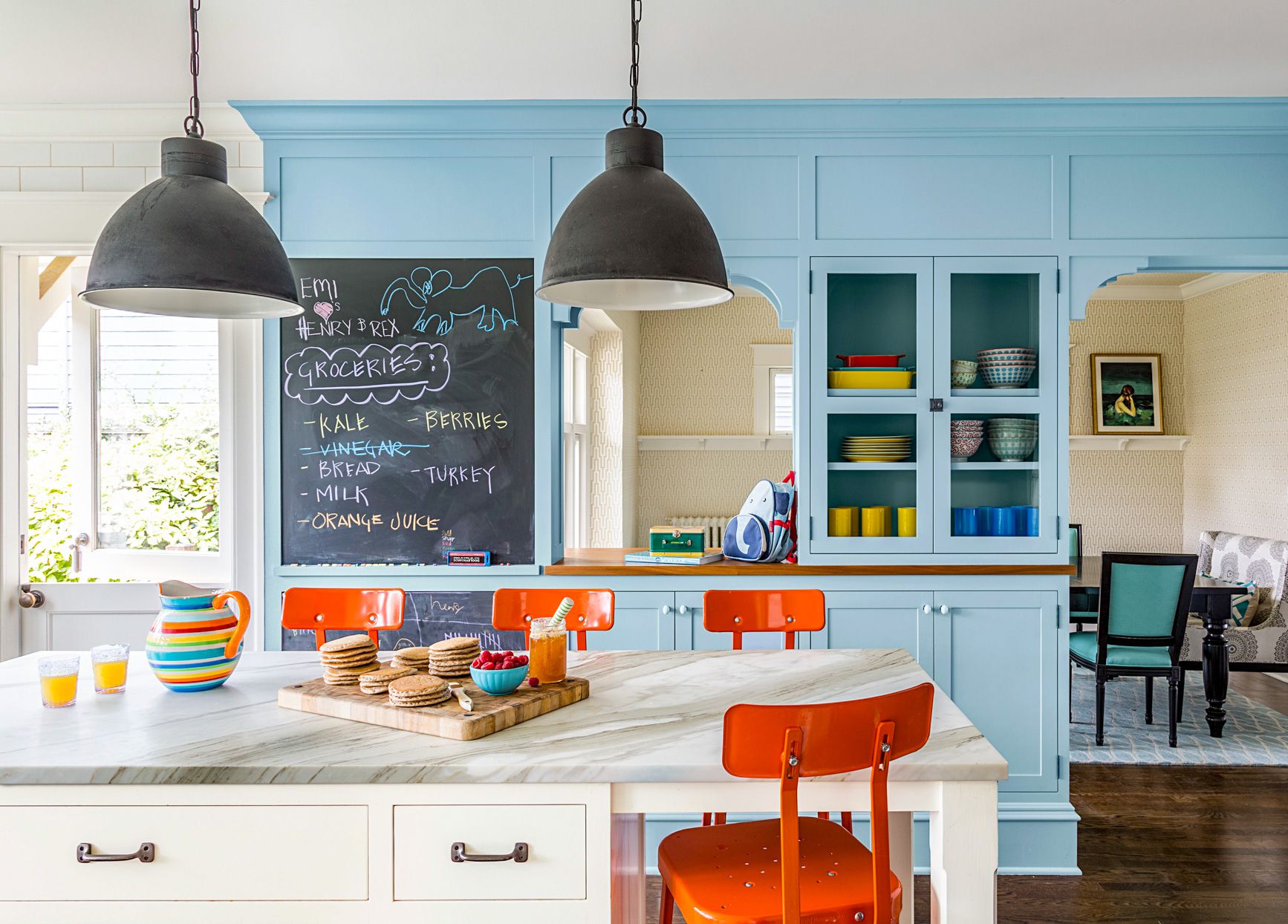
Understanding complementary colors is a core aspect of color theory. These are colors positioned directly opposite each other on the color wheel, such as red and green, blue and orange, or yellow and purple. Complementary colors exhibit the strongest contrast, and when placed side-by-side, they enhance each other's vibrancy. For instance, a yellow next to a blue will appear more intensely orange due to this complementary relationship. Other important color relationships include triads, which are colors spaced 60 degrees apart on the wheel (like primary and secondary colors), and analogous colors, which are adjacent on the wheel and share a common hue, creating harmonious color families.
Precise communication about color is crucial in art and design. Artists and designers employ specific terminology to describe colors accurately. "Hue" refers to the pure color name, such as red or blue, avoiding ambiguous descriptive terms like "khaki" or "peach." "Color value" describes the lightness or darkness of a color; for example, navy blue is a low-value blue, while baby blue is a high-value blue. "Intensity," or saturation, indicates how vivid or muted a color is. High-intensity colors, like those seen in a prism, are vibrant and eye-catching, whereas low-intensity colors tend to be duller or grayer.
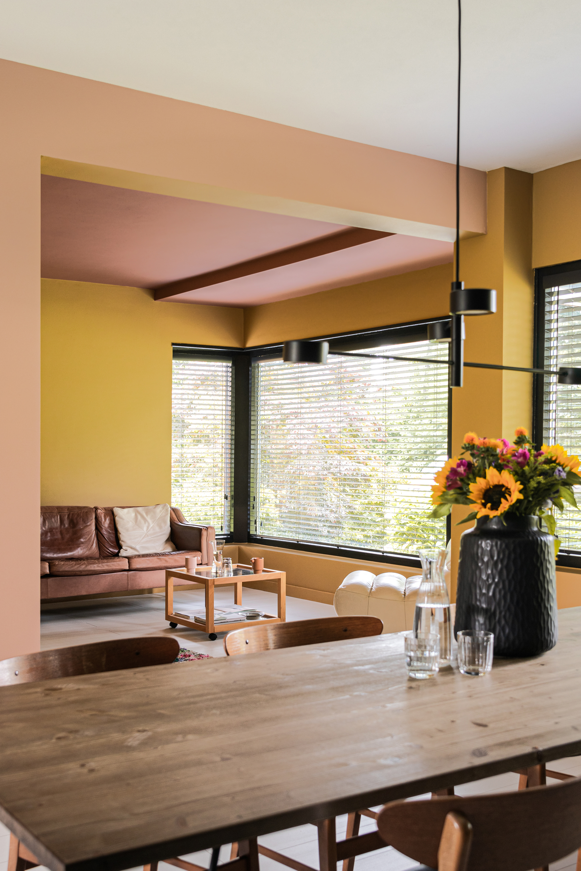
Another significant concept is simultaneous contrast, which highlights how the perception of a color is influenced by the colors surrounding it. Michel Chevreul, a 19th-century chemist, observed this phenomenon while developing dyes. He found that a white fabric, when placed next to purple, could appear yellowish because yellow is the complement of purple. This visual effect demonstrates that colors are not perceived in isolation but are constantly interacting with their environment, influencing each other's appearance. Mastering these elements of color theory enables designers to create visually compelling and harmonious compositions, whether in a painting, a garment, or the interior of a room.
#ColorTheory #ColorWheel #IsaacNewton #PrimaryColors #ComplementaryColors #Hue #ColorValue #Intensity #SimultaneousContrast #ColorTheory #ColorWheel #IsaacNewton #PrimaryColors #ComplementaryColors #Hue #ColorValue #Intensity #SimultaneousContrast
0 comment in total
 No comments yet
You may also like

Mother Nature Knows Best
How to Choose Colors That Work Together Every Time

Using the New Olo Color Scientists Discovered in Your Home

We Asked Designers Which Paint Colors Make a Room Feel Stuffy—And We're Repainting ASAP

'The World of Color is Rife With Danger' — 5 Color Combinations That Don't Go Together and What to Use Instead

Understanding colour blocking


The play of color and light


What Season Are You? Everything You Need to Know About Color Analysis

Ever Heard of a Split Complementary Color Palette? It's the Secret to Perfecting More Unexpected Pairings
If You Think Teal And Turquoise Are The Same Color, You Might Not Do Well On This Color Trivia


Introducing Colour Theory, The Freedom Is Yours To Create With 45 Hues
The Color Combo You’re About to See Everywhere
3 color coordination tips any beginner can master
How do you zone a room with color? 10 genius ideas that will make open concept feel cozier
Ten bright and bold interiors that make use of colour theory

Let the walls talk — colours that shape your space

Here's How to Coordinate Paint Colors Throughout Your Home, so That It Looks Cohesive, Curated, but Still Creative
What Are Advancing and Receding Colors in Interior Design?
What you didn’t know about colour

24 Complementary Color Schemes That Will Make Any Room Pop