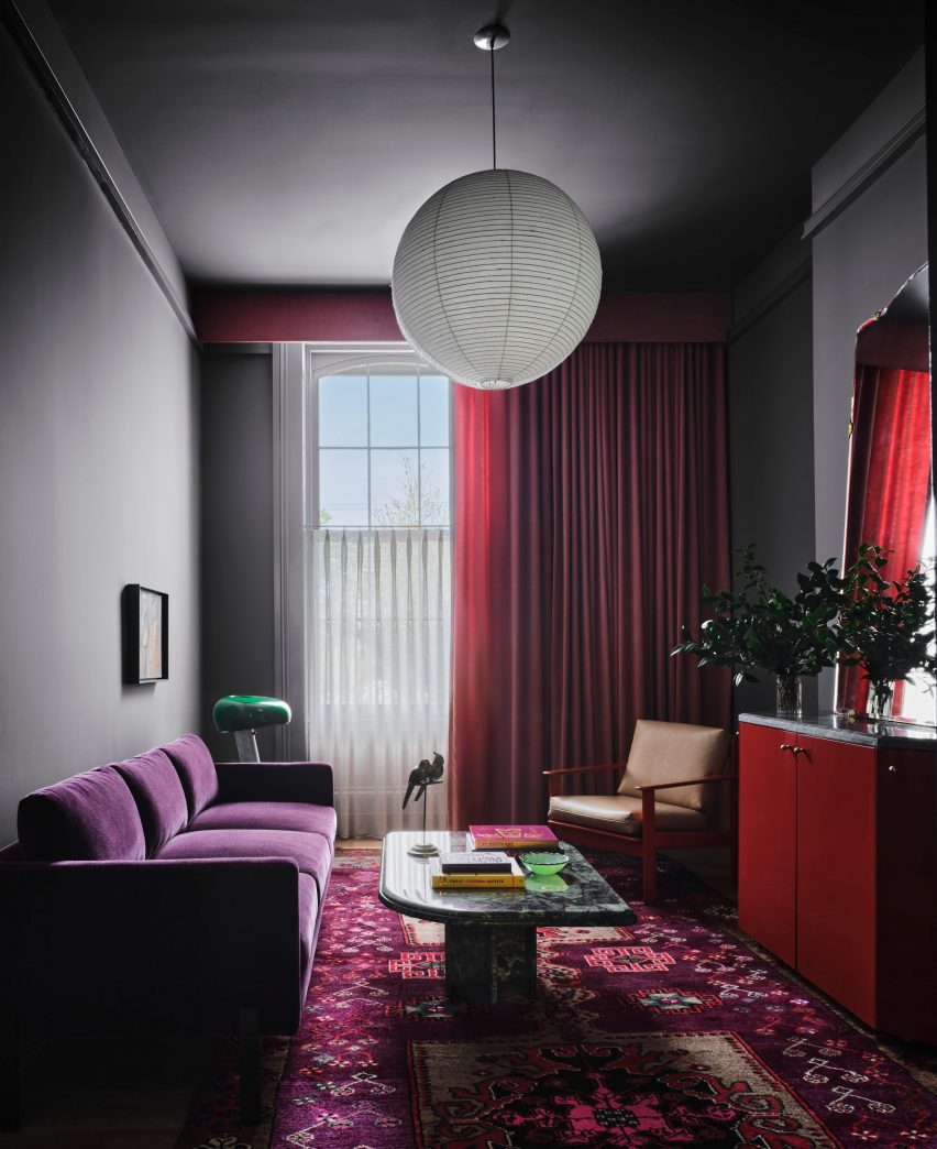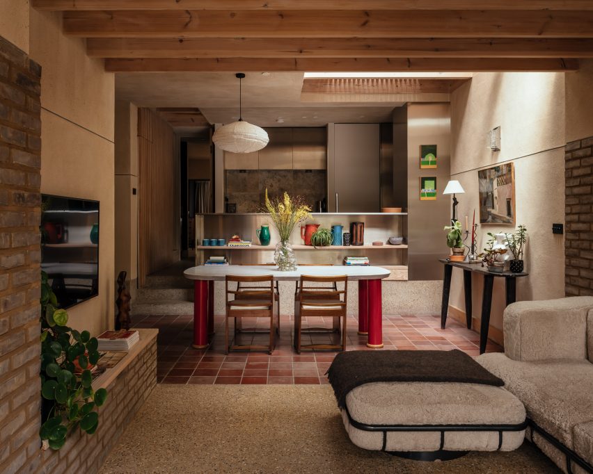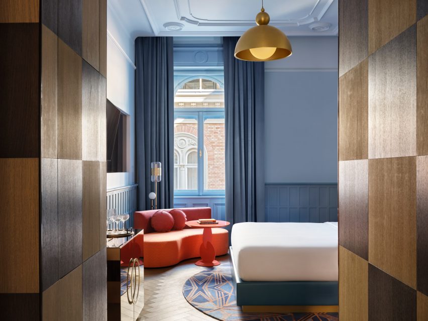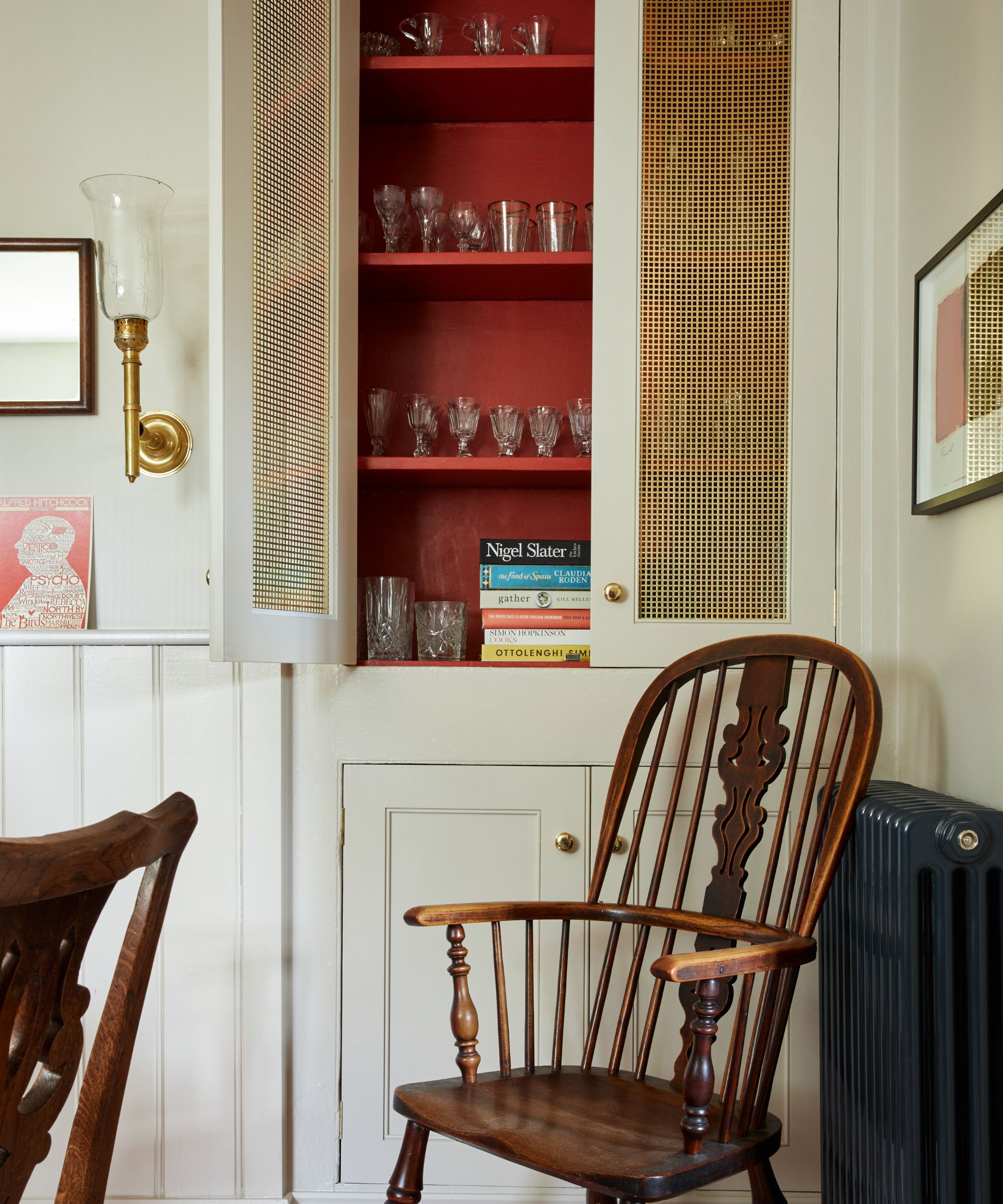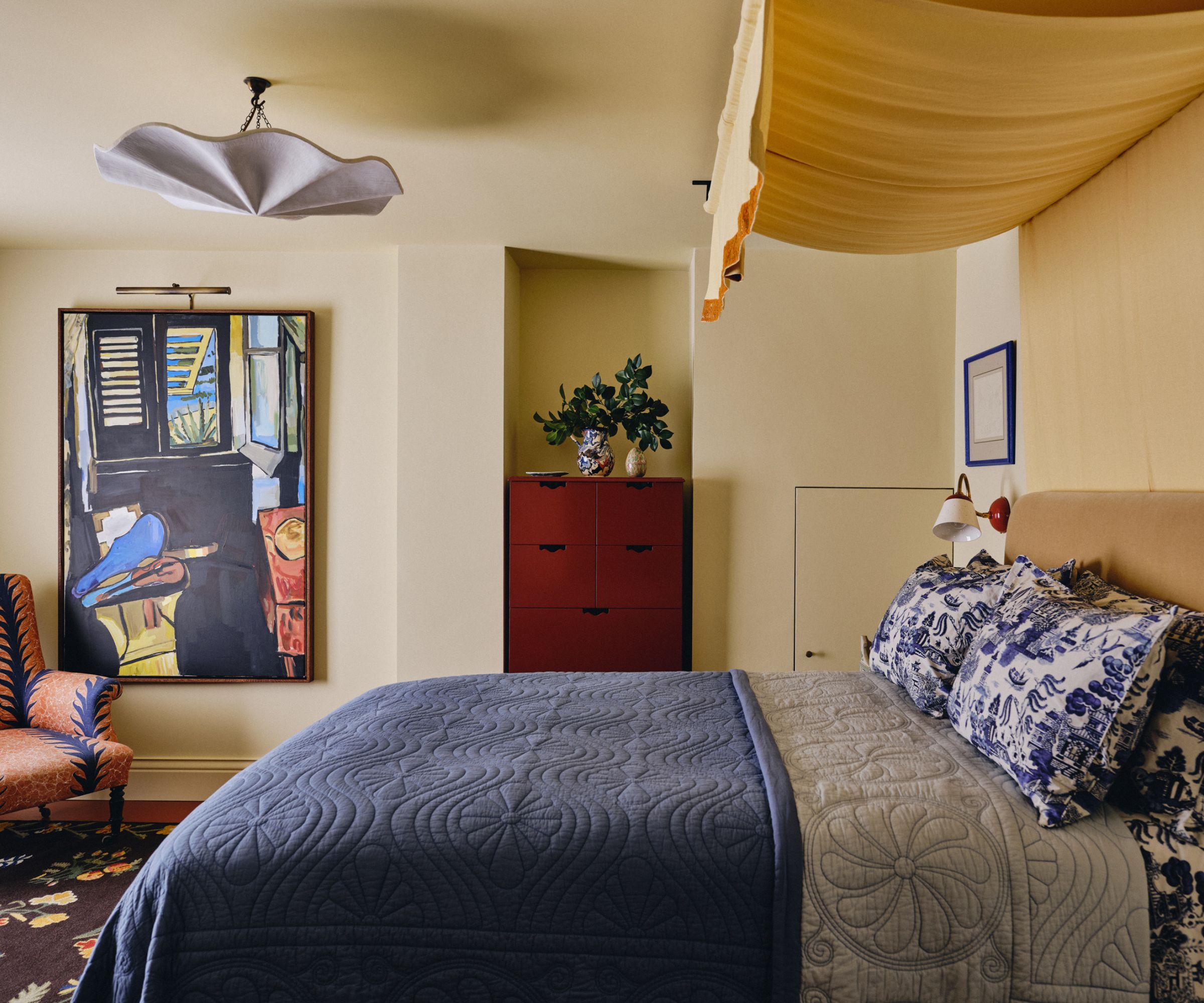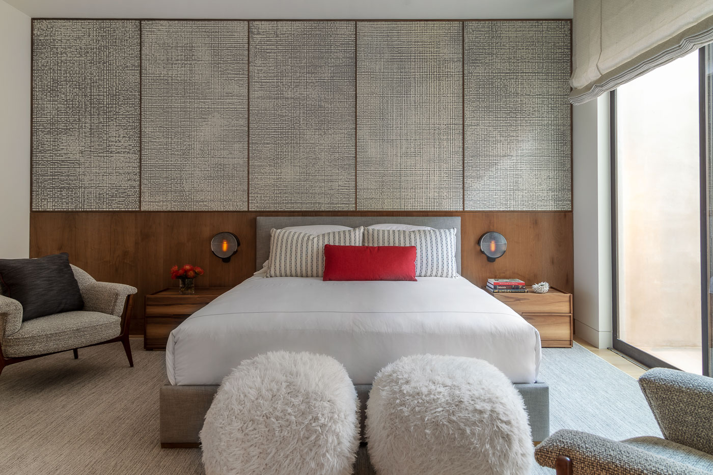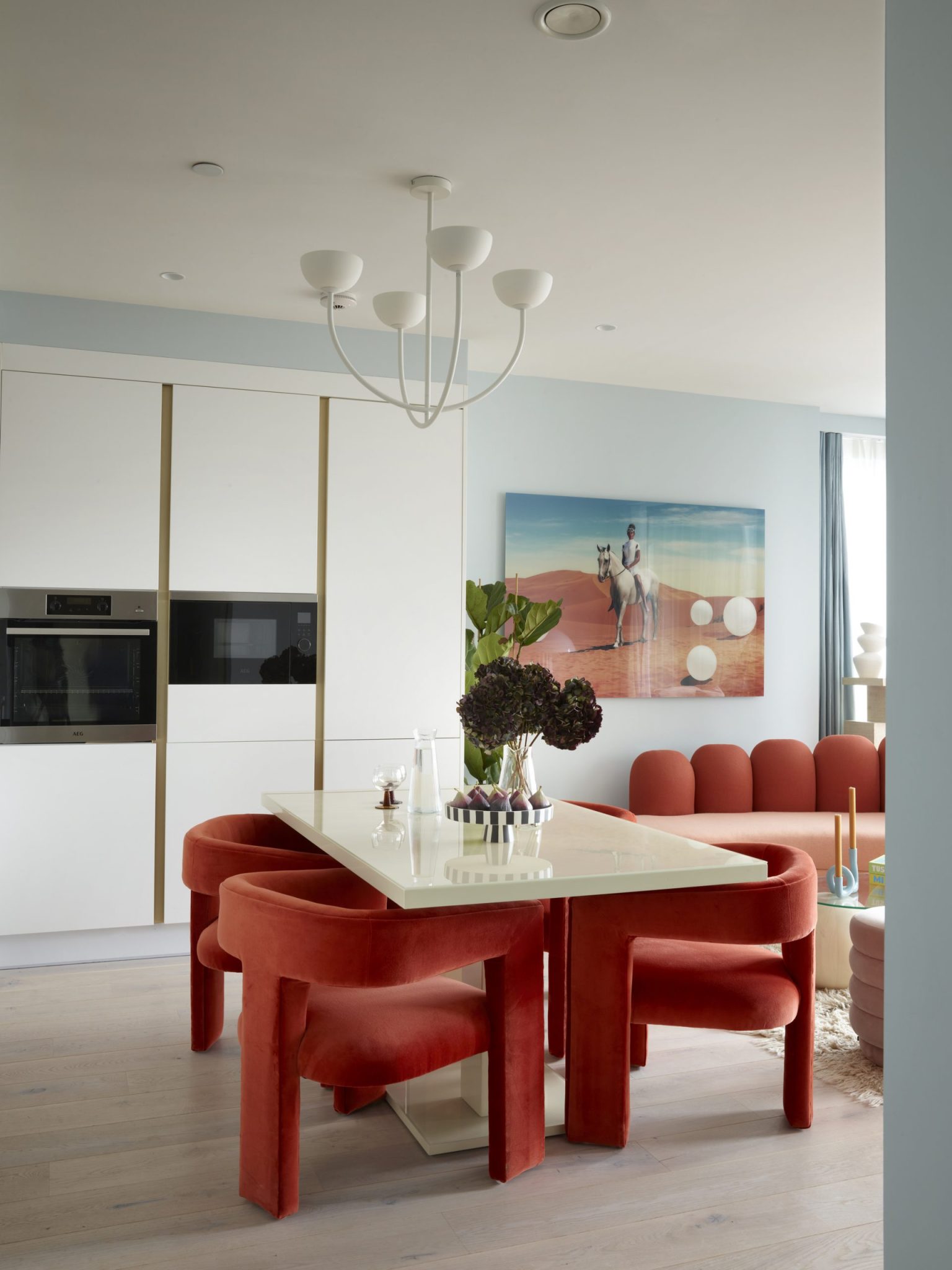
1/4
The Viral ‘Unexpected Red’ Theory in Interior Design Actually Isn’t That Simple
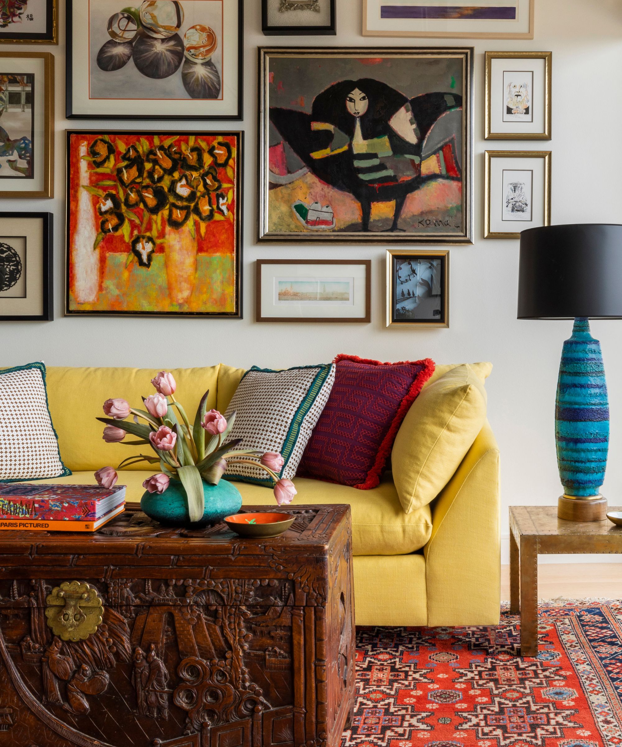
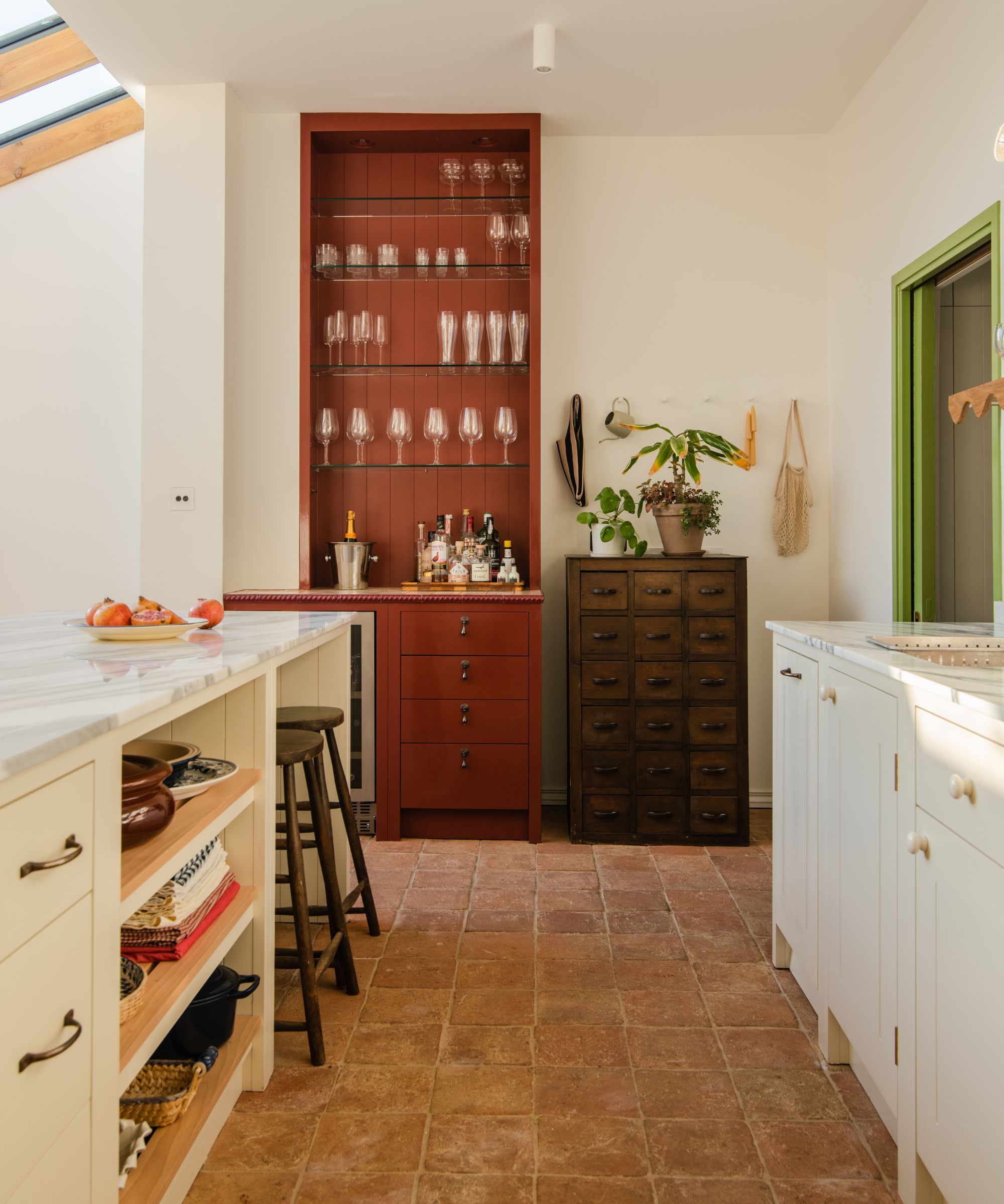
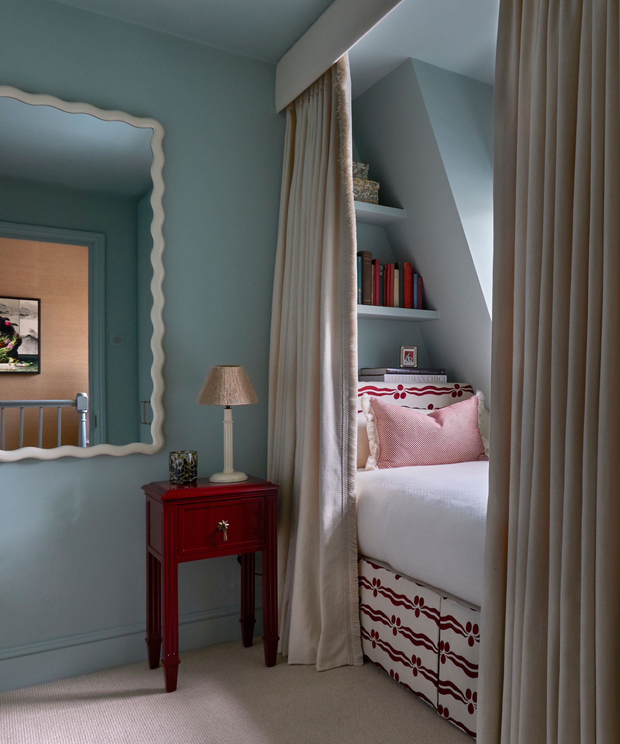
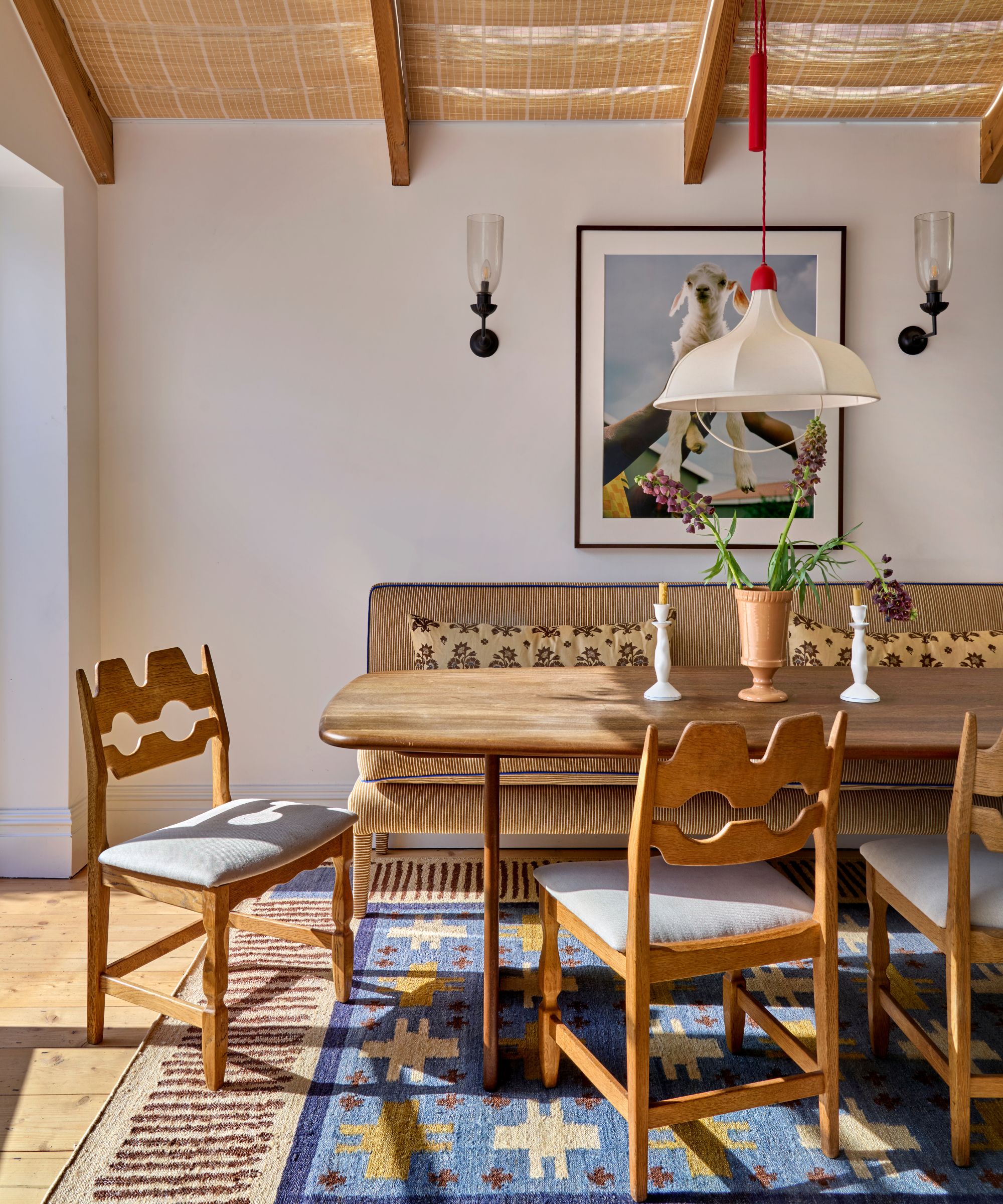
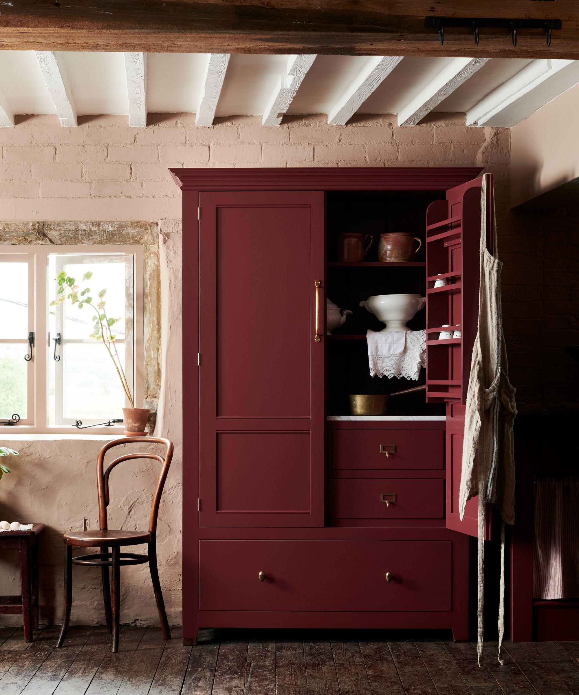
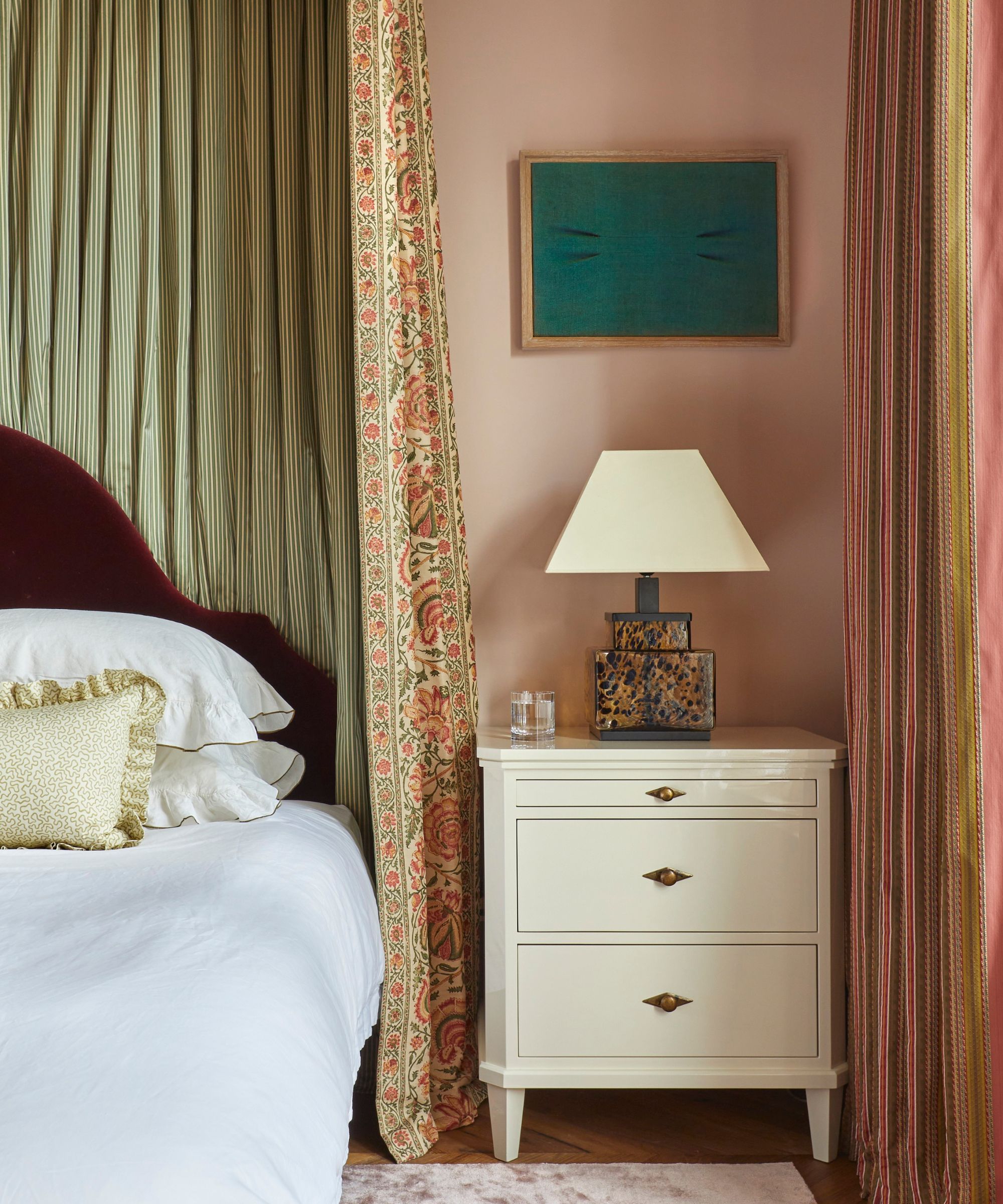
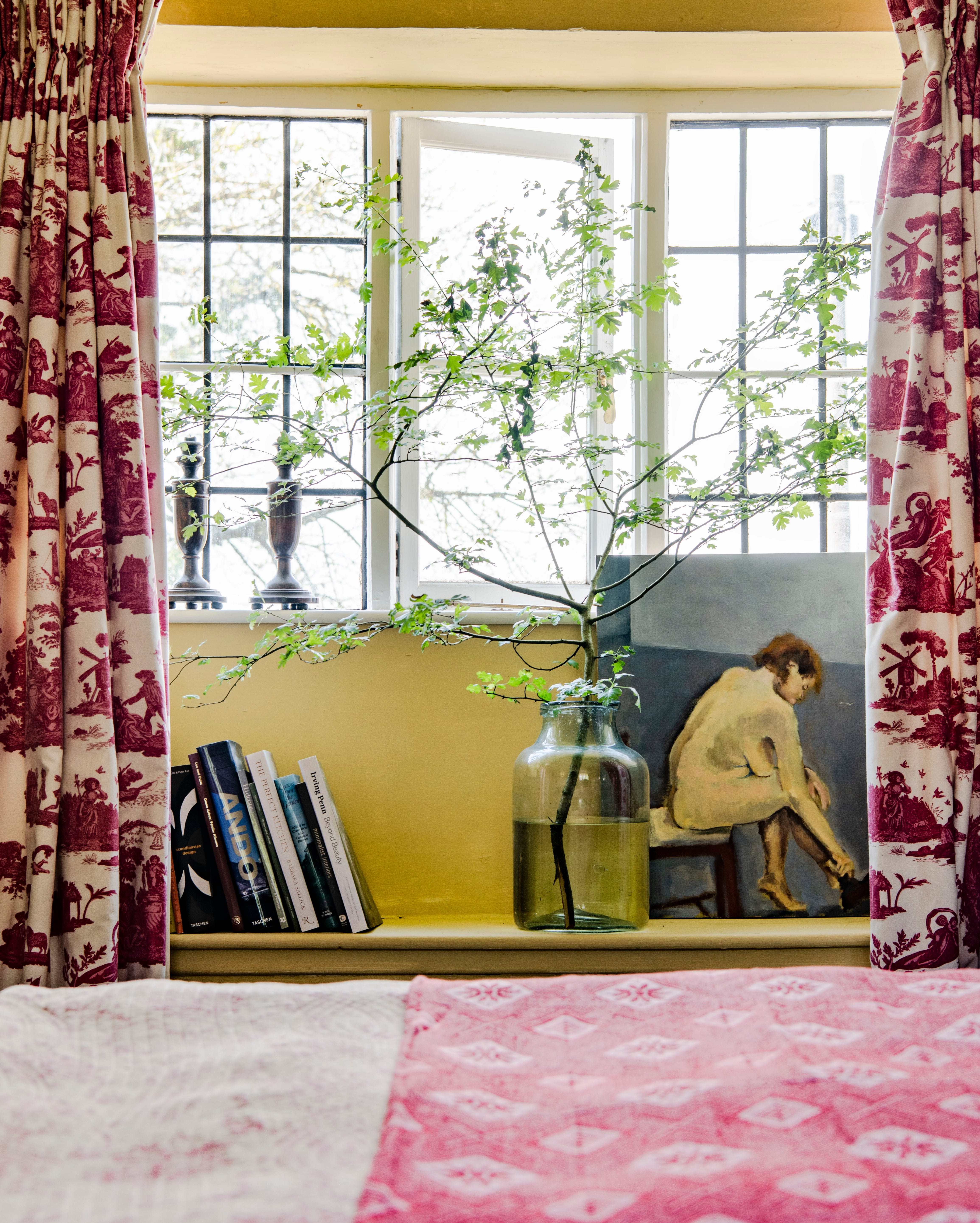
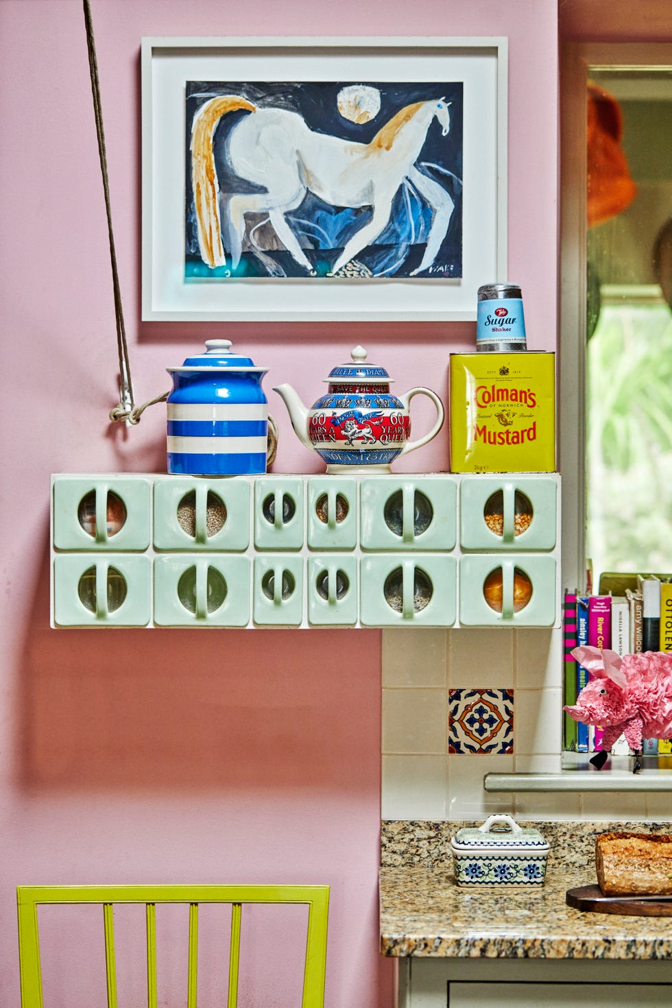
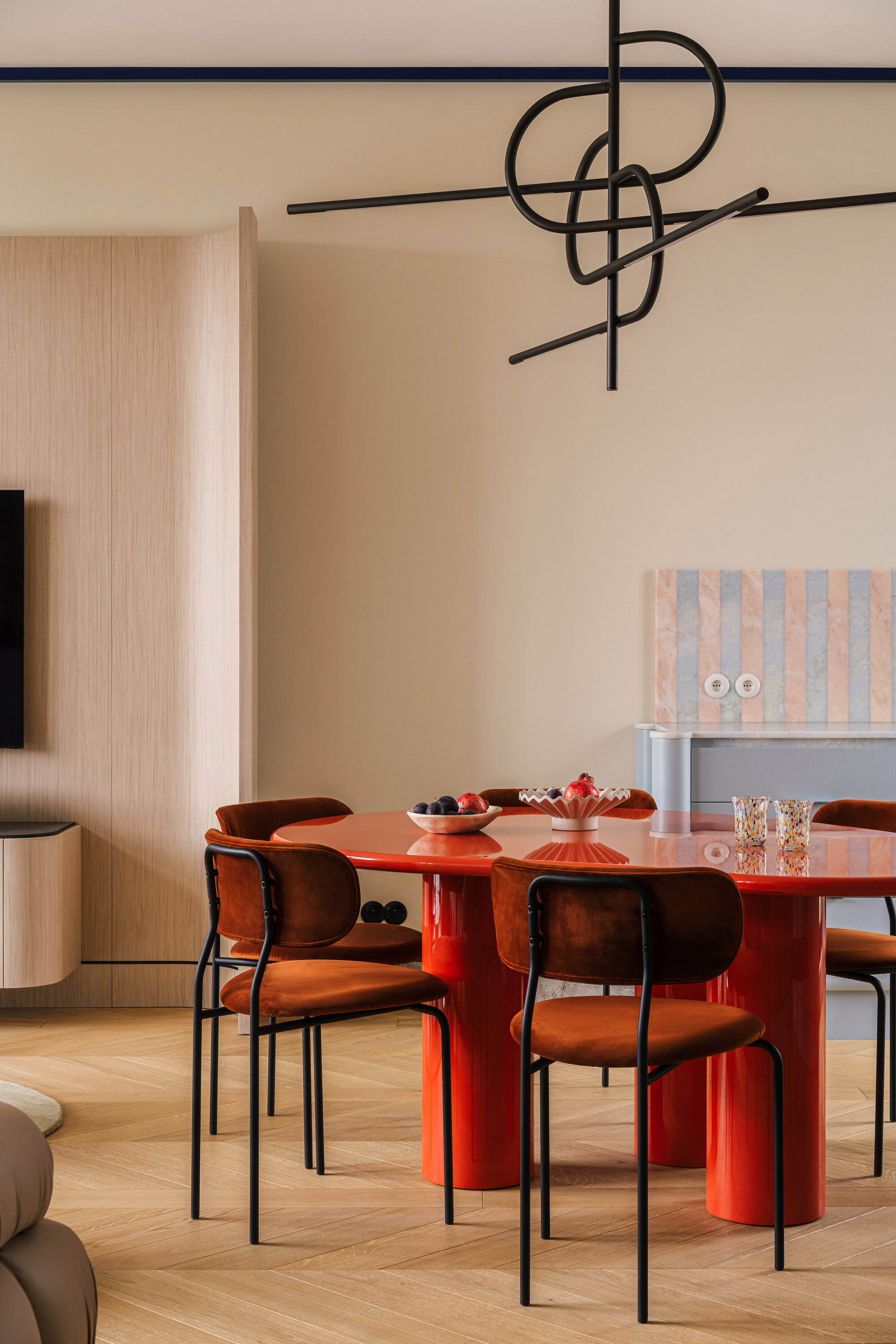
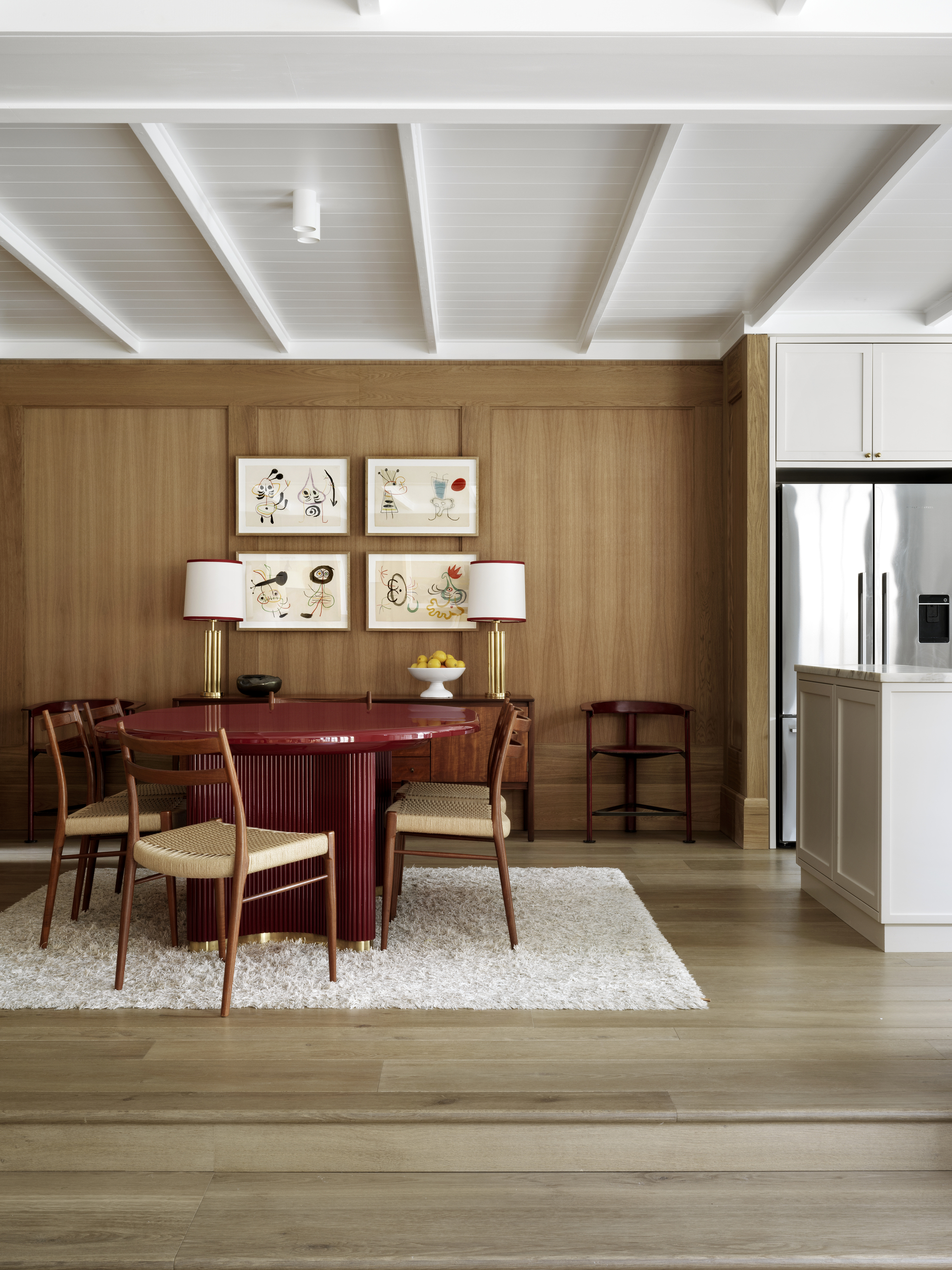
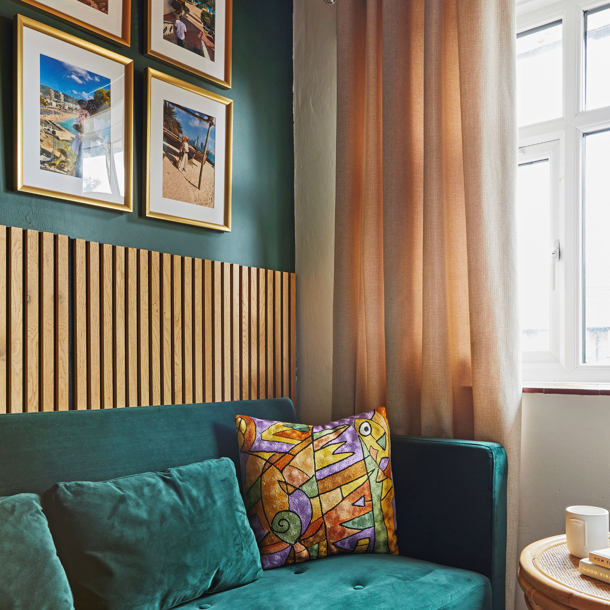
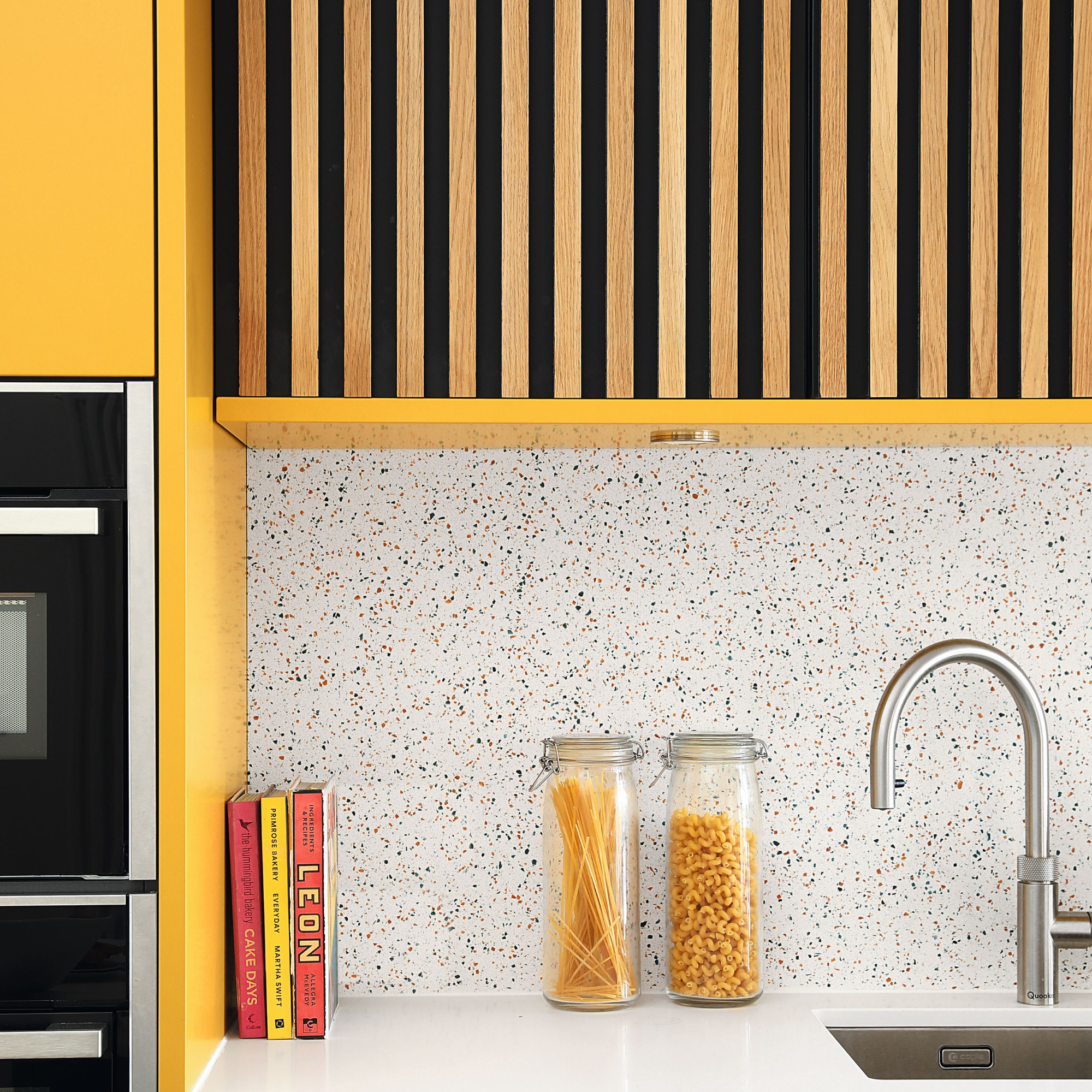
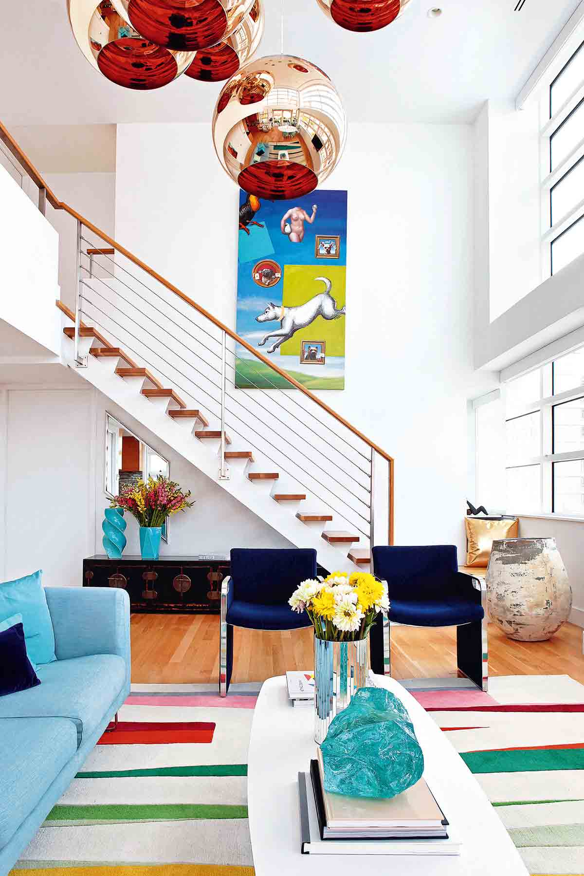
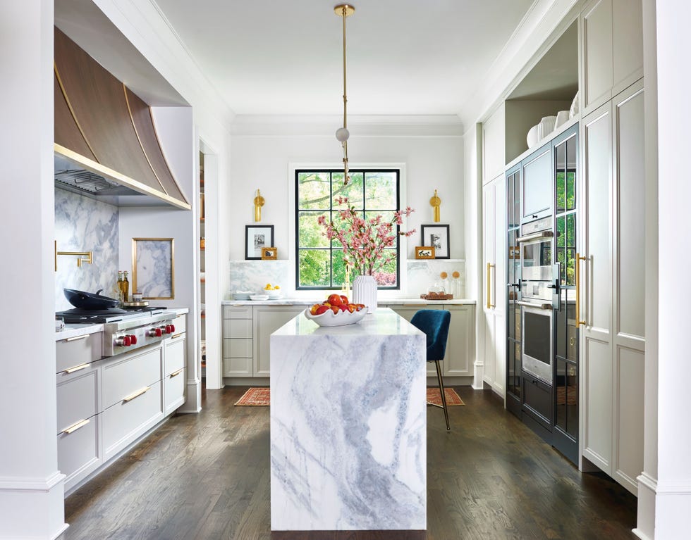
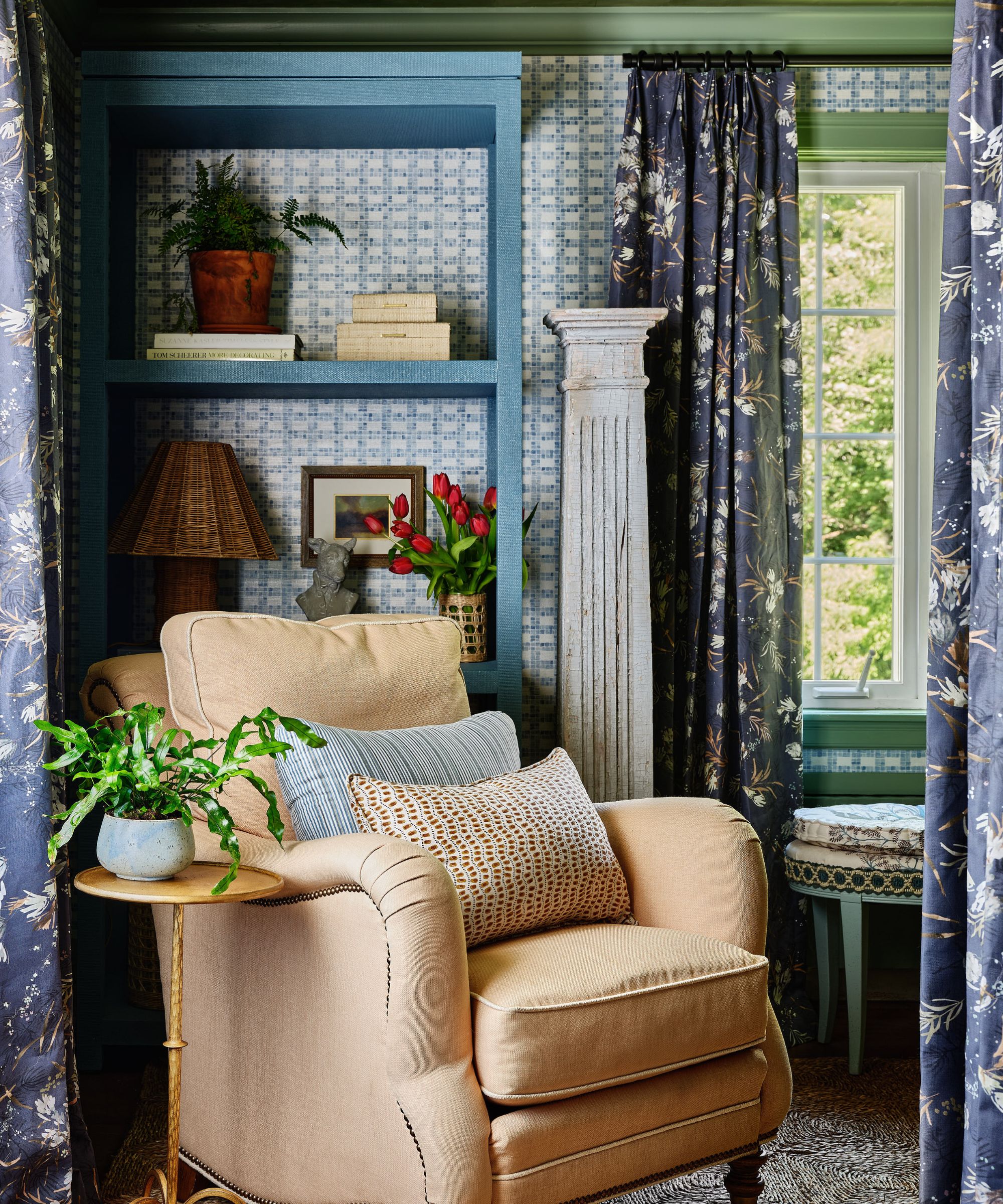
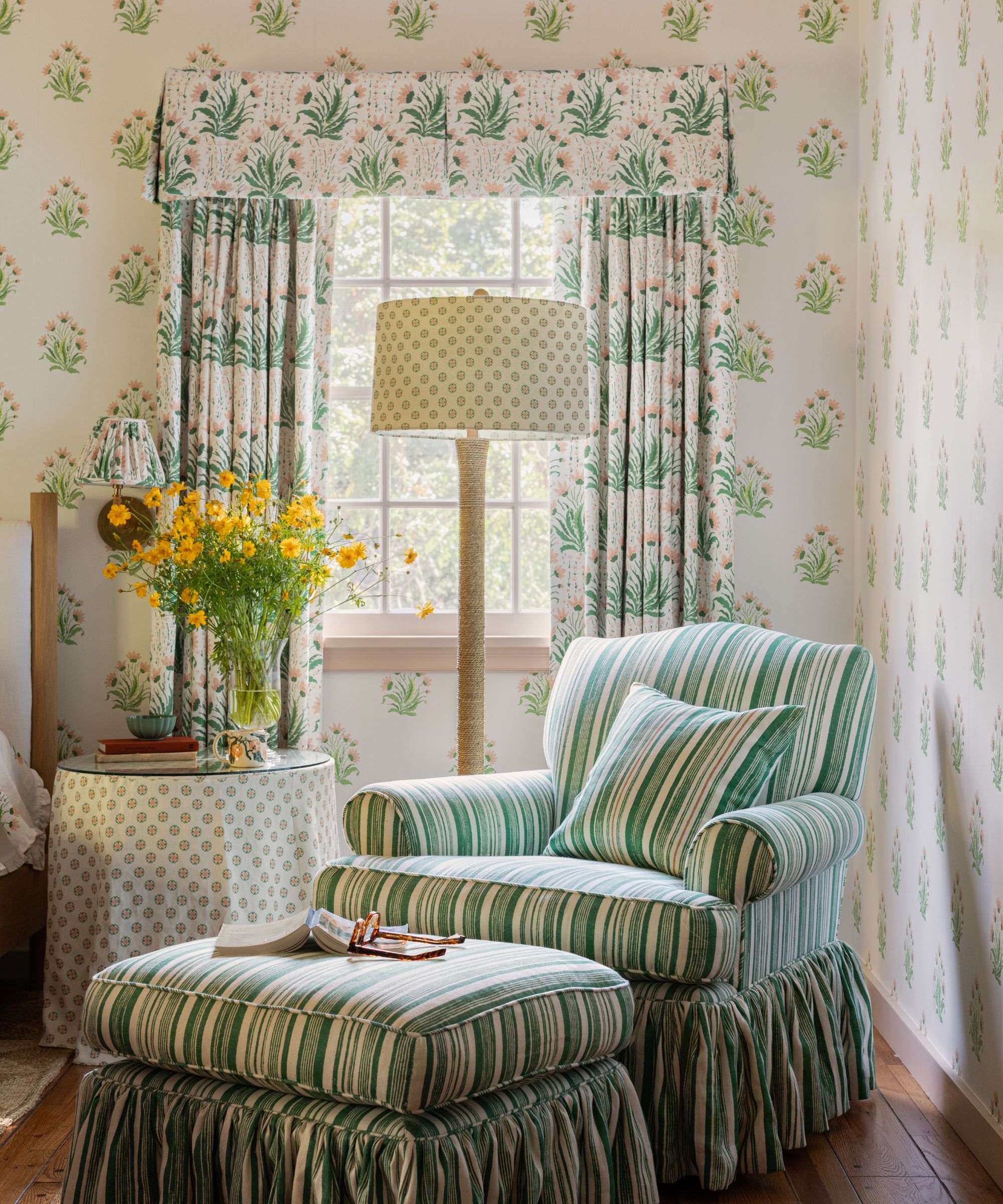
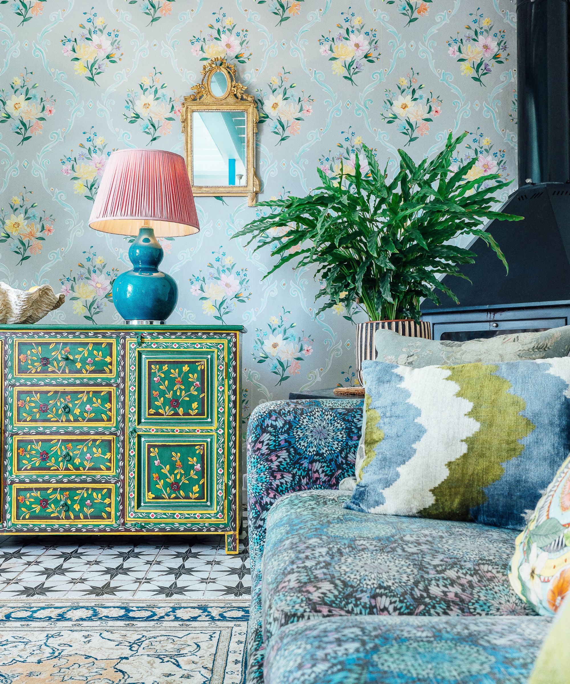
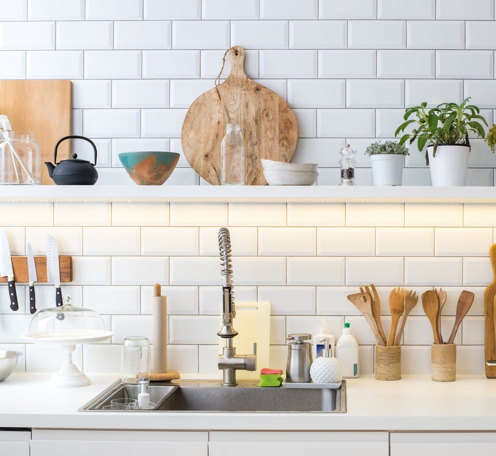
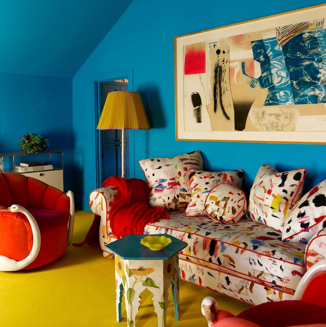
The article delves into the viral TikTok trend known as the ‘unexpected red’ theory, which posits that adding any red item, regardless of size or context, can instantly enhance a room's aesthetic. This theory, popularized by interior designer Taylor Migliazzo Simon, quickly gained traction, accumulating nearly a million views since its posting in January. However, the simplicity of this theory has sparked considerable debate among design professionals.
Interior designers like Samantha Stathis Lynch express skepticism, stating that merely adding a red pillow does not guarantee a perfect room, emphasizing the importance of correct application. Conversely, Kishani Perera highlights that using a 'pop of red' is a long-standing practice in good design, making the term 'theory' somewhat amusing to her. The comment section of Migliazzo Simon’s video often references color theory, to which she playfully acknowledges the late arrival to a well-established concept.
Color experts, including Leatrice Eiseman, executive director of the Pantone Color Institute, generally dismiss the idea that red universally improves a room. Eiseman asserts that no research supports such a sweeping generalization, suggesting red can be used as an accent but not as a guaranteed enhancer. Sheri Peterson, president of the North American chapter of the International Association of Color Consultants (IACC), explains that the effectiveness of red, or any color, relies on understanding hue, value, and chroma. She notes that the successful examples seen in the video likely employ red with correct color theory relationships, such as complementary or analogous combinations, and appropriate value and chroma.
Peterson further clarifies that while red can be uplifting, similar effects can be achieved with other colors if color theory principles are applied correctly. Massimo Caiazzo, vice president of the Italian chapter of the IACC, advises caution when using red due to its physiological impact, which includes a slight acceleration of heartbeat, increased blood pressure, and respiratory rate, indicating that the body expends more energy to process red. This physiological response can influence behavior, leading some designers, like Alexandra Gater and Carrie Moore, to find bright red accents jarring or polarizing, resulting in its less frequent use in their work.
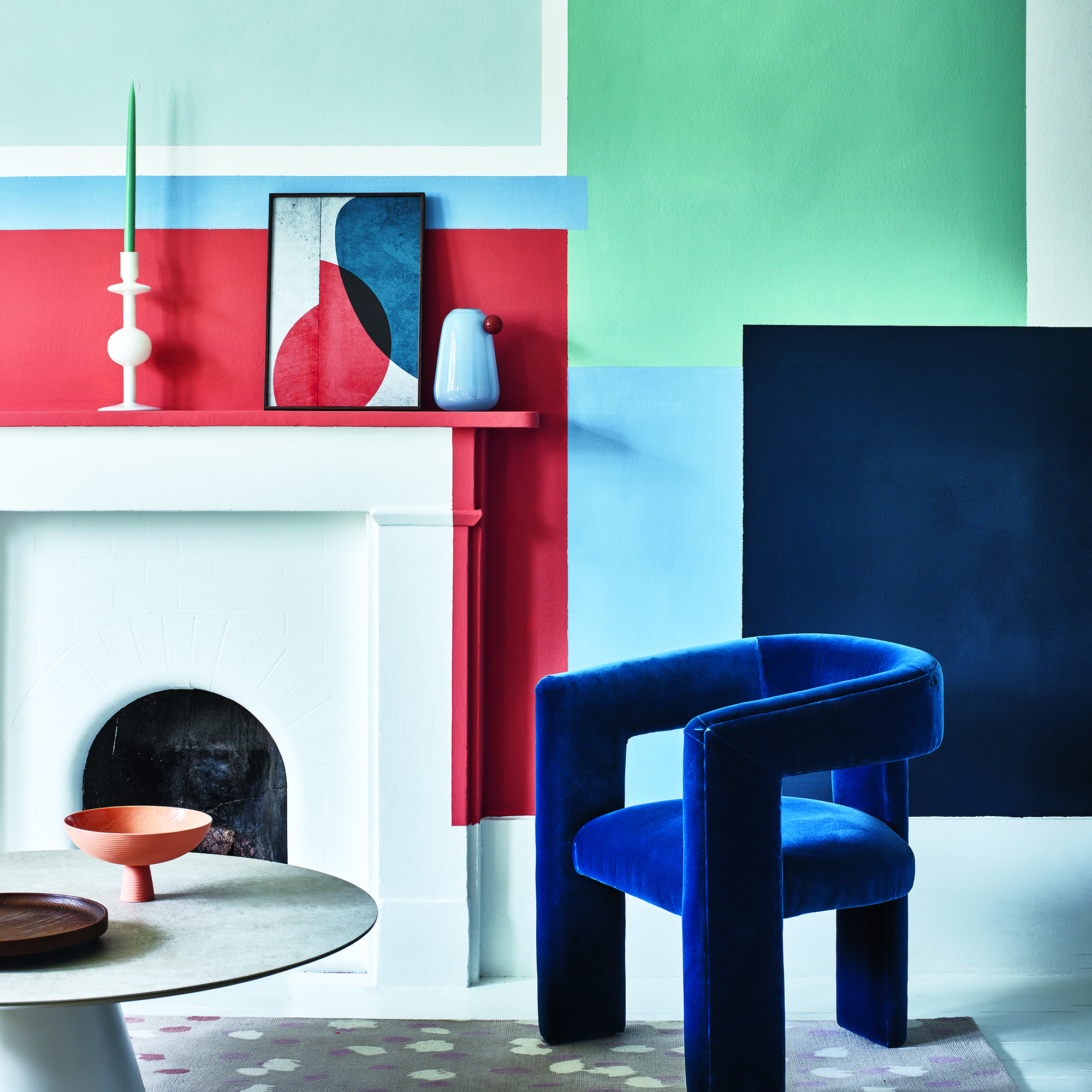
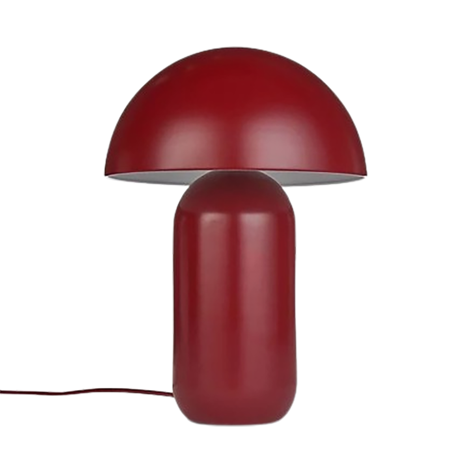
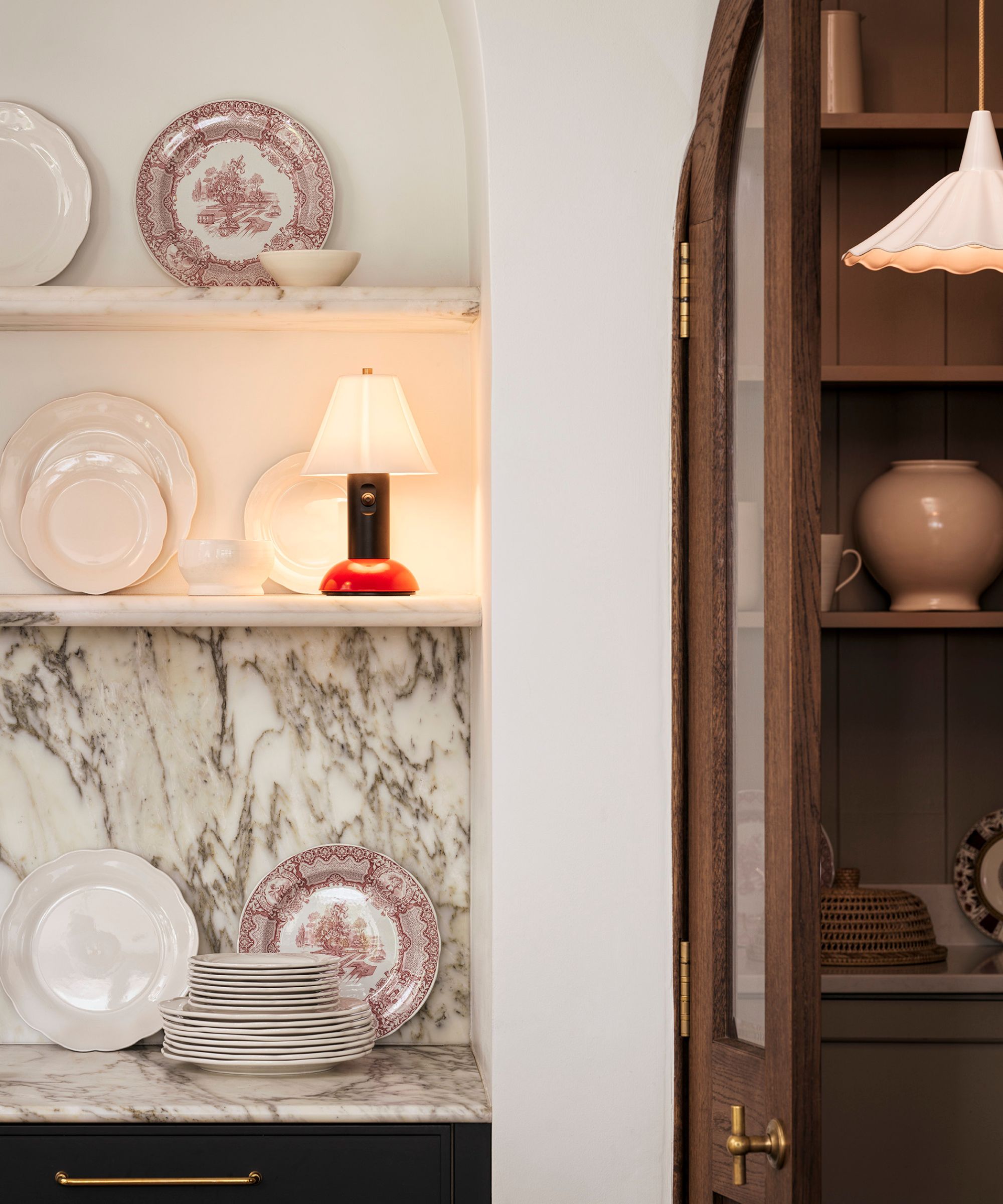
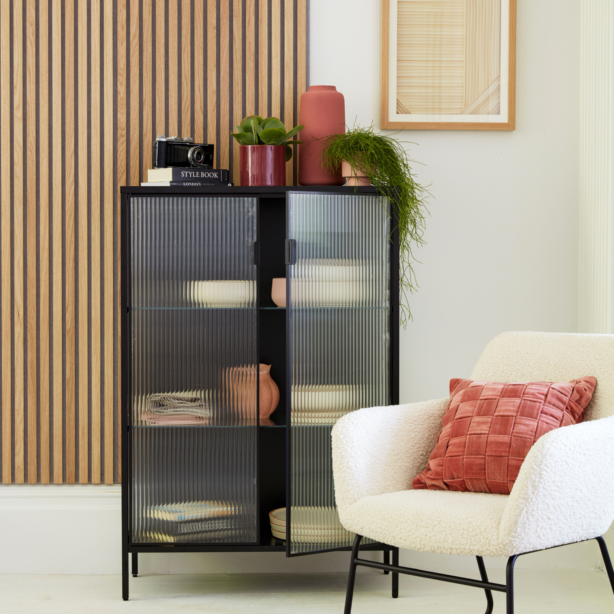
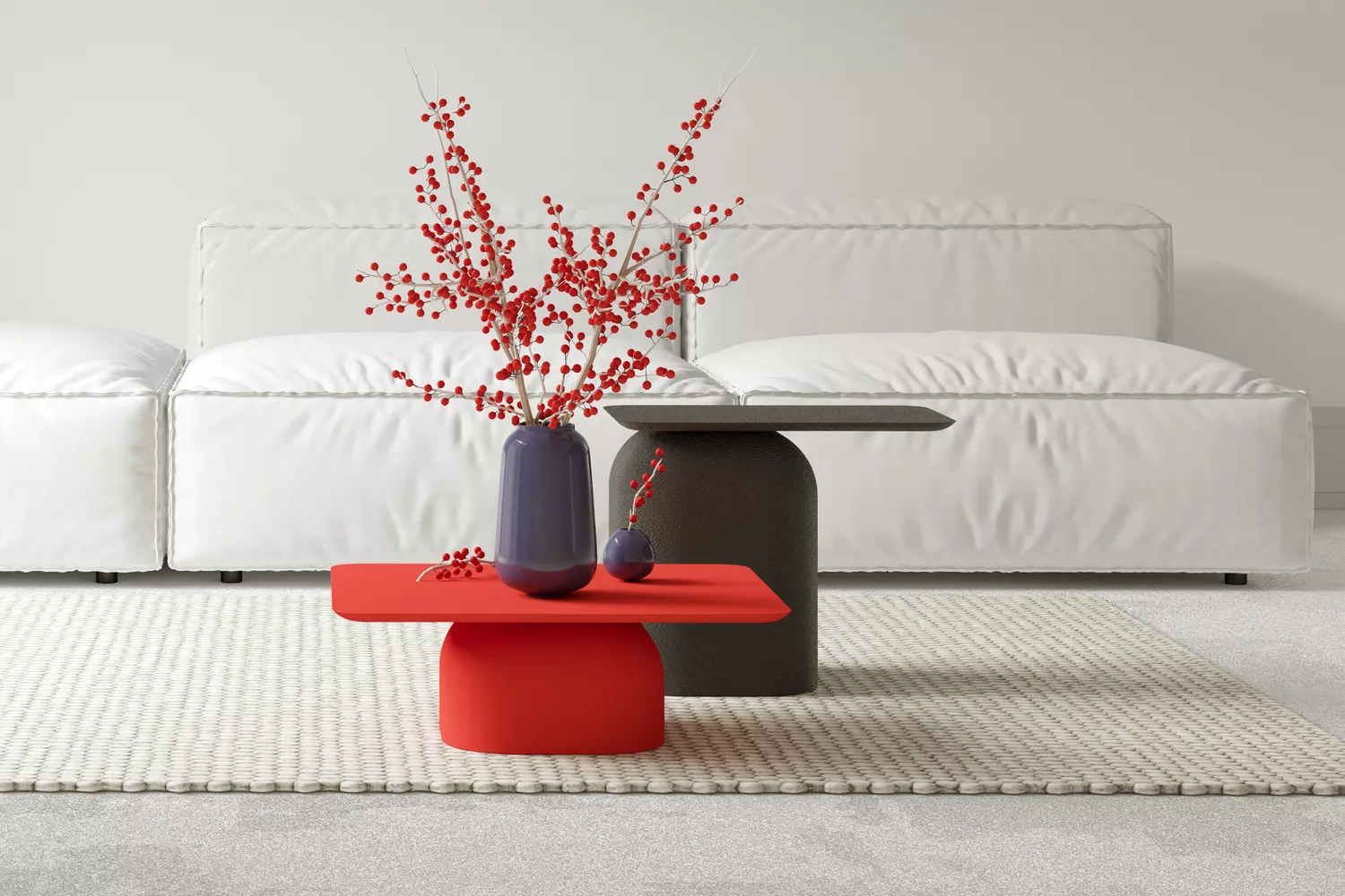
Regan Baker suggests using red sparingly in small doses, such as skinny furniture pieces, small accents, or single items like sconces or frames, given its boldness and intensity. Some experts, like Maria Killam, propose that the theory's popularity stems from red's underutilization in recent design trends, contrasting with the prevalence of white or monotone spaces. Drew Scott welcomes the reintroduction of color, particularly red, as an 'unexpected' element that adds fun and intentionality to a room. Migliazzo Simon clarifies that her intention was to highlight the purposeful and enjoyable incorporation of red in items typically neutral, reinforcing that while a 'pop of red' is not new, the 'unexpected red' theory serves as a rule of thumb rather than a fleeting trend.
#UnexpectedRedTheory #InteriorDesign #ColorTheory #DesignTrends #HomeDecor #RedAccents #TikTokTrend #ColorPsychology #UnexpectedRedTheory #InteriorDesign #ColorTheory #DesignTrends #HomeDecor #RedAccents #TikTokTrend #ColorPsychology
0 comment in total
 No comments yet
You may also like
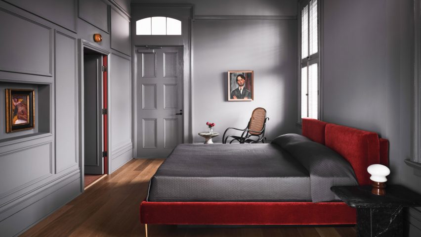
Ten rooms that make clever use of the "unexpected red theory"
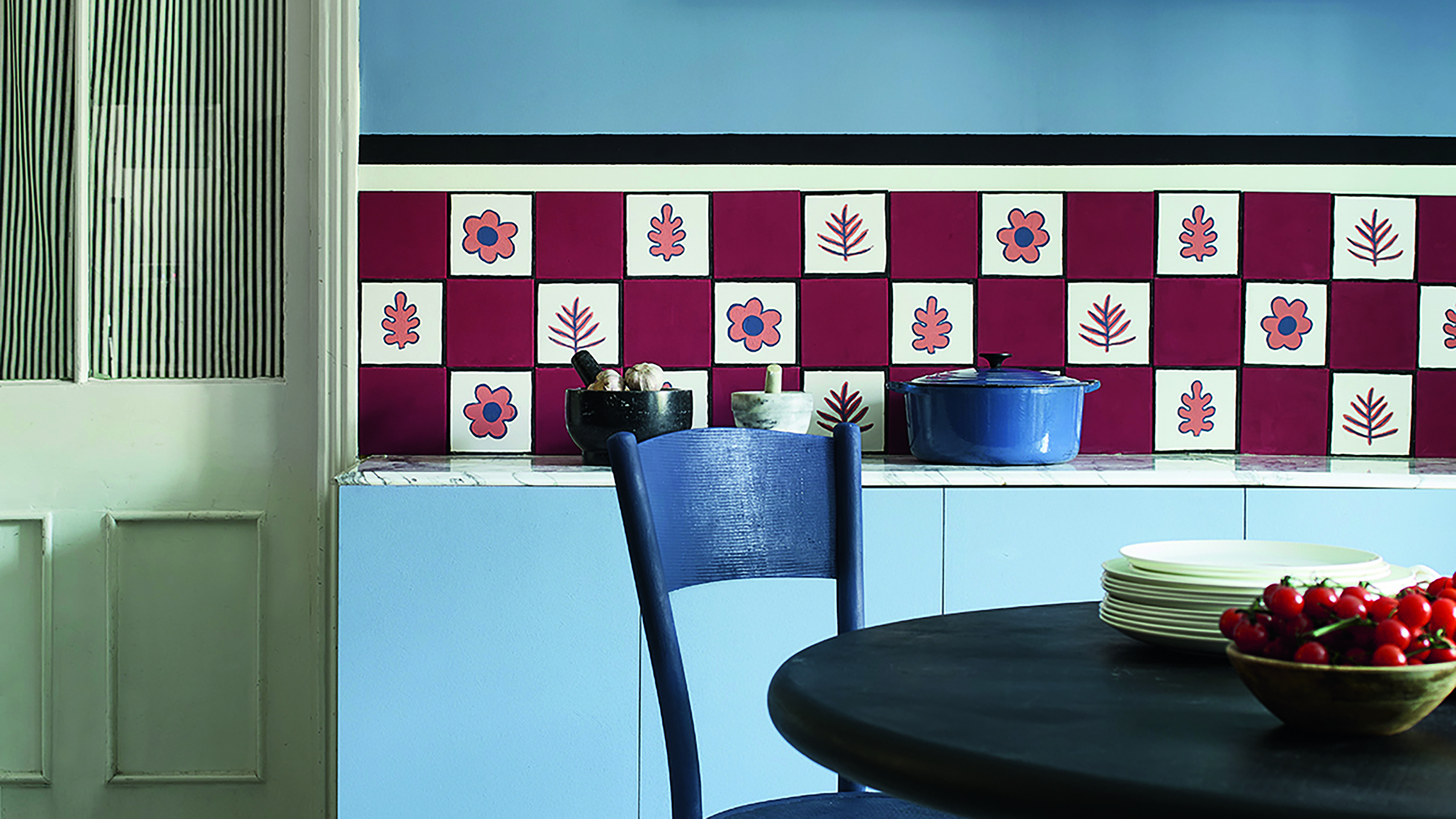
Primary colours are having a moment - but the secret to styling them is through 'unexpected' touches
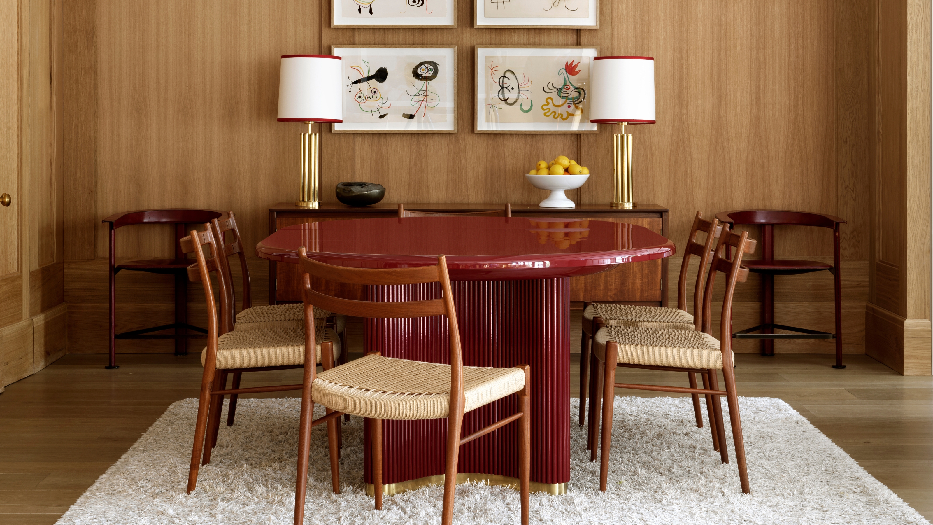
The 'Red Table Trick' Is the Easiest and Most Expensive-Looking Trend to Hit 2025 So Far

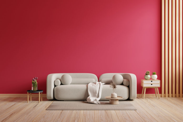
What Is The Unexpected Red Theory? & How To Make It Work For You
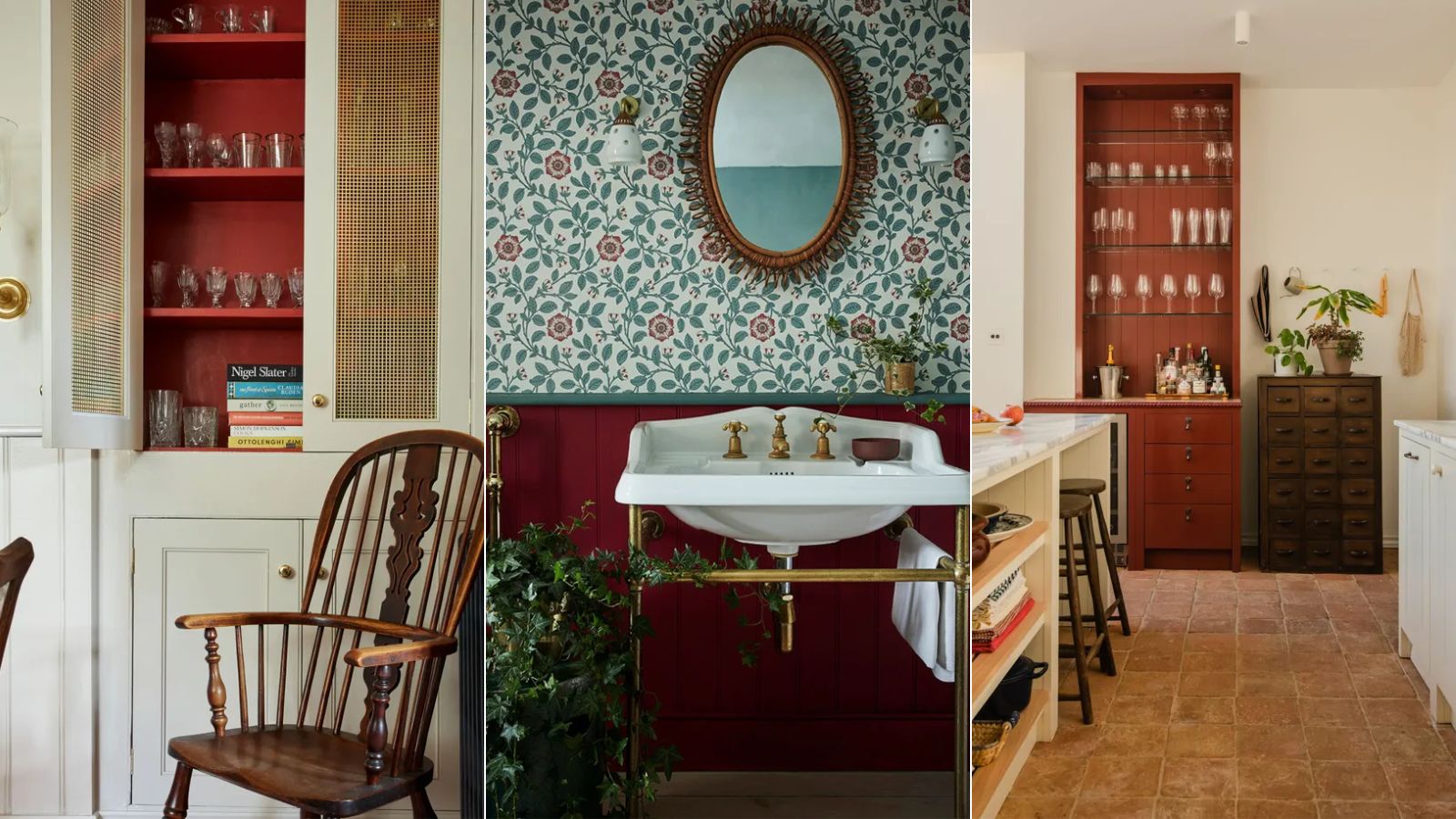
Here's what color experts actually think about the unexpected red theory – is it really as simple as it sounds?

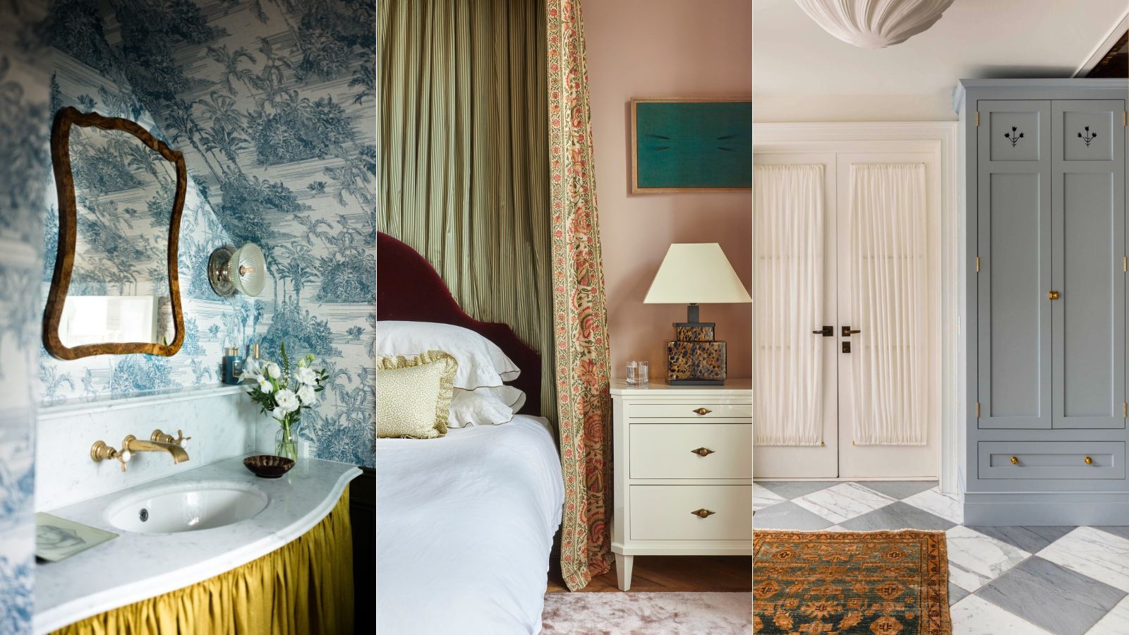
What's replacing the 'Unexpected Red Theory'? Here's what colors designers say will be popular in 2025
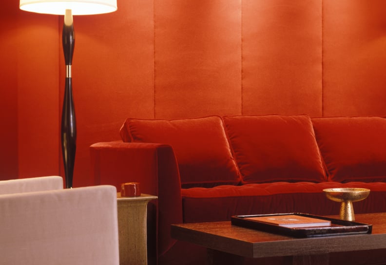
How to Incorporate the "Unexpected Red" Theory Into Your Home
This Controversial Home Layout Has DIVIDED the Design World

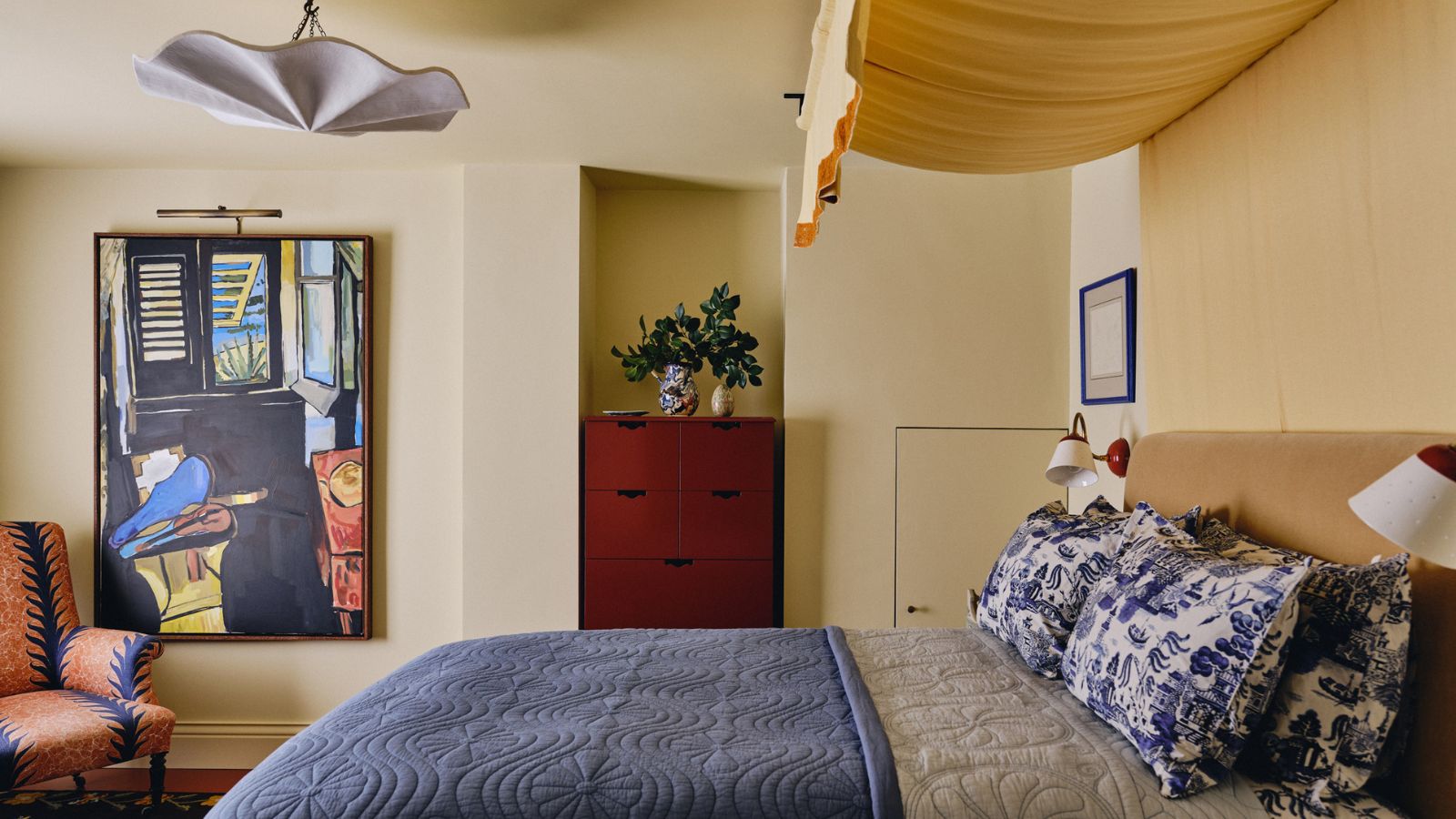
Is the ‘unexpected red theory’ trend still going strong in 2025?
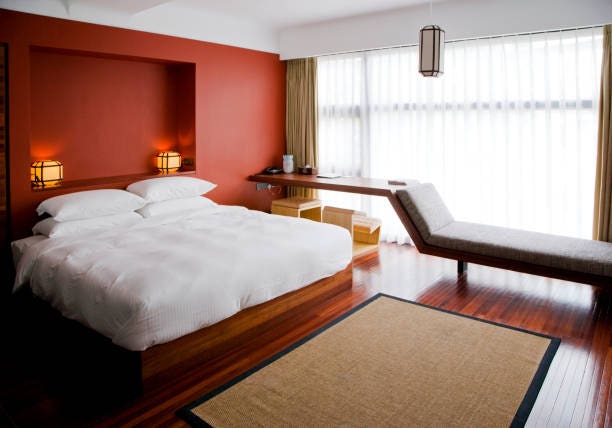
What Is The Unexpected Red Theory, And Why Does It Work?

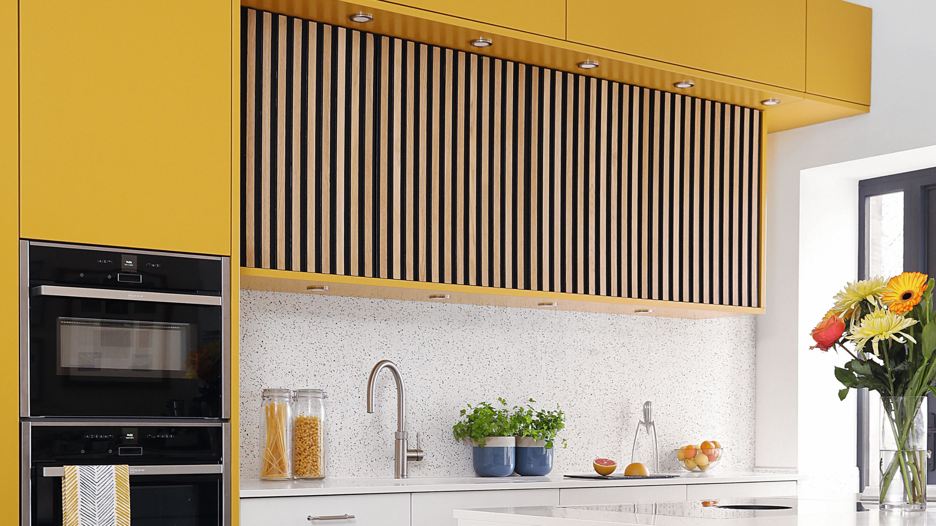
'Potential buyers may see it as a DIY job gone wrong' – this popular interior trend may be devaluing your home
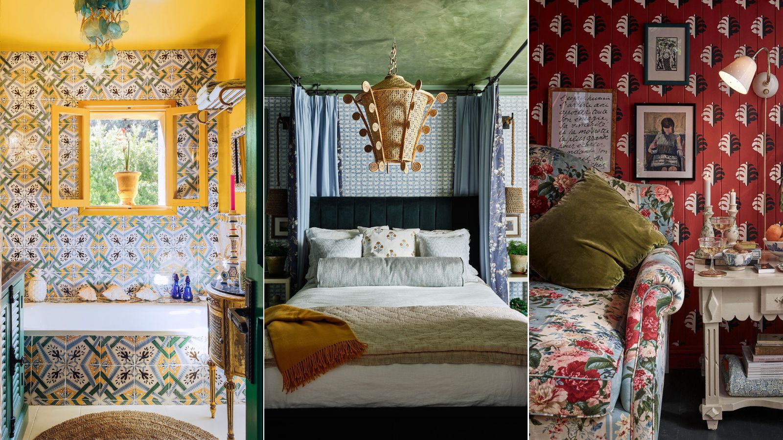
Pattern clashing is the tricky trend we are loving – 10 rules designers always follow to ensure it works
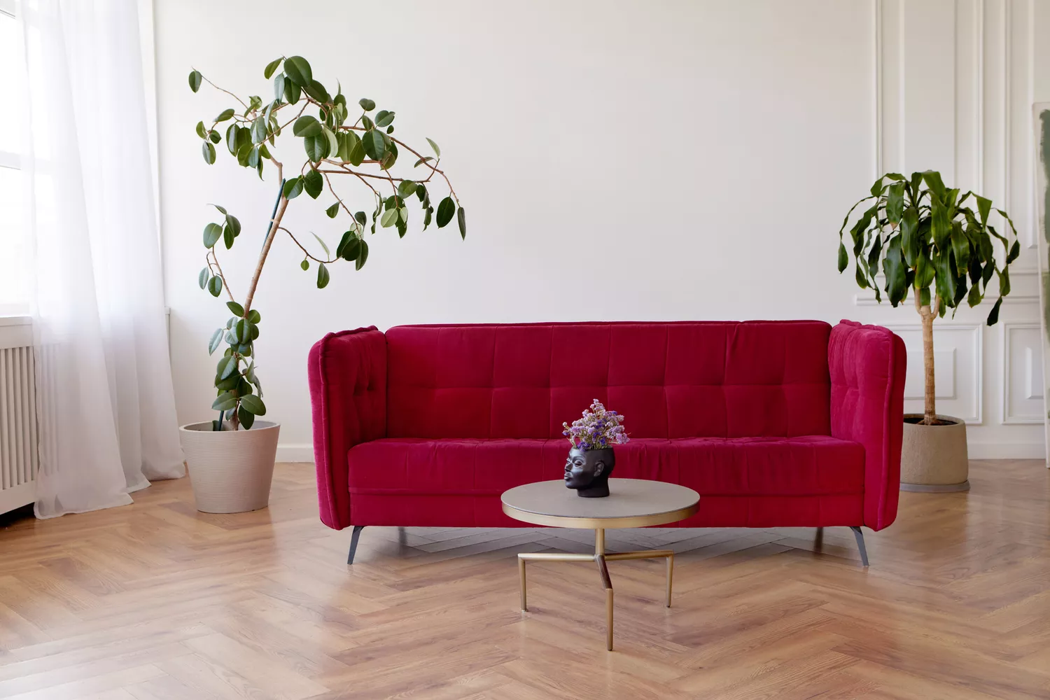
The Unexpected Red Theory Will Change the Way You Approach Interior Design

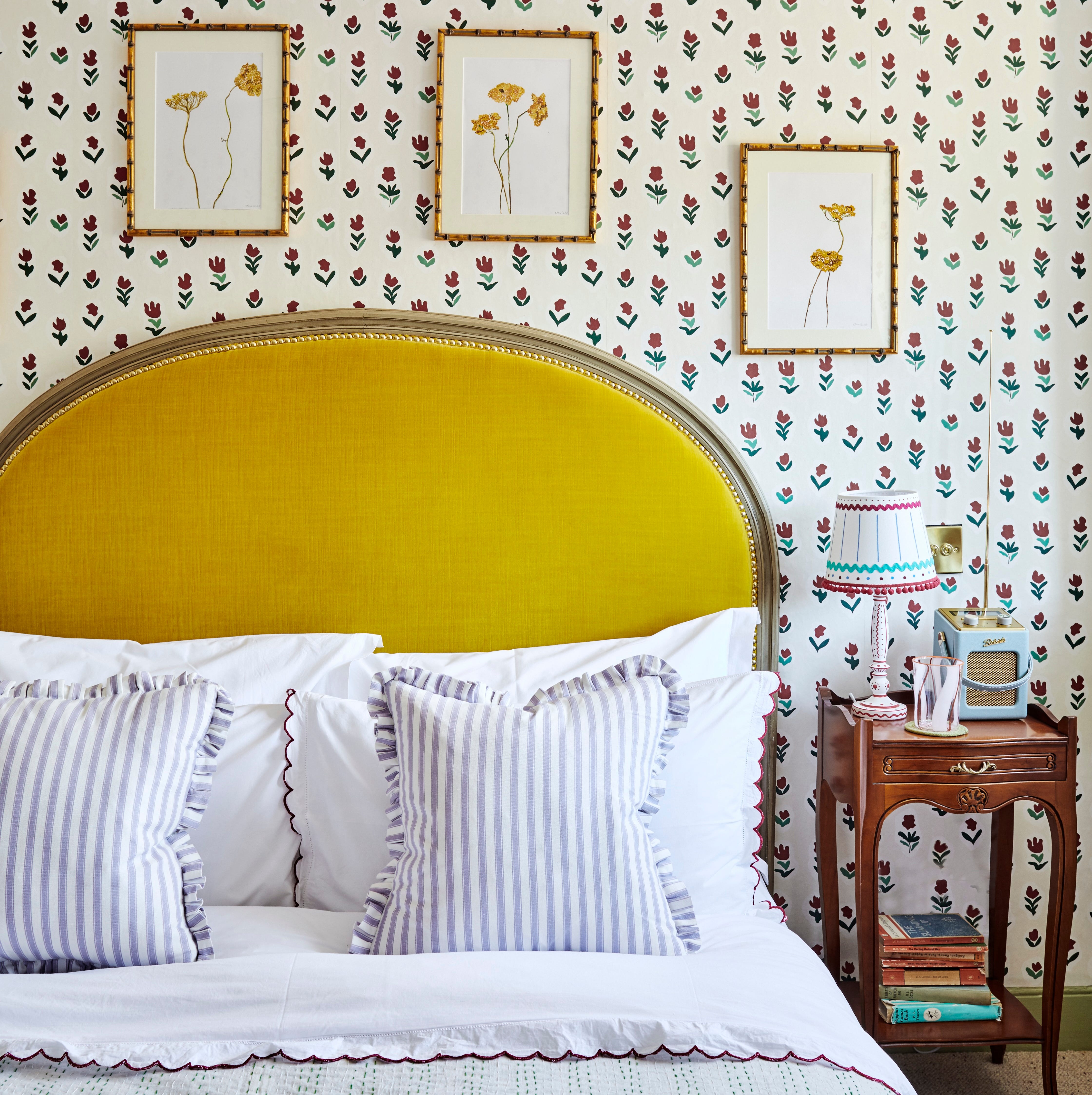
‘Unexpected Yellow Theory’: The Bold New Interior Trend Replacing Red in 2025
Talking Colour with American Design Duo The Novogratz |

People Are Defending The "Unpopular" Home Design Trends That Actually Make A Lot Of Sense In Their Own Homes

"Seeing Red" Doesn't Have to Be a Bad Thing — Here's How Designers Are Decorating With Red in a Way That Still Feels Timeless
These Unusual Paint Colors May Not Be An Obvious Choice, But Designers Can’t Get Enough
Pink as a Design Tool: Atmosphere, Identity, and Experimentation in Interior Design

The "Unexpected Red Theory" Could Elevate Your Home and Fashion Game