1/8
What are the best trim colors? 7 alternatives to white paint to elevate your room's palette
The article explores various alternatives to traditional white paint for interior trim, offering expert advice from interior designers on how to elevate a room's aesthetic through thoughtful color choices for baseboards and crown moldings. Traditionally, trim has been painted white, often becoming an afterthought in the design process. However, the article argues that embracing color for these architectural details can introduce an extra layer of visual interest and create a more considered and impactful space.
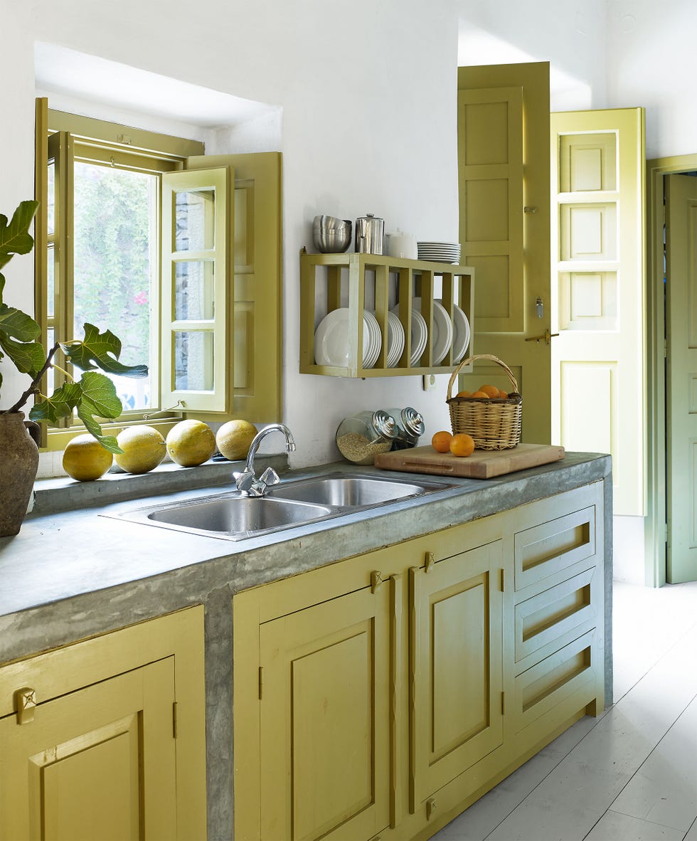
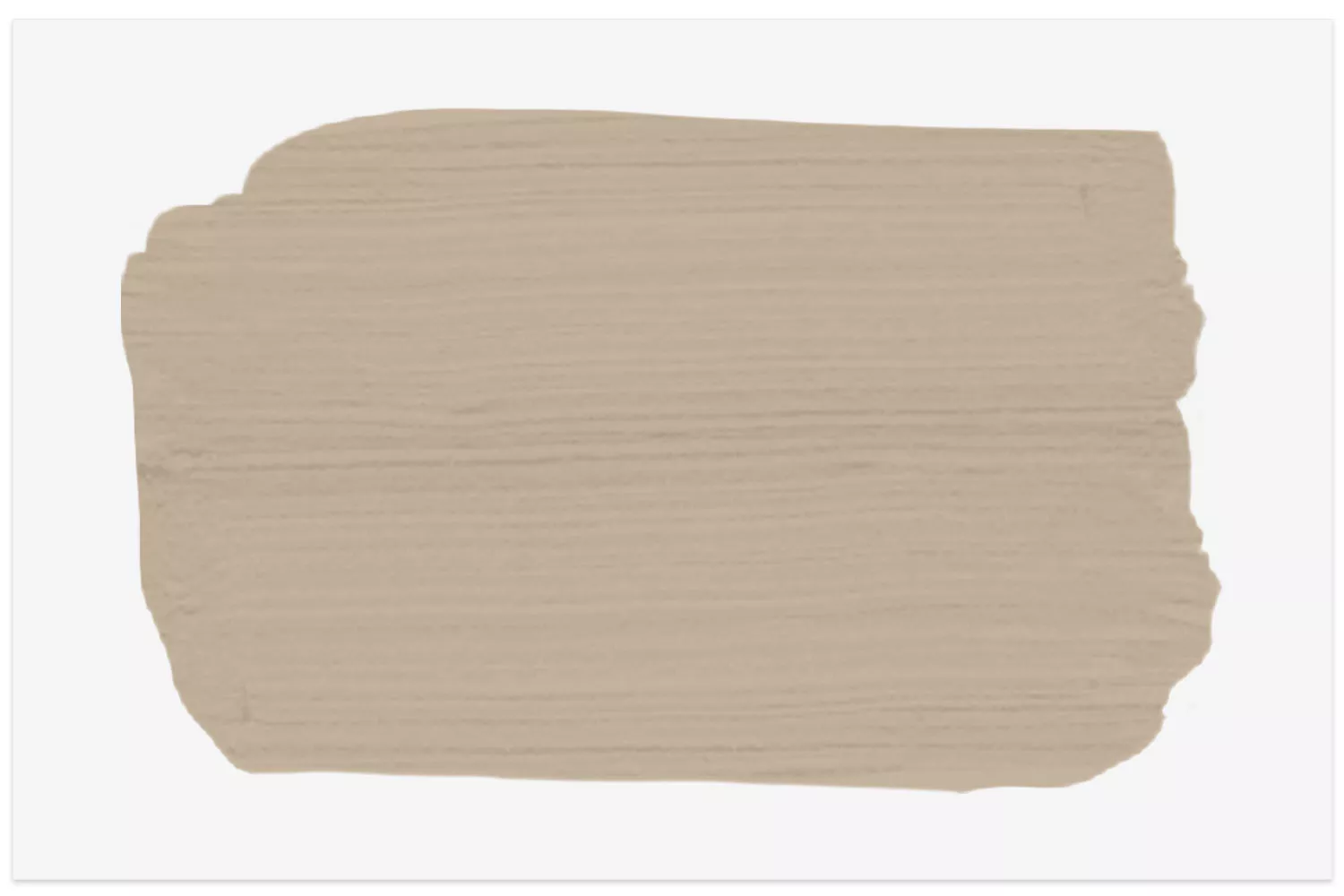
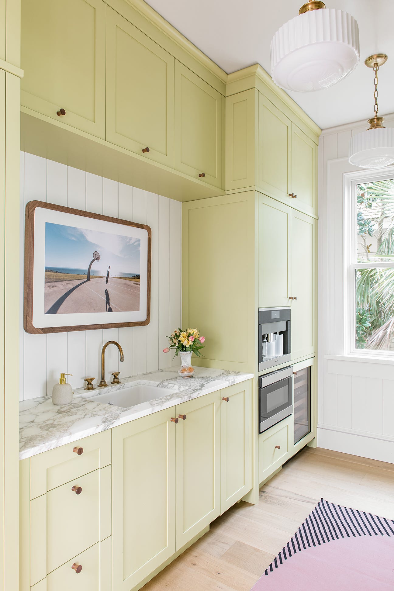
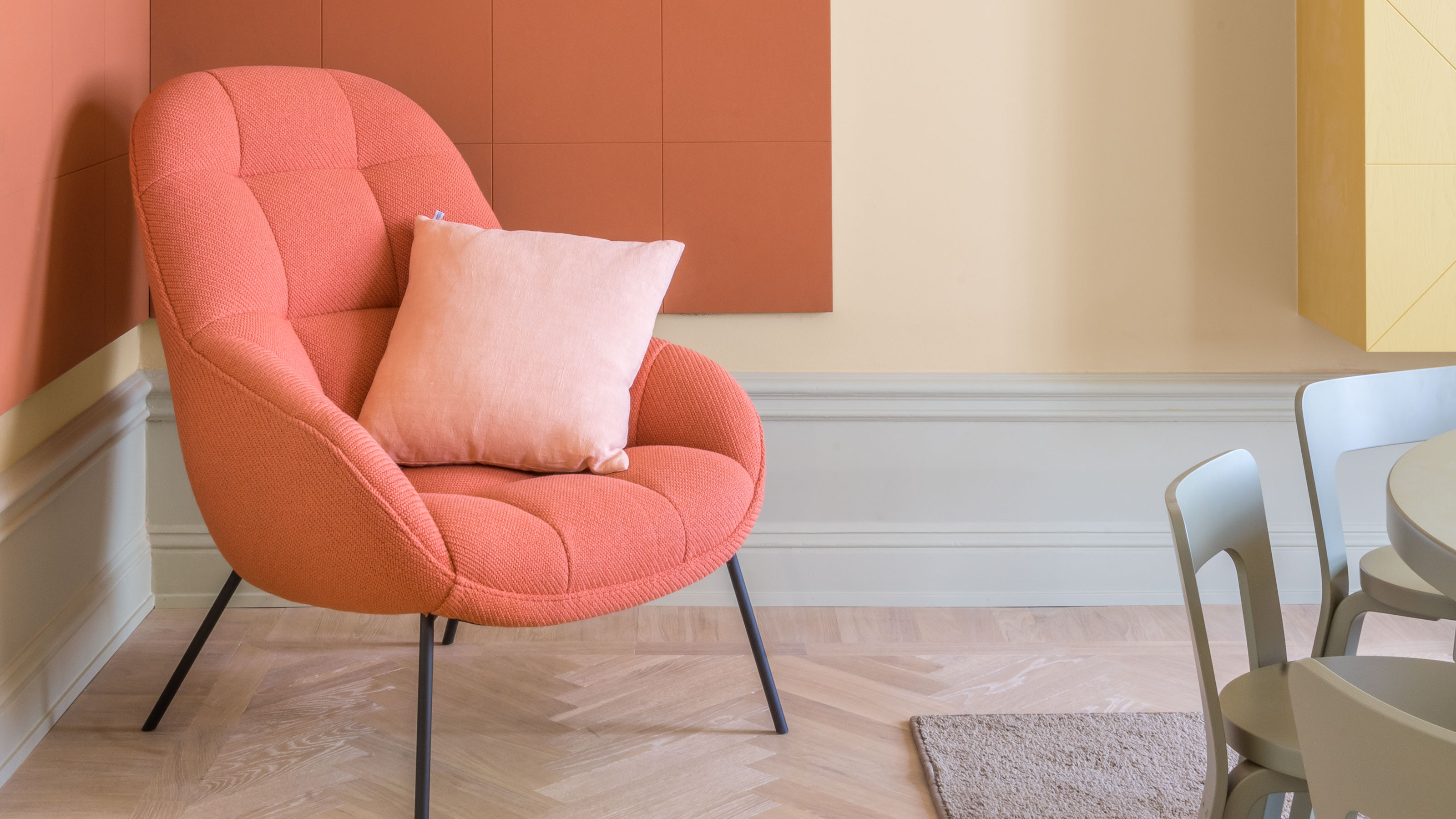
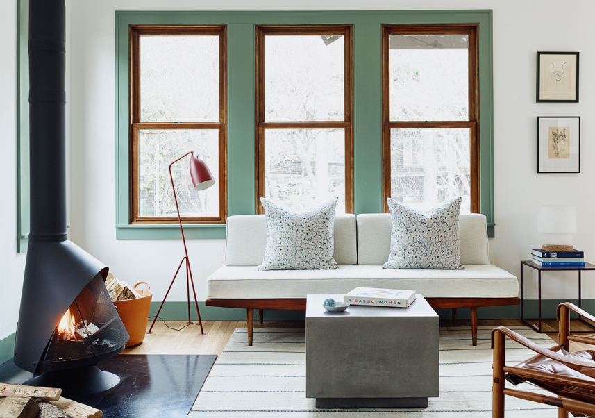
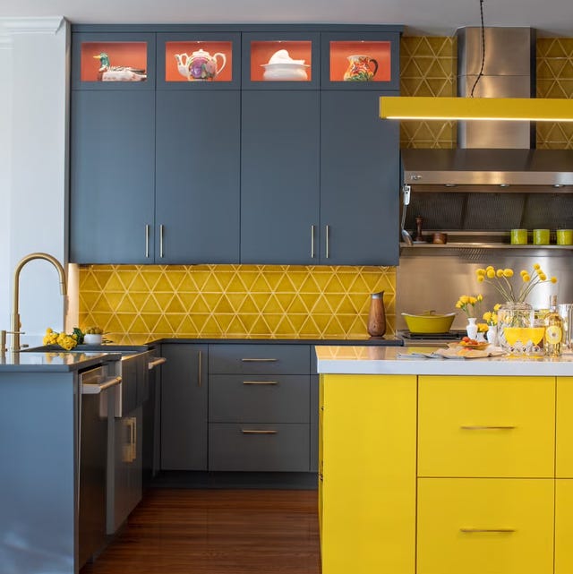
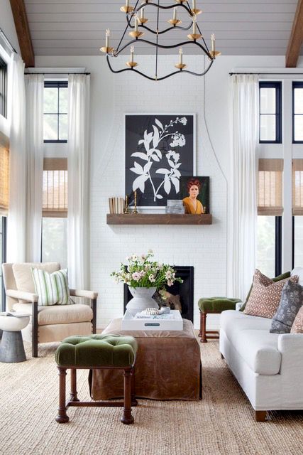
One of the primary recommendations is sage green, which can act as a versatile neutral while adding a touch of playfulness. Cortney Bishop, Principal Designer at Cortney Bishop Design, highlights its ability to draw out substantial trim with color, particularly in rooms with white walls where it can provide warmth and interest without relying solely on large artworks. Yellow is presented as another excellent option, capable of injecting warmth and style, especially when paired with cooler wall colors. Ruth Mottershead, Creative Director at Little Greene, notes that moving away from white woodwork, ceilings, and skirting fosters a contemporary and cohesive scheme. The article suggests using a color wheel to find complementary pairings, such as yellow with blue, for a visually pleasing contrast.
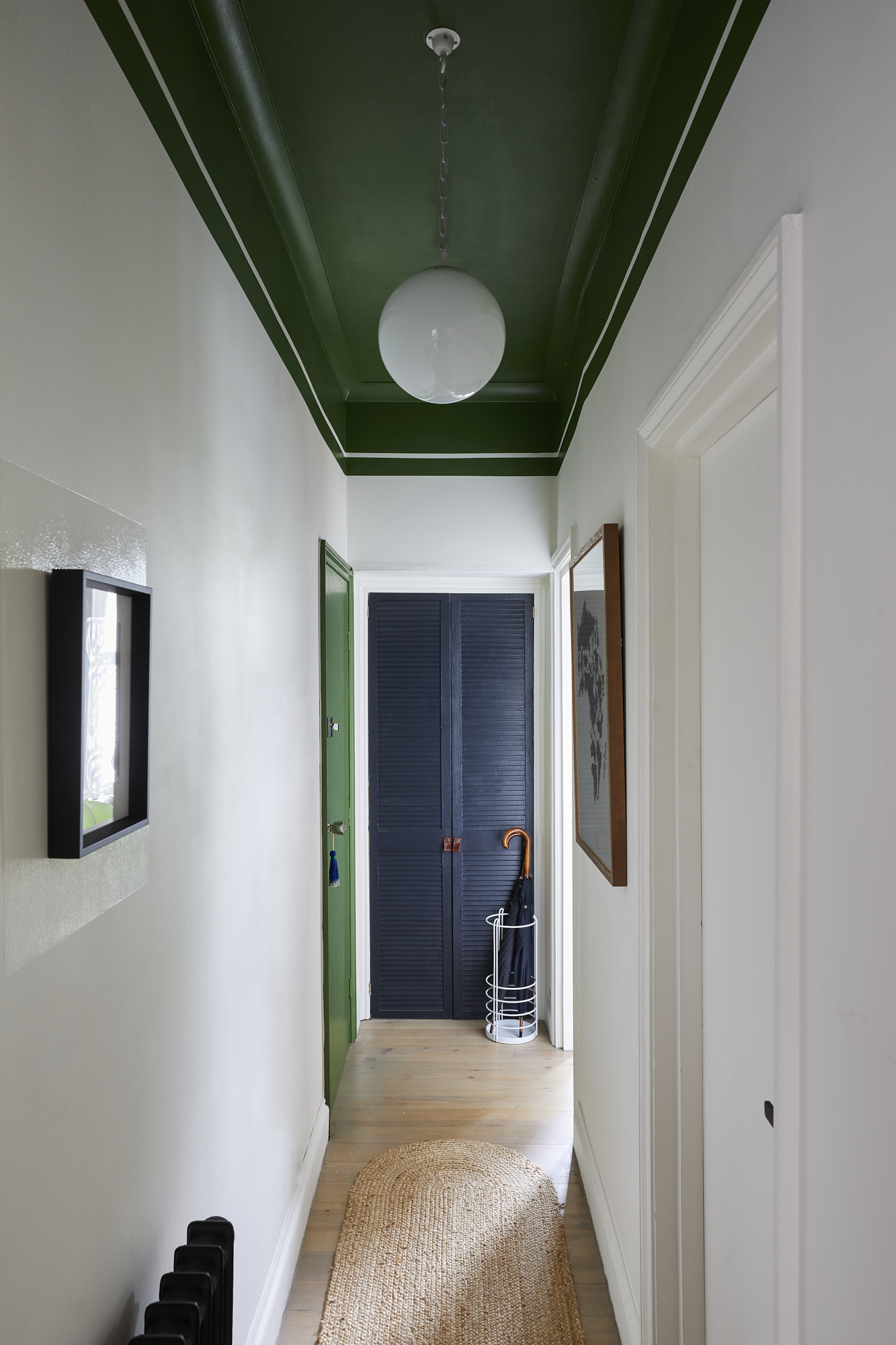
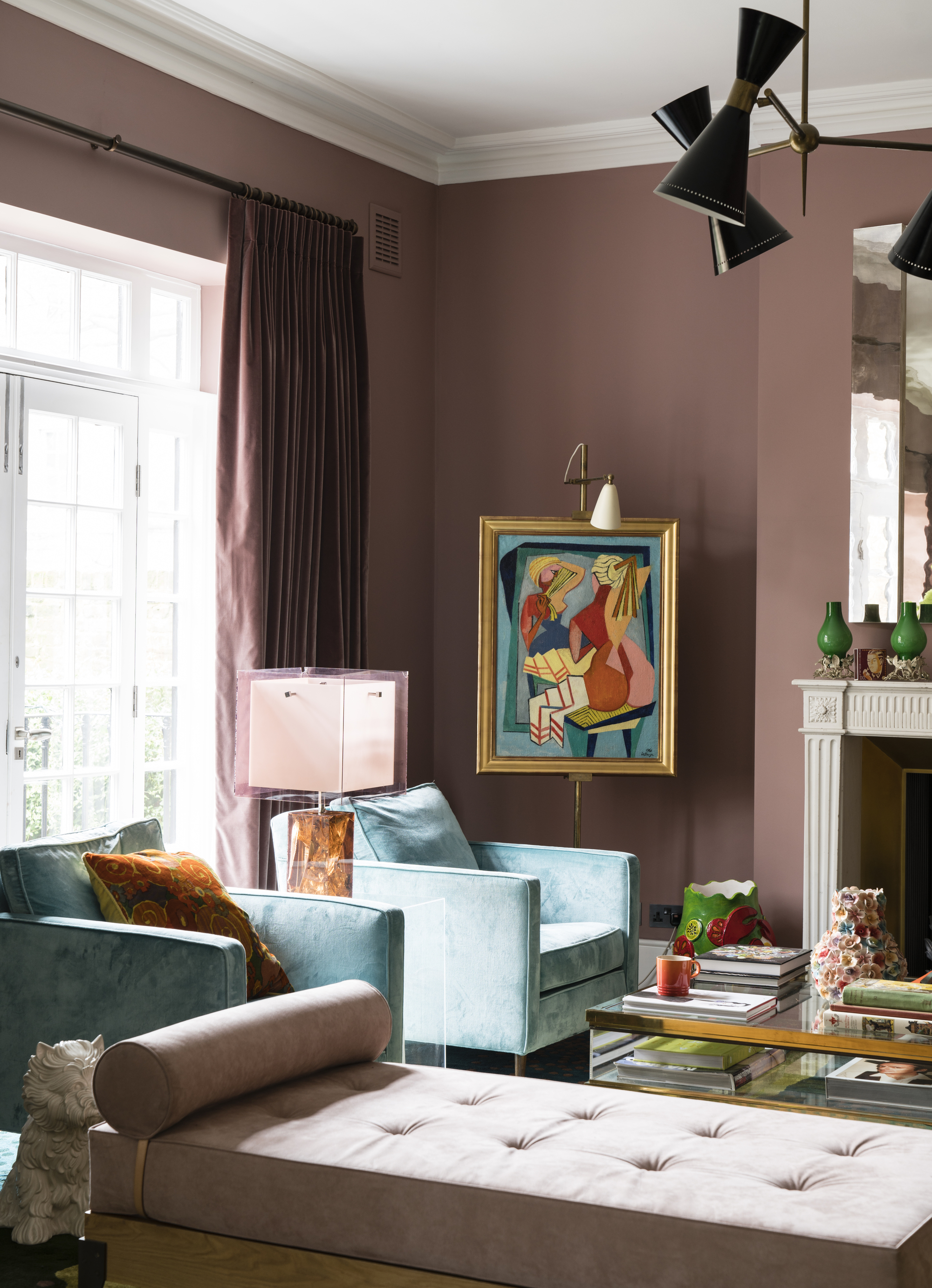
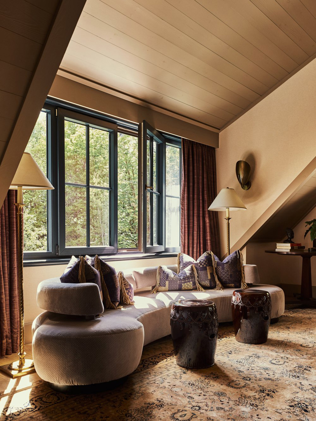
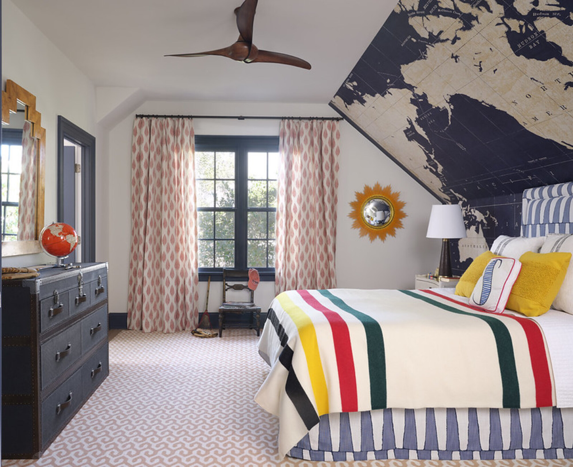
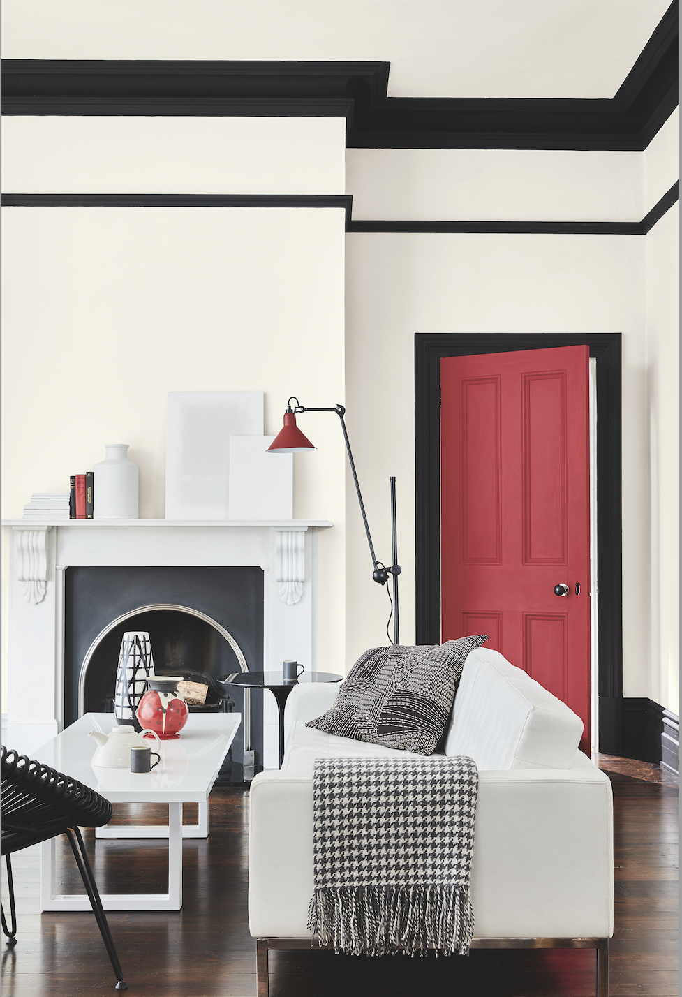
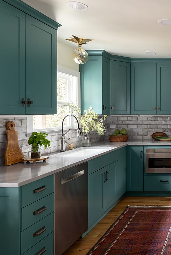
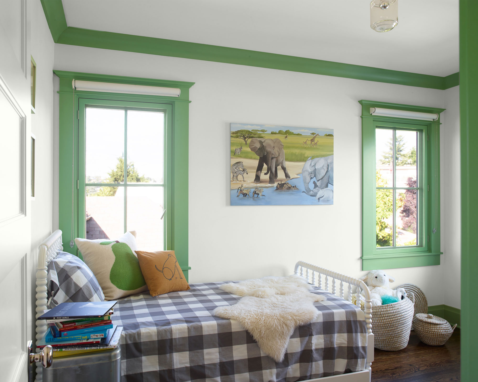
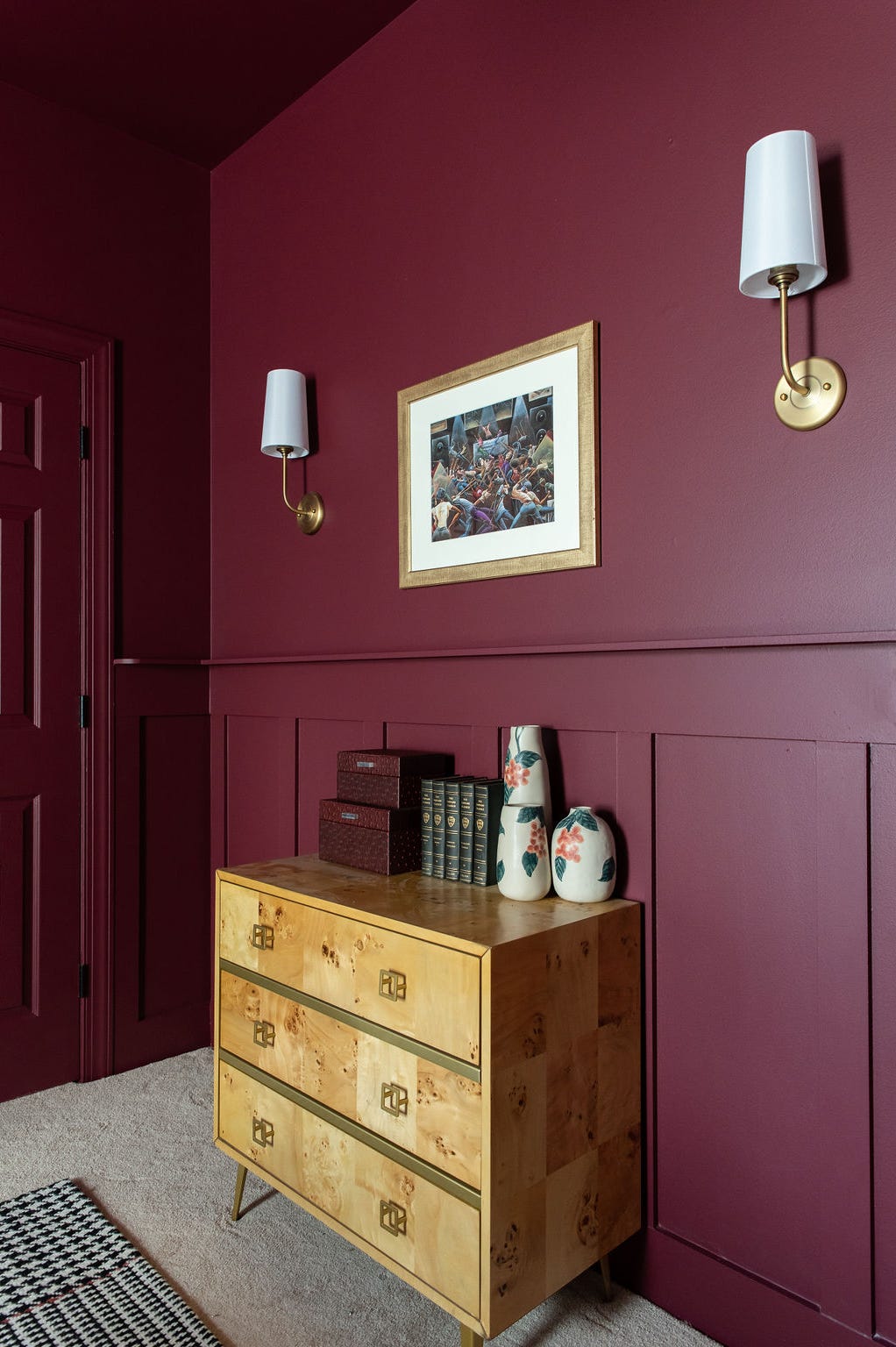
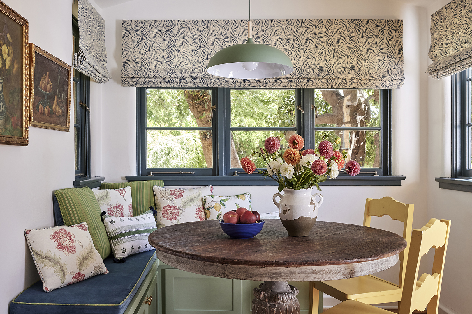
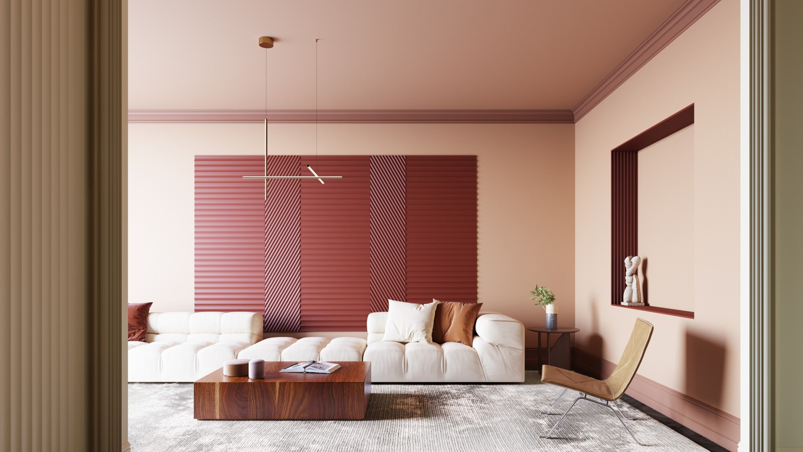
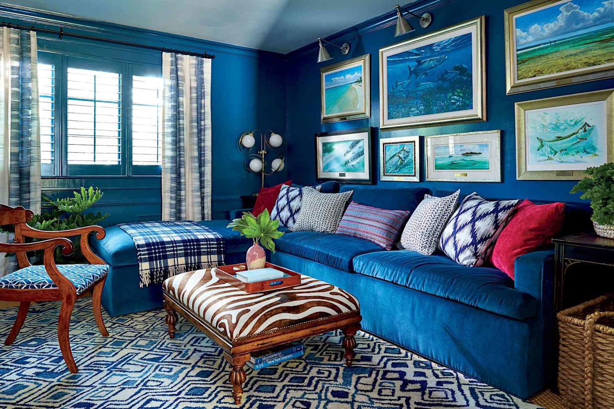
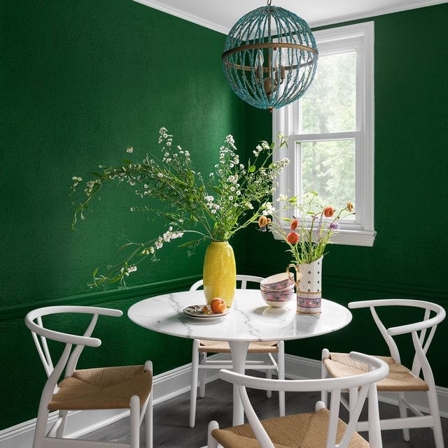
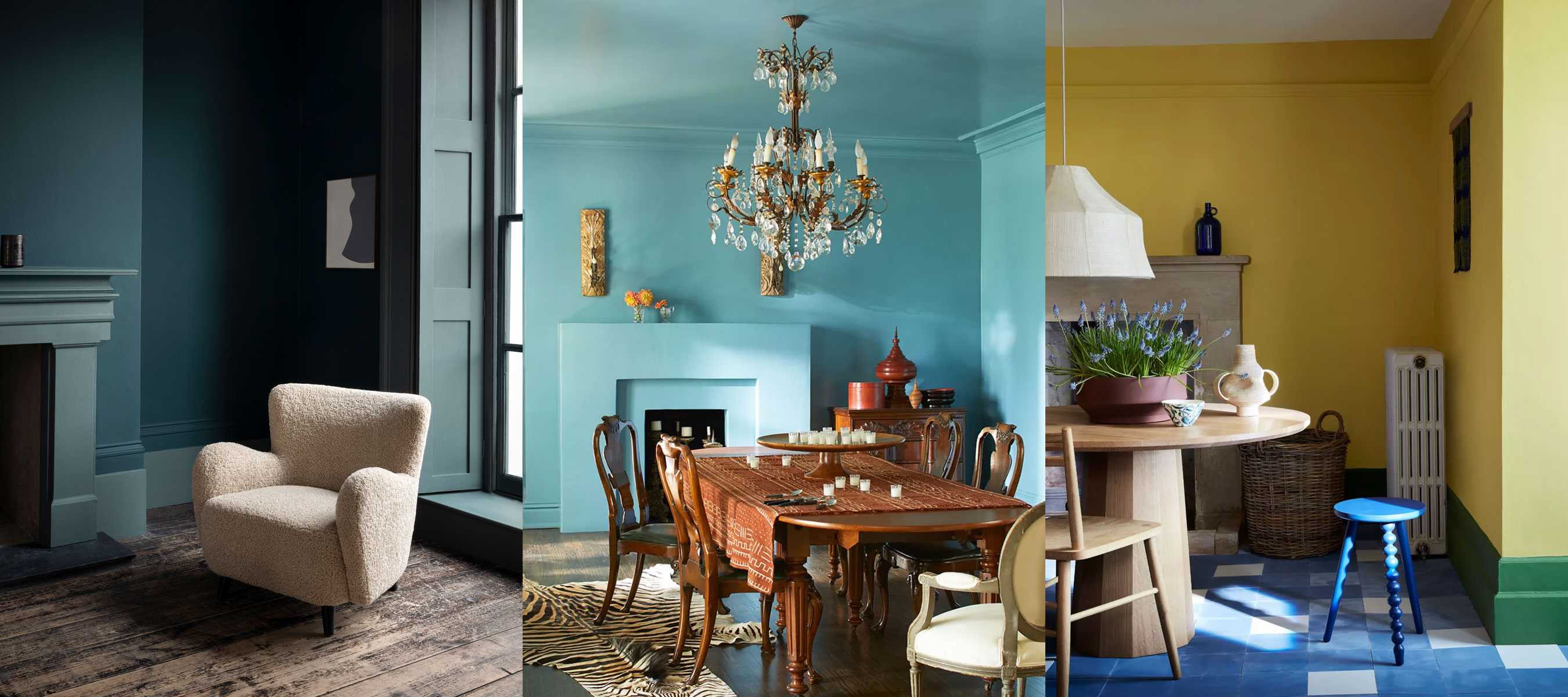
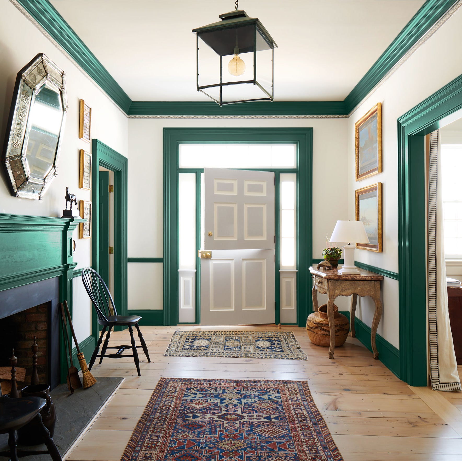
For those seeking bolder statements, red trim is discussed as a way to create intrigue and highlight specific architectural features. Laura Stephens, founder of Laura Stephens Interior Design, describes how red trim can separate different wall colors and draw the eye upwards, as seen in a living room where red trim accented a wallpapered ceiling. She advises selecting a red tone that harmonizes with other existing elements within the scheme to maintain cohesion. Dark green is recommended for baseboards and skirting to ground a space and subtly link open-plan areas. Emma Gurner of Folds Inside suggests using paint color charts to identify complementary colors and even exploring monochromatic schemes with varying tones from the same color family.
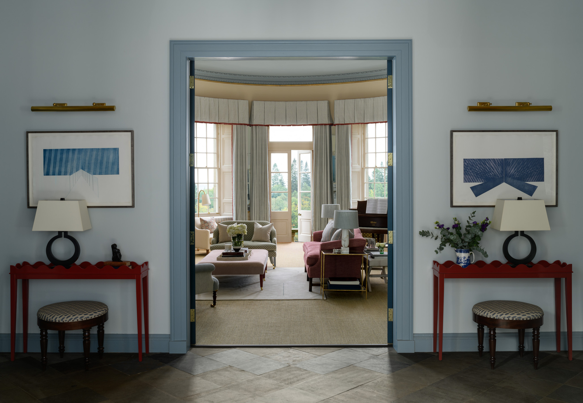
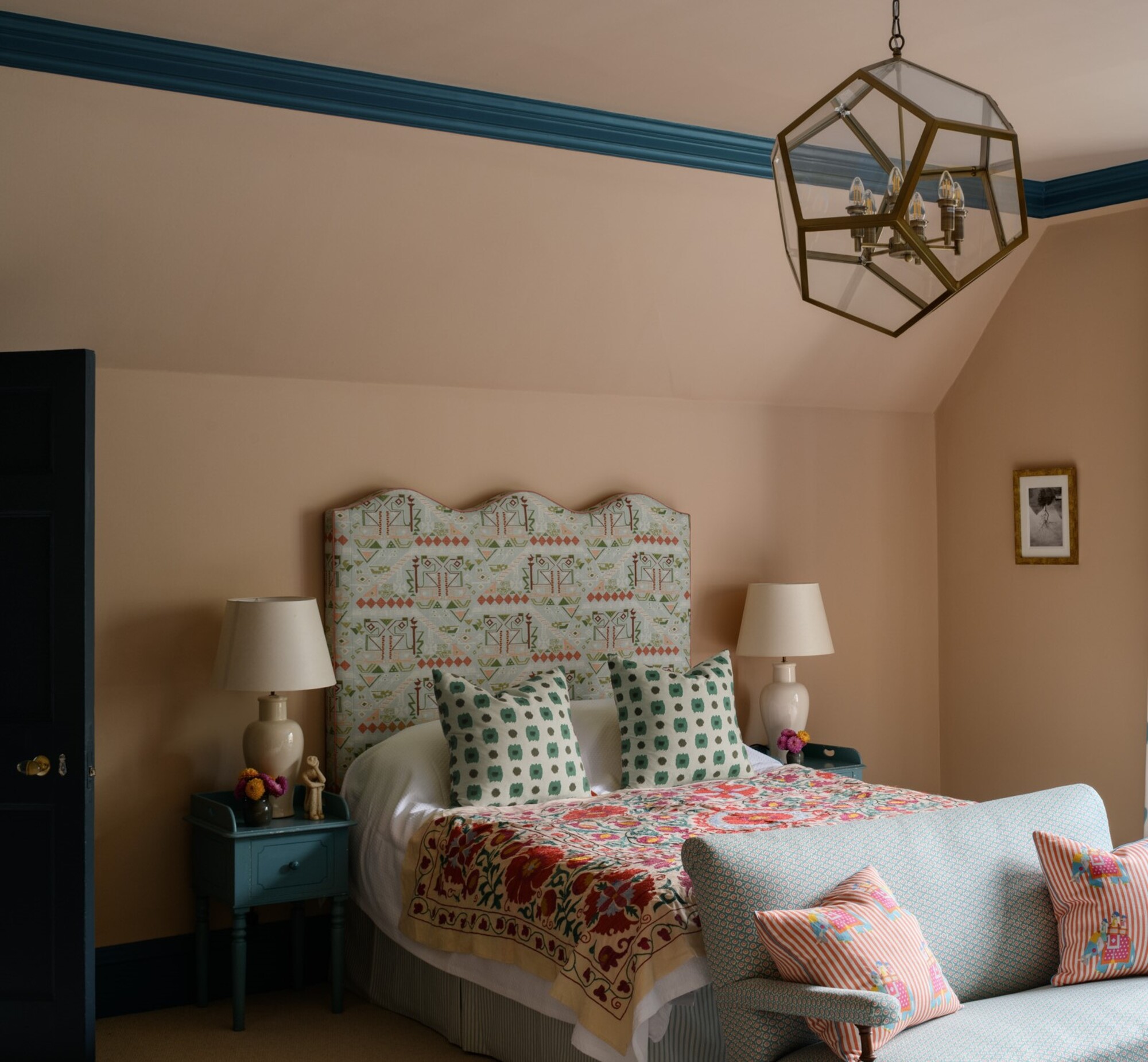
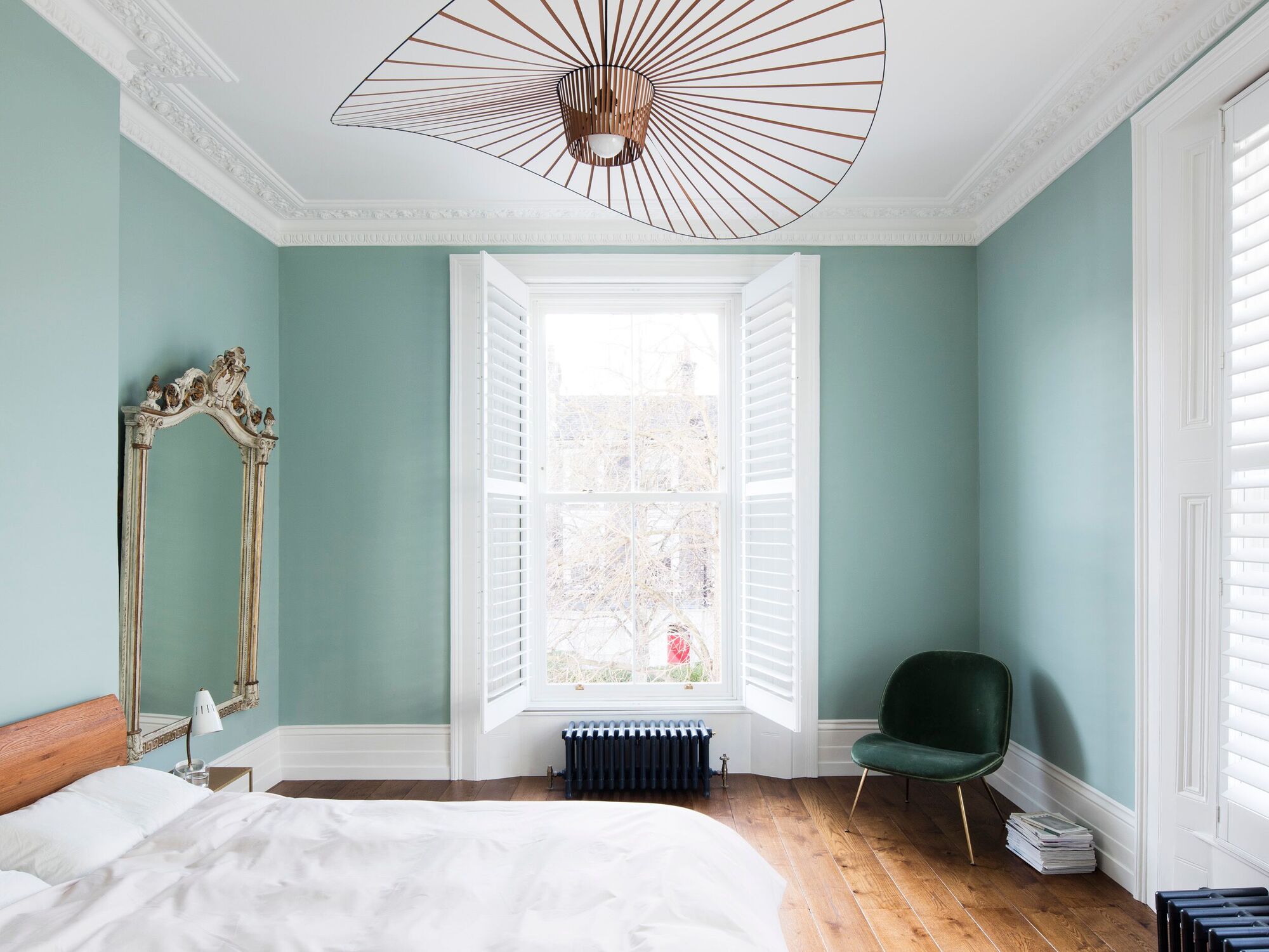
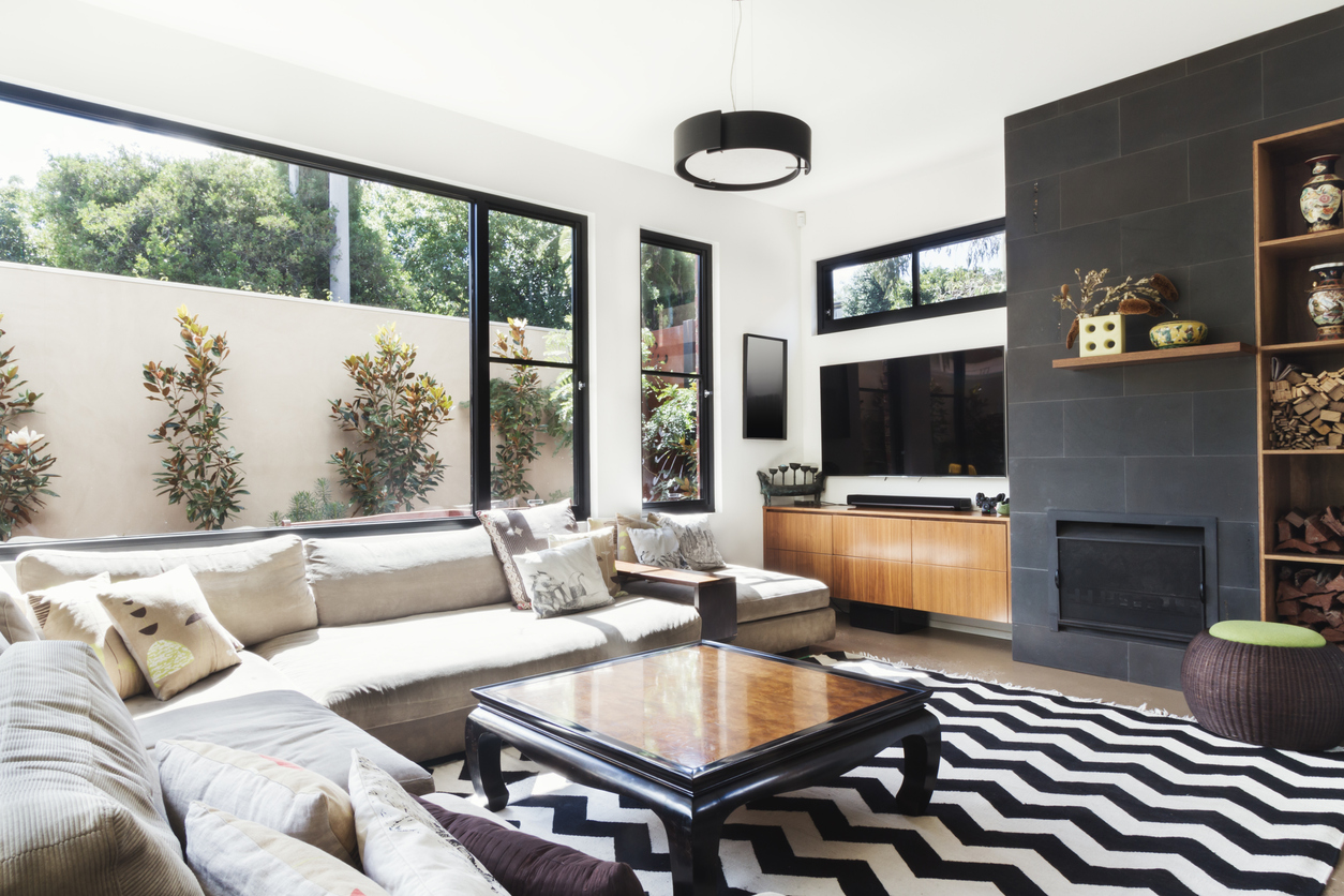
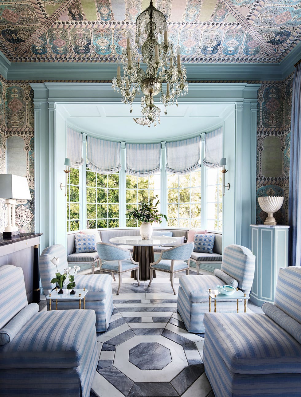
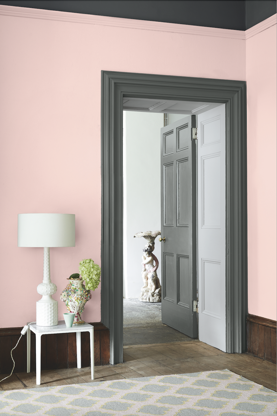
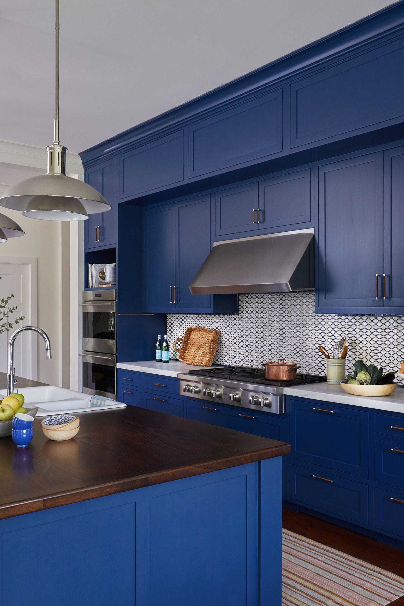
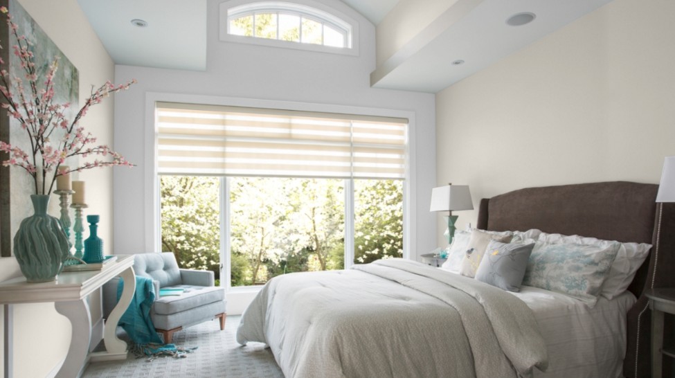
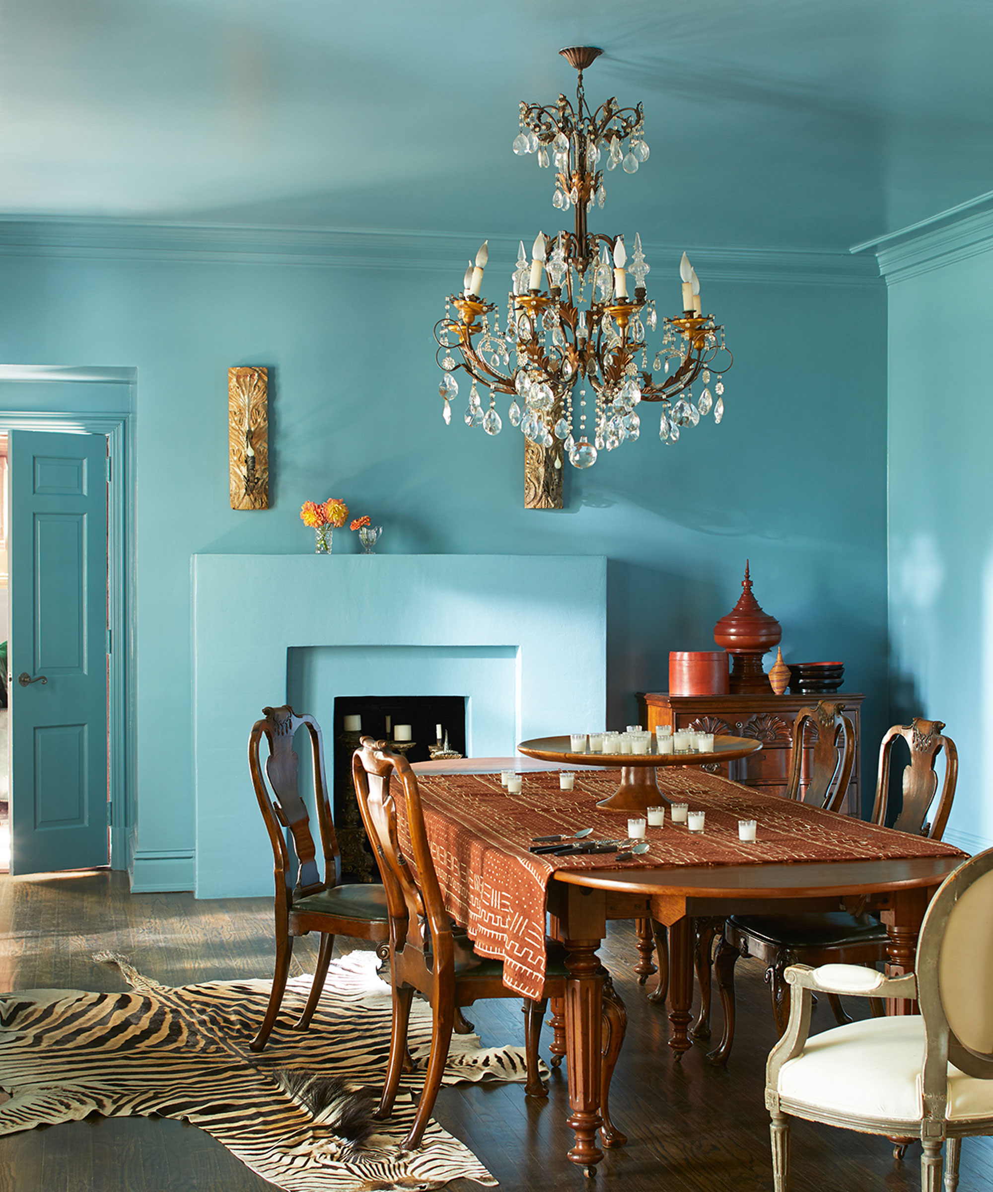
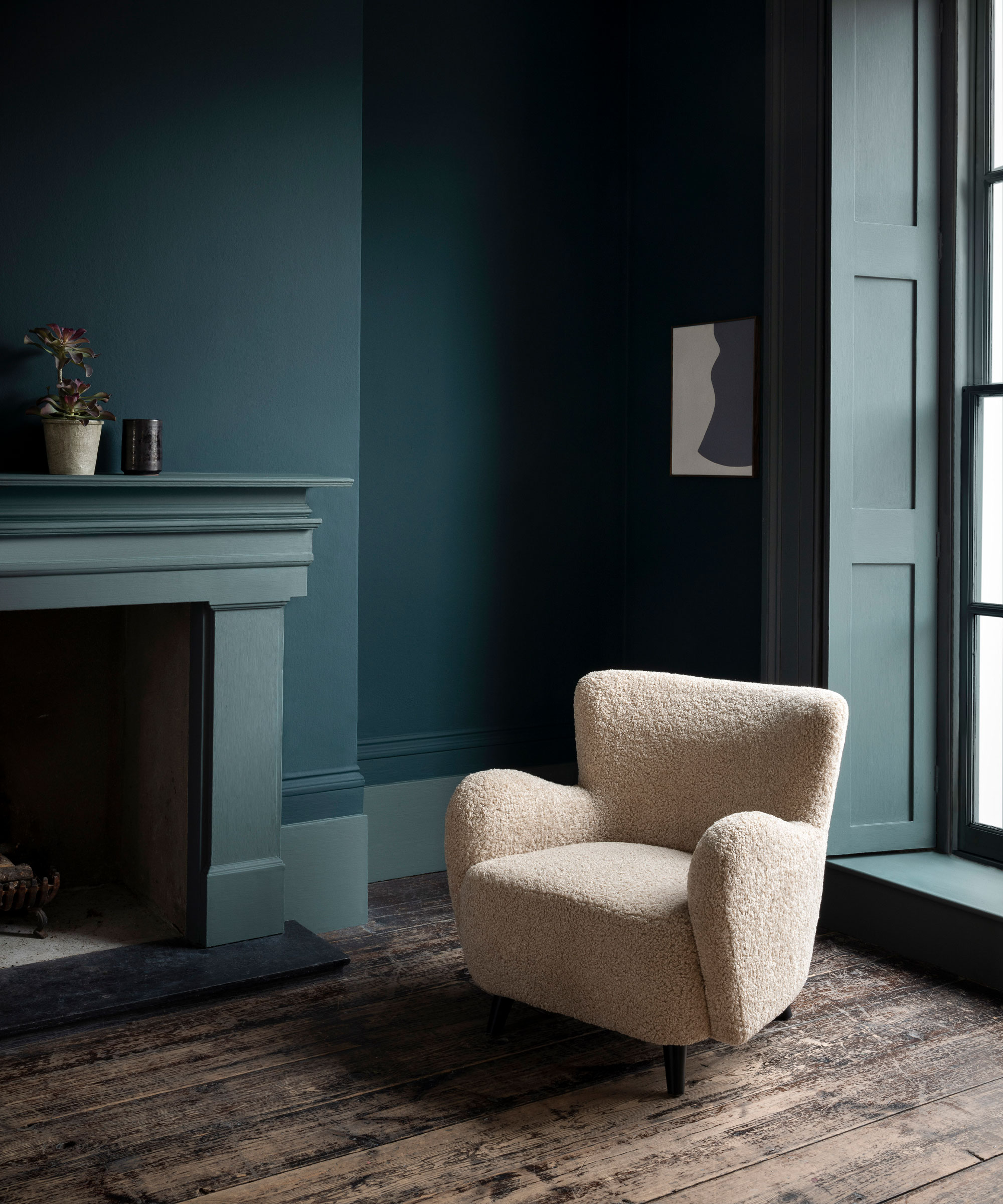
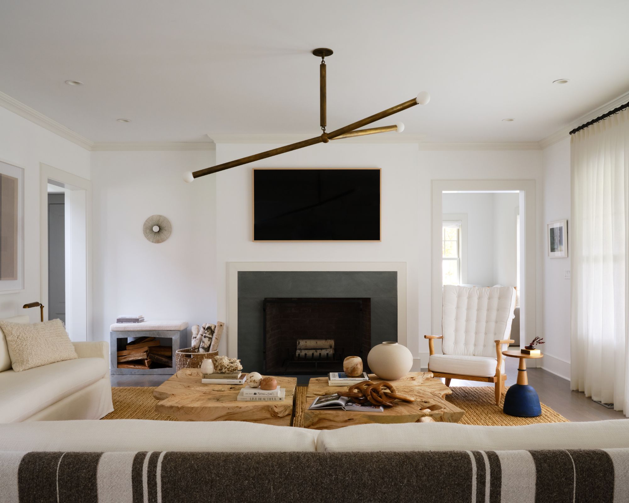
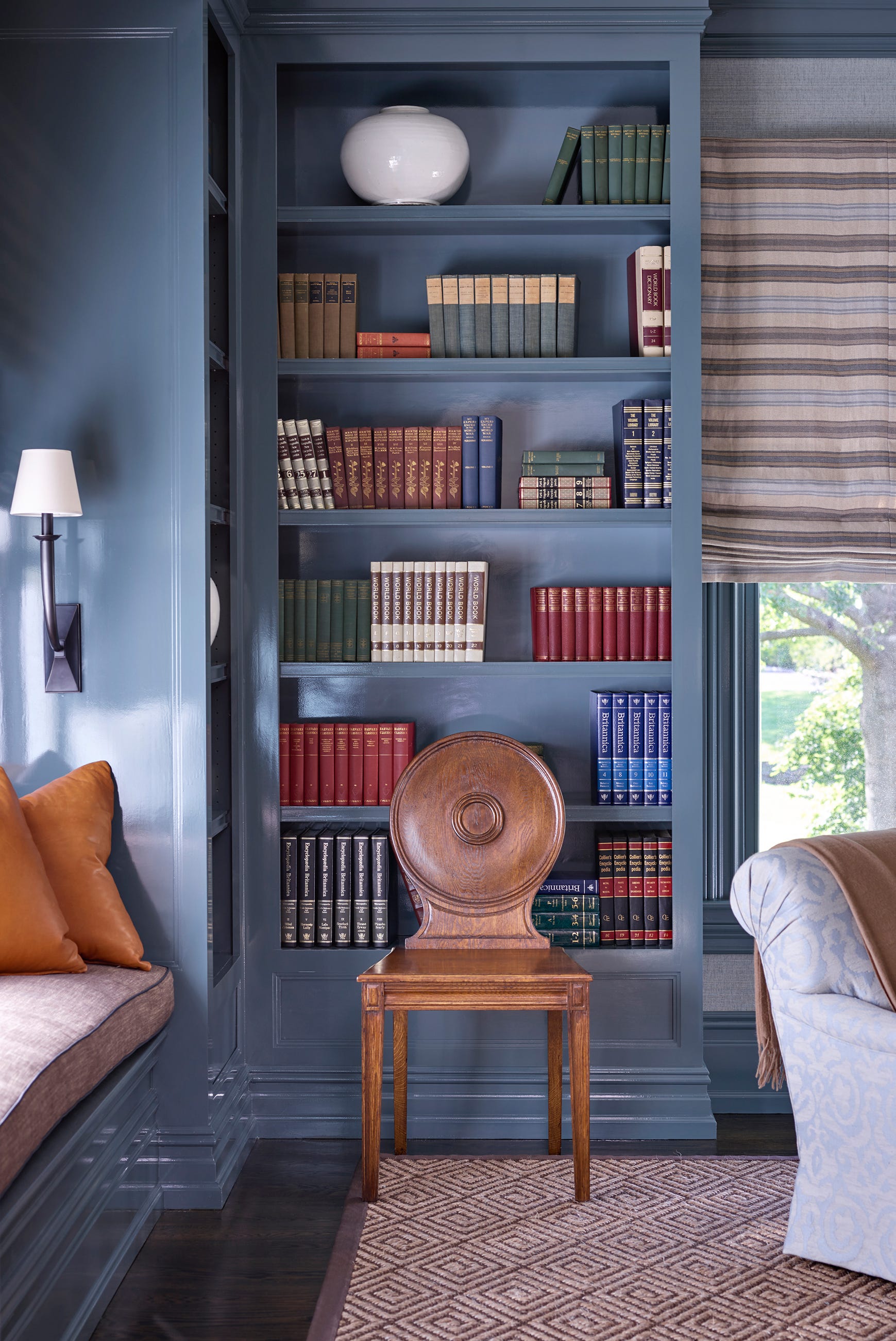
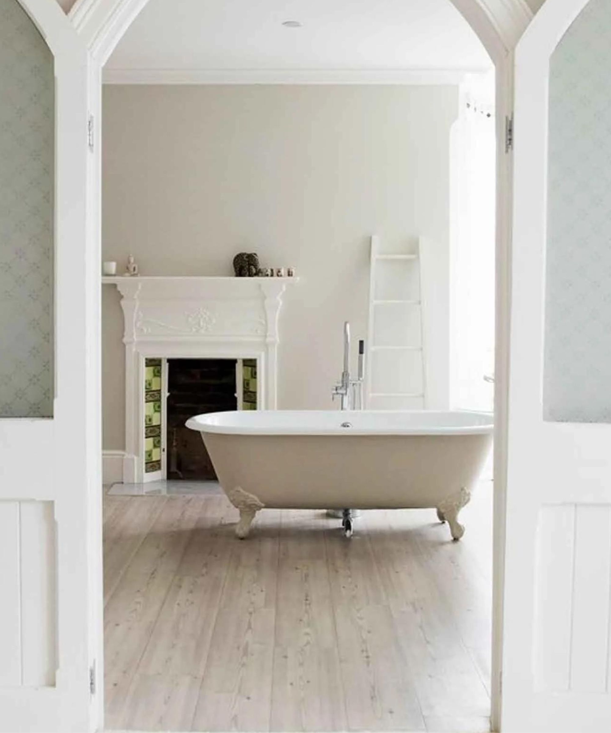
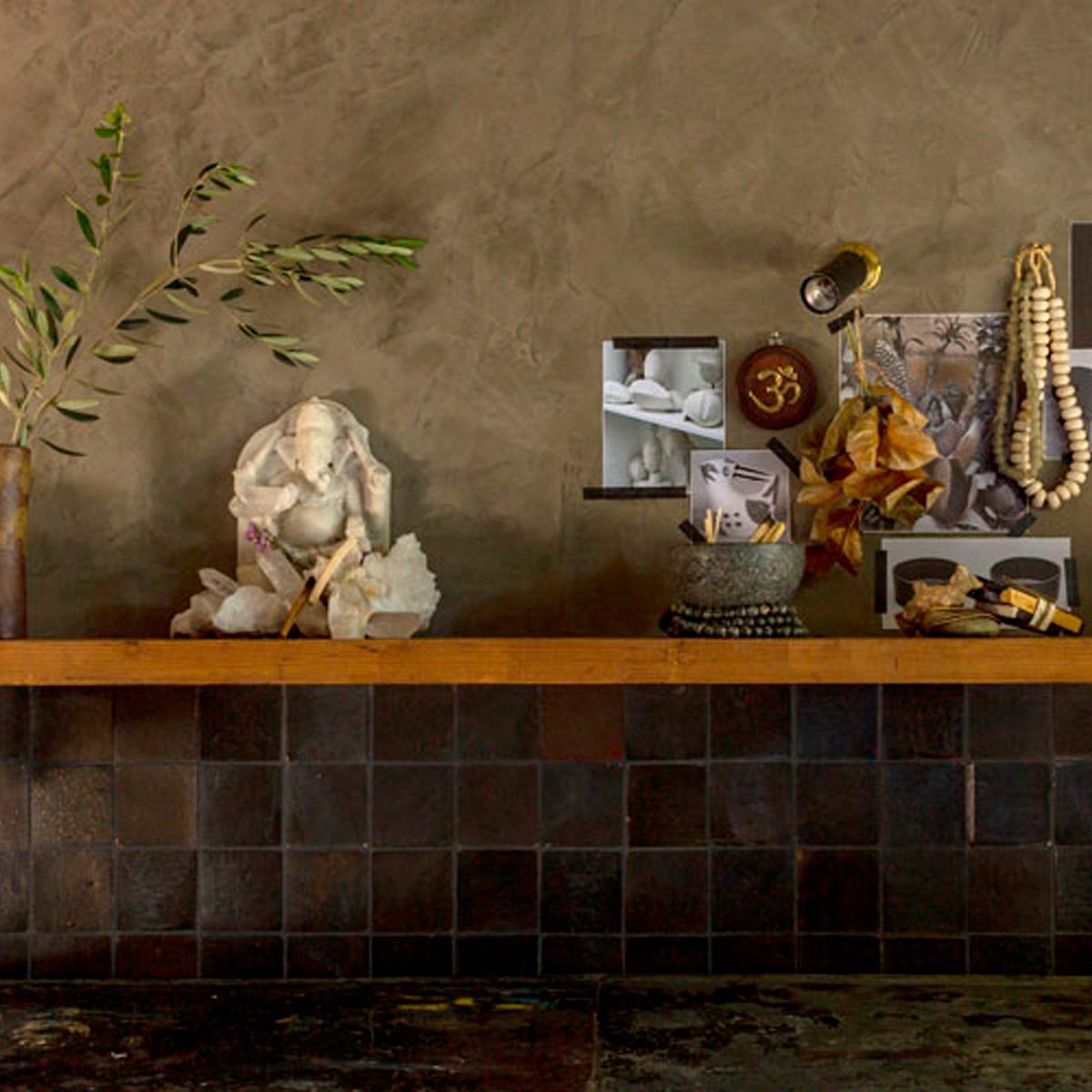
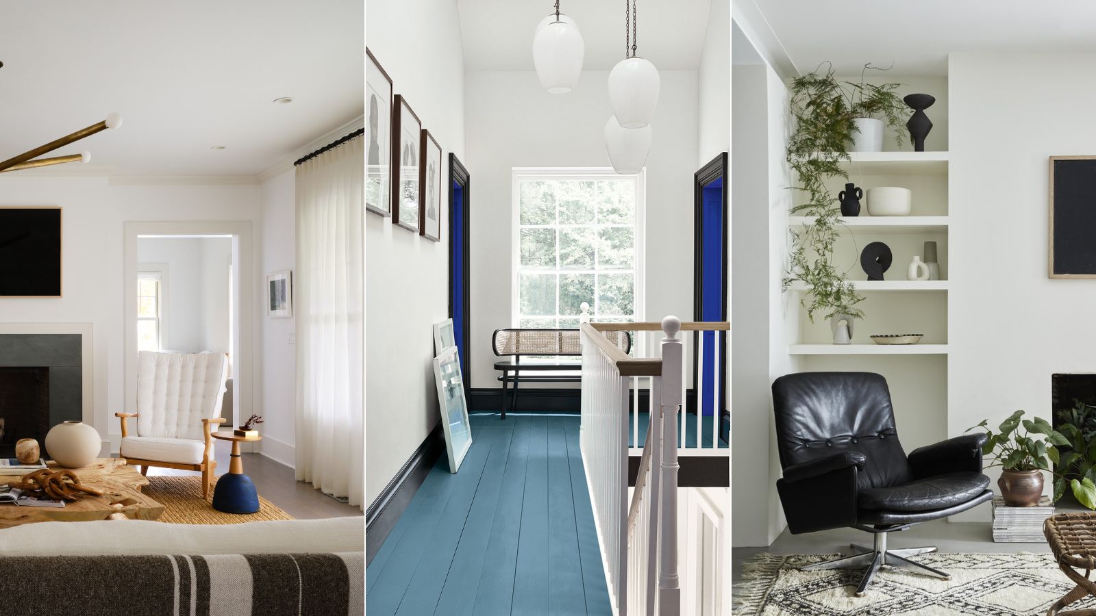
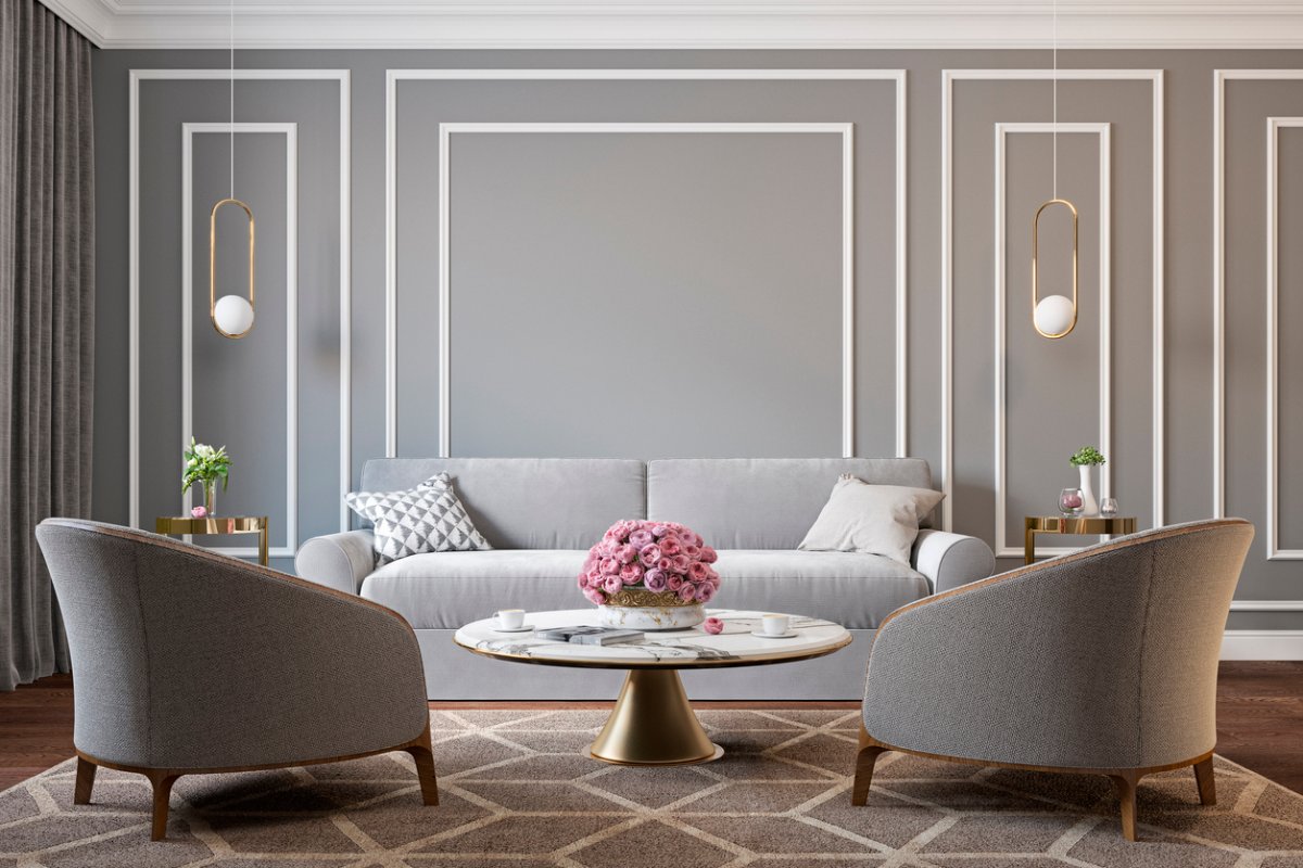
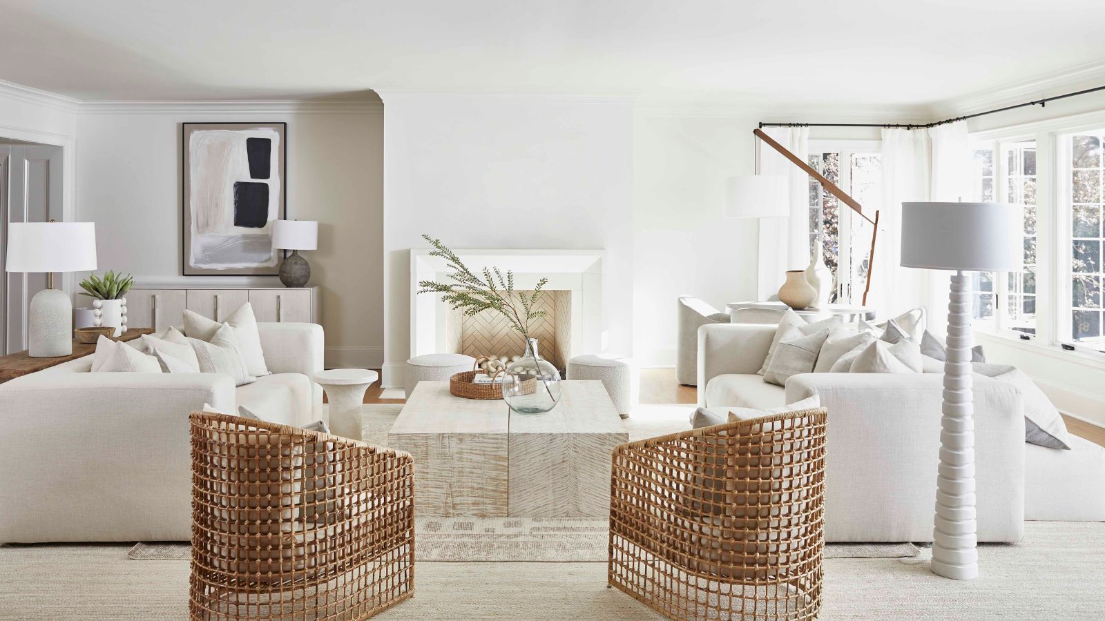
Grey is offered as a sophisticated and timeless alternative, providing visual weight without being overly bold. Tom Cox of HÁM Interiors explains that using a bolder grey for trims and skirtings in conjunction with a natural hue on walls and ceilings can create a tailored effect, with accents of the trim color connecting adjoining rooms. Blue trim is proposed for a luxurious, all-encompassing finish, especially in smaller or awkward spaces like utility rooms or cloakrooms. Helen Shaw, Director at Benjamin Moore, suggests that applying a single shade across skirting, walls, ceiling, and window frames can make a small room feel more expansive by blurring lines. Finally, lilac is introduced as an unexpected yet brilliant choice for a pop of color, working well with pink tones, olive greens, and sunny yellows, or adding intrigue to white and grey schemes. Natasha Bradley, Lick's Director of Interior Design, emphasizes that contrasting woodwork can be a fun way to inject personality, even with neutral wall colors. The article concludes by encouraging readers to experiment with different tones within the same color group for subtle looks or contrasting colors for bolder effects, using the color wheel as a guide. It also highlights the technique of painting trim the same color as the walls to open up a room by eliminating visual breaks.
#InteriorDesign #PaintColors #HomeDecor #ArchitecturalTrim #ColorSchemes #DesignTips #WallPaint #HomeImprovement #DecoratingIdeas #InteriorDesign #PaintColors #HomeDecor #ArchitecturalTrim #ColorSchemes #DesignTips #WallPaint #HomeImprovement #DecoratingIdeas
0 comment in total
You may also like
I'm so over white trim! But I love these color combos designers are using to elevate rooms instead
We Asked 20 Designers for Their Favorite Paint Colors for Windows

7 Best Interior Texture Paints

Why always white trim? These designers are breaking the mold.
Should I paint my wall trim white? The pros and cons to painting your molding
8 ideas for light walls with dark trim that capture this paint trend perfectly
6 Paint Color Mistakes To Stop Making, According To Designers

Is white actually out of style? Interior designers weigh in on this classic color for 2025 decorating

5 Classic Wall and Trim Color Combinations—and 5 for Rule-Breakers Only

13 Paint Colors That Pair Well With Wood Trim


Best white paint colors: Expert share the top options

The Interior Paint Colors You'll Be Seeing Everywhere in 2024

6 Outdated Trim Colors Designers Say to Avoid—and What to Use Instead

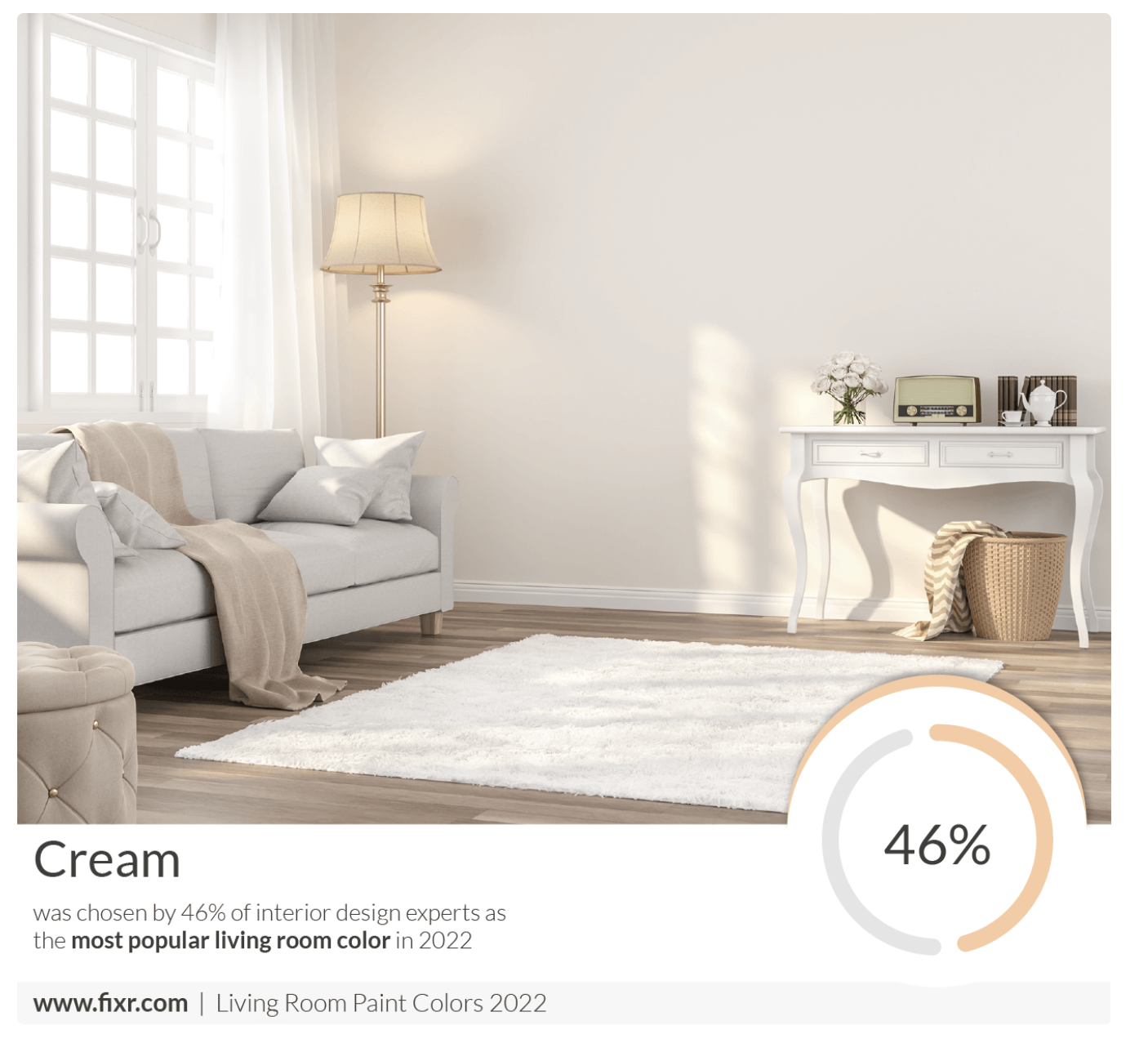
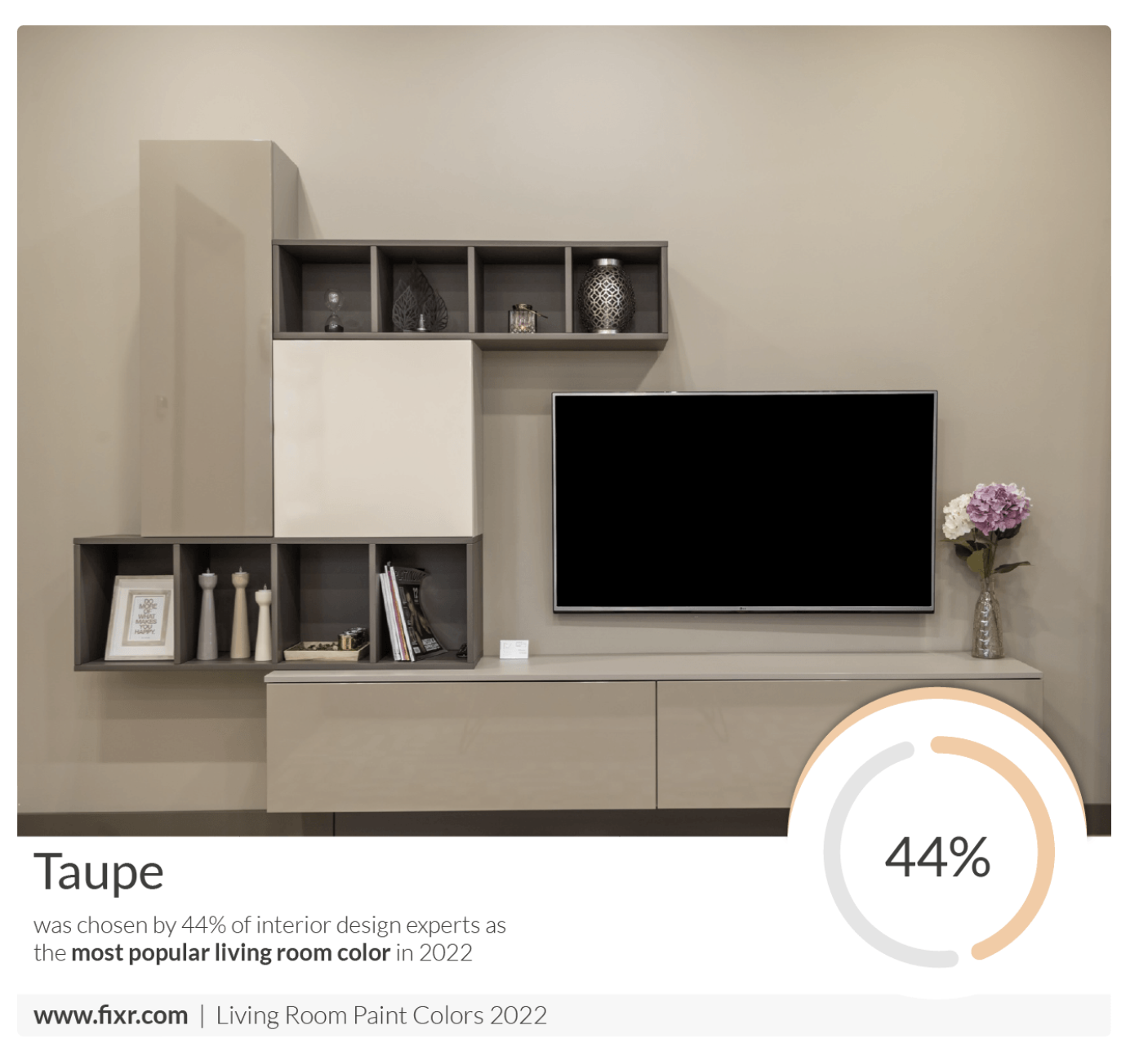
7 Popular Paint Colors for the Living Room
Should your trim match your wall color? Experts reveal 6 color tips that can lead to decorating success
7 of the best cream wall paint colors, as chosen by designers – 'they look modern, and anything but magnolia'
Why the Correct Trim Color Can Totally Transform Your Home
Ditch the White! Try One of These Designer-Approved Kitchen Colors
7 colour tricks to transform your mood and living room design

9 Ceiling Paint Colors Designers Love That Aren’t White