6 Paint Color Mistakes To Stop Making, According To Designers
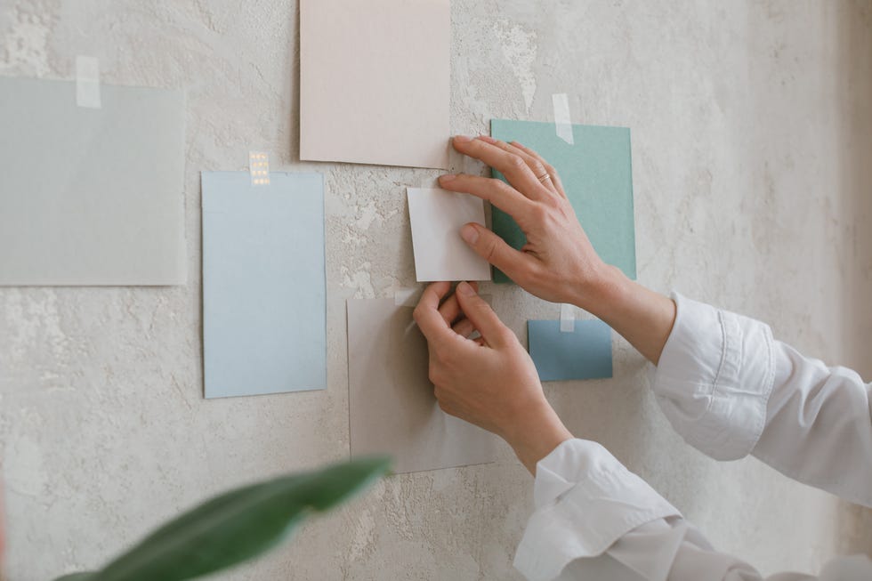
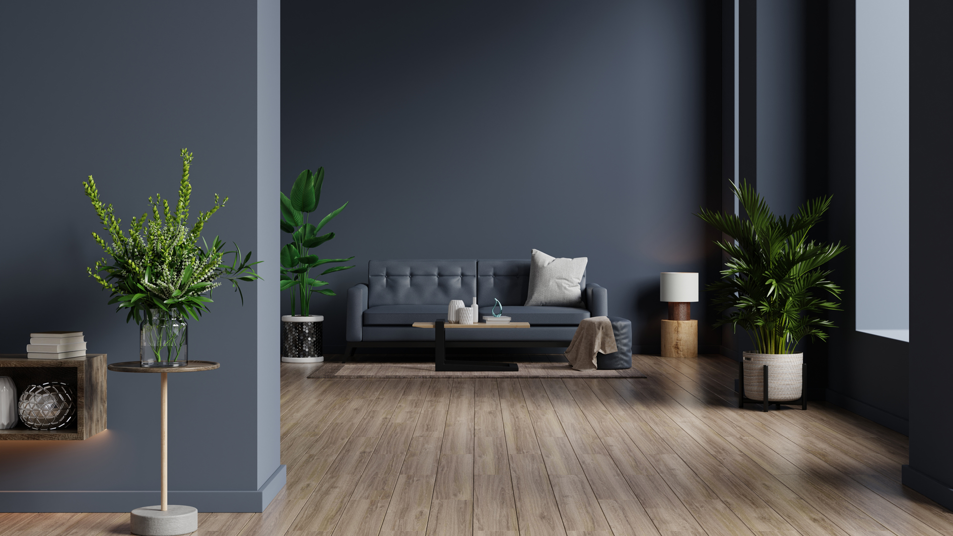
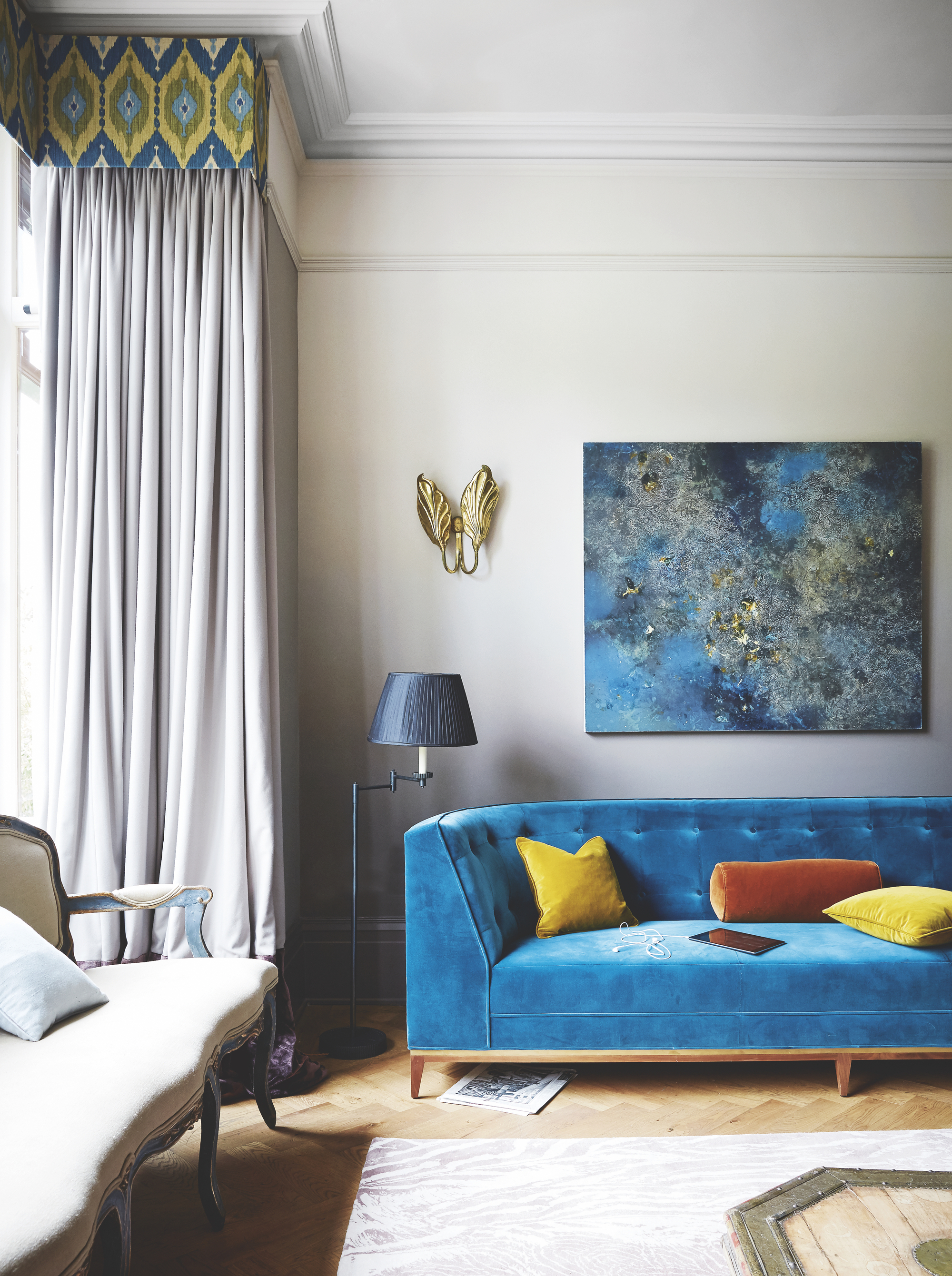
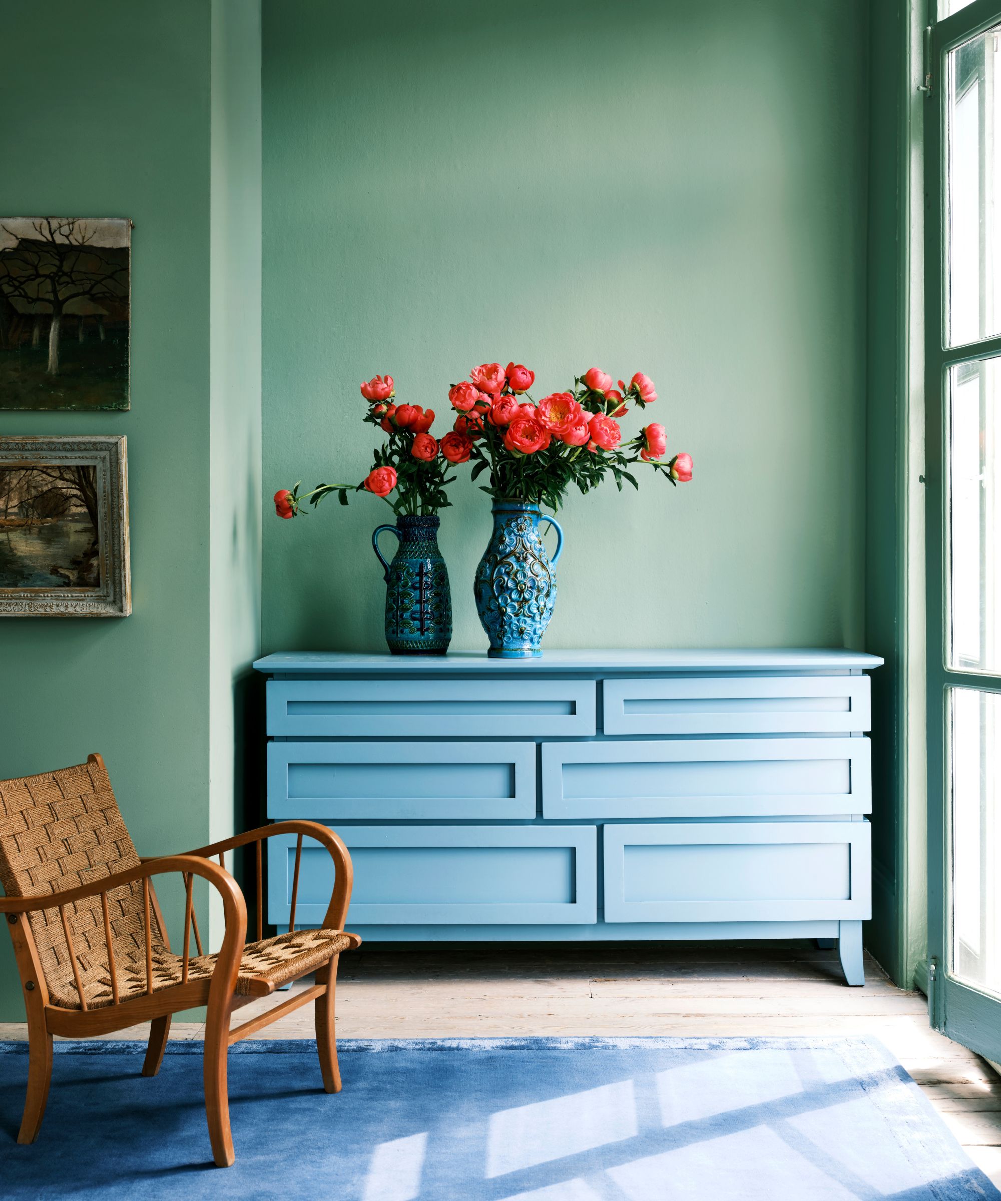

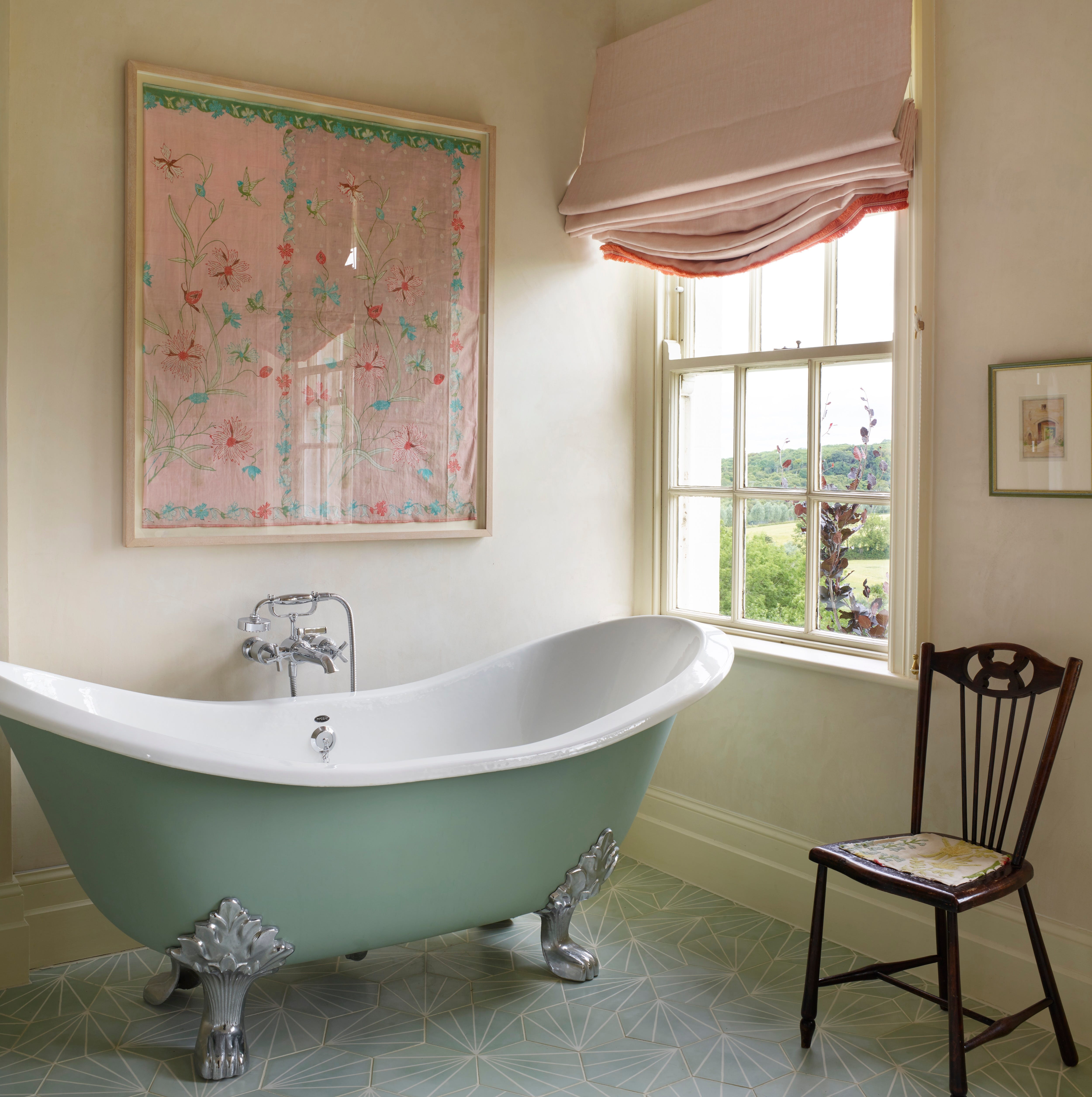
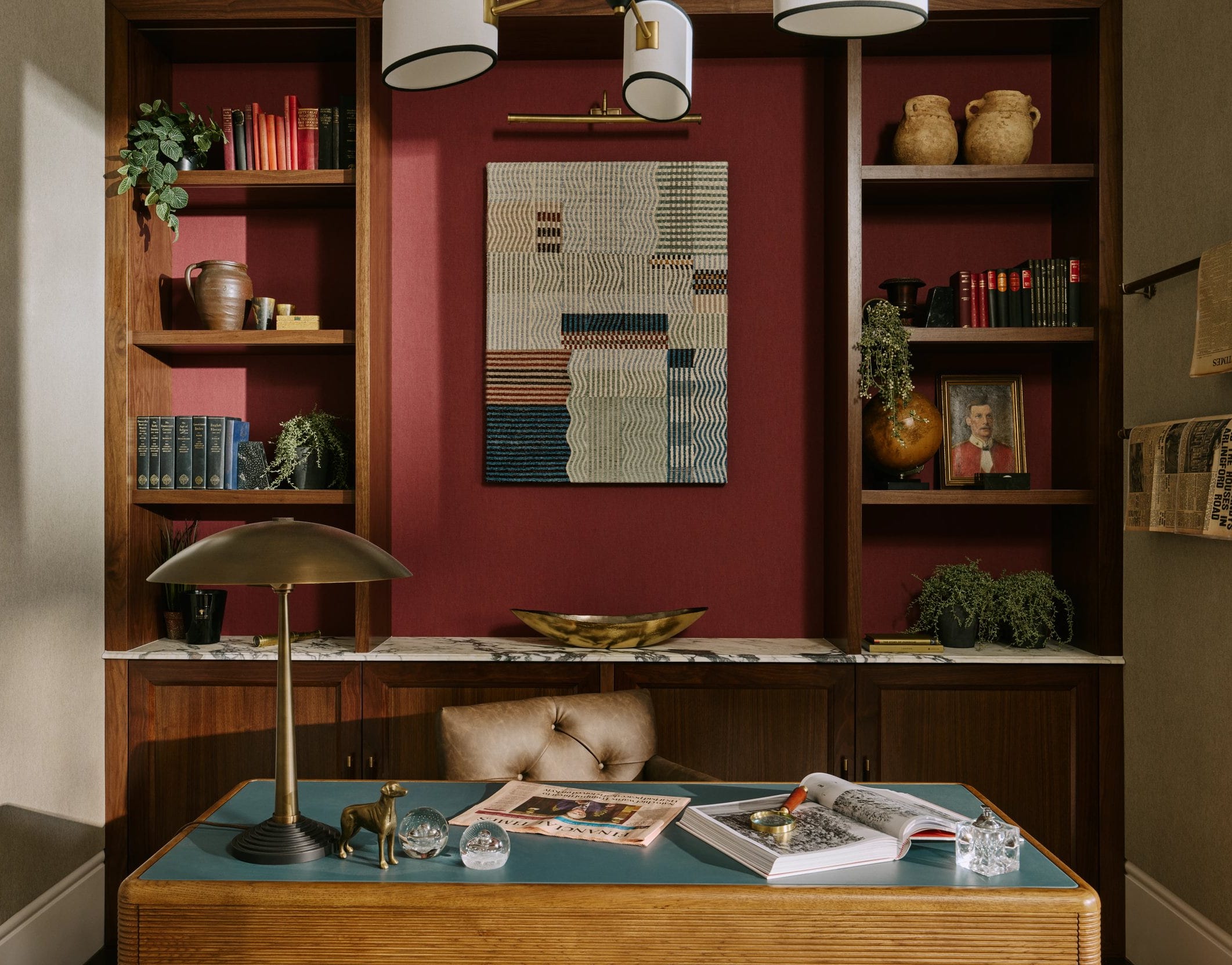
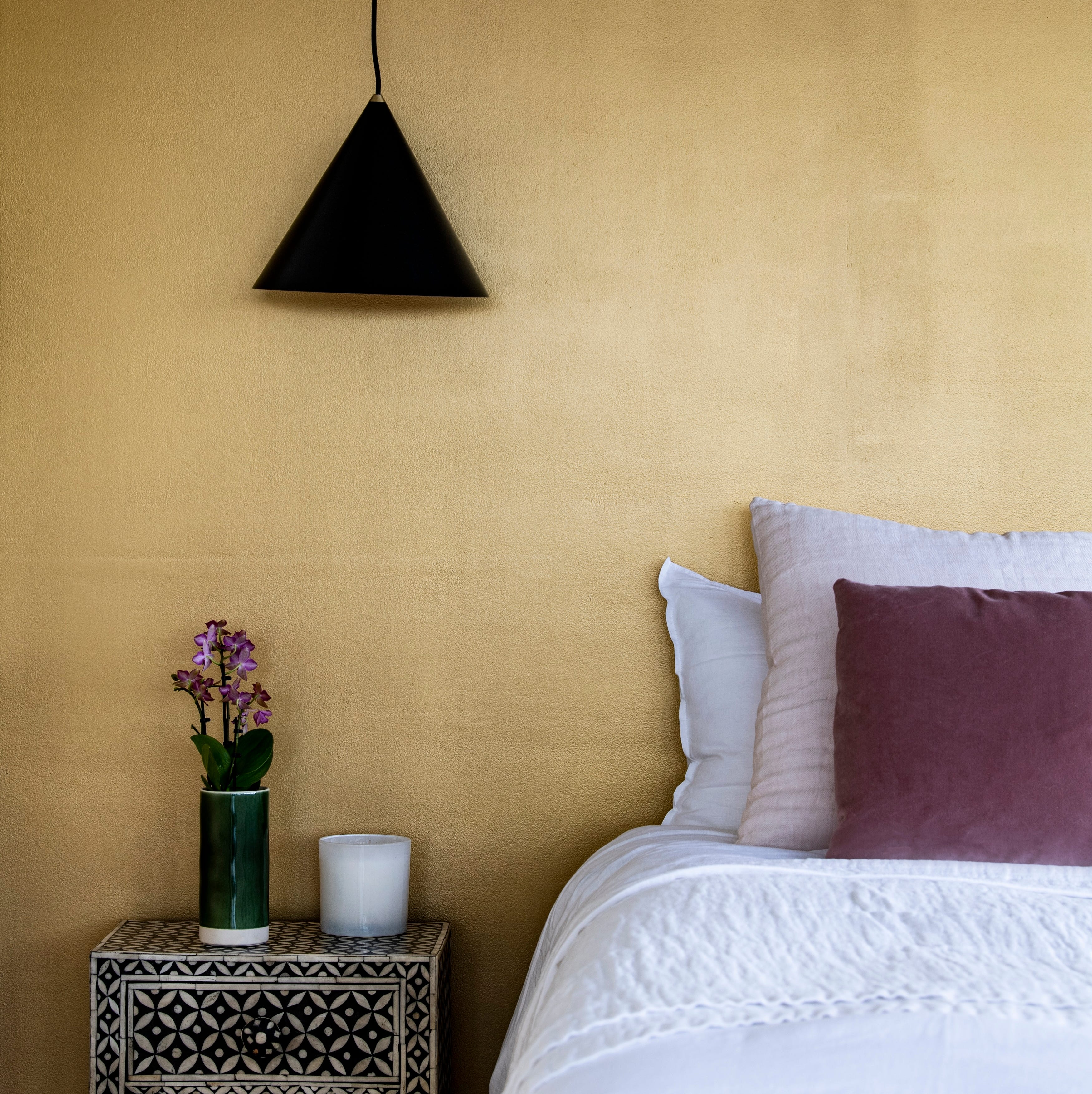
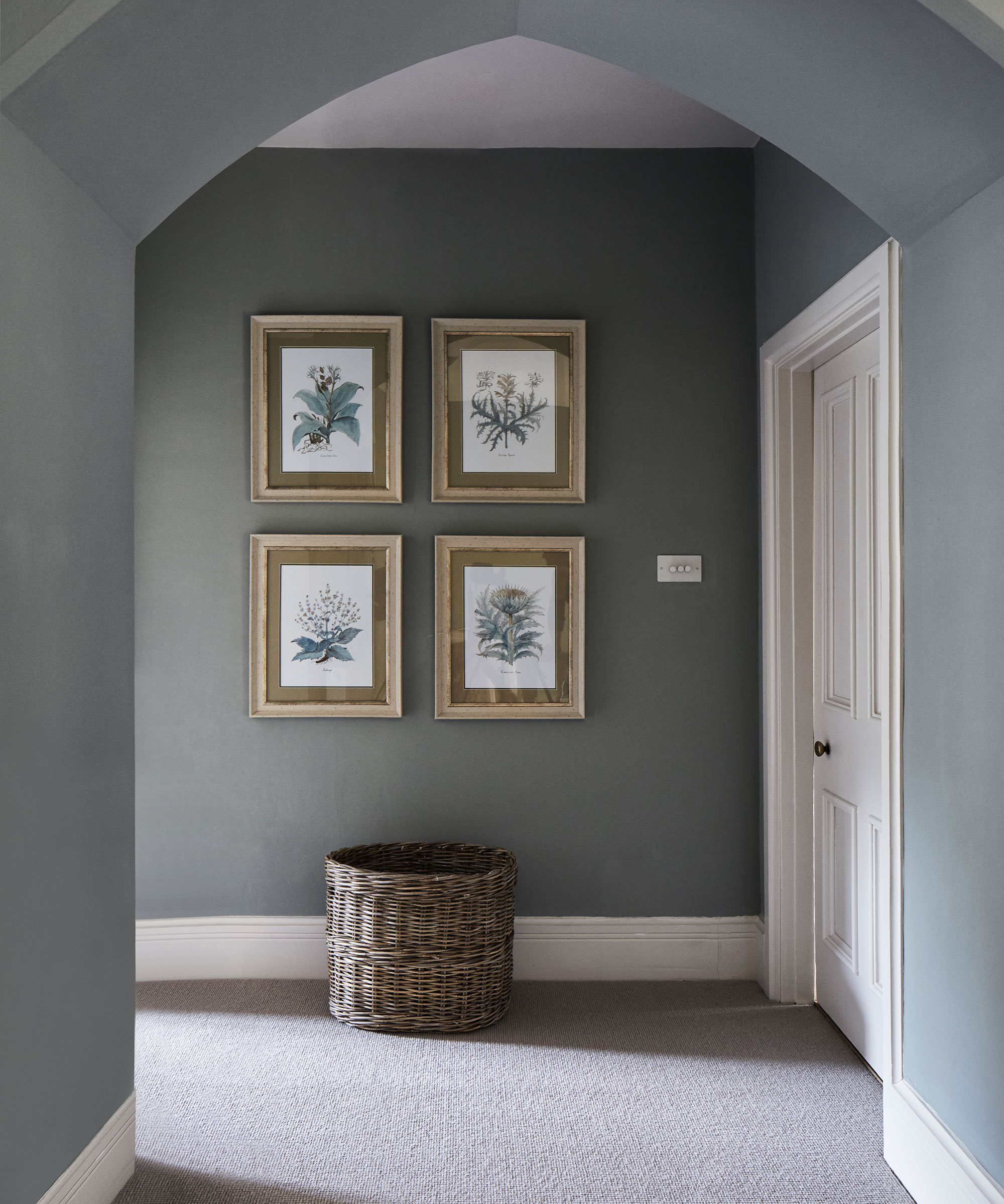
Interior designers frequently observe common mistakes made when selecting and applying paint colors, significantly impacting a space's aesthetic and longevity. A primary error involves neglecting undertones, which are crucial as they dictate how a paint color appears under various lighting conditions. For instance, a gray that seems neutral in a store can reveal blue or purple hues once applied. To avoid this, designers recommend testing at least three, if not five or six, potential colors in the actual space to accurately perceive their undertones and compare them side-by-side, helping to identify whether a color is too crisp, muddy, or bright for the intended environment.
Another critical aspect often overlooked is the paint finish. The sheen of the paint can either enhance or detract from a design. For example, high-gloss or semi-gloss finishes tend to accentuate wall imperfections, while flat or matte finishes, though aesthetically pleasing, might lack the durability required for high-traffic areas. Designers specifically advise against eggshell finishes, considering them dated and suggestive of 1990s interiors. Instead, a matte finish is suggested as a more modern, durable, and forgiving alternative that can better conceal minor wall flaws.
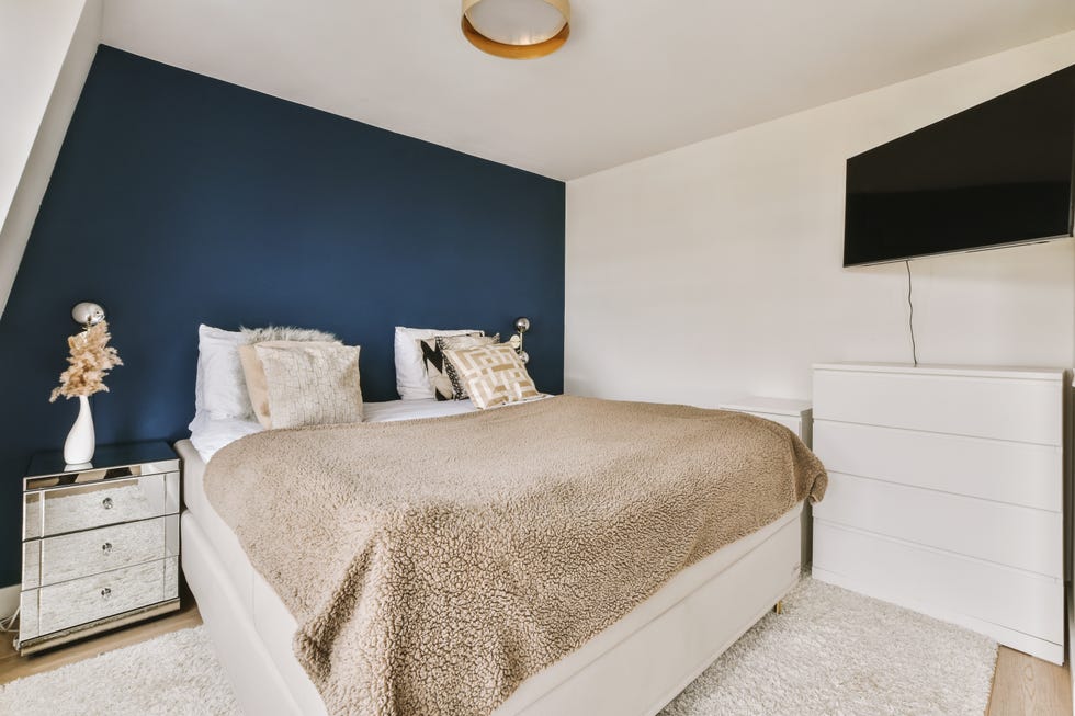
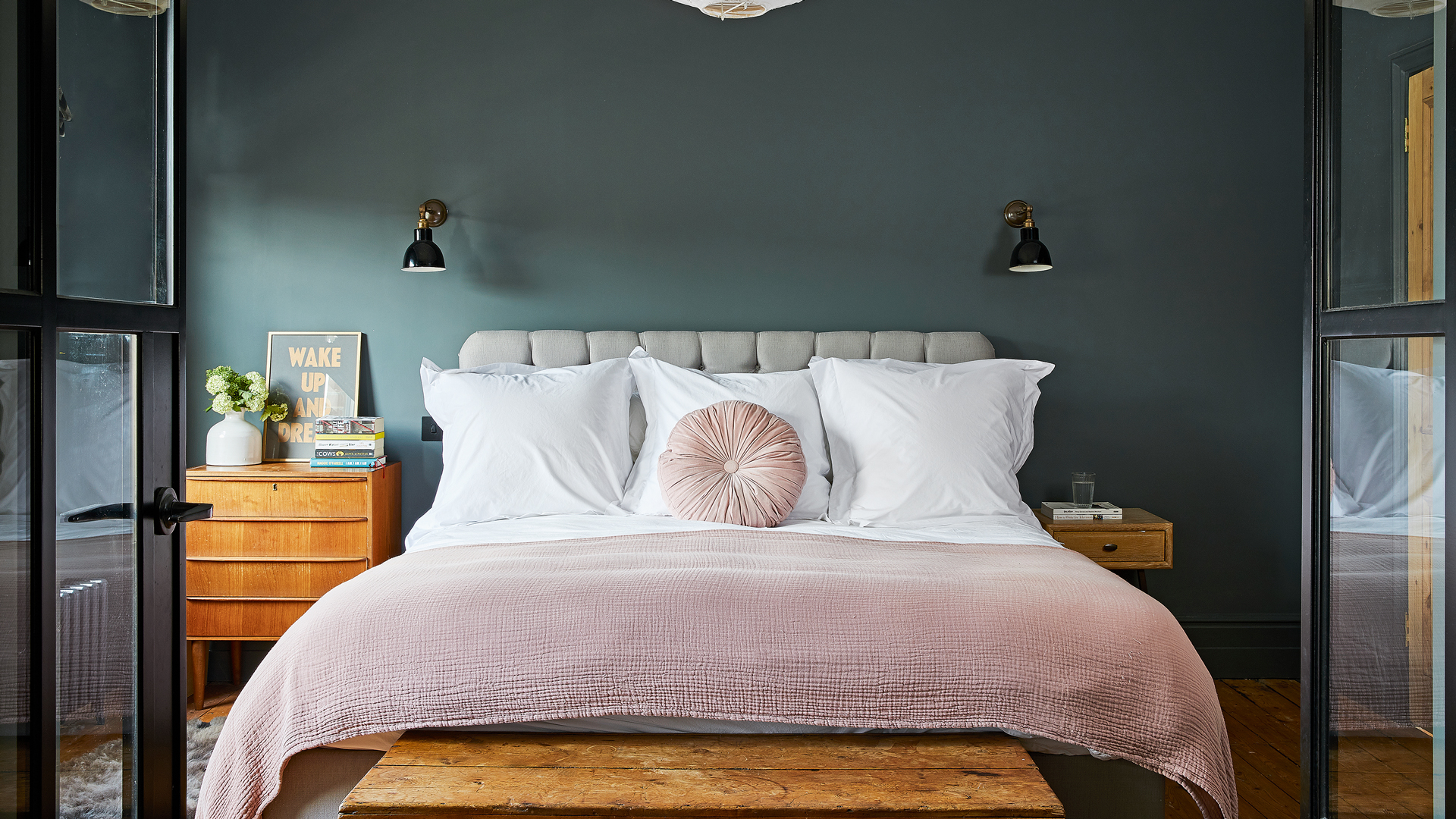
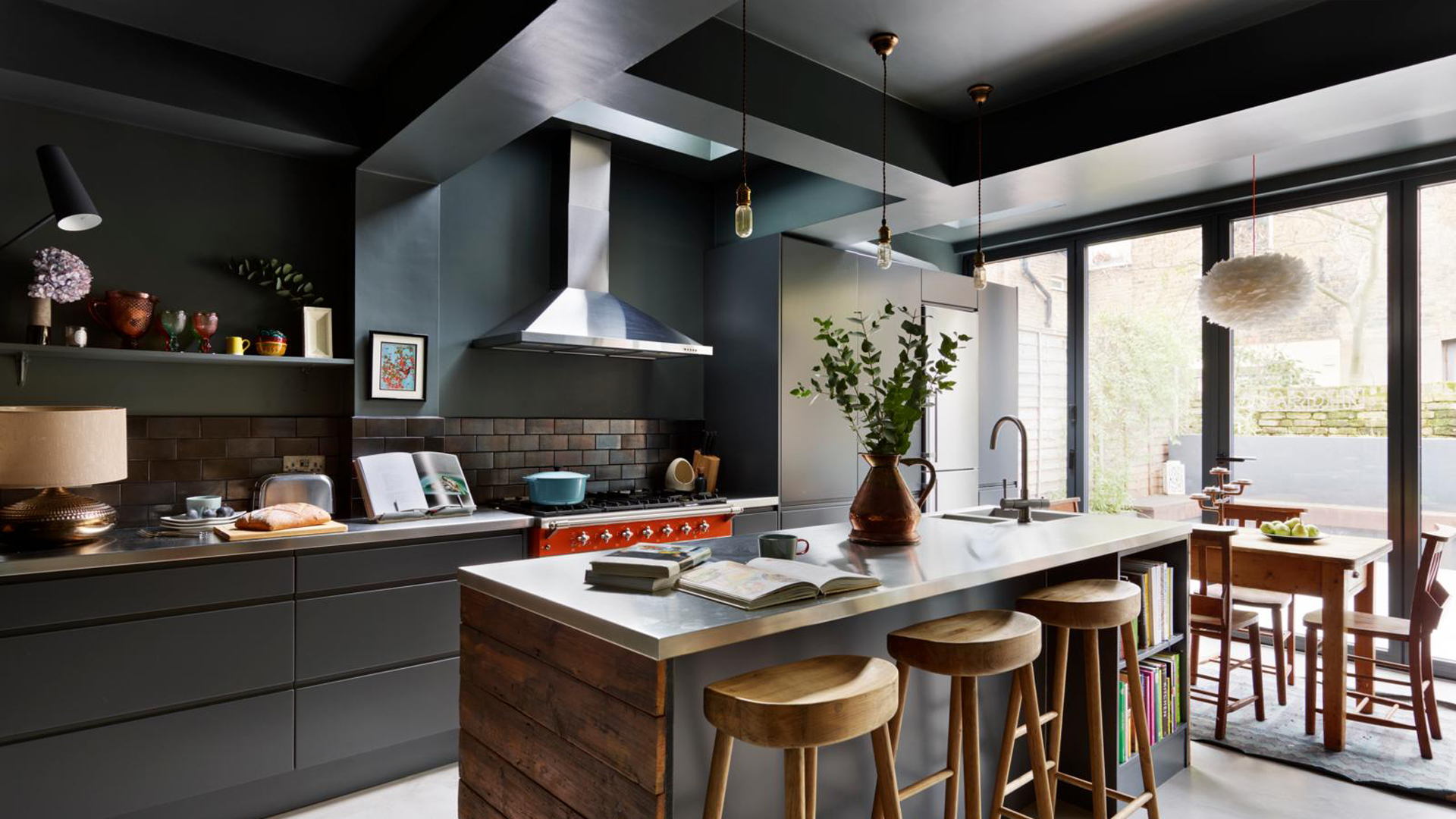
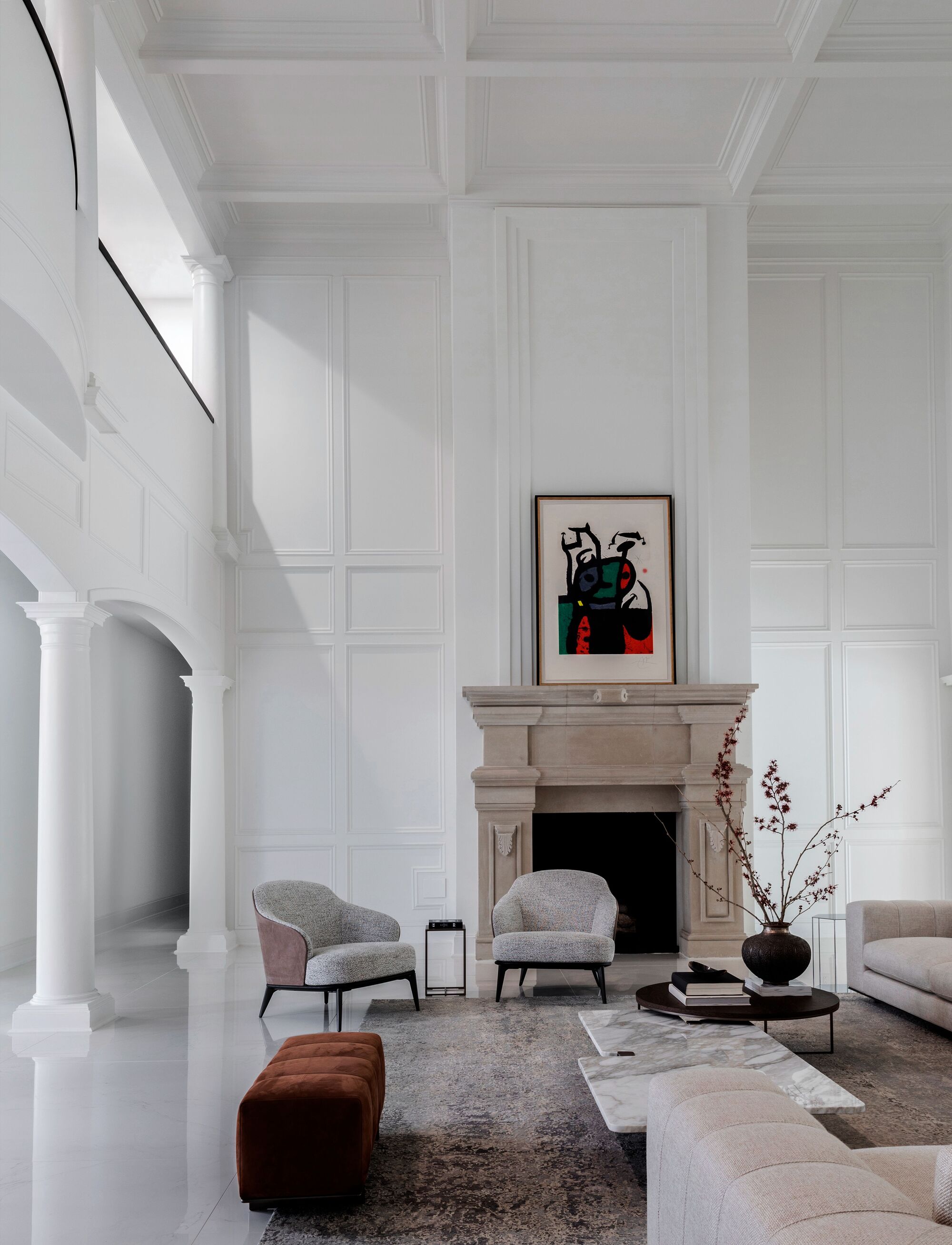
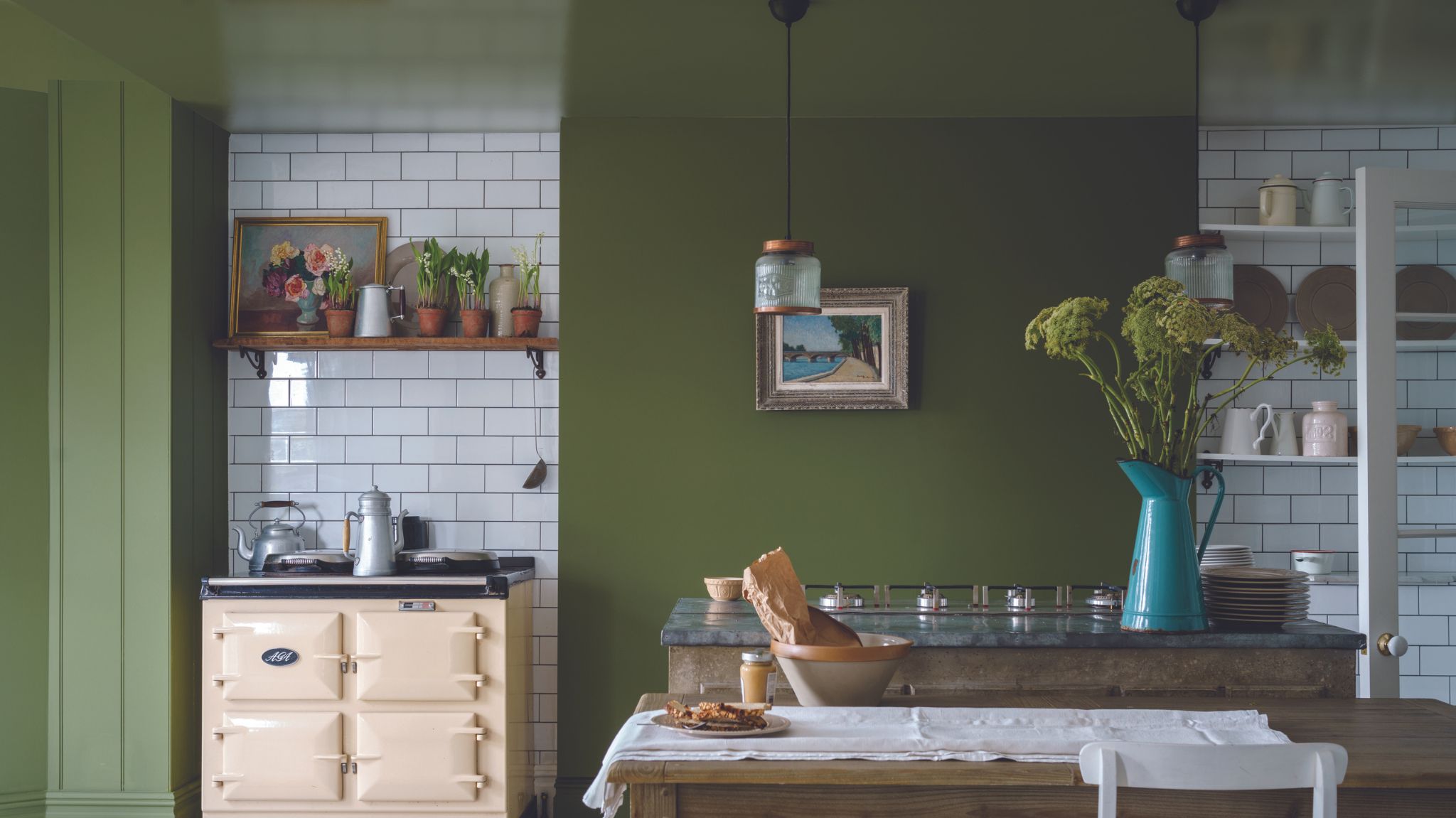
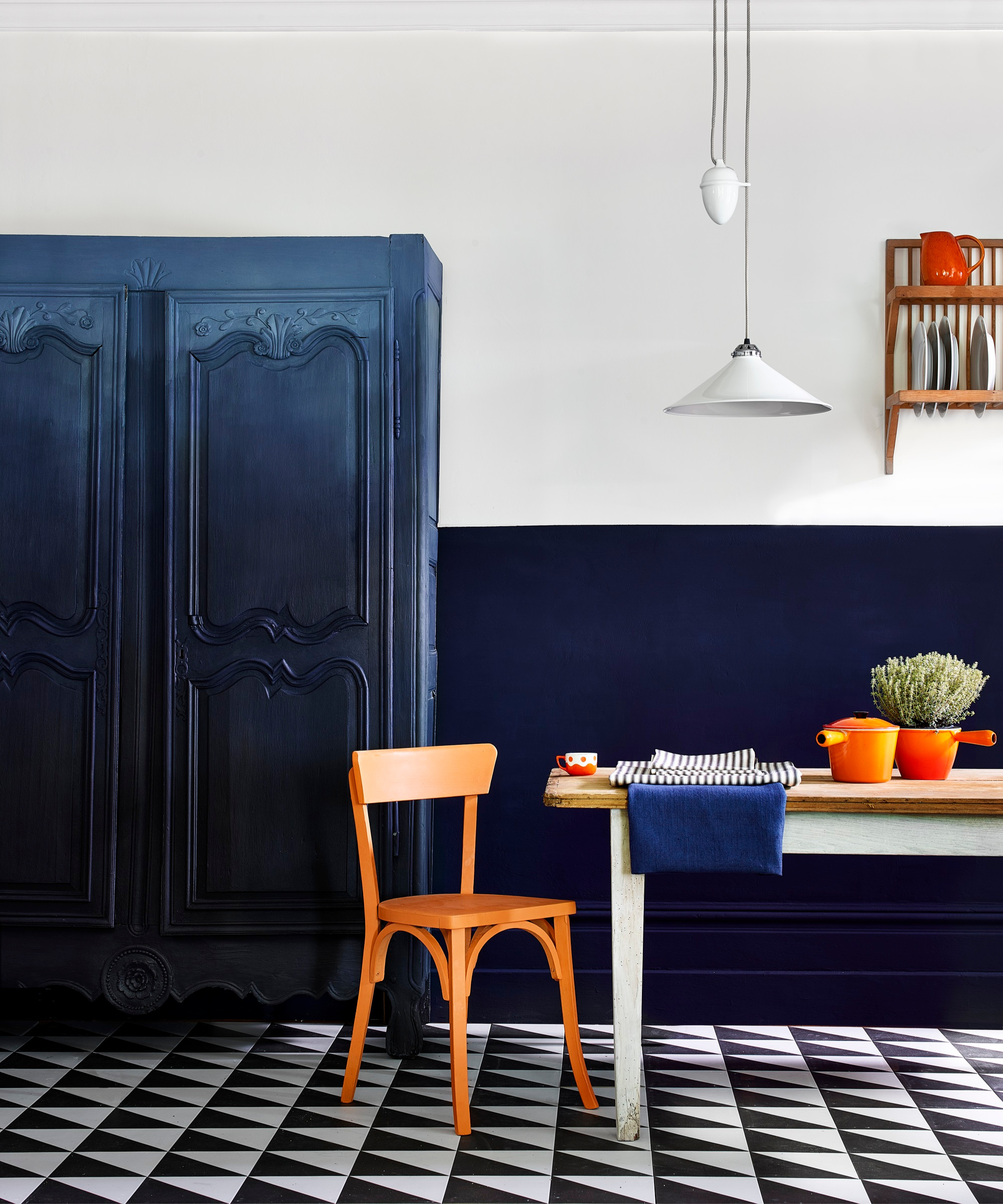
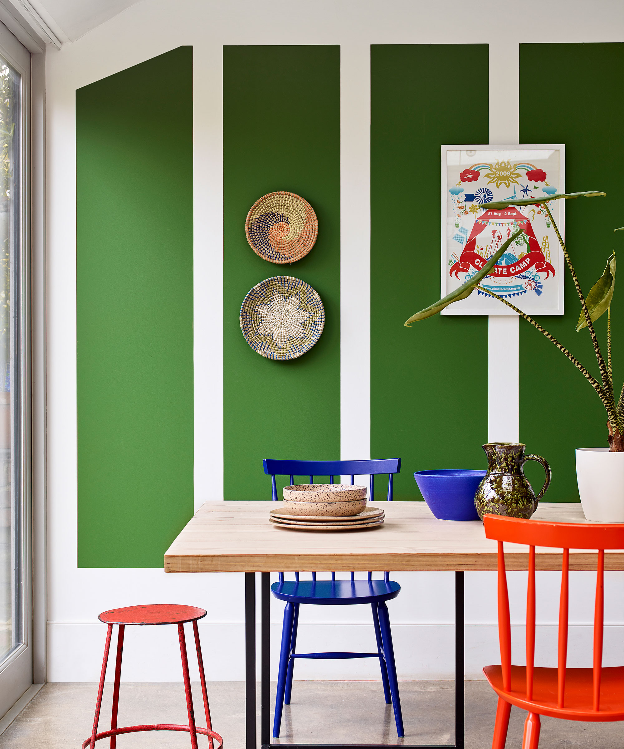
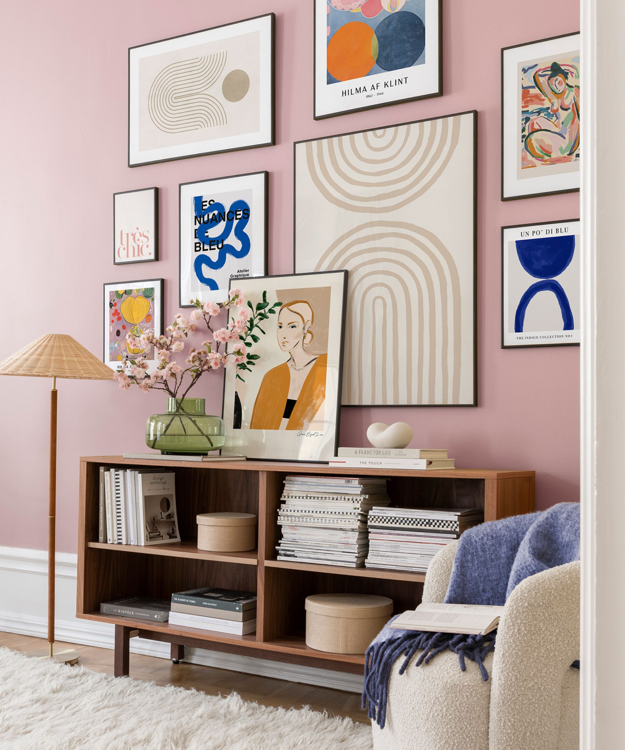
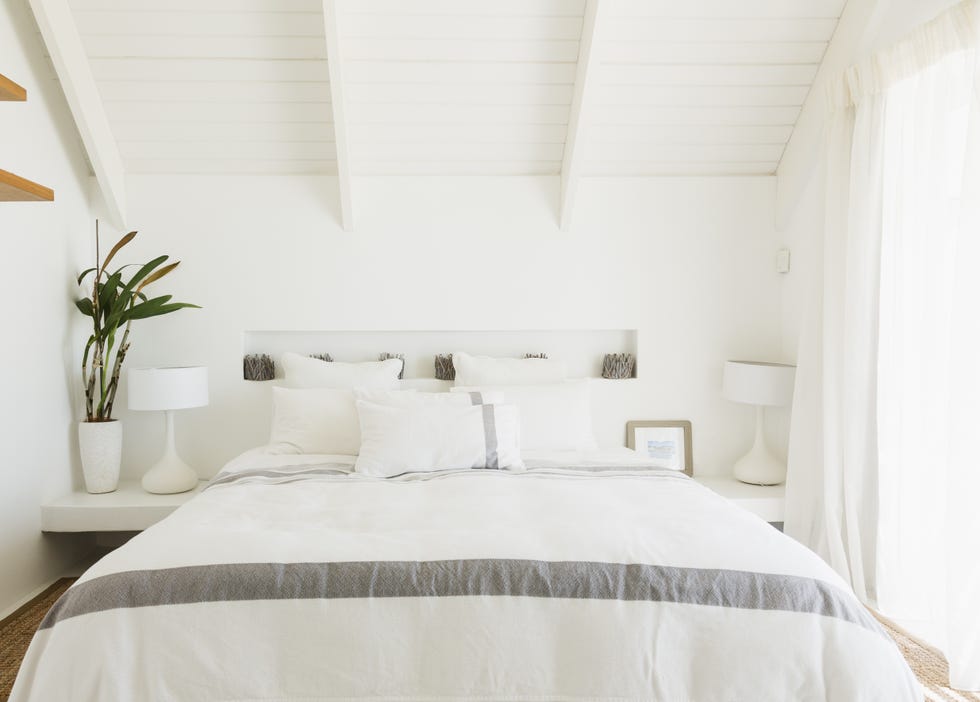
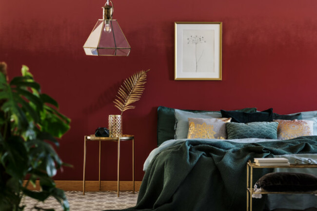
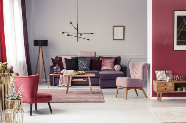
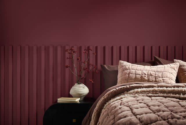
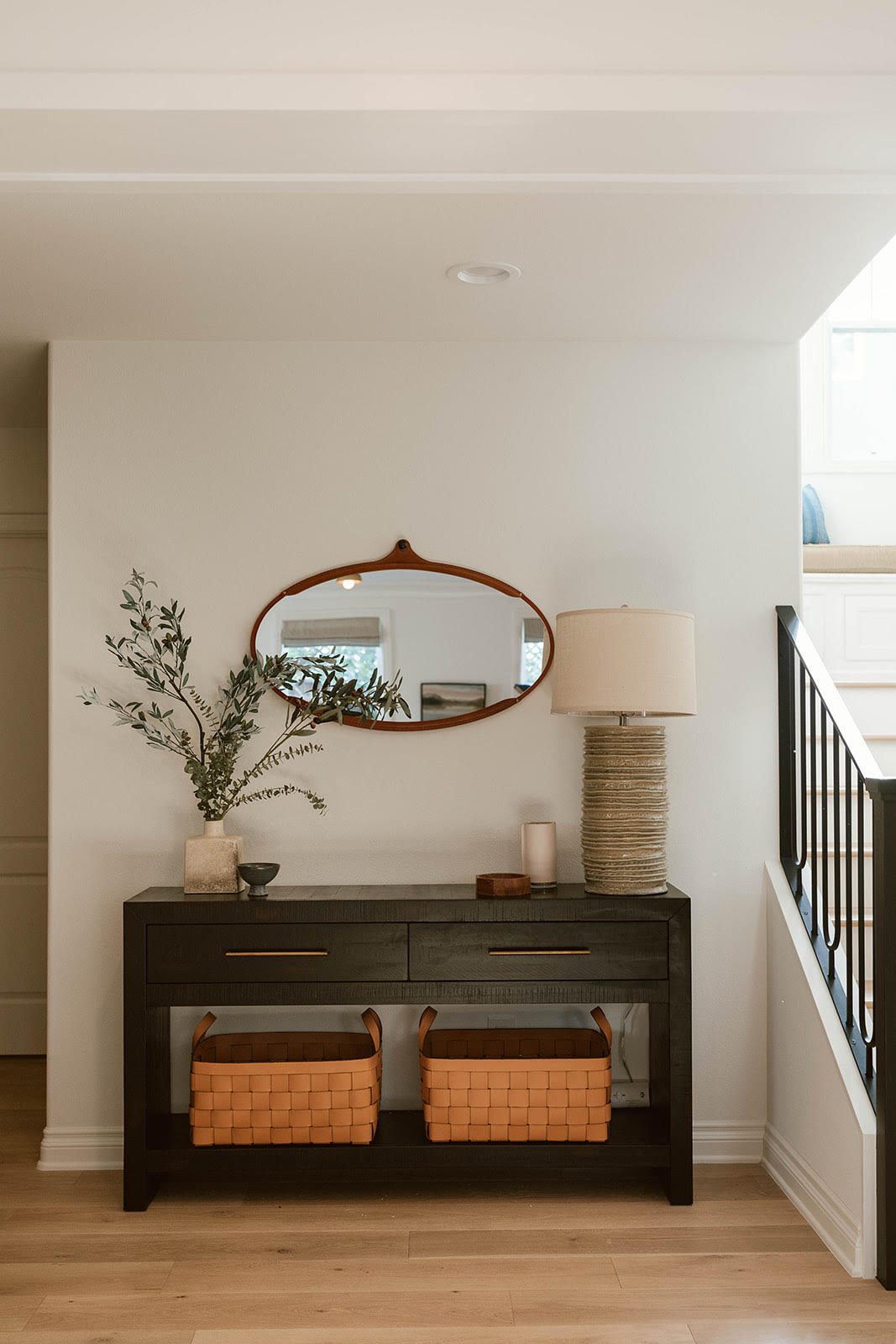
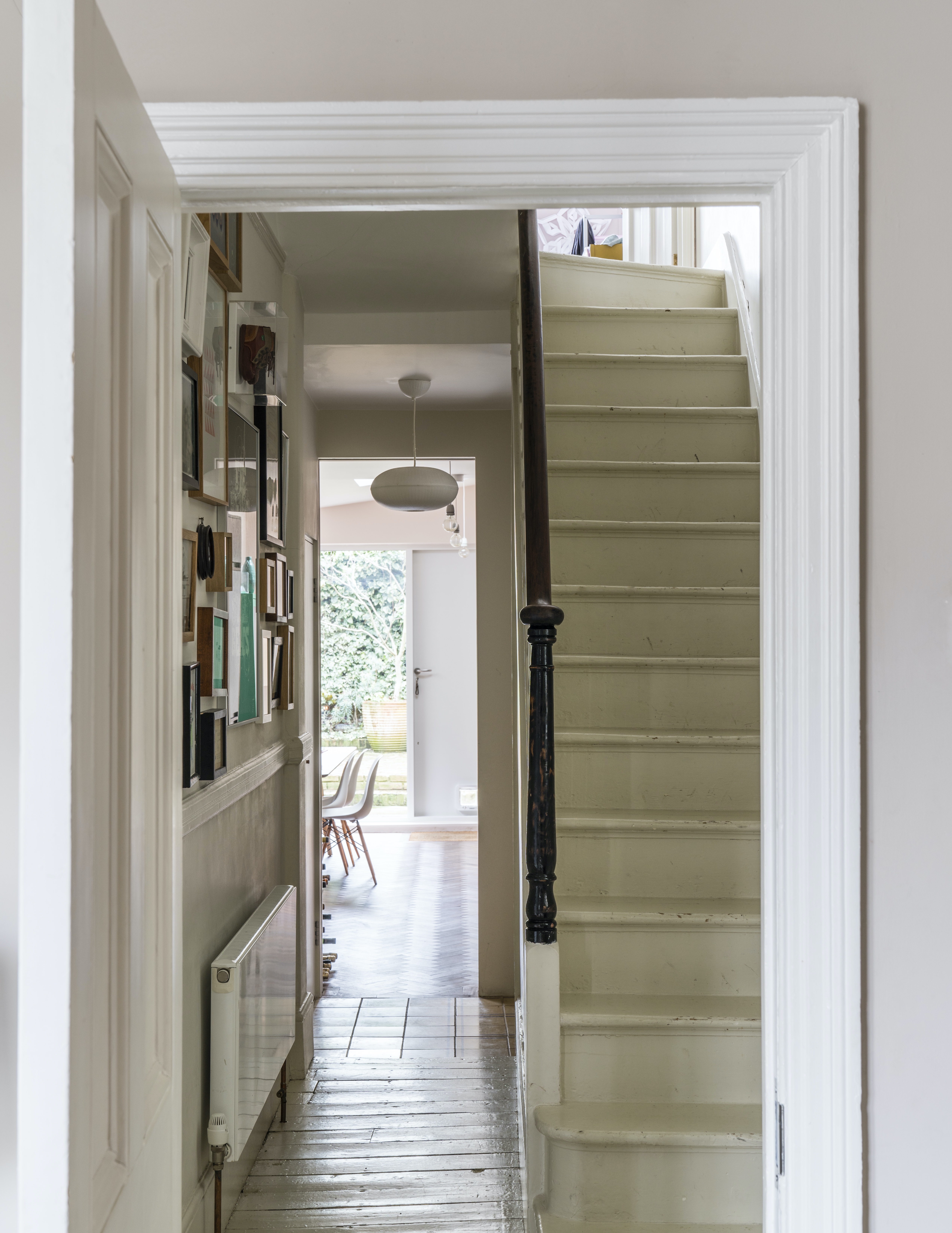
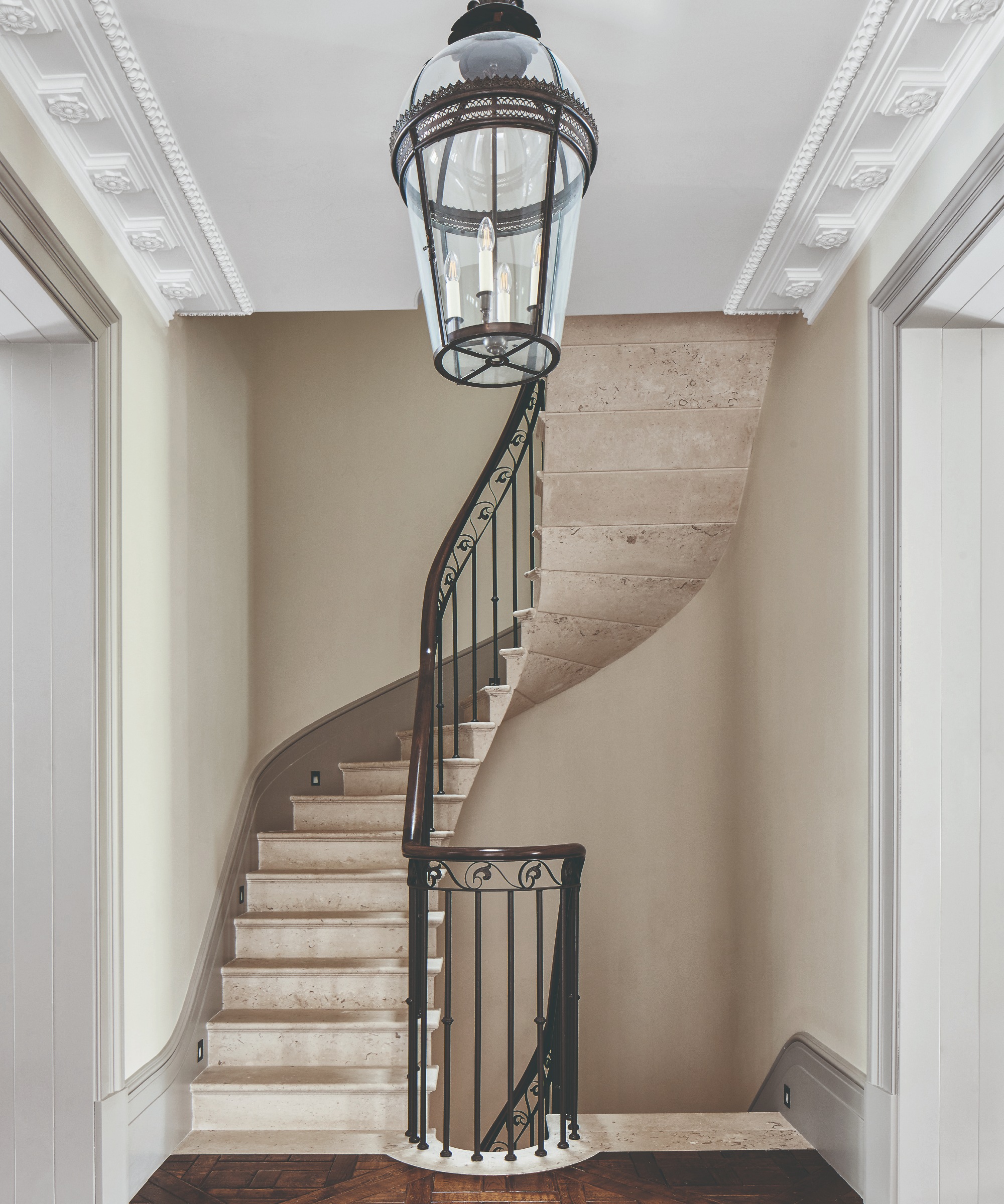
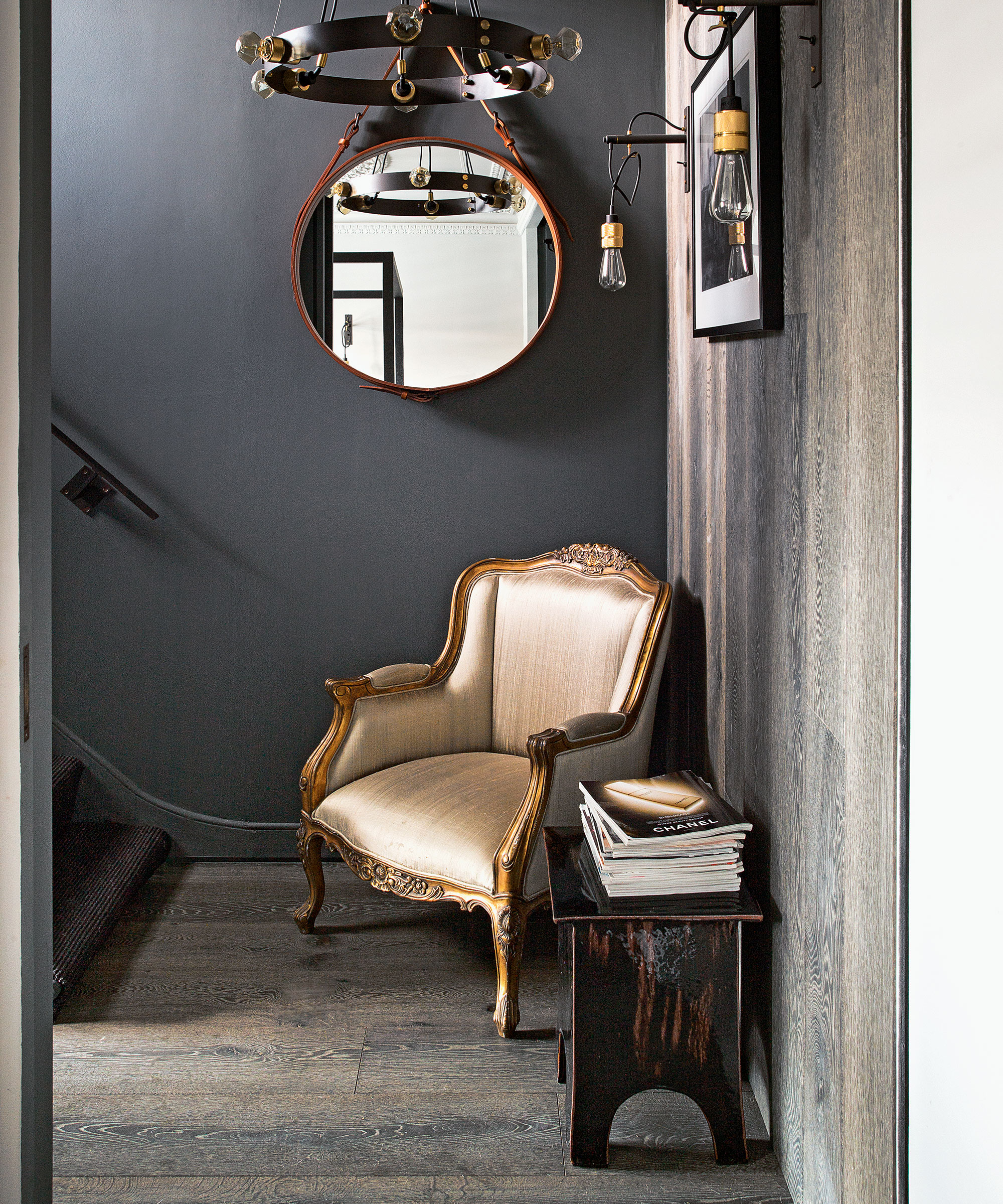
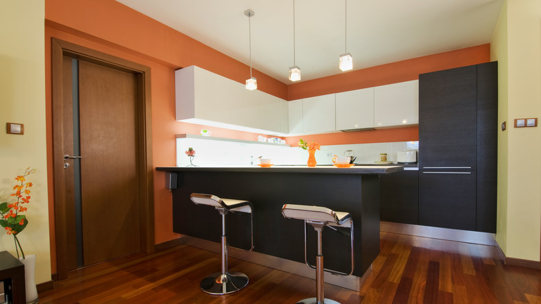
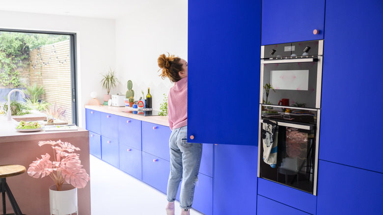
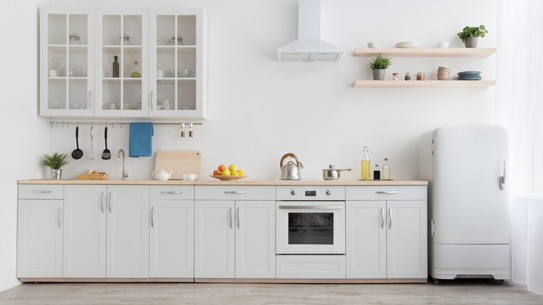
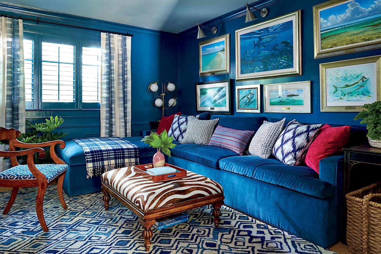
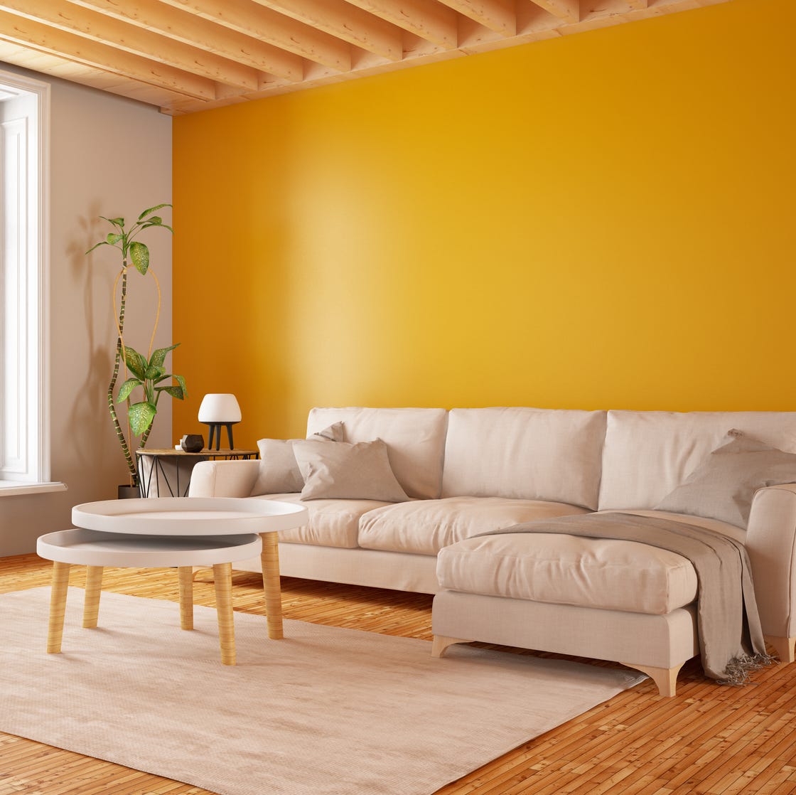
The practice of painting accent walls is also discouraged by designers, who view it as a reluctance to commit to painting an entire room. They suggest that homeowners should embrace confidence and paint the whole space for a more cohesive and impactful design. Similarly, bold colored trim is considered less timeless. Designers advocate for white trim and ceilings, believing this choice offers a classic look that transcends fleeting trends like maximalism and maintains its appeal over time, allowing for more daring wall colors without compromising the overall elegance of the room.
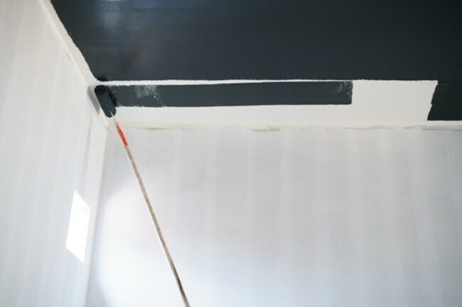
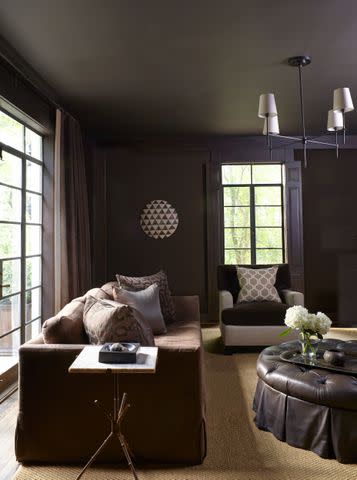
Furthermore, consistency in trim and ceiling color is highlighted as important. Painting the ceiling the same color as the trim ensures a seamless visual flow throughout the room. Introducing a third color for the ceiling—distinct from both wall and trim colors—can disrupt this harmony, creating visual breaks and diminishing the room's cohesive and inviting feel. Ultimately, designers advise against choosing paint colors based solely on current trends or influencer recommendations. A color that looks stunning in one home may not translate well to another due to differences in lighting, existing decor, and architectural elements. To make an informed decision, ordering and reviewing peel-and-stick paint swatches in the actual home is recommended. This allows individuals to observe how colors change throughout the day without the commitment or mess of painting directly onto walls, ensuring the chosen color complements the specific space.
#PaintColor #InteriorDesign #HomeDecoration #PaintUndertones #PaintFinish #AccentWalls #TrimColor #HomeTrends #DesignTips #PaintColor #InteriorDesign #HomeDecoration #PaintUndertones #PaintFinish #AccentWalls #TrimColor #HomeTrends #DesignTips
0 comment in total
 No comments yet
You may also like
7 Paint Mistakes That Make Designers Instantly Cringe When They Walk Into Someone's Home

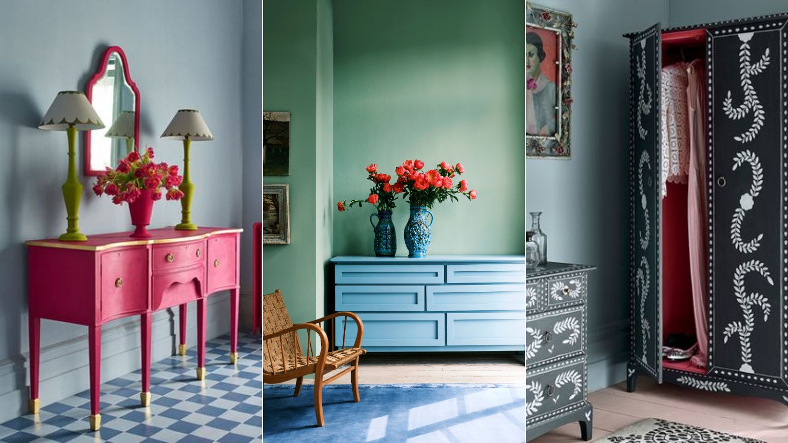
10 mistakes to avoid when painting wooden furniture, according to experts

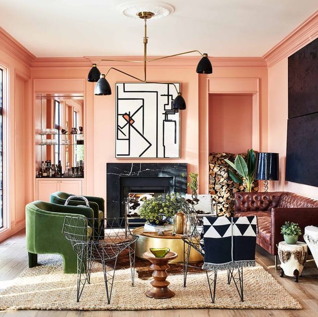
These Master Tips Will Help You Avoid Choosing The Wrong Type Of Paint
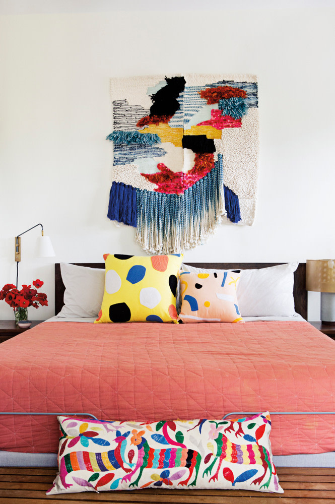
6 Rookie Mistakes to Avoid When Decorating With Pantone’s Color of the Year

Interior design experts reveal the colour rules you should be breaking

5 colors you should never paint a small room – designers warn us to steer clear of these hues, and what to pick instead
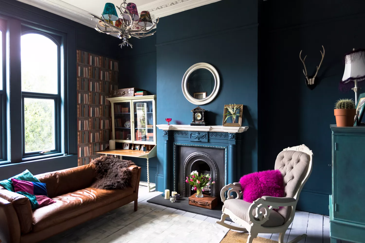
7 Paint Colors Designers Totally Regret Using (and What They Wish They’d Used Instead)


7 Most Underrated Paint Colours, According To Colour Experts

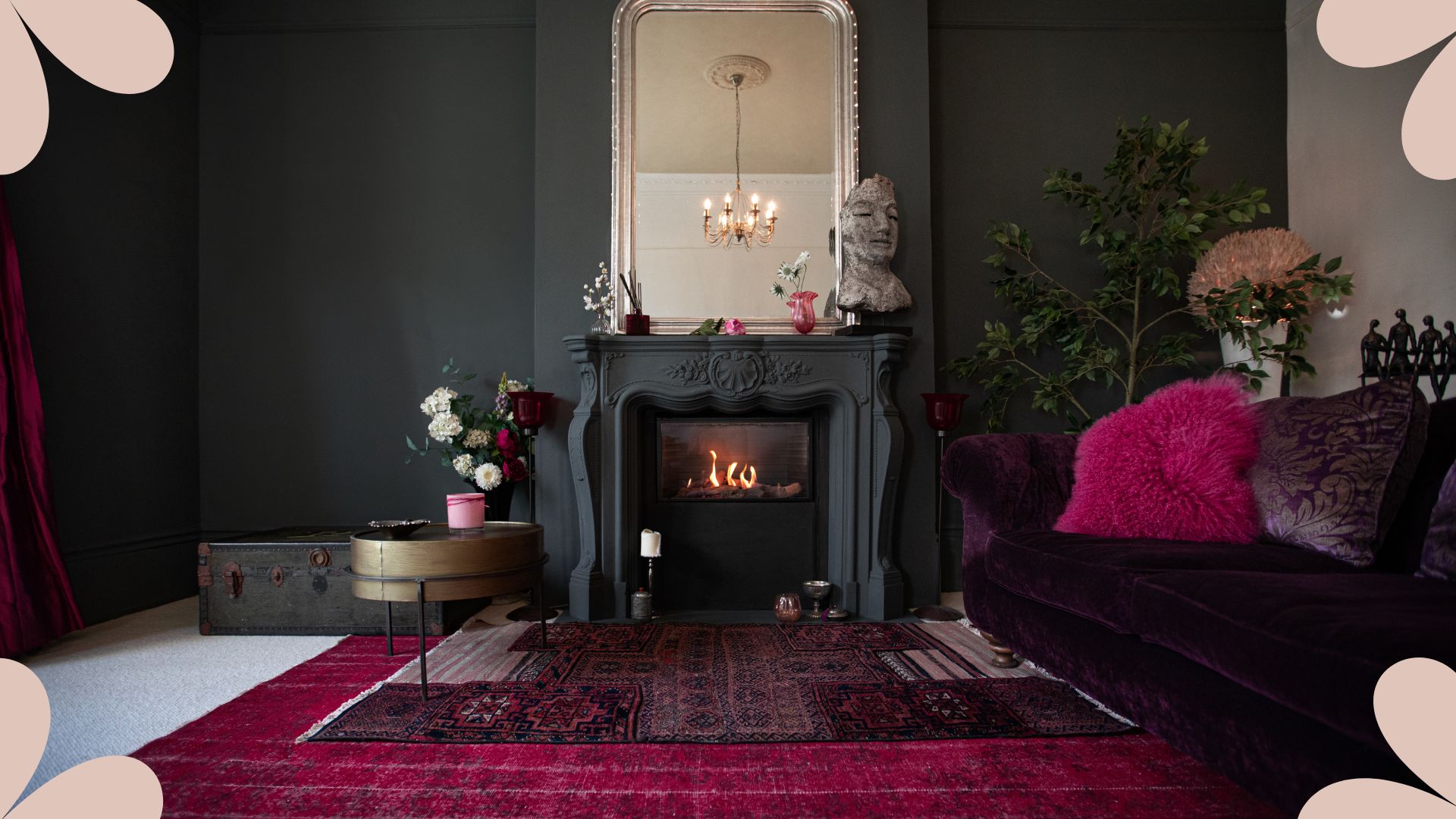
An interior designer reveals the 5 mistakes to avoid when painting with dark colours

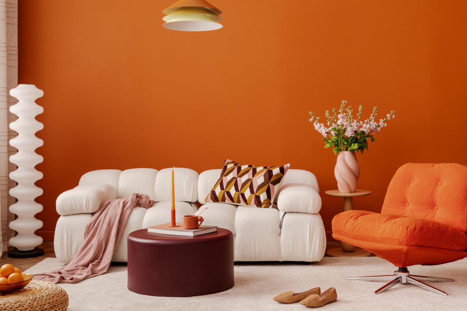
Never Regret a Paint Color Again—Avoid These 6 Common Mistakes


'Dark ceilings make the room look smaller': 6 classic paint colour myths it's time to give up on

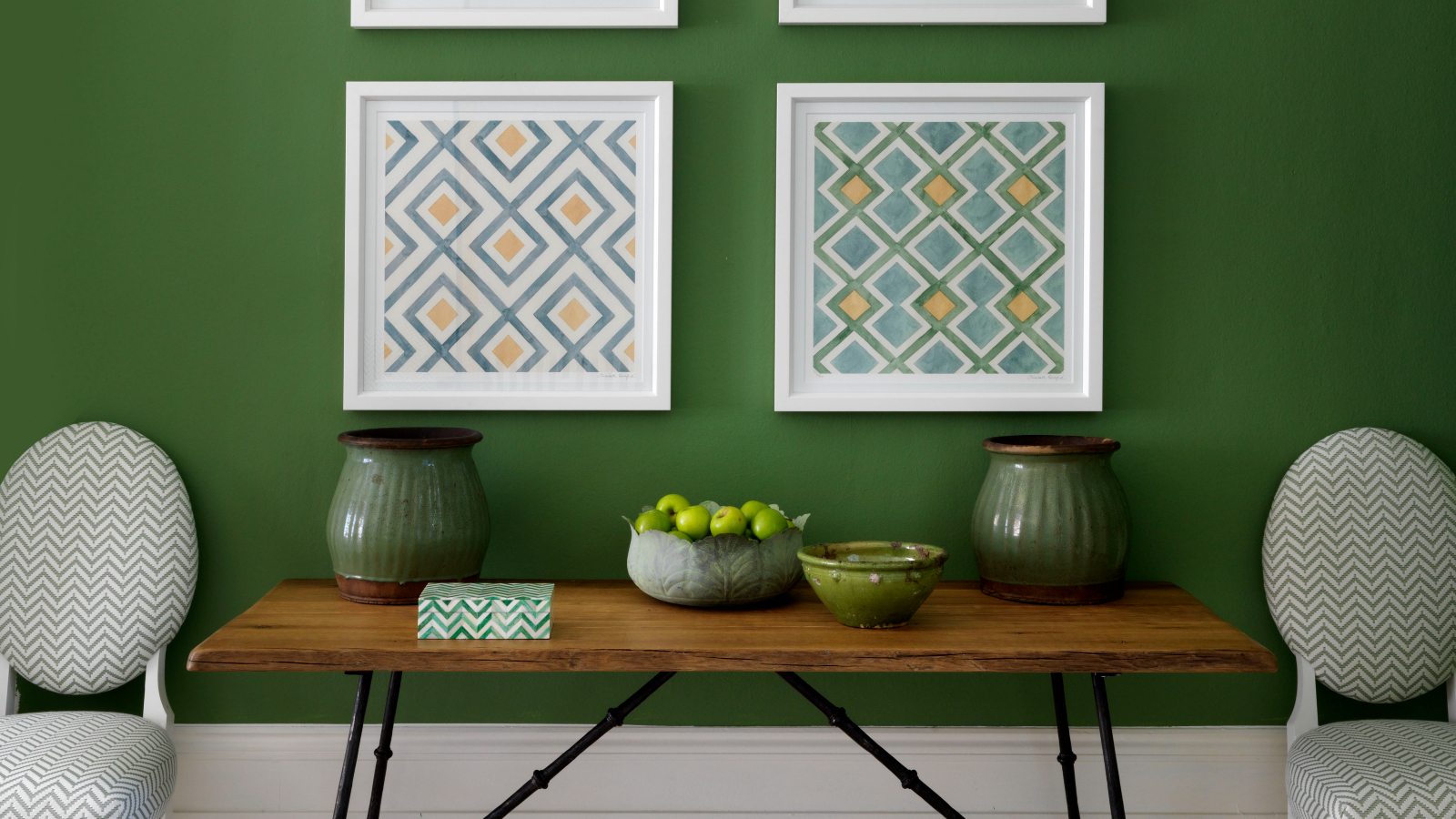
5 colors to avoid painting a landing – and the secret to choosing the right shades
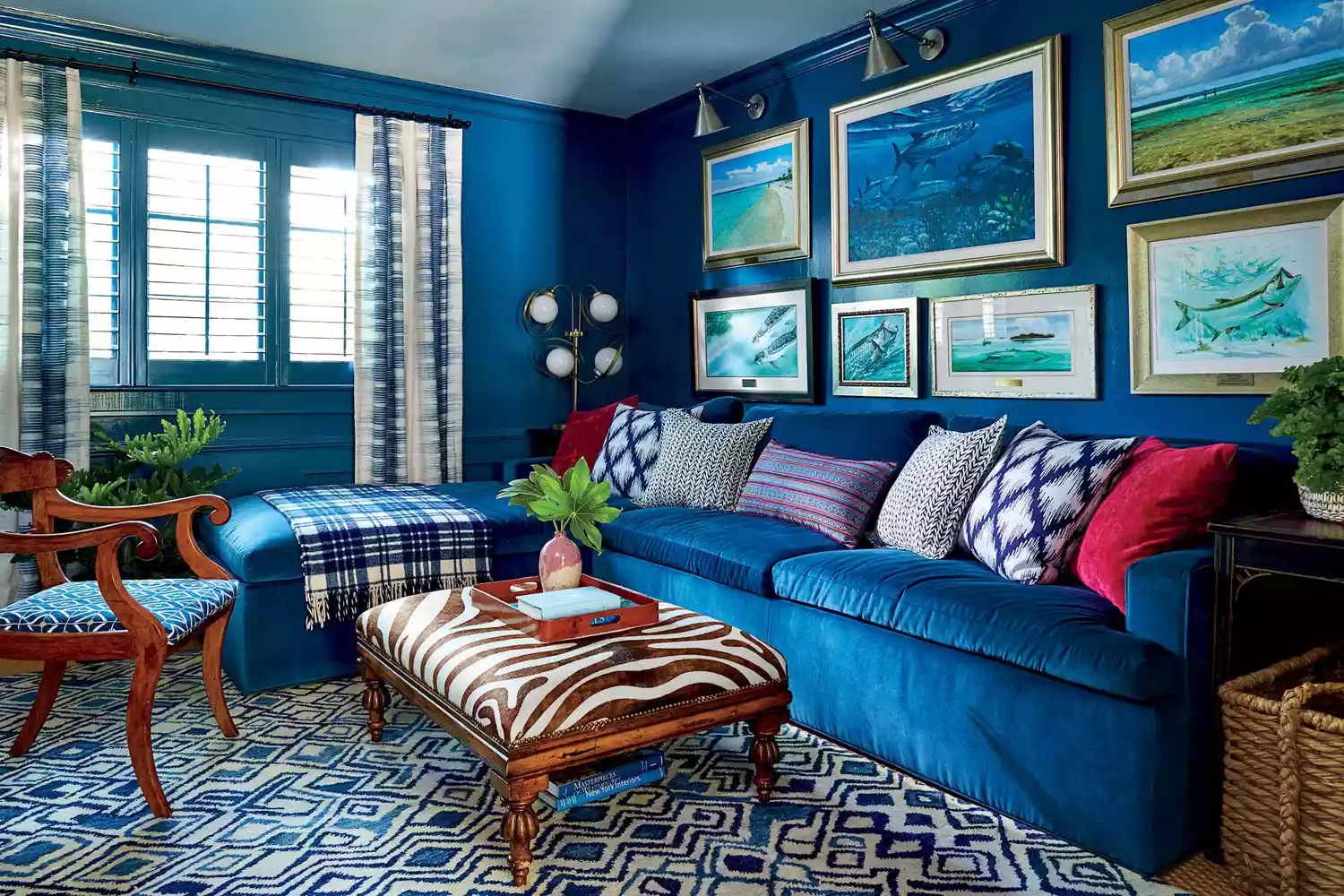
6 Paint Color Mistakes To Stop Making, According To Designers
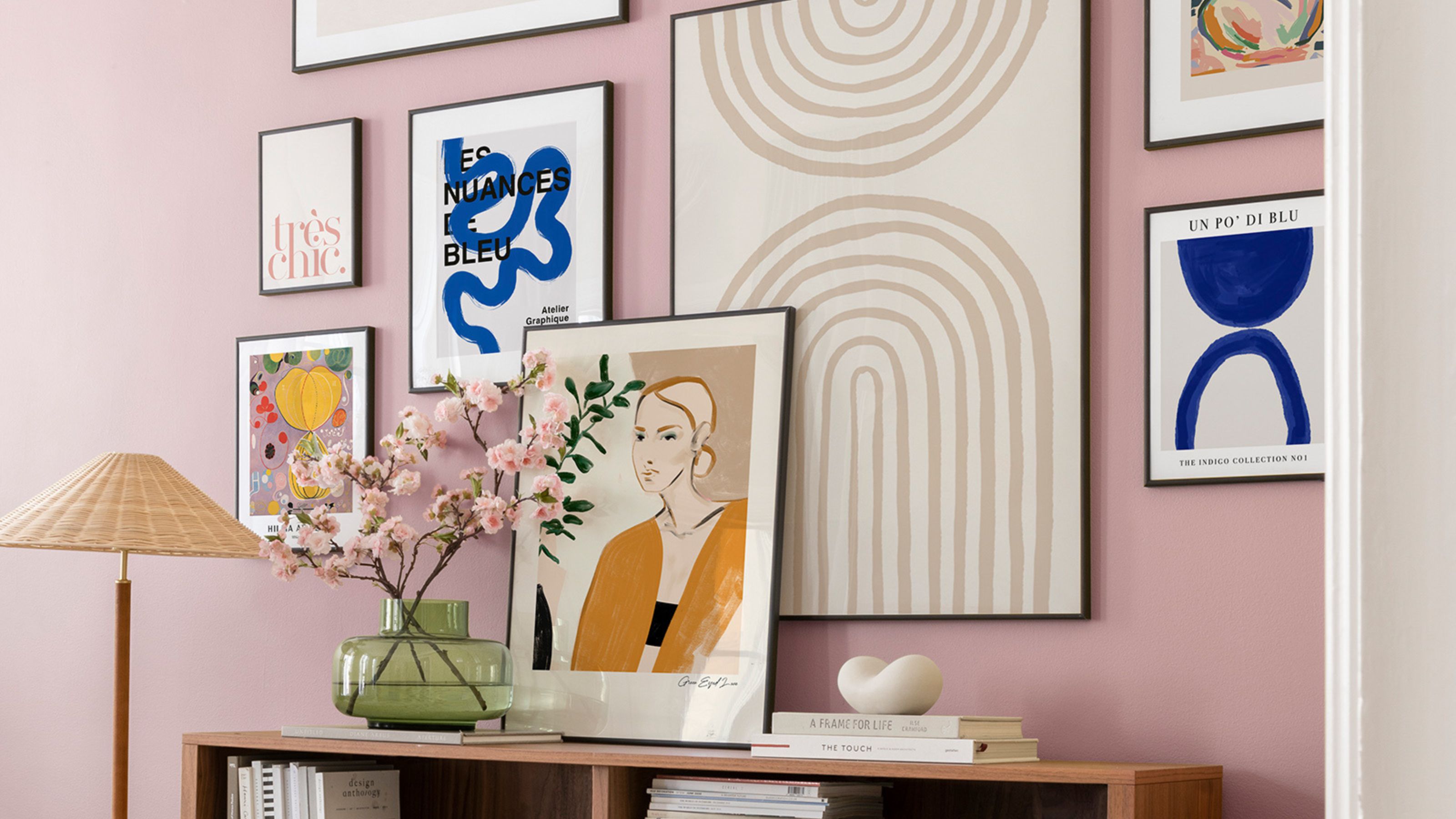
The 5 small entryway color mistakes design experts say are big bloopers

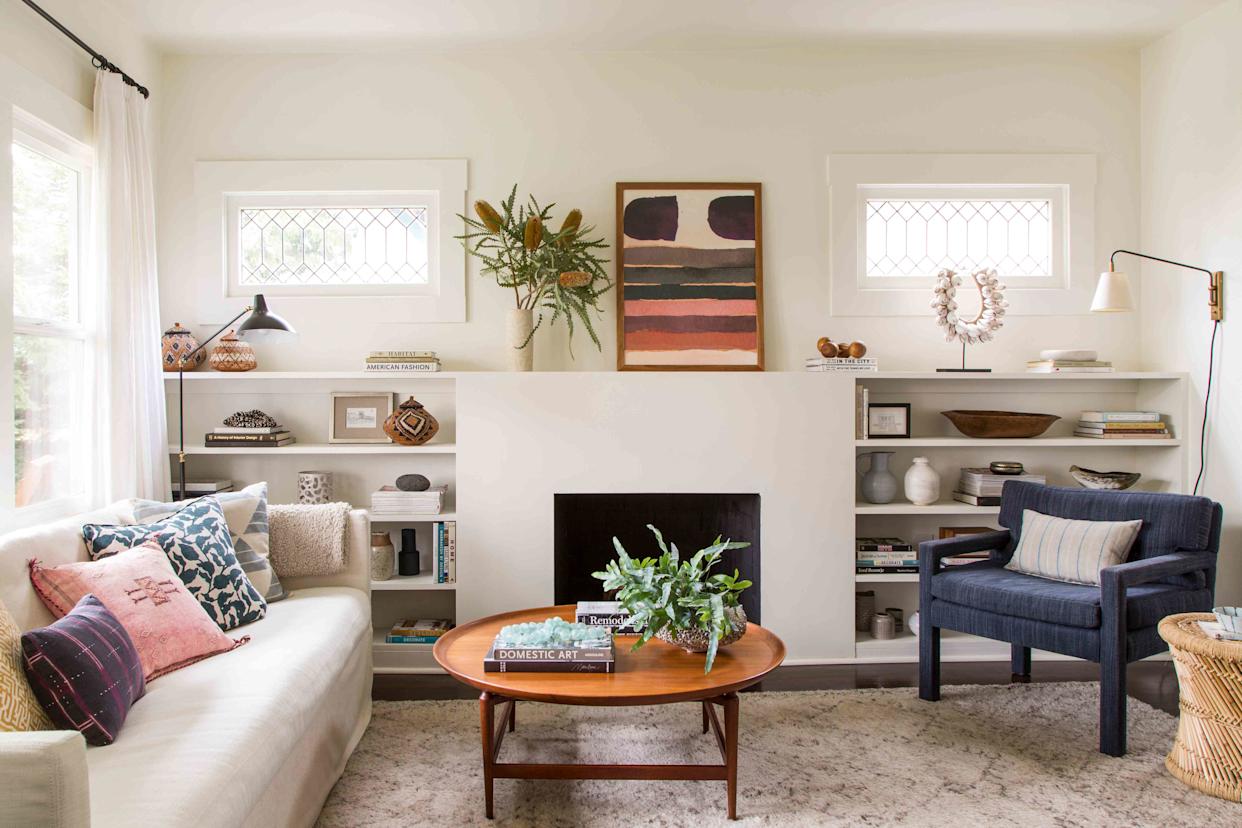
5 Paint Colors That Experts Say You Shouldn't Use in 2025

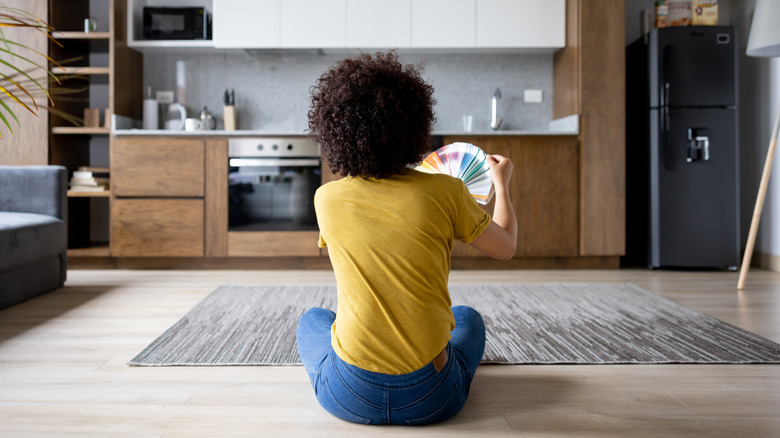
6 Worst Colors To Paint Your Kitchen (And What To Choose Instead)
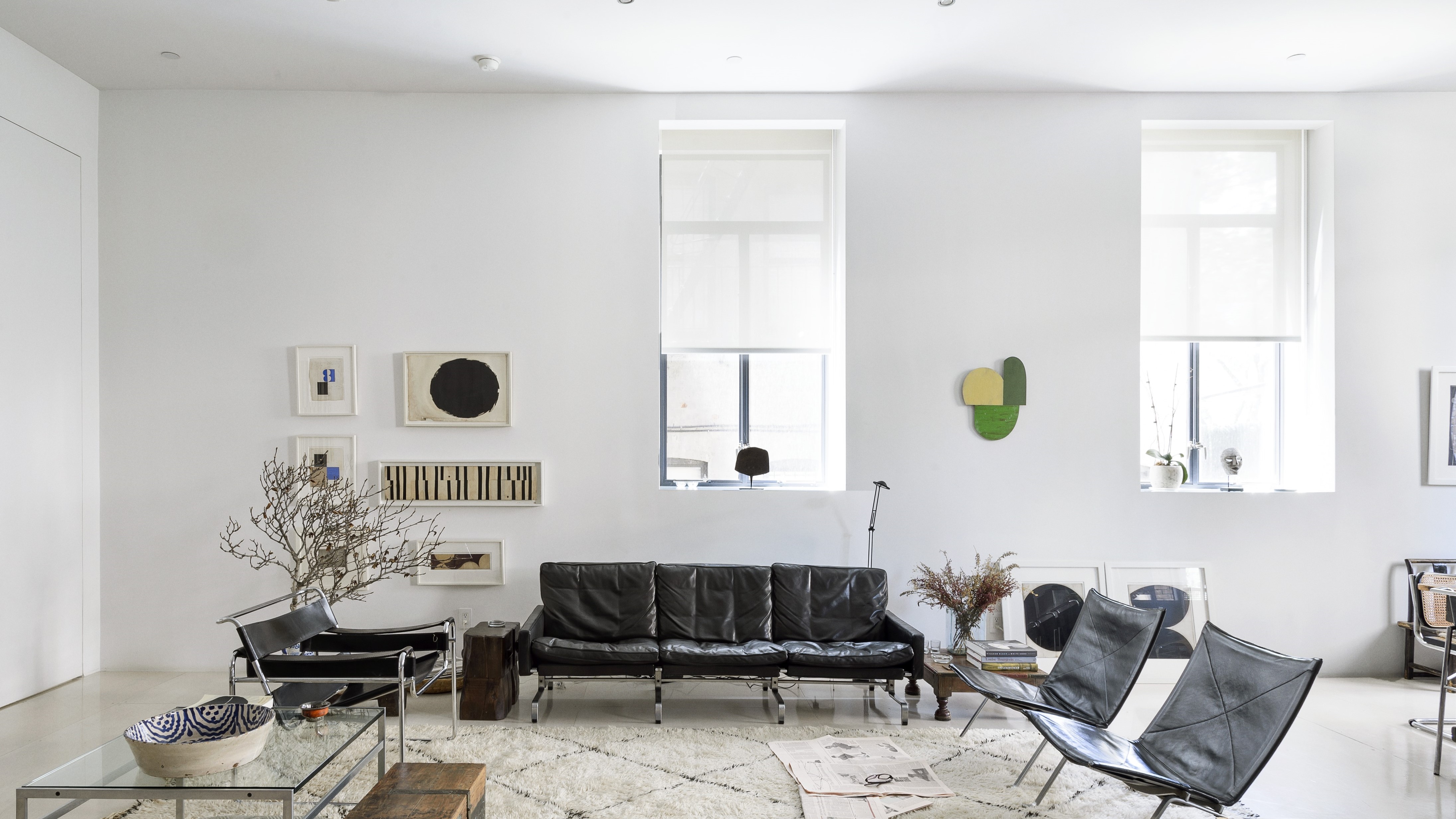
6 painting mistakes that are making your walls look 'dirtier' – and what you should be doing instead

Outdated color trends – 5 overdone colors that designers no longer love, and what to use instead
6 colors to avoid in an entryway – and the ones designers know make a better first impression
The 5 Most Overused Paint Colors and What to Try Instead, According to Designers