1/7
Should your trim match your wall color? Experts reveal 6 color tips that can lead to decorating success
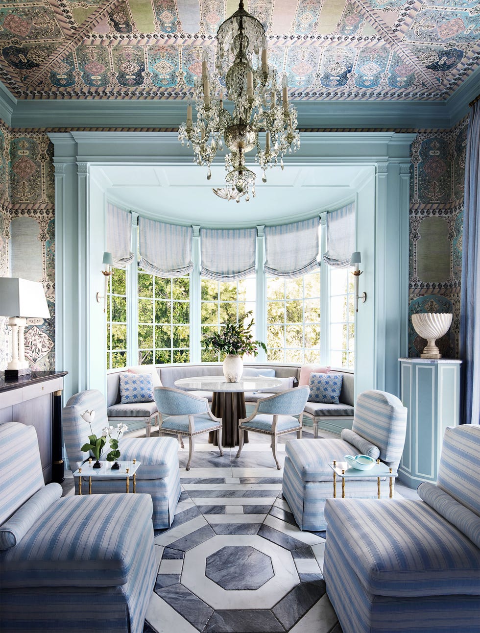
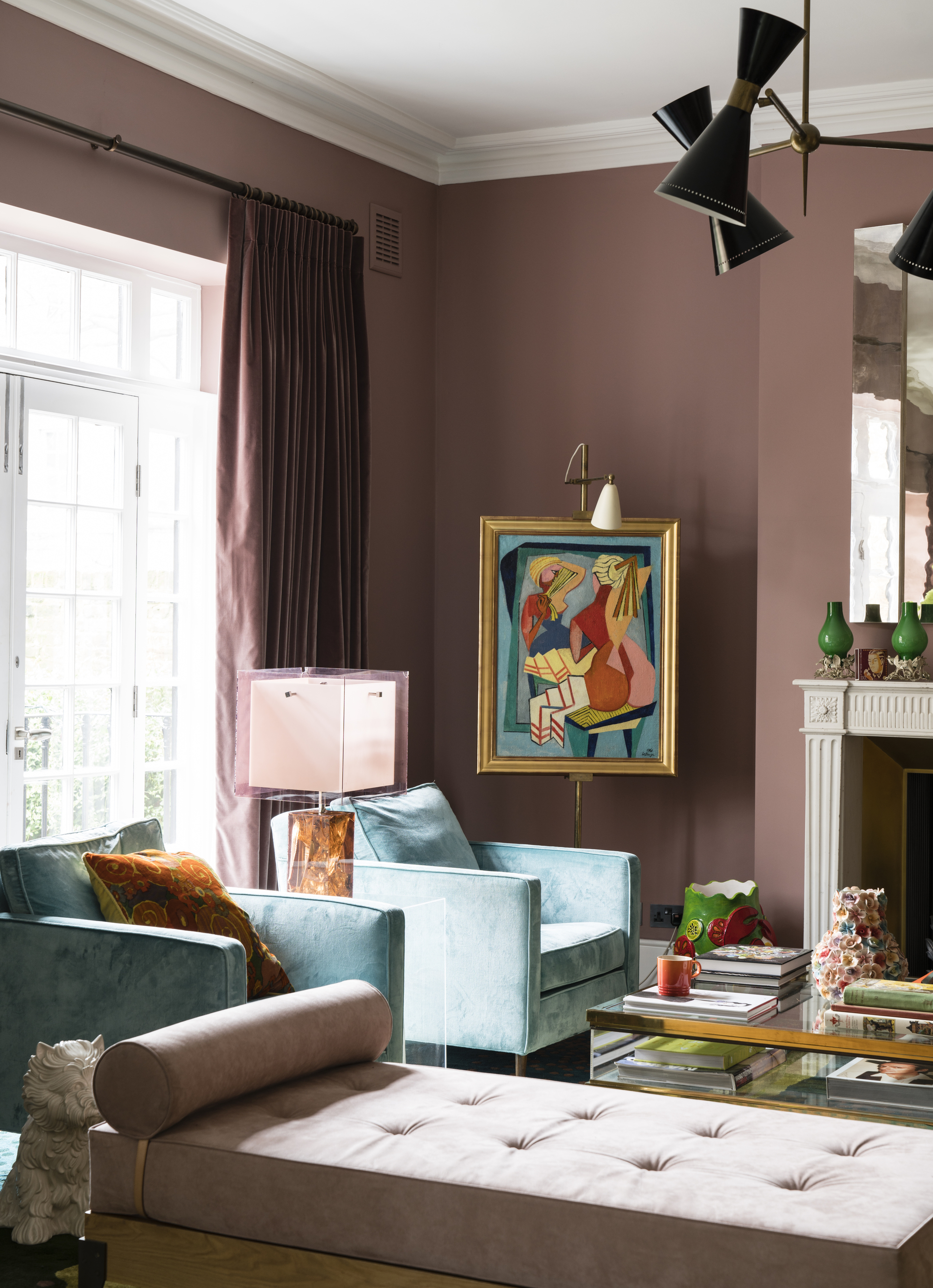
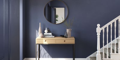
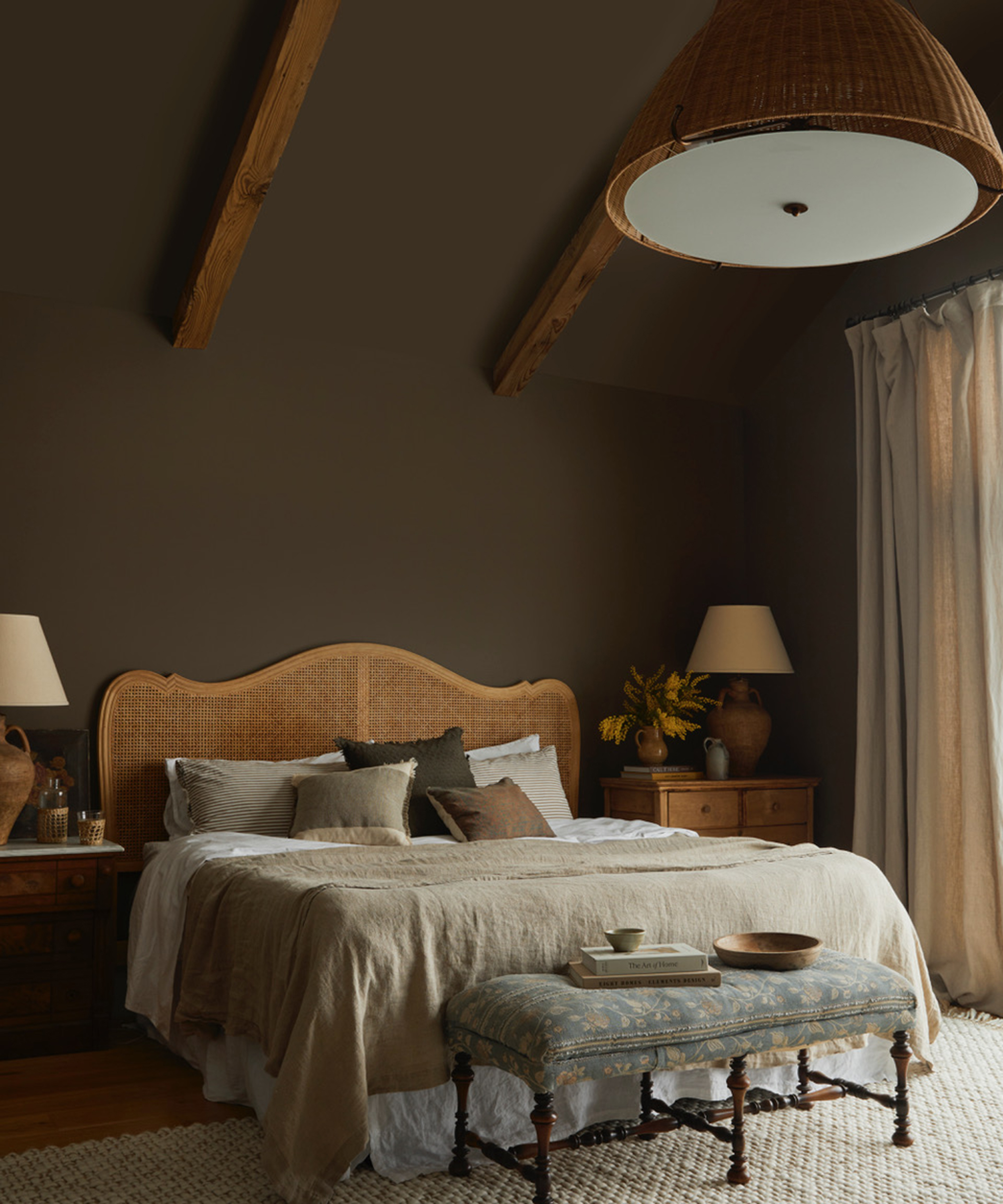
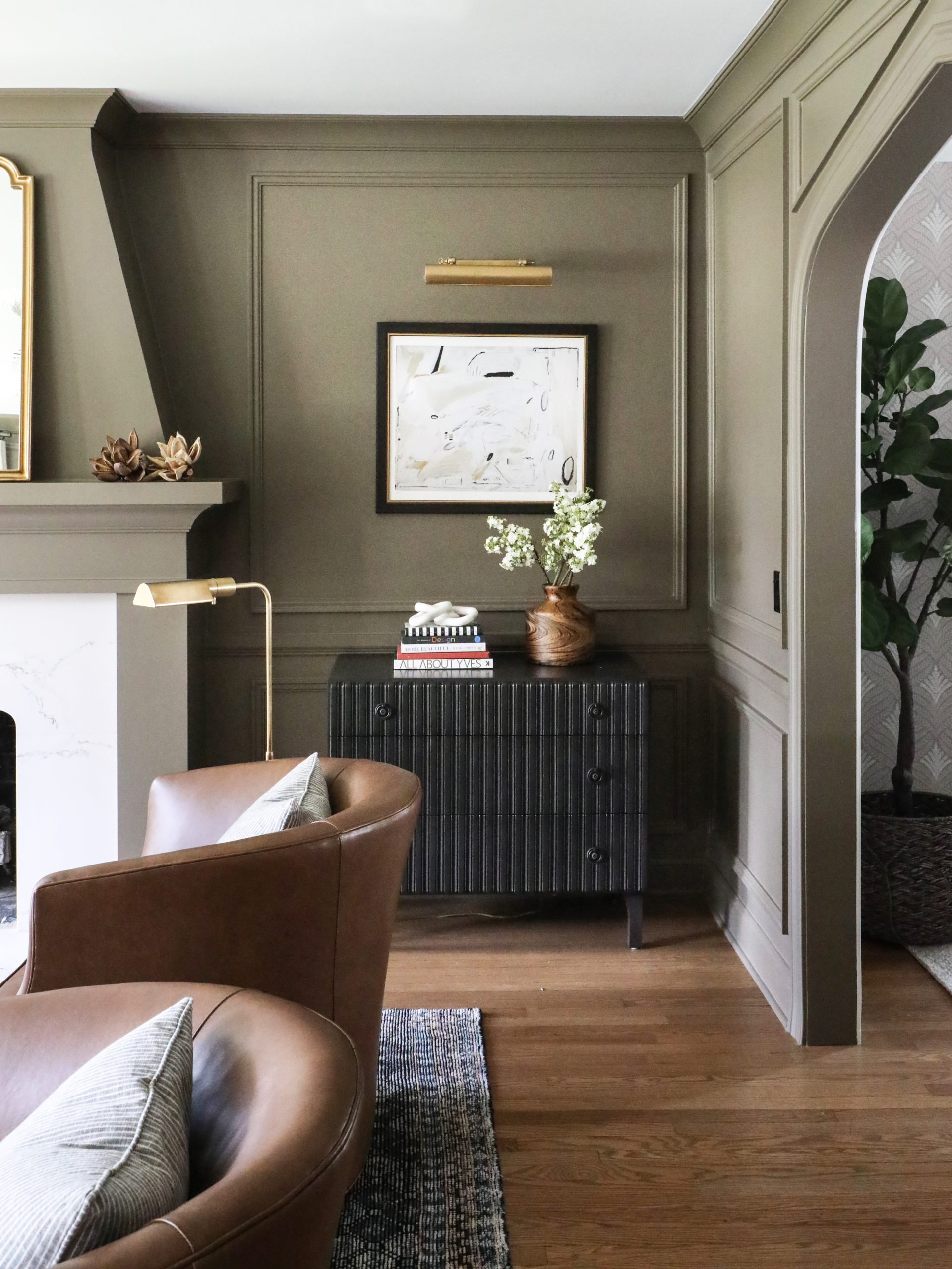
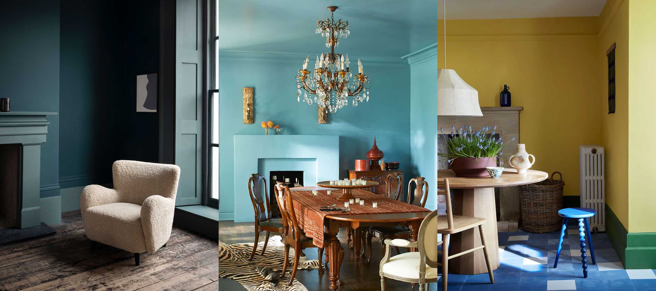
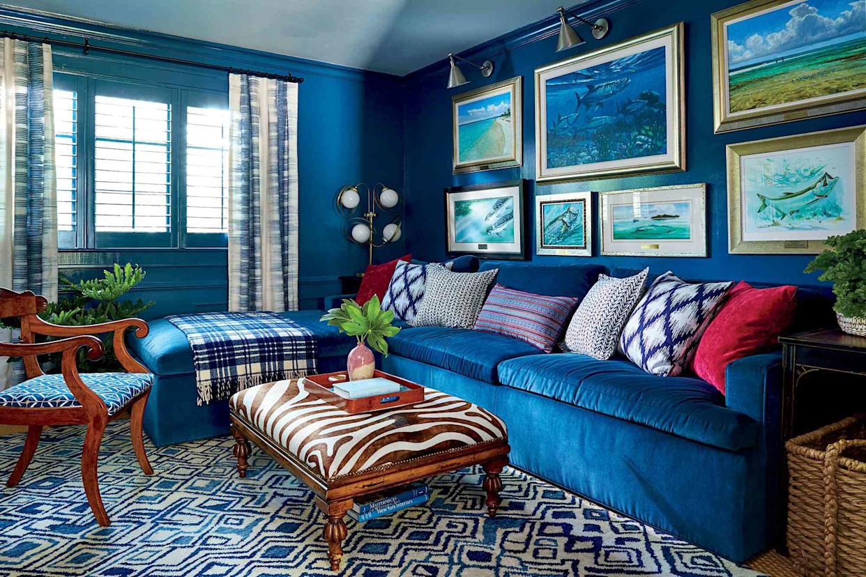
The decision of whether to match wall color and trim color in interior design is explored, offering various perspectives from paint experts. There is no single rule, as the choice depends on the desired aesthetic and overall design vision for a room. Matching the trim to the wall color creates a "color-drenched" or unified look, often making a space feel more intimate, enveloping, and larger due to seamless lines and edges. This approach is particularly effective in living rooms, bedrooms, and hallways. An example cited is a blue dining room where the same vibrant blue on walls, trim, and ceiling creates an immersive effect, contrasting with traditional furniture.
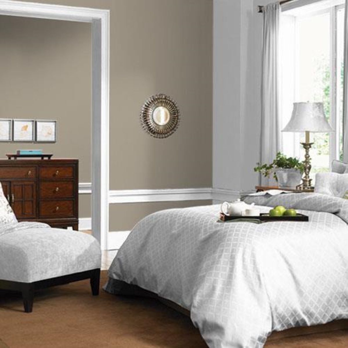
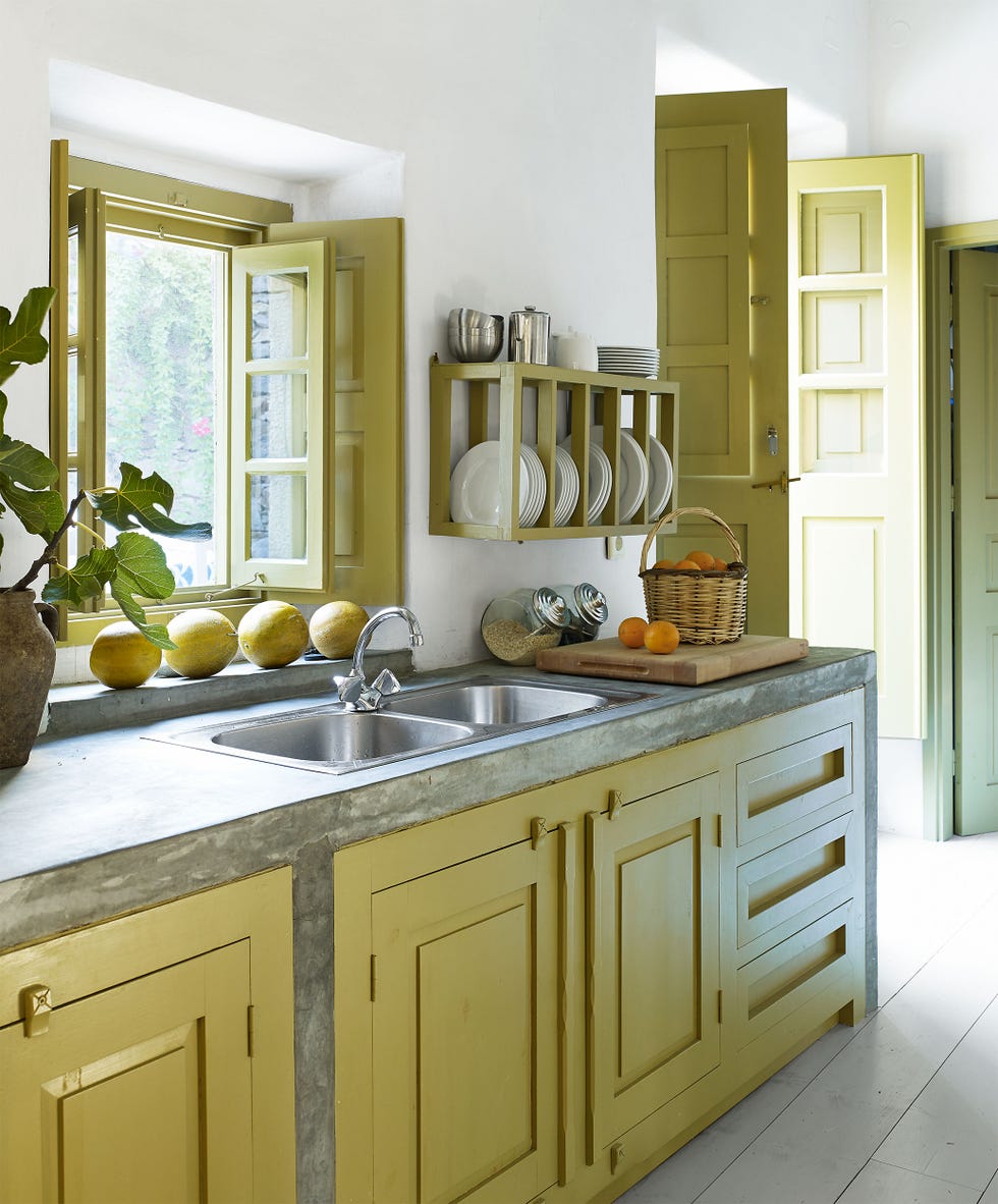
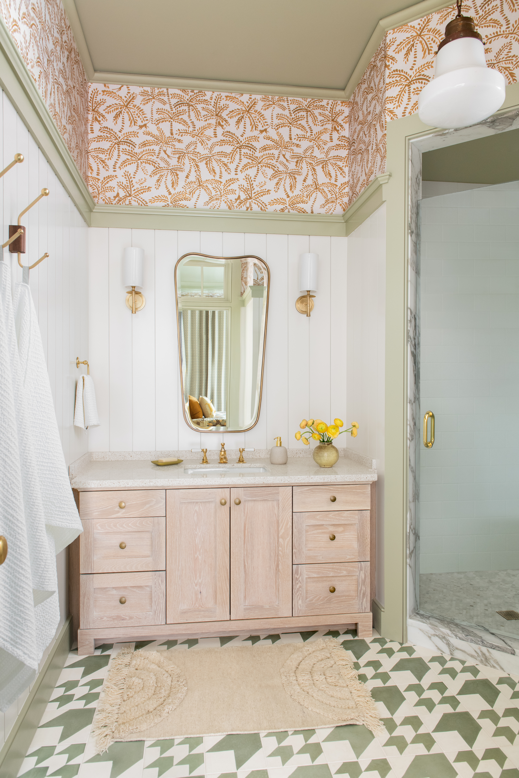
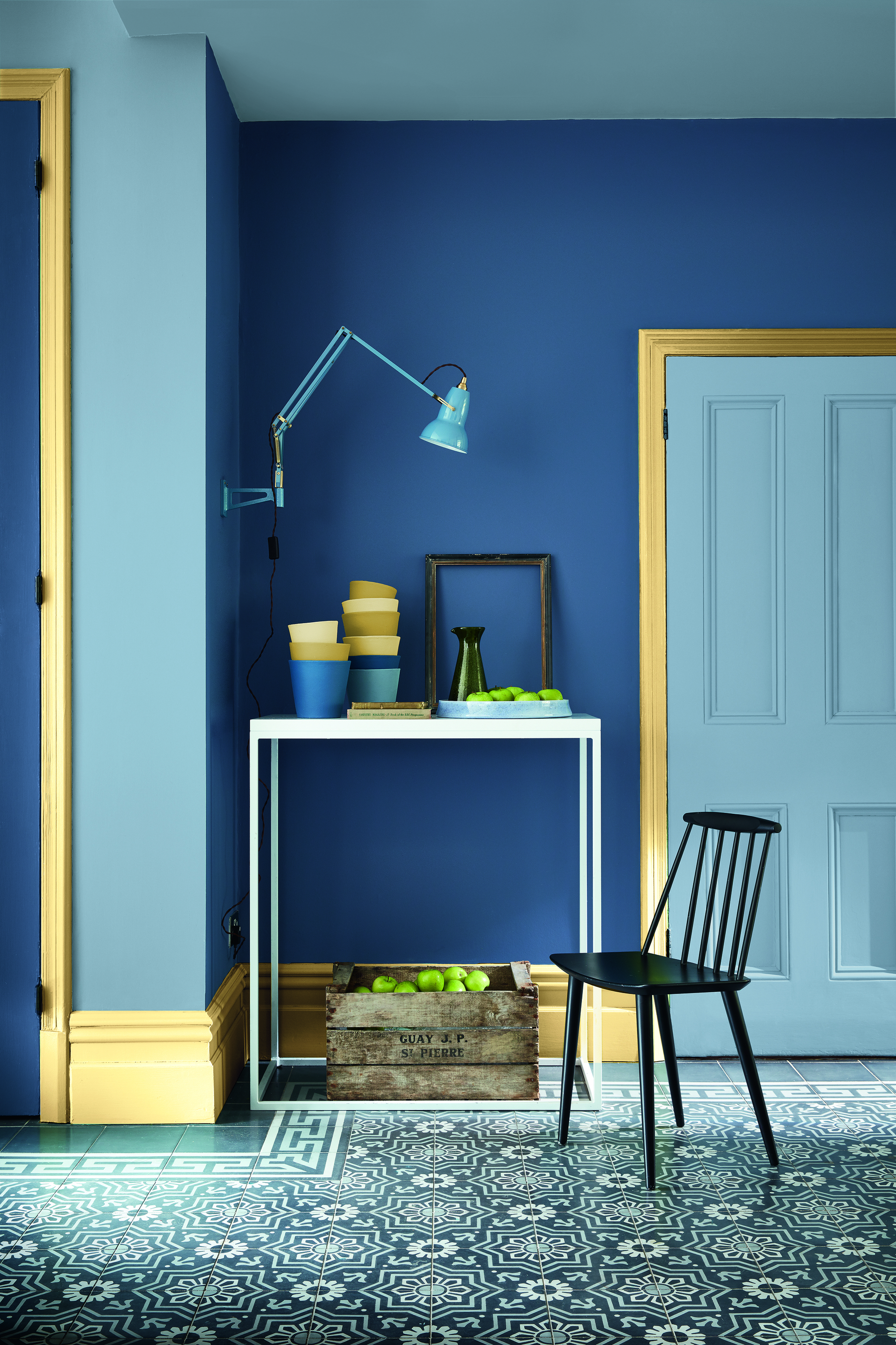
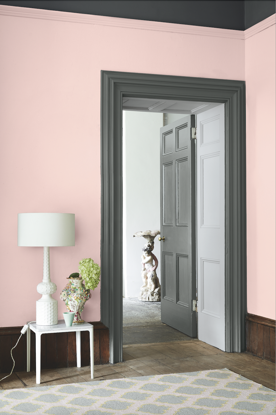
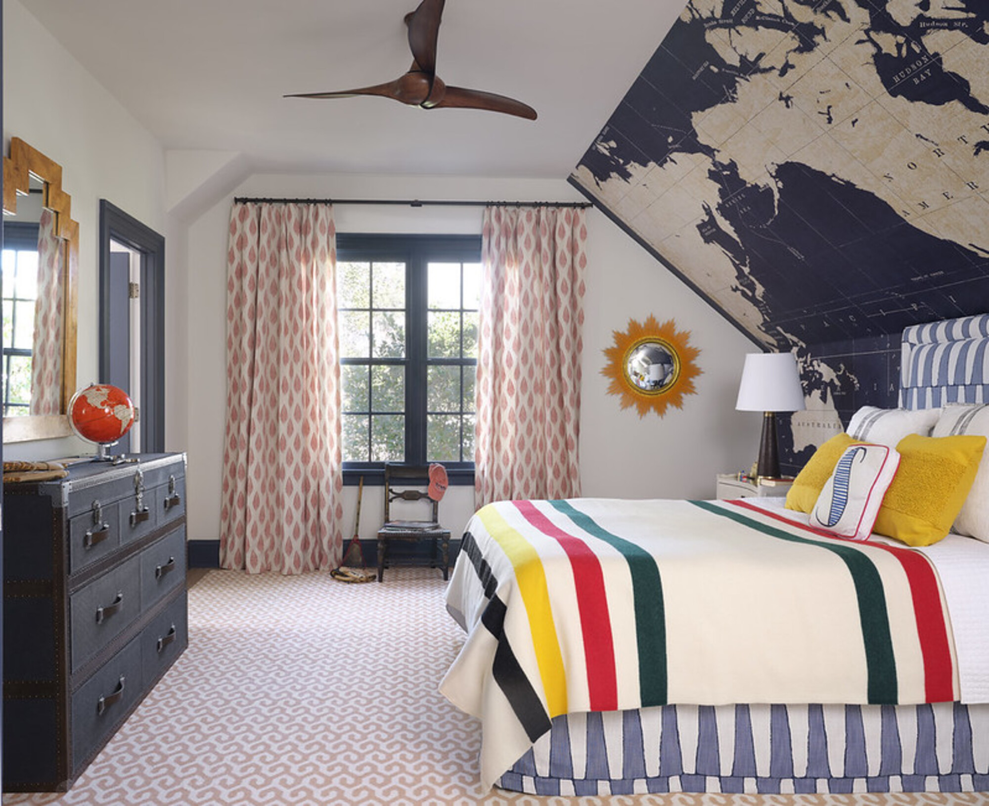
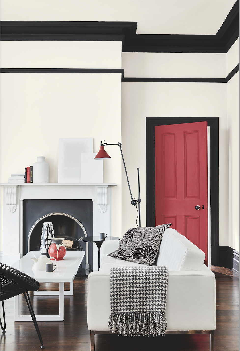
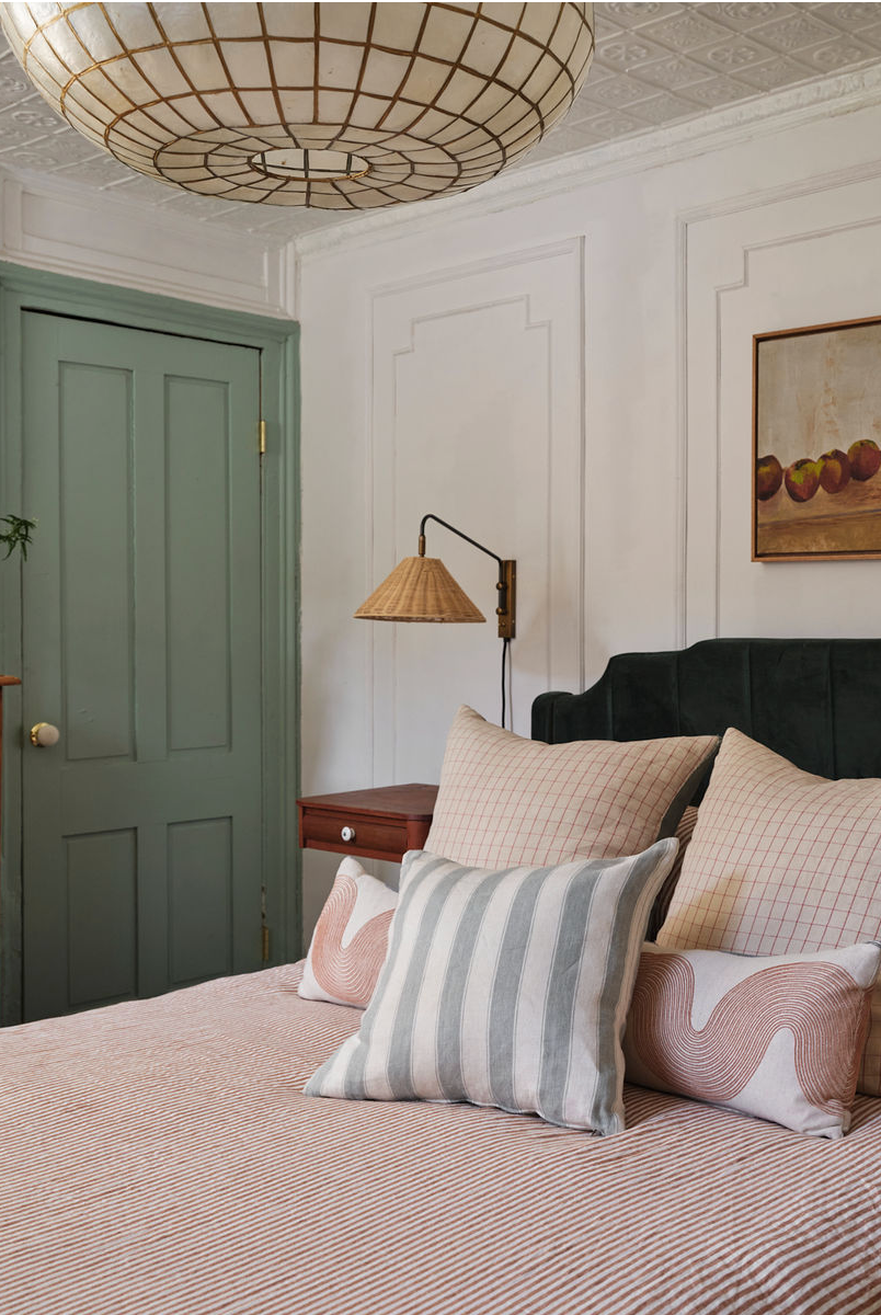
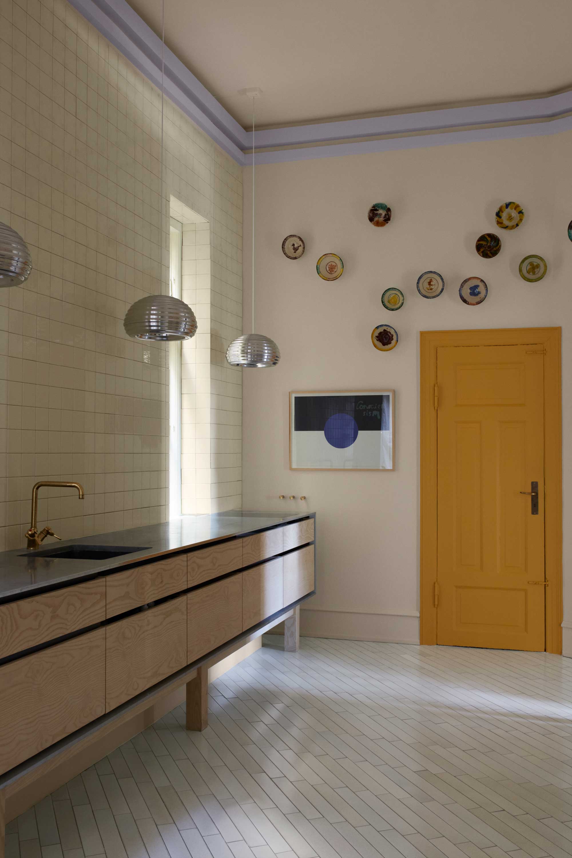
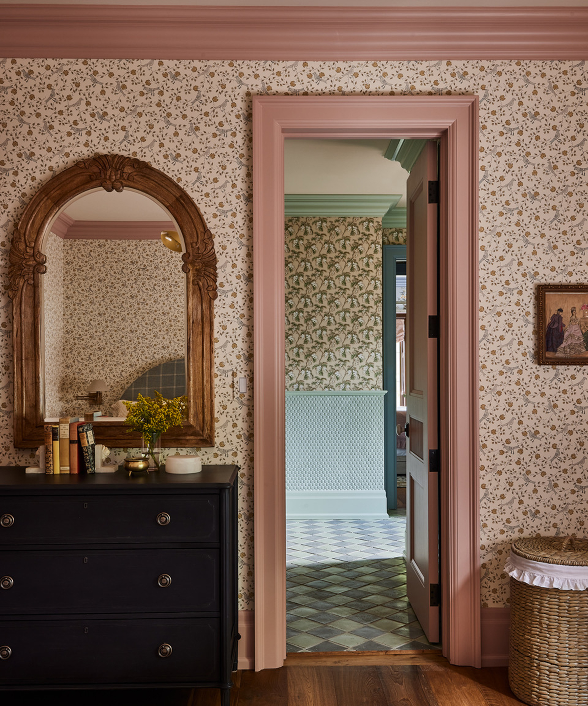
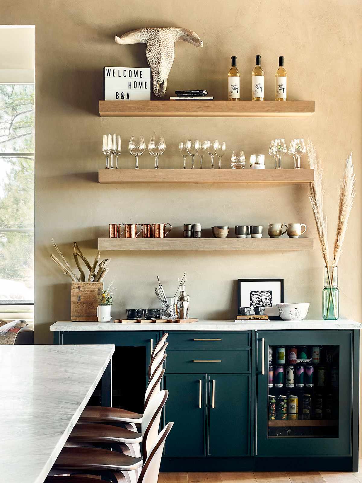
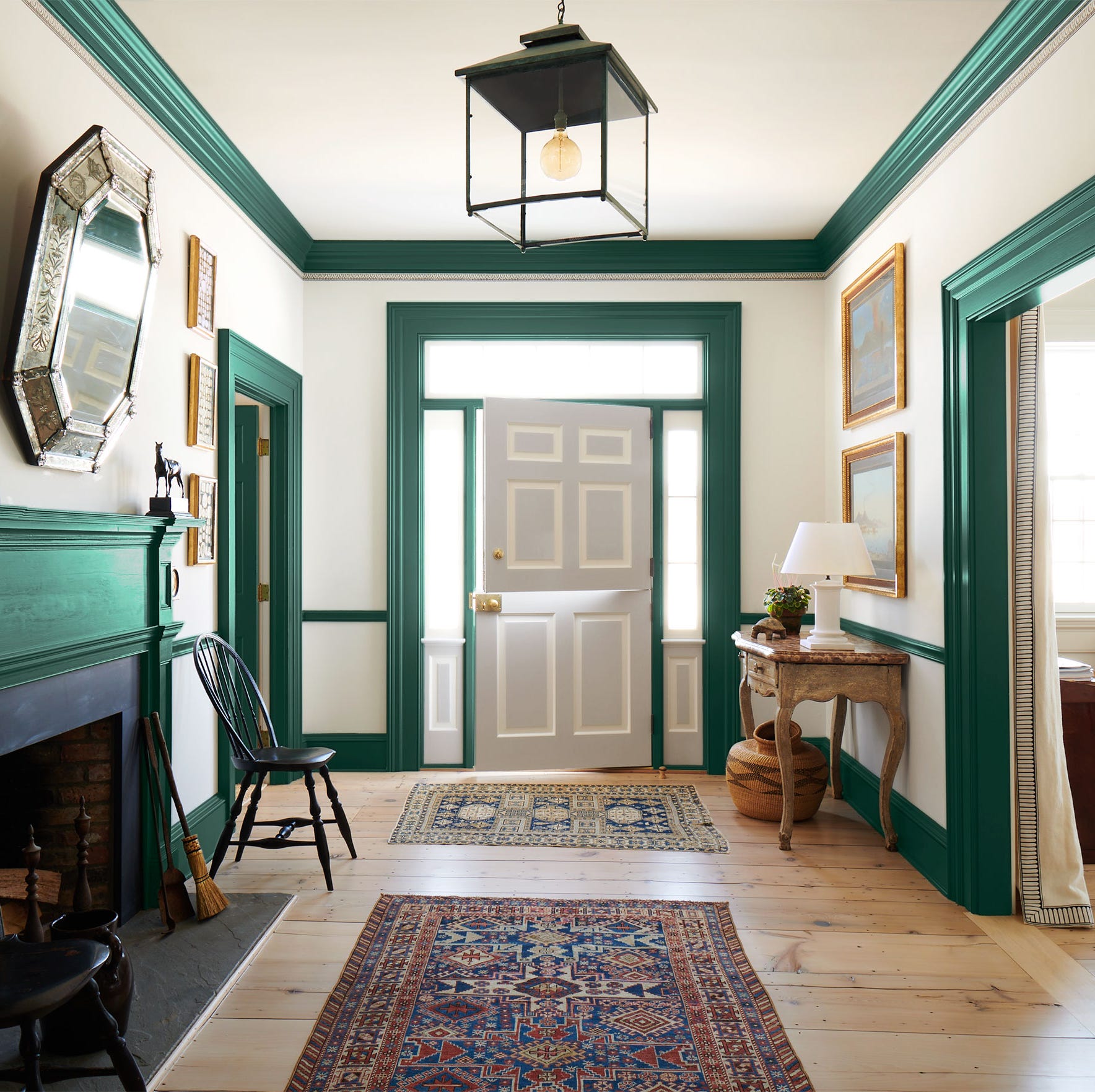
Alternatively, contrasting trim can introduce a stylish element and visual interest. This can be achieved by using a strong accent color for the trim to highlight architectural details like archways, skirting, or picture rails. For instance, in a child's room, green trim against white walls can add character without overwhelming the space with color. For a subtler contrast, designers suggest using different shades from the same color family, creating a more harmonious and tranquil atmosphere. A lighter version of the wall color on the trim can emphasize architectural details without starkness.
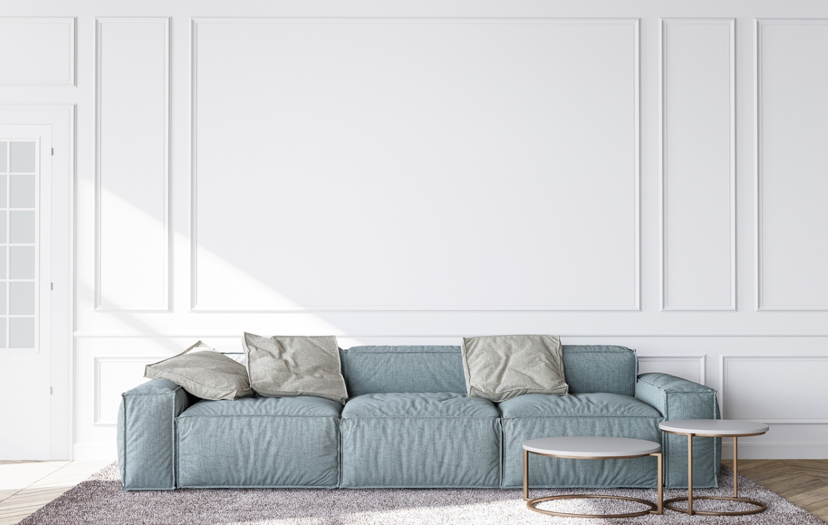
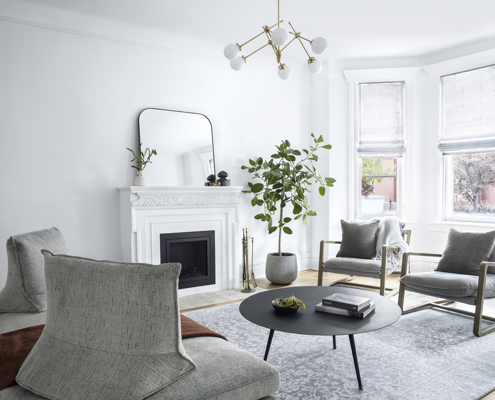
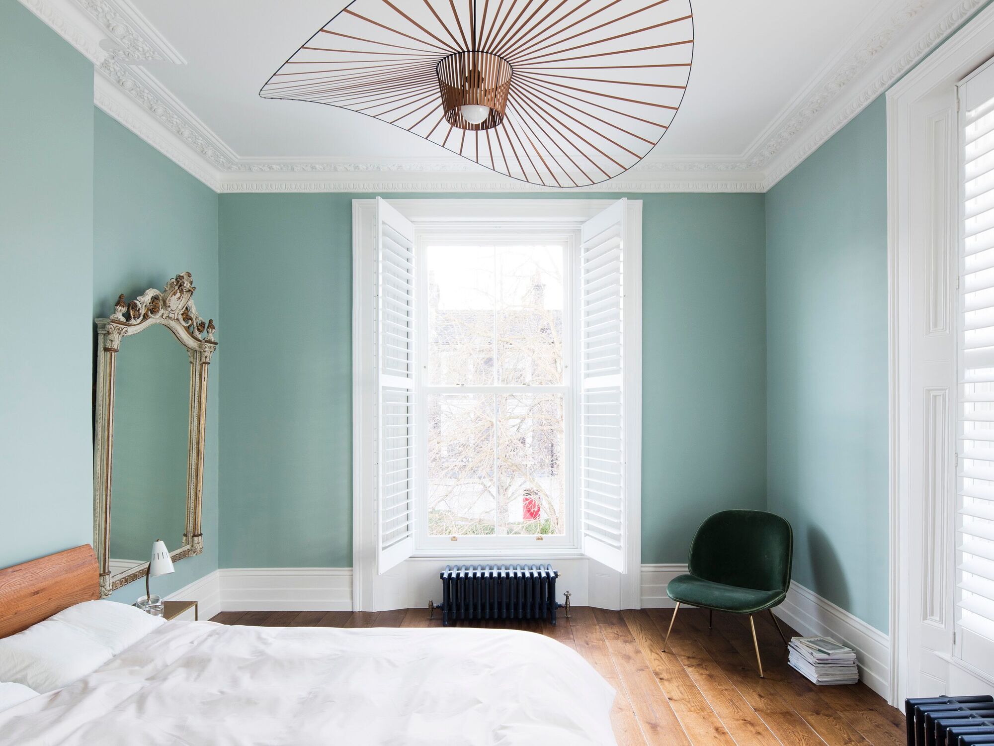
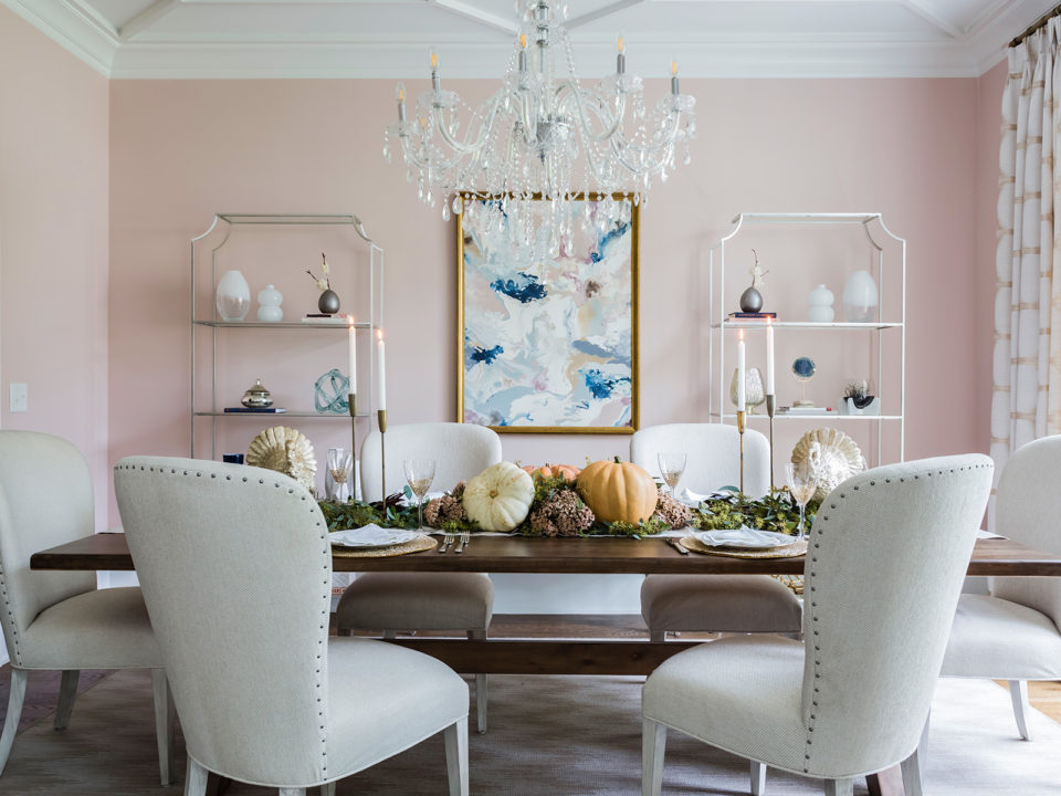
While white trim remains a classic and traditional choice, offering a clean finish that complements any wall color, current color trends indicate a growing confidence in using bolder and more colorful trims. Designers note that a bright white trim can sometimes create too high a contrast, making a room feel less considered or stark. Therefore, choosing white should be a deliberate design decision rather than a default habit.
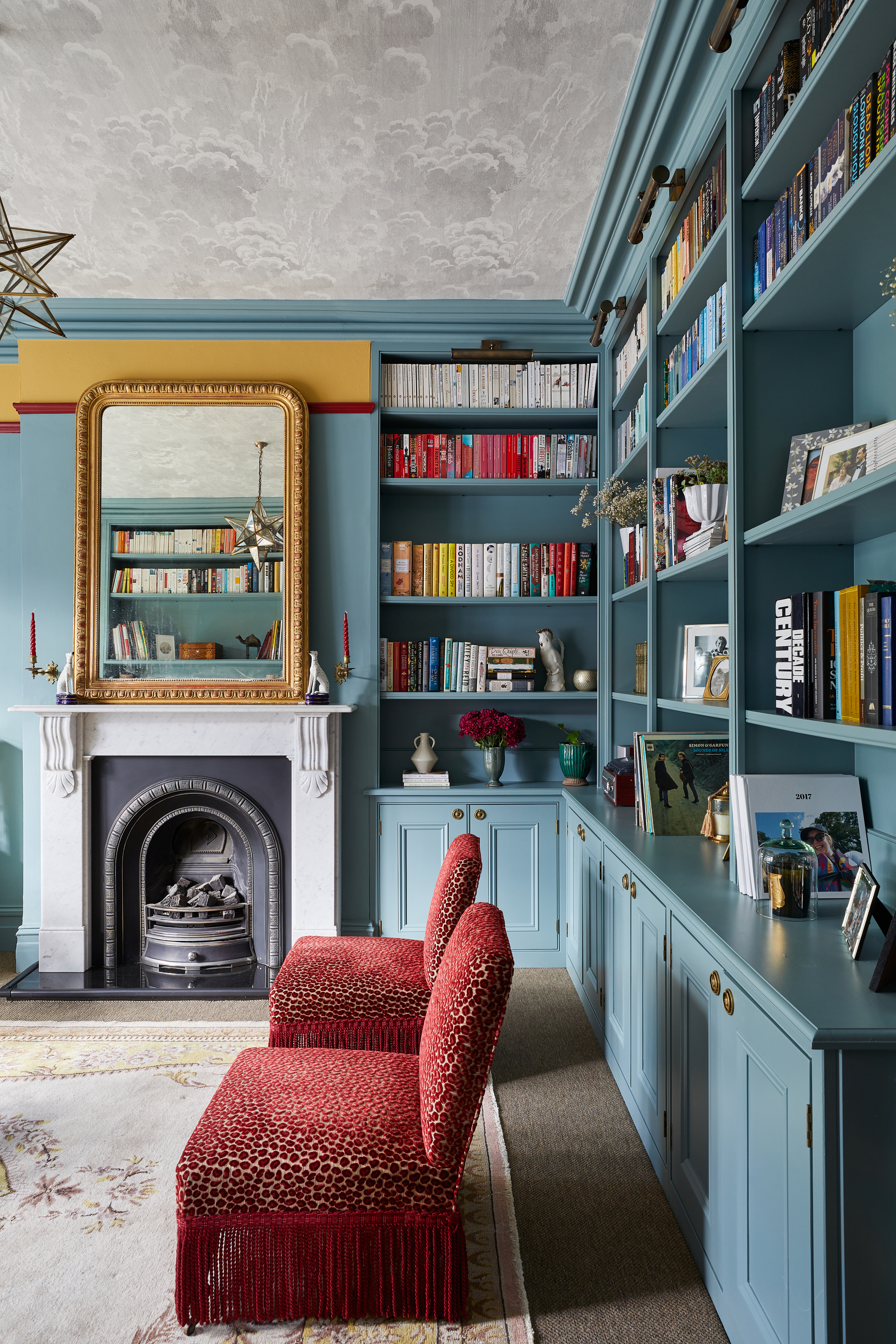
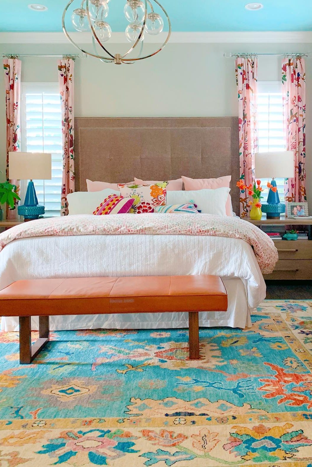
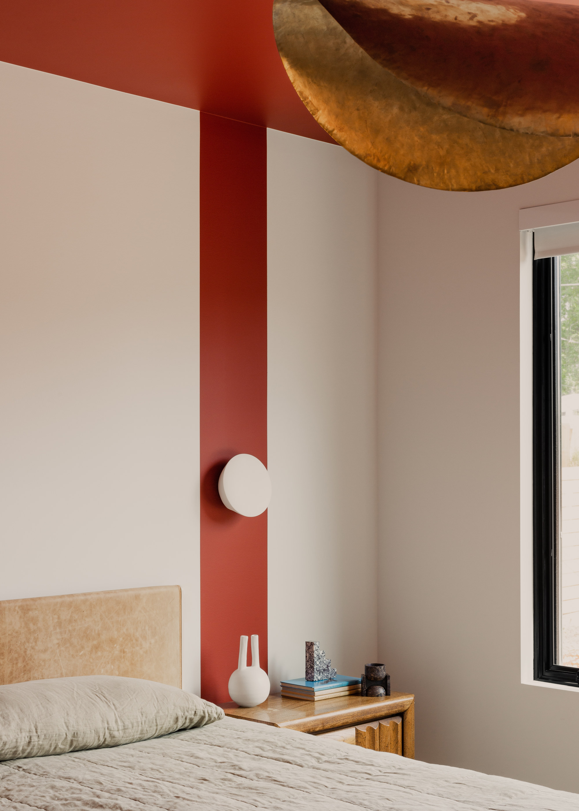
Another innovative approach is to coordinate the trim color with the ceiling color, especially when incorporating ceiling paint ideas. This can enhance the room's design, alter perceptions of height, and soften awkward angles. Using one color for both ceiling and trim removes visual contrast between the wall and ceiling, promoting a seamless flow, particularly beneficial in rooms with lower ceilings.
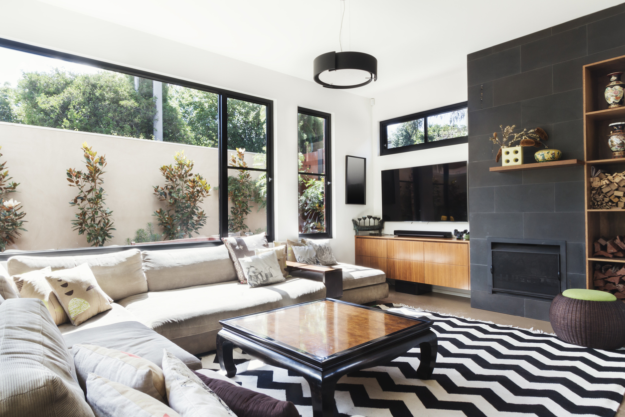
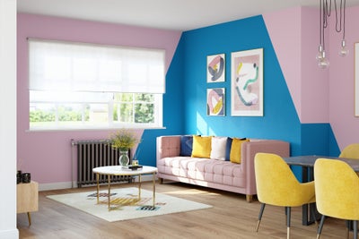
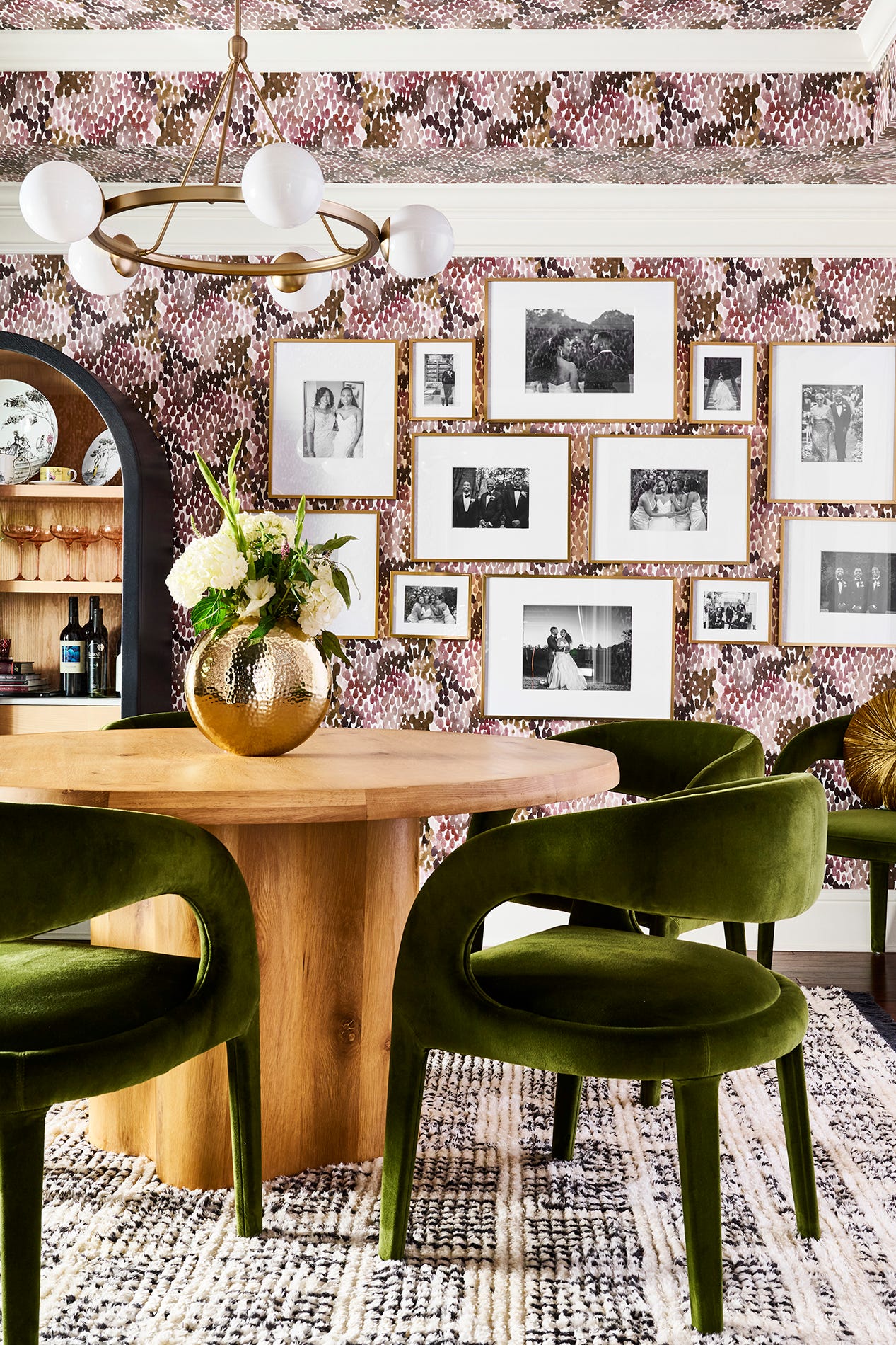
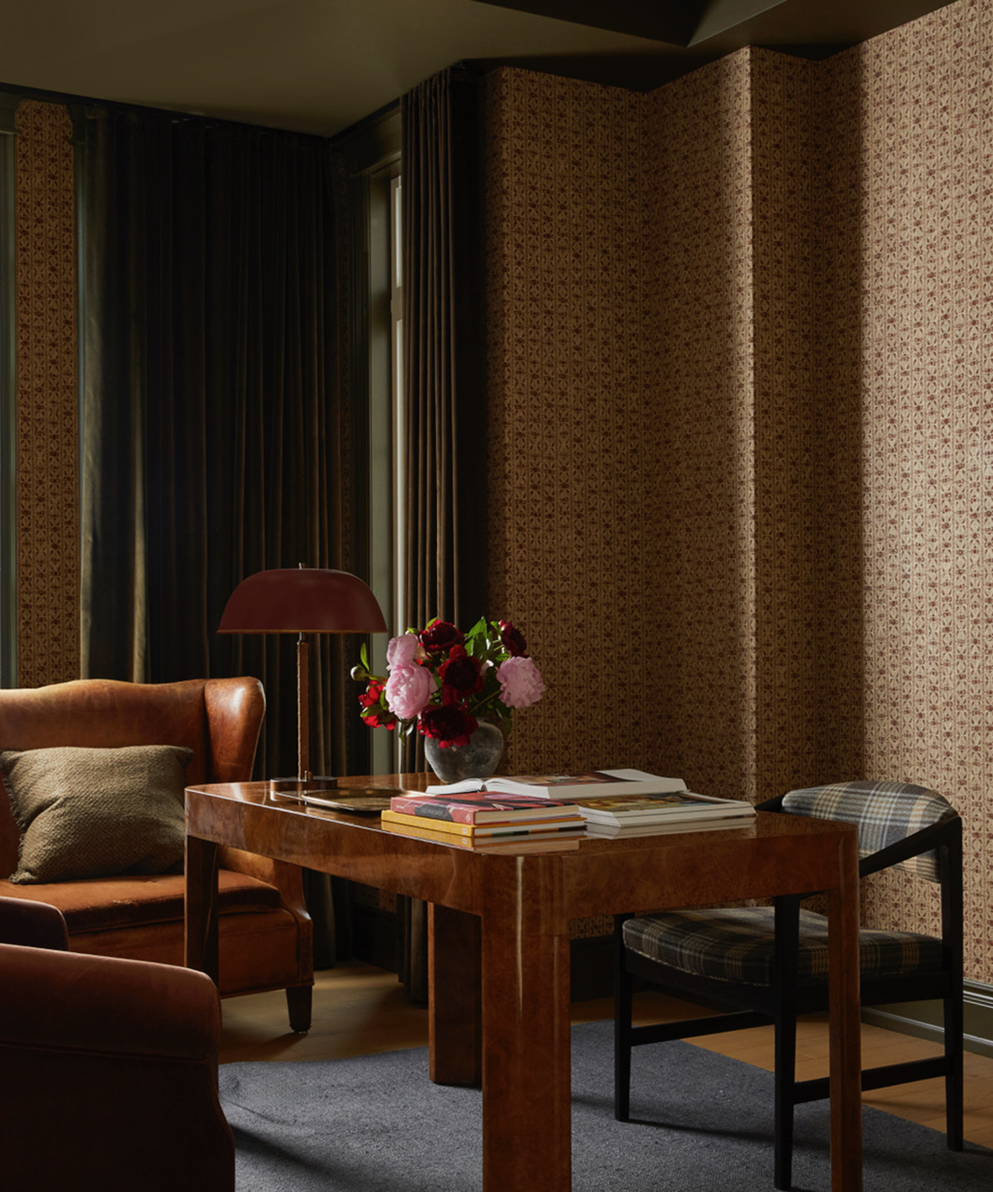
For a truly contemporary and unique interior, mixing and matching different colors across walls and trim areas is suggested. This allows for a tonal color scheme within the same family or bold, contrasting colors on each separate trim, celebrating architectural details with a personalized and artistic touch. The article concludes by emphasizing that both matching and contrasting can be successful, depending on the desired outcome, and encourages homeowners not to shy away from different colors across rooms to best suit each space's design. There are no strict rules on whether trim should be lighter or darker, as both can work depending on the design. Using the same trim color throughout a home creates cohesion, but varying colors in different rooms can also be effective if the overall flow is maintained.
#InteriorDesign #ColorPalette #HomeDecor #PaintTips #ArchitecturalDetails #ColorDrenching #AccentColors #CeilingDesign #ModernInterior #InteriorDesign #ColorPalette #HomeDecor #PaintTips #ArchitecturalDetails #ColorDrenching #AccentColors #CeilingDesign #ModernInterior
0 comment in total
 No comments yet
You may also like
5 Classic Wall and Trim Color Combinations—and 5 for Rule-Breakers Only

Decorating with paint

Here's What Colorists Want You to Know About Picking House Paint

How to Pick Paint to Match Your Wallpaper: 5 Expert Tips

Why the Correct Trim Color Can Totally Transform Your Home

8 ideas for light walls with dark trim that capture this paint trend perfectly

6 Paint Color Mistakes To Stop Making, According To Designers

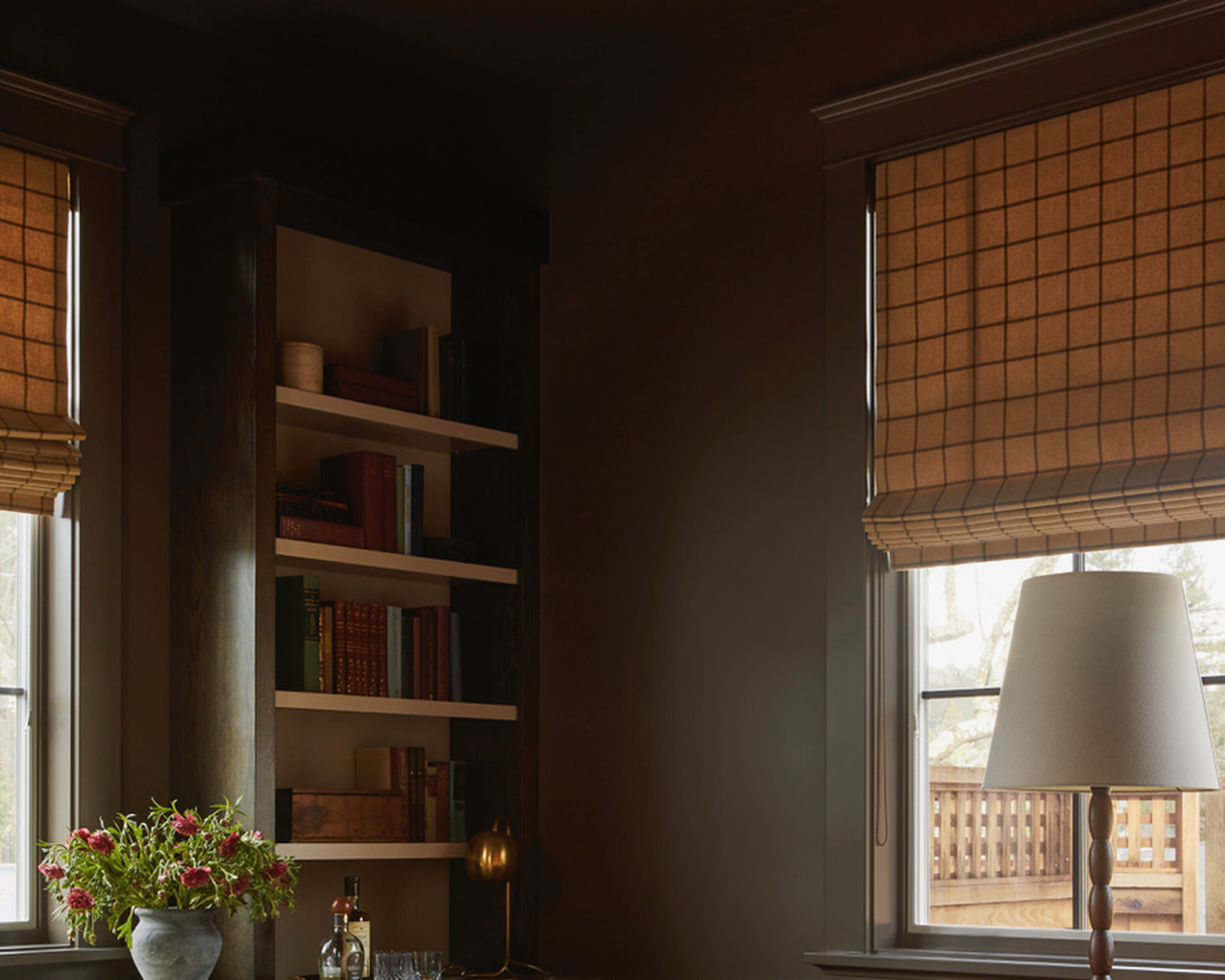
As a designer, I can tell you: this one simple change can transform any home’s decor
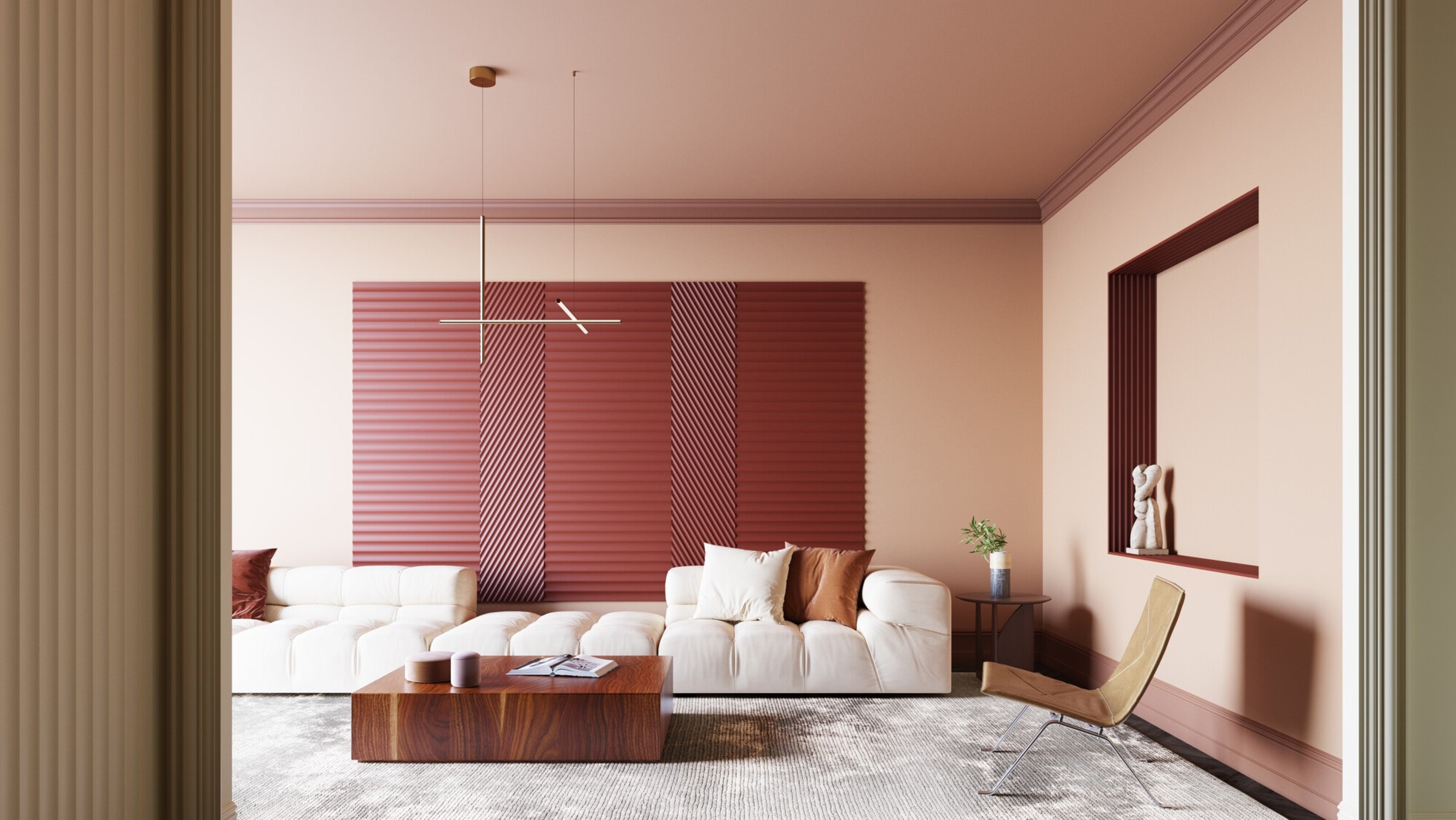
Should I paint my wall trim white? The pros and cons to painting your molding
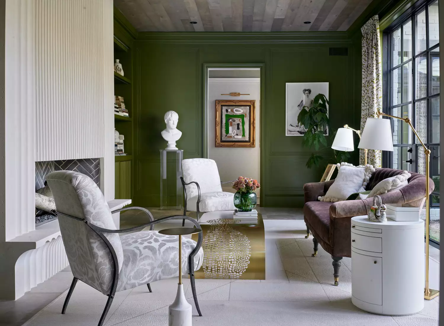
Should You Paint Your Trim And Walls The Same Color?
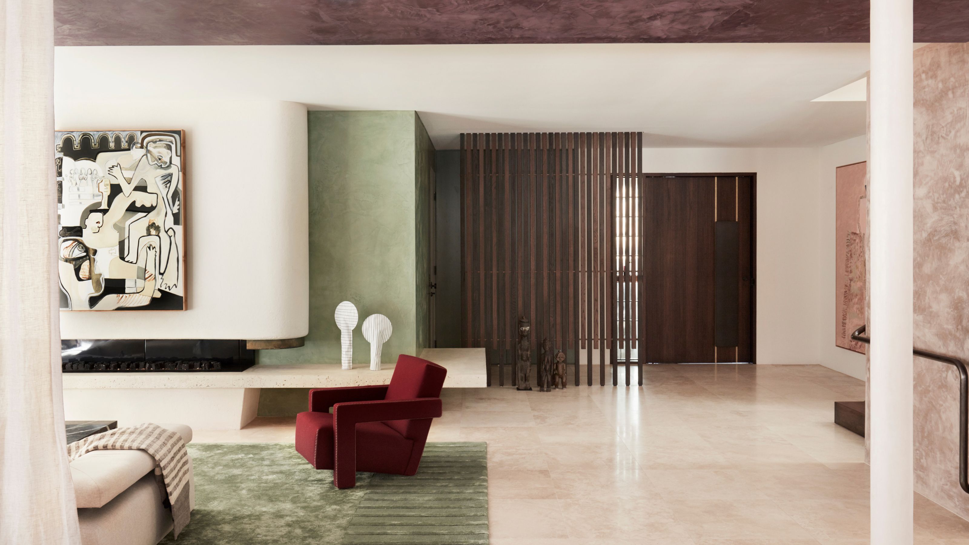
'The World of Color is Rife With Danger' — 5 Color Combinations That Don't Go Together and What to Use Instead
Kitchen Color Selection Tips from 5 Designers

Real Simple Home Designers Share Their Secrets for Picking the Perfect Wall Color

12 Color Schemes That Are Popping Off Right Now, According to Designers

Should Doors and Trim be the Same Color? In 2025, Here's What Designers Are Doing
How to Pick the Best Paint Colors for Every Space in Your Home


What are the best trim colors? 7 alternatives to white paint to elevate your room's palette

What are the worst colors to paint a room? The shades experts say you should never use
7 Paint Mistakes That Make Designers Instantly Cringe When They Walk Into Someone's Home

How To Choose The Right Paint Color For Your Home, According To An Interior Design Expert