6 Outdated Trim Colors Designers Say to Avoid—and What to Use Instead
Updating the paint color of home trim can significantly refresh a room's aesthetic without requiring a complete overhaul. Design experts Paula Taylor, senior stylist and trend specialist at Graham & Brown, and Patrick O’Donnell, global brand ambassador for Farrow & Ball, offer insights into trim colors that may be making homes appear dated and provide contemporary alternatives.
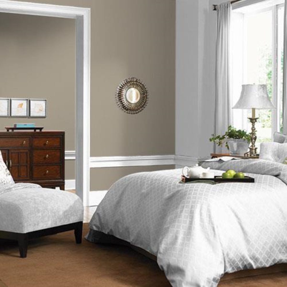
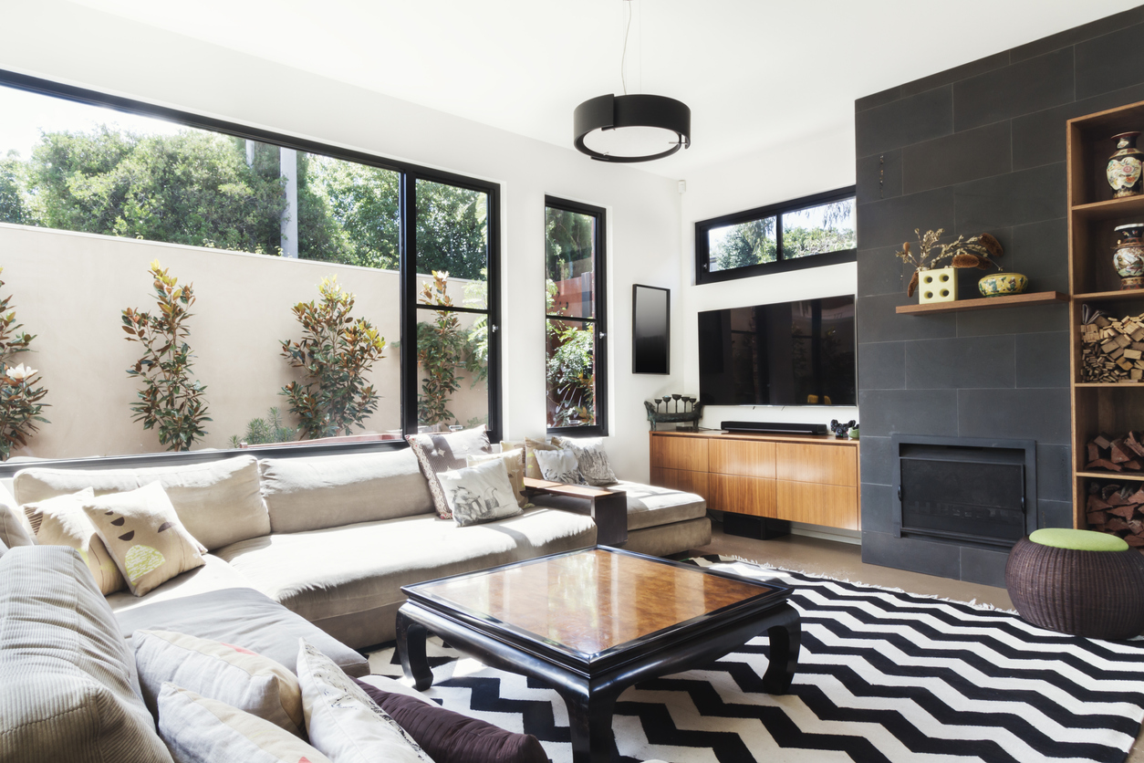
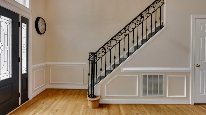
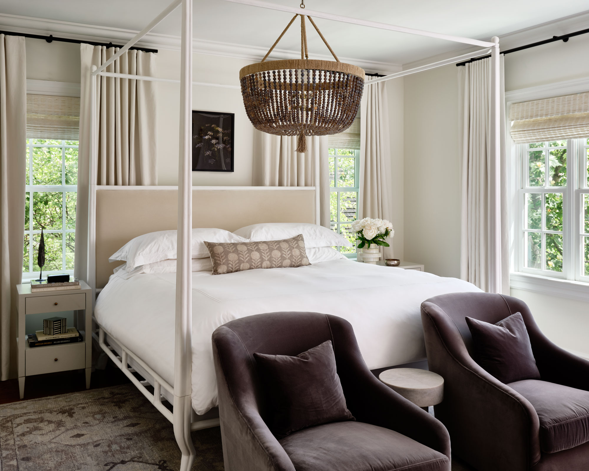
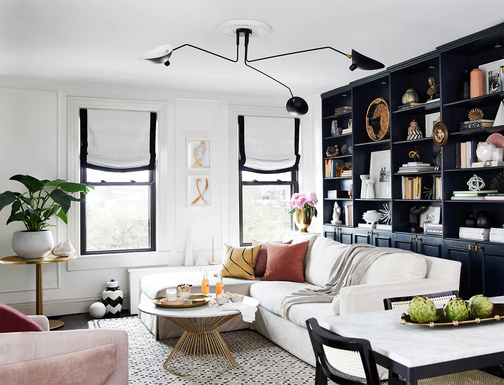
One common mistake is using generic, bright white trim, which often creates a harsh contrast with wall colors. Instead, O’Donnell suggests opting for more nuanced whites with subtle undertones that complement the wall color. For instance, if walls are painted in a mid to dark green, whites with green undertones like Farrow & Ball's Off-White or Shaded White are recommended. Similarly, stark pitch black trim can also make a space feel dated. For those who prefer dark, moody interiors, a rich charcoal or soft black, such as Farrow & Ball's Hopper Head, Railings, or Down Pipe, offers a sophisticated alternative that avoids the abrasive quality of pure black.
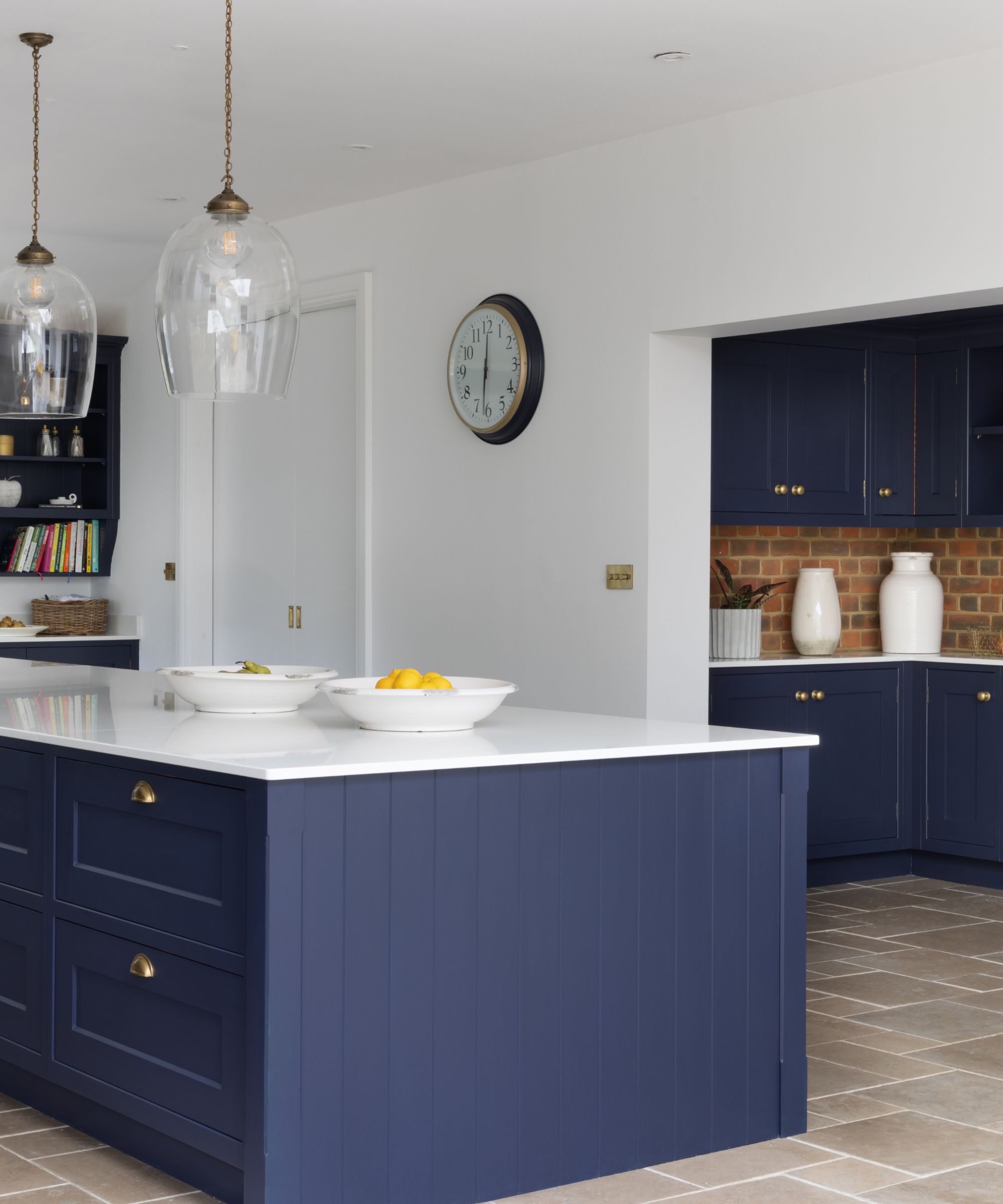
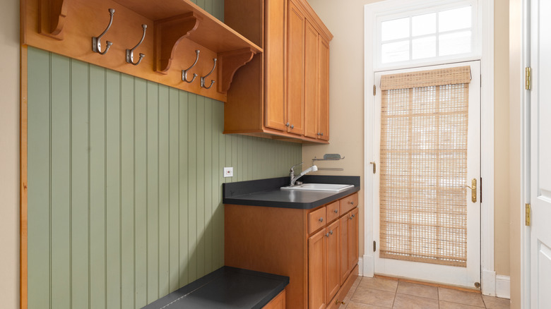
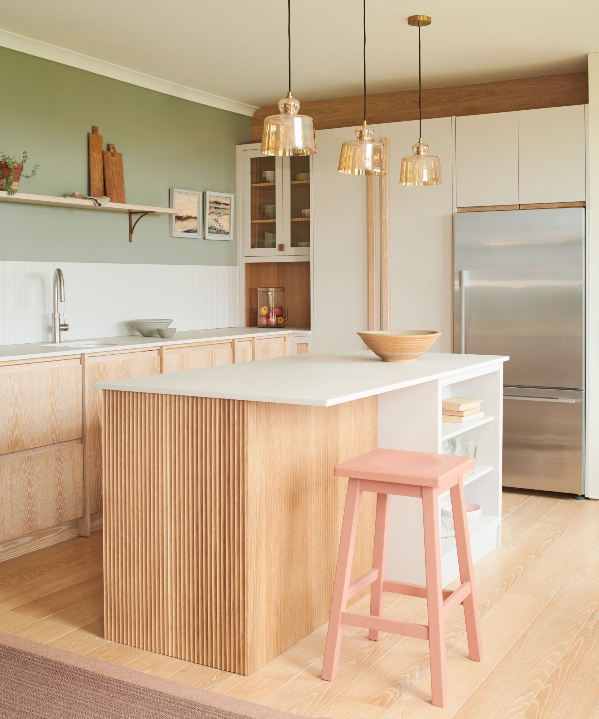
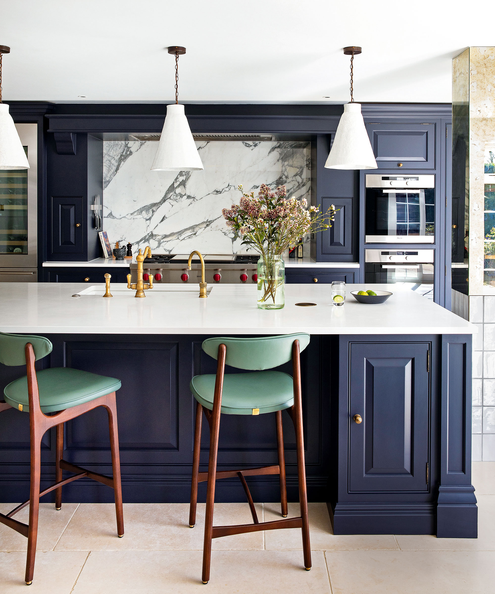
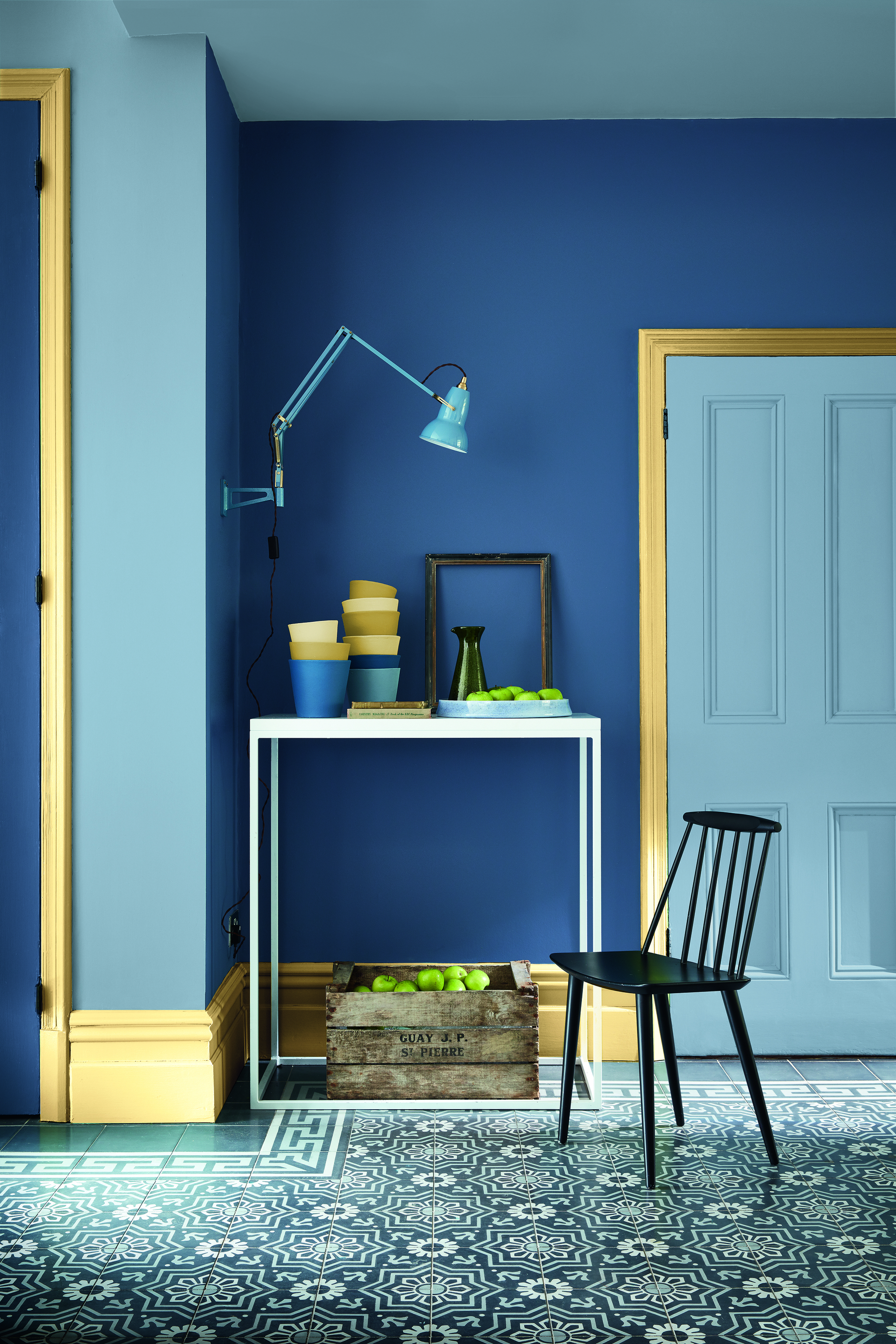
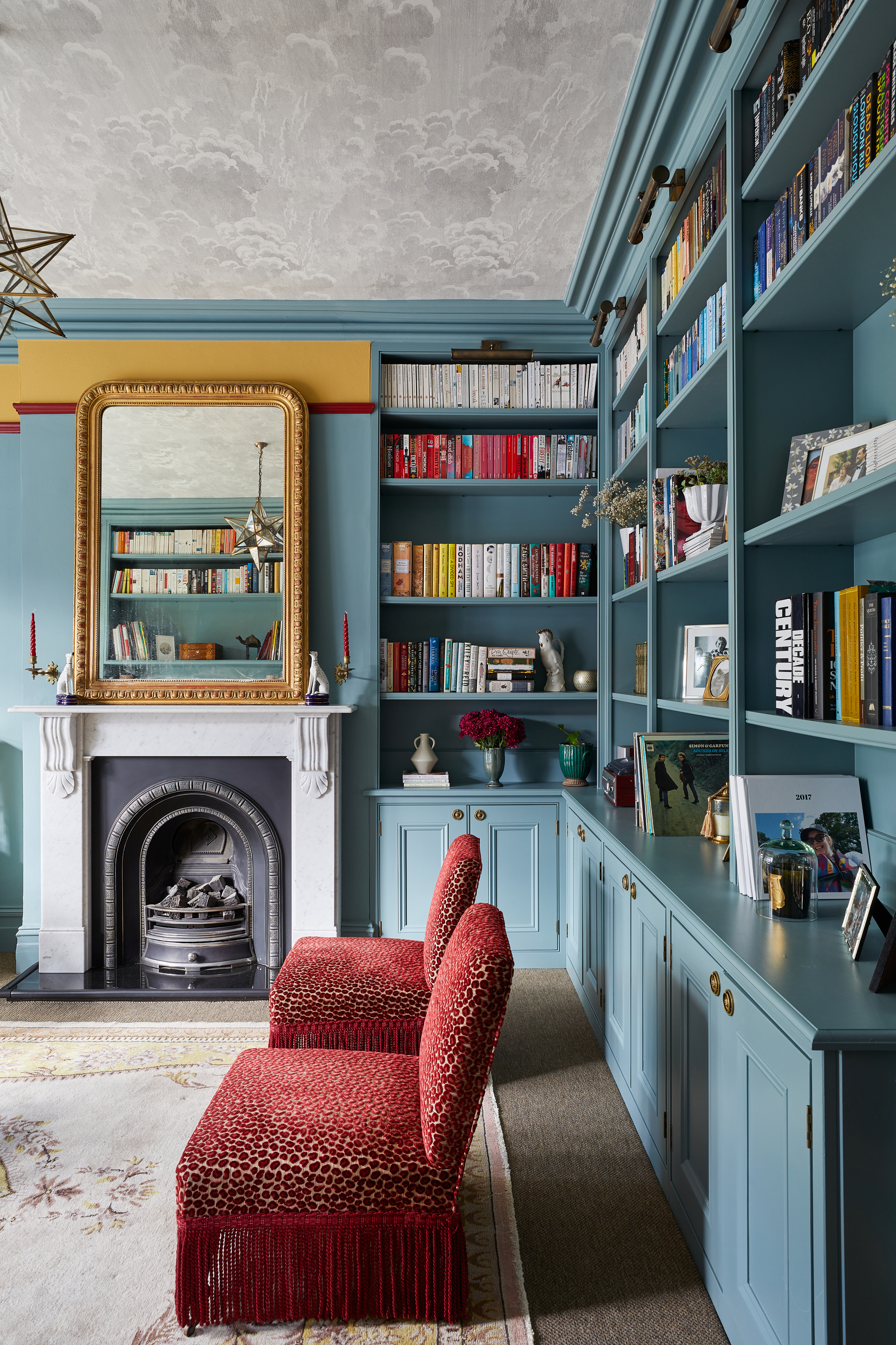
Dark blue trim is another color identified as potentially overused. While dark trim can effectively ground a room, a richer brown alternative like Cardamom or an earthy hue such as Wainscot can provide a more current and impactful look. Rich cream-colored trim can also date a space, particularly if it has a yellow undertone reminiscent of 1980s aesthetics. To modernize this look, O’Donnell advises using creams with a hint of black in their composition, suggesting warm, light grays like Skimming Stone, Shadow White, or Hardwick White for a traditional yet updated feel.
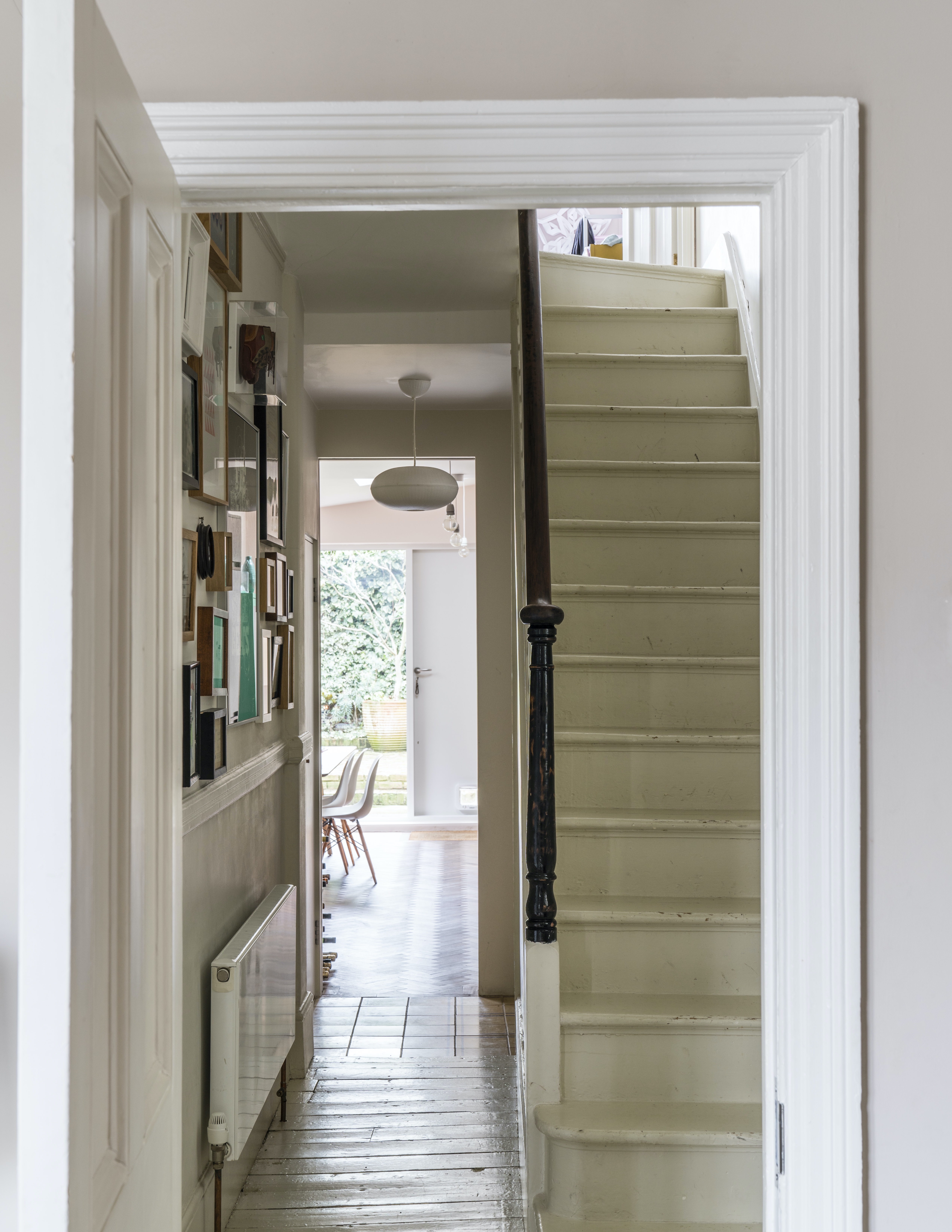
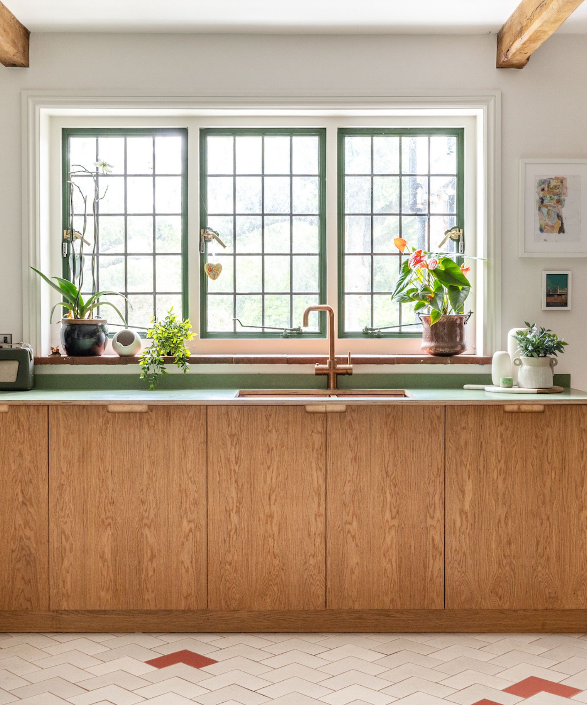
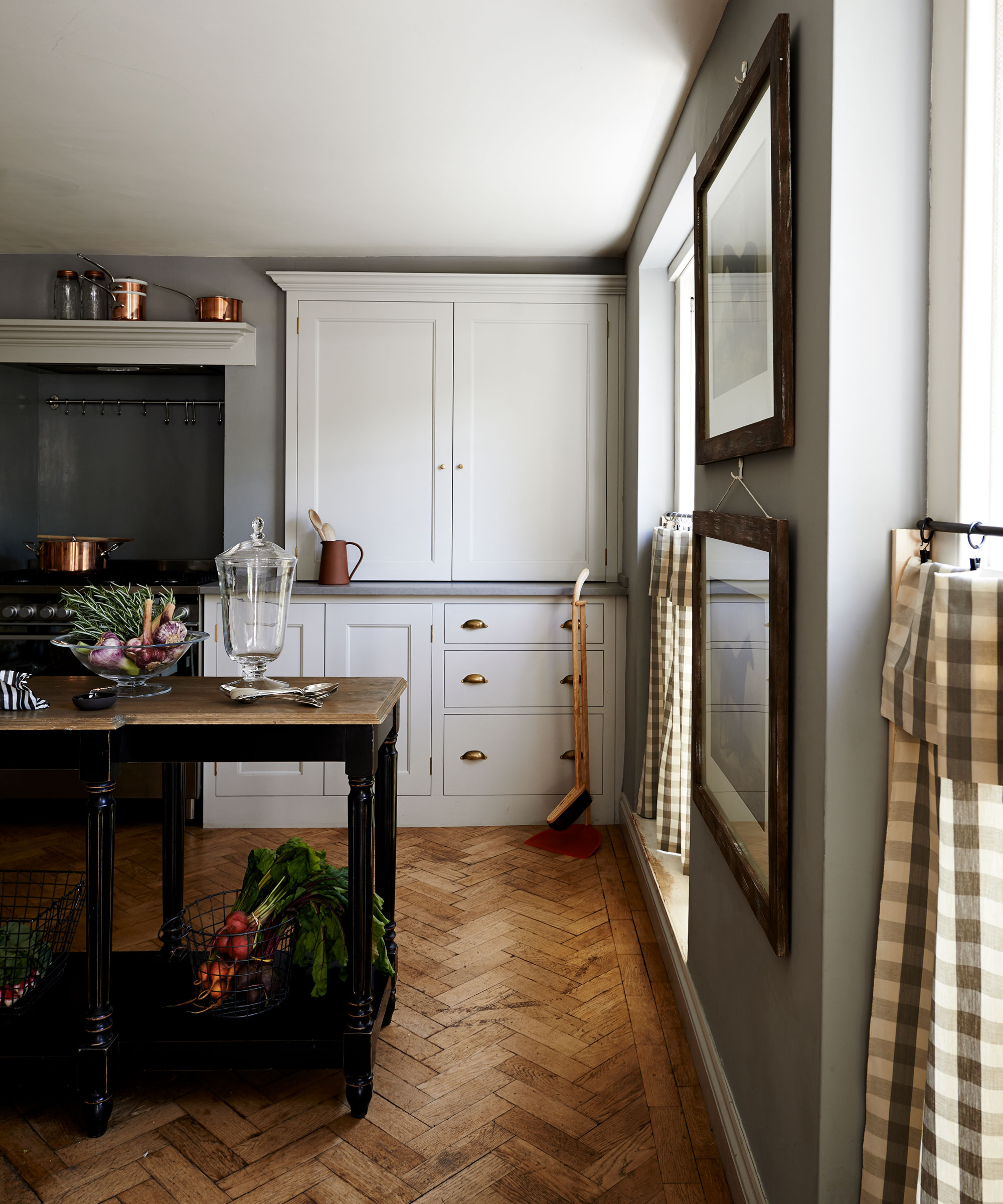
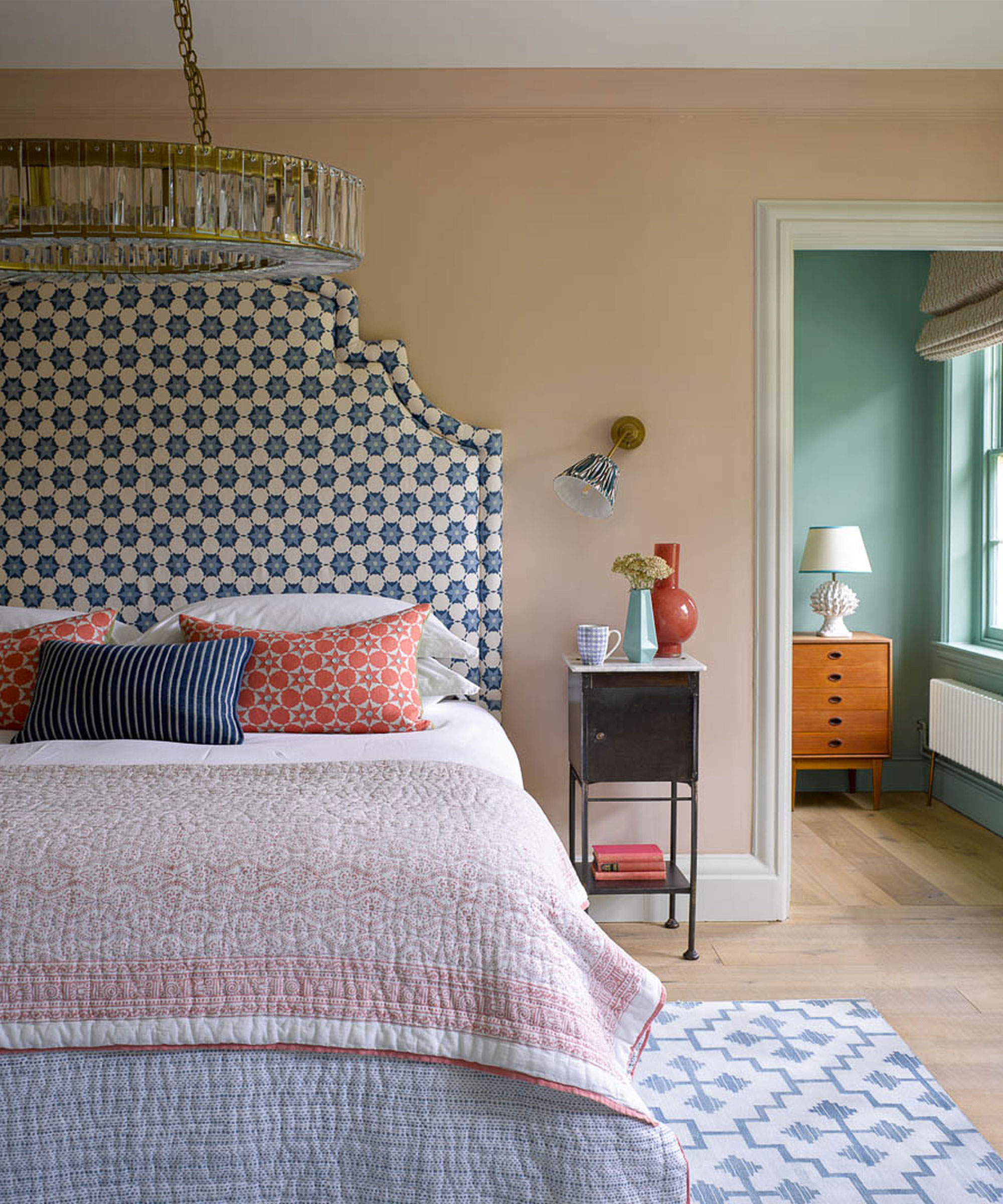
Beyond paint, unpainted wood trim can also contribute to a dated interior, unless it's a unique, antique piece contrasting with wallpaper. Taylor suggests that a color contrast between walls and trim is always timeless and elegant. This can range from dramatic choices like Graham & Brown's Black Cab paint to soft neutrals like Shuttleworth or Champagne Flute. Finally, dark neutrals such as navy, charcoal, and greige are also considered to be past their prime. Taylor recommends lighter hues or even a fun gloss finish for a more contemporary appearance, suggesting off-white shades.
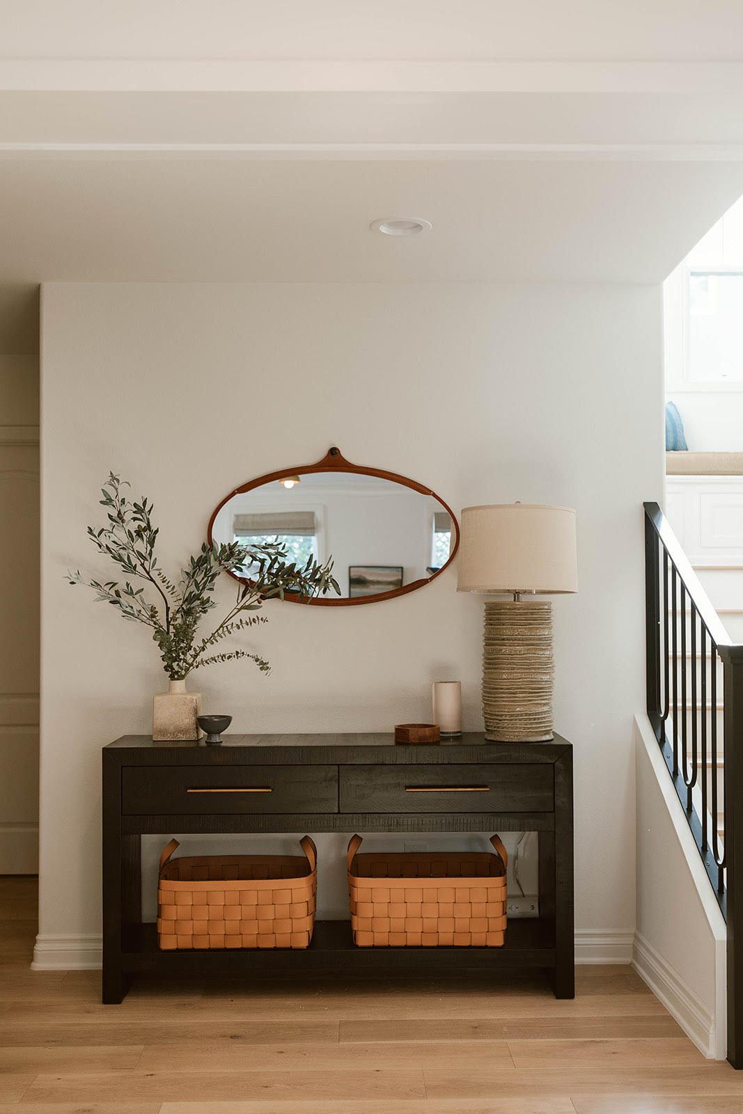

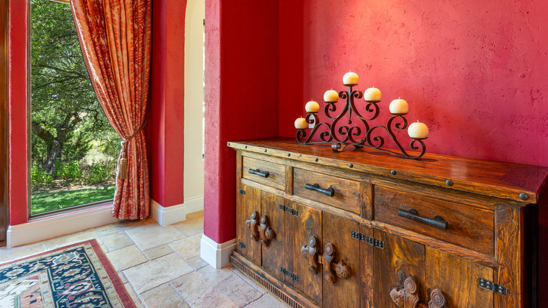
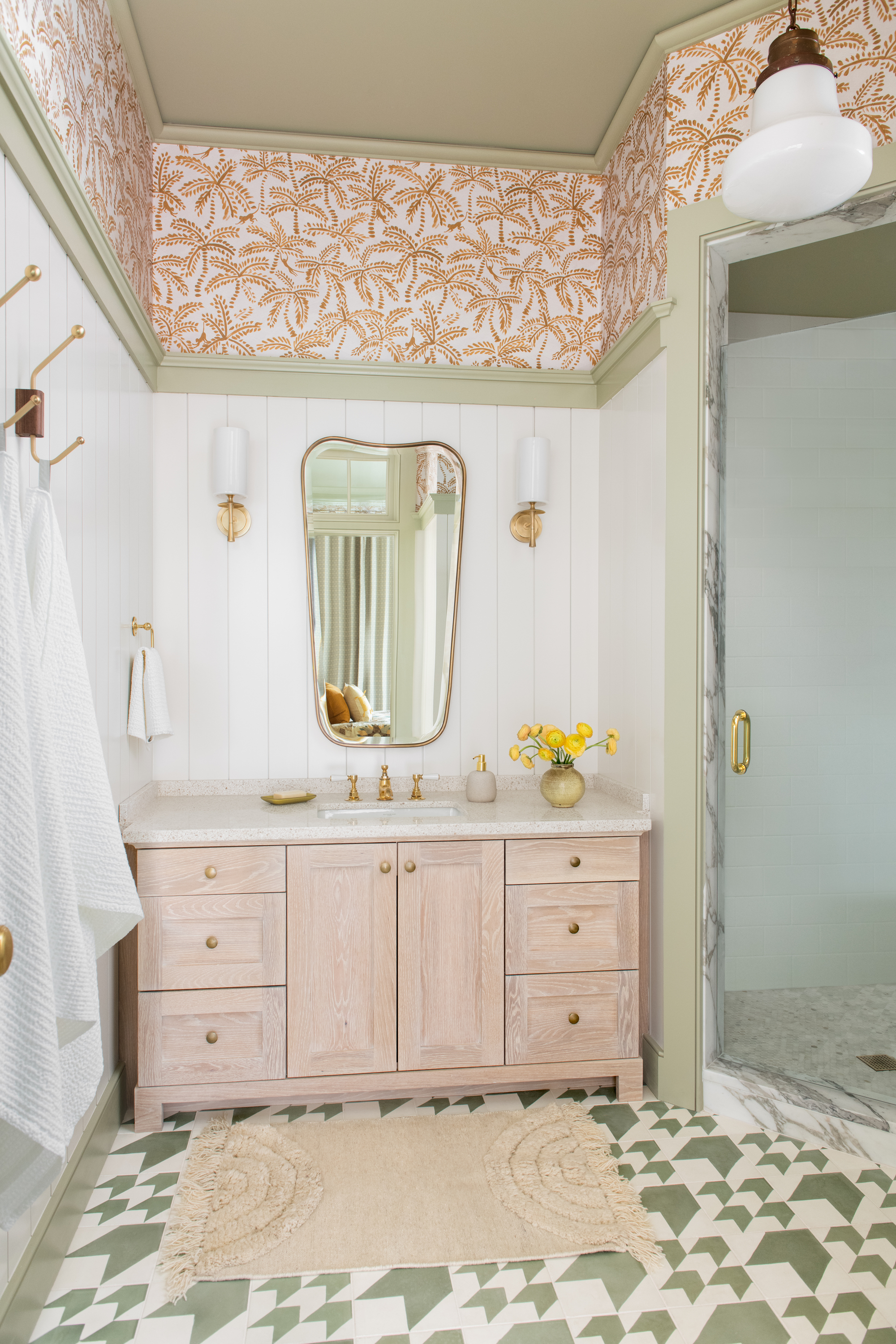
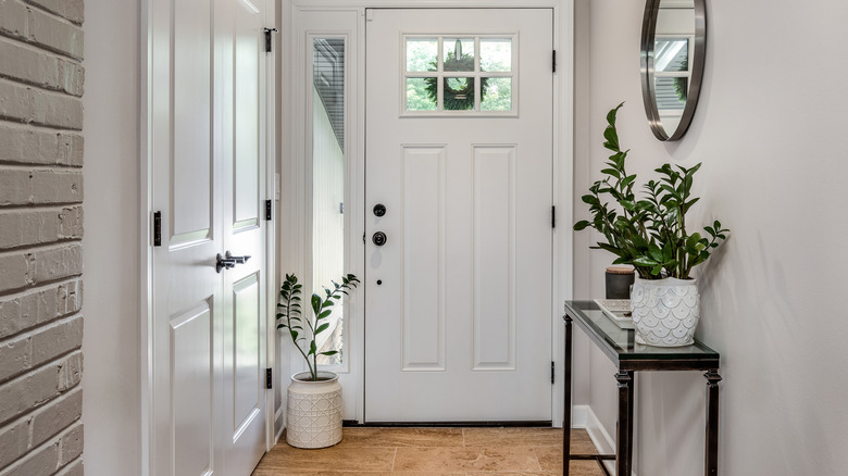
When selecting a trim color, it is crucial to consider the desired mood for the room. For an inviting entry, warm shades like off-white, soft greens, or blues, or a glossy finish, can make a statement. In smaller, more intimate spaces, saturating both walls and trim in the same color, a technique known as color drenching, can create a cohesive and enveloping effect. Additionally, the ceiling, often referred to as the 'fifth wall,' should not be overlooked, as painted ceilings are currently a significant trend. O’Donnell emphasizes that the wall color should be the primary guide in choosing a trim shade, rather than strictly adhering to current trends. Ultimately, while trends evolve, the goal is to create a harmonious and aesthetically pleasing environment.
#HomeImprovement #InteriorDesign #PaintColors #TrimColors #HomeDecor #Modernization #ColorTrends #DecoratingTips #HomeImprovement #InteriorDesign #PaintColors #TrimColors #HomeDecor #Modernization #ColorTrends #DecoratingTips
0 comment in total
 No comments yet
You may also like
Outdated color trends – 5 overdone colors that designers no longer love, and what to use instead

7 outdated kitchen cabinet colors designers say you should wave goodbye to, plus what to try instead

5 Countertop Colors That Are Going Out of Style, and What You Should Choose Instead — According to Kitchen Designers

6 Outdated Paint Colors Designers Don't Want to See in Homes Anymore in 2026


4 Outdated Colors Designers say you Should Steer Clear of When Decorating a Living Room

Interior design experts reveal the colour rules you should be breaking
6 Paint Color Mistakes To Stop Making, According To Designers


What are the best trim colors? 7 alternatives to white paint to elevate your room's palette
5 Classic Wall and Trim Color Combinations—and 5 for Rule-Breakers Only

6 Paint Color Mistakes To Stop Making, According To Designers
Outdated Entryway Paint Colors To Avoid In 2025 (And What To Try Instead)
5 outdated lighting trends designers say to avoid – and the designs and techniques to use, instead
6 Outdated Bathroom Paint Colors Designers Say You Should Never Use
5 outdated kitchen cabinet color trends to avoid if you don't want your kitchen to look unfashionable, say designers
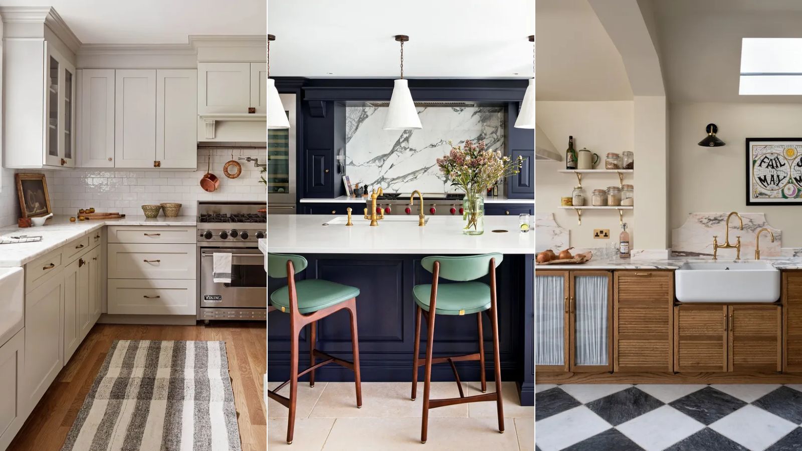
Outdated kitchen color trends – 5 colors to avoid in 2025, and what to use instead
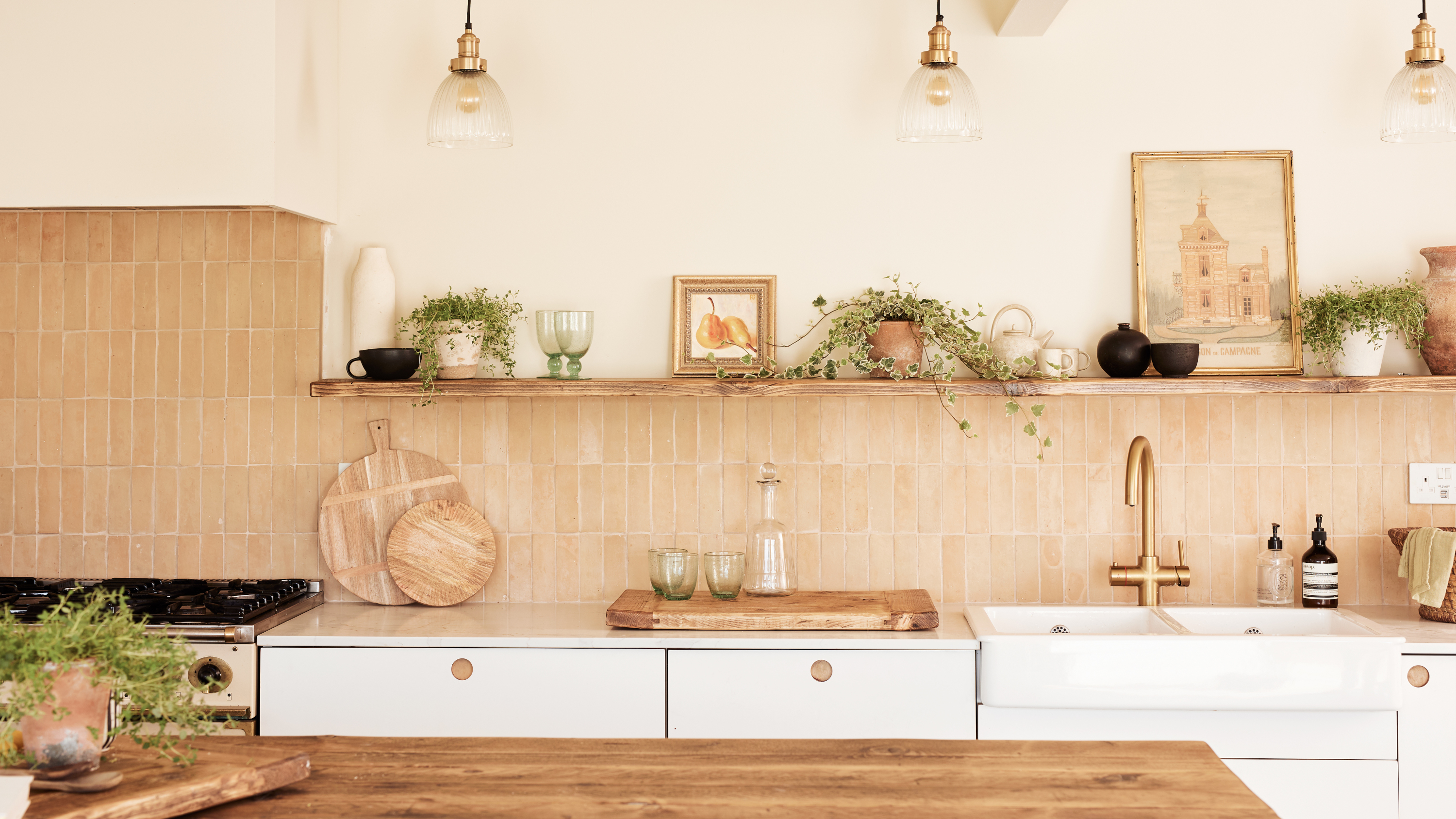
6 Outdated Tile Choices That Interior Designers Aren't Using Anymore — And What They Say to Try Instead

6 colors to avoid in an entryway – and the ones designers know make a better first impression
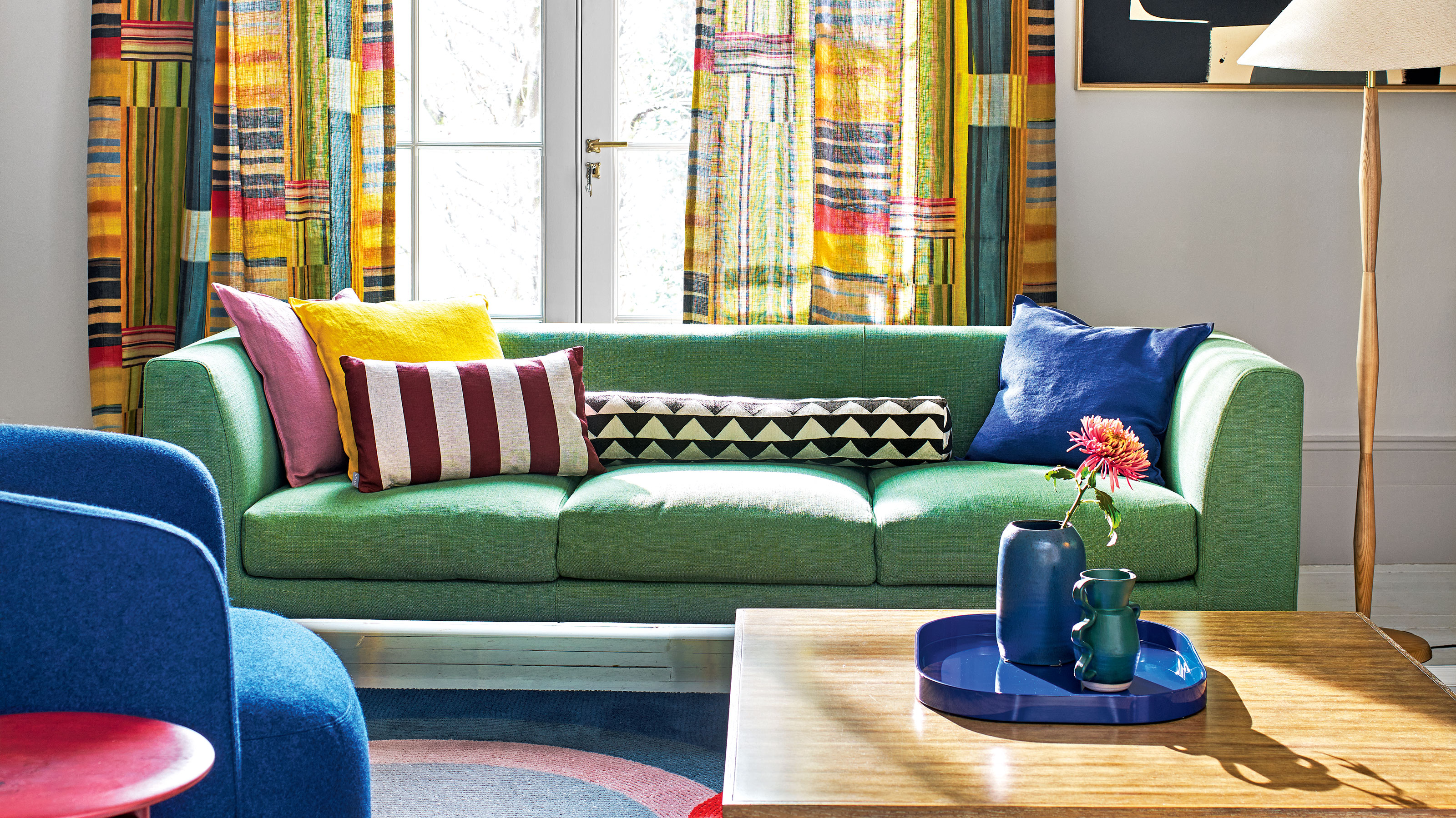
Couch colors to avoid – and what designers are recommending instead
The 5 outdated paint colors of 2024 designers loathe — and what they're loving instead

6 Curtain Styles Designers Say Are Outdated (and What to Use Instead!)