1/11
The 5 outdated paint colors of 2024 designers loathe — and what they're loving instead
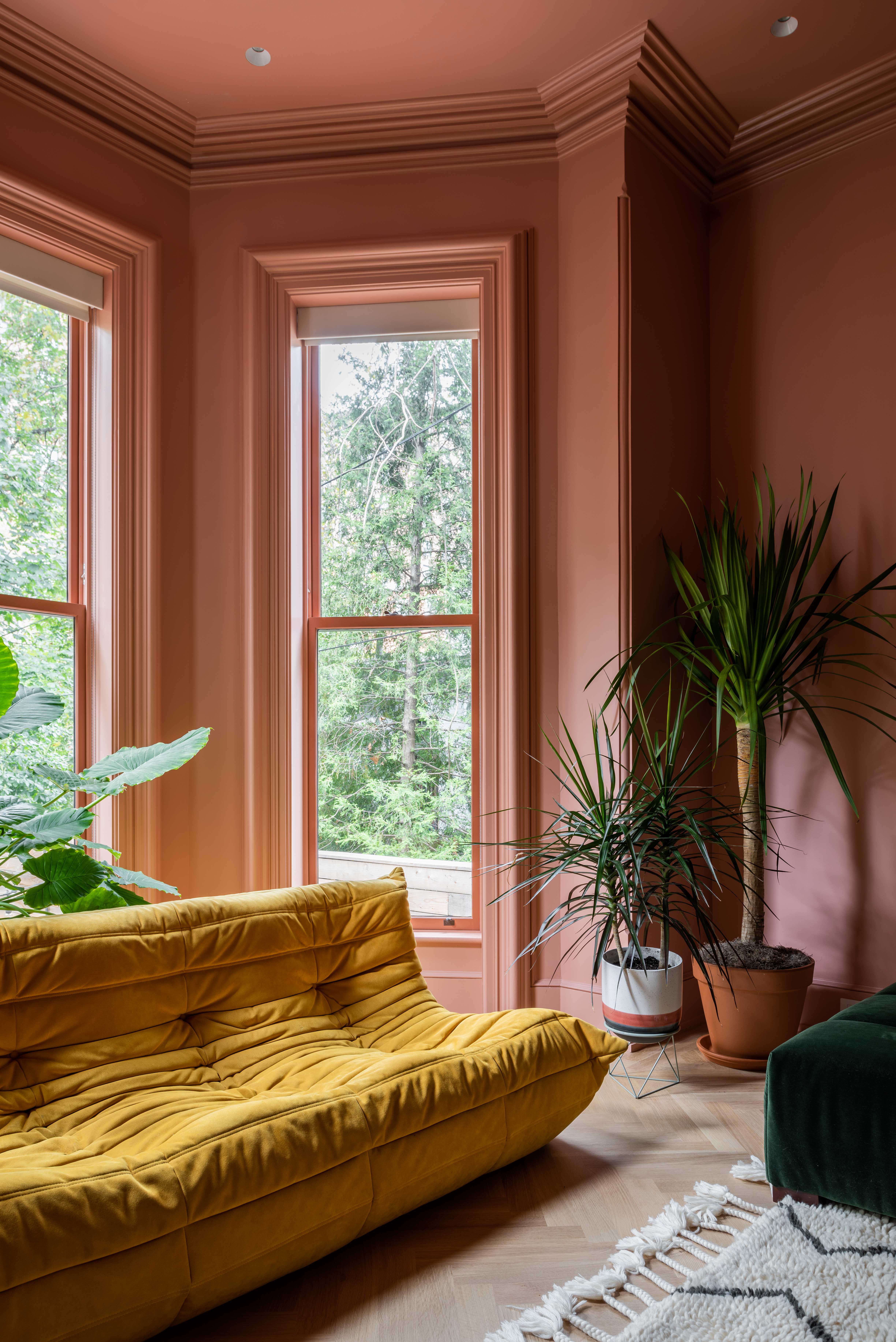
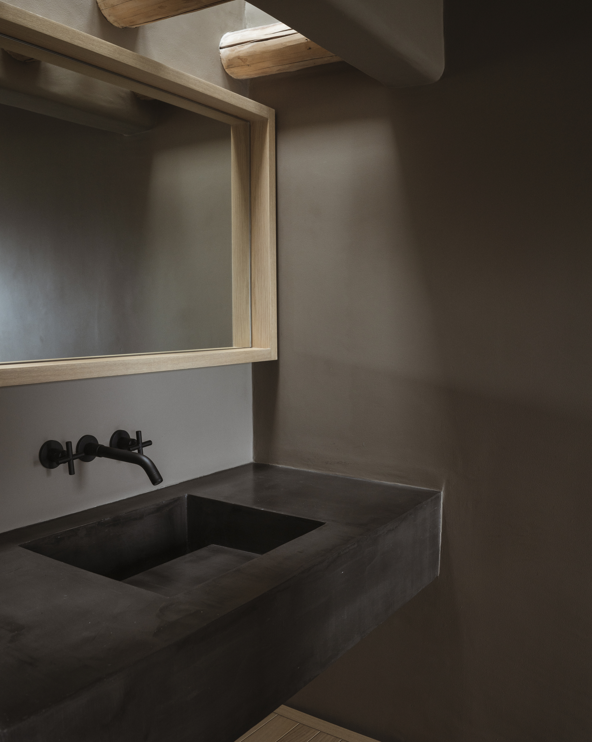
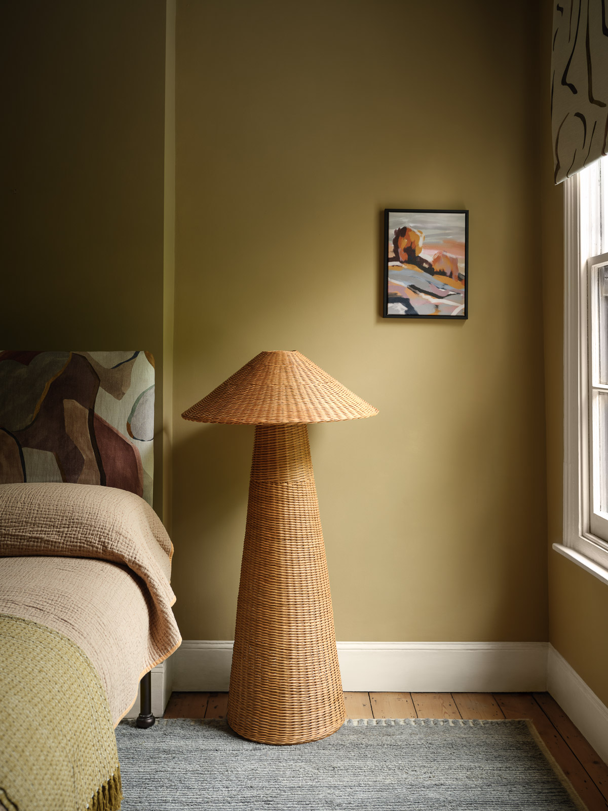
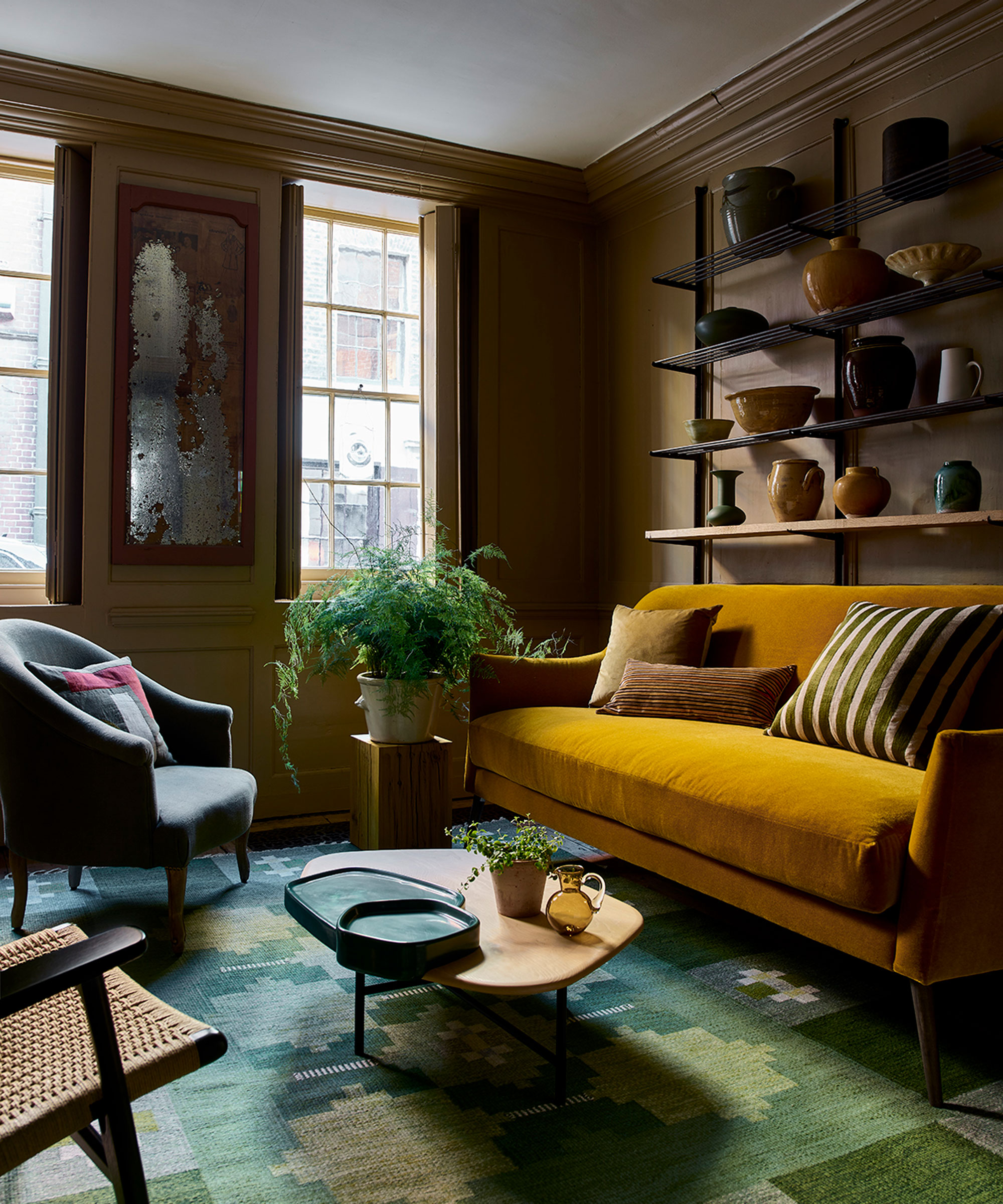
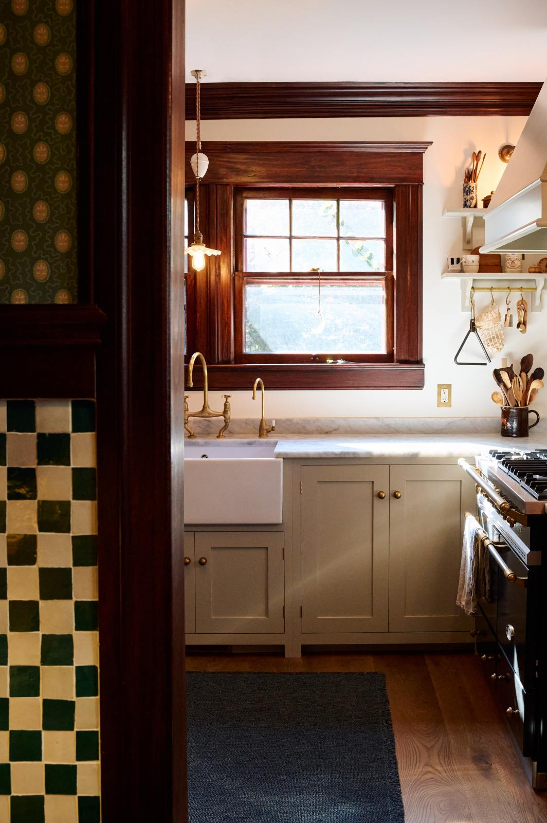
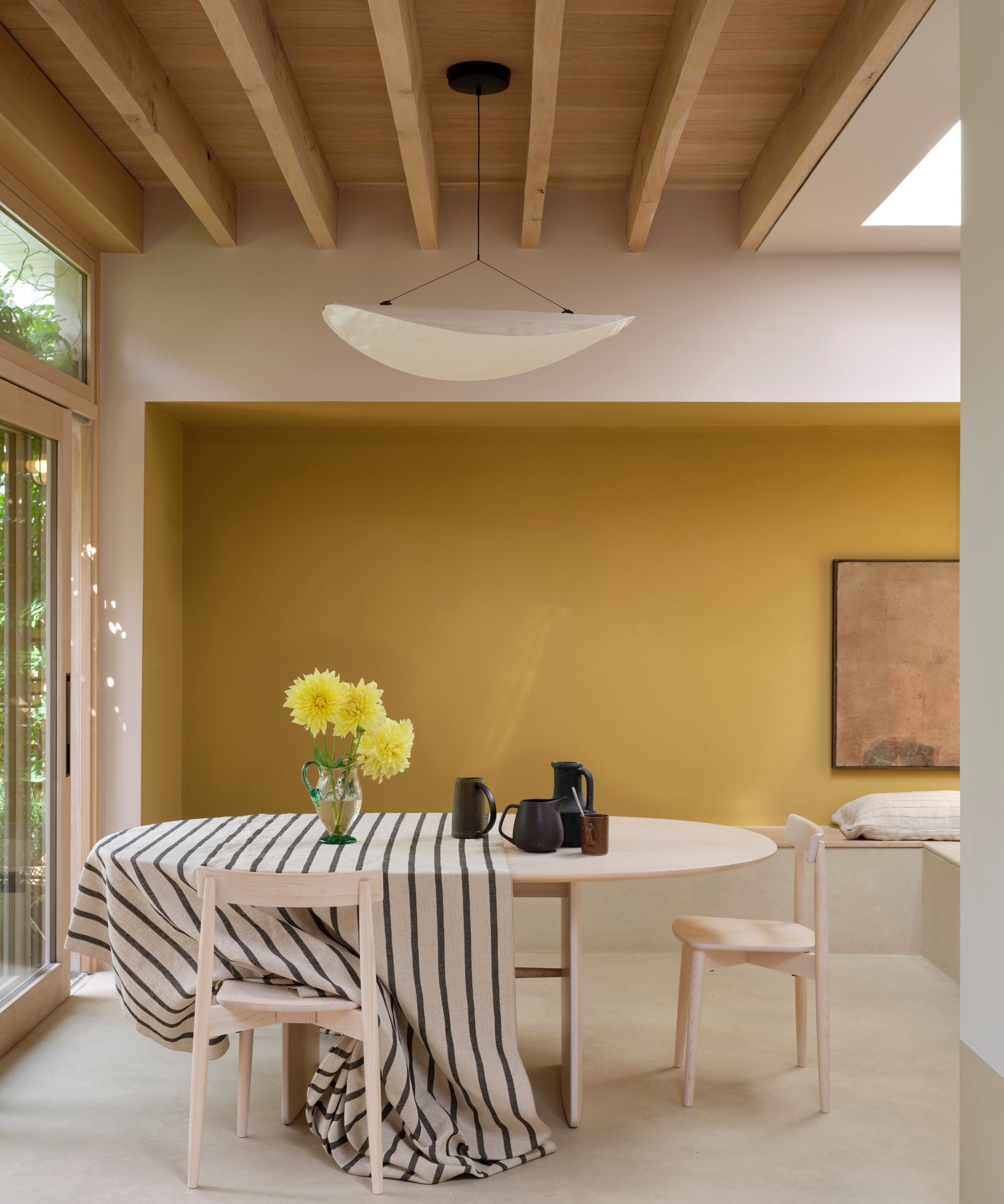
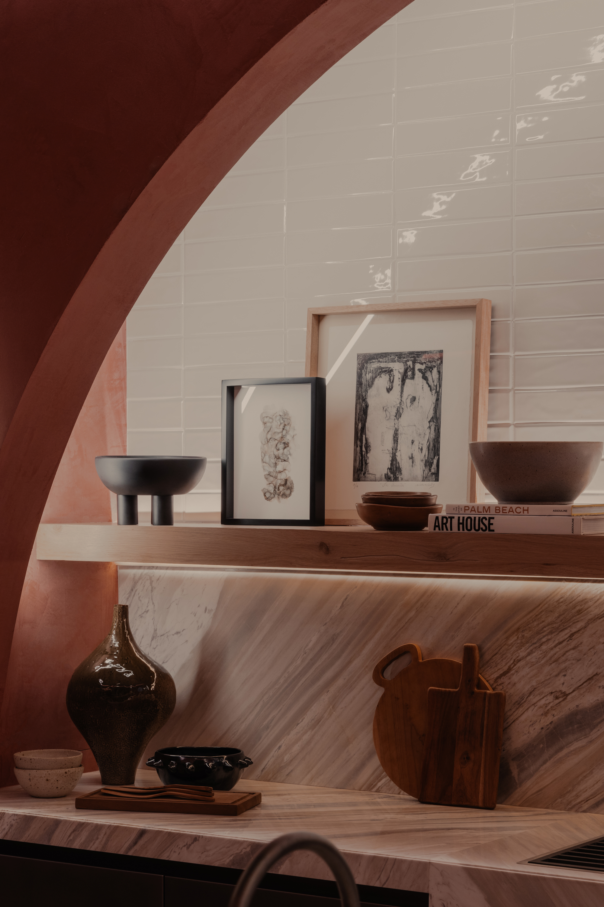
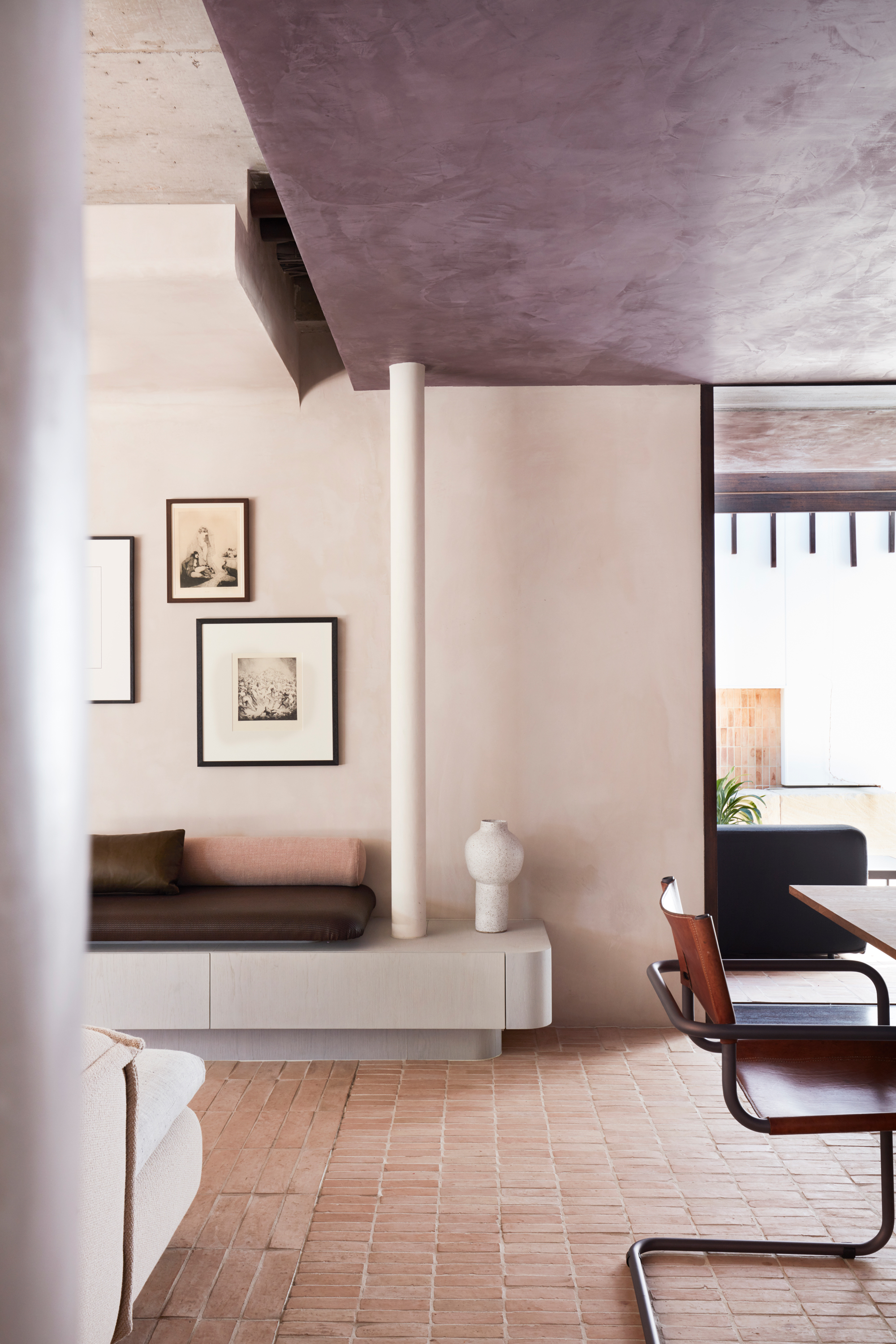
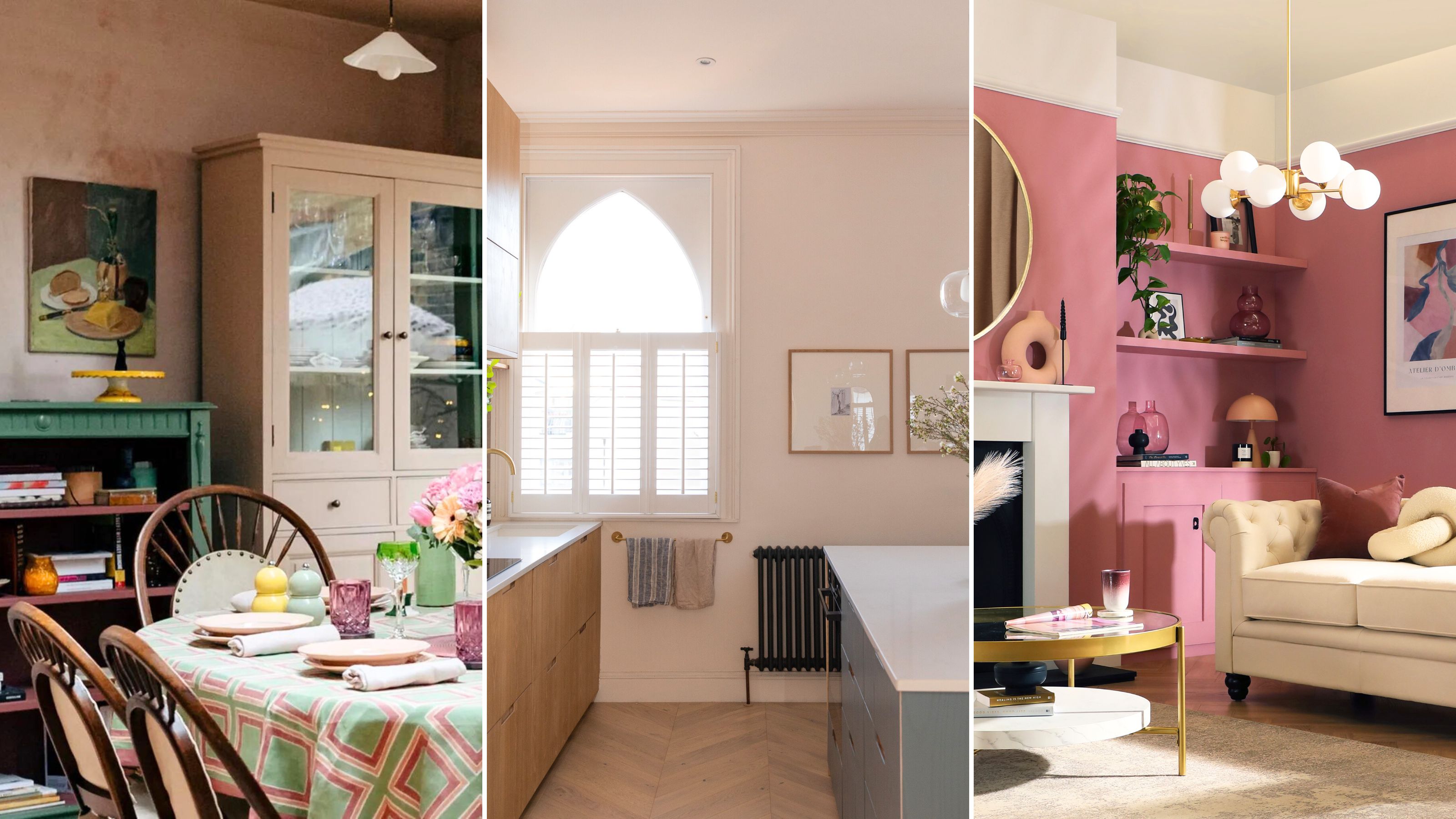
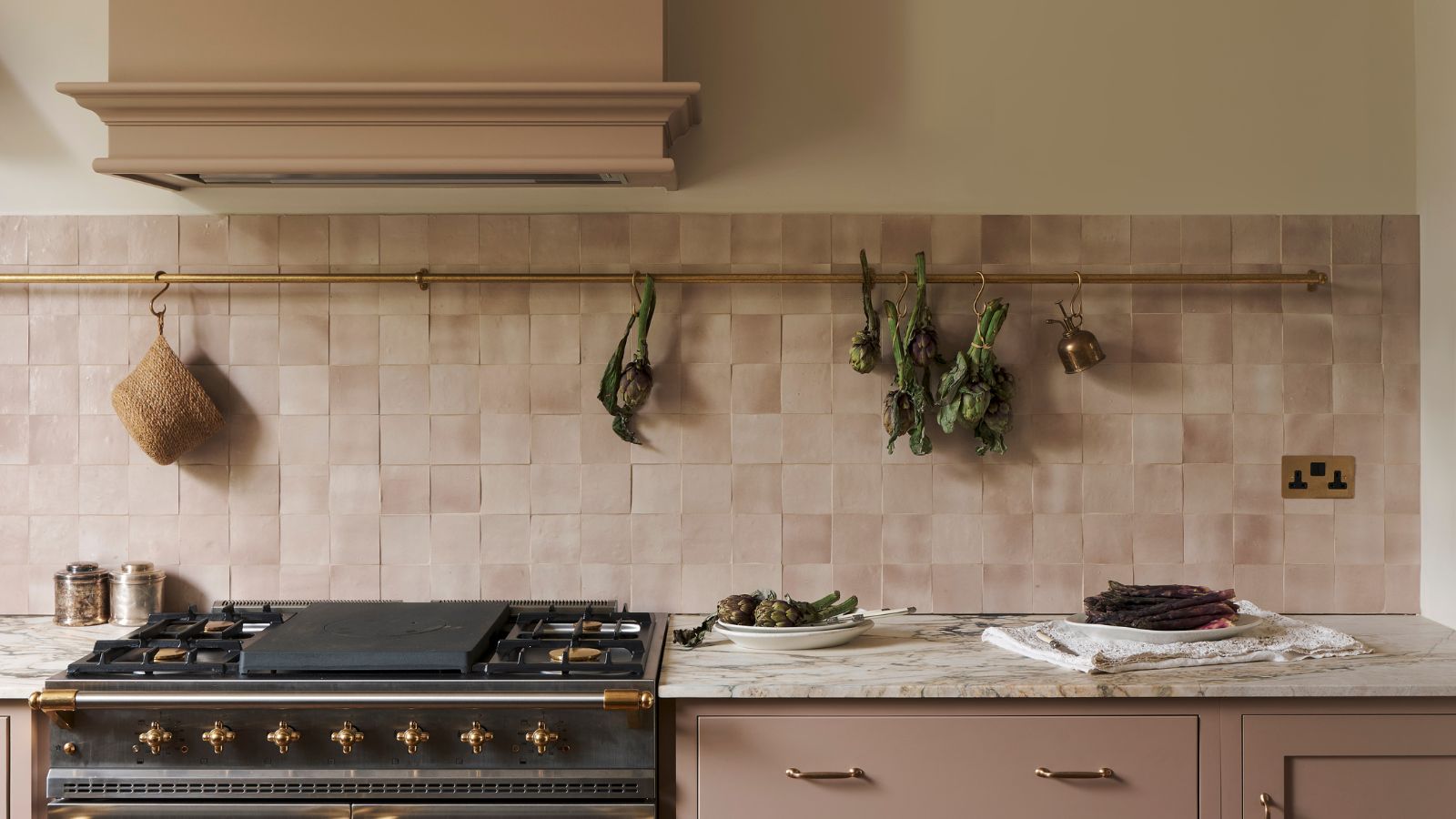
Interior designers are highlighting five paint colors that are becoming outdated in 2024, recommending fresh alternatives to modernize living spaces. The first color to avoid is greige, a combination of gray and beige. Interior designer Priyanshi Jain notes that greige now appears one-dimensional and flat, lacking the depth and personality that contemporary homeowners desire. Instead, soft terracotta is suggested as a neutral, calming, and welcoming alternative that introduces subtle richness. This earthy shade is versatile, suitable for various spaces, and particularly effective in smaller rooms where it enhances light reflection. A color wash effect can be achieved by diluting paint with water and applying it with a sponge.
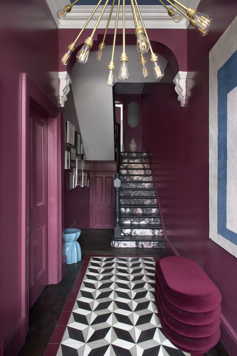
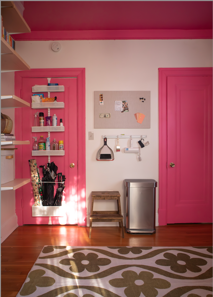
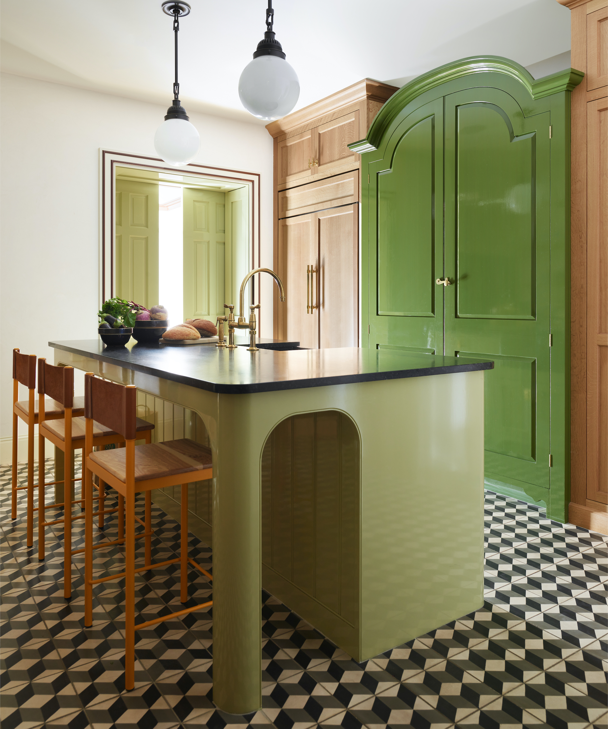
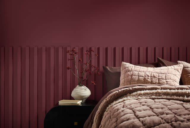
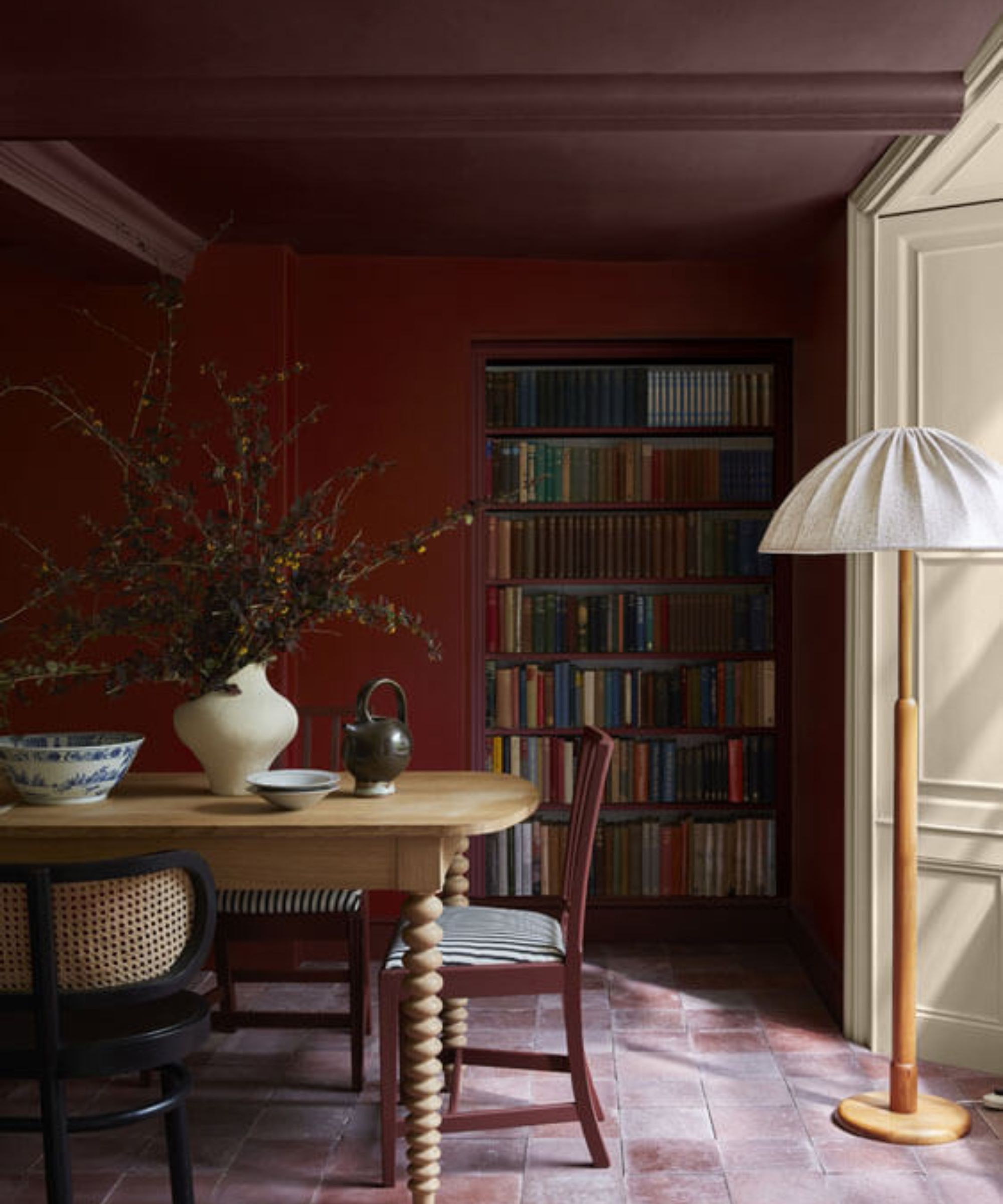
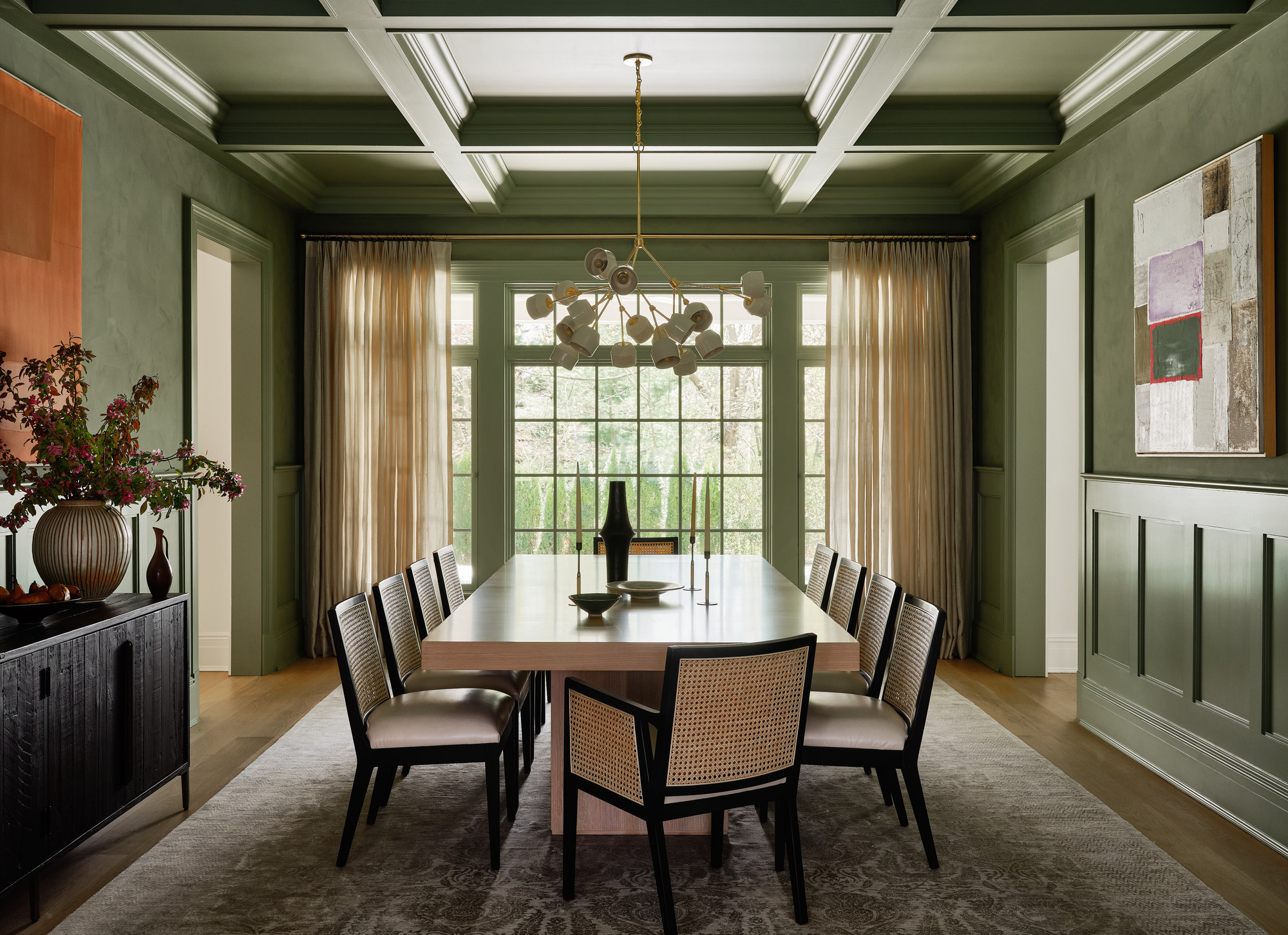
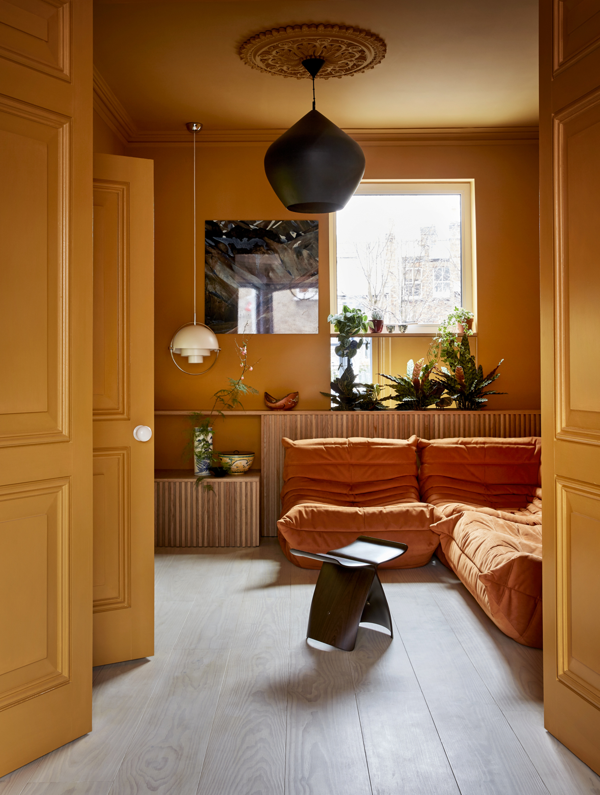
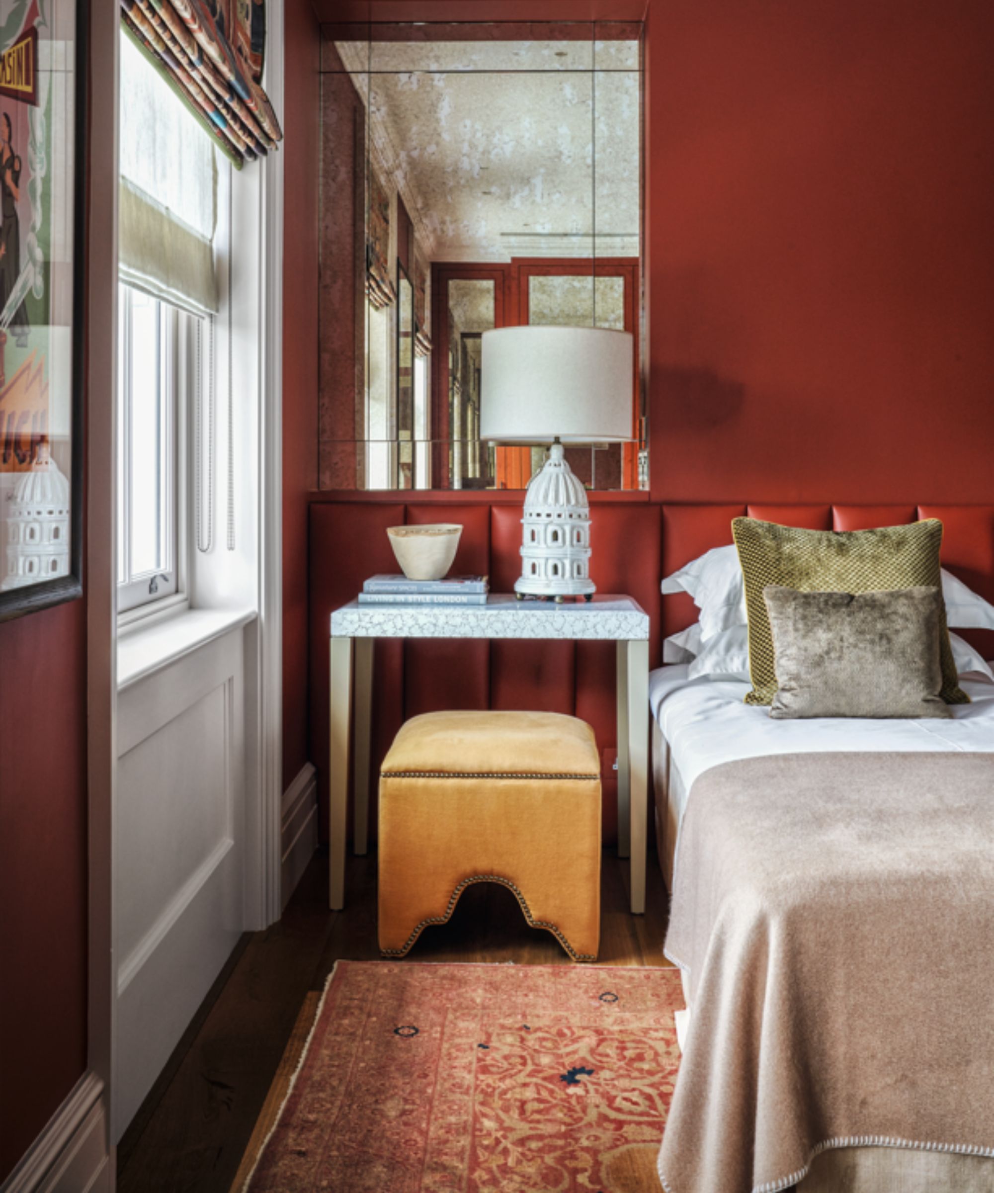
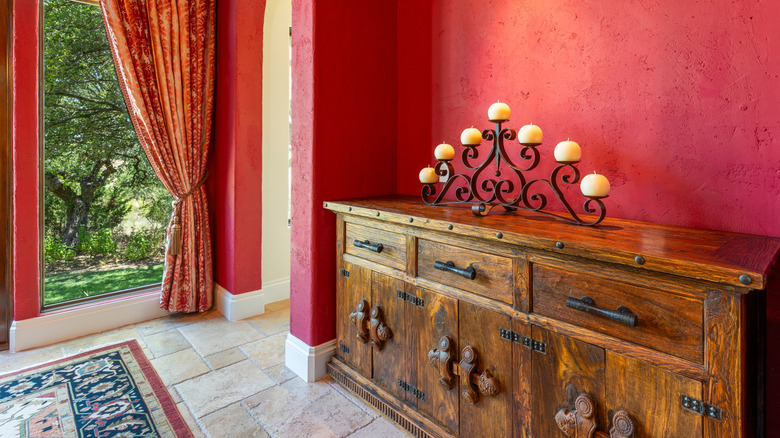
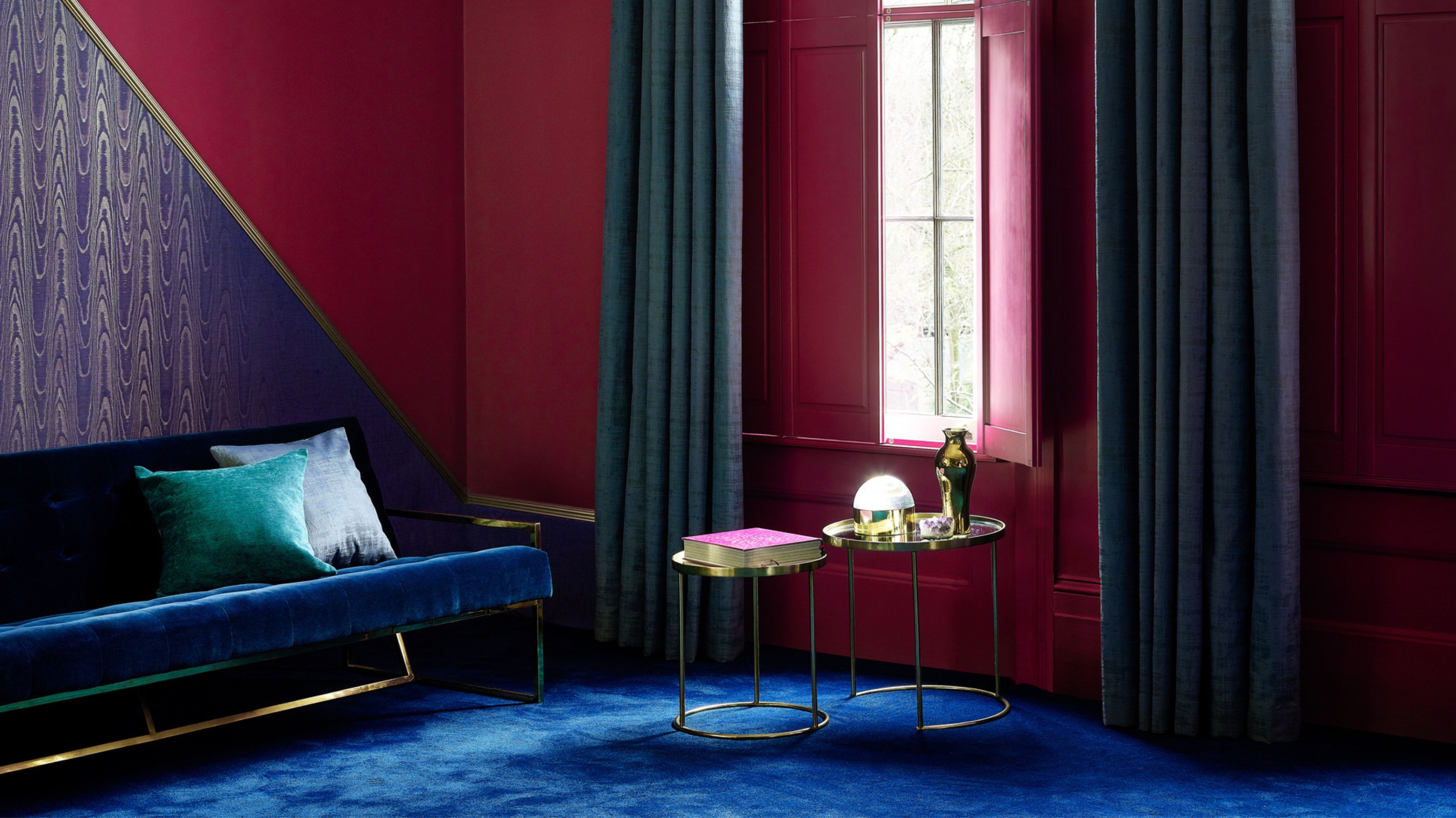
Secondly, bright primary red, often associated with the 'unexpected red theory' and 'Barbiecore,' is considered outdated when used extensively. Gaia Guidi Filippi, founder of Gaia G Interiors, describes bright reds as garish and overwhelming, advocating for colors with more depth and subtlety. Maroon is recommended as a sophisticated alternative to Ferrari red, offering a luxurious feel that transforms with varying light conditions. Other suggested alternatives include terracotta for orange and sage for Kelly green, emphasizing richer, more nuanced tones.
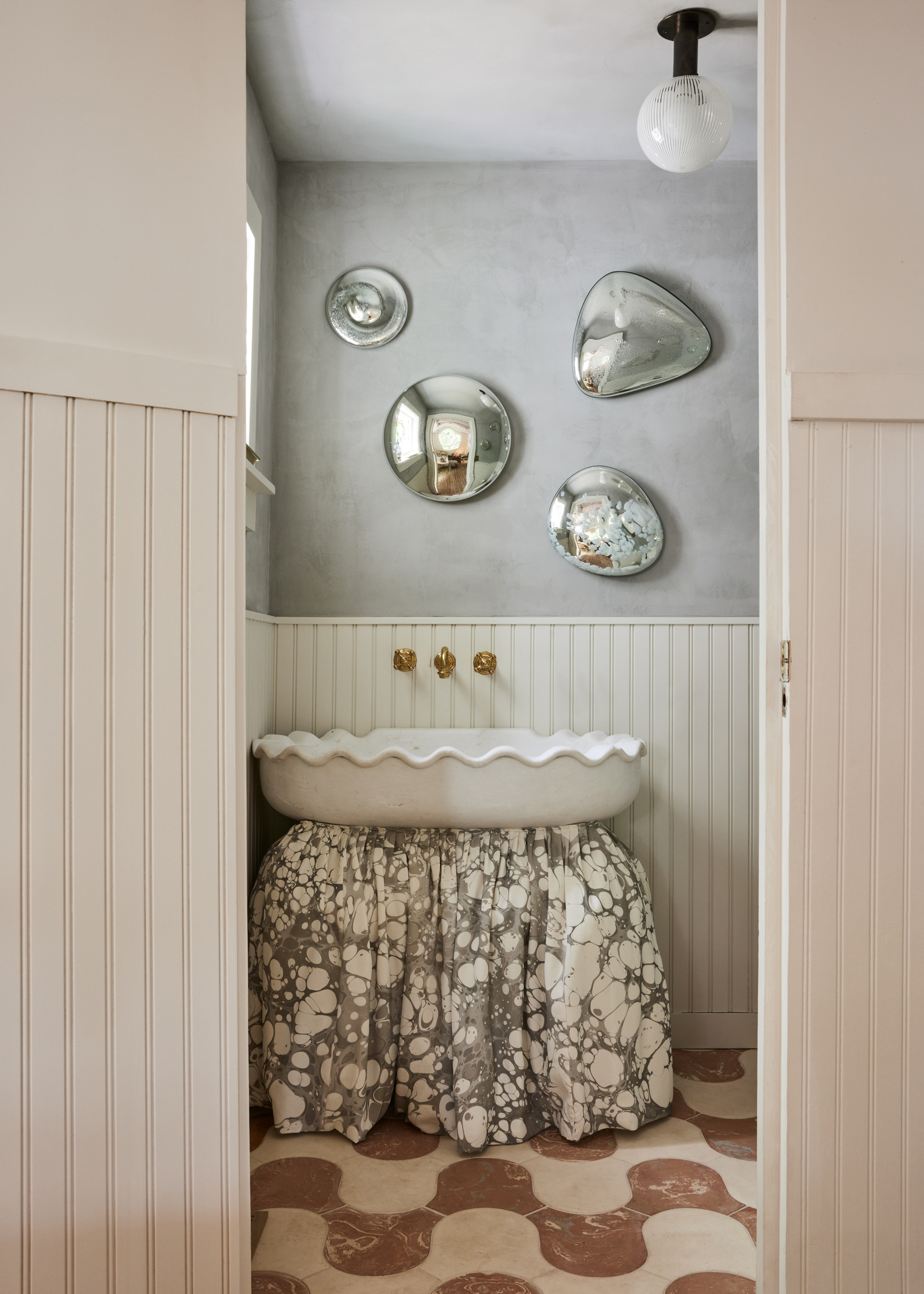
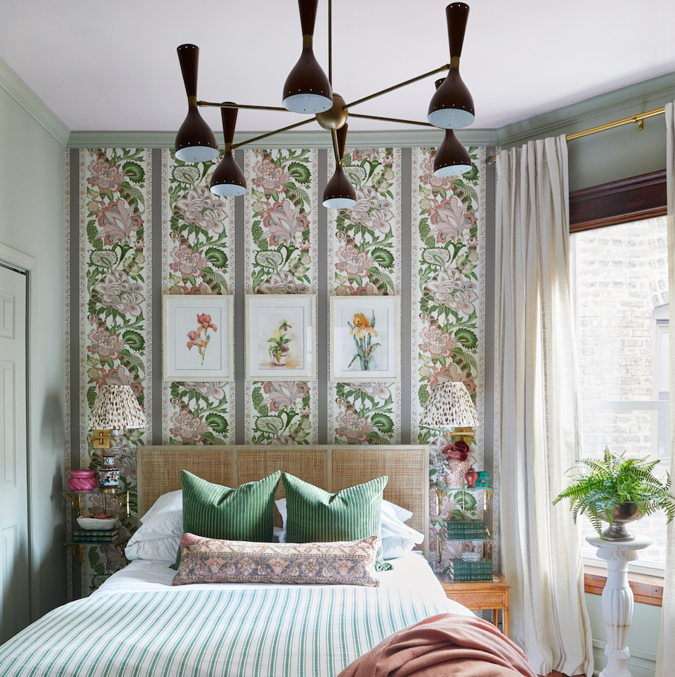
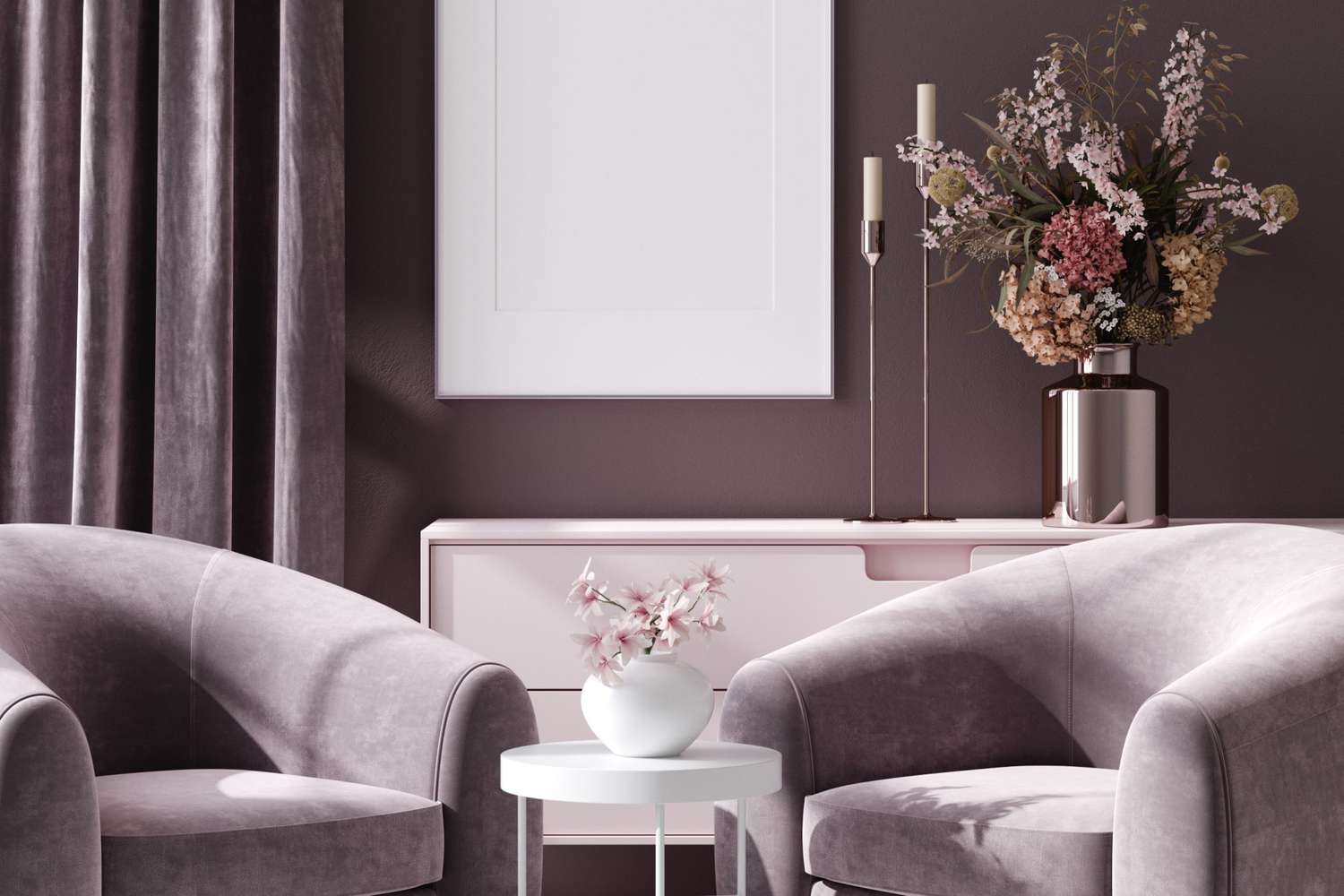
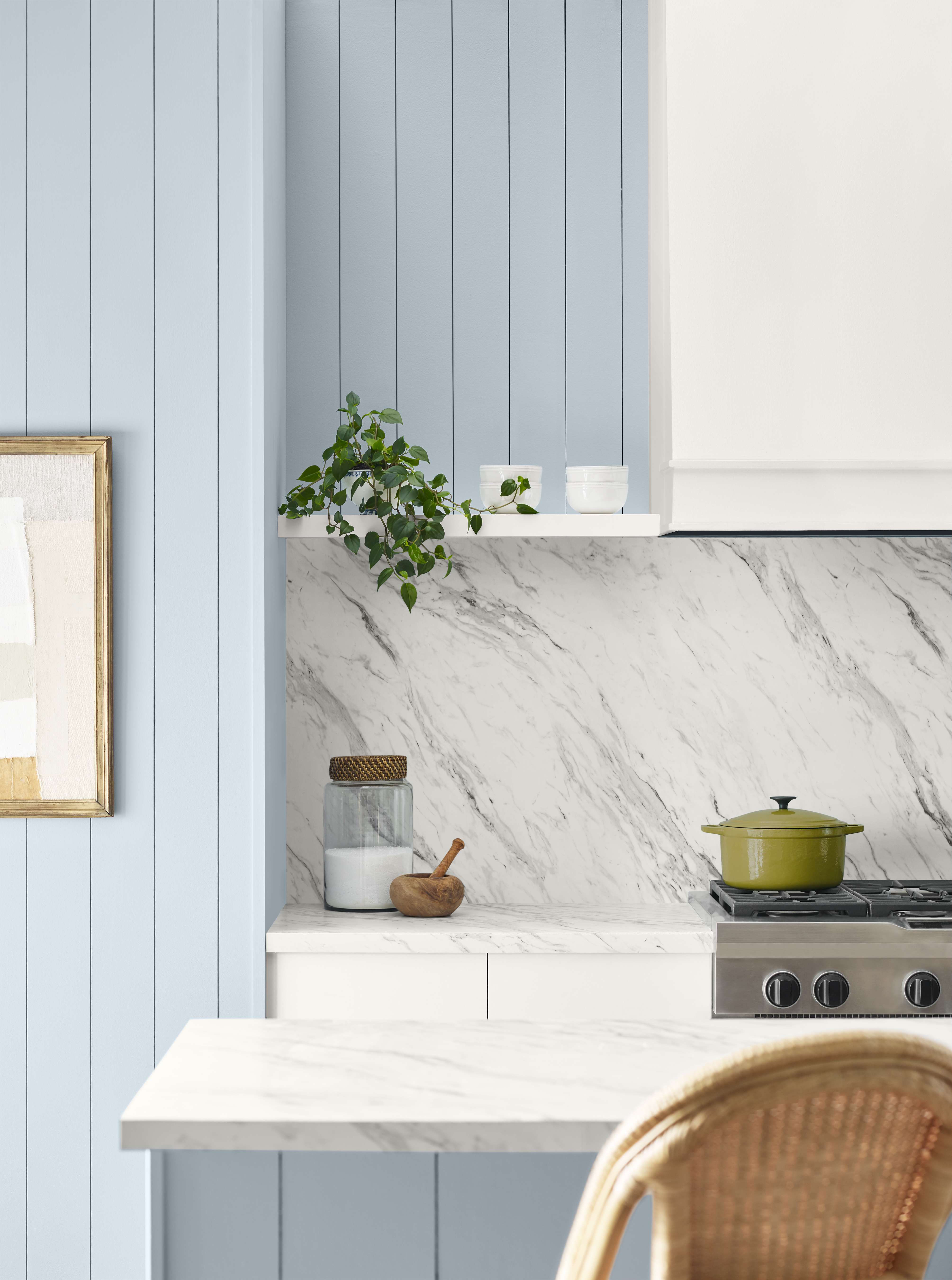
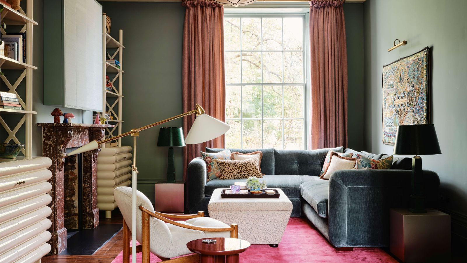
Millennial pink, despite its past popularity, is also losing favor due to overuse. Gaia Guidi Filippi suggests moving towards more sophisticated shades like rose and dusty mauves. These colors provide a refined and mature aesthetic, ideal for creating moody and contemporary rooms. Toasted Mauve, for instance, offers a cozy and inviting feel with a playful hint of pink, which pairs well with crisp whites and light blues.
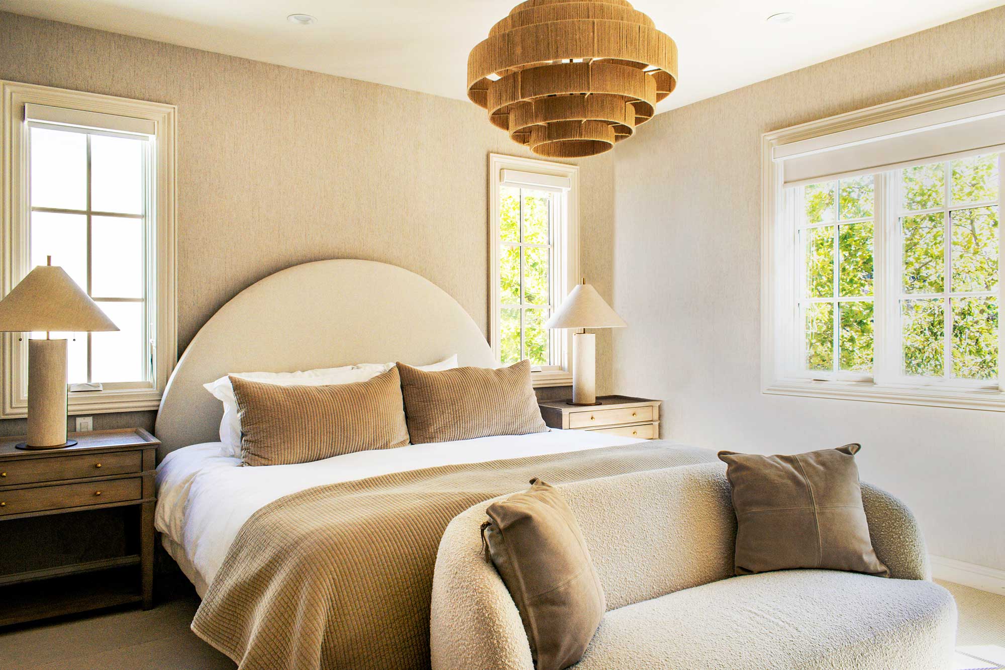
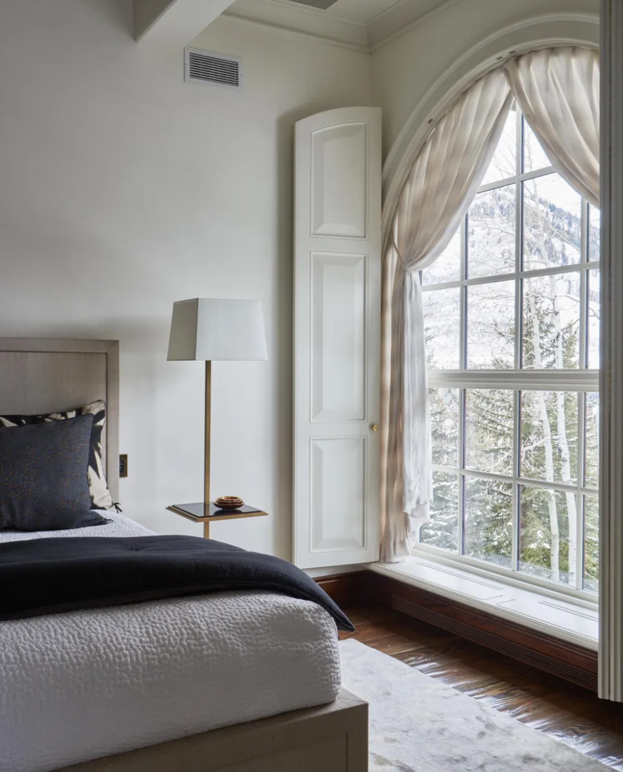
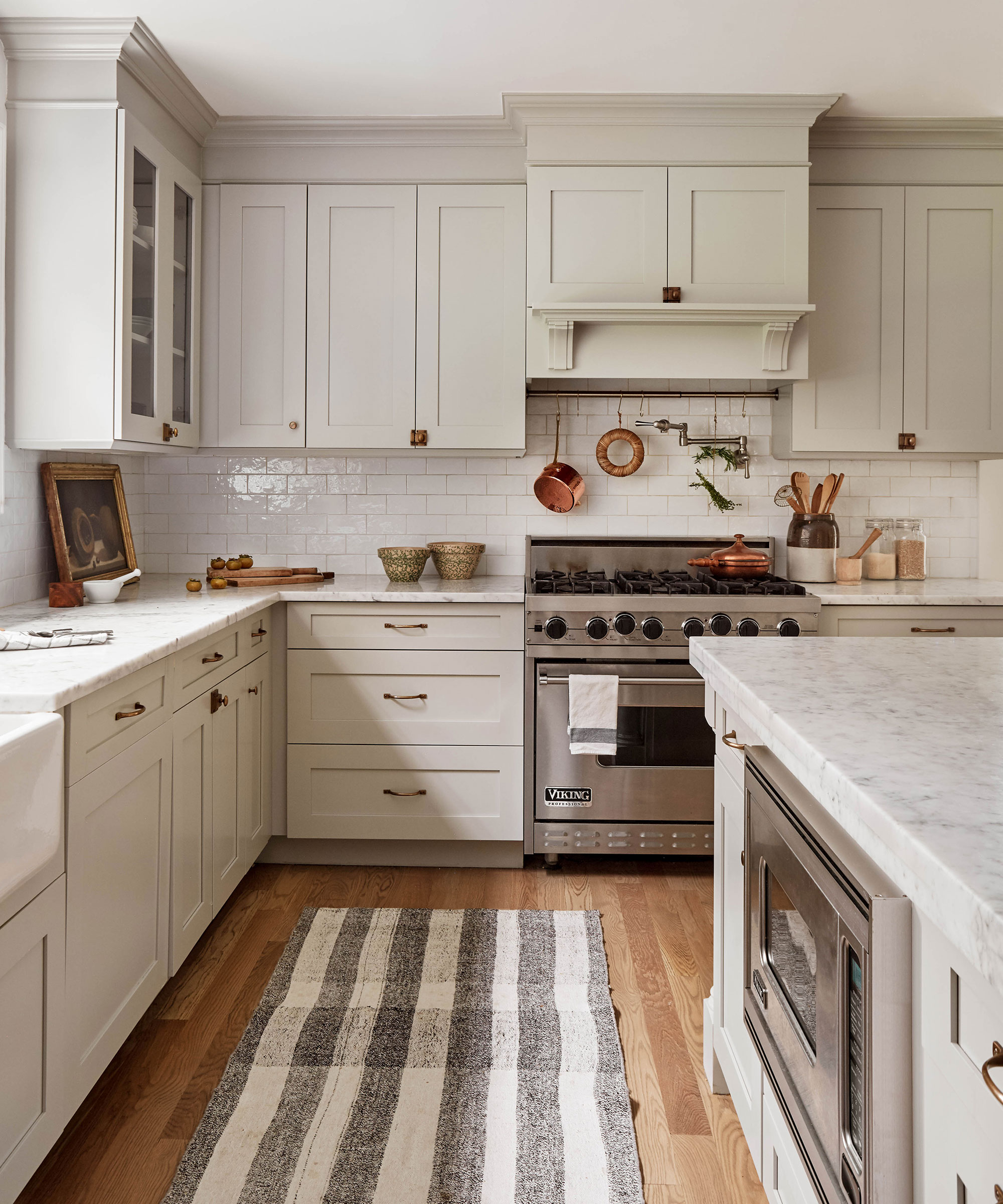
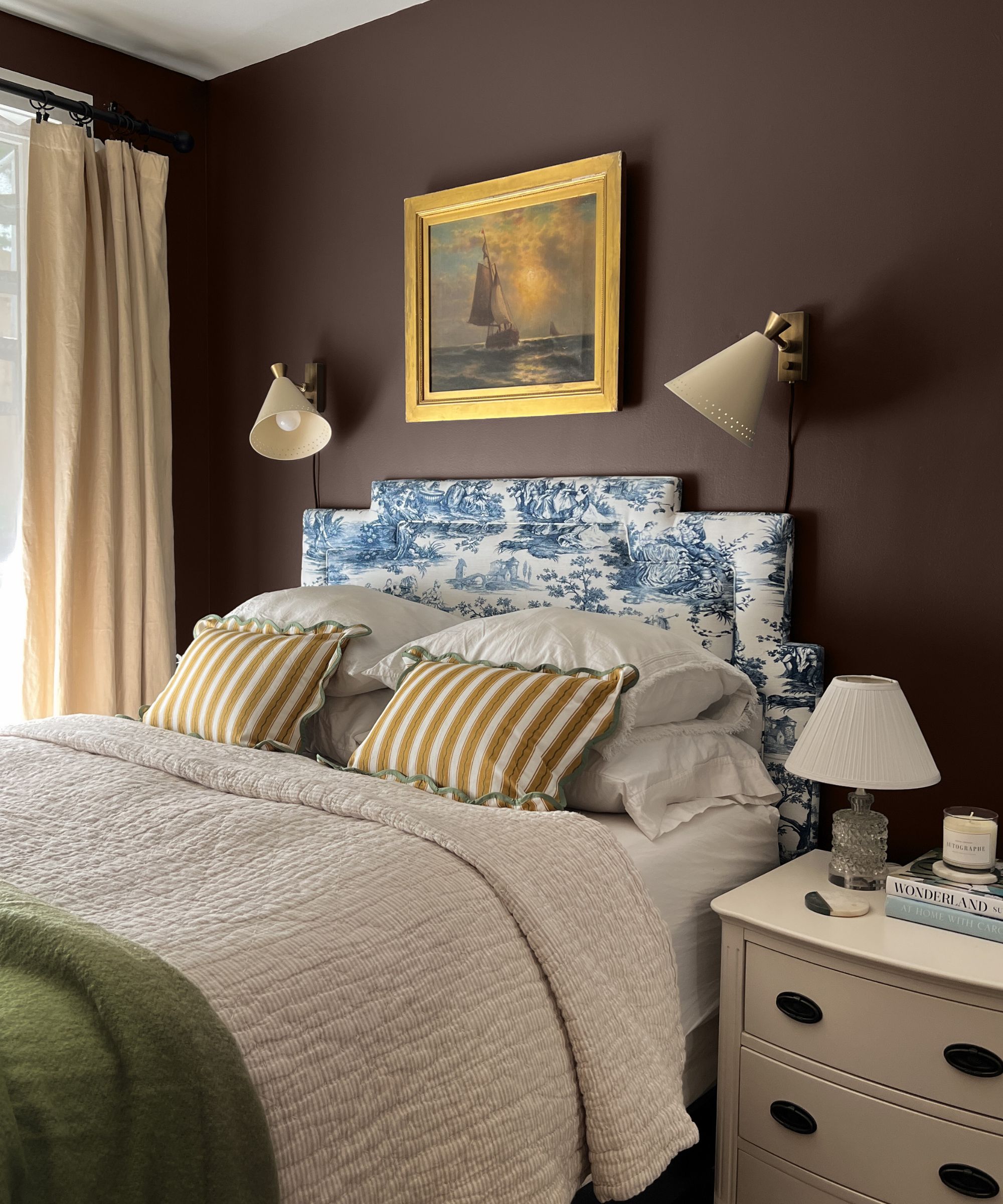

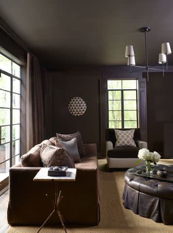
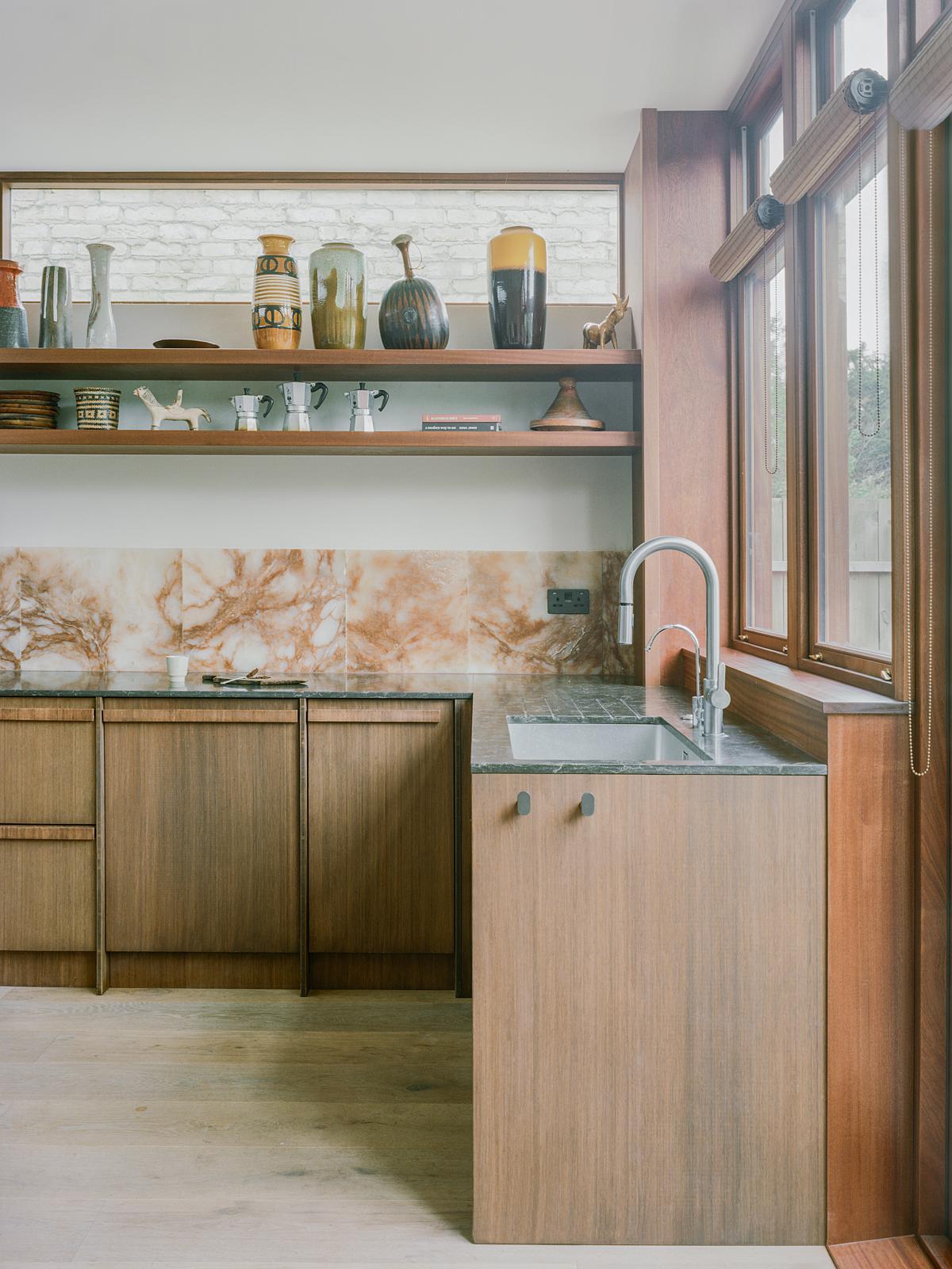
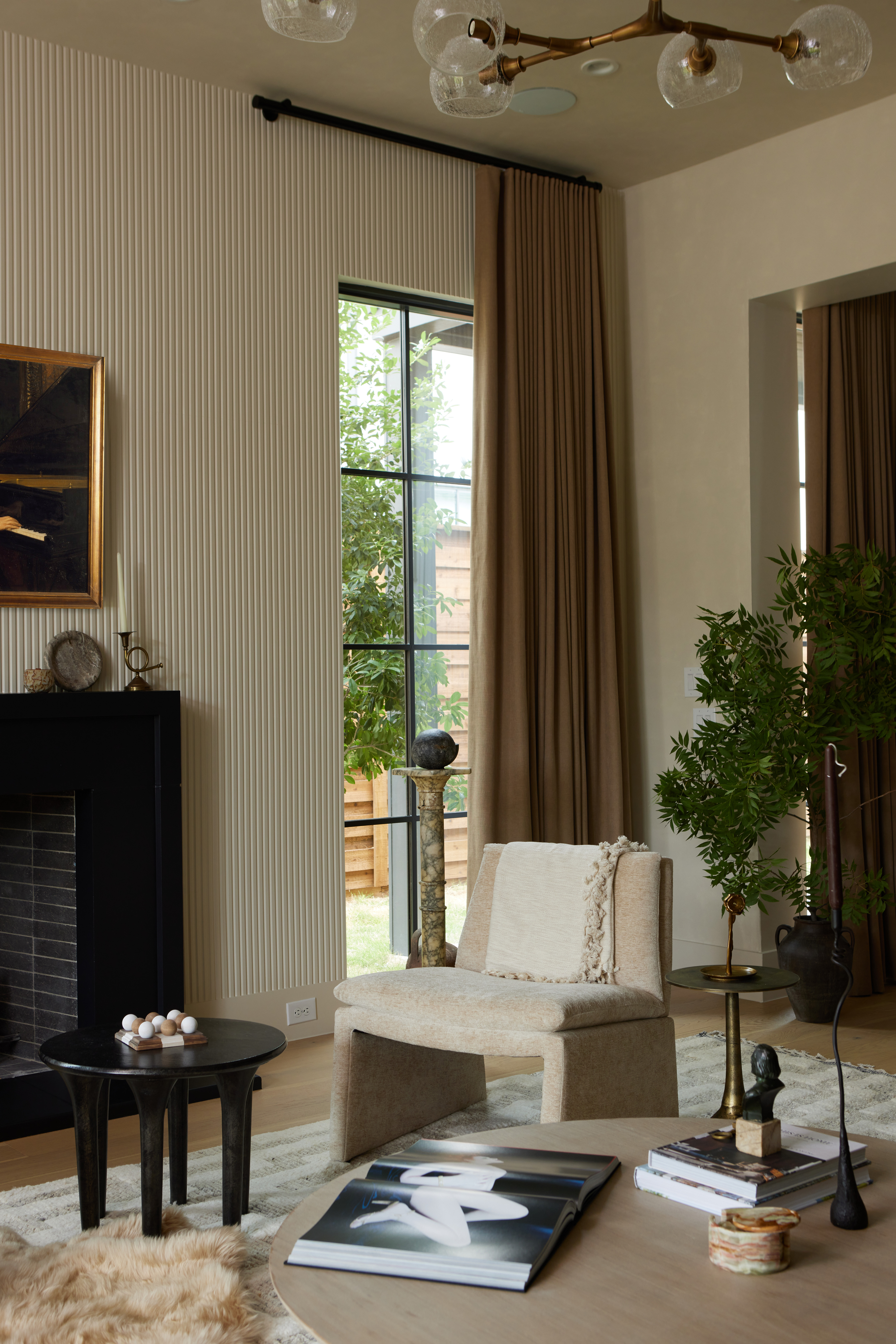
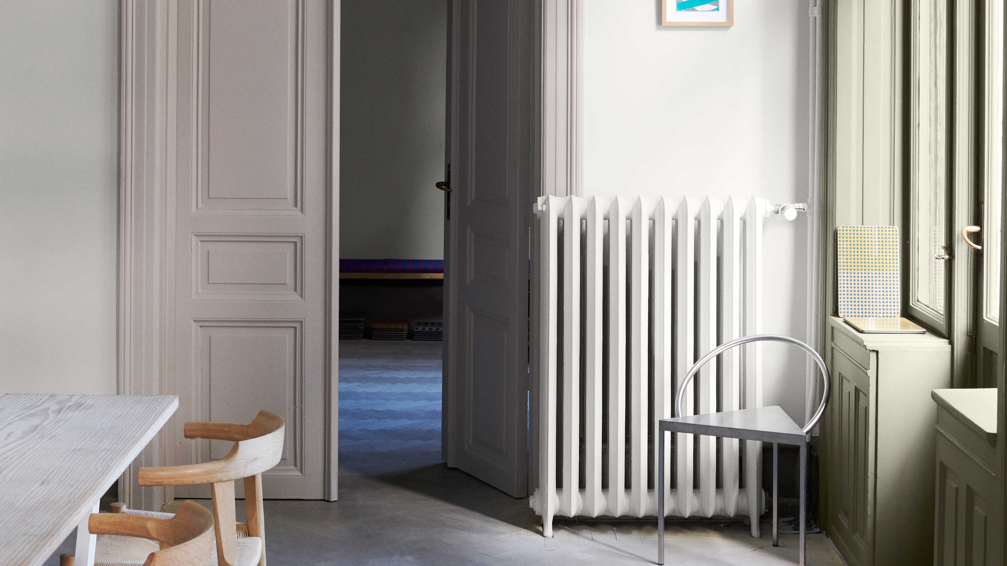
Cool gray, a prevalent choice in the 2010s, is now viewed as cold and impersonal. Gaia advises replacing it with softer neutrals from the brown family, such as taupe. Shades like café au lait and caramel are gaining popularity for their warm and inviting qualities. Taupe 03, inspired by Soho Roc House, balances warmth and neutrality, creating a relaxing atmosphere that can evoke a Mediterranean style, especially when used in bedrooms.
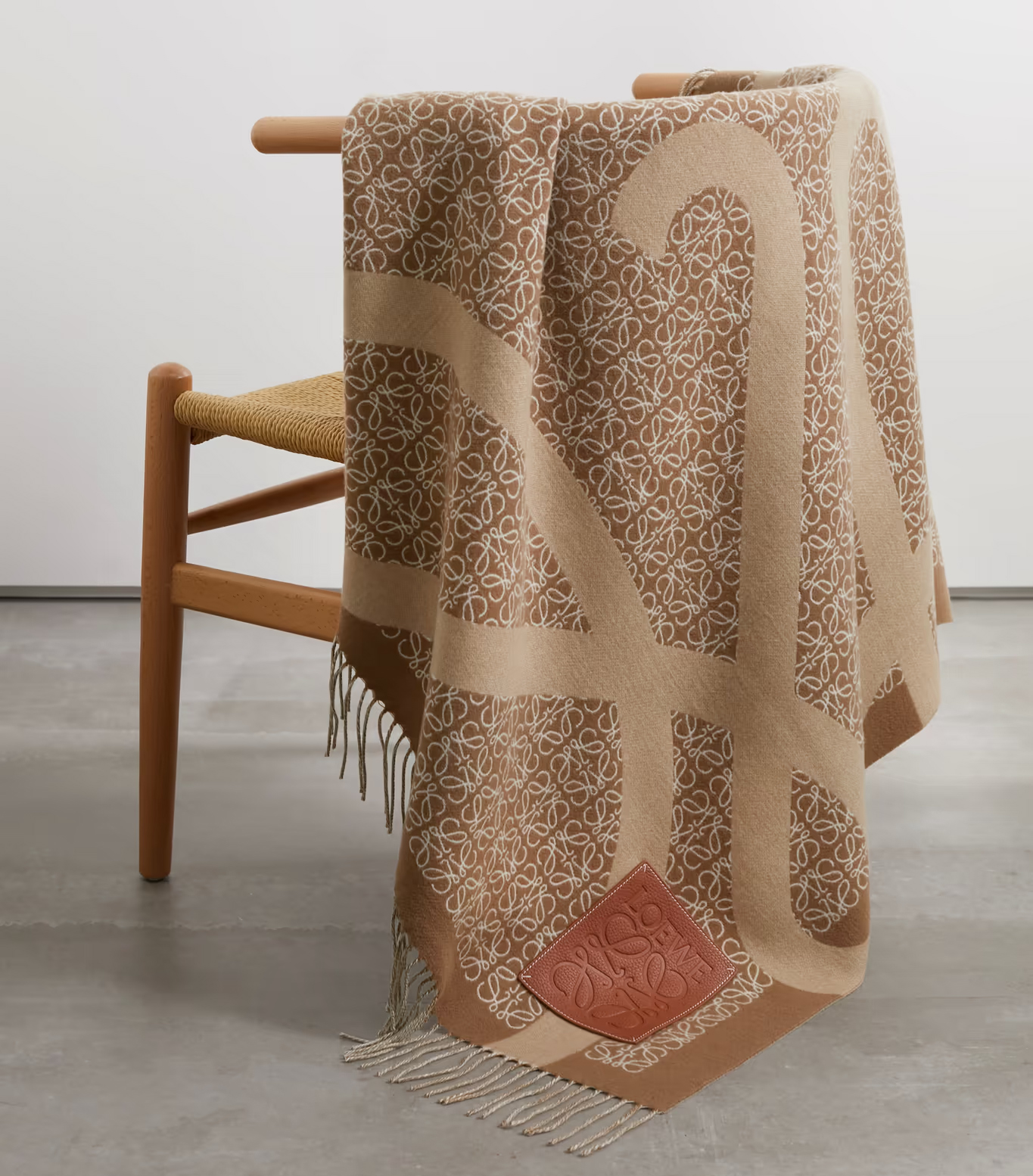
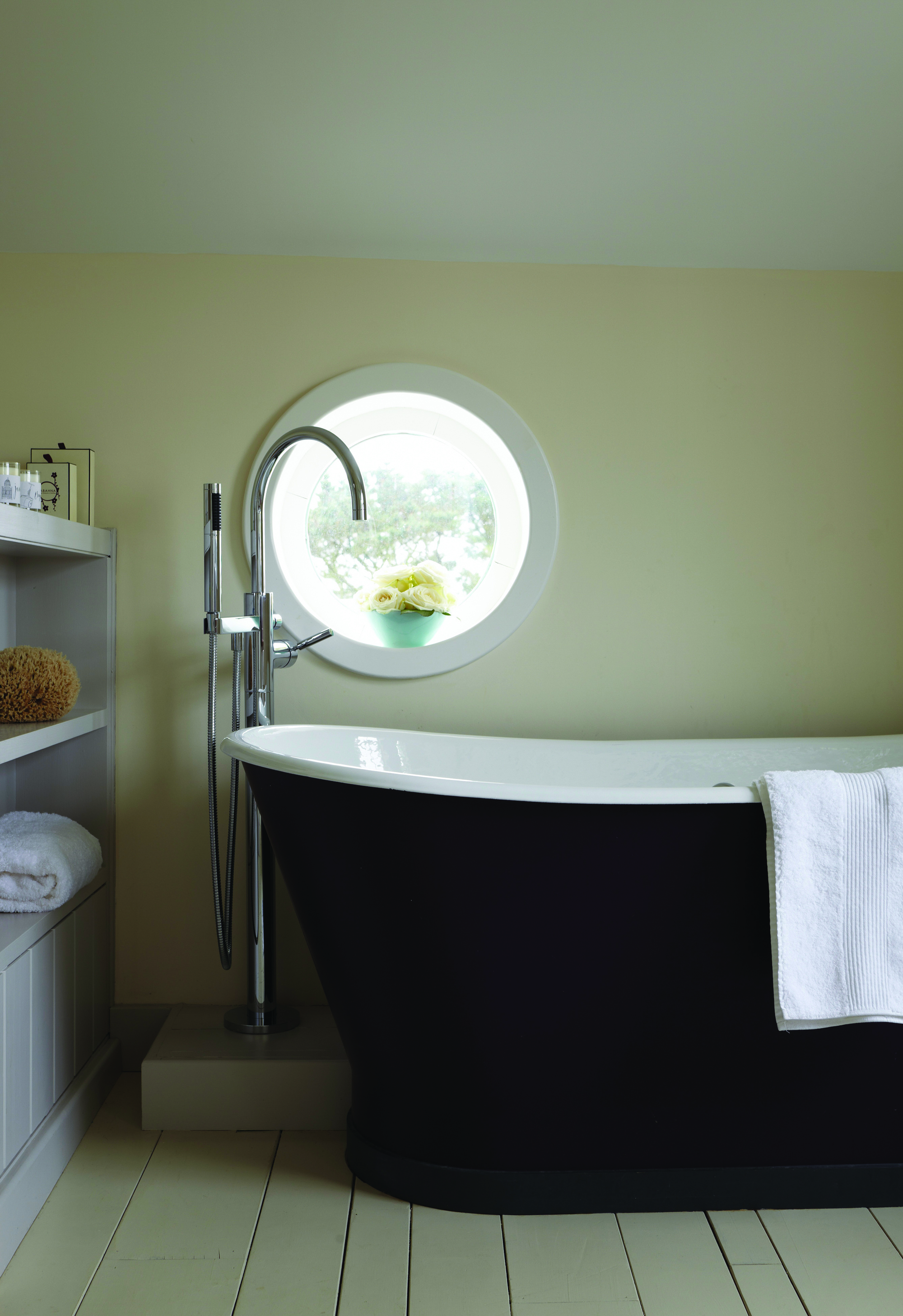
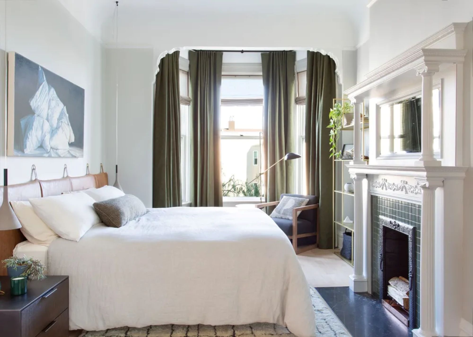
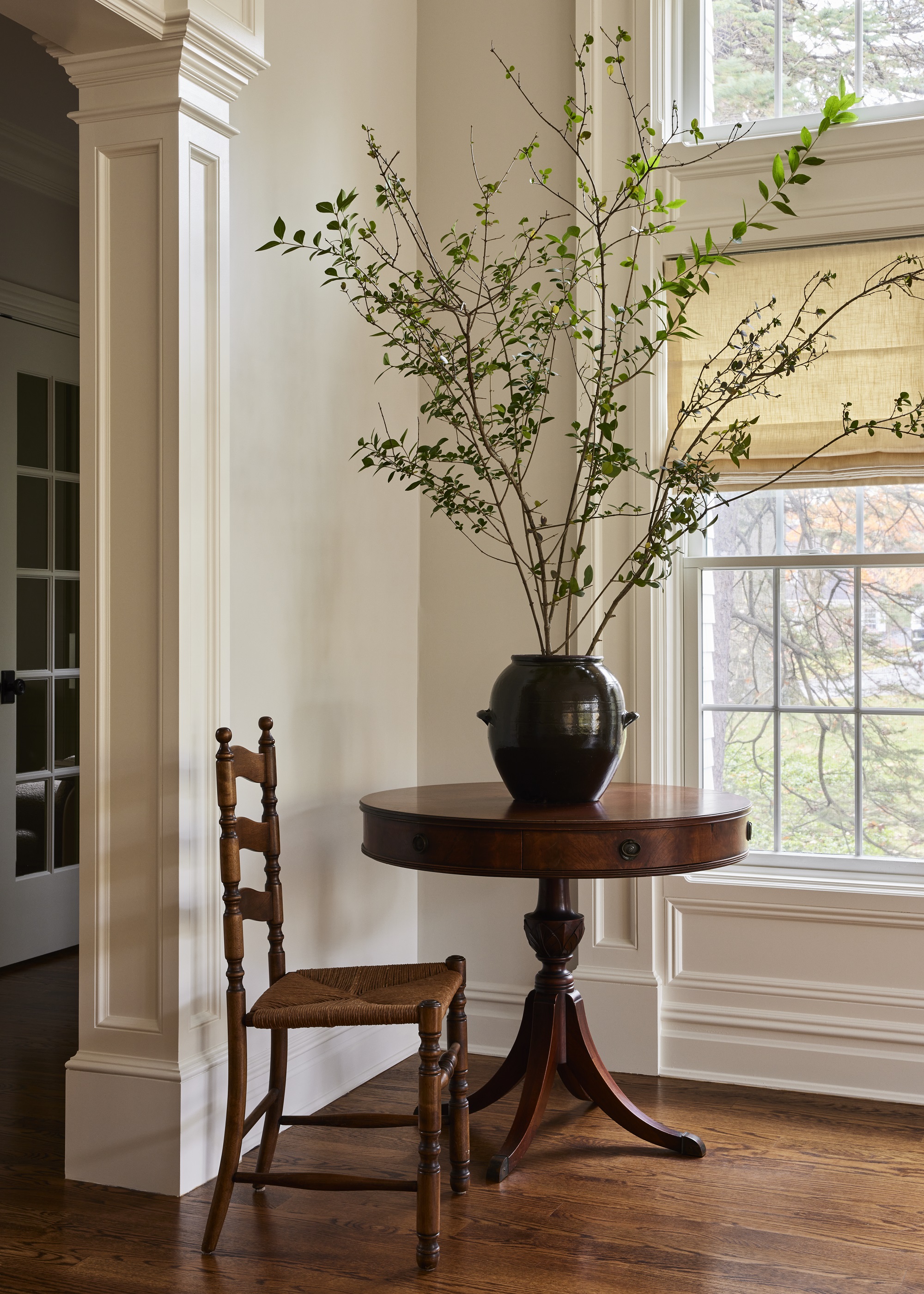
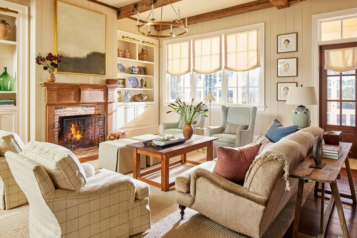
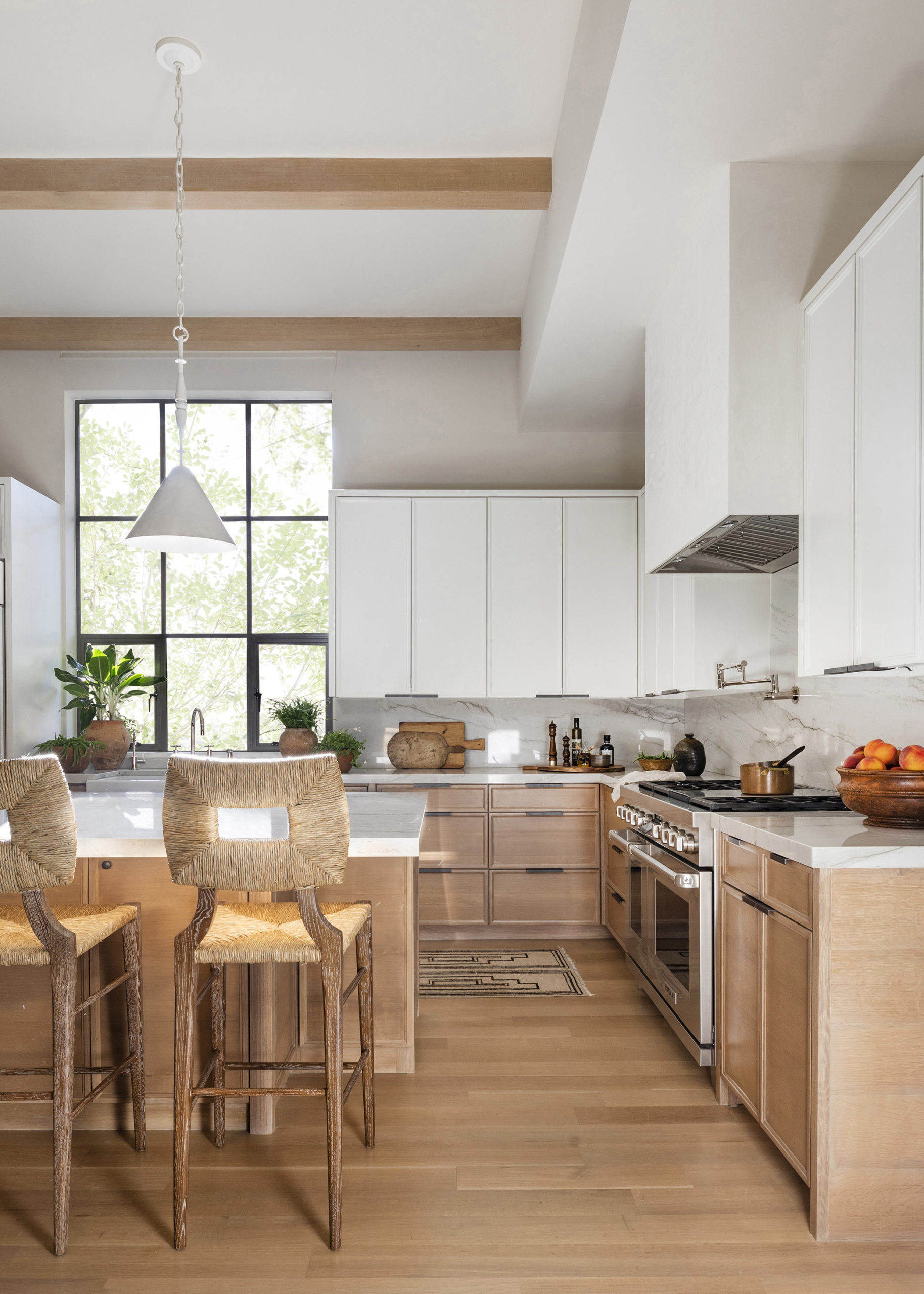
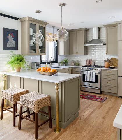
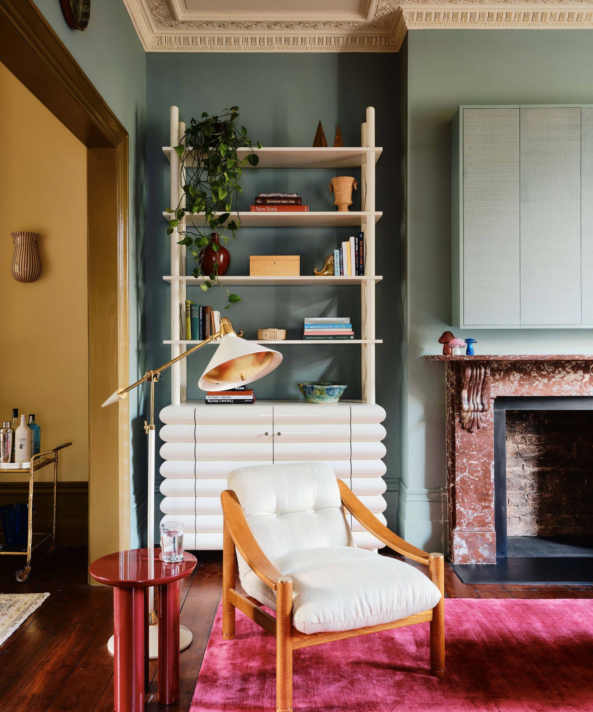
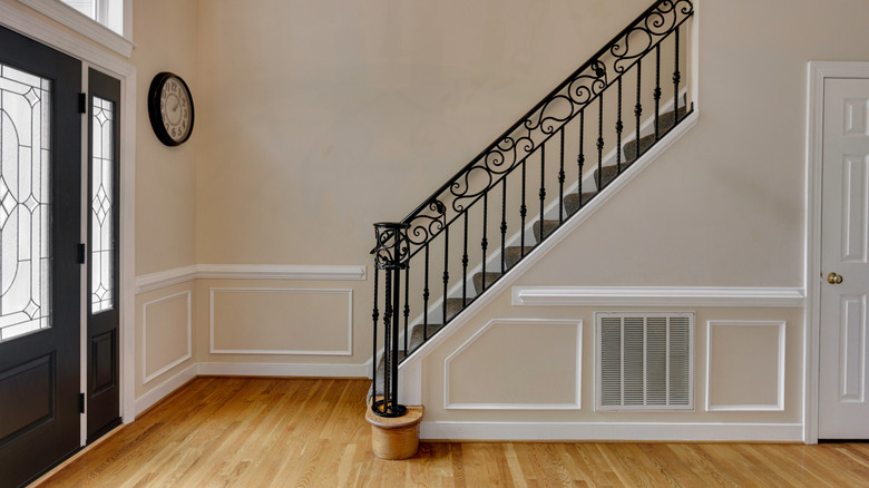
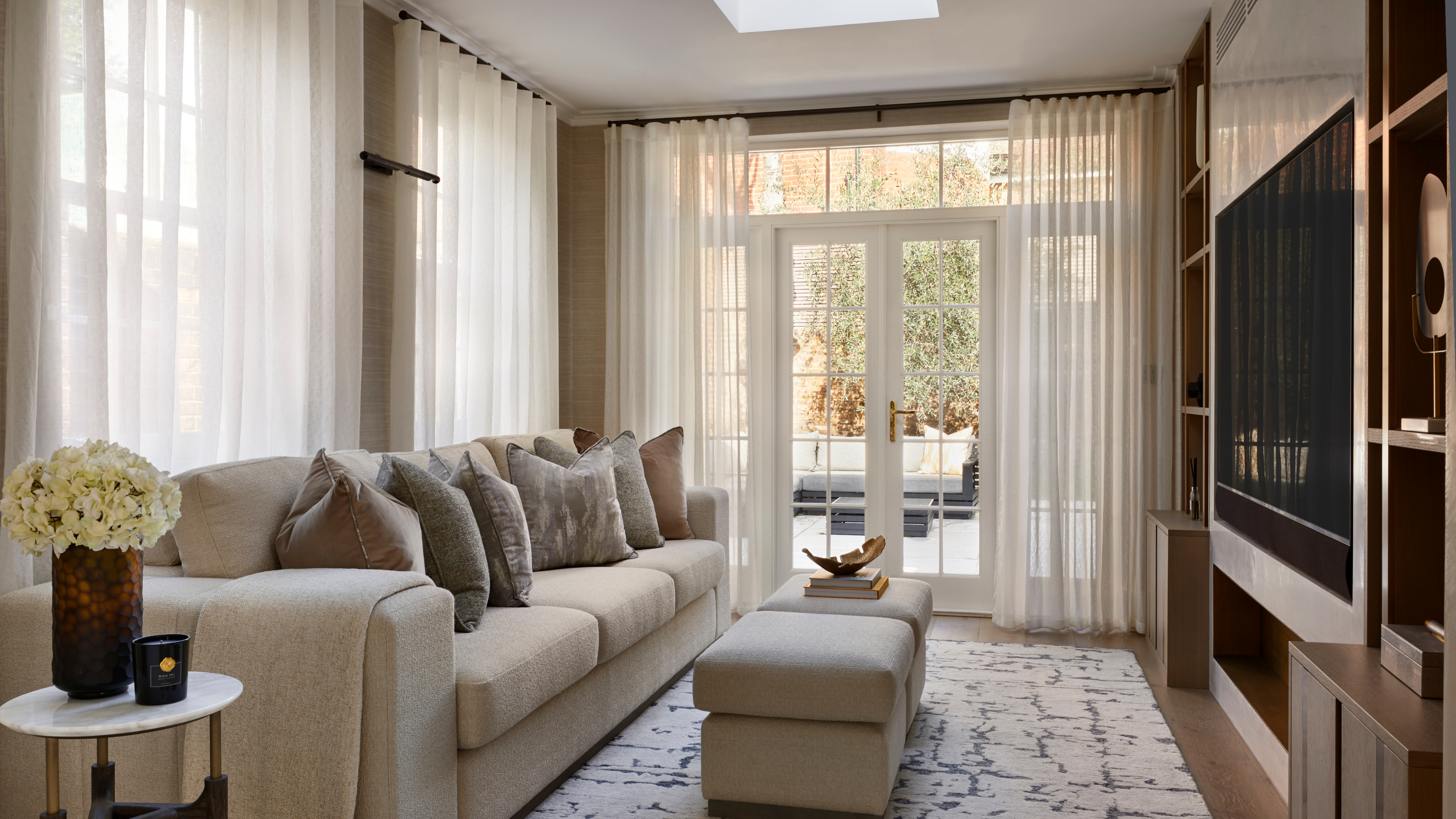
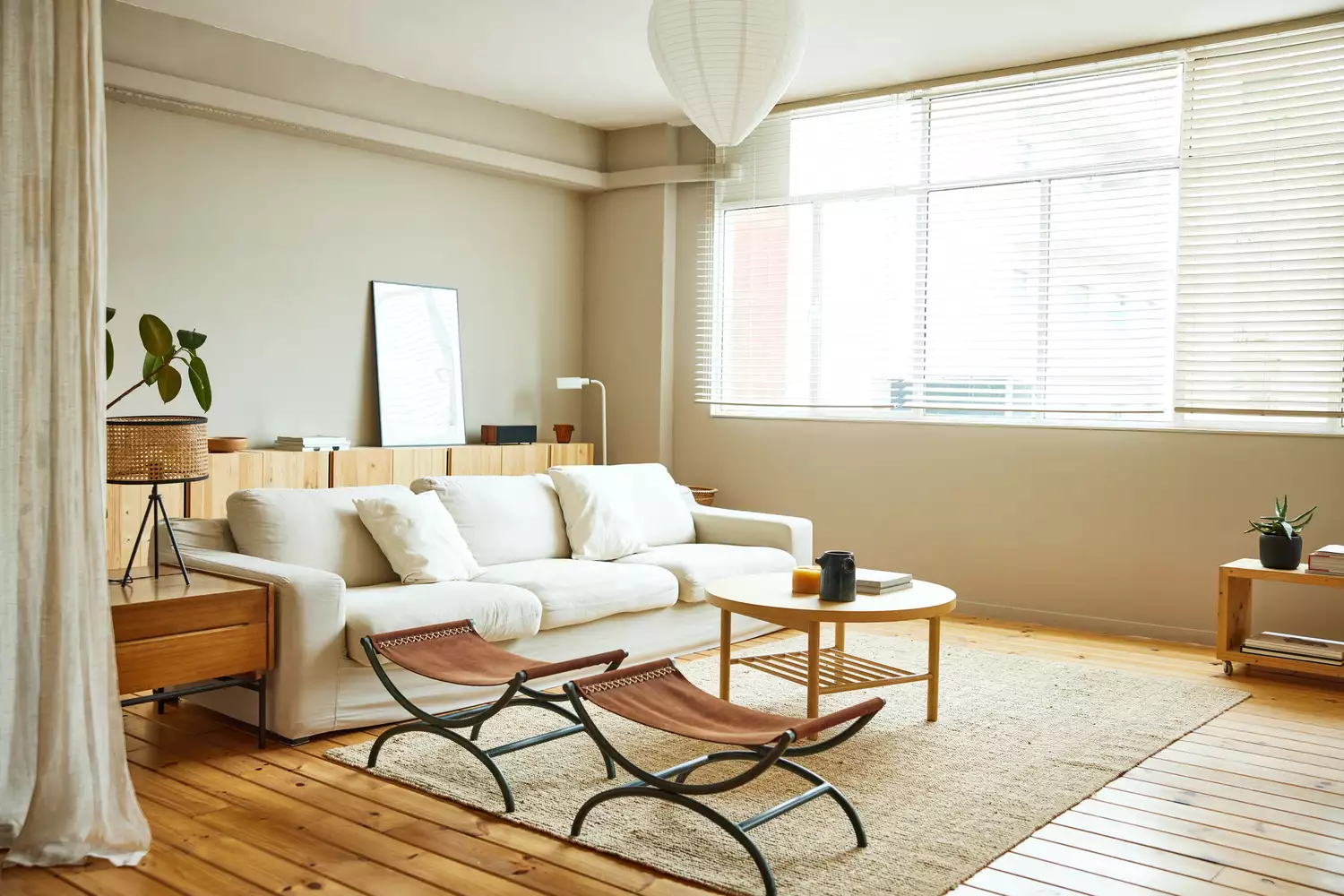
Finally, beige is identified as an uninspiring and outdated paint color. Priyanshi Jain suggests that beige lacks character and coziness. Instead, off-whites with subtle undertones, such as lavender for coolness and sophistication or pink for warmth, are preferred. If beige is still desired, incorporating hints of pink and yellow through accent pieces like throw pillows and blankets can add subtle visual interest and maintain a contemporary feel. The article concludes by emphasizing the importance of considering paint sheens and finishes, recommending high-gloss applications for elements like bookshelves to add an extra touch of style, and highlights the relevance of small space color trends for apartments and rentals.
#OutdatedPaintColors #HomeDesignTrends #InteriorDecor #PaintColorAlternatives #Terracotta #Maroon #MauvePink #Taupe #OffWhite #OutdatedPaintColors #HomeDesignTrends #InteriorDecor #PaintColorAlternatives #Terracotta #Maroon #MauvePink #Taupe #OffWhite
0 comment in total
 No comments yet
You may also like
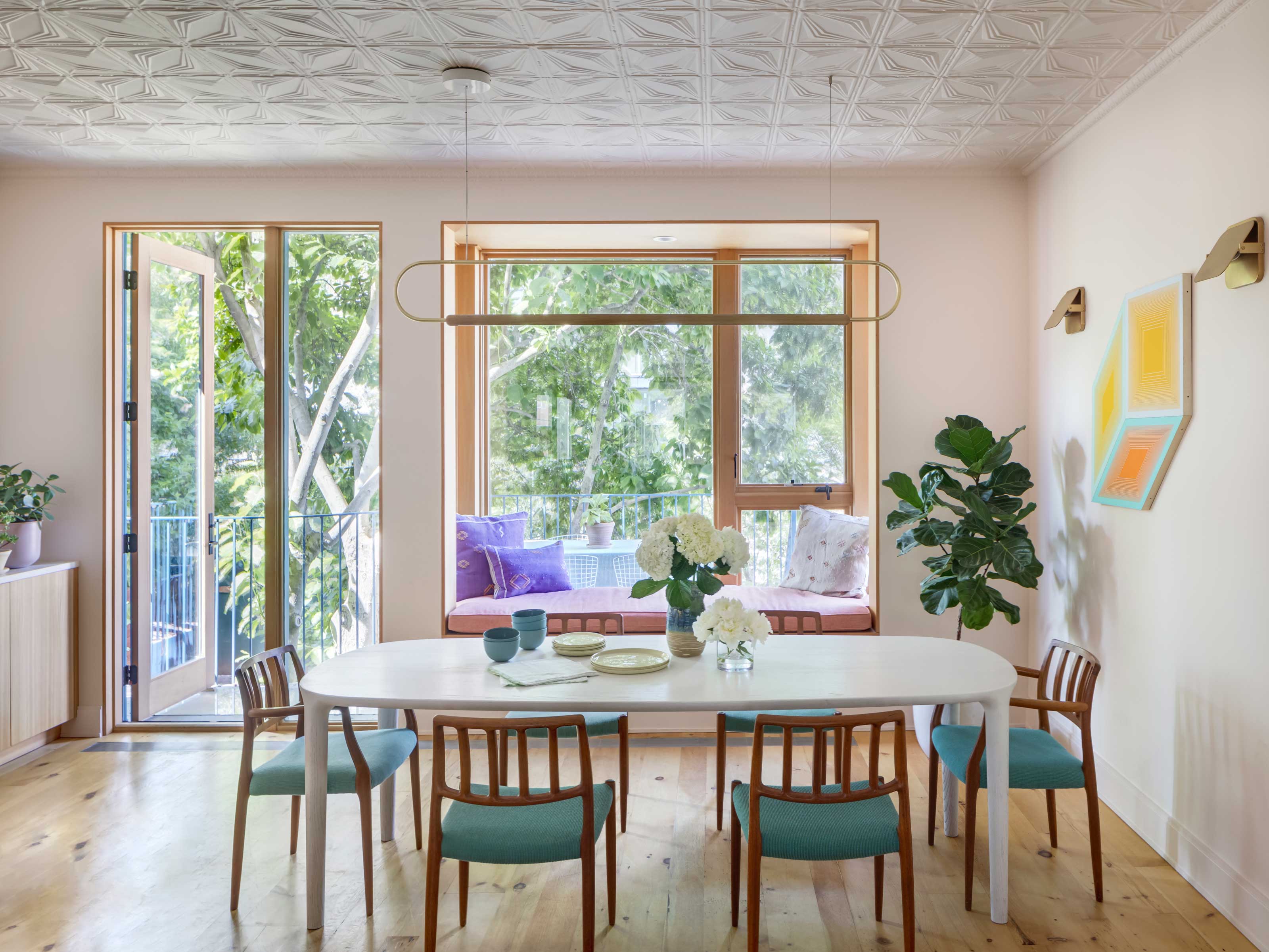
5 outdated color trends interior designers are glad to see the back of – and what they're choosing for 2024 instead

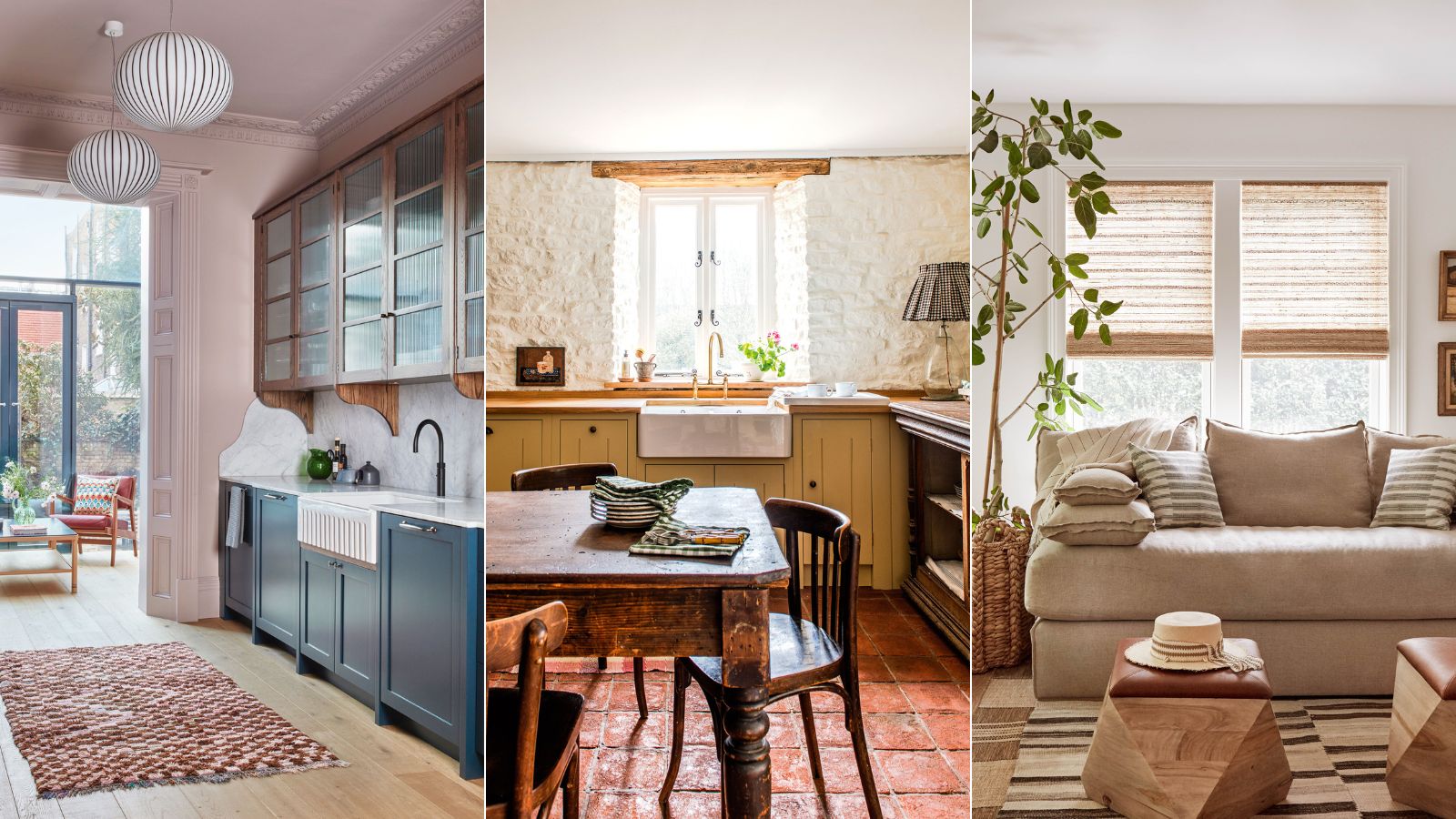
Outdated color trends – 5 overdone colors that designers no longer love, and what to use instead

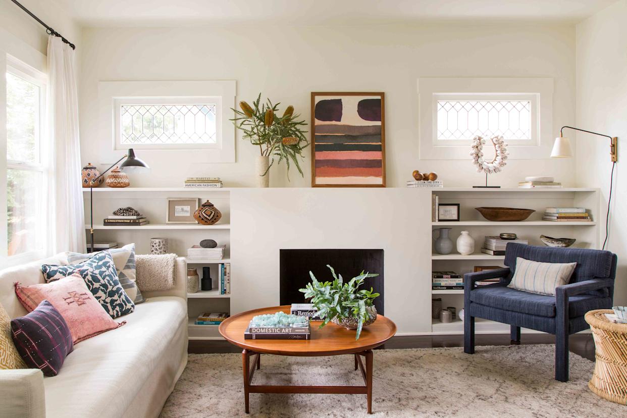
5 Paint Colors That Experts Say You Shouldn't Use in 2025

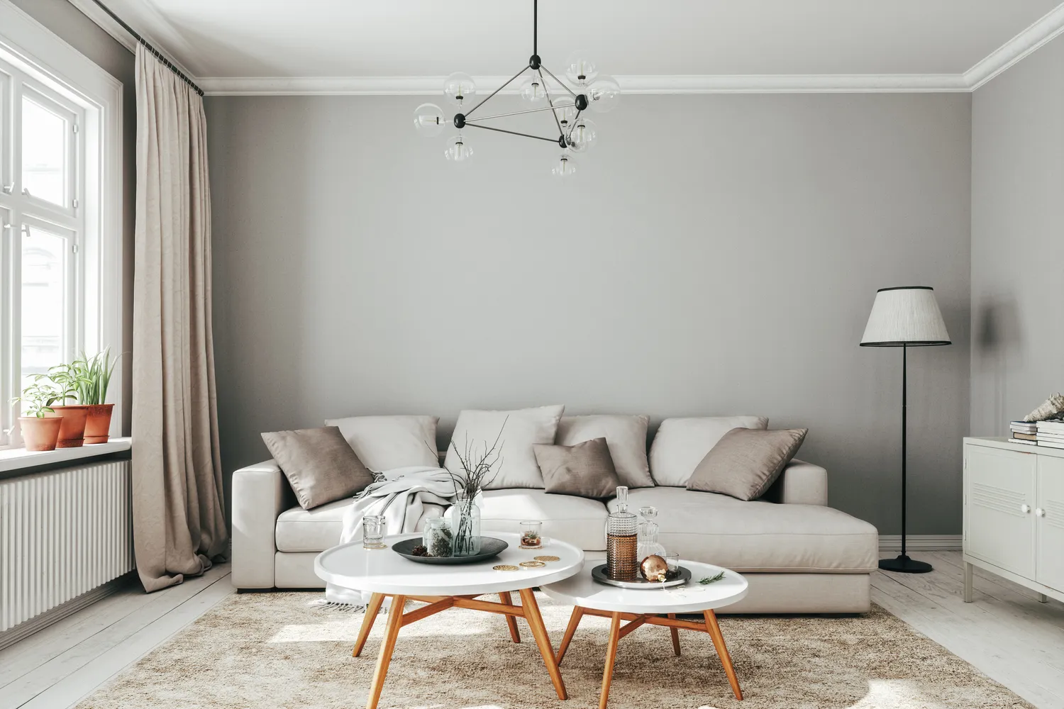
6 Outdated Paint Colors Designers Don't Want to See in Homes Anymore in 2026

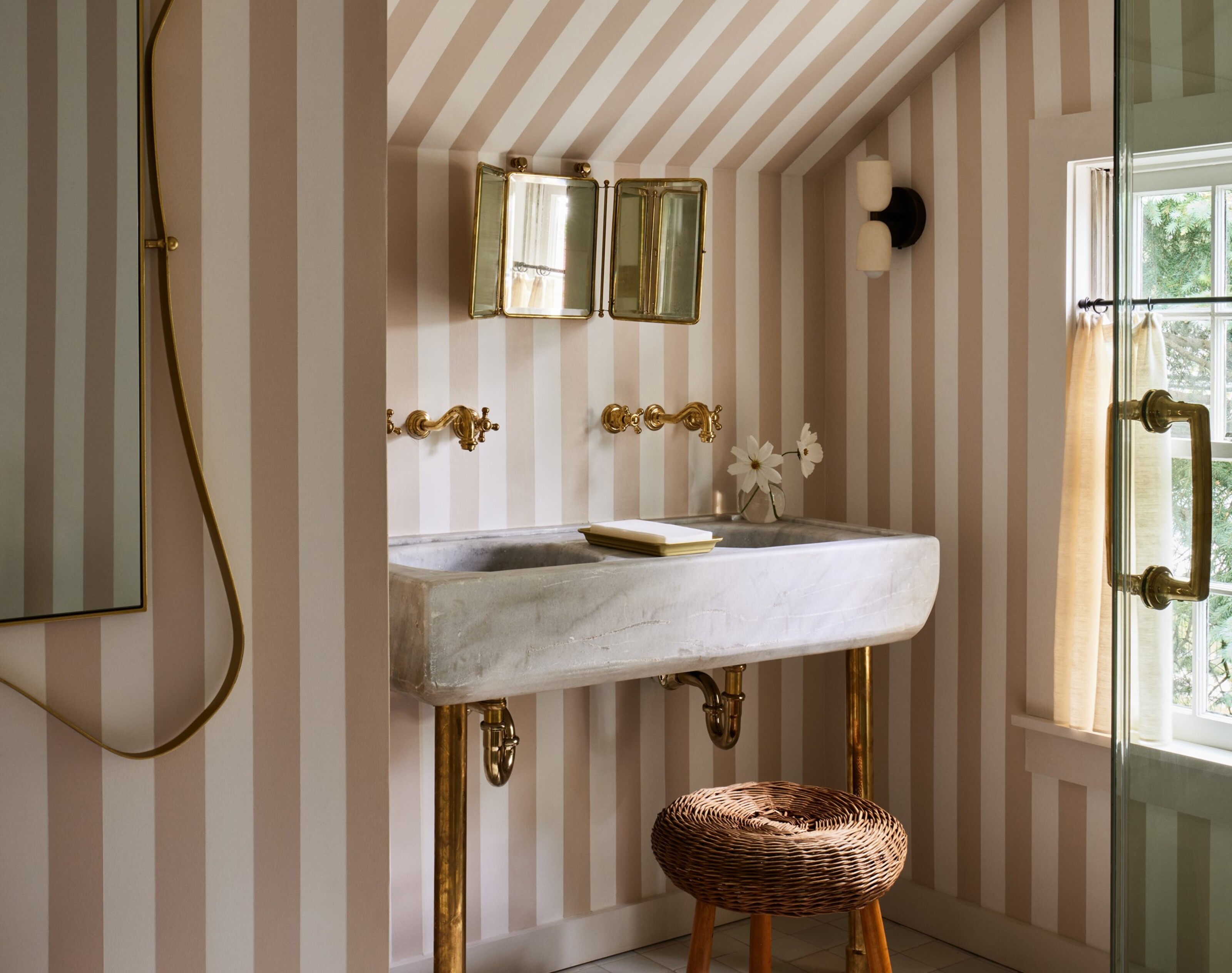
5 colors designers say are outdated for bathrooms - and what they're choosing instead for 2024
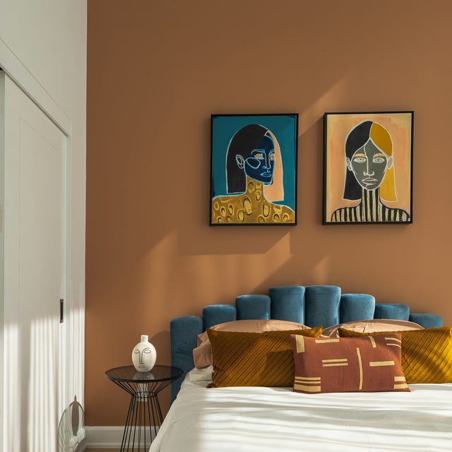
These 5 Paint Color Trends Will Be Everywhere in 2024, According to Interior Designers
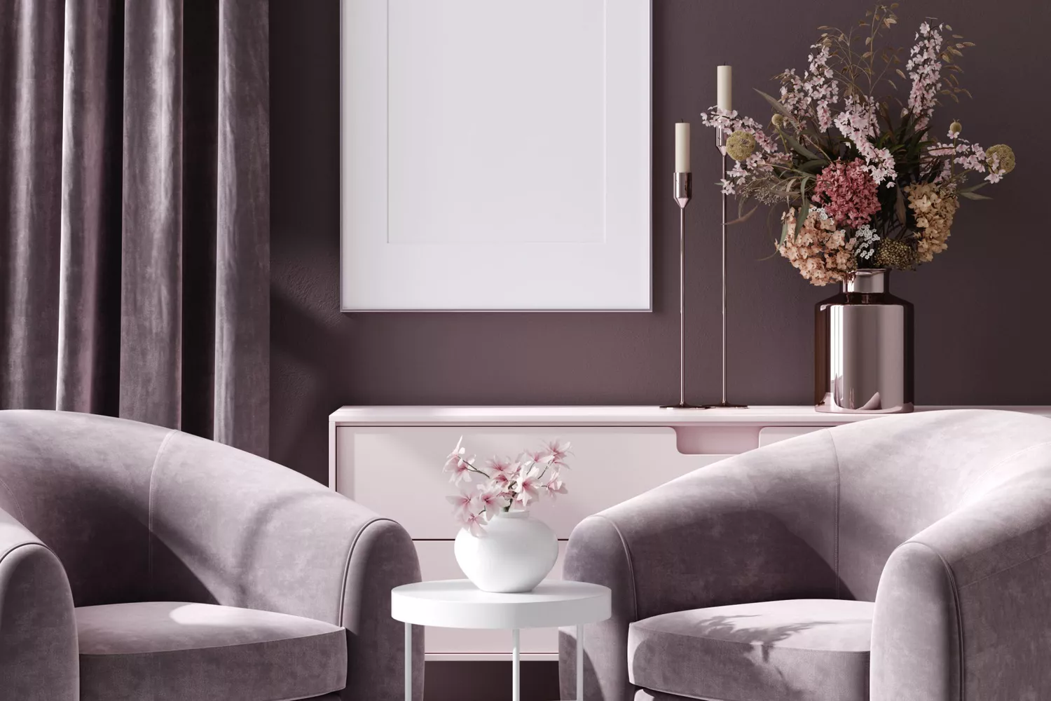
5 Paint Colors That Are Out for 2025, According to Interior Designers

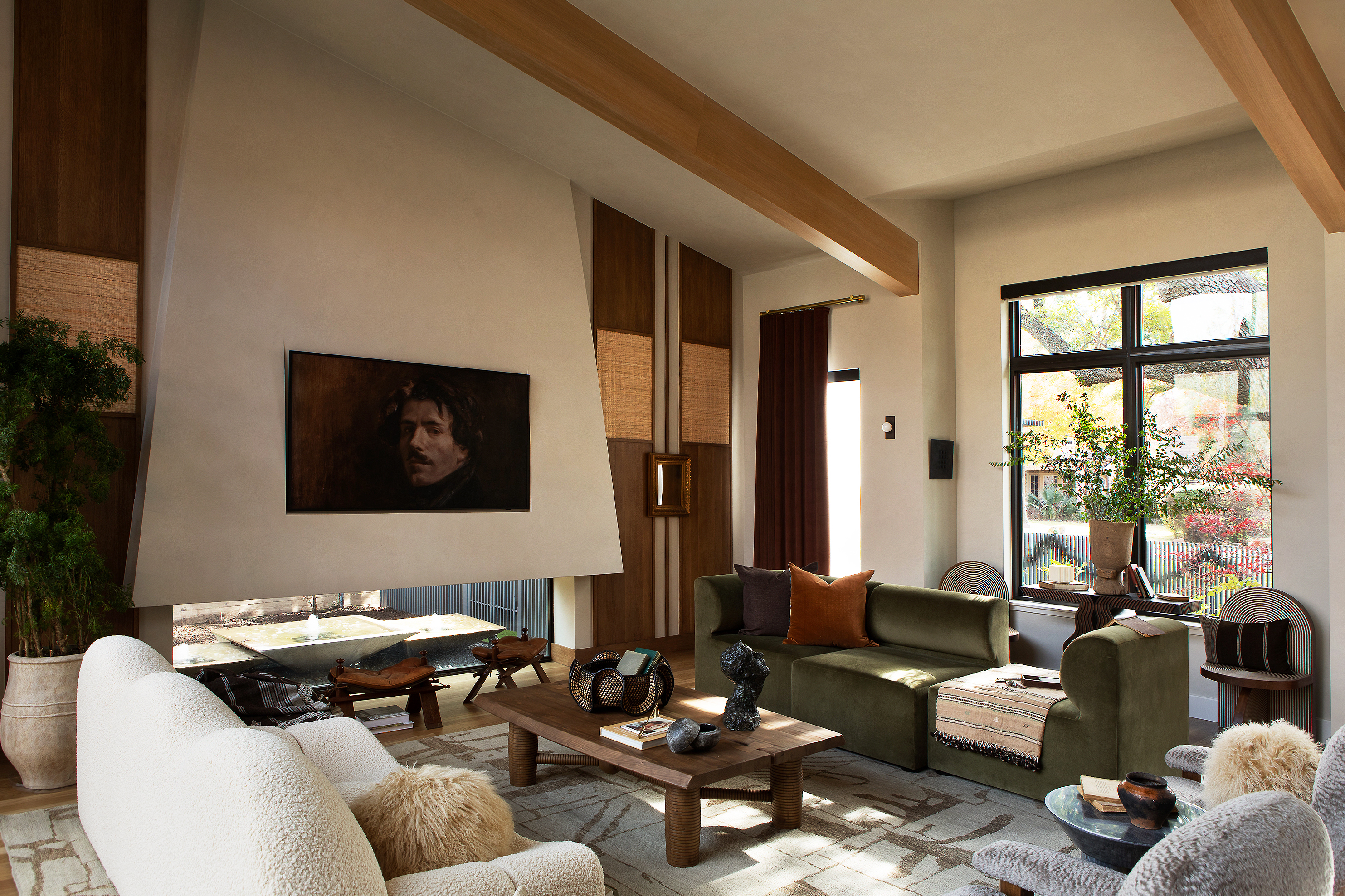
9 colors designers won’t be using in their living rooms in 2025
5 Curtain Colors Designers Say Are Officially Out of Style in 2025 Projects, and What They're Replacing Them With
4 Paint Color Trends Designers Are Ready To Ditch In 2025
According to Designers, These Are The Outdated Color Trends for 2026
5 tile colors going out of style for 2025, according to interior designers
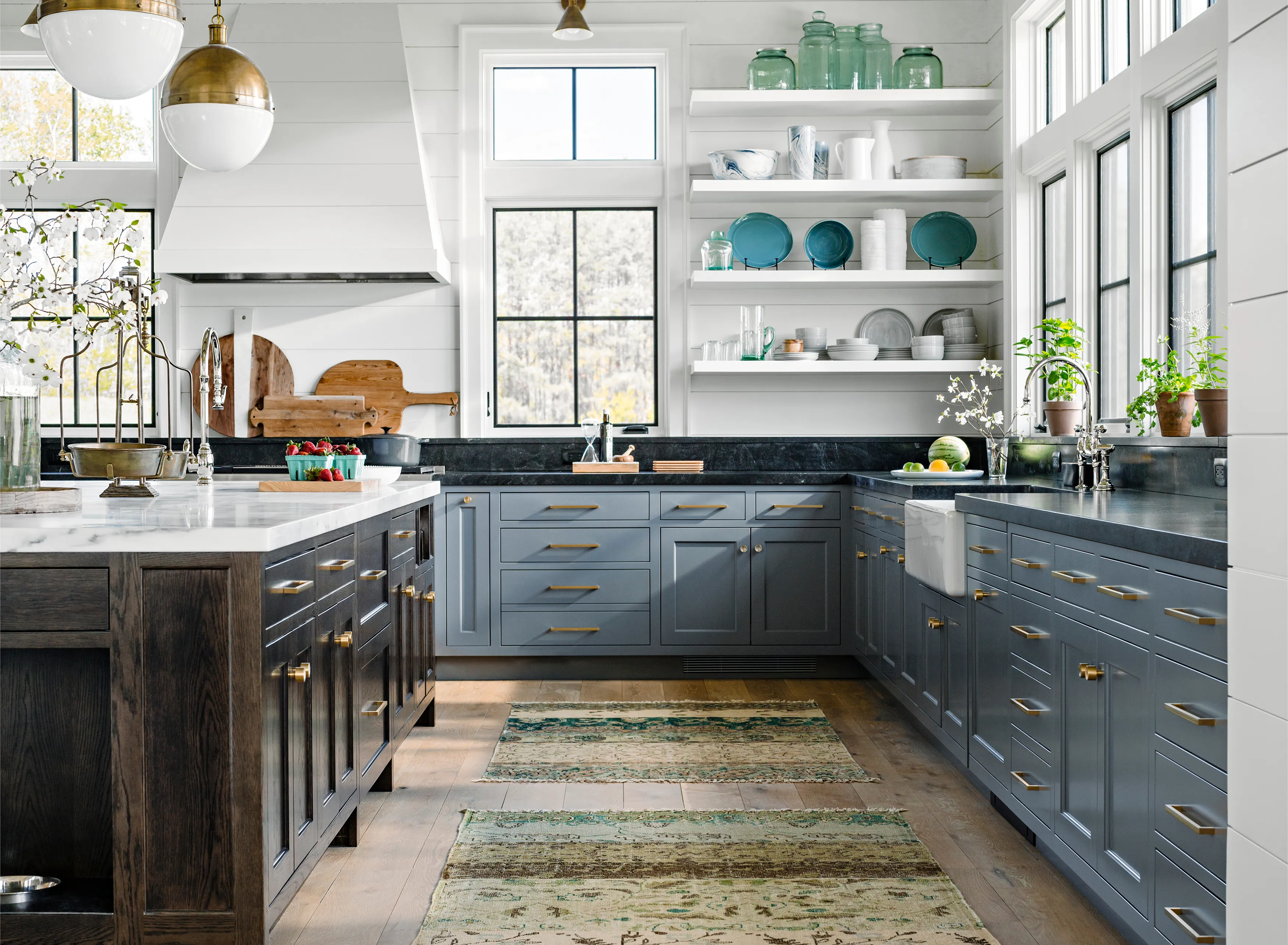
5 Paint Color Trends Designers Are Begging You to Leave in 2025

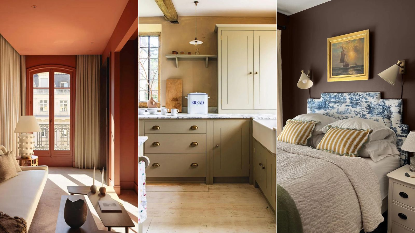
5 'ugly colors' that I'll be decorating with in 2024 – these undesirable colors will trend this year
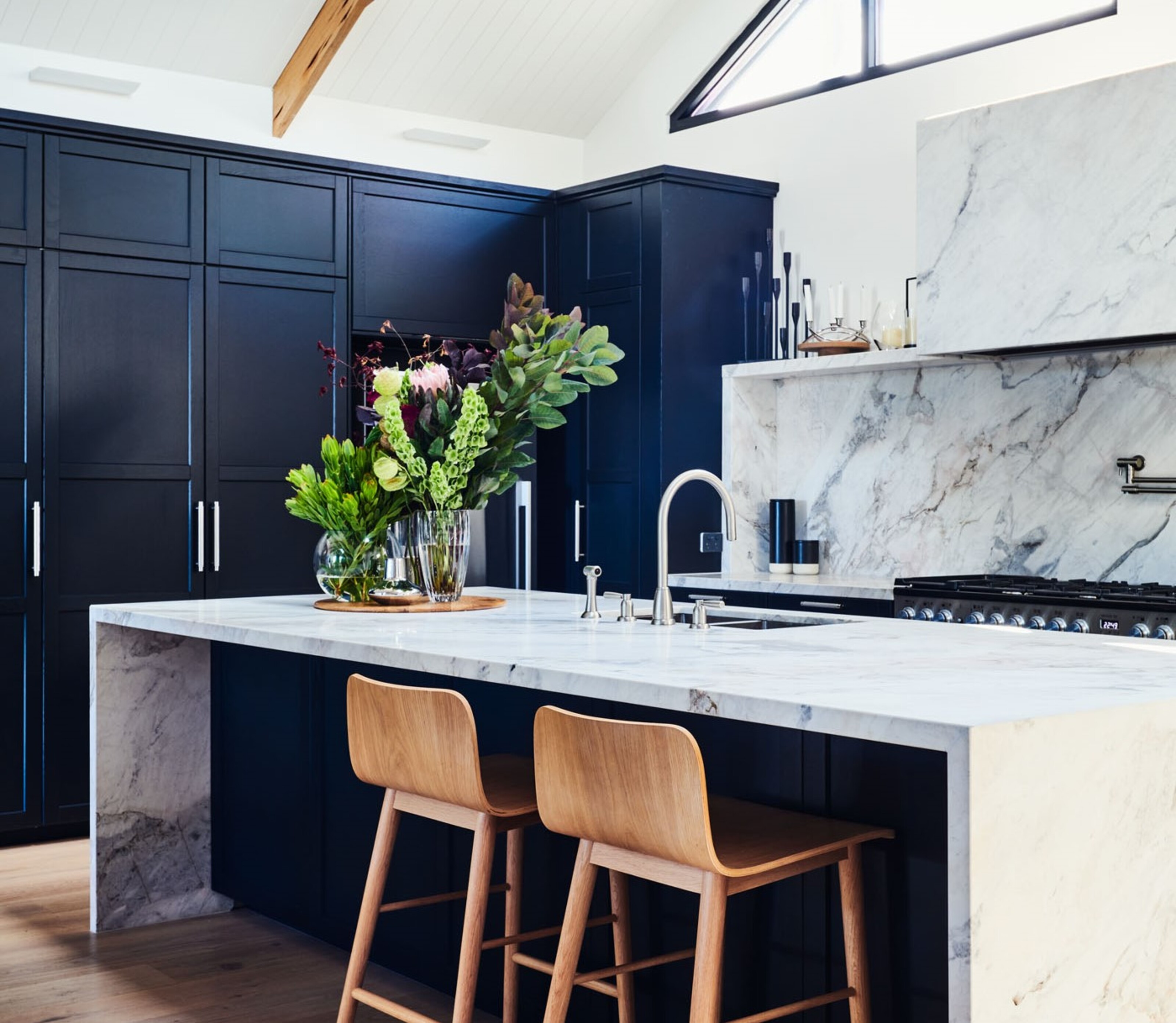
5 kitchen cabinet colors interior designers are avoiding for 2024 - and the shades they're picking instead
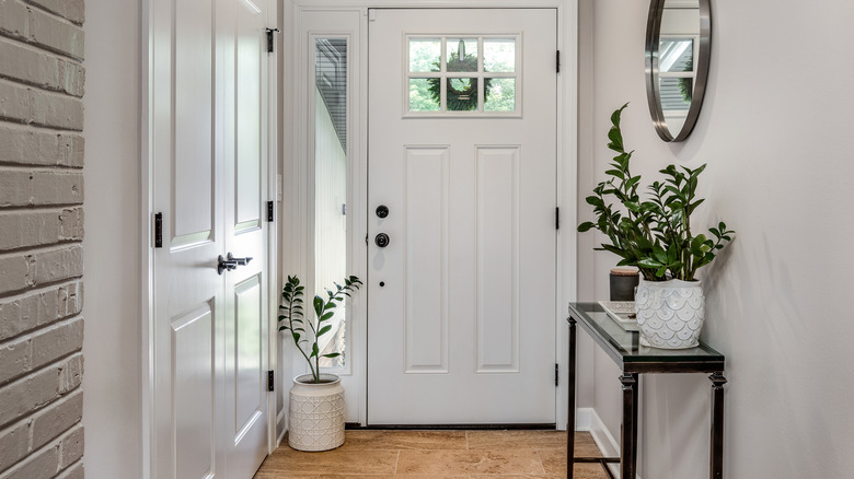
Outdated Entryway Paint Colors To Avoid In 2025 (And What To Try Instead)
5 Paint Colors Going Out of Style in 2025 — And What You Should Replace Them With Before Then
5 kitchen colors going out of style for 2024 – plus the 5 shades designers are replacing them with
5 outdated paint trends that interior designers are glad to see the back of – and what they're doing instead
5 Outdated Color Combinations We're Saying Goodbye to in 2025, According to Designers