1/9
5 outdated color trends interior designers are glad to see the back of – and what they're choosing for 2024 instead
The interior design world is constantly evolving, with color trends being particularly dynamic. What is universally adored one moment can become dated the next, leading designers to continually reassess popular palettes. This article highlights five specific color trends that interior designers are moving away from and suggests contemporary alternatives to keep home interiors fresh and current. Understanding these shifts can help homeowners avoid choices that might make their spaces feel old-fashioned.
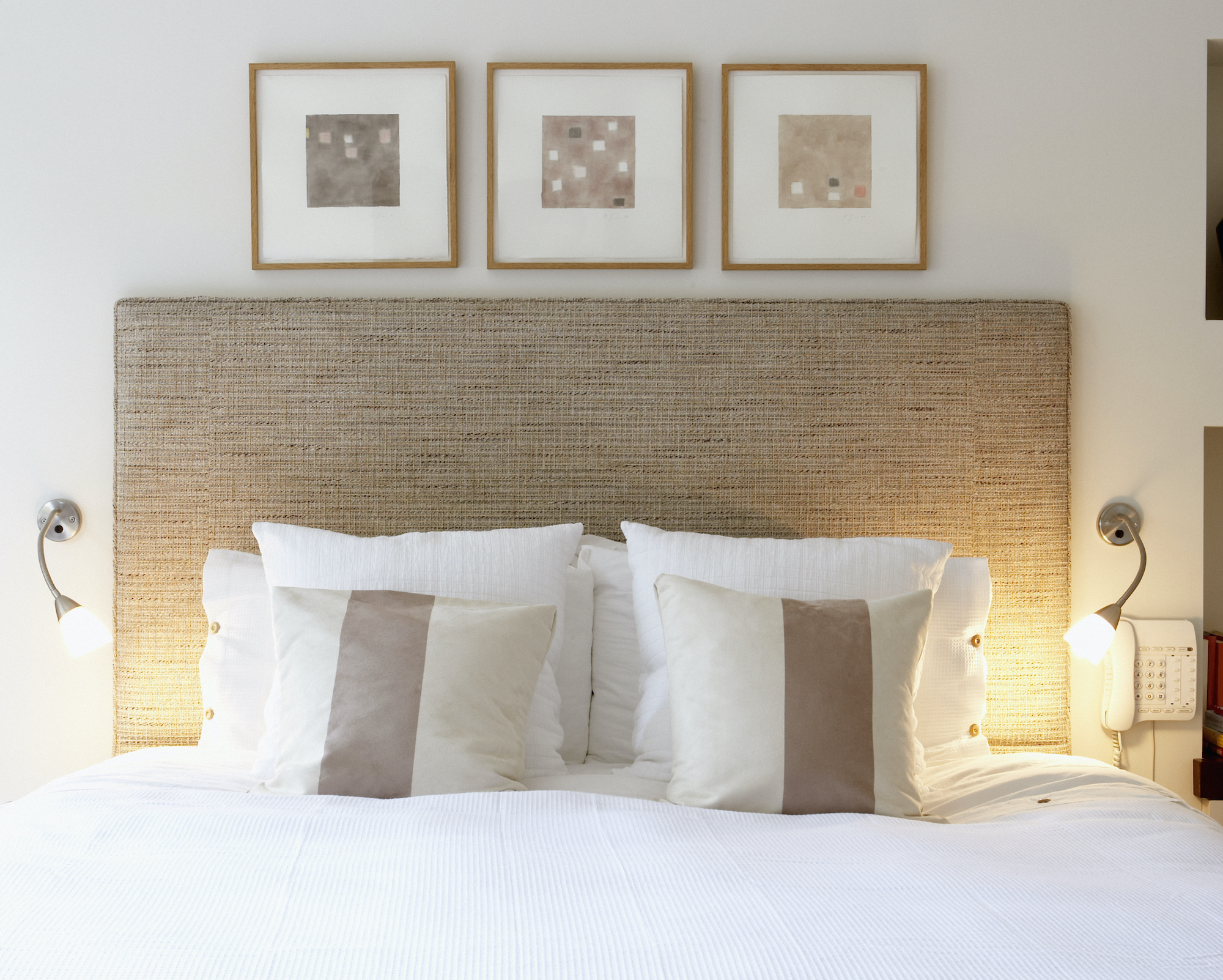
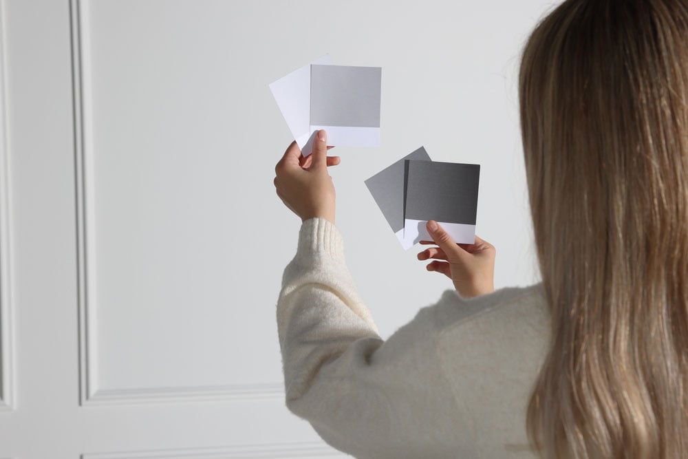
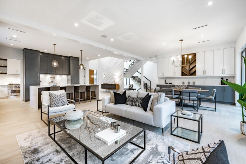
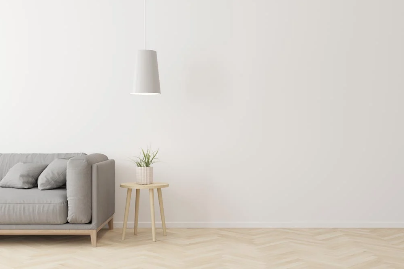
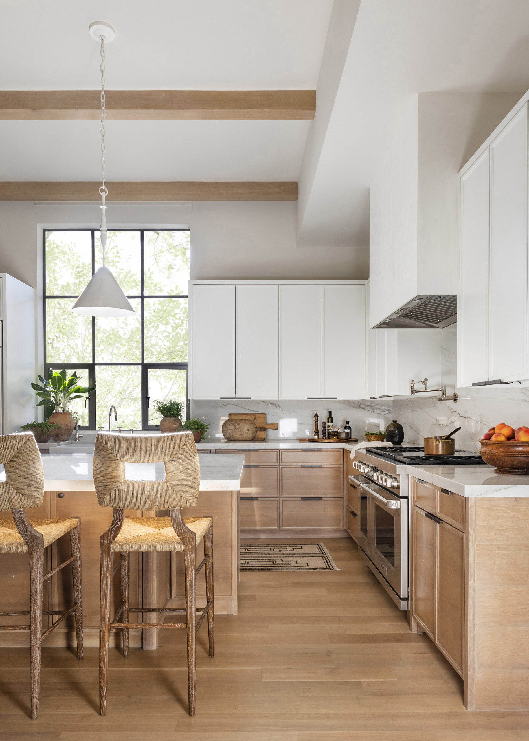
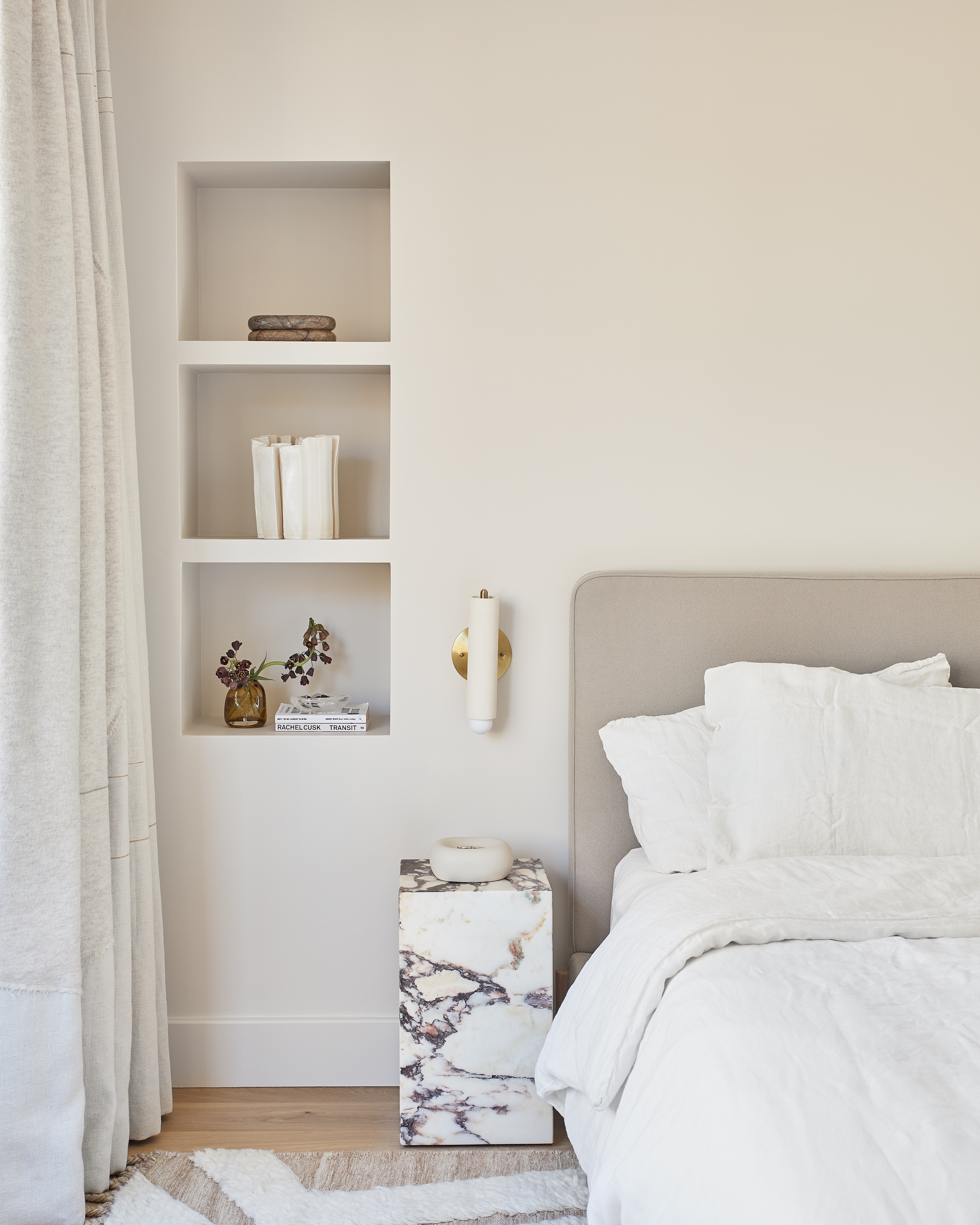
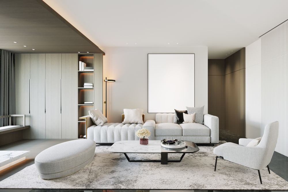
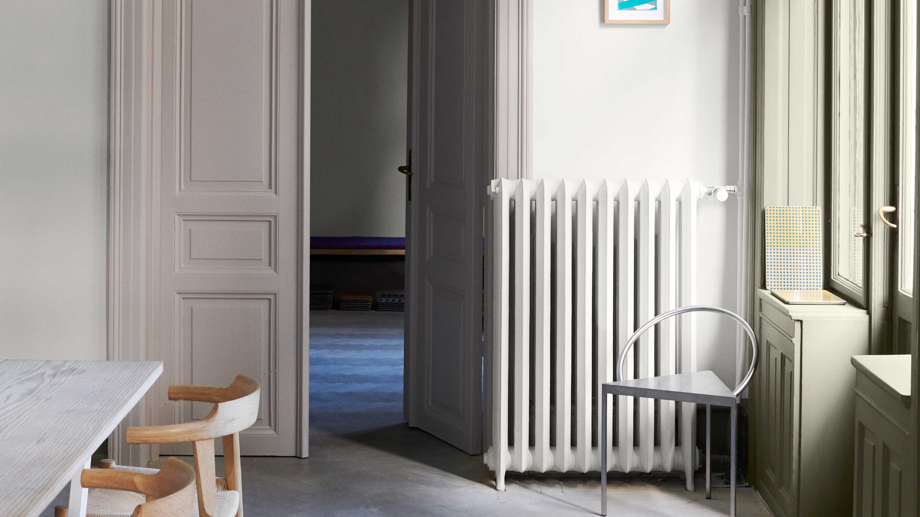
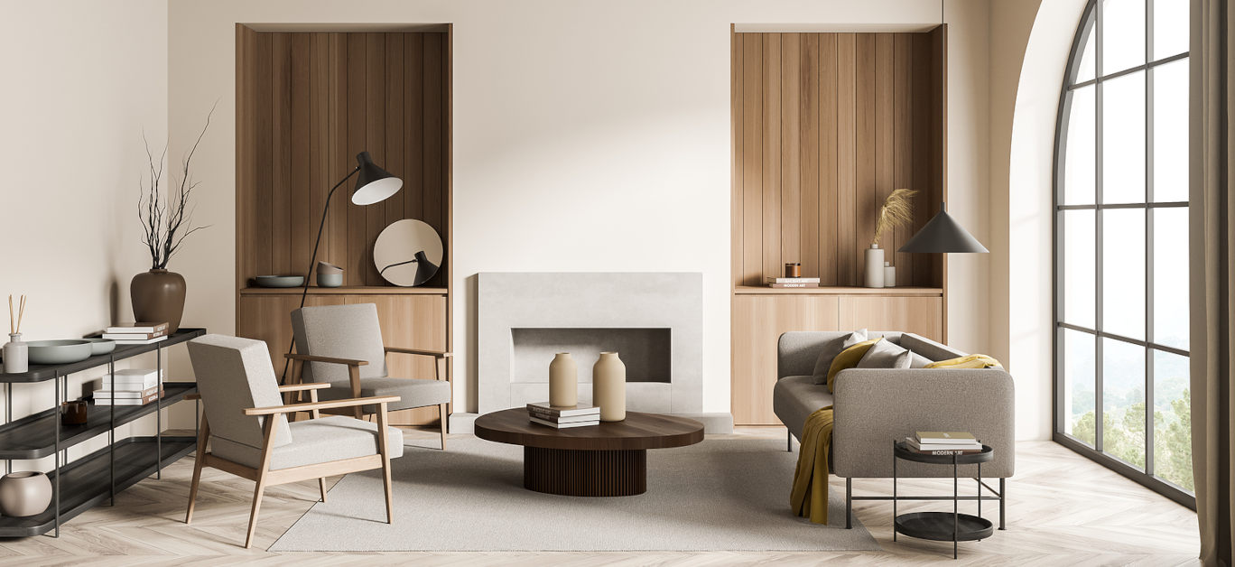
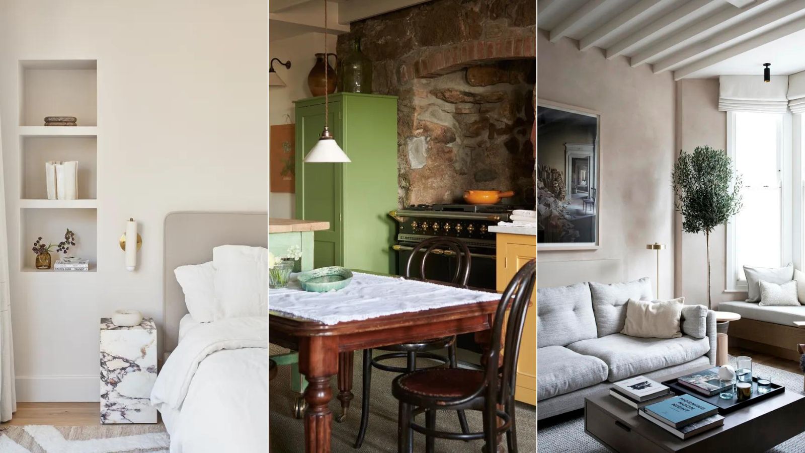
One significant color trend that has seen a dramatic decline in popularity is cool grey. Approximately five years ago, cool grey dominated interior schemes, appearing in homes from modern to traditional styles. However, designers like Charles Cohen note that the prevalent cool greys were often dull and failed to add character. This shade has become so associated with generic new builds that Gen Z has coined the term 'Millennial grey' pejoratively. Instead of cool grey, designers are now favoring warmer, more organic, and textural neutrals such as taupes and earthy grey tones. These alternatives offer increased warmth, sophistication, and a foundation for layered design, adding depth to a room without the starkness of cool grey.
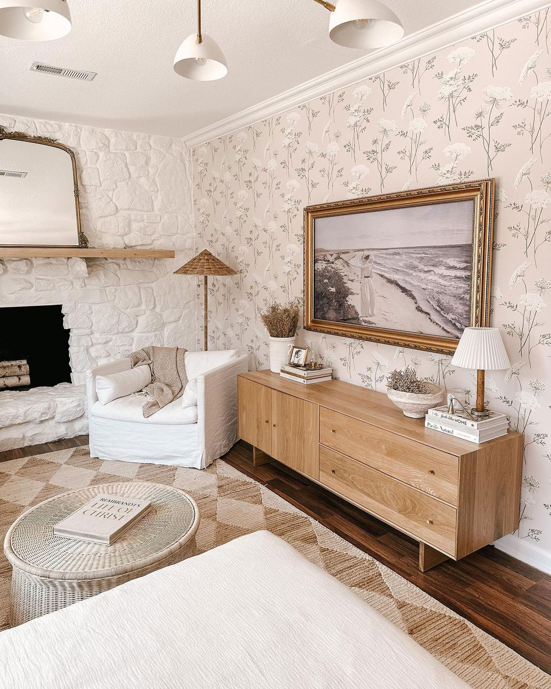
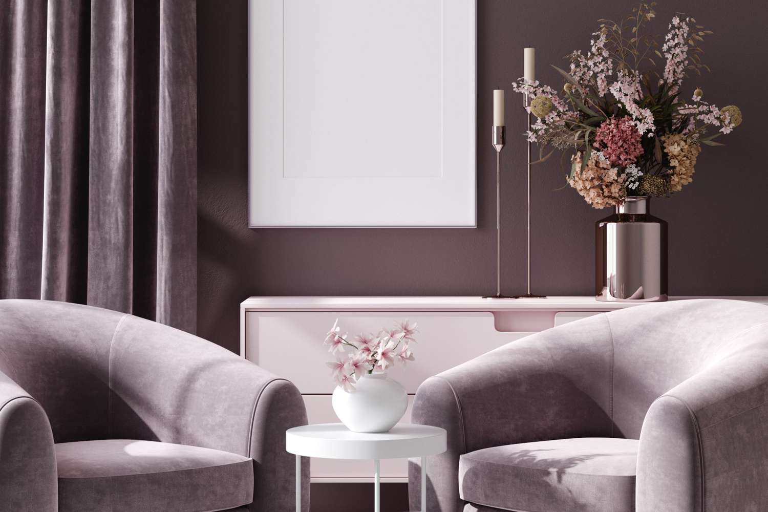
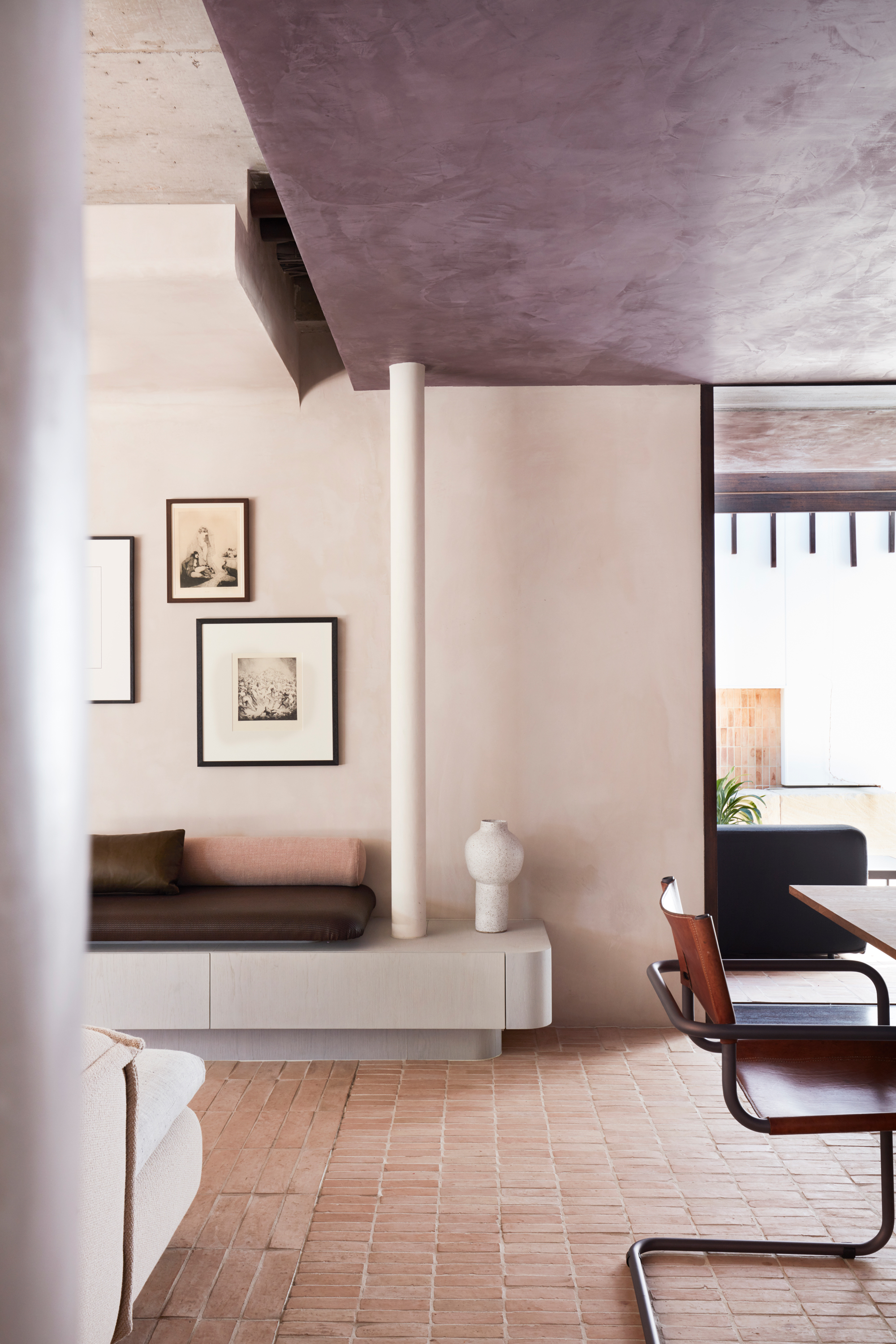
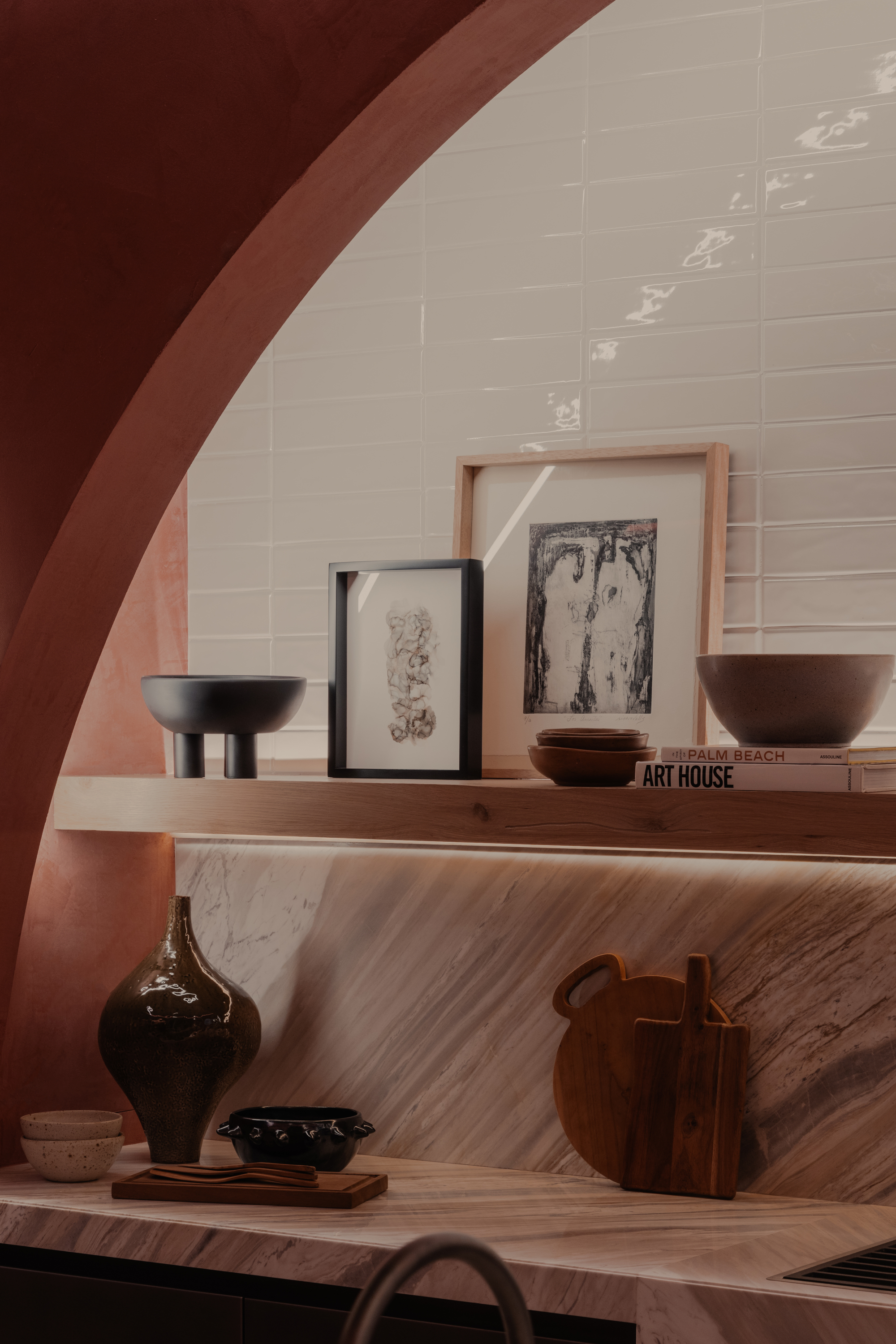
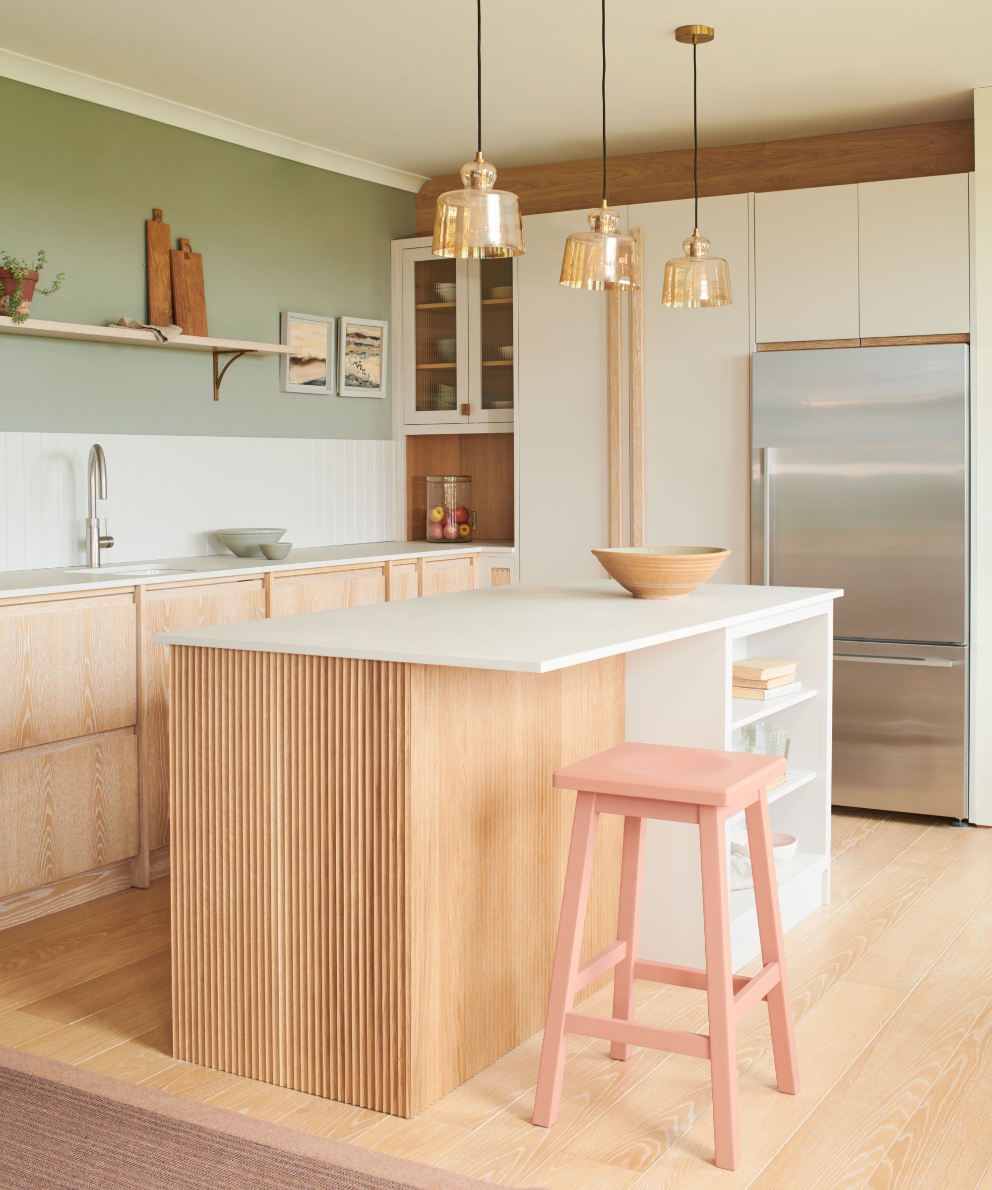
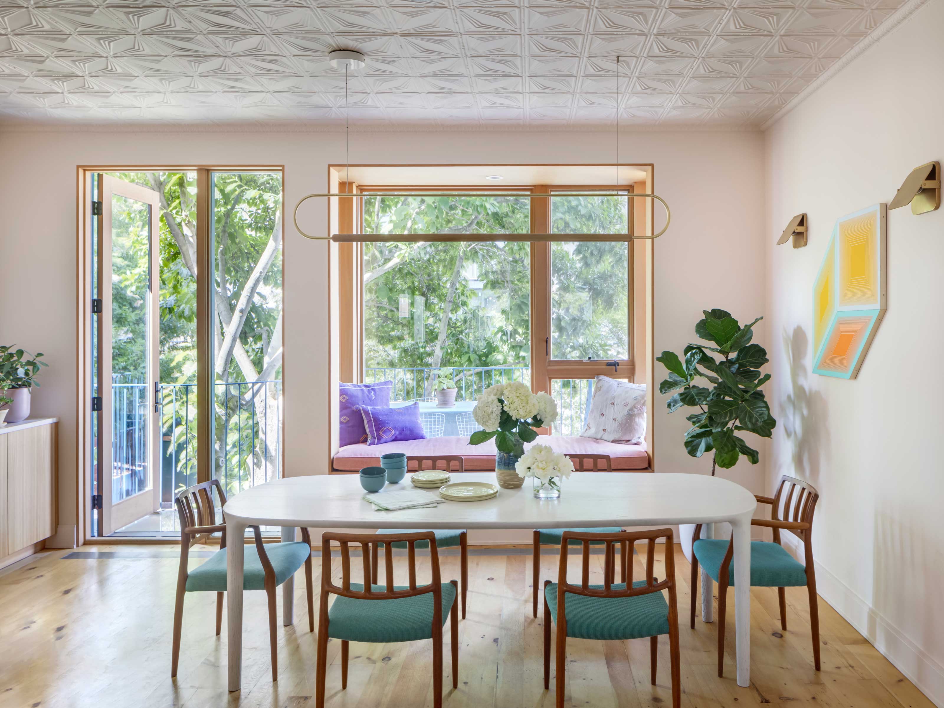
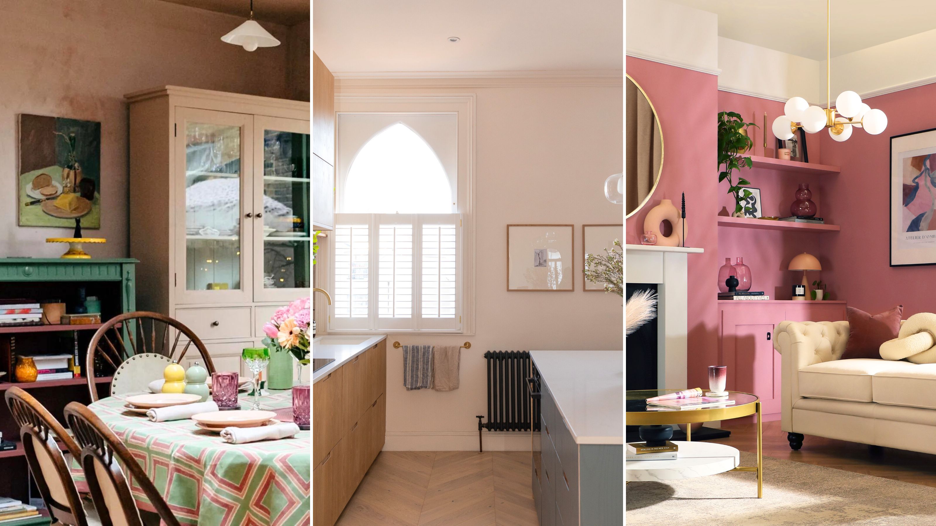
Another trend losing its appeal is millennial pink. While this pale, muted pink with a hint of peach enjoyed widespread popularity, interior designers are increasingly expressing fatigue with its ubiquity. Sara Malek Barney of BANDD/DESIGN suggests that millennial pink lacks long-lasting appeal, while Brooke Spreckman of Design Hutch explicitly states she is content to never see another millennial pink space again. The industry is now gravitating towards colors that fill the void left by millennial pink, with lavender and peach emerging as popular replacements. Additionally, designers are exploring other less-common pinks, with suggestions for classic shades like blush or dusty rose, or opting for more versatile neutrals, to achieve a modern and timeless aesthetic.
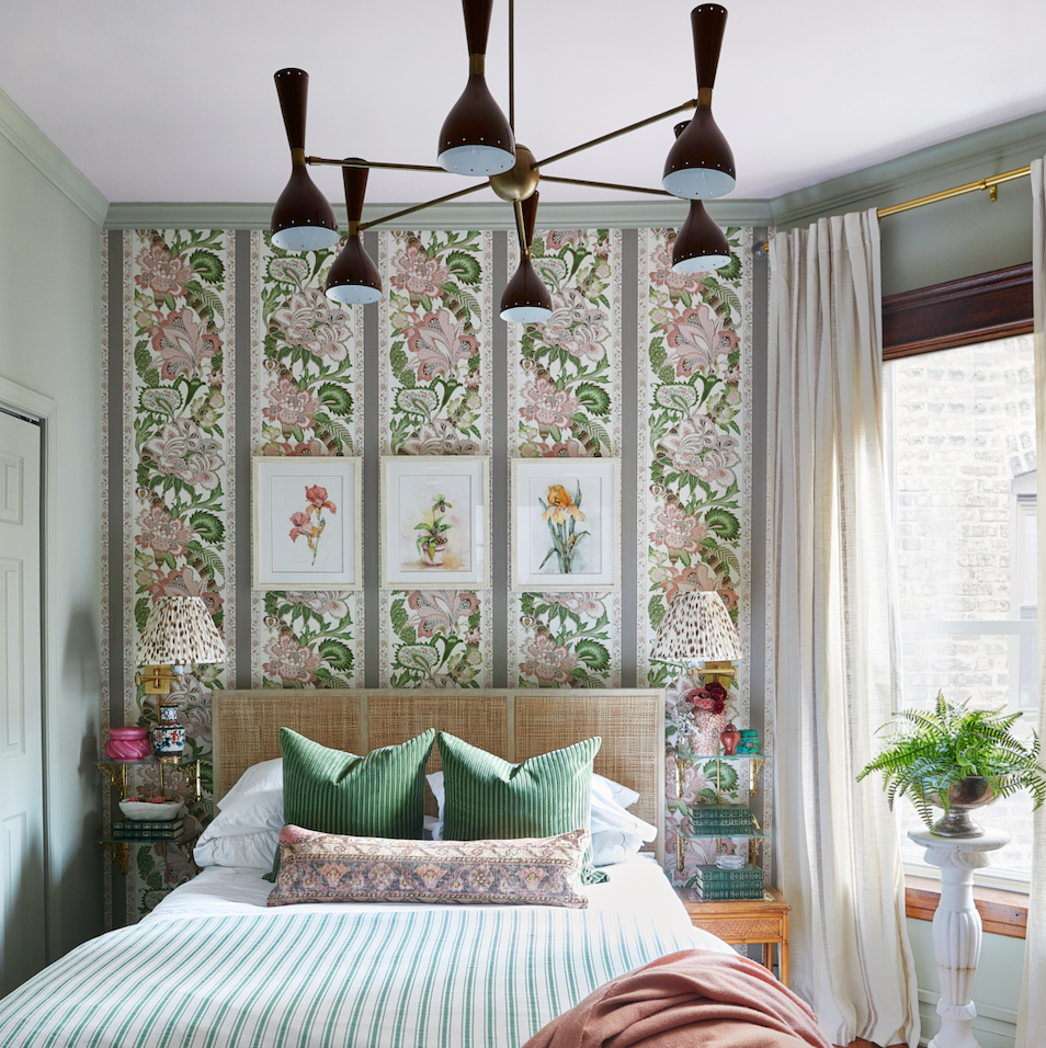
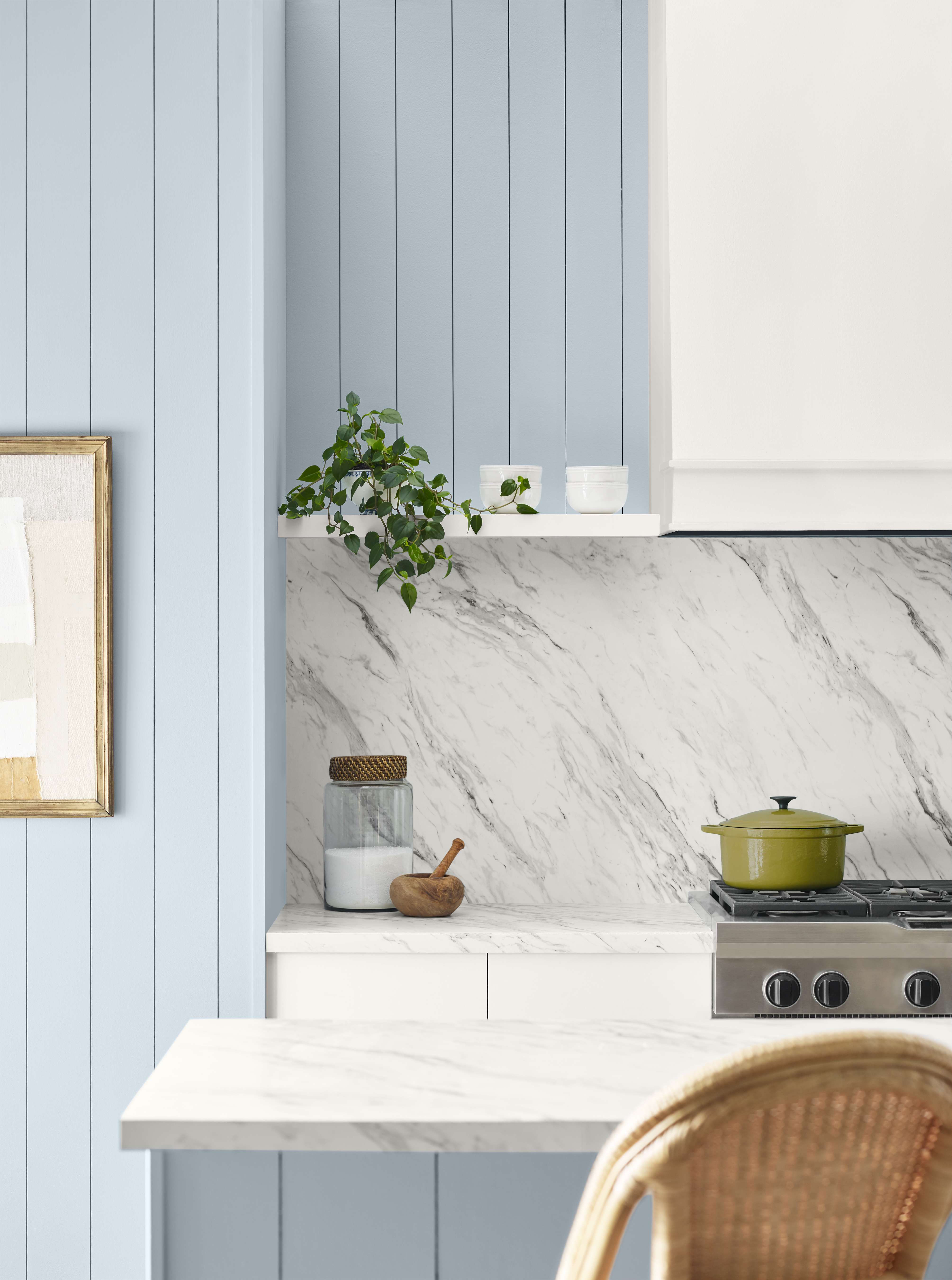
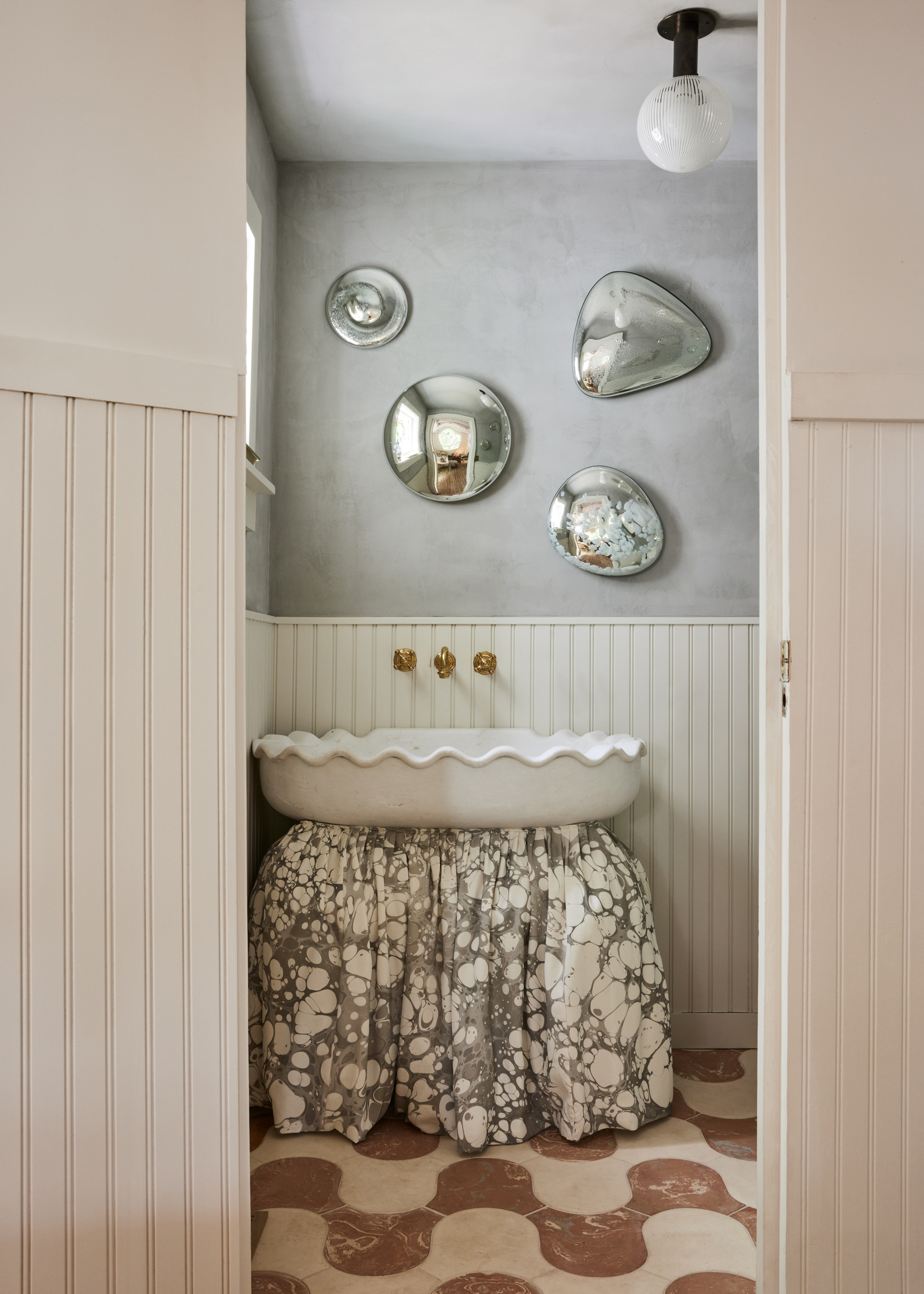
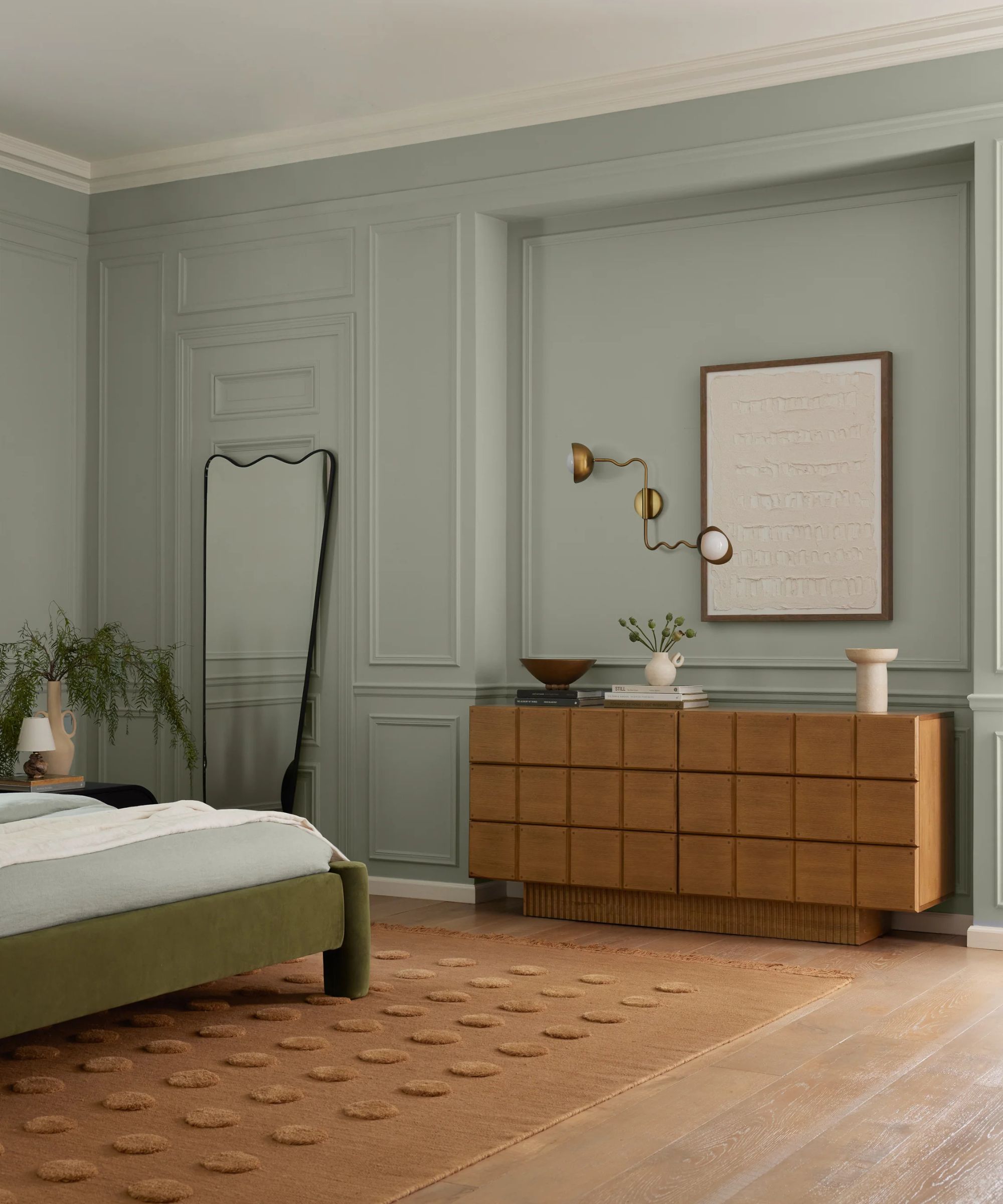
Beyond millennial pink, other pastels are also being re-evaluated. While pastels remain relevant in design, the nuance lies in selecting shades that avoid clichéd palettes. Brooke Speckman expresses her aversion to the 'classic mid-century modern design' pastels, such as baby pink kitchens or seafoam green bathroom vanities, finding them overly soft and uninspiring. The contemporary approach to pastels involves choosing subtler and less expected hues. Sara Malek Barney recommends softer and more gentle pastels, including serene blues, soft greens, or delicate lavenders, which can introduce tranquility and elegance without appearing overly trendy or dated.
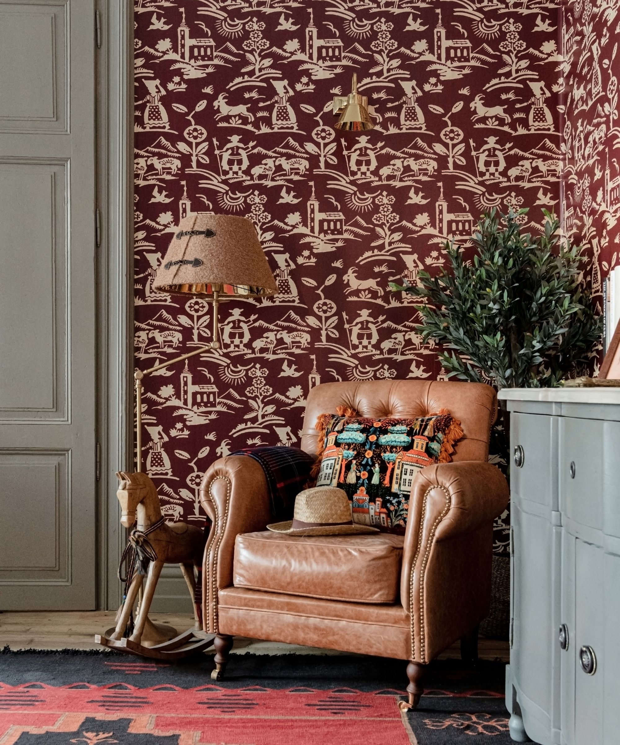
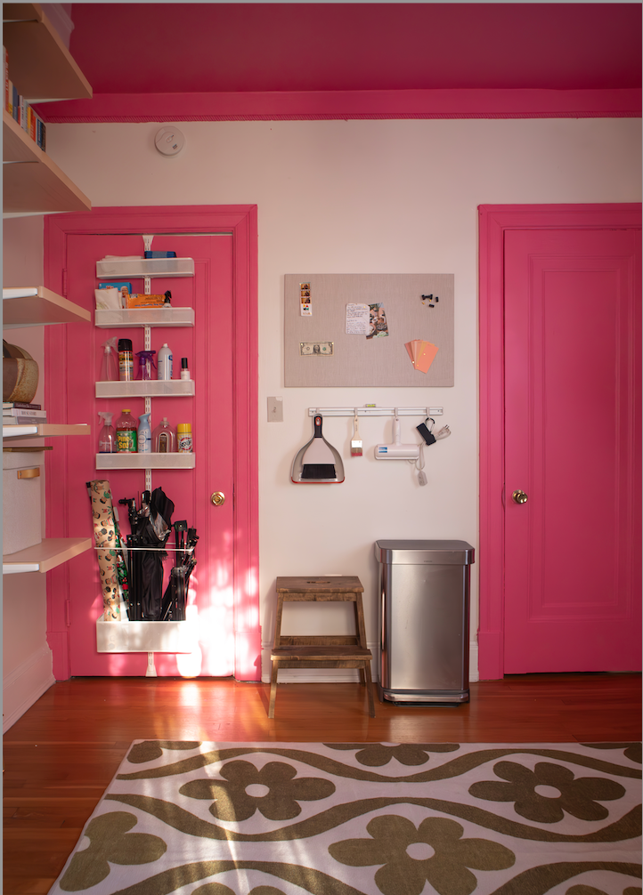
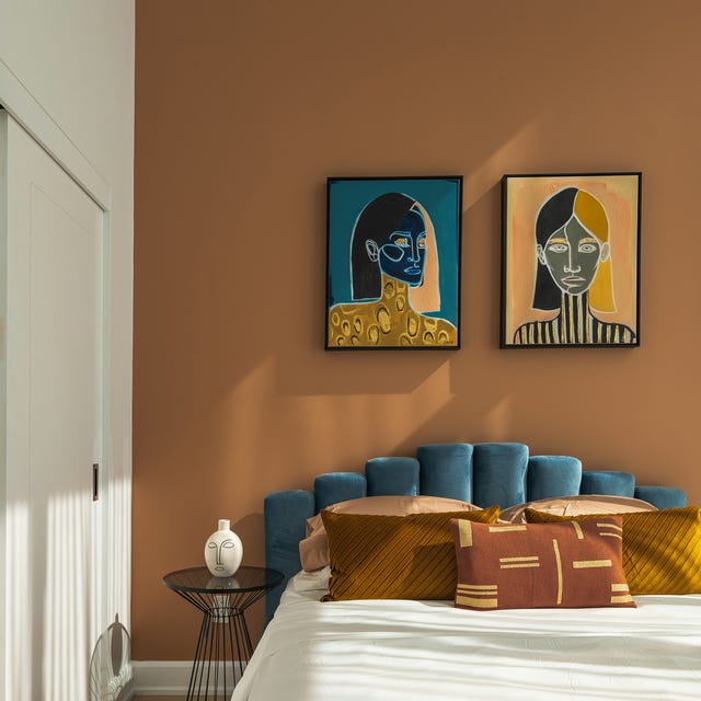
The use of bright accent colors is another trend that designers are moving away from. The accent wall, a paint trend that faded over a decade ago, often featured bold, high-contrast colors intended to make a statement. However, designers now find these vibrant shades can be overpowering and quickly become dated. Similarly, 'color pop' pillows and other highly contrasting accent ideas are being phased out. The current preference leans towards tighter, more cohesive color palettes, with color drenching and monochromatic schemes gaining popularity. For those who still wish to incorporate accents, the advice is to use more muted or sophisticated tones, such as deeper jewel tones or earthy hues, which contribute warmth and coziness without the jarring effect of overly bright accents.
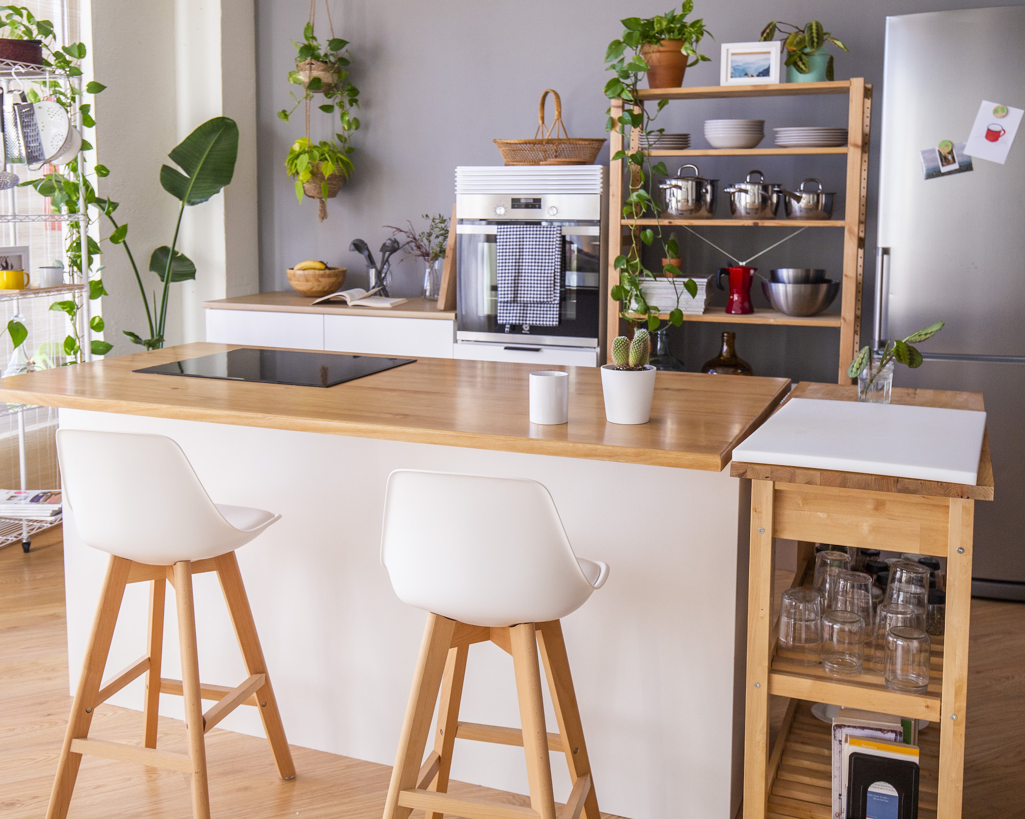
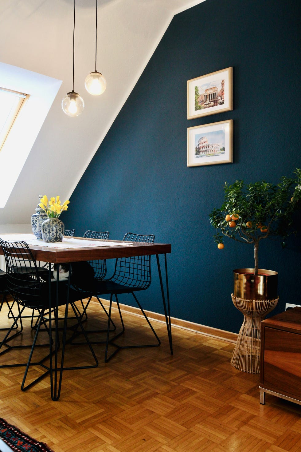

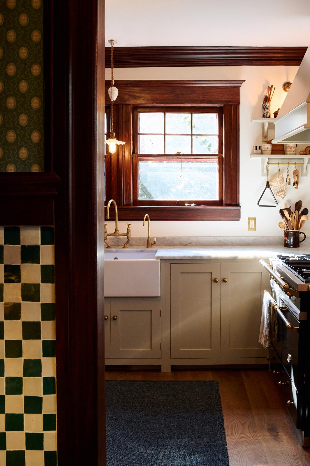
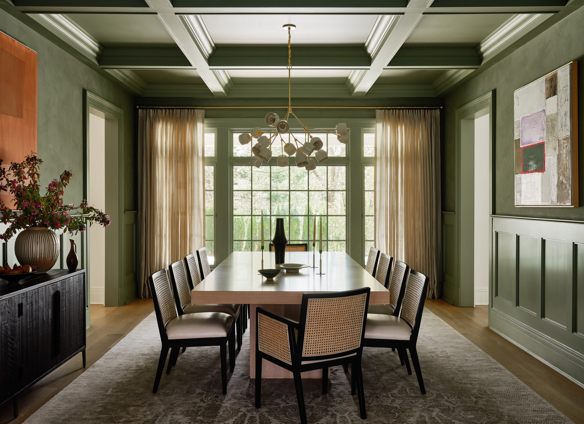
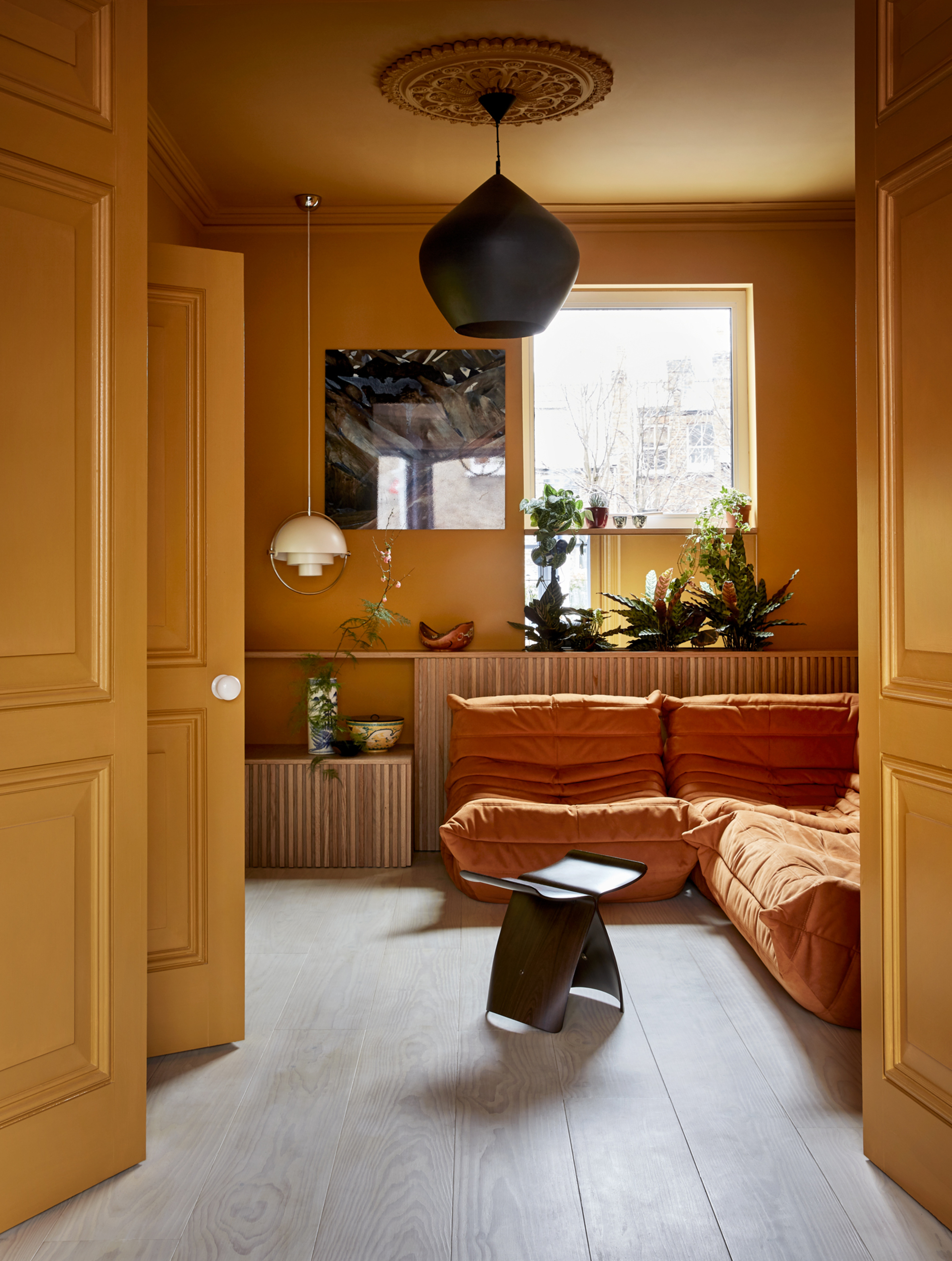
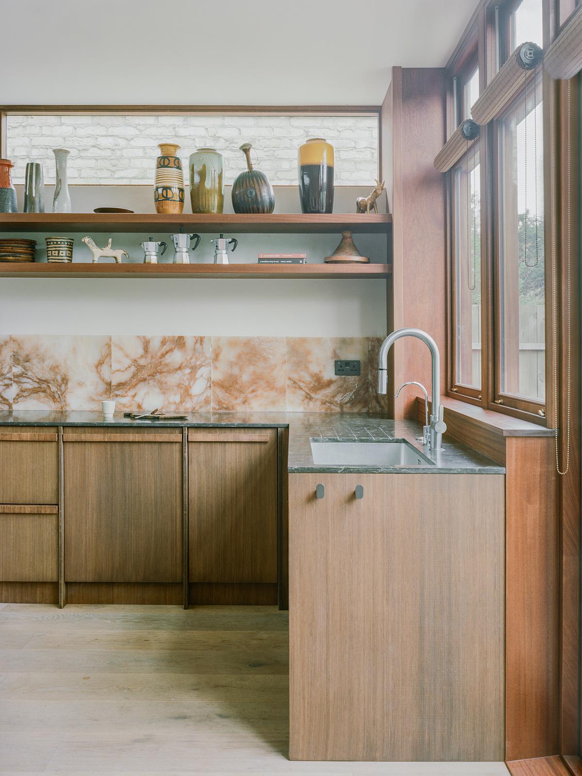
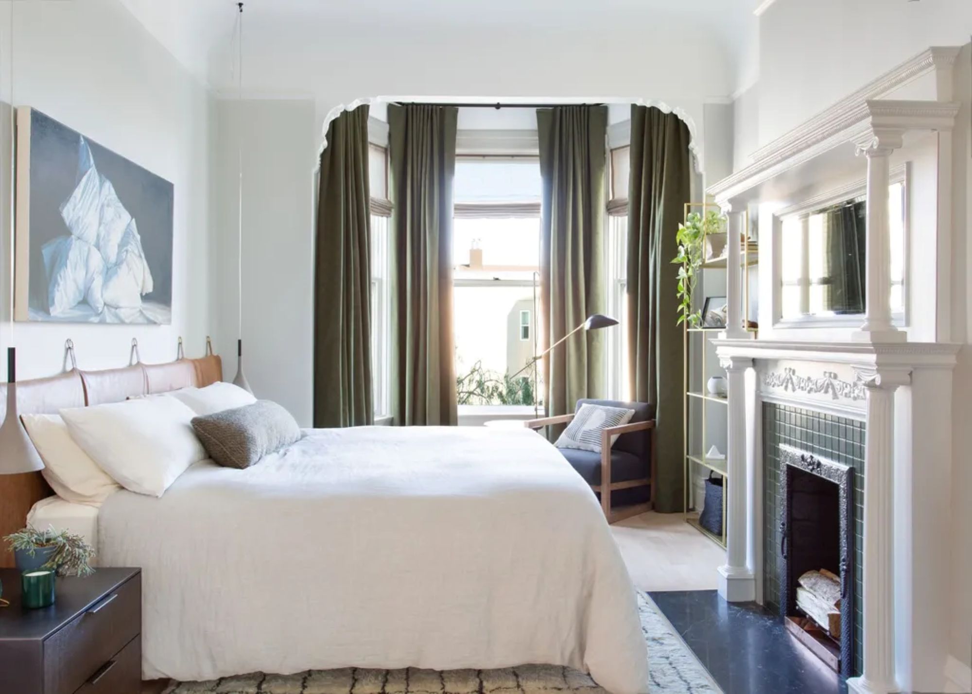
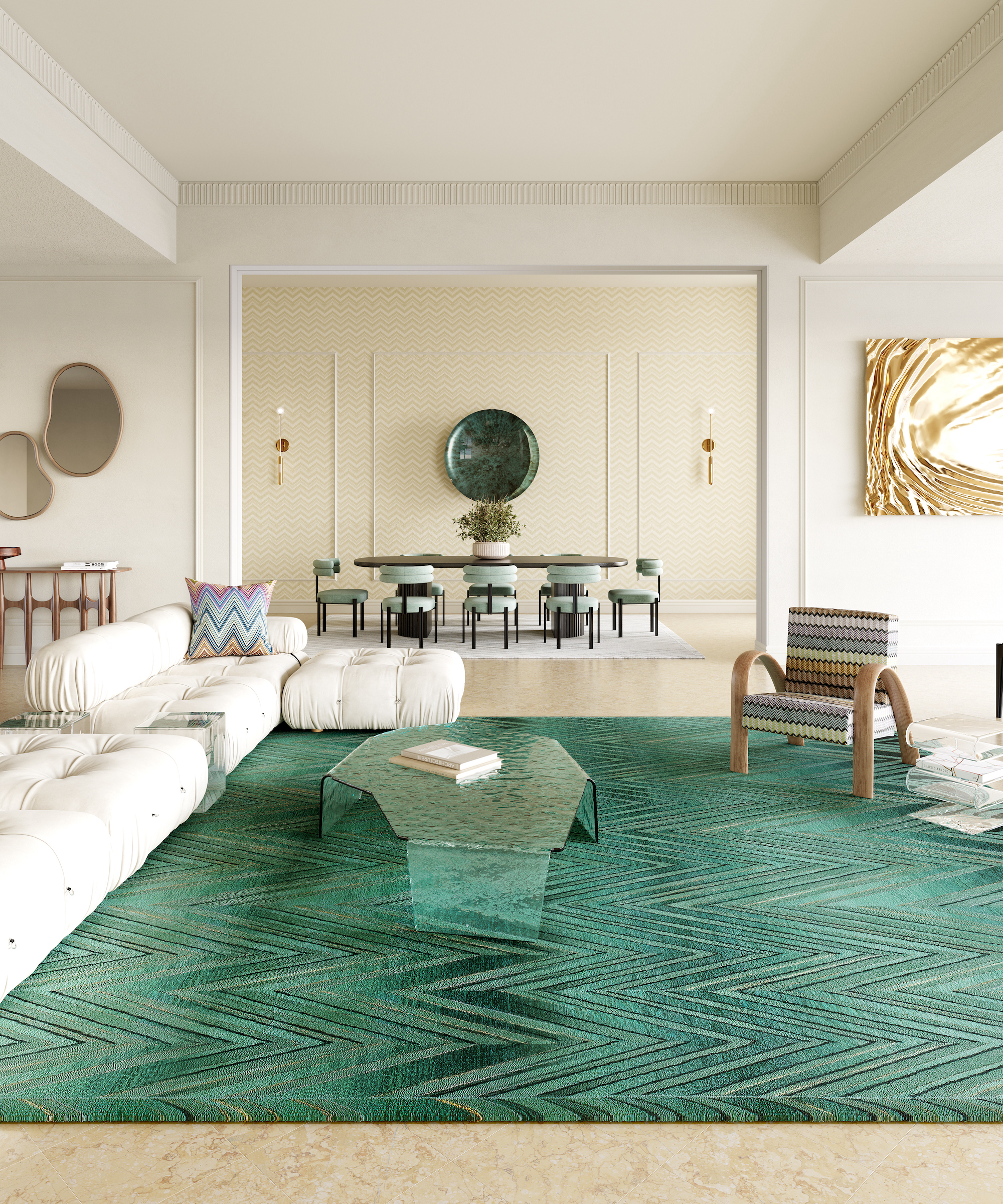
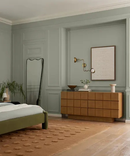
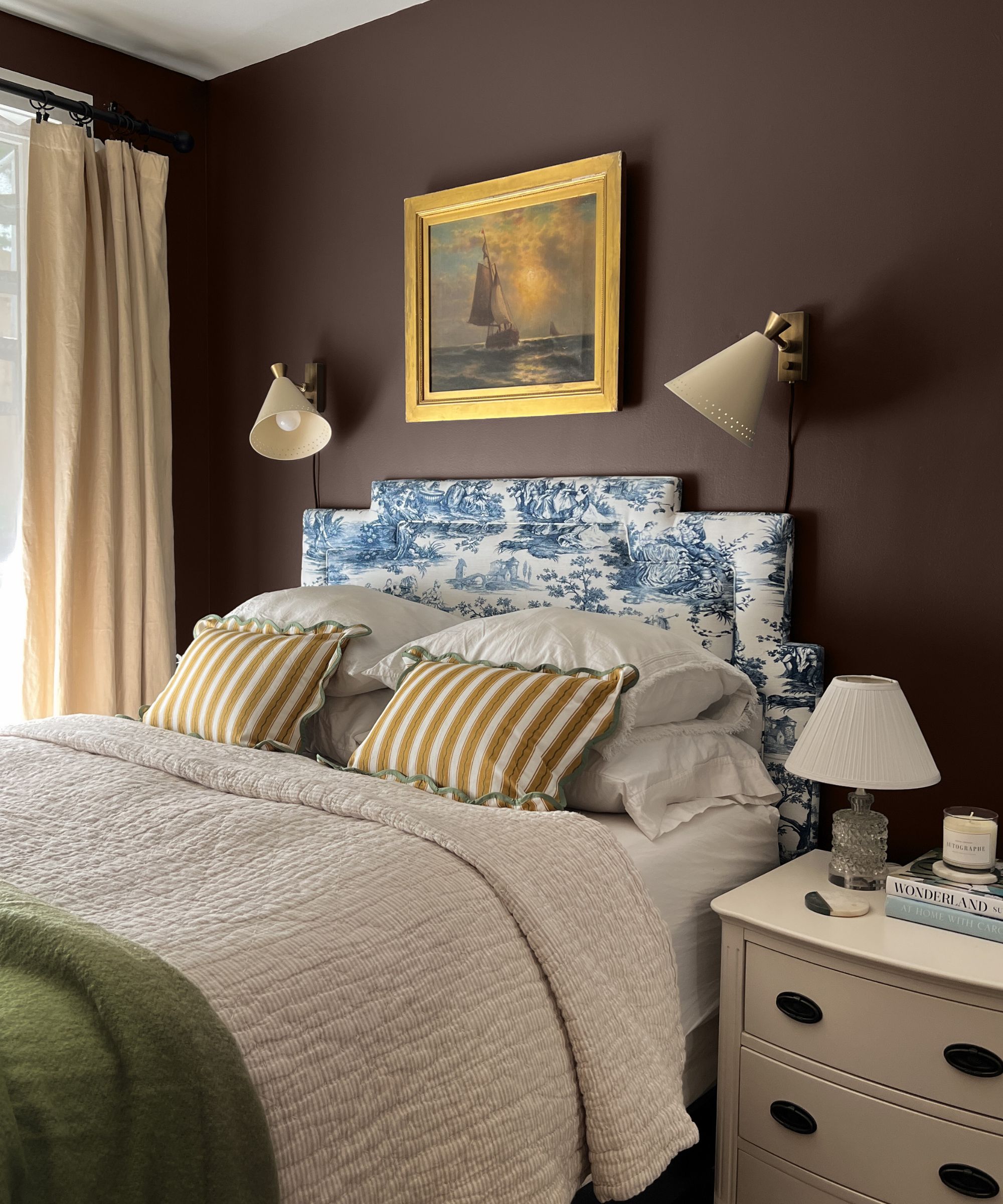
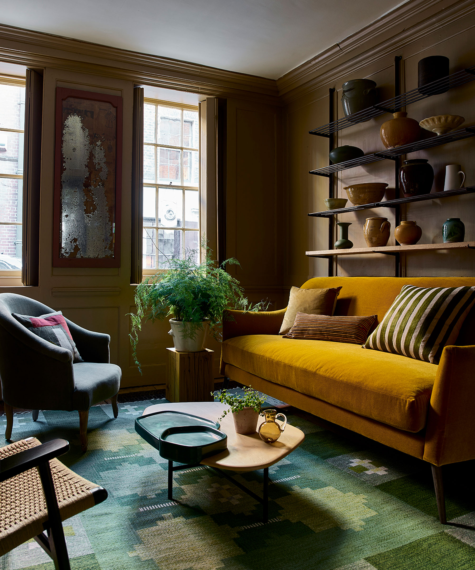
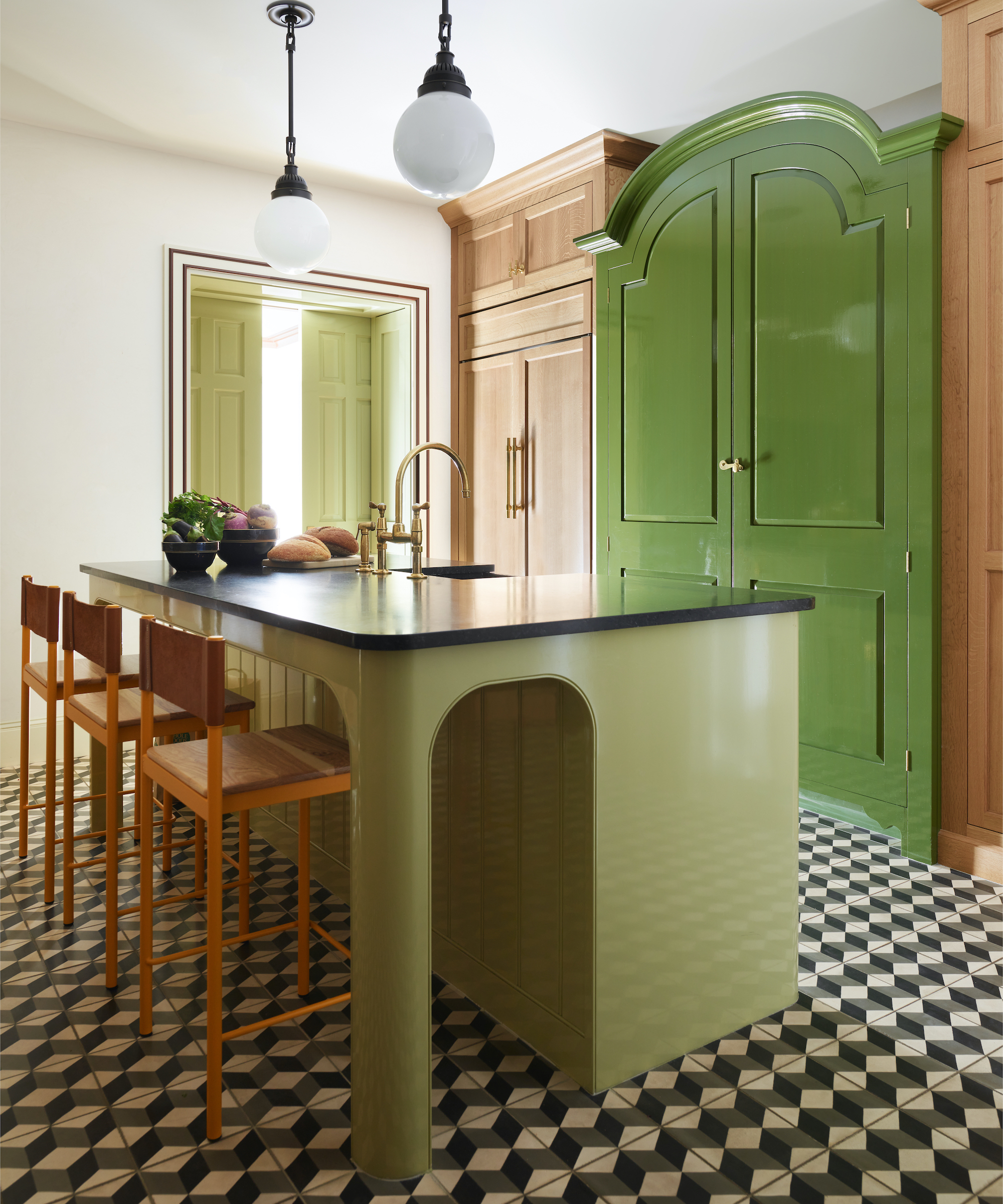
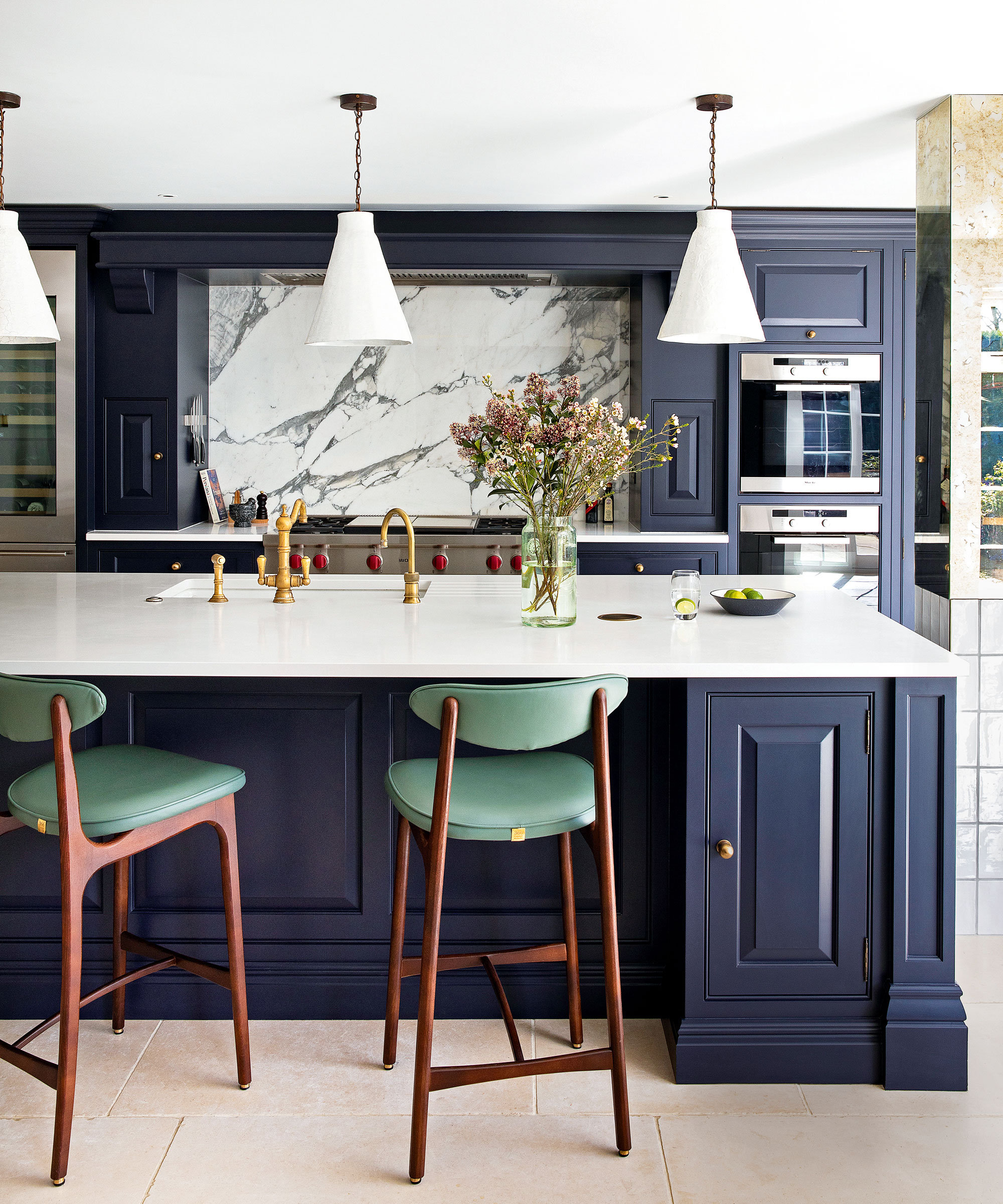
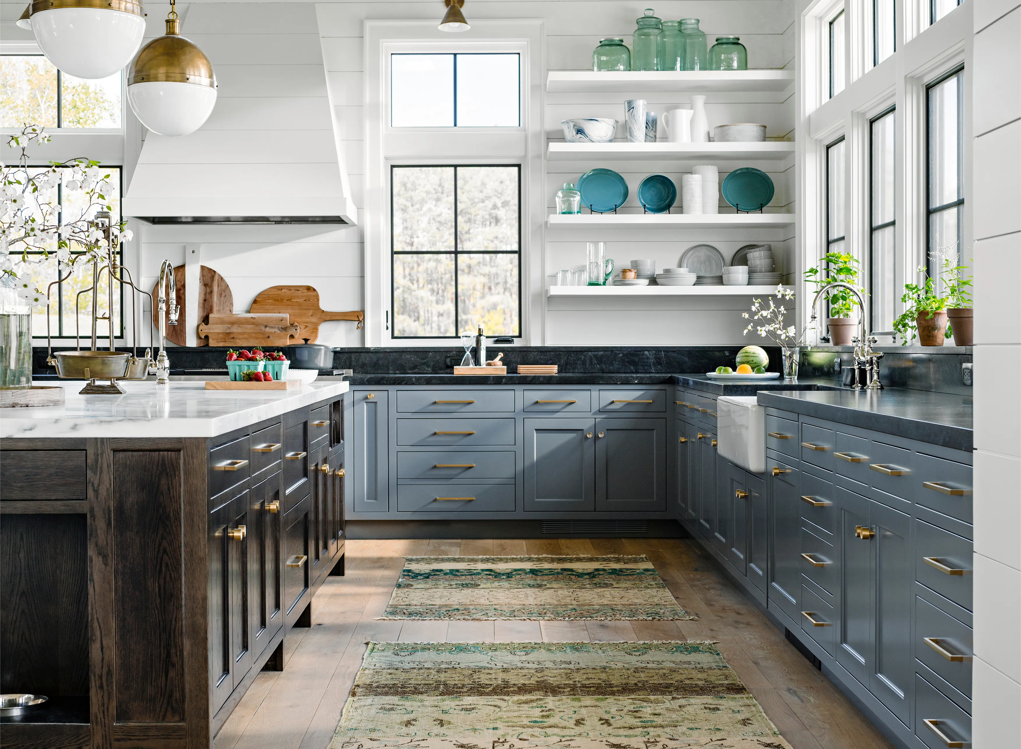
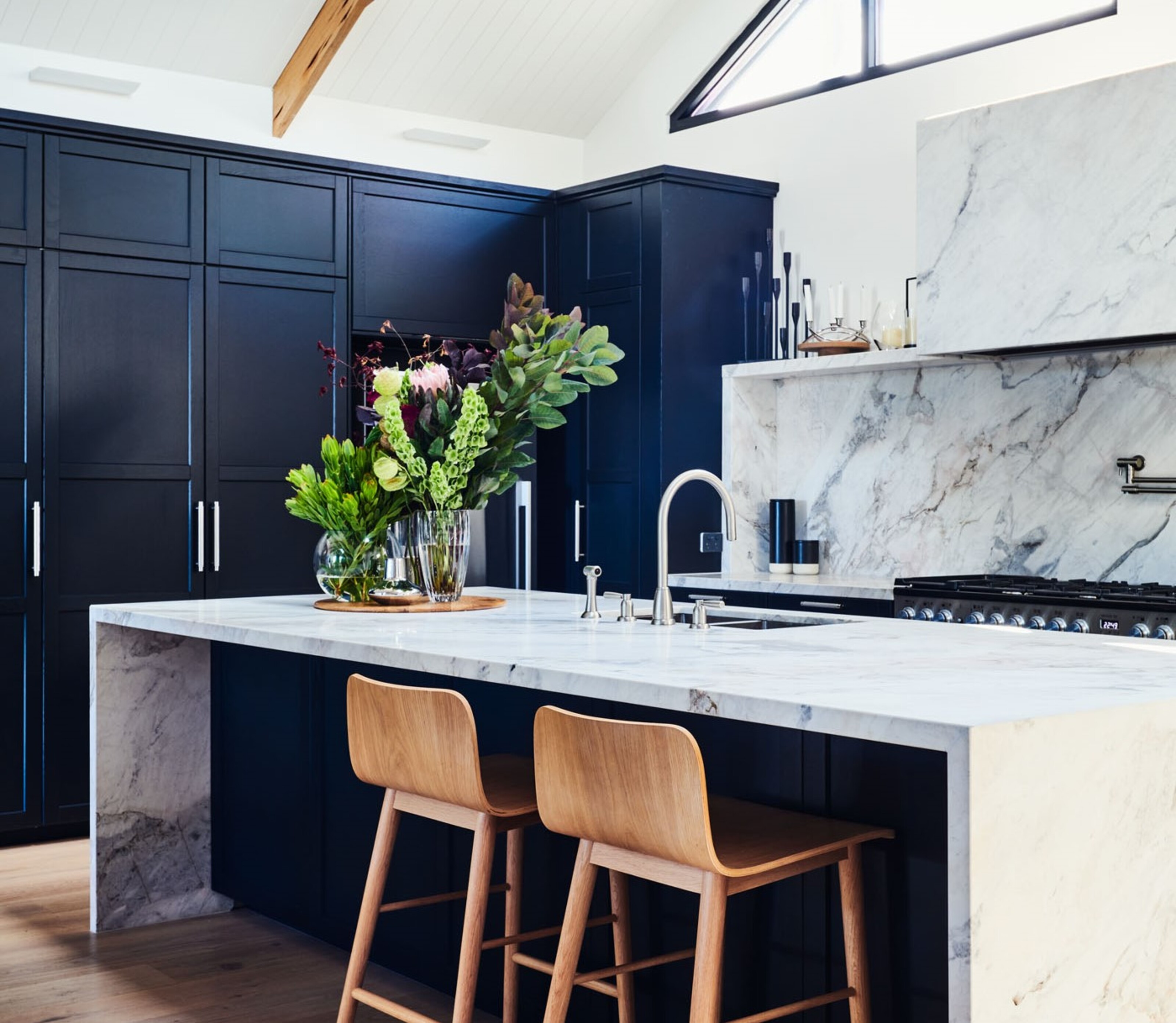
Finally, dark blue, once a dominant force in interior design with shades like Farrow & Ball's Hague Blue being highly sought after for moody schemes, is seeing a decline in usage. While not considered as overtly dated as cool grey, dark blue has made way for alternative dark color schemes. Interior designers are now frequently choosing rich, chocolate brown as a replacement for dark blue. Christina Rottman explains that browns possess a natural richness that feels less contrived compared to primary or secondary colors like dark green or dark blue, which can now appear dated. For those seeking timeless color choices to avoid future obsolescence, designers suggest classic neutrals like whites, beiges, and greys, which offer a versatile backdrop. Incorporating warm or cool undertones with these neutrals allows for custom ambiance. Additionally, earthy tones such as warm browns, soft greens, or muted terracotta are recommended for their ability to add depth, connect with nature, and create a calming, cozy atmosphere.
#InteriorDesignTrends #ColorTrends #HomeDecor #ModernInteriors #NeutralPalettes #AccentColors #MillennialPink #CoolGrey #EarthyTones #InteriorDesignTrends #ColorTrends #HomeDecor #ModernInteriors #NeutralPalettes #AccentColors #MillennialPink #CoolGrey #EarthyTones
0 comment in total
 No comments yet
You may also like
The 5 outdated paint colors of 2024 designers loathe — and what they're loving instead

5 kitchen colors going out of style for 2024 – plus the 5 shades designers are replacing them with
5 Curtain Colors Designers Say Are Officially Out of Style in 2025 Projects, and What They're Replacing Them With
5 Design Trends Interior Designers Can't Wait to Say Goodbye to in 2025

5 outdated home decor trends interior designers want you to kiss goodbye in 2024, and what to do instead

5 outdated paint trends that interior designers are glad to see the back of – and what they're doing instead
5 Paint Color Trends Designers Are Begging You to Leave in 2025

5 of the finest interior design styles that will define 2024

These 5 Paint Color Trends Will Be Everywhere in 2024, According to Interior Designers
5 Paint Colors That Will Take Over in 2025, According to Interior Designers

5 colors designers say are outdated for bathrooms - and what they're choosing instead for 2024
5 'ugly colors' that I'll be decorating with in 2024 – these undesirable colors will trend this year

5 Paint Colors That Are Out for 2025, According to Interior Designers

5 kitchen cabinet colors interior designers are avoiding for 2024 - and the shades they're picking instead
These 5 rug colors are going out of style for 2025, according to interior designers
Outdated kitchen color trends – 5 colors to avoid in 2025, and what to use instead
Sorry, But It’s Time to Retire These 5 Interior Design Trends in 2024

5 outdated '90s interior design trends that everyone will be decorating with again in 2024, and experts agree
These 5 rug colors are going out of style for 2025, according to interior designers

4 Paint Color Trends Designers Are Ready To Ditch In 2025