6 Outdated Bathroom Paint Colors Designers Say You Should Never Use
The article addresses the cyclical nature of paint color trends, particularly within bathroom design, a space utilized daily. It highlights that certain shades, despite past popularity, can now render a bathroom looking dated. A fresh coat of paint is presented as an accessible and economical method to modernize this space. To guide homeowners away from outdated choices, insights from interior designers Hormuz Batliboi of Batliboi Studio, Daniel Joseph Chenin of Daniel Joseph Chenin, Ltd., and Laura Marion of Flight Architecture are compiled, detailing six specific colors that have fallen out of favor and suggesting contemporary alternatives.
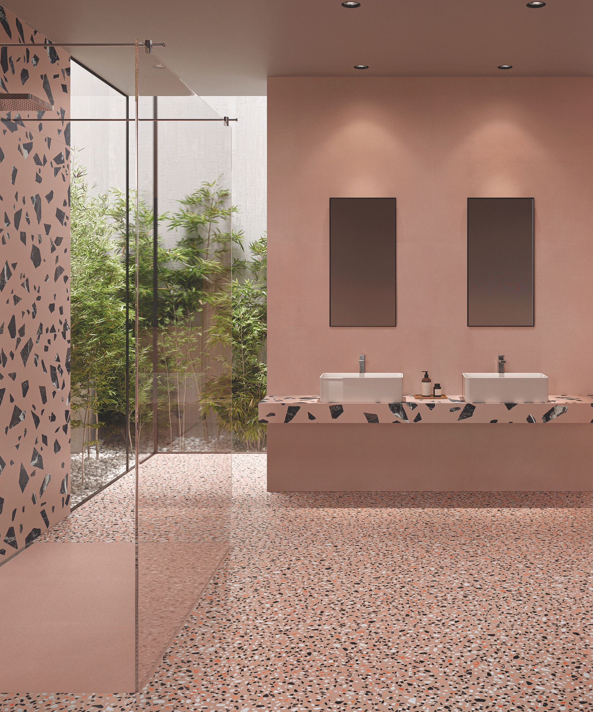
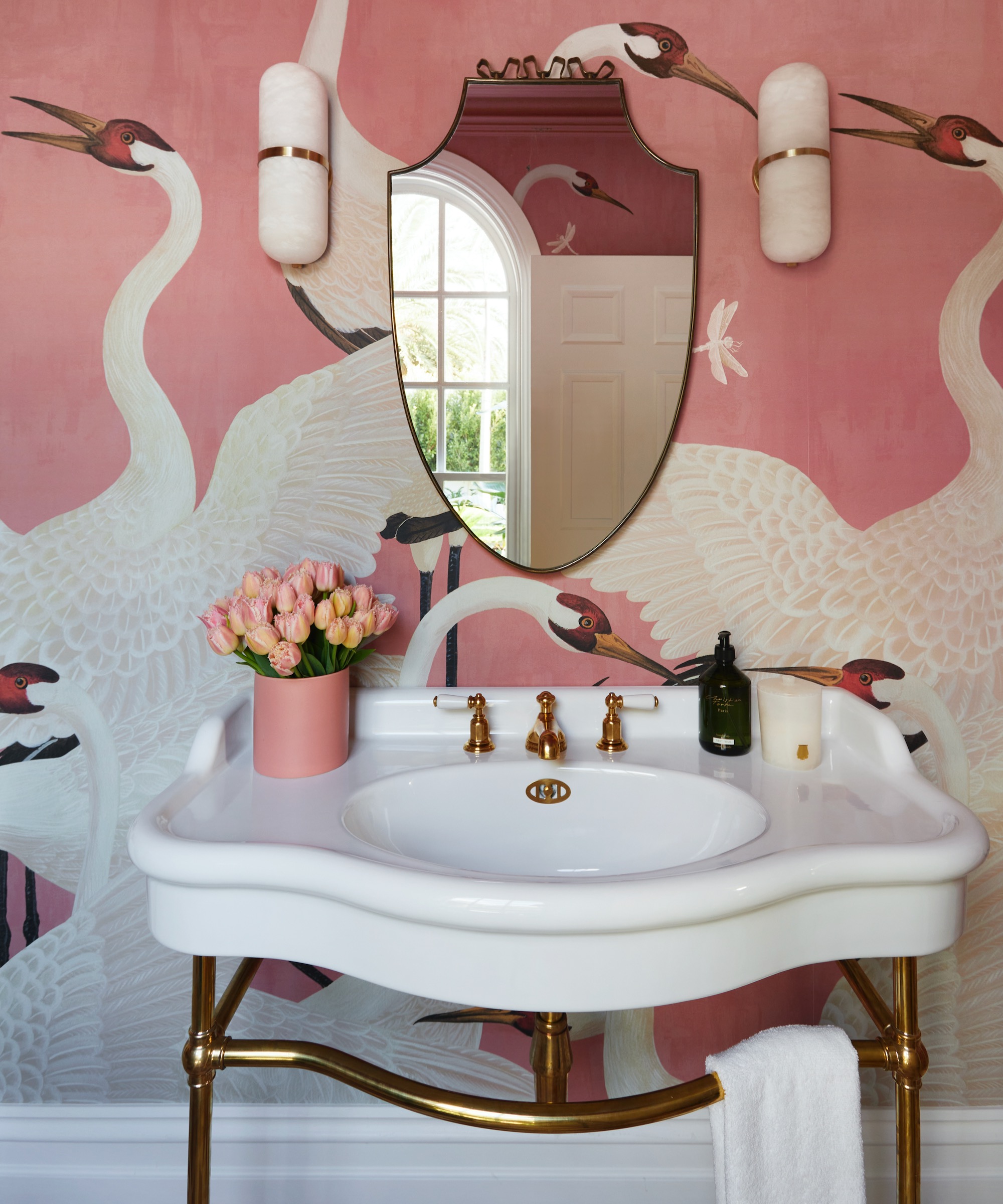
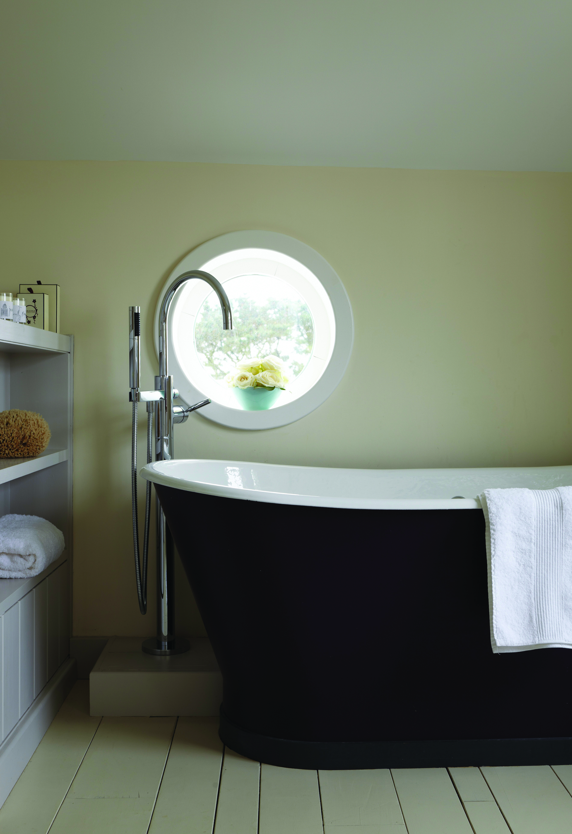
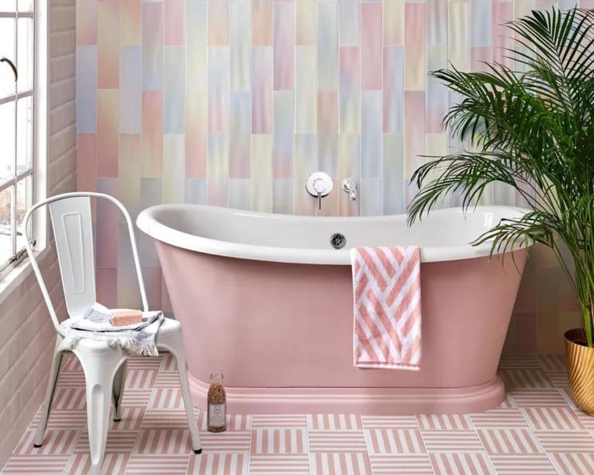
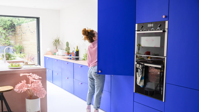
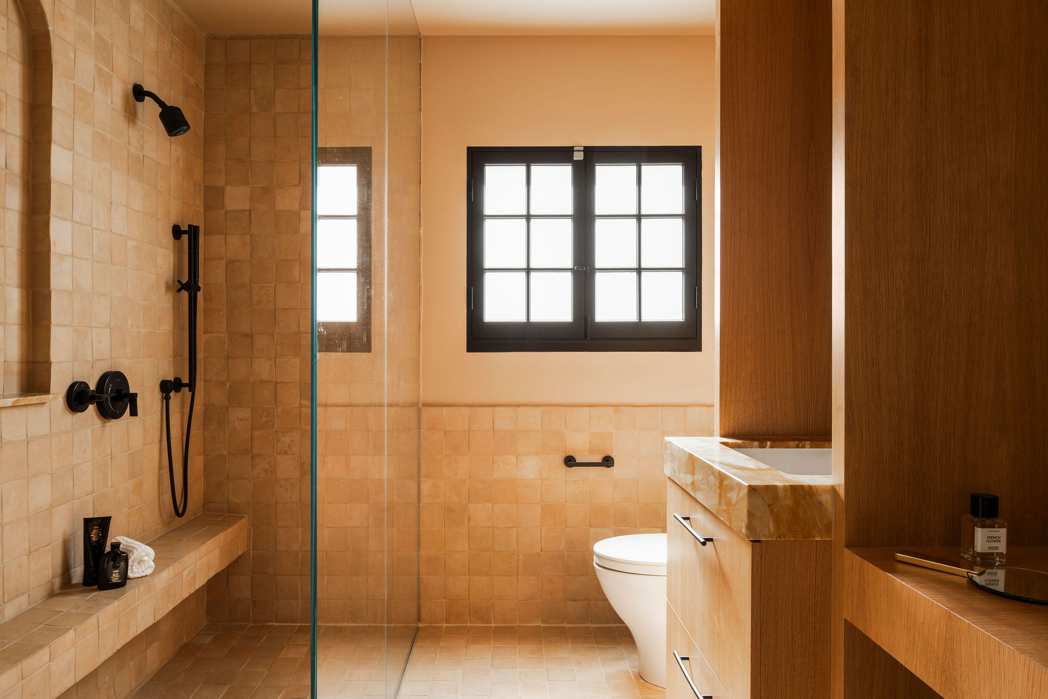
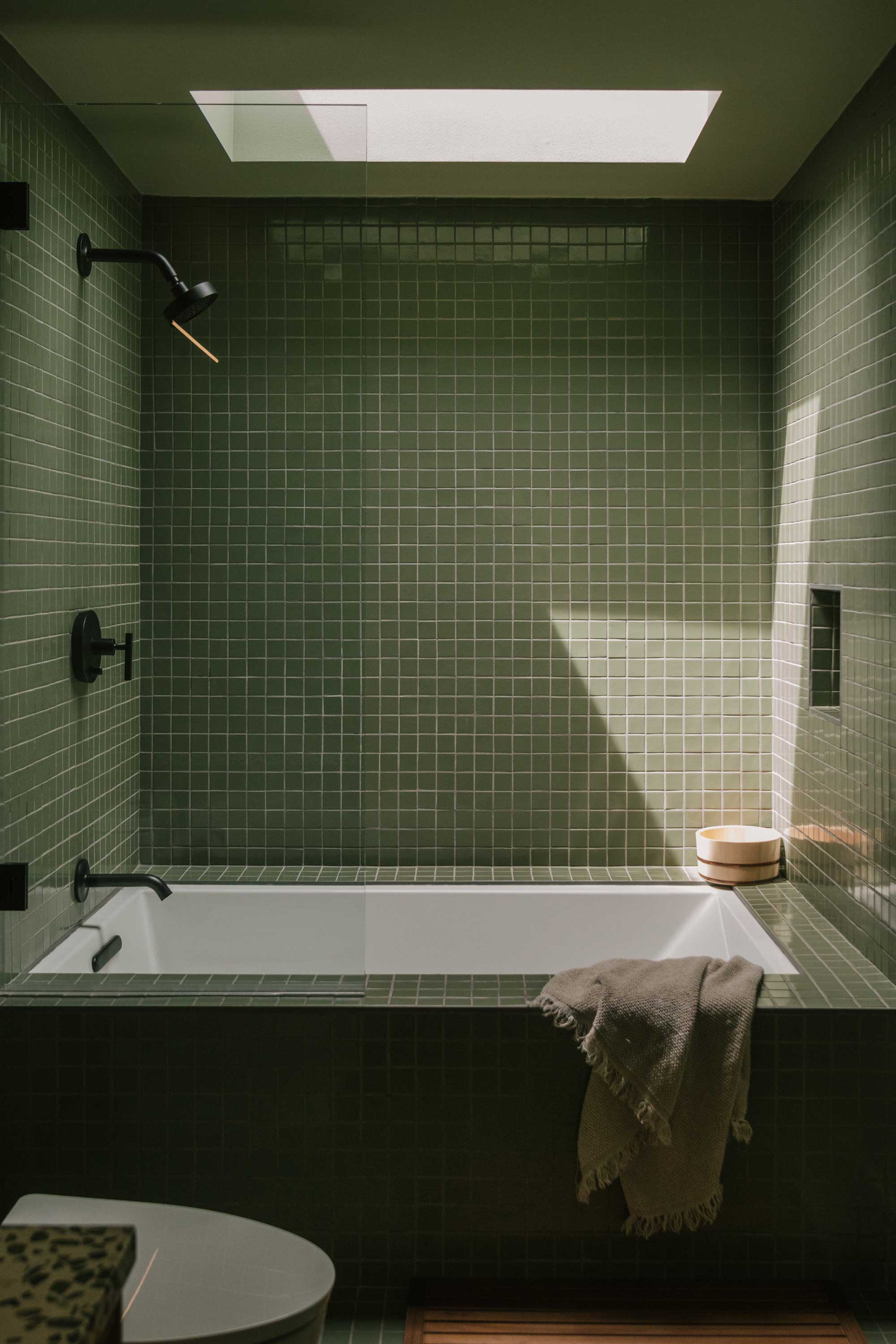
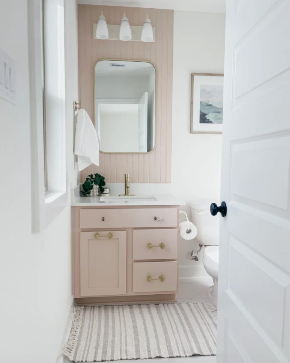
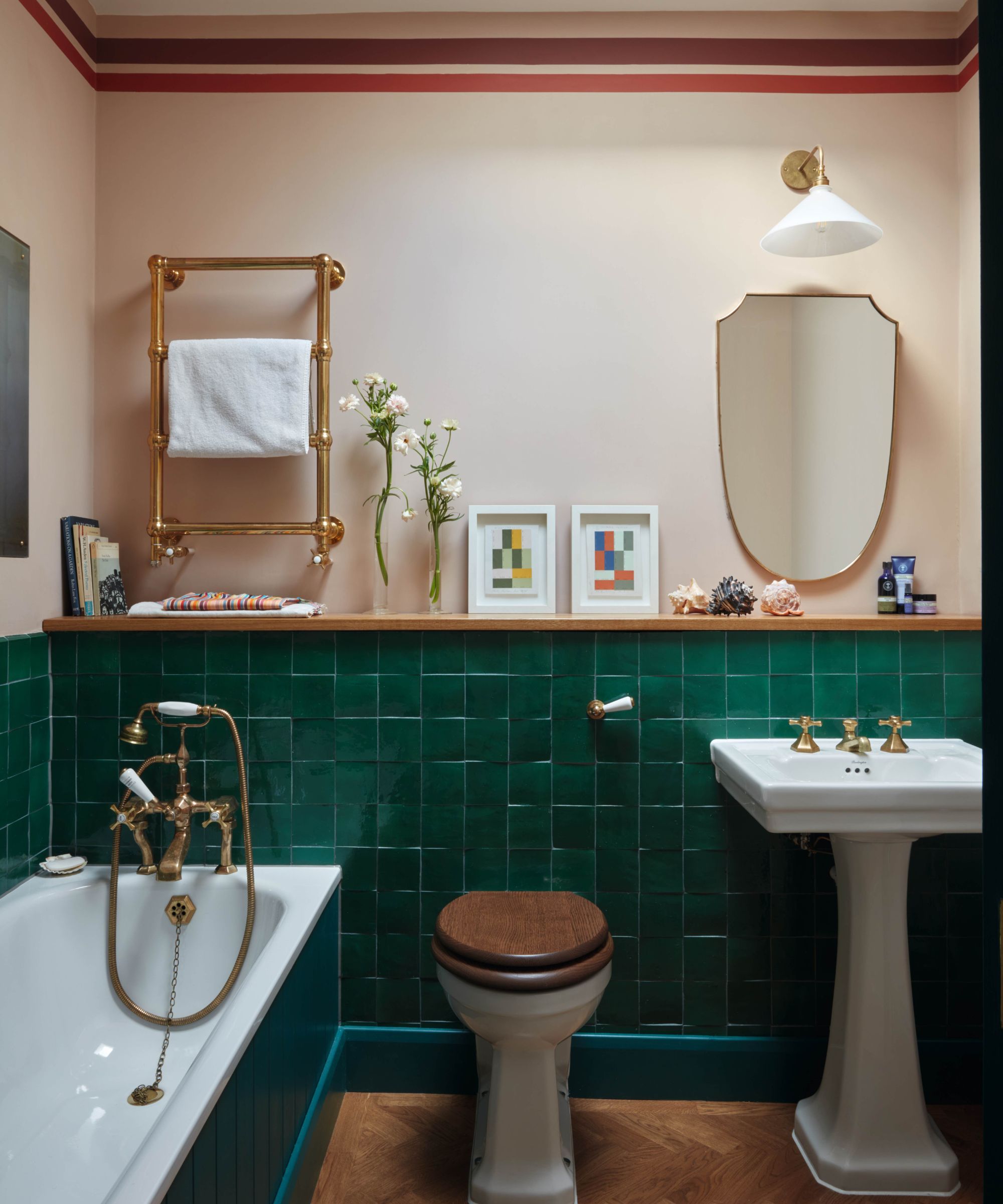
Bubblegum pink, once appreciated for its playful, retro or millennial charm, is now deemed overly saccharine or childish. Hormuz Batliboi advises against stereotypical palettes, suggesting warmer, more mature alternatives such as mustards, ochres, and yellows, which offer depth and age gracefully alongside evolving family needs. Seafoam green, previously selected for its promise of spa-like tranquility, is criticized by Laura Marion for its tendency to appear flat and cast an unhealthy hue. She recommends bolder, more saturated greens like emerald, praising their timeless and dramatic qualities when paired with stone or porcelain fixtures.
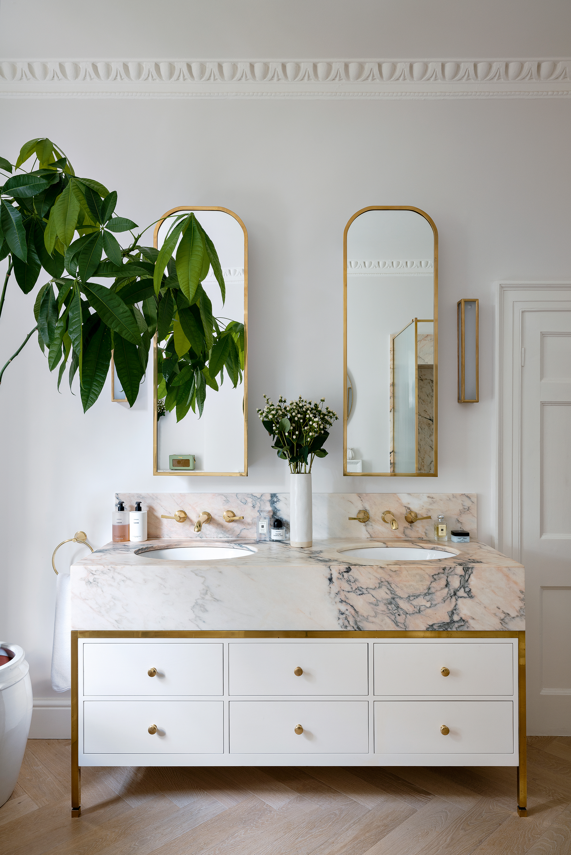
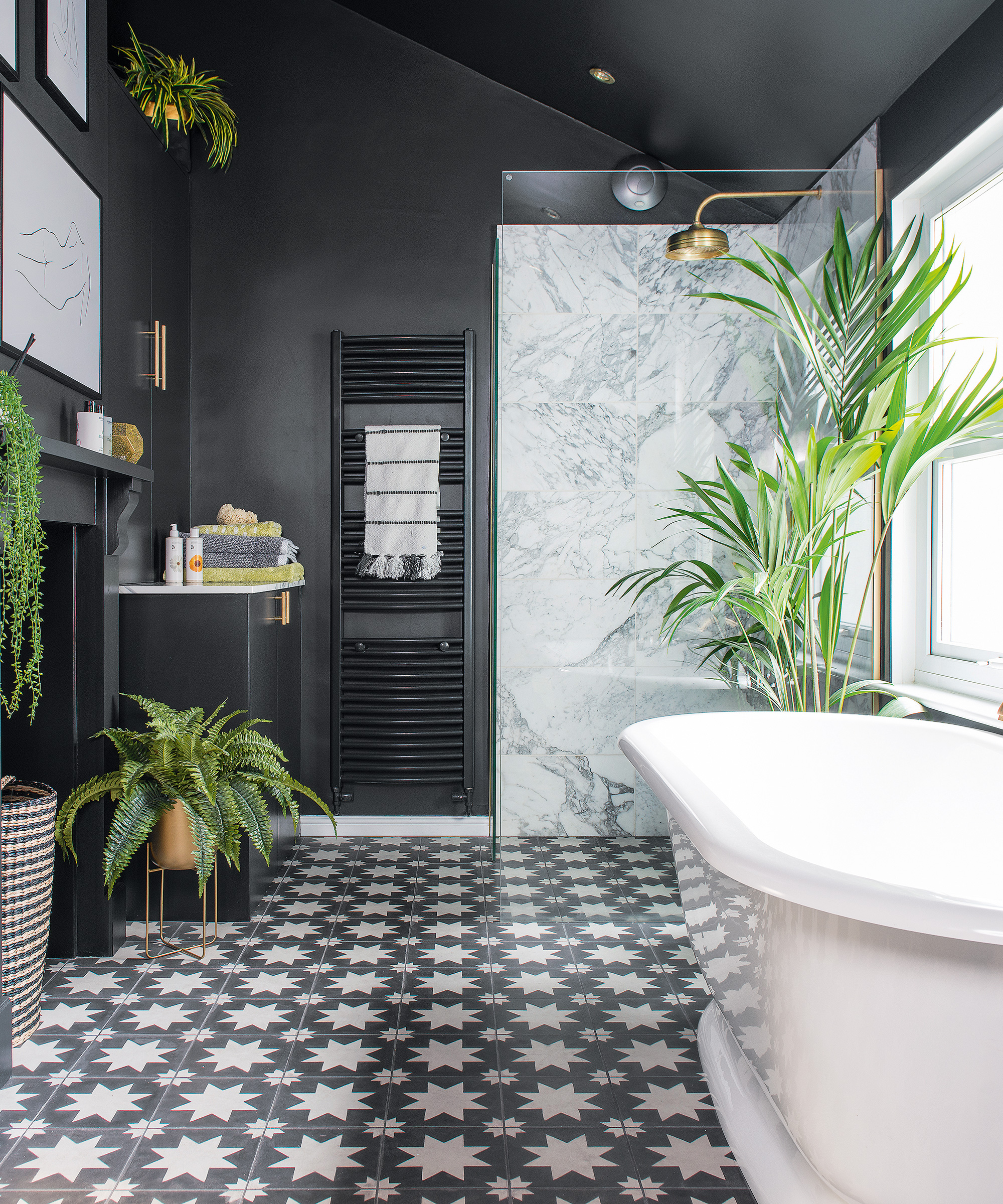
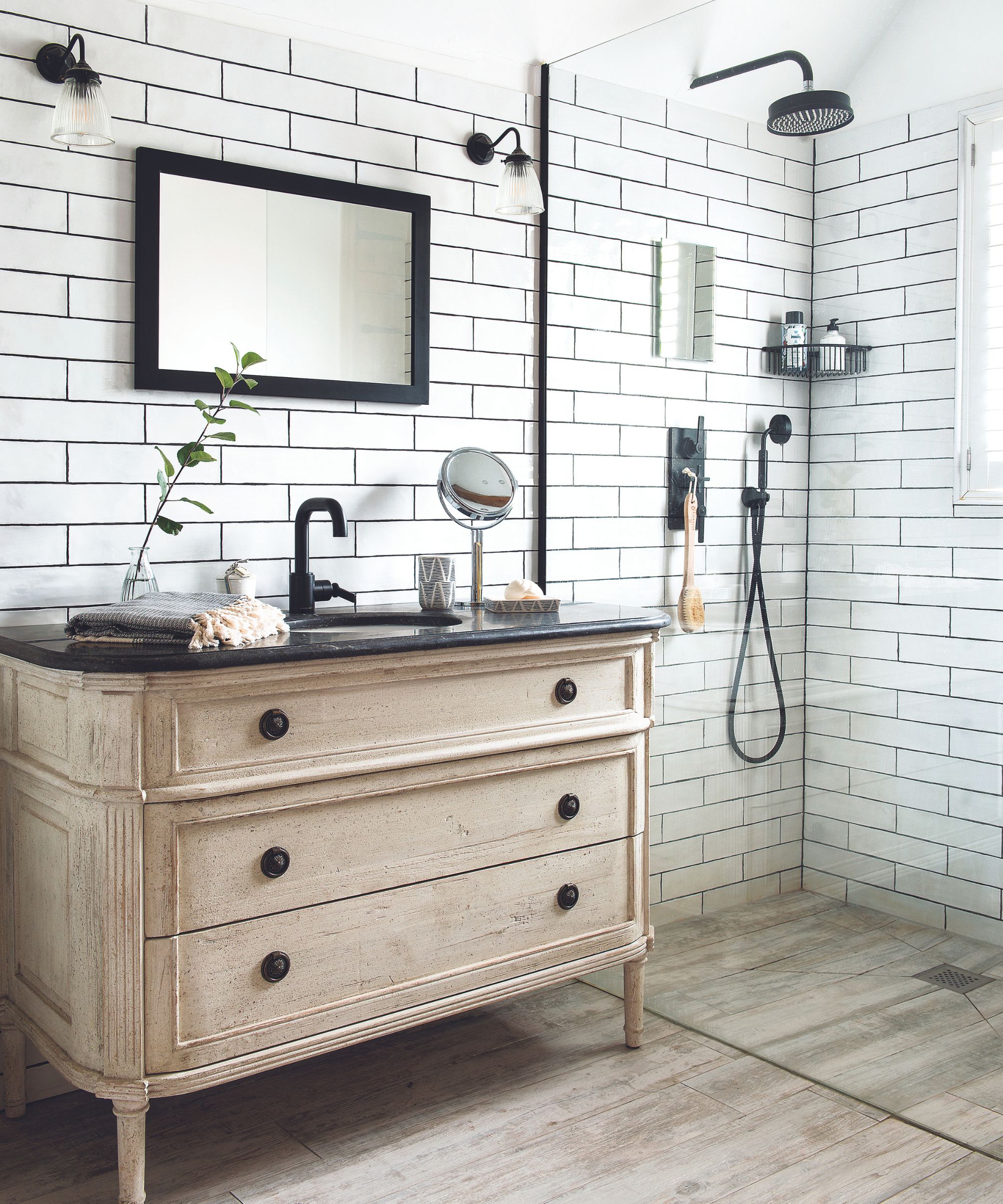
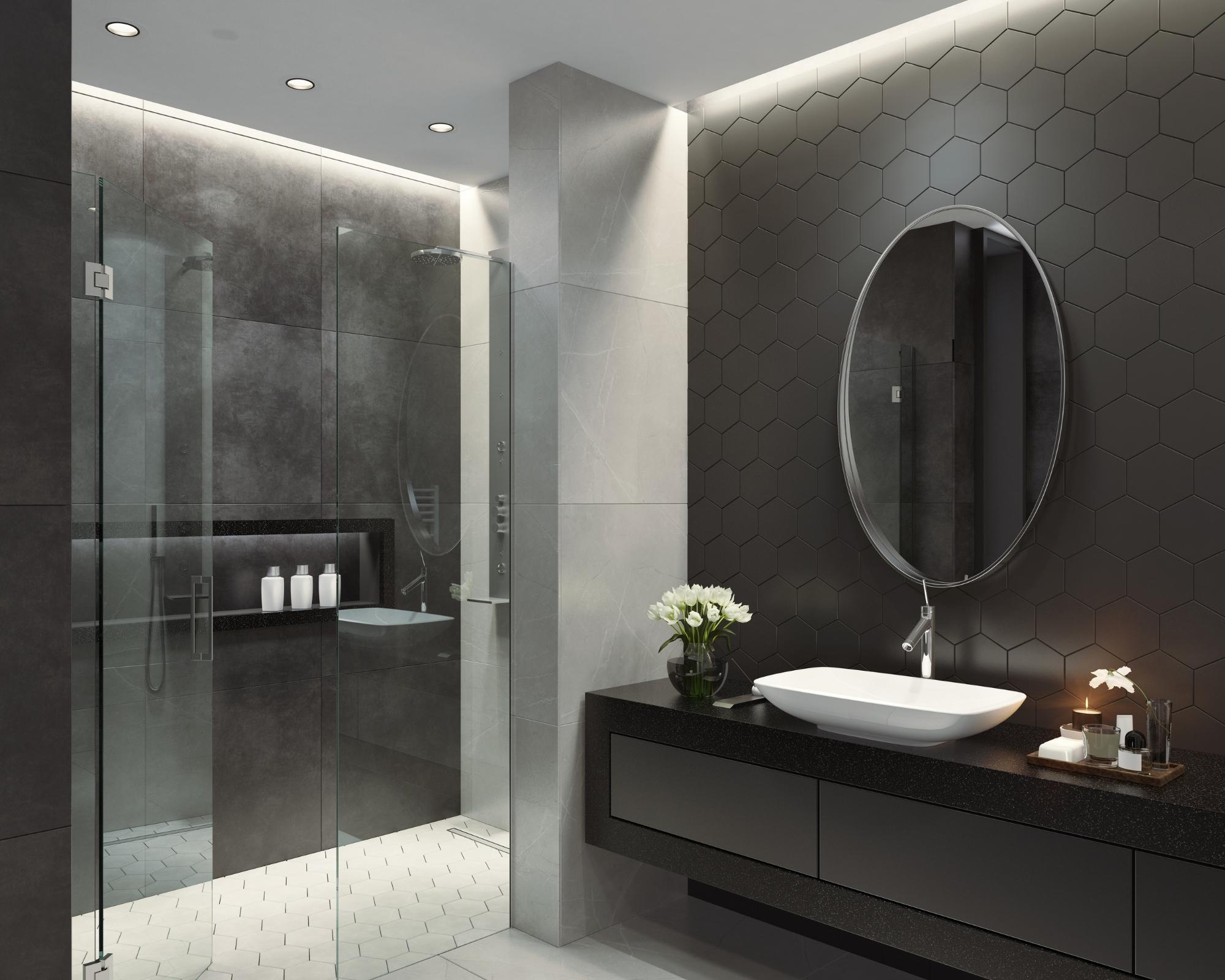
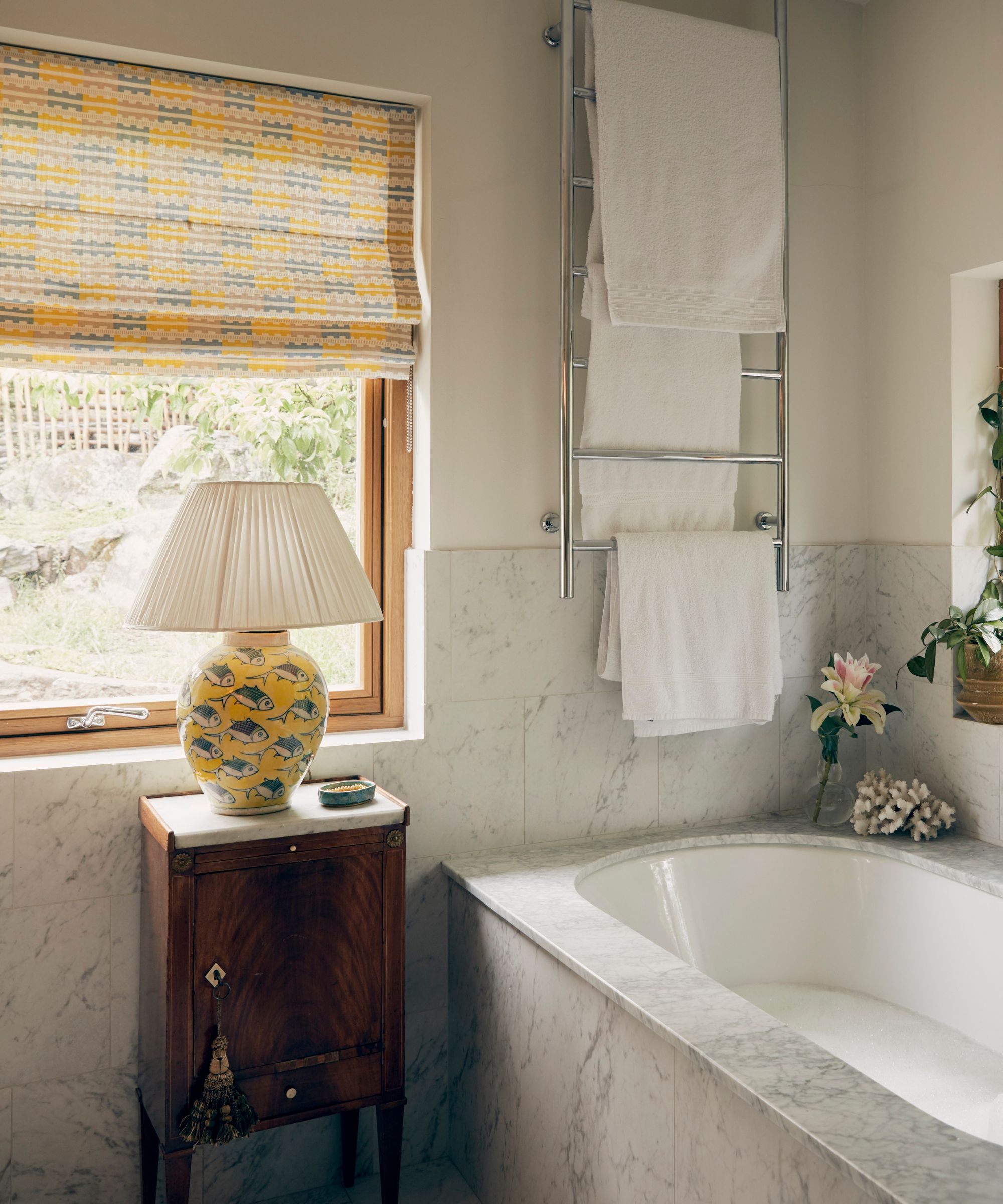
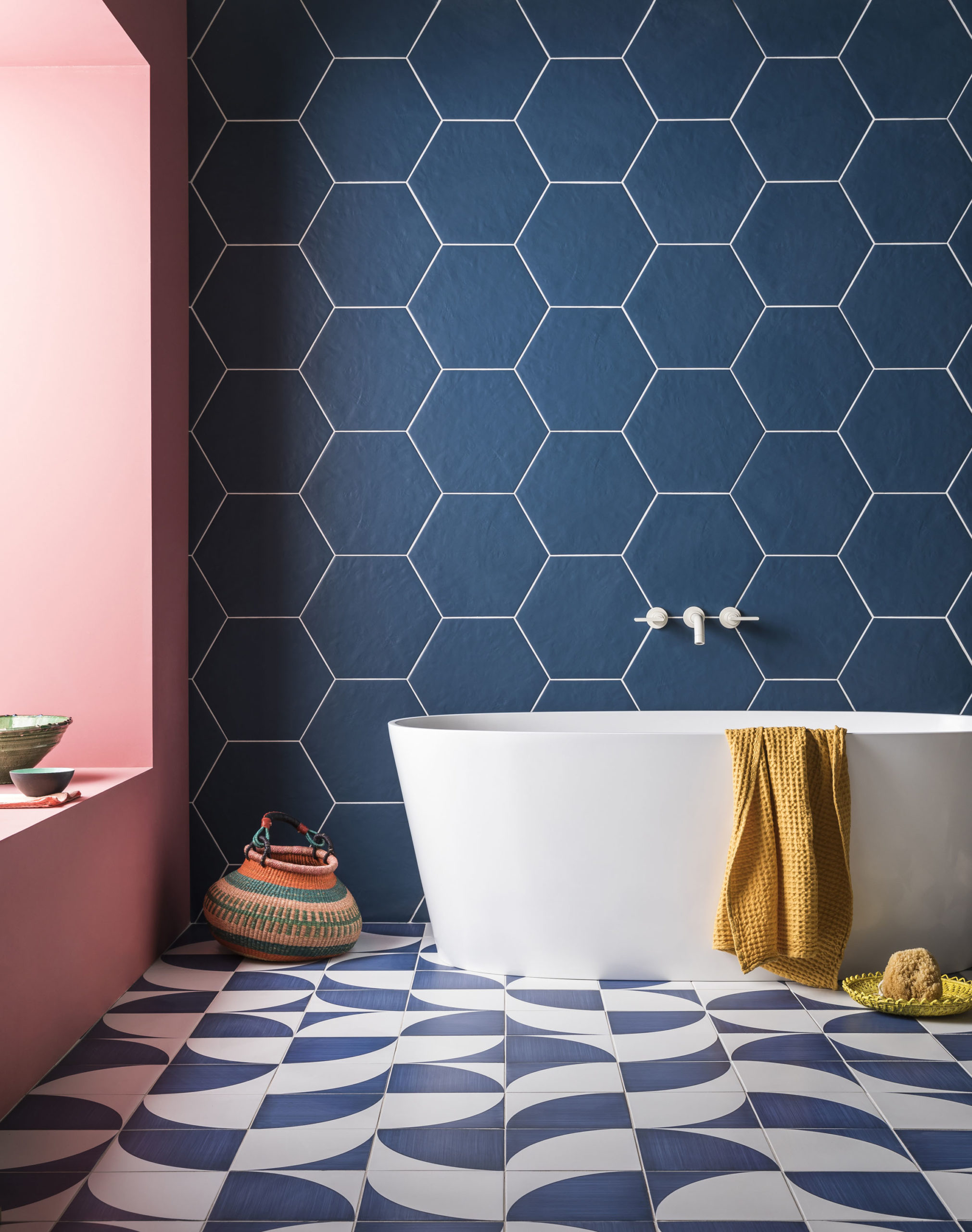
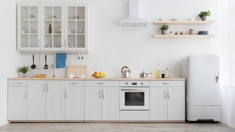
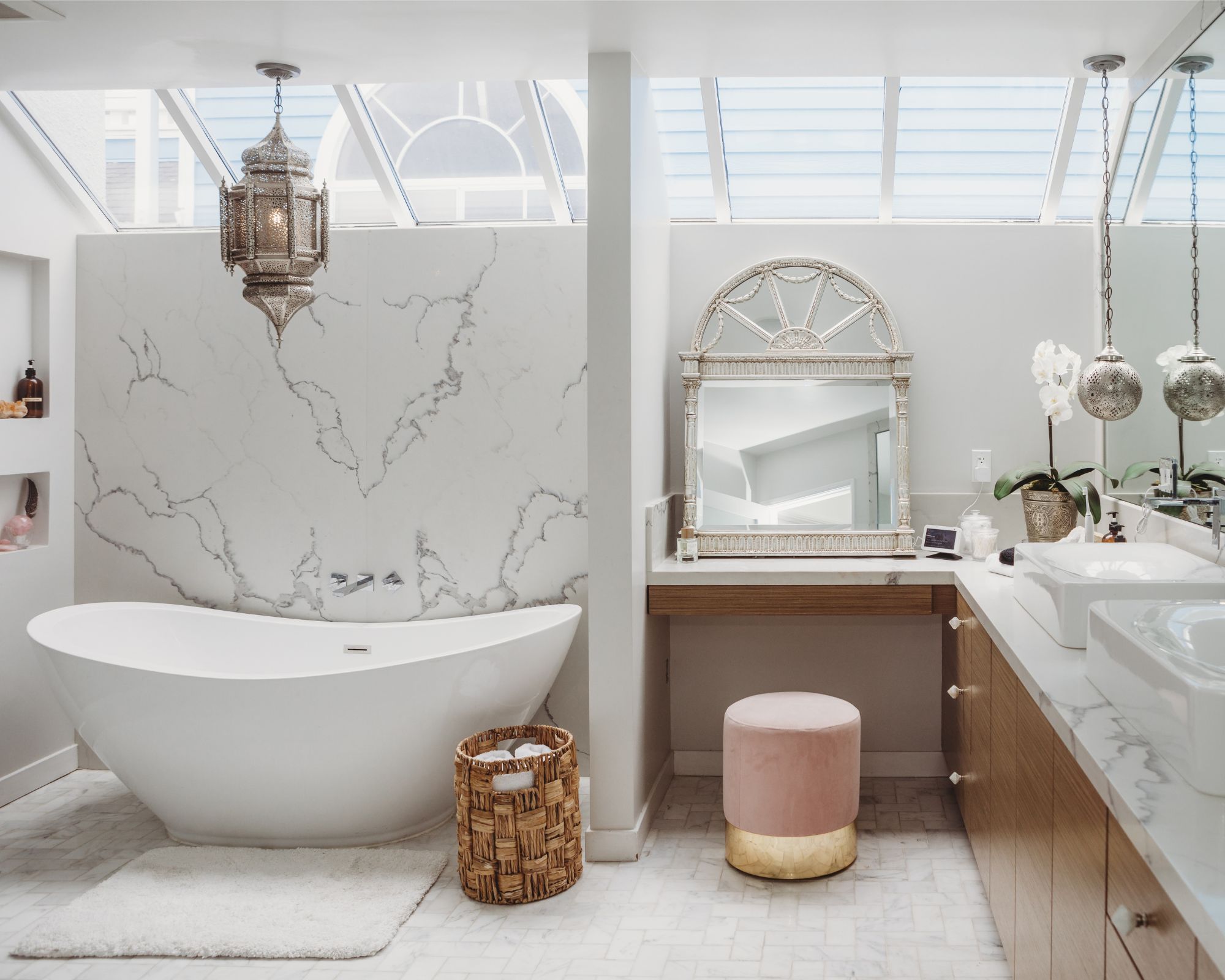
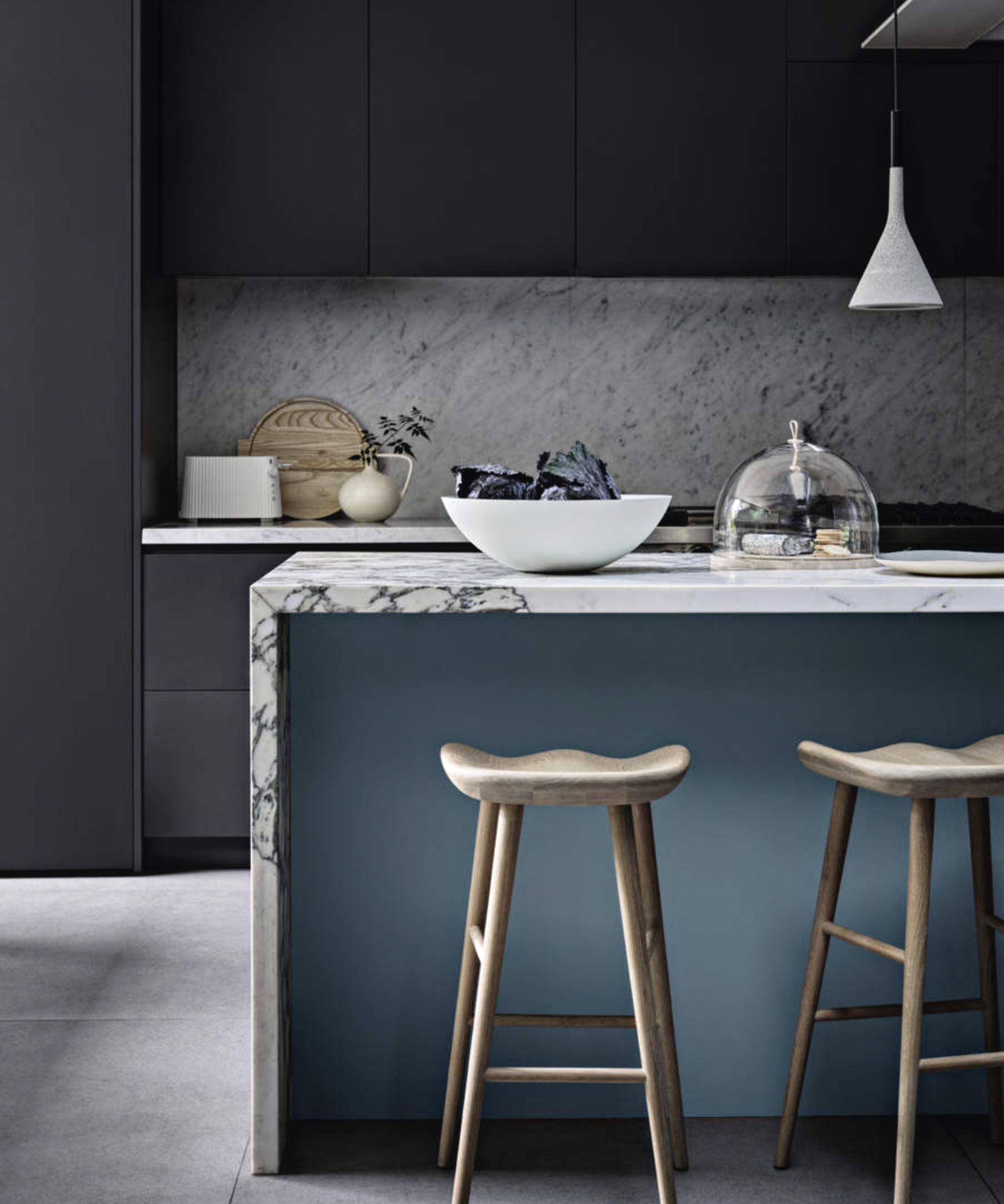
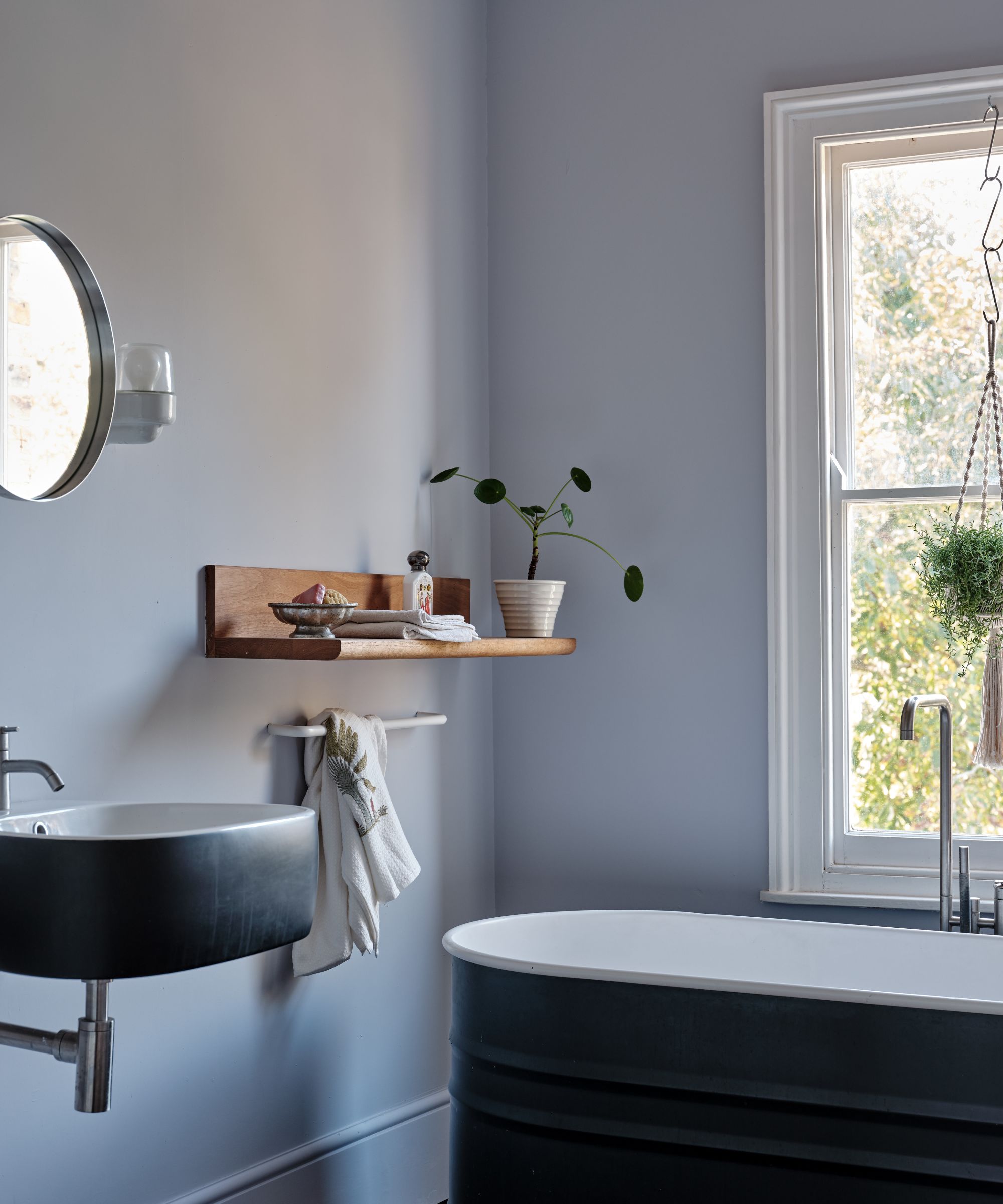
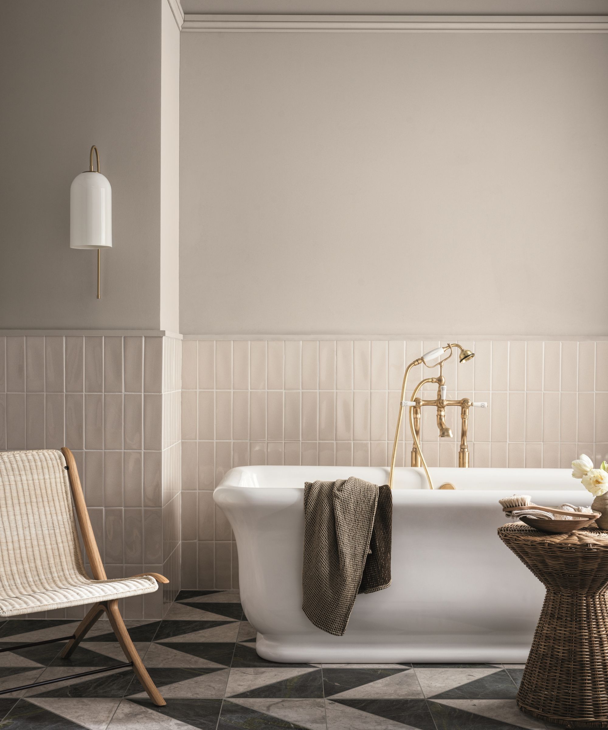
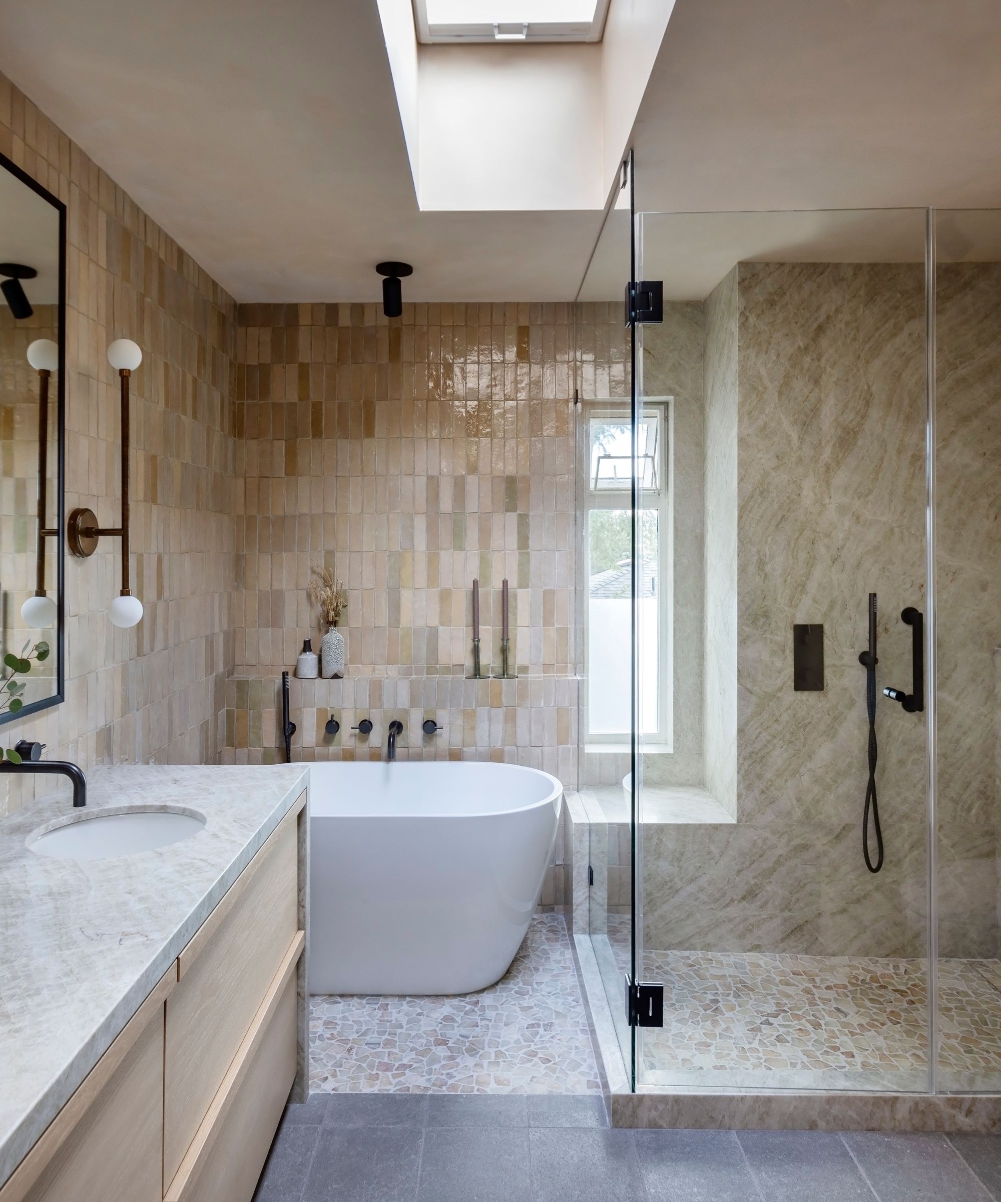
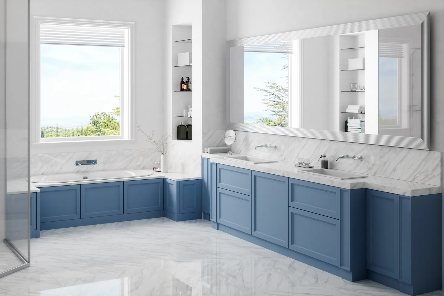
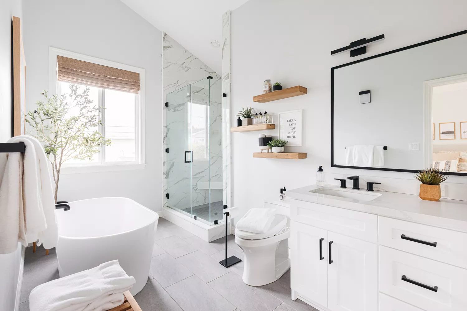
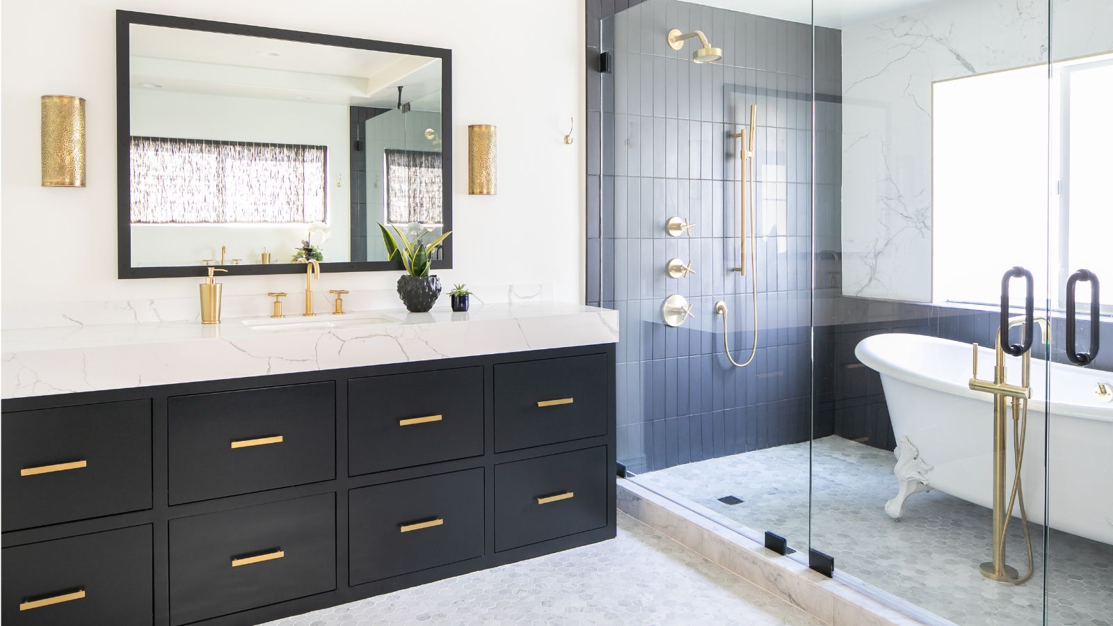
The once-luxurious all-white bathroom scheme is now perceived as cold and monotonous. Marion emphasizes a current desire for grounding and warmth, proposing matte black elements—such as a stone tub, floor tiles, or plumbing trim—to provide contrast and anchor the space, complemented by creamy neutrals, camel tones, and wood accents. Navy blue, once a popular choice for contrast, is now considered flat and predictable by Daniel Joseph Chenin. He suggests midnight teal as an alternative, offering similar depth but with a fresher, richer quality that suits both classic and contemporary styles.
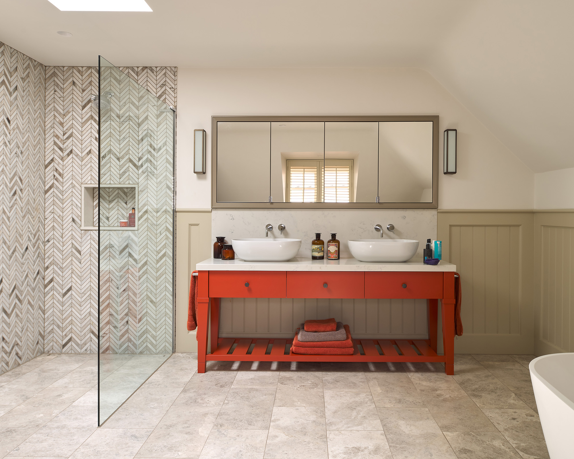
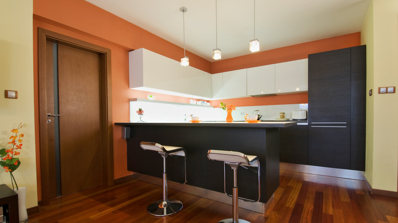
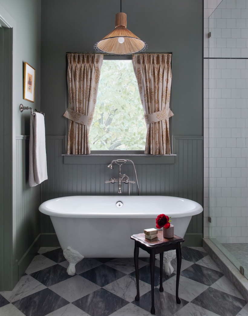
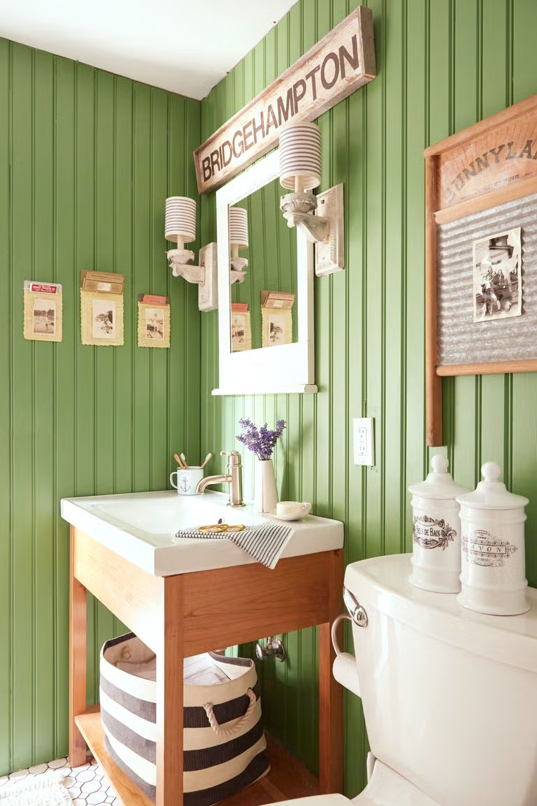
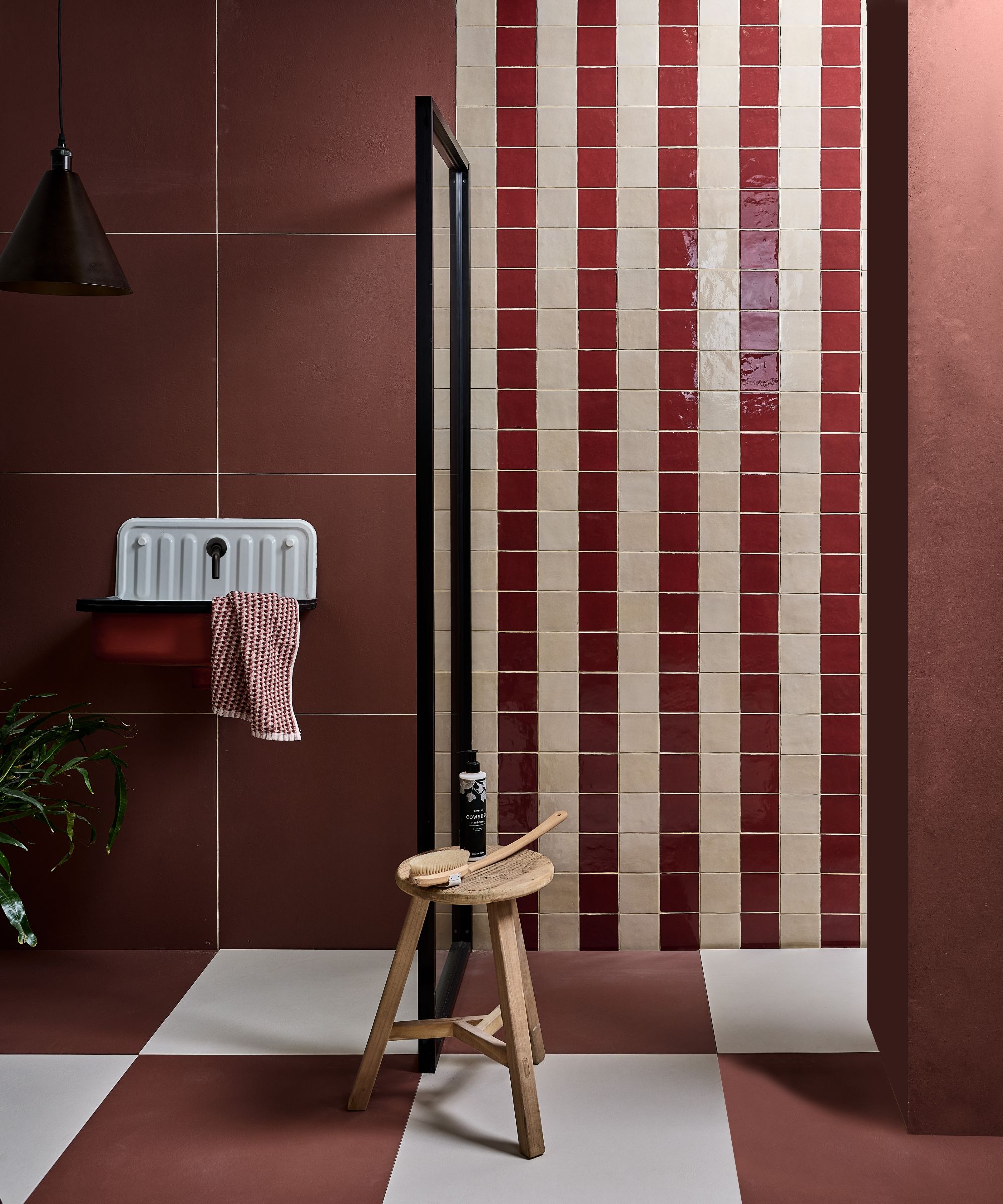
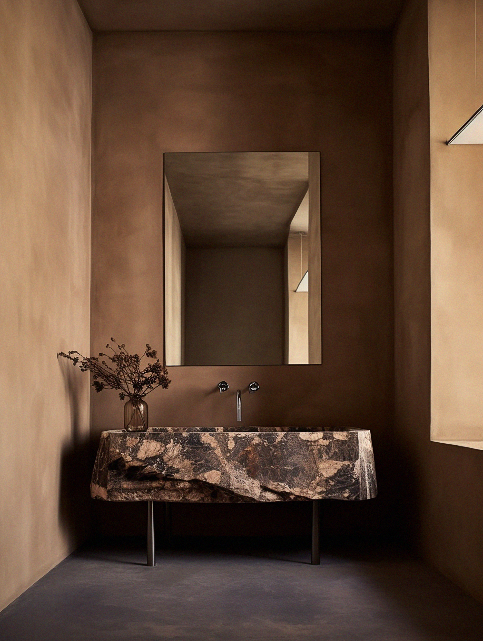
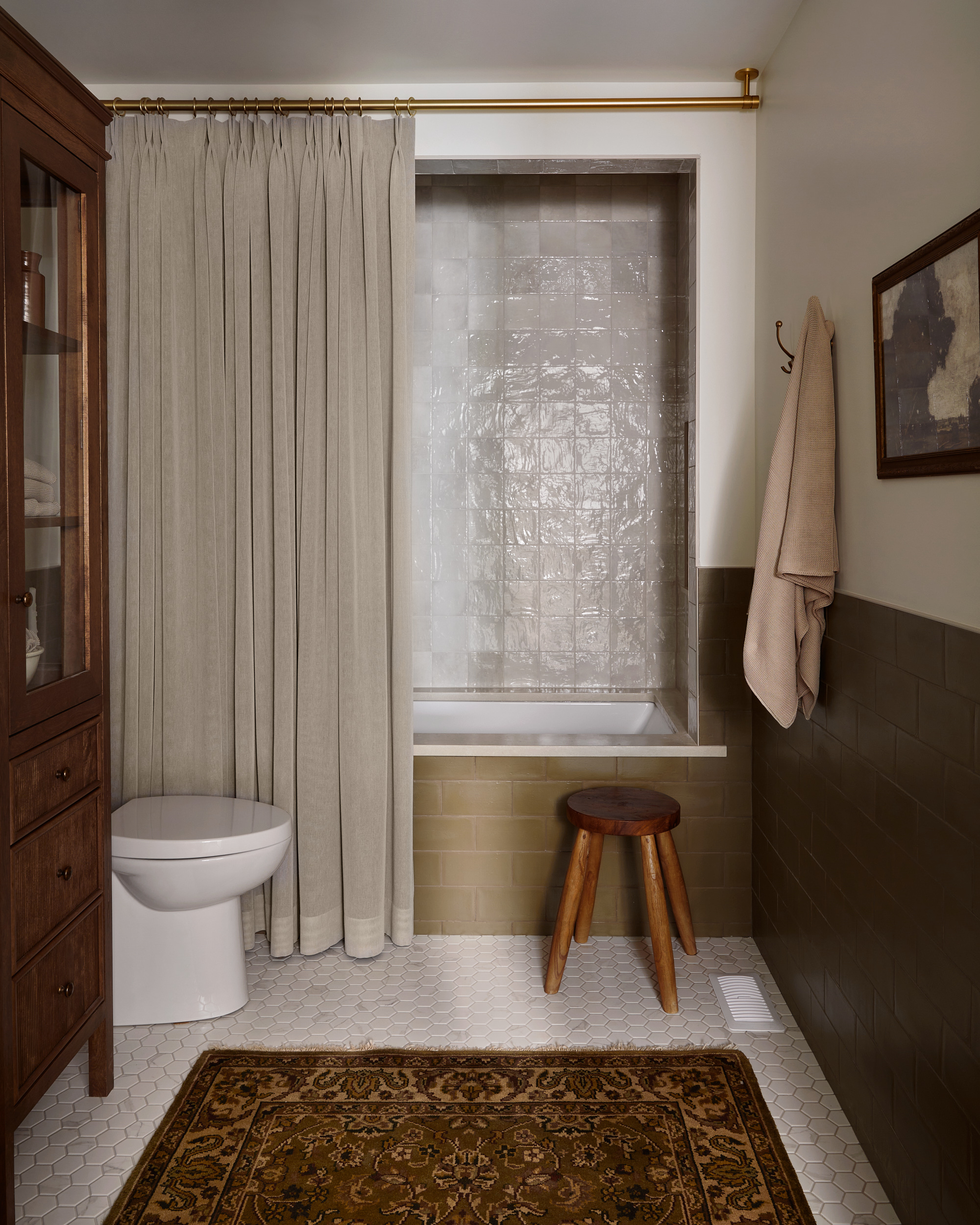
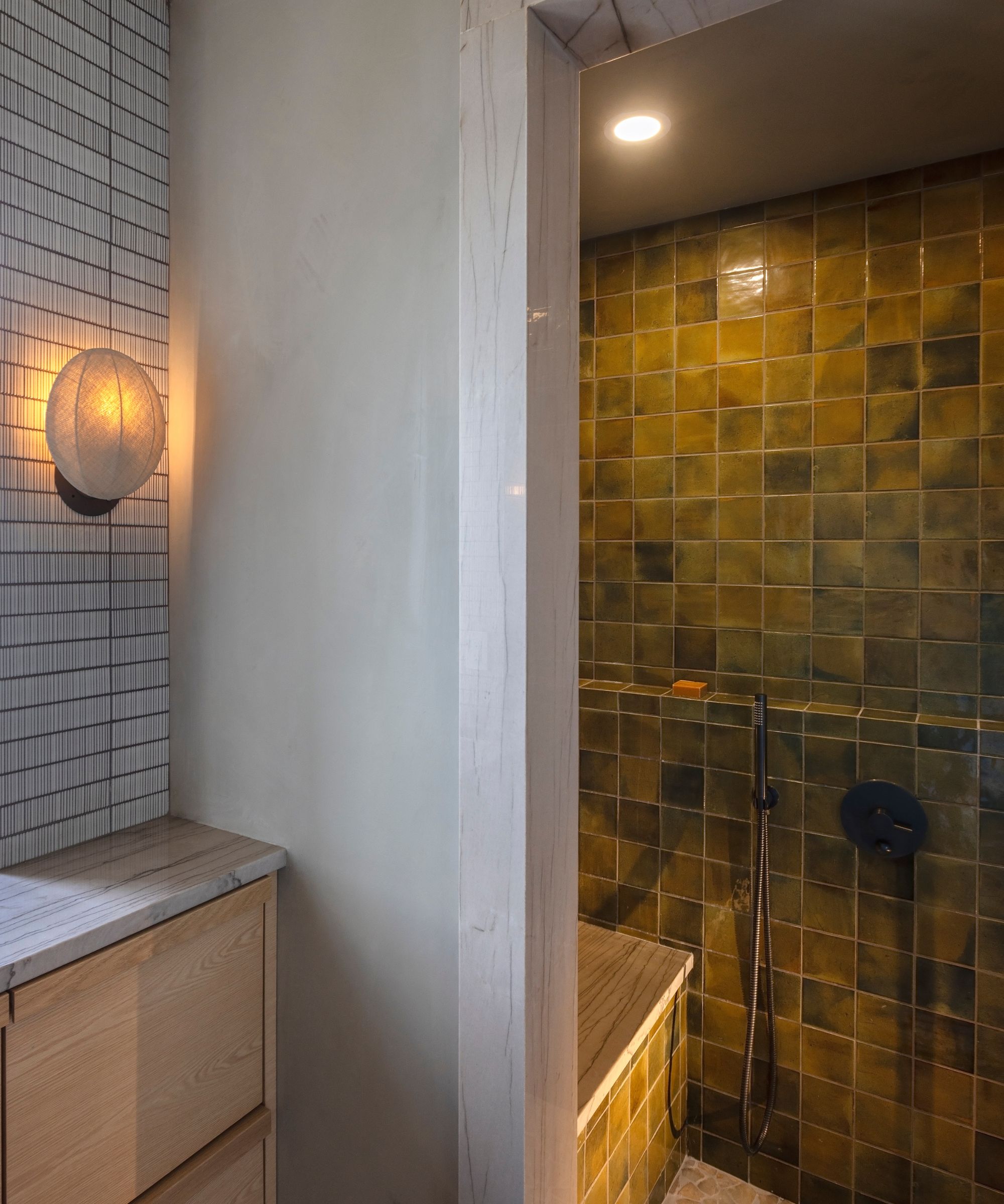
Burgundy, a color with inherent warmth, is also identified as outdated due to its tendency to overwhelm a room and conflict with prevailing lighter, airier palettes. Chenin advocates for deep terracotta as a replacement, which provides comparable warmth while feeling grounded and modern, especially when integrated with natural materials. Lastly, olive green, while once appreciated for its subtle warmth and earthy appeal, is now seen as capable of making rooms feel confined rather than inviting. Chenin recommends sage green as a lighter, softer, and more versatile alternative, which maintains an organic feel and complements modern neutrals and natural textures effectively.
#BathroomDesign #PaintColors #InteriorDesignTrends #HomeDecor #ColorPalettes #RenovationIdeas #ModernInteriors #DesignTips #BathroomDesign #PaintColors #InteriorDesignTrends #HomeDecor #ColorPalettes #RenovationIdeas #ModernInteriors #DesignTips
0 comment in total
 No comments yet
You may also like
5 colors to avoid in a bathroom – according to designers

Towel colors to avoid in bathrooms – and what to buy instead, according to designers
Outdated color trends – 5 overdone colors that designers no longer love, and what to use instead
6 Paint Colors You Should Never Use in Your Bedroom, According to Interior Designers
Outdated bathroom trends – 6 overdone looks that designers like to avoid, and here's why you should too

4 Outdated Colors Designers say you Should Steer Clear of When Decorating a Living Room

6 Paint Colors To Avoid In Your Bathroom—And 6 Shades You Should Use Instead
Bathroom colors going out of style in 2025 – and the designer-approved shades to decorate with instead
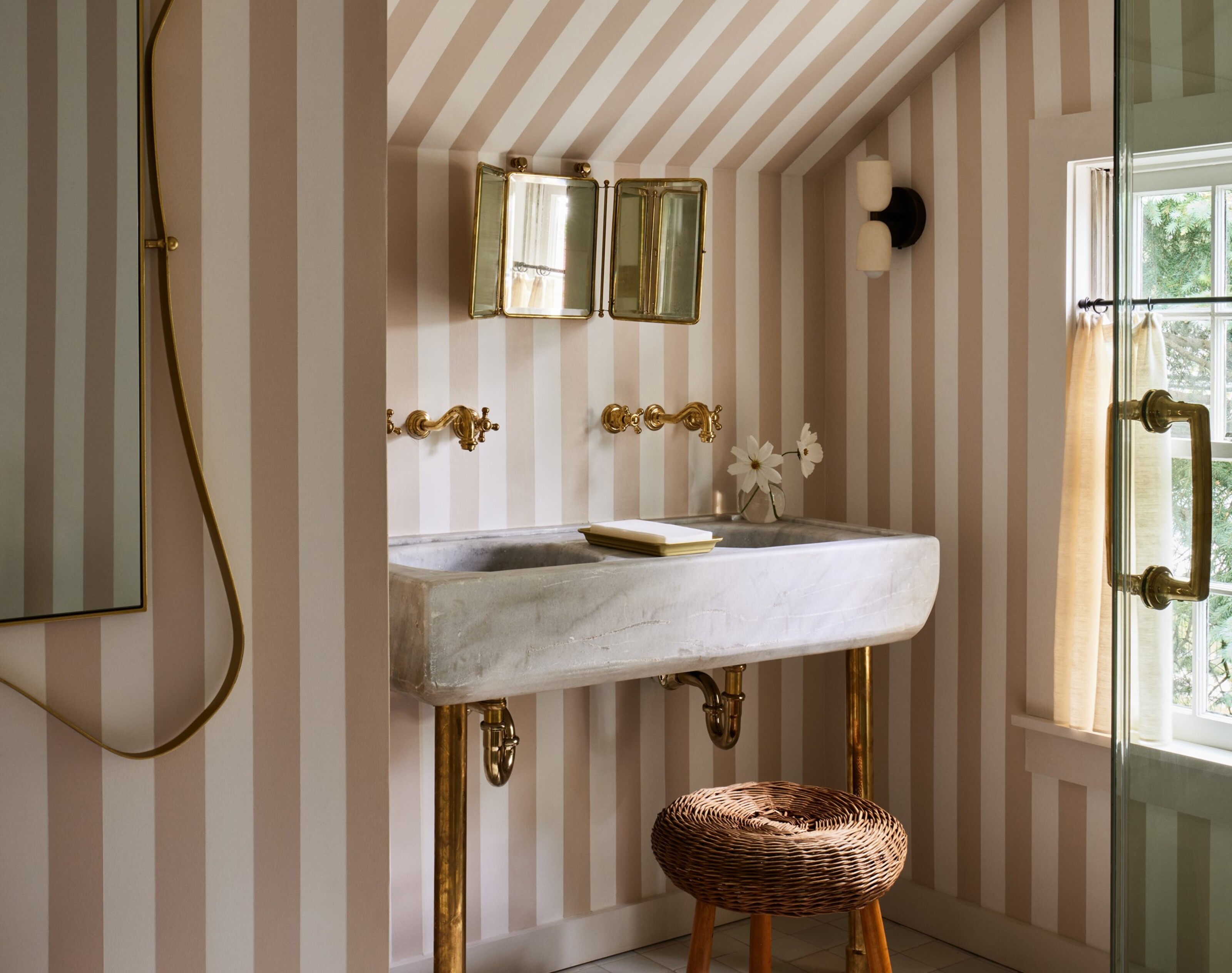
5 colors designers say are outdated for bathrooms - and what they're choosing instead for 2024
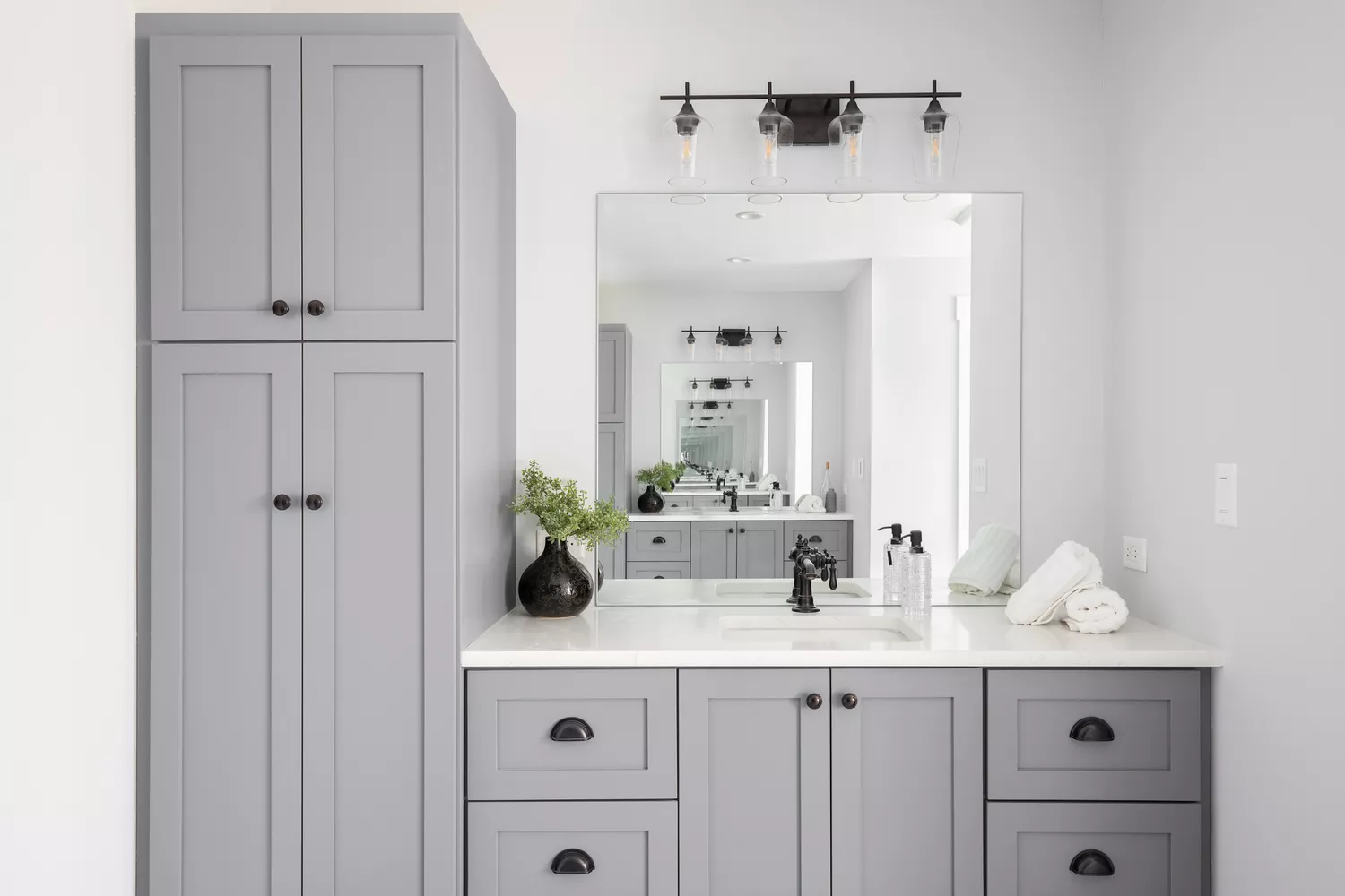
7 Outdated Bathroom Vanity Colors Designers Never Want to See Again

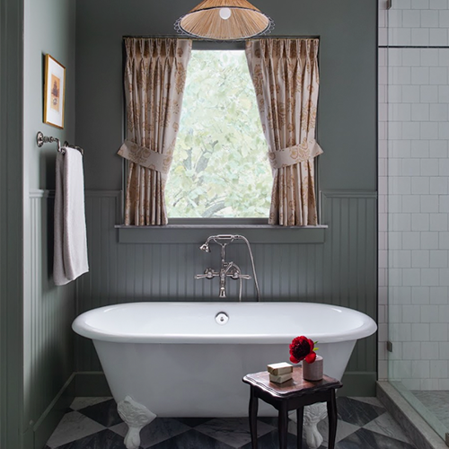
The Bathroom Paint Colors Interior Designers Swear By

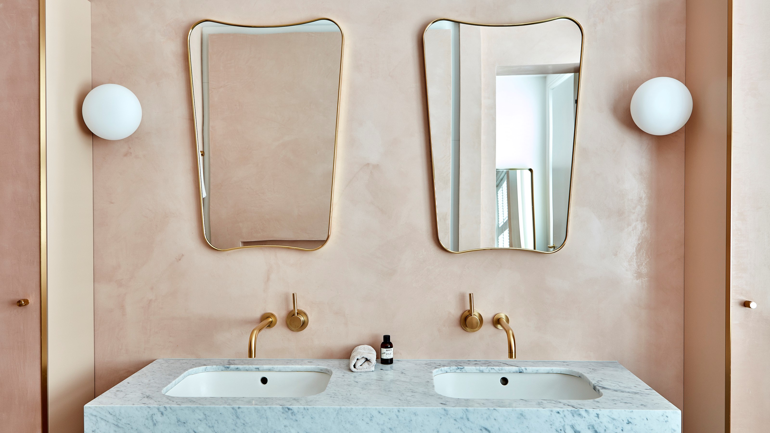
4 Bathroom Colors That Are Going Out of Style in 2025 — Don't Say We Didn't Warn You
5 Paint Colors You Should Never Use in a Bathroom, Designers Warn
6 Worst Colors To Paint Your Kitchen (And What To Choose Instead)

What are the worst colors to paint a room? The shades experts say you should never use
These are the 4 color schemes designers say will always make a bathroom look more expensive
Yikes! The worst colors for a small bathroom that should definitely be avoided

Which Bathroom Tile Colors Will Never Go Out of Style? 5 Timeless Options Favored By Designers


5 colors you should never paint a small room – designers warn us to steer clear of these hues, and what to pick instead
6 Outdated Paint Colors Designers Don't Want to See in Homes Anymore in 2026