6 Paint Colors To Avoid In Your Bathroom—And 6 Shades You Should Use Instead
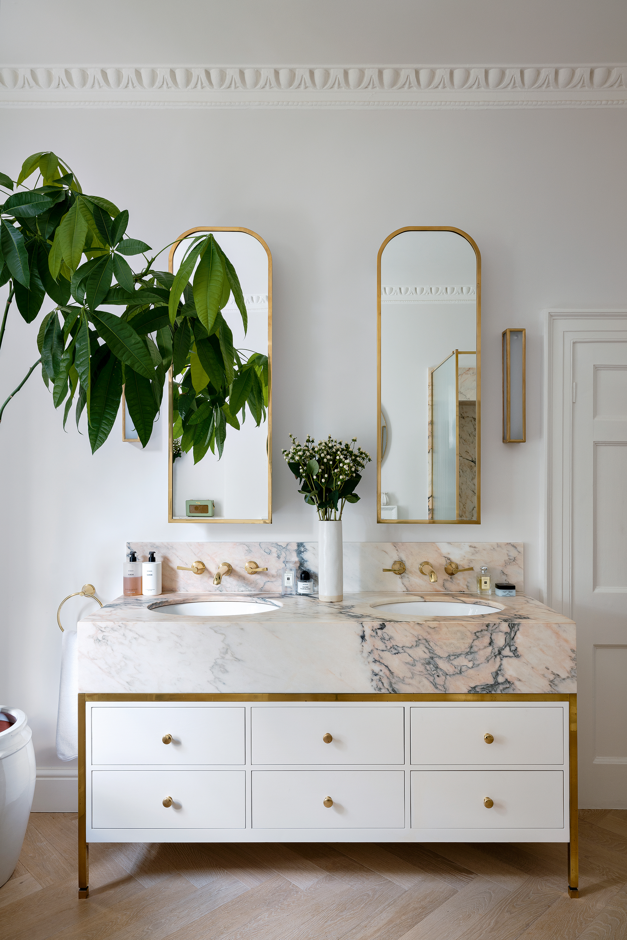
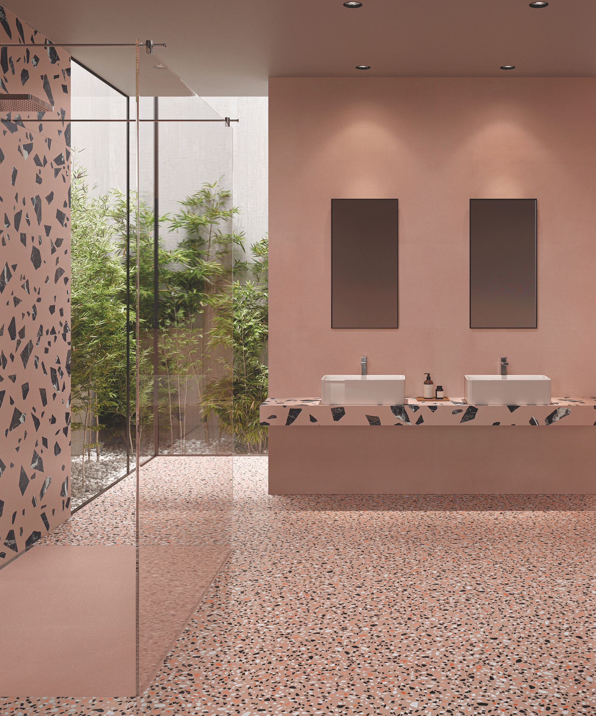
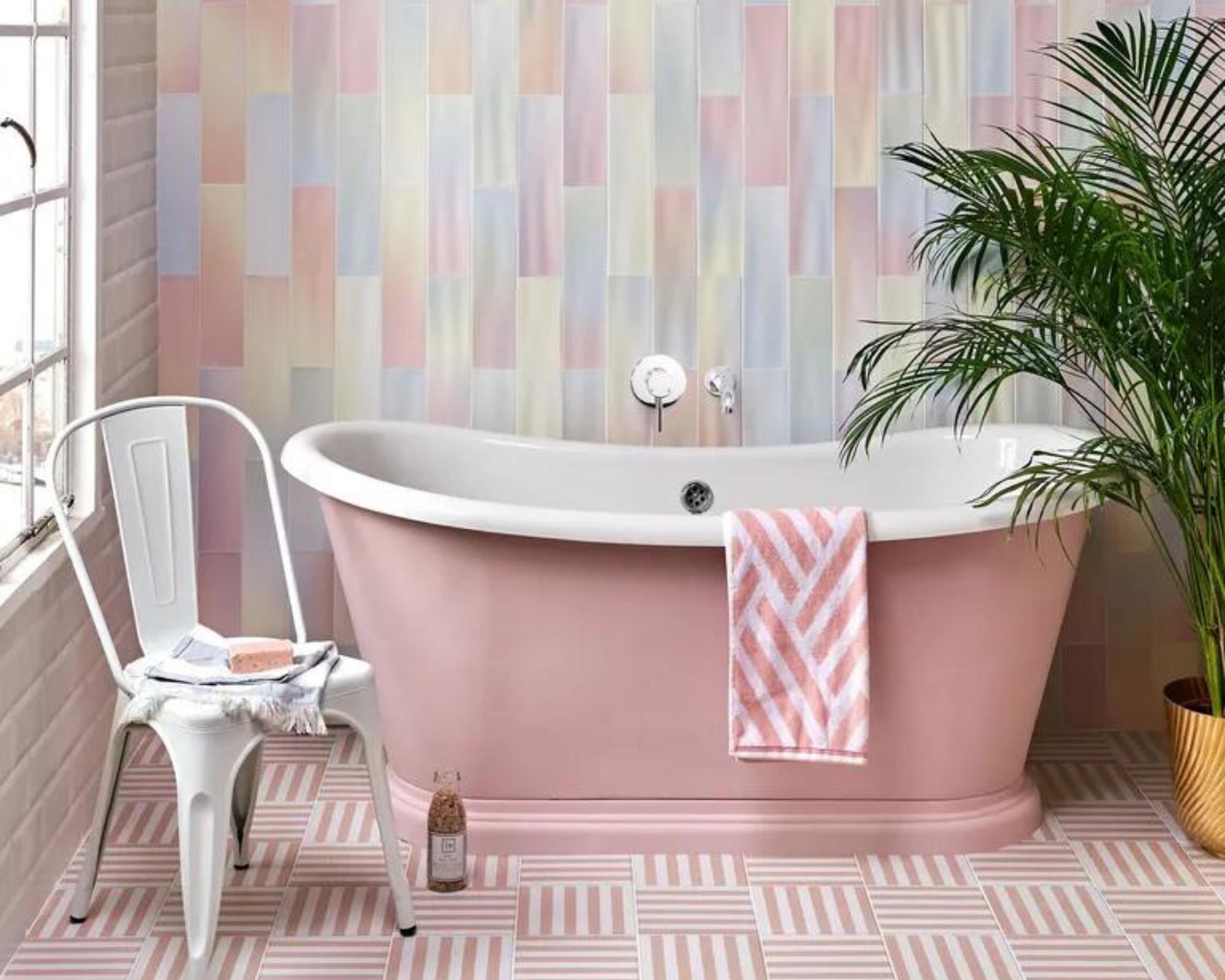
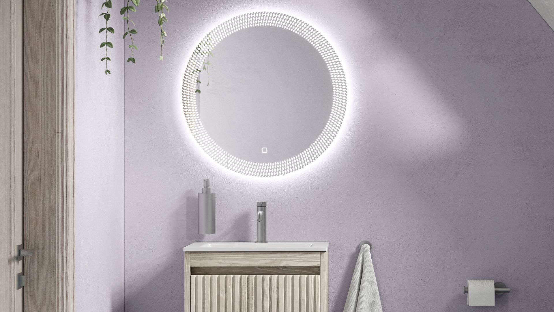
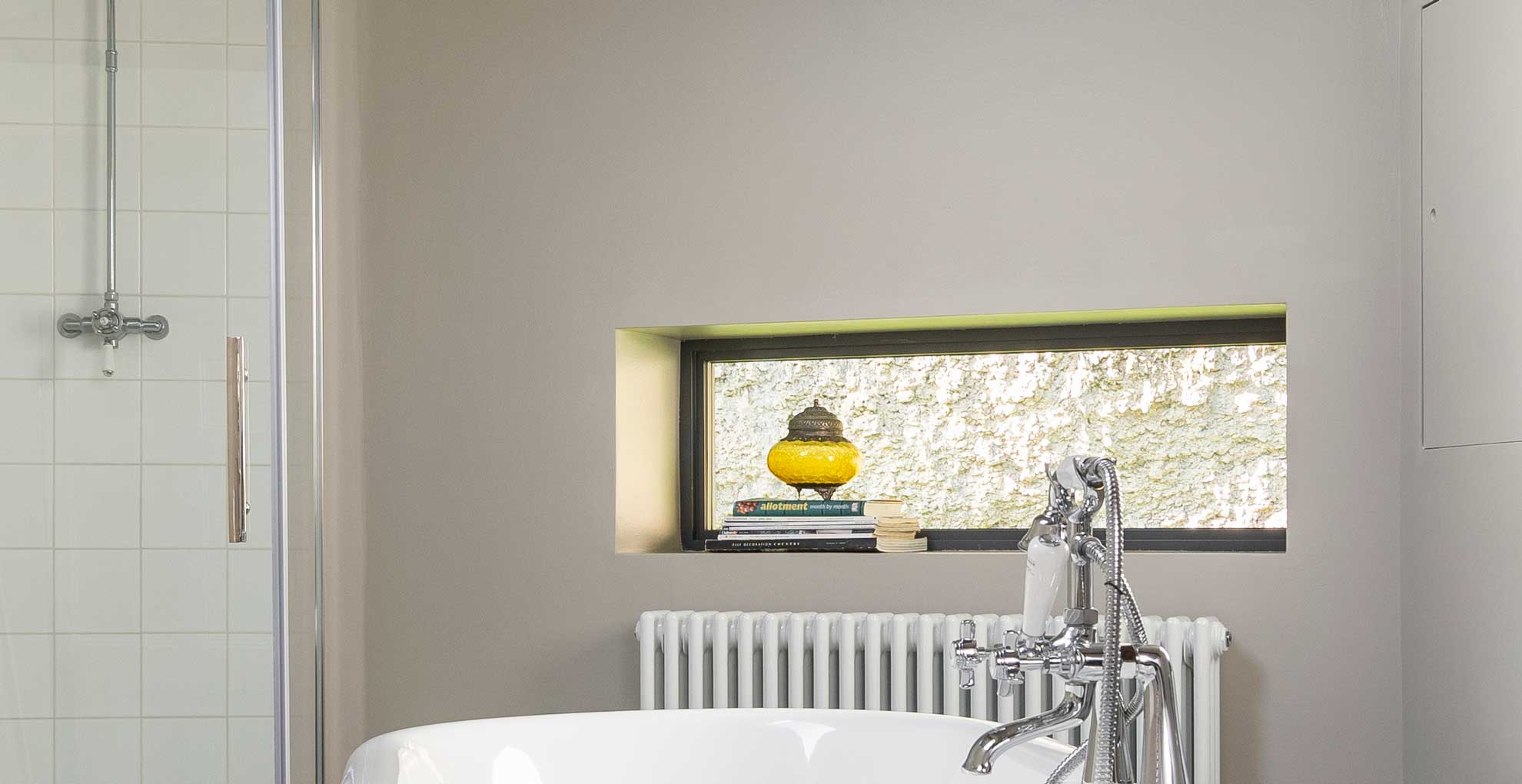
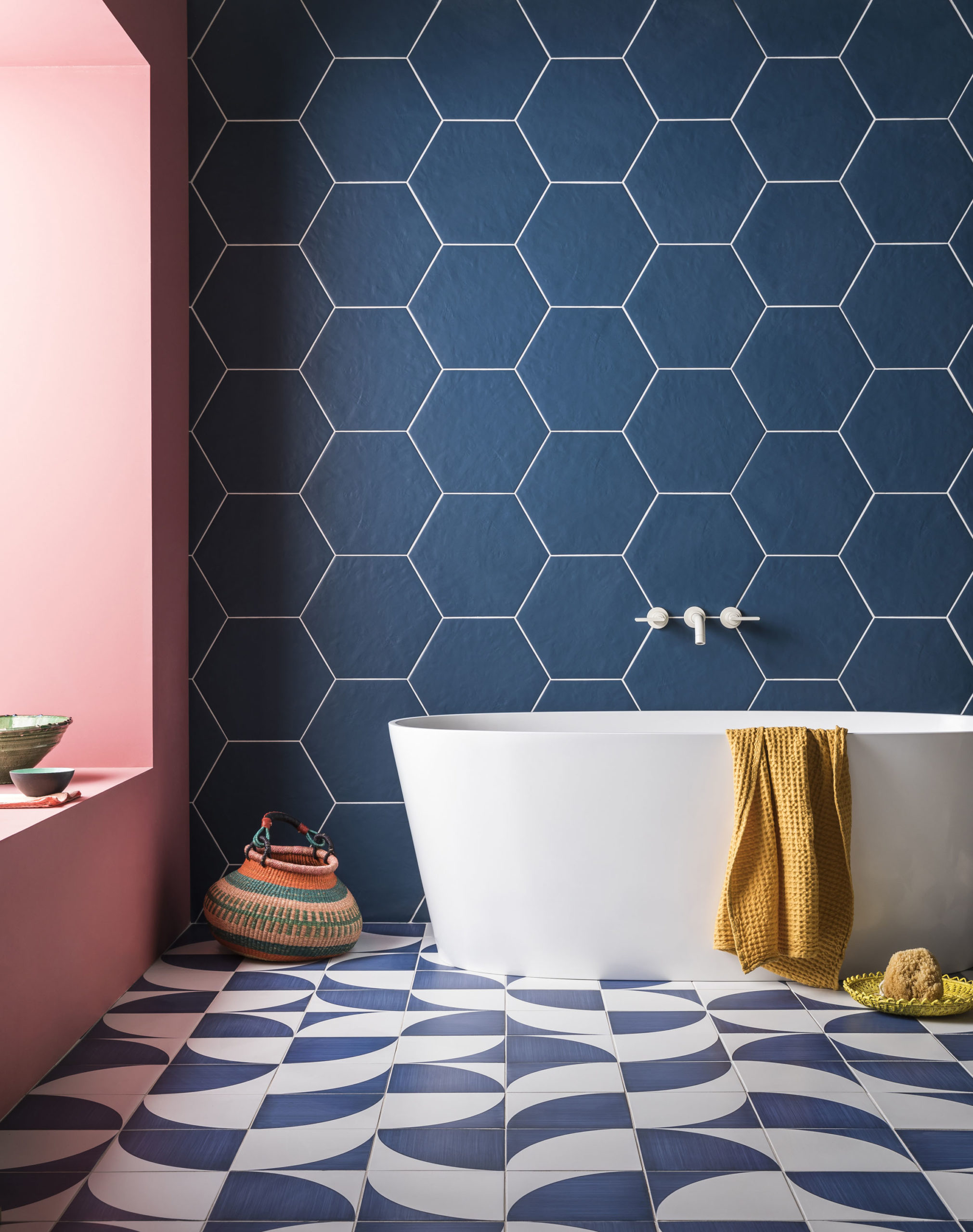
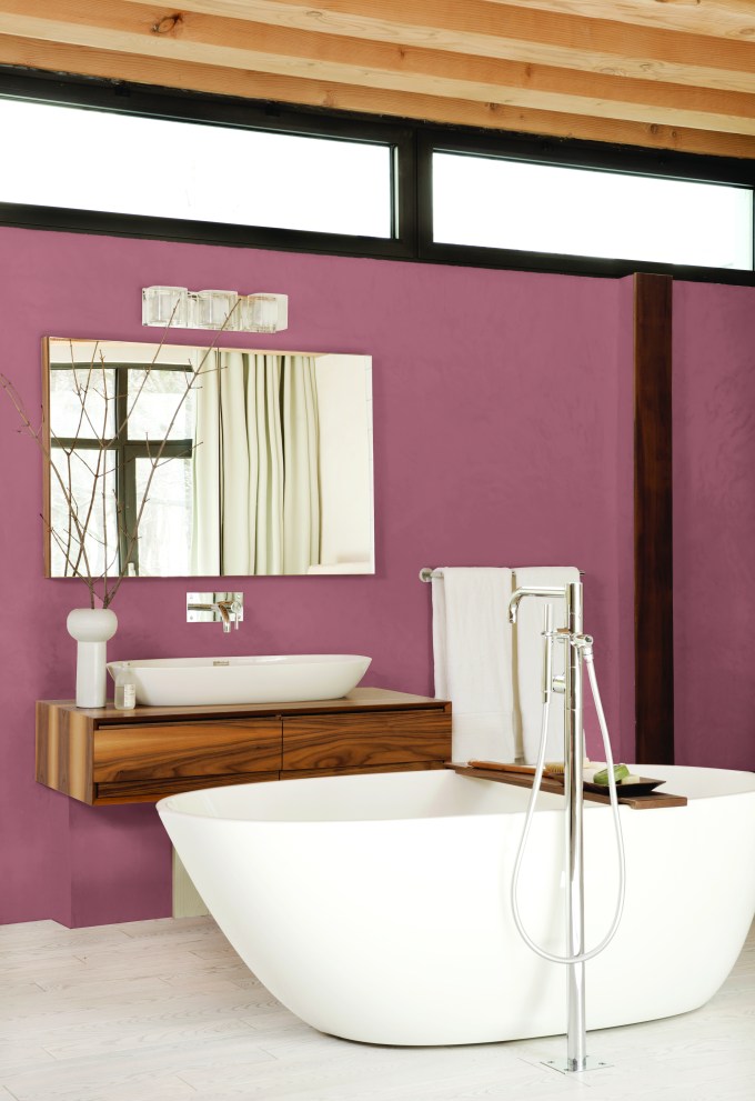
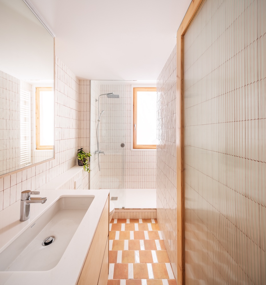
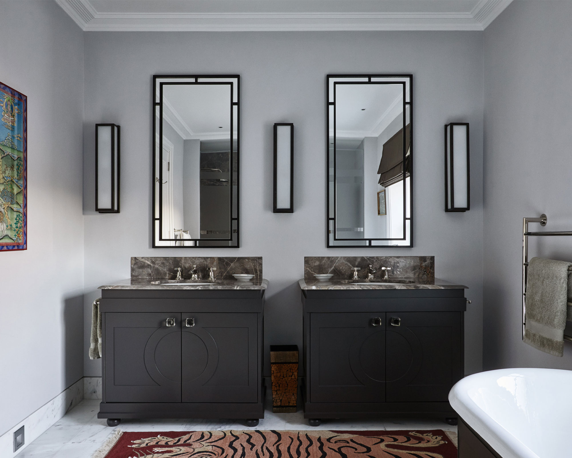
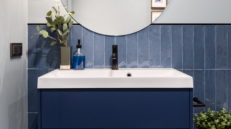
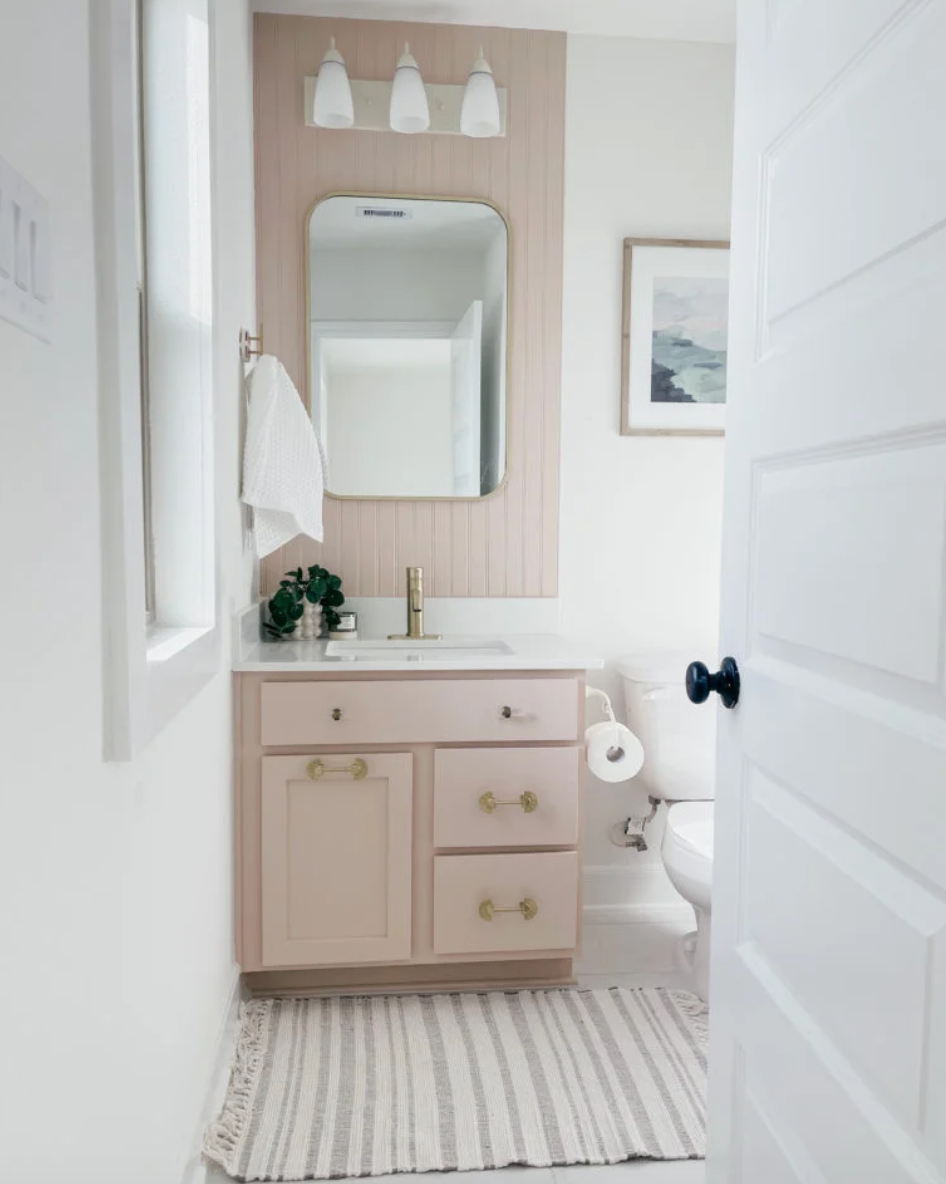
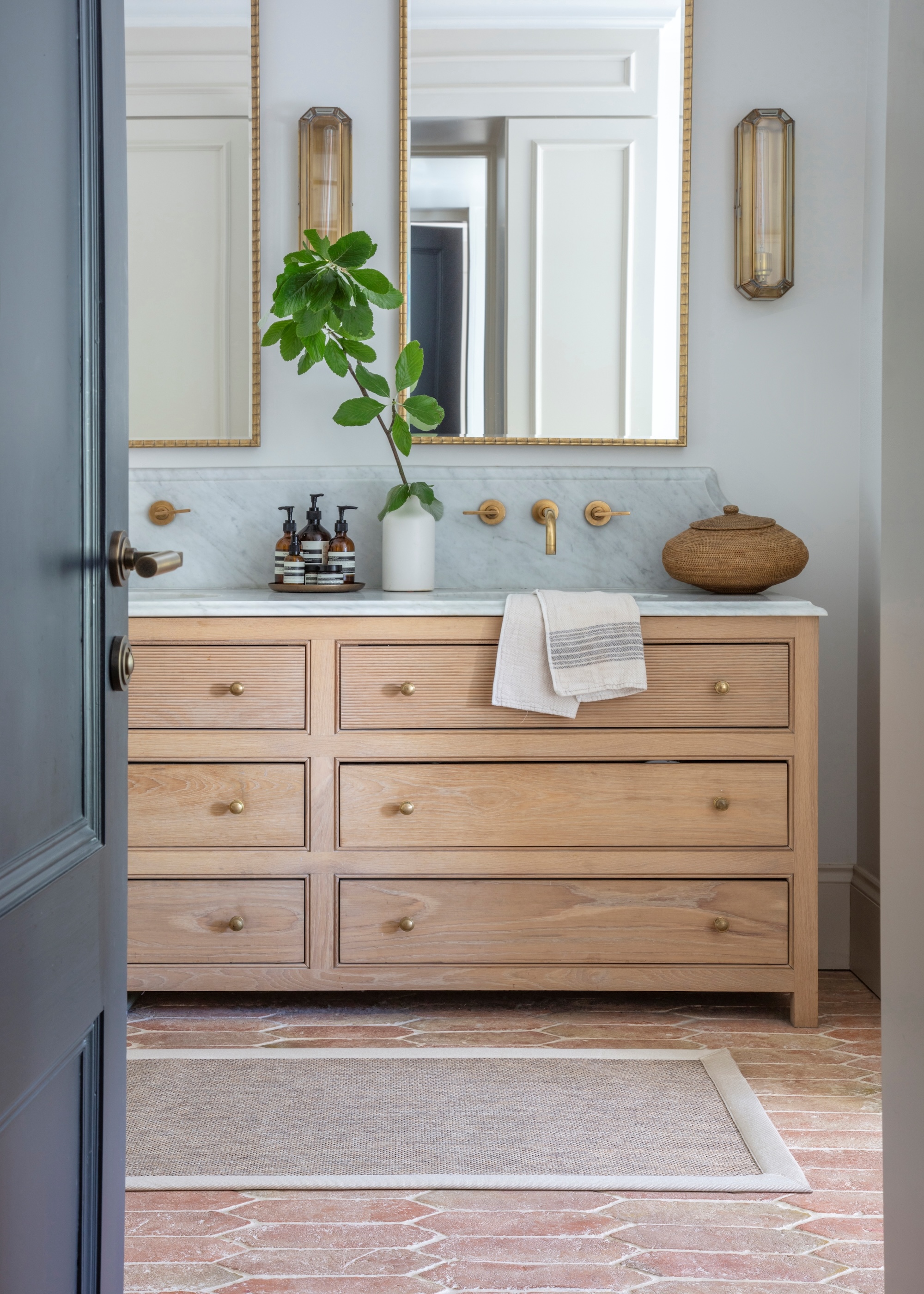
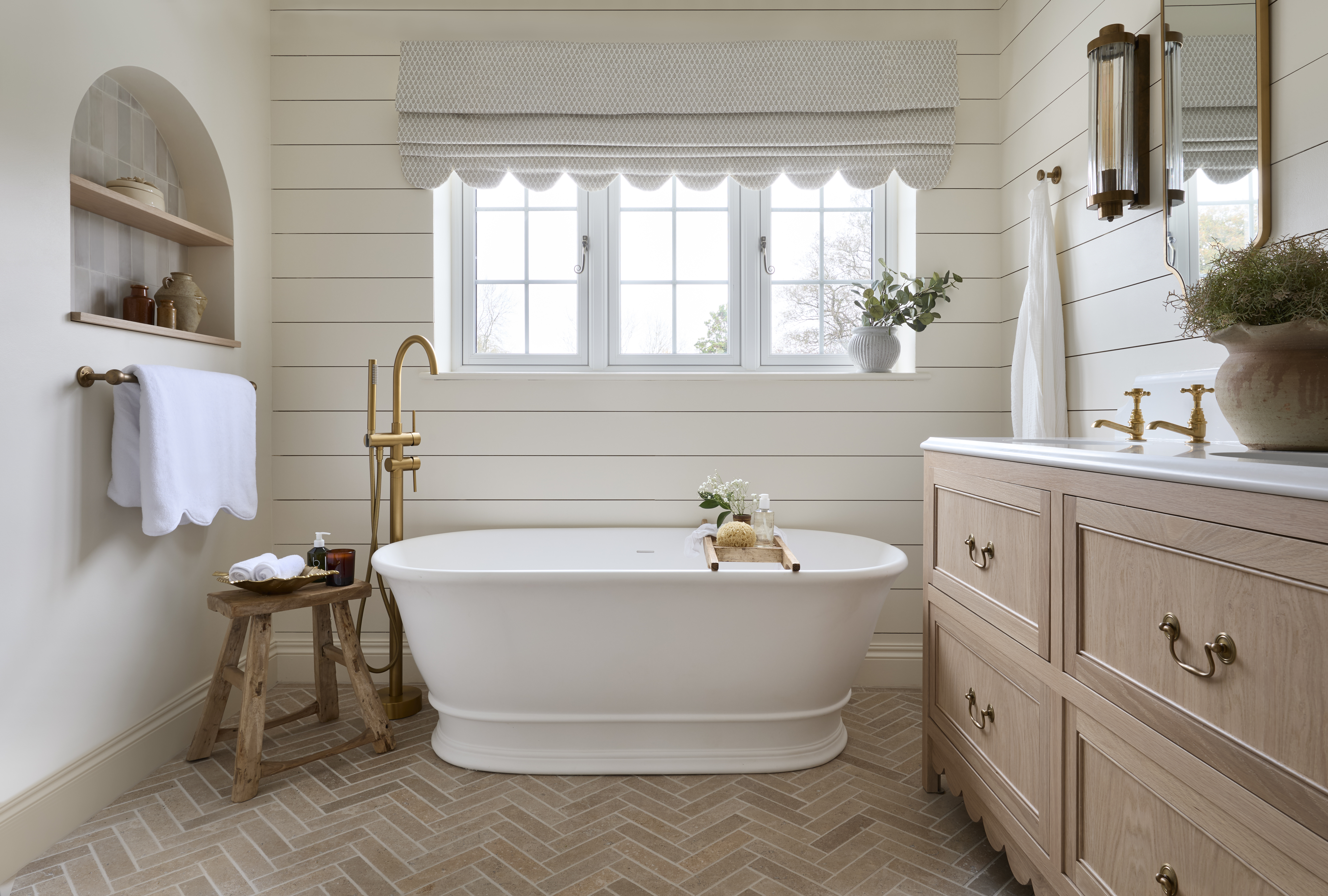
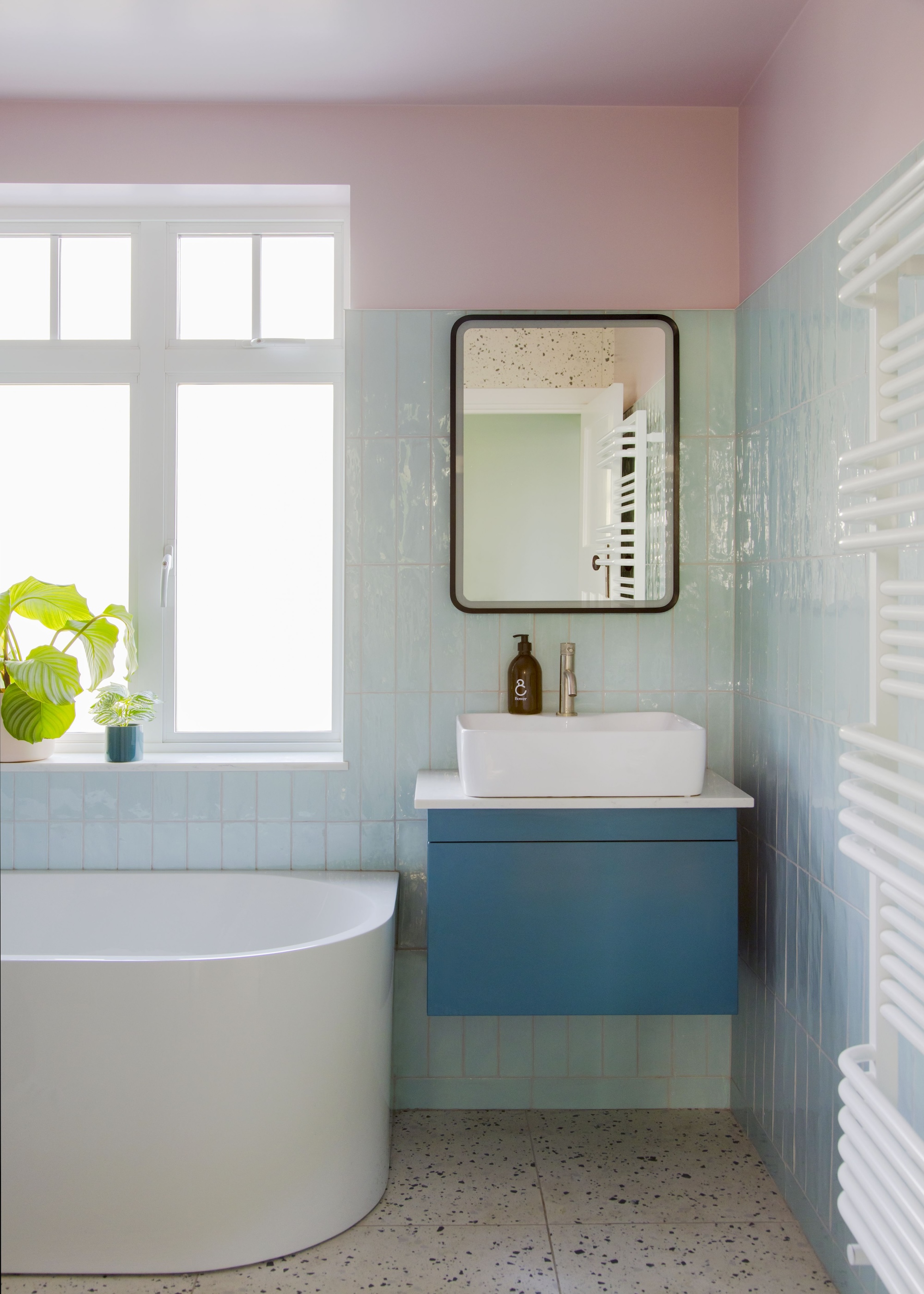
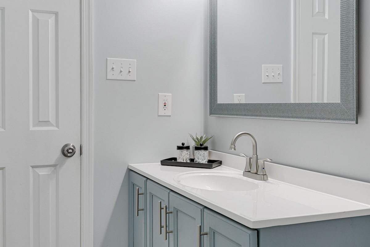
The choice of paint color in a bathroom is crucial for establishing the desired atmosphere, balancing invigoration and restfulness. While personal style is key, some colors and treatments are generally advised against by Southern designers. Neutral colors like beige, tan, and greige should be avoided as they can make a bathroom feel drab, dark, and dingy, and are considered unflattering. Instead, distinct colors, whether a clean white or a true, energizing blue or soft pink, are recommended to add personality and avoid indecisiveness. For instance, Sherwin-Williams’ Pink Shadow (SW 0007) is cited as a vibrant choice for a vanity.
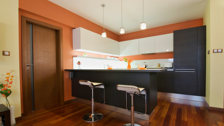
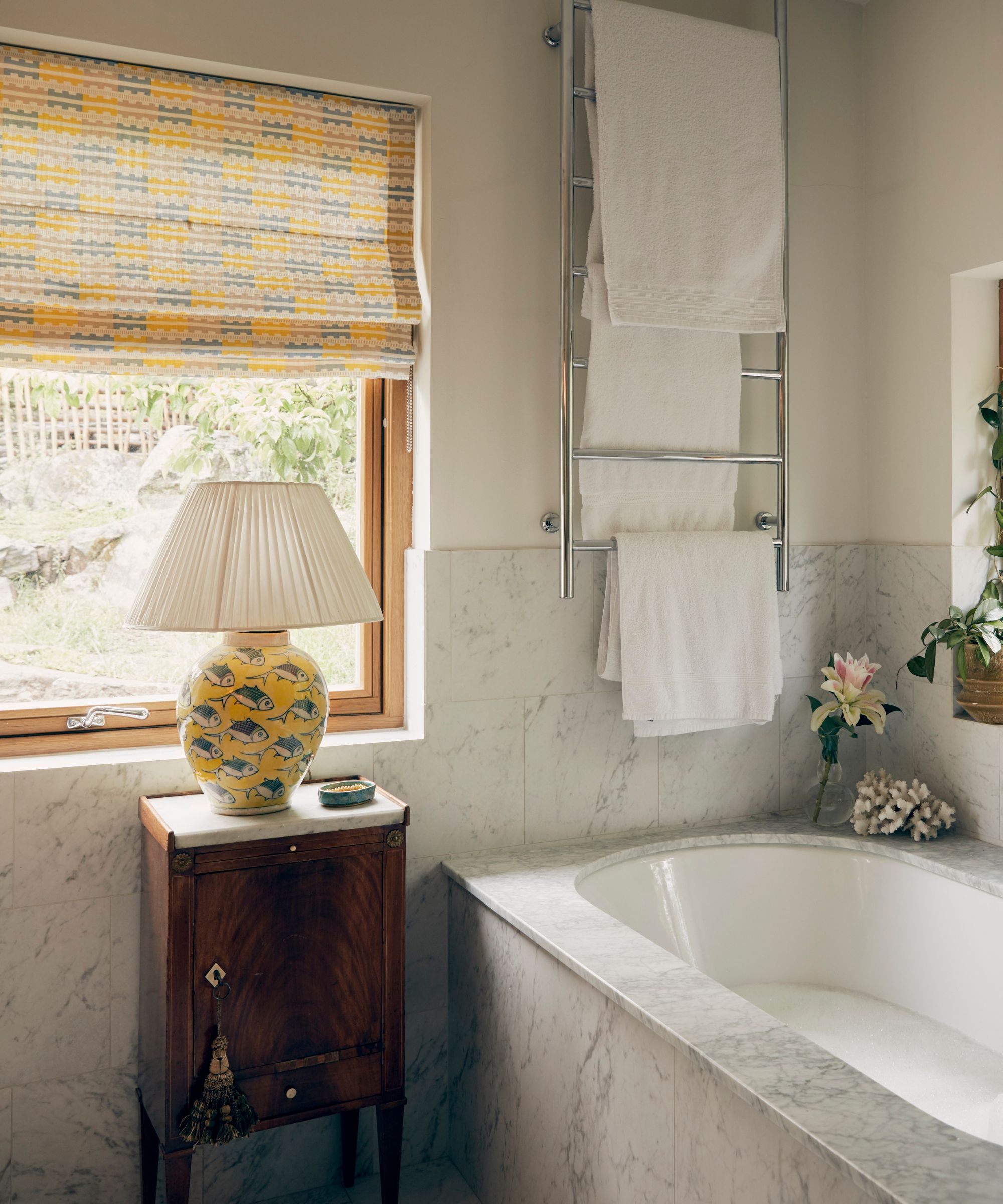
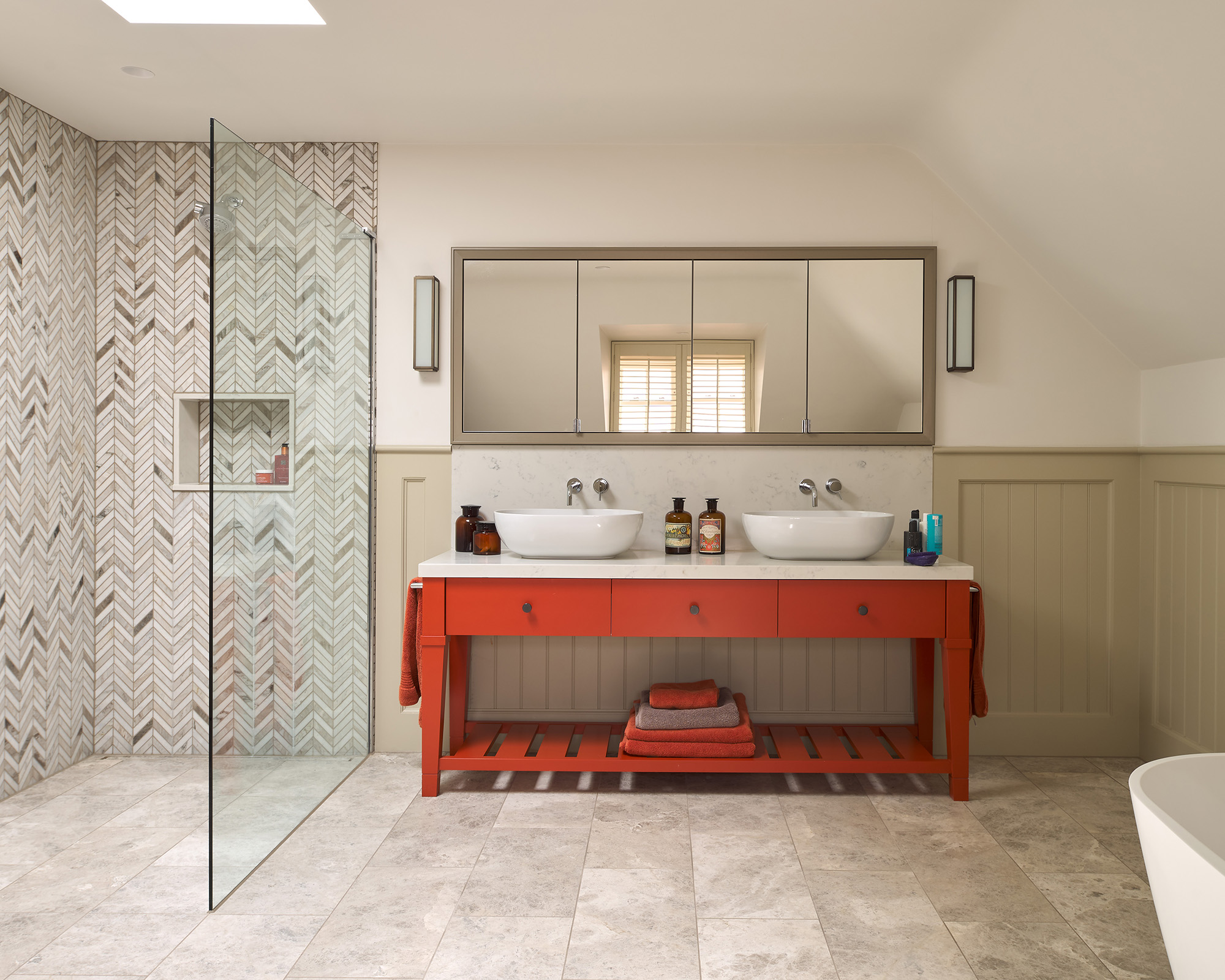
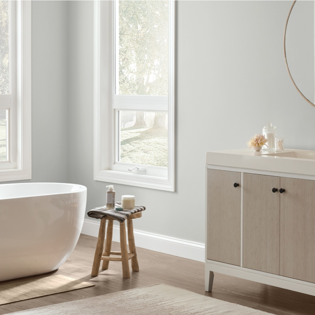
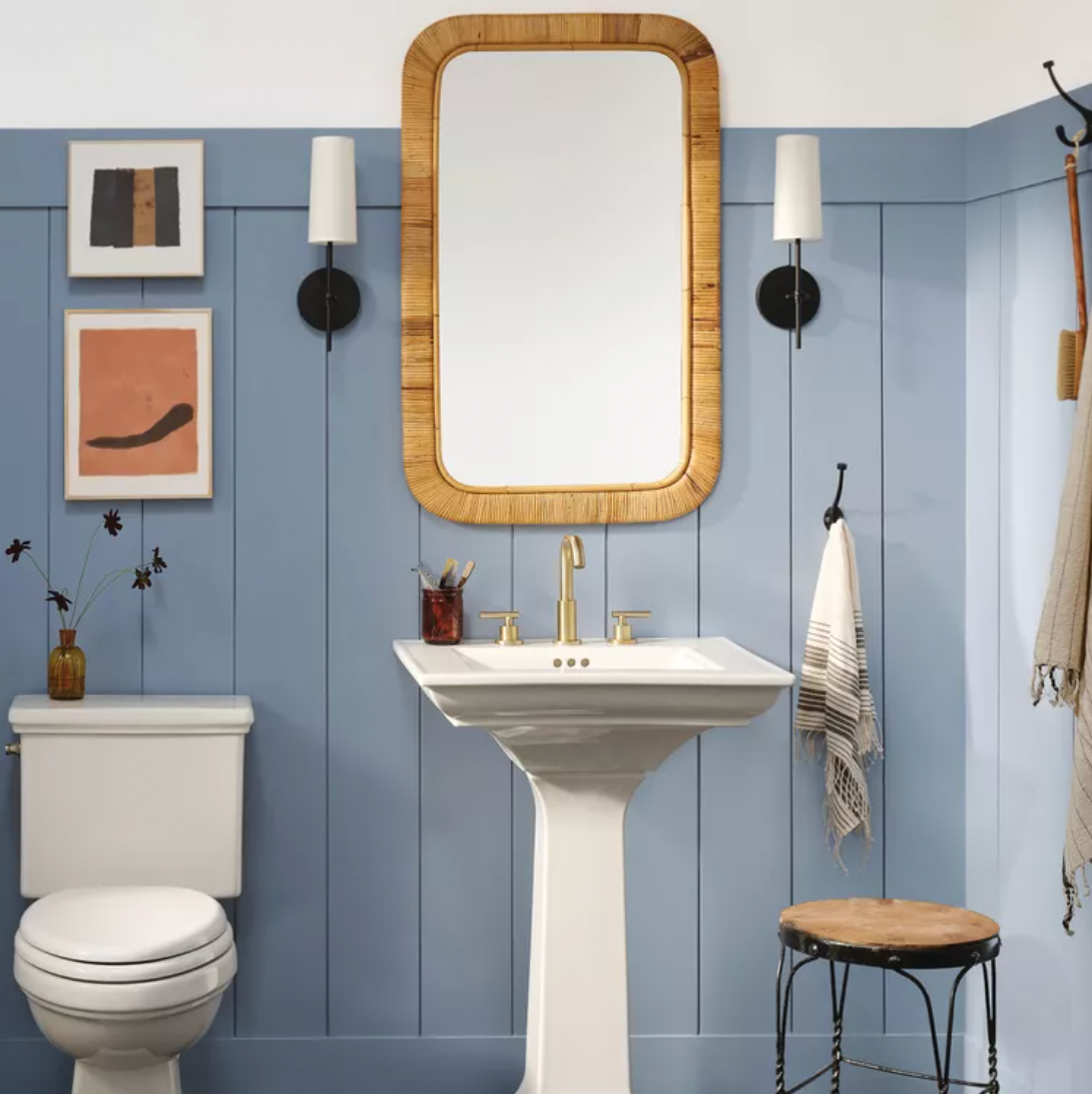
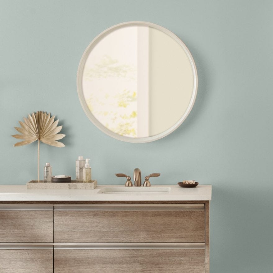
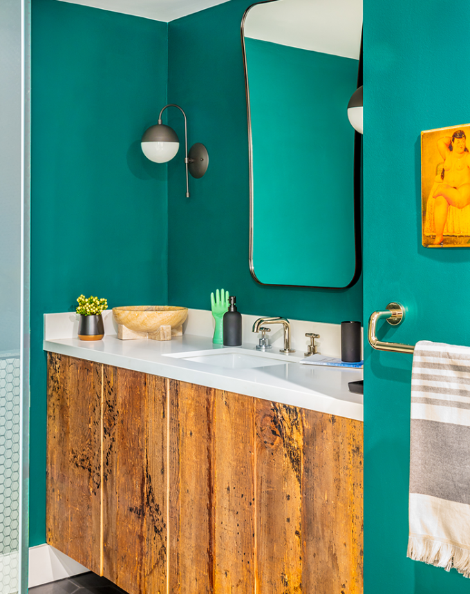
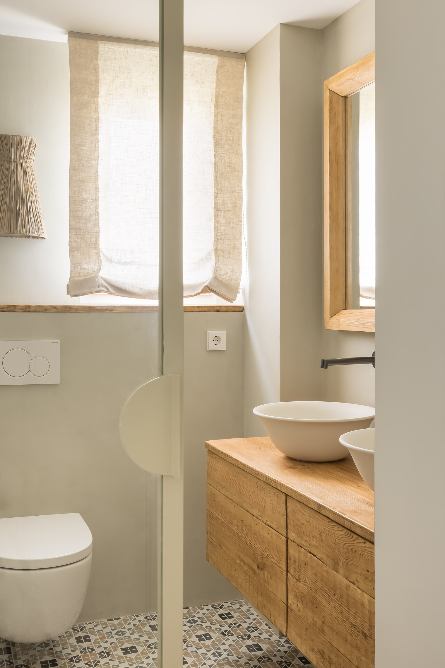
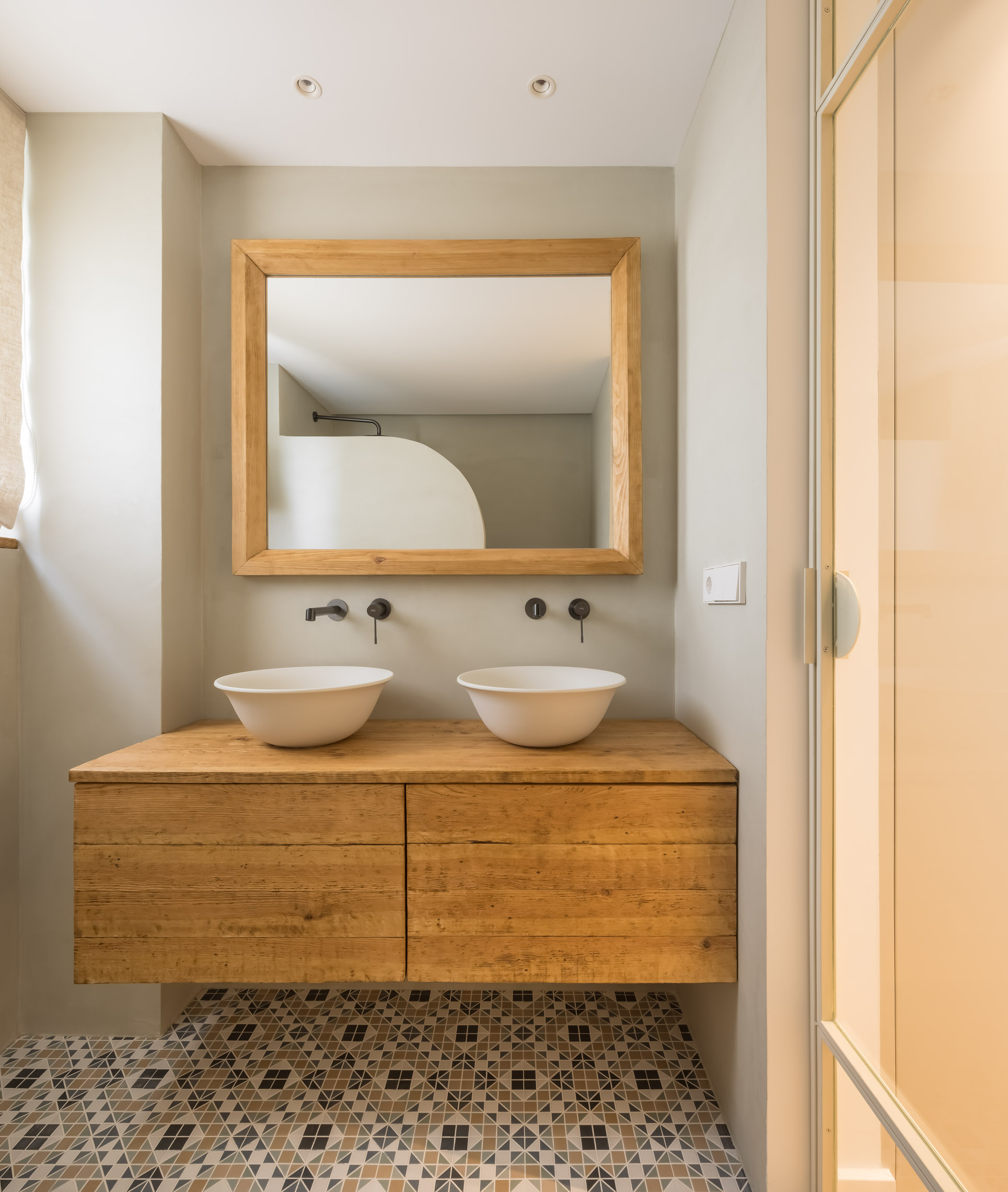
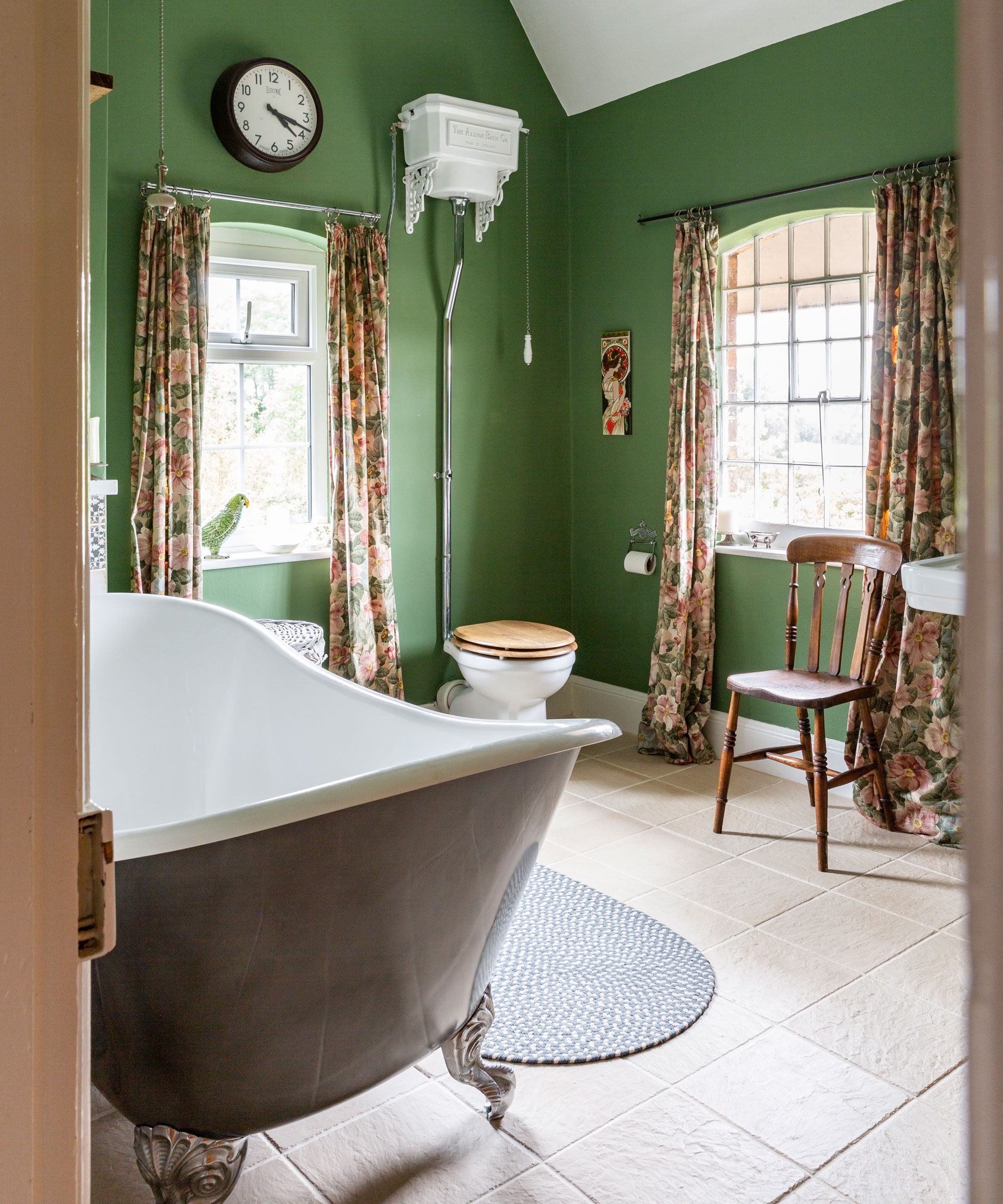
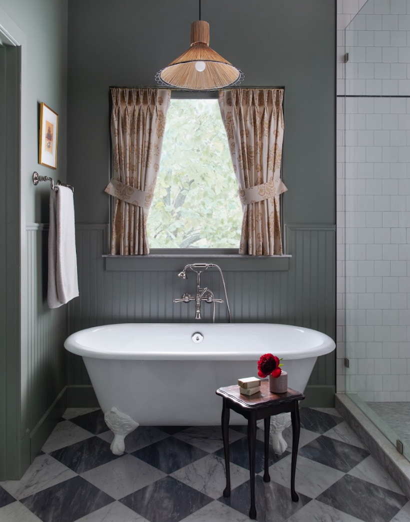
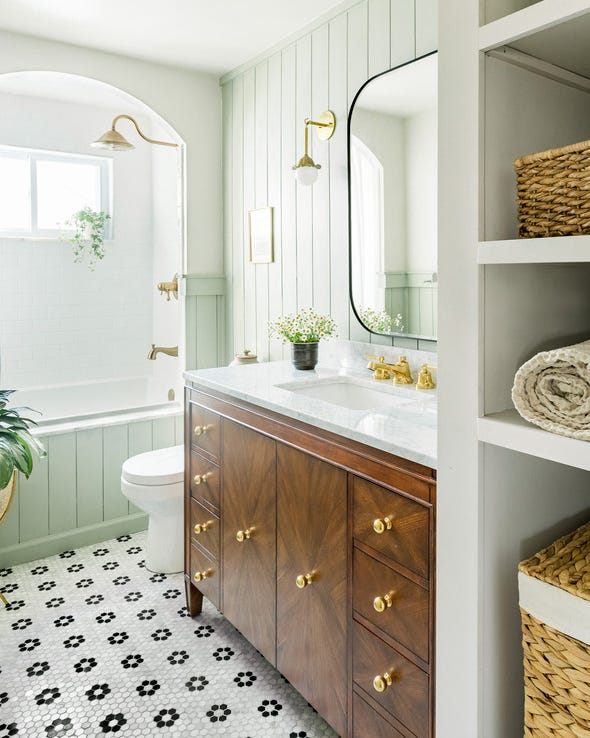
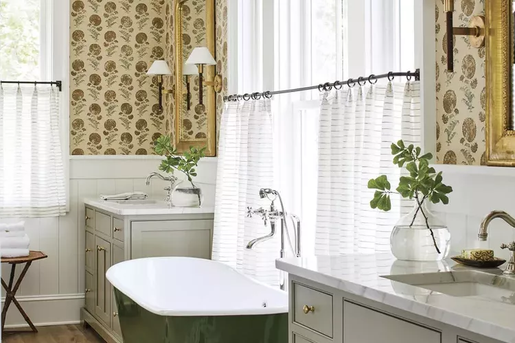
Overly bright whites can create a clinical, cold, and sterile environment, especially when paired with marble and tile. Warmer, softer whites or off-whites are preferred to maintain a sense of cleanliness and openness without the harshness. Sherwin-Williams’ Pearly White (SW 7009) for walls and Extra White (SW 7006) for trim are examples of suitable softer whites. Similarly, while rich and playful hues are often welcome in other areas of a home, warm tones like yellows, oranges, and reds can make smaller bathroom spaces feel humid and muggy. Cool tones such as soft blues, greens, and grays are better alternatives, as they promote calmness, peacefulness, and can function as versatile neutrals, exemplified by Farrow & Ball’s Green Blue (No. 84).
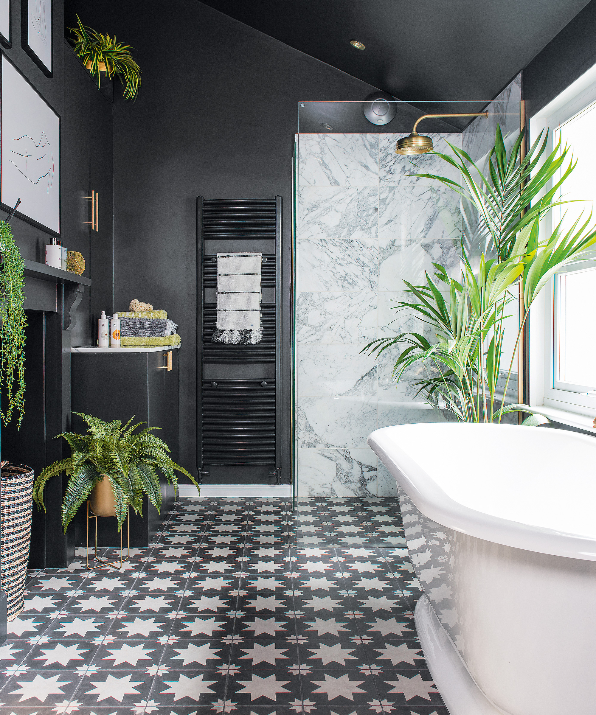
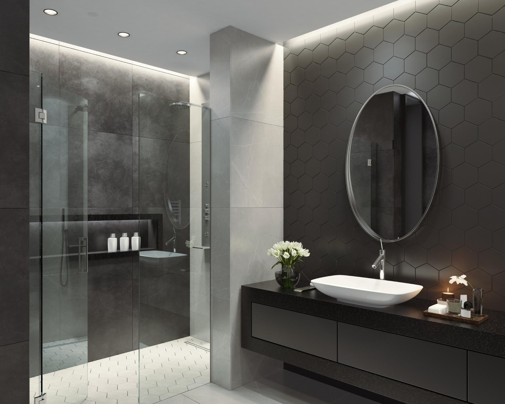
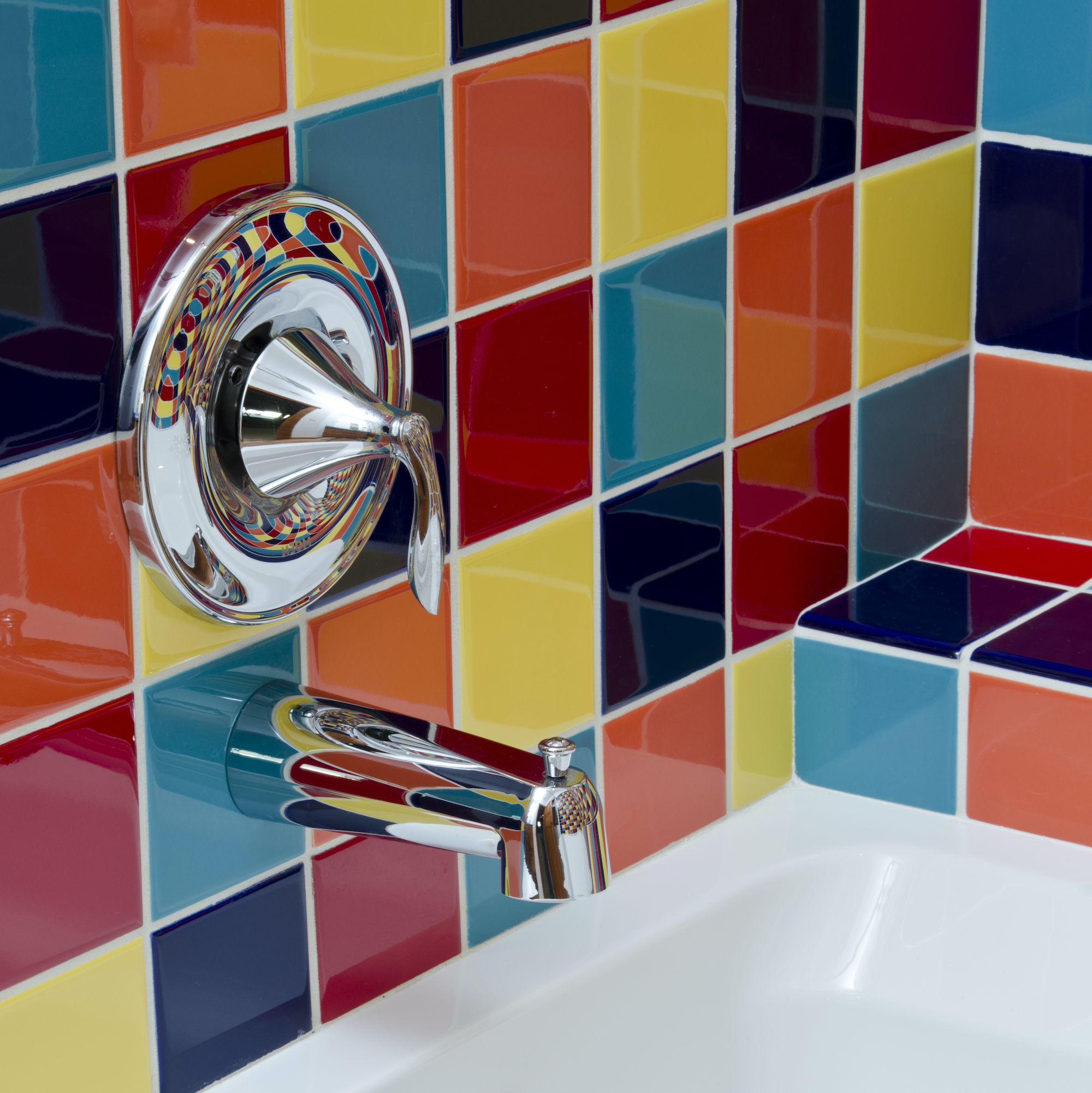
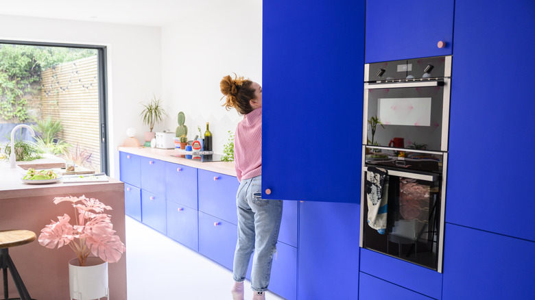
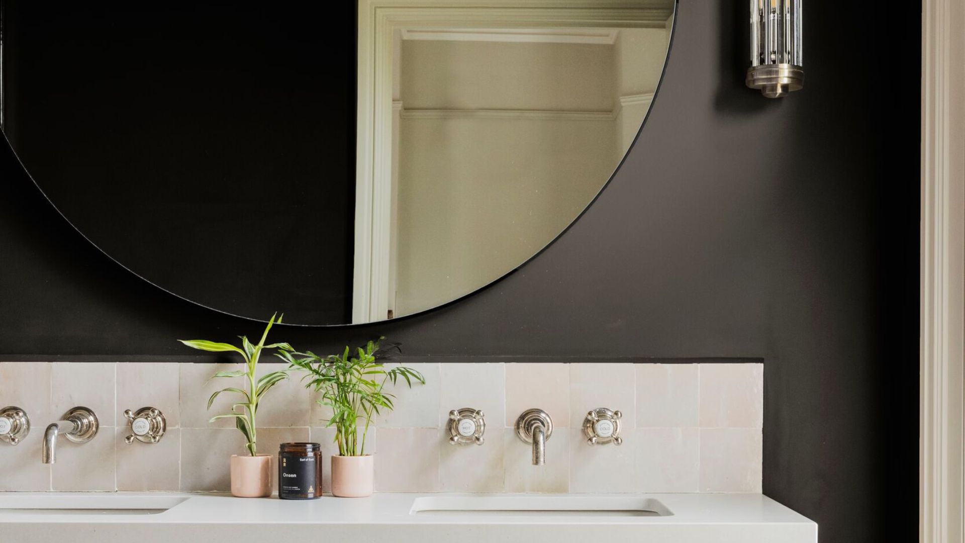
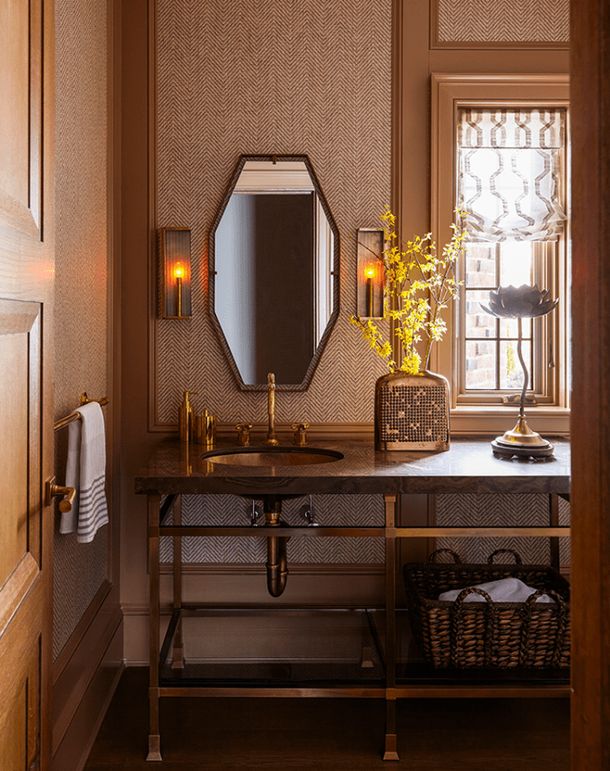
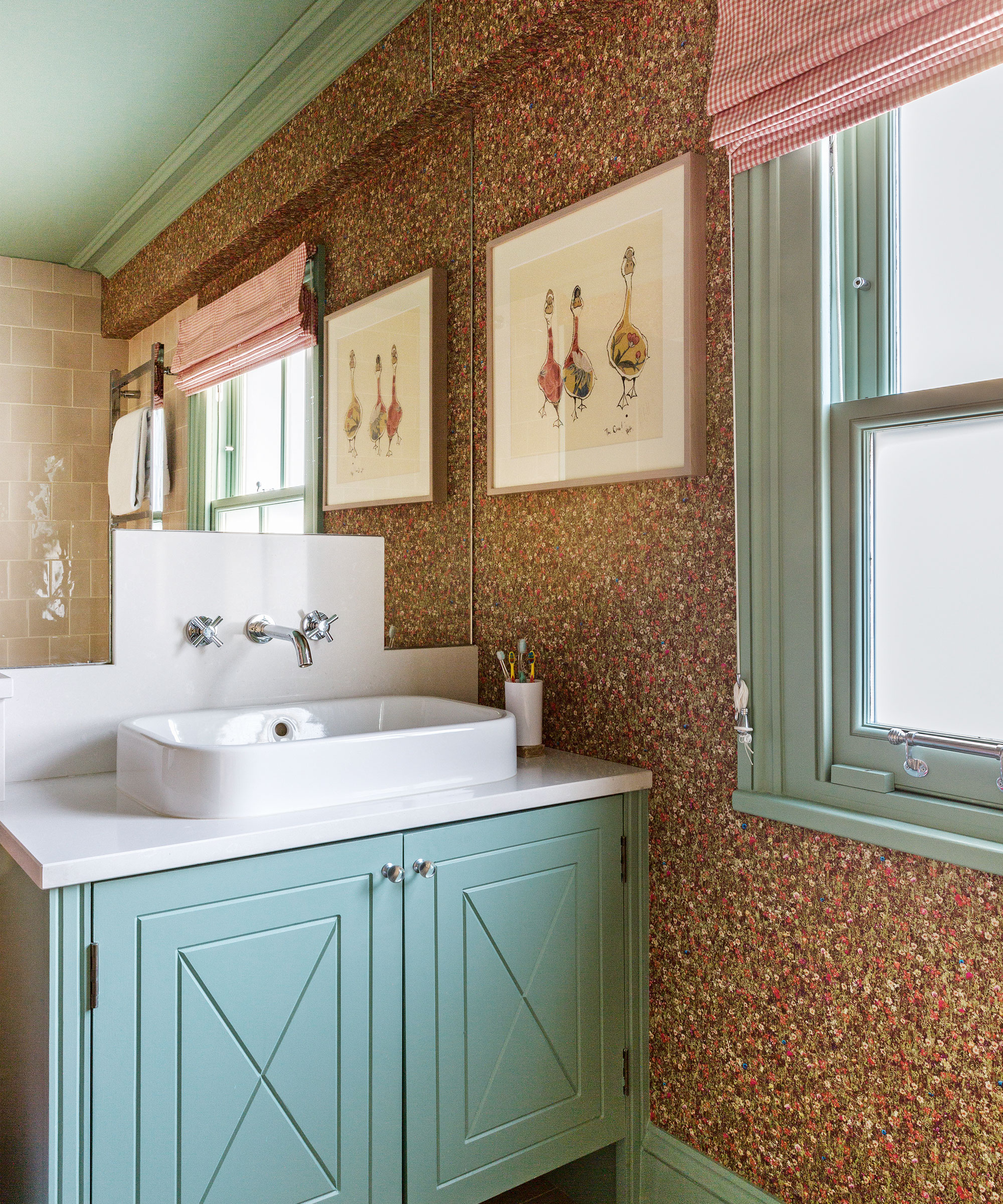
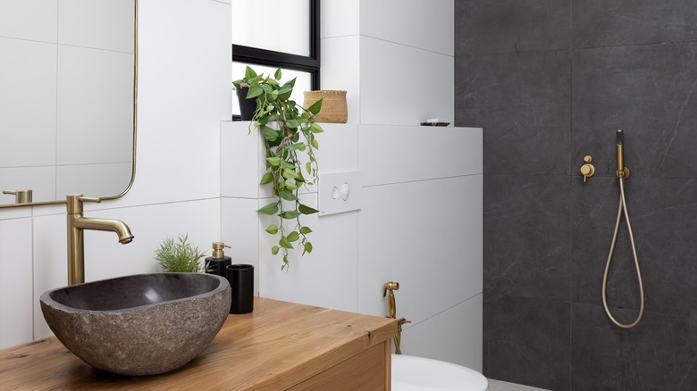
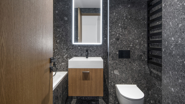
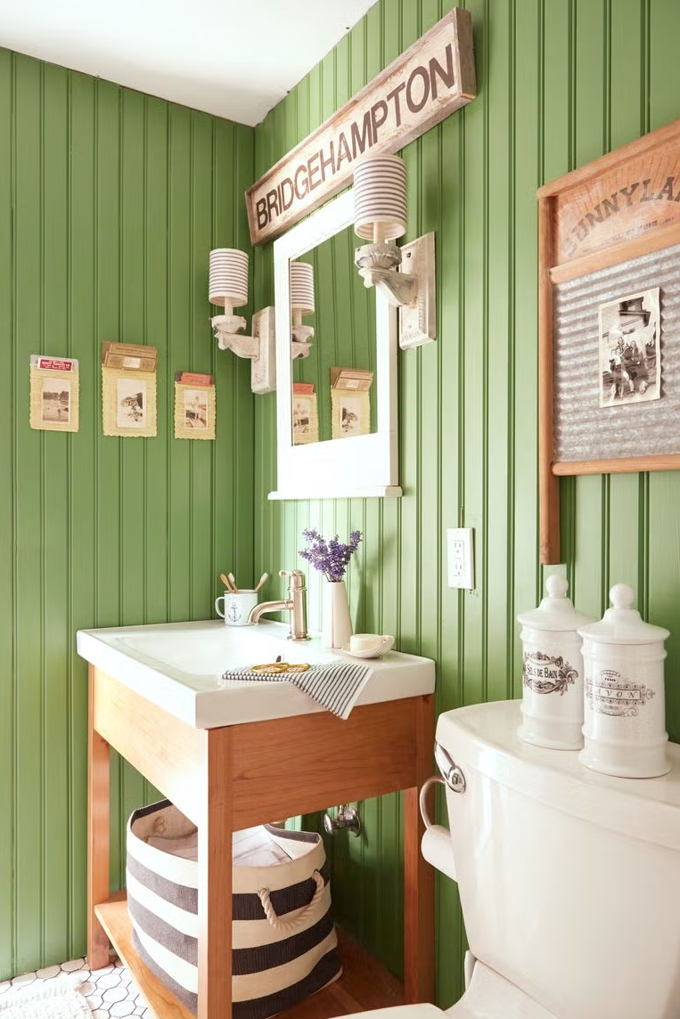
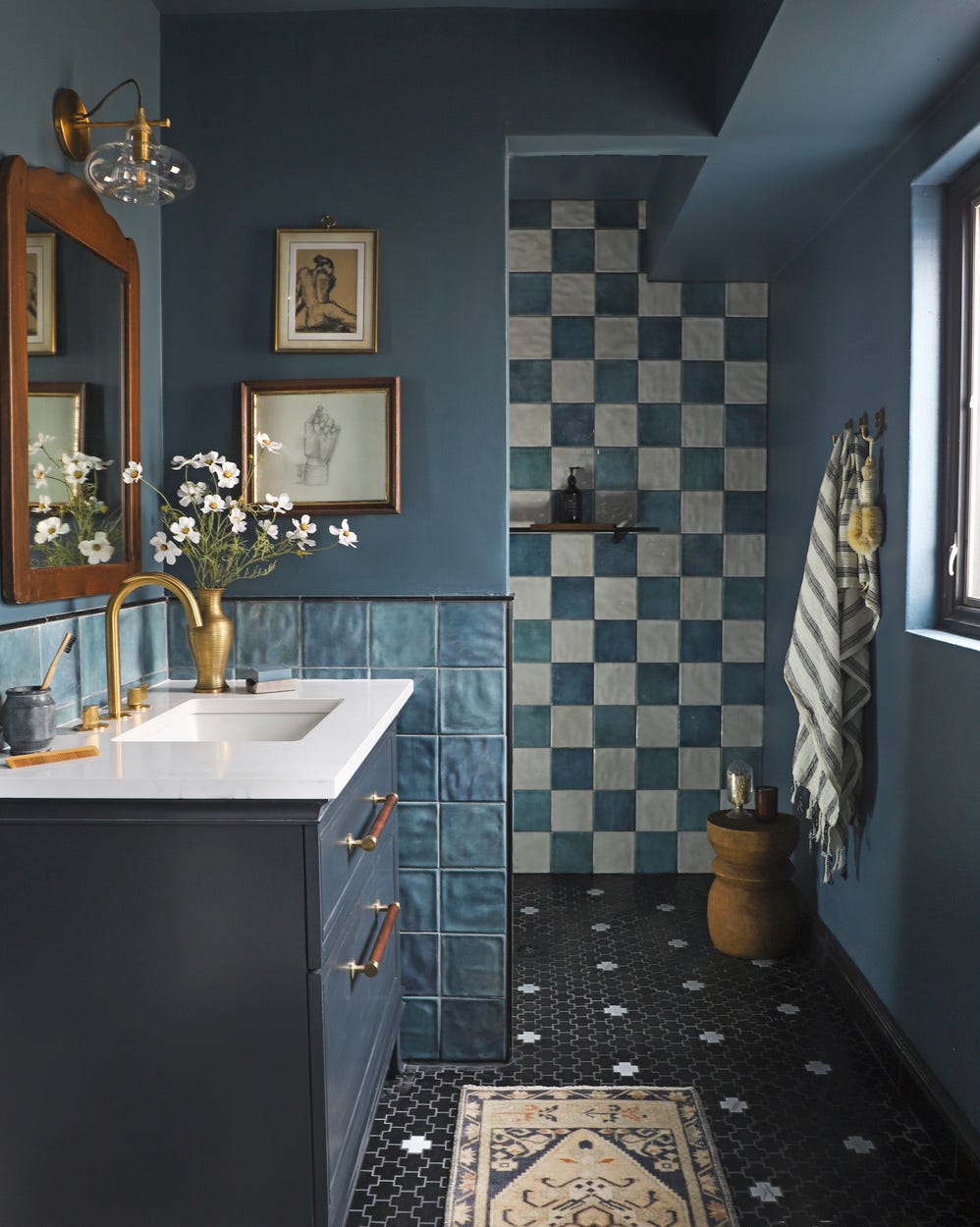
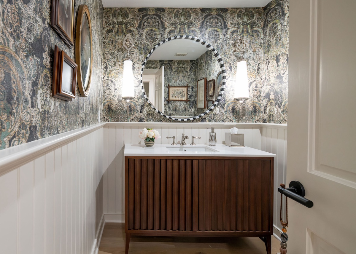
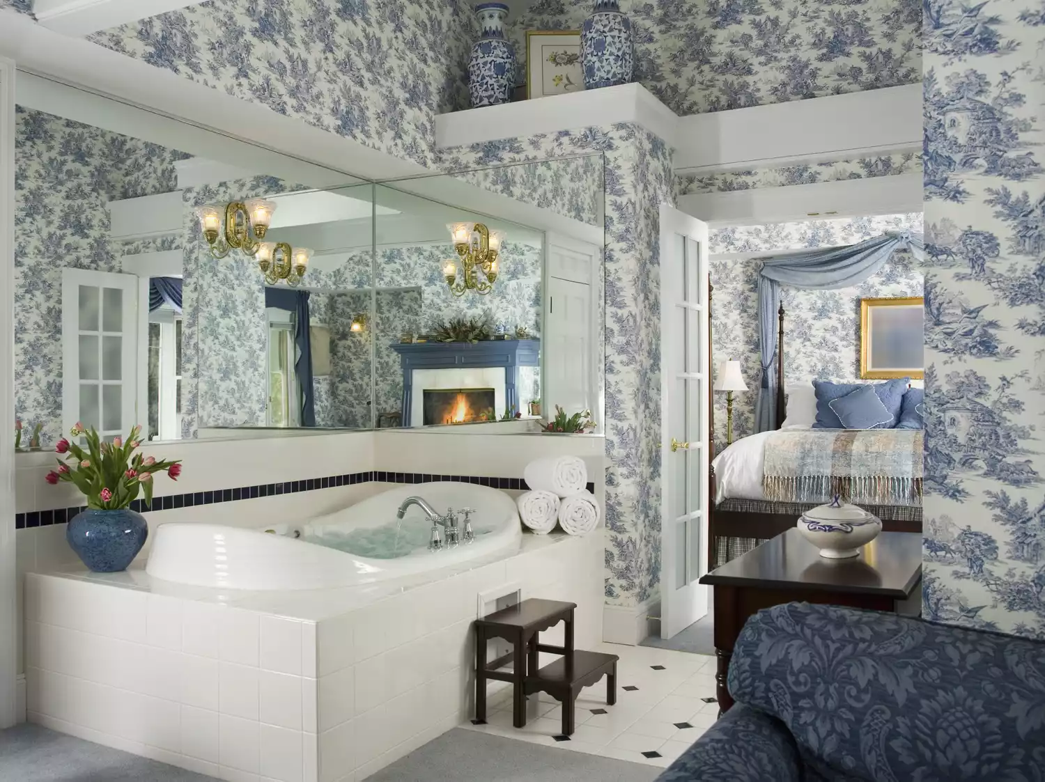
High-gloss finishes are generally not recommended for bathrooms due to their tendency to cause excessive glare and highlight moisture and imperfections. While they might work in powder rooms without showers or tubs, subtle finishes like eggshell, satin, or semi-gloss are advised for a more soothing effect. An example provided is Sherwin-Williams' Herbal Wash (SW 7739) in a satin finish for a nature-inspired bathroom. Ultra-saturated colors, like deep reds, browns, blacks, or vibrant hues such as fire engine red or lime green, can overwhelm small bathrooms, making them appear cramped and cave-like or juvenile. A balanced palette with lighter, airier, and subdued tones is encouraged to create a spa-like, relaxing ambiance. If bold color is desired, it can be introduced in smaller doses, such as on wainscoting or trim, paired with wallpaper, as seen with Farrow & Ball’s Stone Blue, No. 86.
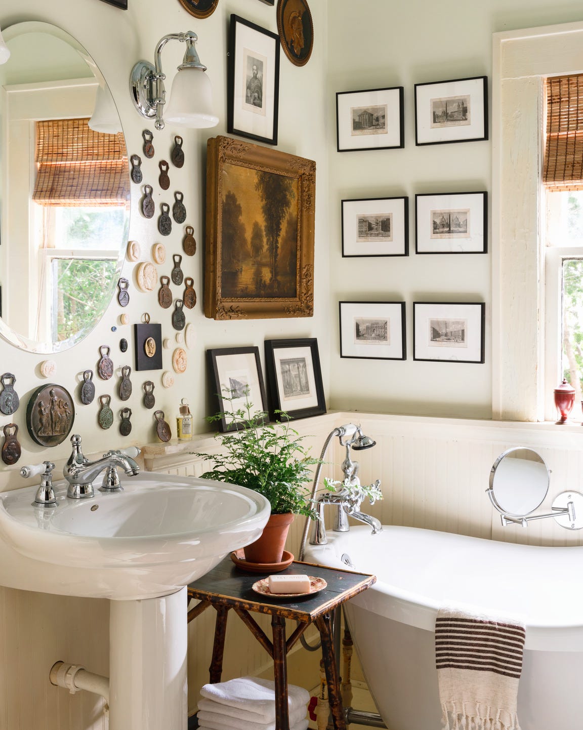
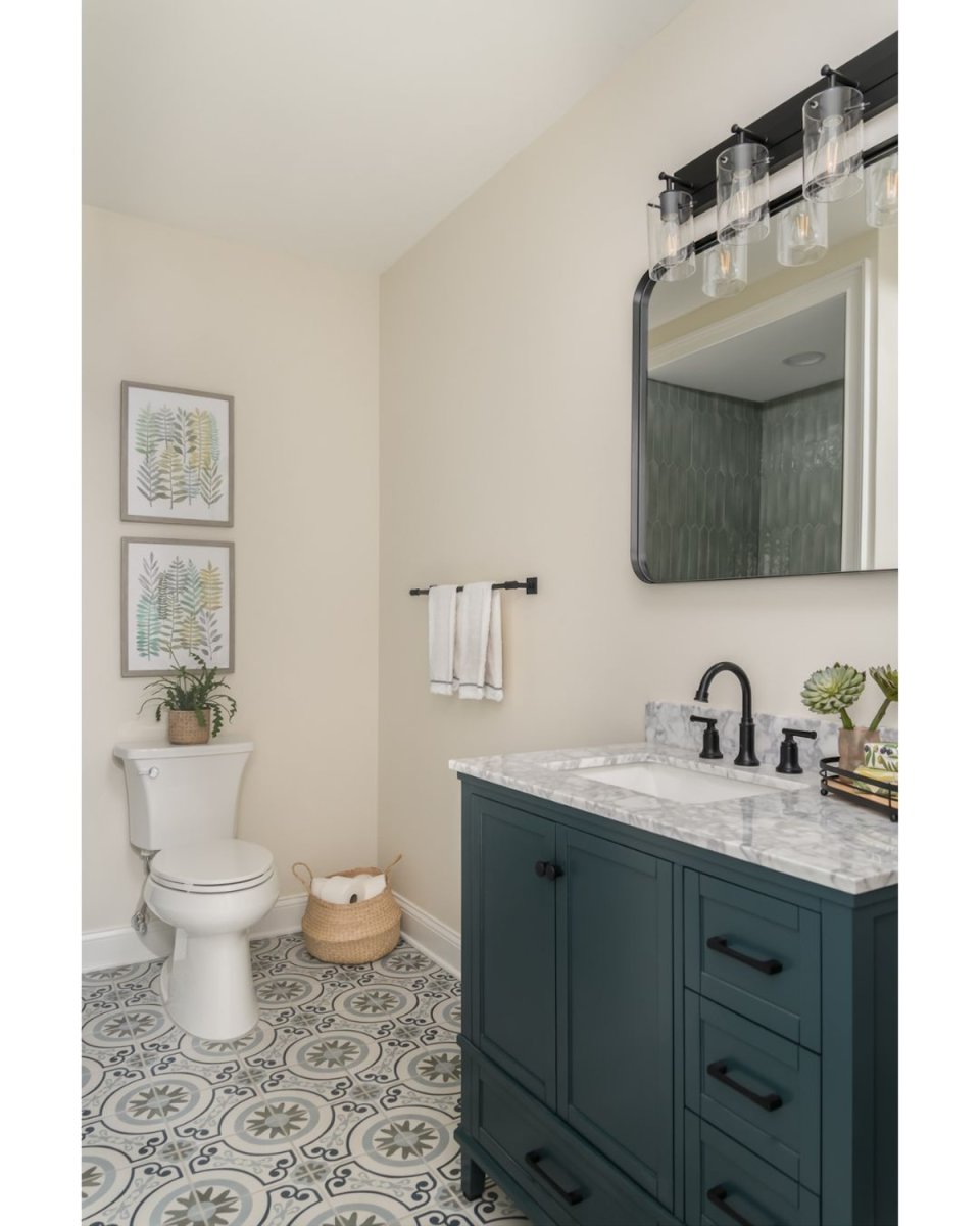
Finally, matching wall paint exactly to existing tile can make a bathroom look outdated and muddled. Instead of painting everything the same color, adding contrasting elements like wallpaper, textiles, or a fresh coat of paint in a brighter shade can liven up the space and create a fresher look. Sherwin-Williams' Pure White (SW 7005) is suggested as a way to maintain cohesion and brightness while avoiding a monochromatic, boring feel when paired with patterned tile flooring.
#BathroomDesign #PaintColors #HomeDecor #InteriorDesign #ColorPalettes #DesignTips #HomeImprovement #PaintFinishes #SouthernLiving #BathroomDesign #PaintColors #HomeDecor #InteriorDesign #ColorPalettes #DesignTips #HomeImprovement #PaintFinishes #SouthernLiving
0 comment in total
 No comments yet
You may also like
5 colors to avoid in a bathroom – according to designers

Towel colors to avoid in bathrooms – and what to buy instead, according to designers
5 Trendy Ways to Add More Color to the Bathroom
6 Colors You Should Never Paint Your Entryway, According to Color Experts

Yikes! The worst colors for a small bathroom that should definitely be avoided

Try These Expert-Approved Bathroom Paint Colors for Your Next Home Makeover

6 Paint Colors You Should Never Use in Your Bedroom, According to Interior Designers
Bathroom in Need of an Upgrade? Try One of These Paint Colors
6 Worst Colors To Paint Your Kitchen (And What To Choose Instead)
5 Paint Colors You Should Never Use in a Bathroom, Designers Warn

Bathroom paint ideas – 11 best paint schemes for your bathroom
6 Things You Should Never Put in a Guest Bathroom

6 Outdated Bathroom Paint Colors Designers Say You Should Never Use
Best bathroom paints: 6 moisture resistant paints
15 Colors That Will Turn Your Bathroom Into A Dark And Moody Oasis

The 10 Best Colors to Paint a Small Bathroom, According to Experts

Paint color ideas for bathrooms: expert advice for choosing the best shades

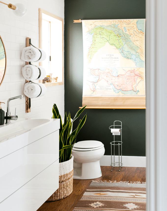
12 Bathroom Paint Color Ideas You Haven't Thought of Before
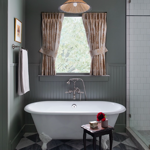
The Bathroom Paint Colors Interior Designers Swear By

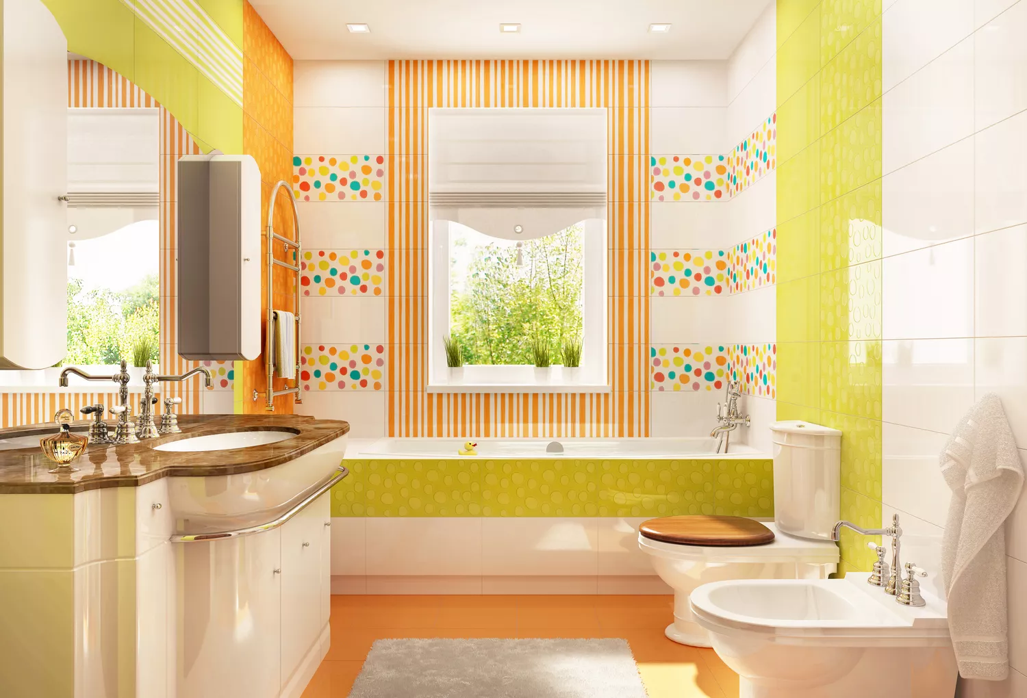
8 Underrated Bathroom Paint Colors Designers Wish You Would Use This Year